Category Archives: Component 1 Personal Investigation

Filters

Author:
Category:

Case Study:Barbara Peacock:American Bedroom-Mock:Identity and Place

Barbara is an American photographer/photojournalist. She is one of five recipients of the Getty Images annual Grants for Editorial Photography programme, which gives photojournalists an award of $10,000 as well as the agency’s support in pursuing projects of their choosing. American Bedroom is an ongoing series of portraits in which she explores the complexities of contemporary American life. American Bedroom is a cultural and anthropological study of Americans in their private dwelling; their bedroom. The nature of the project will be portraits of individuals, couples and families that reveal the depth of their character and spirit.

Cody, Portland, Maine: ‘It’s been really frustrating. I can’t do anything. I can’t hang out with my friends, can’t play sports. I’m stuck here … just me and my illness’ [rheumatic fever]
Pepere, Jay, Maine: ‘I am so quiet in the morning when I wake up so I don’t disturb her. Then I remember she is gone’
Betty, Sweden, Maine: ‘My husband died. I can smoke in the house now’

https://www.theguardian.com/artanddesign/gallery/2017/sep/12/american-bedroom-by-barbara-peacock-photographic-portraits

My Concept:

Barbara’s project on American Bedrooms has influenced me to do a similar idea for the ‘Place and Identity’ mock, in which I am going to take photos of people in Jersey in their bedrooms. I want to be able to explore the inside private space of the people on this island and how their bedrooms reflect their self.

I was also influenced by the media theorist, Goffman who came up with the concept of ‘The Representation of The Self in Everyday Life’ which is the idea that we all have a ‘back and a ‘front’ self, the front  is the one we let everyone see and we want everyone to see and the back is the one that is private to us that we conceal from others. I see a bedroom as a persons ‘back’ self a place or privacy and self expression, the actual person is the ‘front’ self, they leave their bedroom everyday to face the public world they dress themselves up to make an impression on others. I also want to explore how bedrooms change as people age, my impression is that the older you get the less expressive your bedroom becomes and it becomes more neutral and simple. Also it will be interesting to see how the dynamics of marriage and sharing rooms changes a persons private space.

Analysis Of Peacock’s Work:
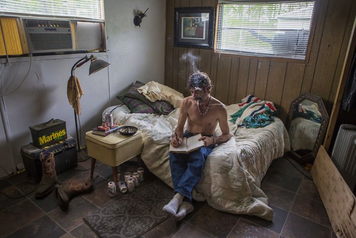
Image result for barbara peacock photography

Barbara’s concept is simple yet complex because the idea of taking a picture of someones bedroom seems easy but it’s the people she chose to take pictures of it intriguing. For instance in the image above there is a middle aged looking man with a cigarette, no clothes on and a reasonably bare room. At first glance it’s just a picture of a man in this room but it tells a story, such as the fact that he smokes inside might mean he lives alone and this bare chest also suggests this. Also the lack of feminine touch indicates that he doesn’t have a women in his life, as well as that the bed being up against the wall makes me think that he doesn’t have a partner because most couples have their beds in the middle of the room so that it is accessible for both of them. The number of beer cans suggest he is a heavy drinker and the ash tray full of cigarette buts indicates he is most likely addicted to nicotine. The lack of portraits on the wall suggest he is a lonely man, possibly no kids and his parents maybe have pasted away. The boots and tool box suggest he could be some sort of builder or construction worker, this links to the number of beer cans and how working on construction sites means you are around males mostly and going out for a drink it a key aspect of workmen culture.

Barbara uses natural lighting to capture the true lighting of the room as this can indicate to a persons identity for instance some people much prefer having the blinds up or being in rooms with less light, which could suggest they are shy or constantly tired or are more of an evening person. The colours are neutral which creates a warm tone which is contrasted with the dingy feel of the room and how some light coming through is blocked by a yellow object which creates a dirty looking light, this mirrors the old cans lying on the floor and ash scattered on the bedside table. Although the room feels dirty it isn’t messy, the lack or furniture creates a repetitive structure which ties in with the idea that the mans life is very structured, work, smoke, drink, sleep and how it lacks the excitement of family and love. On the other hand the thing that sticks out the most visually in this photo is the notebook and how it seems out of place and you would think that he is not the type of man to write, this empathises how we judge people to quickly on their looks (front self) and it’s when they go home that they become their real self.


Introduction-Mock:Identity and Place

Identity is the fact of being who or what a person or thing is. Place is linked to identity as it shapes a persons characteristics, for instance living in a slum with no money can make a person more appreciative towards the little things in life and have more empathy towards others. Whereas people who live in places like Beverley Hills in huge mansions don’t value money as much they spend it likes there is an unlimited supply and generally look down on others with less money. Also places like Russia have extremely high levels of domestic violence and alcoholics, which has been a consistently high rate for centuries now, which says something about the culture in Russia.

Gender Identity is the personal sense of one’s own gender. Gender identity can correlate with assigned sex at birth, or can differ from it. All societies have a set of gender categories that can serve as the basis of the formation of a person’s social identity in relation to other members of society.

Cultural Identity is the identity or feeling of belonging to a group. It is part of a person’s self-conception and self-perception and is related to nationality, ethnicity, religion, social class, generation, locality or any kind of social group that has its own distinct culture.

Social Identity is the portion of an individual’s self-concept derived from perceived membership in a relevant social group.

Geographical Identity is an individual or group’s sense of attachment to the country, region, city, or village in which they live.

Political Identity– refers to political positions based on the interests and perspectives of social groups with which people identify. Identity politics includes the ways in which people’s politics are shaped by aspects of their identity through loosely correlated social organizations.

Lack of / Loss of Identity-An illness, injury, and even aging can take a serious toll on the physical self, leading people a physical loss of identity that can sometimes be accompanied by a loss of self-worth.

Final Piece Displaying

Final Piece 1:

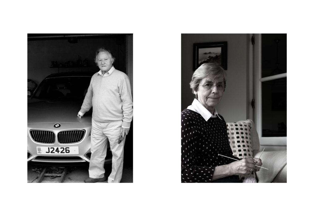
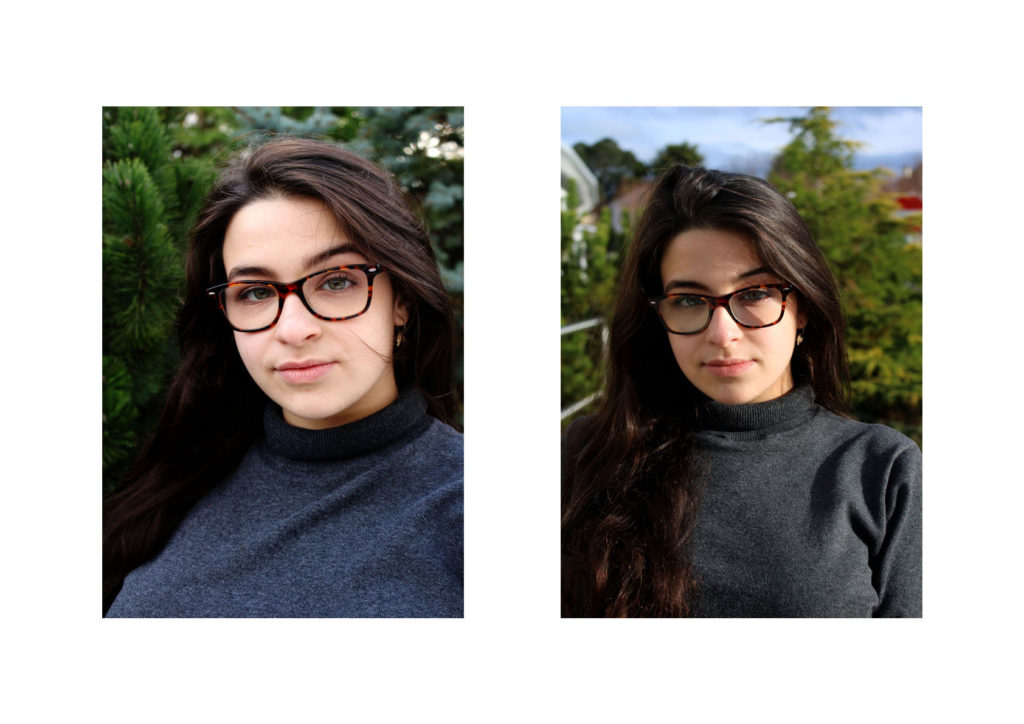
For my first final Piece I will be displaying my environmental portraits. I selected my top two images, which showed gender roles and resized them to be A4 images. To display them I am going to mount them on foam board next to each other, 4cm apart from each other. I feel that a white background suits the two images, and allows them to neatly be presented.

Final Piece 2: 

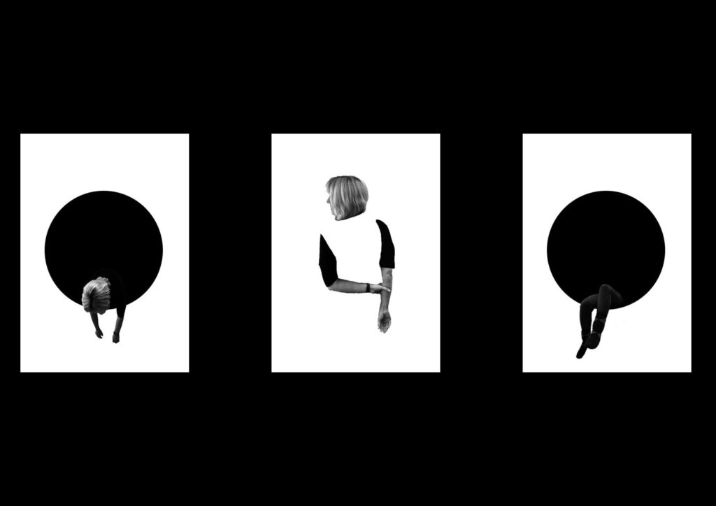
For my next final piece I am displaying the edits from my first photo shoot of loss of identity. I felt that these three images contained a simplistic design and represented the idea that my model has lost their identity, therefore I will be displaying the photographs in a triptych arrangements. All the images will be separately printed on A4 paper, and will be mounted as a window frame. The card is going to be black, due to the image background being white. They will be 4cm apart from each other and 15cm from the top and bottom of the frame.

Final Piece 3:

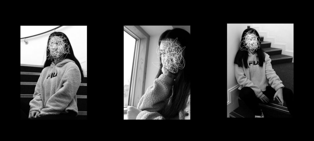
For my third edit I wanted to showcase, the scribble edits, which I created using the forgotten images. I felt that these images had a strong link to loss of identity and felt like the three images would produce a strong outcome. To do this I will  print the images on A4 paper, and will be mounted as a window frame. The card is going to be black, due to the image background being white. They will be 4cm apart from each other and 15cm from the top and bottom of the frame.

Final Piece 4:

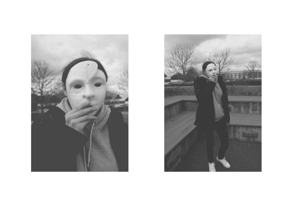
For my next final piece, I wanted to present my top outcomes from my mask photo shoot. I selected these two images, as I felt that they worked well together as a small photographic series. I will be displaying them as a Diptych Arrangement. Due to the two images being naturally lighter I feel like it would be appropriate to display them on white foam board, next to each other. I intended it have the images roughly 6 cm apart from one another and 6 cm away from the edges of the foam board.

Final Piece 5:

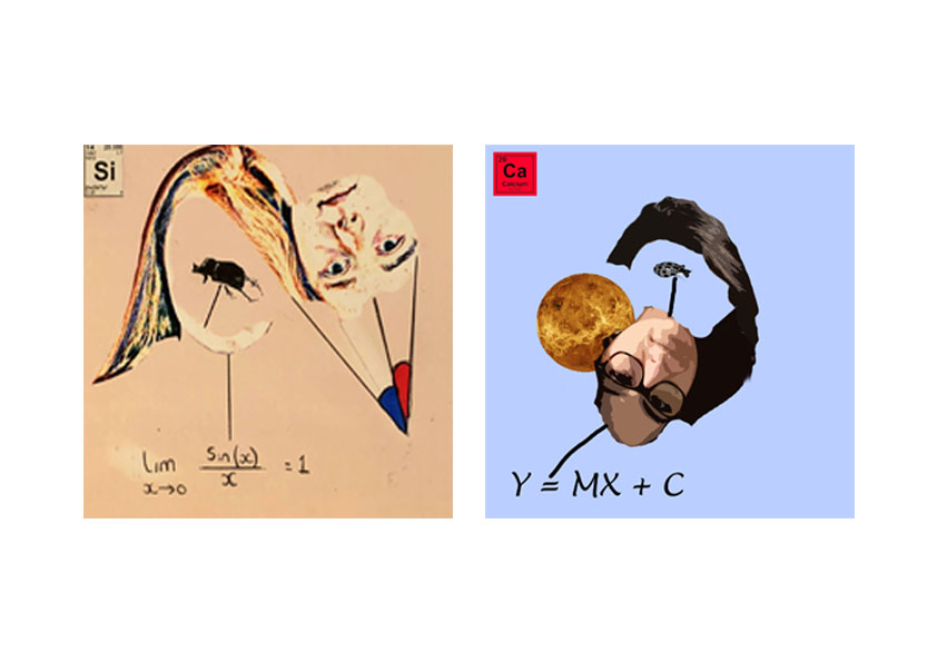
For my next final piece, I want to showcase my strongest photo montages. I decided to use these two montages as I felt that they worked well together. Due to the images being square, I have placed both images on the same A4 paper and will display through a window mount. This will allow the square shape to be kept. The two images are 3 cm apart from each other and will be a distance away from the edges.

Final Piece 6:

In my next final piece I want to display the photographs I captured when I studied natural lighting photography. These two images are my strongest outcomes and I feel like they work well together. I will print them out on separate A4 pieces of paper and frame them using foam board. The images will be 10 cm apart from each other and from the edge of the foam board.

Final Piece 7:

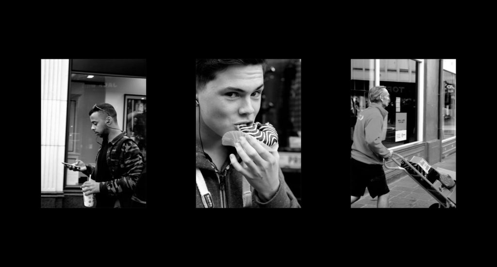
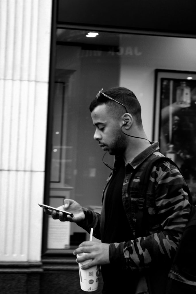
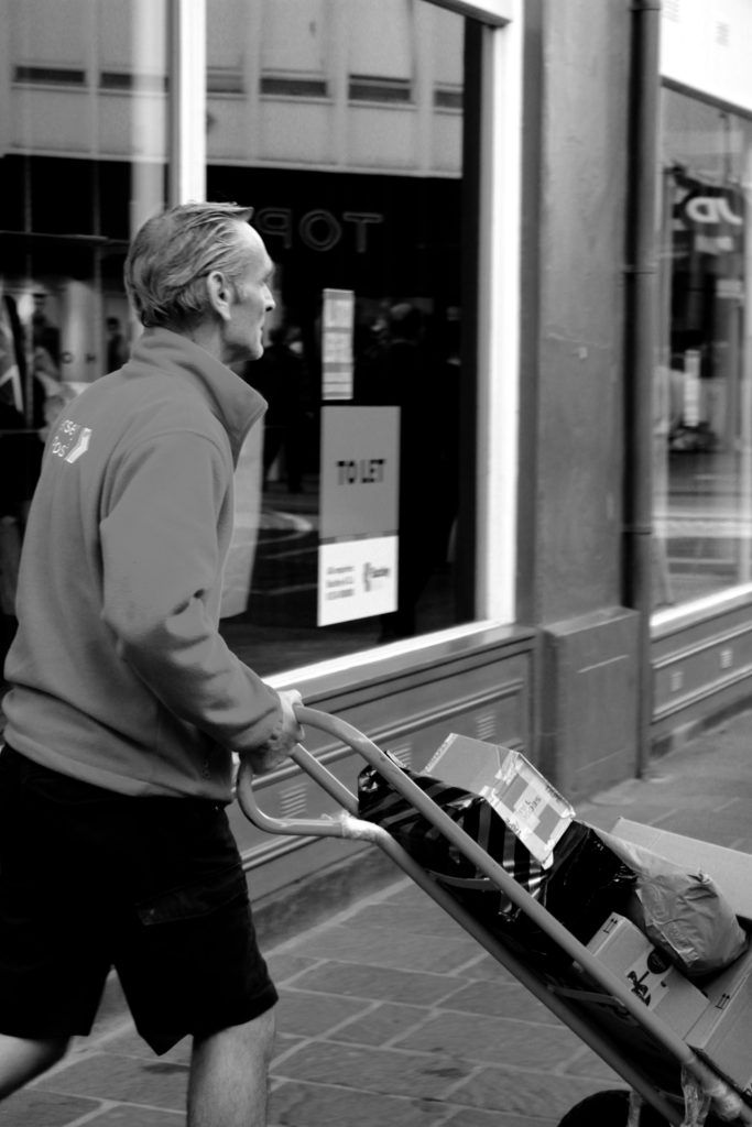
My next final piece showcases my attempt at street photography. I have used my top three images from this shoot and am going to display them next to each other, horizontally. The images will be printed out on A5 paper and be displayed using a window mount. The photographs will be 6 cm away from each other and 10 cm away from the edge of the window frame.

Final Piece 8:

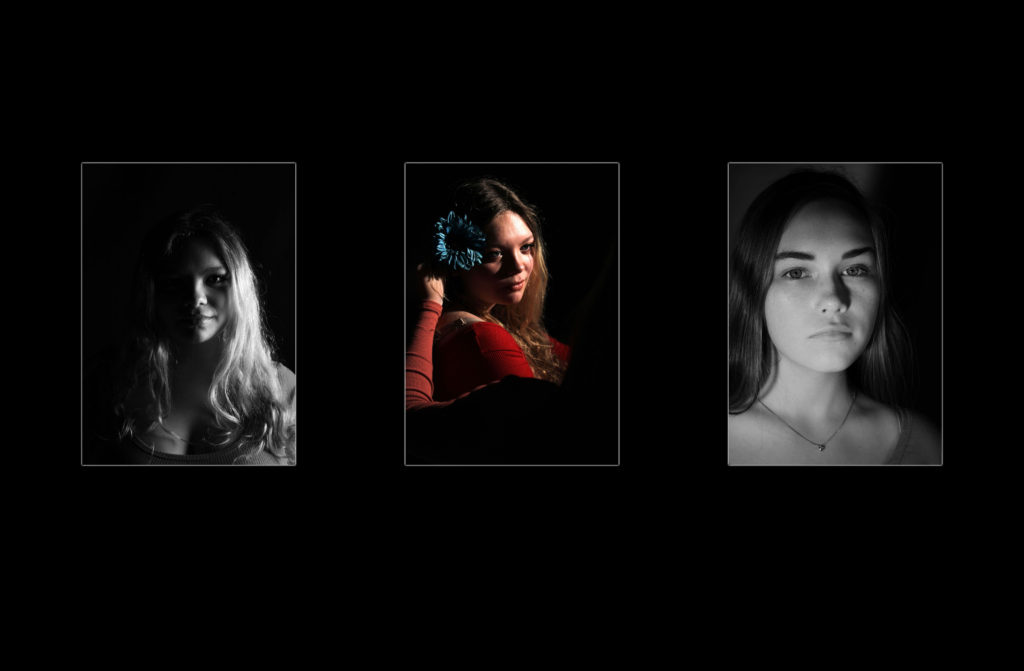
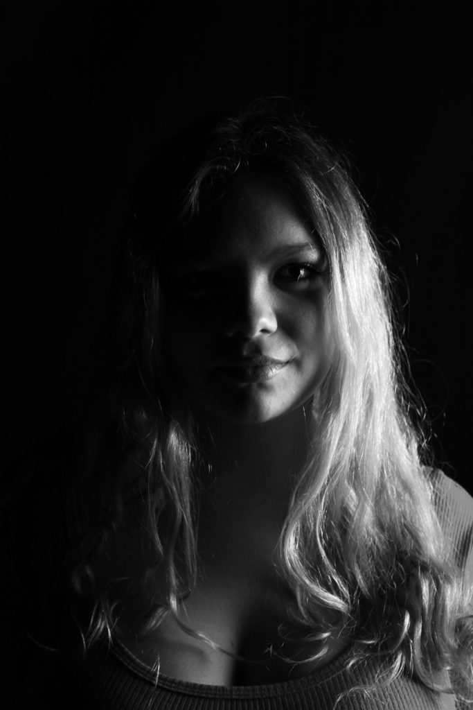
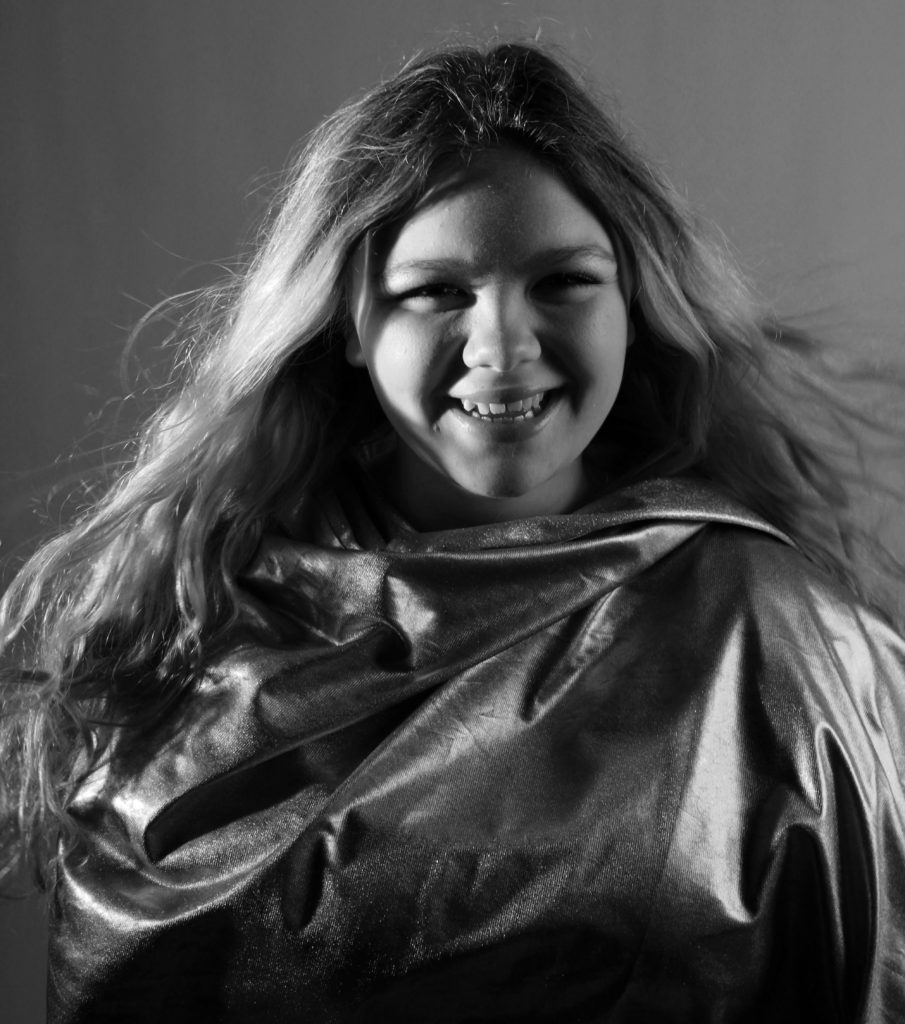
In a similar formate to the final piece above, I want to showcase my studio photography images. These images have been selected as it showed my ability to use different lighting and camera techniques, which shows my development as a photographer. The images will be printed out on A5 paper and be displayed using a window mount. The photographs will be 6 cm away from each other and 10 cm away from the edge of the window frame. The middle image has been left in color as I felt it added variety and makes the final piece visually stimulating.

Final Piece 9:

For my last final piece I intend to showcase my top image from the tableaux photography shoot. I will print this image out on A5 paper and then mount it on black card, allowing the mount to not distract viewers from the actual picture.

All Images Being Made Into a Final Piece:

When Time was Prime 4 — Editing Images*

When I looked over the images some had parts that were overexposed, this wasn’t a problem as I was shooting in raw so I was able to fix any exposure issues. I also cropped some of them but I had to maintain the scale so that they will fit on my final presentation.

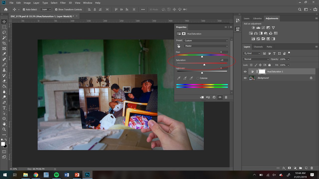
These were only minor changes, the main one that I had to do was to make sure that all of them had the same levels of saturation, the reason for this is because it was an overcast day and the only light source that I had available was the sun, due to the cold light a lot of the images were under saturated so I had to boost it and have it so they all look like they are all equally saturated.

To change the saturation All I had to do was move the circled slider, the problem I had was getting them all to be the same, the way i overcame this is I had one image opened with the correct levels of saturation on one monitor and I was editing all of the other ones to make sure that it matched of the second monitor. This worked well as I could easily refer to the colours that I wanted.


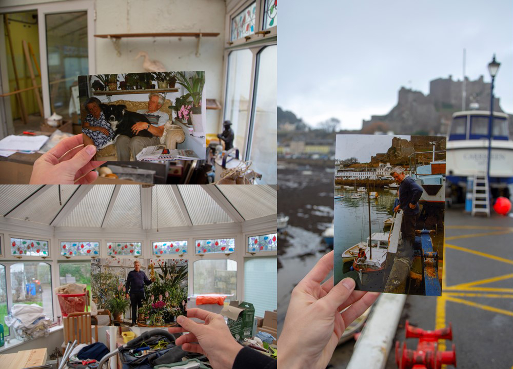
As can be seen below the images turned out well and I am happy with the colour grading and saturation that they all have. 

Top Outcomes – Identity

I have gone through all of my photo shoots which have been conducted throughout the portrait project, and have selected the top outcomes from each shoot. The aim of this is to begin to make final selections of images which could lead to final pieces. Moreover, it is a chance for me to reflect and see what I have achieved throughout this project, and display my best outcomes as a collective. These images are initial thoughts of what could lead into final pieces, and is beginning to make me think about ways of displaying these images, and what message I am wanting to get across.

Response To Identity:

The images below are my top edits, which I believe have the strongest link to loss of identity. Moreover, all of the photographs clearly show good camera techniques and my ability to experiment, and use Photoshop in order to manipulate my images. These photographs have been taken from the two photo shoots and the old picture edit files, which I have produced in the past couple of weeks for the lead up of the mock exam.

Response To Photo-Montage:

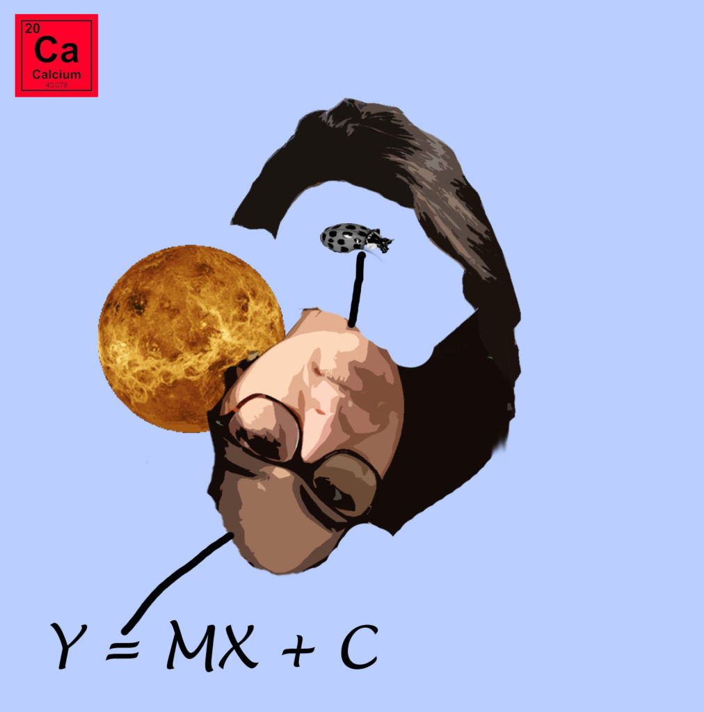
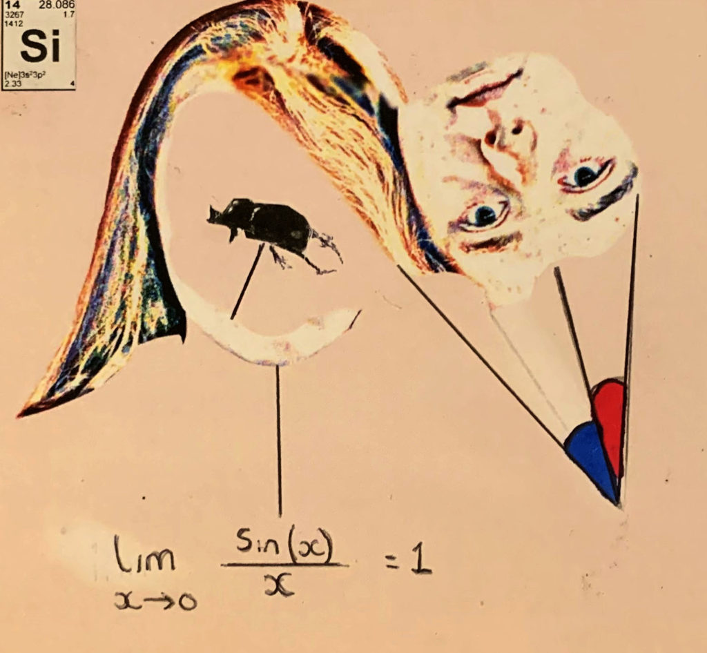
These are my top two photo-montages, which clearly show images being layered on top of each other to create an overall photograph. These two images showcase the inside of a person, by moving the head and placing objects in that and around that area, showcase the type of person they are. Both of the edits are showing the model to be smart, through the use of equations and elements off the periodic table.

Response To Tableaux:

I believe my tableaux photographs are the weakest images that I have produced from this project, as a result of this I have only one image which clearly showcases my approach to this style of photography. The image shows lighting and camera techniques, which help to build a story of what is happening within the photograph.

Response To Studio Lighting:

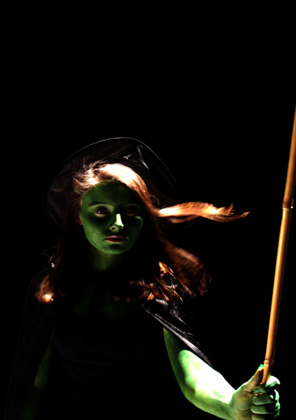
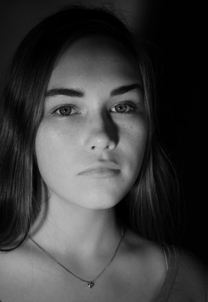
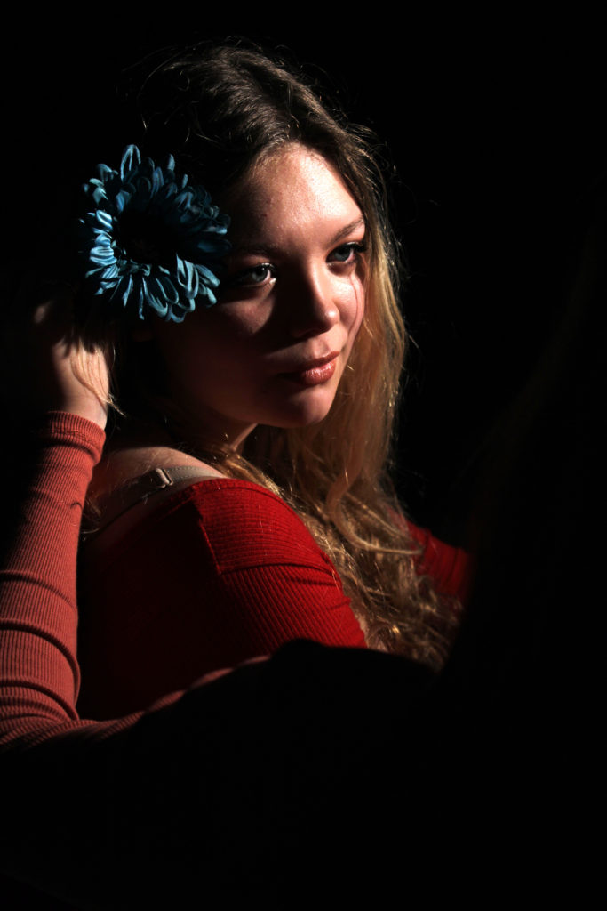
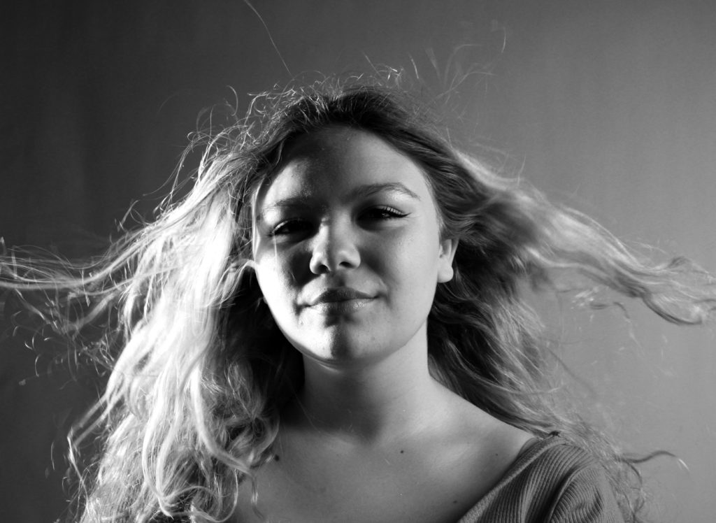
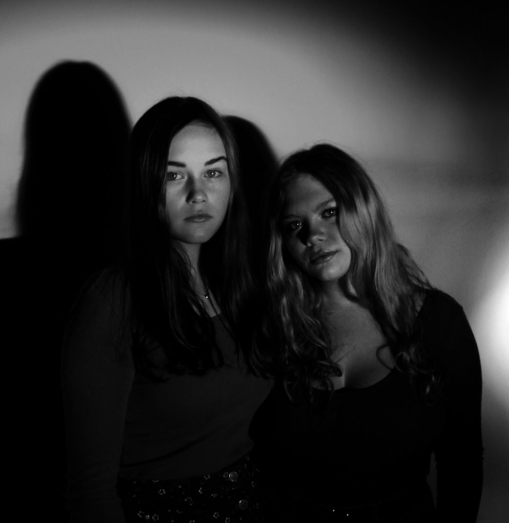
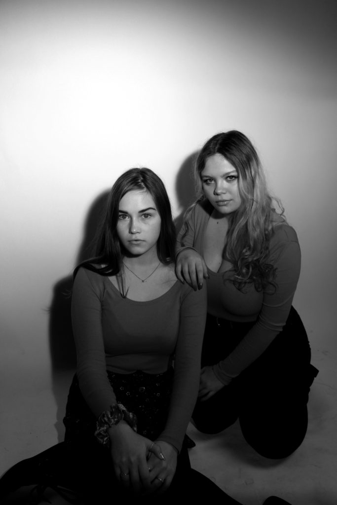
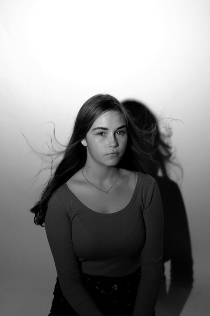
I had a large number of studio photography portraits, which I thought are successful. Due to having so many successful outcomes I am thinking of displaying 9 of the best outcomes, in rows with the middle image being in color. These are the nine best images which I would want to use, and think are the most successful.

Response To Street Portraits:

Very much like the tableaux images, I felt that I was limited of successful images produced which therefore left me with three photographs which I believe could lead to potential final outcomes. These images clearly present the concept of street photography, through the nature of the model not being aware that I am capturing them in a photograph.

Response To Environmental Portraits:

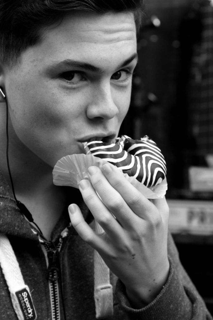
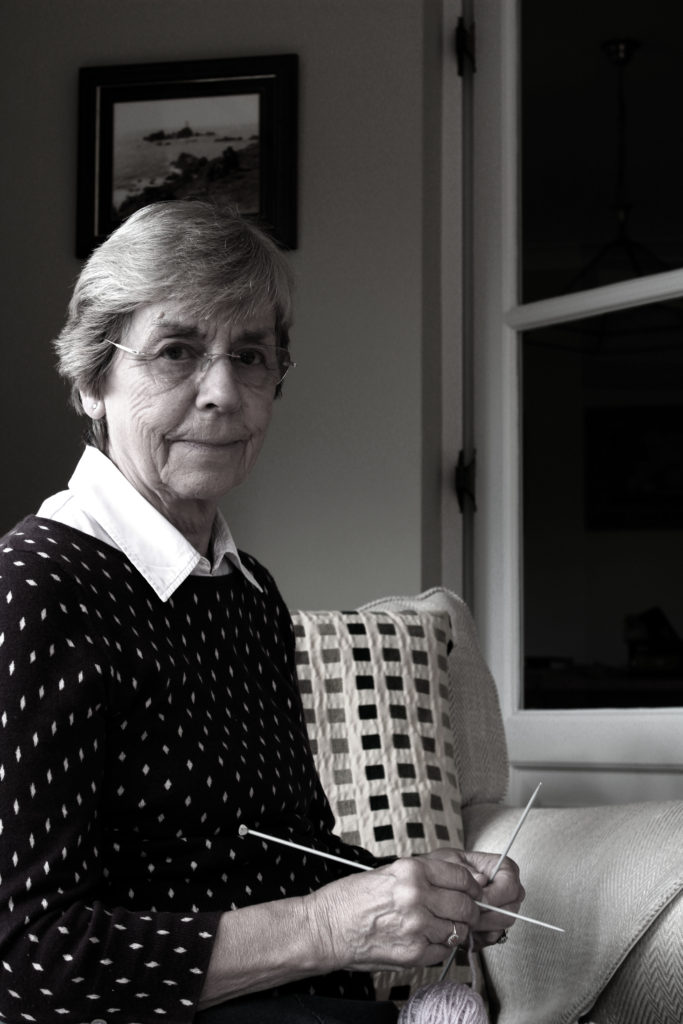
I had a large selection of images which I could have used to showcase my response to environmental portraits. Due to the photo shoot I conducted showing the contrast of male and female stereotypes at retirement, I felt that it was appropriate to showcase two images, one of my male model and one of my female model. These two images, really outlined the contrast of gender roles I was trying to establish and therefore, I believe that they are my strongest outcomes in response to environmental portraits.


Further Loss of Identity Edits

When sifting through my photographs, which have been taken throughout the portrait project, I have found some images which could be manipulated in order to show loss of identity. These images are essentially the ‘forgotten’ images which I believe have potential to be something more. For all the edits I levelled and adjusted the curves to make the image darker and lighter, depending on how much of a tonal contrast I wanted to create.

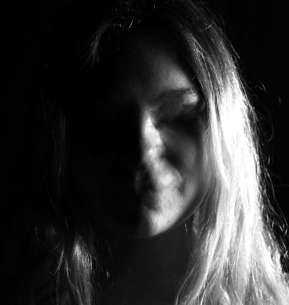
In my first edit I wanted to physically represent my model loosing her identity. this image was taken from the studio lighting shoot, in particular when I looked at the chiaroscuro effect. I started of by cropping the image to be solely focused on the face of my model. The using the spot healing tool I went over the eyes, nose and mouth which erased them from the image. I then went over any areas of facial structure, which shows how the model has physically lost her identity. The black and white also presents no identity as colour has been taken out of the image. I really like how the image has high contrast which allows the facial features, which have been taken away, easily seen. Therefore, this edit successfully present a loss of an identity.

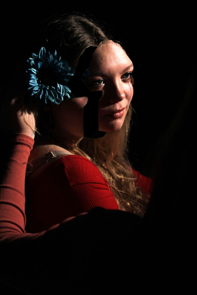
For my next edit I wanted to show the process of losing an identity, physically. I took inspiration from Marccelo  Monreal, who did a similar style of photo manipulation. In Monreal’s image he added flowers behind the cut out of the face, due to this being loss of identity I decided not to include the flowers as I felt that it presented to much of an identity. To do this edit I used the quick selection tool and went over the face, I then pressed layer via cut in order to make the face a new layer. I then used the move tool and  moved this cut out face slightly up and to the right in order to make it look like the models face is being taken away. Due to this edit showing the process of losing an identity I felt that this image should be in colour as it shows the before stage. Although I like the way this edit looks I do not feel that it has strong links to the theme of loss of identity, and therefore am not considering making this into a final piece.

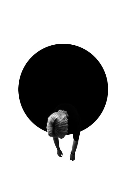
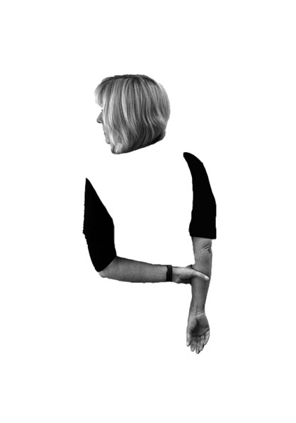
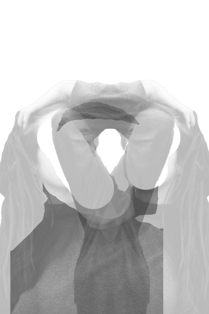
In this edit I wanted to look at the double exposure technique, where I would use two different images to formulate a whole image. I opened up the two images and cut the out using the quick selection tool and made them into separate layers by pressing layer via cut. I then moved these cut outs onto a new A4 white document. Using the rubber tool I decided to rub out the face, only leaving the body. I then placed the two images in the centre of the page and decreased the opacity of both, in order to see both images. I then decided to duplicate the layer with the model playing with her hair, and placed it the other side. Pressing ctrl + t allowed me to make the image face the other way. This final piece shows loss of identity as the models poses shows that she is confused, moreover the missing face suggested that she is lost. Finally the image is presented in black and white, making all aspects of colour identity being taken away.

Series of Three

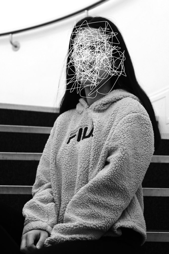
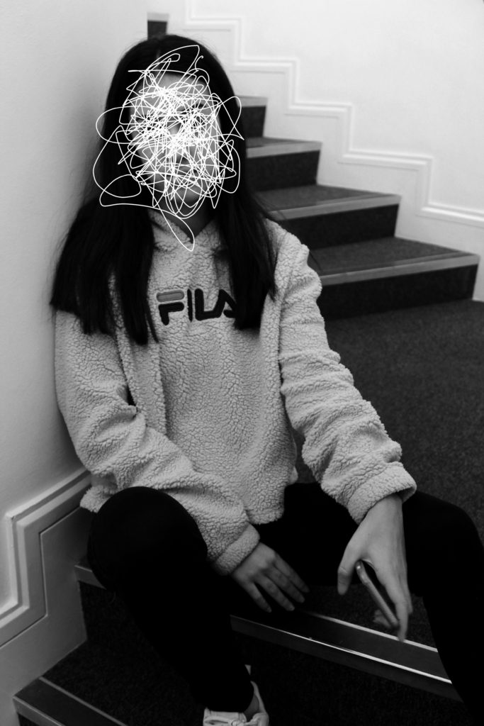
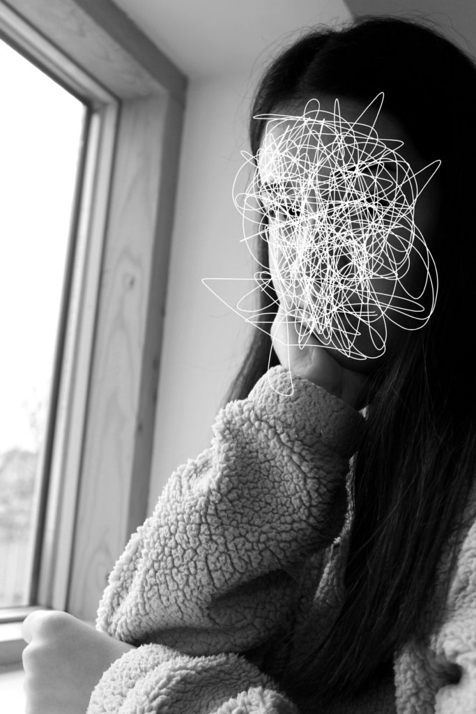
For the next three ideas I followed a similar approach as the first idea, I wanted to physically shows a person who has lost their identity. To do this I simply made the image black and white, to remove colors, and used the paint brush tool (white paint) to scribble of the face. This creates the concept that the image has been scratched to remove the identity of the model. These three edits are the most successful, due to the strong link it has with the theme of loss of identity. Moreover, I believe that these could be a potential final outcome for the loss of identity project.

Series of Two

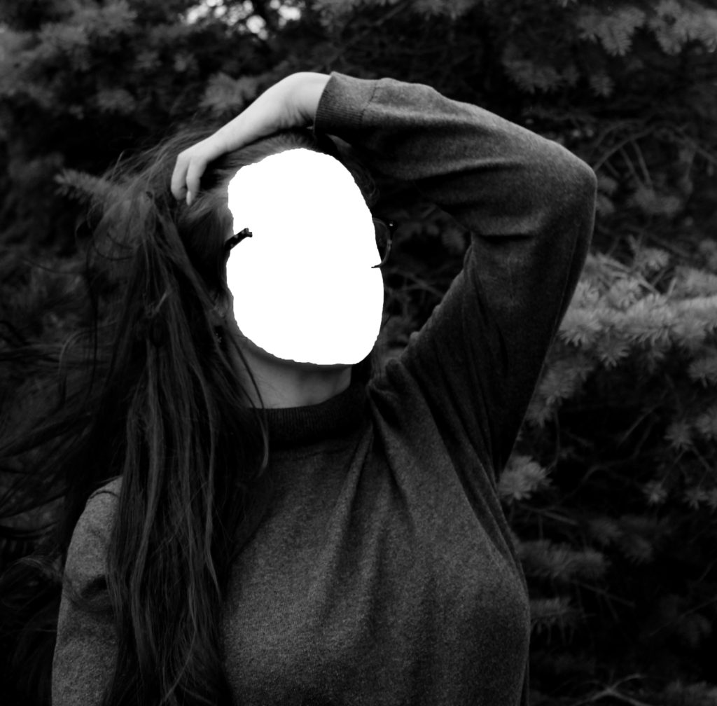
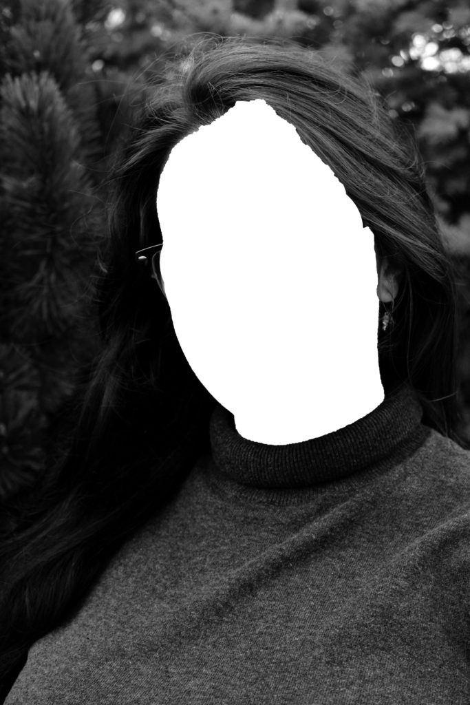
For my final two edits I wanted to physically show a persons loss of identity, as it tends to have the strongest connection with the theme. I followed a similar approach as the edits above, but decided to completely remove the face of my model. To do this I used the quick selection tool, and pressed layer via cut, in order to make the face a new layer. I then deleted the face layer, leaving the body and a white area where the face is meant to be. These edits are strong edits due to the not neat edges, from where I cut out the face, this metaphorically represents the idea that losing an identity can leave marks and scares and is not a tidy process to undergo. I really like the way these edits turned out, but believe they would have been more successful with darker and more sinister images, as the overall tone of the images could then match the concept trying to be presented.

To evaluate these edits, I believe I have produced some strong connections between my images and loss of identity. Moreover, I have managed to incorporate the ‘forgotten’ images and include them into the project successfully. I believe that some of these edits can be furthered into final pieces, due to meanings and representations the images hold. I have been able to clearly show a variety of Photoshop skills in order to manipulate my images in many ways, presenting different approaches to the theme of loss of identity. Thus, these edits have clearly benefited me and my exploration towards the theme of loss of identity.

Final Outcomes

Final Outcome Options

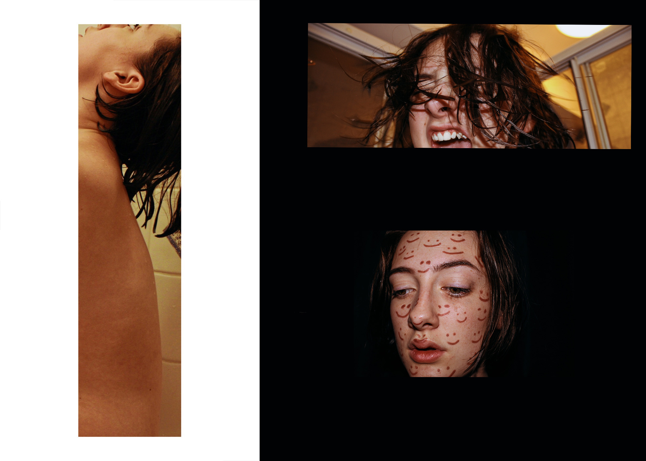
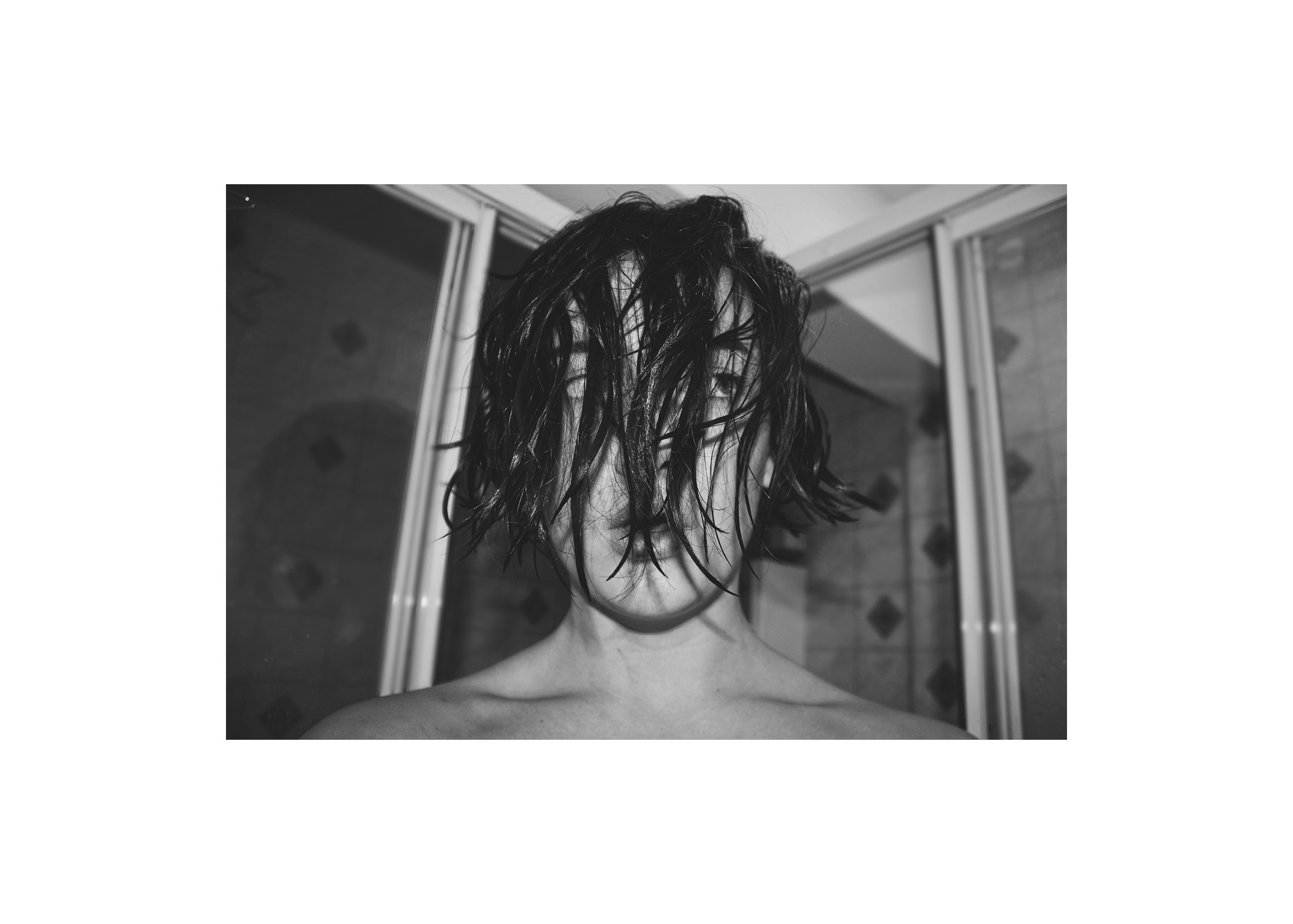
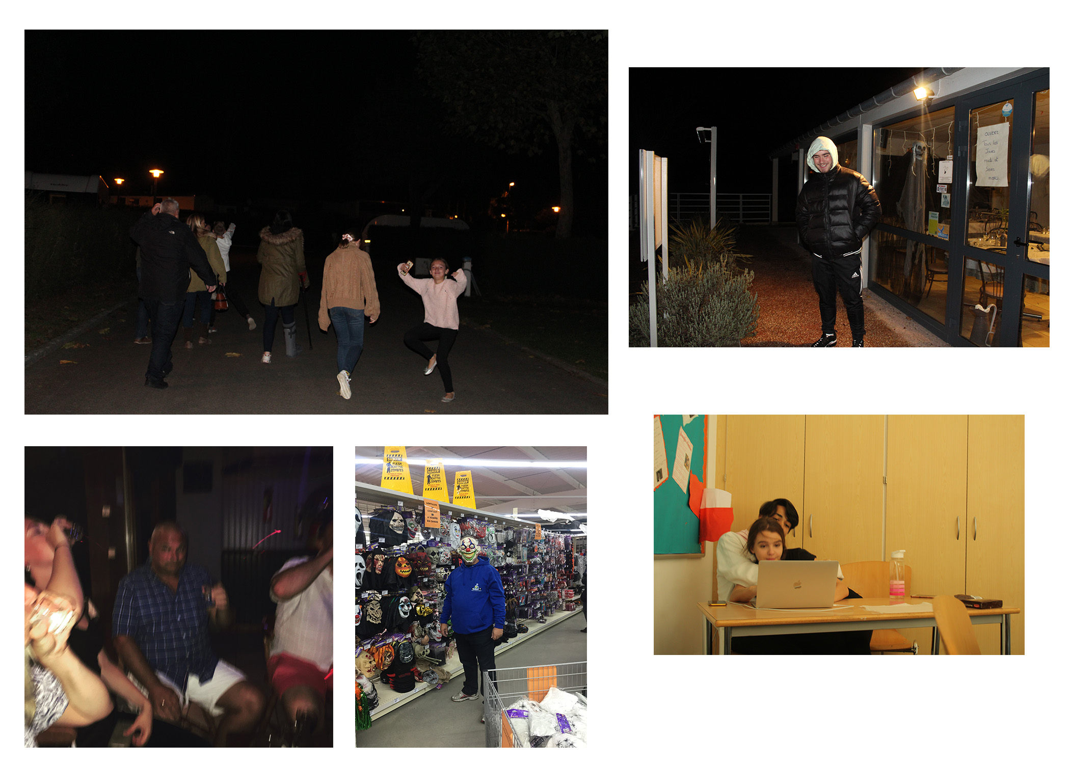
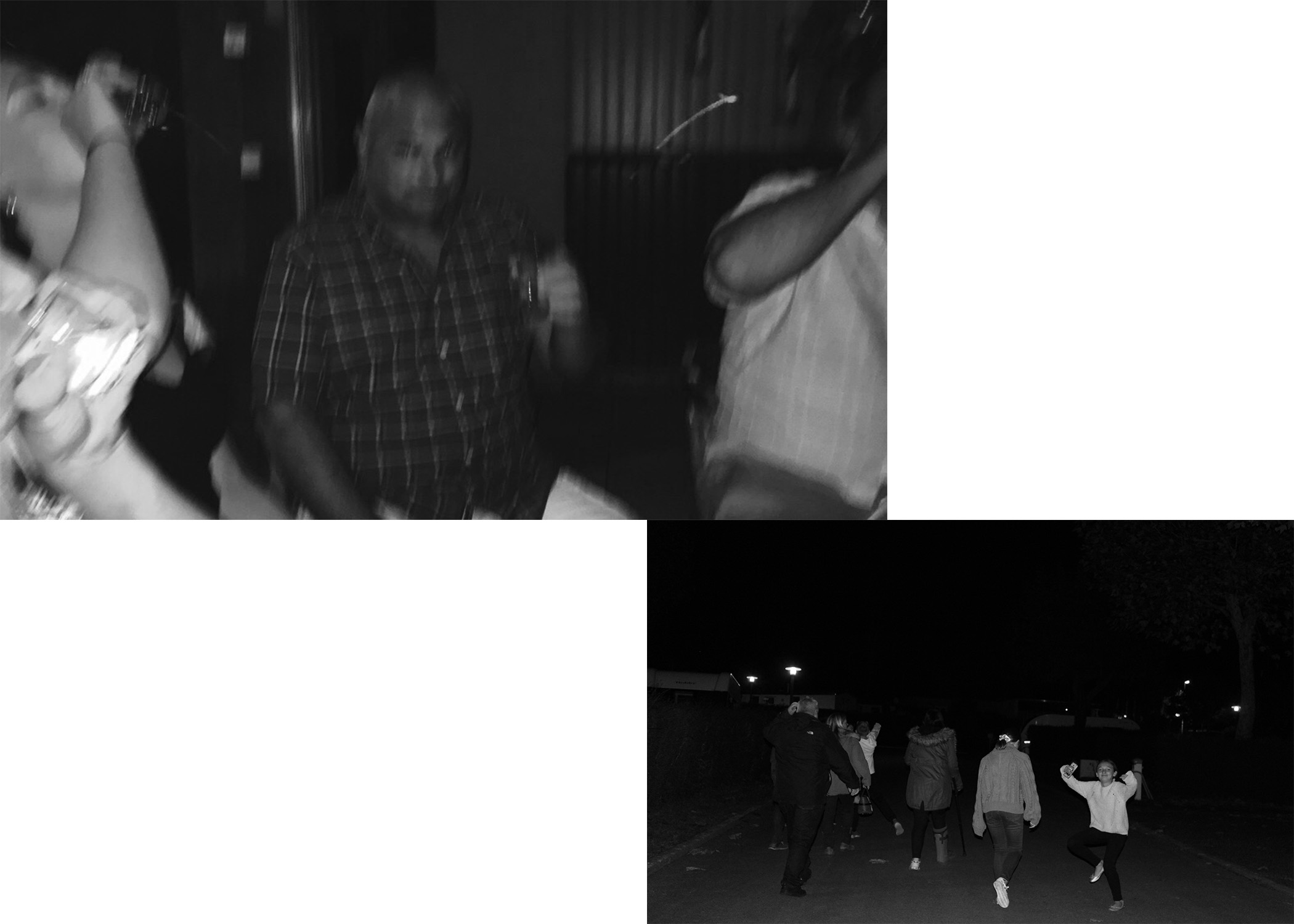
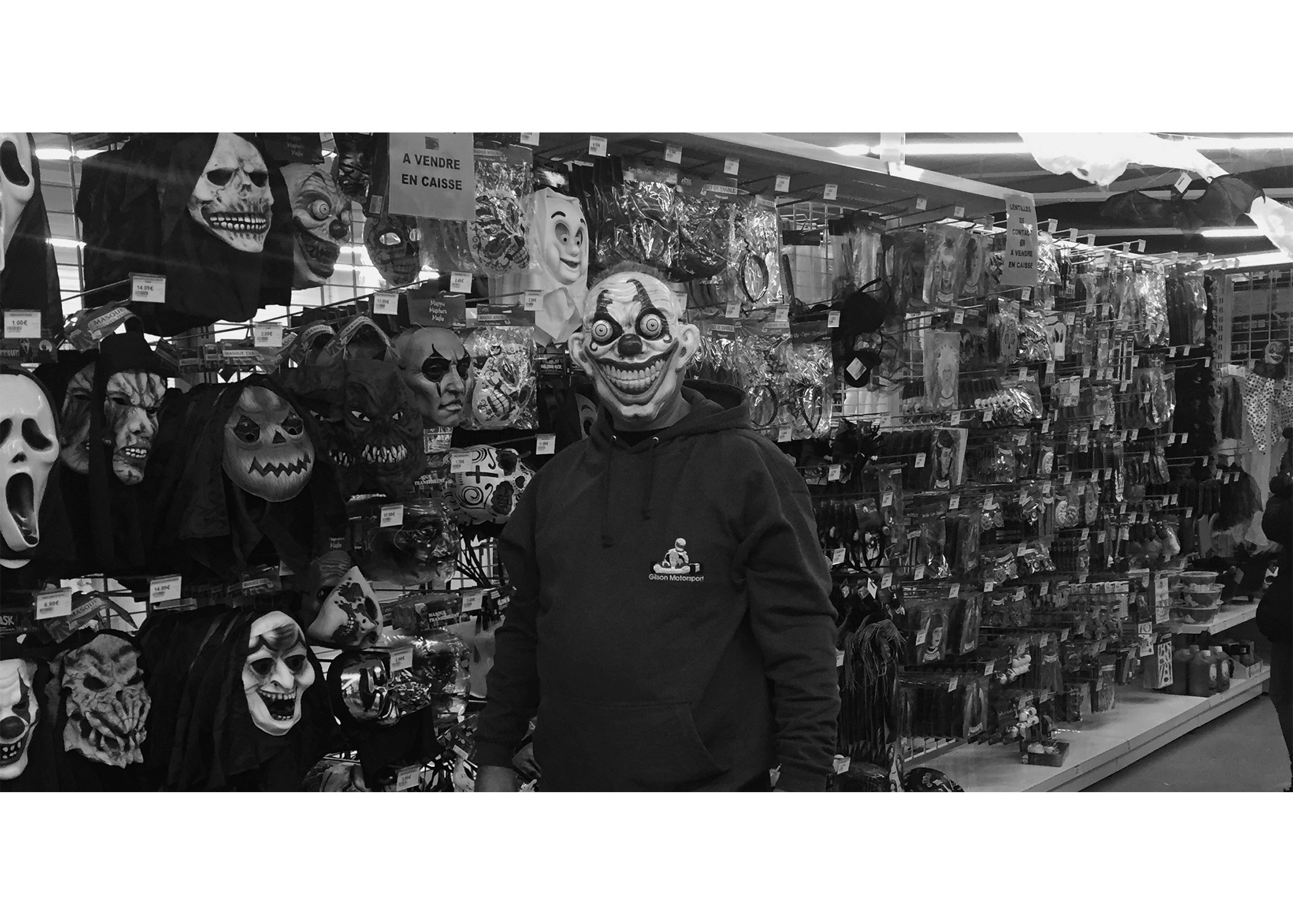
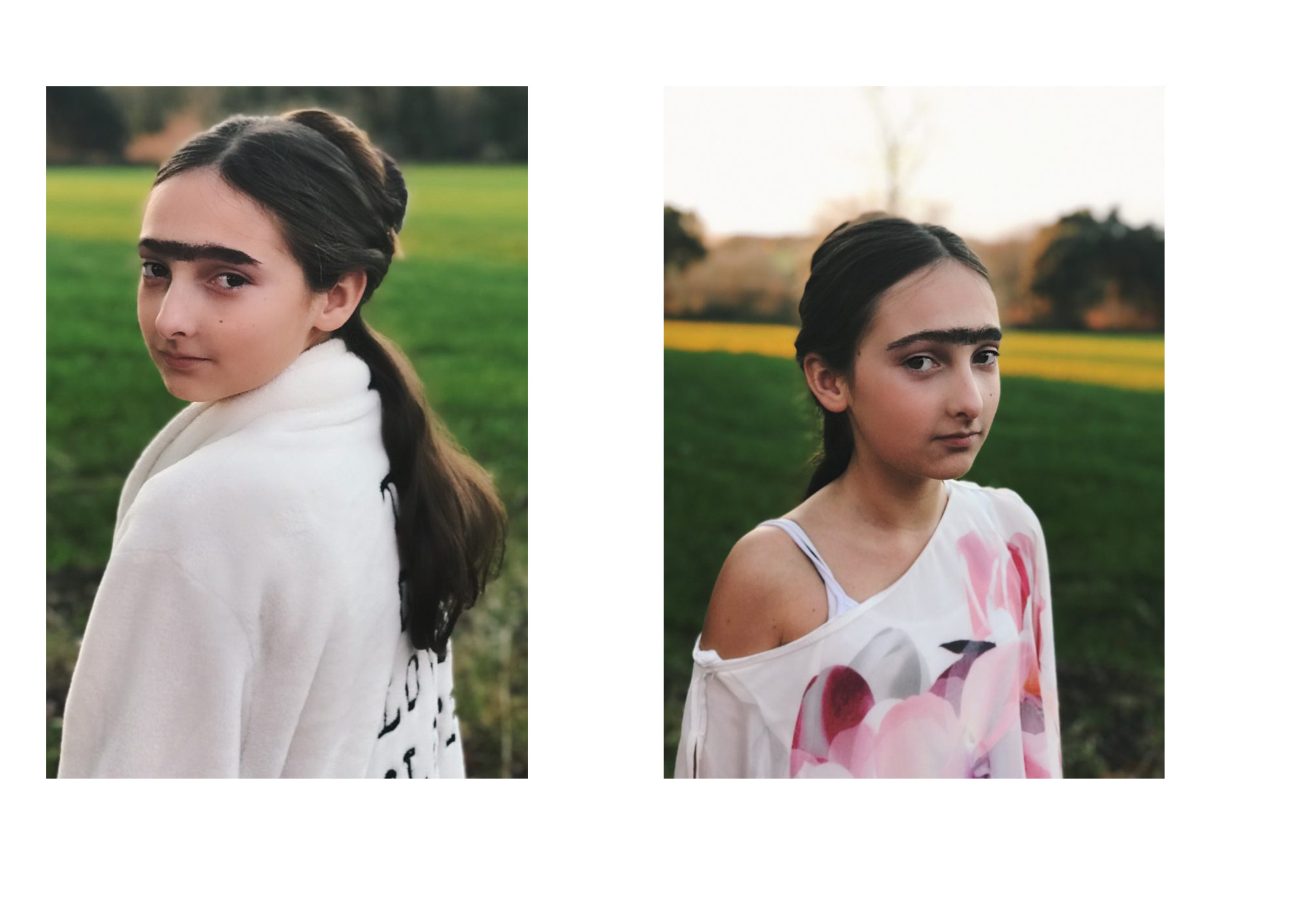
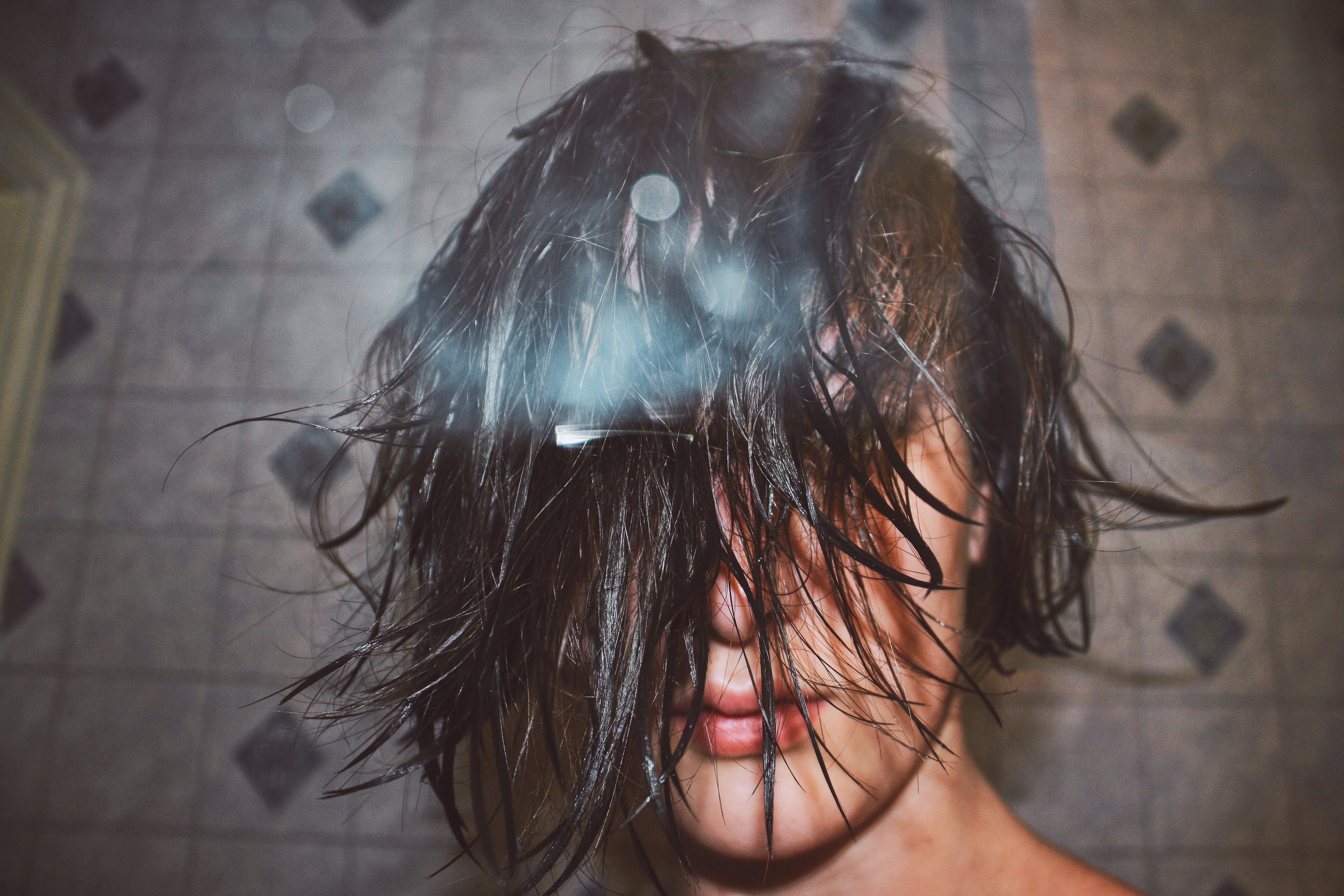
showers of screams
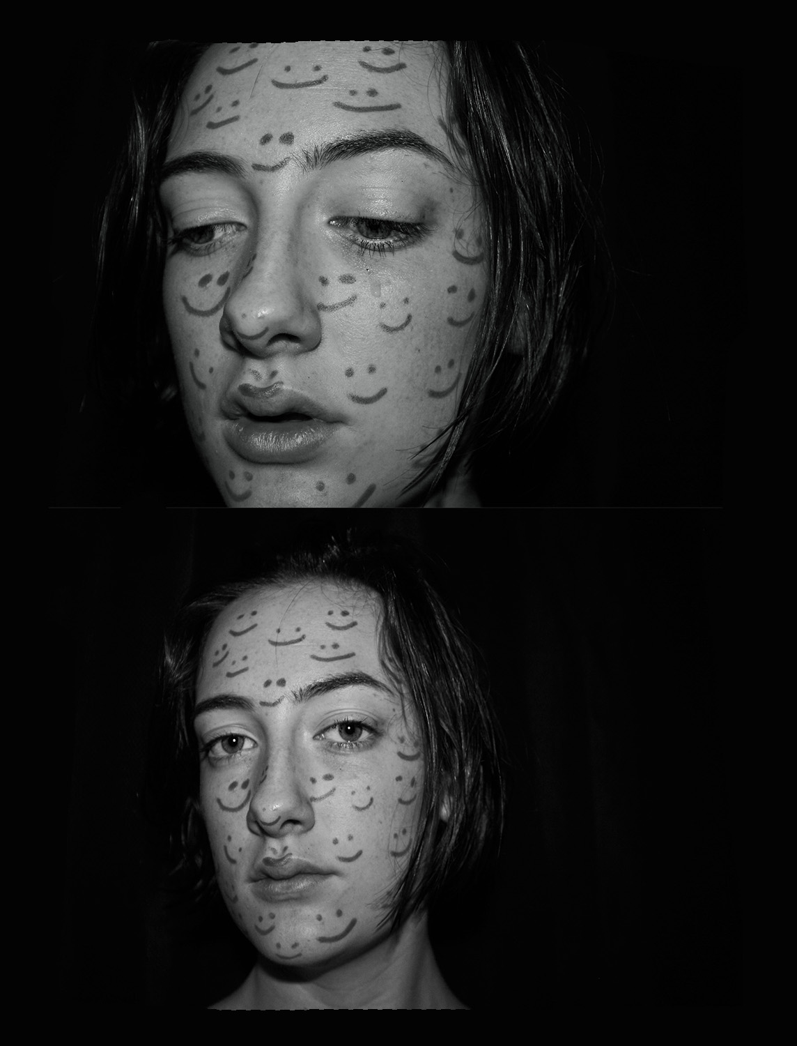
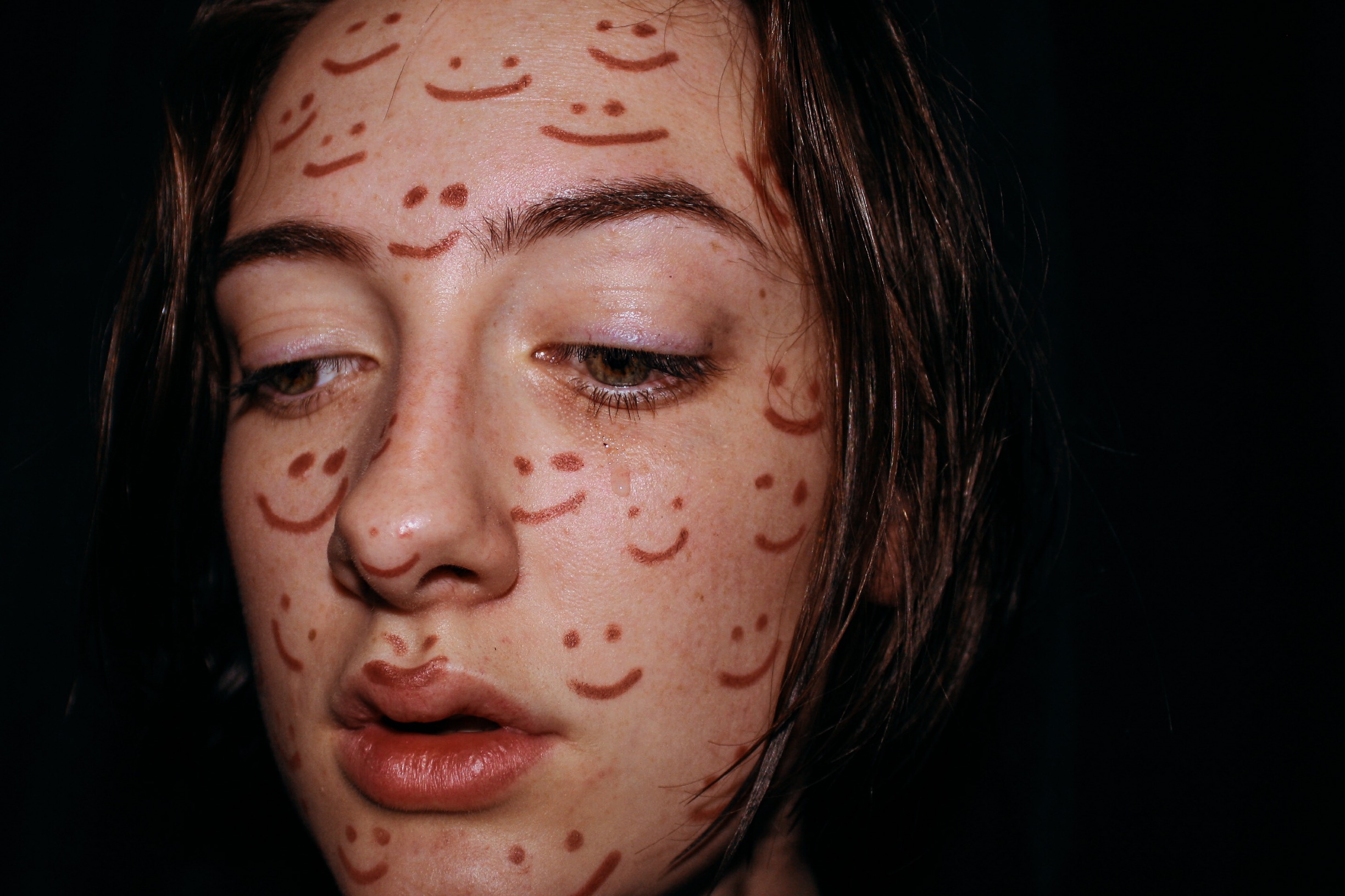
dontsmileatme
sleepparalysis
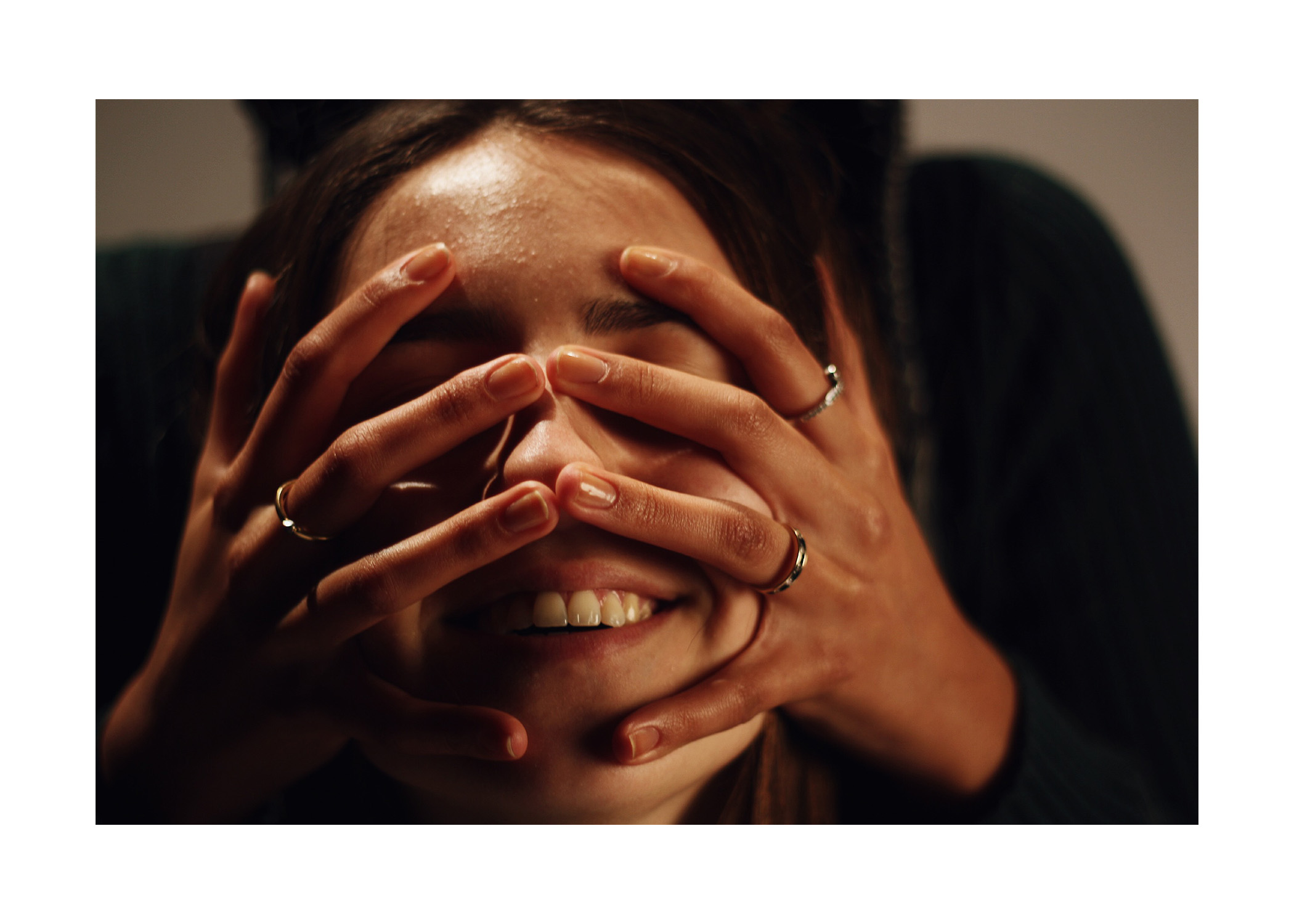
familyfeud
blackout
clowningaround
fridafeeling
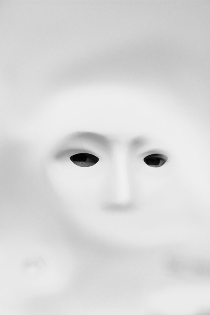
staring

Each one of my final outcome options in my opinion reflects my wanted message. I wanted to put across, within this stimuli, how that you can have a family support system around yet still feel like you don’t fit in. These images all together work together in my opinion because it all correlates to the same ideas.

Actual Final Outcomes

Photo Shoot 2 – Edits

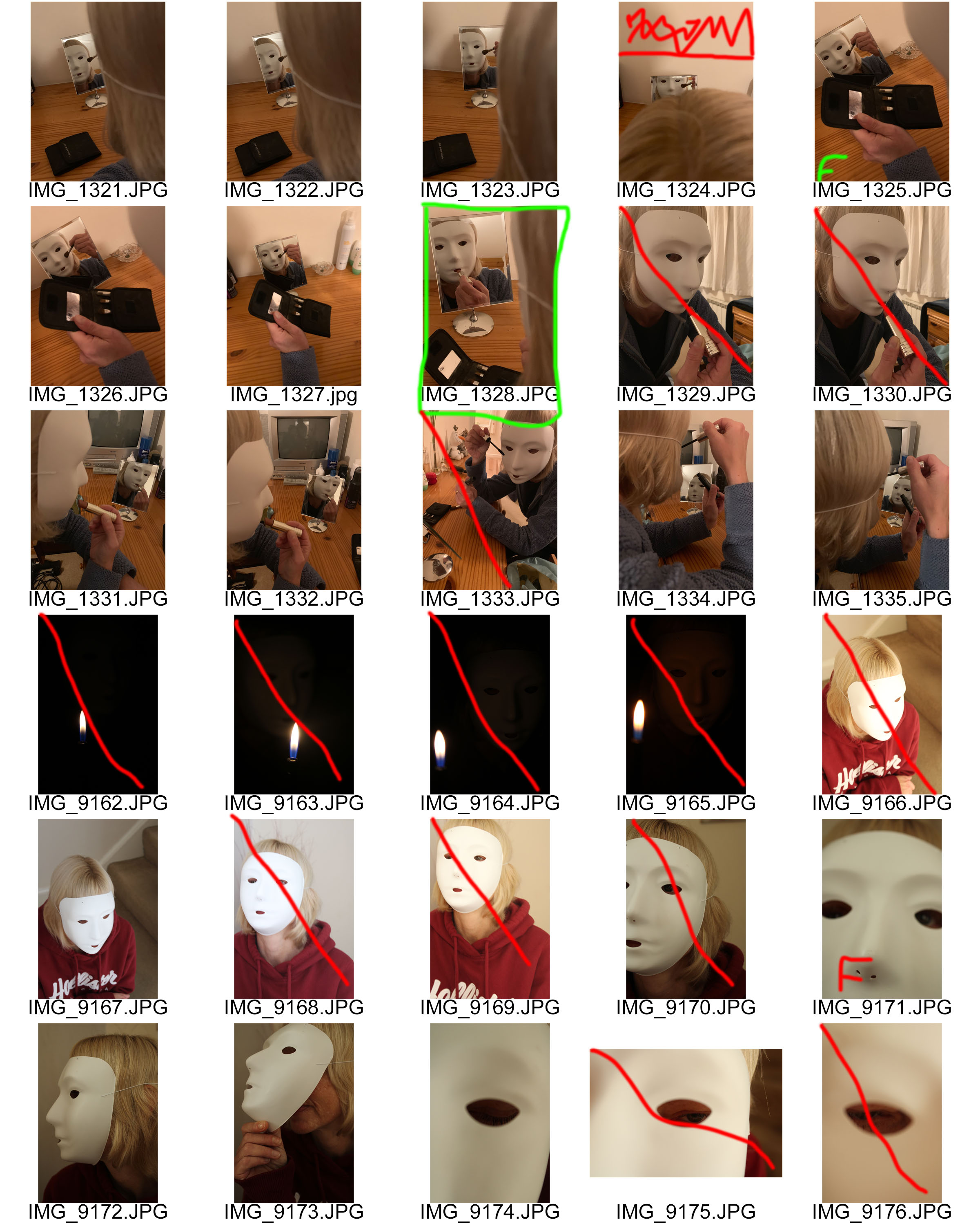
In this image, I took a tableaux approach, where I attempted to create a story within the image. The story being told is that a woman who has lost her identity, is placing makeup on her face in order to rectify the issue. The makeup represents a cover up for the loss of identity, which shows how society wants us to act when we lose our identity. In order for this story to clearly be presented I felt that the image needed to be naturally darker, and so I adjusted the levels and curves to do so. I also decided to turn the image into black and white which has allowed the idea that the woman has no identity to be clearly presented. Although I like the way this image has turned out, I do not feel that it has strong links towards loss of identity, and therefore I believe that this is more least successful outcome.

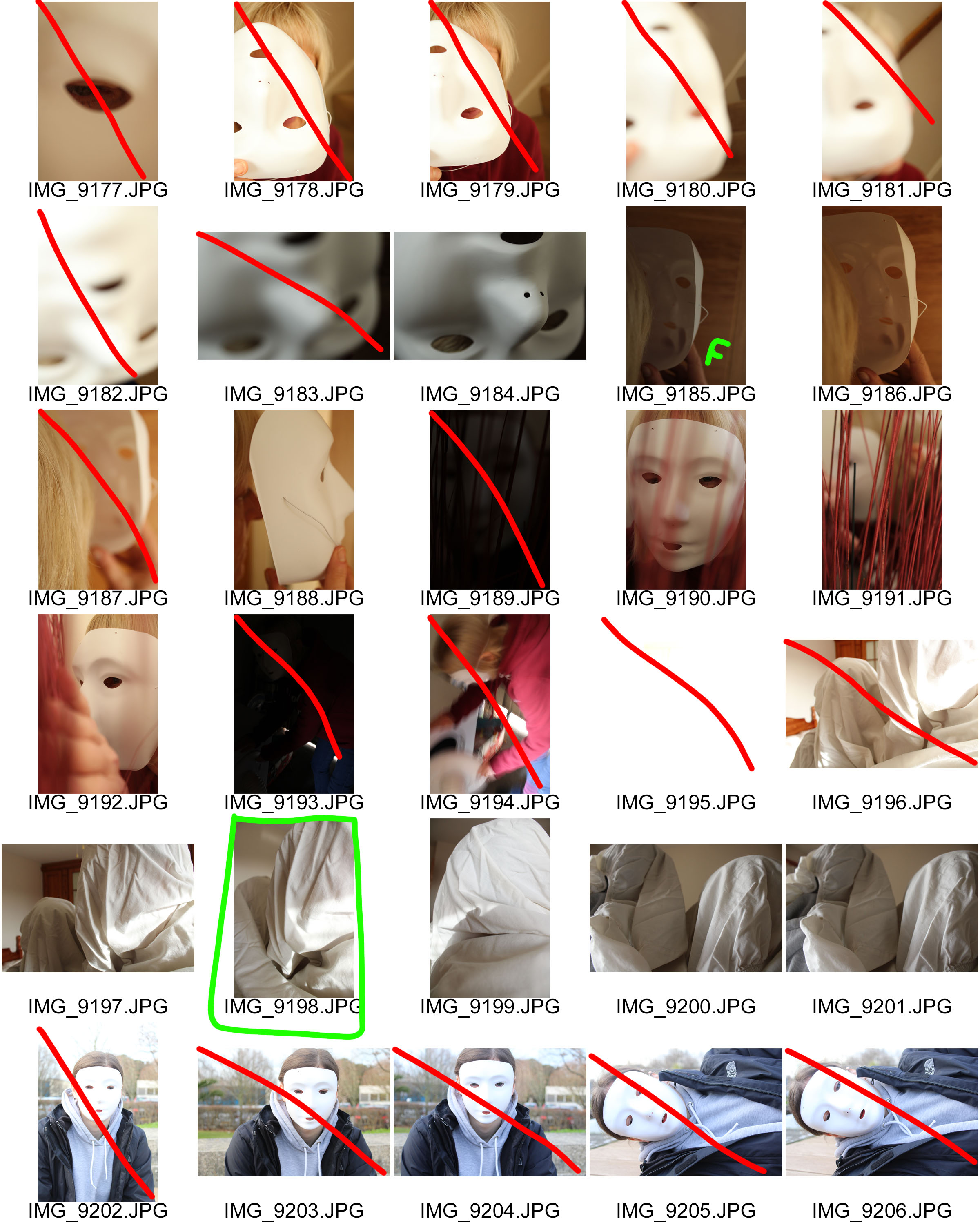
In my second edit, I wanted to showcase my surrealist approach to mask photography. Instead of using a mask I used a bed sheet and rapped it around both of my models heads. I placed the taller model in the foreground and the shortest in the background. From looking at other surrealist photographers work, most of the images are presented in black and white, I believe that the black and white look allows the image to be high in tonal contrast which emphasize the entrapment of my models, and how losing your identity can trap people in their own minds. The bed cover acts metaphorically to represent the mind trapping people. To edit this image I simply adjusted the levels and curves to ensure that the image would produce high tonal contrast.

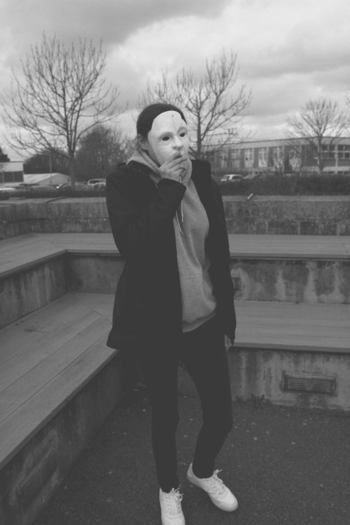
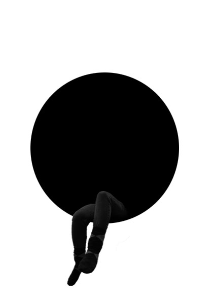
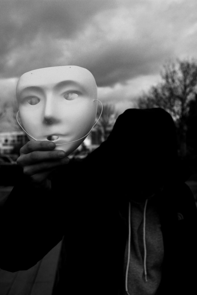
In my next edit I wanted to show my model presenting her mask, before she puts it on, taking away her identity. As seen the models face is not seen and completely black which represents her identity being lost. In order to allow the face to be completely black I made the image seem naturally darker by adjusting the levels and curves, I then decided to turn it into black and white in order to allow the whole face to be completely black. I chose the main focus point to be on the mask as I felt that it represented the importance of ‘putting on a mask’, putting on an act, when you lose your identity. I feel that this image is one of my more successful images due to the different photography techniques  that are shown and the editing techniques I used.

In my next edit we are presented with the mask, looking out of a mask. The idea of this image was to showcase, what viewing the world and others through a mask, when you lose your identity. To edit this photograph, I wanted to ensure the mask on the face could still show facial features, like the nose and eyes, but had the rest of the frame white. To do this I made the image lighter by adjusting the levels and curves, and turned the image into black and white. I areas I went over with the paint brush tool (white) in order to conceal any darker areas. This image strongly portrays the theme of loosing an identity but shows it from the viewpoint of someone who has lost their identity.

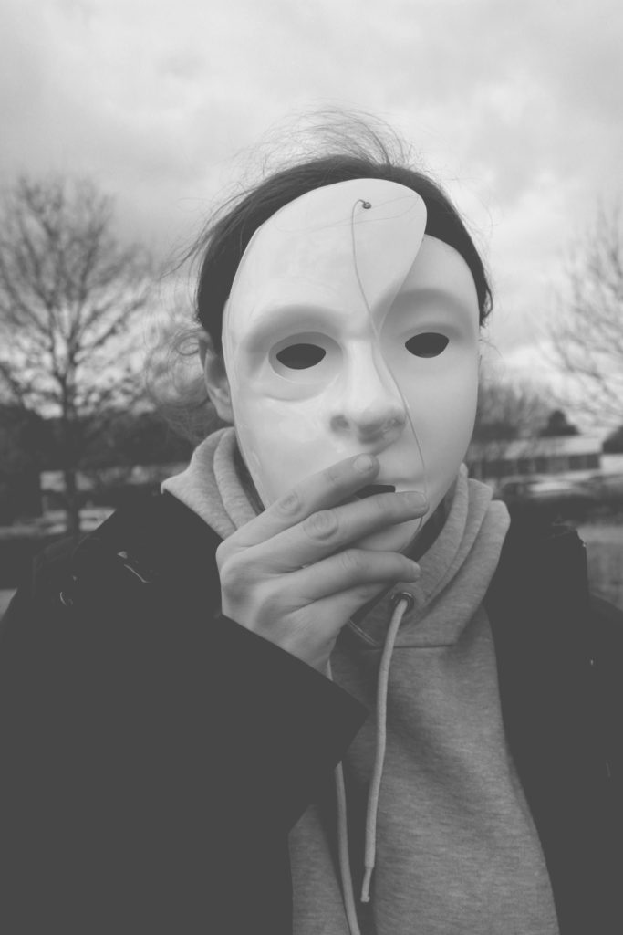
In my next edit, I selected the image where a half mask is placed onto of the full mask. This represents the model falling deeper into the obis of losing their identity. This denotes that losing an identity can layer up and become hard to find themselves again, which shows the importance of speaking to someone when you begin to lose an identity. To edit this image I adjusted the levels and curves and turned the image black and white, in order to make it high in tonal contrast. I then decided to lighten the image by adjusting the lightness to be brighter. This made the image seem more grey, and old which adds to the overall sinister tone of this image.

In my final image I took the same approach as the edit above. I decided to follow the same technique, in order to make a mini series of the layering of the mask. These two images work well together as they are taken at different viewpoints and show two different styles of portrait photography. In this image we see the model in a desolate area looking as if she is walking somewhere, in hope to find someone for help. In the background we see corner stairs, which are used to represent the entrapment and how losing her identity has trapped her and how she is searching for help.

Comparison 

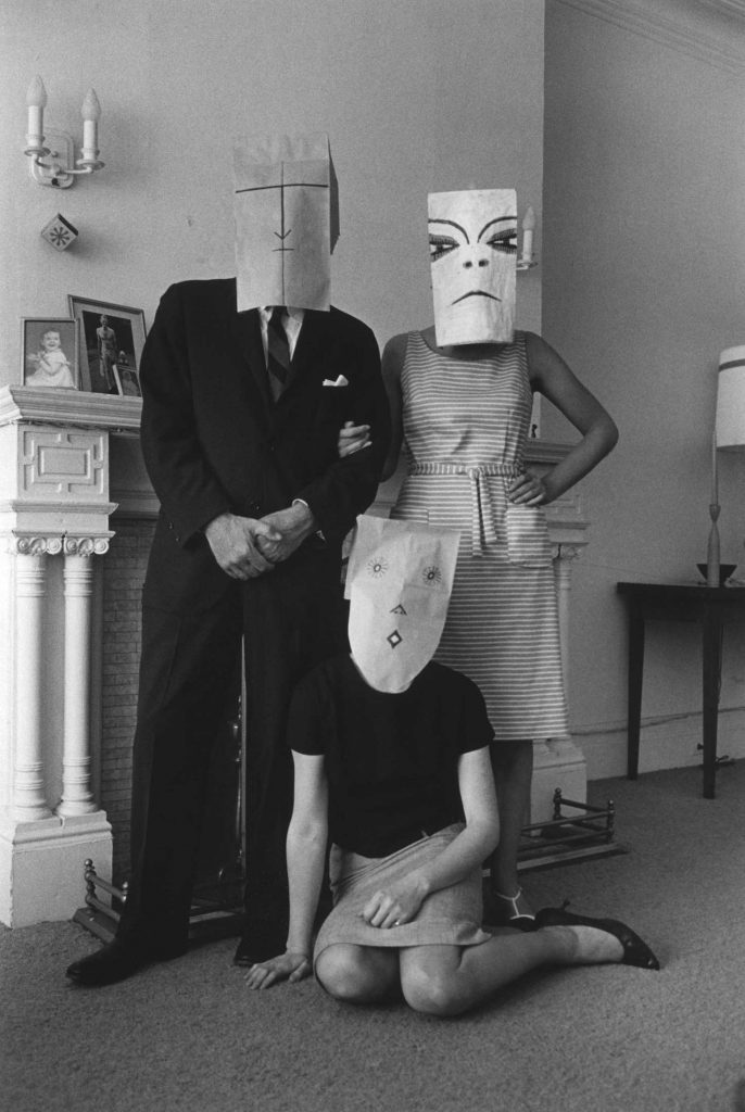
Small Family Group, Chelsea Hotel (from the Mask Series with Saul Steinberg), 1962. Photograph by Inge Morath, © The Inge Morath Foundation

To compare my work to Saul Seinberg, I believe that my approach has a stronger link to the loss of identity. To technically compare my image to Seinberg’s, I took the same idea of using a basic background in order to present context to the image. my background is more isolated and worn down, where as Seinberg’s image uses a posh home environment which creates an identity for those people. Both images seem to use natural cold lighting which adds to the eerie tone which was trying to be created. Both images are presented in black and white, which allows colour to be taken away, which can help present an identity. Moreover, it allows the formal element of tone and shape to be clearly presented within both of the images. One difference is that Seinberg uses paper bags with faces where as I use masks, although I like the paper bag concept I felt that it began to create an identity, which was not the aim of this photo shoot. Therefore, using a mask I felt was more appropriate. Finally, my image uses a short depth of field compared to Seinberg’s image. I felt that the main focus point being on the model helped to isolate the background, allowing the focus to be on the model allowing the clear message to come across.

To evaluate these edits I believe that I have managed to produce a strong response to mask photography, which could then develop into final pieces for the theme of loss of identity. The edits have used simple photoshop techniques which has allowed the theme to clearly be portrayed in every photograph, making these edits successful.

Photo shoot 2 – Masks

Planning

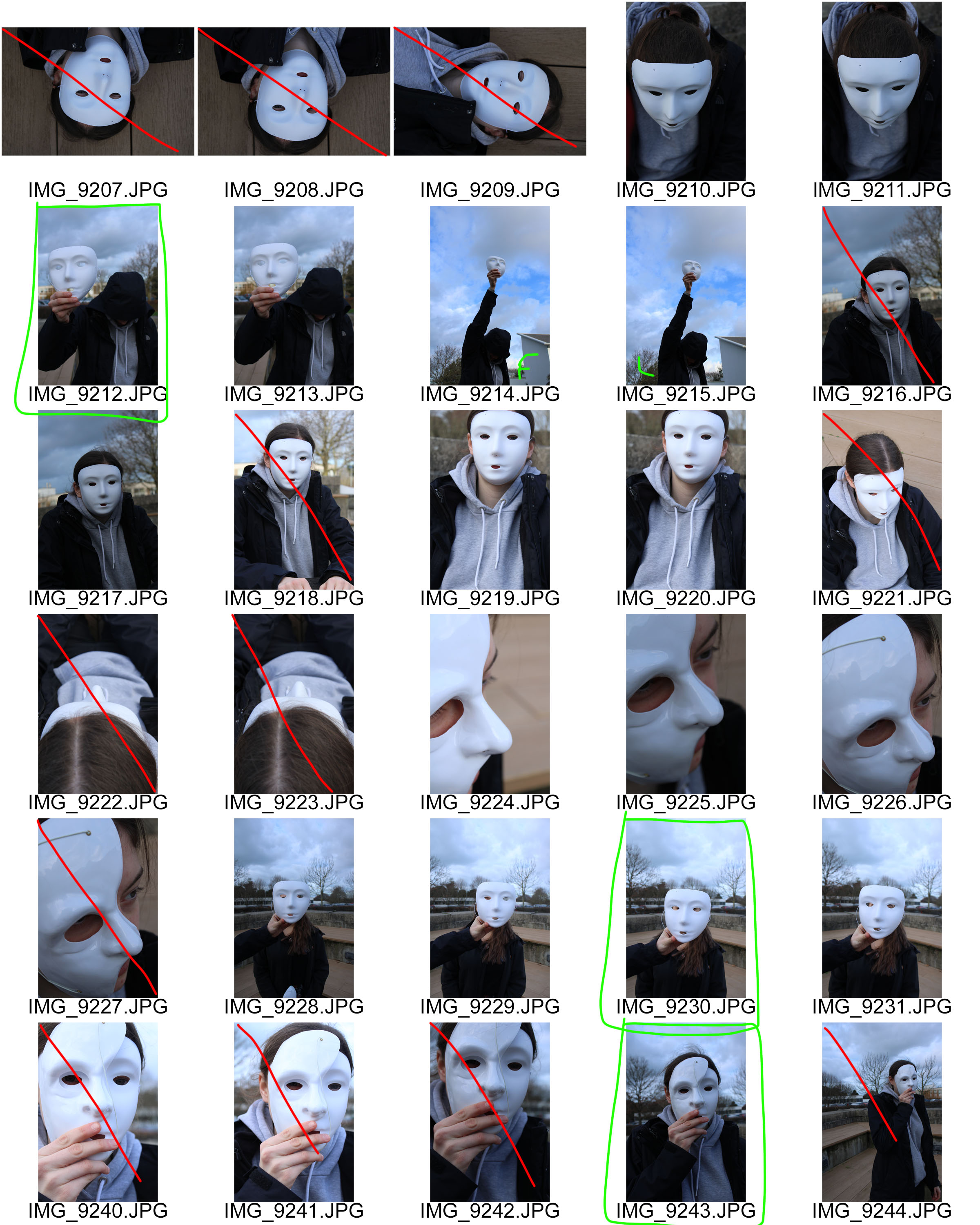
The aim of this photo shoot is to clearly show my response to Saul Seinberg and mask photography. As mentioned before I felt that Seinberg’s work presented too much of an identity and therefore conducted research into mask photography.  In this photo shoot I will be using two types of masks, a whole face mask and a half face mask, in order to present the theme of loss of identity. The location of this photo shoot will be both indoors and outdoors, to gain a mixture of environments. I want to be able to use natural lighting throughout this shoot, in order to make the images seem more natural. Doing this will present the theme of loss of identity as a more natural and realistic occurrence, making viewers more aware of the idea that someone can loose their identity. I will be keep the camera settings pretty standard, with the shutter speed being quick, the ISO on 400-800 and the white balance being on daylight. On Occasion I will alter the shutter speed and ISO in order to make the images seem lighter and darker depending of the location of the image and how I envision the final image to look like. I will direct my model to sit in different positions, do different actions and to look in certain places which will ensure that the images taken are how I want them to look.

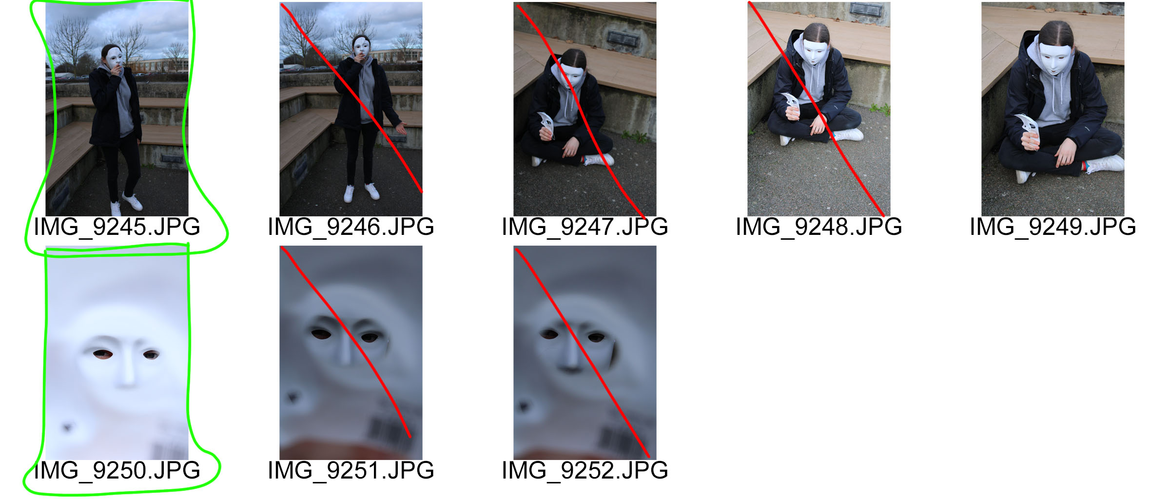
Contact Sheets

To evaluate this photo shoot I felt that I have been able to produce some strong outcomes towards mask photography. I looked at surrealism within mask photography, bed cover over head, and a more naturalistic look with a plain white mask. I felt that I was able to successfully meet the aim of this photo shoot. In the editing process I want to ensure that all personality and identity is extracted from these images, so I will look at adjusting the levels, curves, hue and saturation. I want to be able to create a eerie and sinister tone to the final outcomes, to represent the eerie and sinister feelings people gain when they loose their identity.

Final ideas – Artist Researches

For my final piece, I am focusing on  ‘Mental Identity’:  inner state of identity. I will focus more on how behind closed doors, no one knows how they truly impact someone else and the effect on their emotions. 

Artist References

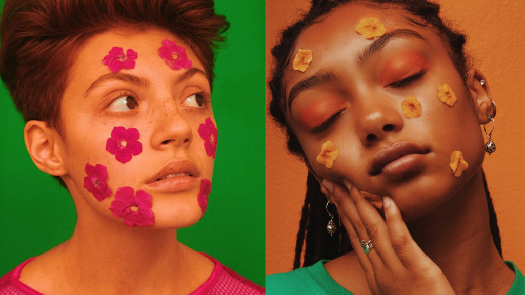
Gabriella Mendez

I admire Mendez’  work due to her perspective and imagination shrouding colours complimenting skin tones. She also uses stickers, projections and objects to portray her ideas of fashion and culture. I  really admired her idea of using appliques and drawings on faces to reflect a certain idea. 

Analysis

VISUAL

Mendez’ work often displays a colourful background with one/two people as the centre focus. In these images she has used bold solid coloured back drops, she then correlates the costume and make up with this colour scheme. With the photo on the left Mendez has correlated the eye and foliage make up to the off-mustard background, then has a contrasting top on the model to vary where the eye’s attention else where. Within the picture on the left however Mendez has made it so that the models foliage and top to contrast the background. This collectively draws the direct attention to the models neutral face in contrast to the boldly coloured extras.

TECHNICAL

In order to create this image Mendez has used a warm toned soft box light so that light isn’t direct, its even dispersed within the studio. During the editing process she has increased the images saturation and contrast to make the image soft and not harsh with lots of colours happening.


Francesca Woodman

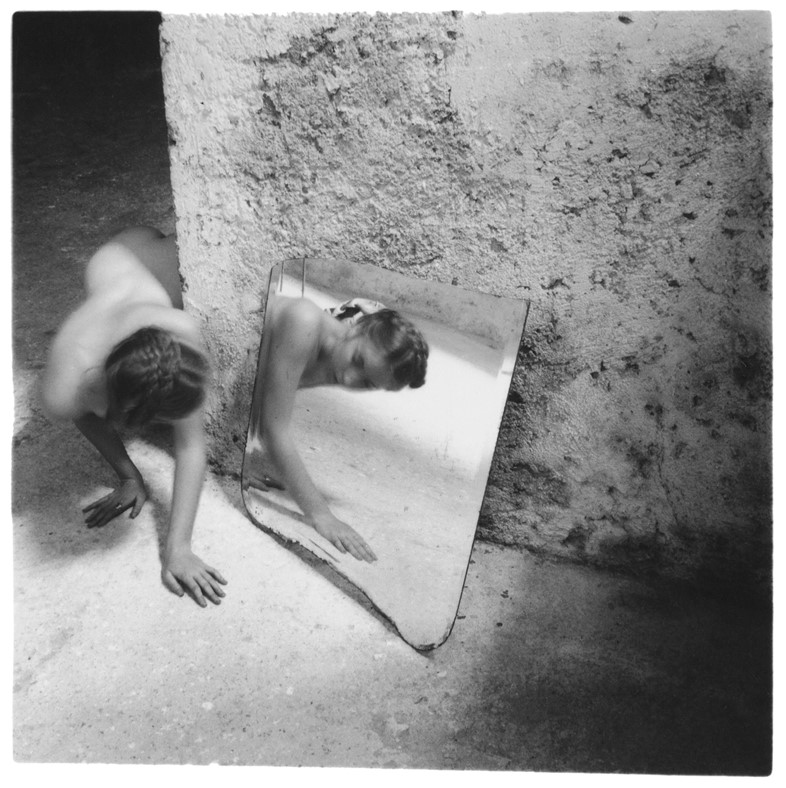
Francesca Stern Woodman was an American photographer best known for her black and white pictures featuring either herself or female models. Many of her photographs show women, naked or clothed, blurred, merging with their surroundings, or whose faces are obscured.

What I admire about Woodman’s work is how she uses her self as the centre focus: she uses her self to reflect her feelings towards her belonging and how she felt about not feeling like the standard person. I originally used this idea to project my emotions and thoughts about myself not fitting into the mold everyone around me has created for me. 

Analysis

VISUAL

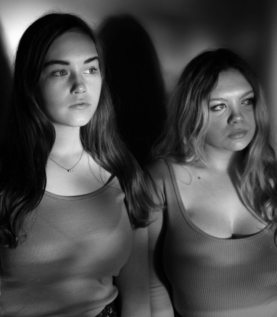
Within this composition, Woodman has used her body to curve around the wall, she is peaking around the corner at her reflection (given off by a mirror on the floor). This in my opinion gives the feeling of searching, and in Woodman’s case searching for herself. This self portrait is set within a decaying empty room with once painted white walls and hard concrete floors. This contrast between her body and the harsh man made structures reflects her innocent self against the harsh world.
TECHNICAL

In order to create lighting in this image, Woodman has used the natural lighting from an unseen window. This light then hits the concrete floor and potentially bounces off the mirror this creates a ‘spotlight’ feel to where Woodman is placed, this is due to the foreground and background corners are unlit. This draws attention to woodman and her reflection.


By utilizing both these artists’ views and my own, I wish to create compositions that reflect my sense of not fitting into the world I was brought into. I aim to show how our inner thoughts cannot be contained once alone. Either through feelings or none at all, the pain of not knowing where to go is the closest rival to death. This all relates down to the epicentre of all of our problems: wanting perfection. In the ideal world, perfection doesn’t exist, we would aim to reach our own maximum capacity, not to correlate with numbers and code. 

“Warning: If you are reading this then this warning is for you. Every word you read of this useless fine print is another second off your life. Don’t you have other things to do? Is your life so empty that you honestly can’t think of a better way to spend these moments? Or are you so impressed with authority that you give respect and credence to all that claim it? Do you read everything you’re supposed to read? Do you think every thing you’re supposed to think? Buy what you’re told to want? Get out of your apartment. Meet a member of the opposite sex. Stop the excessive shopping and masturbation. Quit your job. Start a fight. Prove you’re alive. If you don’t claim your humanity you will become a statistic. You have been warned.” 
― Chuck Palahniuk, Fight Club