What is white balance?
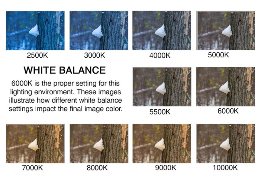
White balance on a digital camera allows the user the change the colour balance in order to make an image appear more natural.
Shoot one; Inside:
- 1/25
- F 5.6





Shoot two; Outside:
- 1/200
- F 5.6




White balance on a digital camera allows the user the change the colour balance in order to make an image appear more natural.


White Balance:
White balance just means adjusting colours so that the image looks more natural. We go through the process of adjusting colours to get rid of colour casts in order to match the image to what we saw while capturing the frame. Factors such as sunlight, lightbulbs and flashlights do not emit purely white light and have a certain ‘colour temperature’. This can cause parts of images to appear different colours on camera than what the eye sees.
In a non digital way this can be demonstrated with the use of tinted glasses or goggles. For example if you are skiing with yellow tinted goggles on, the snow will look yellowish. However, after you ski for a little bit, your eyes and your brain will adjust for the colour and the snow should look white again. When you take off your ski goggles after skiing, the snow will look bluish in colour rather than pure white for a little bit, until your brain adjusts the colours back to normal again. This is done automatically for us. The white balance setting on a camera is just the manual version of this.
Examples of my experiment in outdoor lighting:
Setting – 1/4000, f5.6, ISO 400

Examples of my experiment in indoor lighting:
Setting – 1/30, f5.6, ISO 400

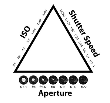
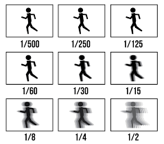
Shutter Speed: the shutter speed changes the way movement appears in photographs. Very short shutter speeds can be used to freeze fast-moving subjects, for example at sporting events. Very long shutter speeds are used to intentionally blur a moving subject for effect.
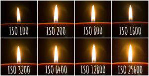
ISO:
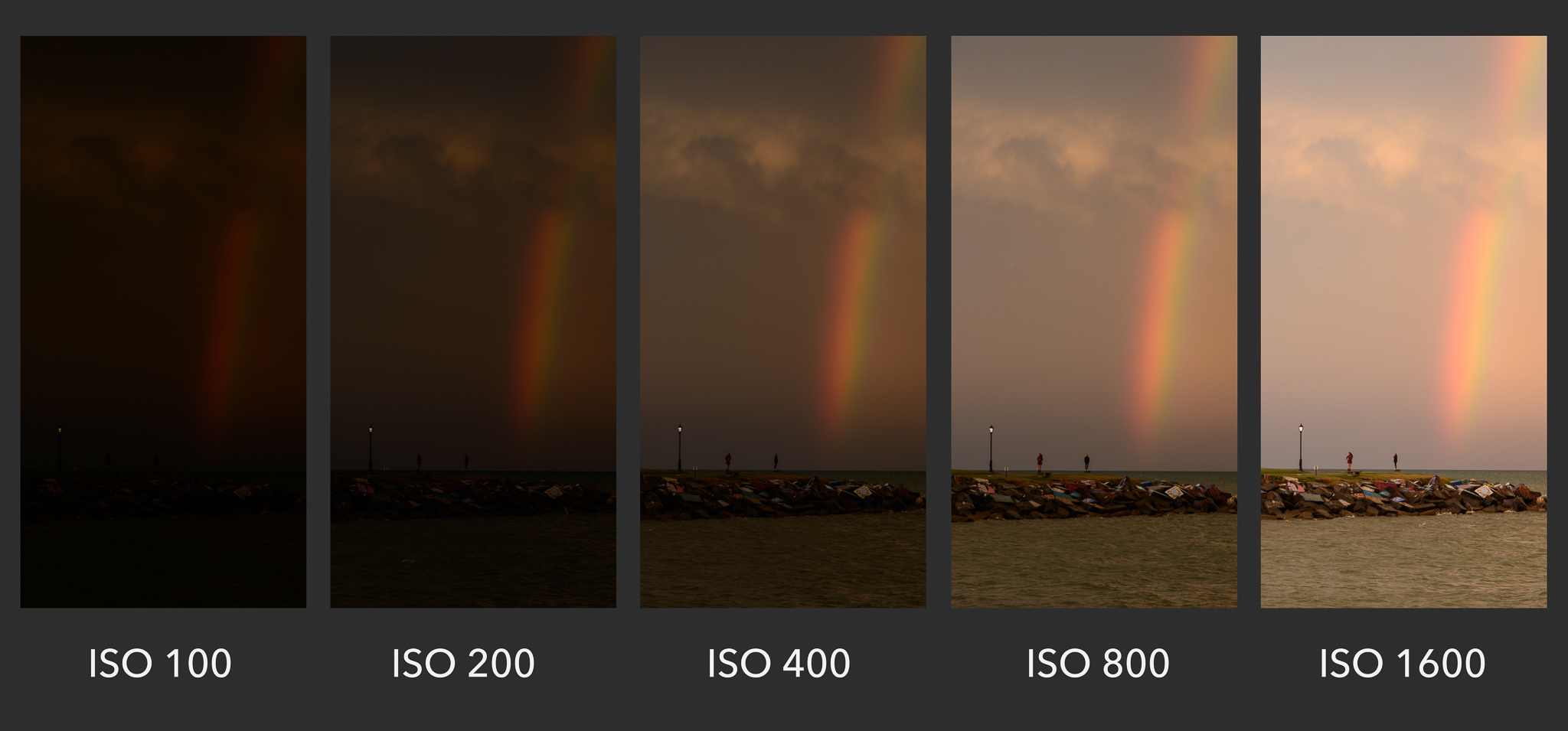
ISO measures the sensitivity of the image sensor. The lower the number the less sensitive the camera is to light and the finer the grain. Higher numbers mean the sensor becomes more sensitive to light which allows you to use your camera in darker situations. The cost of doing so is more grain/noise within the final outcome.
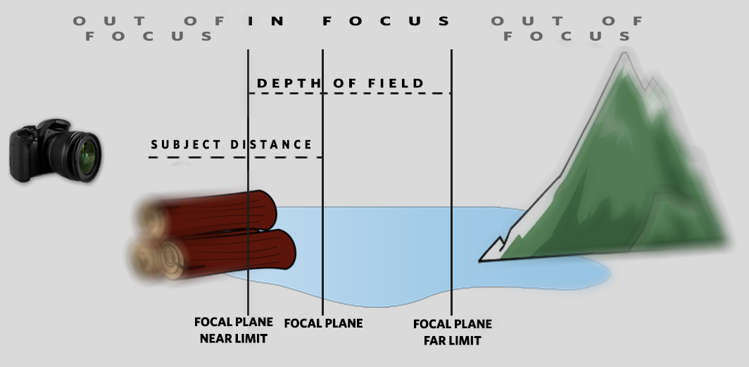
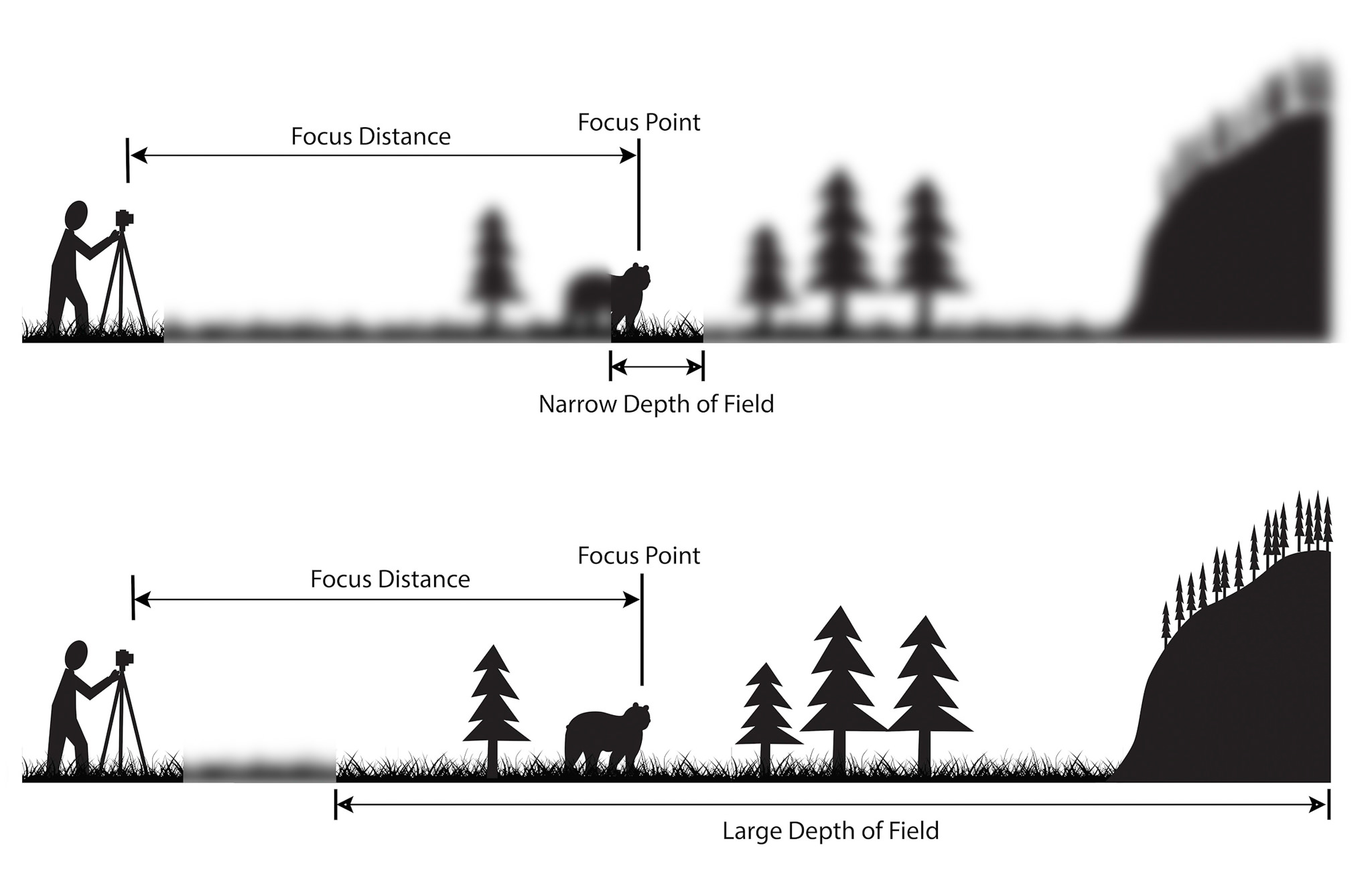
Depth of Field: The distance between the nearest and the furthest objects giving a focused image. A narrow depth of field means that its main focus point will be the only thing in focus, leaving everything else in a blur. Where as a Large depth of field means that most things in the frame will be in focus.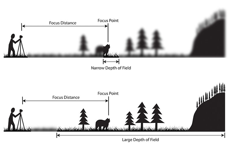 Aperture: ‘The opening in the lens.’ When we hit the shutter release button of the camera a hole opens up that allows your cameras image sensor to catch a glimpse of the scene you’re wanting to capture. The aperture that you set impacts the size of that hole. The larger the hole the more light that gets in – the smaller the hole the less light.
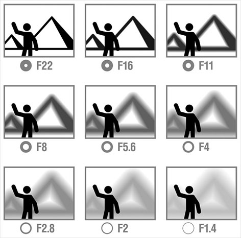
Experimenting With These Camera Settings:


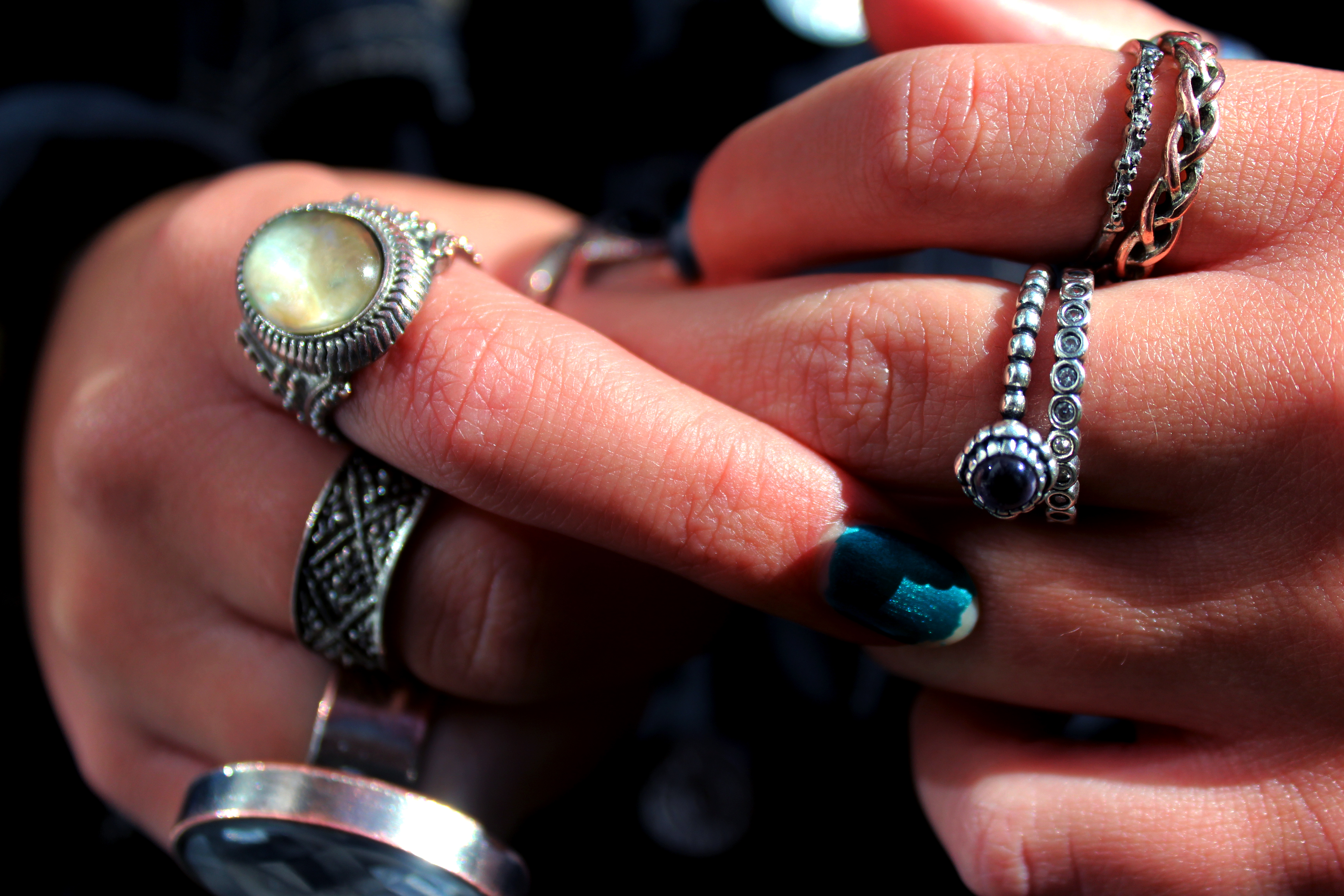
MACRO/CLOSE UP:
In this image I experimented with using the macro setting on my camera in order to capture the great deal of detail within the hands. Whilst on this setting, I continued to use auto focus as it allowed me to take many photos at once without the hassle of adjusting the focus every time the hands moved or shifted in position.
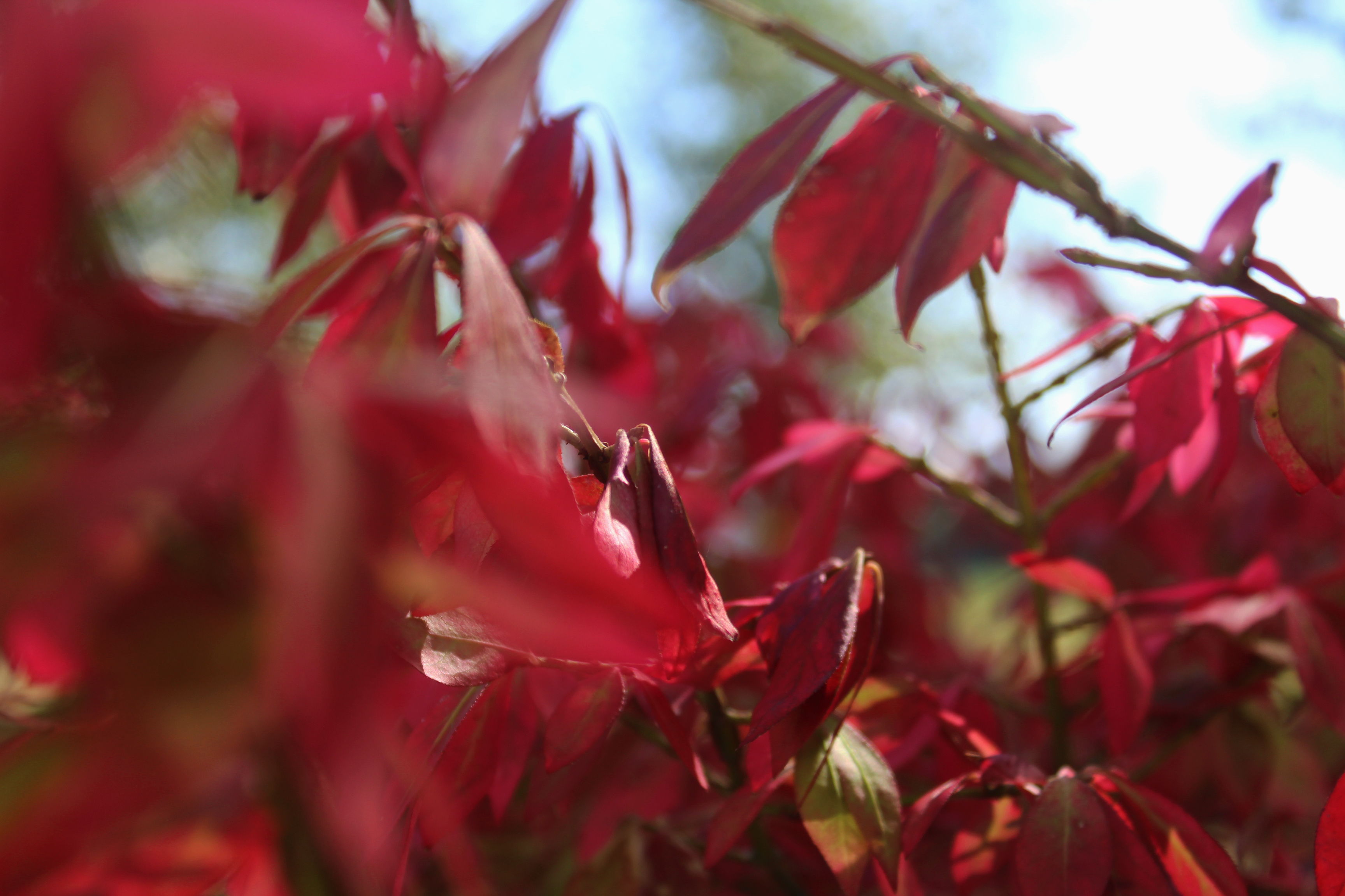
DEPTH OF FIELD:
In this photo I experimented with depth of field by using manual focus on my camera. Instead of focusing on the leafs closest to the camera, it is focused on a different part of the photo. I found that this technique allowed me to create images that were quite different and unique.
FOCAL LENGTH:
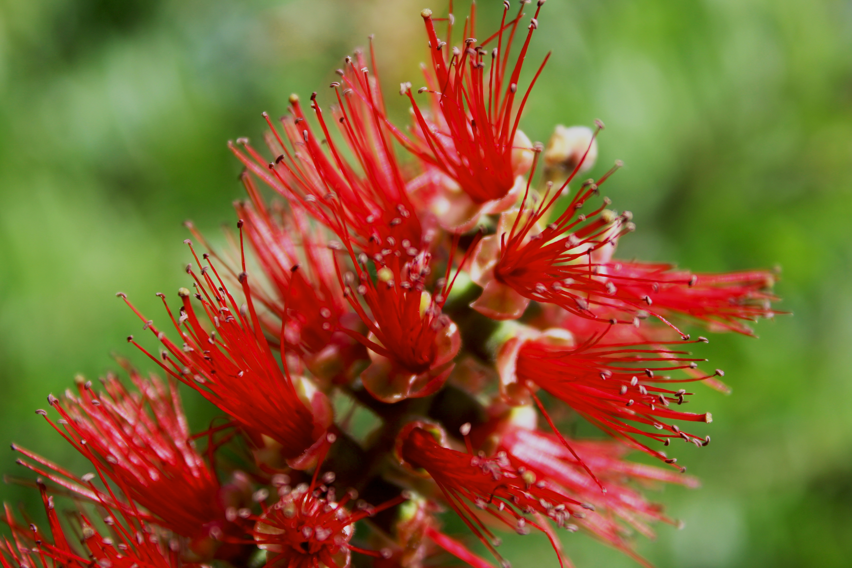
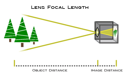
In this image, I tried to play around with the focal point and what effects I can achieve with this. The flower, as seen in the photo, was quite far away from me and the camera. I zoomed in and used the macro setting in order to capture the delicate details of the flower and the plant. It was quite difficult to capture this photo as zooming in meant having a very steady hand and using auto focus that the macro setting provided for me.
MF/AF FOCUS:
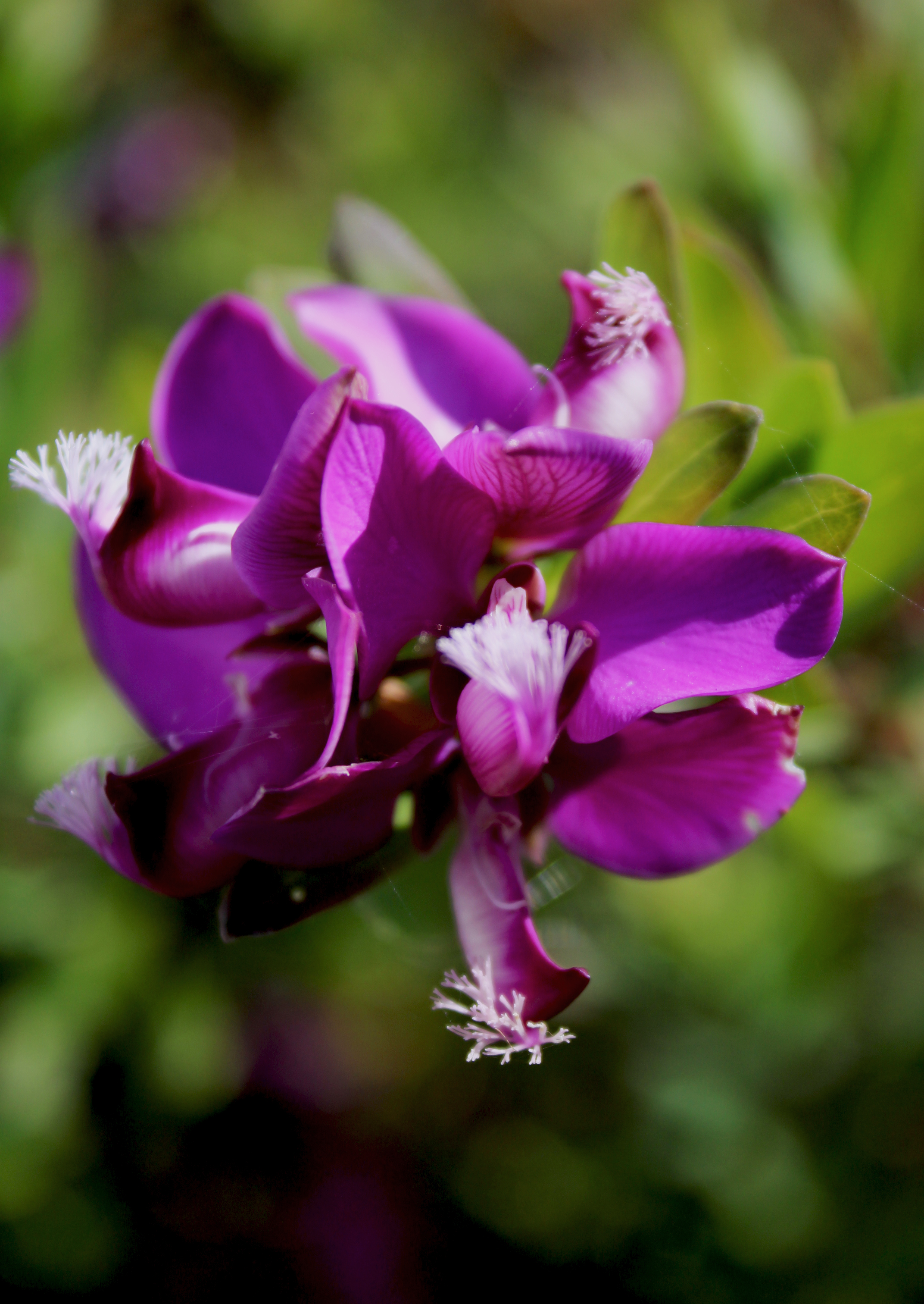
In this photo I used a conjunction of manual focus and the macro setting on my camera. It was very difficult to get the correct focus on my camera whilst using the macro setting with auto focus therefore i switched over to manual focus to help me correct this issue.
CONTACT SHEETS:
In this photo shoot, I focused a lot on plants and flowers in order to experiment with different settings such as macro and AF and MF focus, resulting in very vibrant, and colourful contact sheets.
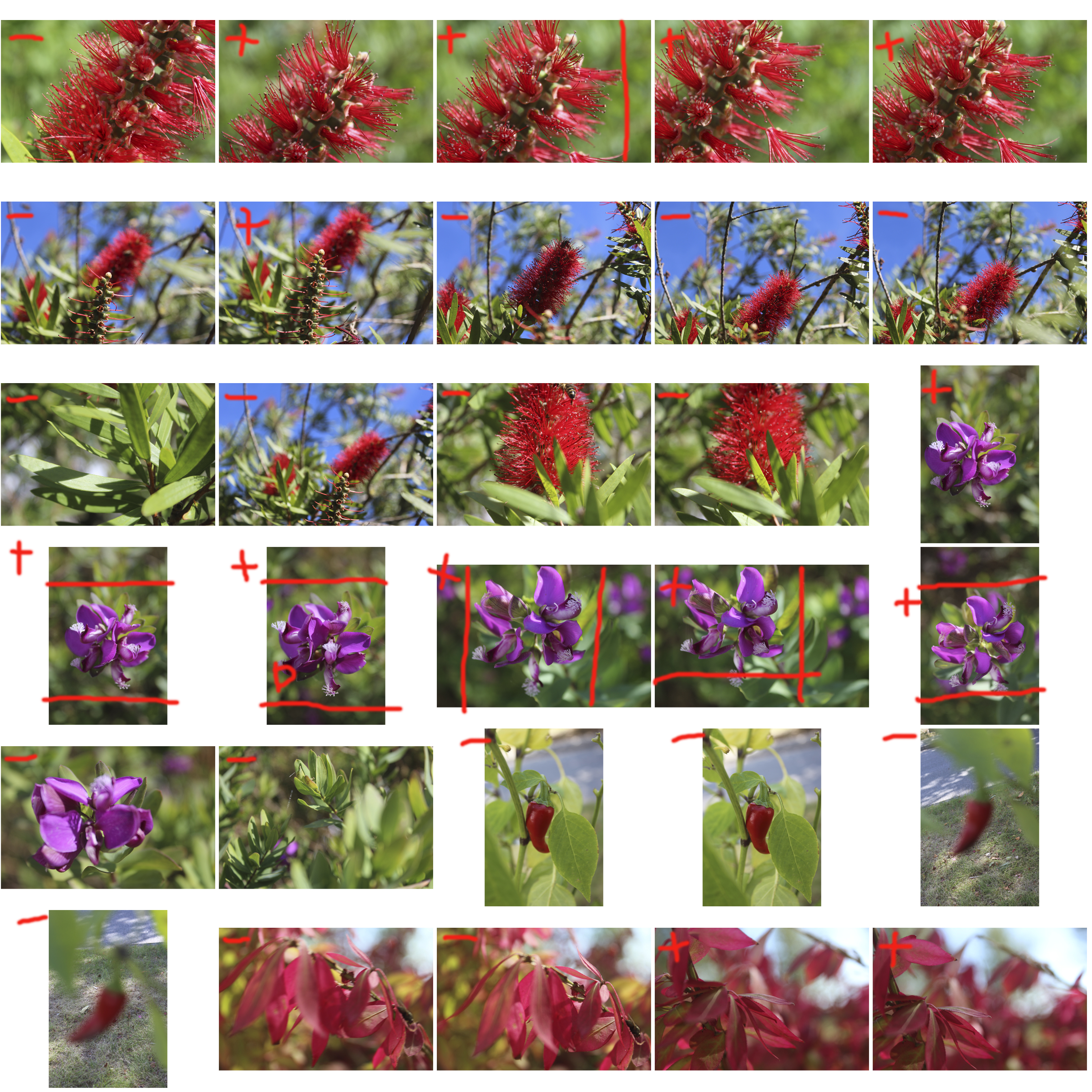
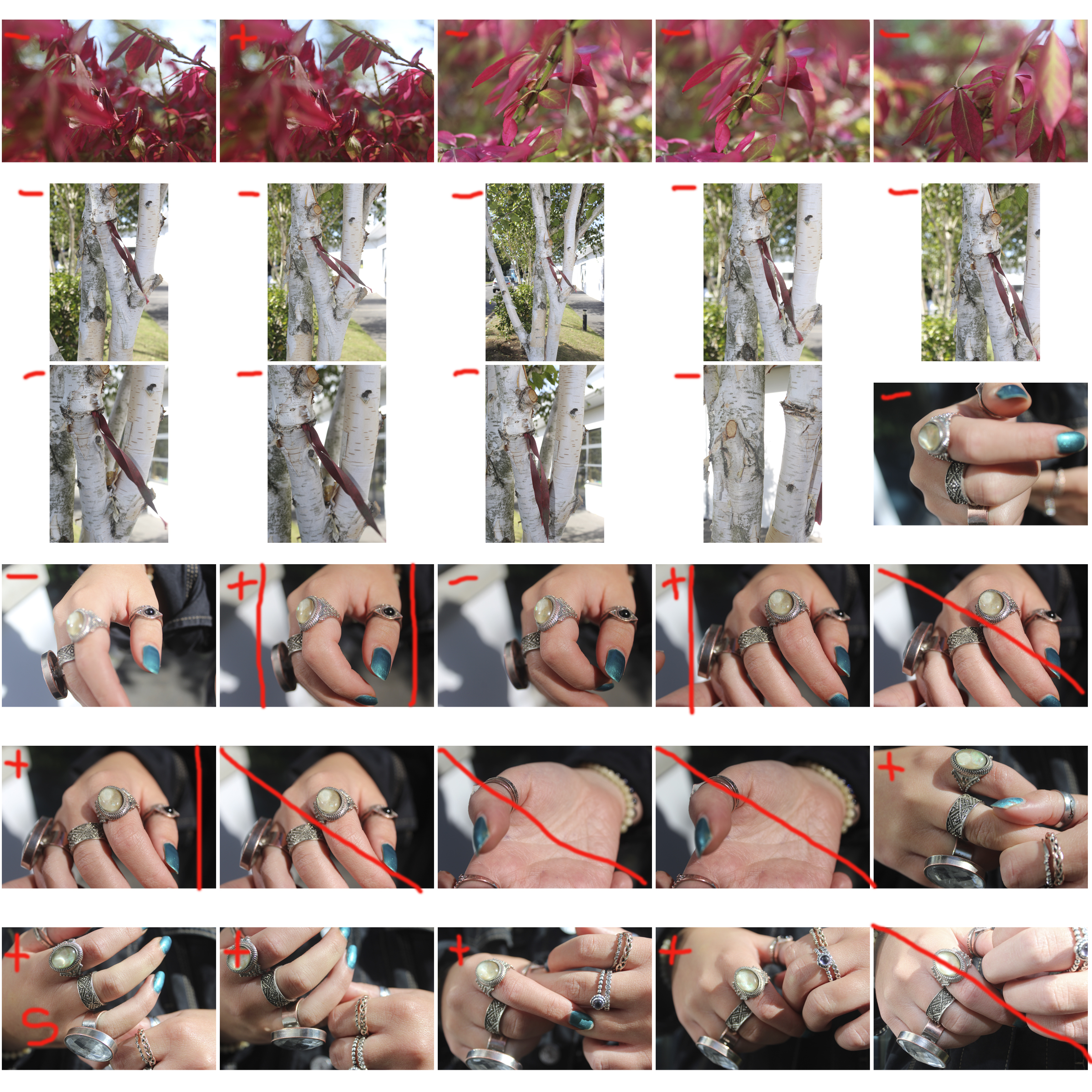

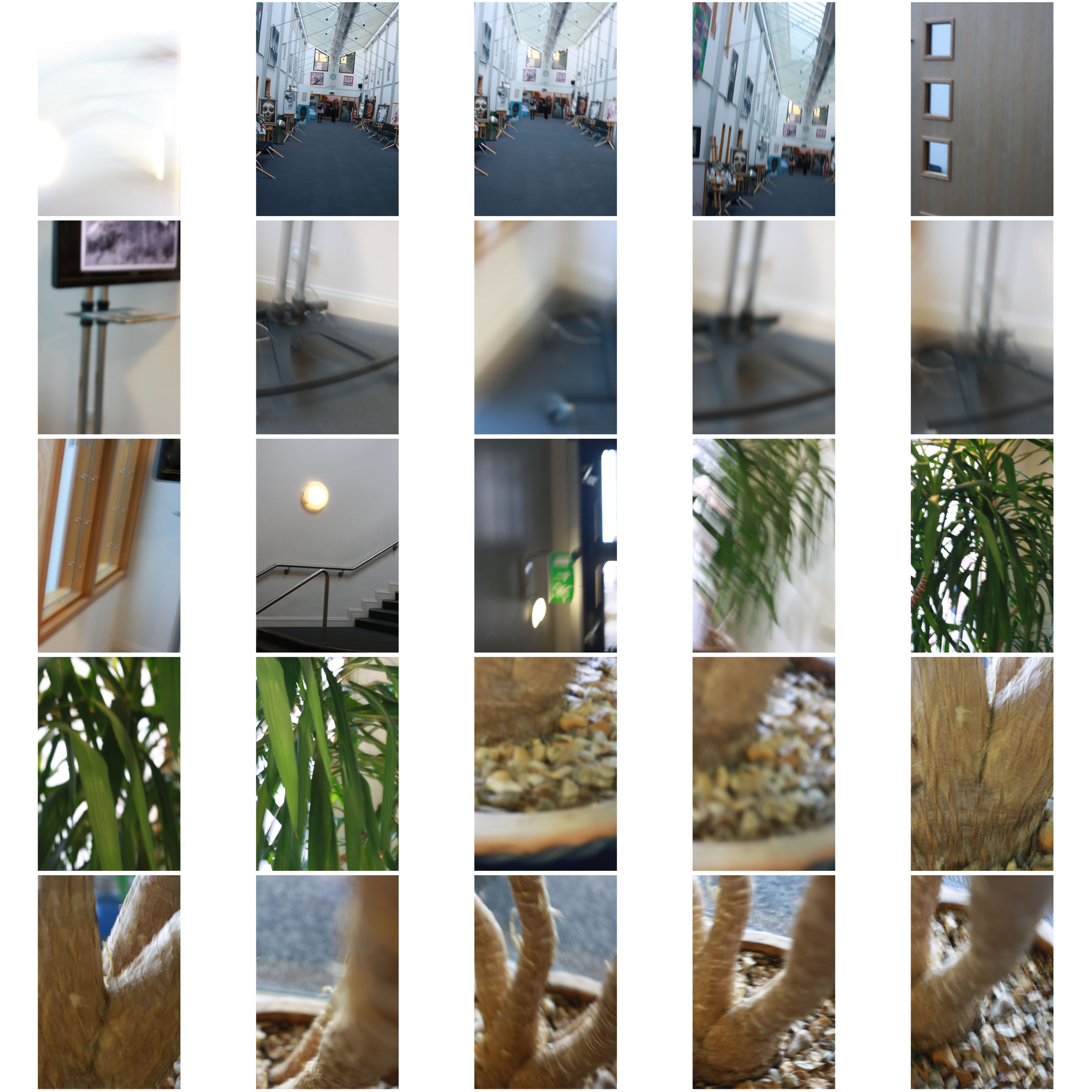
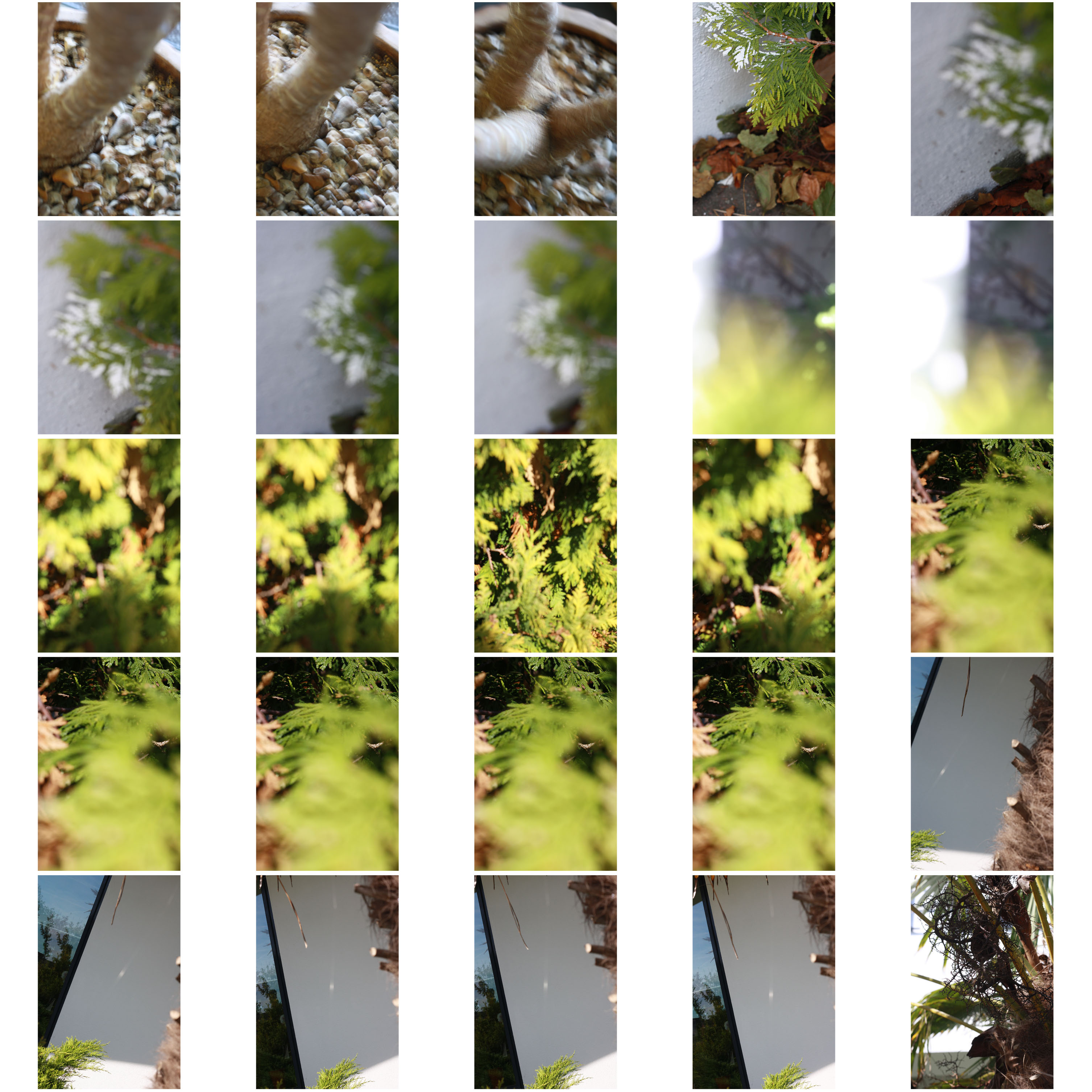

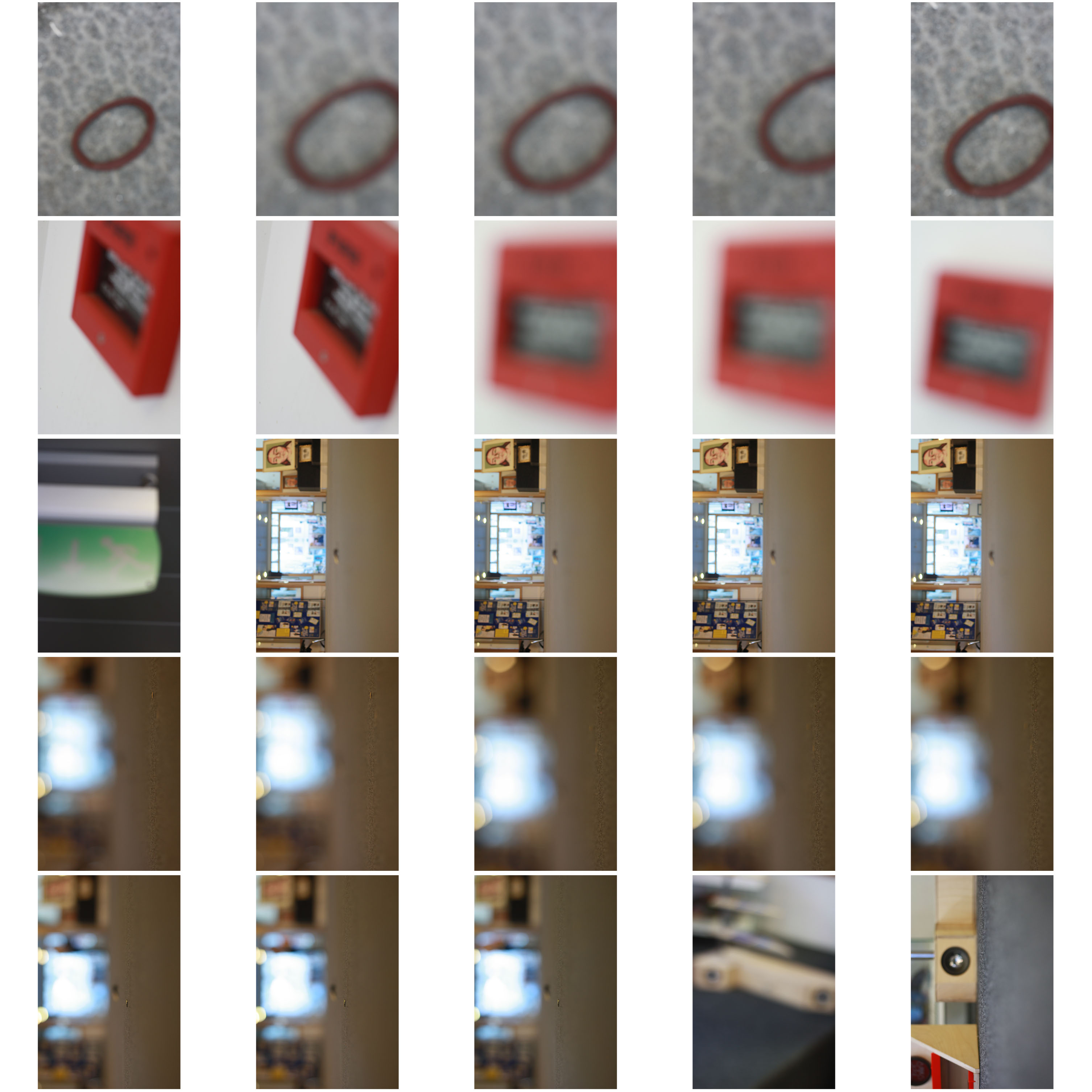
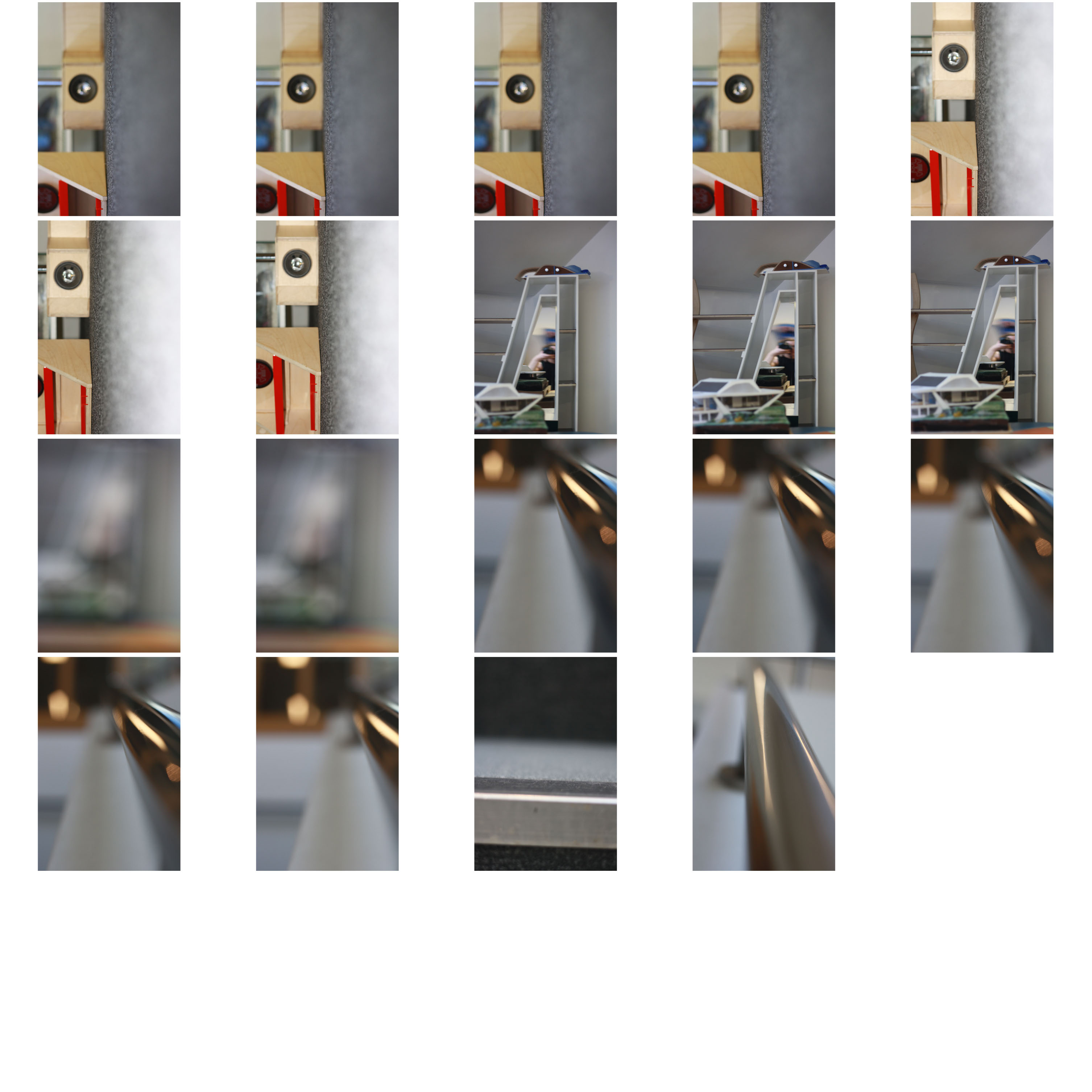
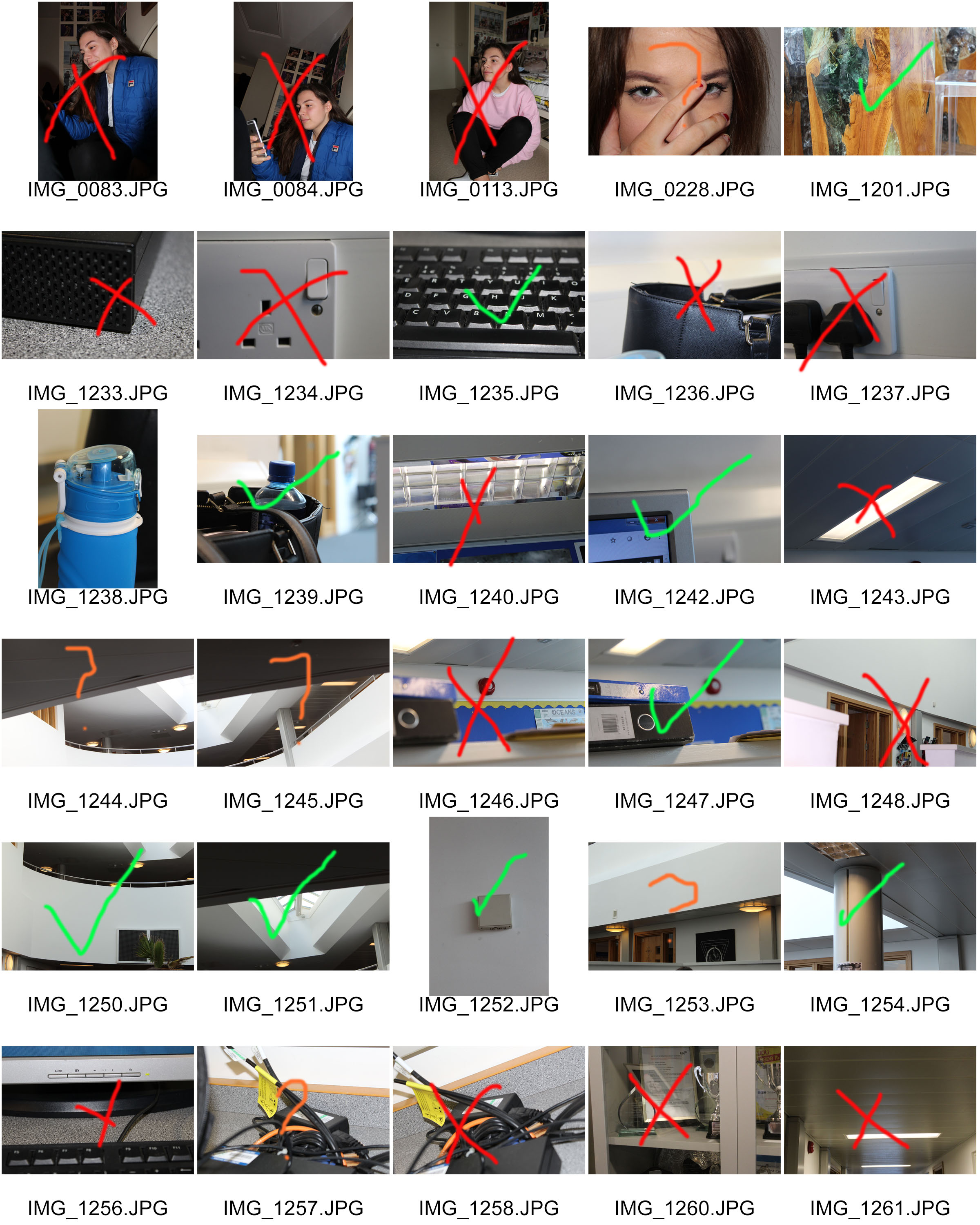
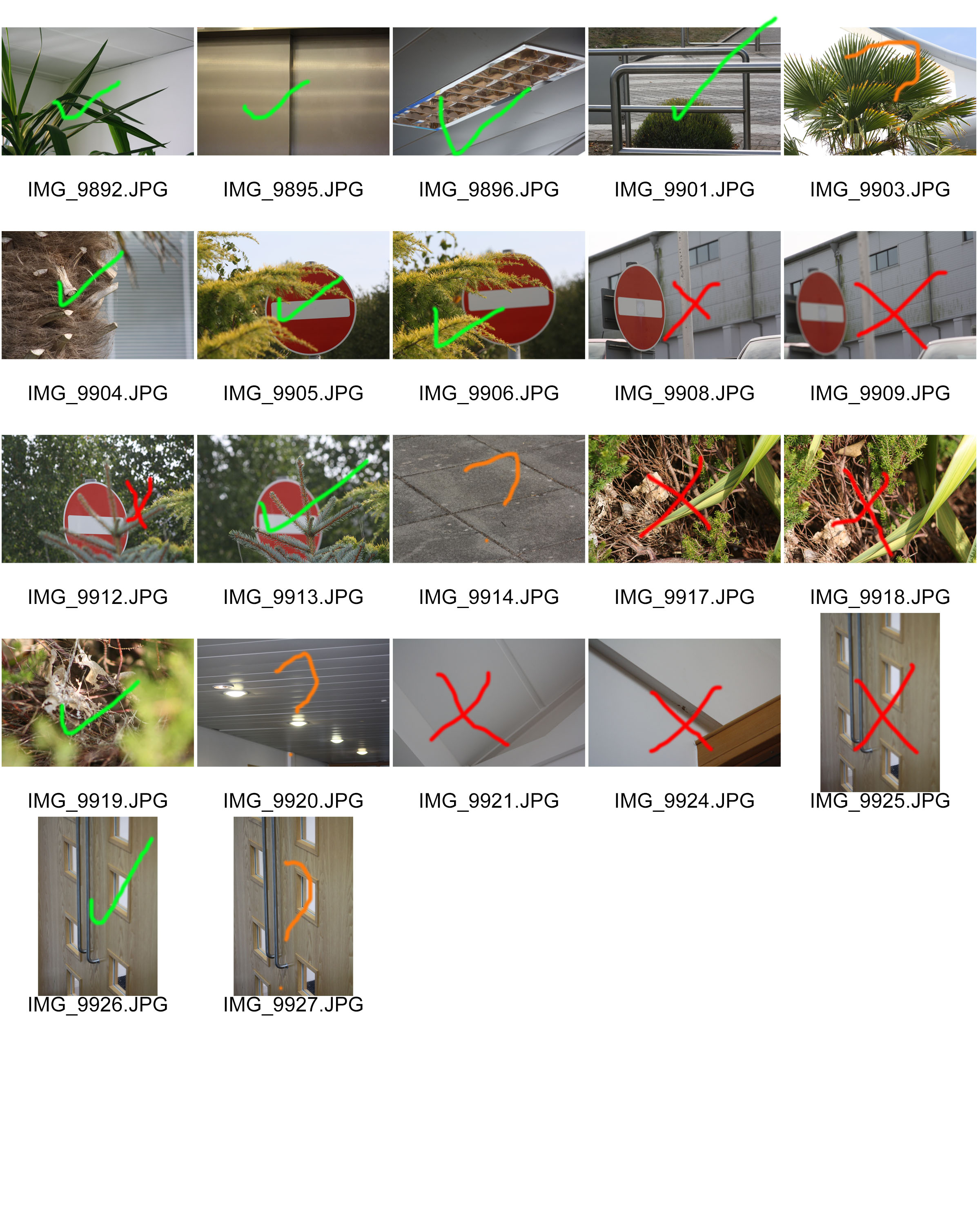
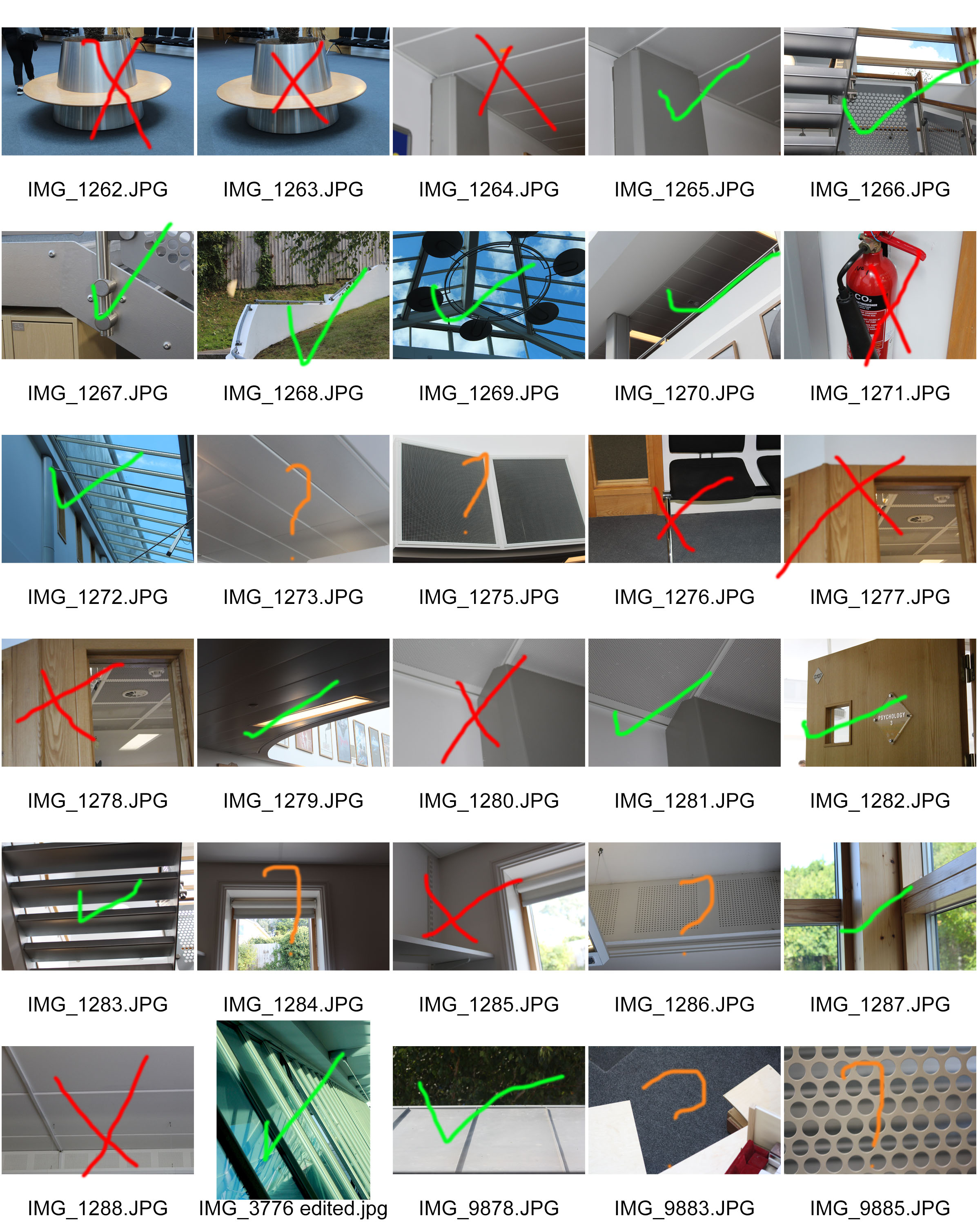
Here I have some of my contact sheets of all the pictures I took and the different types of photos but also how the focus was different in every picture.

here I have messed around playing with the inverted adjustment on the picture. I like it as there is a mixture of light and shadows and also it compares the original to the picture. I also messed around with the contrast making it brighter and darker so the tones of the metal becomes lighter and the background becomes darker so that you will only focus on the metal pole. I like this picture as it focus on the focus on the pole which I wanted. The light in the picture brings out the pole from the dark so it doesn’t get mixed up.

For this picture I messed around with several adjustments for example: I tried out changing the brightness and contrast however I didn’t like how that turned out so I went back to the original photo and started again this time I adjusted the colour levels within the picture and the saturation. This time I like the outcome as it has a variant of colours including bright pinks, blues, greens, browns, blacks, whites and red. It is also a good comparison to the original as I found that the original was blurry and it lacked detail however when I started editing the detail started to become better and it didn’t get more blurry. My favourite bit of the picture is the bright pink on the wood as it makes you focus on the pink and not on the background. This is the attention I wanted, I am really pleased with the outcome.
Definitions of camera skills:

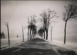
Albert Renger -Patzsch
ALBERT RENGER- PATZCH WAS A GERMAN PHOTOGRAPHER OFTEN ASSOCIATED WITH THE TOPIC OF ABSTRACT PHOTOGRAPHY. HE WAS BORN ON JUNE 22ND 1897 IN WURZBURG. ALBERT BEGAN PHOTOGRAPHING BY THE AGE OF TWELVE. THE ERA HIS PHOTOS WAS BASED AROUND WAS WORLD WAR ONE TO WHICH HE SERVED IN THE MILITARY FOR THEN WENT ON TO STUDYING CHEMISTRY AT DRESDEN TECHNICAL COLLAGE.
Alberts interest in photography led him to creating his best well known book called ‘The world is beautiful’
Albert does not stick to one area of photography. His work consists of elements of wildlife,images of traditional craftsman,landscapes and architecture.
All of his work really captures his love for nature and how he sees the world as a beautiful place, Albert uses photography to show to the public his love for the camera.
In 1928 his book ‘the world is beautiful’ he collected over 100 images with patterns of beauty and order but he does this by photographing through nature but only man- made patterns. Meaning that he did not alter anything to form something that was not there before.
Renger-Patzsch work interested me because of the level of detail that he had included. Another reason i like his work is how lined up everything is. I can tell that Renger patzsch takes time to reflect on the setting before trying to capture the moment.
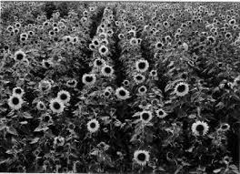
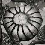
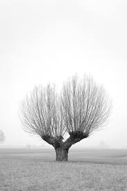
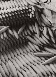
For these edits I wanted to play on the distorted and dark realism effect that Patzsch used for ‘The World is Beautiful’ series. (New Objectivity). Due to the fact I was following this idea, I did not want to do any extreme edits as I believe it would portray realism in the way Patzsch did. The edits I produced where of the top photographs from the photo shoot which I conducted based on the research made about Patzsch. For most of them I adjusted the levels and curves and lowered the saturation enough for it to be deemed black and white but still show a hint of colour. For some other edits I decided to adjust the hue in order for more colours to stand out, based on the colours within the photograph, on the images I decided to leave in colour.
I believe that my final outcomes of this research successful, as I have managed to ensure my editing matched the new objectivity idea, but still ensured that the photograph looks good. I managed to edit the photographs to allow their formal elements stand out more, making them more obvious to viewers. Moreover, I ensured the focal points of the images stood out clearly.
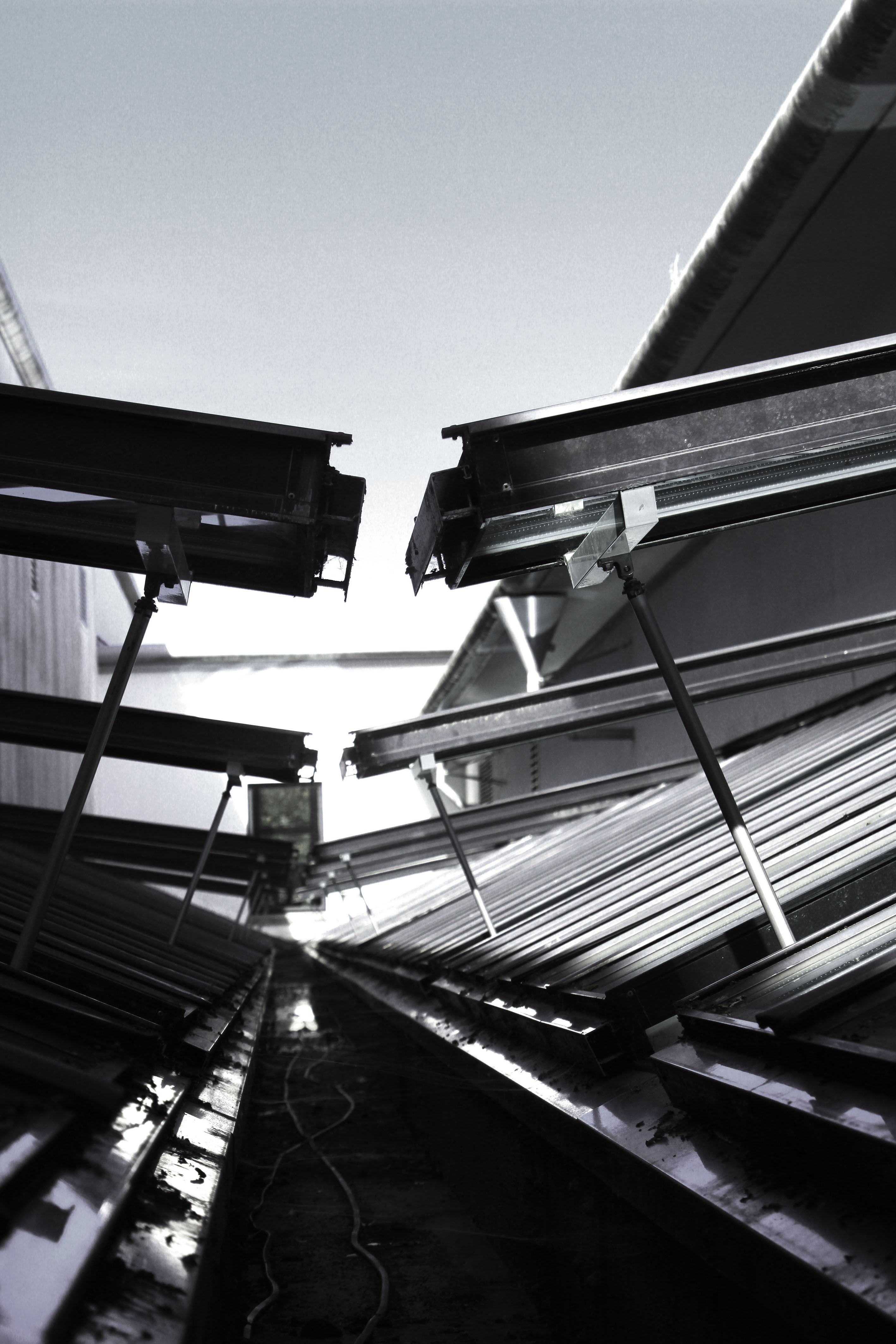
For my first edit I decided to adjust the levels and curves making the photograph darker than usual. I then lowered the saturation of the photograph, which has allowed different tonal regions to stand out. It has also allowed us to see where the natural source of lighting is coming from, which helps direct the viewers eyes around the frame of the photograph. This image also clearly represents the formal element of repetition and shape through the windows that are raised. Moreover, I used the technique leading lines to help guide the viewers eyes around the frame of the photograph. I really like how this edit has turned out as it matches the criteria of new objectivity.
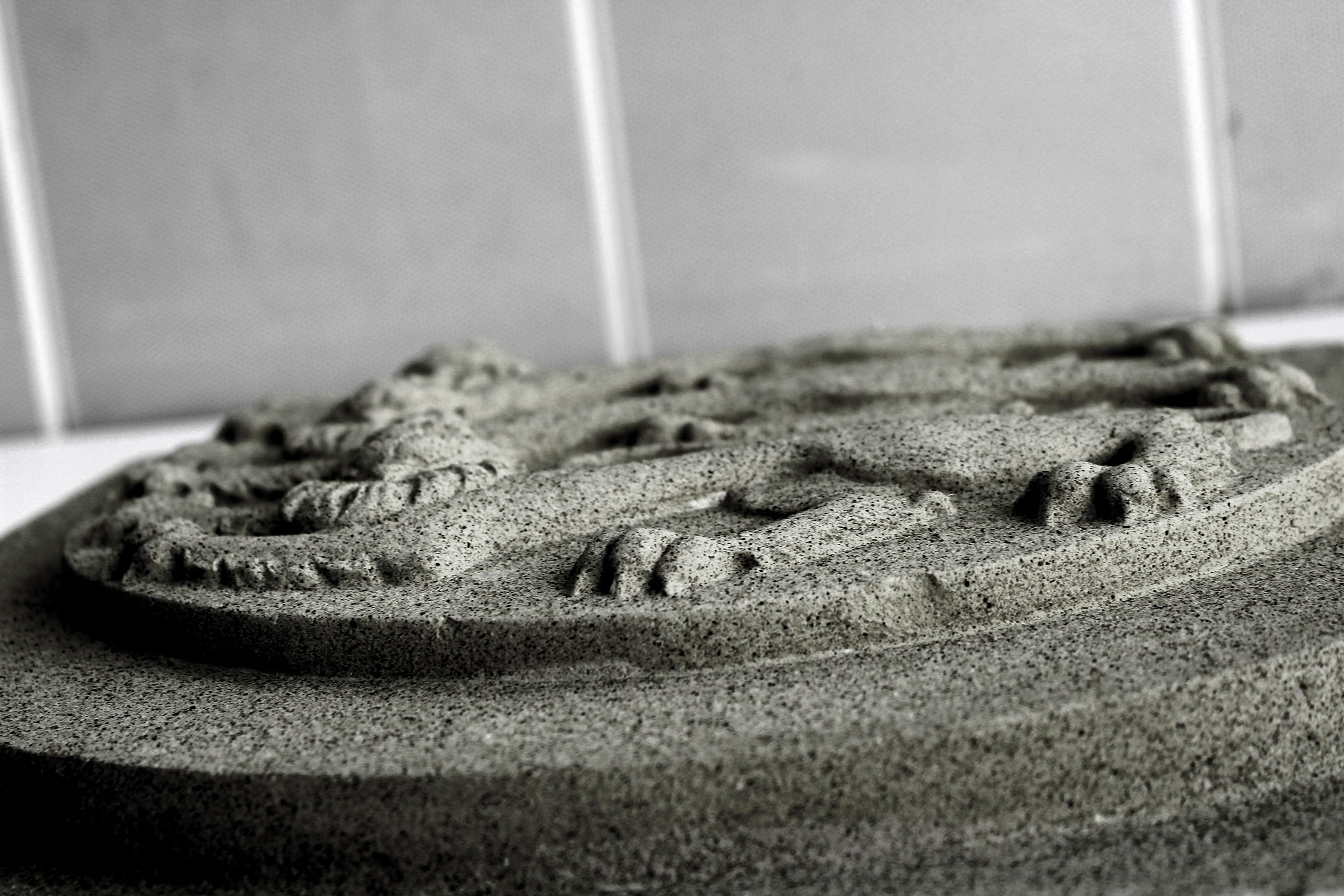
This next edit I decided to level the photograph, allowing the sharpness be clear which has allowed the detail of the subject to be visible. I then lowered the saturation but still allowed a hint of colour to seek through, making it more stimulating for viewers to look at. This image was taken at a worms eye view which allows us to see the formal elements of shape and line which is presented through the lions.
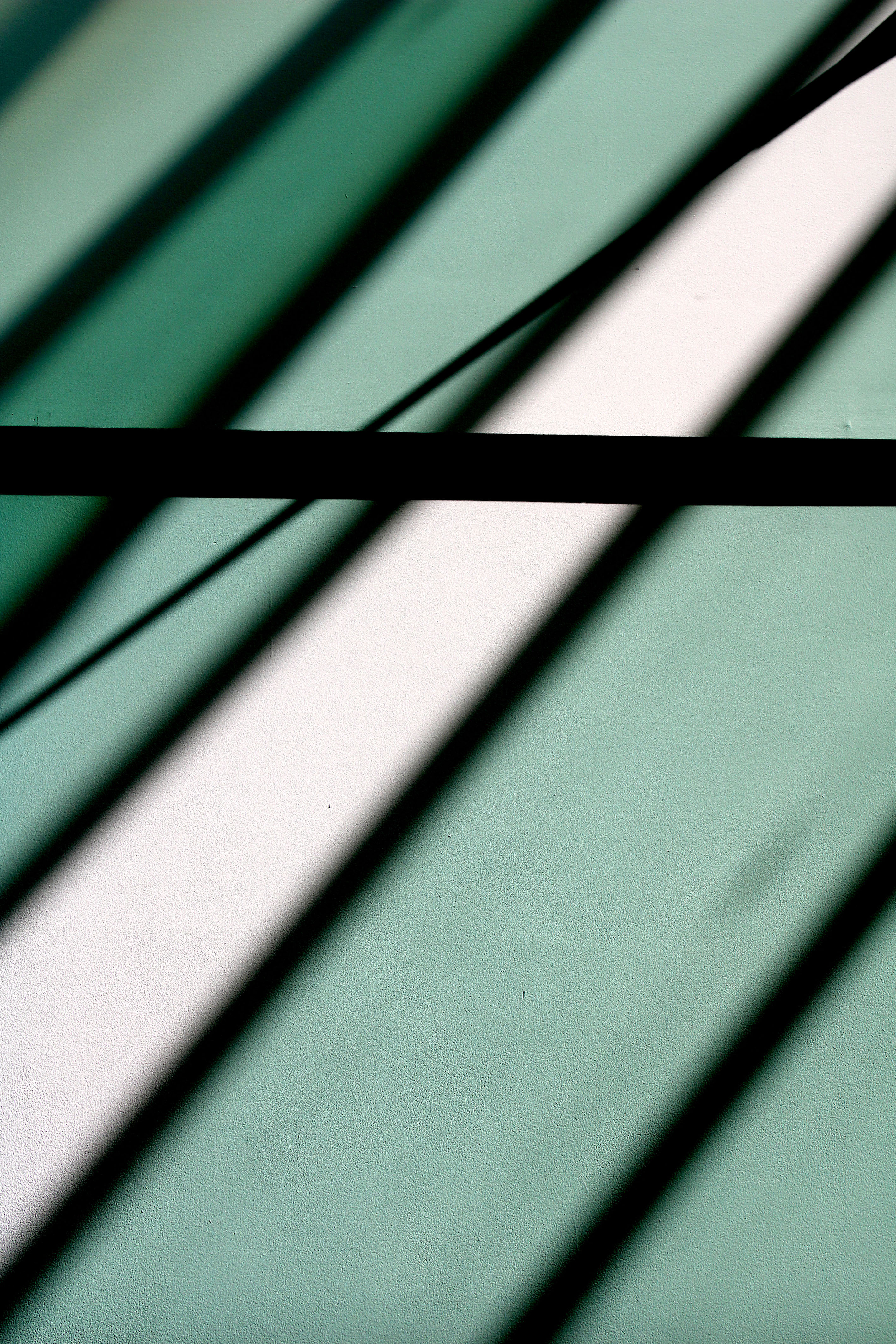
My next edit I decided to keep simple, which has allowed the simplistic overall effect to be created. I decided to level the image to allow it to seem darker than usual which has allowed the black shadows to really stand out, as well as the colours of the shadows which are casted on the wall. The formal element of line and repetition is clearly presented in the photograph, through the rectangular shadows on the wall.
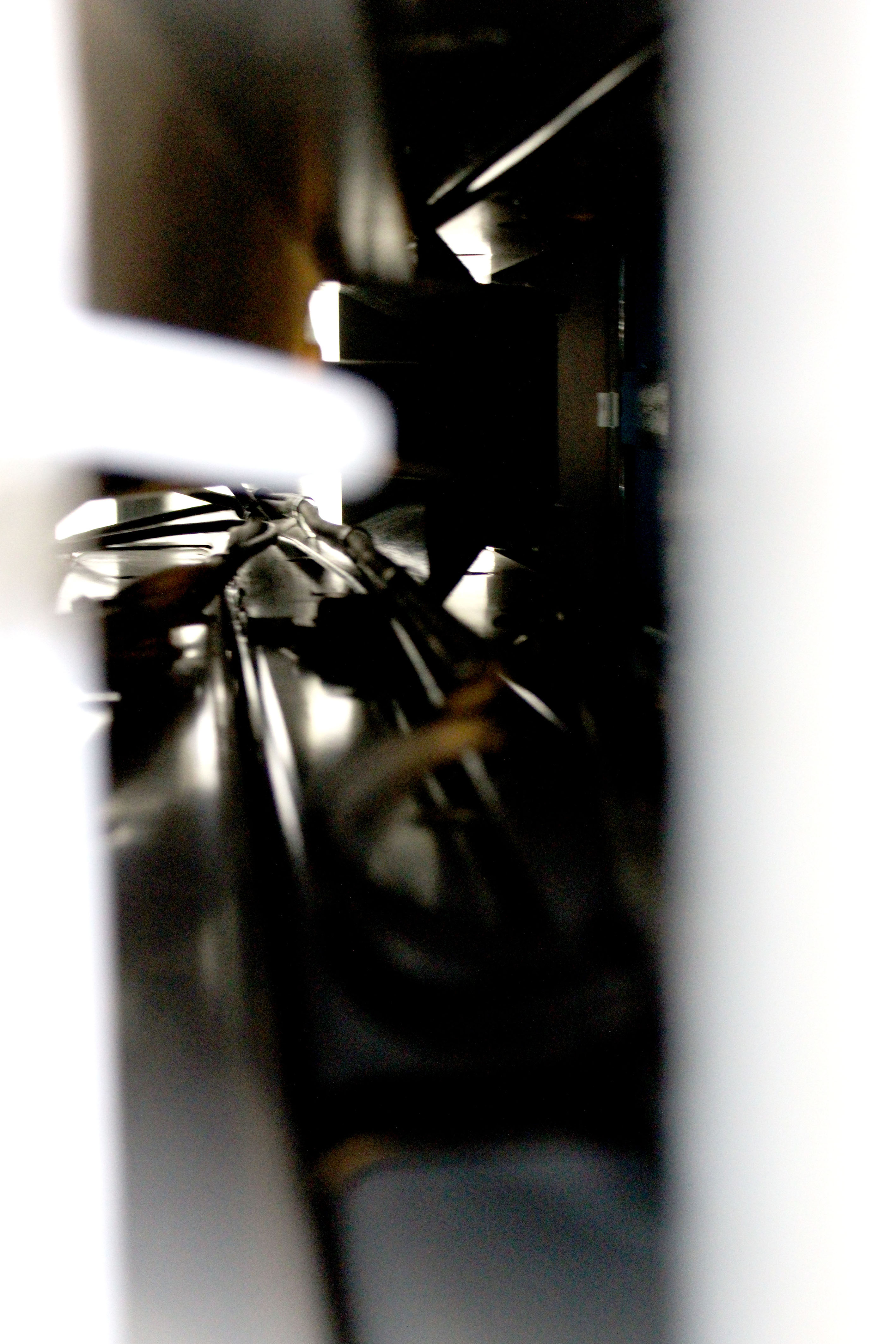
For this edit I decided to keep it simple like the previous one. I levelled the photograph to make it lighter than usual, which has allowed the cables through the tunnel to be visible. It has also added noise and vibrance to the photograph which has allowed a sense of texture to be presented as well. The cables are used to direct the viewers eyes around the frame of the photograph, leading lines, and created mystery as we wonder what is on the other side of the tunnel.
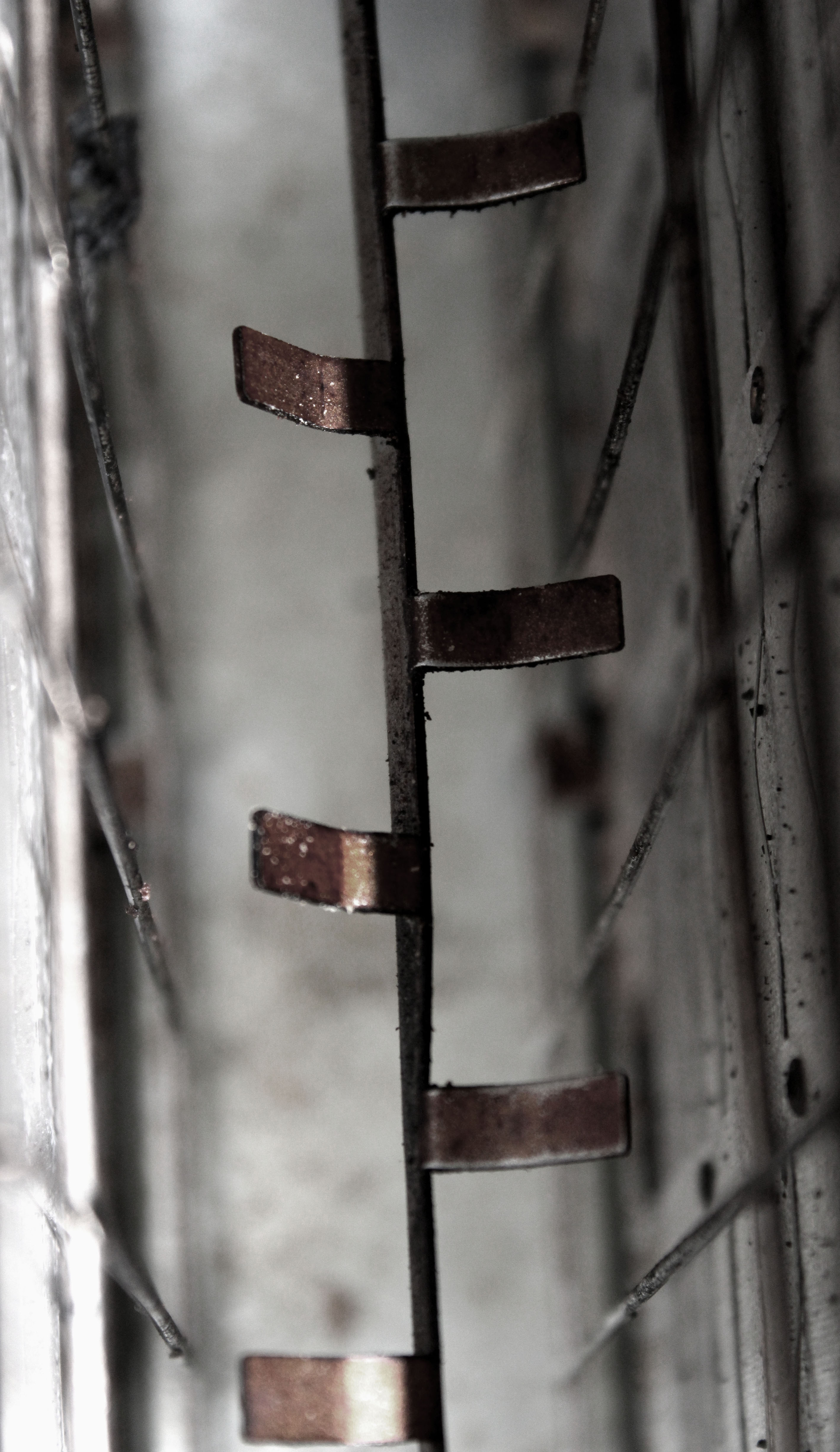
In this edit I started by adjusting the levels and the curves which has allowed the texture of inside the toaster to be presented. It has also helped to showcase the different tonal areas, making it more interesting for viewers to look at. I then turned down the saturation, but ensured the rusted metal rectangles where still in colour. Doing this has helped the context of the image to be presented, allowing viewers to have more of an understanding of where this image was taken. The formal element of line, shape and texture has been presented allowing this image to match the formal elements Patzsch’s work showed.
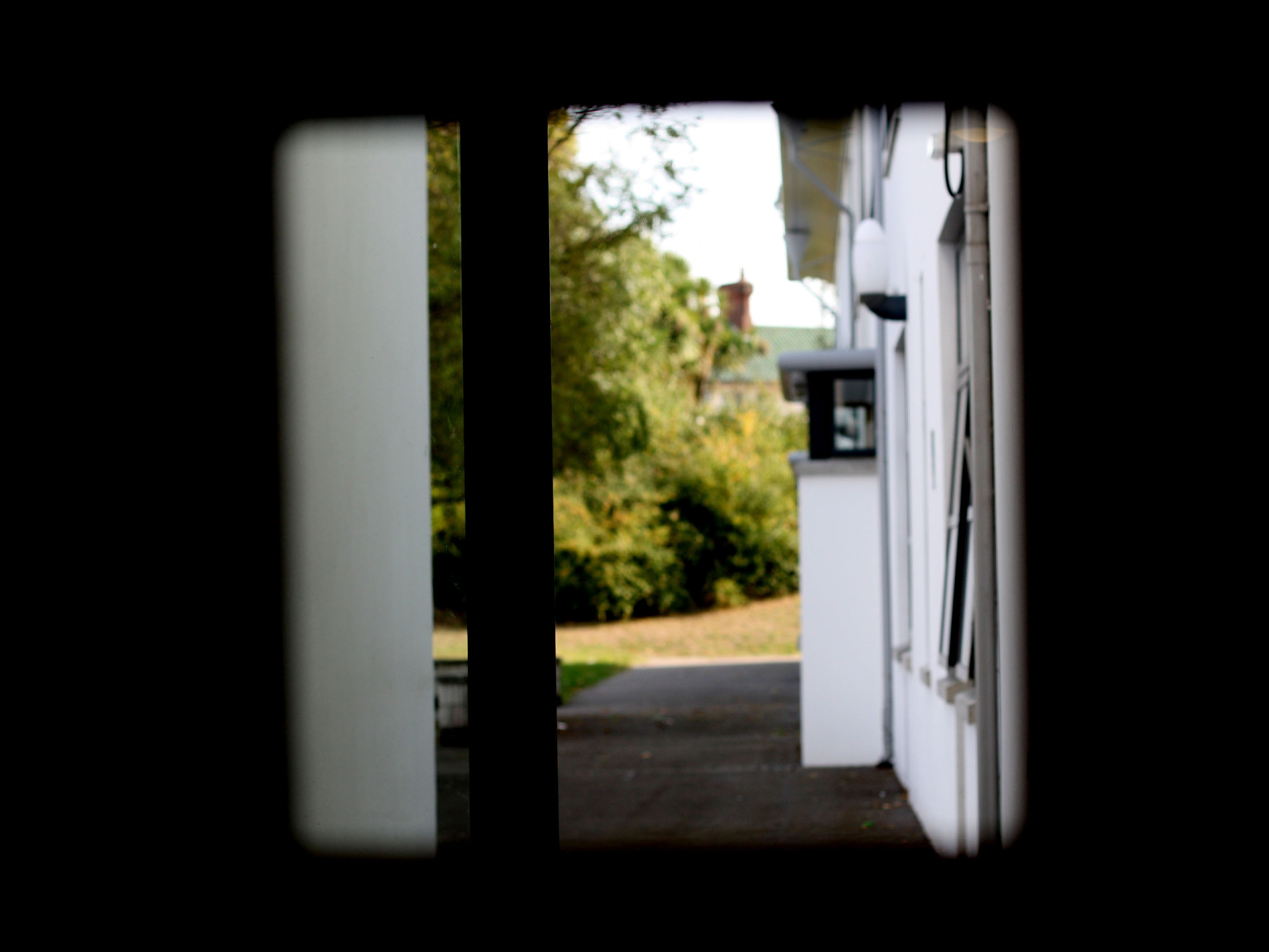
In my penultimat edit I decided to level the image, to make the foreground completely black only allowing the background to be visible. I attempted to use the technique of framing, which has allowed the subject of the image to be captured. I kept the image in colour as I felt it allowed the background to really stand out compared to the black frame work. The formal element of shape is presented through the frame which is capturing the semi-focused background.
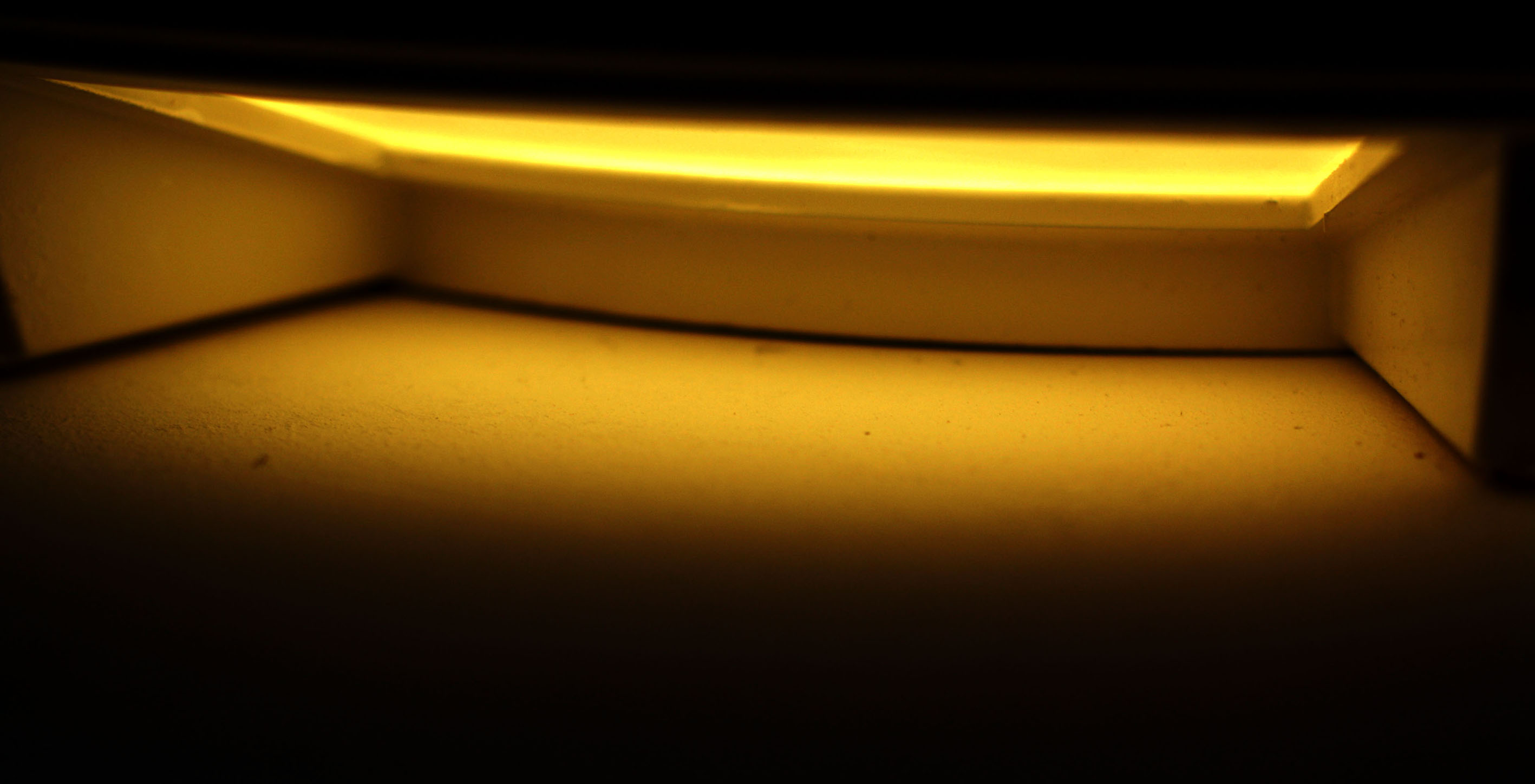
In my final edit I wanted to showcase this empty area, with a simplistic edit to add to the empty effect. For this I adjusted the levels and curves allowing the photograph to be naturally darker, which has allowed the light to stand out. I then adjusted the hue to allow the yellow to stand out more. Moreover, I adjusted the vibrance to create a bit of noise within the photograph but not enough to change the effect of the image. The formal elements of space and shape are clearly presented in the image.

Albert Renger- Patzch was a German photographer associated with the New Objectivity. Renger-Patzsch was born in Würzburg and began making photographs by age twelve. After military service in the First World War he studied chemistry at Dresden Technical College.
In its sharply focused and matter-of-fact style his work exemplifies the aesthetic of The New Objectivity that flourished in the arts in Germany during the Wiemar Republic. Like Edward Weston in the United States, Renger-Patzsch believed that the value of photography was in its ability to reproduce the texture of reality, and to represent the essence of an object.
I tried to capture the essence of his work and I think I got the best result I could get. I took the photos with my DLSR Canon Camera on the close up setting. Most of my photos were landscape but a few were portraits.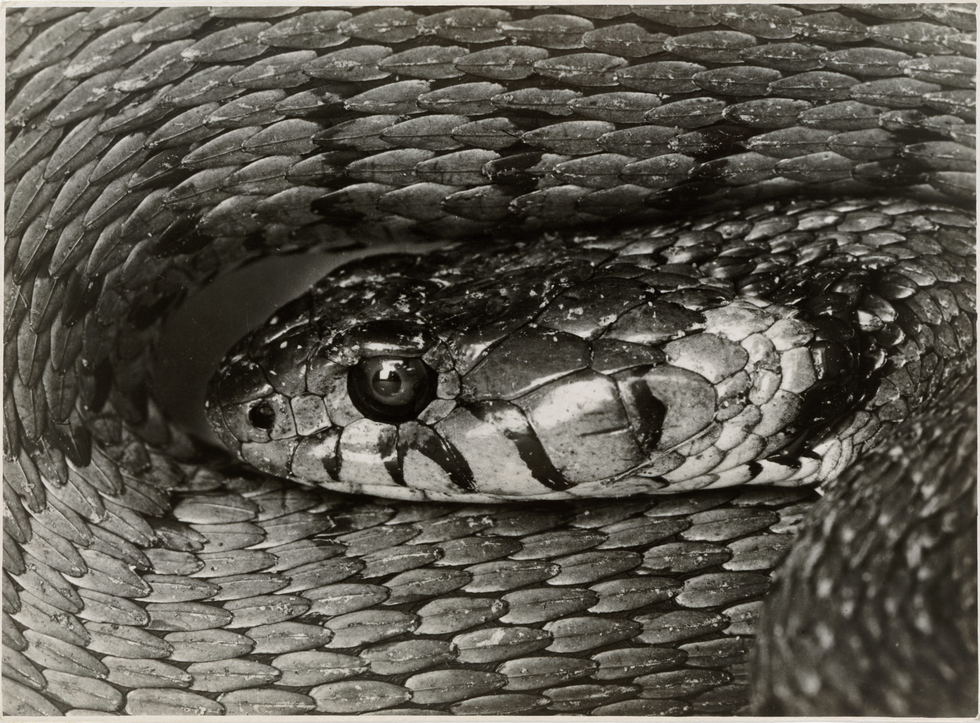
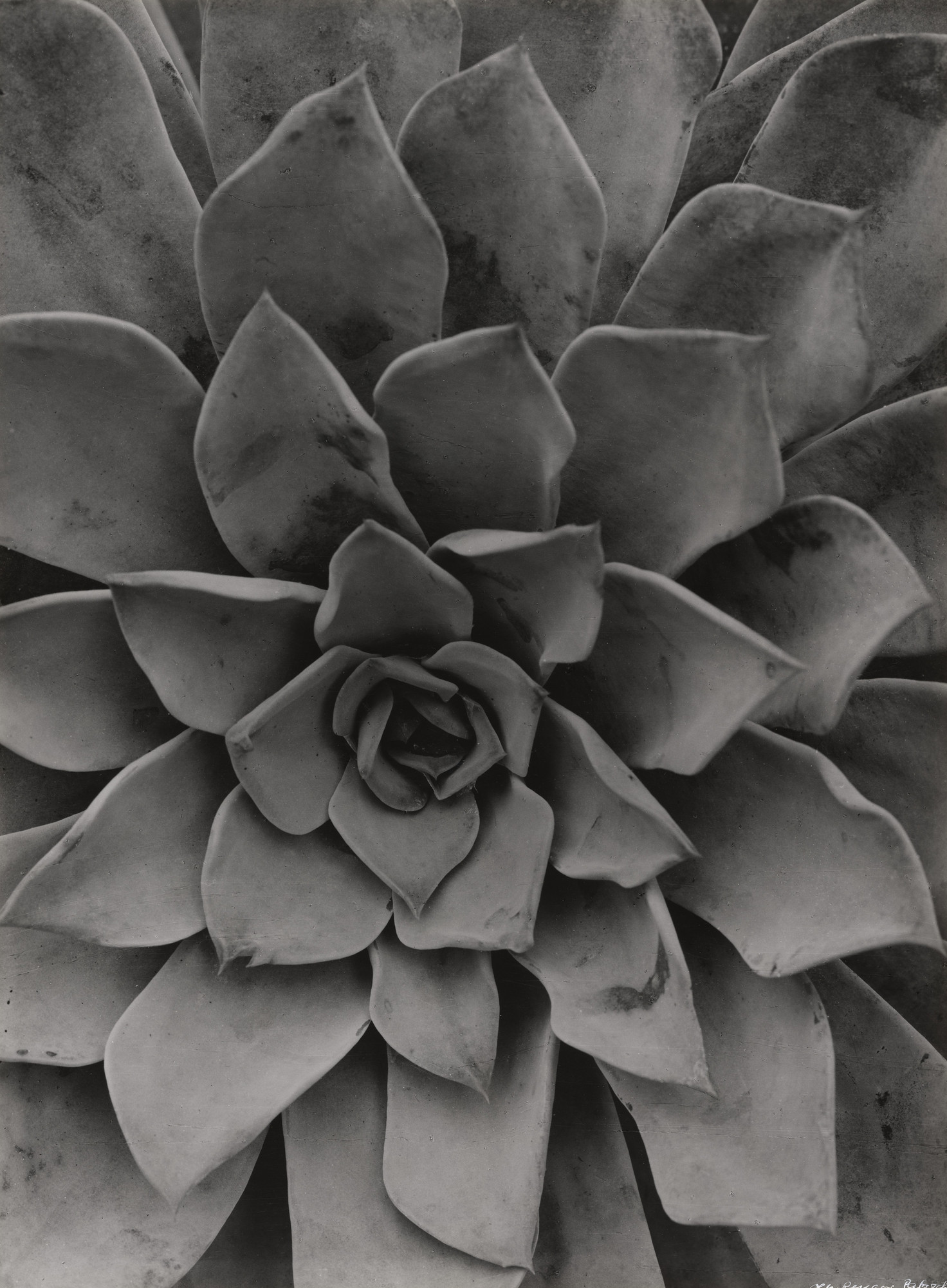
For my response to Albert’s photos I tried to take 100 photos, but only managed around 80 photos. Even though Albert’s photos were in black and white, I have a mixture of black and white and coloured photos edited photos.
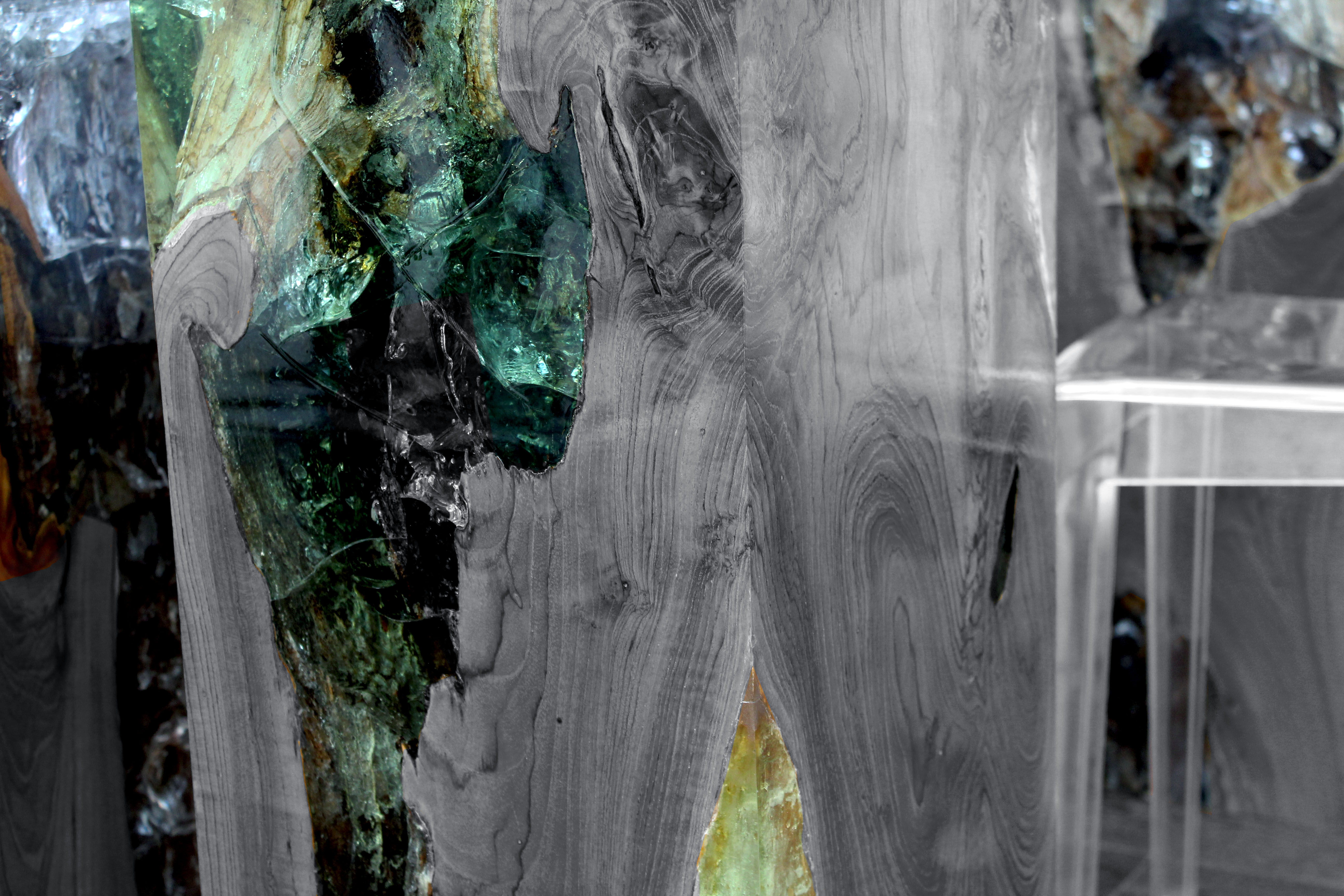
I chose to edit this photo because I really liked how the table had the unique and colourful marble in it. I decided to make the marble pop by making the wood and chairs black and white. I really like how this photo turned out and I will try this style of editing again.
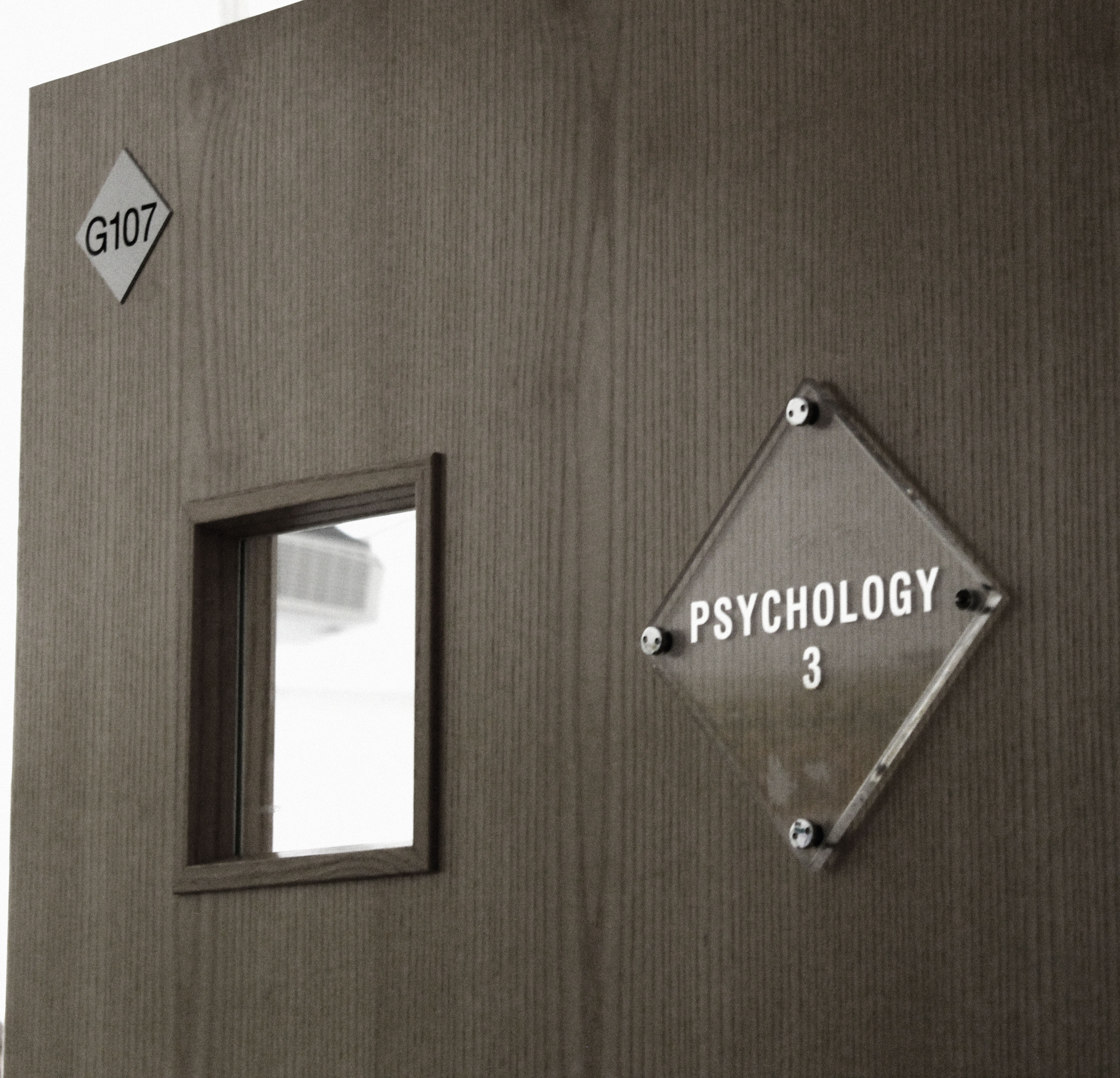
For this next photo I decided to make it more dull and dark as appose to it’s original bright photo. I played with the levels, contrast and saturation to achieve this photo. I’m really happy with how this turned out and I really like the difference of the original photo to the edited photo.
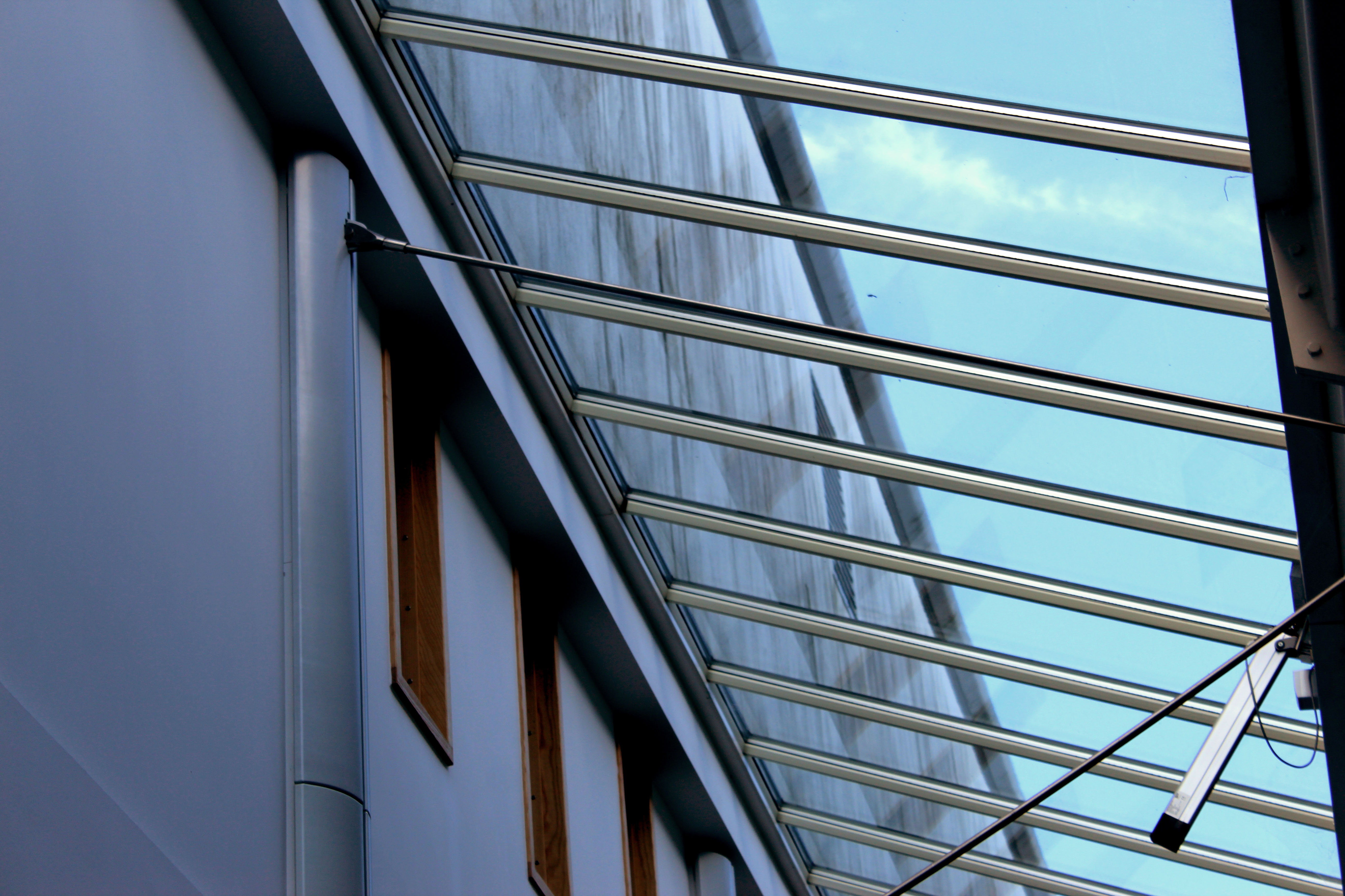
For this photo I decided to use levels, contrast, colour balance and photo filter to achieve this look. I really like how the light is almost shining into the room. I also like the contrast of the wooden windows and glass windows, it gives it a really nice look. I think I edited this photo very well.
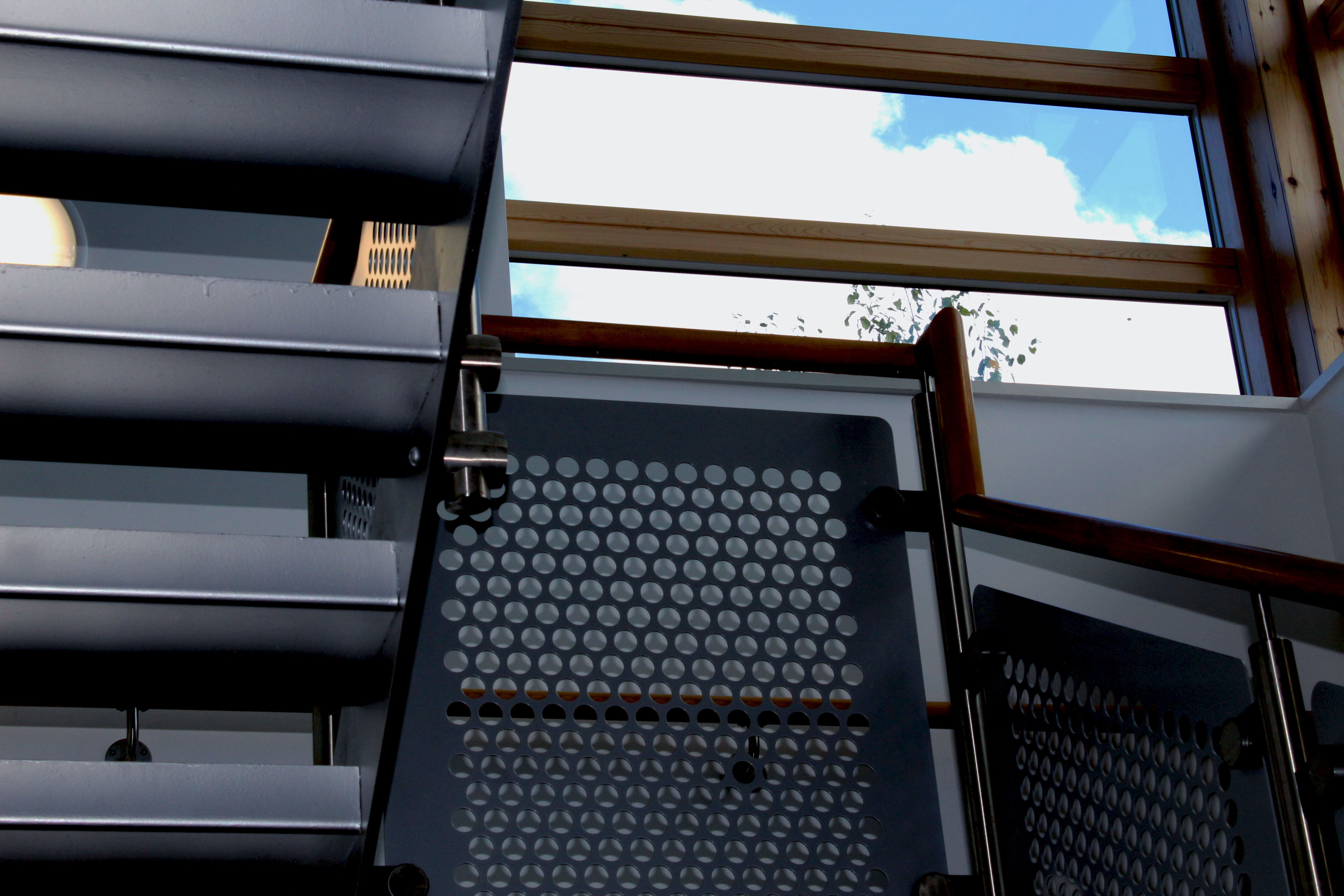
This next photo I used the contrast and exposure setting a lot. My vision was to make the sky brighter than the stairs, and I really like how I achieved this look. I think I got the overall idea of what I wanted for this photo, and it translates very well in the edited final picture.

For this next photo I used exposure, contrast and levels to get this final picture. I really like how the light is centered onto the middle of the keyboard. I think I edited this picture well and will try to use this style of editing in future projects.
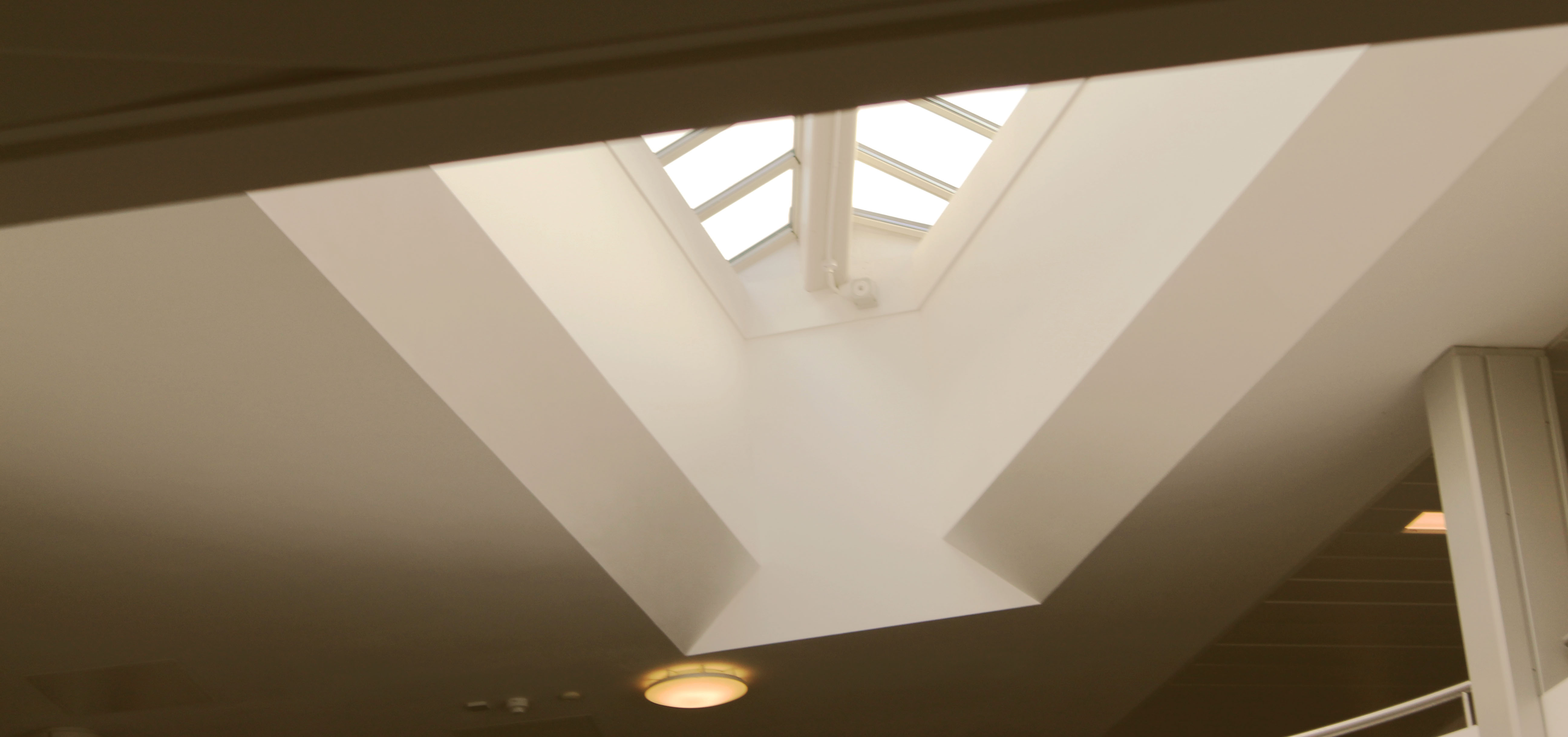
For this last photo I used photo filter, gradient, contrast and exposure. I’m really pleased with how this turned out. The way I edited it gives it a retro and vintage look to it which I personally really enjoy. I hope to also use the style of editing in future projects.
Overall I think a did a good job at recreating Albert Renger- Patzsch style of photography. I really enjoyed doing this project as it gave me inspiration and ideas for future photo shoots and projects. I hope to keep achieving photos that I like and to improve with my camera and photography skills. I would also like to explore more ideas with different photographers and look at work that isn’t my preferred style because I would like to expand my ideas and see other styles from my own.