Category Archives: AO4 Present Ideas

Filters

Author:
Category:

Alfred Stieglitz – Songs Of The Sky

ALFRED STIEGLITZ

“photography fascinated me, first as a toy, then as a passion, then as an obsession”

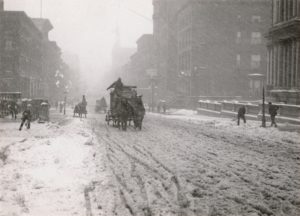
He was an American photographer and modern art promoter who was born on January 1, 1864. He was friends with German artist at the beginning of his career and he brought his first camera and traveled through the European country side photographing landscapes and peasants. He began to self teach himself about photography and he won first place for his Last Joke, Bellagio photography in 1887 from Amateur Photographer. In the main part of his career he considered himself an artist but refused to sell his photographs. His father decided to purchase a small photography business so he could earn a living in his chosen profession, Stieglitz paid his employees a high wage as he wanted high quality images. He then started getting awards for his photography exhibitions. He brought his first hand-held camera in late 1892 and he used this to take his two best known photos which are Winter, Fifth Avenue (right)  and The Terminal (left).

SONGS OF THE SKY

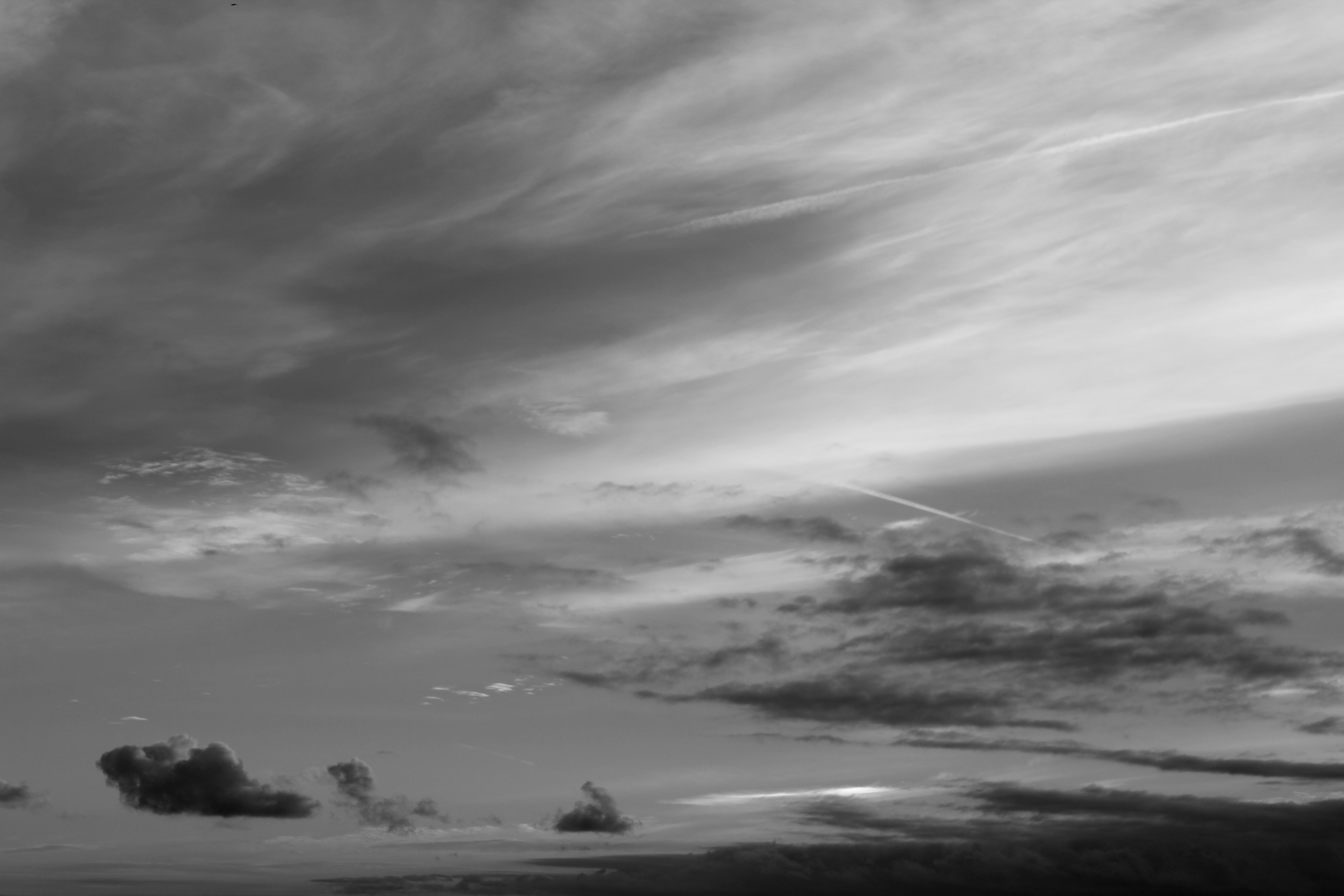
His photographs called ‘Songs of the Sky’ are focused on landscapes of the sky, which have abstract qualities. The title of these images are related to music, which shoes Stieglitz intended to do.

Moodboard;
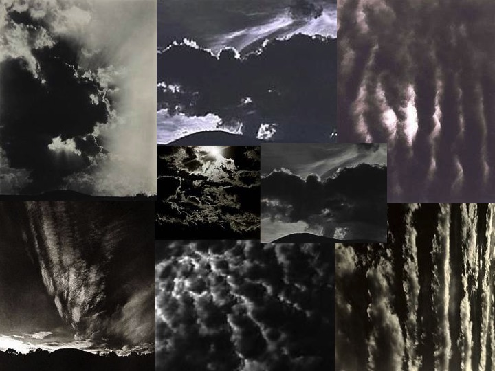
These 8 images here are my inspiration for this shoot. I like how the dark and light in the images contrast each other and they all have different moods such as danger or a sense of heaven. He has really shown nature giving off many emotions in this project and it makes people looks at the images very differently because you can feel an emotion when looking at these images of clouds, something so simple yet with so much meaning.

This image by Stieglitz is one of my favourites because the natural light is seeping through the waves of clouds. The leading eye point in this images would be the whiter parts of the image because it captures the eye as it is contrasting up against the dark duller coloured clouds in the image and this shows how nature works together to create something so simple but beautiful and I believe that was Stieglitz’s motive behind this image, to show the earth for what it is. This image also has little editing to it, so it is showing the natural creations. 

SHOOT 1

When performing my shoot, I regularly came back to the 8 images above, so regain inspiration and to remind myself of the images he took.

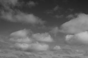
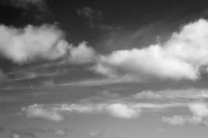
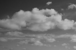
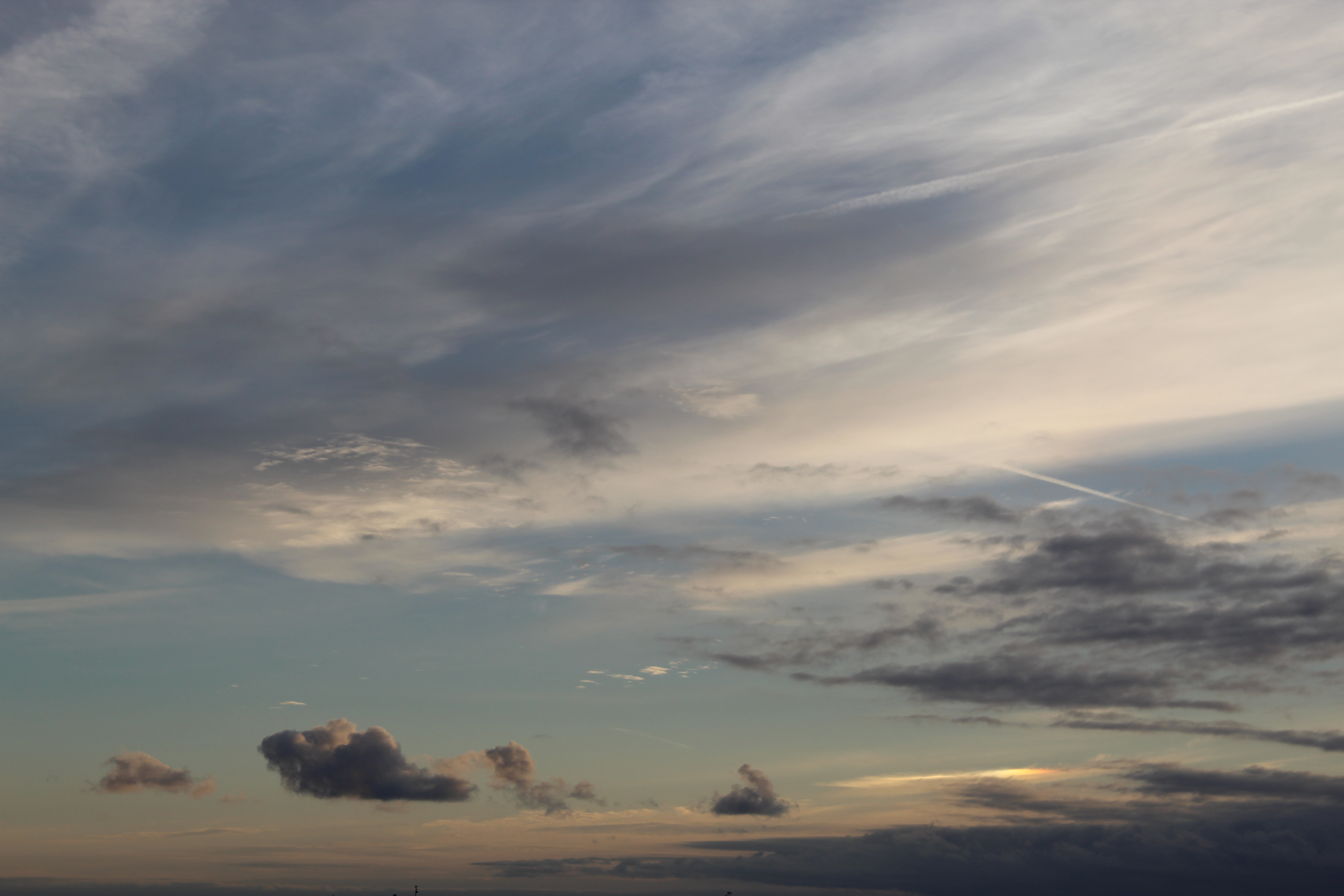
These three images here are a few I selected from my shoot, just to show the variety of images I took. All three images have been edited into black and white and also have adjusted the contract slightly, to make the white clouds pop more. To help me get these images I regularly came back to my moodboard I created earlier before starting to shoot, to remind myself of the way he took his photos and to regain inspiration, to form new ideas.

EDITING/PHOTOSHOP
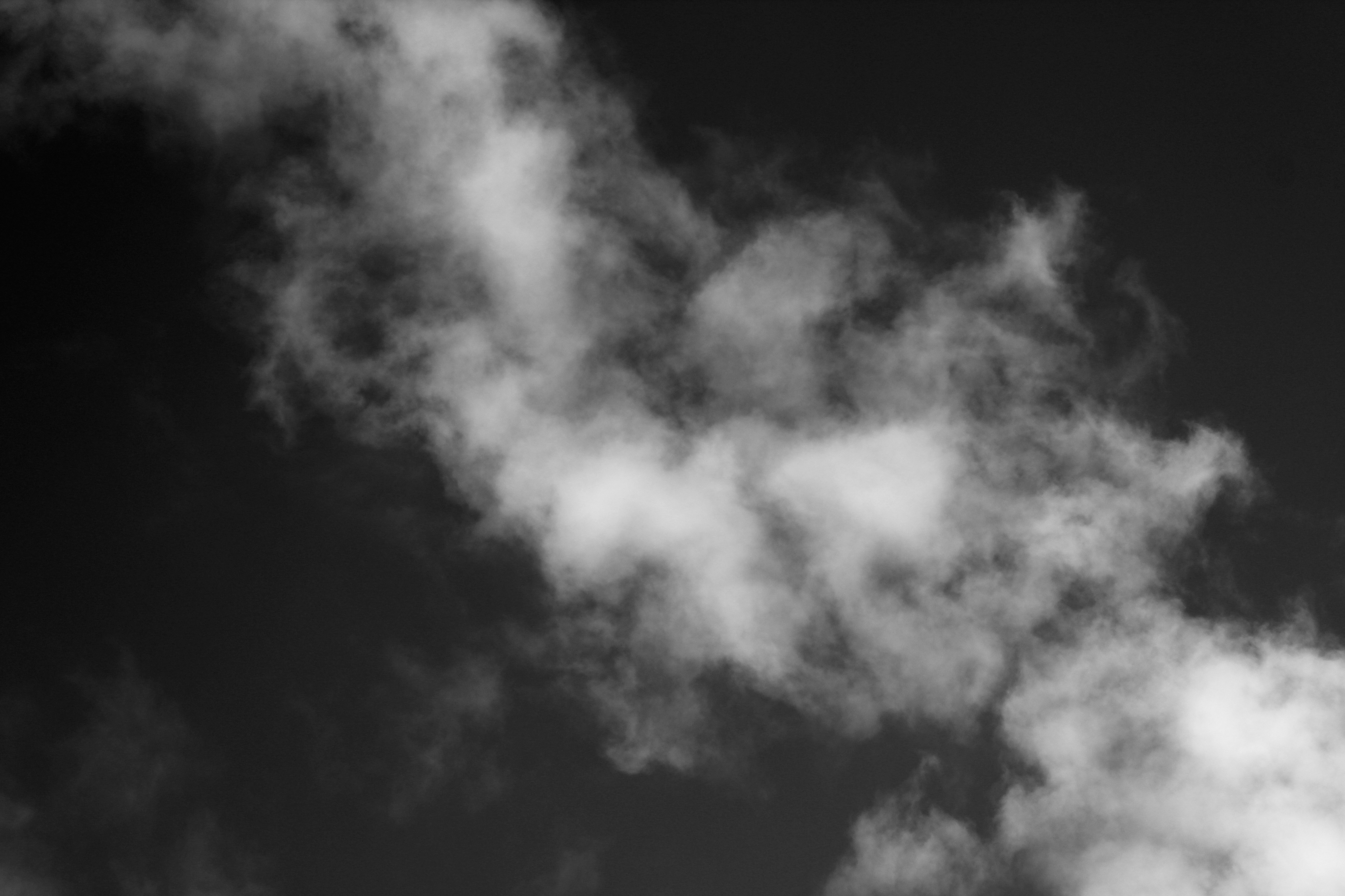
When editing this photo I  focused in editing the darkness of the images, to create a higher contrast between the tones in this images. I would use this image as one of my final images because of the way the clouds look, the texture looks soft, so it gives the image a calm mood, but with the dark background the clouds look more vibrant and bold.

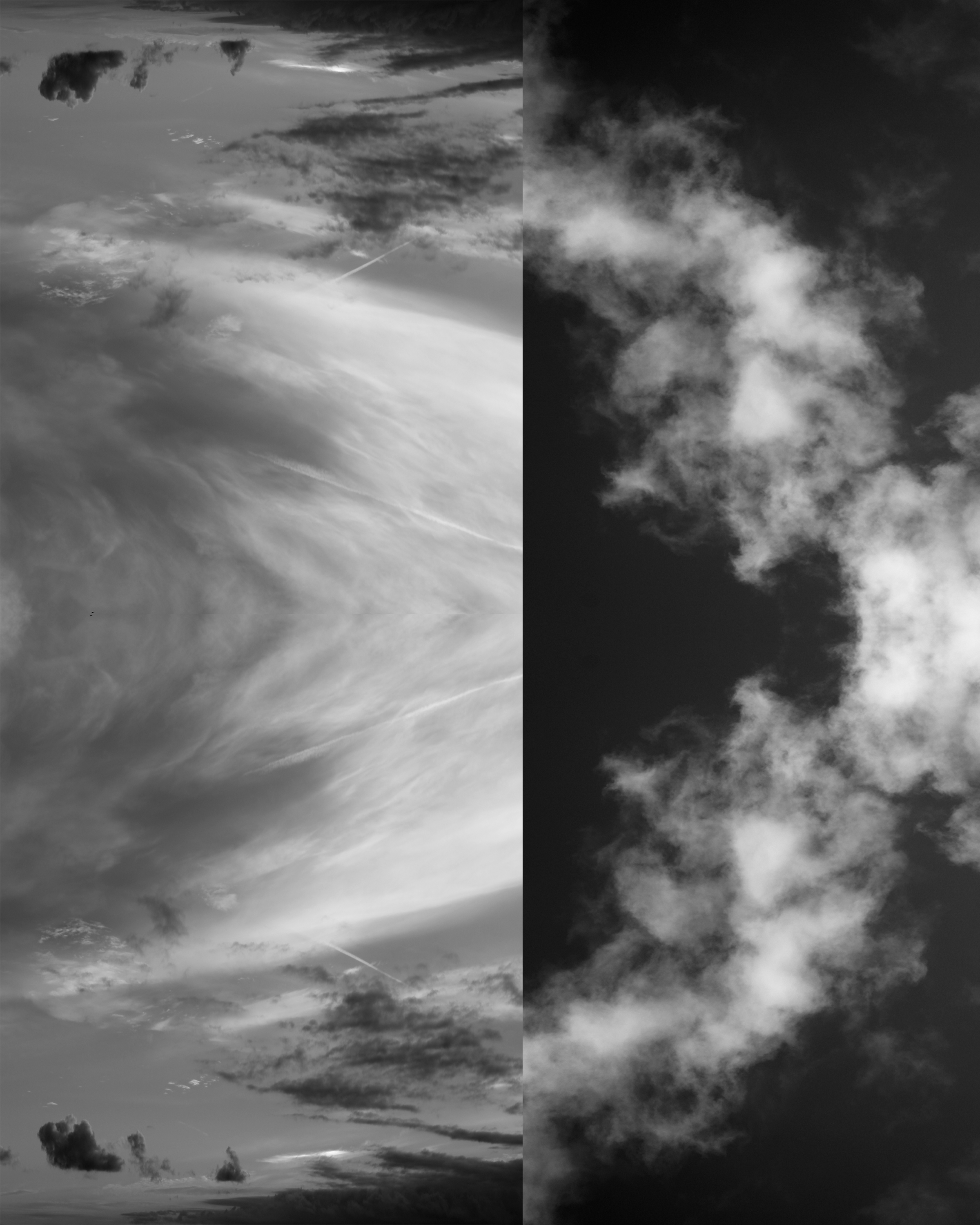
I was also experimental with my images, mirroring them using Photoshop, to make my own abstract photo. I mirrored each image then joined them together to make one photo, this makes the image more interesting and creates a contrast.
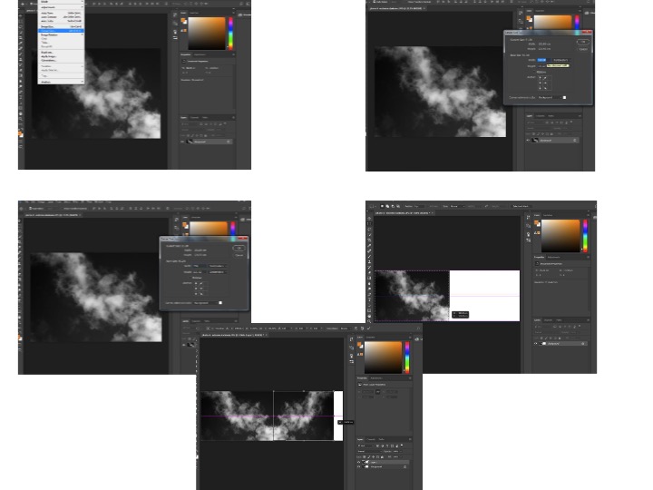
These are the steps on Photoshop I took to get the finished result of joining 2 mirrored photos together;
FINAL IMAGE
Before After

These images demonstrate  a before and after editing. The final, completed image has been edited into black and white but I have also edited the darkness on the image and the contrast. I made the contrast high to show the different tones and shade. There is a depth of field in this photo, the top of the photo feels more close up to the white sheets of cloud and then the clouds become smaller which makes them look further away, even tho everything was in line. The clouds have made many different unique shapes, which creates a more interesting photo as there are more shapes to look at and admire. The images just looks satisfying because of the different tones and shapes around.


Colour and Texture

Aaron Siskind

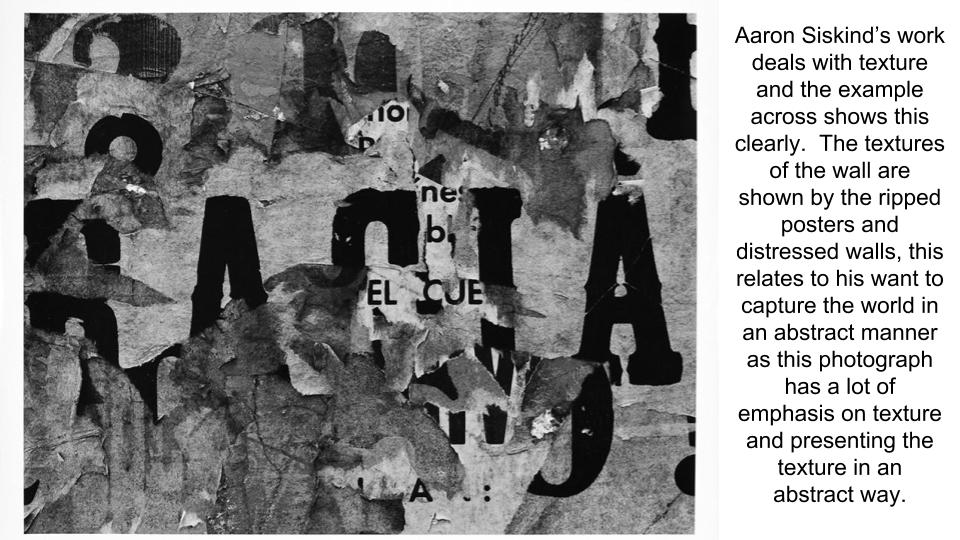
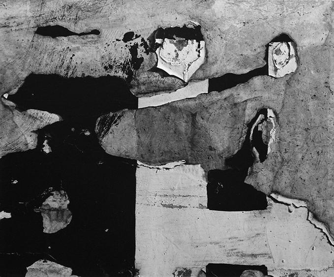
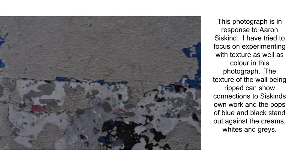
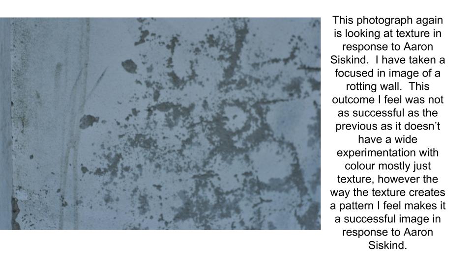
Aaron Siskind is an American photographer who is a part of the abstract movement.  Siskind captures the abstract qualities of layers and texture.  Aaron Siskinds work focuses on ideas of distraction in nature and architecture.  Siskind intensified this approach to photography with the abstract movement with close-up framing and an emphasis on texture, line and visual rhythms, creating abstract images of the real world.   Siskind was one of the first photographers to combine what was known as “straight” photography (recording the real world as the lens “sees” it) with abstraction.  Siskind turned away from the social/political world post-World War II, and instead looked inward to seek meaning in the mostly inanimate forms he observed around him.

Aaron Siskind
Aaron Siskind

The Boyle Family

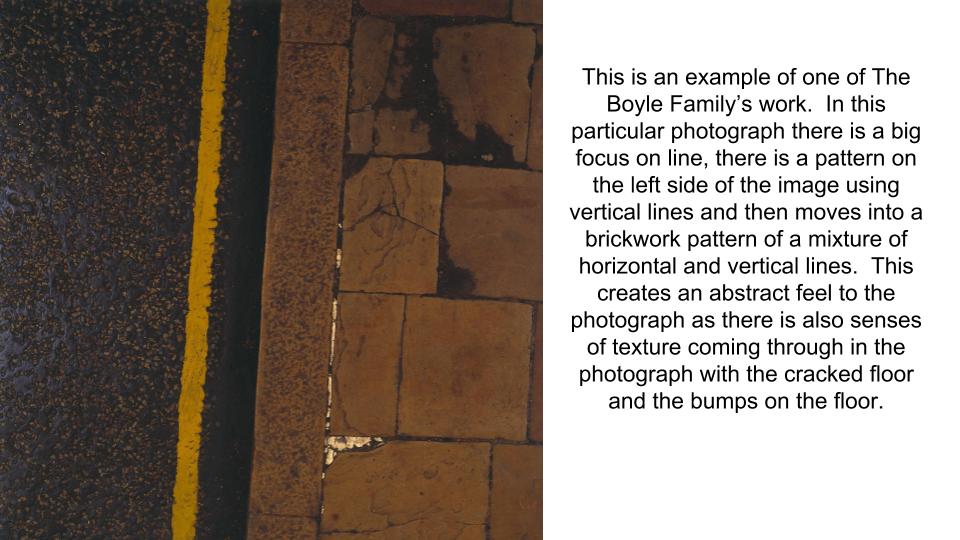
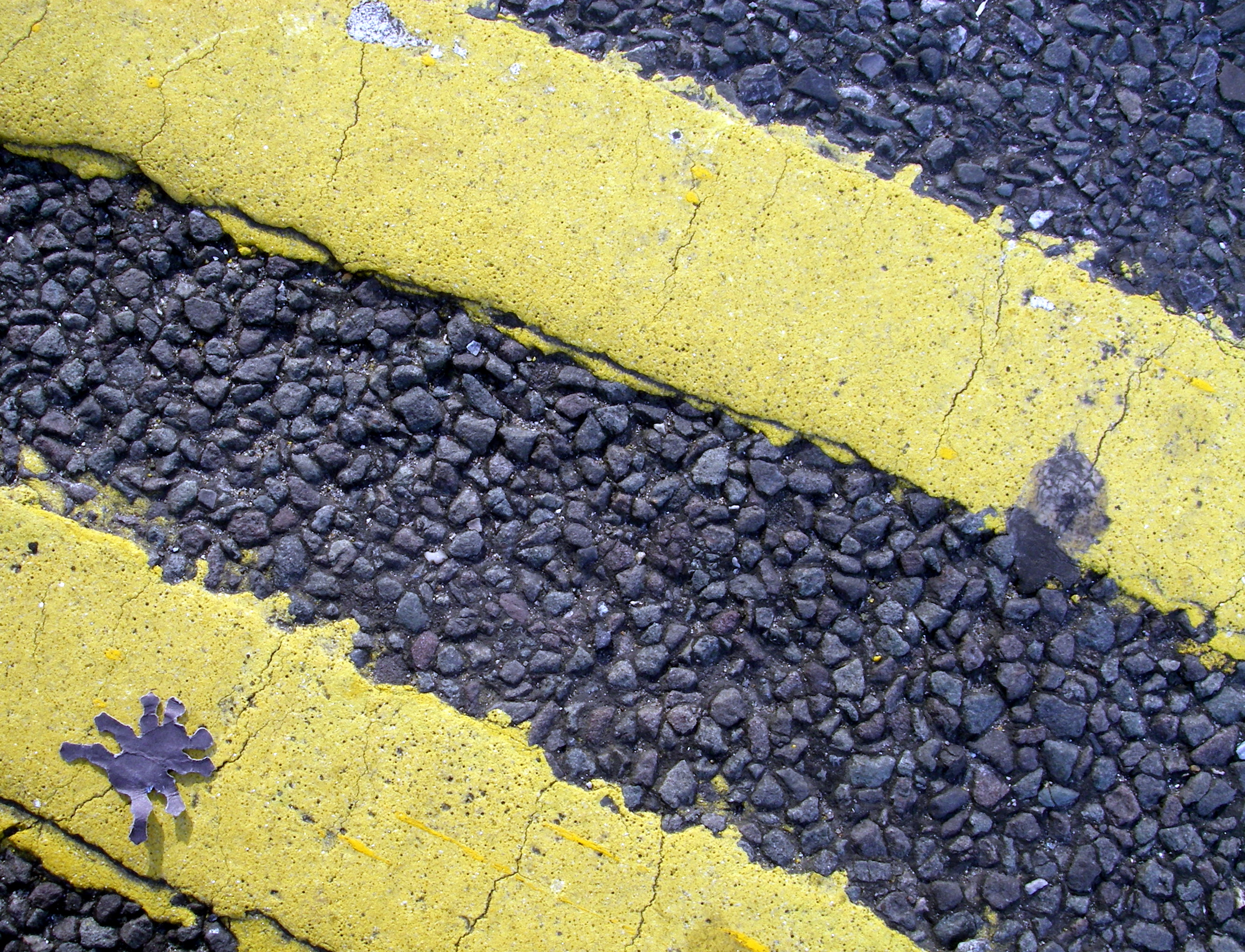
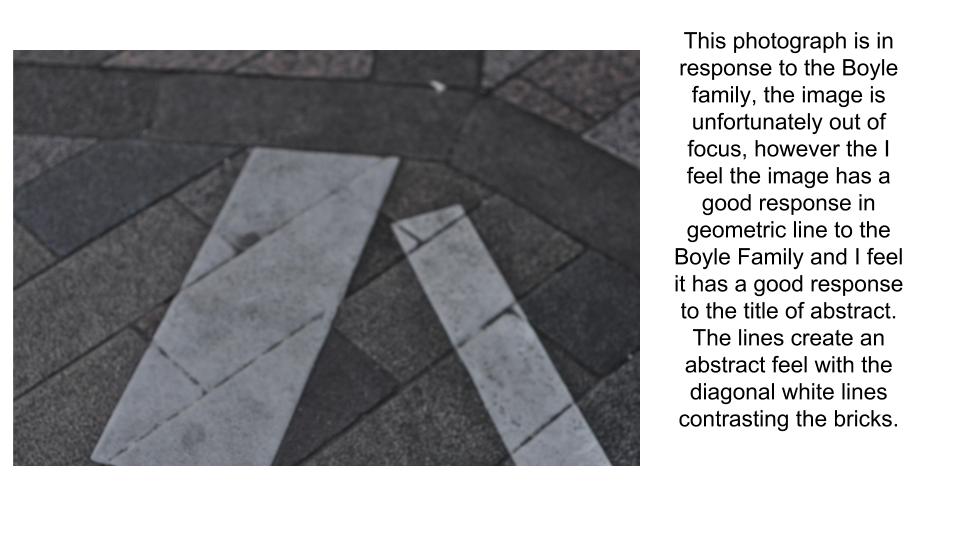
The Boyle Family is a group of collaborative artists based in London.  Boyle Family aims to make art that does not exclude anything as a potential subject. Over the years, subjects have included: earth, air, fire and water; animals, vegetables, minerals; insects, reptiles,  water creatures; human beings and societies; physical elements and fluids from the human body.  Boyle Family is best known for the earth studies: three dimensional casts of the surface of the earth which record and document random sites with great accuracy. These works combine real material from the site (stones, dust, twigs etc) with paint and resins, preserving the form of the ground.
The Boyle Family
The Boyle Family


My Own Responses

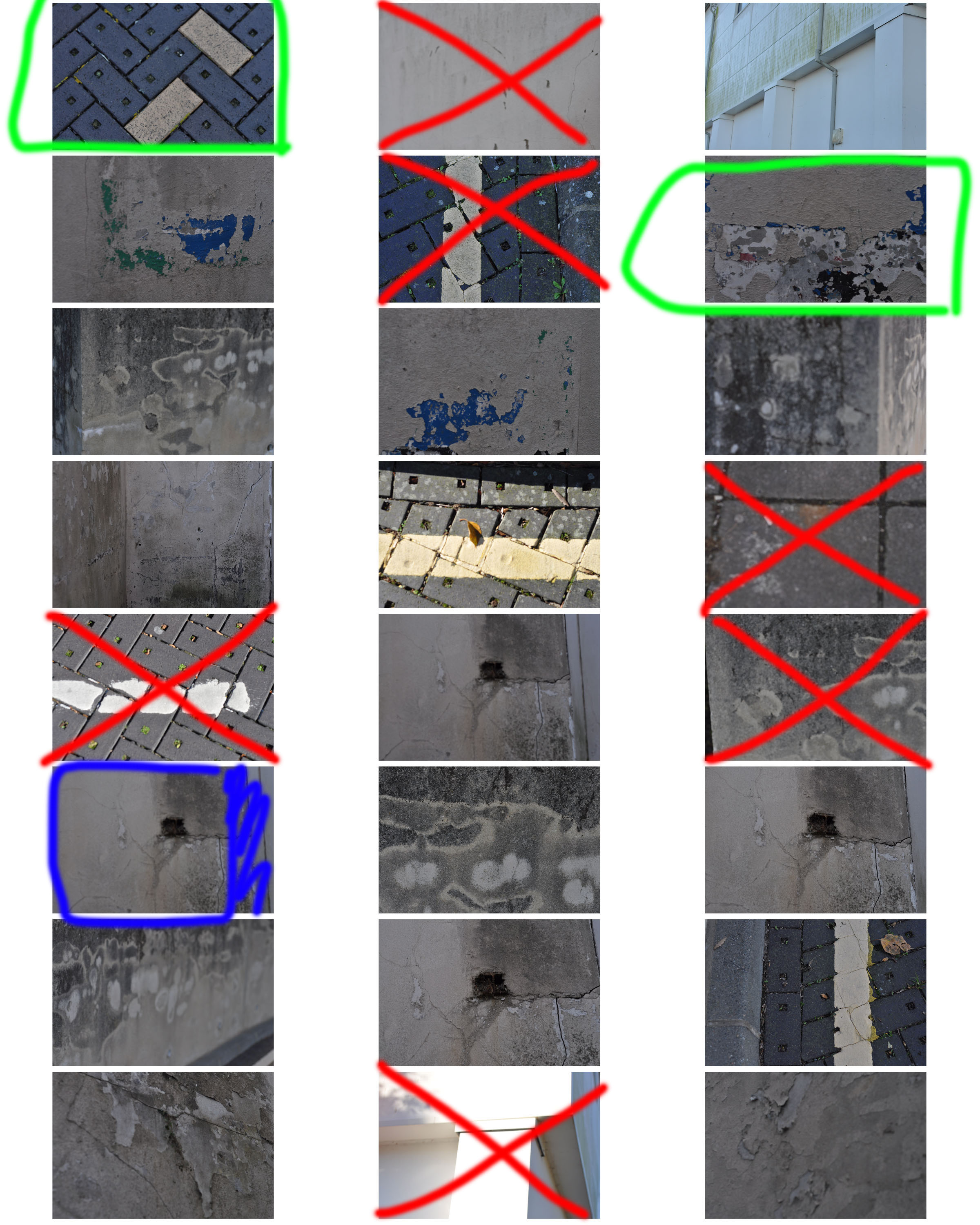
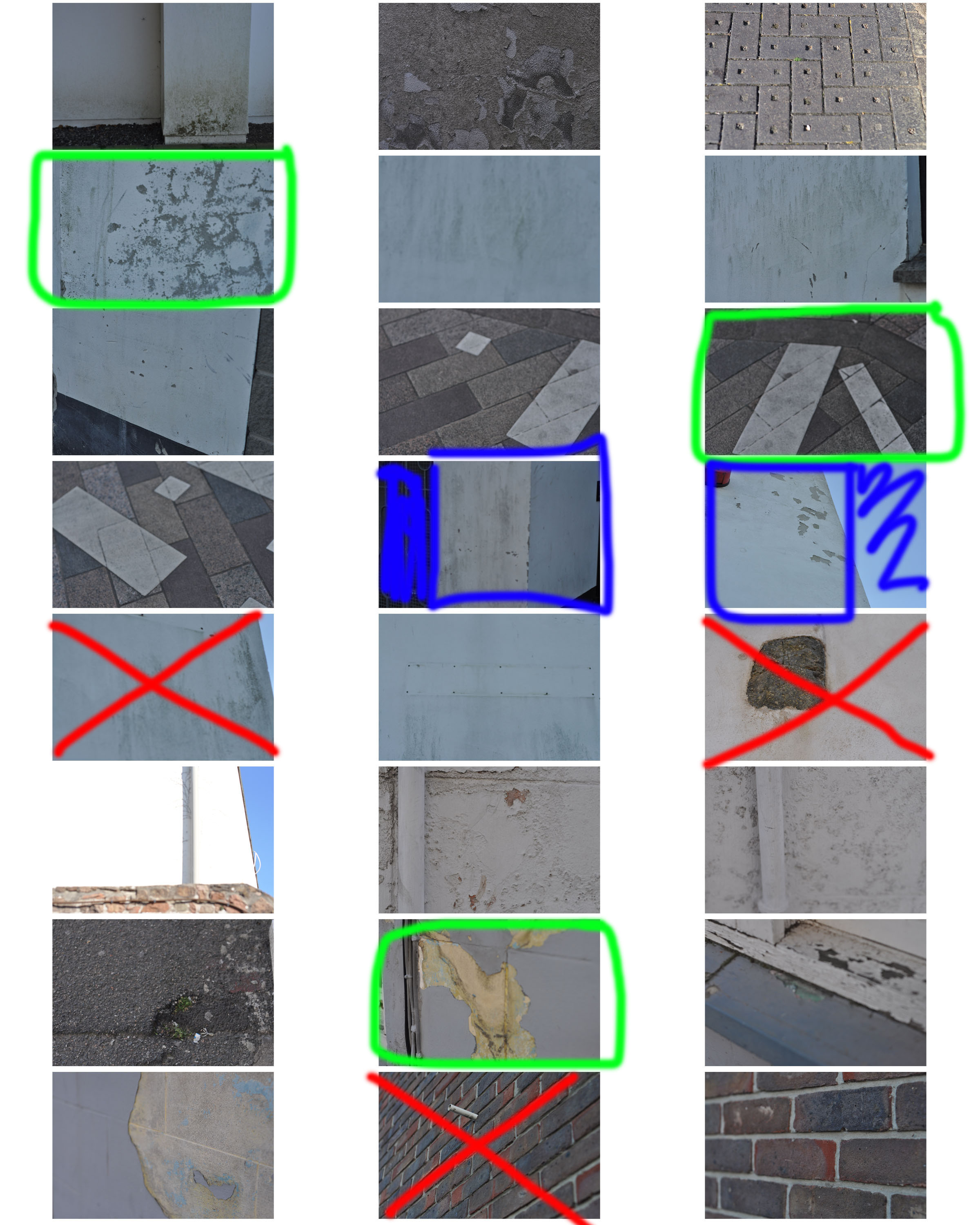
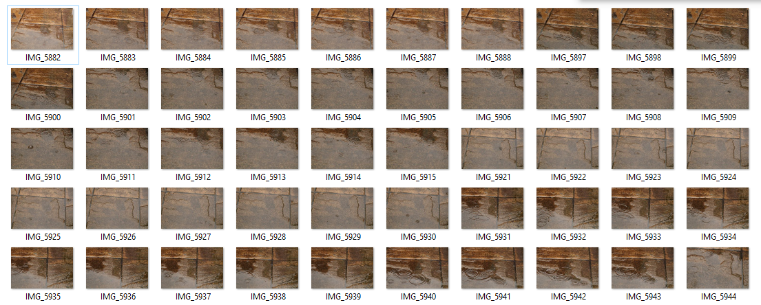
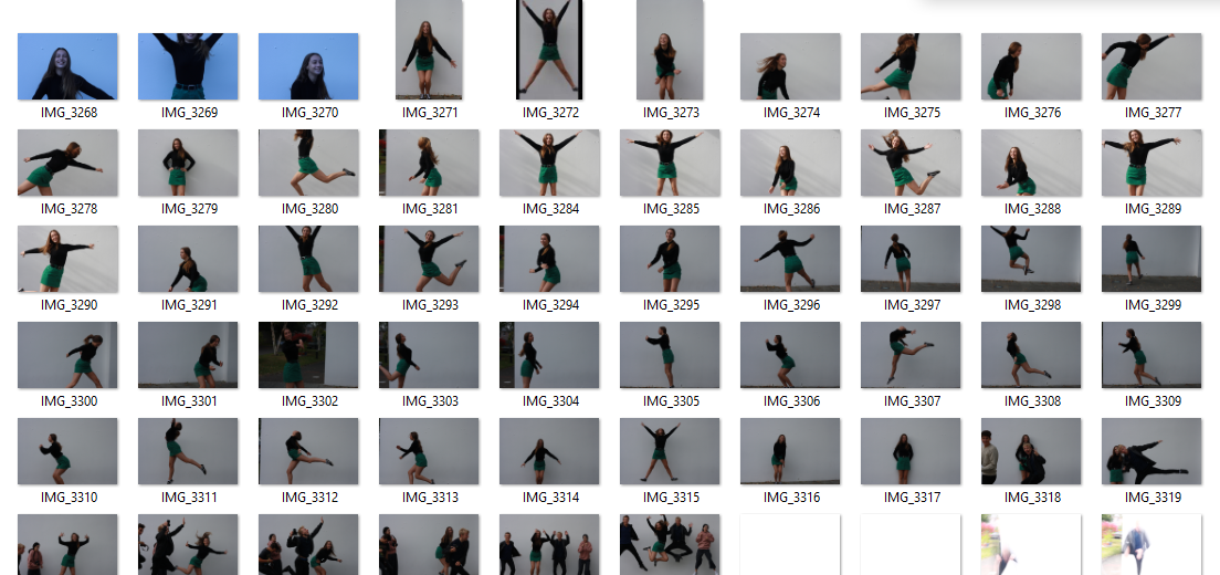
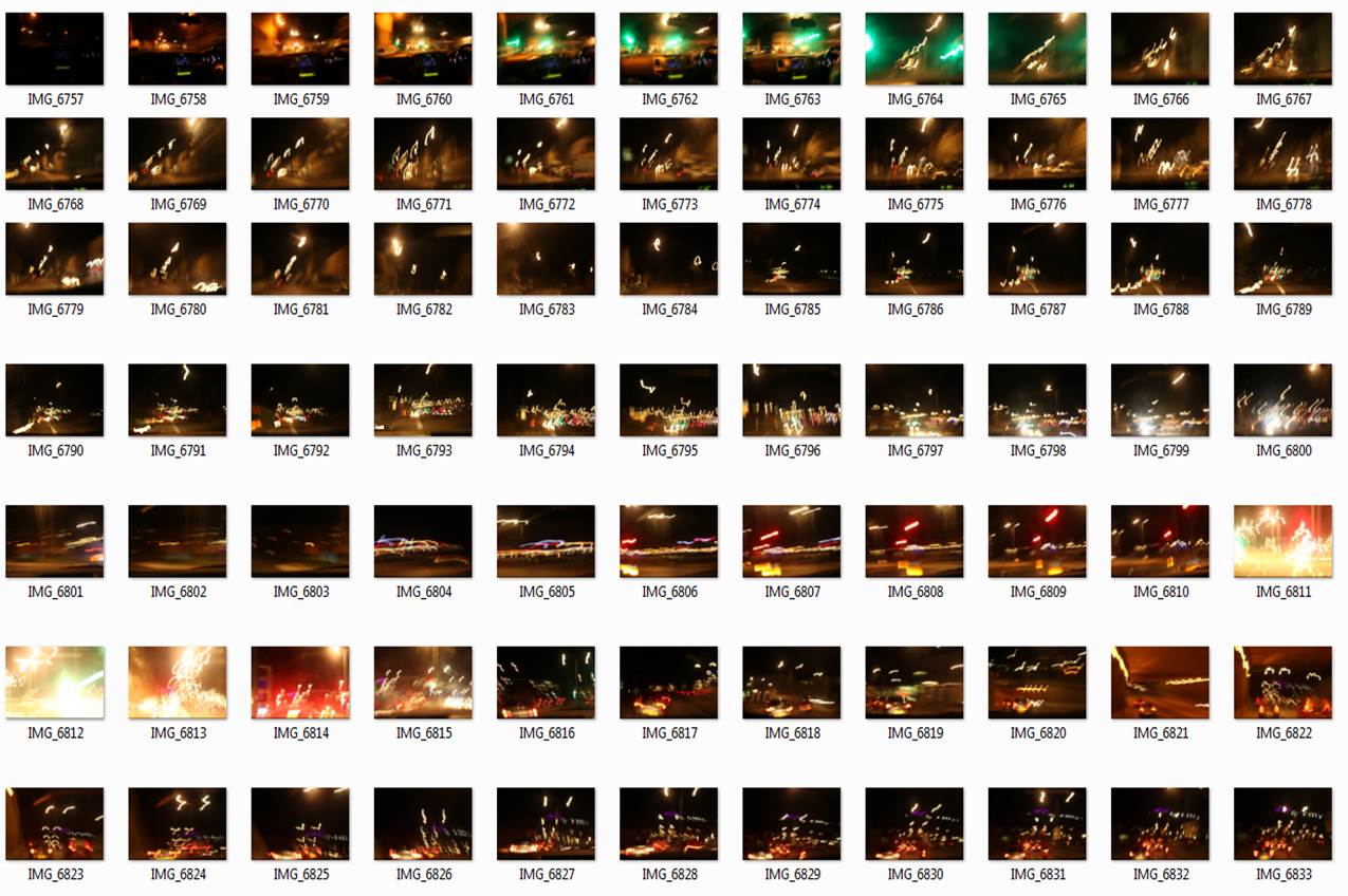
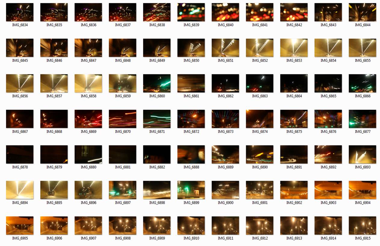
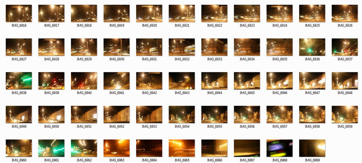
Contact Sheet
Contact Sheet

Analysis of my Best Outcomes

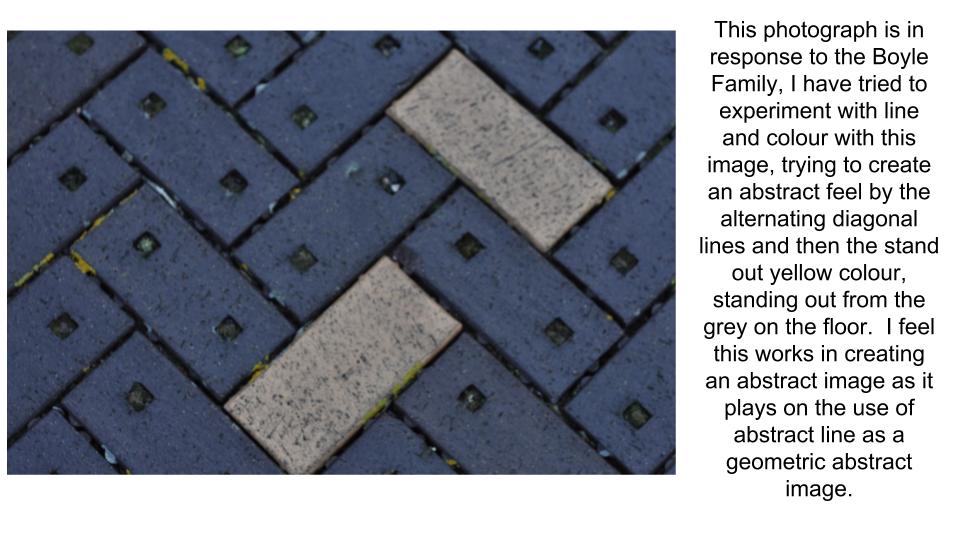
Own Response | Analysis

Week 7 | Completing the Abstract Unit | Assessment Week

Monday 15th October

By now you should have submitted your FINAL IMAGES for printing.

They will be ready to frame, mount, and display by the end of the week. We will show you how to make your final selection and display your work.

Now that you have made your decisions, you are in a good position to…

  • describe your process
  • explain your process
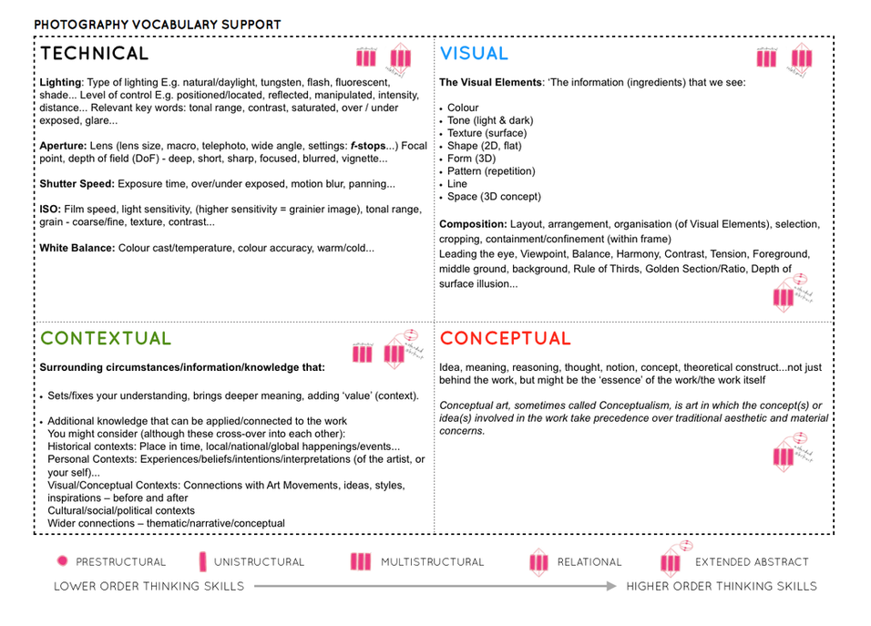
  • analyse key images (TECHNICAL – VISUAL -CONCEPTUAL-CONTEXTUAL)
  • expand your ideas and show your understanding and creativity

We always get asked how many blog posts are required (as a minimum) to complete the unit…so here goes :

  1. Moodboard (AO1) x 1 blog post
  2. Mindmap of ideas (AO1) x blog post
  3. Artist Reference / Case Study with IMAGE ANALYSIS (AO1) x 1 blog post
  4. Action Plan (AO3) x 1 blog post
  5. Photo-shoots + contact sheets (AO3) x 1 blog post
  6. Image Selection (AO2) x 1 blog post
  7. Image Editing/ manipulation (AO2) x 1 blog post
  8. Presentation of final outcomes (AO4) x 1 blog post
  9. Compare and contrast to your artist reference (AO1) x 1 blog post
  10. Evaluate and Critique your final outcomes (AO1+AO4) x 1 blog post

Have a close look at the marking criteria below…and compare to your work / blog posts.


PERFORMANCE CALCULATOR


Cross – Referencing your ideas with contemporary / influential photographers

Compare and Contrast : Edgar Martins

Image result for edgar martins photographer destinerrance

Image result for edgar martins photographer destinerrance

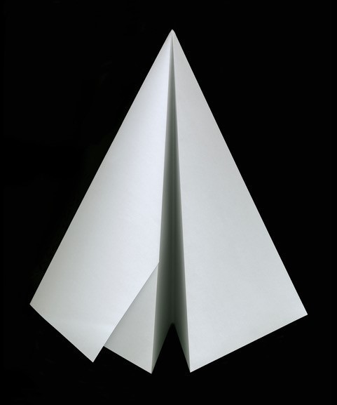
The images above are by a Portuguese photographer, Edgar Martins.

They are part of a series of work inspired by the writing and sending of letters, the power and intimacy of a letter. Martins has recently won various awards for his minimal, direct and stylish approach.

For this mini-series he photographed paper, carefully lit and isolated from any other context. There is a stillness to them that belies the fact they may have been written as suicide notes, contact between prison inmates and loved ones and more. Martins spent time working with court, prison and parole officials and indeed, prisoners in Portugal exploring this theme, that often ended in death for many of his subjects.Now refer back to your experiments with paper, and add your own research and analysis of Edgar Martins’ work.

TASK 1

  • Compare and contrast Edgar Martins work to your own images
  • Ensure you have discussed TECHNICAL and VISUAL aspects of the images
  • Think about the CONCEPT of the work and annotate your own accordingly
  • Can you add some CONTEXT to your work?

TASK 2

Compare and contrast : Lewis Bush “Metropole”

Image result for lewis bush photography

Image result for lewis bush metropole

Lewis Bush

employs a range of editing techniques to his images of London City, it’s constantly changing built environment and the industries held within it.

Have a closer look at his work and compare the way he blurs, overlaps and distorts our vision of the city to techniques that you may have employed to your images.

Why do you think he does this?

Describe and explain how your ideas have evolved.


Remember to use this model when discussing and analysing photographs :

TECHNICAL -VISUAL-CONCEPTUAL-CONTEXTUAL

Picture

ALWAYS choose 1 x key image of your own to discuss in detail

ALWAYS choose 1 x key image of an influential photographer to discuss in detail

HOMEWORK METHOD

Follow the 10 Step Process for each unit to ensure you tackle all Assessment Objectives thoroughly :

  1. Moodboard (AO1)
  2. Mindmap of ideas (AO1)
  3. Artist Reference / Case Study (AO1)
  4. Action Plan (AO3)
  5. Photoshoots + contact sheets (AO3)
  6. Image Selection (AO2)
  7. Image Editing/ manipulation (AO2)
  8. Presentation of final outcomes (AO4)
  9. Compare and contrast (AO1)
  10. Evaluate and Critique (AO1+AO4

Copy and use this plan to help you organise / evaluate your photo-assignments…

Double Exposures

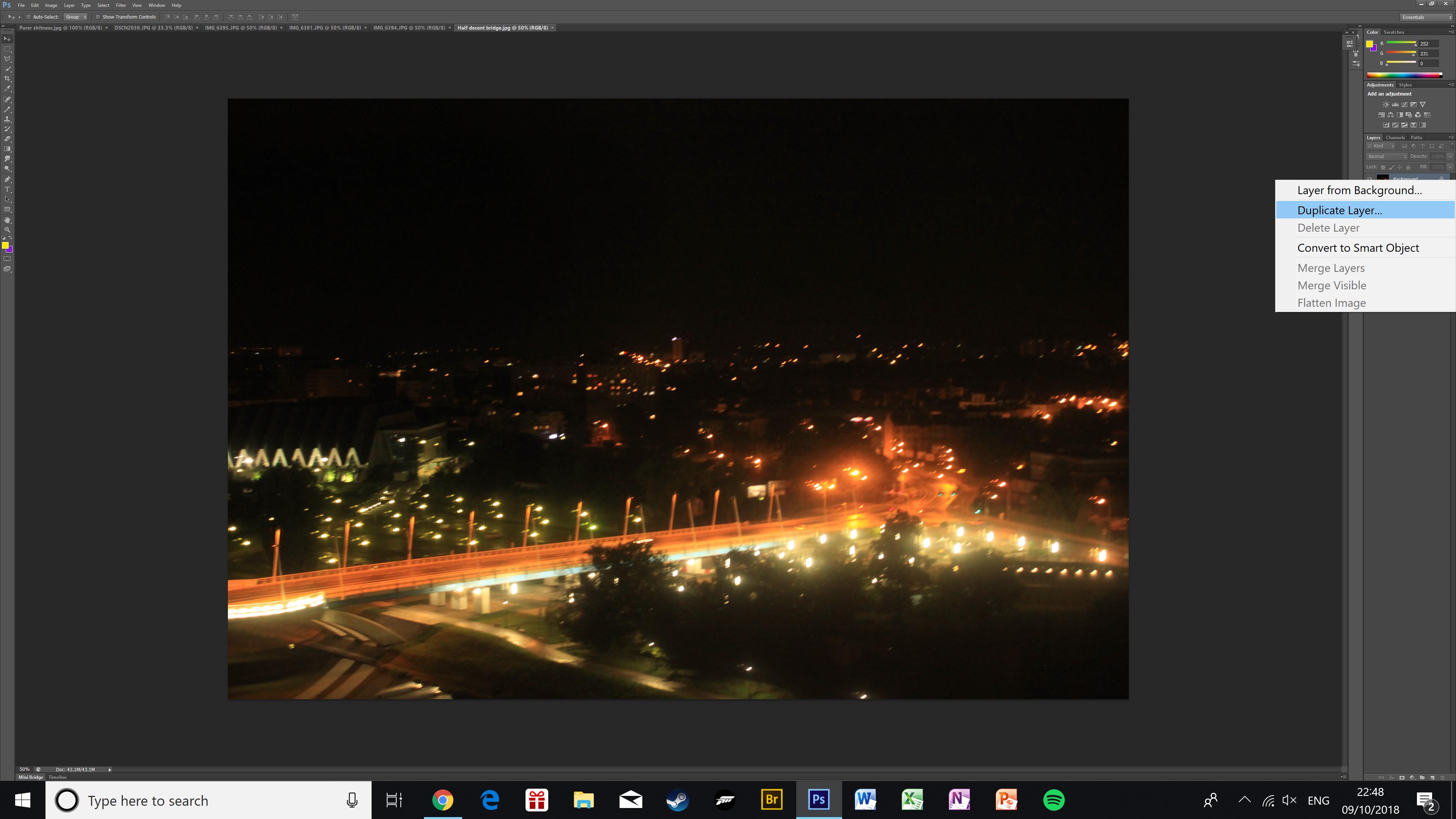
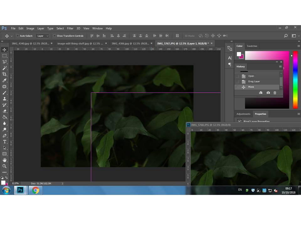
To create a double exposure I used two similar photos of the same bridge. First, I duplicated the layer I wanted to go on top and placed it on top of my base image.
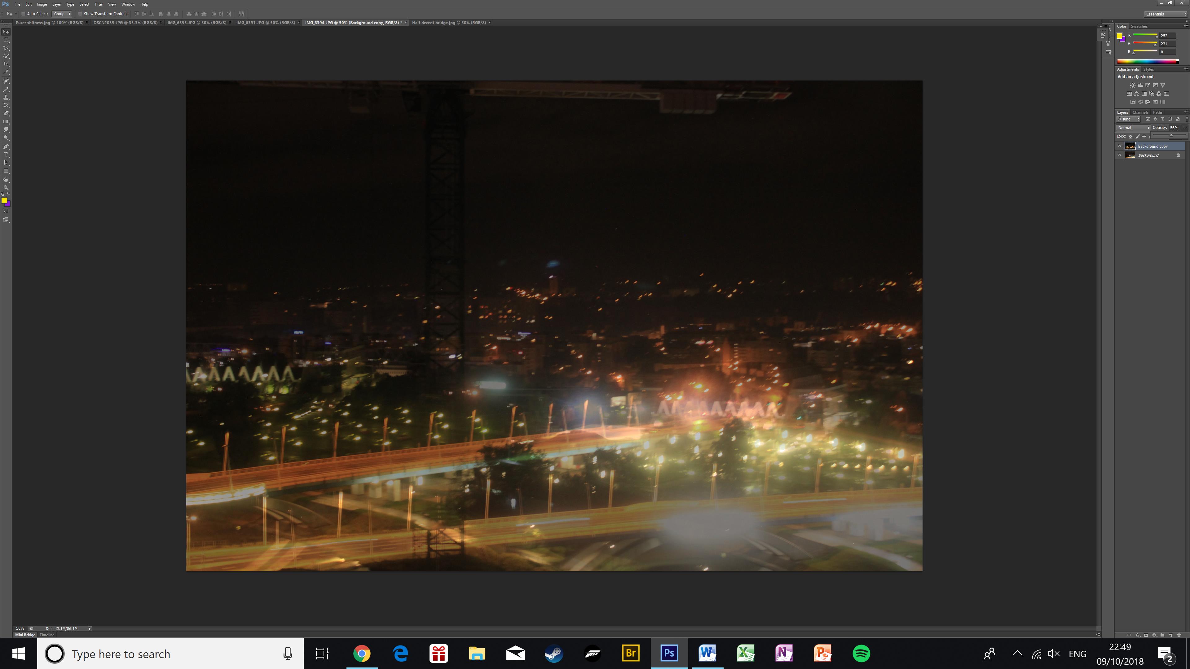
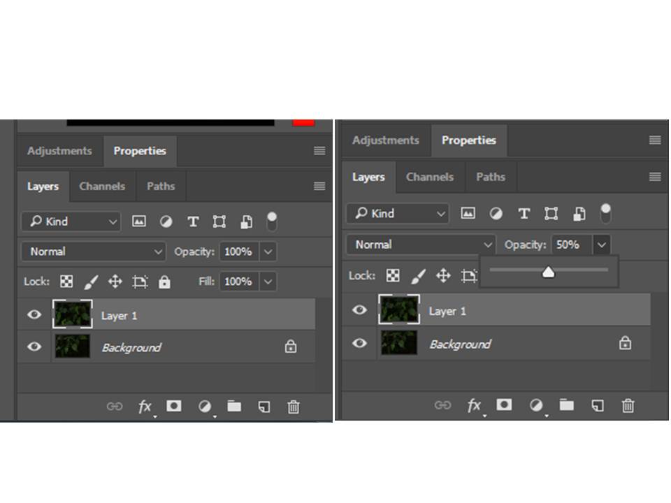
Then I made the top image more transparent using the opacity slider. In this image, it creates an effect of there being two layers of bridges across the bridge, as well as raising the skyline in the background.
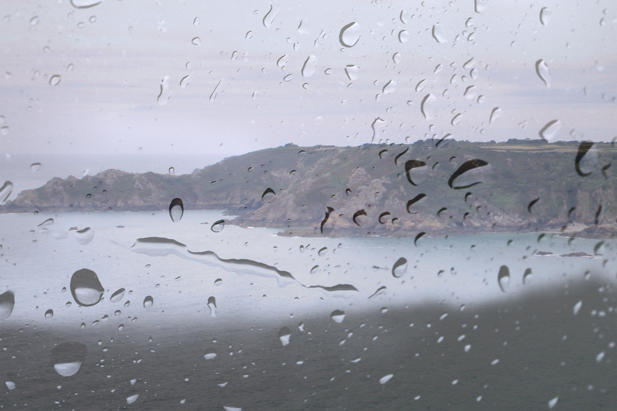
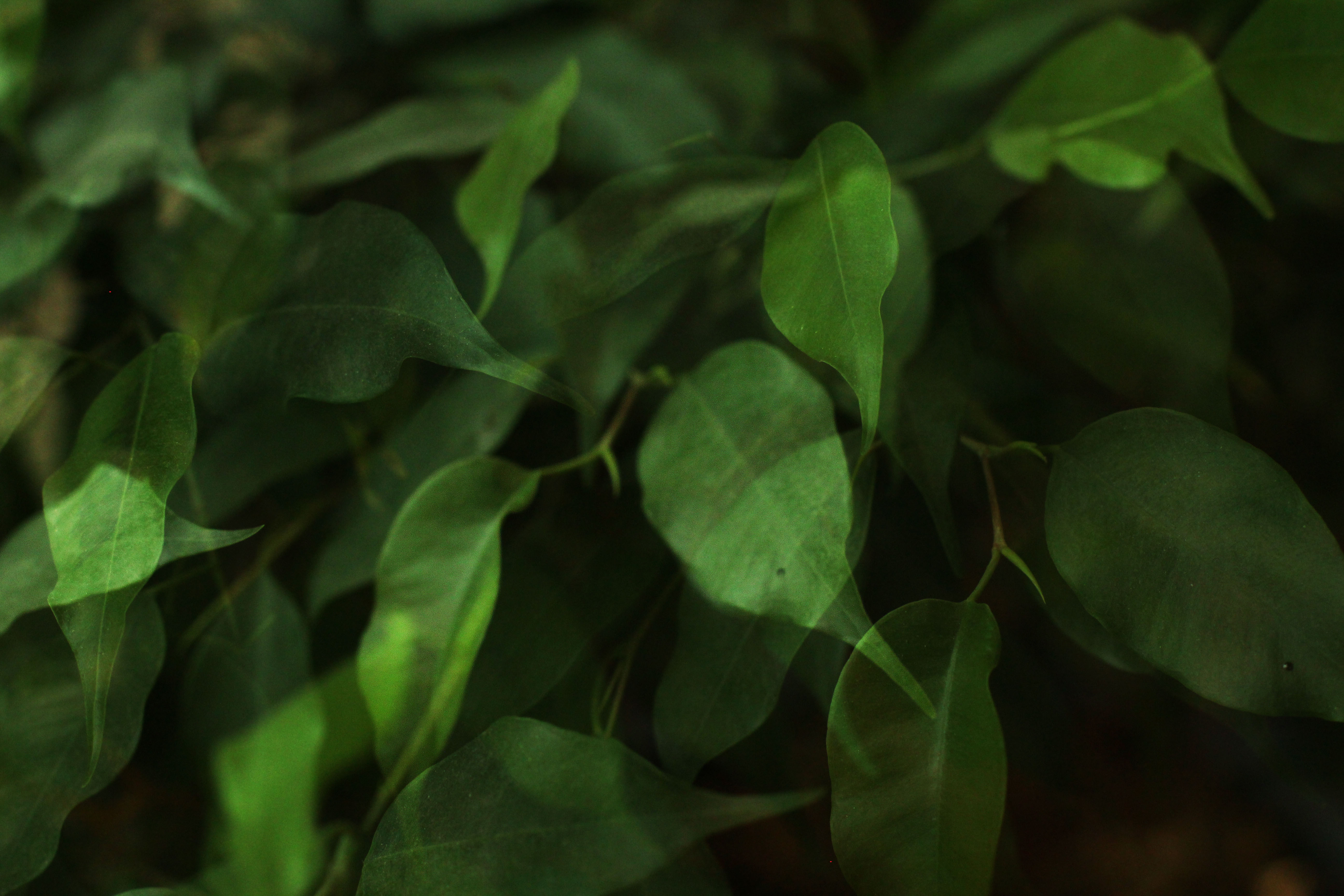
The next two pictures are finished double exposures.

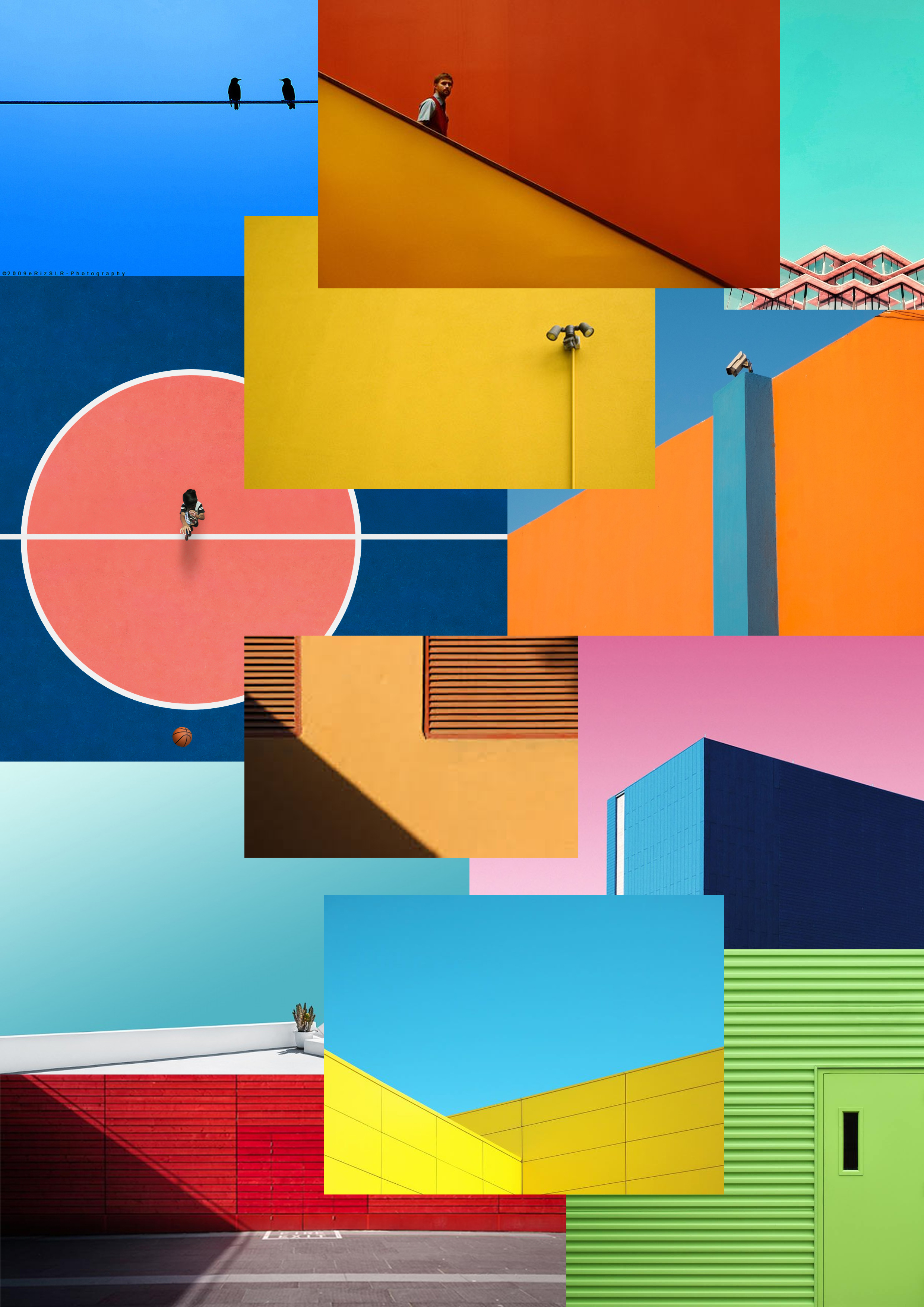
Minimalist Mood board

MY INSPIRATION:

This is a mood board of a set of minimalist images which i am including into my research to get me started with my homework task and give me inspiration for my photo shoot. I particularly enjoy this homework task as minimalism often involves a lot of color and simplicity of shapes and forms.

Colour&Texture

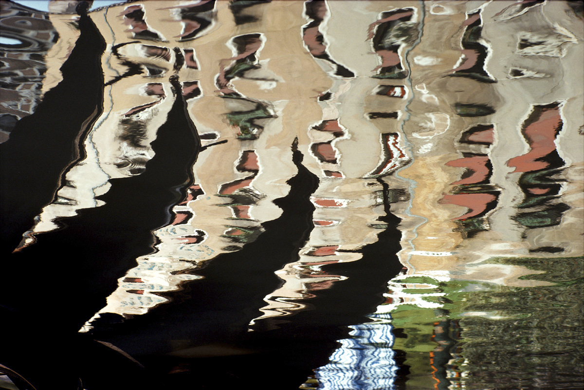
Ernst Haas-Water

Haas  was an Austrian-American photojournalist and colour photographer. He incorporated his photojournalism and photography as a medium of expression and creativity.His father was photographer and encouraged Ernst, but it was only by his fathers death in which he became intrigued by photography when seeing his fathers darkroom. Haas used black and white  film for much of his career, color film and visual experimentalism became integral to his photography. He would make his own photographs, translating his passion for poetry, music, painting, and adventure into colour imagery. Once he began working in color, he most often used kodachrome, known for its rich, saturated colors. To print his color work, Haas used the dye transfer process whenever possible. An expensive, complex process most frequently used at the time for advertising, dye transfer allowed for great control over color hue and saturation. As the technology of color photography evolved and improved during this period, audience interest in color imagery increased. Many of the magazines that published Haas’ work, such as Life, improved the quality of their color reproduction, and increasingly sought to include his work in the medium. Despite this progress, many photographers, curators, and historians were initially reluctant to consider color photography as art, given the technology’s commercial origins. His images don’t have a focal point, the picture as a whole speaks, not just one area of the photo. He uses natural lighting to create the clear reflection, he has relatively low level of control due to the fact he can’t position the whereabouts of the sun, so his pictures may have been planned. His photos have contrasting tones, some areas are warm some are cold, his work clearly empathizes the beauty in colour.  When I think of colour in photography I picture a vibrant, detailed flower, but Haas, creates colour from objects such as transparent water.
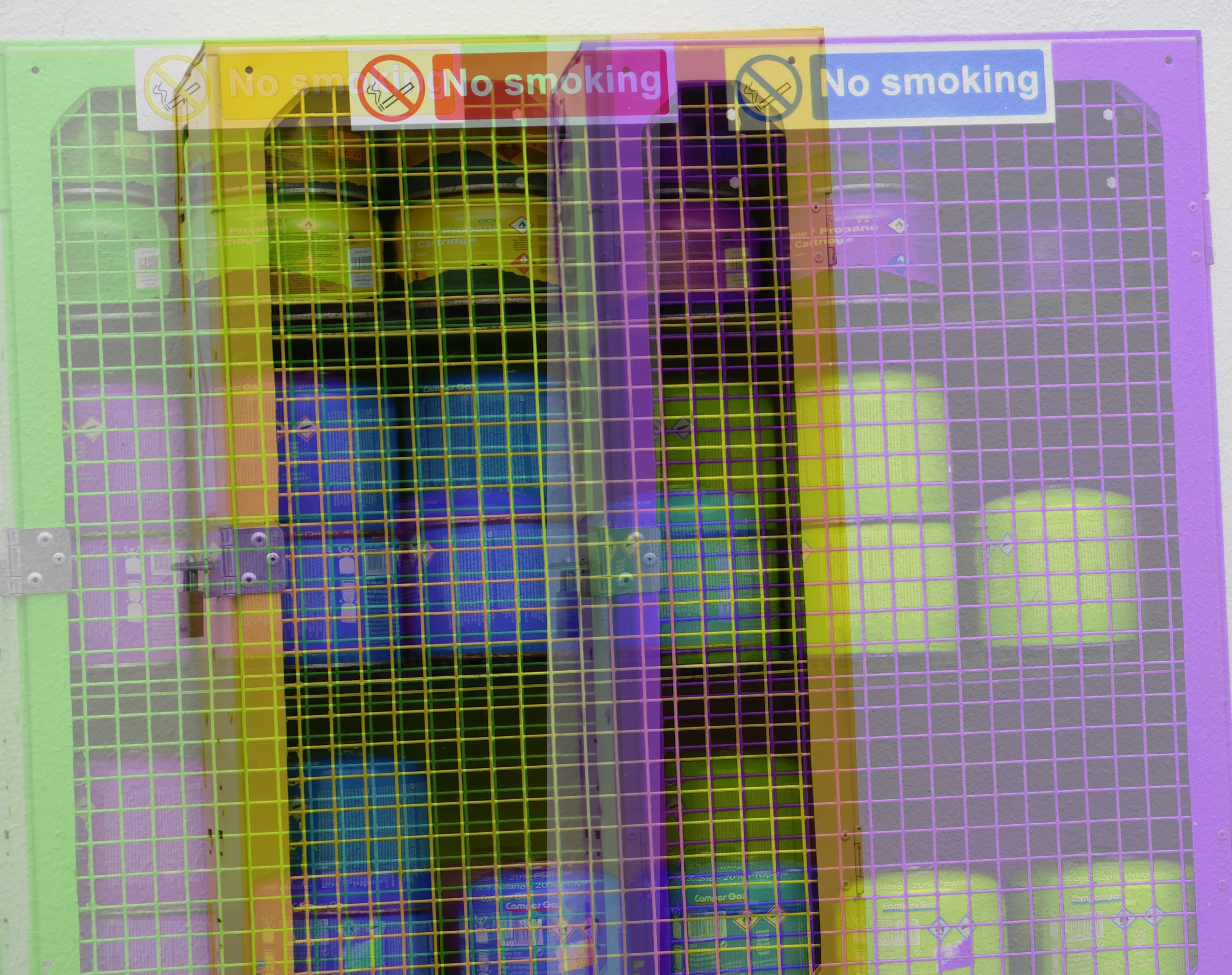
Image result for Ernst Haas water

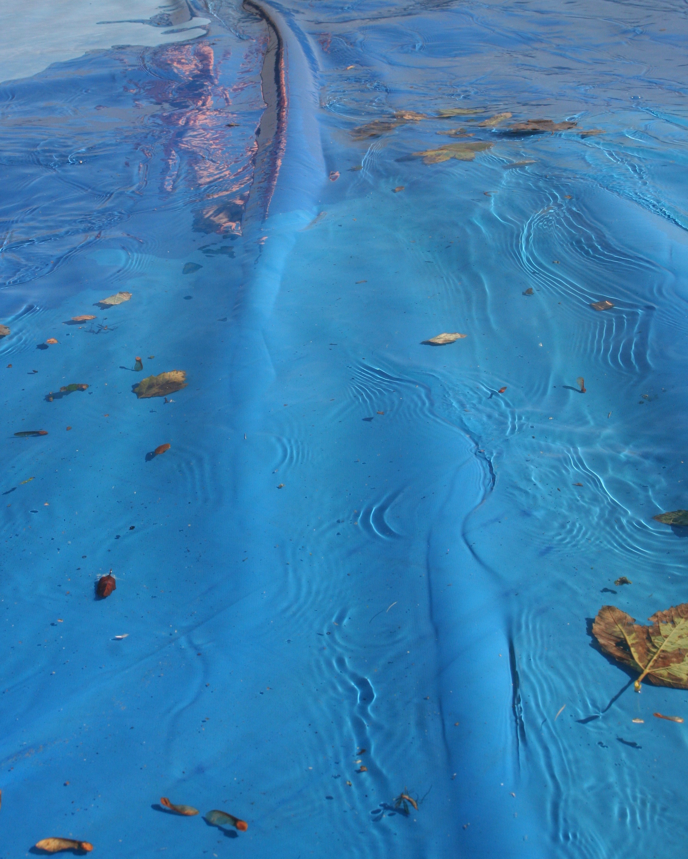
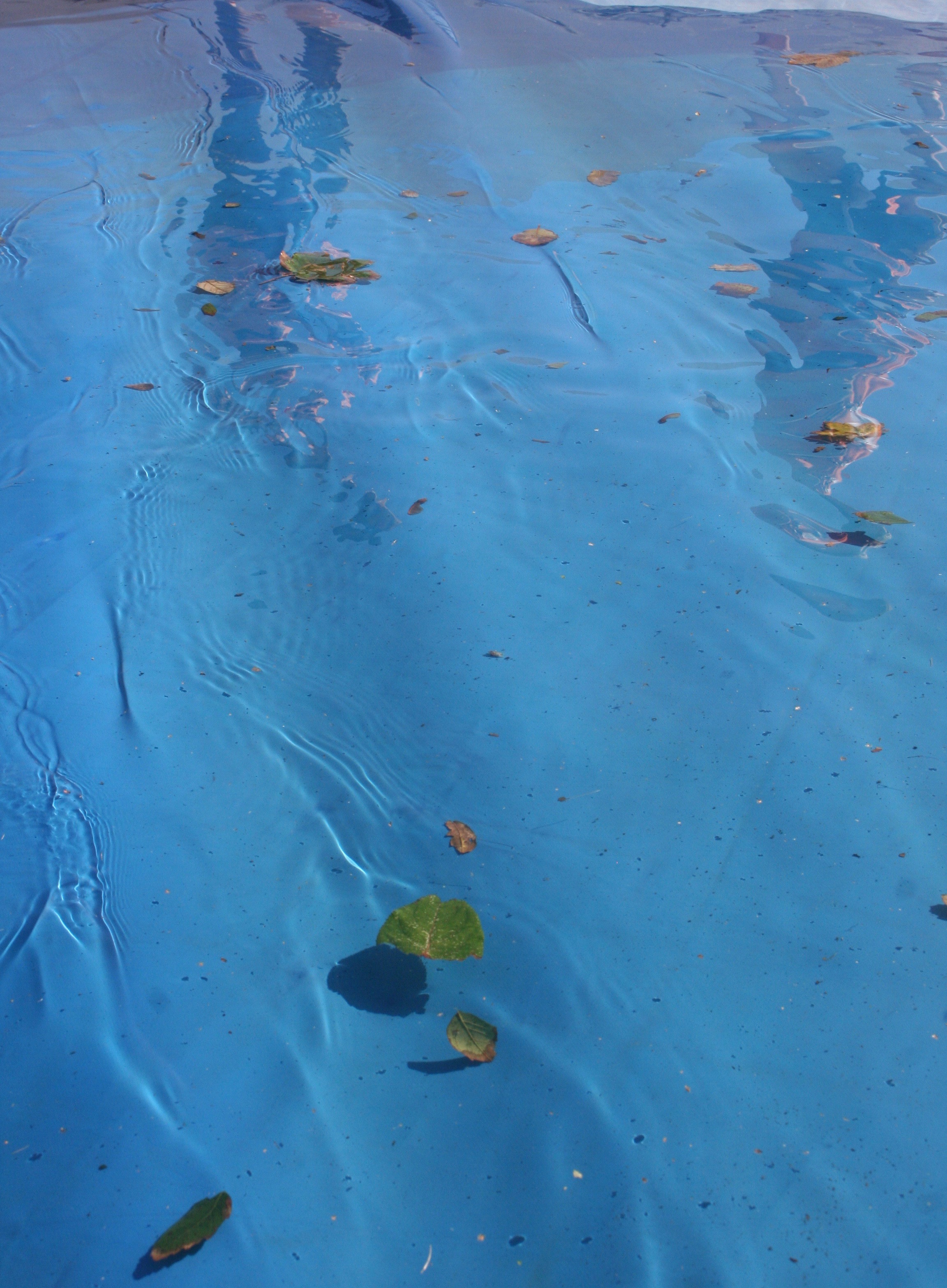
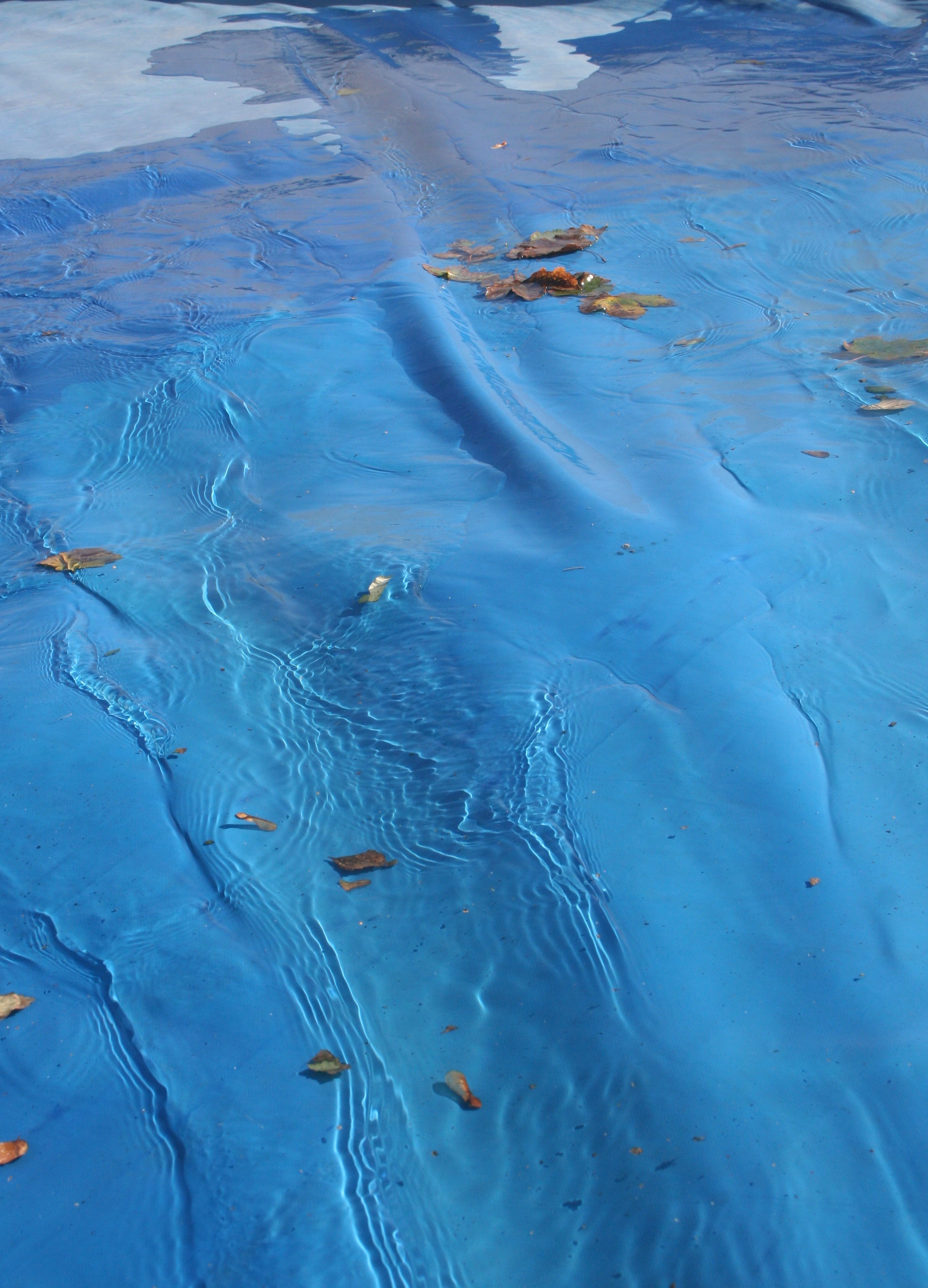
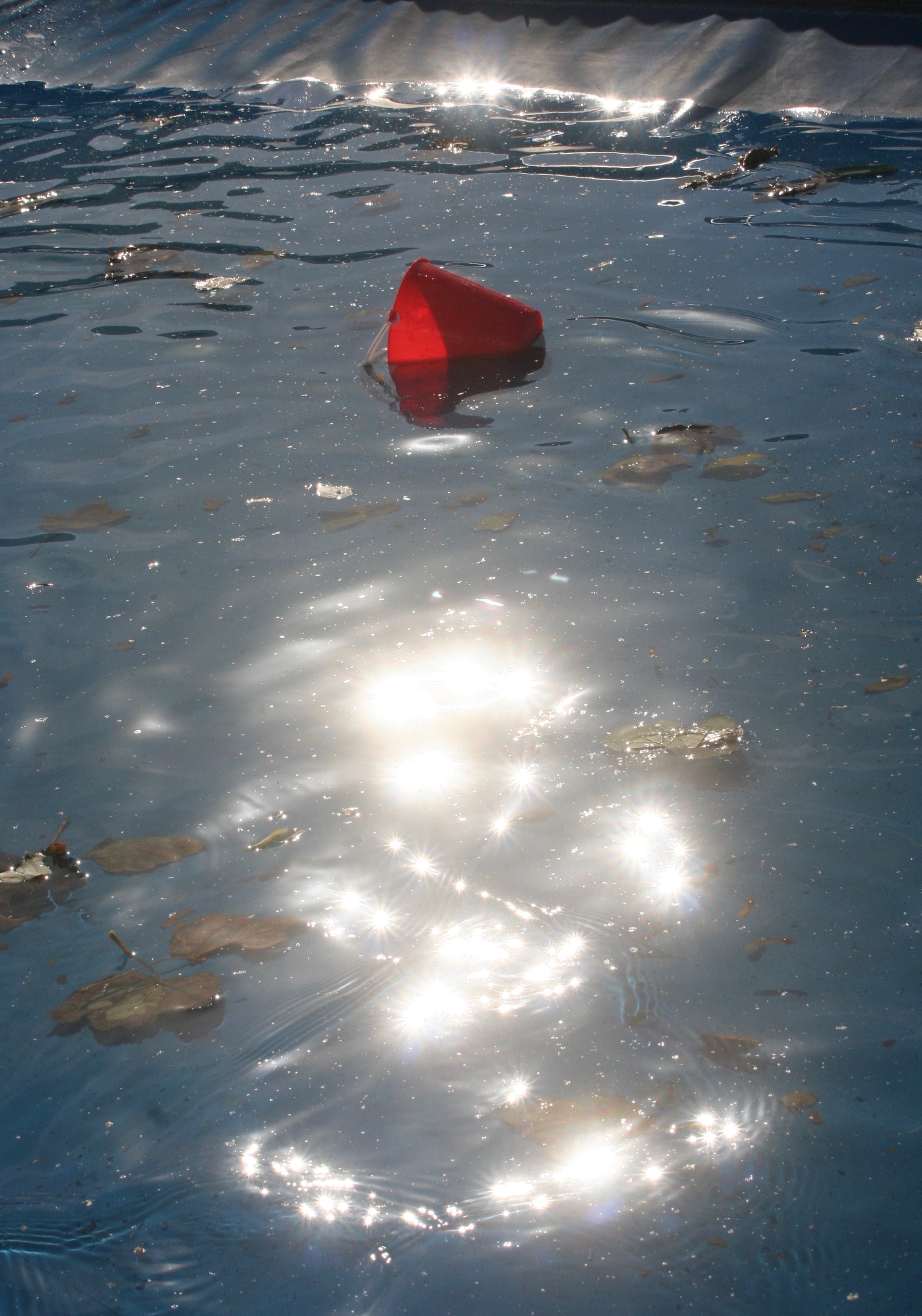
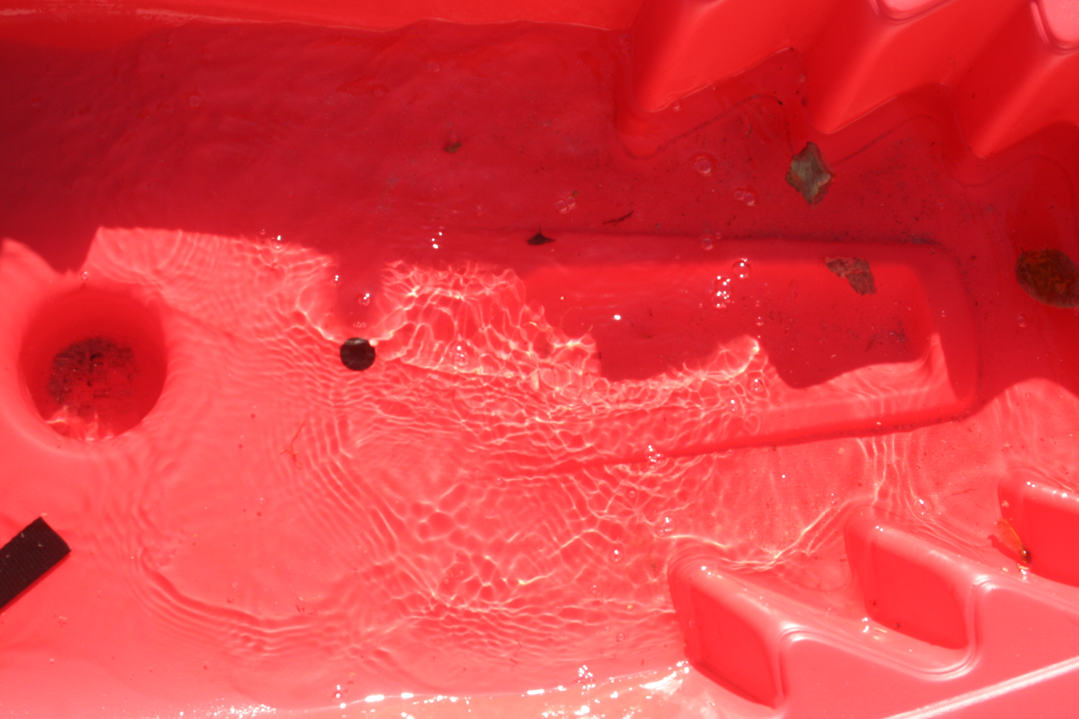
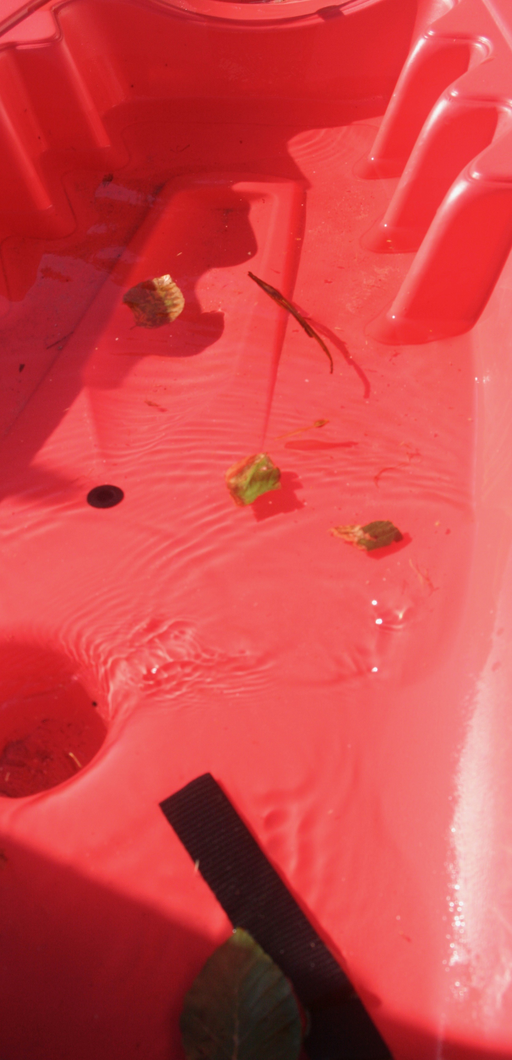
I decided to use Ernst’s water photos as inspiration for my final shoot. I used the puddles of water on a swimming pool cover and on a kayak as a focal point for my reflections and ripples. My texture came from the leaves and water, my colour from the blue and red. In my first and second photos I was influenced by Ernst’s water reflection photos, I got my brothers to stand in the same direction in which the sun was shining in order to achieve the distorted reflections. Natural lighting was the easiest way for me to achieve the reflection, I found I had relatively low levels of control as the positioning of the sun determined the angles at which I could take the photos. I also found it hard to take pictures without them being  over-exposed due to the high intensity of the sun, the ripples however were easy to create and added a sense of structure and pattern. I had to crop all of my final outcomes in order to get rid unwanted negative space which interfered with the overall colour combination.

Final Outcomes:

ISO 400-39mm-f/14-1/320
ISO 400-39mm-f/13-1/320
ISO 200-39mm-f/20-1/500
ISO 400-28mm-f/13-1/250
ISO 400-23mm-f/11-1/320

Double Exposure

Double Exposure involves the overlay of an image over the top of an existing one, while being able to see both the overlay and original.

In order to achieve this you can use two techniques:

Camera:

Most cameras come with a double exposure mode, allowing for two or more photos to be taken over the top of each other within the camera itself.

Photoshop:

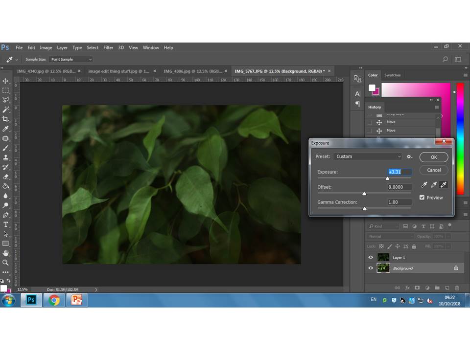
By duplicating or adding in another layer over the top of the existing image and altering the opacity then moving the image to create the effects demonstrated below.

For this experiment, I decided to alter the hue of separate layers in some instances to give off a trippy effect


Photoshop – Mirror

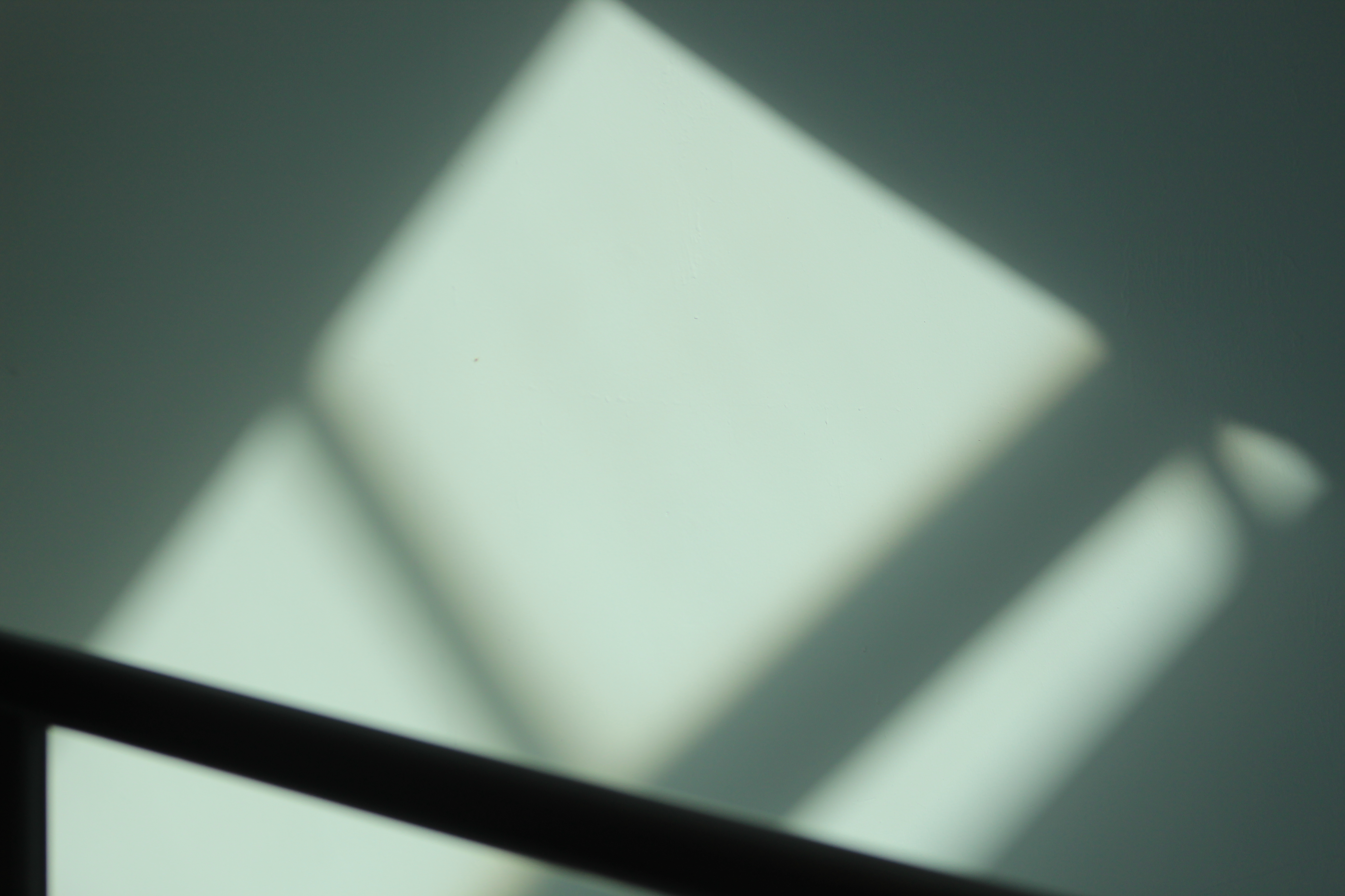
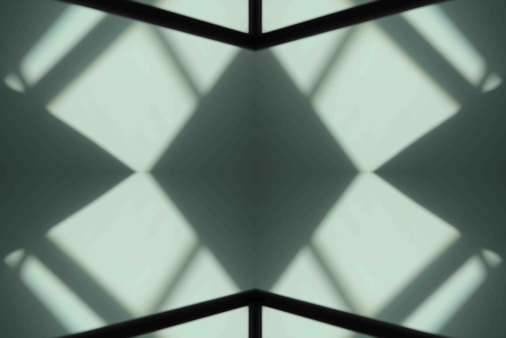
I’ve chosen this image for my mirror effect piece because it includes multiple lines which I can use to create an interesting abstract piece.

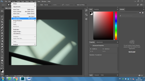
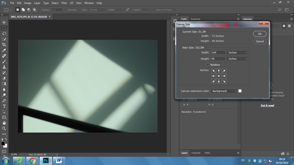
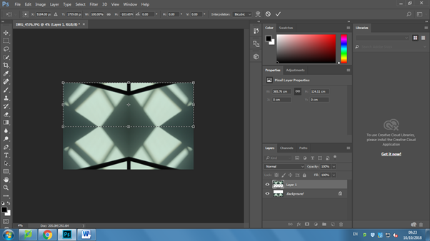
To start, I went and doubled the canvas size to make space for the mirror image. I went to image, and then to canvas size. I then went and changed it from centimeters to inches, and then doubled the size of one of the lengths.

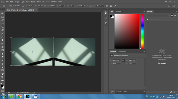
I then went and pressed control + j, which copies the image and pastes it as another layer. I then used the select tool to select the top layer, and then pressed control + t, which selects the image and allows you to adjust the size and orientation. I picked the point on the far side to the right, and pulled it across to the left, creating the mirror image.

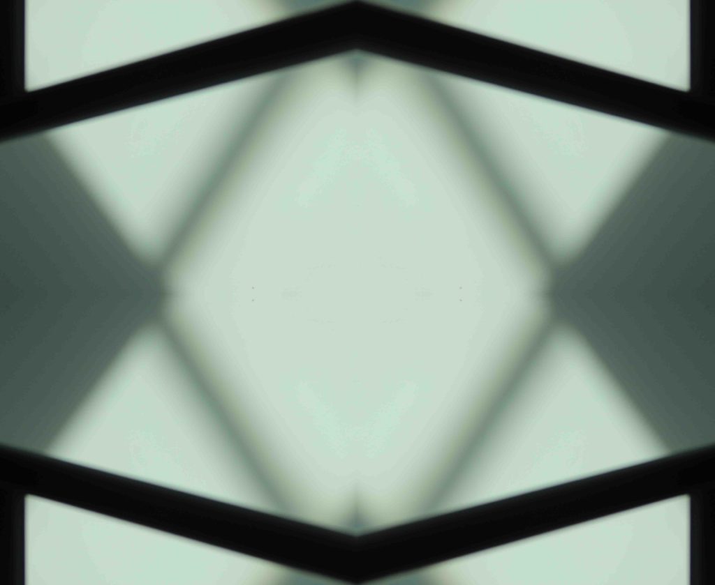
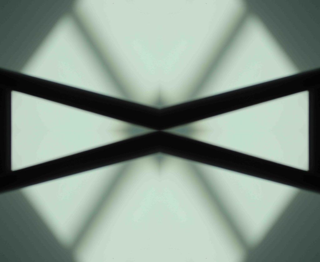
I could have stopped there, but I decided to develop it further and mirror the image the other way. I repeated the process but did it so it was being flipped upwards instead, and this is one of my finished results.


Experimenting with shutter speed

Shutter speed is the amount of time a sensor in a camera is exposed to light.

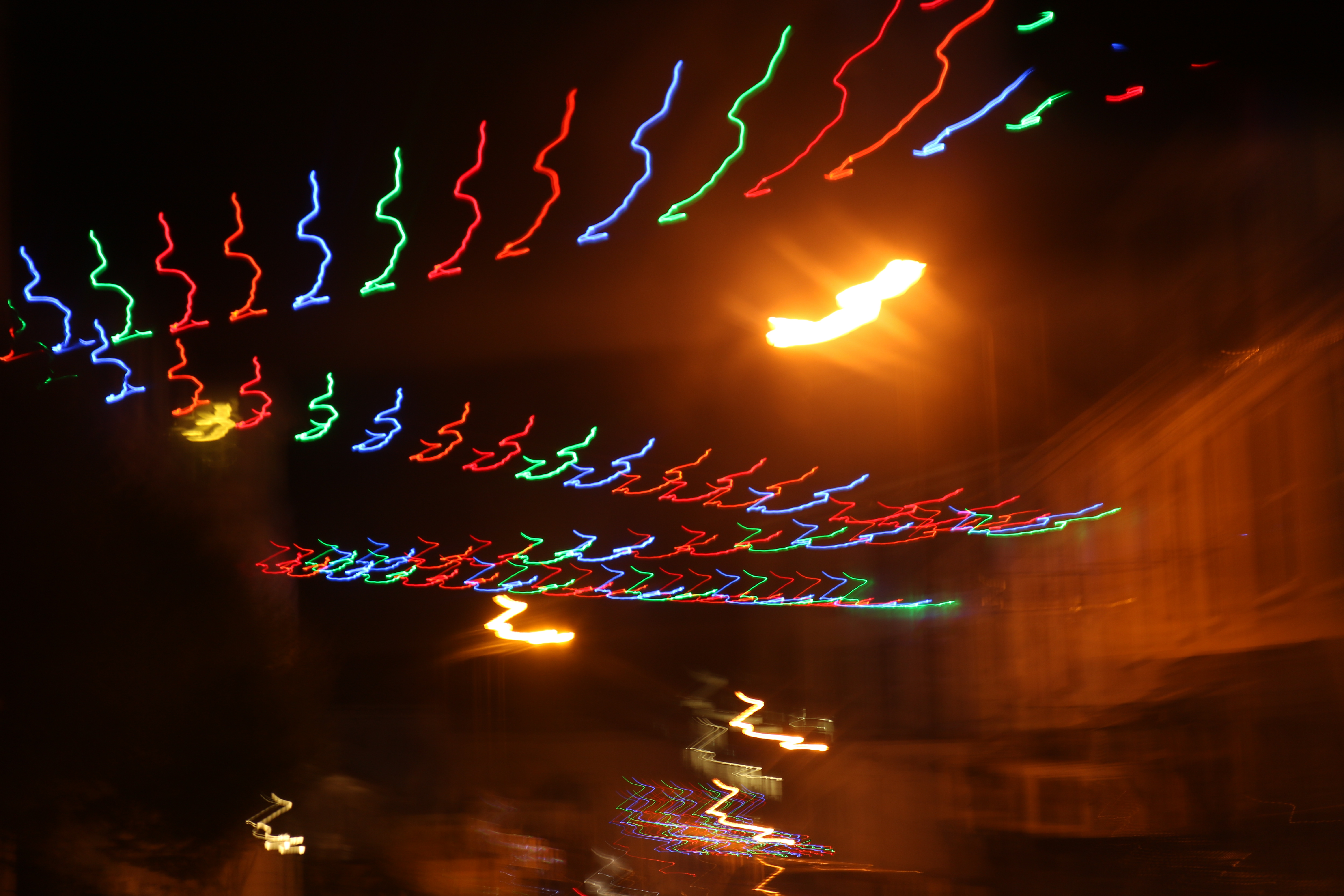
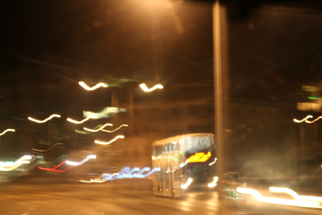
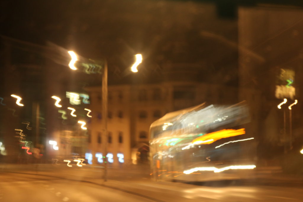
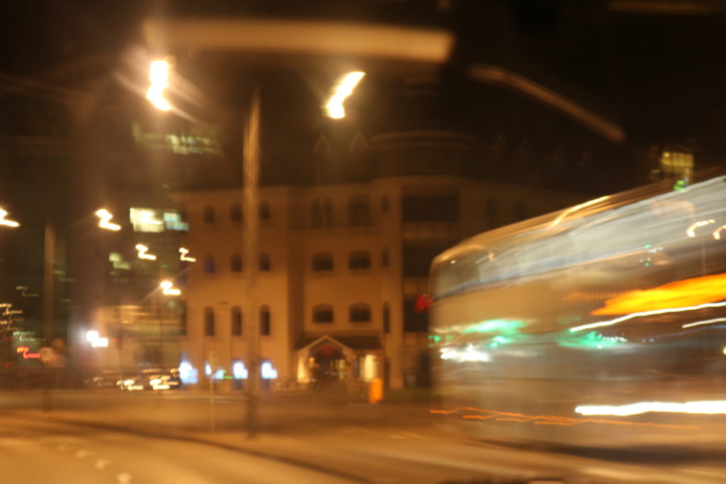
If the shutter speed is very slow, then the image will have a high exposure which means it will most likely be bright. This is an ideal setting to use if you are taking images in a badly lit place place as it will make the image less dark. This would not be ideal to use in a bright setting, as the image would most probably be more overexposed which means it would come out too white. A slow shutter speed is also idea if you want to purposely capture images where things are moving, to create a unique effect. This setting is used to capture light painting or a smooth water effect.

On the other hand, if the shutter speed is fast then the image would have a very low exposure this means it could cause the image to turn out underexposed, which would make the image come out darker than intended. This would be an appropriate setting to use in a properly lit scene as the sensor wouldn’t need to be exposed to light for as long in order for the image to come out with a regular exposure. Fast shutter speed is used to capture things that are moving very quickly, as the image will be taken a lot quicker

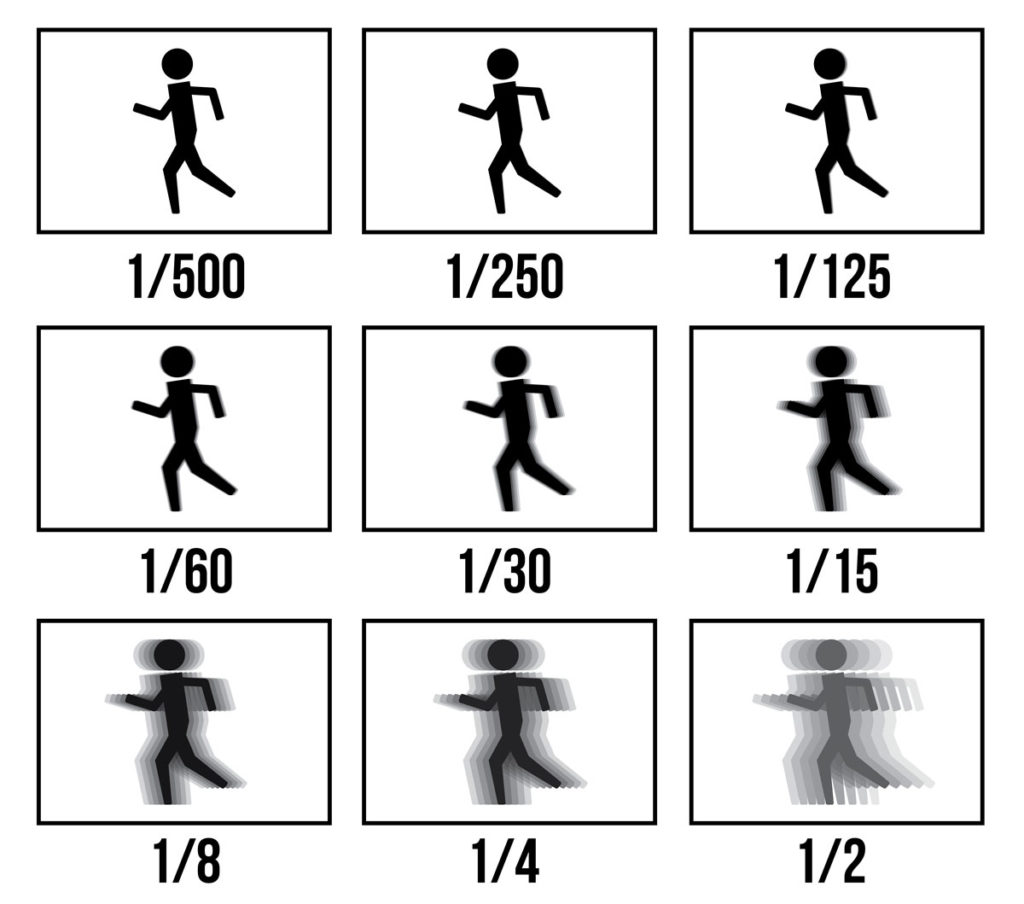
This diagram helps explain what shutter speeds are fast, and which ones are slow. 1/500 would be an example of a very quick shutter speed as the moving image is sharp and in focus, whereas 1/2 is a very slow shutter speed as the moving image is blurred.


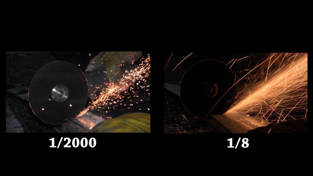
This diagram is also useful in highlighting the differences in fast and slow shutter speeds. The image on the left was taken using a fast shutter speed. That is why the sparks in the image look like they have been frozen, and why the image is not over nor underexposed. However the image on the right was taken with a very slow shutter speed, which is why the sparks look like they are continuous lines.


Experimenting with a Quick shutter speed

1st attempt


2nd attempt 


My most successful outcomes


Experimenting with slow shutter speed

My most successful outcomes