Category Archives: AO4 Present Ideas

Filters

Author:
Category:

Photo shoot 4 – Family Event

Planning:

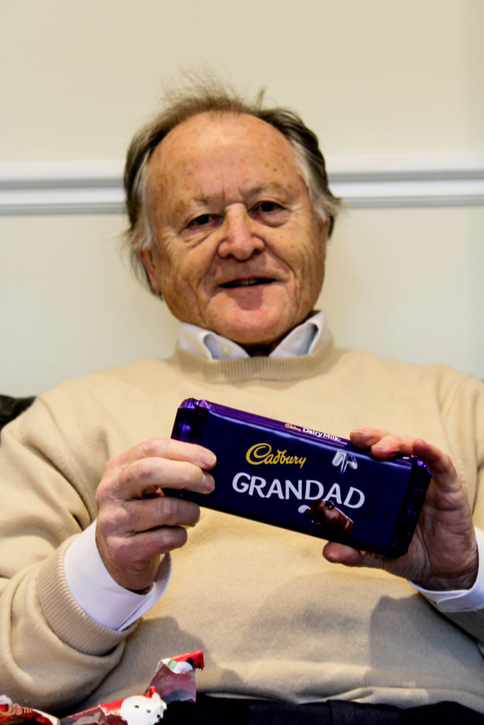
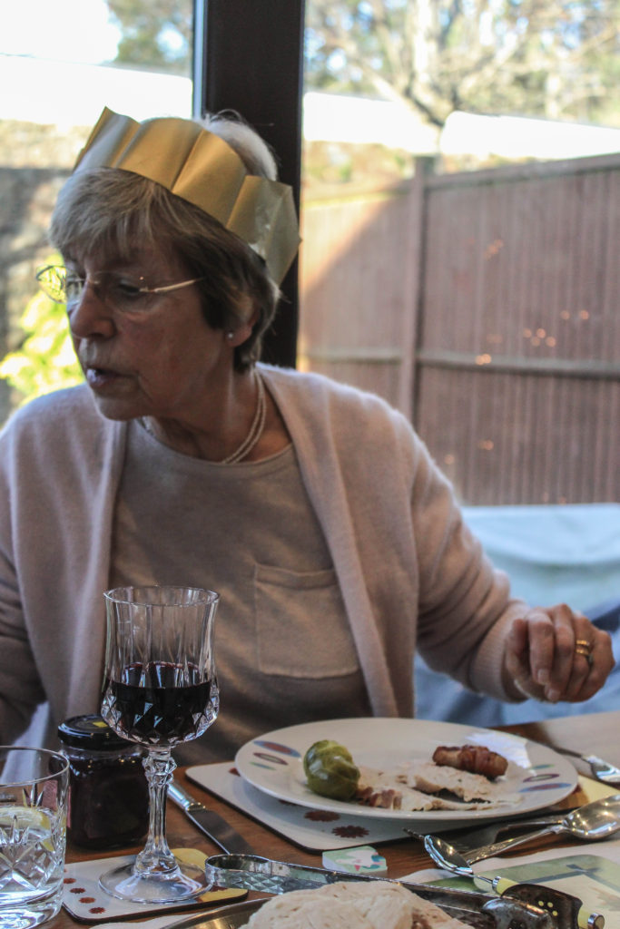
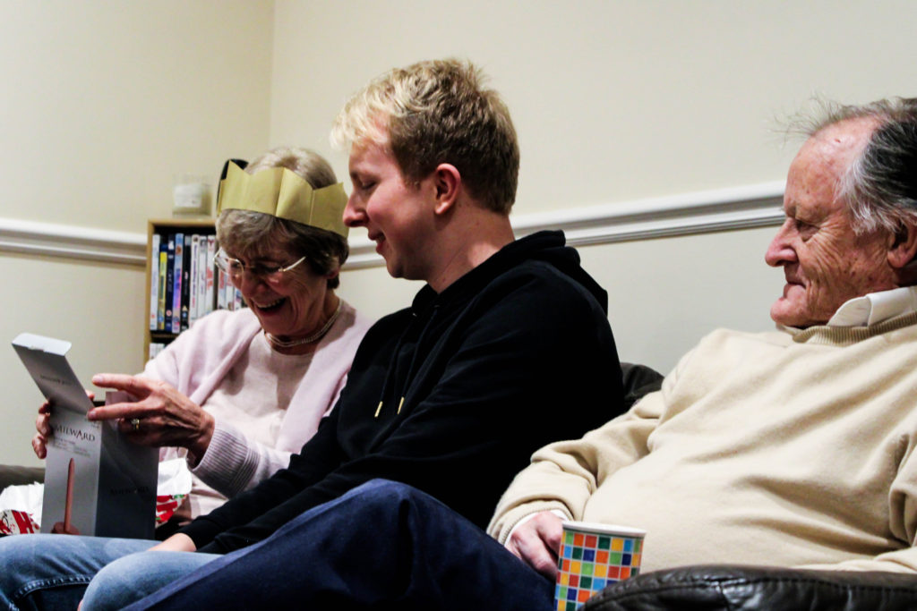
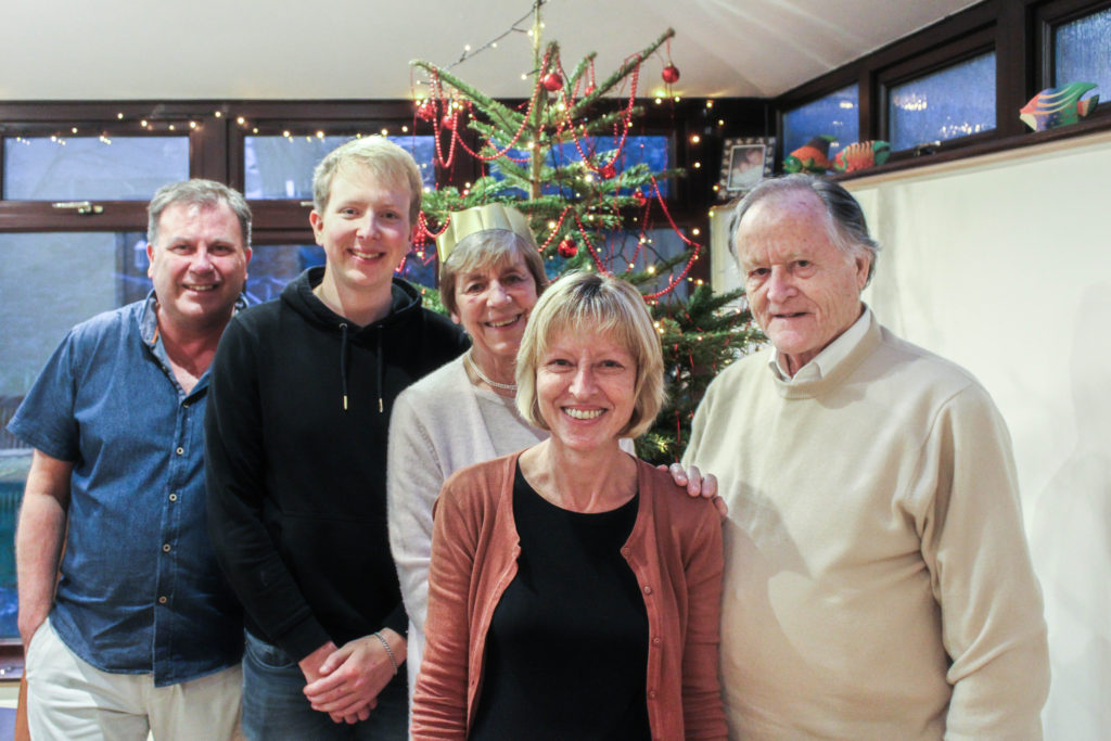
Christmas is a large event, which everyone in my family looks forward to every year. It is a tradition for my Grandparents to go to church in the morning and then come down to my house at around 12pm on Christmas Day to have a Christmas dinner with us, and exchange presents. The aim of this photoshoot is to showcase how my grandparents lifestyle influences the way in which we celebrate Christmas, due to this day being considered religious celebration. I also want to be able to capture the interaction between my grandparents and other family members, as well as showcasing our ‘traditional’ Christmas. When capturing the pictures I tended to take images of key events, and times within the day, and moments when my grandparents personality is clearly being showcased. The camera settings on my DSLR were kept minimal, allowing for a naturalistic documentary style image to be presented. My shutter speed was quick, with my ISO being low and my aperture also being low, reducing noise, blur and allows enough light into my imagery.

Structure of Christmas:

  • 12pm Grandparents arrive – drinks, snacks are presented as we begin celebration.
  • 12:30pm Present exchange – We provide a present exchange, gifting each other plants, car air fresheners etc.
  • 1pm Dinner – at 1pm we gather round the table, say grace, and open our Christmas crackers as the ford begins to arrive. We usually discuss topics such as work, school, future and how our life is in general.
  • 2:30 Dessert – We light the Christmas pudding, and my grandma provides us with her ‘Blue Peter Recipe’, a chocolate cake.
  • 3pm Queens Speech – We all gather around the TV as we watch the queen deliver her yearly speech.
  • 3:30 Christmas Tree Presents – Each year a member of the family will by a ‘joke’ gift for everyone else and will present these gifts later on in the day.
  • 4pm Leaving – My Grandparents leave with their presents, and left over food.

Edits:
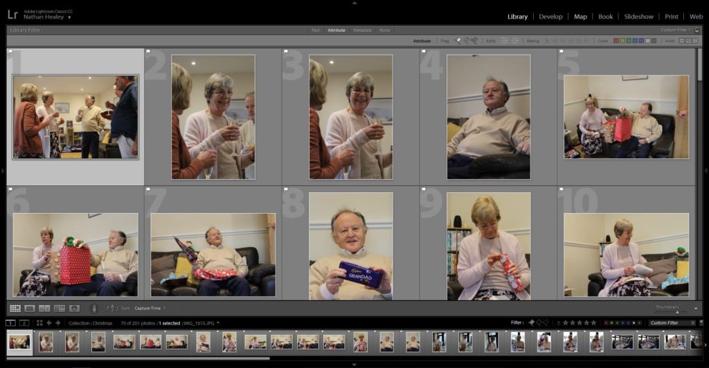
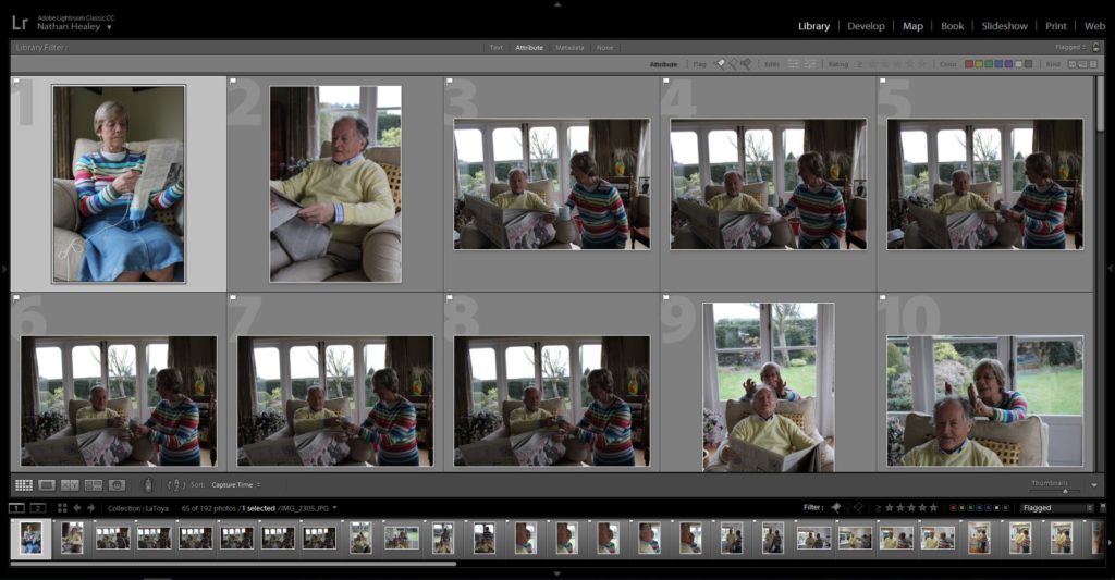
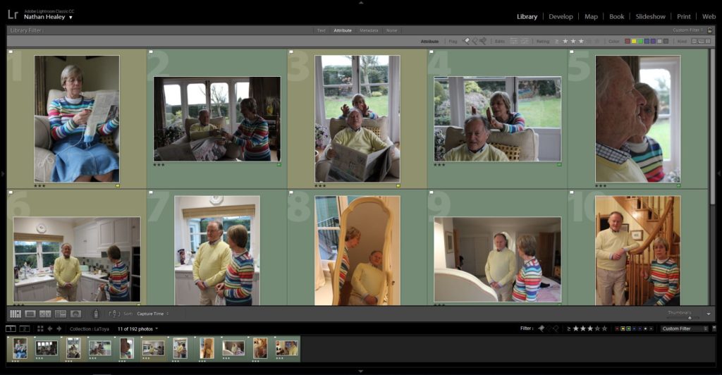
Edit 1 – Flagged
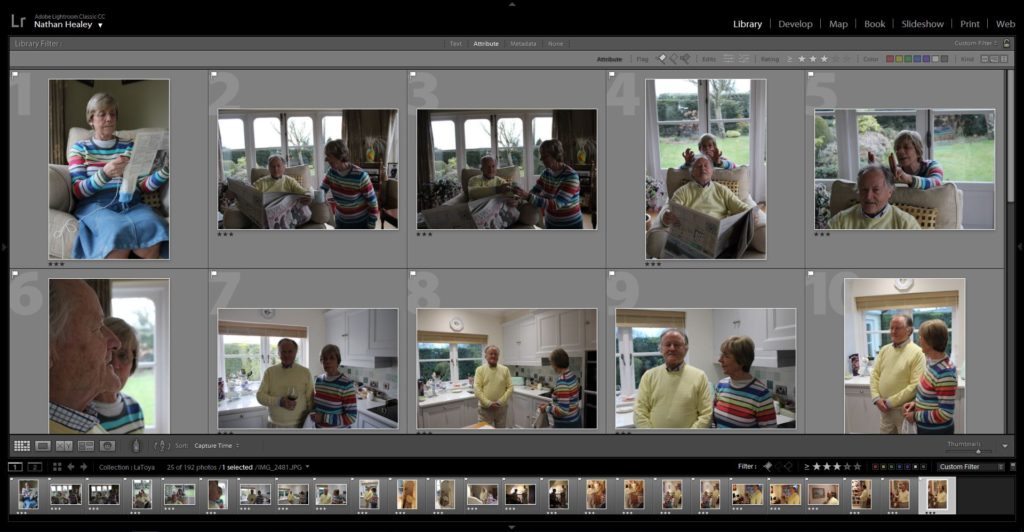
Edit 2 – Star Rating
Edit 3. – Colour Rating

Outcomes:

When selecting my outcomes to edit and adjust to improve the quality of the photograph, I wanted to select images which accurately portray the events and the relationship my family have with my Grandparents, and the way in which this tradition reflects their lifestyle. In addition, I critically chose these photographs to work with as I believed that they helped to tell the narrative of this project. When adjusting the images, I wanted to maintain this simplistic and minimalistic aesthetic towards my work, and so I only present the imagery in black and white or in colour, and the I only focused on adjusting, blacks, white, contrast, detail and sharpness of the imagery. These experimentations are clearly presented below.

Analysis:

The photograph below is my favourite outcome from this photoshoot as I believe it clearly meets the aims of this photoshoot and clearly presents my theme of lifestyle. Conceptually, this is the moment before food arrives and my family are reading out the jokes from the Christmas crackers. It showcases their reaction to the delivery of the jokes. Typically, my brother does not understand the jokes, like this occasion, and requires people to explain. The photograph shows the bond and strong relationship everyone has around this table, as we follow the family tradition, which illustrates my grandparents lifestyle on a major event like this. Contextually, every Christmas we follow the same schedule and repeat the same day essentially every year. Following this pattern is crucial, as it allows my grandparents Christian religious beliefs to fit in with the day, and allows their grandchildren to follow, understand and practice their beliefs and traditions about christianity. Personally, me and my brother have been christened but do not actively consider ourselves as religious people, so this contextual factor on Christmas influences out day and the way in which we go about activities.

Breaking down the visual and technical components of this image allows for the concept and context of the imagery to clearly be displayed. Visually, we are presented with my family sitting around a table, with Christmas hats on as they laugh and look joyous at one another, making this the main focus point of the imagery. The photograph is presented in black and white, allowing clear tonal contrast, and is taken at a straight on angle. In some respects the photograph can be regarded to be using rule of thirds, to create the composition. Further more, the foreground is considered busy and lively due to a lack of space, with the background remaining plain and simplistic, which reduces distractions from the central focus of this image. The main formal elements which are presented in this frame is, space, detail and texture, which are all shown through the way in which the image has been framed. The photograph is sharp and showcases clear detail on the subjects skin, clothes and the table. Technically, the photograph was captured using and quick shutter speed and low ISO, which reduces intended blur and means no noise is presented in the frame. Additionally, the aperture has been set to a medium setting, as enough light is being let in, and a minor narrow depth of field is being presented. Alongside this, naturalistic lighting is being used, which compliments the daylight white balance being utilised.

Conclusion:

To conclude, I believe that photoshoot has been a success. I have been able to produce imagery which meets my artistic aim, and clearly represents my conceptual message of how my grandparents lifestyle influences the way in which my family celebrate major events. On top of this, I have been able to hint at contextual representations throughout my photographs, which adds additional meaning towards my final outcomes of this photoshoot. I have been able to experiment further with different ways of editing imagery using Lightroom, and have reinforced my skill of being able to critically analyse and select imagery which meet my artistic aim.

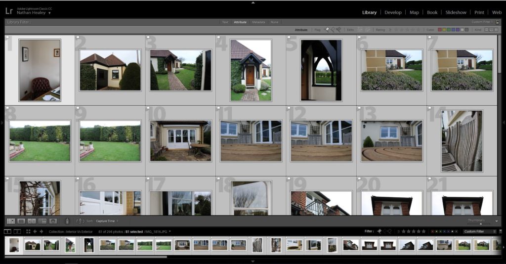
Photo shoot 3 – Laura Blight Inspired

Planning:

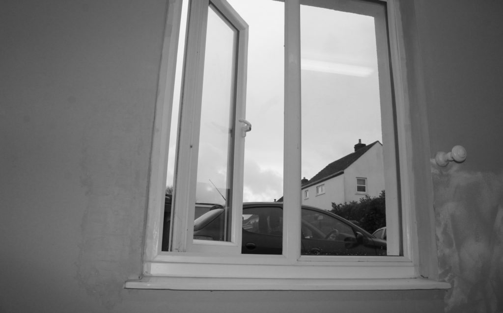
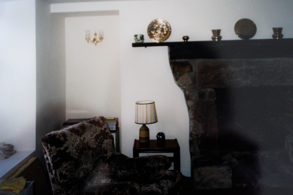
After researching Laura Blight, and the way in which she conveyed interior of houses to tell the narrative of the previous owner he has recently died, I wanted to conduct a photo shoot in a similar style which showcases my Grandparents house in order to tell the narrative of their lifestyle. I will be looking at interior, as well as capturing exterior, furthering from what Blight captured. When deciding what to capture I will be looking at different areas of the house which I believe help to capture their lifestyle, from macro images to using the formal elements of space, texture and colour to help convey this. My camera settings are going to be kept standard, with my ISO being around 400-800, shutter speed being quick and the aperture being round f/5.6, with the use of manual focus and natural light source.

Edits:

Edit 1 – Flagged
Edit 2 – Star Rating
Edit 3 – Colour Rating

Outcomes:

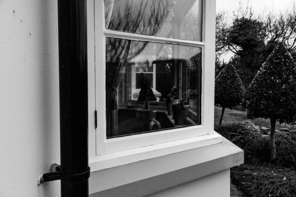
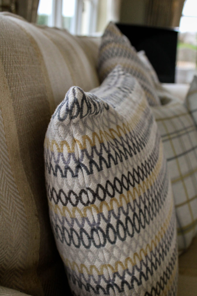
When editing my outcomes, I wanted to adjust the images to look like the work of Blight, by allowing the colours to slightly be desaturated, and noise to be presented, and having a natural darkness and somewhat eerie feel to them. I experimented with mainly the contrast, blacks, whites and shadows as well as the structure on lightroom to produce these outcomes. I tended to stick to black and white outcomes for exterior, as I felt the texture and tonal contrast allows for the house to hold more personality and tell it’s story, and the interior to mainly be in colour so that my work had a similar feel to Blight’s imagery. My experimentation can be viewed below:
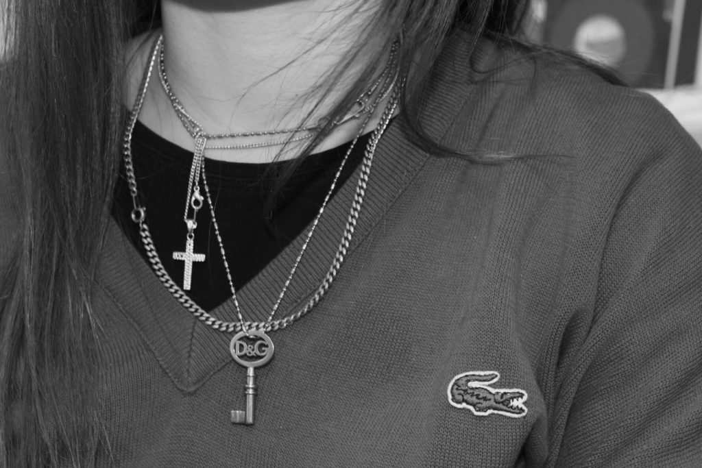
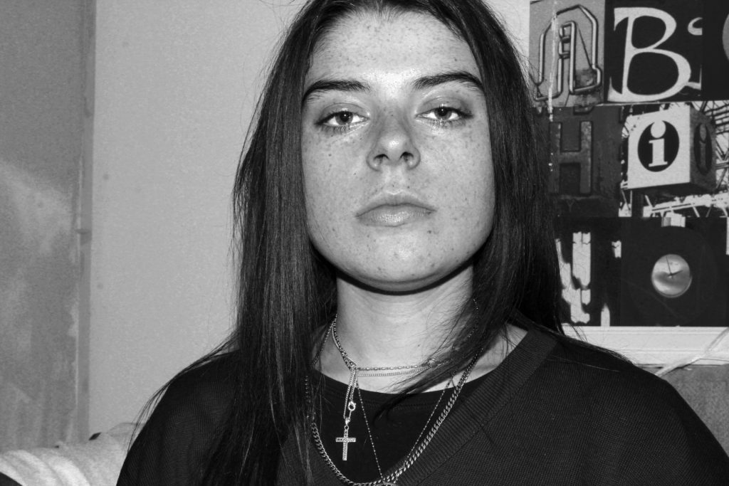
Analysis:

Below is my recreation of Blight’s image of the chair in her photographic series ‘House Clearance’. The two images hold a lot of similarities, due to my clear understanding of the technique Blight used. For example, the composition of the framing is similar, with a chair in the foreground and windows in the background. Both photographs clearly represent the formal element of space, texture and colour, and represent the personality and characteristics of the room, as well as showcasing traces of human life, a key conceptual factor of Blight’s work. Due to similar outcomes, it is likely that we used the same shutter speed, quick, and a low aperture, alongside a natural daylight white balance.

In my image, the photograph presents the chair at more of a worms eye view/straight on angle, and is darker than Blight’s imagery. In addition, the surrounding of the chair in my image is a lot busier, which creates the representation of life still living in the house, which allows my conceptual representation of lifestyle to be clearly presented in my work. In addition, my image has more ‘noise’ in the sense that I used a high ISO, due to the natural lighting not being bright enough to illuminate the whole chair. On top of this, my image hold more of a modern day feel, due to my subject being more modern and up to date furniture. A final difference between to two images is that my photograph uses more of a wide depth of field, as we can clearly see the background of the image, which showcases my grandparents garden, but still does not distract viewers from the conceptual representation of my imagery.

I believe that my attempt of recreating this photograph is strong, I have been able to apply the techniques of Blight into my work, and have been able to introduce the ideology into traces of human activity and apply it to represent my grandparents ‘luxury’ lifestyle they live.

Conclusion:

To conclude, I believe I have been able to produce strong imagery, which clearly depict the luxury and wealthy lifestyle my grandparents have, trough capturing the interior and exterior of their homes. Alongside this, I have been able to employ the composition techniques of Blight when capturing my images, in order to hint at her conceptual representation of human trace. I have been able to further explore this by applying these techniques to capturing the exterior of my Grandparents house, in order to showcase the size and ‘traditional’ values that the house holds, emphasising the luxury lifestyle they live, based on their upbringing and contextual elements of their past.

Photo shoot 2 – LaToya Ruby frazier

Planning:

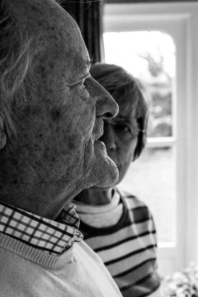
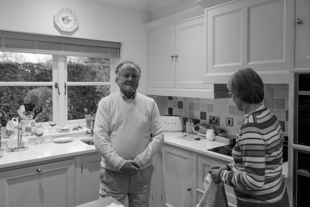
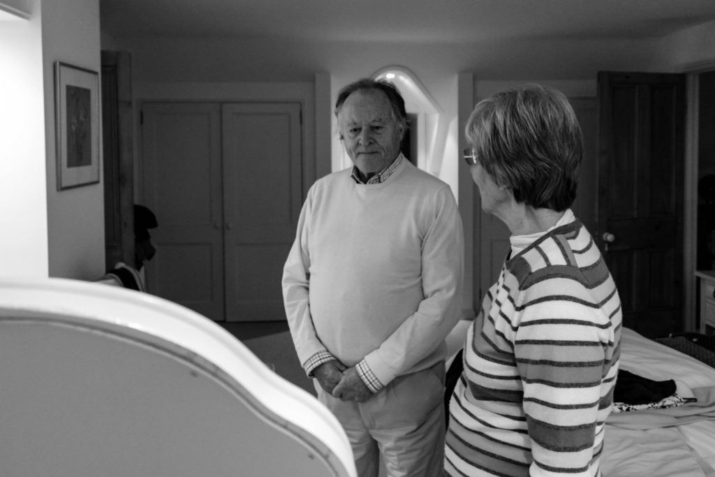
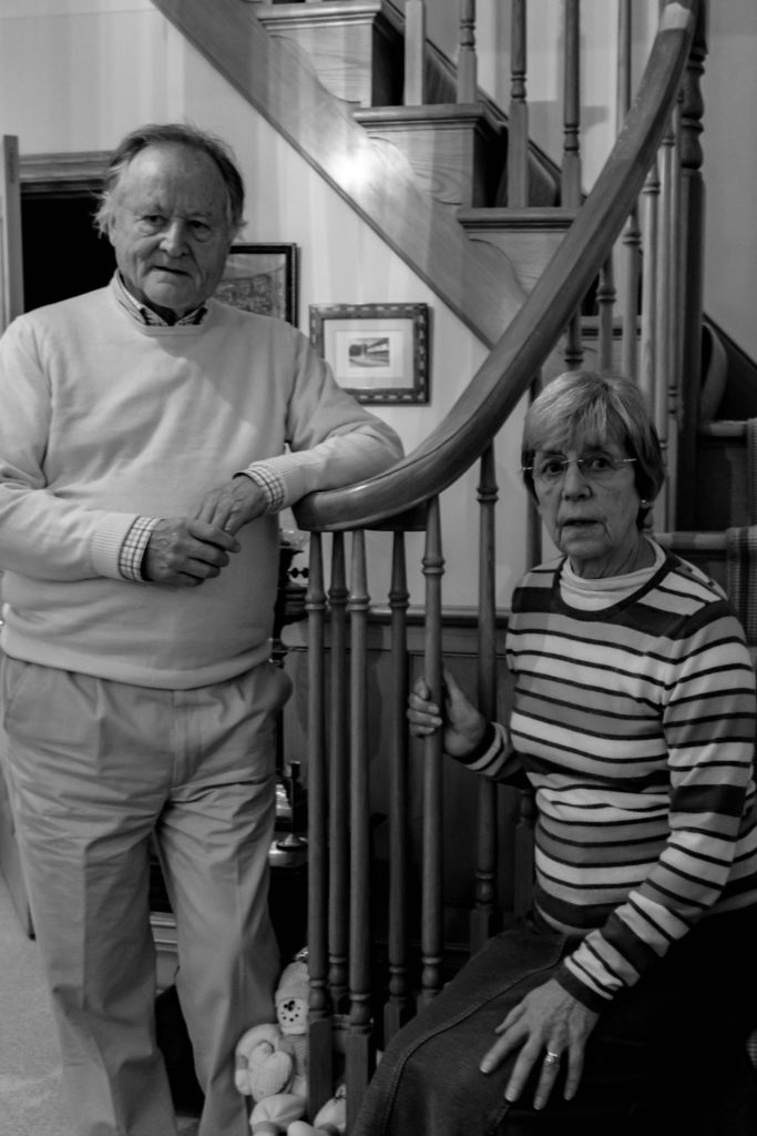
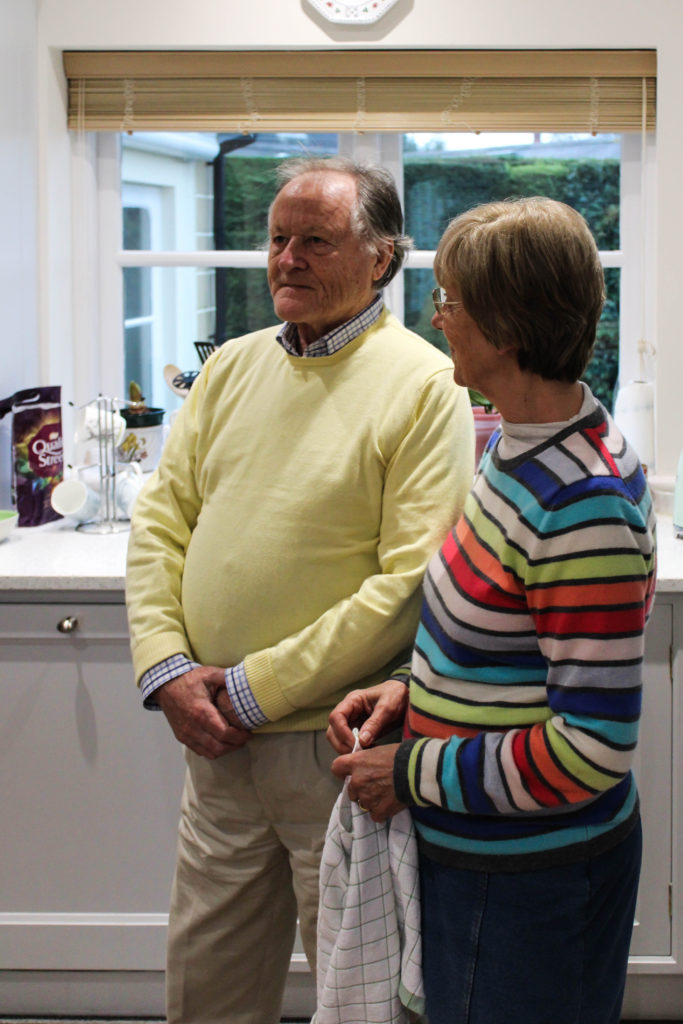
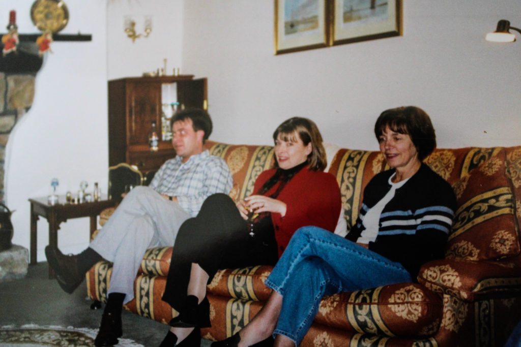
After researching LaToya Ruby Frazier, I was able to understand the way in which her conceptual representations were presented within her imagery. Using this techniques of capturing naturalistic portraits in order to portray lifestyle, I conducted a photoshoot with my grandparents. At the beginning of the session I explained the purpose of the shoot and informed them that I would be following them around as they live out their everyday lives, emphasising the importance of them sticking to their true personality to accurately representing their lifestyle as I followed them around. The shoot was conducted during the middle of the afternoon which meant daylight was beginning to become darker, which forced me to increase my aperture in order to let enough light into, for the frame to clearly illustrate their lifestyle. The camera settings were kept basic, quick shutter speed, middle – high ISO and aperture of around f/5.6 in order to capture the imagery.

Conceptually, I wanted to convey my grandparents lifestyle and how their upbringing and past has influenced their life. For example, I focused on capturing the idea of my grandma being a house wife, while my grandad provided and worked for the family. I also wanted to represent the ideology of economic status and the way in which their financial situation has influenced their lifestyle which they thought were large influencing factors during my interview with them. Due to them being financially stable, it has allowed for them to have luxury habits, such as owning a large house, being able to afford expensive furniture and being able to retire early. These factors I tried to portray through my imagery, as well as recreate and produce imagery which follows the same stylistic features of Frazier.
Edits:

Edit 1 – Flagged
Edit 2 – Star Rating
Edit 3- Colour Edit

Outcomes:

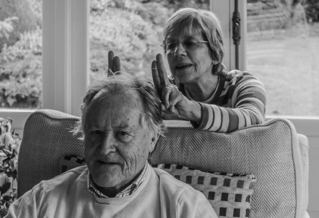
When producing the outcomes from this photo shoot, I wanted to keep them simplistic and authentic, in order to clearly and accurately illustrate the lifestyle they live. Due to Frazier’s work mainly being in black and white, lead most of my outcomes to be showcased in black and white, in order to create close connections between mine and my artists work. However, with two of the images I decided to leave them in colour, as they best suited being presented in colour, due to them having a more authentic persona towards them which meant that the colour allowed for reality to accurately be portrayed within the imagery.

Analysis / Comparison:

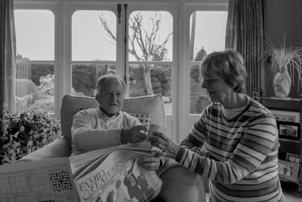
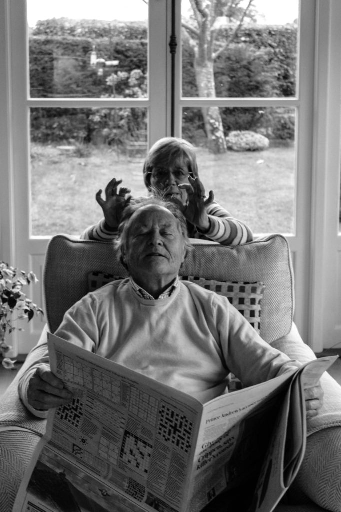
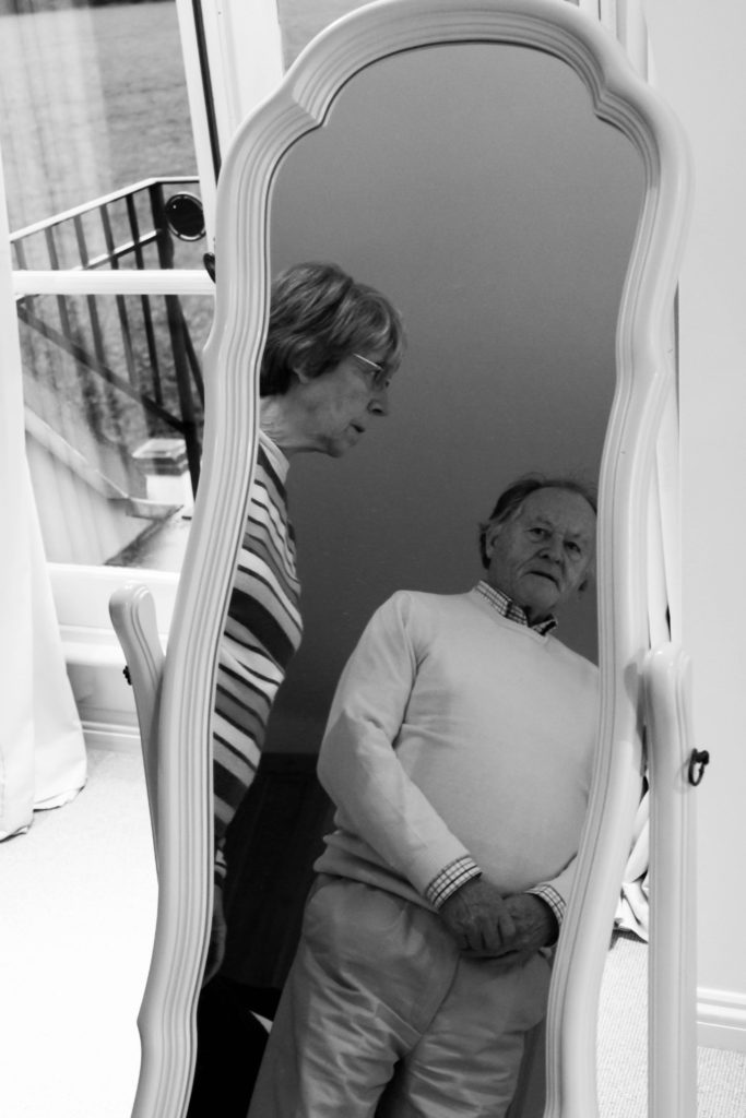
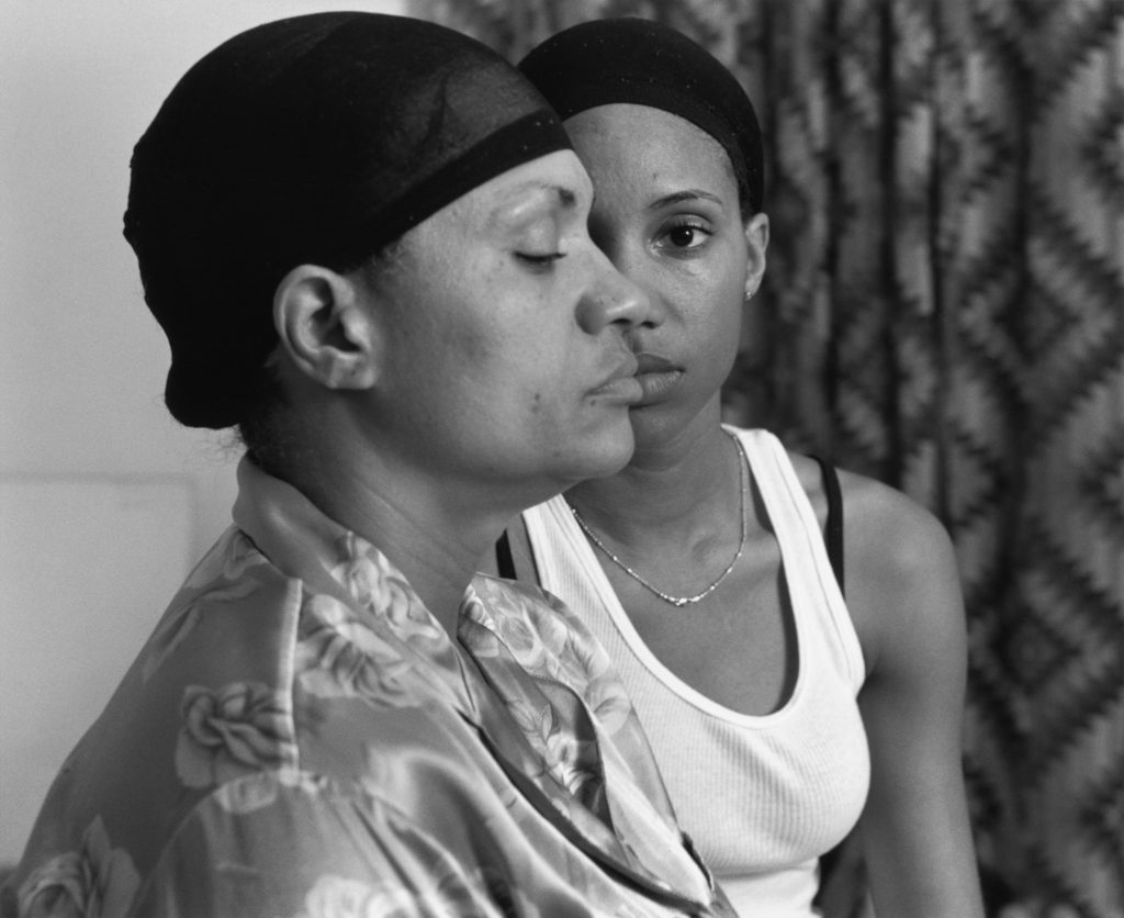
The image below (Frazier’s) is the photograph which I felt held strong conceptual representation, and wanted to recreate within my work to present different concepts in relation to the subjects I was capturing. The two images follow similar composition, by having a subject present in the foreground and background looking in different directions, with a narrow depth of field being utilised. Both photographs are being presented in black and white, with the detail and structure being high, but the smoothness of the imagery and noise being low, likely done through camera settings with editing complimenting these values. Both photographs show clear focus to the formal elements of space, tone and texture which is clearly presented from the proxemics, clothes and basic background. Another similarity between the two is through the camera settings used in order to capture these images, due to them being alike, it suggests that I used similar settings The lighting used would have been artificial through studio lighting and lighting readily found in that room. The light source is soft and can be considered cold, which illustrates the brutality of this reality and how it has negatively impacted the families life. This works well with the low ISO which is used as no intended noise is being presented within the imagery. As well as the white balance being accurately set to an in door setting allowing for clear colour correction, illuminating the tonal contrast within the frame. In addition to this, the shutter speed is kept to a quick capture as there is no movement or intended blur within the frame of the photograph, which helps to compliment the ISO setting used. 

The main difference between the two images are the conceptual representation. Frazier wanted to showcase how herself and her family are being treated as invisible due to their race, presenting political power and situation in their suburb in Braddock. It also illustrates their lifestyle and poverty through the perspective of herself, mum and grandmother, this concept is further explained in my artist research on a previous blog post. Personally, I wanted to convey the social situation which was common in the 1940’s and still present in my grandparents lifestyle today, gender roles. Having my grandad being in the front of the frame well dressed up shows he is the authoritative figure who provides for the household, having my grandmother in the back suggests her submissiveness and willingness to follow instructions from her husband, although this may be considered a bad thing, to them it is normality which they both enjoy.

Conclusion:

In conclusion, I believe that the imagery produced shows close relationships with Fraziers imagery, through the sense of composition and the ideology that we have both conveyed lifestyle in a similar way. With close regards to the final imagery produced, I believe that the photographs shows my ability to capture detailed portraits, which have clear focus and show my ability to produce a strong composition, which compliments the simplistic edits. In addition, I have been able to provide evidence my reinforces my ability to use Lightroom effectively to produce strong imagery.

Essay Draft – Paragraph 1

To what extent can we trust documentary photography to tell the truth about reality?

“The process of manipulation starts as soon as we frame a person, a landscape, an object, or a scene with our cameras: we choose a portrait or landscape format” (Bright, S. and Van Erp, H. 2019; 18) 

The quote above raises a valid point on how artists are constantly manipulating photographs, even when they are not aware, in order to create a captivating images for viewers. This point allows us to consider how photography is a form of secondary data, making our analysis of what seems to be reality within the image unreliable, creating the argument of how documentary photographs do not truthfully depict reality

My personal investigation looks at my grandparent’s lifestyle and how it has been influenced by the time period they grew up in, the 1940’s. I have explored the influence of religion and spirituality, gender roles within the family structure and social norms during this time period which are still present in their lifestyle to this day. Holding strong connections with my grandparents led me to want to base my project on them, as I know I will be able to easily retrieve useful insight into their lifestyle, enhancing the imagery I produce, on top of forming a piece of work in which my family will cherish. In this essay I aim to discuss the extent to which documentary photography accurately portrays reality, with reference to two documentary style photographers, Latoya Ruby Frazier and Walker Evans. In this essay I will be referring to Walker Evan’s photographic series entitled ‘let us now praise famous men’ and Latoya Ruby Frazier’s photographic series ‘The Notion of Family’. Analysing photographers who captured imagery in two different periods of time, contextual and contemporary comparison, allows me to illustrate whether the reliability has changed overtime or stayed consistent, providing a valid argument.

The art movement of realism and straight photography looks at creating imagery which showcase life how it is, this emerged in the 1840’s. Artists who work within this area look at raising social and cultural issues relevant within society at that time, in order to make the audience aware of this issue in hope something can be done to make a change. This area looks at documentary photography and photojournalism to document the events which are occurring. Artists stick to the original techniques and purpose of photography, the use of photography for science, to create detailed, sharp images showcasing real life. Henry Fox Talbot created the calotype, which is said to be the basis for how photography is practised today in documenting everyday life. The calotype was done by creating a paper negative, exposing a sheet of paper coated with silver and chloride to a light source. His photographs used a short exposure time and allowed multiple prints to be produced through one negative. He believed that photographs were the cause of light, the influence of nature, on a paper negative and is illustrated through optical and chemical means. Artist Louis-Jacques Mandé Daguerre, also shared this ideology behind image making and stated that photography “consists in the spontaneous reproduction of the images of nature received in the camera obscura, not with their colors, but with very fine gradation of tones.” (Daguerre Mandé, L-J. 1838). This illustrates how this art movement allows nature to present itself showing the reliability of imagery, which is then contradicted as it states its a spontaneous reproduction suggesting the accuracy of the imagery is reduced. Artist Frederick Henry Evans’ ‘A sea of a step’ clearly presents realism through the composition and use of the formal elements of light and space. Conceptually, the imagery portrays the climbing up the stairs, as if the stairs lead towards a euphoric feeling. “He drew on the Symbolist manner of using objects to directly express esoteric ideas.” (The Art Story – need help referencing this please). This use of symbolism creates a subjective perspective reducing the reliability of this art movement. Paul Strand took a different approach to capturing objects, using a macro technique with clear focus on light and shadow and the contrast between the two in order for the work to “be brutally direct; devoid of all flim-flam; devoid of trickery and of any ‘ism’; devoid of any attempt to mystify an ignorant public, including the photographers themselves.” (need help again referencing). This suggests how Strand’s work produces a more objective narrative which clearly depicts reality illustrating how this art movement can be truthful. Looking closely towards documentary photography, a style of photography which places into this art movement, artist Walker Evan’s and Latoya Ruby Frazier use portraiture to showcase the lifestyle of the subjects presented in the frame in their natural environment, somewhere familiar to them that they have a relationship with, but to what extent does these photographers accurately portray the subjects lifestyle? With my topic being based in my grandparent’s lifestyle, I felt that using documentary photography would be the most appropriate to showcase this, as well as the project looking social issues of family structure and gender roles being raised, thus drawing connections with realism and straight photography.

‘A Sea of Steps’ (1903) – Frederick Henry Evans
‘Bowls’ (1917) – Paul Strand
‘The Notion Family’ – Latoya Ruby Frazier
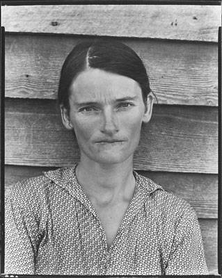
Allie Mae Burroughs, Hale County, Alabama (1936) – Walker Evans

Bibliography:

Bright, S. and Van Erp, H.(2019), Photography Decoded. London: octopus Publishing House

Louis-Jacques Mandé Daguerre.(1838), Louis-Jacques-Mandé Daguerre. photoquotations: http://photoquotations.com/a/171/Louis-Jacques-Mandé+Daguerre

https://www.theartstory.org/movement/straight-photography/

Photo-shoot 2: Final Images:

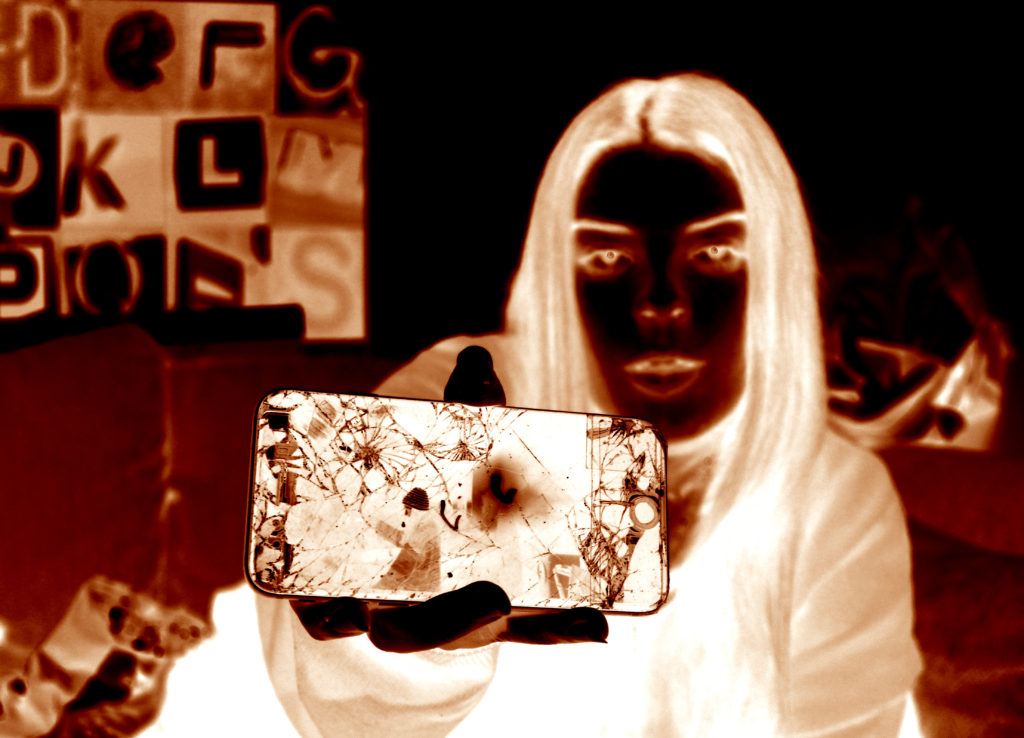
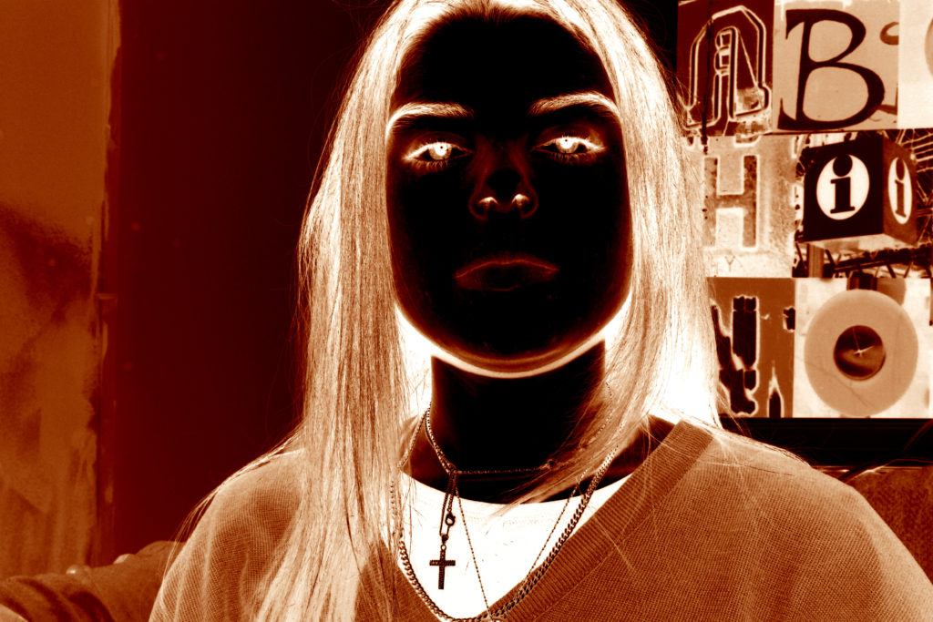
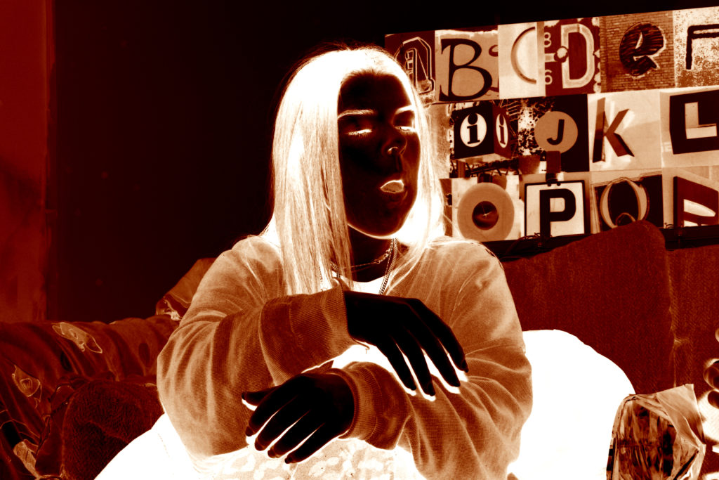
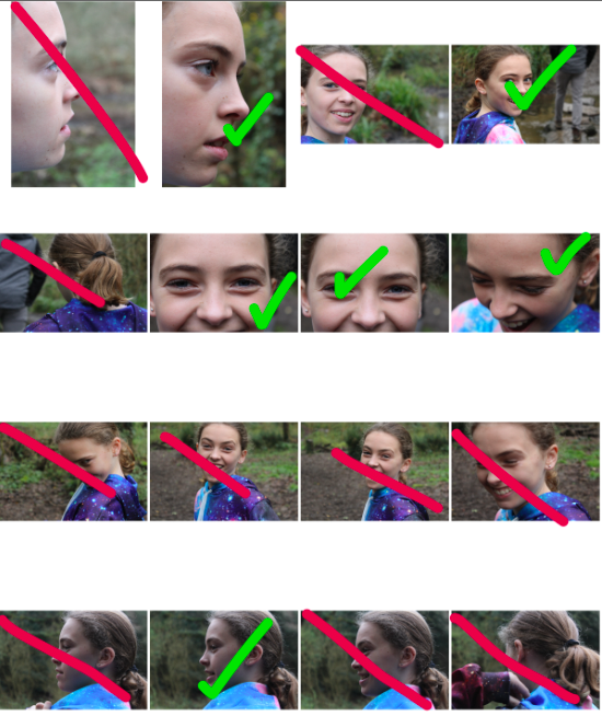
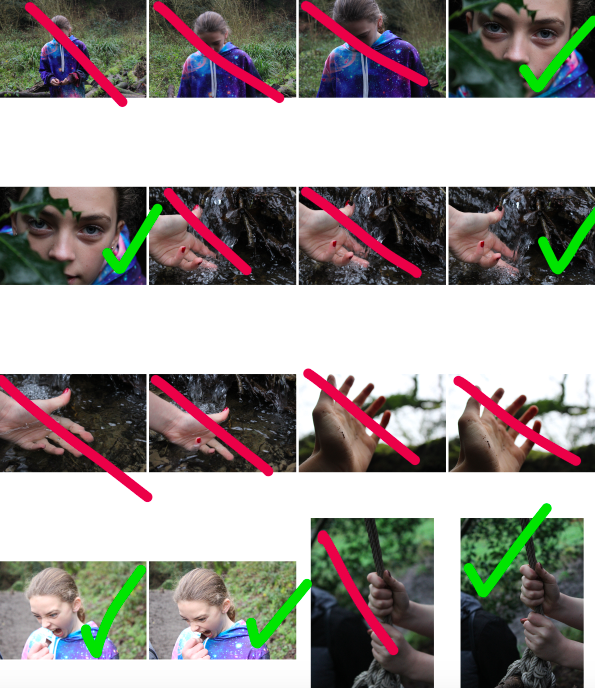
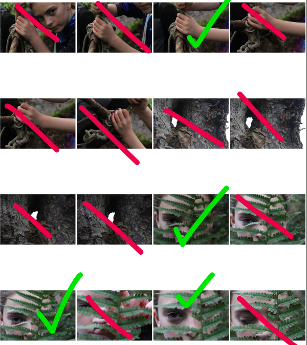
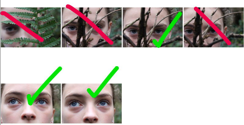
After editing the selection of images from my final photo-shoot, I was able to produce the following pieces. For this photo-shoot I was looking to present a more subtle example of women and girls breaking gender stereotypes, and I did this by placing a female model into an environment that is not considered a stereotypically “feminine” environment. I placed a stereotypically feminine model (wearing makeup, female, wearing jewelry) in an environment that is dirty, with twigs, leaves, water and spiked bushes providing contrast to the gentle appearance of the model. The following images are my final selections:

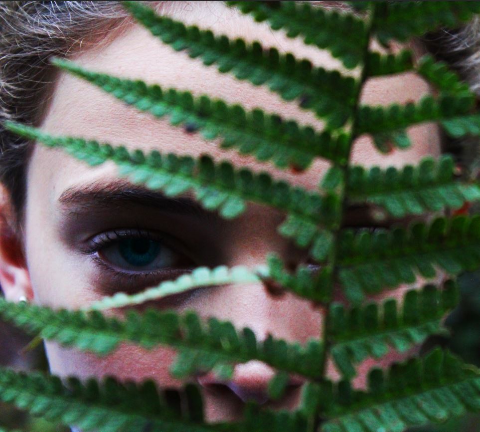
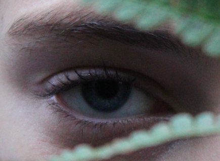
In the above image, I focused on emphasising the colours in the image, and in turn I was able to emphasize the contrast between the model and the plant in front. I feel that this image portrays the sense that the subject is hiding themselves (and in turn their femininity) behind the plant in the foreground. I feel that the eye-catching colour of the eyes draws attention to the stern look of he subject, while at the same time presenting the human side of the subject.

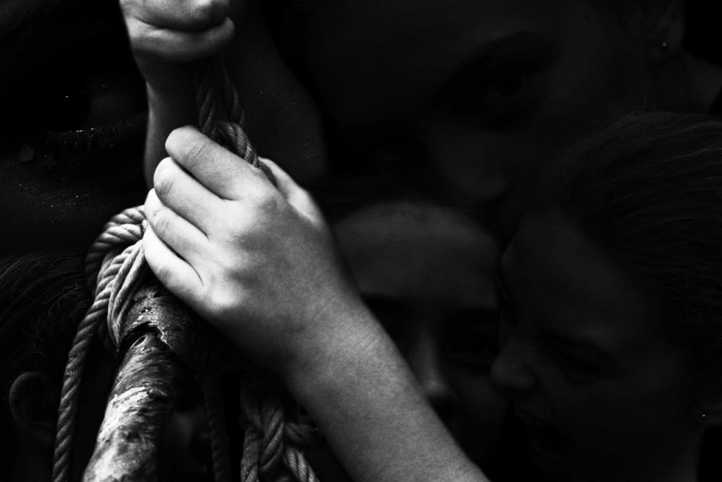
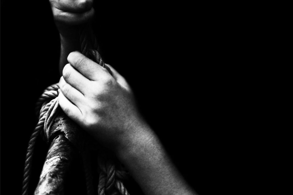
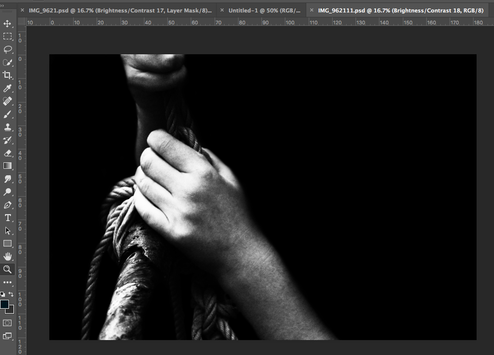
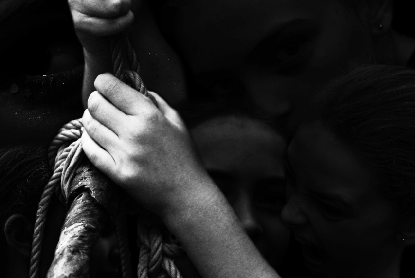
In this image, I was trying to convey the complexity of emotion, and the more extreme emotions of anger and fear which are often not associated with femininity. In this image, I feel that the background presents a selection of extreme emotions, some of which are unsettling to see a young girl portray, and therefore presenting the stark reality that although it is often expected for women to be emotional, feeling emotions of extreme anger, determination and strength are often not associated with femininity. The image in the foreground is an example of the subjects strength, with the contrast between the small feminine hands holding the mess of ropes and wood providing a more obvious example of contrast between things considered stereotypically feminine and masculine,

For the above image, I was focusing on portraying a contrast between the subject and the shapes of the plants in the image. I used a soft, feminine face, looking meekly into the camera, and contrasted this with the harsh sharp shapes of the holly leaves in the foreground. I feel that the use of this sharp plant brings a sense of menace and threat to the image. I also feel that the back of body-shape (other than a head) present in the image, and the use of the dark background, helps to bring an element of unease to the image, as it is difficult to place the subject when their body appears to be absent. I feel like these elements all together help to create a contrast between the gentle and harsher elements of the image.

This image is another version of the image from above, but without the faces in the background. I feel like this image on its own presents an example of strength, and the black and white tones of the image create a contrast, and highlights the different textures and tones of the image.

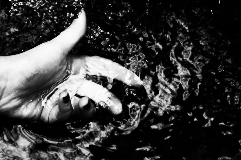
I feel that this image focuses heavily on the texture of the water, and the high contrast of the black and white tones of the image helps to emphasize this texture. I like this image as it presents a distortion of the subjects hand under the water, and the movement of the water gives the image an overall sense of adventure and action (elements not typically associated with feminine features, such as the painted nails)

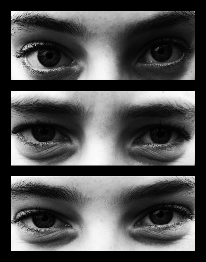
The above image is a presentation of the different emotions that can be inferred from eyes. The subject of the image is seen displaying different emotions through only the use of their eyes, thus focusing on the different and varied emotions that an individual can experience. The gender of the subject remains relatively ambiguous, and therefore the image can be used to represent human emotion, rather than the stereotypes of emotion (such as feminine emotions being fear and care, and masculine emotions being anger and ambition).

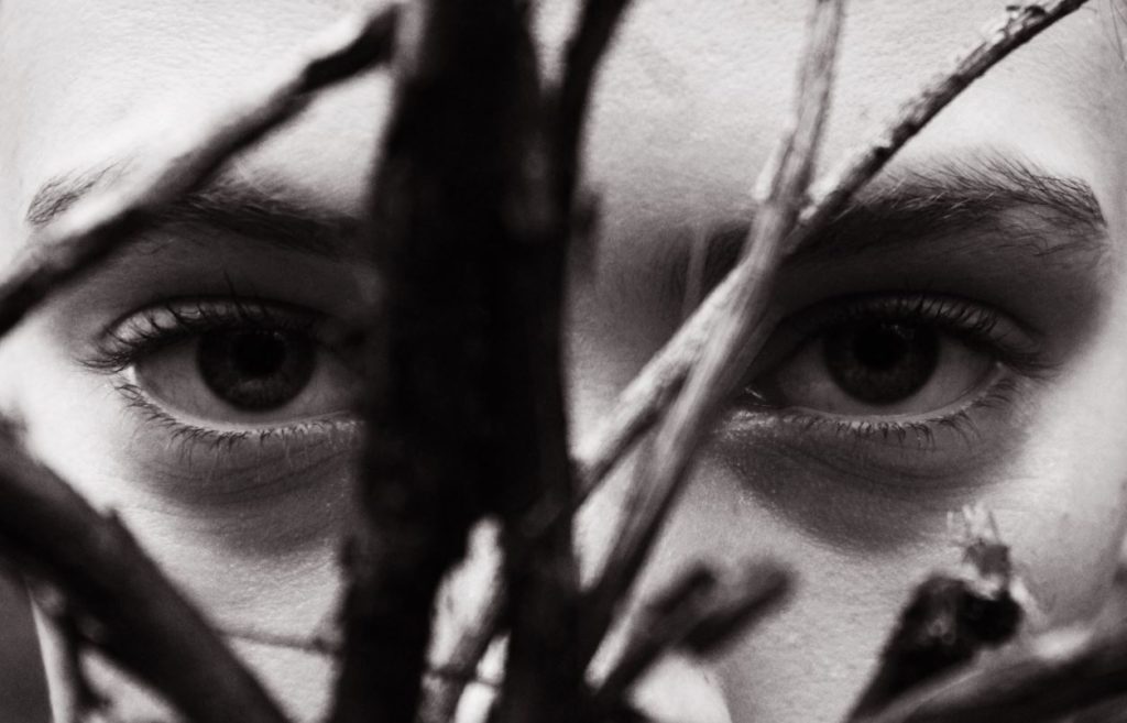
The above image makes use of the contrast between the roundness and detail of the subjects eyes, and the harsh thin shapes of the twigs in the foreground. This contrast in shape helps to emphasize the contrast between the 2 different characteristics of the image (more harsh, masculine aspects, and the femininity of the face), and yet at the same time, both characteristics compliment each other.

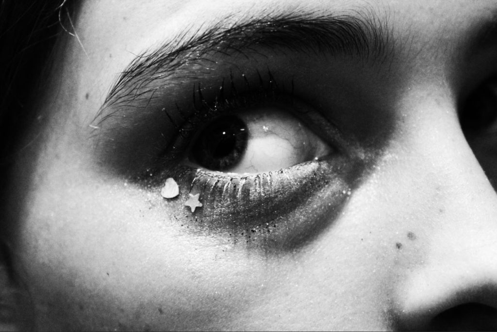
This final image was a close up of the subjects eye, detailing their makeup and the intricacies of their eye. I feel that this image accurately depicts the stereotype of femininity, with the heart and star sequins solidifying the feminine characteristics of the image. The subject is giving a somewhat fearful and alarmed glance to the left, and this contrasts the stereotypical characteristics of femininity in young girls (joy, happiness, excitement, kindness), and brings a level of depth to the image as the viewer is able to look past the physical appearance of the image, and question the reality of what is happening “behind the camera”.

Overall, I feel like this photo-shoot has allowed me to explore the intricacies of what is considered feminine and masculine, and I have been able to present these 2 different but complimentary characteristics in a subtle but impactful way. I feel like this photo-shoot has provided images that can be used in contrast to the move overt and obvious images in my study, and can be used to provide a more subtle, yet equally thought provoking example to the viewer of the ways that out expectations and predictions of gender can be broken and rearranged.

Photo-shoot 2: Selection and Editing:

For my second photo-shoot, I focused on displaying a break in feminine gender roles by focusing on showing women/girls in nature, showing them playing in forests and getting muddy. I feel like this approach allows for a subtle line to be drawn between the expectations that society has for girls, and the reality that many girls find joy in “masculine” activities, such as playing in the woods, exploring and adventuring. I find this concept to be a more subtle show of braking gender stereotypes than my first photo-shoot, and therefore have included this in order to contrast the more overt, brash examples of gender stereotypes with more subtle, hinting examples.

After selecting which images I would use to edit, I used the software Photo-shop to create and edit a range of images:

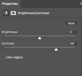
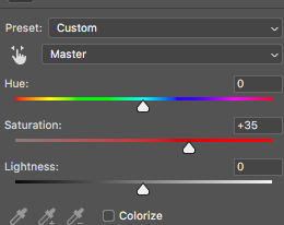
For many of my images, I increased both the saturation and contrast. I did this to make the colours and contrasting shapes and tones of the image stand out, allowing the viewers attention to be drawn to certain aspects of the image.

For the above image, I altered the saturation and contrast of the image, and then using the lasso tool on Photoshop, I highlighted the iris of the eye, and raised the contrast and saturation of the blue, in order to make the eye colour of the subject stand out much more. I did this to make the eye of the subject the focal point of the image, forcing the viewer to see the subject as an individual person by making eye contact with them through the image.

Simply by increasing the contrast and saturation of this image, and making small edits using the lasso tool, I was able to finish this image, using the colouring and shapes of the image as the focal point of the image.

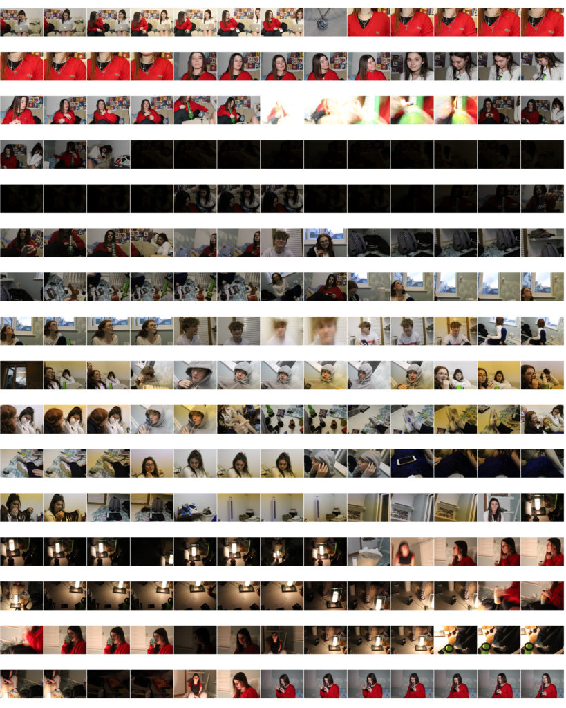
The above image involved turning the images black and white , increasing the contrast, and placing all images onto a single page (I outlined the images with black rectangles using photoshop to better define each image).

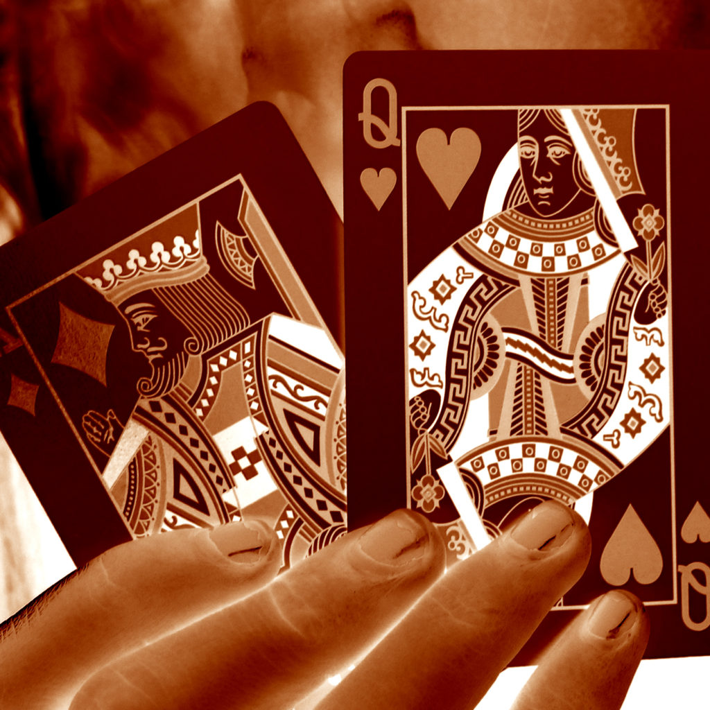
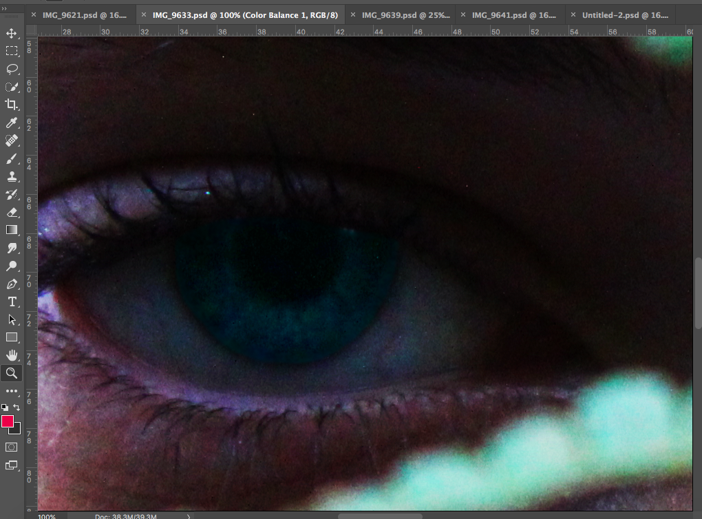
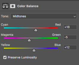
For many of my images, I also altered the colour balance of the image in order to emphasise certain shades and colours. In this instance, I increased the red and blue and magenta tones slightly (and I also increased the contrast and reduced the saturation), which gave the below final outcome:

The hardest image to create was one in which I would be merging a set of images together to create a background, while keeping a single image opaque in the foreground.

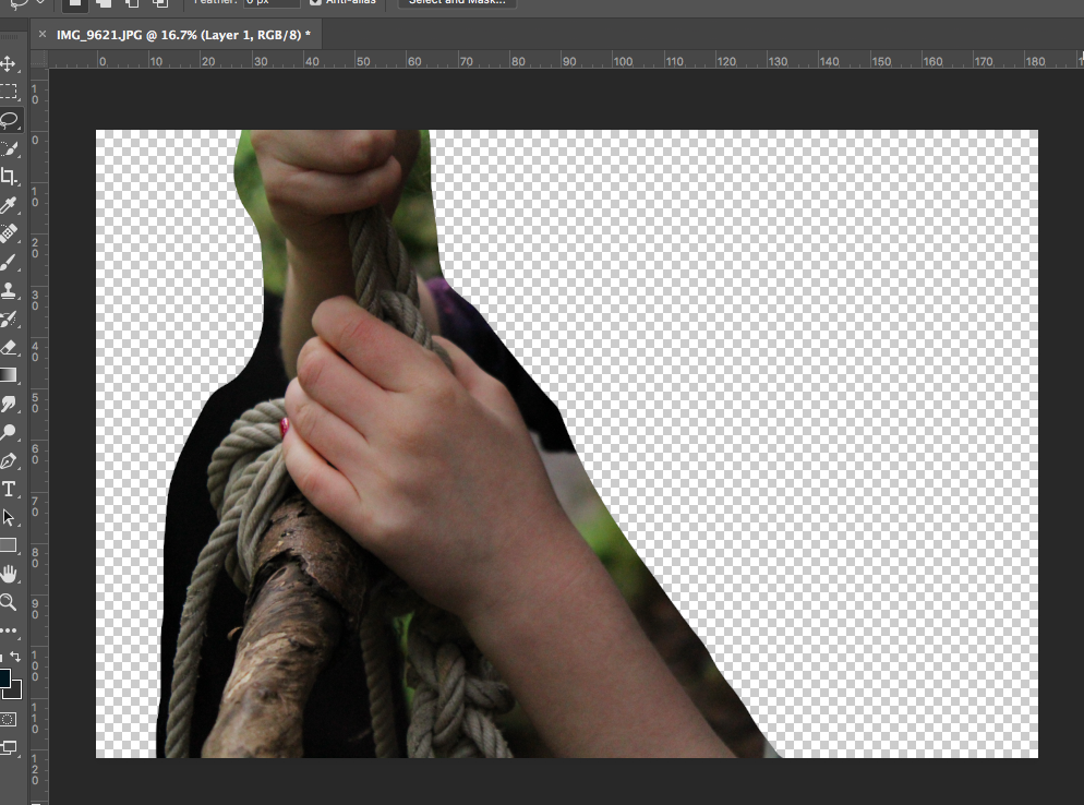
Initially, I cut out the part of the image I wanted to use from the background.

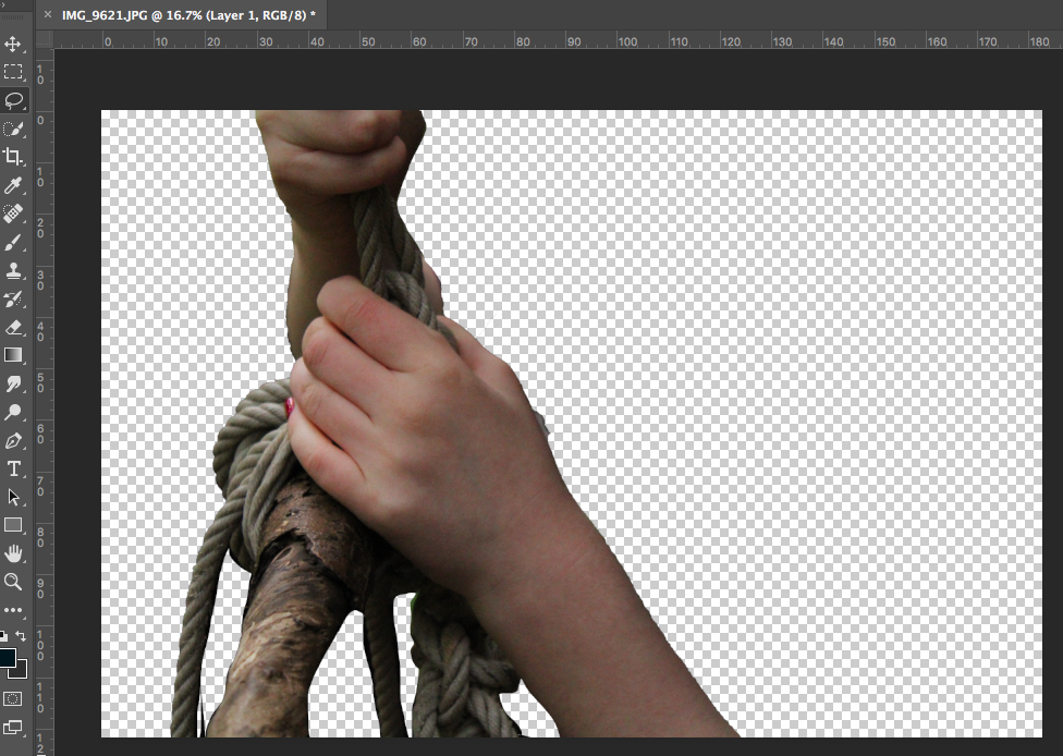
I then used the quick selection tool and lasso tool to cut the image out from the background fully. After this, I used the eraser with 0% hardness to soften out the edges of the image to make it look more natural.

I then increased the contrast of the image and turned the image black and white to match the black background that I added. I used a soft black paintbrush to go around the edges of the image to patch up parts the edges that did not match the background.

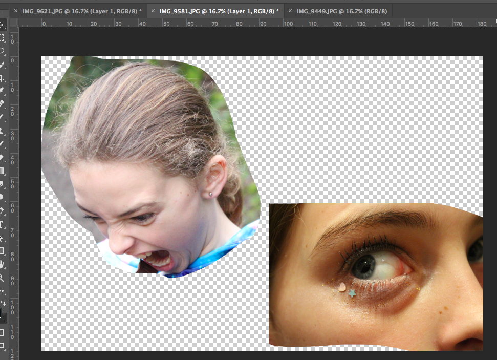
I then used the lasso tool to cut out a range of images of faces showing intense and varied emotion from a range of different images.

I then used the eraser tool at 75% opacity to make these cut out image more opaque and soft. Finally, I added these images behind the image in the foreground, allowing them to create the background for the image. I feel that although this image took a lot of work, I believe the outcome is an effective piece.

Photo Shoot 1 – Archives

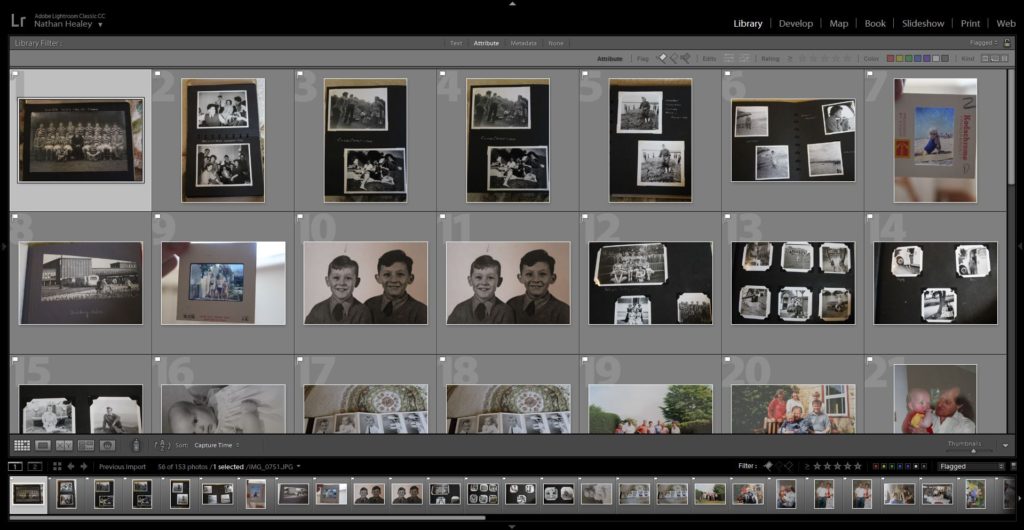
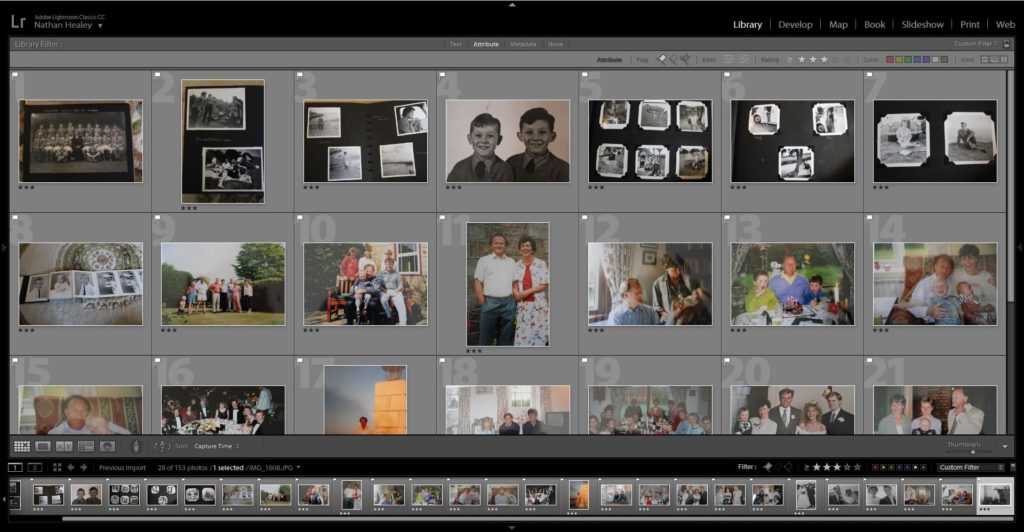
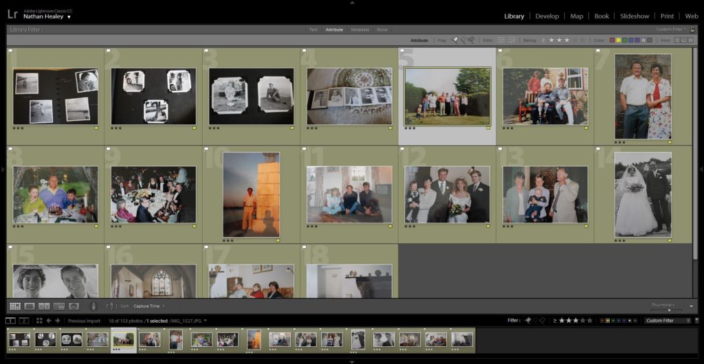
Edits:

Edit 1 – Flagged
Edit 2 – Star Rating
Edit 3 – Colour Rating

Final Outcomes:

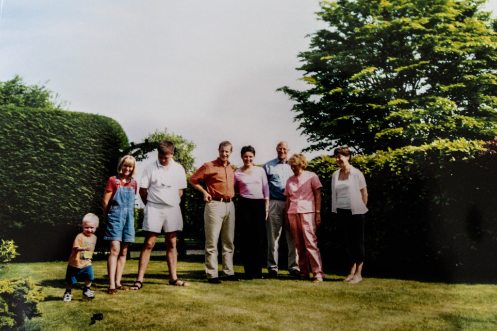
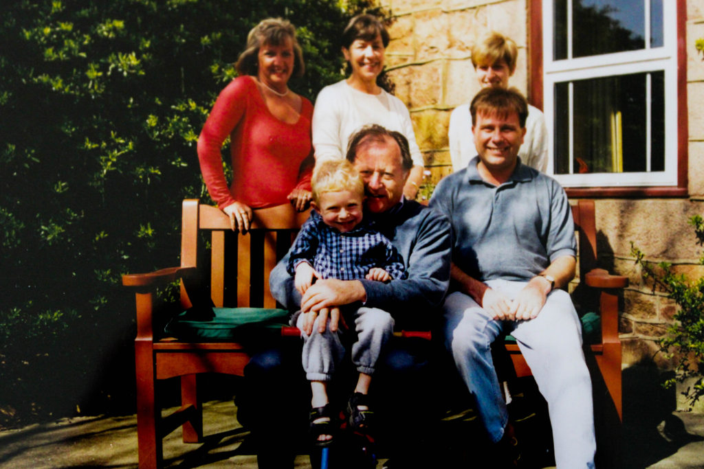
As mentioned in my photo shoot planning post I discussed how I did not want to manipulate the imagery, to the extent to which it takes away from the authenticity. On light room I simply slightly adjusted the shadows, white, blacks, contrast and clarity sliders subtly. Doing this allowed for the image colour and to clearly be showcased. In further edits, I am going to look at using these archival to produce photomontages and or manipulate the photographs to help portray stronger conceptual meaning in order to showcase their lifestyle.

Conclusion:

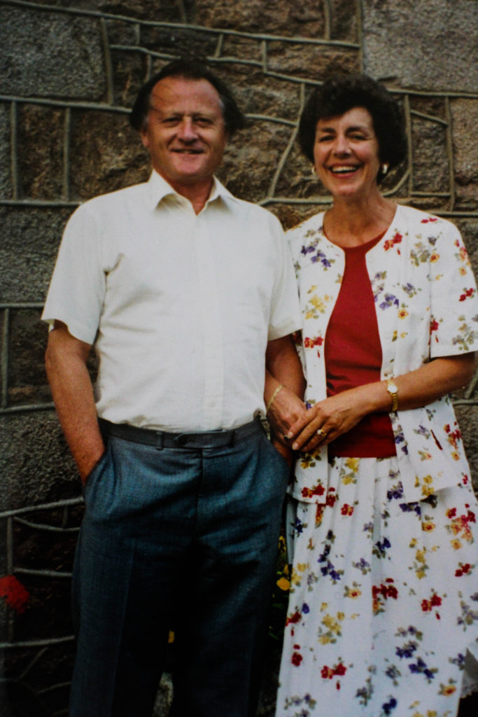
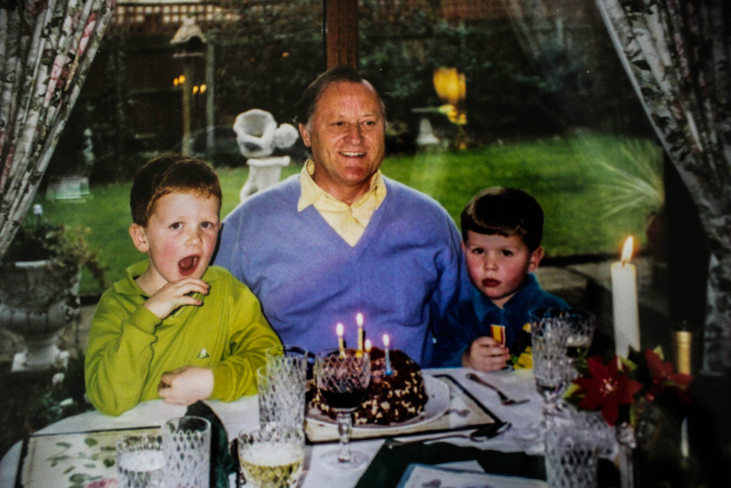
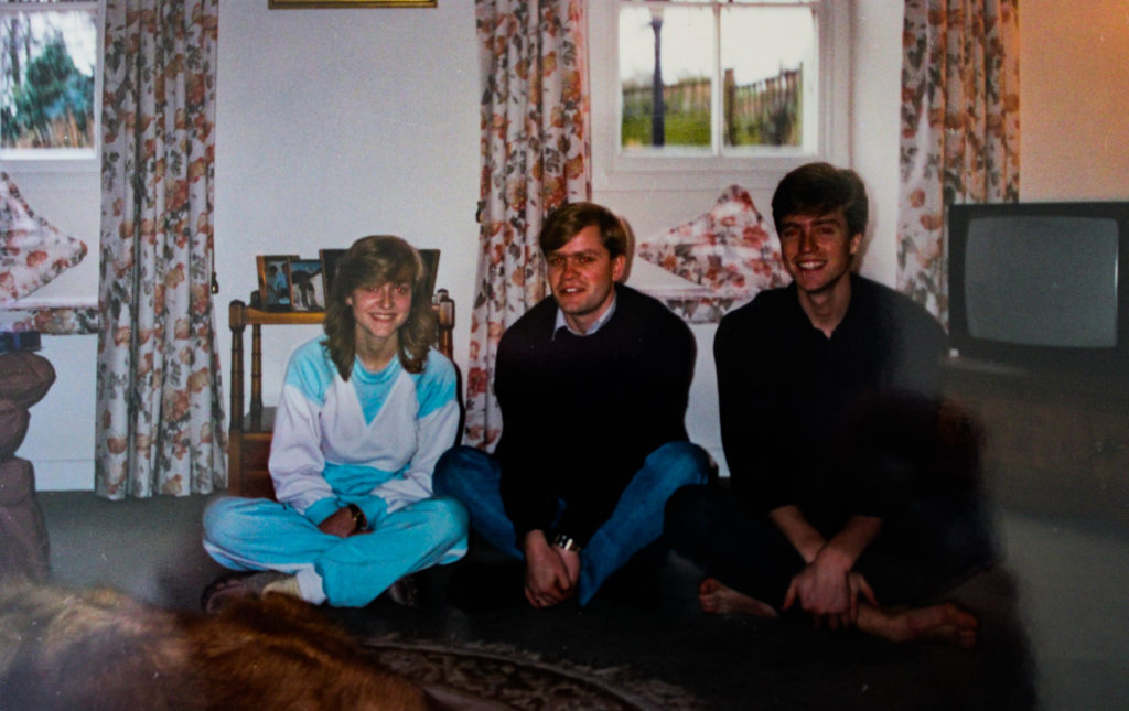
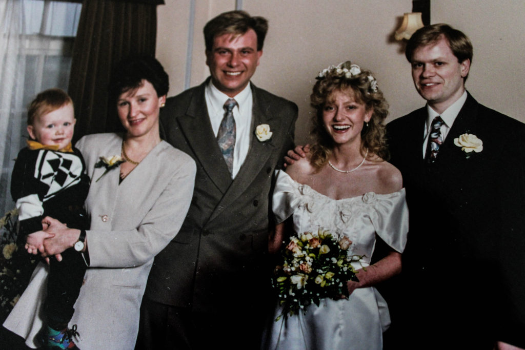
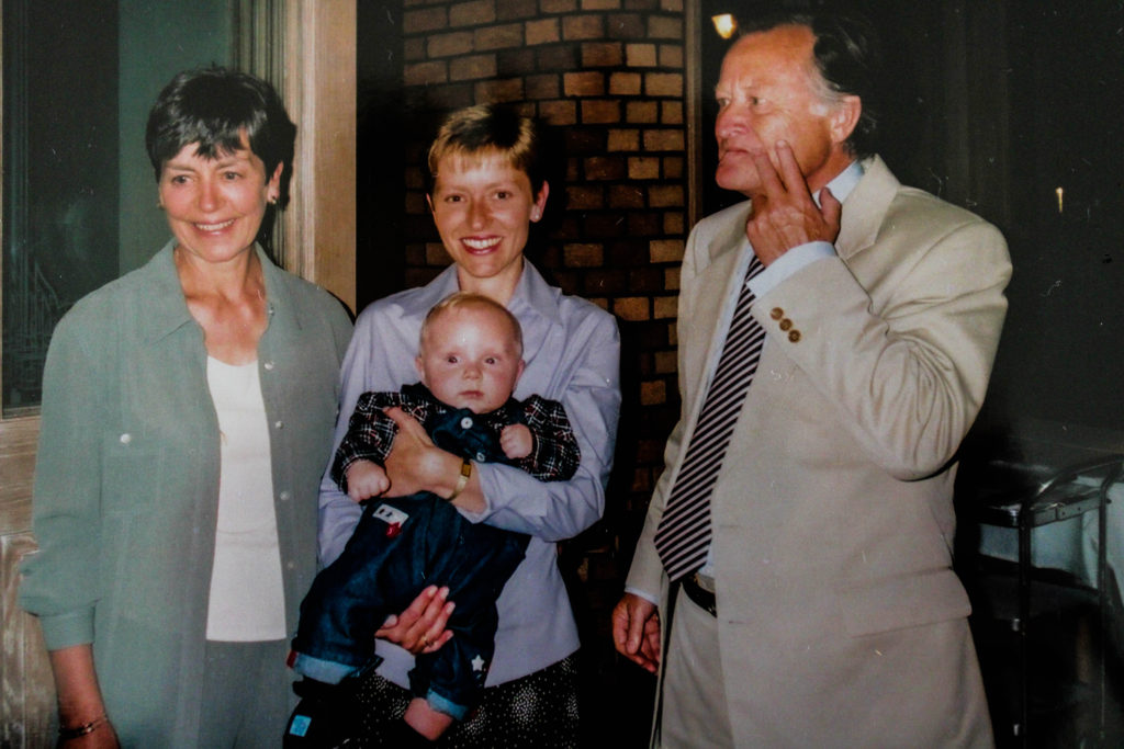
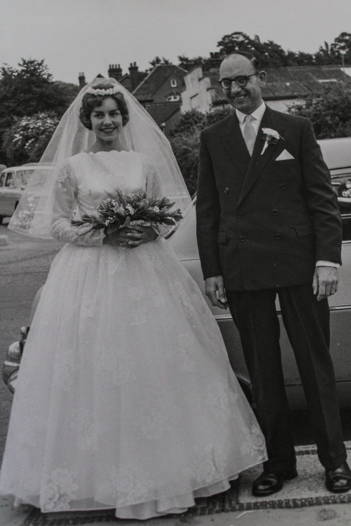
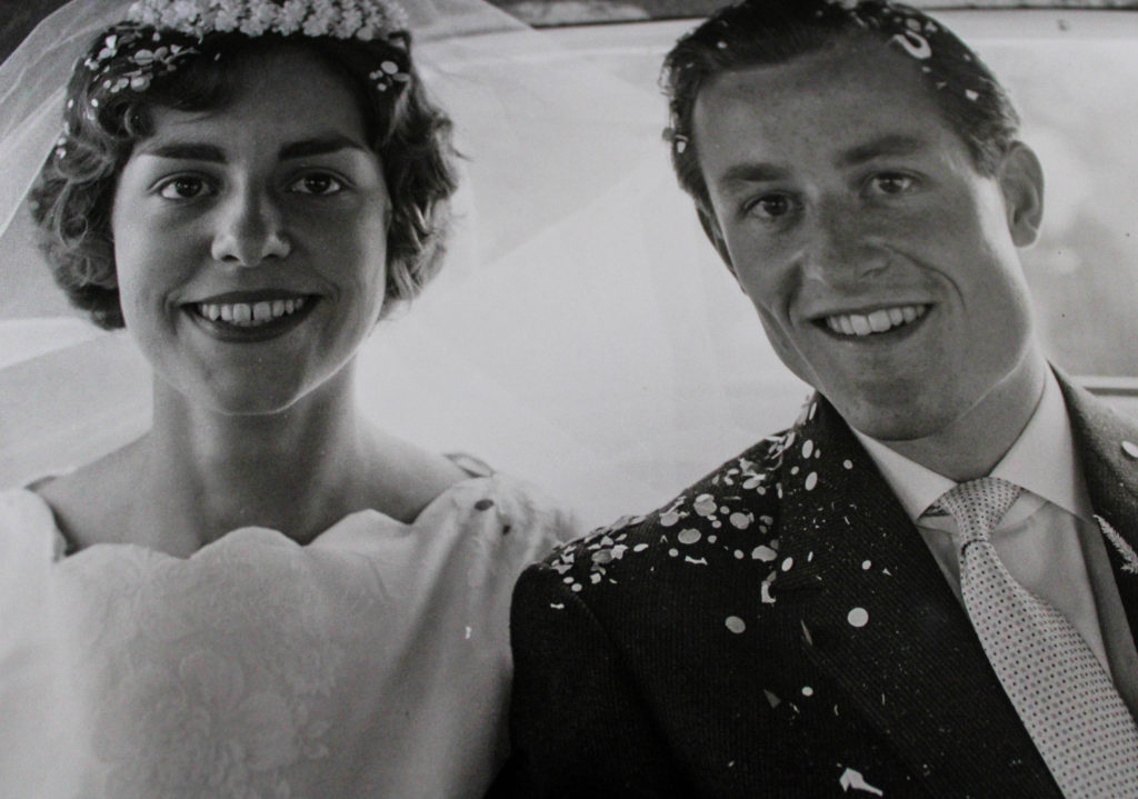
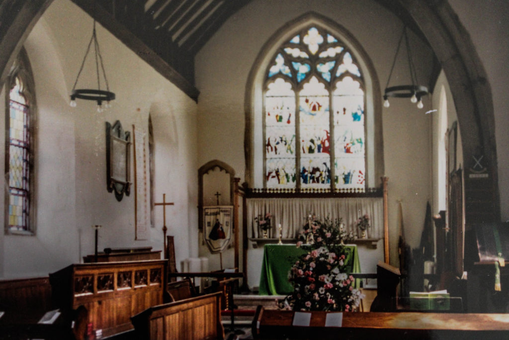
The imagery I managed to gather from searching through my grandparents photo archive, has given me useful insight into different aspects of their lifestyle. One major aspect I realised was the importance of family, many of their images included pictures of them both with other family members at important occasions such as weddings or christenings. These family events can also be considered religious showcasing another factor which has highly impacted their lifestlye. In addition, my Grandad referred a lot to how he worked hard to make a living for him and his wife, showcasing gender roles within their society and upbringing alongside the ideology of wealth, which is also supported through their attired as they seem to constantly be dressed very formally in every occasion. Due to this I am going to base my next lot of photoshoots exploring these ideas of religion, family gathering, gender roles and wealth through portraits and potential for me to explore their house through exterior and interior photography.