Category Archives: AO4 Present Ideas

Filters

Author:
Category:

Experimenting With Lighting

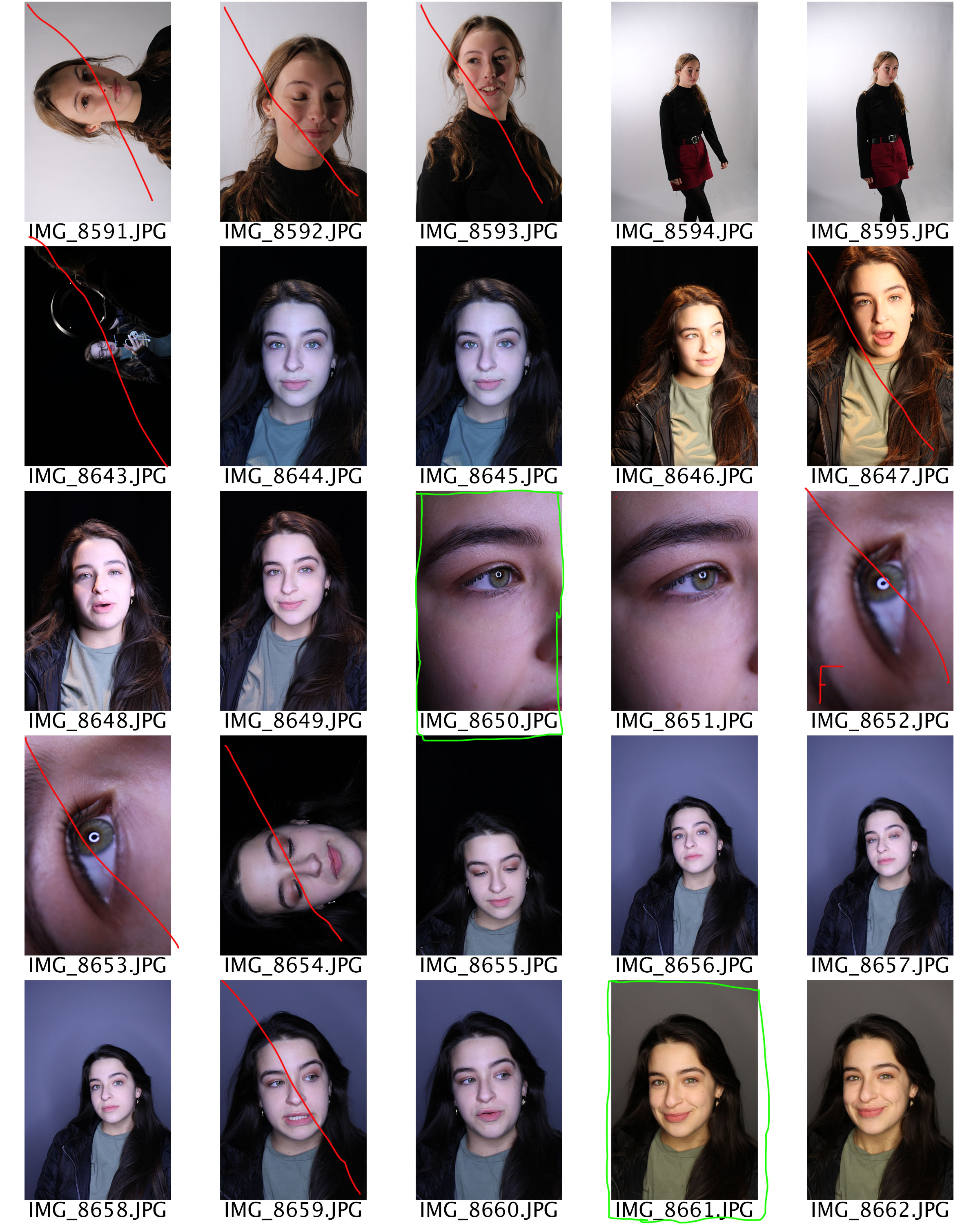
I conducted a photo shoot to explore all the different types of lighting within studio photography. The types of lighting I looked at was:

  • One Point Lighting
  • Two Point Lighting
  • Three Point Lighting
  • Ring Lighting
  • Warm/Cold Lighting
  • Intensity of the Light
  • Lighting Rig (On Ceiling)

All these lighting techniques have been explained in previous blog posts.

Set Up

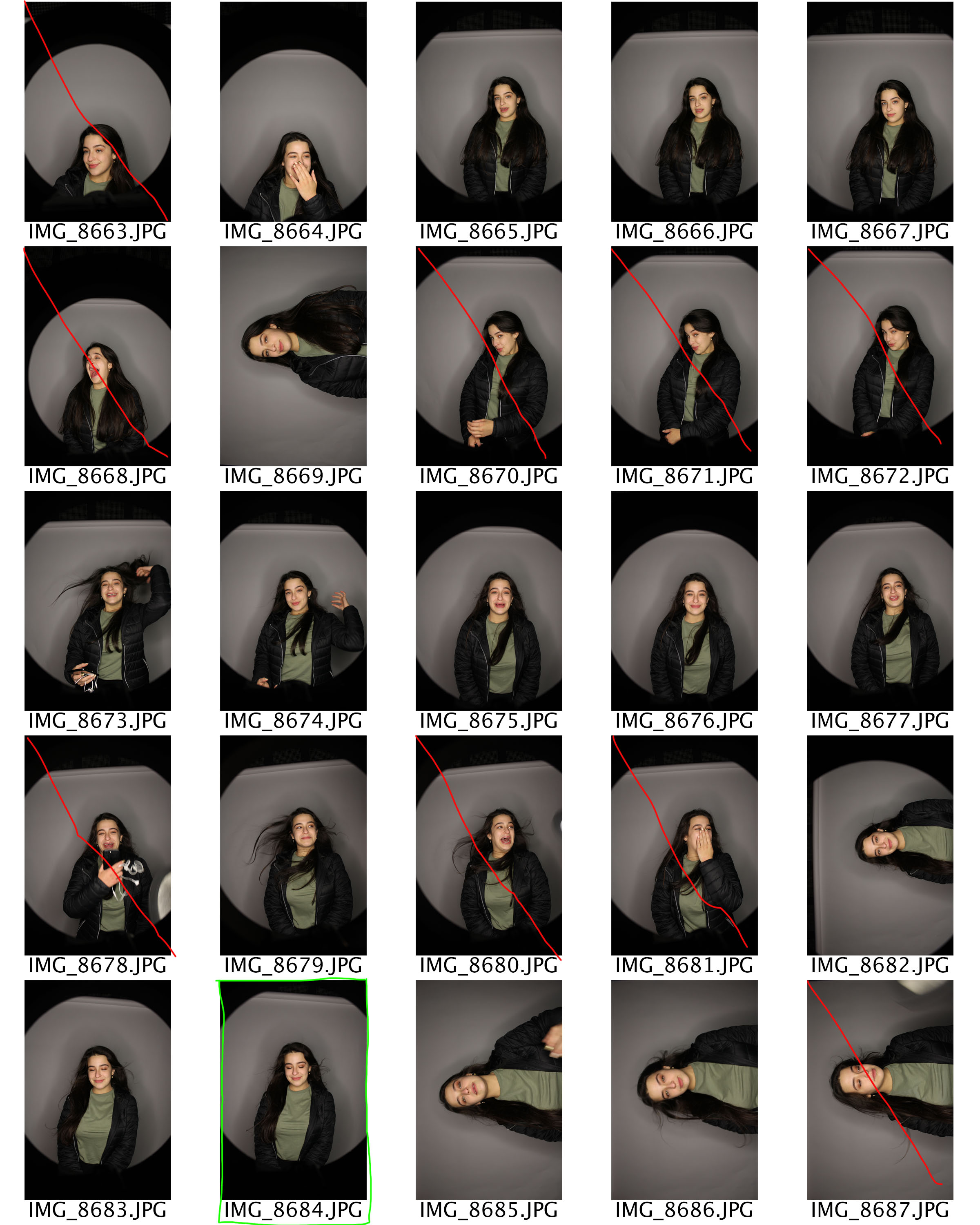
My main light source had a diffuse on it making it a soft light, this was angles slightly to the right of my models face, making a chiaroscuro effect. I then added an additional light which was angles to the left of my model, this evenly lit up my model. Finally I used another light at the back. This was raised on a tripod and was facing directly down onto the model, making the model stand out from the background. Due to this it started to create an element of 3D in my photographs. I then played around with turning some of these lights off, but keeping them in the same place, to see what effect I could create. Moreover, I experimented with ring lighting. This is a singular light which is shaped as a circle, the light is usually quite cold and harsh. You are also able to see the ring of the light in the models eye. When using this light, I made sure it was my only light source. I positioned it to face directly at my model’s face. I then placed my camera through the gap in the middle to capture the model. With this lighting I experimented with the different background colors and the different types of white balance. Additionally, using this lighting I looked at taking macro photographs of my models eye, where you are able to see the ring. Finally, the last lighting set up I used where the ceiling lighting rig. I experimented by using the different lights and their positioning. With some of these photographs I also used the soft box light to make my model more lit up.

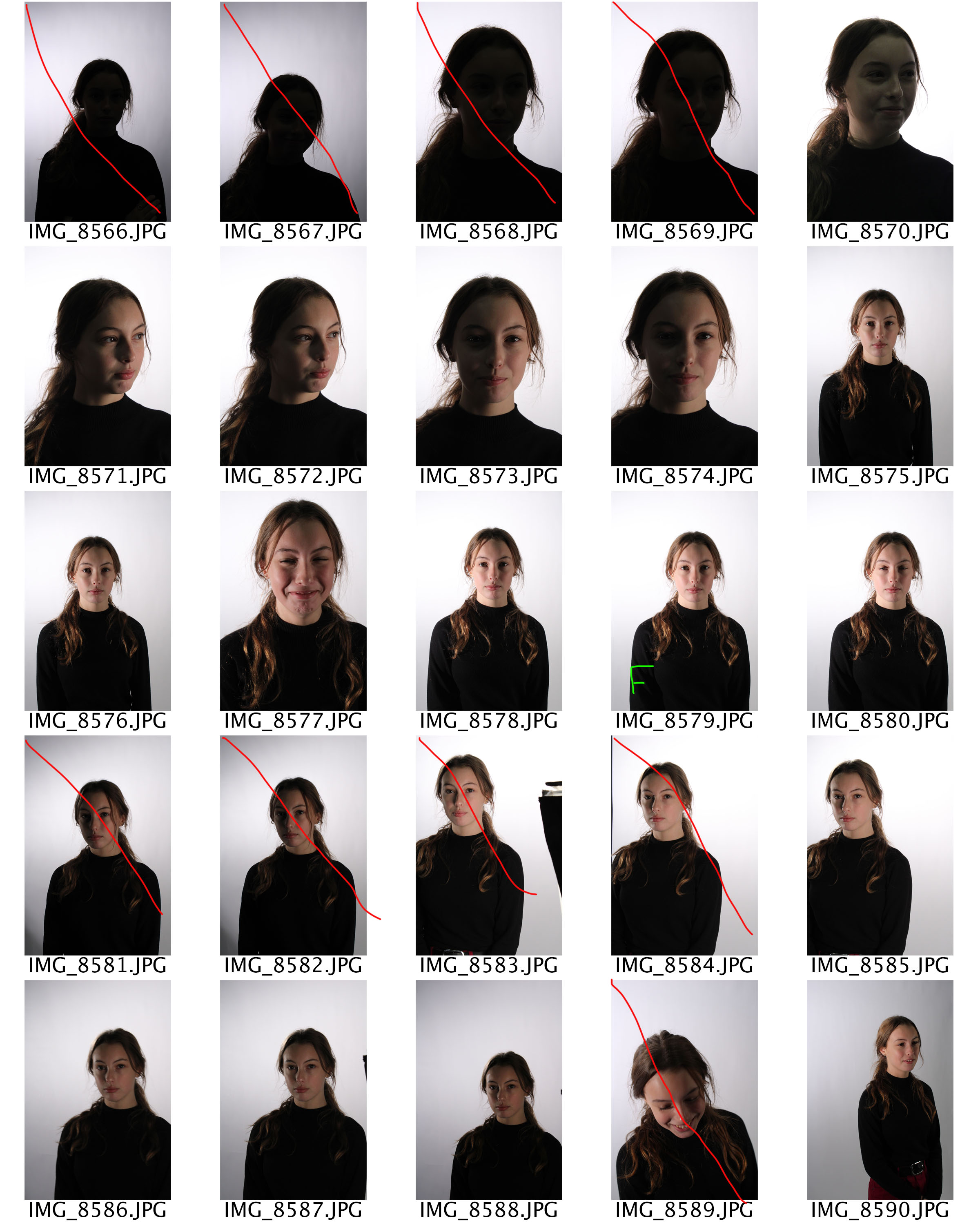
Another technique I looked at while trying to capture these photographs was, high key and low key. In my first set of photo shoots in the studio I mainly focused on low key where there is a lot of shadows and contrast found in the image. This time around I looked at high key photographs, where the images are much lighter and too some extent are over exposed. To capture these images I used harsh cold lighting and adjusted my white balance to make the images seem over exposed. Furthermore, I tended to stick with a white background in order to add to the effect of a high key image. When I come to edit these photographs my intention is to use the levels and curves to make these photographs seem brighter than they actually are which will also help to present these images as high key photographs.

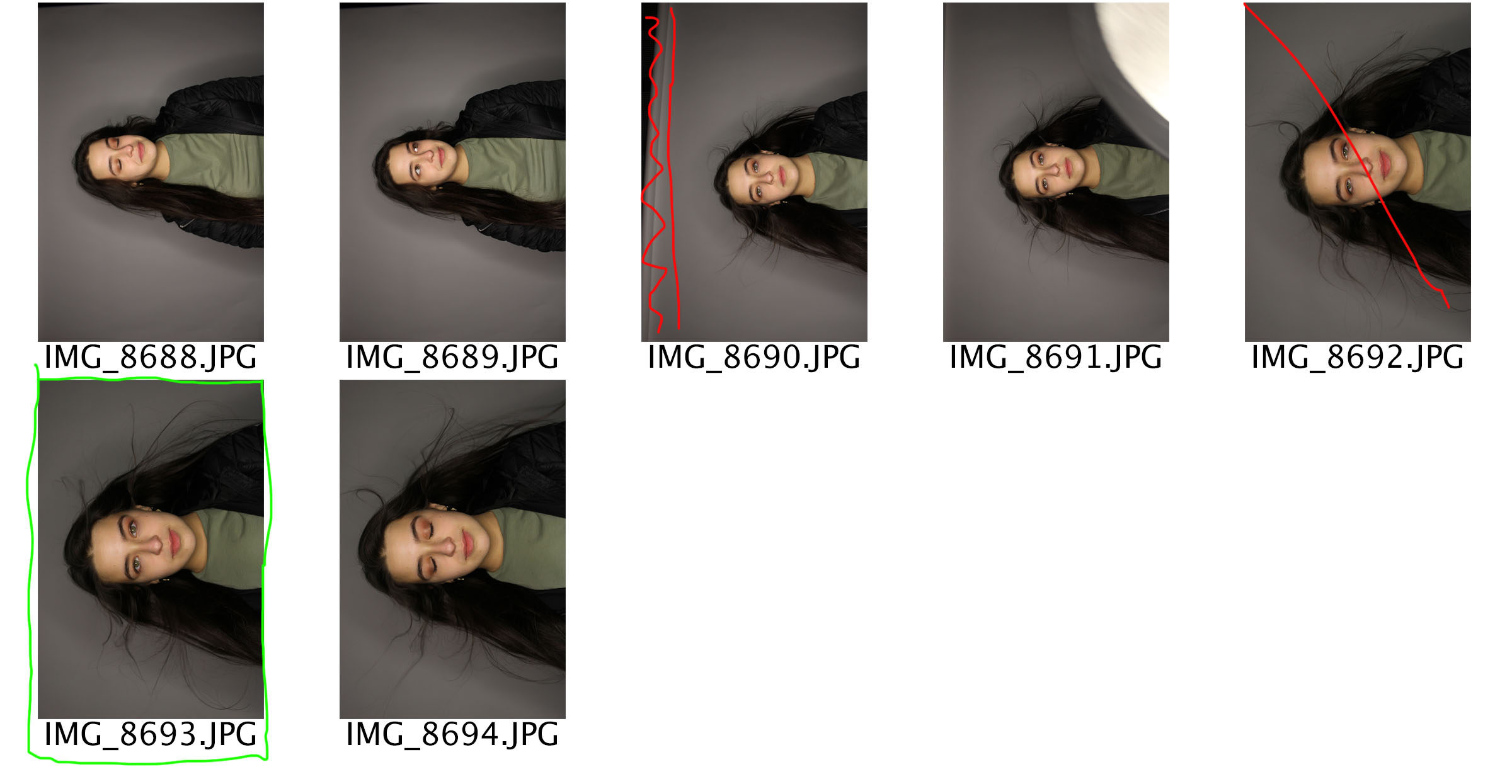
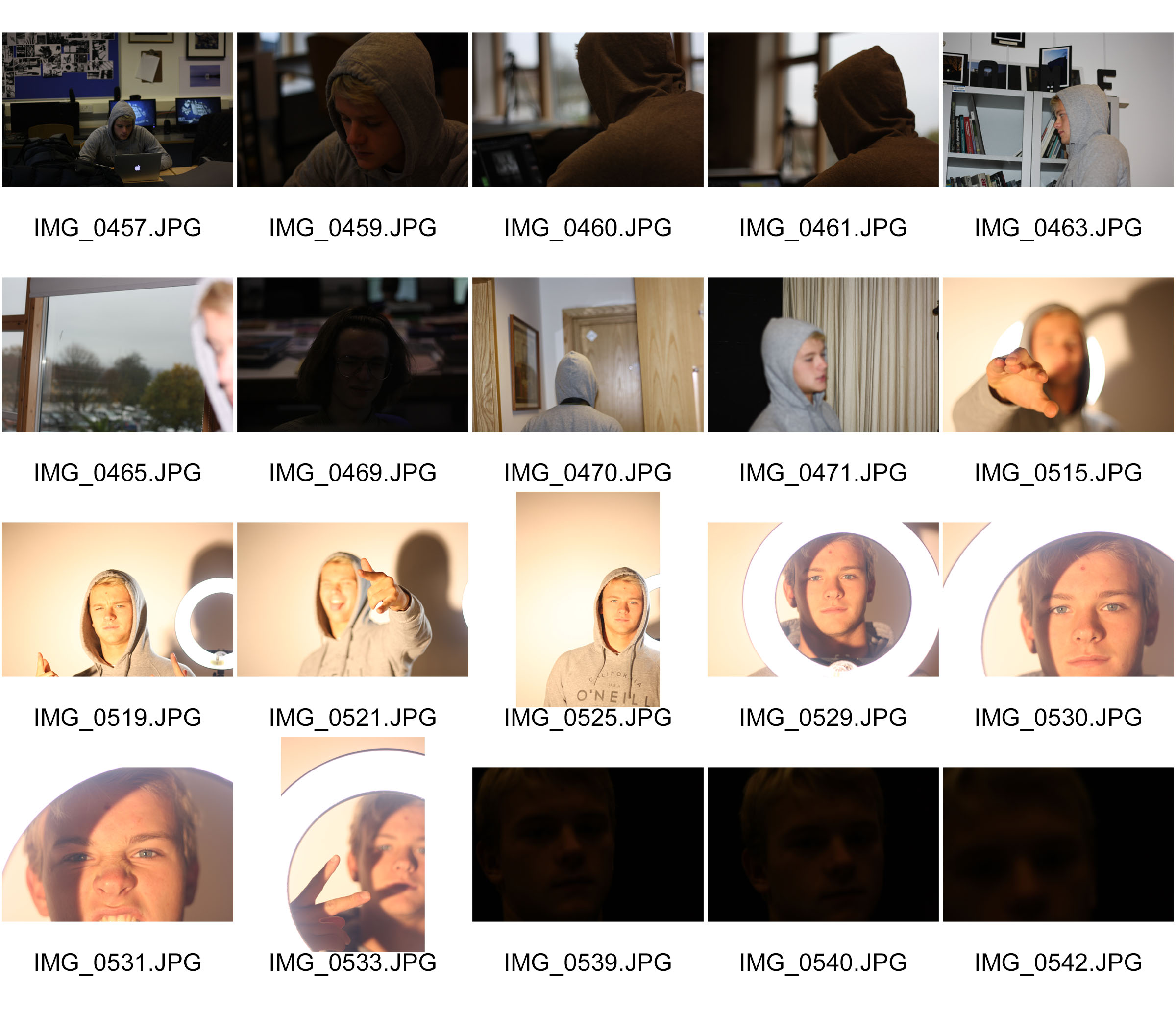
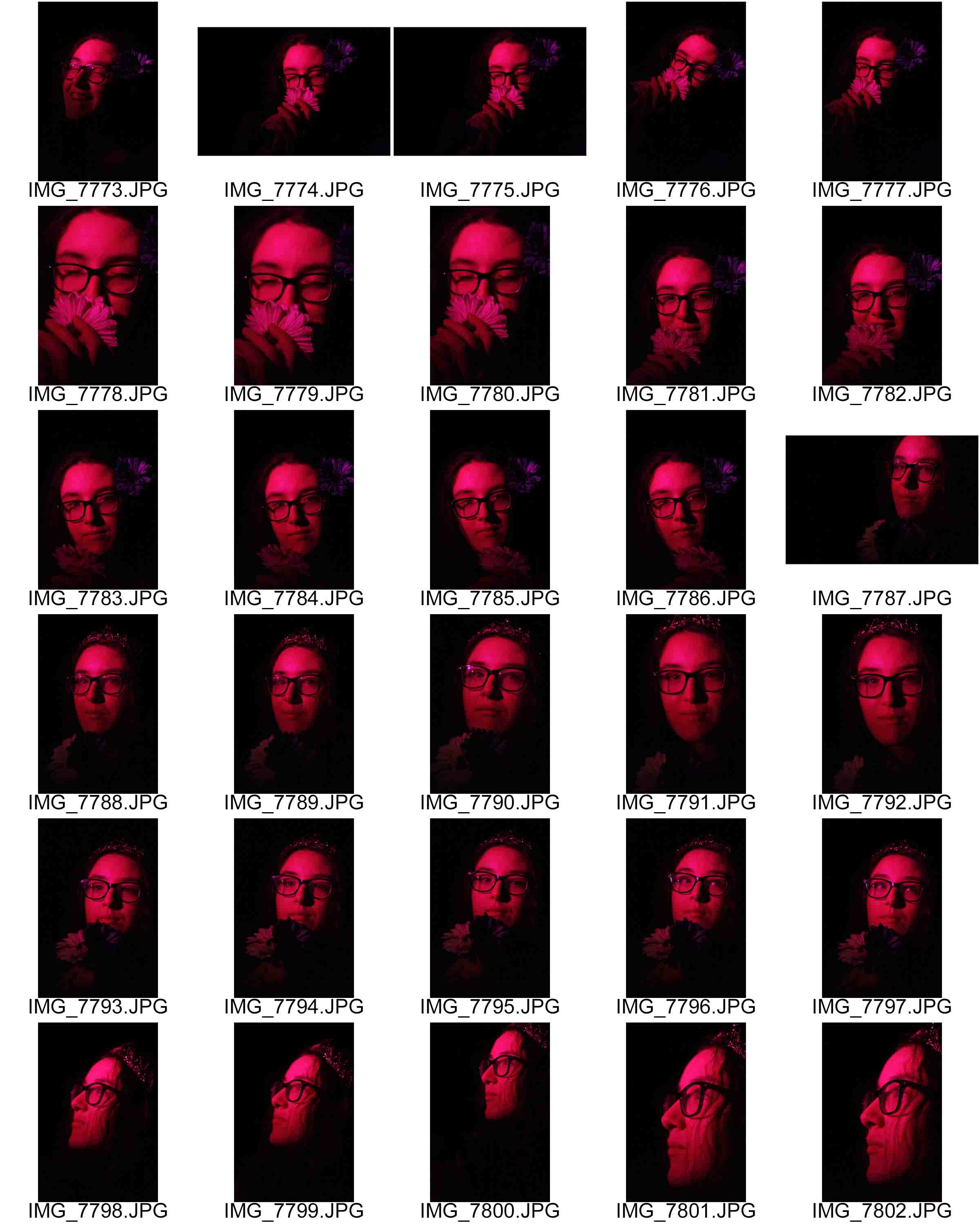
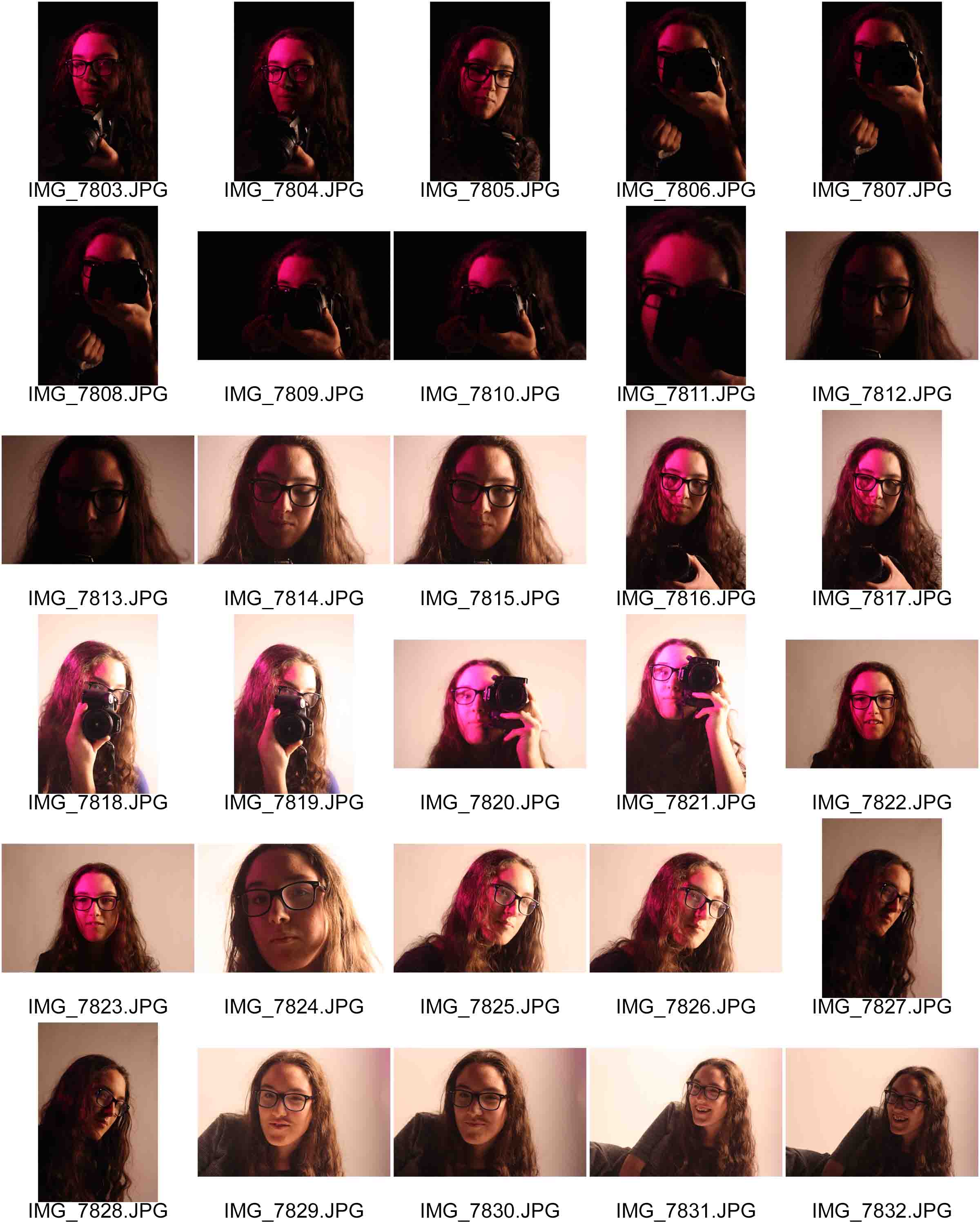
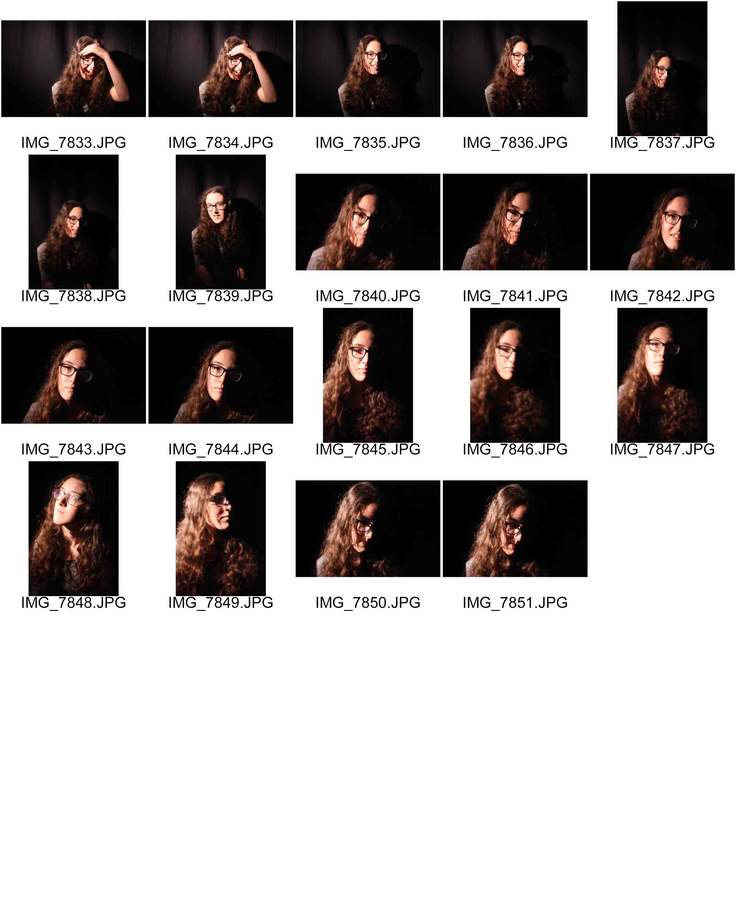
Contact Sheets
Edits

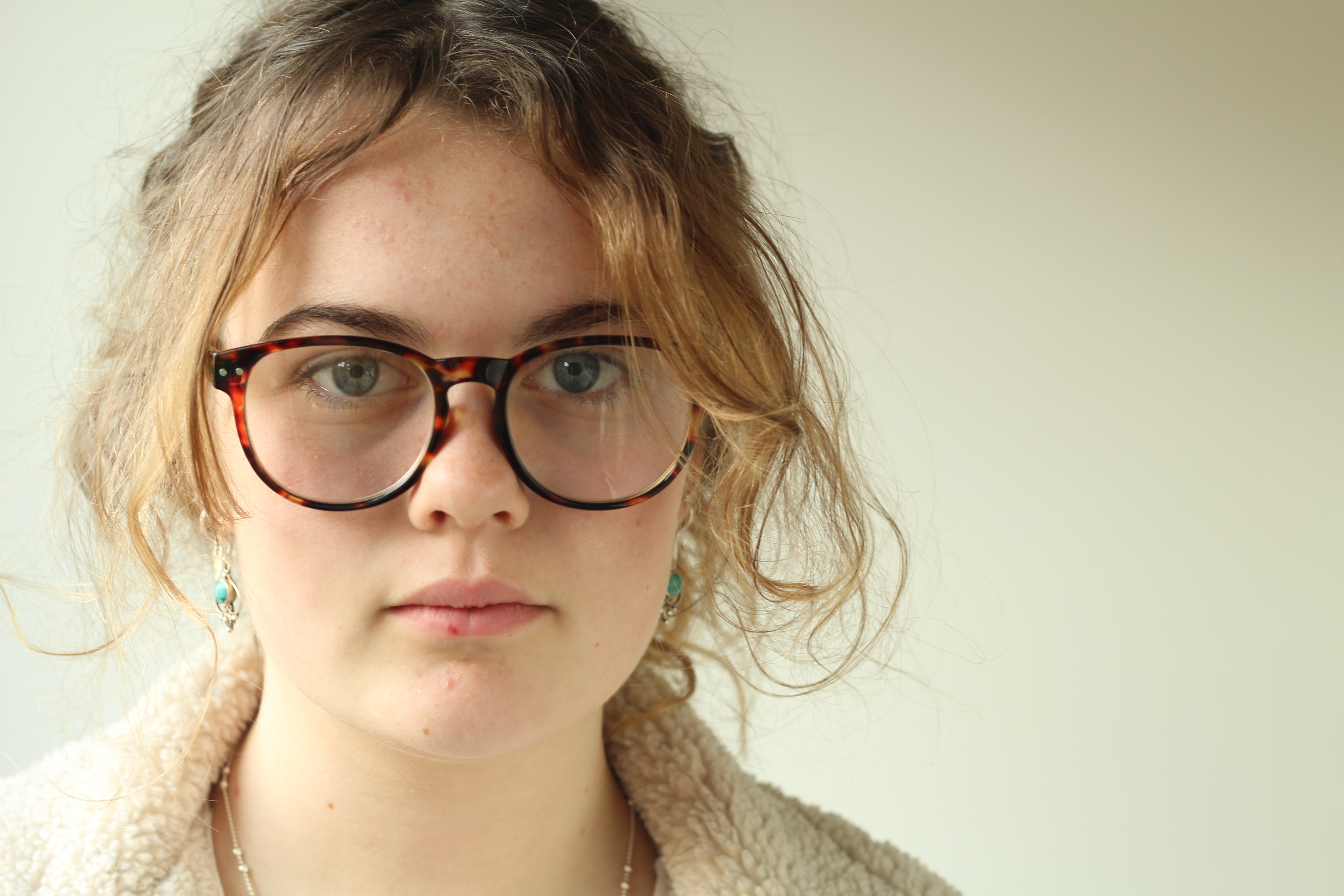
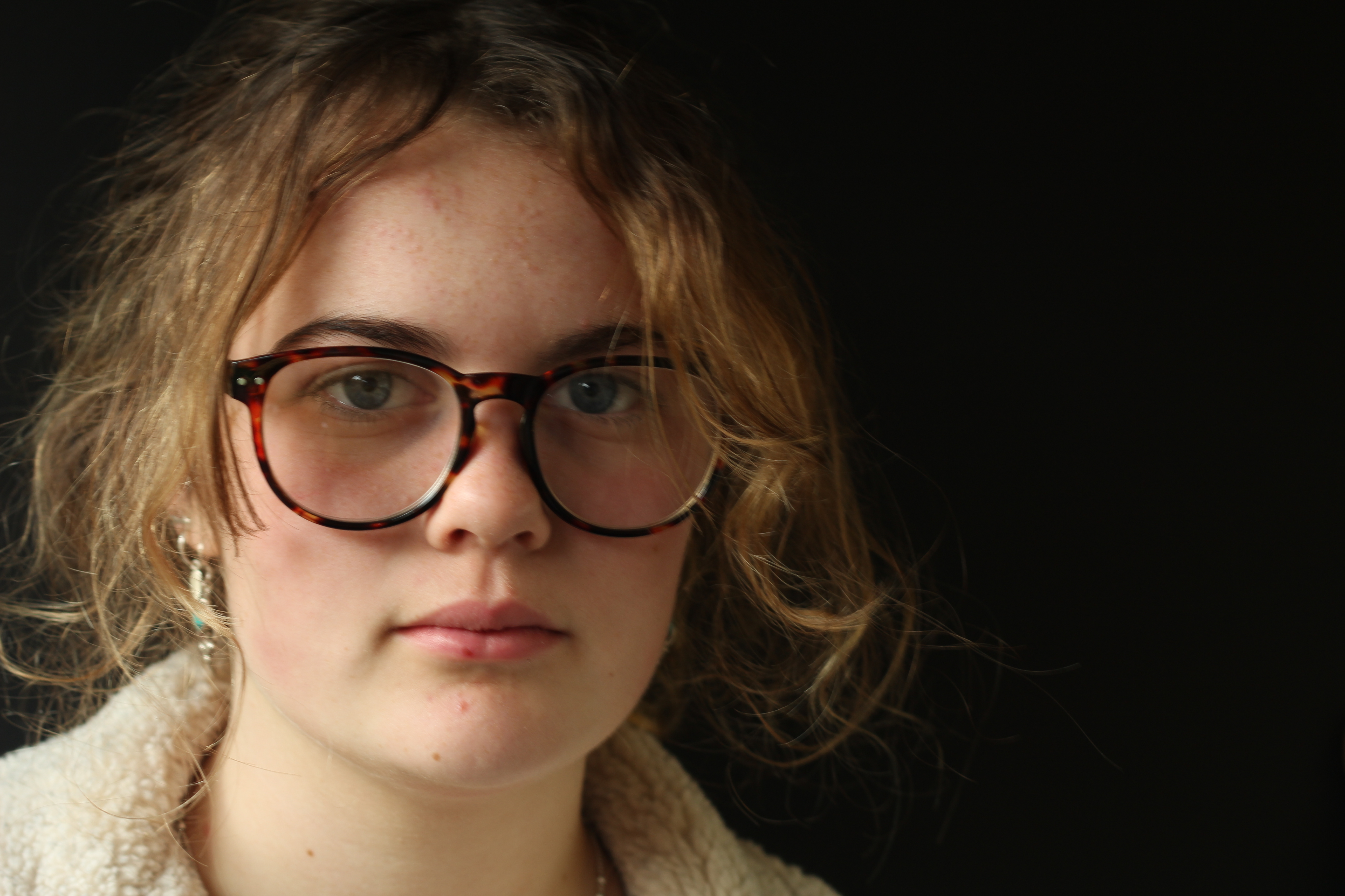
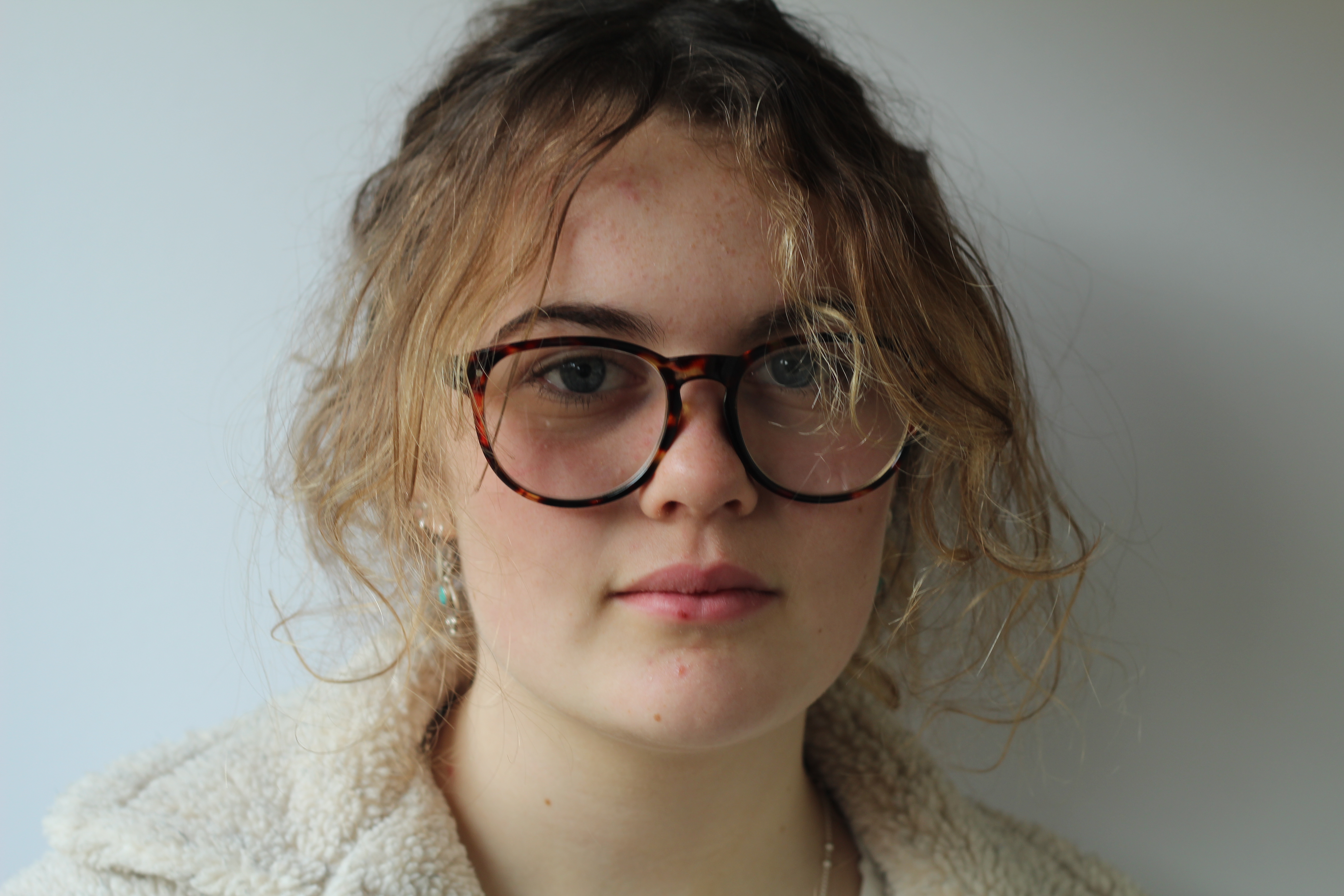
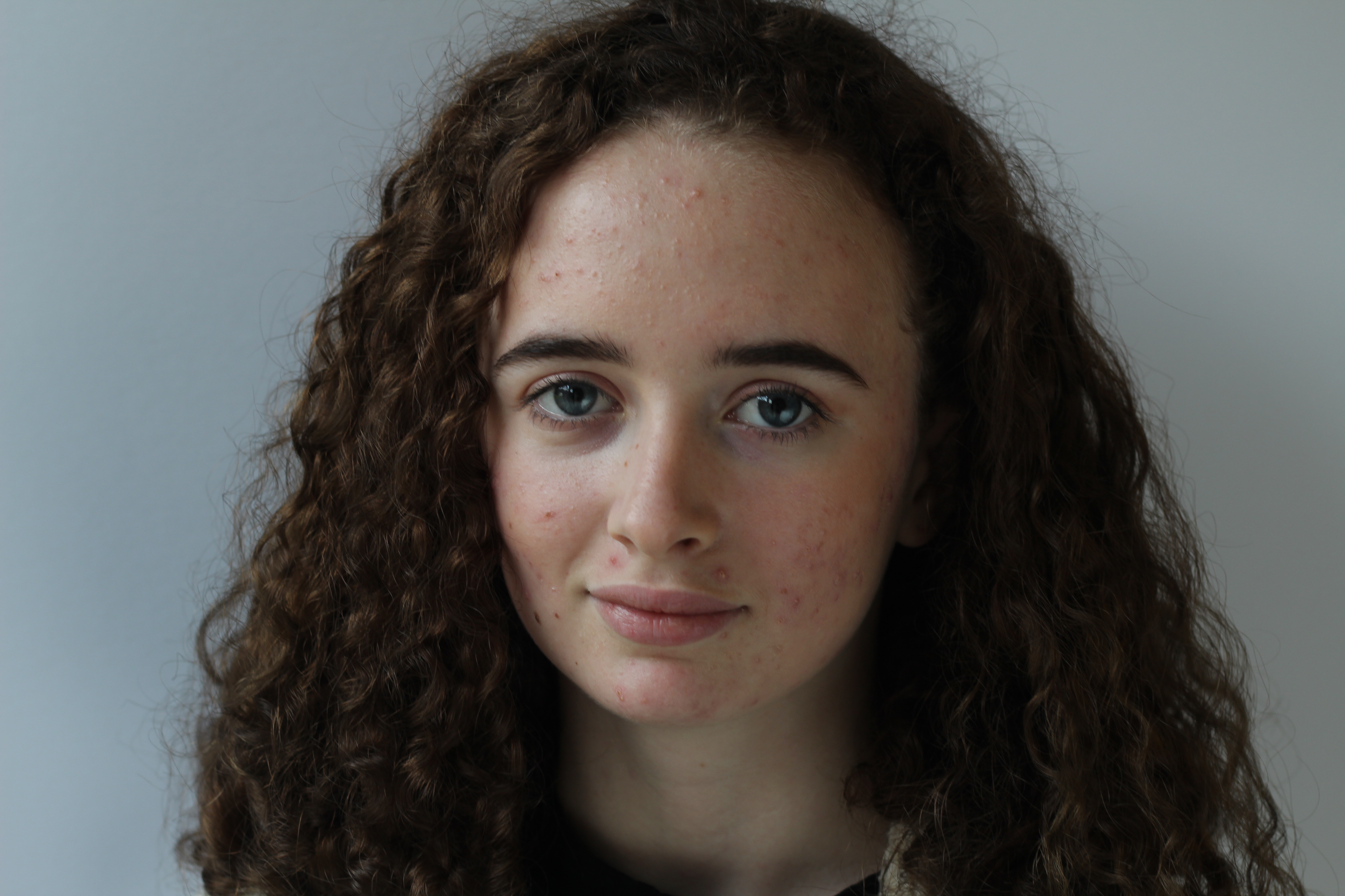
These edits are the best outcomes from using ring lighting. Due to previous photo shoots conducted, the other techniques of lighting can be found in there outcomes. When it came to editing I simply adjusted the levels and curves to ensure that my images where sharp.
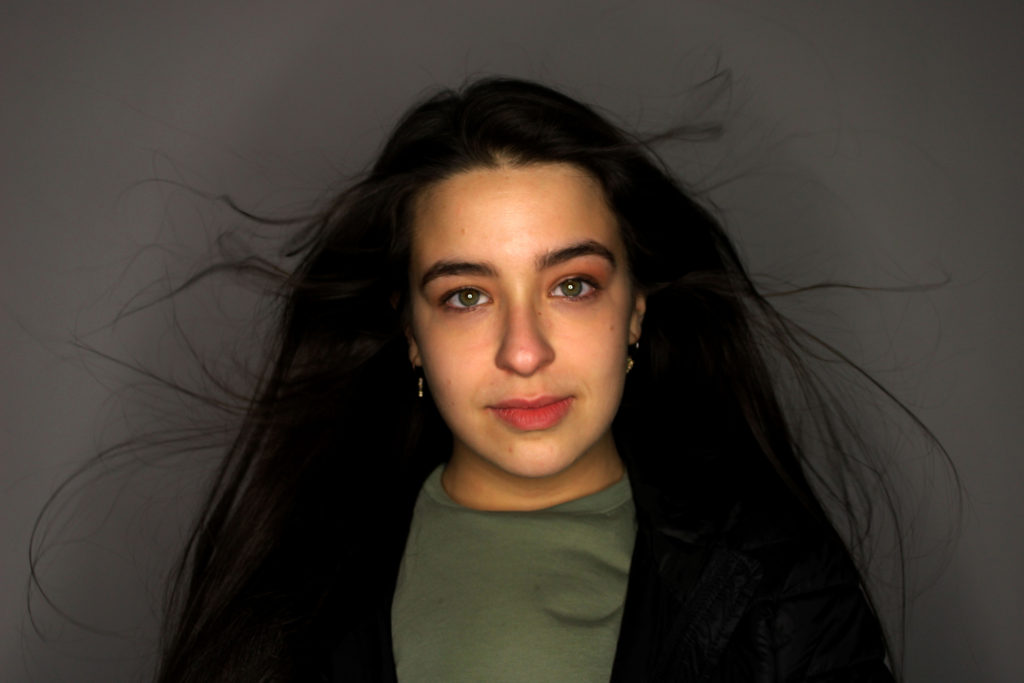
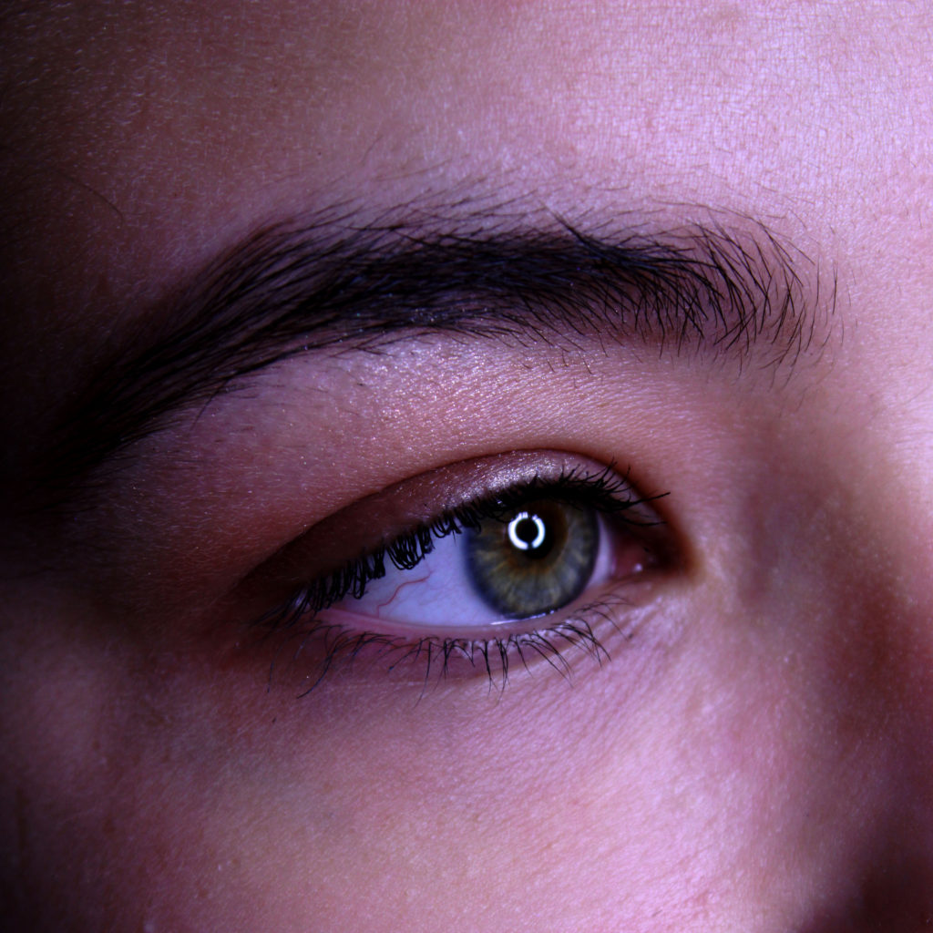
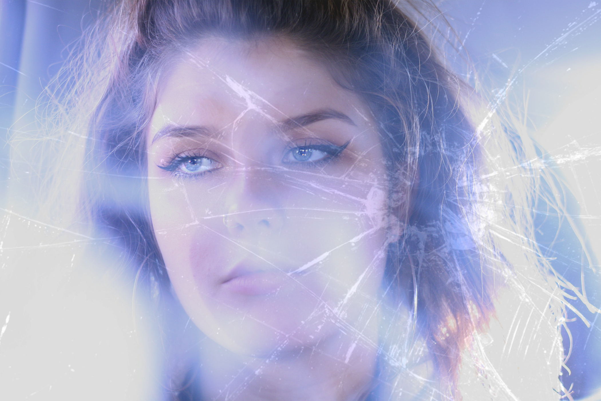
This macro photograph is of the ring light reflecting into my models eye. I decided to capture this as I believed that it was interesting and peculiar to look at. Due to the image being macro it allows the viewer to see all the detail of the facial features, from the eyebrows to the veins in the eye. This helps to present the formal element of line and texture. 
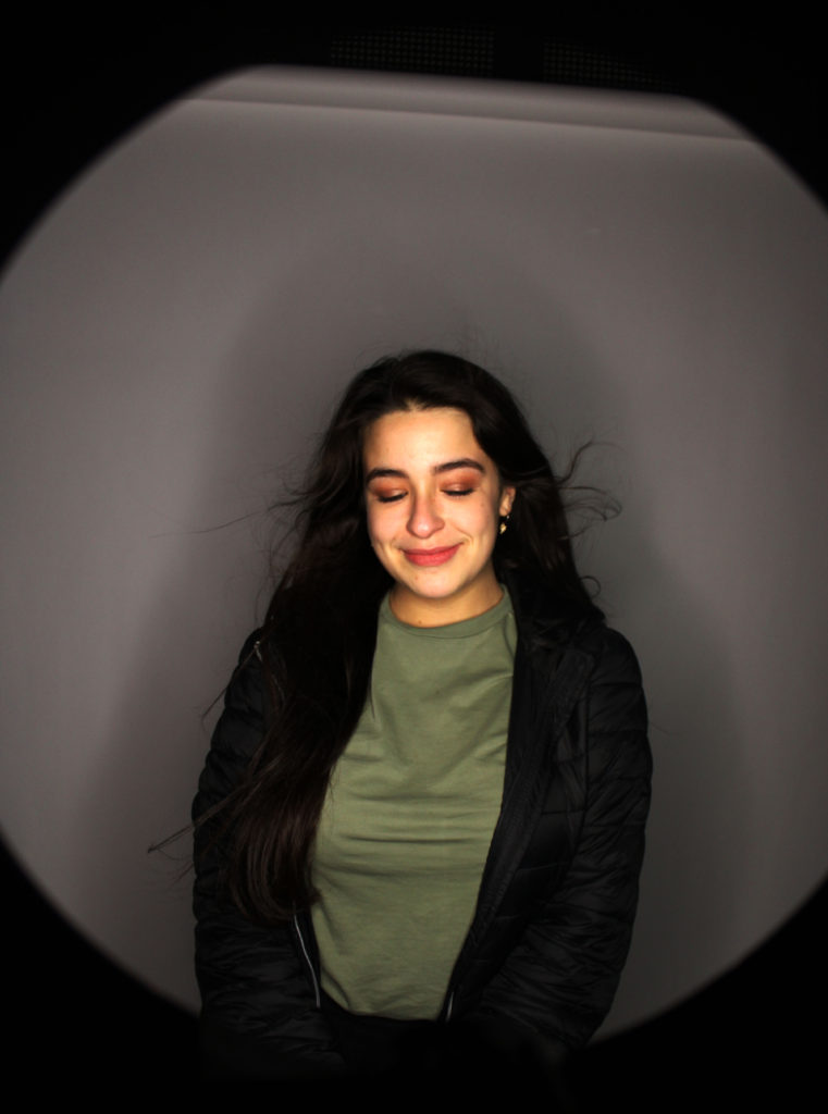
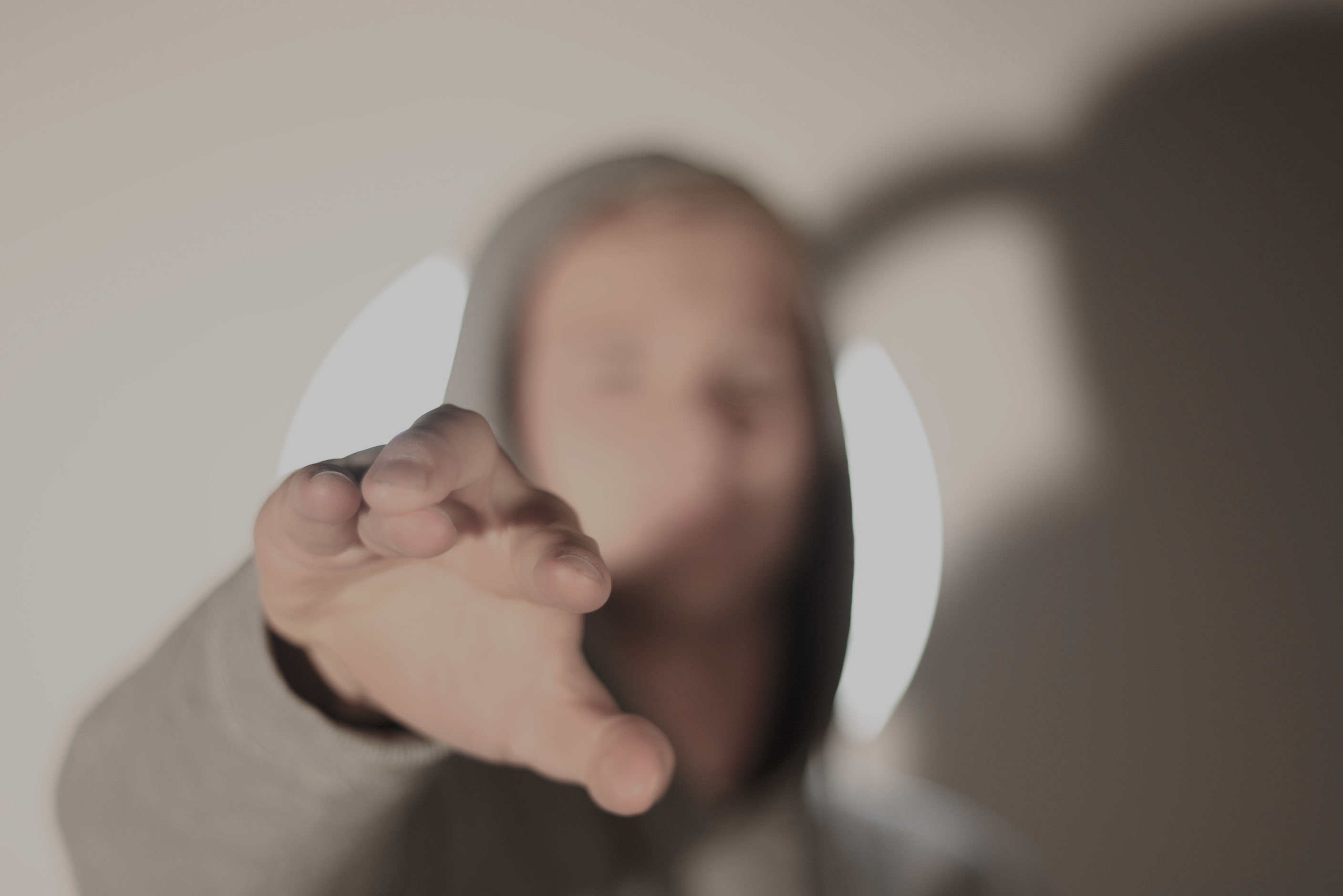
In this final outcome I tried to use the inside of the ring light to frame my model. This has helped to make the model the main focus point of the image. Moreover, I used wind to move around the models hair which has allowed movement and an element of 3D to be found in this image.
Experiment – Textures in Photoshop

Textures in Photoshop:

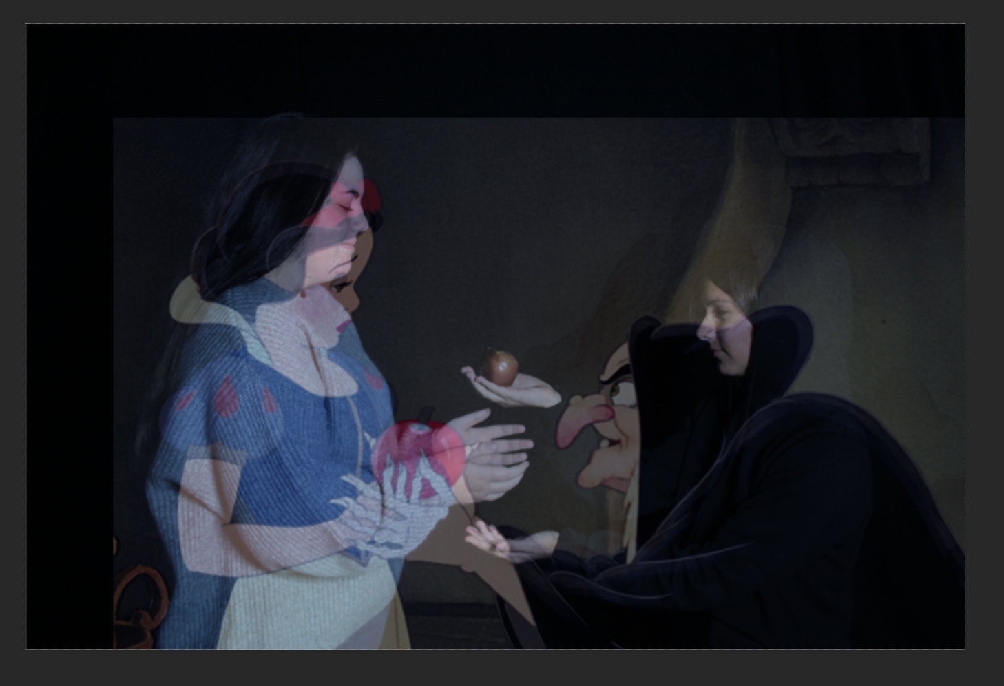
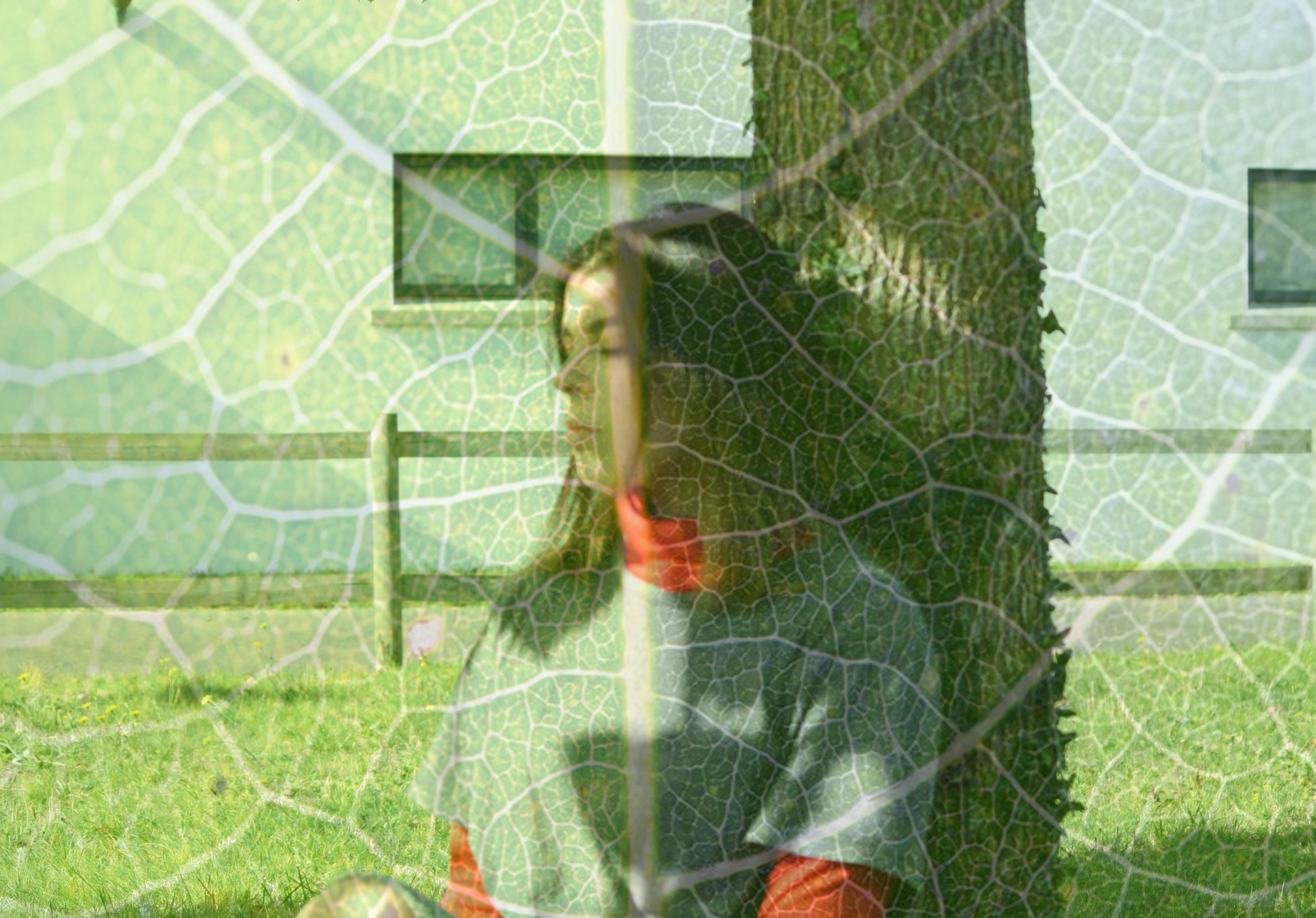
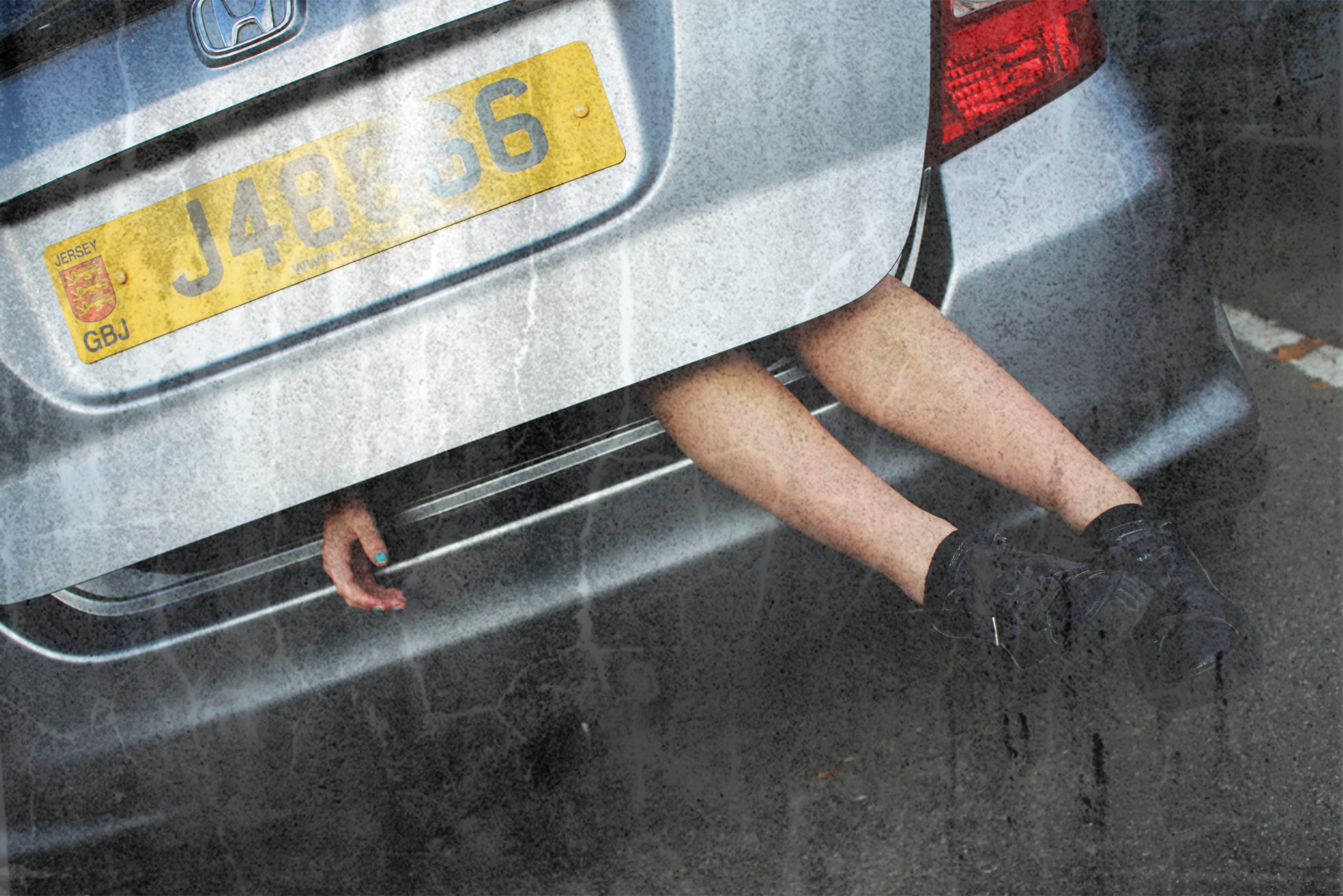
Textures in Photoshop can be used to create different compositions by adding noise or colour or  to enhance the purpose of an image.
It can be achieved by adding a texture or other image over the top of your final image, decreasing the opacity to blend the two or more layers together, creating the illusion that the image was made that way.

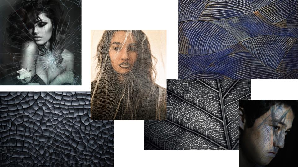
Mood Board:

The addition of textures to the appropriate compositions can enhance the power or effect of the image. It can also emphasise the message or story behind the photo by adding a second layer of visual “context” to the photo, giving further meaning or background to the ideas or concepts being presented.
My Response:

Edited Images:

Paul M Smith artist study – Tableaux

Image result for paul m smith photography

Smith originally studied Fine Art, between 1991 and 1995 at Coventry University and as part of his course he undertook a research project into contemporary art which included living on an Aboriginal reserve for four months. After completing his degree at Coventry he completed a master’s degree in Photography at the Royal College of Art. During this time he examined the meaning and construction of masculinity, concentrating on the cultural and visual creation of various alpha male identities. He has subjected various forms of heroic behaviour to incredible scrutiny. Smith has travelled from ‘Soldier’ via ‘Action Hero’ to arrive in his current body of work, the forensic vision of death presented as a new series called ‘Impact’.      -Wikipedia

Final Photography: Studio Portraiture

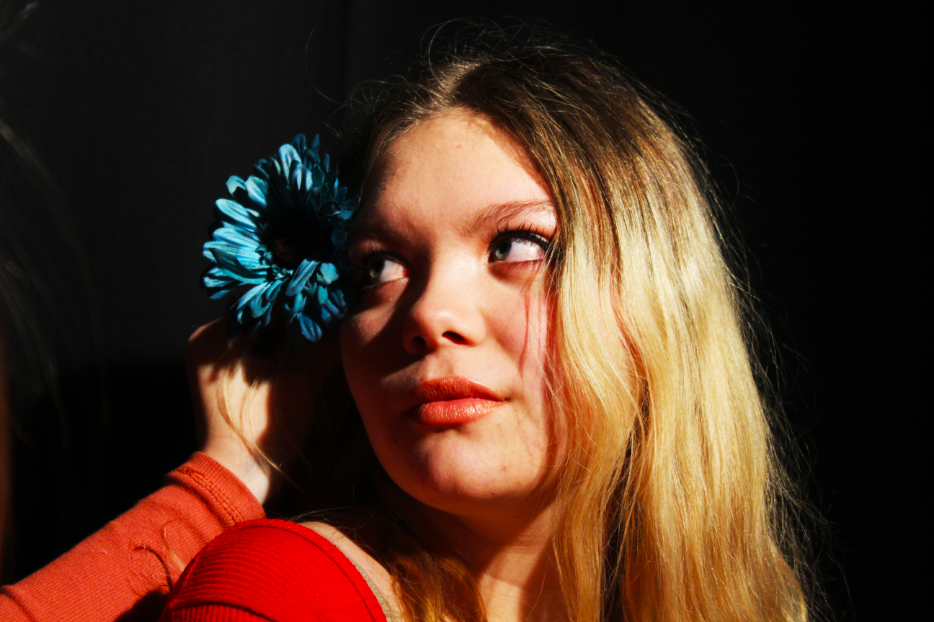
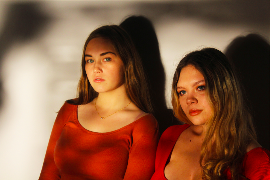
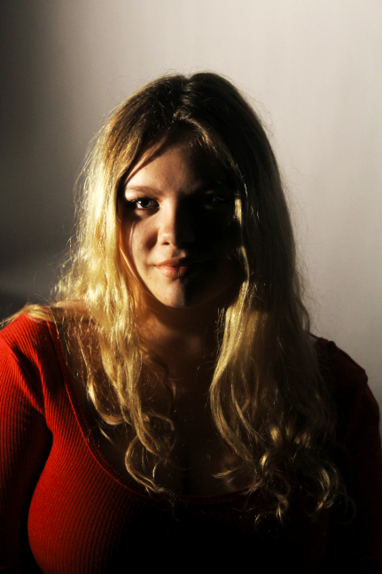
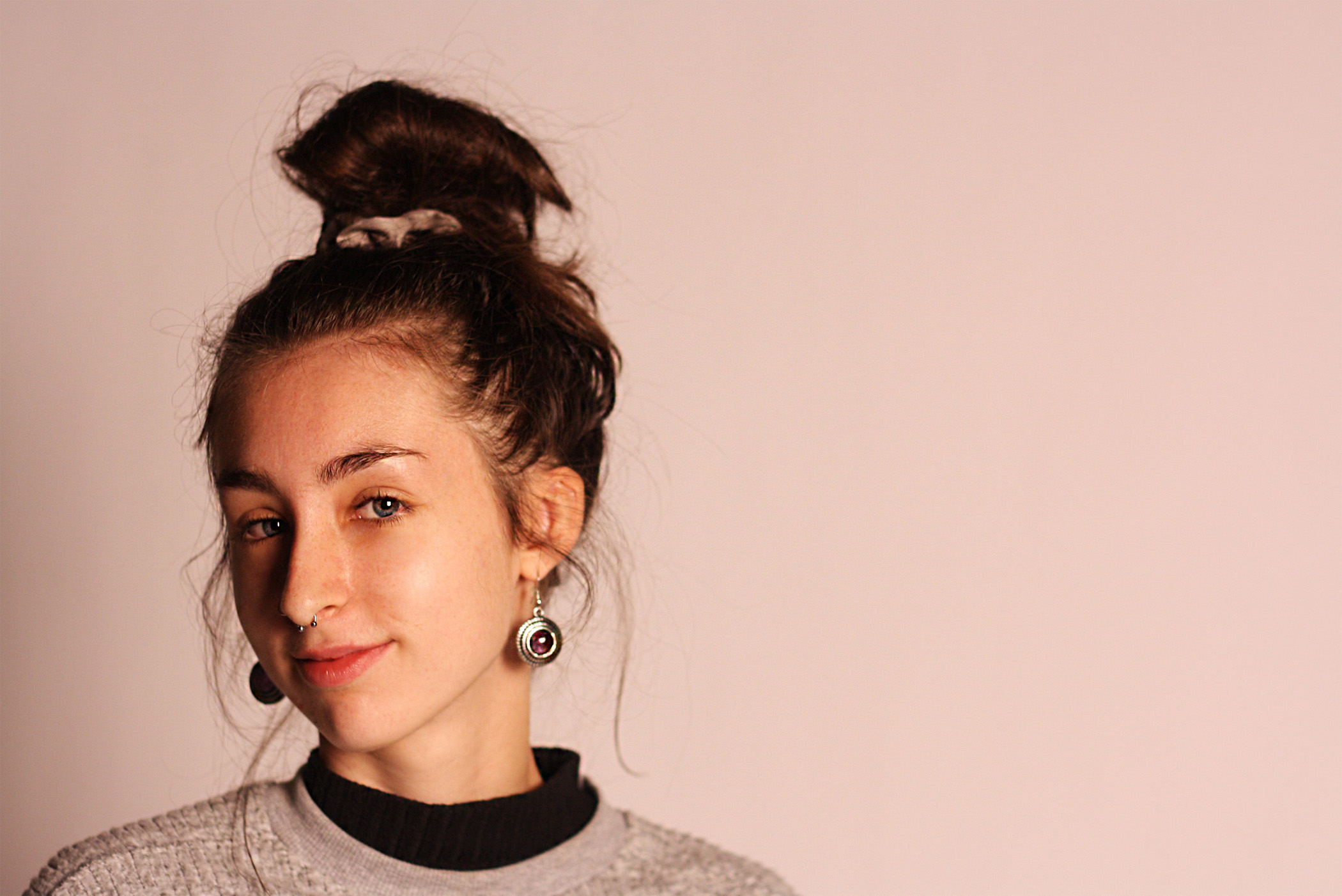
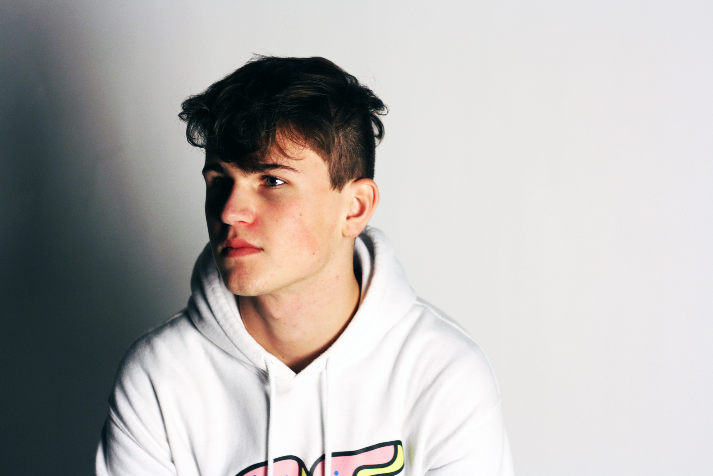
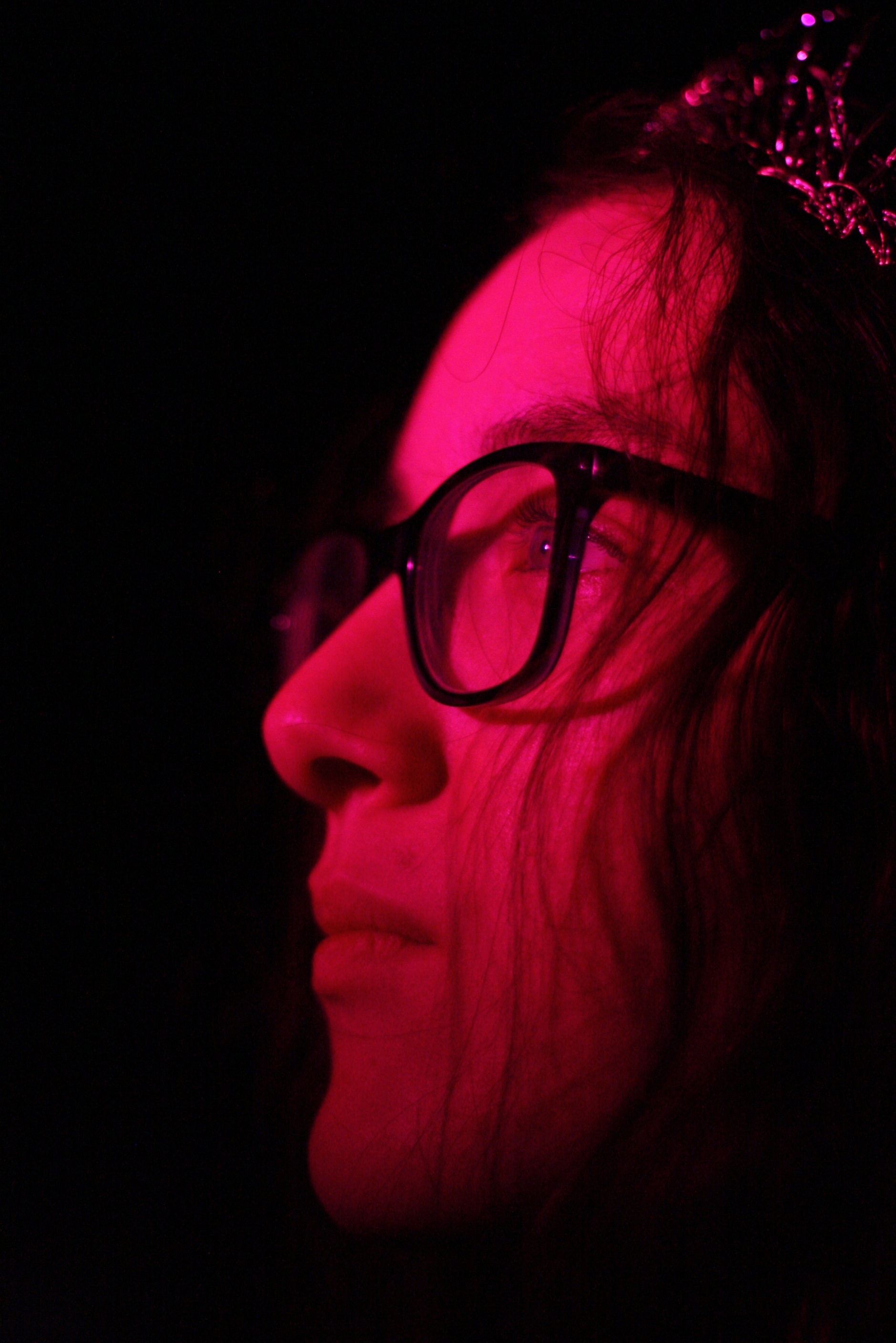
As the final 3 choices for my studio portraiture experimentation, I have decided on the following 3 images:

For the above image, I experimented more with contrasting color and camera angles. I feel like the contrast between the bold blue of the flower and the bold red of the subjects clothing helps to draw more attention to the image, and allows for the viewer to have their eye drawn around the image, rather than focusing on just one section. The contrast between the bold colors of the subject and the background also helps to separate the background and the subject in the foreground, which in turn adds more depth to the image. In addition to the colors, I feel that this image makes use of the contrast between the shaded and light areas of the subjects face, which mimics the chiaroscuro effect often found in grey-scale photographs. I feel that this contrast also adds depth to the image, and allows the viewer to see the image as more 3D rather than 2D.
The above image makes use of more abstract shadows, created by holding torn paper in front of the key light in the studio. I feel like the effect that this caused created an interesting pattern of shadows, which in turn will draw the attention of the viewer. With this image, I attempted to experiment more with shadows, and so i neglected to use the filler light to soften the shadows, which allowed for the shadows of the subjects to remain prominent in the image. I feel like this adds to the contrasting tones and colors within the image, and overall I feel like it draws the attention of the viewer to the different contrasting areas of the image.
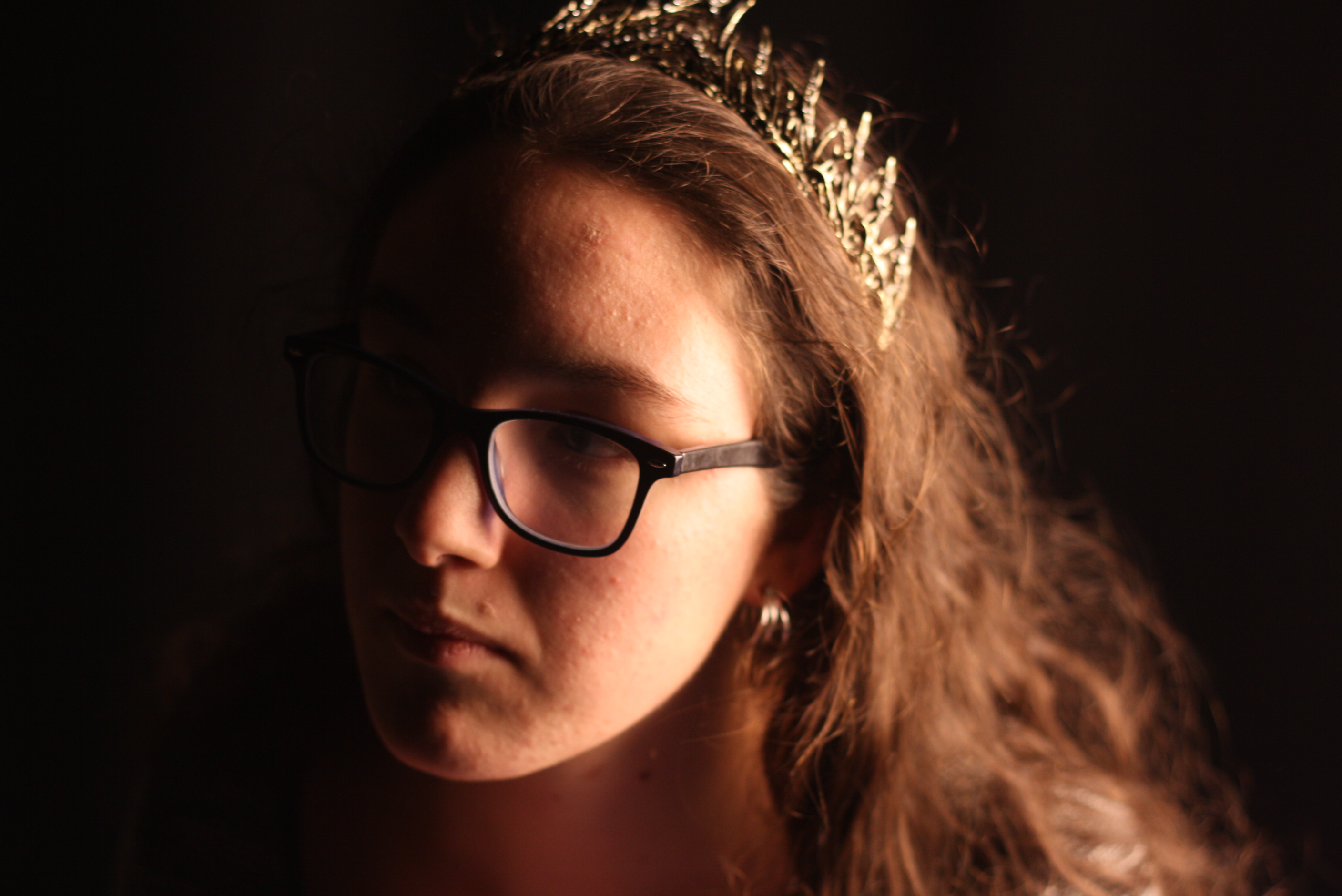
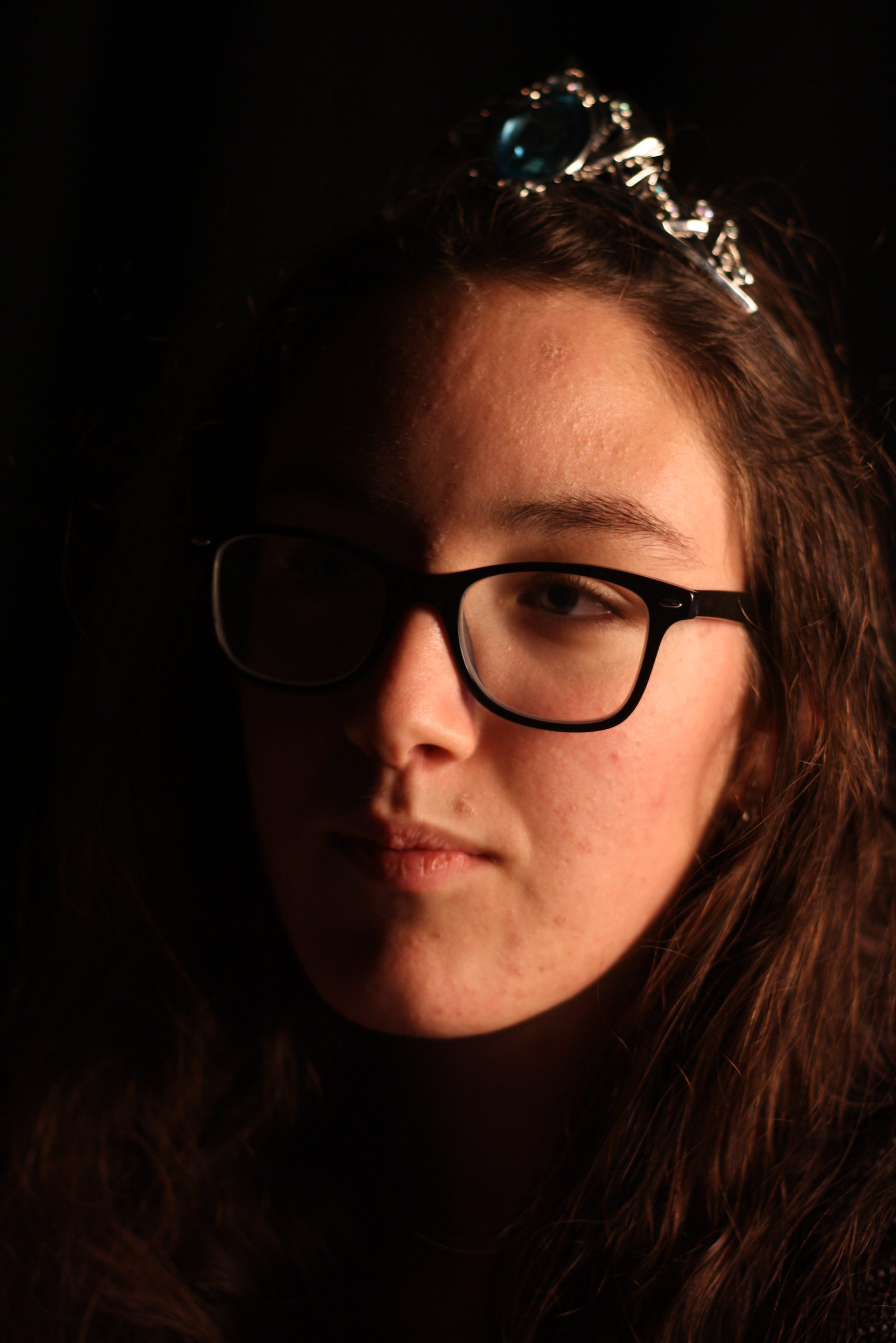
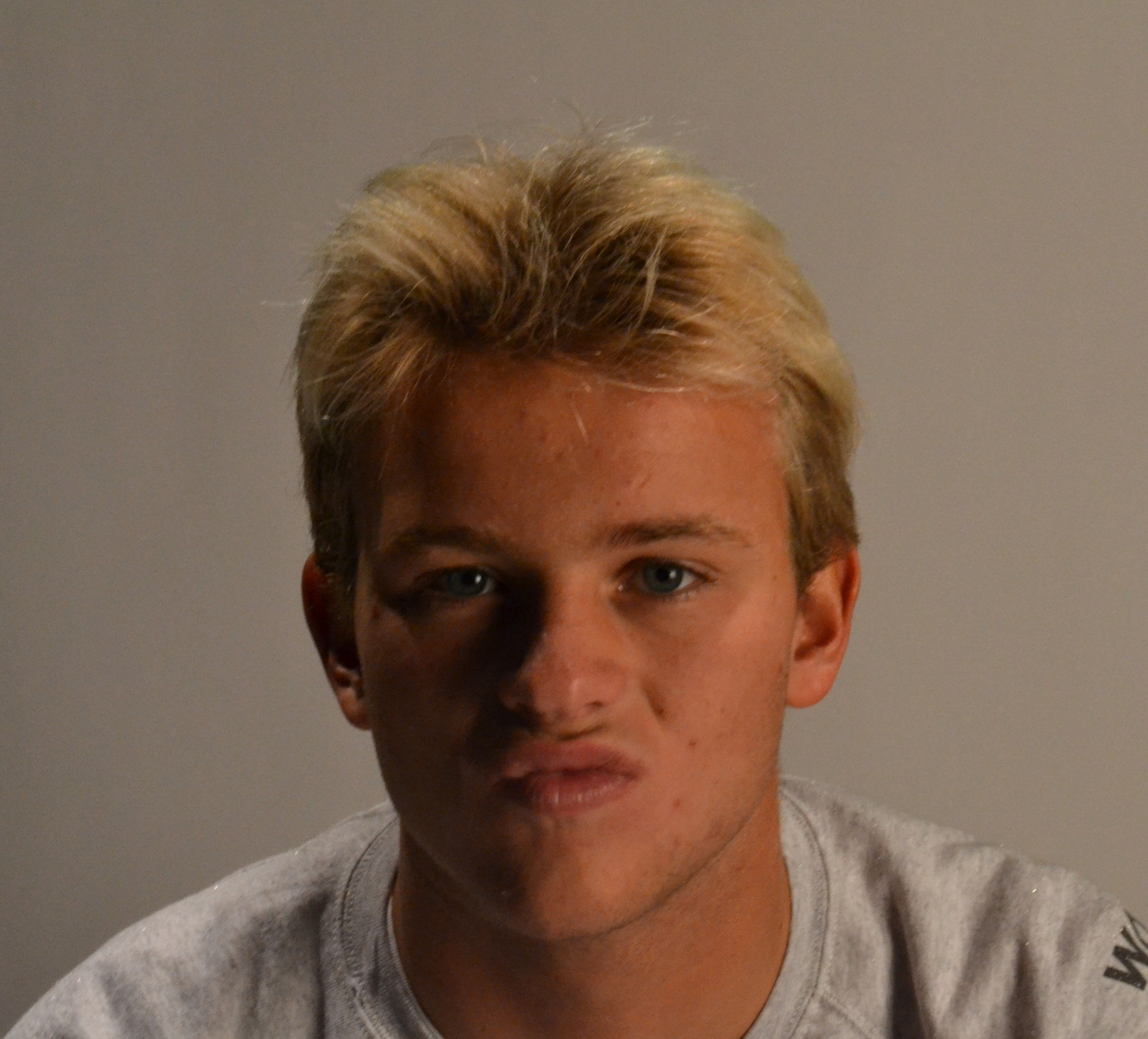
I feel like the above image is the best example I produced of creating a chiaroscuro effect using lighting and camera angles. A key light was used on one side of the subjects face to create this effect, and I feel like the contrast in tones between the left and right side of the face helps to show more depth in the subject. I feel that this image is the best example of me attempting to create a contrast between the light and dark portion of a subjects face. In addition, I feel like the positioning of the camera in this particular image, allows for the viewer eyes to be led directly to the face of the subject, as it is positioned straight ahead of them. I feel that this allows for the viewer to feel more personally involved with the image, and allows them to relate more to the subject and in turn, the photograph itself.
Portraiture: Natural Lighting

Natural lighting is often used in photography, as it often gives the environment and the subject a more natural look, and can be much more cost effective than using artificial lighting, as this requires specialist lights. Natural lighting can provide light to places where light would naturally occur anyway, and the same with shade, and so by using natural lighting, a photographer does not have to manipulate artificial lights to make the lighting match the effect they are attempting to show.

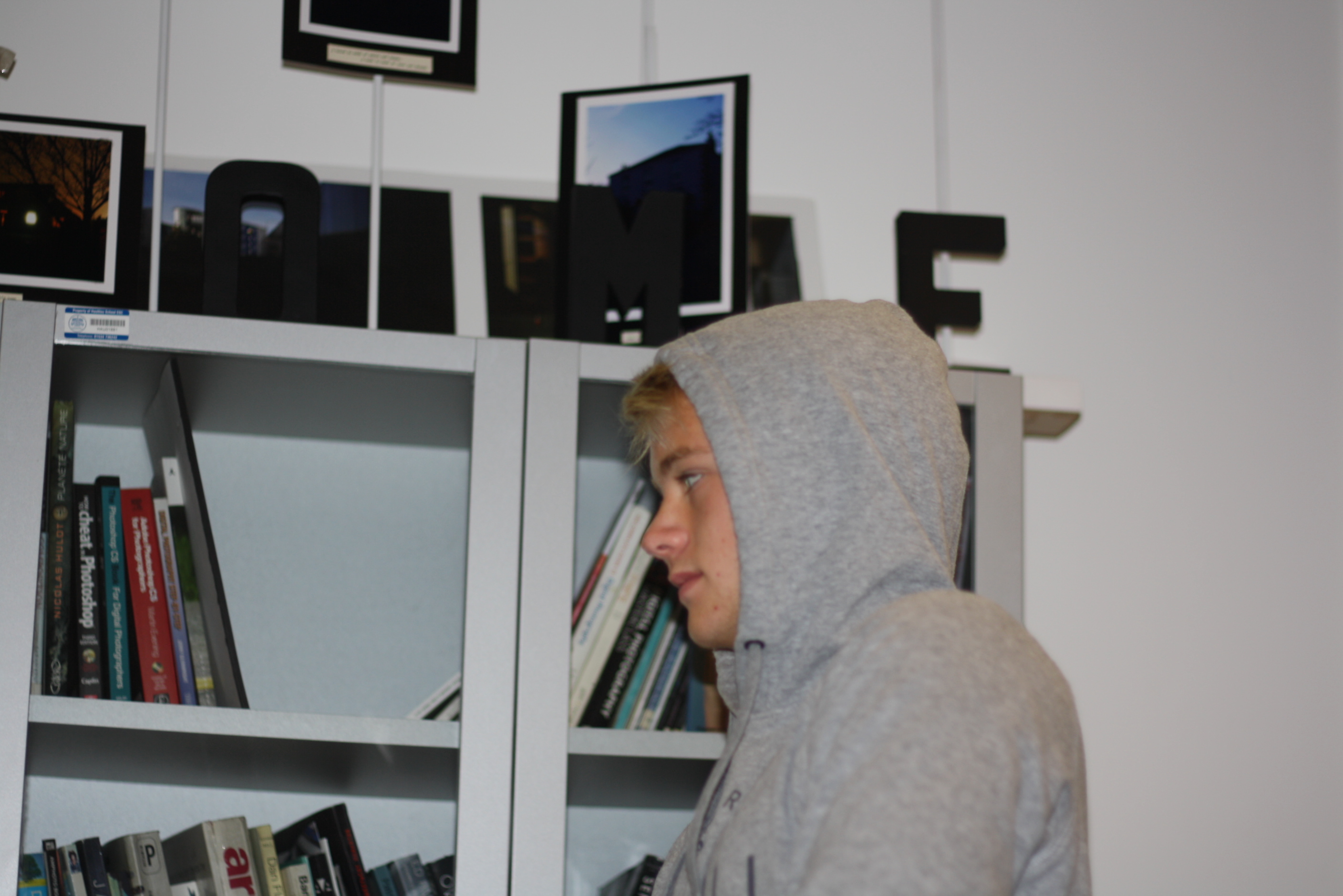
The products of my experience with using natural lighting with head shots (close ups). The lighting used in my experimentation came through a glass door, which the subject was positioned next to:

A negative of using natural lighting is that it can not be manipulated by the photographer to produce the best outcome. This means that when natural lighting is not available (it is overcast or there are no windows) the photograph will not have the right lighting.

The above 2 images are examples of what happens to the lighting when the sun is obstructed from coming straight through the window. These images appear more flat, and are too dark to allow the viewer to make out certain details. This damages the overall eye-catching effect of the images, and is something that cant be controlled when dealing wit natural lighting.

Natural lighting, in some cases, allowed for the subjects face to appear brighter and softer, which is an effect that may have been missed if harsher studio lights had been used. Using natural lighting with close-ups of subjects can, however, mean that some of the detail within the facial features of the subject is lost, and the positioning of the lighting and its intensity cannot be manipulated.

Studio photography

Lately we’ve been experimenting with lights and shadows and how we can transform a portrait into something interesting and unique. For this we’ve been using the studio and have been playing around with the different types of lights in there.  We use studios in photography to control the amount of light we expose in a picture, and to guarantee an outcome that we want.

Pictures taken:

For most of these photos, I used the large soft light to create soft shadows. For others i used the spot light to clearly highlight the model, and used coloured sheets of plastic to cast a certain colour onto her.

Chosen pictures:

ISO 400 Shutter speed 1/125
ISO 800 Shutter speed 1/1000

I took these pictures with the intention of casting half of her face in shadow, or making the surroundings dark enough to illuminate her face. I had her faced sideways of the light, or faces towards it. I played around with angles, ISO, shutter speed, aperture, and lighting, and came out with three final images that I am pleased with.


Studio Lighting – Post 4 (Two Point Lighting Shoot)

Two Point Lighting:

Two point lighting set up produces highlights in the eyes and some light and shadow. The secondary source of light is used to eliminate shadows that are created by the key light, it will soften contrasts and make more of the subject visible by enhancing the illumination of the face from  the key light.

It creates visible contours and enhances highlights and shadows on the face or body of the subject. It is very useful for close up portraiture as it shows off the facial features of the subject subtly. It is often used in the fashion and cosmetic industry as it creates a deep image with shadows and highlights and display the subject very well.

Mood Board:

My Response:

Best Images:

3 Point Lighting

What is 3 Point lighting?

3 Point lighting is the process of capturing the subject with maximal yet effective lighting, controlling shadows and shade.

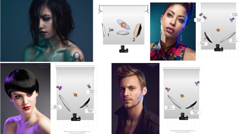
This process involves a hair light, fill light and a key light, all positioned as shown in the diagram below.

Image result for 3 point studio lightingFor th

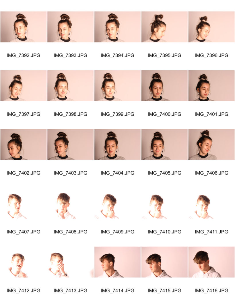
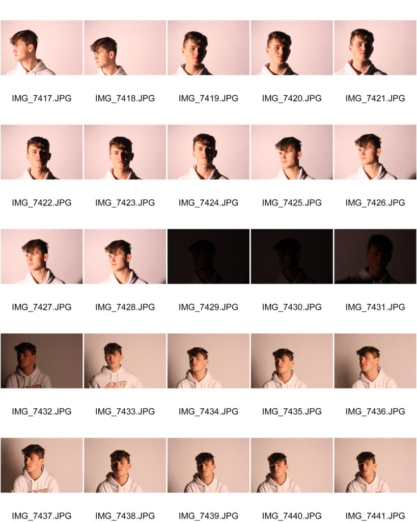
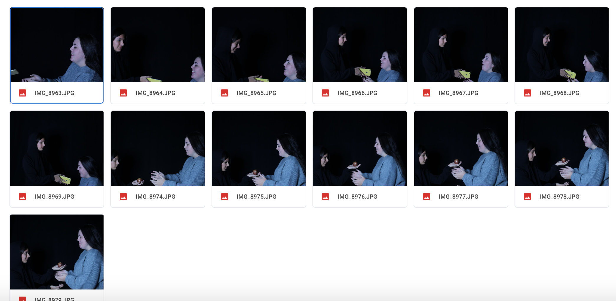
Contact Sheet

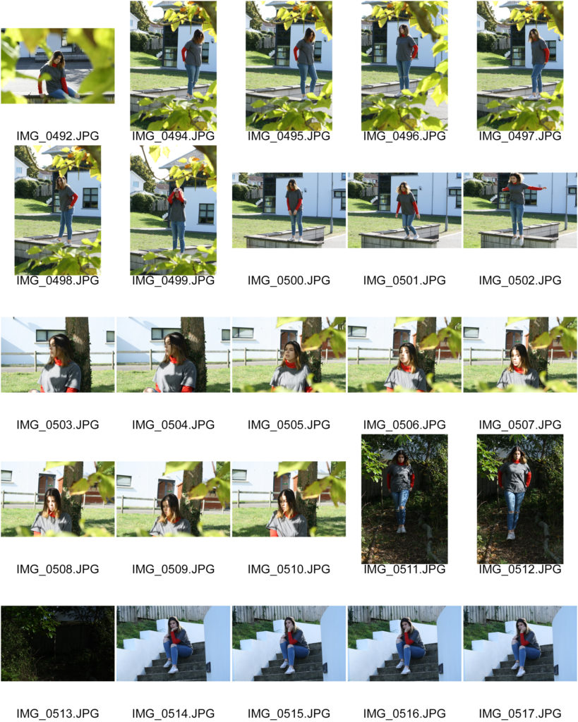
Here is a contact sheet of all my images from the shoot

Selected Image Editing

for this project, I wanted to explore more creativity with my editing, while not going too overboard

Here is an original photo

For this photo, I am going to lower the exposure slightly, increase the cyan colour within the image and apply a distorted filter over the top to give off a lo-fi effect.

Here is another image

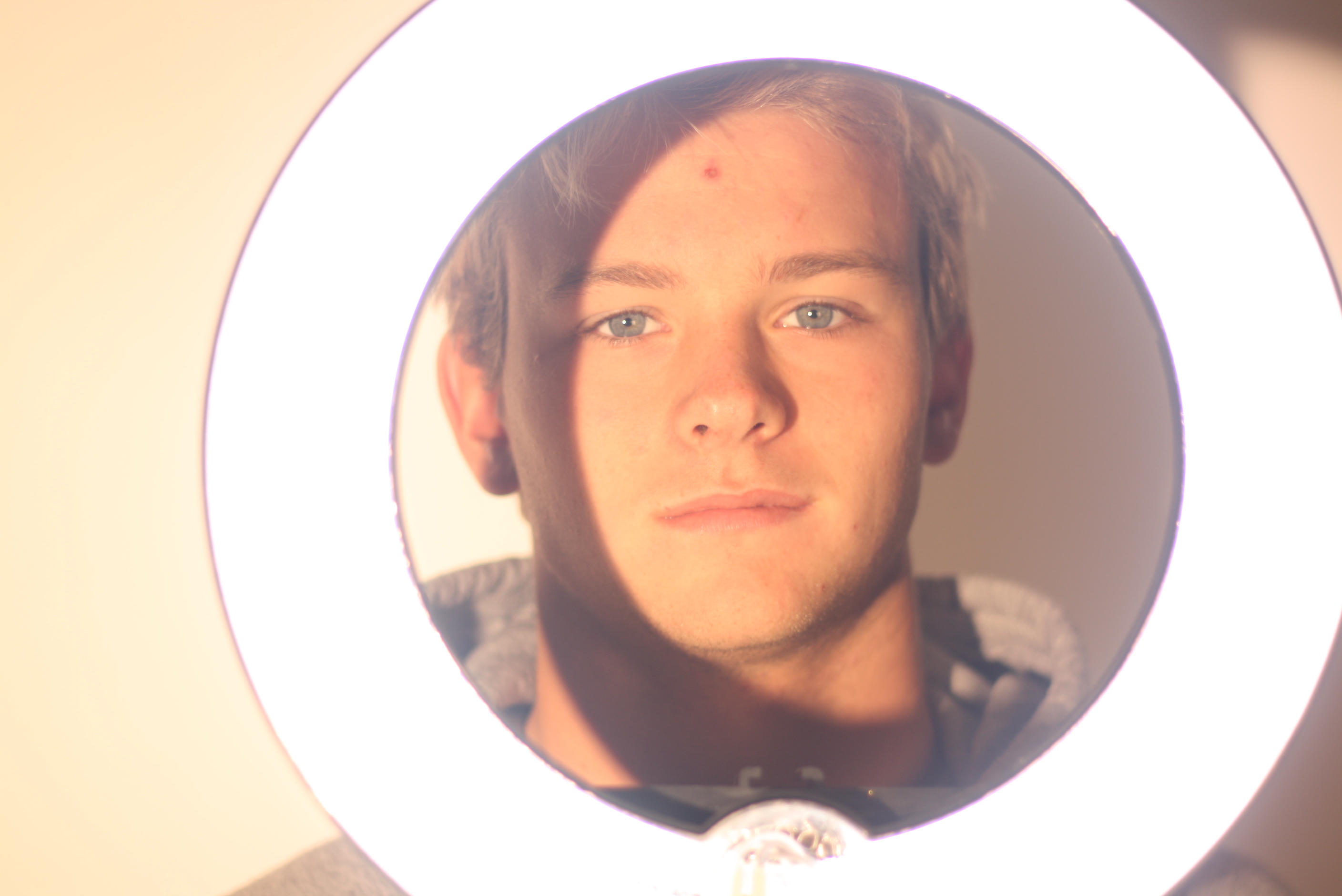
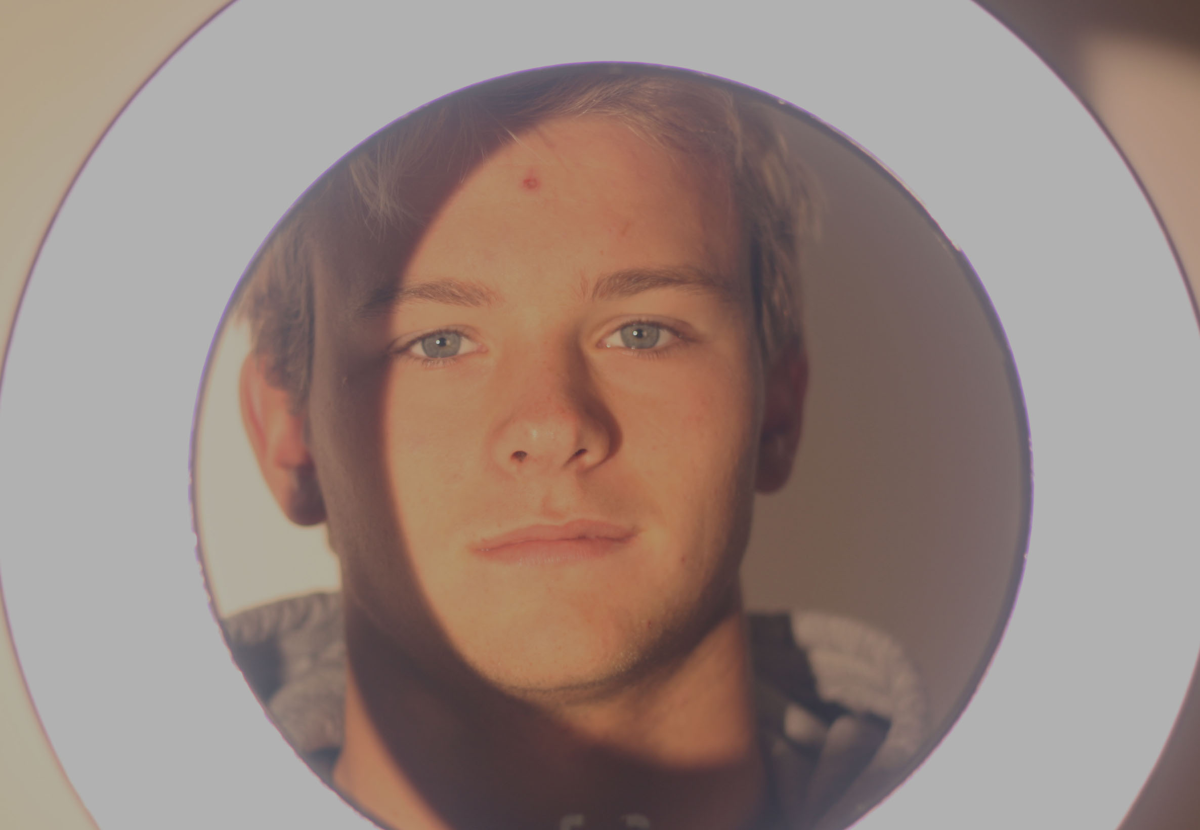
I decided to use the ring light as  a frame to almost isolate the subjects face and create high contrast effects with the ring light and a slight shadow effect on the subjects face while maintaining the 3 point lighting. However, I find the image way too bright so I will edit it accordingly

For this image I simply just lowered the exposure and slightly altered the vibrance.

Final Images

Here are my final images