
Category Archives: AO4 Present Ideas
Filters
Tableaux Vivant
A tableau vivant (often shortened to tableau, plural: tableaux vivants), French for ‘living picture’, is a static scene containing one or more actors or models. They are stationary and silent, usually in costume, carefully posed, with props and/or scenery, and may be theatrically lit. It thus combines aspects of theatre and the visual arts.Staged reality is a main aspect of tableaux vivant in which the photographer captures an artificially constructed scene.
Tom Hunter
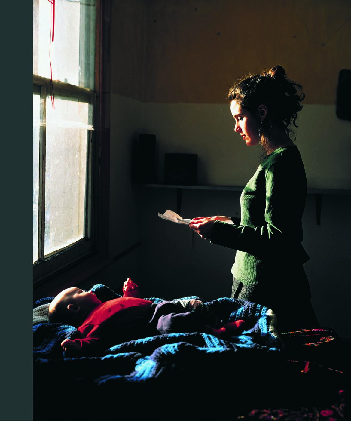
Tom Hunter (born 1965) is a London-based British artist working in photography and film. His photographs often reference and re imagine classical paintings. He studied at the London College of Printing, and was the first photographer to have a one-man show at the National Gallery of London.
He worked alongside friends, neighbours and family to recreate others work but in a much more modern way. For instance the picture on the left is not this own work it is in fact Johannes Vermeer artwork which entails a young girl standing by a window reading a love letter from her man who is far away, possibly at war. Hunter has recreated Vermeer’s work but with a modern update, the women isn’t holding a love letter she is holding an eviction notice. Tom has spent time with the people he takes pictures, for instance he lived on the same tower block as his women, he knew the problem she was going through as he was also being evicted. Even though the to photos are very similar, there are underlying differences, for instance the open window on the left and the light flooding through has connotations of hope and freedom as she is happy her lover is still alive, whereas on the right the window is closed this has connotations of being trapped with no hope for the future, now she is homeless with a baby. As well as that on the left there is a bowl of fruits yet on the right there is a baby, this is symbolic of the fact that the women on the right has a lot more to lose then the women on the left, fruits can be eaten but a baby can’t just be thrown away, it needs love and care and a roof over its head. There is a clear rule of thirds in this photo, this is symbolic of how the women on the left has a structured path in life, its all going in one direction, she can see her path clearly because soon the war will be over and she can marry the man she is in love with. Whereas the women on the right, her rule of thirds represents a sense of being trapped, she can’t escape this harsh cycle of council housing, she is stuck in this rule of thirds layout.
Recreation


This painting was fairly hard to recreate considering it is located on a raft at sea and there are lots of people involved in the photo. We tried to modernize the photo as much as possible for instance we made sure ‘the north face jacket’ which was acting as a flag was clear too see, as the brands represent how society nowadays is materialist and how we need the best of the best not just unbranded, our whole world revolves around money and out doing each other. We were all at different levels in order to create a pyramid shape, a pyramid having connotations of strength, power and sturdiness. As well that it represents society and how those at the top thrive and survive but those ones at the bottom struggle and fail.

I recreated this photo in school near the window by art. I had to select the window on Photoshop and decrease the exposure as the light coming through was over-exposed and too bright. I also increased the contrast to add depth and emphasis the light outside against the darkness inside. This symbolizes how the girl in the Tom Walker photo was exposed to the light and sunny world but under the surface the world was creating more troubles for her then happiness and the weather can’t change the fact that she is a single mum without a home. It’s as if the world is trying to sugarcoat all her worries with clear skies, but she can’t see its true beauty, the only thing she can see is the eviction letter she is holding.

Tom Hunter- The Guardian Article
https://www.theguardian.com/artanddesign/2009/nov/04/photography-tom-hunter-best-shot
Tableaux Photography – Post 2 (My Response)
My Response:
Best Images:


Tableaux Photography – Post 1 (Planning)
Tableaux Photography:
Tableaux , French for ‘living picture’, is a still scene containing one or more actors or models. They are stationary and cannot speak, usually in costume or a selected outfit, carefully posed, with props and/or scenery, and use careful lighting to enhance the effect or narrative of the composition.
Mood Board:

Mind Map:
Key Images: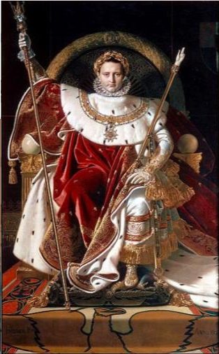
Henri Cartier and Bruce Gilden

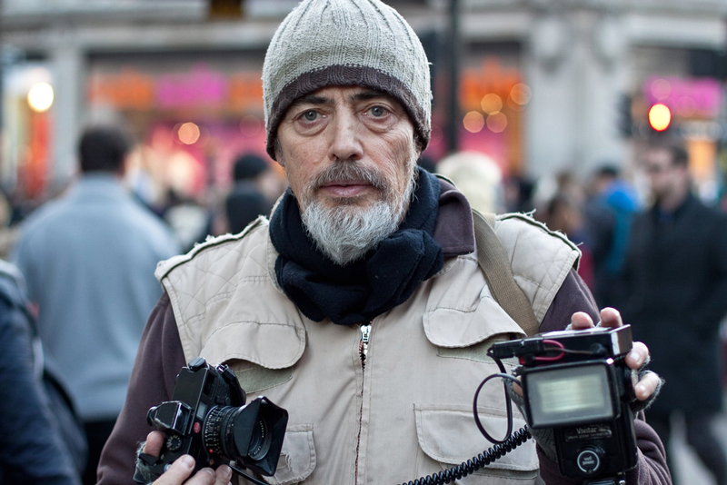
Bruce Gilden is a street photographer who is most known for his up-close photographs of people. He was born in Brooklyn in 1946 and has received many awards including the ‘European publishers award for photography’. The main reason for him starting photography is the film ‘blowup’. Being influenced by this movie, he went and bought his first camera and started attending night school photography classes.
He doesn’t try to be discrete at all when taking photos. He prefers to approach people and take photos of their initial reaction. He also aims to take photos of people who either stand out, or people he can portray as different.
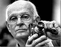
Henri Cartier-Bresson was a French humanist photographer considered a master of candid photography, and an early user of 35 mm film. He pioneered the genre of street photography, and viewed photography as capturing a decisive moment. He was also one of the founding members of Magnum Photos in 1947.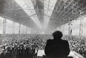
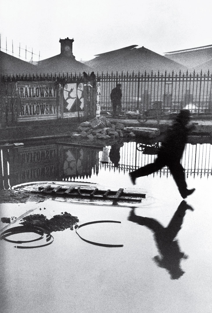
This idea of capturing the decisive moment can definitely be seen in this photo; if the photo was taken a fraction of a second later the person in the foreground would have stepped in the standing water, which would have caused ripples and ruined the clarity of the reflection on the water.
These two photographers are very different but they have one thing in common, they both focus on the decisive moment. For Henri Carter that is the whole frame (like described in the photo above), and for Bruce Gilden it’s the moment people react to him taking a photo of them.
Studio photo shoot No. 2
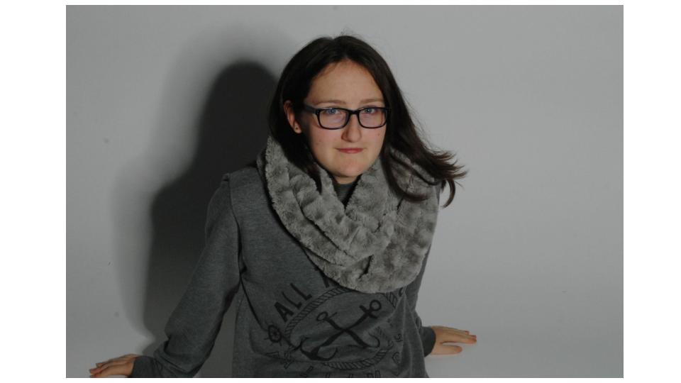
These are my final edited images from another photo shoot in the studio. The main purpose of this shoot was to experiment with different lighting techniques/colours.
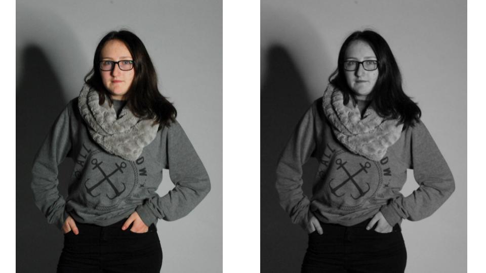
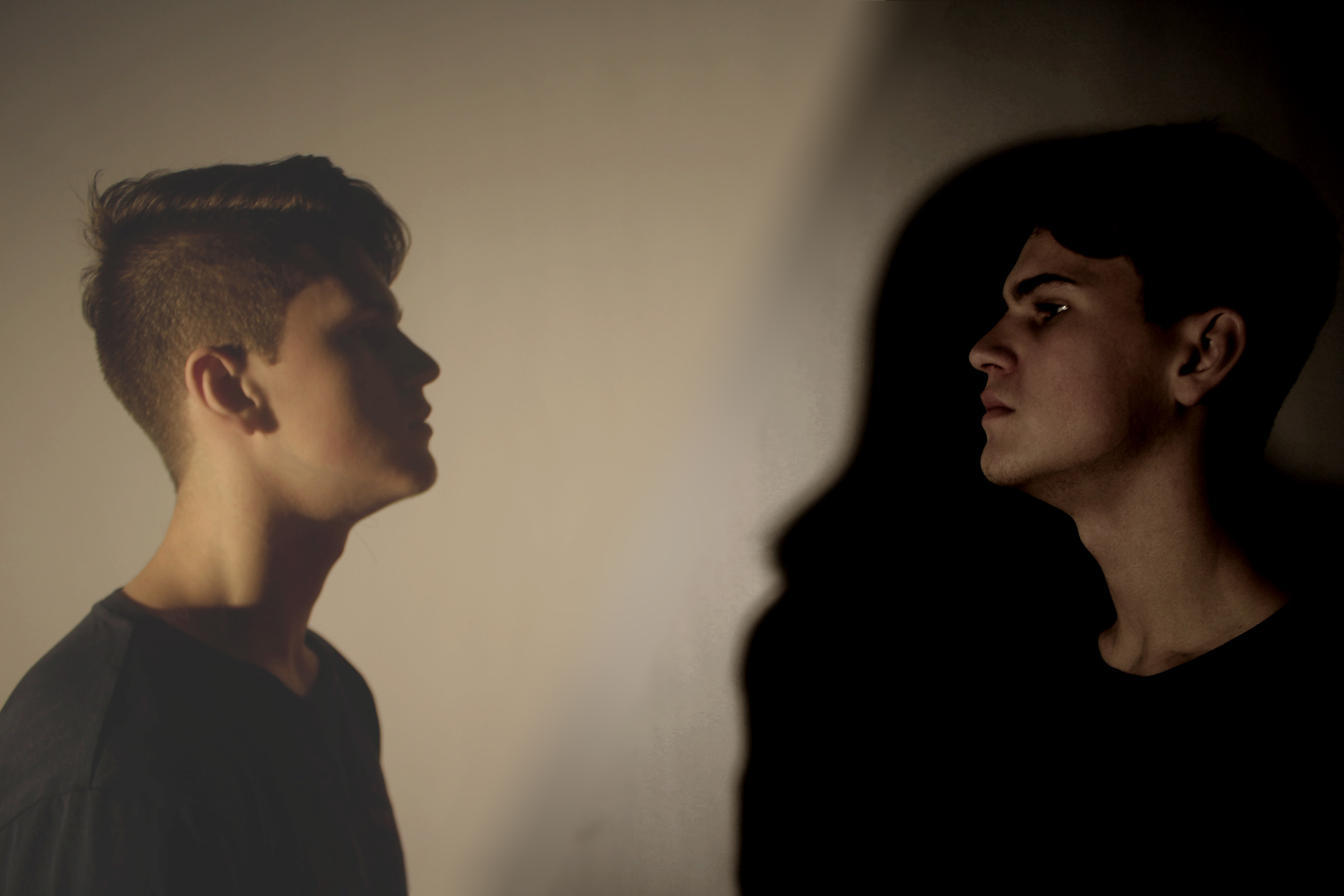 This is two photos edited together. The original was two different people staring at each other, but I decided to take another darker photo of myself and edit it into the previous one. This give a bright/dark good/bad side effect.
 This photo used two-point lighting. A spotlight with a green tint to the left, as well as a ring light positioned directly in front of the camera. The ring light isn’t visible as the camera was placed in the middle of the ring light. This results in a brighter image, but still keeps the colour lighting.
 In both this, and the following photo I have used only one light source, this lights the model in the centre evenly with one colour, it also gives a big clear shadow to one side.
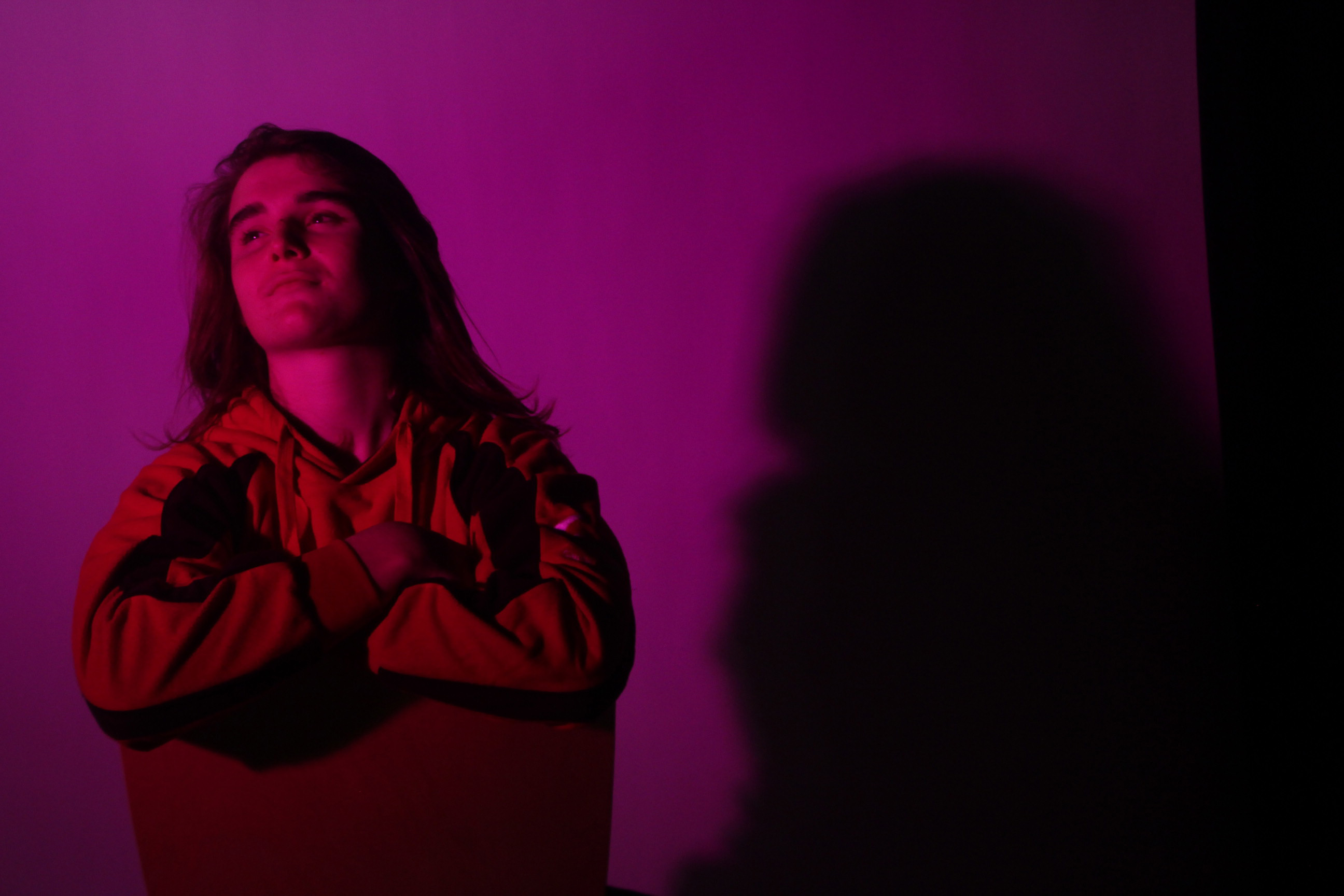
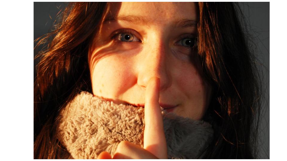
 In this photo I used two-point lighting. There was a softbox placed to the right side at a slight angle, and a spotlight with a purple cover placed on the other side. This creates a warm and colourful effect.
 The same lighting was used for this photo as the previous one. Only in this photo the camera is positioned nearer the purple tinted spotlight, which gives it a bigger overall impact on the face.
Studio Photography Lighting (Triple)
What is 3 point lighting:
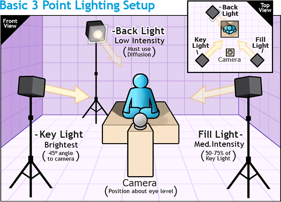
Three-point lighting is a standard method used in visual media such as theatre, video, film, still photography and computer-generated imagery. By using three separate positions, the photographer can illuminate the shot’s subject (such as a person) however desired, while also controlling (or eliminating entirely) the shading and shadows produced by direct lighting.
Diagram:

Examples:

A portrait with three-point lighting: a 300 watt key light, a 150 watt back light, and fill light from a bounce board.
My own aim, action plan and technical features:
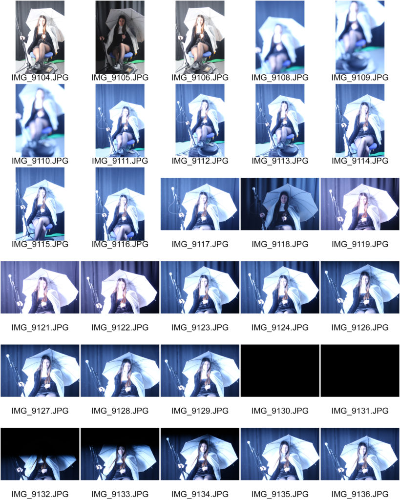
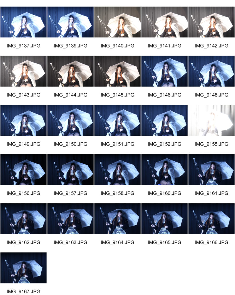
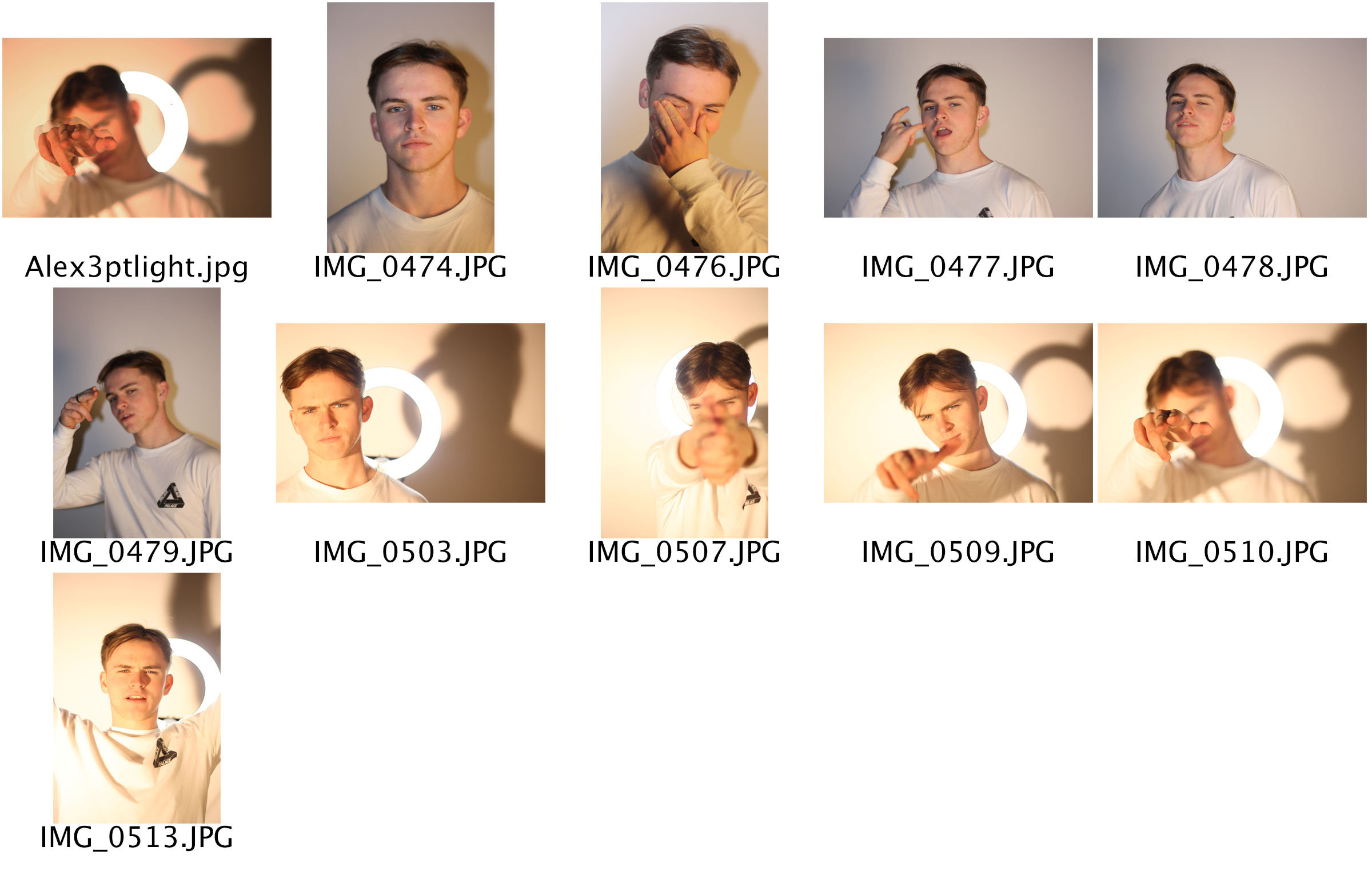
The aim for my 3 point lighting shoot was to use 3 different lights to capture a selection of images that demonstrate I can use the technique correctly whilst also trying to create images that are clear, in focus, and presentable. The lights were placed in 3 positions for some, with one in-front, one to the side and one on he other side. In a lot of the other photos there are a light in-front and behind the model and then a light slightly to the left. The technical features of these images included a wider aperture to allow a lot of light into the lens with a quicker shutter speed to keep the images harp incase the models move.
Contact Sheet:
Final Image Outcome:
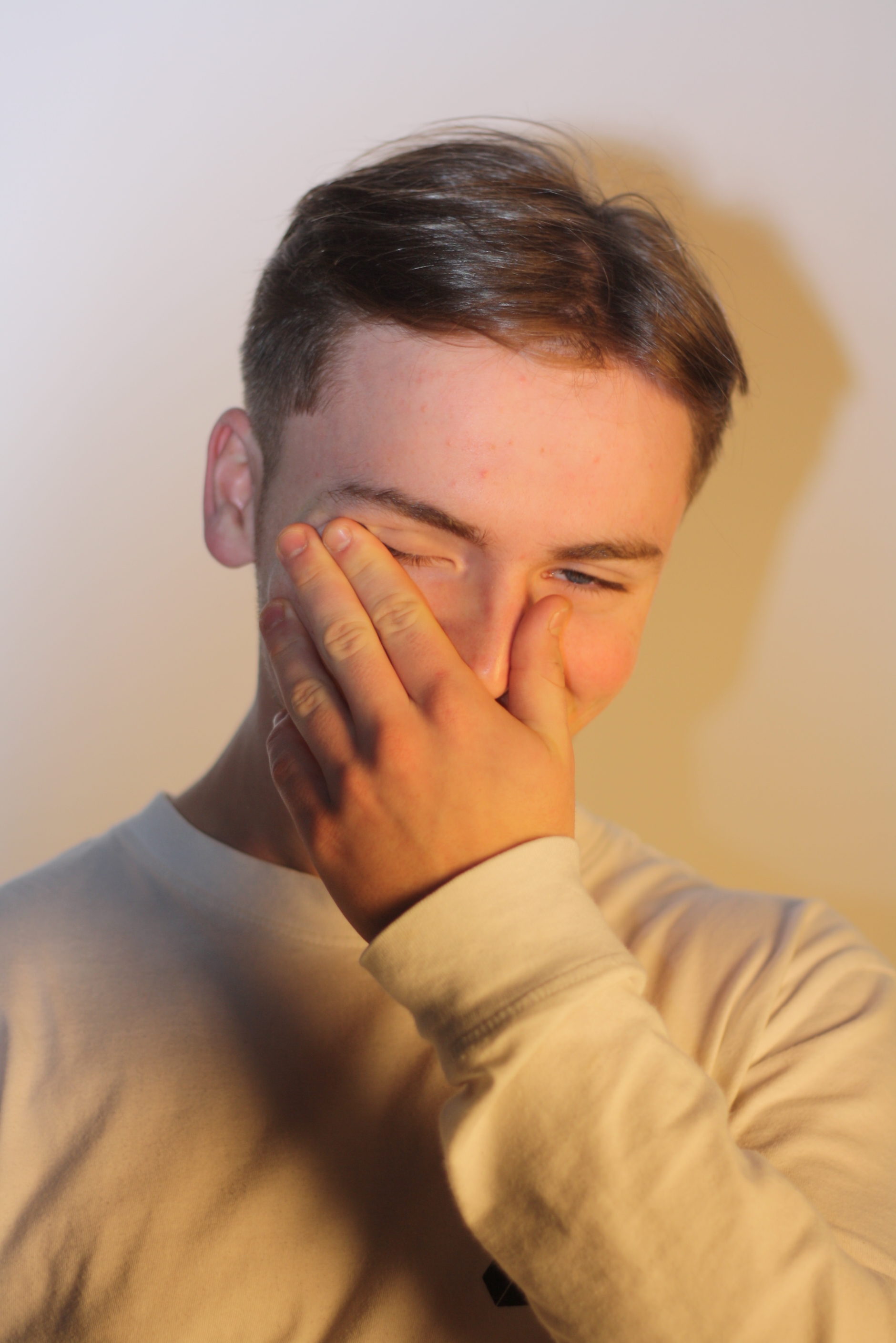
Visual elements of this image include:
Visual elements of this image include a very simplistic array of colours which mainly consist of whites and yellows. The tone is fairly light and the texture, very smooth. There is a fair depth of field due to the shadows on and around the model which also creates a 3D object effect.
Tableaux — Final Image
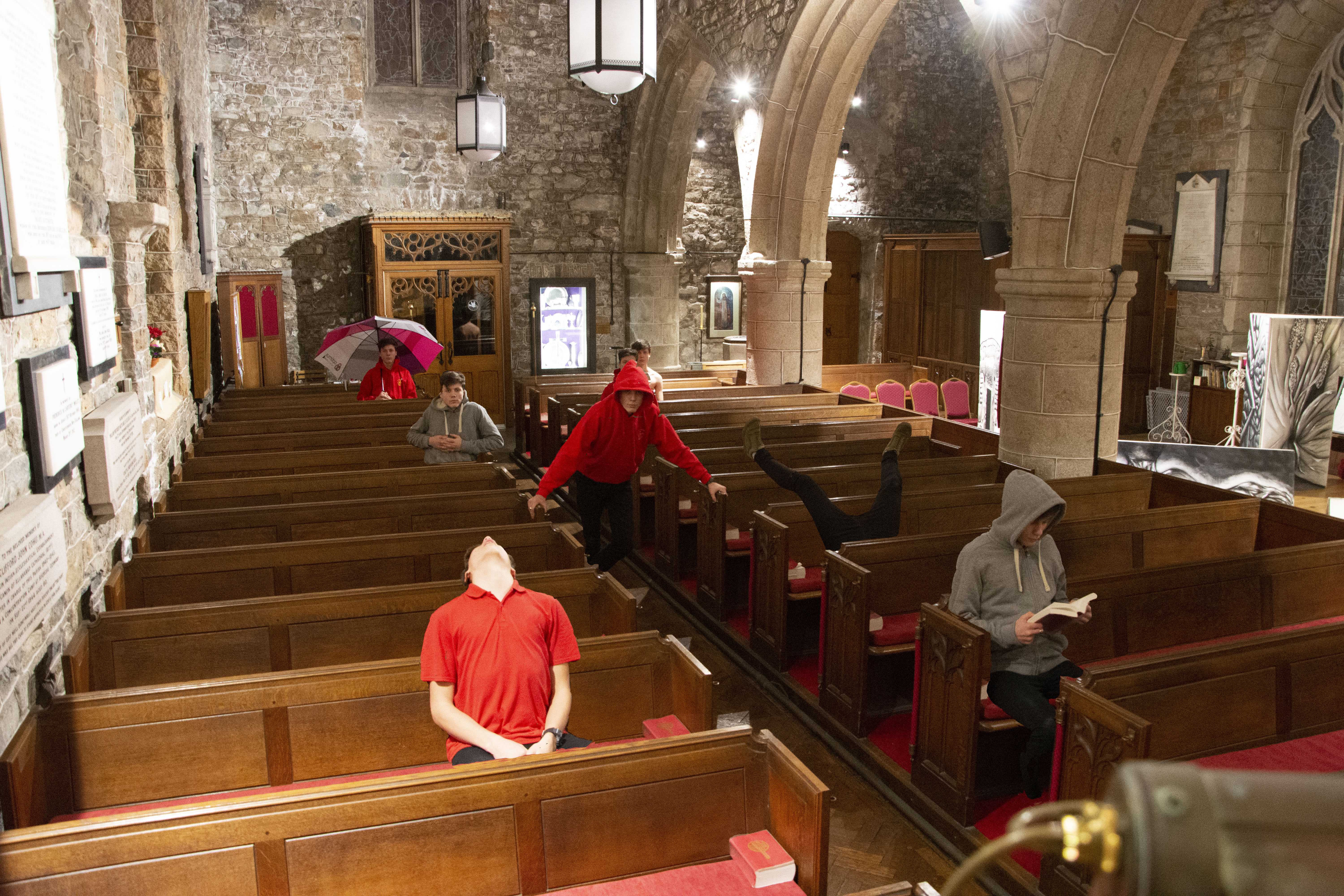
Here is the final image that I made. The solution to the moving tripod, I feel was successful as you cannot see anything that is not aligned without looking very closely at some parts. Other than the editing that it took to make the images of myself appear there was little else done, this was done because I got the exposure correct in camera and knew that if i changed it for one I would have to change it in the exact same way in the exact same amount for each layer, also leaving it with some parts slightly over exposed and some areas with a bit too much shadow means that the image is more realistic and life like and the exposure isn’t so far to one side that an area draws way too much attention and distracts from the whole image.
Top Outcomes From Studio and Natural Portrait Photography
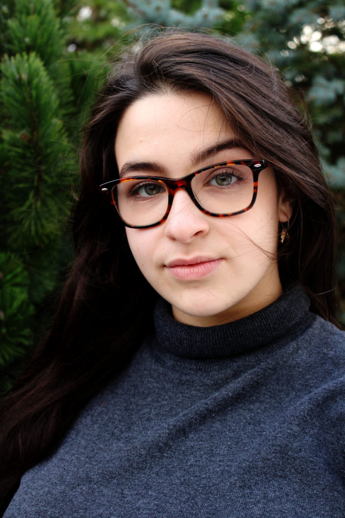
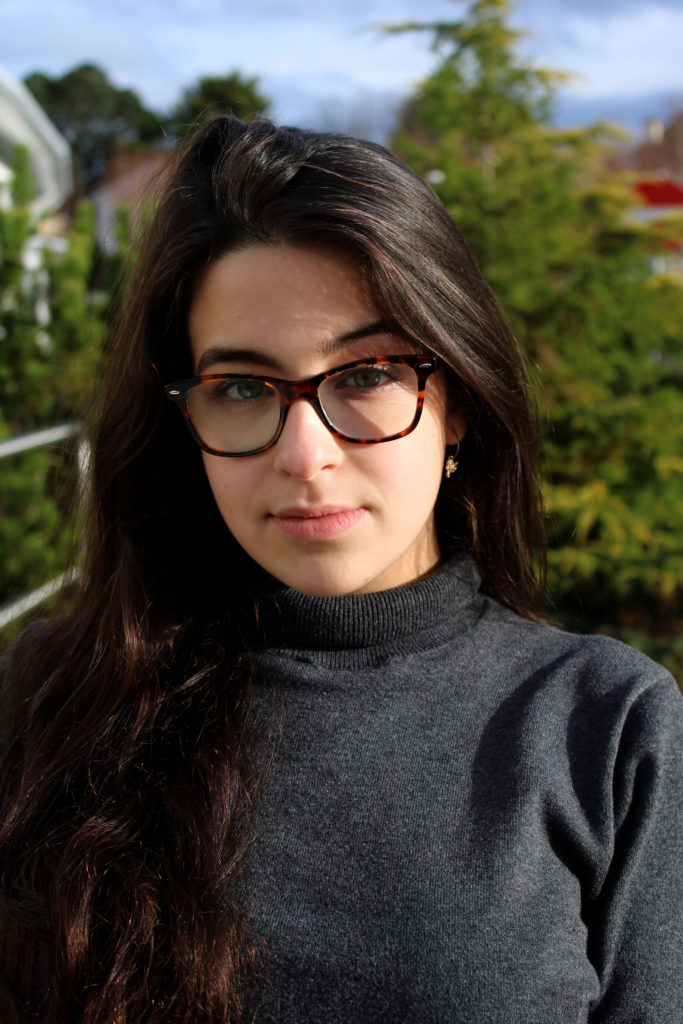
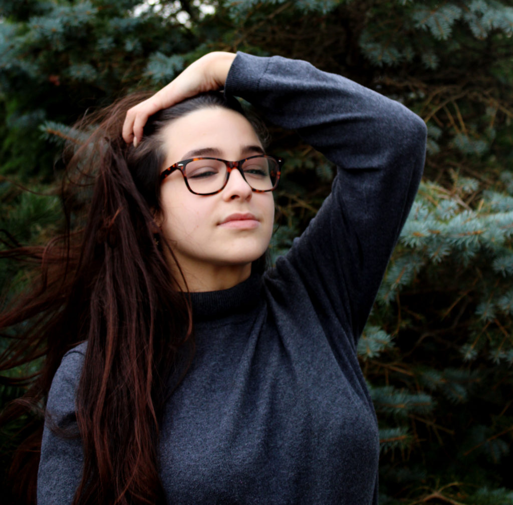
These photographs are the best images that I have taken when experimenting with studio photography and natural lighting photography. I believe that all these images show a variety of techniques from chiaroscuro to depth of field. I am very pleased with my outcomes as I believe that they all convey meaning towards them and are interesting for the viewers to look at.
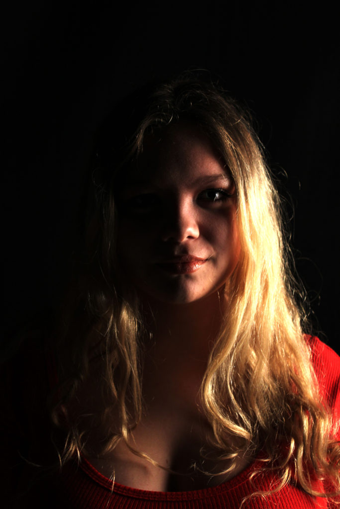
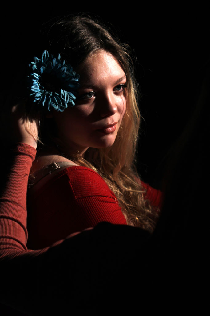
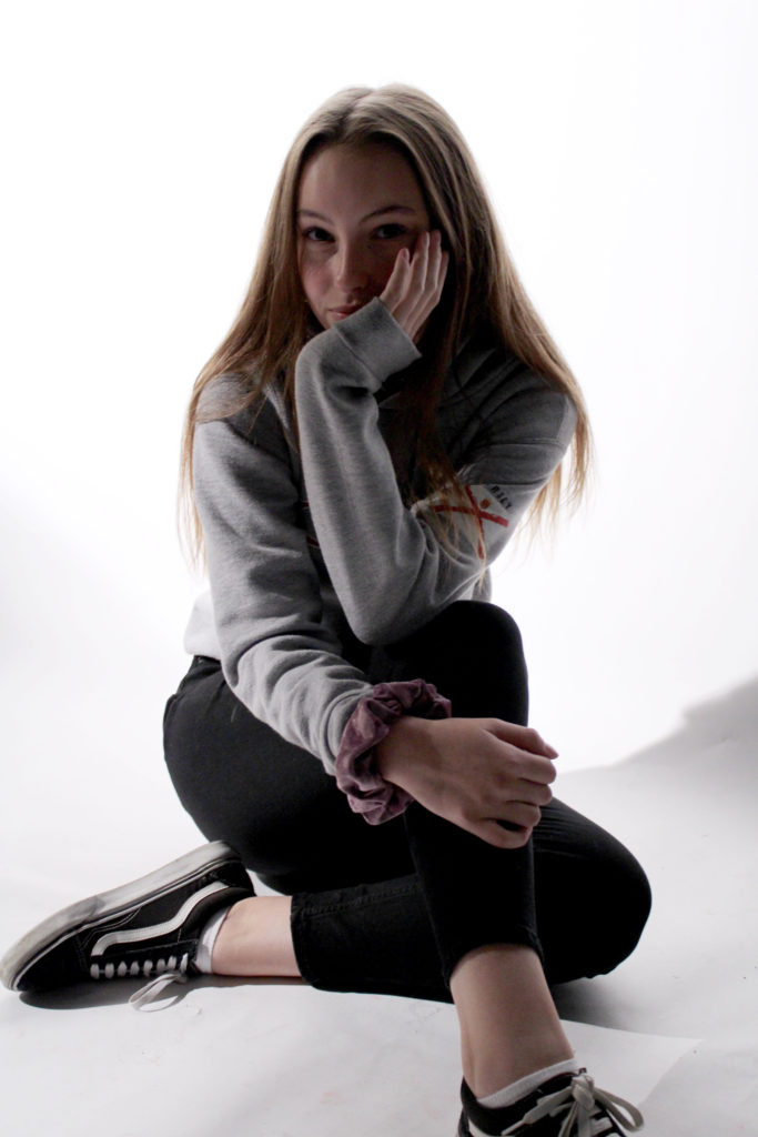

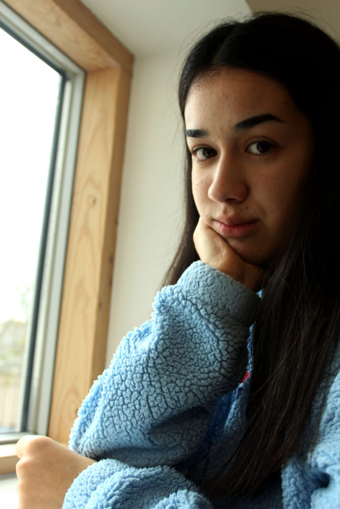
Outdoor Photography
I have been mainly experimenting with artificial lighting during the portrait unit, and have decided to further develop of using natural lighting from the first photo shoot I conducted.
For this photo shoot I decided to conducted outside when the sun had began to come out after a down pour of rain. It was slightly windy as well. I used a silver and a gold reflector to reflect the sunlight onto darker areas of my model, getting rid of the contrast in tones. Due to different areas being lighter and darker my white balance I used varied. I mainly has it on sunny or cloudy. My ISO was low as it stayed of 400 so that no noise was presented on my final images. Moreover, the shutter speed varied again to how lit up the area was. Within this photo shoot I experimented with using different depths of field to have my model in focus and the background slightly out of focus. I also mainly captured head shots of my model, but occasionally took a full body portrait of the modal.
Case Study
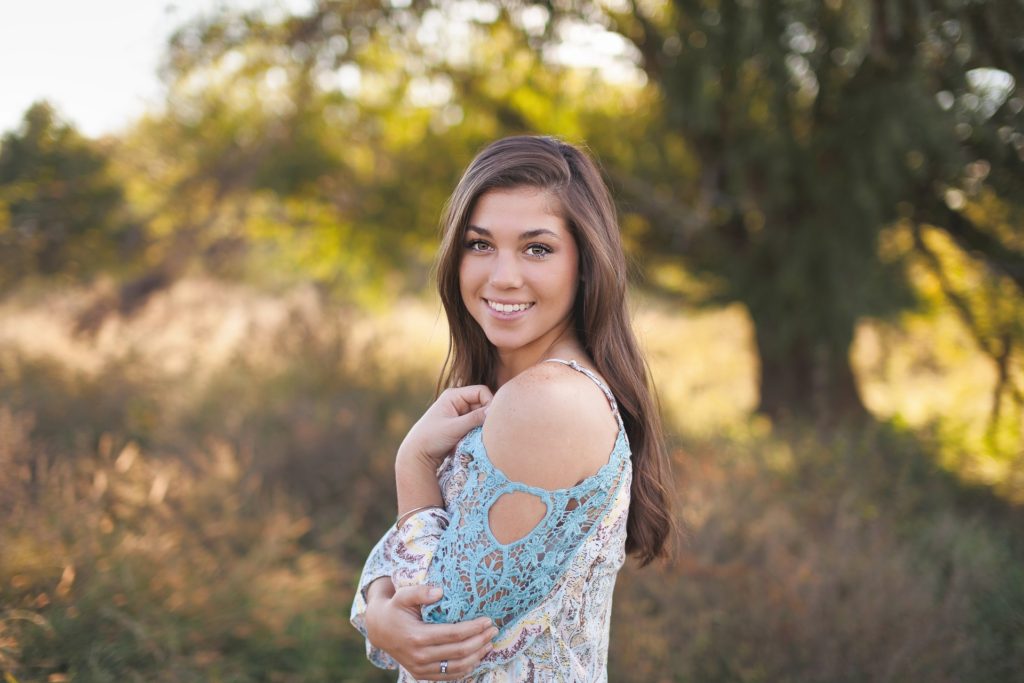
When I first look at this image my eyes are immediately drawn to the woman who is smiling and staring straight down at the lens of the camera. They then move around the slightly blurred out background which shows that she is exploring some woodlands. Putting the two together I can understand that she is enjoying what she is doing. This is also supported by her straight body posture. The artificial lighting, the sun, is warm which also creates a happy tone towards the image. This photograph shown above has many technical elements which I believe makes it a good photograph. As mentioned before the girl is in focus and the background is out of focus, which means that a narrow depth of field has been created. The shutter speed must have been quick as the image is perfectly focused. This also means that the aperture is likely to be around f/5.6. Moreover, no noise is found within the image meaning that the ISO used is also likely to be low. The lighting is found behind the modal, as that is where the sun is at that time, which means no shadow of the modal is created. However, shadows of the background can be found on the grass. This helps makes the model stand out from the background. In addition, the photograph is presented in black and white which shows us all the color and allows the viewer to appreciate the scenery. From this case study, I have learnt that a good outdoor portrait should be in color, but I may experiment in black and white, it would be nice to use a narrow depth of field and the facial expressions and posture of the model is important.
Contact Sheets
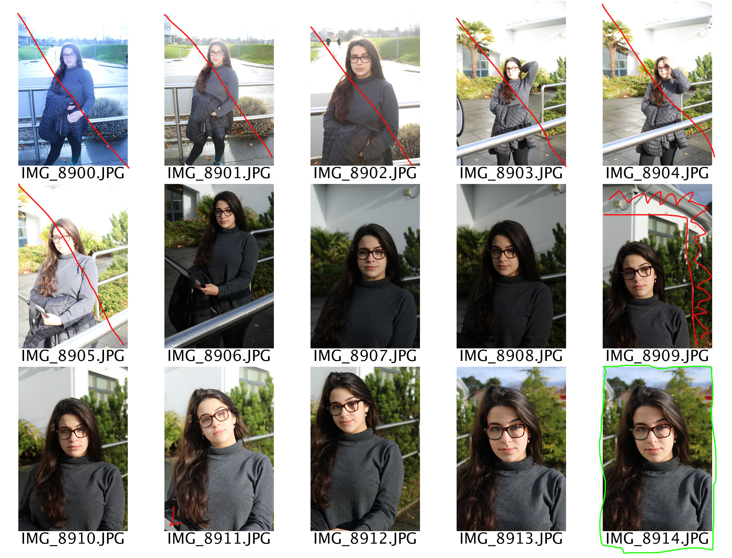
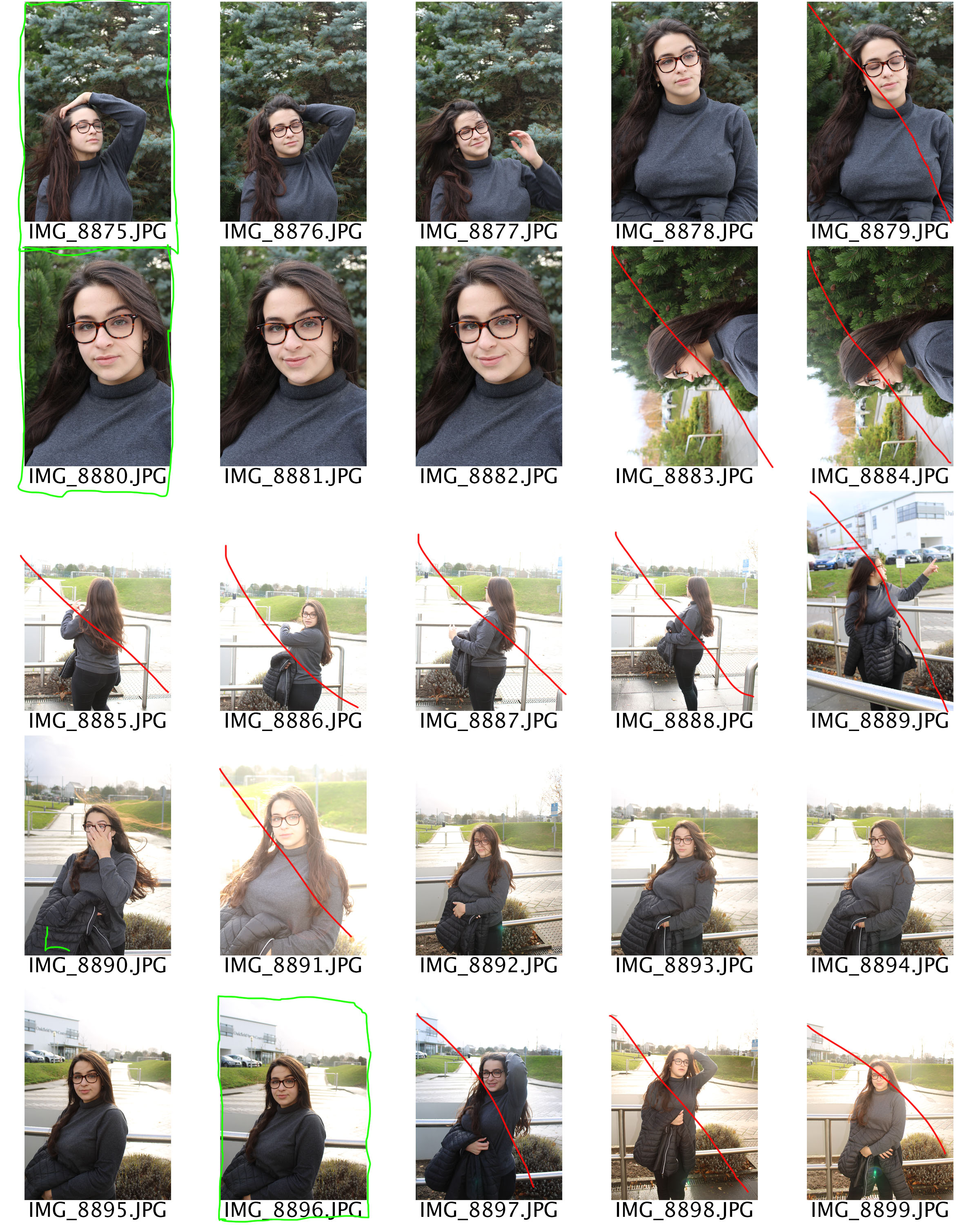
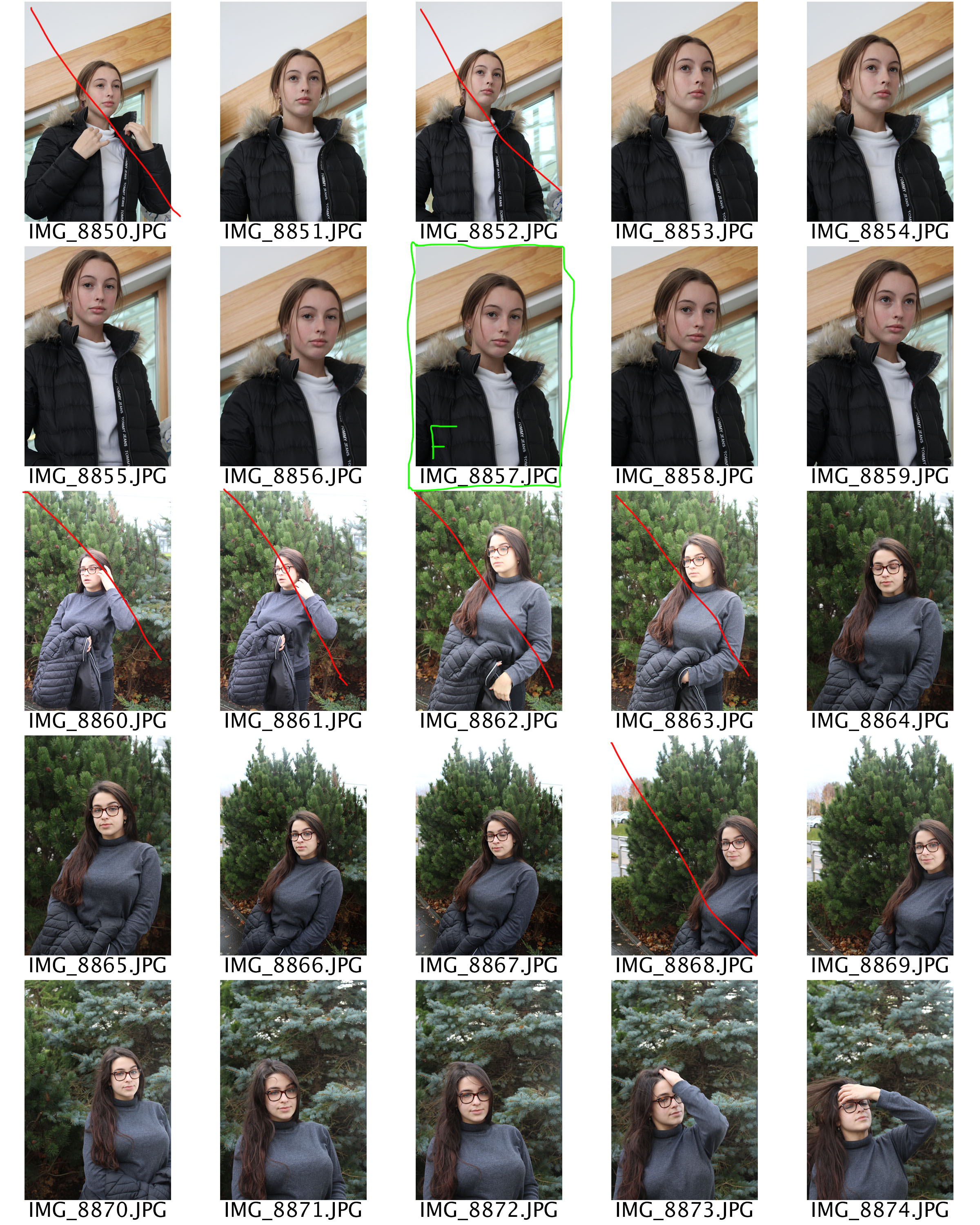
Edits
Within these edits I just adjusted the levels and curves to ensure the photographs where sharp. I believe that these images have been one of the most successful photographs that I have taken so far as they clearly show good camera control, due to the different techniques I have used. In the three edits you are able to see a narrow depth of field as the modal is in focus leaving the background slightly blurred. This ensures that the viewers attention will be focused on. Moreover, the photographs clearly show no intended noise and clearly shows the correct white balance, shutter speed and aperture
.
