Category Archives: AO4 Present Ideas

Filters

Author:
Category:

Lorna Simpson – Case Study

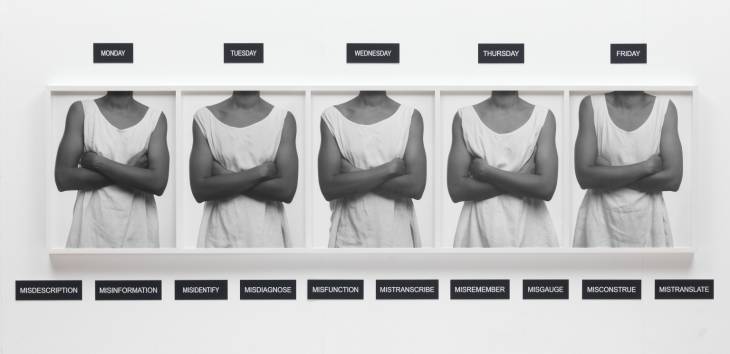
Five Day Forecast 1991

Lorna Sampson has created this image of a person of everyday of the week. Conceptually, she created it to show what her life was like when she had to work multiple jobs in order to fund her hobby of art/photography. There are words which hold negative connotations towards them at the bottom of the image, this implies that Sampson did not enjoy the multiple jobs due to the chaotic and horrible life style it bought. Technically, the images are presented in black and white which allows the images to be high in tonal regions. The main formal elements within this image is repetition, due to the same image being used, and texture due to the creases found in the tank top. The creases inform us that this person does not have much time, due to the multiple jobs, therefore the creases are found upon the shirt. The main focus point is the models waist, these are used to help guide the viewers eyes around the frame. It seems that the ISO used was low due to no noise being presented within the images. The shutter speed is likely to be kept low as there is no intended blur within the repetitive images. The aperture is likely to be on a ‘normal’ setting as the images are not significantly light or dark. The depth of field is large as within the images everything is in focus. The background found is plain white, which also adds to how plain and boring life was like working these multiple jobs. With the models arms being crossed conveys a negative connotation to how this model is feeling. Psychologically speaking having the arms crossed means that people are not likely to take on information that people are saying and are very close about their life. This implies that maybe the model is very closed about their life and entraps the feelings. Towards the bottom of the images there are a bunch of  adjectives which all hold negative connotations, this positions the viewer to understand this time in Simpson’s life. This piece of works links into loss of identity as it shows that by having multiple jobs made Sampson unhappy, less sociable and she lost her identity. Colors are not used as that presents an identity, which was not the aim of the piece. Moreover, one of the words used is ‘Misidentify’ which implies that she is mistaking her identity and slowly loosing it due to her lifestyle.

Taking from Sampson’s piece I like the idea of only presenting the body of my model. This means that an emotional attachment can not be created as there is no face. Moreover, I like how black and white has been used to take away color, as colors can help build a persons identity. The use of negative words about losing identity could easily be implemented within my work allowing words and photography to combine to create a powerful piece. As an action plan I will carry out a photo shoot where I will capture my model without capturing the face. I will do this by placing the model in random locations and positions in order to create different meanings.

 

Initial Photoshoot – Place

For an individual, the people they spend time with impacts how they evolve as a person. These people can influence their future both negatively and positively. The most influential people in MY life are my family and close friends. My small community helps me navigate through life with support with double the enjoyment of each others company. 

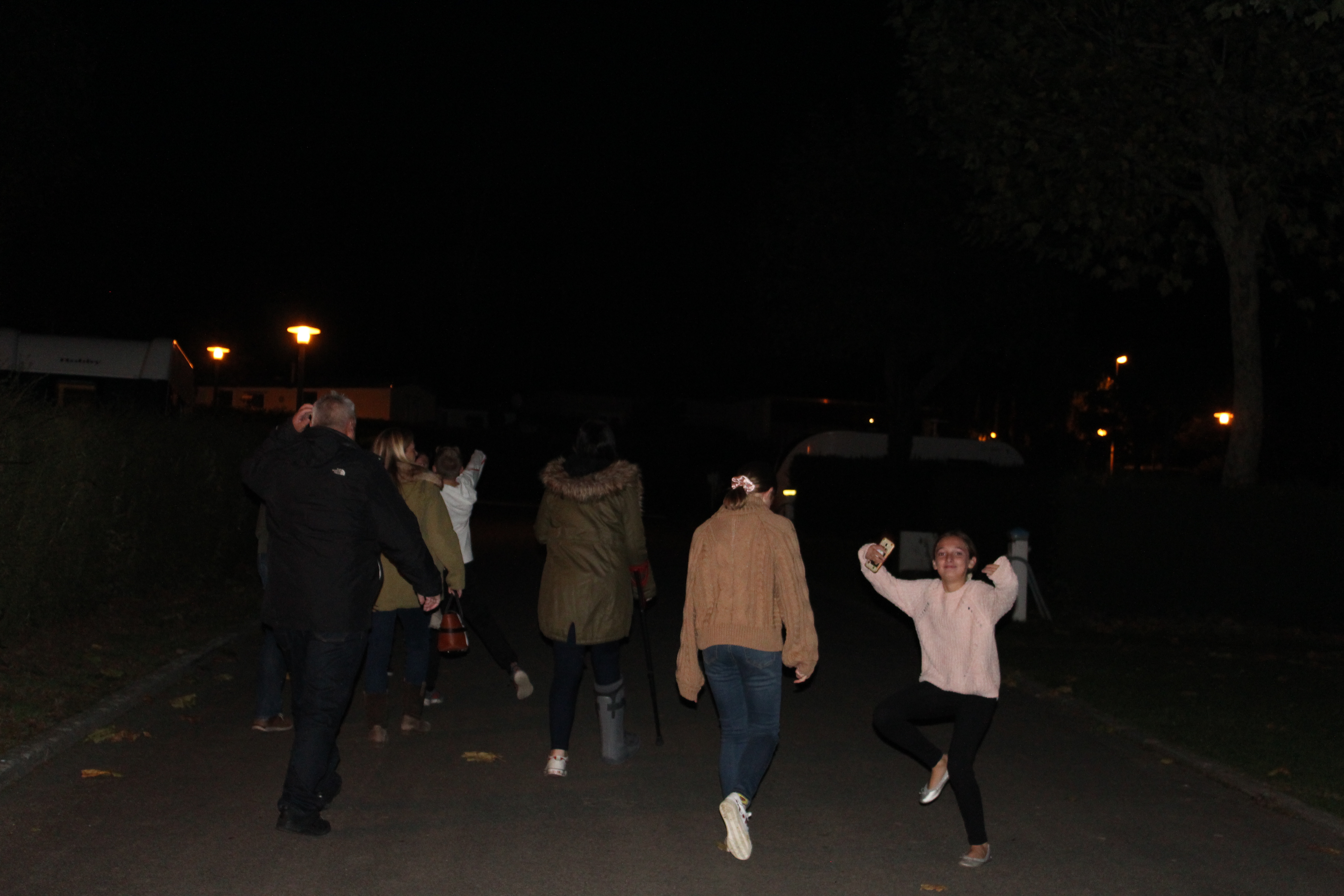
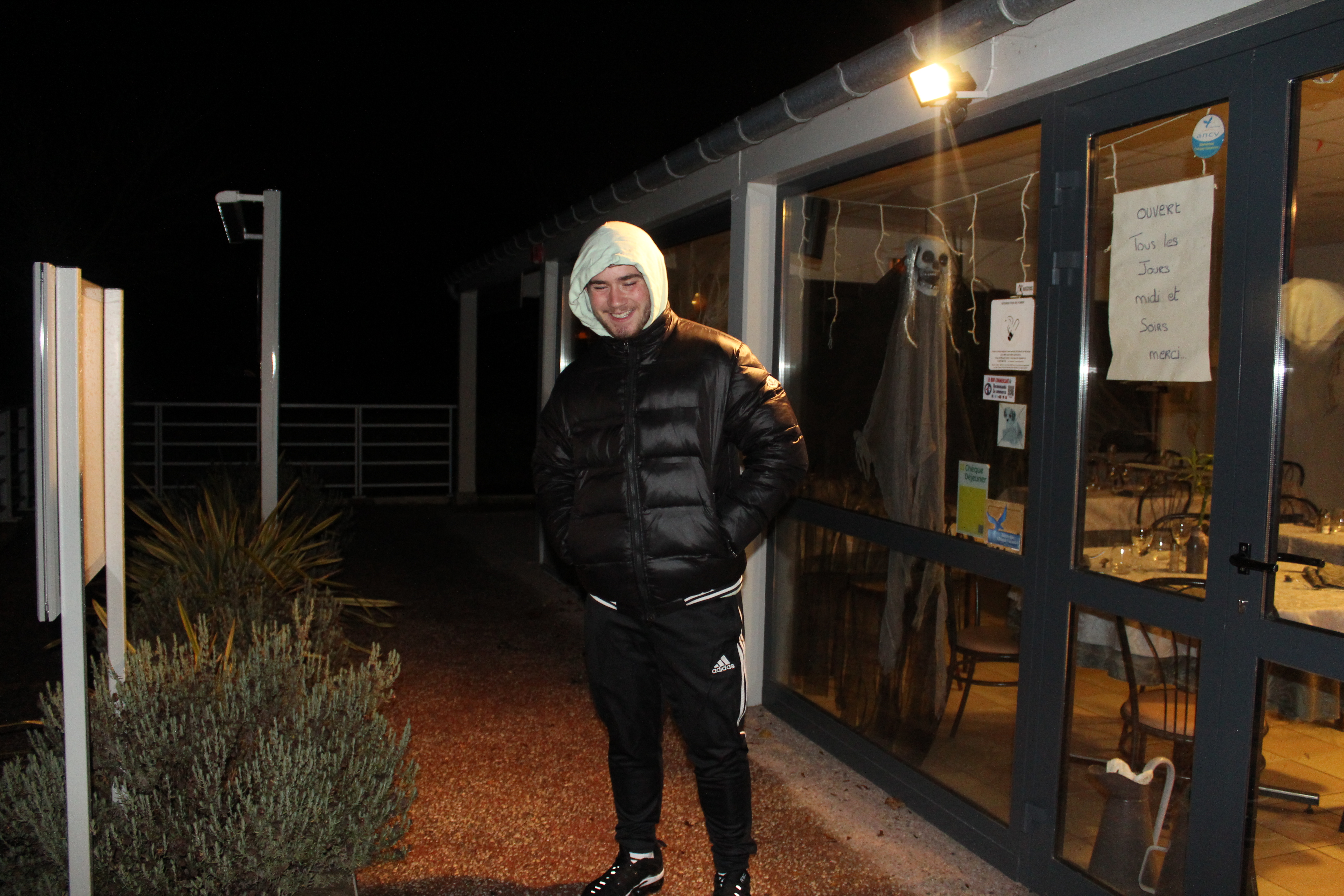
To respond to the stimuli of ‘Identity and Place’, I have photographed moments of which i’m with family and friends to capture that memory and moment. 

Analysis

Within these images I used natural light when available, however in the images taken in the evening, i used flash for them. This is due to me wanting to capture as much detail as possible without over exposing my images. 


Identity and place introduction

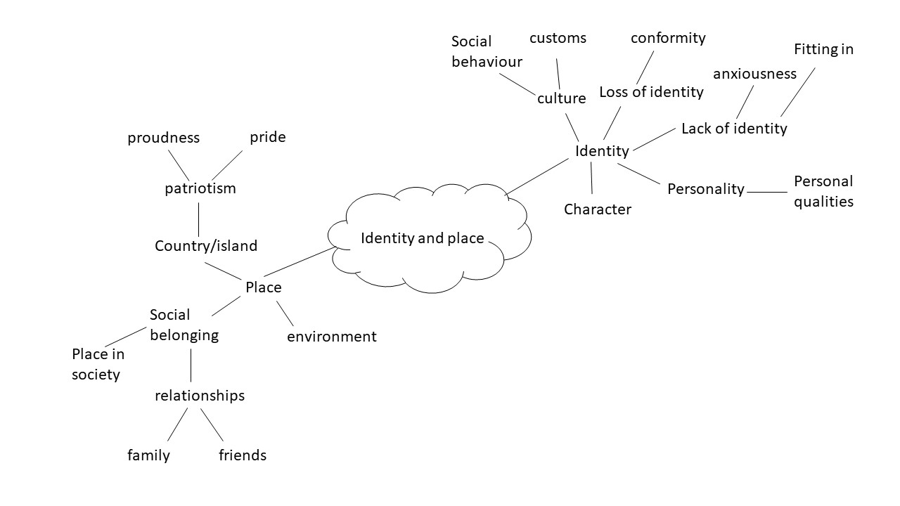
Identity and place

I would describe identity as being a person’s personality and character, but i can also involve a person’s gender,geographical location, political views and social standing. Identity also encompasses one’s culture and this can be influenced depending on someone’s social or geographical location, or their place. 


Mind map

Mood Board

Not my images.

Identity and Place – Post 5 (Editing)

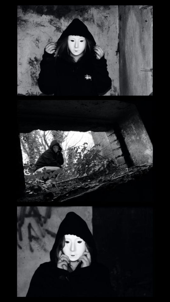
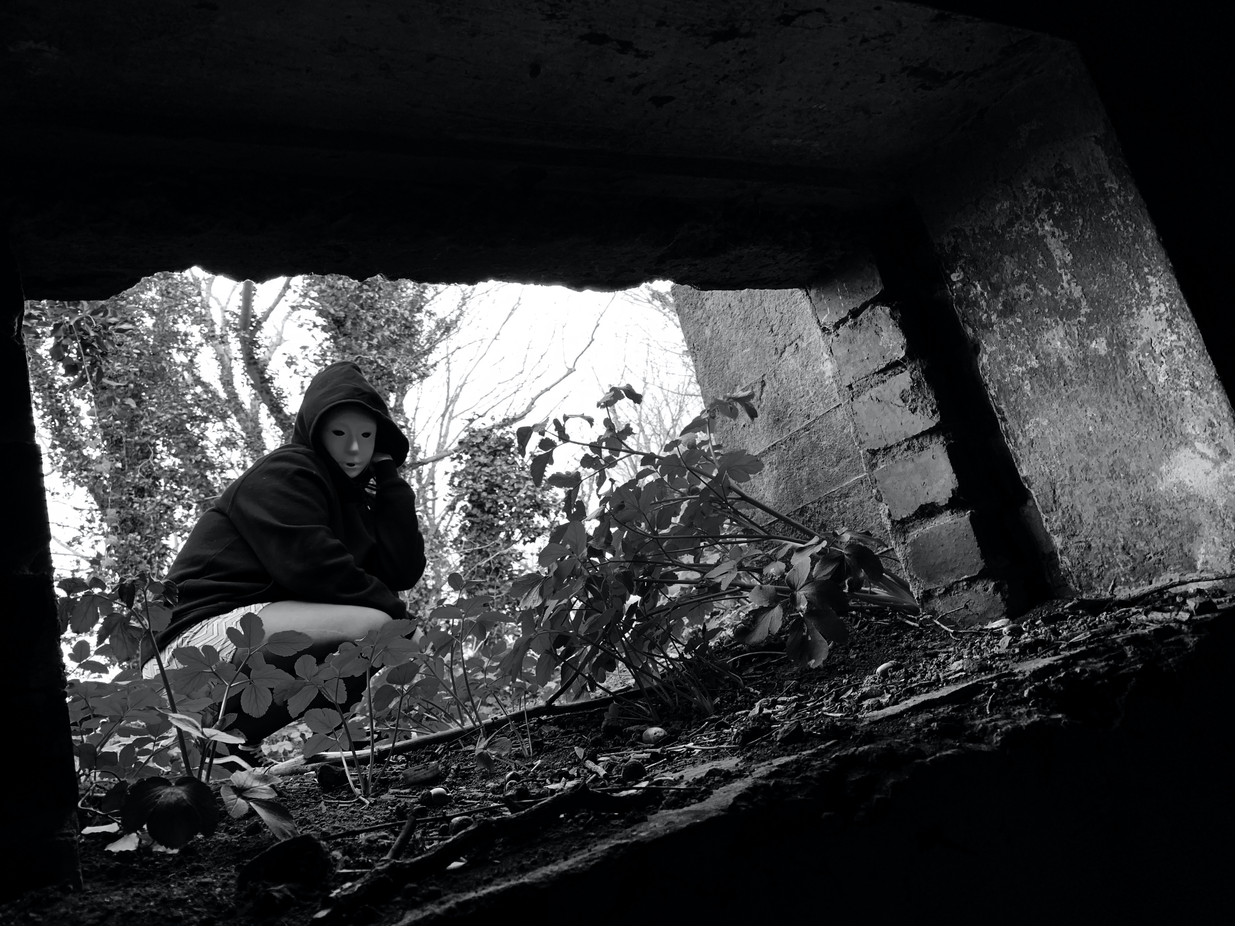
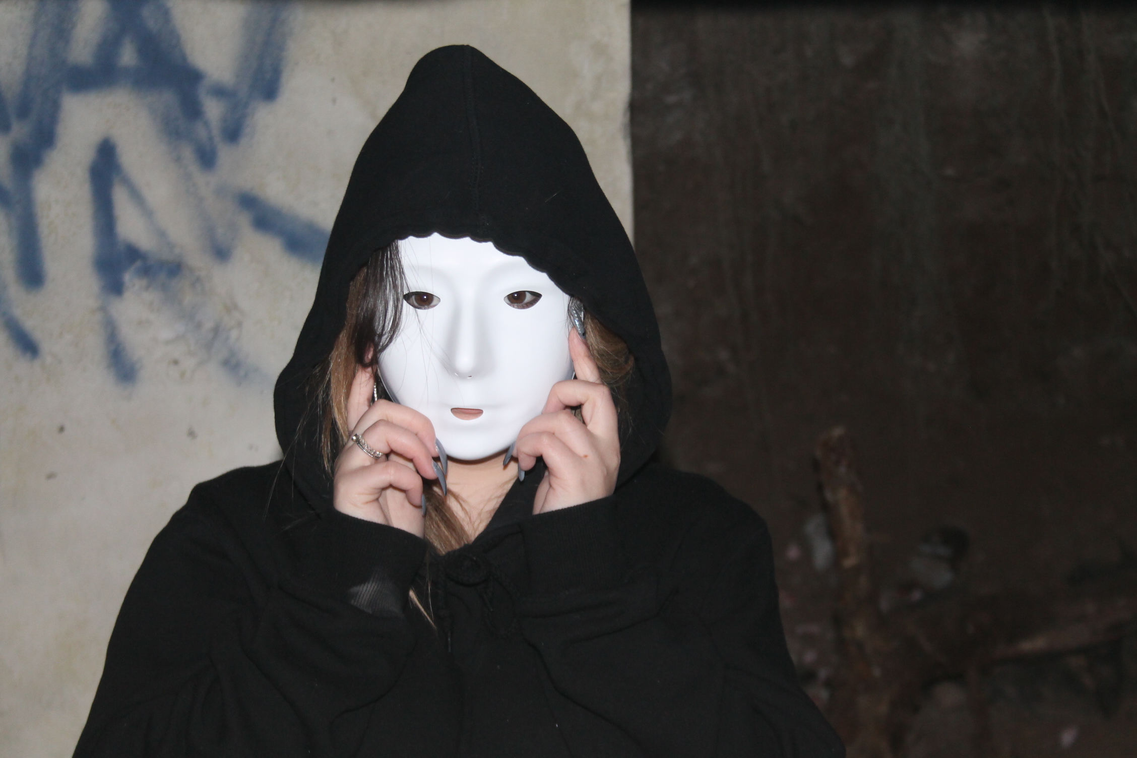
Masked Portraits

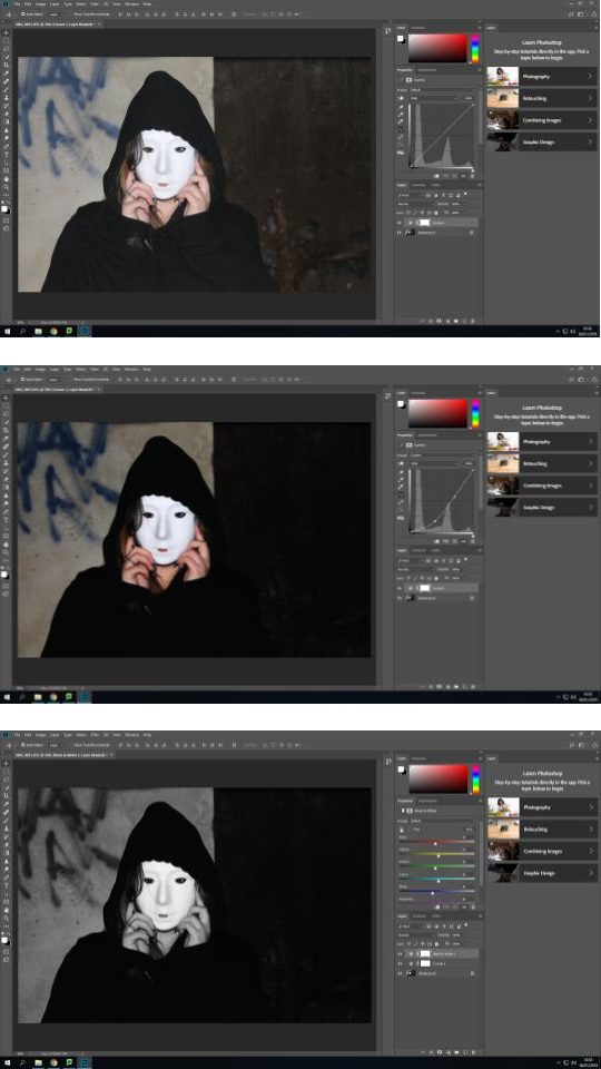
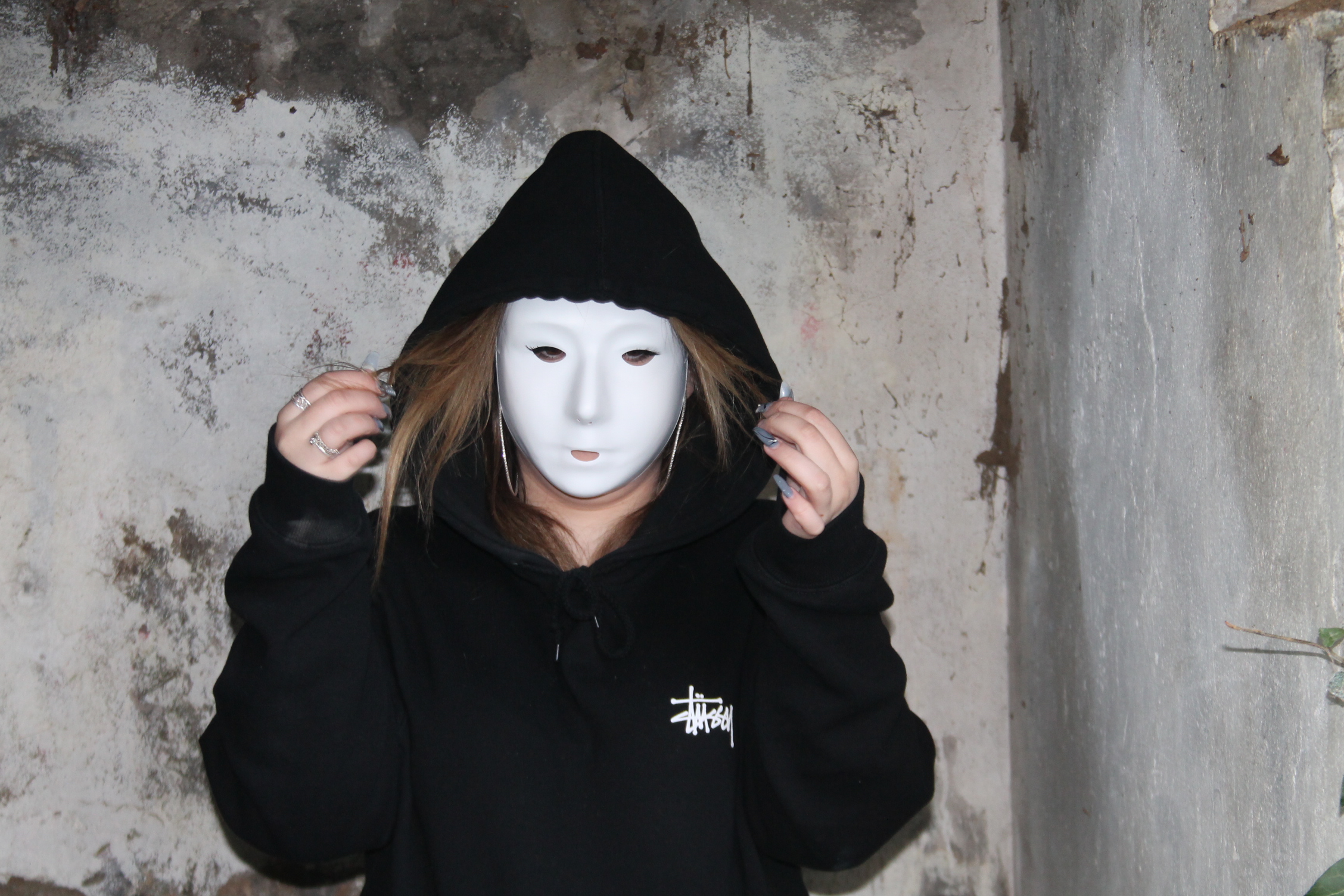
Editing Process:

1. Original image opened in Adobe Photoshop.

2. First I used the “curves” to change the tonality of the image and to create highlights, low lights and increase contrast.

3. I then used the “black & white” feature to take the colour out of the image and cause the mask to stand out from the black hoodie and darker grey background.

4. I then added a tint from the colour library in the “black & white” menu to add subtle tint to the image

5. I repeated step 2, adjusting the curves after having set the image to black and white to ensure the image had slightly more extreme levels of contrast than I wanted.

6. Finally, I used the “brightness/contrast” function to actually decrease the “contrast” as i found this resulted in the shadows on the mask being smoother.

7. I repeated these steps for all 4 of my final images from this shoot.

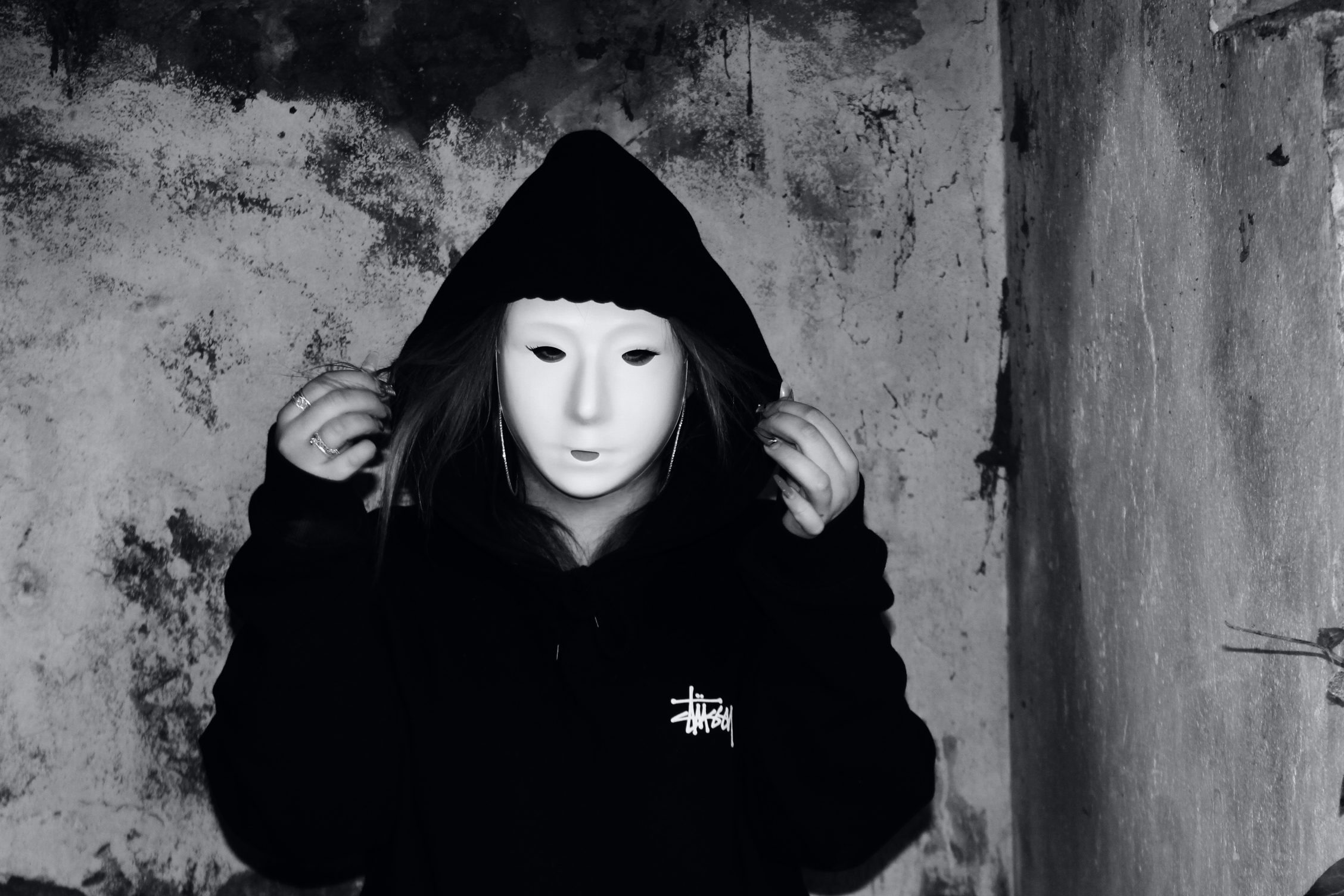
Final Edits:


Edited Portraits

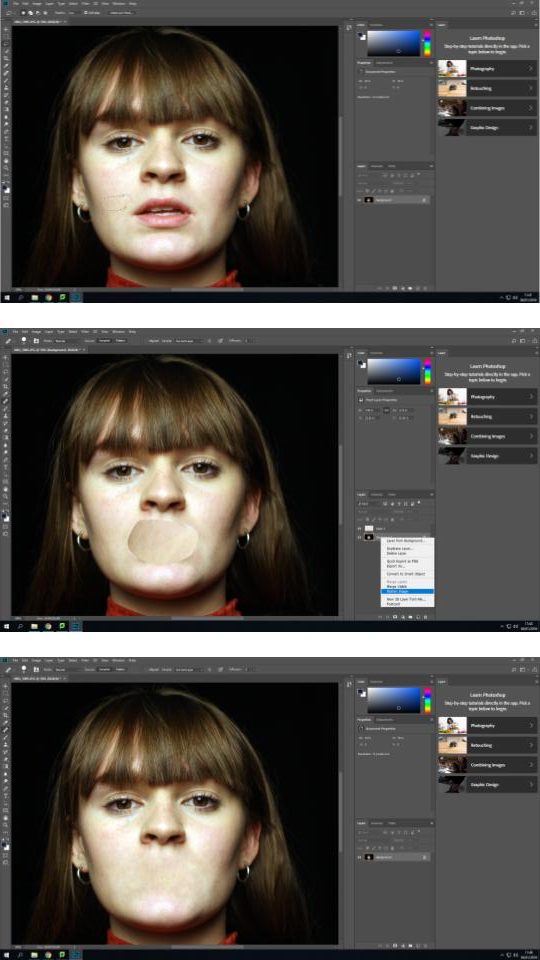
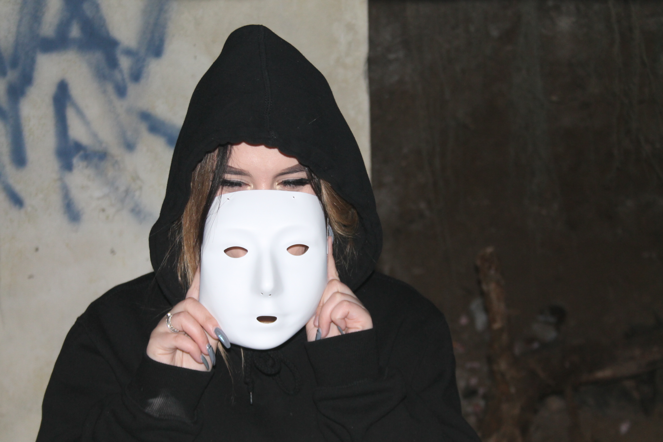
Editing Process:

1. Original image opened in Adobe Photoshop.

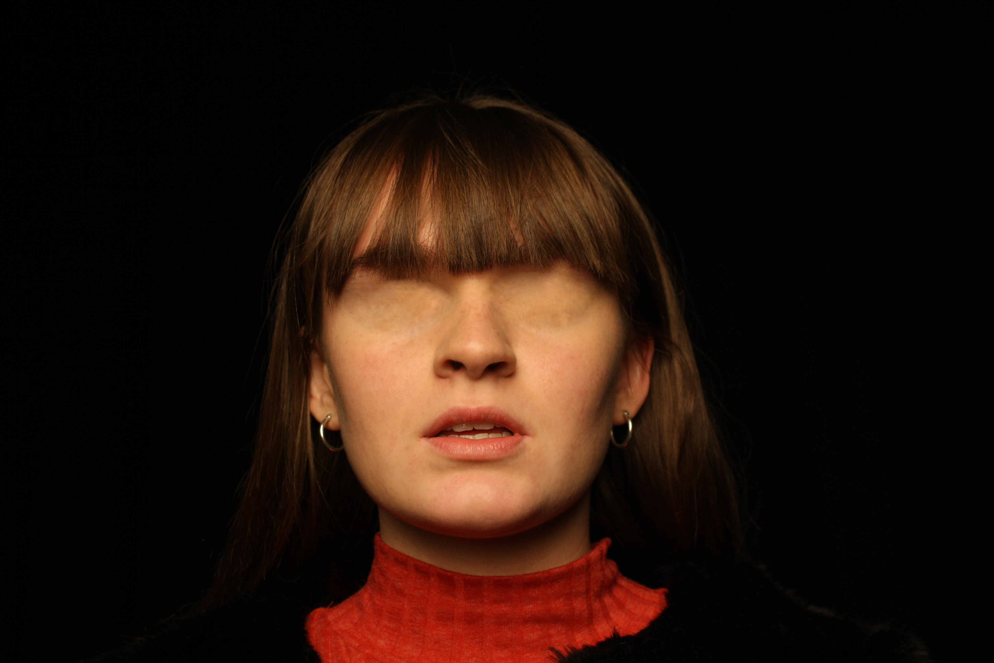
2. I began with the “spot healing brush tool” in order to clear the skin of any blemishes or marks.

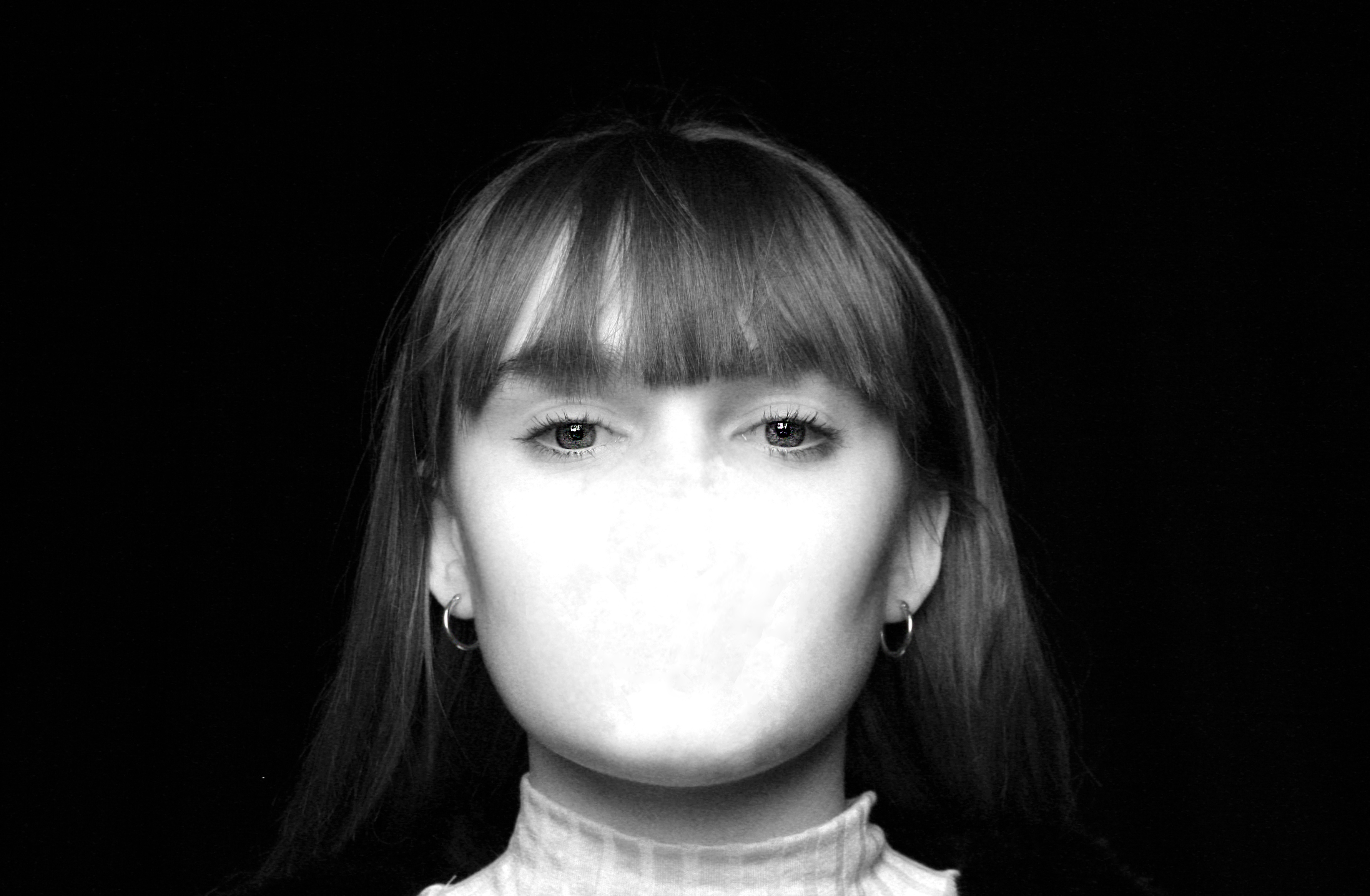
3. Then I used the “blur tool” in order to minimise pores and smooth out the skin to make hiding features easier.

4. I selected the “lasso tool” and cut out a smooth area of the face with minimal amounts of colour differences so the cut out area is not noticable after blending.

5. Using “ctrl+J” and “ctrl+T” I resized and re-positioned the cut out area over the mouth. Then selecting “flatten image” to allow me to start blending out the border between the image and the cut out

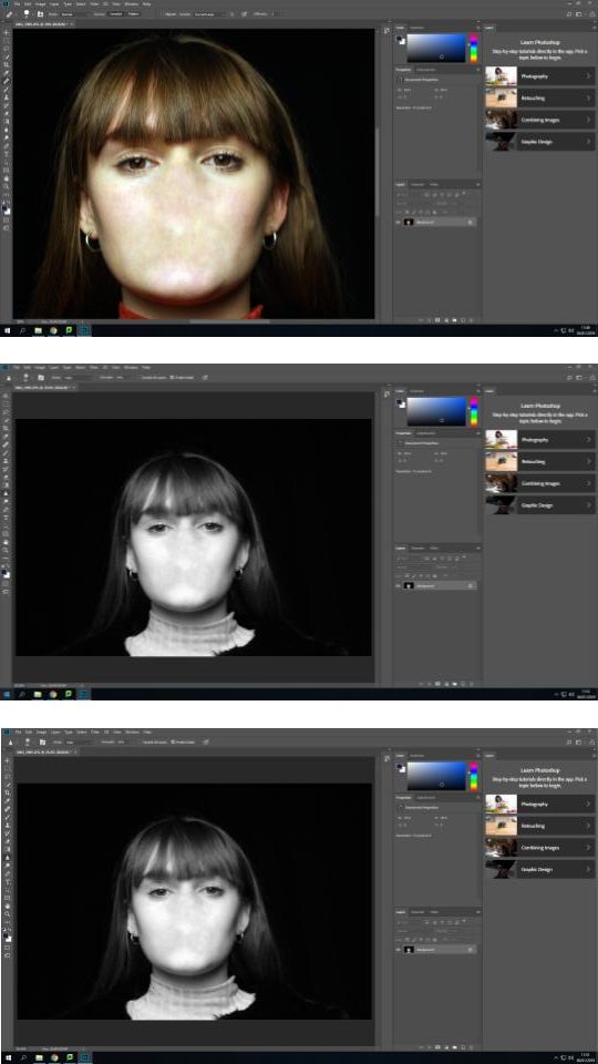
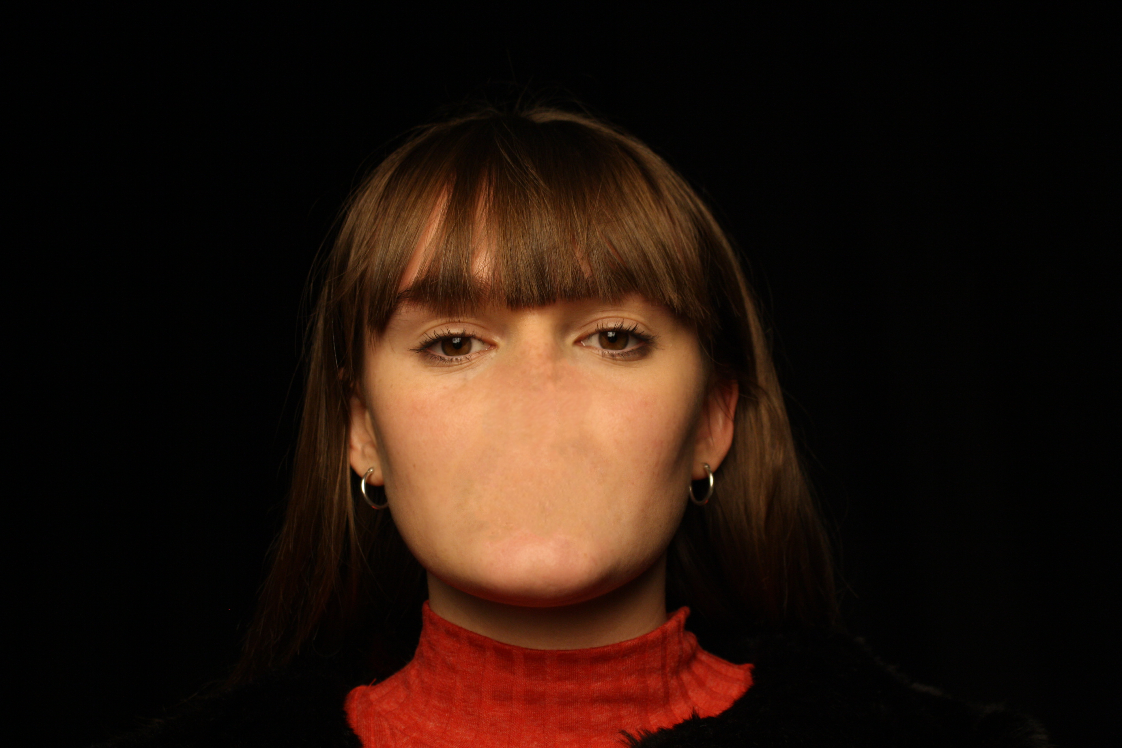
6. Using a combination of “spot healing brush tool“, “healing brush tool” and “blur tool” I blended the cut out area in with the image to create a face without a mouth or noticeable editing lines or patches.

7. I then repeated steps 4-6 to cover the nose.

8. I selected the “black & white” feature, increasing the brightness of reds to create a paler complexion and help separate the face from the black background.

9. Finally I used the “sharpen tool” on the eyes to cause them to stand out more and bring the face together.

Final Edits:

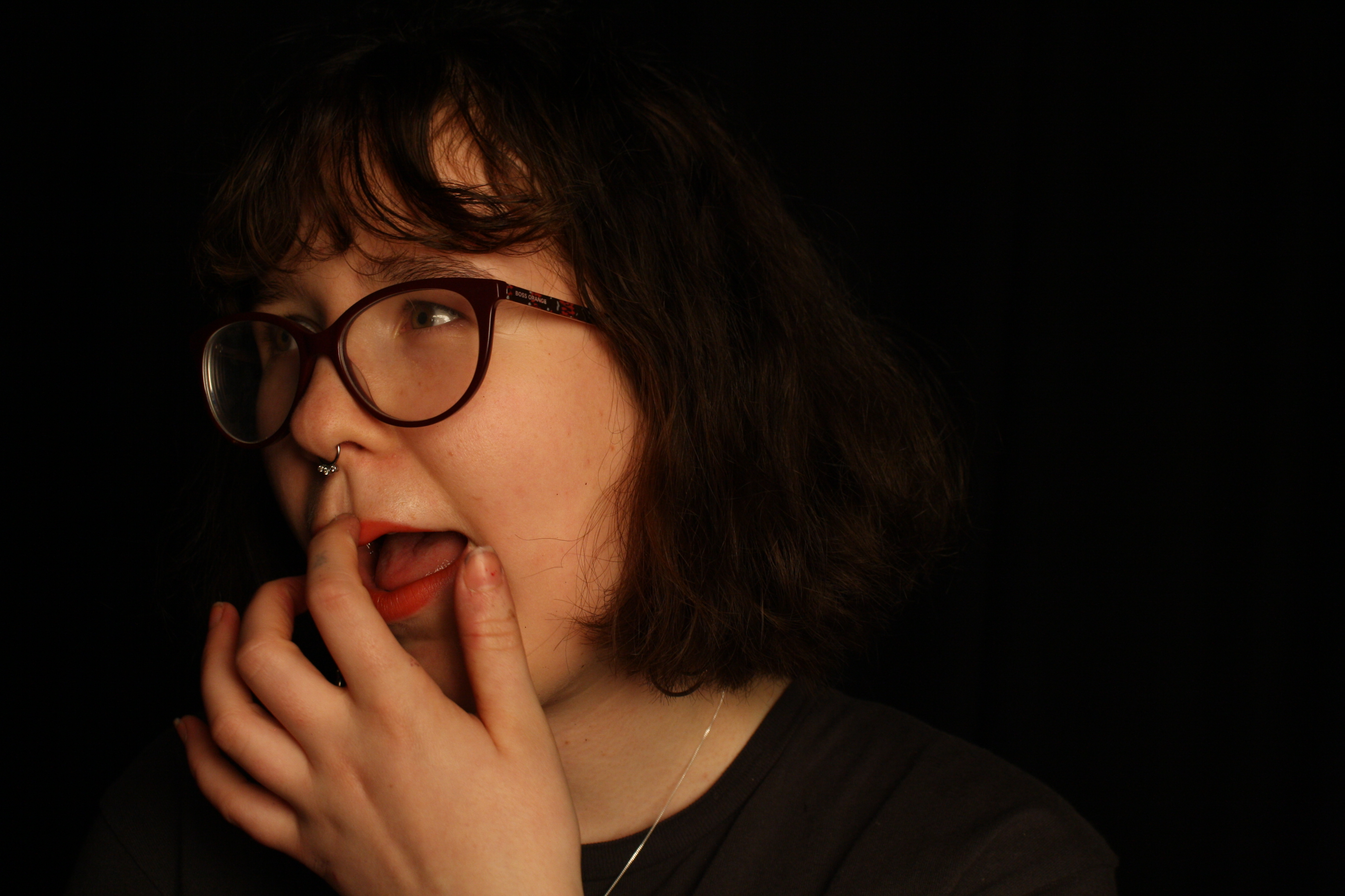
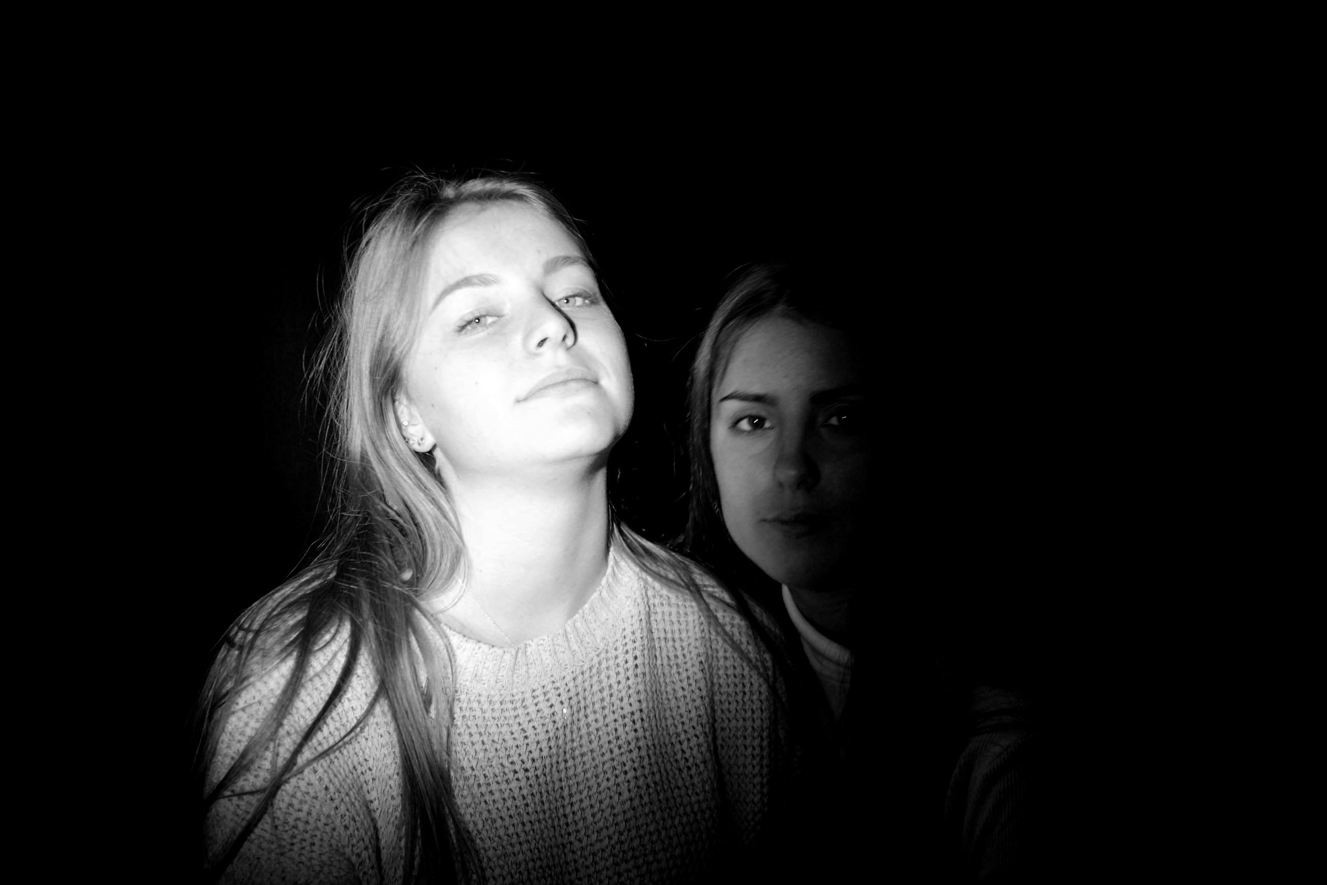
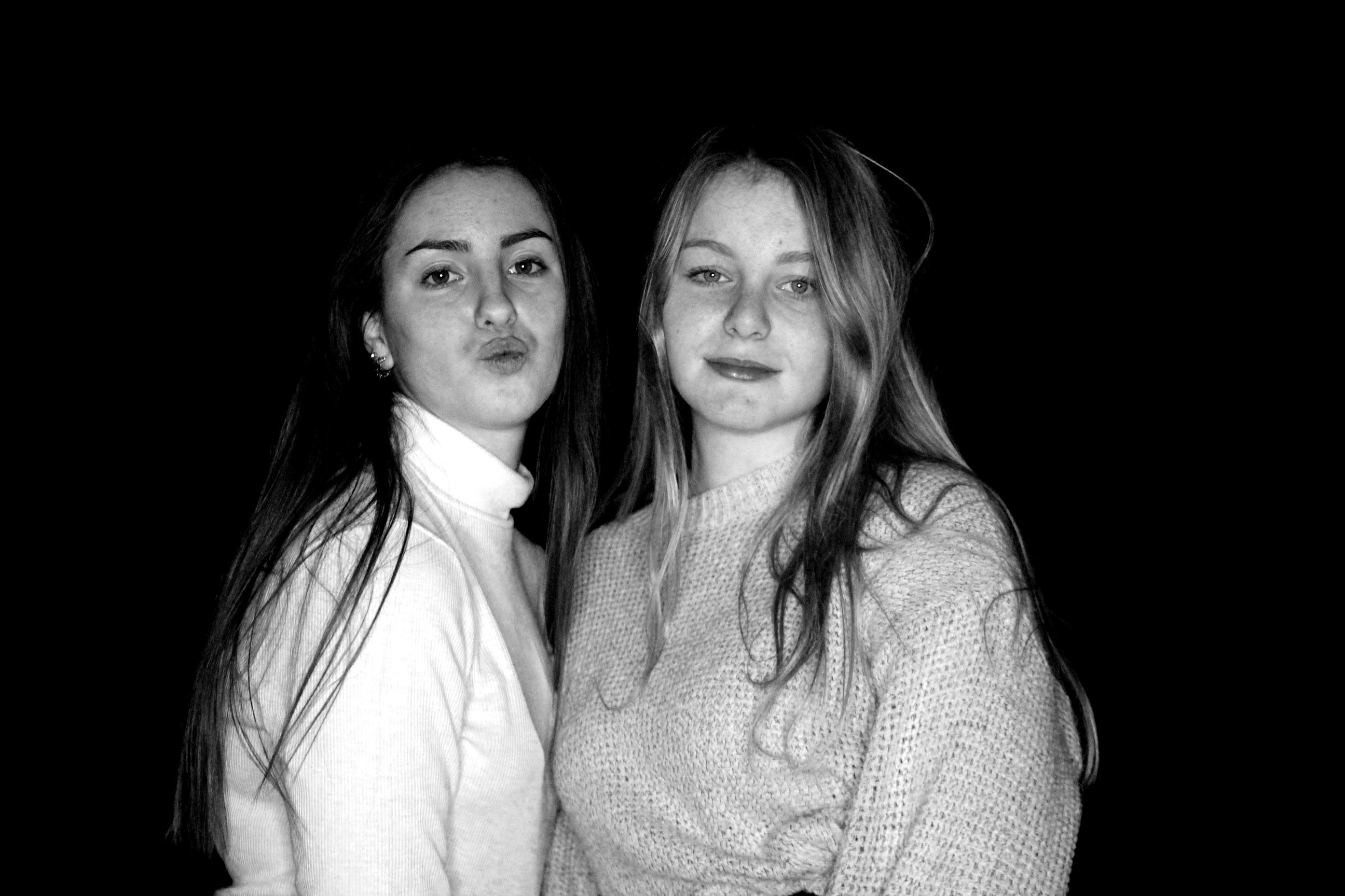
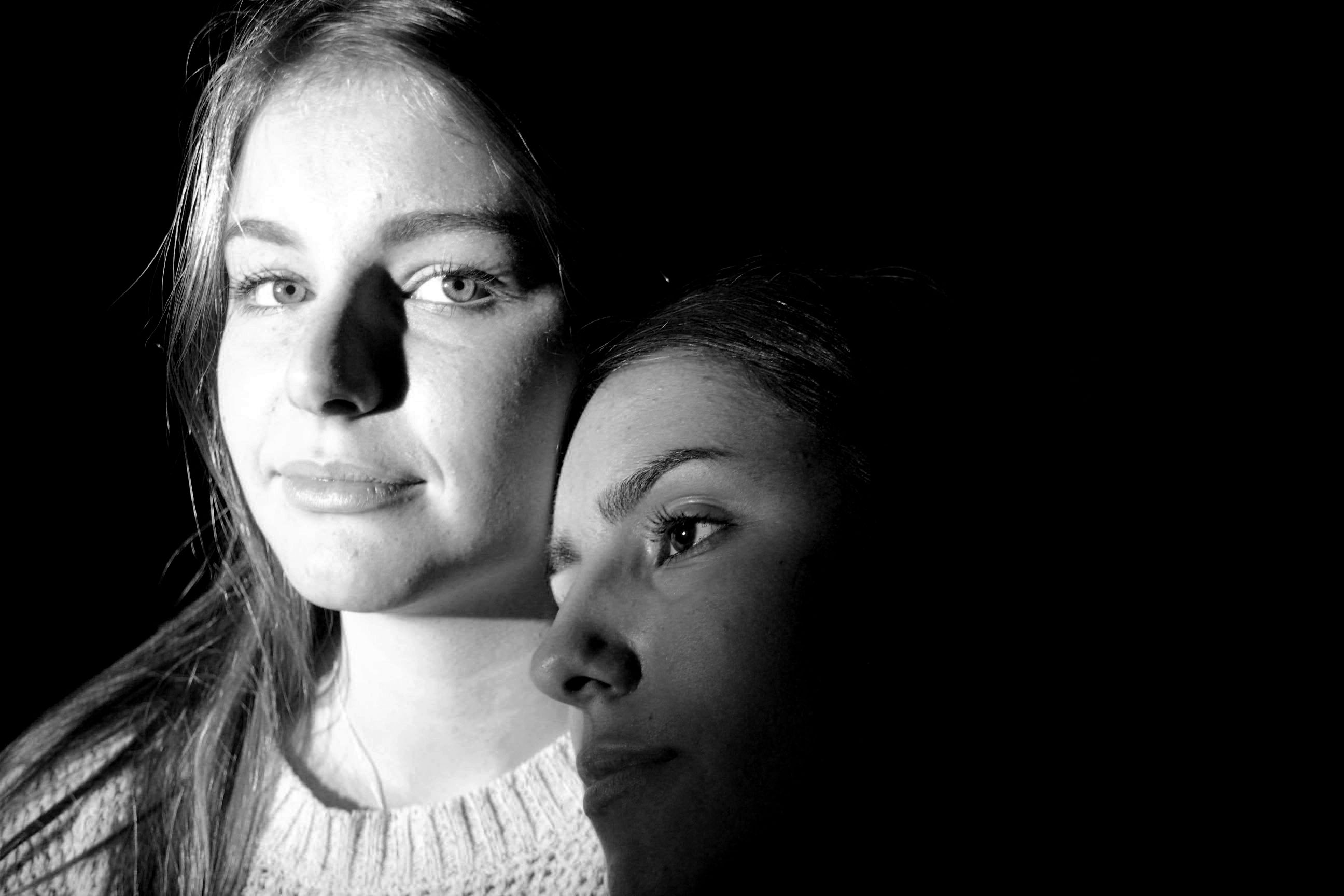
Identity and Place – Post 4.b (Photoshoots – Edited Portraits)

Action Plan:

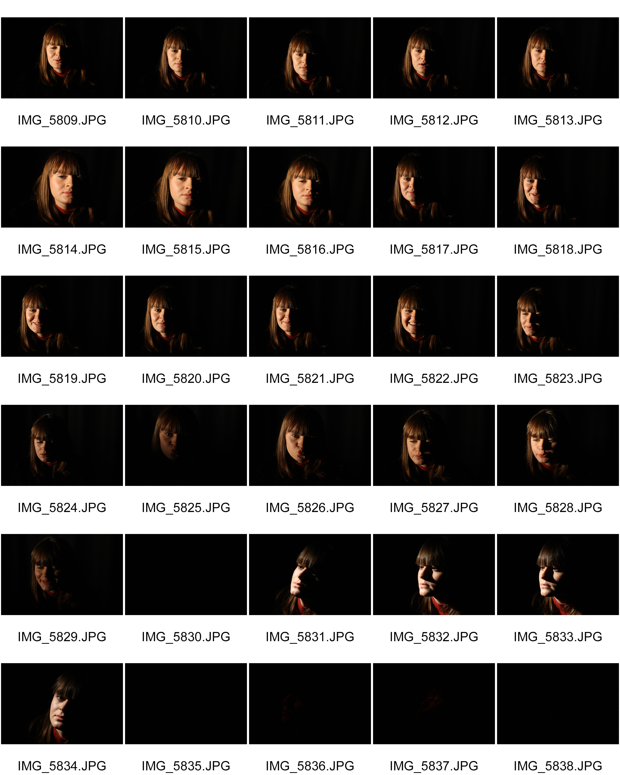
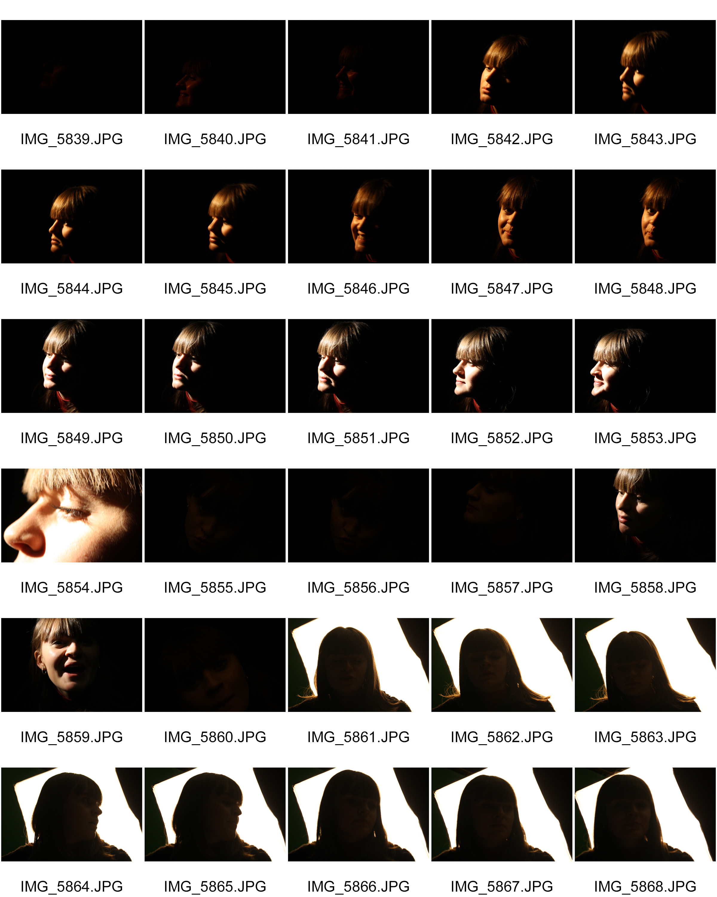
  • Use the single point lighting of a light box to cast soft light on subjects face.
  • Alter position of light box to give different effects on the subject’s face (eg. chiaroscuro).
  • Take photos of subject under different lighting.
  • Select well composed and focused images that show off the combination of the subjects face complementary to the light used.
  • Select best images based on editing plans.
  • Edit images.

My Response: Best Images:

Black and white portrait images

Black and White images 
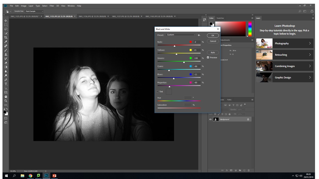
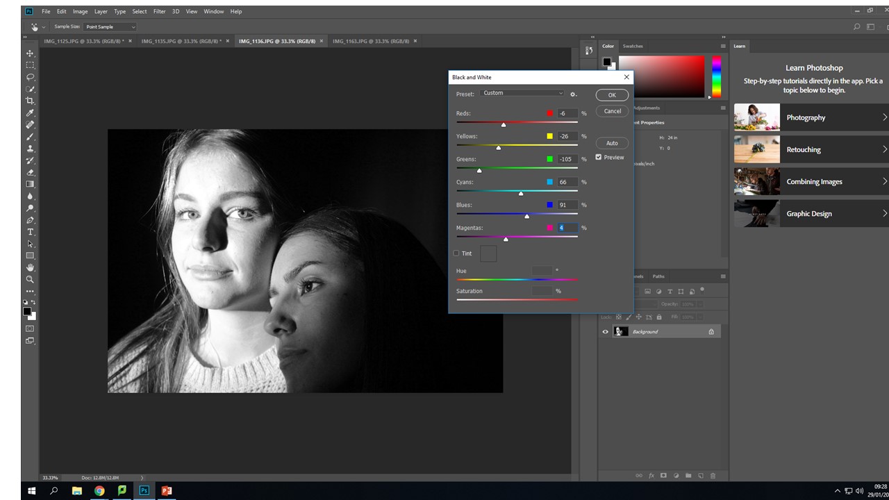
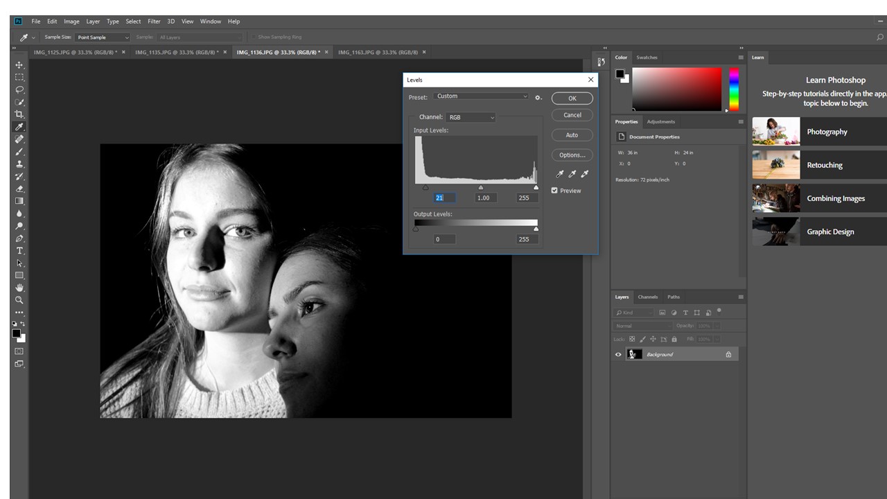
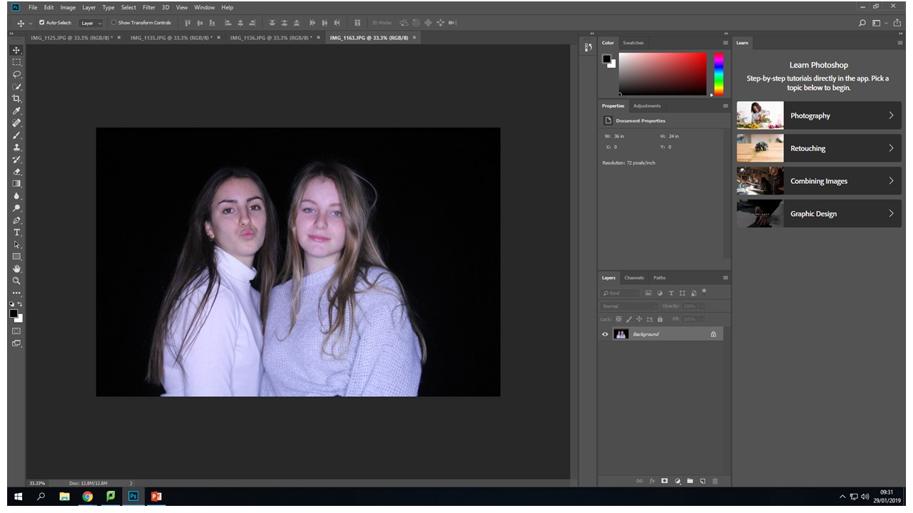
I chose to edit the photos creating even more of a contrast between light and dark. The black and white images create more of a ghostly effect. The purposeful over and under exposure look more intense and create a more interesting image with a clear focal point in relation to the back ground.  

My final outcomes

Image creation process
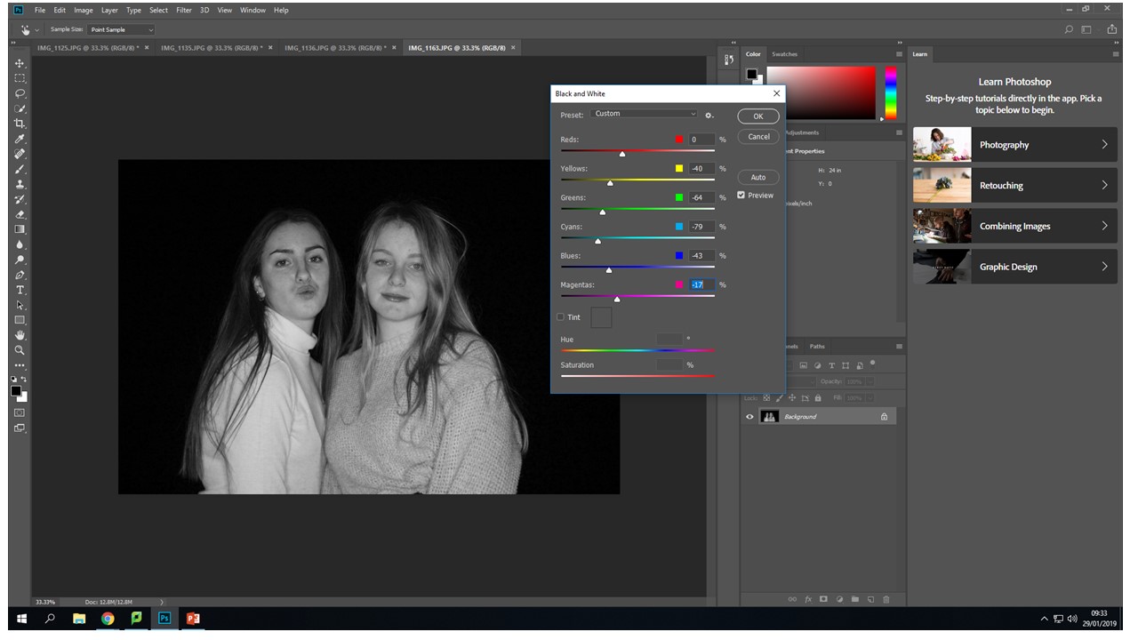
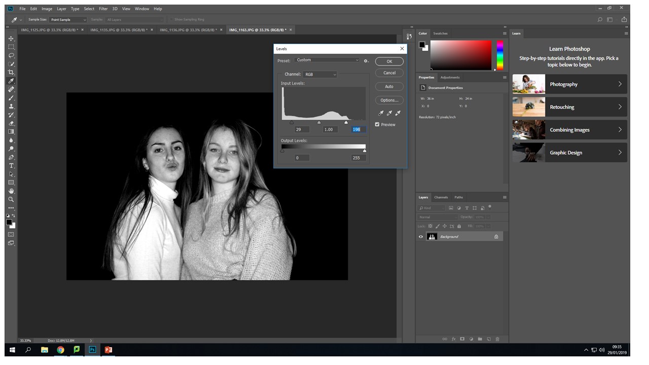
On Photoshop I went into image - adjustments - the i used the black & white controllers to create the initial  flip from color to black and white.  Also to create more contrast and over come the distracting background i used the same process but instead of clicking on black and white, i clicked levels then when from the left to right controller until my back ground got to my desired darkness.


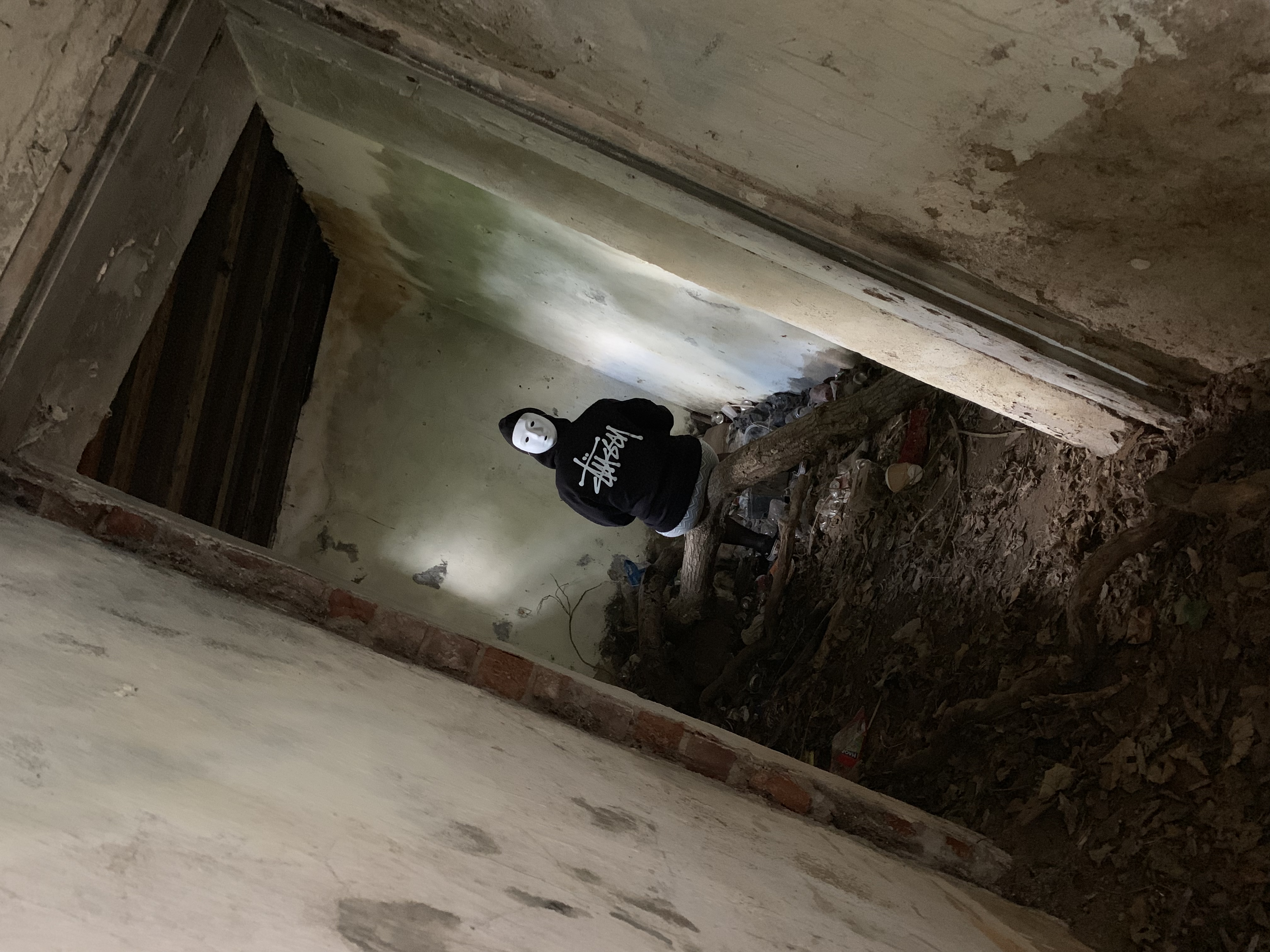
Identity and Place – Post 4.a (Photoshoots – Masked Portraits)

Action Plan:

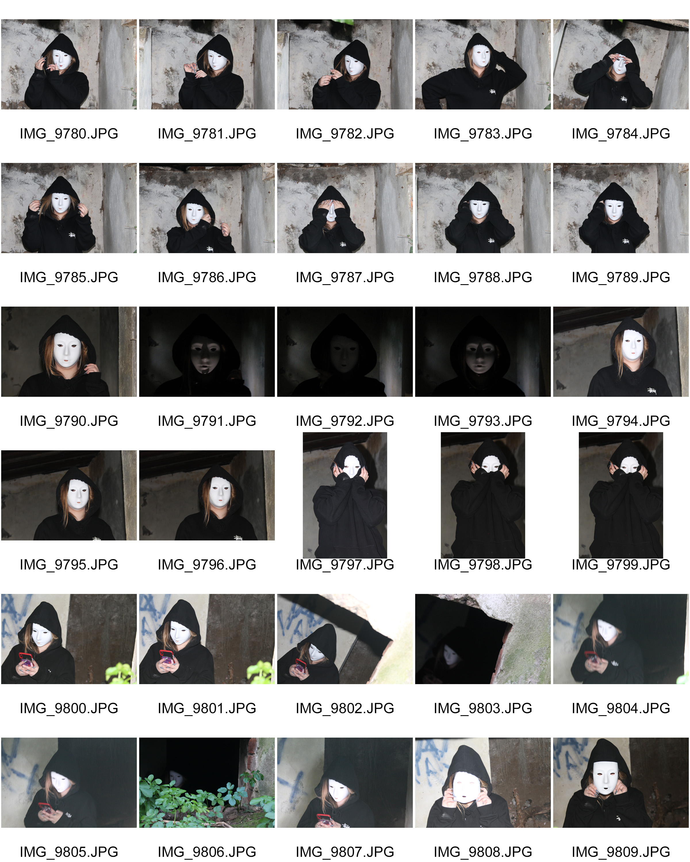
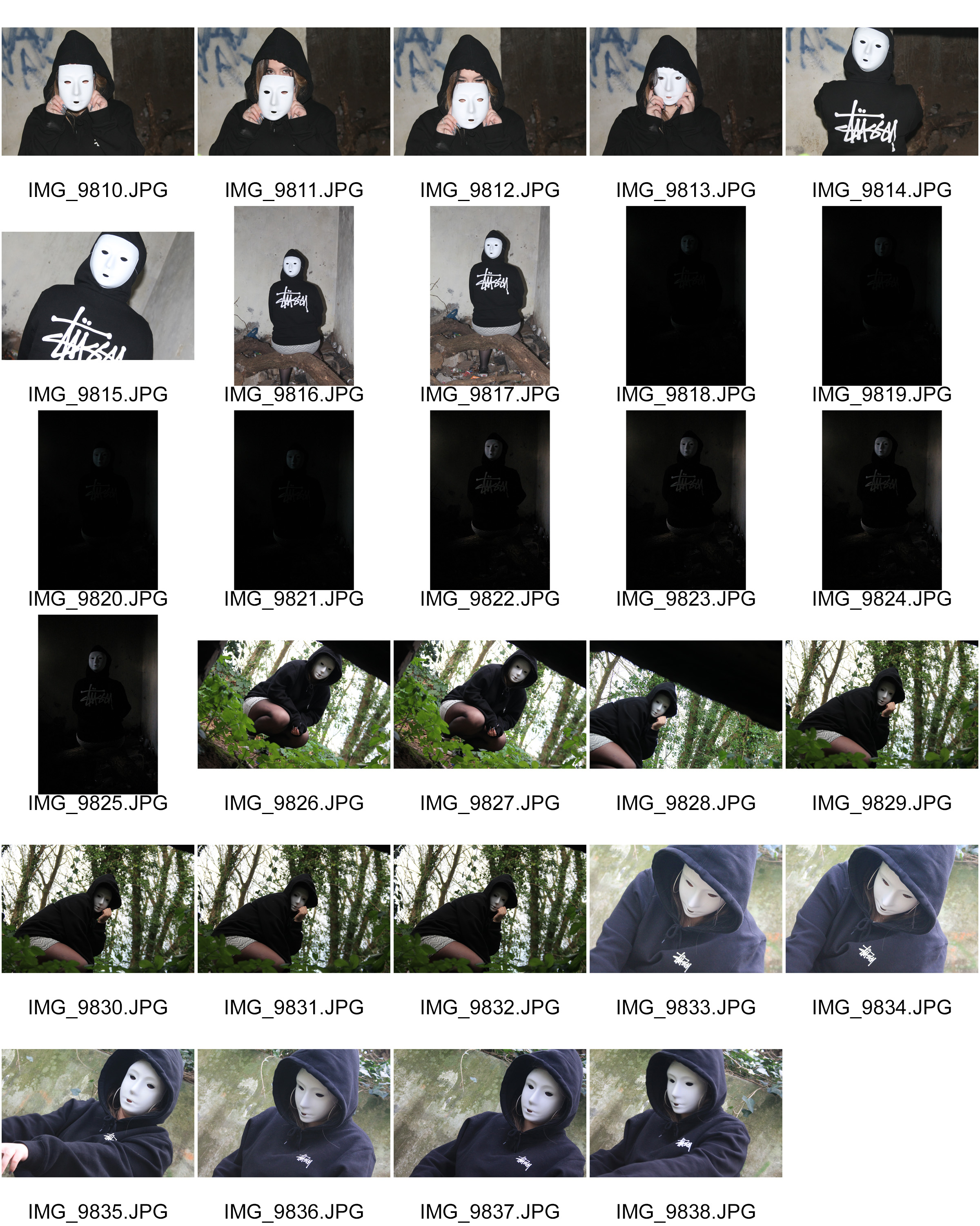
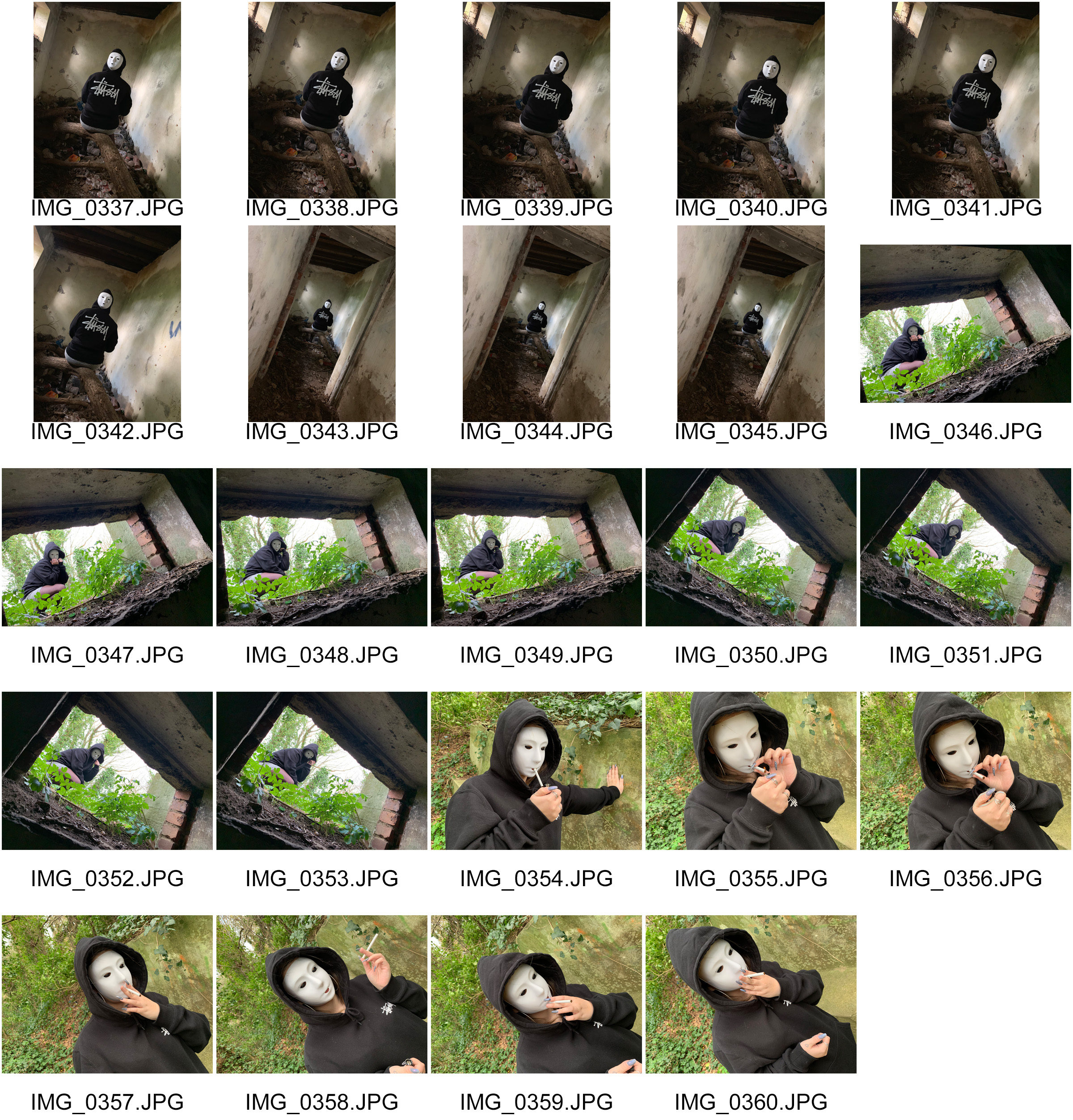
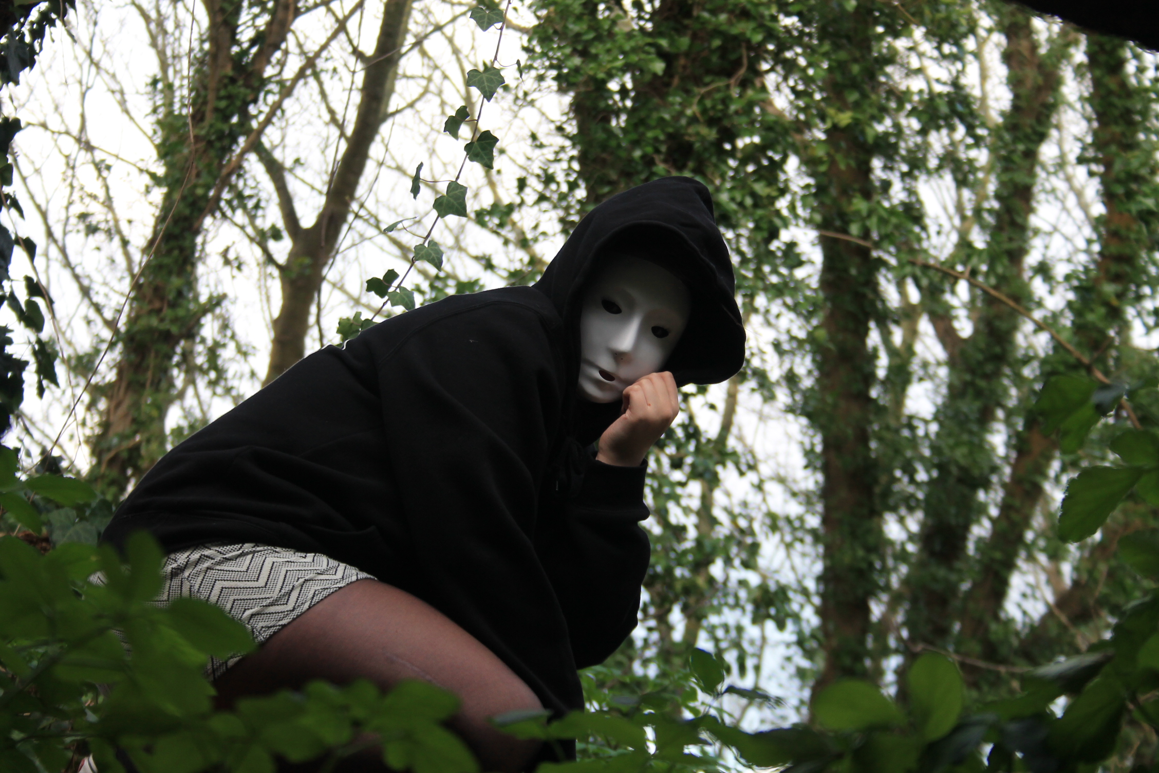
  • Select location suited to particular photoshoot (eg. woods. bunkers, old buildings, run-down areas).
  • Select area with good natural lighting (eg. window lighting).
  • Change camera settings to ensure good quality images in darker areas. (ISO, White balance).
  • Take photographs in a variety of locations or poses to give more potential final images.
  • Select best images based on editing plans.
  • Edit images.

My Response:

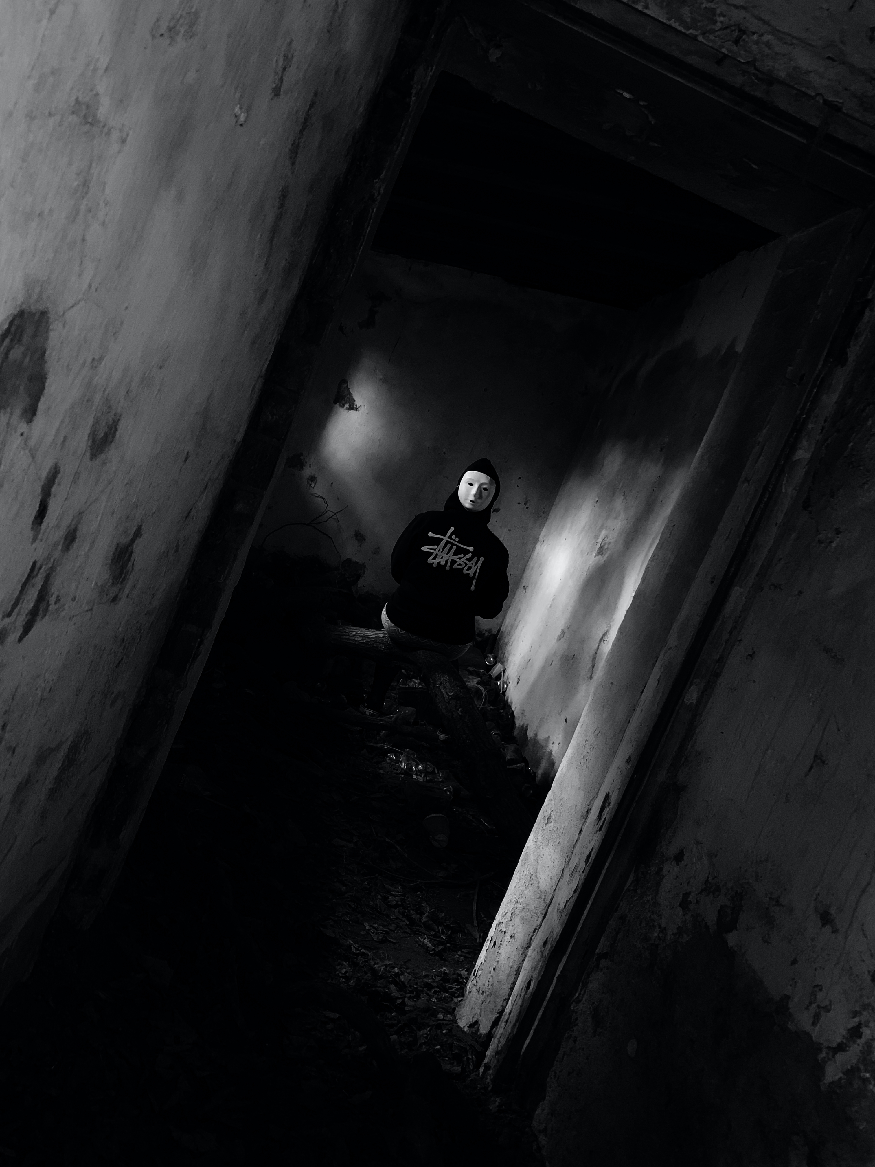
Best Images:

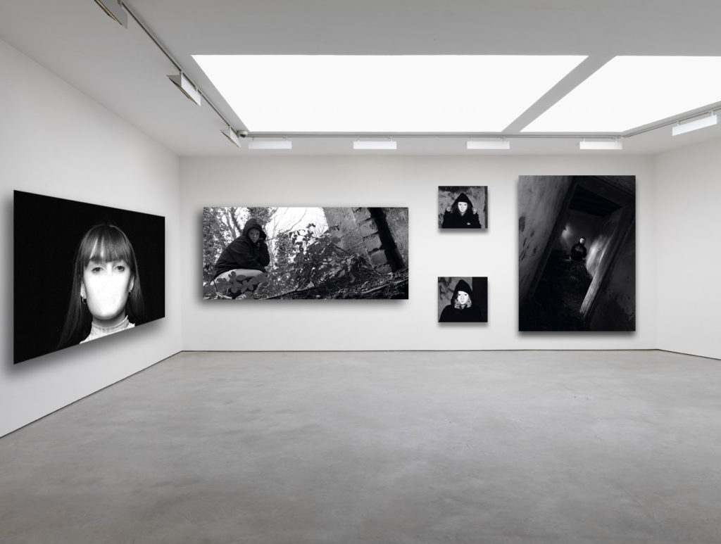
Final Outcomes—display and presentation

YOUR FINAL BLOG POST SHOULD CLEARLY SHOW 3-5 POSSIBLE FINAL OUTCOMES for IDENTITY AND PLACE, INCLUDING YOUR PRESENTATION METHOD

  1. sequencing of images
  2. grouping of images -grids , triptych, diptych, dioramas, predellas
  3. sculptural / multi-media approaches
  4. framing methods
  5. blog (show examples of frames / borders + process)
  6. clarity of final outcomes—which images are your final outcomes?
  7. coursework round – up and evaluation

FROM THIS YOU CAN CHOOSE YOUR IMAGES FOR PRINTING

Contemporary approaches to presentation :

Research and explore alternative approaches to presenting your final images. This should be an integral part of your concept…not a gimmick…ultimately, the quality of your photography will be the primary focus and your mark will reflect this…

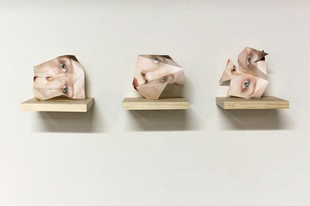
Sculptural methods…

Image result for contemporary photography display

Image result for photography as sculpture

Image result for photography as sculpture

Image result for photography as sculpture

Two-Frame / Diptych Arrangements

Image result for diptych photography

Image result for diptych photography

Triptych (3 frame)

Image result for triptych photographyImage result for triptych photography

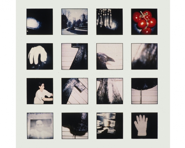
Grid Layout

Image result for grid of photos

Eclectic Layout

Image result for contemporary photography display

Photo-Essay Layout

Image result for photo essay

Circular Aperture

Image result for circular portraits

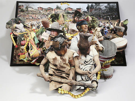
Diorama / pop-out book layout


Image result for photography as sculpture

Image result for photography as sculpture

Using projectors  / clear acetate and transparencies

Image result for photography projection

Image result for photos on acetate

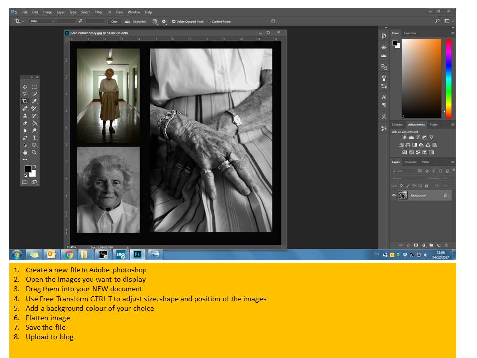
Evidence of your final outcome + framing

Essentials

  • Remember to label each JPEG  in the print folder with your name
  • Minimum 1 x file per A3. A4, A5
  • Ensure that your final images are a direct response to your chosen photographer (s) and show a clear visual link
  • Print size images = 4000 pixels on LONG EDGE
  • BLOG SIZE images = 1000 pixels on LONG EDGE