Category Archives: AO4 Present Ideas

Filters

Author:
Category:

Francesca Woodman: Photo Shoot 1

MY RESPONSE

To respond to Francesca Woodman’s work, I have replicated some of her photographs to create images that show loss of identity. To replicate her photographs, I had my subject half hidden by slow exposures to blur her figure into a ghostly presence. Since she usually photographed herself in empty interiors, I captured my images in the studio room. In the studio room I turned on the spotlight and changed my camera setting to a slower shutter speed to manipulate the light and movement to create the same photographic effects Woodman has in her images. Woodman explored problems that affect young people such as isolation, questions of self and confusion about identity. I wanted to explore the same themes in my own work to create a series of photographs about lack of identity.

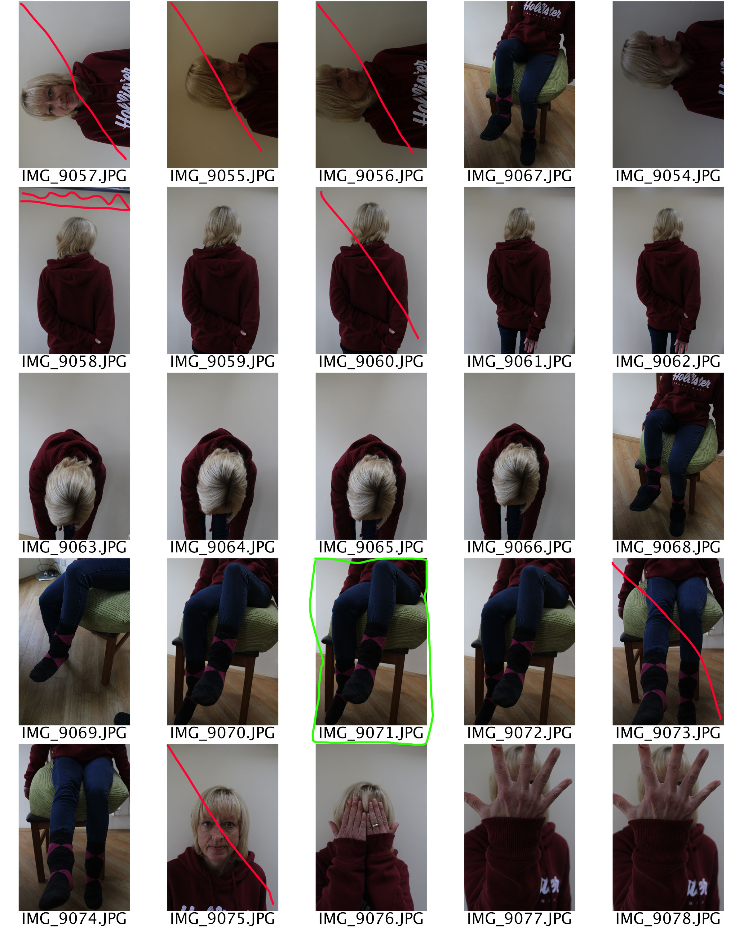
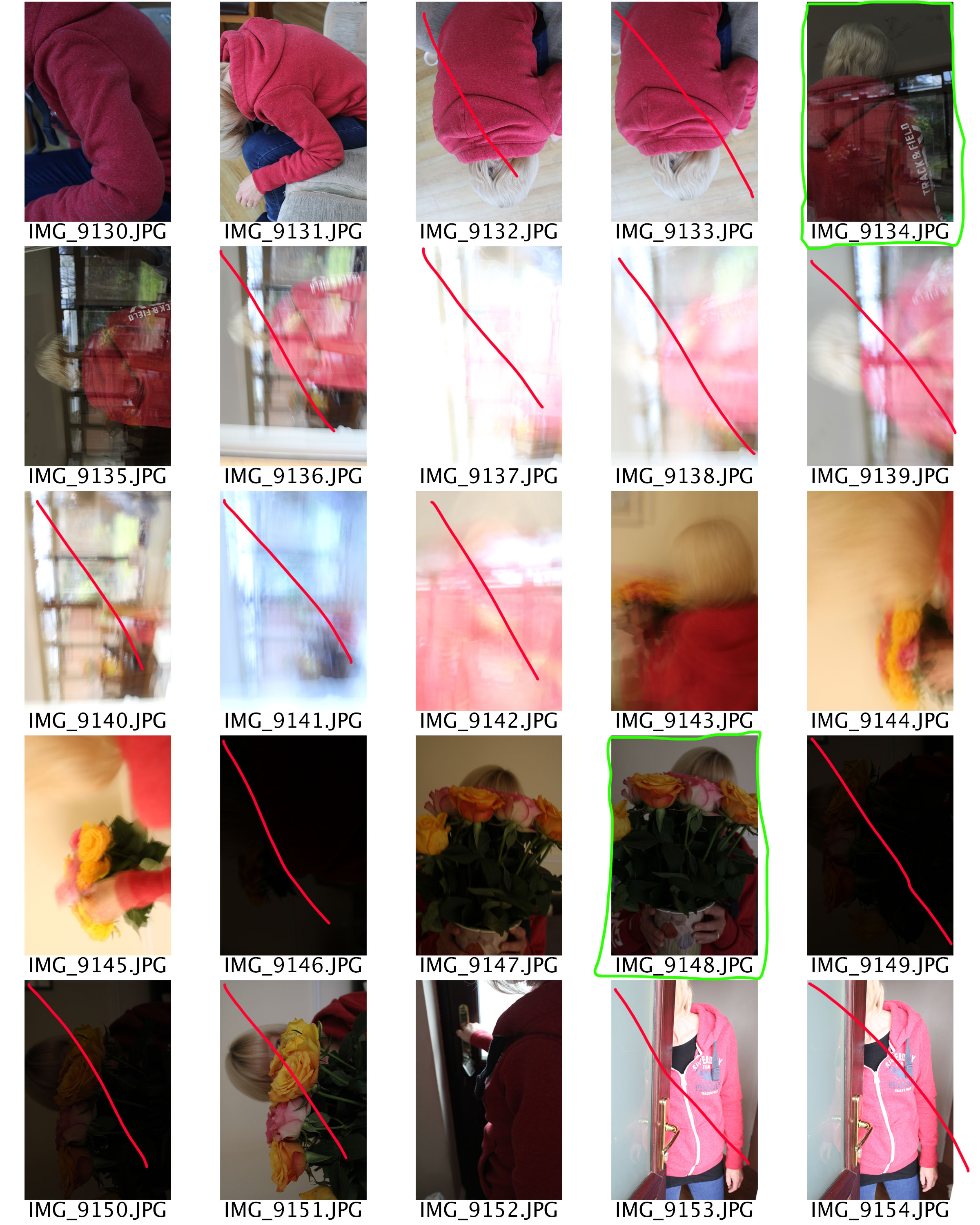
CONTACT SHEET
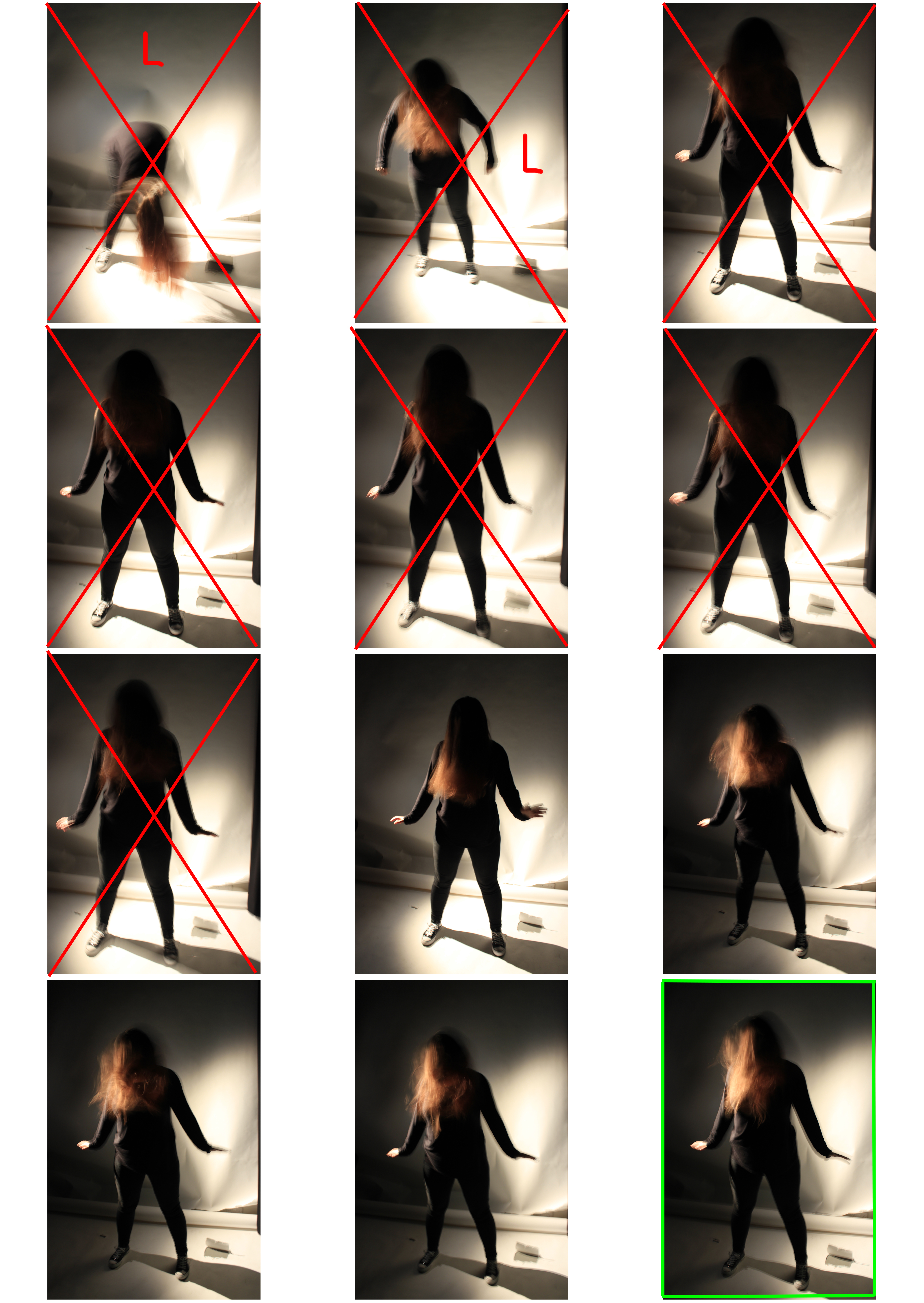
L: The lighting is overexposed/underexposed
F: The image is out of focus
Red X: I will not use this image
Green square: I will use this image
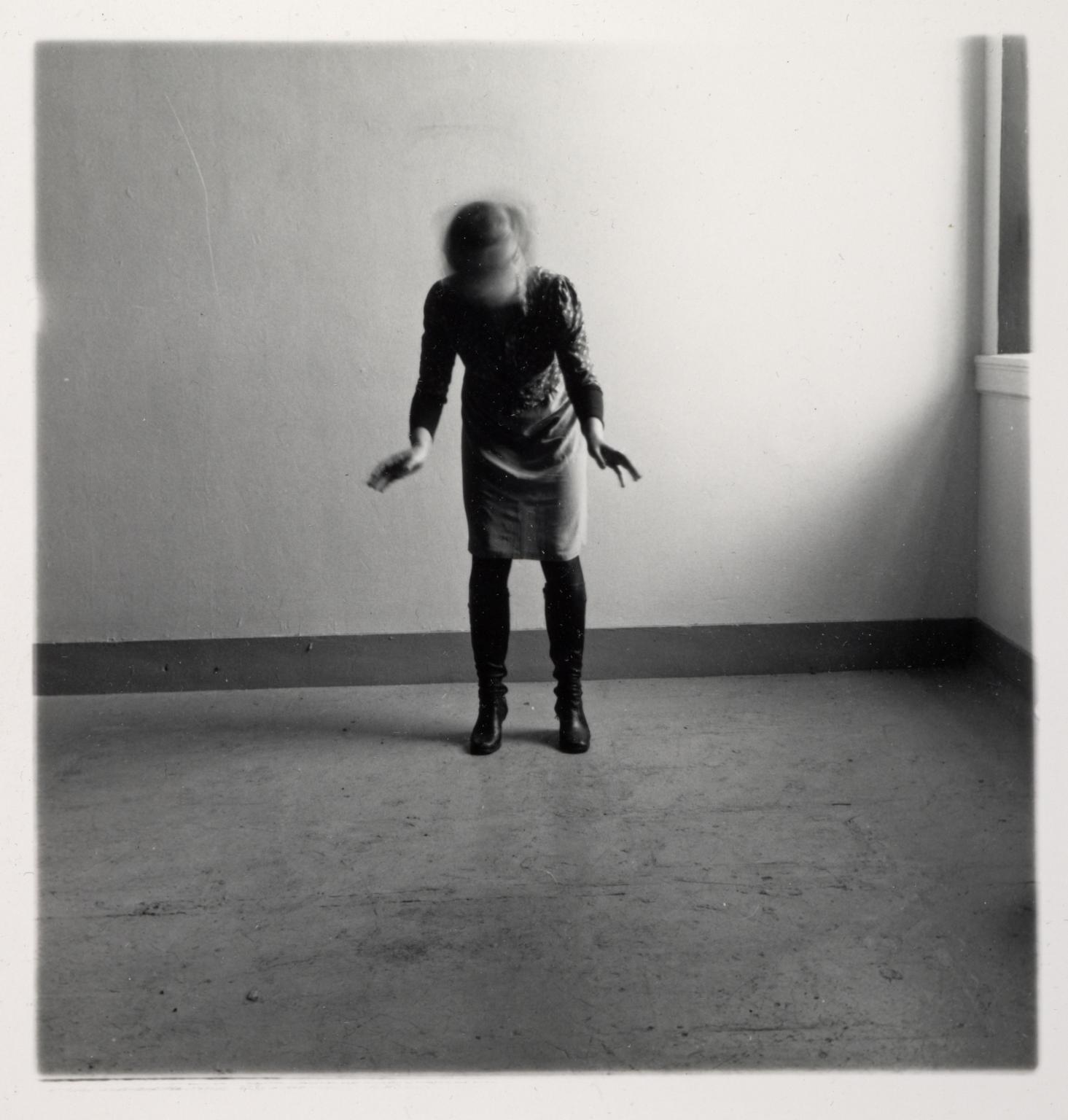
Francesca Woodman, Space 2, 1975-1978

She stands in the centre of the image wearing a dress and black knee high boots. She occupies an empty space in the corner of a room, standing near the back wall. Woodman stands with her feet planted apart and is bent slightly forward towards the camera with her arms and hands out in front of her. Her face, which looks down towards the floor, is obscured by her hair. Woodman is blurred as though she is shaking her head.

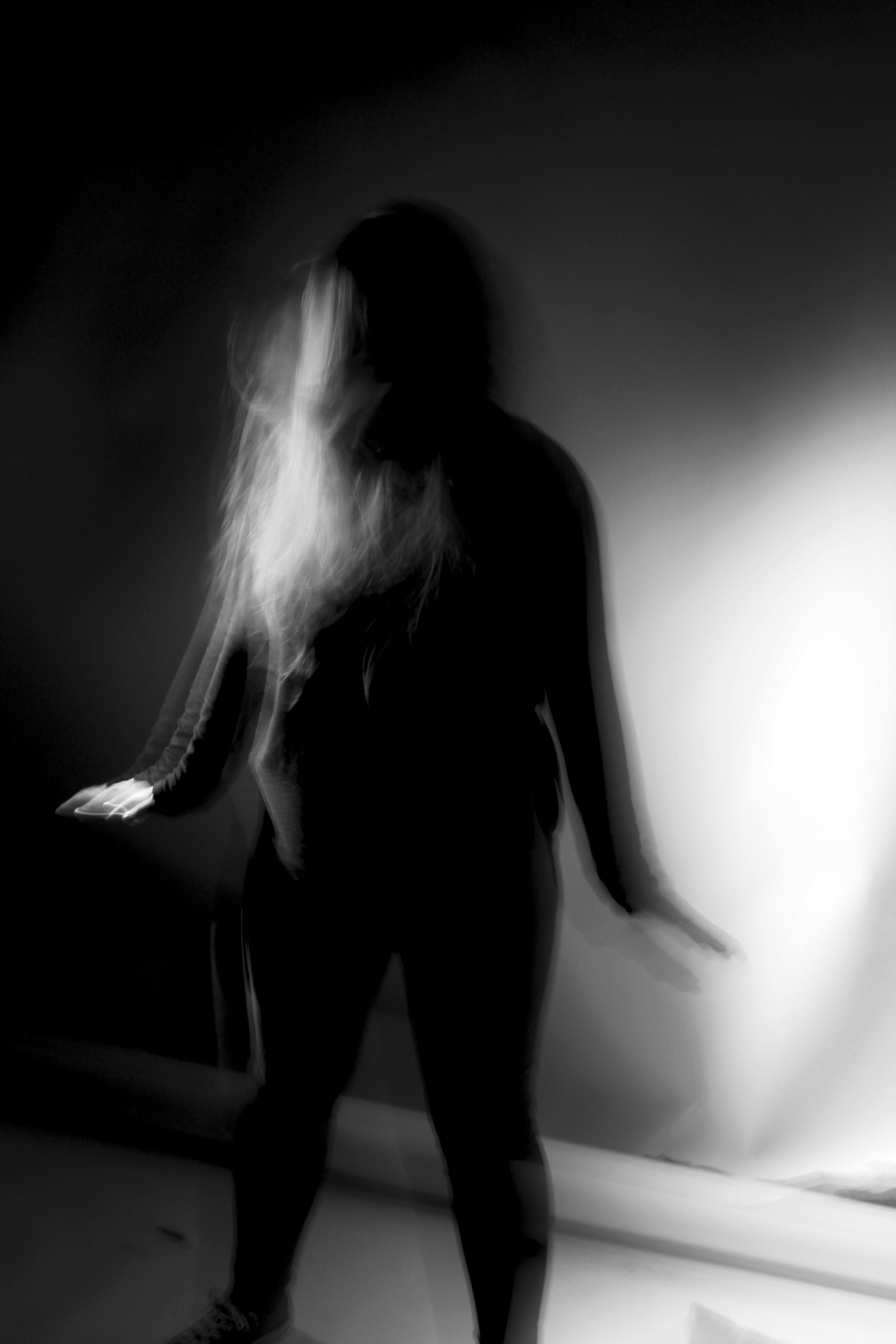
I replicated her first image by having my subject wear all black. I told her to stand with her feet apart and have her arms and hands out in front of her. To create the same blurred effect, I told my subject to look down towards the floor and shake her head. Her face is obscured by her hair which is blurred through movement.  The slow shutter speed captures the movement and creates a ghostly presence. Since there are no windows with light streaming through I used the spotlight in the studio room to create shadows on the floor as well as highlights. On Photoshop I changed the image adjustment to black and white and increased the contrast to create an eerie effect.
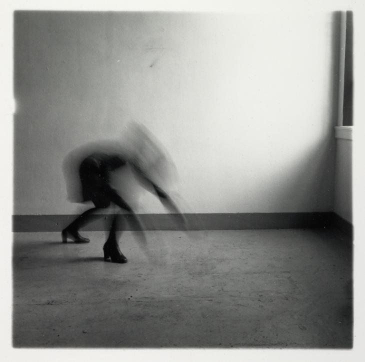
Francesca Woodman, Space 2, 1975-1978

Woodman, wearing a dark dress and knee length boots, occupies an empty interior space with bare white walls. A window can be seen on the far right of the image where light enters the room. With feet firmly planted, Woodman appears to lunge forward. Her body is orientated away from the camera, her knees are bent, back hunched and arms stretched out. Her body from the ankles up is blurred as if in motion, obscuring her face.
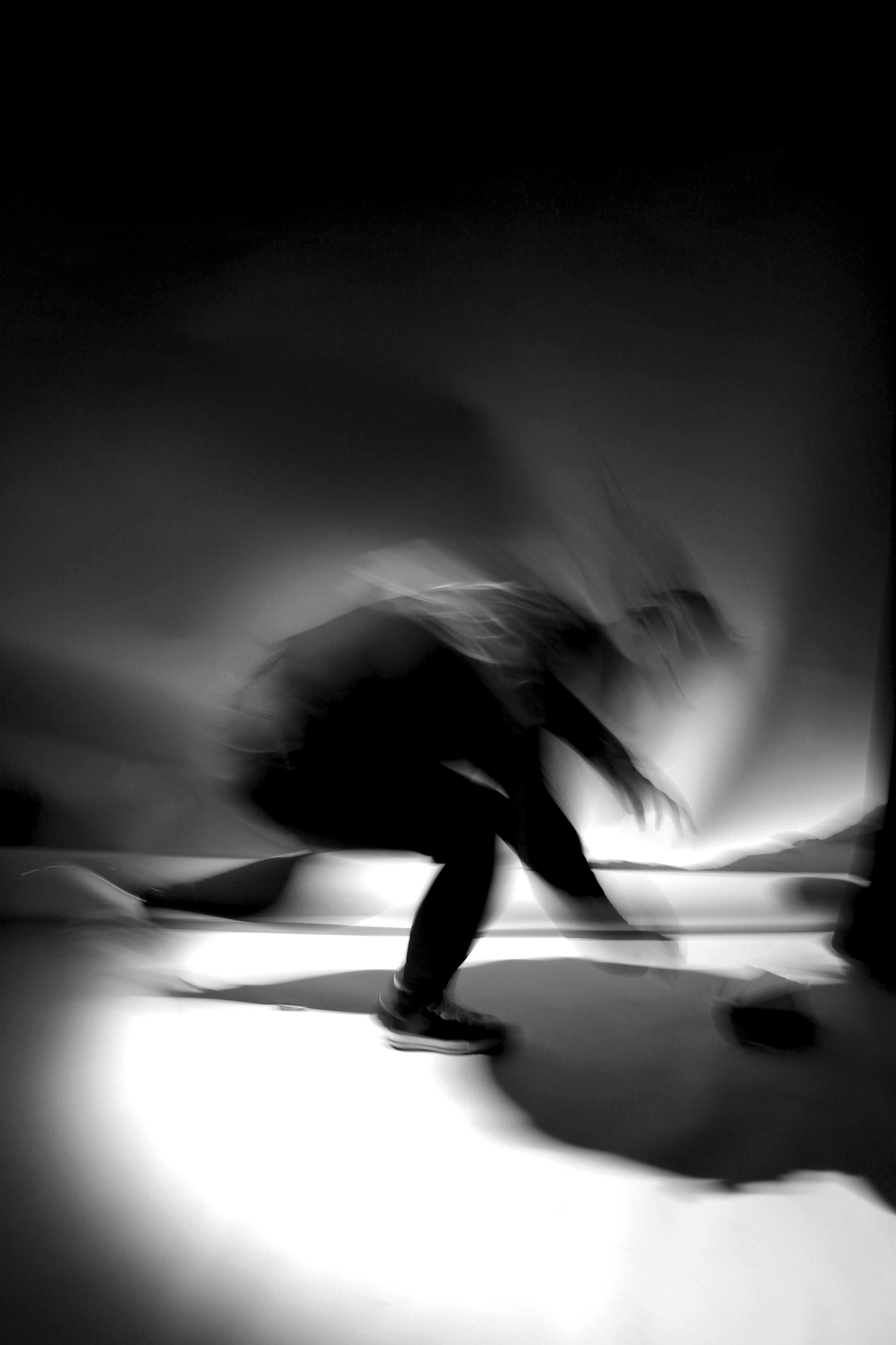
I replicated the second image by having my subject lunge forward towards the spotlight. Because of the fast motion, most of her body is blurred. This is my favourite image that I replicated from Woodman because the rapid movement creates a sense of loss of identity. She appears lost and confused through the motion blur.
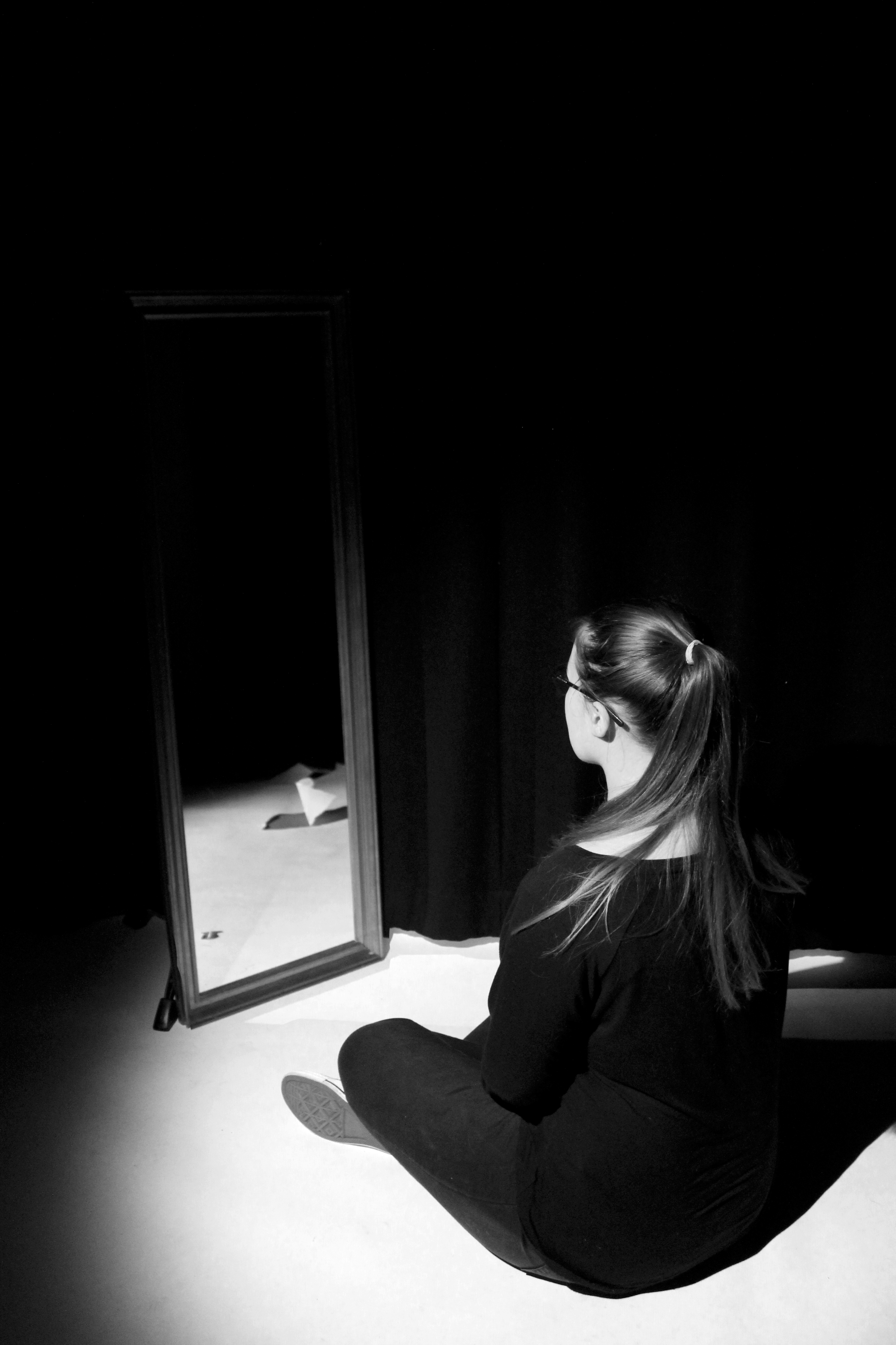
I created more loss of identity images by coming up with my own ideas to represent this topic. Although these images are not a replicate of Francesca Woodman’s photography work, they are inspired by her.  I photographed my subject in front of a mirror admiring herself. I then stayed in the same position and told my subject to move out the frame. On photoshop I opened up the two images and used the opacity tool to help me position the mirror without her reflection onto of the first image. Doing this removed her reflection from the original image which connotes the idea of lack of identity since she cannot see herself through the mirror. I also applied the black and white filter to resemble Francesca Woodman’s images.
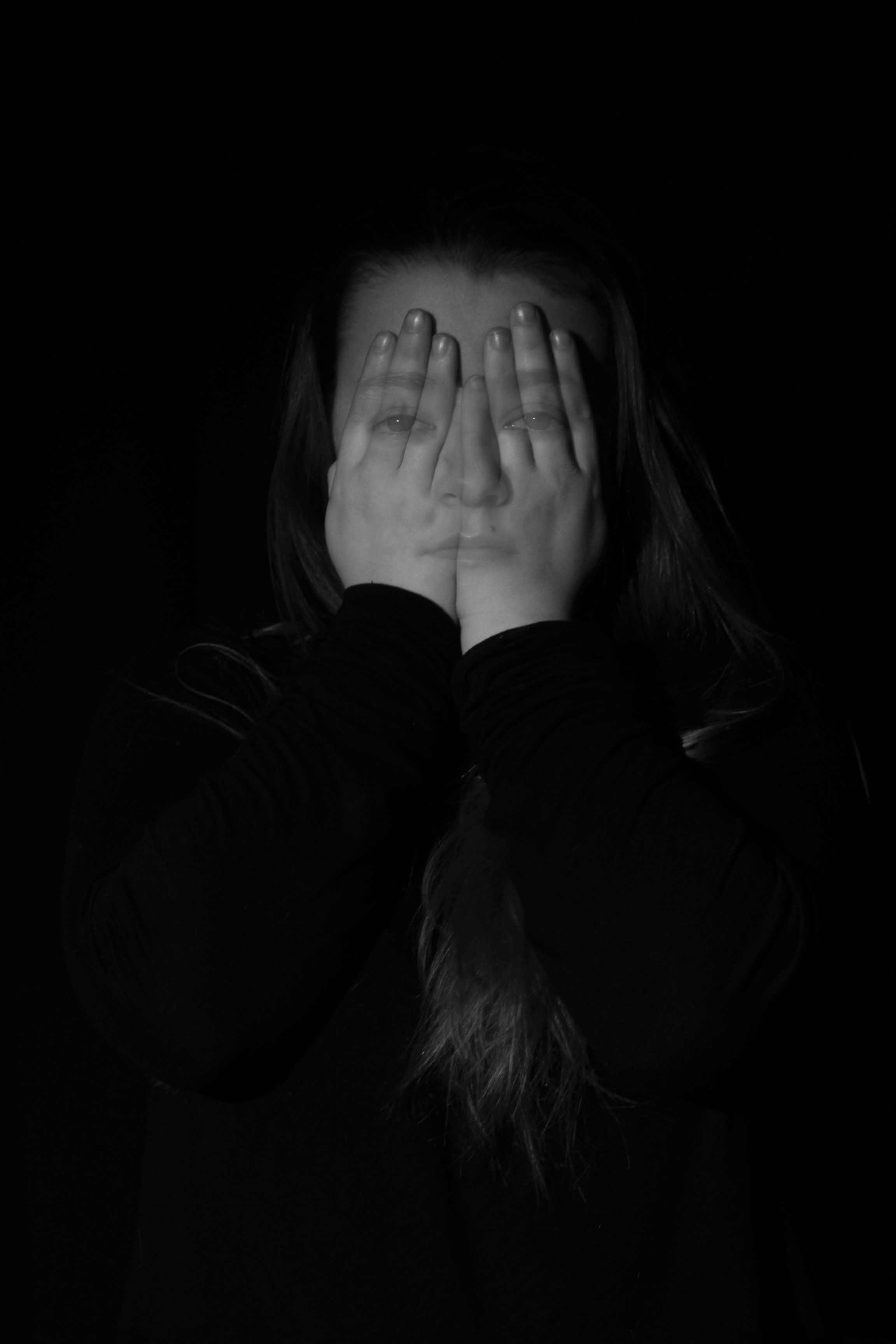
To create this image on Photoshop I told my subject to do two things. I captured one image of her looking directly at the camera, and in the same position I had my her covering her face with her hands. I placed the image with her face showing on top of the other. Using the opacity tool I placed and resized her facial features onto her hands and erased the rest of the image. This edit shows loss of identity since she is hiding her face away from the public. However, she can still be seen faintly through her hands suggesting that she can’t hide away. The subject blending into the black background creates an eerie and dark effect that Francesca Woodman portrays through her images.

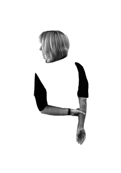
Photo shoot 1 – Edits

In my first photo shop idea I wanted to show the body of my model disappearing. I decided I wanted to get rid of the body but keep the arms and the head. My model has her head slightly turned showing her nose, this makes it look like she is looking out to the horizon, potentially looking for her identity. Her arms are joined which shows she is trying to keep herself together, due to the disappeared body implies that she is finding it hard to do this. The image is in black and white like Simpson’s work and clearly demonstrates my model loosing her identity. In order to achieve this I cut out my model using the quick selection tool, and placed this layer onto a new A4 white page. I then used the rubber tool in order to rub away the body. I then leveled and desaturated the model layer in order to allow a high contrast in tonal regions. I believe that this edit is successful as it shows the process of the model loosing her identity.

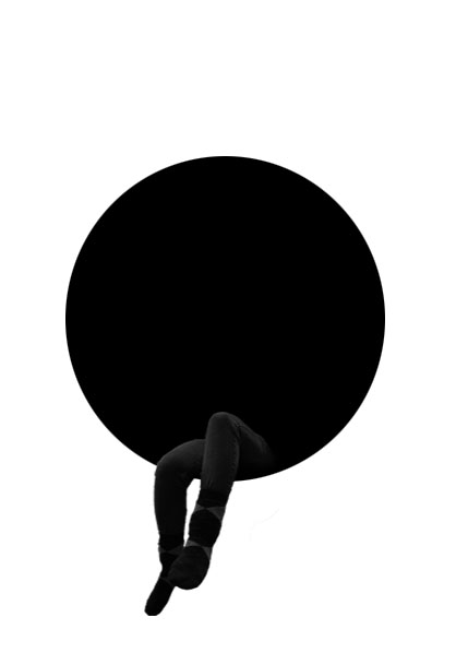
In my second edit I wanted to make it more symbolic, through the use of shapes. In the centre of the image is a black circle, this circle is used to represent the model being swallowed up (her identity being taken away). The color black and white represent a empty void where nothing is, conceptually showing what it is like when you lose your identity. The models legs are sticking out as if she is sitting in this void. This shows that she is so far in (highly depressed) she does not want to come out and talk about, which is usually the best option. Like the other idea no colors have been used in order to prevent a small identity being shown. In order to achieve this idea I created a new A4 page and place a black circle in the center of the page using the ellipsis marquee tool. I the opened up the image I wanted to use and used the quick selection tool to cut out my models legs. I then placed the leg layer on to the A4 document and used the burn and blur tool to blend the legs into the black circle. Using the transformation tool I made the legs smaller, to shows how small loosing your identity can make you feel. I am extremely happy with the outcome of this edit and believe it matches the theme of loss of identity.

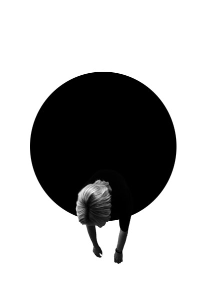
Due to the success of my second edit I wanted to use use the black circle again due to meaning and representations it bought to image. I started off by using the quick selection tool to cut out my model, in the bent over position. I then placed the leg layer on to the A4 document and used the burn and blur tool to blend the legs into the black circle. Using the transformation tool I made the legs smaller, to shows how small loosing your identity can make you feel.

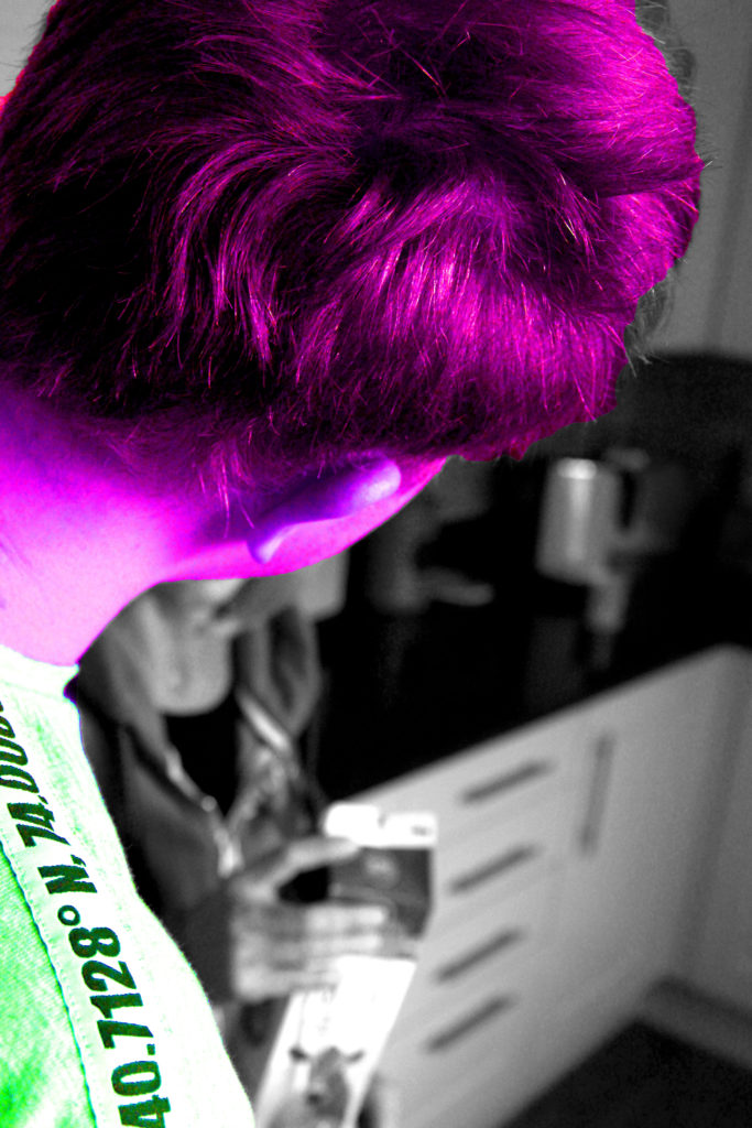
In my next idea, I selected the image were someone else was covering the face of the model who has lost their identity. In order to show this person having an Identity, I decided to use the quick selection tool to cut them out. I then turned the background layer black and white by pressing ctrl + U. This created a colour splash, I felt that I could expand this idea. I decided to change the colour of my model to a ‘wild’ colour in order to create a dramatic contrast. I did this by pressing ctrl + u and altered the hue slider. This contrast I feel clearly portrays someone with identity to someone who has lost their identity. The model who has lost their identity can be seen in the background as a blur, which shows that she is a minor and does not want to be seen by others, thus it helps to create a powerful image.

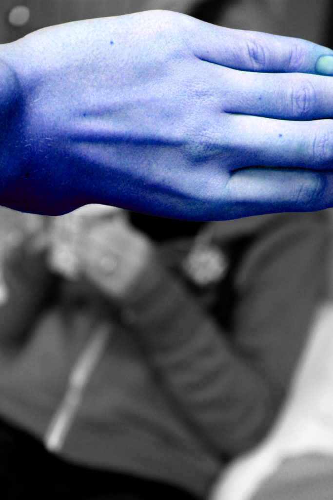
Due to the success of the idea above I decided to follow the same steps but with the image above. Having the hand of someone else covering the models face shows how she is not important and should not be looked at, also presenting what it is like to have lost an identity.

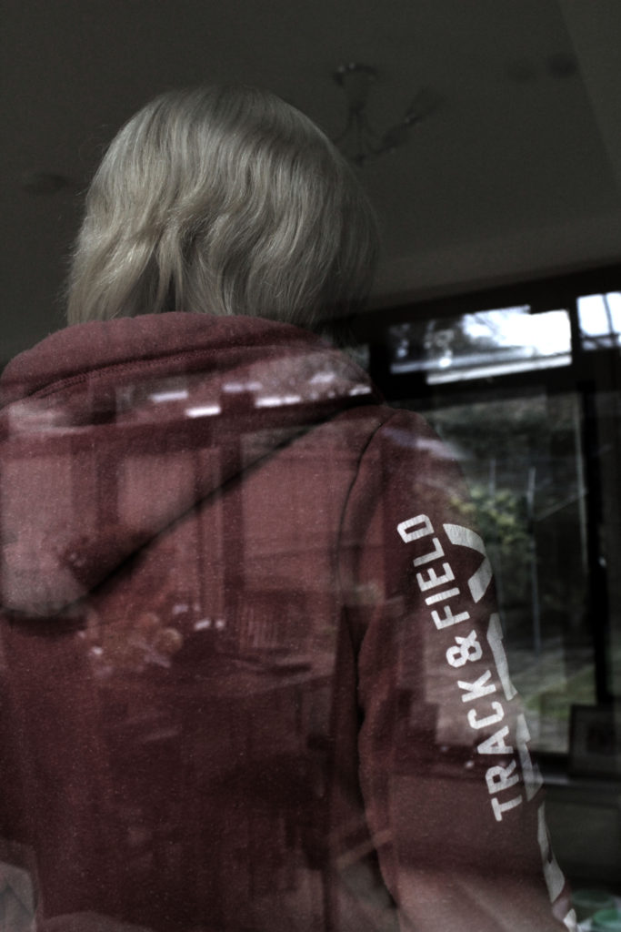
In my final idea I wanted to showcase this natural double exposure. The image was taken through a window, so you are able to see the model and the background being reflected by the mirror. In order to show this I adjusted the levels and curves in order to allow both the model and the scenery to clearly be visible. I turned down the saturation of the image as well to create a dark and depressing mood to the image. I created this to show a before and present image. The scenery is what life was like before the model lost their identity and the model herself is seen looking the other way showing that her life is nothing like this anymore.

I am very happy with all my outcomes from this photoshoot as I believe they all showcase what life is like when you loose your own identity. I believe that these outcomes could lead to successful final pieces.

Identity – Photo shoot 1

This photo shoot is inspired by the artist Lorna Simpson, who captured the model without including their face. I believe that this is a good idea when trying to capture someone loss of their identity.

Planning

I will conduct this photo shoot in a variety of settings, from outdoors to indoors in enclosed areas. In these multiple locations I tend to have a plain background which means setting will not ruin the idea of having no identity. My camera settings will be kept normal, however I may experiment with changing the ISO to make the images darker, which also helps to show the dark and depressing side loosing identity has. Moreover, I am going to look at experimenting with the shutter speed in order to create and intended blur, to convey that maybe loosing an Identity leaves your life in a blur, making those images metaphorical. I will be using different props such as people, pillows, windows etc in order to block the face of my model allowing the sense of loss of identity to be shown.

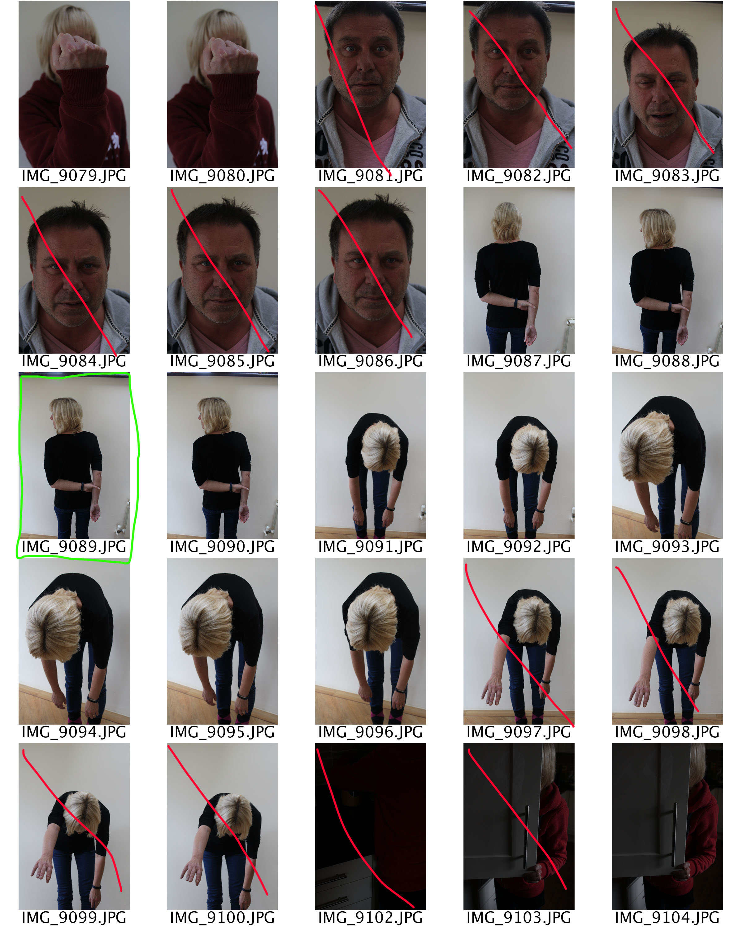
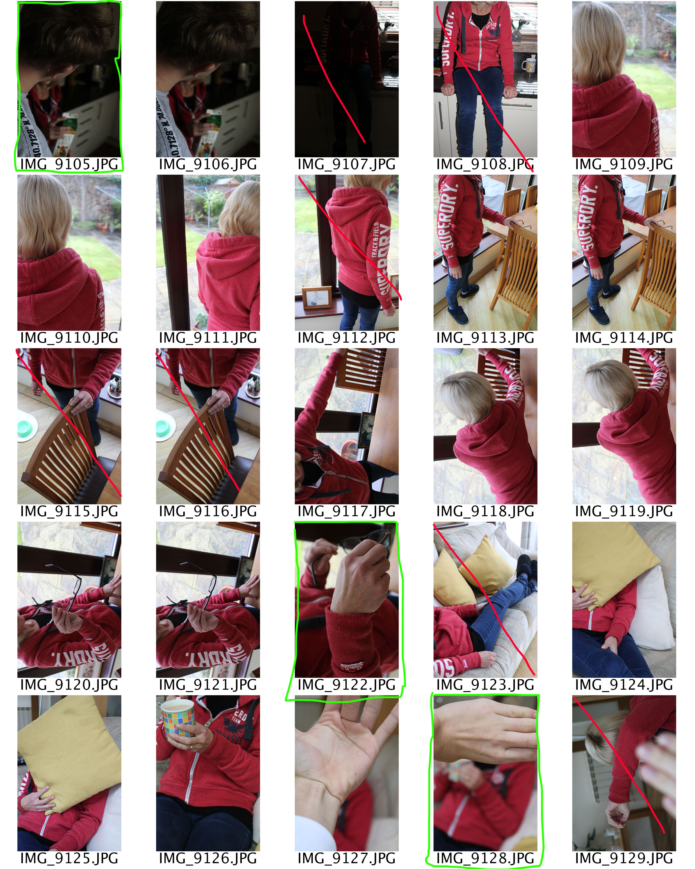
Contact Sheet

I am very happy with the images I managed to take out of this photoshoot as it has provided me with inspiration in the editing stage. However, I found it hard to capture images without repeating the image before, resulting in less images. Knowing this fact it will help inspire my next photoshoot.

Claude Cahun / Clare Rae Exhibition Analysis

The Claude Cahun and Clare Rae exhibition was very inspiring. It clearly demonstrated how the work of Cahun had inspired the work of Rae. Each photographer had their own room with their photos hung up on the walls, with the sizes of the photos ranging. Both Rae and Cahun take their images in similar styles, with most the images being in black and white, with the main focus being portraiture.

Image result for claude cahun
Claude Cahun


This is my favorite Claude Cahun image. It shows a women sitting down, wearing a shirts saying “I am in training, don’t kiss me”. This shows how Cahun might be trying to pass a message saying that as she is a female that she has to train herself to live up to the expectations of society. Cahun could also be trying to get her personality across by wearing the clothes that she has on.

Clare Rae

This is my favorite Clare Rae image. It shows a women cramming herself under a trolley in what looks like a office. Rae might have done this to show that women might feel trapped in today’s society, so she portrayed this by putting herself under a trolley in a small corridor. Rae also might have taken this photo to express previous experience she might have had.

Study for Mock Exam: Identity

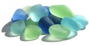
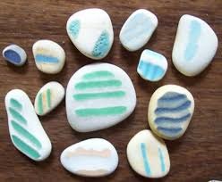
For My ideas i have decided to use beach junk e.g Sea Glass, Sea pottery, As i think that it would relate to the lack or loss of identity if i place over the picture.

Sea Glass meaning and history:

Naturally produced sea glass (“genuine sea glass“) originates as pieces of glass from broken bottles, broken tableware, or even shipwrecks, which are rolled and tumbled in the ocean for years until all of their edges are rounded off, and the slickness of the glass has been worn to a frosted appearance.


Sea pottery meaning and history:


Sea pottery (also known as “sea china” or “sea porcelain” or “beach pottery”) is pottery which is broken into worn pieces and shards and found on beaches along oceans or large lakes. Sea pottery has been tumbled and smoothed by the water and sand, creating small pieces of smooth, frosted pottery. It is often collected with more common sea glass by beachcombers.


Beach Junk meaning and History:

beach junk can also be known as jetsam this is wear unwanted material or goods that have been thrown overboard from a ship and washed ashore, especially material that has been discarded to lighten the vessel.

i thought that i would have two different photos of member of family, For example i would have a younger generation vs  Older generation. Then i would place the sea glass and beach pottery over the photo to disfigure it and then i would use the beach junk to cover the photo in places this would represent loss of identity.


Identity photo shoot planning

My chosen theme for this shoot is self expression; how people express themselves through what they wear and how they communicate (facial expressions and body language).

The purpose of this photo shoot is to explore diversity within the community, how people within the same community differentiate themselves from one another, as well as how they react differently to being placed in the same environment and treat identically.

The shoot will take place in the photography studio where I will take photos of my friends in the exact same way; the camera angle and where they are standing will be identical every time, but it will be up to them how they pose and express themselves in the photos. I will also let them decide what they want to wear for the shoot.

They won’t be doing the same leaning pose as here but the shoot will work in a very similar way. The angle and basic setup will be identical but it’s up to the people being photographed to express themselves. The only difference is that in my shoot I won’t make everyone pose in the same way, that will be up to them.

Identity and Place Case Study- Sarah Maple

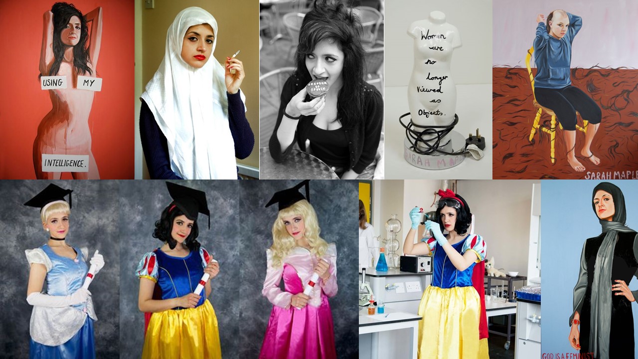
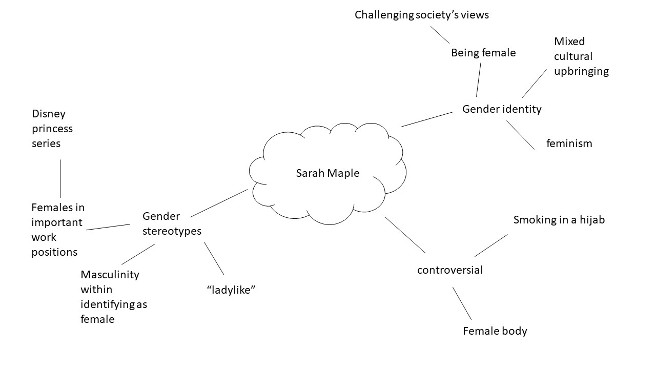
Sarah Maple was born in 1985 to an Iranian Muslim mother, and a Christian father. Most of her work stems from her mixed cultural upbringing, and challenges the traditional social role of women, and also concepts of religion. Some of Maple’s work can be viewed as controversial as she’s pictured herself doing things such as smoking in a hijab.

Mood board

Images/paintings by Sarah Maple


Mind Map

Analysing

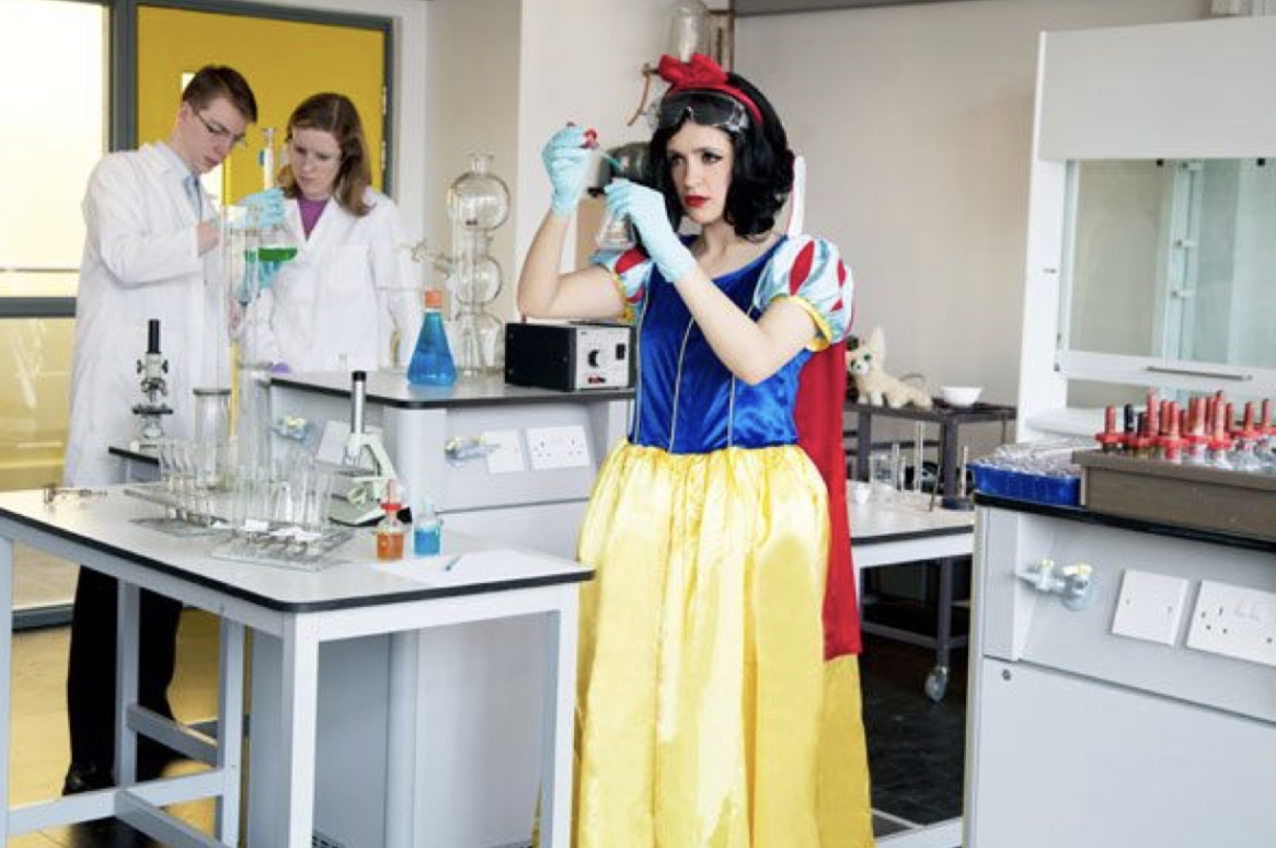
Image by Sarah Maple.
Context

This is an image from Sarah Maple’s Disney Princess series.

Visual

In this image we see 3 people in what seems to be a scientific lab setting. ” of the people are in the background and the third person is in the centre of the frame dressed as snow white while handling a beaker.

Concept

I think this image is very powerful in breaking gender stereotype perceptions. This image shows a Disney princess in what could be considered a very professional and respected job role. By having a stereotypical female, who’s wearing a dress, and makeup taking on the role of a princess Maple is trying to convey the fact that females are fully able to be in respected job roles.


Analysing

Context

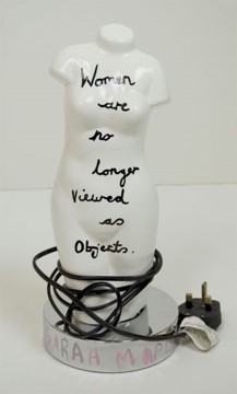
This is a mixed media art piece, Created by Maple then photographed by her.

Visual

This image shows a white lampshade in the shape of a female body, with the message “women are no longer viewed as objects” written on it in a black pen.

Concept

This image is very powerful in conveying Maple’s opinion on the female body. Although the message written on the lampshade says that women are no longer viewed as objects, this image suggests that she doesn’t think that’s true. This is due to the fact that the message is literally written on a lampshade, which is an object, in the shape of a female body. I think this is a very interesting image as the artist has contradicted herself in order to gained the viewers attention, in order for them to understand the concept of the sculpture.


Claude Cahun and Clare Rae comparative essay

EXAMINING THE ARTISTS’ WORK 

For this comparative essay I have chosen to examine these two pieces of photography due to the contrasting nature of the composition and the surroundings.

Firstly, I thoroughly enjoy the work of both Cahun and Rae, Rae following a similar style to Cahun in which she is part of, or the main subject of the photo. Rae tends to incorporate herself into the landscape more as opposed to being the focal point of the image. The strange contortions that she sometimes does during photoshoot is an attempt to flow into and become one with her surrounding. The soft and subtle clothing that she chooses to wear during these photo shoots, illustrates a delicate and fragile side of her that allows her to blend in. I have also noticed that in the majority of her photos she is facing away from the camera , or she is at a disctance where it cannot be seen clearly. This once again suggests that she doesn’t want her identity to shine through as  our face is one of our most distinctive features, rather allowing her environment to be the biggest contributor of the image. In this photo, her attempt at fitting into the cart makes her seem small and insignificant in the maze of archives surrounding her. Rea, like Cahun, works in black and white imagery which again allows her to blend well into her surrounding with the monotone shades that her photography produces.

The work of Rae, although similar to Cahun’s, has some distinctive differences. Cahun also tends to set a lot of her photos outdoors, yet the main target that Cahun has is to explore and capture her out of the ordinary identity. Her strong facial features are clearly captured in the image. The smooth curves of her arms and face are the main center of the photo, contrasting the busy flowers that are in the foreground. Due to the technology of the time, Cahun worked only in black and white imagery but I feel this is was also an advantage as she allows all the character to come from the interesting compositions and themes as opposed to color and tone. Cahun is often discussed in relation to Butler’s idea of the performativity of
gender because of the role that gender performance plays in Cahun’s photographic self- transformations. While Cahun and Moore’s photographs of Cahun are certainly relevant to Butler’s theories of gender it was the ideas such as androgyny and the “third sex,” raised in the 1920s and ‘30s, which truly influenced their work. This image was prior to Cahun shaving her head and completing her androgynous look, portraying more as female. Preharps even the flowers in which she has chosen to stand in is a sort of irony of the traditional views of society and how women are viewed as “innocent flowers”.


Claire Rea, Les Blanche Banques 2017


Claude Cahoon JHT/1995/00032/p

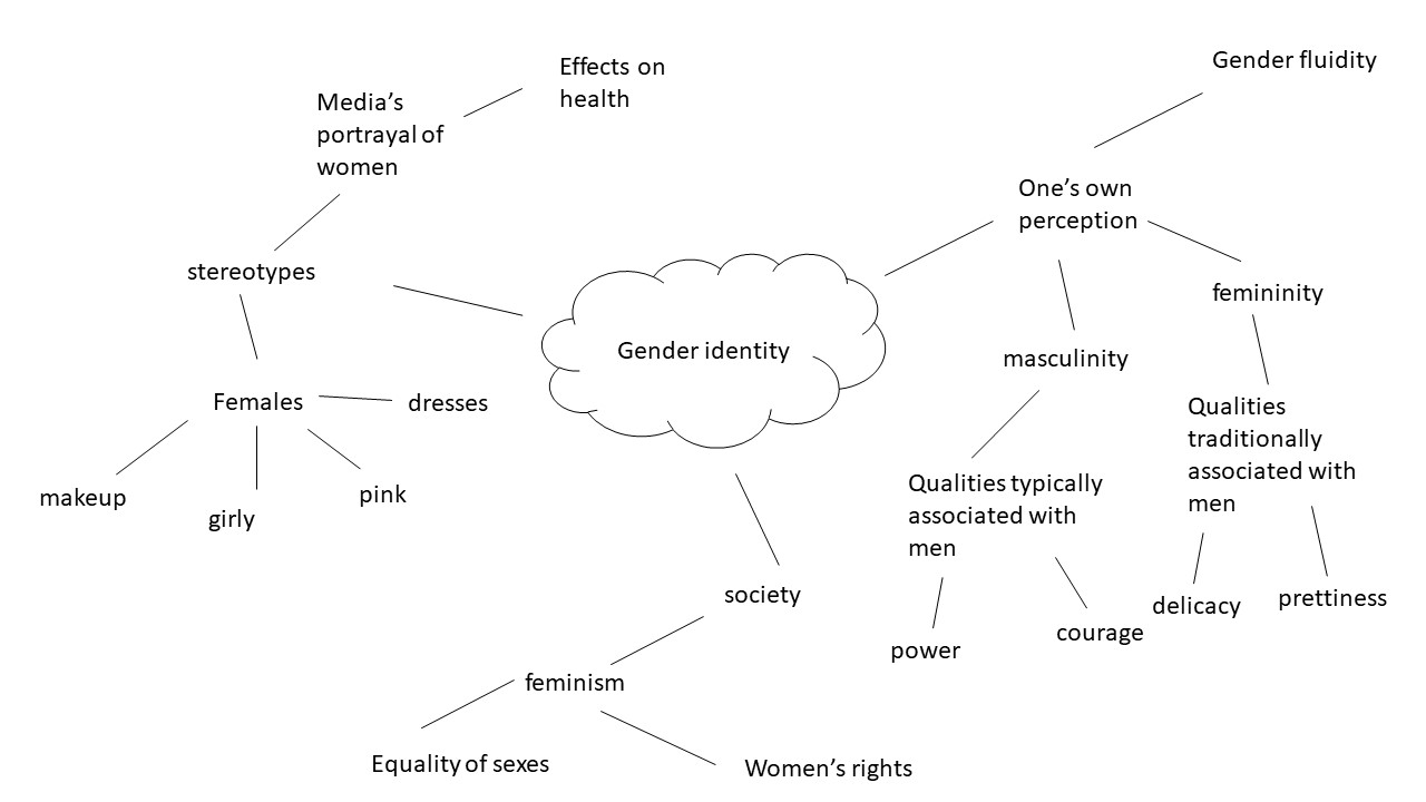
Gender identity

Gender identity is described as being one’s perception of their own gender. This can be the same, or can also differ from one’s assigned sex at birth.  In today’s society it is relatively agreed on that children form their own personal gender identity by age 3, and they are able to do things such as choose toys that are considered “appropriate” for the gender they identify with. This shows how we live in a society where genders can still be stereotyped to the point where children who see themselves as being females choose to play with dolls, and children who see themselves as being males choose to play with toy cars.

In this day and age, I believe that it’s more acceptable than it used to be to do and wear things that a few years ago would be deemed as “not appropriate” for the sex you were. For example, until 1993, Women weren’t allowed to wear trousers on the U.S. Senate floor as trousers were considered “menswear” and In 2003, male employees received paid statutory paternity leave for the first time as taking care of  children was seen as “women’s work”.

Although, advances to break gender stereotypes have been made in the past few years there are definitely many stereotypes that are deeply rooted into society, which I think would be very interesting to explore for the theme “identity and place”.  For this project I will be focusing specifically on the female gender. Most of this project will focuses on challenging stereotypical views that society may have of females.

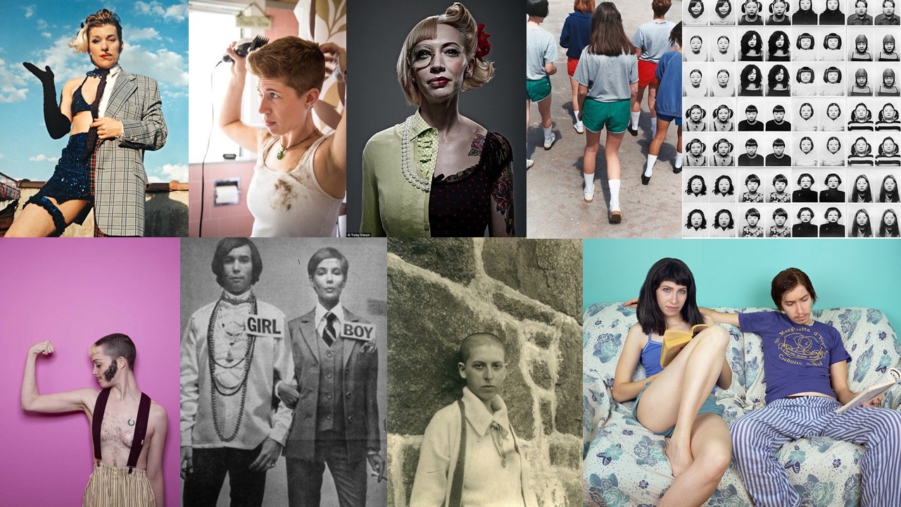
Mood Board

Not my images.

Mind Map


Photo-Montage Experiments Task 3

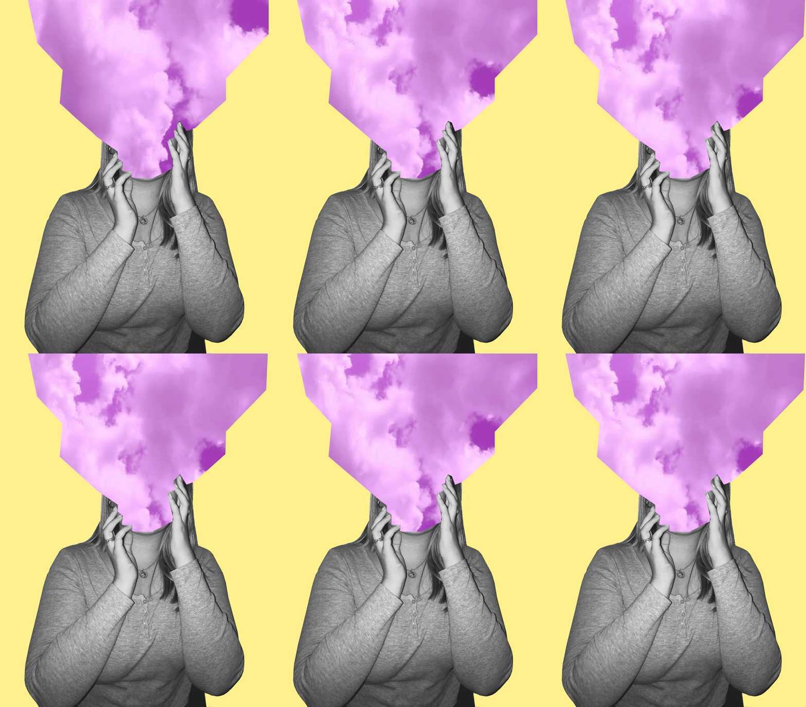
For my first two photos I decided to recreate pieces in the style of Tyler Spangler. I really enjoyed doing these pieces because I really like Tyler’s style of photography.

1st Photo:

For my first photo, I recreated a photo in this style –

My Photo:

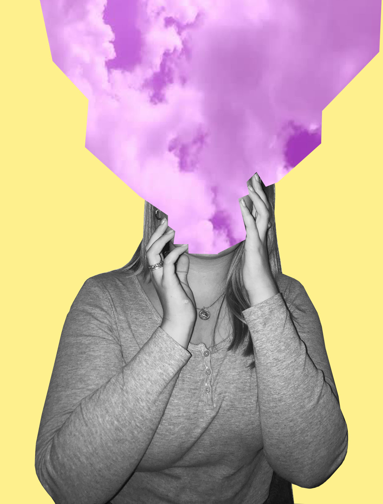
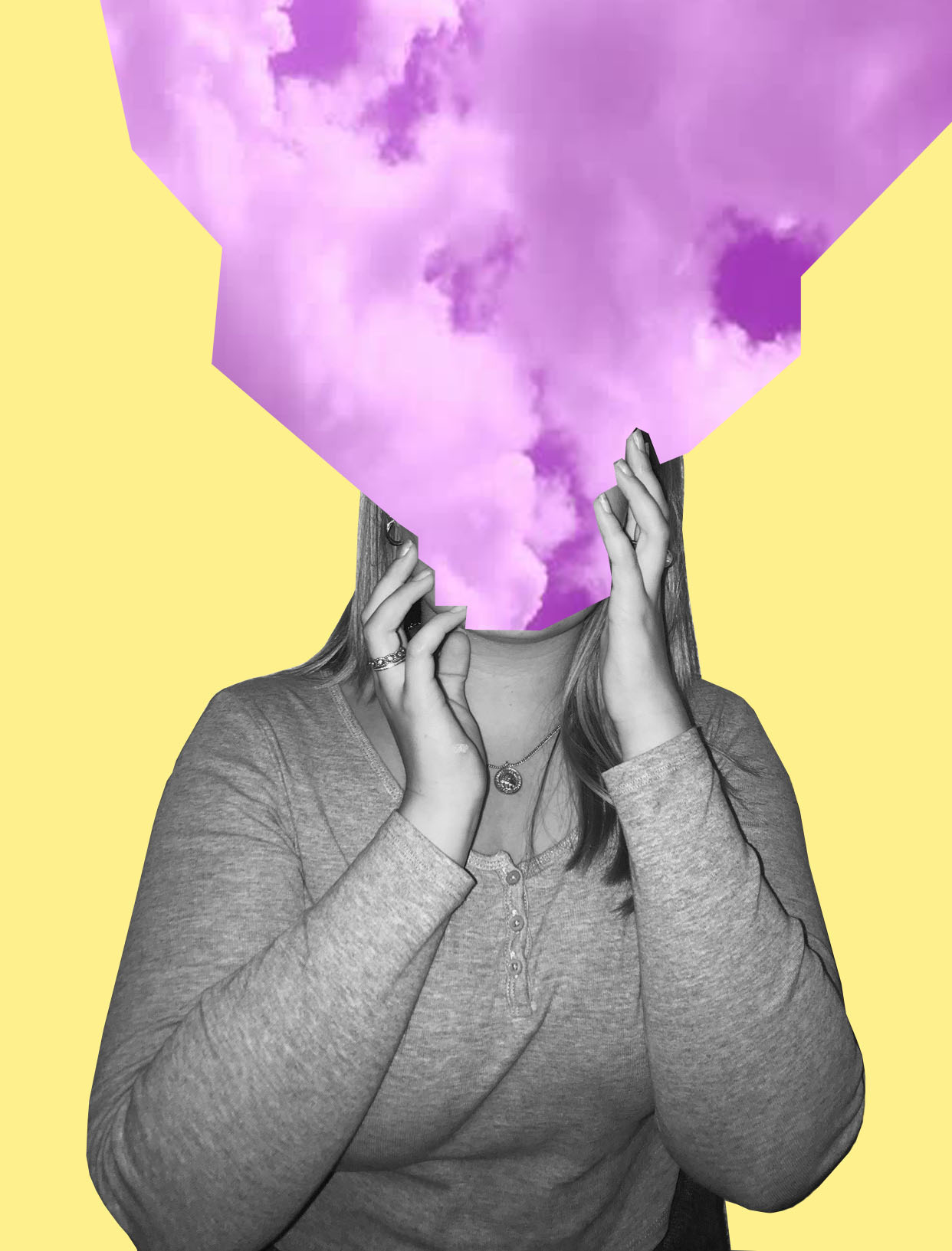
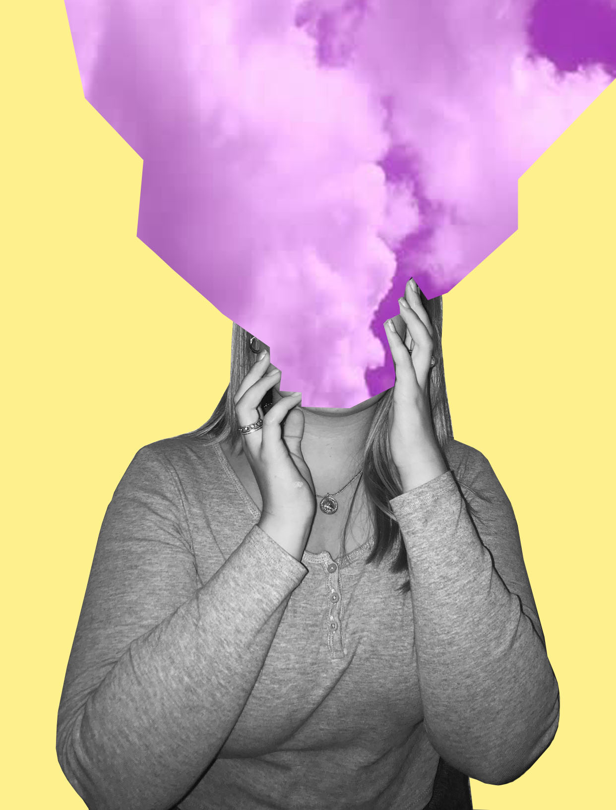
I’m really happy with how this photo came out. The message behind this piece is about how sometimes people feel like their head is in the clouds and how sometimes people don’t pay attention to their surroundings, and has their attention in their own thoughts. I wanted to keep the theme of identity and place present but not too obvious as I want people to interpret this photo in any way they want to.

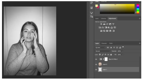
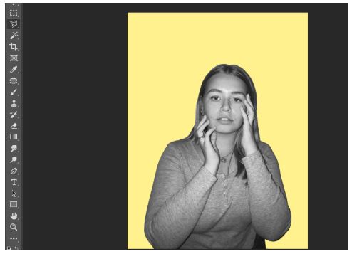
Step By Step on How I Created This Photo:

Firstly, I made the photo black and white.

I then cut out the image and put it onto a pastel yellow background.

Shutterstock

I then got this photo of purple clouds from google images.

I then cut the purple clouds image onto three separate images. I used three different angles of the purple clouds to get three different images of the clouds.

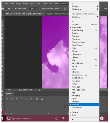
I then pressed windows, then timeline to get the animation window.

Then I clicked create frame animation.

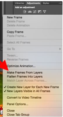
I then clicked make frames from layers to make each layer into a frame.

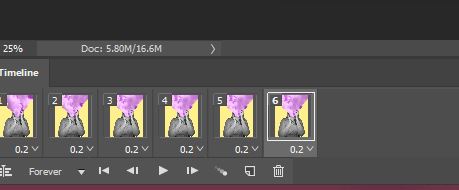
I then duplicated the three layers and made them last 0.2 seconds long.

2nd Photo:

I also recreated this photo –

Image result for tyler spangler
Tyler Spangler

My Photo:

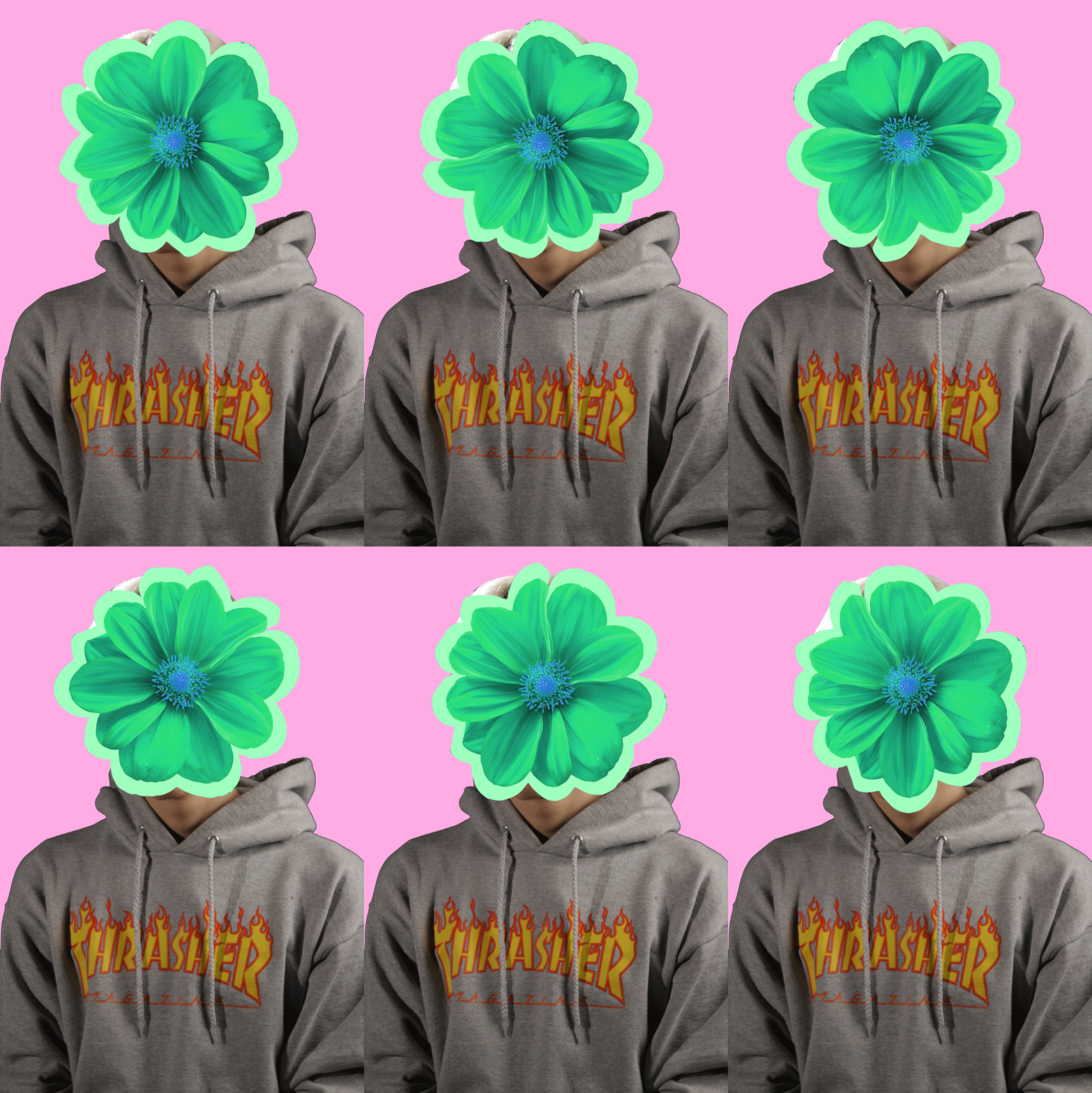
I really liked this piece as I like how it turned out. I think I was able to to capture the photographers style very well, but still having elements of my style in it. Even though the model is not in black and white I still like it in colour. Again this photo is open for interpretation and is loosely based off of identity and place.

Step By Step:

PlusPNG

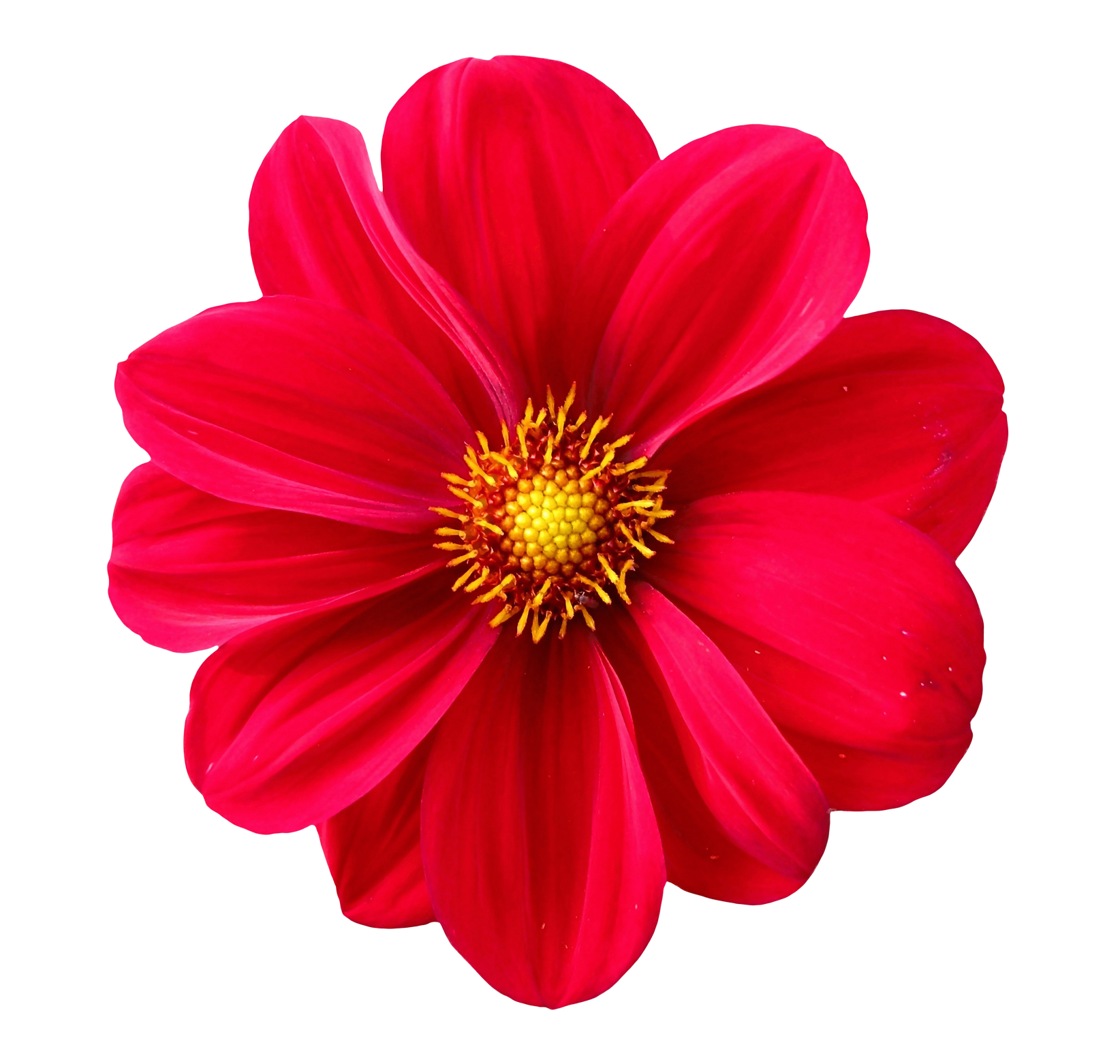
For this I basically copied the same steps in the first photo, but instead of the sky I took a picture of a flower from google, changed the colour of it and made it spin around the models head.

3rd Photo:

Even though this photo took me longest and was the most challenging one out of the three, I really like the end result of it. I added noise to the photo and I really like how that looks. Also again this is loosely based off of the theme identity and place.

This photo was inspired by Eugenia Loli’s Photo –

Image result for eugenia loli
Eugenia Loli

Overall, I’m really happy with how all my photos turned out and I really like working in this style of photography because of the freedom you have with the photos.