

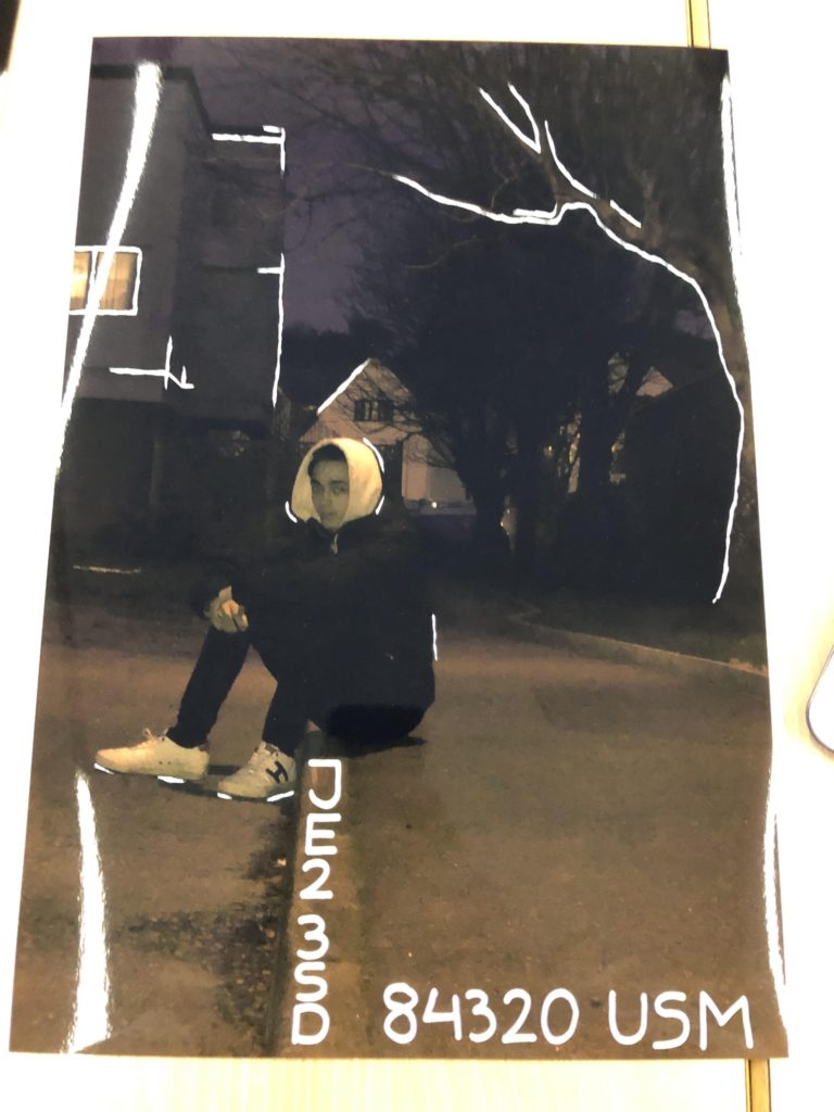
For my ideas for the theme of Identity I am choosing to draw and write onto the physical pictures. I’m going to be doing this using white paint pens, writing and creating comments on the persons identity with the writing surrounding them.
I am going to be finding close information about the subject to write along the pictures, to make it a bit more intriguing and interesting I am going to be finding other ways to write the information such as significant places written using the longitude and latitude of places. This will make the information more interesting and mysterious as it will not be immediately clear what it means.
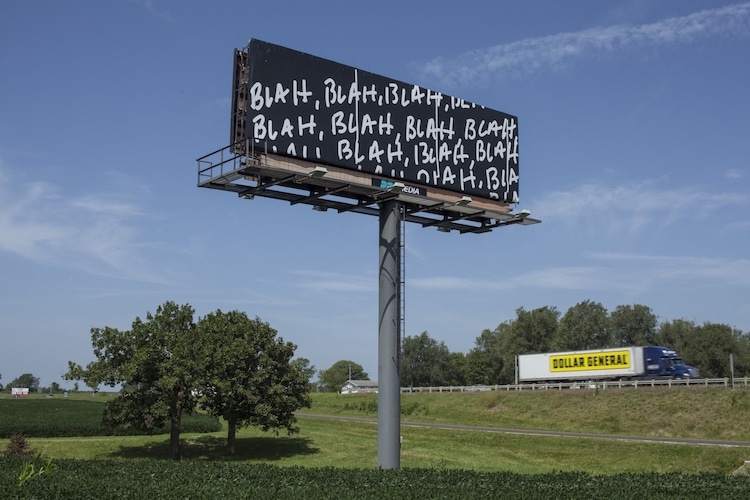
Above shows a piece done by conceptual artist Mel Bochner who has been active since the 1960s. A highly versatile artist, Bochner works with painting, installation art, and photography. His thesaurus paintings show overlapping synonyms executed in rainbow colors, while other pieces often take a single word, repeated for effect.
Although I am not working into a sculpture or the surroundings to then take the picture I feel I can relate what I am doing some how to Mel Bochner as I am going to be writing certain things for an effect just as Bochner does with the idea of repeating a word. This is a photograph an artist I can show where some of my inspiration has come from with how to go about the writing.
Before going straight onto the actual images I started by printing on paper my layout to test how to work the paint pens and what I wanted going where so I could get a rough idea of what works and what doesn’t and also testing the thickness of the pens.
I have stuck to having only 5/6 ‘facts’ across the whole layout as I don’t want to over crowd the photographs, I have also chosen to draw into the actual photos not just with words as to make the photographs more intriguing.
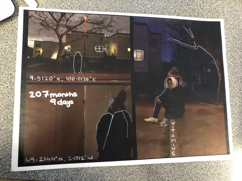
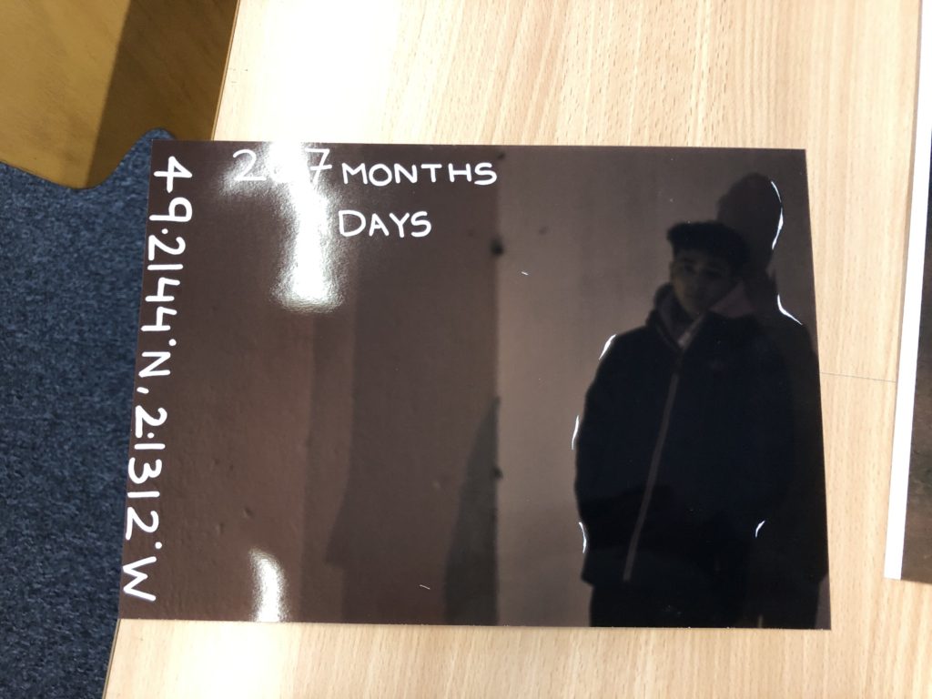
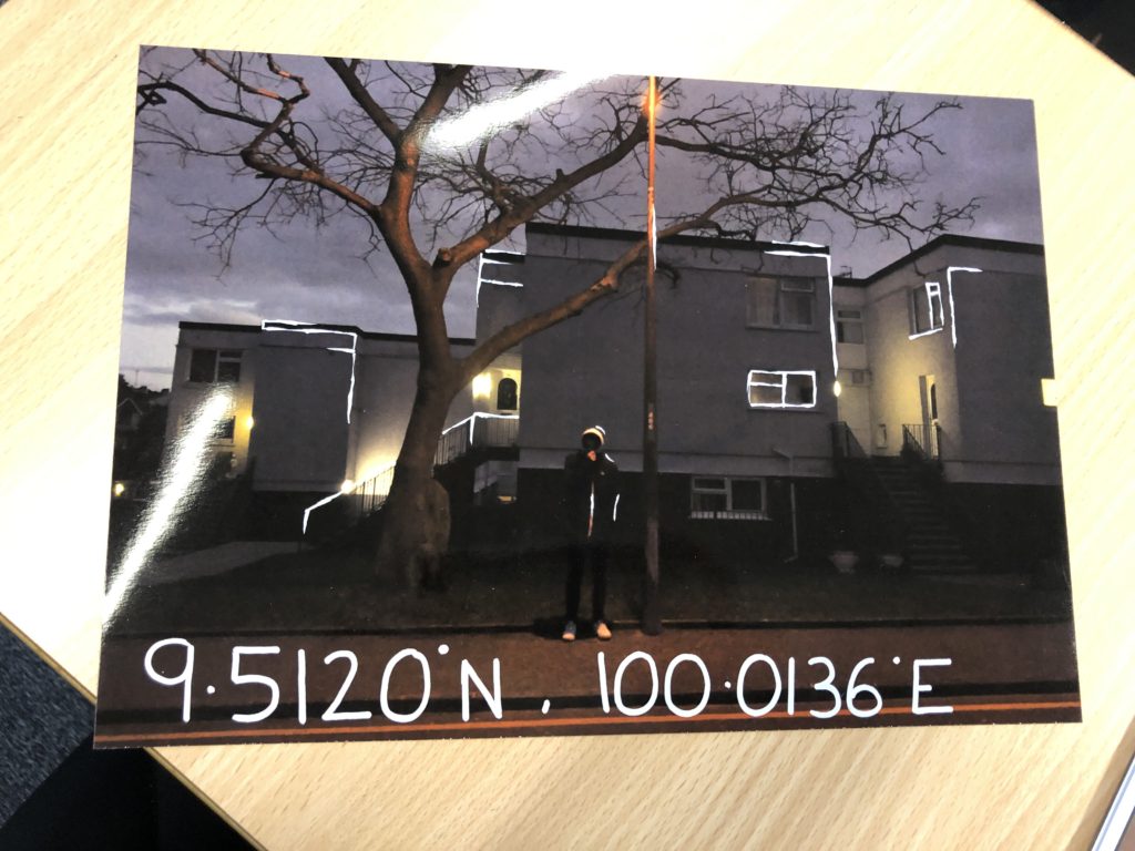
Below shows how I finished off editing straight onto the prints, I stuck mostly in using codes as references towards significant places or things to do with the subjects identity. I have done this to try and make it more intriguing, knowing that the codes stand for something however they are not completely clear.
I have also added some outlines as highlights to certain parts of the page this is just to add something to the photograph and to make it more pleasing to the eye.
While editing onto the actual prints I did encounter some trouble with using the paint pens and this halted the process a little bit and made things a little more difficult however I feel that they still turned out in a way that I wanted them too.
BIOGRAPHY: he was born in 1948 currently 71 years of age. He is a British professional photographer who began his carrier as a sports photographer and who has won four times sports photographer of the year between 1978-1984. He then changed his attention to The Guardian and The observer for more general editorial portraiture. Not only that but McCabe managed to cover 3 of the Olympics.


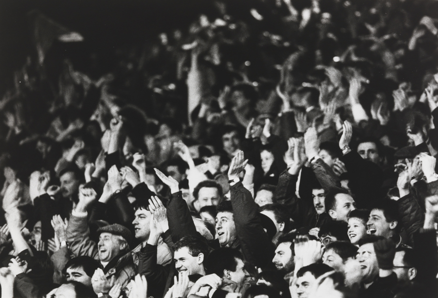
Visually, the images above all have a story behind them.The purpose of photography is to capture moments which make you reflect on the day, the event, the moment. Here, the first image i have interpreted it as a celebratory moment. By looking at this image its quite evident just by the body language of the man that he had clearly scored a goal and this was his celebration moment. The shutter speed in the image would have had to on a fast setting to be able to capture the moment he started running towards the camera and we can see that by the way his hair is being breezed backwards. The image itself is focused well and the contrast between the man and the people in the background that almost look gutted that they didn’t manage to black the goal. Additionally , the image is quite happy to look at and gives a sense of almost achievement as if we were there to cheer with them. The iconic 1970s English soccer player, Kevin Keegan was the first sports personality to actively enter into what was then known as a “face contract” for what were essentially his image rights.
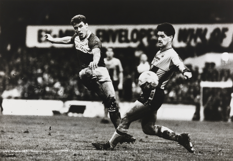
The last image from the ones above i chose to insert into the blog as it caught my eye as its like an action shot. This drew to my attention due to the posture of the footballers.
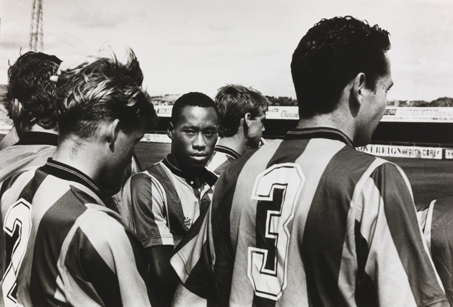
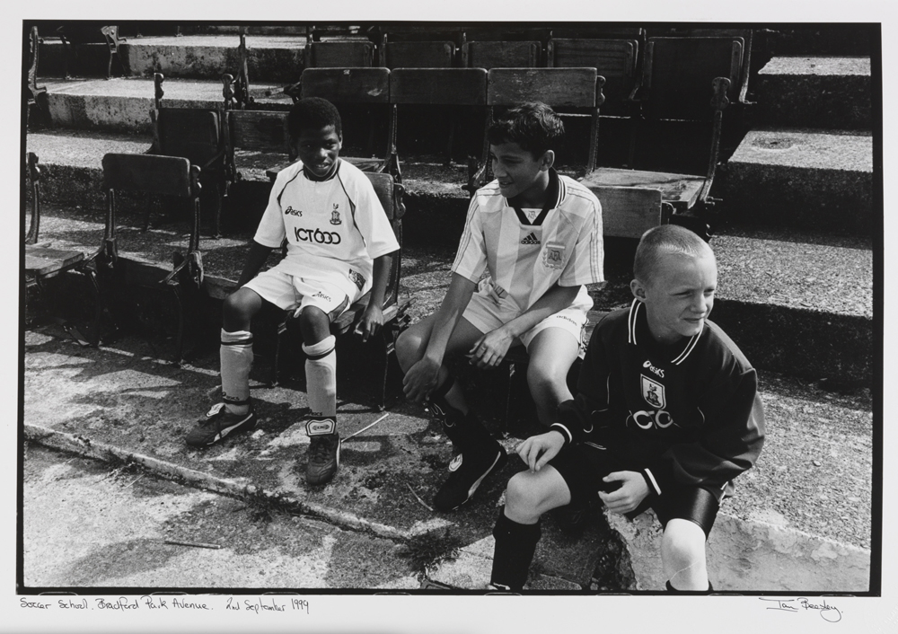
Furthermore, Eamonn McCabe was the Bradford Fellow in Photography for 1998, and photographed City both on and off the pitch. Bradford-born Ian Beesley captured City’s first season in the Premiership. His photographs reflect the emotions of not just a professional photographer, but also of a Bradford City fan. Hence the story of the images below. Examples :
These are some of the final outcome ideas that I have come up with using my favourite and best images.
The first two images shown below I have not really edited a lot. This is because I was trying to do them like John Bulmers work and didn’t want to overdo the editing, as John Bulmer did not normally edit his work. Although these two haven’t really been edited a lot I like how they came out, especially the first one due to the saturation used to make her face stand out along with the other darker colours in the glass and the drinks in the fridge.
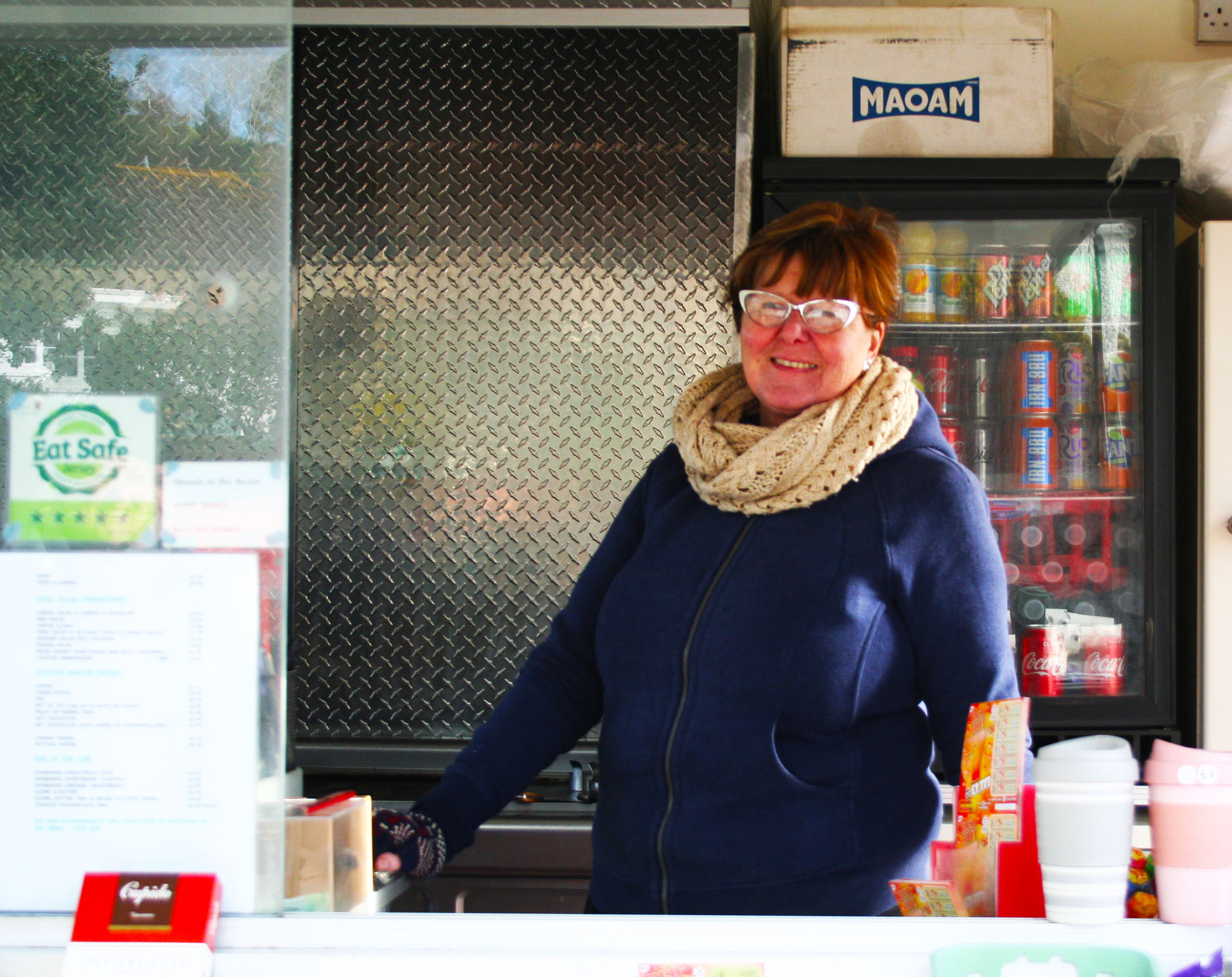
With this third image I changed the contrast and the exposure so that her face in the image isn’t as dark as in the original image because it was quite hard to see her face in the original image. I have also transformed this image to turn it as I took it on an angle.
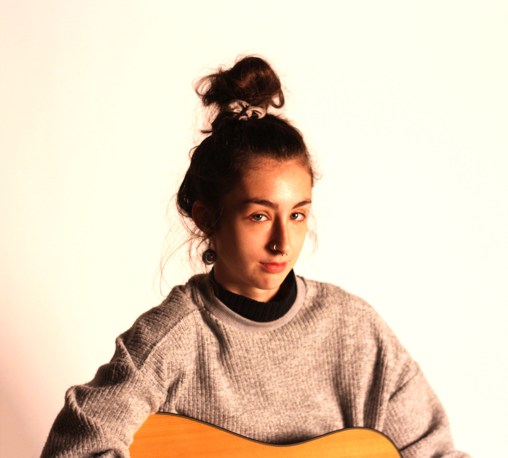
The images below are different than the ones above as they aren’t taken as street photography and are instead studio photography.
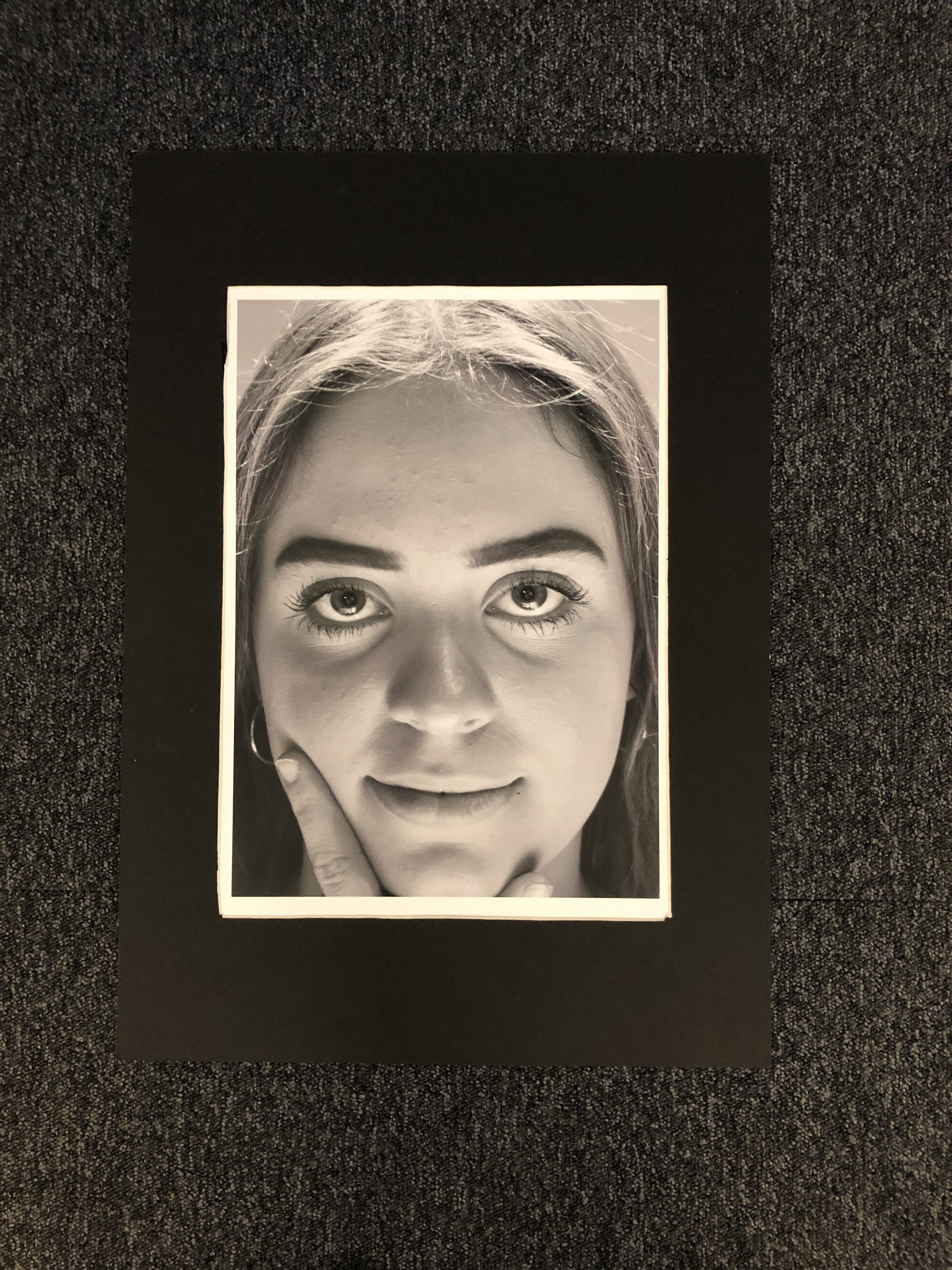
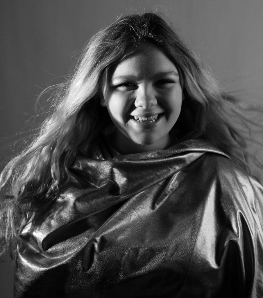
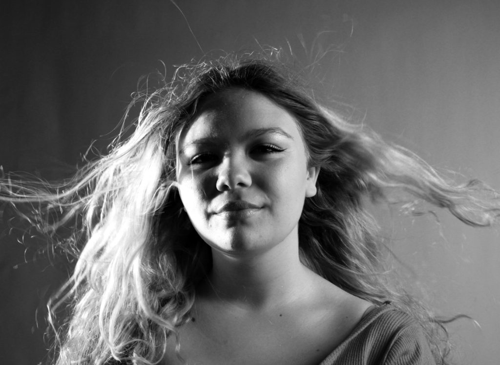
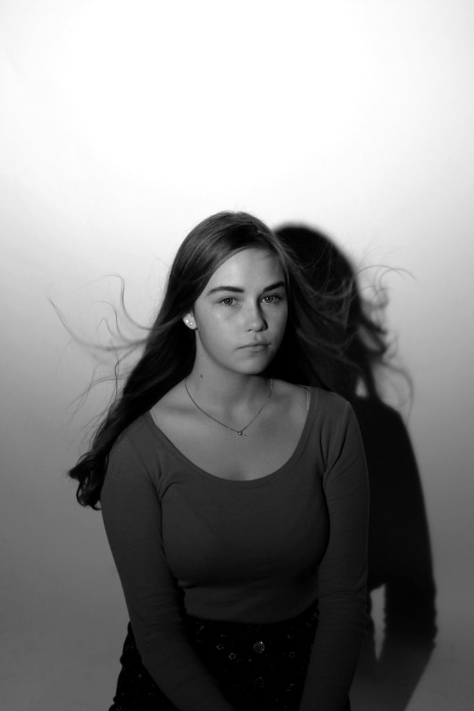
This fourth image I have taken on a white background with artificial one point lighting. I like how this one came out because of how sharp it was, this along with the high contrast I have added, makes her hair and face stand out over the rest of her body
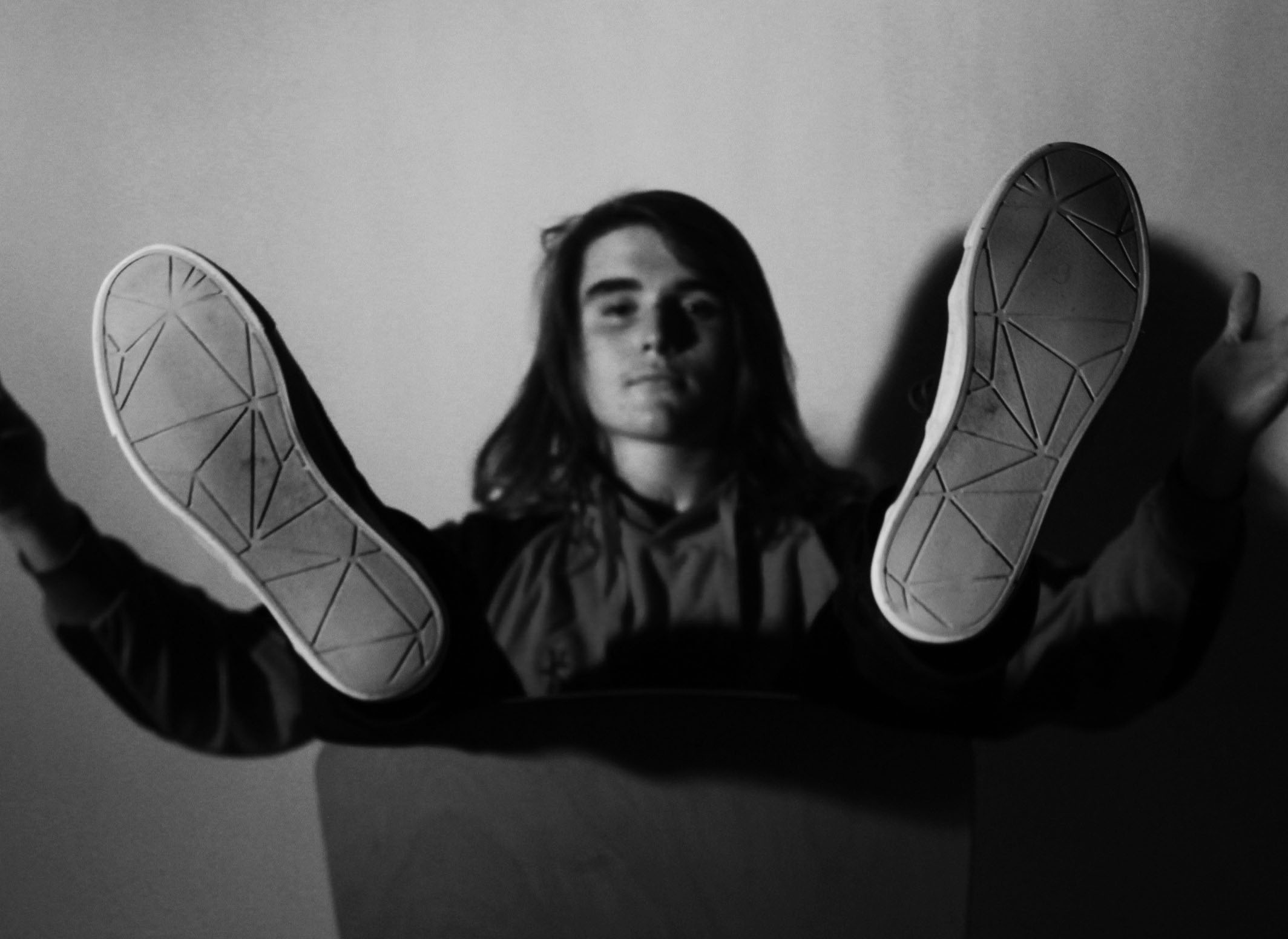
I have picked this last image because of his pose in the image. This image isn’t the sharpest image, but this is because the camera was focused onto his feet so that his face and body was put into the background. The pose he is in may show people what the persons personality is like.
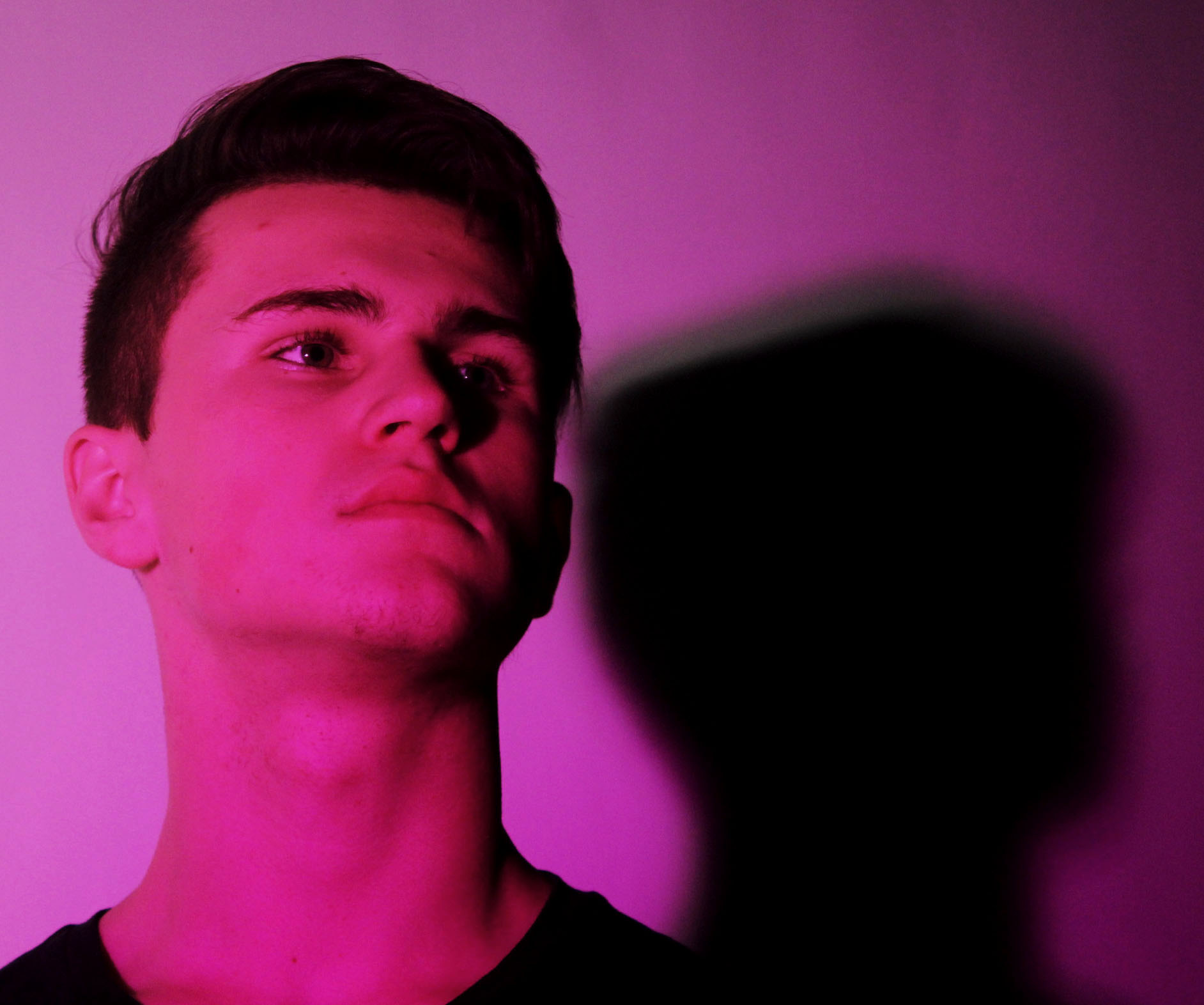
This image like the one above, shows the person in a pose. This pose is a lot simpler as it is just him looking away. I have taken the image from underneath to make them look as if they’re higher up than others.
Brad is actually a sports photographer but as my theme is identity and place and that my model is my brother playing football to symbolise his idea of valued place to portray his hobby I thought that looking at a bit of sports photography would be great.
Brad Mangin is a Bay Area freelance sports photographer. Mangin has done eight cover shots for Sports Illustrated. Mangin graduated from San Jose State in a degree in photojournalism. He was born in 1965 and is now age 54. Mangin is known for his photographing of Major League Baseball for clients like Sports Illustrated and Major League Baseball Photos since 1987.
The reason i have chosen Brad Mangin to study is because it links well with the idea of identity and place. He chose to place himself in areas of the game to capture action shots like some of the examples before. This links well with my idea as im doing sports as part of the identity of my model. I’ve also decided to use the times before and after the games as almost like a before and after to capture the tiredness and the determined facial expressions of the individuals.


![]()


Having looked at Brad’s work, I have chosen to go down the lines of social identity and enviromental portraits. To be able to achieve sports photography,
However having reviewed over more photographers that base around the area of Sports photography i have decided that i do not just want to stick to the idea of just photographing my brother playing sports in a field but to capture his passion for football. I am going to portray a series of images that rather than just being seen as a simple images with no context there will be a story of a boy who aspires to be a famous footballer and play for teams like Manchester United and Portugal, not to mention his slight obsession with Ronaldo, whom he sees as a role model.
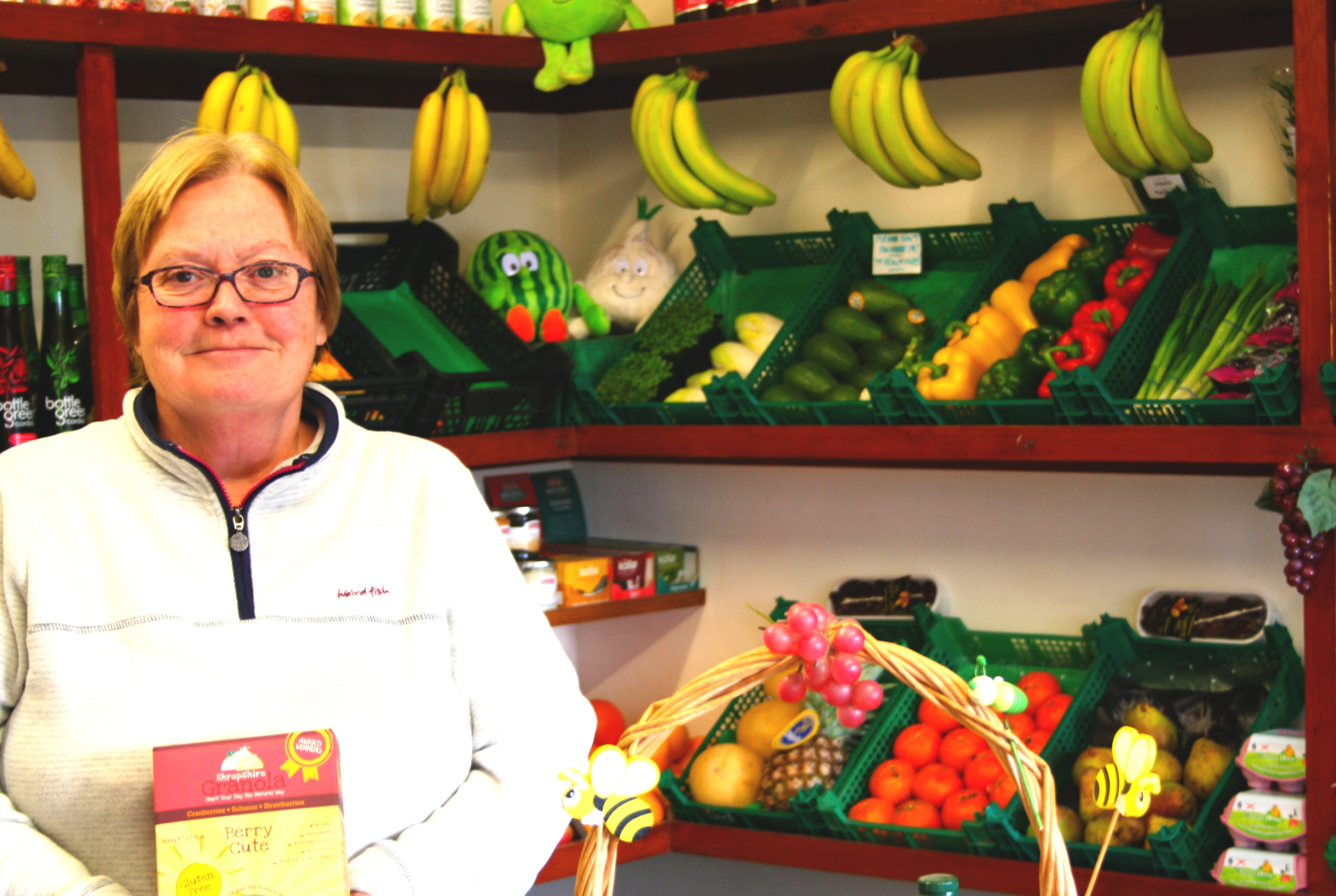
This is the original image. It is bright and uses natural lighting and artificial lighting from above.

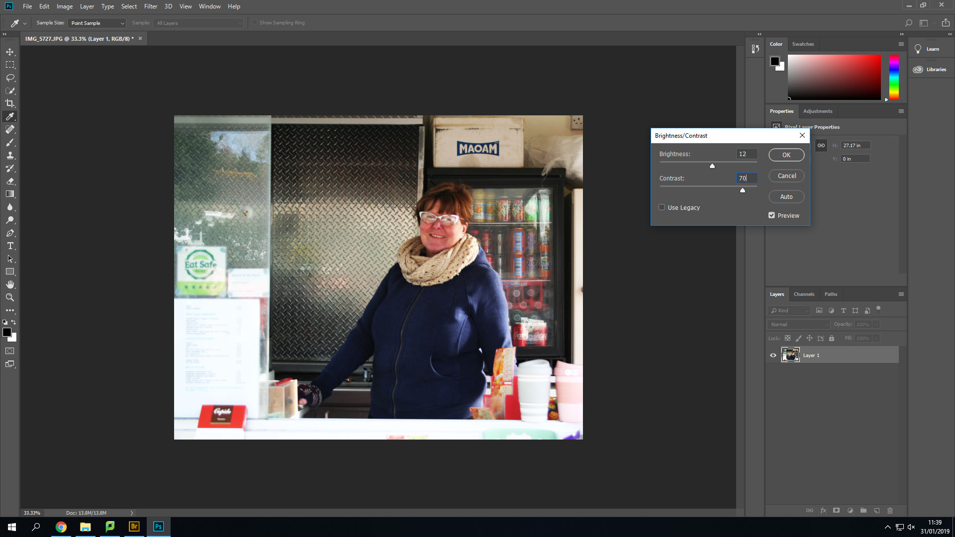
Firstly, I changed the contrast and the brightness to make the image slightly brighter, but also so that I could add more shadows in the background such as under each shelf.
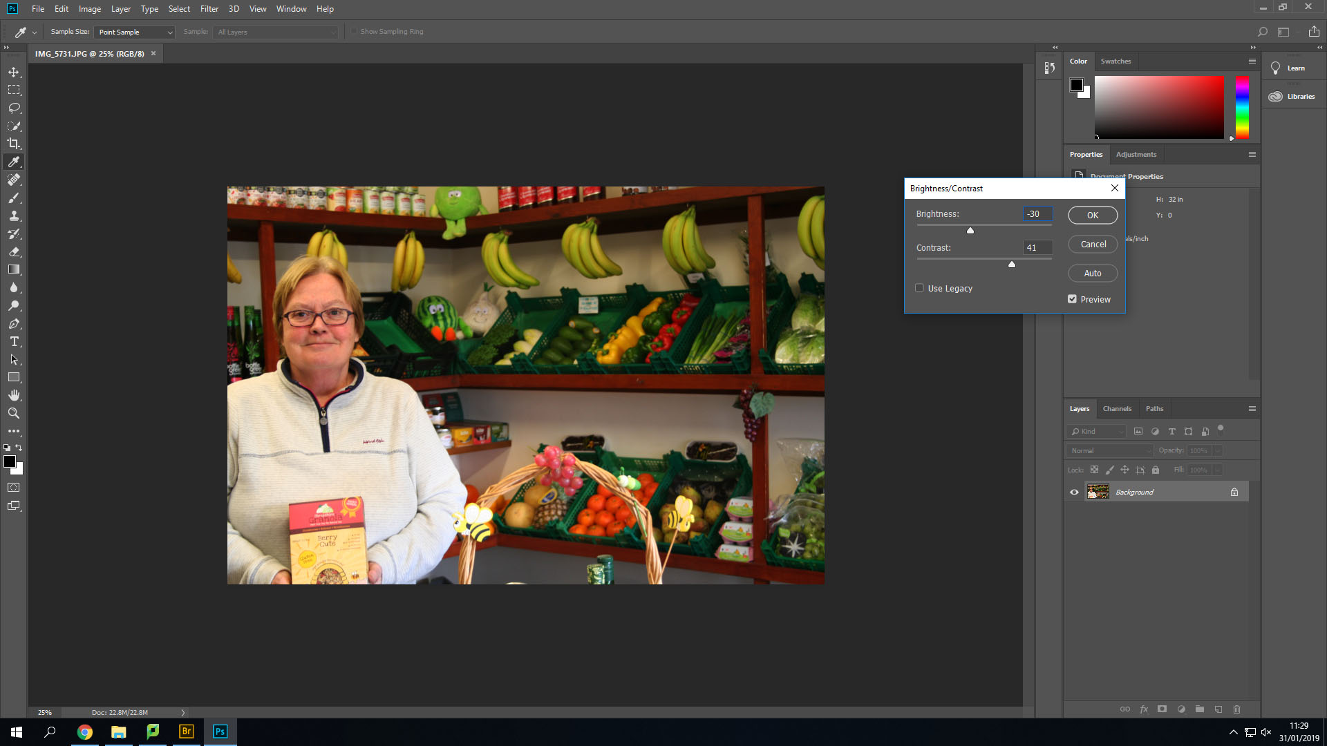
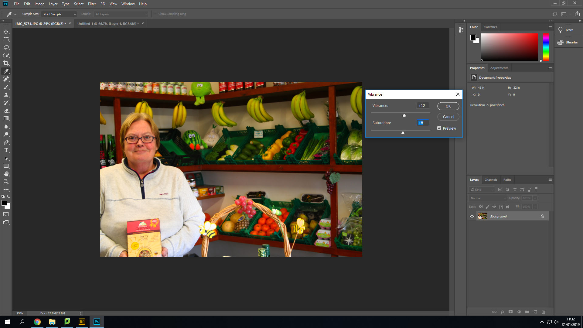
Secondly, I changed the Vibrance and saturation options to make the lighter colours stand out more and become brighter.
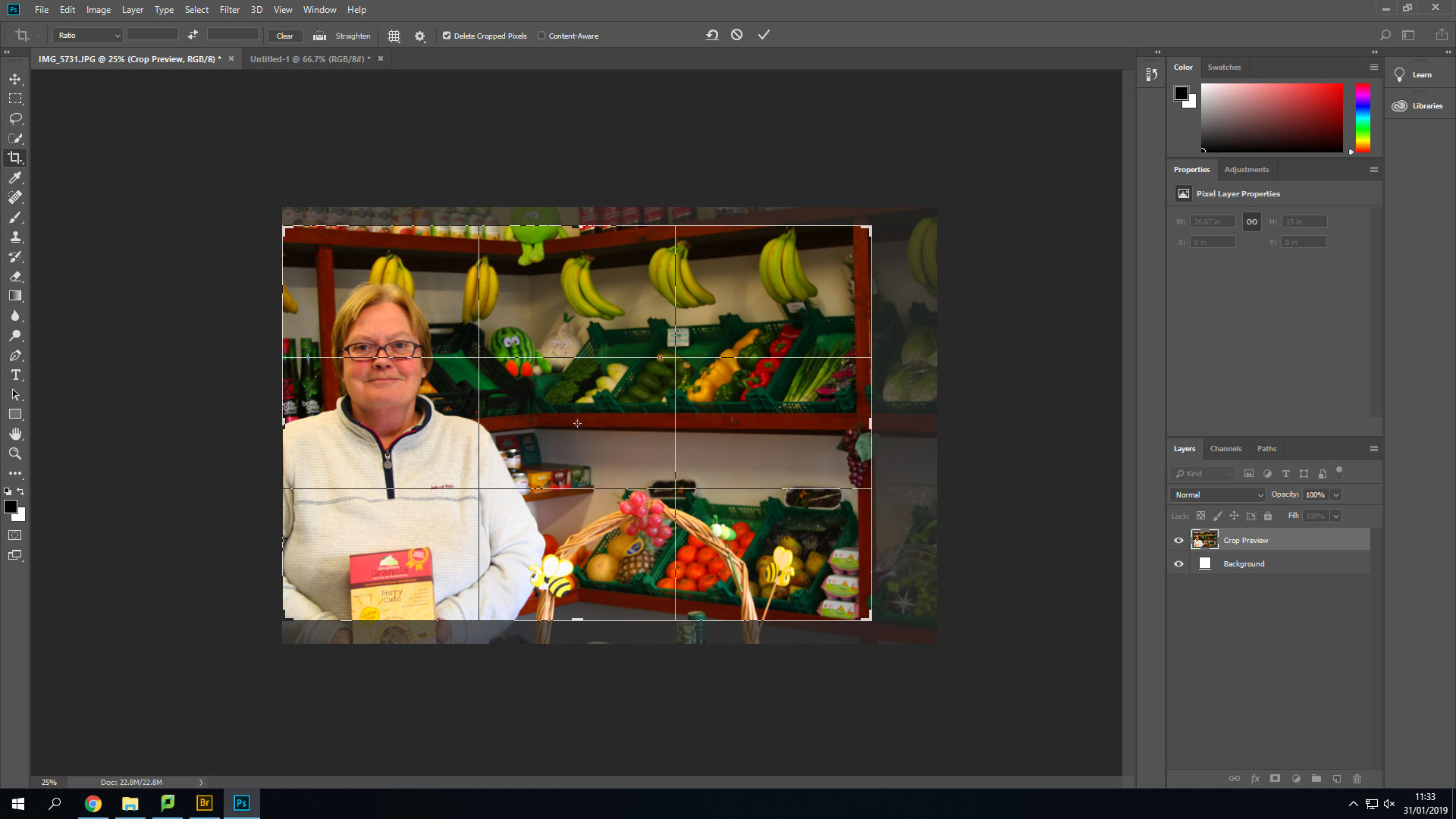
After this I cropped the image down a little bit to remove her hands from the image and line up her face into the middle of two different thirds.
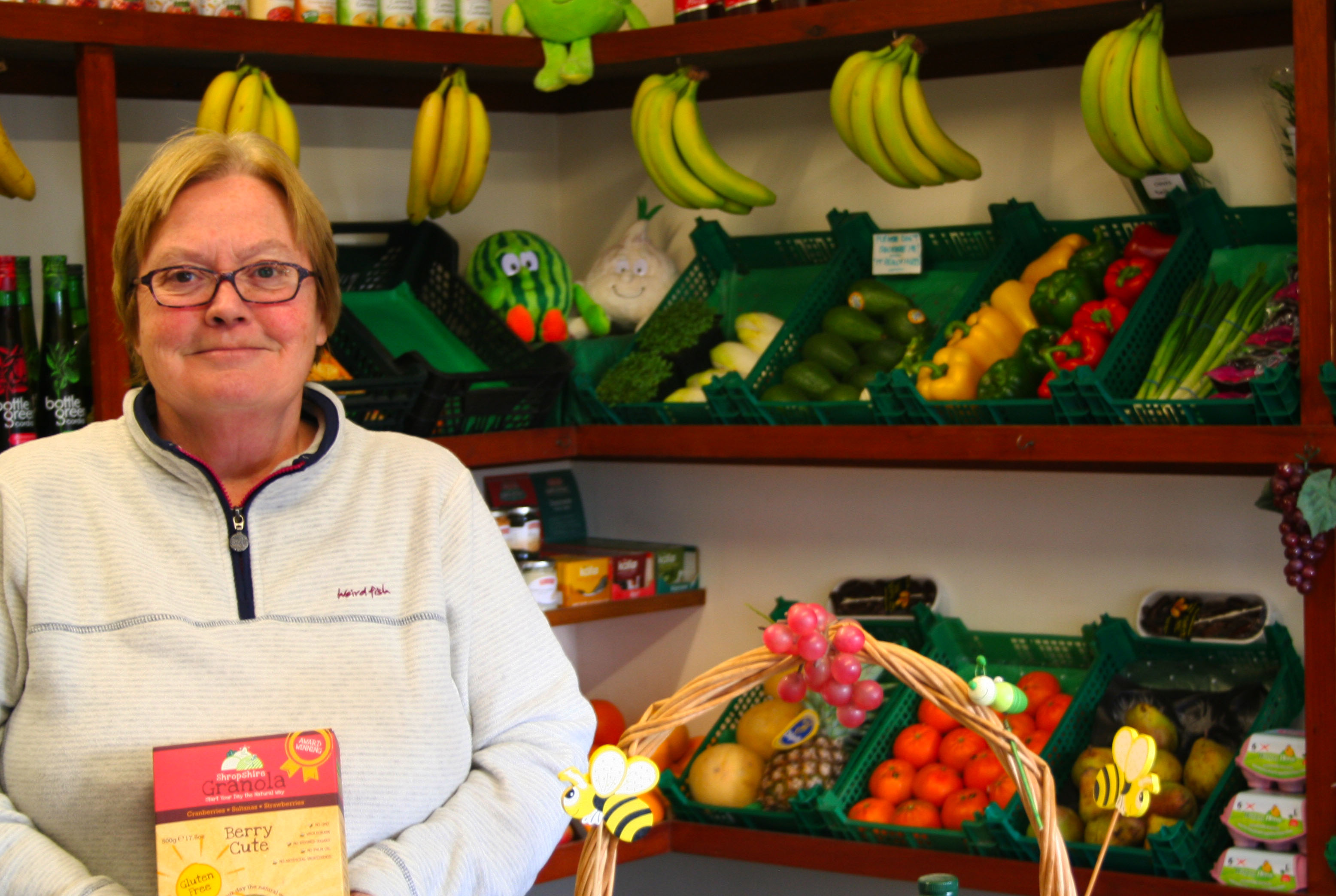
This is the final outcome of this image. I like how it has turned out. I could edit it more, but I do not want to overdo the editing as it could become far from the original image and be very different from the images like Tish Murthas and John Bulmers.
The image below is also one of the original images I took.
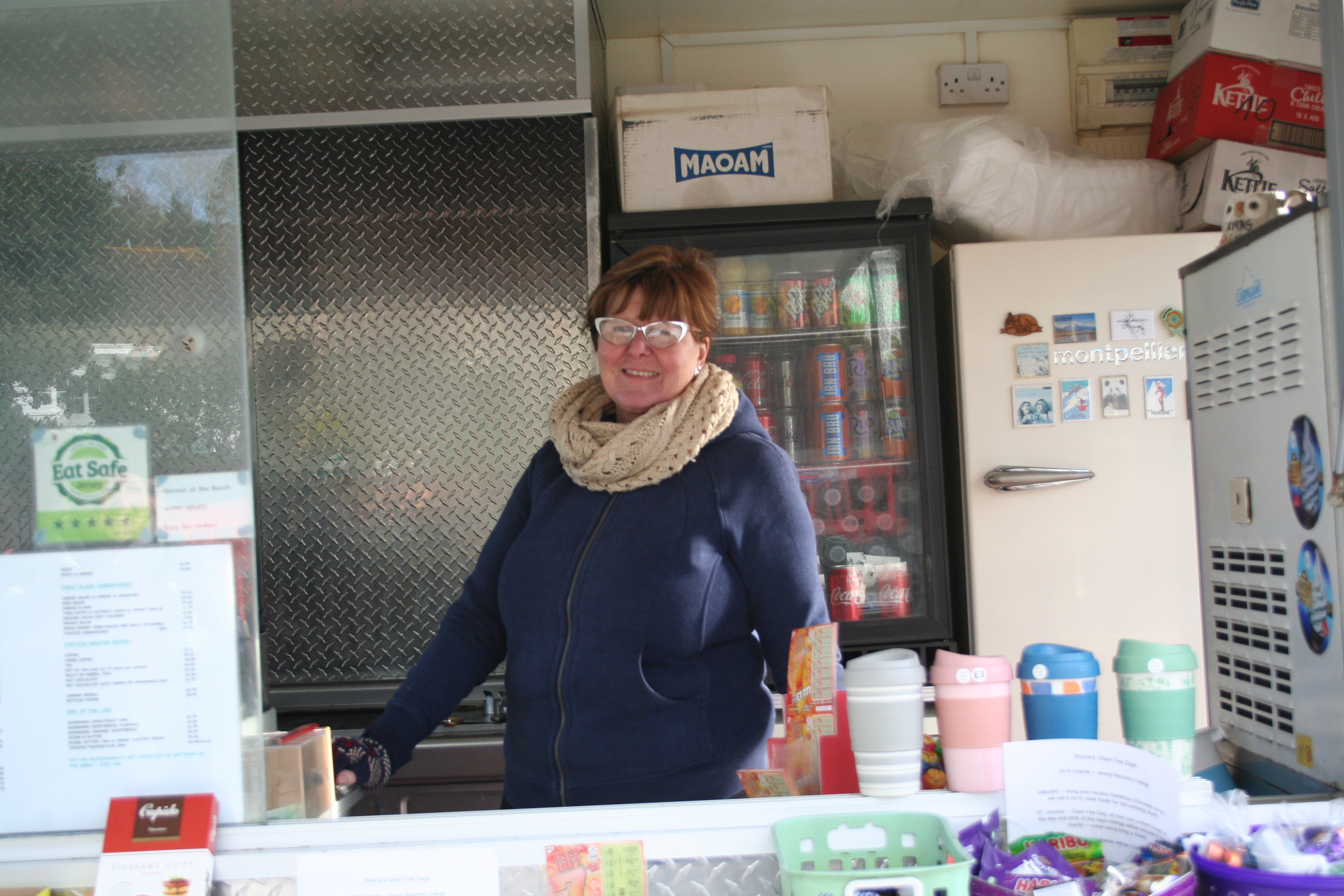
Firstly, with this image I transformed the image and turned it slightly to remove the angle that I took the image on. After that I cropped it down to remove the background showing behind the image that was created after I turned it. Then like the first image I changed the brightness and contrast to make the shadows larger and appear darker.
Secondly, I changed the vibrance and saturation again. This allowed me to make her face which was red at the time stand out more and let other colours such as the drinks in the background and the reflection off the glass to appear more easily.
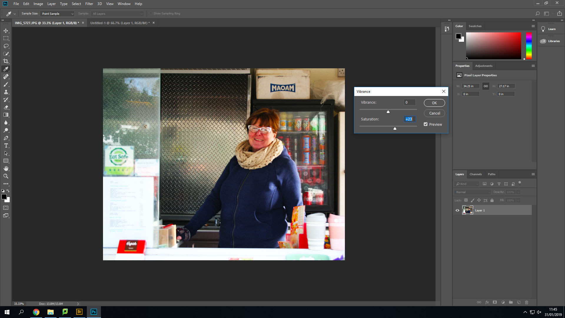
This is the final outcome of that image. I especially like how this one turned out by using the high saturation.

Final Piece 1: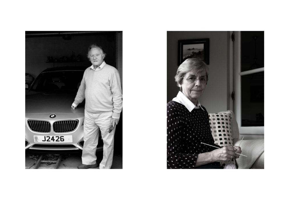
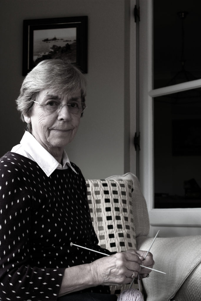
For my first final Piece I will be displaying my environmental portraits. I selected my top two images, which showed gender roles and resized them to be A4 images. To display them I am going to mount them on foam board next to each other, 4cm apart from each other. I feel that a white background suits the two images, and allows them to neatly be presented.
Final Piece 2: 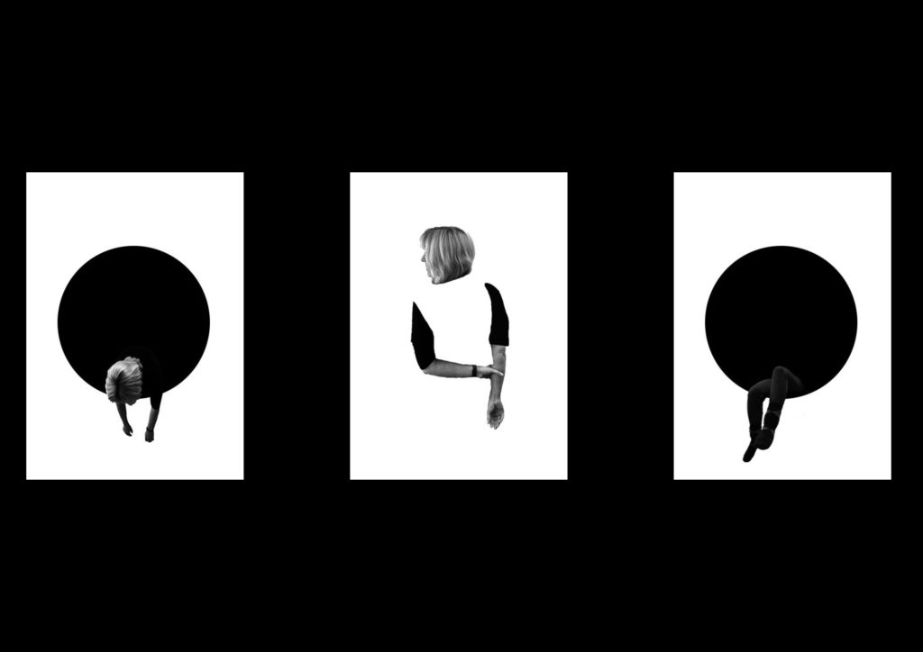
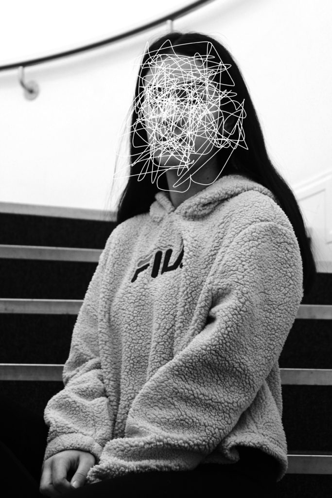
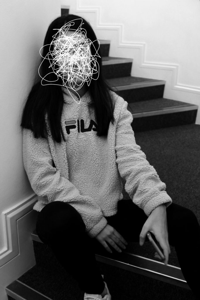
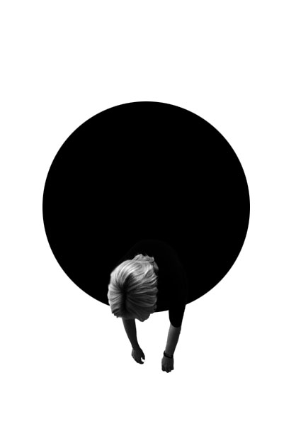
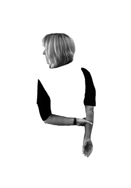
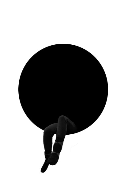
For my next final piece I am displaying the edits from my first photo shoot of loss of identity. I felt that these three images contained a simplistic design and represented the idea that my model has lost their identity, therefore I will be displaying the photographs in a triptych arrangements. All the images will be separately printed on A4 paper, and will be mounted as a window frame. The card is going to be black, due to the image background being white. They will be 4cm apart from each other and 15cm from the top and bottom of the frame.
Final Piece 3: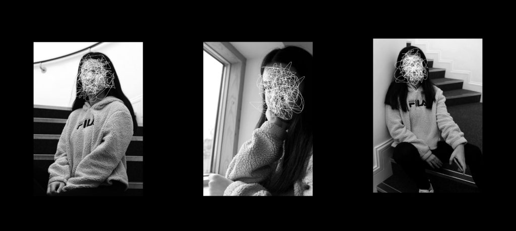
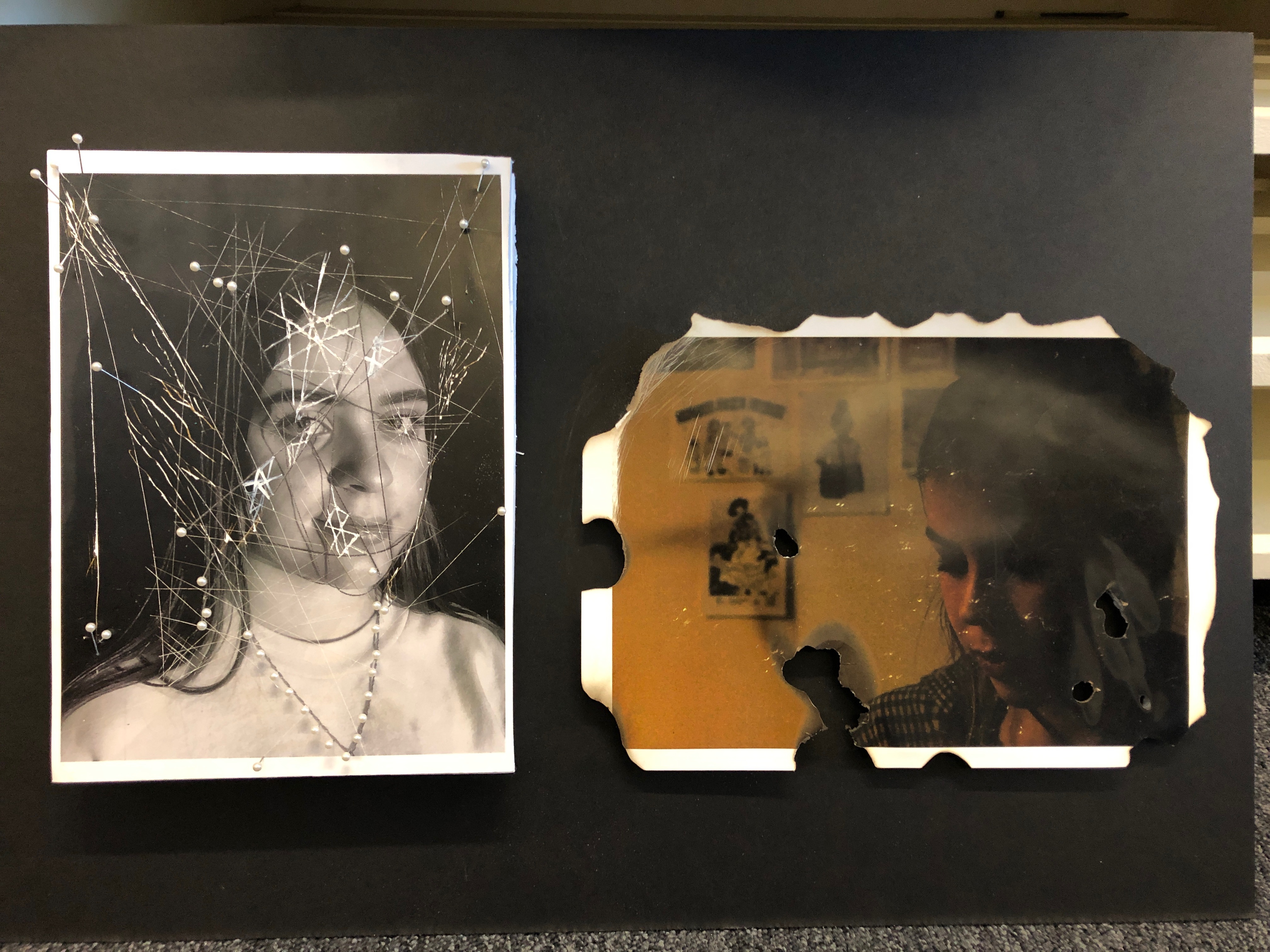
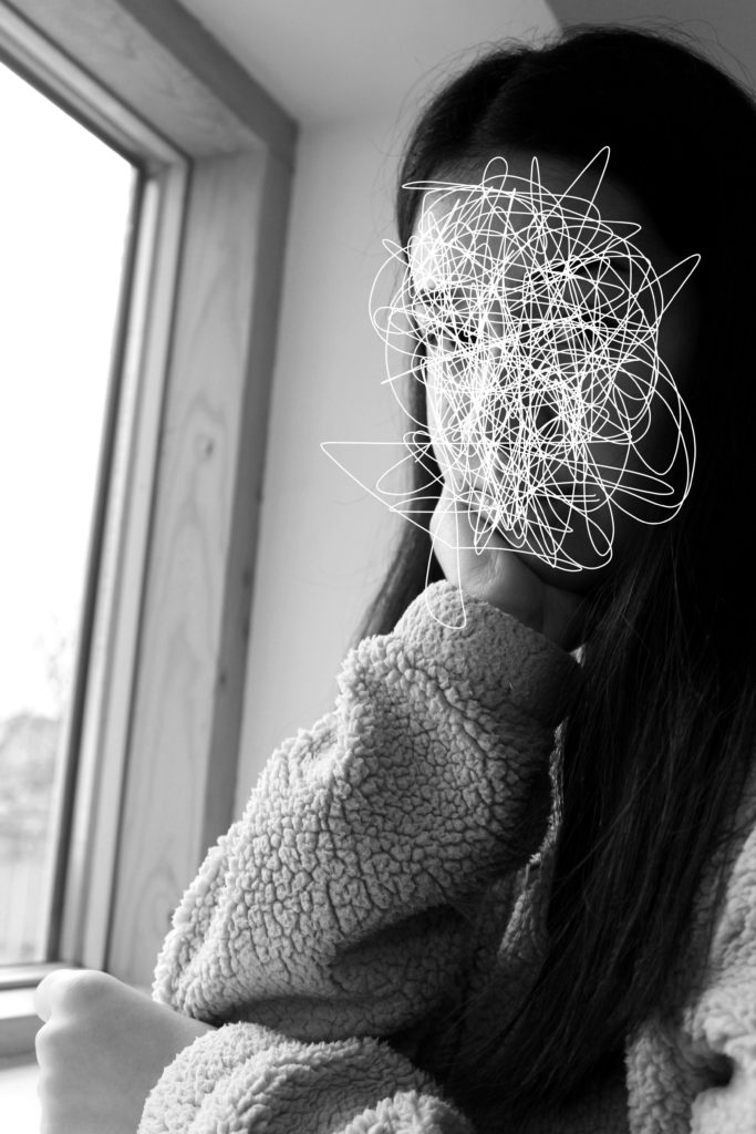
For my third edit I wanted to showcase, the scribble edits, which I created using the forgotten images. I felt that these images had a strong link to loss of identity and felt like the three images would produce a strong outcome. To do this I will print the images on A4 paper, and will be mounted as a window frame. The card is going to be black, due to the image background being white. They will be 4cm apart from each other and 15cm from the top and bottom of the frame.
Final Piece 4:
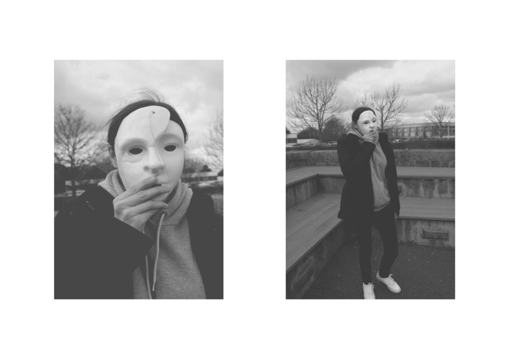
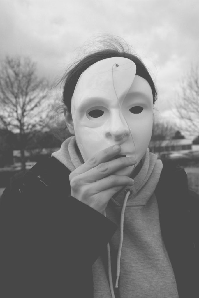
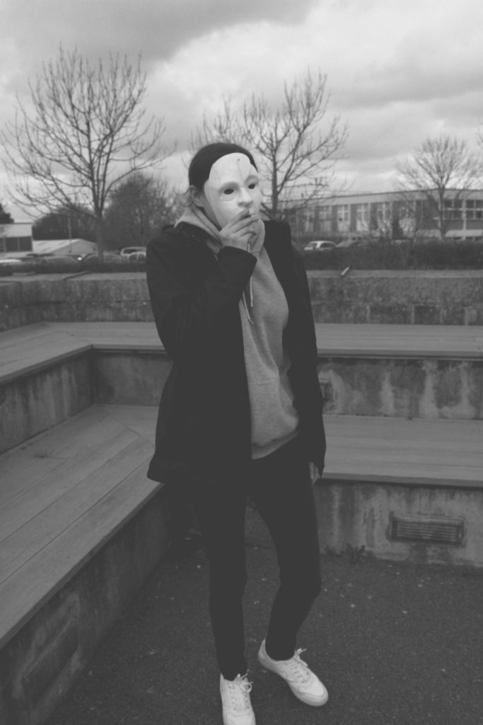
For my next final piece, I wanted to present my top outcomes from my mask photo shoot. I selected these two images, as I felt that they worked well together as a small photographic series. I will be displaying them as a Diptych Arrangement. Due to the two images being naturally lighter I feel like it would be appropriate to display them on white foam board, next to each other. I intended it have the images roughly 6 cm apart from one another and 6 cm away from the edges of the foam board.
Final Piece 5:
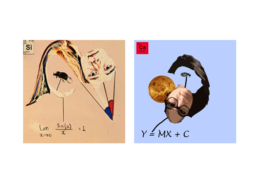
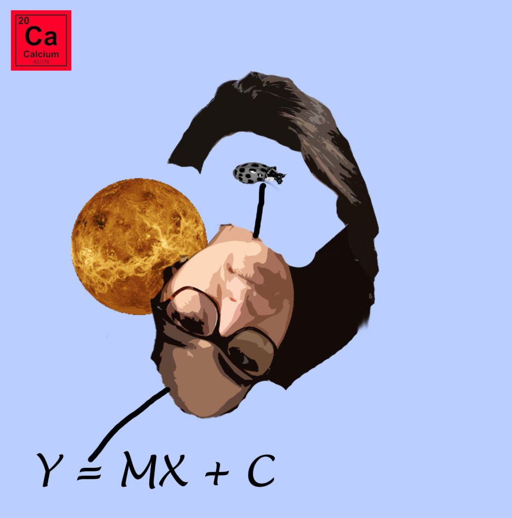
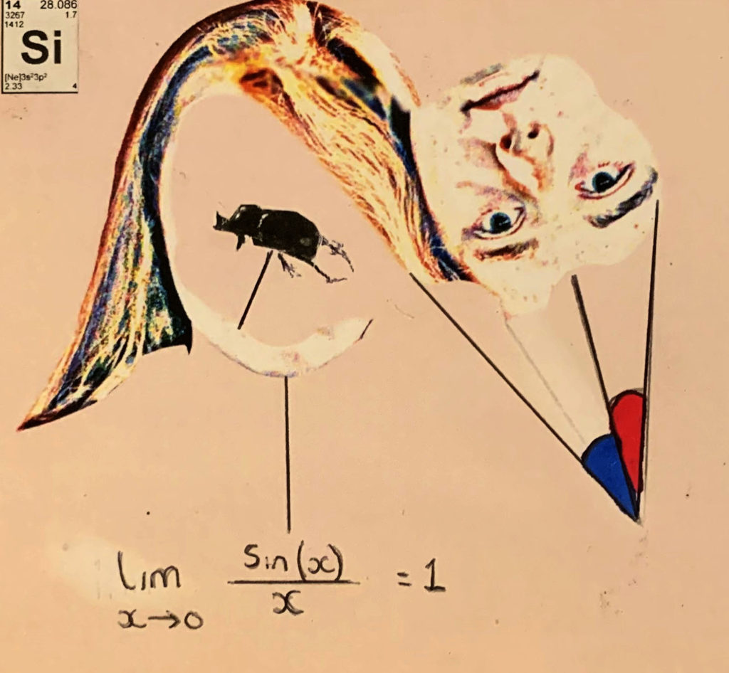
For my next final piece, I want to showcase my strongest photo montages. I decided to use these two montages as I felt that they worked well together. Due to the images being square, I have placed both images on the same A4 paper and will display through a window mount. This will allow the square shape to be kept. The two images are 3 cm apart from each other and will be a distance away from the edges.
Final Piece 6:
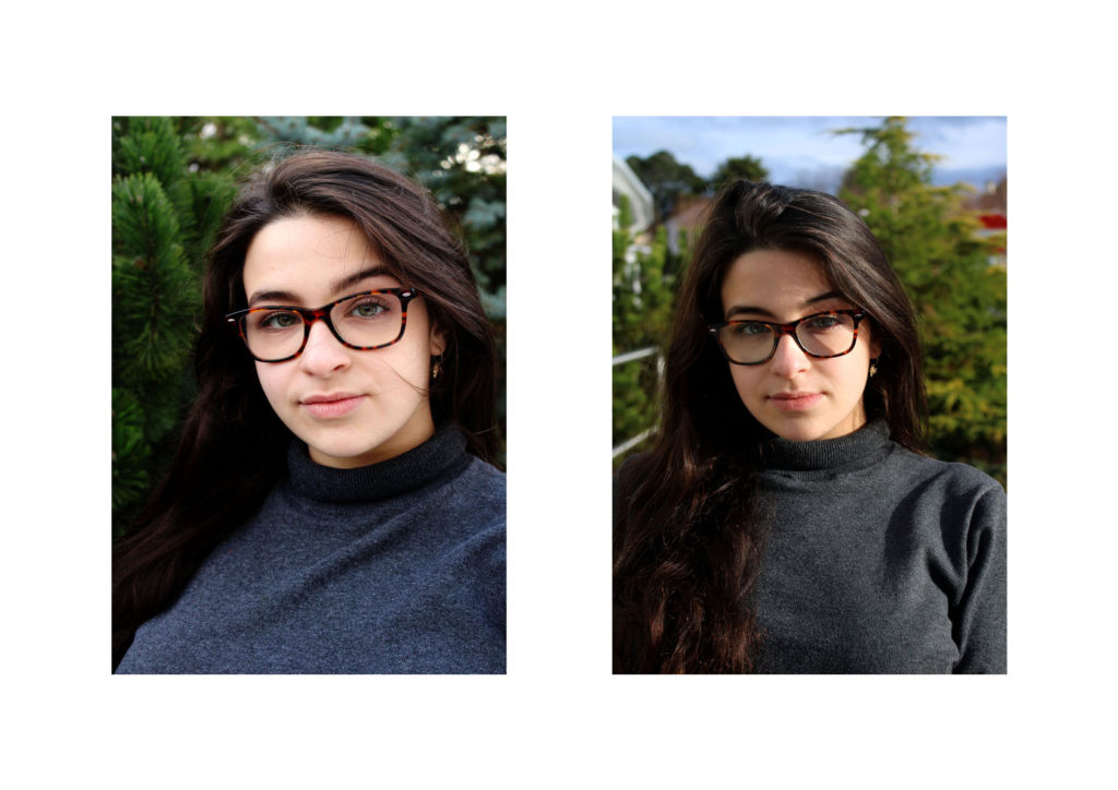
In my next final piece I want to display the photographs I captured when I studied natural lighting photography. These two images are my strongest outcomes and I feel like they work well together. I will print them out on separate A4 pieces of paper and frame them using foam board. The images will be 10 cm apart from each other and from the edge of the foam board.
Final Piece 7:
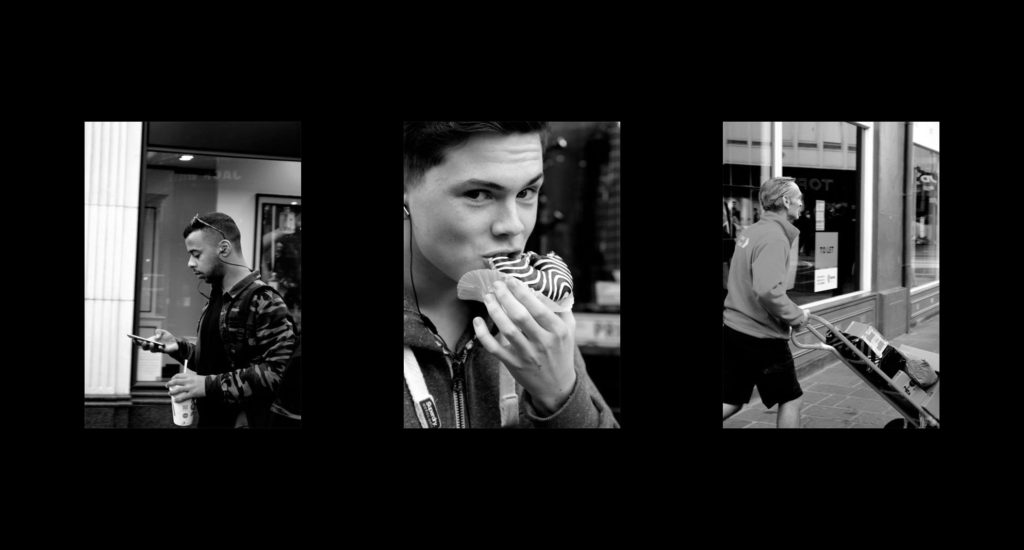
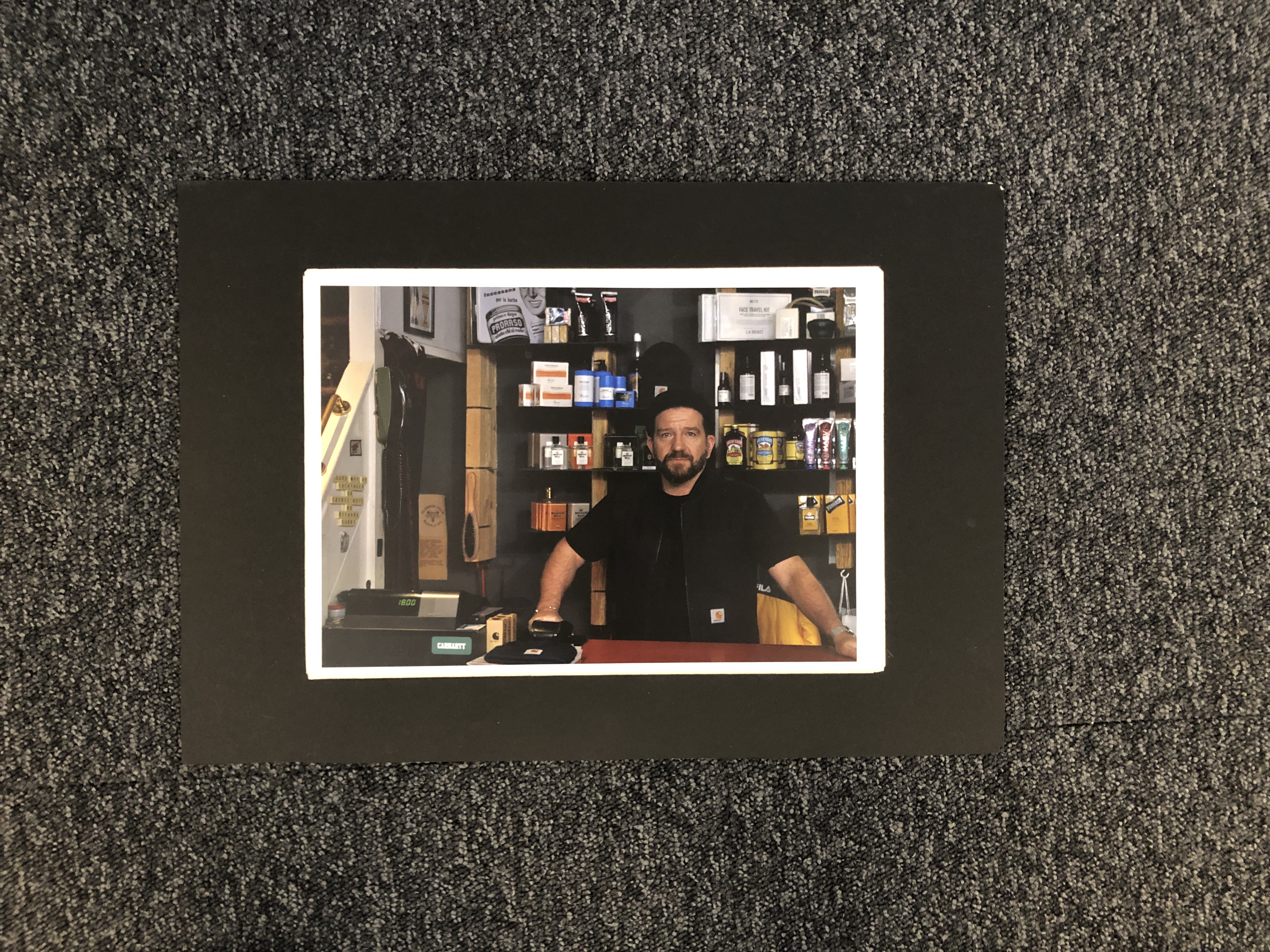
My next final piece showcases my attempt at street photography. I have used my top three images from this shoot and am going to display them next to each other, horizontally. The images will be printed out on A5 paper and be displayed using a window mount. The photographs will be 6 cm away from each other and 10 cm away from the edge of the window frame.
Final Piece 8:
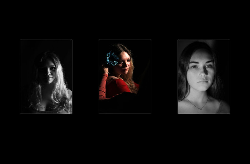
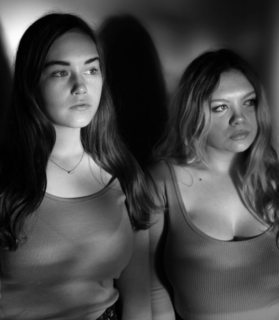
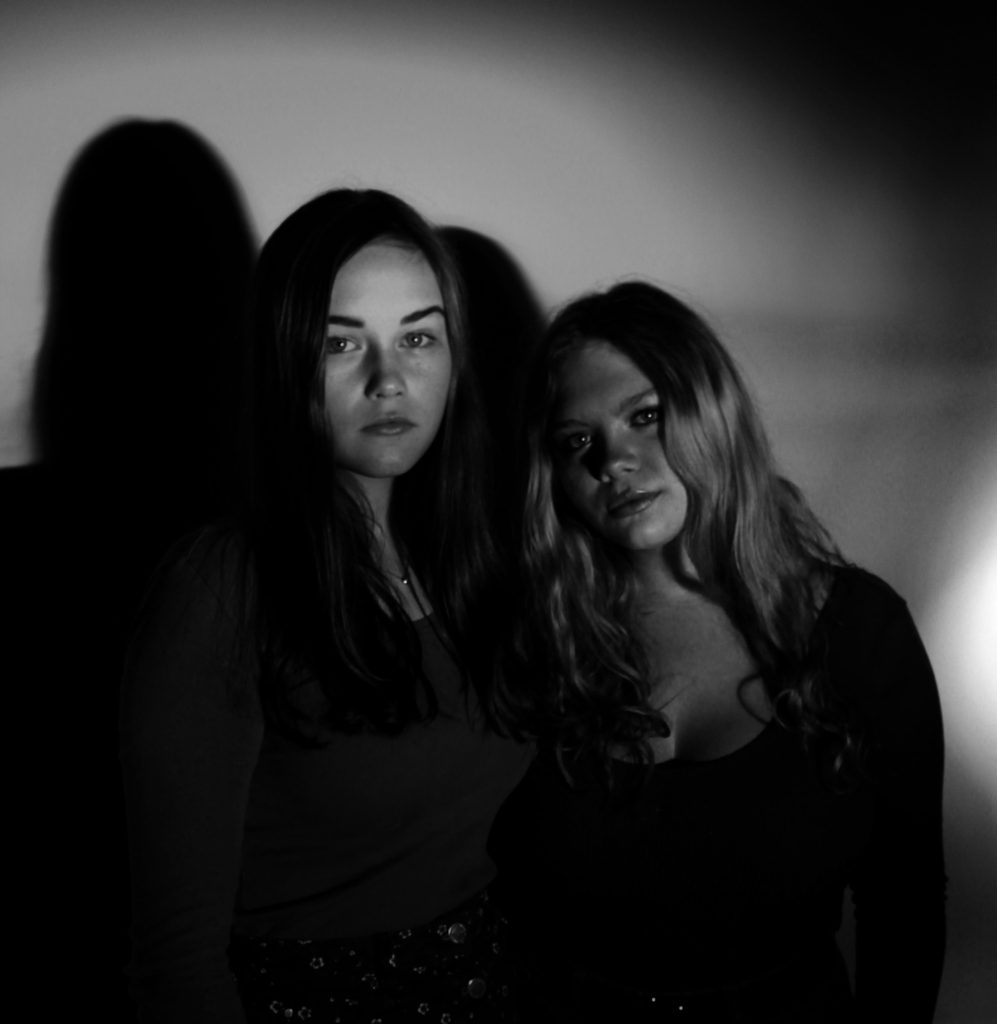
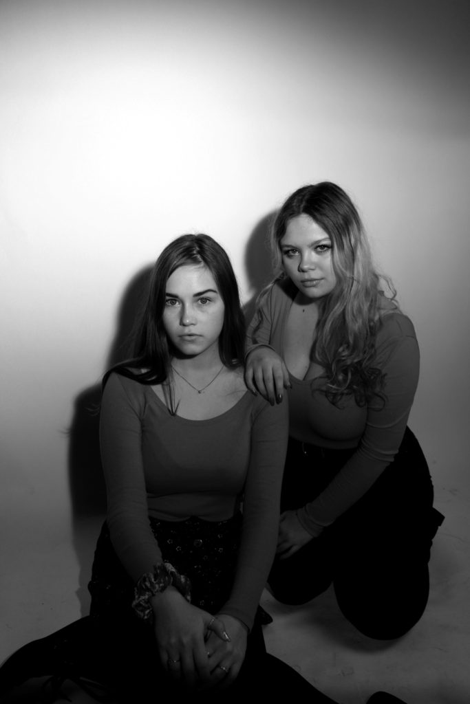
In a similar formate to the final piece above, I want to showcase my studio photography images. These images have been selected as it showed my ability to use different lighting and camera techniques, which shows my development as a photographer. The images will be printed out on A5 paper and be displayed using a window mount. The photographs will be 6 cm away from each other and 10 cm away from the edge of the window frame. The middle image has been left in color as I felt it added variety and makes the final piece visually stimulating.
Final Piece 9:
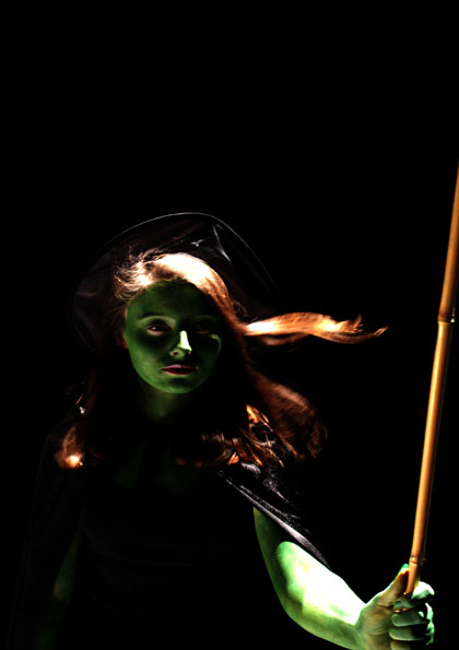
For my last final piece I intend to showcase my top image from the tableaux photography shoot. I will print this image out on A5 paper and then mount it on black card, allowing the mount to not distract viewers from the actual picture.
All Images Being Made Into a Final Piece:
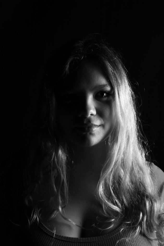
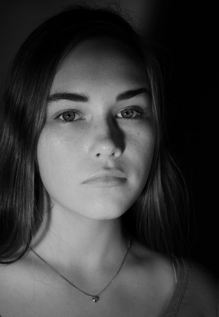
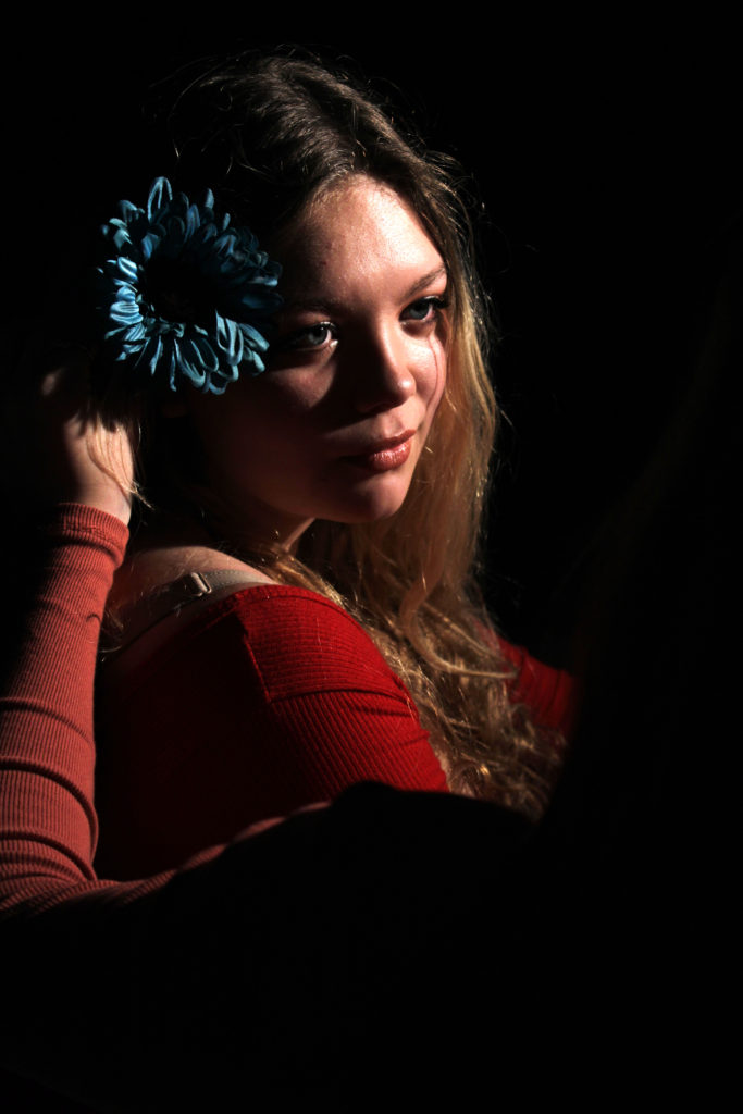

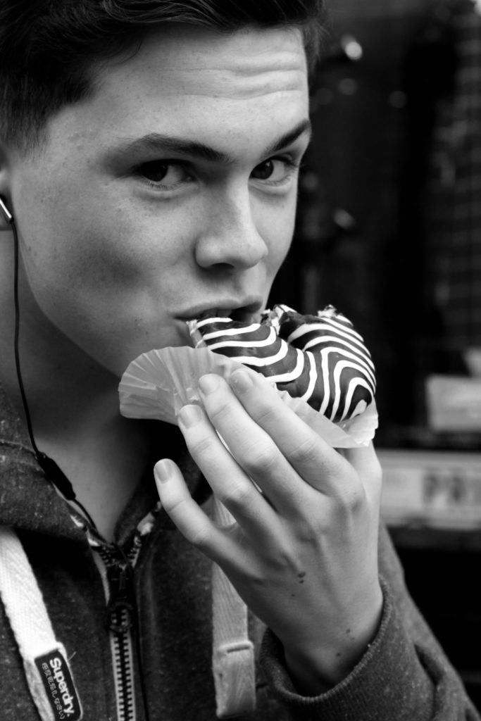
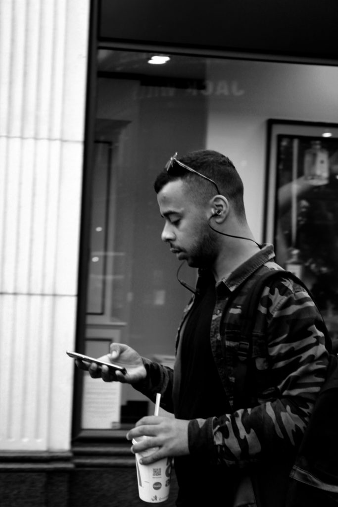
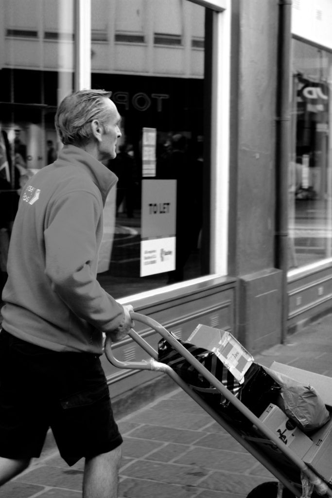


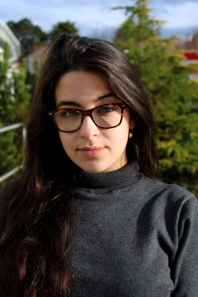
This is the final photoshoot I have done. I have done some more street photography for it. I have decided to do more street photography for it as it allowed me to get some more images like the ones Tish Murtha and John Bulmer have taken.
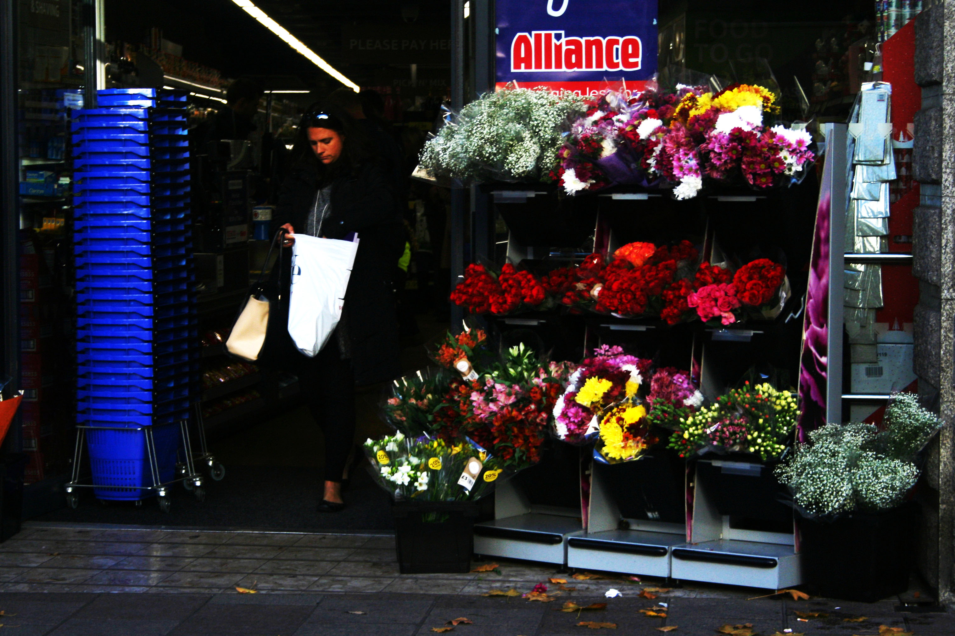
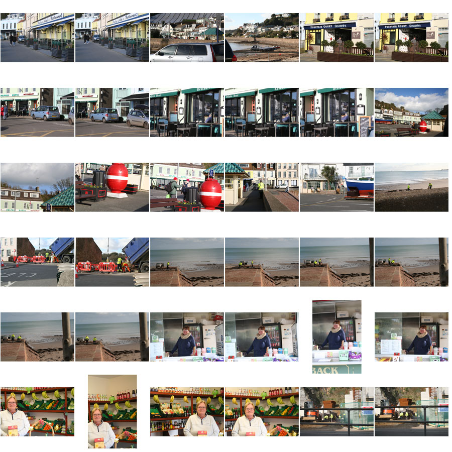
Below are a selection of the images I have taken on this photoshoot. A few of them turned out to be quite good images, that I may be able to use. Quite a lot of them didn’t turn out how I would have liked though, without many faces showing or being very dark or coming out blurry due to me using a higher shutter speed for some of the images.
The images below are the best two I have taken.
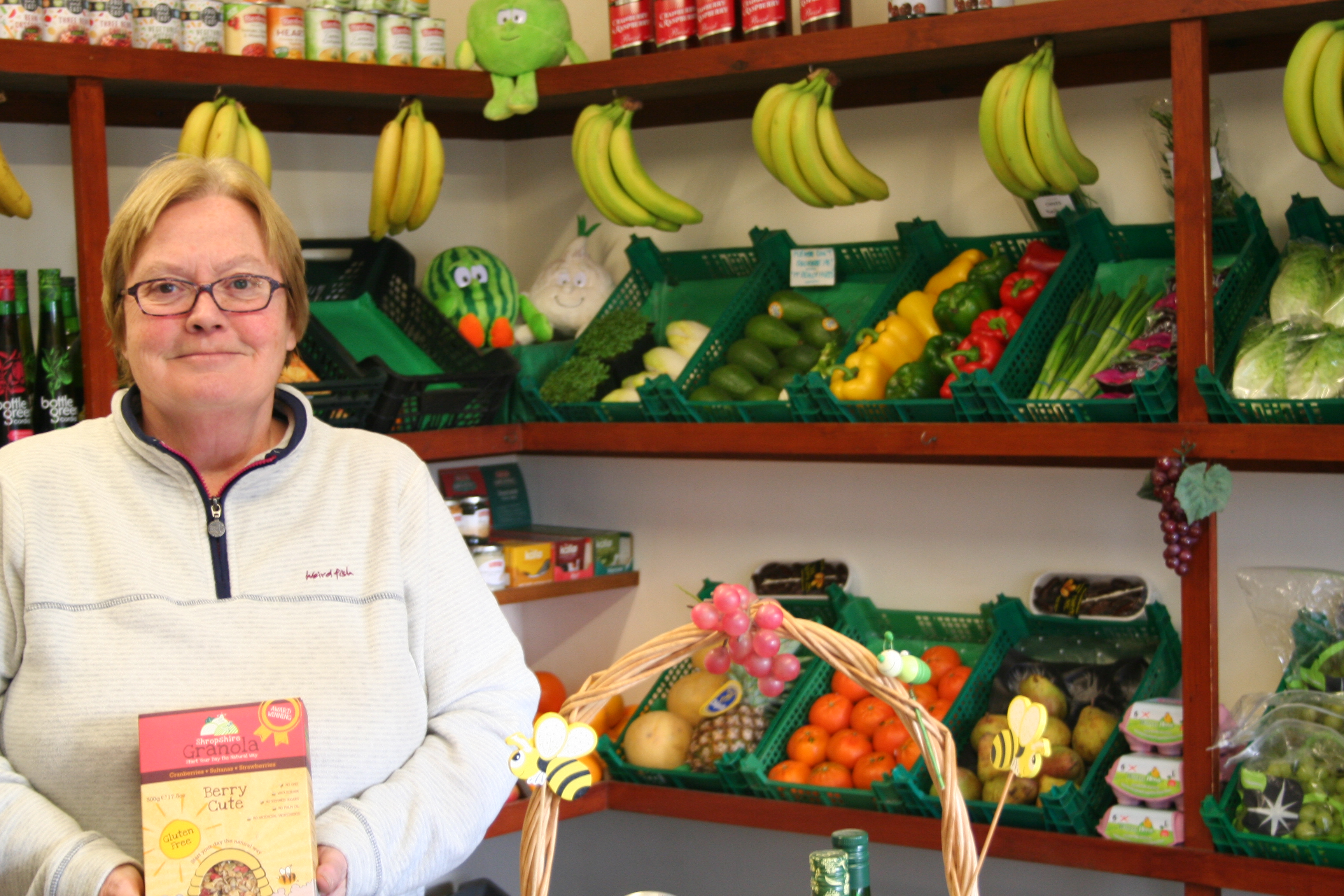
I have picked the image above because it came out to be a sharp image. If I were to edit it I would crop the image at the bottom to remove her hands and the bottom of the box and change the contrast in the image.

I have picked this image as it turned out sharp. When taking this image I purposefully angled it slightly. Though when editing I may take the image off of an angle as I don’t think the angle works. I may also add some saturation to make some of the lighter colours and the colours in her face to stand out.
The theme I will be exploring is the lack/loss of identity, and i’ll be looking at multiple different photographers to gain ideas to add to my final piece.
Michalina Woźniak is a self-taught Polish photographer and has been taking pictures since 2009. In her Identity Series, she focuses on the loss/lack of identity and portrays it through dark and gloomy images.
I’m a self taught 21 y.o. photographer based in Lublin (Poland). I’m in love with deep and dark emotions, the more disturbing they are, the more powerful they’re for me. I need those strong connections between me and another worlds (creations) to FEEL it and to be able to touch it somehow.
This story is about Identity and alter ego, but everyone can find whatever he/she wants here. I don’t want to tell you what’s it all about, I want you to look for it and to feel it.
Photography is like a poem – it’s all about the impression and impulse. You need to feel it, to find the moment.
– Michanlina Wosniak
Contact sheets:
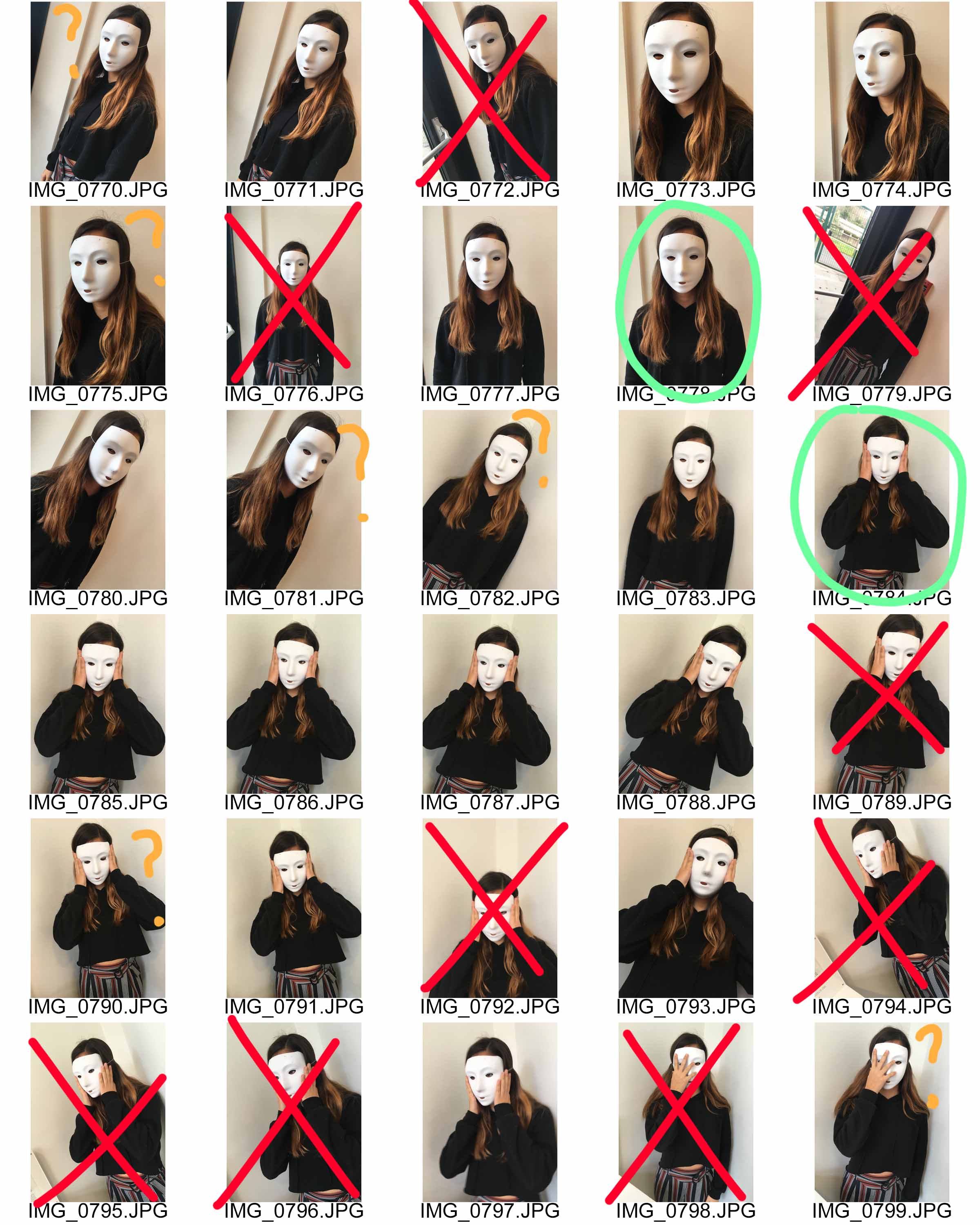

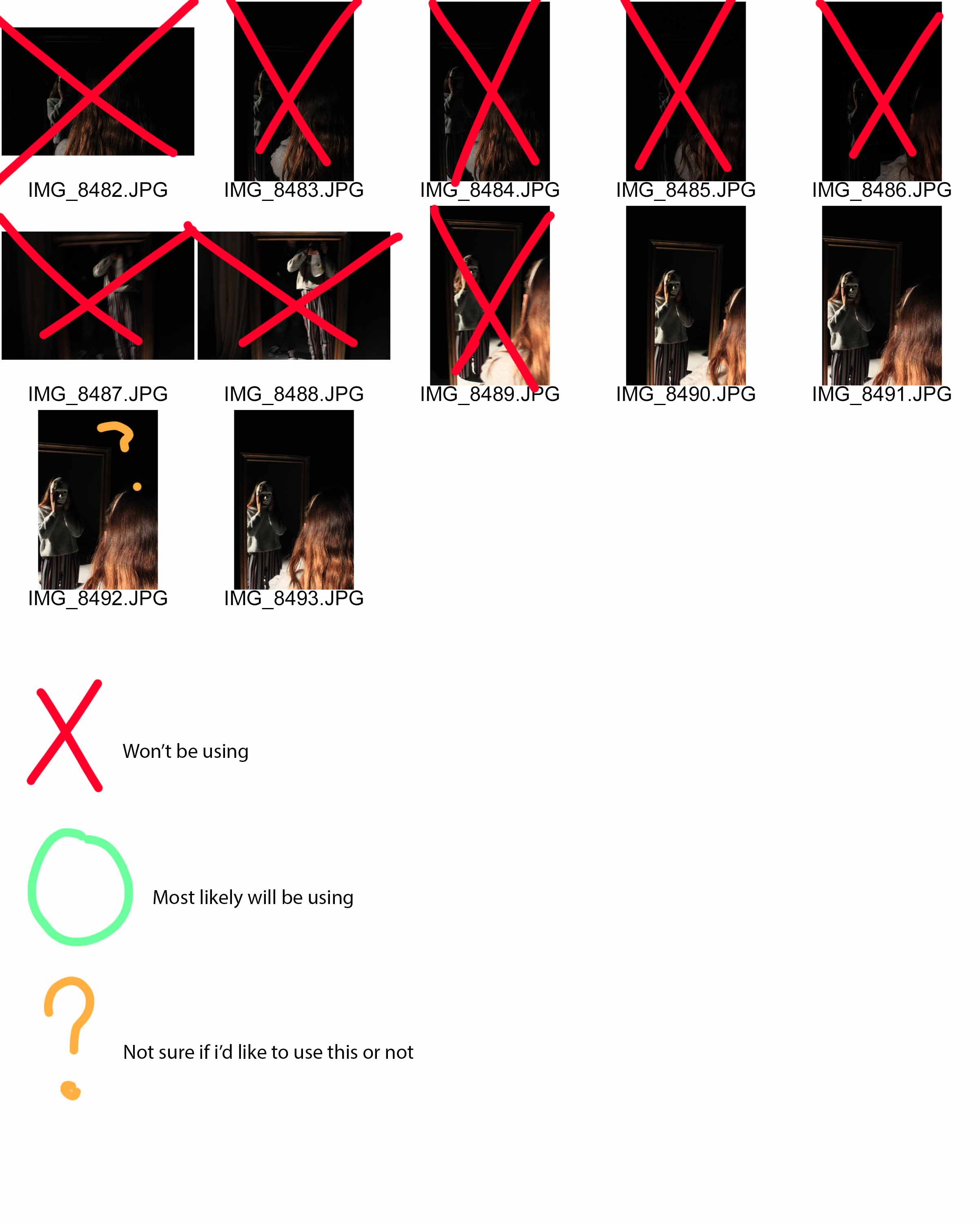
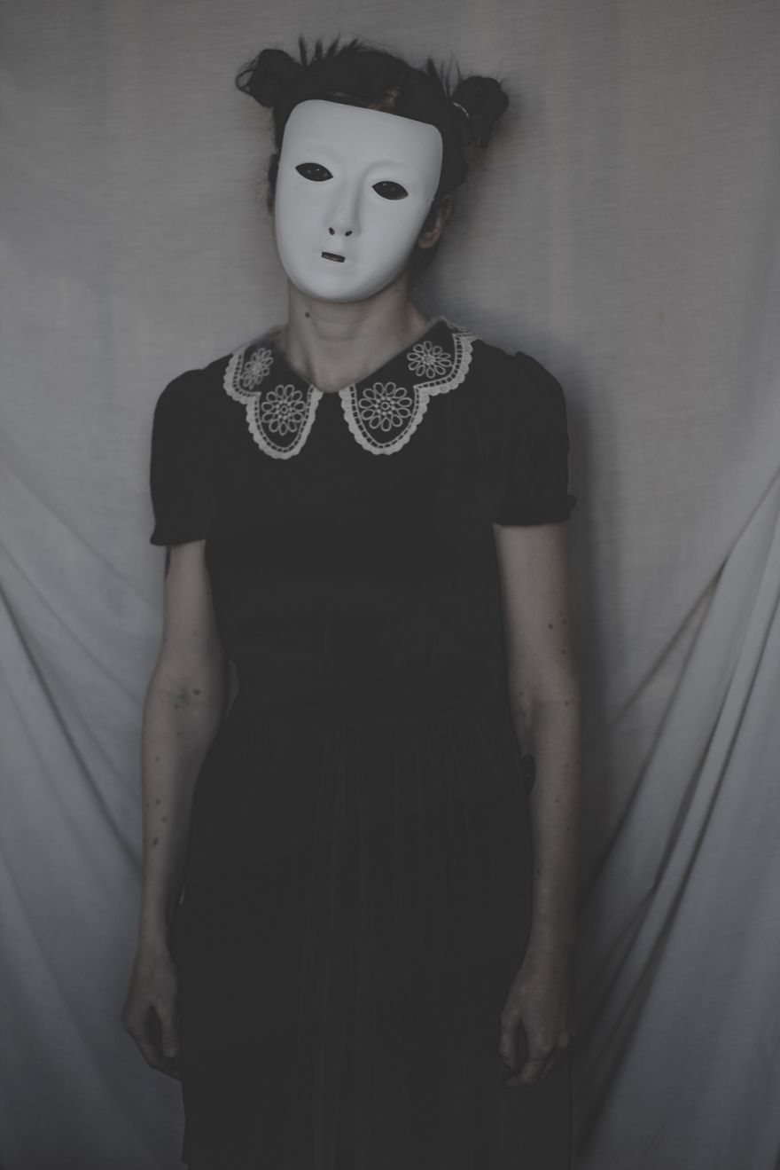
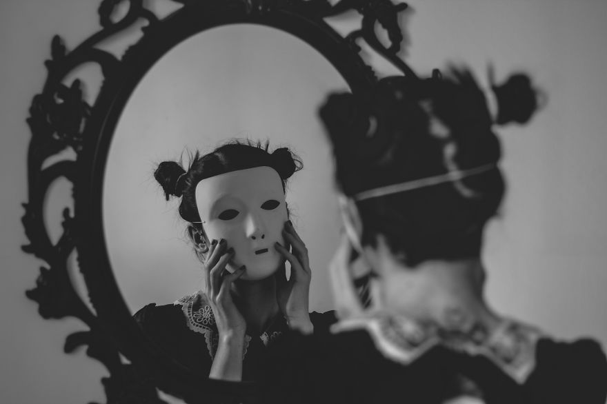
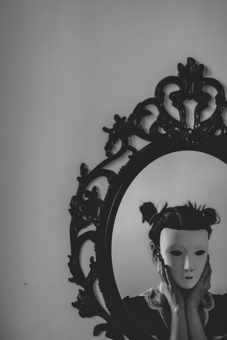
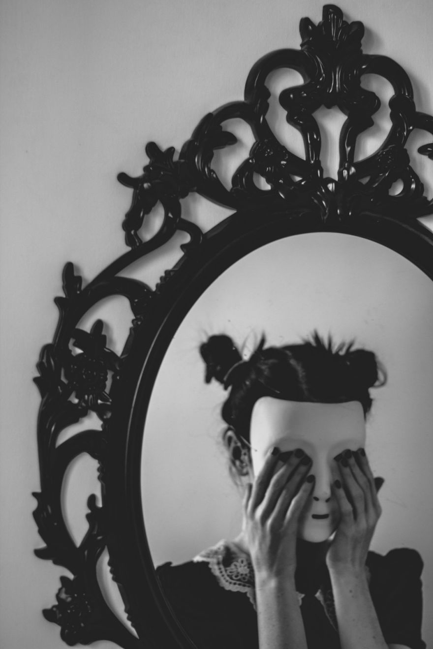
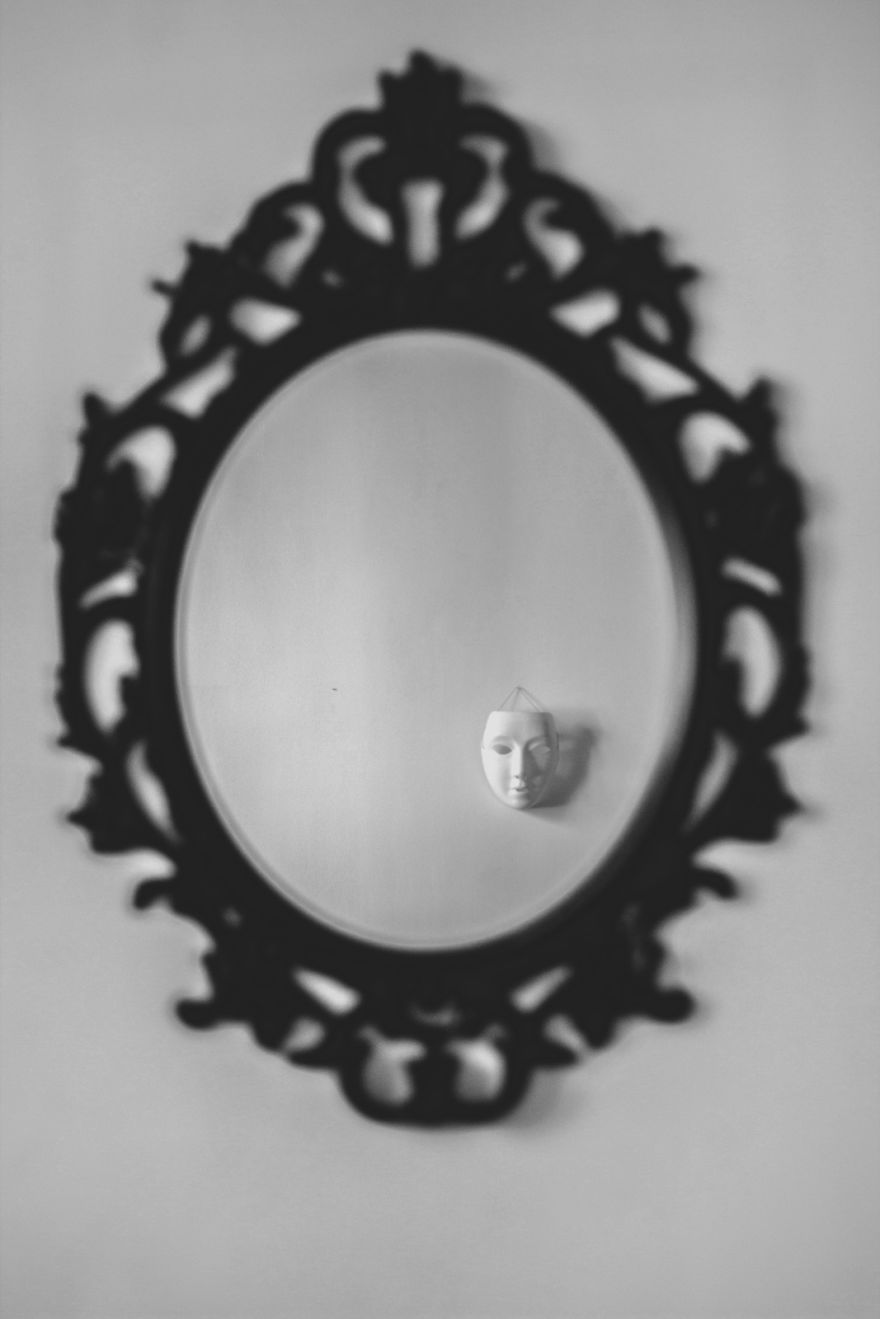
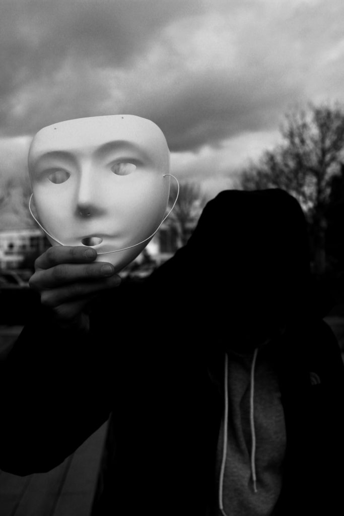
For my theme, I focused on the aspect of a masked face, and not being able to see the identity of the model in the picture. I also tried replicating pictures done by Wozniak, of a masked person looking into the mirror, surface which gives off a reflection, or looking directly into the camera. These link to my theme of the lack/loss of identity as the face of the person is hidden, and them looking into the mirror with the mask on, touching their face as if in confusion or distress, suggests that they themselves don’t know who they are. I got my subject to do multiple poses for this project, looking right at the camera with the mask, touching their face with their hands, and looking to a mirror or reflection.
Chosen edits:
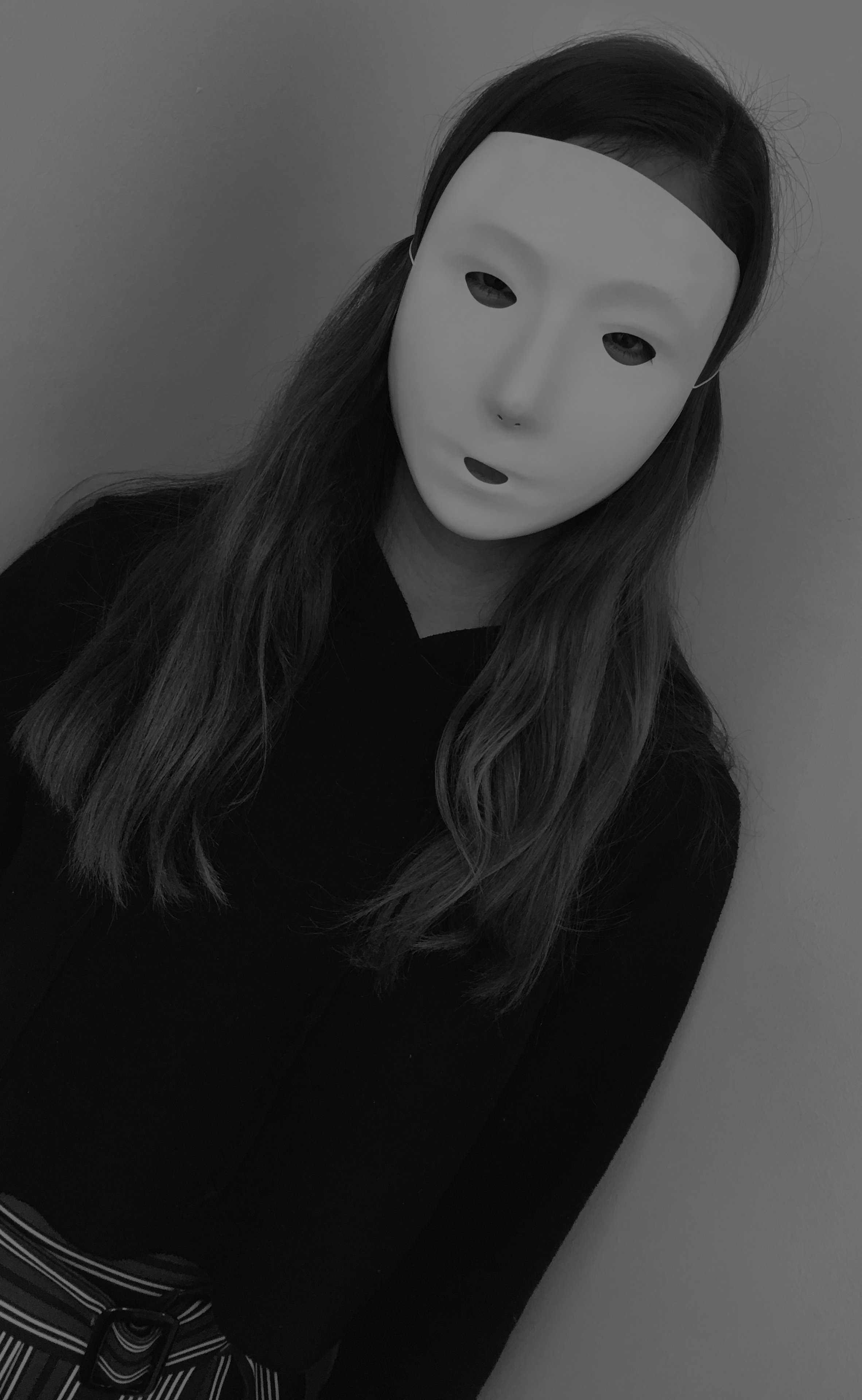
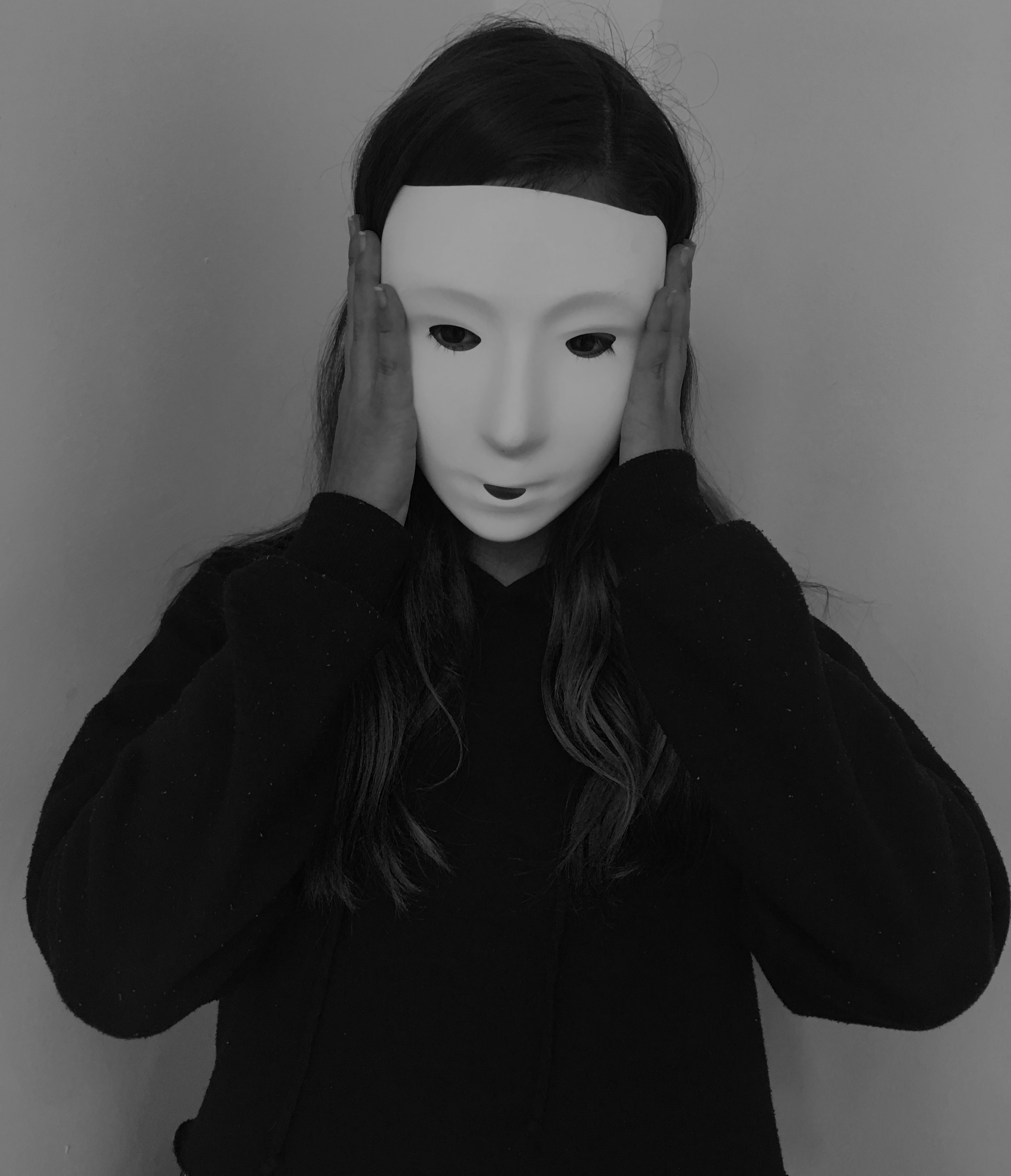
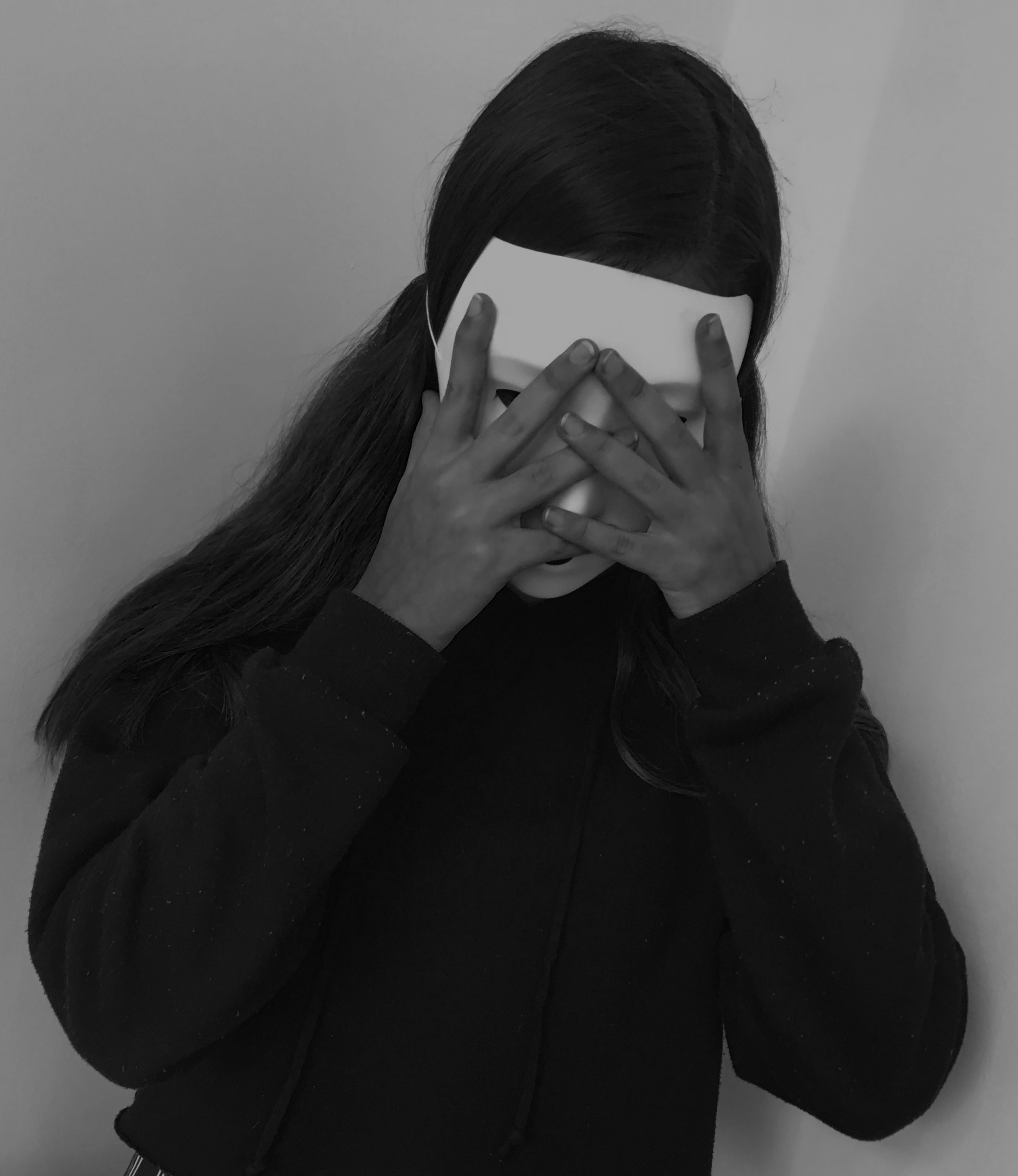
I chose these images because I believe that they relate to the theme of lack/loss of identity and portray Michalina Woźniak’s work successfully, with the masked subject and the eerie black and white setting. I think they also show a story, the first picture she seems normal, staring into the camera as if nothing’s wrong. Then in the second image, she’s touching her face as if she had just realised something, maybe the fact that she lacks identity. And in the last image it’s as if she’s in distress, her hands covering her mask as if she’s hiding away.
I like my final outcomes, they tell a story of someone who’s lost their identity and don’t know who they are, but I believe I could have taken more of a variety of images, with more mirrors, more poses and different people, including me. That would have defiantly increased the quality of this project.
I have gone through all of my photo shoots which have been conducted throughout the portrait project, and have selected the top outcomes from each shoot. The aim of this is to begin to make final selections of images which could lead to final pieces. Moreover, it is a chance for me to reflect and see what I have achieved throughout this project, and display my best outcomes as a collective. These images are initial thoughts of what could lead into final pieces, and is beginning to make me think about ways of displaying these images, and what message I am wanting to get across.
Response To Identity:
The images below are my top edits, which I believe have the strongest link to loss of identity. Moreover, all of the photographs clearly show good camera techniques and my ability to experiment, and use Photoshop in order to manipulate my images. These photographs have been taken from the two photo shoots and the old picture edit files, which I have produced in the past couple of weeks for the lead up of the mock exam.




Response To Photo-Montage:
These are my top two photo-montages, which clearly show images being layered on top of each other to create an overall photograph. These two images showcase the inside of a person, by moving the head and placing objects in that and around that area, showcase the type of person they are. Both of the edits are showing the model to be smart, through the use of equations and elements off the periodic table.


Response To Tableaux:
I believe my tableaux photographs are the weakest images that I have produced from this project, as a result of this I have only one image which clearly showcases my approach to this style of photography. The image shows lighting and camera techniques, which help to build a story of what is happening within the photograph.

Response To Studio Lighting:
I had a large number of studio photography portraits, which I thought are successful. Due to having so many successful outcomes I am thinking of displaying 9 of the best outcomes, in rows with the middle image being in color. These are the nine best images which I would want to use, and think are the most successful.


Response To Street Portraits:
Very much like the tableaux images, I felt that I was limited of successful images produced which therefore left me with three photographs which I believe could lead to potential final outcomes. These images clearly present the concept of street photography, through the nature of the model not being aware that I am capturing them in a photograph.


Response To Environmental Portraits:
I had a large selection of images which I could have used to showcase my response to environmental portraits. Due to the photo shoot I conducted showing the contrast of male and female stereotypes at retirement, I felt that it was appropriate to showcase two images, one of my male model and one of my female model. These two images, really outlined the contrast of gender roles I was trying to establish and therefore, I believe that they are my strongest outcomes in response to environmental portraits.

