Category Archives: AO4 Present Ideas

Filters

Author:
Category:

Personal project-Story

How it all started:

It all started when Talal’s Jordanian Grandfather Wael got his student visa and went to Bristol to study in college, while he was doing that he met Talal’s English grandmother Sherree in the same college and they fell in love, and had their first child later on which was Talal’s mother “Jumanah. After they had Jumanah, Wael’s student visa ran out so he had to go back to Jordan and left Sherree with two options which were either to stay in England and raise a child on her own or go live with  him in a country she has never been to and barley knows anything about.

So Sherree being just young and in love chose option two and went to Jordan, where she discovered over the time that it’s not easy for an English women to live a normal western life in a middle eastern country, where women’s rights are different and what I like to refer to as “cultural clash” kicked in and created the differences between Sherree and Wael and these differences later on separated them when Jumanah was only 4 years old. So Sherree left and went back to her home country and Wael couldn’t raise a kid on his own so left Jumanah with her auntie and her auntie’s  husband Muhammad Al-Jazi who raised her. So Talal always saw Muhammad as a Grandfather figure because he was practically the one who raised his mother.

Muhammad Al-Jazi and “the knife”

Muhammad (AKA: Abu Ali) was the kind of person who always lived his life on the edge as he was one of the most adventurous people in Talal’s life. So one day he invited Talal to go with him to his small hunting house which was located in Ma’an in Jordan, and that was one of the most traditional places in Jordan with only a few houses and a lot of desert land so they went Jar-boa hunting in the morning then went back to his summer house for lunch and that’s where Talal being his touchy self-wanting to touch and play with anything he can get his hands on, picked up an outstanding antique knife Abu Ali had in the middle of his desk on a fancy stand, out of curiosity Talal opened the case of the knife and while he was doing that Abu Ali just realized what he was doing so screamed: “NO! Talal!”  So Talal got jump scared and dropped the knife on the floor where the lion head on the end of the knife broke into three pieces as it was some type of ceramic. So he looked at Talal and said that this was a really precious thing to him so Talal asked him why was it? and he replied by telling Talal to take it with him back home and to fix it, so he can give it back to Abu Ali as it was before, in order for him to tell Talal the story behind it.

The terrible death of Abu Ali

As they were heading back home to the city Amman they went to see a buggy shop on the way as Abu Ali was curious to see the new buggies they got, so they went inside and as Abu Ali was looking around he found a nice dirt ATV and hopped on it to ask Talal how he looked on it, and he replied by informing him how much it suits him, so he bought it on the spot and they told him that they will deliver it to his farm house next day. So Talal went back home and everything was fine until he woke up next day to the noise of crying coming from his parents room, so Talal instantly thought that his great grandmother passes away because she was very poorly with cancer at that time so it just felt normal to him so he just started crying then his dad came into his room with his eyes all filled up with tears then he asked Talal why was he crying and he told him: “did my great grandma pass away?” And he replied: “no son she’s still fine but a couple of hours ago in the morning your grandpa Abu Ali got an ATV delivered to his farm so he got too excited and took it right away for a test drive, then went on a dirt path at the top of a mountain where he was going down the path and went straight into the valley where two farmers found his body beaten like a rag doll and called the ambulance so a helicopter came and took him right away where he passed away mid-way to the hospital on the helicopter”. And Talal just had the weirdest feeling as he knew it was true but just couldn’t believe it in the same time because his head just didn’t process the information because he was just with him the day before when he was in perfect health.

The story behind the knife

After being in shock behind the story Talal heard he started to process that his grandfather actually passed away a couple of days after the incident. So on the third day of the funeral Talal was with Hamza which is Abu Ali’s eldest son and Talal asked him: “what should I do with the knife because I was supposed to give it back to him after fixing it.” So Hamza was really surprised when he showed him the knife and Hamza said: “that’s a really antique and priceless knife you have there.”, then Talal asked him if he knew the story behind it and he told him all about it.

What Talal learnt about his family history.

After Hamza told Talal about the story behind the knife Talal was left in shock after Hamza informed him that this knife belonged to his great grandfather Mashhour Al-Jazi, who was the command officer of a really important battle in Jordan, which was between Israel and Jordan and Palestine’s combined force. The war was called “Battle of Karameh”. And the knife Talal has was actually the knife Mashhour used in that battle. Mashhour is a really loved and known figure by his country as he did great things for it.

How Mashhour’s accomplishments Inspired Talal

After Talal learnt all about Mashhour’s stories he got really inspired by the world of War and national service, then kept doing all his research about it. And his dream ever since was to join the Jordanian Military service. But unfortunately due to family reasons a couple of years after that Talal had to move away from his family alone to live with his friend in Jersey. But being his stubborn self he didn’t change his mind about joining the national service and still worked with what he had even if it cost him serving a country he wasn’t brought up in. So he joined the Marine Cadets at the beginning where he was exposed to the experience soldiers go through in the Navy, to give him a kind of sense of what he was getting himself into.

Everything was going great for Talal apart from the racism he received at the cadet center due to his different ethnicity which confused him about whether he wants to go through that in the actually navy, because it’s a lot of years of commitment and there’s no going back.

Final prints/mounting

Here you will see my final prints, which I plan on mounting on foam board. I wanted to mount on foam board -instead of cutting a window mount for example- because my personal study is essentially a story. This means a foam board will be more suitable because it allows greater flow, and is not as strict and put in place as a window mount. Each image is going to represent a different point in the narrative, which I will explain below.

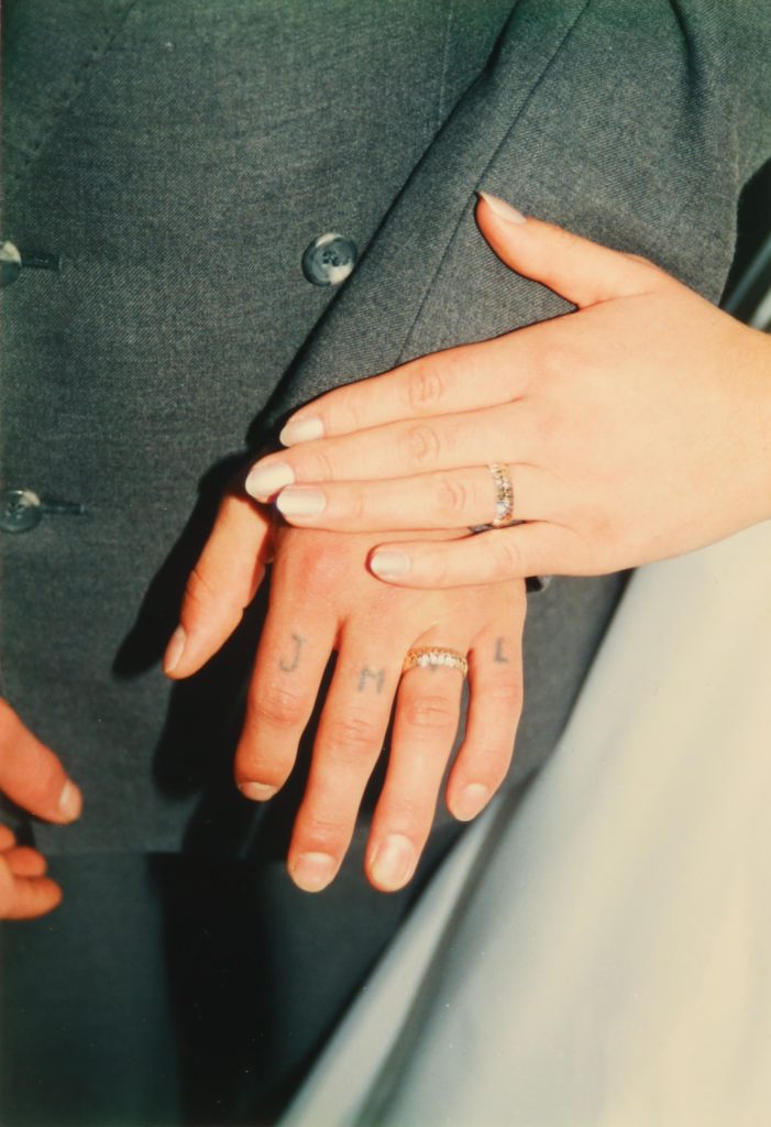
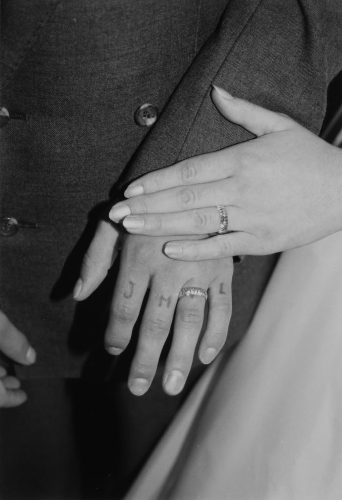
This image was changed into black and white, the exposure was decreased and the contrast was increased. I decreased the exposure because when i made the image black and white, the scene in the frame looked was too washed out and bright. I then increased the contrast to go with this, in order to make the hands, and rings more prominent.
This archival image symbolises my parent’s marriage, and by making it black and white it also represents separation. This is because the filter represents how it is in the past. Since this is quite a large and important event it will be printed in A5.
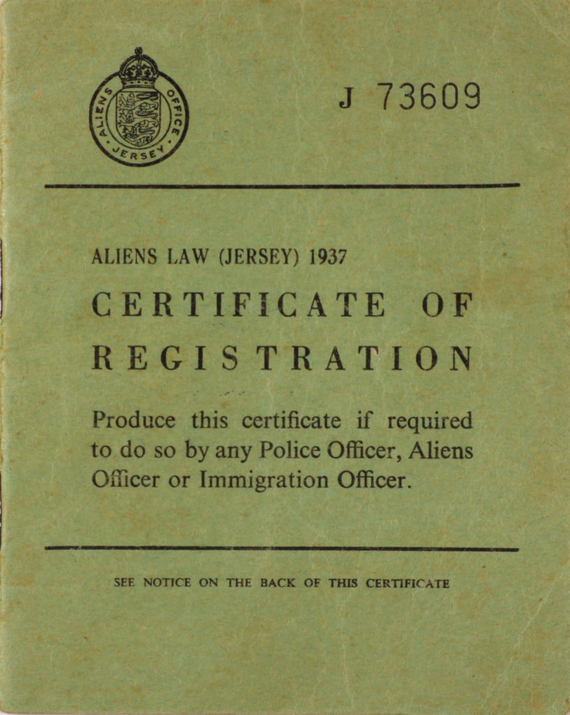
I wanted this image of my dad’s Jersey registration card to represent immigration. Since the foam board I plan to use will be white, I wanted to make sure this stood out a lot so I increased the contrast helping to make it pop more, and not be washed out by the larger images since this will be printed in A3.

Below are the selection of images I will be printing and mounting:

what my final piece will look like:

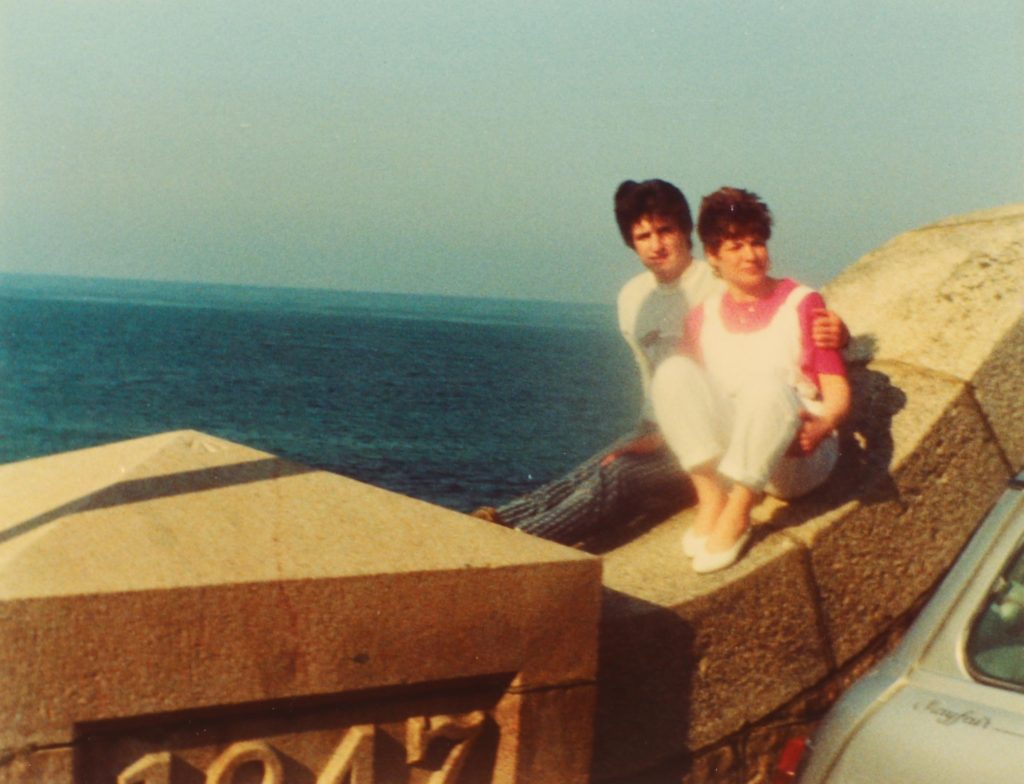
Overall, I believe my final display is quite successful. To represent the fact that my personal study is a story, I used a foam board and essentially arranged my images in a “story board” format as I thought this would be a way to express the narrative with more freedom. The top of the display shows an image of both my parents at in their late teens/early 20s and this represents them first meeting. Down the side on the left, there are certain objects and documents that play a role in the story. We can see an immigration card which represents them moving to Jersey, and further down an image of both mine and my brother’s hospital wristbands given to us the day we were born represent how they started a family. The final image is perhaps the more symbolic and metaphoric. It is an image of my parent’s hands, showing their wedding rings the day they were married. This is placed right at the bottom on the right hand side to represent the end of the narrative, very similar to how an actual written story would end. This image conveys a double meaning since it shows how they got married, but since it is in black and white it also represents their divorce as the filter represents something in the past, that is no longer. I also used sizing to represent the importance of each event, The bigger the image, the most significance it has to the narrative.

Actual final piece:

home sweet home project-ENVIRONMENTAL portraits

Intro

Although i don’t live in my own parent’s house due to me living with my friend’s parents house i still decided to get out of my comfort zone and take photographs of the house i’m living in. Although they’re not my actual parents they still make me feel like i’m one of their own and treat me as if its my own home, so at the moment i do call it my temporary home.

Environmental Photography

Environmental portraits have always inspired me as it is a portrait executed in the subject’s usual environment, such as in their home or workplace, and typically illuminates the subject’s life and surroundings. The term is most frequently used of a genre of photography. And i love taking real photographs as environmental portraits are taken, they just show how something is without acting any different in front of a camera like most stuff do now a days.

What I Did

I borrowed a camera from school and came home one day and built up the courage to ask the people living at my temporary home if they would give me their permission to photograph them and they were more than happy to do so. So all i asked from them was for them to just act normal as if i’m not there so i can get the realest picture of would they look like naturally in the comfort of their home. And here is how it went:

Mark

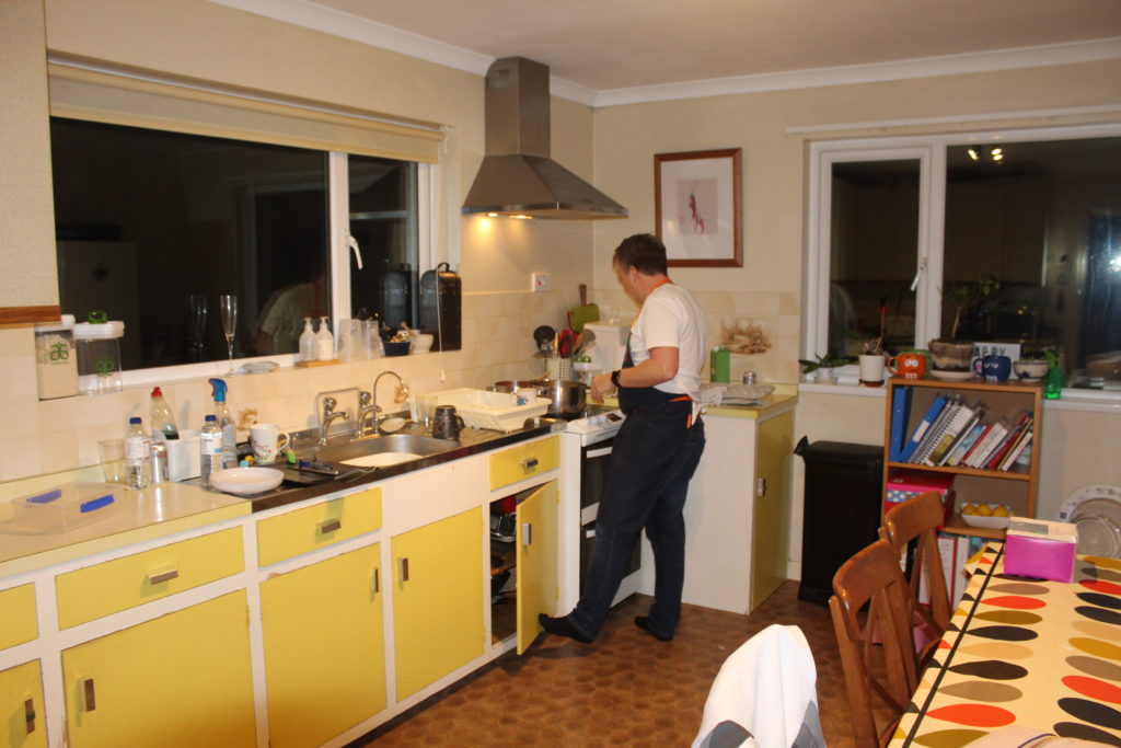
Mark is my friend’s father and he is the best cook ever, therefore hes the one in charge of the cooking in the house, and apart from that hes also in charge of Gypsy the do. So i began with waiting for him to cook something then went ahead and took photographs of him in the kitchen while he was cooking first and this is what i came out with:

This image has an empty alt attribute; its file name is IMG_8948-1024x683.jpg
i like the lighting in this photograph, as the yellowness of the room and light adds a lot of color to the portrait

Alison

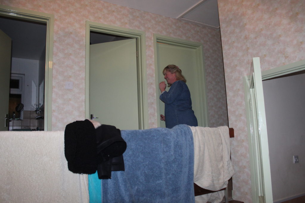
Alison, my friend’s mother is the hardest worker in the house and works with children. She comes home late and goes straight to her room most of the time but i managed to take a couple of unique photographs of her rare sighting just before she smuggled into her room:

I had to take this portrait at fast shutter speed as i had to take it in a rush before Alison went into her room

Mathew

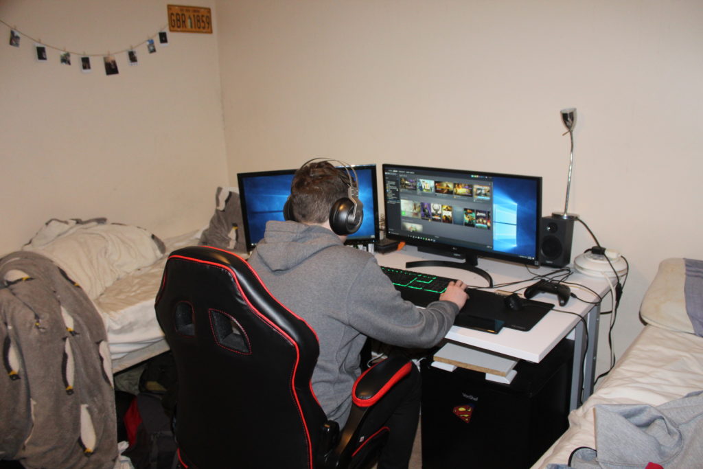
Mathew is my best friend or more like a brother to me. He is mostly playing games on his PC, so i decided that this is what i want to photograph him doing. So i just sneaked from the back of the room and photographed him without him even knowing:

You can see how messy the room is in this portrait which shows how naturally the rooms look like without preparing it to be photographed. And i chose florescent white balance to create this white tinge in the portrait

Gypsy

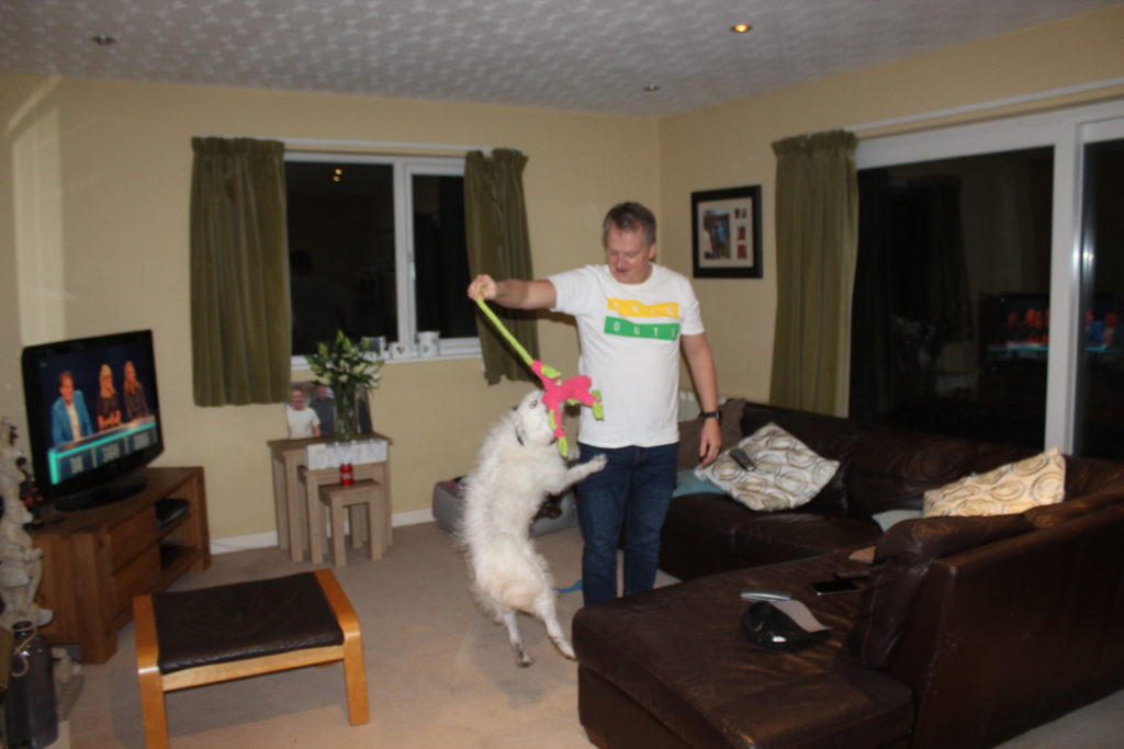
Gypsy the dog is very active and jumpy, as to her close relationship with Mark i decided to take photographs of her as she was playing with mark:

Just a casual portrait of Mark messing about with Gypsy here and i like how i got the best picture at really fast shutter speed while gypsy is mid air jumping towards her toy

Best Portrait

I chose this as my best portrait as it has a lot of meaning showing how common it is now a days for parents to just forget about the world around them and just get so lost and involved in their technology. In this photograph you can see how Mark and Alison are both sitting down in the same room on the same couch but not much interaction is happening between them as each one of them is on their phone and they’re watching T.V in the same time.

Conclusion

In conclusion, in this project it helped me a lot to discover the home i’m living in and get closer to the family i am living with, by photographing what they do in their daily lives on a day to day basis without changing what they’re doing and how they look like.

Photo montges

In this blog post I will be exploring the use of montages to express mental illness. I think montages may be the best way to convey this event because it’s something that is difficult to picture with a camera, but easier to show by manipulating and combining images. Below is a mood board with images I used as inspiration when creating my photo montages. In the images, most of the subjects are obscured from the images.

Mood board.
Images are not my own.

The image below I also used as a prime example, by my case study Diana Markosian.

“This is the closet thing I had to an image of my father. A cut out of him in my mother’s photo album.”

Editing images:

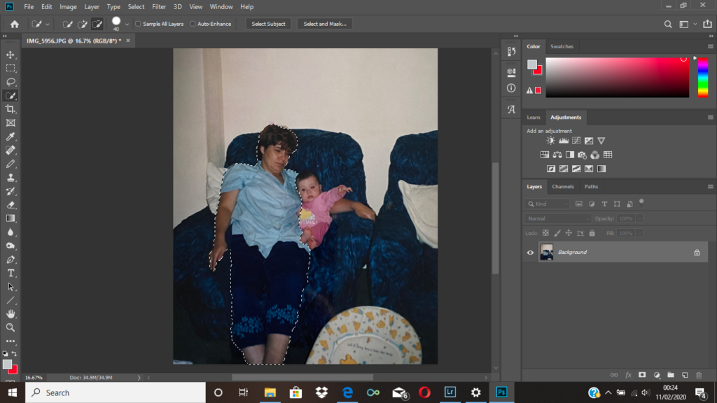
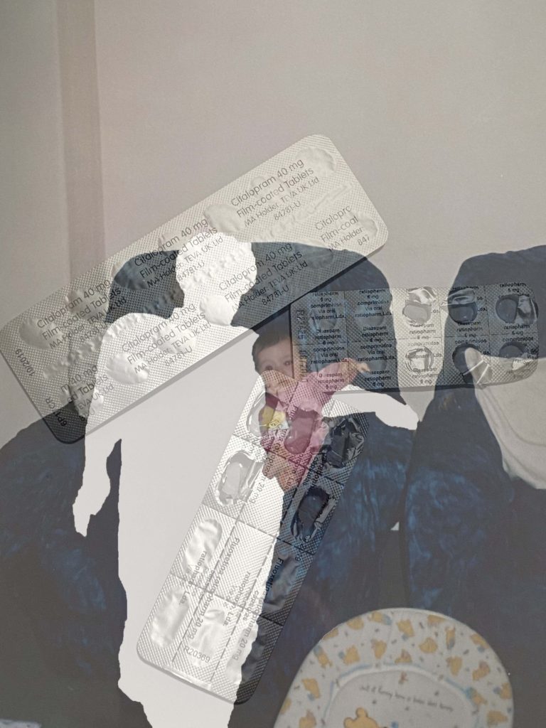
I began with an image of my mother, and me as a baby. I used the quick selection tool to select her, then right clicked pressing layer via cut, I then removed the layer, leaving a blank space in the image where my mother originally was. You can see the final output above. Although I thought it was a successful image I wanted to experiment with some variations. Because of this I added an image of her medication, and layered it over the top, and changed the opacity to around 50% so the original layer was visible. This is the 4th image you see above. I think overall both images are effective in conveying mental illness, however I think the second image gives more context to the situation. Ultimately, the image I will end up using will be the one that fits in more with the photo selection from my book, which I think will be the initial montage.

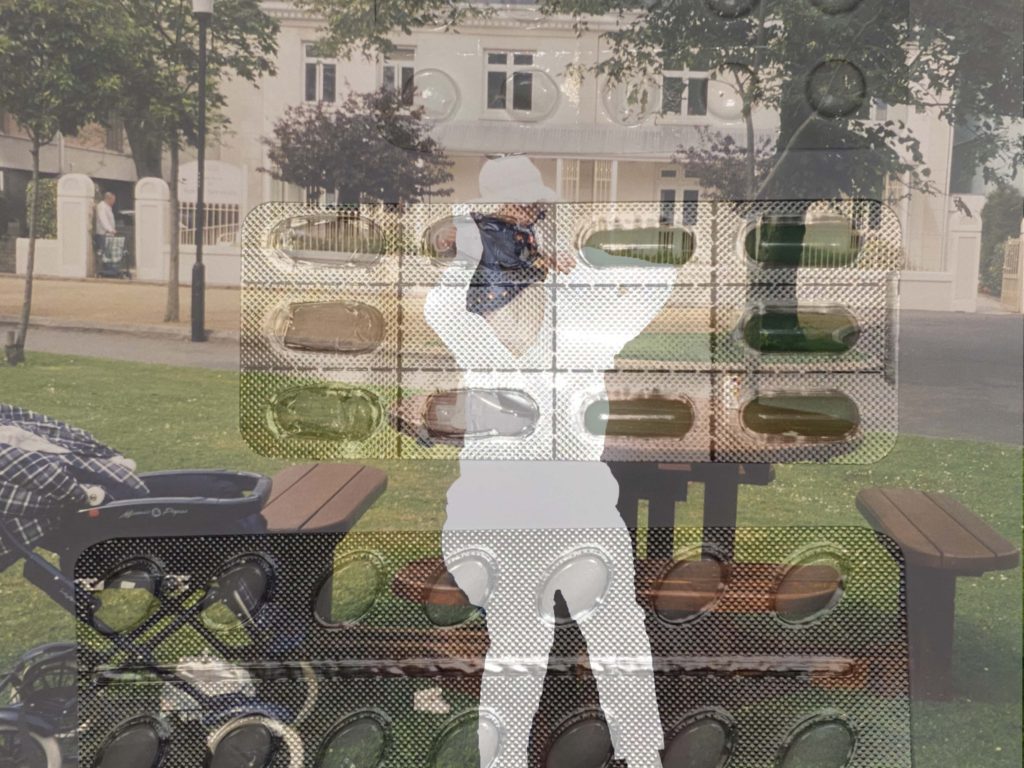
To complete the montages above I followed the same process stated at the beginning, the only difference being the image I layered on top of my archival image.

Text Within the Photo-Book: Essay

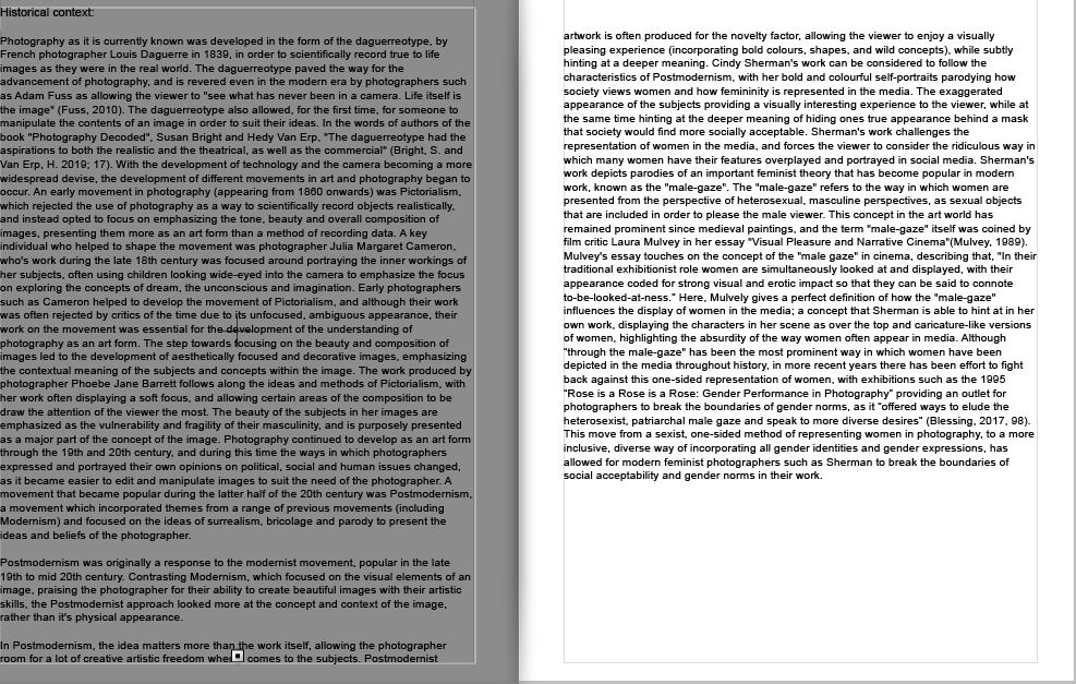
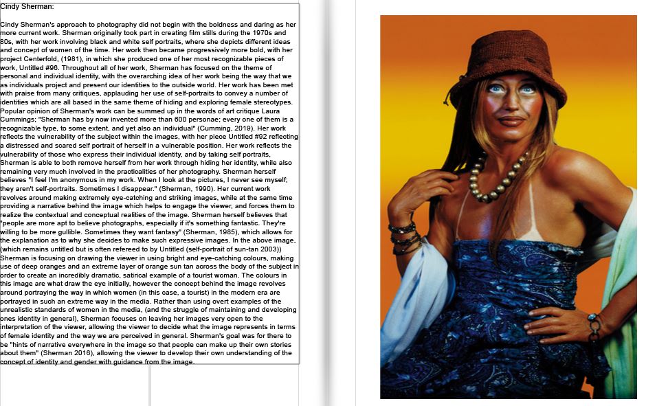
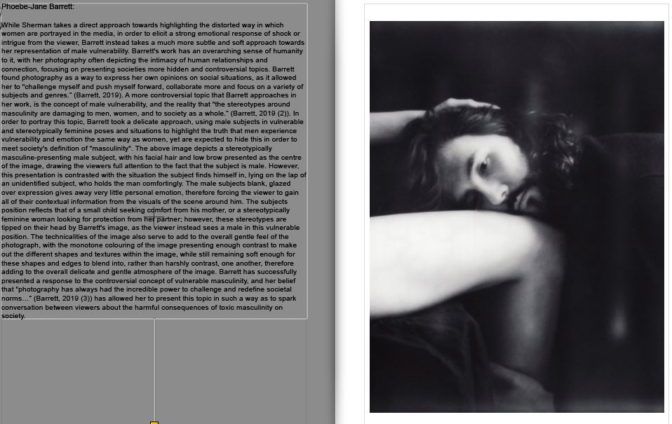
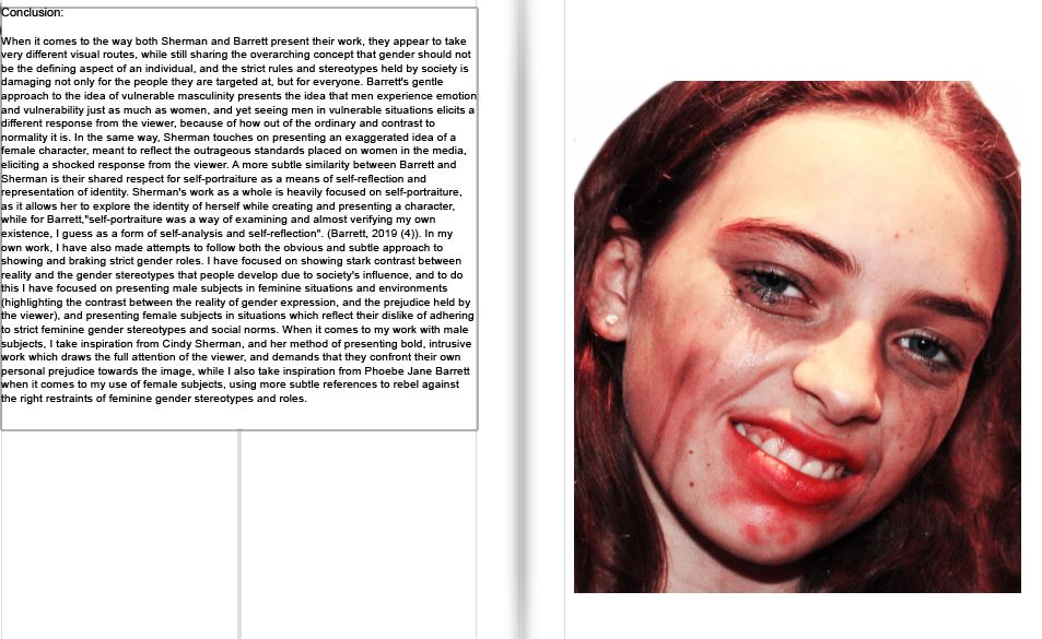
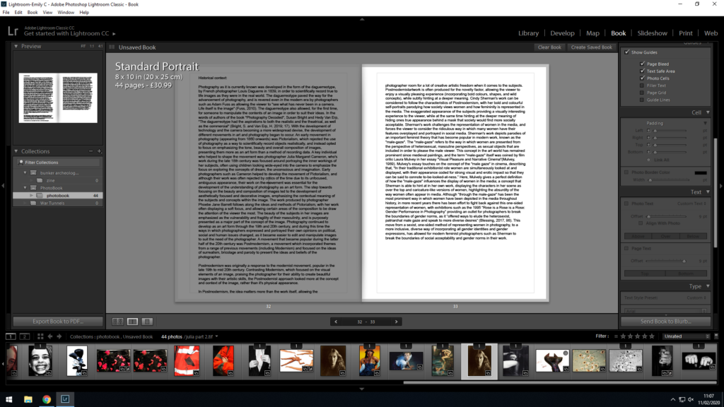
I needed to find a way to incorporate my essay in a visually appropriate and practical way, while not taking away from the main purpose of the book (the photos). In order to do this, I pasted the essay into Light-room, and from there I experimented with the placement of text, titles and photos that I would use to layout my essay and present it at the back of my book. My first draft of organizing and layout of the essay in my book was as below:

With this initial layout, I placed the essay in paragraphs, and tried to make sure each paragraph was written with a corresponding image on the page next to it, this way I could maintain the viewers attention, and give examples of the concepts and works that I was referencing in the essay. As my historical context paragraph was longer than the others, I gave that section of my essay a double page spread, and decided to include 2 images over the following 2 pages to present examples for the viewer to better understand the contents of the historical context portion of the essay. This double page of images also allows for a split in the essay after the 2 whole pages of text, therefore I find it important to add in order to split the essay into manageable chunks.
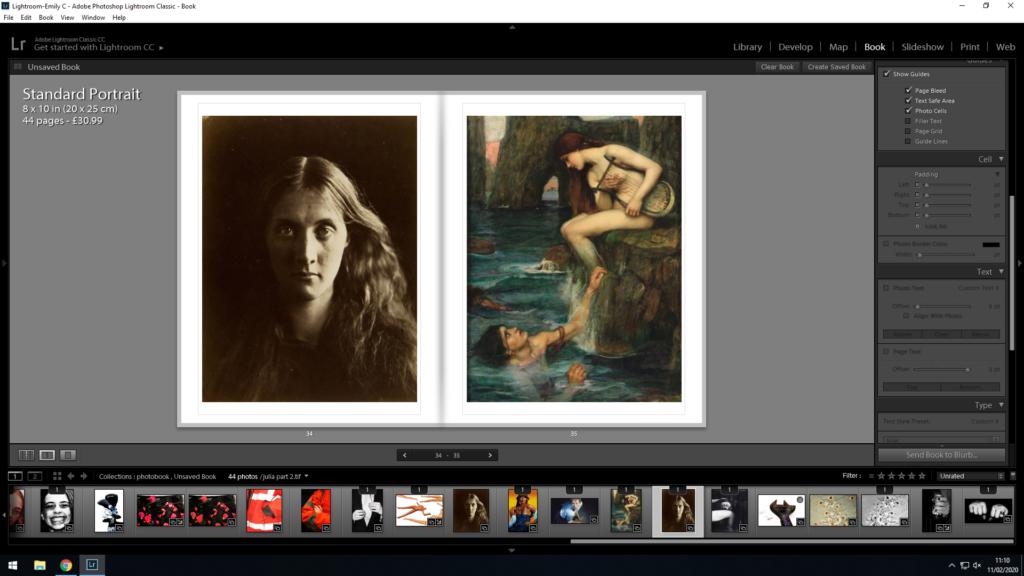
After placing my essay using the initial layout, I decided to restructure the layout so that it fit more flush with the pages, and the size was small enough to fit and work on the page, but large enough to be read without issue.

Firstly, I decided to keep the title at 12 pt, and move it into the middle of the page. I felt like this allowed for the title to stand out against the essay, and gave the reader a clear beginning to start reading. I differentiated from the title by placing the essay in 11 pt (a size large enough to read but small enough to fit on the page). Furthermore, I increased the padding from the left and right sides of the page to 26 pt, as I did not want the text to spill out into the gutter of the book (where the paper begins to bend over) as I felt that this would make it difficult to read.

I used the same 11 pt font and 26 pt padding across all of the pages with my essay on (to ensure continuity). I feel like this layout gives the essay pages more structure, and I am happy that the text does not come too close to the edges of the paper, or the gutter of the book.

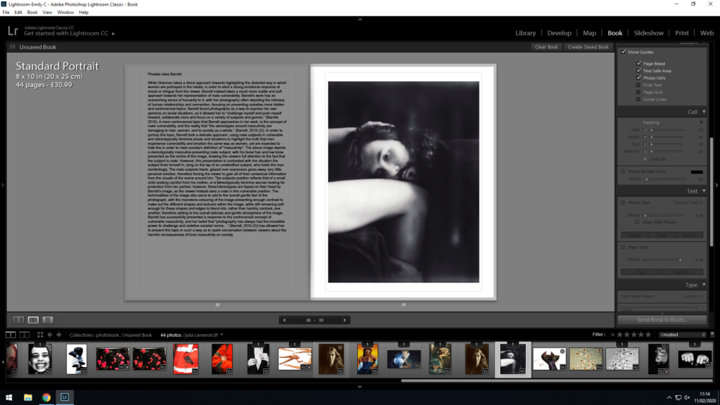
Below is the final layout for the essay portion of my book:

When comparing between my first and second draft, I fee like my second layout has a lot more structure to it, and allows the reader to navigate the essay much more easily.

Final Photo-book and EVALUATION

Preview: Flight of an Imagination

Above is an online display presentation of my final photo-book. ‘A Flight of Imagination’ is my photographic book surrounding the narratives of some of the folklore tales in Jersey, Channel Islands. Some of the tales date back hundreds of years and still showcase themselves in ways to the residents and tourists of this island in todays society. The book includes landscapes of the sights surrounding the stories as well as staged tableaux photographs which I went out and produced in order to tell these tales in a way in which showcased them still inhabiting the areas of the island. I split the photo-book in two, focusing on one tale in the beginning of the book and then moving forward to the next as I feel this made the most sense. I began each story with a starting image, heading off and leading into the story, the use of text in my book helped to elevate the stories most I feel, as the photographs need context to help make the narrative make sense so the best way I felt to do this was tell the story throughout the photo-book. For the first story I mainly focused on the landscape that surrounds the tale of Devil’s Hole, as it is something that brings a lot of locals and tourism to this specific point, now having a pub and cliff walk around the hole itself, I tried to create and include a small amount of tableaux photographs in this section however focused heavily on the landscape area. For the second story in my photo-book I mainly used and focused on the staged photographs, taking myself out and putting models in specific costumes to create these photographs, I wanted to tell a specific narrative with these photographs, the story specifically, although also using text to help add context to the photographs I focused on moving from character to character to create the story and narrative with minimal words. The use of the disposable camera in this section I feel adds a different touch to the photographs, they have a mystical hue around them which I feel works well with the subject of the story in telling it. I chose to have my impactful or important photographs larger and on double page or 3/4 page spreads as this makes them stand apart from the others. I decided to use some of the physical prints into the book to add a different effect to showcase the idea of these tales still being really in the island, to have them captured ‘on camera’ makes them seem more real and there I feel. I have ended my second story on a strip of negatives from the disposable camera to add a human, realistic touch, while displaying a subject which does not seem all that real. The essay, my personal investigation, found at the end of the photo-book, gives some context and insight to the lengths and extent that these images are influenced and derive from stories. I chose to place this at the back of my photo-book as I feel it helps to add some substance to my images more, it gives context into the idea of staged and tableaux photography and the idea of fact and fiction and where the lines are blurring of what separate individual people believe and how this also effects the outcome. This design has gone through many experimentation and trials to find the best way to produce and display the photographs, I believe I have successfully been able to produce what I aimed to of a book which displays the idea of stories and folklore tales occupying the island of Jersey, Channel Islands, I feel it has a clear narrative and I have been able to produce photographs that work well together and flow to clearing show meaning and narrative discussion.

Final Print Layouts

Here I have my final layouts for the print work I produced at the end of the personal investigation in relation to Occupation and Liberation. I chose and finalised on the specific layouts I did as I feel they all enhance and showcase the work well. Choosing to single out one large photograph against the black I feel works well with the particular image due to the colours and the forms in the image works well by itself as I do not have many like it. For my other photographs I chose them together as they work well in a sequence, telling a narrative together to create a larger picture to take from.

Final Book Layout

Below are screenshots of each page spread of my final book design entitled ‘Mr Ronald Welling and Mrs Welling’. As mentioned in my development blog post the title came about to show dominance and authority of my Grandad, Ron, through the formality of the title which can also suggest his business side. The photograph on the dust jacket is from their wedding day, suggesting the ideology of religion, family and happiness beginning the ameliorative mood of the overall photo book. My final book design can be viewed below:

‘Mr Ronald Welling and Mrs Welling’ is my photographic book which portrays the narrative of the occupation of lifestyle on my Grandparents, and how their upbringing in the 1940’s reflects their lifestyle in the modern day. The book includes mainly portraits of the two subject which shows intimacy, religion, family structure, authority and aspects of relationship which all cast the same underlying theme of lifestyle. In a sense the sequencing of the photographs are broken into three sections which are not explicitly sections. The first section establishes the couple, their relationship and the ideology of my Grandad being the provider for his wife and having the authority over her, this is presented through portraits inspired by Walker Evans, LaToya Ruby Frazier and some of my own artistic influence to compose the photograph. Within this section I have used archival imagery to present a compassion of their lifestyle when they were younger and present day allowing a more reliable reflection of their lifestyle. In addition, I decided to include one interior and exterior photograph which begins to reinforce the luxurious lifestyle they live through a new subject, reinforcing the ideologies of my project. The second section looks at family events and how my Grandparent’s lifestyle adapts, reflects and compares to my lifestyle. These photographs follow a family photograph style capturing the highlights of the religious event ‘Christmas’. The interaction between my Grandparents and my family, illustrate their lifestyle clearly at a major event. In the final section I mainly focus on the interior and exterior of their house through mainly landscape imagery. I also use more portraits to show my Grandad’s relationship with the specific rooms, creating semantics towards the imagery and reinforcing the idea of intimacy. For the majority of the time I have stuck to having just one image for two pages, using a single, 3/4 or double page spread. However, I have used up to two photographs over two pages if I need to emphasise a certain point. The photo book itself is a Standard Portrait, 20×25 cm. My pages will be white and printed on premium matte paper, as it makes the book seem like an official file. As stated above I will be using a dust jacket, meaning the actual hardcover of the book has not been designed. I intend to use a fabricated cover, subtle cover, as many family photographic books at the time they were raised was often this material, thus making it relevant and appropriate to use. The essay found at the end of my photo book explore the extent to which we can trust documentary photography to reflect reality, which follows the same path as the images found in my book. This presents viewers with the question of how accurately my images reflect my Grandparents lifestyle, adding a more academic response to the book. The essay includes photographs of artists work as well as my response to their work showing exploration and understanding of key theories within photography. To conclude, I believe the sequencing displayed above clearly illustrates my intended narrative which compliments my essay in response to my hypothesis. This well thought out design has gone through many experimentation and development in order to make the images powerful in the message they present as well as having a clear narrative which flows smoothly because of my sequencing of my photographs.

Final Prints

Final Print 1:

For my first final print I wanted to utilise the eclectic layout to illustrate my Grandparents lifestyle. After consideration I decided I did not want to use all of the photographs as I felt, that it became to chaotic and took away from my intended narrative. I decided to use the three interior images and the two photographs inspired by LaToya Ruby Frazier as I felt these images complimented each other to convey the ideology of lifestyle, authority and luxury. I decided to come away from the ‘randomly spread out’ idea and made it all lined up and straight in order to show more structure within their lifestyle. Personally, I really like the way the images compliment each other as they follow a similar simplistic composition, as well as conveying my narrative for the project.

Final Piece 2:

Using these two images almost juxtapose one another, however I believe it informs us a lot about my Grandad. They both hold the ideology of spirituality, the top image shows red wine which suggests the last supper and a common drink had within church services as it represents Jesus’ blood. Additionally, the photograph below is an image of intimacy showing my Grandad reaching out and praying to god. Placing these two images together clearly represents the ideology of spirituality, and therefore making it a successful outcome.

Final Piece 3:

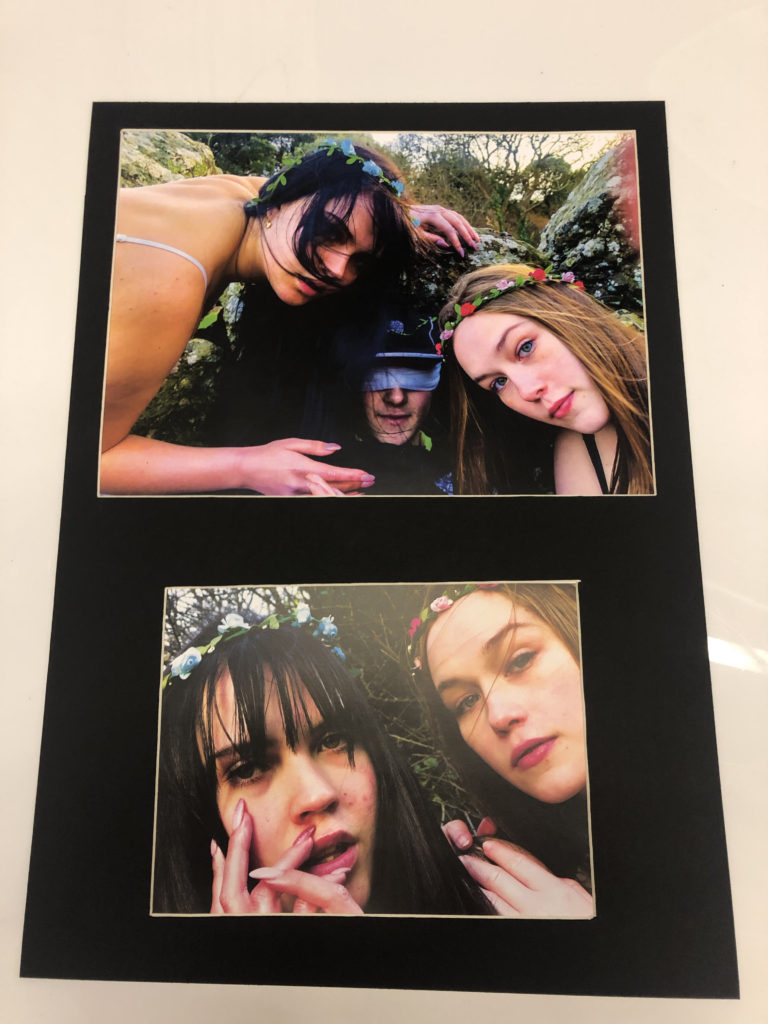
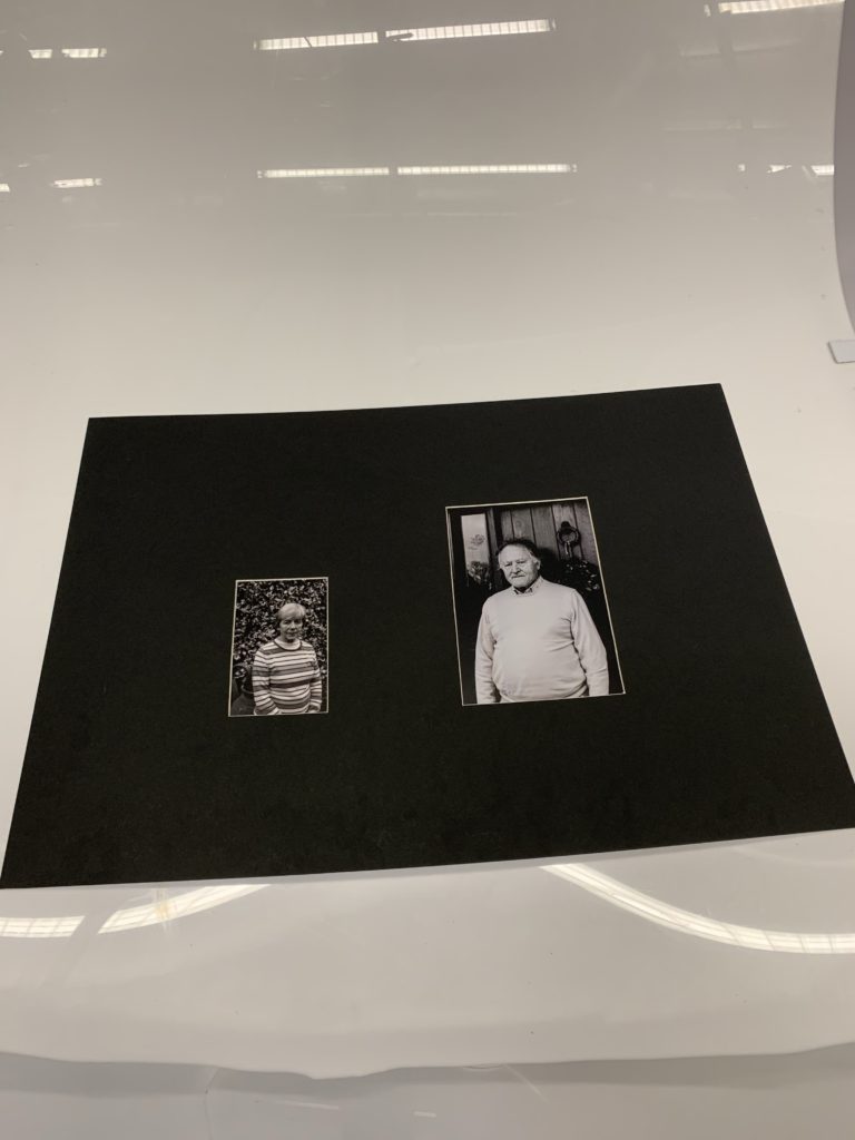
In my third final outcome I selected the two portraits, one of my Grandma and the other of my Grandad inspired by Walker Evans. I chose to use a window mount to illustrate the ideology of authority and family structure and hierarchy, as the portrait of my Grandad is larger in size, thus implying the conceptual representation. I really like the way in which they compliment each other through a similar composition as Walker Evans, as it suggests a relationship with the outdoors and their home, which showcases lifestyle. I believe this outcome is strong and clearly shows my narrative, thus making it successful.

Final Outcome 4:

For my last final outcome I chose to frame the A3 photograph of my families interaction with my Grandparents during a religious period in time, Christmas. The image is displayed in a black window mount, and holds an ameliorative atmosphere, as it explains how the two different lifestyles compliment one another. The photograph alone is structurally quite busy, thus making it effective on its own, as the monochrome composition allows detail and structure to be emphasised, reinforcing the happiness shown on the subjects faces. Personally, I really like this design as I feel it clearly illustrates the meaning of family as well as informing viewers about my intended narrative.

Evaluation:

To evaluate, I believe I have successfully selected some of my strongest imagery from the project in order to display my intended narrative within the project. I have creatively experimented with ways in which I could display my photographs, with showing a variety of methods, window mounts and stuck on foam board. The simplicity of the display allows the authenticity of my photographs to be up held. I have shown my ability to place ‘like’ photographs together in order for them to compliment and almost hold a mini narrative of their own which adds to my overall narrative. Therefore, I have successfully displayed my photographs, as well as being satisfied with my outcomes.