
Category Archives: AO4 Present Ideas
Filters
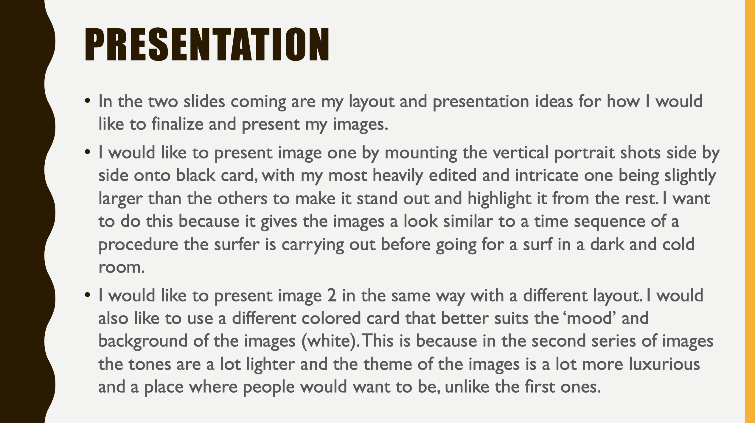
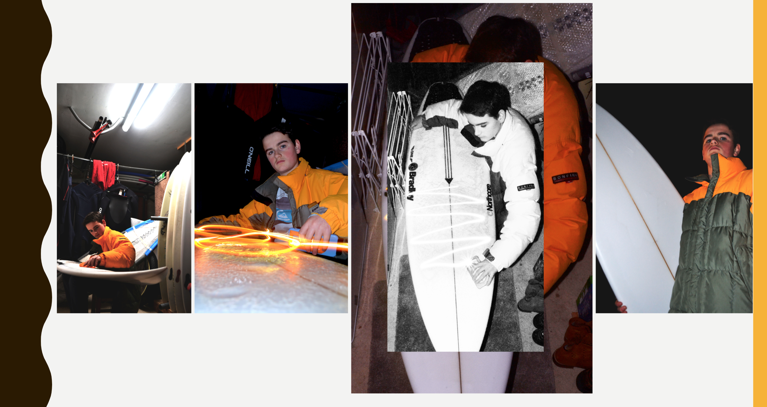
Mock Exam Post 6 Edit/Select 2
Mock Exam Post 5 Edit/Select 1
Mock Exam Post 5 Photoshoot 2
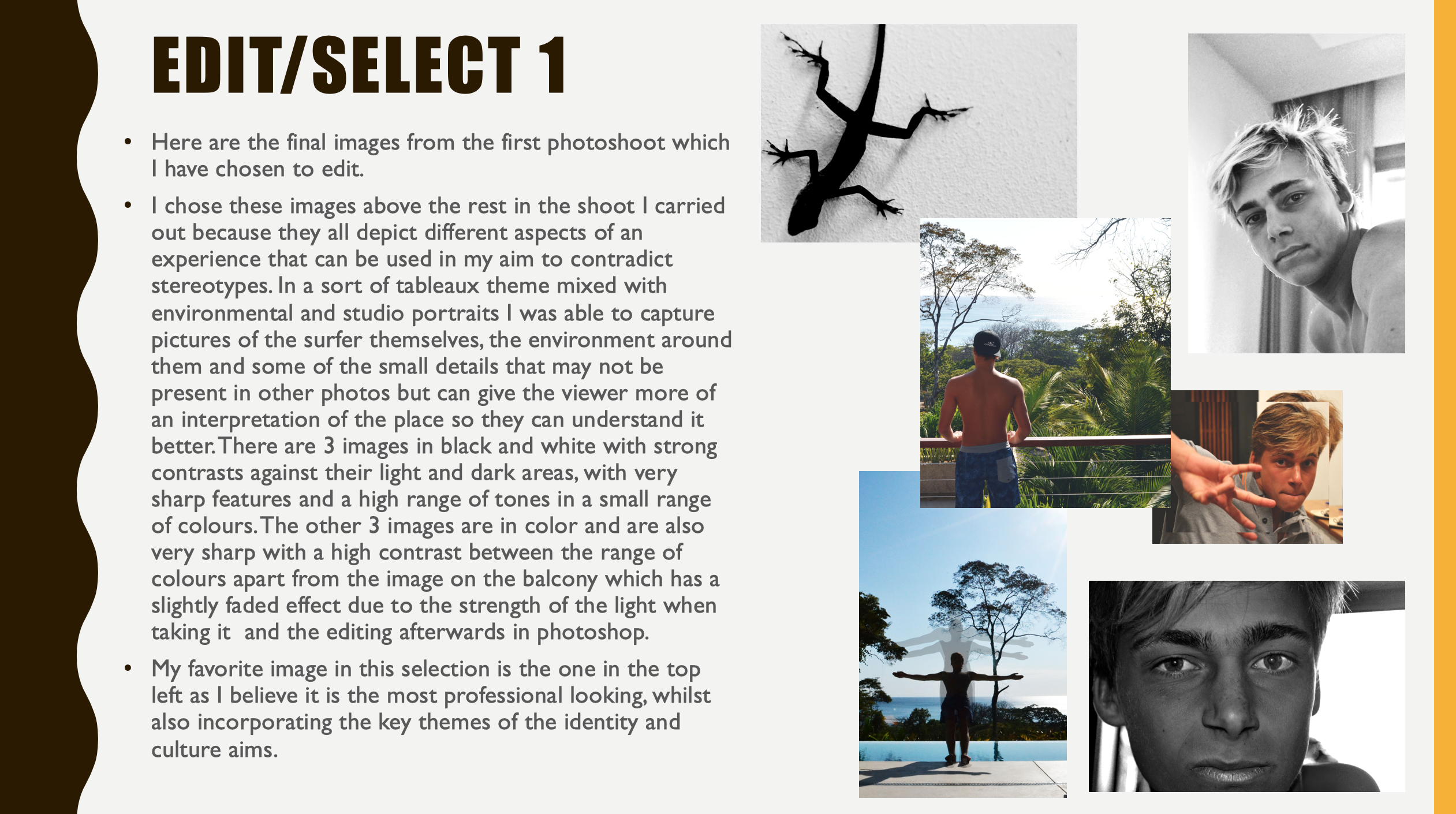
PHOTOSHOOT 2 –
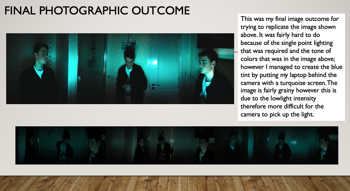
- Surfer in a dark room preparing equipment and outside early in the morning before he break of dawn in the cold ready to go and surf.
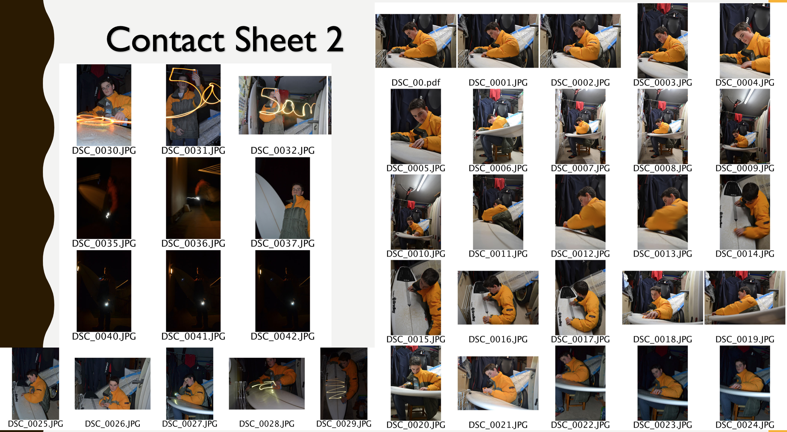
- This photoshoot took place at my home. The aim of it was to capture a surfer in a cold environment (hence the thick coast), who was preparing for a surf in an environment that people would not usually like to be in (e.g. a cold garage, outside in winter, a dark rom on their own). This was to highlight the commitment surfers have to their sport and equipment to keep it in check and combat the stereotype of them being typically lazy.
- Therefore the areas I chose to shoot in were in my garage and outside my house. I captured my images in these places because they provided areas of low and dim lighting, whilst also being areas that are cold and require thick clothing to keep warm. They are also areas that people usually would not enjoy spending long periods of time in, therefore by photographing my brother there, they can relate it to similar environments around their home and it gives them an almost personalized knowledge of the dedication of the surfers spending their time there to continue with their sport.
Mock Exam Post 4 Photoshoot 1
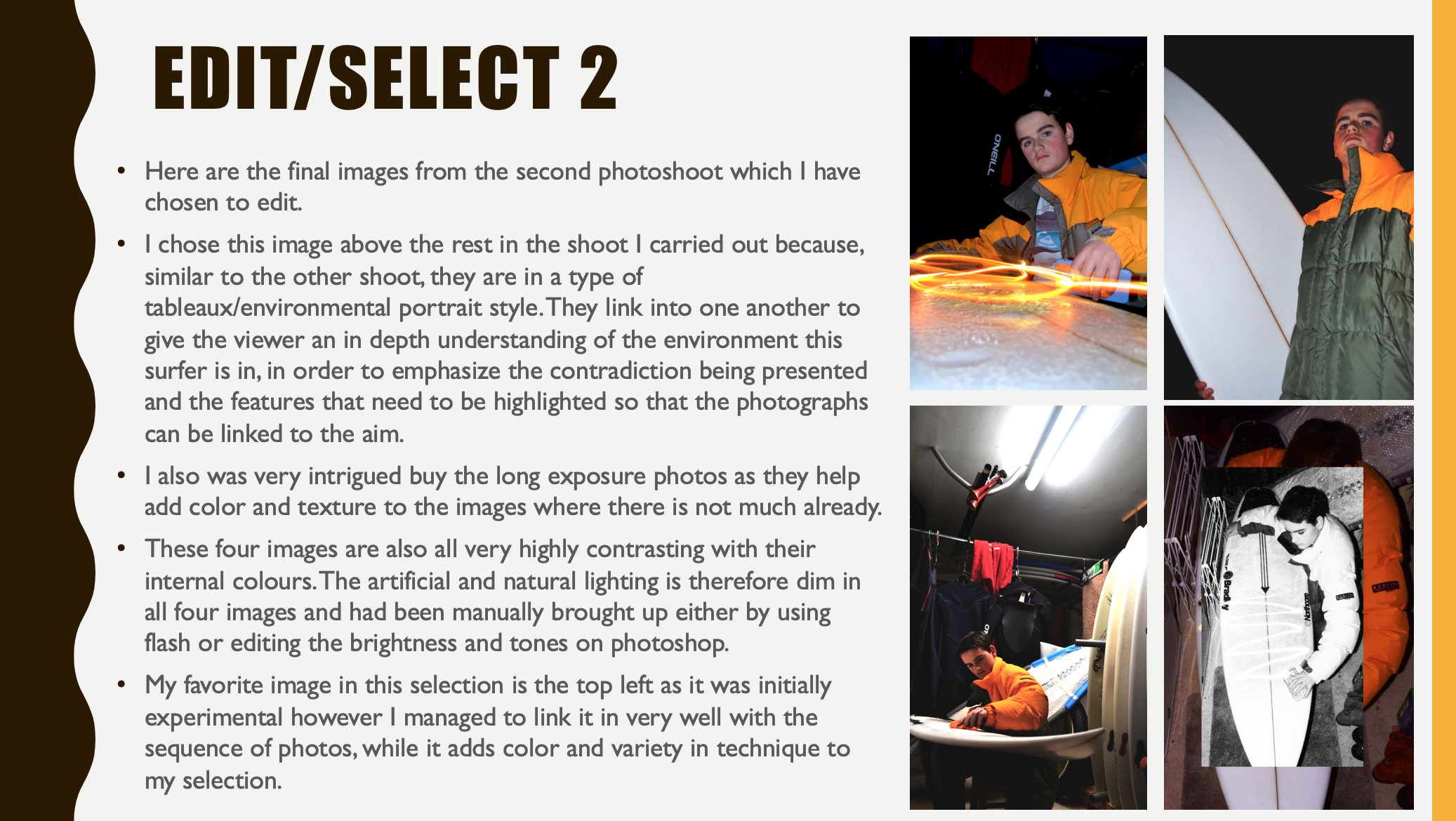
PHOTOSHOOT 1 –
– Surfer in luxury accommodation
- In this photoshoot I was aiming to combat the stereotype of surfers being poor and scruffy. Due to the old nature of the sport, surfers are stereotypically beach bums who live out of their vans and don’t give much to personal appearance. Which is why, to link my project to identity and place I am combatting this stereotype by showing the surfer combating the stereotype as the identity with personal appearance and the luxury villa contradicting the stereotypical place.
- The areas where I chose to shoot in the villa, were places where the light was strong, there was vast amount of scenery and great views (meaning mostly outside) and in minimalistic areas for example, where the colours were plain so the colours of the object or person I was photographing would stand out and in places where the architecture was very prominent in the photograph. This added some depth and tonal range to the images as well. However, I think the best images were created when I wasn’t focusing on where I was shooting but what I was shooting as it allowed me to properly think about the techniques I had learning and camera skills which would help me capture the most effective image instead of worrying about cramming all different things into the photos.
CONTACT SHEET:

Portrait Project Final Images


Photo Montage – My own response

My Own Response to Tableaux


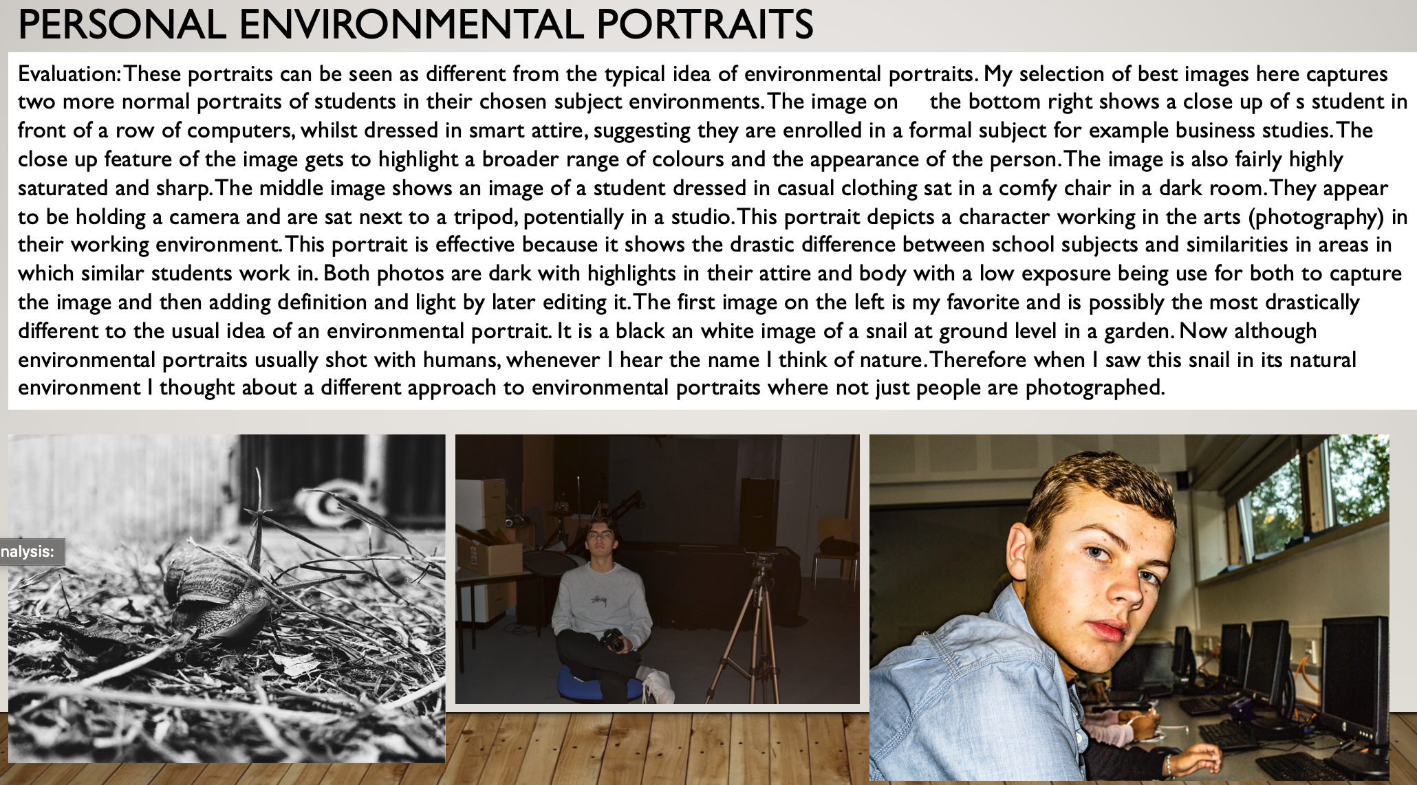
Environmental Portraits Post 2
Identity & Place Project Evaluation (mock)
concept
Throughout my mock exam finals I aimed to keep all of my images together whilst also making sense as individual edits. I wanted to take inspiration from Steve Rosenfield in terms of concept, as in his 'What I Be' project, people opened up about their 'secrets' and insecurities, and through my finals i told a part of my story, which was also a 'secret'.
I wanted to tackle stigmatised issues such as emotional abuse and mental health because these are both topics that I feel extremely strongly about, and they're not usually spoken about openly, this only increases the stigma attached. I personally believe that if someone is experiencing either of these they are automatically labelled an 'attention seeker' or 'liar' and ultimately stop talking, they feel alone and this leads to the loss of identity, the feeling of not being able to get better from it, not knowing who you are, or what your purpose is.
Through my finals I wanted to get across the message that you WILL get better, and it won't last forever.

I personally feel like I was successful with my thoughts and ideas for what I aimed to do with this concept. I think I did this because I had 5 finals, the first was the beginning of my story, the second related to the emotional abuse and the feelings of loss of identity that came with it, the third was the 'invisible wounds' or affects that ARE suffered as a consequence, and the fourth and fifth represented the support available and recovery and moving on. This showed that although there may be a very negative beginning, there can always be a positive ending.
visual
For the editing and visuals of my finals I took inspiration and was influenced by Barbara Krugers work. Kruger is known for her heavily cropped and contrasted black and white images, below a thick red border, with red text boxes for her bold, white writing to lay on top of. I edited my text this way, however had a few differences.
In Krugers work she used the same font for all of her text, I did not do this, I changed my font to emphasise words, I also used fonts that I thought were more appropriate, for example, in my first image, for the word 'eight' I used the font Comic Sans, I did this because this is a font that I've always associated with primary school.
Also, Kruger does not incorporate any colour into her images, and in my final, final piece, I used the history tool in Photoshop to bring Katie back into her original, unedited state, back into colour. I did this because this was one of the images representing getting better, and black and white photos are often associated with sadness, and this was not a sad edit.

Overall, I'm happy with how my edits presented as finals once edited. I think that they were so eye catching whilst also getting across an important message.
