Category Archives: AO4 Present Ideas

Filters

Author:
Category:

CUT AND PASTE PHOTO MONTAGE EXERCISE

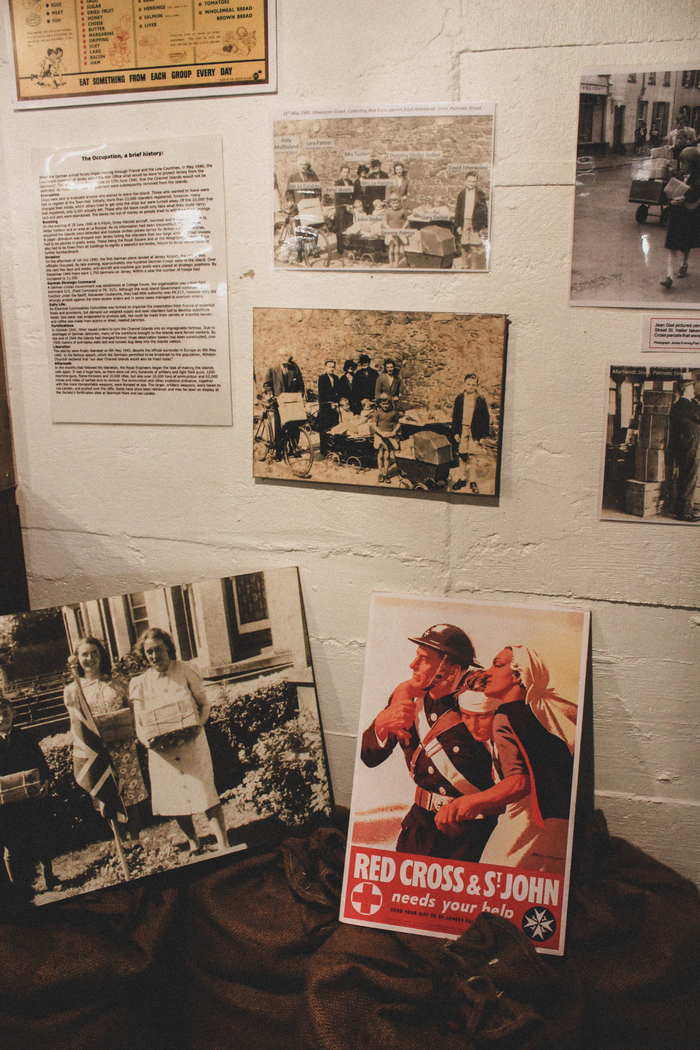
I have decided to experiment with the photo montage technique for potential use in my long term project. I have incorporated my own images and combined them with archival imagery to create strong and powerful motifs representative of life in Jersey during the occupation. I have used the traditional approach of physically cutting and pasting images with craft knives and glue. I am looking to tell a story through each image by using photos and images that are relevant to one another

Images

Here are my edited images. All have been cut and paste together by hand and during this process, I have been looking at ways of making the montage both interesting and informative, for example for the below image, I used an archival image of a group of young Jersey men, whom assisted in the building of multiple German fortifications. In the second image I have utilized the front page of the JEP newspaper as a backdrop to a German radio tower. The newspaper cover contains a notice on it regarding the allied invasion of Normandy, and it is a message from the German commandant to the islanders warning them that if Jersey were to be invaded then resistance/ co operation with the allies would be punishable
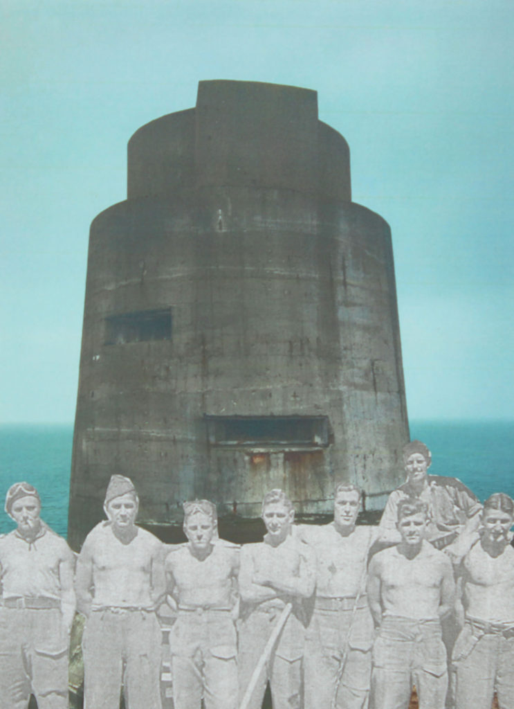
In this image I have chosen to cut and paste a group of male workers over the top of the Les landes radio tower. I chose the photo as it is providing us an insight into the faces of the real men who were forced into creating these structures.
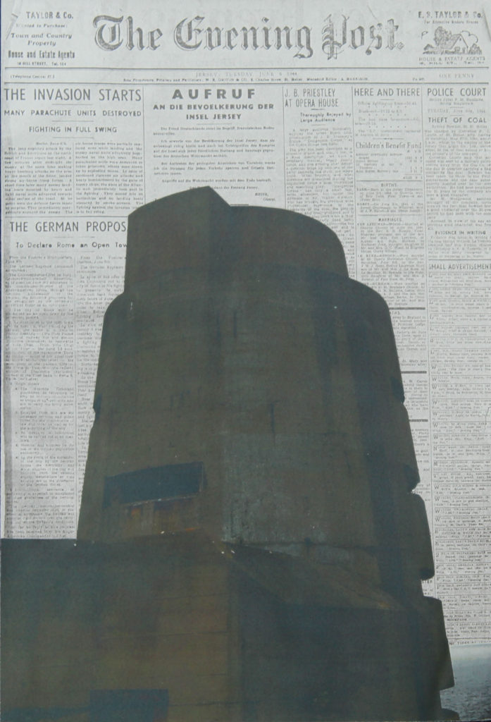
This image is my favorite image I have produced. I have cut out the outline of the Les Landes radio tower and pasted it over the top of a copy of an original JEP front cover from D-Day. The newspaper article itself is essentially German propaganda as it is stating that many parachute units have been destroyed and the article also states that the Germans are successfully pushing the allies back into the sea, which wasn’t the case. This propaganda was used to lower morale in islanders in order to keep them under control and create less chance of an islander led rebellion.
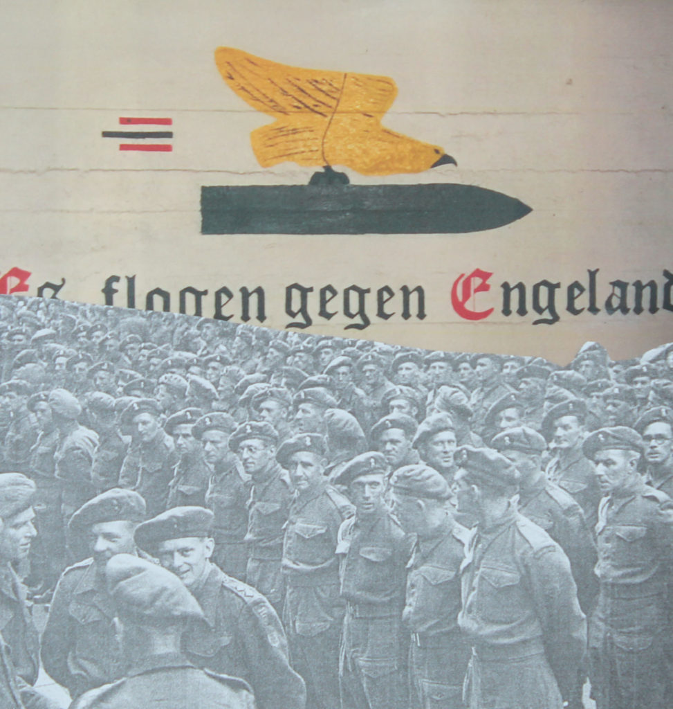
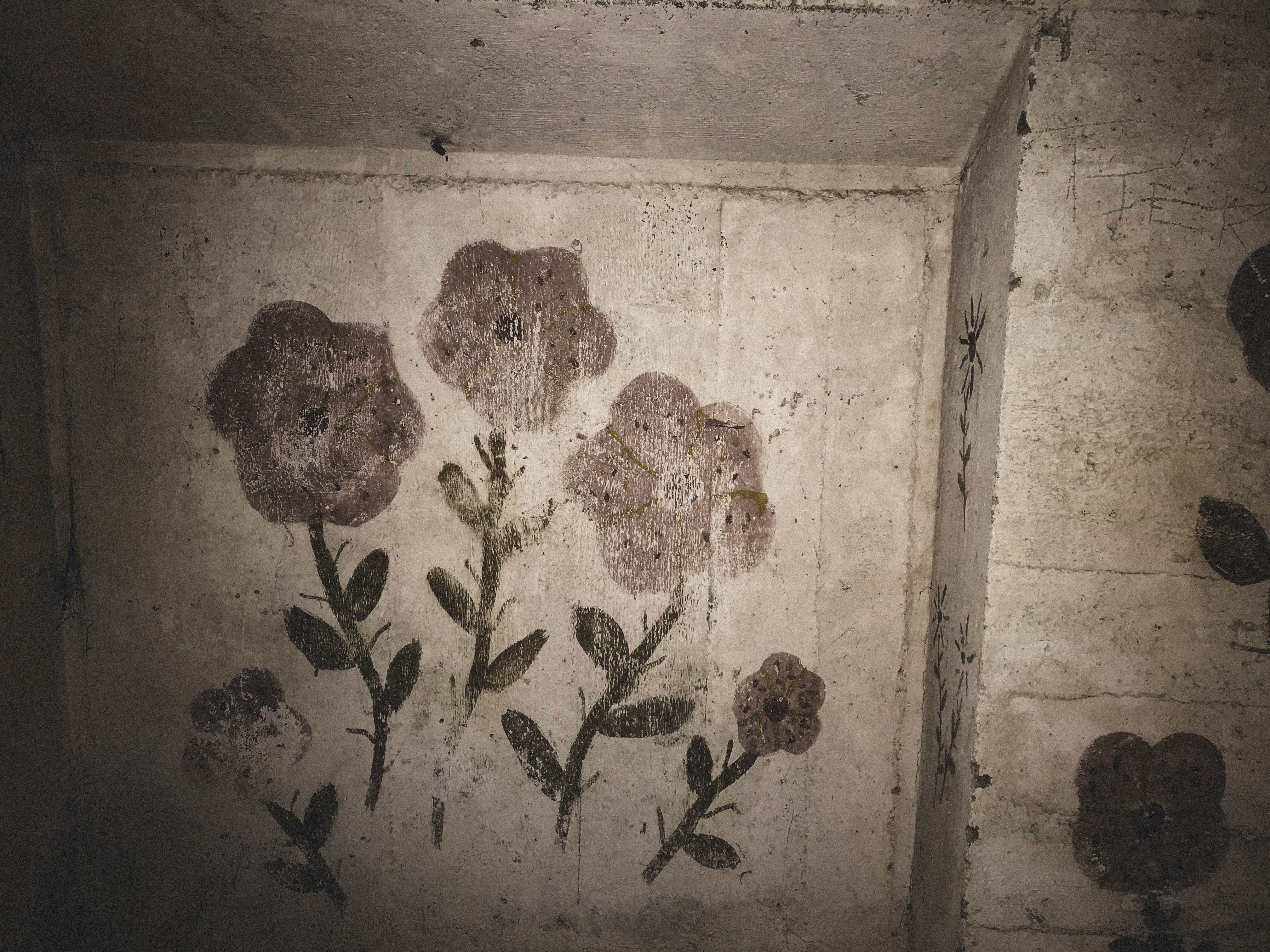
This image incorporates German bunker art in the batterie moltke bunker system, with an image of the first allied military service on the island after Liberation. The bunker art depicts an eagle atop a bomb with the caption translating to “It will fly over England”,meaning that the eagle which is a metaphor for the German Luftwaffe will have aerial superiority over the skies of the mainland. It was painted in the bunker most likely to boost morale and used as a form of propaganda. I have decided to superimpose the image of the allied military parade over the top of the bunker art, as the image of the allied parade is representative of triumph and victory, and also due to it being layered over the top of the image, represents allied superiority.
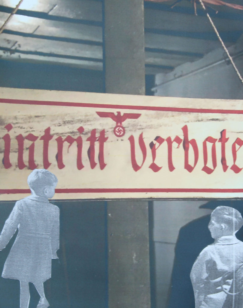
In this image, I have chosen to utilise a photograph of a German signpost, which translates to “entry forbidden” and I have incorporated images of young children from the occupation into the image. I find it quite a powerful image as for some of these children growing up, they would have seen the occupation as rather quite normal as they may not have had much experience of freedom and liberty before the occupation. For children that may have experienced life before occupation, the process of going from total freedom to living under Nazi rule must have been a very confusing process. from freely roaming through country lanes to having restrictions on where they could go and play must have been confusing beyond comprehension for children and young people

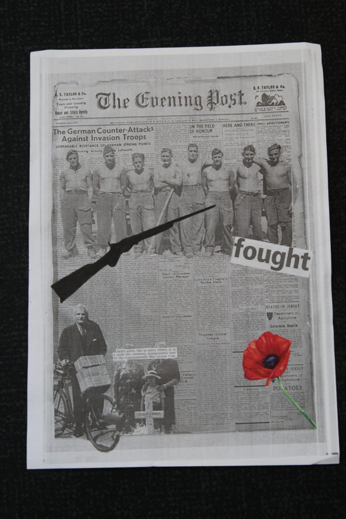
Final Montages

My first montage I created was a paper version. To do this montage I gathered together different images that the JEP had printed in the newspapers from the occupation in Jersey so I could insert an image into my zine that has a connection to my life and its history. I create this I started by brain storming different ideas and came to conclusion that I wanted all my images in black and white to add a older feel to it. After picking my background, which is a page from a newspaper during the occupation in jersey which has a few standout words which I thought would bring more to my montage. I found an image of soldiers during some recreational time during the war which I decided to place towards the top of the background and adding a bold word in text which is too the point but makes it seem dramatic. I then added a few more images I found, one was of a man who was collecting his belongings before being evacuated and the other was of a family who had lost their sun, husband and father, along with this there was a piece of text next to this image talking about a soldier who had died so I cut that out as well and stuck it over the family. I then decided to add a colored image in of a poppy, which shows respect to the soldiers as the poppy is what is used during remembrance of service men and women who went or were involved in war. I then finally finished my montage buy using a cut out of a gun and coloring it in black, to just show the silhouette of the gun, to show a bold representation of what used i the war and it adds an emotion of respect and pain towards the people who were involved.
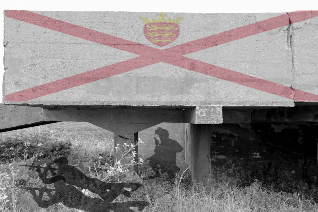
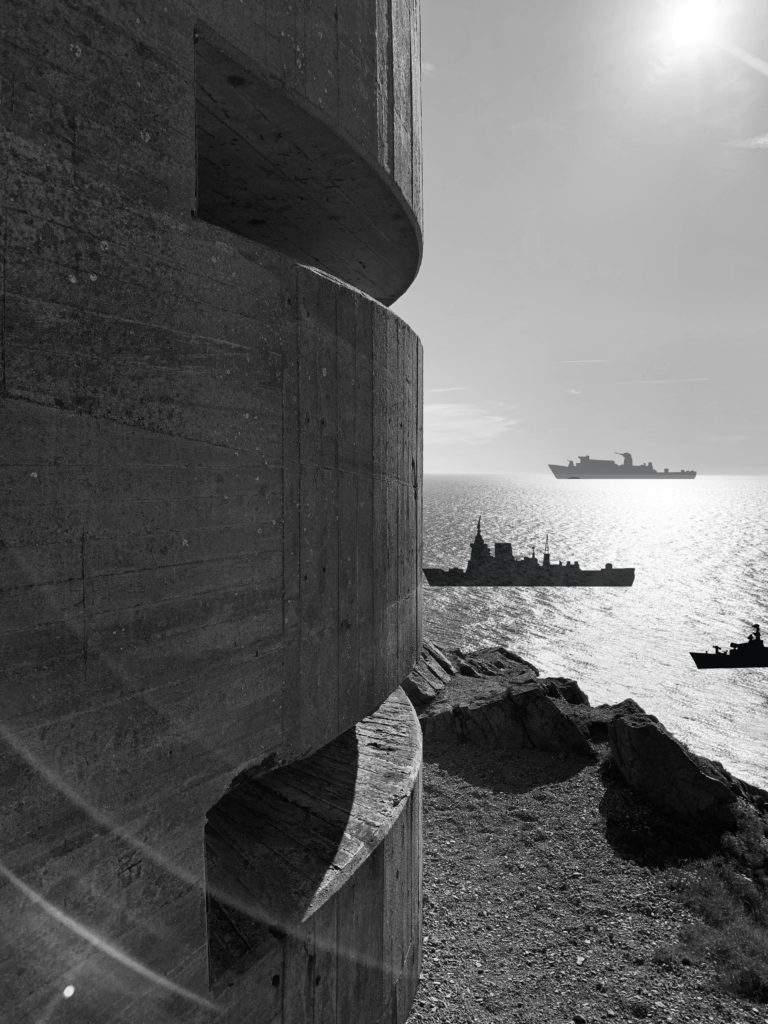
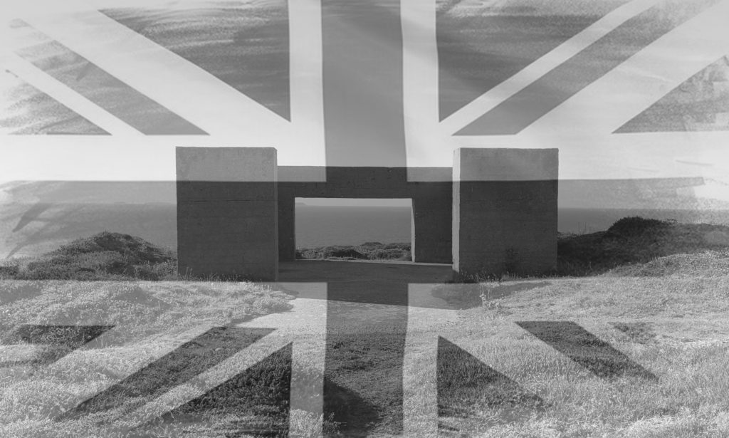
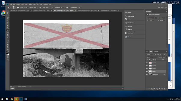
My second montage was created on Photoshop. I used an image I took when photographing bunkers, I then proceeded to add images of silhouette of soldiers and the Islands flag. I reduced the opacity of the soldiers as they are now a memory, they are acting as spirits for the people who fought in the wars for our freedom. The image acts as a piece of remembrance and respect.
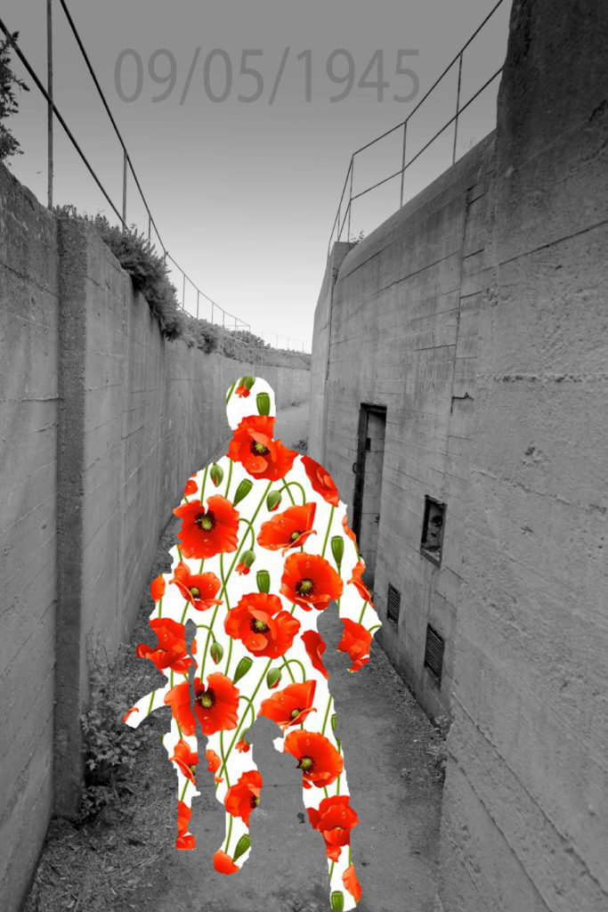
Again, similar to the image above this montage I created stands as a means of respect and remembrance to the soldiers who didn’t make it to liberation day in the Channel Islands. The poppys add emotion too the image, making it more touching for a viewer to look at, as they know the sign and meaning behind the poppys.

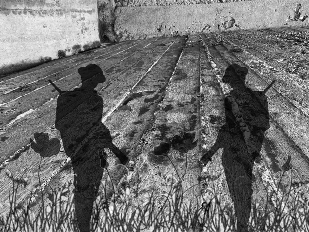
My meaning behind my final montage, is to show respect to those who lost their lives for us, but using an image of a veteran grave yard, where everyone who lost their lives during WW2 was buried so we could all honor them together. What is very touching about this graveyard in Normandy, France is that some of the crosses don’t have names on them as soldiers where unrecognizable. I added the wall of names over the top of the images to show respect to the people who had been lost in action and where never found, this also adds a more touching emotion to the images and allows for people to make their respect to the people. Finally, but adding in two soldiers in blacked silhouette and turning down the opacity holds a gut wrenching feel and created a desolated feeling amongst us as the soldiers are creating a ghost like figure. I am thinking of place this image at the end of my Zine to create an everlasting effect of the people who look at it as it is the last image they see but one which holds the most meaning and emotion, it is also symbolizing the end of the war, so with this image as a full bleed over two pages will really finish off the Zine and images will be in the same order which everything happened during WW2 and the German Occupation
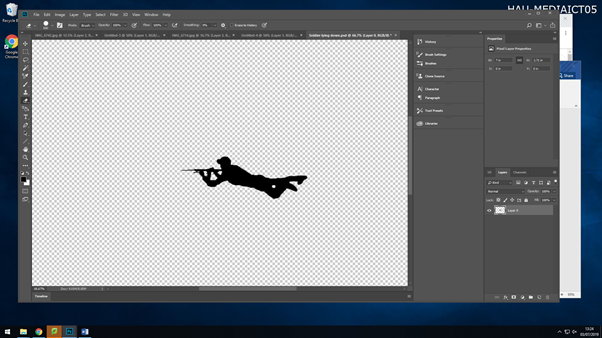
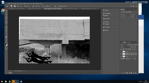
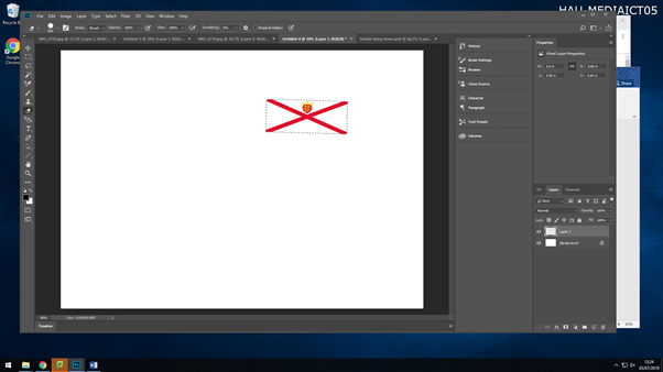
Photo Montage

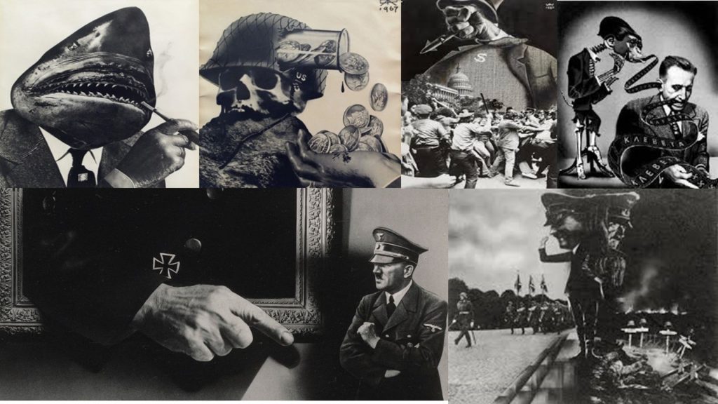
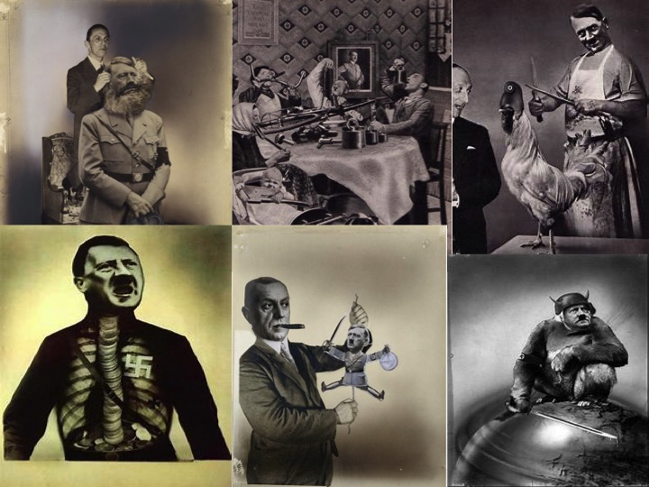
During the occupation and world war 2 many montages where made as posters, and where put up around villages and towns which had been invaded. The montages gave off messages to people and also governmental issues. There were many photographers and artists who have made montages based on the war. Two artists who I came across where Aleksander Zhitomirsky and John Heartfiled who have both made montages on the German occupation along with different wars. I like their work as it is simple yet effective as it is putting accorss a strong message to society.
Aleksander Zhiyomirsky was a Russian photographer who was boring in January 1907. After studying in Moscow he went on working as an illustrator and began making posters for magazines. Shortly after people began to realise what photo montage actually was and started to value and respect his work. Most of his montages would come from different types of culture he would experience but mainly the Soviet mass culture. After WW2 he began to find many photos based on the war and started putting them together, to show history in a different way which may have a everlasting effect on people. After this his work was published throughout Europe, Russia and the USA and it is still being viewed up to this day.

John Heartfiled was a German visual artist who was born June 1891. He was one a small amount who used art as a political weapon, such as his well known montages includes of anti-Nazi statements. His work appeared on many magazines during the time of the war. During his time making his montages, he had to flee from the Nazi’s on many occasions and had to leave his family.

After being inspired after looking at these artists, I then began to picture and have ideas on what I wanted to produce. To create my montage, I found photos of images that had been taken back during the German occupation in the channel islands and used them to create my montage, so that it what have a bigger meaning and relate better to me. After picking the images I wanted to use, I began to cut out the sections of images that I wanted to stick onto my background, which was a copy of an old newspaper. I then places the images on top and arranged them how I saw fit. This is my final product of my montage I created.

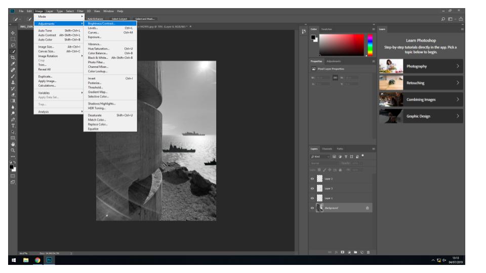
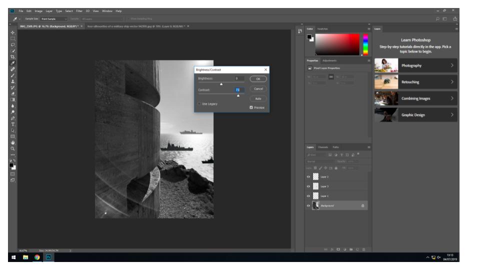
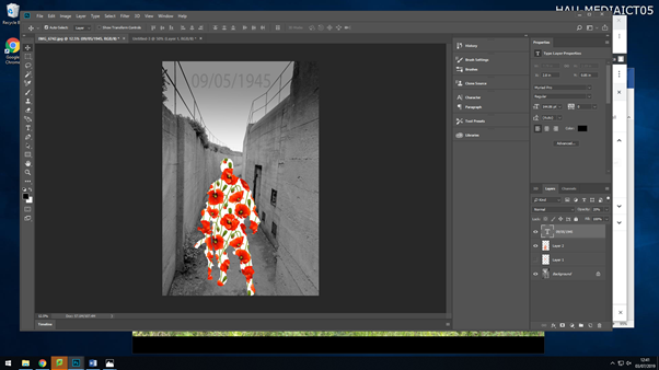
After creating a paper base montage, I then moved on on to creating montages in Photoshop, which I preferred, this is because I could use more images, and select parts of the images with more precision. For the first montage I created, I wanted it to be simple yet effective. This is what I created and these are the steps I took;

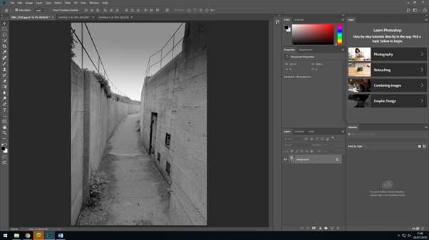
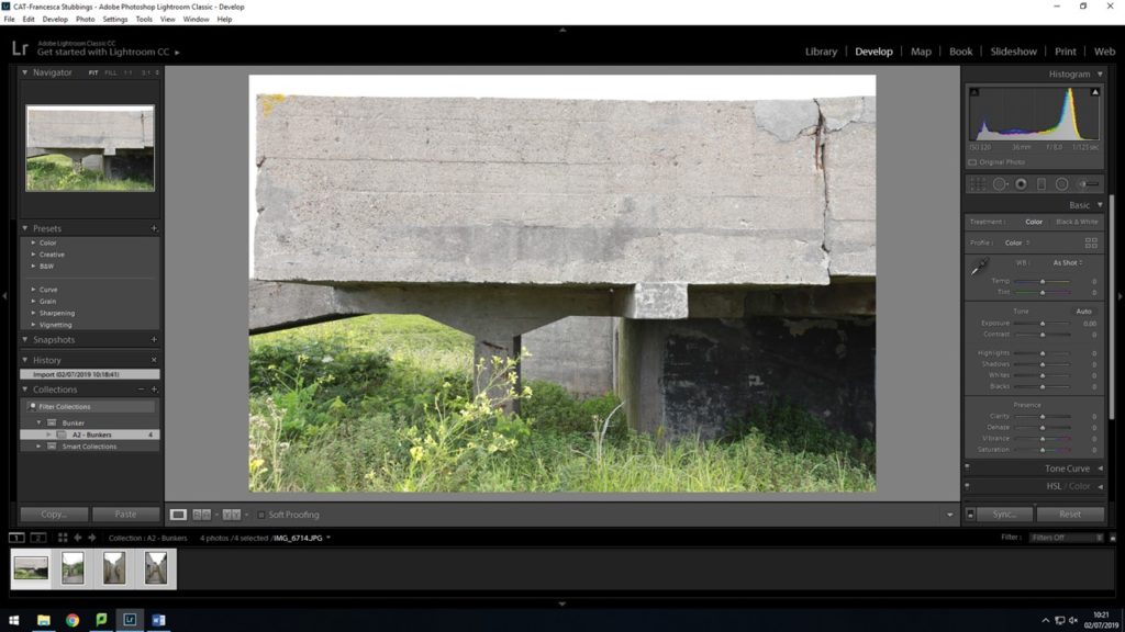
I firstly started off with my original image that I had edited in lightroom, in the previous lesson.

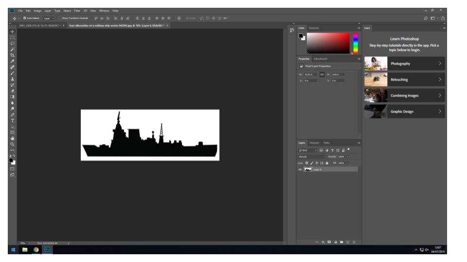
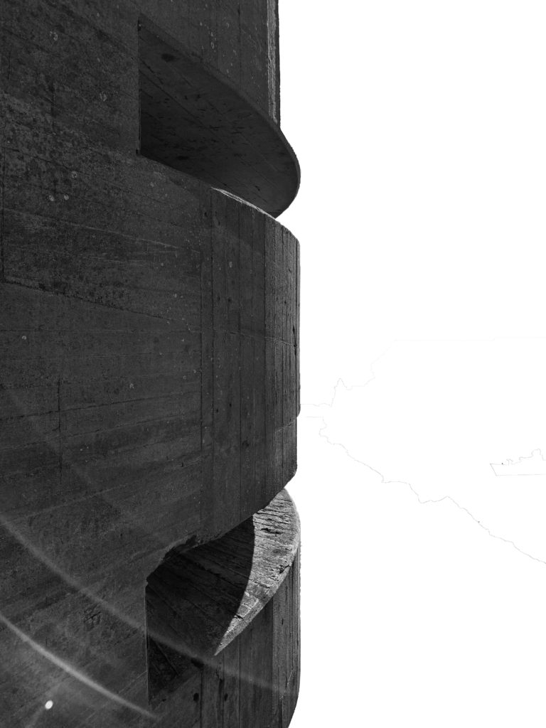
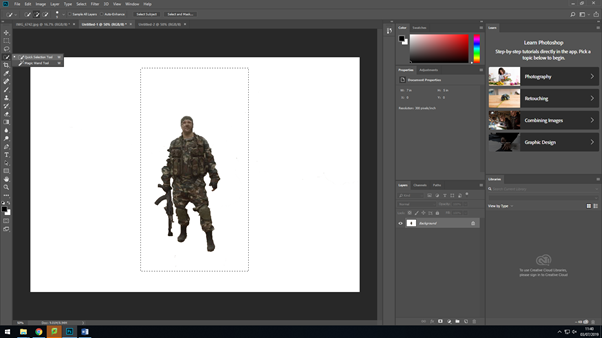
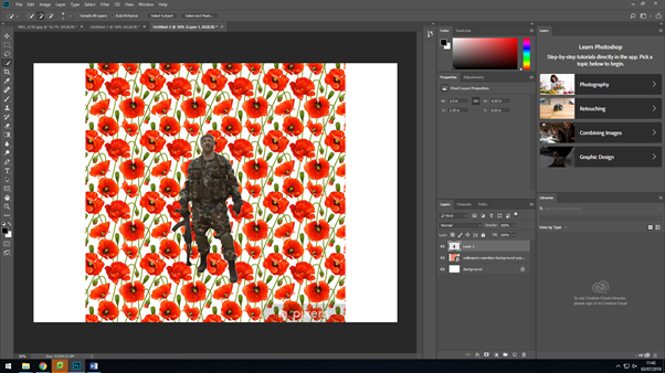
I then went on and opened up a new canvas in Photoshop, where I added this image of a soldier. I then used the ‘quick selection’ took and the ‘eraser’ tool to then remove the original background of the image.

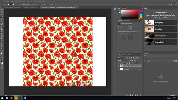
After editing the background of the previous image, I went on too add the image I was going to make the silhouette of the soldier out off, by adding a new canvas again.

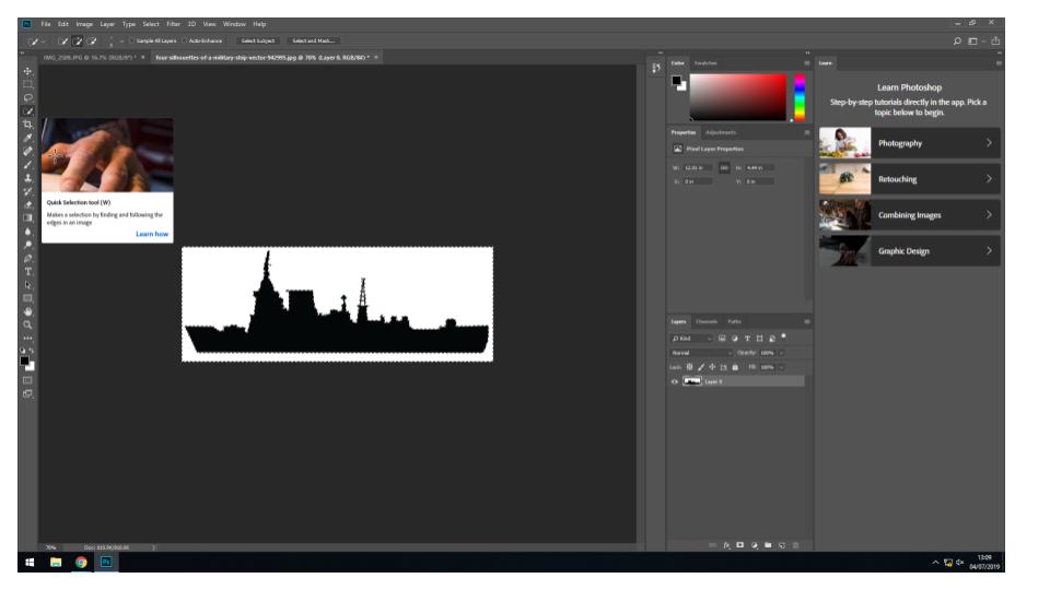
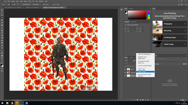
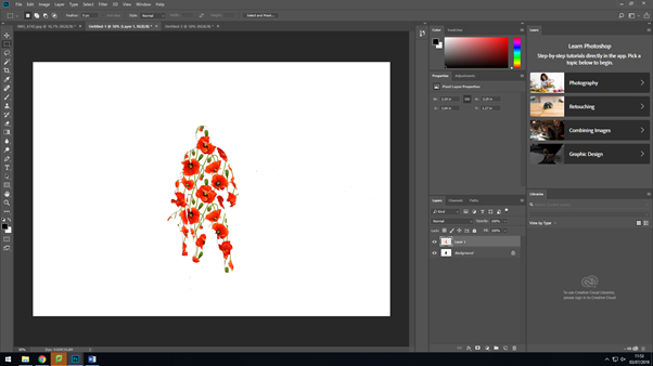
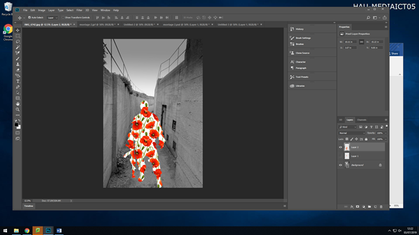
After dragging on the solider to the poppy background, I then selected everything by using the ‘magic wand’ took, I then made sure that the settings were set to ‘invert’ this is so that the background would change and come onto the outline of the soldier after this I then flatten all the layers together to make it one image.

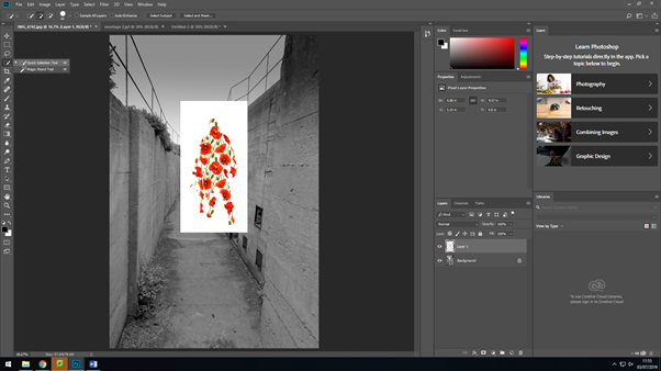
I then selected around the solider after flattening the layers and dragged it over to where I was making my montage. I then used the ‘quick selection’ tool again to removed the white background around the solider, so that I would just have them on their own. After doing that, I saved the soldier as it was, so then I could use it for any other montages I would make, so I would’ve have to remove the background again.

I then placed the soldier where I wanted it, by ‘Ctrl+T’ and then holding down shift whilst making the image bigger, this is so that everything stays within proportion of itself.

After moving around the soldier, I then went in and added some text to the image. After typing it in, I changed the text to black, made the font size bigger so viewers where able to read it at a glance, but then I changed the opacity of it, as I felt with the text being at 100% opacity, it was drawing attention away from the main aspect of the image. This is what my final first montage came out to look like;

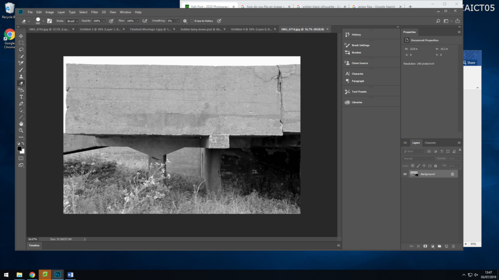
My seconded montage I created, was completely different to my first one, I wanted there to be a relation and link to the Jersey Occupation in this one. This is what I produced and the steps I took;

As before I have started off with my original image, this image is my background for my montage.

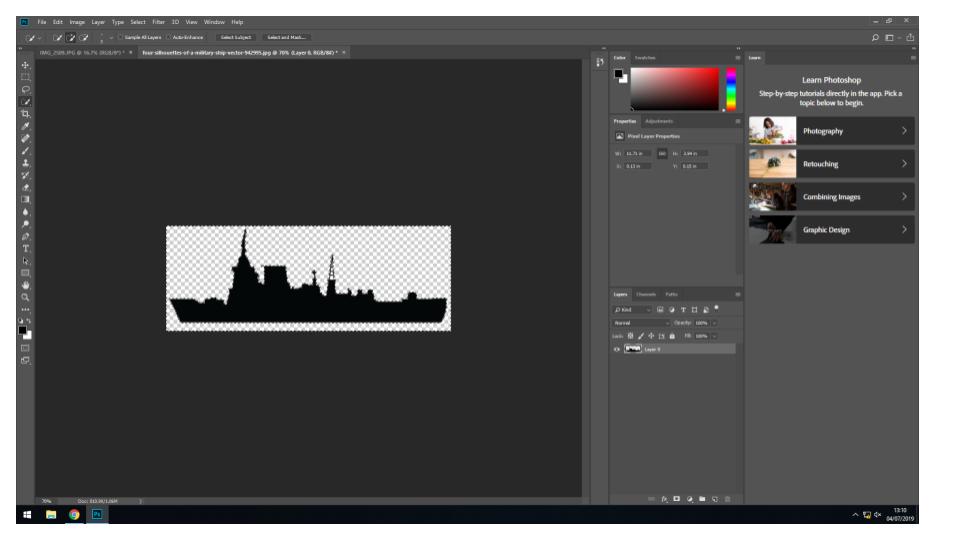
I then created a new page, and added on a black silhouette of a soldier lying down with their gun, I then deleted the background with the ‘quick selection’ took and then saved the image as a PNG so I could then use again if I needed too.

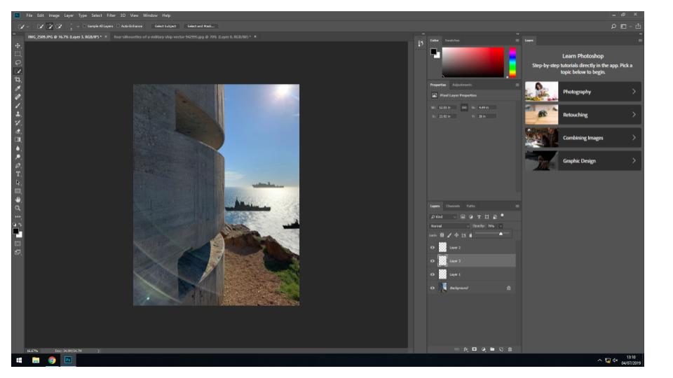
I then dragged the image onto my background twice and enlarged them by selecting the layer they were each on, going ‘Ctrl+T’, then holding down shift whilst dragging the image outwards to make it bigger whilst keeping the proportions the same.

I then went in on downloading an image of the Jersey flag, as this allows people to connect to the image more as you have something relating to you which also defines you. I also then added this to my background image.

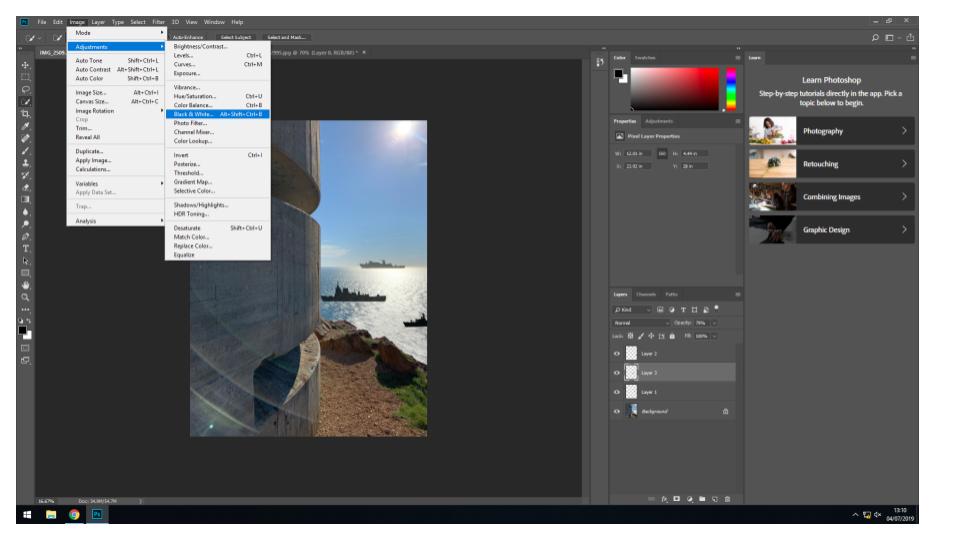
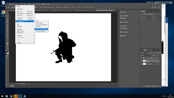
I then decided to ass another silhouette to my montage. But after downloading the image I realised it was the wrong way round for where I wanted to put it. So by selecting the image then going Image>Image Rotation>Flip Canvas Horizontal,I got the image to flip to the side I needed it to be. I then again removed the back ground, saved it as a PNG and then dragged it onto my background image.

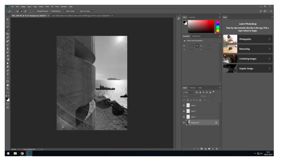
After adding all my images to my background, I then went ahead and changed the opacity of each image, to give it a shadow effect. I changed the opacity of the soldiers as they aren’t alive anymore, so they are representing ghosts.

This is my third montage I created on Photoshop

In this montage I have used a war graveyard as the main background, this graveyard were for soldiers who fought in world war 2, as the German occupation happened during world war 2, so their is a link between the two. I then added a black silhouette of two soldiers walking, and lowered the opacity, so they are acting as ghosts walking around their fellow soldiers who lost their lives. And to then finally finish it off, I added an overlay of people who lost their lives in world war 2 and the occupation, I placed this over the full image, and lowered the opacity again, so you could see the image through it, this gives the image a touching emotion.

Lightroom

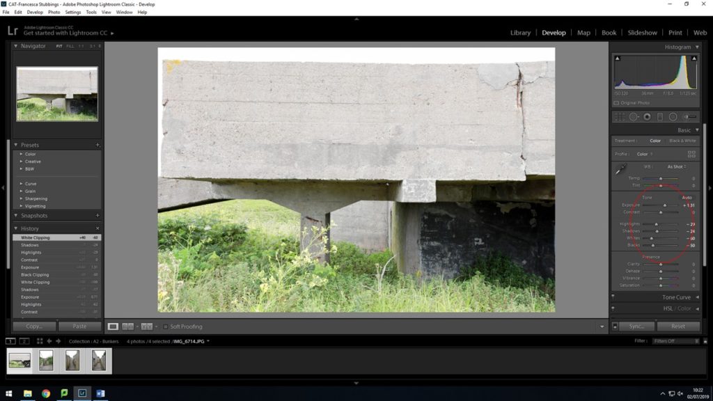
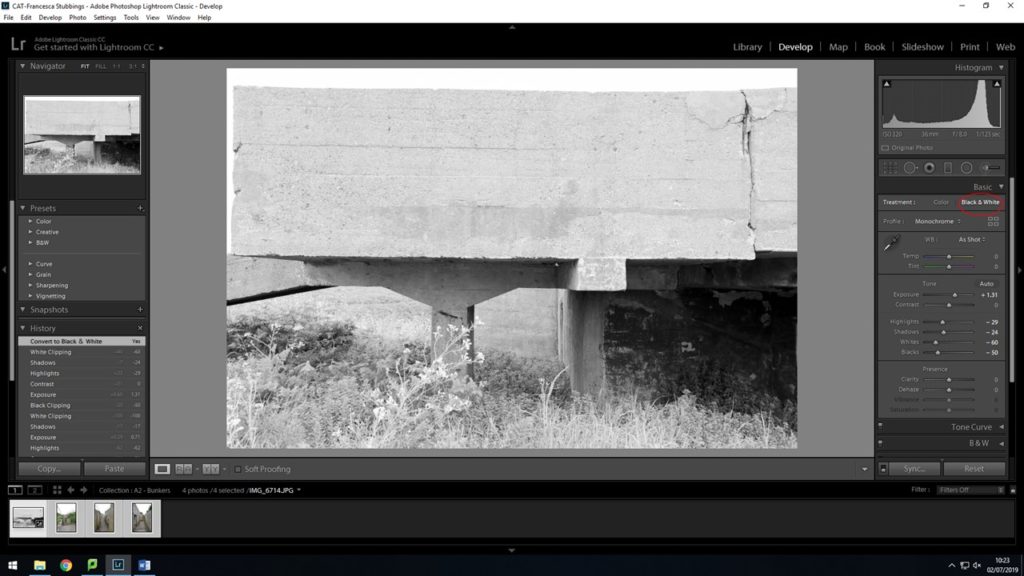
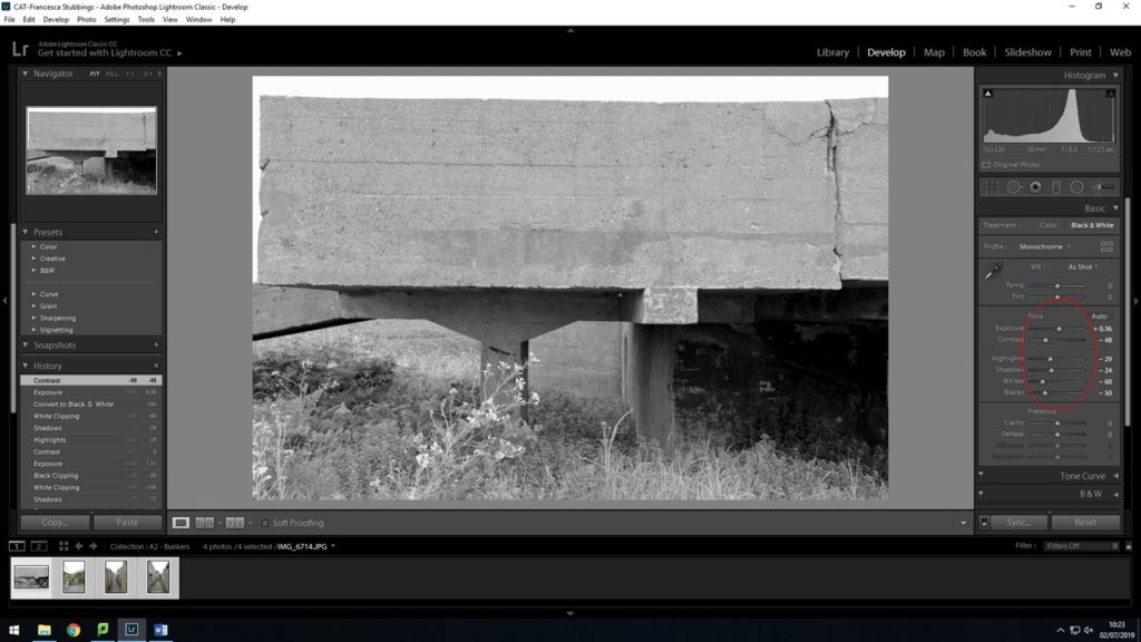
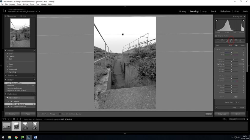
With the photos taken at Noirmount I then used light room to edit them and adjust the settings. I then finally decided to change them into black and white as I feel the images look better. These are the steps I took to edit my photos

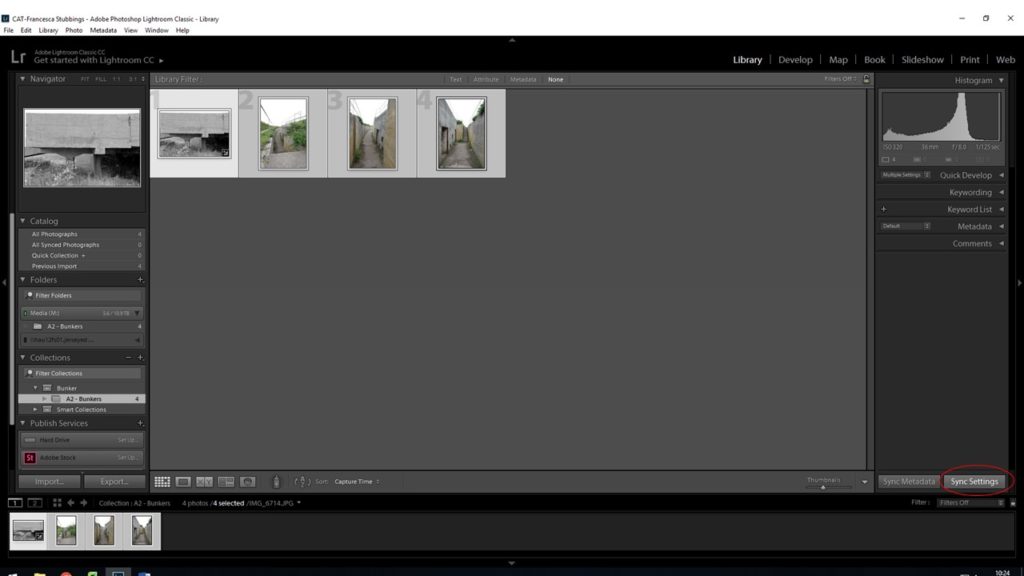
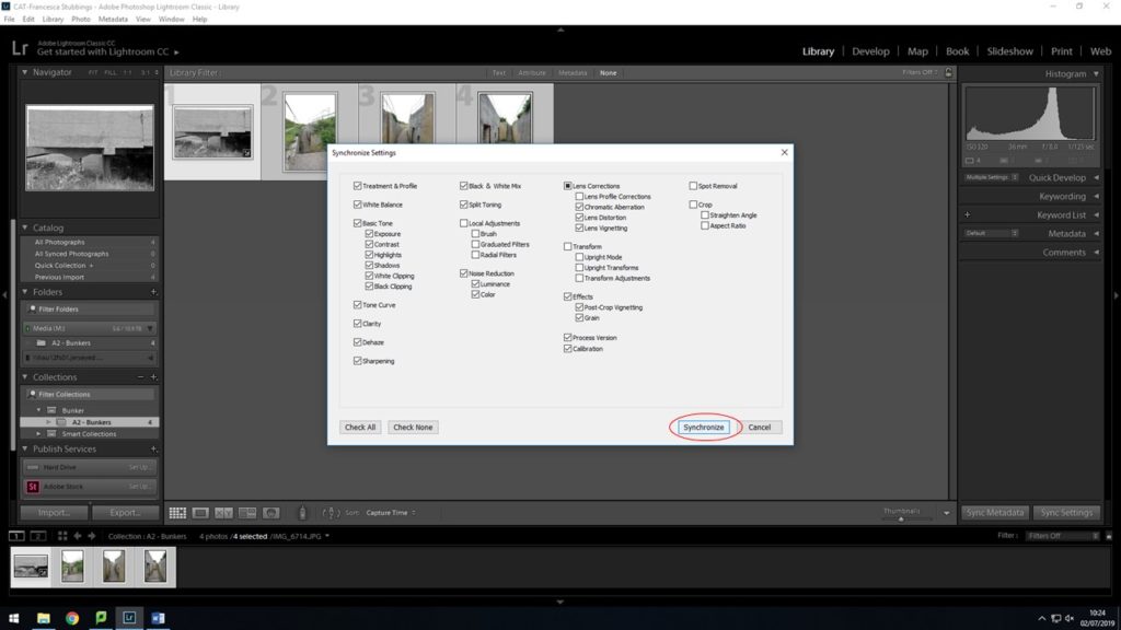
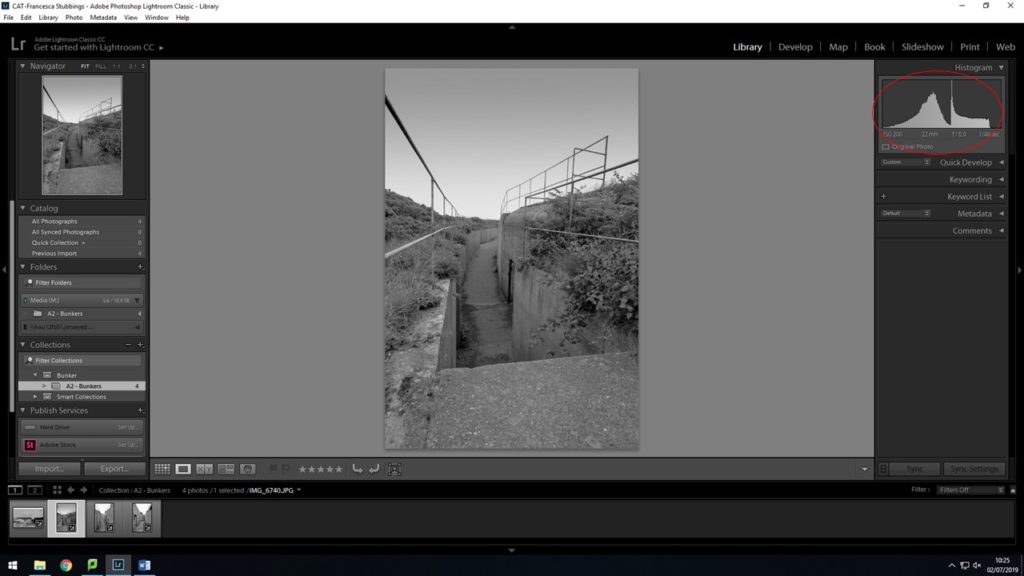
After editing my first image, I then when back to the ‘library’ view so I could see all my images, I then selected them all and clicked on the ‘sync settings’ button in the bottom right hand corner. This allows me to change all my photos into black and white, along with the same exposure, contrast, highlights, etc as the first photo I edited.

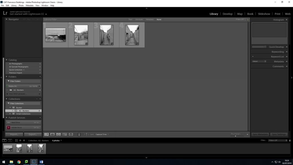
After confirming to synchronize my settings to all the same, my images are now all in black and white. But when going through them some of them look over exposed, but I can still go in and change the settings of that one image, without it then changing the rest of them.

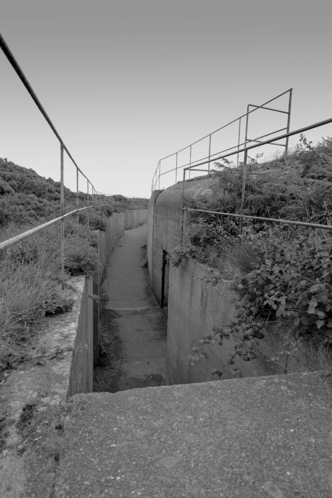
Here using the gradient tool, and dragging down from the top of my image and stopping about half way, this allows me to select that part of my image and then only edit that specific part. I changed the exposure of the sky and made it a bit darker to give it more of a unlit look and the darker sky fits the bunker and environment I have photographed

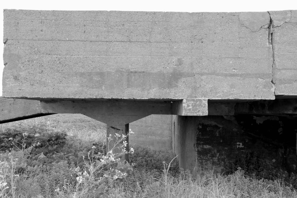
After editing my images in lightroom, I then had to export them as a JPEG in order for me to upload them to the blog. Overall I think editing my images made a massive change in the way I now look at them. They come across as more deep and strong as they were before I edited them. These are my final images;

Experiment 2: Cropping

Cropping is an important aspect when it comes to editing photos since it gets rid of unwanted areas within the image, improves the framing and accentuates/isolates the subject. Cropping allows the viewer to focus on the main features within the photo. By using the cropping tool in Lightroom I began to make some radical changes by selecting areas of my images for a different visual impact. Cropping can create drama in an image as well as making the composition more interesting than previously. Cropping can also decontextualise a subject within the frame which creates a great effect or can change the nature of an image radically.

Experiment 1: B&W/Colour Adjustments

black and white

I experimented with lightroom by changing a few images into black and white to link them to the type of photos they would have captured during World War 2. Viewers may have a different perspective on how they see a black and white image and may feel more somber as a result of the dark colour scheme. I used the preset B&W Sepia Tone since it brings a slight vintage feel to the image.

why use black and white?

  • Colour can be distracting in some images and can take the focus away from the subject.
  • Textures and contrast within a black and white image are prominent.
  • Black and white images often have a nostalgic look. Because black and white was invented before colour, we associate monochromatic images with the past, even when they portray a current event. As a result, subjects from the past tend to look best when edited in black and white.
  • The contrast between the highlights and shadows of a black and white photograph can add a dramatic effect. Turning up the contrast is a powerful way to capture the viewers attention.

colour

For the colour images I added the Matte filter. This filter makes the contrast subtle and the saturation lower than normal. These adjustments make the vibrance of the images less intense. I wanted my outcomes to have a vintage effect so that’s why I chose this specific filter for the colour images. Finally, I added grain to make the images appear like film.

why use colour?

  • Colour photographs show important aspects of a subject.
  • Colour can suggest the era in which the photograph was taken. Films manufactured in the past often have a very distinct look.
  • Colour can help describe the mood of a picture.

Bunker Archaeology: Editing images

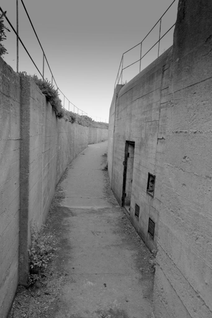
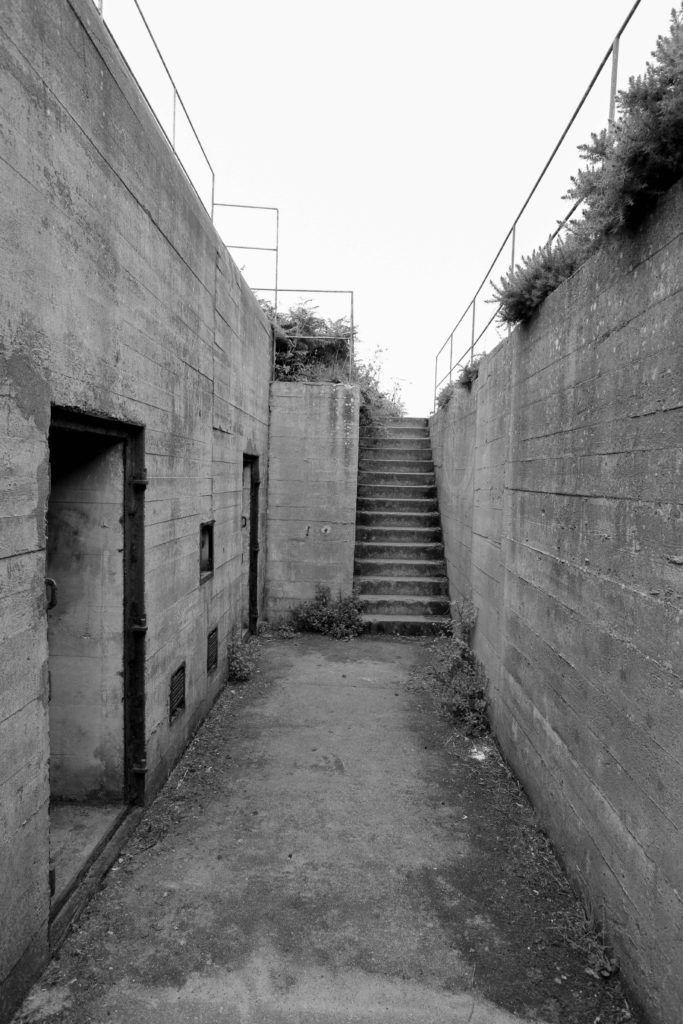
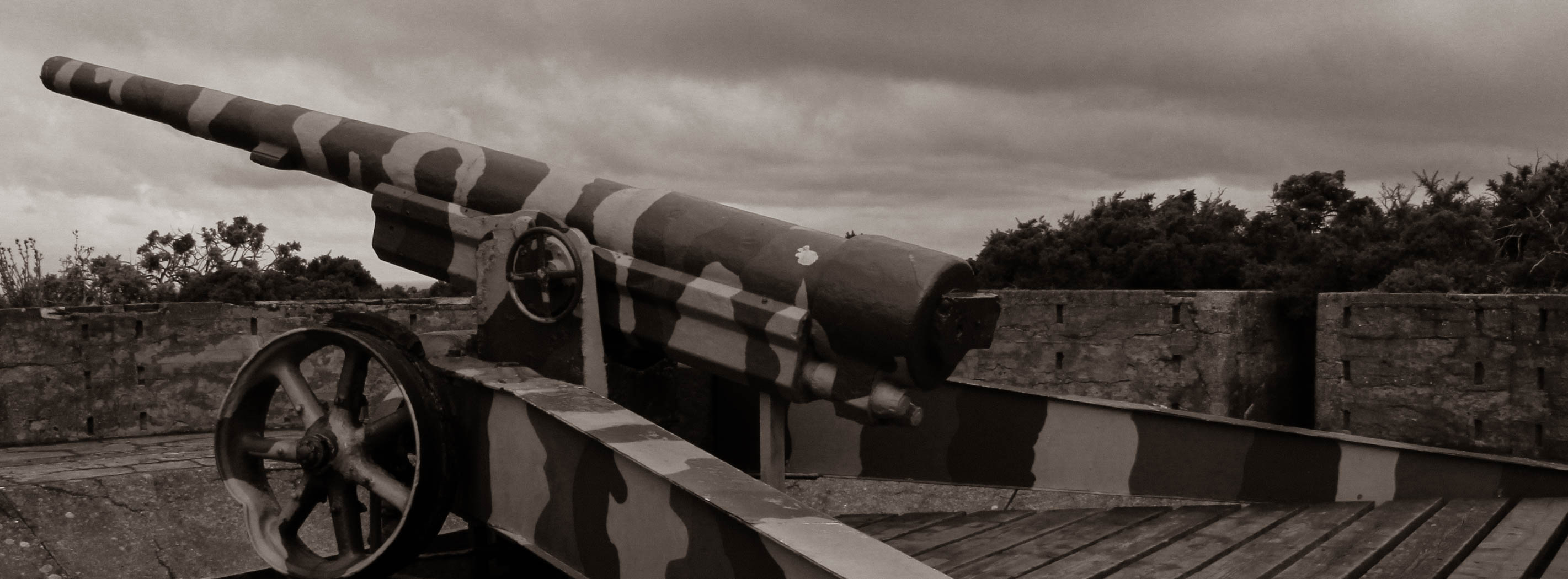
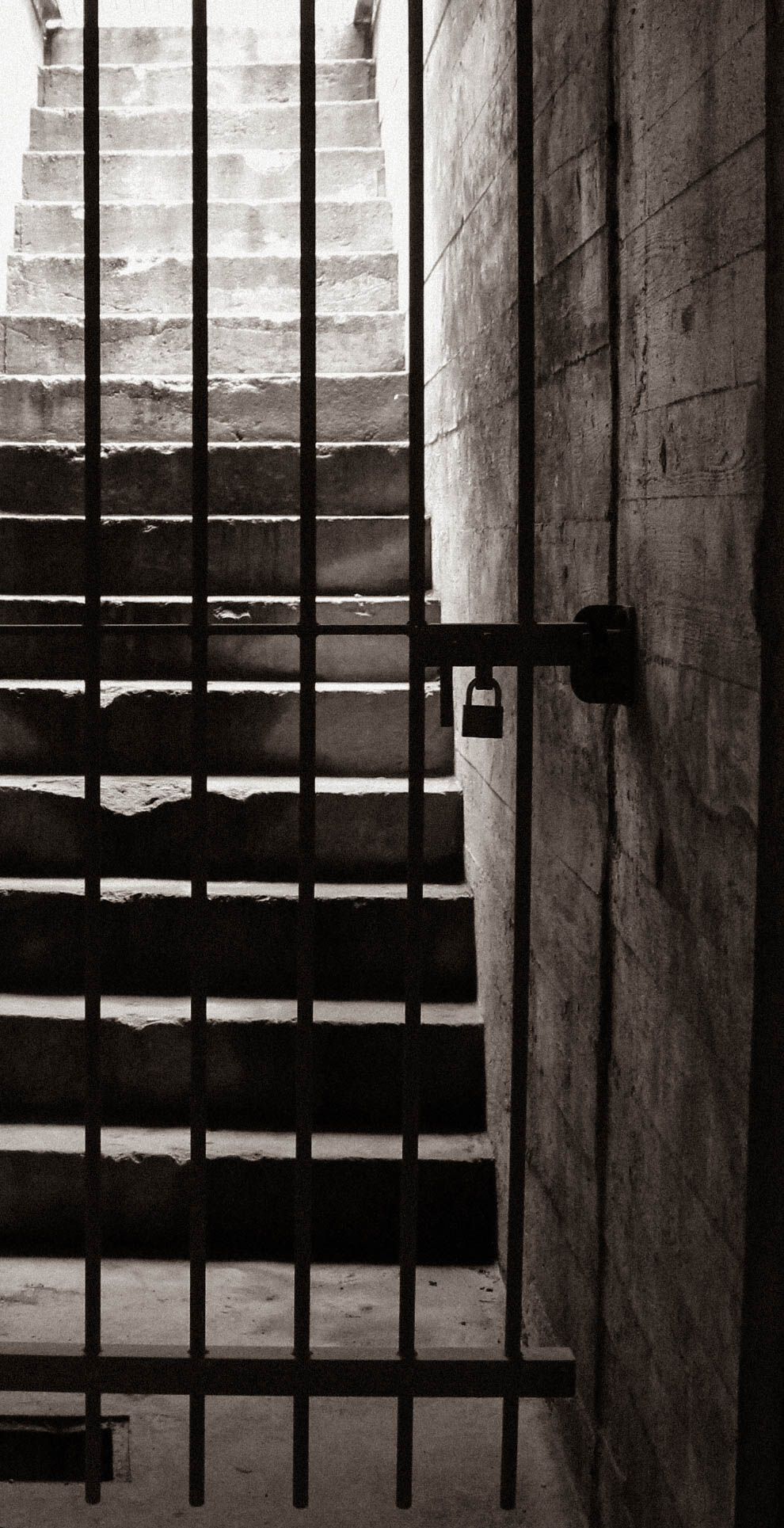
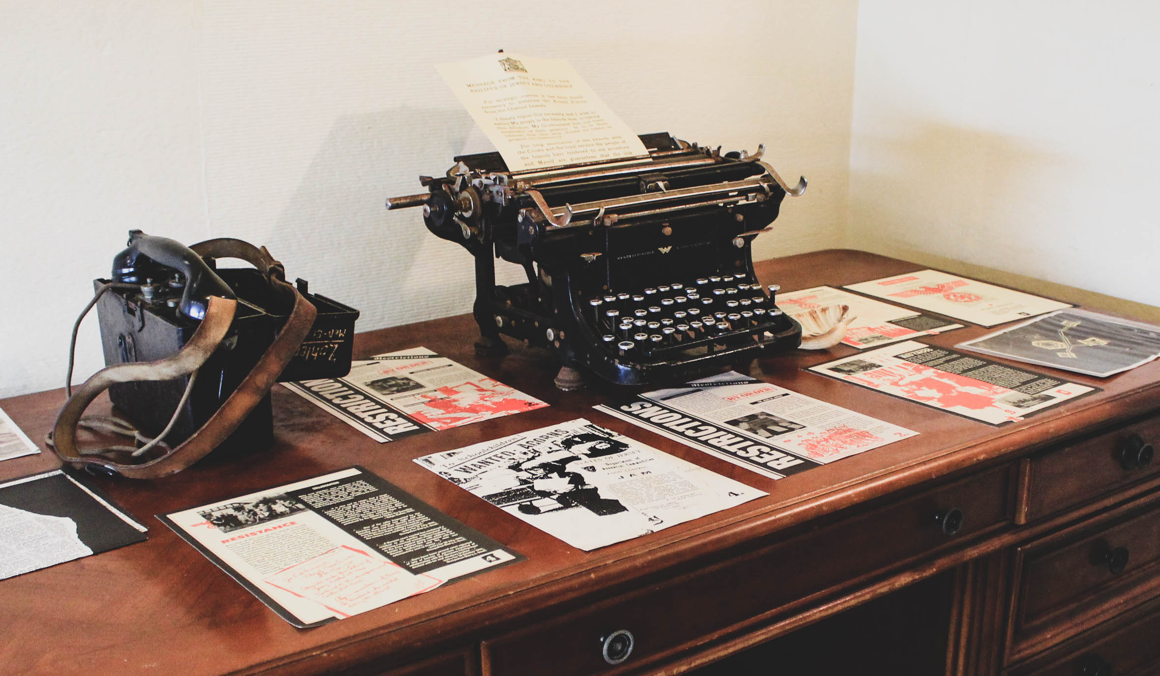
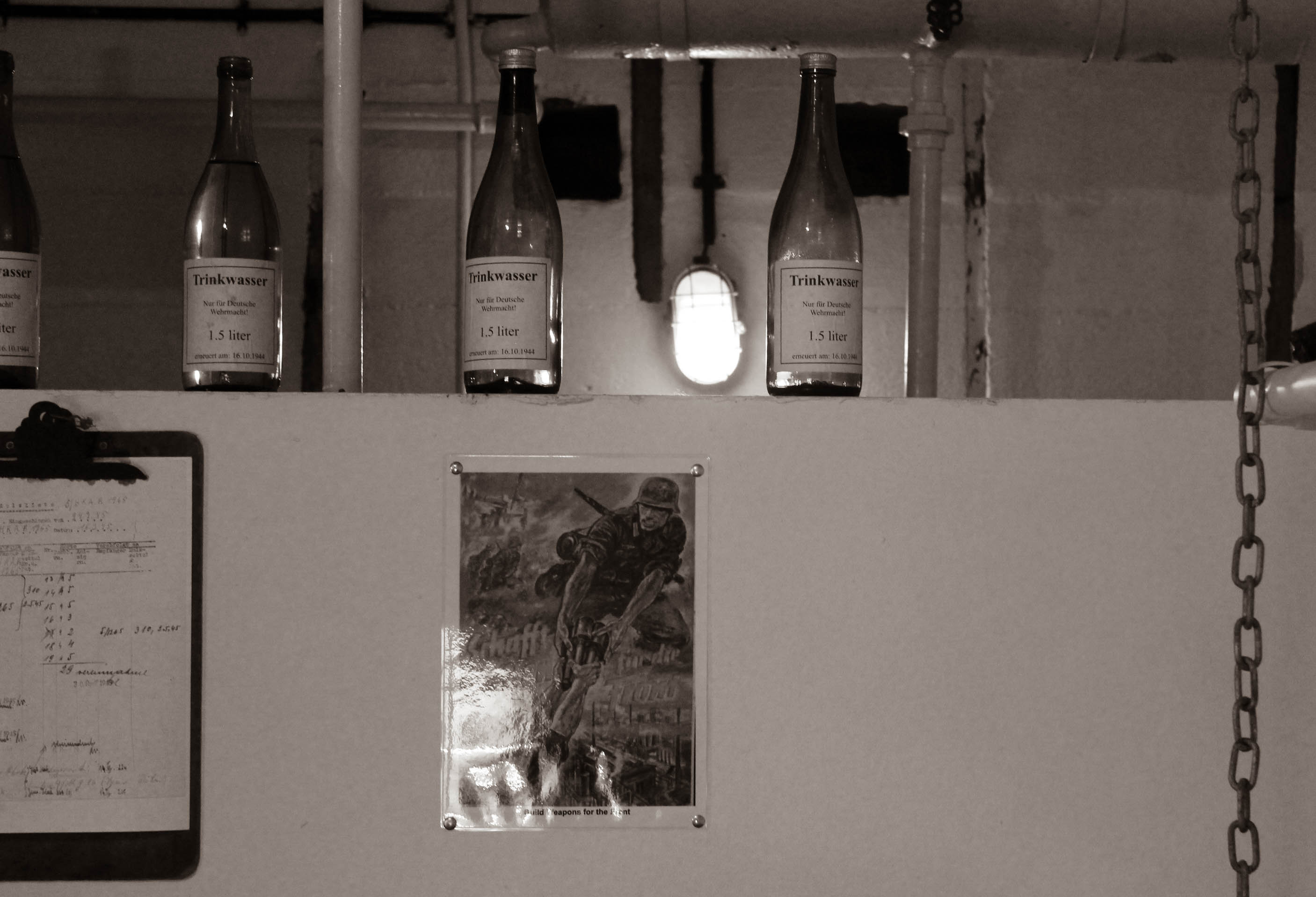
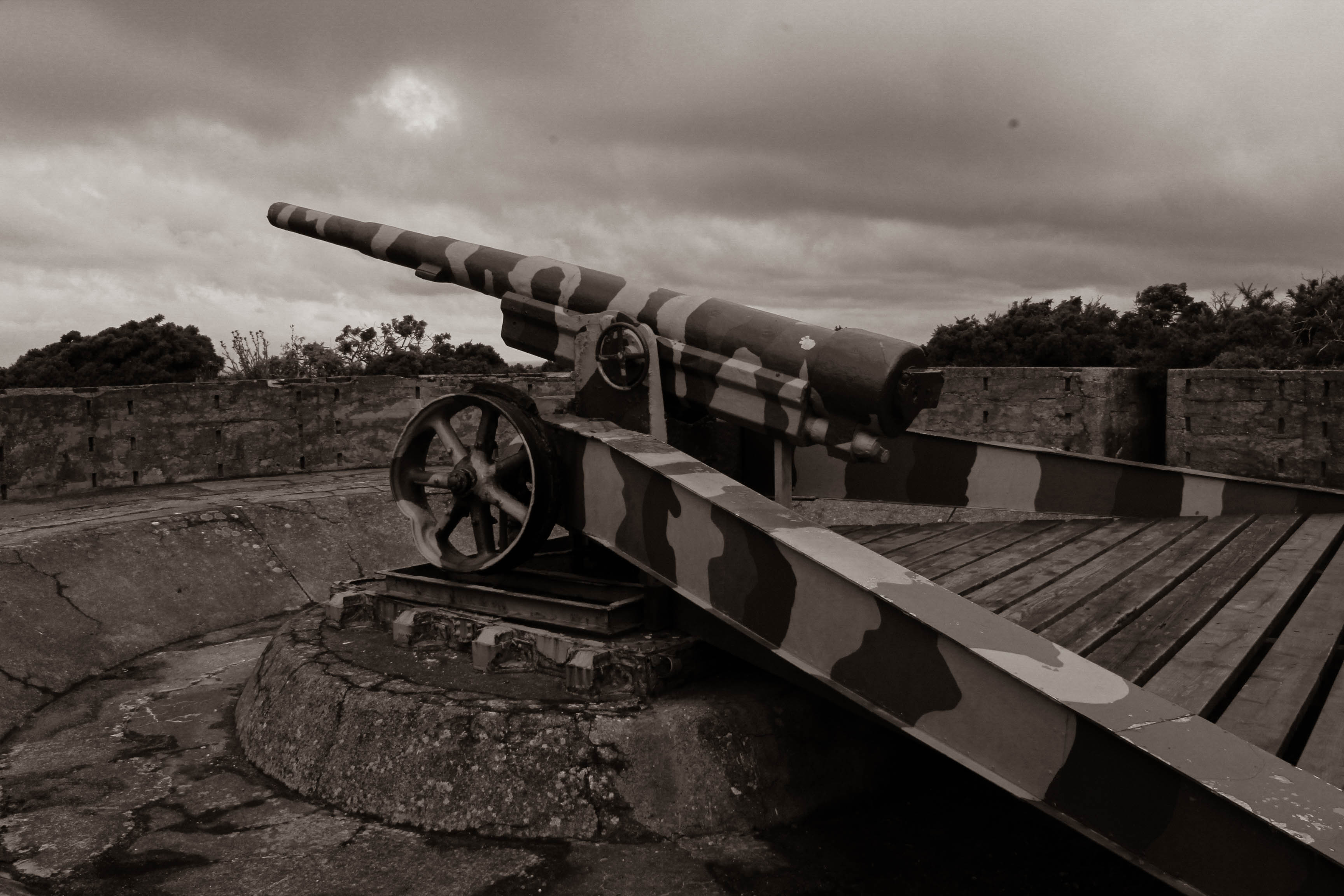
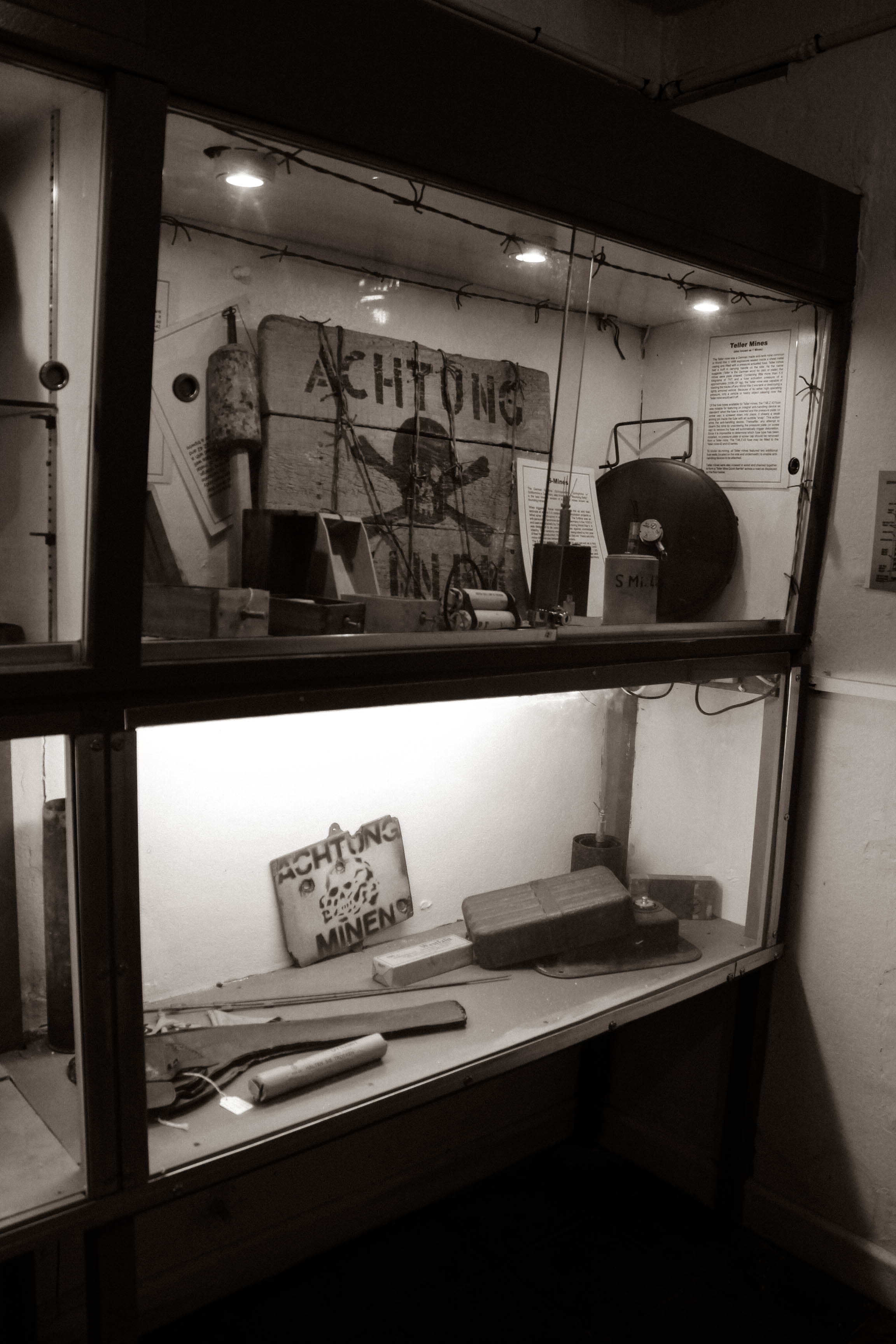
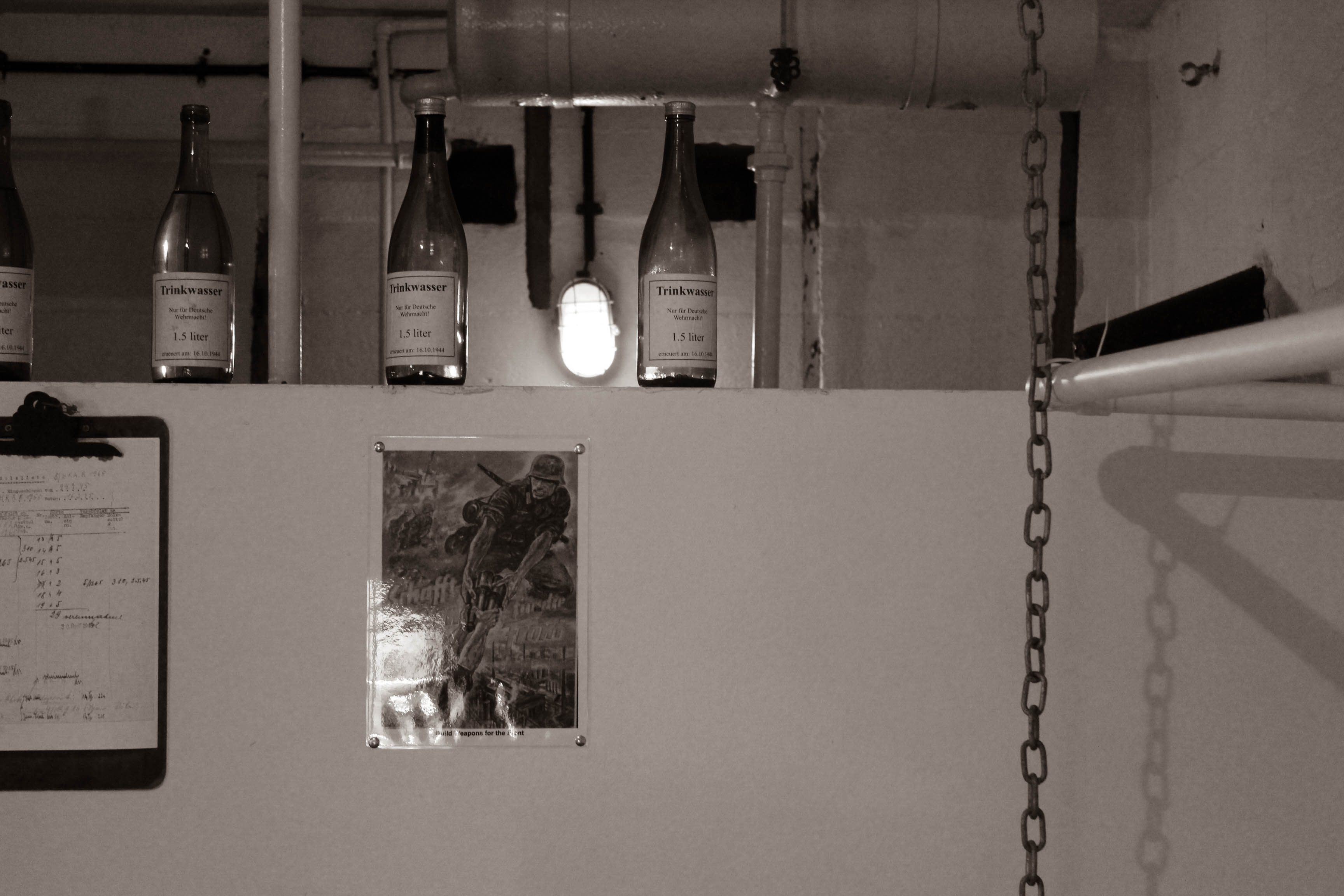
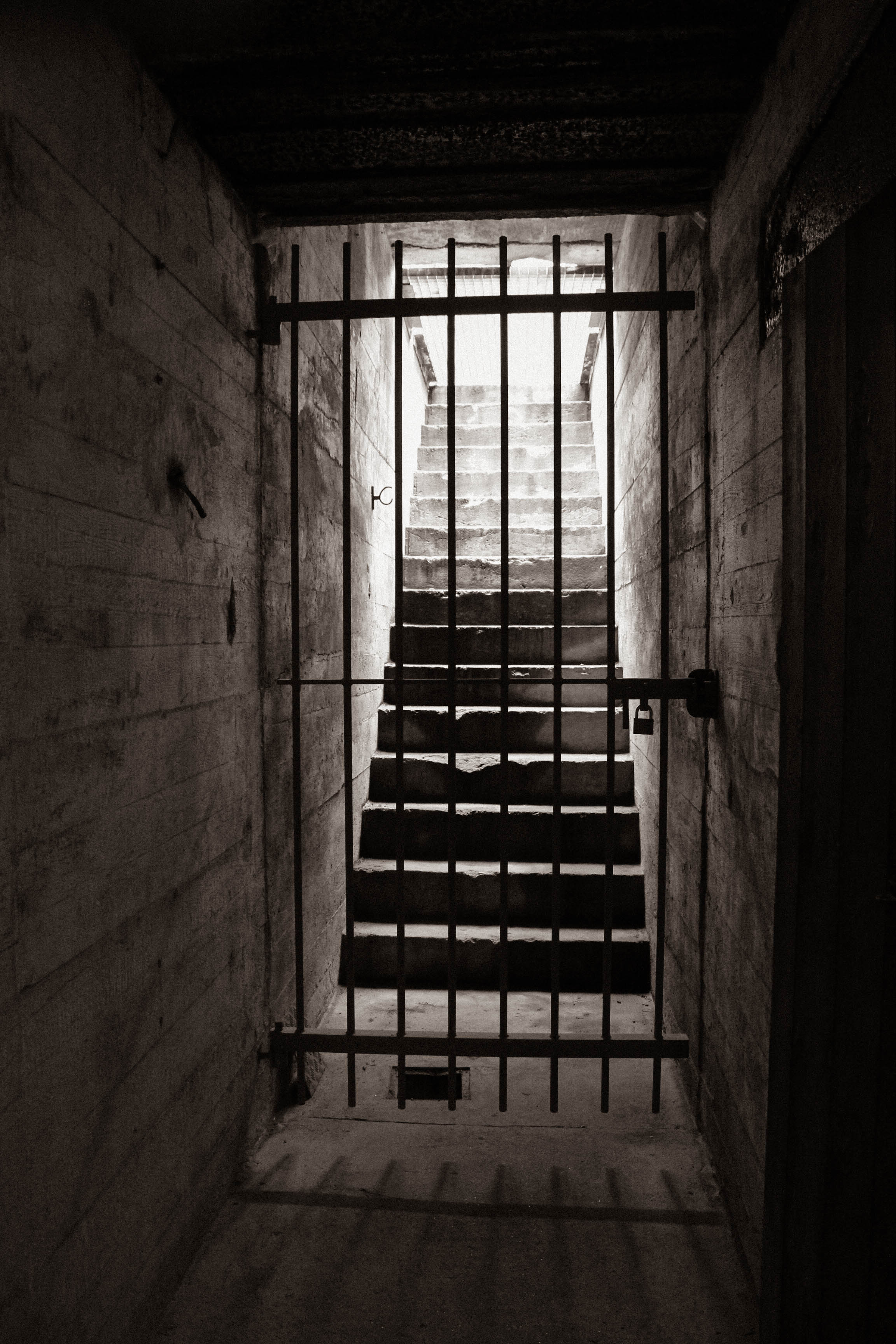
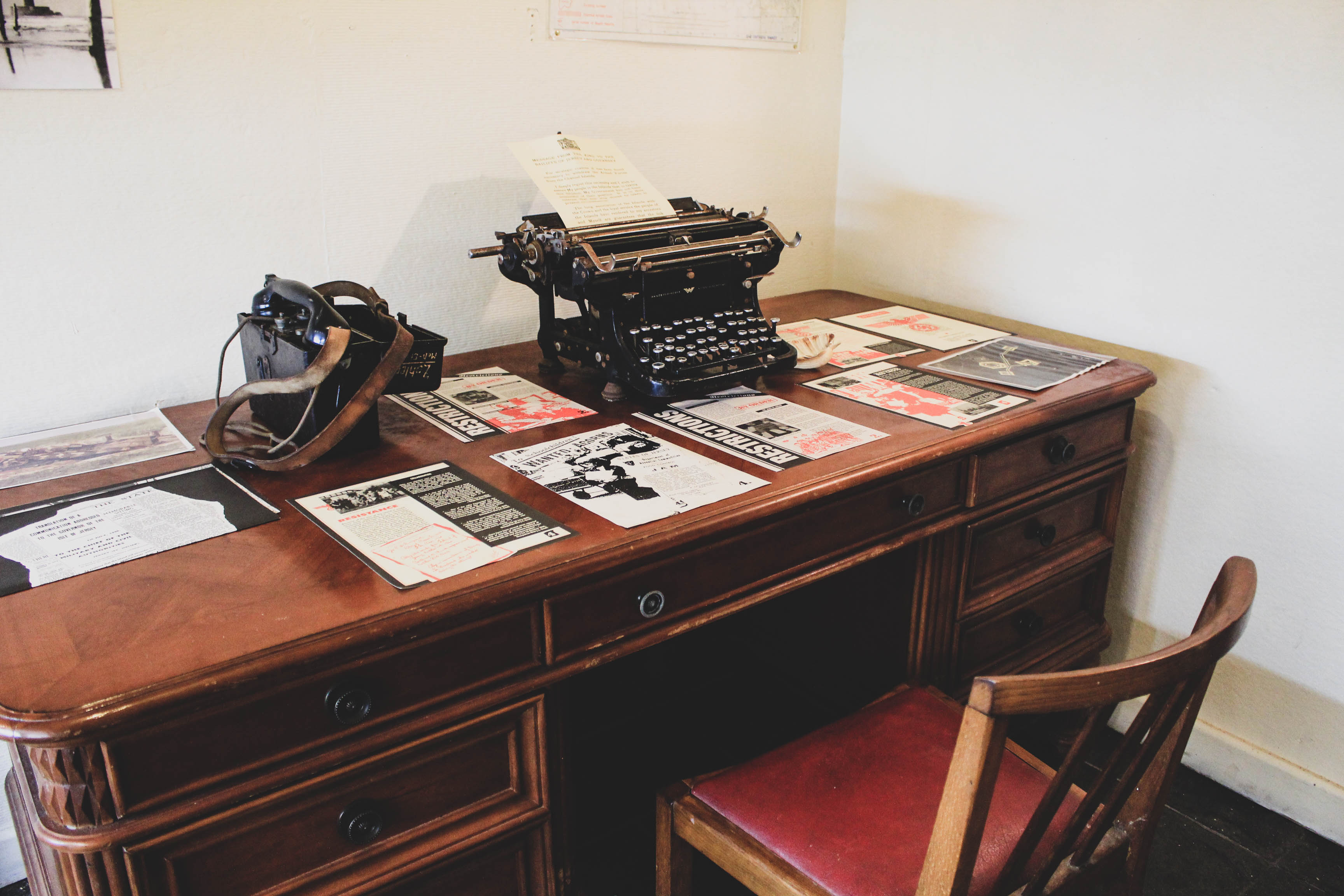
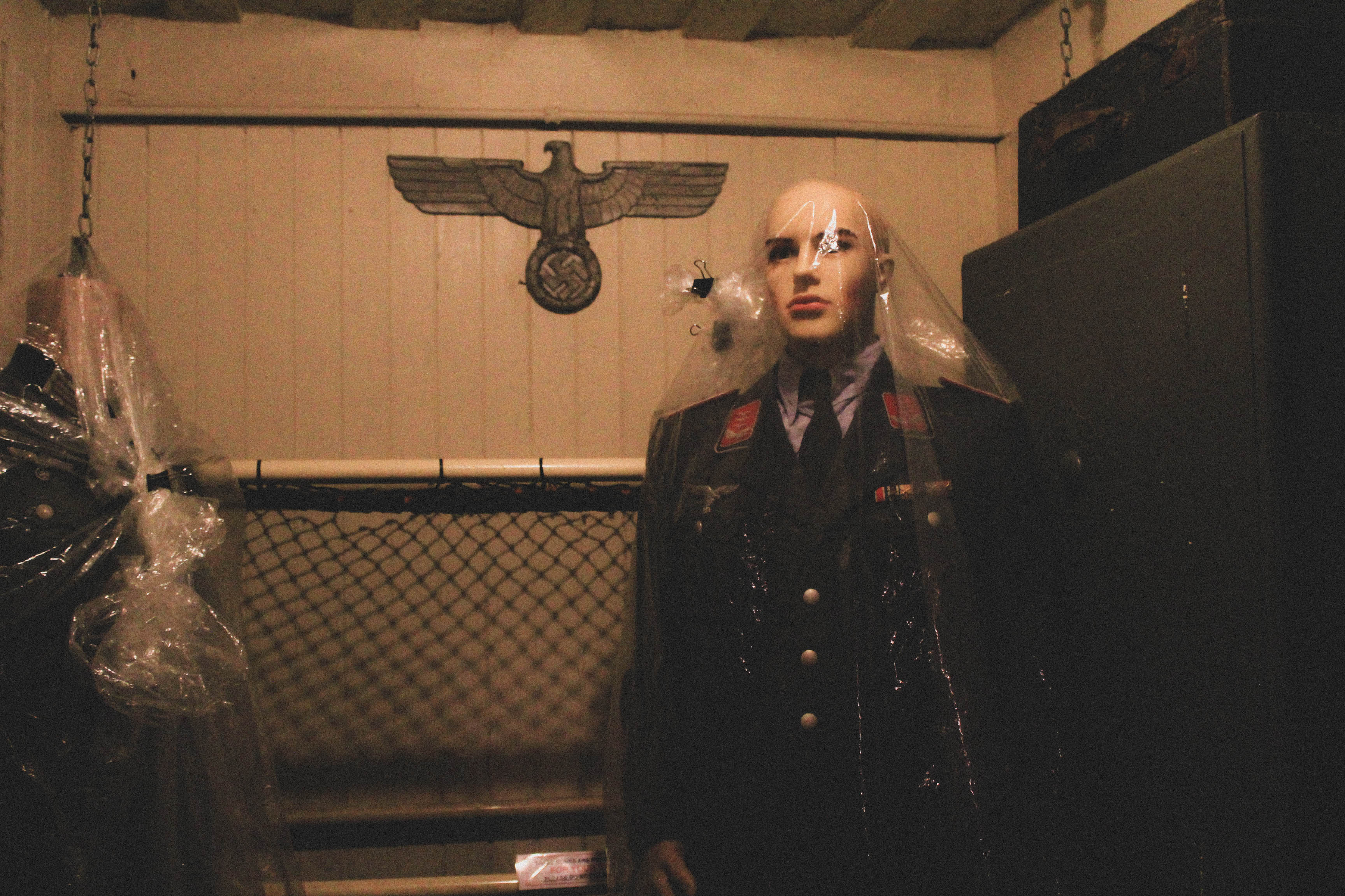
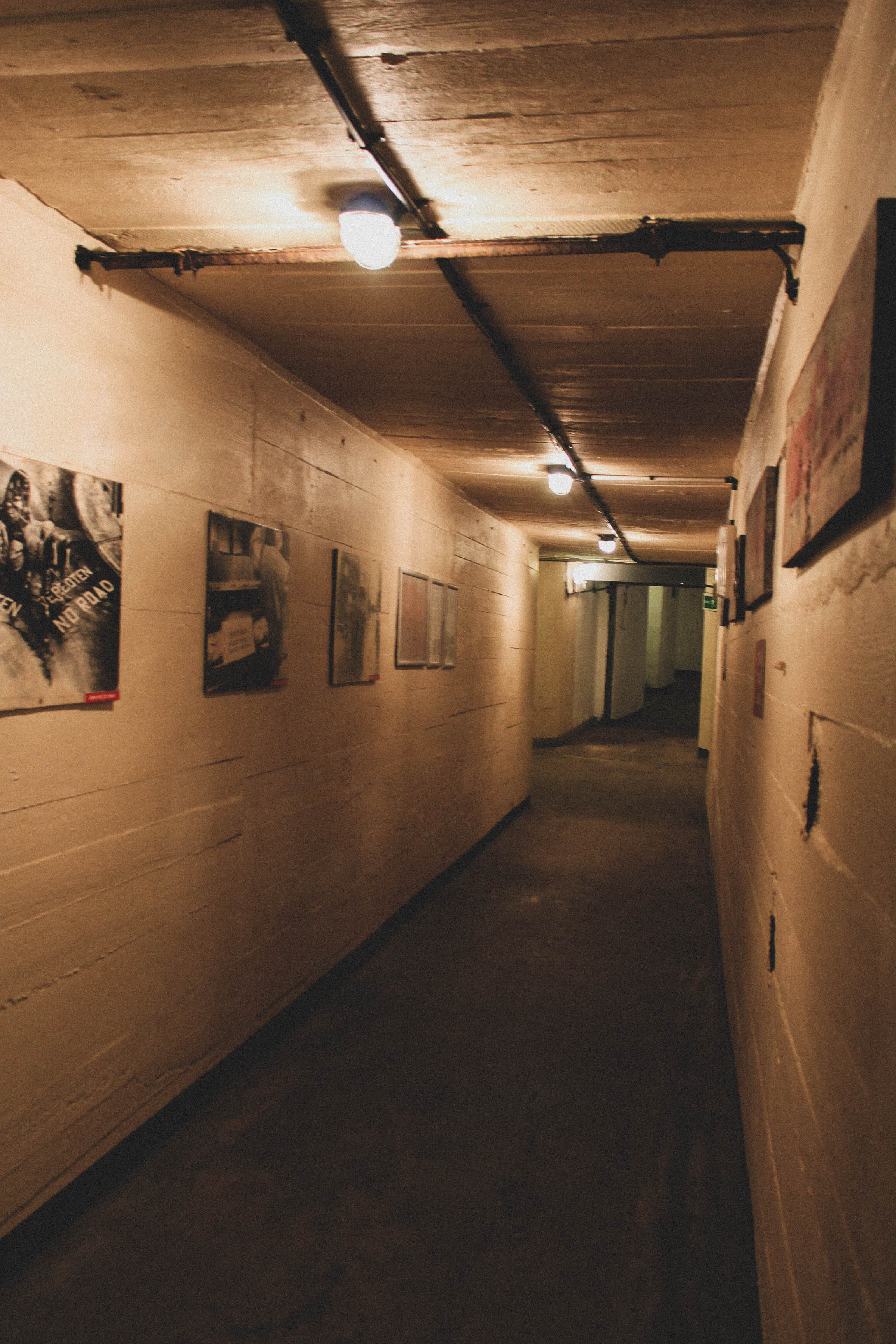
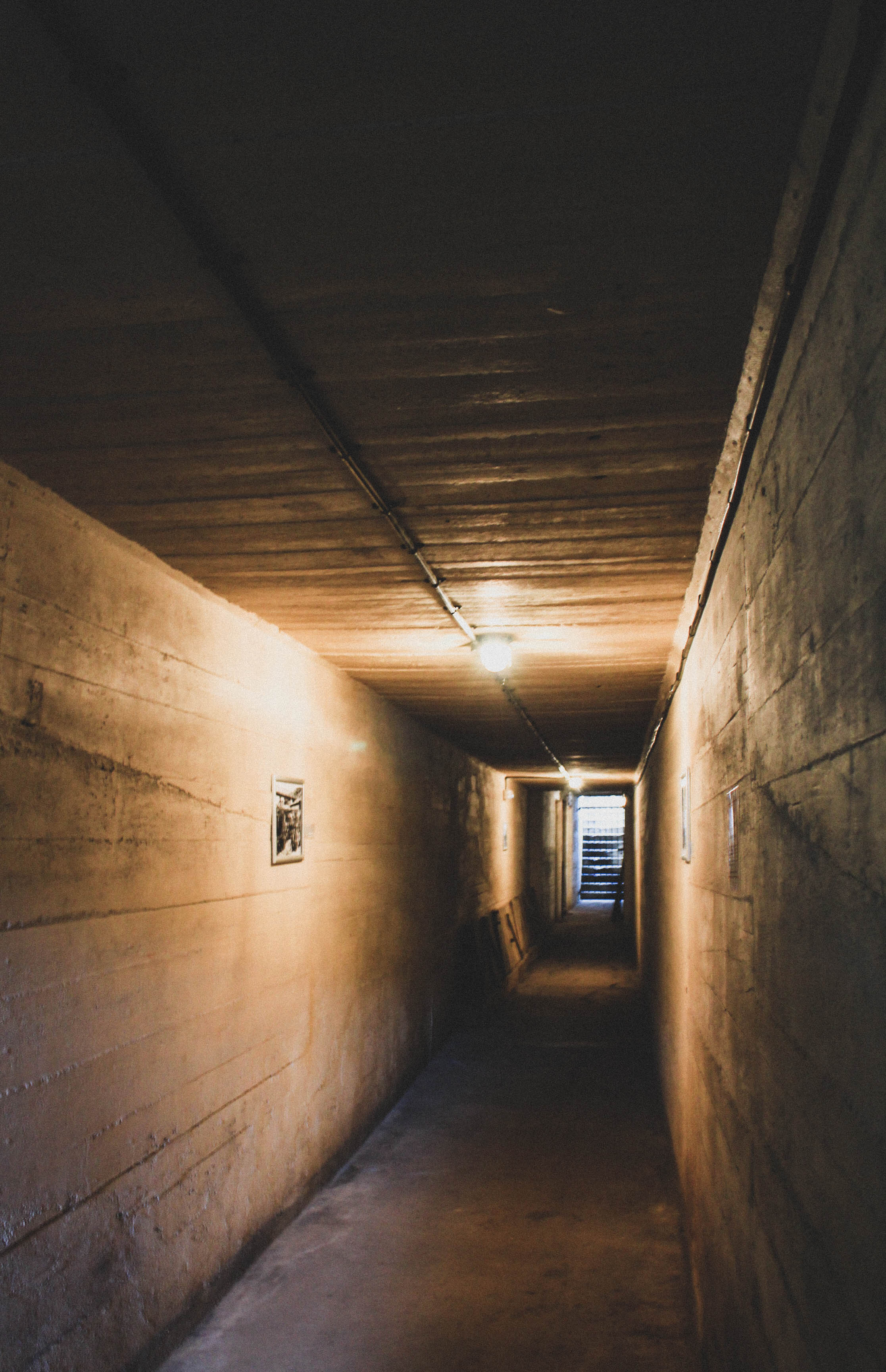
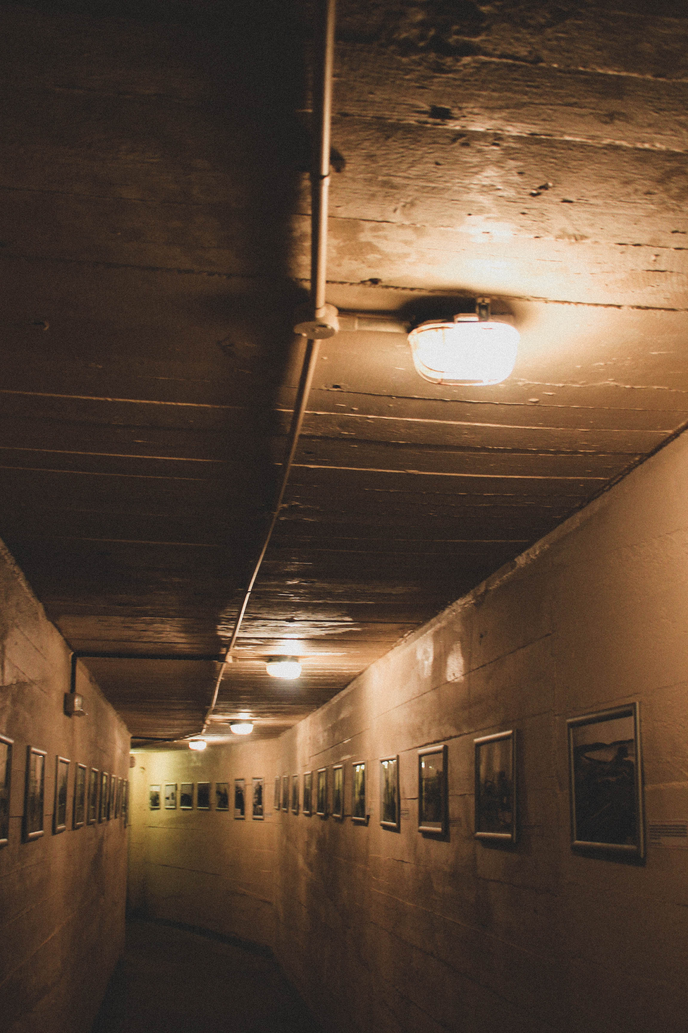
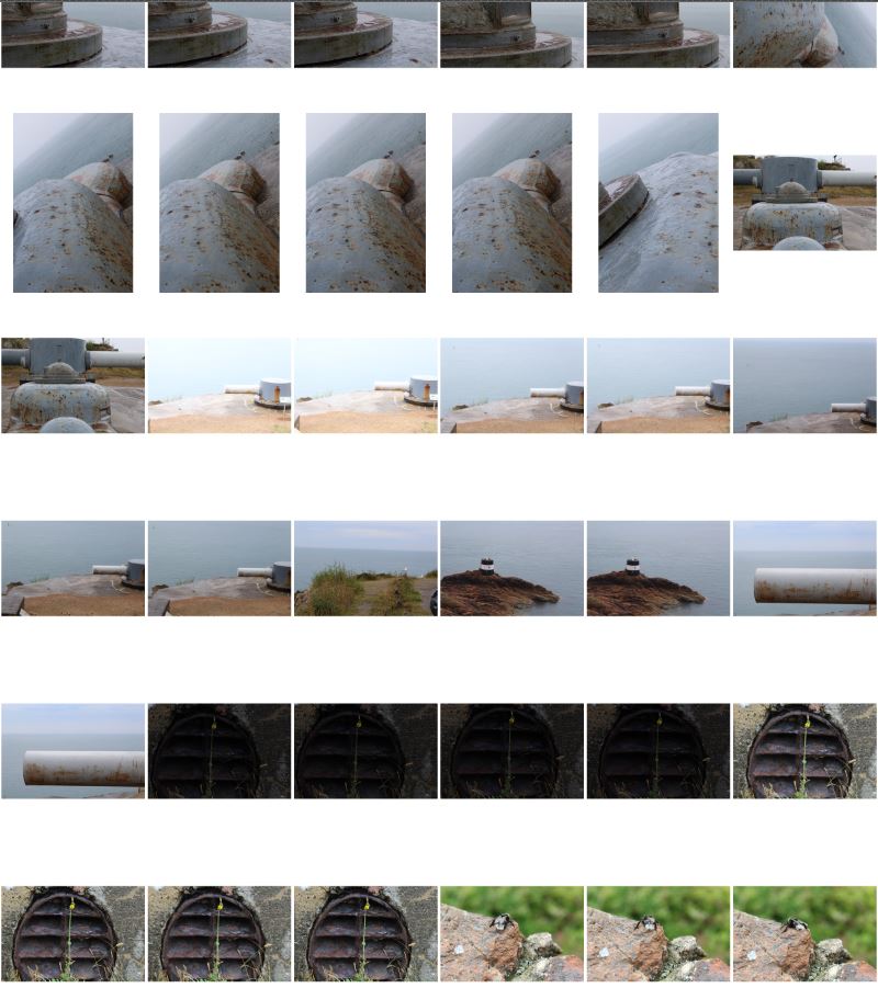
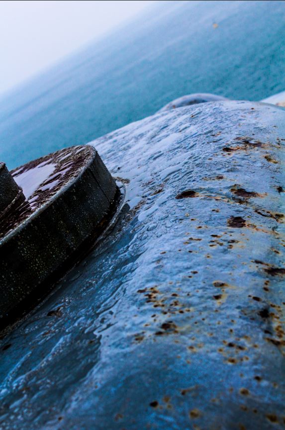
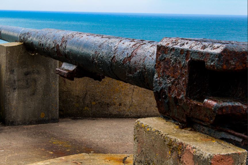
To start on the bunker archaeology project, I took a series of 400-500 images at a location known for it’s German bunkers. The site at which I took my images had a wide range of WW2 German military architecture, which had been renovated by the States of Jersey in order to preserve the memory of the occupation. The following are a selection of images that I took on the day:

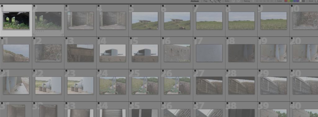
After taking the initial images, I imported all of the images into Adobe Light-room in order to pin down my selection of images, and to edit the images before exporting them back into my “Final Images” folder. I used a process of rating and colour coding in Light-room in order to nail down my images to ~10 final selections (these were the ones that I was going to put time into editing). Below is a series of screenshots of the editing process in Light-room:

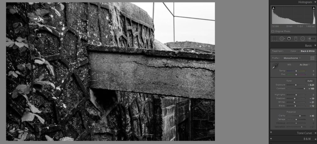
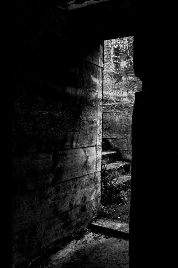
The above is a screenshot of the editing process of a black and white image. I decided to change some of my images into black and white, as for some images it helps to emphasize the contrast between colors, textures and depth.
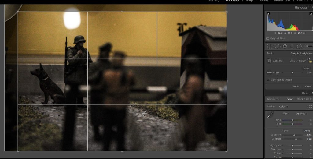
I cropped the majority of the images that I took as a first step in the editing process. This was to cut out parts of the boarders of the images that I did not want, or to draw more attention to certain areas of the image.
I used a colour coding system to label my images so that I could select images that I felt were the best candidates to edit. Green = definite final image, yellow = possible final image, red = rejected at this stage.
My initial move in the editing process was to decide which images to reject, and which to give further attention to. I did this using the flag system in Light-room. The images that i rejected mainly consisted of copies, blurred images, and those that I did not feel could be improved by further editing.
My edited my final images in Light-room, and my 12 final images post-editing can be seen above:

After selecting my final images, I was able to edit these images, changing some of them to black and white, and increasing the contrast of others in order to emphasize the contrasting shadows, shapes and textures. The following images are my final images from this particular photo-shoot:

As these are my final selected images from this shoot, I will be further editing them in order to use them in my photo-montage experimentation and further final images and creations for this project.

Whose Archive is it Anyways?

Archives are used to store peoples memories and preserve them so that the past is not forgotten. Archival organisations preserve archives and pieces of history for the public to use and look at the past.Archives contain primary source documents that have accumulated over the course of an individual or organization’s lifetime, and are kept to show the function of that person or organization. And also its a place where people can go to gather firsthand facts, data, and evidence from letters, reports, notes, memos, photographs, and other primary sources. they also keep records of many forms including correspondence, diaries , financial and legal documents, photographs and film.  Most state governments, schools, businesses, libraries, and historical societies maintain archives. people also use archives in their everyday lives to create and store information about their personal and business activities and archivists identify and preserve these documents if they are of lasting value. In reality photographs are not objective and they are highly influenced by the perspective of the photographer so it makes people sometimes question whether the photograph is true or not? while the real question should be what does a specific photograph do? Because it can effectively represent an  interaction with human memory and culture even if it contains biases or misrepresentation.

Image result for archive

Due to Jersey being located between England and France it has a broad and rich photographic history. The local Societe Jersiaise photographic archive alone includes over 80,000 historical images dating back to mid 1900s.

Data archiving is the process of moving data that is no longer actively used to a separate storage device for long-term retention. Archive data consists of older data that remains important to the organization or must be retained for future reference or regulatory compliance reasons.

Archives are made also for normal people with access to phones or media to store day to day memories like photos or videos so these will never be forgotten, also theyre used for advertising, news, documentary, fine art, identity and anthropology. And one of their biggest abilities is providing visual history,  knowledge and power.

To help me explore archives i asked my own parents to look up old photographs, documentaries or anything that can make up an archive of my past. My grandmother told me that she keeps an archive of my life in Jersey and it was a folder containing everything from my first ever vehicle to photographs of my travels around the island. I liked the archive because in years to come i can look back at the archive and remember how i used to live. And this is why archives interest me. The only problem with these kinds of archives is that they can be damaged or lost because it is just a folder with paper after all. So that’s where virtual archives come in handy as an online archive cannot be lost s easily except if of course you forget the password for some reason…or the data itself is held by an unco-operative body.

Image result for archive virtual

So there is no specific answer to whose archive is it as for example i am the creator of this blog post so to me i think this archive with the images in them belong to me but in the same time all my blog posts are under the control of a “gatekeeper” which is the company or source that runs the website so they might consider my blog posts as theirs so their is no real answer to the question in the end.

Final image gallery

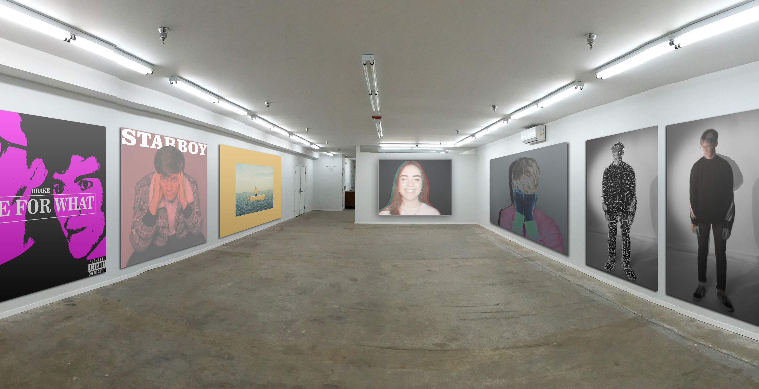
I have created a virtual gallery containing my final photos as well as en extra photo to fill out the space.

On the right side are the final pieces that were created in the studio. I have chosen to group them together because they all explore emotions and expression.They are also all composed of similar colours; the third photo along is more colourful than the others but it still has a dark background and has a cold tone which helps it fit in. The furthest away photo was part of this photo shoot but I didn’t include it in my final photos as it didn’t match the colours of the other photos, as well as it expressing a contradicting emotion (hapiness) to the rest of the photos, which primarily express sadness. But I have included it in this gallery as it fits in well enough to be placed next to them. However, it isn’t located on the same plain to show that it is somewhat seperate.

On the left side are my takes on album covers. These are a lot brighter and more colourful than the photos on the other side. In my opinion this balances out the room as a whole, it isn’t overpowered by monotone or colourful photos.