


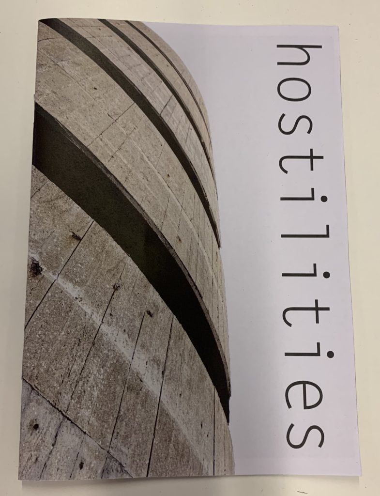
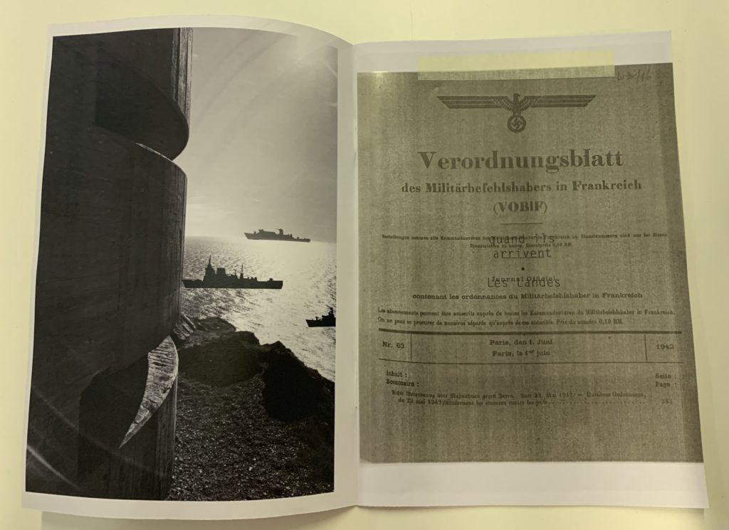

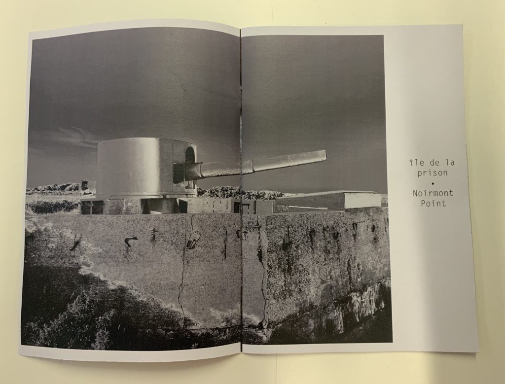

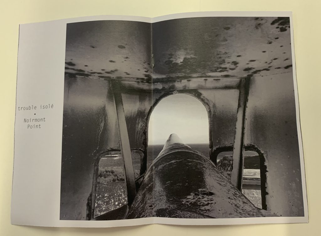



What is a Zine?
A zine is a independently or self-published booklet, often created by physically cutting and gluing text and images together onto a master flat for photocopying, but it is also common to produce the master by typing and formatting pages on a computer. The publication is usually folded and stapled.
Analysis of a Zine:
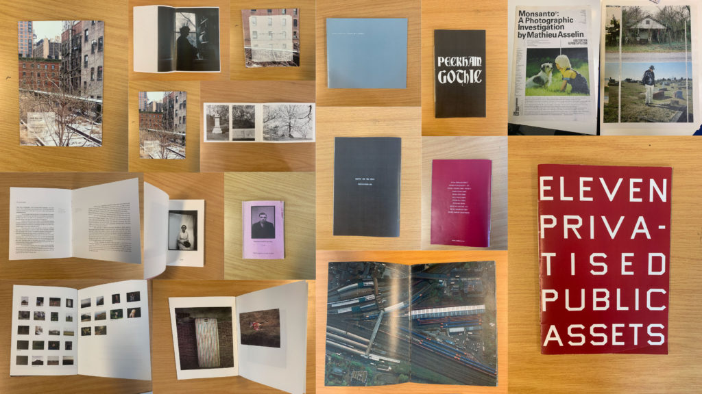
I will be analysing ‘Lingering Ghosts – The waiting for refuge’ by Sam Ivin in order to gain a better understanding of narrative and sequencing, and what makes a successful zine. I watched a video interview with Ivin where he explained his rational behind the zine and why the topic was important to him. His passion towards the subject matter is clearly shown through his work which showcases the importance of really understand and enjoying the subject matter to clearly portray a strong narrative within my own zine.
Link to Ivin’s website which provided me with further research and understanding of his project: http://www.samivin.com/lingeringghosts



Format, size and orientation
This zine is the size of A5 paper, which is used to create a literal representation of the actual size of someone’s passport, linking to the key theme of the zine. In addition to this, the zine is in a portrait orientation which further expands our understanding of the zine prier to reading it. It is formatted in a rectangular shape which is the same as a passport, which presents Ivin’s artistic creativity to present the theme of asylum seekers and immigration.
Design and layout
As previously mentioned the design of the zine is in the style of the passport which begins to build a relationship with the imagery and the theme of immigration and asylum seekers.
Rhythm and sequencing
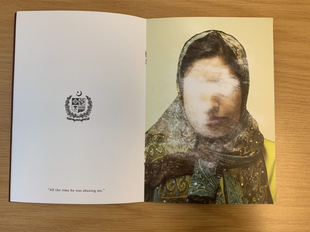
The sequence of the images is very simplistic but effective. On the left hand page the nationality of the person is presented through the country’s emblem, below this is a quote taken from what that person has said about being denied from seeking asylum. For example it says “All this time he was abusing me”. On the next page is a picture of that person with their face scratched out to show how they have been ghosted from England, and how the artist is expressing how others find asylum seekers irrelevant.
Narrative and visual concept
The story being told within the zine is people who are trying to seek asylum but are being declined. It’s trying to capture the uncertainty of their future and how their life has come to a stop and how they are being forgotten by others. This is shown through the portrait of the asylum seekers (in color), and the face has been scratched out, which symbolically represents this narrative. I would say the narrative is clear within the zine due to the introduction at the start of the zine. Needless to say, the imagery really encapsulates this idea.
Title and cover
The cover is very simplistic but has symbolic representations to present the theme of the zine. The background is a dark royal red/burgundy color which is the same color as a British passport which showcases the theme of travel. The simplicity of the design allows a bigger impact for the content within. The title ‘Lingering Ghosts’ is metaphorical to showcase how asylum seekers are neglected, frowned upon and find it hard to fit into society and are “unsure of what their future will hold”. Below the title is Britain’s emblem which is also shown on a passport, which presents the views of the artist that we should allow these asylum seekers into the country as they want safety.
Images and text
Image and text plays a massive role within this zine, due to the topic it is presenting. When we look at a two page spread, on the left we are presented with a country’s emblem with a quote taken direct from the asylum seekers words. On the right hand side is the picture of the asylum seekers them self which has been scratched out and distorted, which allows the image and text to work in cohesion.
Use of other design elements or inserts: archives, montages, graphics, typography
The images have been distorted by being scratched which showcases physical interactions with the photograph, showcasing a surrealist approach to photomontage. The text used is a simplistic bold lettering which is easy to read and understand from a viewers perspective.
Further Analysis:
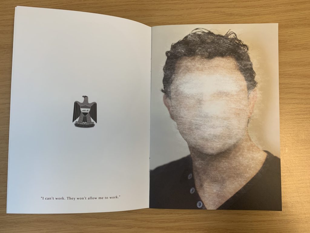
To analyse this double page spread of Sam Ivin zine, I will be looking at different elements which make it successful. Conceptually, Ivin is trying to showcase the fact that the man has been declined asylum and is almost being forgotten by Britain, leaving him unsafe and uncertain about his future. This is clearly portrayed through the symbolism of the face of the man being scratched out, which showcases Britain trying to take away their identity. Contextually, these asylum seekers are leaving their country due to them being in danger as well as their family, and Britain are declining their entry due to the customs and immigration officers not believing what they are saying is true. This issue is very current today and this zine is aimed to inform those about this issue that innocent people are facing. Visually, the zine presents the formal elements of texture, shape and line through the scratching out of the portrait. The composition of the portrait is very simplistic, the portrait is located in the centre of the page and fills up most of the page, leaving the background plain allowing our focus to stay on the portrait. On the other side, the composition is also simplistic them emblem from where the man comes from is located in the centre of the page at a medium size with a quote taken directly from the man’s words located at the bottom of this page. Technically, the image uses a lot of negative space which represents the idea that they are left with nothing and being declined asylum leaves them feeling empty and not apart of society, due to where they come from. The portrait of the person is presented in colour which showcases the idea that they do still have an identity. In addition, the lighting used to capture the portrait is artificial warm lighting due to the image having a studio feel to it. To capture the images the aperture was low, and a large depth of field was used. The shutter speed was quick and the ISO is also low as there is no intended blur or noise presented within the image. The white balance used creates a warm atmosphere which creates a sense of coziness and safety which juxtaposes the theme of uncertainty which allows viewers to really understand and think about the issue before them. The zine uses a combination of image and text which makes it successful and shows variety also helping it to appeal to the viewers. In addition to this, the face (eyes in particular) have been scratched off showing photo manipulation in order to present the narrative of these people’s identity being stripped and taken away leaving them in uncertainty.
Information:
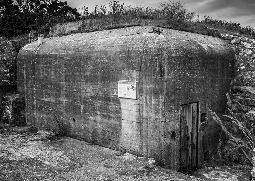
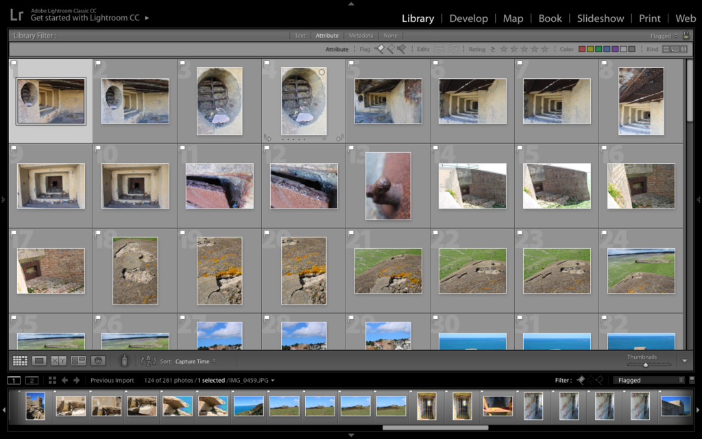
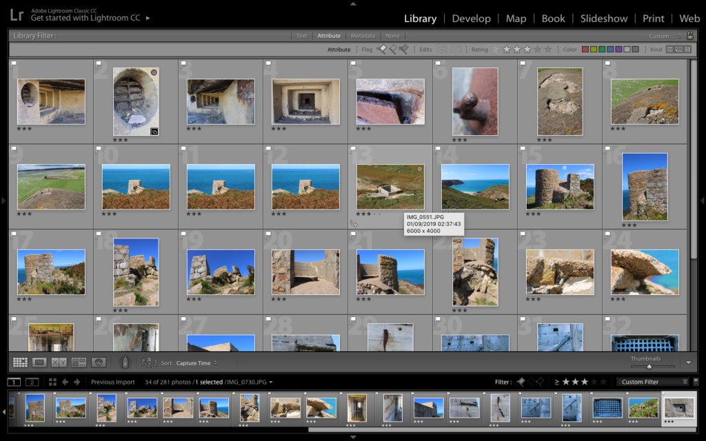
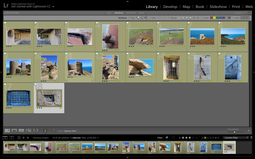
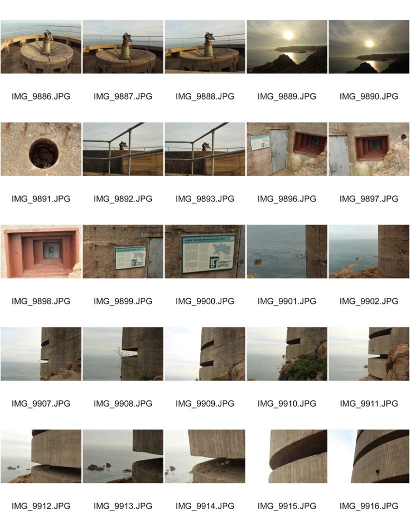
Due to my previous success on the other two photoshoots, capturing different bunker sites in Jersey. I wanted to further explore a different site, looking at different aspects and ways of presenting the decay of bunker archeology, creating a rational for this photoshoot. The site I selected is Strongpoint Plemont, which didn’t have as many structures to capture compared to the other two locations, creating a challenge and allowing me to explore artistically with my camera.
Strongpoint Plemont is site located on the North-West coast on the Island, it was created by the Troopsof 216 Infantry Devision. The purpose of the site was mainly to hold communication cables to Guernsey left Jersey from there. It also was a holiday camp which would have been useful for billeting the soldiers. 319th IR arrive and reinforced field positions are put in place in different levels becoming a Strongpoint. On top of this the bunker site also held many different weapons to prevent unauthorised access into the Island.
In preparation for the photoshoot I preplanned and adjusted my camera settings based on the weather outside, when conducting this photoshoot. I used the AV setting on my camera allowing me to put main focus onto my aperture settings. I used a quick shutter speed, alongside a mix of high and low apertures, allowing different depths of fields to be used in order to capture the archeology. The ISO remained low, due to the sun being beaming onto the bunker’s, as well as the white balance being set onto sunny day, in order for a sense of warmth and image colour correction within my composition.
Lightroom Selection:
Black and White Edits:
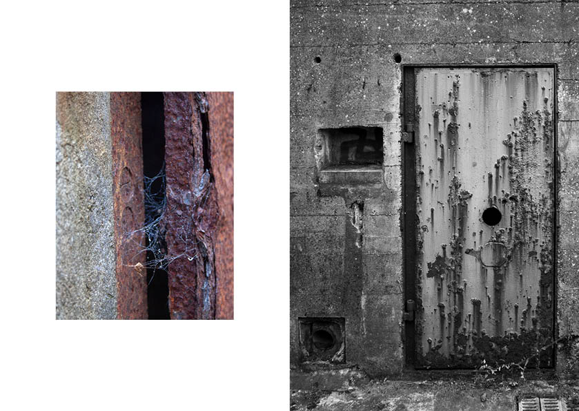
For my black and white final outcomes, I decided to utilise images which clearly presented the formal elements of texture and shape, and wanted these to clearly be presented within the final composition, As well as using macro images, presenting a new way to perceive the archeologies. I started of by cropping some of the images, in order to present a clear subject alongside having a clearer ascetic to my work.
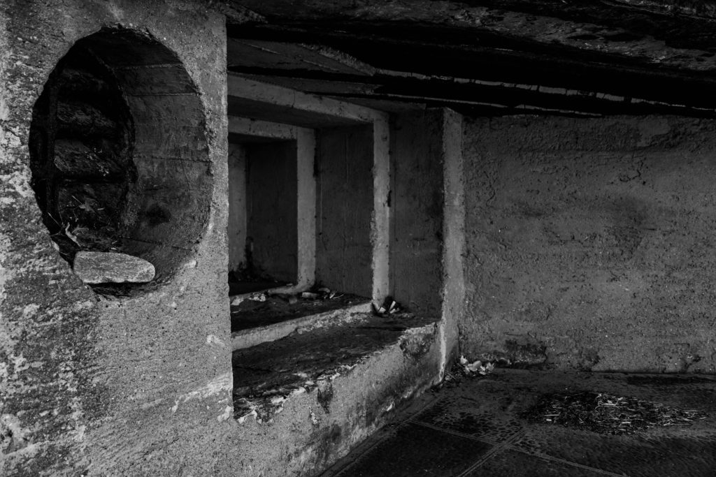
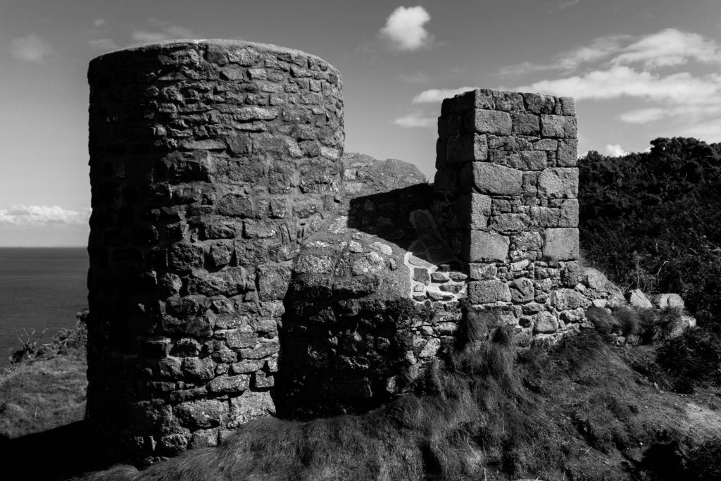
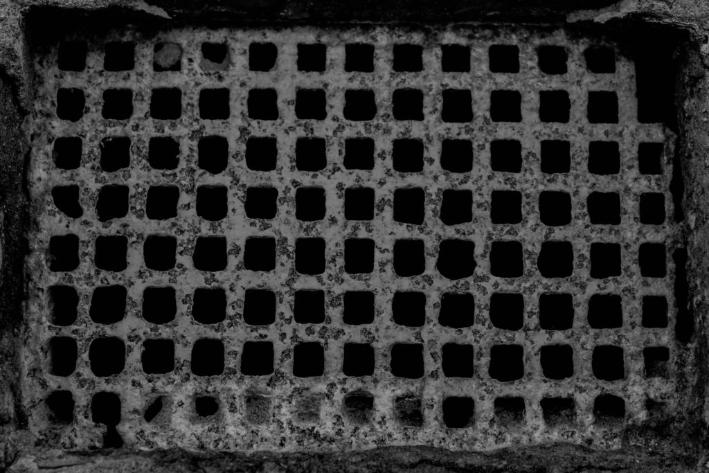
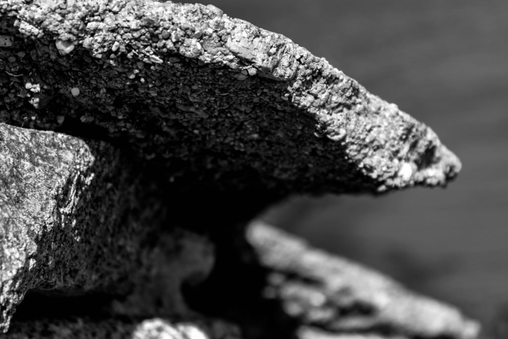
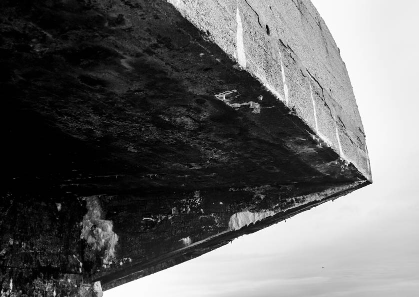
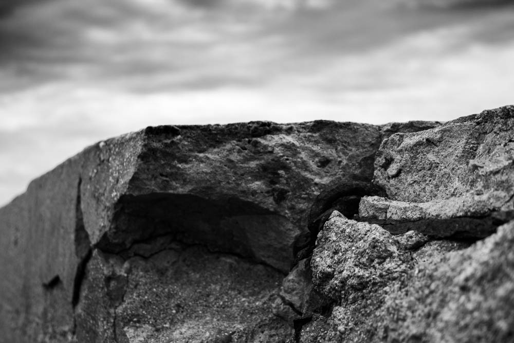
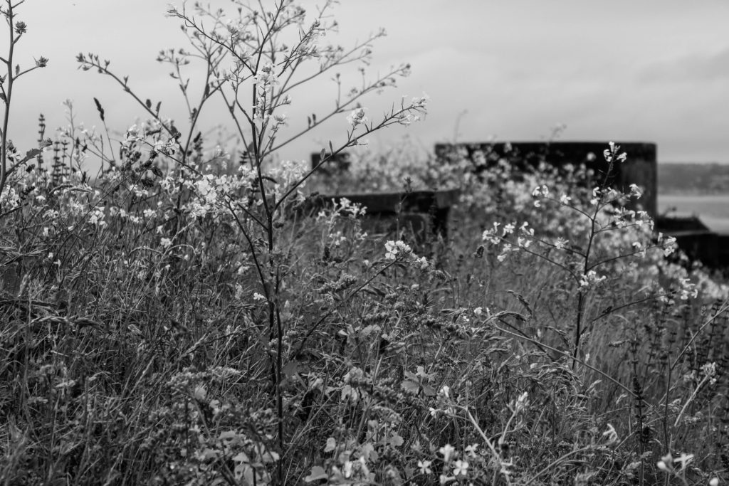
Above is my favourite outcome from the photoshoot, thus I deiced to break down the different components within the image, to showcase my rational as a photographer. Conceptually, I was showcasing the decay of bunkers, and how they have been abandoned and untouched since the war, allowing nature to grow and take back it’s land, whilst leaving a permanent mark on the Island reminding us of the history of Jersey. Contextually, the bunker’s were used to store artillery and weapons in order to prevent unauthorised access into the island. Visually, I have used a macro photograph of the structure of the bunker which has been destroyed, leaving jagger edges, creating a textural design within my imagery. The composition is simplistic as the foreground is apart of the structure and background is the landscape which is blurred, showcasing the use of a narrow depth of field. The photograph was taken at a straight on angle, and is in black and white, allowing a contrast in tonal regions to clearly be illustrated within my work. Technically, the lighting used is natural, produced by the sun, and is soft allowing the structure to not seem so full on, and allows the shadows to naturally be casted onto the structure. The ISO used was low, as there is no intended noise within the photograph as well as the shutter speed being quick as there is no intended blur. The aperture used was low creating the narrow depth of field, which I previously mentioned and the white balance is set to the daylight setting.
Colour Edits:
For my colour edits I used different photographs, which allowed me to explore ways of editing the photographs to make the bunkers not look like they are in real life. I achieved this by moving the bipolar bars to either extreme on the panels, for example having the blacks one end and the whites the other end. The unique and abstract designs produced allows us to rethink the purpose of the bunker, outlining their importance to the Island’s history.
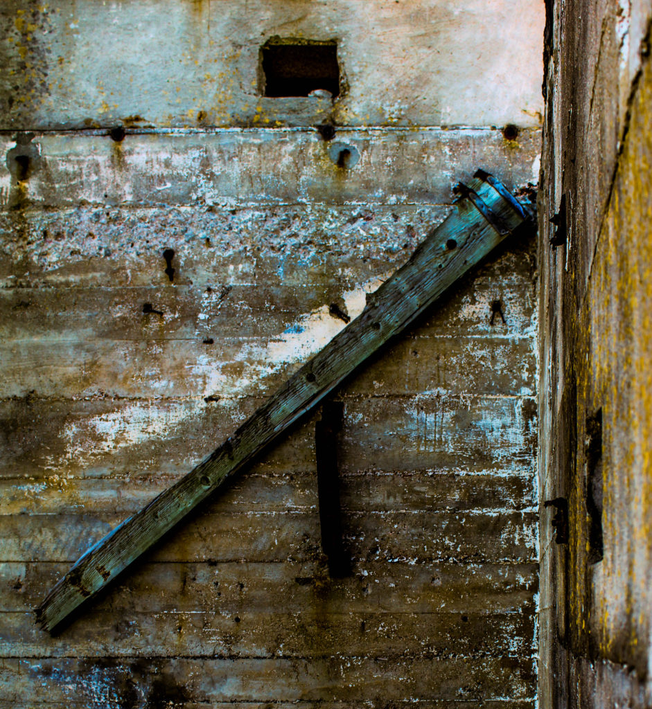
Above is my favourite image from the colour edits, as well as my top image from the whole photoshoot, as I believe it changes the perspective and the way in which we look at Jersey’s bunkers. Conceptually, I was showcasing the decay of bunkers, and how they have been abandoned and untouched since the war, allowing nature to grow and take back it’s land, whilst leaving a permanent mark on the Island reminding us of the history of Jersey. Contextually, the bunker’s were used to store artillery and weapons in order to prevent unauthorised access into the island. Visually, the image clearly showcases the formal elements of texture, space and form, which is showcased by the editing technique I adopted as well as the subject of the image. The composition of this photograph is simple, as the piece of wood is the subject of the photograph, main focus point, and the background is the simple structure of the bunker which has moss and shows decay, again clearly outlines by the editing technique. Technically, the photograph uses natural lighting produced by the sun, which is not harsh as the image was taken at a straight on angle in a location in the shade, allowing my white balance to stay on the daylight setting. The ISO was kept low as there is no noise being presented within my work, as well as the shutter speed being quick due to no intended blur. The photograph uses a wide depth of field which showcases the high aperture used.
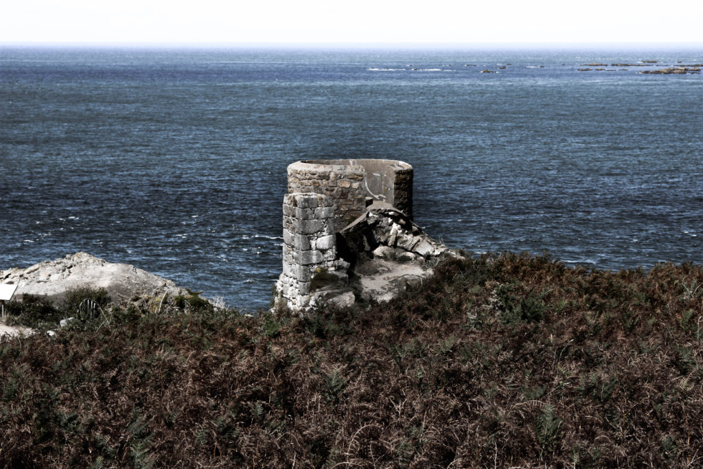
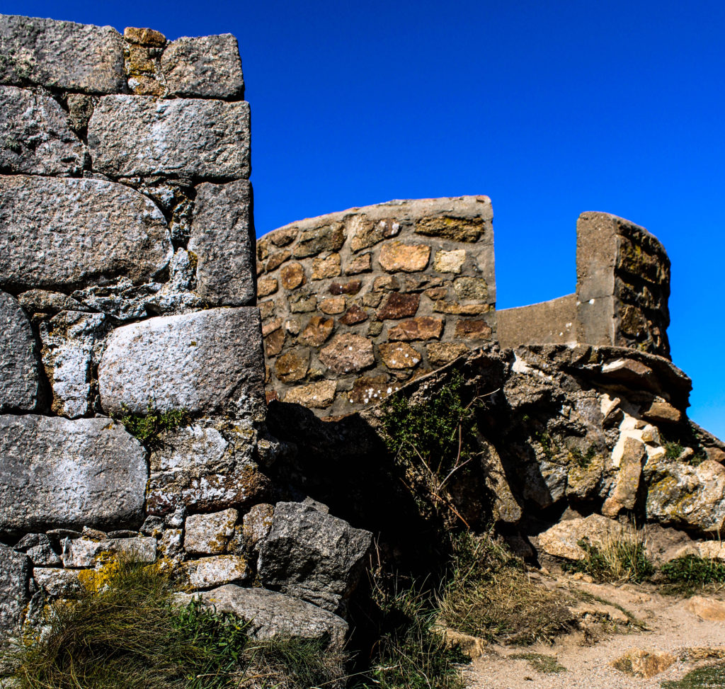
Evaluation:
To evaluate my third photoshoot exploring the bunkers, I believe I have been able to produce strong outcomes showcasing the bunkers in an abstract way, allowing us to rethink and remind ourselves of the importance of the bunkers on our Island. I have been able to further explore with the editing on Lightroom, showing my competence to think creatively as well as not sticking to the basic and standard edits that are usually conducted when editing images. I have been able to gain further understanding into the history of Jersey and have shown further exploration into the project.
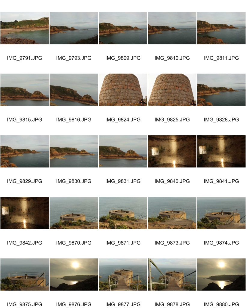
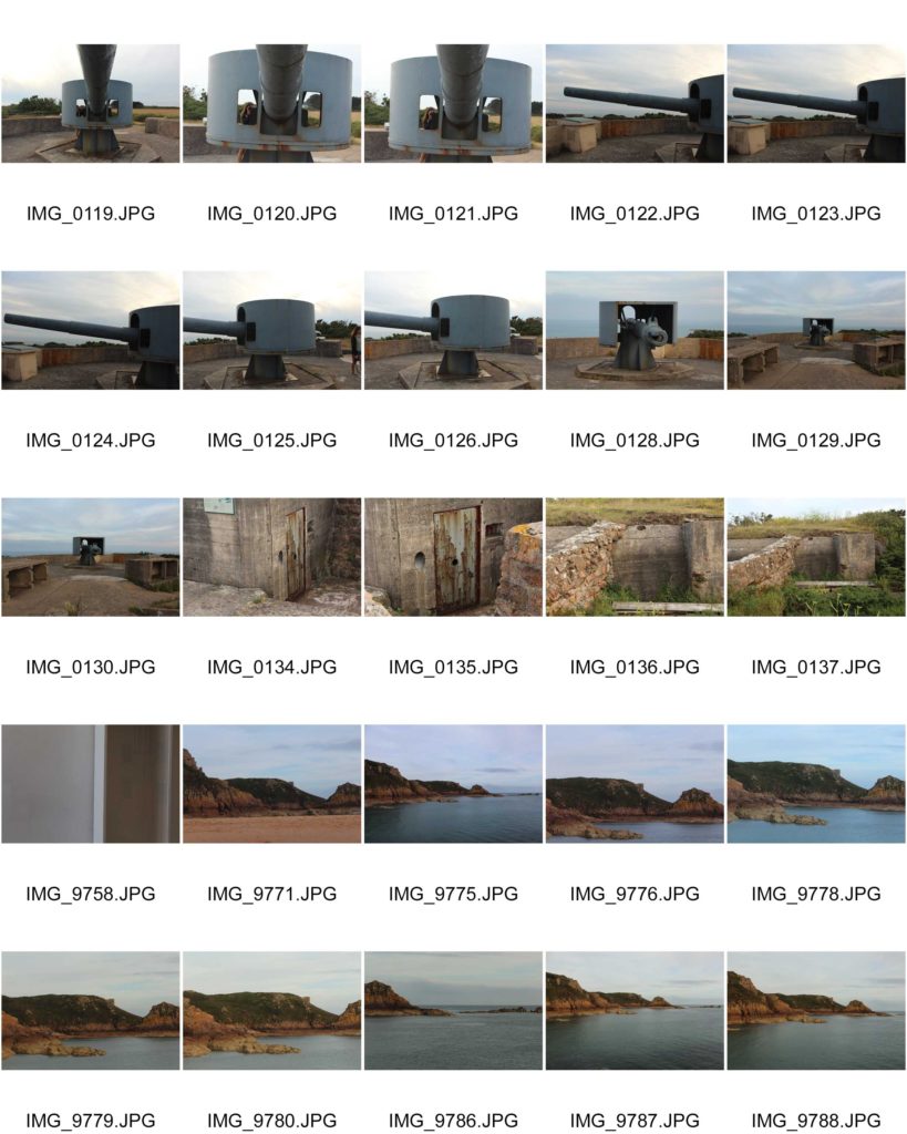
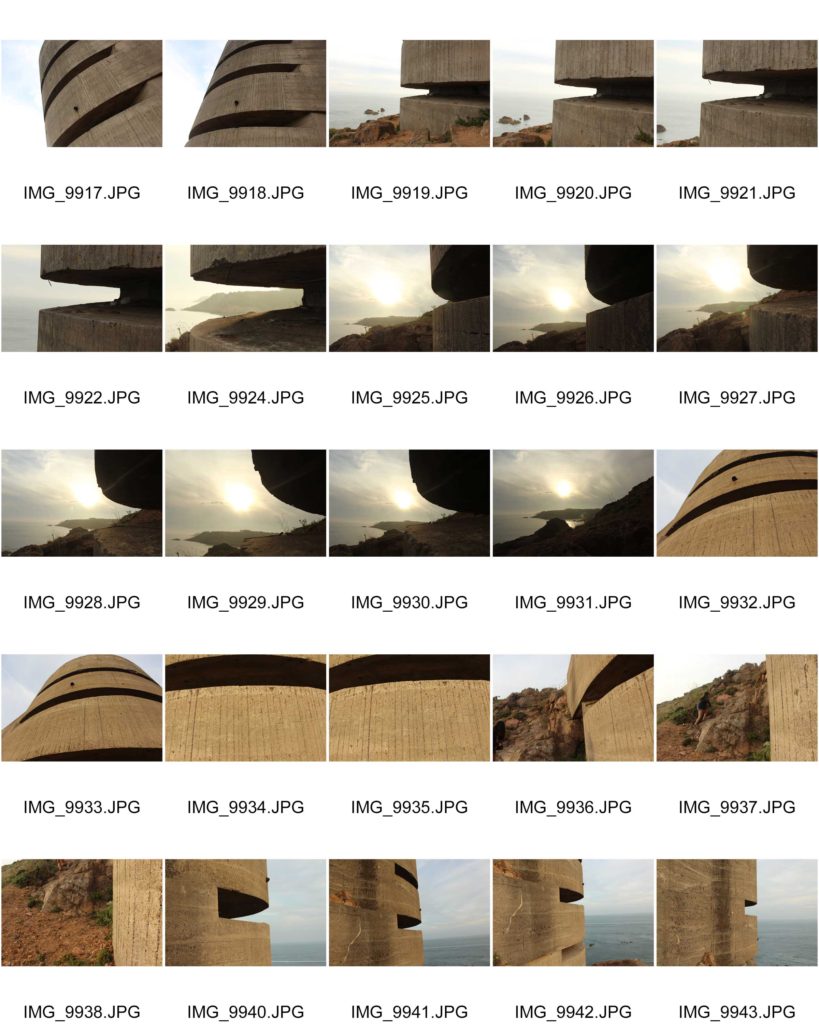
Last weekend I went to Noirmont and then Portlet shortly to take images of the historical German sites it has to offer.
Noirmont is a headland in Saint Brelade enclosing St Aubin’s Bay on the western side.
Noirmont Point and a substantial part of the headland behind it was acquired by the States in 1950 as the Island’s war memorial.
It is a strange irony given its status as a memorial of a war in which Jersey was occupied by the Germans for five years, that probably the main reason for visiting the headland is to view the restored bunkers and gun emplacements of Batterie Lothringen, the only naval coastal artillery battery in the island and part of Hitler’s infamous Atlantic Wall.
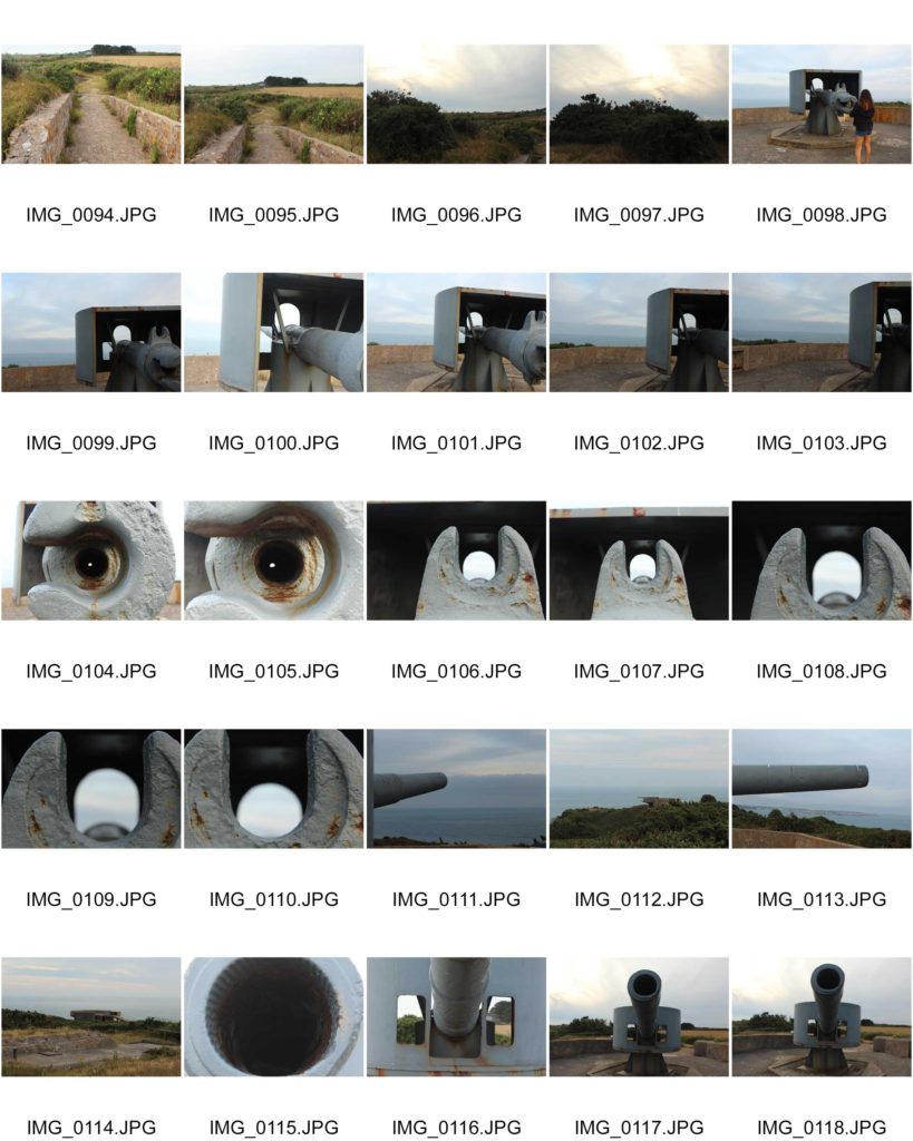
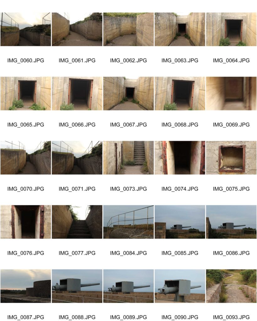
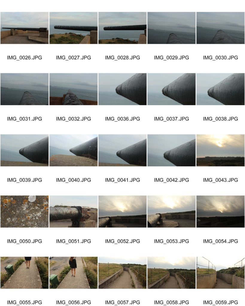
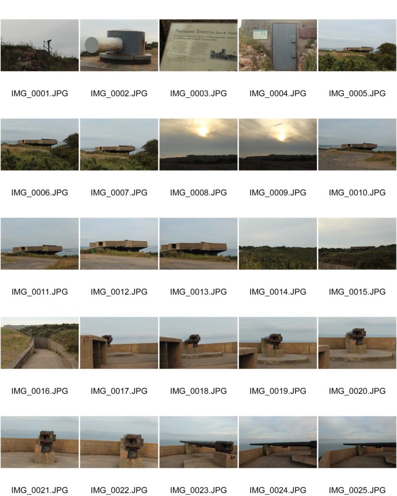
Final edited images:
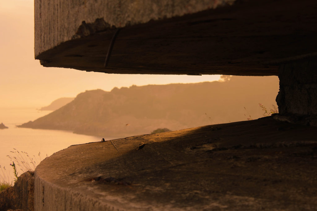
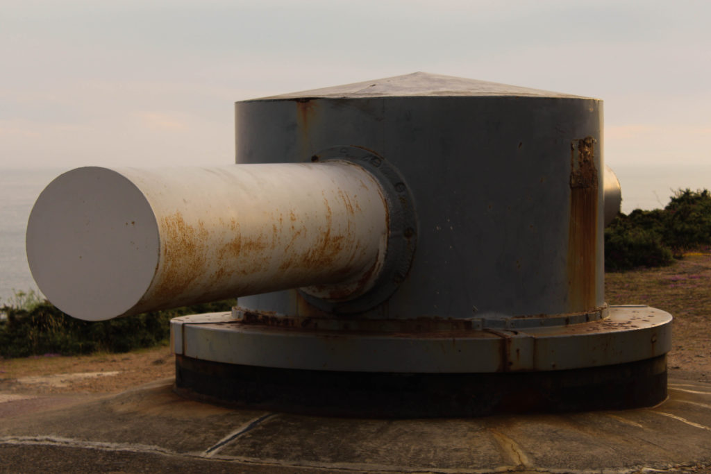
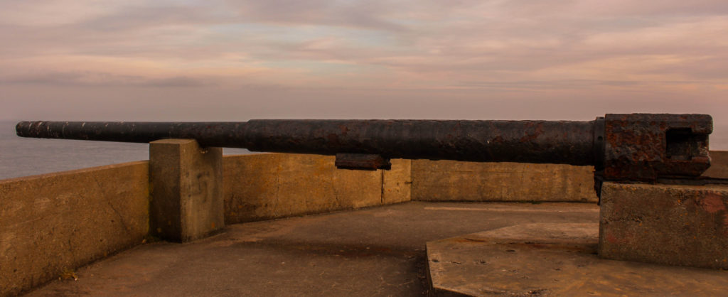
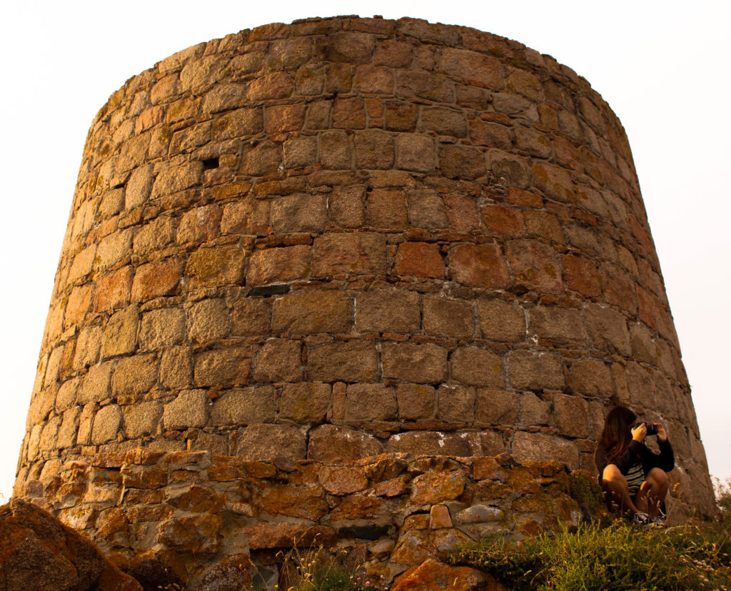
Information:
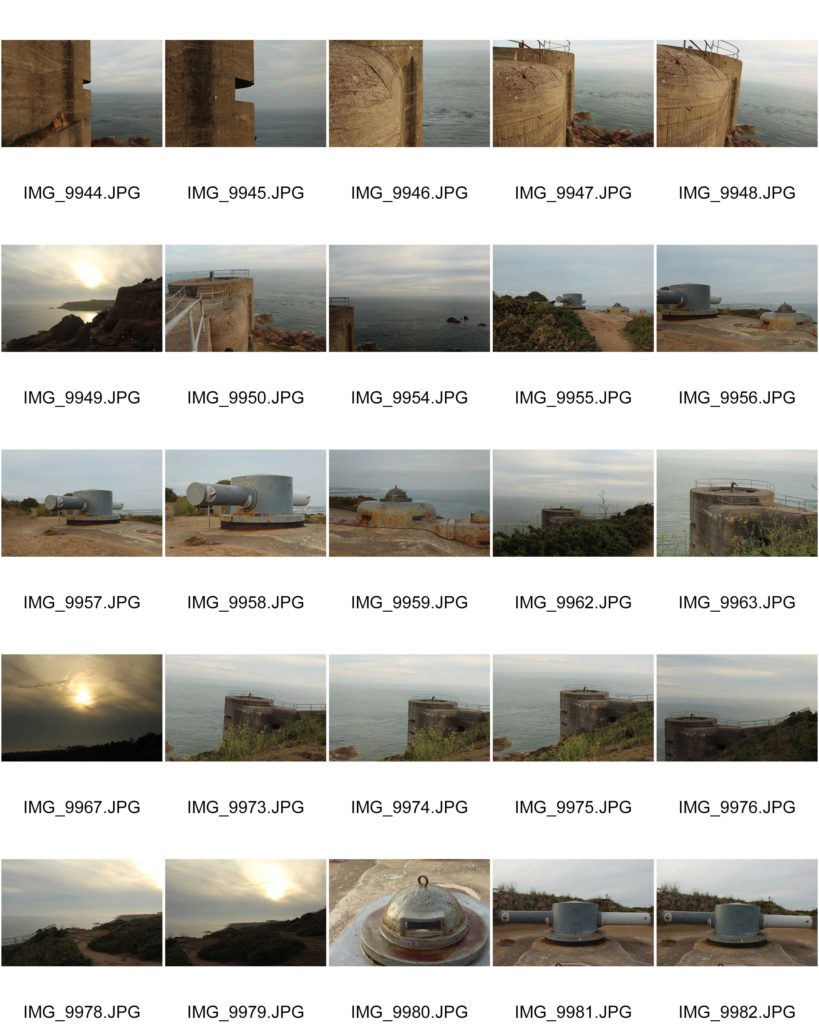
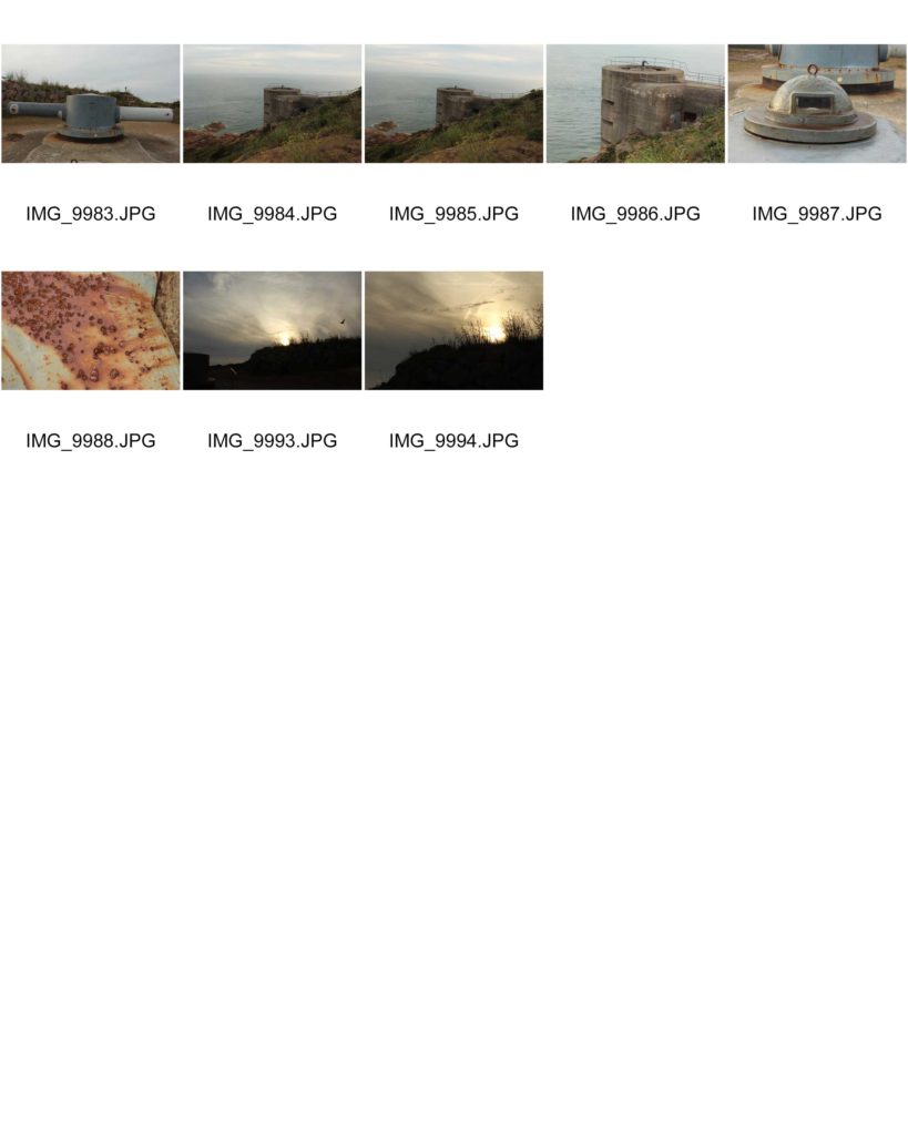
Due to the success of my first trip to Noirmont point, I decided to explore another artillery battery on the island. I wanted to produce more images which supported the theme of bunker abandonment and how nature is taking back the island. I explored more with the weapons located on the site and different details on the structures which could creating an interesting and abstract looking image.
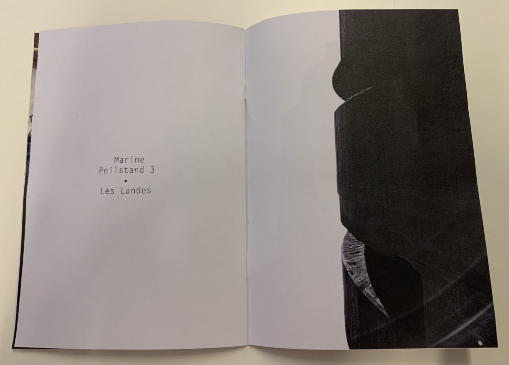
Battery Moltke is an incomplete World War 2 former coastal artillery battery located in St Ouen’s. It is located in Les Lands, which is where all the guns where chucked off the coast at the end of the occupation. The artillery has bunkers, guns and the Marine Peilstand 3 tower located on site. The bunker was being built as the war came to a closure, thus they did not manage to finish making it in time leaving it unfinished. The artillery battery was being built to protect St Ouen’s bay from any attacks to the island. All the different structures were close in proxemics and close to the cliff face, which showcases how the location was ideal for the Nazi’s to prevent anyone entering or leaving the island.
Planning:
To prepare for this shoot I used the AV setting on my camera which allowed me to prioritize my aperture. The weather was some what sunny but had some fog, which meant that my aperture was middle in the range. My ISO was slightly higher than my previous shoot as well due to the lack of sun light provided, did not exceed 600. I used a quick shutter speed, with manual focus in order to allow me to control my camera. I wanted to explore with macro images as well landscape to capture the bunker. When editing I am going to simply stick with the techniques used from the first shoot, but it may vary due to the outcomes I produce.
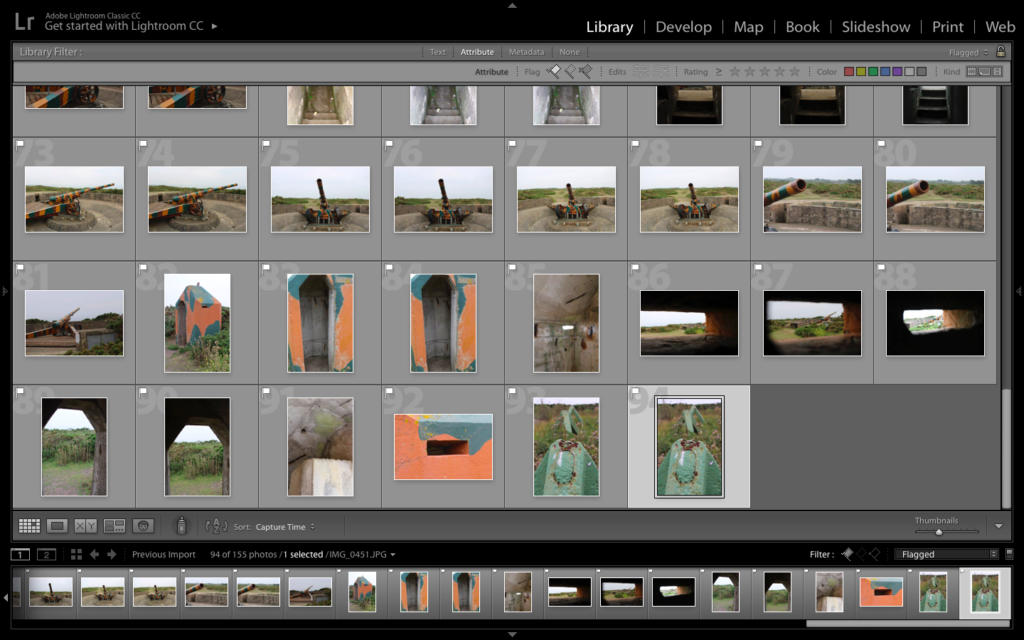
Lightroom Selections:
Color Edits:
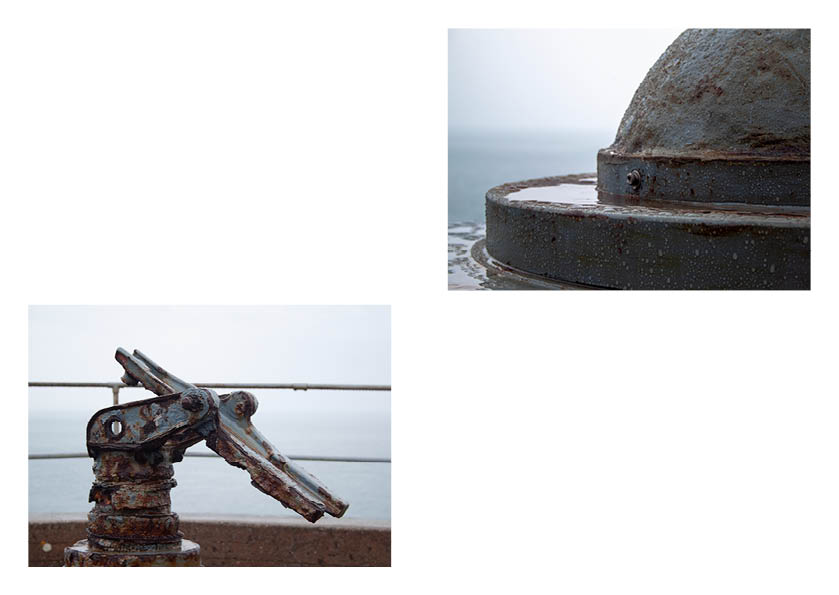
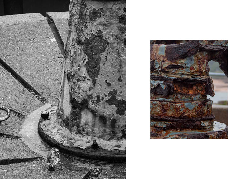
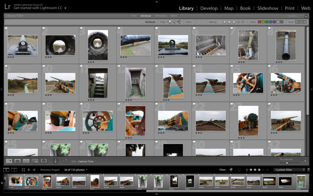
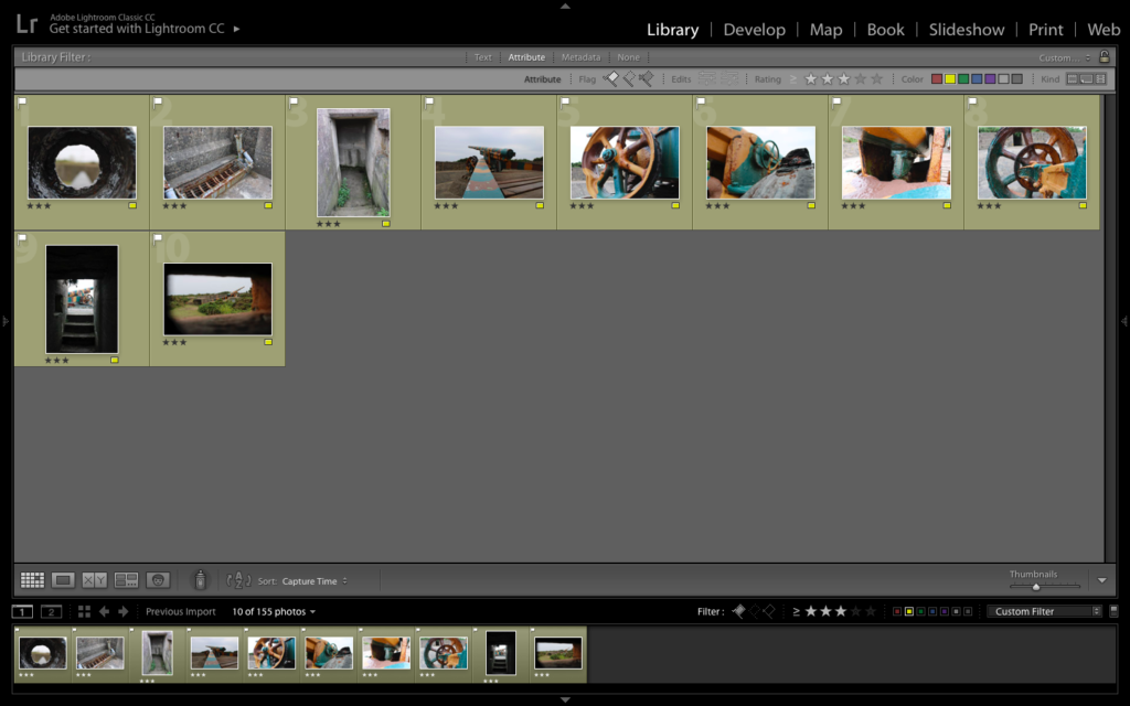
For my color edits I decided to explore and experiment with the different developing tools within light room. I always made the white balance setting to ‘as shut’, but adjusted the clarity, shadows, blacks, whites etc to enable the best possible outcome for my imagery. For the first edit I wanted the center of the frame to be lighter than the outsides, to create a sense of entrapment and allows the viewers eyes to be easily guided around the frame of the image. I did this by using the Radial filter tool. Moreover, for this edit I wanted to encapsulate how nature is growing around the bunker, which I showed by increasing the structure and clarity of the images. For my second macro image I wanted to showcase the detail and texture of inside the the gun, I did this by making the whites and black sliders down to bipolar ends, and made the clarity slightly darker allowing this effect to be created. I am very happy with the way in which these two color edits have come out due to how they clearly present the theme of nature taking back the island from the occupation. In addition, the camera techniques (such as depth of field and rule of thirds) used are effective as they allow the archaeology to present decay and historical factors of the second world war.

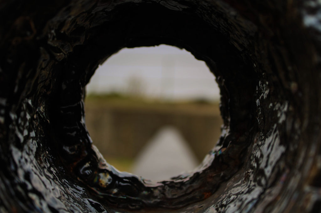
Black and White Edits:
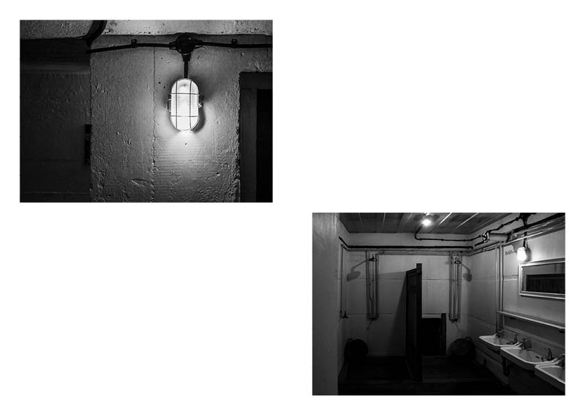
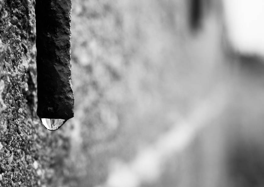
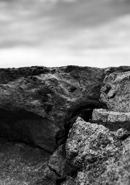
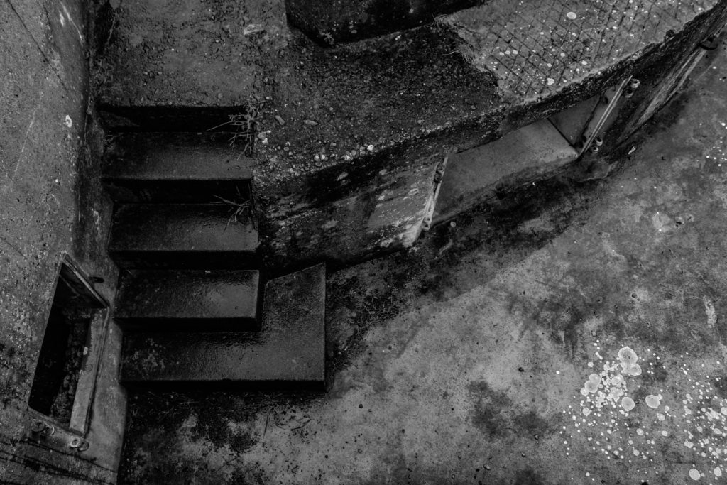
For my black and white images I looked at exploring with my macro images and creating a tonal contrast within them. I achieved this by adjusting the blacks, whites, shadows and clarity, by moving the sliders closer to either end allowed a clear tonal contrast within the images, making them interesting for viewers to look at. Moreover, I made these decisions to allow the detail and the formal elements of line and texture to clearly be presented in my images. I also looked at cropping my images to emphasis the details on the bunkers which clearly showcases the decay of the bunkers.
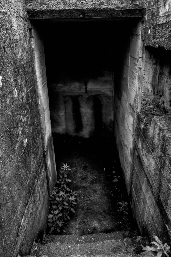
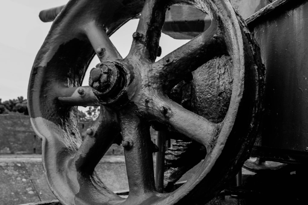
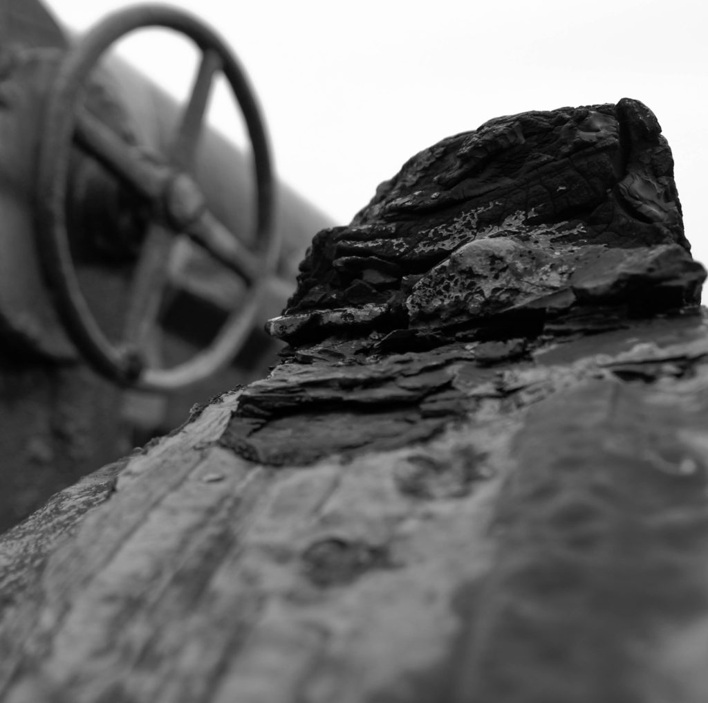


Conclusion:
To conclude I am very happy with the outcomes produced in this shoot. Experimenting with macro and landscape photography allowed me to present bunker archaeology in a new way, developing the idea of capturing bunkers and presenting the decay of them. In addition, I have been able to successfully select and develop these image which showcases my ability to use light room effectively and understand the different settings and how to adjust them to make an interesting outcome. Exploring another bunker has also allowed me to understand that the layout of each site are similar and contain practically the same things, however the weapons and views are different which allows new landscapes to be presented. Moving forward I would like to look at photo montages, combining images from both shoots with archival material in order to showcase bunker archaeology in a new light.
A photo montage is a series of individual photographs, collectively of one subject, arranged together to create a single image. Sometimes a photomontage can move and include video.
A photo montage can contain any number of photos. There is no limit to the amount of time it takes to create this series of images. There is also no limit to the variety of locations the photographer can use to make the photos. To be practical in the execution of a photo montage, some limitation is advisable.
For my photo montage, I took images based on the war and which were taken during that time, and then I also took my own images which are of German bunkers and places which were used during the war. To make my photo montages I took my images and paired them up depending on their similarities, and then cut certain pieces out, stuck them together and even burned one of them. Below are my results.
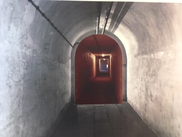
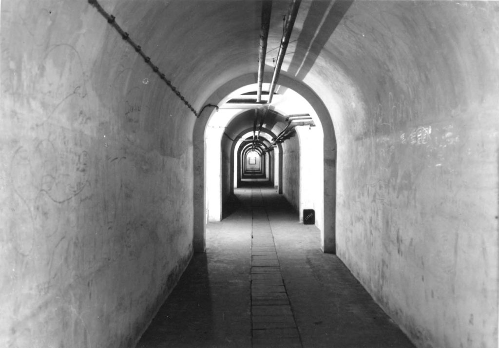
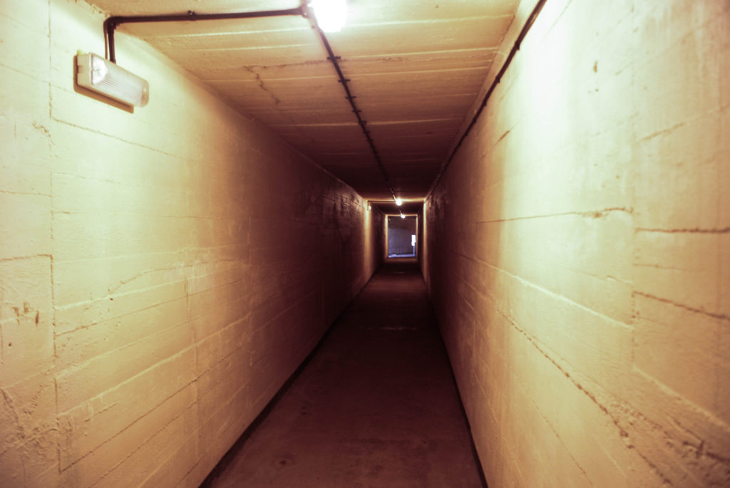
For this montage I took two images, one which was taken during the war in a tunnel and one which I took when I went to Battery Moltke. I then took the image from the war, cut out the middle where the hallway continues and matched it up to the recent image so they look like one hallway.
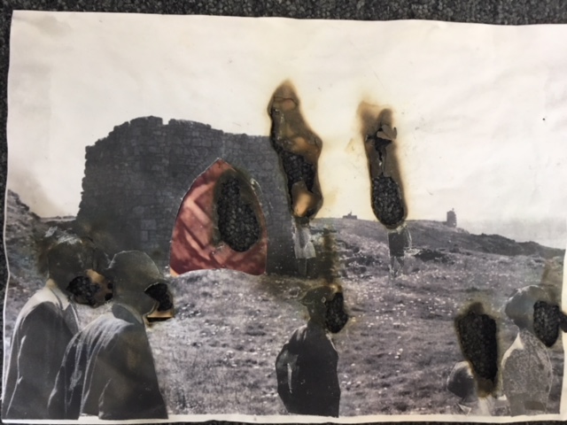
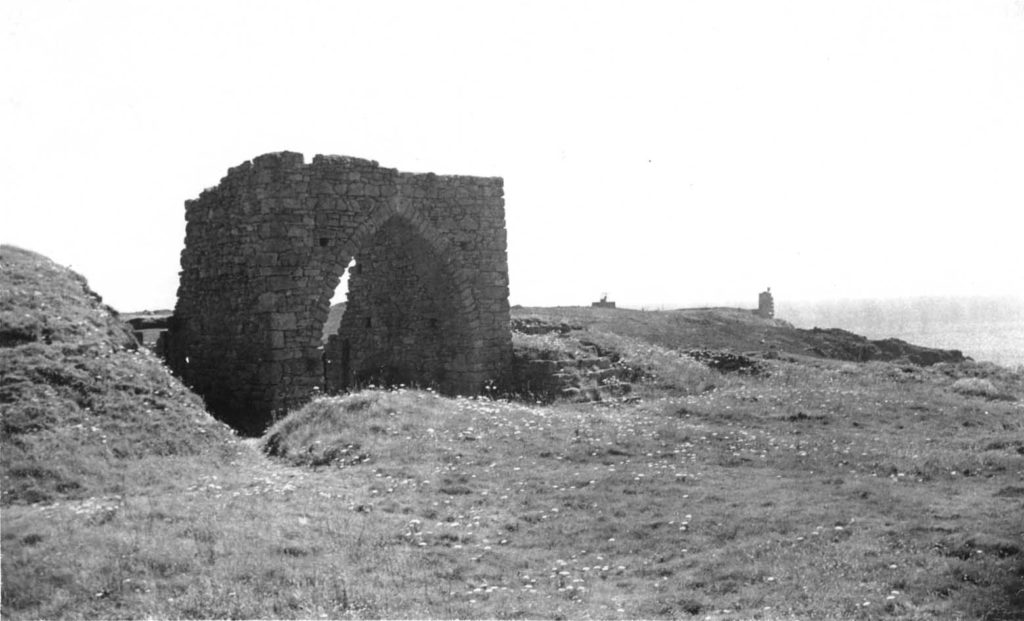
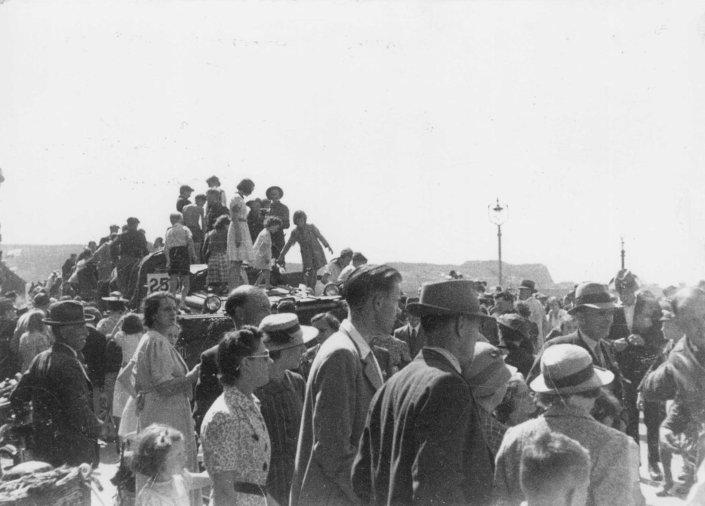
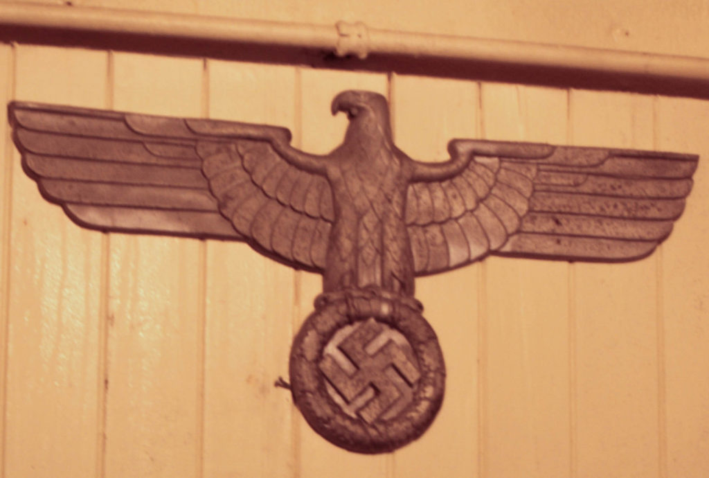
For this image above, I found a picture taken during the war of the French castle ruins close to Battery Moltke, another where there were a crowd of people around a car, and one which I took of a Nazi symbol. I cut out the people in the crowd image and stuck them among the ruins picture to make them appear as if they were there looking at towards the archway and the bunker in the background. I then cut out a hole where the archway was and put the Nazi sign there. To finish it off I burnt holes into the images where the faces of the people were, and where the Nazi sign was so that they lost their identity as they would have when they were taken over during the war.
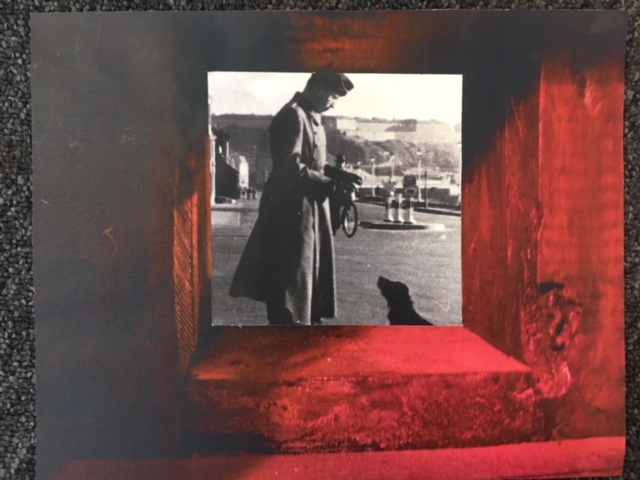
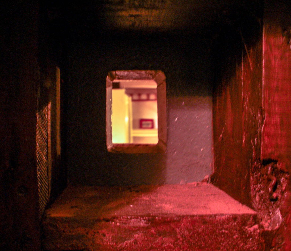
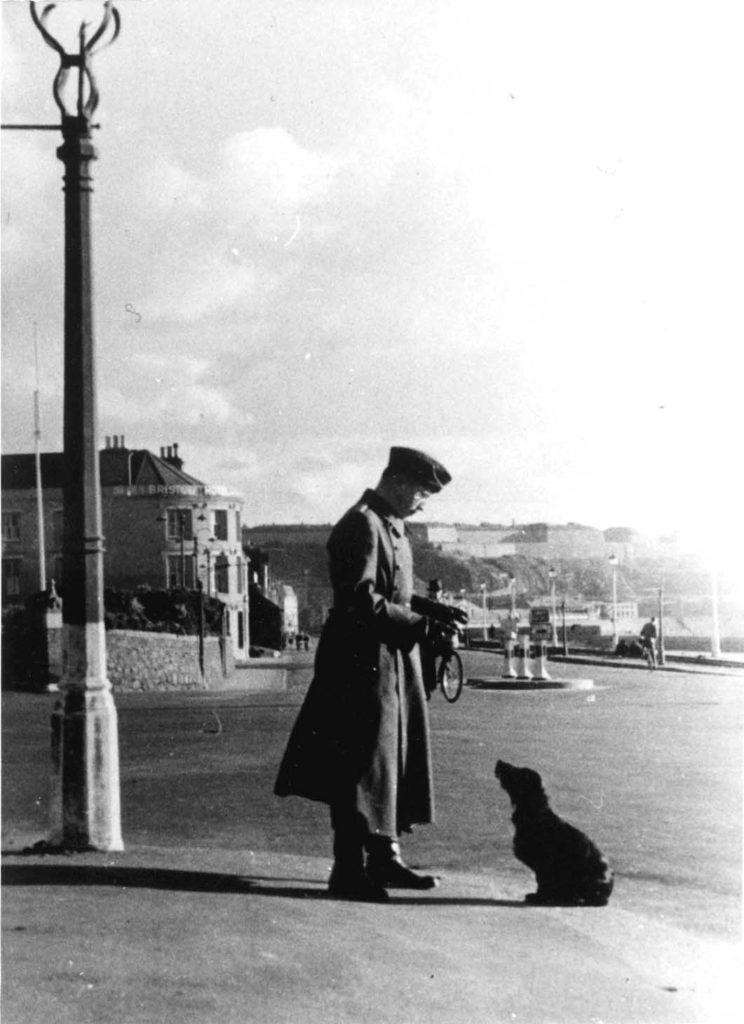
to make this image a took an image of my own, which was a square hole in the wall of the hallways we visited at Battery Molke, and took an image from the archive of a German soldier with a black dog. I cut out the space where the hole would have been in my image and stuck the older image behind it, as if we are looking back into the past through this German-made hole.
In this blog post I will be experimenting by creating photo-montages related to the war, which show the occupation of Jersey and the effects it had on the island. I will be using a mixture of original archive images and also some of my own images that I have taken as part of the project so far.
Montages can be created either physically or digitally using software such as Photoshop. It is the process of putting different types of images on top of each other in creative ways, in order to convey a feeling of theme.
Below are some historical related photo montages that I have looked at, and used as inspiration before creating my own.
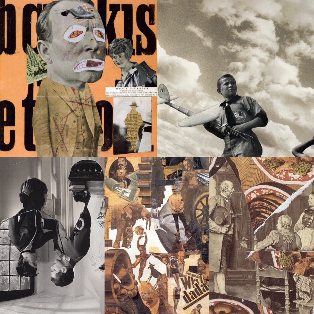
Below are my own montages that I have created my cutting and sticking together printed images.
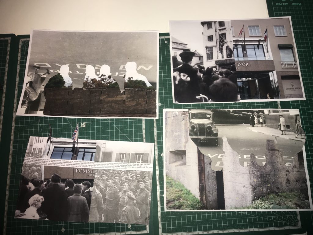
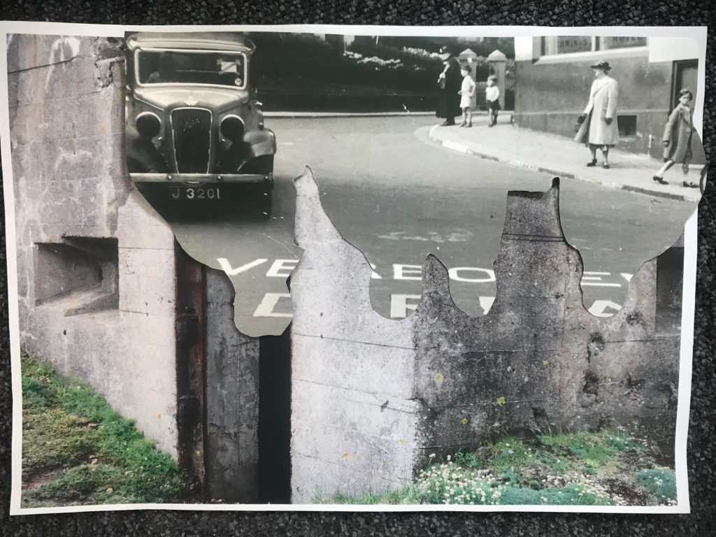
This montage was intended to show how the Island changed under the occupation to include more “Nazi lifestyle”. The image includes something to represent different things that and how they changed Jersey. The fortification I used as my background shows how the island was changed and altered to become resistant to attacks, the road with the German writing on it shows how the language became introduced and forced onto the Jersey people, and the outline of the solders represents how they enforced a different way of life onto people.
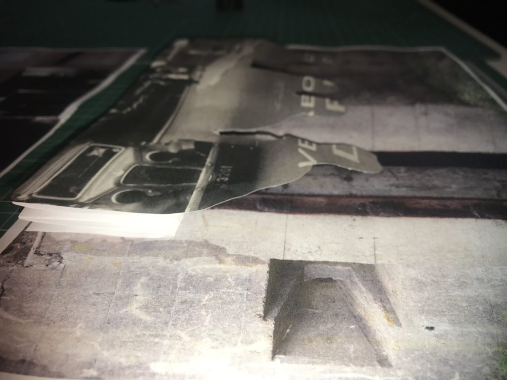

If I were to display these montages I would display this one with my previous one as they both represent changes in Jersey’s society. This image shows a different part of a fortification in the background, to show how the island was changed into a fortress, the outline of the soldiers and the German writing shows how the islanders lost their freedoms and language.
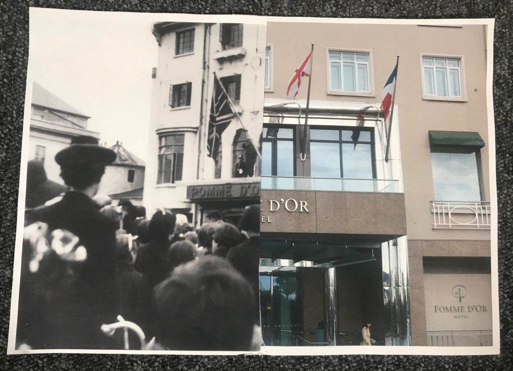
I think this montage is very effective because you can clearly compare. It is very interesting because there is such a huge contrast in era, however you can also see that it is the exact same building. I think this shows that every place can have an important history. I decided to to a montage of this specific hotel because on Liberation Day, British troops hung a Union Jack from the balcony to symbolise the end of Jersey’s occupation, which is a very important turning point in Jersey’s history which I felt could be represented well in this way.

This montage is interesting as it also alludes to Jersey’s liberation. The image of the hotel and the image of the islanders celebrating being liberated is placed over the image of the German soldiers. Having the German soldiers partially hidden represents the fact that they were defeated. Having the contrast of the hotel in the modern day, and the liberators standing outside the same hotel on the original day is also a huge but effective contrast since it shows that the site is just as important in representing liberation as it was in 1945.
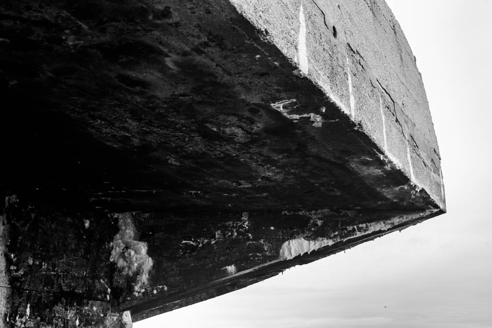
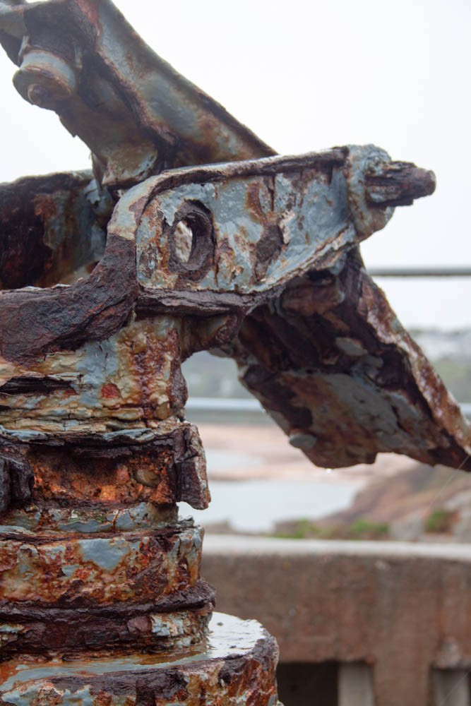
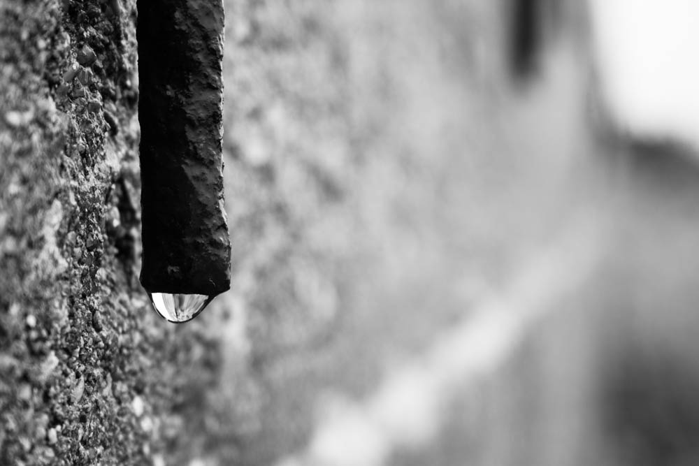
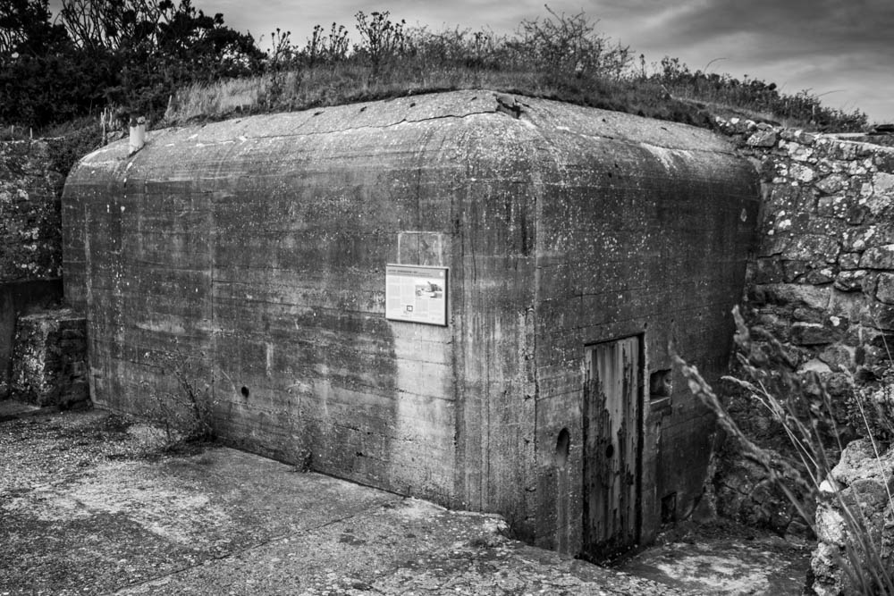
On the 4th June 2019 we visited the ‘Societe Jersiase’ where we were introduced to theme of our A2 project ‘Occupation’. During this introduction we where told about key dates and events during the occupation of Jersey (such as the time frame of the occupation form 1939-1945, for more information about the key dates can be seen on this blog post)and Key photographers who captured images within the second world war. These artists included Henry Mullins (portrait photographer), William Collie (Fox Talbet and calotype photography) and Thomas Sutton (panoramic photography).
Societe Jersiase is well known for their private photo archive, which explores Jersey’s historical, cultural and social over a large period of time. Thankfully, the archive has numerous of albums containing images taken during the occupation of Jersey, allowing me to explore different aspects of Jersey’s war. All images where placed in plastic covers to ensure our hands do not ruin the photographs which have been preserved over a longitudinal period of time. To further explore these images workers within the archive made some of the images digital and printed them off, allowing us to begin to explore narratives. We had to select our favorite images and order them in order to storyteling and create a narrative, and meaning towards the collection of images. With in depth exploration into the archive and the activity of creating a narrative allowed me to gain a better understanding of what life was like for people living through this time, and how Jersey has changed and developed since the second world war.
As our final activity we were given the opportunity to explore town, now understanding the history of the war, and capture one landscape, one portrait and one picture of an object. Doing this allowed to think and explore creatively trying to capture Jersey’s war or what is left from the war in today’s society. Below are the top images produced:
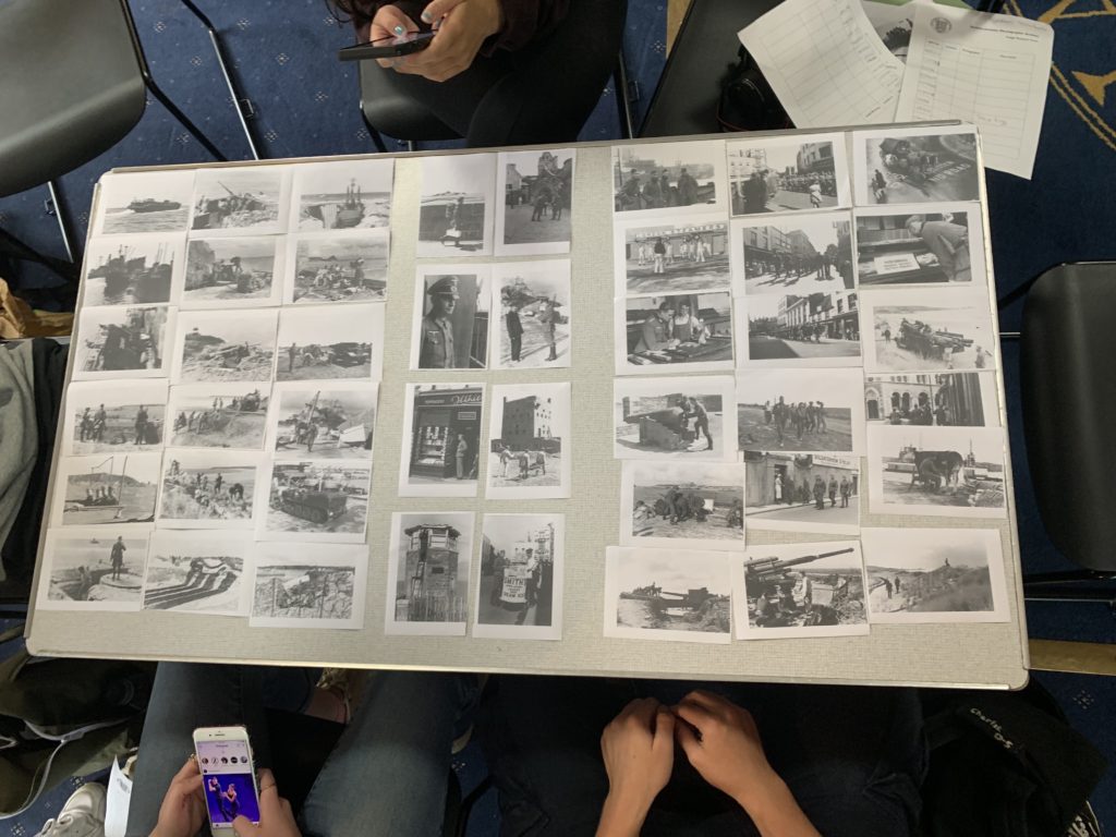
Within our narrative we told the story of how the occupation effected different aspects of the island. The story starts on the left, like a book, which showcases the shore of Jersey and how highly protected it was, so that no one entered or left the country. It then followed through to a portrait of a man with different locations and items which were personal to him showcasing a personal effect the war had on someone. Moving over Jersey’s town is presented, which showcases the social and cultural aspects of Jersey during that time. In addition, we used a lot of photographs to make it a chaotic looking narrative which is symbolic for the chaos Jersey experienced during the occupation of Jersey.
After that task we were then allowed to take photographs using our cameras. Our brief was to try and capture the Occupation of Jersey, including a landscape, portrait and photograph of an object. My initial ideas was to walk to the Bunker located on Mount Bingham, for the other two types of images I was unsure what to capture but experimented with different things around town as I wondered around. My camera settings where kept normal, with a quick shutter speed, low ISO, automatic white balance and varied my aperture as well as experimenting with depth of field. My outcomes and editing process can be seen below:
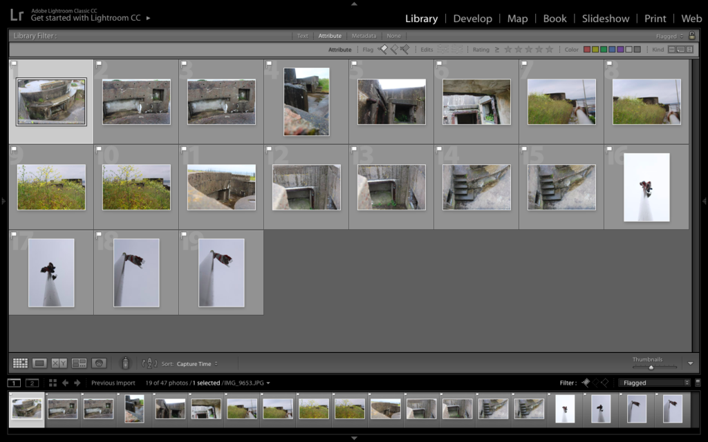
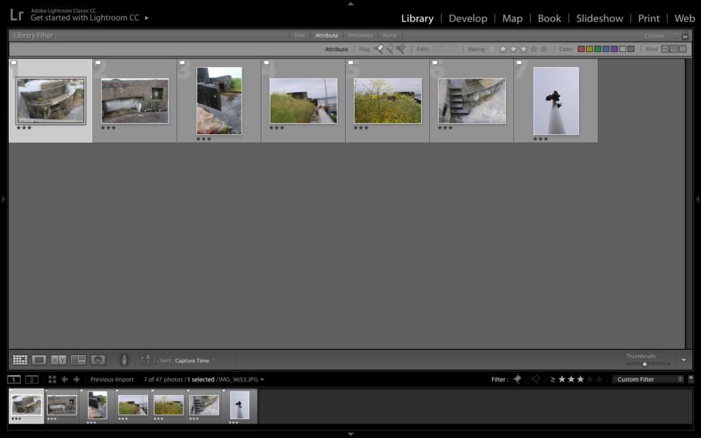
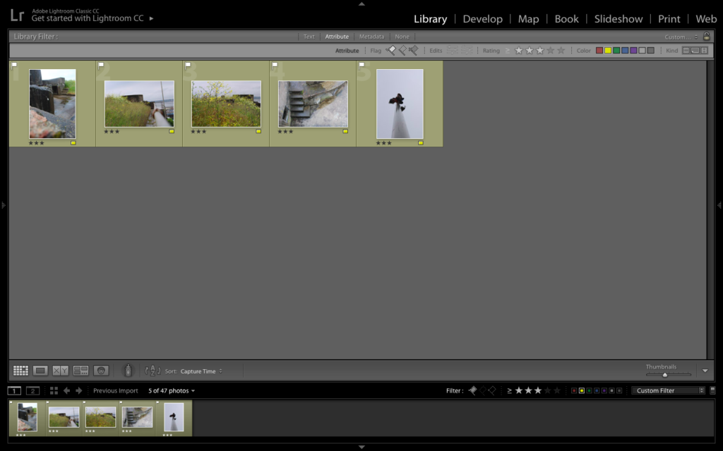
To create these outcomes I used the develop section in Lightroom, where I adjusted the contrast, exposure, highlights, black and white, curves, cropping and other elements which slightly adjusted the images. I am very happy with these outcomes as they showcase how Jersey has been left since the war has ended and how Jersey is out growing these abandoned bunkers, due to the over grow and nature taking back that land. All four images clearly show my competence in taking images and my ability to accurately adjust and edit images to showcase a theme or story in a creative manor.


To conclude this outline was successful, I learnt the importance of photo archives, I learnt more about the history of Jersey and have a more in-depth understanding about the occupation of Jersey, as well as how photography has developed on the island. Moreover, I have been able to begin to look at narratives and was able to capture images in town relating to Jersey’s war which creates a narrative in itself. In addition, I have had a successful first attempt at editing and experimenting with the images on Lightroom in order to clearly present the historical and cultural elements towards the images.