Category Archives: AO4 Present Ideas

Filters

Author:
Category:

Occupation objects: studio shoots

RECORDING:

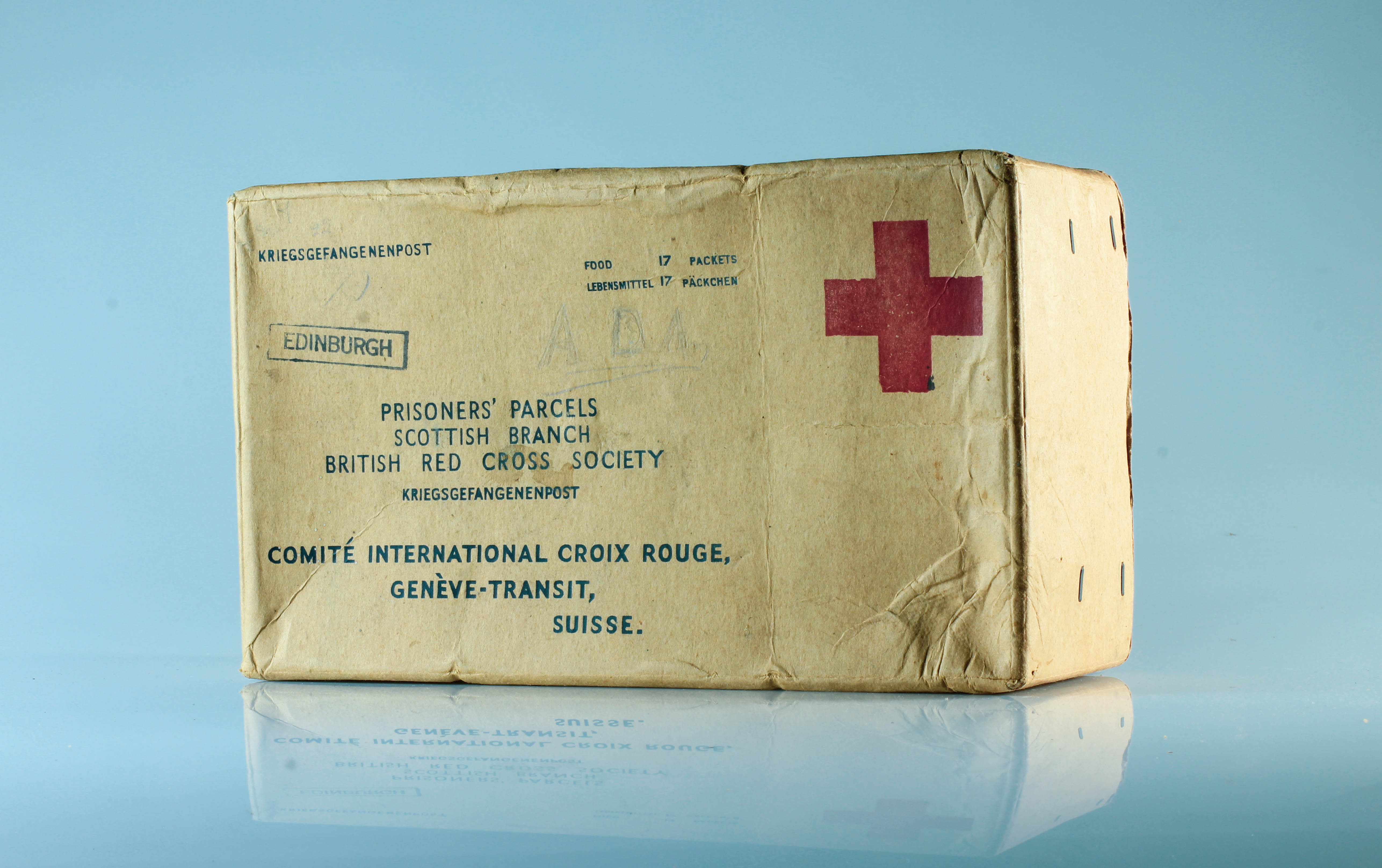
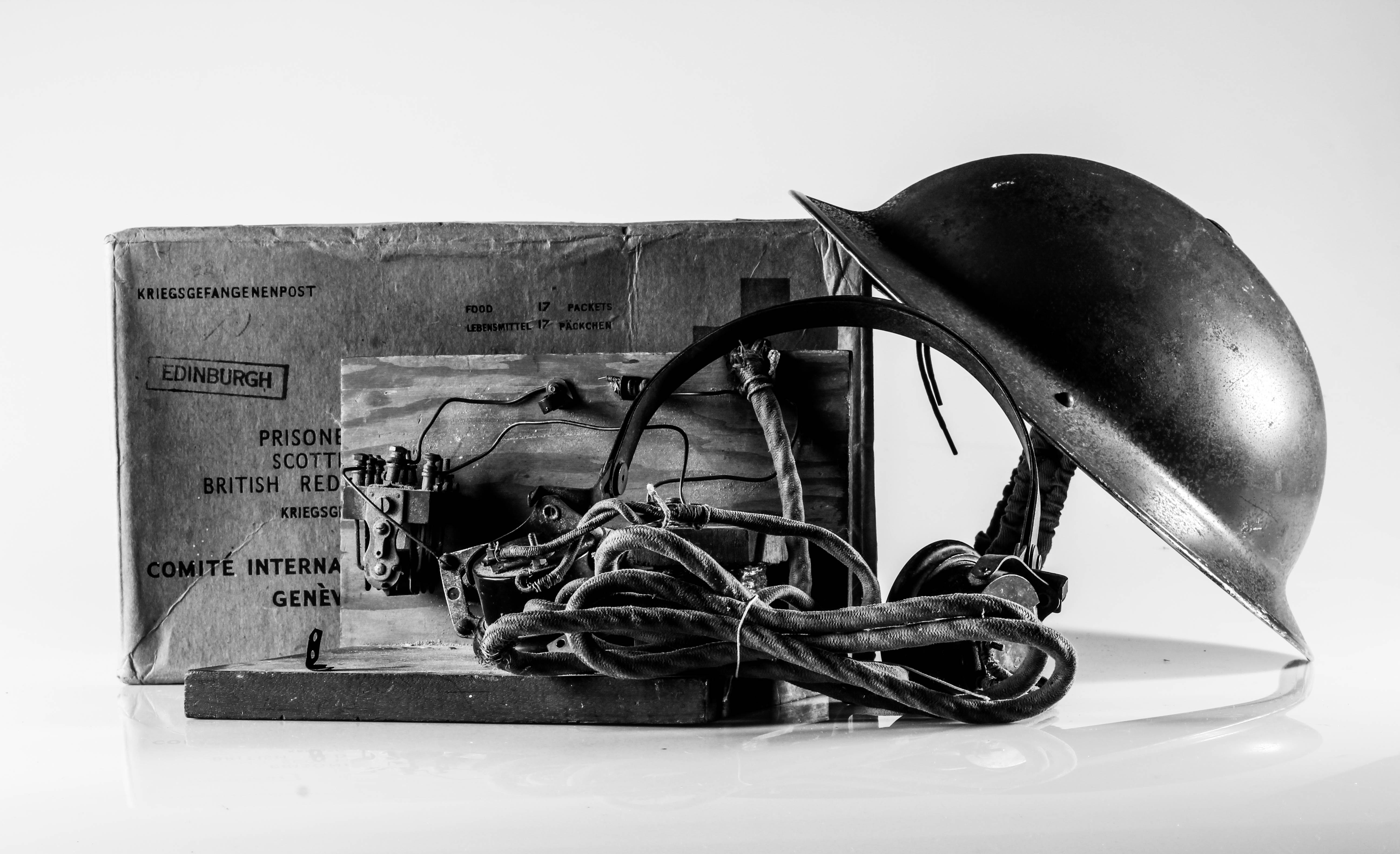
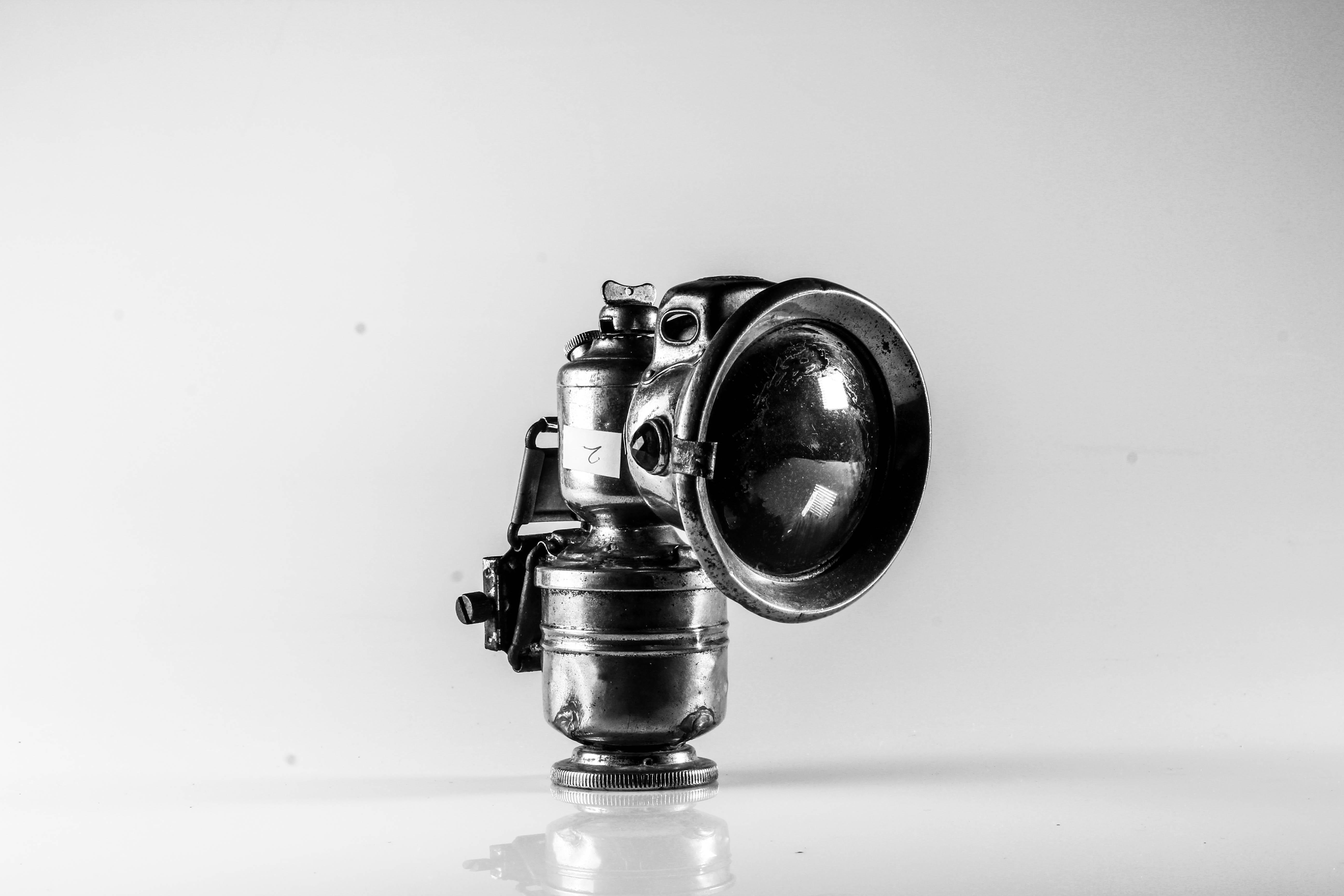
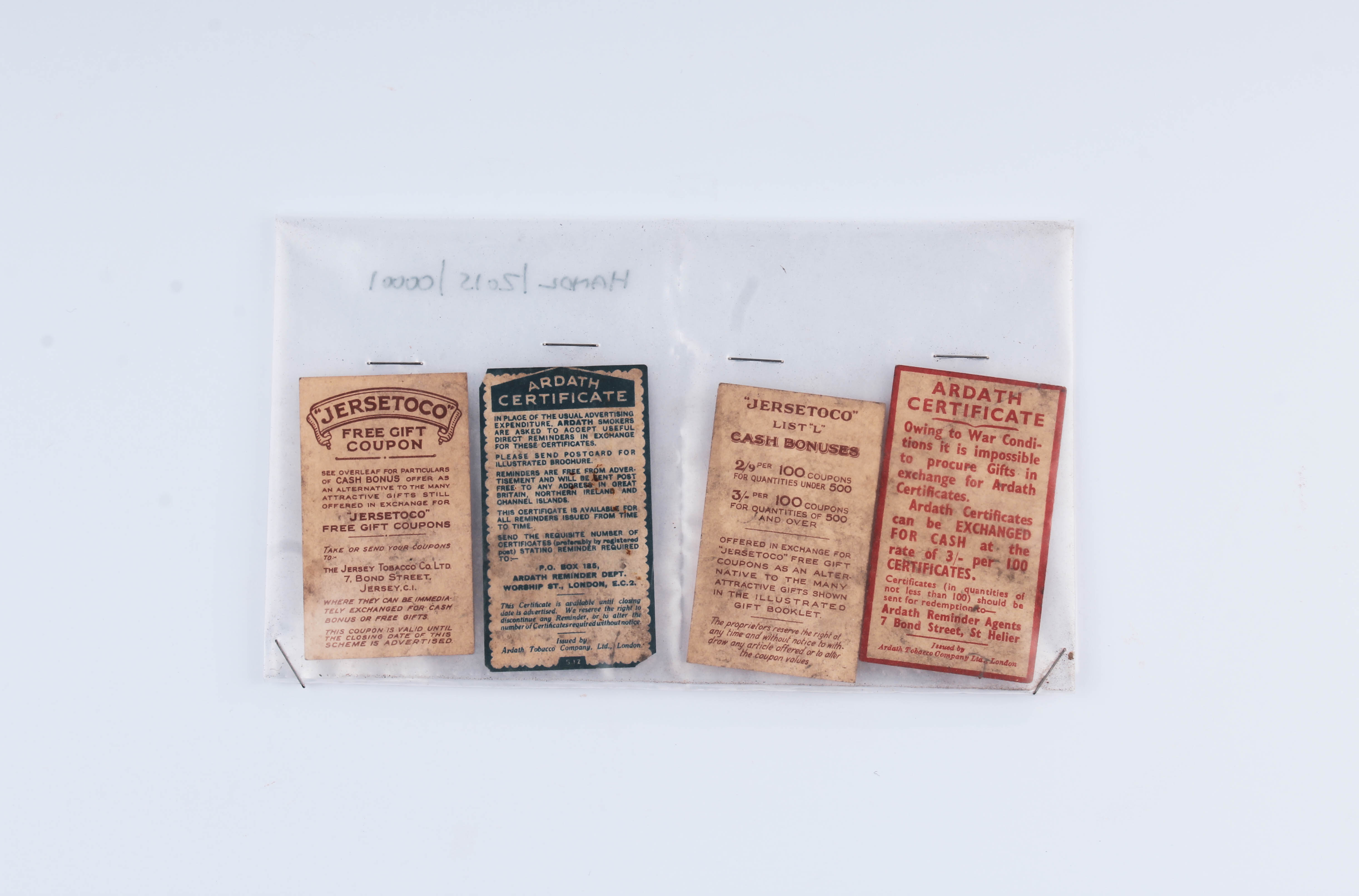
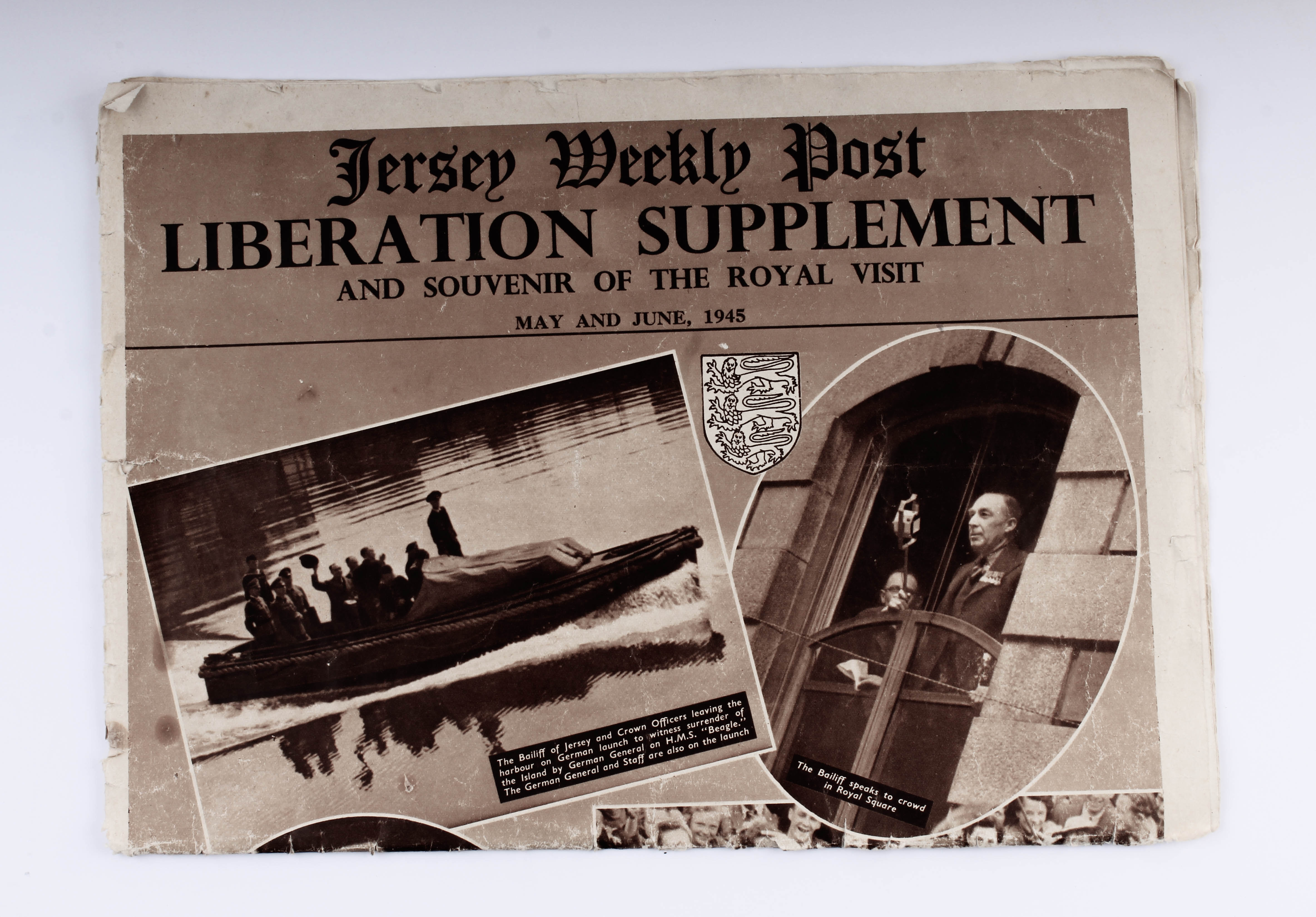
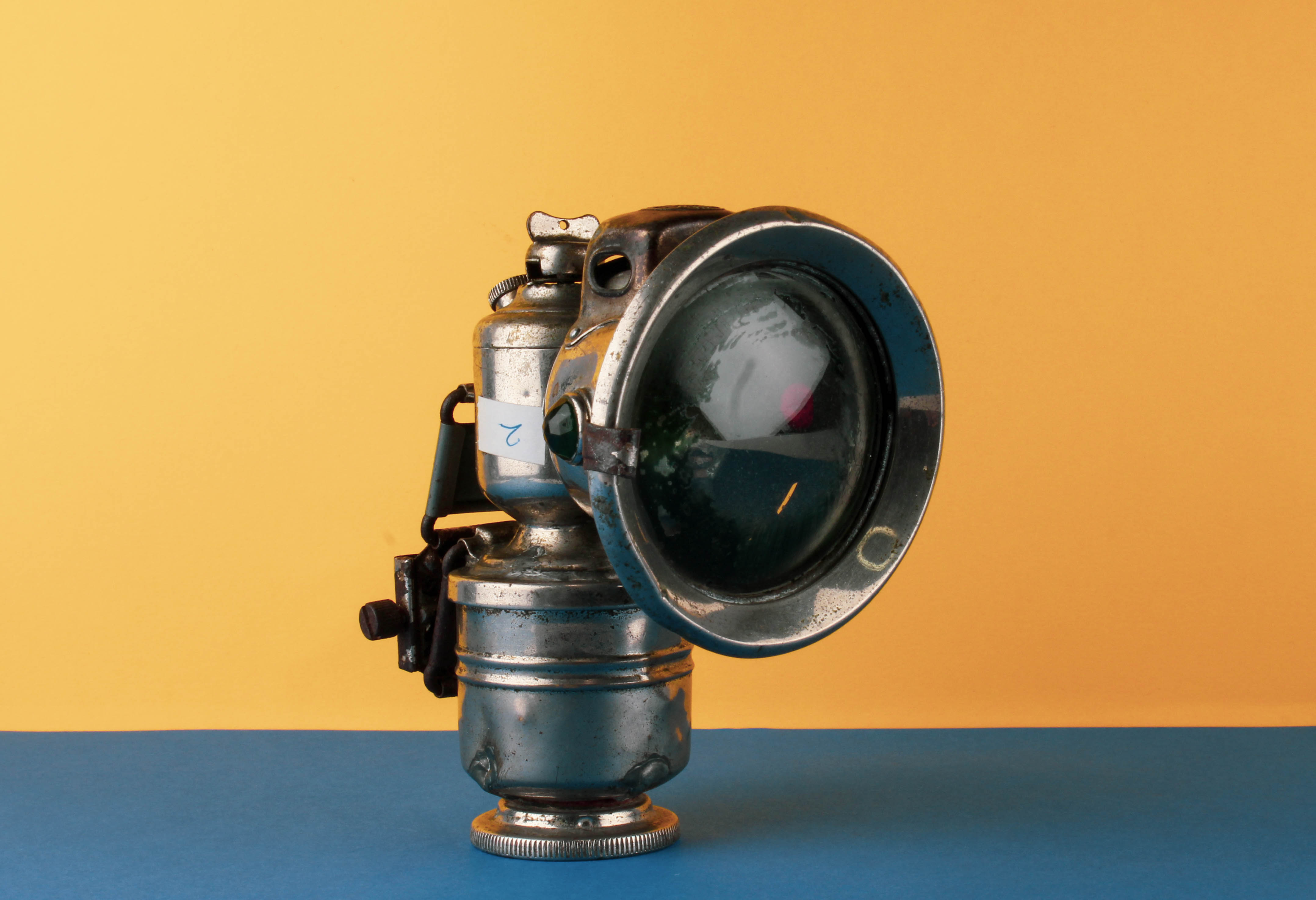
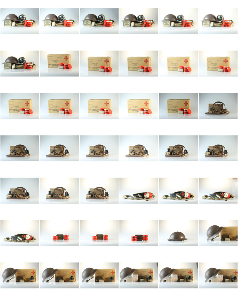
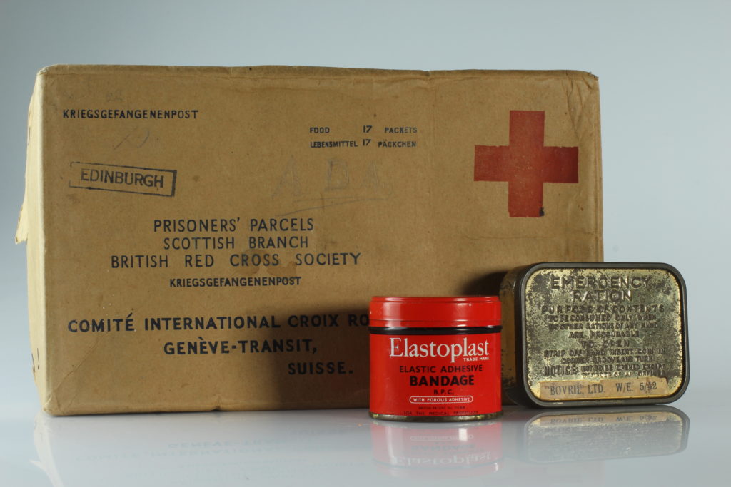
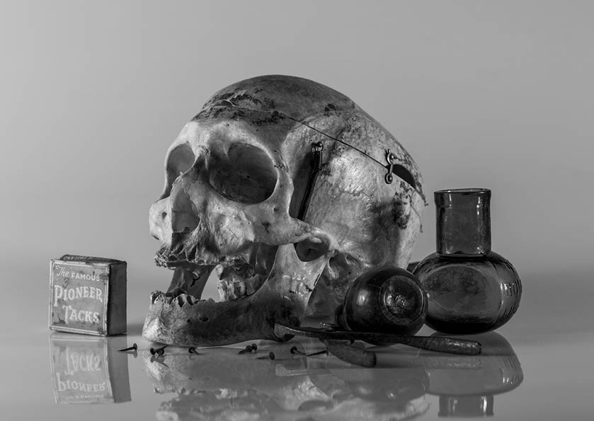
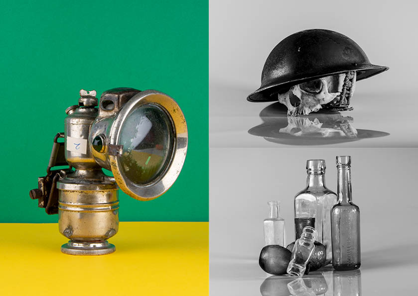
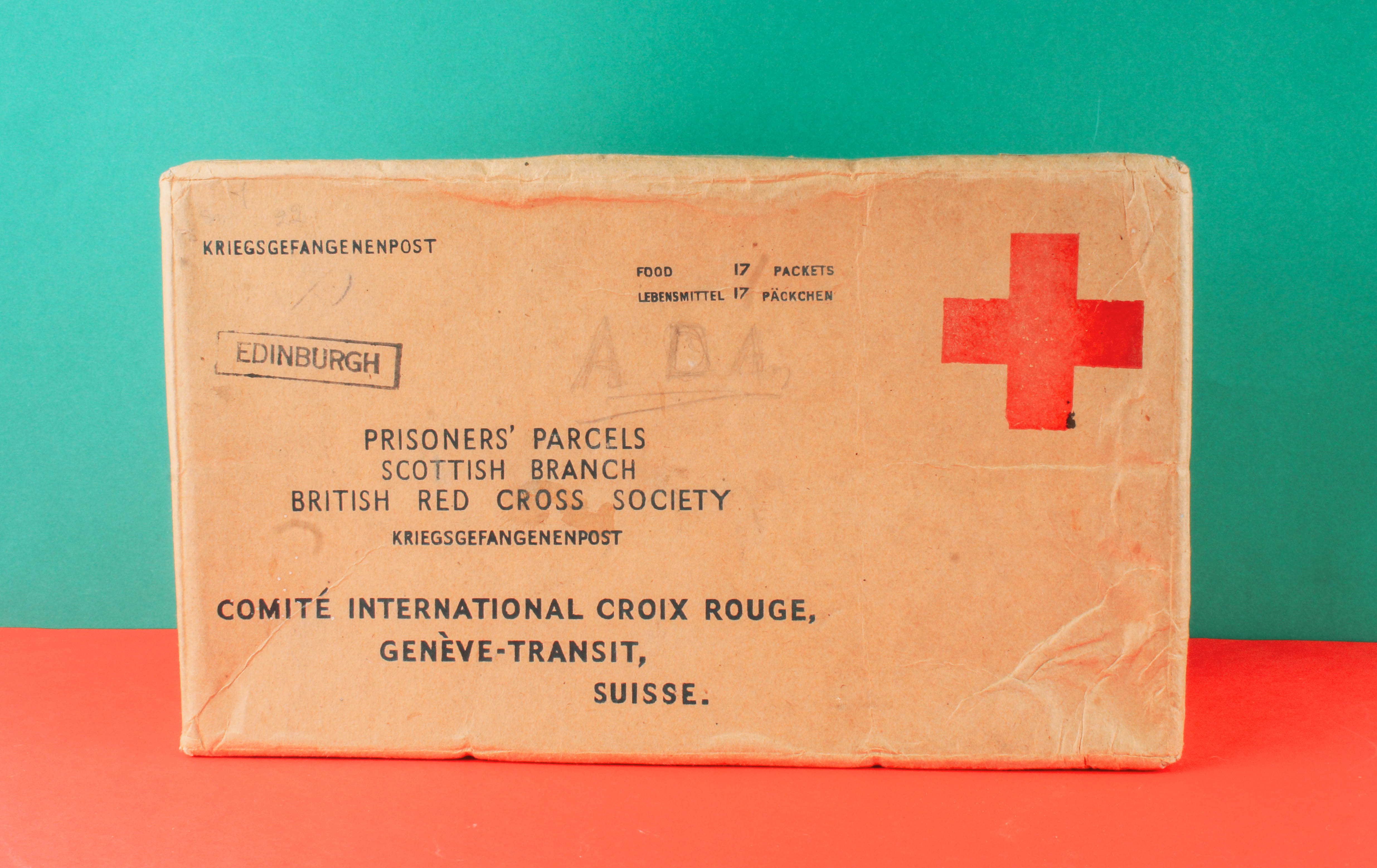
We had to present the Occupation objects from the Jersey Archives in a creative way and use a special still-life table and its translucent backdrop. I photographed the objects using different angles, both from above, side and front. I chose to either photograph each object individually or group together several objects for a more complex still life arrangement.

LIGHTING:

To photograph the Occupation objects in the studio, we experimented with different lighting set-ups, both continuous lights and flash lights. Continuous lighting has studio lights that stay on. You can power them up or down, based on what lighting you need. Flash lighting, lights up when you trigger it. You cannot see how the scene will be captured until the flash is triggered. When it is, a high intensity light will pulse for just a fraction of a section, lighting the scene.

TECHNICAL:

Continuous lights – To photograph objects three dimensionally

  • Camera setting: Manual Mode
  • ISO: 100
  • White Balance: Daylight
  • Aperture: F/16
  • Shutter: 0.5 sec to 0.8 sec
  • Lights in the room had to be switched off to avoid reflections

Flash lights – To photograph images, documents, books, newspapers, etc.

  • Camera setting: Manual Mode
  • ISO: 100
  • White Balance: Daylight
  • Aperture: F/16
  • Shutter: 1/125 – 1/200
  • Flash heads set to power output: 2.0
  • Pilot light was used for focusing
EDITING:

After photographing in the studio, I uploaded my images from the photo shoot on to Lightroom and made a rough edit of 6 images. I used the presets Desaturated Contrast, B&W Punch, Warm Contrast and Red Lift Matte. After selecting the filter, I adjusted the contrast, shadows and highlights. I also cropped unwanted areas to centre the Occupation objects in the middle of the frame.

MY RESPONSE:
FIRST PHOTO-SHOOT
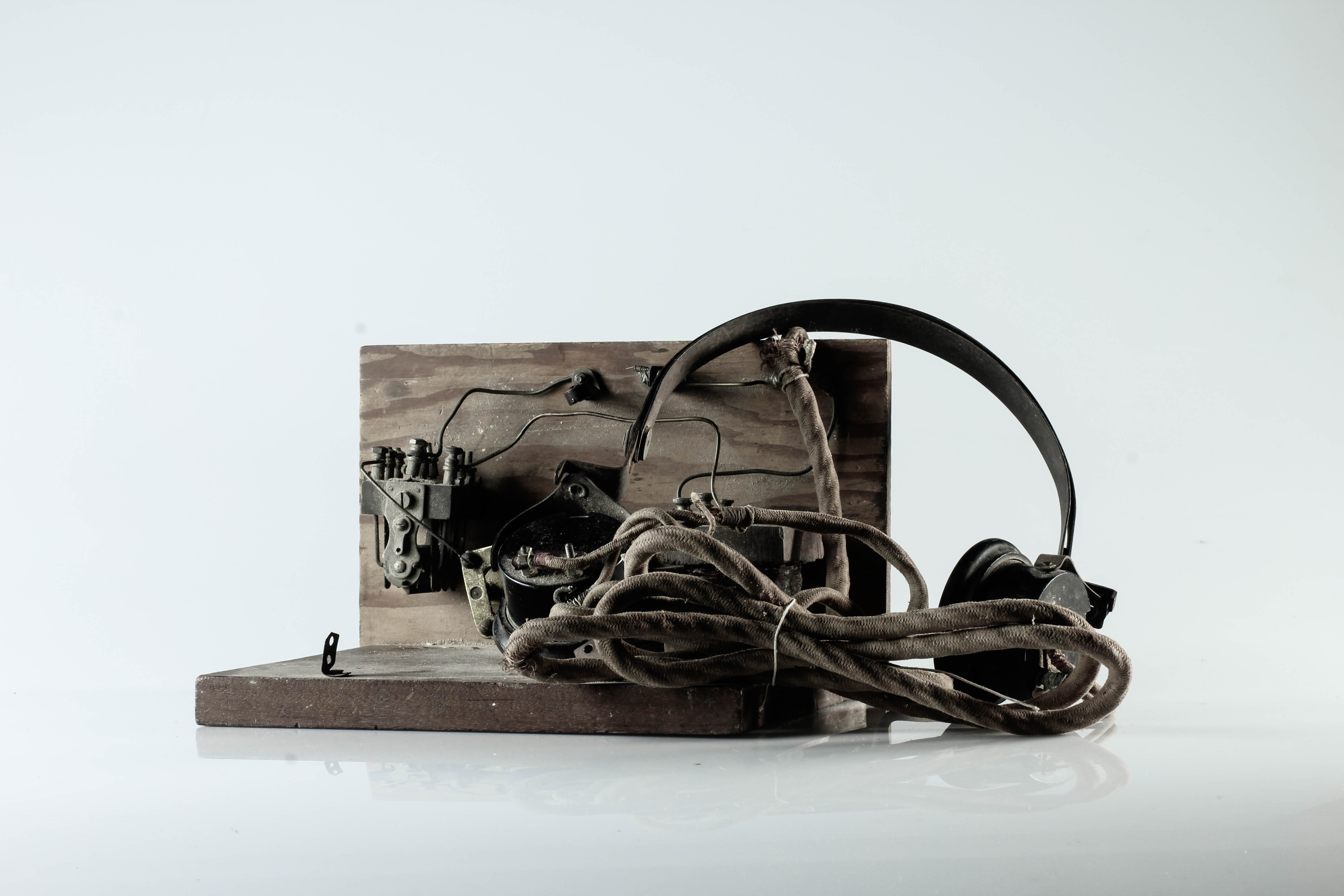
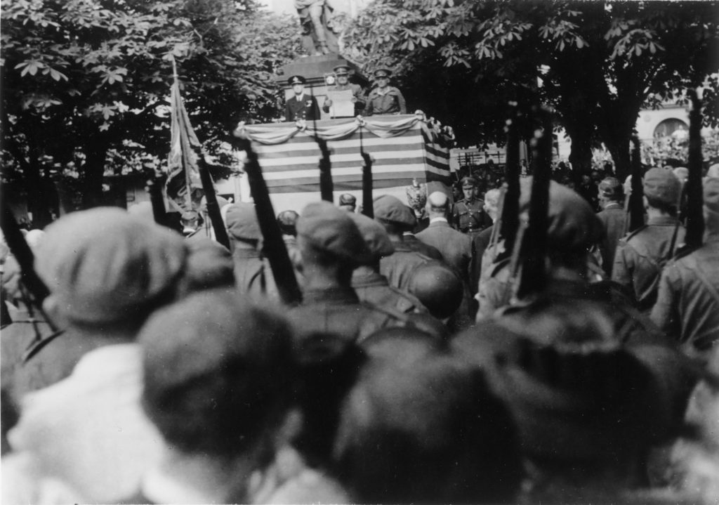
To evaluate my first still life photo-shoot, I believe that I have been able to produce photographs that explore my own style of capturing Occupation objects. I have shot these images using different angles and lighting to contextually showcase the significance of these objects during World War 2. I believe that my outcomes turned out well since they capture the detail and textures of the objects. The minimal editing and central framing helps to draw the viewer’s attention, further emphasising the point that these items are of importance.

SECOND PHOTO-SHOOT

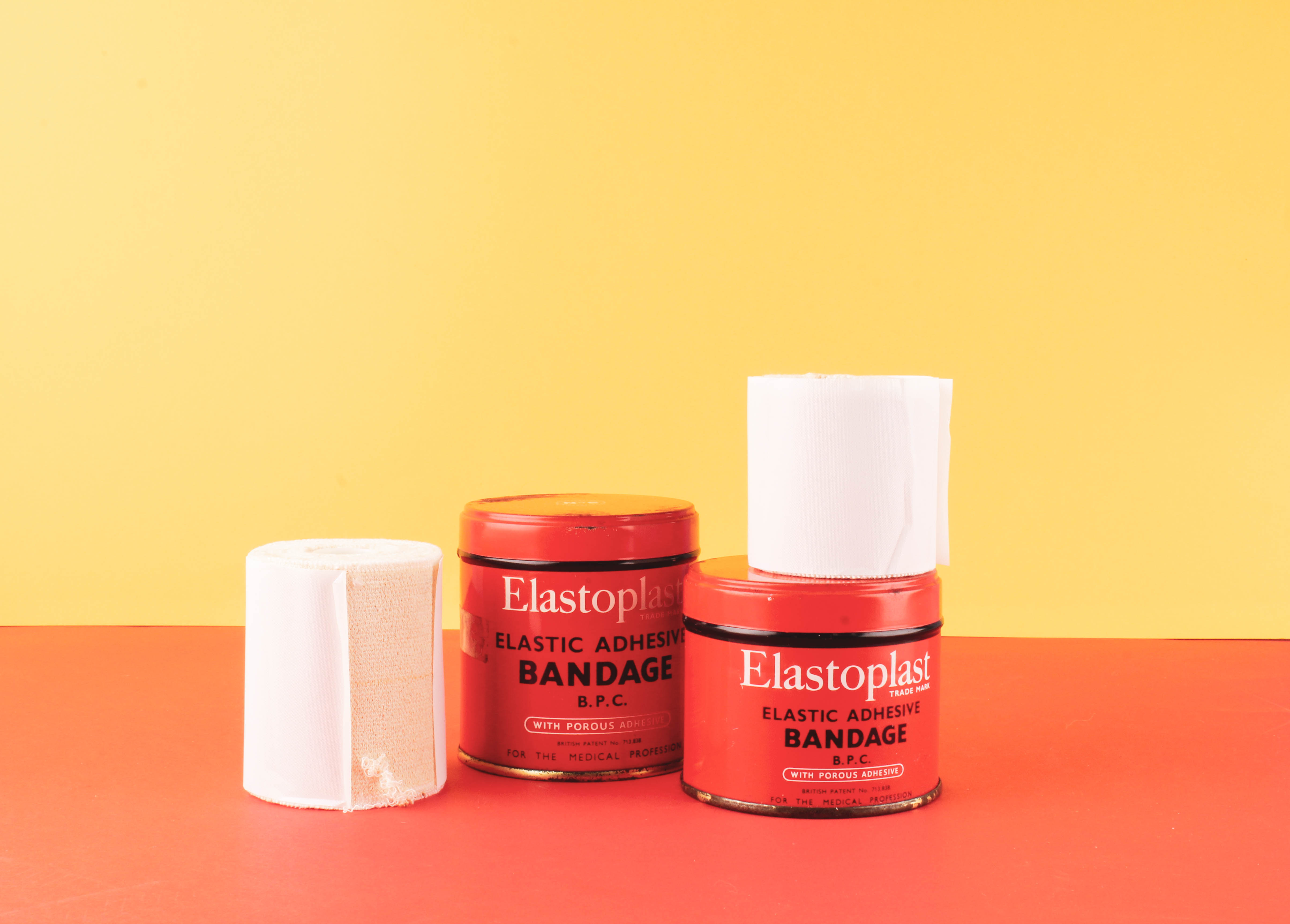
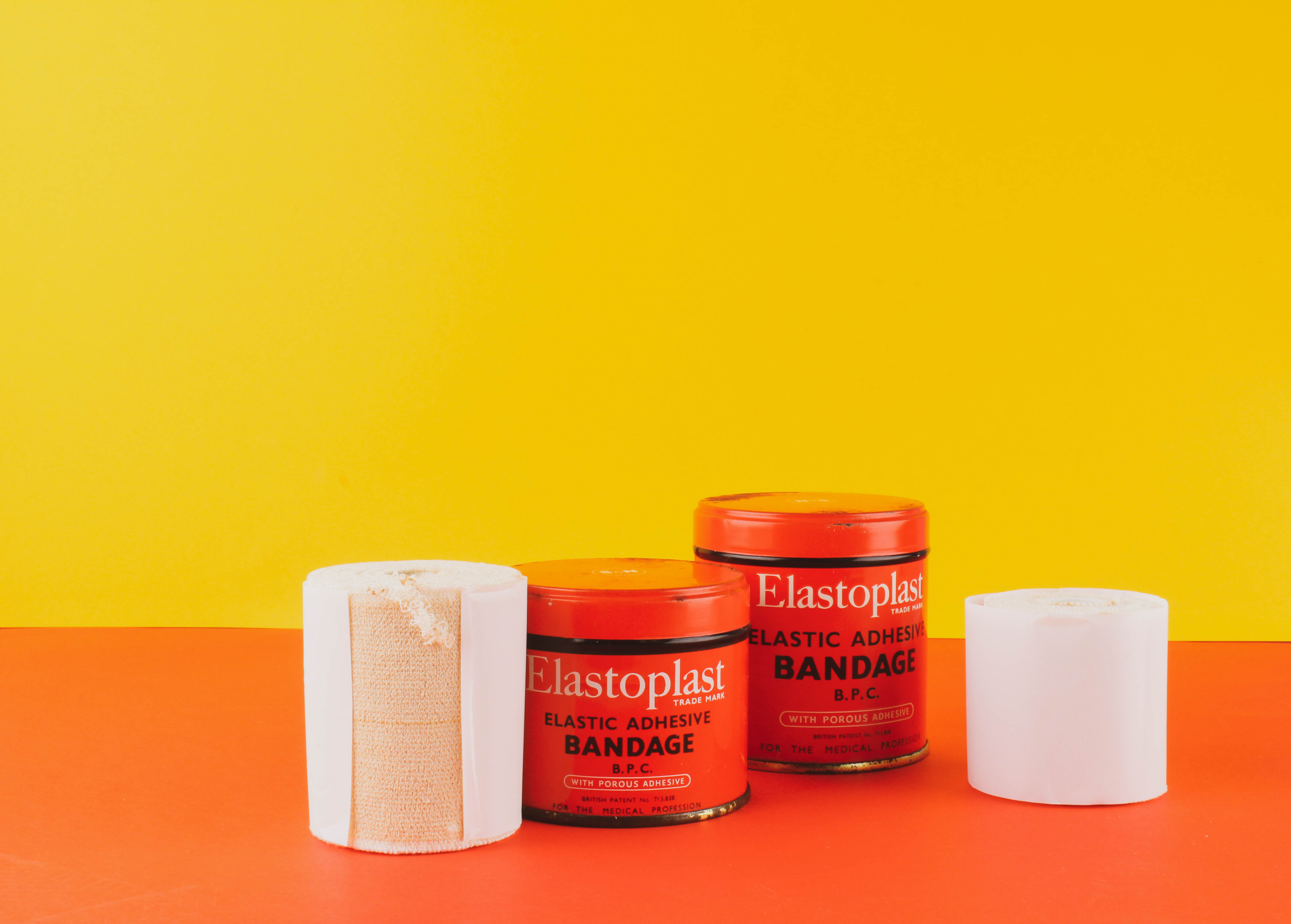
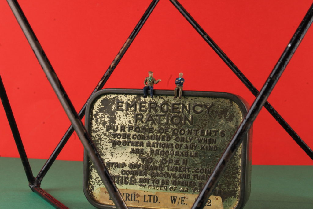
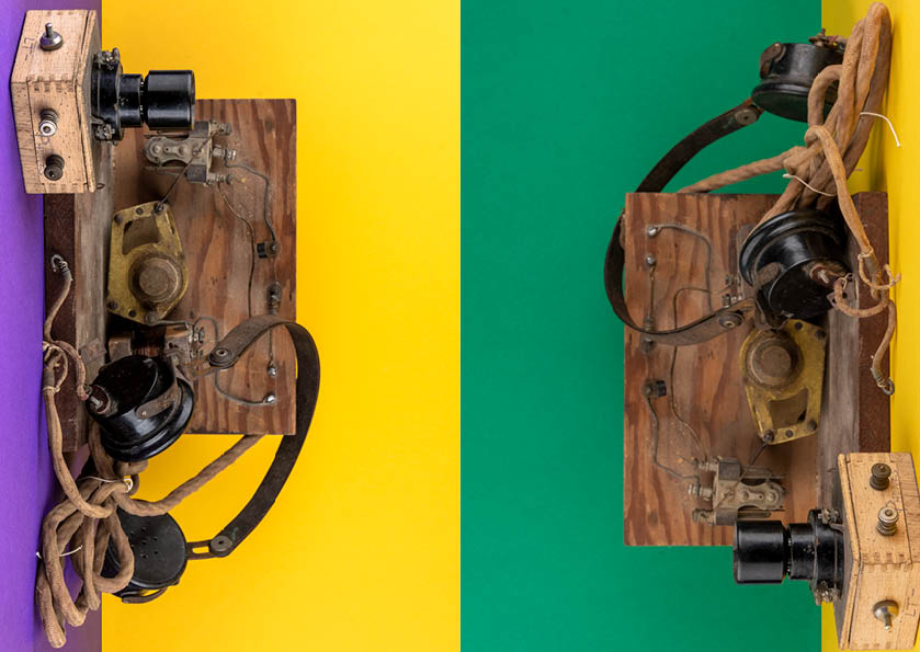
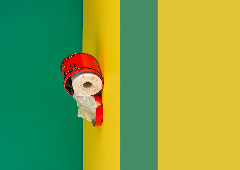
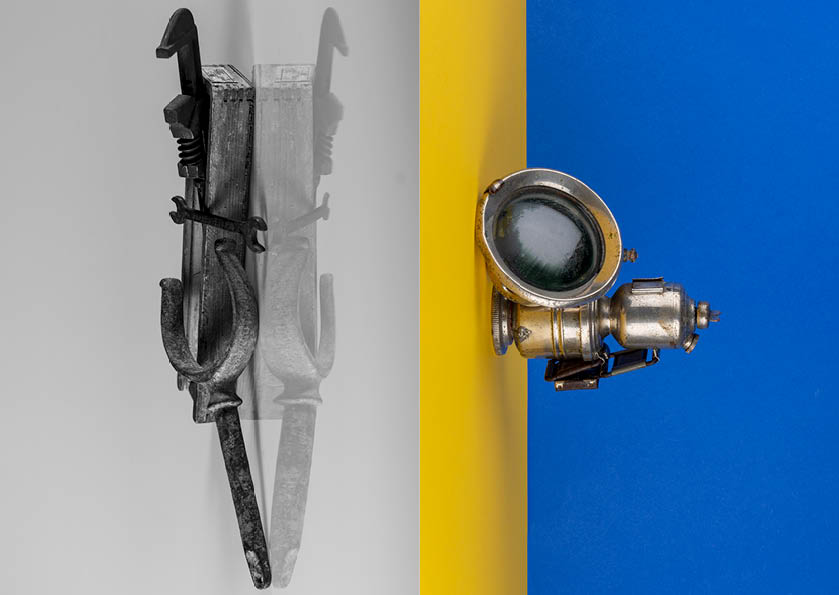
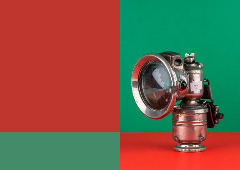
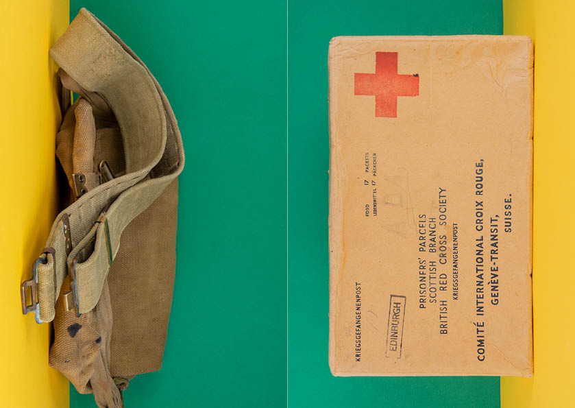
For my second photo-shoot, I decided to capture photos with a contemporary approach by using coloured backdrops which has been inspired by Rafal Milach’s work. Using his photographic style has allowed me to further develop my response to still life Occupation objects. Below are my 5 final outcomes for the colour photo-shoot that have been edited on Lightroom to enhance the saturation of backgrounds. I love how the coloured edits turned out because it makes the objects appear childish, as if it was a toy. This juxtaposes and camouflages the serious subject matter of World War 2.
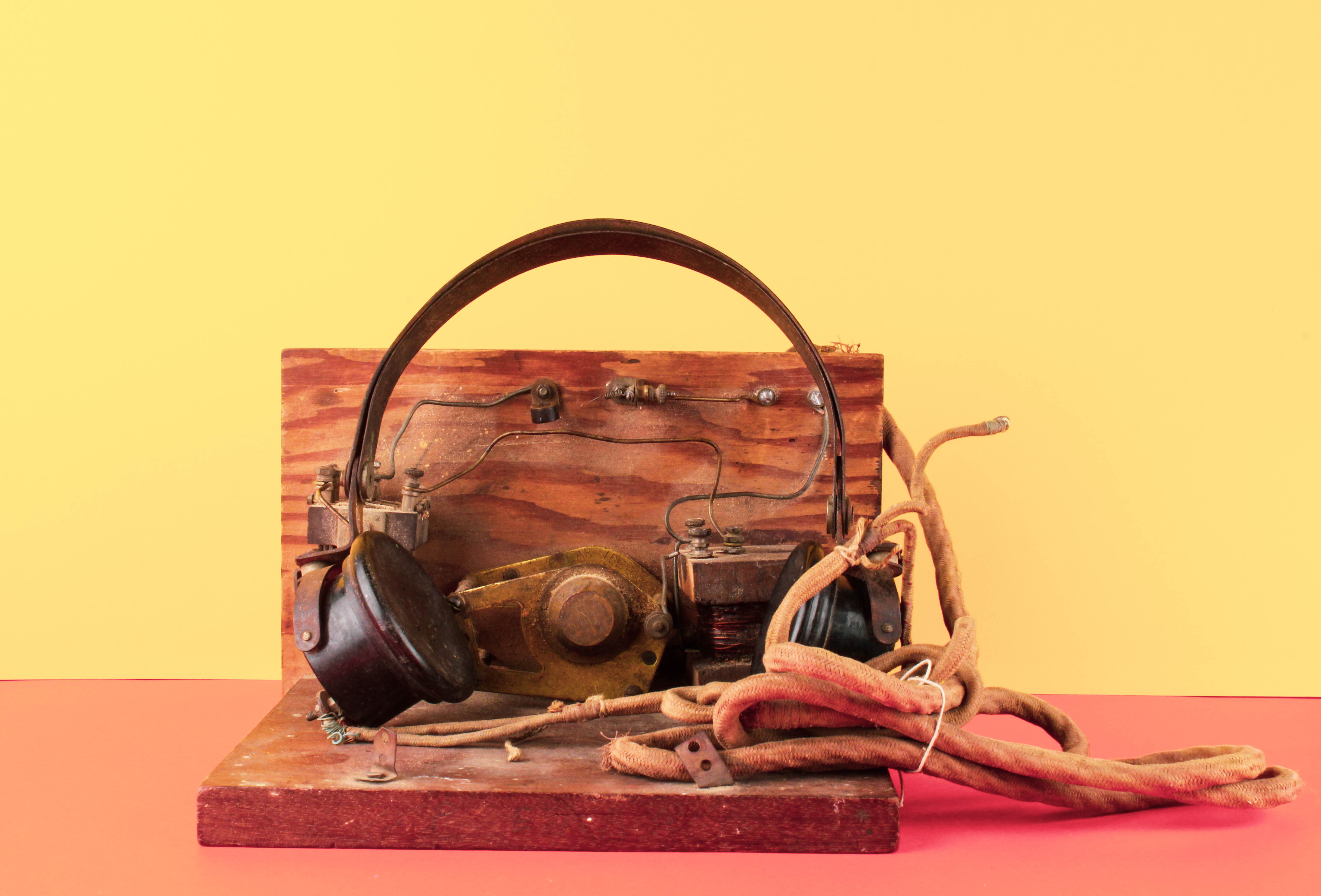
To evaluate I believe that I have produced imagery which clearly conveys my own understanding of Rafal Milach’s work and my ability to apply his photomontage style into my own photographs. This new way of capturing still life Occupation objects has furthered my exploration since I am now presenting coloured outcomes which creates a strong link to Milach’s work.

Rafal Milach inspired photo shoot/montage making

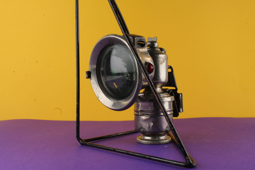
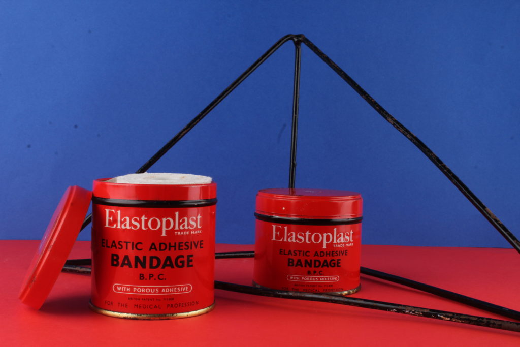
In this photo shoot I plan on taking image of the occupation objects in a slightly more artistic way. I will be using very vividly colored background as this is what Rafal did in his work, and I like how it makes the objects he’s photographing stand out more. I also like how he used geometrical patterns in order to symbolise being being enclosed or trapped, so I will be using different geometrical shapes in order to do the same thing as it symbolises how Jersey people must have felt under the occupation. I want to create a strong sense of displacement through contrasting colours, and a feeling of being trapped through the use of geometrical shapes.

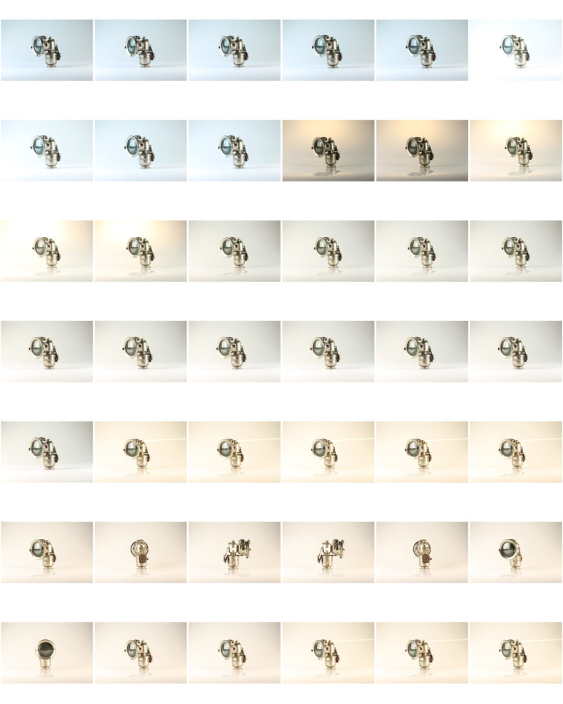
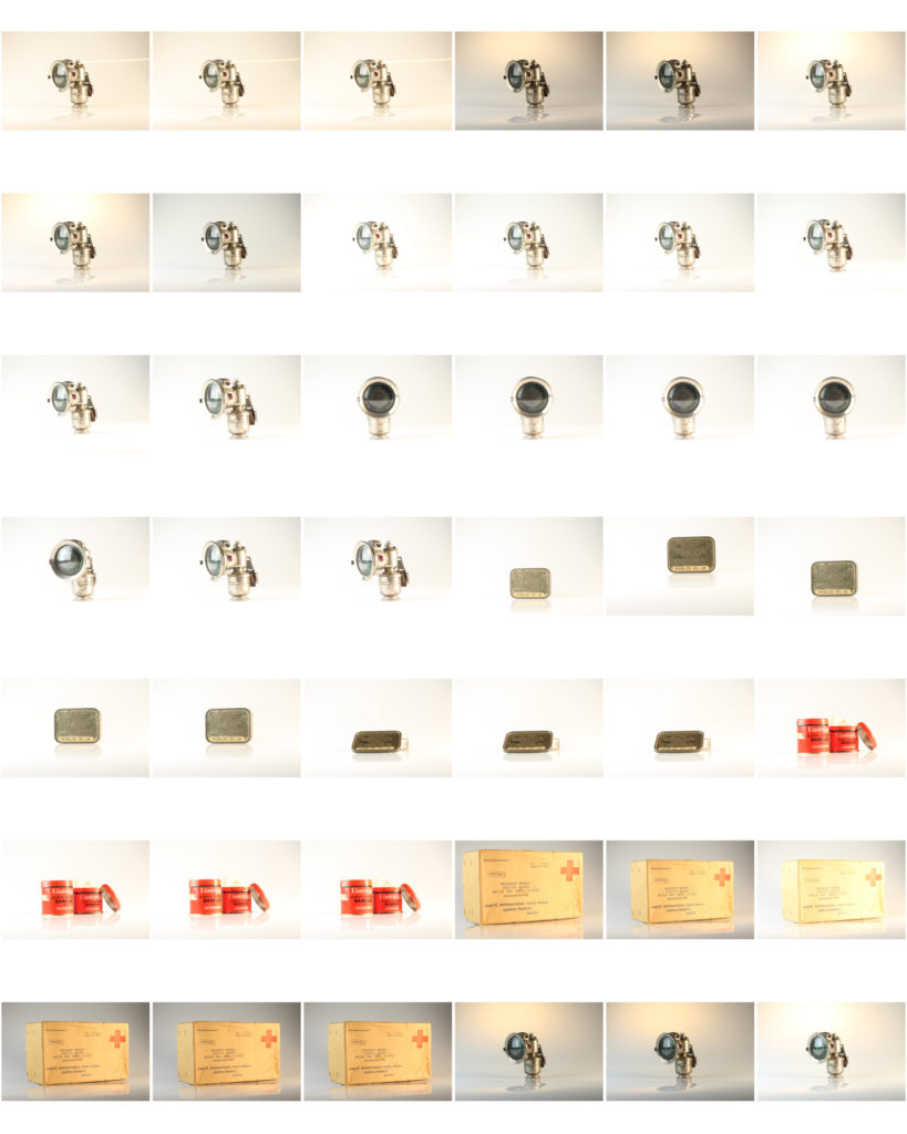
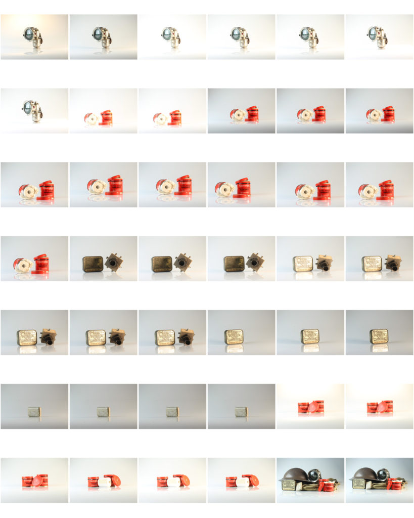
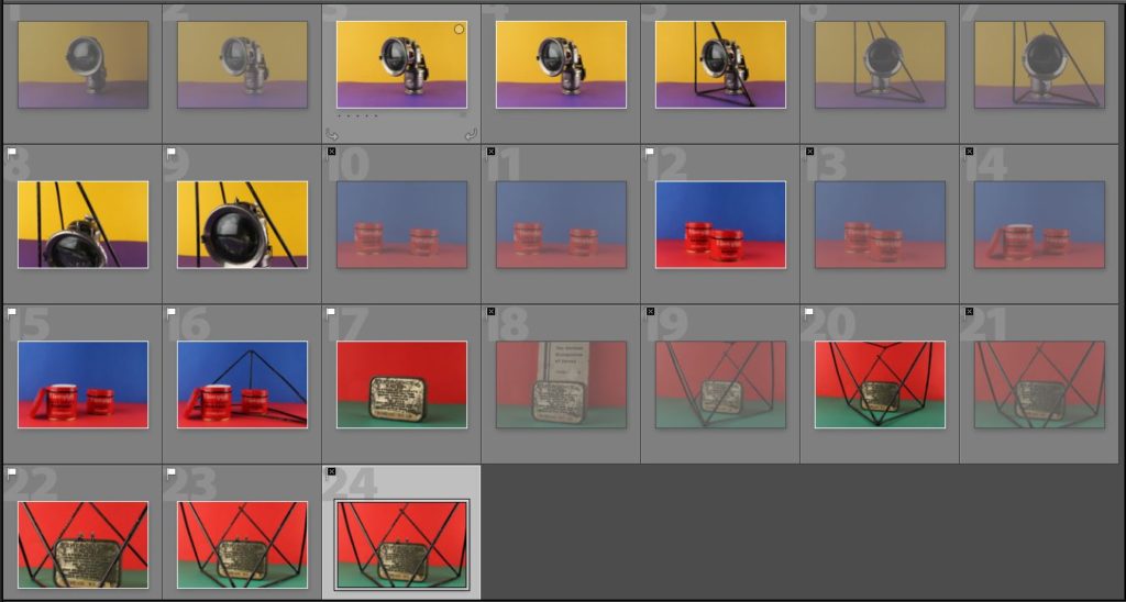
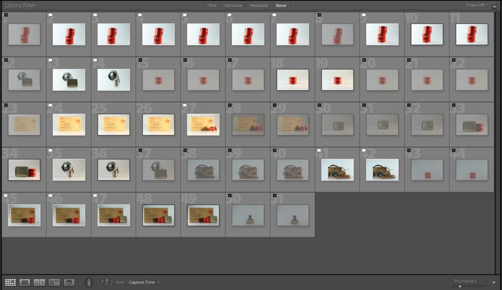
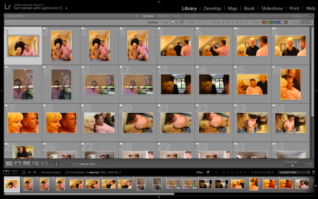
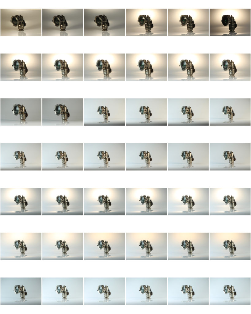
Here are all the images I took, you can see the both the flagged and rejected images.
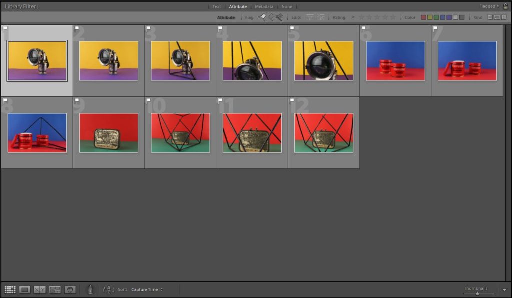
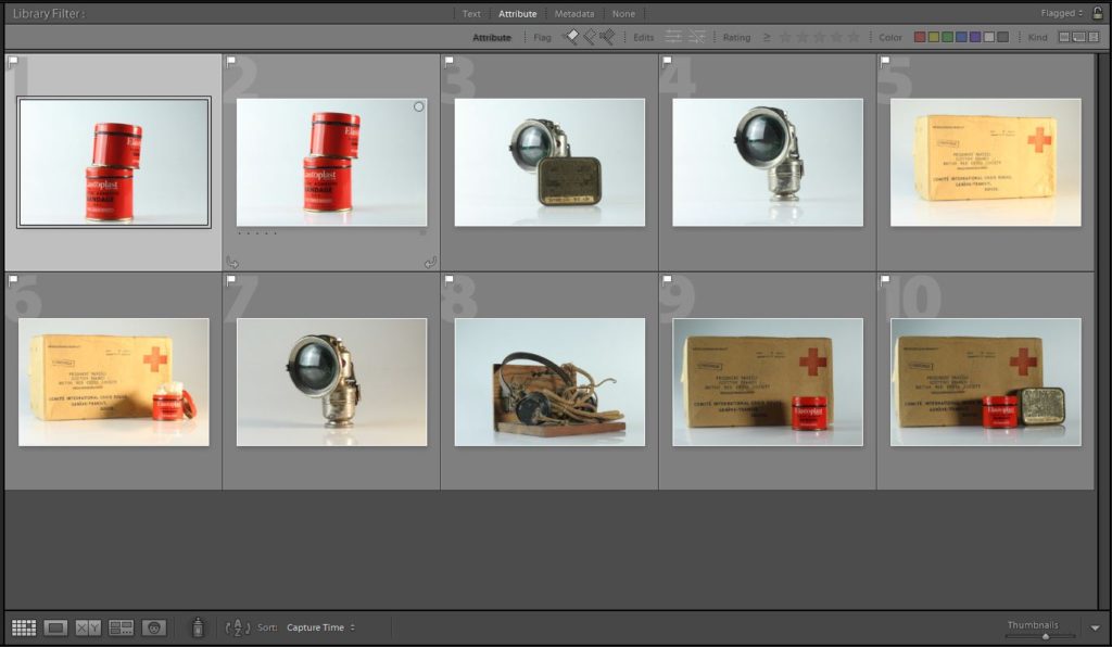
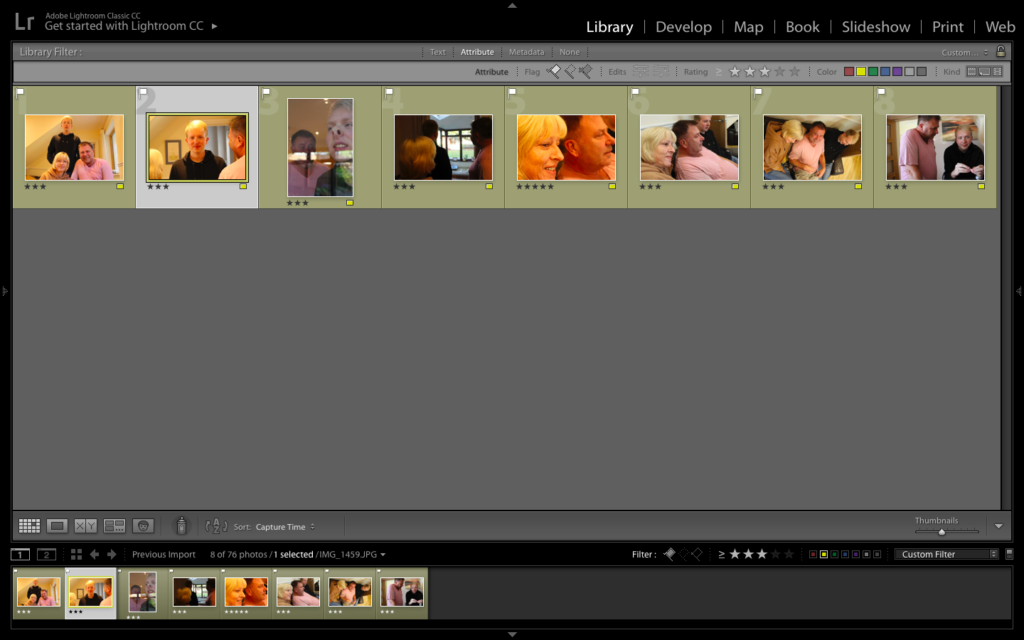
Here is an image of just my flagged images, which are my best images.
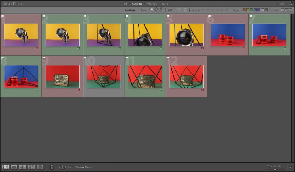
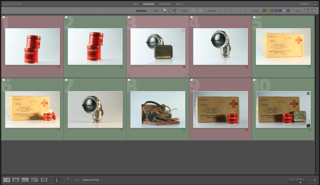
From my flagged images, I colour coded my best pictures green and my least favorite, red.

Best images

Further developing using archive images

1st montage:

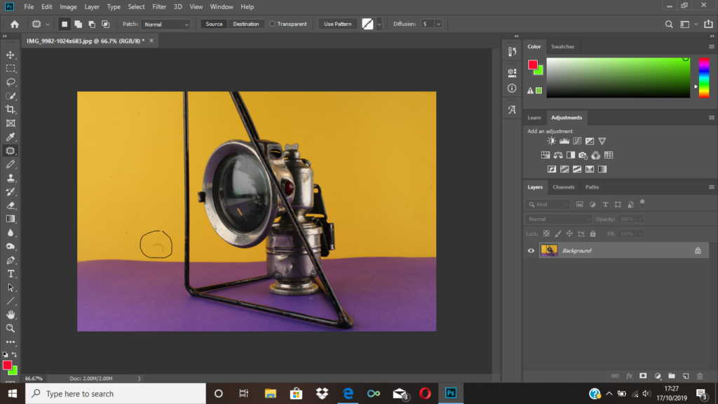
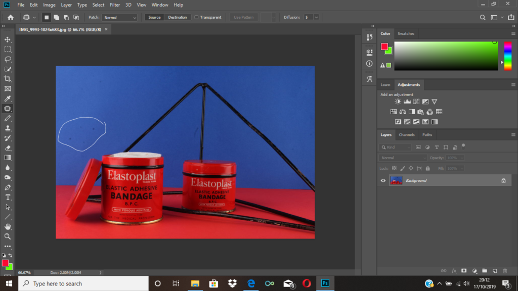
Firstly, I used the patch tool to get rid of some marks that can be seen on the card as I wanted the background to appear very pristine and put together.
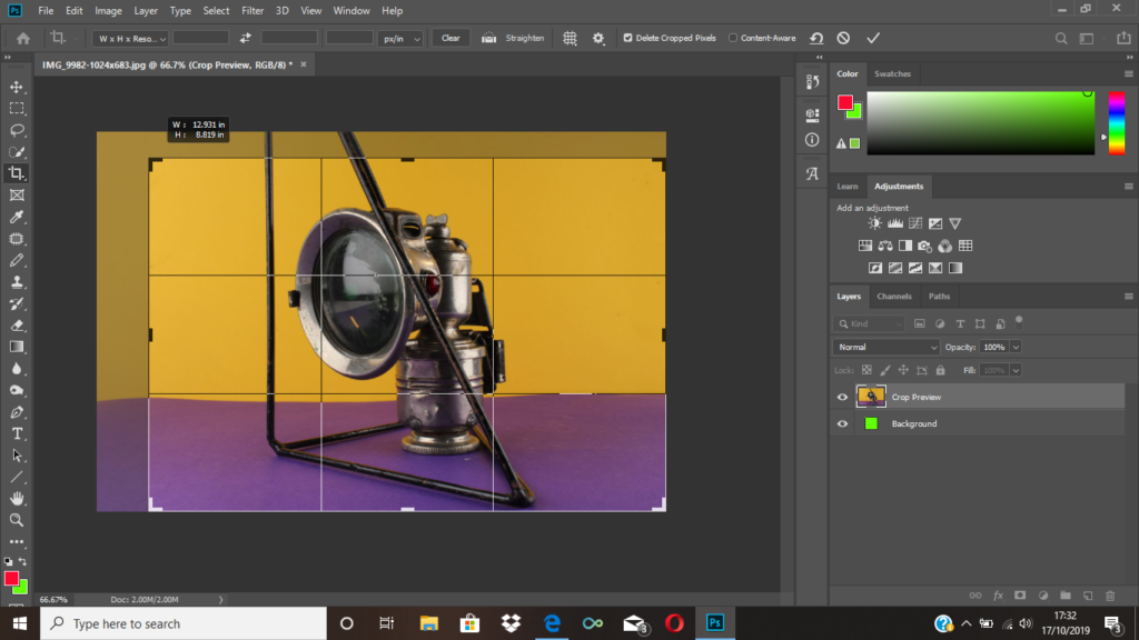
I then cropped the image because I wanted the object to be at the centre since it didn’t look right having a lot of clear space to the left of the image.
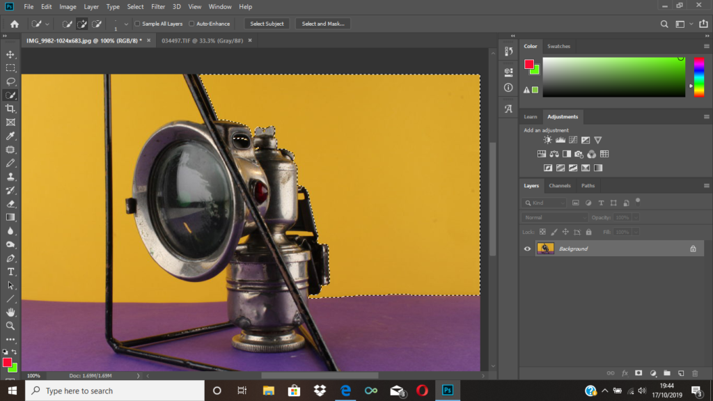
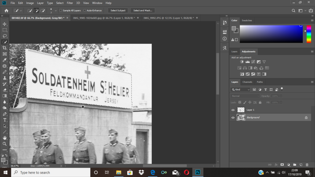
I then used to quick selection tool to highlight the area shown above as I wanted to place an archival image there. I then right clicked the area, and pressed layer via cut so that part of the image became a layer that I could delete at the end.
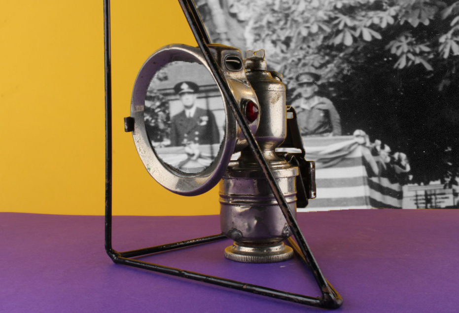
I then dragged and dropped an archival image onto my initial image and placed it just above my background. I also decided to use the quick selection tool again to get rid of the lens of the object. I then moved the archival image in the background, so that one of the figures could be seen through the lens area.
Final image.

2nd montage:

To begin, I used the quick selection tool in order to get rid of any markings on the backgrounds I used.
I then used the quick selection tool to get rid of the area of my original picture that I wanted gone.
As you can see above, I got rid of the area within the geometrical shapes as I thought this was the place where the archival image would look best.
Final image.

3rd montage:

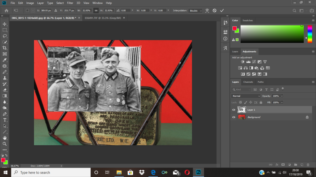
Similarly to before, I dragged my archival background picture onto my original image.
I then selected certain areas of the picture that I wanted removed so that we could see the archive image in the background.
Final image.

4th montage:

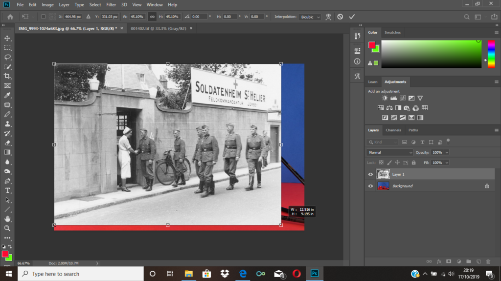
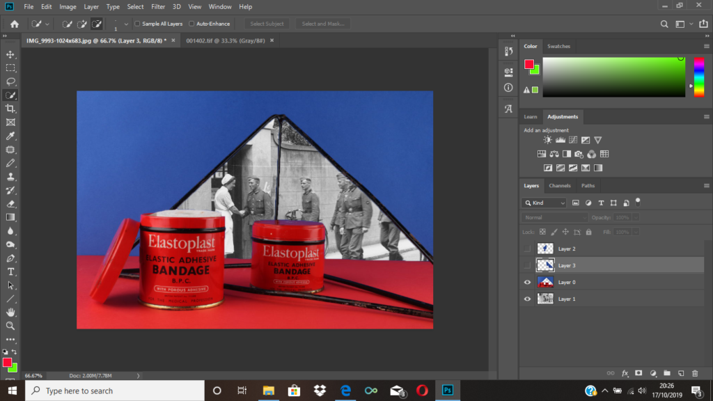
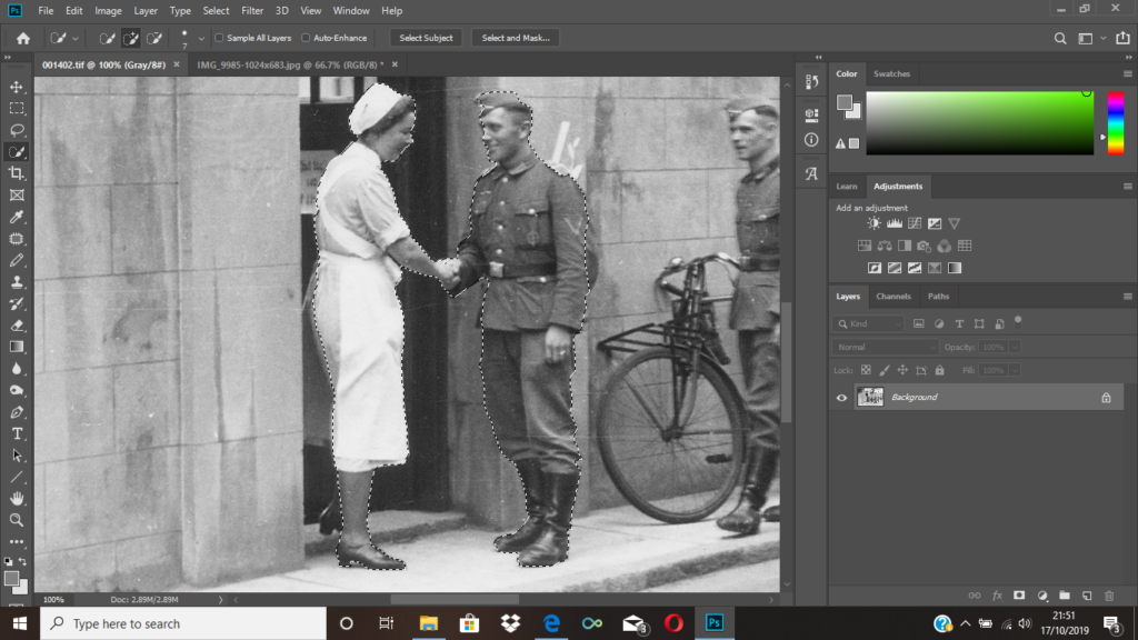
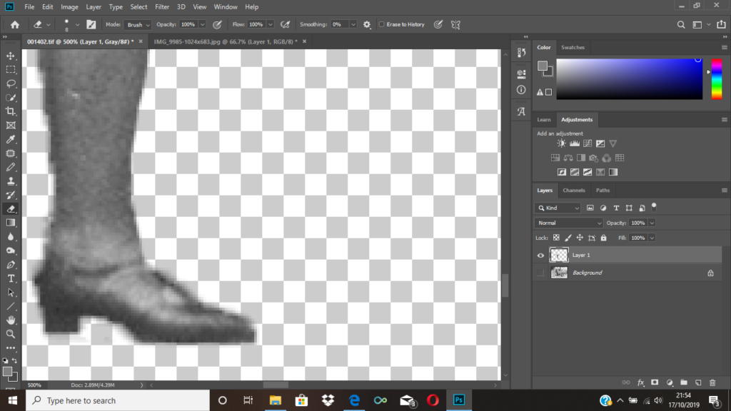
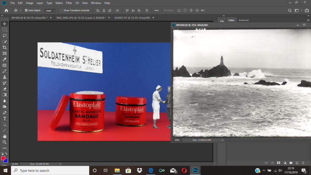
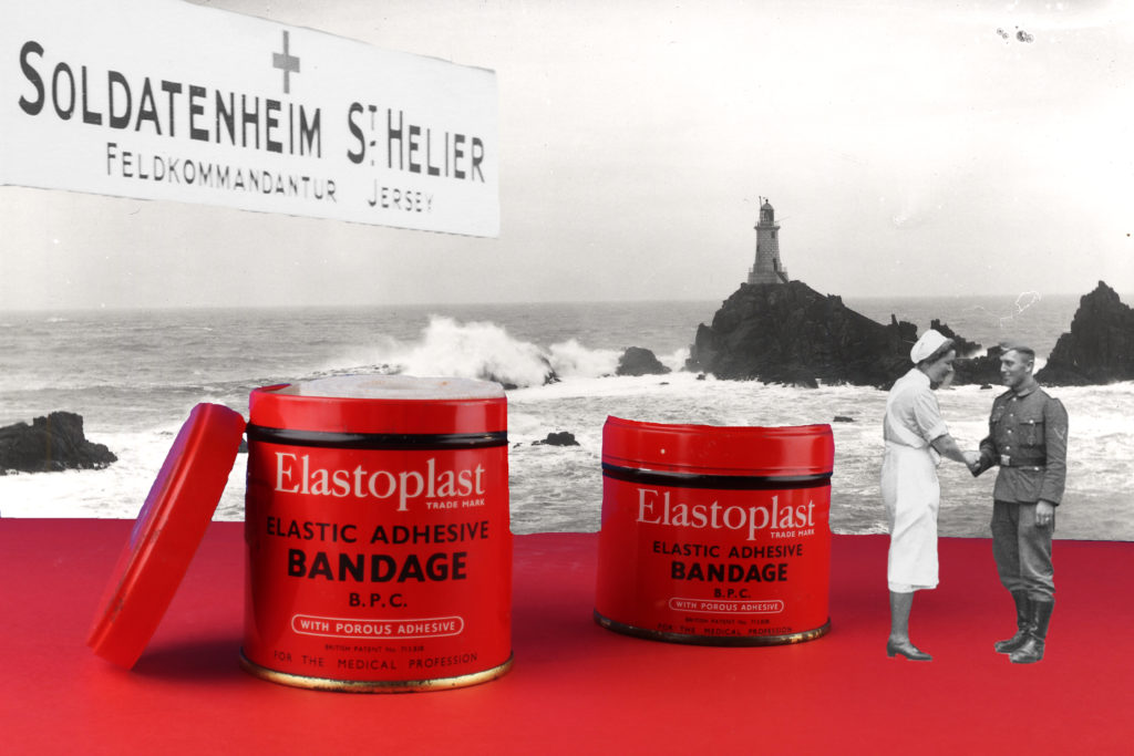
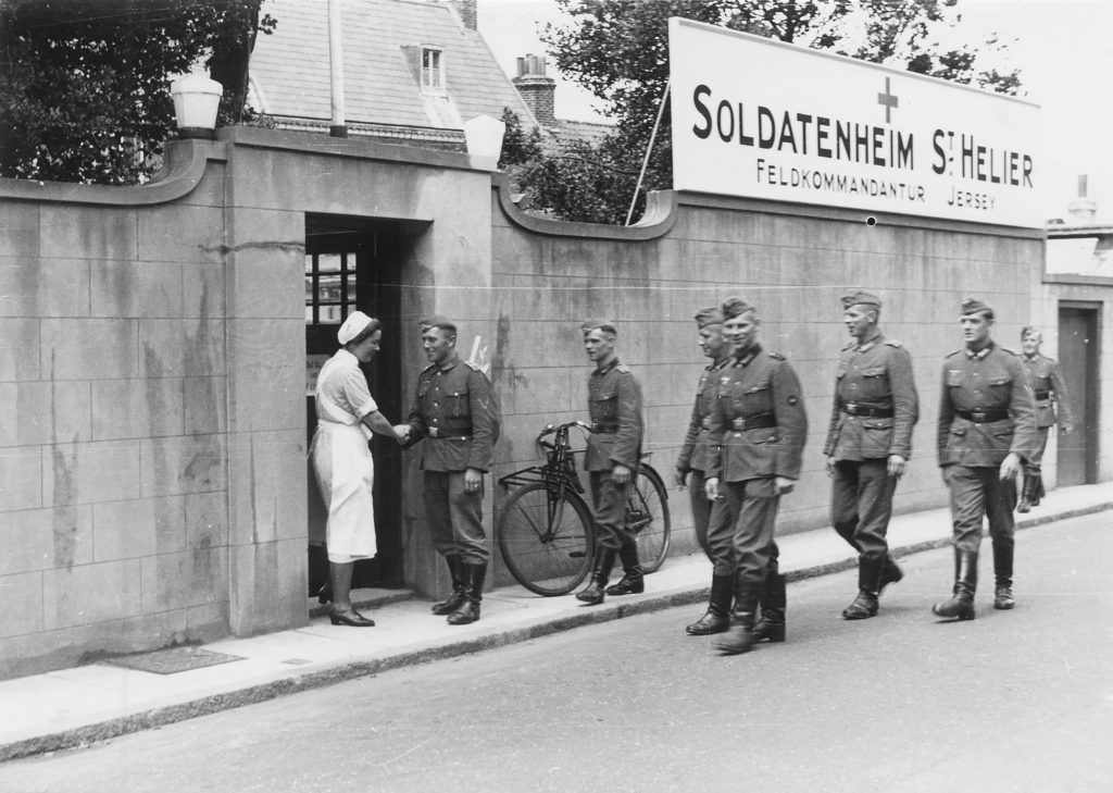
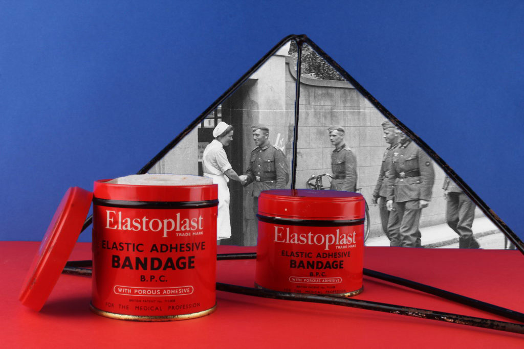
To achieve my final montage, I used the archive image seen above. I thought an interesting part of the image was the nurse and the soldier shaking hands, and also the medical sign. I selected both of these areas using the quick selection took, so that I was then able to place them onto my image. After selecting them, I used to eraser tool to clean up the edges as I knew they would be going onto a photo with a bright background.

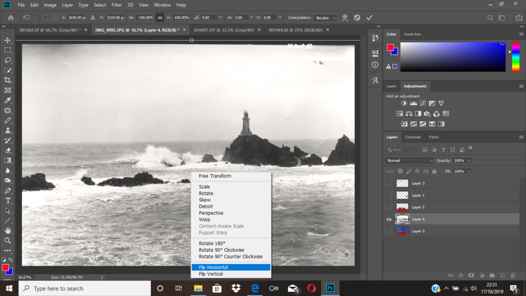
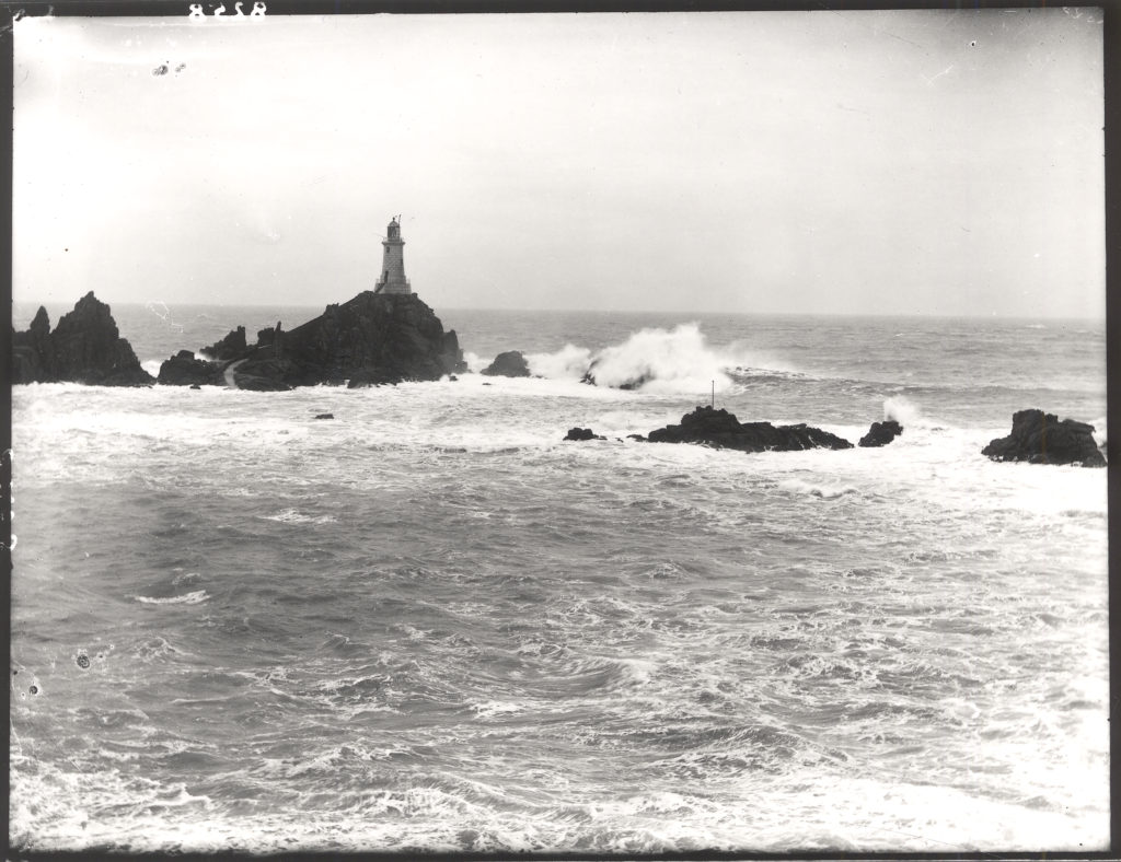
After placing the two sections of the archive image, onto my own, I then went on to open another archival image of a Jersey landscape as I thought this would make my montage more interesting. I selected the blue area of my montage with the quick selection tool, deleted the selected layer and dragged the archival image on. Since the lighthouse would’ve originally been covered to the my placement of the medical sign, I then flipped the image horizontally.

Final image.

Initial images vs. Final images

1st montage:

2nd montage:

I thought these images would look interesting together because it shows a medicinal side to the occupation in 2 different time periods. It almost looks like we are looking into the past through the geometrical shape, and we can also see a medical product used back then, in the present.

3rd montage:

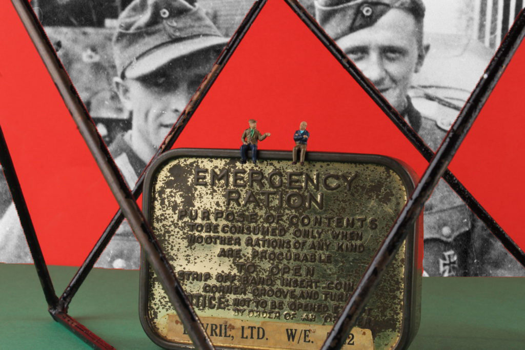
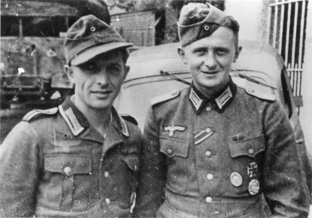
I chose to place these 2 specific pictures together because I thought they had an interesting narrative together. My original image contains an emergency ration pot, with 2 little figures of old men sitting on top. By having the picture of the 2 young soldiers as a background, it could represent the 2 people in different time periods.

4th montage:

I chose to put all these specific images together as they’re all quite similar in theme. I added the nurse and the medical sign onto my original image because the original image contains bandages as my object, so I thought something medical related would be fitting. I decided to add the landscape as my background as I thought it makes it more related to Jersey under the occupation.

Photographing Occupation objects

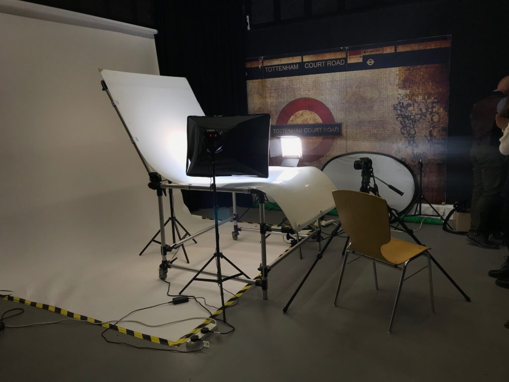
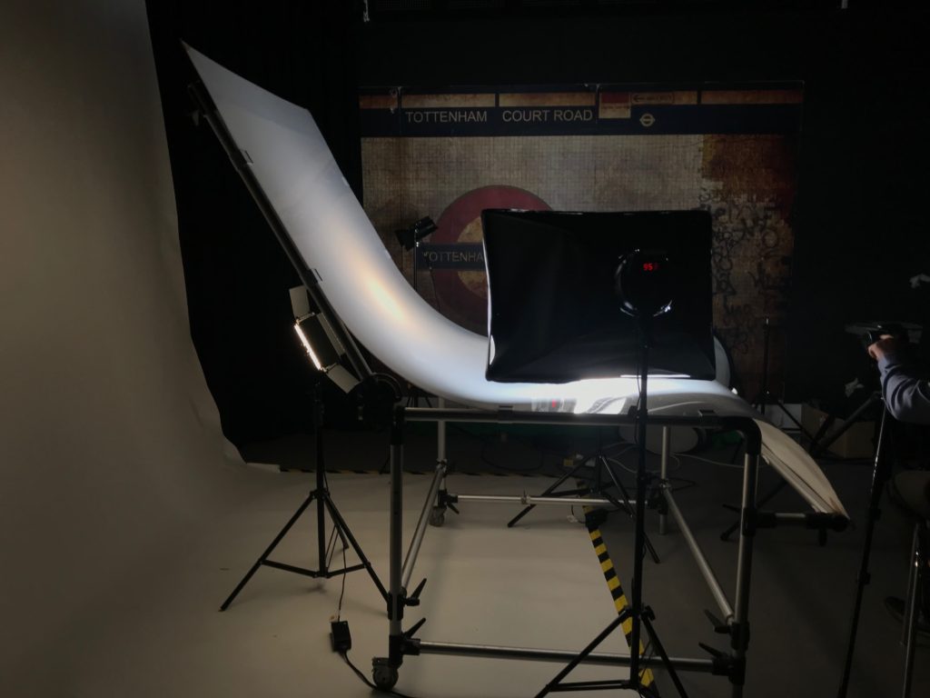
First lighting setup

The light on the left is the continuous light, which is also known as a fill light as it has a diffuser of it. When photographing it should be set up to around 500 kelvin, and the dimmer can be adjusted in order to make the light brighter or darker.

The light on the right side if called a key light, which is the strongest light. It projects a very strong, clear light in for the camera to clearly be able to focus on the object.

Behind the backdrop, we also have a back light. This helps the backdrop appear slightly lighter, as it is translucent and allows minimal light through.

when photographing using this set up, you should use a slow shutter speed , which means it is a good idea to use a tripod and a cable release as it will mean the camera wont shake and make the images blurry. The white balance should be adjusted to match the type of light the continuous light is emitting. The F stop should be quite high, around 16 as this gives the image a shorter depth of field as the aperture is smaller.

This set up is effective when taking images of things with dimensions, as you can experiment with angles and lighting in order to emphasize different parts of the object. This is also useful when capturing lots of objects together, as it allows to a lot of space, and it contains a lot of different lighting set ups to effectively be able make the groups of objects look aesthetically pleasing.

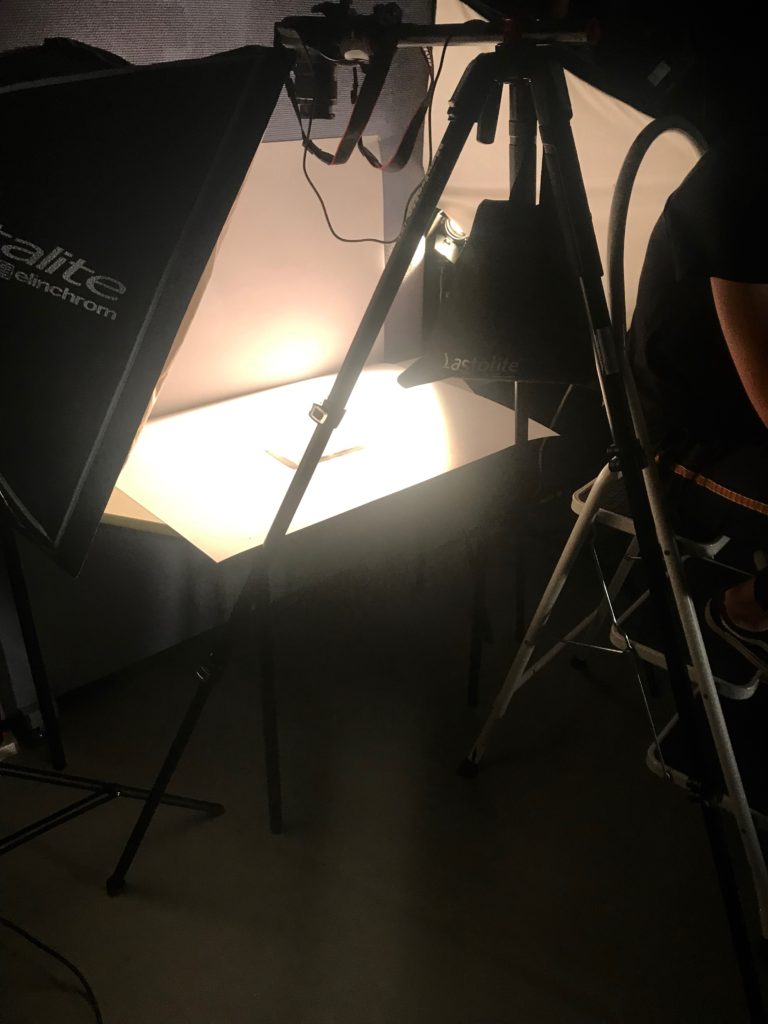
Second light setup

This set up can be used to capture images from a higher angle. On the left, there is a flash head light which is triggered by the transmitter which is connected to the camera. It is also important to place a sandbag on the tripod in order for the weight to be balanced, so the camera doesn’t fall over. It is important to place the camera parallel to the 3rd leg of the tripod as this means the camera will be straight. To be able to see what is being photographed, there is a ladder placed on the right hand side, to help you be able to looking through the view finder.

This set up is highly effective when wanting to photograph things that appear 2D or almost flat, such as books, or newspapers since you may only want to be capturing these things from a front facing angle.

Photo shoot

Here are all the images i took.
I then flagged my best images.
From my flagged pictures, I colour coded my best and worst images, green being my best, and red being my worst.

Developing

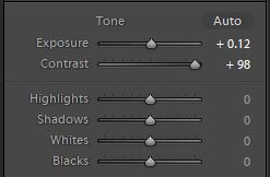
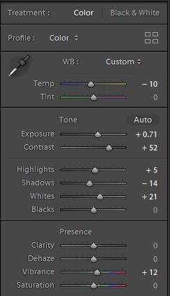
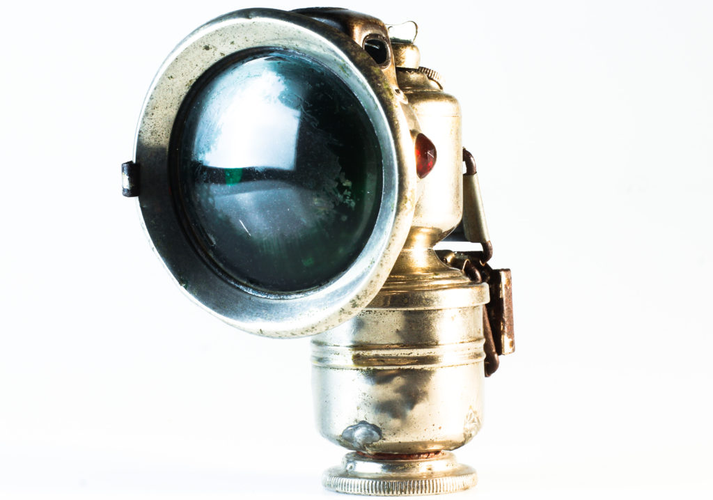
To edit my image, I increased the exposure slightly in order to make the background of the image whiter. To make the object very prominent, I increased the contrast almost all the way.
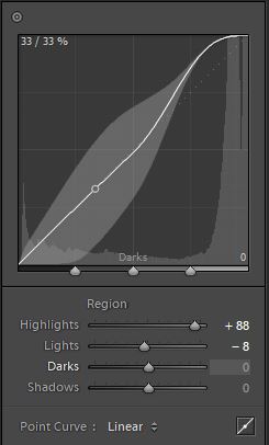
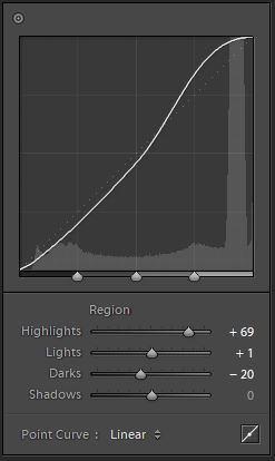
I also adjusted the tone curve in order to increase the highlights in the image, as it helped the object to stand out more among the background. I also cropped the images as I thought there was too much unnecessary background space.
Final image.
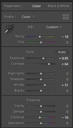
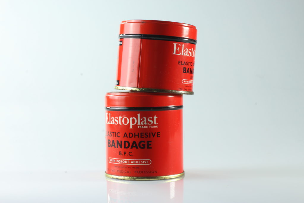
In order to make my edited images fairly similar, and is if they were part of a series. I increased the exposure to make the image brighter, and increased the contrast to make the colours stand out. I didn’t increase the contrast on this image as much as I did on the previous image as the lighting on this image was slightly warmer, and if I increased it too much the tone would be too yellow. Due to the irregular tone of the picture, I had to increase the whites in order to balance the tone. Decreasing the vibrancy also helped to even out the tone, as it made the image less saturated.
I adjusted the tone curve so that the highlights were more prominent, and I cropped the picture as i didn’t like the slightly grayish parts of the outside of the image.
Final image.
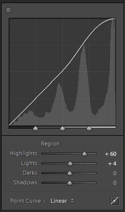
To develop this image I decreased the temperature as the image looked too warm in order to match the other edited pictures. Increasing the exposure made my picture brighter, and I also increased the contrast so that the object would stand out in front of all the white space. I then adjusted the Highlights, Shadows and whites in order to get a good balance of light and darkness within the image. Increasing the vibrancy helped the object stand out, while making the background whiter.
As I mentioned before, my aim was to make the object stand out and have the background whitened. I adjusted the tone curve to further achieve this objective better.
Final image.

Initial images vs. Final images

I really like how the object in the image above stands out a lot more from the background. I also think the colours are a lot more vivid, and they stand out more as it almost appears as there is no background. I like how my final picture has more dimension to it due to the emphasized shadowing and the highlight on the objects.

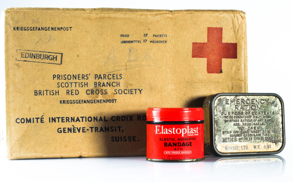
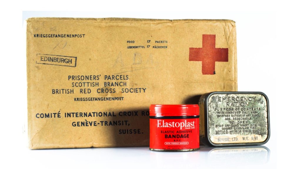
The objects in this image all have their own different type of texture, which I think is brought out more in the final image. I like how you an see all the details in the parcel such as some staining, and scratches. You can also see the rusting on the emergency ration box a lot more clearly. I think this makes my image a lot more successful as it gives the photo a lot more character, and it emphasizes how there is a rich story and history behind each object, which otherwise may not have been as notable to an audience.

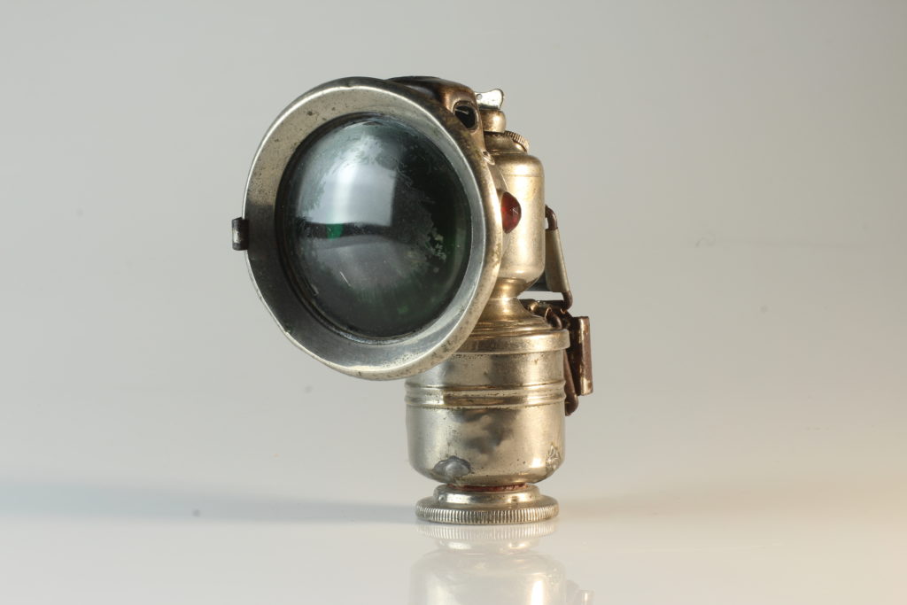
I like how the bicycle light looks a lot bolder and clearer in my final image, compared to my initial one. I think this makes the image far more interesting because it makes the object look slightly more mysterious, which may be intriguing to an audience. However, I think the final outcome could’ve been improved if I would’ve left the shadowing of the object on the bottom left hand side as it would help add a more dramatic effect to the picture.

Photo Assignment 3: Home Sweet Home: Interior vs Exterior

For my homework into capturing the interior and exterior of my home and the area in which I lived, I experimented with a range of different locations and places in order to best present the place in which I lived, and to best show the personalities, attitudes and lives of the people I live with/around through presenting their houses and what is included inside/outside of them. I captured a range of photographs, ranging from my street to the inside of rooms and houses, in order to encompass both the “interior” and “exterior” aspects of the project.

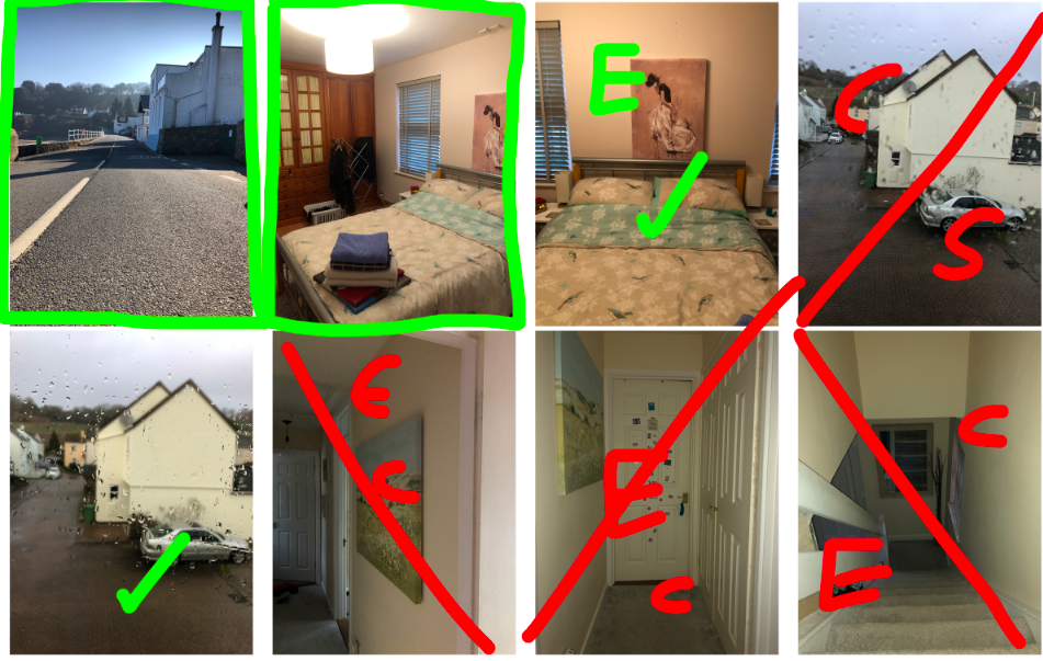
Below my contact sheets can be found where I have made a selection of images to bring forward to the editing process:

GREEN: box = final image, tick = possible final image, E = small issue with exposure
RED: line = rejected image, E = too over/under exposed, C = issue with the positioning of the camera/focus/technical issue
GREEN: box = final image, tick = possible final image, E = small issue with exposure, F = small focus issue, CR = requires small capping adjustment
RED: line = rejected image, E = too over/under exposed, C = issue with the positioning of the camera/focus/technical issue

After selecting the images I wanted to use, I moved onto Photoshop to experiment with the editing of the images:

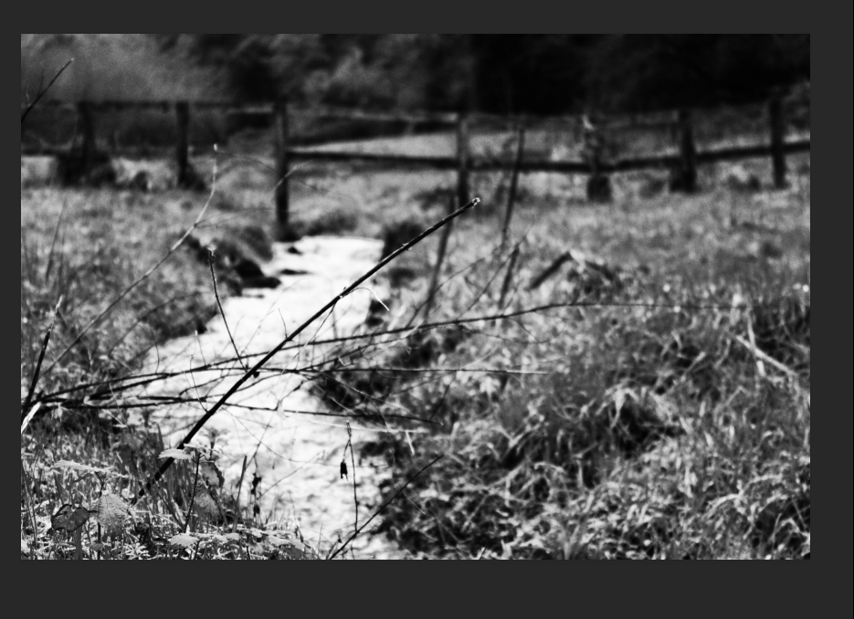
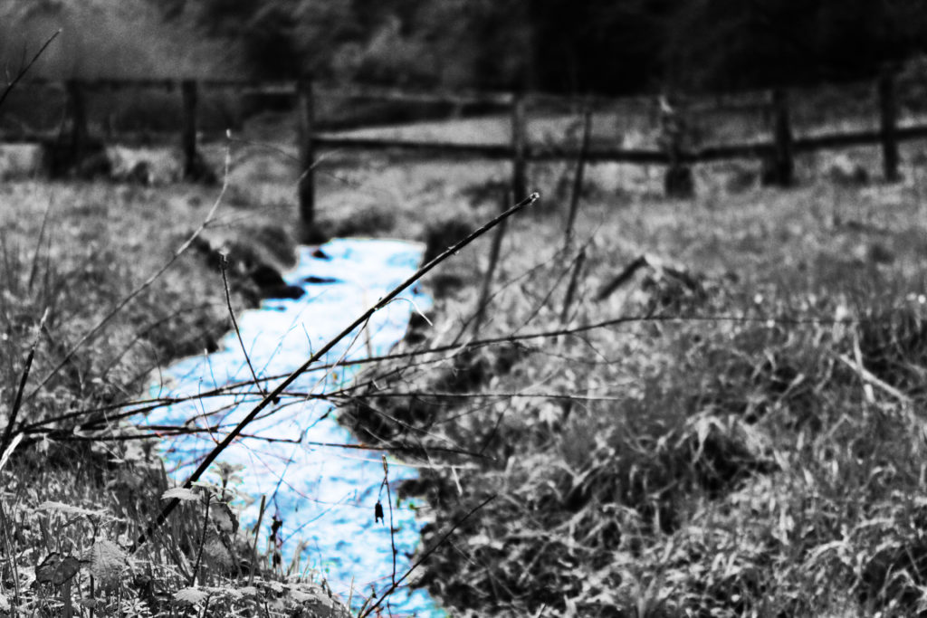
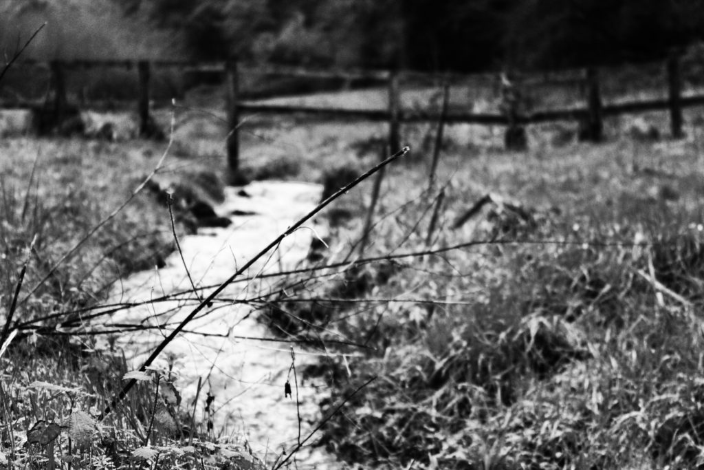
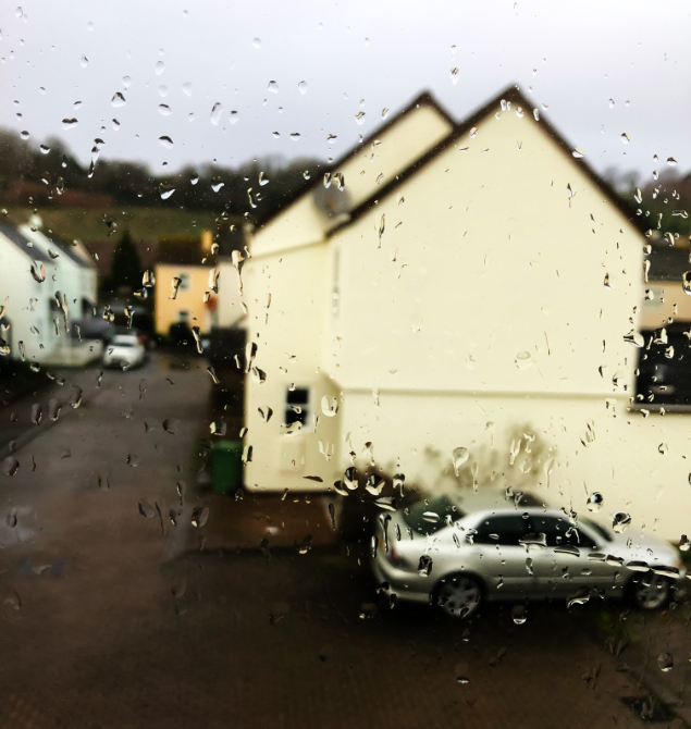
For this first image of the exterior of where I live, I decided to make the initial version of the image black and white as this gave the shapes and textures of the image more emphasis. After turning the image mono-chrome, I decided to further experiment with the image by adding a small amount of colour.

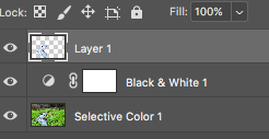
I used the lasso tool to cut around the water of the image, and copied this onto a separate layer so that I could edit the water and the background separately.

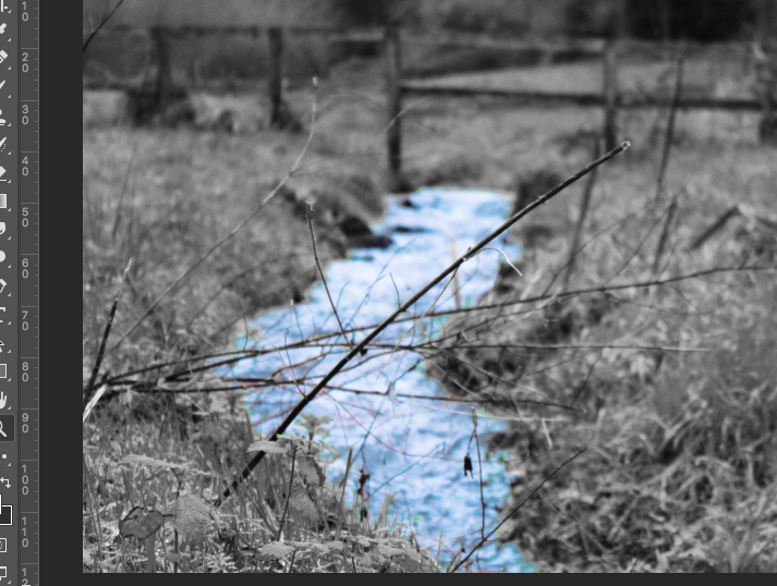
After separating the 2 components of the image, I used the “selective colour” tool to increase the cyan and blue colours of the image, giving the water a heightened colour which contrasted the monochrome background.

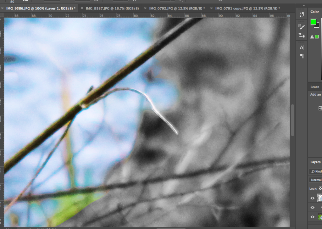
I then went around the edges of the water layer with a soft eraser tool to soften out the edges of the water, allowing them to blend more with the edges of the background. I also used the eraser tool to erase the green plants that I had accidentally included in the layer, which meant that the only thing left in colour was the water. I feel like this gave the image a cleaner look, with the blue water looking more “natural” as opposed to simply being cut and pasted over the background.

After heightening the contrast of the whole image after I had finished editing the water, the above was my final result. I feel like experimenting with the flash of colour in the water allowed for me to compare the 2 versions of the image, and in turn I was able to decide whether I felt the pop of colour was effective at drawing attention to the image or not.

Above are the 2 possible outcomes. After comparing the 2 visually, I decided that my final image would be the purely monochrome image. I found that experimenting with colour allowed me to gain a better understanding of what worked for the image, and I concluded that the simplicity of the monochrome image allowed for more attention to be drawn to the texture, shading and shapes of the surrounding without distracting the viewer with unnecessary colour.

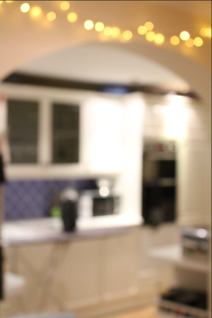
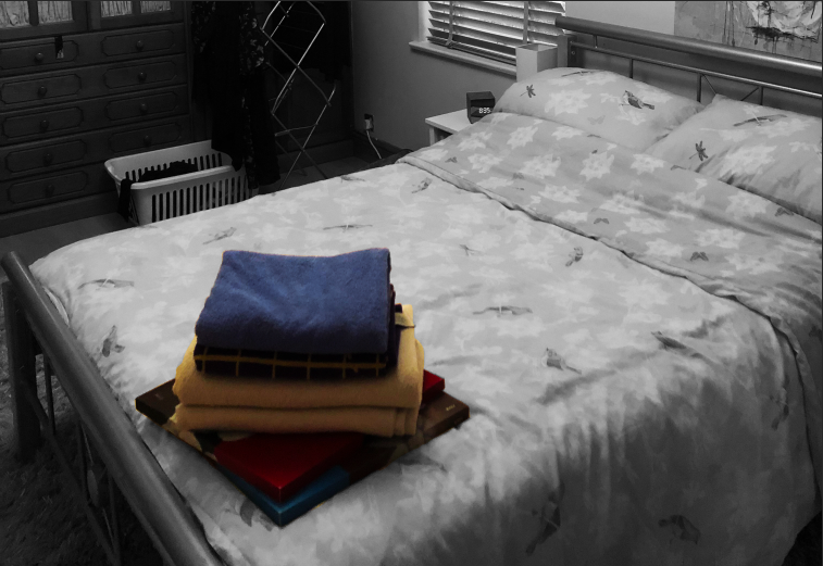
After editing this first image, I went on to use the same sort of process (increasing contrast, using selective colour editing or using monochrome) to edit the remaining images. Below is an example of one of the interior images I used:

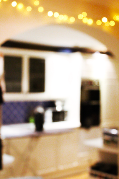
In order to create this image, I increased the contrast of the image, and used the selective colour tool to increase the brightness of the white in the background:

I decided to use this blurred image, as I felt it gave an intimate view into the interior of an individuals private life. The lack of focus allows for the interior to retain some privacy, and draws attention to the fact that the viewer is looking into the most private aspect of an individuals life; their home. I feel like although this image does not stick to the norms when it comes to its visual and technical layout, the concept behind the image fits the title of the project well, and therefore I decided on it as a final image or this reason.

Final image

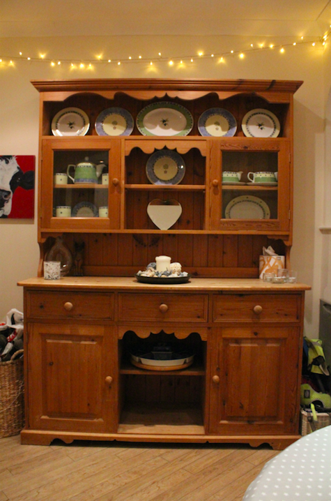
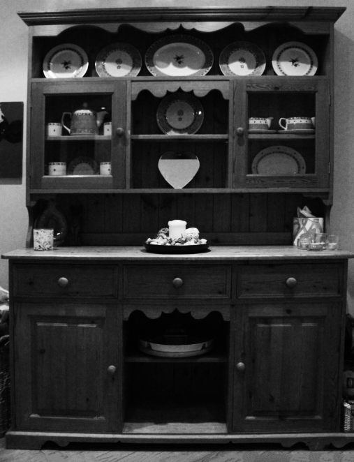
I then decided to edit the image which I originally decided had an issue with its perspective. I used the photograph of the bookcase which I had initially taken using a handheld camera, and thus the image came out with the bookshelf appearing uneven and lob-sided, as shown underneath:

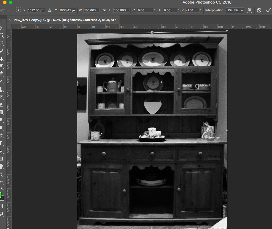
I took the image to Photoshop, where I turned the image monochrome (as I disliked the yellow tint to the image and felt the textures could be best emphasised using black and white) and then proceeded to alter the perspective of the image using CMD-T in Photoshop:

This allowed me to better straighten the cabinet, and thus I created a much more in-line, symmetrical image.

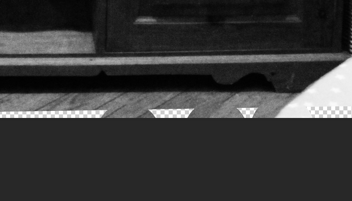
I then had to fill in the gap at the bottom of the image, left from where the image had been lifted due to the perspective change. To fill this, I used the spot healing brush tool, and allowed the software to fill the gaps in:

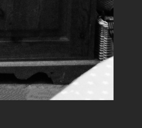
I then decided to remove the table corner in the bottom right of the image which distracted from the cabinet itself, and to do this, I also made use of the spot healing brush tool:

After this editing was complete, this was my final product:

I followed the same sort of process for the rest of my images, and developed the following as my final images:

I feel like my final images for this project reflect the meanings of both “interior” and “exterior” well, with a range of images for each criteria. I feel like my final images give a feel and understanding to the viewer of the public and intimate aspects of the lives of individuals living in the houses and areas that I photographed, and the intimacy of rooms such as the bedroom and kitchen allow for the viewer o gain an understanding of the personality of the people living inside and around these rooms. I feel like the editing process allowed me to emphasise certain aspects of the images, and downplay others, which I felt was an effective method for drawing attention to certain components of the image which helped to better convey the meaning of the image.

Establishing Shot – Photo shoot

Planning:

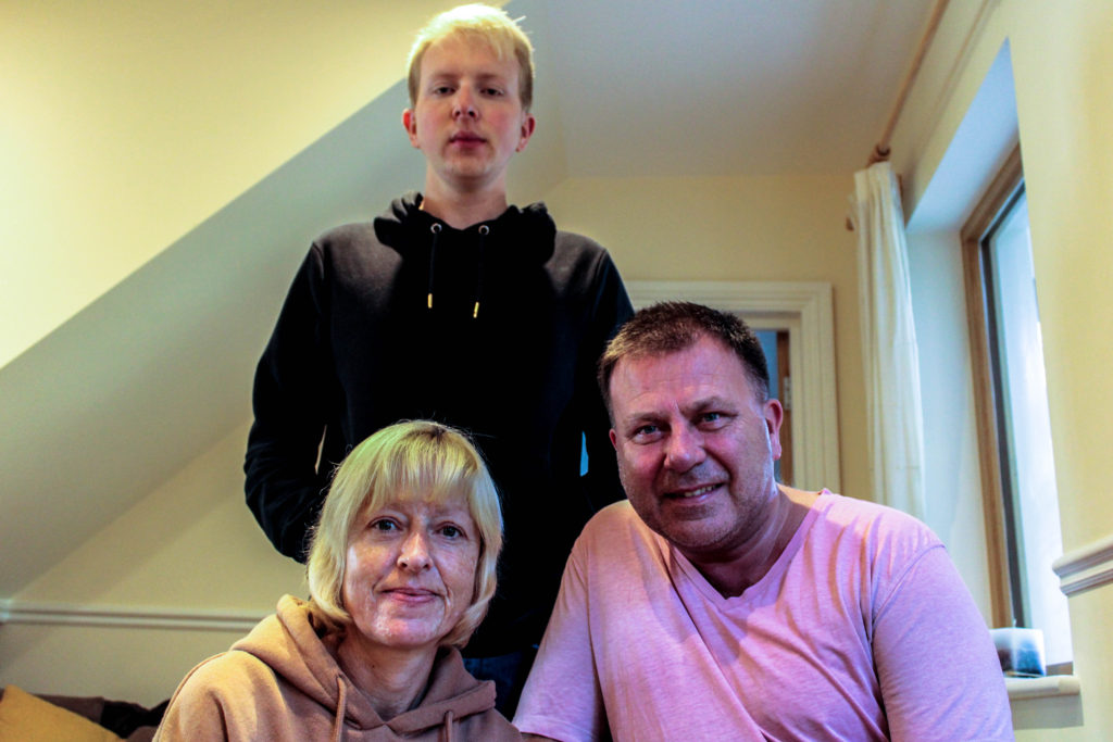
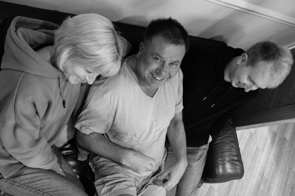
In preparation for this photo shoot I looked back at Sian Davey’s candid photography, in order to reflect on the techniques she used, so that I can implement her approach into my work. I wanted half to be highly staged, more like an environmental form, family portrait, and half naturalistic in order to showcase a true representation of my family, following more of a candid form of documentation photography. My camera setting where kept similar to the detail shot photo shoot, due to the shoots occurring on the same day.  used the AV setting, allowing me to focus on the aperture and depth of field. On the day these photographs were taken, the lighting was dull, but well lit, which meant that I used a low ISO. My f number stayed on 5.6, unless the room itself was much darker. The shutter speed was set on a quick setting and the white balance was set to the day light setting. In order for further control I used manual focus, allowing me to control the depth of field and the overall composition.

Edits:

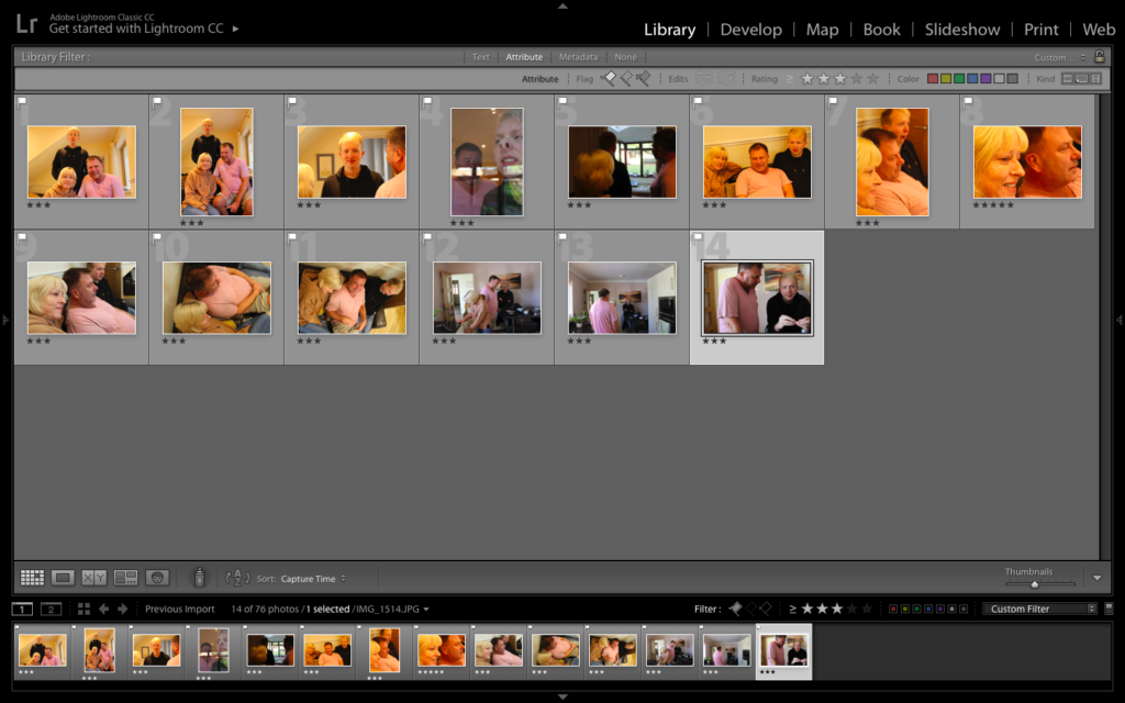
First Edit – Flagged
Second Edit – Star Rating
Third Edit – Colour Rating

Colour:

For my colour edits, I wanted the outcomes to be kept as naturalistic as possible, so I ensure that the detail and structure was not over the top, creating soft outcomes, focusing on the conceptual reasoning, family love, to be presented within my imagery. I explored with adjusting the white and blacks and shadows in order to create outcomes which still presented tonal contrast, allowing the colours and environment and subjects to be the focus of the composition. I am pleased with the way in which these outcomes have turned out, due to me keeping the editing simple, to capture the naturalism of the photographs.

Black and White:

For my black and white outcome, I explored with an image which uses a birds eye view angle. The tonal contrast and new angle allows the conceptual meaning to be presented in a new way, which showcases this further exploration as successful. The photograph follows a candid style of photography, and presents my three subjects, with one looking at the camera, implementing an environmental stylistic feature to my work. The composition uses the rule of thirds, allowing viewers eyes to be guided around the frame. The formal element of space plays an active role with the outcome. In the frame there seems to be a lack of empty space, thus my models are in close proxemics to one another, which emphasise the conceptual representation of family love and bonding within the work. The background, is kept simplistic with not much going on showcasing my families naturalistic environment.
Technically, the photograph uses a small aperture, due to the the whole frame being in focus. The ISO used is low which is shown through there being no noise being created. This also allows us to understand that natural lighting produced by the daylight was used to capture this, and informs us that the white balance has colour accuracy and that it presents a sense of warmth, adding to the overall pleasant mood to the piece. In addition, the shutter speed is quick, due to no interned blur being presented within the outcome.

In order to achieve all of this, I kept the editing simplistic. I turned the photograph black and white and focused mainly on adjusting the black, white, shadows and contrast sliders in order to create the overall photograph.

Evaluation:

To evaluate I believe I have produced strong photographs which clearly showcases my understanding of ‘Establishing a shot’ and the ability to use candid photography in order to produce naturalistic outcomes, which explores a narrative within my work. I have reinforced my ability to have control over manual settings and shown my competence of using Lightroom in order to edit my photographs. Although I have produced strong imagery, I do not believe it is as successful as the detail shot photo shoot. However, the imagery still produced has an clear overall aesthetic and shows exploration into the home sweet home briefing.

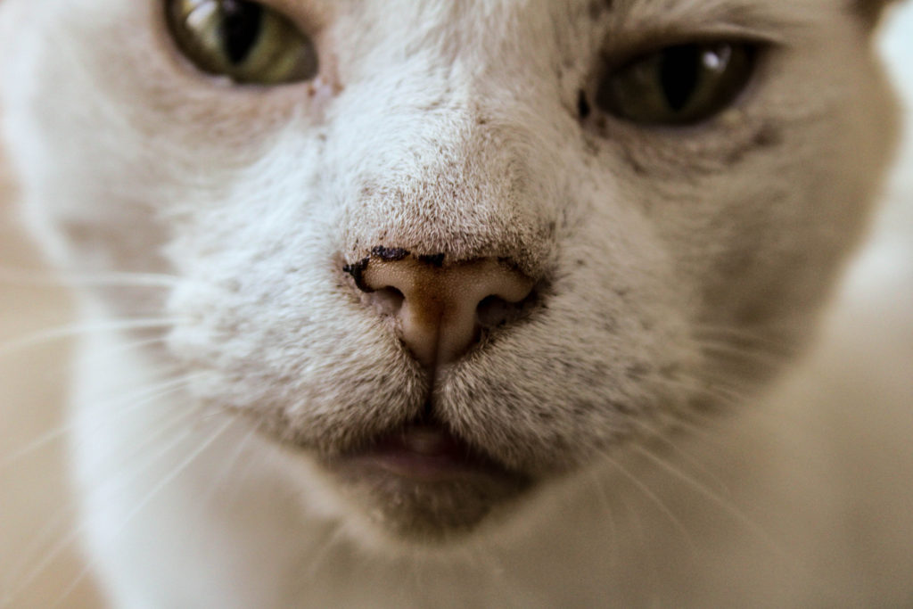
Detail Shot – Photo shoot

Planning:

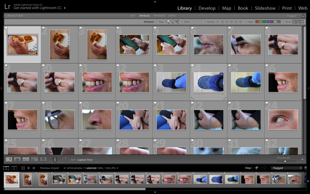
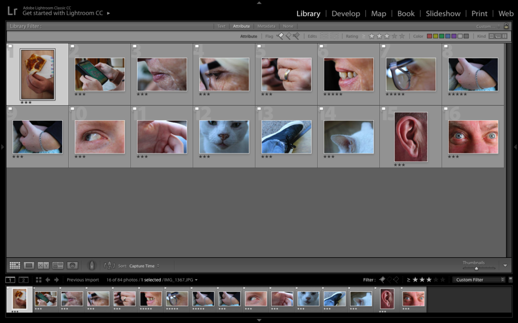
When going about this photoshoot I kept in mind the technique the Martin Parr used when he captured detailed/macro photography, in order to create an effective outcome which can hold a lot of conceptual meaning. On top of this, I also took inspiration from the mood board created on the previous blog post, in order to create new ways and approaches of capturing this style of photography. When capturing this set of photographs I used the AV setting, allowing me to focus on the aperture and depth of field, an important feature for macro style photography. On the day these photographs were taken, the lighting was dull, but well lit, which meant that I used a low ISO. My f number stayed on 5.6, unless the room itself was much darker. The shutter speed was set on a quick setting and the white balance was set to the day light setting. In order for further control I used manual focus, allowing me to control the depth of field and the overall composition.

Edits:

First Edit – Flagged
Second Edit – Star Rating
Third Edit – Colour Rating

Colour Edits:

For my colour edits I tried to explore with making the colours vibrant and over the top, to create a similar outcome as Parr. In order to do this I increased the contrast, vibrance, white and blacks. Although this worked well, I did not think that it was justifying my work, so I decided to edit them normally, as if it was a normal portrait, in order to allow the detail to clearly be showcased. To do this I subtly moved the sliders in order to correct the imagery until I gained my desired effect. I believe my colour outcomes are successful as they clearly showcase the formal elements of colour, texture, space and shape, which enables the macro photographs to meet the briefing and showcase my implementation of Parr’s work within mine.

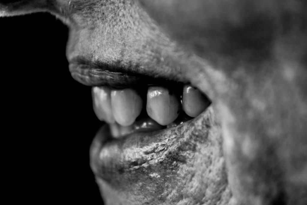
Black and White:

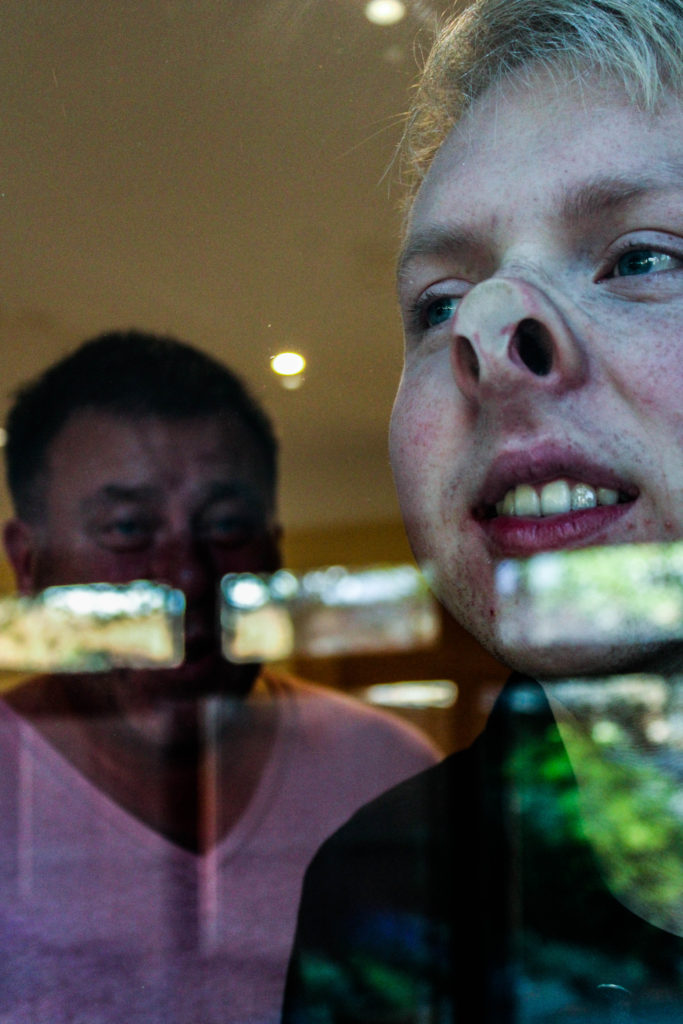
Experimenting in black and white; I was a little skeptical at first as all my inspiration did not use black and white imagery to present the macro photograph. I then decided to go ahead with this idea, because I knew it would show exploration outside of my research. In order to achieve this effect, I set the image to black and white and mainly focused on adjusting the black, white, contrast, structure and shadow sliders in order to create the outcome below. I am happy that I experimented with black and white, as I believe that this is my strongest outcome from the photoshoot, with my reasoning for this being explained in an analysis of my work below.

Visually, we are presented with a landscape macro photograph of a models mouth, who is smiling showing her teeth. The frame is 3/4 full, with a sense of space on the left of the frame, presenting the technique of rule of thirds bring utilised in this outcome. The main focus point is the teeth, due to it being the area most in focus, which informs us that a large depth of field has been used when capturing the photograph. The photograph presents the formal elements of space, texture, shape and tone, which is being shown through the detail of the lower half of the models face. The photograph is presented in black and white which allows a clear tonal contrast to be showcased, making the imagery even stronger. The background is black, which enables our attention to be focused on the foreground, the face of the model, allowing the conceptual representation of happiness within a family to be clearly presented.

Technically, the photograph uses a medium aperture, due to the narrow depth of field being utilised in order to allow the focus to be on the mouth and teeth. The ISO used is low which is shown through there being no noise being created. This also allows us to understand that natural lighting produced by the daylight was used to capture this, and informs us that the white balance has colour accuracy and that it presents a sense of warmth, adding to the overall pleasant mood to the piece. In addition, the shutter speed used to capture this macro photograph was quick sue to no intended blur being presented in the overall composition.

Evaluation:

To evaluate this photo shoot, I believe that it was more successful than the previous home sweet home shoot, due to me producing stronger imagery, through more control over my camera settings. I have been able to show my competence with macro photography, as well as showing my ability to use manual focus in order to create depth of field and put different features in focus for effect. I have also shown my ability to take inspiration and implement it into my work, on top of adding my own artist style to show further exploration within my imagery. I believe that my overall outcomes are successful due to high control in my camera settings, and quality editing, making my work have a clear overall aesthetic.

Contextual Analysis – Pieter Claesz

Pieter Claesz lived through the 1600’s when still-life paintings began to take off, during this time he was soon titled a ‘Dutch Golden Age Painter of Still-Life’. He was born in 1597 in Belgium. His art work was painted with subdued, virtually monochrome colours, with a subtle handling of light and texture allowing the symbolic meanings and expressions within the outcome to clearly be showcased. It is common to see motifs such as skulls for allegorical purposes. His work avoided a crowded composition and stuck to simplicity in order for the prime symbolism to be shown. It is said the Claesz artistic aim was to render the materials and catch the reflected light as accurately as possible, which was considered his speciality with still life pieces. He was the first artist to portray everyday objects, such as a rummer, a tin plate and a herring, in such a way to showcase the beauty of the objects.

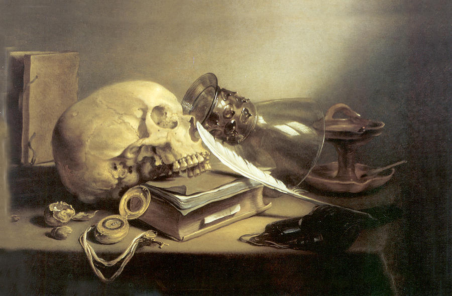
Still Life with a Skull and a Writing Quill,1628 – Pieter Claesz

The image above is ‘Still Life with a Skull and a Writing Quill’ painted in 1628 by Pieter Claesz. The artist used a median of wood and painted the image using oil paint. The sizing of the painting is 24.1 cm by 35.9 cm and can be found in the Metropolitan Museum of Art in New York. The painting falls into the subcategory of Vanitas

Visually, the art piece creates a sense of business through the proximity of all the objects, which contrasts the small amount of objects there actually is. The first item my eyes are drawn to is the skull, which presents the formal elements of texture and scape. In addition, it informs viewers that the work falls into the still life subcategory of vanitas. The skull itself symbolises the death and mortality, which is also emphasised by the pocket watch, located in the foreground of the skull, which is symbolic for a lack of time, creating the overall ideology that life is short. The skull is leaning on a book which has a quill placed next to it, (contextually, and expensive item during the time period the work was painted in, creating a stronger meaning towards the symbolism it holds.), which is a common feature in a vanitas painting, which is used to warn viewers of the futility of worldly pursuit. Moreover, in the background there is an old school candle holder, with the glass covering laying beside it. You can faintly see an amber in the holder, suggesting the candle has just been blown out, which symbolises a passage of time and reinforce the sense of death.
After deciphering the symbolic representation of each item within the frame, it clearly demonstrates the intended conceptual representation in the work. The painting is suggesting, that time is short and that we do not have long left till we die, bringing in the concept of death (which many feared the thought of death in 1628). Contextually, the concept of death is major due to the two outbreaks of the bubonic plague during this time. Suggesting the idea of death and lack of time, emphasises the ideology that people thought the plague would kill everyone off and that when people gain the illness they do not have long before it kills them off.
The main formal elements presented within this painting are texture, space and shape, which are all presented through the positing of the different objects. Overall, the painting has a morbid tone which is emphasises by the monochrome colours. Claesz, focused on accurately representing the light, which I think he was successful in doing within the still life painting. This is due to an accurate reflection on the glass and the artificial light source being shone and above, and has a clear radius. This lighting also mainly illuminates the skull, making it the main focal point of the painting, which clearly emphasises the conceptual representation within the piece.

Still Life: Emile F. Guiton – Autochromes Study:

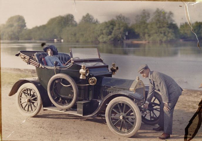
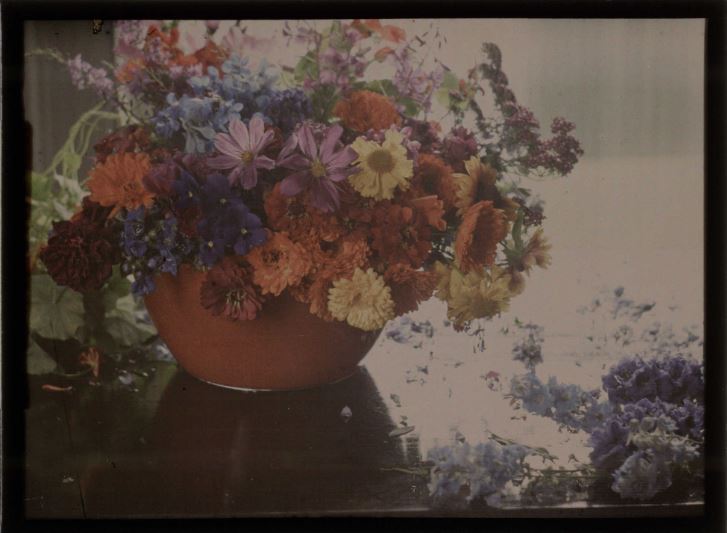
Autochrome colour photography was developed in 1903 by the Lumiere brothers in France, and involved the process of creating a filter from placing tiny starch potato grains onto a sheet of glass, and dying them red, blue and green (with black charcoal being used to fill in the gaps between the colours), before coating the entire sheet with an emulsion. The 3 primary colours, when subjected to light, would create a range of different colours which would reflect the accurate colours of a real life object. In order to counteract the blue sensitivity of the emulsion, the exposures were made using a yellow filter, giving the final image it’s distinctive slightly yellow tone.


Source: Anon, Couple with a motor car, c.1910, auto-chrome, notice the slightly yellow undertones caused by the yellow filter.

Source: Baron de Meyer, Flower study, 1908, autochrome – this image is a reflection of the type of subjects that were often used in the early days of auto-chrome photography, including fruits, flowers and vases.

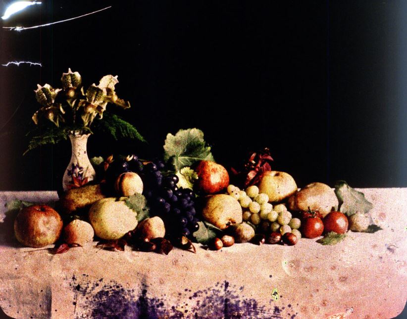
The first colour image taken in Jersey was produced by the founding father of Societe Jersiaise, Emile F. Guiton, in 1904. Guiton was an enthusiastic amateur photographer, and made use of the newly developed Autochrome technique to produce coloured images of vases, flowers and fruits.


Emile F. Guiton, early 1900’s – this auto-chrome is an experimentation by Guiton to look into the ways colour interacts within an image.

The ability for photographers to take coloured autochrome images was revolutionary, and many people commented on the depth of the images along with the vibrance of the colours. in 1908, the Photographic News was quoted as saying:

when the effect of relief is joined to a life-like presentation in colour the effect is quite startling in its reality. It is not easy to imagine what the effect of anything of this kind would have been on our ancestors and witchcraft would have been but a feeble, almost complimentary term, for anything so realistic and startling

This quote reflects the opinions of photographers towards the development of the auto-chrome, and allows for us to grasp an understanding of how revolutionary it was that photographers could now take images and photographs in colour that almost perfectly reflected real life. A huge difference from the common black and white photography.