

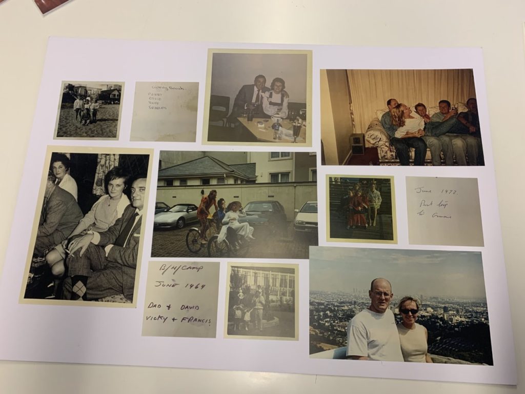


For the framing of my images I had the idea of tessellation prior to selecting my images. This eventually evolved to the idea of arranging the images similar to the logarithmic spiral created in accordance with the findings of Phidias (more commonly known as the golden spiral or golden ratio). As such I arranged my prints in such a manner that the images appeared to roughly halve length-ways, with equal spacing between the images in all directions.
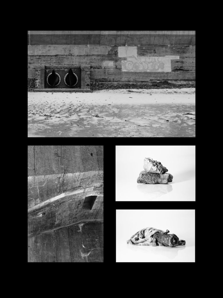
Below is a link to the final composition
The sequencing of my photo-book is primarily for aesthetics reasons, as to not crowd particular sections of the photo-book with images to visually similar to the images proceeding them, with much of the narrative aspect coming from the photos as a collective as opposed to a linear narrative.
Interspersed within the images are commentaries on abstraction and photography as a medium from myself and other photographers/ writers.
In order to occasionally break up the landscape oriented images are several studio photographs to introduce more elements of 3D shape in form.
I decided against including the essay directly within the book in order to prevent the book from being broken up by several large blocks of text. As such I decided upon creating a booklet using Adobe InDesign. I instead decided to intersperse my photos with commentaries on photography and abstraction from myself and others.
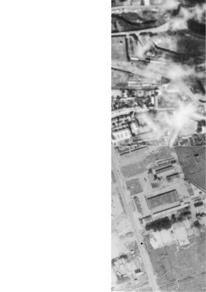
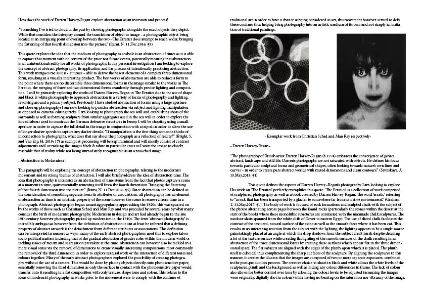
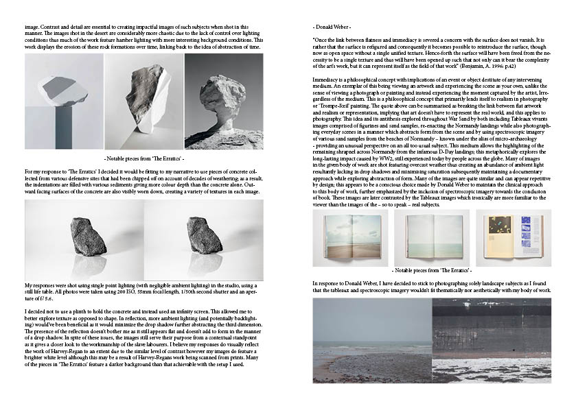
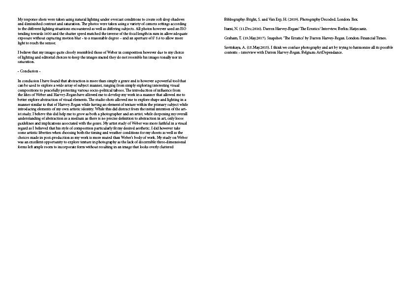

Final essay booklet layout
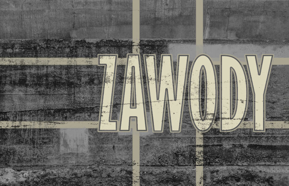
I decided upon using ‘Zawody’ as my final title for the book. This is the polish word for occupations under the context of work synonymous of professions as a form of wordplay due to the forced labour of many Europeans used in the construction of the subjects within my photo-book. The initial title was simply ‘Occupations’ however I had felt that this didn’t bring any personal connection to the title, as such I chose to use the polish translation of the word in it’s stead.
I had decided that I wanted to include a strong graphical element in my title-page and thus I began studying German military markings used during WW2 and looked for one that i believed would be of sufficient impact for a title-page. I decided upon the general composition of the title-page prior to creating it digitally.
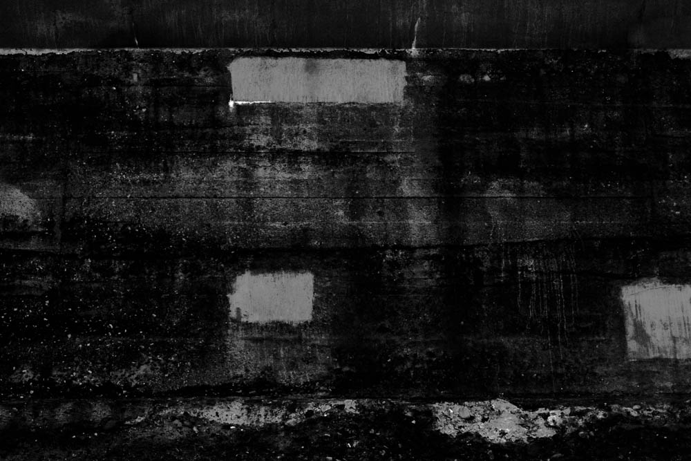
The original edit consisted of a deadpan shot of the sea wall, converted to monochrome with very low levels with minimal highlights to suggest the presence of texture. I did this as i didn’t want to simply use a black background due to the lack of room for further experimentation given that approach.
The marking was then created and weathered using blending options on Photoshop combined with a low radius Gaussian blur filter in order to reduce any aliasing produced by the blending.
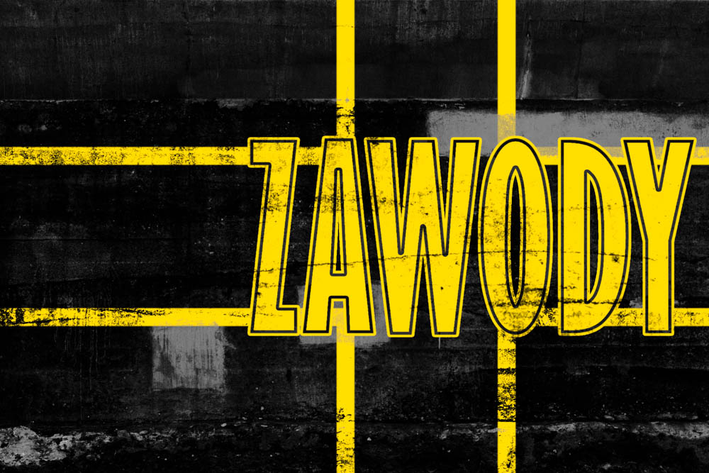
I later decided that the yellow was too harsh a contrast to the rest of the subject matter within the book and thus brought it down to a more subtle tone.

The decision was later made to have the title-page on the first double page spread of the book instead of as a cover, leaving a linen cover. Due to this decision the title-page once more harshly contrasted the rest of the book, thus I brought up the shadows quite heavily and reduced the contrast. The text and markings were also brought to a tone and colour closer to that of the sand in the images.
The story about my great grandfather Mashhoor Hadeetha Al-Jazi as told in my photobook got me thinking about war and how war has been photographed. The military has always played a significant part in my family. Nine members of my family have all had a distinguished career in the Jordanian military, but my great-grandfather’s, who was a Jordanian army commander in the Battle of K has always fascinated me and to a large extent influenced me in following in his footsteps. In this essay I will be investigating how war in the Middle East has been documented in photographs. This study will be based around analyzing a set of images from my great-grandfather’s Battle at and compare those images to images of recent conflicts in the region
The Purpose of War Photography:
I am really effected by the way wars have changed over time and how now a days war is much easier due to the industrial revolution some countries can destroy a whole other country from the comfort of an office. And years ago soldiers had to actually go on battle fields and put their lives at risk and that is how I lost my great grandfather.
“If war truly is a force that gives us meaning, photography is a force that gives us a means by which to envision that meaning.” (Bob Duggan,2012:1) Duggan is saying that photography of war is just as important as the war itself or else the war wouldn’t have much meaning.
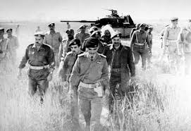
This is my favorite war photographs, it was taken in 1964 in the Karamah Battle and you can see Mashhour in the front taking the lead. With his great heroic character as seen in the photograph wearing his CO uniform giving him this leader image. This photograph was taken by a war journalist back then when they had to be embedded within a troop risking their life to take these photographs that are the most important aspect of a war to complete its meaning as if there is a war without much photographs not many people will give it their attention, as the sad reality is that what people haven’t seen to them it hasn’t happened. The photographer took this photograph while Mashhour was leading his troop towards the war field and he took it just in time when you can see even though they’re headed towards war Mashhour still had a smile on his face which represent how proud he was to be the one chosen to lead these heroes to bring independence to their country. They were barging through the grass reaching half way their height, off road marching on the desert sands, waiting patiently for something to happen.
The photograph was taken under natural day light where the broad day desert sun light was positioned from above, making the photograph a bit over exposed mean while giving it a good glare. The aperture was made to be a wide range giving the photograph a deep depth of field but due to the poor quality of lenses at that time the photograph was not very focused and gave the image that small blare effect. And high speed shutter speed wasn’t available at that time so it there was a slight motion blur. The chosen shutter speed gave the photograph high grain. More over, the white balance of the camera settings made the photograph quite warm. The combination of the grass and soldiers give the image textural quality that is ‘busy’ to look at. The color of their uniform blends in with the background. And the combination of the dark soldiers with the bright environment gave the image more quality.

This is a recent photograph of a modern day war in Afghanistan taken on November 2001, these american marines where in a country that isn’t theirs and were fighting the locals in it. You can see the difference between this photograph and the old photograph of the Karamah battle, in this photo it represents how much the soldiers had to carry on their back as there is too much evolved technology so war became more competitive with time. These marines look very exhausted as they’re walking through the sunny desert sun with a lot of load on them. Further more, in the Karamah battle photograph the background was just of an old tank which is what they used to use in the old days meanwhile the back ground of this photograph is off a more evolved and technological weaponry vehicle which is a helicopter. And i believe that war now a days is not as much effort taking but if more destructive as to the evolution of weaponry which increased competition between nations.
This photograph was taken using a state of the art camera which is easier to use as its lighter with better quality and finally more settings option. This photograph was taken with the sunlight that’s positioned facing the soldiers as the main source of light, you can see that as the reflection of the light on their faces prove it. And that brightness made the image over exposed with a slight glare. And the advanced lens was more focused with a deep depth of field making it sharp. Due to the option of faster shutter speed with new cameras. The shadow effect on the soldier’s faces contribute to the secrecy of them. The white balance on the photo though made it quite cold. The pattern of the soldiers walking in a single file behind each other on the arid land gave the photograph a good pattern quality.
War photography was harder to achieve good quality photographs in the old times although it was easier to have access to war. Zooms were then clumsy, heavy and of poor optical quality. Meanwhile digital cameras today can automatically adjust the film speed setting to the available light, are much better than film in very low light, have rapid auto focus, and can be used with zooms that give good optical quality across a wide range. With a laptop and a satellite phone, pictures can be adjusted and sent to the publisher within minutes, while in the old times the photographer had to keep his camera safe with them until they reached back to their base, but if they got stuck on the way or died then the photographs will never be published. And unfortunately now a days there is so many restrictions on taking photographs in a war zone mostly because the countries with the greater power don’t want to show the world what they are doing so basically no photographs that show evidence of war is allowed in these countries, which is very discomforting as people are just sitting in their homes doing there daily stuff normally around the world and have no clue about what is actually happening in these countries with war. What is even worse is that now editing photographs is very easily done so countries with more power can just easily edit a photograph that shows something disturbing to show something normal from the comfort of an office.
In conclusion after doing my research on the purpose of war photograph and got deep in it, i found out how important a photographer can be, as if a war didn’t have any photographs it would have much meaning to the people who weren’t there. And then that lead me to questioning how war changed with time and evolution of technology. And the most artist who inspired me but i didn’t mention her a lot was Julian Stallabrass who went and risked her life in the Iraq war to get the finest of war photographs, and used her words through my essay to direct me on the right path of war photograph.
Bibliography
Julian,S.(2013) Photoworks. Grand Parade, Brighton, BN2 9
In this post, I will be looking at the layout of my photo book and describing the way I have presented each image. I have made decisions regarding the order of the book and the size of the photographs, paying close attention to how they occupy the pages in relation to one another. The book features a number of different layouts for the images, as I wanted to present an array of different arrangements to enforce variety. The way that the images are presented is very important as it dictates the way in which the story is being told to the viewer.
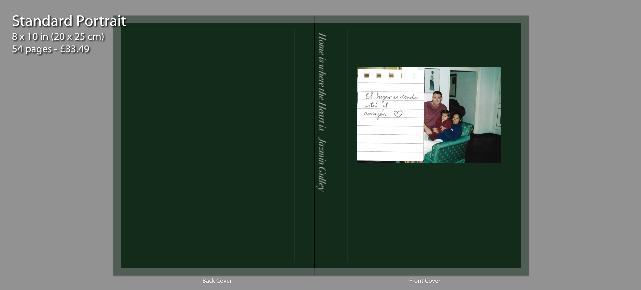
The cover of my photo book displays an image of my family sat on the sofa in our house located in Peru. This is where our family journey started. Alongside the archival image is a handwritten note on lined paper saying “El hogar es donde está el corazón” which translates to “Home is where the Heart is”. Writing the title as a note was a good idea because it gives the book a personal touch. I chose the colour dark green for the background because for me this colour represents memories, nostalgia and importance. Although it is a simple cover, I think it’s effective as it conveys to the viewer that within the book I will include archival images where I explore my family and the past.
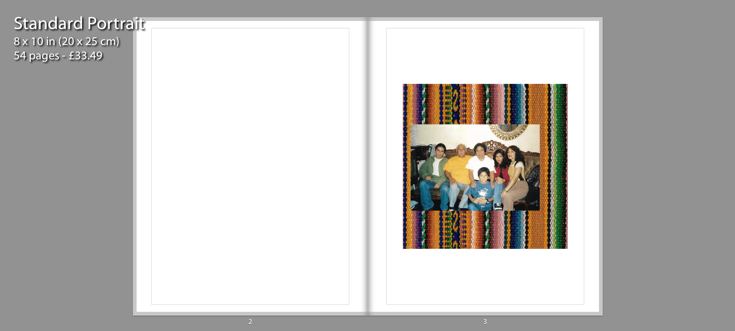
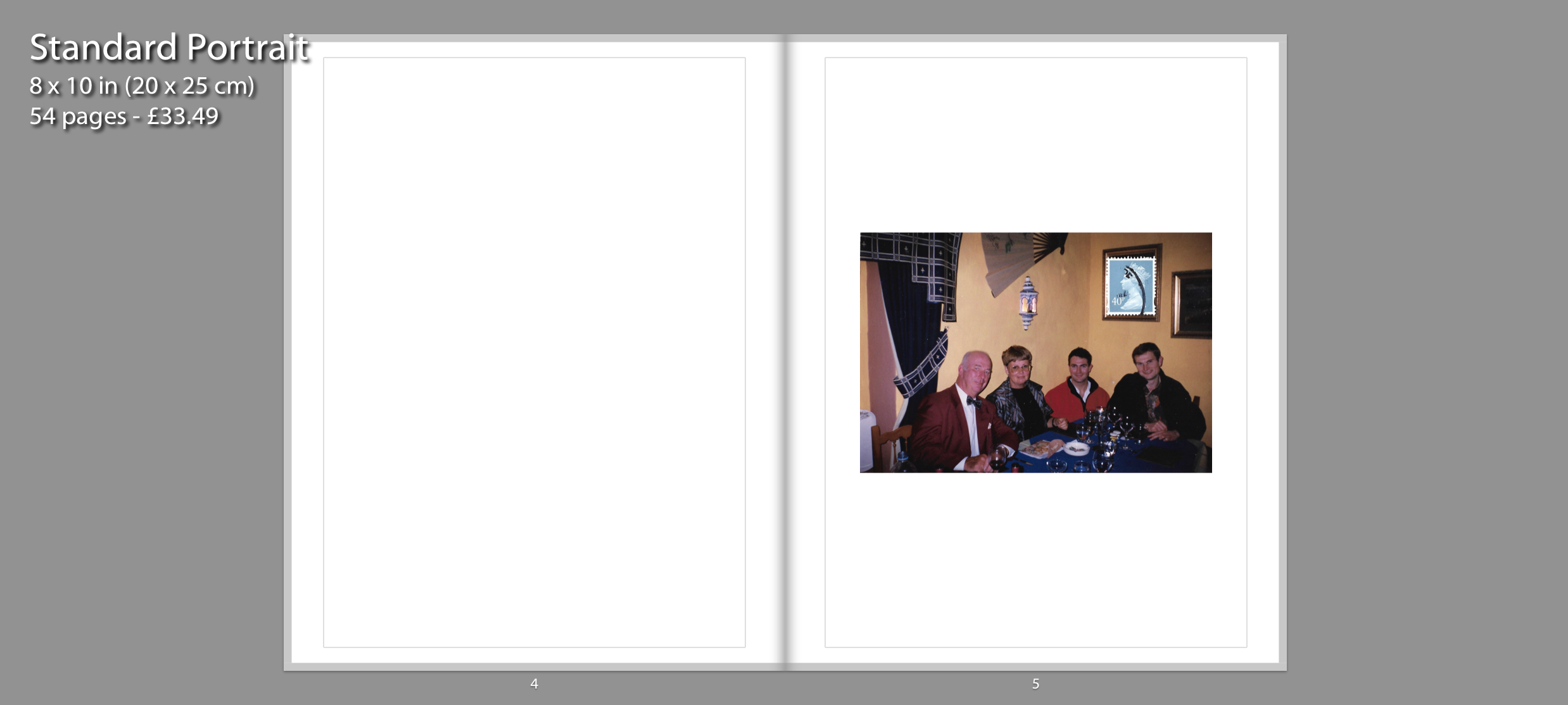
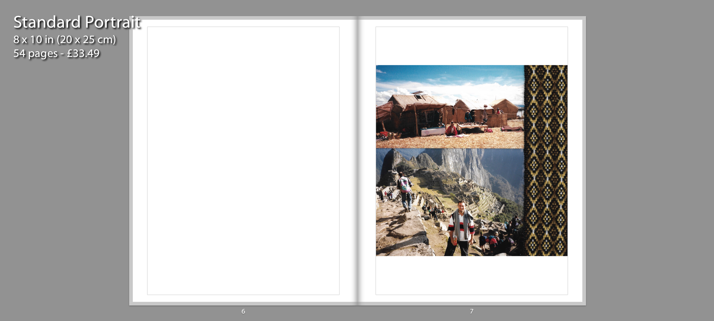
My photo book is mostly in chronological order and only breaks this pattern when reflecting on the past with present photographs such as souvenir images. This order will make the reader feel like they are going on a personal journey as they experience my childhood through archival images. I start the narrative of the book before I was even born, focusing on my mother and my father and their first encounters together. All these images are accompanied with a blank page on the left side to ensure focus on the singular images. The first page depicts a family portrait from my mother’s side in a collage combined with Peruvian textile. On the second page I have incorporated another image that depicts a family, however this time it showcases my father’s side. Finally, the third page depicts a third digital collage which tells the story of when my father moved to Peru. Through applying to jobs in different countries, he ended up in Peru which is where he met my mother Isabel. The two images showcase the culture in Peru and the different locations he visited once he arrived. One of the photographs depicts my father visiting Machu Picchu for the first time, an iconic landmark in Peru. On the right side is another piece of Peruvian fabric I decided to incorporate into my digital collages.
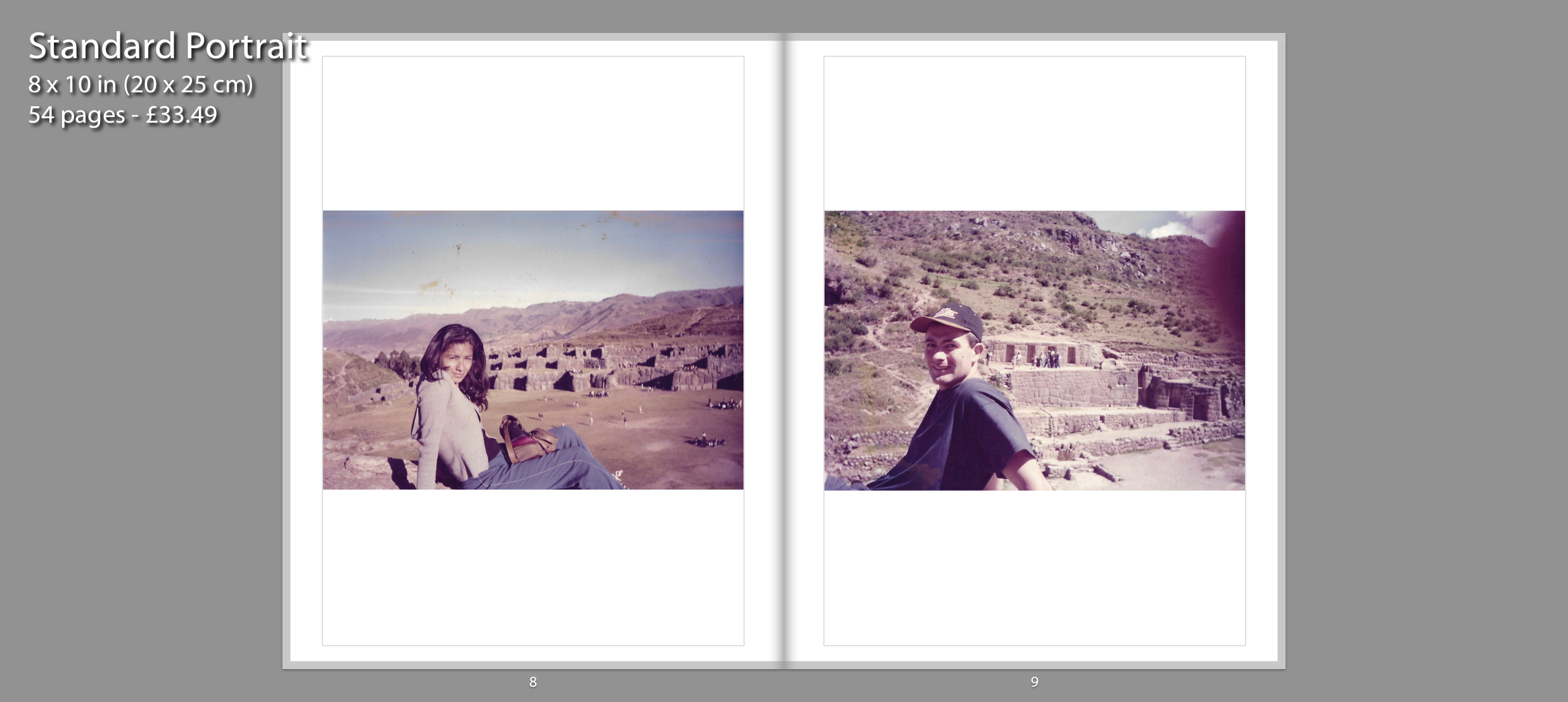
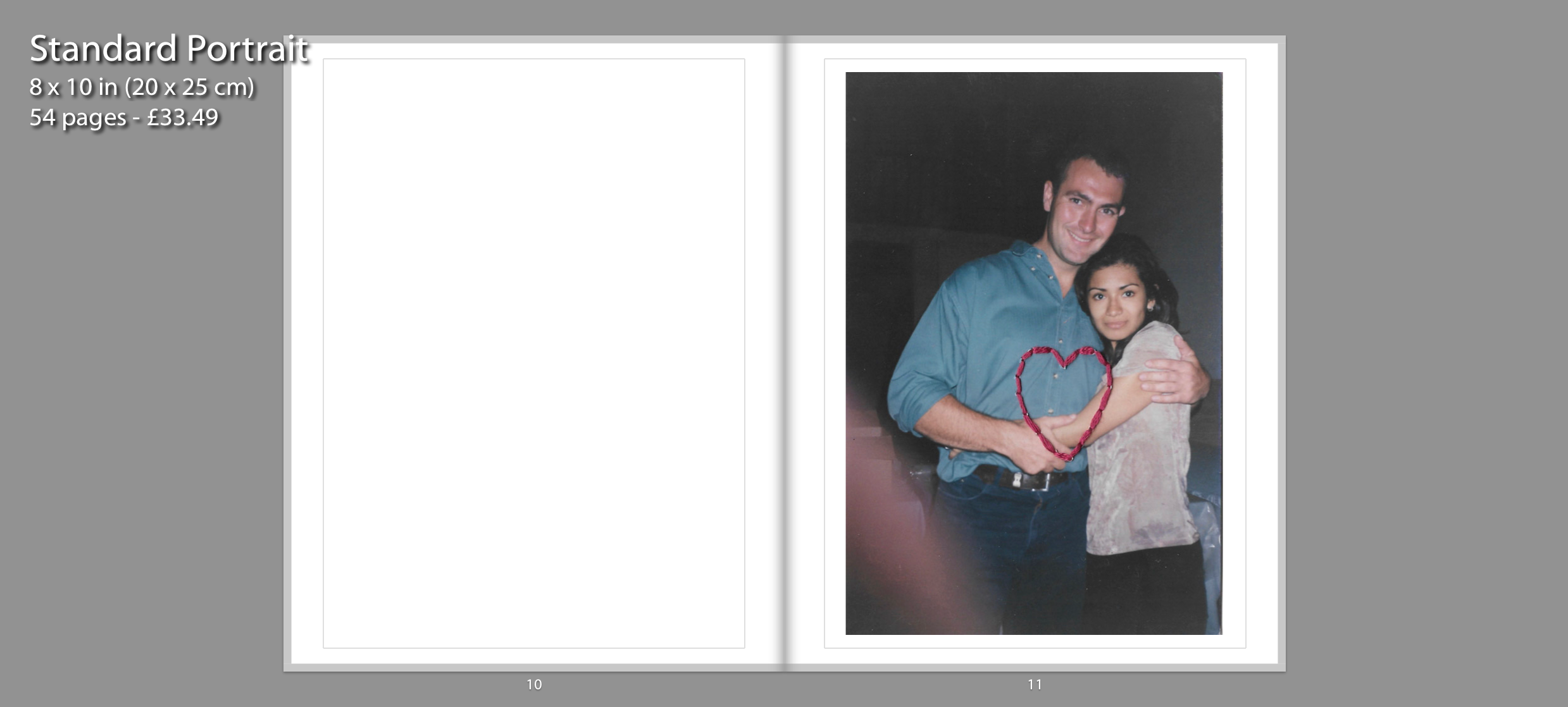
The sense of chronological order is continued with the following pages shown above, which displays my parents first encounters together. On page 8 and 9, I have displayed two archival images depicting my mother and father on a trip around Peru. I chose to pair these two images together in a double page spread because the composition of both images are similar to one another. Page 11 displays an image of my parents relationship blossoming. I chose to stitch a heart using pink thread to represent their strong connection.
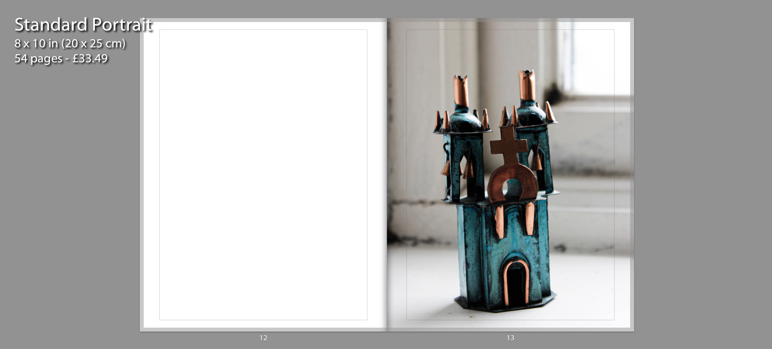
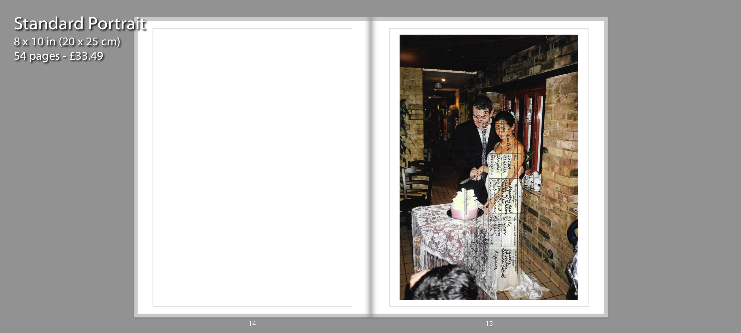
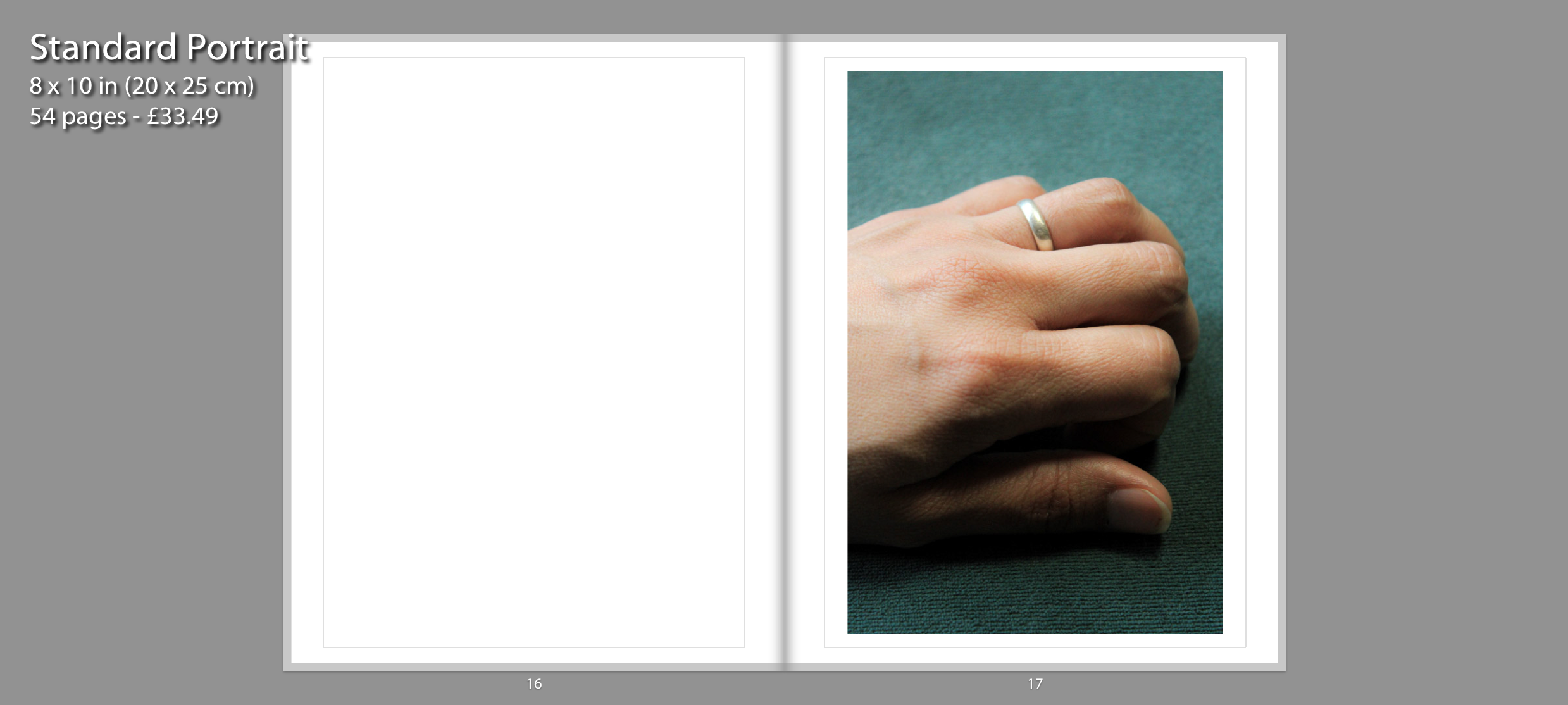
These following three images showcase the marriage between my parents. The image on page 13 depicts a handmade copper and bronze Ayacucho Church sculpture. I decided to photograph this sculpture because my mother’s family side are Christians and they regularly attend church. It is also displayed as a metaphor “hearing the wedding bells ring” as a sign of the upcoming marriage between my parents. I experimented with the layout by having it full bleed on one page. I chose to present the image in this composition because it’s a small souvenir, so I decided display the photograph in a large scale. The image on page 15 depicts a snapshot of my parent’s wedding and layered on top is their marriage certificate. Page 17 features a current photograph of my mother’s hand wearing her wedding ring. This is presented after the archival image of the wedding to showcase that the marriage between my parents is still going strong.
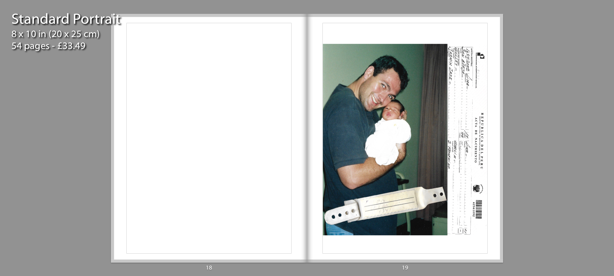
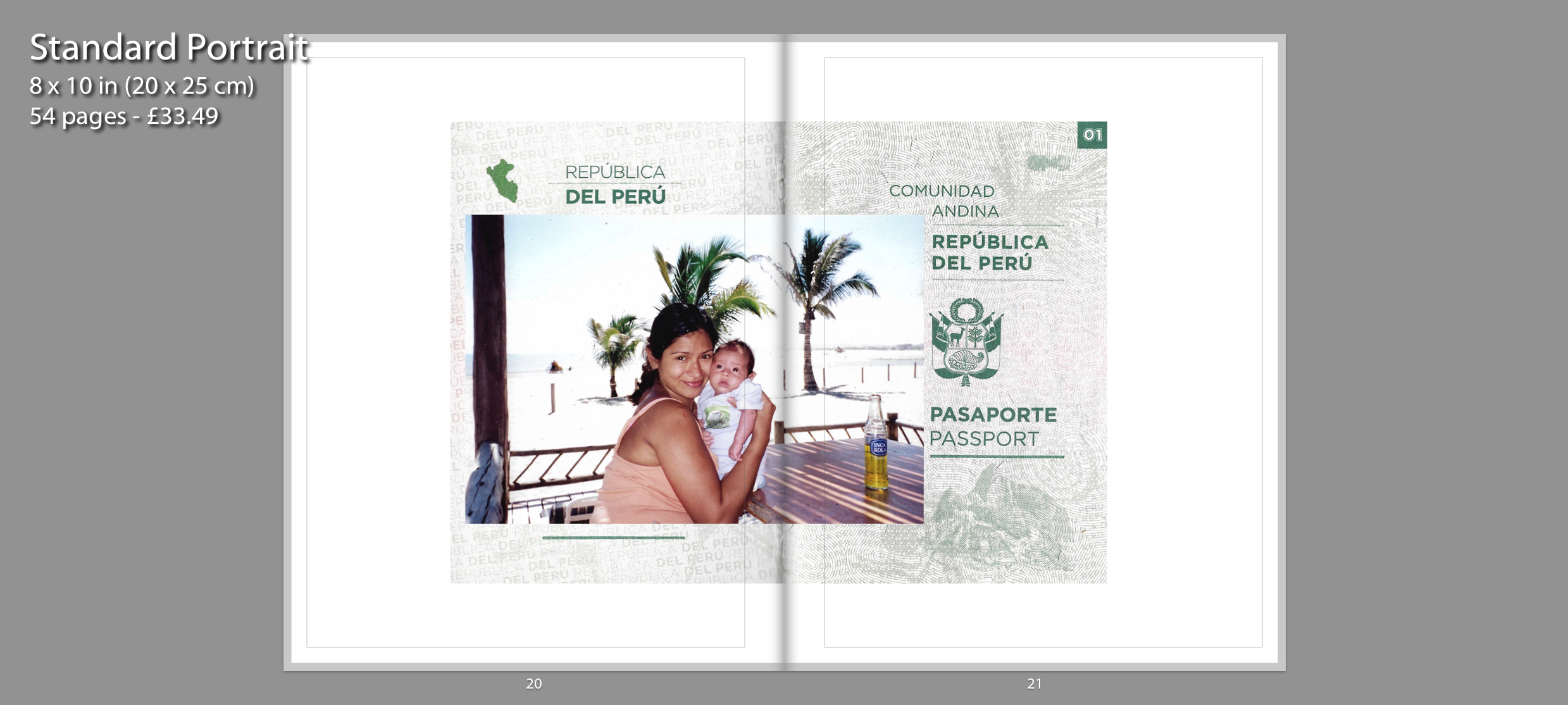
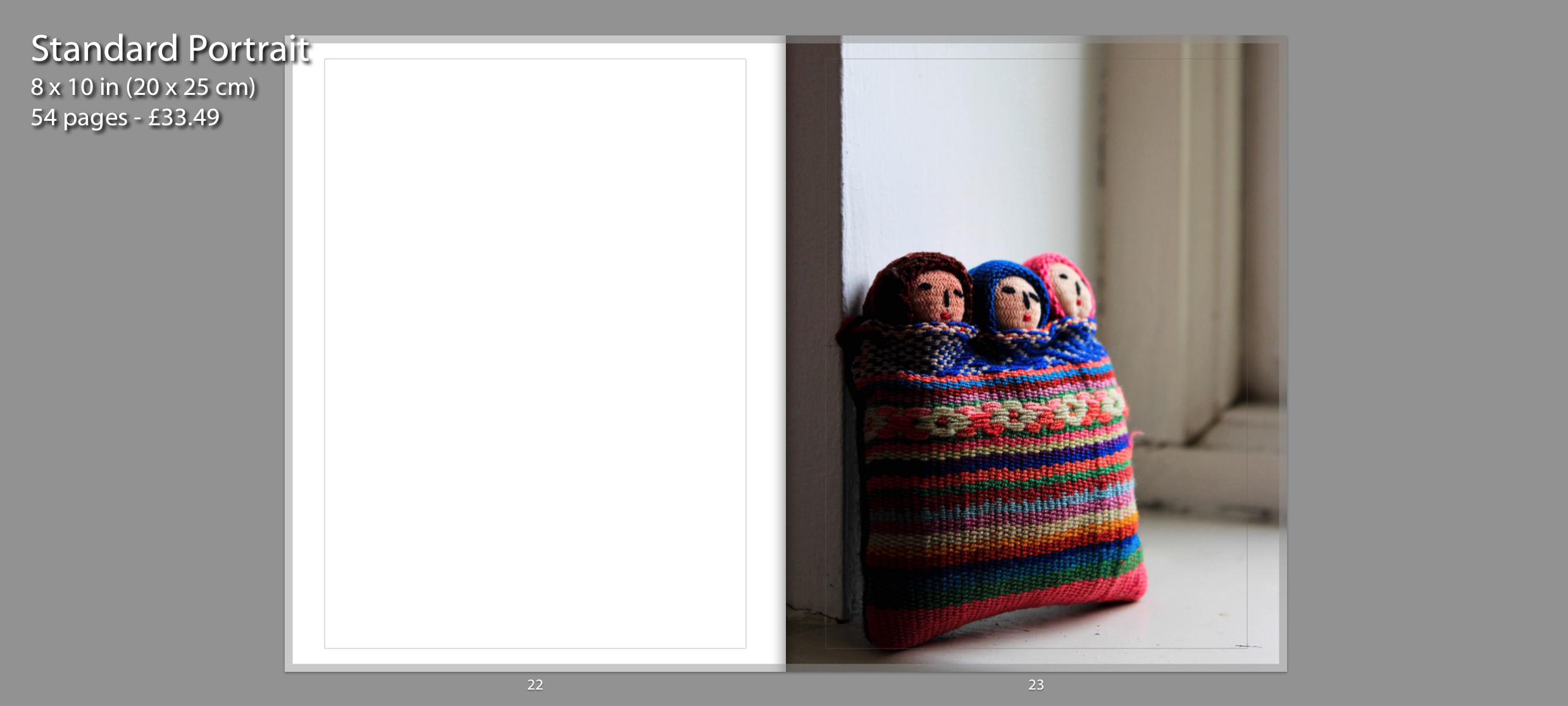
The following outcomes are inspired by Claudia Ruiz Gustafson. I have created digital compositions which incorporate archival documents. The images on page 19 and 20, 21 display the events that followed after I was born. The right side on the first image contains my birth certificate and layered on top is the band I had around my wrist in the hospital. The next double page spread also incorporates an important document which is my mother’s Peruvian passport. This is the first image within my photo book that goes across two pages. The fold on the passport is directly on the fold of the book. Layered on top of the document is an archival image which depicts the first few months we spent in Peru before we shifted countries. Similar to the first souvenir image, I made the photo on page 23 full bleed for the same intention. This depicts three people closely bonded through textile. This represents me and my parents strong connection together as well as our connection to Peru since its where my mother and I were born and where my mother and father met.
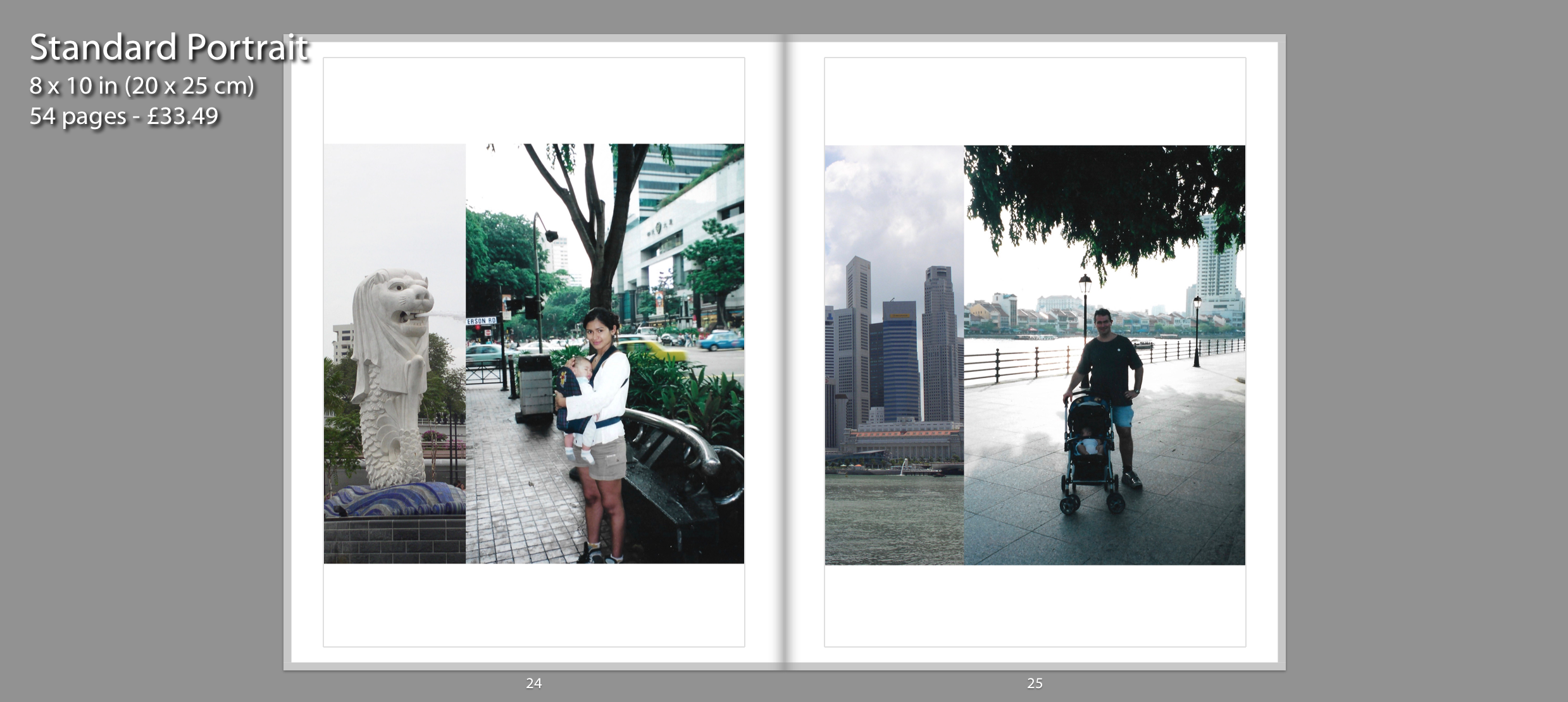
The two digital collages are also inspired by Claudia and depict the time when my family decided to move over to Singapore. I scanned two separate images and decided to combine them together through Photoshop. The archival images on the right display my mother and father looking after me as a baby. On the left side of each collage, I decided to combine the photographs with an iconic landmark from Singapore. I paired them together in a double page spread because they display the same country and have a similar collage composition. they occupy the space well because both are presented in a square frame.
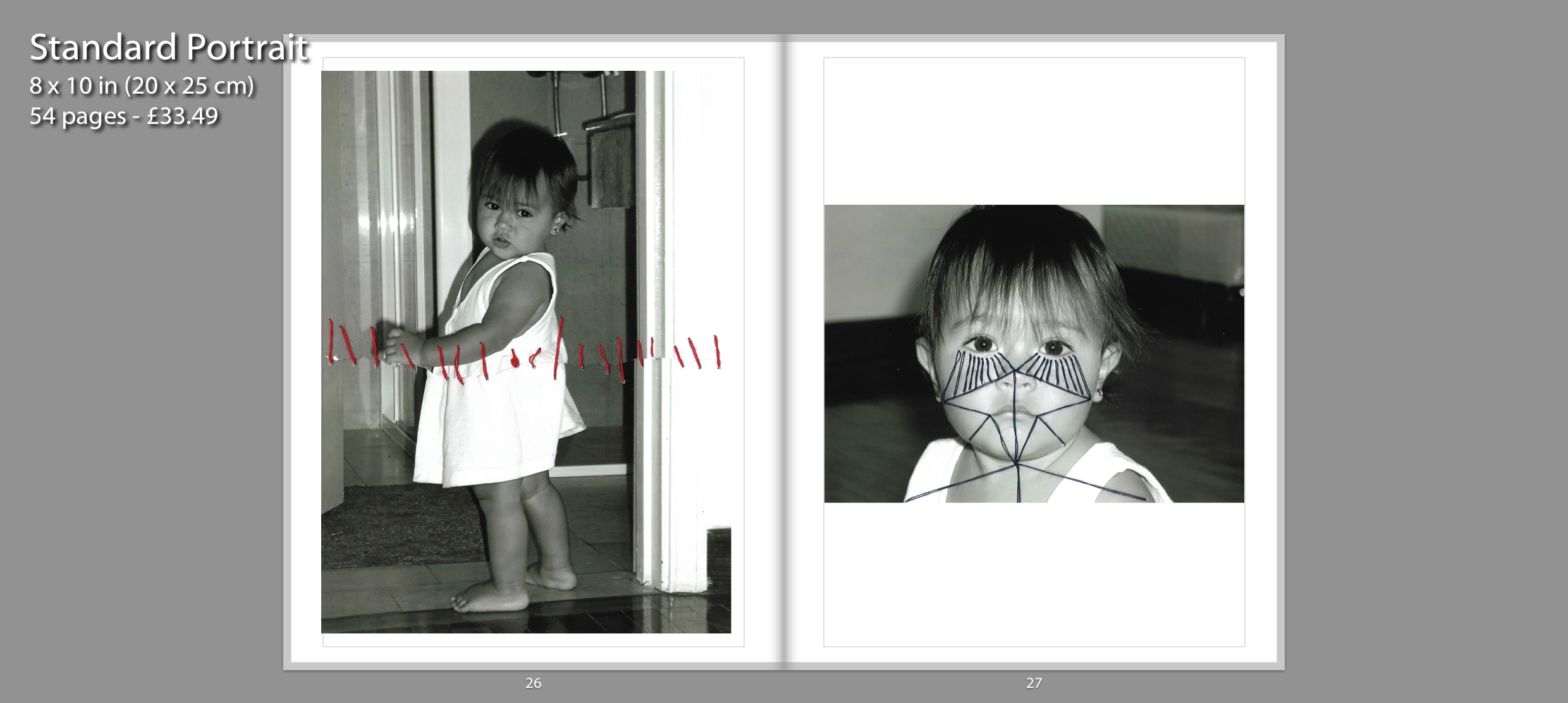
For these photo-manipulations, I used thread for my archival images to be sewn over with geometric patterns. I recreated the abstract aspect of Annegret Soltau’s work by joining facial features together with thread. I specifically chose a photograph which had a close up of my face in order to see the patterns through line. I think these photo manipulations were a success as I managed to recreate Annegret Soltau photomontages with my own archival images. I think this photo manipulation portrays the idea of identity, specifically questioning personal identity on an abstract scale. I liked the symbolism behind her work and wanted to incorporate that into my own work. I wanted the thread to act as a metaphor for the displacement in my life. the thread showcases that movement doesn’t necessarily mean freedom. Although constant movement can be exciting it doesn’t allow you to settle down in one place. It’s restricting in the way that you feel out of place, a sense of not feeling like you belong at “home”. I paired these two images together because they present artistic manipulation using thread.
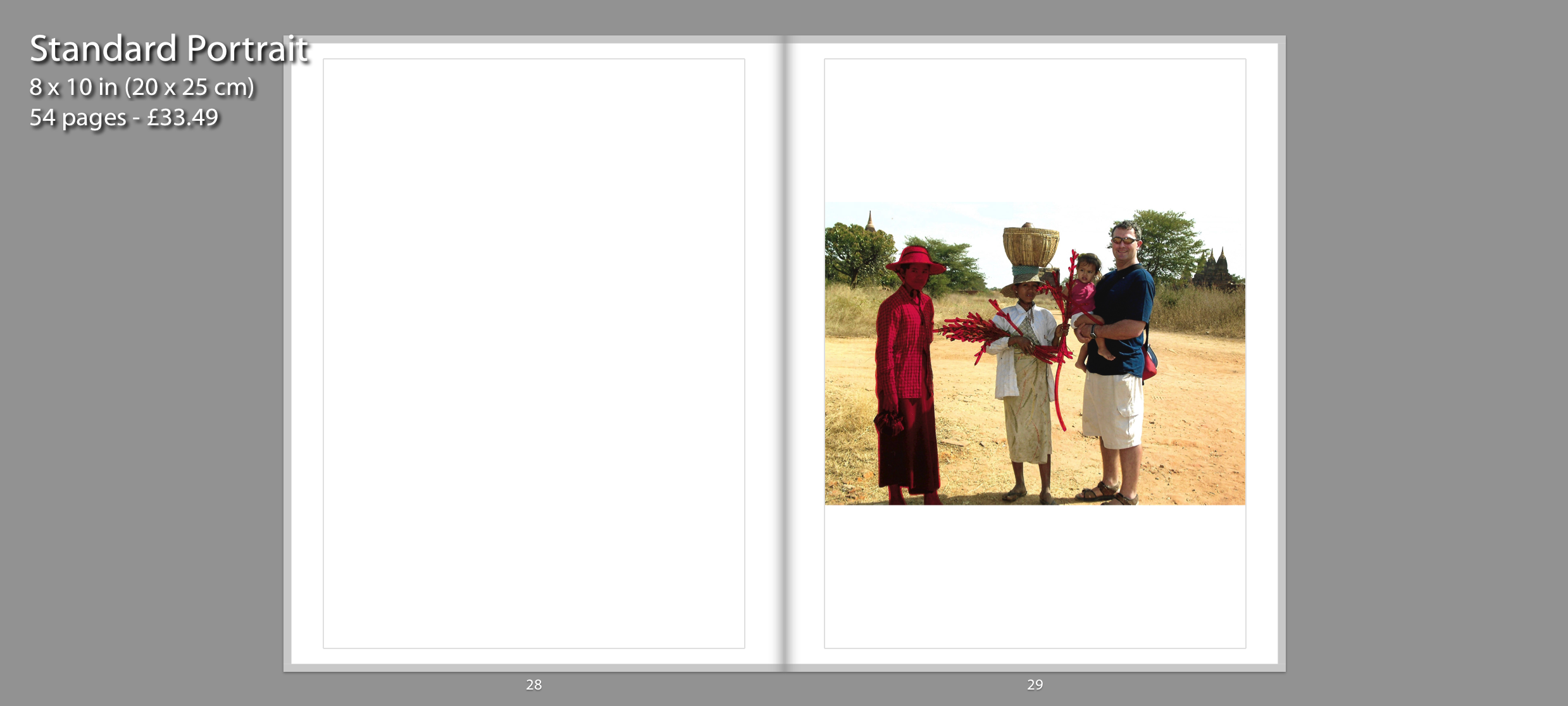
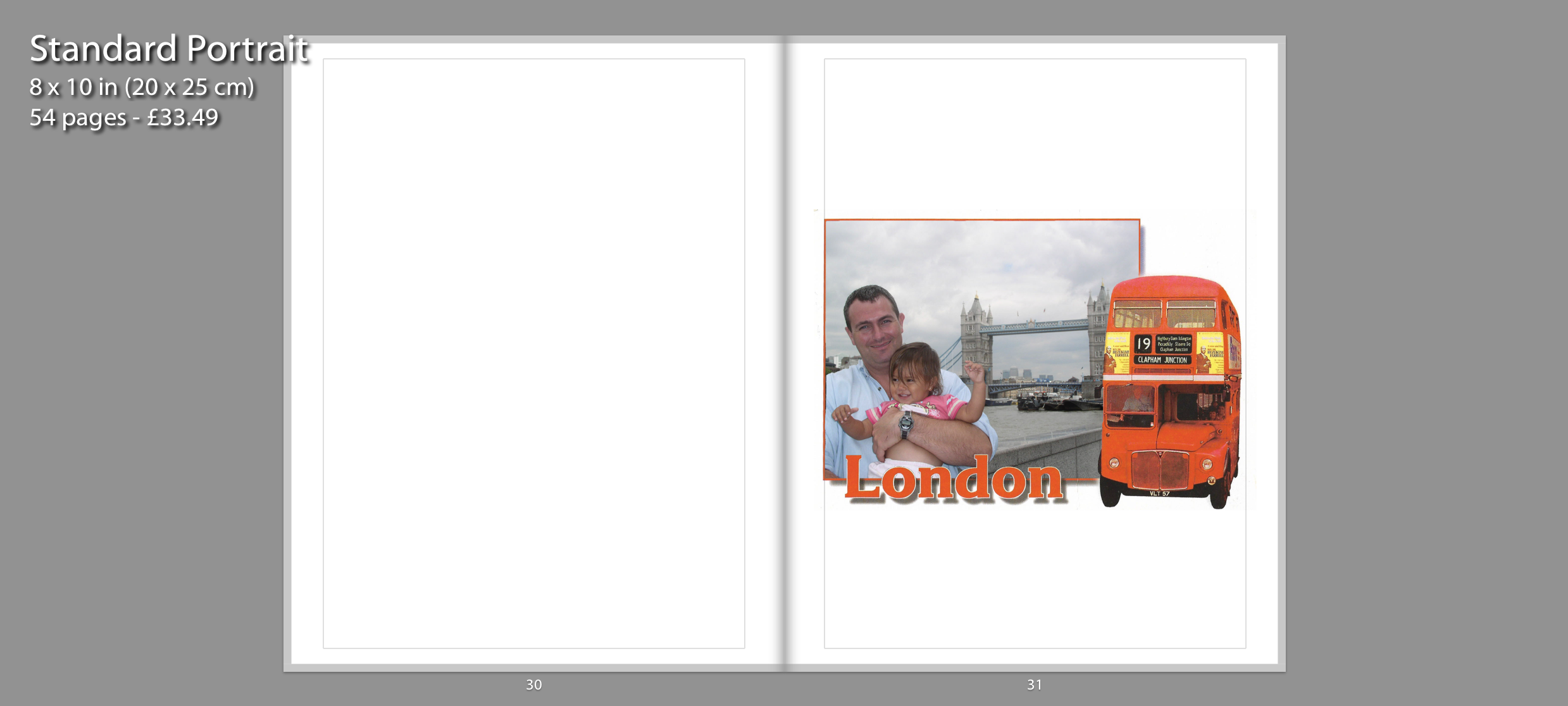
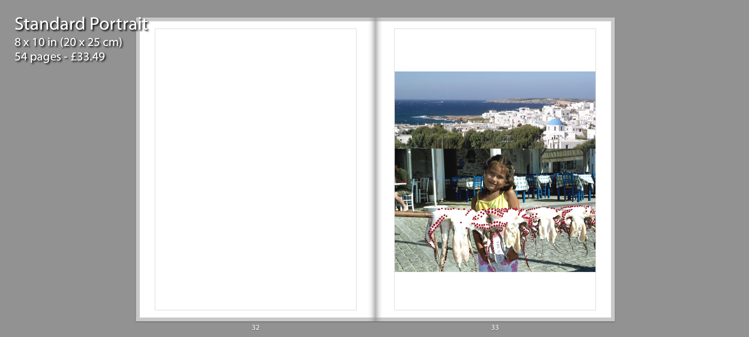
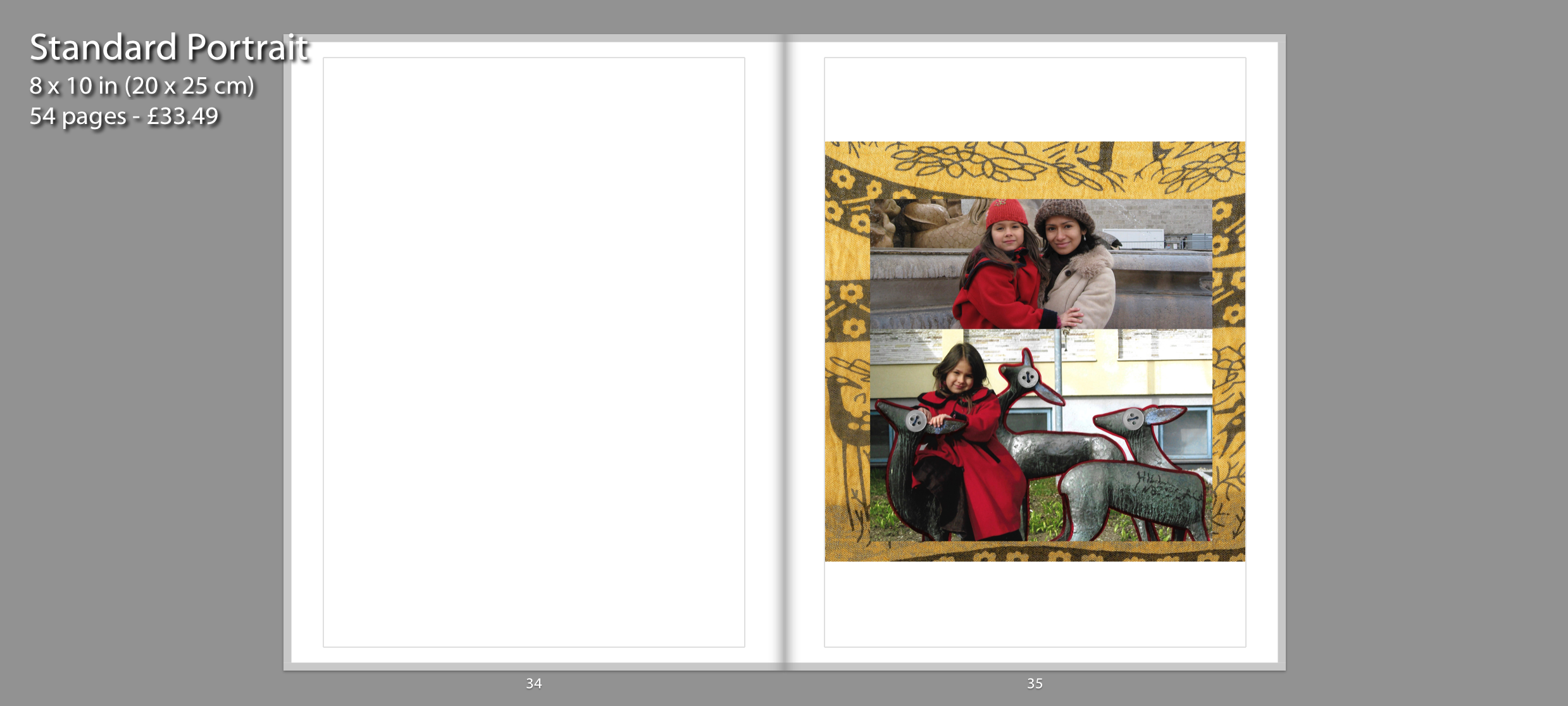
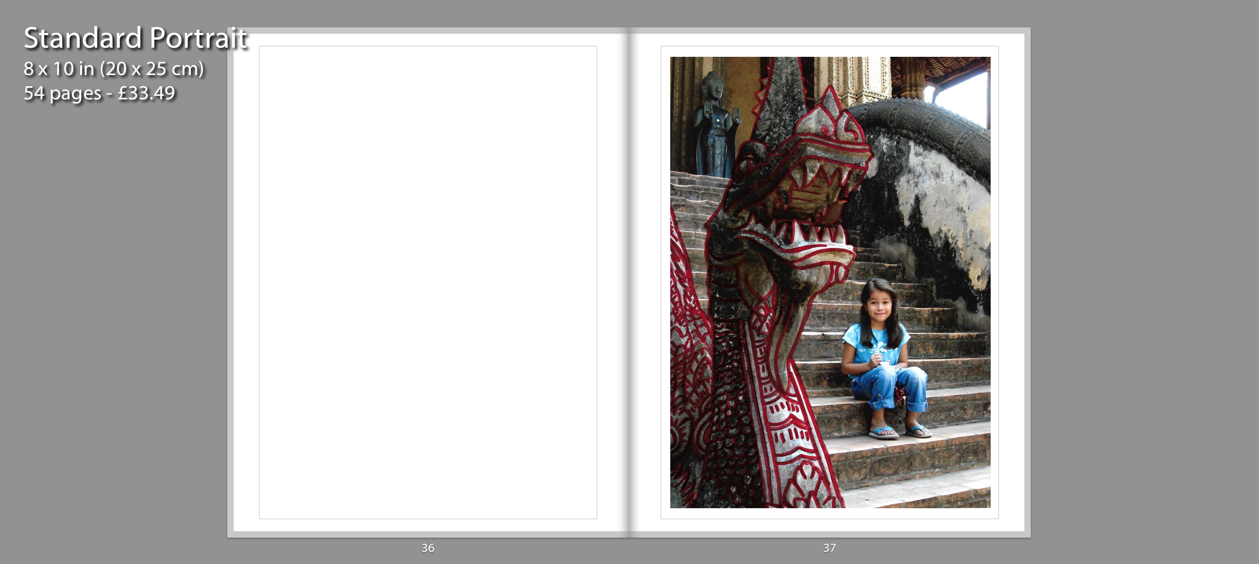
These collages are influenced by Carolle Benitah as well as Claudia Ruiz Gustafson. They depict countries where I used to live or places where I have visited during childhood. I have replicated Benitah’s series Photo Souvenirs by reworking old family snapshots. I have mainly used red graphic ink pen in order to draw illustrations on top of the images. I created these red marks as a metaphor for leaving my traces behind in each country. I decided to present these collages by themselves so the viewers understand that each place I go to is a new chapter in my childhood journey. They have a larger impact when presented on a singular page since the viewers only focus on that image.
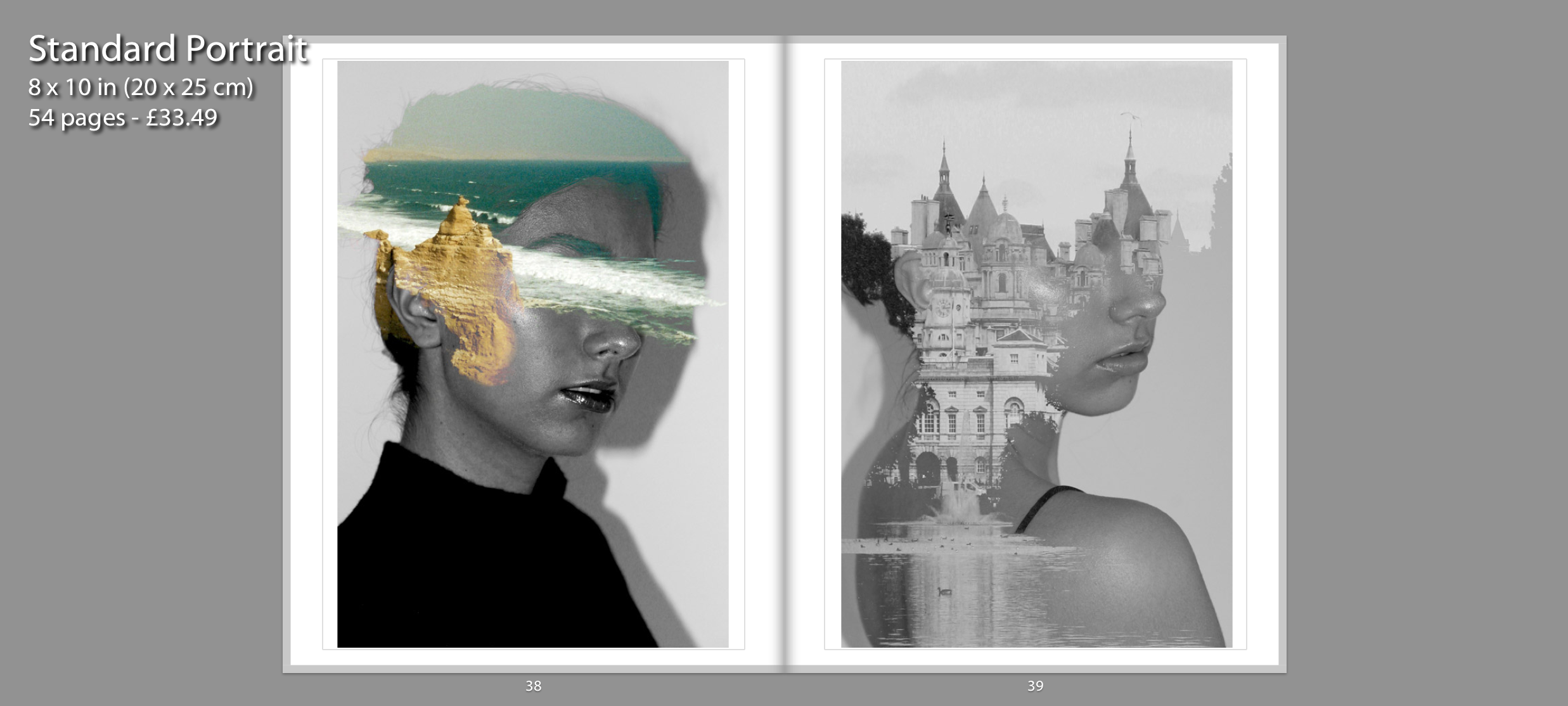
Similar to Claudia Ruiz Gustafson, I have continued my exploration of my cultural identity by creating photomontages which merges self portraits from present time with archival images to exhibit how my cultural identity has shaped me as an individual. I created these double exposures on Photoshop to be able to blend my self portraits with archival images that my parents have captured from Peru and England. I presented these together on a double page spread because both are inspired by Antonio Mora. They pair together well since I am facing in the same direction and because I wanted to present the contrast between Peru and England and how my mixed identity has shaped me. These images are displayed after the montage of memories to show my current self to the viewers.
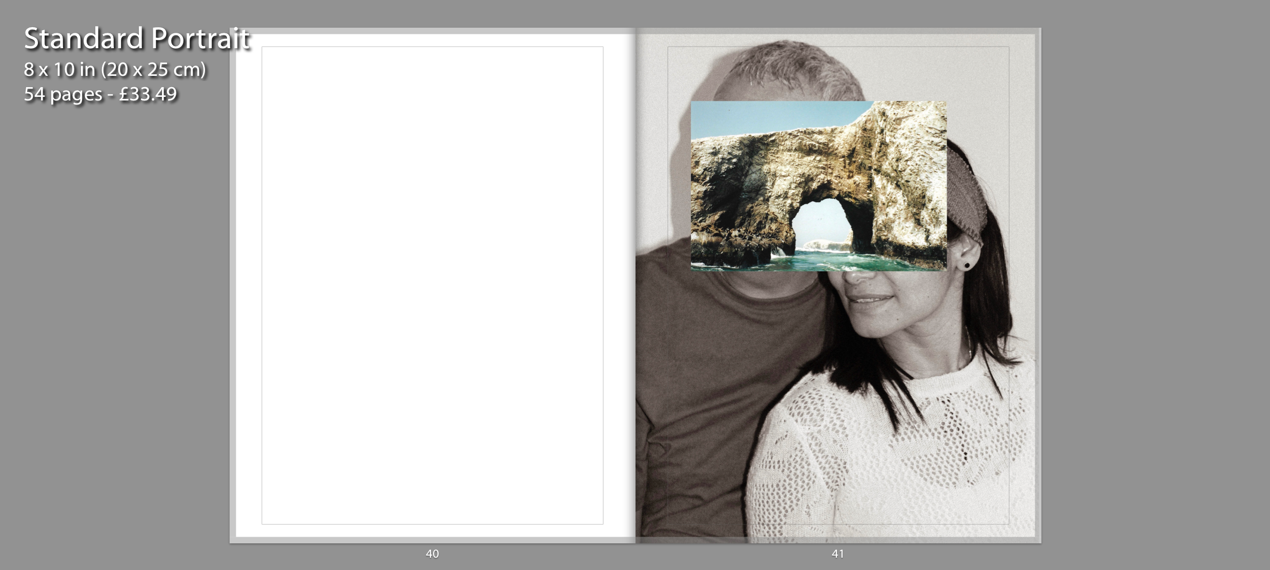
This photo montage of my parents presented on page 41 is inspired by John Stezaker who overlays images. I have recreated Stezaker famous series called Mask where he fuses sitters with natural landscapes or architecture in order to create a new outcome. I photographed my parents together and used an archival image from Peru to layer on top of their faces. I have presented a portrait of my parents together since when I think of “home” I associate it with them since I haven’t had a long term house or place I have lived at. I chose to have the portraits in black and white in order to contrast with the colourful archival image concealing their faces. The image is in full bleed on a singular page because I wanted the final photograph within my photo book to have a strong impact on the viewer. I chose to have current portraits of me and my parents as the final images to show how these memories have shaped us. It ends with a portrait of my parents together because they started this journey together and are still happily married after 17 years.
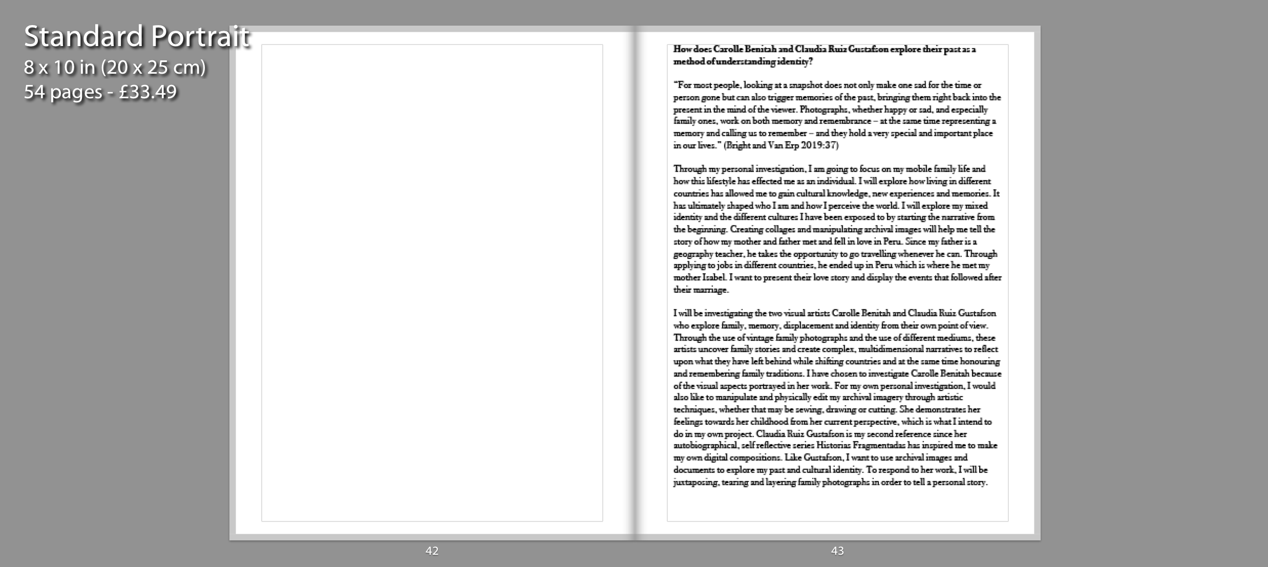
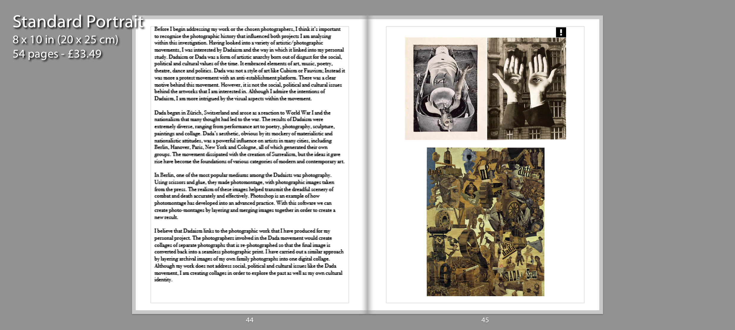
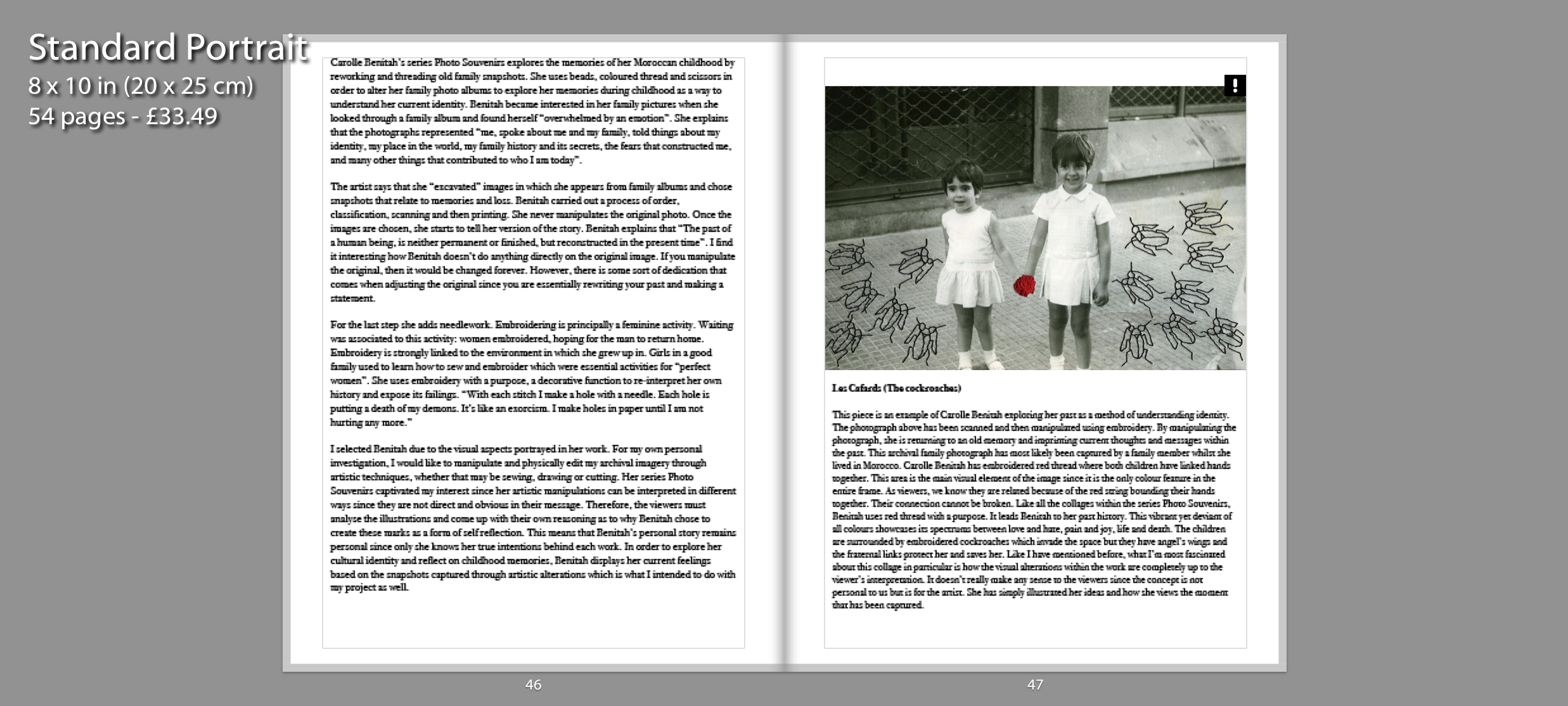
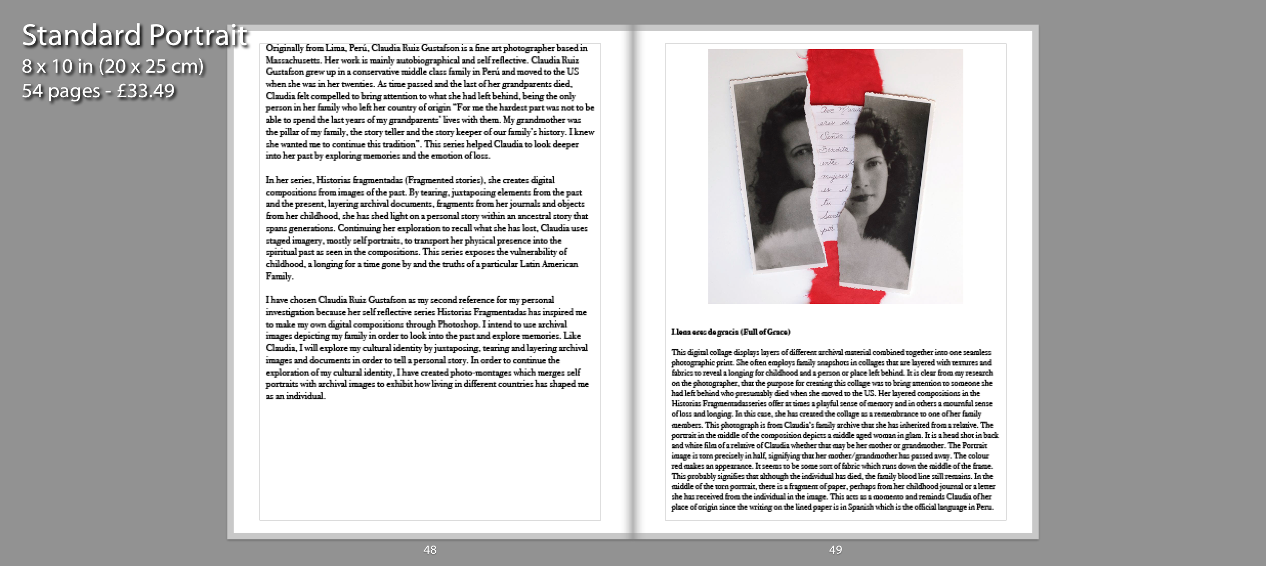
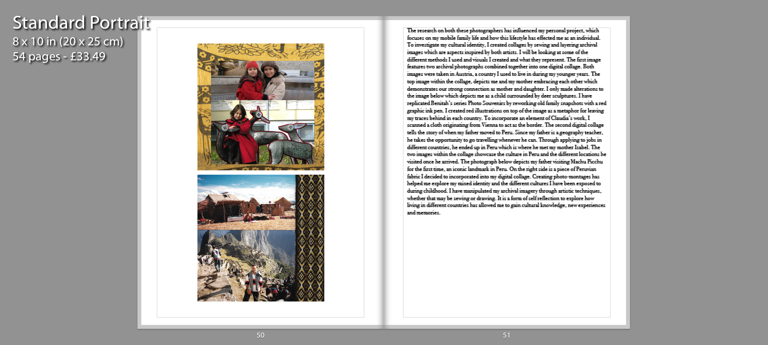
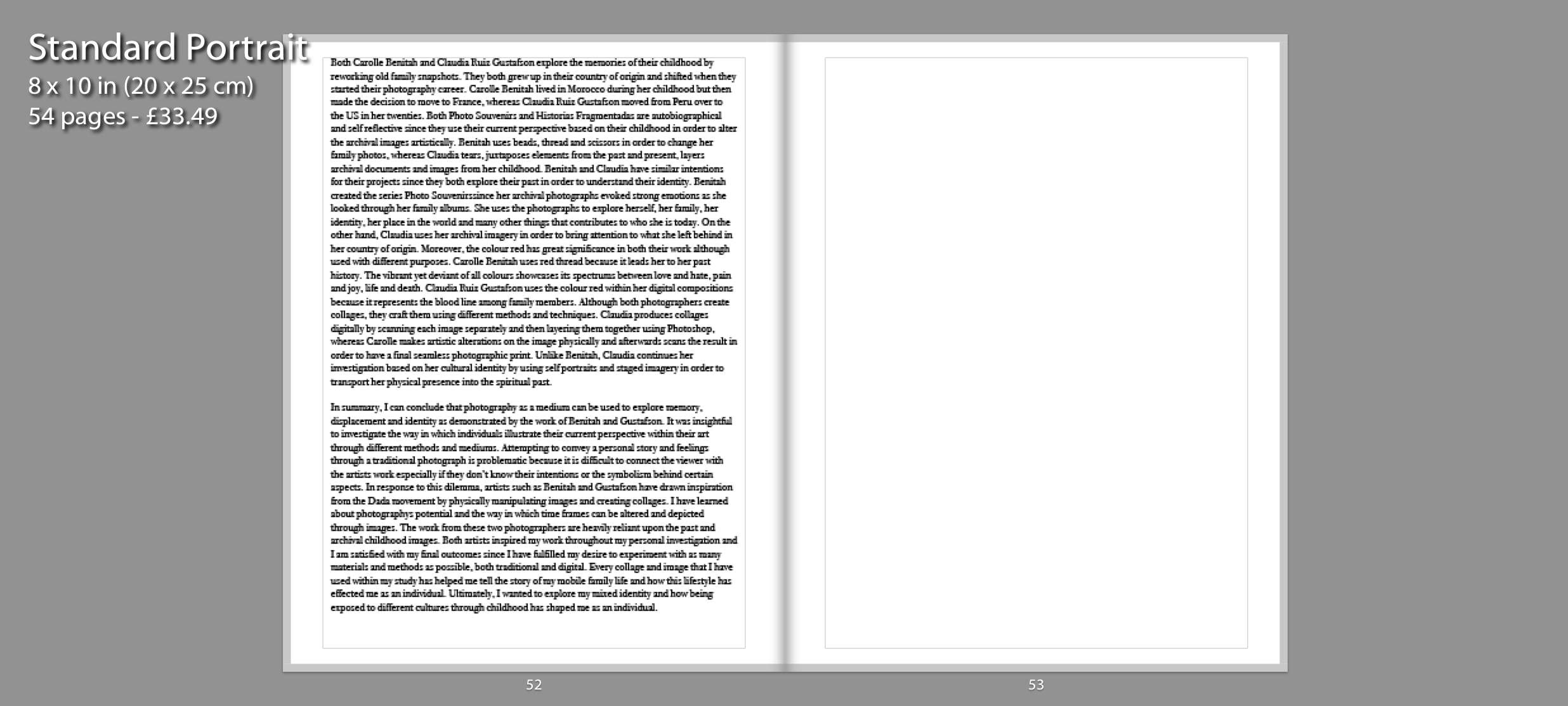
For the following pages, I needed to incorporate my essay at the end of my book so viewers can understand the influences behind my personal project.
To create my photo book I will be using this blog post as a guide: https://hautlieucreative.co.uk/photo20al/2020/01/17/archival-images-establishing-a-timeline-narrative/
I will most likely begin my ordering my most effective archival images in chronological order beginning from when my parents were teenagers, to showing them meeting, through to marriage, having children and eventually separation. I may also include some montages I created in this too, if I feel it fits in with the rest of the selection to make the book flow easily.


2nd Layout:
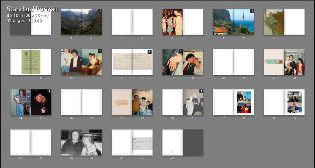
3rd layout:
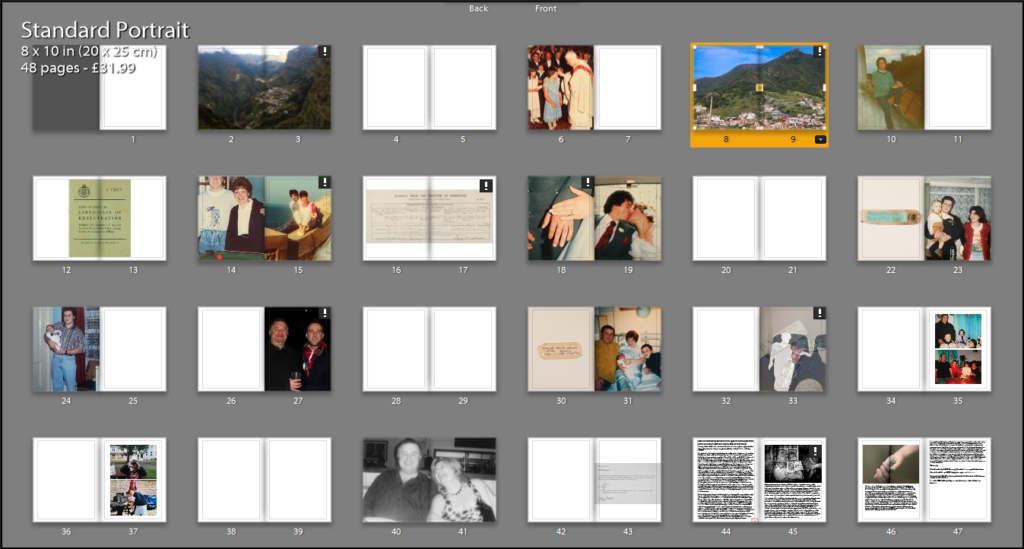

4th layout:

5th layout:

6th layout:

current Final layout:

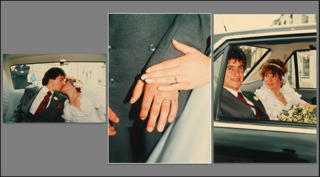

The layout above is my current final layout. I plan on adding some quotes on some of the blank pages to add more context to images. I will also edit the image on 38-39 to further convey their separation.
Front/back cover:

On a basic level I believe my exploration into the terms of occupation and liberation went well. The terms were broad and allowed me to consider many different opportunities to explore, but I felt looking at the occupation my Grandparents lifestyle was a perfect fit. At first I was a little worried as I knew my portraits were not always my strong point within photography, but I knew it would allow me to refine and develop me skills within this area of photography. Using artists such as Walker Evans, LaToya Ruby Frazier, Laura Blight and many allowed me to explore different ways to present my Grandparents lifestyle through portraits and landscapes. Initially, I wanted to focus of both my Grandma and Grandad but as my project developed I made the decision to place the central focus on my Grandad due to his higher position within the family hierarchy and how he considers himself the backbone of the household. At first, I looked at just capturing portraits and understood that my narrative of my book would need a change of pace and so I decided to explore the interior and exterior of their house and the relationship between landscape and person. In terms of photographic styles my project follows a documentary style as I try and capture the reality of my Grandparents lifestyle. I often found it challenging to produce reliable imagery as I did not want to ‘intrude’ on my Grandparents, but I felt as the project went along the bond between me and my Grandparents became stronger allowing me to decode their lifestyle more.

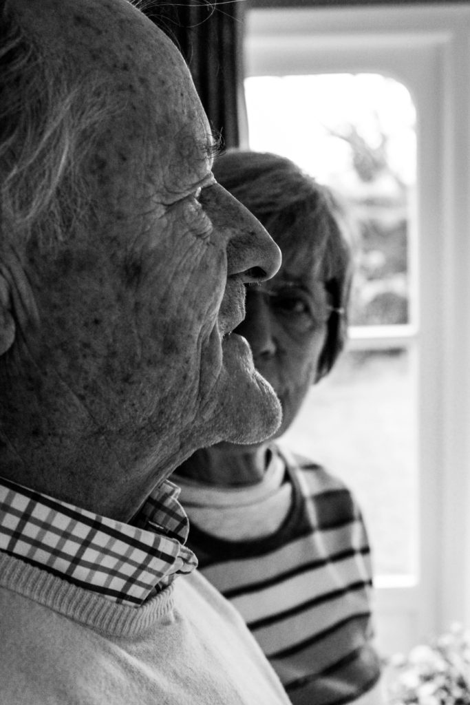
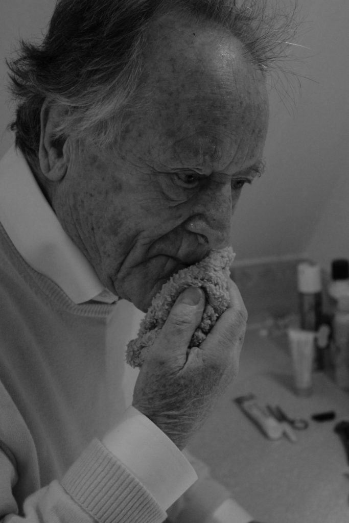
Overall, the six photo shoots conducted I was able to produce high quality photographs which illustrate my competence of using a camera and its settings. Most of my photographs are in black and white as I felt it showcased detail, structure and space much clearer and I felt the context of the 1940’s, when my Grandparents was born, was much clearer. I tended not to deviate from a naturalistic edit as I felt that the authenticity of my photographs would be reduced, thus reducing the reliability of my outcomes. However, to show further exploration I decided to take a more contemporary route, and although I liked the way they looked I felt it did not follow my aesthetic and did not show my narrative and contextual and conceptual elements in the right way. The project itself has taught me a lot about my family and the way in which lifestyle affects the way in which my Grandparents live their life. It has allowed me to become much closer with my Grandparents and the final book is something that they will cherish, thus making it a worth while and rewarding project to do.
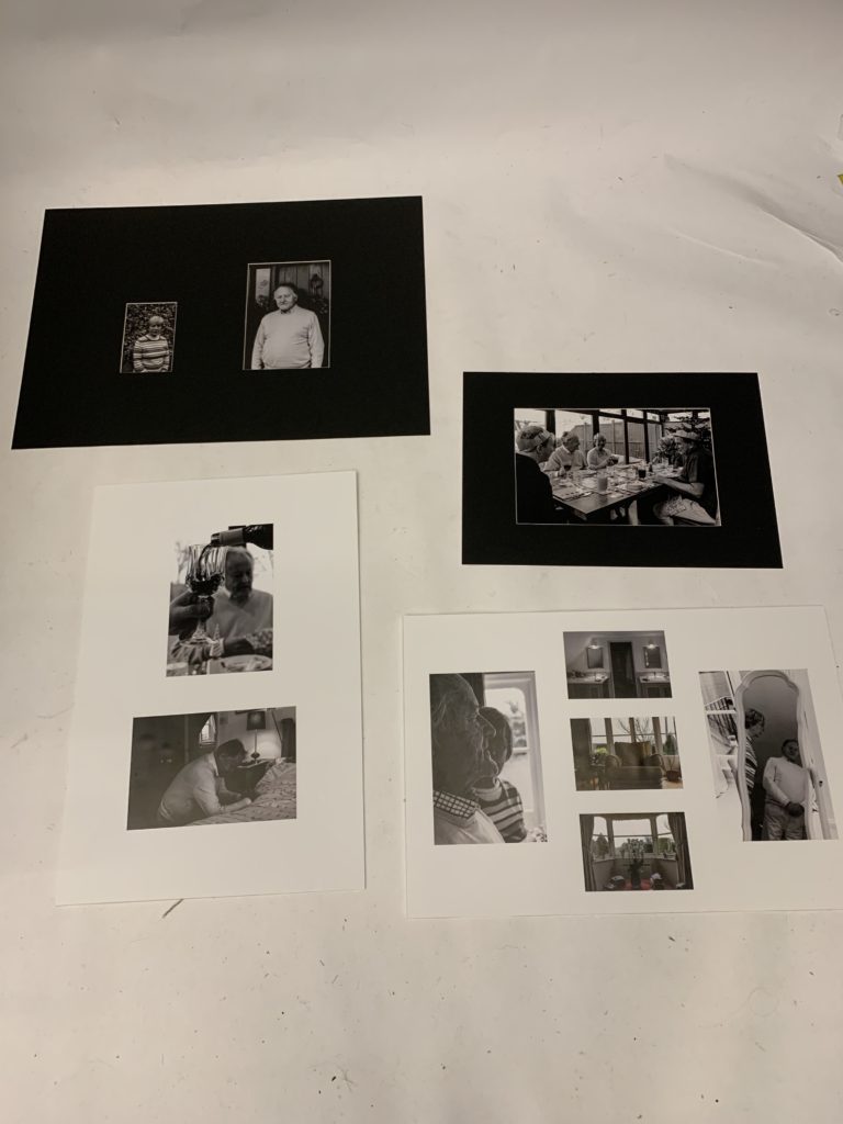
With regard to my final outcomes, I believe I have successfully managed to show my competence in display techniques. I have been able to artistically express my intended narrative within my imagery, whilst being able to uphold the authenticity of the photograph through the simplistic and basic looking framing techniques. I have successfully shown my creatively ability to combine photographs within a frame to illustrate a new element of their lifestyle which adds to the overall conceptual and contextual values of my work. Individually the photographs themselves, printed out, show the high quality of work, which reflects my ability to produce crisp images as well as edit the photographs for effect. Personally, I really like the way in which these outcomes have turned out as they outcast my best embodiment of work within the project, and how they reflect my narrative.
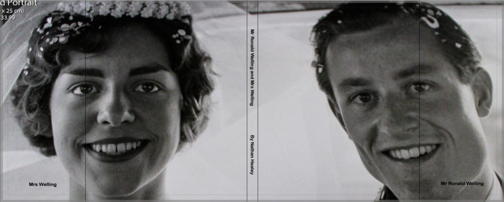
As my other final outcome, my photographic book clearly illustrates my intended narrative of representing my Grandparents lifestyle, and how the 1940’s has influenced this, with specific focus onto religion, family structure and hierarchy, relationship and interaction. The final sequencing of my photographs, clearly represent my intended effect, through the use of intimate portraits as well as landscape interior and exterior images which present a new light to my narrative. Within this period of making the book I have been able to show my ability to effectively sequence my photographs for intended effect, whilst still conveying my narrative. As well as, producing a captivating book which my Grandparents will cherish.
To conclude, I believe through the six photo shoots and different final outcomes, I have showcased my ability to experiment and explore the concept of Occupation and Liberation in a more contemporary route. In addition to this, I have shown my ability to develop an idea from artists work as well as the inspiration of my overall aesthetic which developed as the project went on. Personally, I am pleased with the way in which this project has went as I have held authenticity within my work, produced strong images, shown my ability to successfully edit images as well as sequence them to be placed in a book. In terms of my essay, I believe I have conducted a lot of research and reading to form a well structured and thought out essay, which has relevance to my project. On top of this, the essay allowed me to take this project into a deeper meaning, which is clearly shown within my work.
Final word count: 1,816
How do Diana Markosian and Rita Puig-Serra Costa express the notion of family history and relationships in their work?
“If manipulation is the first thing someone thinks of in connection to photography, what does that say about the value of the photograph as a reflection of reality?” (Bright and Van Erp 2019:17)
The notion of family is a subject that has been thoroughly explored by photographers such as Rita Puig-serra Costa and Diana Markosian. However, “when it comes to interpreting internal family dynamics, perspective is everything” (Hawarth,S. and Mclaney, S, 2016, 8). I believe each photographer portrays an either positive or negative view in regards to their personal relations, making it important to consider their individual point of view when deciding how much weight their narrative bears when showing the truth behind family dynamics. My personal study is focusing on my family’s history; more specifically the story of both my parents and important events in their life which lead to me being where I am today. I have chosen to analyse Markosian because her project “Inventing My Father” contrasts directly with Costa’s study “Where Mimosa Bloom” which I will also be referring to throughout this essay. I like the way Markosian explores the absence of her father in her life in such a personal and raw way, which eventually leads to a reunion which she captured through images. The photographs along with the context she provides into her life, makes this project very fascinating. Equally, I think the way Costa explores her family through the use of archival images and objects was effective as it really conveyed a sense of love and importance of family. I specifically loved how her entire project was an homage to her mother since carefully photographed objects paired with thoughtfully taken portraits further shows how fond she is of her family. These two photographers were particularly interesting to me as I felt I could personally relate to both bodies of work. Due to my Portuguese heritage, family is a of great importance to me and is valued highly in my family’s culture. However, my parents choosing to separate also led to the lack of a parental figure in my life which I will be exploring in the narrative. In this essay I will be discussing the notion of family and relationships, loss and hope in the works of both these artists, and evaluating my own response to their subjects.
Realism is the concept of capturing things in their natural element. This genre of photography is most useful when trying to capture something such as family history, as documentary photography allows us to be able to see someone’s real life situation through images. Photographers such as Dorothea Lange and Paul Strand focused on documenting the effects of urbanization and industrialization on working class Americans. This was something very prominent at the time of this movement, as the great depression in 1929 left a lot of people economically struggling. We now see this type of photography as realism. I feel as if this movement fits in well with my personal study as it recognizes the importance of capturing raw, documentary style images which I think is necessary when exploring something as personal as a family’s history, especially involving immigration and the struggle surrounding that journey. Images of this sort are characterized by having a wide depth of field and having sharp focus which contradicts the pictorialist style. The move away from creating a painterly aesthetic ultimately opened the door to a more forensic approach but also one that is open to distortion and manipulation in its pursuit of a good story of a good story. This will ultimately depend on the agenda of the artist, their integrity and skill in delivering a message, story or sequence of events.
In the words of Martin Parr, “most family albums are a form of propaganda, where the family looks perfect and everyone is smiling” (Hawarth, and Mclaney 2016, 7). Although to certain extent I believe this is true, Markosian goes against this idea as she uses a non-traditional method of exploring the family concept. Instead of portraying a sense of happiness and love, which is typically associated with family relationships, Markosian chooses a more raw and honest approach highlighting how she grew up without her father figure and turning that into the foundation that her project is built upon. In this context, I believe the words of John Tagg are appropriate as the view that “the camera is an instrument of evidence” (John Tagg:1988) perfectly demonstrates how Markosian’s work stands out amongst other artists exploring the same themes, since a certain truthfulness radiates from her images which goes against the dominating stereotype that every family is perfect, leading to a more contemporary output which appeals to modern day people.This view is put across quite skillfully and subtly through the use of black and white images which puts forward a sense of emptiness since the monochrome theme is often associated with despair. This means that the audience will be able to feel a certain coldness and the lack of emotion, while also simultaneously feeling a surge of emotion through the scenes and objects depicted in the images leading to an interesting contrast that is highly effective throughout her work. The use of archival imagery is complementary to Markosian’s photography since by itself it would usually portray a sense of happiness, however with the context, it is instead replaced with a slight sense of resentment, especially the archival image showing her dad cut out of an image.
I believe the image above to be one of Markosian’s best not just due to its impeccable technicality, but also because it is rich in context. This image shows a suitcase belonging to her father containing things such as undelivered letters, newspaper clippings, and a shirt he was saving for her brother’s wedding. This image is in black and white making it more emotionally detached yet since the objects are sentimental it creates an interesting juxtaposition, as it shows the photographer is conflicted over her feelings. I believe Diana Markosian represents a modern wave of photography where beauty can be found in imperfections, and appreciated.
“Where Mimosa Bloom” by Costa takes the completely opposite approach into the exploration of family culture. It becomes obvious that the entire project is very thoughtful and the audience can almost feel an overpowering sense of the love Costa has for her family. Although Costa focuses on the positiveness of relationships with family, I believe it is the underlying theme of her mother’s death which makes her work particularly stand out since it reinforces the view that “real families aren’t often idyllic” (Hawarth, and Mclaney, 2016, 7) , even though on the surface, her family circumstances appear favourable. While exploring important people, objects and places that play a significant role in her relationship with her mum, she alludes to her death in an ennobling way. This notion is put across carefully through many aspects throughout the book such as a light colour scheme which conveys a sense of delicacy through pastel shades and also the metaphorical link to mimosa, a tree that blooms bright, yellow flowers in Spring, in Barcelona, where Costa is from.
This image is one which perhaps evokes the most emotion. In this double page spread we see Costa clutching a premature bird in her hand. Costa said, “When she died, I felt like a bird whose mother had abandoned the nest. I had to learn how to fly on my own,”. The context in combination with the image depicts a real sense of vulnerability, conveyed through the bird, that Costa is feeling in relation to not having her mother anymore. I think that using the bird as a medium for her own feelings, further shows how much thought and care was taken into each image as this has deep metaphorical value. I think that Rita’s work is a more traditional way of portraying family as she utilises portraiture and archival objects in a positive way, while also showing feelings and emotions through metaphors. I believe Rita Puig-Serra’s work represents positive sentiments towards relationships giving an almost romantic representation of a typical family unit.This book exudes closeness and sentimentality, by showing a kind of poetic bond between her relatives. However, with the view that “photography is a system of visual editing” (John Szarkowski:1976), the possibility of work being refined and changed to reflect perfectionism could be high.
When capturing my own images, and throughout the editing process, I kept each photographer’s approach in mind. Below is a final outcomes of my personal study. You can see that by using Photoshop I was able to give the illusion that my mum was “cut out” of the image, and layered on top is an image showing medication used to manage her anxiety and depression. The aim of this picture is to show how my mother battled mental illness after my birth, while also representing the concept of family. This image contains elements from both Markosian and Costa’s work. The use of an archival image makes it very personal, expressing the sentiment of love, inspired by Costa’s work. However, the manipulation gives the image a certain degree truthfulness as it adds context about an emotionally difficult subject, and would otherwise may not have been obvious from the original image, similar to Markosian’s work.
To conclude, both Markosian and Costa have created very emotional pieces of work based on their own personal family stories and journeys. Although we do get a sense of love from Markosian’s work, I believe this sentiment is often fighting against a feeling of hatred and resentment towards her father, whereas we purely get the feeling of love and closeness from Costa’s photo book with hint of sadness due to the loss of her mother. Costa’s photo book contains a very unique color palette containing light, delicate, pastel colors which is expected as her images are delicately framed and excrete fondness towards her family. On the other hand, Markosian’s body of work contains a lot of black and white images which shows that there is a lot of distance between her and the subject, yet all the things she photographs are of rich sentimental meaning to her. Both photographers also make use of archival images and objects, Costa utilises this to show a deep connection to her mother whereas due to the nature of Markosian’s work, her archival objects are used to show her father as being someone she is detached from.
Bibliography:
Bright, S. and Van Erp, H.(2019). Photography Decoded. London: octopus Publishing House
Howarth, S. and McLaney, S. (2016). Family photography now. London: Thames & Hudson
Szarkowski, John (1976), William Eggleston’s Guide. New York & Cambridge, MA: The Museum of Modern Art & The MIT Press
Tagg, John (1988). The Burden of Representation. Basingstoke and New York: Palgrave Macmillan