
Category Archives: AO3 Record Ideas
Filters
Threshold Experimentation – Keld Helmer Petersen
Keld Helmer Peterson was an architectural photographer who did a lot of working regarding experimentation with high contrast images featuring man made structures.
A similar effect can be created using the threshold tool in Photoshop
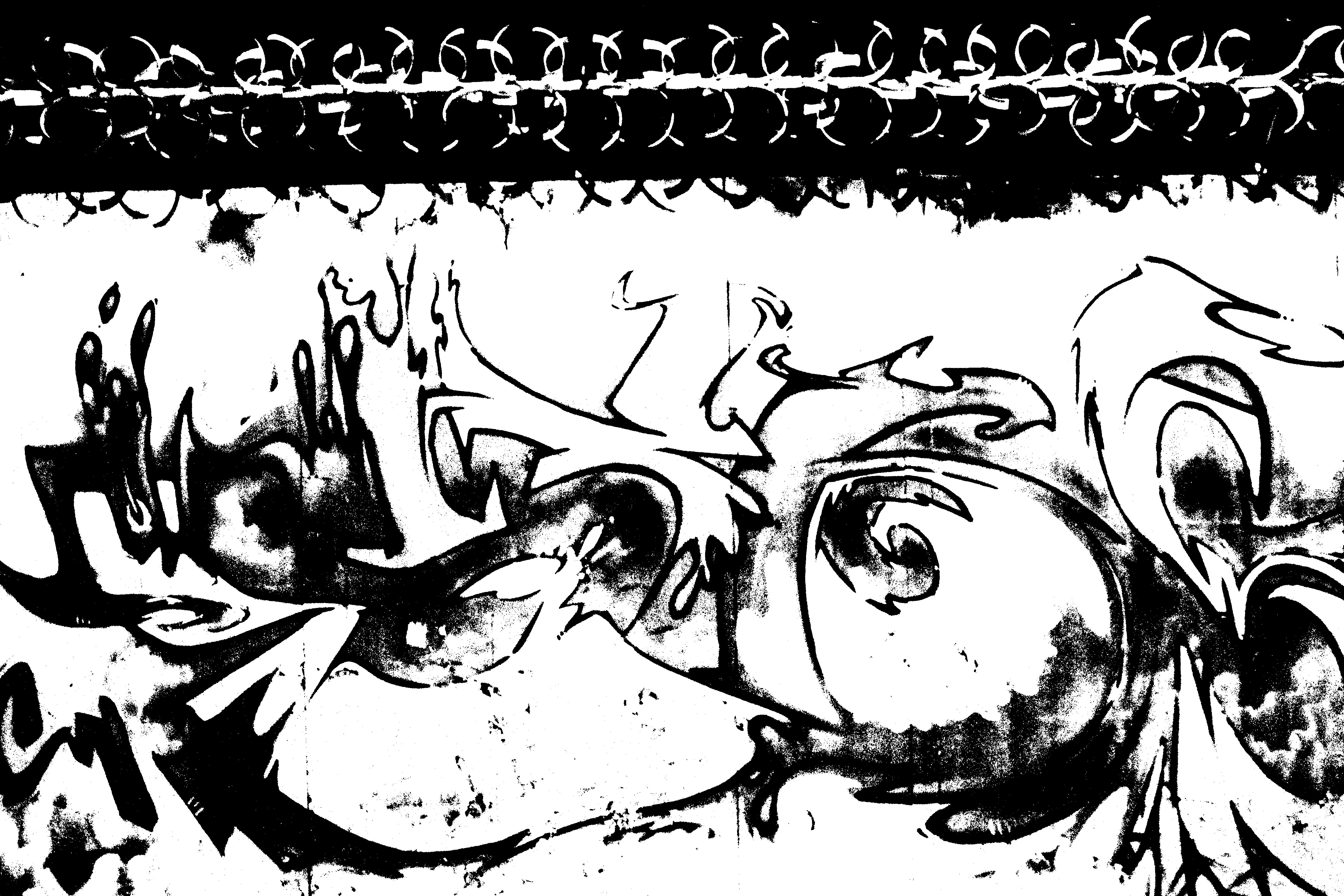
I found that Graffiti translated well into the threshold tool however it creates a rather boring image. I also like how the barbed wire looks when using the threshold tool as it creates an abstract, repeating but chaotic pattern.
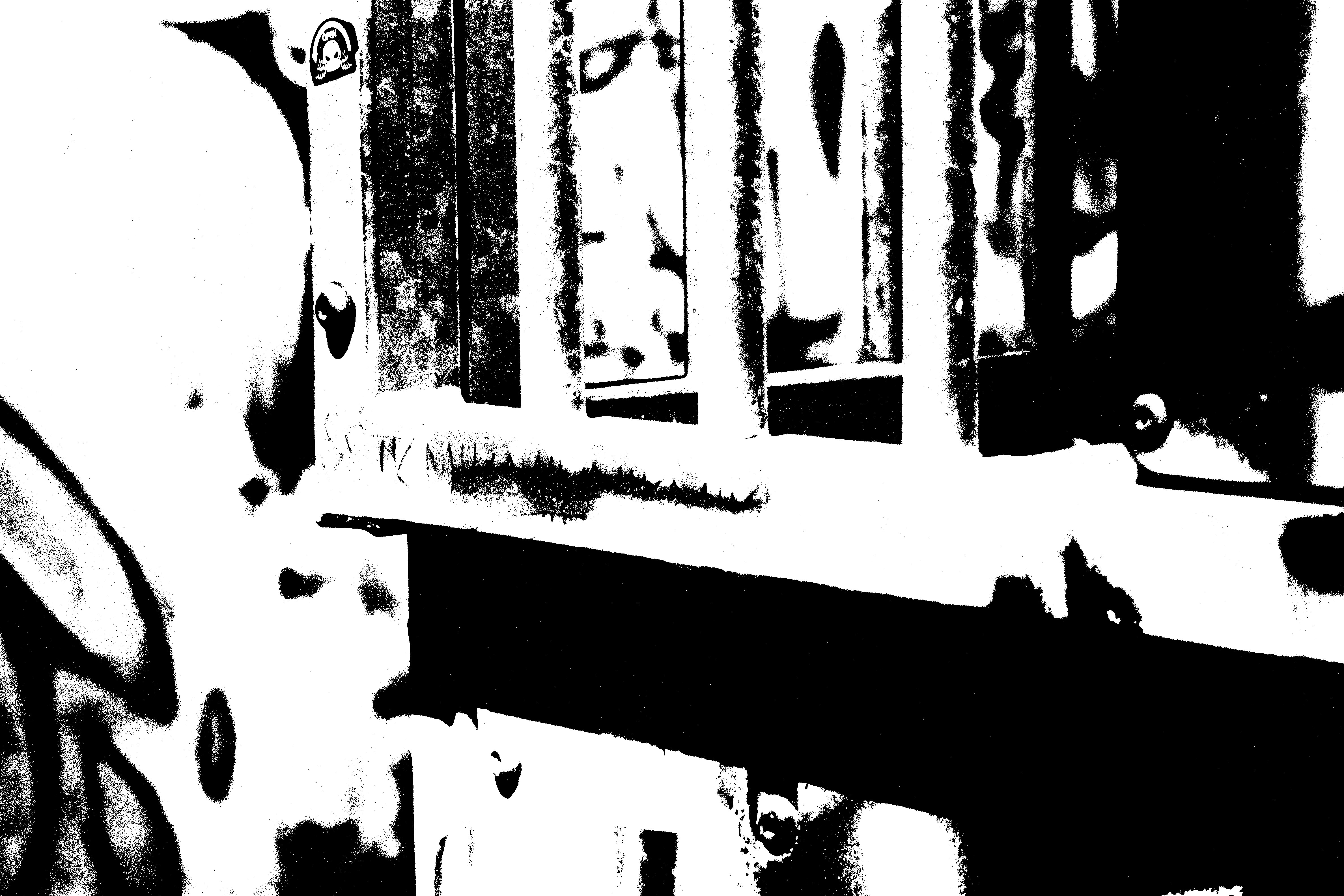
I found that introducing grain into the flatter images helped the image react better to the threshold tool. however i was careful not to add too much grain as it would result in the image simply looking like a grainy black and white image.
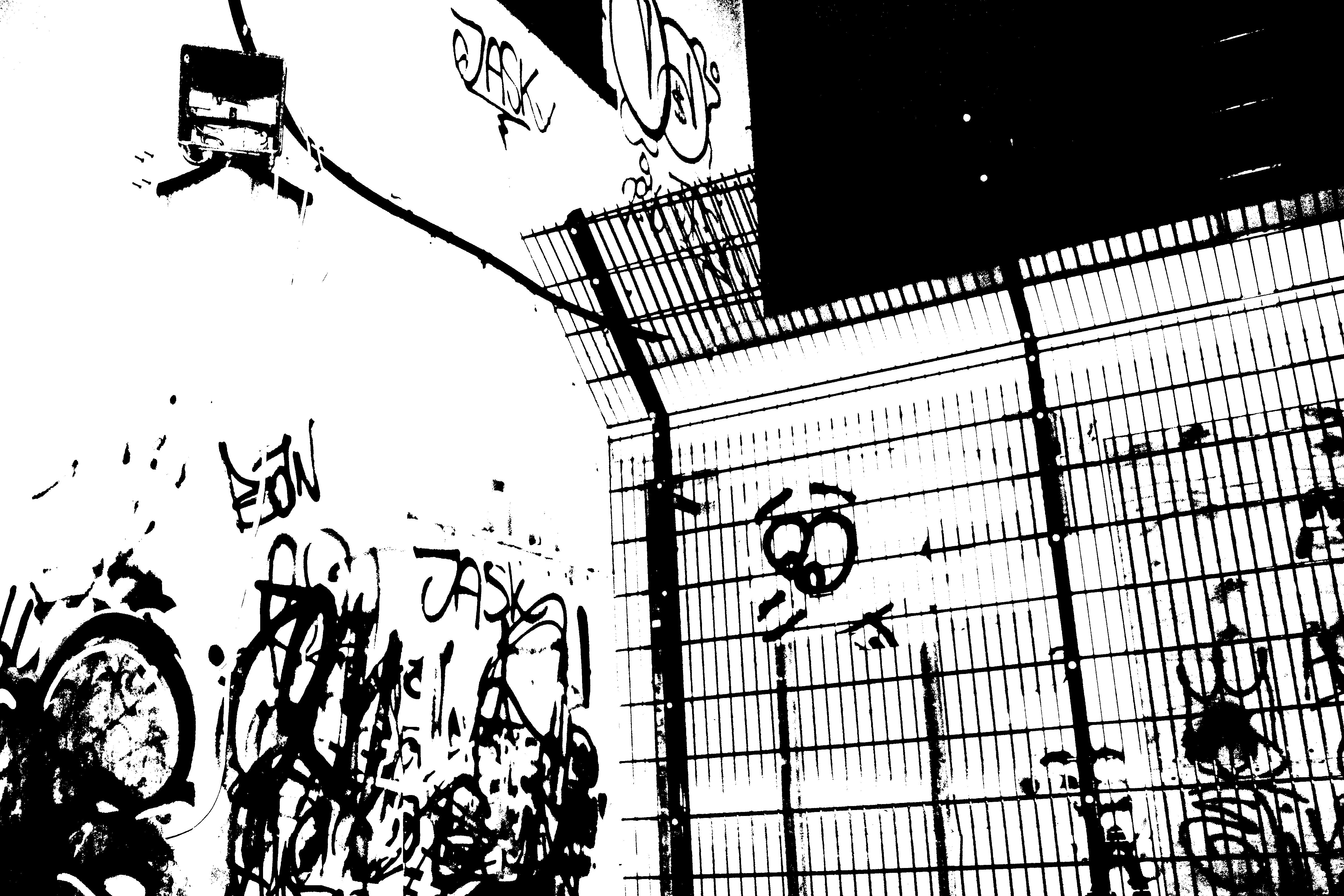
This was one of my favorite images of the photo-shoot. The fence reacted very nicely to the threshold tool giving a strong contrast to the white walls littered with graffiti.
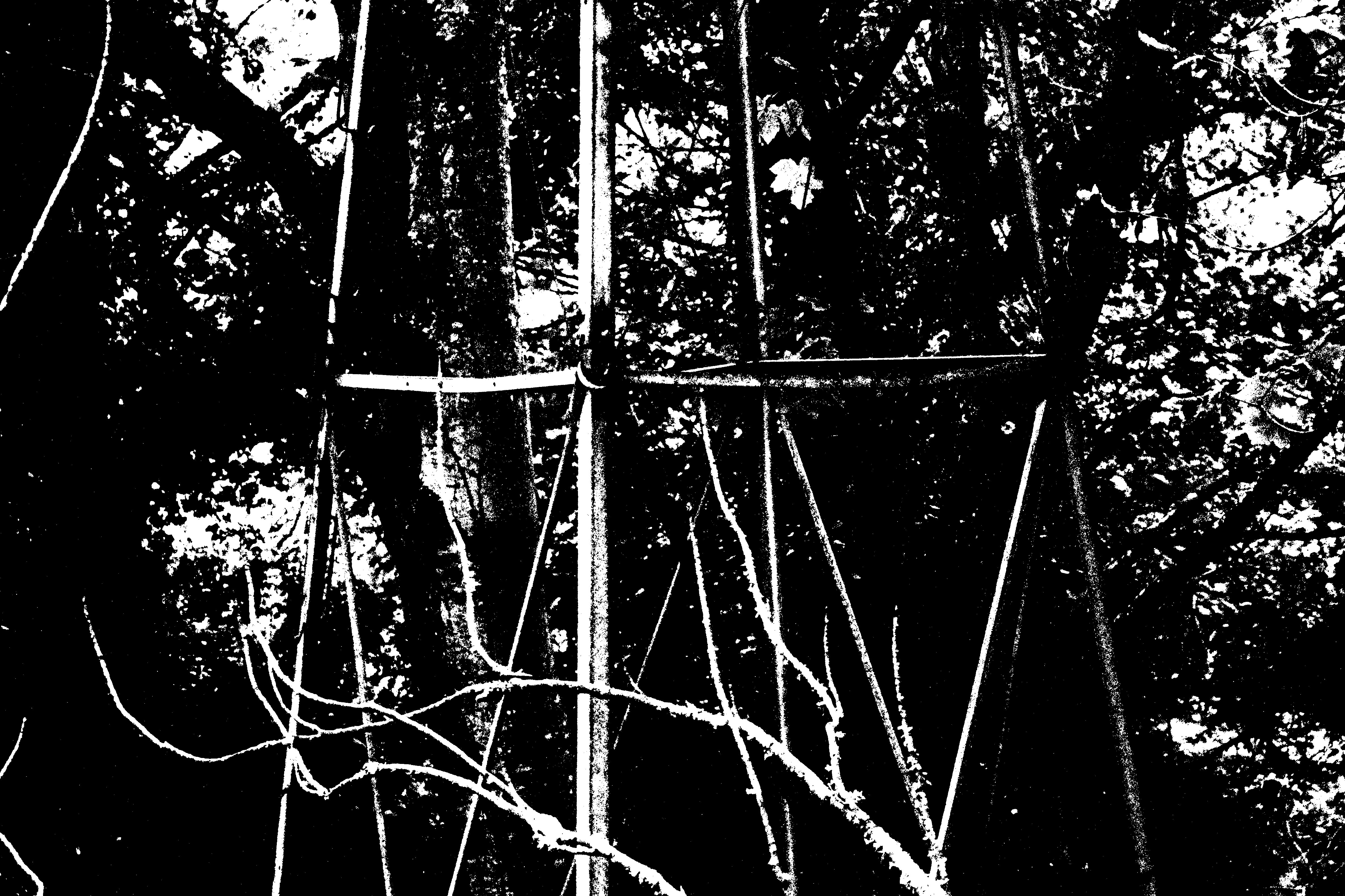
This is my favorite image of the photo-shoot, while the original image was taken in very low lighting, the threshold tool works nicely to highlight the main subject of the photo.
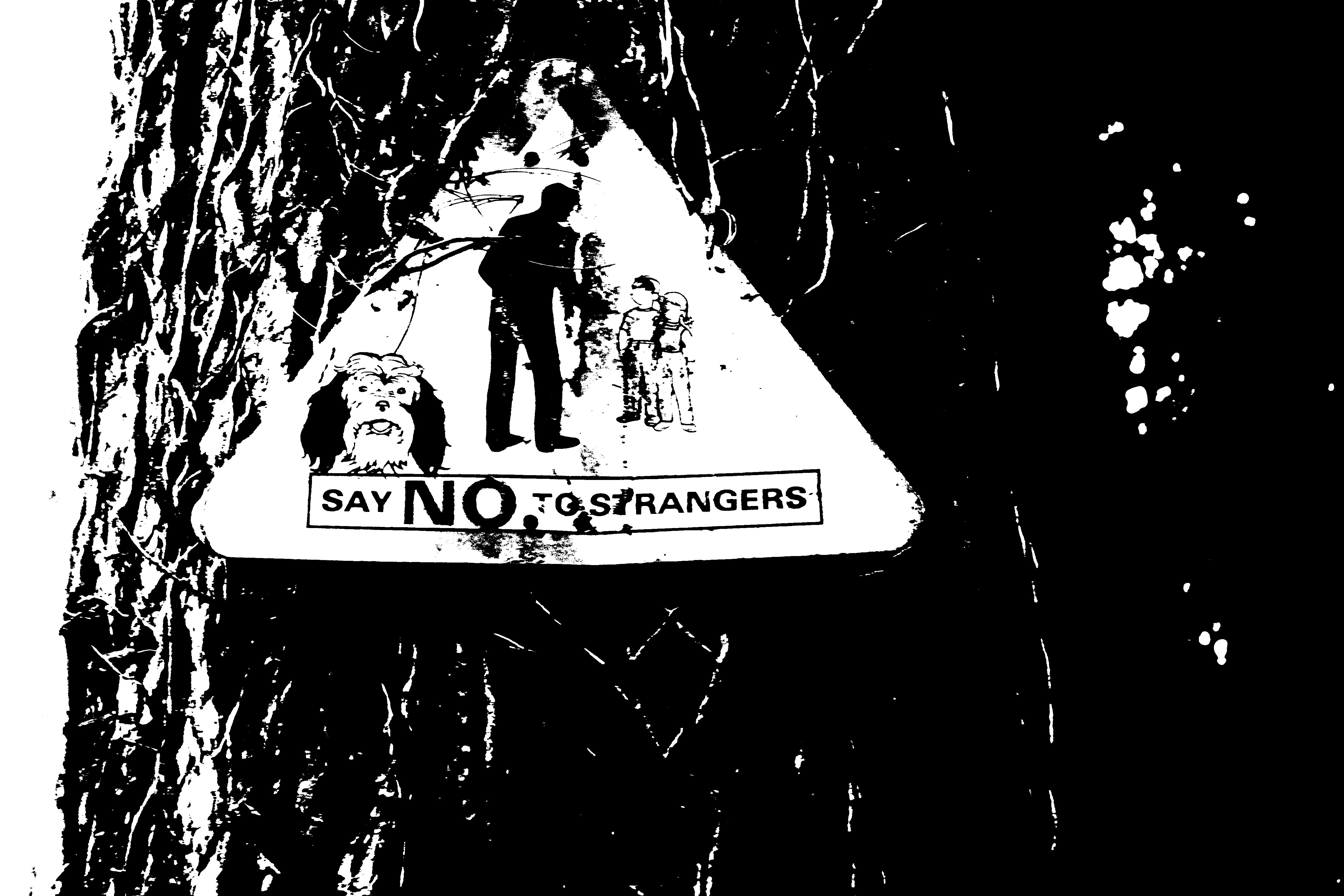
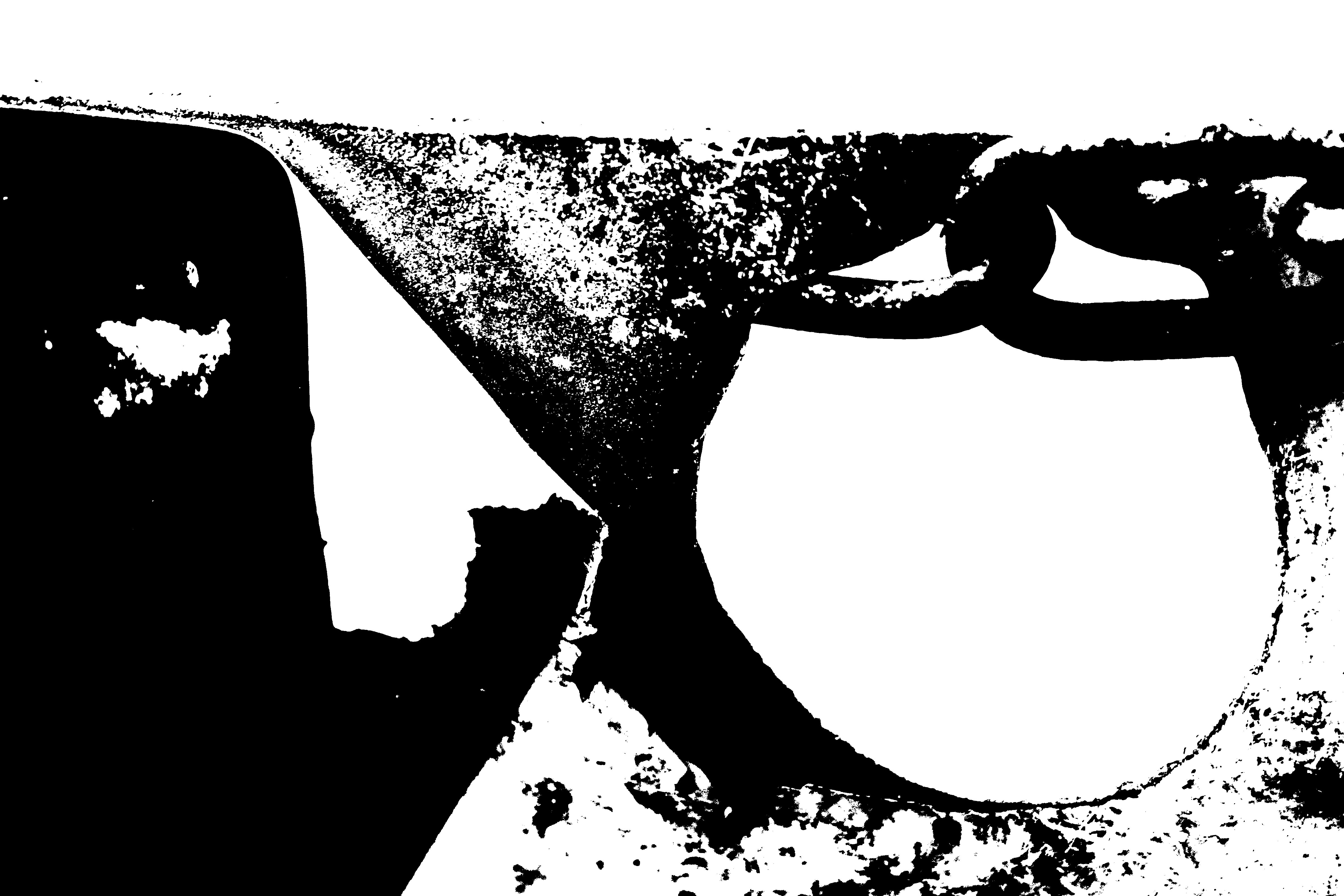
Here I experimented with photographing various signs. On the second image the rust and the peeling vinyl on the sign creates some interesting texture to prevent the image from being too flat.
Abstract Depth of Field Photoshoot
Ralph Eugene Meatyard was born in 1925 in Illinois. He studied pre-dentistry but later changed his studies into become an optician. He bought his first camera in 1950 to photograph his first new born child. In 1954 he joined the Lexington camera club.
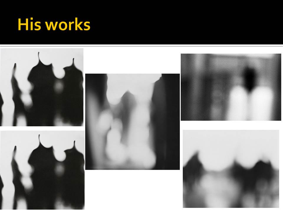
Though Meatyard experimented with lots of different ways to take images such as using multiple exposures and blur. He often worked with very heavy depth of field effects in his images and normally worked in black and white. He may have worked with heavy depth of field effects to reflect his job as an optician. These can be seen especially well in his “Zen Twigs” project.
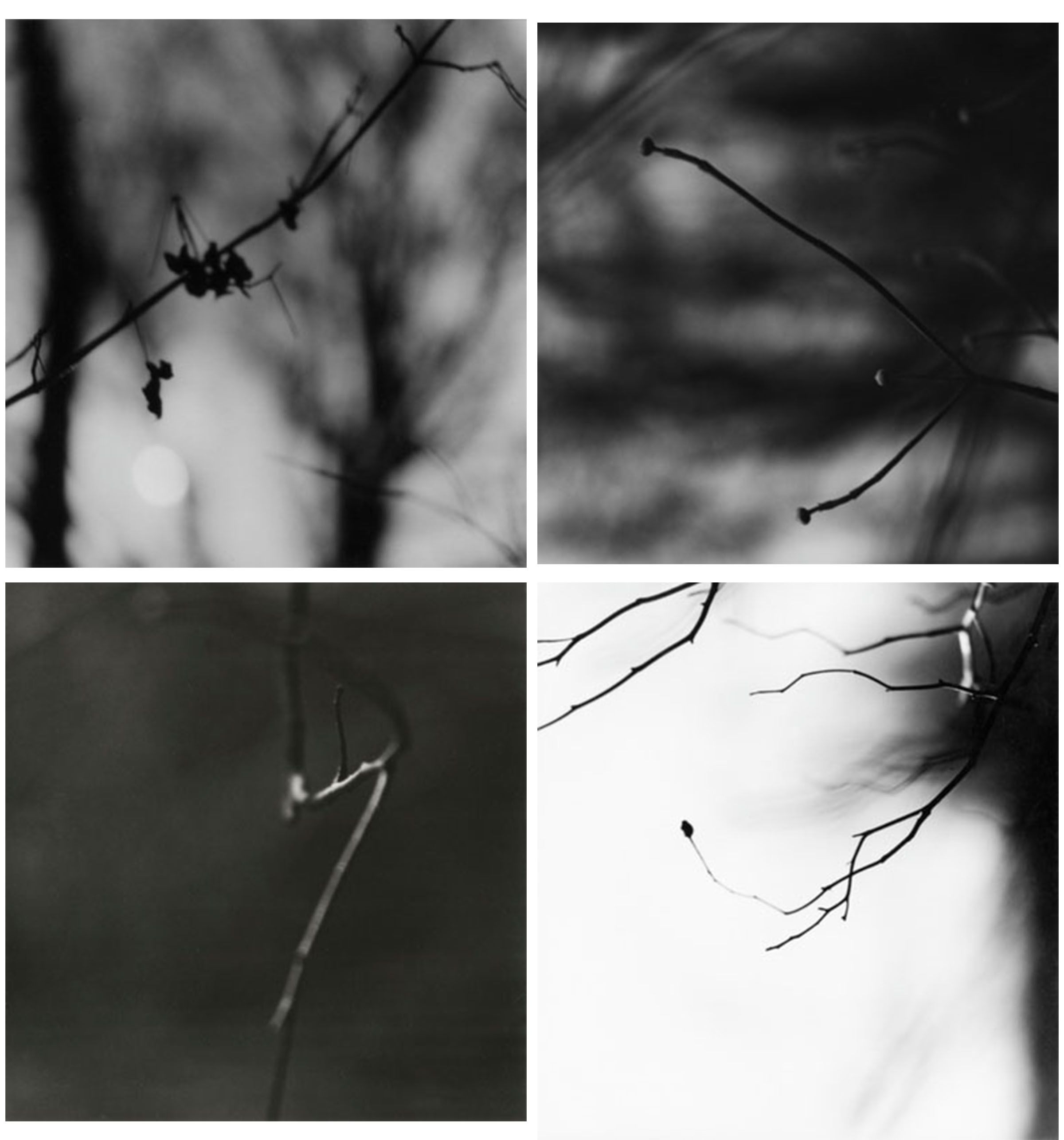
This is a selection of my favourite work by Meatyard. These are all images from his “Zen Twigs” project. In this project he focused mostly on depth of field to make the images look simple.
After researching about Meatyard, I went out and took some images like the ones from his “Zen Twig” project. After I went out and took some photographs I went into photoshop and edited the best ones. I have done this to crop them down to the parts I wanted, to make them black and white so they’re more similar to Meatyards project and to change the exposure levels to make some of the images a lot darker than the others. I have changed the exposure to make them darker so that the blacks in the images stand out a lot more over the whites. These are the best images I took on this photoshoot:

The image shown above is my favourite image that I took. In this image specifically I have added a lot of exposure to make the dark areas stand out a lot over the white. I think this image mimics Meatyard’s work the best out of the images I took as it shows a very heavy amount of depth of field around the focus point. While the image below don’t show nearly as much.
The images above and below show branches in focus in the foreground with a lot of depth of field in the background. These images follows closely with Meatyard’s work due to the main focus point and the huge amount of depth of field in the background. If I were to take the above image again I’d focus further in on one part of the branch rather than the whole thing. While the below image I am happy with how it turned out. 
Conceal/ Reveal Other Experiemnts
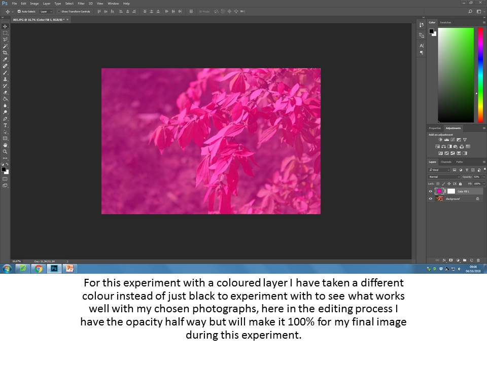
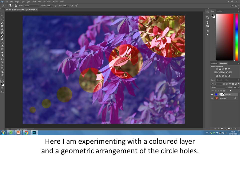
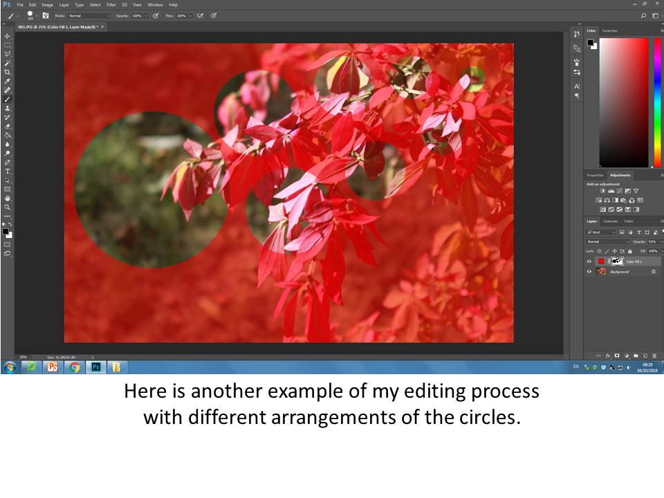
After experimenting with just using a solid black layer and the circles I will continue to experiment using different coloured layers, different circle arrangements, different opacity of the layers and using previously edited photographs for different effects.
Solid Colour Layers and Circle Arrangement
Final Outcomes
Solid Colour
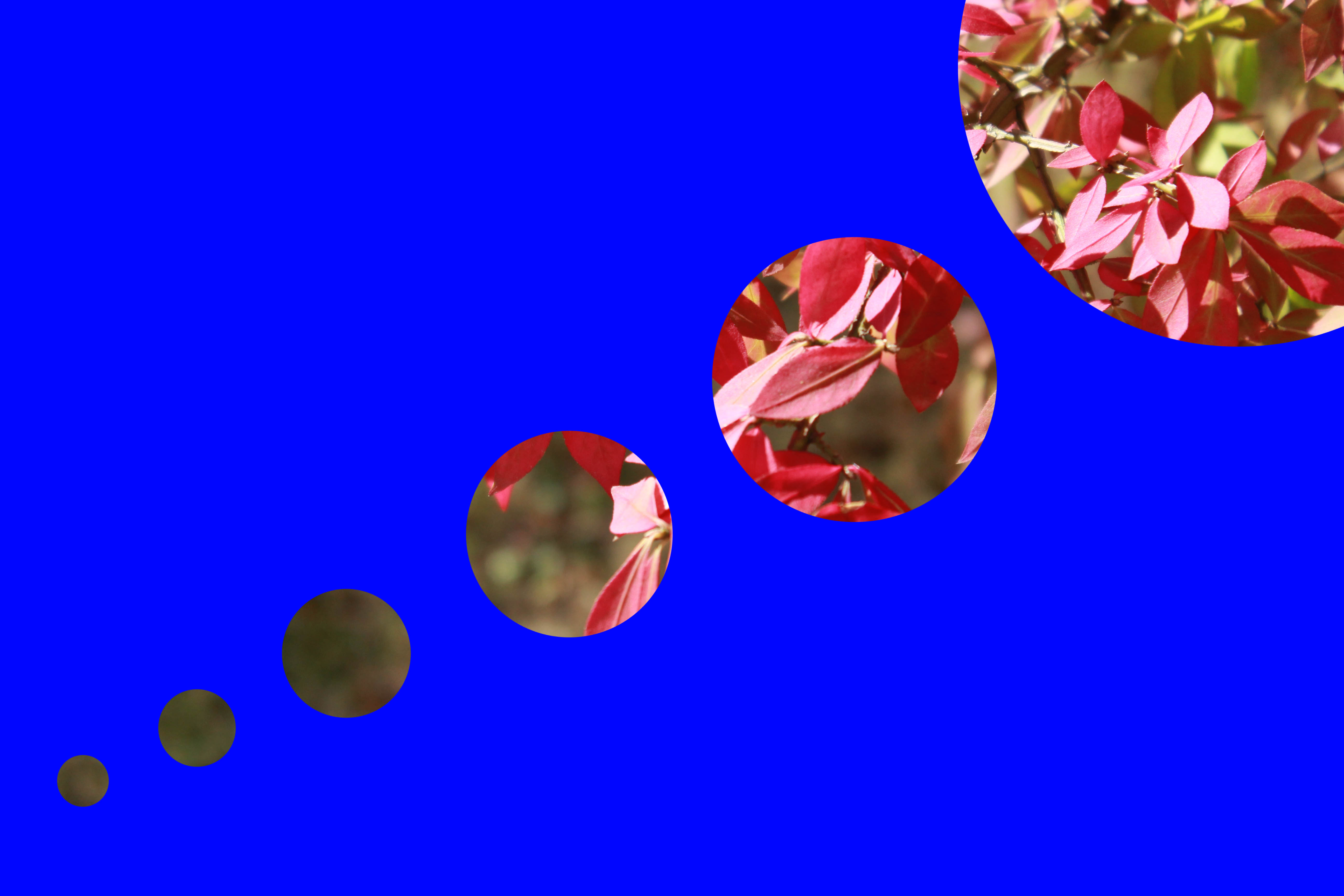
Solid Colour and New Arrangement
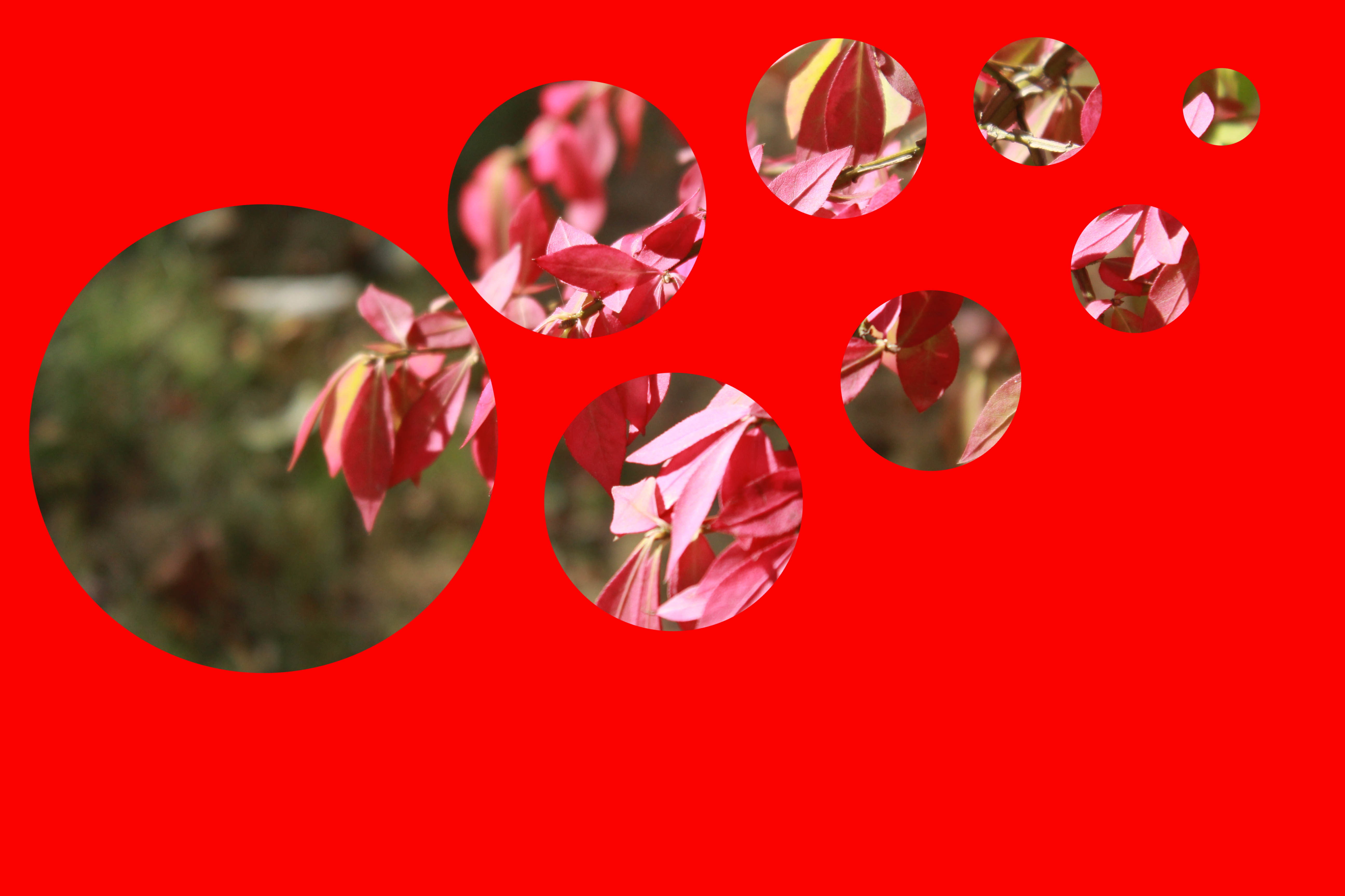
Solid Colour and New Arrangement
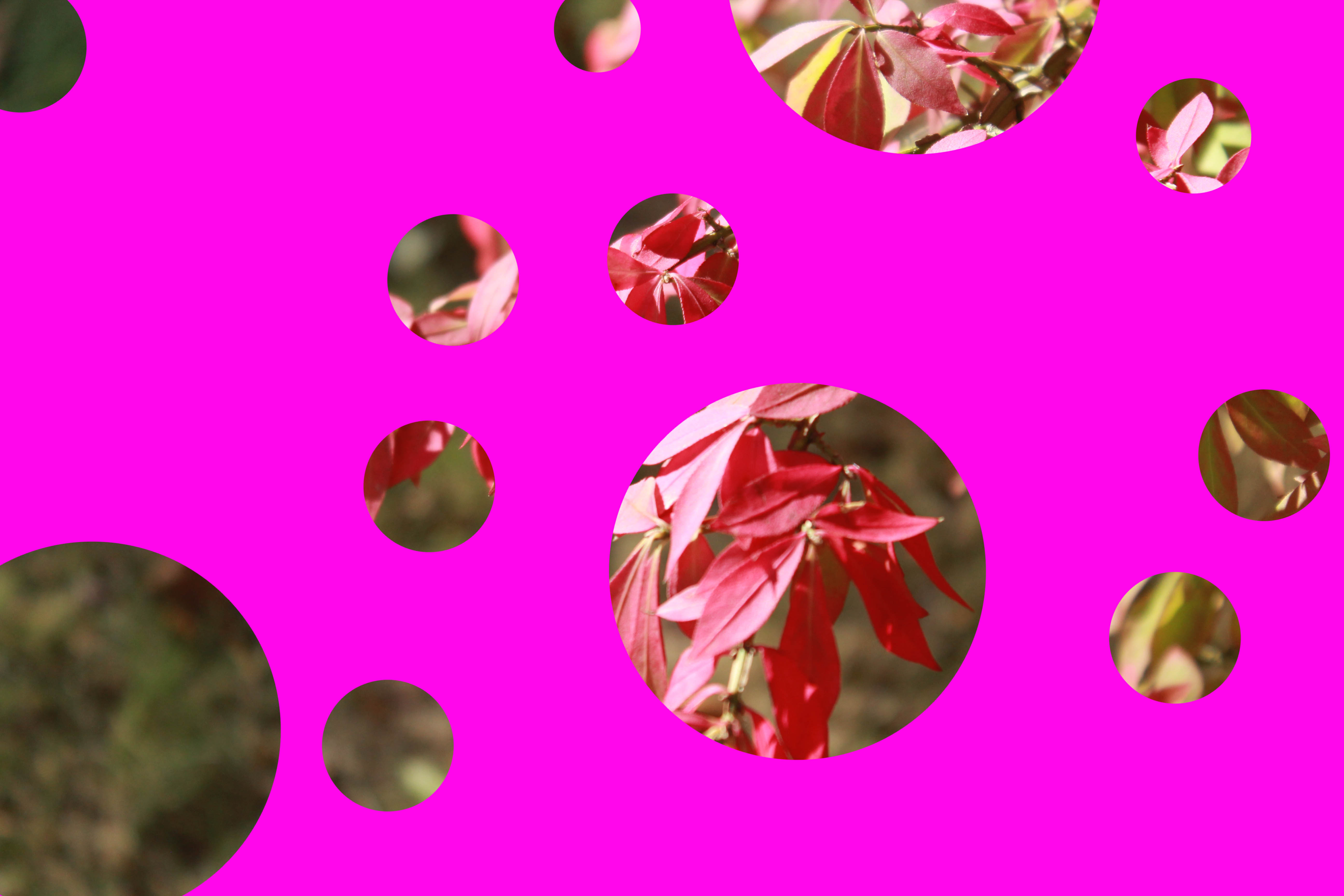
Above are all my final outcomes for the experiments I have produced. I feel they have worked well and I have been able to find different ways to arrange my circle holes and also the effects of using different colours as the solid colour.
Different Opacity and Previously Edited Photographs
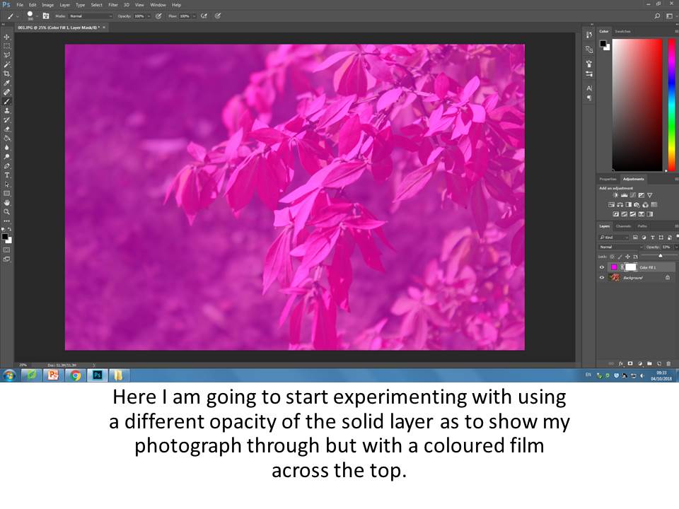
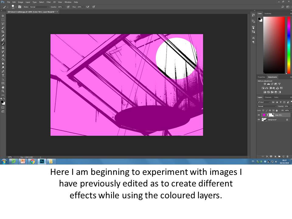
Final Outcomes
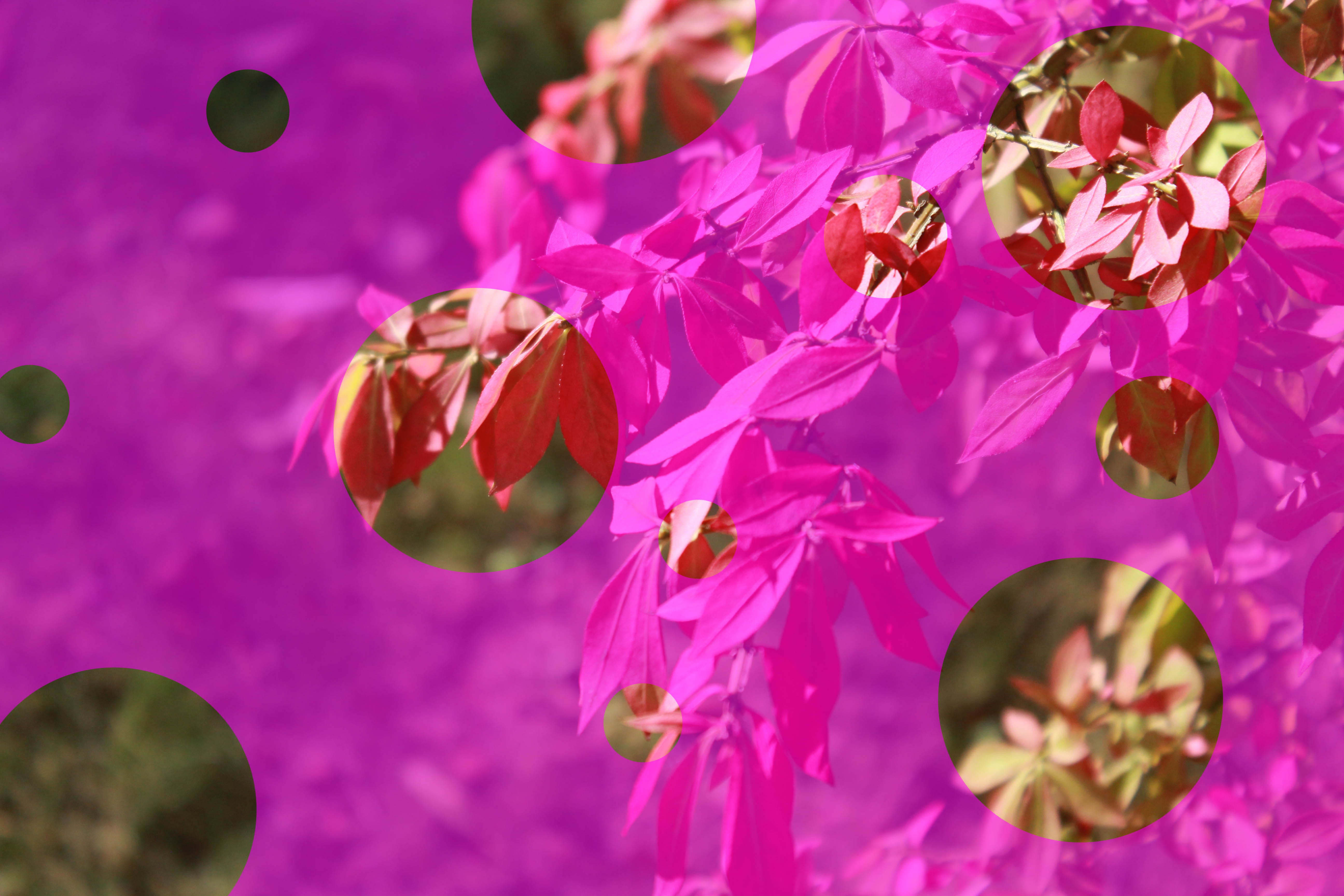
Using a Different Opacity
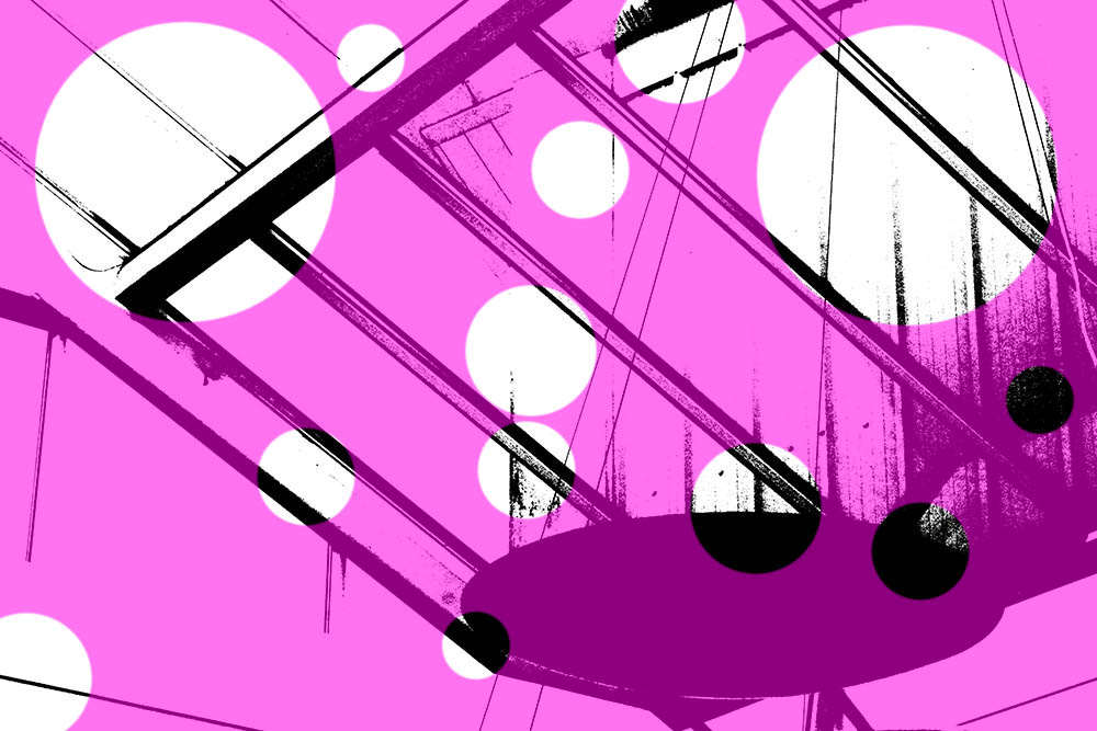
Using a Previously Edited Image, Different Opacity
These are more of my final outcomes for other experiments that I produced, I feel these I my most successful as I think they show a range of experiments by using my previously edited photographs and also the different opacity of the solid layers.
Conceal/ Reveal
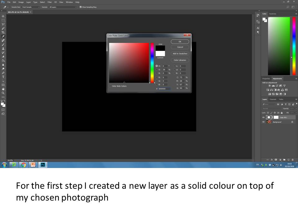
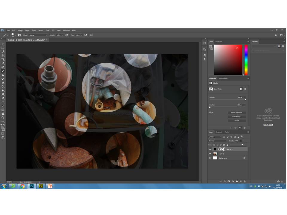
For this experiment I will be exploring using layers as layer masks to reveal and conceal areas of my photographs and exploring different ways to do this.
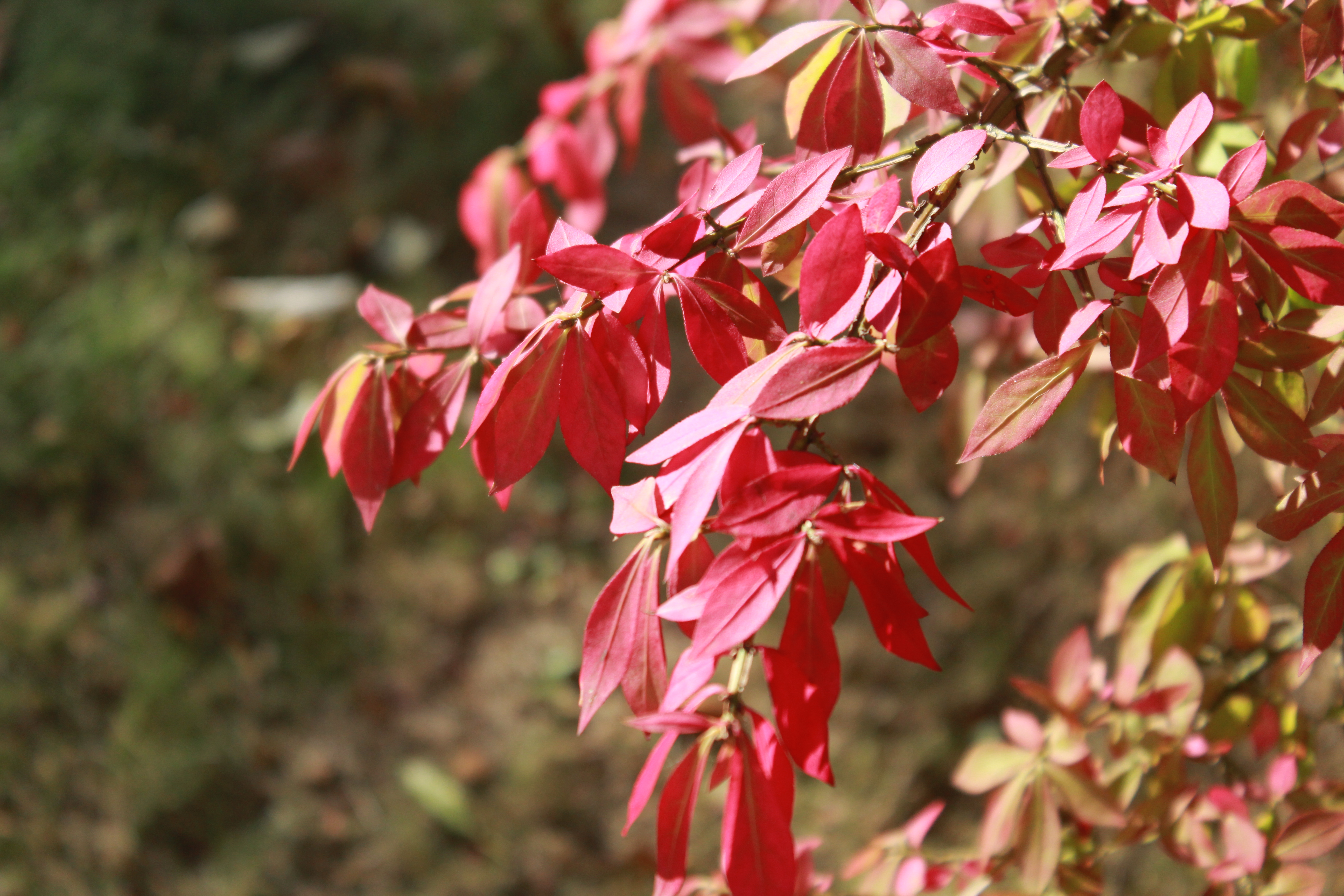
Chosen Photograph to Experiment with
Editing Process
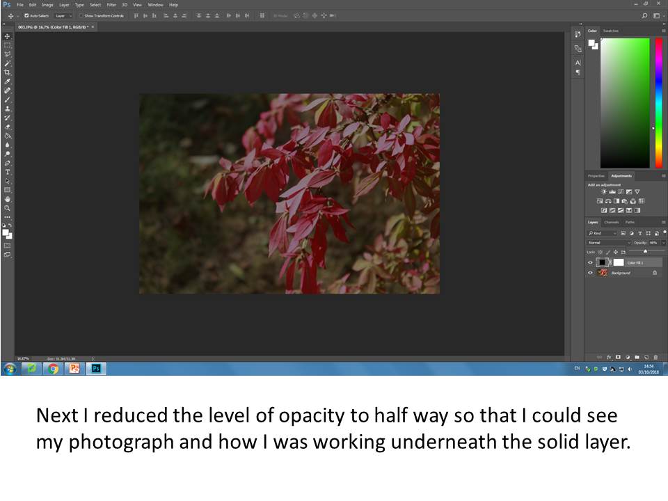
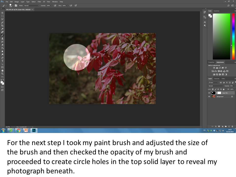
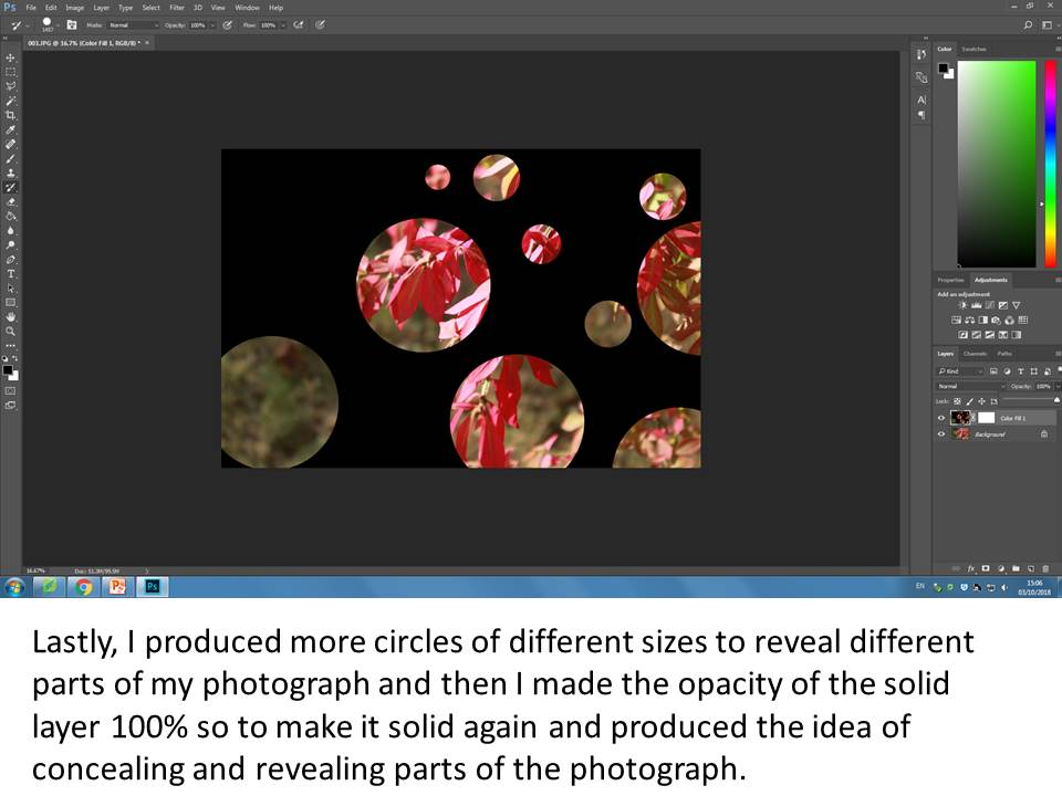
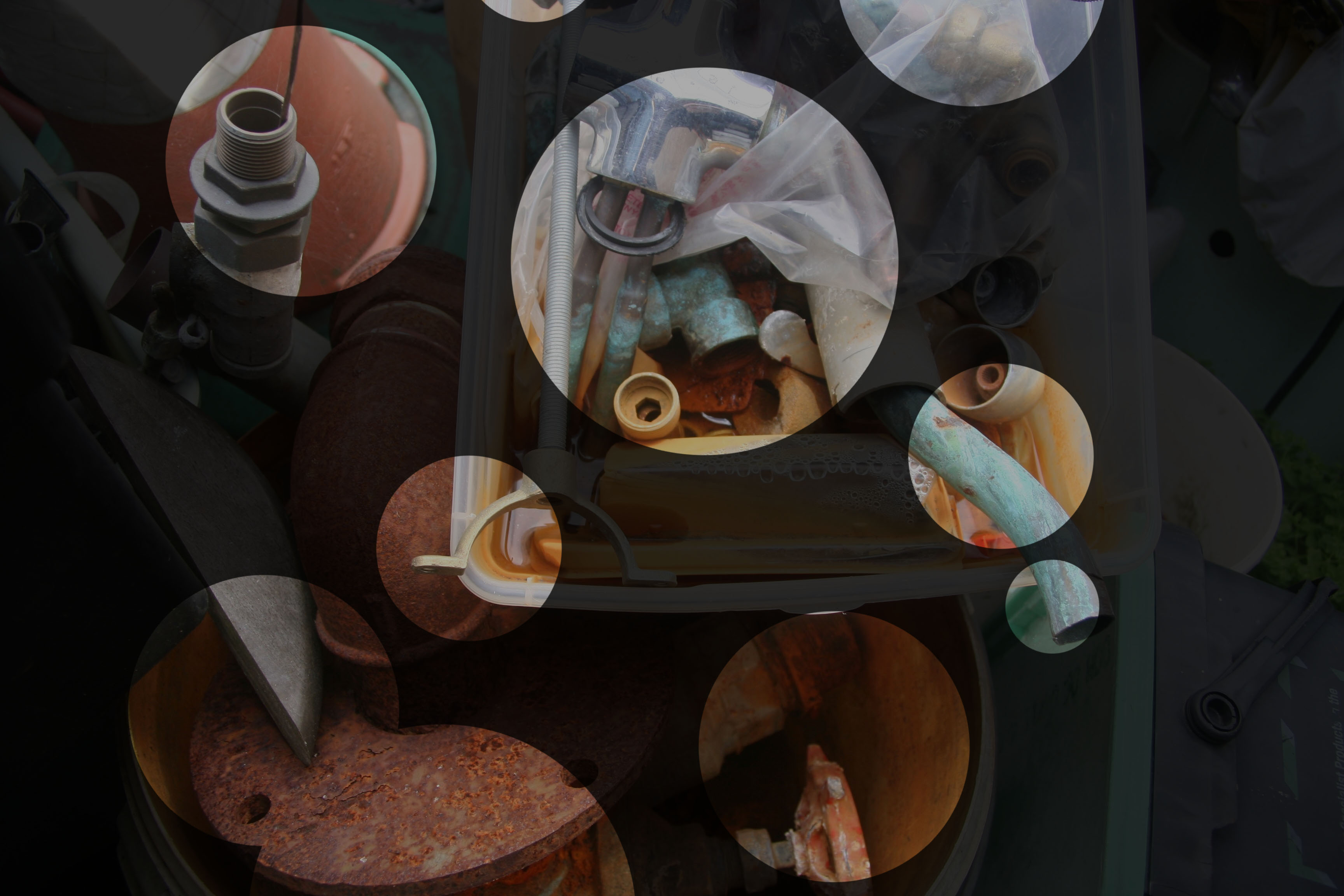
Final Produced Image
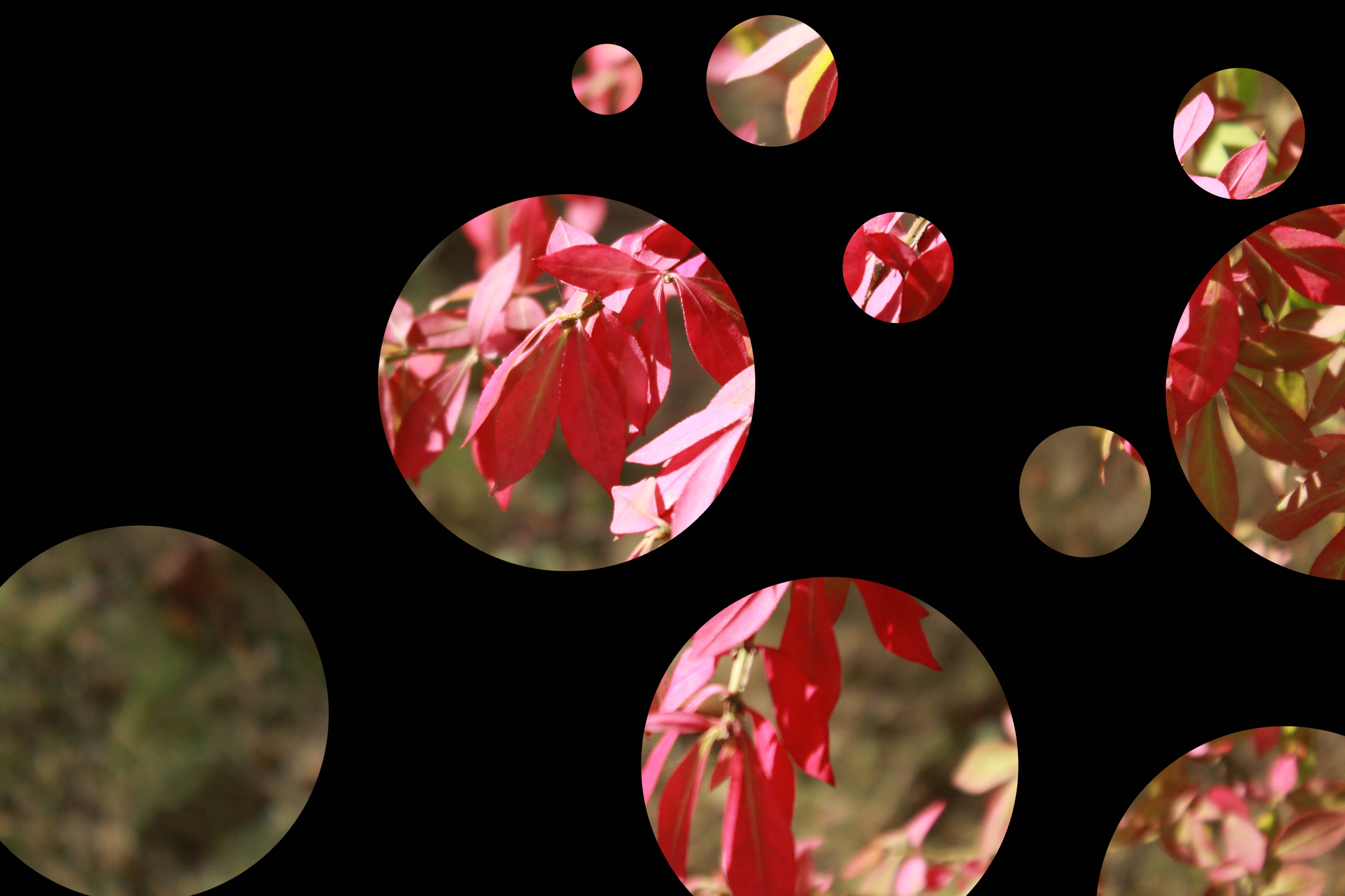
Conceal/Reveal
The Process
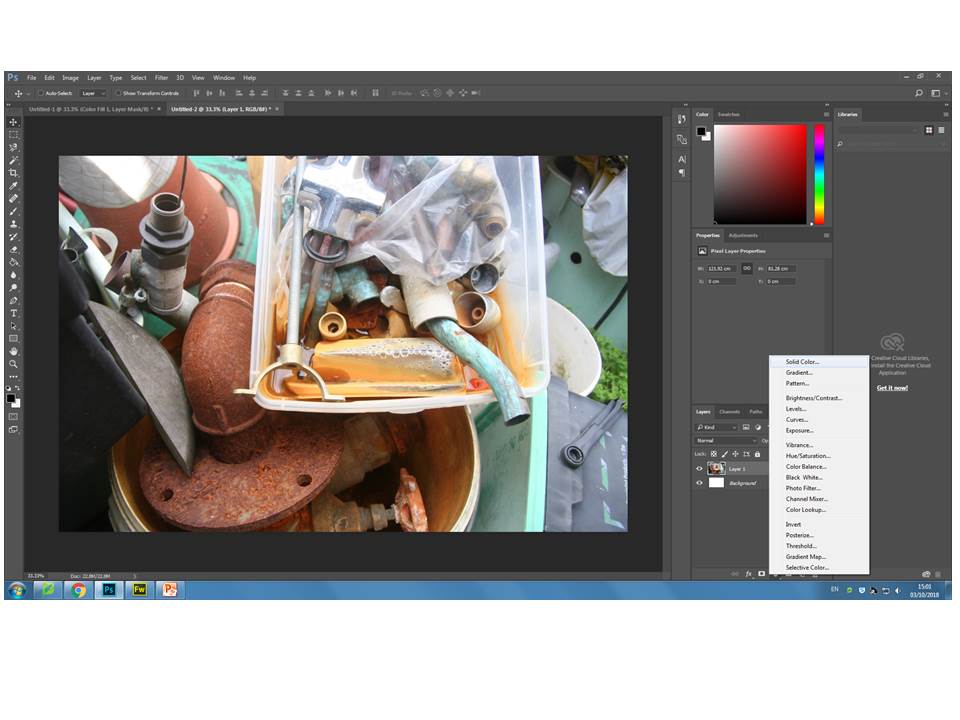
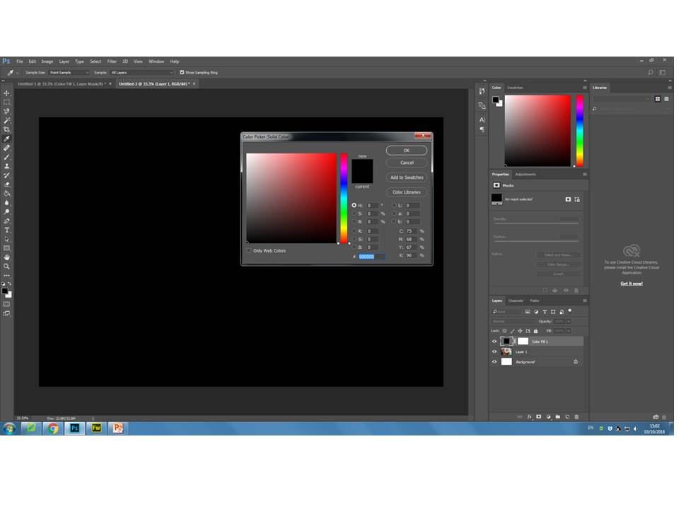
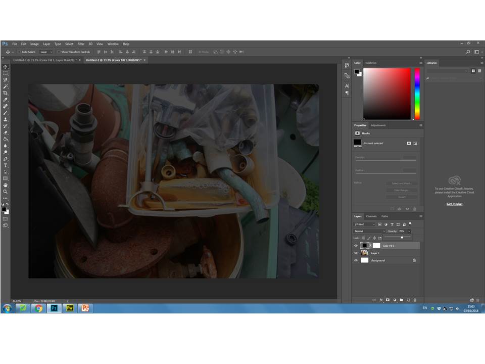
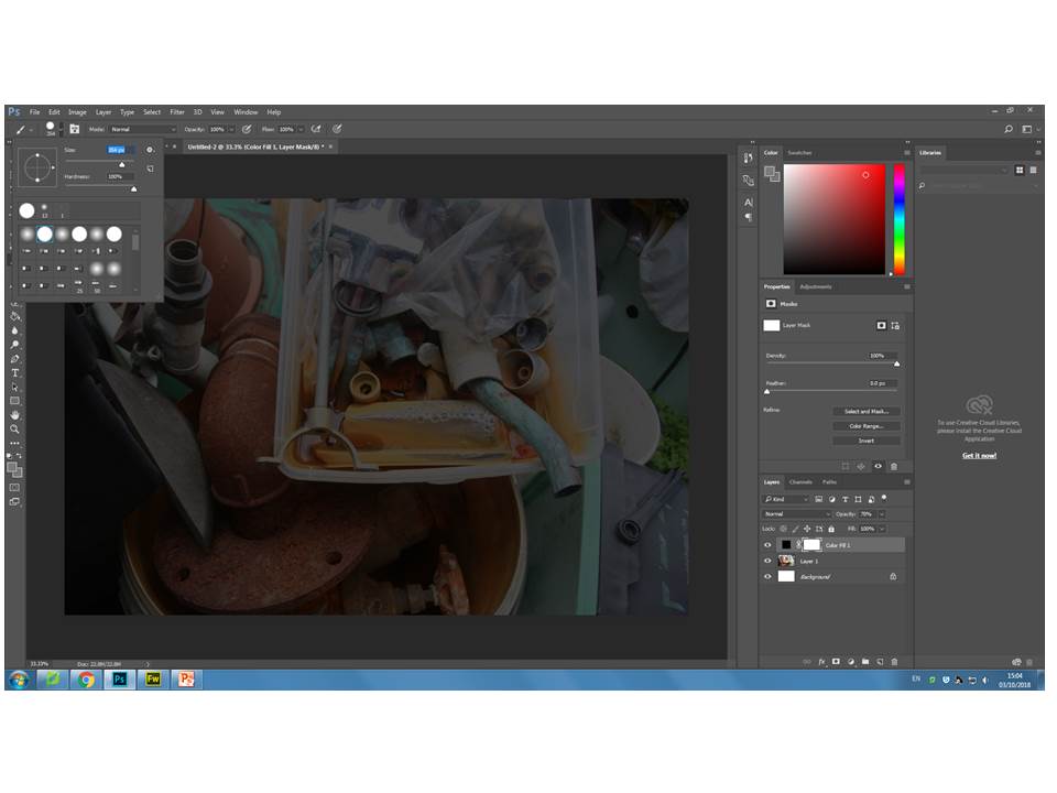
Analysis
The process to create my final image was relatively simple to complete and is now something I can use more often in my work. I reduced the opacity in a way which the ‘concealed’ area of the photo became visible, but ensuring the ‘revealed’ was more prominent and vibrant to extenuate the colour of the pipes. If I was to do this exercise again I would have used a photo with more colour in order to create more contrast between the dark ‘concealed’ areas and the bright ‘revealed’ areas. I ‘revealed’ the area with the sharpest focus and most depth, for instance the bottom left hand corner had detailed rusting and was displayed well in the natural lighting. The texture of the picture varied between rust and cooper residue, which adds a sense disorganization which fits well with my ‘revealed’ circles because they displayed the areas where most is going on, not the tidier areas of negative space in the background. The pipes are all in 3D form, this adds more depth to the photo with shadowing as displayed in the bottom ‘revealed’ circles.
Experiment – Curve/Tonality (Colour)
Tonality: Colour
A curve, in image editing, is a remapping of image tonality, as a way to emphasise colours or tone in an picture. Changing the black point, grey point or white point of an image can dramatically affect the colours shown in an image. Below I have included some examples of where I have changed these points in different areas of the image to create different colour schemes in each image. I used an image of fire as it had many tones running through it that I thought may give good results.
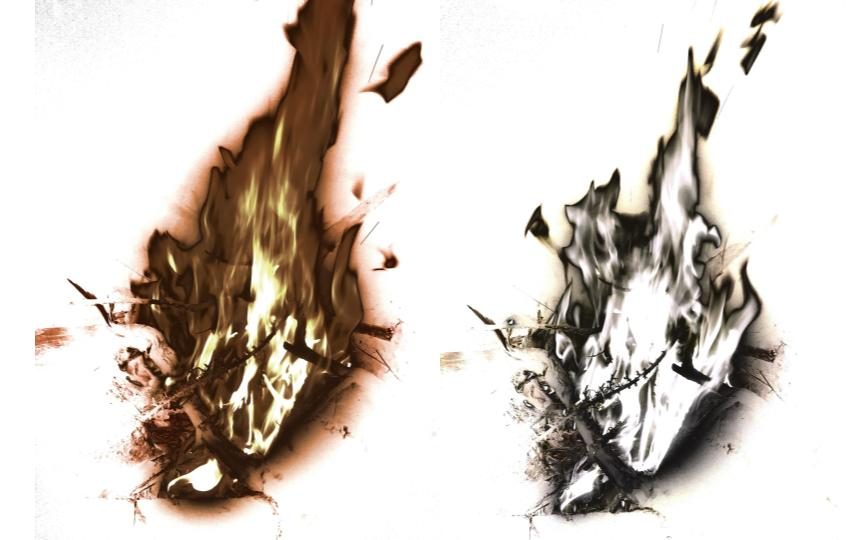
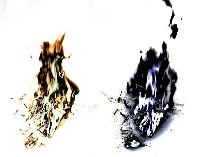
As shown in these images, changing the black point, grey point or white point of an image can massively change the appearance of an image. The original colours of the fire (white, yellow and orange) were changed as I changed the tone points of each image.
I was less subtle with the editing process of these images, resulting in them looking highly unrealistic and obviously manipulated, however in doing so I produced some dramatic very images.
Ralph Eugene Meatyard
About Ralph Eugene Meatyard:
Ralph Eugene Meatyard lived in Lexington, Kentucky, where he made his living as an optician while creating an impressive and enigmatic body of photographs. Meatyard’s work spanned many genres and experimented with new means of expression, from dreamlike portraits—often set in abandoned places—to multiple exposures, motion-blur, and other methods of photographic abstraction. He also collaborated with his friend Wendell Berry on the book The Unforeseen Wilderness , for which Meatyard contributed photographs of Kentucky’s Red River Gorge.
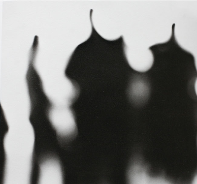
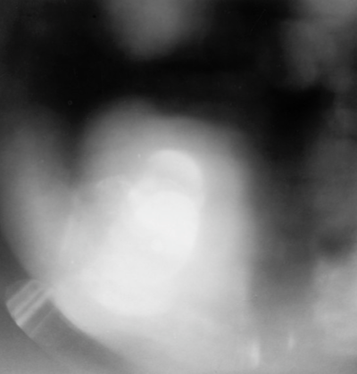
My photos :

My edited work:
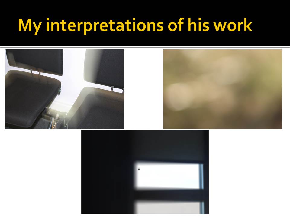
I took some of the photos which I thought could be used in inspiration of Eugene, and put a black and white filter on them. I then used the blur option until I got my desired look.


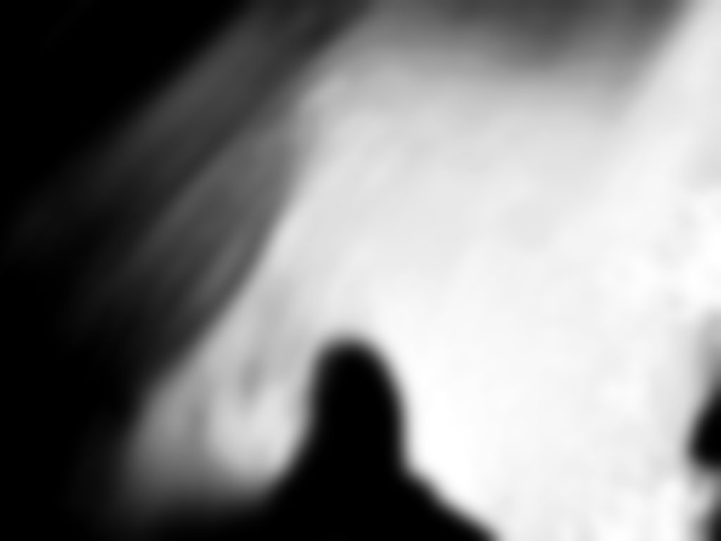

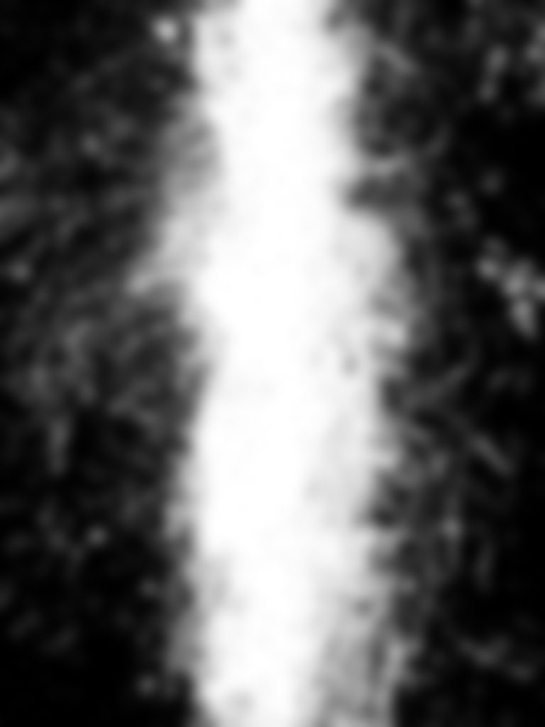

Ralph Eugene Meatyard Response
| Ralph Eugene Meatyard was a qualified optician, the company he worked for sold photography equipment. For his son’s birthday he bought him a camera, which sparked his career into photography. He later became a member of the Lexington Camera Club where he pursued his passion for photography outside the main stream, he experimented with multiple exposures, motion blur and depth of field to create non focal pictures. |
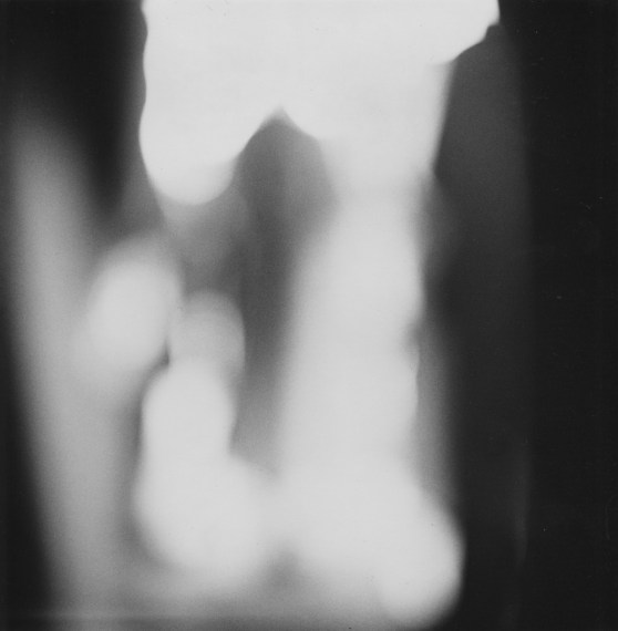
This photo by Meatyard is from his ‘no focus’ collection in which he has many photos with a blur effect, creating an all round negative space. From my interpretations this photo is of busy people walking, its good that I don’t know what the photo is of as this is what Meatyard wanted us to feel, a sense of the unknown. In order for this blur affect to be achieved the aperture must be wide (smallest f-value) so that the blurred area is harsher. A long focal length and a reasonably far distance from the subject would have also been techniques that Meatyard would have used. In all this photos of this particular collection he used a colour balance of black and white, which creates cold tone. The black and white goes well with the motion blur as it creates a mirroring effect for instance the people are walking, everything is fast pace and blurry, you can see no expression from anyone, this is similar to how there is no colour expressing the atmosphere, everything is gloomy and dull. As well as that there appears to be a pattern within this photo, the people are evenly spread apart, there is a clear rule of thirds. This also creates a sense of repetition and how everyday is the same nothing changes, there is nothing new to look forward to, everything is black and white.
My Photos:
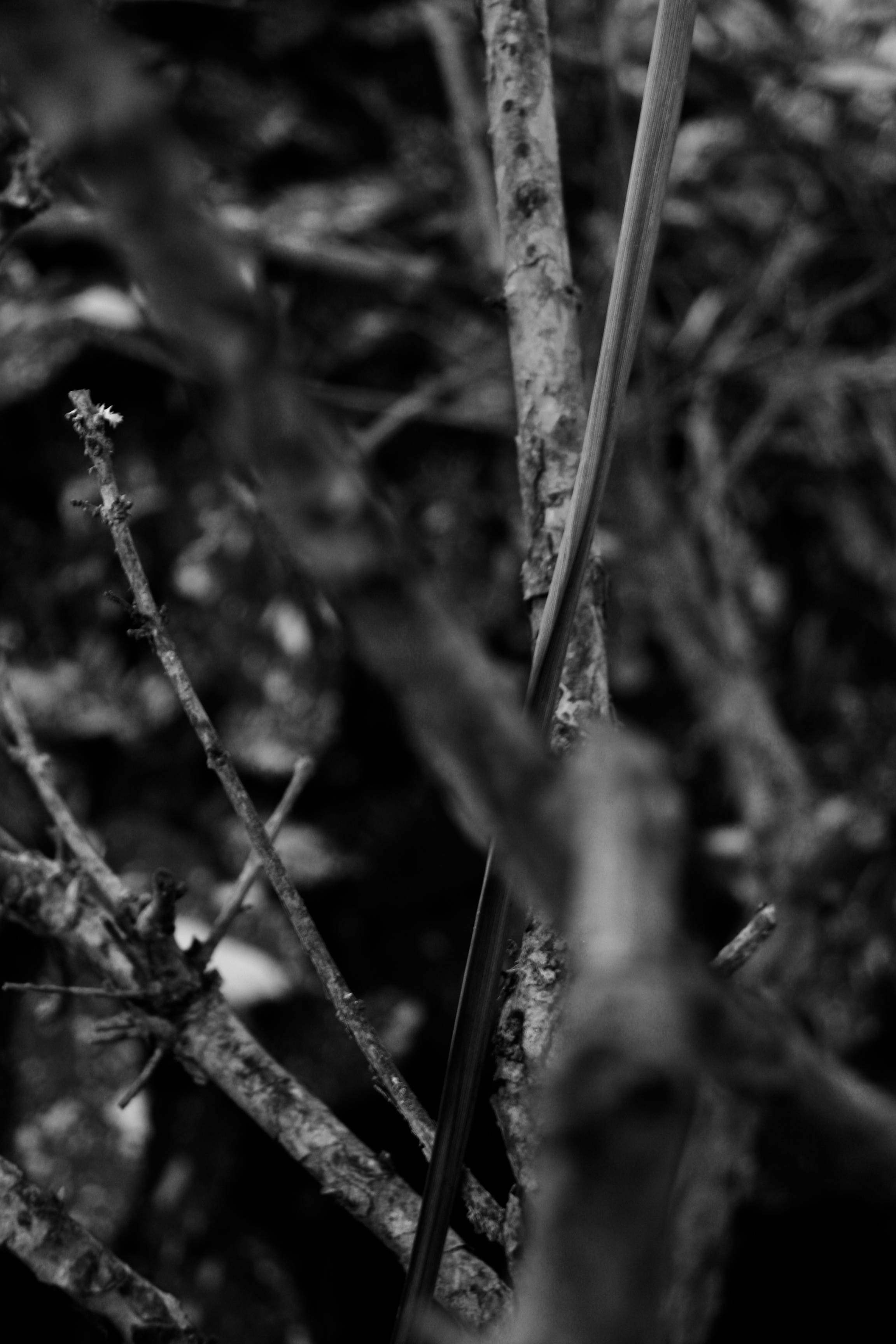
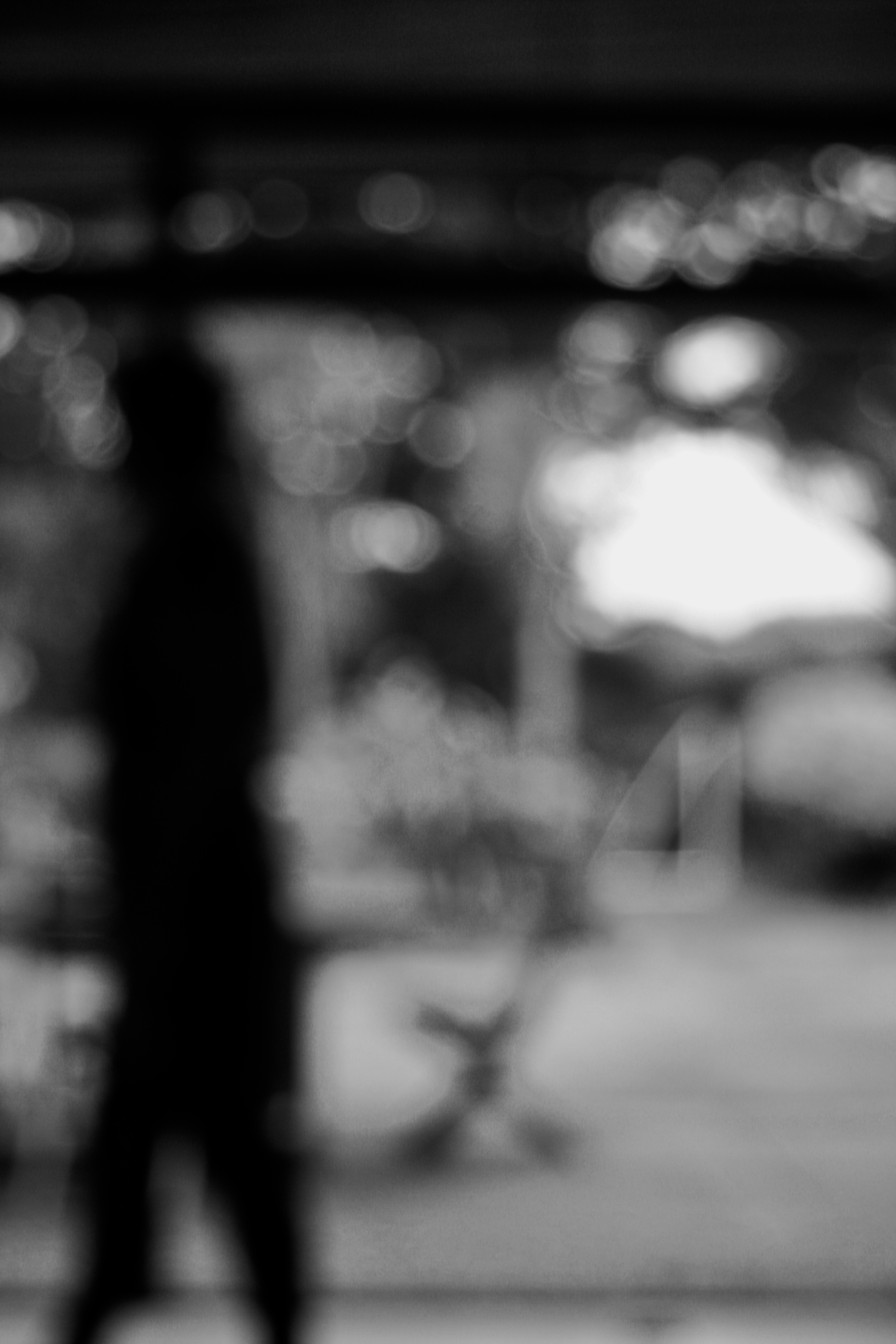
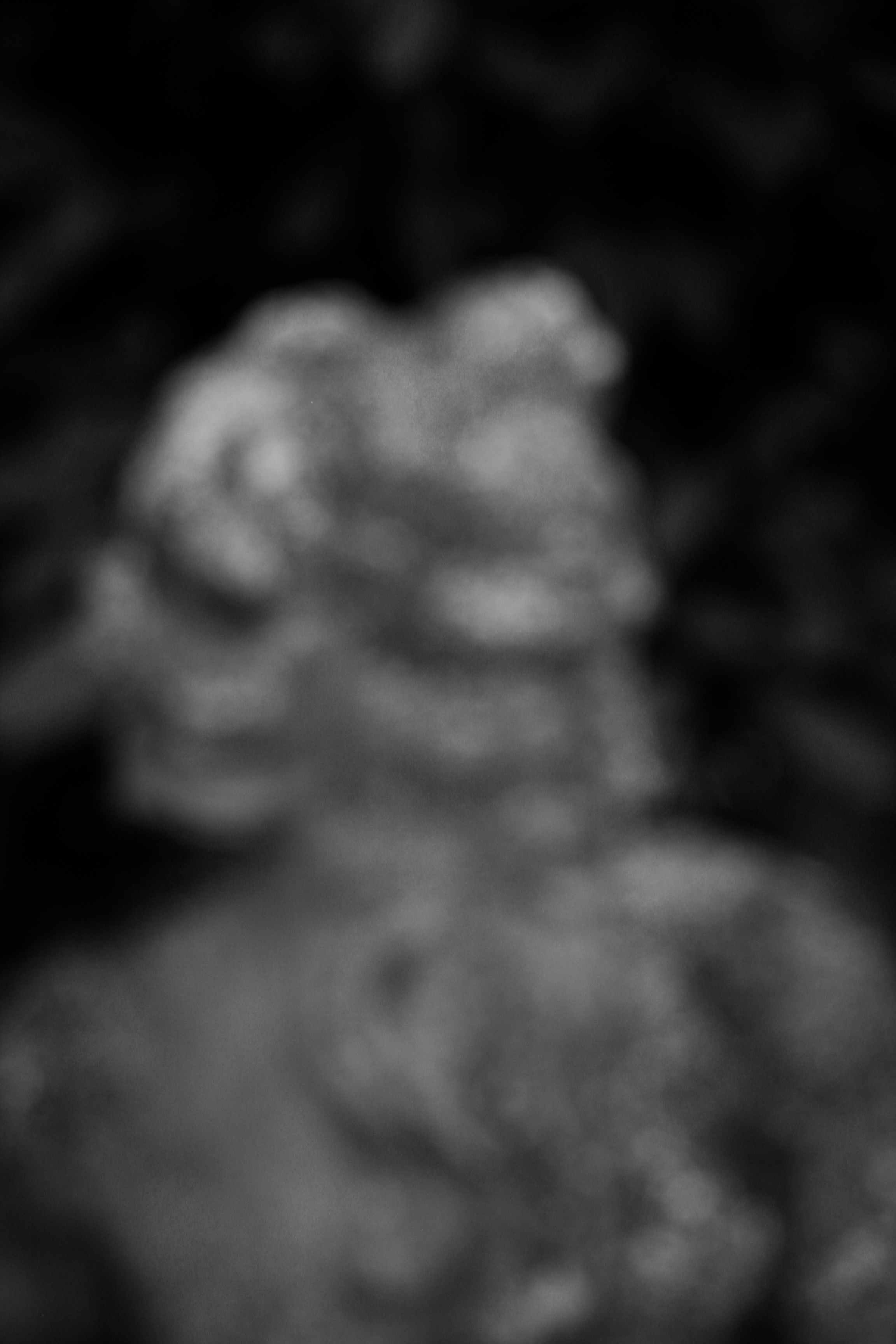
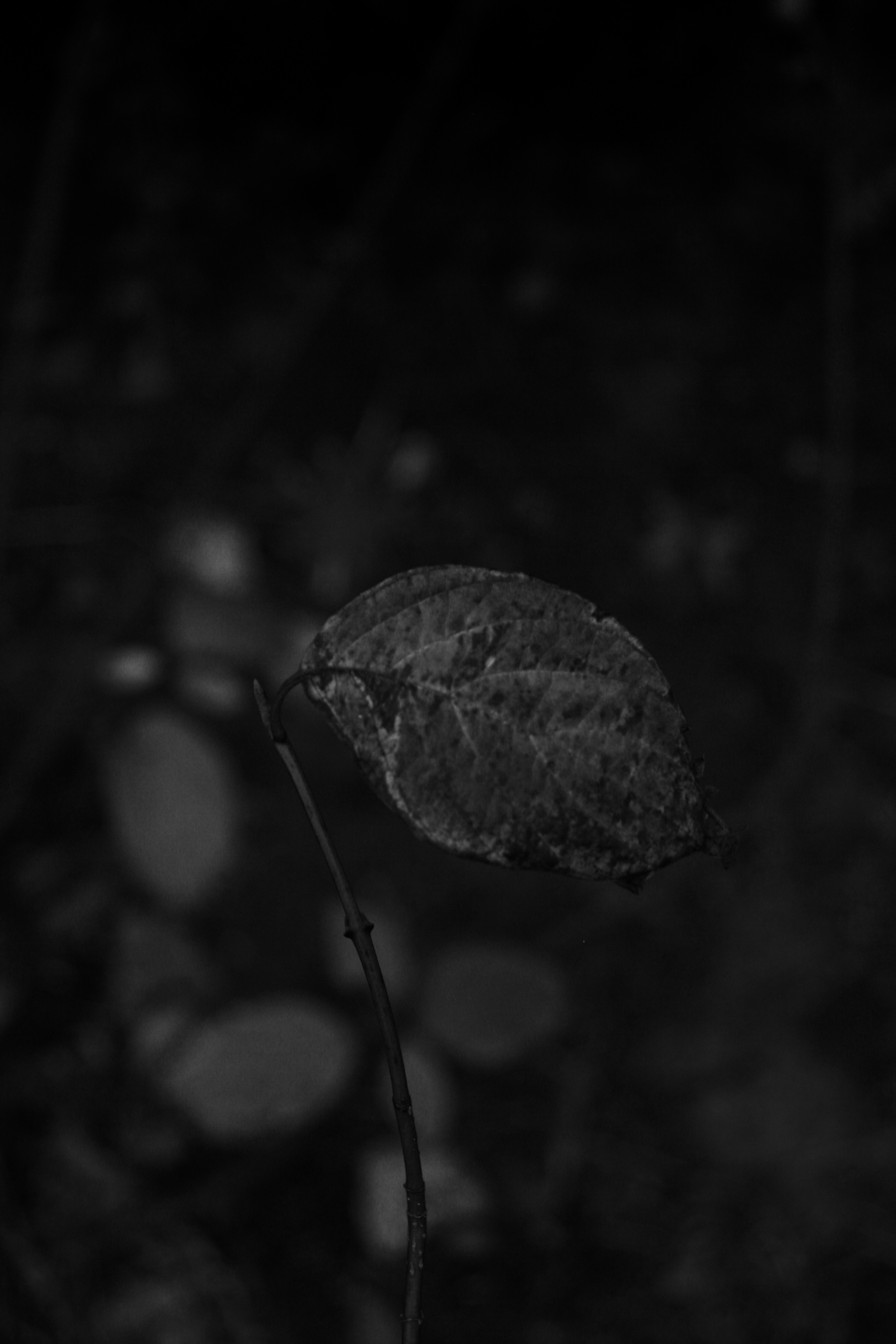
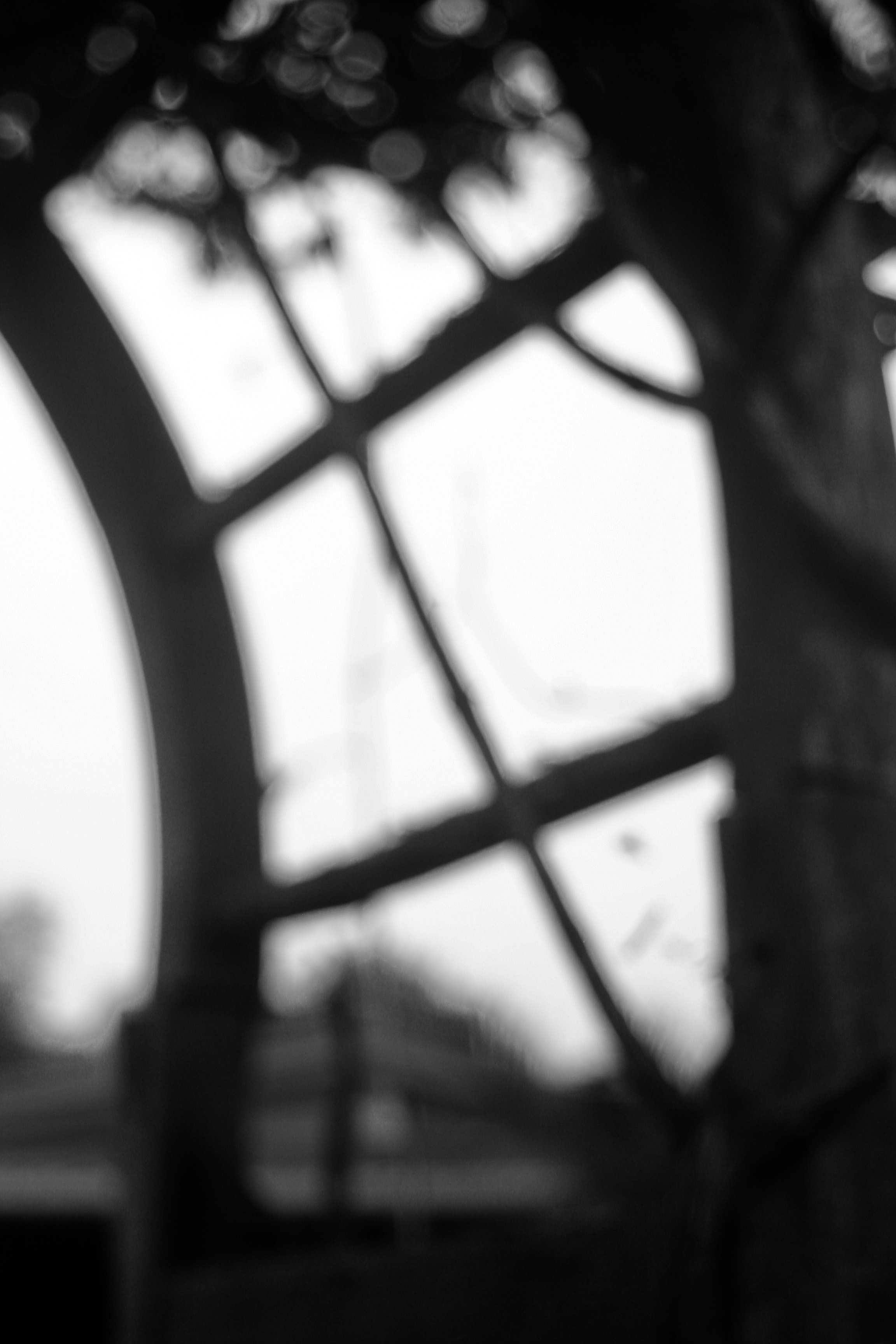
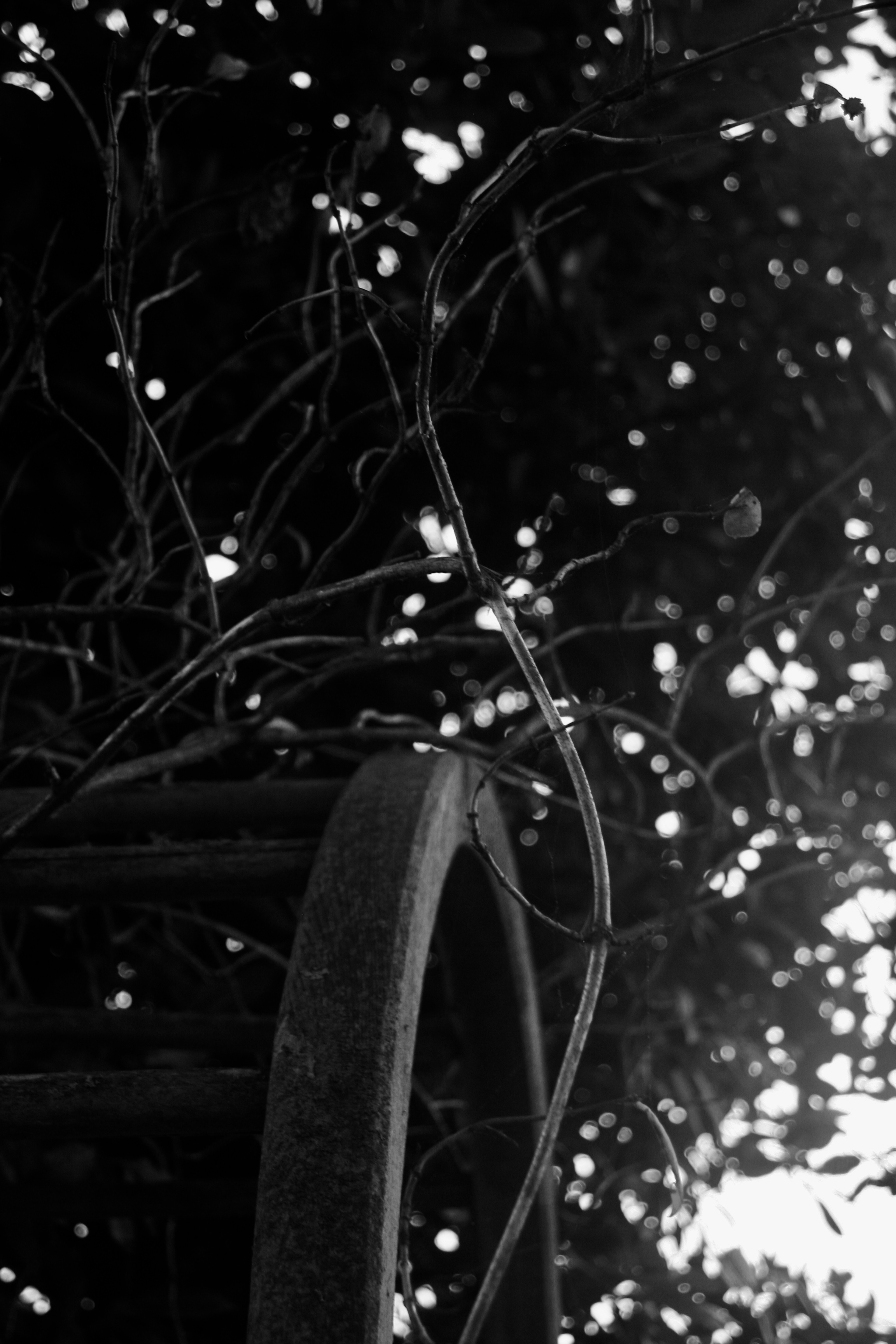
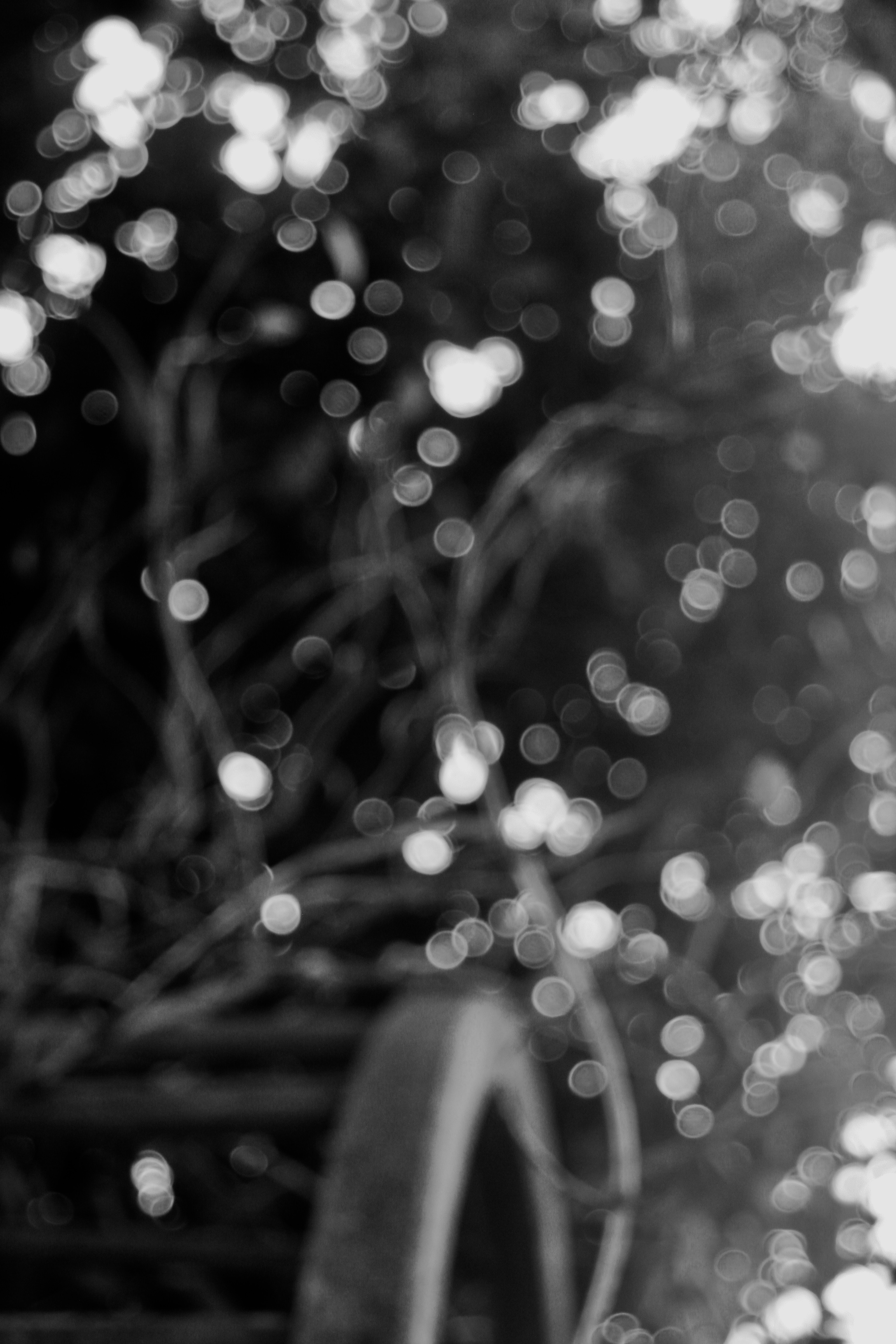
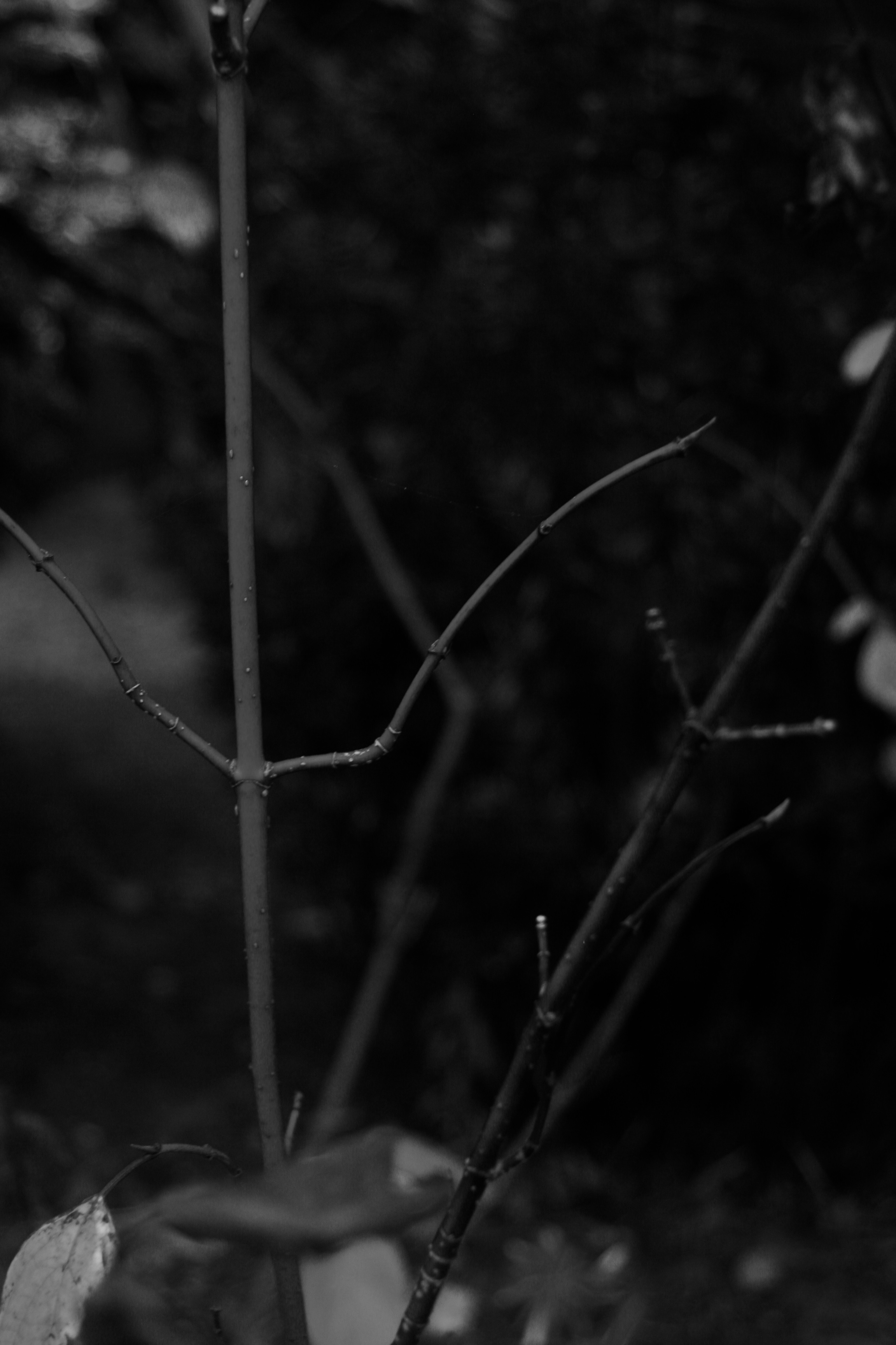
In response to Meatyard’s work I experimented with focal length, depth of field and aperture. I took most of my inspiration from his ‘zen twigs’ collection, focusing in on plants and branches and blurring out the background to create large negative space. In order to achieve this set my camera to a large aperture and I had a shallow depth of field. Overall I am pleased with my final images, I decreased the brightness of all images and made them black and white, to resemble the work of Meatyard. I have tried to mirror his work as my photos are either completely blurred or there is one focal point and the rest is out of focus negative space.
Experiment: Curve/Tonality (Contrast)
Tonality: Contrast
A curve, in image editing, is a remapping of image tonality, as a way to emphasise colours or tone in a picture.
Applying a curve to all channels of an image typically change the brightness. Light parts of an image can become lighter while dark parts of an image become darker, increasing the contrast in a composition.
Below I have shown examples of images in their original form as well as with two examples of the same image with different levels of contrast.

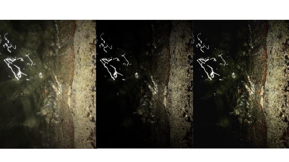
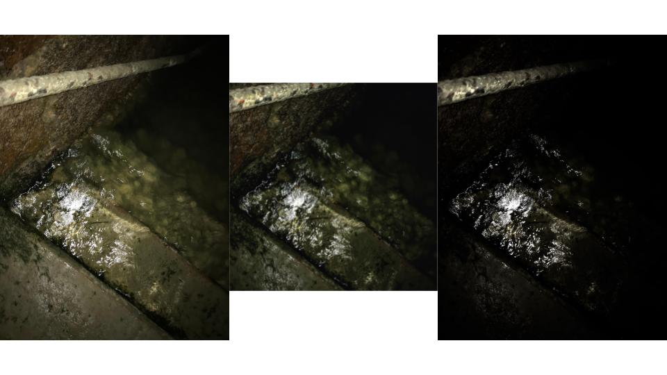


As displayed in these images, the higher the contrast the more dramatic the image. I took these frames of light reflecting on water at night to create natural contrast before the editing process to show how slight changes to the tonality of an image can drastically change how an image appears.
I could have further increased the curve of these images or perhaps even decreased it to give the images less contrast, however I felt it was most effective for these specific images to increase the curve sensibly to create realistic images rather than obviously edited ones.
