Category Archives: AO3 Record Ideas

Filters

Author:
Category:

colour and texture

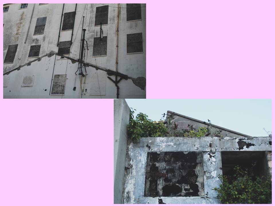
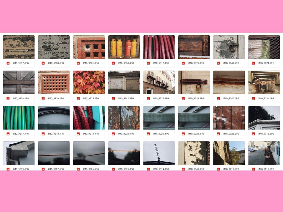
For this task I took inspiration from Aaron Siskind. He focuses on aged and peeling surfaces, for example: old posters left to rot or old wall paint.

Aaron Siskind’s work

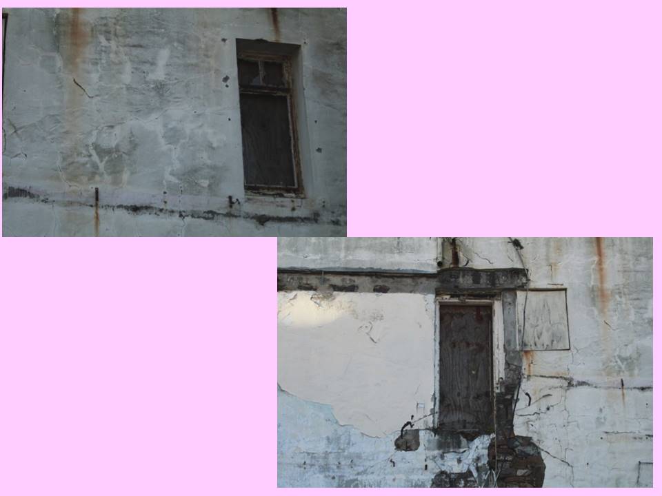
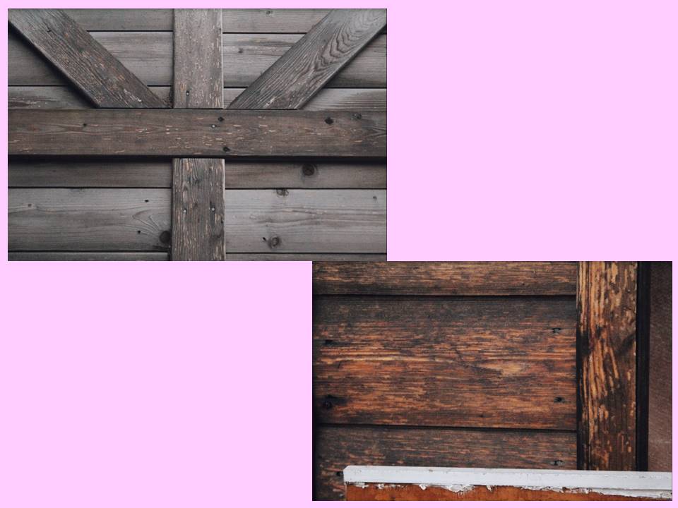
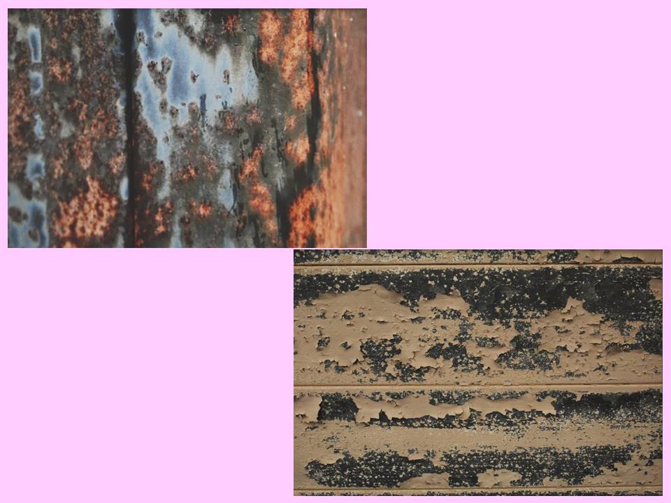
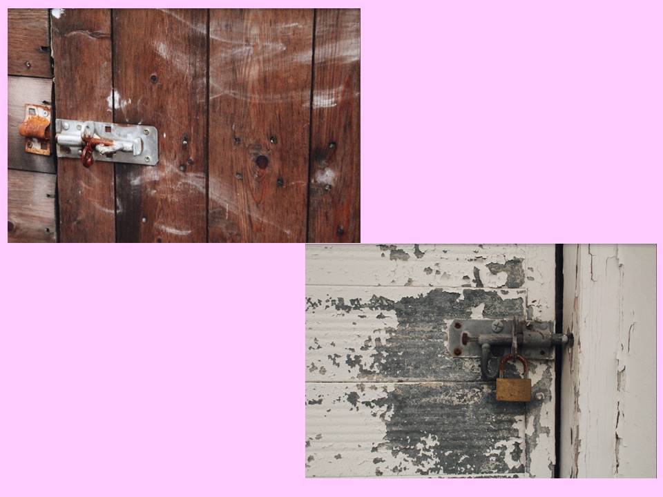
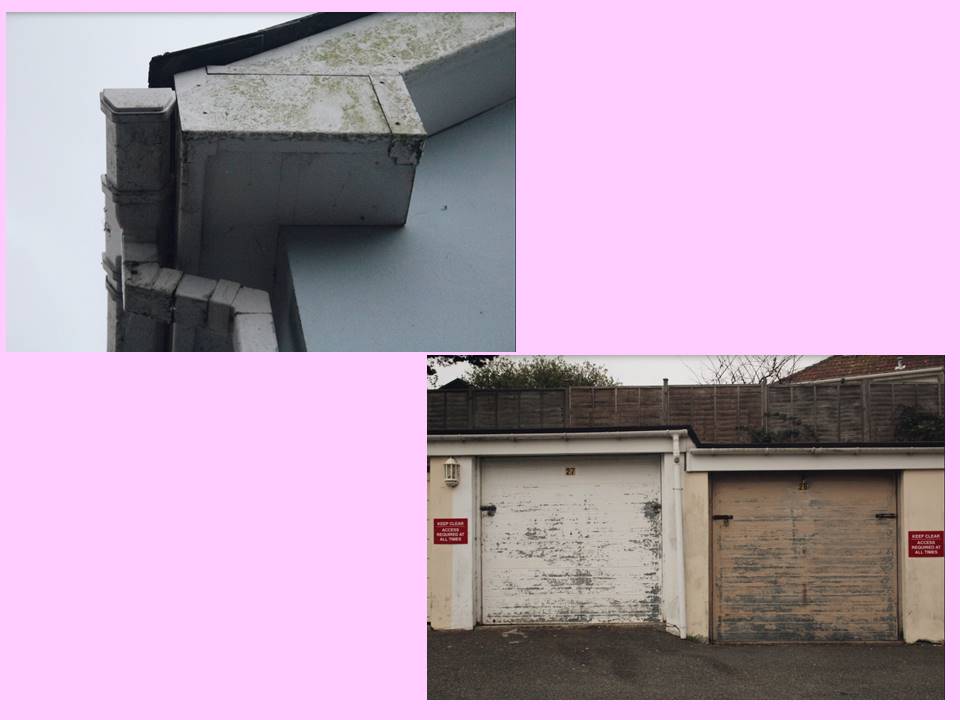
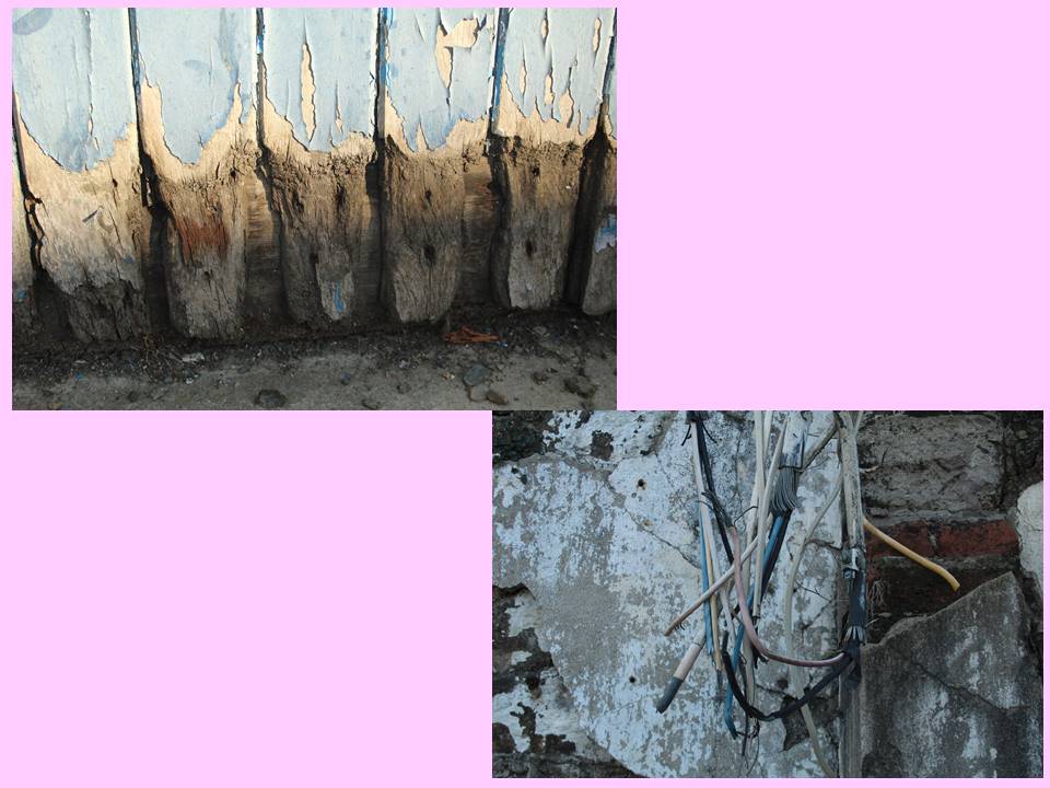
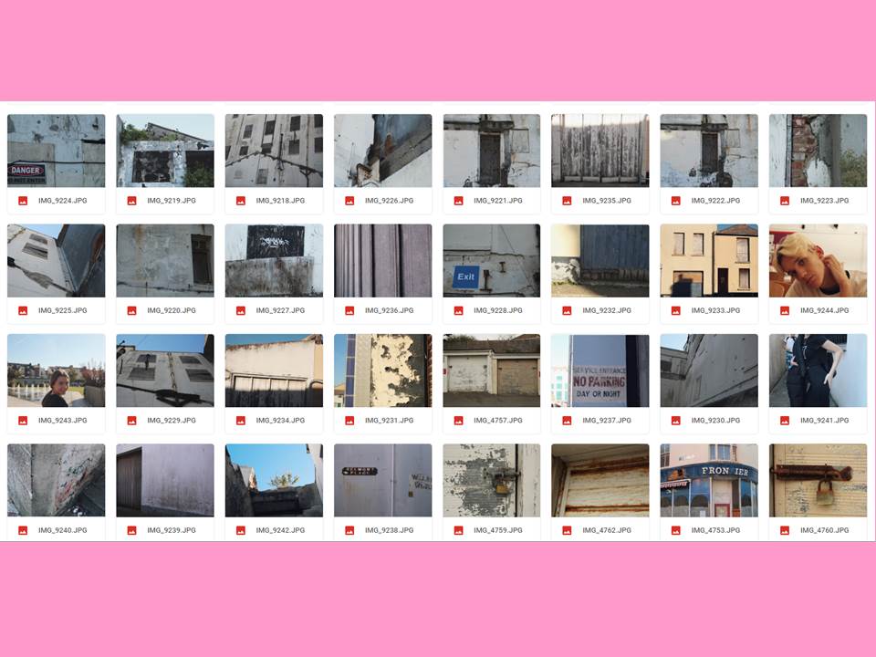
From the stimuli given from Siskind’s work, I focused on the ‘decay’ of walls and buildings which all fitted into our urban lifestyles. My first shoot was based in the old Jersey Brewery, which is now being slowly nocked down and being turned into apartments. However this means there’s more parts of the old building being revealed. I mainly focused on the decay of the building’s crumbling walls and peeling paint.

My response

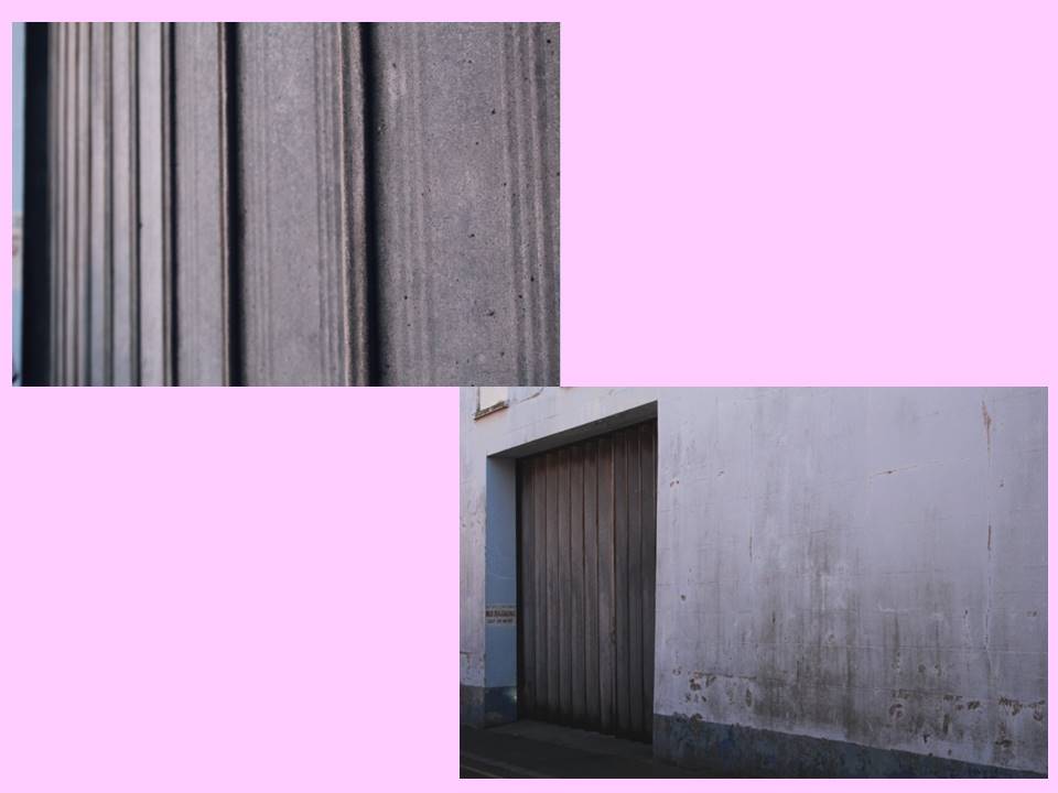
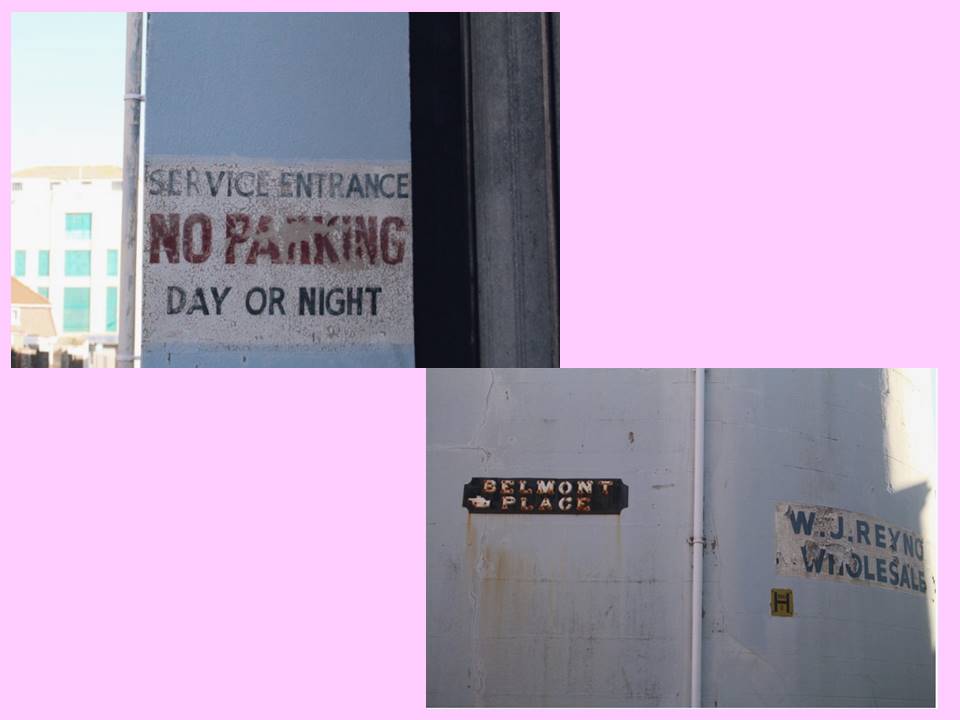
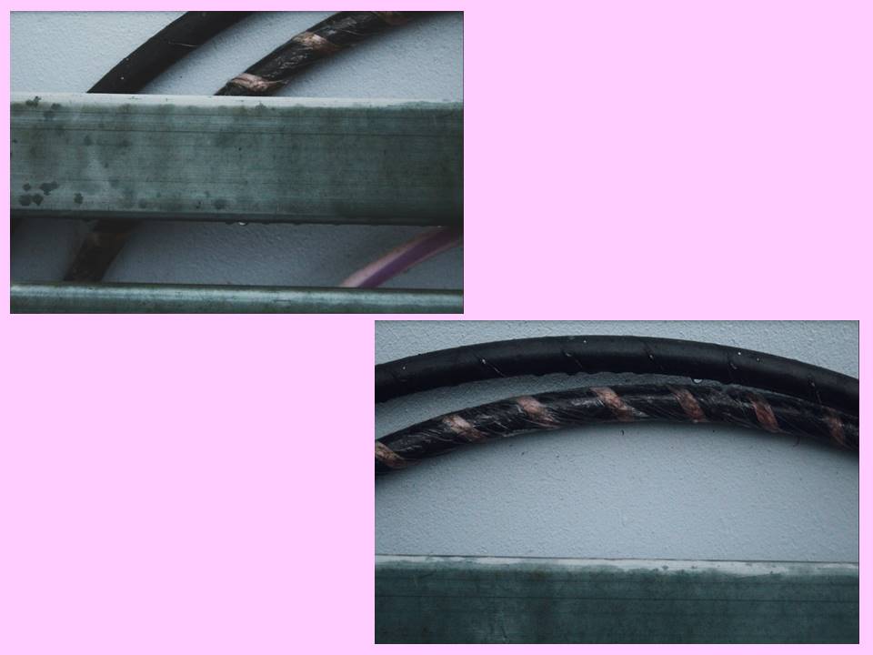
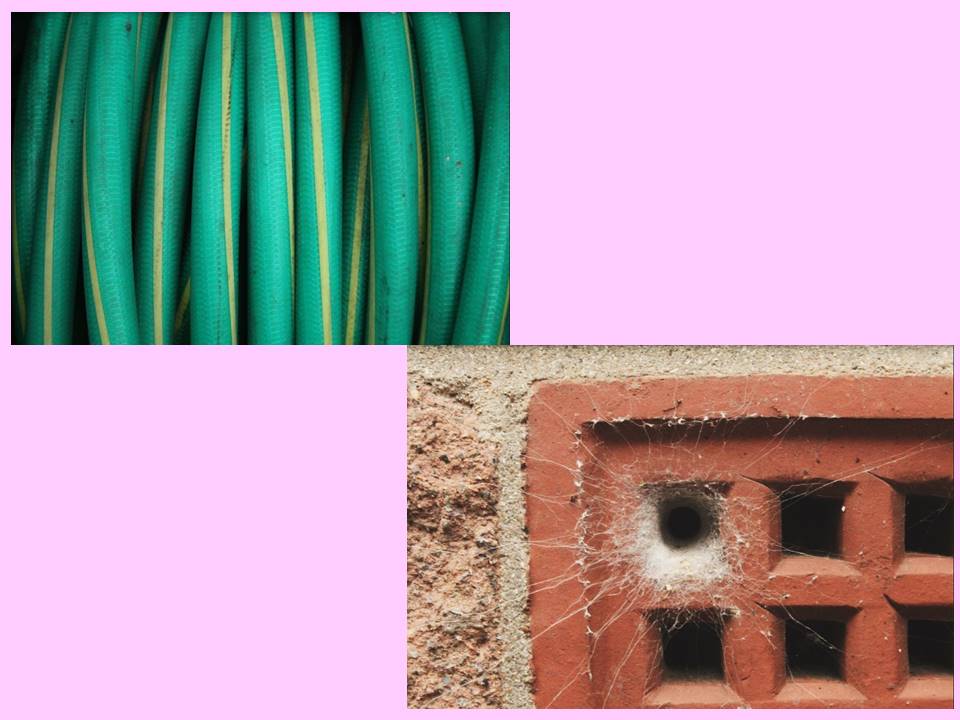
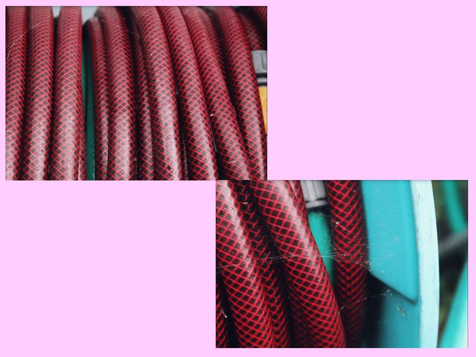
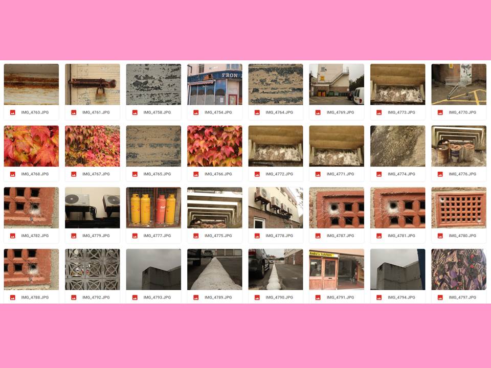
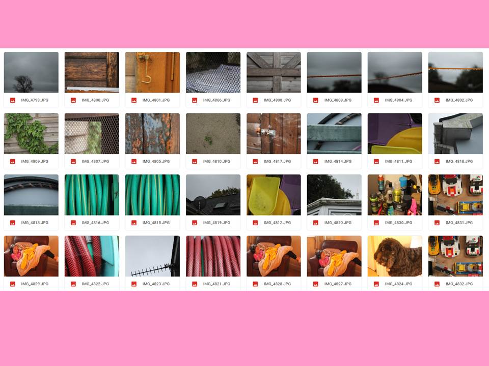
My second response involved focusing more the textures and lines that came naturally either from natural or decaying objects.

My Second Response

Experiment – Depth of Field

Depth of Field:

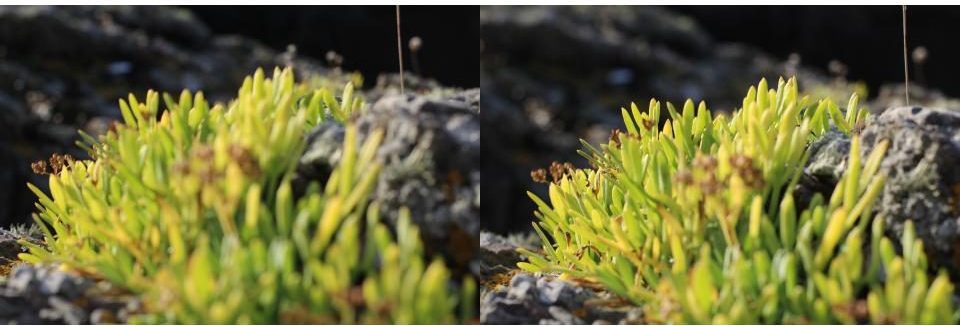
In photography, depth of field determines the closest and farthest objects in an image. This can involve the entire image being focus or something in the foreground or background being sharp while the rest of the image appears unfocused. This is useful in highlighting a certain aspect of a frame and can enhance the importance and effect of an object.

Three main factors that affect a photographer’s control over depth of field are the aperture, proximity to the image being photographed and the focal length of the camera lens.

Large aperture = shallow DOF

Small aperture = deep DOF

My Examples:

As visible in the frames above the depth of field greatly affects the appearance of an image. The first two images are focused on the furthest away section of the plant in relation to the position of the camera and create a relatively bland image while the bottom two images are focused on the section of plant in the foreground highlighting the stem in the centre of the image, giving the composition much more life and dimension with different colours and shapes making the image more interesting.

Further Examples:

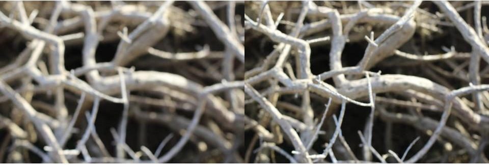
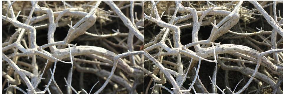
This is another example of how depth of field reveals different layers of an image, creating different focal areas. This creates a more dramatic image as aspects of the frame are much sharper and bolder.

Shutter speed and exposure

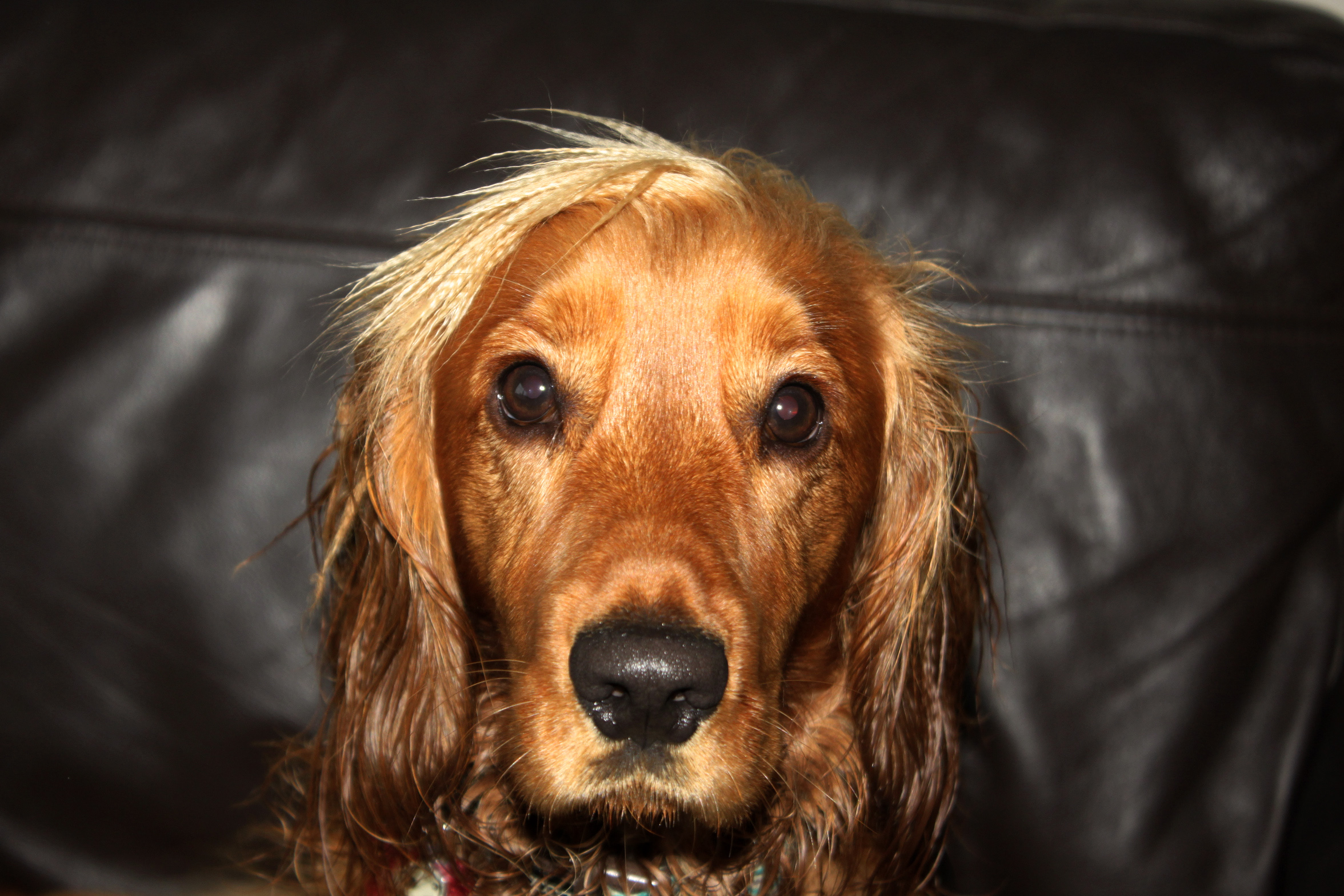
In this photo I had to use a very quick shutter speed so that I could take a sharp photo despite my dog moving around. To keep the image bright (and to show details in the hair) I also used flash.
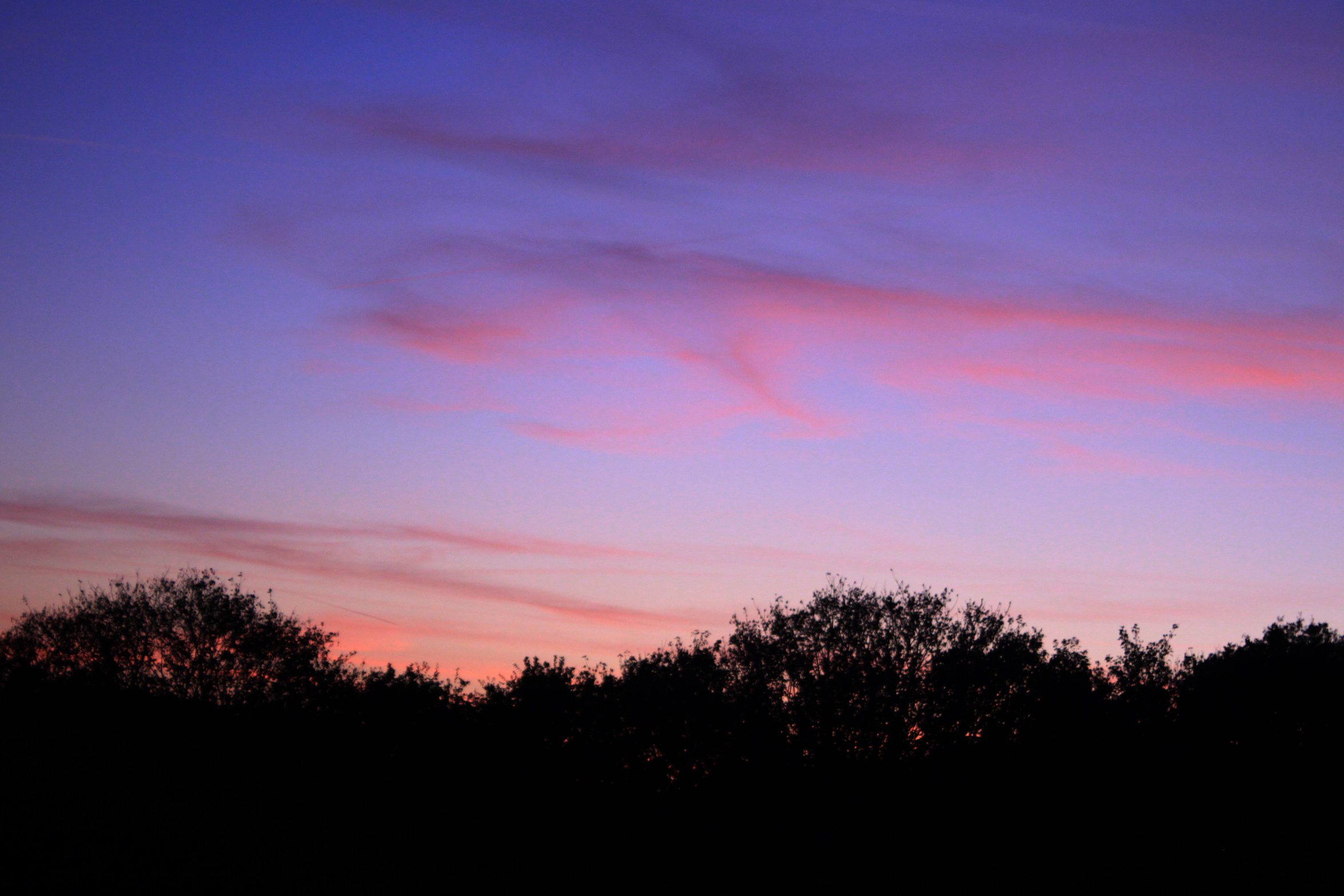
In this photo I used a short exposure and a longer shutter speed to capture a little movement of the clouds and to keep the photo dark in order to capture the colours in the sky properly.
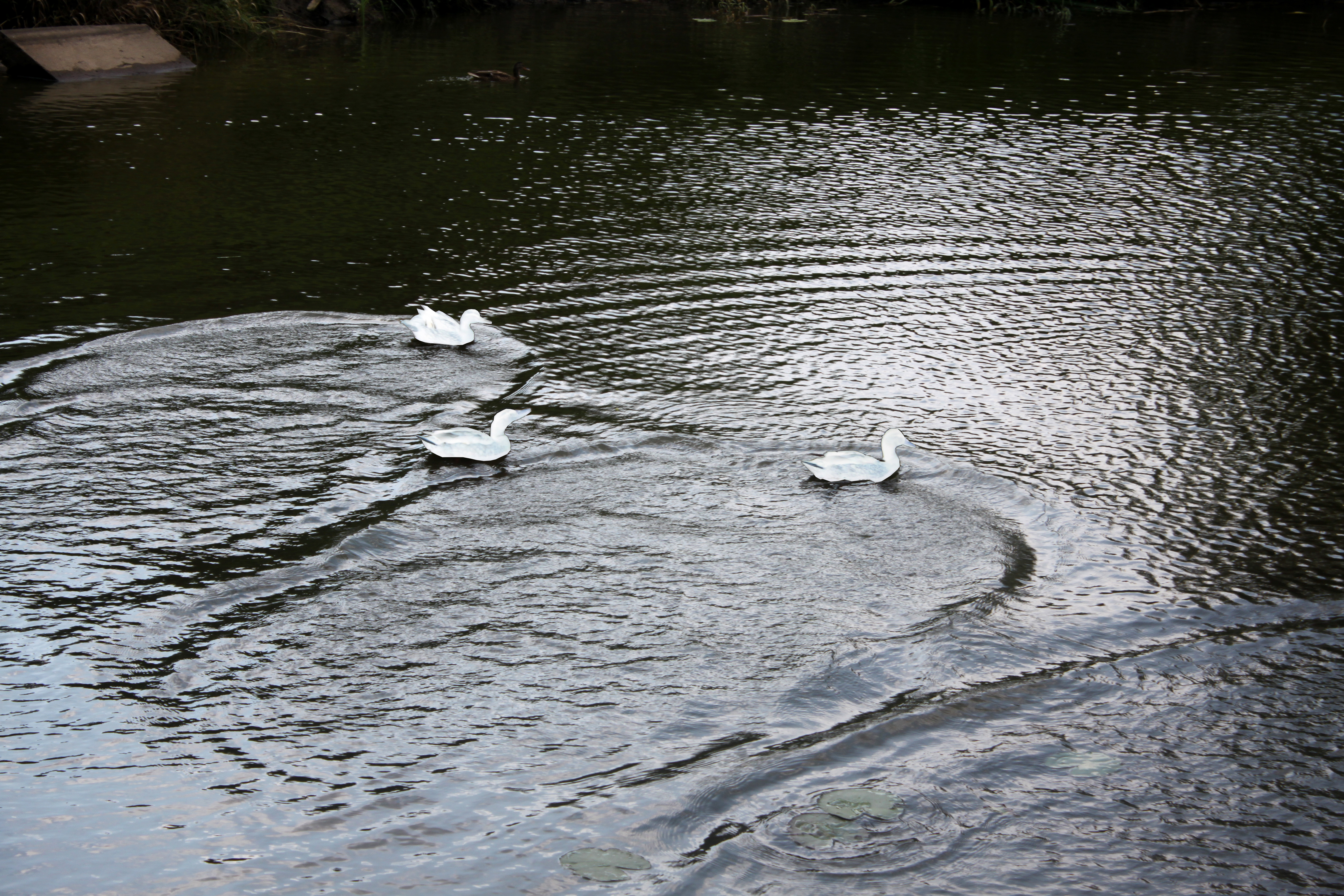
In this photo I used a very fast shutter speed to capture the waves created by the ducks swimming around. In this photo I also selected the ducks and inverted their colours to make them blend in with the water more. This stops the focus of attention being the ducks and brings more attention to the waves.


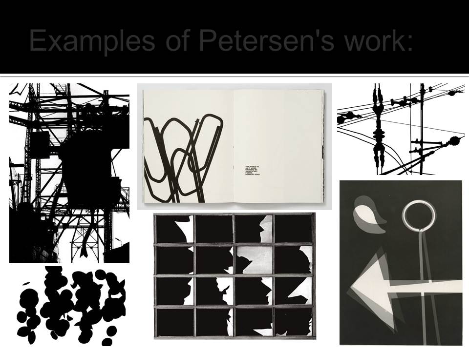
Keld Helmer-Petersen – Threshold

Keld Helmer-Petersen:

Helmer-Petersen was born and raised in the Osterbro quarter of Copenhagen (Denmark). His interest in photography began in 1938 when he received a Leica camera as a graduation present. He became aware of international photography trends early on in his photography career. Helmer-Petersen’s interest in contemporary art and architecture heavily influenced his work, as he became one of the first Danish photographers to begin working on abstract photography.

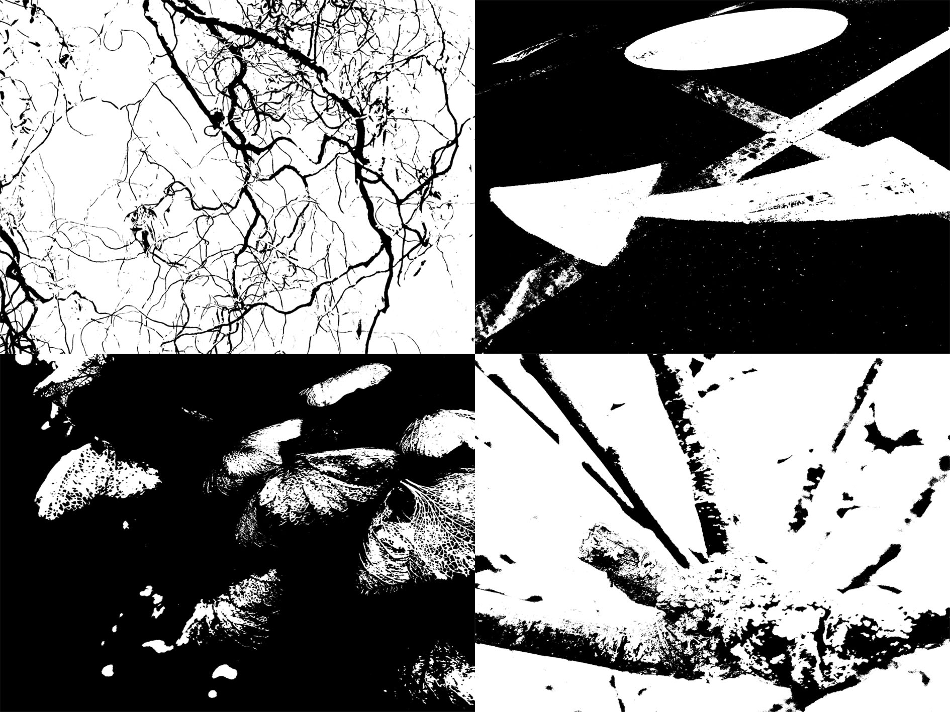
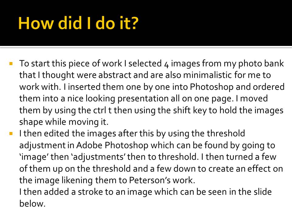
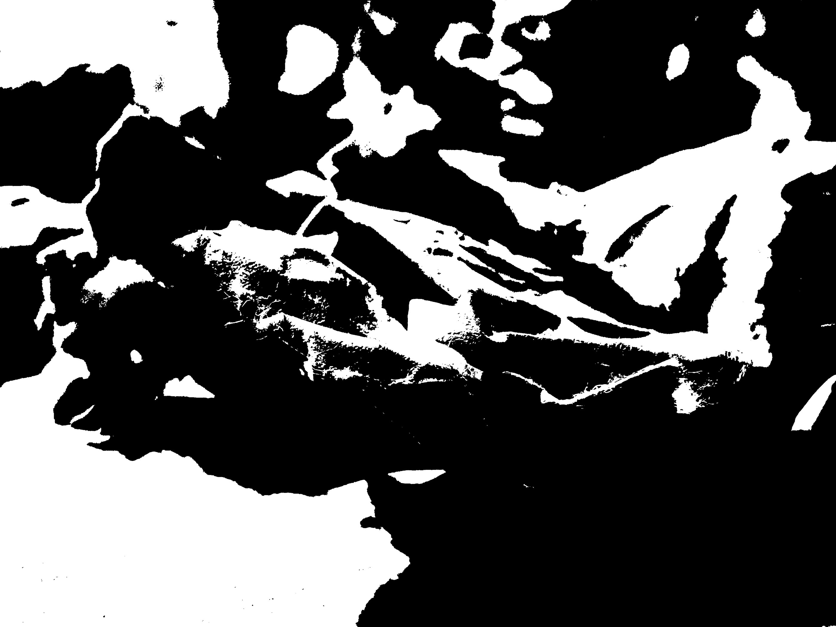
Helmer-Petersen used high thresholds to give his work a dramatic finish. The frames below are examples of my response to the work of Helmer Peterson.

My Response:

8. Aperture

What is aperture?

The aperture is a hole on a digital camera that adjusts in side in order to control how much light is let into the camera lens. The side of the aperture is measured using the f-stop.

The smaller the f-stop, the more light is let through.

The larger the f-stop, the less light is let through.

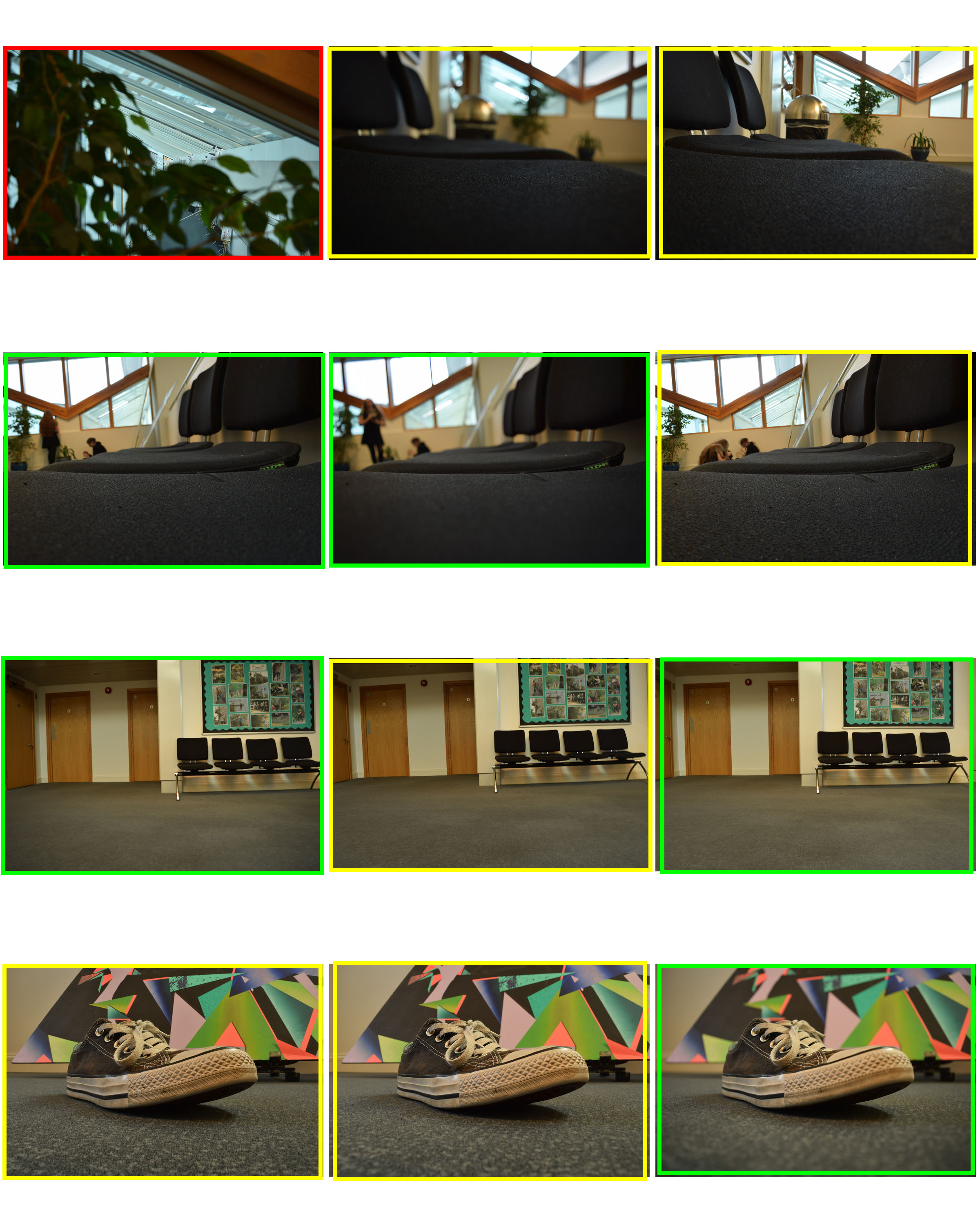
Contact sheet:

  • RED – Not usable.
  • YELLOW – Maybe / Needs editing.
  • GREEN – Usable.

This was my favourite image as it displayed the effects of aperture well. I set my camera to use a f-stop of F3.5, ISO 100 and a shutter speed of 1/15. The image shows a good use of focus as the shoe is clear but the background is blurred. The aperture has distorted the front of the shoe to make it appear significantly larger than the rest of the shoe.


Abstract Final Photoshoot

For this photo shoot I have taken inspiration from both Aaron Siskind and partially from Nick Albertson.

Aaron Siskind was born in New York City. He started taking photos after he got a camera as a wedding present. He often worked with natural forms and urban areas he usually looked for the texture in the natural forms he photographed to get the images he wanted. 
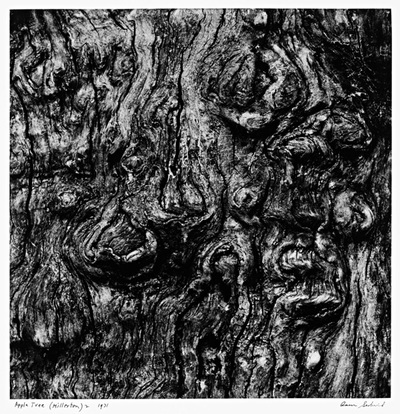
This is an example of one of Aaron Siskind’s images. In this image, Siskind only really photographed in black and white. This created a sense of simplicity in the images he produced, even though he focused mainly on texture and line throughout his images. In the image above texture can be seen especially well. Siskind used light in his images to create texture and contrast. The image above shows light coming in from the top left creating shadows on the underneath of some parts that stick out and a larger shadow on the right hand side of the tree.

Nick Albertson was born in 1983 in Boston. He often works with everyday items to create repeating forms which are used to create pattern and texture in his images.
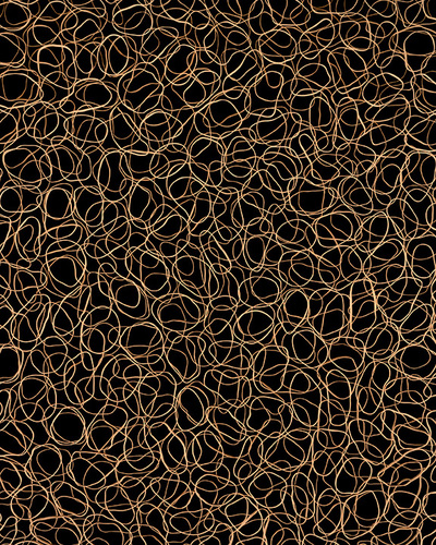
This is one of Nick Albertson’s images. In this image he has created a texture by scattering flat rubber bands all over a black background. This image has been taken from directly above where the elastic bands were scattered over. Albertson doesn’t tend to use shadows in his images, because of this the lighting is the same all the way around the image.

My response:

These are some of the best images that I took while I went on my photoshoot. I have tried to take images that best show line,texture or repeated patterns.
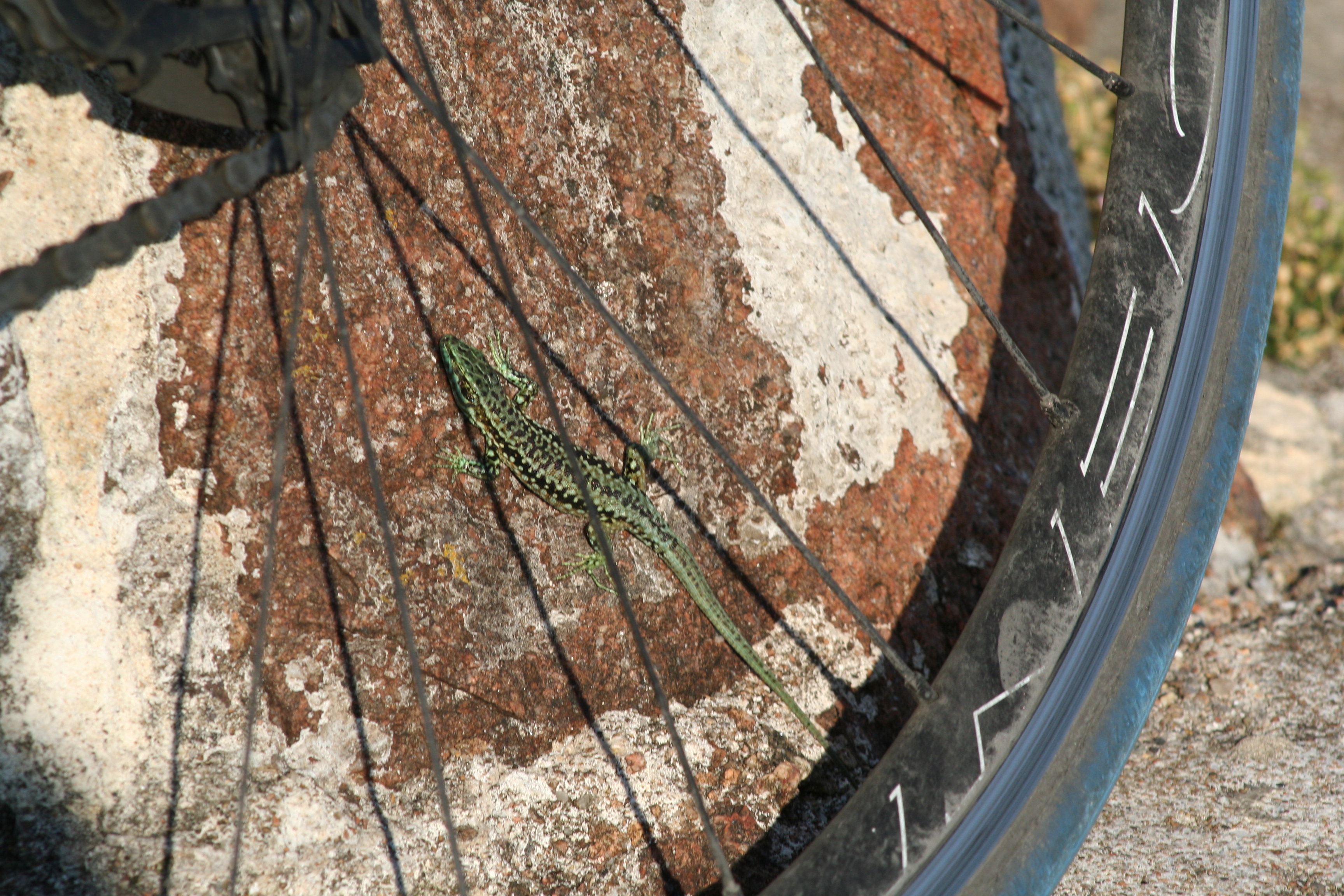
I have picked the image above as it shows a complex texture in the stone wall. I have also picked it due to the repeated texture on the back of the lizard. If I were able to take this image again I would have zoomed into the back of the lizard to get a larger image of the repeated textures over the back of the lizard.
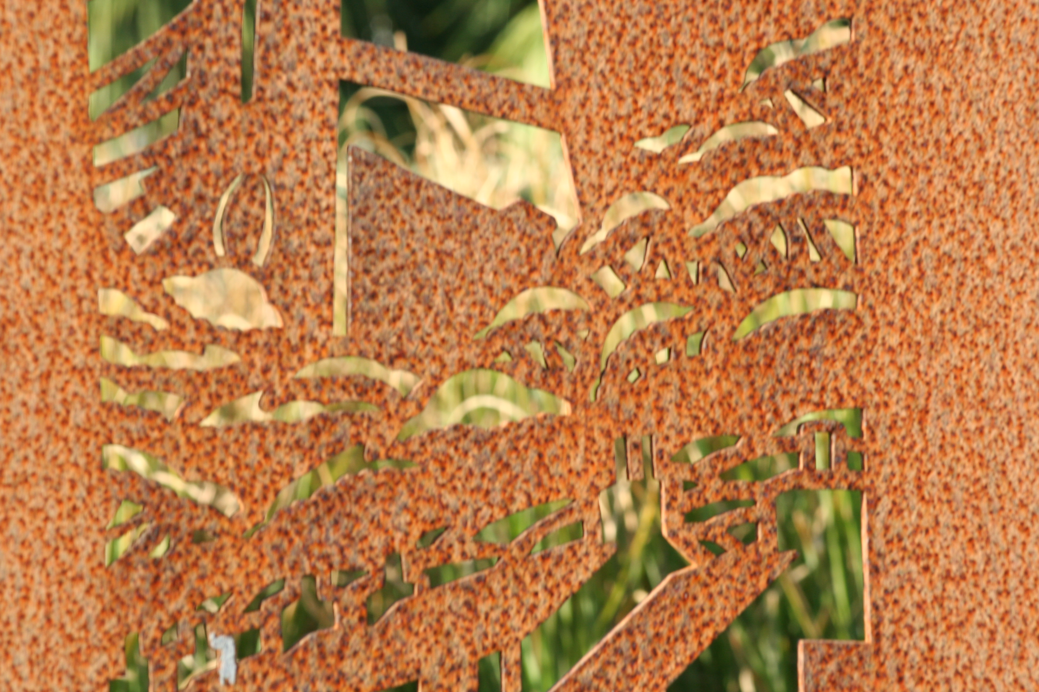
I have picked the image above because the rust is creating a pattern over the top of the metal. This pattern can be seen where the rust goes darker creating brown spots all over the metal.

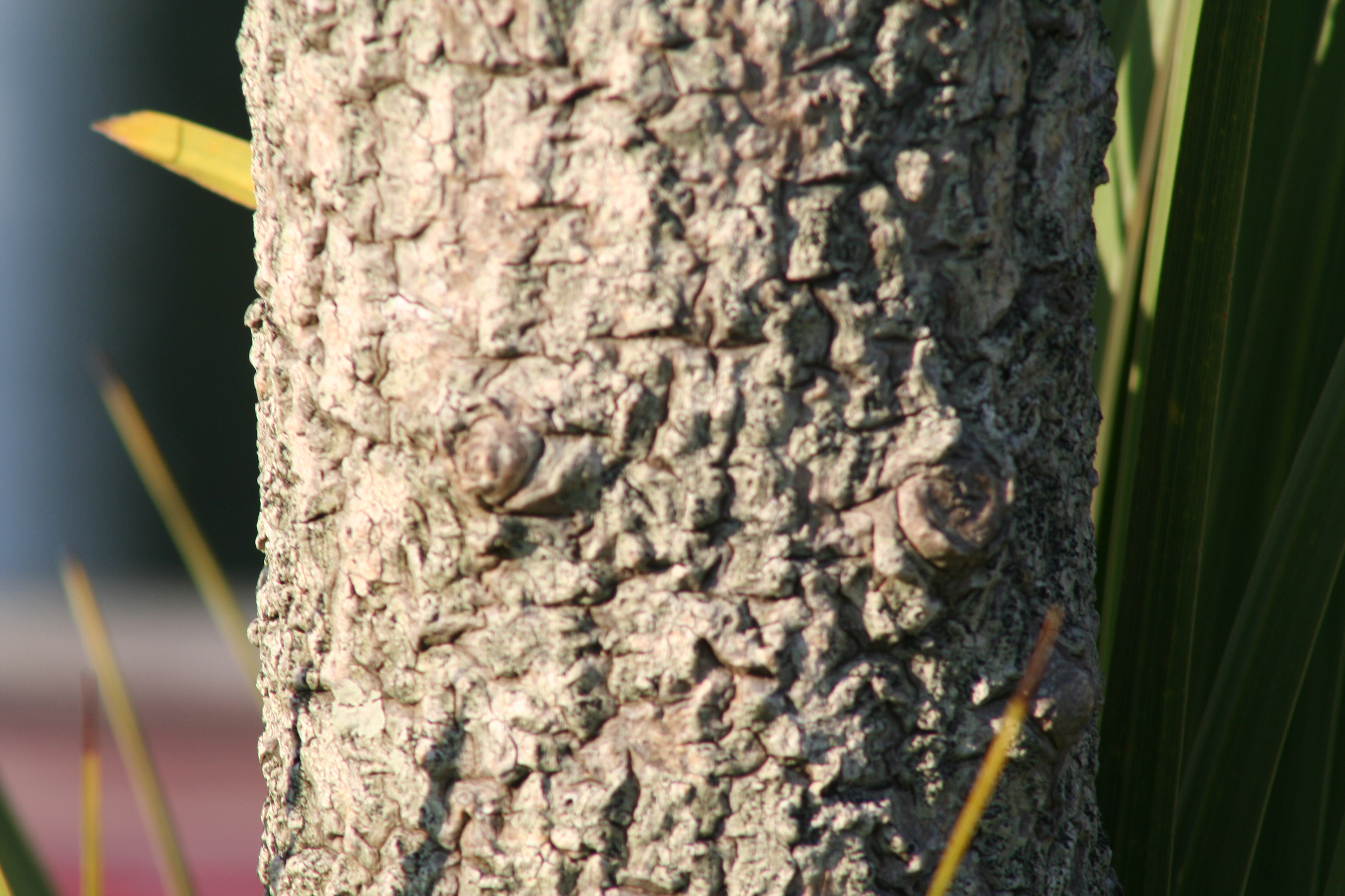
I have picked these last two images because I have zoomed in quite far into both. By zooming in  it let me see the textures closely in both the rope and the tree. I have taken both of these images outside during the day. This has created a nice shadow on one side of each object, this has worked especially well on the rope as the texture in the rope can be seen quite well in and out of the shaded area. On the tree I could have taken it with a higher ISO or a lower shutter speed so that the the lighter side appeared dimmer letting you see the texture in the tree a lot easier.
 

Homework 5: Abstract Colour and Texture

Julian Schulze

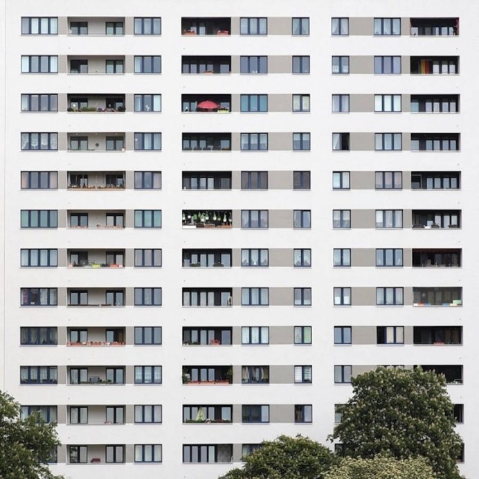
Julian Schulze is a Berlin born and based minimalist Photographer who chooses to focus on geometric abstractions and minimalist compositions with high contrast and wide ranges of colour. His work is very expansive and eye catching ,consisting of architectural features of cityscape environments

His work ranges from everyday scenes taken from different perspectives to mind blowing pieces that play with your perception and that can really make you question what it is you are looking at.
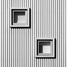
Below are some examples of his work

Image result for julian schulze

Image result for julian schulze

Image result for julian schulze

Image result for julian schulze

I have decided to use Schulze as my inspiration due to his portrayal  of colour and shape in his works, as well as his ability to truly capture the imagination of his Audience.

Shooting

For my Julian Schulze inspired shoot, I decided to go to my local town area and identify buildings and scenes that I thought matched this criteria in terms of colour shape and texture. I photographed high rise office blocks and items in the street to try and truly emulate this style

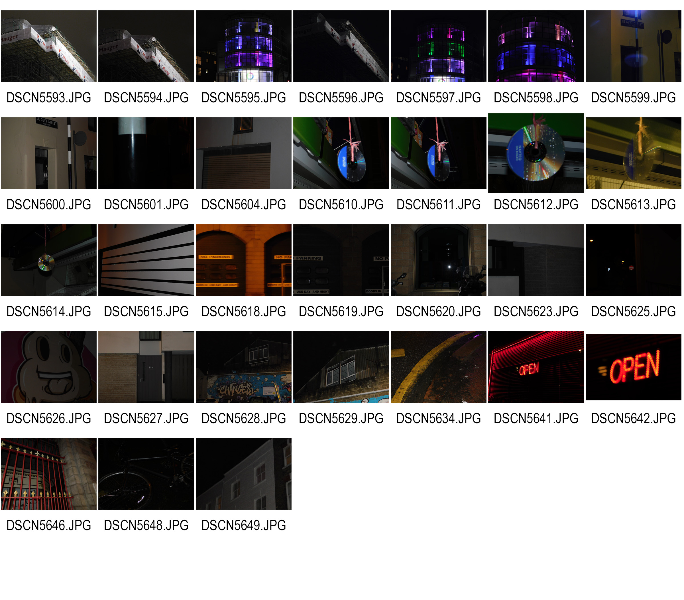
Contact Sheets

Here are my contact sheets for this project

Final Image Selection

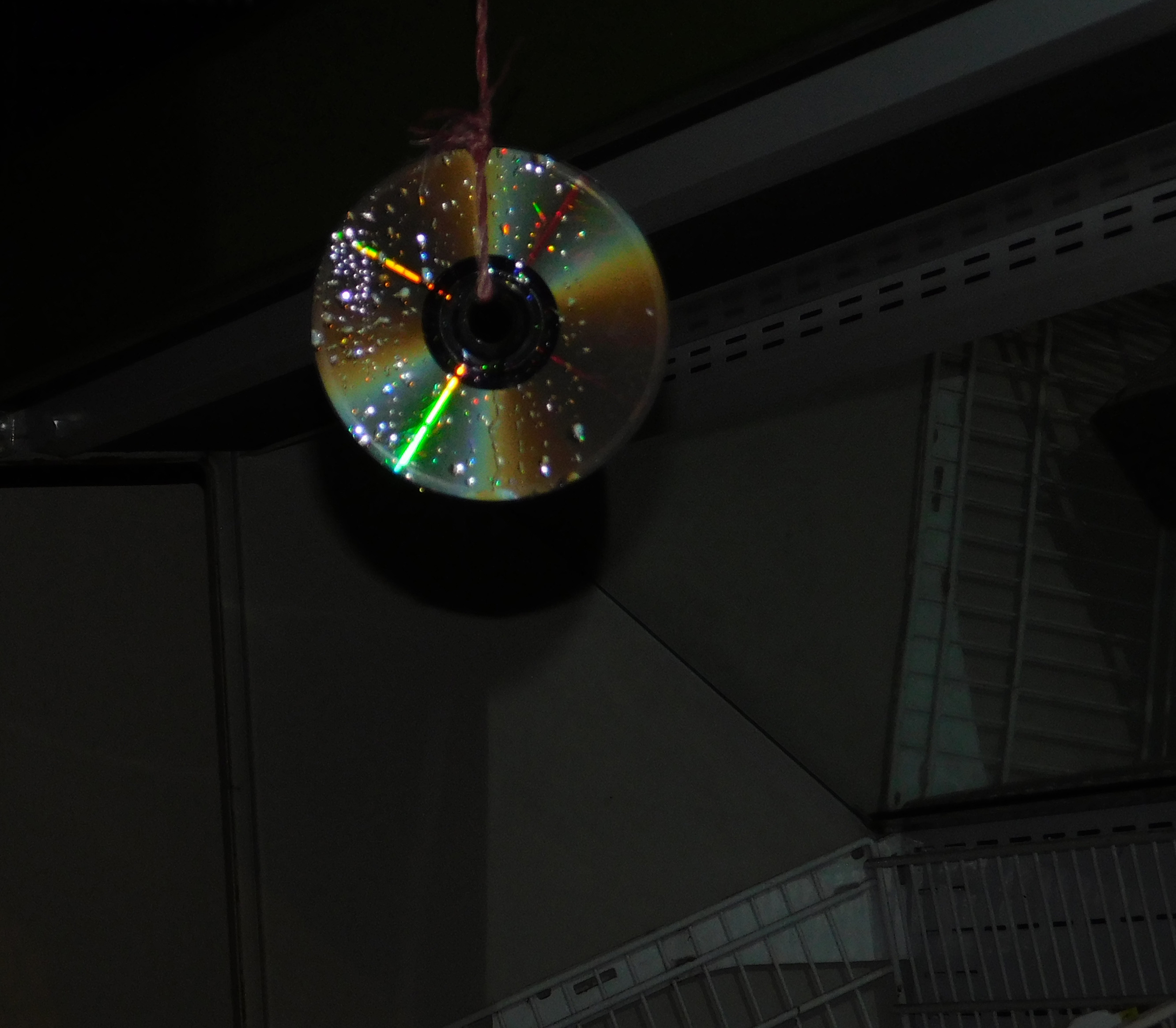
An old CD Hung up outside a shop to scare birds off of the fresh fruit. whole background has been lowered in vibrance and the CD isolated and adjusted

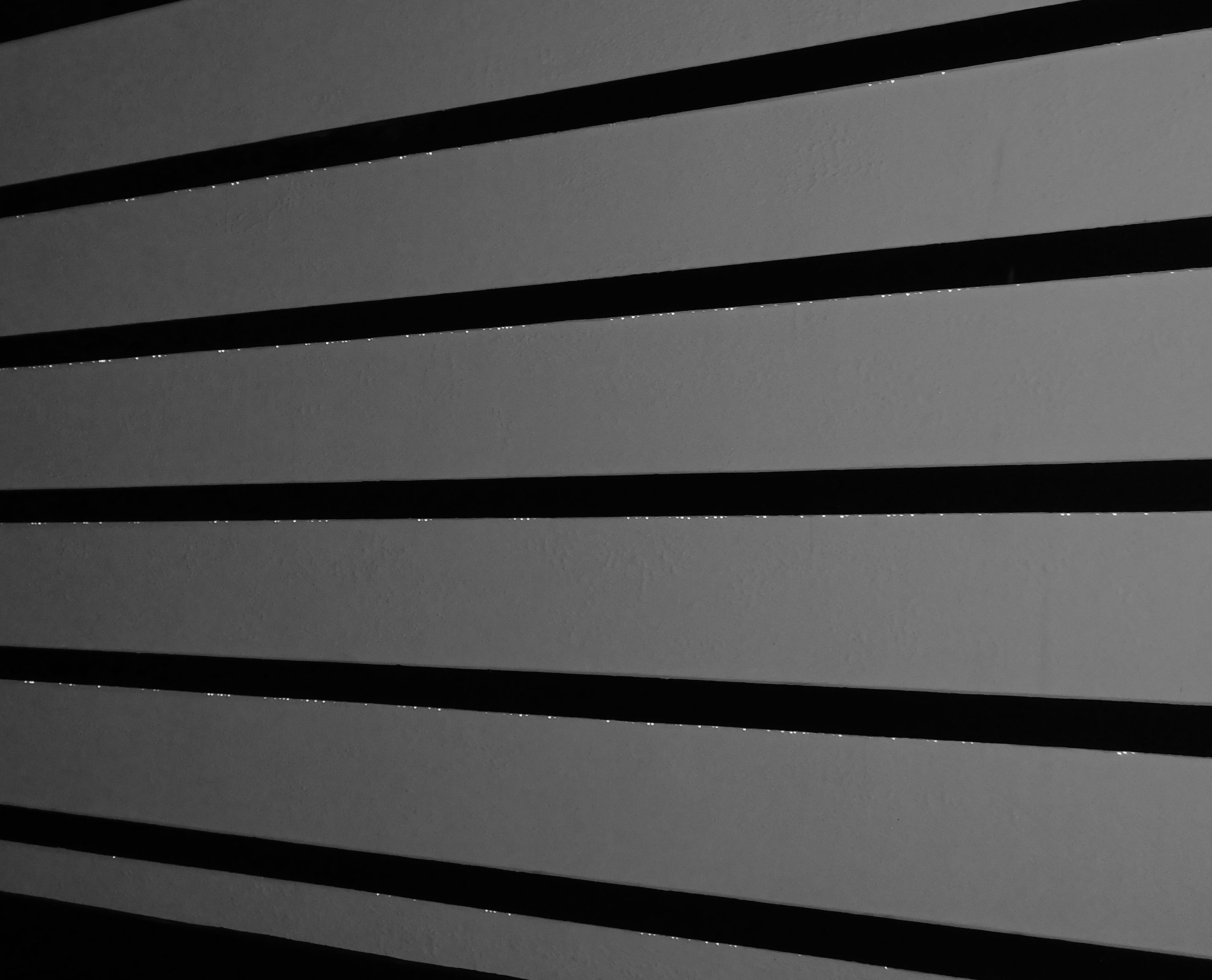
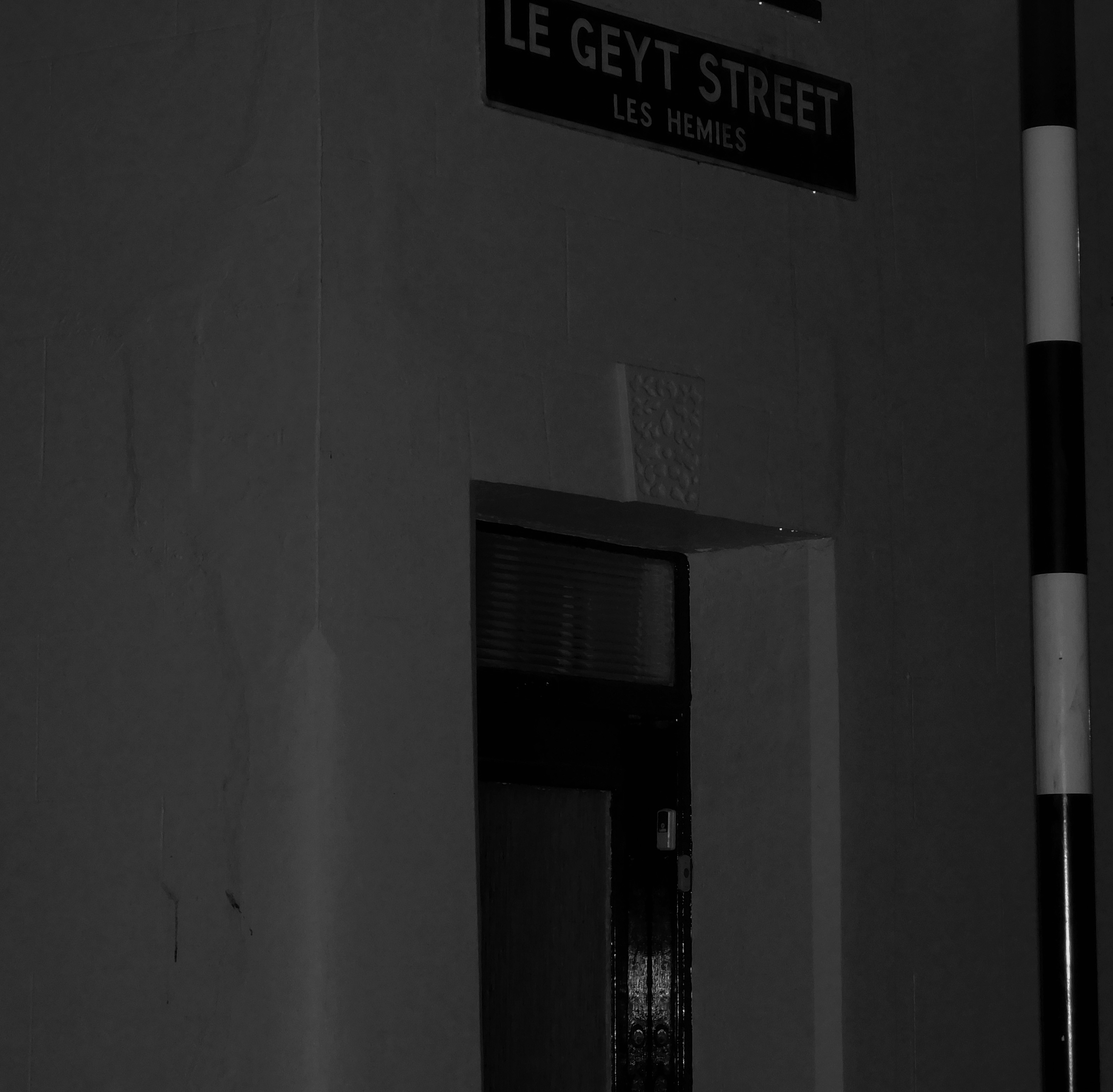
Black and white garage doors, no alerting needed

Open sign outside a restaurant with red LED’s. Red border around the outside to supplement the colour

Black and white desaturated street corner

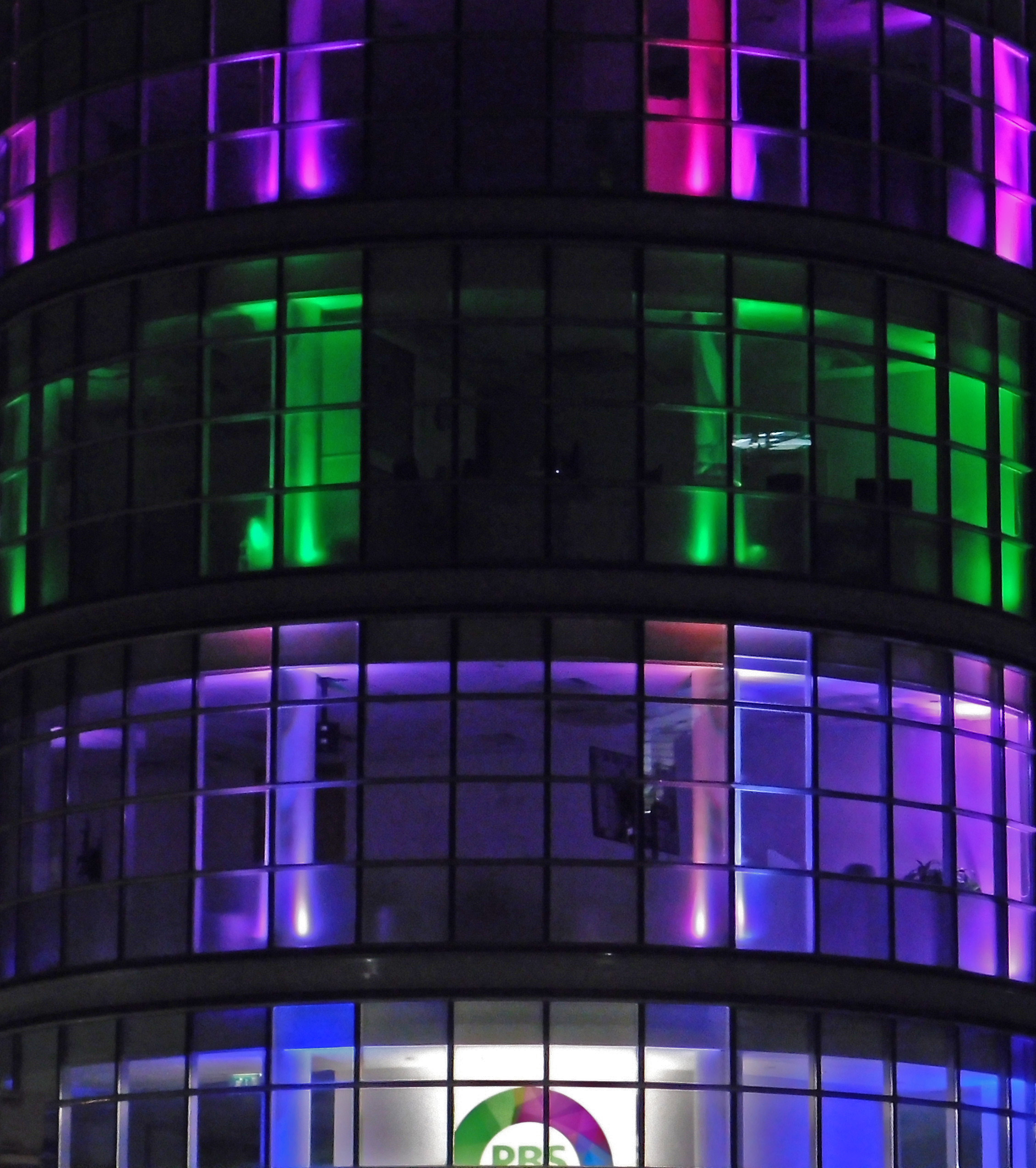
Illuminated office blocks

High contrast images with Keld Helmer-Petersen

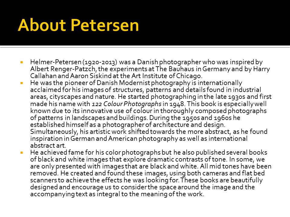
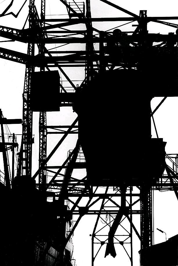
Keld Helmer-Peterson was a Danish photographer who took abstract photographs. He was heavily inspired by Albert Renger-Patzsch and Aaron Siskind. This photographer took images of things like buildings, and edited his photos until the contrasts were very high. He published many books that contained heavily contrasted images, like the one below. He took the images in the books using cameras, and also bed scanners. All the images in the book are surrounded by a lot of space and sometimes even text.


My images

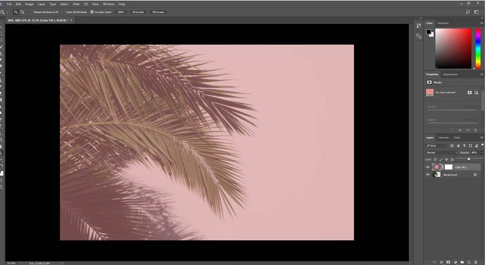
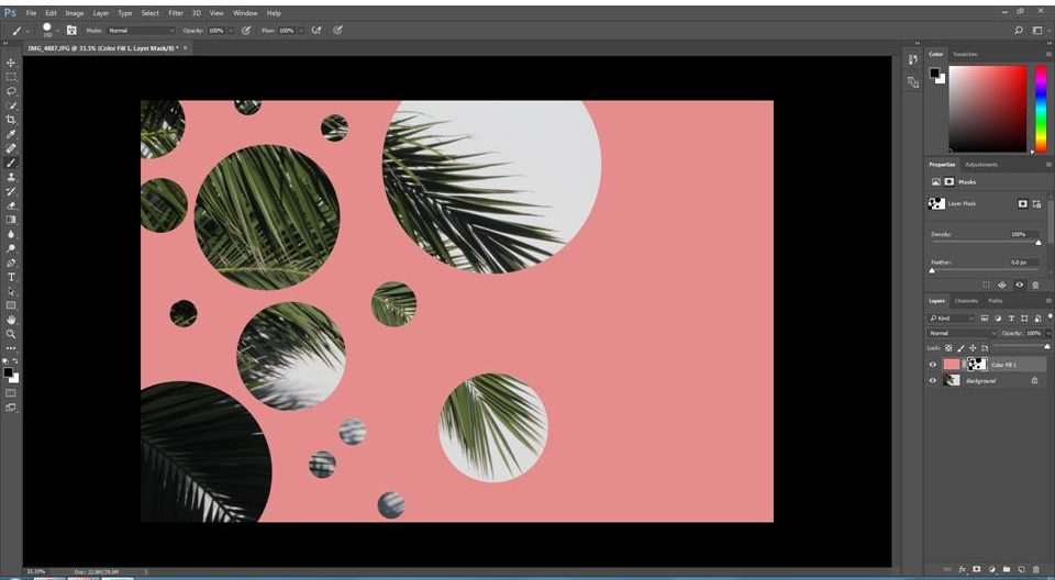
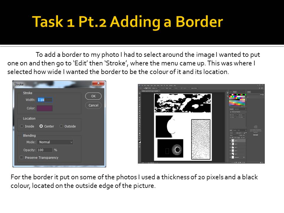
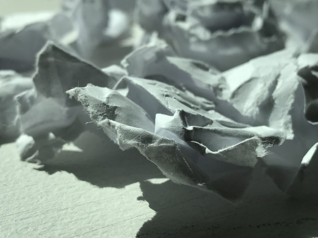
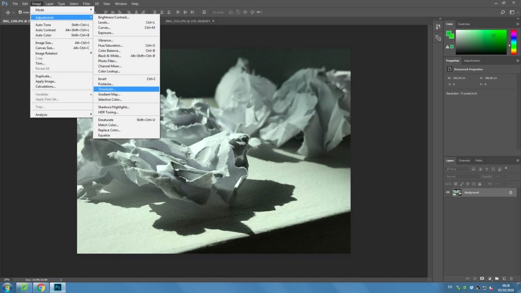
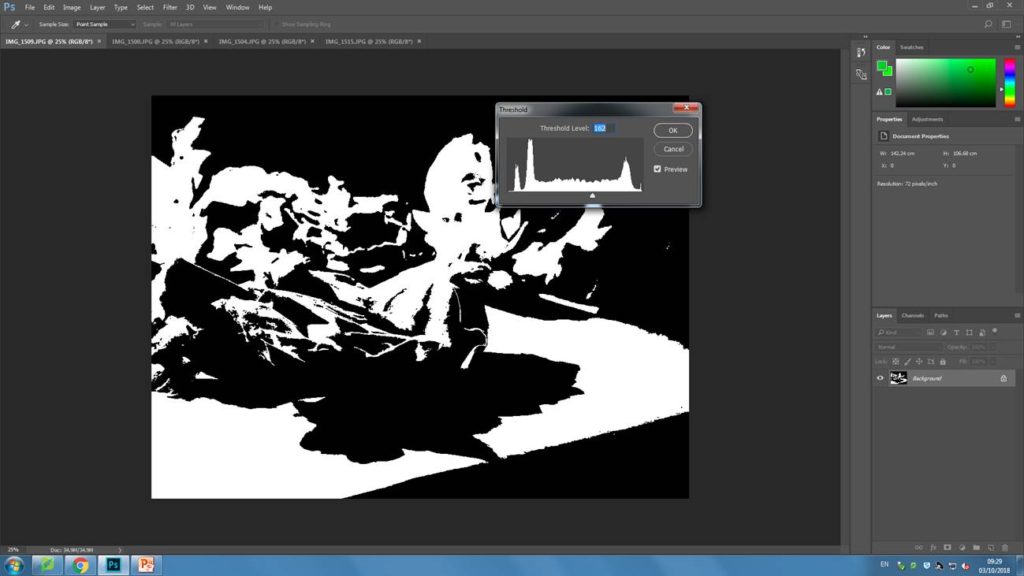
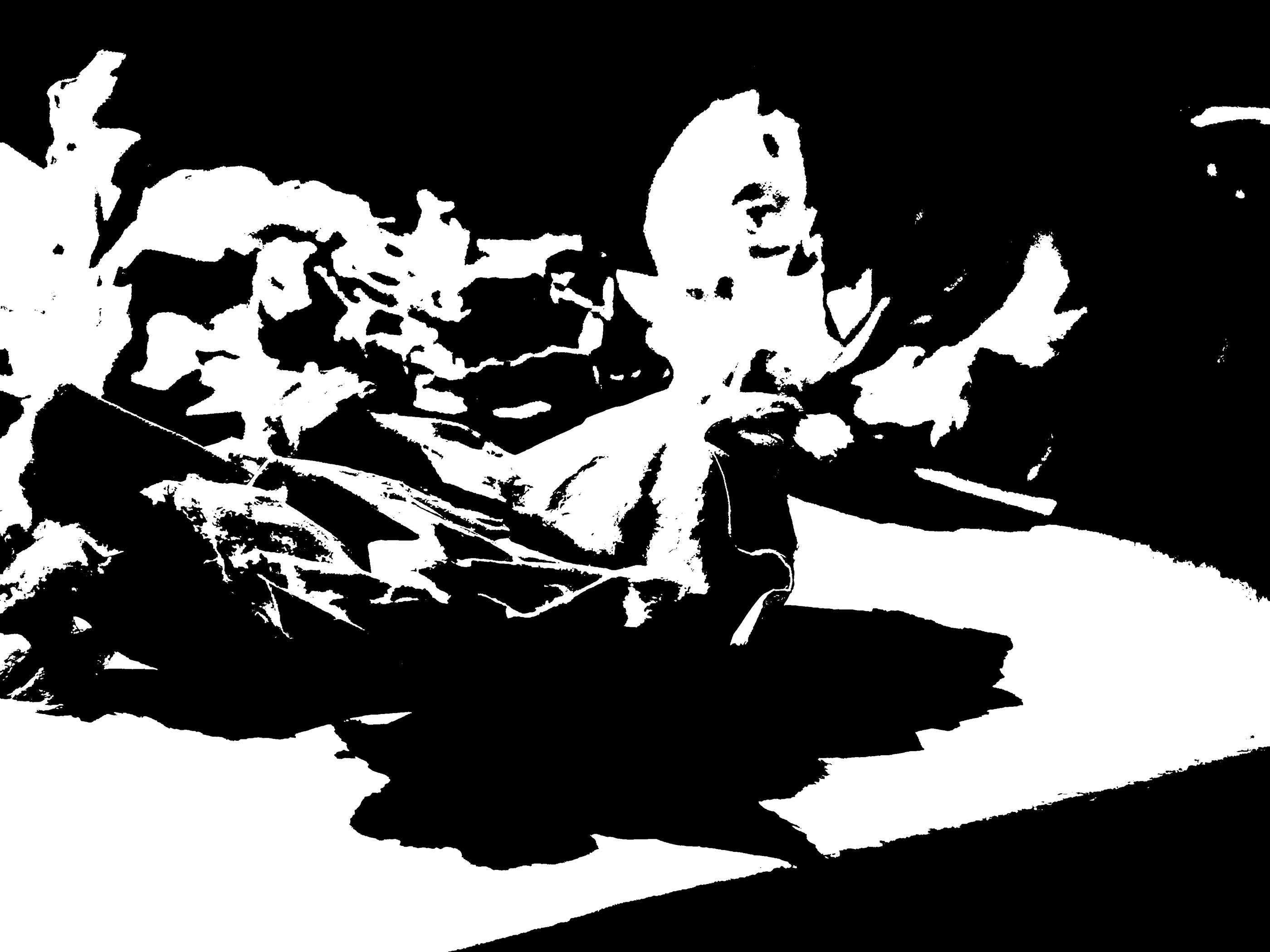
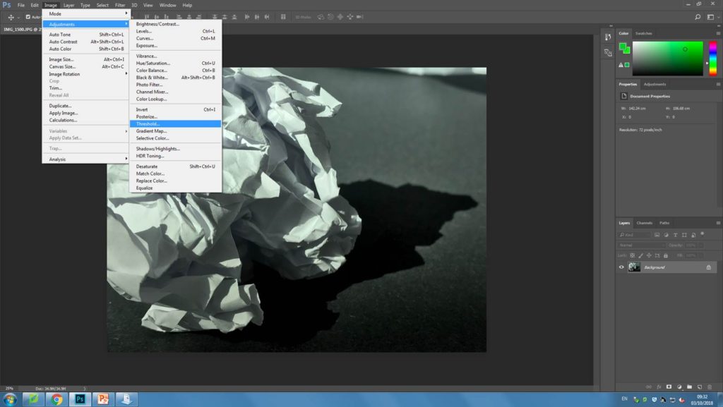
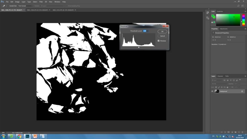
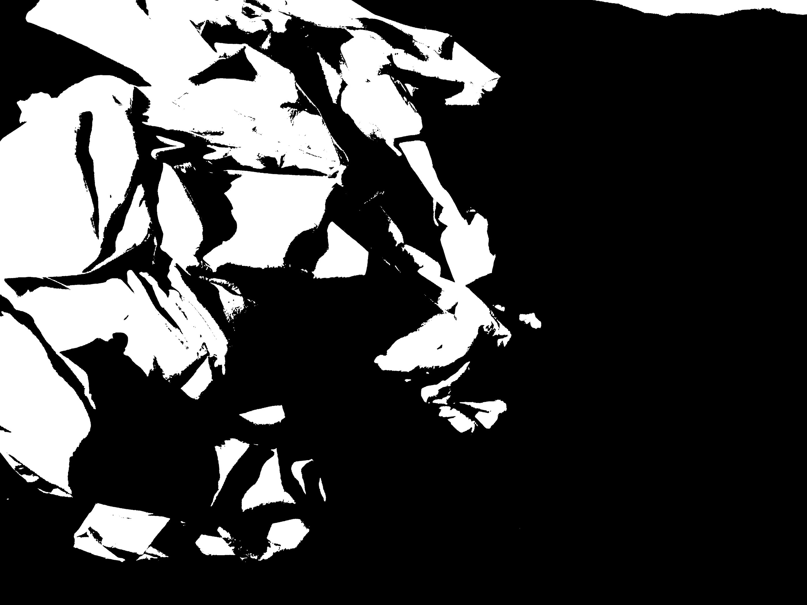
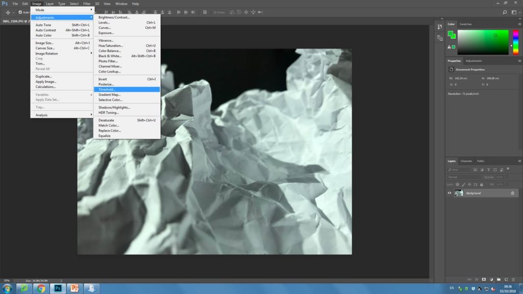
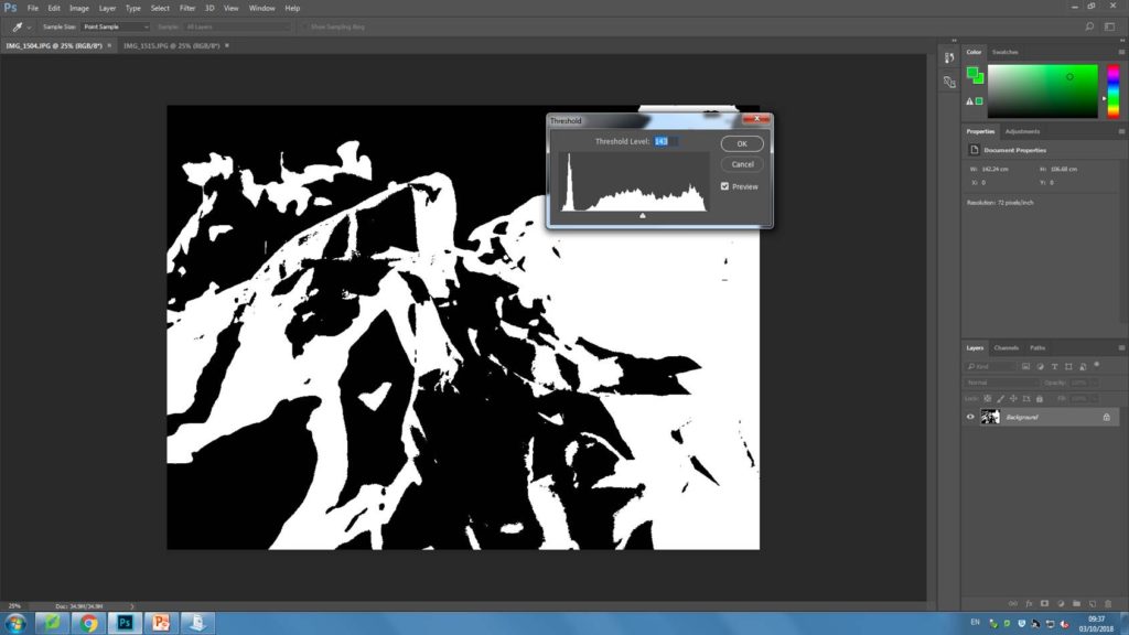
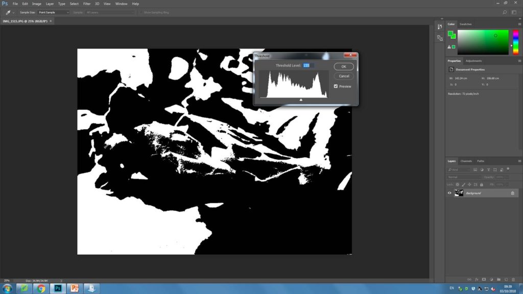
For my following experimentation, I have chosen 4 abstract images I have previously taken to edit on Photoshop. To edit all the images I have adjusted the threshold, by going to image then selecting ‘adjustments’. For each image I have then adjusted the threshold until i has satisfied that I had a heavily contrasted image that i was happy with. Below i have included screenshots of my process for each image.

My final image.


My second image

My final image.


My 3rd image

My final image.


My 4th original image

My final image.

My final piece

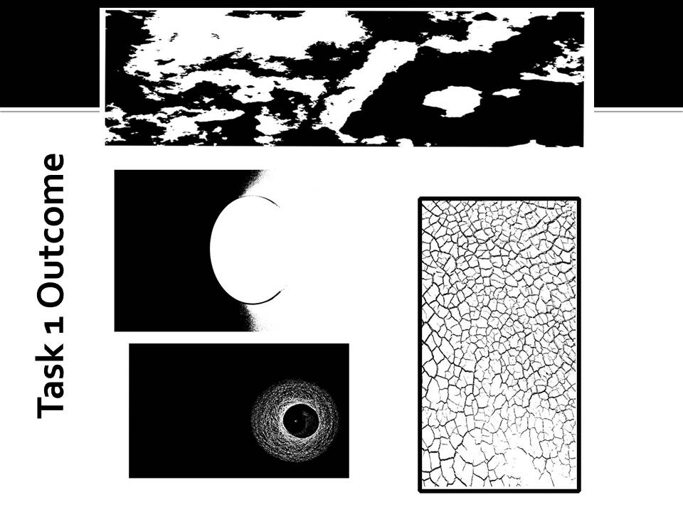
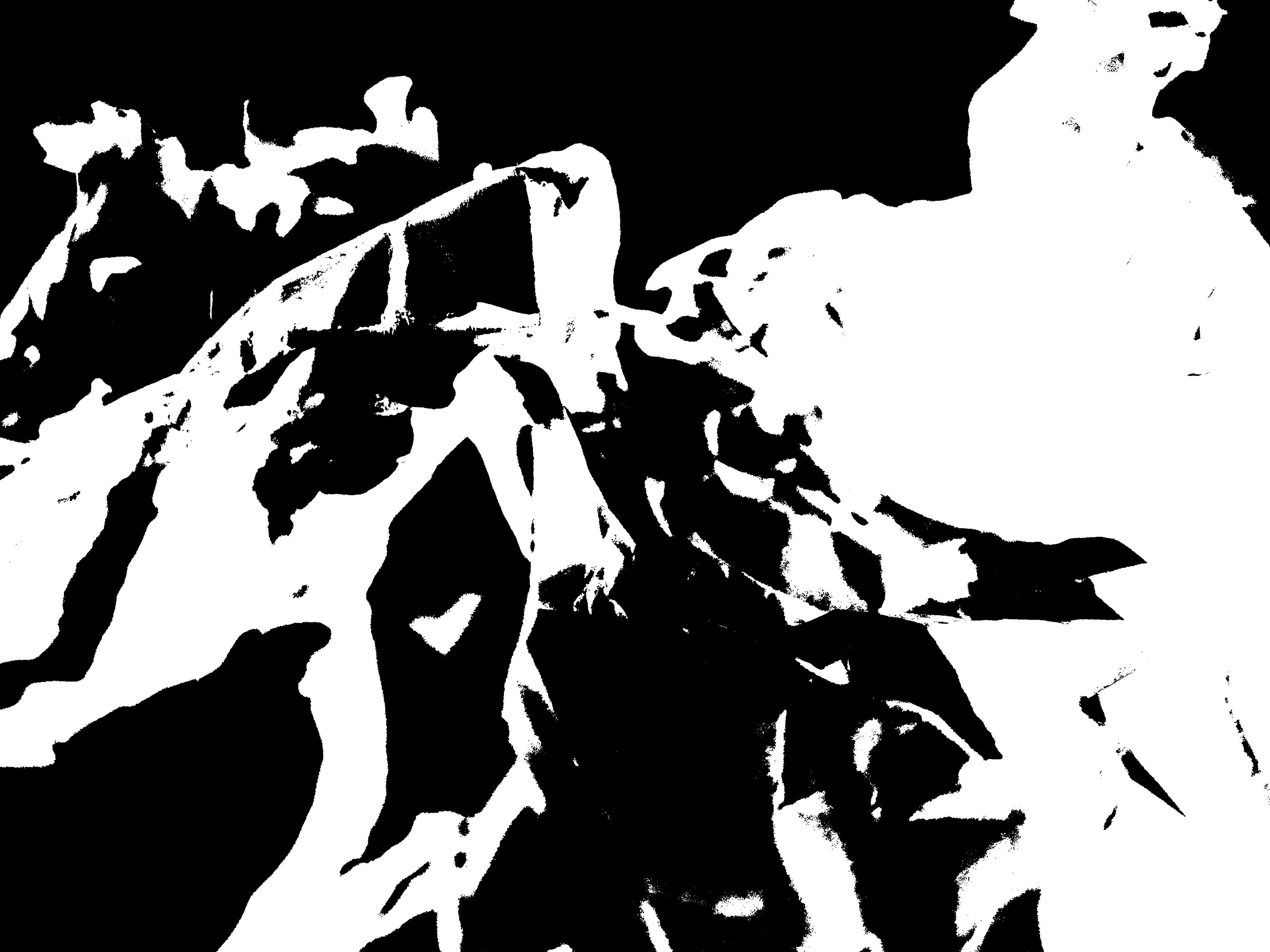
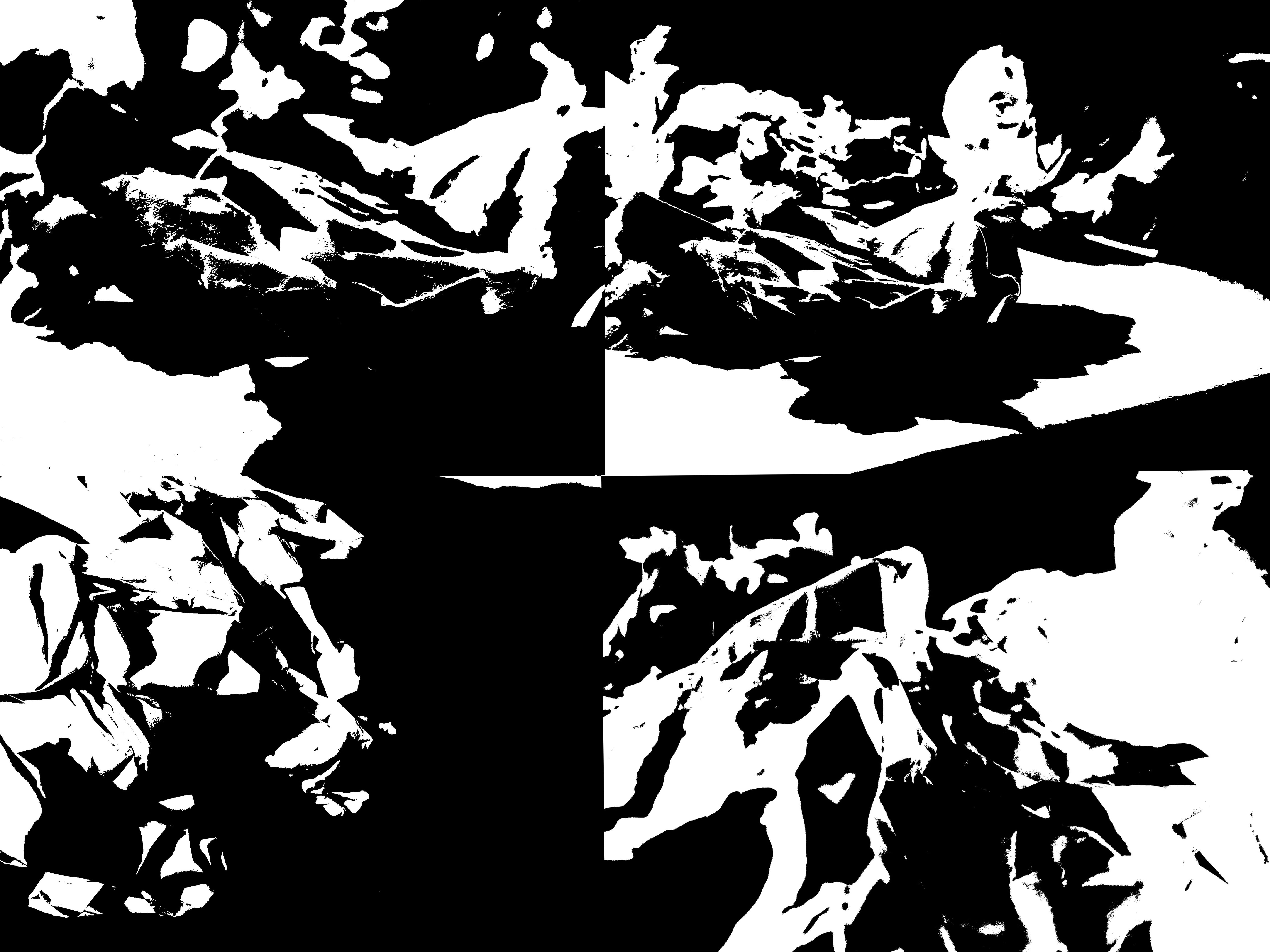
For my final pieces, I have attempted to create images like the ones Helmer- Petersen presented in his books. I think my images turned out very successful as they are very heavily contrasted and all the mid tones have also been removed. Because the paper I took pictures of was very scrumped, there were many different points on the paper that were illuminated by light, and other parts that were more shadowed. I think that has helped my images look very interesting after I had photo shopped them as there is a nice blend of both black and white on my final images.