Category Archives: AO3 Record Ideas

Filters

Author:
Category:

Tableaux – Editing photos

When editing the photos I encountered a problem that I  have mentioned in an earlier post and that is that because I had no trigger and a tripod not suited to my camera, I had some minor problems with camera shake and movement, I did partly fix it by having the camera on a timer but there was some slight miss-alignment in the editing but I did manage to find a way around it, and still produce the image that I wanted. 

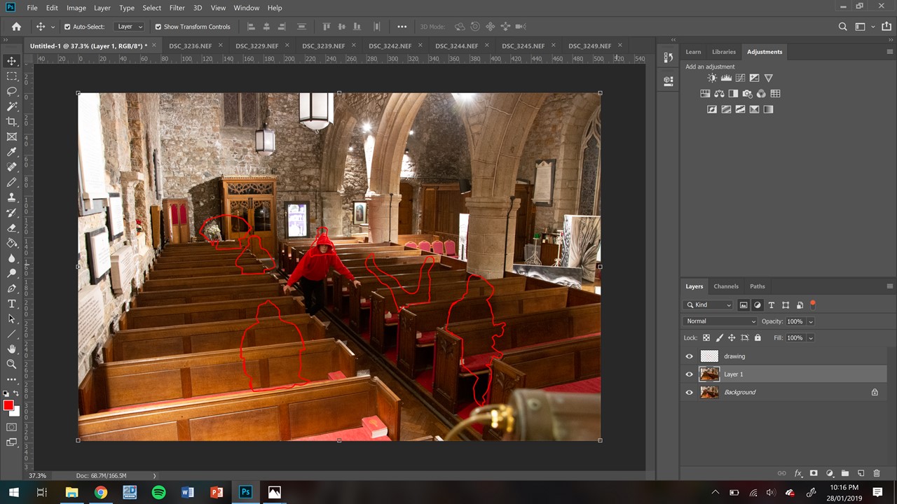
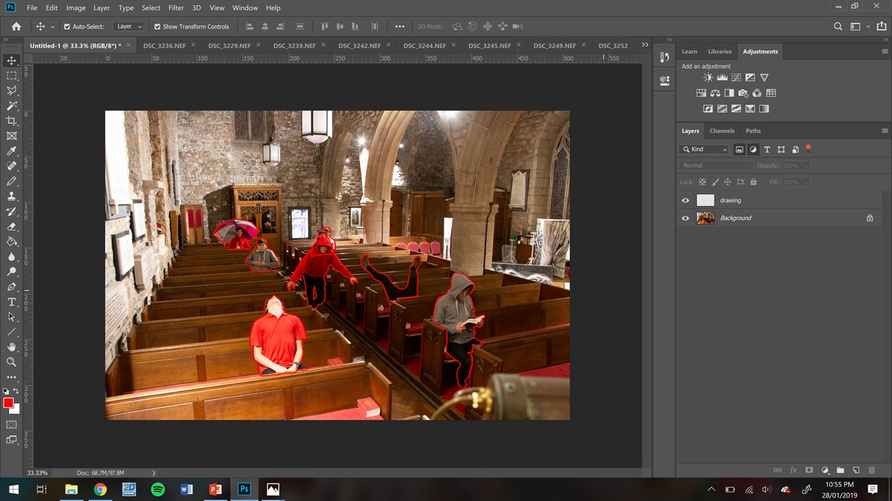
What I tried to do was just to layer each photo on-top of one another and simply rub out the areas where I was in the photo, however, because of the straight lines of the pews and the shake of the camera, that didn’t work, so I decided to add each photo one at a time on top of each other and before I put the next layer on I had a bank layer called “drawing” (seen as the top of the three layers above) and I carefully drew round each of the “me’s” and then rubbed out the filling from the red box each time, and after I did this on a layer I made the drawing layer invisible, by clicking the small eye next to it, and then merged the visible layers and built it up until i had the complete image.

Seen above is the completed image with all outlines. 

Tableaux — Photo-shoot / Image Selection

When I went to take the photos there was a slight problem that the area wasn’t lit as well as I had hoped because the shoot took place in the evening an it was dark, to combat this I boosted the iso on my camera slightly higher than I would have liked but not so much that the grain was immediately evident. Then as I didn’t have a trigger and the tripod I was using is not very strong and I have a large camera my friend who was operating had problems keeping the camera still, the way that I combated this is I set the camera to have a 5 second timer and to take a two shot burst at the end of the timer. This eliminated most of the shake but there was still some.

SOME PHOTOS MISSING


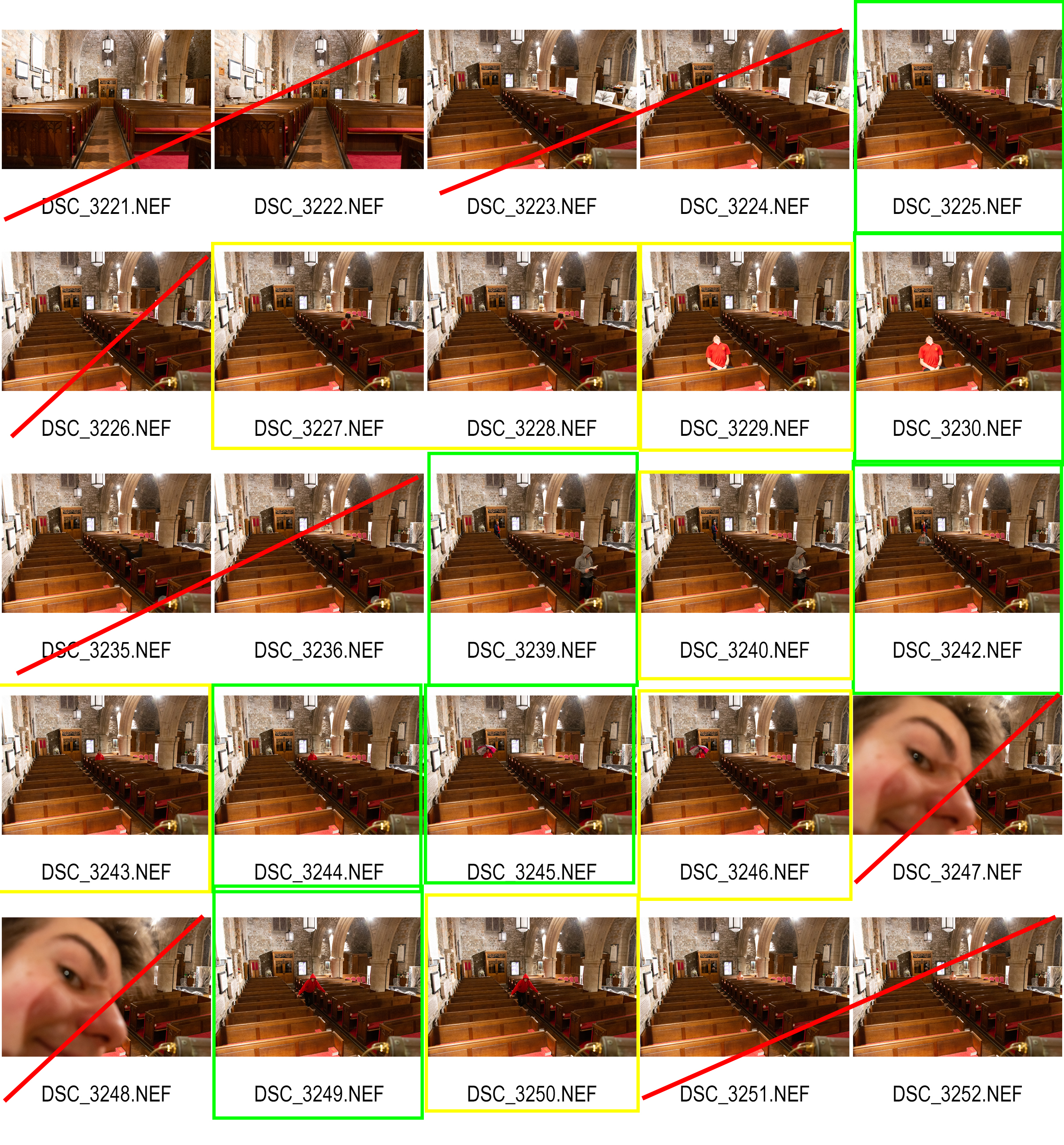
The problem that I had is that image 3227-8 I sat in a bad place and didn’t realise until I reviewed them the next day. The problem was that because in that pose i was leaning onto the back of the pew in-front was being obstructed by a more important image that I later took that was more important to the shoot and would stand out more. So I had to leave images 3227-8 out of the final edit. And all of the images in the green boxes made it into the edit and some that wouldn’t appear on the contact sheet.

Studio photography

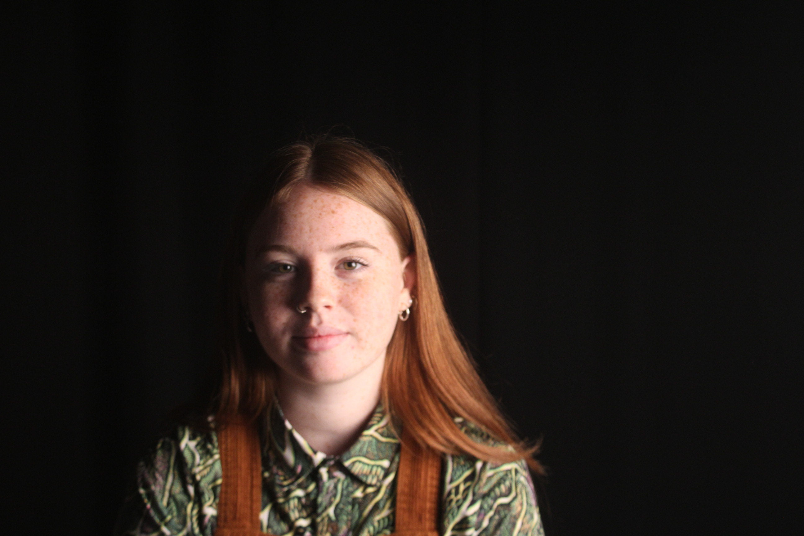
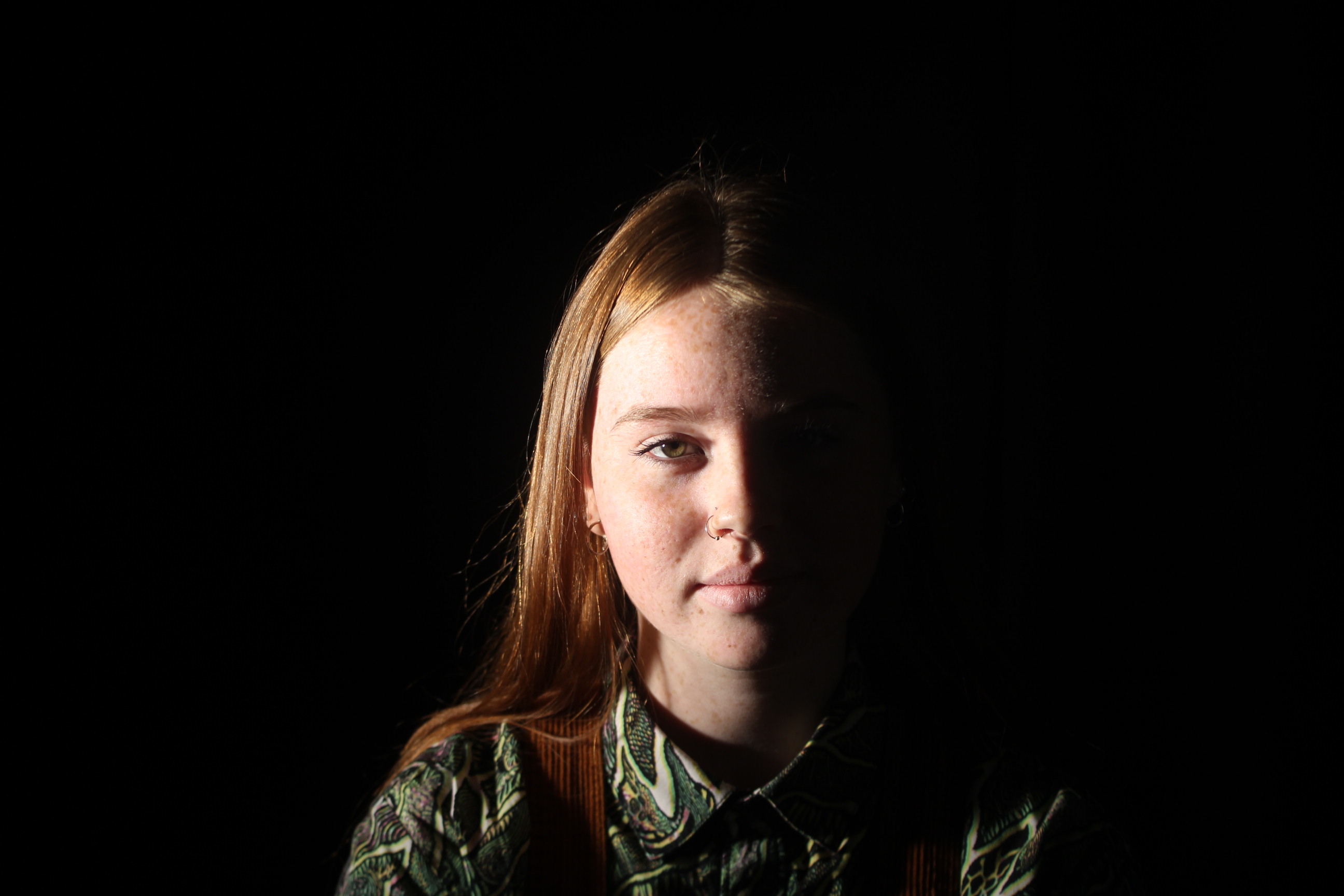
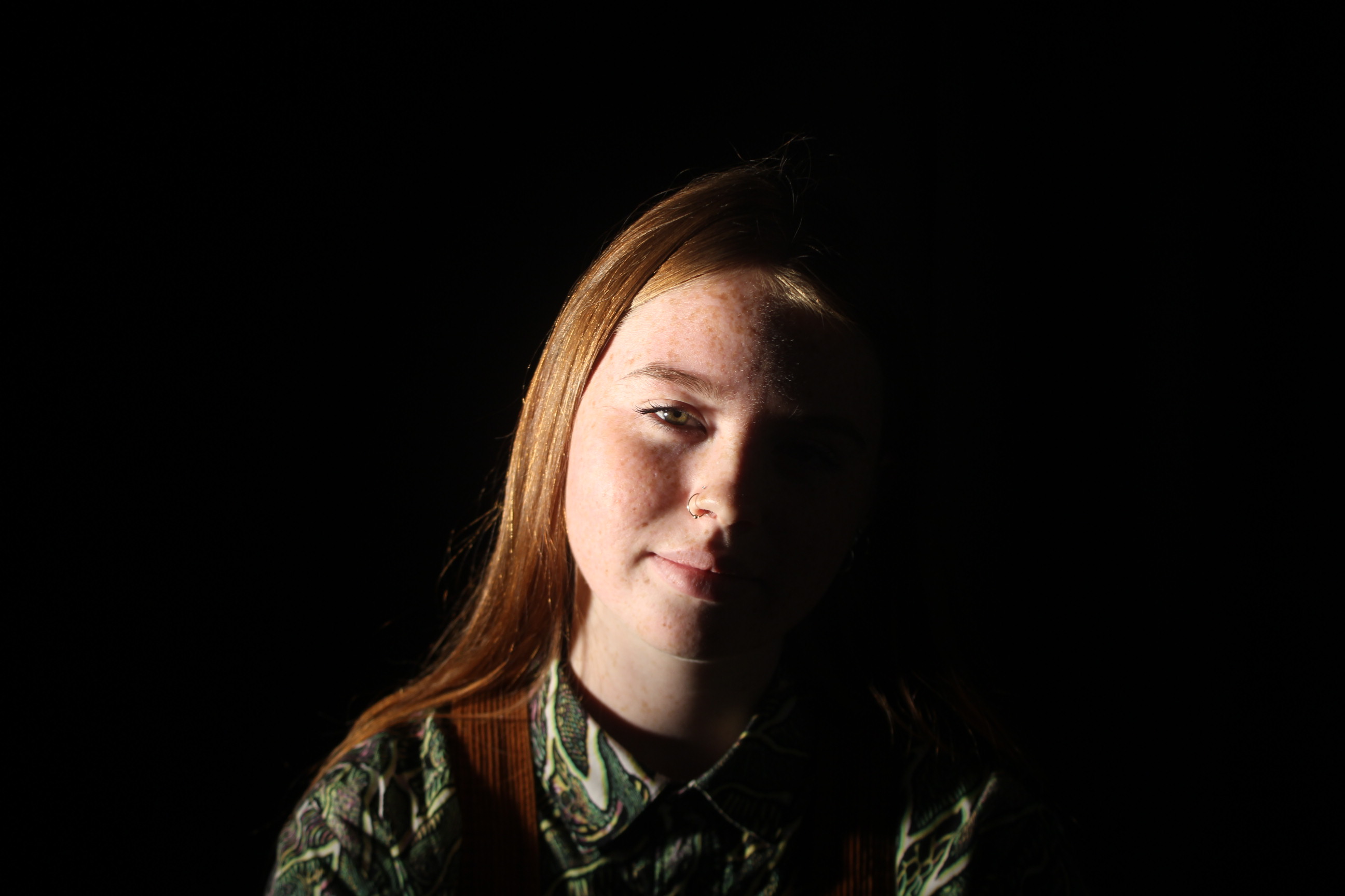
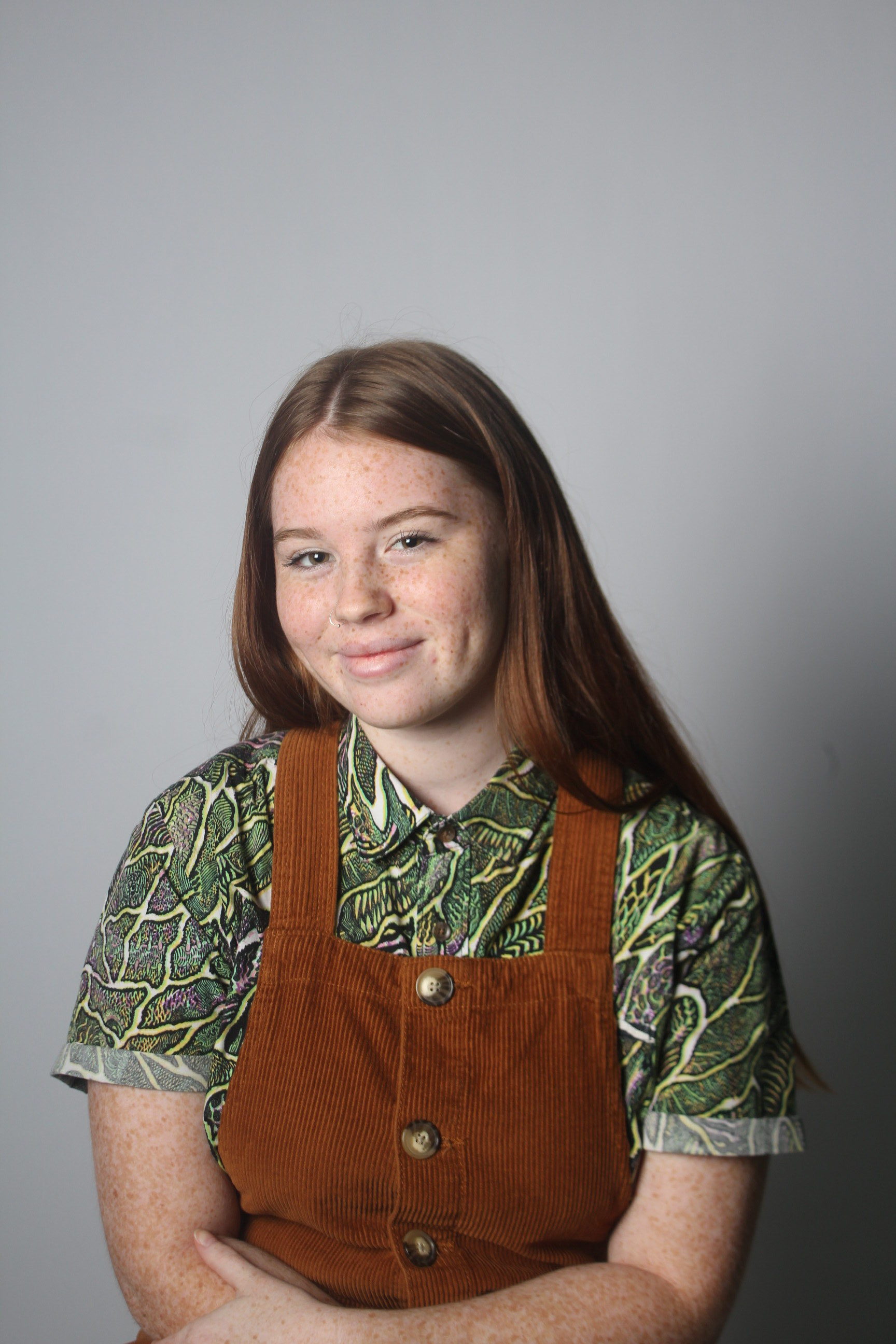
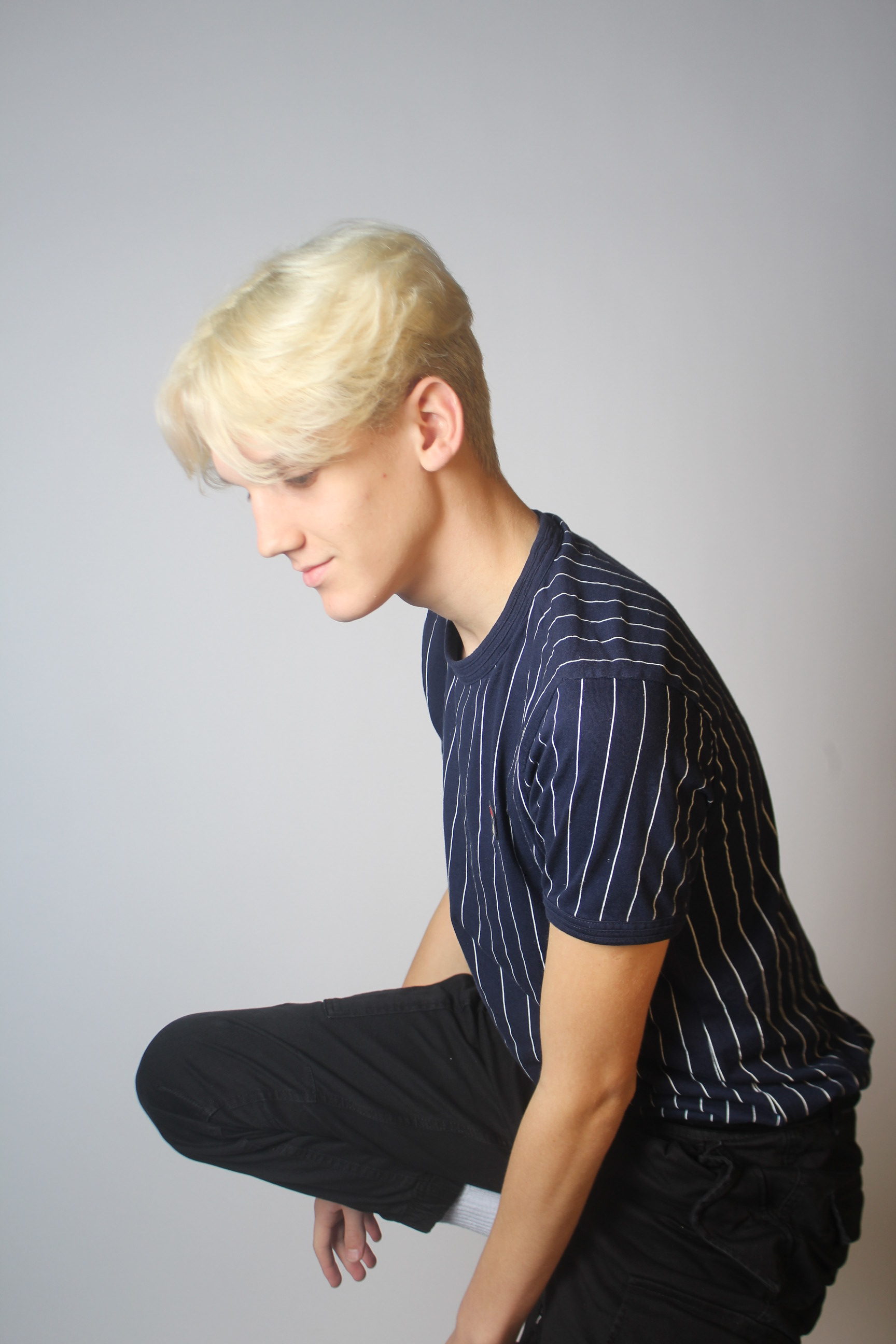
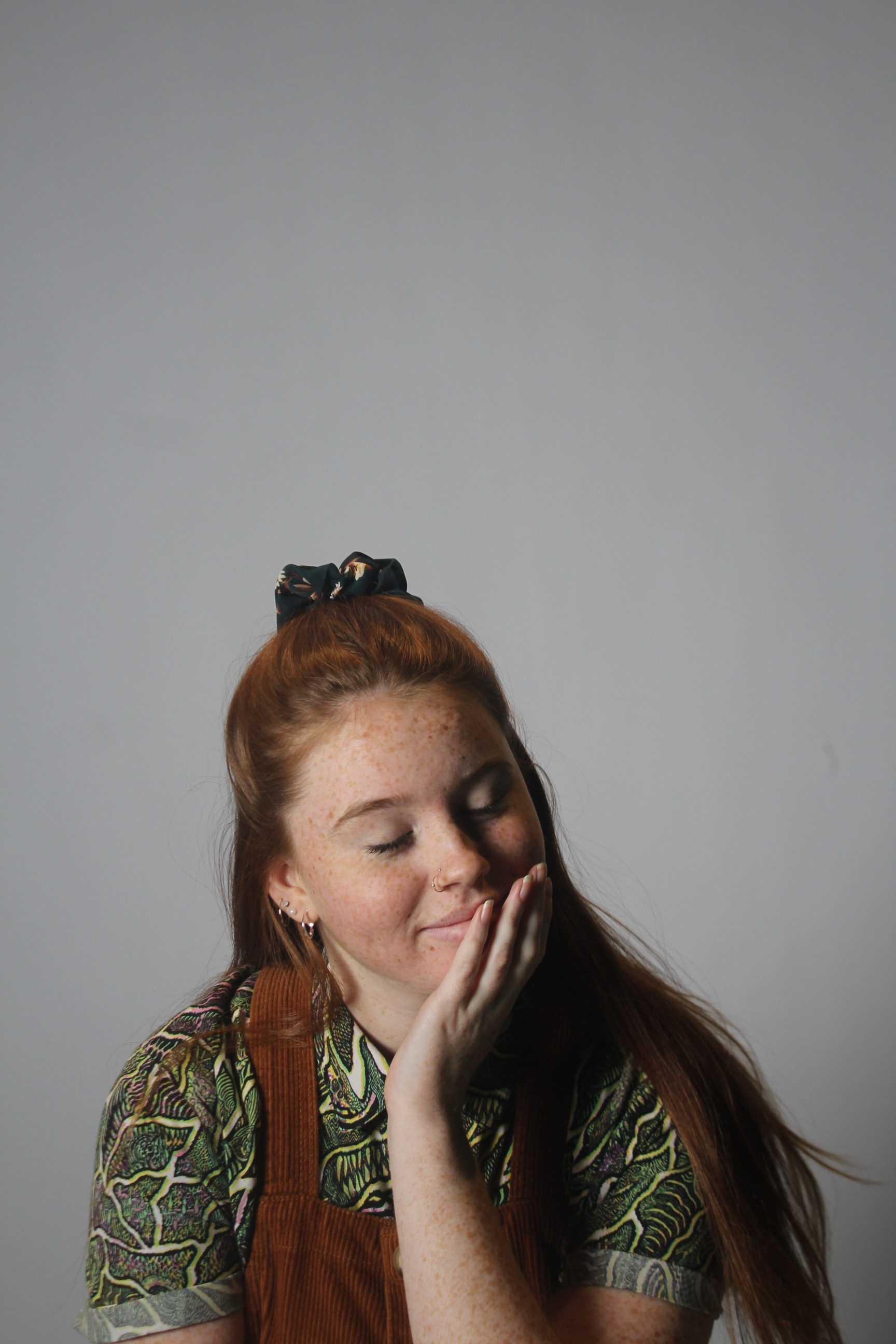
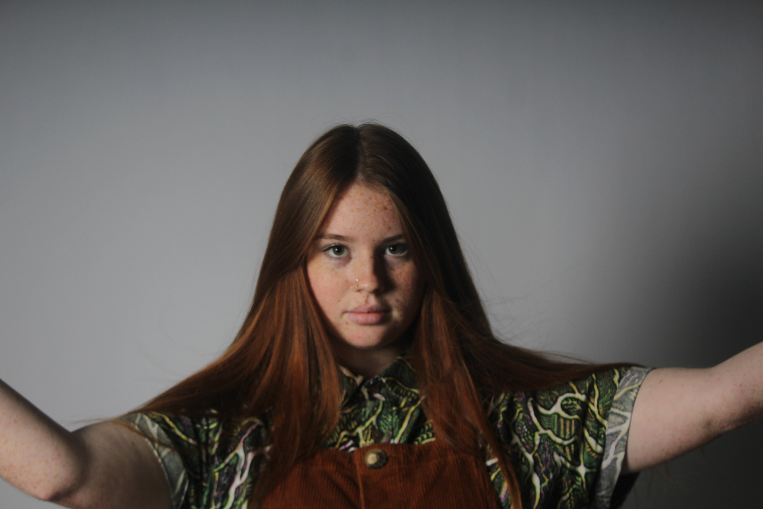
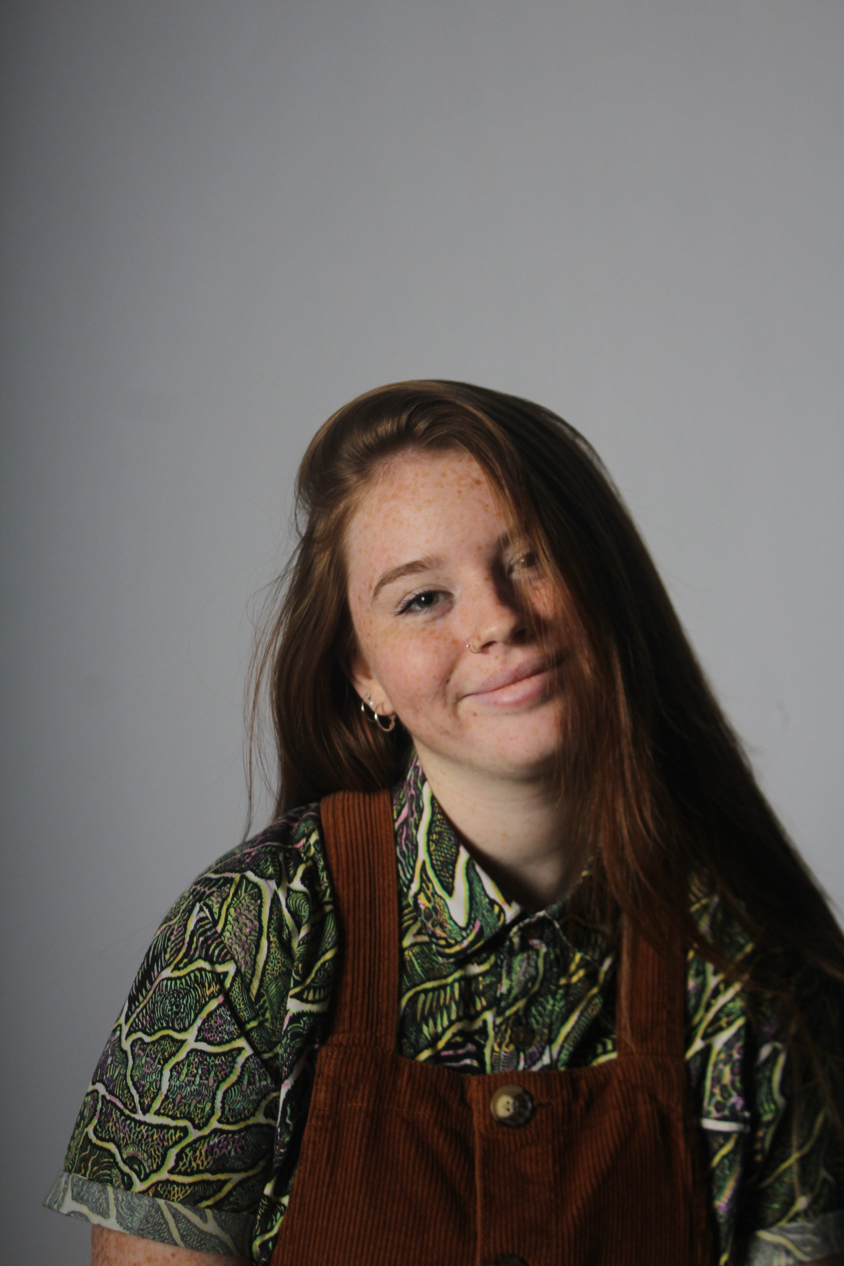
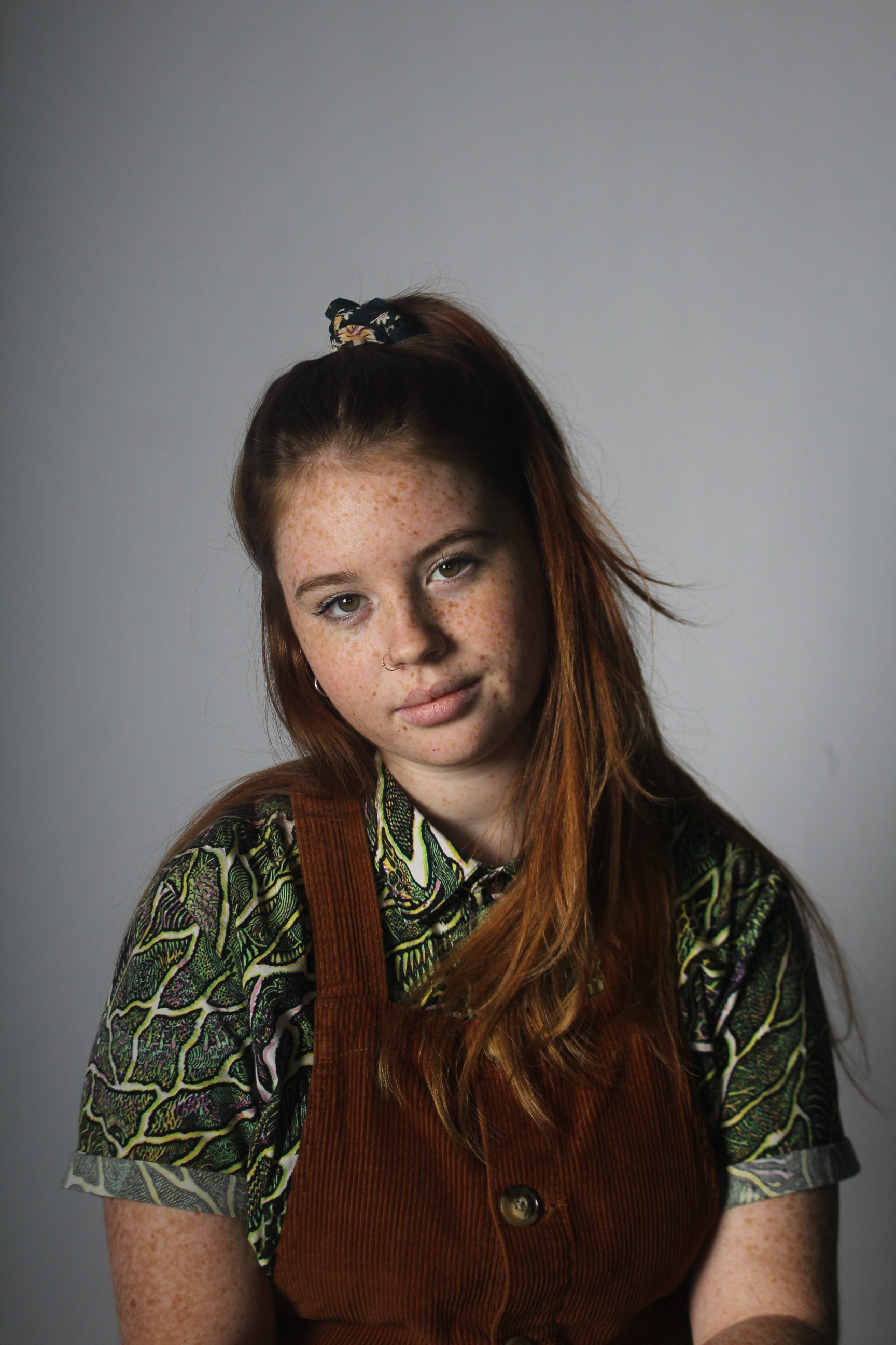
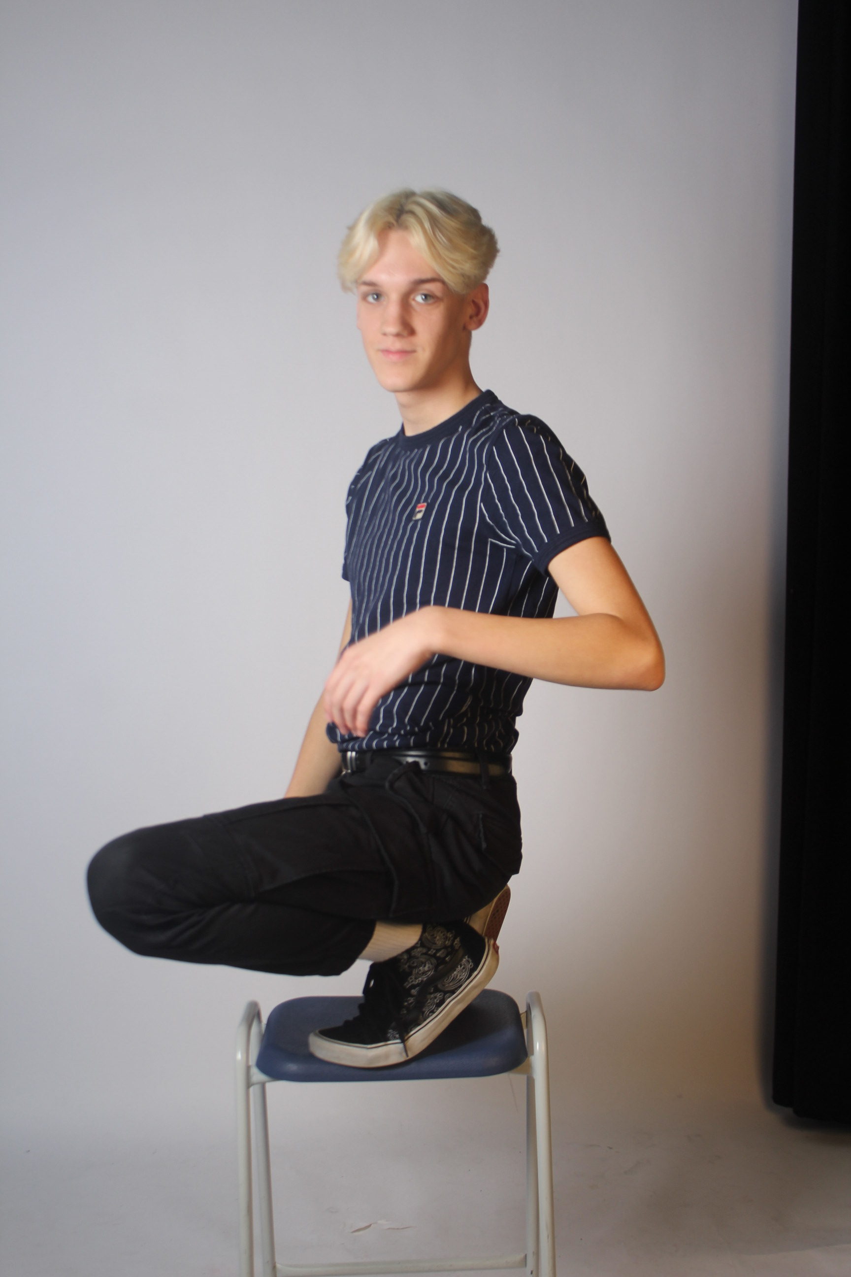
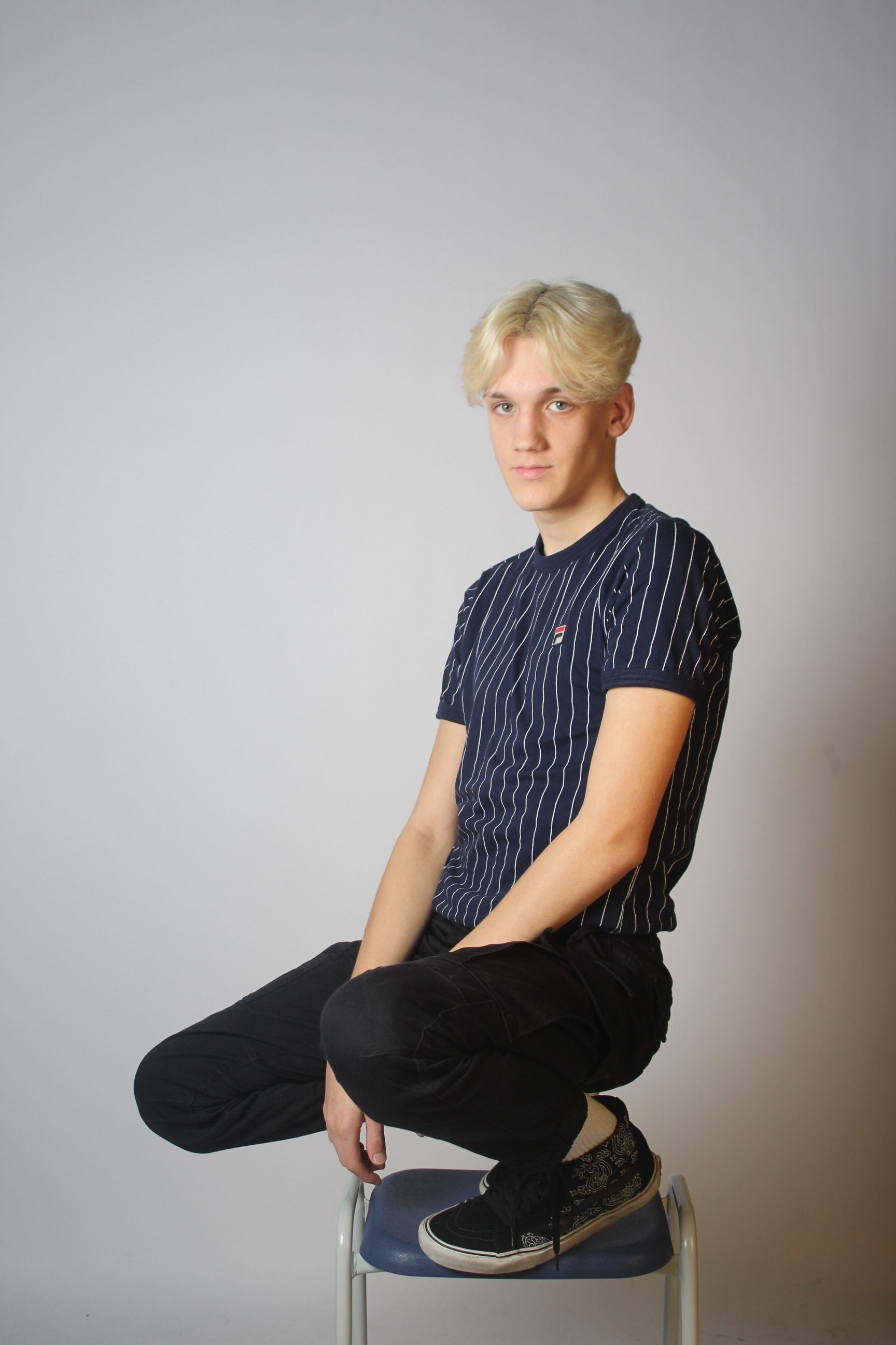
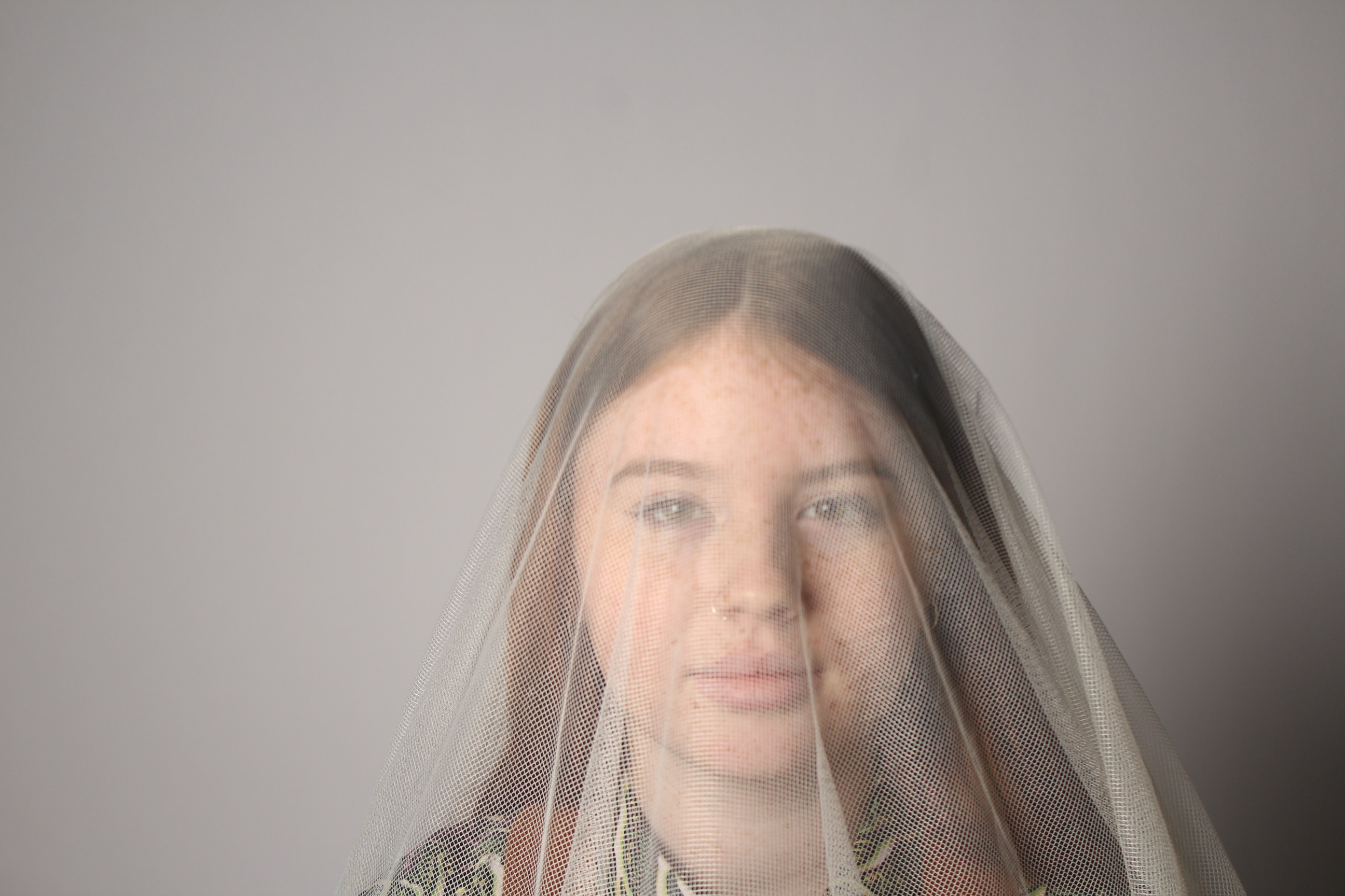
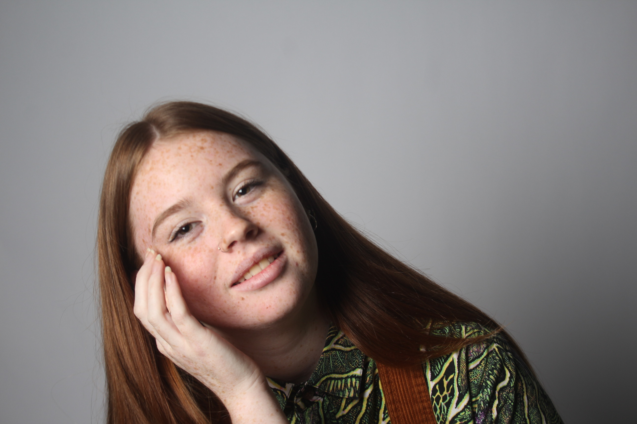
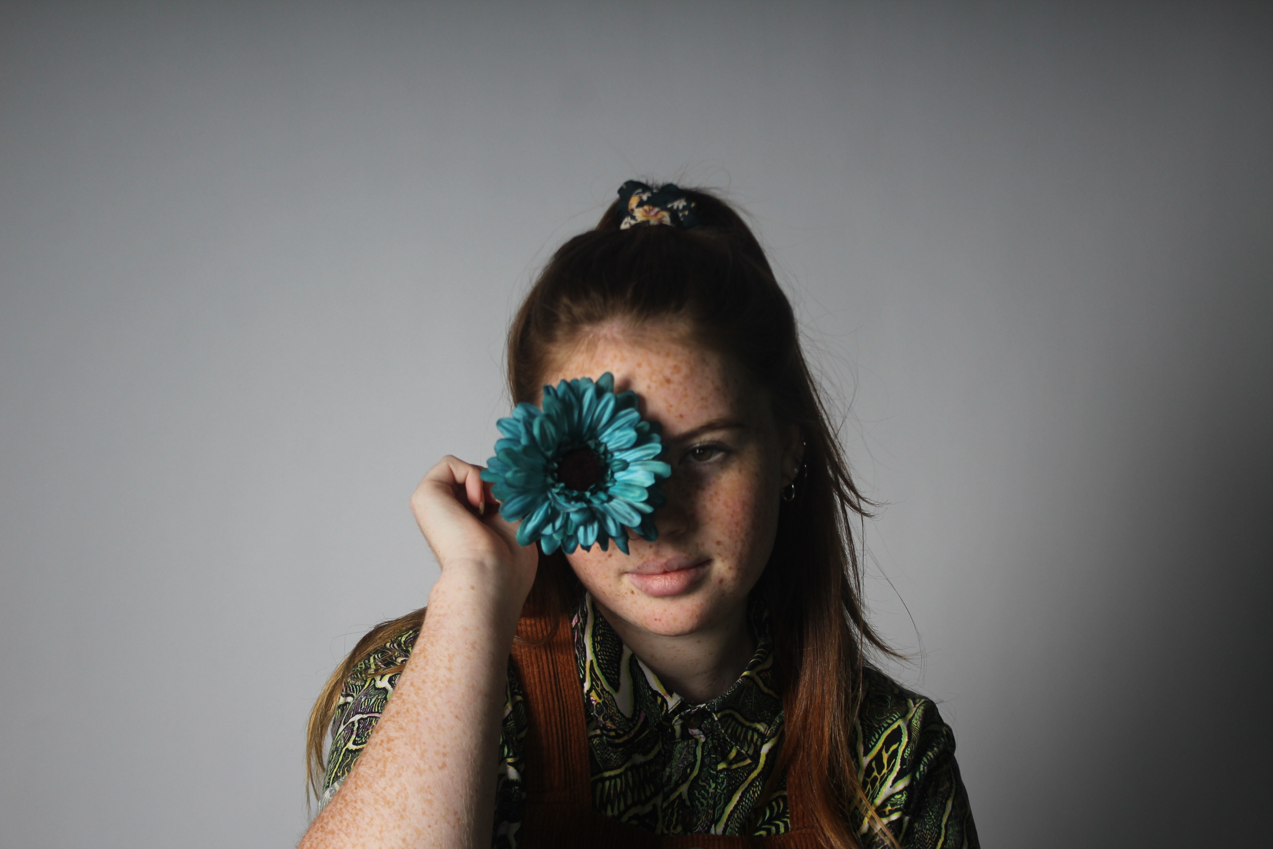
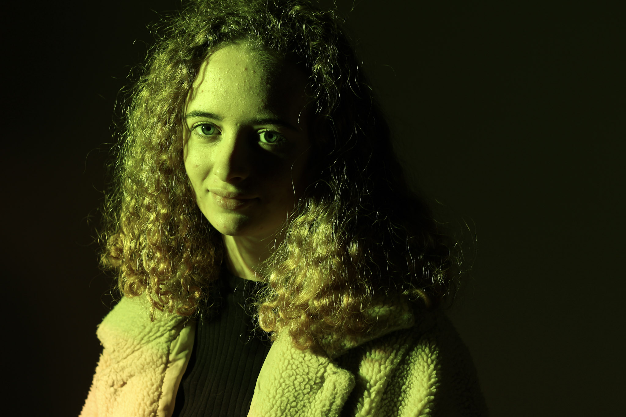
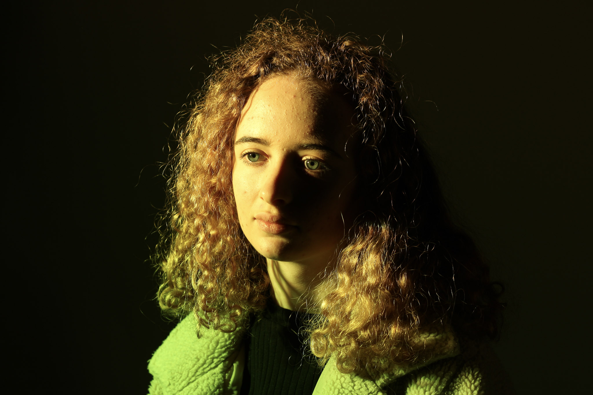
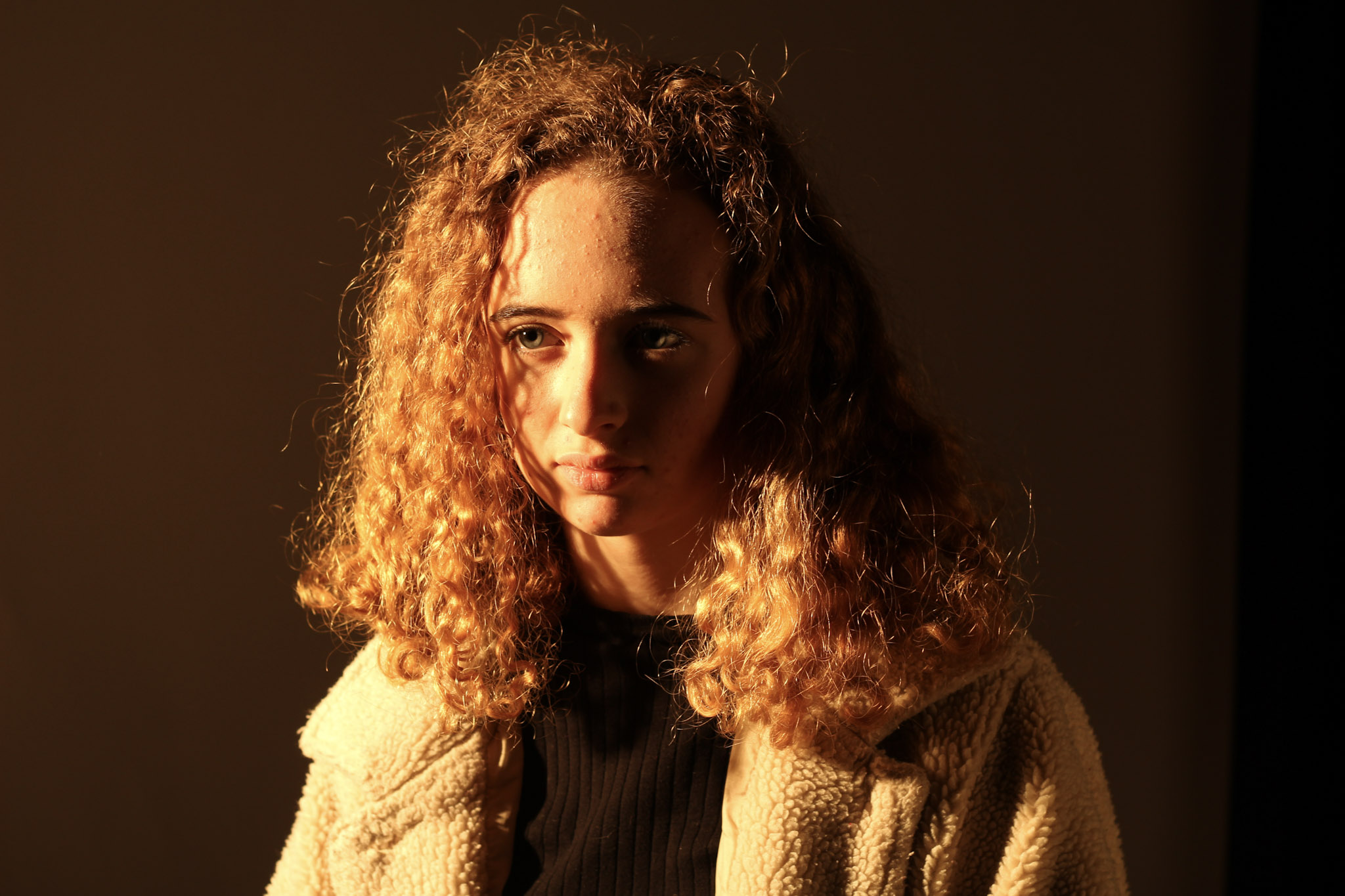
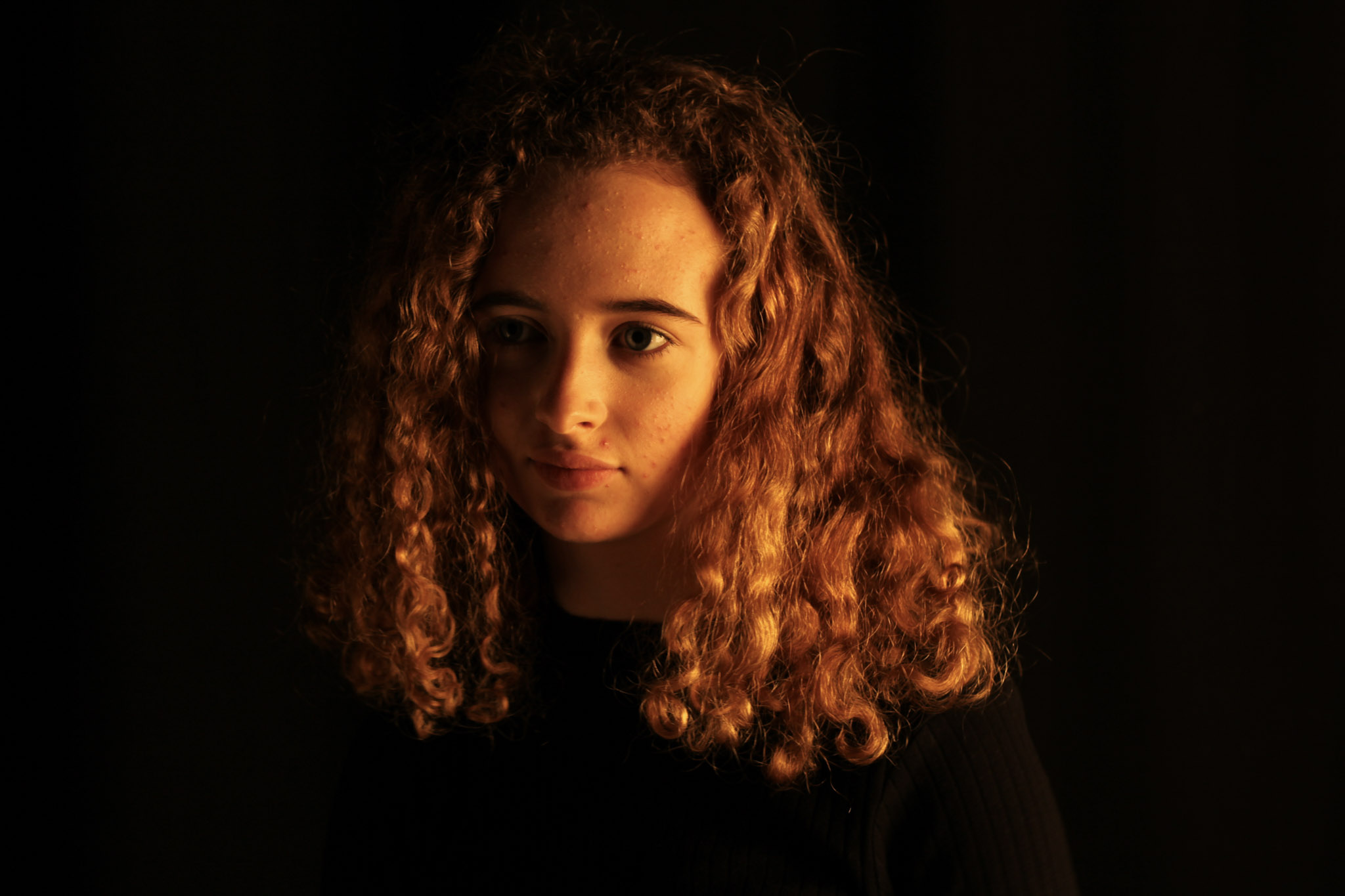
Lately we’ve been experimenting with lights and shadows and how we can transform a portrait into something interesting and unique. For this we’ve been using the studio and have been playing around with the different types of lights in there.  We use studios in photography to control the amount of light we expose in a picture, and to guarantee an outcome that we want.

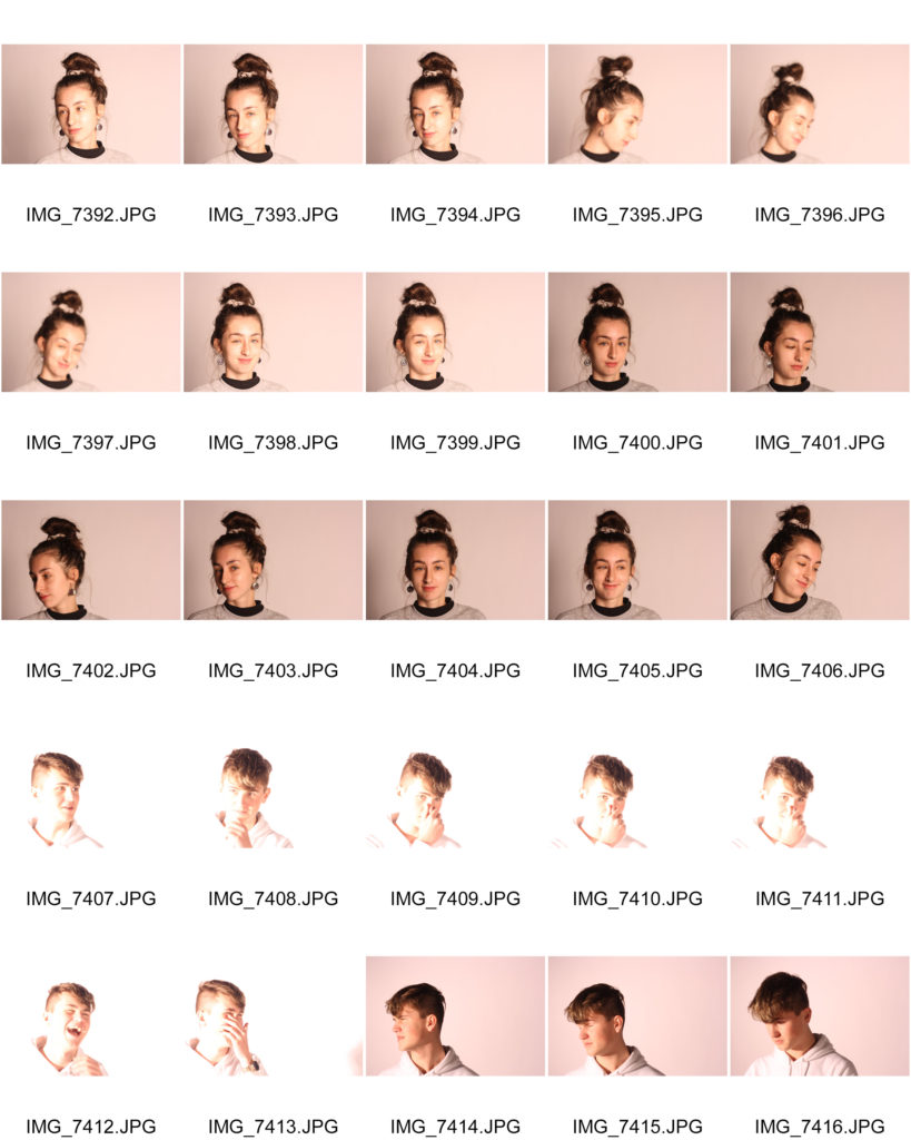
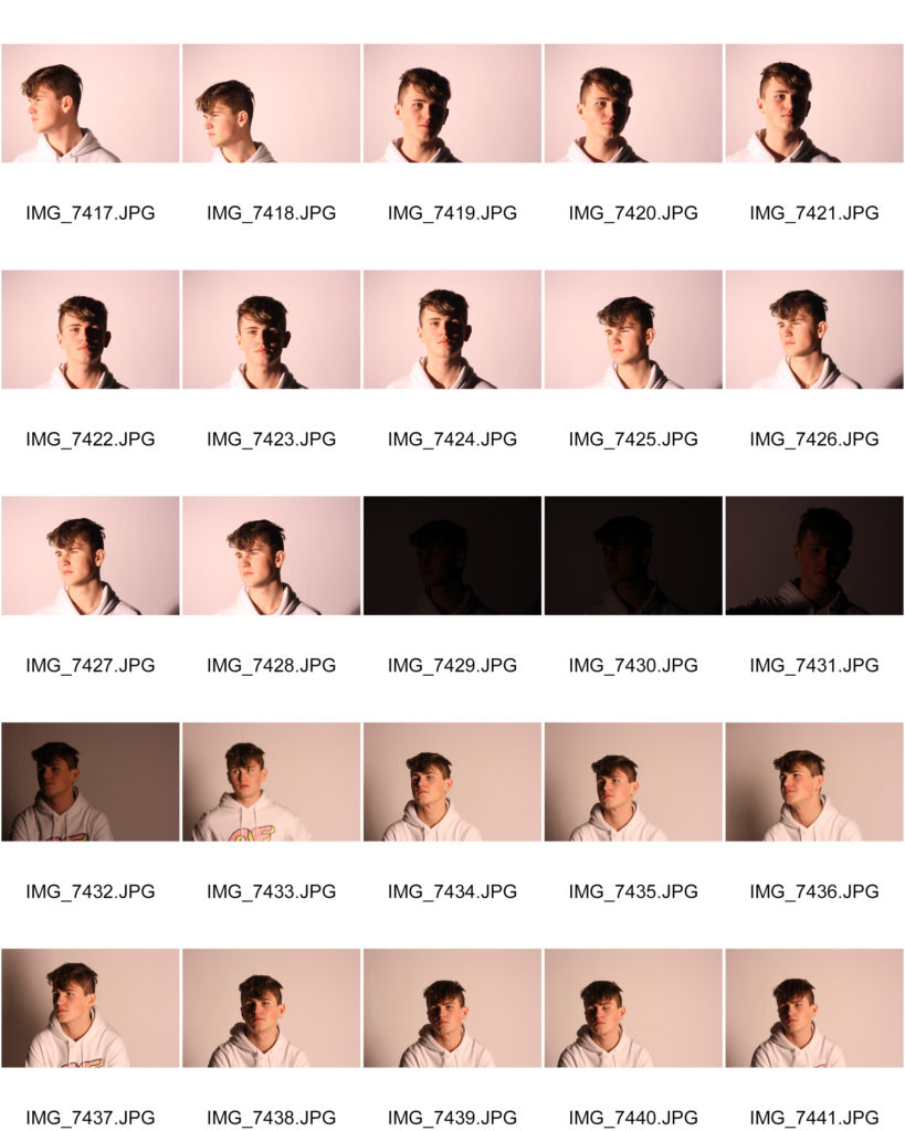
Pictures taken:

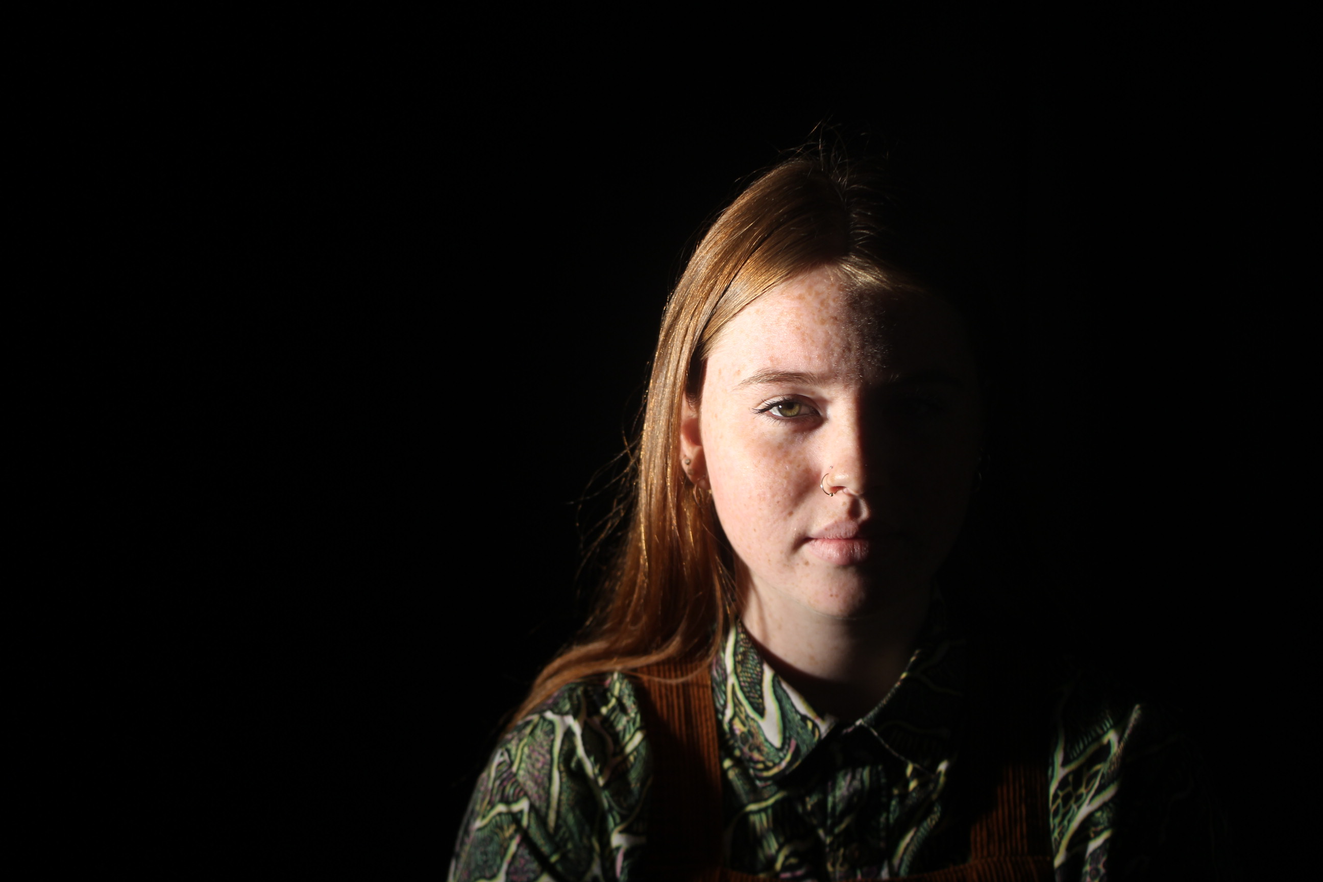
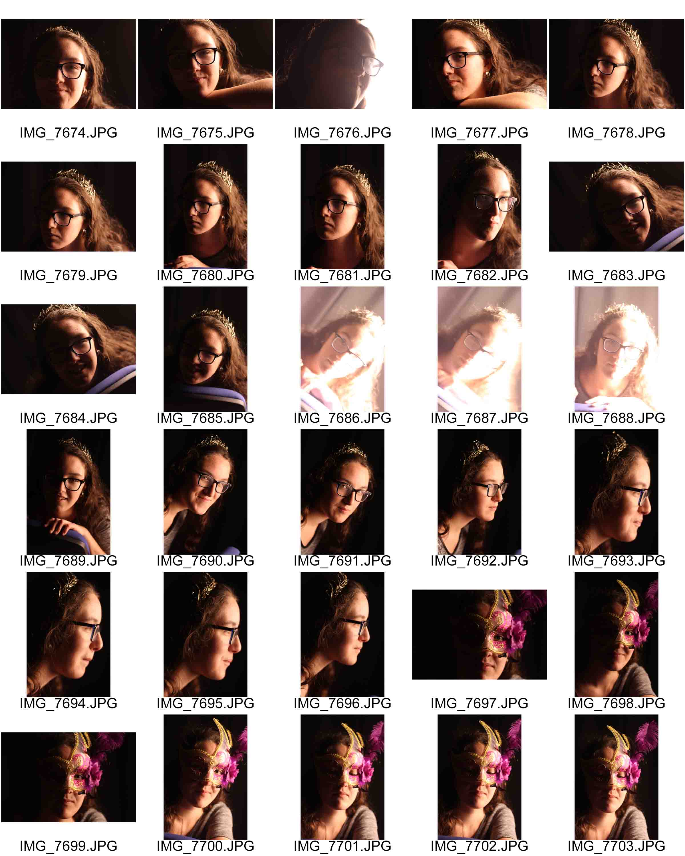
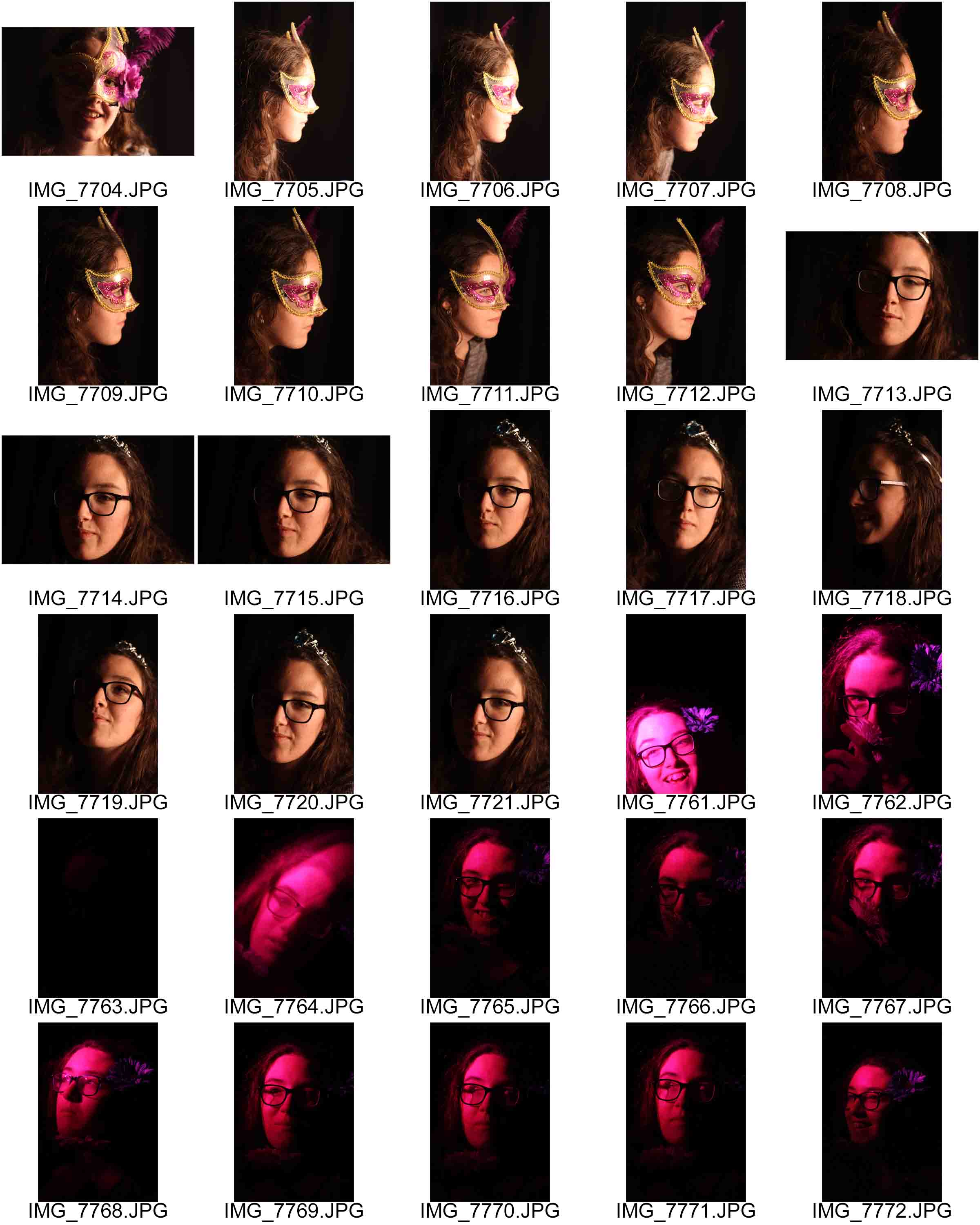
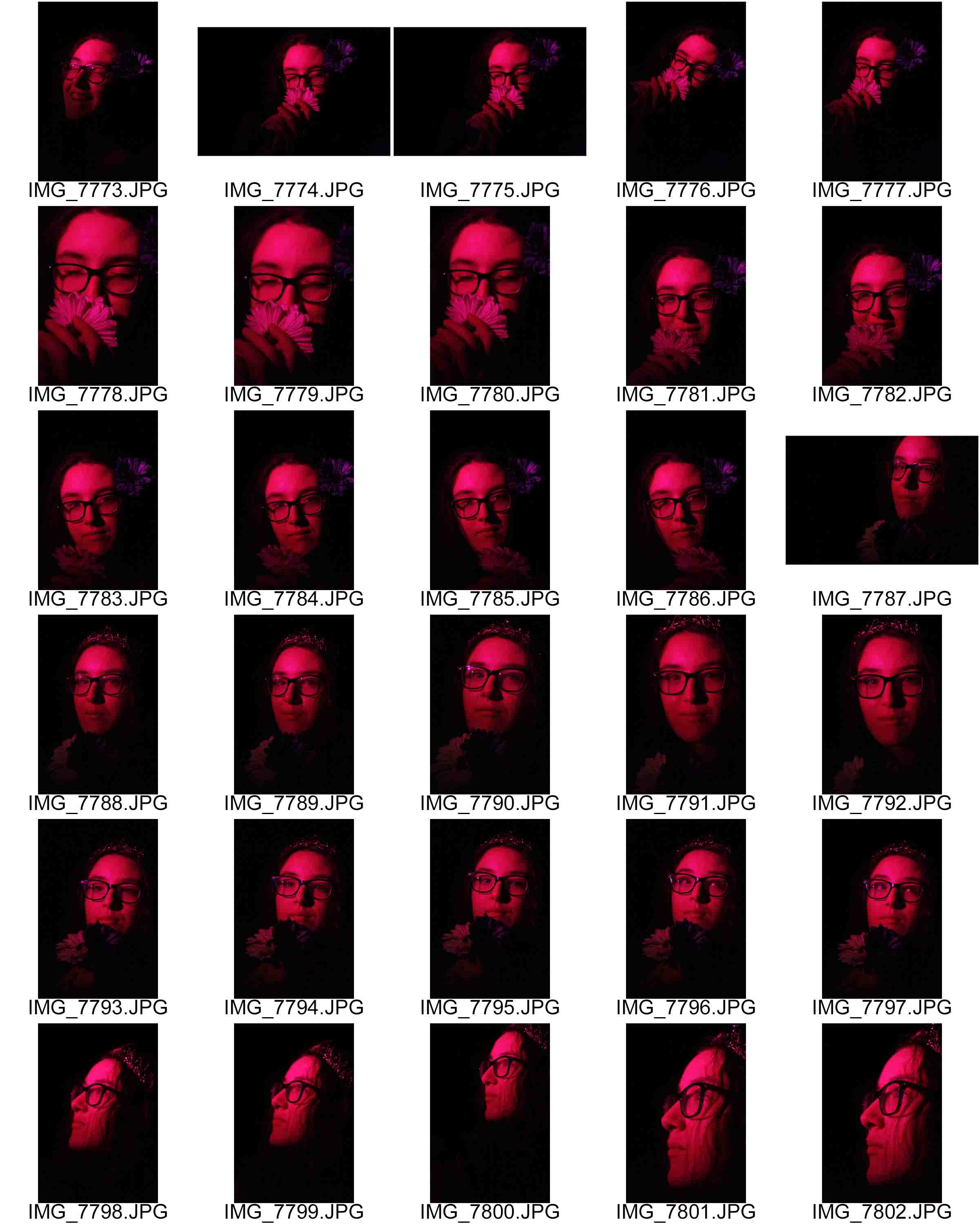
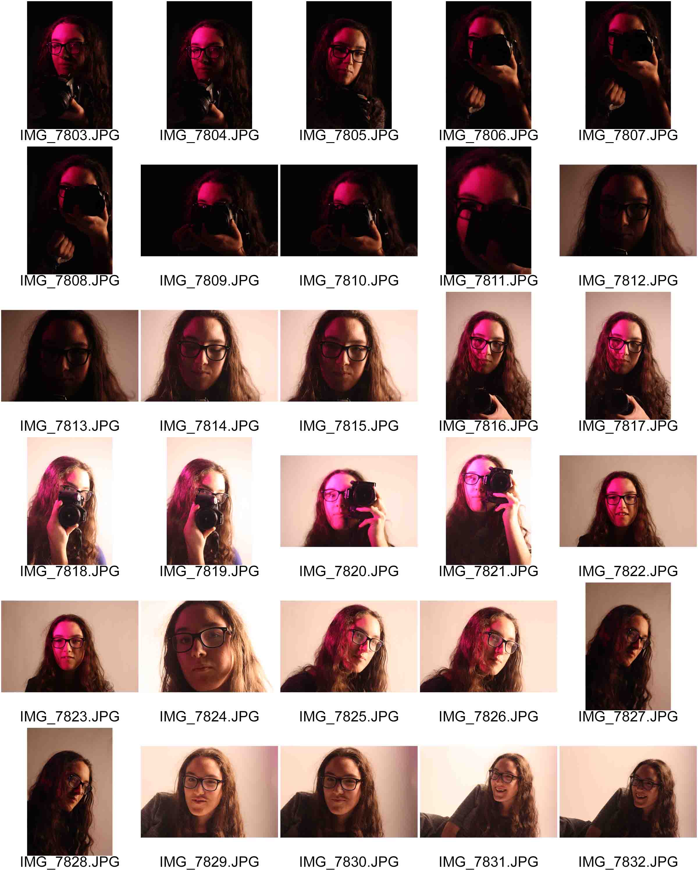
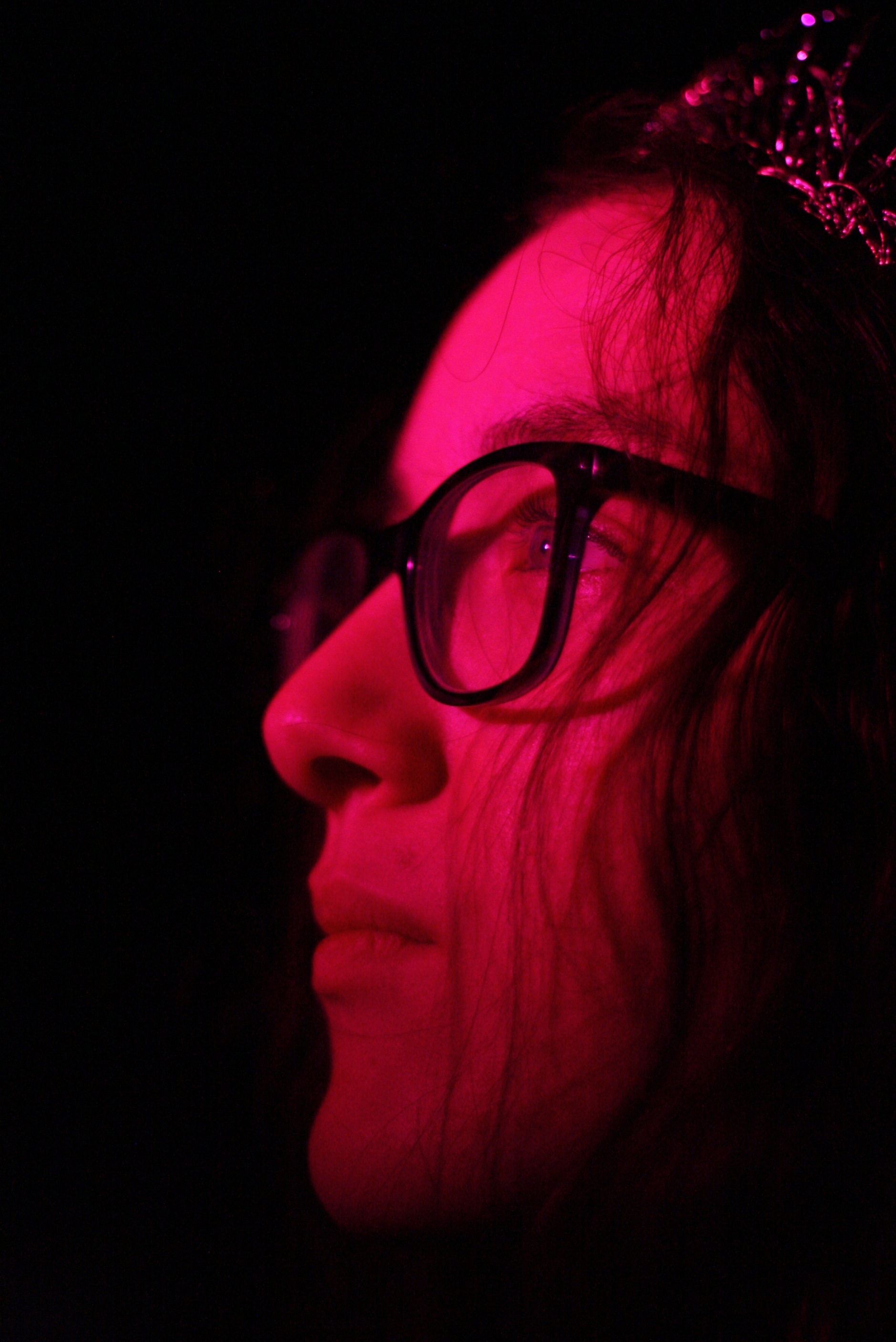
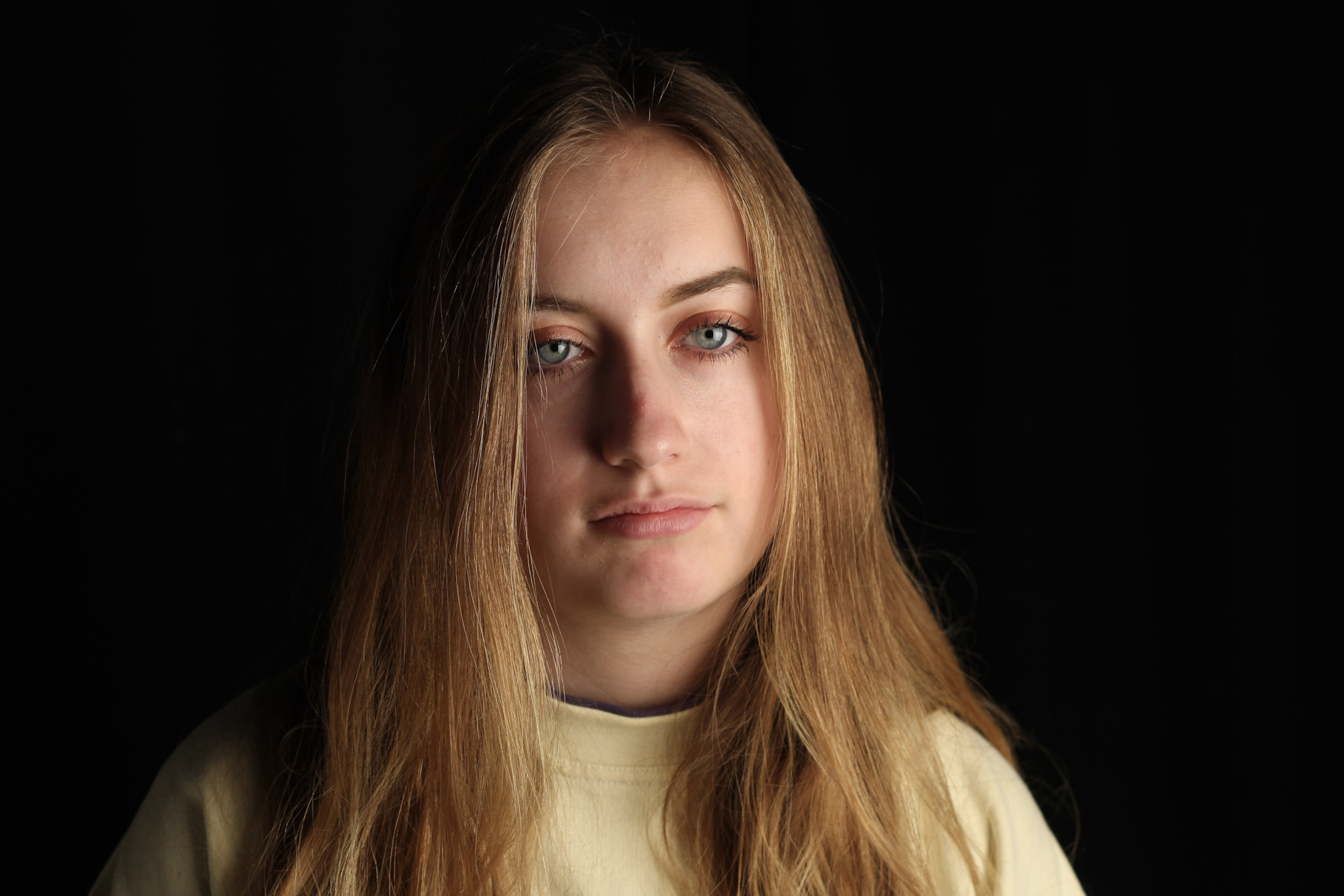
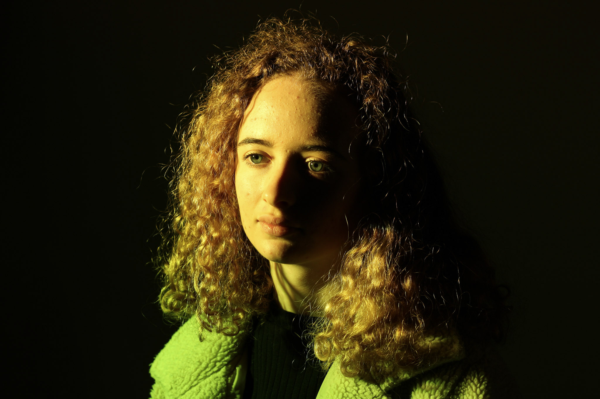
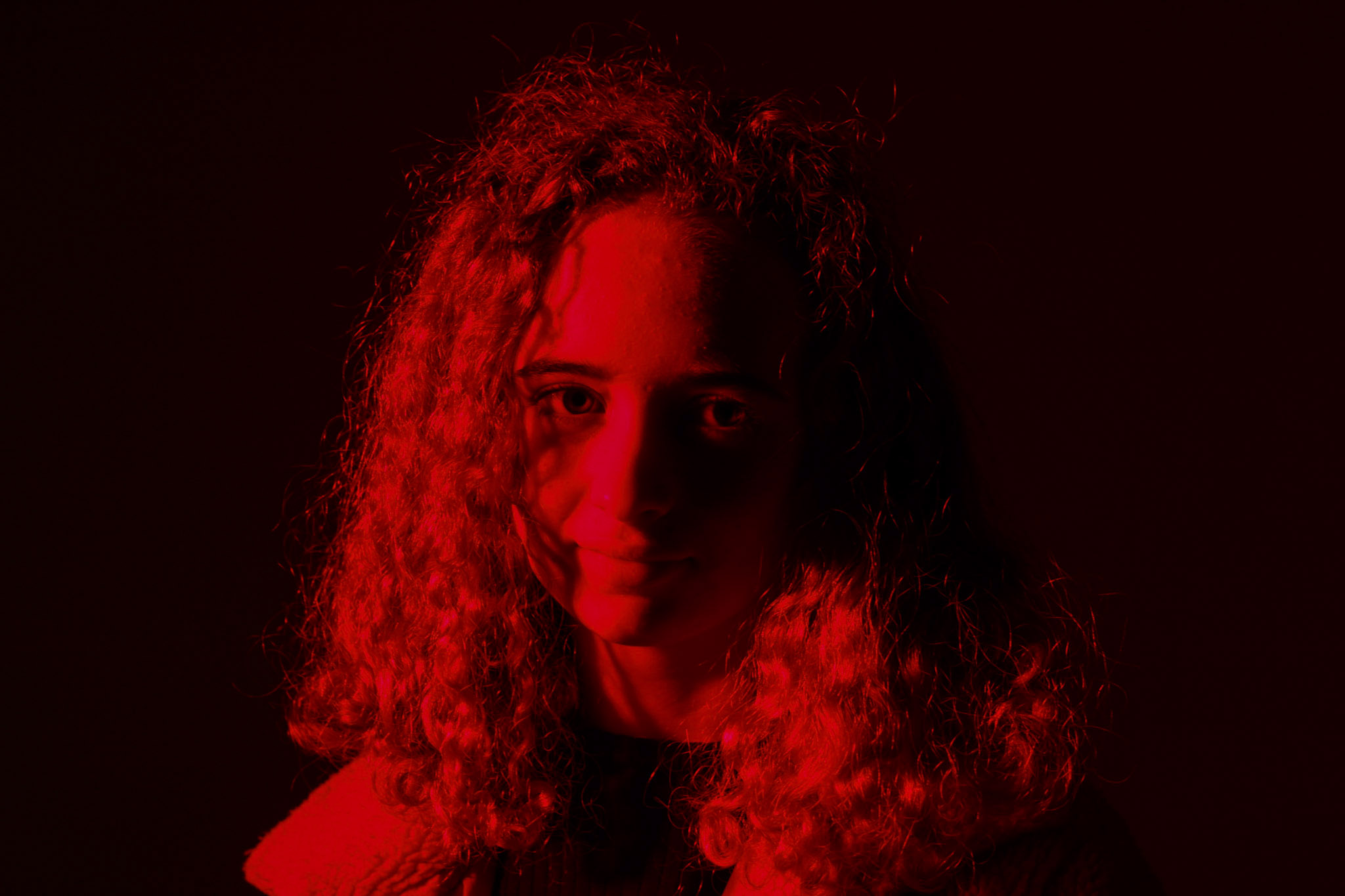
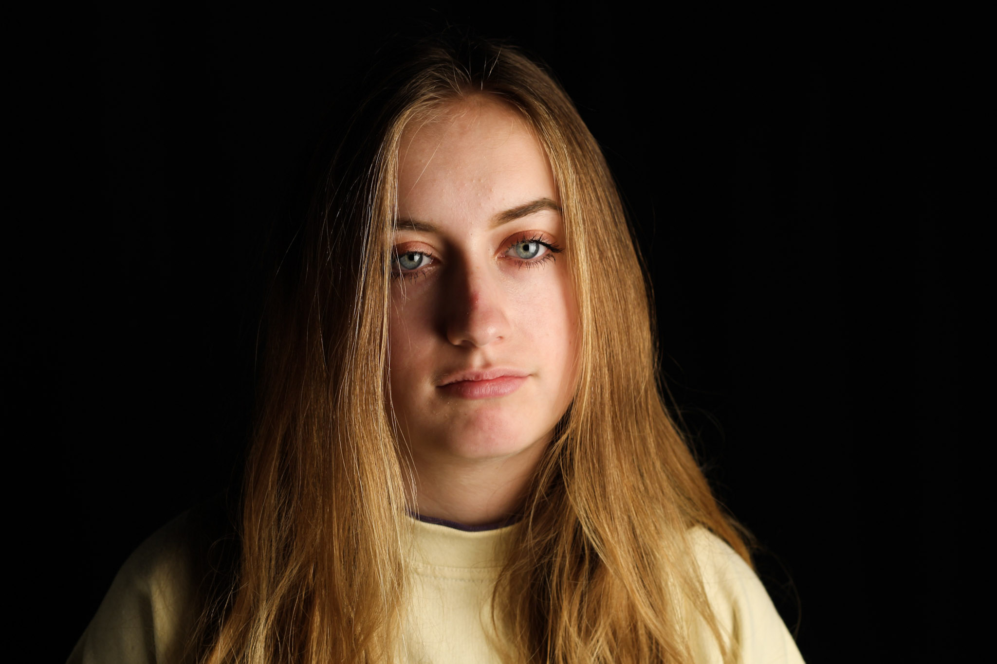
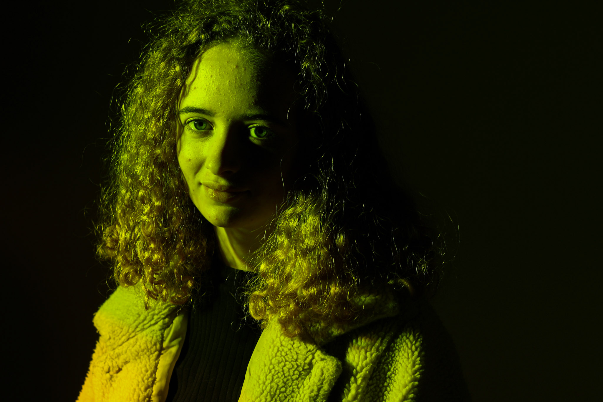
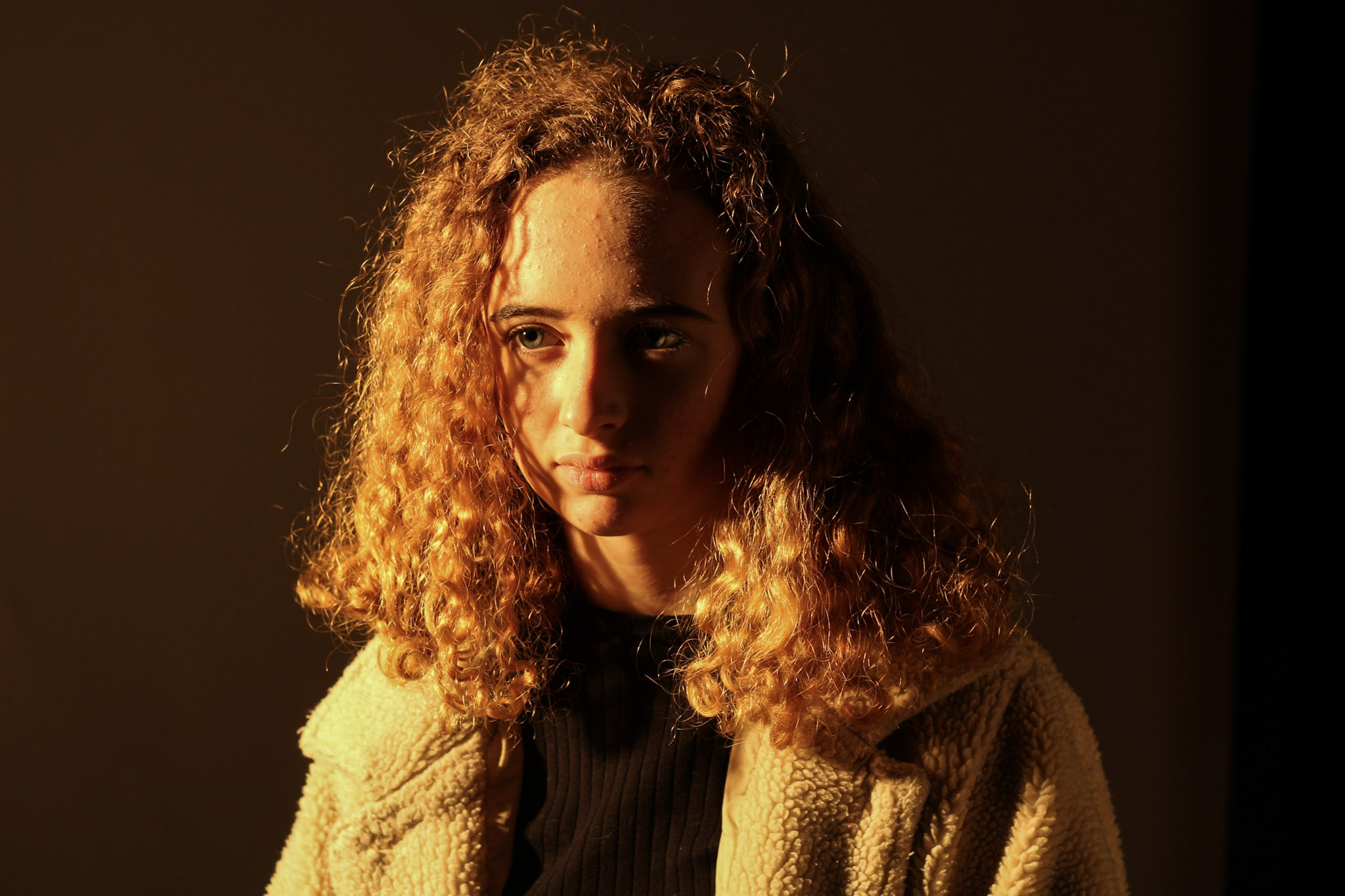
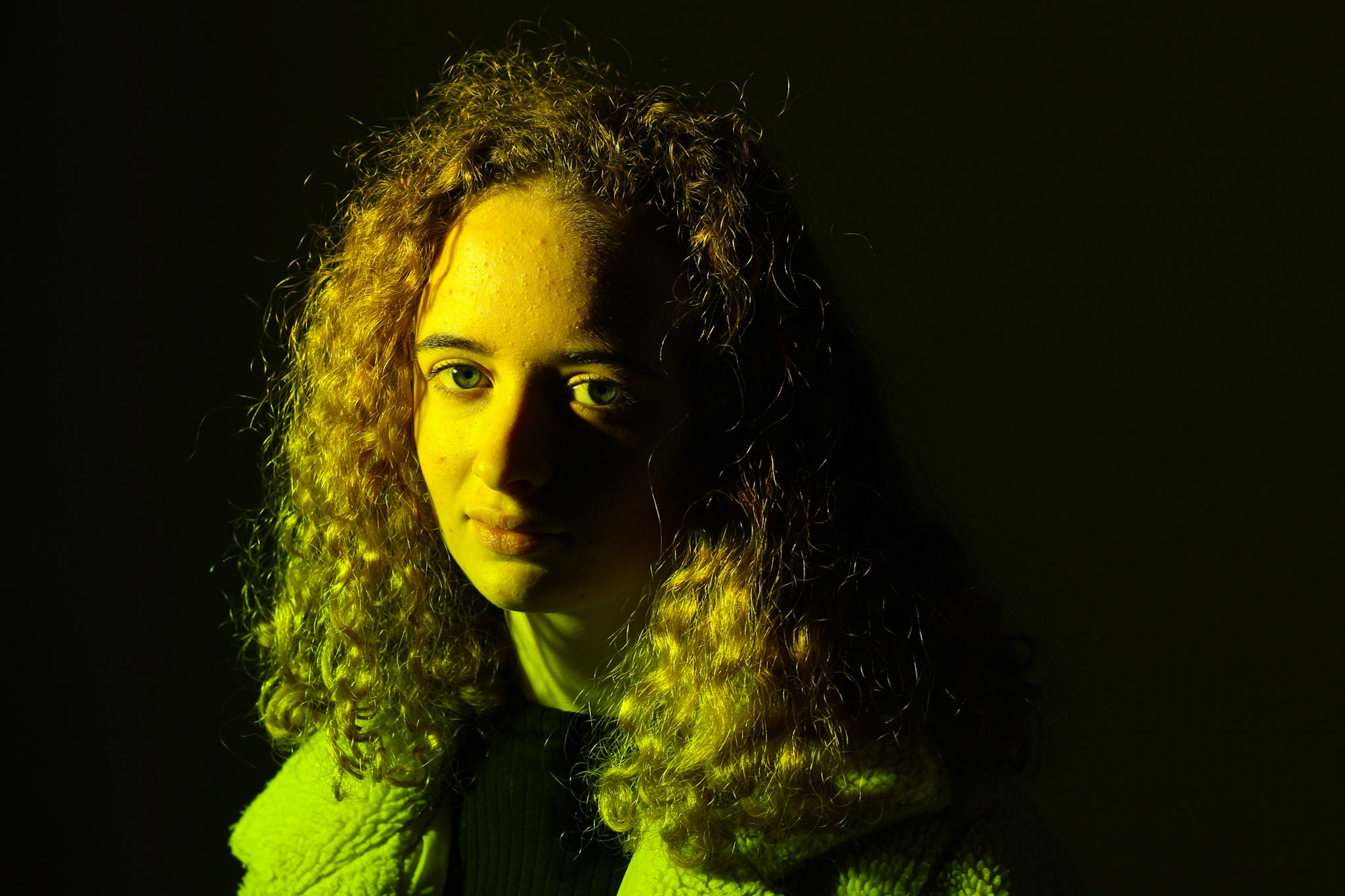
For most of these photos, I used the large soft light to create soft shadows. For others i used the spot light to clearly highlight the model, and used coloured sheets of plastic to cast a certain colour onto her.

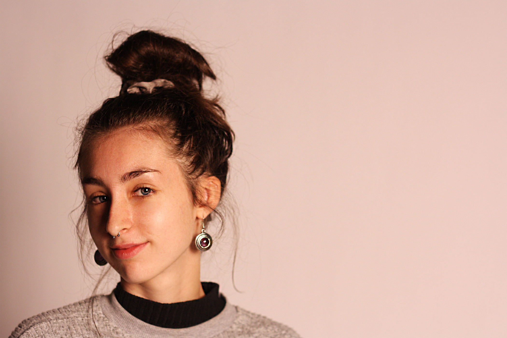
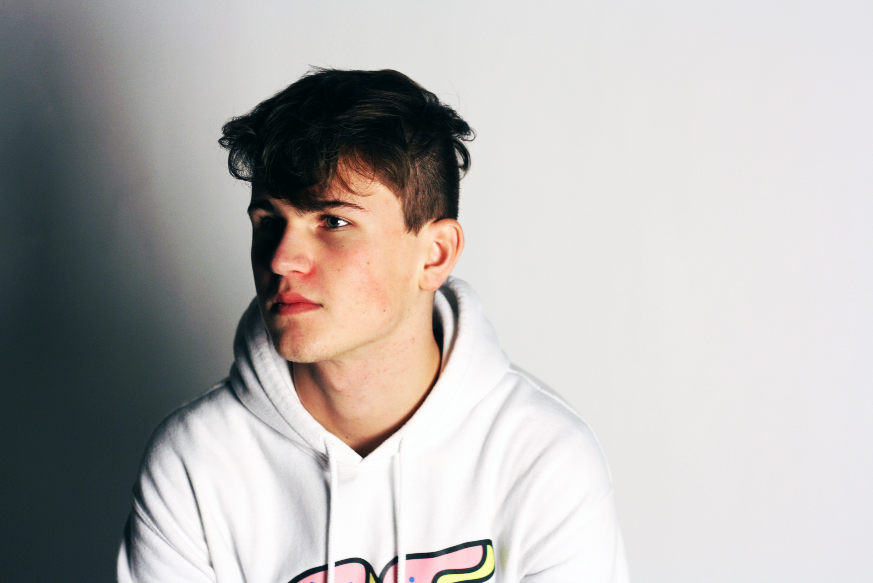
Chosen pictures:

ISO 400 Shutter speed 1/125
ISO 800 Shutter speed 1/1000

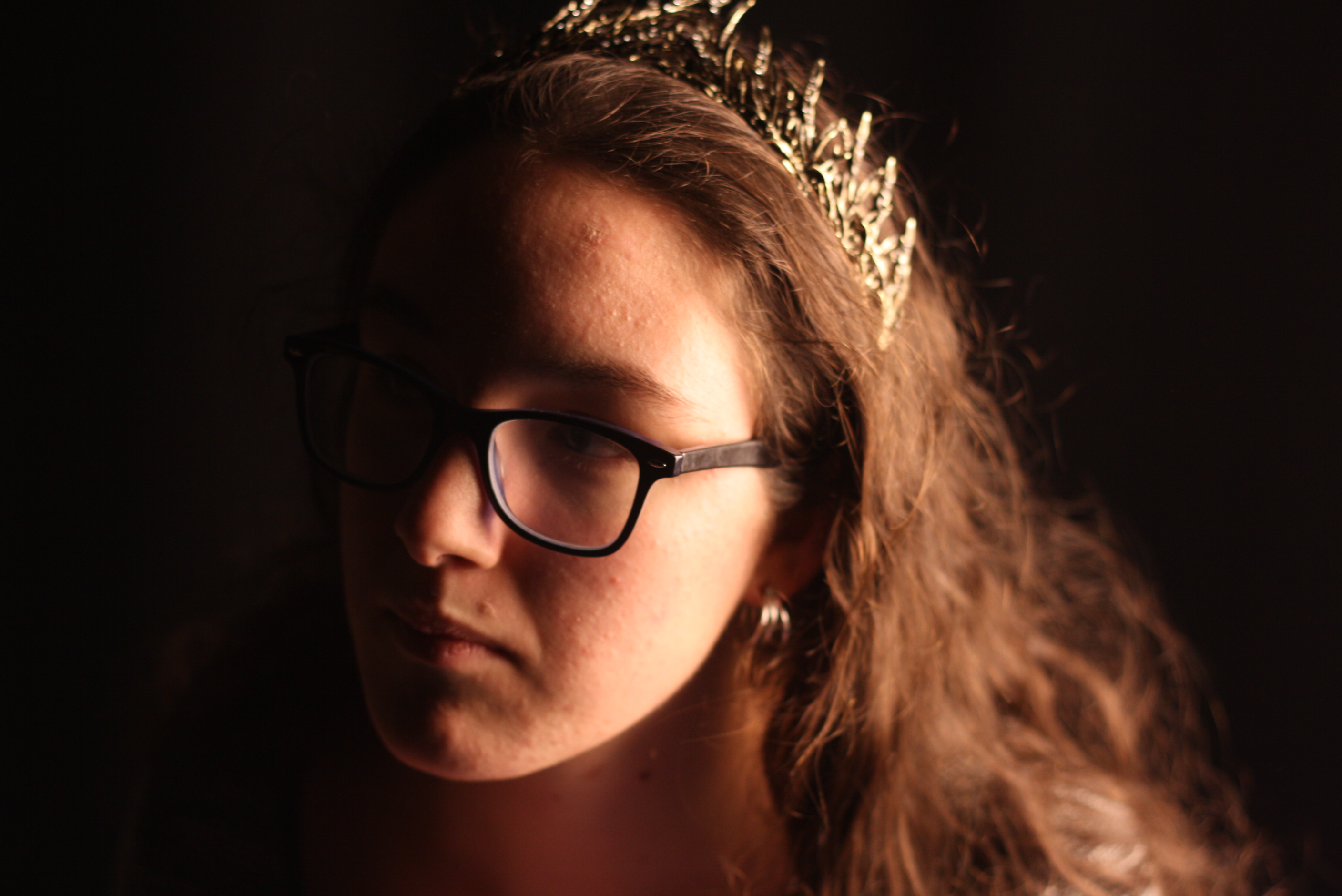
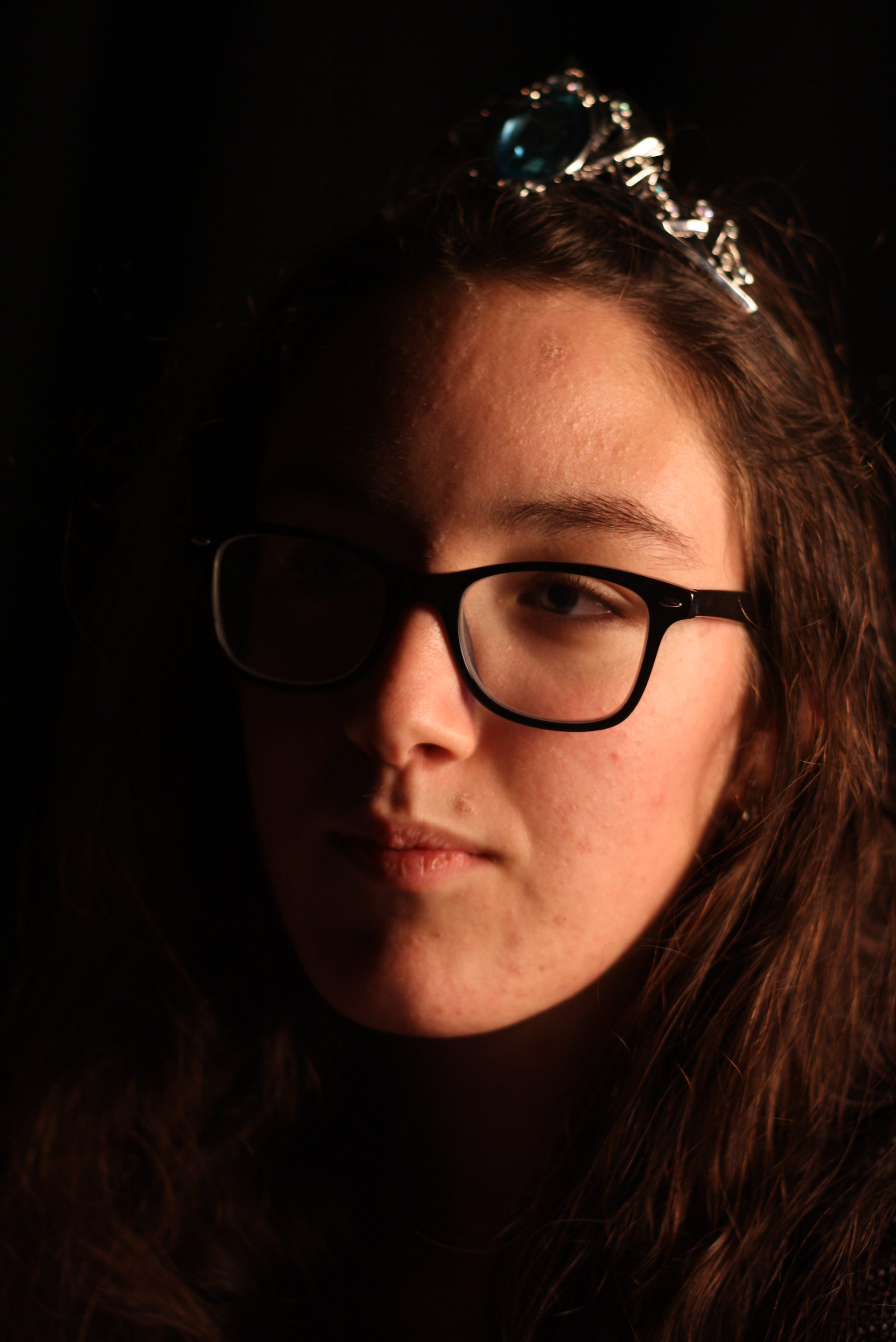
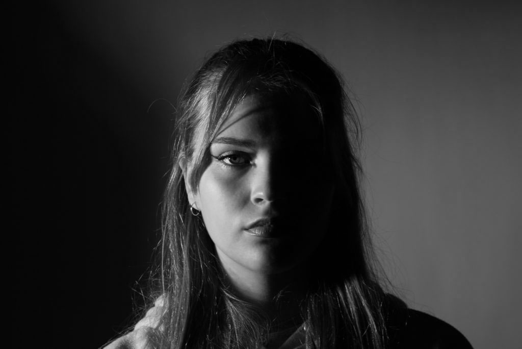
I took these pictures with the intention of casting half of her face in shadow, or making the surroundings dark enough to illuminate her face. I had her faced sideways of the light, or faces towards it. I played around with angles, ISO, shutter speed, aperture, and lighting, and came out with three final images that I am pleased with.


Street photography — Artist comparison


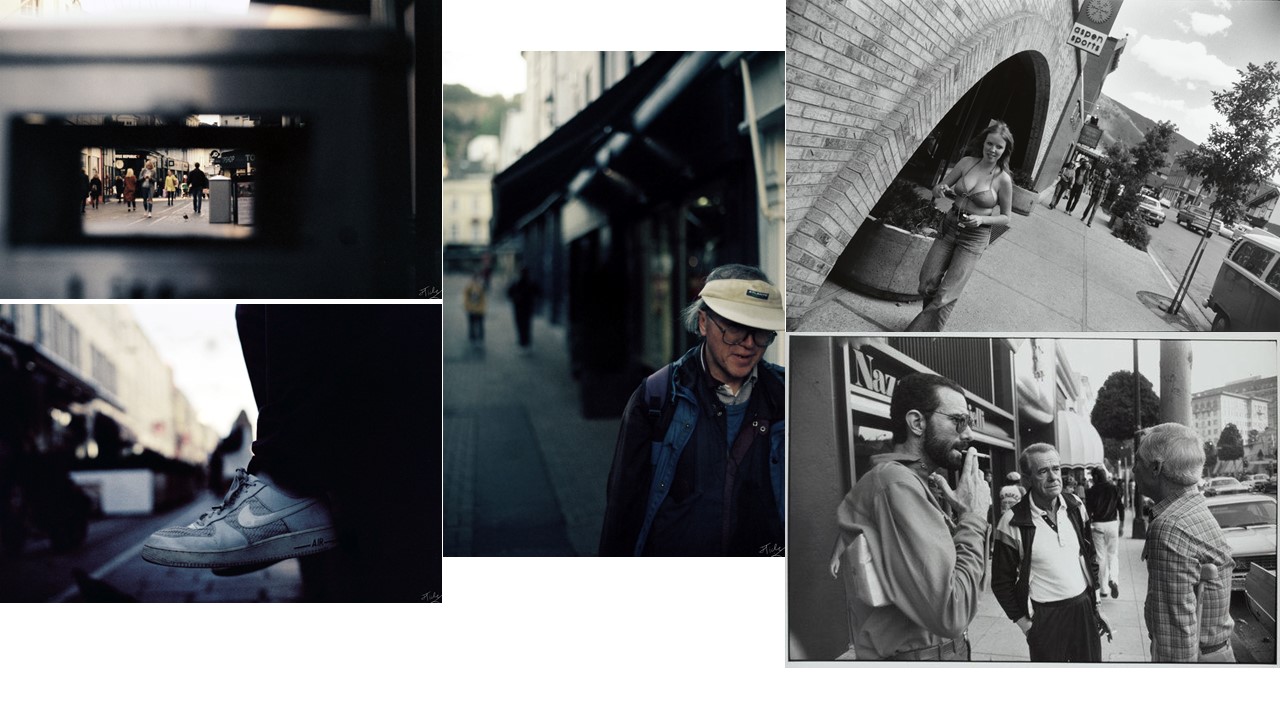
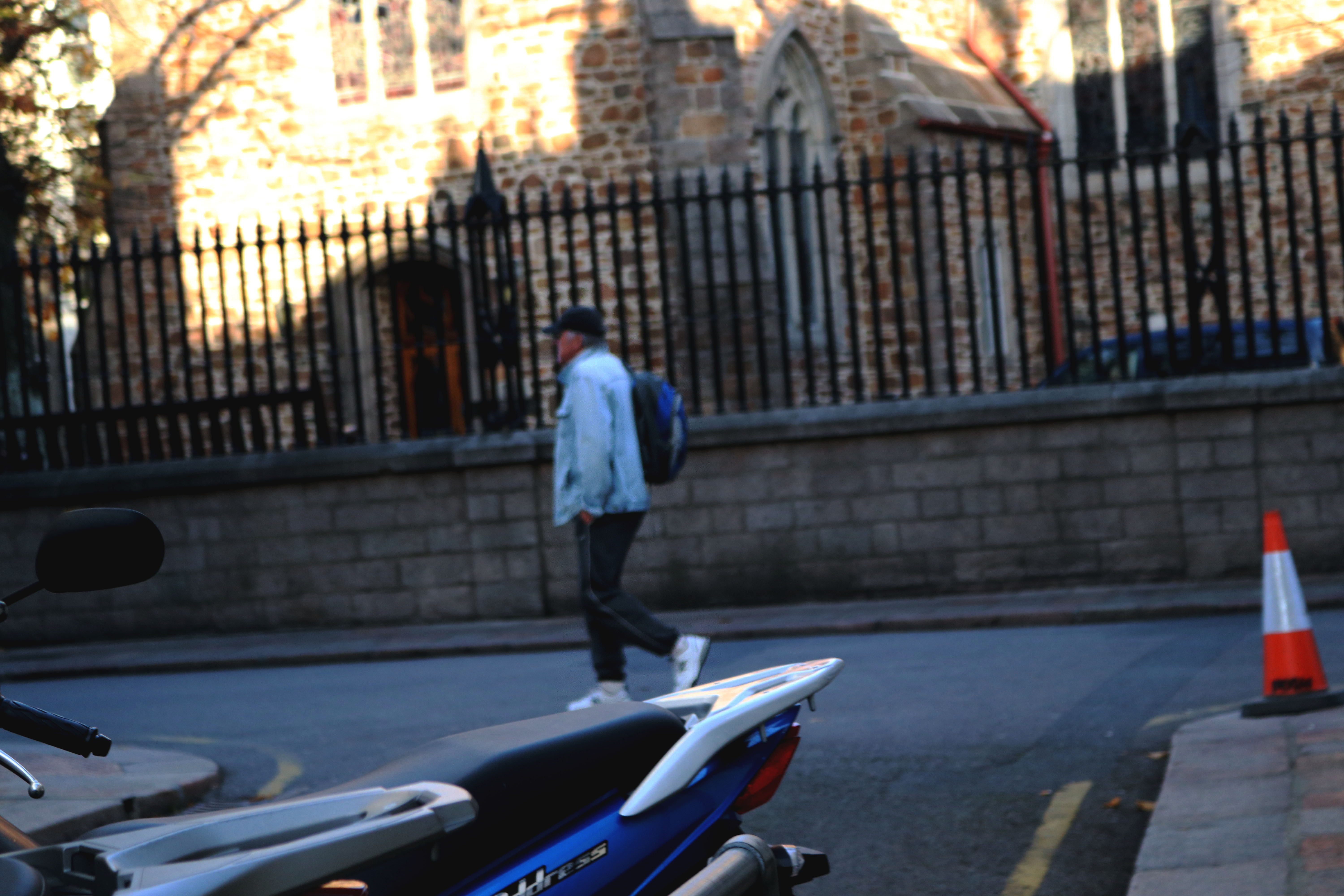
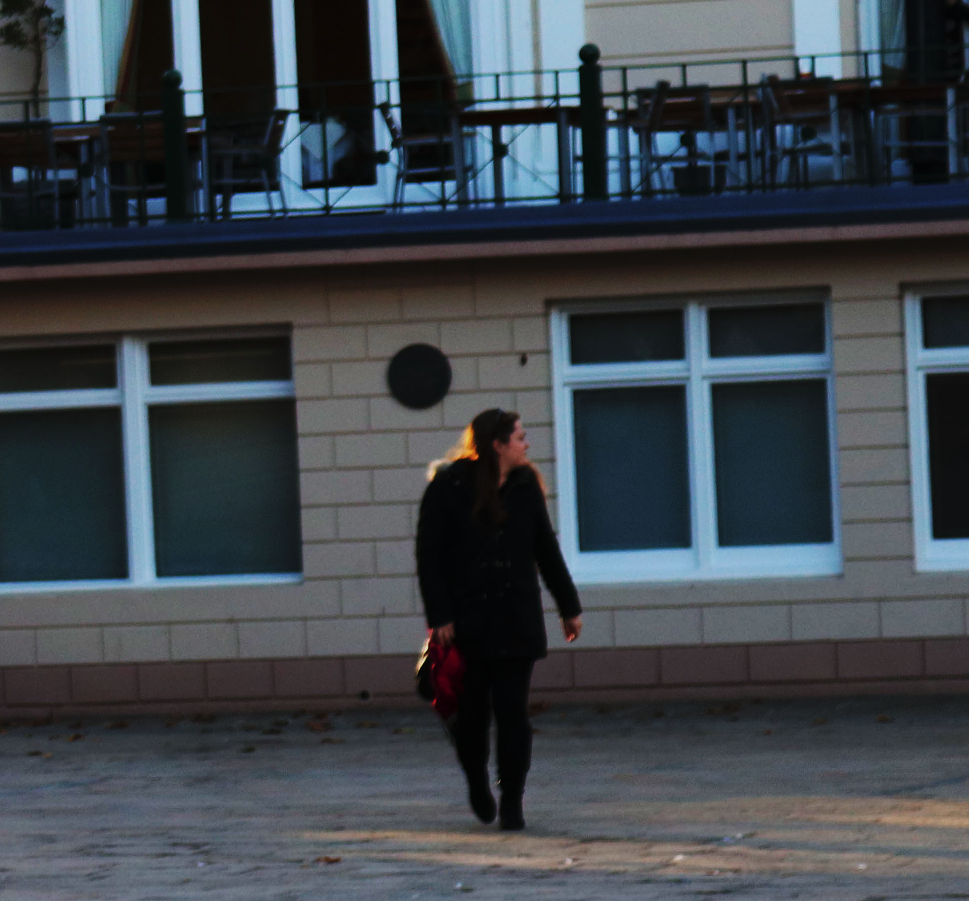
I think that the portrait photo that I produced is very similar to the style of Winogrand because it has the main features of his work, i.e. the main subject in the fore-ground and shows the street and the surrounding area to.

The other two images have elements of Winogrand in them, they are inspired by his work, but instead of having a person as the front point and main focus one has a shoe and shows the background and the setting of the street, and the other shows the opposite to the others with the background being out of focus and the main feature, being the bin, being thrown far out of focus.

To get all of the shots that I needed for this I did use a film camera like I talked about but I didn’t have the ability to get some black and white film of the grade I wanted in time and it would have taken too long to get developed.

Studio Lighting – Post 4 (Two Point Lighting Shoot)

Two Point Lighting:

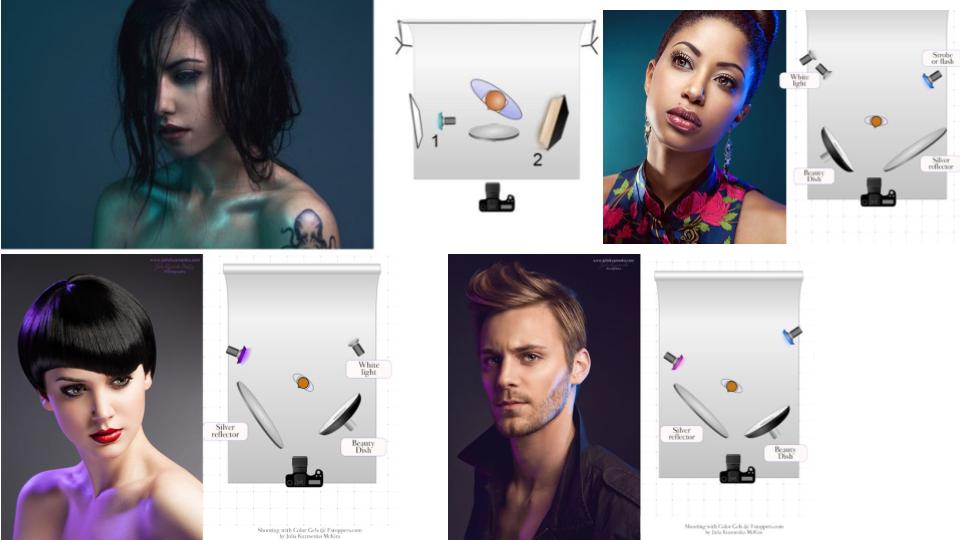
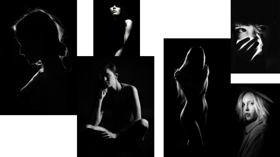
Two point lighting set up produces highlights in the eyes and some light and shadow. The secondary source of light is used to eliminate shadows that are created by the key light, it will soften contrasts and make more of the subject visible by enhancing the illumination of the face from  the key light.

It creates visible contours and enhances highlights and shadows on the face or body of the subject. It is very useful for close up portraiture as it shows off the facial features of the subject subtly. It is often used in the fashion and cosmetic industry as it creates a deep image with shadows and highlights and display the subject very well.

Mood Board:

My Response:

Best Images:

3 Point Lighting

What is 3 Point lighting?

3 Point lighting is the process of capturing the subject with maximal yet effective lighting, controlling shadows and shade.

This process involves a hair light, fill light and a key light, all positioned as shown in the diagram below.

Image result for 3 point studio lightingFor th

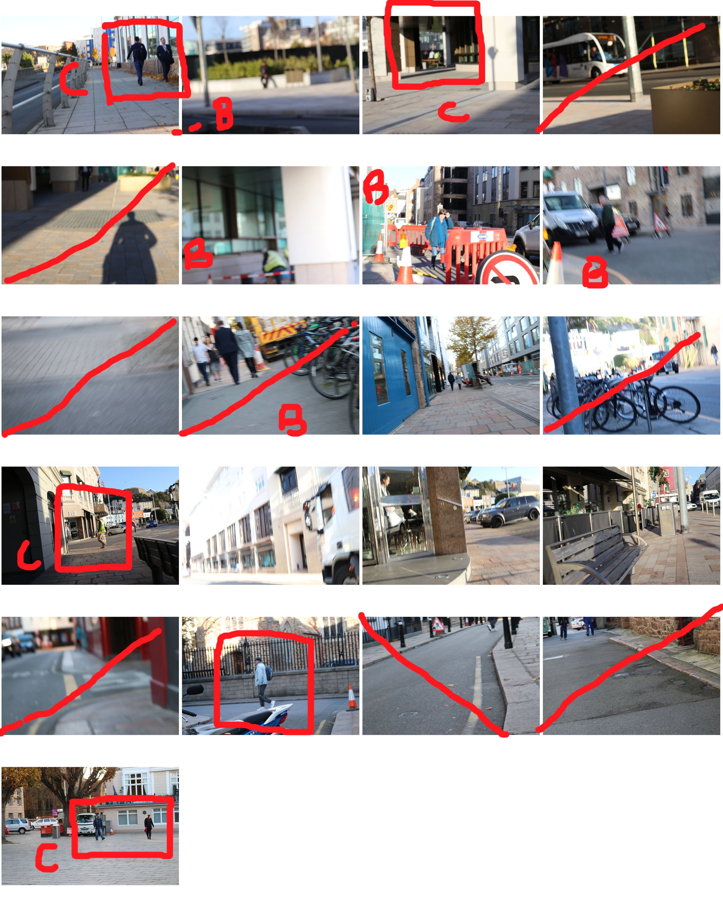
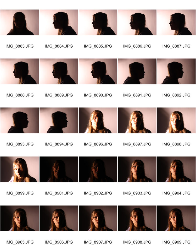
Contact Sheet

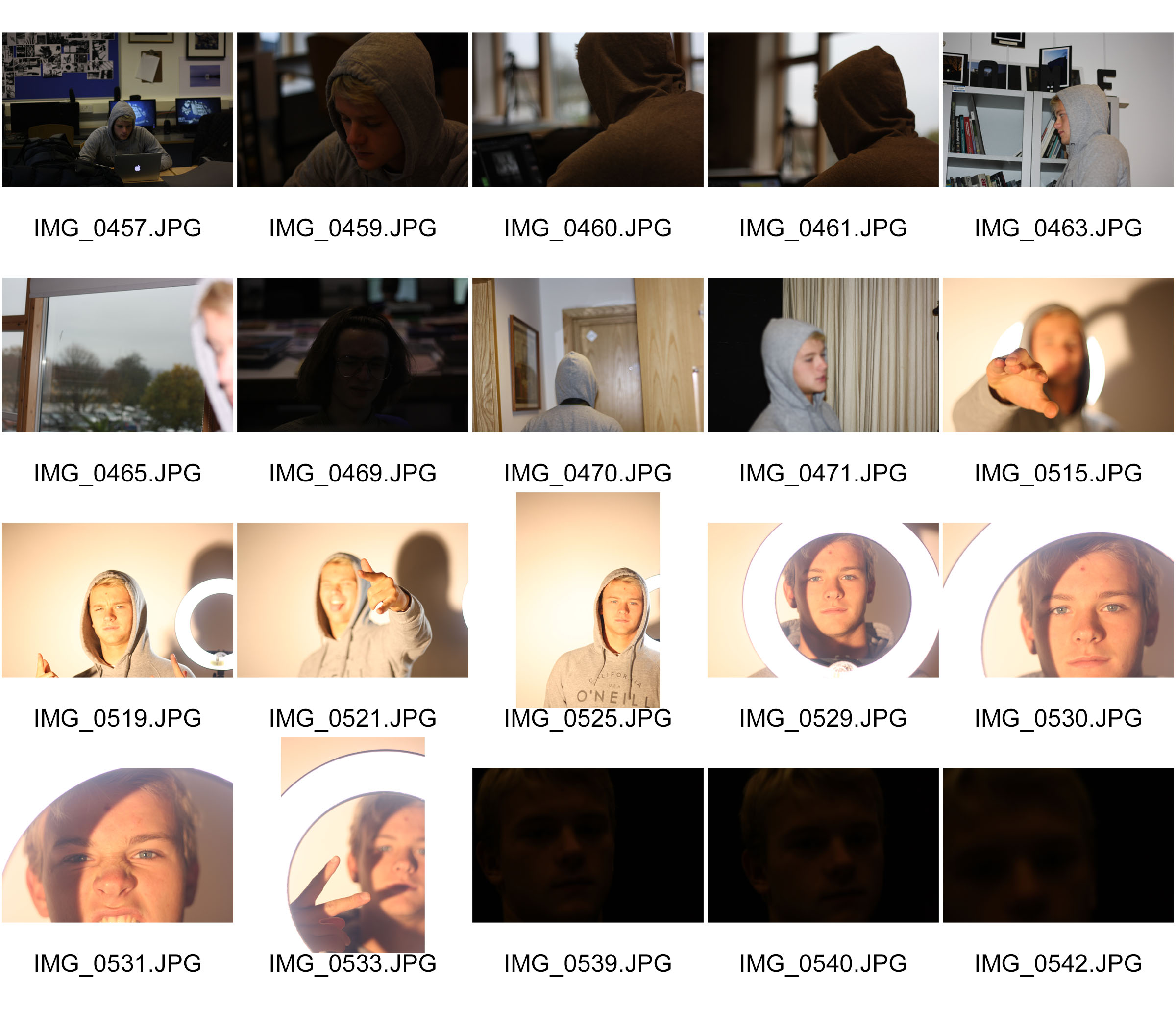
Here is a contact sheet of all my images from the shoot

Selected Image Editing

for this project, I wanted to explore more creativity with my editing, while not going too overboard

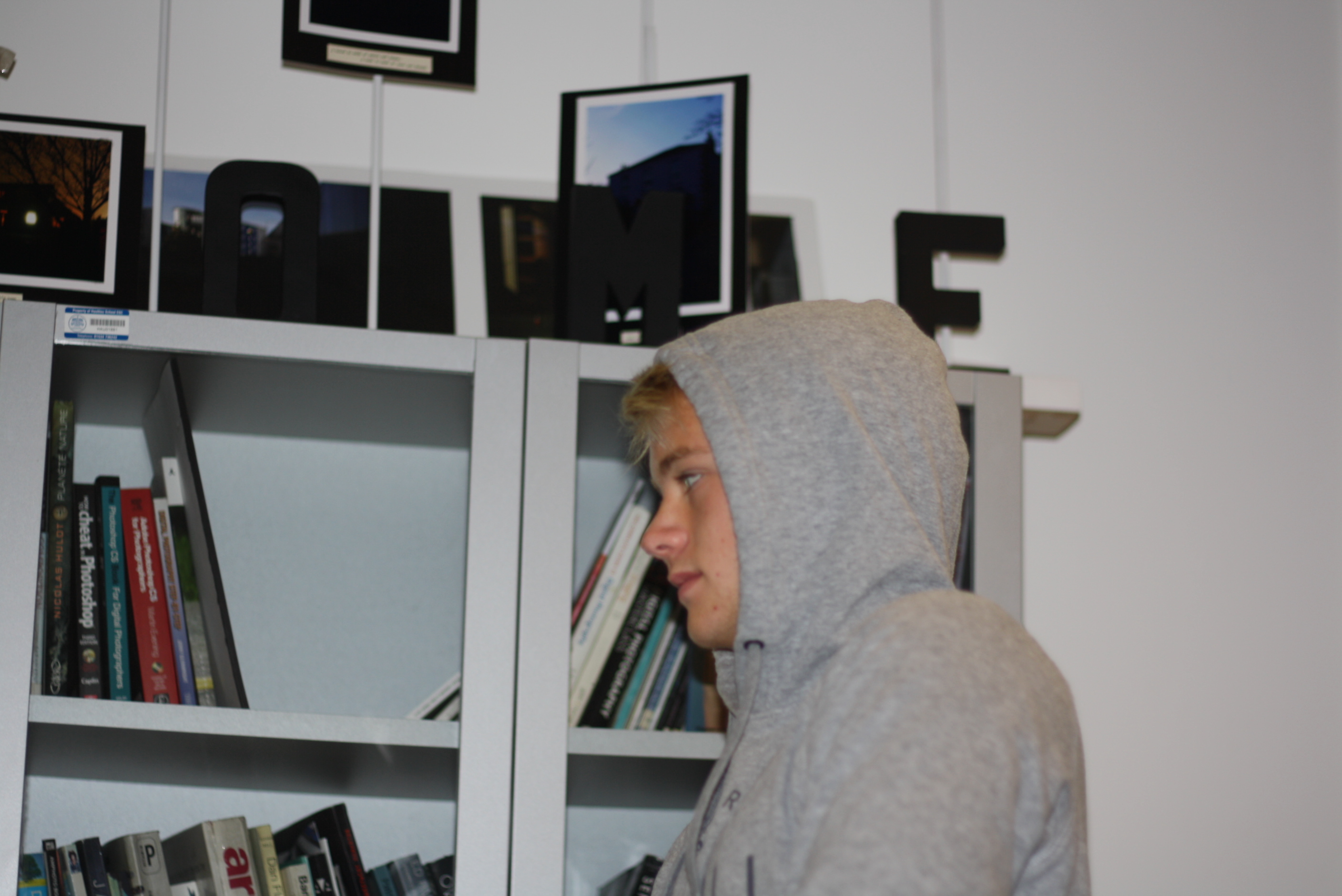
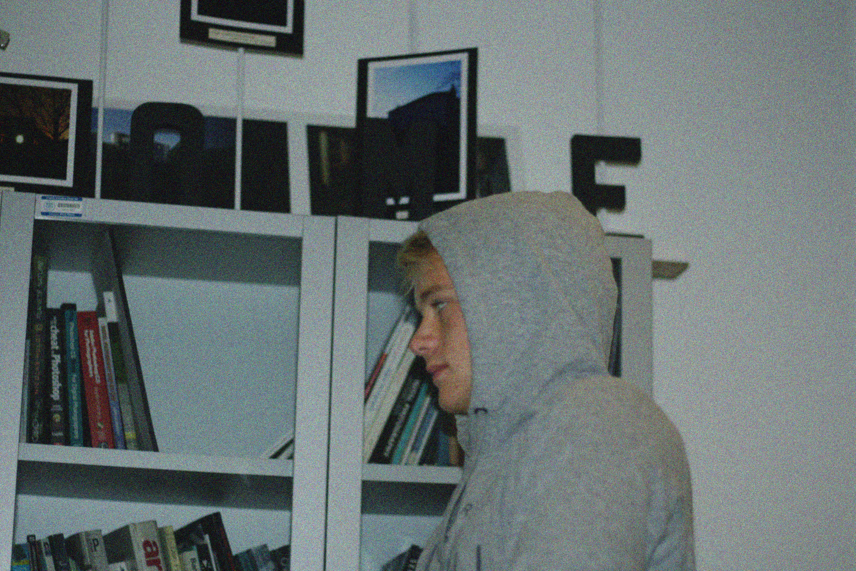
Here is an original photo

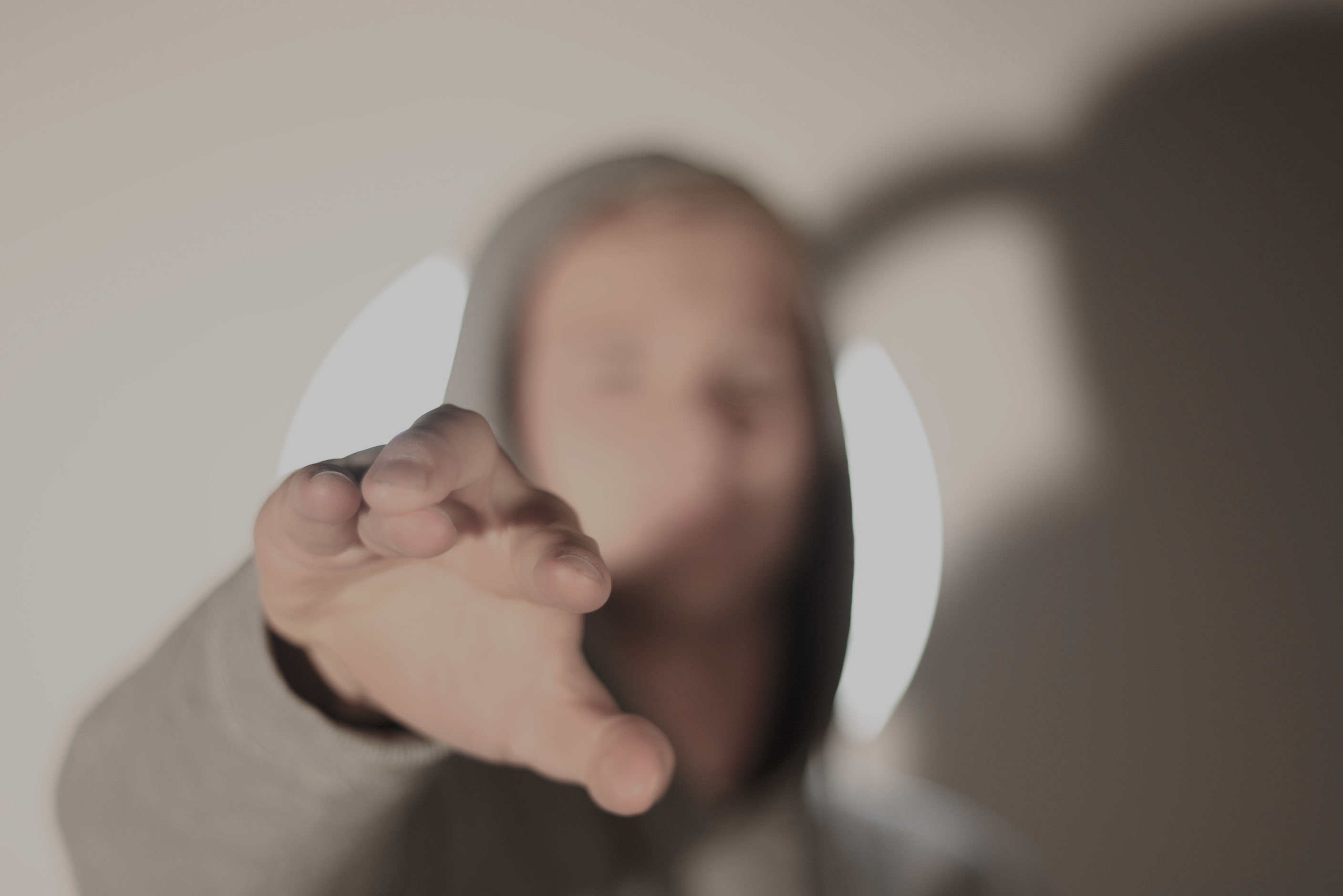
For this photo, I am going to lower the exposure slightly, increase the cyan colour within the image and apply a distorted filter over the top to give off a lo-fi effect.

Here is another image

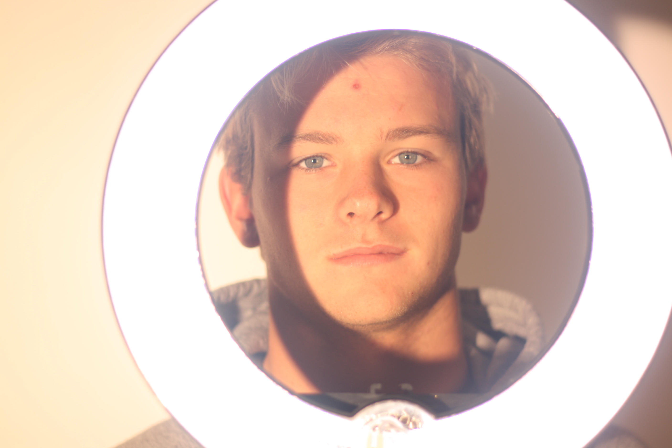
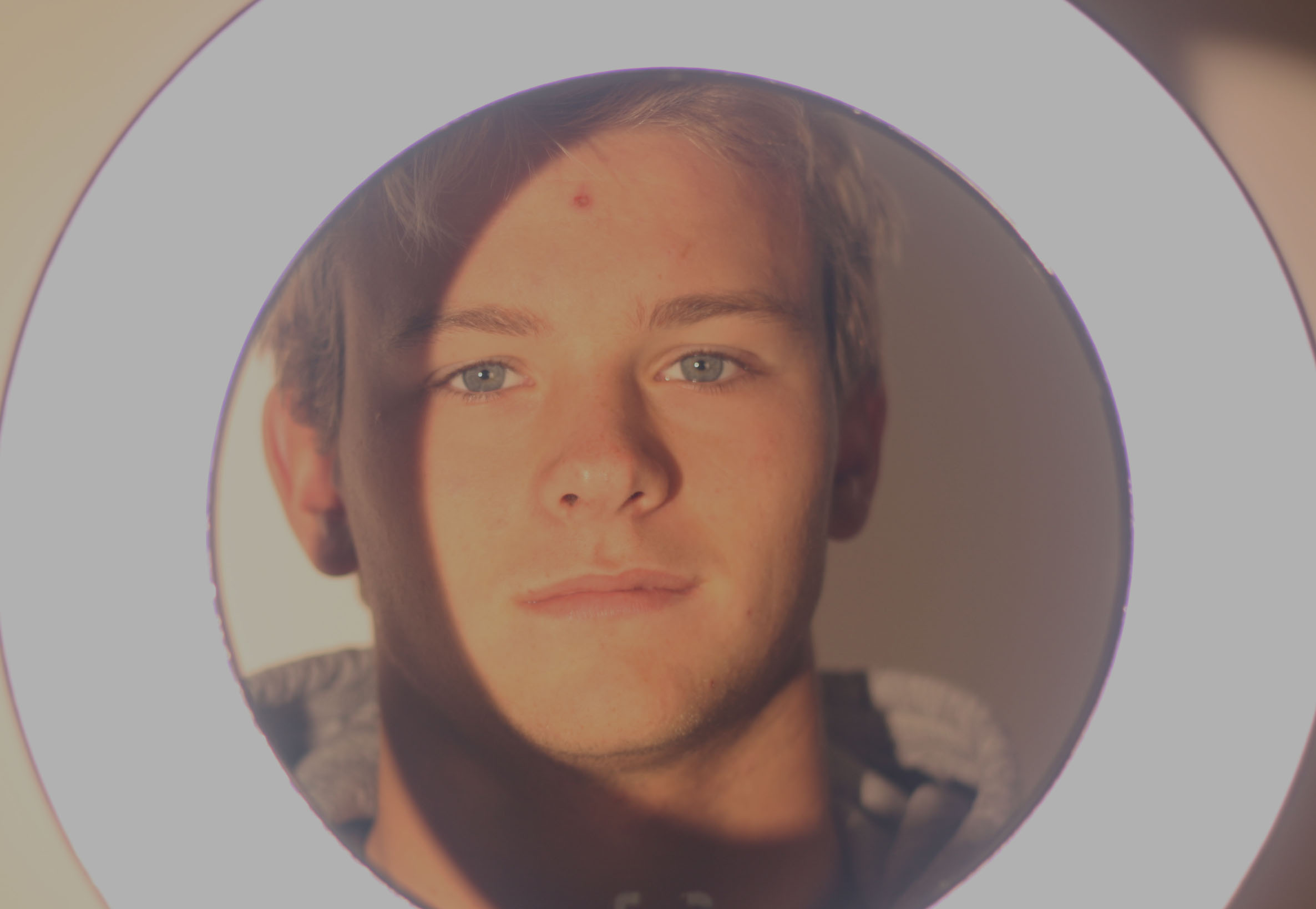
I decided to use the ring light as  a frame to almost isolate the subjects face and create high contrast effects with the ring light and a slight shadow effect on the subjects face while maintaining the 3 point lighting. However, I find the image way too bright so I will edit it accordingly

For this image I simply just lowered the exposure and slightly altered the vibrance.

Final Images

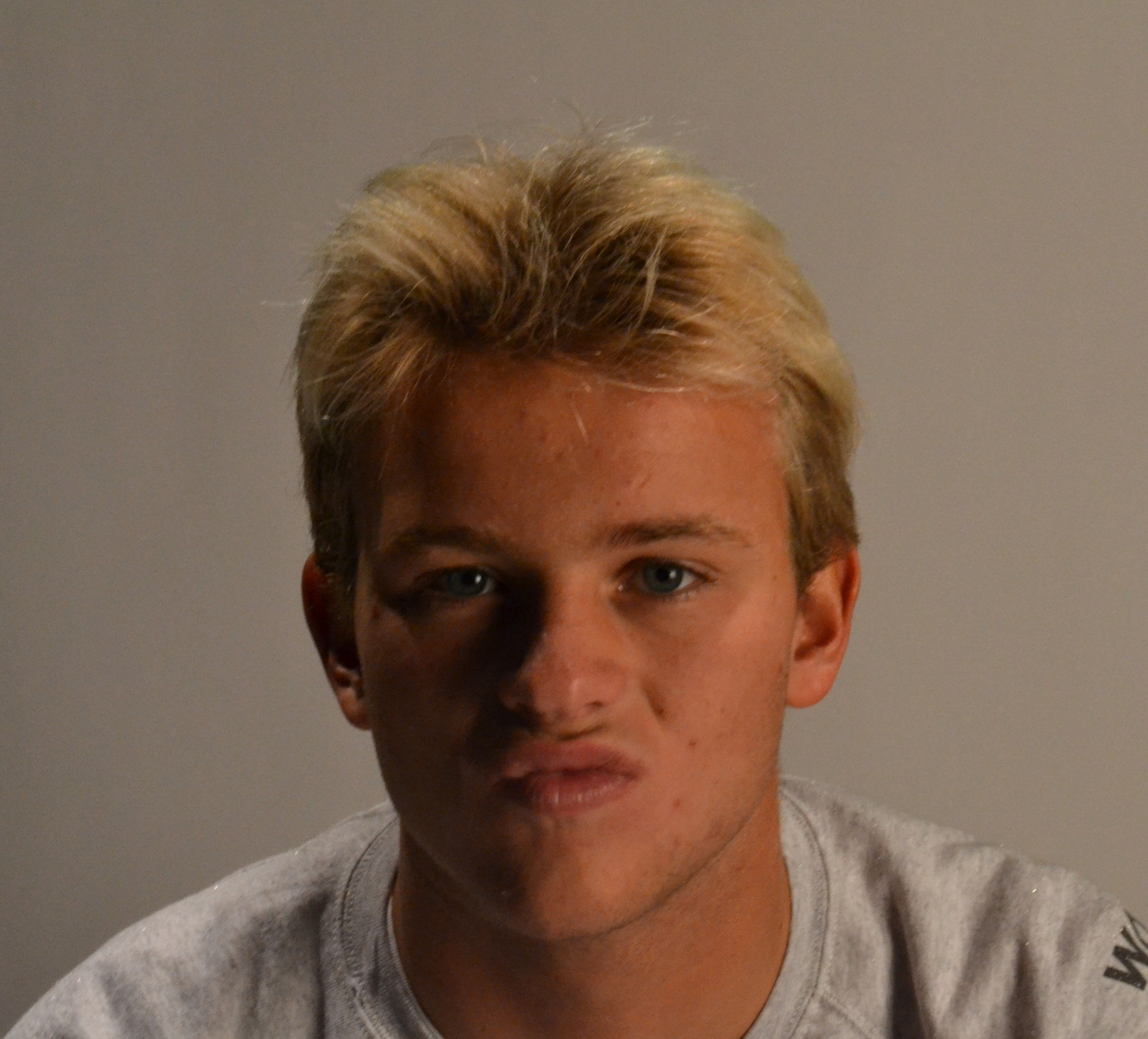
Here are my final images

Studio Portraits 2

When using the studio to take portraits there are 4 types of light you can use; red-head (soft/harsh light), ring light, spot light and flash light. I experimented with all types of lighting and came to a conclusion that I prefer flash lighting and lighting formed by red-head lights.

CHIAROSCURO – USING HARSH & SOFT LIGHT

Chiaroscuro is an Italian term for ‘light-dark’ Artists who are well-known for the use of chiaroscuro are Leonardo De Vinci, who gave vivid impression of three-dimensional figures. The effect started off in paintings and photographers slowly got inspired by the effect and brought it to photography. The ‘Mona Lisa’ is a prime example of the chiaroscuro effect.

Image result for is the mona lisa Chiaroscuro

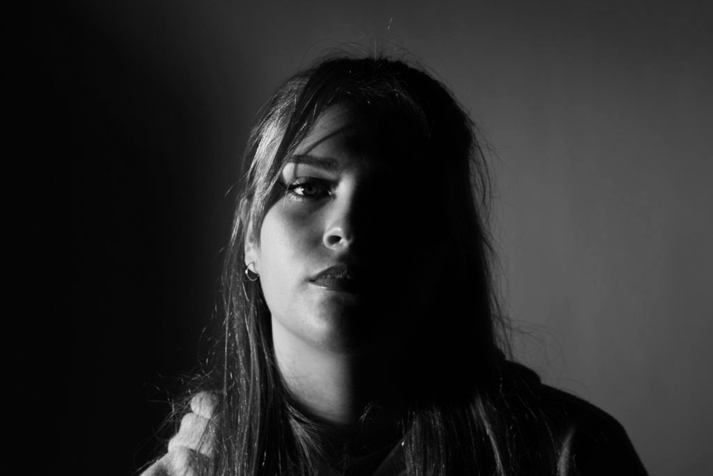
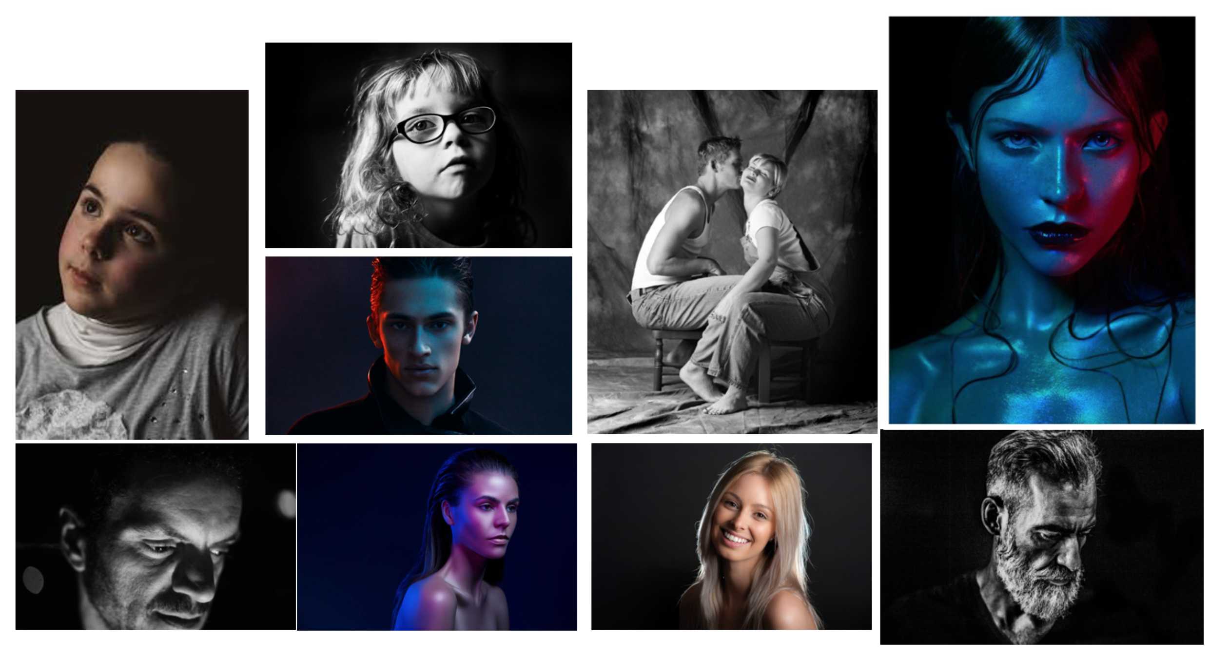
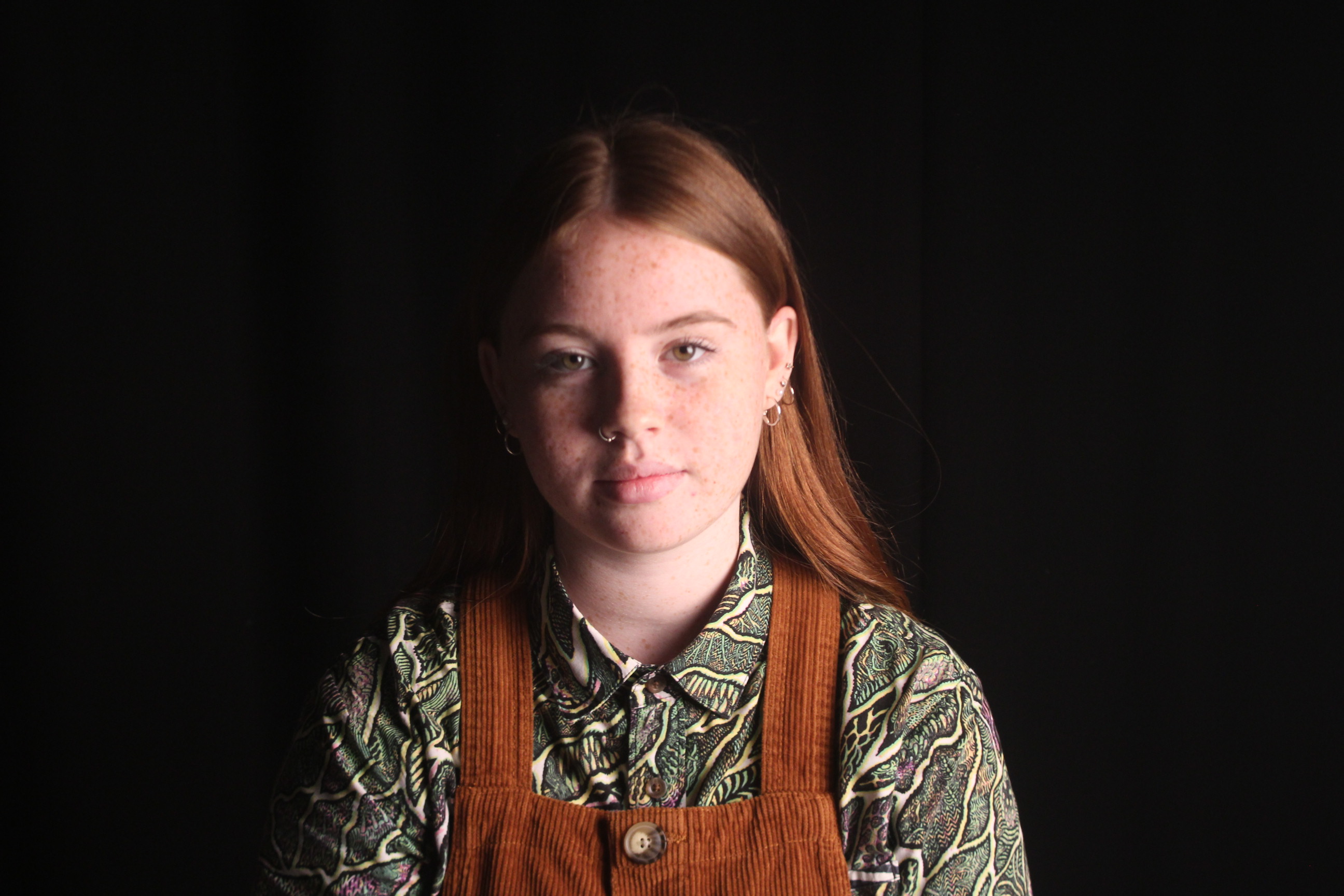
When experimenting with the chiaroscuro affect, I mainly had to focus on the contrast of light and dark, these types of photo give off a sense of volume and boldness through the photo. The image tends to have one side of the face lighten up by a studio light, which tends to be harsh to the face, which then causes the other half of the face to hide in shadow. Here are a few examples of chiaroscuro portraits.

MY RESPONSE
EVALUATION

To get this style of photo I shined a soft light, to the side of the girls face and I used a black background so the chiaroscuro effect would be more defined and bold. I took these photos using a manual setting, I had the shutter speed at 1/200, this is so the camera wouldn’t take in all the light that was available and I had the ISO on 100 so the camera wasn’t too sensitive too light, otherwise my images would’ve been over exposed and too white. I feel that using a stronger more harsh light shows the chiaroscuro effect more. The strong light creates a bold shadow on the other half of the face making you focus in on the side that is lit up and in center focus on the image.


RING LIGHITING 

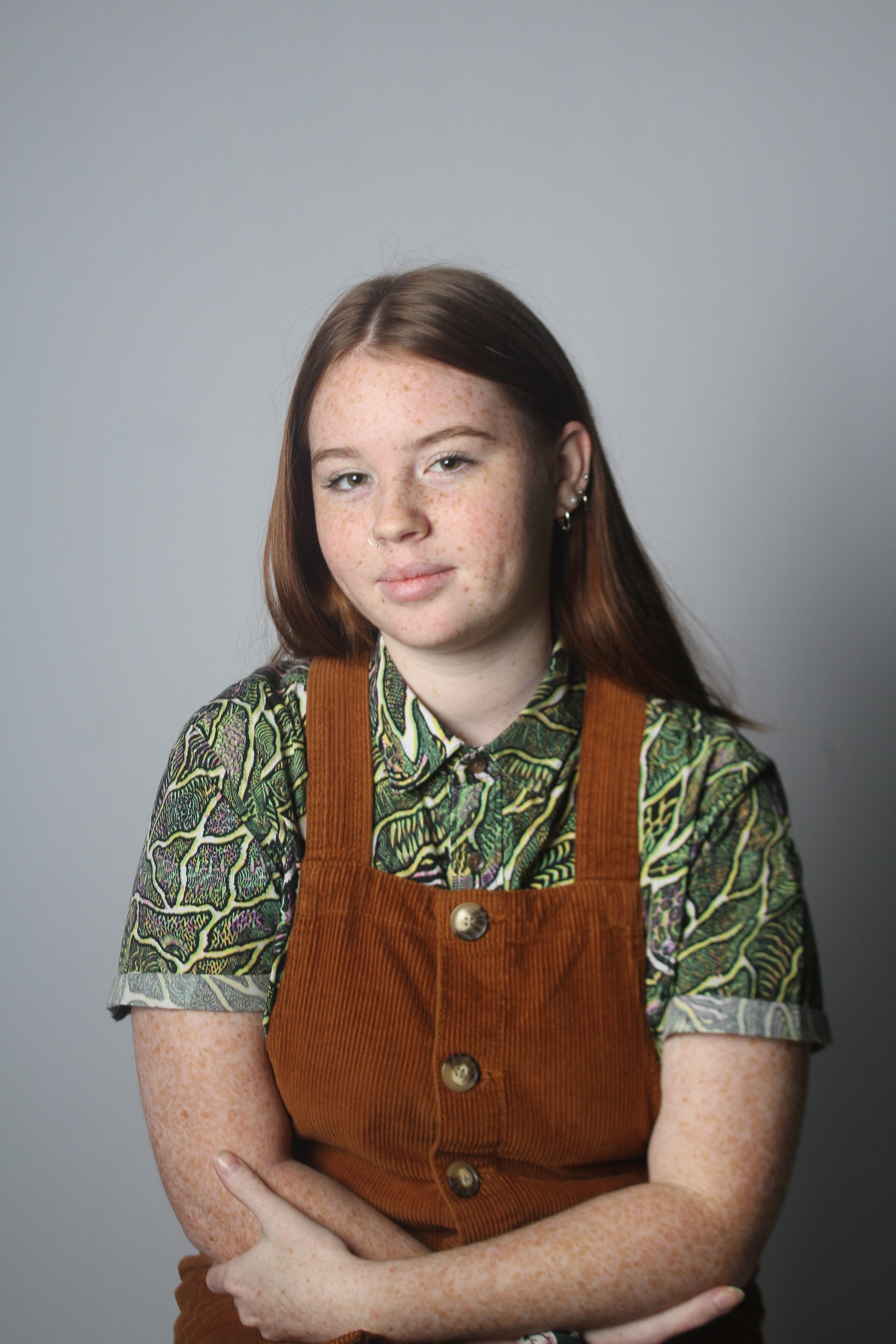
Ring lighting allowed me to really focus on the detail of facial features. I could sit the camera in the middle of the ring, which allowed me to get stability so my photo wouldn’t be blurry and I could get the persons face in the center of the image.

The ring light could be adjusted by a dimmer, making a stronger or weaker light. I prefers the stronger light as it made a more powerful image. When photographing using the ring light, I again used manual focus, had my ISO on 100 so the camera wouldn’t be to sensitive to the bright light and my shutter speed on 1/400, this allowed me to get a sharp image that wasn’t over exposed due to the lighting. Here are a few results of using ring lighting;

EVALUATION

This type of lighting is one of my preferred because it highlights the area you want to focus on. The strong lighting creates a soft tone on the skin. With the white background it makes the subjects pop and become the center of focus. Ring lighting can be used in many different ways, to get your concept across to the viewers, these images where just experimental for the next time I shoot with a concept. The images have a sharp focus to them, that is clear for viewers to understand what is in the image.


FLASH LIGHTING

Flash lightening tends to be used when photographers take school photos, or family portraits. 

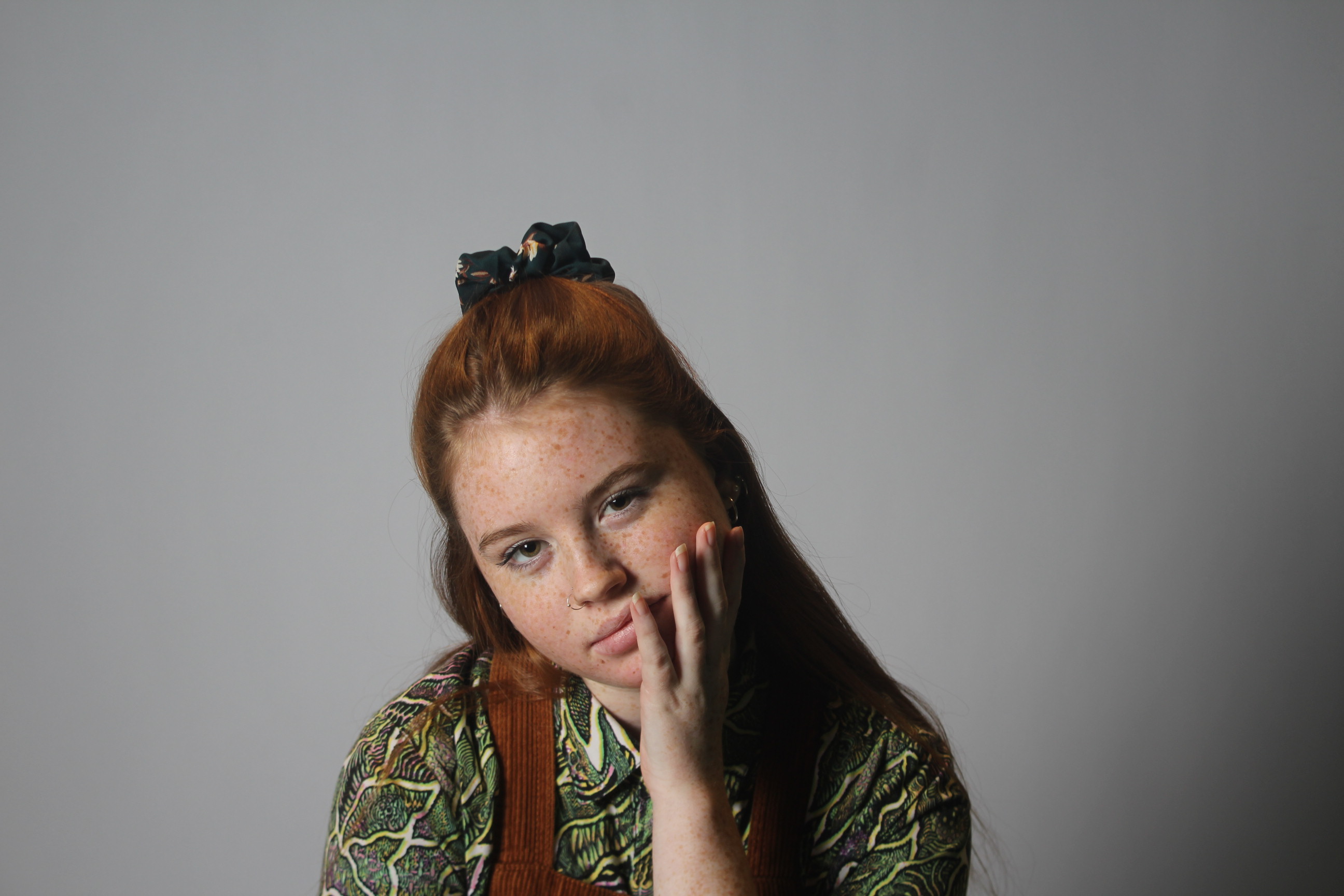
This light is covered by a cover to make the flash softer on the skin when the image is taken. A device is put on top of your camera and then is connected to the light, which controls the flash, so that when you press down the capture button it sets of a flash so that the subject is captured in a sharp light.  Some of the images I produce with this lighting are; 
EVALUATION

This lighting allows you to capture your image how you want it. It creates a soft tone throughout the image and with the white background it makes the images look sharp and fresh. This type of lighting is my favorite.

FINAL IMAGES

These images are my favorites out over the 3 shoots I have done in the studio using different types of lighting. With experimenting with the different types of lighting and how to adjust my camera to the different lighting I feel I can now apply it to when I am photographing in the studio again but next time having a concept behind my images can make them more connectable to the viewers.
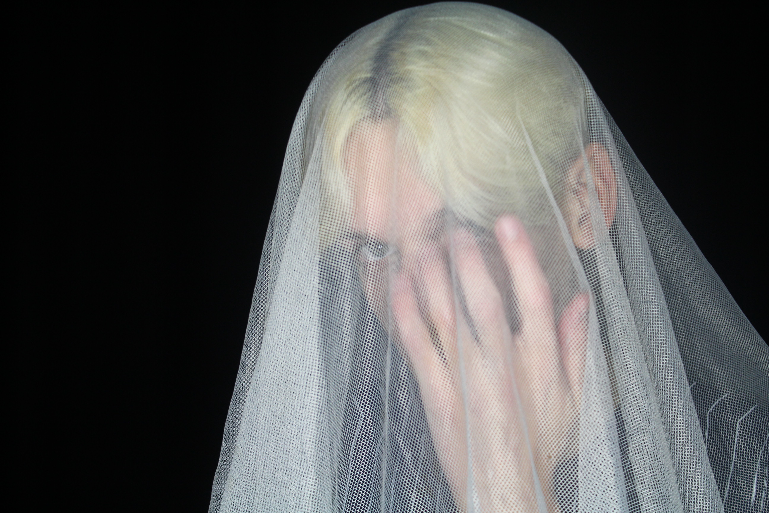
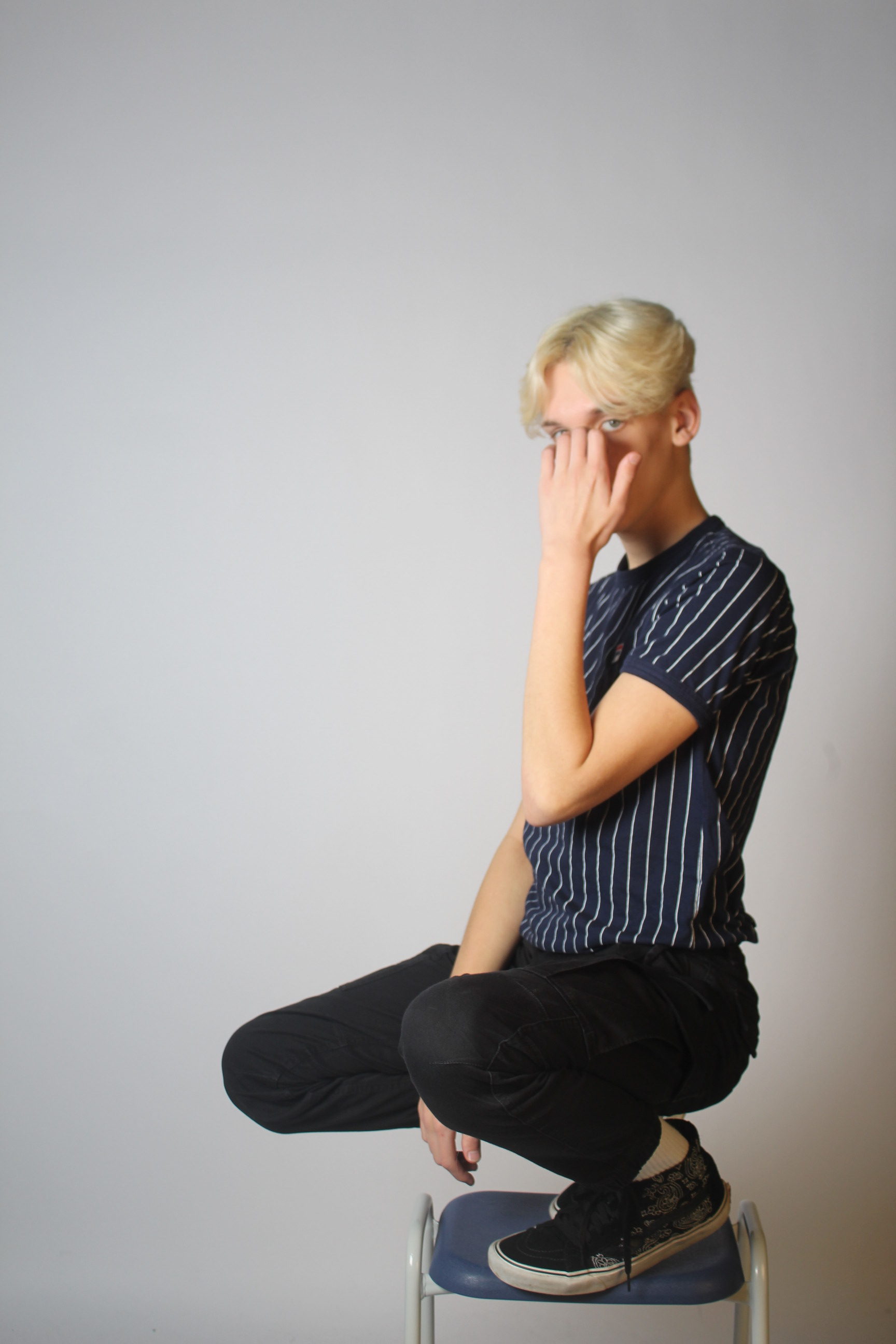


Studio Lighting – Post 3 (Chiaroscuro Shoot)
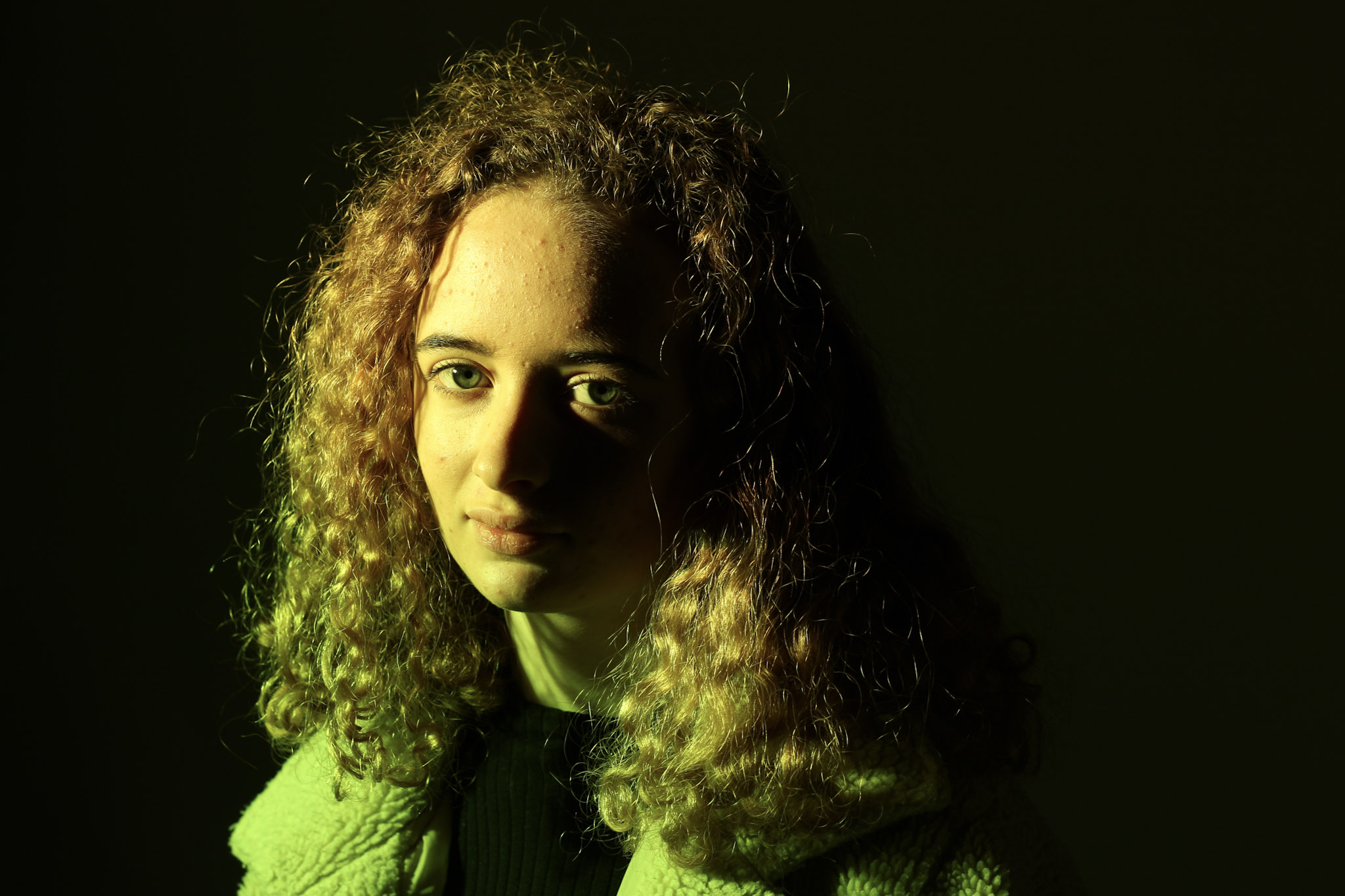
Chiaroscuro:

While the term chiaroscuro originates from the Renaissance period and is often associated with painting or drawing, it has evolved into the photographic world and now often simply means strong and bold contrasts between light and dark areas in a photograph.

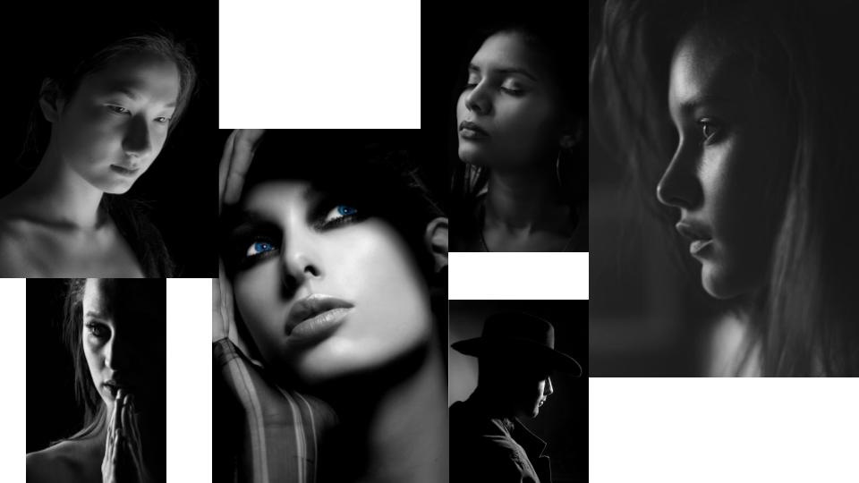
Chiaroscuro is achieved by using one point lighting to illuminate one side of the face while the rest of the face and background remain in shadow. It creates bold images which are often composed in black and white to further enhance the effect. It allows for a strong sense of form with very little exposure of the subject’s full appearance. This can be used to emphasise elegance or tone of a figure, as well as beauty and structure of the face. This is why chiaroscuro is often used to create aesthetic images as opposed to more thought provoking or meaningful photos.

Mood Board:

My Response:

Best Images:

Studio Lighting Shoot 1 – Experimentation

What Is Studio Lighting:
When lighting a studio setup, dramatic lighting is important. Create dramatic lighting by producing a lot of contrast. This means that dark areas are just as important as light areas. Dramatic lighting requires a number of light sources placed in a way to create very light and very dark areas.

The most basic studio lighting arrangement uses a key light (1), a fill light (2), and a back light (3). This is the most common lighting arrangement for standalone characters and objects in the studio. A three-point setup will give good results right away and is an excellent starting point for creating special effects. Spotlights are useful because you can control their direction and hot spot to give the scene drama.

http://docs.mcneel.com.s3.amazonaws.com/flamingo/nxt/help/en-us/lighting/studio_lighting_basics.htm
Basic 3 Light Set Up:
Key light: The key light is the dominant light in the scene. It sets the mood, provides direction, shows dimension and texture, and creates the darkest shadows. 
Fill light: The fill light is placed just above the lens on the opposite side from the key light. Its purpose is to reduce contrast and bring out detail in the shadows by simulating light reflected off nearby objects. The key light and fill light may be of equal intensity for a low-contrast result, but the key light is usually brighter and harder than the fill light. The fill light should not introduce any more dark shadows into the scene.
Back light:  The backlight effect is subtle but can define the edges of objects in the scene and add depth by preventing objects from blending into the background. Backlights are usually placed behind and above the object and are pointed toward the camera. The effectiveness of backlights depends in part on the reflectivity of the surfaces they are lighting.

http://docs.mcneel.com.s3.amazonaws.com/flamingo/nxt/help/en-us/lighting/studio_lighting_basics.htm
Mood Board:

Action Plan:
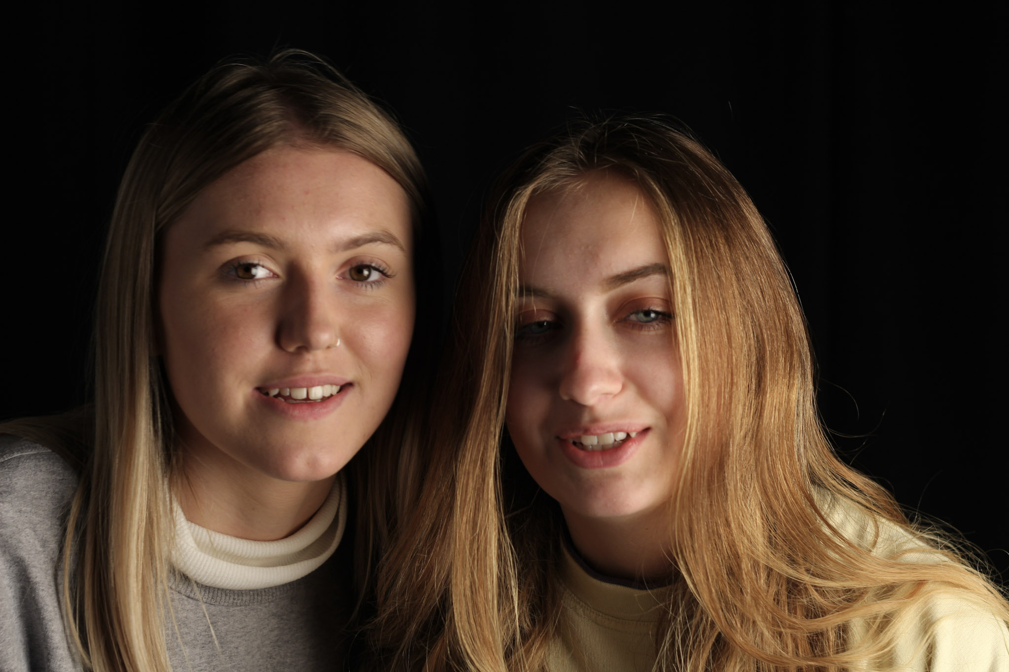
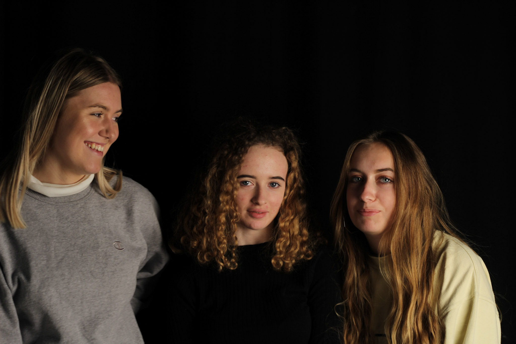
In my first studio lighting shoot I am going to try to create both contrast by having one half of the face with the light, and the other half with a shadow. I am also going to experiment with filters and using two lights on either side of the face. I will also experiment with shooting onperson, two people and then three people to see how the light works with numerous people. There are two lights that I am going to switch between my images, a light with a soft box and a redhead light. With the red head light I also placed coloured filters over to experiment with.
The Photoshoot:

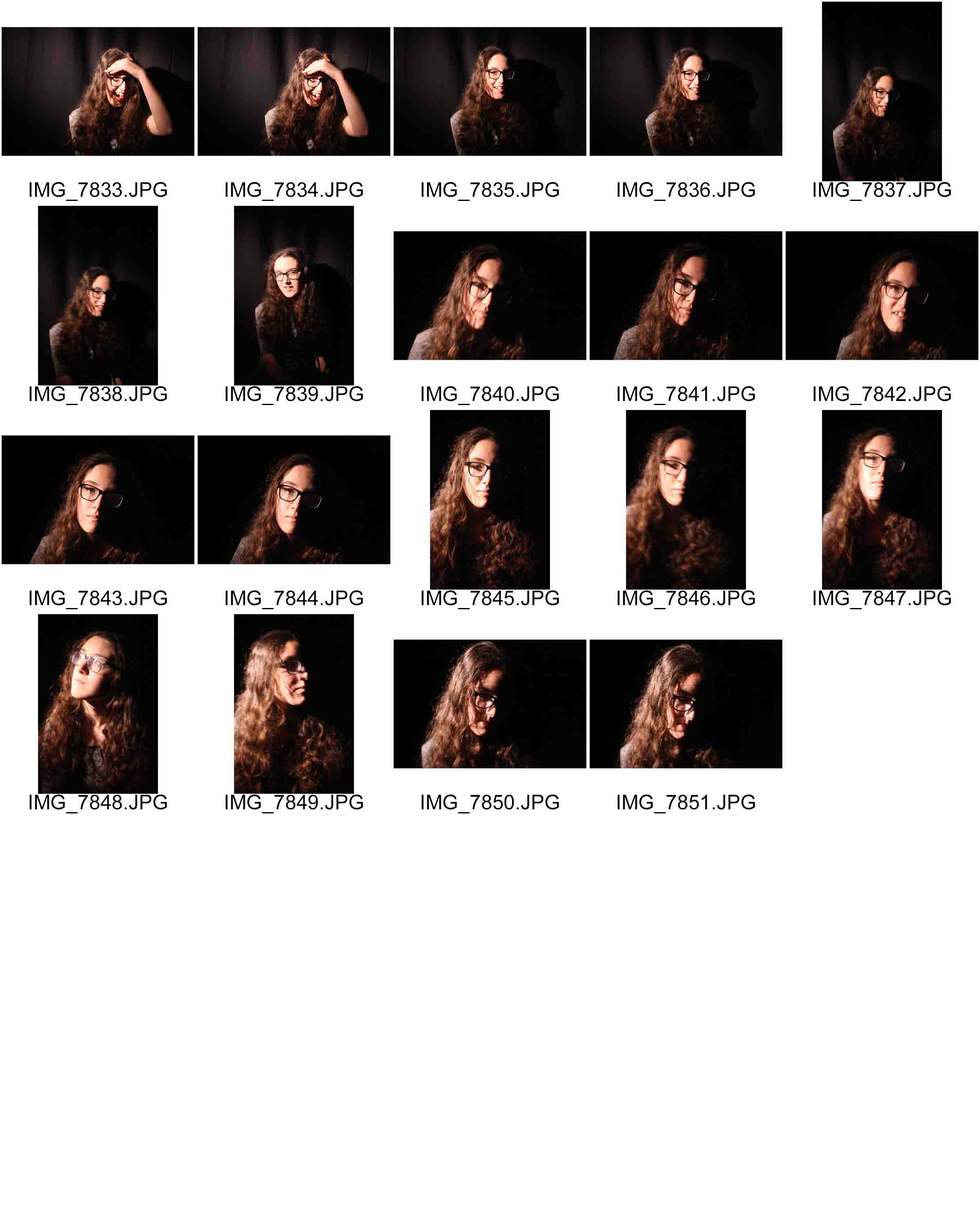
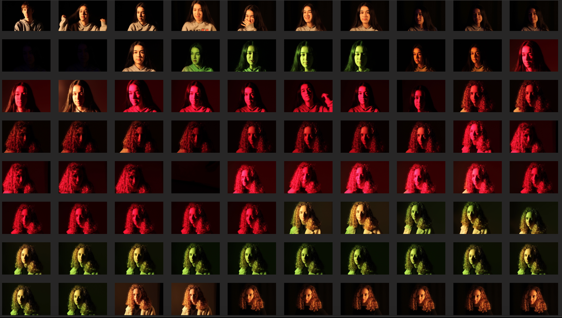
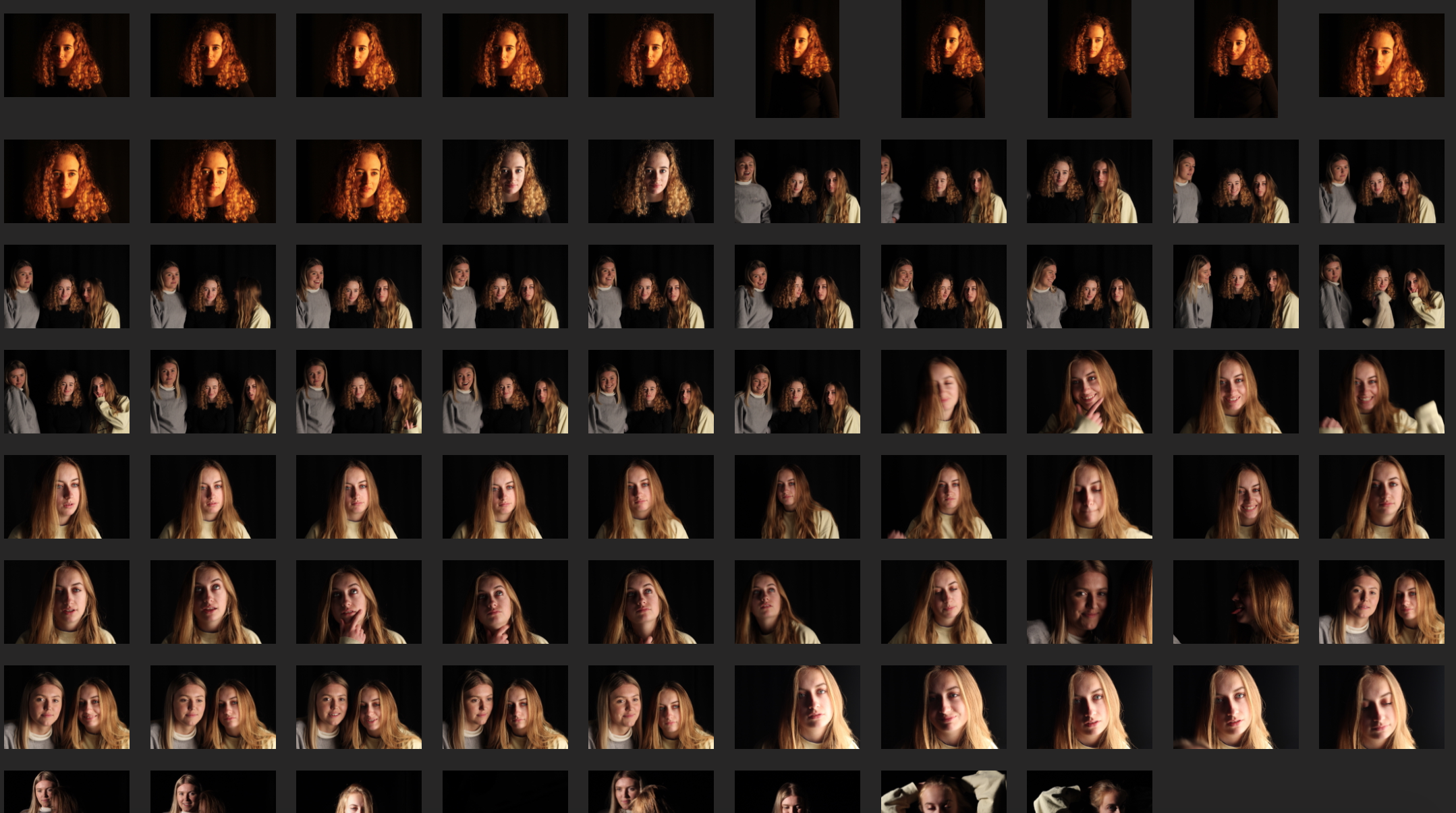
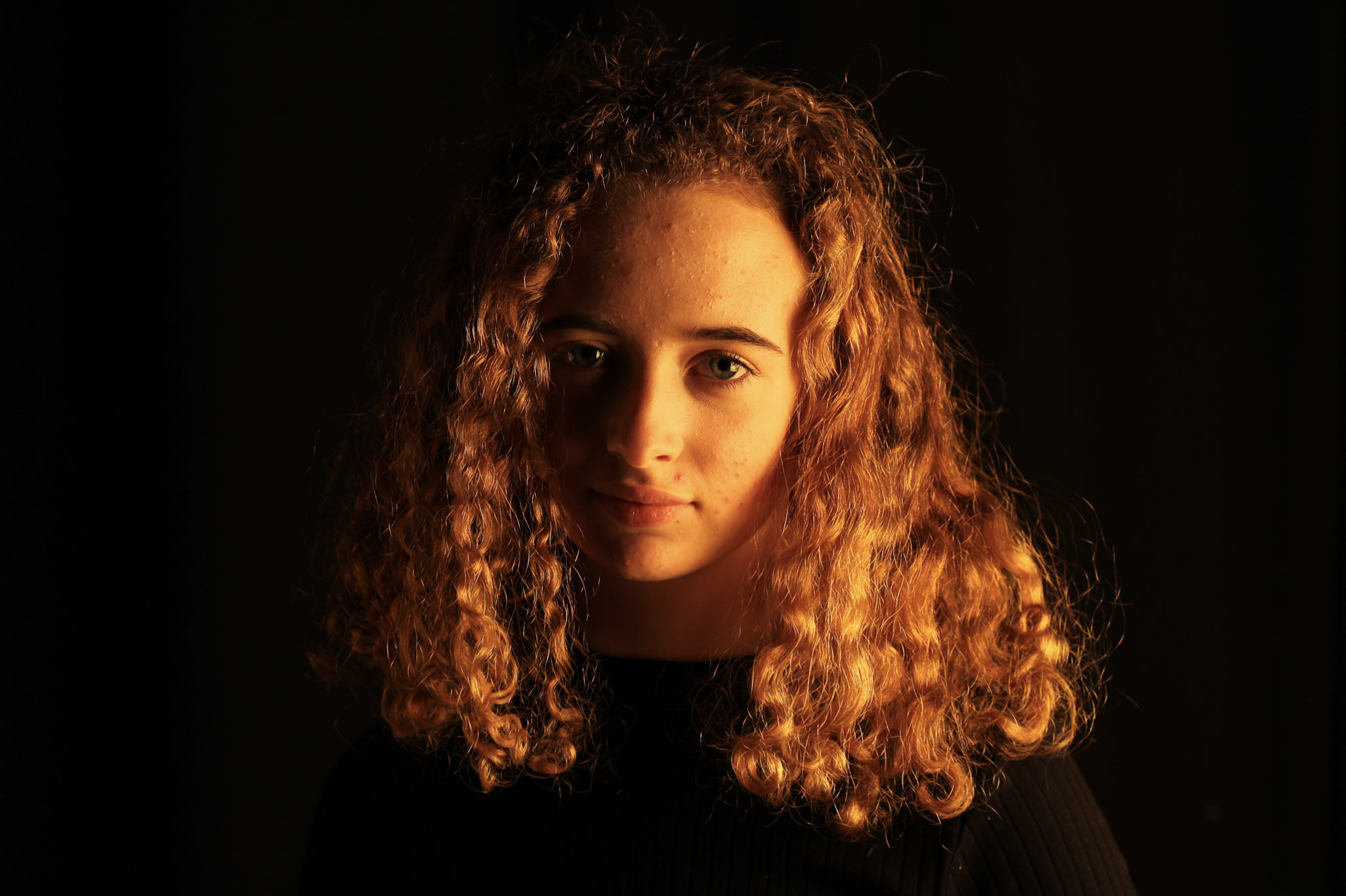
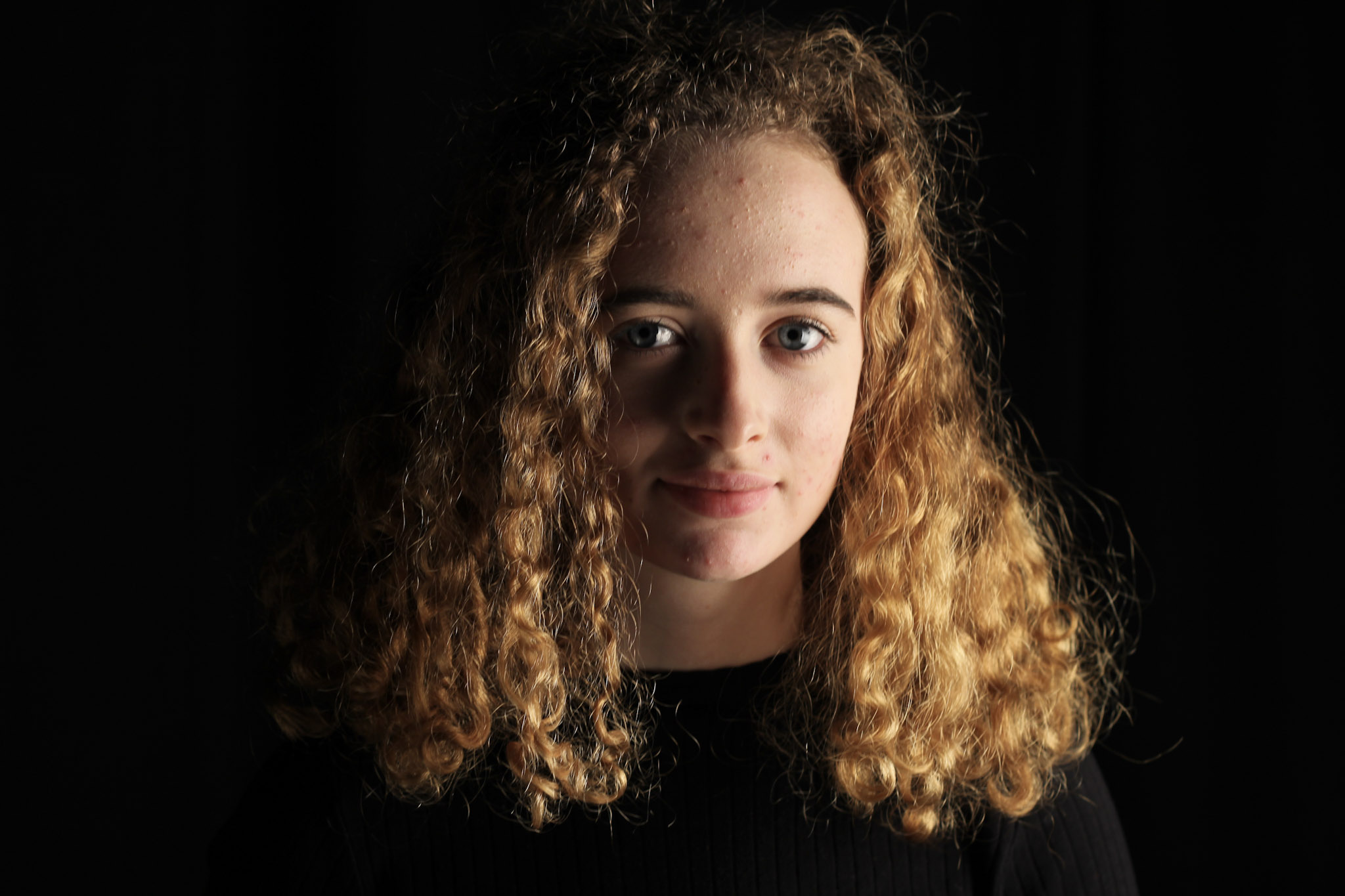
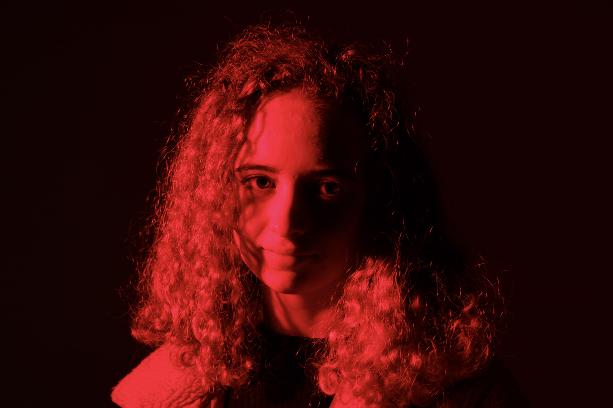
As you can see I experimented with soft light, hard light, colour filters and multiple people. I also experimented with different white balances, creating a warm tone in some images. The shadowing of the soft box creates a contrast across the face betwen light and dark. It adds mystery and depth to the image. I stood fairly close to the models while taking the images however I also wanted to include the black background in the image because I feel it makes the models stand out more.
Images to Manipulate:
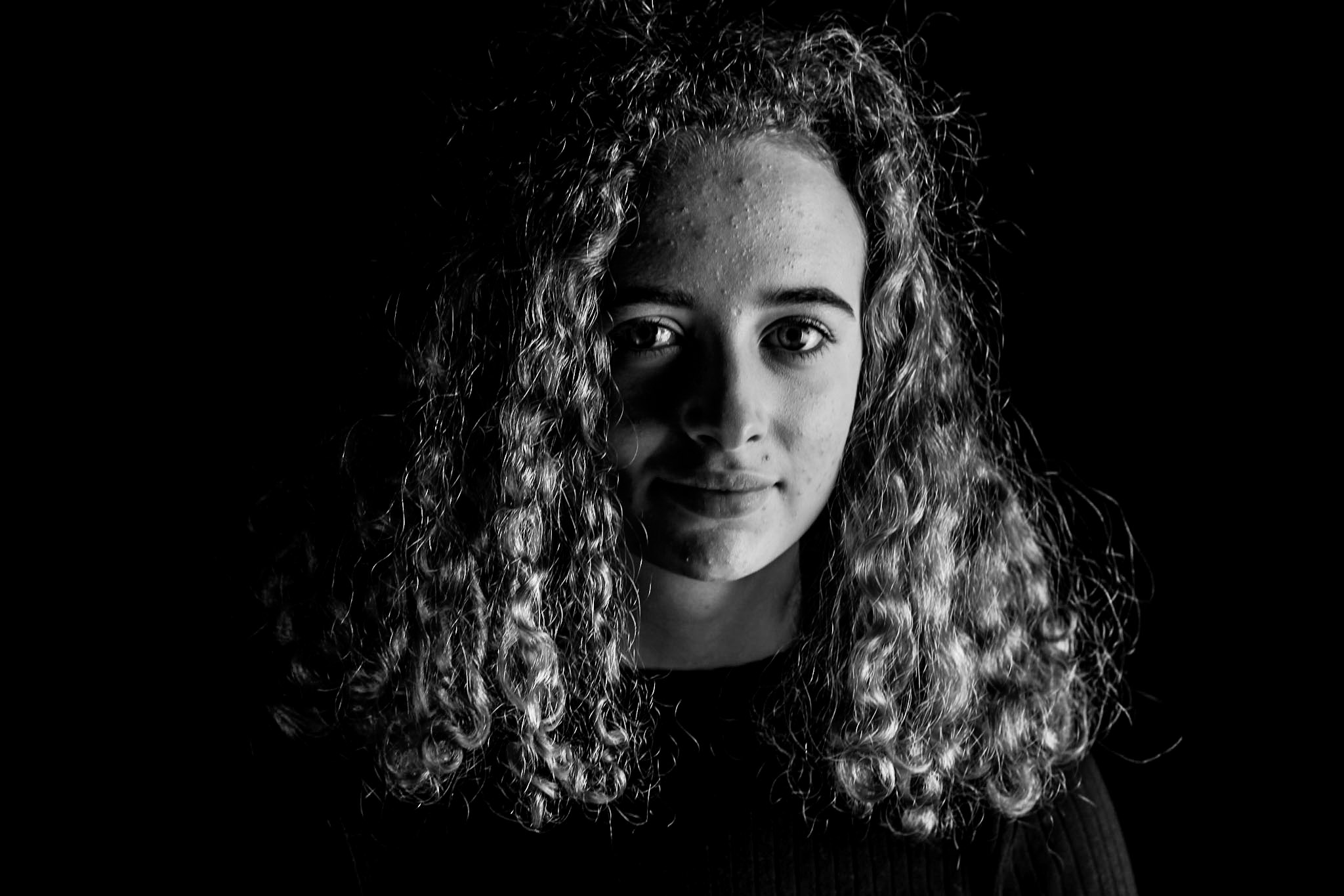
I chose to manipulate these images because they were the most focused and aesthetically pleasing images. I feel that the curly haired model Aimee has very photogenic eyes which make the image more interesting.
Manipulated Images:

I manipulated all of these images using adobe lightroom. I adjusted general settings such as contrast, highlights, shadows, exposure, vibrance, saturation and clarity. However, with some images I also experimented with presets. For example, my image of my friend Aimee in black and white was applied with the black and white filter "punch". I then slightly adjusted the exposure, highlights and contrast.
Reflection:
Overall I did like the outcome of my images. Once again I need to perfect my focusing skillsbecause some of my images are still slightly blurry. I also need to experiment with different lighting techniques such as using two lights at once. I would also like to experiment more with composing my images to make it look more interesting and maybe using male models aswell so I can compare and see if I have to take my images any differently.