Category Archives: AO3 Record Ideas

Filters

Author:
Category:

Photo-Montage Experiments

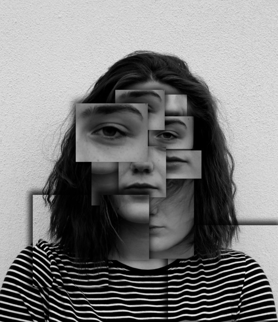
In my first experiment I wanted to create a piece which was similar to Brno Del Zou. I liked the overall message that he was trying to create and surrealist approach. In order to create this I re levelled this photograph in order to give off a dramatic effect, then I turned my photograph into black and white in order for it to look like Brno’s work. I then cropped the photograph to only have the shoulders and the face of my model in the frame of the image. Next I used the rectangular marquee tool and selected different features of the face. I then pressed ctrl + J to copy that section and ctrl + T to enlarge or make smaller that feature. I then repeated this until I was happy with the effect. Once I had all the section cut out I moved around the layers to ensure I liked the way that they all overlapped each other. Finally, I added drop shadows to them to make them stand out from the original image, it is also used to help create a 3D effect. I am very happy with the way that this photo-montage has turned out as it is ascetically pleasing to look.
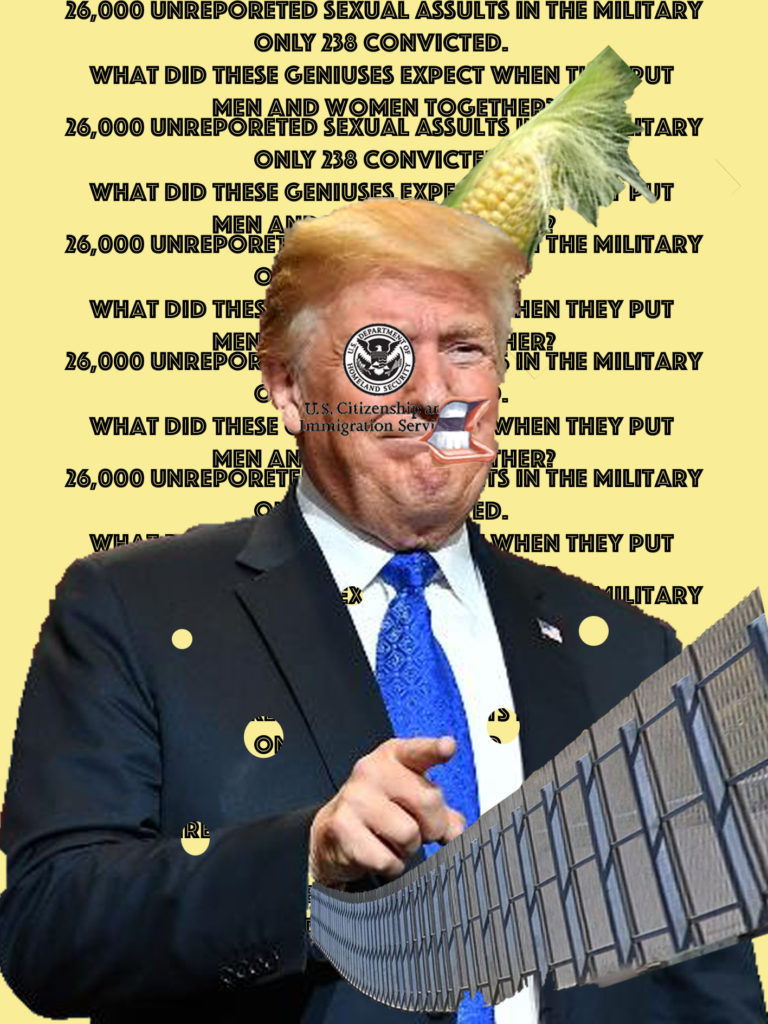
In response to Hausann I decided to create my own Dadaism photo-montage in a similar style. First off the background is made out of a sexist quote that president Trump said in one of his speeches. This being repeated allows the viewers to understand the point being made and emphasises how foolish the president is. Trump himself is located in the centre of the frame with his finger pointing towards the viewer. Pointing directly at someone can be considered rude, so by using this image I wanted to portray the rude side of Trump. Coming out of his arm is a long fenced gate wall, which is presenting his idea on building a wall which he wants to place on the boarder of Mexico and USA. His left eye has been replaced by the USA’s Immigration services logo, to show the idea that he wants to stop immigration into the country, making it hard to live their if you where not born their. I put this on to show how hypercritical Trump is, he is saying all this about immigration but then his wife is not from America but he bought her into the country to live, but he sees that as okay. Similarly to Hausann’s work I used a cartoon mouth to show that Trump is very much all say and does not think before he speaks. By trumps head is a bit of corn, which went viral on social media when people started comparing Trump’s hair to different objects. Implementing this into my work allows me to express my views that Trump is just a joke. This photo-montage is used to express my negative viewpoints towards the current US President, as I do not believe he is doing America justice. As shown their are many similarities between mine and Hausann’s work as I was inspired by him to create this piece.

*All of the images used in this piece have been taken from google.*
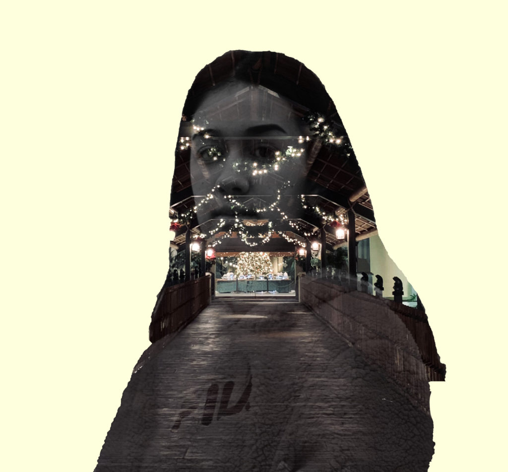
My next montage is using the double exposure technique, where I combined two images together. First of all I opened the picture which I wanted to expose the background image. Once it was opened I levelled the image by pressing ctrl + alt + L. I then outlined the model by using the quick selection tool,I then pressed ctrl + Jwhich copied the outline onto a new layer. Next I created a new layer and put it underneath the layer with the outline. I also made the background layer invisible by pressing the eye. With the new layer made I turned the background white using the paint buckettool. After I choose the background image and placed it onto the page with the model. I then moved the background image around to go over my model. After I pressed ctrl + left clickedthe layer with my model which showed the outline. I then pressed the background layer and made a new vector mask. Which now shows the outline and the background inside the outline. I then turned the opacityof the top layer down to 58% in order to see the background and the models face. Finally I made a new layer and rubbed out the sharp edges. I am very happy with the way this photo-montage turned out as I like how it takes upon the surrealist approach. I also like how this idea begins to present the theme of identity and place.
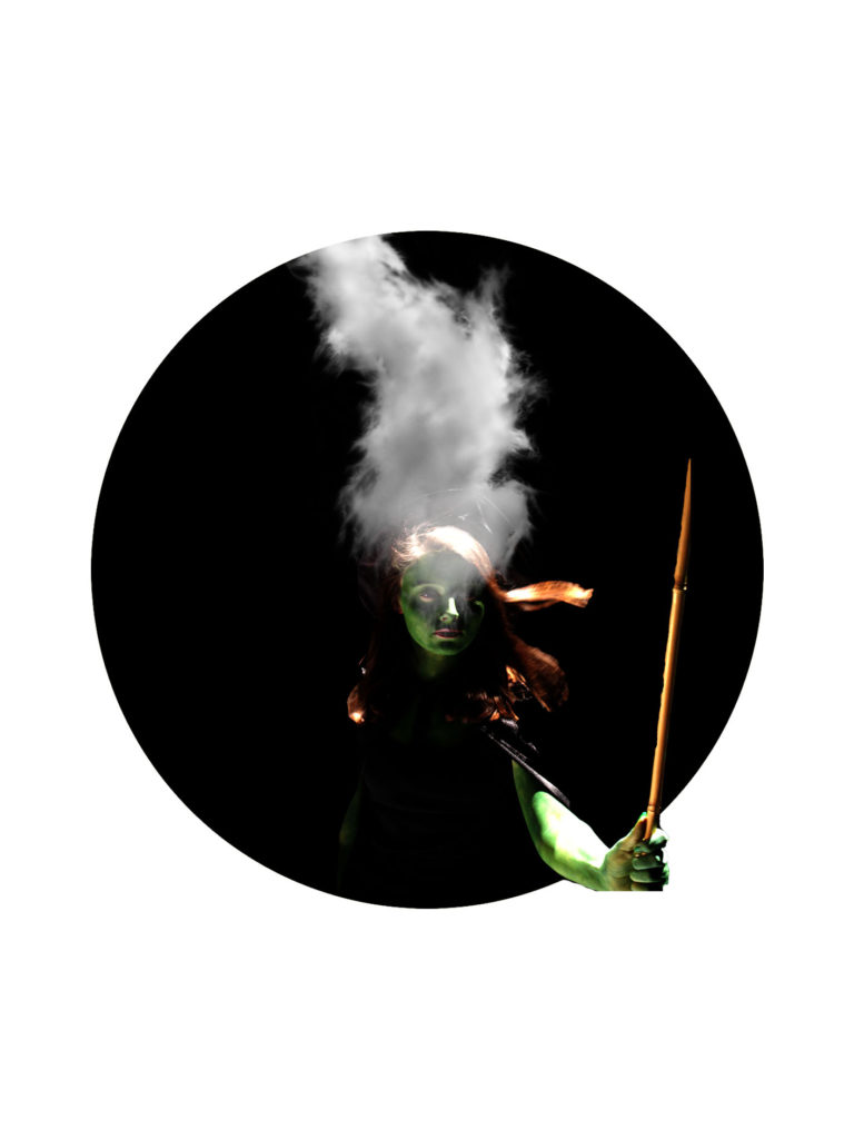
For my next surrealism photo-montage I wanted to be able to show identity and place again. For this idea I opened up a new photoshop document and created a white background. Then using the circular marquee tool I created a large black circle in the centre of the page. I then opened up the picture of my model. Using the quick selection tool I cut out my model and dragged her onto the white with black circle photoshop page. Using the transformation tool I made her smaller to fit into the circle and positioned her to have her arm slightly coming out of the circle. I then added a piece of smoke, image taken from google, and have it coming from my models head. The simple background is used to create emptiness and create a location of isolation. The smoke is used to show how if we overthink are minds can not cope. I really like the way this photo-montage has turned out.
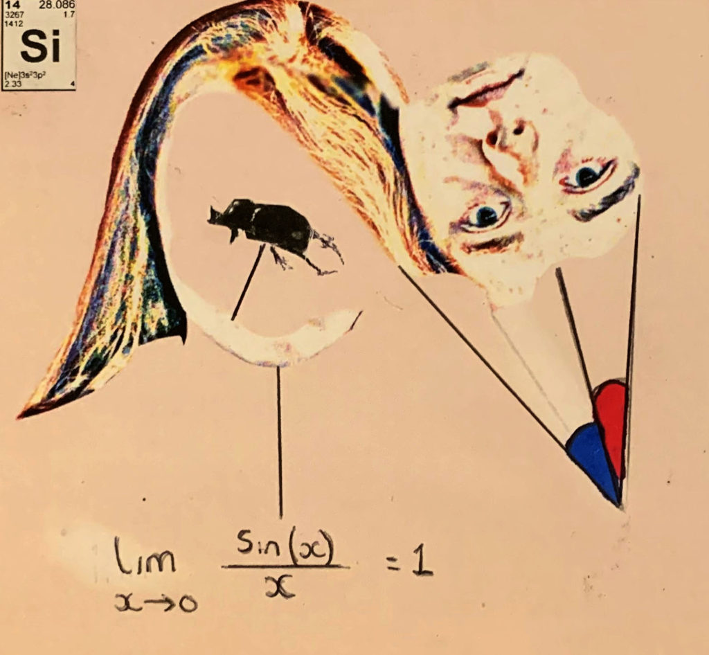
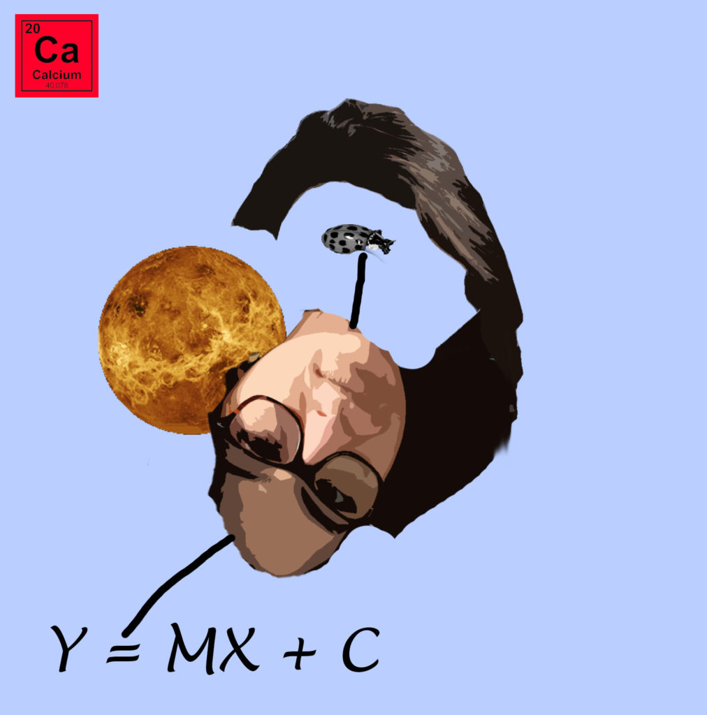
For my final photo-montage I decided to create a hand crafted piece, the image above is a picture of what I created. The piece was inspired by Carl Breezy. In photoshop I cut out a section of the models face a turned it to create the gap in the centre of the face. I then used the burn  and smudge tool to blend in the hair. I wanted to present my model as someone who is intelligent, to do this I added a long equation with an arrow connecting it to the face. This informs us that the model knows how and when to use that equation. I then added an element of the periodic table to the top left corner as I wanted to portray the model as someone who is important, important enough to have her own period on the periodic table. It also presents the idea that this girl is a period and reminds us that humans are made out of chemicals. I then added angles to the face which also shows my models intelligence. Adding the bug into the centre of the face was inspired by Breezy’s work as he tend to put a bug into the centre. I chose a beetle as I felt it would suit best in this photo-montage. I created this to make it seem like a sketchbook and that it looks like quick working outs in order to shows the mental process of someone. I am very happy with the way this photo-montage turned out as I like the simplicity of the idea.

To evaluate my photo-montages I believe that I have been successful in showing the difference of Dadaism and surrealism. I have been able to use artist inspiration and create pieces of work in a similar style, but making them relevant to today’s issues. I have been able to experiment with different photoshop tools and techniques in order to create my final outcomes. If I was to create another piece, I would look at implementing the theme of identity and place into all of them. I would also look at creating more Dadaism pieces in order to get across my political viewpoints

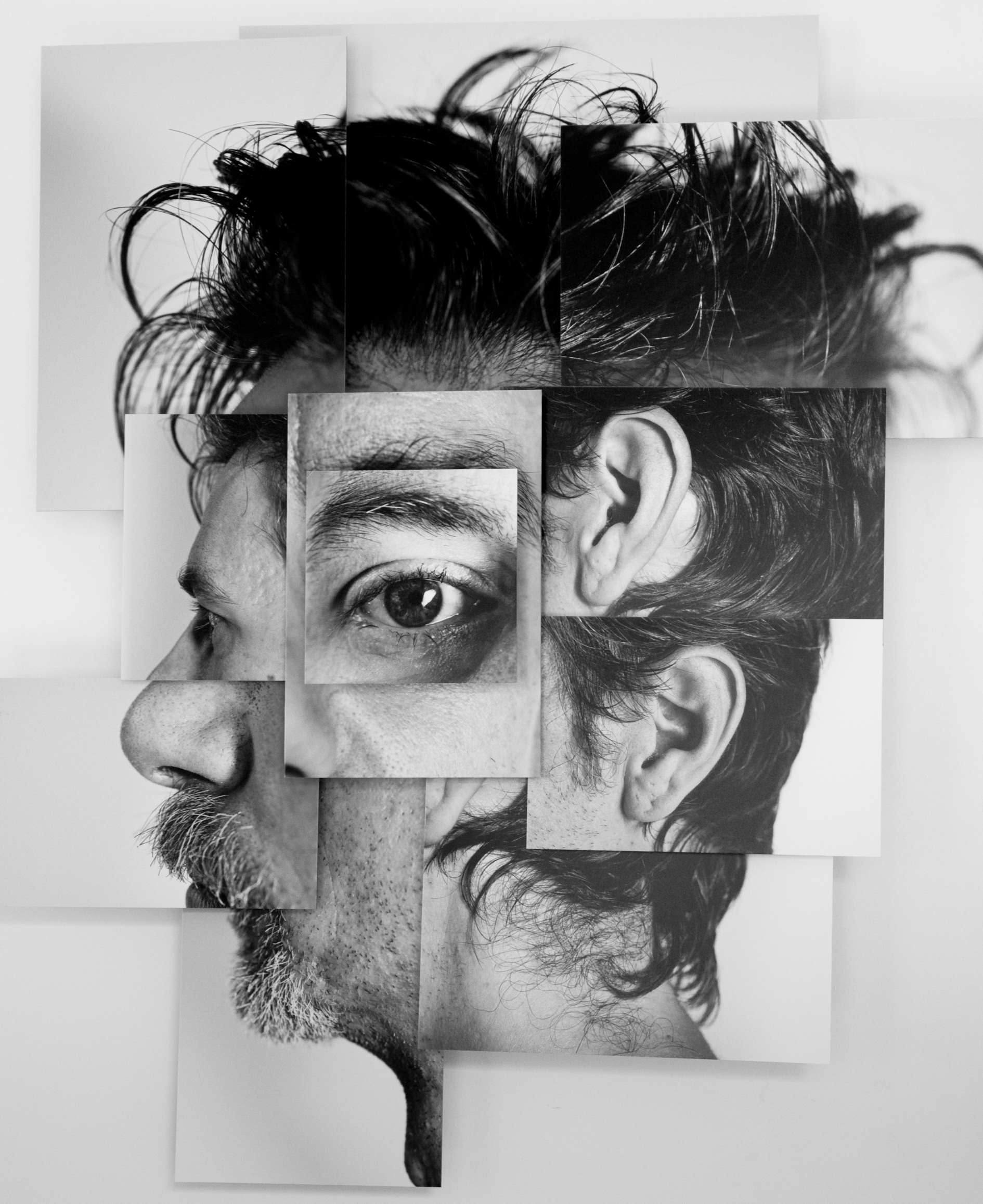
Photo-Montage Artist Research

Brno Del Zou

Brno Del Zou Photograph From photosculpture series

Brno Del Zou is a French photographer who was born in 1963. In his photography he takes a very imaginative look towards a human. He wants to show his viewers the chaotic side of our brains. This is seen as his artistic aim. In my opinion I believe that Del Zou has met his artistic aim. In this series of photographs ‘photosculptures’, he wants to be able to understand the human body better and so he does this by using fragments of the faceto create the bizarre looking face. This clearly links to the conceptual factor of the image, understanding the human body in all of its complexity. The facial features used helps to create a connection of scales, this is outlined by the volumes of the body features. The photographs are all in black and whitewhich helps Del Zou to bring across his desired mood and tone. I believe that the mood and tone presentedis a mysterious and artificial, which helps to intrigue the viewers to his photographs. More over the apertureis small as not much is in the frameof the photograph. Moreover the message which is being presented through this series of photographs is that the human mind can be chaotic, and it is normal if it is. The set of photographs are all take as portrait at a straight on angle, which allows the models face to be the main focus point.The tone of the photographs seems to be quite light as the tends to be no shadows give off the body parts nor the face itself. There is a low contrast in the tone, which helps to present the overall creative theme. The lighting used seems to be artificial lighting, which seems to be soft allowing the models body to easily be recognised. The shutter speed of these photographs looks to have been normal due to the fact Del Zou is not capturing anything moving. The depth of field in these photographs is short as the models face is the only object which is in focus. The background of these photographs are plain and simple, allowing the viewer to focus primarily of the distorted models face. The images within the series are mainly in black and white, however, in some of the images there is a hint of colour, which allows more important features to stand out more. Due to the images being in black and white it allows the tone of the image to be clearly presented. Del Zou’s photography from the photo sculpture series is a prime example of surrealism. The artist is not presenting a political viewpoint, but is taking the route of a non-naturalistic photograph.

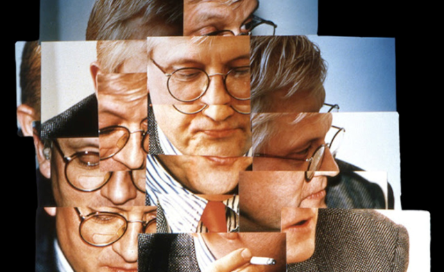
I believe that Brno Del Zou took inspiration off David Hockney who produced similar work. In Hockney’s work, he used different angles of a model and combined them together to create a fragmented surrealist piece. Whereas, in Del Zou’s work he uses the same angle just different facial features to layer up to create a fragmented surrealist piece. In Hockney’s work the images are mainly presented in colour and their is a background for the model which allows context to be added to the images and allows viewers to think about the situation the model is in. In contrast, Del Zou’s images are presented in black and white and have a plain background, which helps to alienate the models. A similarity of both artists is that I believe that the share the same artistic aim as the tones of both images are similar. Moreover, they both took the surrealist approach which allows their creativity to be expressed. Finally, I think that Del Zou’s work is an updated version of Hockney’s work due to the similarities in their work.

David Hockney’s Photograph

Raoul Haussman

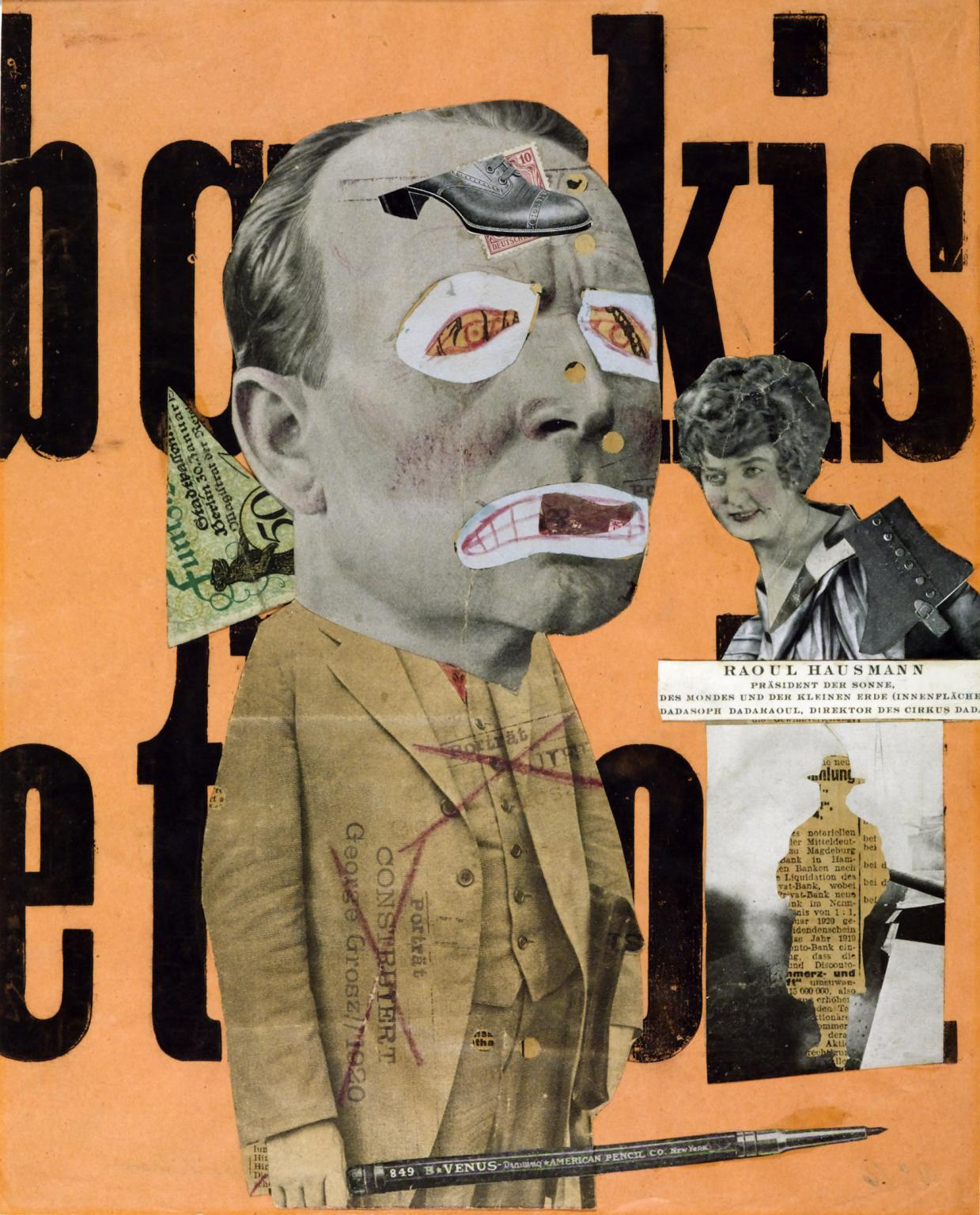
Raoul Hausmann – Der Kunstkritiker

In 1919  Hausmann created ‘Der Kunstkritiker’ which is also known as ‘The Art Critic’. He created this photo-montage’ to challenge the idea of a stereotypical art critic, and the an art critics requirements in order to decided whether a piece of art is fashionable. The main motivation for Hausmann to create this image was because he was a member of Berlin’s Dada movement, and was not too happy with the traditional art styles and pieces they where creating so decided to make his own to present his disapproval to this. This photomontage has taken a disorganised style which allows the feelings of Hausmann to be clearly be presented. Due to how old this image is, it stands to reason that this photomontage was hand crafted. The main focus point is the art critic which is located in middle of the image, making him the first thing viewers look at. The head of the critic is much larger than the body, which presents the idea that art critics can consider themselves to be big headed and much superior than others. On the face the eyes and mouth has been covered by which seems to be a child’s drawing of eyes and a mouth, which presents the idea that these people are child like. It also shows that critics opinions are irrelevant as they can not see art as it should be viewed. Their is a large pencil as well in the critics hand, which shows the power that the pencil has. It is considered powerful as it is what the art critic would use to make their review about the art work. Next to the critic is a woman, who looks to be apart of the upper class, due to the way she is dressed and presented. During the time this photomontage was created the class system was being used. Hausmann used an upper class lady as it shows that the art critics where not basing their decision on whether they liked the art but on whether members of the upper class would like the pieces of art. Behind the critic is a triangular cut out of money which presents the idea that people in this job was money orientated, they worked hard in order to get money off the upper class, who had way too much power. Underneath the upper class lady is a newspaper article which outlines a man, which is taken from the business section.  He added this onto the montage in order to show that he does not like the fact that people with more money have more power. The background has large words which are incomprehensible which also adds to the negative tone being created. The background colour is also loud also presenting the idea that people in this career are loud. As shown Haumann is showing his viewpoints as negative towards the class system and the way art critics work, clearly presenting a clear example of Dadaism. He is also showing that art work does not have to be created in order to please others, but should be created for self enjoyment. This piece of work is very powerful in the way that it has been done, suggesting that it was well thought out by Hausmann. In order to create a photomontage in this style I will need to think about what overall message I am trying to get across and how each image adds to the overall message.

Photo-montage Introduction

Photo-montage is two or more images to construct a college. This style of photography originated from Dadaism but is also very similar to surrealism. This style of art/photography has developed significantly since it first originated. It’s peak point was during the 20th century where multiple artists decided to experiment with creating abstract portraits. Photo-montage is still a big style of photography, as many artists are still creating this style of images. Nowadays, artists are presenting their opinions towards current political event and issues which are relevant to today, instead of issues which are no longer relevant.

Dadaism – This was the art movement during the first world war, to show the negative reaction towards horrors of the war. The aim of these images was to destroy traditional values in art and to create a new art to replace the old..

Surrealism – Is aimed to ‘revolutionaries human experience’, by taking away all rations thoughts and visions towards visions of life. Which allowed the values of dreams to be presented. The word itself informs us that it is ‘beyond reality’, which means it take a less naturalistic path towards photography.

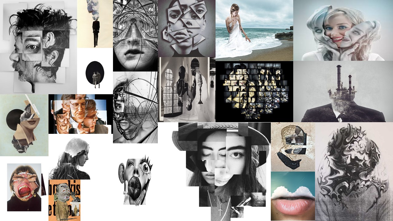
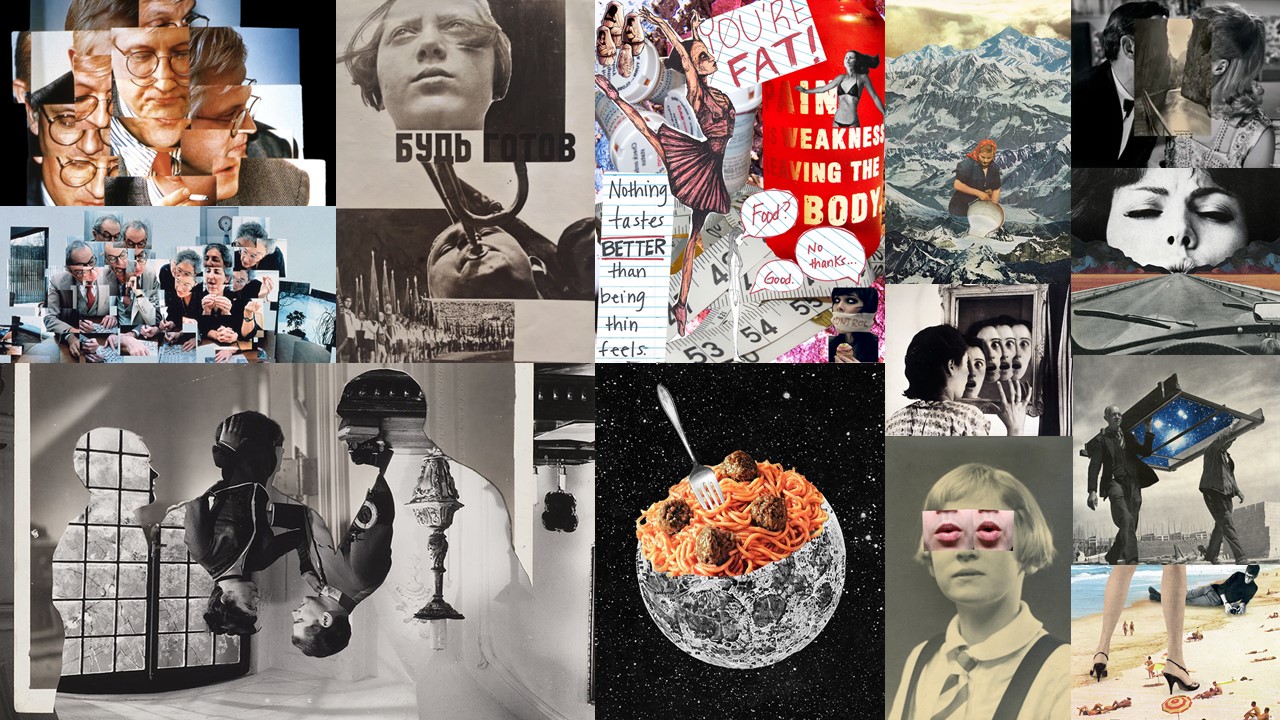
This style of photography allows artists viewpoints and thoughts to be expressed in a creative way. These images can be created through  the use of photoshop or can be hand created. Below are a selection of my favourite examples of photomontage. I added a variety of styles, which follow Dadaism and surrealism. Personally, my initial reaction is that I prefer surrealism due to its more creative nature, however, I do believe dadaism examples are also just as good as they provide a strong message to viewers. This style of photography manipulation is mainly done on computers, on image editing software, however they still can be produced as a hand craft.

Mood Board

Photomontage — Artist comparison

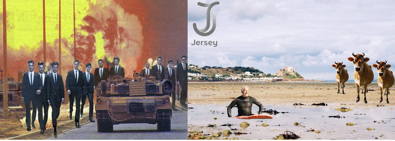
When looking at Rosler’s work and comparing it to mine she aims at more sensitive topics like war and the people behind war as shown in the image below. Where as I was going for a less serious and more jokey topic. Her work, specifically this image, influenced me because of when I put one cow in I thought that the image looked empty so to get some inspiration for what to put in the to fill some of the empty space I saw this image and thought to repeat the cow and put it in different places and with different sizes. If I had other pictures of cows I would have used them but as I didn’t I decided to use the same one but just change the size of it.

Photomontage — Final Image

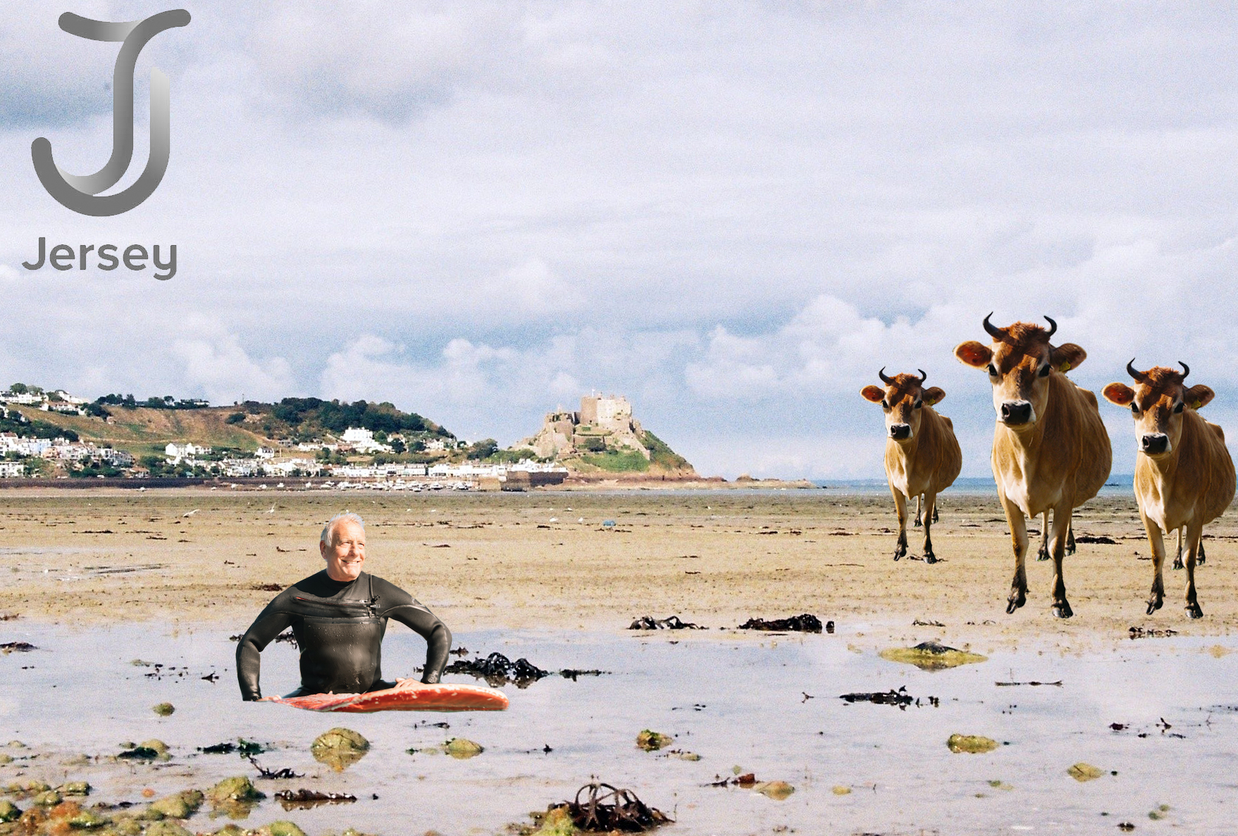
When making the image I decided to make multiple copies of the cows and change their size, also the visit jersey logo had to be slightly larger than I originally planned because of the shade of it and it almost blending in to the sky in the photo.

I think that the background image is good because it means that any messy edges are not as apparent, the reason for this is because it was taken on 35mm film, and so was the photo of the bull.

Photomontage — Idea plan

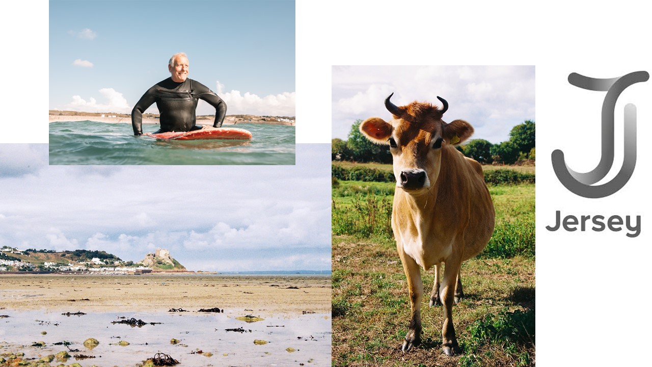
My thought is to try and make something that imitates the “visit Jersey” adverts, the reason that I am going to do this is that I already have a large selection of images that  are of Jersey land marks and ‘Quintessentially’ Jersey things. Therefore I will find a landscape of a castle or something that is clearly from Jersey and then overlay somethings like Cows and surfers.

The cow and the landscape are my images and the other two are taken from the Jersey tourism, my plan is to use the landscape as the background and then cut the cow out and put it on the right of the image. I will also cut out the surfer and put him is the small puddle at the landscape. Finally I will use the magic wand tool  and get rid of the background of the logo.

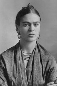
Frida Kahlo – Tableau photography

Frida Kahlo de Rivera born Magdalena Carmen Frida Kahlo y Calderon; 6 July 1907 – 13 July ) was a Mexican artist who painted many portraits, self-portraits and works inspired by the nature and artefacts of Mexico. Inspired by the country’s popular culture, she employed a naïve folk art style to explore questions of identity, post colonialism, gender, class and race in Mexican society. Her paintings often had strong autobiographical elements and mixed realism with fantasy. In addition to belonging to the post-revolutionary Mexicayotl movement, which sought to define a Mexican identity, Kahlo has been described as a surrealist or magical realist.

My Response

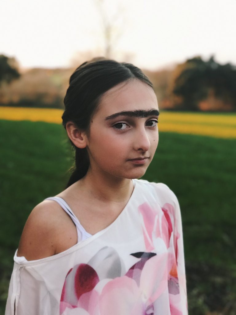
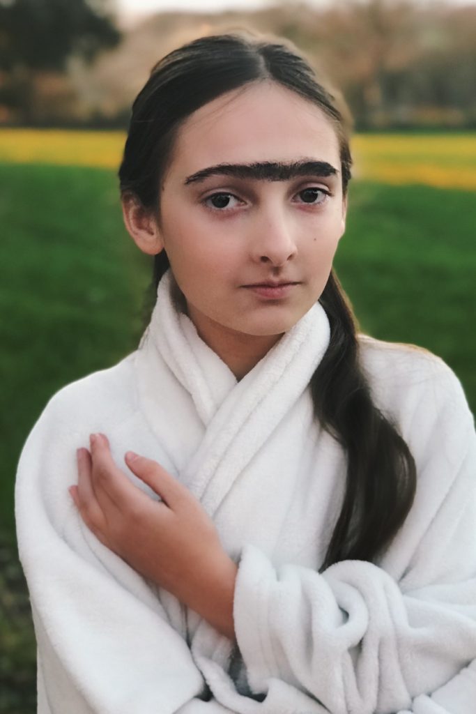
Within my response I wanted to incorporate her idea of portraying the taboo topics within society and beauty standards. People expect to look like models and Instagram posers so they go to extreme lengths to achieve this programmed look.

In my shoot I used a younger model due to the standards being passed down to even younger generations than before. I then incorporated Frida’ natural look he had. Through some research I found that during the Roman Empire Era, facial hair on women was a sign of intelligence and nobility. In a way, Frida reflected these traits whilst going against her modern day standards. 

Final Images

Analysis

VISUAL

Within these images I wanted my main focus to be my model but not have a plain background. Within Kahlo’s paintings shes depicted infront of either shrubbery or a earthy coloured background. So, i put my model in front of a field to capture the nature as well as the model. 

TECHNICAL

In order to create my blurred background, I firstly set my cameras depth of field so that it only focused on my model, then once i began processing the image my background wasn’t blurred enough so I used the Photoshop blurring tool so that only my model was in focus. As far as lighting goes, I only used natural light.

Tableau photography

Background:

The idea behind Tableau Photography comes from the term ‘Tableaux Vivants’, which translates from French to Living Picture. These are made to show a static scene showcasing actions between 1 or more characters in a scene. They are usually in costume and carefully posed with props. The term was mainly used for artwork/Paintings in the early 20th century, where artists would paint stills of large detailed events. Tableau Photography and painting is linked to theater in terms of lighting, poses and style. The main point of Tableau Photography is to create emotion and introduce symbolism and meaning to your photographs.

Examples:

Image result for Tableaux VivantImage result for Tableaux Vivant

Photo montages

What are photo montages?

Photo montages are images created by manipulating pictures in a way where images may be overlapping or rearranged.  If done by hand it will probably involve cutting and sticking, however photo montages can also be done through certain computer soft wares,like Photoshop.

History of photo montages

Historically, photo montages were used as a way to express people’s views on politics. Photo montages were used in 1915 in protests against World War 1, then it became a popular technique for surrealist artists who are  artists who make art that shows the thoughts of the unconscious  mind. Their work is usually very imaginative and creative. For this reason, photo montages became popular within them as it allows them to create pieces that are based on their imagination.

Mood Board

Not my images.

Mind Map


Photo-Montage Case Study – Jerry Uelsmann

Jerry Uelsmann is an American photographer known for his work on photo-montage, and it has been said that his work inspired many elements of Adobe’s ‘Photoshop’ image editing software. Uelsmann focused on surrealist images created by layering film on top of one another in a dark room. Uelsmann was born and raised in Detroit in 1934 and became interested in photography as a hobby in high school when he was 14 and used it as a way to escape from his school life, where he was getting poor grades. He managed to land a few modeling and wedding shoots and began working as a part time photo assistant for a commercial studio and wedding photographer, then eventually went on to earn a BA from the Rochester Institute of Technology and M.S. and M.F.A. degrees from Indiana University. Uelsmann was a driving force of surrealist photography and was a pioneer of collage and multiple imaging in photography.

Image result for Jerry UelsmannImage result for Jerry Uelsmann

These photos are still fairly difficult to create in today’s times, and you have to know your way around Photoshop to even begin a process like this, yet Uelsmann was creating these pictures well before the invention of Photoshop, using a range of unconventional techniques, he managed to create flawlessly realized and executed images working with multiple enlargers, negatives and an array of highly-refined masking, diffusion, burning and dodging techniques.  it was after graduating from Indiana University in 1960 and embarking upon a teaching career at the University of Florida that this experimentation really took off. Uelsmann had his first solo show at MOMA in 1967, and is currently the subject of two major retrospective shows. “The Mind’s Eye,” featuring approximately 90 images (including early documentary images dating from the mid-’50s), opens at the Peabody Essex Museum in Salem, Massachusetts in February 2012 after having debuted this summer at the Harn Museum of Art at the University of Florida in Gainesville, where Uelsmann taught photography for close to 40 years.

Image result for Jerry Uelsmann