Editing Process:


Examples of images using this process:

Editing Process:


Examples of images using this process:


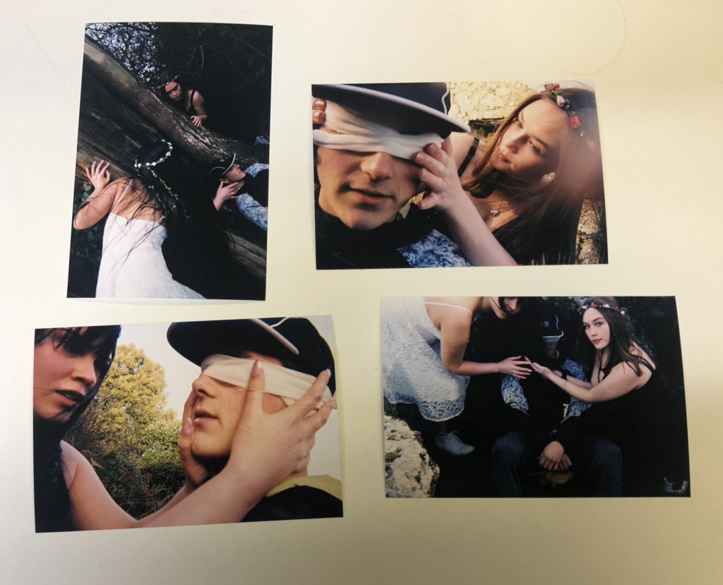
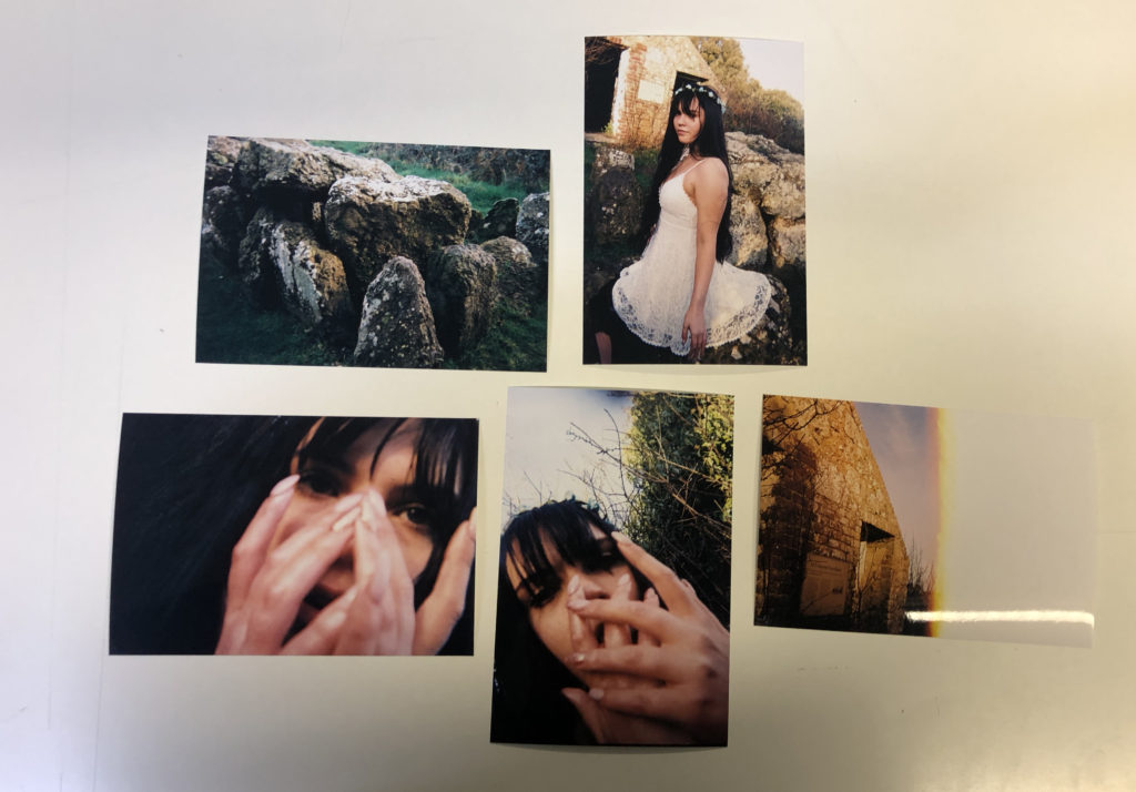
When developing the narrative of the photobook I began to do this with the physical prints of photographs that I had as I found it more useful to be able to move them and discard them in front of me physically, beginning with all of the photographs in front of me I went through the photographs and grouped them together based on situations and tells, the action photographs, scene setting and others, once I had them grouped I began to be able to build a narrative, moving from creating and setting the area, and developing a sense of character, using the photographs of just the girls themselves, showing them interacting with the scenery. I further moved onto the ‘action’ photographs, showing the contents of the story, ones with the hands across the males face and the crowding ones, this then would allow me to lead onto a ‘resolution’, using the more ominous photographs towards the end, the slightly out of focus and also the half exposed landscape photographs.
This act of laying the photographs helped me to develop this narrative, below I have my final groupings of a narrative in a ‘beginning, middle and end’ style as to help my design process. In Lightroom I will now be able to narrow down my photographs further however I have been able to create a starting base for myself to see what works in the photobook and the actual layout.

For my first three layouts I wanted to explore typologies and how putting photographs in a triptych and diptych format in order to portray the narrative of the occupation of my Grandparents lifestyle. I decided to use the portraits which have emotional value and suggest important part of my Grandparents lifestyle as the first triptych. These photographs are being printed as A4 photographs and will be displayed with a 4cm gap between each photograph and will be either stuck onto foam board or put in a window mount on white card, as I believe white compliments the photographs the best. For my next triptych layout I printed out four landscape photographs of the interior of my Grandparents house, two in colour and one in black and white. The images are being printed as A5, and will be displayed in a similar format, 4cm gap between each photograph and displayed vertically. My final out come using typologies is a diptych which is a portrait of my Grandad and one of my Grandma. I printed one out as an A4 and one as an A5, the size difference of both will reinforce the ideology of power within family structure and how my Grandad has the most dominance. I will display the two images next to each other as a window mount or on white foam board with a 4cm gap between each photograph. These designs can be viewed below, as I created a layout of them using photoshop.


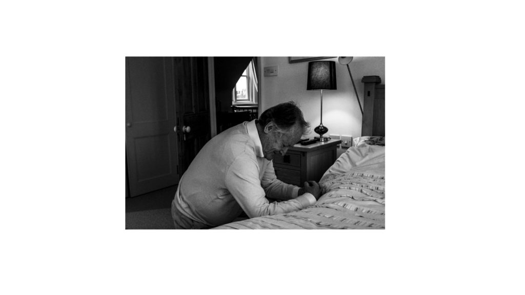
The next two display ideas are singular photographs, which would not work as a typology, and so I have deiced to display them on their own. The first photograph is of my family sat around a table at Christmas, showing the interaction of my lifestyle with my Grandparents lifestyle at a religious event. The photograph will be printed on A3 paper and displayed on white foam board. Below is a photograph of my Grandad praying, conceptually representing intimacy and the idea of religion on his lifestyle. The photograph is being printed as an A4 photograph as will displayed in the same way as the A3 photograph of my family. These full bleed photograph displays are visible below.

To show further experimentation and thought into the displaying of my photographs, I decided to create an eclectic display of all the outcomes. The chaotic design suggests that their lifestyle isn’t simple and has its ups and downs, and conceptually clearly presents my intended narrative. Personally, I really like the way in which this looks and will look at creating this on a large piece of foam board when the prints arrive, the design may change due to the size of the photographs, however I do want to see what this would look like with the real images and how impactful the narrative it displays is.
Initial Design Process:
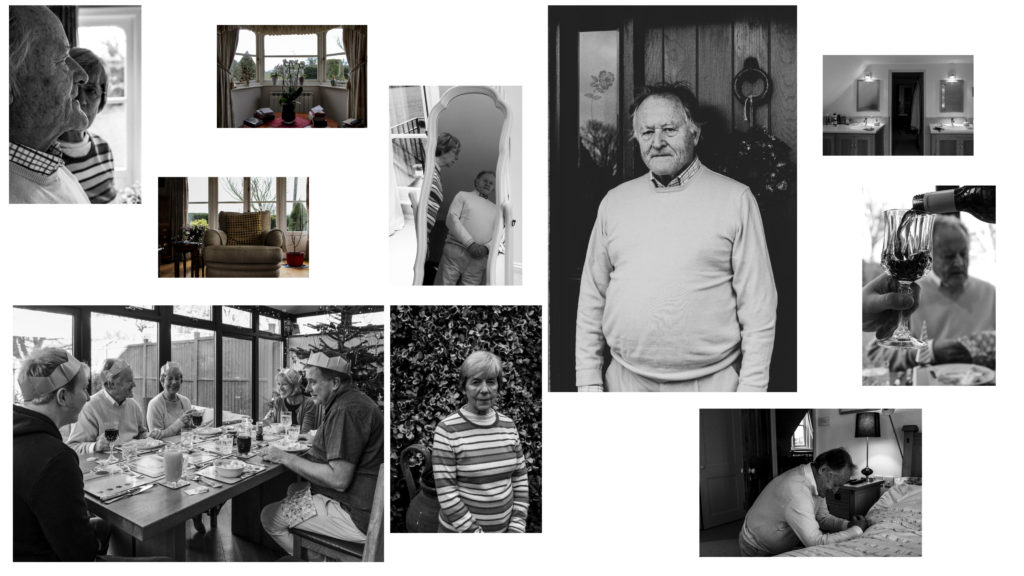
In the initial stages of my photo book design I wanted to ensure I maintained simplicity whilst making the narrative of my Grandparents lifestyle clearly presented. I started by experimenting with the sequencing of my imagery, combing interior and exterior with my portraits, trying to form a relationship between the two to create meaning to illustrate the lifestyle of my Grandparents. I decided to have two portraits or archives and then add an interior and or exterior to have a ‘break from the action’ to change the pace of the book. Although I liked the way in which it looked, I felt the sequencing of my photographs was not the clearest way of presenting my intended narrative, thus making me further explore the way in which I could sequence my photographs. In addition, in this first section of the book I wanted to include archival imagery which allowed a comparison between the past and present lifestyle to portray how their lifestyle has changed or stayed the same, thus emphasising how the time period they were brought up in has influenced their lifestyle. I felt this sequencing of archival imagery amongst present portraits was an affective way of showcasing my intended narrative and allowed a sense of flow within the book itself, therefore I am going to keep these archival images in this position of the sequence due to the reasons stated above. Due to the interior and exterior photographs not ‘fitting in’ well with this particular moment of my book I decided to move them into a new section, allowing for further experimentation.
Second Design:
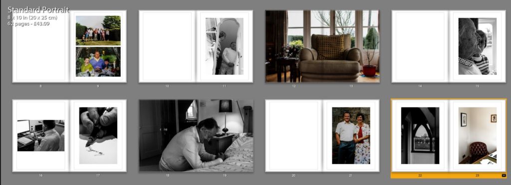
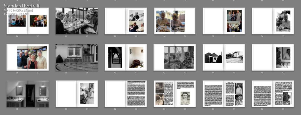
Taking from the experimentation of my first design I took what went well and things needed to be changed to produce my second design. As mentioned in my book specification I wanted the book to start and end with a strong portrait of my Grandad as I felt it was a clear way of presenting my narrative at the beginning of the book, as well as using a similar portrait at the end to clarify and support the narrative, allowing the book to finish in a conclusive way. I then mainly had portrait and archival imagery in the first section, as this is what worked in my initial design. Occasionally, I did decided to implement 3/4 and double page spreads of interior and exterior to give a break from the action and present my narrative in a new light, however I did not over do this like in my first design. Moving onto the next section of my photo book I wanted to showcase the interaction of their lifestyle with mine at a family event, and so decided to utilise the photographs from Christmas. I occasionally added more archival imagery of family events in order to show the change in interaction of both lifestyles. Within this section I tended to stick with using single, 3/4 and double page spreads in order to show the interaction of lifestyles. I believe the way in which I sequenced these photographs was successful as it allows the narrative to flow, presenting a new way of looking at their lifestyle, with looking at aspects of religious events and how it impacts them. Moving onto the next section I wanted to use my interior and exterior images, as I believe these photographs are a clear way of presenting their lifestyle as well as them being some of my strongest outcomes. The sequencing of these images was kept simplistic, as I tended to show these photographs and then on the following page would be a portrait, to support the conceptual understanding of the location and my Grandparents relationship with it. In this version I decided to layout my essay within the book, I tended to have a combination of full page of text and the use of columns, to break up the chunk of text, making it seem more manageable, thus making viewers more likely to read the essay. To evaluate this design, I believe the overall sequence clearly presents my intended narrative of the occupation of lifestyle on my Grandparents, and flows smoothly with each image being an asset of presenting my intended narrative.
Fine Tuning My Design:
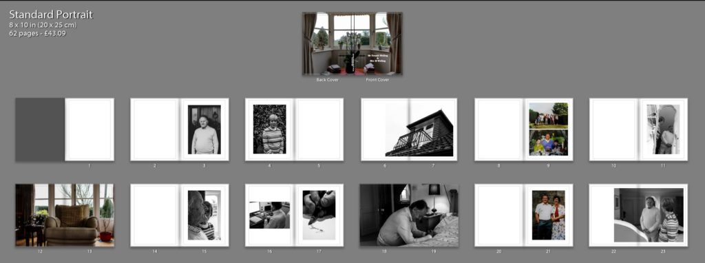
After the second design I am happy with the sequencing of my photographs in order to show my intended narrative. I decided to focus on fine tuning some of my spreads to make the photographs more effective in presenting my narrative, as well as improving the overall aesthetic of my photo book. A few of these artistic decision can be seen below, in order to show my experimentation in my design, as well as my decision making and thought process.
In my first fine tuning of my design I looked at the way in which I presented my double page spreads. For the most part I had a white boarder around the photograph, so it did not fill the whole page, I did this as it allowed the whole photograph to be showcased without anything being cut out, thus making my imagery more reliable in depicting reality. However, after consideration I felt that I was not achieving maximum impact of the photographs and so decided to get rid of the white boarder and have the photograph fill up the whole page. This meant that elements of the photograph was cut out, however I believe it allowed the sequence to flow a lot smoother as well as the photograph to have maximum impact on the side of story telling. The ‘cutting’ of the photograph was not highly impactful, as it did not cut out the main focus point of the chair it only cut out a slight part of the background, thus we were not loosing useful information, making this decision more affective. I decided to do this for my other double page spreads, in order to make all double pages look the same, in the sense to maintain my overall aesthetic. The old and new design are showcased below.


The next fine tuning I wanted to focus on was the title page, this is because it is the first thing a viewer will see, thus I wanted it to be high effective and clear in depicting what is within the book. After consideration I decided upon the title ‘Mr Ronald Welling & Mrs M Welling’, I chose this as I felt it clearly presented what the narrative is about and conceptually begins to present my Grandad authority. Using the picture of the windowsill was a good artistic decision as the simplicity and inactive frame allows a sense of tranquil to be presented, suggesting an ameliorative and calm lifestyle. I wanted the text in white in the bottom left corner as I felt it was the most subtle place to have the text, emphasising the sense of calm. Initially I decided to use the typography of ‘Candara’ as I liked the way in which the letters were structured. However, after time and consideration I felt this effectiveness fell and so I decided to change the font to ‘Bookman Old Style’. This fonts structure reminded me of an envelope or address on an important letter. In a way it also reminds me of my Grandad’s writing, and therefore these two reasonings made this decision affective as it suggest the business side of my Grandad, due to the formal representations it holds.


I then experimented with a different cover design using a photograph which more explicitly outlines the narrative of my book. I decided to use the archival imagery of my Grandparents wedding. I decided to change the front cover to a dust jacket, which has allowed this photograph to wrap around the book. The front cover holds my Grandad and the back cover holds my Grandma, suggesting the idea of my Grandad’s authority and my Grandma being the backbone of him in essence. Using the crop tool I accurately cropped the photograph so the dust jacket would fold on the same point of each of their eye, and on the fold in I placed their name ‘Mr Ronald Welling’ and ‘Mrs Welling’. Sticking to the title as stated above supports the idea of authority. In this design I decided to again experiment with text font and changed it to a more bold font which makes the title stand out a lot clearer. Personally, I much prefer this design as I feel it gets straight to the point and clearly presents my underlying theme and narrative. Therefore, I have decided to change my front cover to this design, as well as the text font.
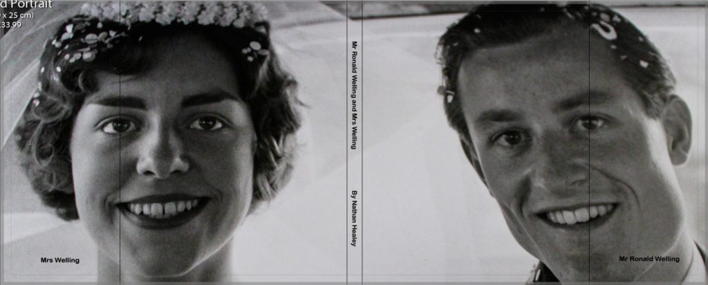
My next piece of fine tuning was to do with the sequencing of my photographs in order to emphasises the authoritative conceptual representation of my Grandad. Initially, I had one portrait on each side so that they are next to each other, in order to emphasise relationship of the two subject, however I felt this was not sustained as much as the authority of my Grandad, and so decided to change the sequencing. The first image you see in the book is my Walker Evans inspired photograph of my Grandad on the right hand side, as the right is the page to which viewers first look at. Turning the page my Grandma is placed on the left page, as we do not immediately look on that side of the book, thus suggesting authority of my Grandad and the submissiveness of my Grandma, thus helping to portray my intended narrative.

Evaluation:
To evaluate, I believe I have been able to successfully sequence my photographs in order to present my intended narrative. Through experimentation, I have been able to see the layouts which are most successful, allowing the photographs to have maximum impact and flow nicely in order to showcase the underlying theme of lifestyle. In addition, I have been able to articulate my thought process and decision making as to why I have decided to sequence the photographs in a particular order and why I have chosen that page spread. The development of my photo book has been a long process and so I only showcased the major and most important changes, as well as details on each section and what its meant to showcase and suggest. From now to the final product, it is likely more minor changes will be made and will be discussed in my final photo book layout blog post.
Editing Process:


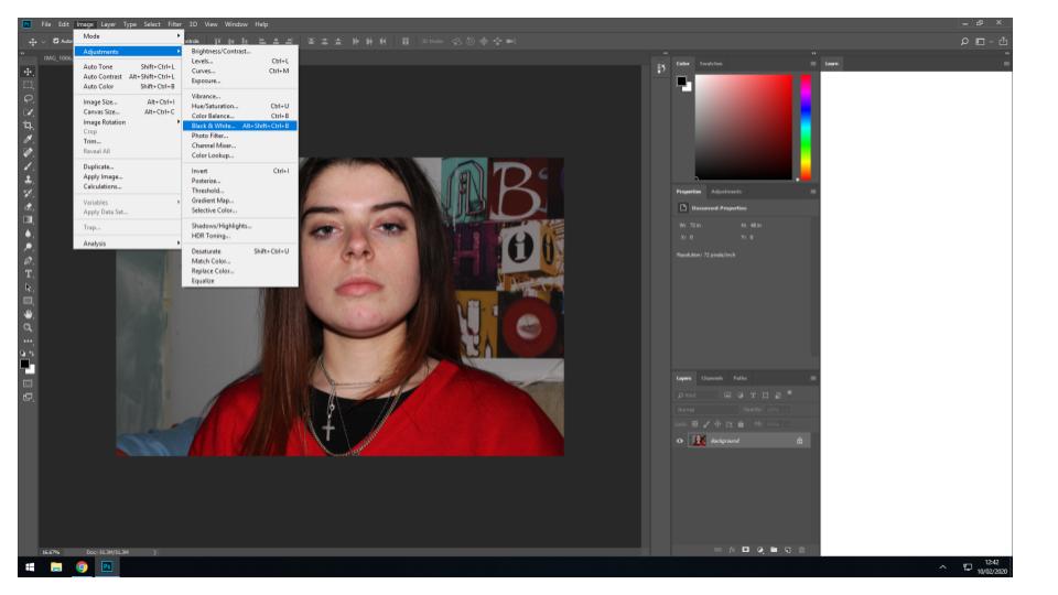


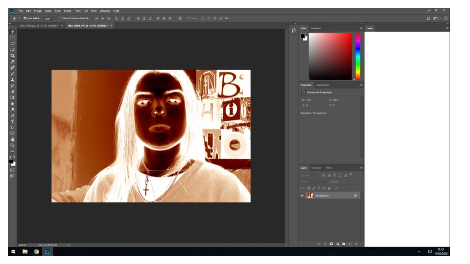
Examples of images following this process:


Final layout of photo book:


Front Cover:

For the front cover of my photo book I selected the only ‘in colour’, mostly unedited image incorporated into the book. The cover contrasts with the images inside, yet the themes bright colours in the cover are reflected in the images and the relationship between the blue and red follows on with the concept of the different coloured, more abtract full bleed image throughout the book. I have selected the title ‘Understated’ as an oxymoron to the actual images, as they are bold and overstated. The term understated relates to the content of the book as the theme throughout is simple, abstracted portraits and still life images depicting how me and my friends go through life together, and the ideas and concepts that bring us together.
Main Images:

The main layout inside the book is stark, bright images on black paper to enhance the compositions. There are a combination of double page spreads, single photos and two photos on a double page spread, which each work to frame and marry together the key concepts and ideas of the book and the photos.
Dividing Images:

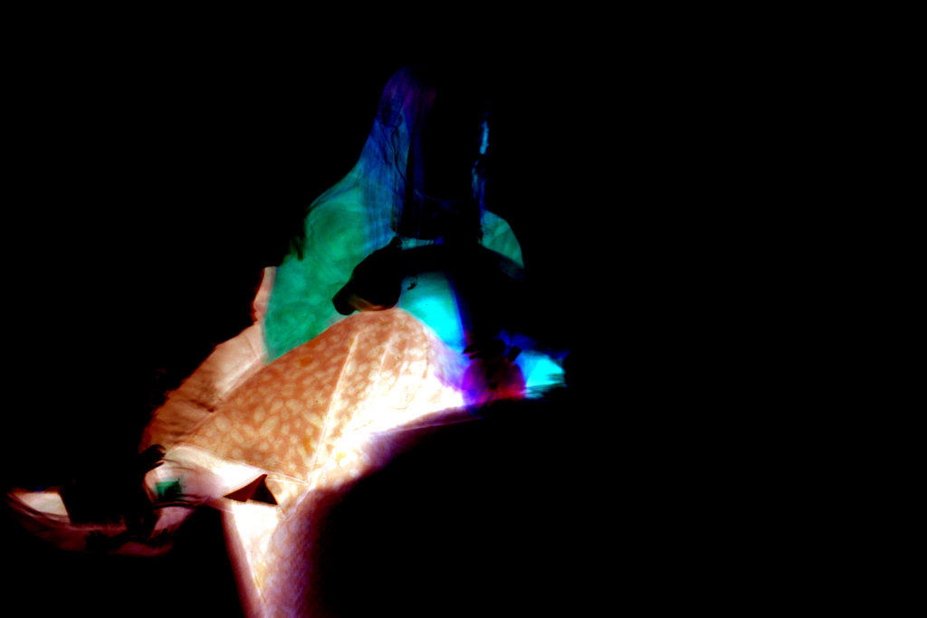
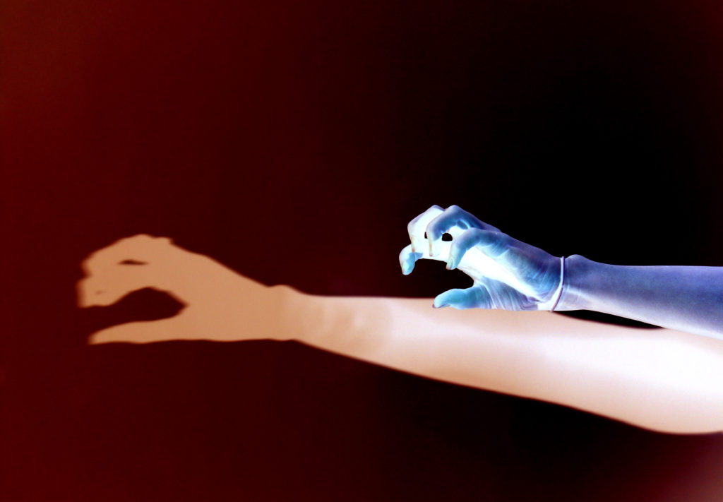
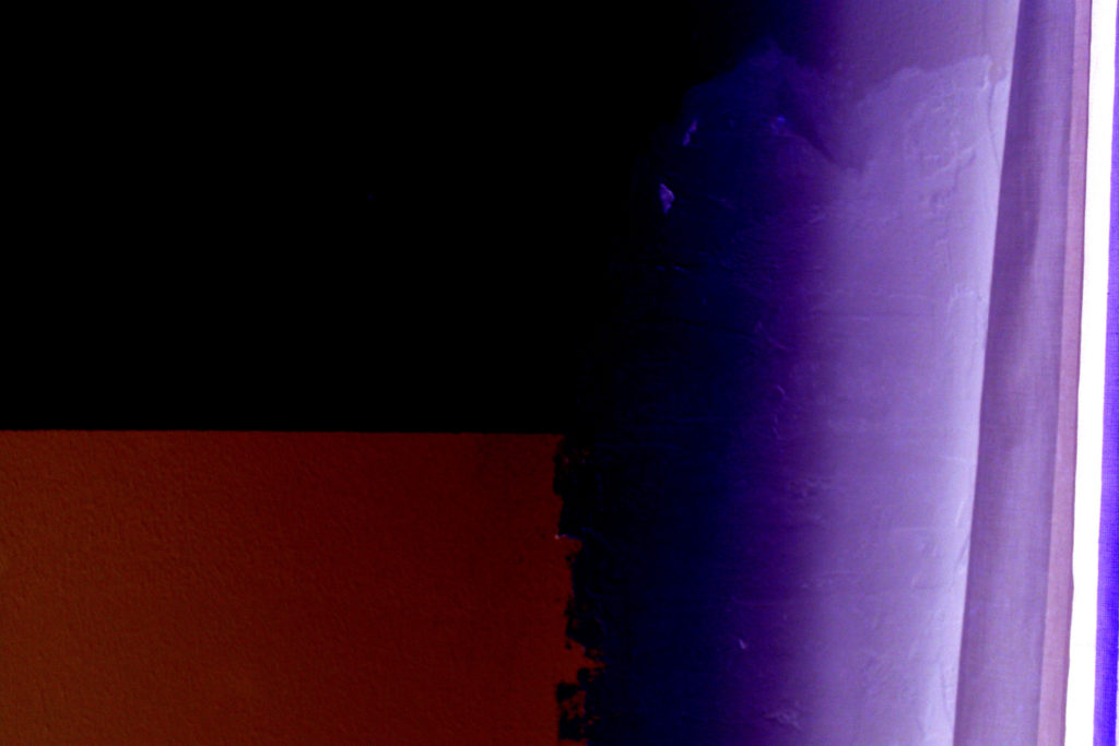
An addition theme to my photo book is the incorporation of a series of linked, colour contrasting full bleed images throughout the book. This helps break up the colour scheme of the book and adds a different perspective to the images.
The following images are a combination of images from several photo shoots I have done throughout this project; these images will be incorporated into my photo book to help break up the dark and warm toned images. The addition of a touch of colour to the almost duo-chromatic final design creates a more versatile and striking array of images. The mismatch of colour within the book is reflected in the front cover of the book itself.




Double page spread layouts:

This full bleed double page spread allows the viewer to see every detail of the image. It is a bold layout which enhances the power of the image.
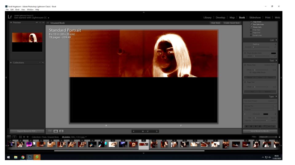
A horizontal half double page spread is a good way to frame a more rectangular image. I have decided to have the image take up the entire top half of the double page spread to draw attention to the subject in this image.

This optical double page spread only contains an image on the right hand side, but due to the structure of the photo and the very left hand side trailing off into darkness, the empty black page on the left almost seems to be a continuation of the image on the right.
Single photo layouts:

This single photo layouts is composed of a small square image on a single page of a double page spread. This layout appears several times throughout the book as a series of more abstract images among the more clear portraits or still life imagery.

This single photo layout is a more simplistic one, involving only one image adjacent to the top or bottom of the left or right page. The stand alone image draws all focus to this image.
Multiple photo layouts:
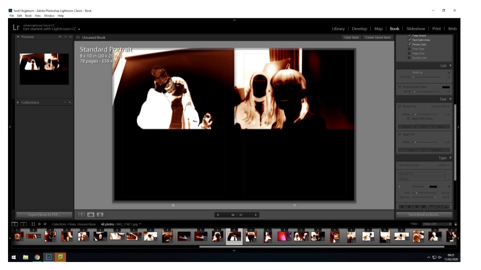
This layout involves two images adjacent at the top of both pages in a double page spread. This layout helps to link two compositions together and allows the viewer to see the relationship between the images.

This layout involves a full bleed image on one page and a smaller image with borders around it on the other. This layouts allows the two images to be viewed together but both in their own ways. The busier photo is the larger one to allow the viewer to see everything in the photo while the complimentary portrait is smaller as it is more simplistic.
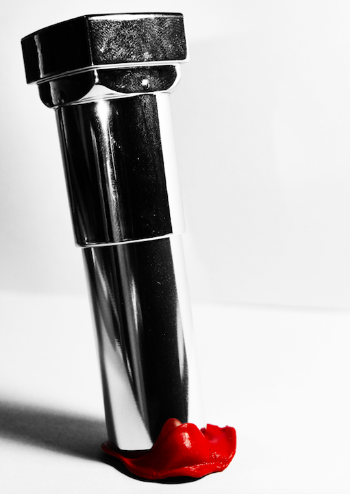
I selected a range of images to be printed and mounted using a range of different framing and mounting techniques. For this part of the exam, I decided to print images that I felt would work best as a collection, and would be most effective when individually framed. Below are the images which I will be framing once printed:
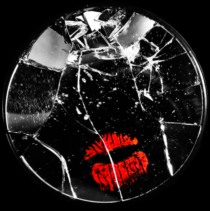
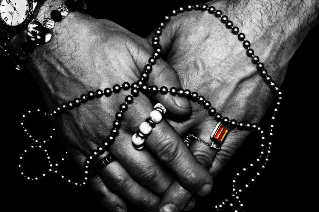
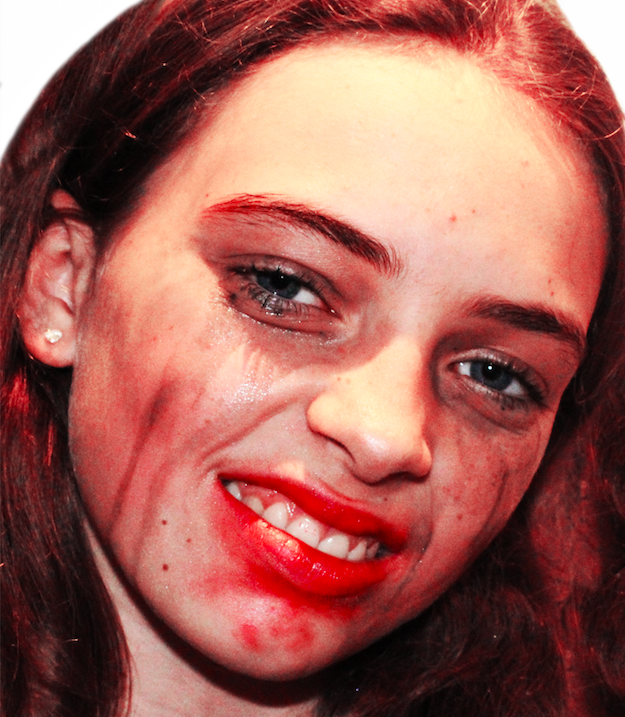
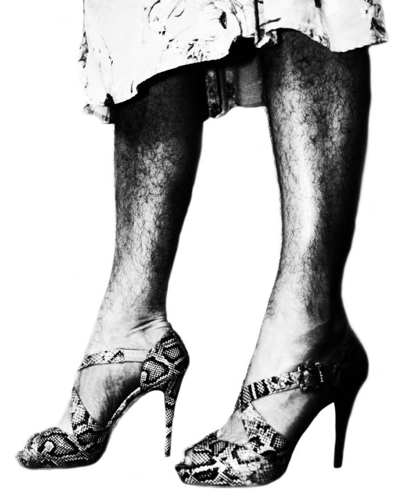

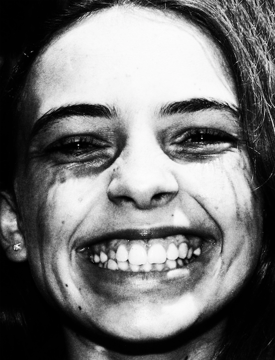
The images were printed in a range of A4, A3 and A5, which I selected based on the details of the image, and which images I felt would be the most eye-catching to the viewer of the selection.
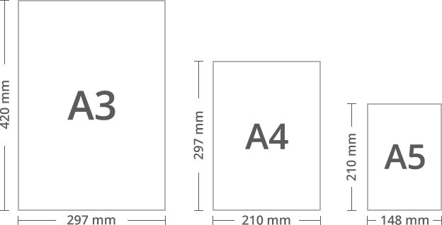
I will be using a series of framing techniques in order to present these printed images. I will be using:
I have printed 6 photos, and will be physically framing them in a way that best presents the images.
The final results from the framing can be seen below:
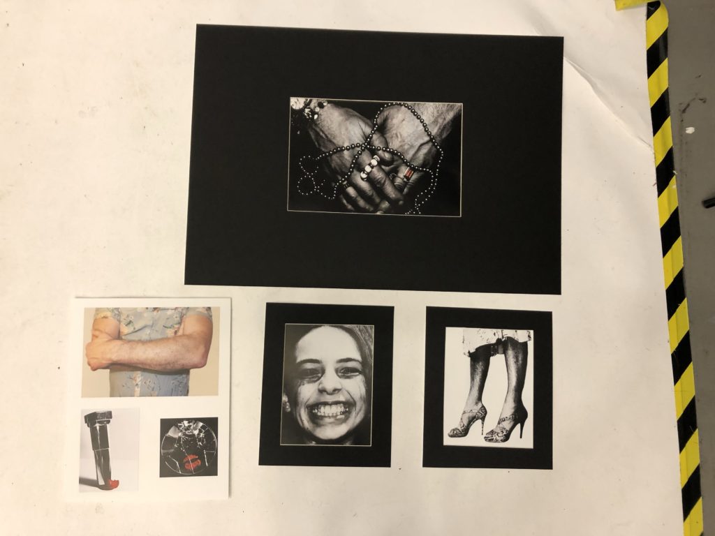
I decided to wind mount 3 of my images, and stuck the remaining 3 onto foam board. I did this because I believed that some of the images suited a black background more, and I believed that the darker large images would sit we’ll with the small white outline of the window mount. I also believed that the 3 images I mounted on foam board worked well together as a group, and so I mounted them together.
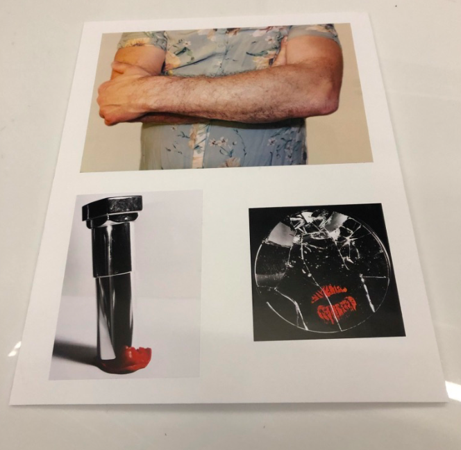
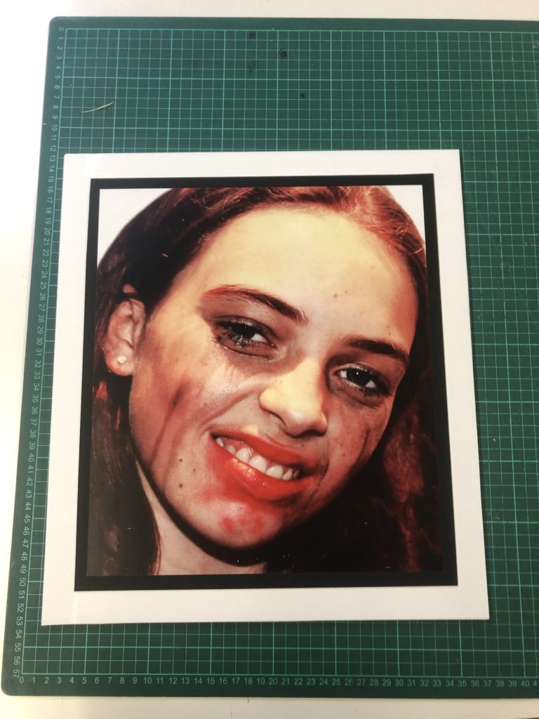
For this piece, I decided to use the above 3 images in a group, as I believed that their colour schemes fit together well, and the red tones of the lower 2 images worked well with the bright white of the foam board. I also believed that the more soft, warmer colours of the top image worked in contrast with the more harsh, bold images below, therefore I grouped these images together to make the final piece. I also believe that these images work together conceptually, as each image reflects an example of rebelling against gender stereotypes, with the top image being a reflection of rebelling against conforming to stereotypical masculine roles, and the bottom 2 images showing a rejection of traditional feminine beauty standards. I believe that together, these image symbolise a break from traditional gender roles, and give a powerful message of empowerment to the individual rather than gender conformity. I believe the lack of dark background places all attention on the images themselves, and helps form them to work together, rather than stand out separate, in order to give the above mentioned meaning.
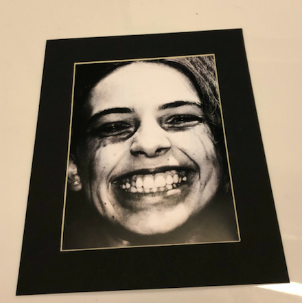
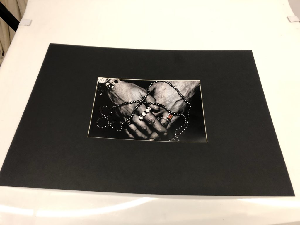
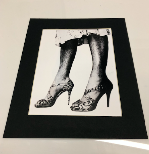
For the above images, I decided to use window mounts. I did this because I believed that the rich blacks of the image would be better emphasised using a boarder that was also black, while the white bordering of the window mount could act to stop the viewer from loosing focus when processing the detail in the image (the white outline acted as a way to contain the image). I presented each image individually as I believe that each image is strong and bold enough to work on its own, and presenting them in a series of group would retract from their individual detail and meaning. I used a 4cm barber around 2 of my images, and for the largest image (A3) I used a much larger boarder. I did this to separate the level of detail in the large image and to provide the viewer with some breathing room around the image, while at the same time placing maximum focus on the image itself due to the lack of detail around the edge of the image. I feel like such a large boarder helps to draw attention to the detail within the image, which I believe reflects the struggles of feeling trapped when being forced to conform to a gender role that doesn’t fit the individual, while at the same time feeling freed when allowed to experience more feminine aspects in private. To conclude, I feel like this image works well on a large window mount, and I believe that it draws maximum attention to the detail and meaning within the image.
My final layout for my Photo-book (including the essay portion) can be seen below:


The sequencing of my book represents the internal conflict experienced by an individual who is attempting to navigate their gender and identity in a society where there are still strict gender roles and norms. The book shows examples of both liberation of gender, such as the destruction of makeup, the mixing of both feminine and masculine features, and the don’t-care attitude presented by those who disregard society’s norms, and present themselves without apology. However, it also presents examples of the fear and anxiety that can be cause by expressing ones own gender identity, as the pressure and judgement of society causes individuals to hide how they want to portray themselves for fear of judgement. I feel like my book presents both of these themes well with the reoccurring colour of deep-red drawing attention to the anger, frustration and boldness of those who oppose society’s gender roles and norms.
I decided on using 2 images as double page spreads, because I felt like these images required 2 pages for the level of detail that they contained, or because the concept that they conveyed needed extra space for the viewer to focus their attention on to just that singular image. I feel like my first double page spread is effective at focusing on the emotion of the subject, and draws attention to the bored, tired expression on their face. I feel like this image conveys the delicate emotion that Phoebe Jane Barrett conveys in her own work, and due to this I feel like it was more effectively placed as a double page spread. In contrast to this, I decided on placing my second double page spread further along in the book, and this image focuses more on the concept rather than its visual aspects. The image of the broken Barbie dolls conveys the concept of what society’s toxic views of femininity can do to a woman, and displays this in a visually intriguing, but also conceptual way. It is for this reason that I chose these 2 images as my double page spreads.
For some of the images I left blank pages after or before, allowing the viewer to concentrate on a singular image over a 2 page spread. I did this with the images that. fit were strong enough on their own, and by adding a second image opposite them, I would risk overcrowding the viewer. I felt that by leaving spaces between the stronger images in my book, I provided a less cramped, more visually relaxed, enjoyable experience.
Overall, I feel like my book encompasses all of the important aspects that I was originally trying to covey. The end product works with a mixture of emotional and bold imagery, both taking inspiration from Cindy Sherman’s satirical, stylised approach, and Phoebe Jane Barrett intimate, delicate approach. I feel like I have effectively conveyed the struggles and triumphs of fighting back and rebelling against gender stereotypes and norms, while presenting new examples and interpretations of how individuals may rebel against, or feel forced to adhere to, gender stereotypes and identities.
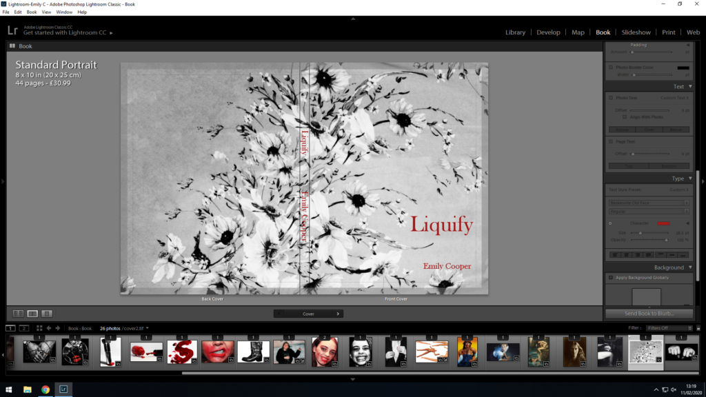
For the physical properties of the book, I have decided to go with a hard cover, premium lustre paper, with a standard portrait orientation. I believe the paper is the most important part of the book, as it allows for the images to be presented with the best possible contrast and colours, and so I have selected premium lustre in order to emphasise the contrast in my images most effectively. Furthermore, I selected portrait orientation, as many of my images are portrait, and I feel like my images as a whole work better in portrait. I have also selected hardcover for its durability factors, as well as the level of quality it adds to the front cover which I feel is necessary due to my cover being more simplistic.