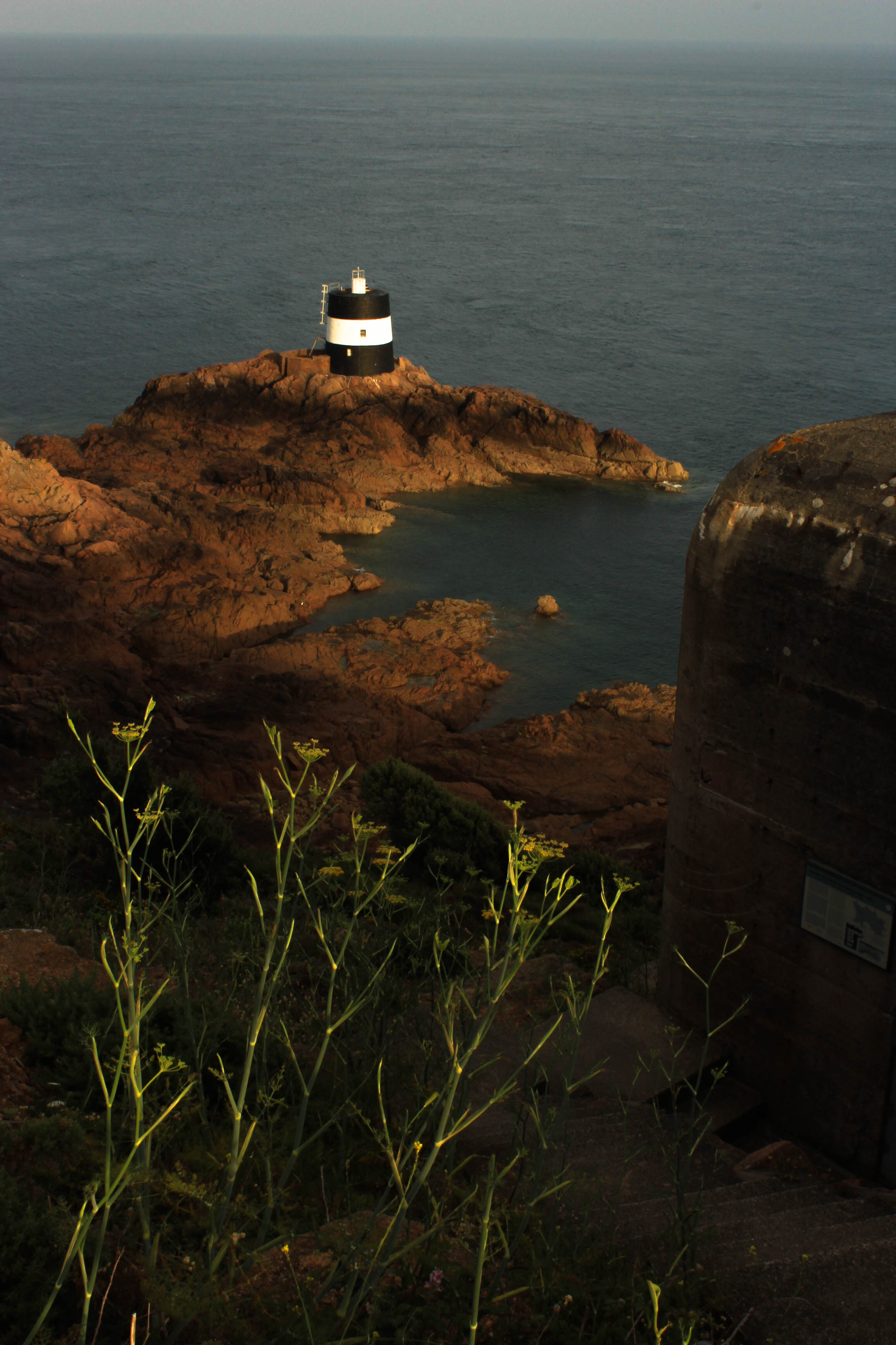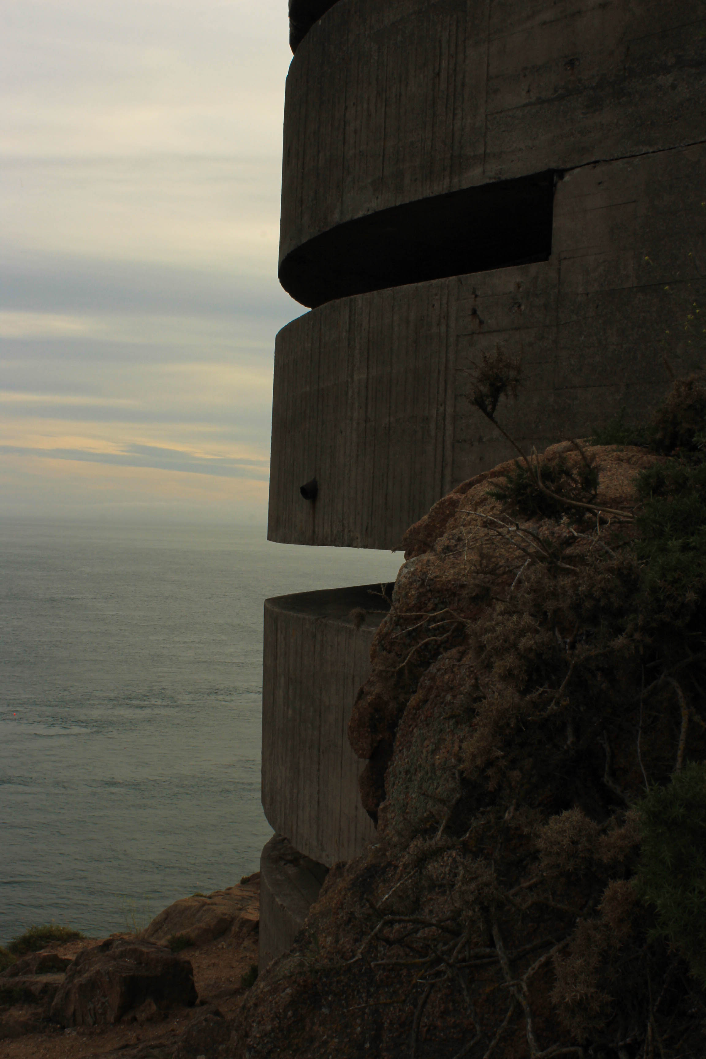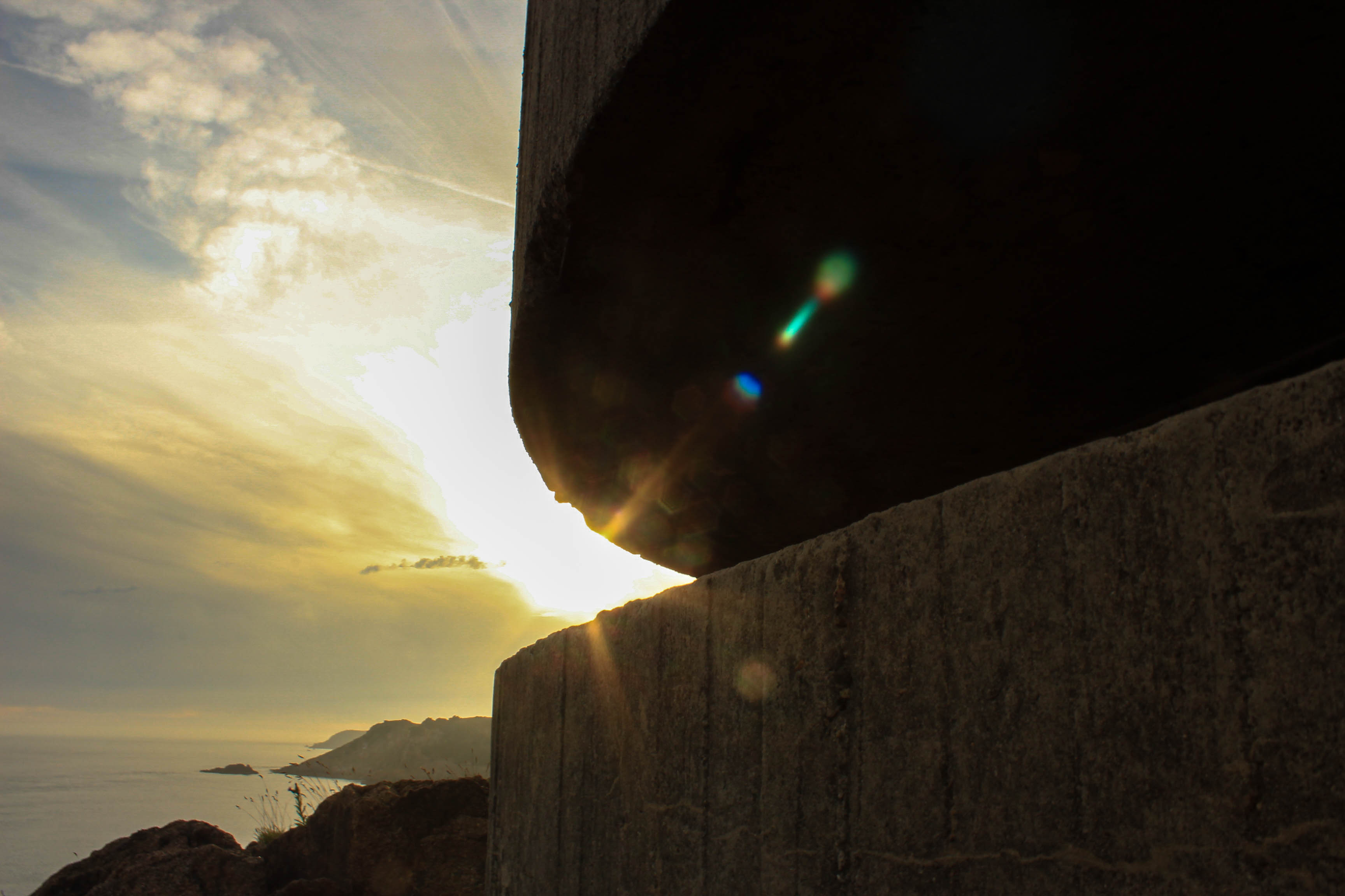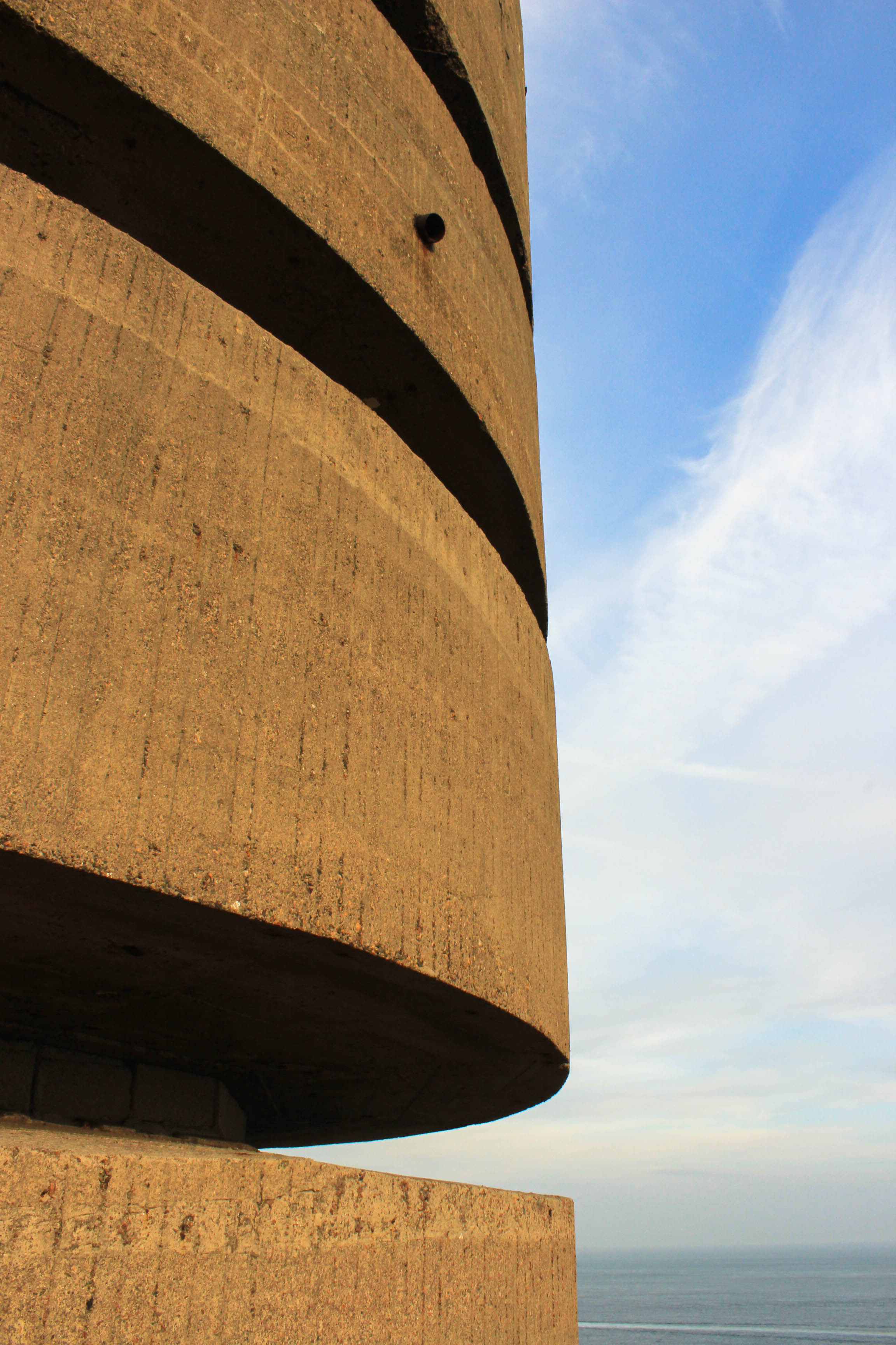







Evaluation:
To evaluate my zine design, I believe I have produced a strong outcome which showcases my work following my intended narrative. To begin with my front cover takes inspiration from the bunker green books made by the German’s during the second world war, which showcases my ability to take inspiration and implement said inspiration into my work for an intended affect. The sequencing of my imagery within my photographic zine works well, as it clearly showcases my narrative, the decay of Jersey’s bunker’s and how nature is taking back its land, and each image compliments one another with not having any miss fits within the design. My layouts are well thought out, as I have considered contrast, shape and how the images compliment each other, and work at different sizes. This process was not easy and my experimentation can be seen on previous blog posts, were I explored the layouts of different images. In my final design I decided to include text, which I believed to help convey my narrative, supporting the images in the story. I experimented with different fonts till I was happy with one which fit well with my images and presents an older time frame within my images. To conclude, I am very happy with my final design, as it showcases my strongest outcomes from my work so far, and shows my understanding of what makes a successful zine, which shows how I have acted upon my research.
Design 1:
For my first design I followed the sequence which I outlined on my previous blog post. Having the start and finish have imagery of landscapes of and around the bunkers, and the middle pages containing images of the bunkers, showcasing their decay. To create this layout I used InDesign, I set up my page to be portrait and the size of A5 paper and in the style of a photo book. In this attempt I looked at different page spreads, what works and what does not look as effective. Within this initial design and experimentation I managed to produce spreads which work well in showcasing my narrative. However, some pages need to be reconsidered and the sequencing of my images could also be reconsidered in order to produce a stronger outcome.
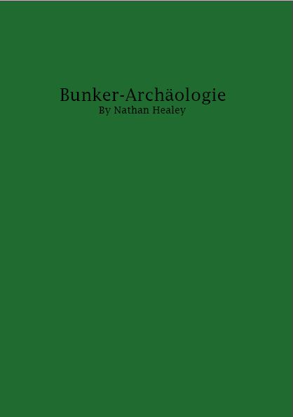
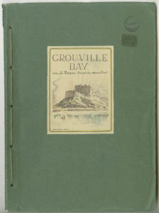
For my front cover, I took inspiration from the archival green books found at Society Jersiase. Below is an example of the green book cover.
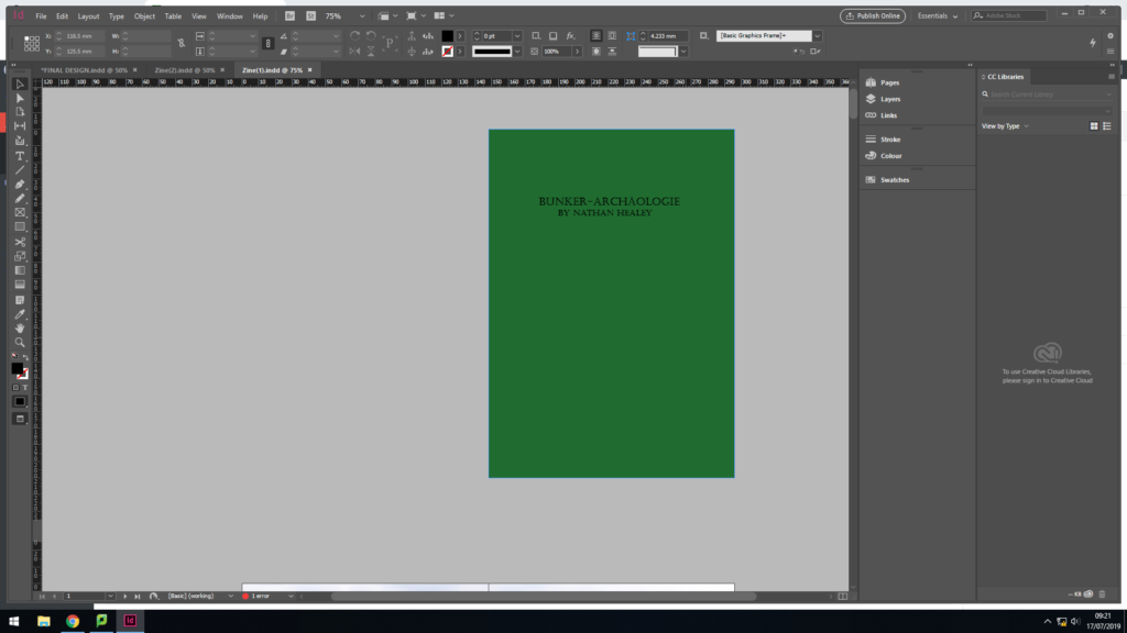
The ideology behind replicating this, was that the green books were created by the German’s during the war, showcasing the defence systems in the area on the front cover. Due to them being archival material it begins to suggest that the defence systems have changed due to the abandonment, thus it begins to present my narrative of the decay of Jersey Bunkers. For my cover I used a dark green to cover the back and black text. Although the two covers are very different, I wanted it to be a ‘modern’ version of the green book, thus this simplistic design clearly showcases this. The title of the Zine is ‘Bunker-Archäologie’, it translate to Bunker archeology in English. Deciding to have my title in German, reminds us of how the bunker’s were built for German soldiers to prevent people getting into the Island, thus it showcases how the Germans have left their mark on the island and allowing it to decay. The font used for the title is bold and has a rigid structure, which represents what the bunkers once were.
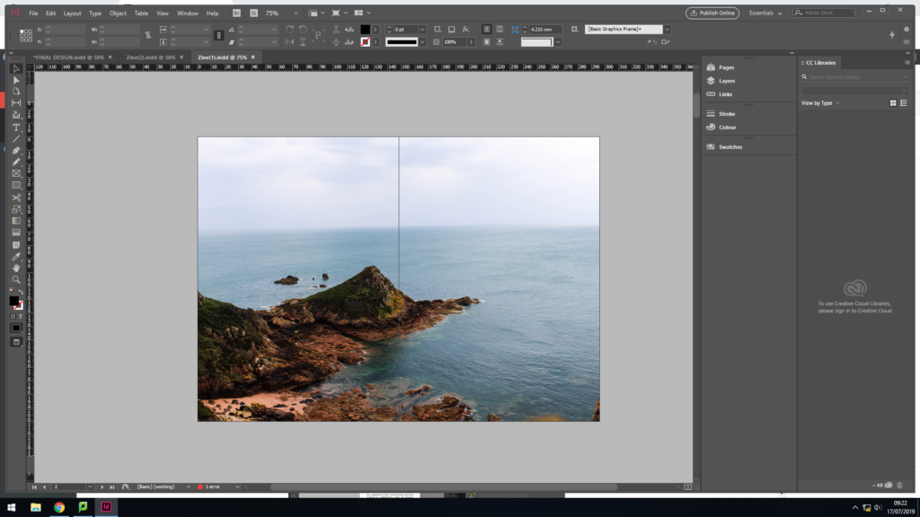
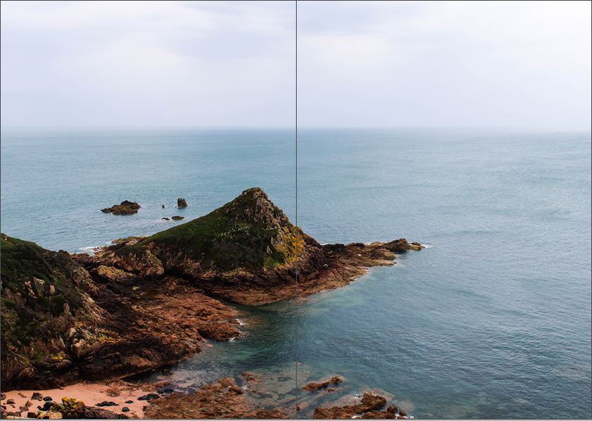
For my second page of the Zine, I used a full page spread of the landscape photograph, looking out from the Noirmont point, a location of one of Jersey’s bunkers. I kept this image in colour to showcase that the image is recent and reinforces the idea of a modern green book. In addition, it showcases the beauty of Jersey, and although the bunker’s are decaying on the top, it is not forcing the rest of the island to decay with them. The full page spread clearly showcases the sea line, and beauty of the nature, which creates a sense of space and a peaceful mood, which holds a ameliorative tone towards the photograph.
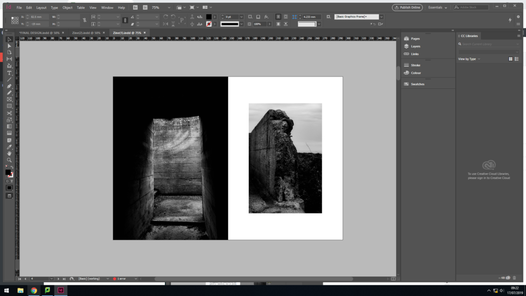
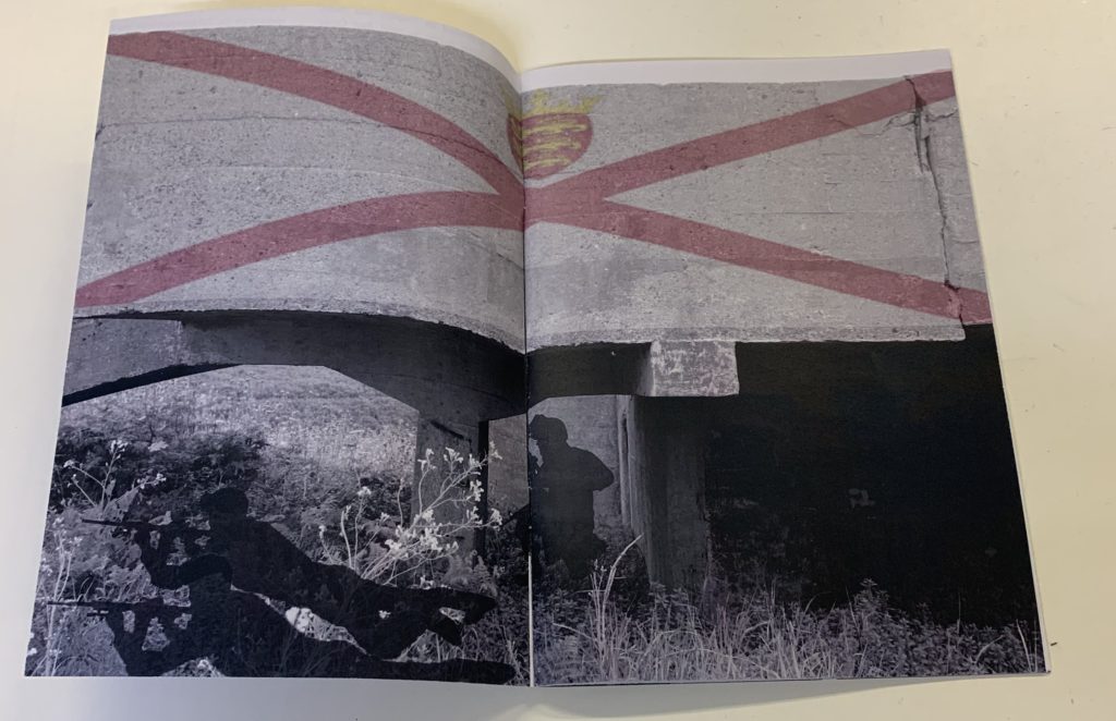
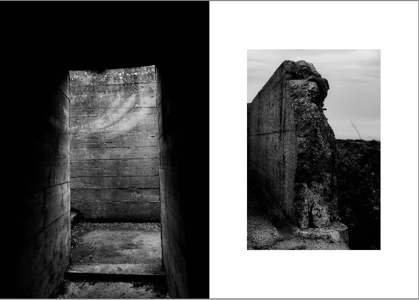
For my next page, I wanted to start showcasing the decay of the bunker’s, this layout clearly emphasises this. The juxtaposing colours, showcases the abandonment of the bunkers, which is reinforced by the formal elements of space and texture. The image on the left is a half page spread, filling the screen creating the sense of space. The image on the right is much smaller and located in the centre of the page, producing juxtaposing colours which helps the photographs to compliment one another. I believe that this layout is my strongest page spread, and is unlikely to be changed.
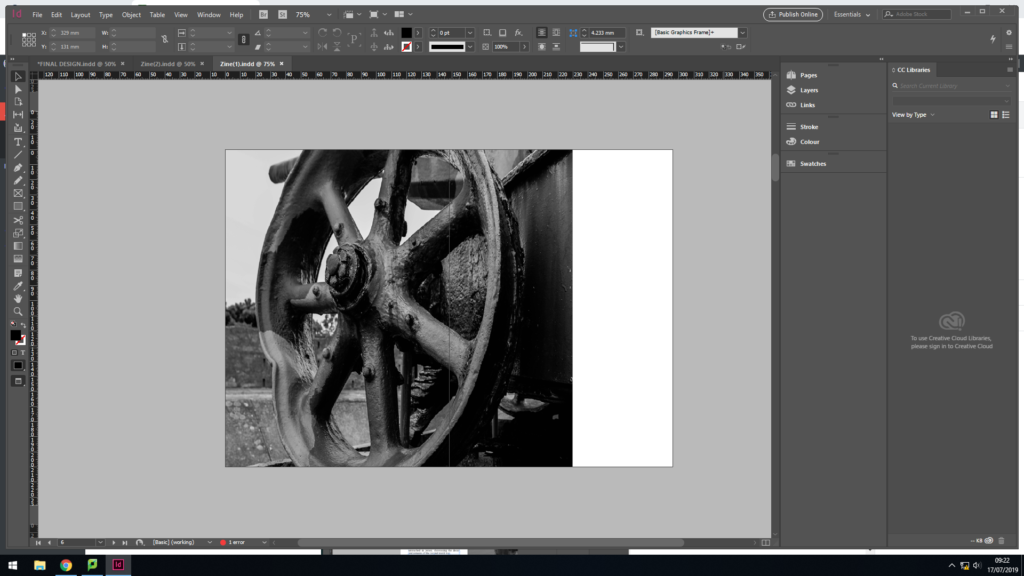
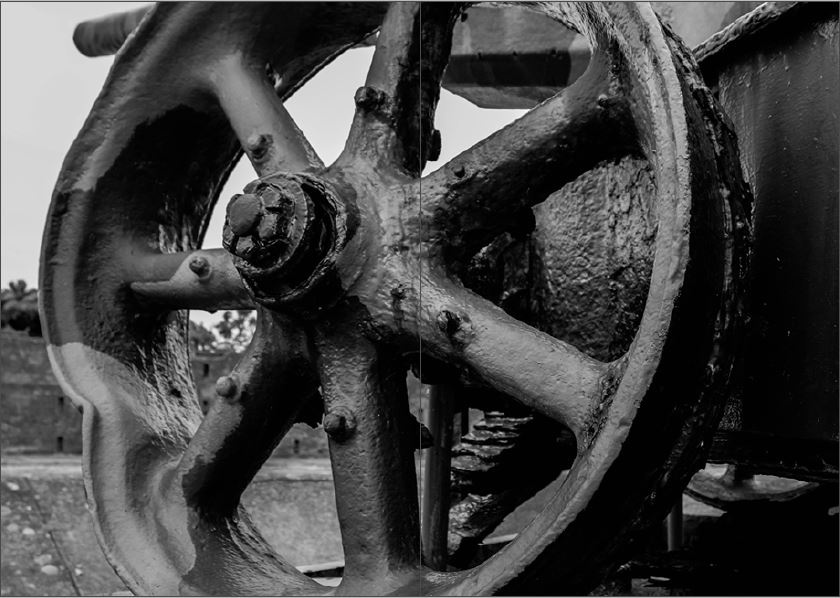
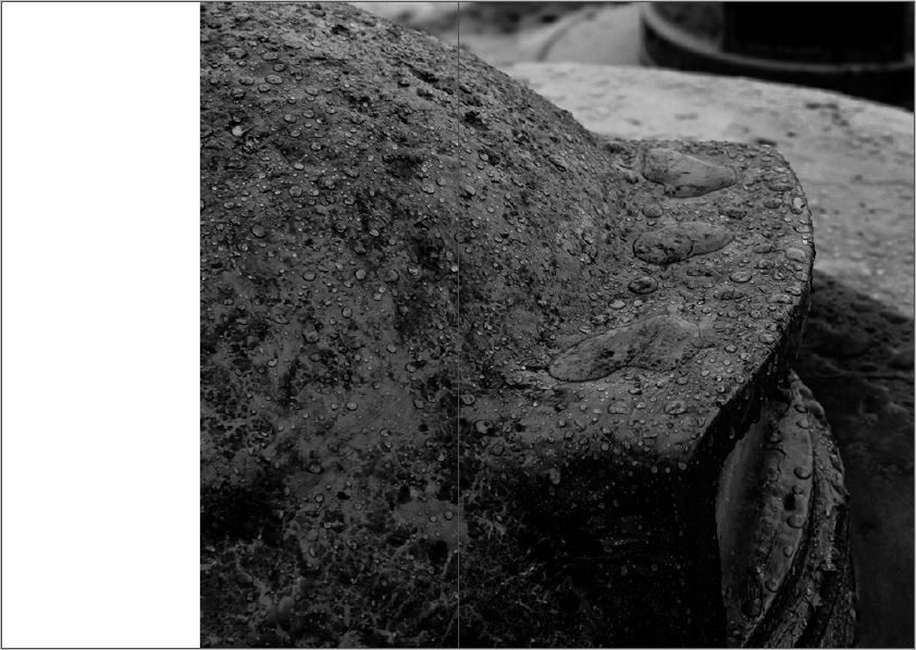
In my next page spread, I used a 3/4 page spread to showcase this macro image of the bottom of the gun. This layout allows the formal elements of texture and shape to clearly be showcased, reinforcing the narrative of the decay of the bunker. This photograph is strong enough to be alone and is busy, allowing viewers to be drawn into the image. In my opinion this page works well within my design.
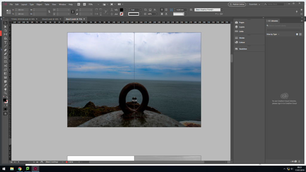
For my middle page spread I decided to repeat the idea of have a landscape image looking out in colour. I used a full page spread, for the same reasoning as the first page. This artistic design worked well, as it reinforces the idea that the bunker’s are decaying but the island will not decay with the bunker. The image works well as it uses the technique of framing to enclose a bunker type building out at sea, leaving the rest of landscape to be free. Although I like the way in which this page turned out, I do not believe that having a colour image in the centre of the zine is the best idea, as it almost distracts viewers from the actual narrative, decay of the bunkers.
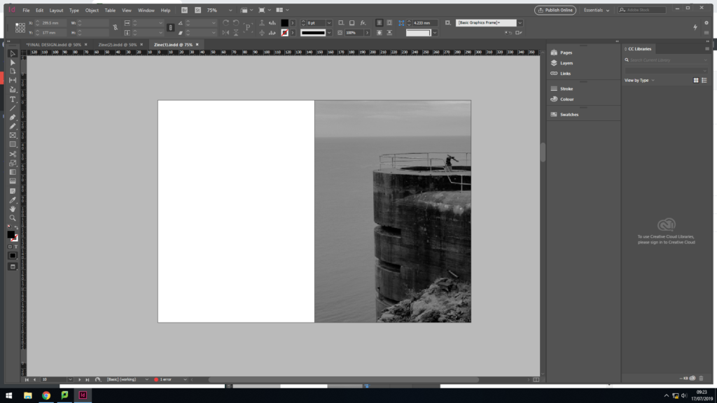
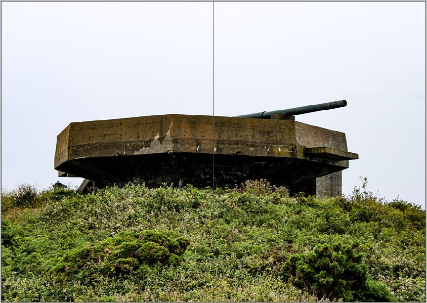
For my next page spread I decided to go with a half page spread for the image, and leave the other half blank. Creating this blank page takes a break from the action, allowing the information and concept of the zine to settle into viewers heads, it can also be used represent the idea that one day the bunkers will be gone, due to them decaying so rapidly. The image is placed on the right side of the page, as the structure is cut off on the right, so the edge of the zine acts as the end of the bunker.
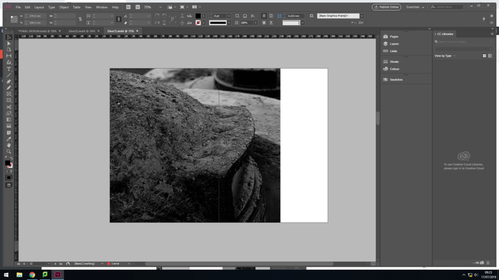
In my next page, I decided to use the 3/4 page spread again, due to me liking the way in which the other 3/4 page spread look. The image used suits being a larger image, due to the texture being presented through the raindrops and decaying of the bunker.
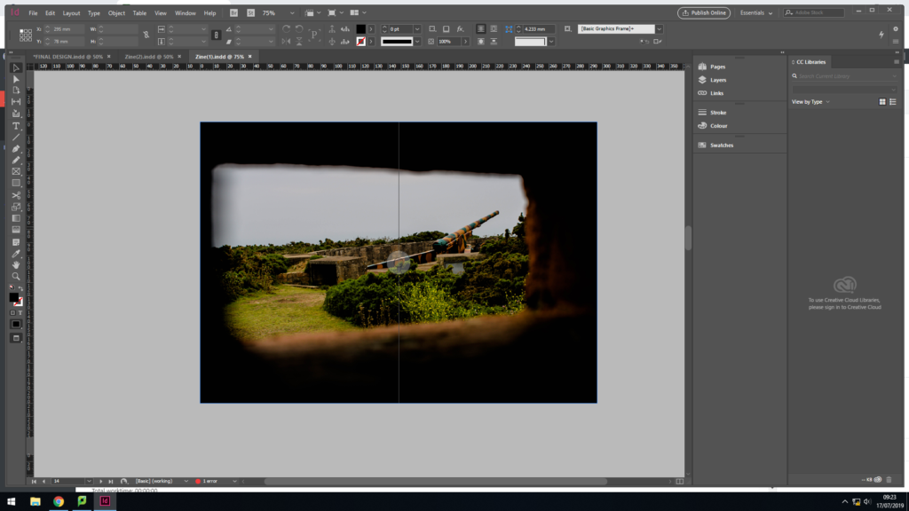
For my final page spread I wanted to use another landscape image, to create a circular plot and allowing it to follow my intended sequence stated in a previous blog post. I used a full page spread, and a colour image. This time the landscape photograph is looking back at the bunker, which nicely brings the zine to an end, as we can see how the bunkers are decaying the but what surrounds is not decaying. Although this image works well on a full page spread, I do not believe that it is the strongest finish to my zine, thus I will look at changing this.
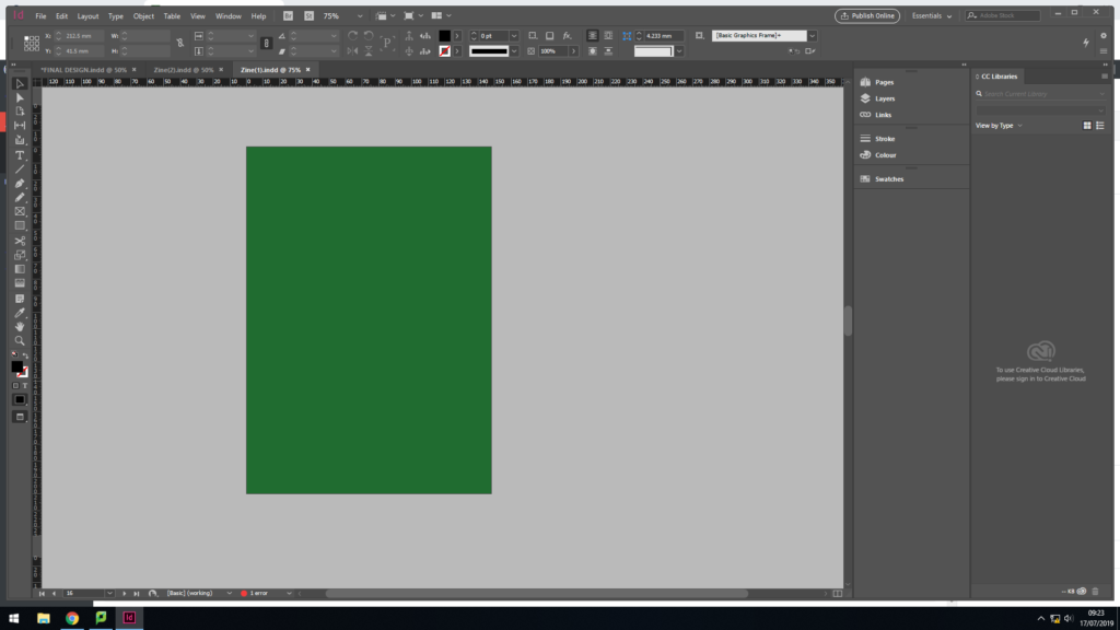
The back page of my zine is simply the same colour green as the front cover, which refers to the archival green books which showcase the layout of the bunkers, made by the German’s.
Design 2:
In my second design I looked at alternative ways in displaying my images, by changing the spreads and adding in text in my zine. I explored a different front cover option as well as different layout options. I intend to use my best page spreads, from this design and my previous design, to create my final sequence and make my final zine design. Doing this further exploration of page layouts has allowed me to develop my skills within InDesign and has allowed me to show development within my work.
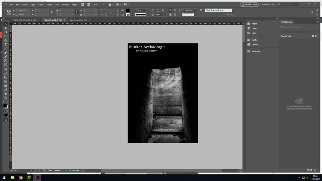
In this front cover design, I decided to use my strongest image produced in my photoshoot, It clearly showcases the decay of the bunkers, thus bringing my narrative from the get go. In addition, I used the same title and font as I did in my first design, but set the colouring to white. The placement of the text is in the top left corner, which is a little hidden, but is placed with in a completely black are making it work successfully. Although I like the way in which this front cover looks, I think this image would work better in the spread created in the previous design. Needless to say, it was well worth doing this experimentation as it confirms that I like the way in which my original front cover looks, and the conceptual and contextual factors it holds.
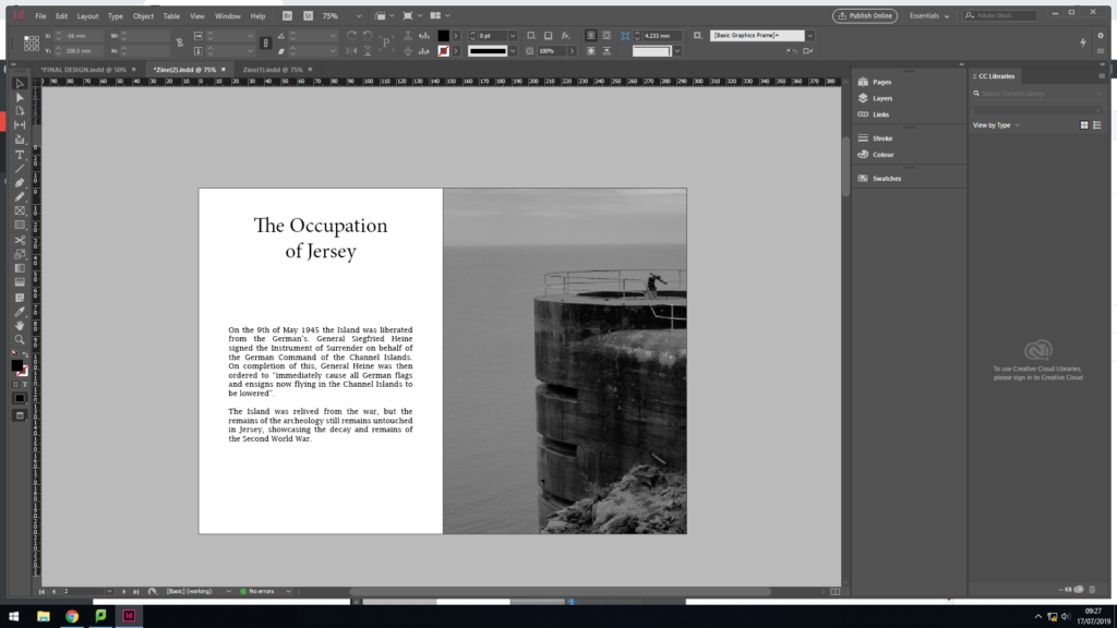
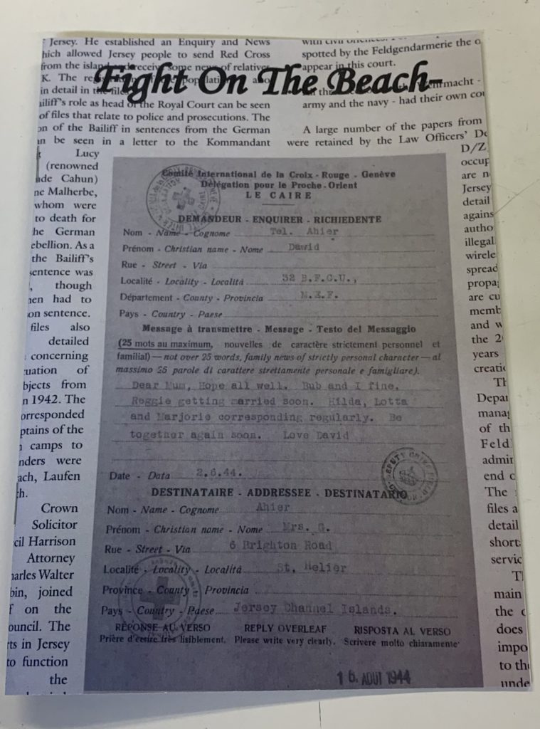
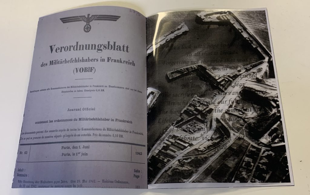
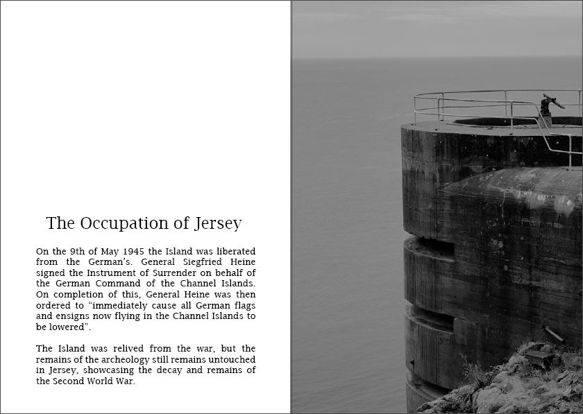
In my next layout I wanted to experiment with adding text into my work, in order to clearly outline the historical factors of the Second World War in Jersey. With this I simply added a title and text which outlines the liberation of the island and how the bunkers have been left to decay. The short text allows my narrative to be presented, and works well with the one page image spread next to it. I really like the way in which this spread looks, thus I am planning on implementing it in my final design. However, I will develop the font and layout of the text, as I do not believe it is having maximum impact within the zine.
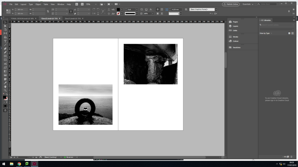
My next layout, I looked at placing two landscape images on a page. I selected two images which juxtapose the sense of space. One image is placed at the top and the other at the bottom. For the narrative I am going for I do not believe that this spread is effective, or fits in with the other layouts within my zine. Therefore, I will not be further developing this layout.
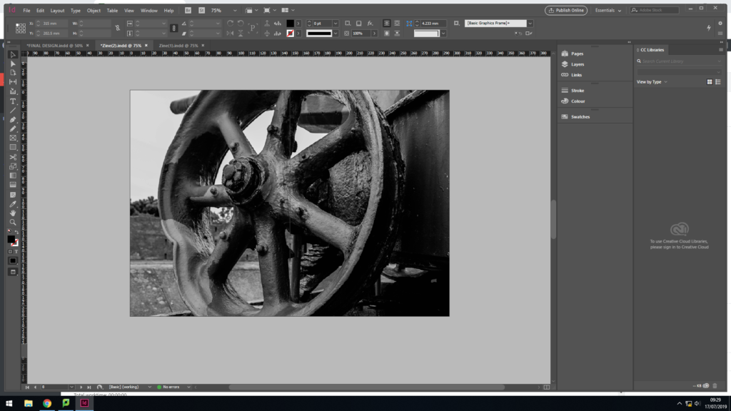
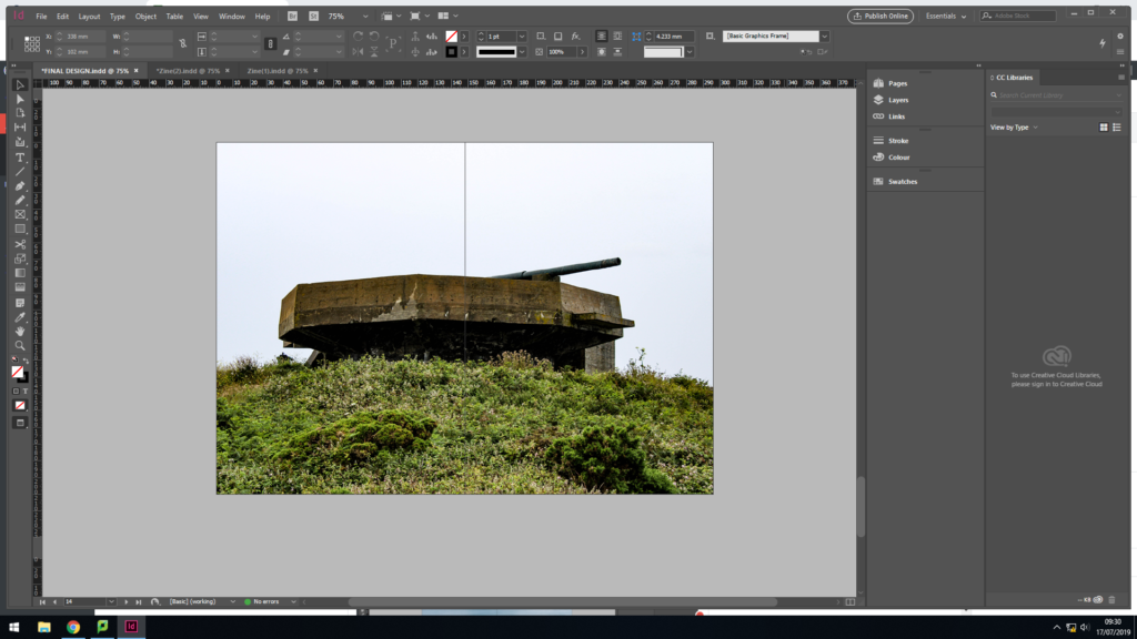
I then decided to look at another alternative for a middle page spread as I was not happy with the one created in my initial design. I decided to use this photograph, which was originally a 3/4 page spread, and made the black and white photograph a full page spread in the middle. I much prefer this layout, as it does not disturb viewers from the narrative with a colour photograph in the middle, thus fitting my sequence more appropriately.
Changes:
After developing my two design idea, I still had pages which I liked but still needed developing in order to have maximum impact. Below are the three main changes I made. This shows my further development and me critiquing my work from an artistic perspective.
Font:
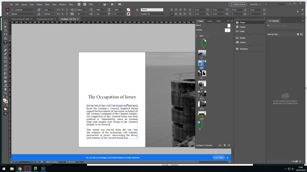
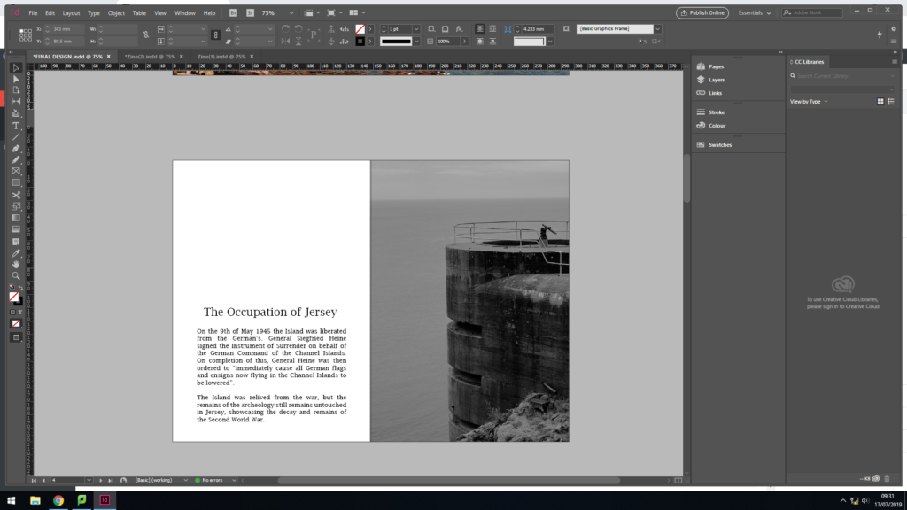
As mentioned earlier I was not happy with the font I used to create the page spread which included information about the decay of Jersey’s bunker’s. I decided to change the font to one which is similar to my title, keeping my work consistent. I also decreased the size so my title fitted on one line as well as getting rid of the hyphens within the paragraph. In addition, I moved all my text down to the bottom of the page, which is a typical design layout for a zine when the text does not fill the whole page. I am much happier with this change in design, as it allows the zine to flow more fluidly now and presents my narrative well.
First and Last Page Design:
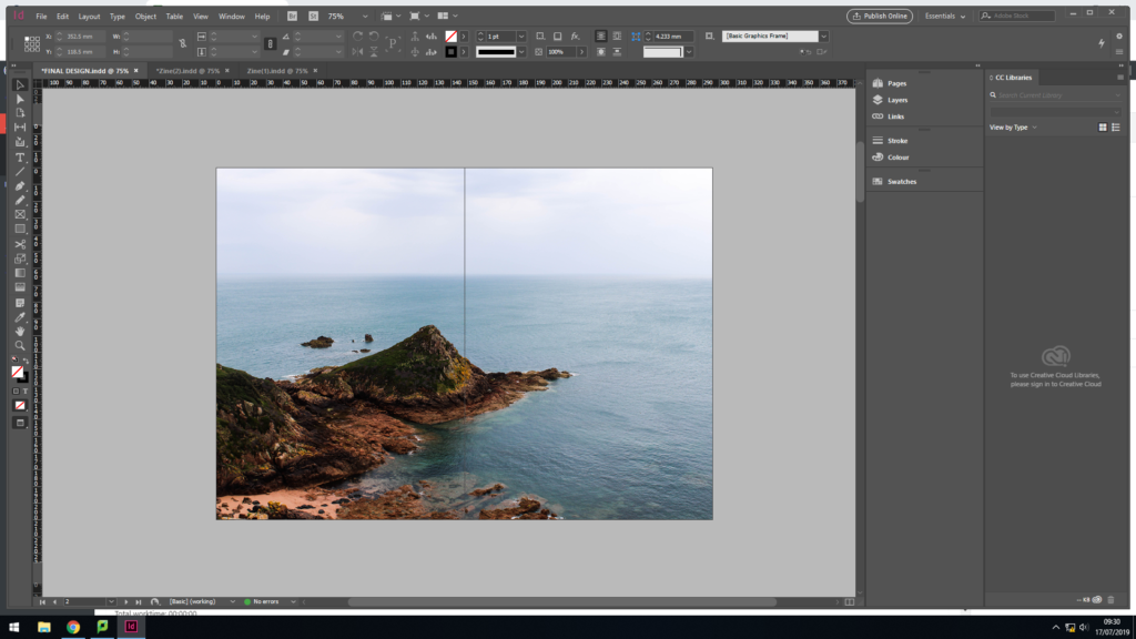
Colour Changing:
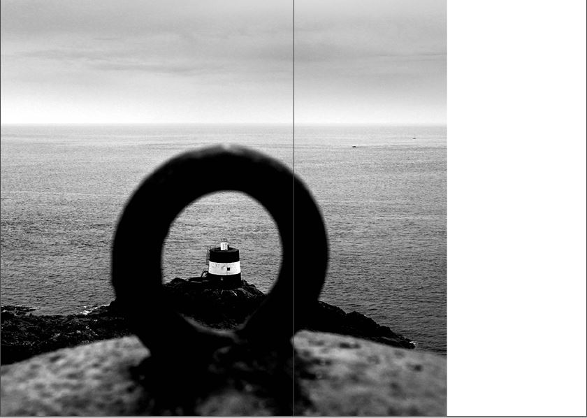

My last major change was the colouring and positing of the image above. Originally this image was in colour and a full page spread in the centre of my zine. As mentioned, I did not think this was an affective look as disturbed the rhythm within my zine so I created a new centre page. I still wanted to include this image somewhere in my final produce. I decided to turn it black and white and have it as a 3/4 spread, taking the position of where the wheel image was. I believe that this image is better suited in black and white and in this layout, as it showcases the decay more appropriately.
Action Plan:
As an action plan I will now combine my favourite spreads onto one document, creating my final design for my zine. I will then place them in the appropriate sequence and evaluate my final outcome on another blog post, which shows my final design page by page.
Narrative: A narrative is a story which is being told through writing, speech or photographs. Many times a narrative can be presented through all three forms. Usually the narrative is clear and easy to follow through out. Putting this in terms with a zine, the narrative of my zine should clearly showcase the storyline I am telling from the first page, and should consistently tell this story till the last page.
Describing my Zine’s Narrative:
3 words:
Jersey’s Bunker Decay
A sentence:
My rational for my zine is to tell the story of how the Jersey’s bunkers have been untouched since the war and has decayed over time, allowing us to constantly be reminded about this key period in Jersey’s history.
A paragraph:
My zine aims to showcase the decay of the war and the imprint it has left on the island. I intend to use images which focus on the formal elements of texture, shape and line in order to clearly present the decay and the abandonment of the bunkers, which will present different viewpoints towards the decay. The story being told will not just be focused on bunker’s, but also the scenery and landscapes around the bunkers in order to showcase how that area of land has been affected, as well as bringing in contextual factors of the war and Jersey. In addition, the story will follow a linear narrative (chronological order) and will have a clear start, middle and end. Following this narrative structure should clearly show the decay of Jersey’s bunkers and how the island was heavily impacted during the 5 years of the German Occupation.
Sequencing: Sequencing is the order in which images are placed in a zine or photobook in order to present the intended narrative.
At the beginning the zine will showcase the effect of the war on the landscape with an introduction paragraph which will contain information of the war. The middle will have different styles of images (macro, different angles and focus points) showcasing the decay of the bunkers, and it will end with the way it begins, almost like a circular plot, having a landscape image looking out at the scenery. This is a brief overview of the order in which I would like my images in order to present the narrative of the decay of the bunkers.
Action Plan:
I will now produce a new blog post which will show my first attempt at placing my chosen images into a sequence which should clearly portray my narrative. I will discuss my thought process as to why I selected the chosen order and creative thoughts towards laying out the image. Furthermore, I will use this first layout as an experimentation, allowing me to evaluate my work as to what went well and what should be changed, which should then lead me on to creating a second draft.
For my final product I was able to produce the 16 page zine surrounding the idea of landscapes and the history of the Jersey Occupation, I am personally happy with my final zine that I have been able to produce.


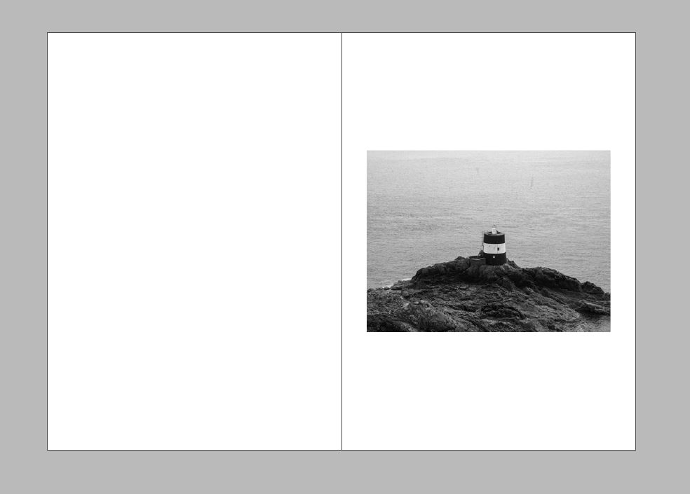

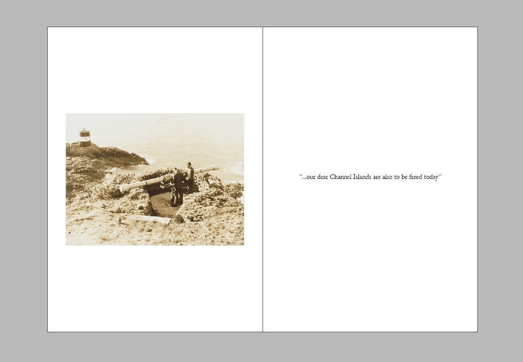
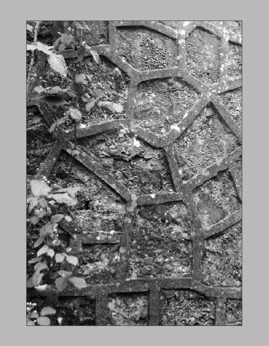
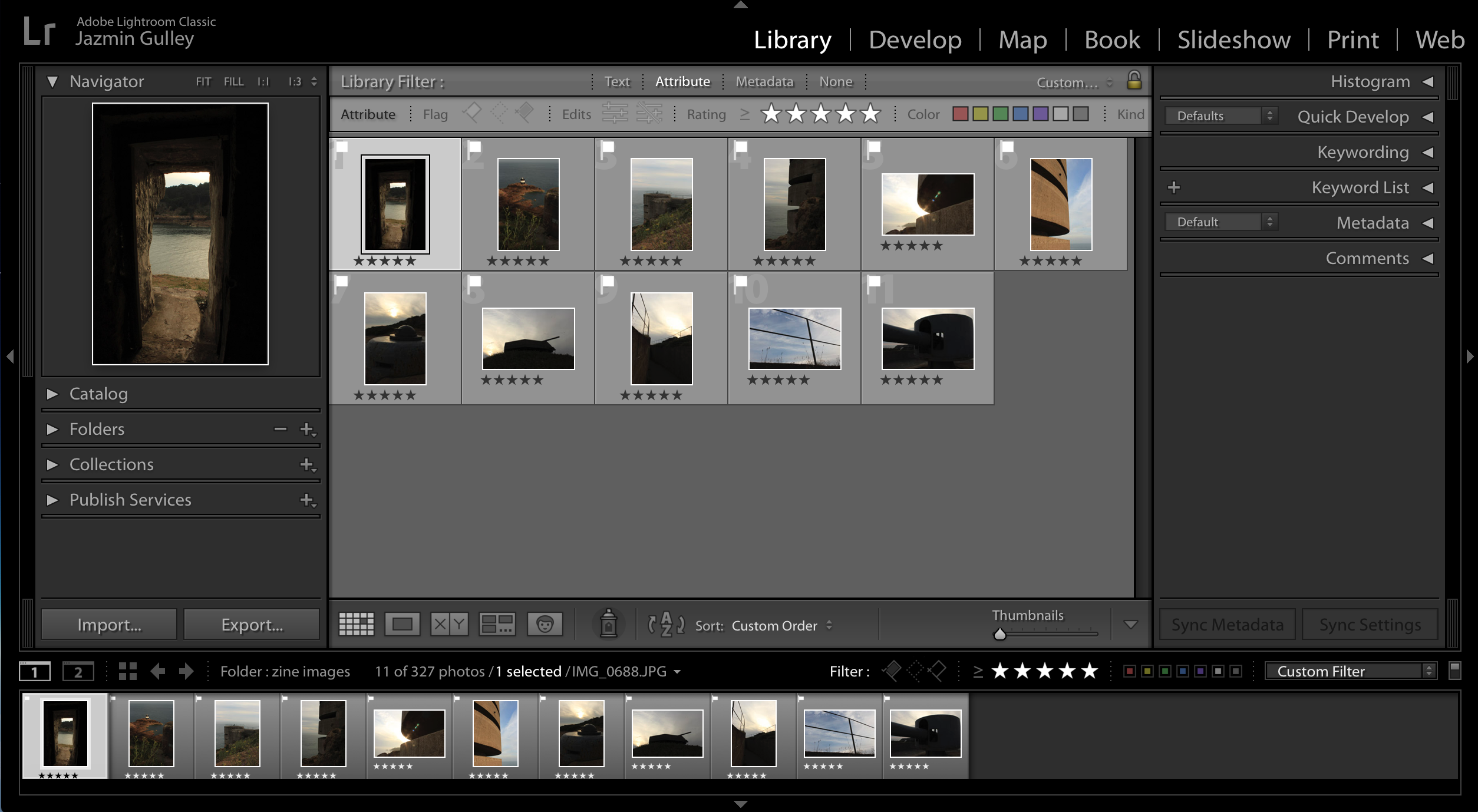
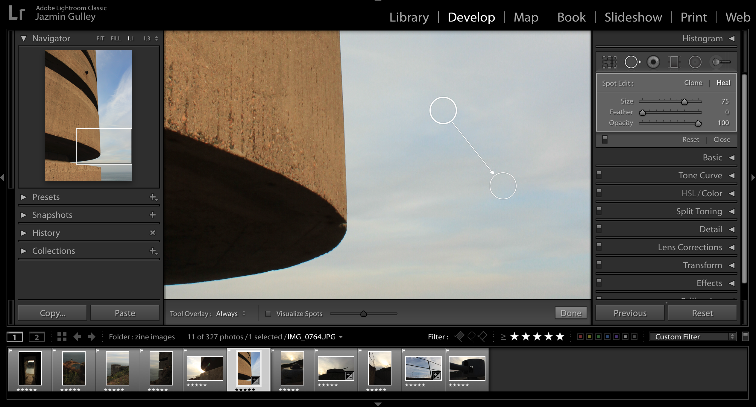
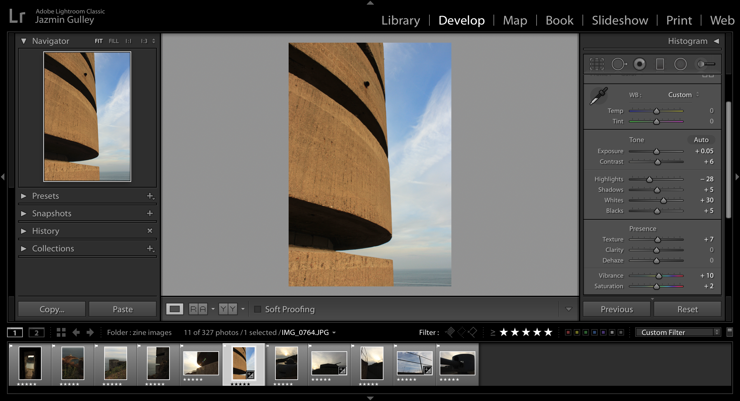
I used Adobe InDesign in order to produce the final layout for my zine. In doing so, I was able to manipulate the layout and sequence of the images easily, and could continuously develop my ideas as I worked to find the best layout for the narrative of my zine. The following steps are those that I followed using InDesign:

In the above image, I was experimenting with the layout of individual images. With some of the images, I decided that in order to keep the interest of the viewer, and to break the images between the pages up more clearly, I would use some of the landscape images, and rotate them 90 degrees so that they presented landscape, horizontally across the book, and by reducing their size, they fit on the page, leaving blank space on all sides. I n doing this I feel I am able to draw more attention to these specific images, and it allows me to break up the images so that they do not look like one continuous block of image.
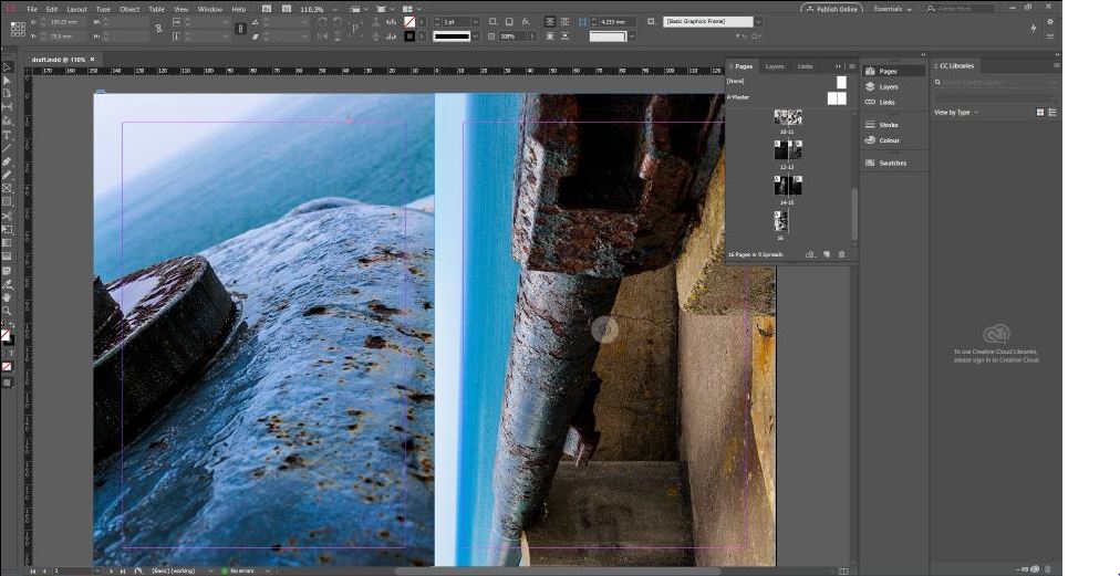
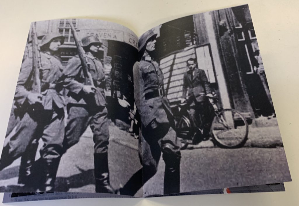
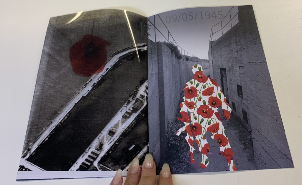
The above image is an example of one of the final doubly-page spreads for the zine. One of the images is portrait, and the other is landscape. I used a full bleed layout, and rotated the landscape image in order to fit it on the page.
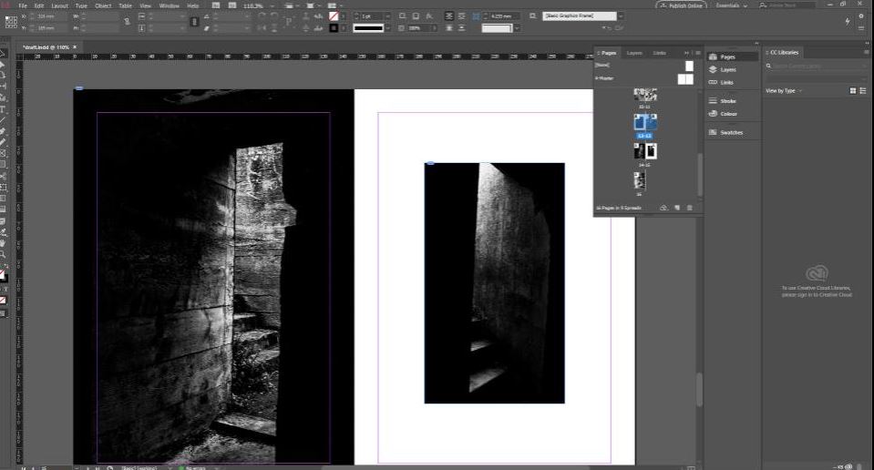
The above image is an example of where I reduced the size of a portrait image, in order to break up the images further along in the zine. These images are both dark in colour, and so in order to between distinguish between the images, I reduced the size of one of them, leaving blank space as a boarder to frame the image and draw more attention to it.

The final image is an example of the layout of all of the pages for my zine. Here it is easier to see the progression from the lighter images to the darker images as the zine progresses, reflecting the increasingly dismal atmosphere of the occupation of Jersey by the German forces.
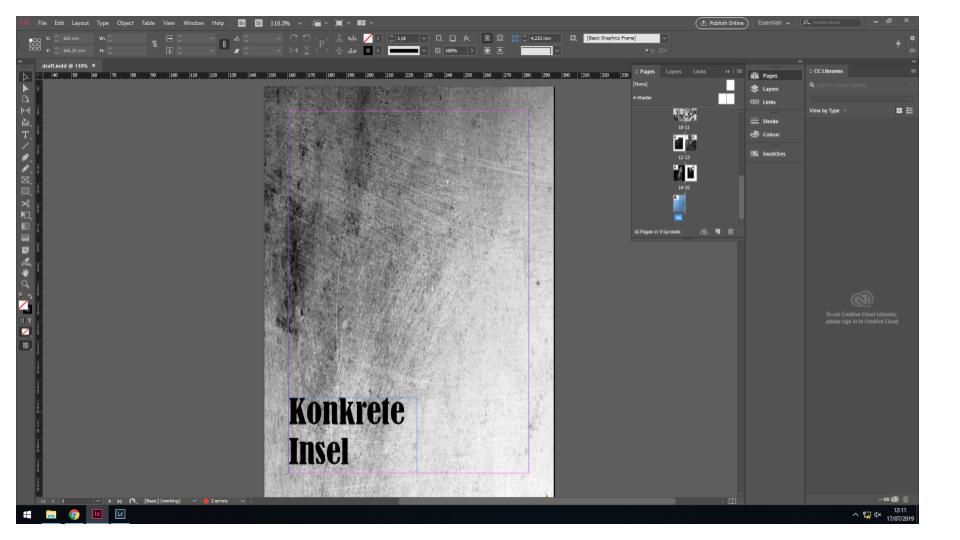
The above image is what I will be using as a front cover. It is a simple image of close up concrete, which I feel provides a minimalist and tidy layout as the front cover. I have experimented with having a leaflet stapled to the size of the zine, which would showcase a map of Jersey taken from the archives, in order to draw the attention of the viewer and add more to the front cover. The title I have chosen is the German translation of “Concrete Island”. I feel like this title sums up what the German occupation did to the island of Jersey, turning the landscapes from fields and forest land into concrete bunkers and watch stations.
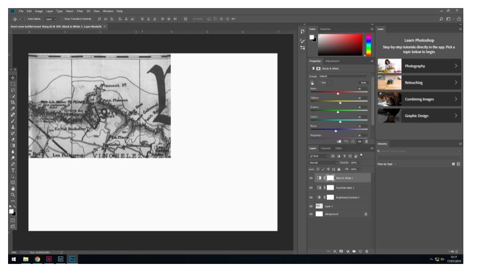
Above is an experimentation with what I may use as a leaflet stapled to the outside of the zine to add more to the front cover. It is an image of a map of Jersey designed around the time of the occupation. I increased the contrast and saturation to make the lines darker, which draws more attention to the image.
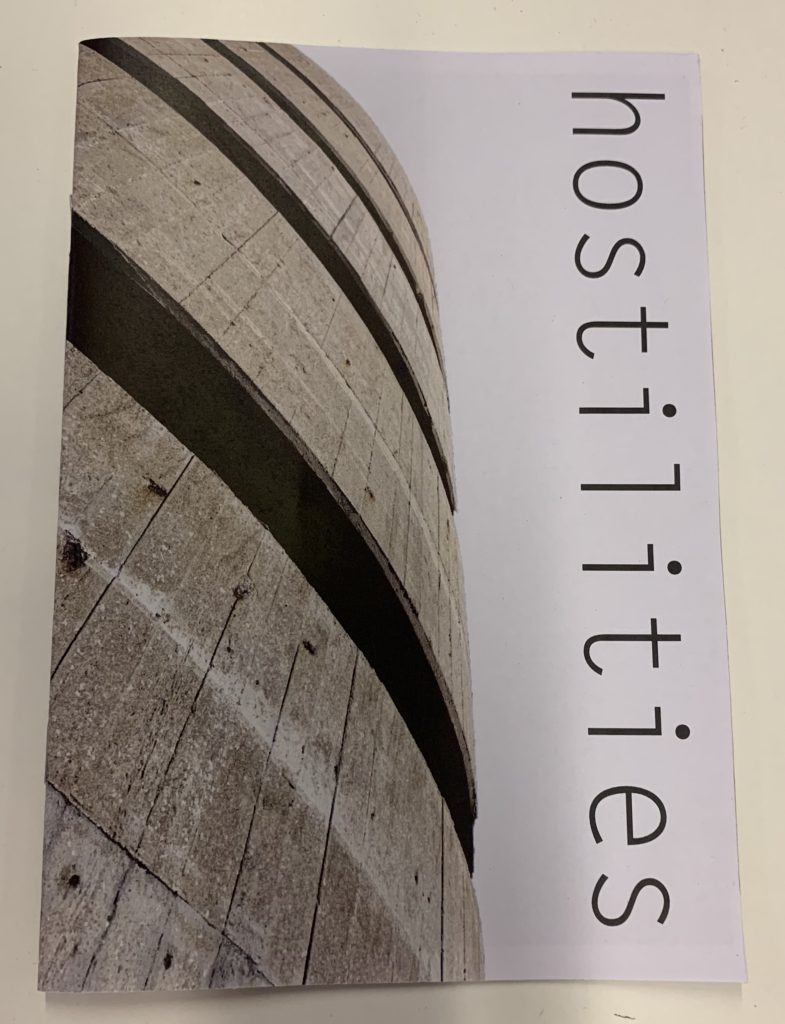
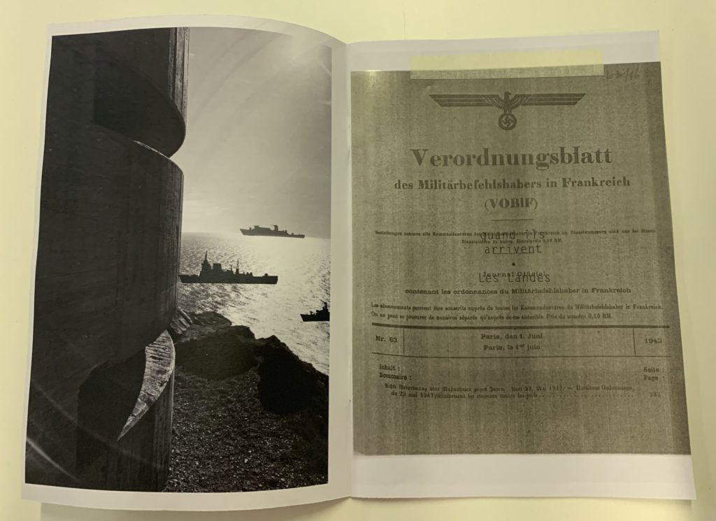

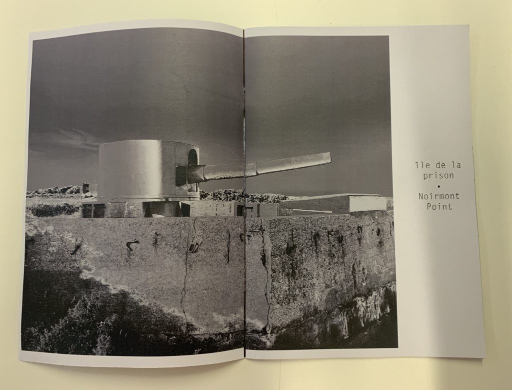

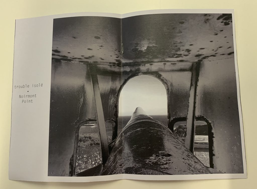



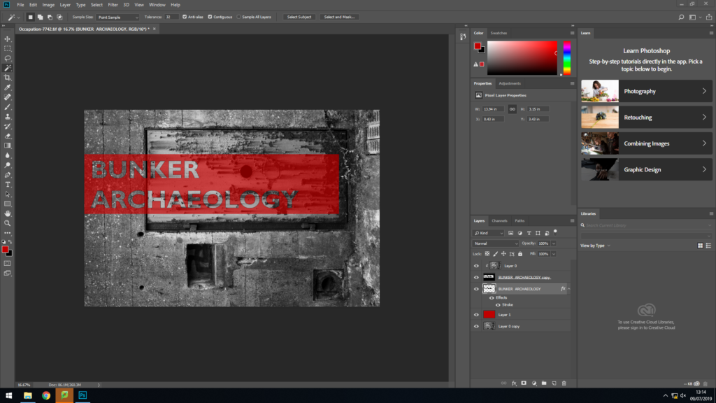
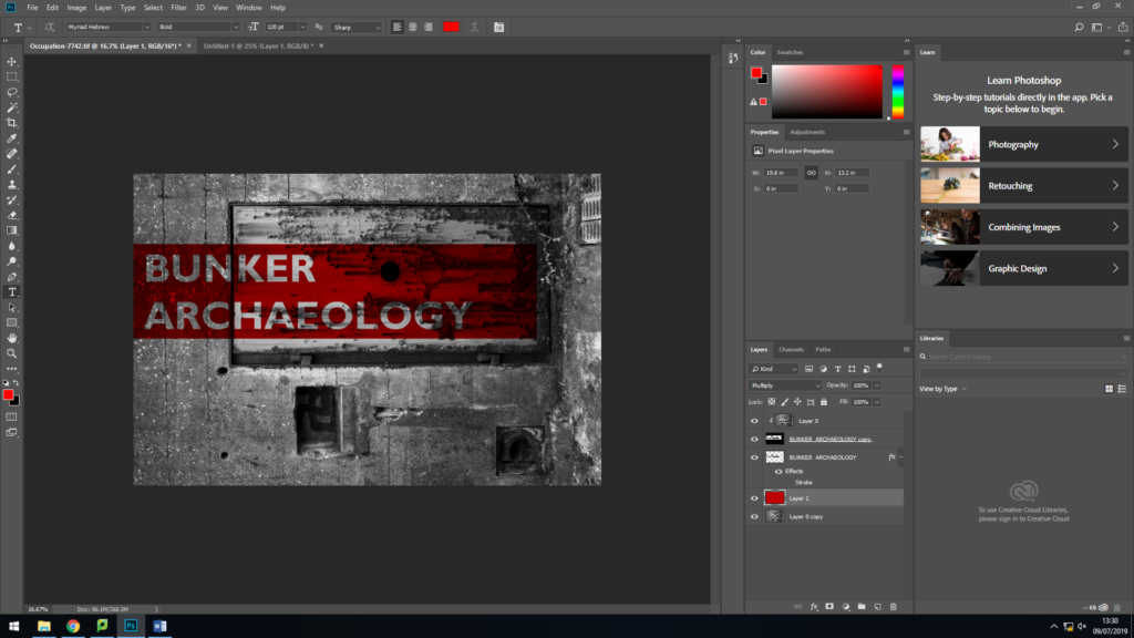
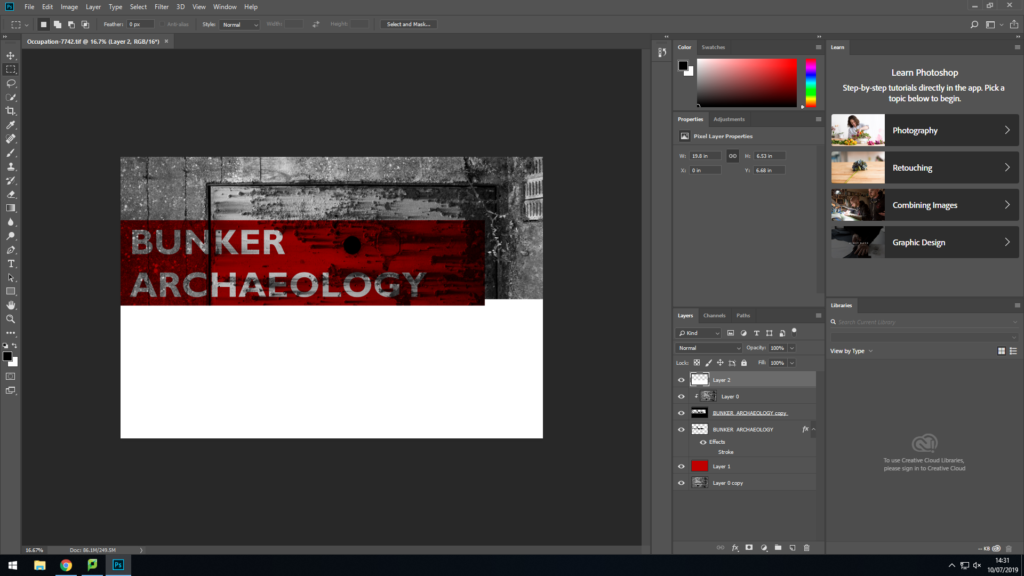
My initial ideas for the front cover of the zine involved experimentation using an overlay to add some contrast to the front cover while better framing the writing
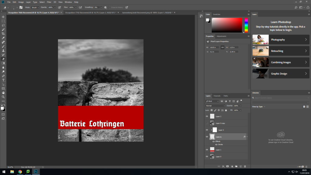
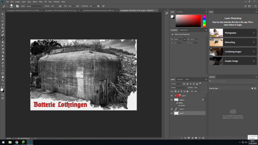
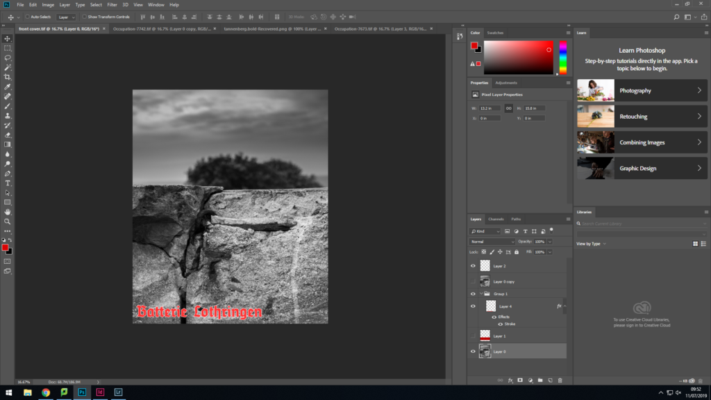
I experimented with some more solid color in order to create a harsher contrast as as well as calling back to the German WW2 propaganda posters as I am a fan of the design used and the general aesthetic.
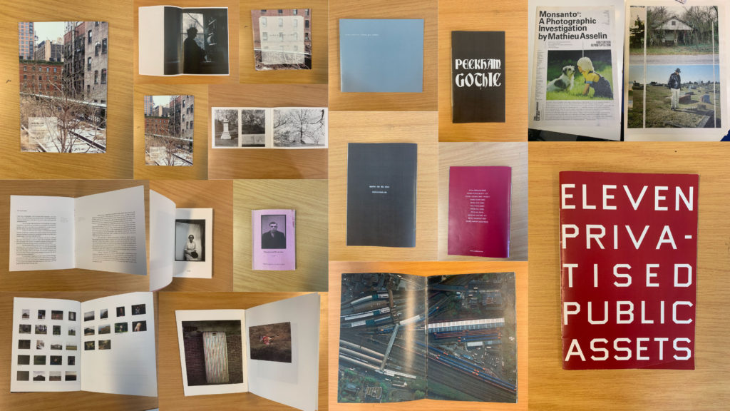
What is a Zine?
A zine is a independently or self-published booklet, often created by physically cutting and gluing text and images together onto a master flat for photocopying, but it is also common to produce the master by typing and formatting pages on a computer. The publication is usually folded and stapled.
Analysis of a Zine:
I will be analysing ‘Lingering Ghosts – The waiting for refuge’ by Sam Ivin in order to gain a better understanding of narrative and sequencing, and what makes a successful zine. I watched a video interview with Ivin where he explained his rational behind the zine and why the topic was important to him. His passion towards the subject matter is clearly shown through his work which showcases the importance of really understand and enjoying the subject matter to clearly portray a strong narrative within my own zine.
Link to Ivin’s website which provided me with further research and understanding of his project: http://www.samivin.com/lingeringghosts


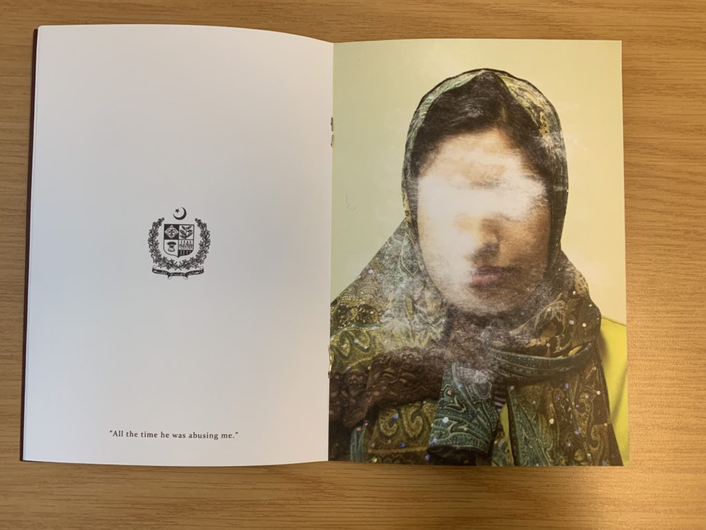

Format, size and orientation
This zine is the size of A5 paper, which is used to create a literal representation of the actual size of someone’s passport, linking to the key theme of the zine. In addition to this, the zine is in a portrait orientation which further expands our understanding of the zine prier to reading it. It is formatted in a rectangular shape which is the same as a passport, which presents Ivin’s artistic creativity to present the theme of asylum seekers and immigration.
Design and layout
As previously mentioned the design of the zine is in the style of the passport which begins to build a relationship with the imagery and the theme of immigration and asylum seekers.
Rhythm and sequencing
The sequence of the images is very simplistic but effective. On the left hand page the nationality of the person is presented through the country’s emblem, below this is a quote taken from what that person has said about being denied from seeking asylum. For example it says “All this time he was abusing me”. On the next page is a picture of that person with their face scratched out to show how they have been ghosted from England, and how the artist is expressing how others find asylum seekers irrelevant.
Narrative and visual concept
The story being told within the zine is people who are trying to seek asylum but are being declined. It’s trying to capture the uncertainty of their future and how their life has come to a stop and how they are being forgotten by others. This is shown through the portrait of the asylum seekers (in color), and the face has been scratched out, which symbolically represents this narrative. I would say the narrative is clear within the zine due to the introduction at the start of the zine. Needless to say, the imagery really encapsulates this idea.
Title and cover
The cover is very simplistic but has symbolic representations to present the theme of the zine. The background is a dark royal red/burgundy color which is the same color as a British passport which showcases the theme of travel. The simplicity of the design allows a bigger impact for the content within. The title ‘Lingering Ghosts’ is metaphorical to showcase how asylum seekers are neglected, frowned upon and find it hard to fit into society and are “unsure of what their future will hold”. Below the title is Britain’s emblem which is also shown on a passport, which presents the views of the artist that we should allow these asylum seekers into the country as they want safety.
Images and text
Image and text plays a massive role within this zine, due to the topic it is presenting. When we look at a two page spread, on the left we are presented with a country’s emblem with a quote taken direct from the asylum seekers words. On the right hand side is the picture of the asylum seekers them self which has been scratched out and distorted, which allows the image and text to work in cohesion.
Use of other design elements or inserts: archives, montages, graphics, typography
The images have been distorted by being scratched which showcases physical interactions with the photograph, showcasing a surrealist approach to photomontage. The text used is a simplistic bold lettering which is easy to read and understand from a viewers perspective.
Further Analysis:
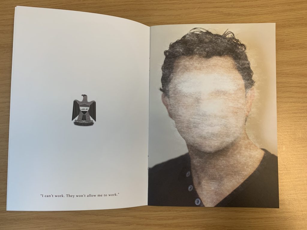
To analyse this double page spread of Sam Ivin zine, I will be looking at different elements which make it successful. Conceptually, Ivin is trying to showcase the fact that the man has been declined asylum and is almost being forgotten by Britain, leaving him unsafe and uncertain about his future. This is clearly portrayed through the symbolism of the face of the man being scratched out, which showcases Britain trying to take away their identity. Contextually, these asylum seekers are leaving their country due to them being in danger as well as their family, and Britain are declining their entry due to the customs and immigration officers not believing what they are saying is true. This issue is very current today and this zine is aimed to inform those about this issue that innocent people are facing. Visually, the zine presents the formal elements of texture, shape and line through the scratching out of the portrait. The composition of the portrait is very simplistic, the portrait is located in the centre of the page and fills up most of the page, leaving the background plain allowing our focus to stay on the portrait. On the other side, the composition is also simplistic them emblem from where the man comes from is located in the centre of the page at a medium size with a quote taken directly from the man’s words located at the bottom of this page. Technically, the image uses a lot of negative space which represents the idea that they are left with nothing and being declined asylum leaves them feeling empty and not apart of society, due to where they come from. The portrait of the person is presented in colour which showcases the idea that they do still have an identity. In addition, the lighting used to capture the portrait is artificial warm lighting due to the image having a studio feel to it. To capture the images the aperture was low, and a large depth of field was used. The shutter speed was quick and the ISO is also low as there is no intended blur or noise presented within the image. The white balance used creates a warm atmosphere which creates a sense of coziness and safety which juxtaposes the theme of uncertainty which allows viewers to really understand and think about the issue before them. The zine uses a combination of image and text which makes it successful and shows variety also helping it to appeal to the viewers. In addition to this, the face (eyes in particular) have been scratched off showing photo manipulation in order to present the narrative of these people’s identity being stripped and taken away leaving them in uncertainty.
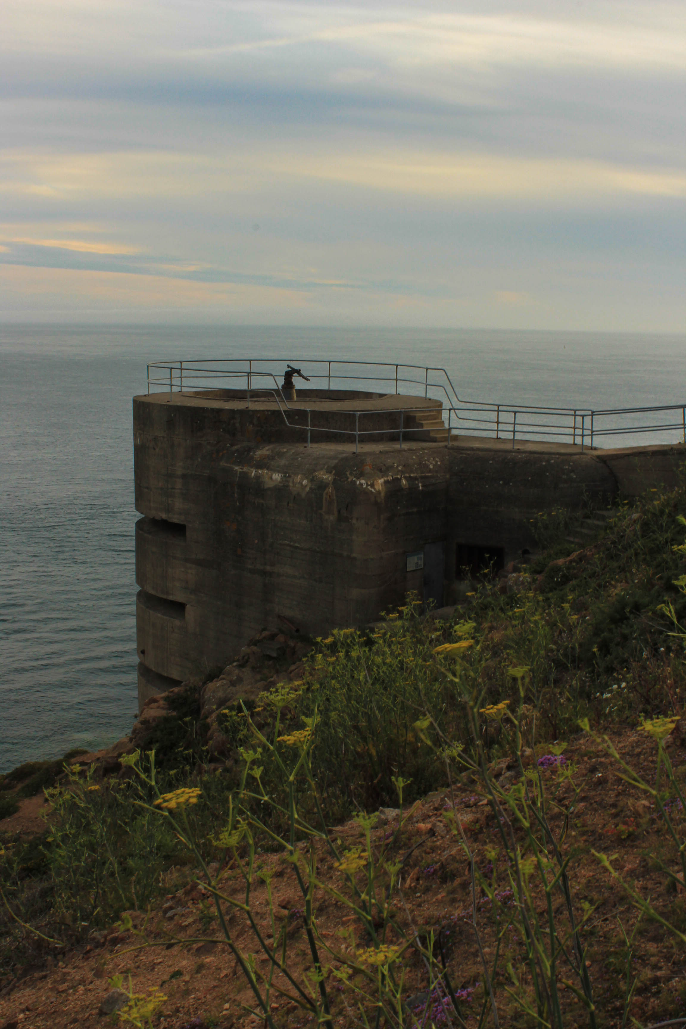
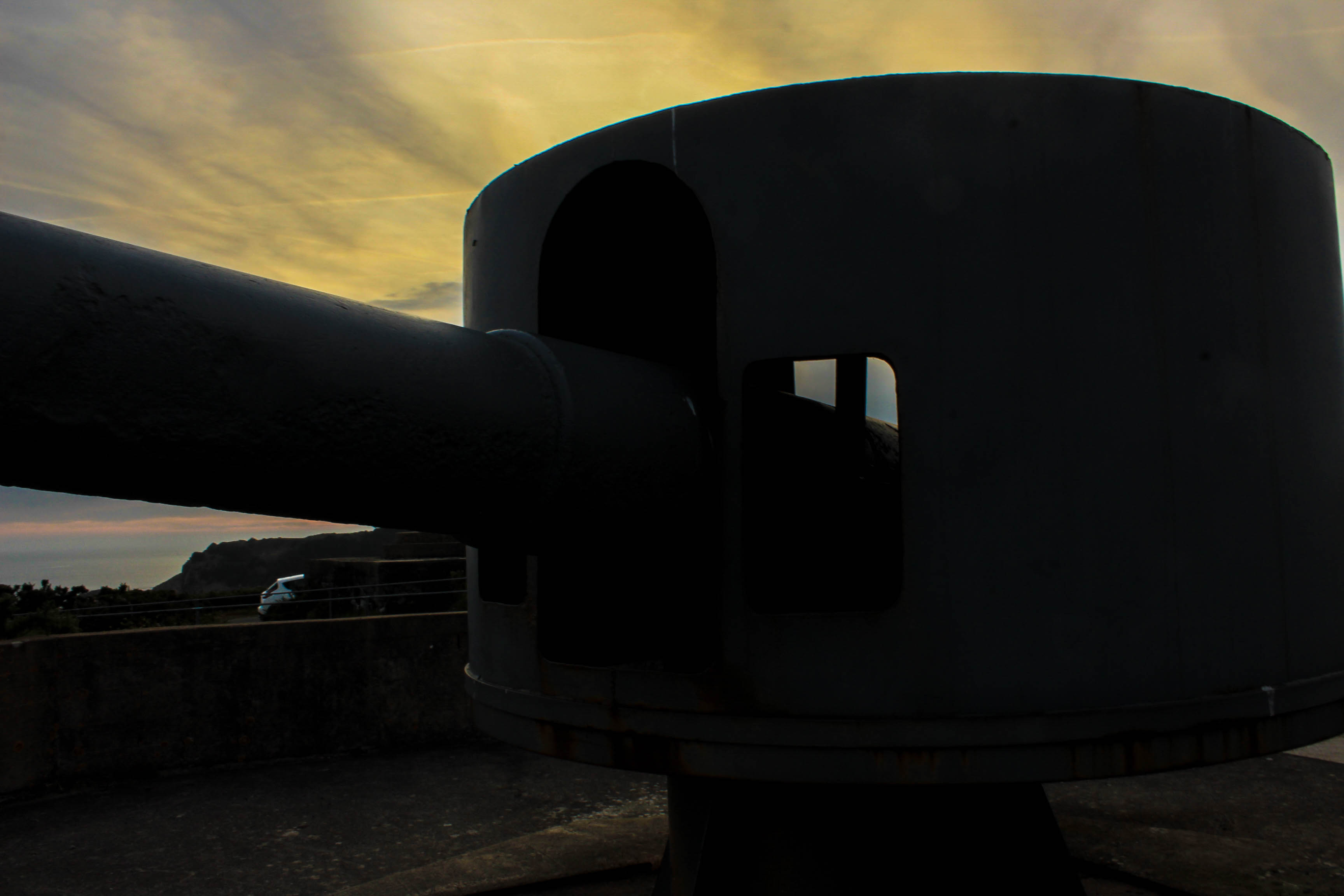
Batterie Lothringen was a World War 2 coastal artillery battery in Saint Brélade and constructed by Organisation Todt for the Wehrmacht during the Occupation of the Channel Islands. The first installations were completed in 1941, around the same time as the completion of Battery Moltke.
The site is located at the end of Noirmont Point, a rock headland. It was a part of the Atlantic Wall system of coastal fortifications and most of the concrete structures remain today. The site is preserved by the Channel Islands Occupation Society and open to the public.
In 1950 the States of Jersey purchased the headland of Noirmont as a memorial to all those Jersey people who died during the Occupation. A memorial stone was unveiled at Noirmont on 9 May 1970 to mark the 25th anniversary of Liberation.
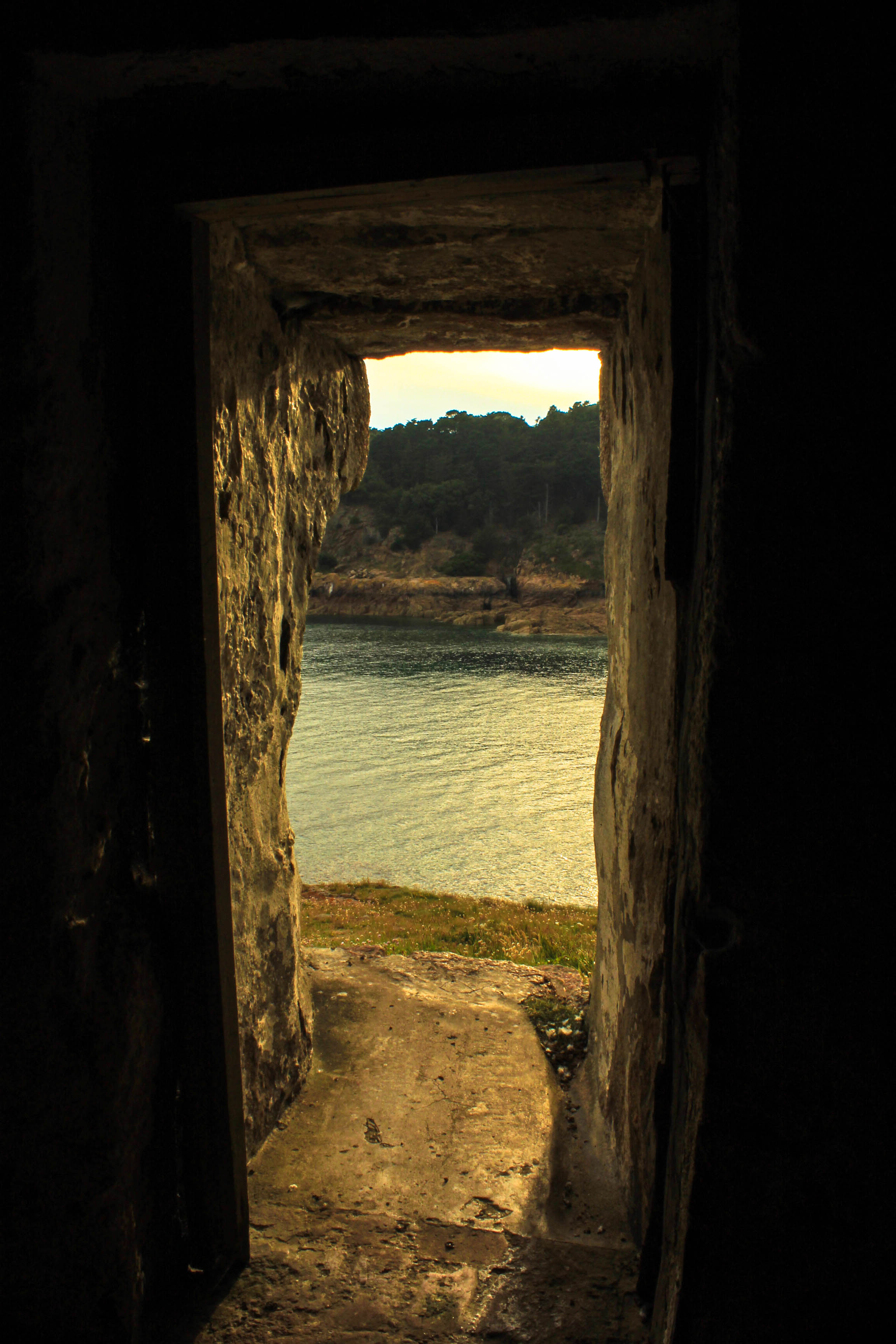
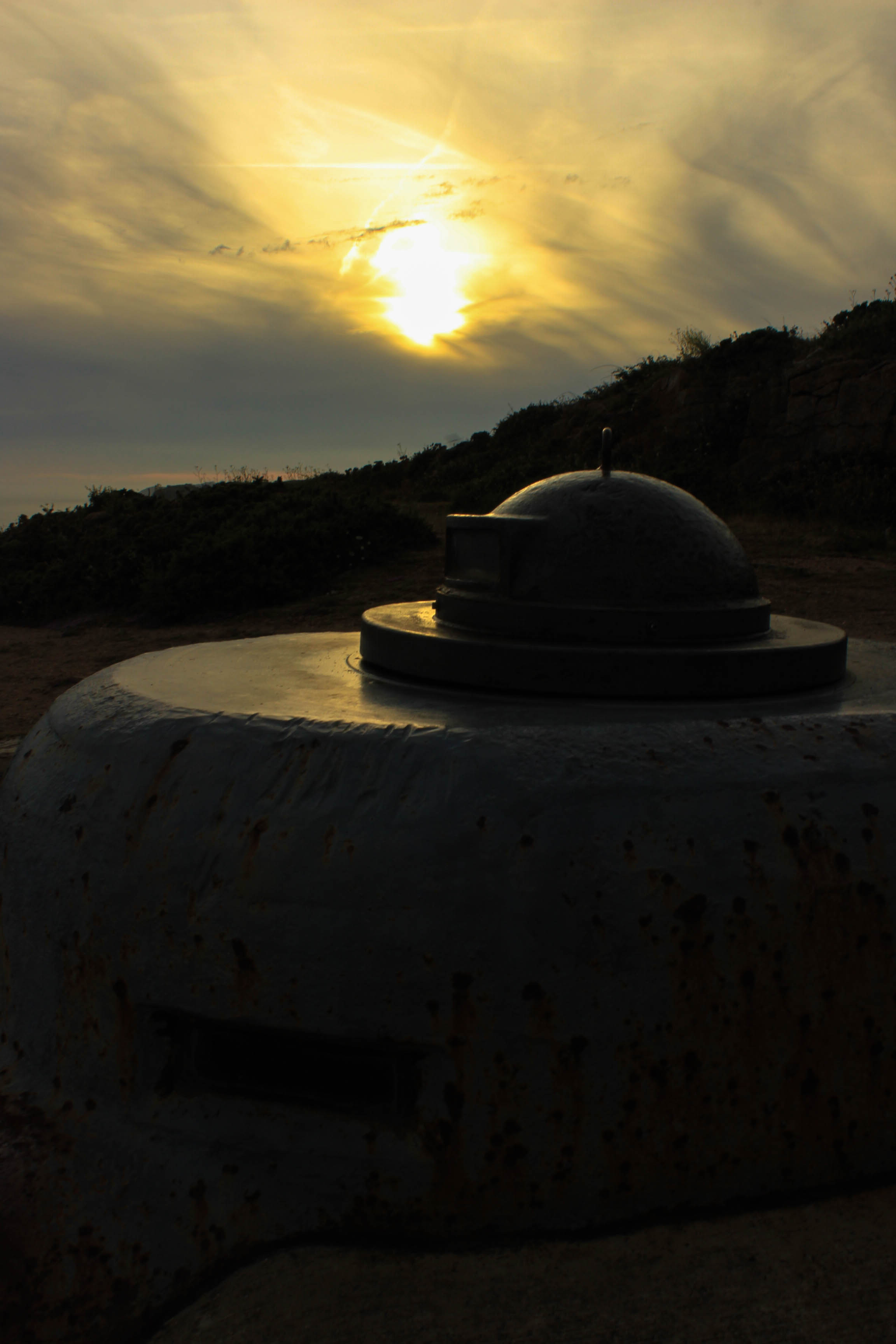
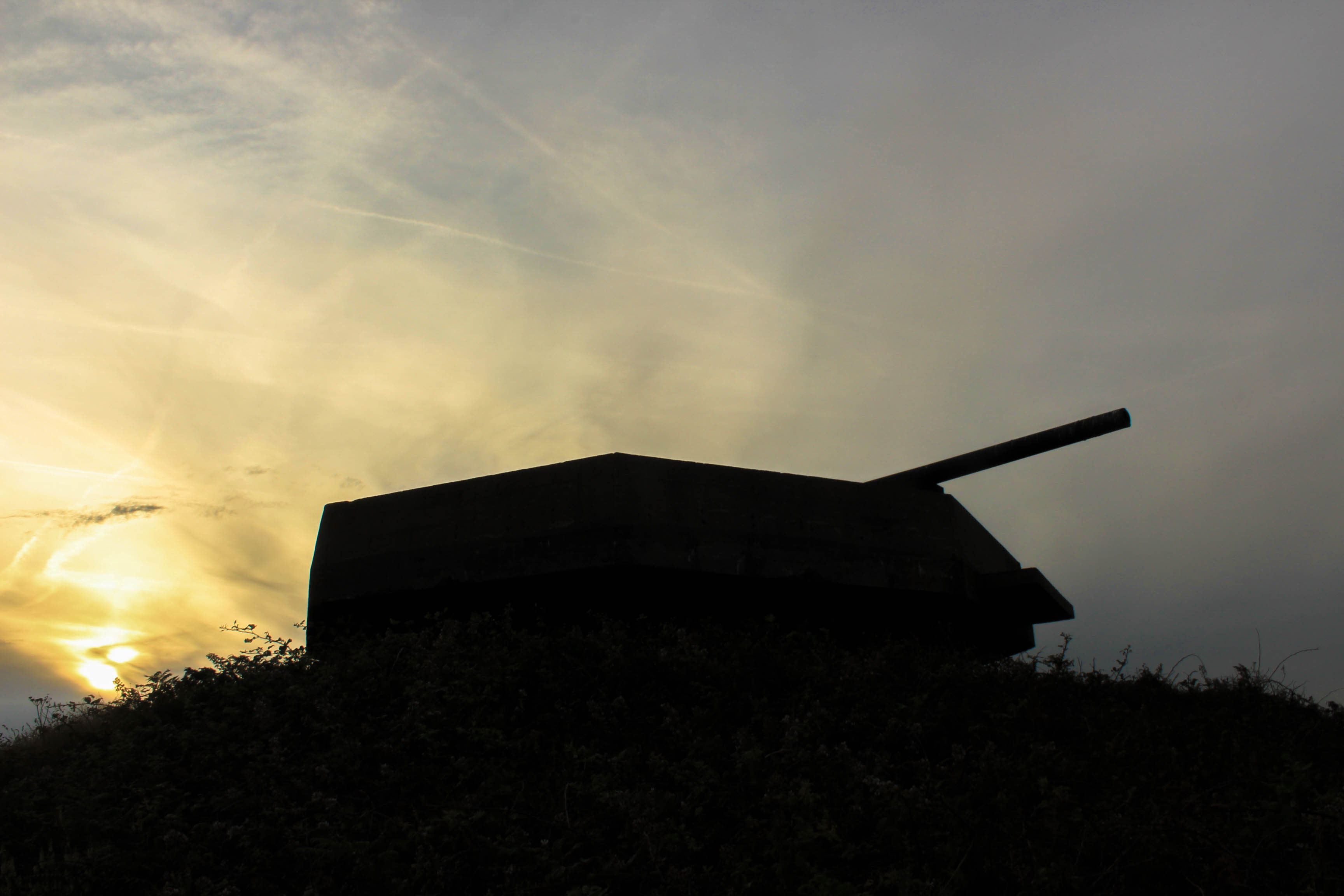
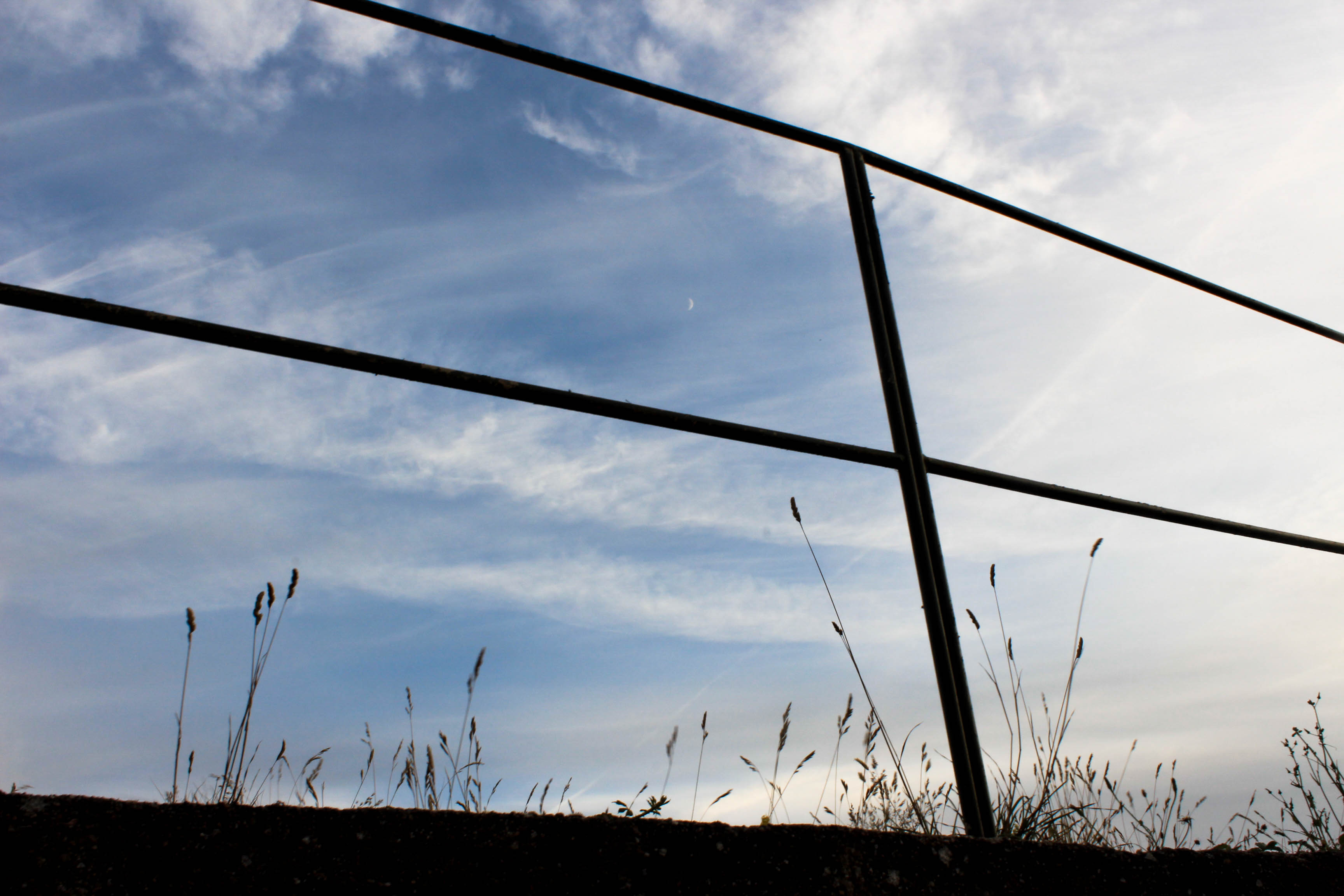
When visiting Batterie Lothringen, I took into account the time of day. I decided to have a photo shoot at the site during the evening around 7pm so I could capture images during the golden hour, the period just before sunset. In landscape photography, the warm colour of the low sun is often considered desirable to enhance the colours of the scene. It is the best time of day for any photography since the light is diffused and warm.
