Category Archives: AO3 Record Ideas

Filters

Author:
Category:

The War Tunnels:

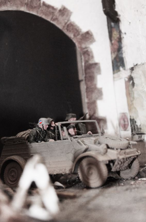
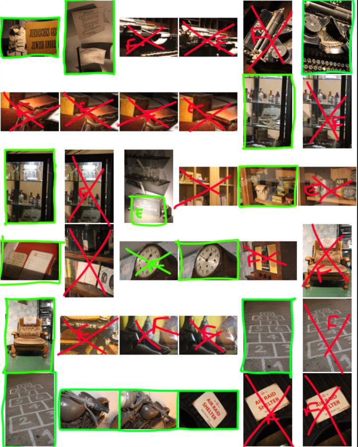
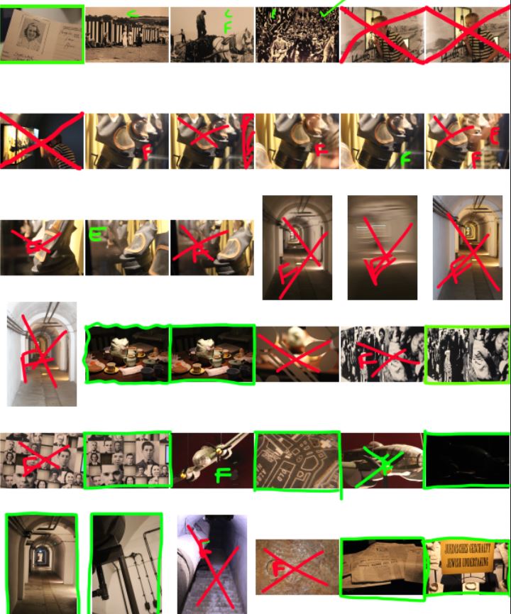
I decided on my final images, and the below images are the final images after editing in Photoshop:
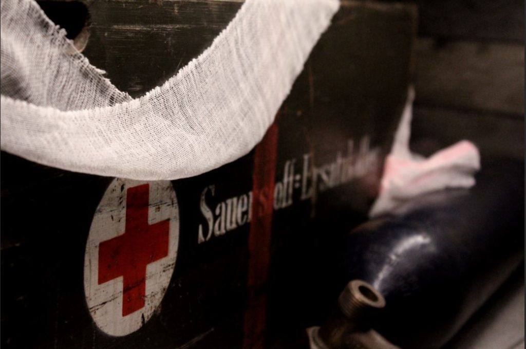
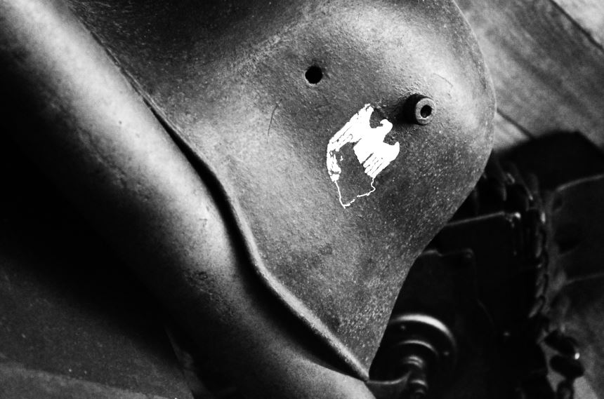
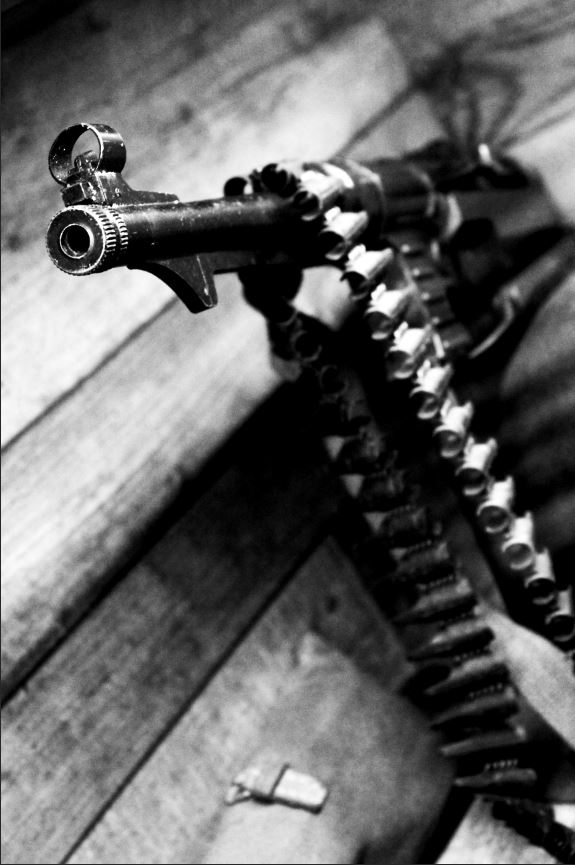
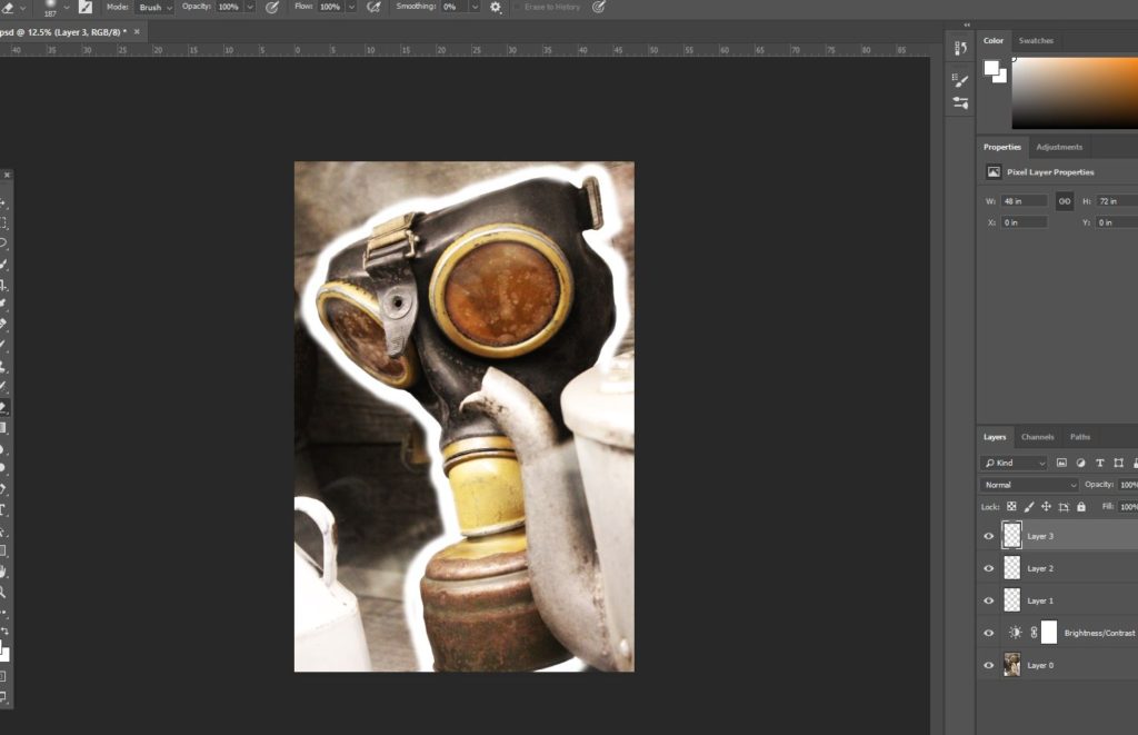
In Photo-shop, I was able to use the following techniques to produce the final images:
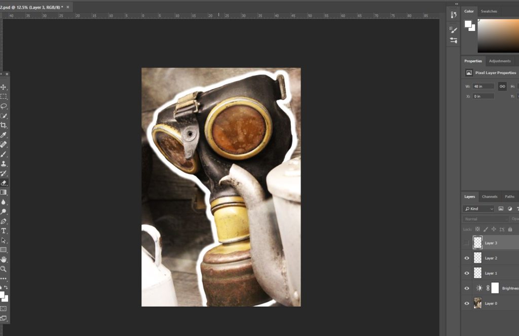
In the above 2 images, I was experimenting with the width of the boarder around the gas mask, and to do so, I used the brush tool to draw outlines of different widths. I also experimented with the softness of the outline, originally working with a hard line, and then moving towards a softer outline version. In this image, I was attempting to make a distinction between the background and the gas mask. The concept of this image was to show how, during the war, conflict and violence became a common part of life, and to do this, I made a distinction between the gas mask, and the teacups and kitchenware placed directly next to it. By arranging the gas mask and familiar kitchen ware together, it can be established that fear of an enemy gas attack lay around every corner, and nowhere (not even the safety of home) was safe from the threat of violence. This image merges the two opposites together (fear and safety), and in editing an outline around the gas mask, it draws more attention directly to the mask itself, and also disconnects the mask from the rest of the image. In doing so I am able to make some distinction between the kitchen ware and gas mask, hopefully drawing more attention to the fact that these 2 things should not be seen as normal together, and yet also presenting the fact that in reality, they were.
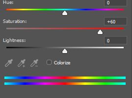
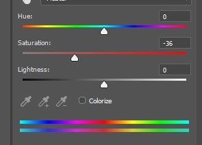
The 2 images above are examples of the colour editing I worked on in the below image. I used two different layers when it came to editing this image, the first image including the background, and the second layer including the soldier in the foreground. I reduced the saturation of the background in order to give it a more somber tone, reflective of the reality of conflict and war, and in order to contrast this, used the layer on which the soldier sat to heighten the saturation, showing contrast between the background and the individual soldier in the foreground. As a concept, I did this because I was attempting to reflect the reality that all soldiers during the occupation were individual people too, with hopes and fears, many of which did not want to leave their families in Europe to come and occupy Jersey. I chose a single soldier and made him easily distinguishable from the rest, regardless of his own insignificance in terms of the whole image, because I wanted to convey the idea that all individuals, German and Jersey, were people that were individually affected by the impact of the war/occupation, and should not all be grouped together as “enemy” or “friend”.
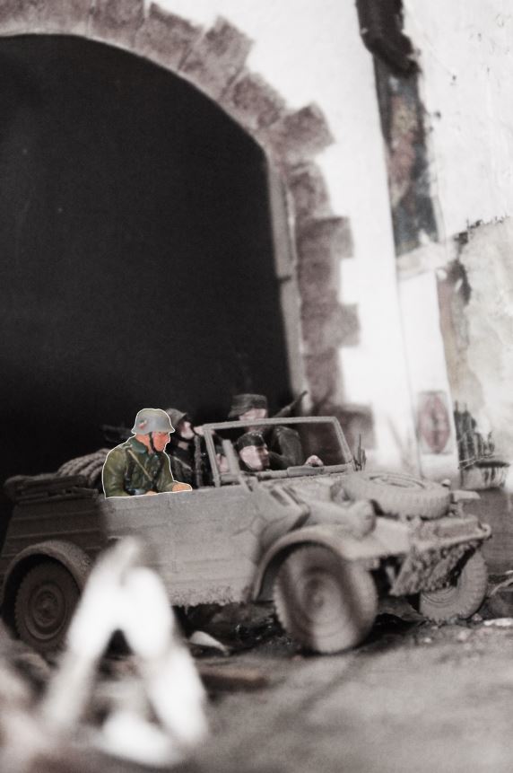
Photo assignment: “home sweet home”

For this assignment I will be taking environmental and candid portraits within the home.

An environmental portrait is an image taking of someone, where their surrounding is important as it contains information or clues towards someone’s personal story.

A Candid portrait is an image taken of people when they’re unaware. Unlike environmental portraits, the scene is not artificially set which means that this photography style is used to capture natural, raw moments.

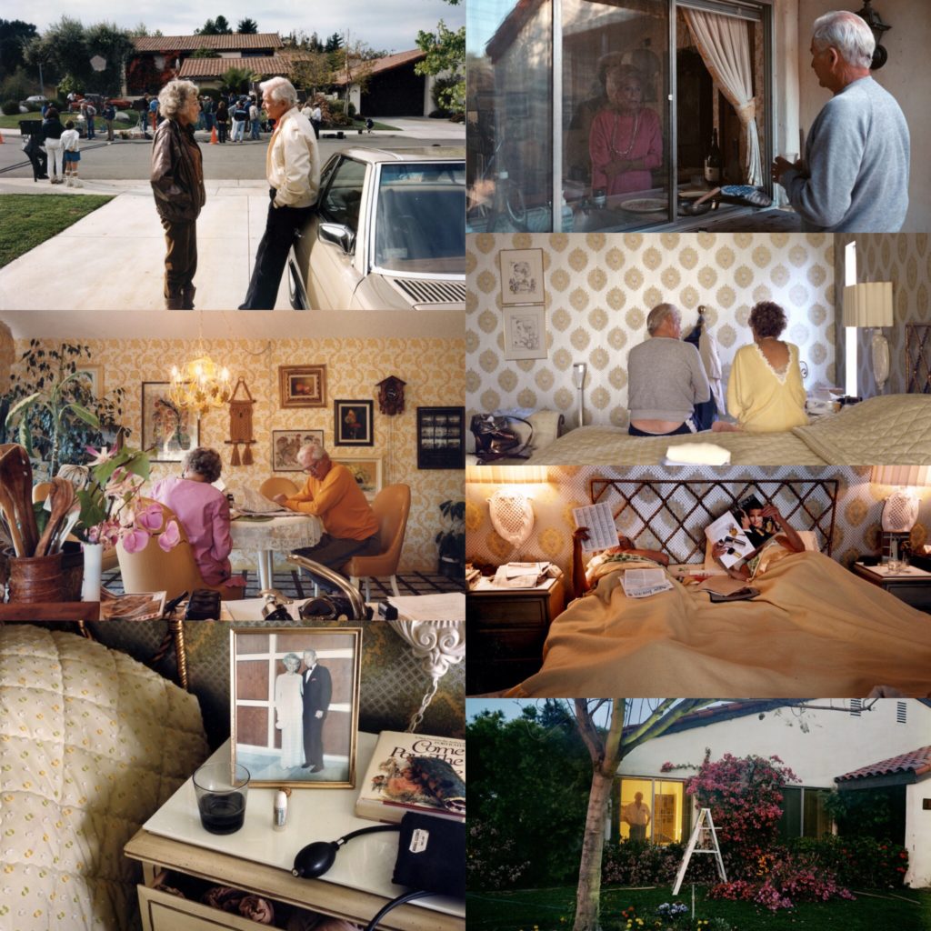
Larry Sultan

Larry Sultan (July 13, 1946 – December 13, 2009) was an American photographer from California. He taught at the San Francisco art institute and at the California college of arts.

“I love making pictures, even if most of the results are lousy.” – Source

His book “pictures from home” was published in 1992, and is a collection of images he took of is parents in the 80s.

“The demands of my project and my confusion about its meaning, is the wish to take photography literally. To stop time. I want my parents to live for ever.”Source

Candid photography photo shoot

Plan:

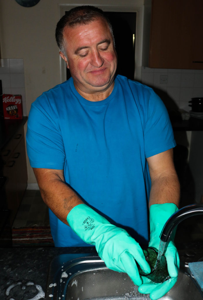
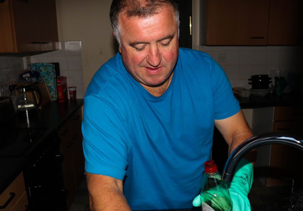
After looking at Larry Sultan’s work, I decided I also wanted to photograph family. I chose to photograph my dad as he is my closest family member meaning I can get a realistic representation of him. I chose to photograph him as I know that he has multiple varied roles in the house and I thought that it would be interesting to see the contrasts. I do not plan on intentionally creating scenarios, instead I plan on taking images of him doing things naturally that I think I could photograph in an interesting way.

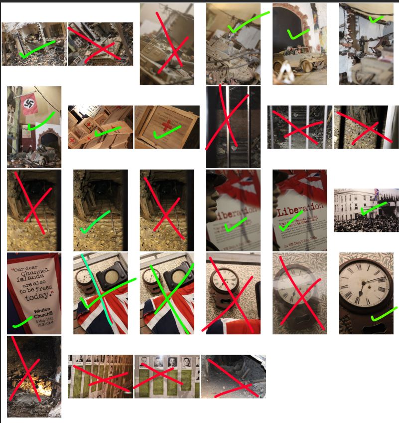
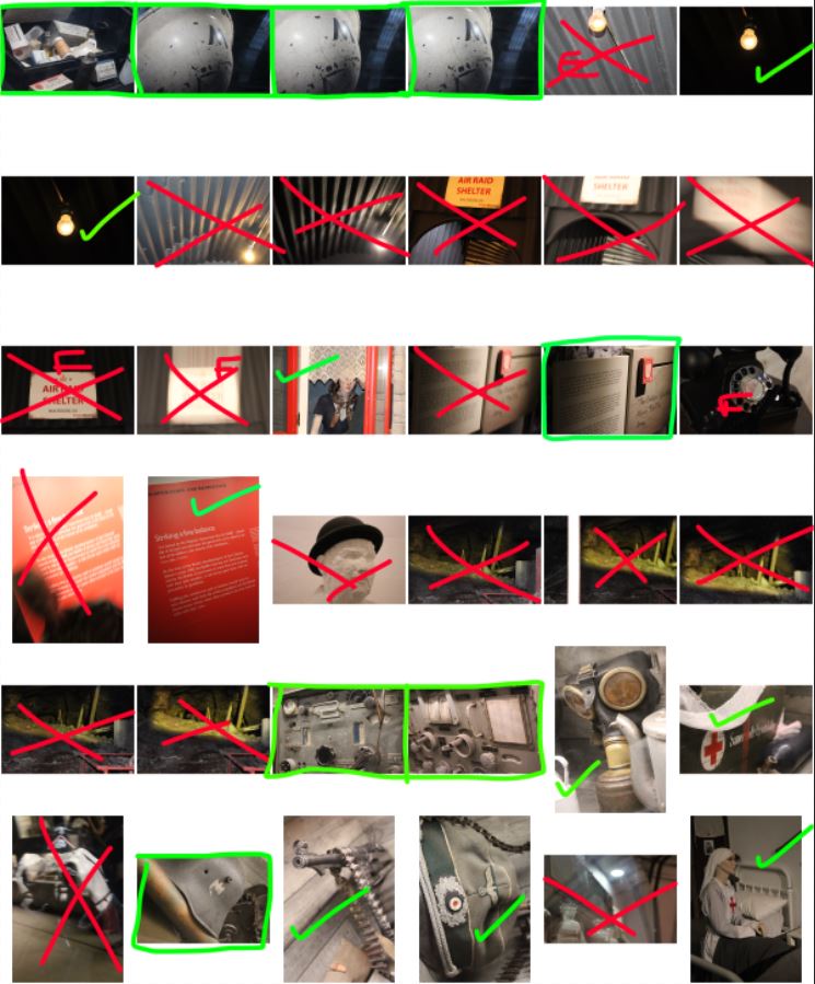
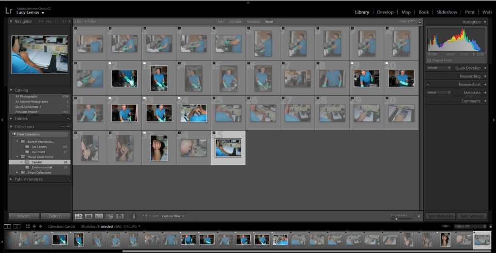
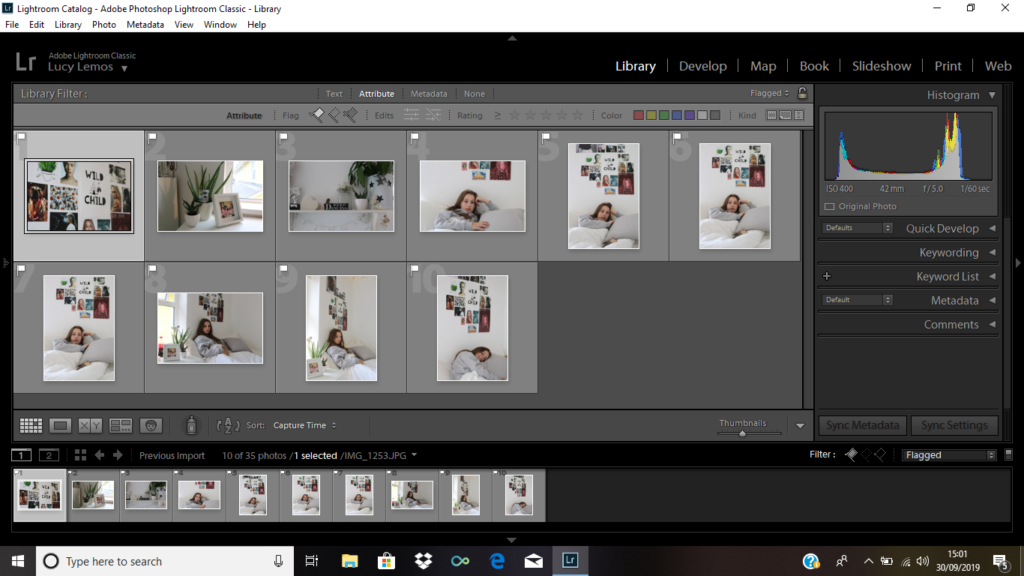
1st selection of images- I flagged the images that I thought were the best from my entire photo shoot.
Here you can see all the flagged images.
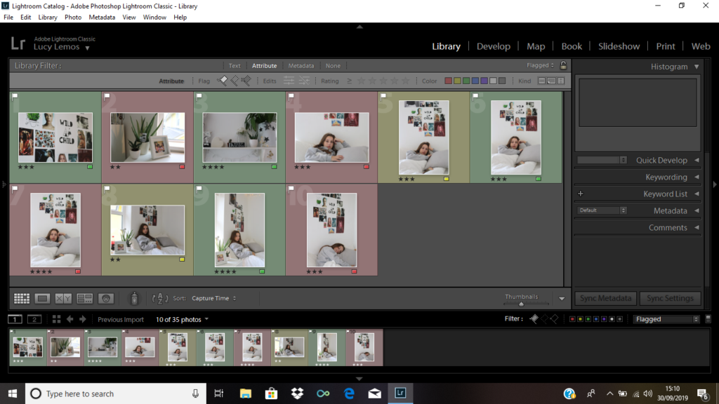
Next, I colour coded my flagged images with green being the best photos, yellow being the ok images, and the red being the ones I didn’t think were very good.

Edits:

To edit these images I used a very similar approach. I increased the contrast slightly in order to make the subject stand out more,and I increased the vibrancy on each image in order to bring more colour to the selection of images.

Technical: I took this image using manual focus so that the hand was very clear, and the background slightly blurred. I used a shutter speed of around 1/250, and flash to brighten the scene,
Context: I took this image of my dad while he was in his home office.
Visual: It is clear that this image was taken from an unusual perspective as were able to see a side view from behind the subject. The background is filled with books and stacks of paper making it clear that it is an office environment. we can also see a faded tattoo on the subject’s hand.
Conceptual: I think that this image is very interesting as we cannot see the subject’s face, however we still see some elements of their personality through the background and through the tattoo.

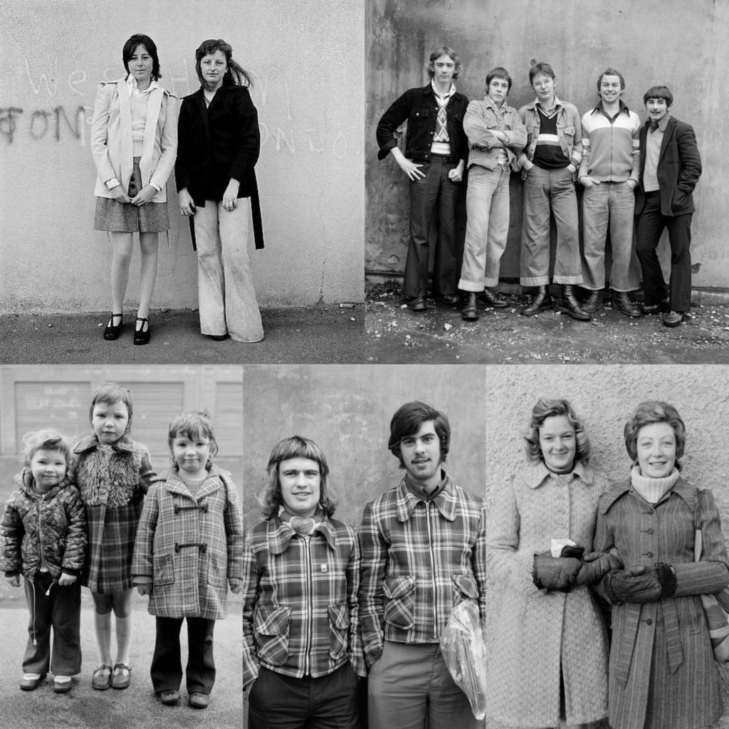
Daniel Meadows

Daniel meadows was born in Gloucestershire, England on the 28 Jan 1952.

“As a photographer, my principal subject was – and remains – the British people,” – Source

From January 1972 he rented a barber shop in Manchester and invited people in to have their portraits taken for free. He team out of money in two months but had gained good experience. In the 70s he became interested in becoming a teacher and was invited to help teach documentary photography at Newport college of art and design.

“I’m not interested in celebrities, just ordinary folk.”– Source

Environmental portrait shoot

Plan:

After looking at Daniel’s work, I like how he took images of people who weren’t as personal to him. I plan on taking images of one of my friends in their bedroom as I feel it is a personal environment to them and it allows us to see elements of their personality. This shoot with be slightly more staged as I will need to position the subject in order to get successful environmental portraits and the subject will be more aware of my presence.

Here are all the outcomes from the shoot.
Here you can see the images I flagged s part as my 1st selection
Next I colour coded the images based on how successful I thought they were

Edits:

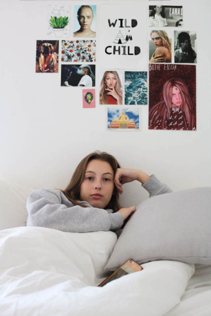
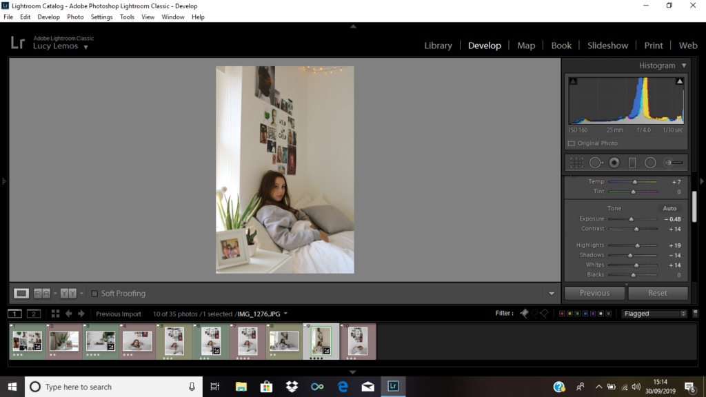
To edit this image, I increased the contrast as there are a lot of different colours in the images on the wall, and I wanted them to stand out. I also increased the highlights and decreased the white. All this combined helped the white balance look more appropriate and it also helped add more colour to the photo.
Although this does not show the subject, it allows us to learn about them since it shows their interests and what sort of images they like.
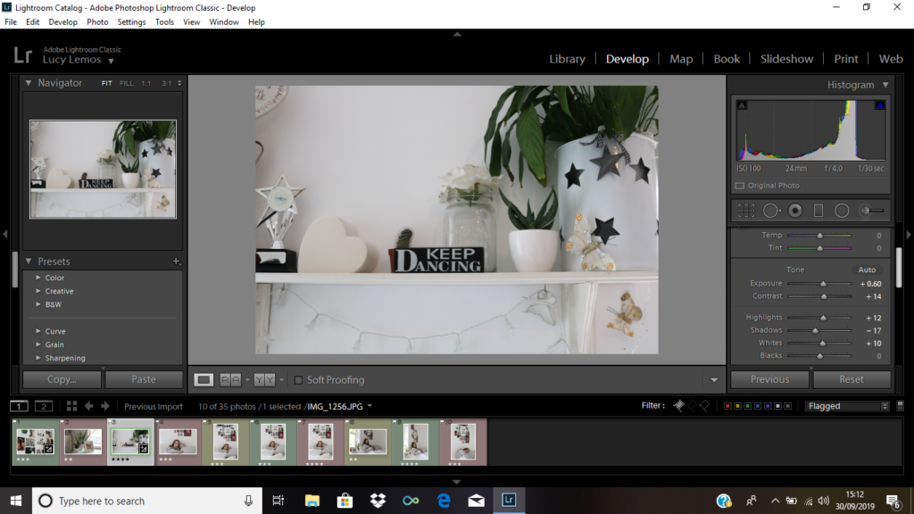
To achieve the outcome below, I increased the contrast slightly to make the green and black look more prominent amongst all the white. I increased the highlight and white in order to make the overall appearance of the photo appear brighter. Decreasing the shadow helped make the image less dark.
I think that this image is successful as it shows the subject’s passion. It is clear from this picture that the subject is a dancer or enjoys dance as we can see a sign referring to the activity and because we can also see a trophy to the left which may have been dance related.
to begin, I slightly increased the exposure because I thought my image looked slightly dark. I then increased the contrast in order to make sure the image didn’t look over exposed. I then increased the highlights so that the picture looked brighter, and I decreased the shadow to make sure the overall aesthetic of the photo was bright.
To begin with, this image was slightly over exposed due to the excess light coming in from the window. To fix this, I decreased the exposure until I felt the picture looked balanced. I then increased the contrast so that all the colours in the photo didn’t look washed out amongst the white background. To make sure the room looked clear and bright, I increased the whites and the highlights. One aspect of the image I really wanted to capture were the fairy lights. However since it was still very light outside I was not able to capture the slight yellow tint they were emitting. Because of this, I increased the temperature to a point where I felt it looked quite natural and as it it was due to the lights. This was important for me to capture as I felt like it makes the image look more homely and cosy, and less cold and clinical.

Technical: This picture was taken using portrait mode, and the exposure time was 1/30.
Context: I took this image of a friend in their bedroom.
Visual: In this picture we see a subject in bed. The image is very bright and the background appears very white and clean. On the bottom Left hand side of the image we see a photo frame with an image in it, and 2 plants. Behind the subject we can see an image wall which resembles a mood board.
Conceptual: The main concept of this picture was to try and capture the subject’s personality. The picture frame on the side does this as it shows the subject’s friends. We can also learn a lot about the person through the images they chose to display on their wall. The fairy lights also add a homely warmth to the image.

Exploring Family Archive – Percy G. Newman

Percy Newman:

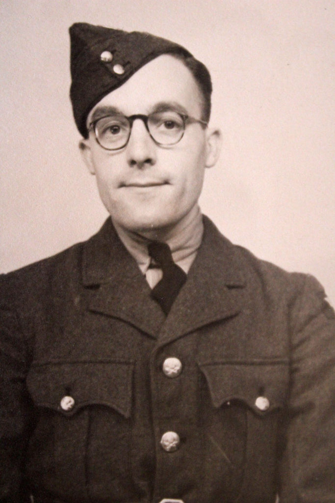
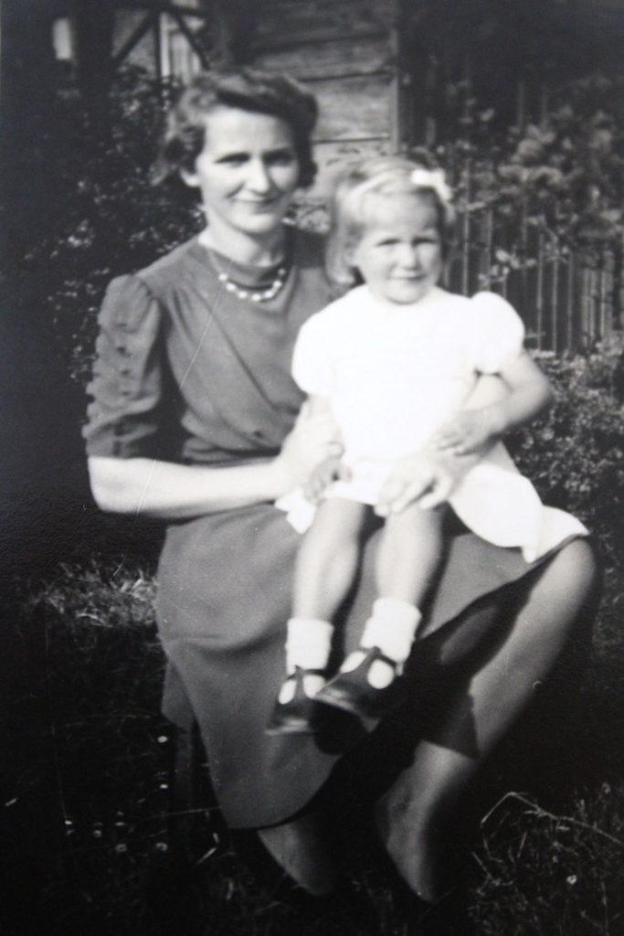
Percy Newman was born in 1915, in Abercorn Crescent, Harrow, Middlesex. His home life as a youth was considered normal, he lived with his mother and father for the majority of his life. In 1940, he married his love interest, who was his next door neighbour throughout childhood, they where married for two years until Percy sadly passed away, during the war. During their two years of marriage, they conceived a child Margret Newman (my Grandma), who was only 4 months old when her father passed away.

After talking with Grandma, exploring her father’s passed. I asked her about memories with her father to which she replied “I do not remember my father at all.”. She has kept all the documents below for all her life, in memory of her father who she never really met or got to know. These documents are “precious” to her, as it is the only thing she has left of her father, allowing her to have a basic understand of the life he lead and the type of personality he had.
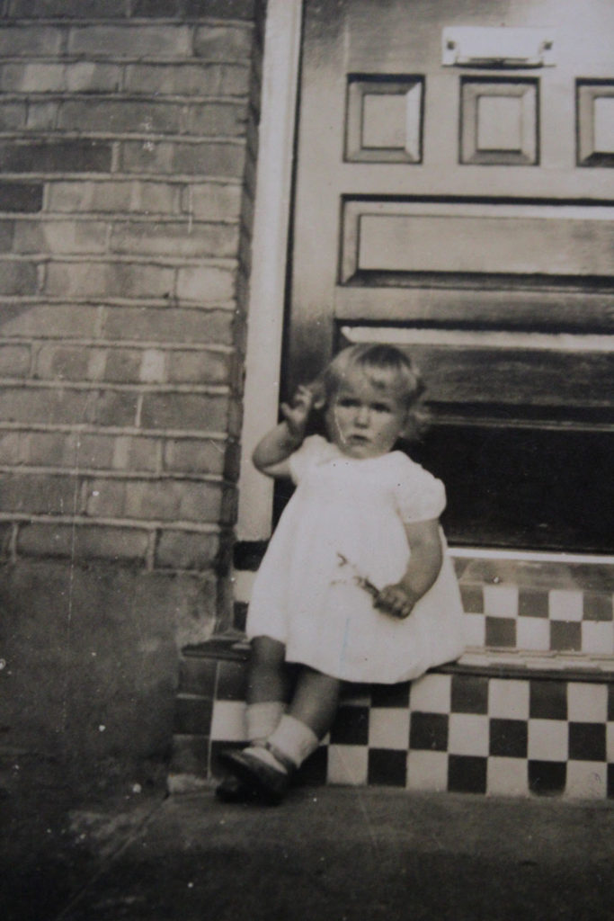
At age 24, when the Second World War broke out, At this time he was  a member of the ground engineers and worked on the instruments inside plane’s. He worked on fixing war aircrafts to ensure they were ready and fully working, to be used to attack the apposing enemies. However, on documentation he was falsely recorded to be a pilot for these aircrafts, and the documentation can be seen below.

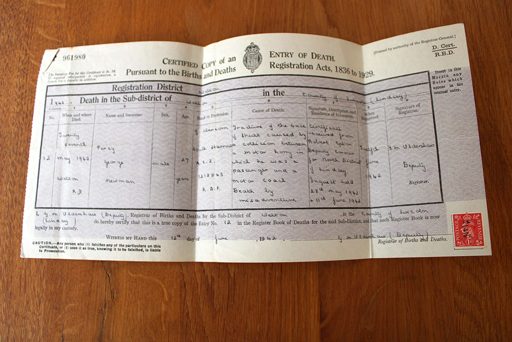
Although he worked for the British Army, he did not die because of the war. Him and two others were killed after a collision between a motor lorry and a coach near Welton on Wednesday 27th May. Alongside this collision 6 other men were seriously injured but did not die. This event hit the local papers shortly after, and the extract can be seen below. On top of this, I was also able to see my Great Grandad’s death certificate which certifies the date and way he died and other personal details about him.

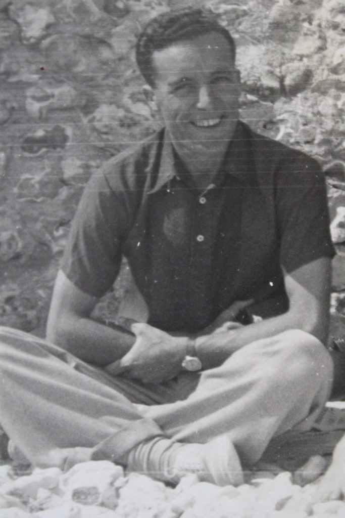
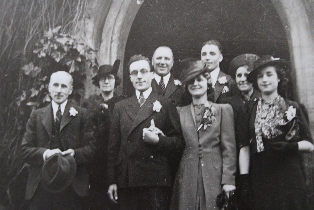
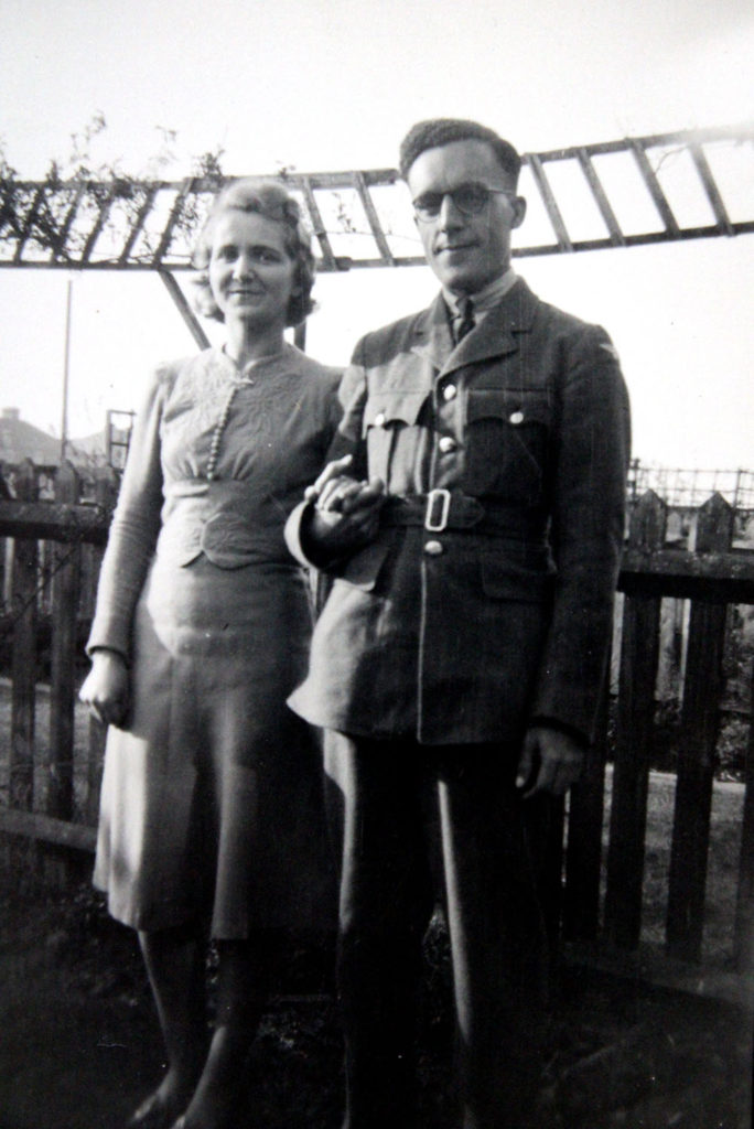
Below is the only picture on record of my Percy with his wife, and his only child Margret Welling. This photograph is one of Grandmas most cherished items as it holds a lot of meaning and sentimental value to her. The happiness found on the couples faces as they look down upon their child, shows ho much care and love they had towards Margret, and the thought that she has no recollection of him, only begins to show the importance of the image.

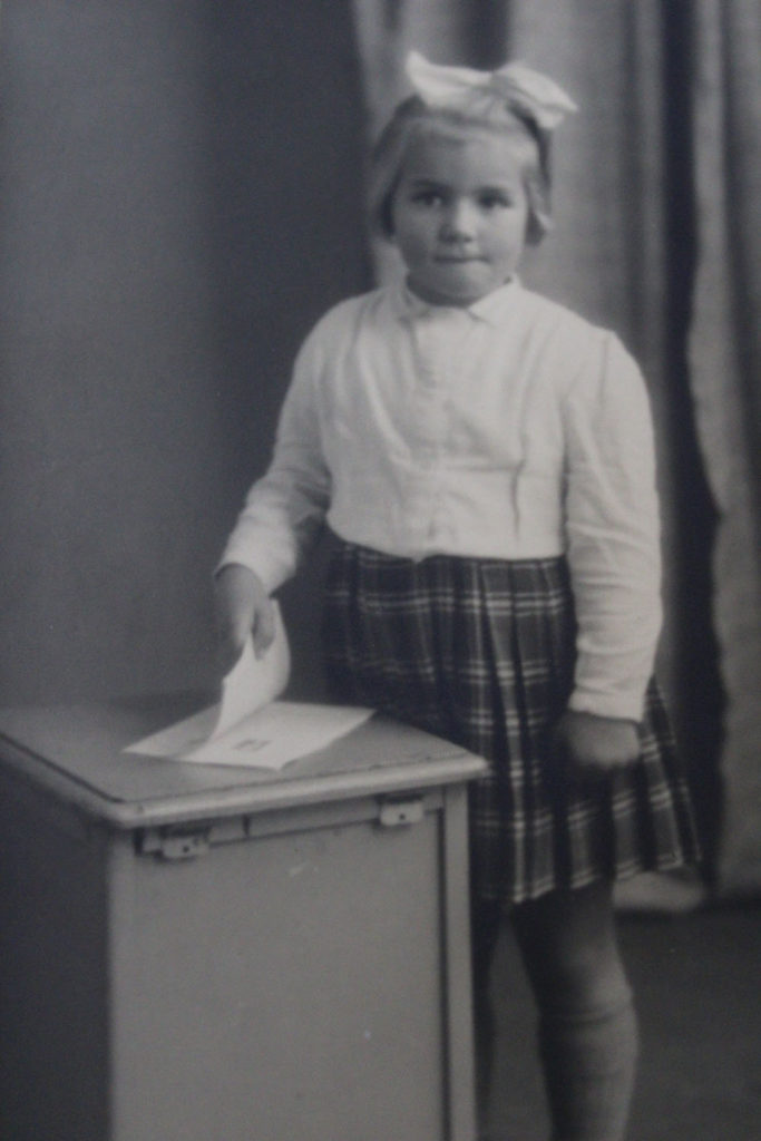
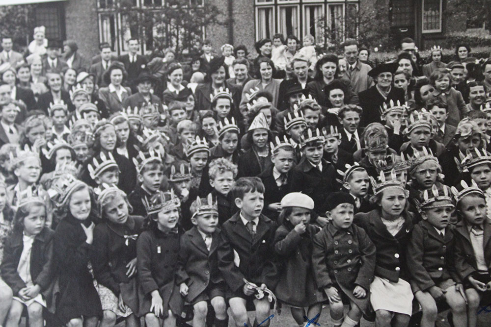
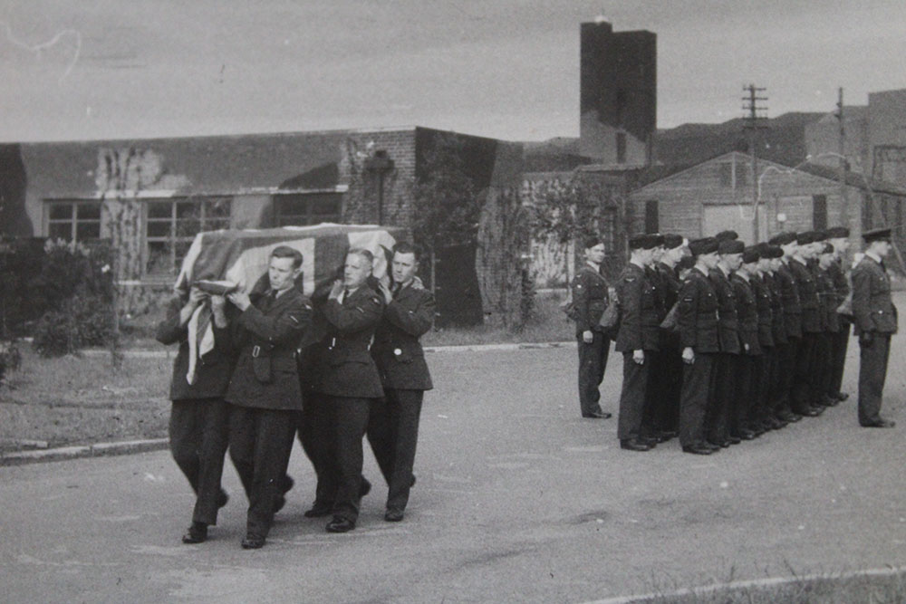
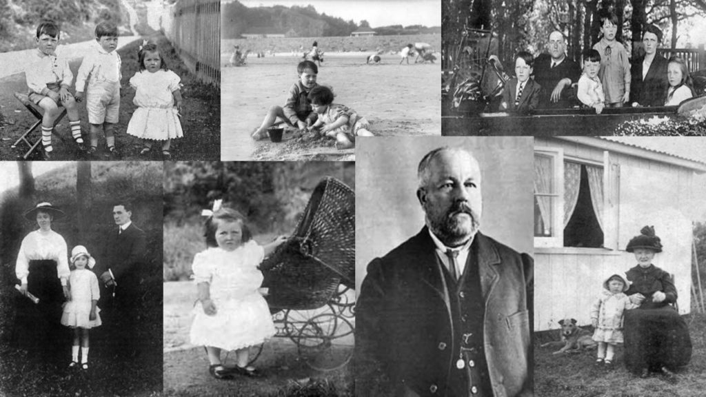
I then sifted through the other photographs within the archive and selected the photographs, which I think clearly represent his life. The images include, picture of his daughter growing up, pictures of him and his wife, pictures of him at school, and a photograph of his funeral. The photographs hold a lot of value not only to my Grandma but also to me know, as I understand the life my Great Grandad had, who I sadly could never meet.

Looking through these images allowed me to explore my family history which I did not know much about, and informed me that my family has links to the war, which present the themes of occupation and liberation, as well as nicely fitting in with other work which I have produced where I have looked at Jersey’s different archives.

Jersey Archive

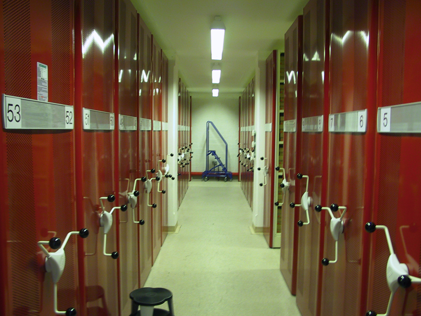
The Jersey Archive is the Island’s national repository holding archival material from public institutions as well as private businesses and individuals. The purpose of the archive, is to is to retain images, objects, documents and memories from time periods of history, allowing us to reflect on Jersey’s past through these form of documentations. The material within Jersey’s archive allows us to trace our family history, making the documents personal to the individuals, In addition, it also outlines the importance of islanders’ records in today’s society. The archive holds over 300,000 documents and images, which date back to the early 19th century, the archive was founded in 1981, and still runs today, storing new documents and allowing us to explore the past lives within our family and island.

Within the family history collection, the archive holds books, family trees, indexes of baptisms, marriages, burials and censuses. This outlines the extensive amount of files that the archive has on different family history. Having archival material available to the public, allows us to gain a better understanding of that set period of time and explore the past and our family history.In addition, another major aspect of Jersey’s archive is the extensive archival material they hold on the German Occupation, WW2. Within this aspect of the archive, they hold, letters from the Bailiff, German Register Cards, German ID cards and items from the Law Officer’s department.

The archive is different to other archives on the island, this is because it does not just hold photographs but other documents which present a person’s history and insight into the life they had.

Bob Le Seure: Portraits

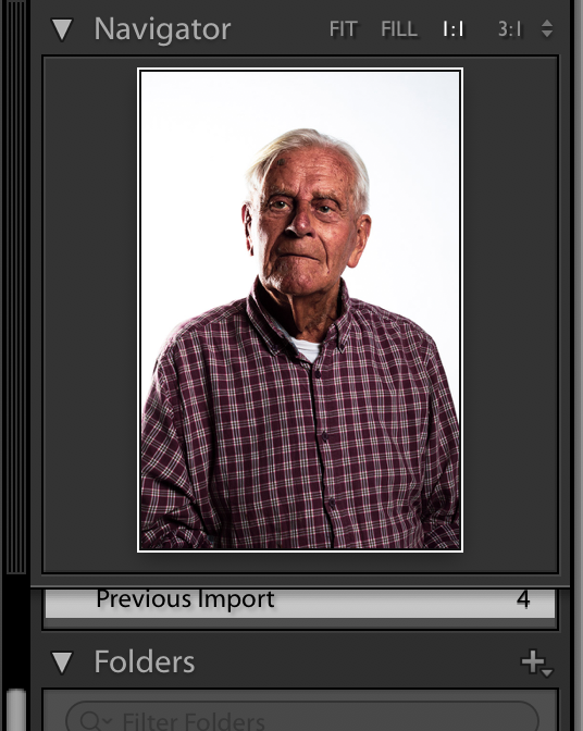
Bob Le Seure is a Jersey man who was 19 years old when the Germans occupied the island of Jersey and is due to turn 99 this year. I was lucky enough to be able to spend some time listening to Bob talk about his experiences during the war and then go and take some portrait photographs of him in our studio.

Below shows my four best images I have chosen to work with in the editing process of my photographs. Out of all my photographs these were the clearest and best ones I thought I would be able to work with to develop into final outcomes for this photoshoot.

Contact Sheet:

Edit 1: Black and White

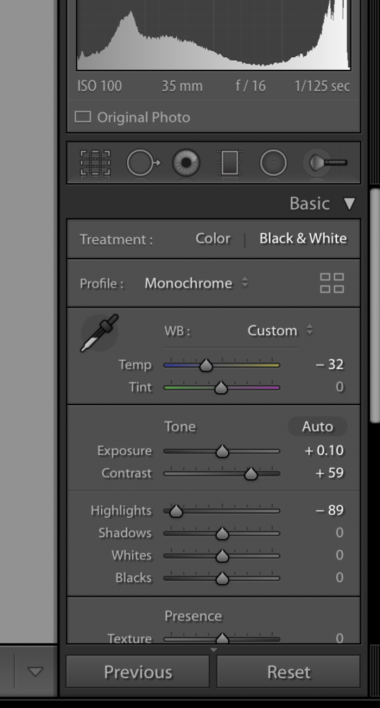
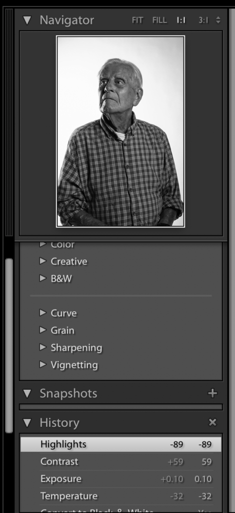
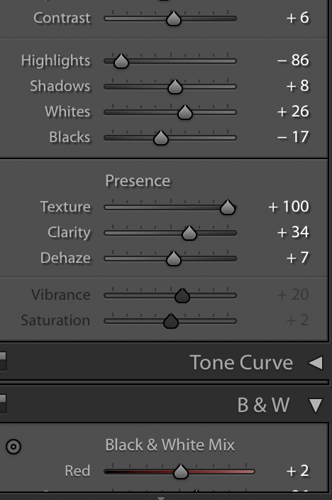
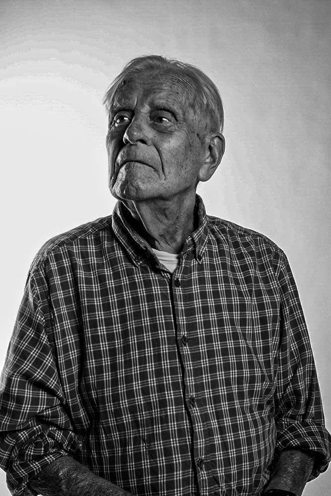
For my black and white photographs I knew I wanted to create them in high contrast as it creates a sense of drama in the photograph. To start with I started in the quick edit section of light room to just straight away turning the photograph into black and white, choosing the preset option of ‘high contrast’ that I could then go through and change and adjust myself to how I feel the photograph needed. I then went to develop, here I altered smaller parts such as the contrast itself and exposure, as well as highlights and shadows; I did this to begin to darken the image, to create some deep shadows and tonal range. I also went in an heightened the texture and the clarity as I felt that it created for a sharper photograph which I feel worked well for what I was trying to achieve as it shows the lines on Bob’s face and all the details which is important to me to show as it shows him as he is as a person and is creating an interesting photograph of him and his stories.

I feel the edited photograph below turned out well and how I personally wanted it too. I feel the position I had Bob in works for this photographs as it lets the light pouring in from the left side of the frame (right side of Bob) to begin to gently light his eye as below his nose onto mouth however unlike the colour image I don’t feel it is working too harshly and is something I am happy with. If I was to go back in again I would possibly think to adjust the photograph to stop the backdrop of Bob from going to grey and would be something I will learn from the alter next time. Overall, however, I feel turning this photograph into black and white has worked well.

Edit 2: Colour Enhancing

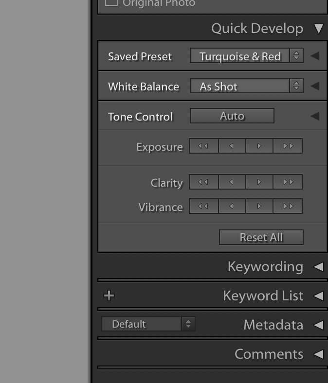
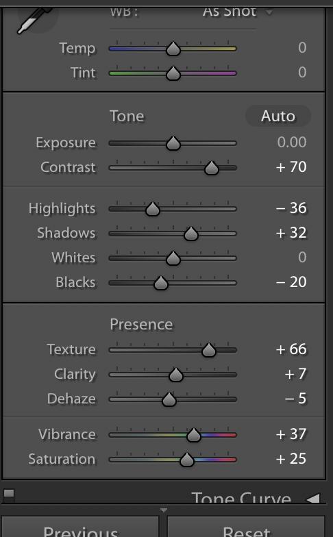
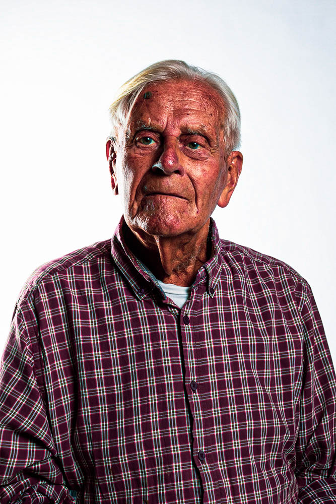
For my colour photograph I wasn’t aiming to so much change the photograph drastically, just enhance it. To start with I experimented with looking at the different pre-sets available to me in Lightroom to get an understanding of what changing different aspects might start to look light so I knew where I wanted to go and what would work. I ended up deciding to use one of the presets: Turquoise & Red. I decided to do this as it enhanced the photograph closely to what I was going to aim for myself. From here I went to develop and I began to alter some of the temperatures to create a warmer photograph around Bob himself as well as the contrasts and exposures to enhance the tones and colours in the photographs to make it more vibrant. Again, like with the black and white, I went in and adjusted the texture and clarity to enhance Bob’s features themselves as he has quite distinct features which would be a shame not to bring out and make seen.

The edited photograph, I believe has turned out well and is my favourite of the two photographs due to the vibrancy in the image. I feel if gone back into I could look to adjust the harsh light that is lighting the right side of his face more compared to the left, something that worked well slightly with the black and white image, this I would believe is due to the position that Bob is in, I chose to have him looking straight on to me as I feel he has very compelling eyes and this is something I wanted to capture, however maybe I would go back through and edit it a bit more due to the lighting that this position then lets back onto the face. Overall I do think that this is a successful outcome for enhancing the photograph.

German Registration Cards:

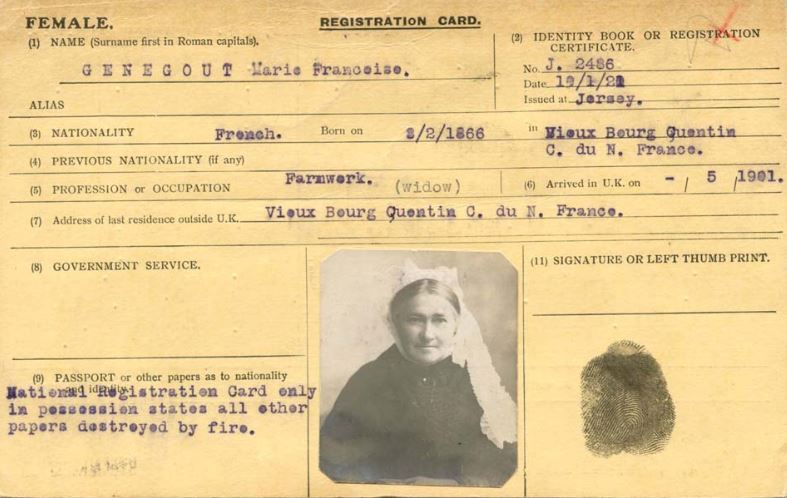
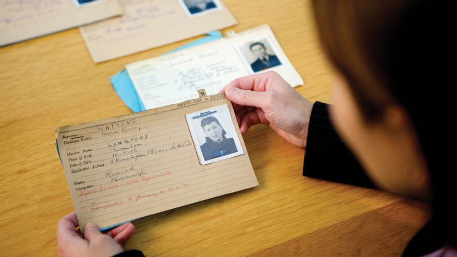
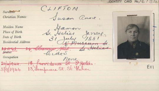
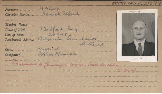
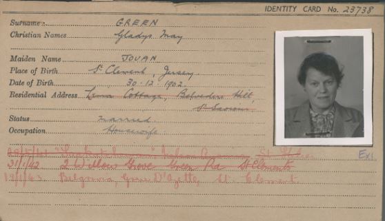
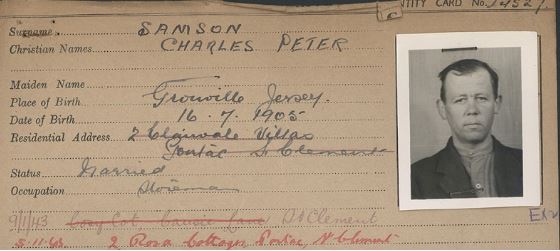
In December 1940, the Germans who occupied Jersey the summer before released a decree that ordered ever person over the age of 14 to register under the Registration and Identification of Persons (Jersey) Order, 1940. This resulted in all inhabitants of the island over the age of 14 being issued with a registration card, which included photograph of the owner, their address, name and other personal details. Children under the age of 14 were recorded on the back of their fathers card. The purpose of the cards was to provide clear identification of an individual if they were stopped by a German official, gave occupiers a rounded consensus of Jerseys population, and assisted in identifying and deporting certain individuals based on their nationality. Below is a selection of some of the registration cards given to people living on Jersey during the occupation:

The stories of the people who owned the above registration cards can be found in the Jersey War Tunnels, where some of their stories have been documented, and photocopies of the registration cards are available to look at and keep. Their stories reflect only a handful of the stories available from the German occupation, all of which tell a different tale of the struggles the people of Jersey endured under the strict rules and regulation of the Germans during the occupation.

Occupation / Liberation II – Post 2 (Artist Reference – (Historical) Francis Foot)

Francis Foot:

Francis Foot was born during 1885 in Jersey Channel Islands. He began working as a gas fitter, but shortly after starting he was fascinated by photography and started developing his skills further, this enabled him to make a living out of doing what he loved. His family helped him invest in a shop in Pitt Street, where he was able to work on and sell his work.


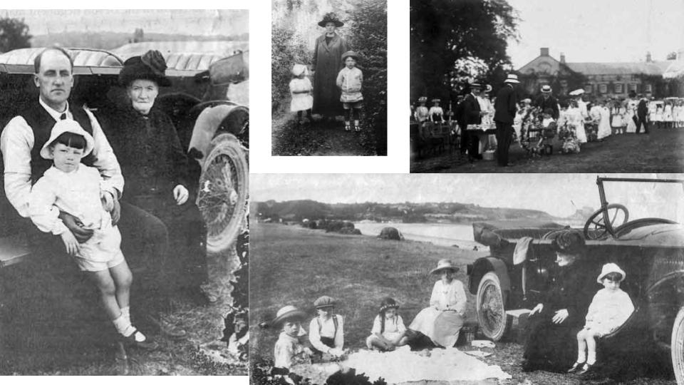
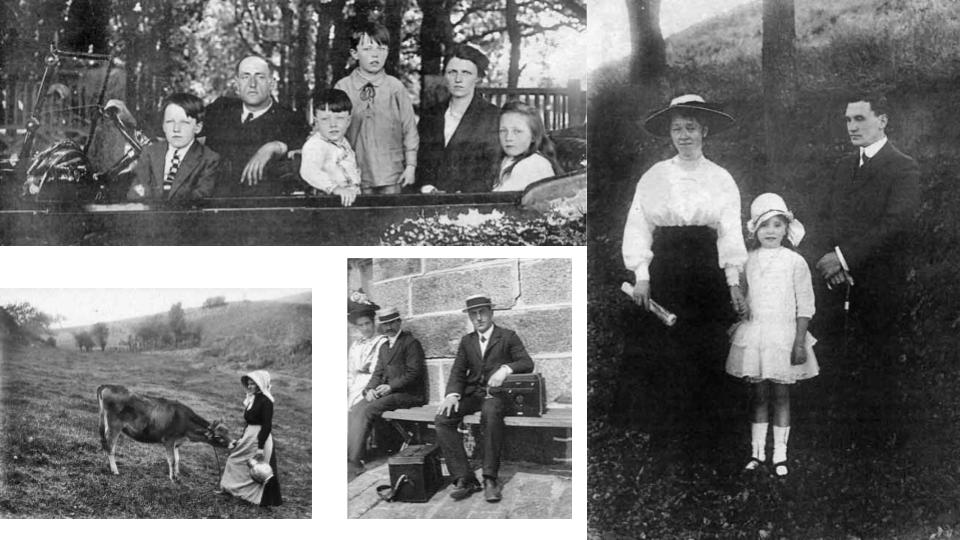
Many of Foot’s images depict family members, this led Foot to create an archive for his family, where he was able to document peoples’ lives, actions and show the developments of individuals growing up. His work has a personal touch too it, as he is presenting to society the evolution of his family, it is almost as if he is paying tribute too them, with all the com positions displaying them at various stages of their lives or life events. Not only has foot taken portraits but he has also documented events happening around the island during his time.

Best Images:


Technical:

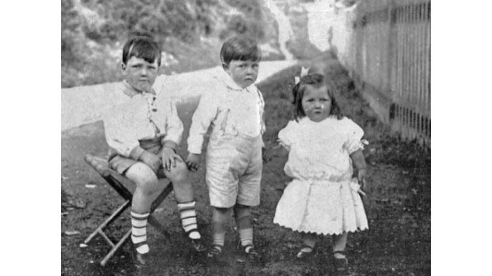
The subjects in this image are being photographed head on in height order. There is a pathway and a fence leading into the distance of the image, this creates a sense of depth and makes the subjects in the foreground appear more flat and structural.

Visual:

The tallest is seen sat on a chair which presumably was used to allow all three subjects to be clearly seen in the photo without the background taking up too much of the composition. The young girl and middle boy are holding hands which suggests they know each other well, this is the case as they are related.

Contextual:

The image is in black and white however I doubt this is for effect, and is purely due to the technology available to photographers at the time. The image documents 3 siblings together.

Conceptual:

Foot likely took this photo to add to his family archive with many other compositions of his documenting the lives and existence of his family members. The image is mainly for archival purposes and lacks any hidden concepts or detail.

Occupation / Liberation II – Post 1 (Artist Reference – (Contemporary) Michelle Sank)

Michelle Sank:

Michelle Sank was born in Cape Town, South Africa. She left there in 1978 and has been living in England since 1987. Her images reflect a preoccupation with the human condition and to this end can be viewed as social documentary. Her work encompasses issues around social and cultural diversity.

My.Self :

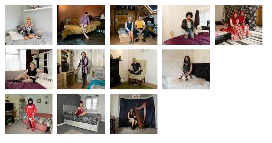
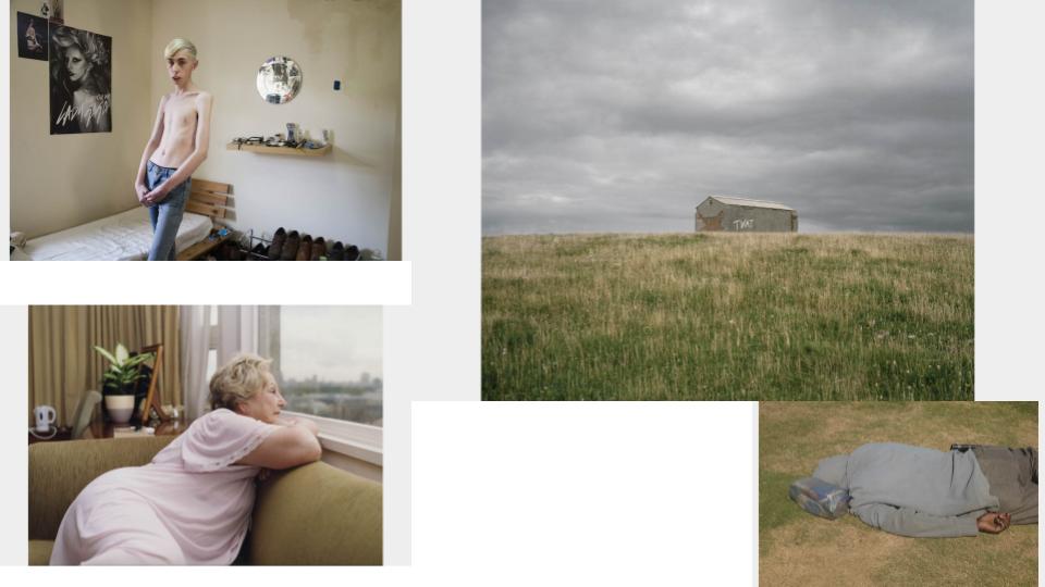
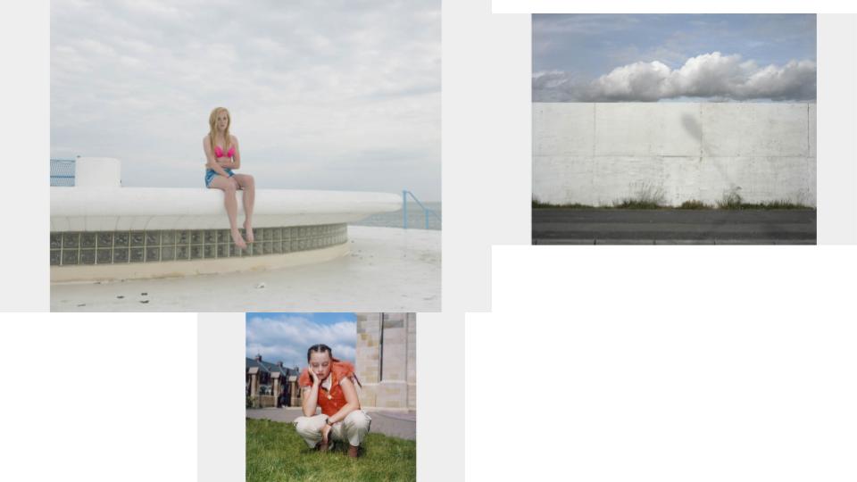
“This work was commissioned by Multistory. My remit was to document the diversity of young people living in the area – what it means to be a young person in today’s society as well as living in the Black Country. I worked across the cultural divide to cover all aspects of the social strata there.The subjects were photographed in their bedrooms so that the objects and decoration within became metaphors for their individuality and their cultural contexts.”

Insula:

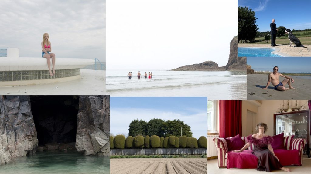
“Working outside of particular demographic scenarios Sank’s Jersey imagery continues to develop a lyrical vision within which the defining influences are place and cultural geography. As a stranger, present for a limited period only, Sank’s ‘residency photographs’ are of course procured under certain psychological precepts. In April 2013 when she arrived at the Archisle Project to undertake a six month residency, geographic and historical influences also loomed large. There were late twentieth century blanks in the archive to compensate, Jersey’s peculiar British-Norman cultural identity to contemplate, economy, politics, community, work, leisure, environment; these concerns together set against a twenty-first century backdrop. As Insula, the Latinate title of Sank’s resulting exhibition suggests, an enduring islandness is a defining influence in this body of work. It also seems fitting that the insula or Island of Reil in the human brain plays a part in regulating self-awareness and emotion.


Insula eschews a specific brief though the work responds to the wealth of nineteenth century portrait photographs within the Jersey Photographic Archive that it now joins as a powerful point of interpretation. The beguiling qualities of these new photographs call to mind the position that Lewis Baltz found for photographic series, ‘somewhere between the novel and film.’ As such, Sank’s photographs offer a visual poem to the island”

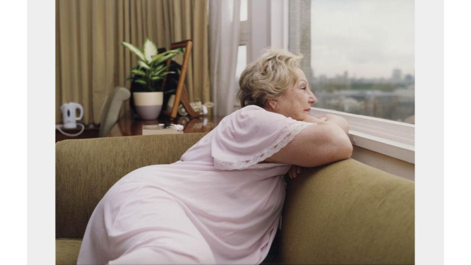
Best Images:

Technical:

The Image is quite colourful and cluttered yet simplistic. The imagedivided into imaginary quarters, the top left and bottom right corner being more green/brown, whereas the opposing corners are predominantly grey and white.

Visual:

As well as this the left side of the image is more textured with the curtains and desk objects in the background and the subject’s creased clothing, whereas the right side is much smoother consisting of a couch and a smooth window which depicts a city skyline almost like a picture.

Conceptual:

Sank attempted to show Jersey’s peculiar British-Norman cultural identity to contemplate, economy, politics, community, work, leisure, environment; these concerns together set against a twenty-first century backdrop.

Contemporary Artist Reference – Michelle Sank

Michelle Sank was originally from Cape Town, South Africa. But she later decided to move to England in 1978 where she could present her images and they could be viewed as a social documentary. Her work has been set around social and cultural diversity. The photos I have chosen to look at are Sank’s project called Insula. In this project she has photographed people in their day to day environments or places which best describe her models. Her images are simple yet captivating but they have a deeper context behind them, which I like. These are a few of her images I like;

Mood-bored Of Image From Michelle’s “Insula” Project

From all of her images this is my favorite image from her project, Insula.

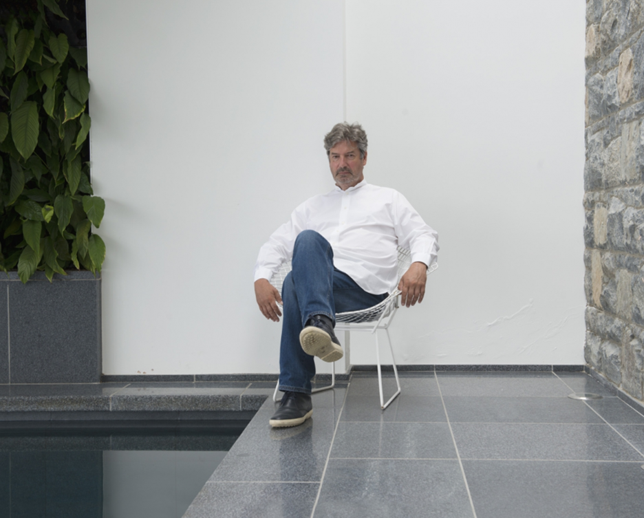
Technical; This image is in portrait style, where the man is centred in the image. The lighting is very bright, this is due to the fact of the white wall he is sat in front of emphases the light and by the looks of it the lighting has come from the rooms natural lighting and I cam to this decision because of the shadows that have been created are soft and are coming from a downwards direction . The image is balanced nicely with all the light colours, so it is not over exposed and the man is focused on in the middle of the image.

Visual; The image is almost monotone, with the colours in the image all nearly black and white. Looking at the image, on the right hand side of the image the wall is bricks which gives the image a different texture instead of it being all smooth there is a wall that is rough, which makes the image more interesting to look at. The image is also satisfying to look at due to the fact of the man sitting in the middle of the image and the straight lines on the floor.

Contextual/Conceptual; This man was photographed in his home and in this background to show off the success he has made through is surroundings he is photographed in. Along with the smart clothes he is photographed in, suggests he is successful and plays an important role in a business.

Historical Artist Reference – Francis Foot

Francis-foot.jpg
A Self-Portrait of Francis Foot

Francis Foot was born during 1885 in Jersey Channel Island. He began working as a gas fitter, but shortly after starting he was fascinated by photography and learnt he would be able to make a living off it. His family went on an brought anther shop in Pitt Street, where he would be able to work on his photographs and develop as a photographer. Many of Foot’s images have family members in them, this made him create an archive for his family, where he was able to document peoples existence, actions and show individuals growing up from his family. His work has a personal touch too it, as he is presenting to society, the evolution of his own family, it is almost as if he is paying tribute too them, with all the different photos of them all. Not only has foot taken portraits but he has also documented events happening around the island during his time.

Mood-board Of A Selection Of Photos From Foot.

When analysing one of Foot’s images I went through different stages and picked the image apart;

An Image From Francis Foot’s Portraits

Technical; The image is taken at a direct on approach, capturing the ‘models’ face on. The lighting in this image is all natural and has come from the sun, but you can see that the ‘models’ have been placed in the shade, this may of been because the photo was too over exposed in pure sunlight, or maybe foot just preferred out the features could be outlined in the image in the shade. Within the image you can see a deep depth of field as the children are close up towards the lens then you have the background behind them going on a far way back. Whilst having the deep depth of field, the focus remains on the children, with the features of them being sharp and accurate.

Visual; You can see the image is in black and white, and that the white is very bright, it almost looks over exposed. But as the children are dressed in white, it makes them stand out of the surroundings they are being photographed in. The image does look very 2D as you can’t see much shadow. There are 3 young children stood in the centre of the image wearing white, they are related to Foot.

Contextual; The image is there to show what the children looked like before they grow, its a photo showing the beginning of their timeline. It is also there as a document of their existence. Foot took many portraits of his family members so this is just another image of family. The images he took where during his time as his family grew and is photographic ability improved, these photos are also reminders for him and his family whenever somebody passes, they still have the images of them.

Conceptual; The idea behind this photo is too document these younger children in the photo as they grow up, it is showing their existance and what they began looking like. There could be many reasons behind why Foot took many of photos like this, it maybe so the family can keep memories about individuals forever and family members can be shown and taught about them when they pass, it is like they are keeping them alive even when they do pass. You can see the photos are personal to foot, as they are all images of his family, he is creating an archive for his family by documenting different images of them over many years.