Category Archives: AO3 Record Ideas

Filters

Author:
Category:

Home Sweet Home – Establishing Shots and Detail Shots

Establishing Shot:

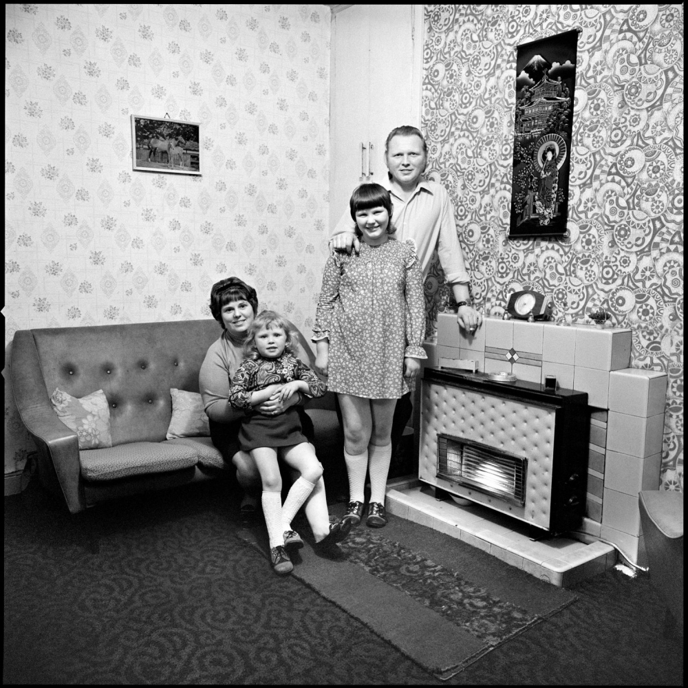
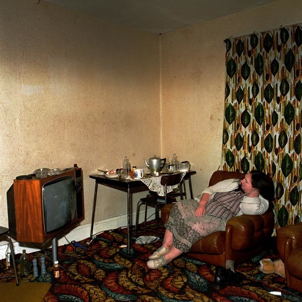
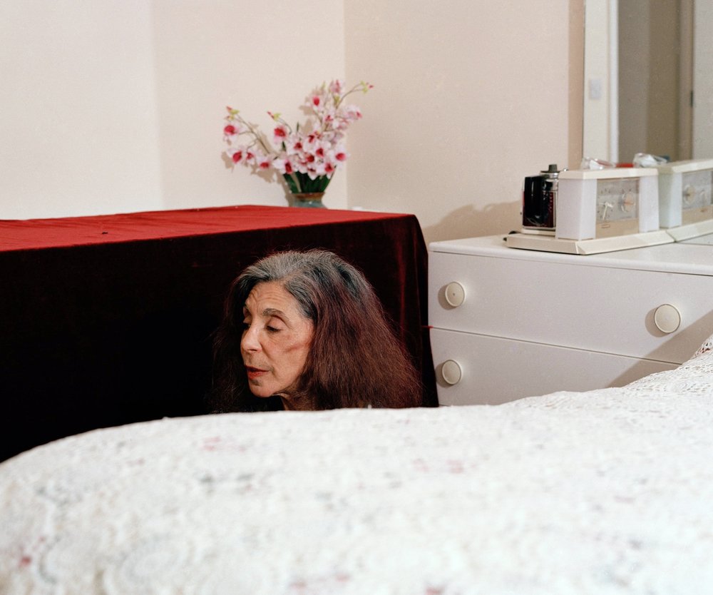
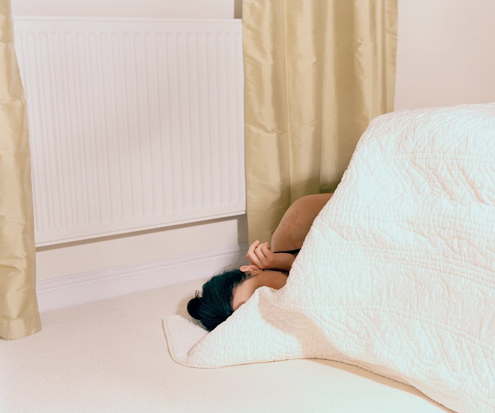
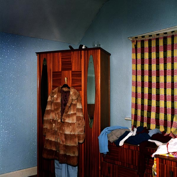
This form of documentary photography requires two or more subjects within the frame. The photograph almost acts like a tableaux as the photographer positions the subjects in order to convey a story and narrative, making this the main element to an established shot. In addition, the story can be presented through the background or the subject (is there an interaction or connection with the subjects in order to convey meaning). This technique is also used within film making, as directors, to establish angles and settings which would work for the scene.

Mood Board Showcasing Photography in the style of ‘Establishing Shots’

Sian Davey:

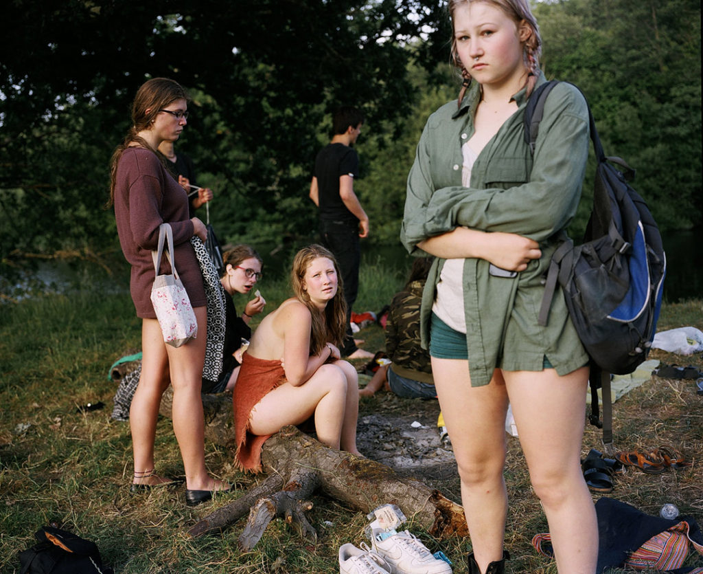
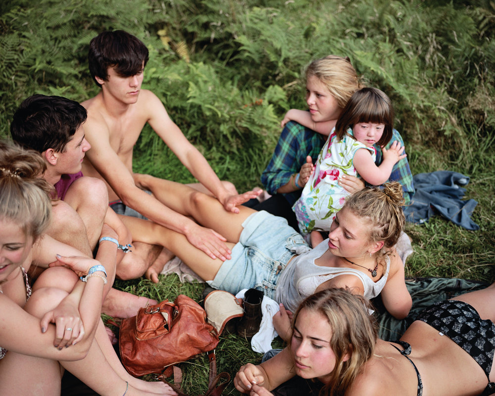
One photographer which I personally enjoy the work of Sian Davey who followed her teenage daughter round capturing her life on camera. The form of naturalistic images found within the ‘Matha’ series clearly conveys the narrative of Martha’s life, social interaction and her growing up and experiencing the world.
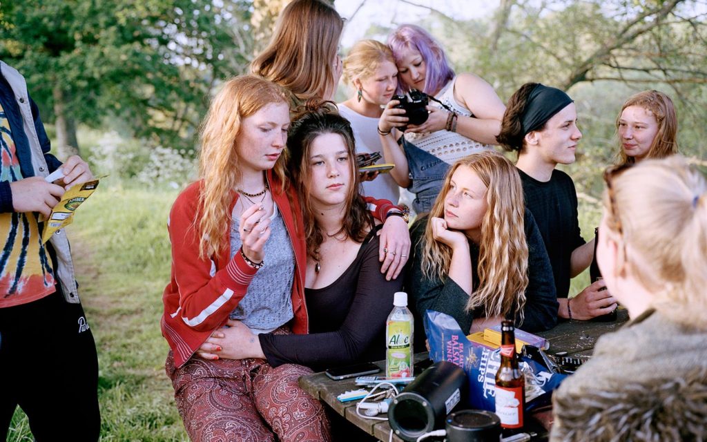
Above is one of my personal favourite photographs from the series. Visually, the photograph is almost chaotic in the sense of a lot of things happening within the frame making it interesting for viewers to look at. The main focal point is the three girls located within the centre of the frame, with the background having other girls and forrest type environment. The photograph captures the girls almost rebelling, and doing things they should not be doing, like drinking and smoking, due to the age of Davey’s daughter only being 16. These are shown through the objects in the frame which help to tell the key narrative within the photograph. The key formal elements within this photograph is colour, space and texture, which is shown through the different elements within the composition as well as the positioning of the girls. The positing of the subjects is naturalistic, creating a sense of realism within this form of documentary photography. In a sense the photograph seems to be using the rule thirds, which allows the naturalistic feel to run through and allows viewers to perceive the photograph more naturally. The photograph is captured at a straight on angle with the orientation of the photograph being landscape.

Conceptually, the narrative told within the photograph is the teenage girl rebelling due to the restrictions she has in her life. In a recent interview with Davey said “providing me with access to her social situations—in a sense, access to her social world at an age where parents are typically explicitly kept at bay.” Contextually, the Davey wanted to explore social norms which was influenced by her interest in her main subjects, her two daughters.

Technically, the photograph uses quite simplistic settings in order to maintain a naturalistic feeling towards the overall image, and photographic series. The lighting is natural, produced by natural sunlight due to the outdoors environment in which the photograph was captured in. This lighting has a sense of warmth which is emphasised through the light beaming through the trees and the correct outdoors white balance being utilised. This also works along the low ISO which is shown as no noise being presented through the frame of the photograph. In addition, the shutter speed has been put on a quick shutter speed due to no intended blur, and the aperture has been slightly raised as a slightly narrow depth of field is being presented, as the background is slightly blurred.

Detail Shot:

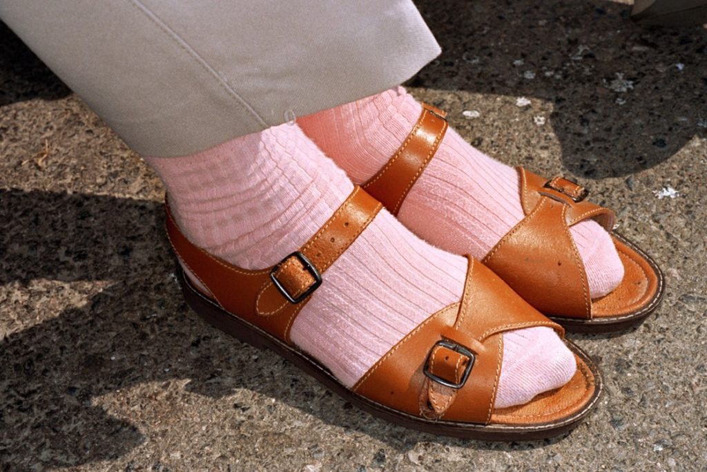
This form of macro photography, looks at capturing a portrait to convey new conceptual meaning. The imagery produced has close connotations with identity and informs us about the subject being captured within the shot. Normally, the main formal elements produced within this style of photography are: texture, shape and space, which all work together to create a powerful set of imagery.

Mood Board Inspiring my Detailed Shot:

Martin Parr:

Martin Parr is a British photographer, who capture photographs in the style of documentary photography. His photograph looks at capturing an anthropological way of looking at modern life, with major focus looking at the still existing class system within the UK. Within his time as a photographer, he has published over 40 phonebooks and his work has put into 80 exhibitions world wide, showcasing his success. I will be analysing the work which was displayed in a exhibition name Souvenir in 2013. The images are apart of the ‘Real Food’ photographic book too, which contained images similar to the one below.
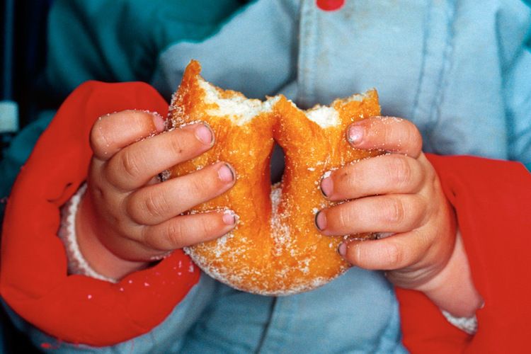
Martin Parr – 1996 – ‘New British’ + ‘Common Sense’

The above photograph is my favourite from the Real Food photographic book as it clearly showcases the techniques of a detail shot. Visually, we are presented with a photograph of a child holding a sugar doughnut which has been bitten into. The composition of the frame is full, however not busy, due to the photograph being considered as a macro style image, which creates a sense of containment and enclosure drawing us into the photograph. The main focal point is the doughnut, which is suggested through the central positing of the food in the frame and the narrow depth of field being used. This illuminates our understanding that the foreground is the hands and doughnuts and the background is the coat. The frame of the photograph tells us a lot about whats going on, the small hands, belonging to a small child wearing a vibrant coloured coat, which grip onto the doughnut, informs us that this child could be on holiday and enjoying himself. The photograph presents the formal elements of colour and texture, which helps to emphases the point just stated. The colours seem to be warm suggesting happiness, creating and overall pleasant mood to the imagery.

Conceptually, Parr wanted to capture an anthropological way of looking at modern life, which is clearly being showcased within the macro photograph. Contextually, Parr still noticed that the UK still presents a subtle class decided within modern society, which can be seen emphasised within his work. The colour of the coat seem to represent the same as a place like Butlins, holiday location in the UK, these places where considered cheap and accessible for those in the lower and middle class, which represent his negative viewpoint towards the class system.

To technically analyse this piece, Parr has kept his camera setting simple allowing the detailed shot to be successful and impactful on viewers. The lighting used half natural, through daylight, and half artificial, as it seems that he has used his flash allowing the foreground to be illuminated, with the background having shadows. This creates a warm atmosphere this was achieved through the correct white balance being used, which works in co with the low ISO being used due to the low intended noise. The shutter speed seems to be quick due to there being no intended blur. As mentioned before there is a small narrow depth of field being used to allow the doughnut and hands to be the centre of focus, allowing the conceptual and contextual elements to be illuminated.

Action Plan:

As an action plan I will now produce a set of images to respond to the ideology of establishing shot and detail shot, using inspiration from the work of Parr and Davey. I will look at using their methodology when capturing my family, and try and apply their conceptual reasoning into my work, adjusting it in order to fit within my family.

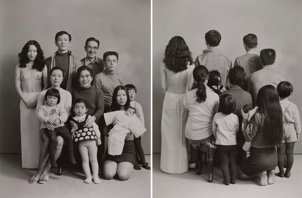
Contemporary still life – laura letinsky

Laura Letinsky is a Canadian photographer, who graduated from Yale School of Art in 1991. At present she is teaching her expertise and the Visual Art University in Chicago. Her initial interest was in portrait photography, but soon moved to still life where she focuses on capturing food, and the symbolism for the food. It is said that she uses photography to convey our understanding of relationships and love. Her investigation of still life is in associations with femininity, the minor arts, and its imbrication within the home as the space of intimacy.

“Still lifes provides her with the potential to explore the false dichotomy between the personal and the political.”

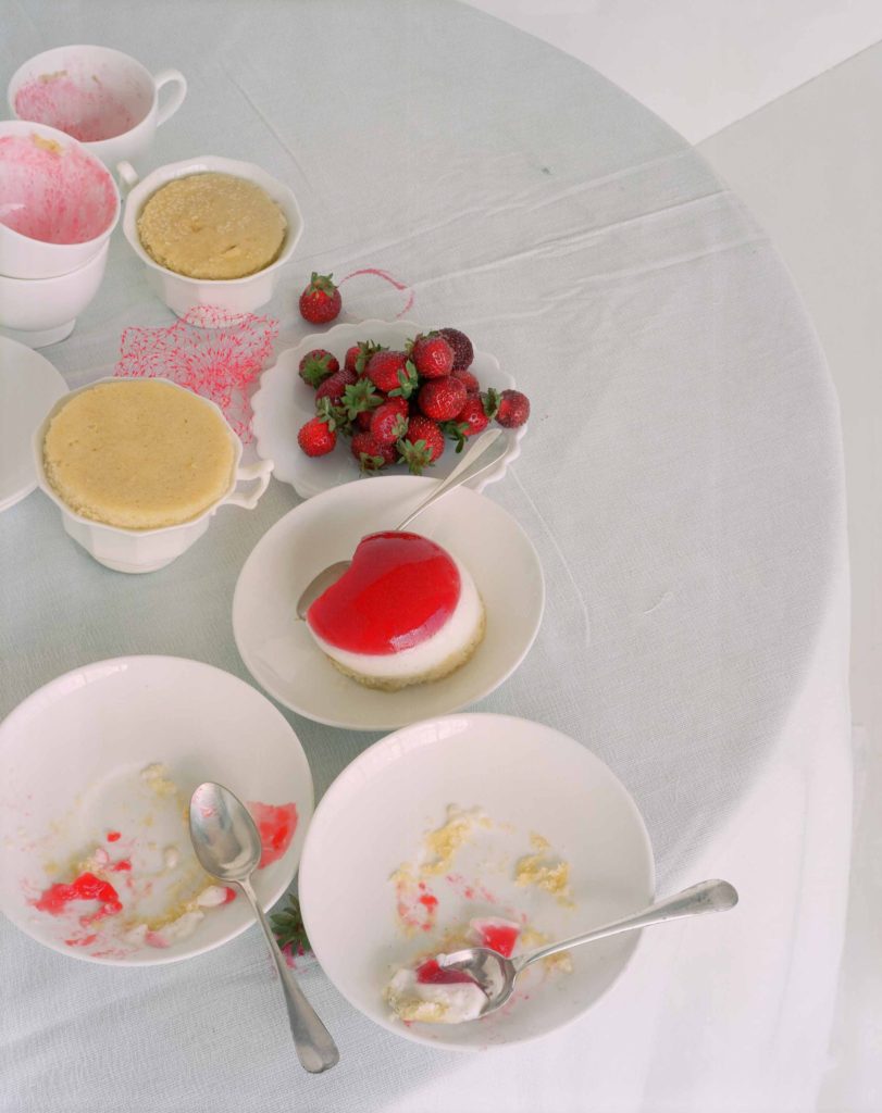
The Quote above is suggesting that this style of photography is allowing Letinsky to explore the contrast of people and political viewpoints through objects, in this case leftover food and crockery. Letinsky’s carefully crafted scenes often focus on the remnants of a meal or party, as she plays with ideas about perception and the transformative qualities of a photograph. Her close photographs on this subject enables us to understand the beauty of the objects that we take for granted.

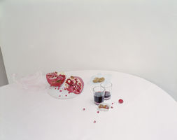
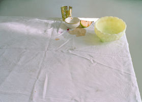
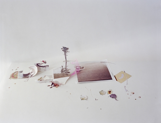
Mood Board Showcasing Imagery From ‘Hardly More Than Ever Series

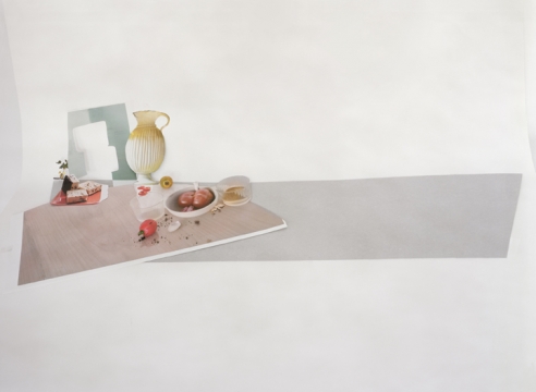
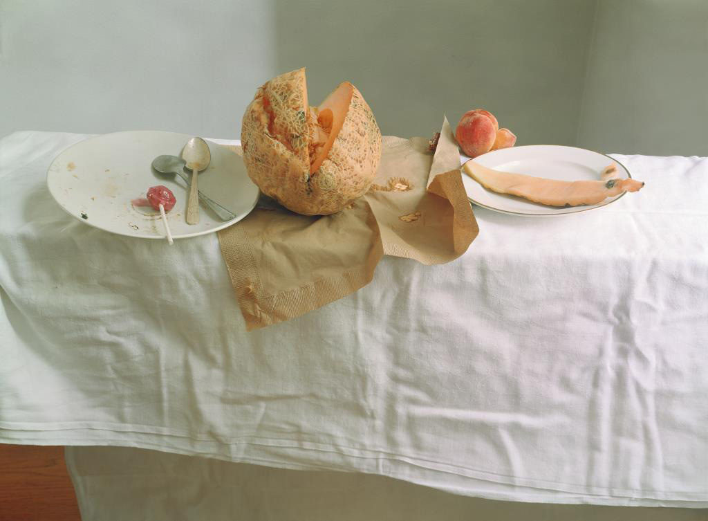
 UNTITLED #54 FROM HARDLY MORE THAN EVER SERIES 2002.

The photograph above is my favourite photograph from her ‘Hardly More Than Ever’ photographic series. The work showcases the transformation of still life painting from the 16th century into the 21st, with the main difference being the photograph being presented in colour and is a high resolution photograph. The photograph is taken as a landscape with the main focus point being in the centre of the frame, the half eaten melon. The colours are very dull and monotone, whites blacks and greys, which is similar to the classical outlook on still life imagery. This contrast the yellow/orange/green melon located in the centre reinforcing this as the main focal point. In addition, the background is kept simplistic, in order for attention to remain on the symbolic representation of the fruit. In Letinsky’s work the left over food is symbolic for inner beauty. Contextually, melons where considered a way of expressing a males fantasies of the female figure, having this melon broken showcases feminism in the present and the ideology that woman are not objects. The table cloth is creased, which creates a sense of mess and uncleanliness which adds to the overall tone and mood of the Letinsky’s work. The main formal elements which are being presented within the composition is shape, texture and space through the artificial positing of the food.

Conceptually, Letinsky wanted to capture the inner beauty of woman, through breaking the historical stereotypes and objectifying of woman through the half eaten melons and the uncleanliness of the table. This also helps to showcase the contextual transformation that still life imagery has undergone in today’s society, with new meanings and symbolism being presented through the objects.

Technically, the photograph uses simplistic camera settings, allowing the symbolism and the conceptual factors to be the importance of the photograph. The shutter speed used to capture the photograph is quick due to there being no intended blur within the frame. The ISO is low due to soft artificial lighting, created through studio lights which have a cold tone, due to there being no noise or texture through the light source. The white balance shows colour accuracy of the environment to which the photograph is set in, and allows the monotone colour scheme to really be emphasised. The aperture used to capture this still life image seems to be low due to the large depth of field it has, although the background begins to slightly to blur showing that there a small use of this technique within the work.

Action Plan:

After reviewing a contextual and contemporary version of still life I have been able to develop and understanding of the importance of this type of imagery. I have learnt that the positing of items is important as it allows the clarity of the symbolic representations to be clearly shown, thus making it something I need to consider when I capture my still life imagery. Photographic wise I have learnt that I should implement simple camera settings such as quick shutter speed, low ISO and some what low aperture, with soft cold artificial lighting to be used. when I capture my still life I will be copying the stylistic features of Letinsky, however showing experimentation through depth of field and positing of the items within the table. I intended to produce a strong set of still life photograph which showcase a symbolic representation of the Occupation through the technique and outlook stated above.

Autochromes

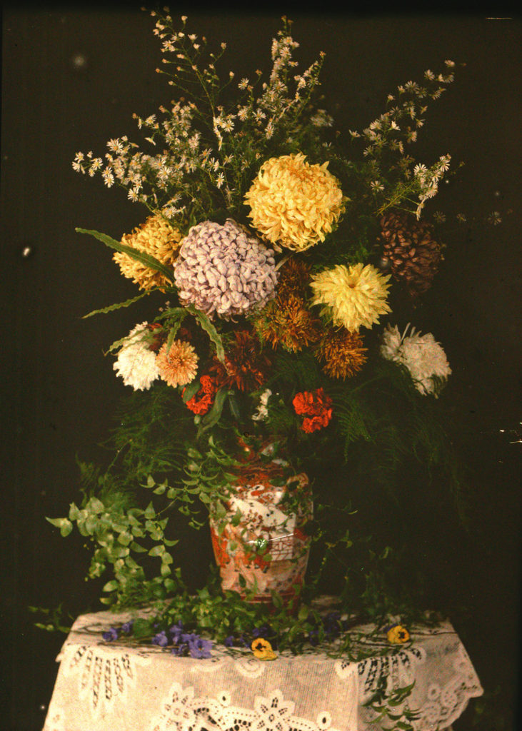
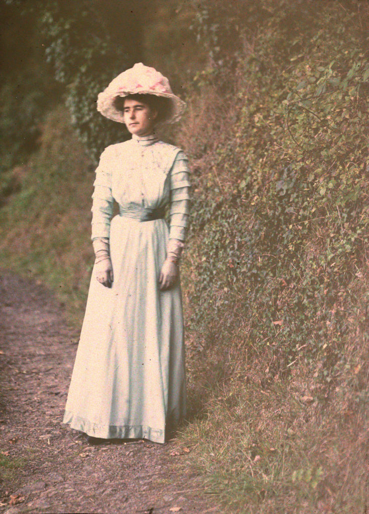
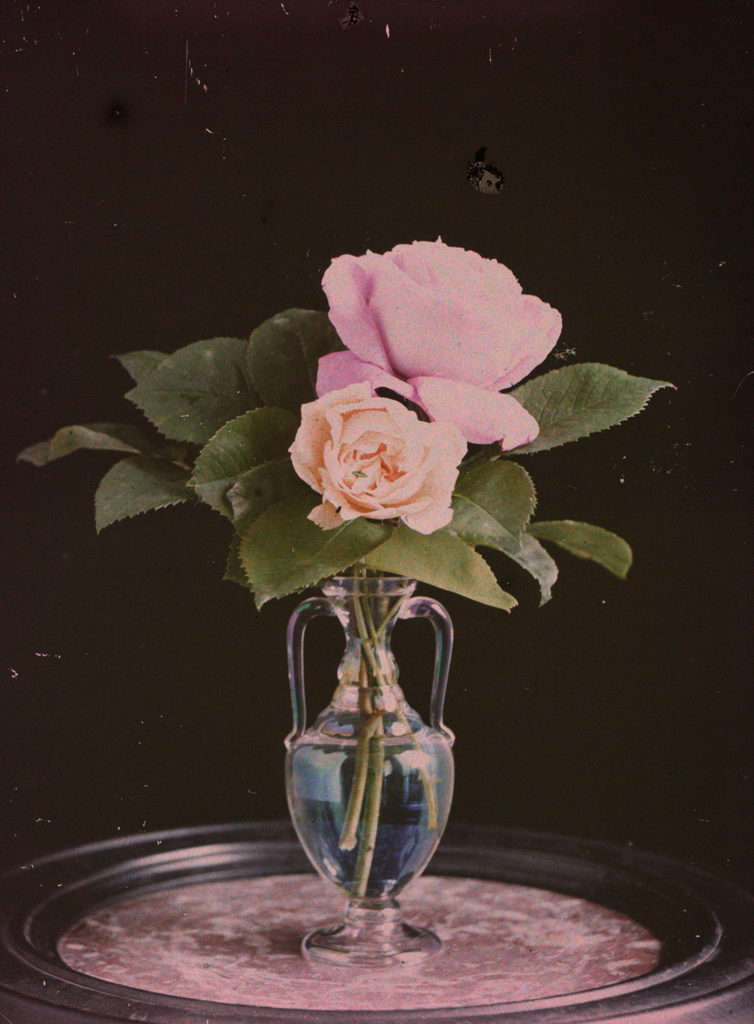
Autochromes is a material which was once used for colour photography, consisting of a photographic emulsion applied over a multicolored screen of minute starch grains dyed red, green, and blue-violet. This effect was achieved by getting a glass plate and coating it with a latex-based varnish and covered with a thin, regular layer of grains of potato starch dyed green, blue, and red-orange. In order to achieve the negative element of this type of photograph, one side of the glass would be covered with a thin layer of collodion (a flammable syrup) containing ammonium or potassium halides (iodide or iodide and bromide). The collodion is richer than the other substances which creates the negative, producing the whitish image. allowing it show up better against the dark background used when viewing the final outcome.

 Emile F. Guiton:

The founder of the Societe Jersiaise Photographic Archive had a passion for capturing colour photographs, during the begining of colour photography in the early 20th century. Emile captured two categories when using the autochrome technique: still life, fruit and flowers showcasing symbolism and domestic photographs, taking a more portraiture approach. He used still life photography in order for him to develop his skills, when using the chemicals to create the autochrome effect. In addition, the subject was still allowing for a controlled environment making the colour experimentation to be clearer. Emile would sell the autochromes in packs of four, which showed his experimentation with the chemicals. It is said that he created his work to capture the heritage of the island.

One of Emile’s most famous photographs was Valley de Vaux, which showcased two of Jersey’s landscapes in colour. One was a country environment and one was showcasing the urban life of Jersey, creating a clear juxtaposition. This photograph I could not find online, but from the description read on https://hautlieucreative.co.uk/photo20al/wp-content/uploads/sites/33/2019/09/The-Autochromes-of-Emile-Guiton.pdf it is clear that the work is trying to showcase the cultural change during this time period.

PHOTO-ASSIGNMENT 2: Home Sweet Home

ESTABLISHING SHOT:

A group portrait of two or more members of the family where you are constructing an image that tells a story. This image can be naturally observed or staged. The main focus is conveying a sense of narrative.

DETAIL SHOT:

Focus on detail of a person or a close up that conveys something about the individual character or identity e.g. age, race, gender, sexuality, fashion, hobby, lifestyle etc.

ALAIN LABOILE

La Familie

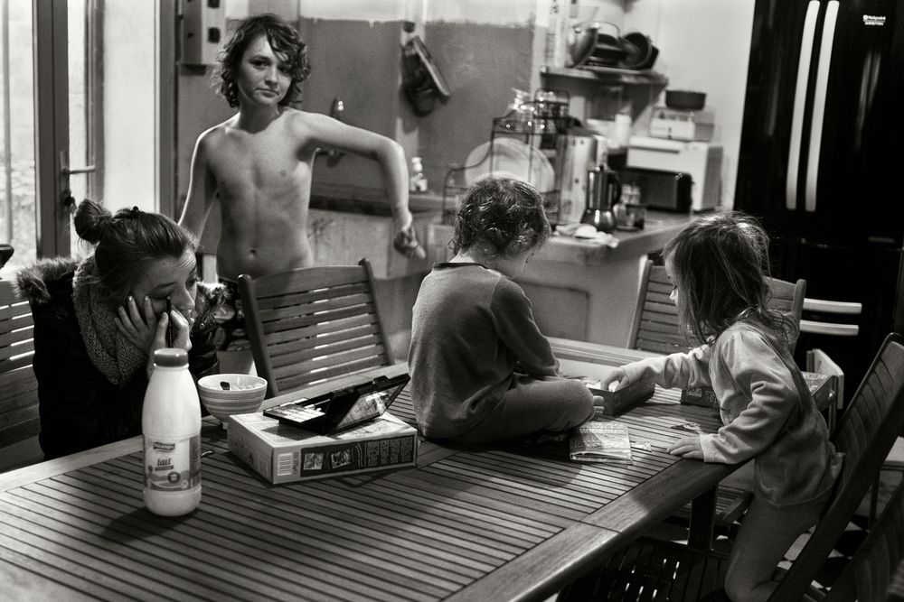
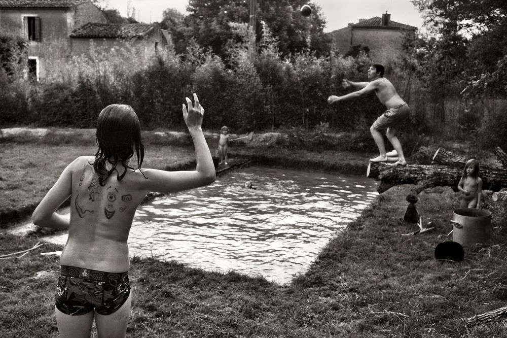
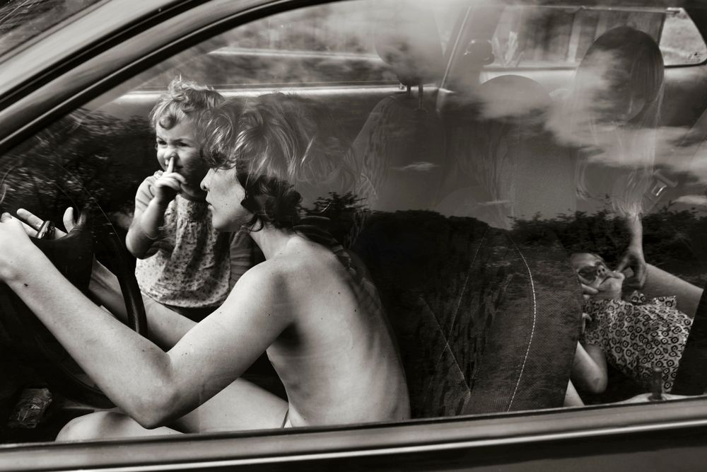
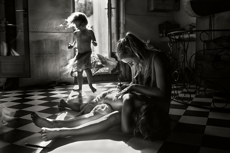
Alain Laboile is a father of six. Through his photographic work he celebrates and documents his family life. His work reflects their way of life, revolving around their childhood. Although his work is deeply personal, it is also accessible, addressing human nature and allowing the viewer to enter his life and reflect on their own childhood. His eye for beautiful compositions, along with his choice to shoot in black and white, gives his photographs a timeless feel and make them seem as though they could have been a part of anyone’s childhood. Laboile describes his family’s life as “atypical”. Lots of Western families these days find themselves living in urban settings, unlike the rural area his children explore in his photos.

MY RESPONSE

Still Life – Post 3 (Autochrome)

In 1907, the Lumière brothers, Auguste and Louis, introduced the first viable method of color photography. Although color photographs had existed, the process was clumsy and complicated. The key ingredient, the Lumières discovered, was potato starch.

The process, called autochrome, involved covering a glass plate with a thin wash of tiny potato starch grains dyed red, green, and blue, thus creating a filter. A thin layer of emulsion was added over that. When the plate was flipped and exposed to light, the resulting image could be developed into a transparency. Autochrome was immediately popular in Paris, where it was introduced, and soon spread to the United States. Like early black and white photography, autochrome was a slow process. Because exposures were long, subjects had to stay still—sometimes unsuccessfully—to avoid a blurred image. But with autochrome, the blur had an unusual aesthetic effect. Paired with the soft, dyed colors, it made the photo look like a painting.

Most publishers adopted Kodachrome in the 1930s because it was easier to use. Autochrome required photographers to carry around heavy wooden suitcases filled with fragile glass plates; Kodachrome film, twinned with a 35mm camera, was light and easy to travel with. Today, autochrome is rarely used, and films like Kodachrome have been supplanted by digital. The autochrome plates in archives provide a unique look into the past, to a time before digital precision replaced a softer, painterly look and palette.

https://www.nationalgeographic.com/news/2015/01/150131-pictures-autochrome-color-photography-history-people-culture/

Emile Guiton:

Born in Jersey in 1879 he had a keen interest in history and was a member of La Société Jersiaise, served on its executive committee as joint honorary secretary, and was curator of the Museum and editor of the Annual Bulletin.He also realised that history was being made during his own lifetime and he recorded the development of his native island from the turn of the century until his death in 1972. He experimented with Autochrome colour very early in the century. Not only did he record events and activities during his own lifetime, particularly agriculture, but he had a fascination with the past and chronicled with his images many archaeological excavations (his pictures of the interior of La Hougue Bie remain some of the best in existence) as well as photographing Mont Orgueil (Gorey) Castle and other coastal fortifications, sites of geological interest, and architecture. Guiton had a particular interest in the design of Jersey houses over the centuries, and particularly in different styles of arches to be found in the island. He was present at many major events, including the Liberation in 1945 (he had also taken photographs during the German Occupation, and the proclamations of successive monarchs in the Royal Square.

Emile Guiton was a keen amateur photographer and practised throughout his long life. He experimented with colour at the beginning of the twentieth century in “Autochromes”. His subjects include the recording of archaeological excavations and he was one of the few people in Jersey permitted to take photographs during the German Occupation of 1940 – 1945. Emile Guiton also recognised very early on the importance of collecting photographs, both as a valuable social historic resource and as interesting artefacts – examples of developments in science and technology. He donated many images to the Société Jersiaise. He died in 1972.

https://www.theislandwiki.org/index.php/Emile_Guiton

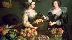
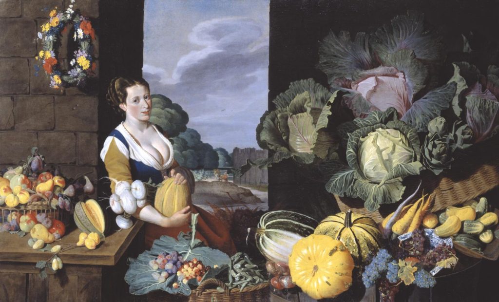
Still Life – Post 2 (Painting Analysis – Cook maid with Still Life of Vegetables and Fruit)

Cook maid with Still Life of Vegetables and Fruit, painted by Sir Nathaniel Bacon (c.1620-5)

Technical:

Incorporates highlights and shadows, showing a clear understanding of light and dark. This image contains three factors. The stature and framing of the female subject in the centre, as well as the clouds in the sky in the background and a series of fruits and vegetables in the foreground.

Visual:

The image captures a slightly larger woman surrounded by fruits and vegetables, both signify some sort of wealth or financial sustenance to be able to afford those foods and clearly have enough food on the table to thrive. The position of a large fruit over the woman’s belly represents fertility and the ability to carry and produce a healthy child. The composition is very colourful, with fruits and vegetables around the base of the image and a flowery wreath hung up on the wall.

Contextual:

‘Cookmaid’ and market scenes, popular in the seventeenth century, evolved in the Low Countries from a genre practised by Pieter Aertse and his pupil Joachim Beuckalaer, which combined contemporary kitchen scenes with a New Testament episode beyond. An inventory of 1659 connected to the will of the artist’s wife lists ‘Ten Great peeces in Wainscote of fish and fowle’. Two other ‘Cookmaid’ pictures are known to exist: Cookmaid with Still Life of Game and Cookmaid with Still Life of Birds, both in the possession of the artist’s descendants. The Tate’s work is possibly part of this group. Such groups were often intended to depict the four seasons or the twelve months of the year. In the case of this piece, however, although every item represented in the painting was grown in England at the time, not all would have been in season simultaneously. Bacon, according to a letter dated 19 June 1626, was growing melons at his estate in East Anglia, and he was known to have a keen interest in horticulture. The subject would most likely have had erotic connotations. The abundance of ripe melons surrounding the cookmaid echo her figure.

Still Life – Post 1 (Historical Context)

Origins and Definition of Still Life:

Still life paintings have technically been around for thousands of years. The earliest examples of still life paintings were by cavemen dating back toA still life composition is a work of art depicting mostly inanimate subject matter, typically commonplace objects which are either natural or man-made. The art style often uses symbolism and meanings hidden within the image. Still life images should rarely be taken at surface value.

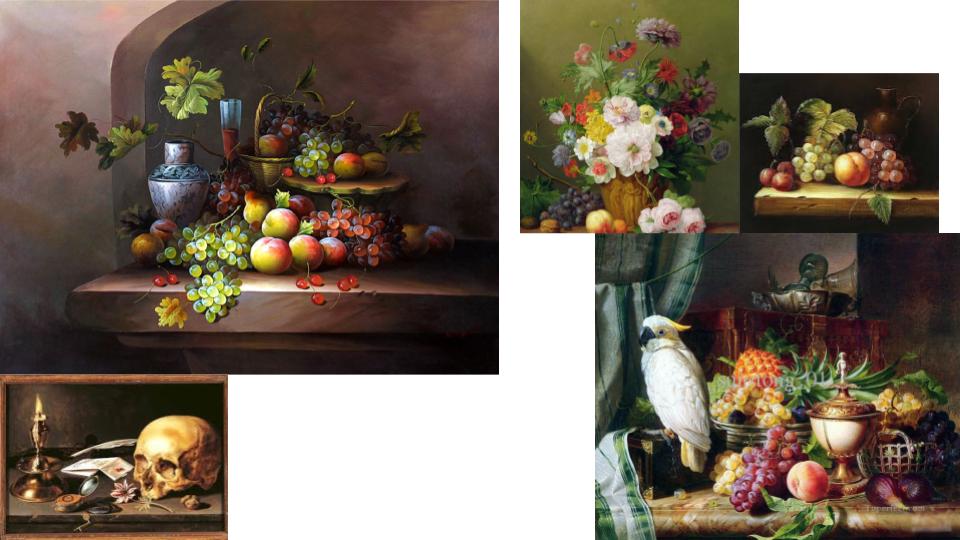
Dutch artists of the 17th Century became renowned for being greatly concerned with ‘a close scrutiny of the natural world.’ This, combined with their preoccupation with perspective and the study of light, provided the fundamental elements of Still Life painting. The term had come into general usage in mid-century, Still Life being the carefully composed portrayal of inanimate objects, such as: fruits, flowers, skulls and other prestigious objects. Living creatures were able to be incorporated as long as they were incidental to the main theme. Still Life, in itself a particular aspect of art, further diversified into different categories.

The Distinct Categories:

The earliest examples, from the beginning of the 1600s and later influenced by ‘tulip-mania’, were the popular floral paintings. These were followed by flowers with fruit, then the humble ‘breakfast pieces’. As the century progressed, and wealth became widespread, so the ‘breakfast’ developed into the ‘banquet piece’, depicting large quantities of high end food and delicacies. Another important facet of Still Life called ‘Trompe L’Oeil’, French for ‘deceive the eye’ – evolved in the mid-century from the game piece and its illusionist appeal to the Dutch. Finally, at the latter part of the century, taste changed, colour and form became more baroque.

Flower Pieces:

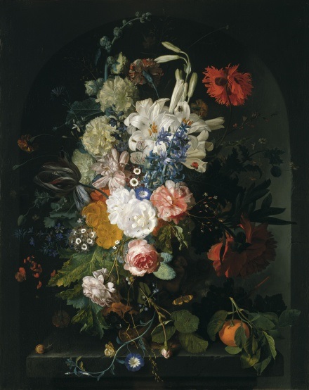
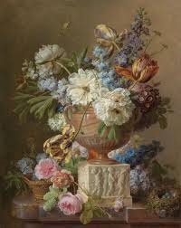
Just as painters specialised in different aspects of art, certain towns became the focal points for specific genres. Dutch cities such as Middelburg, Utrecht and Amsterdam were the main centres for flower painting, a genre that was highly regarded and very well paid. The artists, although portraying genuine flowers, depicted them in impossible arrangements such as blooms from all four seasons were shown at once, reflecting the studio practice of painting individual flowers, in season, as studies for future reference. Flowers were accurately detailed without the overlapping that would happen naturally in a vase arrangement. Flowers were ciphers for spring but there was also an evolving symbolism in the language of flowers that was accessible to contemporary viewers. For example the Madonna lily was an attribute of the Virgin Mary, the white iris a symbol of her purity and the rose, of her love. A daisy meant charity, a buttercup represented the unmarried , and the sunflower represented the love of God, or sometimes love of the earth. Some artists presented their work as so-called ‘niche’.

Fruit with Flowers:

Symbolism was highly present at the time in objects such as exotic fruits and shells brought back by trading merchants. Shells had particular appeal to a nation governed by the sea and, with fruit, were often displayed as part of floral compositions. Fruit had a religious message; the apple of temptation, the grape the blood of Christ; and a different shell might represent each continent as visual tribute to the geographic and scientific discoveries of the day.
Breakfast Pieces:

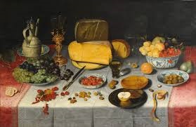
With the introduction in Haarlem and Amsterdam of the Ontbijtje, the Breakfast Piece, the format changed to landscape to accommodate the expanse of a tabletop. Placing the table edge parallel to the horizon, with the table-cover dropping markedly downwards, enhanced the impression of space. The food illustrated was basic – bread, cheese, fruit, nuts, herring – and often presented half eaten for realism. The cutlery and dishes of pewter or pottery were equally simple but skilfully painted. In earlier breakfast pieces, the viewer is looking downwards onto the table, but as the century progresses, the viewpoint is lowered. Like the flowers, the objects were carefully spaced and by the 1620s were projecting over the table edge, creating an illusion of nearness to the viewer. By the 1630s these bright colours were becoming more monochromatic.
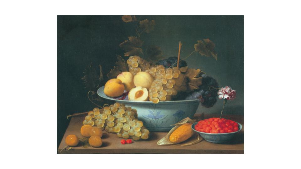
PHOTO-ASSIGNMENT 1: Home Sweet Home

ENVIRONMENTAL PORTRAIT:

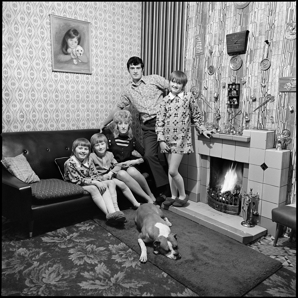
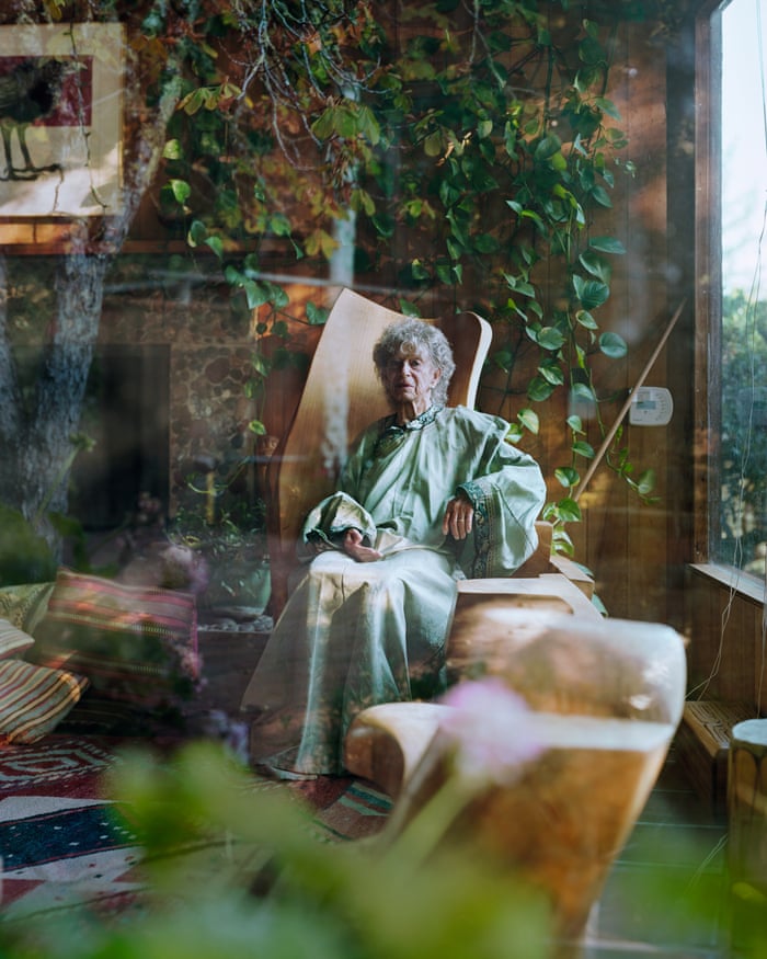
An environmental portrait is a portrait captured in the subject’s usual environment, such as in their home or workplace, and usually highlights the subject’s life and surroundings. By photographing a person in their natural surroundings, the photographer will be able to illuminate their character better and therefore portray their personality rather than their physical features. It is also thought that by photographing a person in their natural surroundings , the subject will be more at ease, as opposed to in a studio which portrays an artificial experience.

CANDID PORTRAIT:

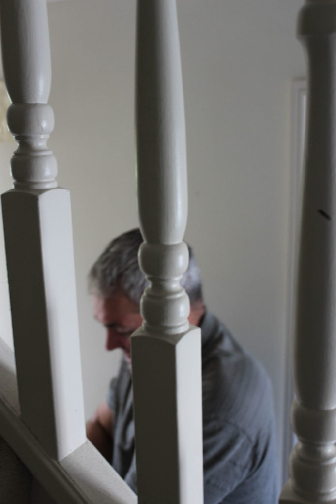
A candid portrait is where the subject is unaware that a photo has been taken. The idea of a candid portrait is to capture people acting naturally. They should be unaware they are being photographed, as their behaviour often changes once they become aware of the camera.

ALEC SOTH

I Know How Furiously Your Heart Is Beating is a slim book including 35 photographs. The domestic interiors captured in his photographs illuminate the subjects who lives in them. When capturing portraits he looks for interesting people and interesting spaces: “They can be male or female, young or old, rich or poor. The main thing is to have an intimate encounter that is visually strong”.

The reporter Sean O’Hagan, who wrote an article about Alec Soth for the Guardian, watched him work up close as he photographed people who lived in “interesting spaces”. Apparently Soth uses a large glass plate camera on a tripod. The process is difficult and requires patience from the sitter, who has to remain still while Soth sets up the shot, disappearing for a long amount of time under a large blanket. He works in a Victorian way which is more suited for outdoor photography. Under the blanket Soth tries to get things in focus. It’s a camera built to photograph landscapes and Soth is using it in constricted interior spaces. It’s hard work for Alec Soth to take a photograph but nothing else comes close when it comes to capturing light and texture.

https://www.theguardian.com/artanddesign/2019/mar/09/alec-soth-photographer-i-know-your-heart-is-beating-furious-interview

MY RESPONSE

Still Life Historical Context

Origin:

Still Life has emerged over the years particularly in the 1600s, in Dutch and Europe. There is different types of still life, some f the categories include Flower Pieces, Vanitas Paintings, Trompe L’Oeil and Fruit, these varieties. This was caused by the trading of the east, meaning that dutch artists were renown for still life paintings.

Definition of Still Life:

Still Life in photography focuses on intimate subjects, mainly a group of objects together, they usually enfold a message to the audience to reveal, a hidden message.

MoodBoard:

Analyse of Chosen Image:

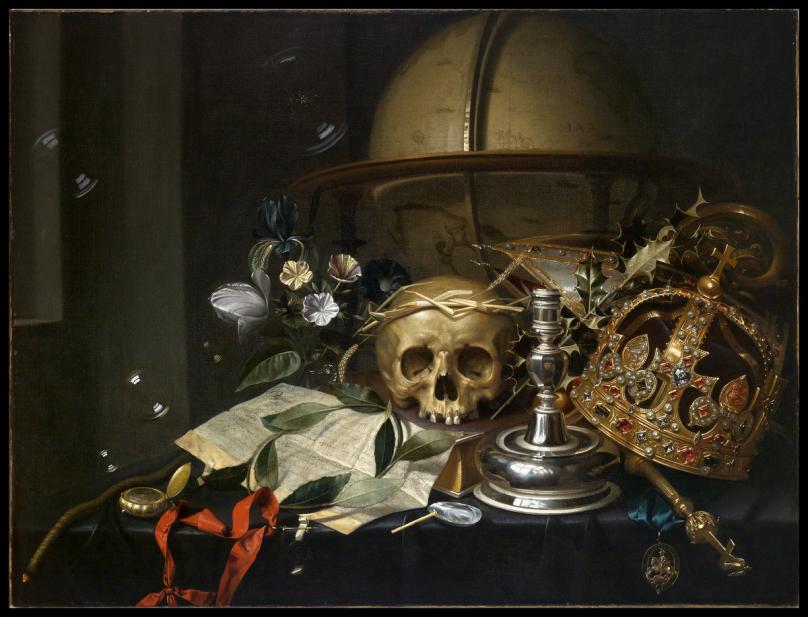
Andriessen, Hendrick, Vanitas still-life
Vanitas – Hendrick Andriessen

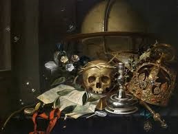
VISUAL: In the image you can see he Crown, Scepter and medal of St George, you can also see a skull in the middle of the image. You can also see bubbles and a watch, candle holder, glass vase. The colours in the image are a mixture of dark colours and light colours for example the crown has very light colours which can reflect on the status of the person who owns this object.

TECHNICAL: The lighting within the image has been directed at an angle therefore, the light is hitting the objects and creating

CONTEXTUAL/CONCEPTUAL: This image was painted by an artist called Hendrick Andriessen on a canvas around 1650, The image had several inspirations for example the Crown,Scepter, and Medal was an idea taken from the contemporary events which happened at the time, for example he took ideas from the brutal civil wars happening in England at the time. Every item has a meaning, from the Watch, and how its been positioned on the table.

Meaning of the Objects:

Watch: The hand of the watch being set at 5 to Midnight symbolizes the passing of time, and the approach of the ‘Final Reckoning’.

Book: The book which the skull is being rested on symbolizes the emblematic of the ‘futility of intellectual pursuits’.

Holly Branch: A symbol of Christ’s crown of thorns, offers further ‘promise of salvation’.

Crown of Wheat: Refers to the ‘Eucharist and therefore to rebirth and resurrection’.

Candle, Glass Vase, Bubbles, Flowers: This refers to the ‘fragility and ephemerality of life’.

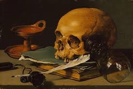
Skull: Is a reminder to ‘death and morality’.

https://artmuseum.mtholyoke.edu/object/vanitas-still-life

Home-Sweet-Home – Post 3 (Final Images)

Final Images:

Shoot 1:

Shoot 2:

Best Image:

Technical:

I manipulated this image in editing so that the door frame is completely vertical, despite this making the wall in the centre of the image slightly slanted. The image was taken with the idea of having two halves of the image; One plain and one full of tones and textures that are lacking in the opposite side.

Visual:

This photograph has two clear halves; the plain white wall and the door, frame and hanging items of clothing. The white wall however, isn’t completely white. Due to the reflection of the light passing through a sky light window there are warm tone and cool tone patches, creating an interesting beaming effect on the wall. The other half consists mainly of black, white and grey items of clothing, which break up the image. The multi-tone dress in the centre of the door is the focal point of the entire image, helping to add texture and an interesting pattern.

Conceptual/Contextual:

The concept behind this image and the entire ‘Home-Sweet-Home’ photoshoot was to shoot my house in quite a simple, cool tone yet visually (aesthetically) appealing way. For this reason I decided to photograph an array of dull clothes and a slightly colourful reflection of sunlight to create a balanced yet contrasting image.