Category Archives: AO3 Record Ideas

Filters

Author:
Category:

Personal Investigation – Essay

Can photographs actually capture feelings and emotions or can they not be taken on face value?

“Every portrait that is painted with feelings is a portrait of the artist, not of the sitter” (D. Lewis, 2015; Face)

No matter what I’m doing I’m always in deep thought about something, be it something small like thinking about what I might wear today or something seemingly more personal and relevant to just me like the way that argument was left unresolved the previous night. Every wake up is different to the day before. You know more, you’ve seen more, you’ve thought more. Even though someone can present themselves a certain way, they are the only person that they have shared every breath and life experience with. The only person that truly understands the ins and outs of their own mind. I’m a strong believer in the chaos theory, the concept that each and every one of our experiences in life shape our complete development as people, down to how we look at life, how we think and how we react in certain situations. If you knew everything someone had been through and felt, their actions and mind set could become completely predictable. This is why it is possible to understand another person on a deeper level such as a friend, family member or lover. It is the sharing and relating of ideologies and experiences that unlock the secrets to a person’s true self.

This leads me on to my personal investigation, which focuses on the close interpersonal connections between my close friends and I, and the complexities of social science involved in the making of a friendship. Is it possible to form a friendship with anyone or does there have to be a certain level of compatibility? In the same way many of us believe ‘compatibility’ to be a key factor when it comes to finding love romantically, does it have an impact in a platonic way, can you learn to love and form a bond with anyone or is the possibility of a relationship between two people predetermined by other factors?

I will be analysing the work of two photographers: Bruce Gilden and Daren You. Both photographers work very differently. Gilden often focuses on strangers, he selects individuals he knows nothing about on the streets of New York and photographs them in obscure ways to emphasise a point of their character. He will interact with a subject he finds intriguing or out of the ordinary, allowing opportunity to find him, getting up close and personal with them, inspired by Robert Capa’s saying “If your photographs aren’t good enough, you’re not close enough”. I was inspired by the fact that he just takes a photo when he sees something interesting rather than going out and looking for it. This links with my personal investigation as I use candid portrait images throughout the project. The best compositions stemming from genuine moments and expressions captured in an image.
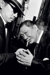
This composition features two men, one assisting the other in lighting a cigarette. The image appears candid due to the startled facial expressions of the man on the right. The image is black and white, which draws attention to their faces, hands and the cigarette and its smoke as the focal points of the image. Both are dressed in suits and shirts and look relatively formal. The buildings and structures in the background are slanted, which when paired with the men leaning in to each other creates a bold structure. The man on the left has his eyes covered with black sunglasses and a blank expression while the man on the right seems to be aware of the photographer. Gilden’s intentions with this image are to display the characters of the subjects without having previous knowledge of them as individuals, allowing truly candid images that say something about himself as well as the two suited men. The effect of this image is that it tells the viewer something about the subjects without any prior information on the couple. It allows the viewer to create their own reality and idea of the subjects, in this sense the image is quite liberal, there are no right or wrong ways to interpret this image. Giving power to the mind of the beholder.

Daren You similarly allows the opportunity of a good photograph to find him. You uses different techniques while developing his images, using reticulated film through a high temperature developing process, inkjet printing, darkroom printing, liquid emulsion and encaustic painting. The final result of the layering of these images creates a completely random image that looks very different from the original image he shot. In this way he explores the beauty of randomness as his art is created through both skill and chance.
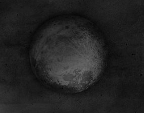
This image depicts the surface of the full moon against a grainy black emptiness, this light contrast draws focus to the protruding sphere front and centre. The image appears quite plain at first glance but closer inspection of the moon itself reveals an array of light and dark scratches, lines and craters which form a shade mosaic of beautiful randomness. You’s intentions with this piece are to create an eye catching monochrome image which shows something recognisable by anyone, in a different way. Through the developing process of the image he has made something ‘random’ even more so by the unique appearance of the final outcome. This piece has a powerful effect on the viewer, seeming almost three-dimensional due to the nature of the shadow cast by the moon itself.

These photographers link with my investigation as I’m exploring the ability to convey genuine feelings and emotion through photography and whether it is possible to show the deeper aspects of relationship. Both photographers work in very different ways. Gilden is more candid. His rapid approach to photographing his subjects in action results in a variety of unique shots showcasing individuals and their unique story. You works more with the manipulation of the developing process to create visual diversity in the way the image appears rather than the matter in the photo. I am inspired by his processes of changing the image and have decided to have a theme for editing my images. This theme involves changing colours and the hue of images, to then change the tessellation of the image to create a semi-random composition with a stark and unique feel to it. Following this editing process resulted in a lot of strong photographs turning out very differently and many being discarded. The final images therefore being a combination of my camera skills and controlled factors included in a photo shoot such as lighting, camera setting and subject matter and the selective editing and choosing processes.

I will be responding to the work of Daren You and Bruce Gilden and my essay question, to investigate whether photographs can convey the thoughts and emotions of the subject, through the production of a photobook called “Understated”. This photobook showcases my friends and myself in a series of images which incorporate our friendship and inter personal relationships with each other in a range of settings where we often find ourselves. The majority of the portraits developed throughout my personal investigation were candid shots as I wished to portray the genuine nature of our relationship and how we act around people we are comfortable with without it being forced or staged.

Other images in this photobook consist of still life, close up shots of items used and located in our usual environment. The combination of portrait and still life imagery are a reflection of my two inspirations for this investigation; Gilden and You. The combination of these different mediums allowed me to explore not only the relationship between the subjects and myself but how our common interests add a distinctive dynamic between friends which is totally unique to us as individuals. The visual cultures relating to my investigation are solarisation and superimposition, both of which I have showed an interest in throughout the course. Solarisation is the method by which part of, or an entire photograph is reversed. This makes the dark areas appear light and the lighter areas appear dark. This interested me as the same image can look completely different and allow the viewer to focus on different parts of the composition simply by flipping what appears light and dark. Superimposition involves the placement of an image on top of an existing image, usually this is done to add to the overall effect of the image, but this method can also be used to conceal something. I achieved this by massively lowering the shutter speed and taking a photo of the subject in action or in the middle of a movement. This created the effect of double exposure. In some cases I followed these steps while adjusting the zoom, this created a double exposure which appeared to zoom in on an image.

My personal investigation follows a post-modernist approach to photography. Post-modernism was a movement developed in the late 20th century. Architects were at the head of this movement as they criticised the international style of architecture which up until then had followed a modernist approach. These architects felt that their international style had become repressive and orthodox and was losing its artistic value. Post-modernism follows the idea that while for modernists the image is captured from the photographer’s point of view, which leads the viewer to see one meaning, while post-modernisms focuses on the notion that there can be a lot of different interpretations and different understandings of a piece of work. This allows the photographer to tap into more debatable and taboo topics which different individuals can interpret in different ways. Post-modernism also explores the social forces exerted and their power to shape individual identities and even cultures and sub-cultures as the value of this type of photography isn’t its universal and timeless nature but the fact that it is hard hitting, relevant and accessible. These post-modernist themes are displayed throughout my work as I am discussing an individual and personal topic which is easily relatable. My investigation focuses on social norms and differences, the unique factors that bring my friends and myself together and the sub-cultures that we fall into as a group of people.

While my work in this project has a certain meaning to me, it is open to interpretation on behalf of the viewer. Different people can take away different feelings and emotions from my work, relating to different aspects of it in different ways. This leads me back to my opening quote “Every portrait that is painted with feelings is a portrait of the artist, not of the sitter” (D. Lewis, 2015; Face). As it can be said that the interpretation of a portrait can be determined by the viewer, by their mood and outlook at the time of viewing a piece of work. In this way, my work is relatively open ended as it can mean different things to different people. It can represent fun and friendships as the images display the possibility to make these connotation, however there could also be an element of rebelliousness or irrationality. The almost abstract nature of my project makes it very timeless. The series can be given thought and meaning but can also be viewed as aesthetically pleasing images which are simply enjoyable to look at. Therefore I conclude that it is possible to capture true emotions in a photograph but I feel that unlocking that emotional connection is down to the artist and the viewer. Feelings can be conveyed in an image, perhaps not in the form of a smile or frown of the subject in question, but the emotion and ‘feelings’ felt when the images are interpreted inside the mind of the viewer. This makes it subjective as it is a different thing to view an image and to understand it, but the subjective nature of photography in its entirety is what allows it to be so accessible and globally powerful.

Bibliography:

https://www.picturecorrect.com/tips/the-artist-behind-the-viewfinder-emotional-photography-insight/

https://www.lensculture.com/articles/daren-you-chaos

https://www.lensc

FINAL IMAGES – Framing

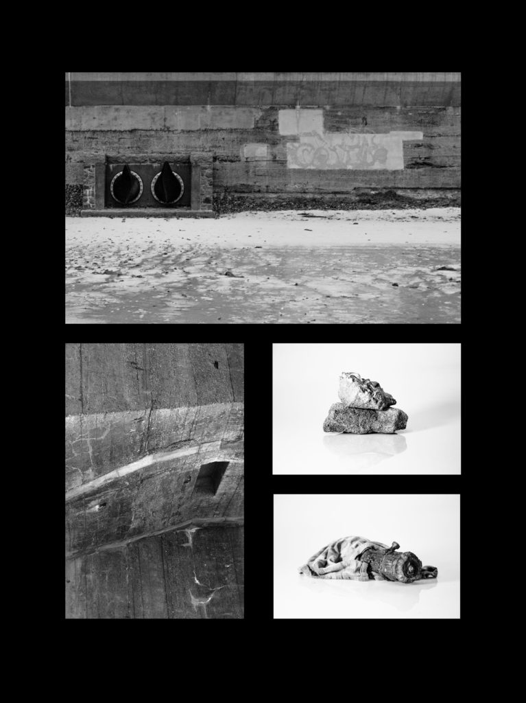
For the framing of my images I had the idea of tessellation prior to selecting my images. This eventually evolved to the idea of arranging the images similar to the logarithmic spiral created in accordance with the findings of Phidias (more commonly known as the golden spiral or golden ratio). As such I arranged my prints in such a manner that the images appeared to roughly halve length-ways, with equal spacing between the images in all directions.

Photo book design process

To create my photo book I will be using this blog post as a guide: https://hautlieucreative.co.uk/photo20al/2020/01/17/archival-images-establishing-a-timeline-narrative/
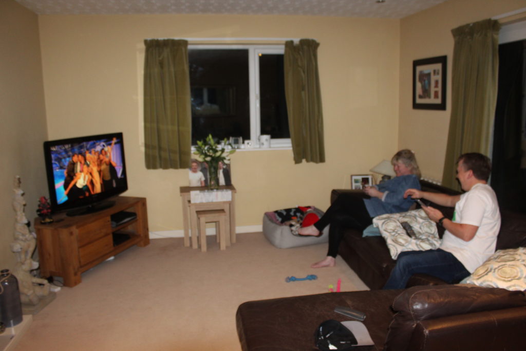
I will most likely begin my ordering my most effective archival images in chronological order beginning from when my parents were teenagers, to showing them meeting, through to marriage, having children and eventually separation. I may also include some montages I created in this too, if I feel it fits in with the rest of the selection to make the book flow easily.

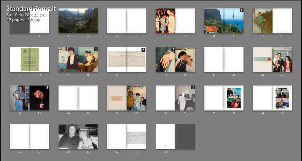
I began my photo book by placing an image as my mum as a child, and an image I took of her hometown. I left a blank double page spread and repeated this with an image as my dad as a young teenager, with an image of his hometown. This represents the beginning of their story, and gives some background context to the story.
I then went on to separate it further as I felt the book didn’t flow well with a landscape and archival portrait directly opposite each other.
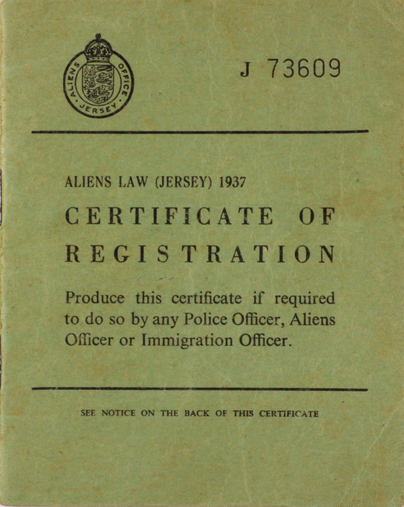
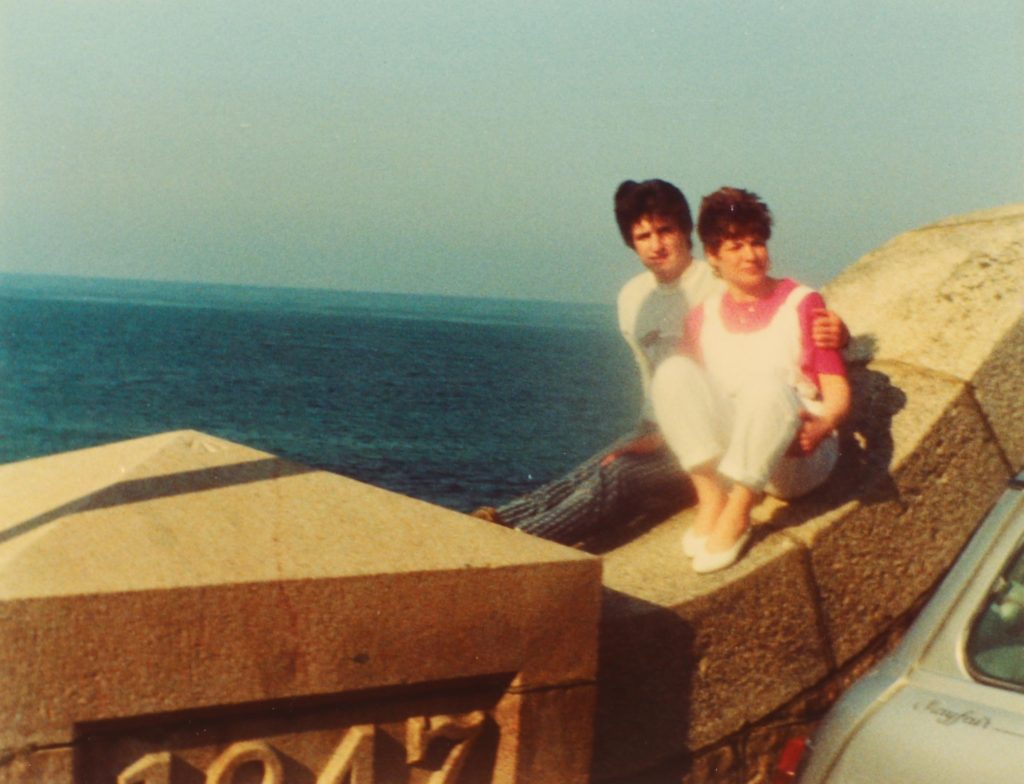
I then used a photograph of my dad’s Jersey identity card, to represent a shift in time to him moving to Jersey. Next to that I placed 2 images of my parents in their late teens/20s to represent them meeting. Next is an image of their marriage certificate, and a few images from their wedding. Then there’s a blank double page spread to show a shift in time, and after that I placed an image of my brother’s baby wristband and an archival image of him with my parents to represent his birth.
I then went onto show a few images with him and my dad when he was younger, right next to a current image of them. I then inserted a double page spread to represent a slight shift in time, and placed an image of my birth wristband and an image of my family the day I was born, which represents me being born. I then placed the photo montage I made of me and my mother to show how she suffered from mental illnesses after my birth. After that I placed some images of me and my family, and me and my brother on the next 2 pages.
The double page spread represents a different point in the narrative, followed by an image of my parents around 5 years ago just before their divorce in black and white to show how they’re no longer together.On the page after that there is an image of a document showing how I live with my father.

2nd Layout:

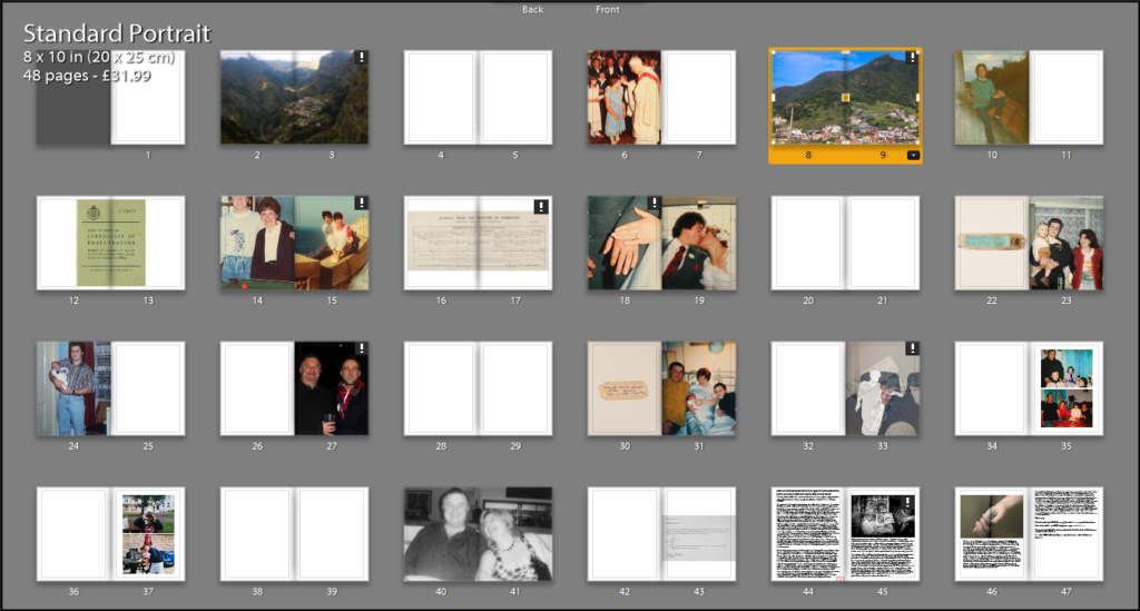
For my second layout I made the landscape images a double page spread as I thought they’d look better that way, then I made the first 2 archival image full bleed. I then removed the blank double page spread before the marriage certificate image, as I thought that image would be more representative of this event.

3rd layout:

On page 8-9 I changed the image that shows my dad’s hometown as I thought his image looked better with the image of my mum’s hometown. I then placed the portrait of my brother and dad on a different page as they did not look very good next to each other. I then added my essay to the end of the book.
Deciding on my image for p8-9 to represent my dad’s hometown

4th layout:

I removed a blank double page spread after the 1st landscape, and placed the image of the registration card on a single page rather than on a double page. I then removed an image on page 37 as I felt they didn’t go very well together. I then made the image of the document on page 41 full bleed rather than cropped so it is more obvious it is a document.

5th layout:

I removed the image of the marriage certificate as I thought it made the book a[[ear too packed, and the wedding images were self explanatory, and didn’t need a document for context. Towards the end i added some pages with a black background to further convey their separation.

6th layout:

On page 8 I made the document slightly smaller, on the middle of the page as I thought it would look better since the baby wristbands were also placed in a similar way and would make my photo book look more uniform. I also changed pages 16 and 17 to experiment what would look better. on page 35, I then added a different archival image of me and my brother. on page 40 I also made the letter slightly smaller like I did with the registration card at the beginning.

current Final layout:

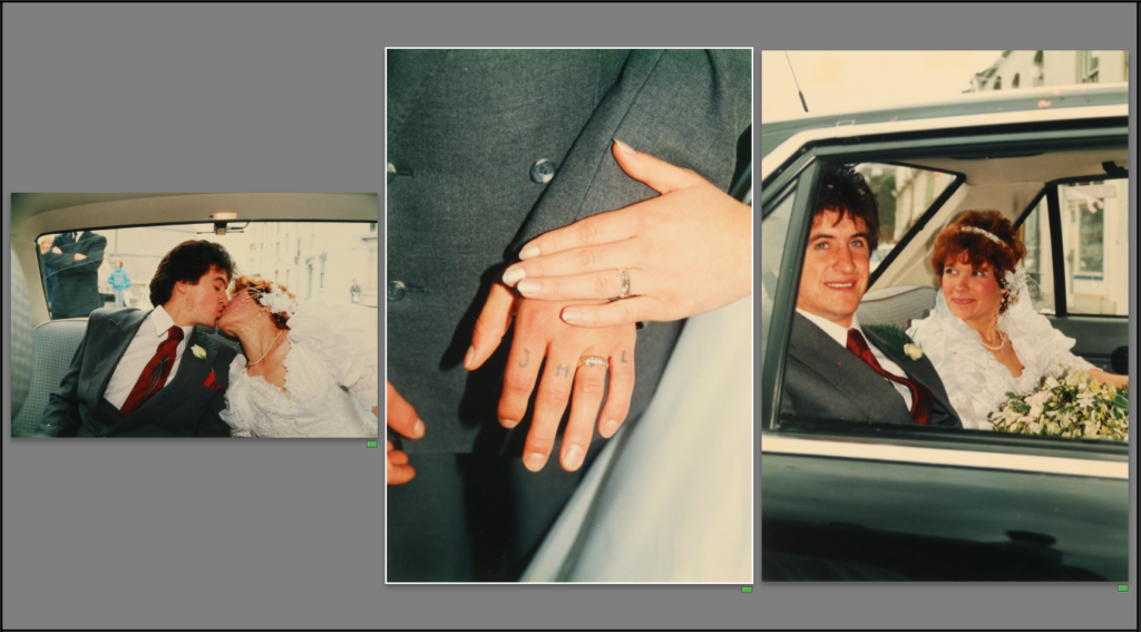
By this point, I’m quite happy with the layout except for page 16-17, and page 23-25 so I experimented with another layout.
comparing images to decide on the image for p17 to show their wedding.
Deciding on image for p25, and comparing to see which one would best match the archival iamge.

The layout above is my current final layout. I plan on adding some quotes on some of the blank pages to add more context to images. I will also edit the image on 38-39 to further convey their separation.

Front/back cover:

I created this montage as a front and back cover. I layered some important family images using photoshop as I think it encompasses the whole “feel” and mood of my photo book, which is useful as it gives an insight into what the book is about.

Project Evaluation

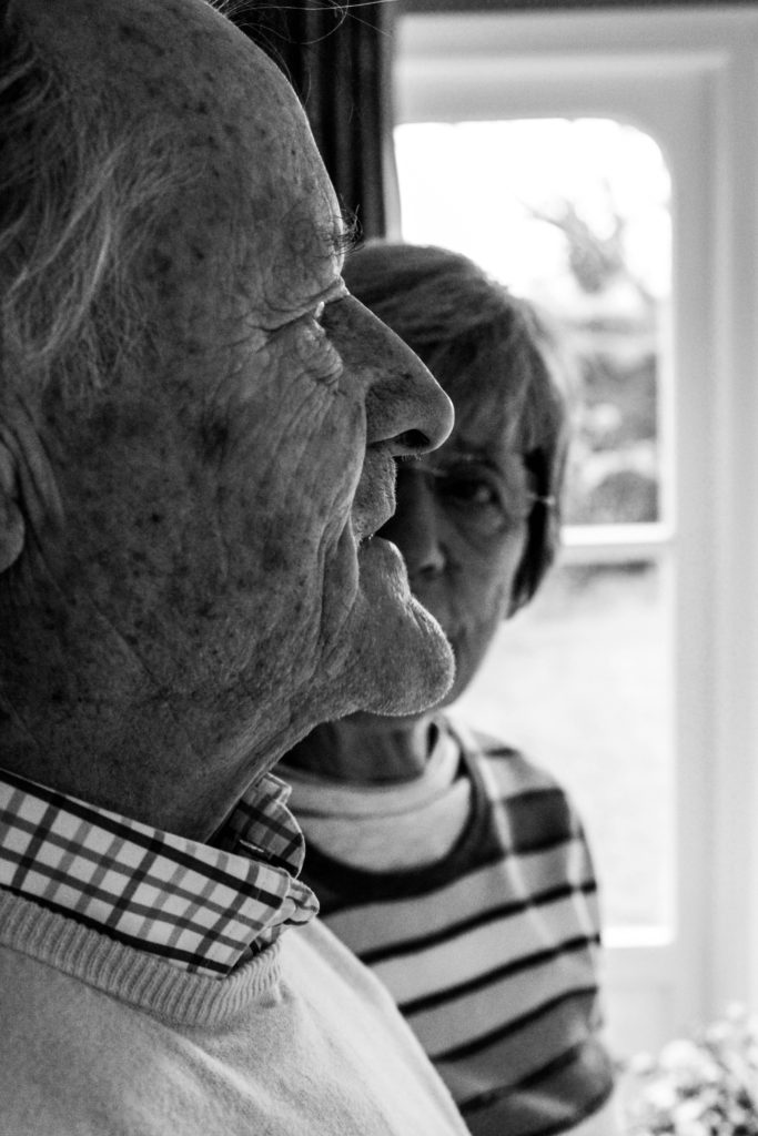
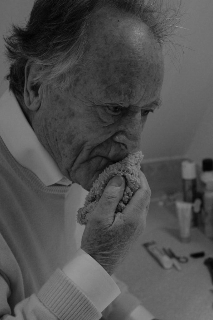
On a basic level I believe my exploration into the terms of occupation and liberation went well. The terms were broad and allowed me to consider many different opportunities to explore, but I felt looking at the occupation my Grandparents lifestyle was a perfect fit. At first I was a little worried as I knew my portraits were not always my strong point within photography, but I knew it would allow me to refine and develop me skills within this area of photography. Using artists such as Walker Evans, LaToya Ruby Frazier, Laura Blight and many allowed me to explore different ways to present my Grandparents lifestyle through portraits and landscapes. Initially, I wanted to focus of both my Grandma and Grandad but as my project developed I made the decision to place the central focus on my Grandad due to his higher position within the family hierarchy and how he considers himself the backbone of the household. At first, I looked at just capturing portraits and understood that my narrative of my book would need a change of pace and so I decided to explore the interior and exterior of their house and the relationship between landscape and person. In terms of photographic styles my project follows a documentary style as I try and capture the reality of my Grandparents lifestyle. I often found it challenging to produce reliable imagery as I did not want to ‘intrude’ on my Grandparents, but I felt as the project went along the bond between me and my Grandparents became stronger allowing me to decode their lifestyle more.

Overall, the six photo shoots conducted I was able to produce high quality photographs which illustrate my competence of using a camera and its settings. Most of my photographs are in black and white as I felt it showcased detail, structure and space much clearer and I felt the context of the 1940’s, when my Grandparents was born, was much clearer. I tended not to deviate from a naturalistic edit as I felt that the authenticity of my photographs would be reduced, thus reducing the reliability of my outcomes. However, to show further exploration I decided to take a more contemporary route, and although I liked the way they looked I felt it did not follow my aesthetic and did not show my narrative and contextual and conceptual elements in the right way. The project itself has taught me a lot about my family and the way in which lifestyle affects the way in which my Grandparents live their life. It has allowed me to become much closer with my Grandparents and the final book is something that they will cherish, thus making it a worth while and rewarding project to do.

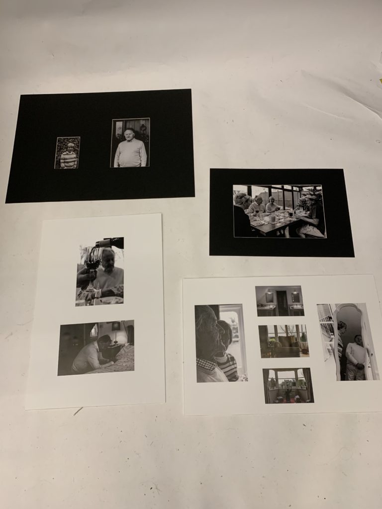
With regard to my final outcomes, I believe I have successfully managed to show my competence in display techniques. I have been able to artistically express my intended narrative within my imagery, whilst being able to uphold the authenticity of the photograph through the simplistic and basic looking framing techniques. I have successfully shown my creatively ability to combine photographs within a frame to illustrate a new element of their lifestyle which adds to the overall conceptual and contextual values of my work. Individually the photographs themselves, printed out, show the high quality of work, which reflects my ability to produce crisp images as well as edit the photographs for effect. Personally, I really like the way in which these outcomes have turned out as they outcast my best embodiment of work within the project, and how they reflect my narrative.

As my other final outcome, my photographic book clearly illustrates my intended narrative of representing my Grandparents lifestyle, and how the 1940’s has influenced this, with specific focus onto religion, family structure and hierarchy, relationship and interaction. The final sequencing of my photographs, clearly represent my intended effect, through the use of intimate portraits as well as landscape interior and exterior images which present a new light to my narrative. Within this period of making the book I have been able to show my ability to effectively sequence my photographs for intended effect, whilst still conveying my narrative. As well as, producing a captivating book which my Grandparents will cherish.

To conclude, I believe through the six photo shoots and different final outcomes, I have showcased my ability to experiment and explore the concept of Occupation and Liberation in a more contemporary route. In addition to this, I have shown my ability to develop an idea from artists work as well as the inspiration of my overall aesthetic which developed as the project went on. Personally, I am pleased with the way in which this project has went as I have held authenticity within my work, produced strong images, shown my ability to successfully edit images as well as sequence them to be placed in a book. In terms of my essay, I believe I have conducted a lot of research and reading to form a well structured and thought out essay, which has relevance to my project. On top of this, the essay allowed me to take this project into a deeper meaning, which is clearly shown within my work.

Final prints/mounting

Here you will see my final prints, which I plan on mounting on foam board. I wanted to mount on foam board -instead of cutting a window mount for example- because my personal study is essentially a story. This means a foam board will be more suitable because it allows greater flow, and is not as strict and put in place as a window mount. Each image is going to represent a different point in the narrative, which I will explain below.

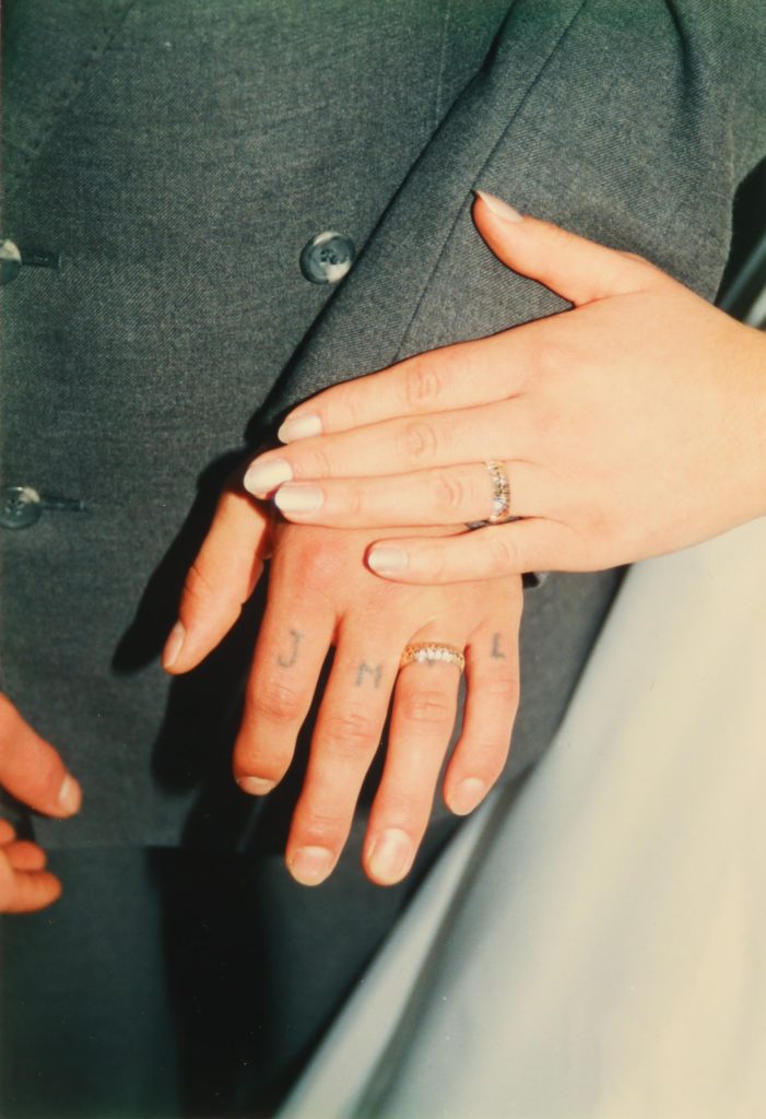
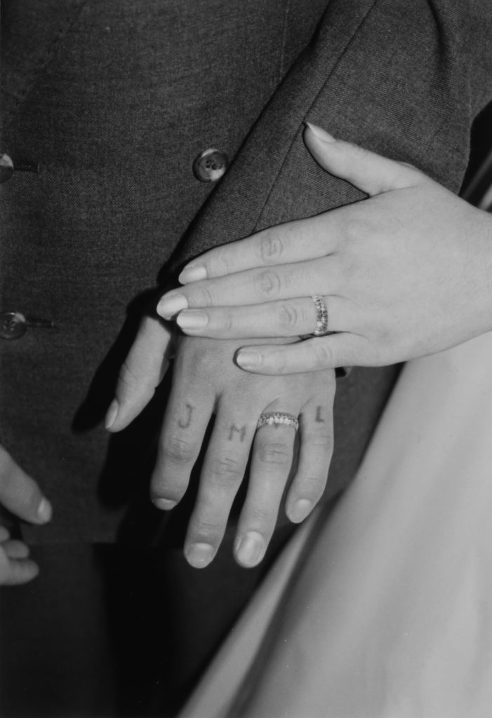
This image was changed into black and white, the exposure was decreased and the contrast was increased. I decreased the exposure because when i made the image black and white, the scene in the frame looked was too washed out and bright. I then increased the contrast to go with this, in order to make the hands, and rings more prominent.
This archival image symbolises my parent’s marriage, and by making it black and white it also represents separation. This is because the filter represents how it is in the past. Since this is quite a large and important event it will be printed in A5.
I wanted this image of my dad’s Jersey registration card to represent immigration. Since the foam board I plan to use will be white, I wanted to make sure this stood out a lot so I increased the contrast helping to make it pop more, and not be washed out by the larger images since this will be printed in A3.

Below are the selection of images I will be printing and mounting:

what my final piece will look like:

Overall, I believe my final display is quite successful. To represent the fact that my personal study is a story, I used a foam board and essentially arranged my images in a “story board” format as I thought this would be a way to express the narrative with more freedom. The top of the display shows an image of both my parents at in their late teens/early 20s and this represents them first meeting. Down the side on the left, there are certain objects and documents that play a role in the story. We can see an immigration card which represents them moving to Jersey, and further down an image of both mine and my brother’s hospital wristbands given to us the day we were born represent how they started a family. The final image is perhaps the more symbolic and metaphoric. It is an image of my parent’s hands, showing their wedding rings the day they were married. This is placed right at the bottom on the right hand side to represent the end of the narrative, very similar to how an actual written story would end. This image conveys a double meaning since it shows how they got married, but since it is in black and white it also represents their divorce as the filter represents something in the past, that is no longer. I also used sizing to represent the importance of each event, The bigger the image, the most significance it has to the narrative.

Actual final piece:

home sweet home project-ENVIRONMENTAL portraits

Intro

Although i don’t live in my own parent’s house due to me living with my friend’s parents house i still decided to get out of my comfort zone and take photographs of the house i’m living in. Although they’re not my actual parents they still make me feel like i’m one of their own and treat me as if its my own home, so at the moment i do call it my temporary home.

Environmental Photography

Environmental portraits have always inspired me as it is a portrait executed in the subject’s usual environment, such as in their home or workplace, and typically illuminates the subject’s life and surroundings. The term is most frequently used of a genre of photography. And i love taking real photographs as environmental portraits are taken, they just show how something is without acting any different in front of a camera like most stuff do now a days.

What I Did

I borrowed a camera from school and came home one day and built up the courage to ask the people living at my temporary home if they would give me their permission to photograph them and they were more than happy to do so. So all i asked from them was for them to just act normal as if i’m not there so i can get the realest picture of would they look like naturally in the comfort of their home. And here is how it went:

Mark

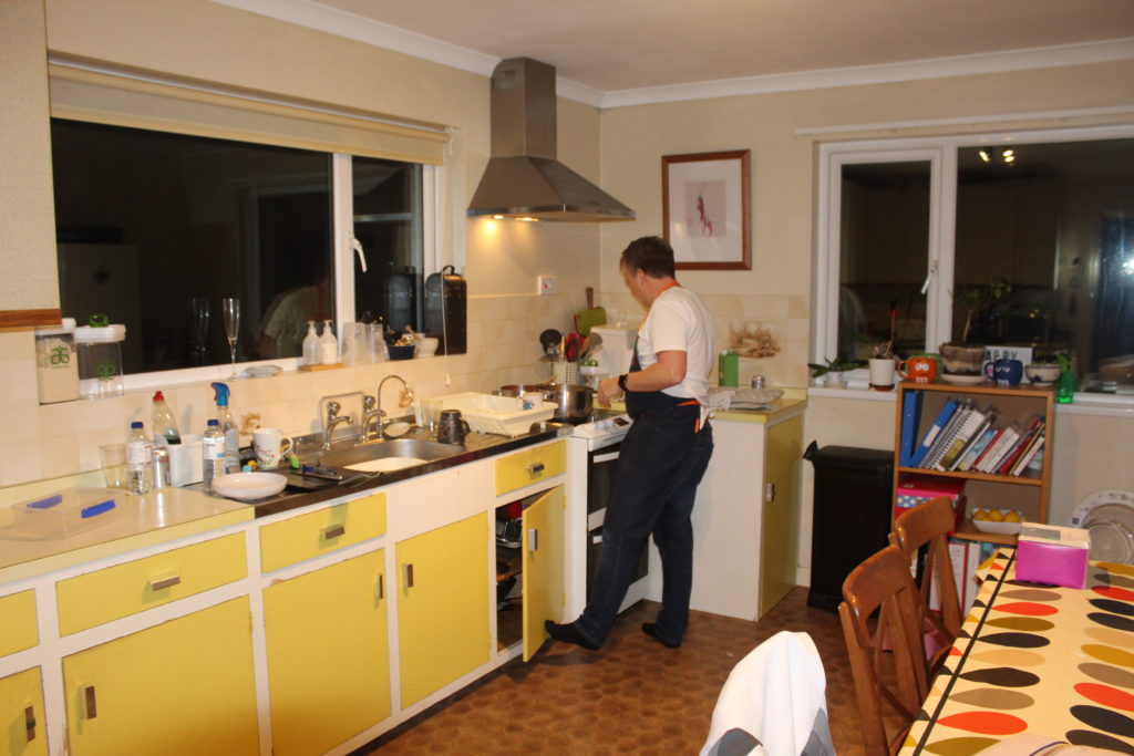
Mark is my friend’s father and he is the best cook ever, therefore hes the one in charge of the cooking in the house, and apart from that hes also in charge of Gypsy the do. So i began with waiting for him to cook something then went ahead and took photographs of him in the kitchen while he was cooking first and this is what i came out with:

This image has an empty alt attribute; its file name is IMG_8948-1024x683.jpg
i like the lighting in this photograph, as the yellowness of the room and light adds a lot of color to the portrait

Alison

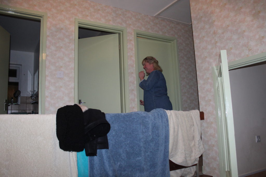
Alison, my friend’s mother is the hardest worker in the house and works with children. She comes home late and goes straight to her room most of the time but i managed to take a couple of unique photographs of her rare sighting just before she smuggled into her room:

I had to take this portrait at fast shutter speed as i had to take it in a rush before Alison went into her room

Mathew

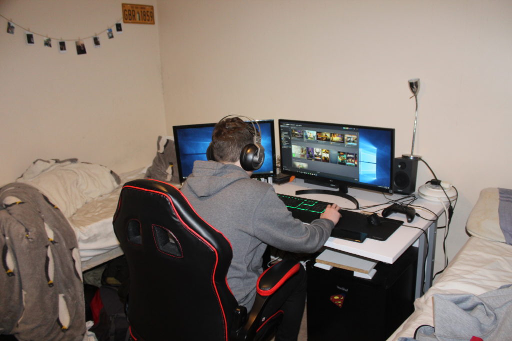
Mathew is my best friend or more like a brother to me. He is mostly playing games on his PC, so i decided that this is what i want to photograph him doing. So i just sneaked from the back of the room and photographed him without him even knowing:

You can see how messy the room is in this portrait which shows how naturally the rooms look like without preparing it to be photographed. And i chose florescent white balance to create this white tinge in the portrait

Gypsy

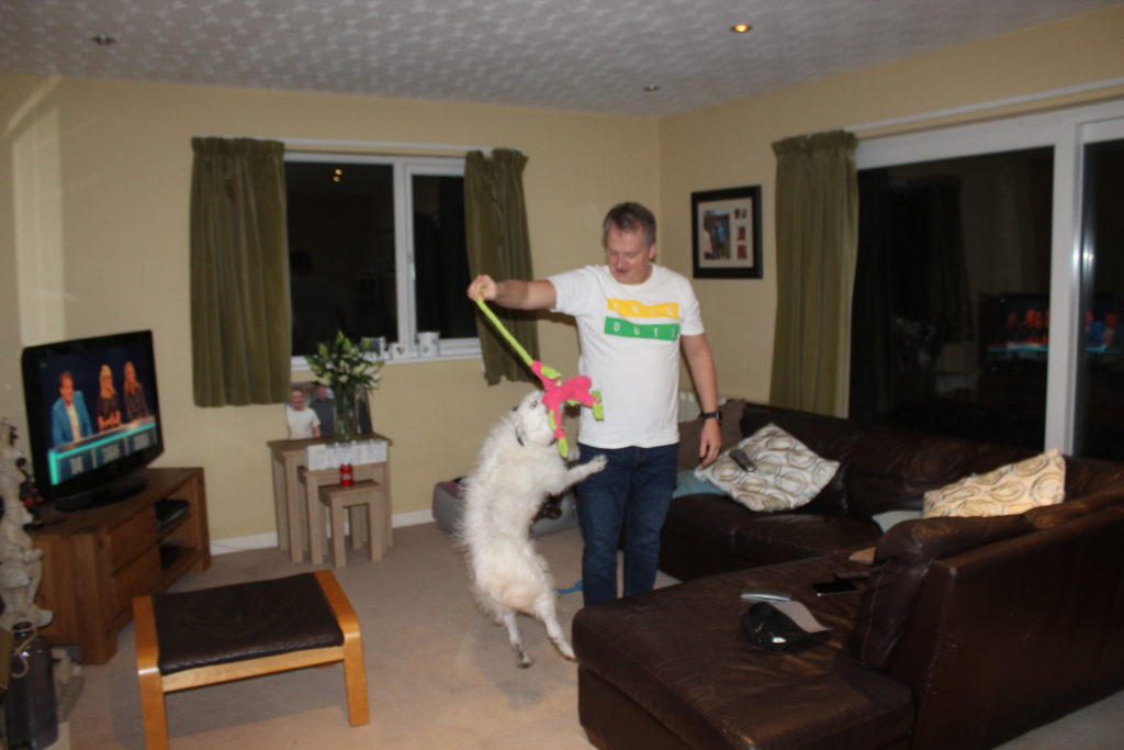
Gypsy the dog is very active and jumpy, as to her close relationship with Mark i decided to take photographs of her as she was playing with mark:

Just a casual portrait of Mark messing about with Gypsy here and i like how i got the best picture at really fast shutter speed while gypsy is mid air jumping towards her toy

Best Portrait

I chose this as my best portrait as it has a lot of meaning showing how common it is now a days for parents to just forget about the world around them and just get so lost and involved in their technology. In this photograph you can see how Mark and Alison are both sitting down in the same room on the same couch but not much interaction is happening between them as each one of them is on their phone and they’re watching T.V in the same time.

Conclusion

In conclusion, in this project it helped me a lot to discover the home i’m living in and get closer to the family i am living with, by photographing what they do in their daily lives on a day to day basis without changing what they’re doing and how they look like.

Photo montges

In this blog post I will be exploring the use of montages to express mental illness. I think montages may be the best way to convey this event because it’s something that is difficult to picture with a camera, but easier to show by manipulating and combining images. Below is a mood board with images I used as inspiration when creating my photo montages. In the images, most of the subjects are obscured from the images.

Mood board.
Images are not my own.

The image below I also used as a prime example, by my case study Diana Markosian.

“This is the closet thing I had to an image of my father. A cut out of him in my mother’s photo album.”

Editing images:

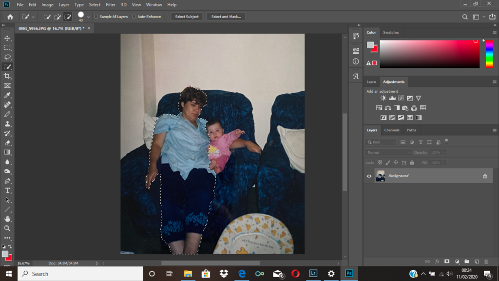
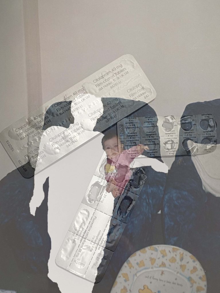
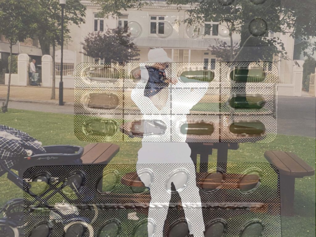
I began with an image of my mother, and me as a baby. I used the quick selection tool to select her, then right clicked pressing layer via cut, I then removed the layer, leaving a blank space in the image where my mother originally was. You can see the final output above. Although I thought it was a successful image I wanted to experiment with some variations. Because of this I added an image of her medication, and layered it over the top, and changed the opacity to around 50% so the original layer was visible. This is the 4th image you see above. I think overall both images are effective in conveying mental illness, however I think the second image gives more context to the situation. Ultimately, the image I will end up using will be the one that fits in more with the photo selection from my book, which I think will be the initial montage.

To complete the montages above I followed the same process stated at the beginning, the only difference being the image I layered on top of my archival image.

Text Within the Photo-Book: Essay

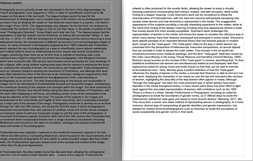
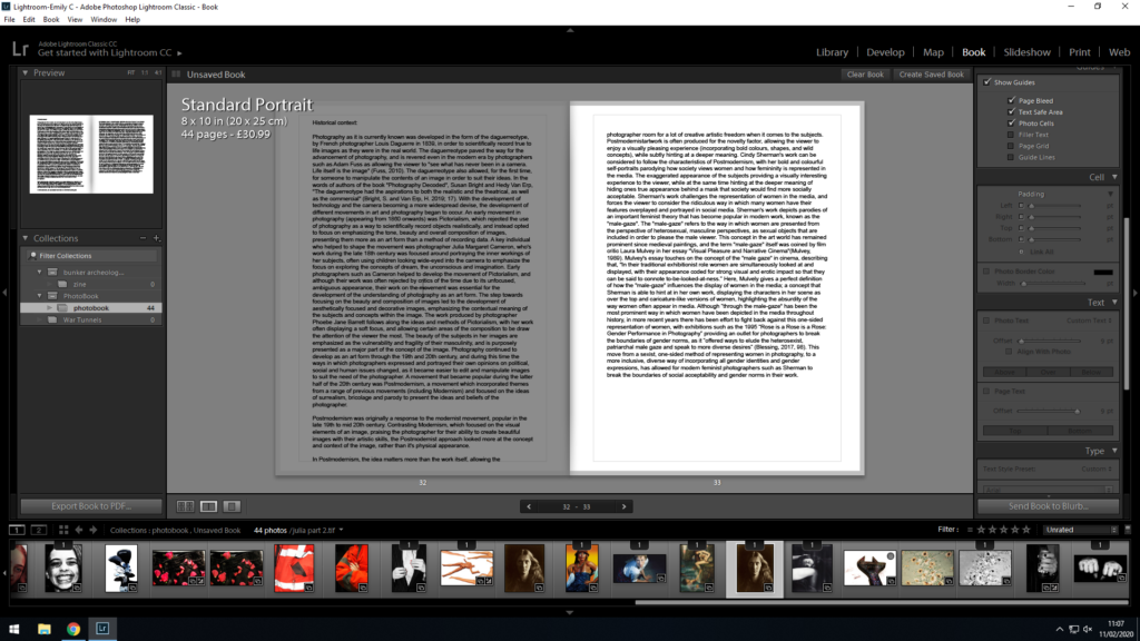
I needed to find a way to incorporate my essay in a visually appropriate and practical way, while not taking away from the main purpose of the book (the photos). In order to do this, I pasted the essay into Light-room, and from there I experimented with the placement of text, titles and photos that I would use to layout my essay and present it at the back of my book. My first draft of organizing and layout of the essay in my book was as below:

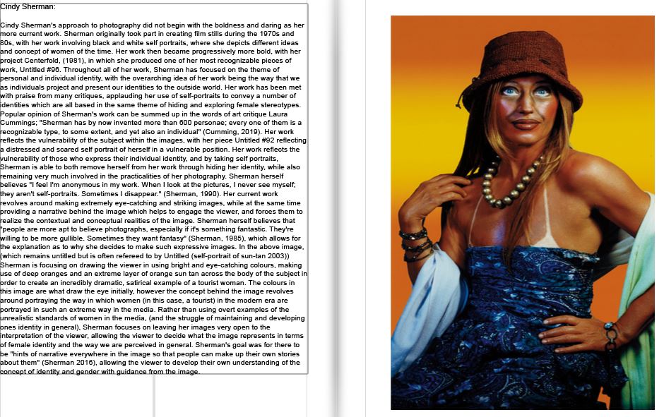
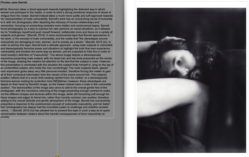
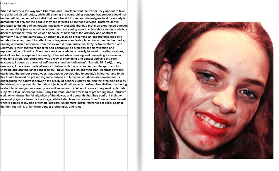
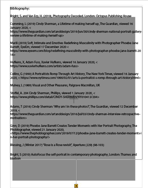
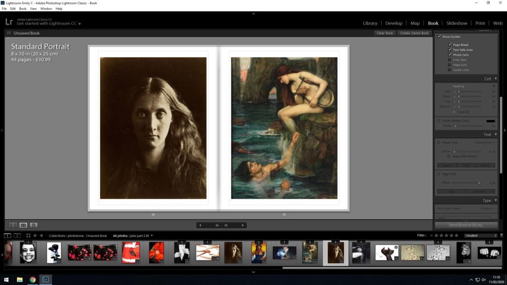
With this initial layout, I placed the essay in paragraphs, and tried to make sure each paragraph was written with a corresponding image on the page next to it, this way I could maintain the viewers attention, and give examples of the concepts and works that I was referencing in the essay. As my historical context paragraph was longer than the others, I gave that section of my essay a double page spread, and decided to include 2 images over the following 2 pages to present examples for the viewer to better understand the contents of the historical context portion of the essay. This double page of images also allows for a split in the essay after the 2 whole pages of text, therefore I find it important to add in order to split the essay into manageable chunks.

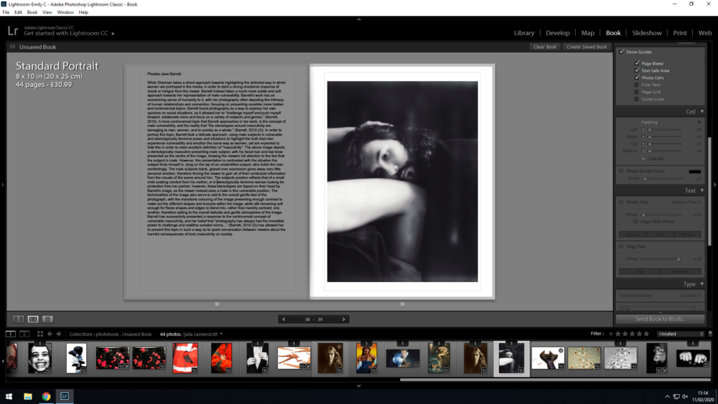
After placing my essay using the initial layout, I decided to restructure the layout so that it fit more flush with the pages, and the size was small enough to fit and work on the page, but large enough to be read without issue.

Firstly, I decided to keep the title at 12 pt, and move it into the middle of the page. I felt like this allowed for the title to stand out against the essay, and gave the reader a clear beginning to start reading. I differentiated from the title by placing the essay in 11 pt (a size large enough to read but small enough to fit on the page). Furthermore, I increased the padding from the left and right sides of the page to 26 pt, as I did not want the text to spill out into the gutter of the book (where the paper begins to bend over) as I felt that this would make it difficult to read.

I used the same 11 pt font and 26 pt padding across all of the pages with my essay on (to ensure continuity). I feel like this layout gives the essay pages more structure, and I am happy that the text does not come too close to the edges of the paper, or the gutter of the book.

Below is the final layout for the essay portion of my book:

When comparing between my first and second draft, I fee like my second layout has a lot more structure to it, and allows the reader to navigate the essay much more easily.

Final Book Layout

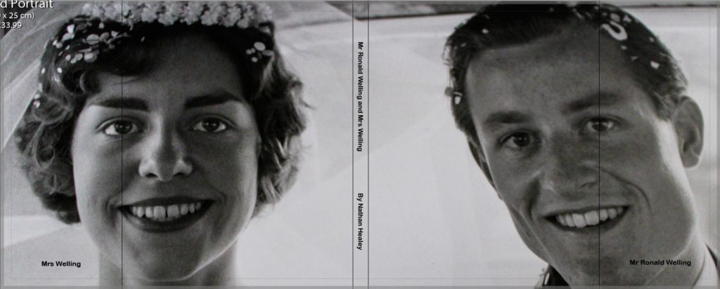
Below are screenshots of each page spread of my final book design entitled ‘Mr Ronald Welling and Mrs Welling’. As mentioned in my development blog post the title came about to show dominance and authority of my Grandad, Ron, through the formality of the title which can also suggest his business side. The photograph on the dust jacket is from their wedding day, suggesting the ideology of religion, family and happiness beginning the ameliorative mood of the overall photo book. My final book design can be viewed below:

‘Mr Ronald Welling and Mrs Welling’ is my photographic book which portrays the narrative of the occupation of lifestyle on my Grandparents, and how their upbringing in the 1940’s reflects their lifestyle in the modern day. The book includes mainly portraits of the two subject which shows intimacy, religion, family structure, authority and aspects of relationship which all cast the same underlying theme of lifestyle. In a sense the sequencing of the photographs are broken into three sections which are not explicitly sections. The first section establishes the couple, their relationship and the ideology of my Grandad being the provider for his wife and having the authority over her, this is presented through portraits inspired by Walker Evans, LaToya Ruby Frazier and some of my own artistic influence to compose the photograph. Within this section I have used archival imagery to present a compassion of their lifestyle when they were younger and present day allowing a more reliable reflection of their lifestyle. In addition, I decided to include one interior and exterior photograph which begins to reinforce the luxurious lifestyle they live through a new subject, reinforcing the ideologies of my project. The second section looks at family events and how my Grandparent’s lifestyle adapts, reflects and compares to my lifestyle. These photographs follow a family photograph style capturing the highlights of the religious event ‘Christmas’. The interaction between my Grandparents and my family, illustrate their lifestyle clearly at a major event. In the final section I mainly focus on the interior and exterior of their house through mainly landscape imagery. I also use more portraits to show my Grandad’s relationship with the specific rooms, creating semantics towards the imagery and reinforcing the idea of intimacy. For the majority of the time I have stuck to having just one image for two pages, using a single, 3/4 or double page spread. However, I have used up to two photographs over two pages if I need to emphasise a certain point. The photo book itself is a Standard Portrait, 20×25 cm. My pages will be white and printed on premium matte paper, as it makes the book seem like an official file. As stated above I will be using a dust jacket, meaning the actual hardcover of the book has not been designed. I intend to use a fabricated cover, subtle cover, as many family photographic books at the time they were raised was often this material, thus making it relevant and appropriate to use. The essay found at the end of my photo book explore the extent to which we can trust documentary photography to reflect reality, which follows the same path as the images found in my book. This presents viewers with the question of how accurately my images reflect my Grandparents lifestyle, adding a more academic response to the book. The essay includes photographs of artists work as well as my response to their work showing exploration and understanding of key theories within photography. To conclude, I believe the sequencing displayed above clearly illustrates my intended narrative which compliments my essay in response to my hypothesis. This well thought out design has gone through many experimentation and development in order to make the images powerful in the message they present as well as having a clear narrative which flows smoothly because of my sequencing of my photographs.