Category Archives: AO2 Explore Ideas

Filters

Author:
Category:

Claude Cahun x Clare Rae

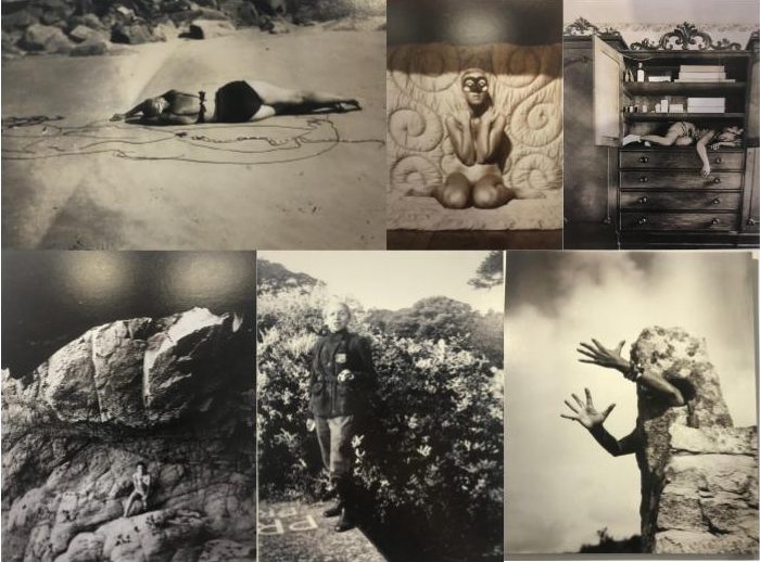
a mixture of Cahun and Rae’s work


Claude Cahun

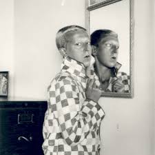
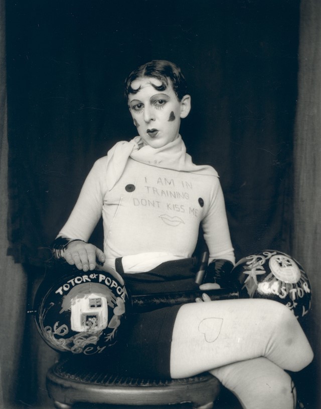
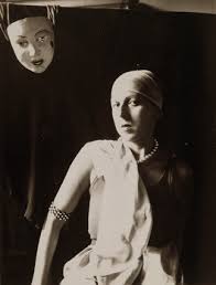
Claude Cahun’s photographic self-portraits present a dizzying kaleidoscopic mix of mystery, exuberance, and sobriety. Born in France, she lived most of her life on the island of Jersey with her stepsister and long-term love, Marcel Moore. Also known as Lucy Schwob and Suzanne Malherbe, both women adopted their preferred gender-neutral pseudonyms during early adulthood. Moore, although often invisible, was always present – typically taking the photographs and also authoring collages – and in this sense was as much artist collaborator as she was Cahun’s personal support. Described in her own words as a “hunt”, through a combination of text and imagery, Cahun’s exploration of self is relentless and at times unsettling. From circus performer, clothed in layers of artifice, to a stripped-down Buddhist monk grounded by integrity, Cahun is engaged in an ongoing dialogue with multiplicity. Tragically in line with the fragmentary nature of her outlook, much of the artist’s work was destroyed following her arrest and subsequent imprisonment for resistance against the Nazis. What remains bares interesting parallel to the title of Cahun’s diaristic publication Aveux Non Avenus, translated as Disavowels, which enigmatically suggests that for all that is revealed and given, much is still hidden or has been lost.

Themes of melancholy, futility, and uncertainty run deep through Cahun’s career. She does not make ‘complete’ artworks but rather all of her photographs and writings combine to become part of a bigger and yet still unfinished whole. She says herself that she does not have the answers to her questions, and as such unusually makes visible the rawness, torment, and distress of not knowing.

There is an obscurity surrounding Cahun that has made her an isolated figure. In character she was an obsessive loner, and yet she was also inextricable from Moore. From 1937 onwards, moving away from the artistic circles of Paris to the remote island of Jersey, the couple became somewhat awkward, ostracized, and inaccessible. Furthermore, with much of Cahun’s work destroyed in 1944, the overall body of her production became relatively small further heightening her mystery. The original works that survive are very small, as though they have been left as clues for a much bigger treasure hunt.


Clare Rae

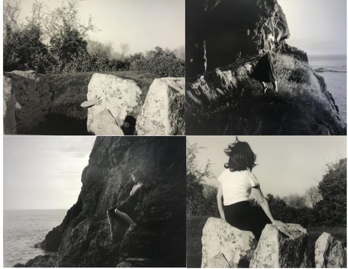
In her photographic practice Clare explores ideas of performance and gesture to interrogate and subvert dominant modes of representation. Her work is informed by feminist theory, and presents an alternate and often awkward experience of subjectivity and the female body, usually the artists’ own.

Recent projects have engaged with site specificity, involving works that are captured and displayed within the same environment. A central interest within her practice is the exploration of performance documentation, specifically how the camera can act as a collaborator, rather than mute witness, to the performer.


Both collections of work were displayed along side each other, as Rae took inspiration from the works of Cahun. She hoped to pursue the idea of individuality and self expression like Cahun did.


CCA Galleries: Claude Cahun and Clare Rae Exhibition

Claude Cahun:

Claude Cahun is a French-Jewish photographer that grew up in Nates (western France) with her mother but ended up living with her grandmother after at a young age, Cahun’s mother, Mary-Antoinette Courbebaisse, was institutionalised. Cahun faced anti-semitism at her high school in Nates, therefor she joined a private school during her time in Surrey.

Her work reflects her sexuality and ideas of gender-ambiguity. Much of her work involves self-portraits in which she usually looked directly at the viewer, showing her shaved head and shoulders, blurring an indicators of her gender.


Clare Rae:

Clare Rae is an artist based in Melbourne (Australia). In her photos she explores ideas of performance and gesture. A lot of her work is informed by feminist theory and usually presents an alternate experience of subjectivity and the female body.

Her work, a response to the earlier work of Claude Cahun, is defined by the main aspect of all the frames being of the artists body. Clare Rae understood that Cahun produced many intimate photographs in Jersey. Rae followed in this aspect by depicting her body in many of the photos, utilising gesture and the performing body to contrast traditional representations of the female figure and attract the male eye to the landscape rather than the body.

Clare Rae X Claude Cahun

Hw- task 2 -CCA Galleries International

Claude Cahun X Clare Rae Exhibition 

Clare Rae- Exhibition

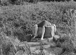
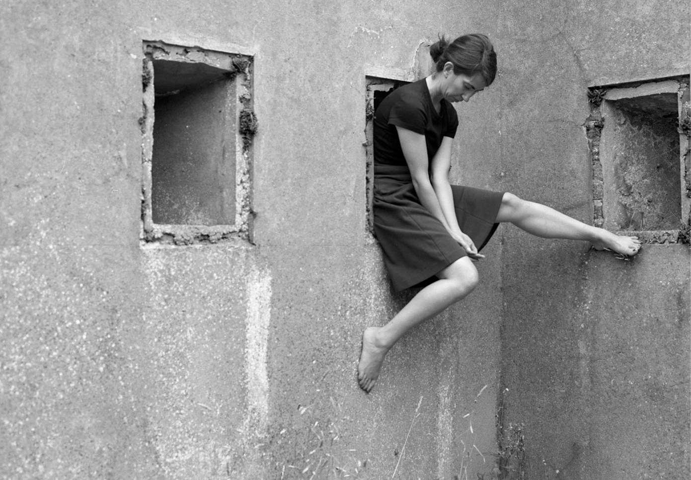
I chose this image by Clare rae due to how it stood out compared to the rest of her images, although her images all stick to a theme of portraits clare seems to try and adapt to the environment around her. She does this by positioning herself inside holes in buildings or by climbing onto rocks at the beaches or the sand dunes. This image she has physically lied across a rock this i found particularly weird as i had never seen an artist do that before. I particularly like her images because she works with black and white. For me i think the images that have quite a lot going on in the photo as in the surrounding that she has chosen, it creates more shading which also brings out certain detail that maybe if she hadn’t done it in black and white we would not have been able to spot due to sunlight or if the image was too bright.


Clare Rae Block


Claude Cahun

This is an example of Claude Cahun work. This was my favorite image due to the elements of weirdness in the picture.  I think this picture is unique due to the fact its not simply sticking to the idea of just normal portraiture photography. Cahun works with black and white so therefore she relies on the heavy shades and contrasts between colours to adapt to the type of image she wants as an outcome. Every photo that Claude takes has a story she tends to explore out of the box ideas which in her age would have been seen as a brave but challenging thing to do. Cahun works around the theme of identity. This is shown not only in this photo but many others. She was looked up on as she was known for her exploration of sexuality and she shows that in her photographs.

Overall both artists create ideas of expression of identity and allowing and not being ashamed of showing off the female body. Both artists are expressive and work well in what there trying to create when someone is looking at their images as all images have a story so once understanding the context I realised why their images might have been seen as strange.


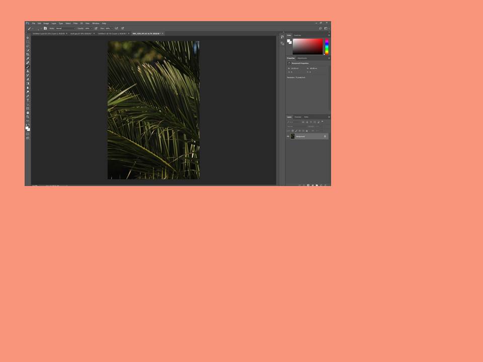
First time using photoshop

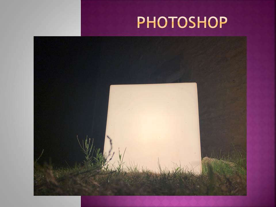
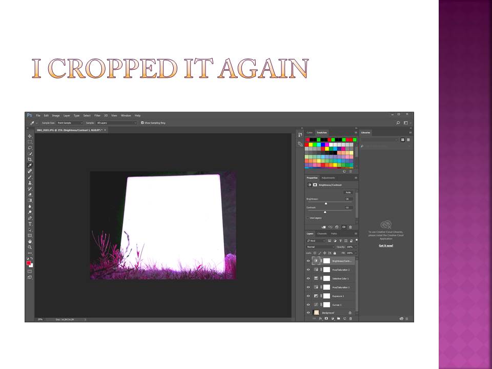
Here is a small demonstration of how i first used Photoshop and edited one of my own photos.

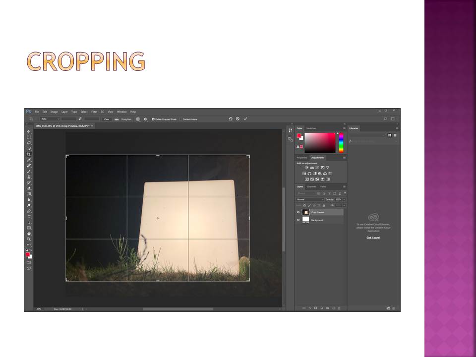
With this picture i was really trying to over exaggerate the effect of the light block, therefore i cropped the image to make the block more central and in the focus of the image.
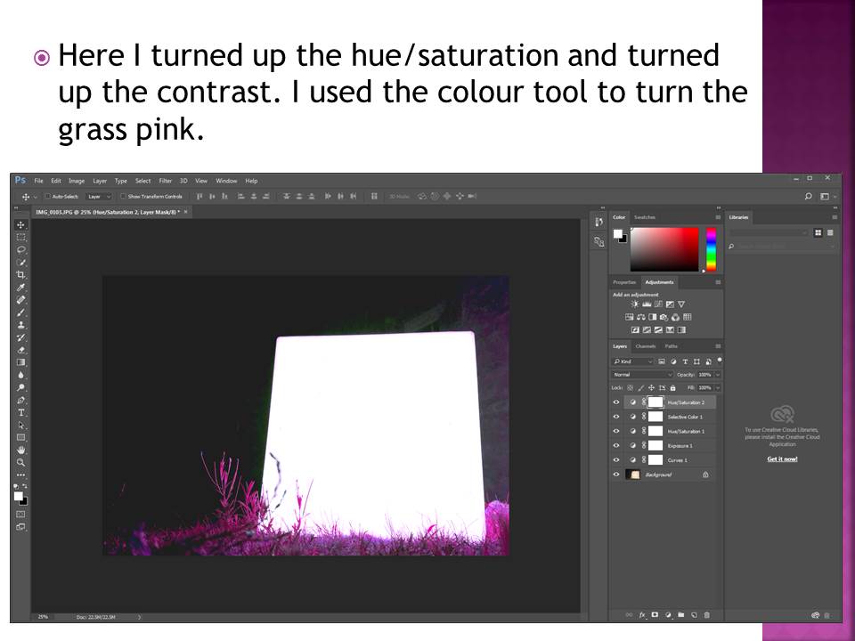
I also increased the brightness of the block and the contrast against the background to give the image a greater depth and again to highlight the block.

I then turned the pink/purple hue up to change the color of the grass giving it the luminous effect it has now. This increases the contrast between the colour of the grass and the cube which makes the image more powerful.

White Paper Challenge

Intro

The idea of abstract photography revolves around perception. The eyes perception of a given object. In this exercise, I have explored the idea of manipulating the appearance of a plain white piece of A4 paper and creating many different looks to it and ways of viewing it. I have utilised studio lighting to create shadows and I have either folded, Scrunched up or torn the paper in order to create images that show a wide range of shape, texture and contrast.

I have decided to desaturate every image in Photoshop and alter the brightness, contrast and exposure separately on each image to really highlight the shape, texture and shadows given off by this effect

Here are my outcomes from the Project below presented in a contact sheet

Contact sheet

I used an off-white coloured table with a black wall as the background. I utilised a box light and altered the white and yellow lighting from shot to shot to give off the effect of natural and artificial lighting.

Outcomes and analysis

I like the minimalistic values of this image, Mainly due to the shadow cast by the piece of paper and it generally creating a nice aesthetic.

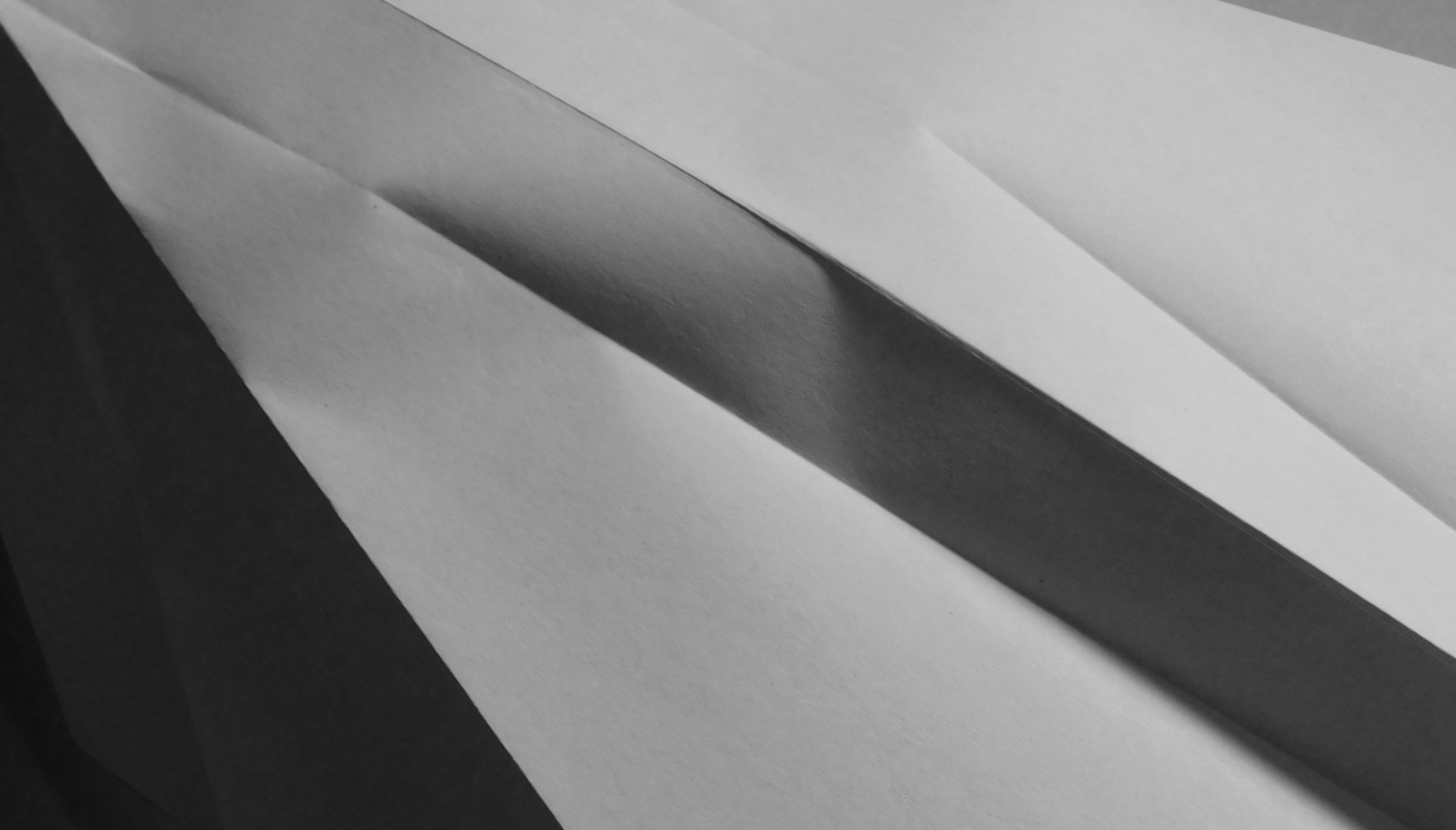
With this image, I am particularly drawn into the neat folds in the paper and the sharpness of the image. The folds are almost there to separate darker parts of the paper from the light and creates a very nice contrast and rich tone.


For this image, I decided to pinch the piece of paper and twist it around, Which has created an interesting blend of contrast within the paper itself as well as provided an interesting shape and shadows.

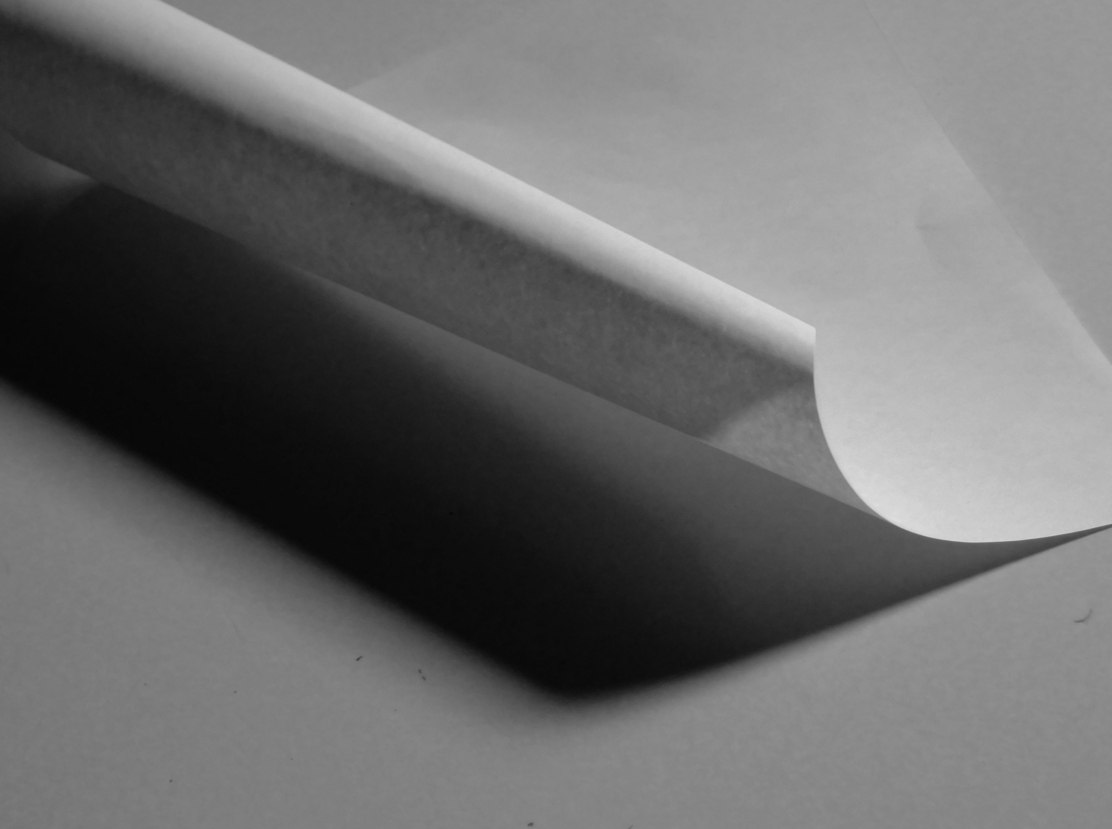
The paper has been rolled adn let to unroll and the resulting curl provides quite a dramatic image with a very good blend of shadows and light levels.


Photoshop Task


I edited all these photos on Photoshop and used multiple functions to edit them.

For this photo I lowered the saturation and vibrancy, I also heightened the contrast and and exposure.

With this photo I made the contrast more saturated and used the colour sliders to alter the colour of the photo.

For this photo I added high contrast because the original photo was very dull and boring.  I also put the vibrancy up and I think it made the tree more appealing and makes it stand out.

For this photo I experimented with contrast and exposure. I also used the colour sliders to alter the colours of the photo.

For the last photo I played around with contrast and exposure again. I also changed the vibrancy to be more dull.

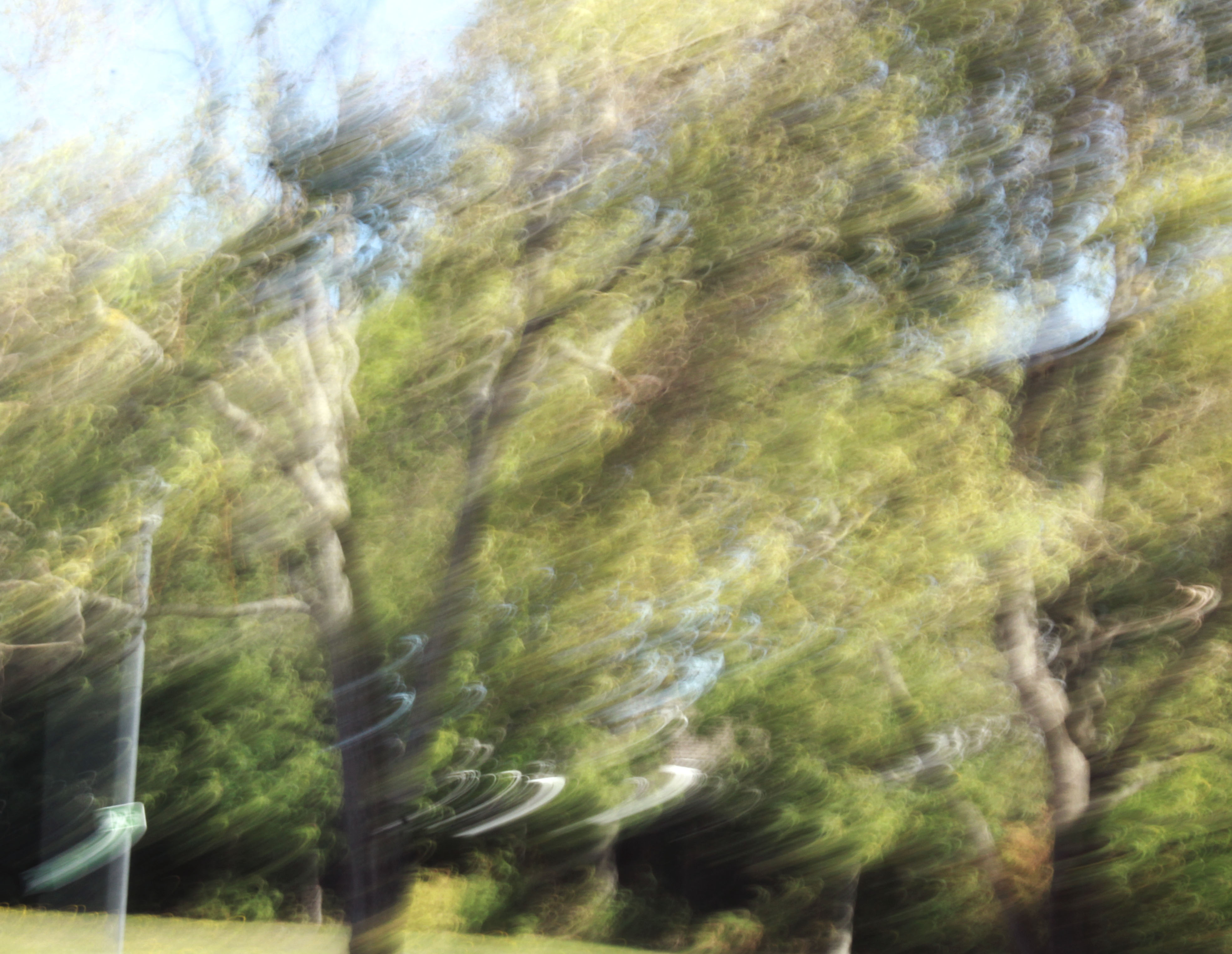
I’m also really happy with how these photos turned out. I think I edited them really well, and they came out really well. I really liked how I edited them and also how I took them. I think taking photos with ICM turn out really unique and abstract and I really enjoy taking photos like this. I will try and use this style of taking photos again as I think it gives a good look to the final pictures.


Photoshop Task

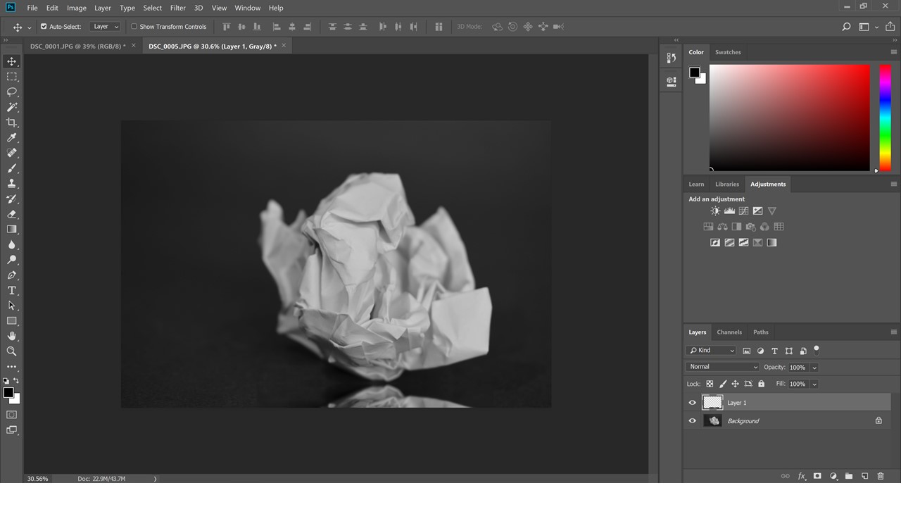
The first photo was taken with a very low aperture and so that only the closest point of the paper was in focus and I used a large piece of back paper to make it look like there is no background and it is infinite.

Then I have made the picture black and white and cropped it slightly.

Then I highlighted the ball with the marquee tool then with ctrl-j I duplicated the layer and then using ctrl-t I transformed the layer and then dragged the second layer down so tat it looks like a reflection.

Photoshop experiments

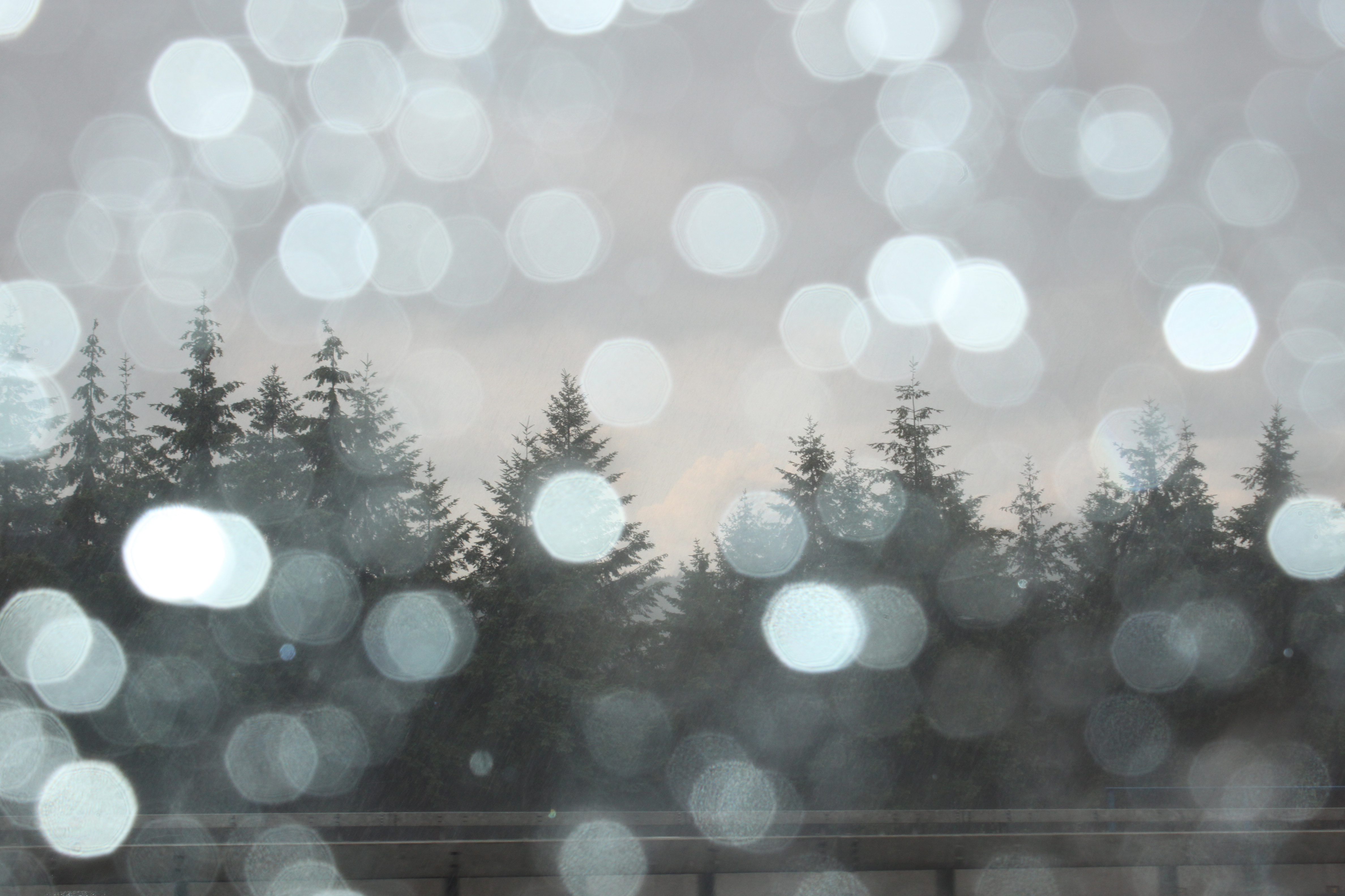
This is the original photo which I took a few weeks ago in Germany. The photo consists of blurred rain drops on the car window in the foreground, and trees in the background which are in-focus.
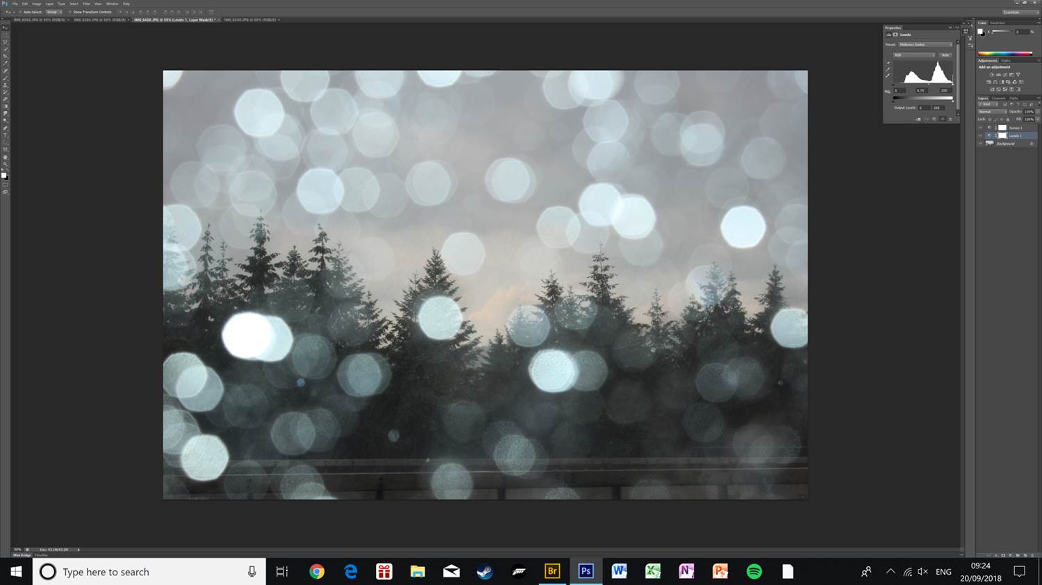
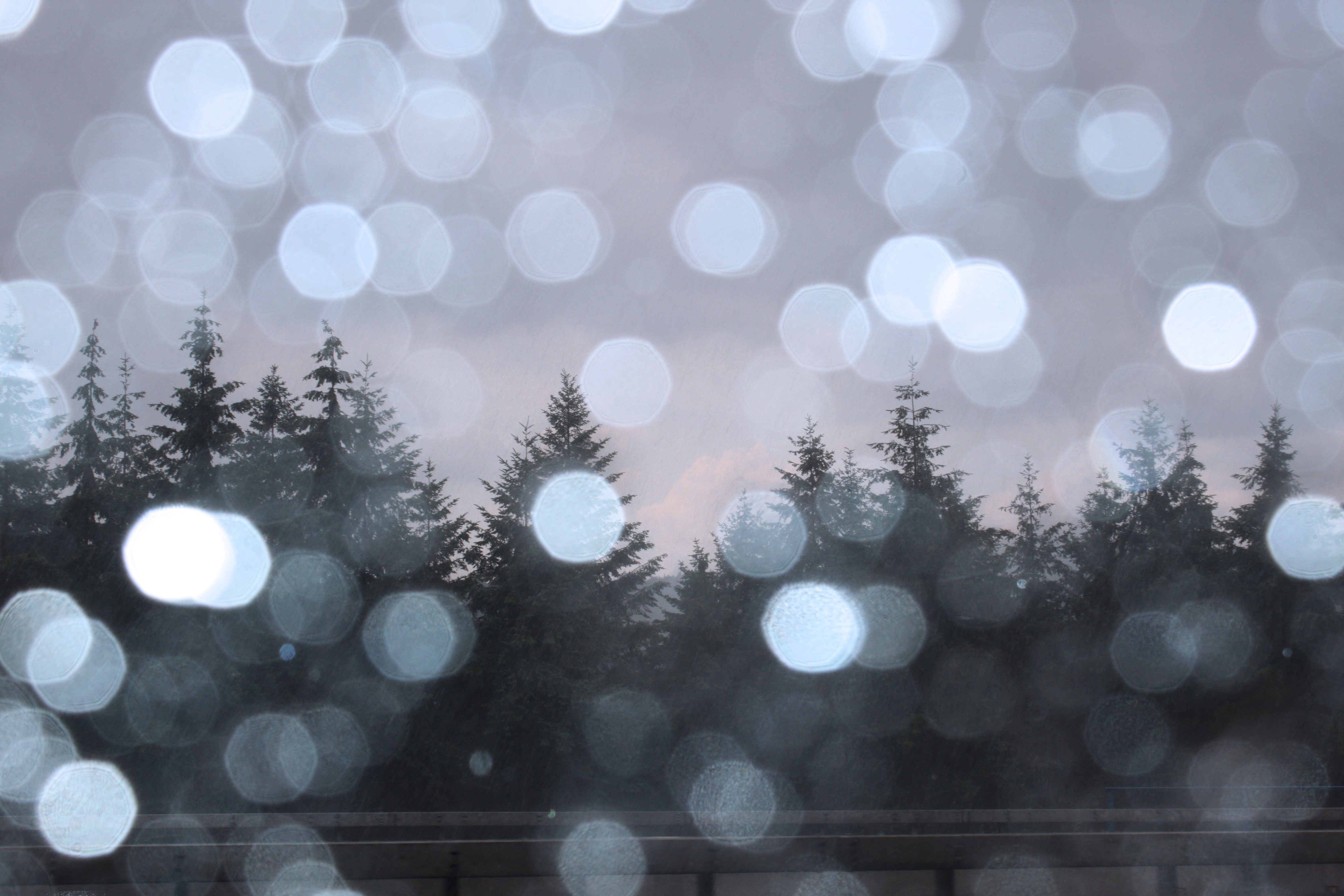
I edited the light levels, slightly increased the contrast, and applied a blue colour filter to the photo. This helps bring out the detail in the trees, as well as making the clouds in the background visible due to more contrast.
This is the first final image. I have kept it looking as natural as possible to keep the cool tone of the photo.
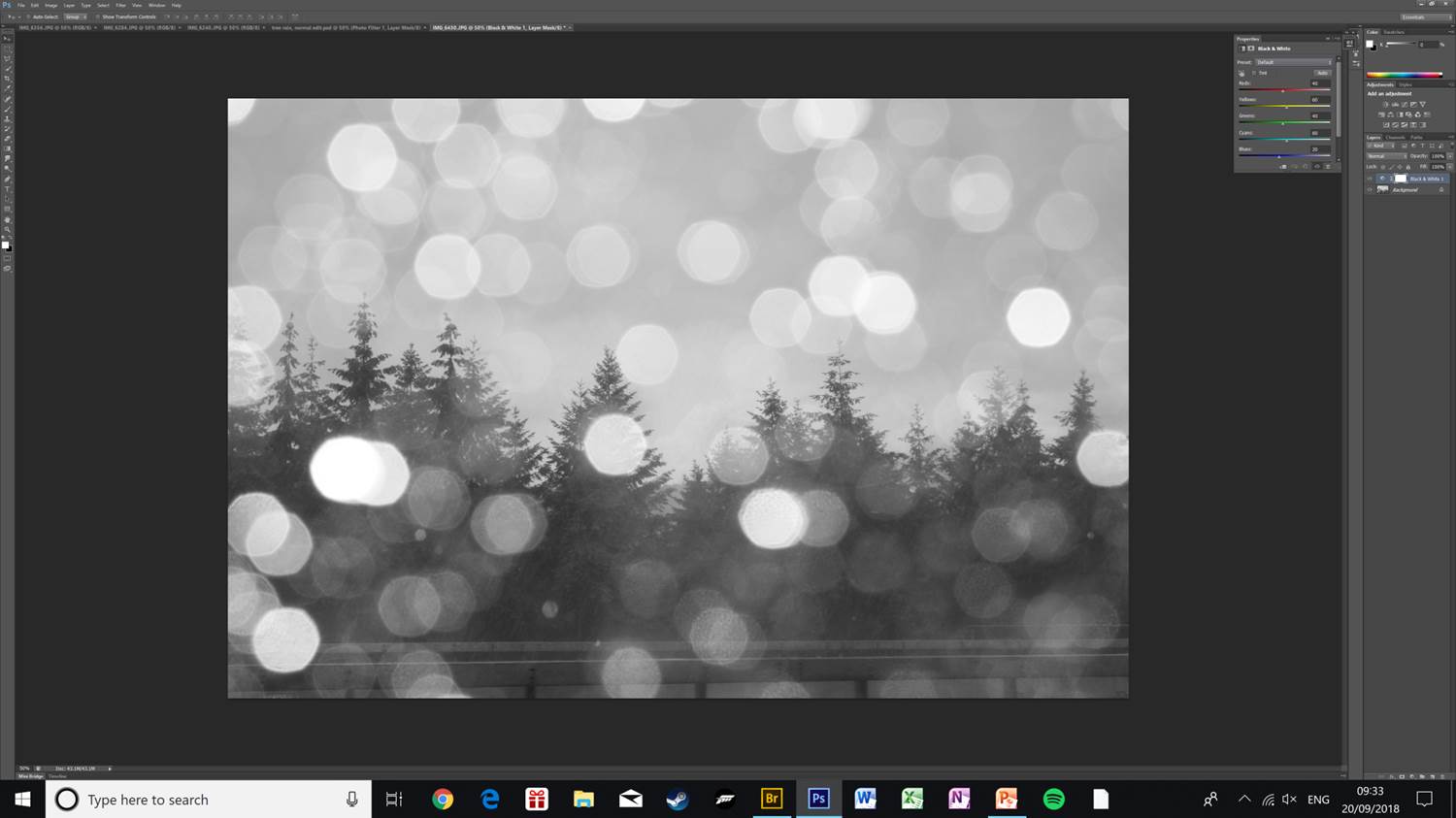
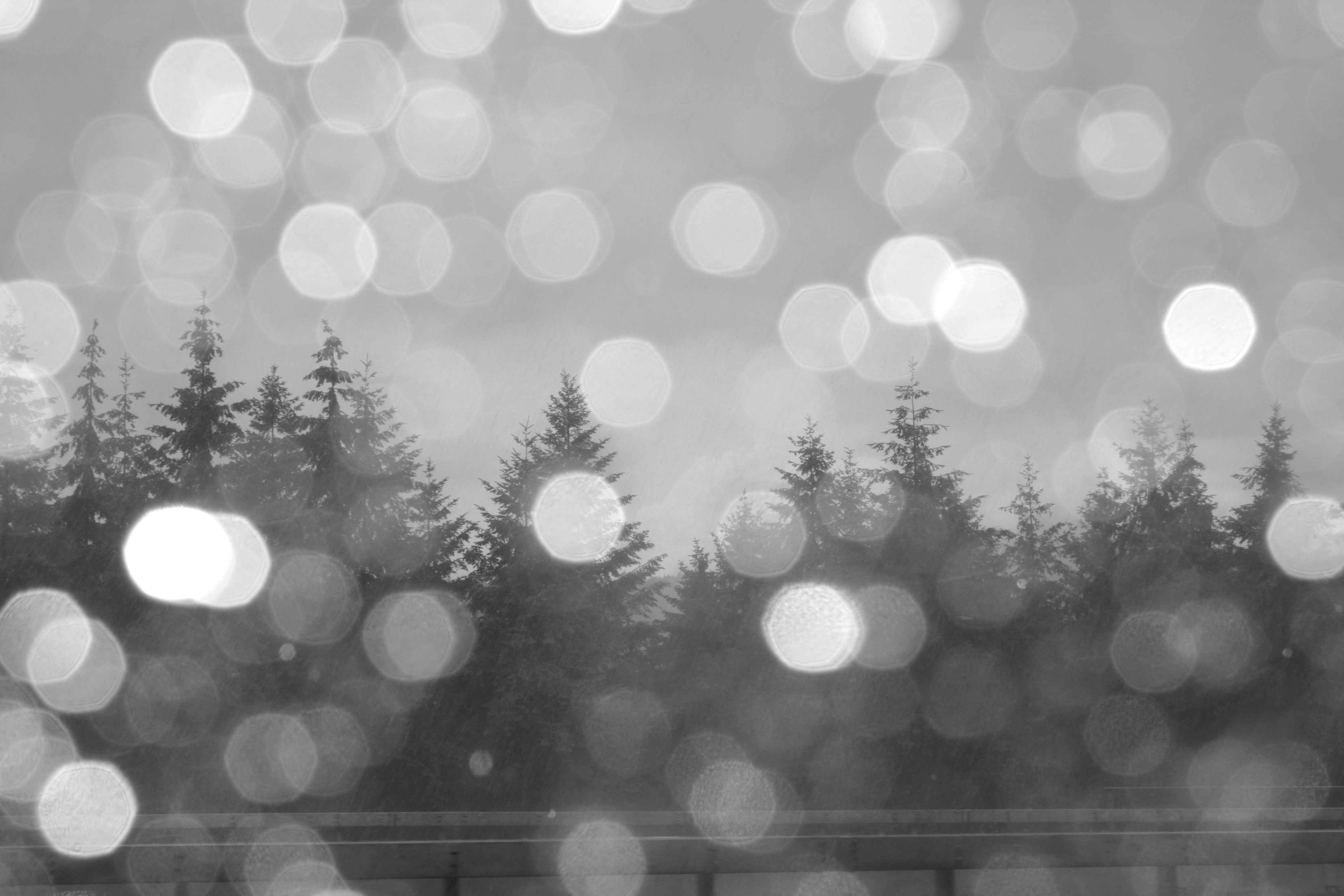
This is an alternative version of the photo, I have applied a black & white filter, and increased the brightness and contrast slightly as applying the filter made the photo dark and hard to see.
To get the final photo I have further increased the brightness and exposure, this helps make all the details in the photo visible, as well as making the rain drops in the foreground less prominent, which makes the angled rain in the middle-ground visible and diverts attention to the pine trees.
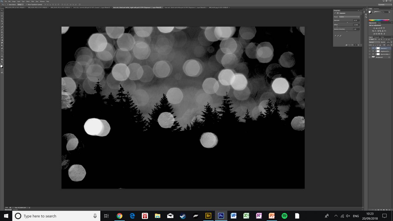
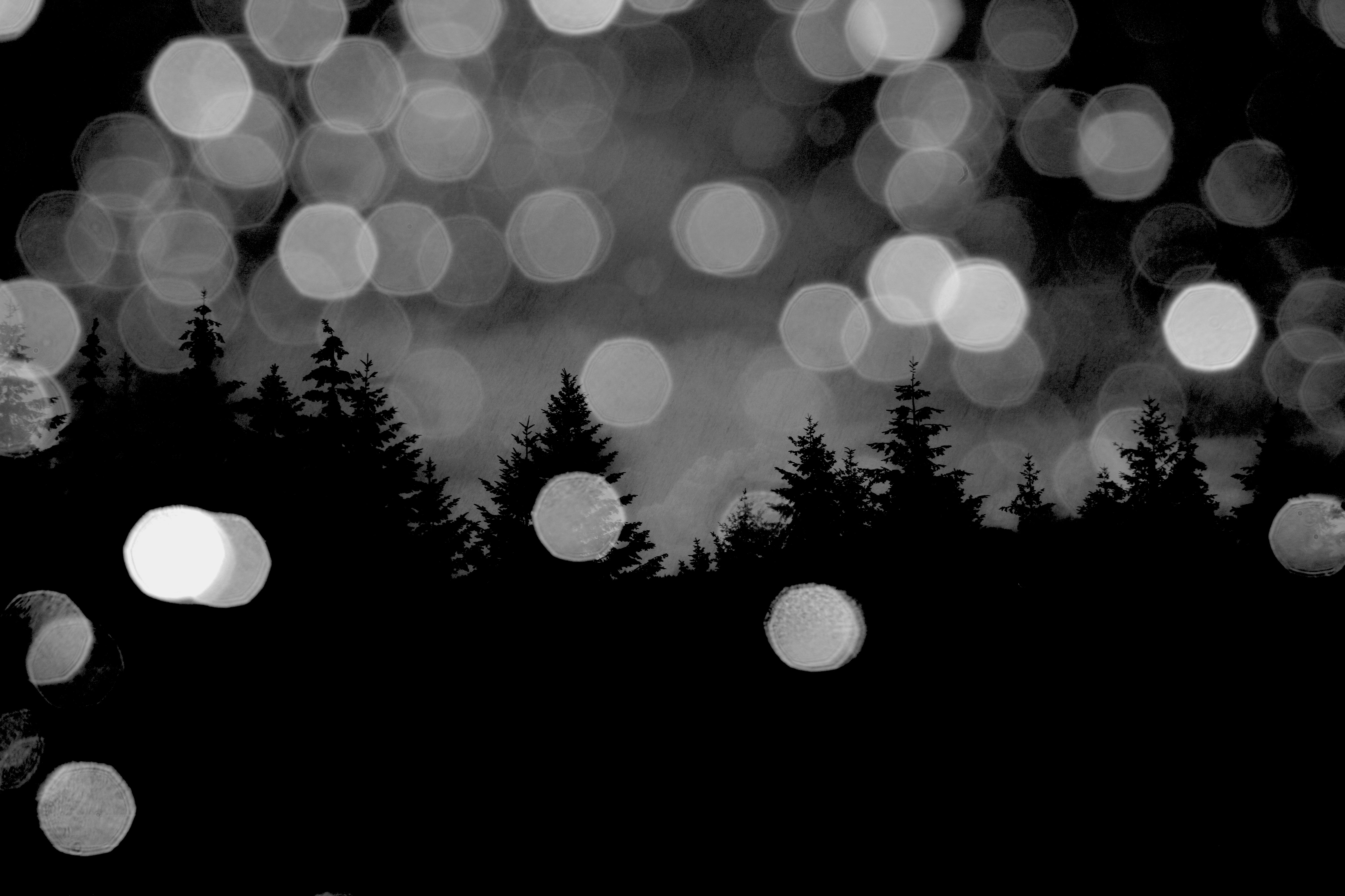
This is a variation of the black & white edit of the same pine tree photo. Here I have lowered the offset which makes the photo really dark and creates the effect of the photo being taken at night. I have also increased the exposure slightly and raised the gamma correction.
This is my favourite edit of the lot that I have done of this photo. The clouds in the background are really clear and only the outline of the trees is visible. The rest of the trees being solid black makes the whole photo stand out more as there are less distractions around the edges. The rain drops still being visible and bright help give the photo depth as the light brings contrast to the mostly dark photo.