
Category Archives: AO2 Explore Ideas
Filters
Albert Renger-Patzsch
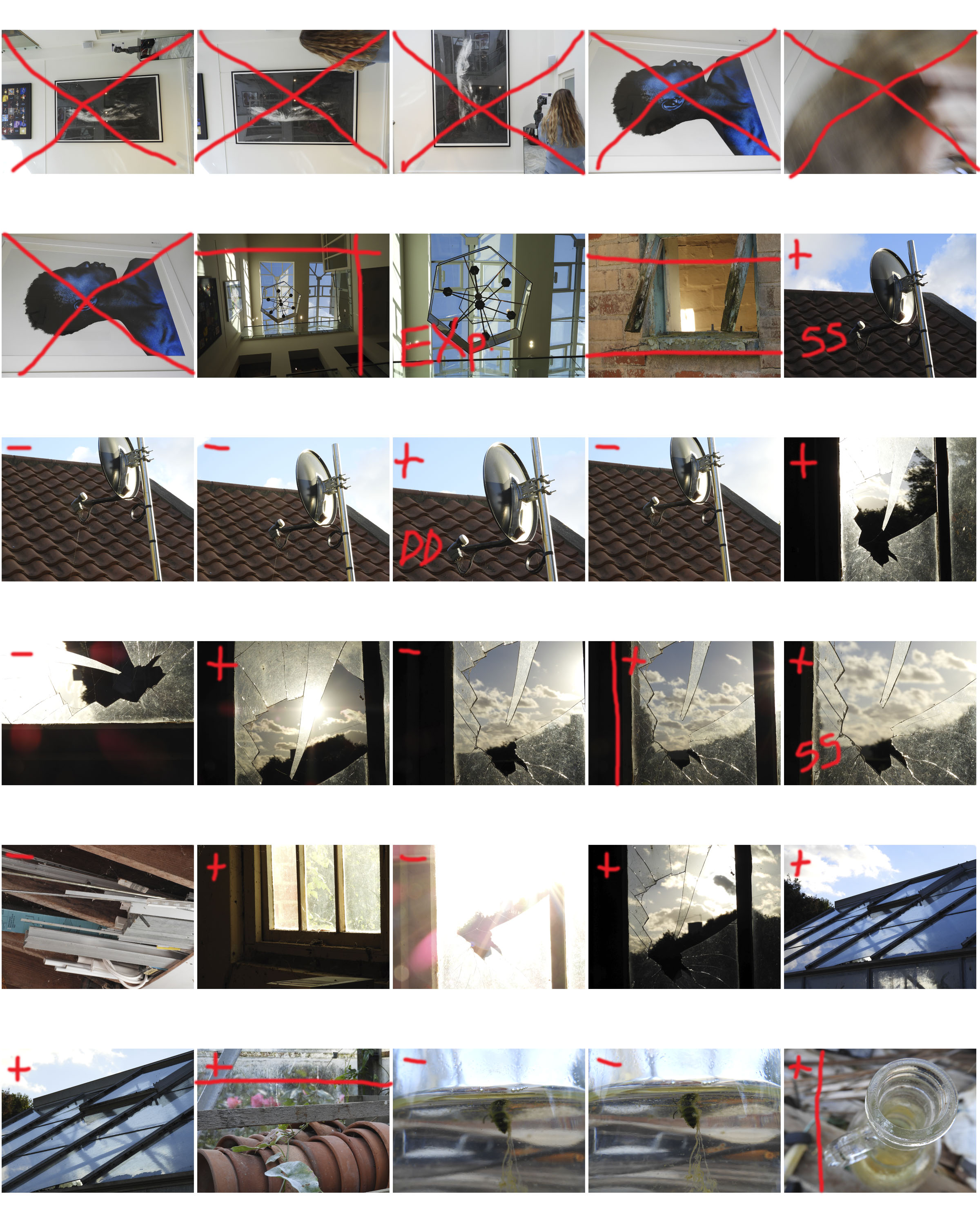
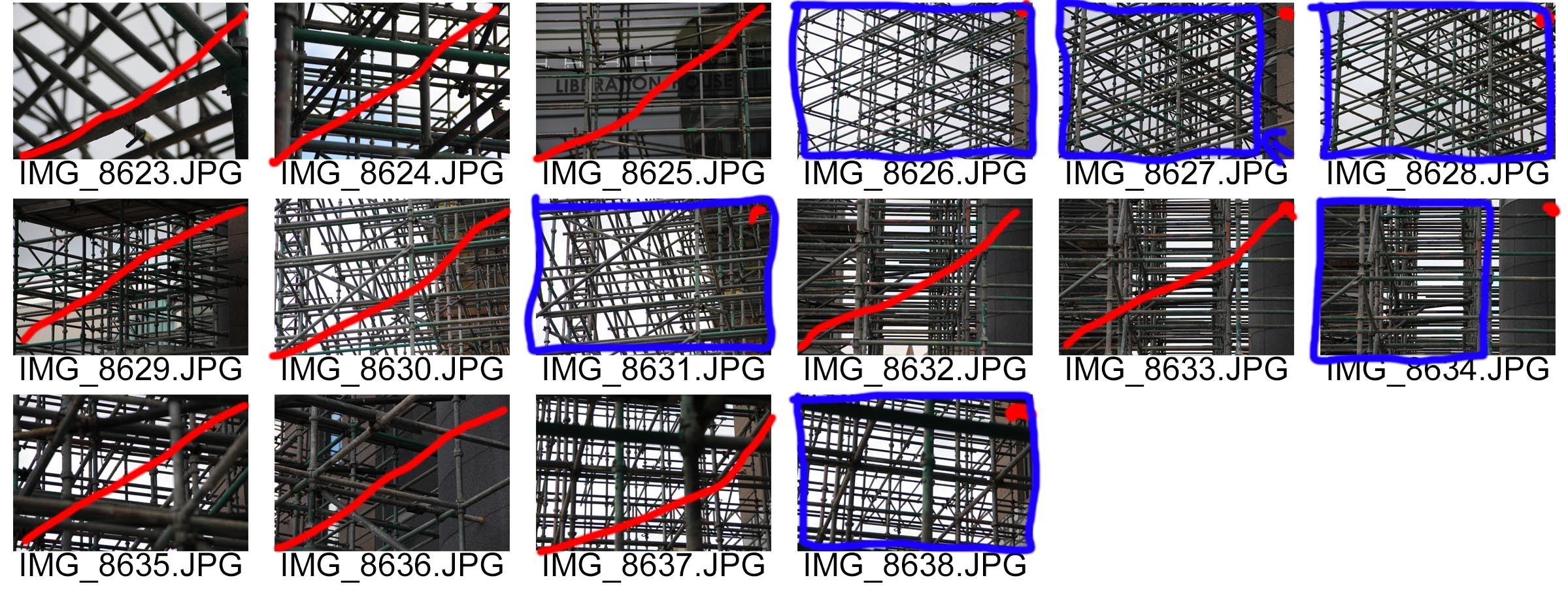
Contact Sheet
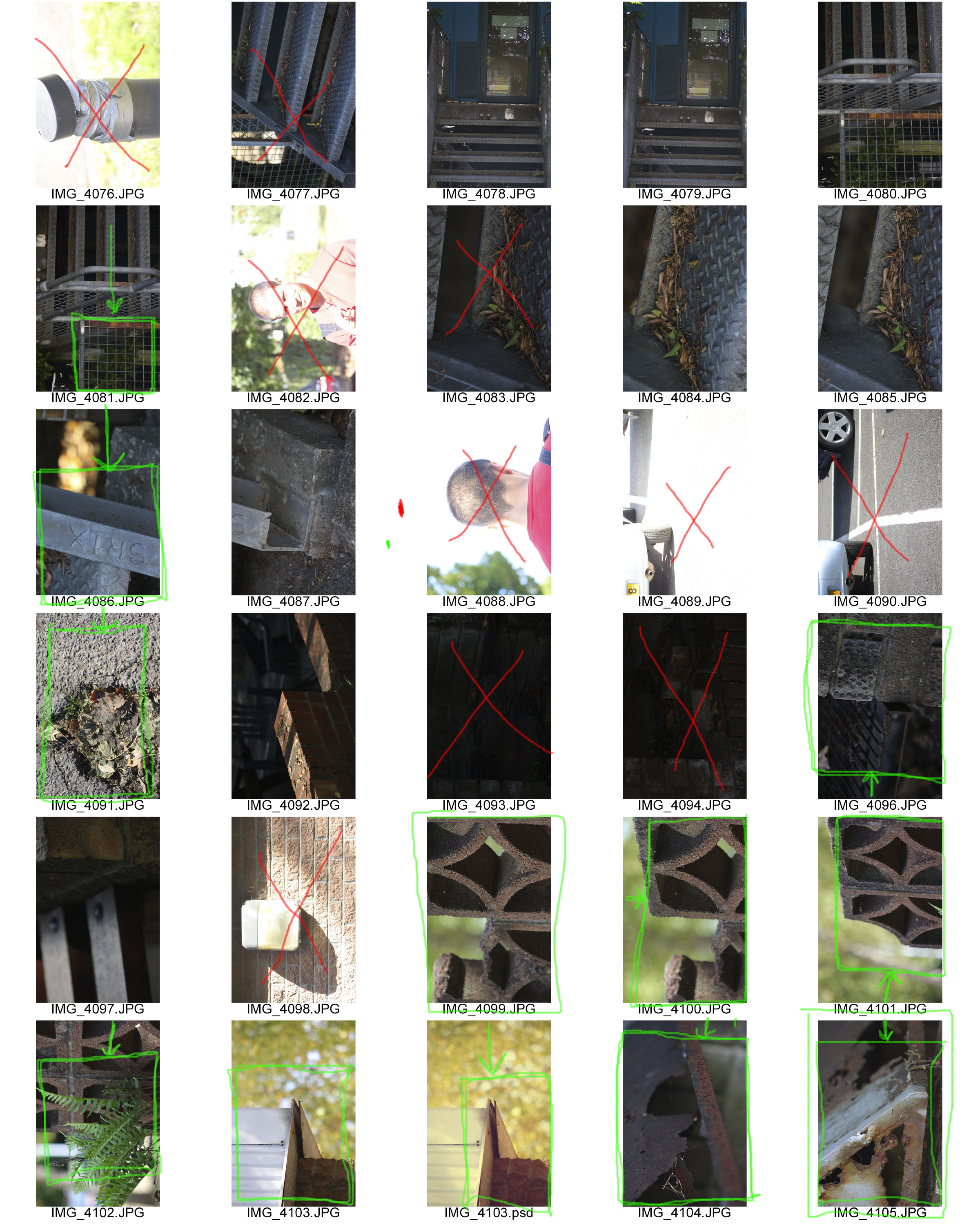
Red Line – do not use
Red Dot – possible candidate for editing
Red Square with Arrow – Crop
Blue Outline – Select for Editing


Albert Renger-Patzsch
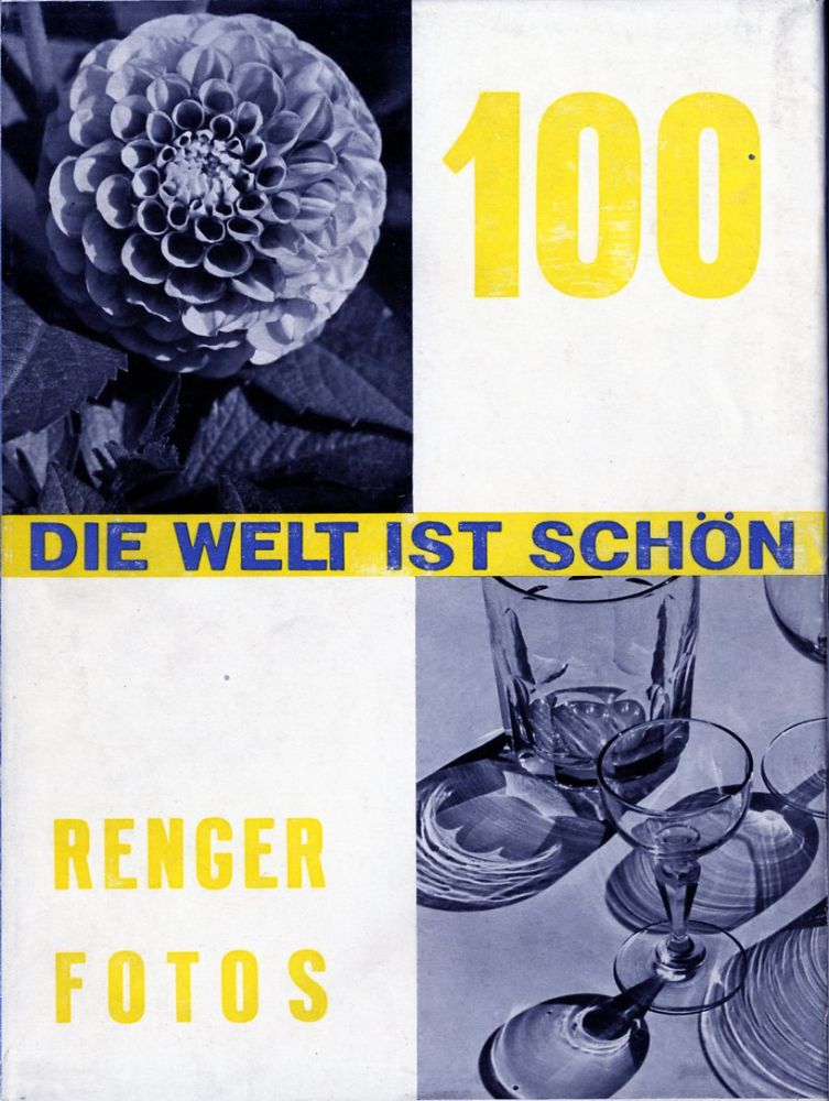
Albert Renger-Patzsch was a German photographer in the 1920s that was key in pioneering the New Objectivity movement. He worked as a press photographer in the early 1920s, then became a freelancer and published his first book (The choir stalls of Cappenberg) in 1925. His first museum exhibition was in 1927. His more well-known book (The World Is Beautiful) was released in 1928.
 Patzsch was known for taking pictures that faithfully recorded his view on the world. This was especially relevant in Germany (where he was working) at the time, as they had just lost the war. He wrote “There must be an increase in the joy one takes in an object, and the photographer should be fully conscious of the splendid fidelity of reproduction made possible by his technique”

In his early work, Patzsch took pictures of wildlife, mechanical equipment and landscapes as well as architecture. His 2nd Book, The World Is Beautiful, was a collection of 100 of his photographs that focused on man-made and natural beauty, ranging from trees and animals to houses and machines. This embodied a new and modern way of looking at the world, and it is because of this distinctly unique style, that he has sculpted modern Photography, and is known for being one of the most influential photographers of the 20th Century.
My Final Photos

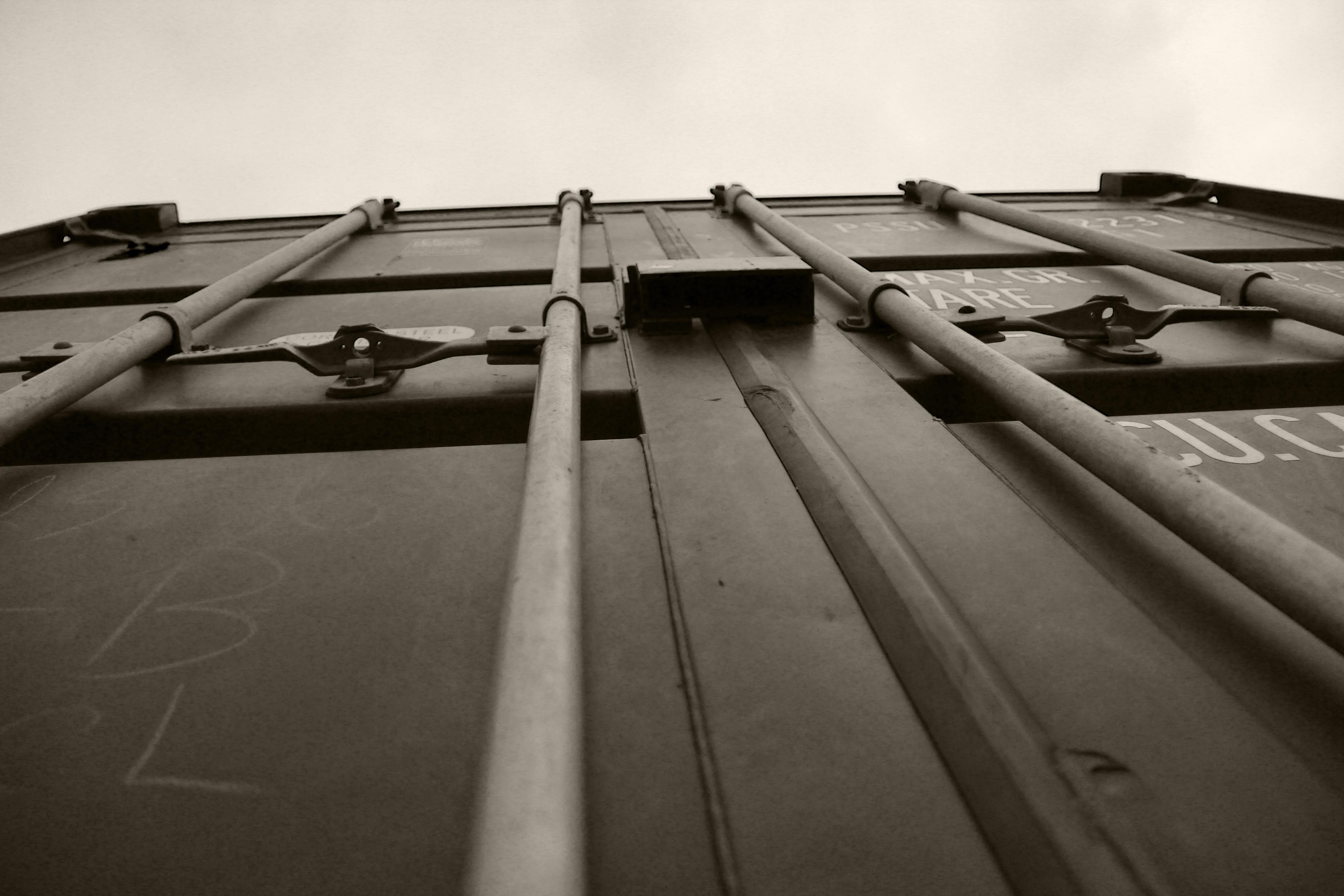


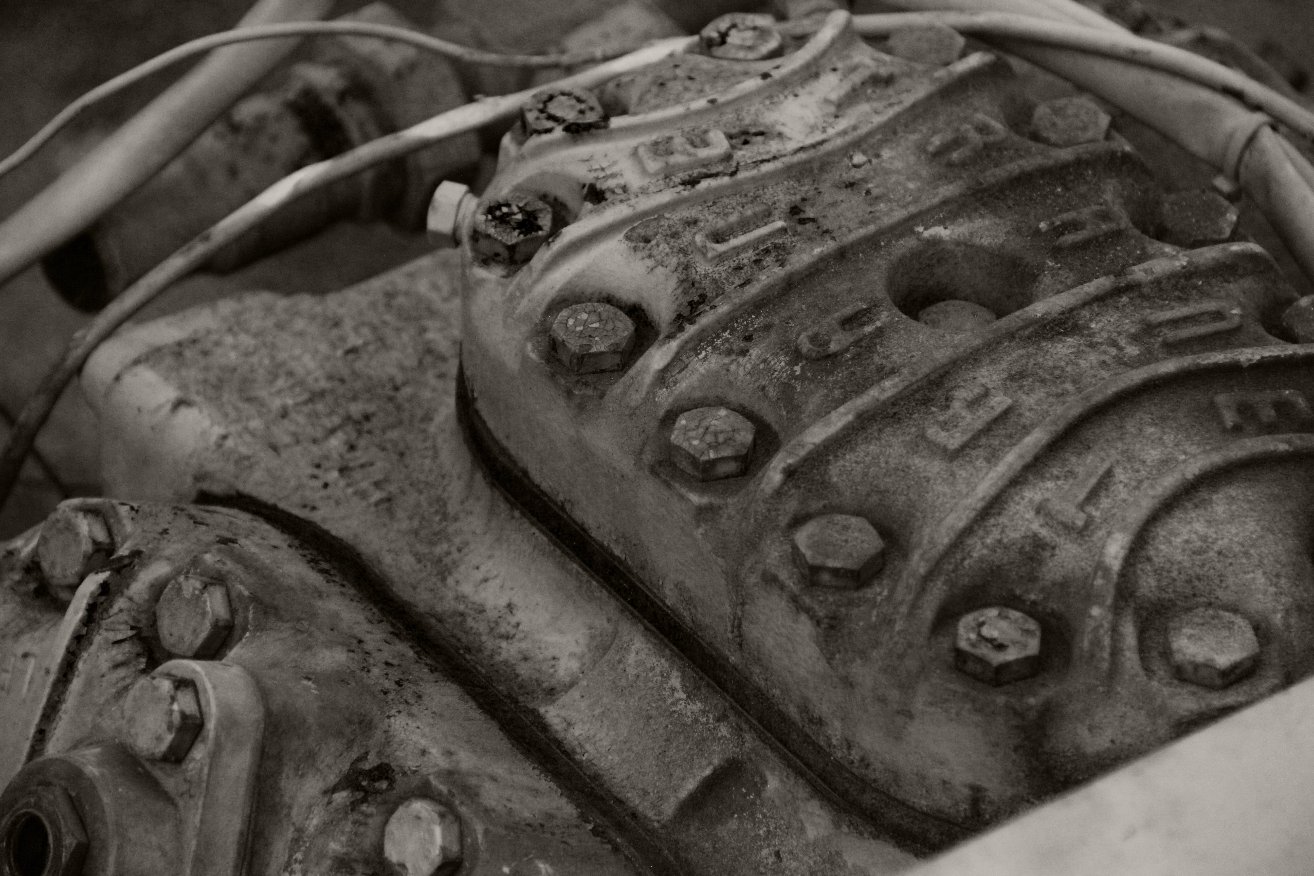
For my final photos, i wanted to recreate Patzsch’s industrial photos of machines and other metal objects. To achieve this, i decided to go down to the Victoria Pier area to take photos of the cranes and machinery. i wanted to successfully show a similar viewpoint to Patzsch and i feel as though i have achieved this with work similar to his machine photos.
Camera skills
Definitions of camera skills:
- Focus Control– Focus is the one area that lenses out perform the human eye. Lenses come in a wide variety of focal lengths, allowing them to “see” objects that are very large and very far away, like galaxies and stars, or objects that are very small and very nearby, like bacteria and DNA.
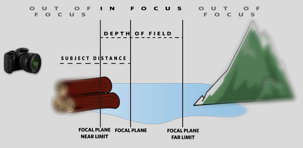
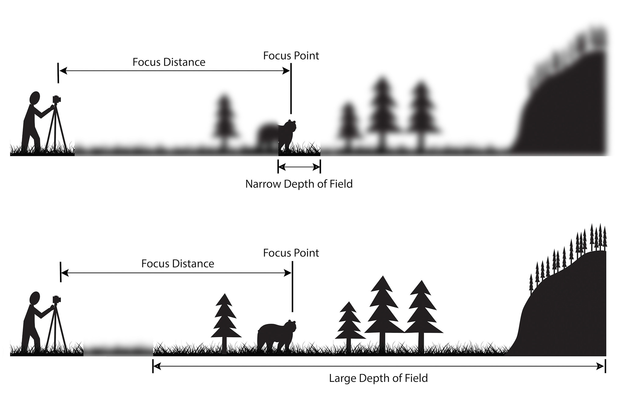
- Depth of Field- the distance between the nearest and the furthest objects giving a focused image.
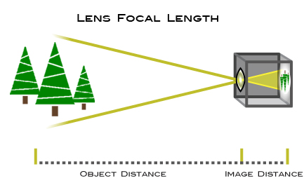
- Focal length– the distance between the centre of a lens or curved mirror and its focus.
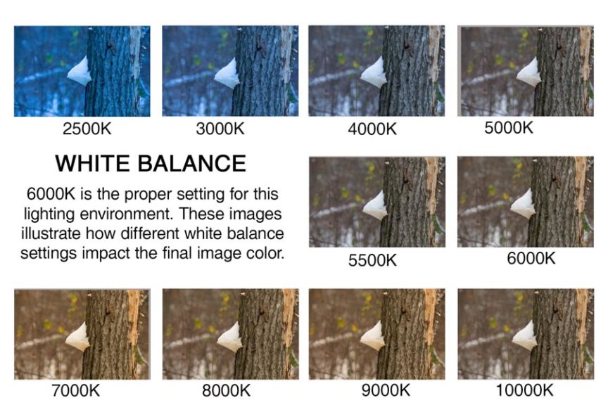
- White Balance– the colour balance of the image
- ISO– measures the sensitivity of the image sensor
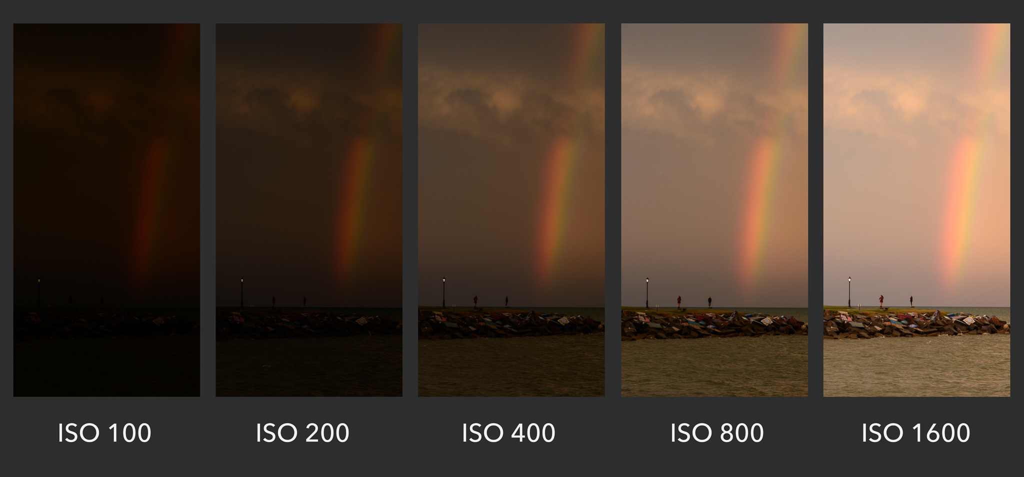
- Aperture– a space through which light passes in an optical or photographic instrument, especially the variable opening by which light enters a camera.

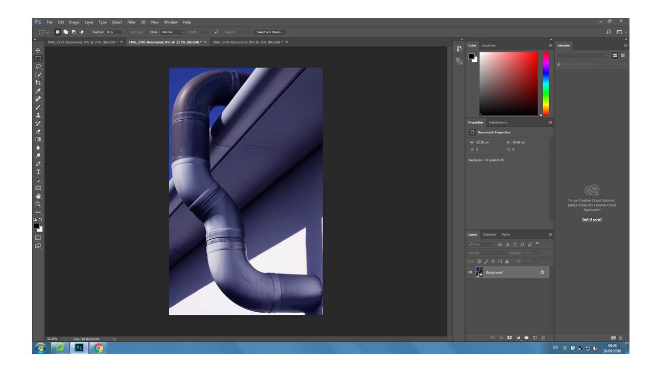
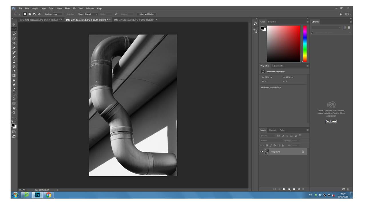
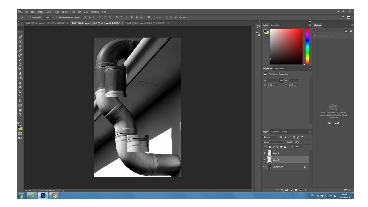
Experimenting In Photoshop
Albert Renger -Patzsch
ALBERT RENGER- PATZCH WAS A GERMAN PHOTOGRAPHER OFTEN ASSOCIATED WITH THE TOPIC OF ABSTRACT PHOTOGRAPHY. HE WAS BORN ON JUNE 22ND 1897 IN WURZBURG. ALBERT BEGAN PHOTOGRAPHING BY THE AGE OF TWELVE. THE ERA HIS PHOTOS WAS BASED AROUND WAS WORLD WAR ONE TO WHICH HE SERVED IN THE MILITARY FOR THEN WENT ON TO STUDYING CHEMISTRY AT DRESDEN TECHNICAL COLLAGE.
Alberts interest in photography led him to creating his best well known book called ‘The world is beautiful’
Albert does not stick to one area of photography. His work consists of elements of wildlife,images of traditional craftsman,landscapes and architecture.
All of his work really captures his love for nature and how he sees the world as a beautiful place, Albert uses photography to show to the public his love for the camera.
In 1928 his book ‘the world is beautiful’ he collected over 100 images with patterns of beauty and order but he does this by photographing through nature but only man- made patterns. Meaning that he did not alter anything to form something that was not there before.
Renger-Patzsch work interested me because of the level of detail that he had included. Another reason i like his work is how lined up everything is. I can tell that Renger patzsch takes time to reflect on the setting before trying to capture the moment.
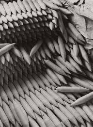
Albert Renger-Patzsch – Edits
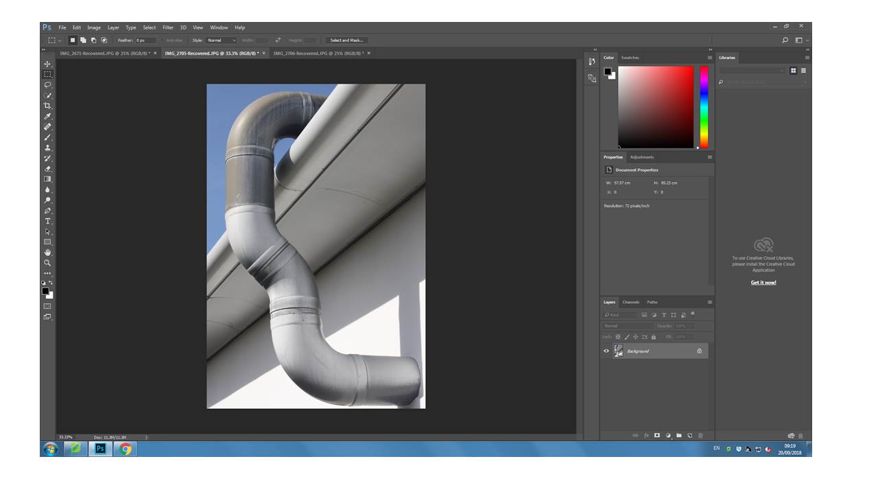
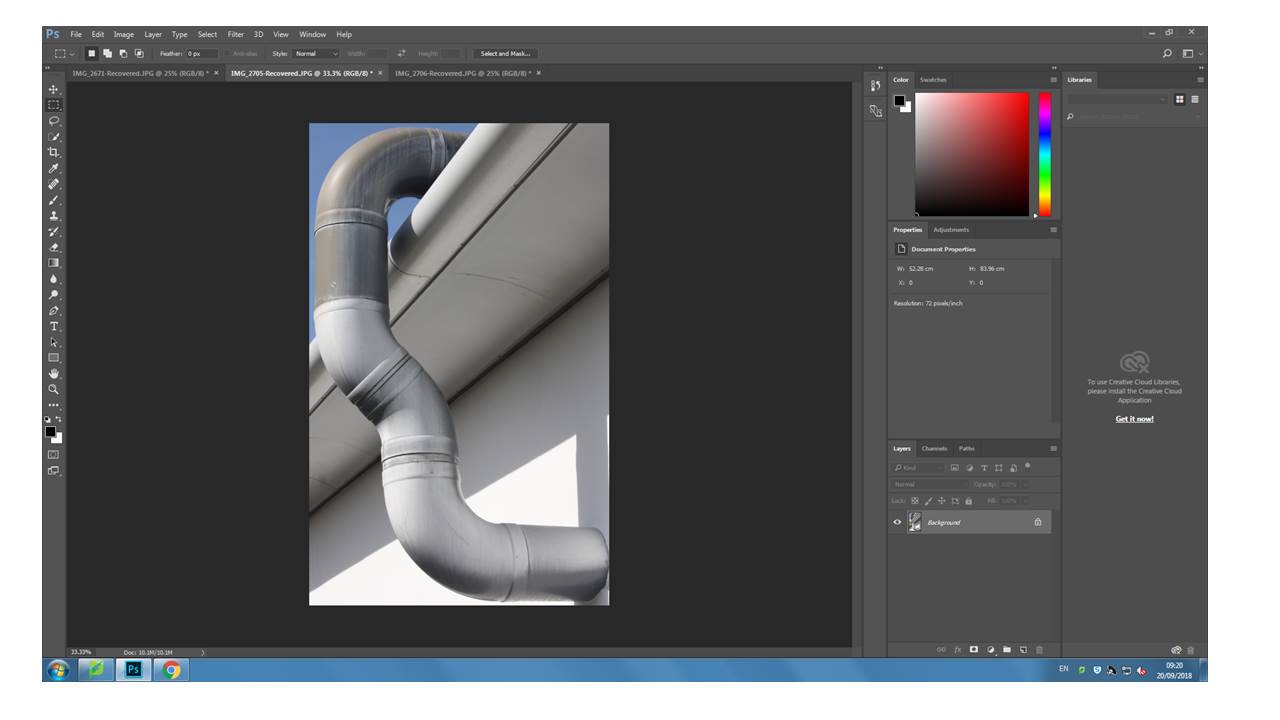
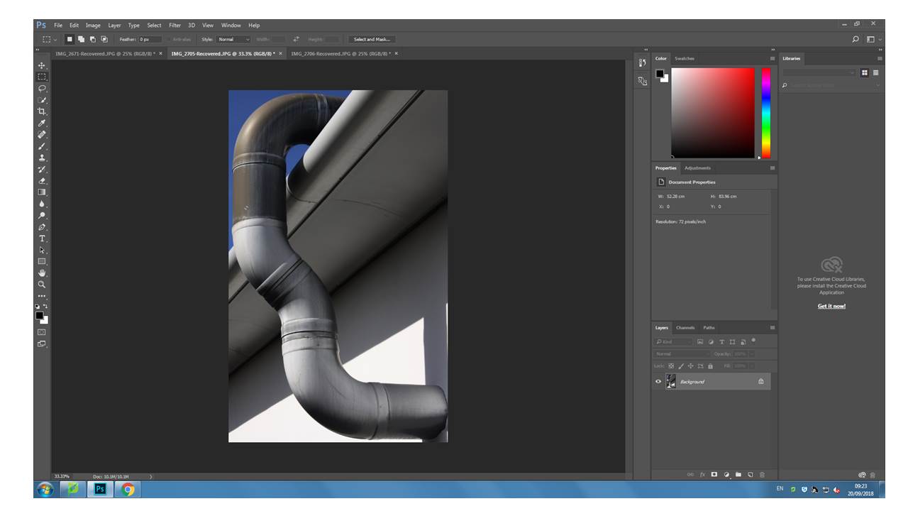
For these edits I wanted to play on the distorted and dark realism effect that Patzsch used for ‘The World is Beautiful’ series. (New Objectivity). Due to the fact I was following this idea, I did not want to do any extreme edits as I believe it would portray realism in the way Patzsch did. The edits I produced where of the top photographs from the photo shoot which I conducted based on the research made about Patzsch. For most of them I adjusted the levels and curves and lowered the saturation enough for it to be deemed black and white but still show a hint of colour. For some other edits I decided to adjust the hue in order for more colours to stand out, based on the colours within the photograph, on the images I decided to leave in colour.
I believe that my final outcomes of this research successful, as I have managed to ensure my editing matched the new objectivity idea, but still ensured that the photograph looks good. I managed to edit the photographs to allow their formal elements stand out more, making them more obvious to viewers. Moreover, I ensured the focal points of the images stood out clearly.

For my first edit I decided to adjust the levels and curves making the photograph darker than usual. I then lowered the saturation of the photograph, which has allowed different tonal regions to stand out. It has also allowed us to see where the natural source of lighting is coming from, which helps direct the viewers eyes around the frame of the photograph. This image also clearly represents the formal element of repetition and shape through the windows that are raised. Moreover, I used the technique leading lines to help guide the viewers eyes around the frame of the photograph. I really like how this edit has turned out as it matches the criteria of new objectivity.
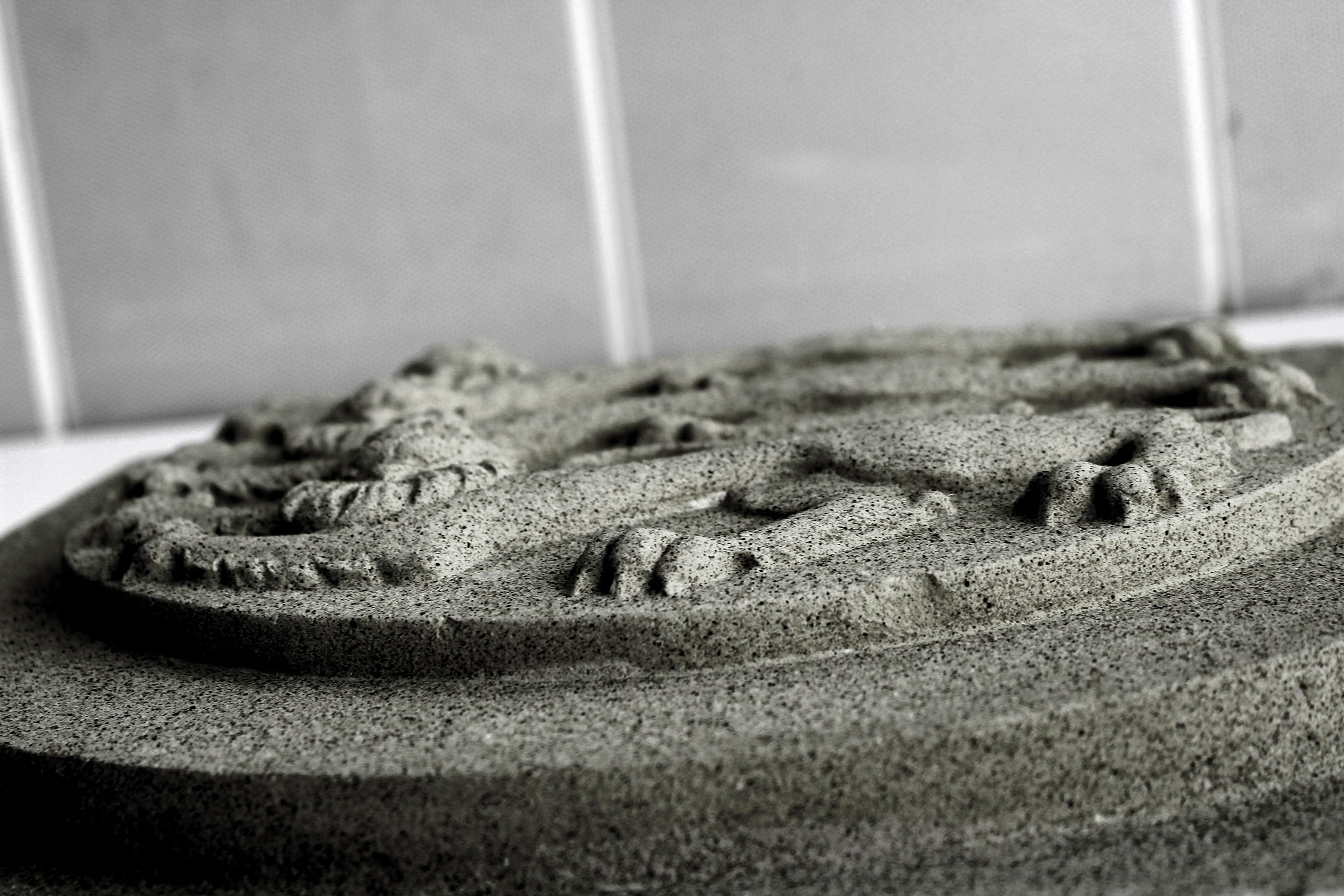
This next edit I decided to level the photograph, allowing the sharpness be clear which has allowed the detail of the subject to be visible. I then lowered the saturation but still allowed a hint of colour to seek through, making it more stimulating for viewers to look at. This image was taken at a worms eye view which allows us to see the formal elements of shape and line which is presented through the lions.

My next edit I decided to keep simple, which has allowed the simplistic overall effect to be created. I decided to level the image to allow it to seem darker than usual which has allowed the black shadows to really stand out, as well as the colours of the shadows which are casted on the wall. The formal element of line and repetition is clearly presented in the photograph, through the rectangular shadows on the wall.
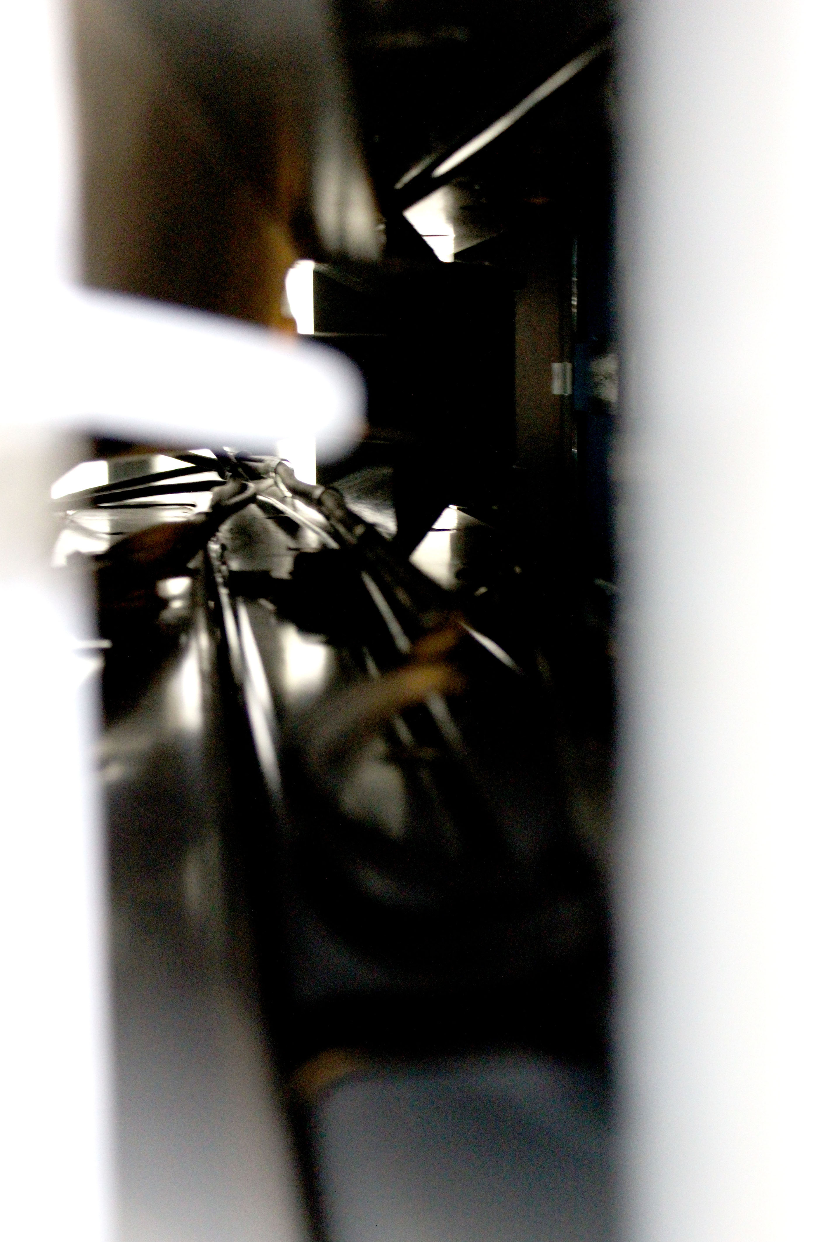
For this edit I decided to keep it simple like the previous one. I levelled the photograph to make it lighter than usual, which has allowed the cables through the tunnel to be visible. It has also added noise and vibrance to the photograph which has allowed a sense of texture to be presented as well. The cables are used to direct the viewers eyes around the frame of the photograph, leading lines, and created mystery as we wonder what is on the other side of the tunnel.
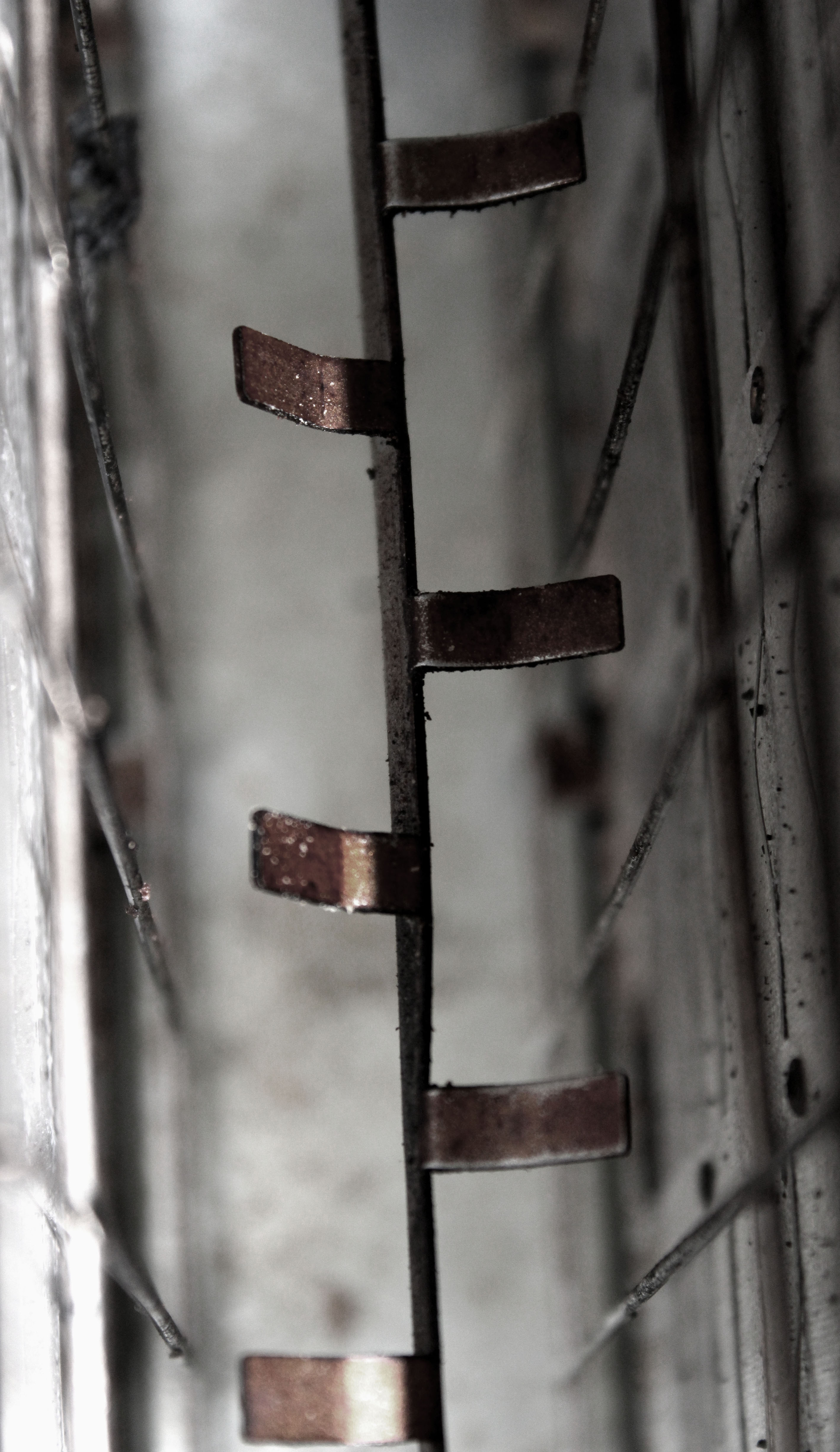
In this edit I started by adjusting the levels and the curves which has allowed the texture of inside the toaster to be presented. It has also helped to showcase the different tonal areas, making it more interesting for viewers to look at. I then turned down the saturation, but ensured the rusted metal rectangles where still in colour. Doing this has helped the context of the image to be presented, allowing viewers to have more of an understanding of where this image was taken. The formal element of line, shape and texture has been presented allowing this image to match the formal elements Patzsch’s work showed.
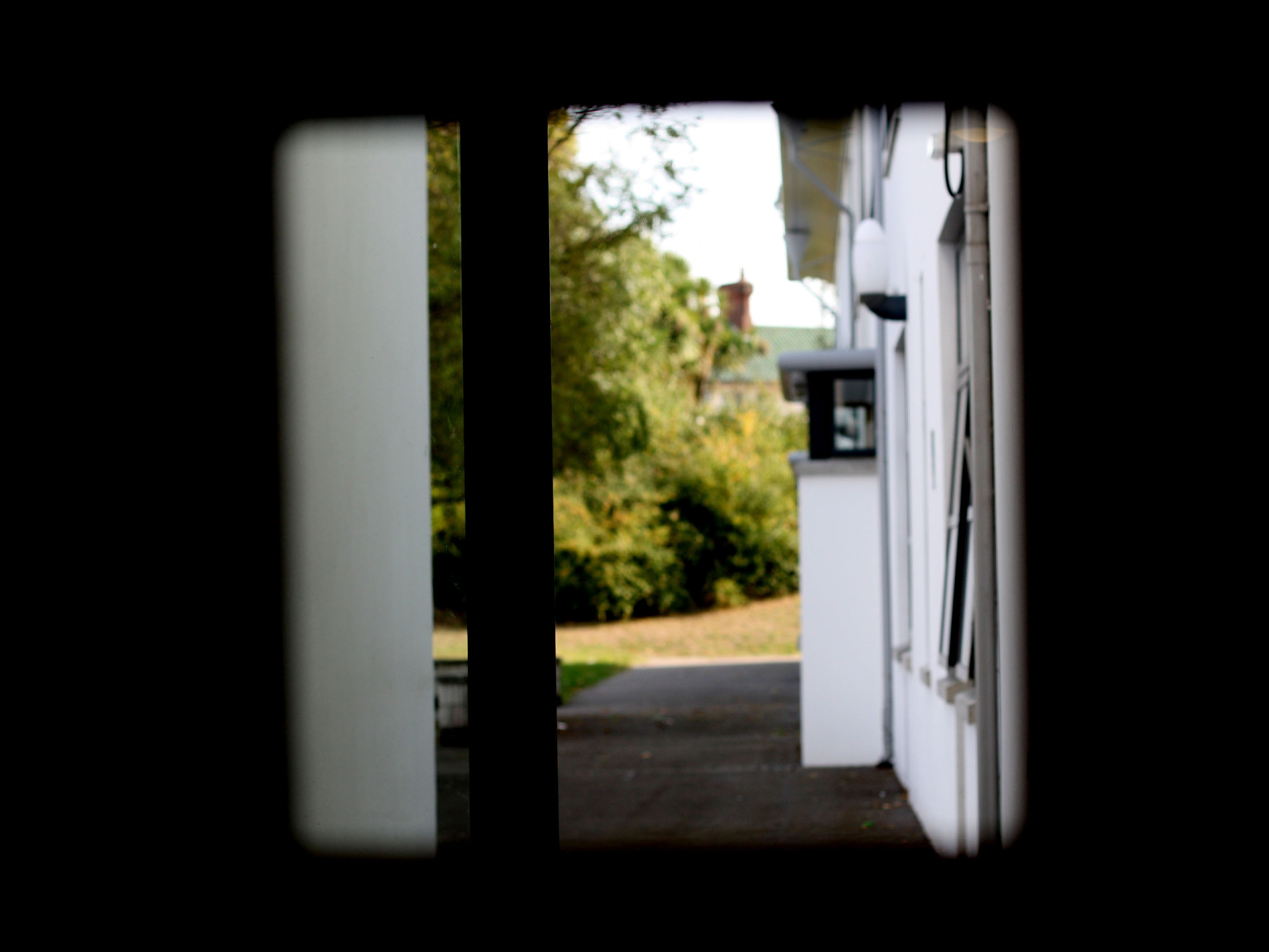
In my penultimat edit I decided to level the image, to make the foreground completely black only allowing the background to be visible. I attempted to use the technique of framing, which has allowed the subject of the image to be captured. I kept the image in colour as I felt it allowed the background to really stand out compared to the black frame work. The formal element of shape is presented through the frame which is capturing the semi-focused background.

In my final edit I wanted to showcase this empty area, with a simplistic edit to add to the empty effect. For this I adjusted the levels and curves allowing the photograph to be naturally darker, which has allowed the light to stand out. I then adjusted the hue to allow the yellow to stand out more. Moreover, I adjusted the vibrance to create a bit of noise within the photograph but not enough to change the effect of the image. The formal elements of space and shape are clearly presented in the image.
Contact Sheet Research and Experimentation
A contact sheet was originally a piece of photographic paper, on which all negatives from a photo shoot would be contact-printed. This would give both the photographer and potential buyers of the photograph, a chance to see the photographs printed before they were published in full size and full resolution.
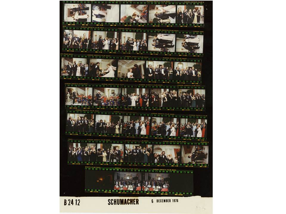
The above image is an example of a contact sheet, containing all of the negatives from a particular photo shoot. Contact sheets were once necessary to see the photograph before the image was printed properly, as it gave a less expensive, smaller sample, that the photographer could use to chose their best photos from the shoot.
The development of digital cameras led to contact sheets becoming less essential, as photos can now be viewed on the screen of a lot of cameras. However, contact sheets are still used in many instances where a photographer wants to be able to provide a potential buyer with a physical copy of the photographs, and can also be useful when a photographer is trying to build an idea of which photographs they do and do not want to use.
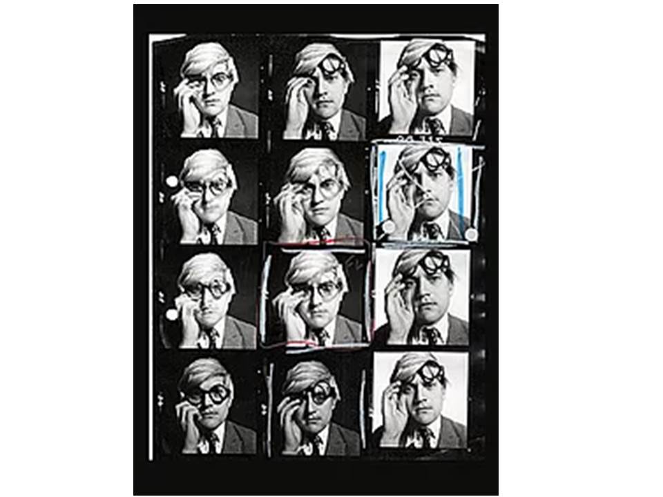
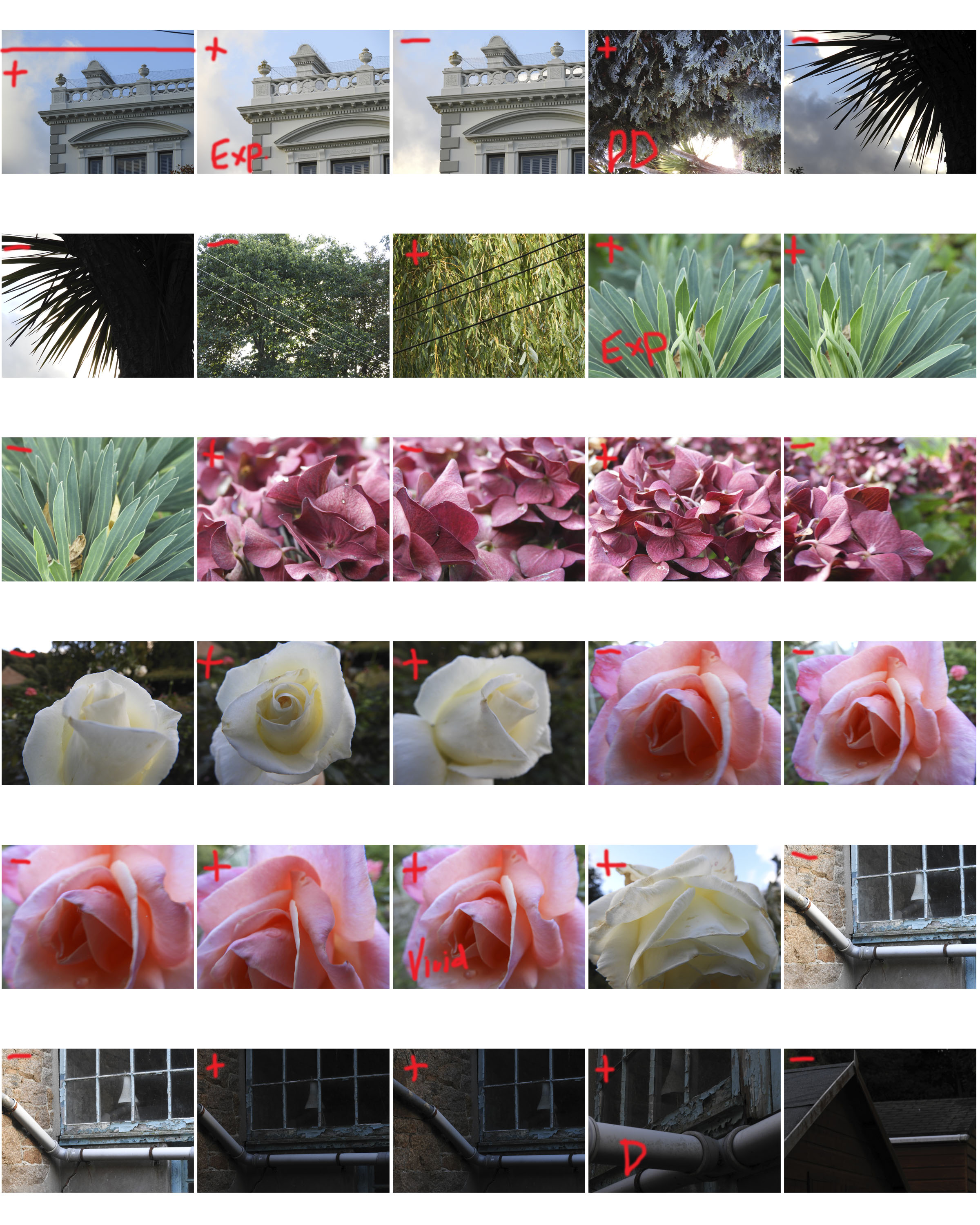
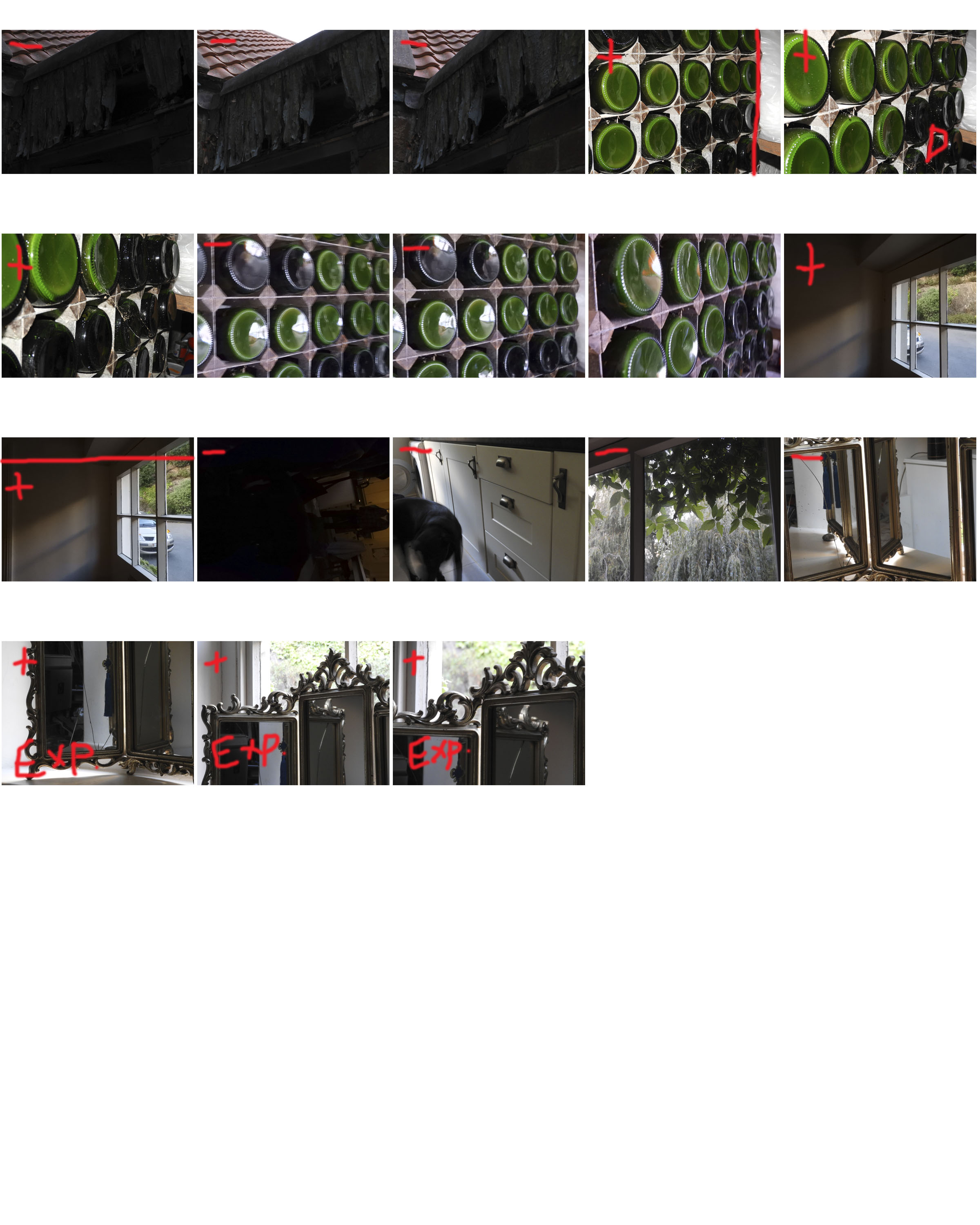
A contact sheet can be edited to make the photographers selections more obvious, and to shot their thought process when deciding on their best photos. The above image shows the selection process of the photographer, as they have clearly used different colour to indicate different selections and choices. Unfortunately a key hasn’t been provided, and so the different colours and shapes can’t be differentiated.
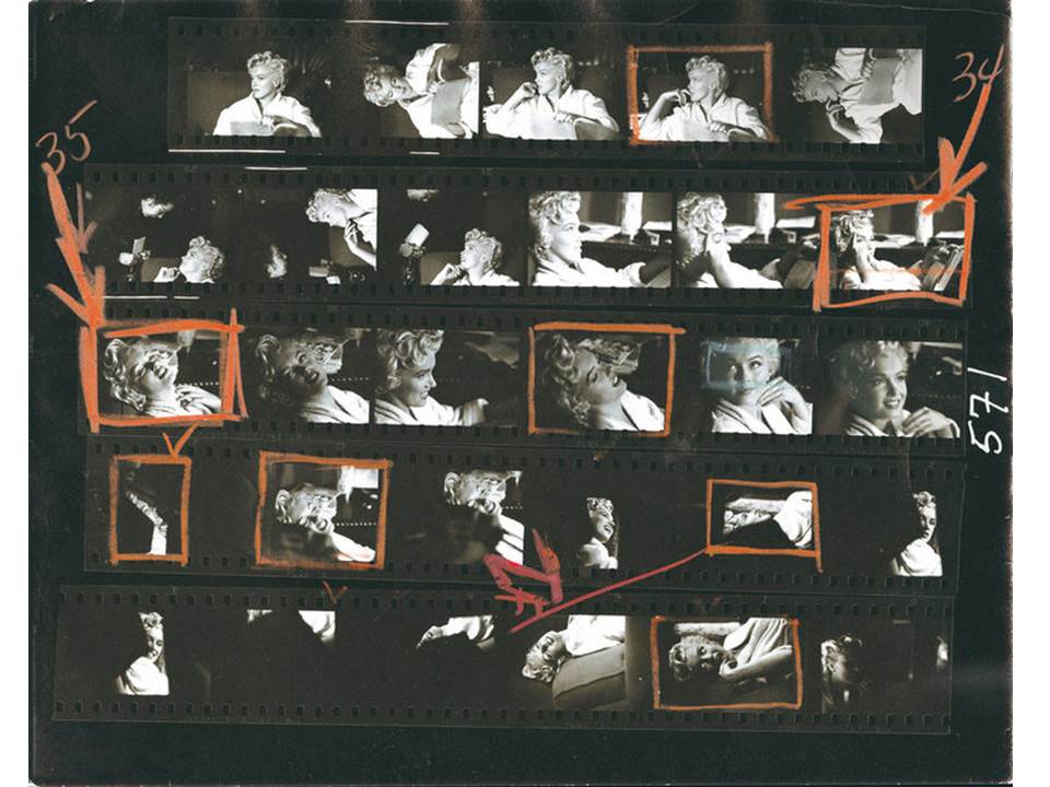
Some contact sheets can show multiple selections, as well as images that the photographer doesn’t want to work with (which are normally crossed out). More than one image can be processed into the editing phase, before a final selection is made.
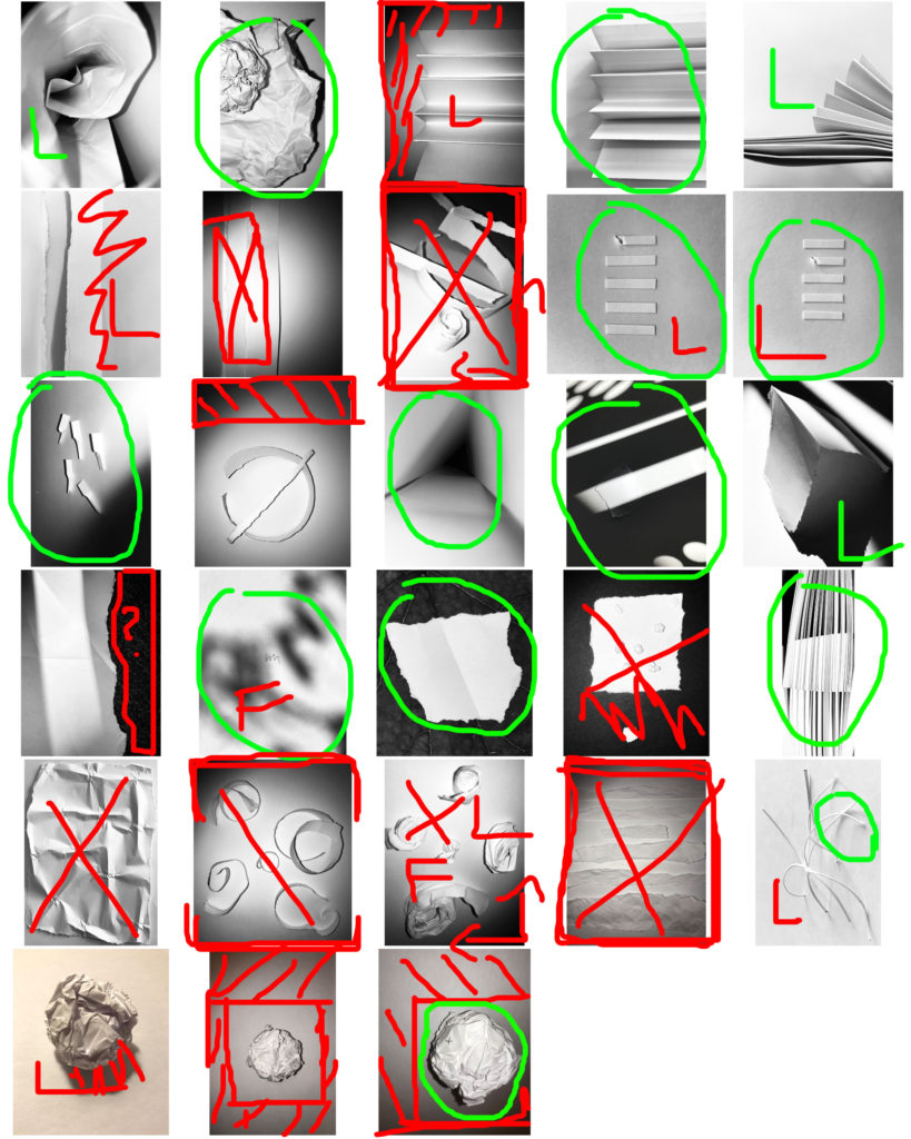
Above is an example of a contact sheet I created for my Paper Project, in which I took images from the photo shoot I completed, and used the software Adobe Bridge to create a contact sheet in Photoshop. From there, I edited the images using different colours and shapes to show my thought process, and I clearly stated which photographs i would be most likely to use in my final selection.
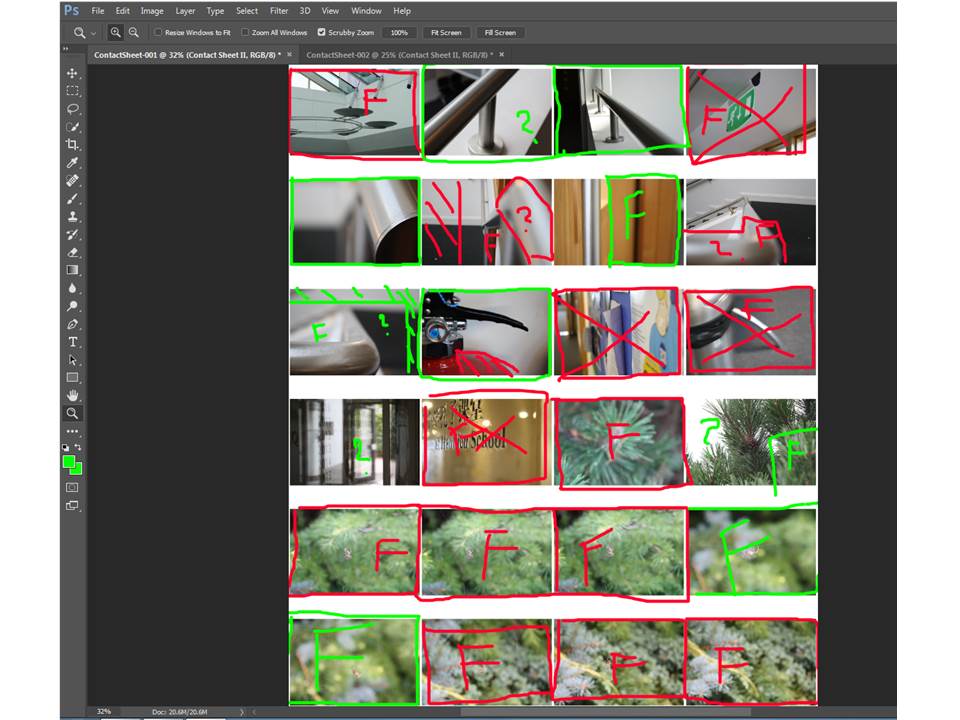
By uploading the photos taken in the photo shoot to Adobe Bridge, I then went to the Tools option, and the Photoshop option. After I selected Contact Sheet 2, a contact sheet was automatically created in Photoshop, and I was then able to edit my selections. The above image is an example of another contact sheet I created for my Camera Lens Experimentation.
Albert Renger- Patzsch
Albert Renger- Patzsch

Albert Renger- Patzch was a German photographer associated with the New Objectivity. Renger-Patzsch was born in Würzburg and began making photographs by age twelve. After military service in the First World War he studied chemistry at Dresden Technical College.
In its sharply focused and matter-of-fact style his work exemplifies the aesthetic of The New Objectivity that flourished in the arts in Germany during the Wiemar Republic. Like Edward Weston in the United States, Renger-Patzsch believed that the value of photography was in its ability to reproduce the texture of reality, and to represent the essence of an object.
I tried to capture the essence of his work and I think I got the best result I could get. I took the photos with my DLSR Canon Camera on the close up setting. Most of my photos were landscape but a few were portraits.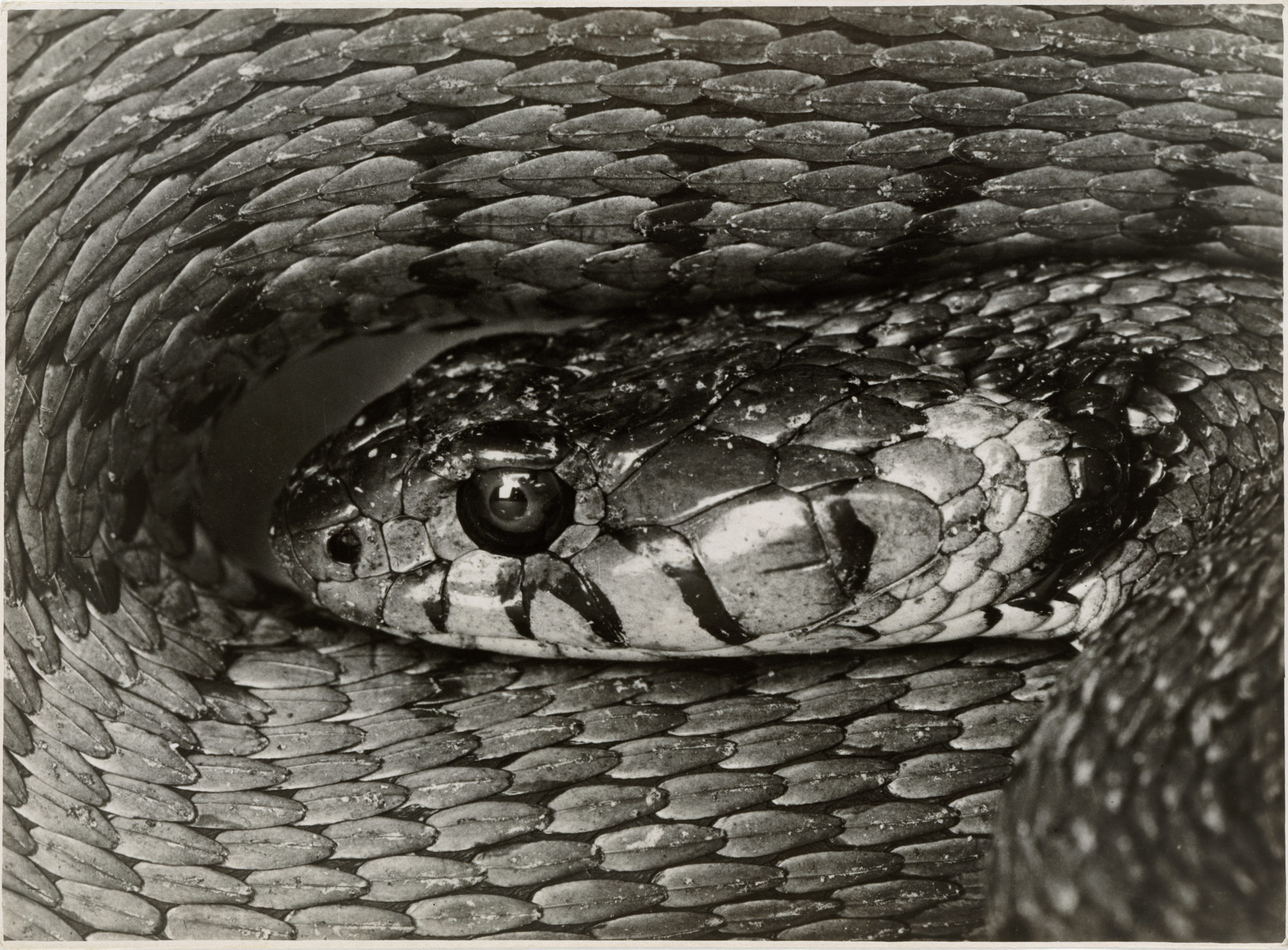
For my response to Albert’s photos I tried to take 100 photos, but only managed around 80 photos. Even though Albert’s photos were in black and white, I have a mixture of black and white and coloured photos edited photos.
Contact Sheets
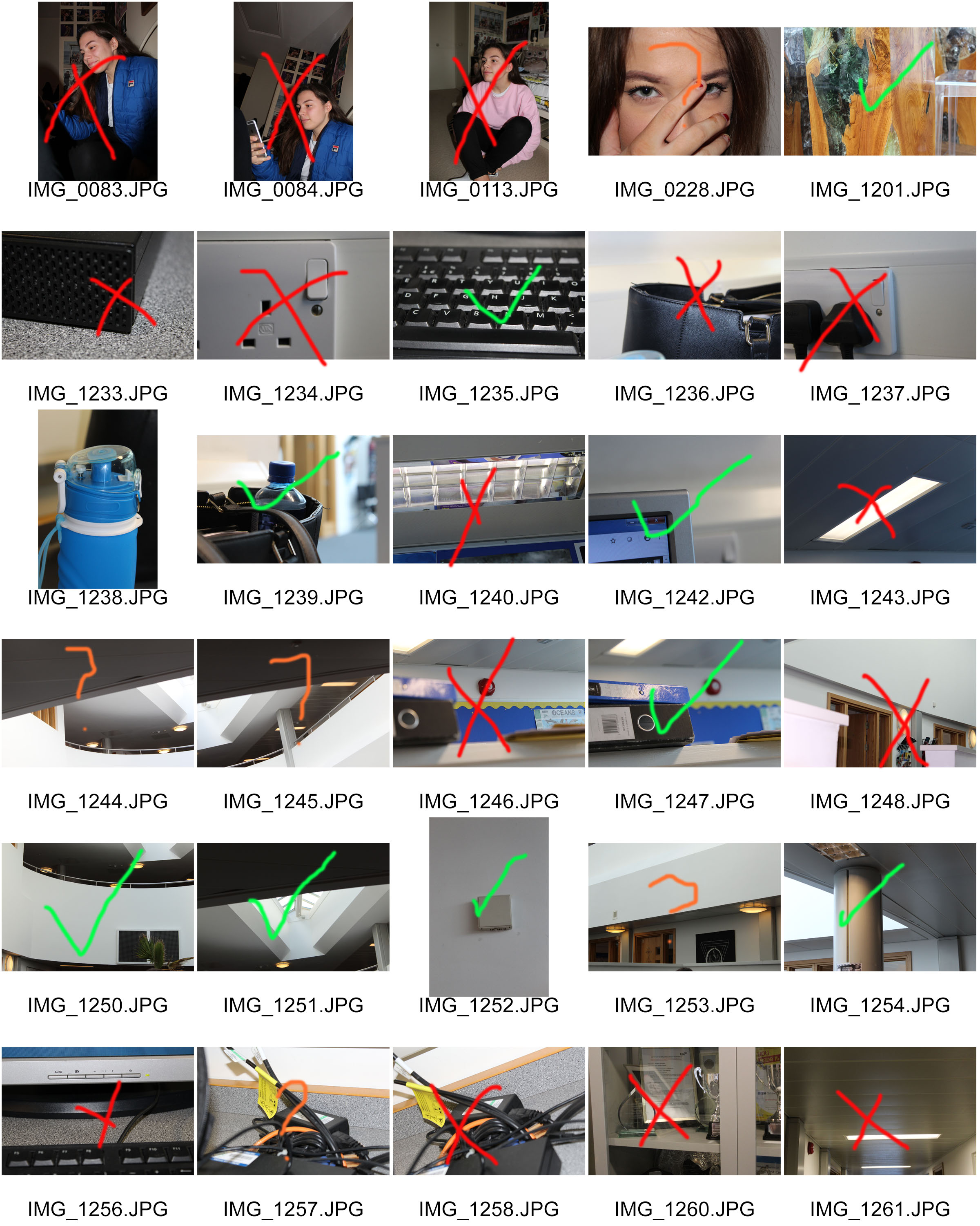
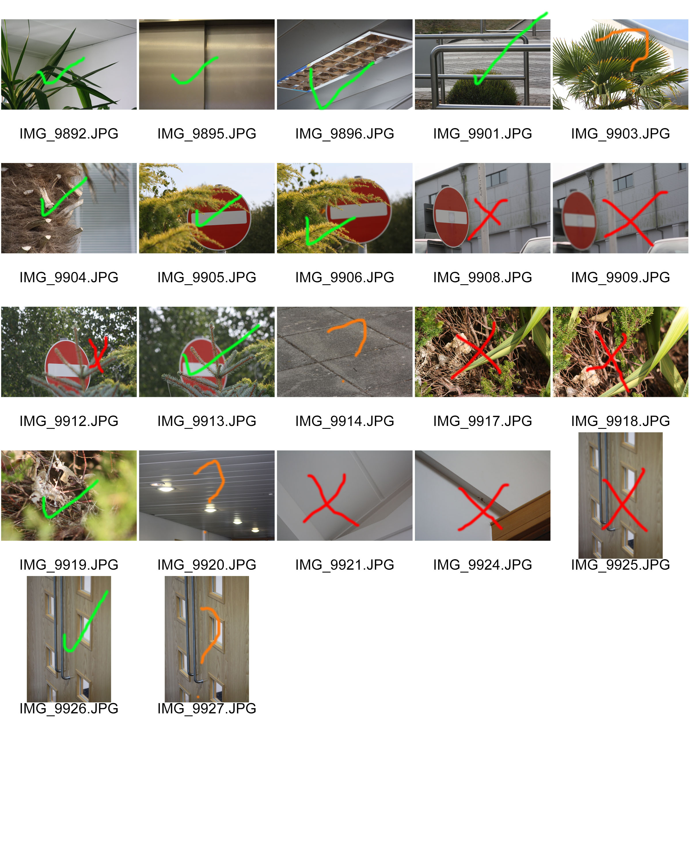
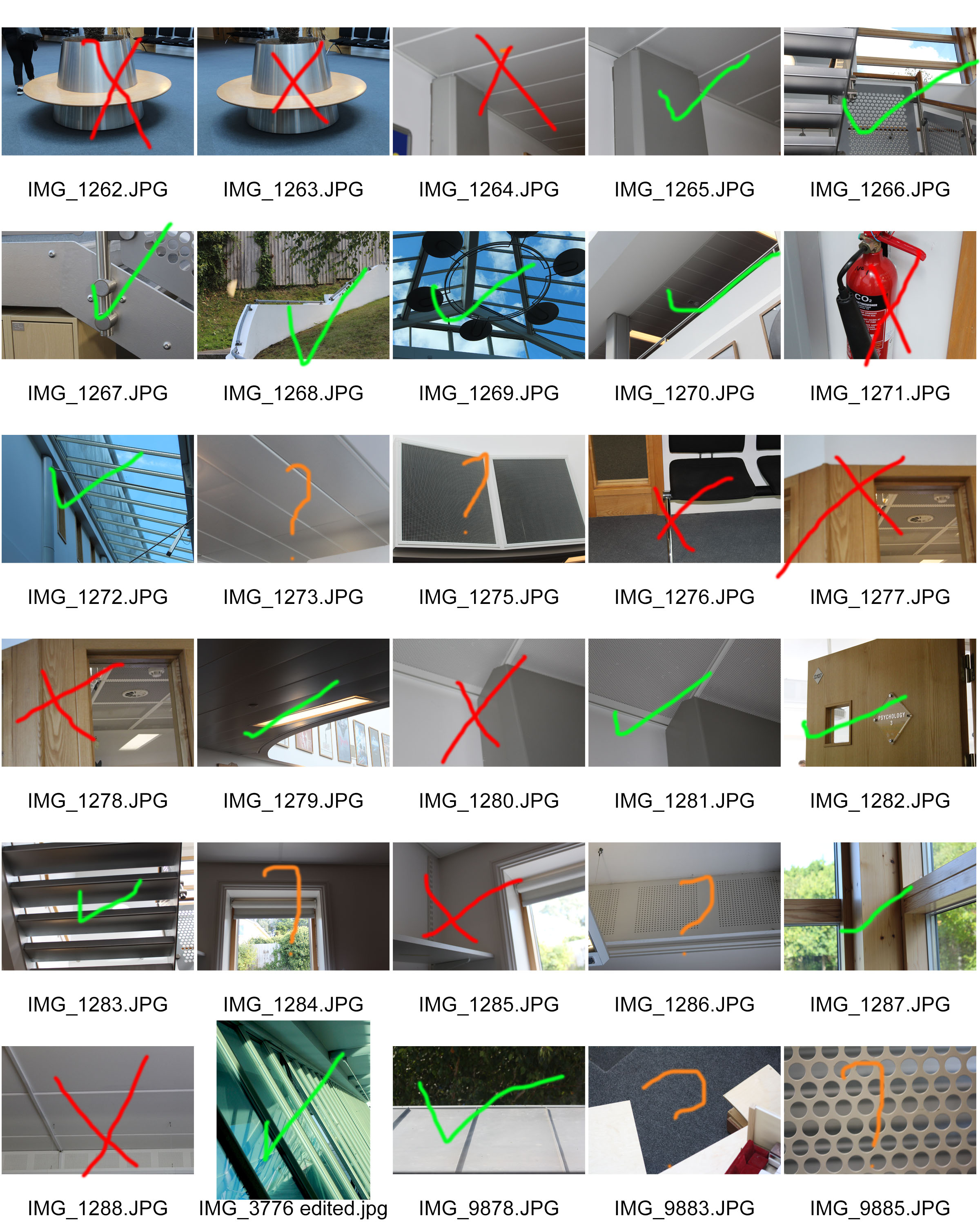
Top Favourite Photos (Edited)
Edited all on Photoshop
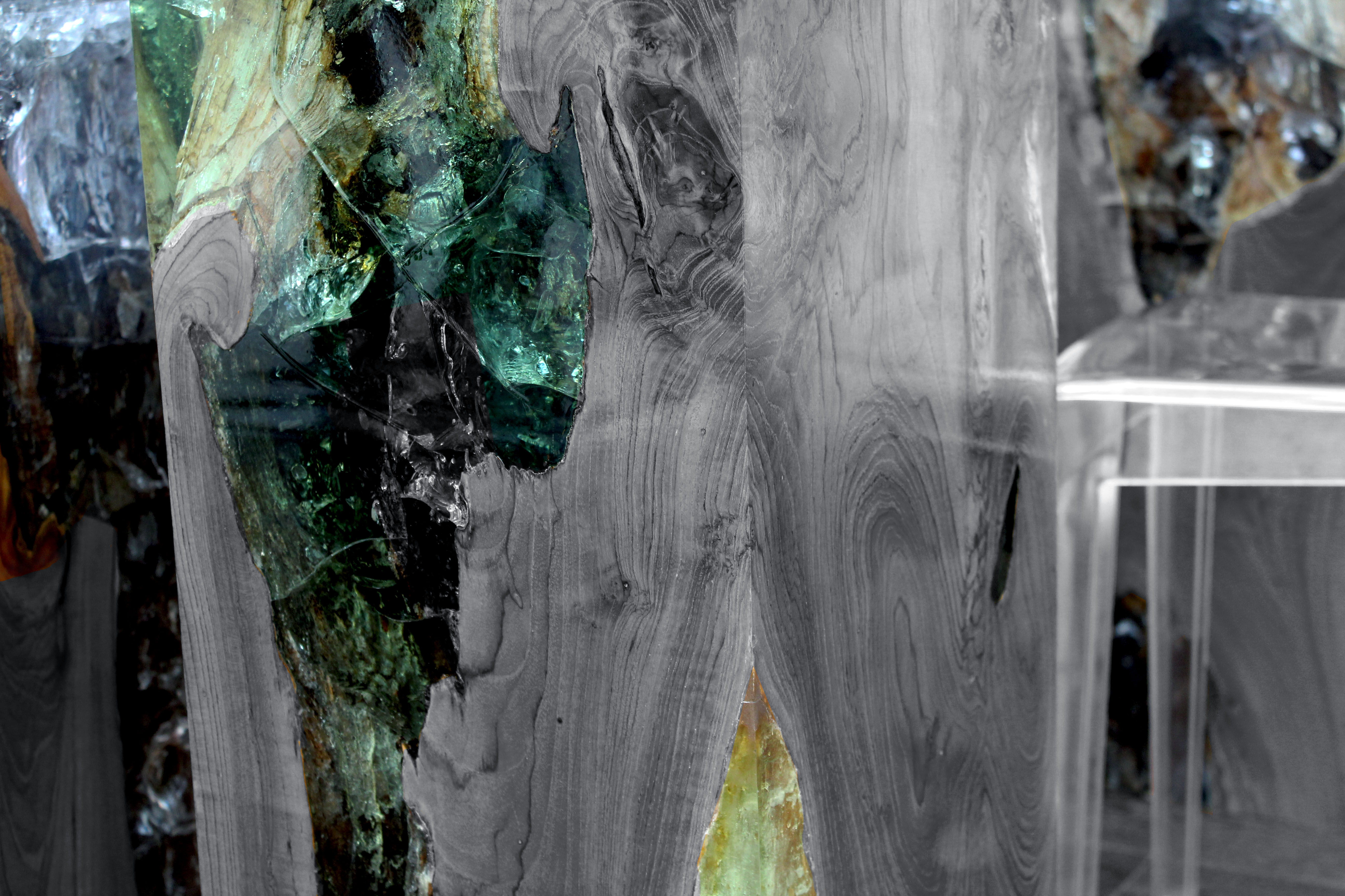
I chose to edit this photo because I really liked how the table had the unique and colourful marble in it. I decided to make the marble pop by making the wood and chairs black and white. I really like how this photo turned out and I will try this style of editing again.
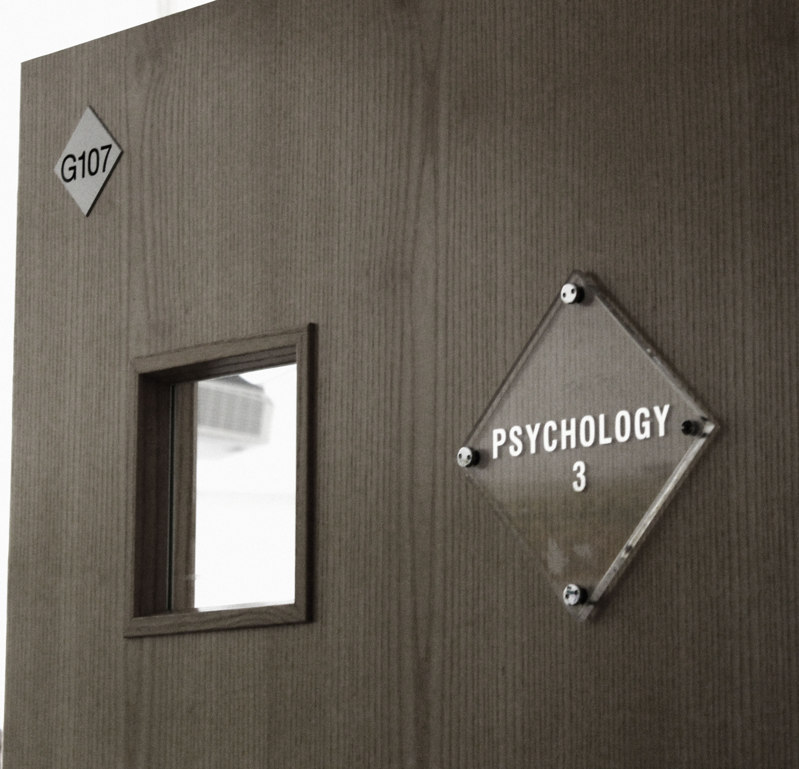
For this next photo I decided to make it more dull and dark as appose to it’s original bright photo. I played with the levels, contrast and saturation to achieve this photo. I’m really happy with how this turned out and I really like the difference of the original photo to the edited photo.

For this photo I decided to use levels, contrast, colour balance and photo filter to achieve this look. I really like how the light is almost shining into the room. I also like the contrast of the wooden windows and glass windows, it gives it a really nice look. I think I edited this photo very well.

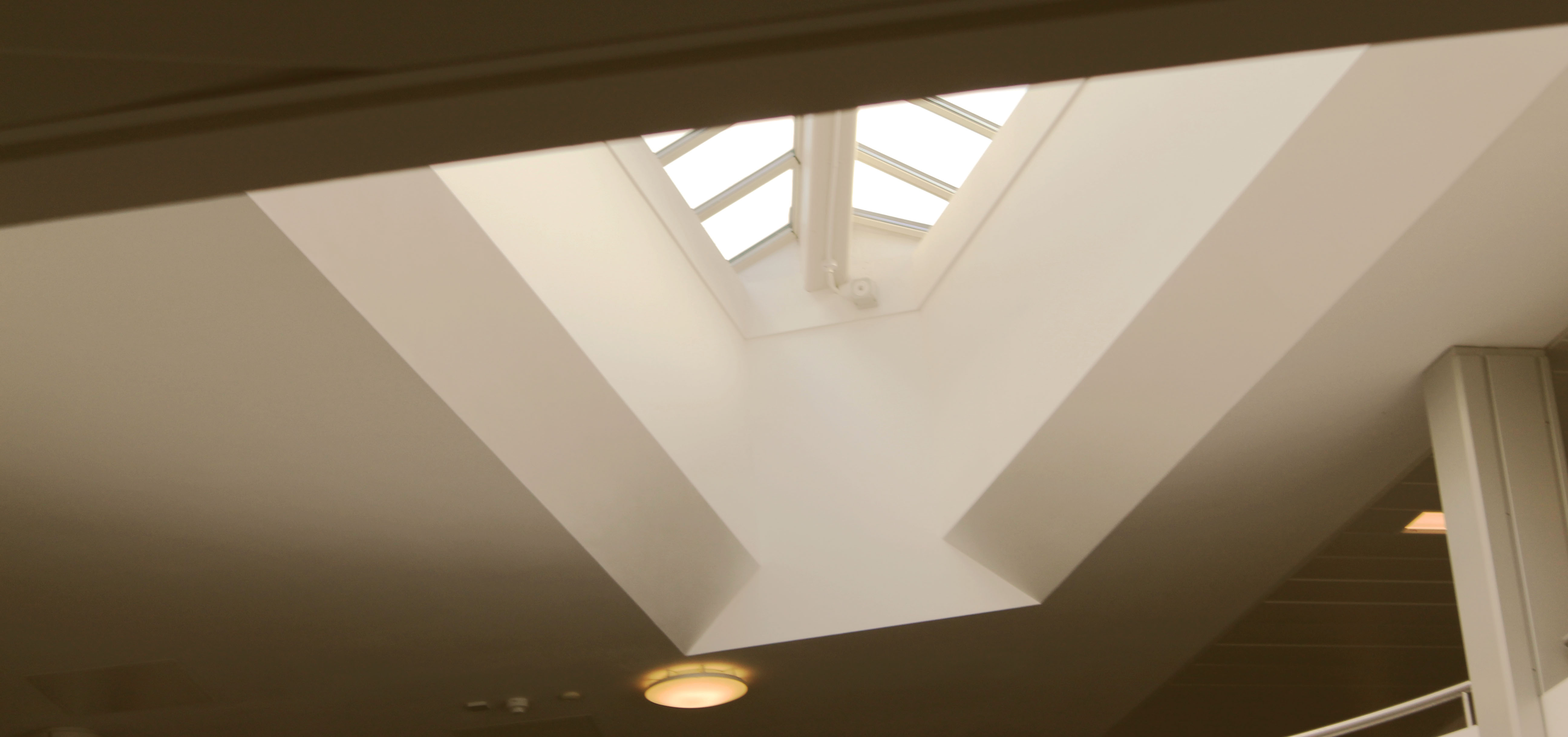
This next photo I used the contrast and exposure setting a lot. My vision was to make the sky brighter than the stairs, and I really like how I achieved this look. I think I got the overall idea of what I wanted for this photo, and it translates very well in the edited final picture.

For this next photo I used exposure, contrast and levels to get this final picture. I really like how the light is centered onto the middle of the keyboard. I think I edited this picture well and will try to use this style of editing in future projects.
For this last photo I used photo filter, gradient, contrast and exposure. I’m really pleased with how this turned out. The way I edited it gives it a retro and vintage look to it which I personally really enjoy. I hope to also use the style of editing in future projects.
Evaluation
Overall I think a did a good job at recreating Albert Renger- Patzsch style of photography. I really enjoyed doing this project as it gave me inspiration and ideas for future photo shoots and projects. I hope to keep achieving photos that I like and to improve with my camera and photography skills. I would also like to explore more ideas with different photographers and look at work that isn’t my preferred style because I would like to expand my ideas and see other styles from my own.
Response to Albert Renger-Patzsch
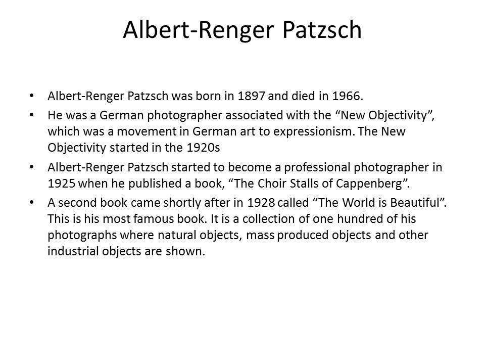
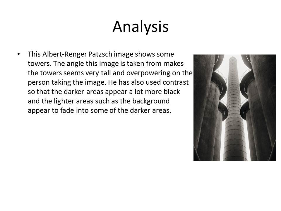


My response to Albert Renger-Patzsch:
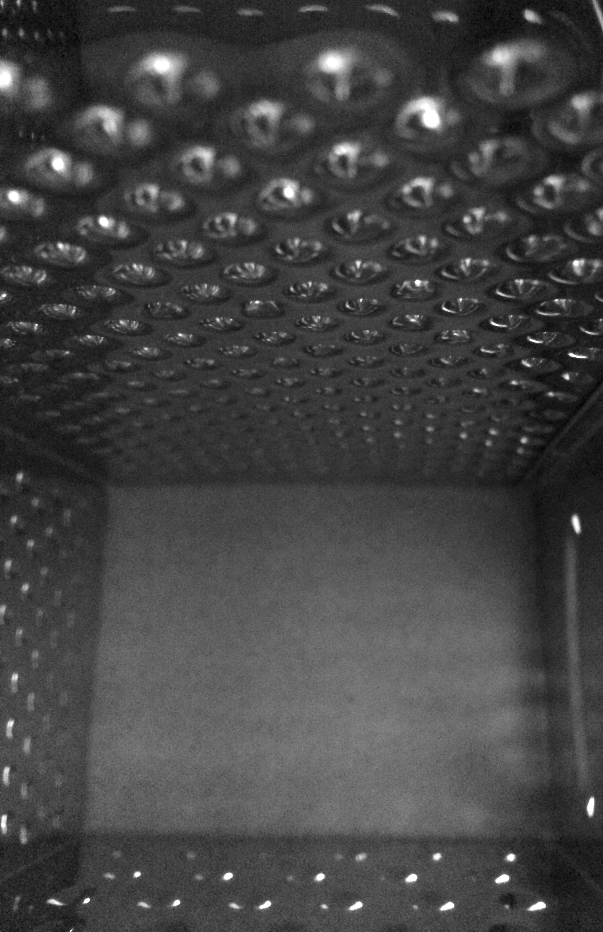
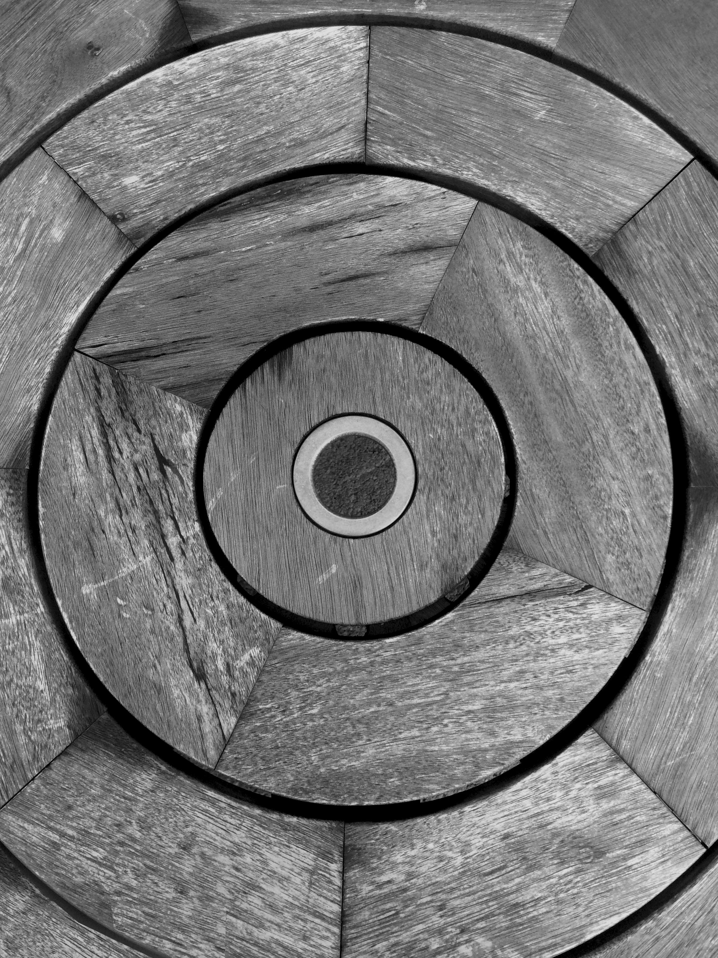
These are the best images I have taken after looking at how Albert Renger-Patzsch takes his images. I have taken images from weird angles and usually quite close up to make these images. I have then taken the best ones I took into photoshop and have made them black and white as Albert Renger-Patzsch always did his work in black and white. I have also cropped and adjusted the exposure settings on a few of these images to create contrast and to make the texture stand out.


Albert Renger-Patzsch
Albert Renger-Patzsch
Albert Renger-Patzsch, born on June 22, 1897 was a German photographer who was heavily associated with the New Objectivity. Renger-Patzsch was born in Würzburg, Germany, and began taking photographs by the age of twelve. After military service in the First World War he studied chemistry at Dresden Technical College. In the early 1920s he worked as a press photographer for the Chicago Tribune before becoming a freelancer. In 1925, publishing a book, the choir stalls of Cappenberg. He had his first museum exhibition in 1927.
A second book followed in 1928, Die Welt ist schön (The World is Beautiful). This, his best-known book, is a collection of one hundred of his photographs in which natural forms, industrial subjects and mass-produced objects are presented with the clarity of scientific illustrations, the intent being to create beautiful photographs out of everyday items. The book’s title was chosen by his publisher; Renger-Patzsch’s preferred title for the collection was Die Dinge.
In its sharply focused on the newly emerging style of the time, The New Objectivity that flourished in the arts in Germany during the Weimar Republic. Like Edward Weston in the United States, Renger-Patzsch believed that the value of photography was in being able to capture the world in a way which displays all the textures and feelings that come along with it, and to represent the essence of an object. He wrote: “The secret of a good photograph—which, like a work of art, can have aesthetic qualities—is its realism … Let us therefore leave art to artists and endeavour to create, with the means peculiar to photography and without borrowing from art, photographs which will last because of their photographic qualities.”
Patzsch preferred to photograph items over people, focusing mainly on very ordinary everyday items but captured in a way which makes them extraordinary. A lot of his work also focuses on pattern and rhythm. The plants he photographs are often geometric and contain a lot regular pattern.
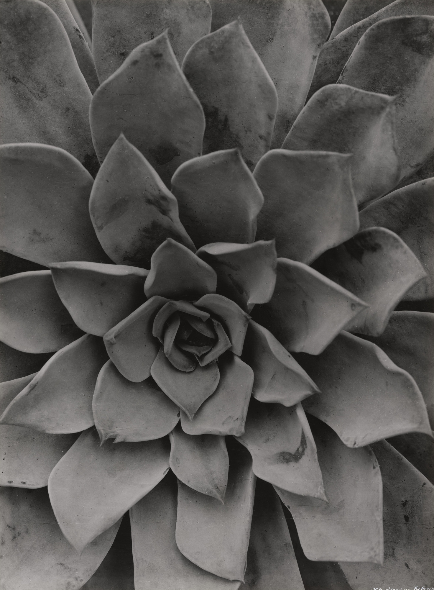
Among his works of the 1920s are Echeoeria (1922) and Viper’s Head. During the 1930s Renger-Patzsch made photographs for industry and advertising. His archives were destroyed during the Second World War. In 1944 he moved to Wamel, Möhnesee, where he lived the rest of his life.
ANALYSIS OF HIS WORK:
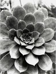
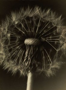
I have chosen and compare and analyse these two photos from Albert Renger-Patzsch’s work. Both of these photos include the presence of organic items, plants in this instance. Both have very clear and geometric shapes, with repeating patterns of forms. The focal point of the dandelion flower is the round and even tip of the stem, from which a repeating pattern of seeds come from. On the other hand, the image on the right lacks any noticeable focal point. Both images are very dramatic in nature, with deep and dark shadows being cast from the shapes of the two plants. The image on the right is very exposed, and the highlights are very strong, whereas the image on the left has more subtle highlights having an overall dark tone all-round. The image on the left has a deeper field of view through the use of the dark backdrop, whereas the image of the right lacks this as the light and over exposed backdrop shirks the depth of view. The overall undertone of the image on the left is warm and yellow, and the image on the right is a lot cooler with blue based undertones. Both images have been captured in portrait, unusual yet different and effective for this type of imagery.
MY FAVORITE IMAGES:
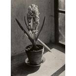
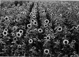
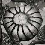
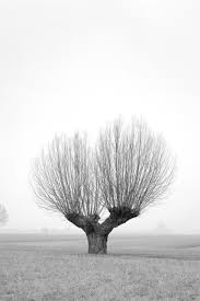
This is a collection of my favorite Albert RengerPatzsch work.
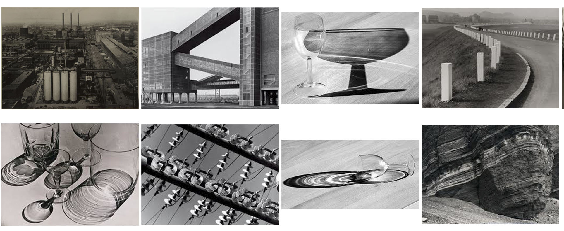

RESPONSE AND CONTACT SHEETS OF MY OWN WORK:
This is my response of Patzsch’s work in the form of contact sheets. like Patzsch, I focused on capturing very simple, everyday objects in a way that is beautiful and impressive. I experimented with light, changing the ISO settings on my camera and shutter speed, in order to capture images that are interesting and detailed. I found myself to often be using the macro setting on my camera when capturing up close photographs of plants, this allowed me to have clear and crisp photos that illustrated the detailed line work in the plants.
