

Garry Gay
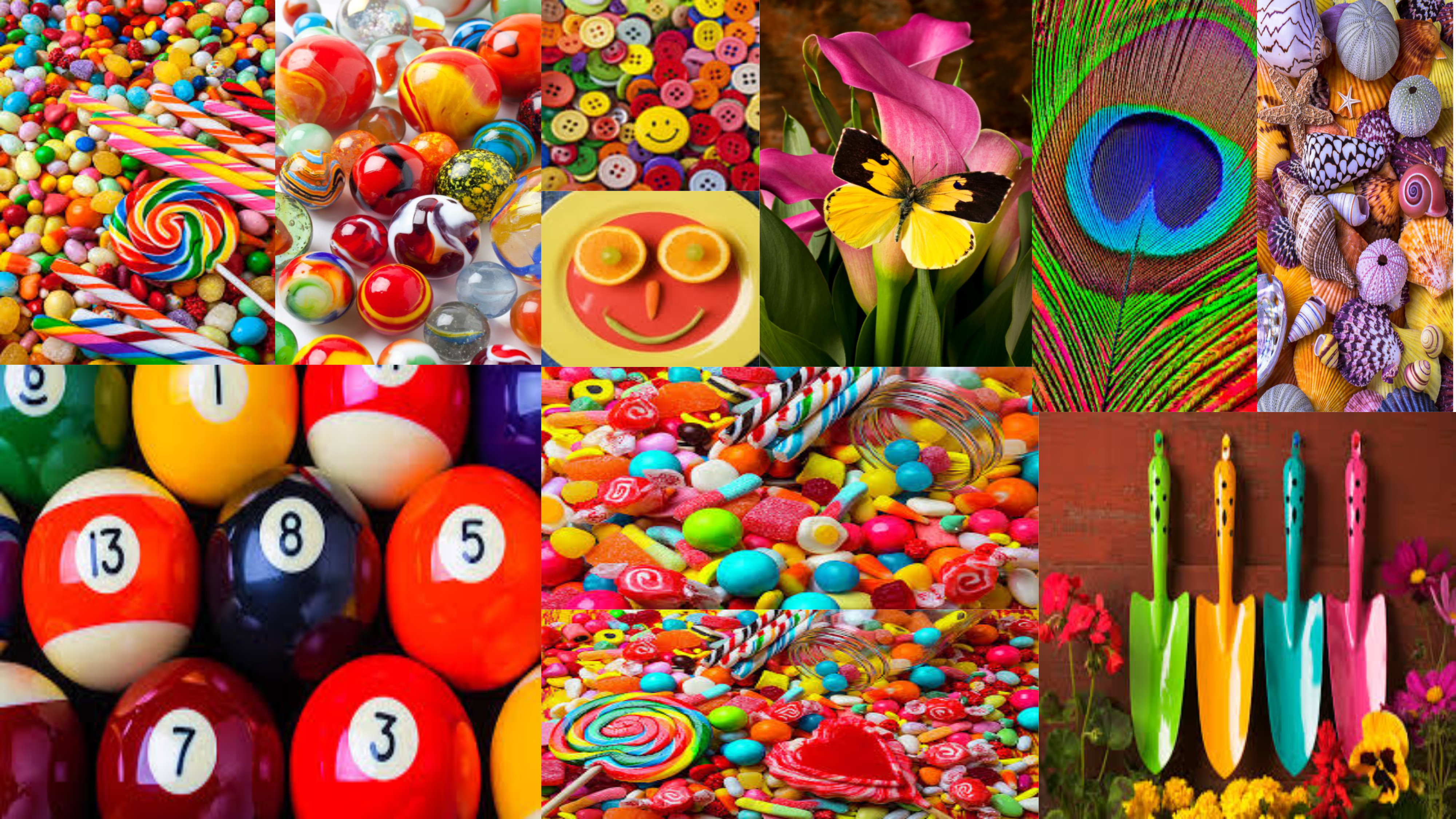
Gary Gay was born in Glendale, California in the year of 1951. He has been taking digital photographs since the year of 1993. Garry Gay has had a successful carrier as he has been elected president in many photography clubs. In these images he captures a range of colourful household objects and spreads them out to capture the different objects that stand out.
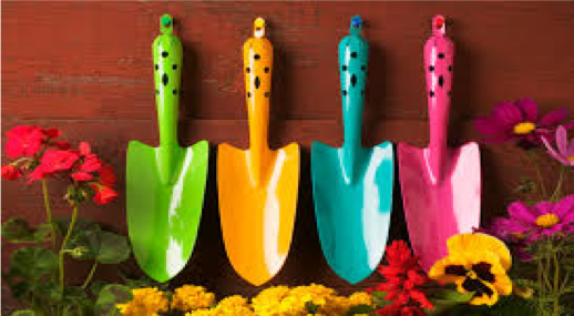
The main focus point of Garry Gay’s work is the different colourful objects that are satisfying to look at. The formal elements found in Garry Gay’s photography are shape and texture. Shape is shown with the different sized and shaped objects in the frame of the image and texture is shown through the materialistic objects. The lighting used in Garry Gay’s photography seems to be bright and artificial, which allows the main focus point to stand out. To capture these amazing images I think Garry Gay has used a quick shutter speed, this is because there is no intended blur in his images. The photograph is taken at a straight on angel, allowing Garry to showcase the different objects. Contextually, these images are usually transferred onto puzzles, mugs etc which informs us why so much colour is presented in his photographic series. This makes the product eye catching and will want the customer to buy the product because of the bright colours he has captured. The background of Garry Gay’s photography seems to be something plain which allows the main focus point stand out more, or Garry does not use a background as he is showing a collection of items which cover up the background. This informs us that he has used a wide depth of field as usually the whole frame is in focus. Moreover, this tells us that the aperture used to capture the images is high, which also allows the whole frame to be in focus. Within this image, we can see that there is no noise, which tells us the ISO is low, as it is not that sensitive to the artificial lighting. Overall, I like Garry’s work as it presented both colour and texture in a unique way. It shows simplistic objects, but the images are captured in a way to make them seem much more interesting.
Planning
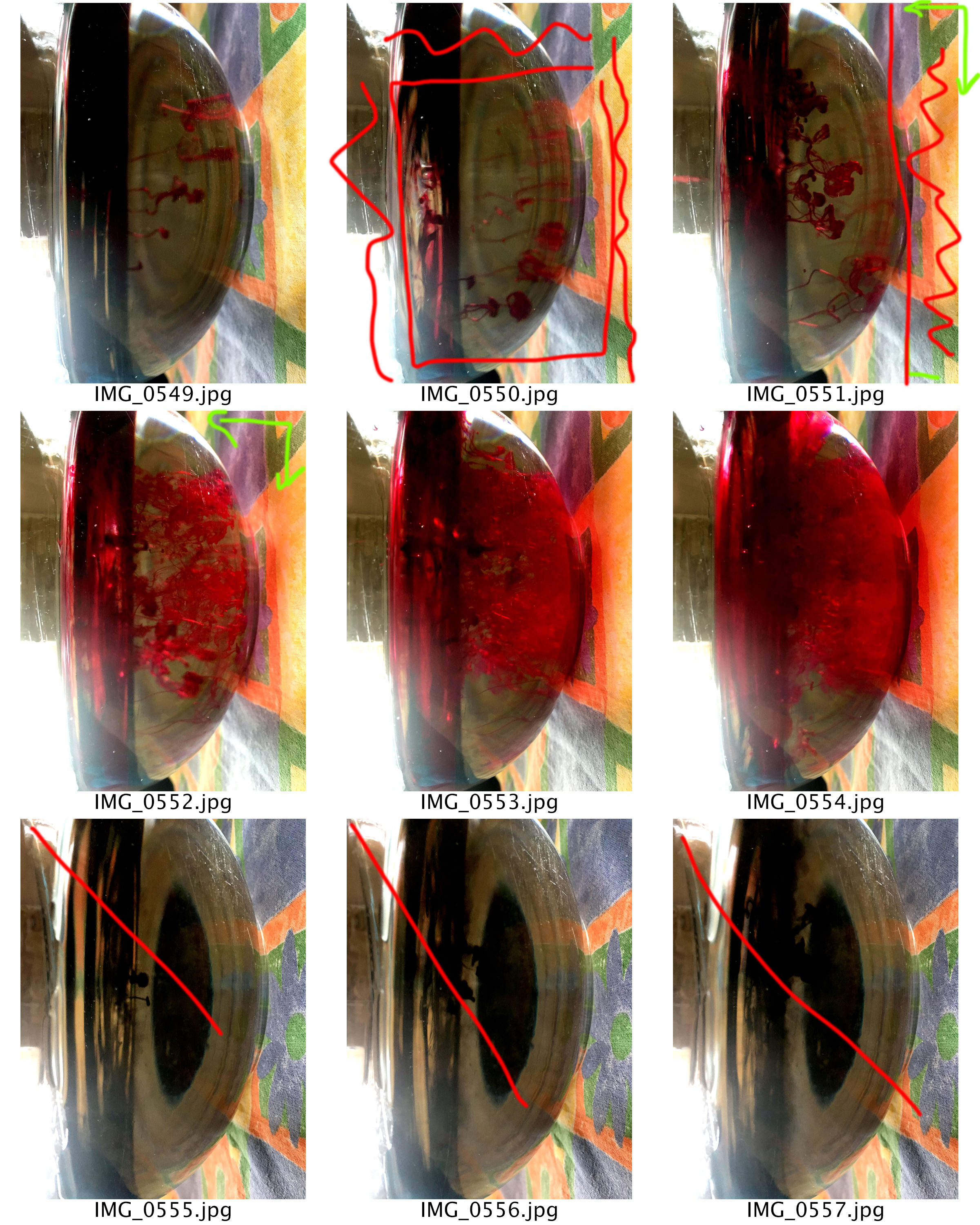
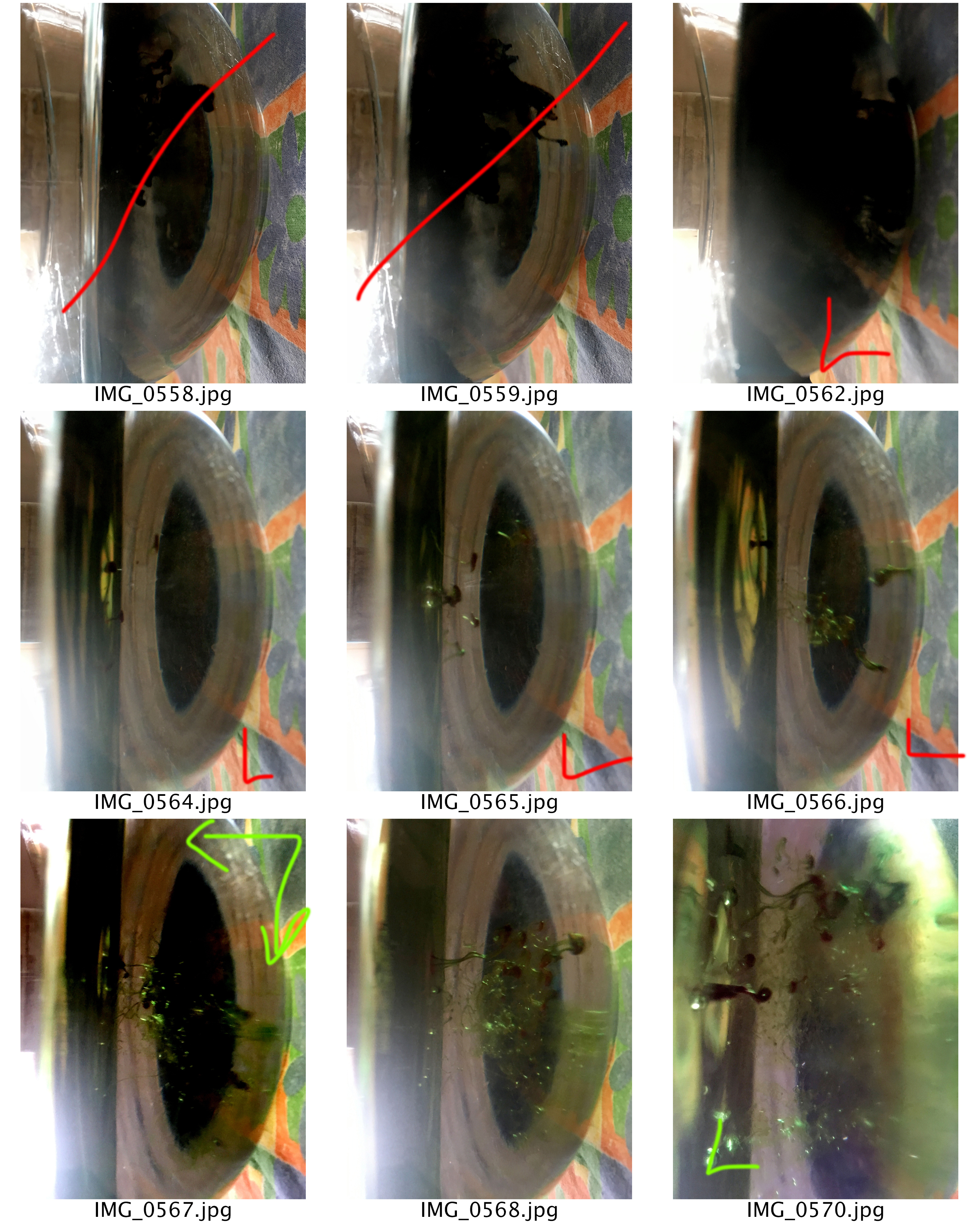
For this photoshoot I am going to look at capturing a collection of items, food and look at using a quick shutter speed to capture food colouring falling into water. I intend to copy Garry’s idea of collection of items, however the food colouring idea I thought of myself and thought that it would work well.
When Capturing the images, I will be using my DSLR camera on the manual setting, allowing me to control the aperture, shutter speed, focus and ISO. I will probably set these on a ‘standard’ setting but change them as and when I need to. I will capture these photographs indoors, using artificial lighting, allowing me to create different shadows. I will attempt to use a plain background as well, to make the images more like Gary’s.
For editing these images I want to look a different ways I could display the images, and manipulating them to make the photographs seem more captivating. The edits are not likely to be simplistic, however, I feel that it will help to presented the formal element of colour and texture.
Contact Sheets


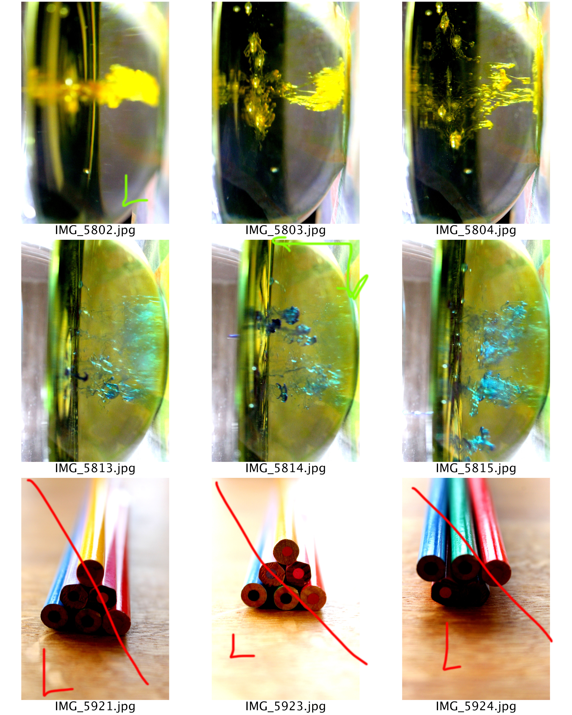
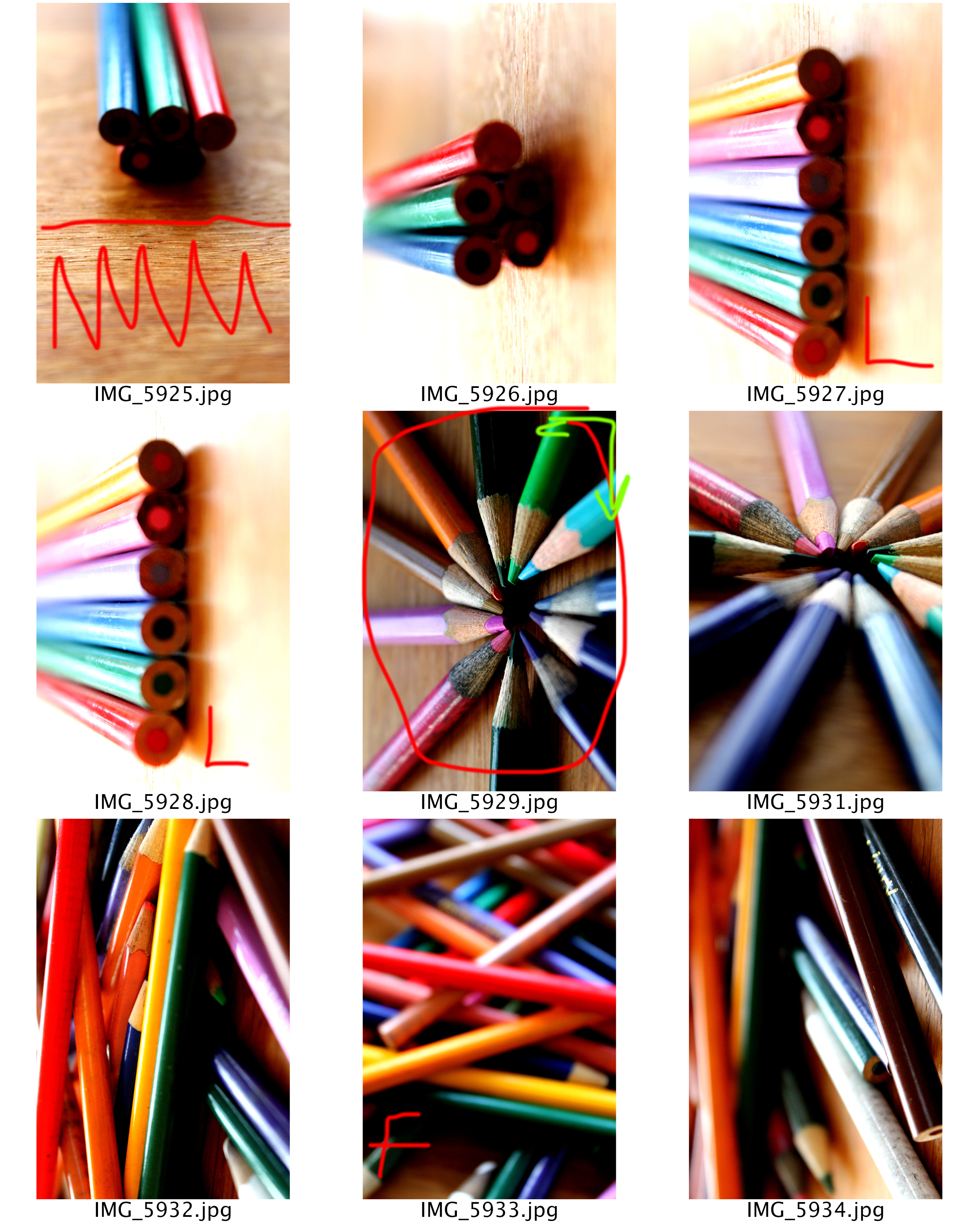


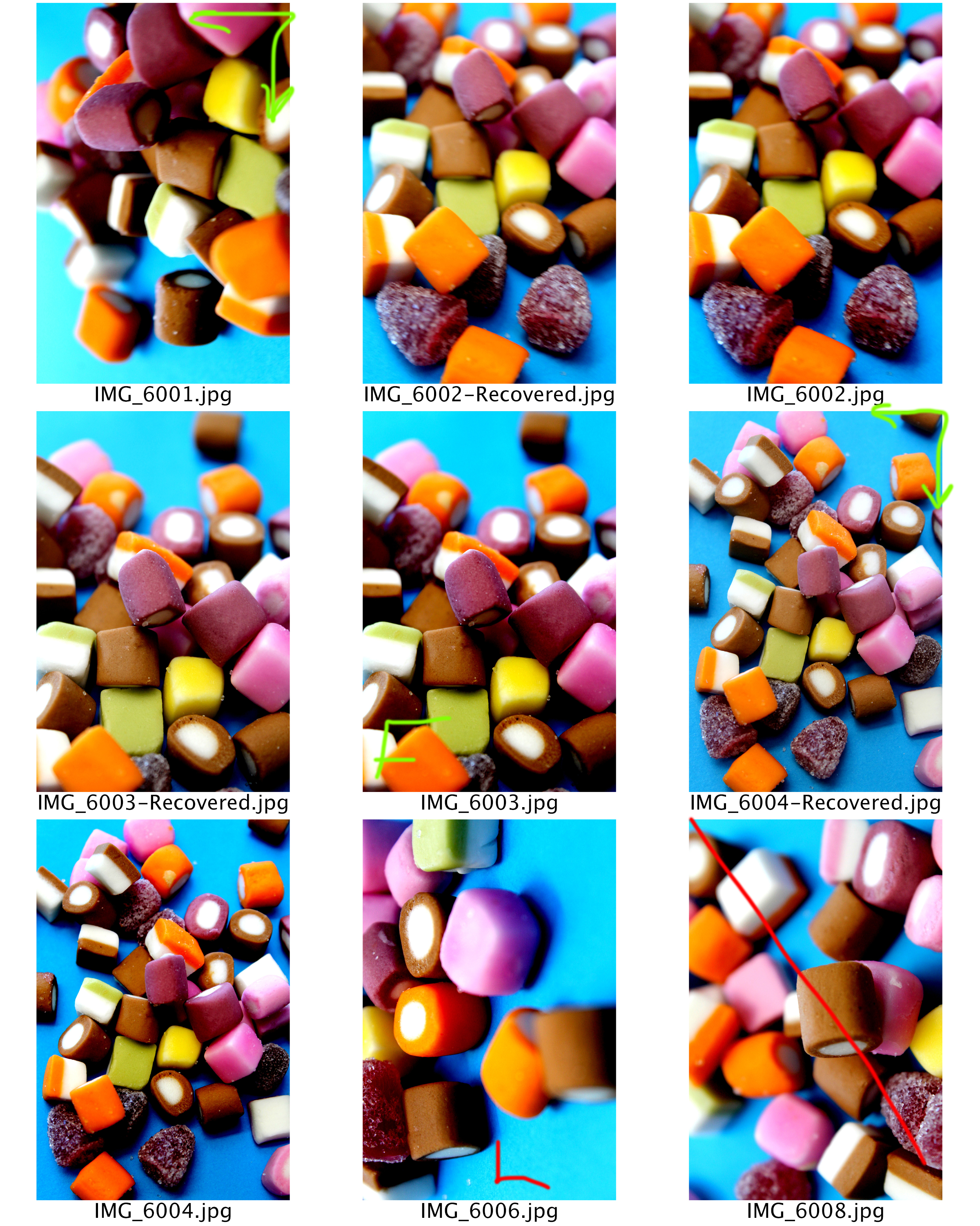


Edits
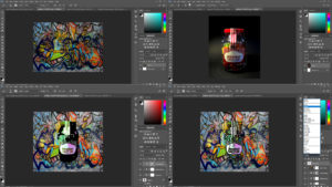
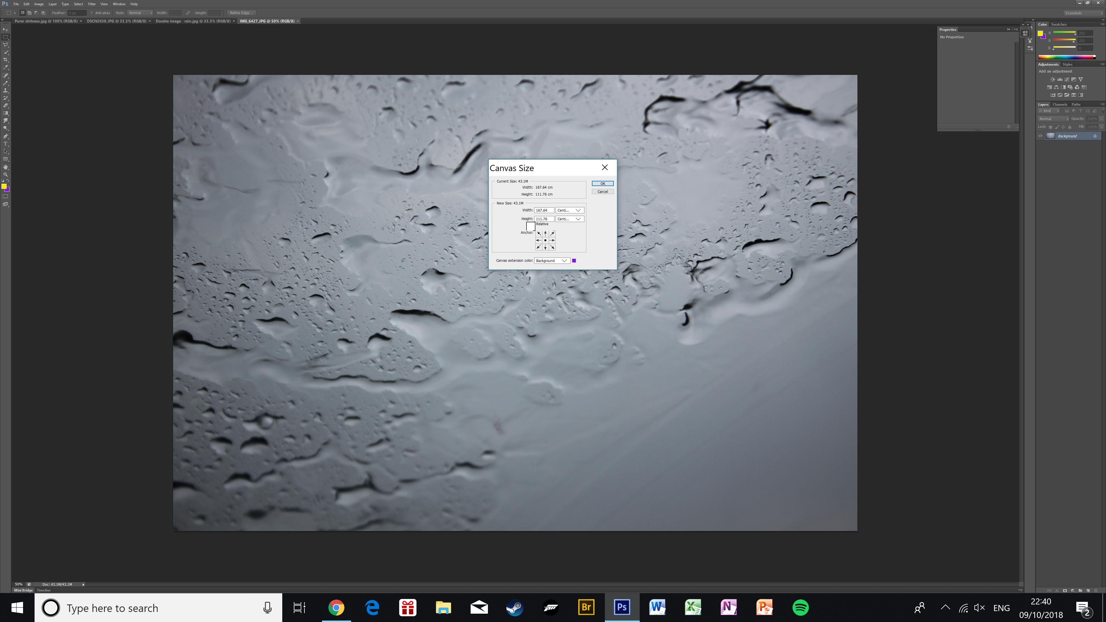
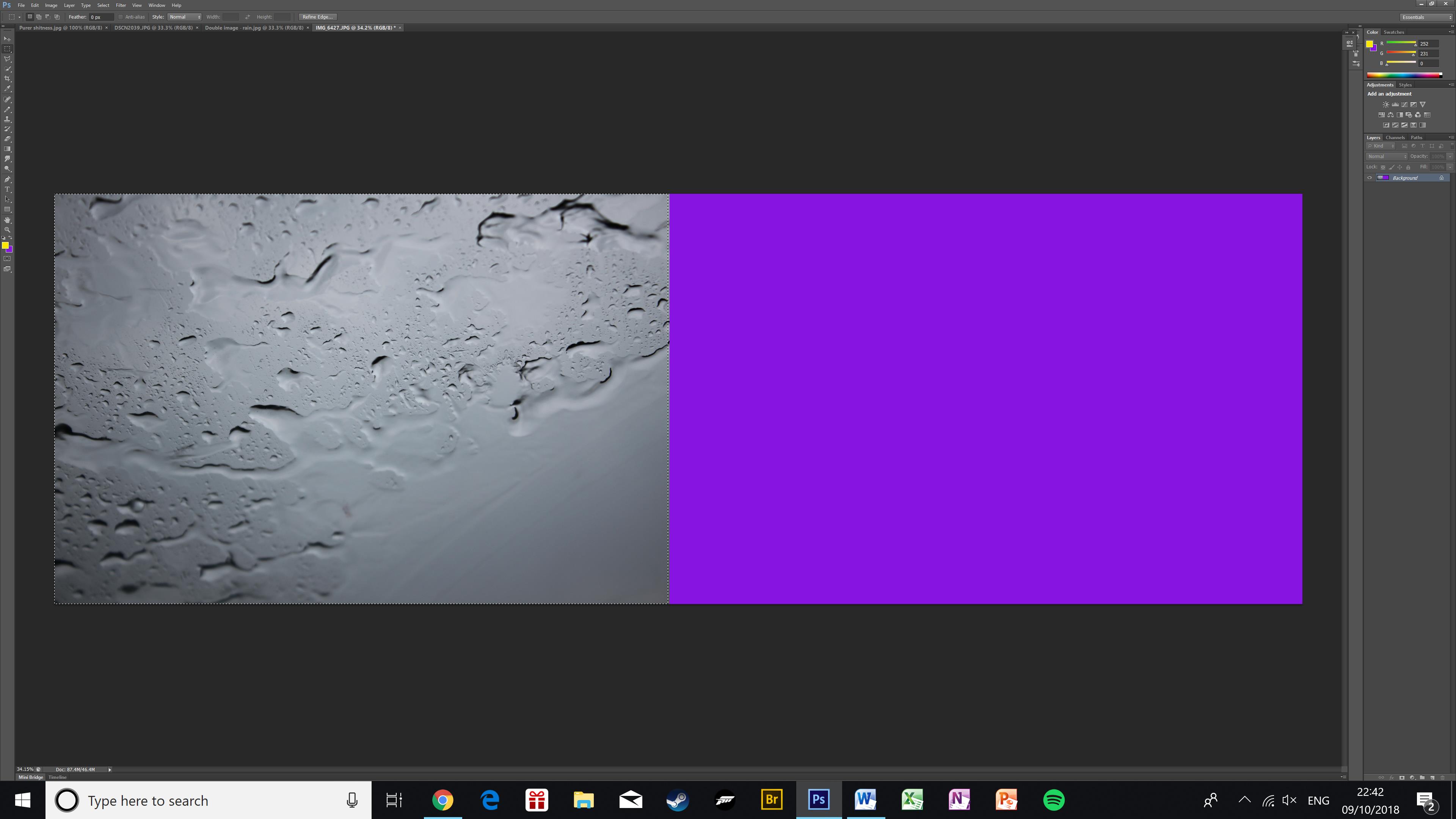
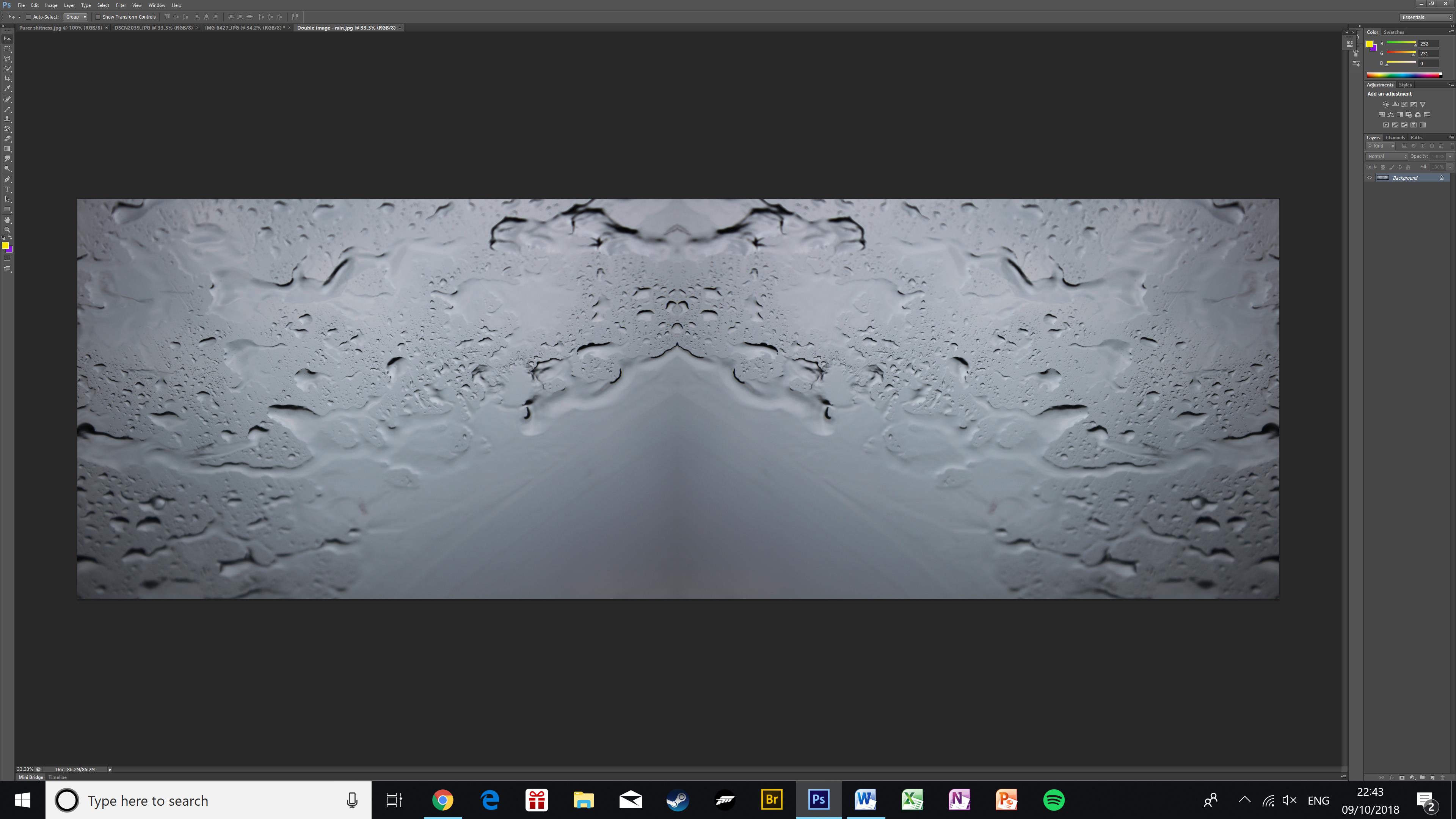
First of all I created a new document which was landscape. I then copied a graffiti wall image onto the page. Using a gunge paint brush I taped on it to create texture in the photograph. I then opened the photograph I wanted to use and used the quick selection tool to cut around it. I then pressed layer via cut and place it onto the graffiti wall page. I then used the cutout filter on the sweets. The I added a new posterize, hue/saturation, brightness adjustment layers. I ensured these layers were clipping masks to the sweets. I then on the brightness layer used the same brush tool as before to reveal some colour. Next I then created a new layer and pasted the sweet cut out on again. I then went to filter and added a photocopy sketch and then another artistic cut out. Then to make the image blend into the wall I set the blend mode to multiply
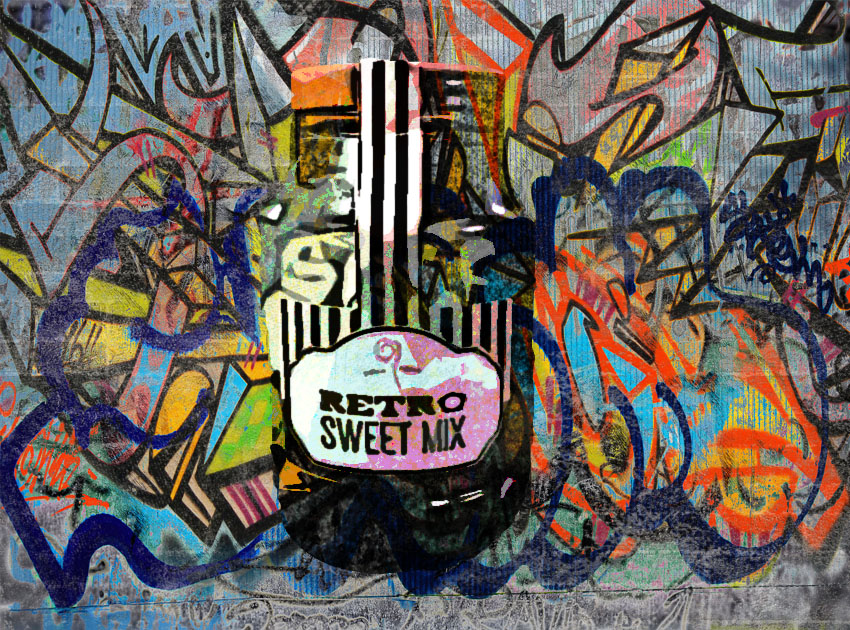
I am really happy with the way this edit has turned out. My image has been blended in with the graffiti wall, making it seem more realistic. The colours are complimenting each other making it pleasing for viewers to look at. Texture and colour has clearly been presented by the graffiti wall. Although this edit is not like Garry’s I feel that I still have met the same artistic intention that Garry had when capturing and editing his images.
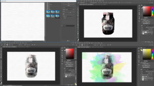
First of all I opened a new landscape document. I then went into the filter gallery and then into texture and then selected the texturize filter. I ensured that the scaling was 150% and the relief was 3. I then pasted the photograph I wanted to use onto the textured document and desaturated it by pressing ctrl + U. I then went into the filter gallery and set the filter to water colour. I then added a vector mask to this layer. I then used a paint brush tool and black paint on the vector mask to dissolve some of the photograph, in order to add the bursts of colour later. I then created a new layer. Using pastel colours a used another water colour paint brush and started tapping around the sweets. I made sure that the colours blended well.
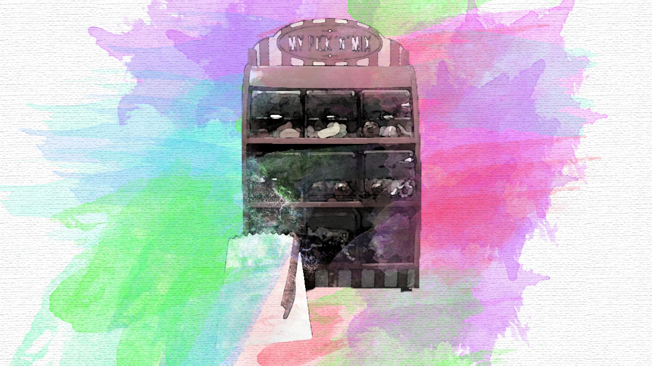
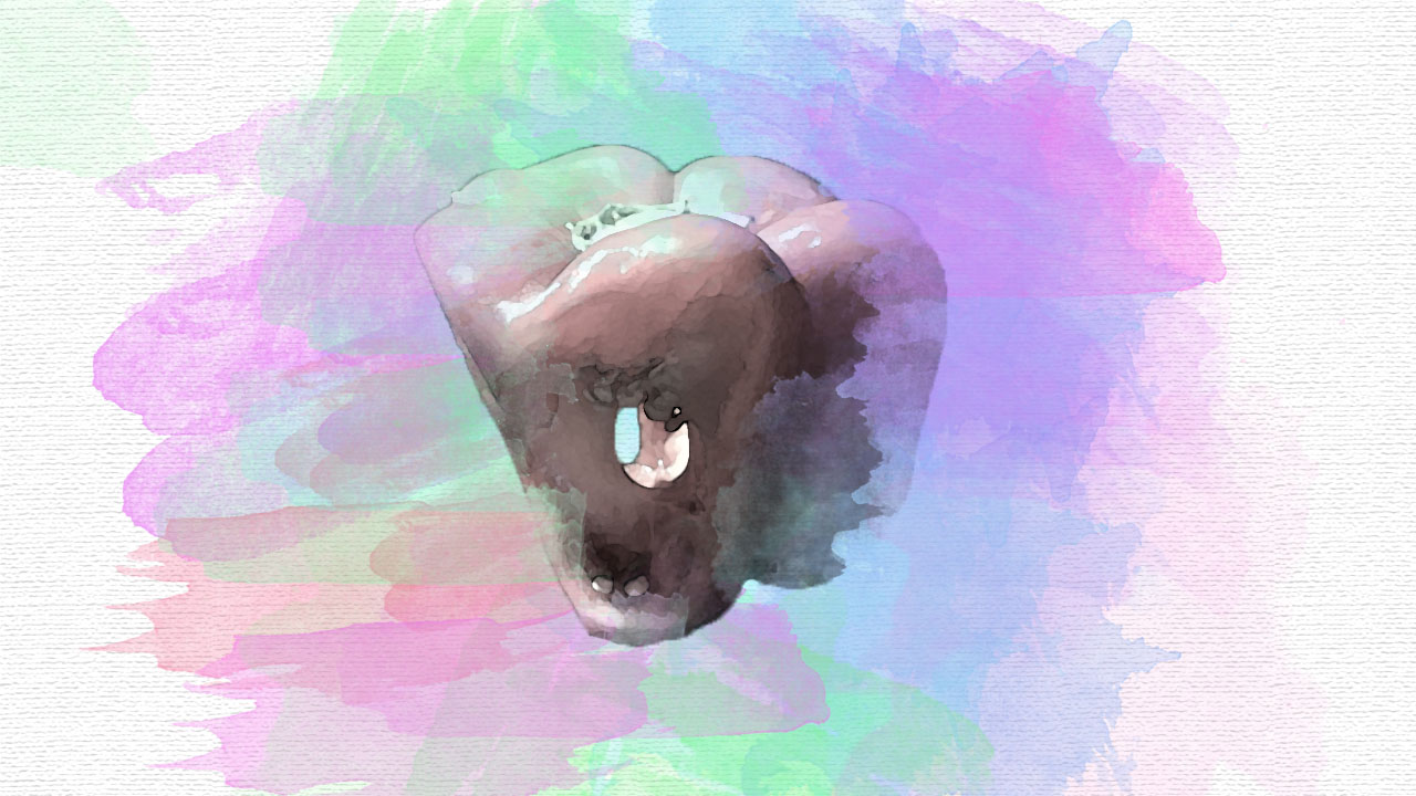
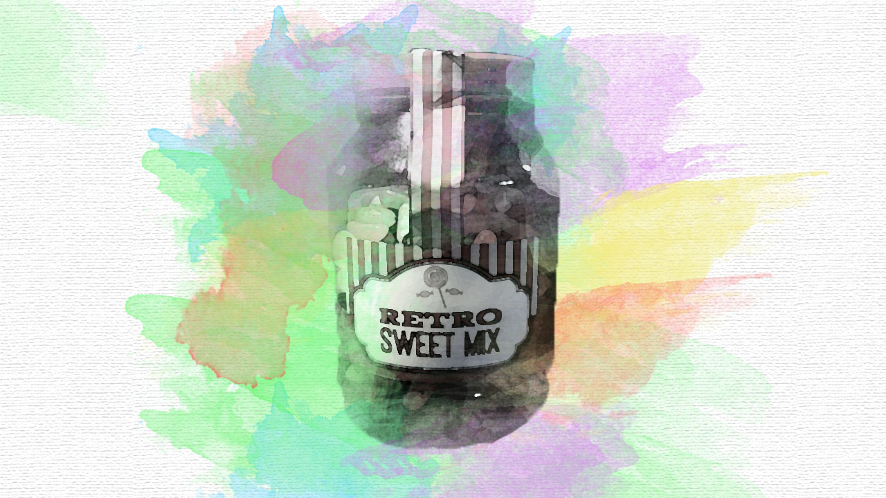
The three edits present the theme of colour, through the watercolours which are bursting out of the main focus point of the edit. The subjects have been pixelated, to present the formal element of texture and the background has been kept plain. This allows this edit to be more like Garry’s and allows the subject to stand out more, has more emphasis on the subject.
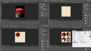
First of all I selected all the photographs I wanted to use. I used the ellipsis and tool and cut out a circle in the centre of the photograph. I then created a new document in order to put the circles on. I then turned the background colour to cream. I then moved the circle onto the new document and resized it by pressing ctrl + T. I then repeated this step till all the circles where on the document. I then added drop shadows to all of the photographs to add depth to the photographs.

The circles are used to help display certain aspects of these four images. Each section clearly shows colour and texture, making them all like each other in a way. The circles have a drop shadow and stroke, which pushes the sections forward making them stand out more. In this edit the background has also been kept plain, to allow the circles to be the main focus point and to make this edit more like Garry’s work.
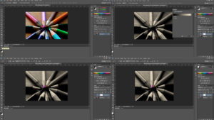
First of all I selected the image I wanted to use and re levelled it. I then ensured that black and white where my colours on the colours panel. I then added a gradient map by pressing the adjustment layer > gradient map. I then ensured that the vector mask was white . Then using the paint brush tool I used the black paint and paint over the areas I wanted to be in colour. As I painted over the colour started to reveal. If I painted over an area which I did not want coloured, I used the white paint and it went away.

I really like the use of the colour splash, as it allows the tips of the pencils to have a burst of colour. This edit only really presents colour, however I still believe that this edit is still as successful as the rest. I like how only a certain section of the image is in colour as it allows the viewers eyes to be drawn to there first, making it the main focus point. I also believe that this edit still has met the same artistic intention that Garry had when capturing and editing his images.
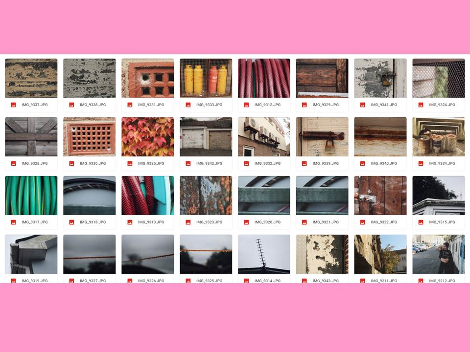
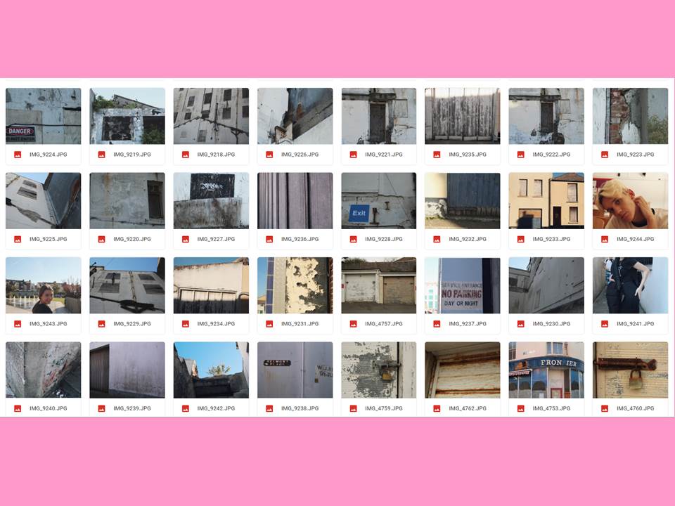
For this task I took inspiration from Aaron Siskind. He focuses on aged and peeling surfaces, for example: old posters left to rot or old wall paint.

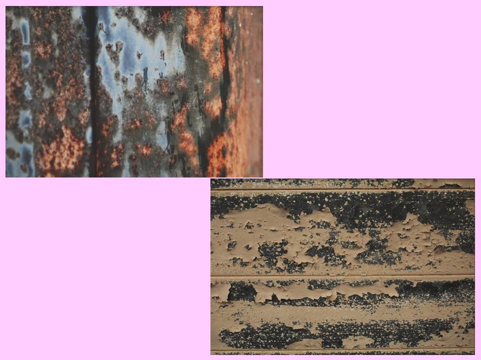
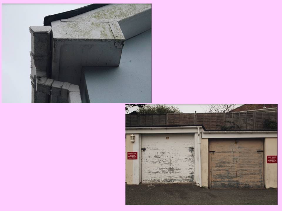
From the stimuli given from Siskind’s work, I focused on the ‘decay’ of walls and buildings which all fitted into our urban lifestyles. My first shoot was based in the old Jersey Brewery, which is now being slowly nocked down and being turned into apartments. However this means there’s more parts of the old building being revealed. I mainly focused on the decay of the building’s crumbling walls and peeling paint.
My response
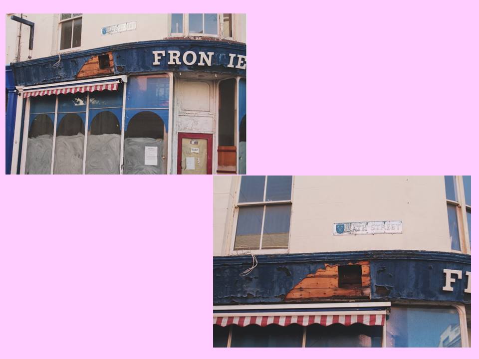

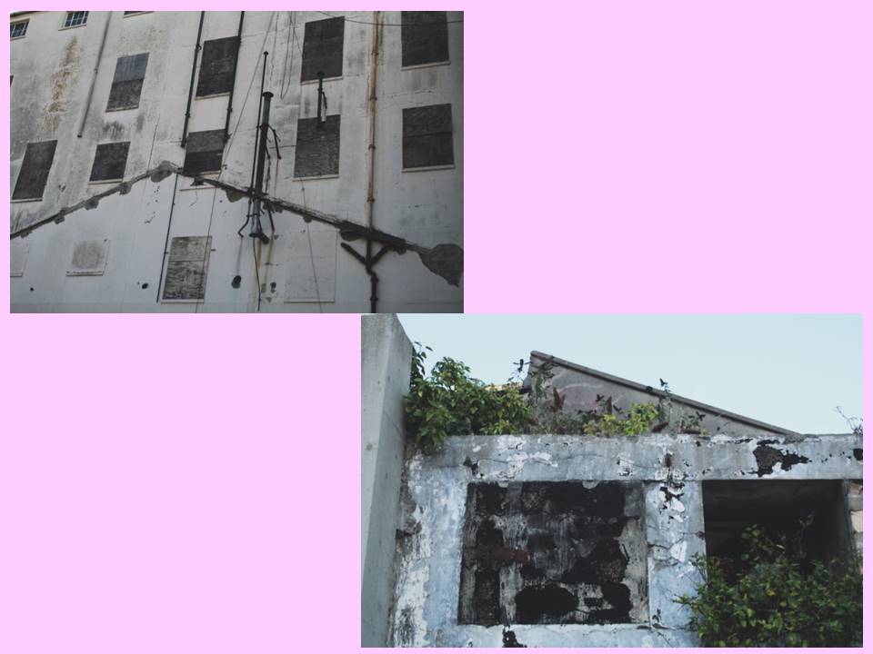
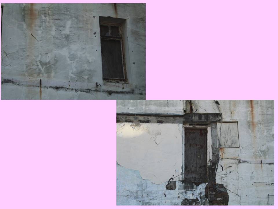
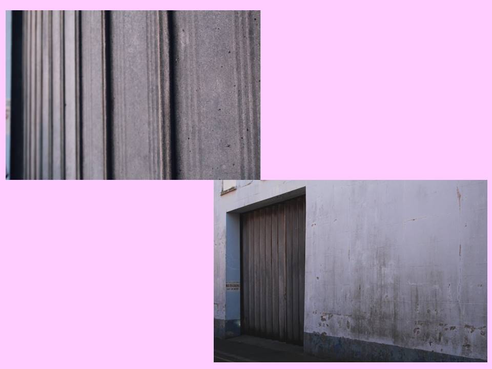
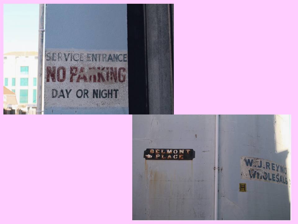

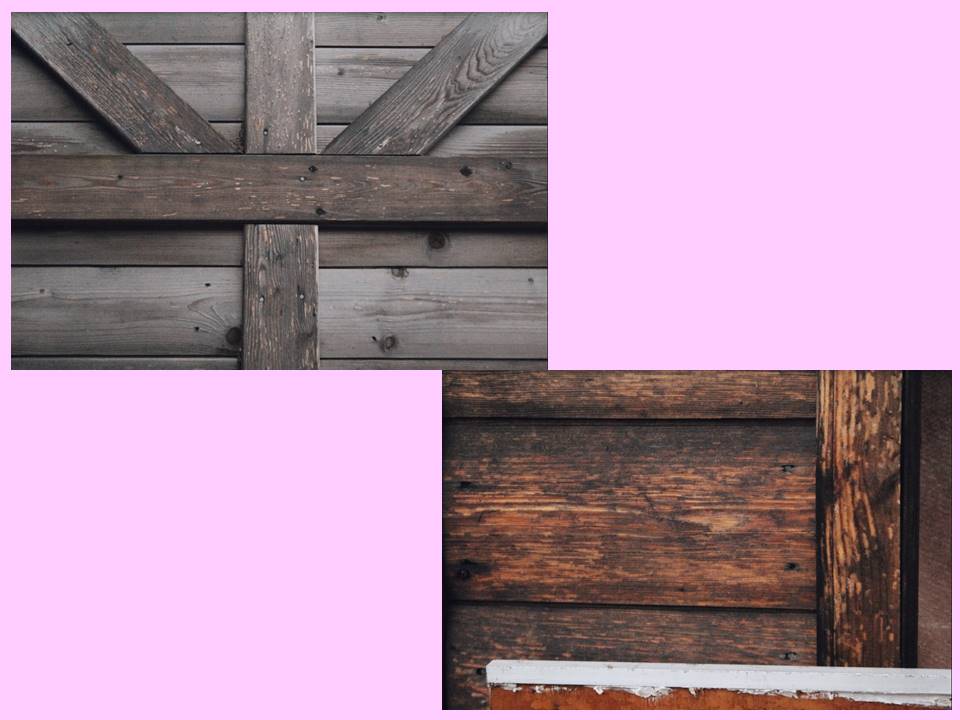
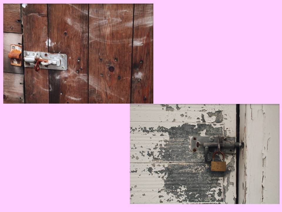
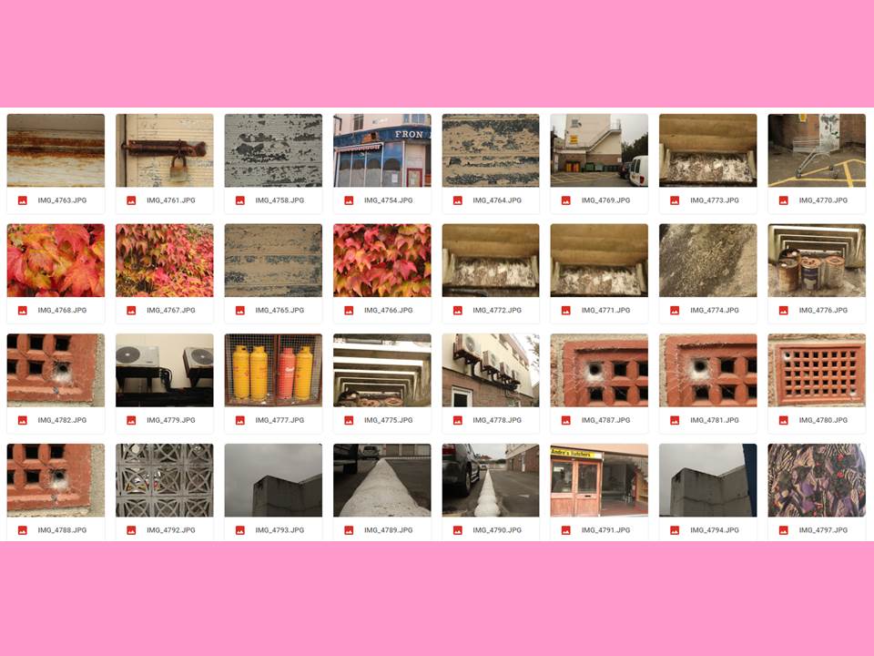
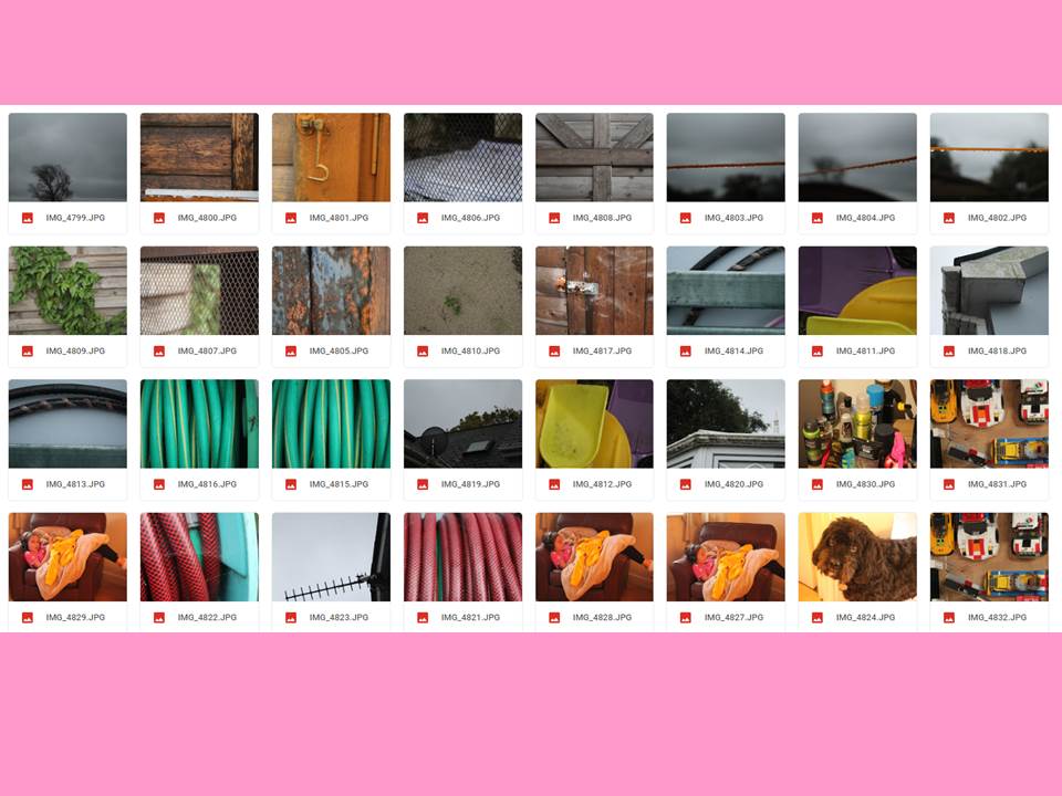
My second response involved focusing more the textures and lines that came naturally either from natural or decaying objects.
My Second Response
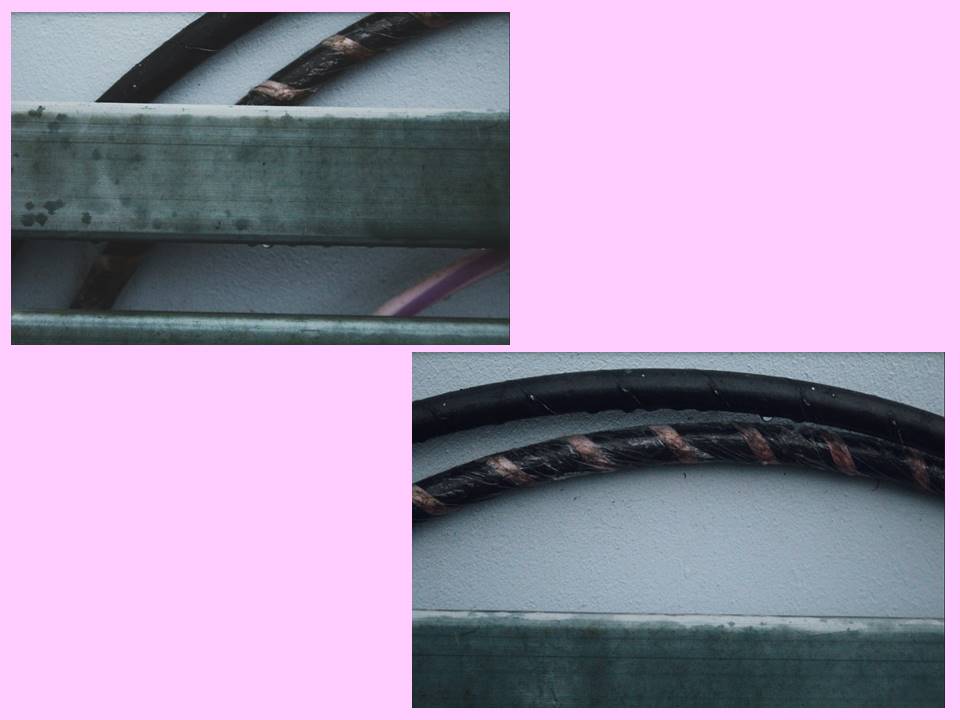

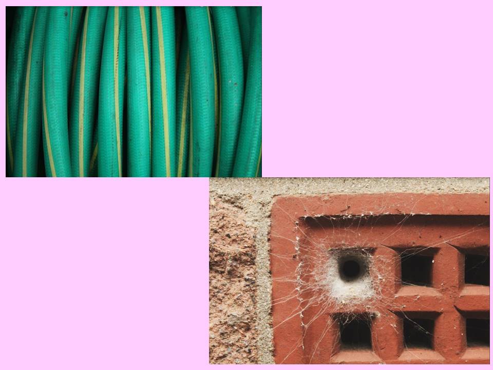
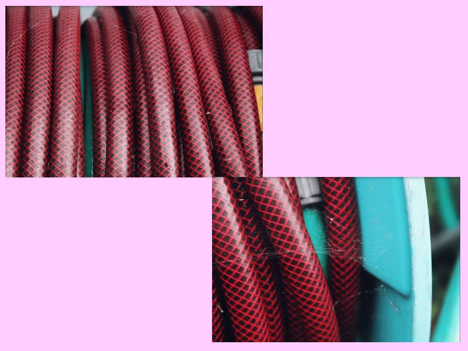
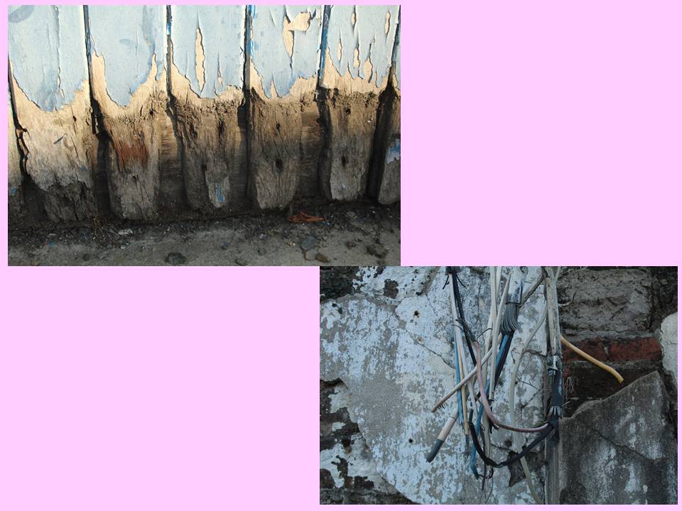
Depth of Field:
In photography, depth of field determines the closest and farthest objects in an image. This can involve the entire image being focus or something in the foreground or background being sharp while the rest of the image appears unfocused. This is useful in highlighting a certain aspect of a frame and can enhance the importance and effect of an object.
Three main factors that affect a photographer’s control over depth of field are the aperture, proximity to the image being photographed and the focal length of the camera lens.
Large aperture = shallow DOF
Small aperture = deep DOF
My Examples:
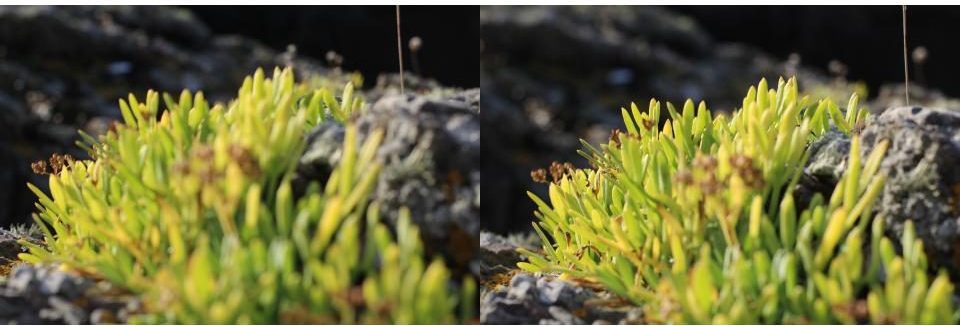

As visible in the frames above the depth of field greatly affects the appearance of an image. The first two images are focused on the furthest away section of the plant in relation to the position of the camera and create a relatively bland image while the bottom two images are focused on the section of plant in the foreground highlighting the stem in the centre of the image, giving the composition much more life and dimension with different colours and shapes making the image more interesting.
Further Examples:
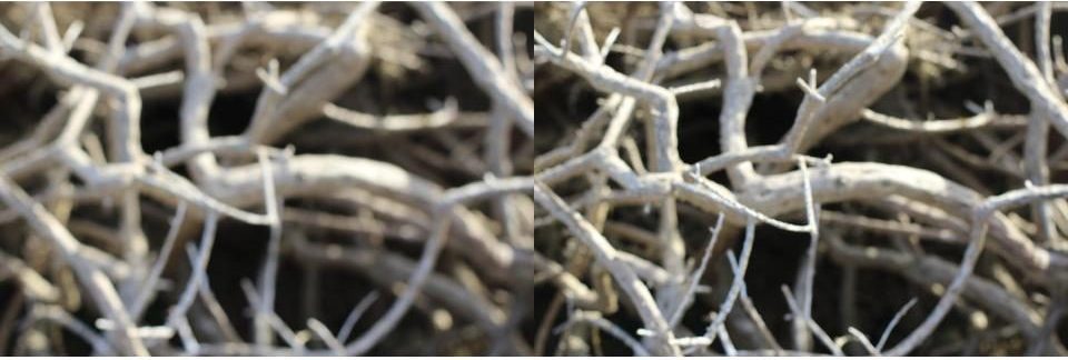
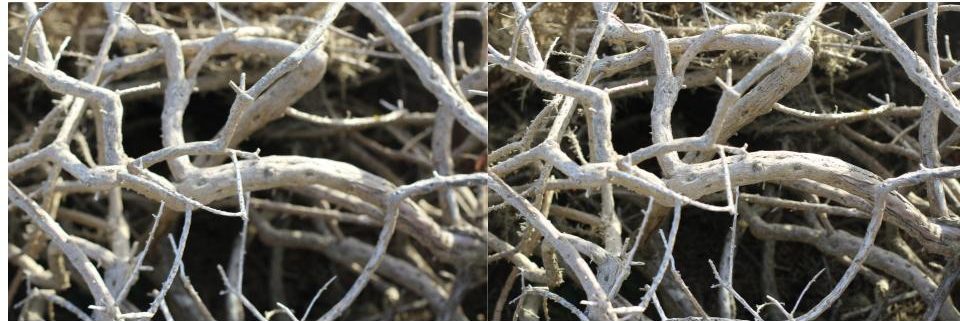
This is another example of how depth of field reveals different layers of an image, creating different focal areas. This creates a more dramatic image as aspects of the frame are much sharper and bolder.
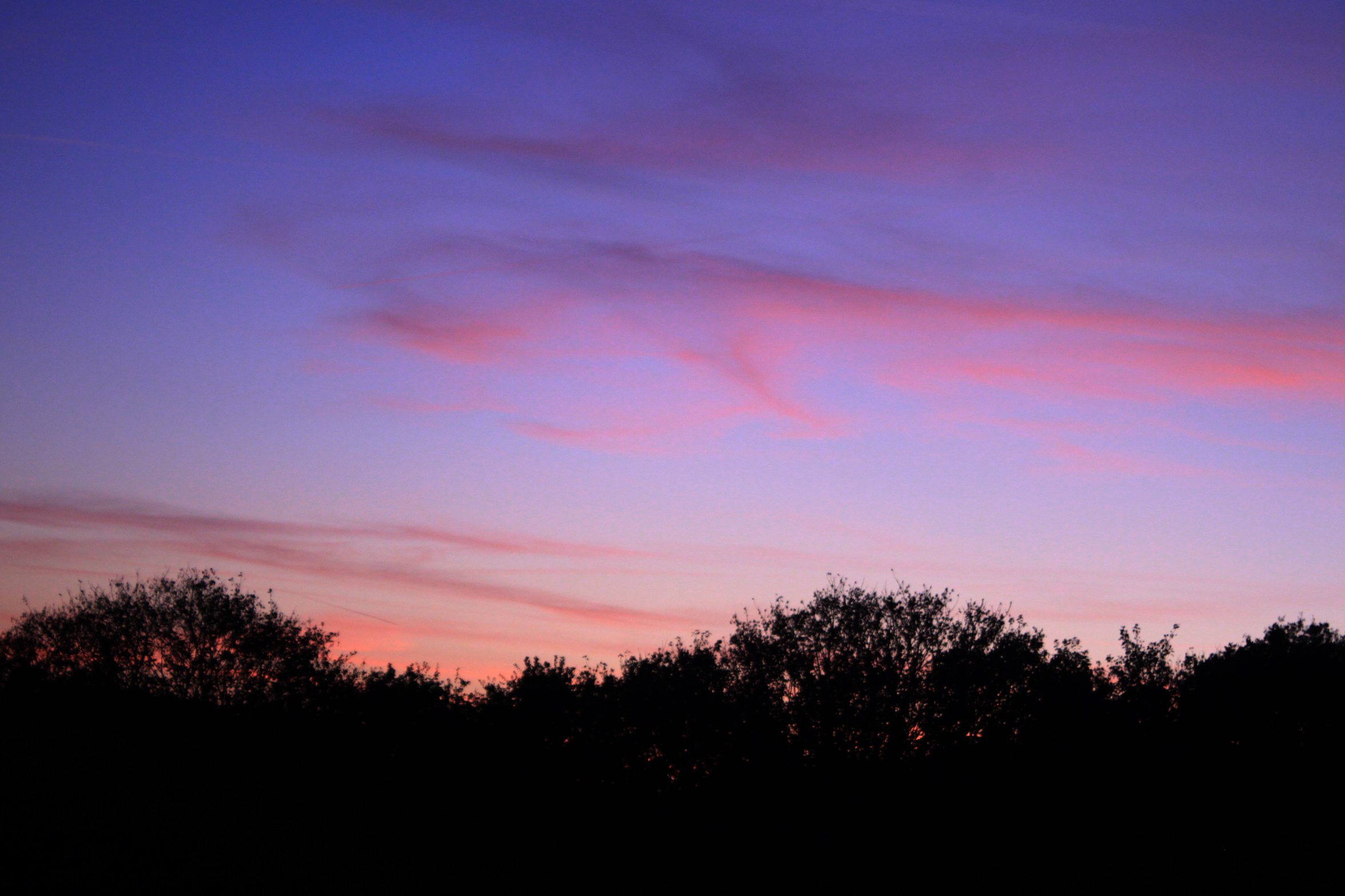
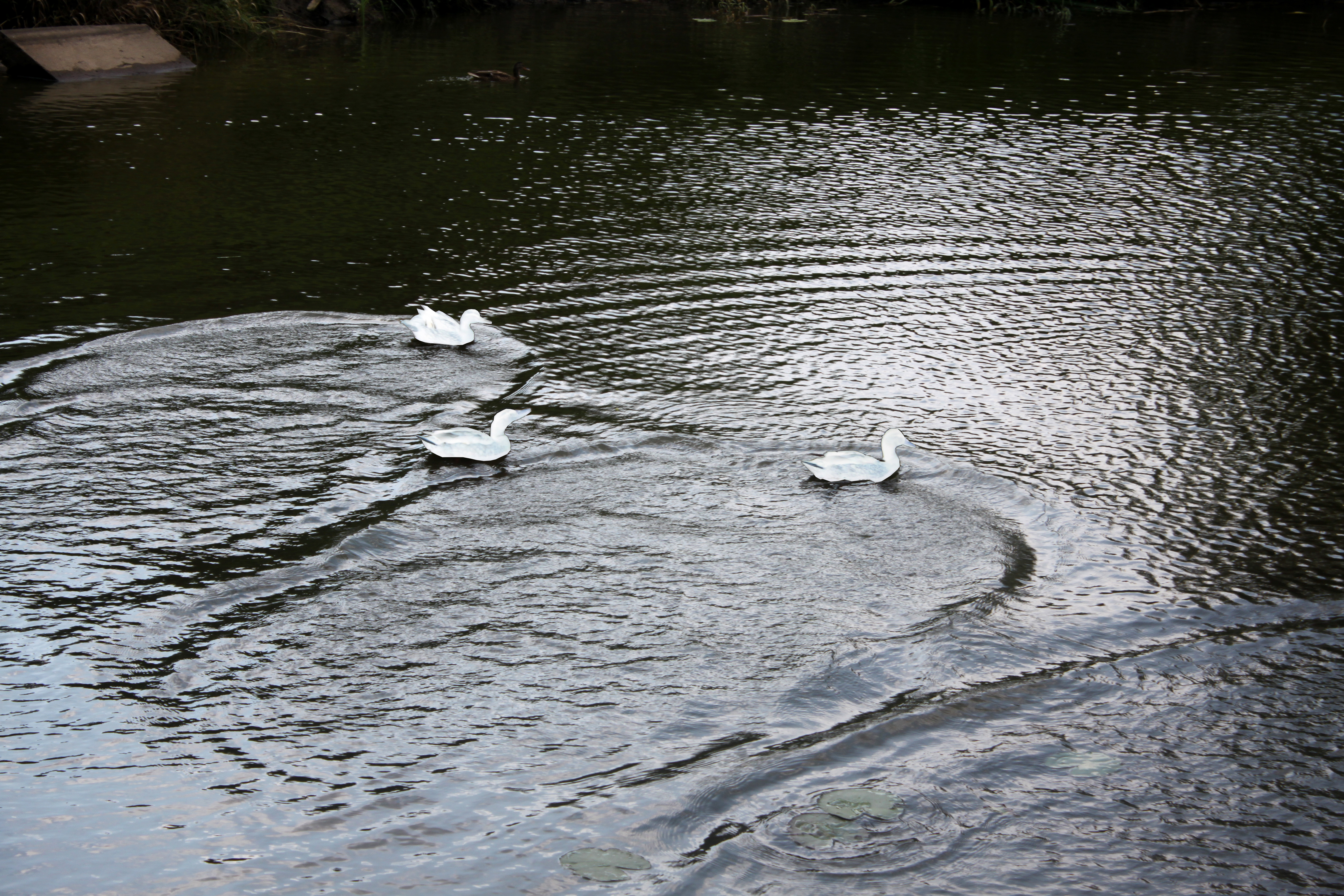
Shutter-speed allows for a camera to pick up on movement, and record the movement in a single photograph. Shutter-speed is the length of time that the sensor of the camera is exposed to light, and so the longer the shutter-speed, the more movement and light the camera can track.
Shutter-speed is useful when attempting to give the sense of movement, and can allow for an image to seem like it has captured a subject moving from one place to another. Examples of images taken with slow shutter-speeds can be seen below:


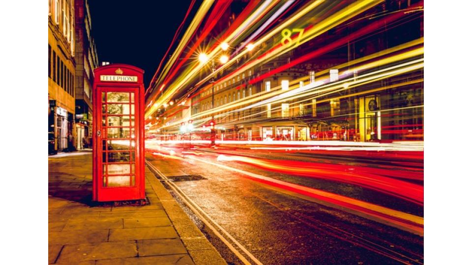
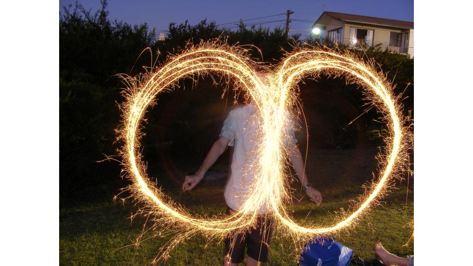
As using a slow shutter-speed tracks movement, this setting is useful for sports adverts, travel adverts, and any photograph used to show a busy area or the speed of an object.
Shutter-speed can be adjusted by turning the main control dial. Doing this makes the shutter-speed wither faster or slower, and so the shutter-speed can be adjusted easily depending on what kind of photograph is being taken.
The following are examples of photographs I have taken using a slow shutter-speed (of 0 “4 or 0 “6):
These images are taken of light, late at night, as this best shows the movement in a clear and obvious way. In some of the photos the source of the light itself was moving (e.g a cars break lights), and in others I manually moved the camera. The movement of the light was tracked due to the slow shutter-speed, and an be seen in the images.
Shutter-speed can also be adjusted to become faster than normal, meaning that clear images of objects that are moving fast can be captured, showing a freeze-frame of the object without showing it’s movement. Examples of images using a fast shutter-speed can be seen below:
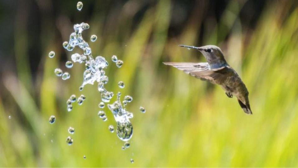


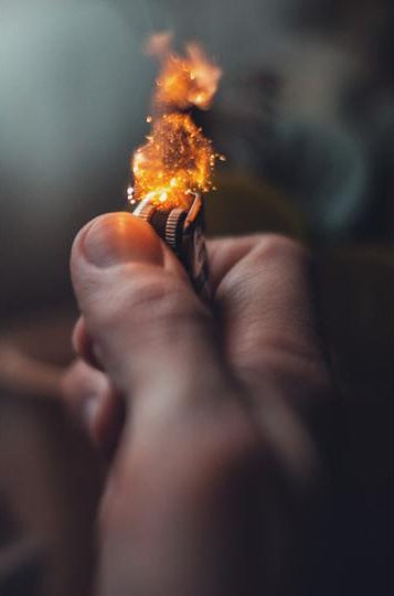
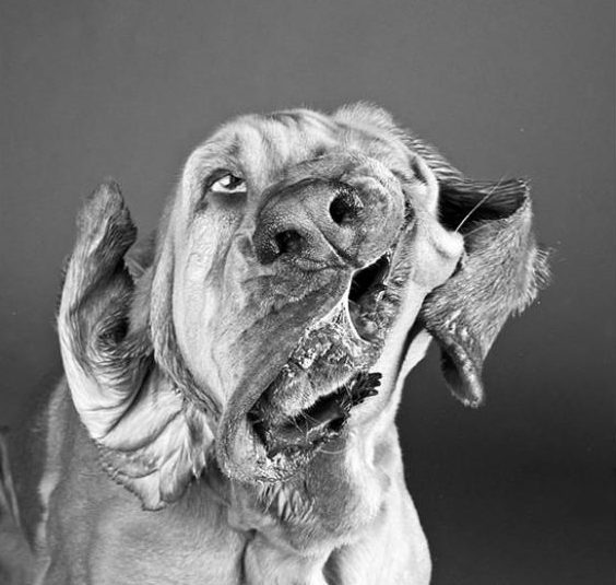
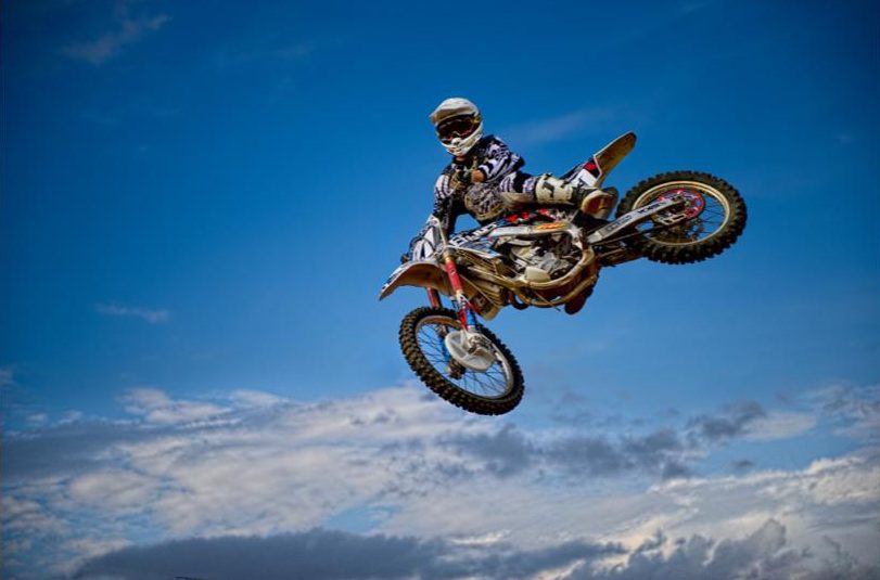
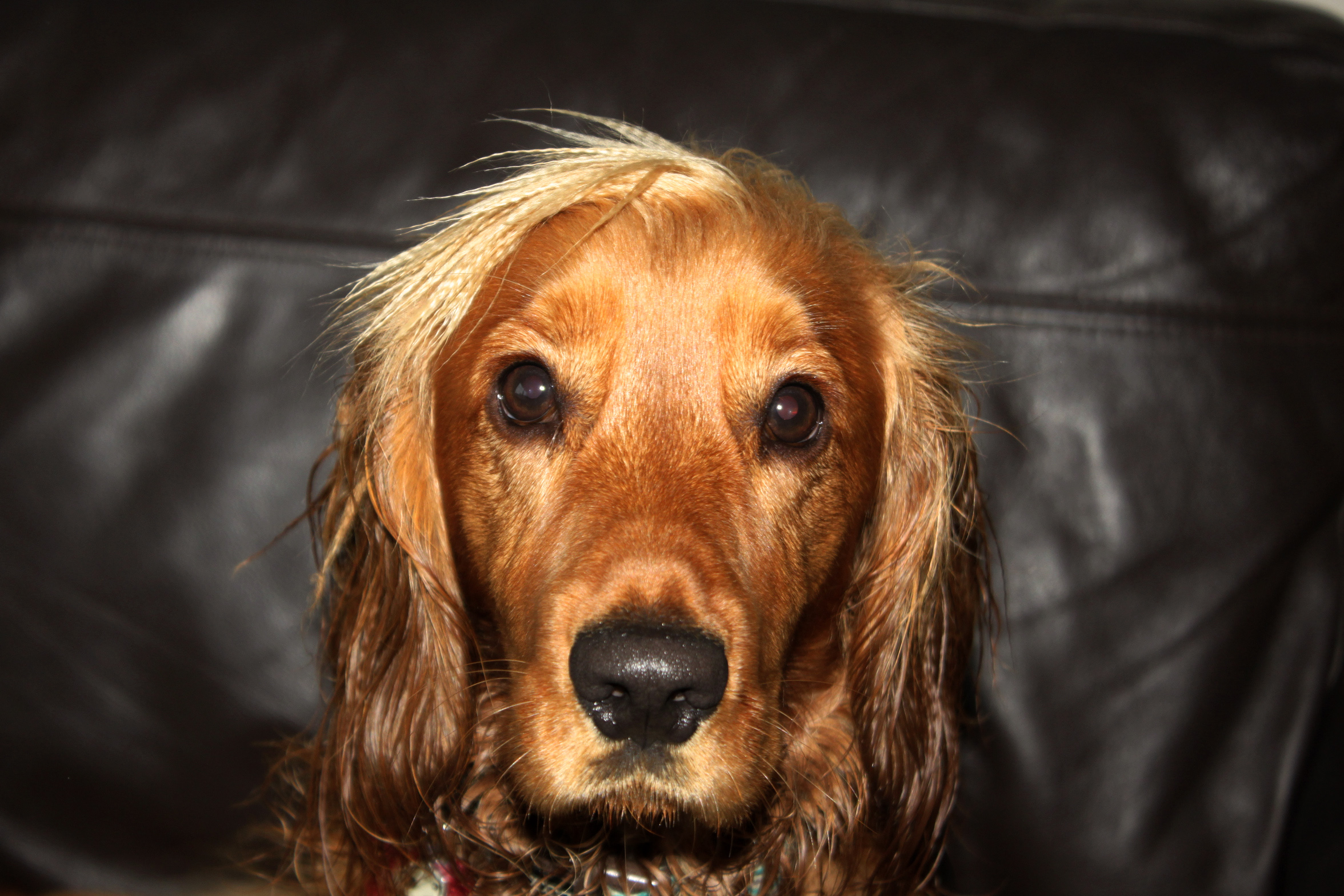
Images like these can be taken and used to show a different perspective of a familiar situation, freezing what is normally a fast action (like a dog shaking). This gives the viewer an interesting look at a situation, and can be used to draw the eye and increase interest.
Keld Helmer-Petersen:
Helmer-Petersen was born and raised in the Osterbro quarter of Copenhagen (Denmark). His interest in photography began in 1938 when he received a Leica camera as a graduation present. He became aware of international photography trends early on in his photography career. Helmer-Petersen’s interest in contemporary art and architecture heavily influenced his work, as he became one of the first Danish photographers to begin working on abstract photography.
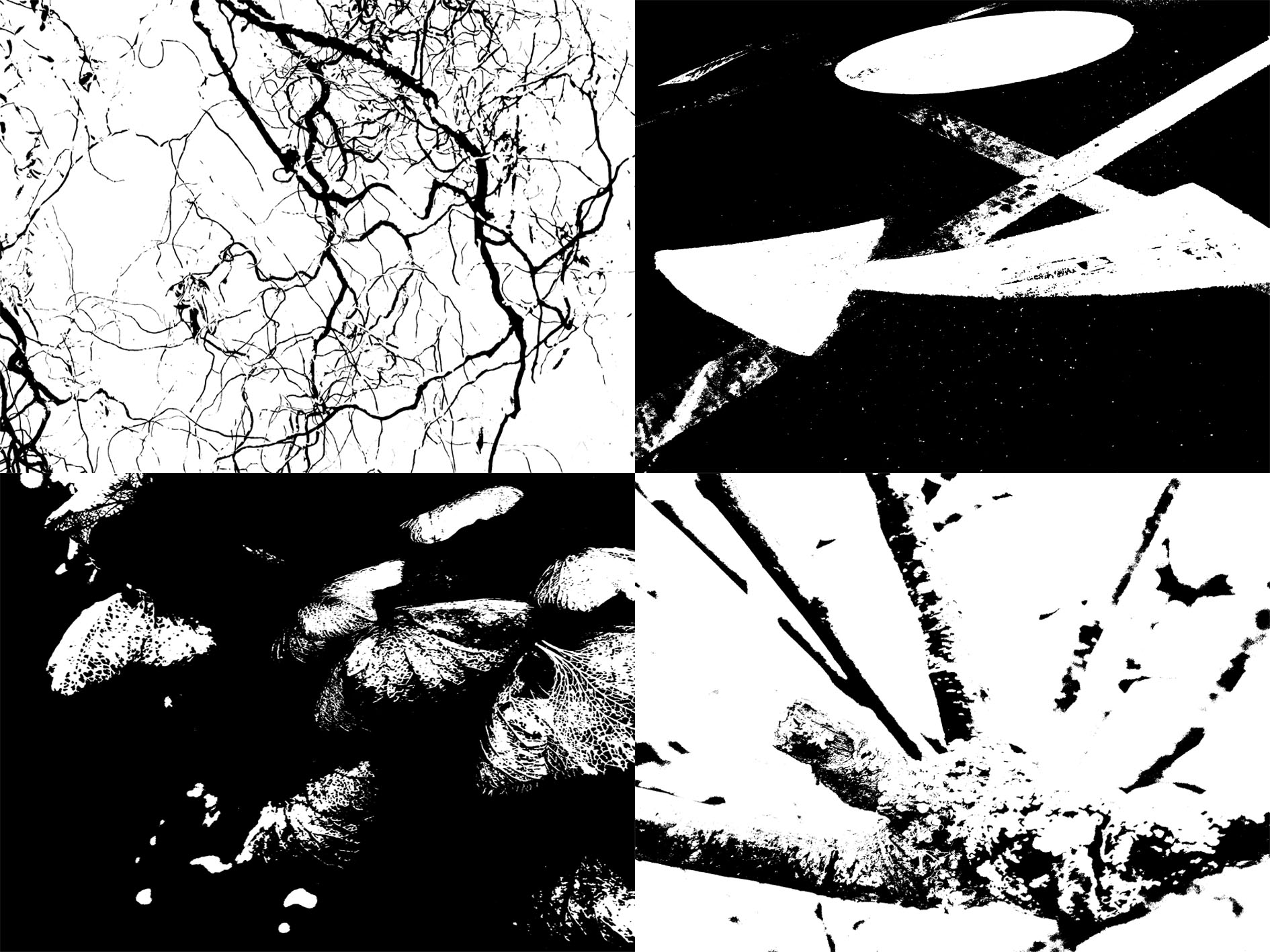
Helmer-Petersen used high thresholds to give his work a dramatic finish. The frames below are examples of my response to the work of Helmer Peterson.
My Response:
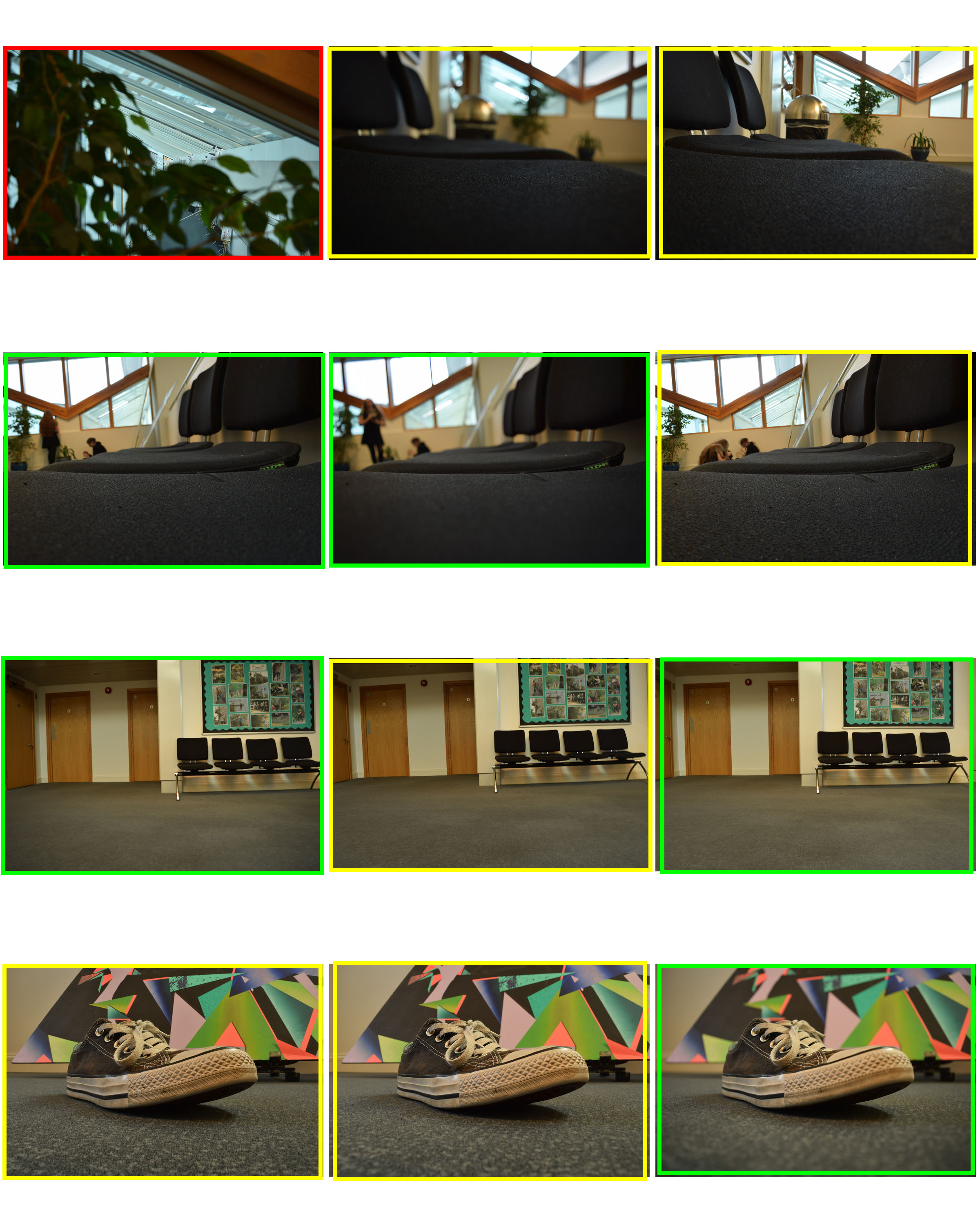
For my experimentation into aperture and how it effects the depth of field of my photographs, I took multiple photographs of the same subject in order to compare the differences.
Changing the aperture allowed for the depth of field of my image to change. Lowering the aperture meant that the parts of the subject that were in focus were much smaller and more specific, and more of the image was thrown out of focus, whereas raising the aperture allowed for more of the image to stay in focus, and less of the image was thrown out of focus.
Using a lower aperture allows for more emphasis to be placed on the subject still in focus, and draws more attention to specific parts of the subject that are in focus. The following images are the result of my photo shoot, each using different apertures.
For many of the photos, I used the same subject, but either lowered or raised the aperture. Adjusting the aperture also meant that I had to adjust the ISO, depending on how much light was being let into the image. For example, a higher aperture would make the image darker, and so I raised the aperture to allow more light, which makes the image more visible.
Below is an example of where I took 3 images of the same subject, but adjusted the aperture and the ISO, meaning the the depths of field and focus points vary from image to image:
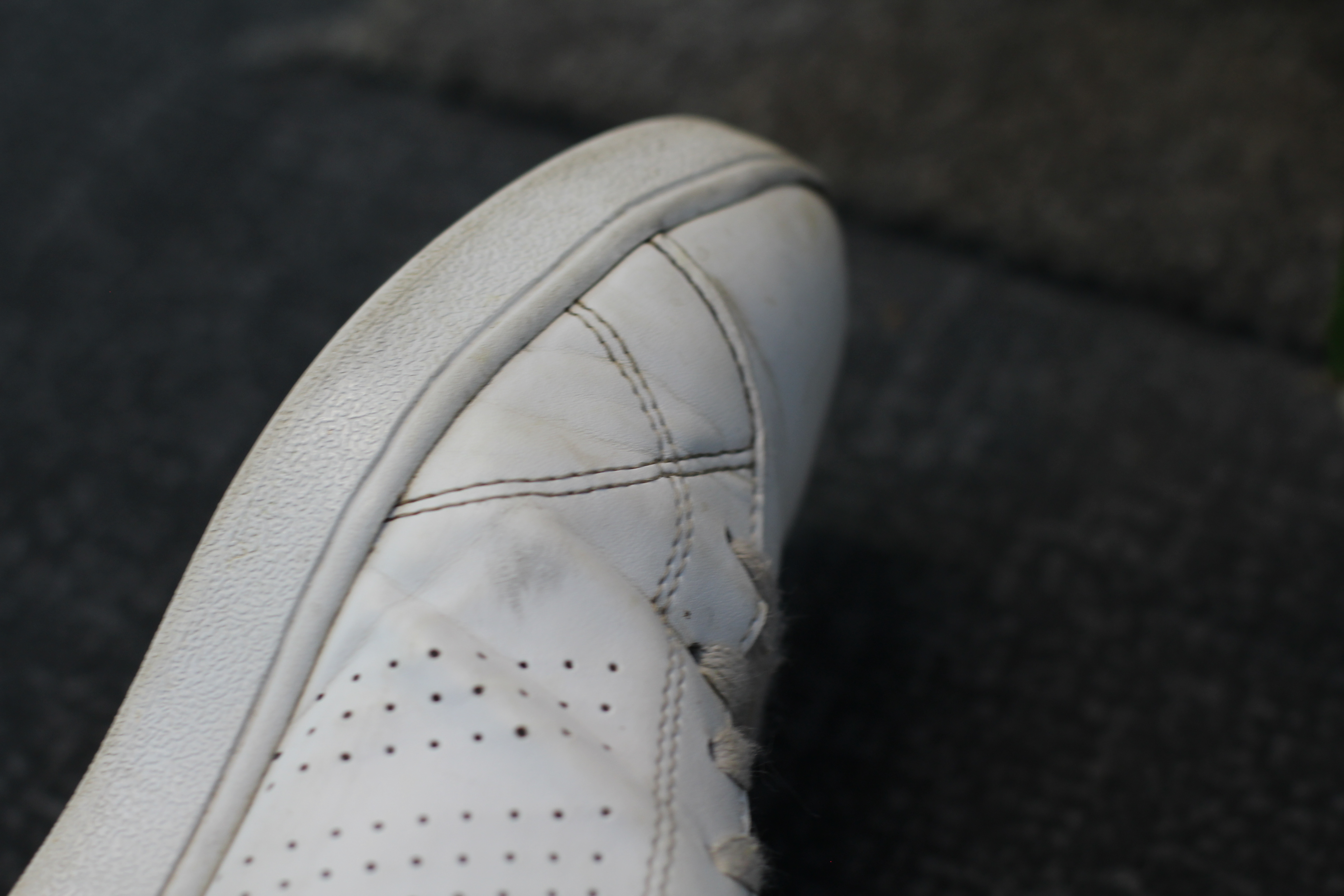
The above image was taken using high aperture (f/10). This high aperture allows for the whole shoe to remain in focus, and all of the detail of the shoe is displayed clearly. Using a higher aperture allows for more of the image to remain in focus, and so the subject (the shoe) can be very clearly seen.
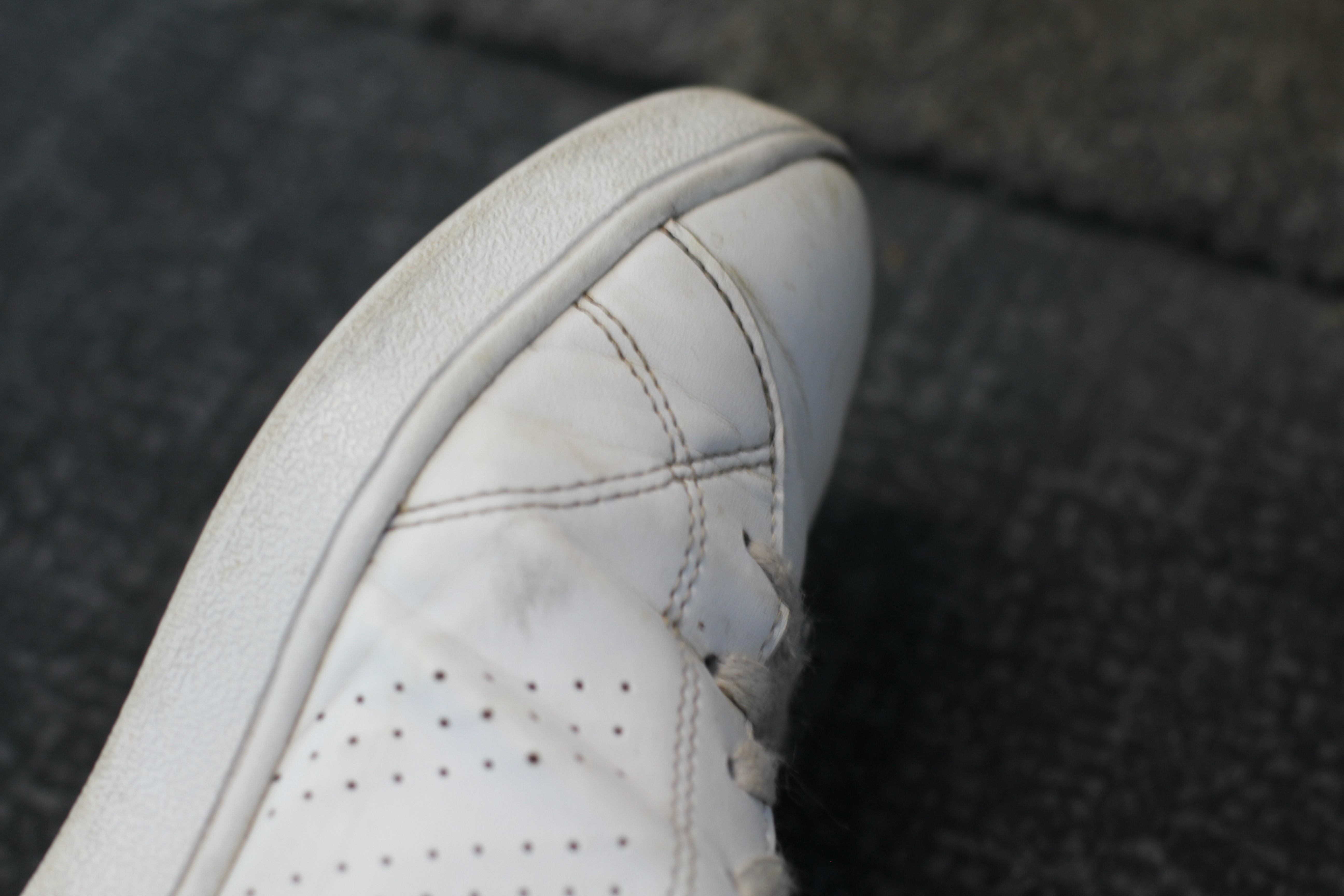
The above image was taken using a slightly lower aperture (f/5). Due to the lower aperture the image became lighter, as more light was allowed into the image. To counteract this, I adjusted the ISO to a lower number in order to give the image a normal amount of light. As I used an aperture of f/5, I adjusted the ISO setting to 200. As shown, the amount of the shoe that is still in focus has reduced. The main focal point is towards the top of the shoe, and just centimetres away the subject begins to fall out of focus. This allows for the focal point to become more obvious, and the attention of the viewer is drawn more to the specific focal point.
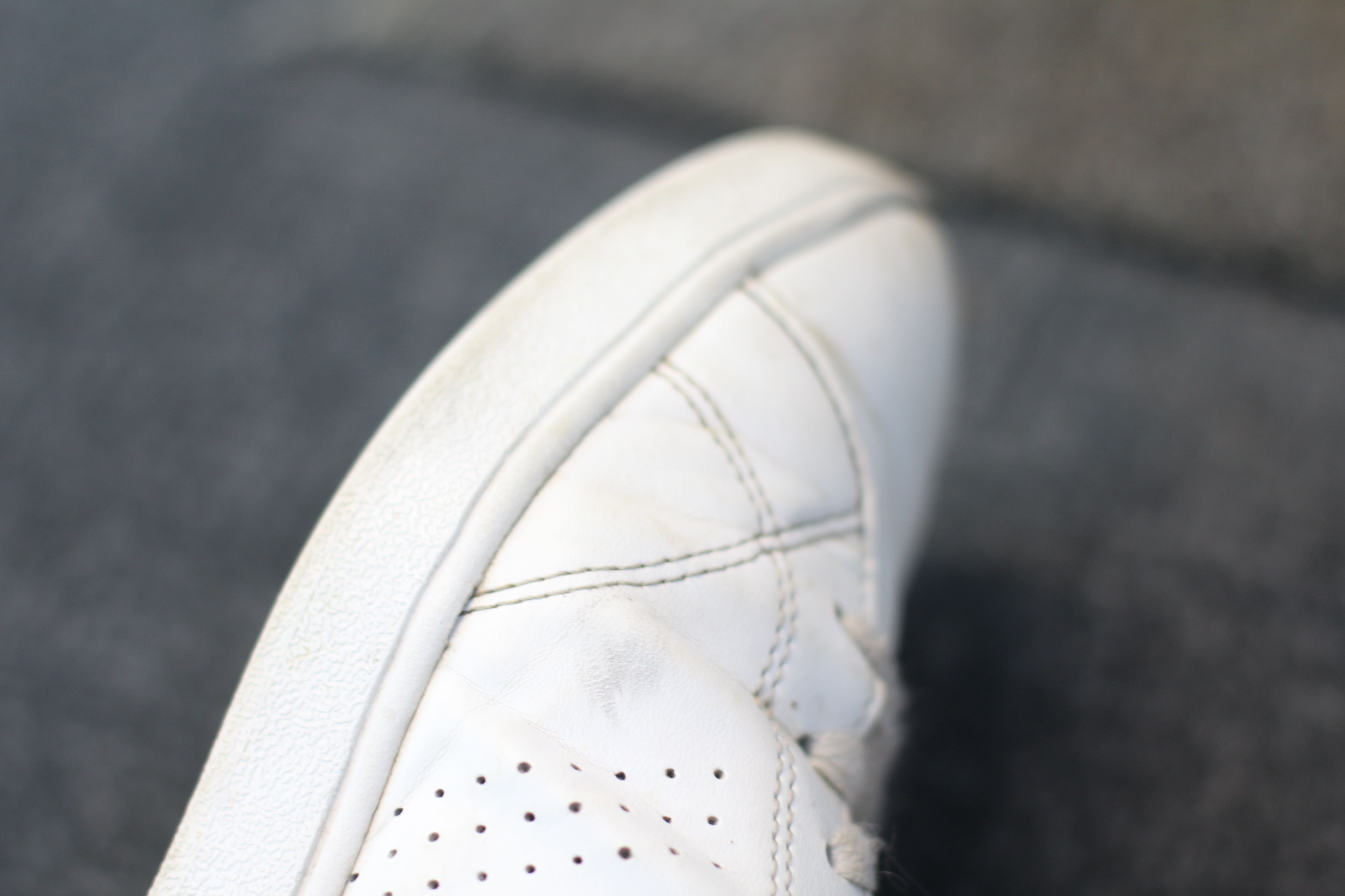
The above image was taken with the lowest aperture (f/2.8). Due to this low aperture, I again adjusted the ISO to a lower number (100). This adjustment is ISO means that all of the images allowed in a different amount of light, but still look clear and bright. For this image, the main focus point was towards the bottom of the photograph, and now it is just millimetres away that the subject begins to fall more out of focus. This image has a much more narrow depth of field than the above 2, due to the small amount of the subject that is in focus. This draws maximum attention to the focus point, and is useful when a photographer wants to draw all of the viewers attention to a very specific area, while blurring out the rest of the image. Due to the narrow depth of field, the carpet (background) of the image is completely out of focus, regardless of it only being a short distance away.
Altering aperture and ISO settings of a camera allows for the image taken to either keep the majority of the subject in focus, or just a small fraction in focus. These differences can draw more attention to specific parts of an image, or draw attention to the whole image depending on which way they are used. Adjusting aperture is a useful technique depending on what the goal of the photographer is.
The aperture is a hole on a digital camera that adjusts in side in order to control how much light is let into the camera lens. The side of the aperture is measured using the f-stop.
The smaller the f-stop, the more light is let through.
The larger the f-stop, the less light is let through.

This was my favourite image as it displayed the effects of aperture well. I set my camera to use a f-stop of F3.5, ISO 100 and a shutter speed of 1/15. The image shows a good use of focus as the shoe is clear but the background is blurred. The aperture has distorted the front of the shoe to make it appear significantly larger than the rest of the shoe.
For this photo shoot I have taken inspiration from both Aaron Siskind and partially from Nick Albertson.
Aaron Siskind was born in New York City. He started taking photos after he got a camera as a wedding present. He often worked with natural forms and urban areas he usually looked for the texture in the natural forms he photographed to get the images he wanted. 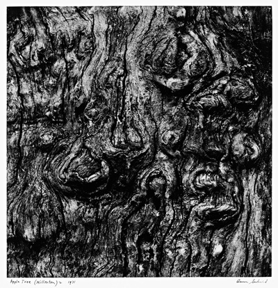
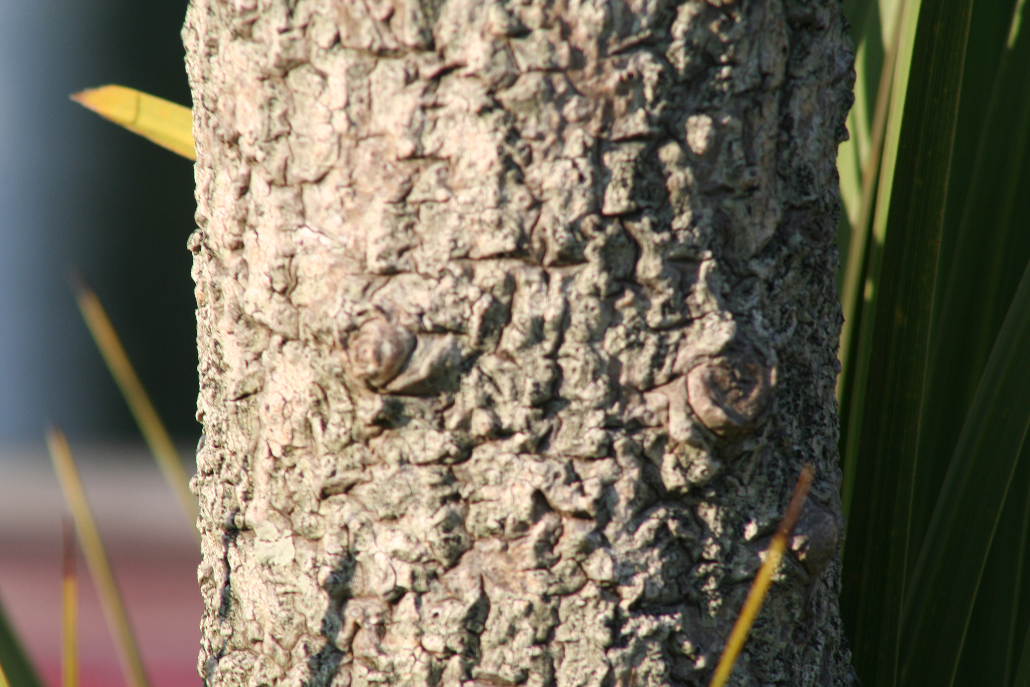
This is an example of one of Aaron Siskind’s images. In this image, Siskind only really photographed in black and white. This created a sense of simplicity in the images he produced, even though he focused mainly on texture and line throughout his images. In the image above texture can be seen especially well. Siskind used light in his images to create texture and contrast. The image above shows light coming in from the top left creating shadows on the underneath of some parts that stick out and a larger shadow on the right hand side of the tree.
Nick Albertson was born in 1983 in Boston. He often works with everyday items to create repeating forms which are used to create pattern and texture in his images.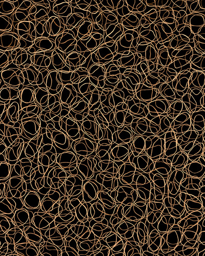
This is one of Nick Albertson’s images. In this image he has created a texture by scattering flat rubber bands all over a black background. This image has been taken from directly above where the elastic bands were scattered over. Albertson doesn’t tend to use shadows in his images, because of this the lighting is the same all the way around the image.
My response:
These are some of the best images that I took while I went on my photoshoot. I have tried to take images that best show line,texture or repeated patterns.
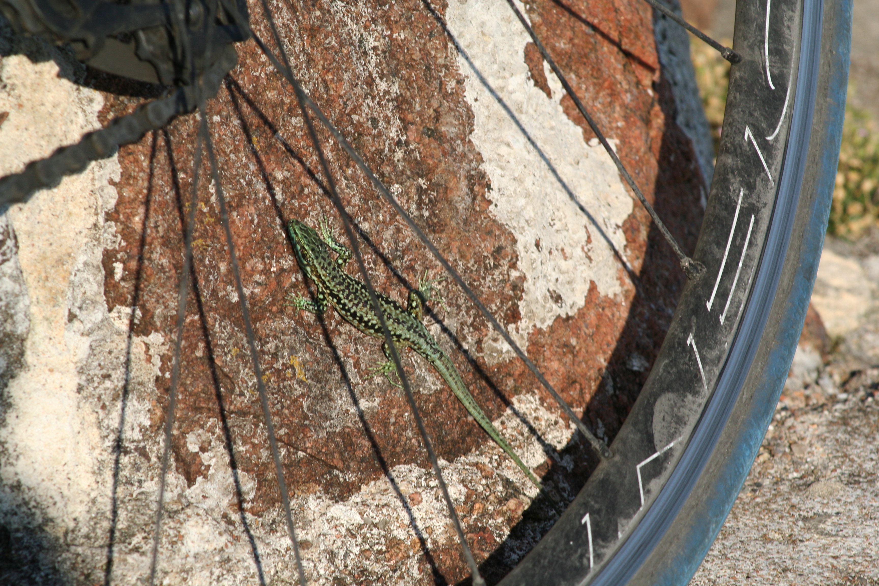
I have picked the image above as it shows a complex texture in the stone wall. I have also picked it due to the repeated texture on the back of the lizard. If I were able to take this image again I would have zoomed into the back of the lizard to get a larger image of the repeated textures over the back of the lizard.
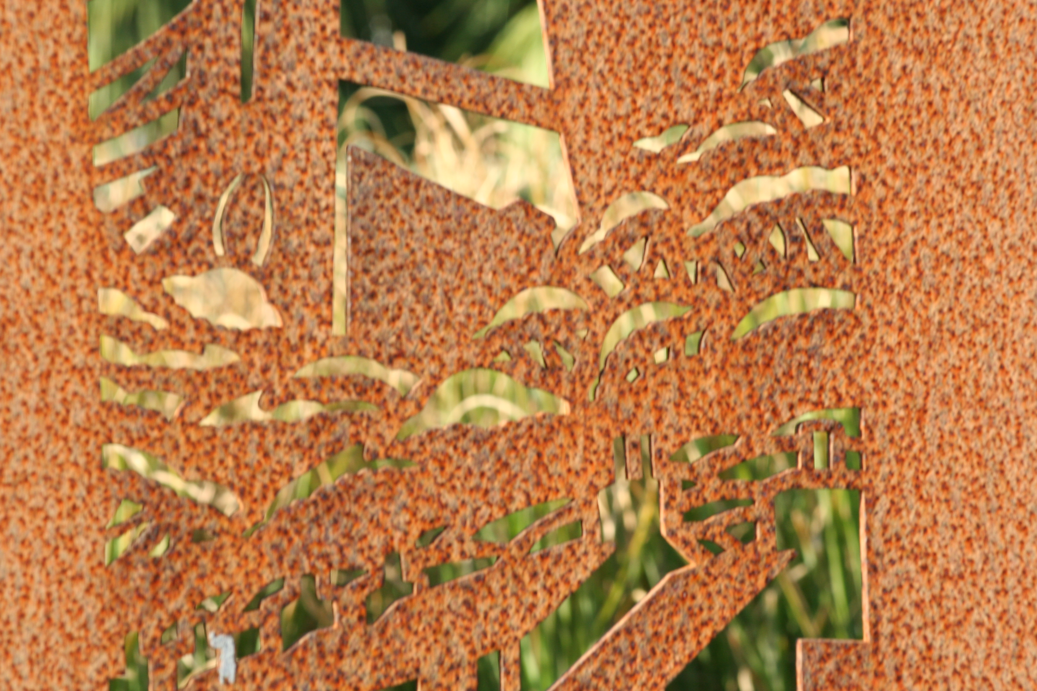
I have picked the image above because the rust is creating a pattern over the top of the metal. This pattern can be seen where the rust goes darker creating brown spots all over the metal.

I have picked these last two images because I have zoomed in quite far into both. By zooming in it let me see the textures closely in both the rope and the tree. I have taken both of these images outside during the day. This has created a nice shadow on one side of each object, this has worked especially well on the rope as the texture in the rope can be seen quite well in and out of the shaded area. On the tree I could have taken it with a higher ISO or a lower shutter speed so that the the lighter side appeared dimmer letting you see the texture in the tree a lot easier.