Category Archives: AO2 Explore Ideas

Filters

Author:
Category:

Finalizing my final images

Now that I have narrowed down my favorite images for printing, I will do the lasts bits of editing and present how I want them to be displayed.

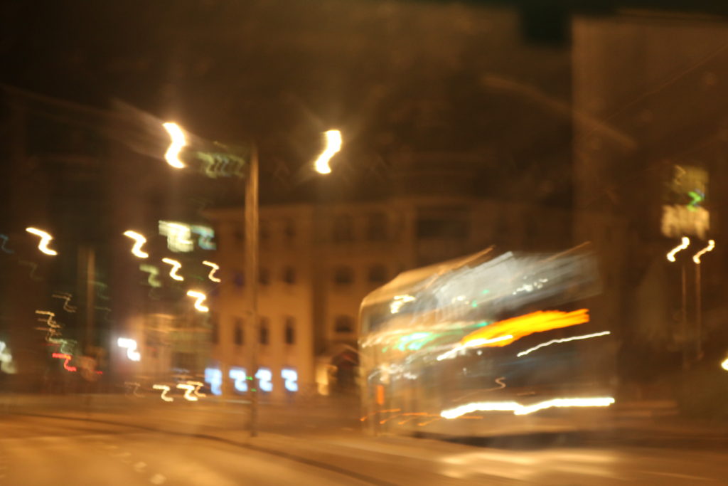
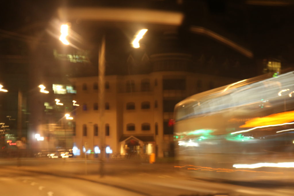
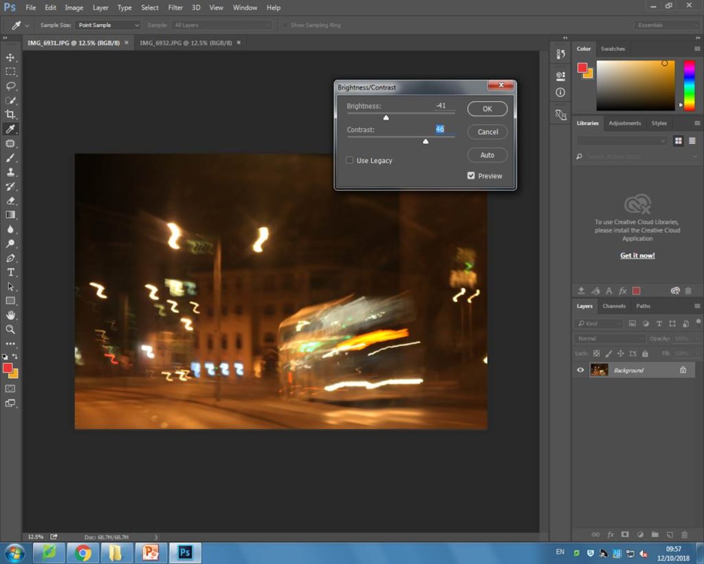
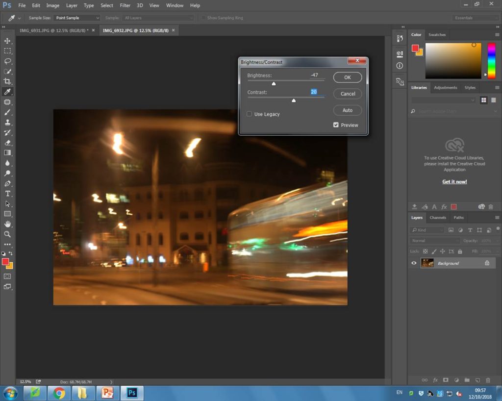
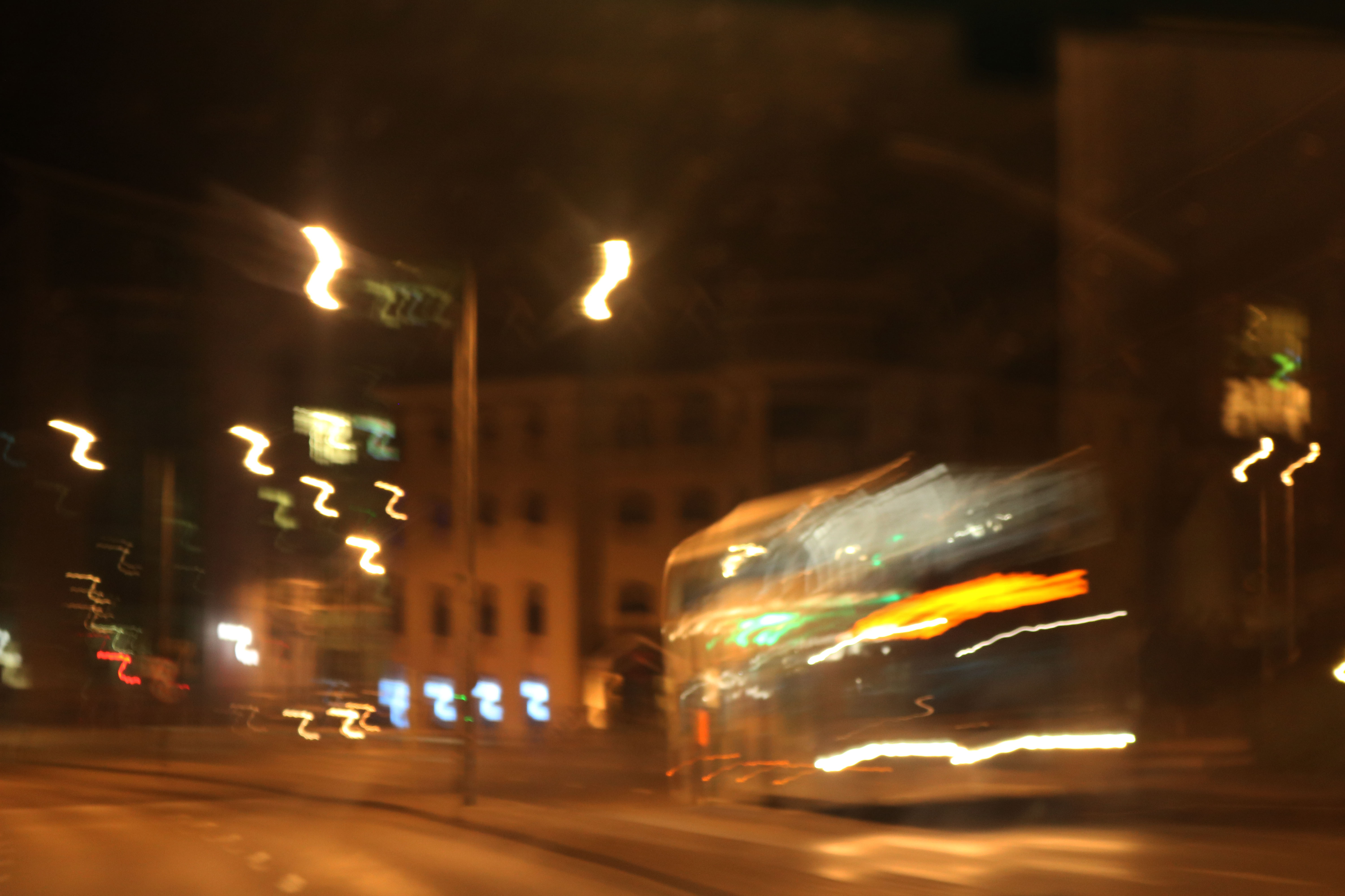
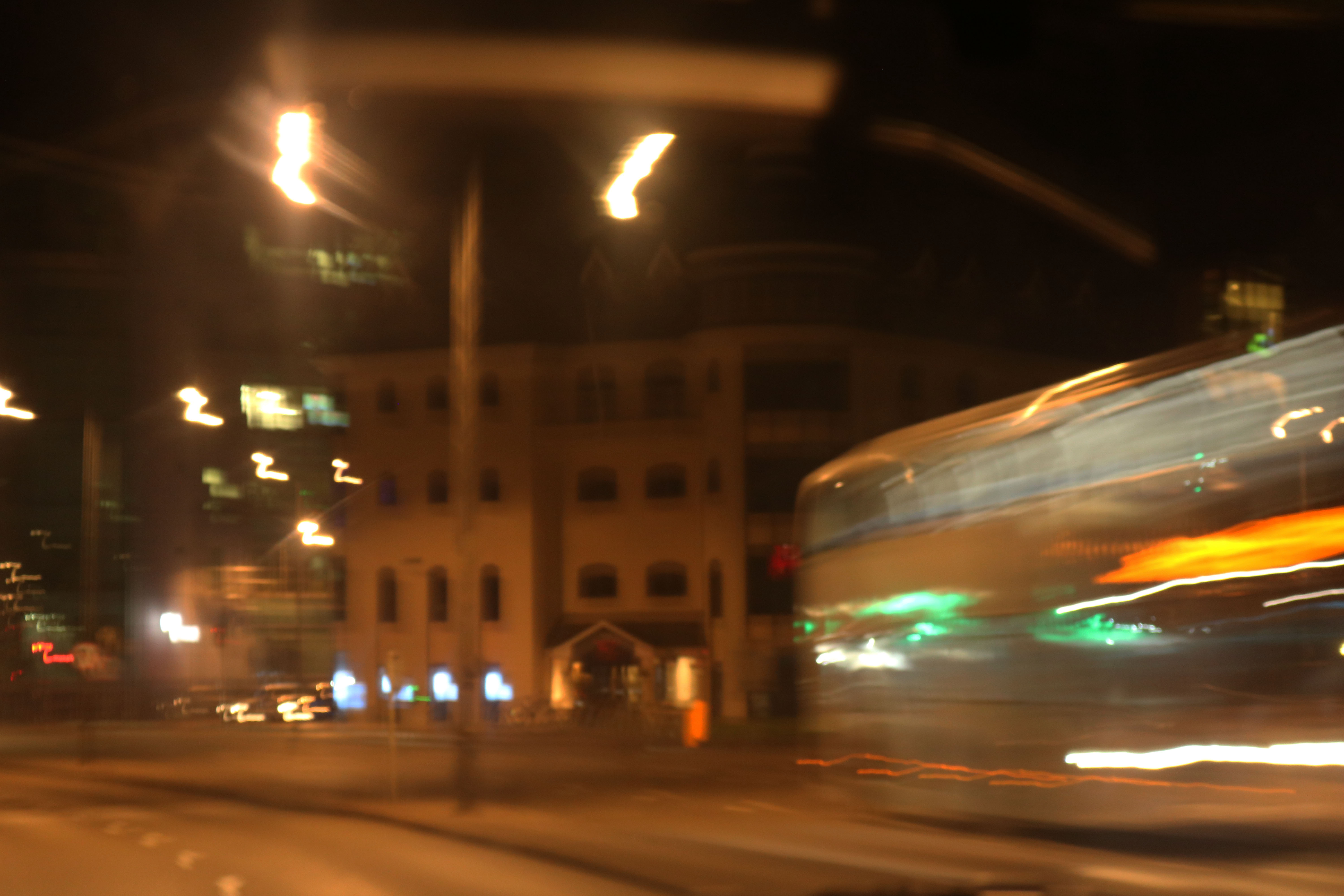
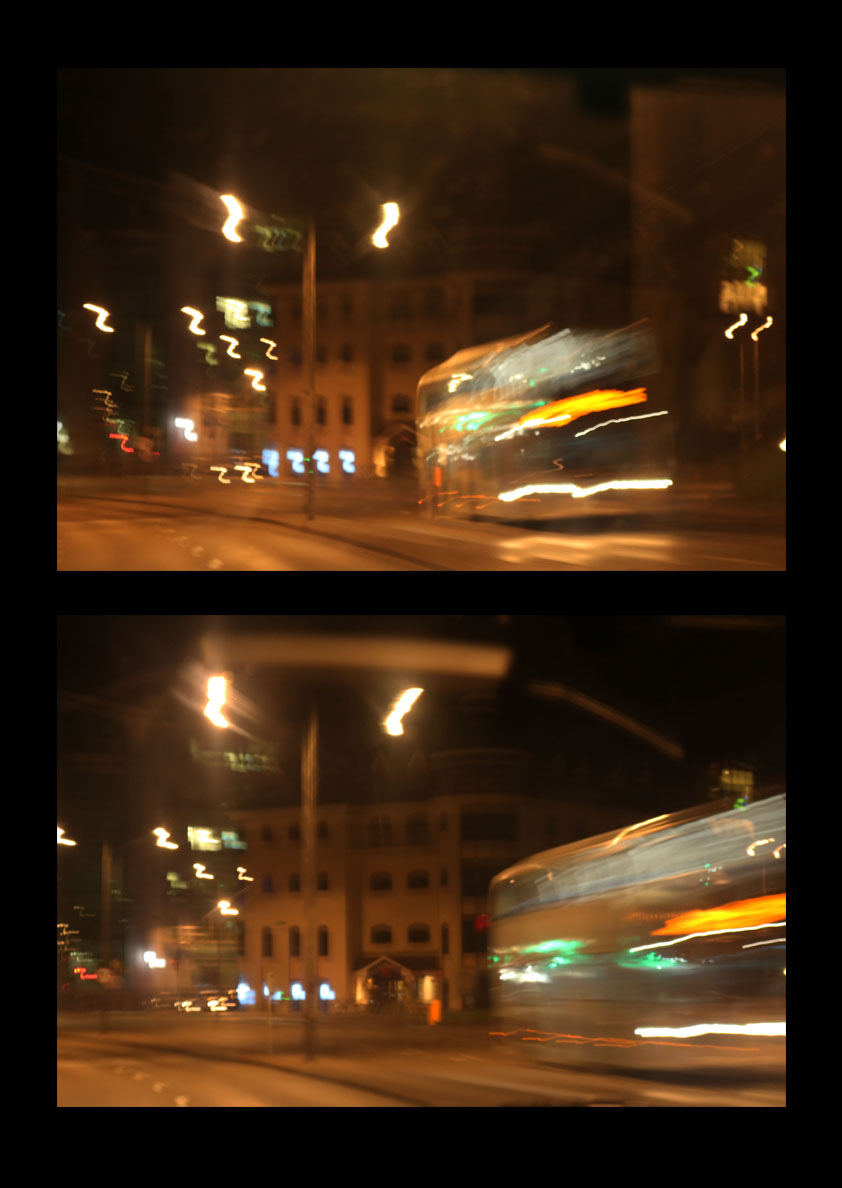
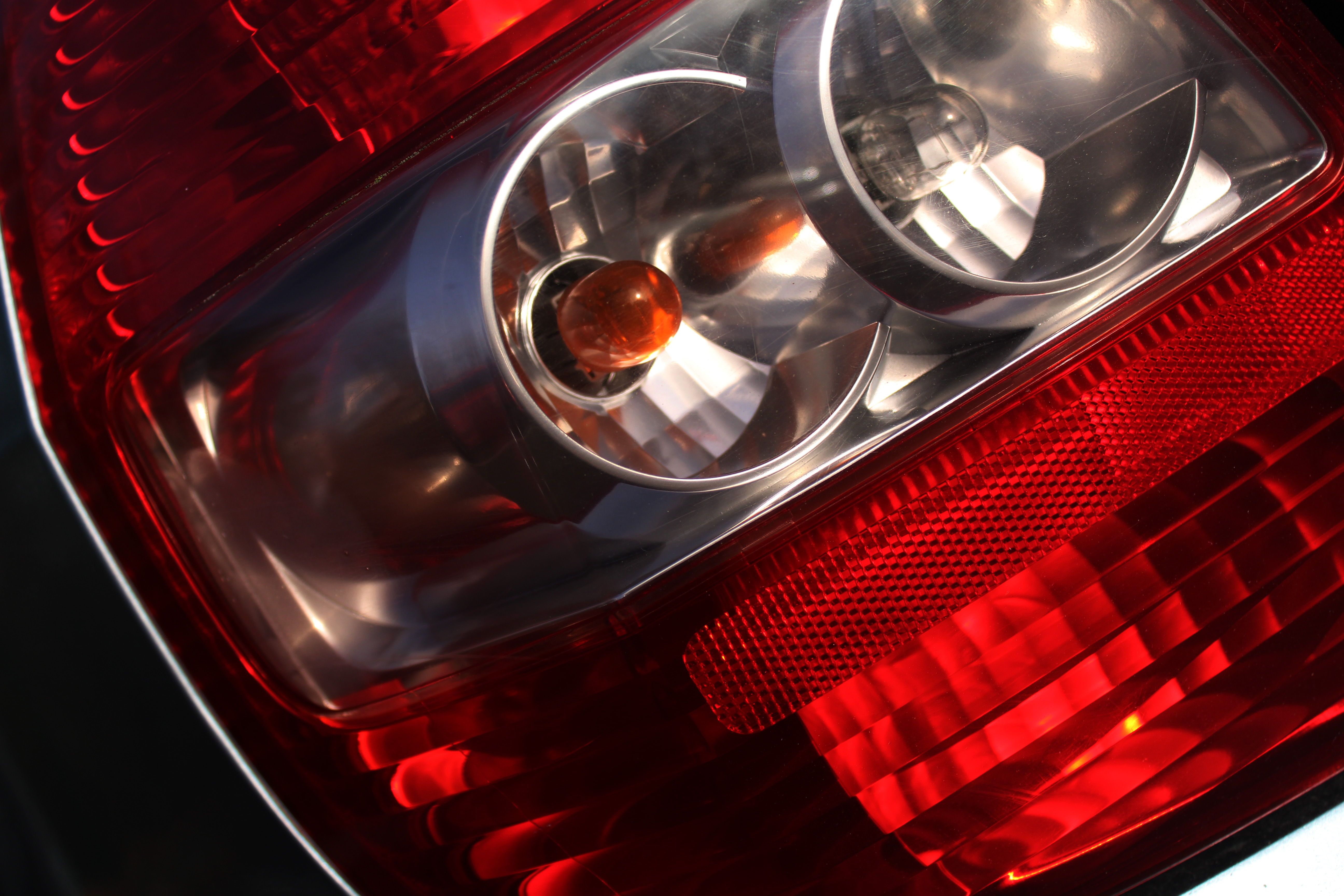
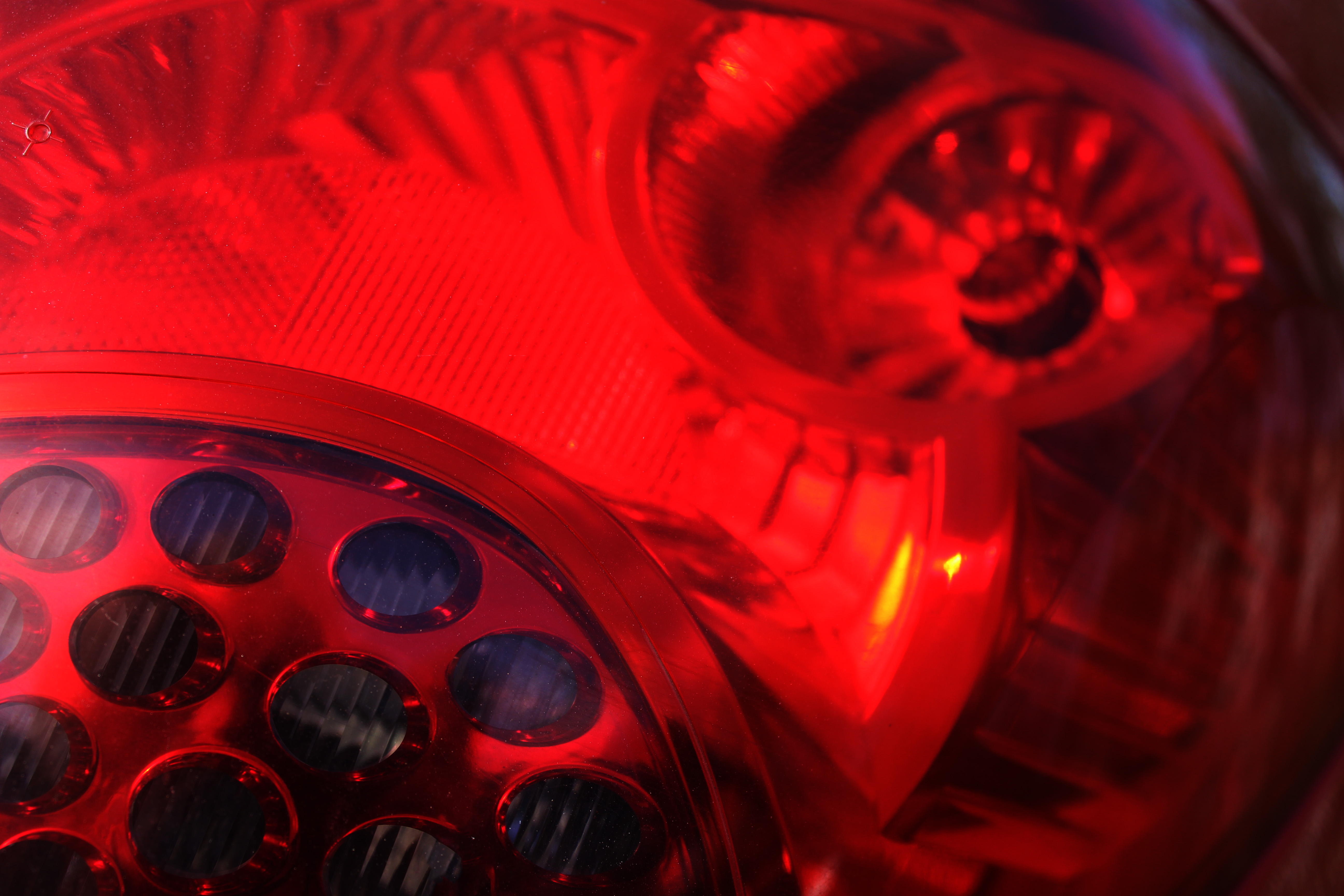
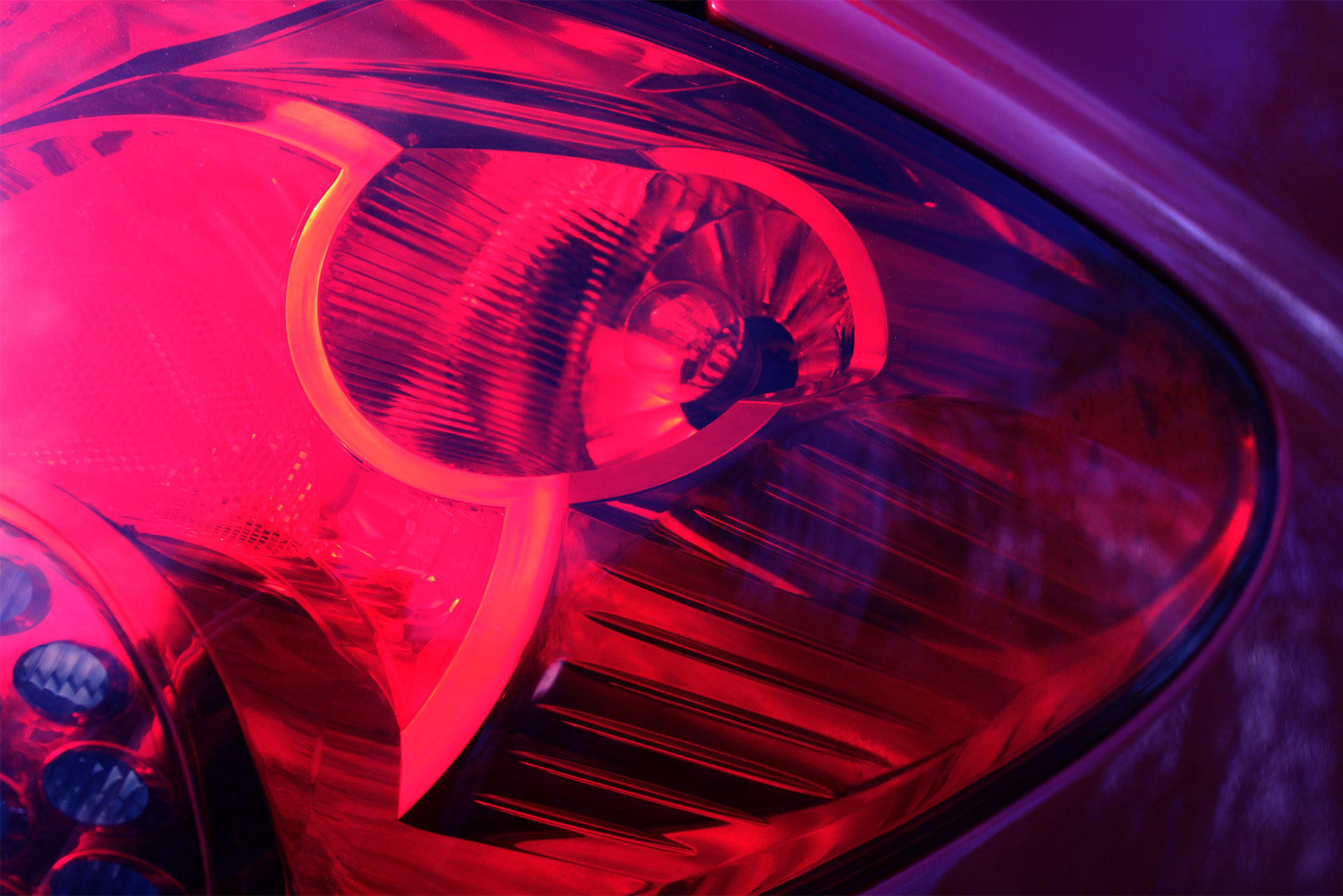
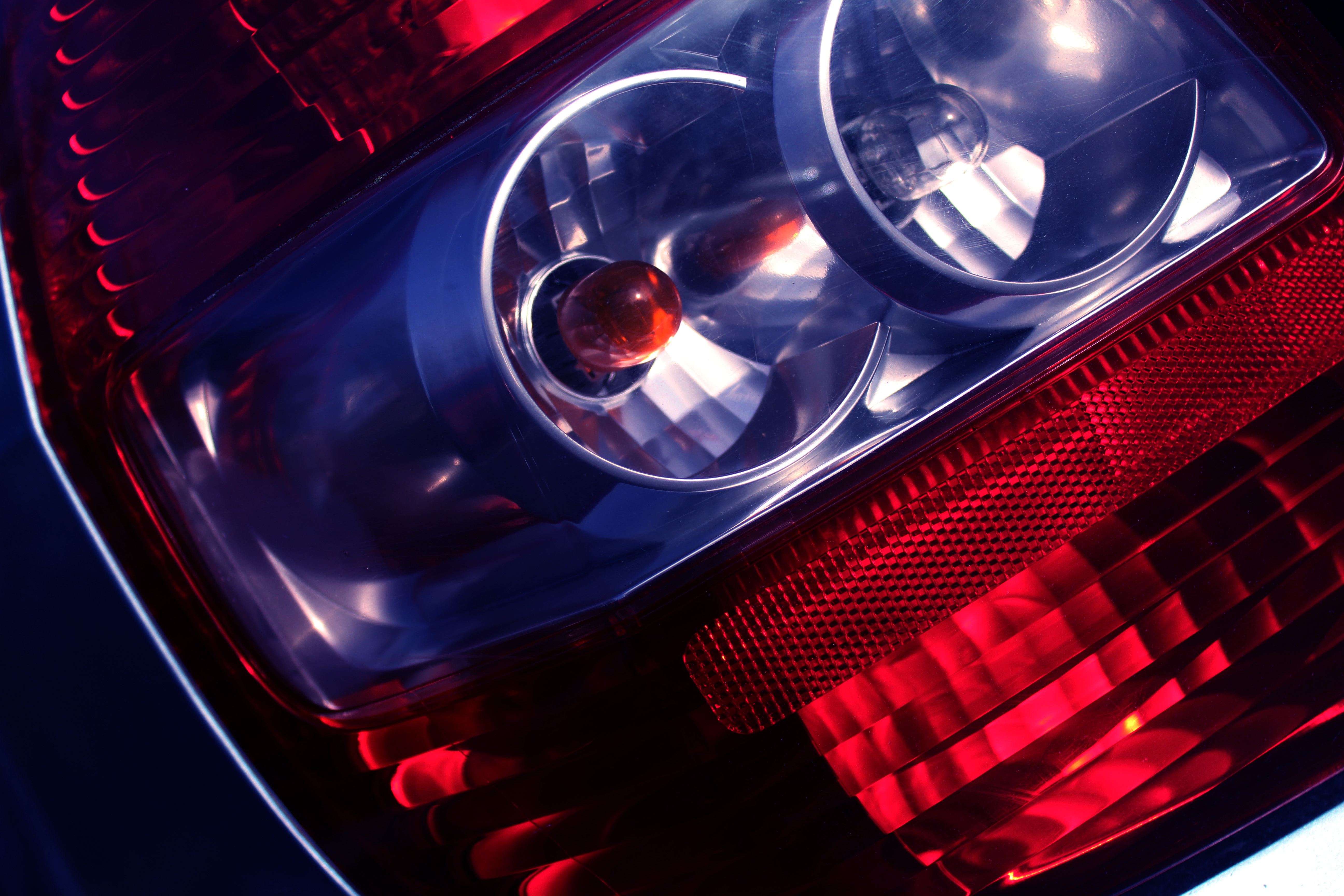
These are the two images from my last post that I want to adjust slightly to try and tone down the over exposure of the images.

For both of the images, I just turned the brightness down and increased the contrast so the coloured lights could stand out better.

This image, and the one below, are the outcomes that I will be using to print.


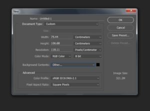
Next, I opened a blank document and set the width and length to make the page A3 size. I also set the background as black instead of white because I wanted the lights on the images to stand out more and this would only work on a dark background.


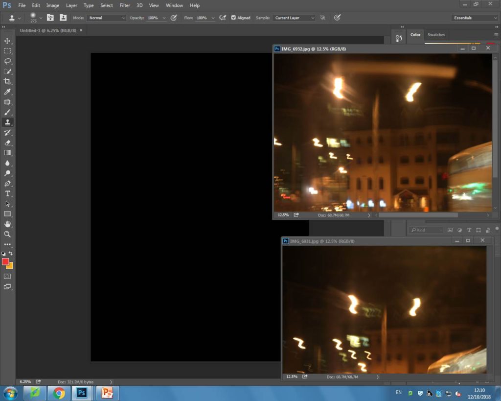
After, I opened up both the images I wanted to display together and I positioned one above the other on the black background in the order that I took them in. Below is my outcome:


My A3 image

My A4 image


My A5 image


I felt that my other two images would work well by themselves and they didn’t need any more editing to be done. The reason I chose these particular images together, was because they all incorporated some sort of light in the frame, either captured using a bokeh effect or with slow shutter speed.


Initial final pieces

In this post I will be presenting my potential final outcomes for the whole abstract unit.

Potential outcomes


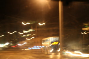
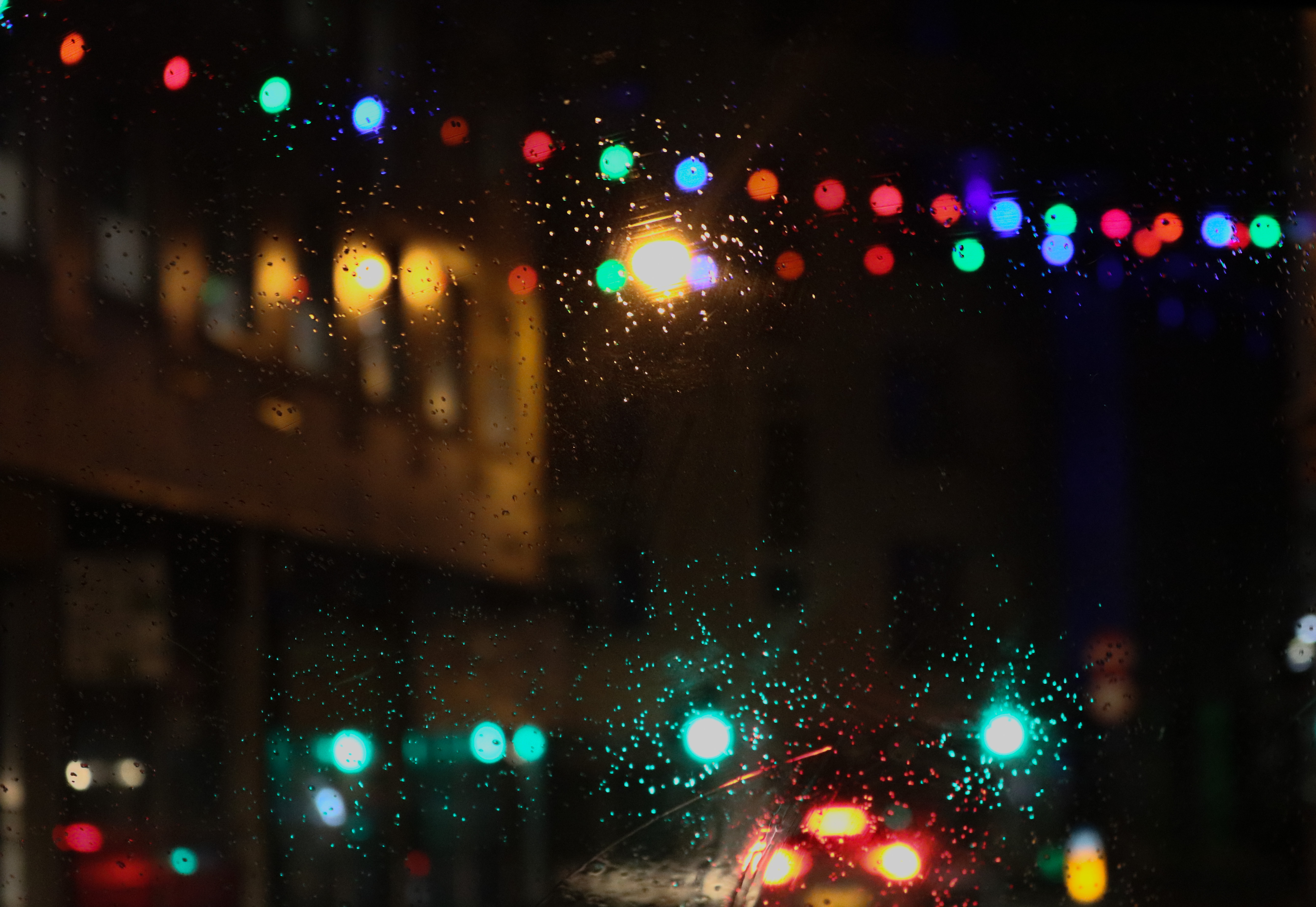
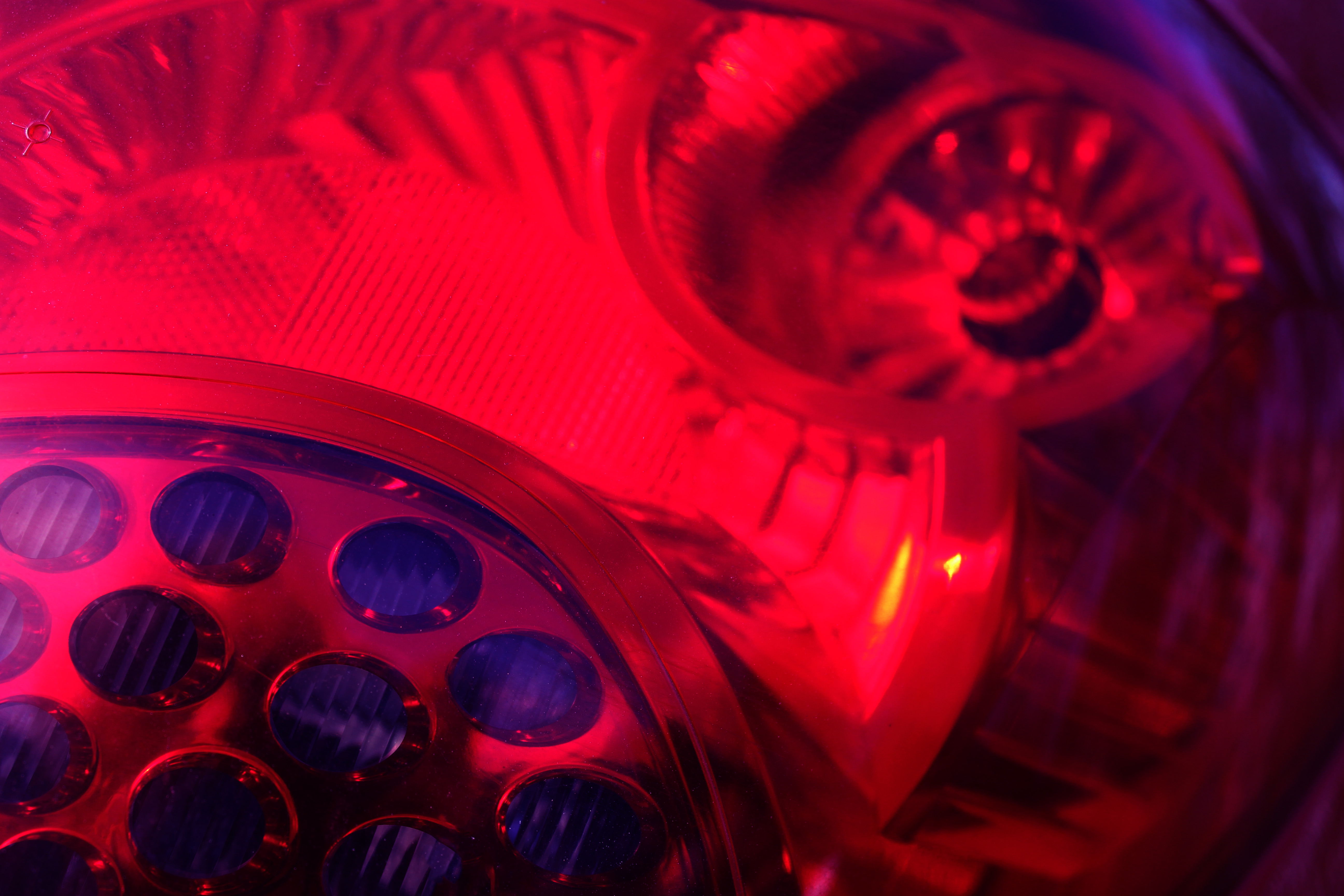
This is the image that I will most probably be choosing for my A4 print out. The reason why I have decided to use this image is because I think it my most successful image from my Uta Barth inspired photo shoot. I think this is My the most successful bokeh image I took because the scenery around me was filled with a lot of light, and the rain helped to enhance the colour in the image helping make the colour a more prominent image.

Another reason why I picked this image is because it displays some camera techniques that i have learnt through the abstract theme. In this image I used manual focus so I was able to purposely make the scenery blurred. In this image I also adjusted the settings to a quick shutter speed so I was able to capture the lights in place, and not shaking, as this image was taken in a moving car. I also made sure that the ISO wasn’t too high as I wanted most of the background to be dark, so the blurred lights would stand out.

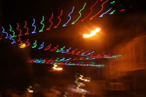
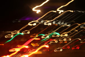
This is one of my best images from my experimentation with slow shutter speed. I think this image is very visually successful as the slow shutter speed meant that when I moved the camera, I created a very interesting pattern with the light, making the image very abstract.

This image also demonstrates a range of camera skills that I learnt, which is another reason why I chose it as a final outcome. In this image I used manual focus again to be able to focus primarily on the lighting, and not on anything in the background. The camera was also on a very slow shutter speed, which meant that the exposure time was longer than normal, meaning that when the camera moved, the final outcome ended up as it did.


For my last outcome, I am considering these two images. These pictures were also taken while I was using a slow shutter speed, and also continuous shooting. As it was on slow shutter speed I was able to capture the movement of the bus, and the continuous shoot meant that I was able to take one image straight after the other. I chose these two images because i think they would look very well, side by side when displaying them. For my final A3 print, I am going to find a way to display both of these images together in one frame as having the second image together with the first gives the images some context. However, I think that before I find a way to display them both in one image I will slightly Photoshop the images as they are both slightly overexposed due to the slow shutter increasing the exposure time.


Week 5 Homework: Colour and Texture

Franco Fontana

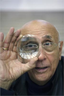
Image result for franco fontana

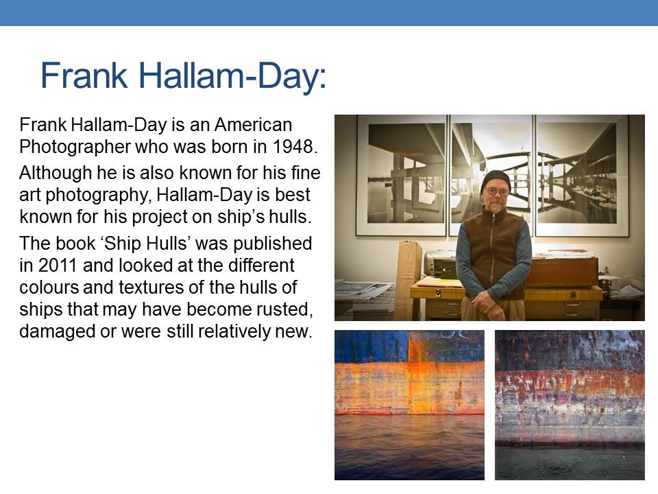
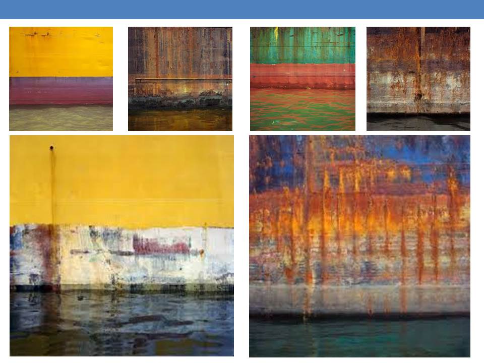
Franco Fontana is an Italian photographer born in Modena, on December, 9th, 1933. He is best known for his abstract colour landscapes. Fontana’s photos have been used as album cover art for records produced by the ECM jazz label. He is known as the inventor of the photographic line referred to as concept of line.  He has published over seventy books with Italian, French, German, Swiss, Spanish, American and Japanese publishers. His photographs have appeared worldwide in over 400 exhibitions, solo and collective.

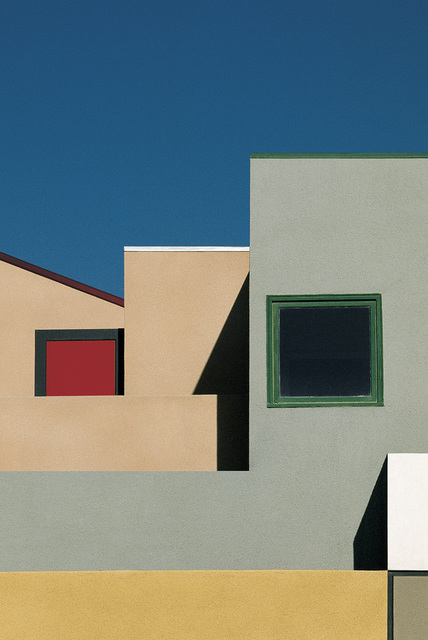
Fontana’s work is more minimalist and simple. Fontana is above all interested in the interplay of colours and he had based his own vibrant and original language on that. The later critics had labeled it as ‘Photographic Trans-avantgarde’. He explored different subjects: urban landscape, portraiture, fashion, still-life and the nude. He worked with 35 mm cameras, mostly on location claiming that his studio was the ‘world’.

I really enjoy Fontana’s work as I like simple and minimalist photography as well. I will try and work with his style of photography and incorporate it into my project.

Nick Albertson

Nick Albertson (b. 1983, Boston, Massachusetts) received his MFA in Photography at Columbia College Chicago. He received his BA in Photography from Bard College in 2006. His work has been exhibited in Chicago, Portland, Seattle, San Francisco and New York as well as internationally at the Pingyao International Photo Festival.

Nick Albertson describes his process of work on his websitehttps://www.nickalbertson.com/home

Here is the process of each of his styles of photography:

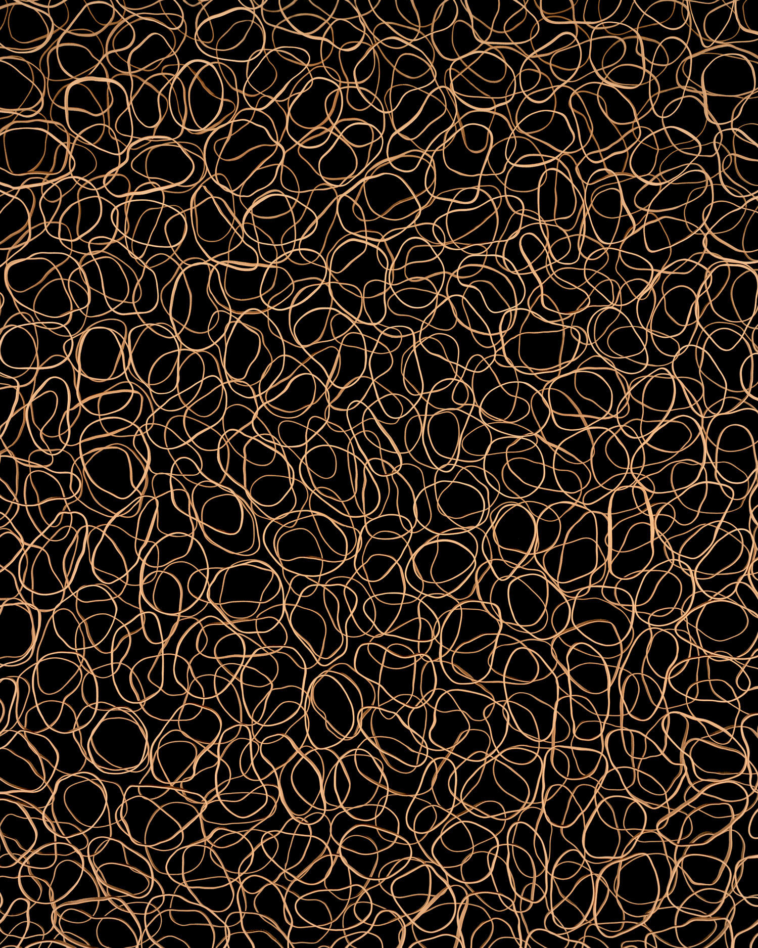
“My process blends techniques similar to those of painting as well, sometimes altering and emphasizing elements of the image with the use of Photoshop. Though the image always starts with a camera, it is further abstracted to varying degrees in the computer. The act of creating the compositions in the physical world allows the images to feel familiar. The slight variations from object to object suggest the imperfection of the real world as well as that of the artist’s hand.” From https://www.nickalbertson.com/manufactured-gestures

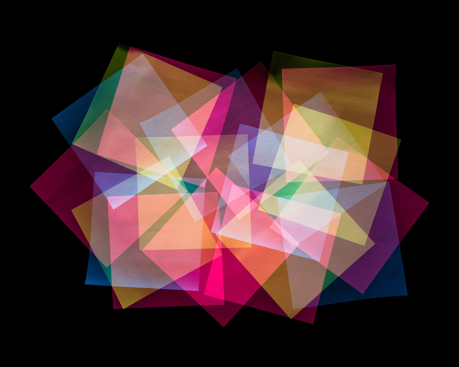
“White Light was created by popping a flash as many times as I could during a single thirty-second exposure, slightly moving Post-it notes in between each flash on a black velvet background in a very dark room. The areas where the Post-its overlap build up luminescence as those areas are subjected to more light reflected back on to the camera’s sensor. ” From https://www.nickalbertson.com/white-light

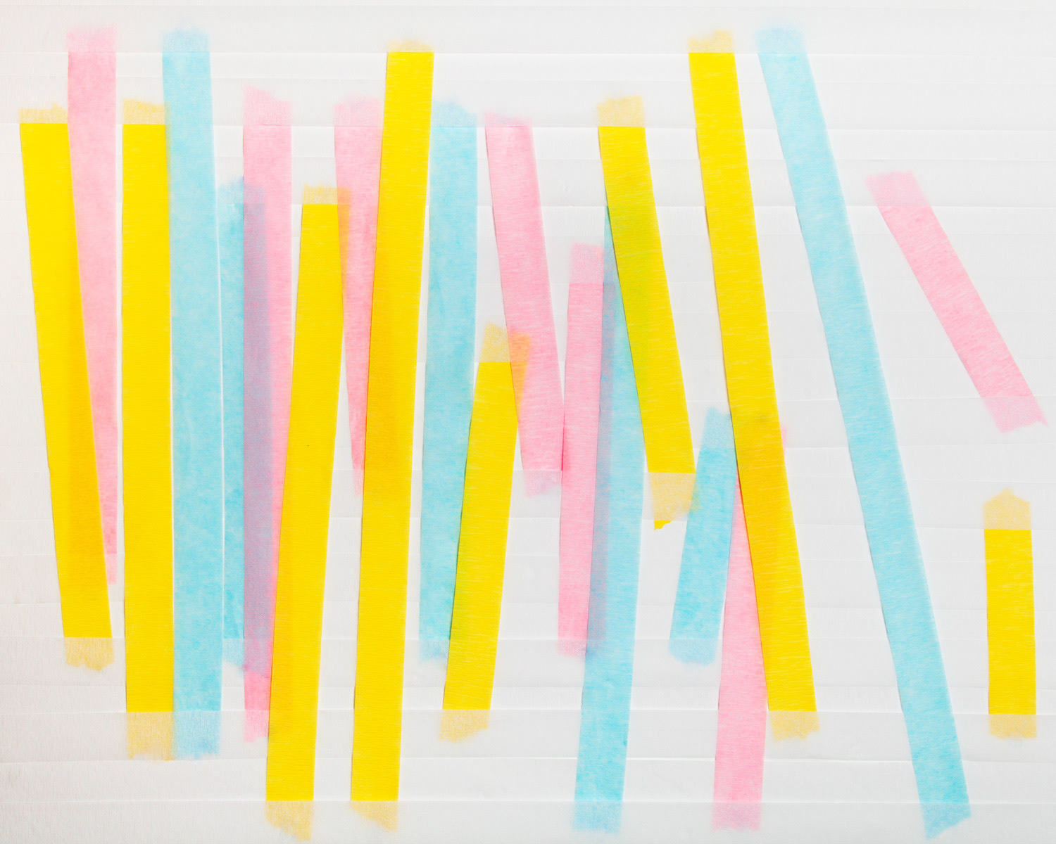
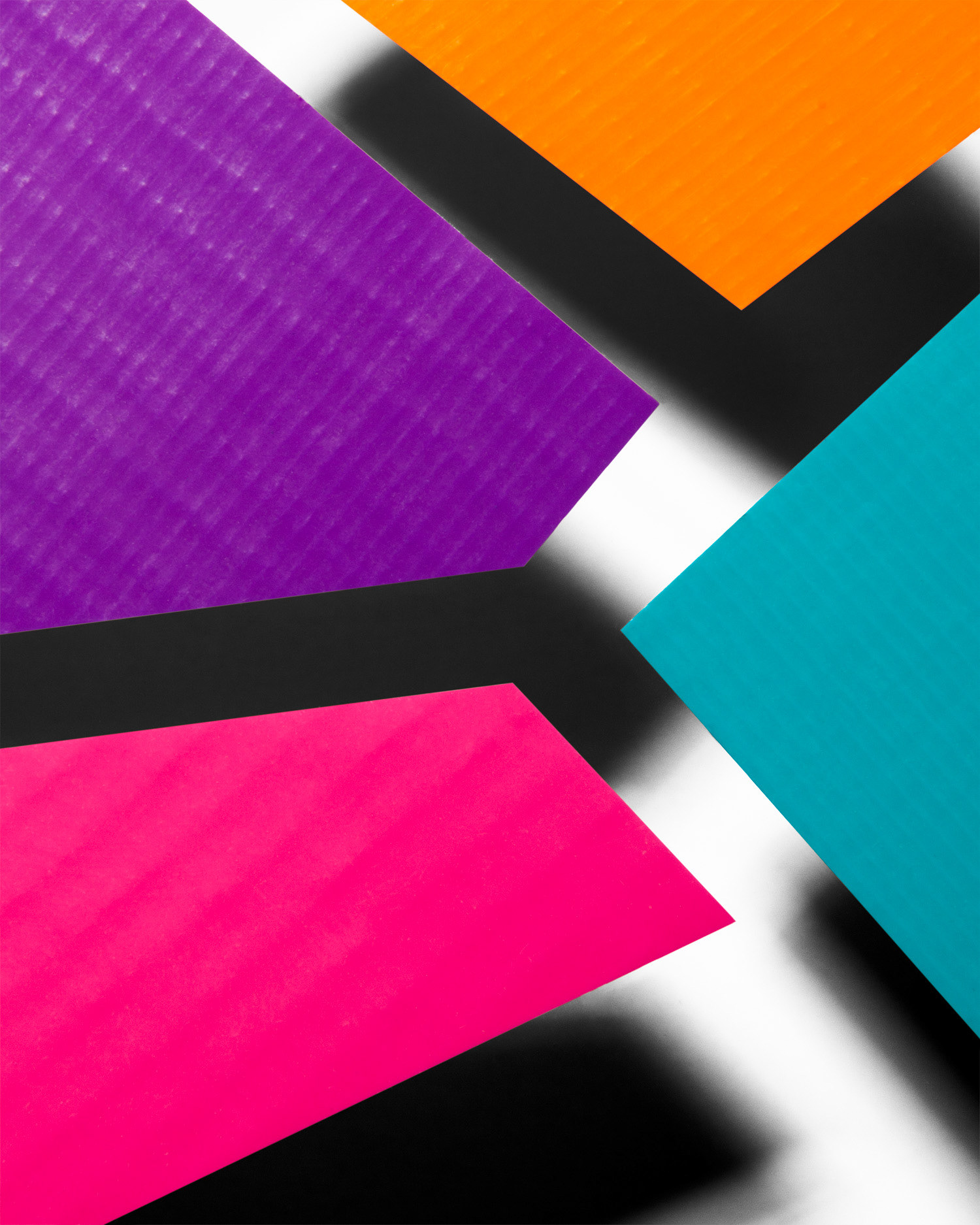
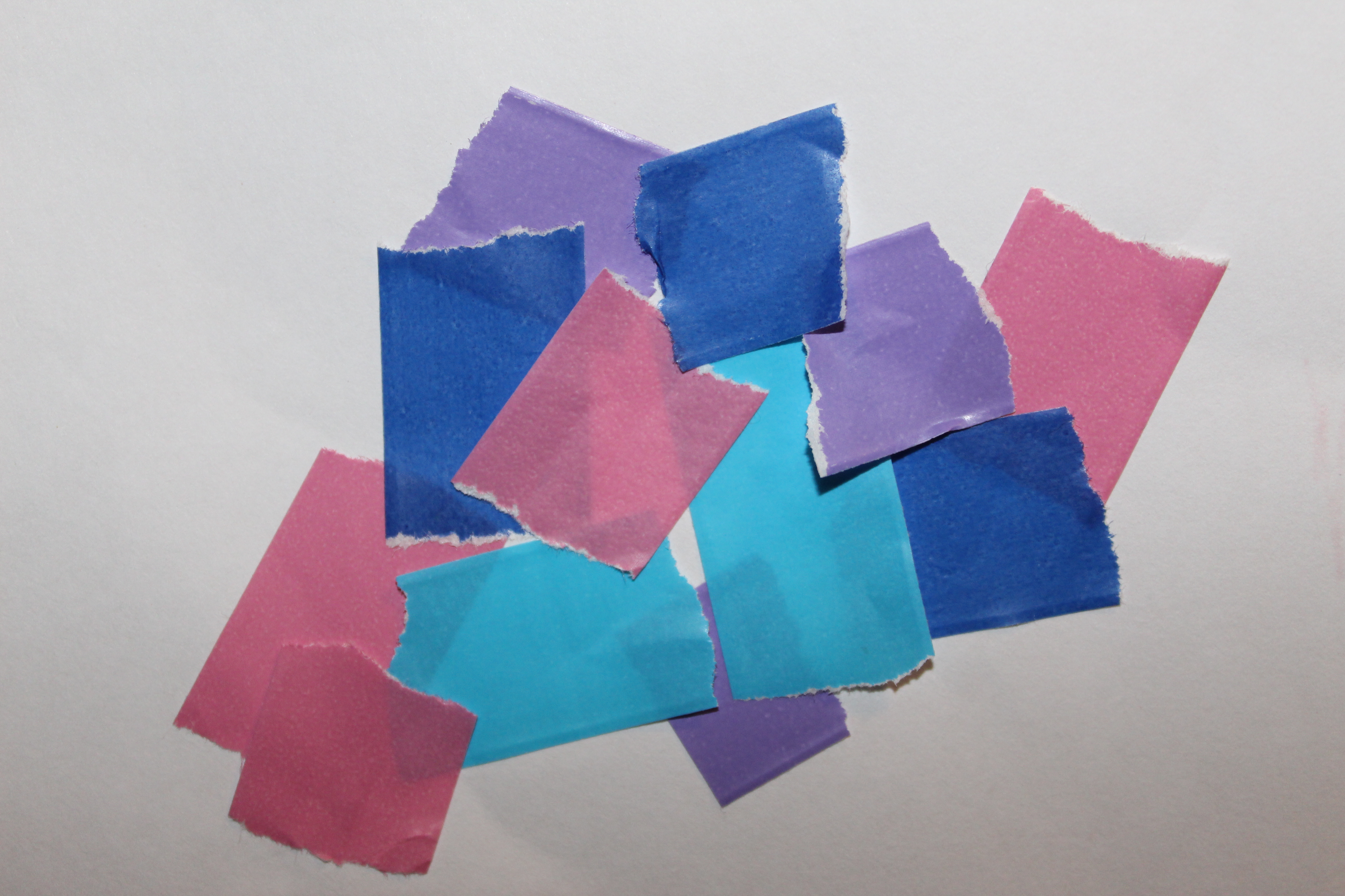
“Tape Cuts are a series of images in which I cut pieces of colored duct tape and photographed them floating over a white background with hard lighting. They are meant to reference color field painting and hard edge abstraction, but the shadows emphasize the fact that they are photographs of objects in space, not pure abstraction.” From https://www.nickalbertson.com/tape-cuts

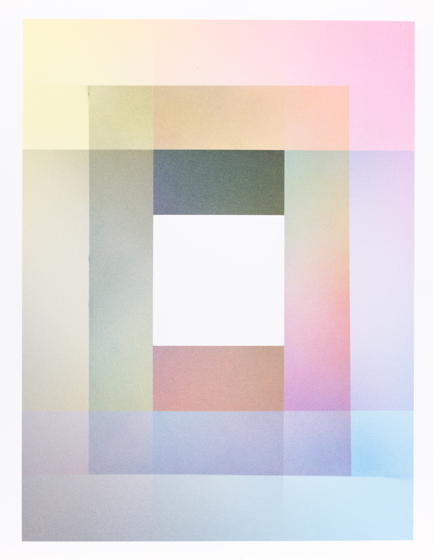
“Photo Sprays are a combination of computer-generated gradients printed on Epson Hot Press Bright paper overlaid by airbrush-applied Epson Ultrachrome K3 inks, the same inks used to print the initial inkjet print. While not a photograph, these works are photographic in makeup. The works, made with photographic materials but created with more painterly techniques, seek to complicate the relationship between photography and other media (painting, prints, works on paper).” From https://www.nickalbertson.com/photo-sprays

I really like the way Albertson takes his photos so I also want to incorporate his style into my project as well. I almost want to mix both Fontana’s style and Albertson’s together.

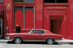
Photos of Fontana’s Work:

Image result for franco fontanaImage result for franco fontanaImage result for franco fontanaImage result for franco fontana

Photos of Albertson’s Work:

Plan:

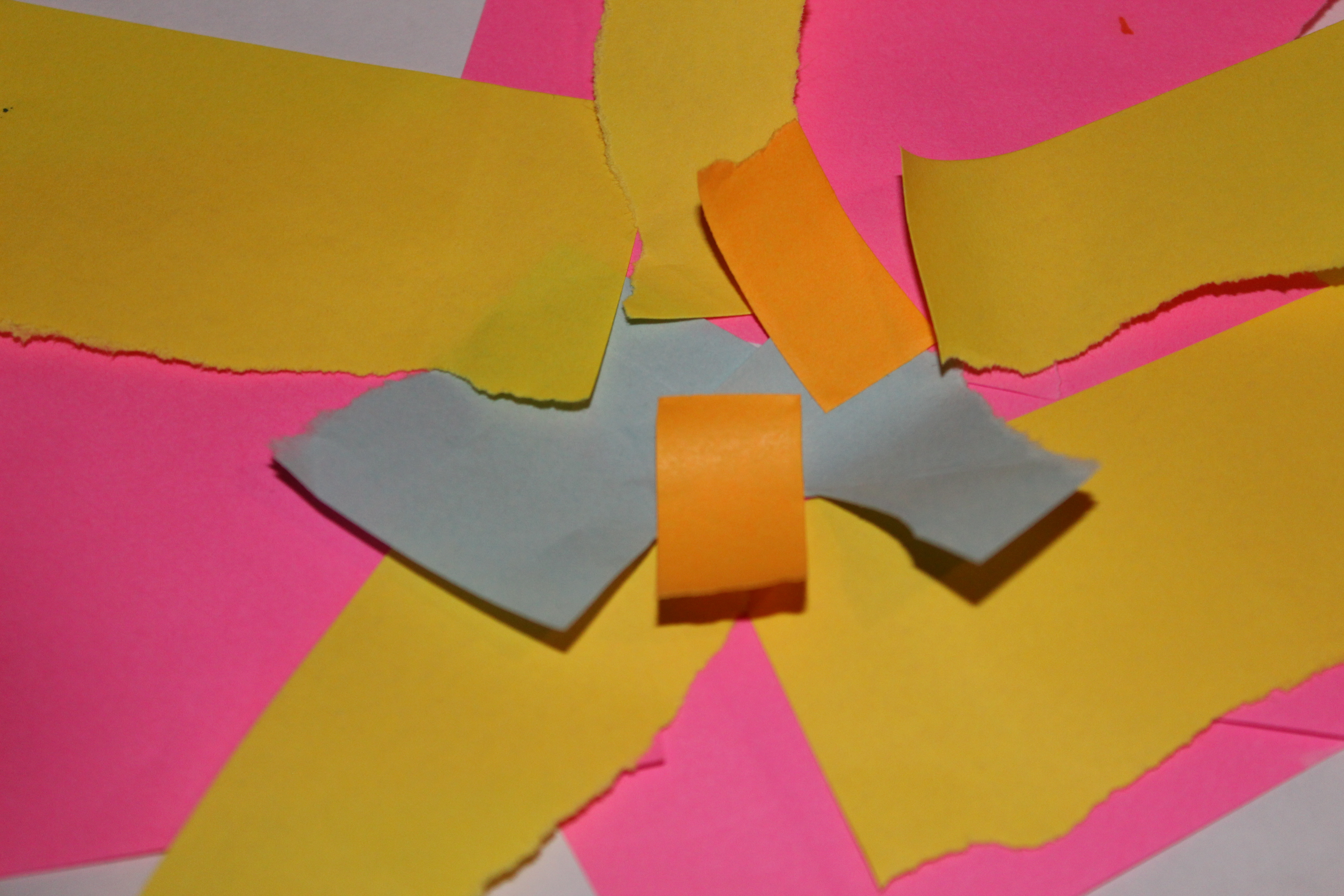
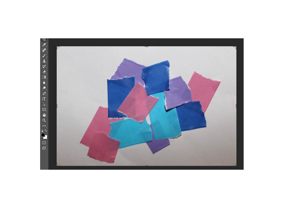
For this photo shoot I plan to take photos of buildings, landscapes and materials such as: paper,tape and memo pads. I also plan to edit them on Photoshop in different styles like this:

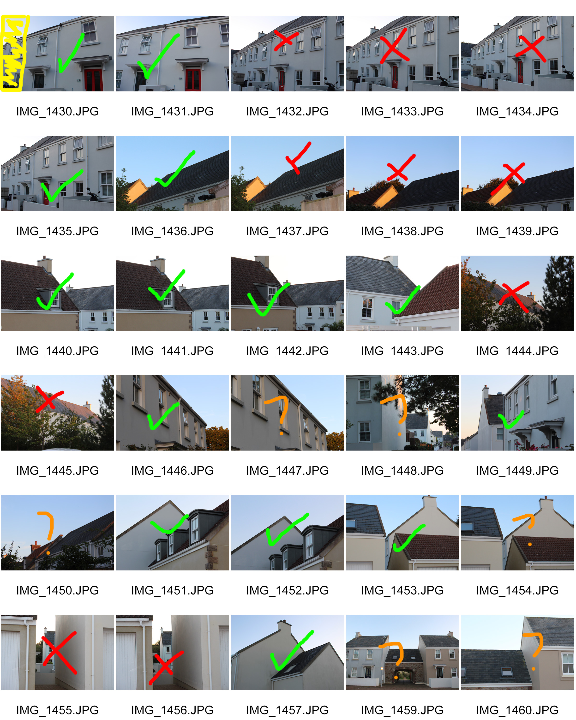
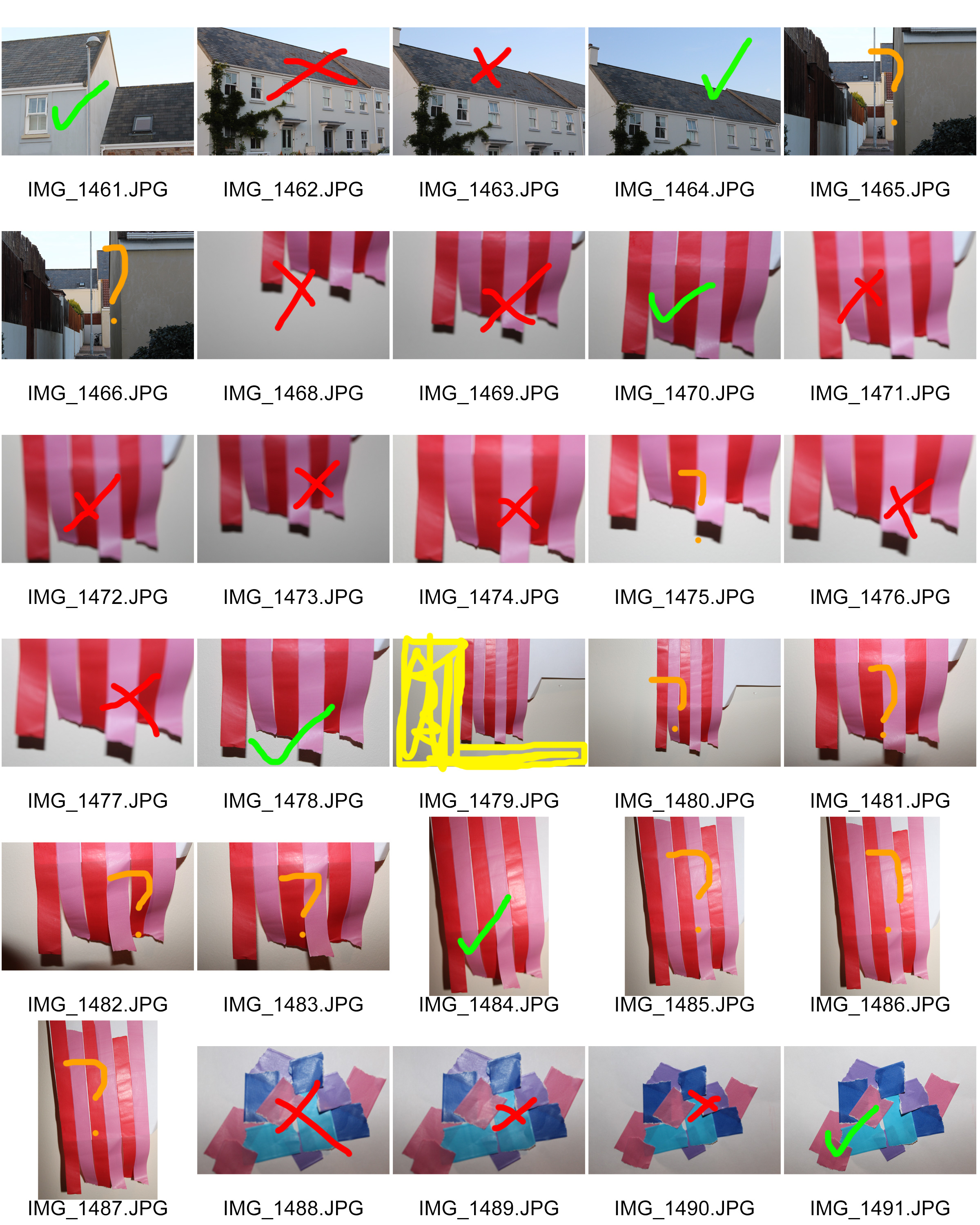
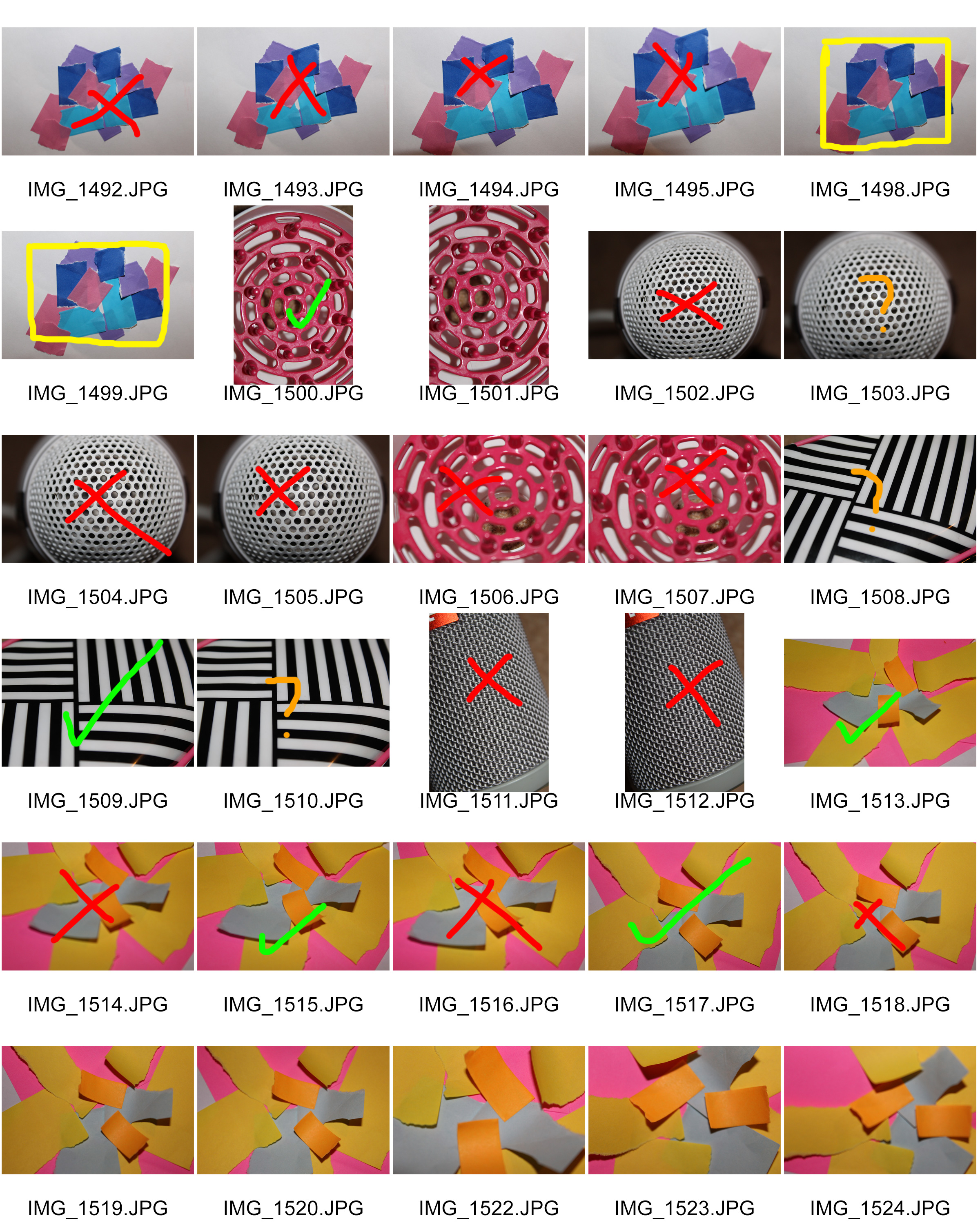
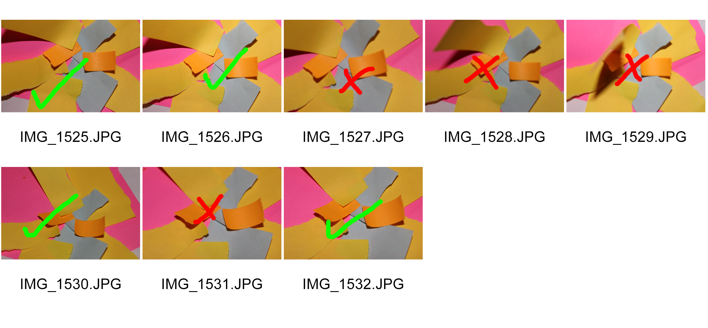
Contact Sheets

Red – No

Green – Yes

Orange – Maybe

Yellow – Edit

My Best Photos (Unedited)

My Photos (Edited)

I edited all these photos on Photoshop

I’m really happy with how these edited photos came out as I believe I achieved the same style and look of the photographers I have researched. I really like how I edited these photos. Next time I think I will take more photos

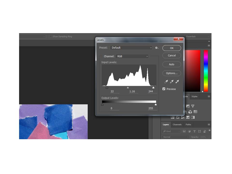
Step by step how I edited one of my photos:

First I cropped my photo to my liking with the crop toolImage result for crop tool photoshop

Then when I cropped it, I pressed Ctrl, alt, L on my keyboard and brought up the levels tool. This tool allows you to change the darkness, exposure and light on your image.

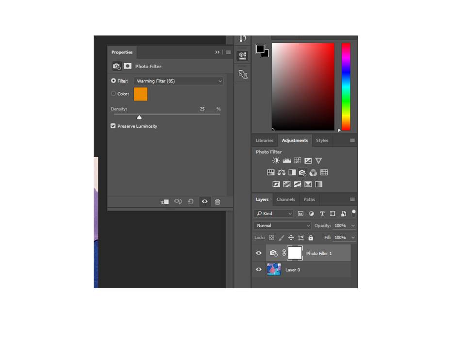
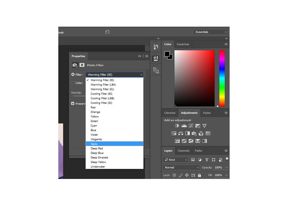
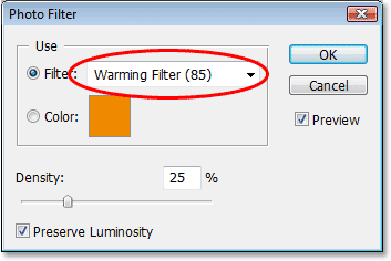
Then I pressed the photo filter tool and set it to the sepia filter.

Image result for photo filter tool photoshop


Week 5 Photoshoot Colour/Texture

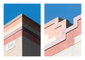
For this shoot, I took a lot of inspiration from minimalist photographers such as Jon Setter, Kyle Jeffers and Julian Schulze, but also tried to take into account the style of Photographers like The Boyle Family and Aaron Siskind, and tried to get at least on subject photographed in the style of these photographers. i found it very interesting focusing of colour and shape, as well as texture and different techniques. I wanted this Photoshoot to show a verity of these skills and I feel as though i have achieved this.

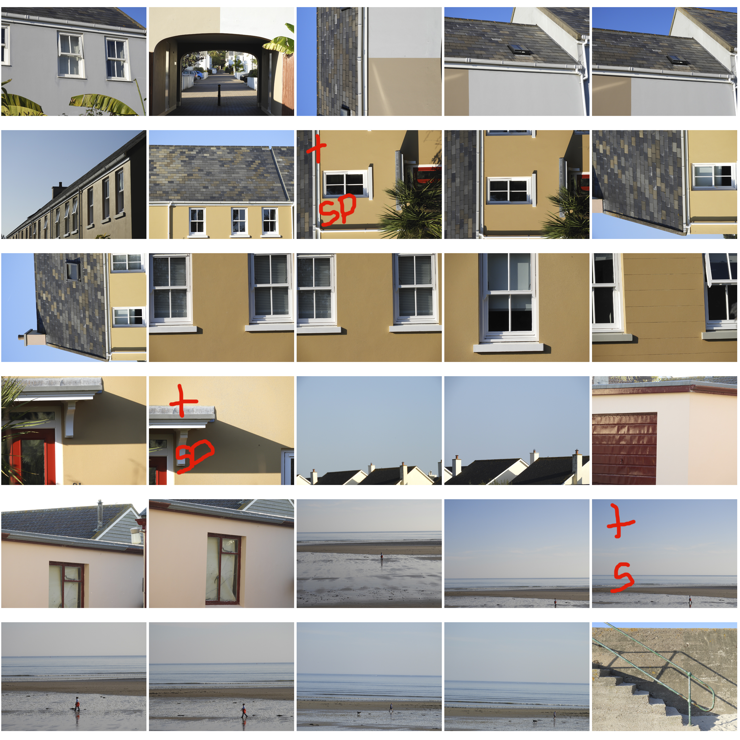
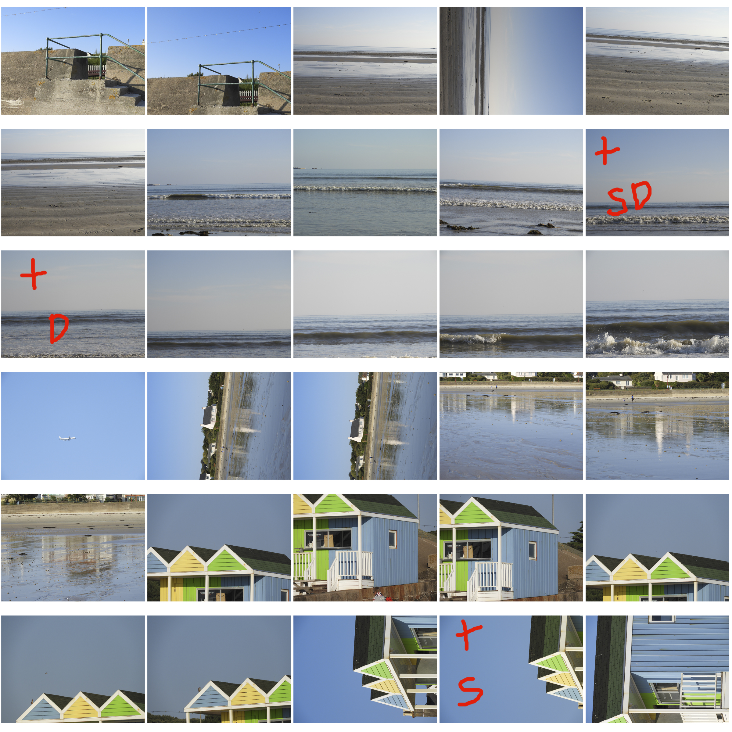
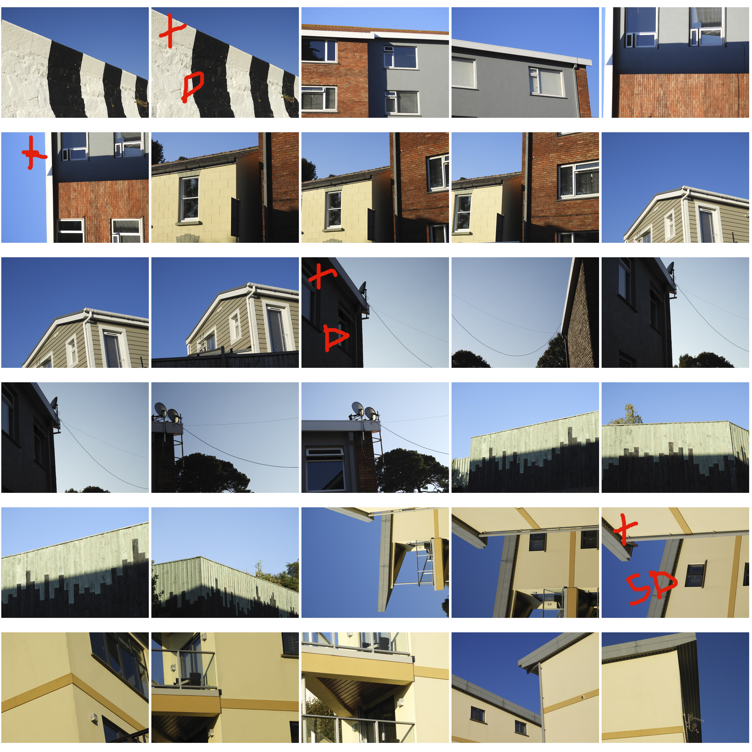
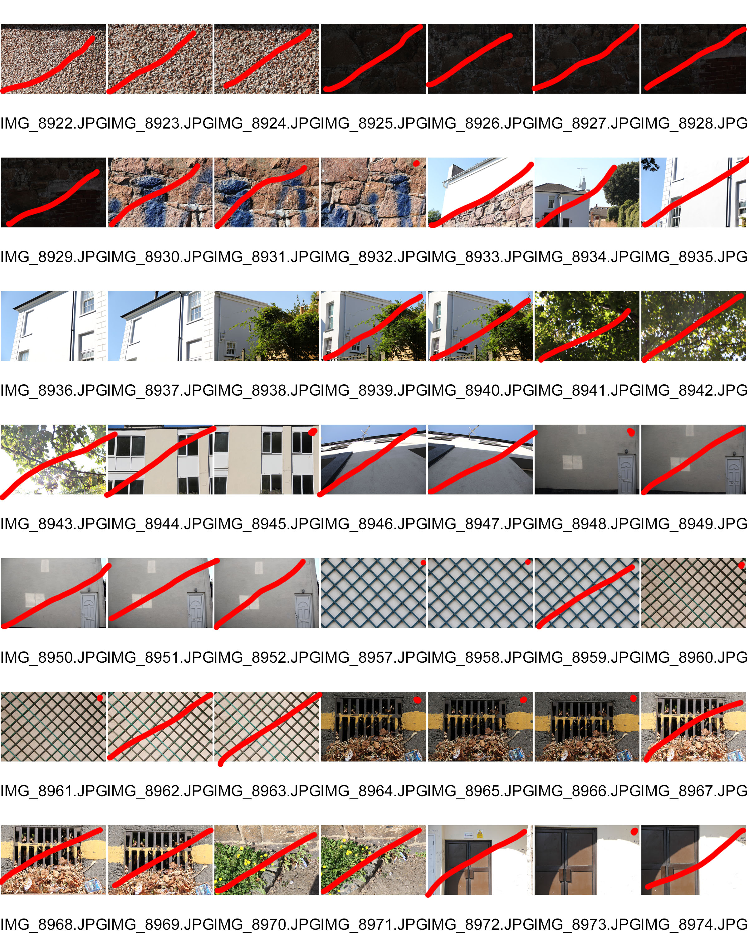
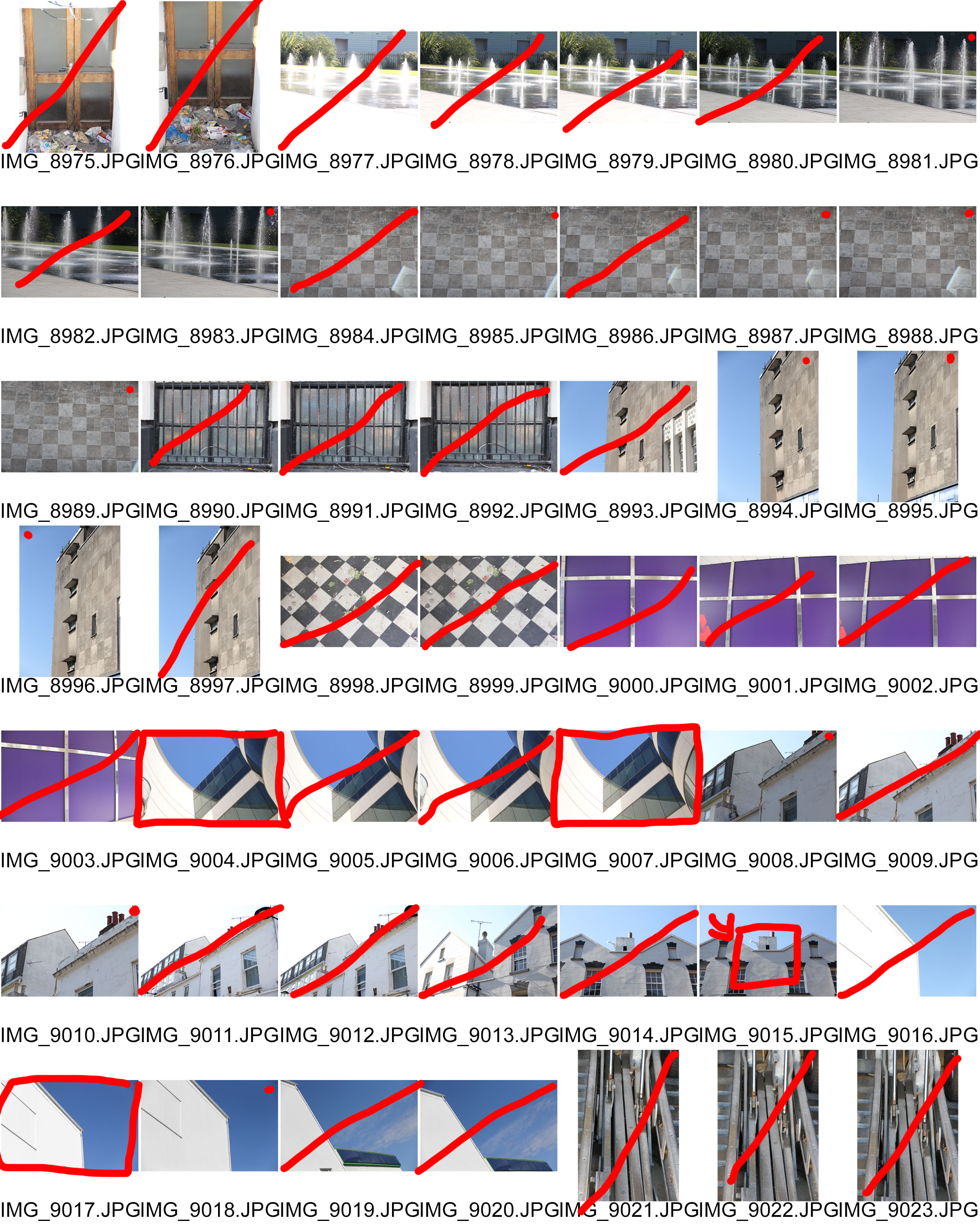
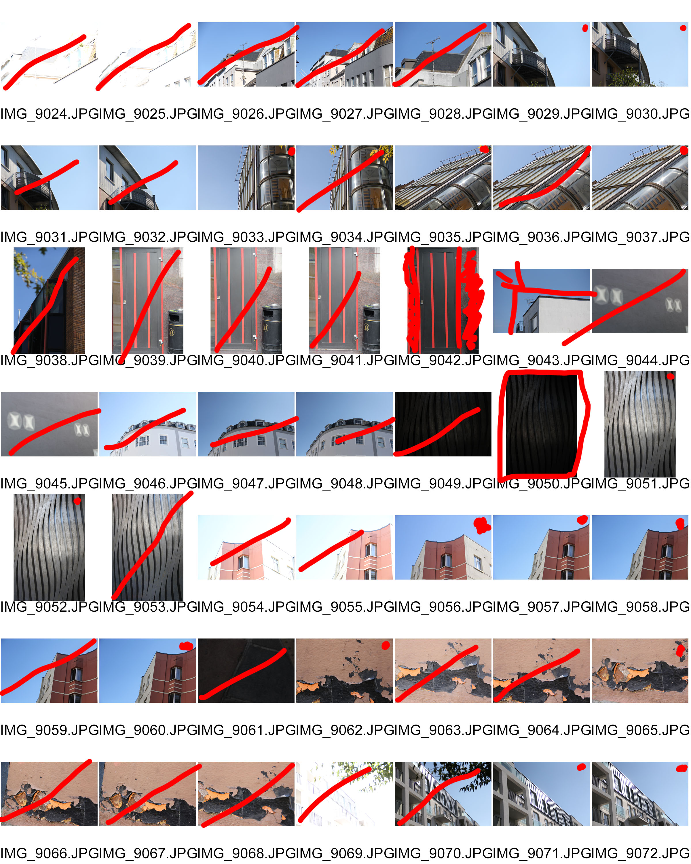
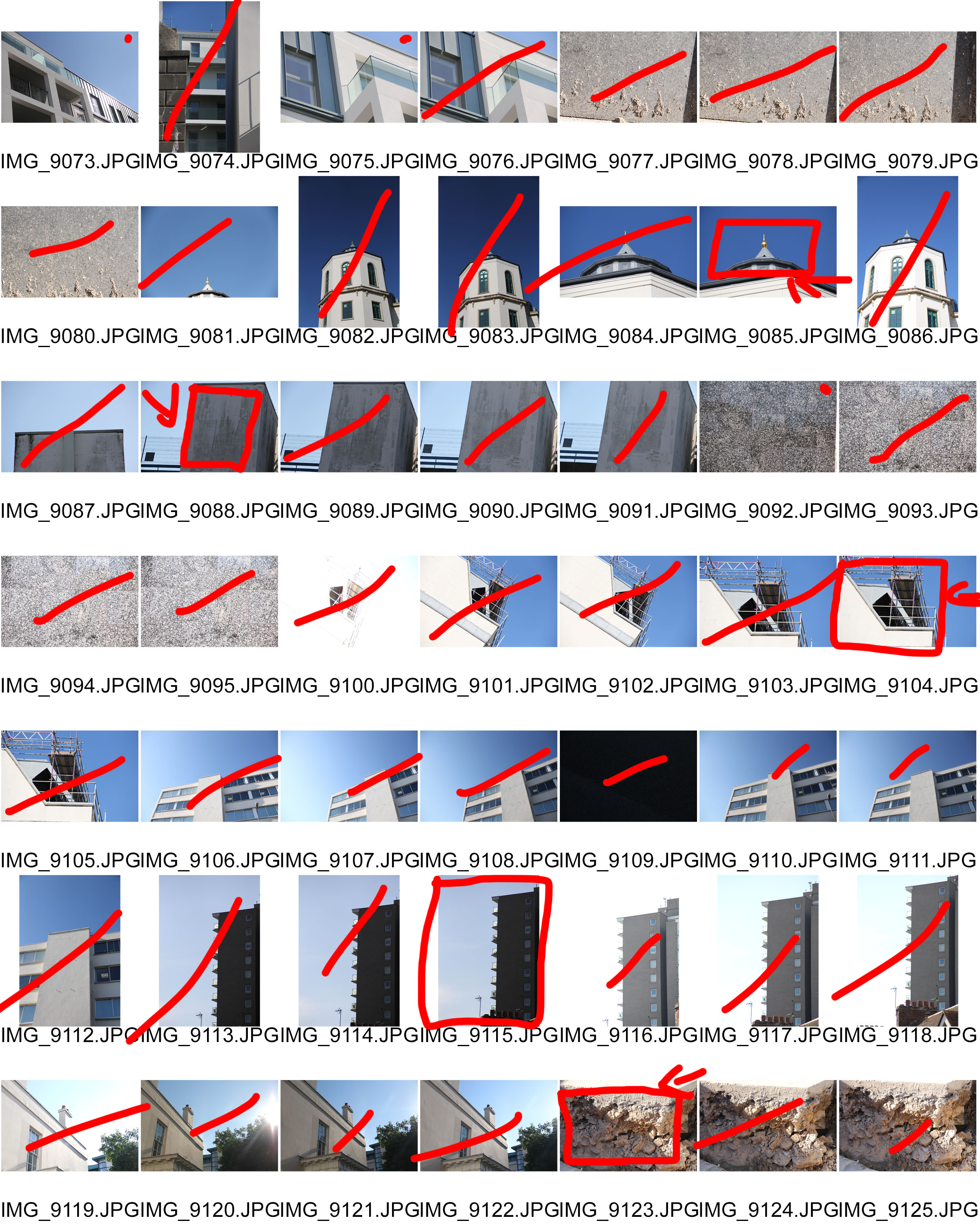
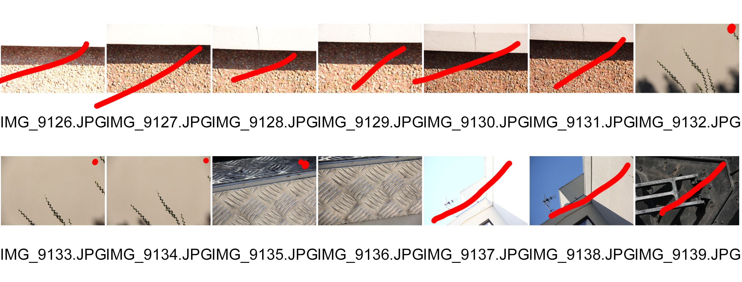
Contact Sheets:

Red Dot: Consider for final edit

Red Line: do not use

Box + Arrow: Crop

Inspiration for my images:

Many of the images in my contact sheet are based on the works of Kyle Jeffers and Jon Setter especially. I wanted to recreate the sharp images of setter combined with a slightly less saturated palate of Jeffers (concerning his pictures of buildings that is) and therefor i can see many elements of their work starting to emerge through my own.

However, I also wanted to try to take some pictures in the style of other photographers as well, most notably the Boyle Family, but also a few in the vain of Aaron Siskind (although i tried to do different shots compared to the summer task that i completed about him) to try  and challenge myself and produce the best variety of high quality photographs.

Final Images:

I found that this image is the closest that i got to that of Jeffers’ and Setter’s work, as it has the same characteristics in terms of shape, sharp edges, and an interesting colour palate. My goal for this picture was to try and emulate Setter’s ‘RedMilk’. I also feel as though I have put a unique spin on my picture, using a picture taken from further away.

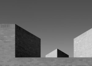
For this Picture, I liked how the lines were perpendicular to one another, similar to a lot of Setter’s work, yet it also has more of a  monochromatic tone compared to a lot of Setter’s pictures. I also Like the use of angles in this photo, as the camera is slightly canted and this adds to the sharp edges of the perpendicular, 90 degree angles within the picture.

For this picture i wanted to focus on minimalism and It has definitely turned out better than i was expecting. This specific photo was not taken as an attempt to copy others work, but as this was near the end of my shoot, I had started to get an eye for the colour and texture photos that Photographers were producing, yet it does still feature some of the key elements of minimalistic photographer’s work.

Franco Fontana Response

FRANCO FONTANA’S LIFE AND WORK:

Franco Fontana was born in 1933 in Modena. He took up photography in 1961 and joined an amateur club. He held his earliest solo shows in 1968 in Modena, his native city, which marked a turning point in his career. He has published over seventy books with Italian, French, German, Swiss, Spanish, American and Japanese publishers. His photographs have appeared worldwide in over 400 exhibitions, solo and collective. His images are in collections in over fifty public and private, Italian and international galleries, including: the Bibliothèque Nationale, and the Maison Européenne de la Photographie, Paris; the George Eastman House International Museum of Photography, Rochester, the Musée de la Photographie, Arles, New York, the National Museum, Beijing, the Stedelijk Museum, Amsterdam, the Metropolitan Museum of Photography, Tokyo, the Galleria Civica d’Arte Moderna e Contemporanea, Turin, and the Victoria and Albert Museum, London. Many companies have asked him to collaborate on advertising campaigns, he has published photographs in Time-Life, The New York Times, Vogue Usa, Vogue France, Il Venerdì di Repubblica, Sette del Corriere della Sera, Panorama, Frankfurter Allgemeine Zeitung, Class, Epoca and others. Fontana has been invited to hold photography workshops in various schools, universities and institutes such as the Guggenheim Museum in New York, the Tokyo Institute of Technology, the Académie Royale des Beaux Arts, Brussels, the Toronto University, and so on in Rome, Paris, Arles, Rockpot, Barcelona, Taipei,  Politecnico di Torino, and the LUISS University, Rome.  He has collaborated with the Centre Georges Pompidou, the Japanese Ministry of Culture, the French Ministry of Culture.
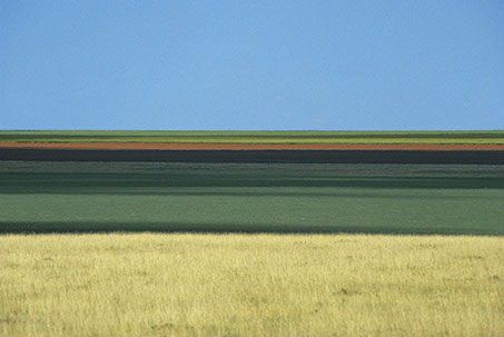
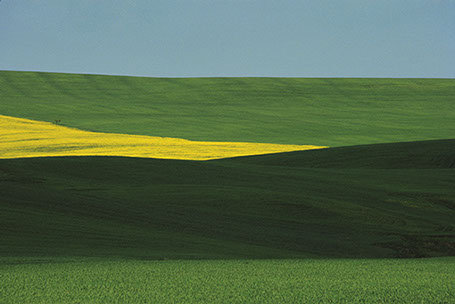
CRITICAL ANALYSIS:
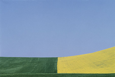
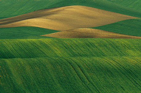
This piece by Franco is very simple in composition, only consisting of simple line work, going along the rolling hills of the grasslands. There are large blocks of color which separate the photo into 3 sections, blocking each color into a section. Even through the photo contains a very simplistic color pallets, the colors merge and harmonize together to create an overalll “tied together”look. There is no real foreground, mid ground or background, therefore the landscape appears 2D and flat. The length and width of each block of color is fairly relative to one another therefore there is a slight sense of pattern and repetition. I believe that during editing, the colors have been over saturated in order to create impact and boldness. The natural lighting coming directly above from the sun, gives the image brightness yet lacks any sort of shadows or tone differentiation. Even though this is a photograph of fields, the image does not feel organic or natural in any sense due to the symmetry and geometry seen within it.

His reasoning for creating these images are “my goal is to interpret reality. Anyone can see the landscapes I photograph, but with my camera I try to capture the details and features that the eye cannot see. Some tell me, “I went to Provence and I saw ‘your’ landscapes”; sometimes they will have seen those places before coming to an exhibition, but only after looking at my work they see that part of reality pinpointing something they had not noticed before.”

CONTACT SHEETS AND SELECTION:

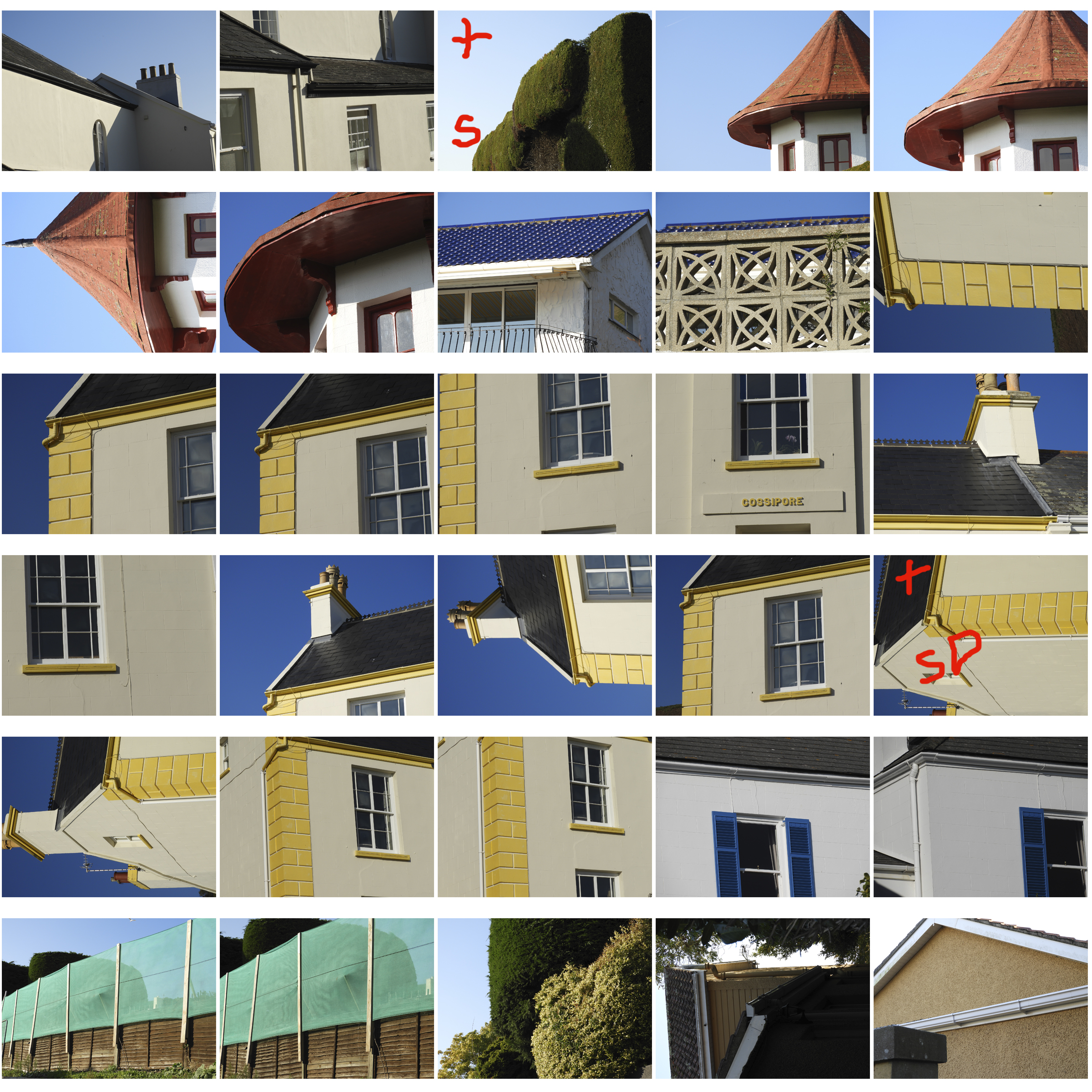
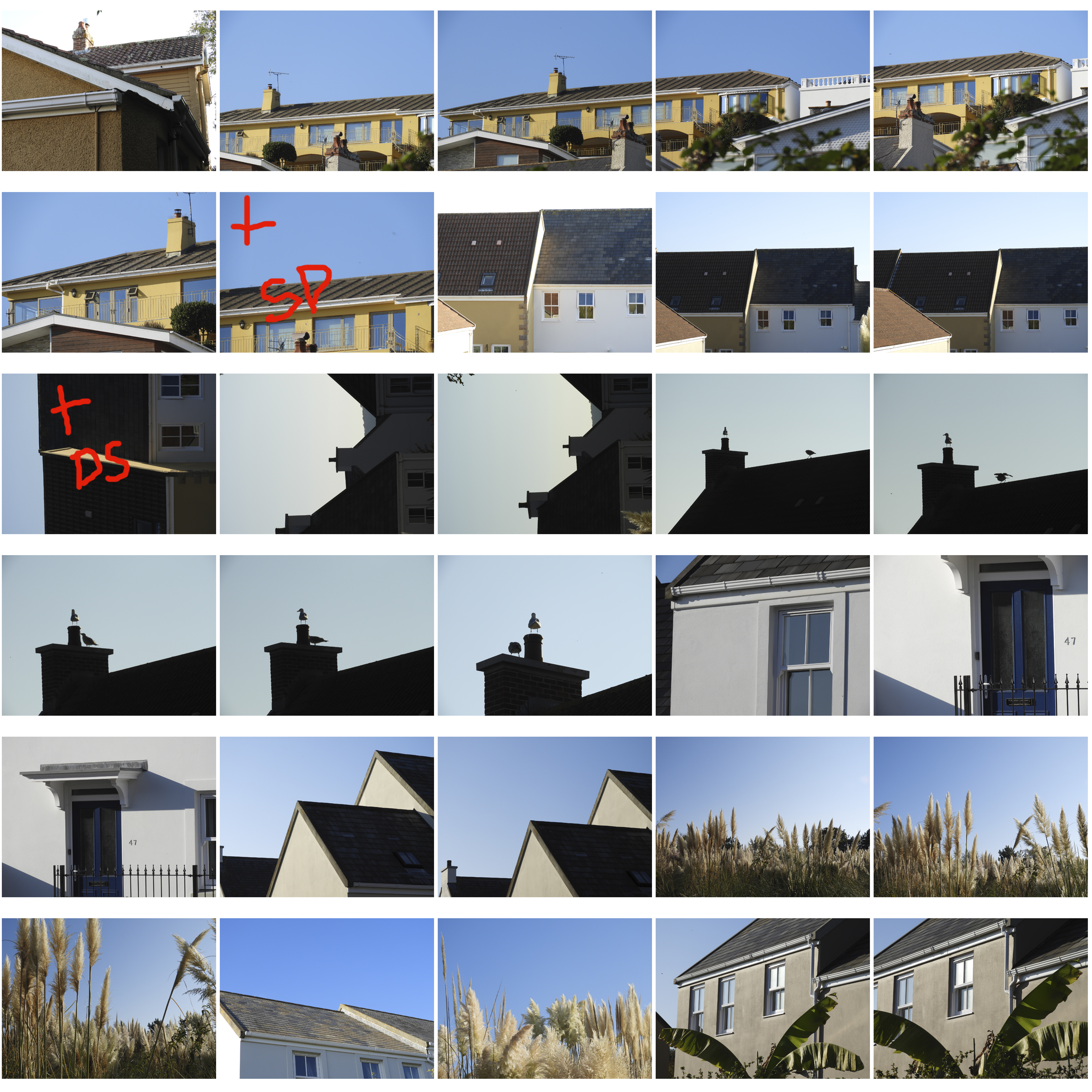
This was a very extensive and thorough photo shoot therefore i ended up with over 200 photos which i eventually cut down to 9 with the help of contact sheets. The plus indicates that the image is successful. The S indicates the need to further saturate the image, and the D indicates the need to lighten the image.
ANALYSIS OF MY MOST SUCCESSFUL PHOTO:

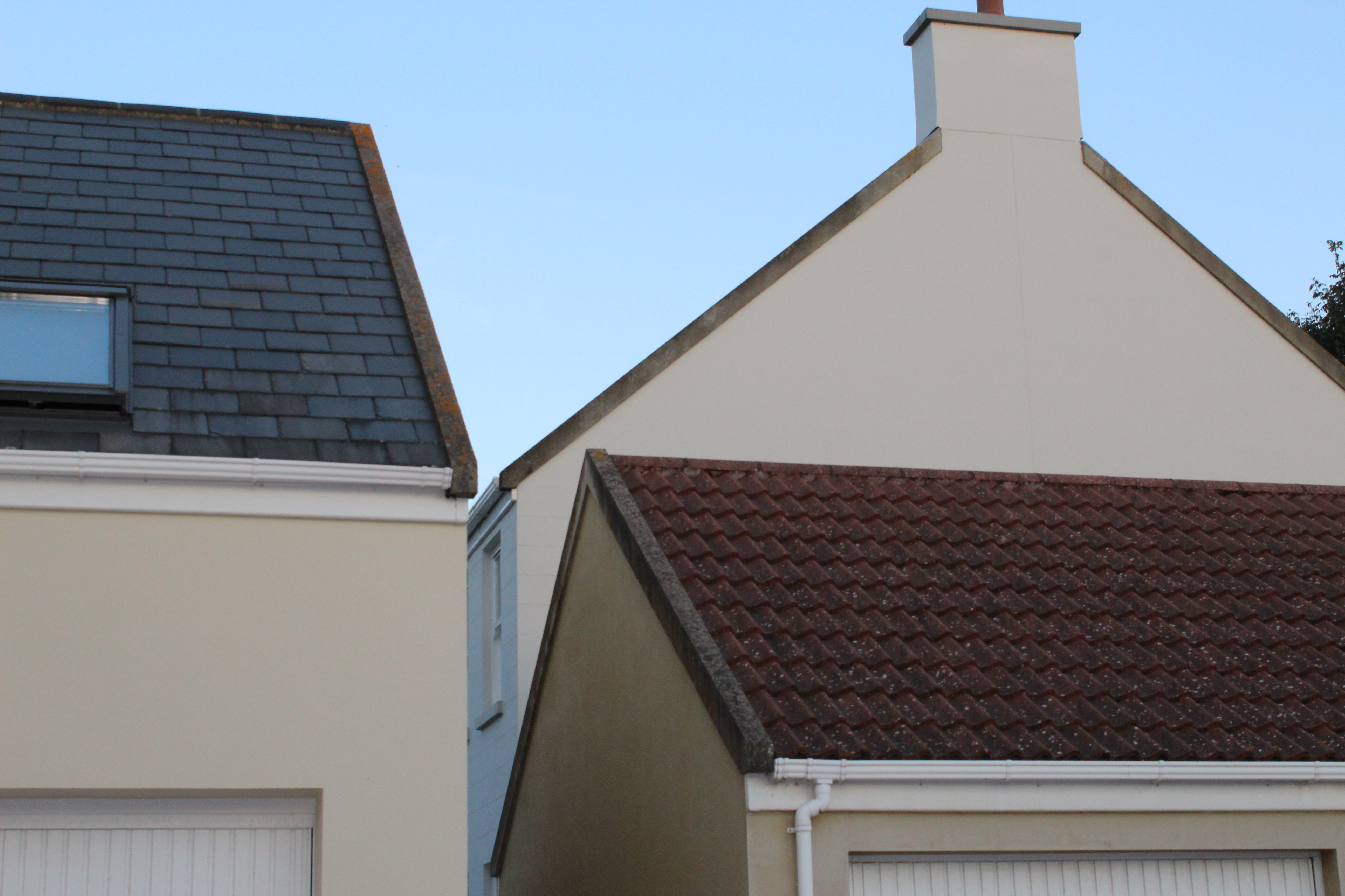
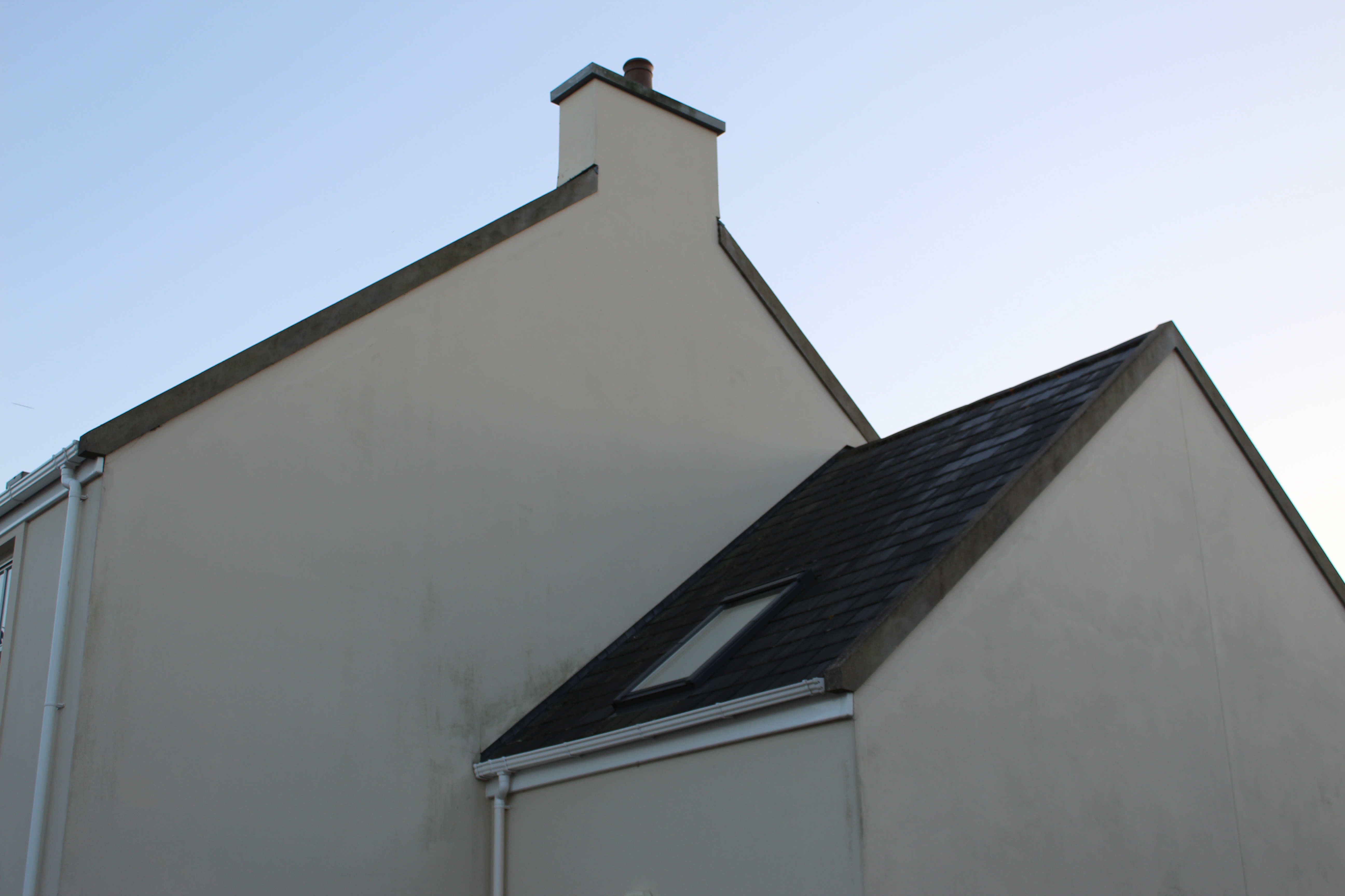
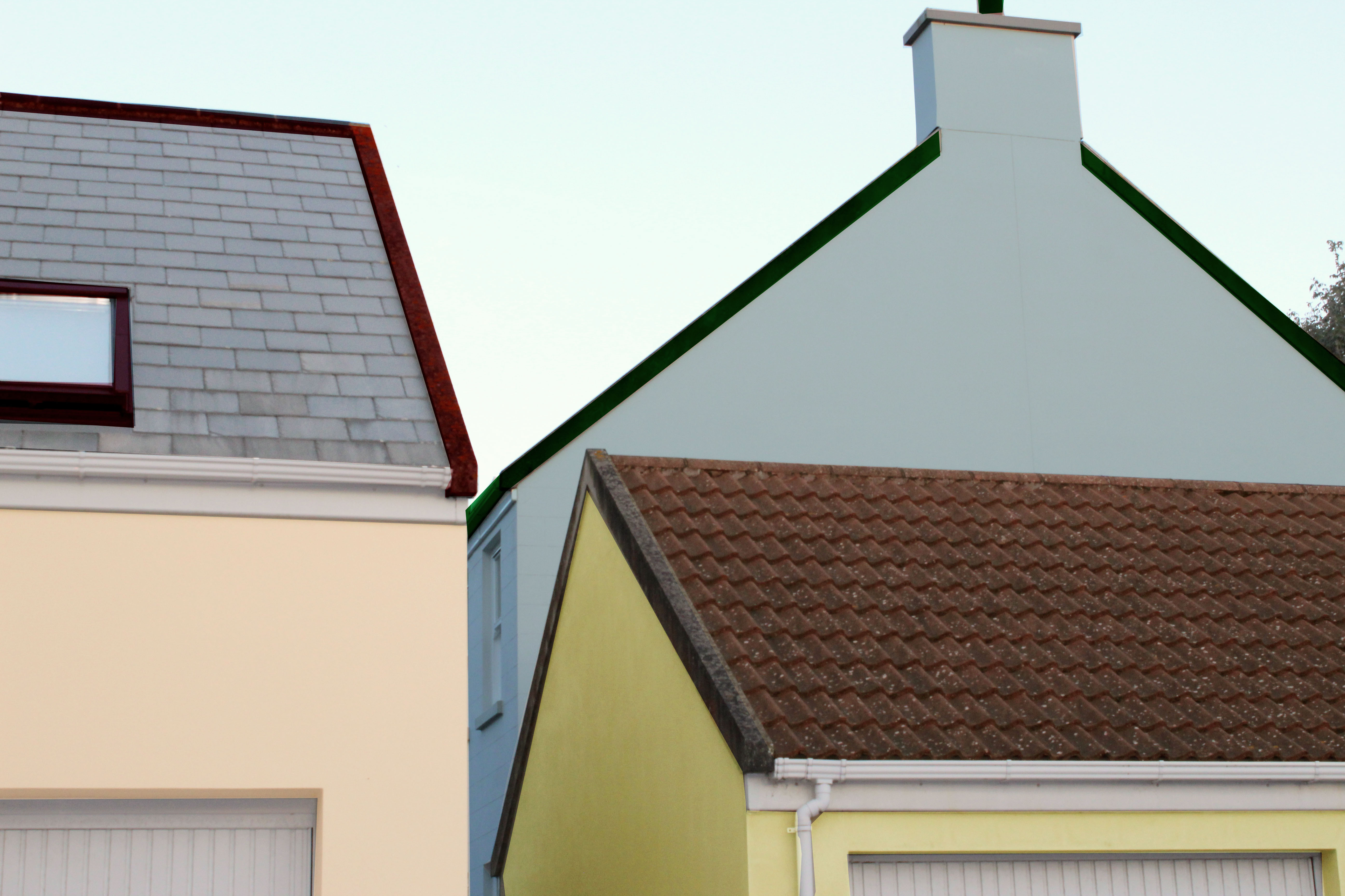
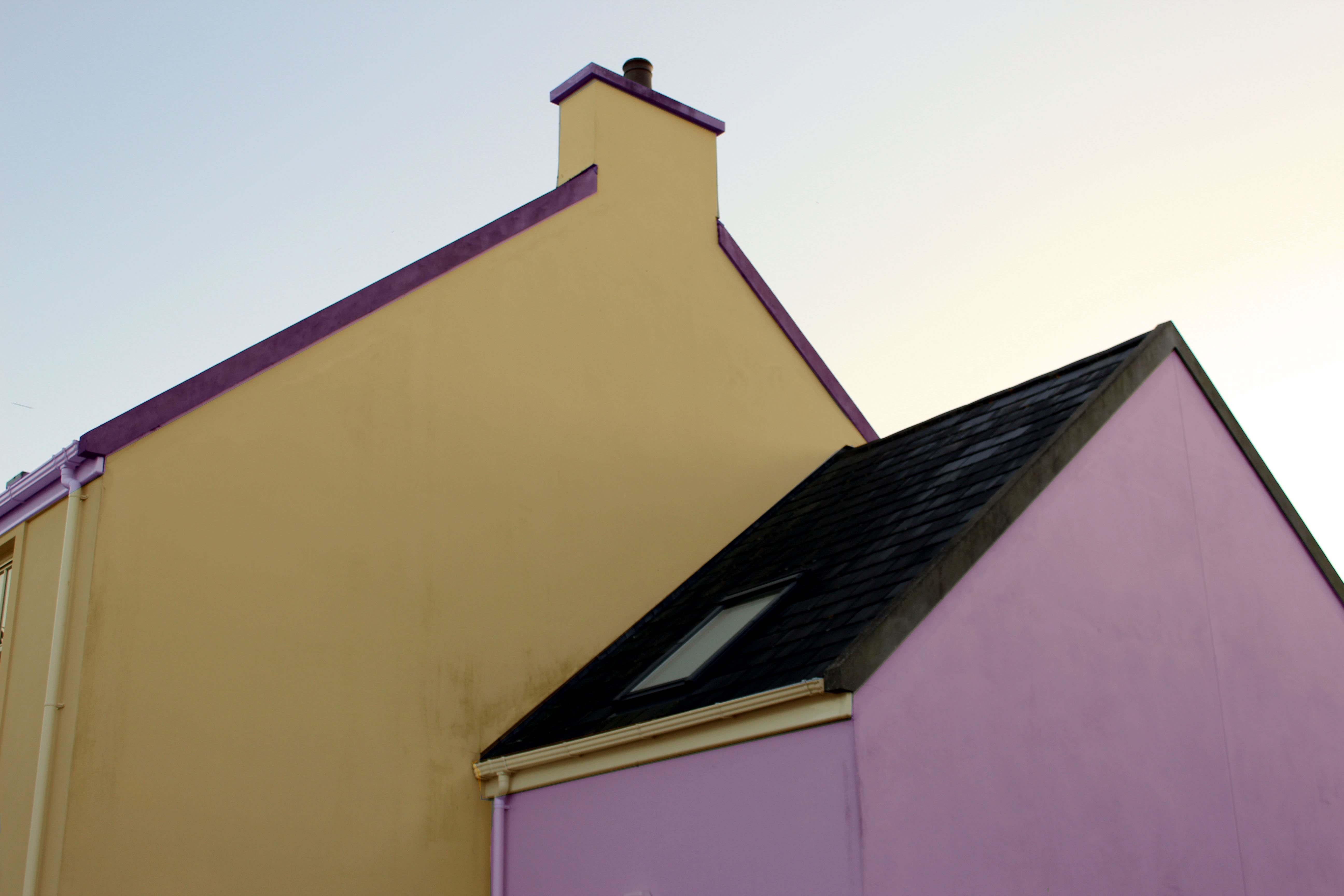
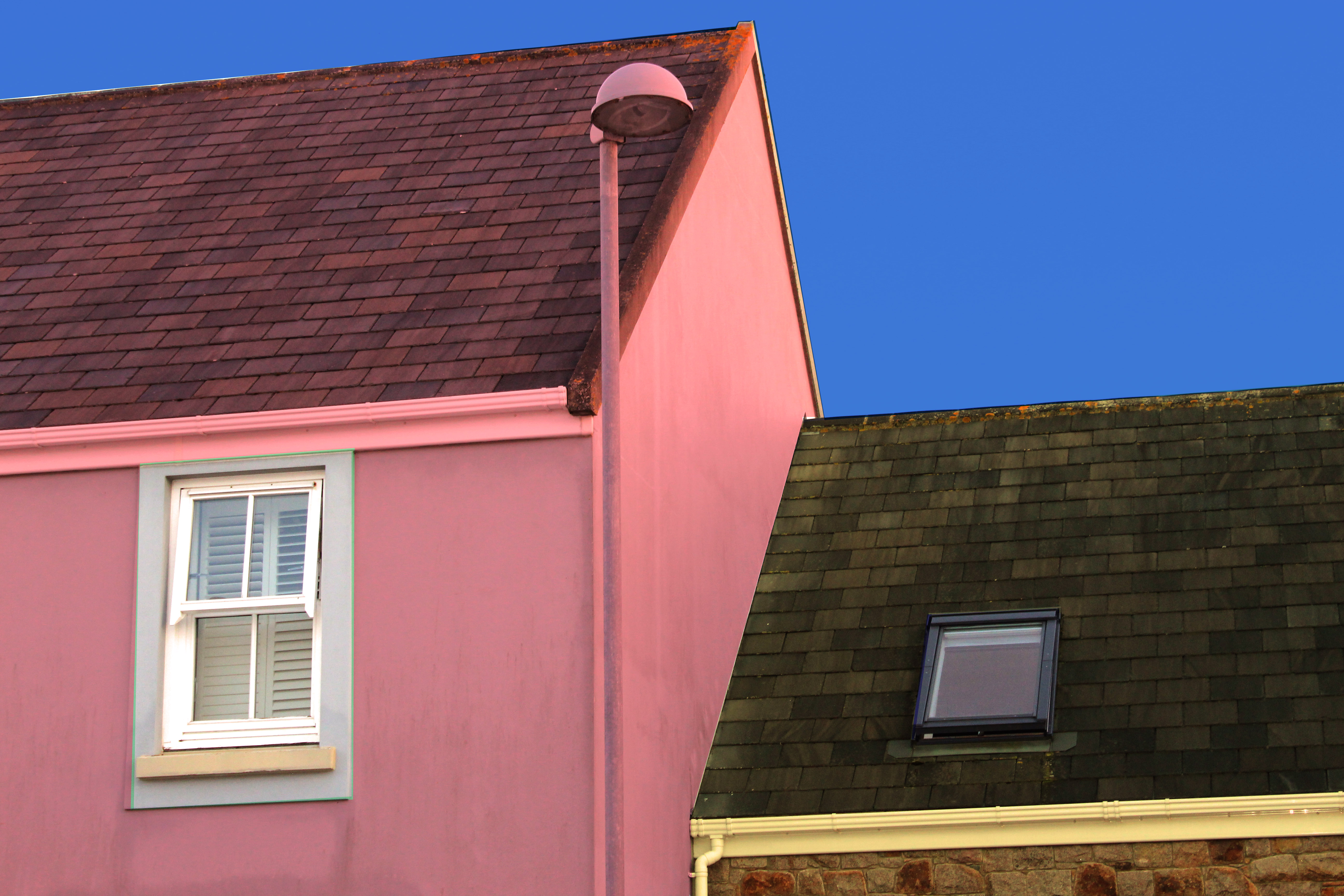
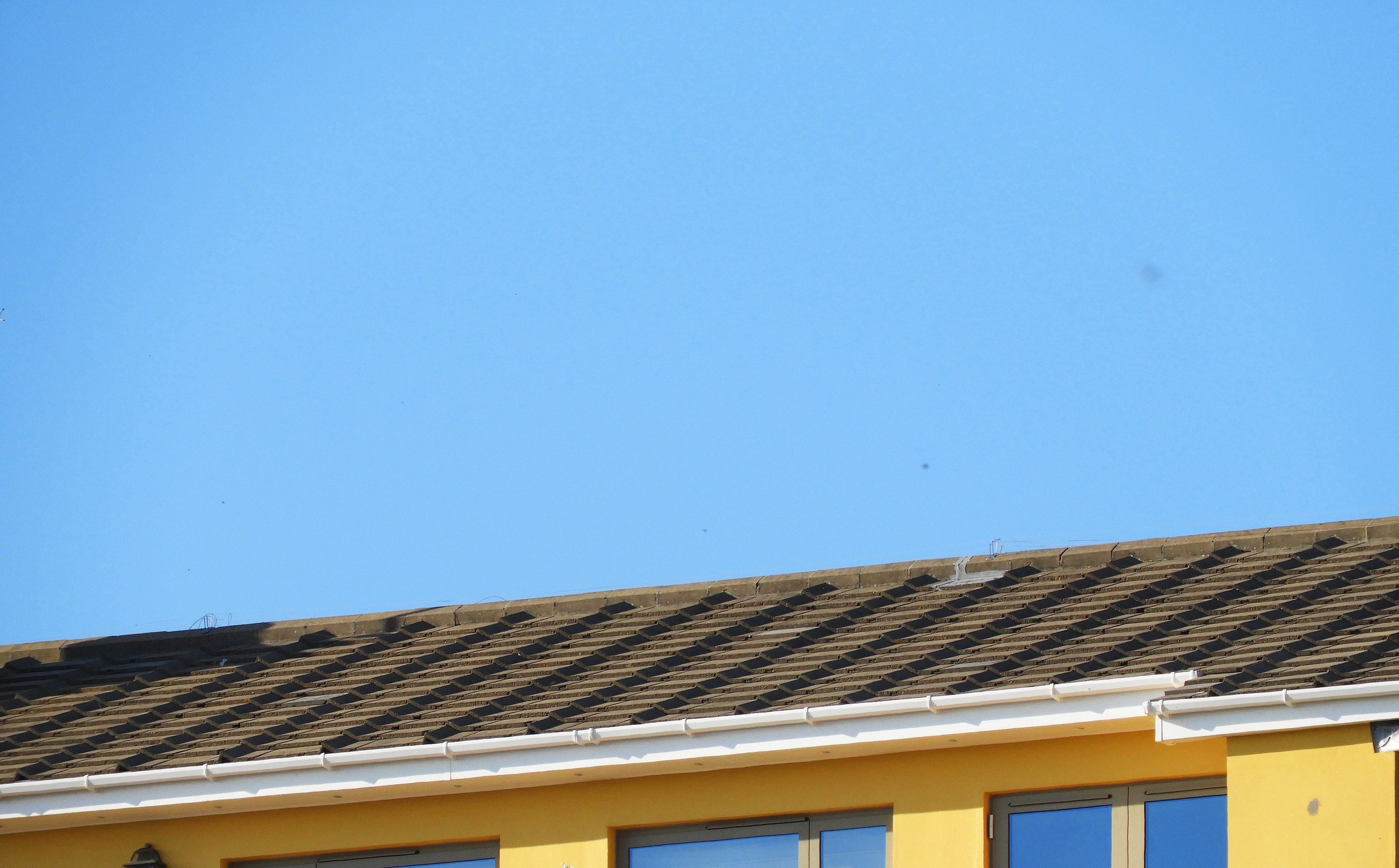
i felt that this photo encapsulated the formal elements that Franco explores best. Firstly, the main focus of the image is the bright and saturated colors of the sky and the yellow building below, which perfectly harmonize to create an impactful image. The light grey and brown roof tones down the image slightly, yet works well together with the blue and yellow. Like Franco, I captured these images on days with few clouds and strong natural lighting which allowed the bright blue sky to pop and provide a clean backdrop for the image. The light was hitting the building from the top left hand of the sky therefore no real shadows are cast onto the building. The image follows the  rule of 3, with the sky filling up the top 2/3 of the image and the building filling up only 1/3 of the image.  Like with Franco’s work, There is a slight sense of repetition in this image through the evenly spaced roof tiles and windows in the bottom third of the image. The repetition of pattern also makes this image feel industrial and man-made, far from anything organic. This image is also very flat and does not have a clear foreground or background giving it a 2D quality.

Whilst capturing these images, I set my exposure to 600, as it was quite a bright day yet i wanted it high enough to allow color to be bright. As there was plenty of natural light, I maintained my shutter speed at 1/60 which was enough to produce clear and crisp images. I set my white balance to direct sunlight as these were the conditions i was experiencing that day. The field of view in this image is very small, meaning that i zoomed in quite far into the building to capture this image.
 

Franco Fontana Response: Most Successful Photos

WHAT I DID:

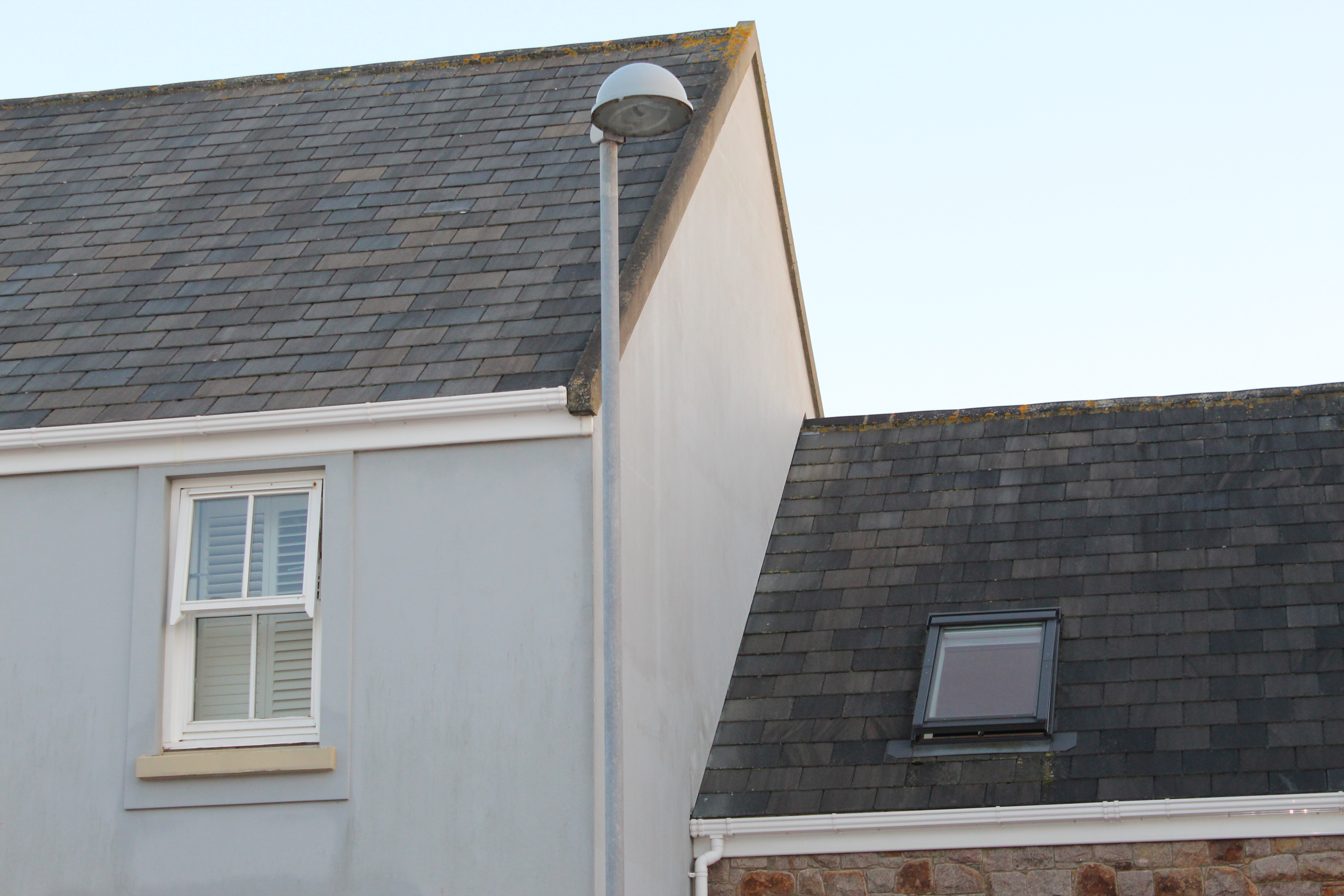
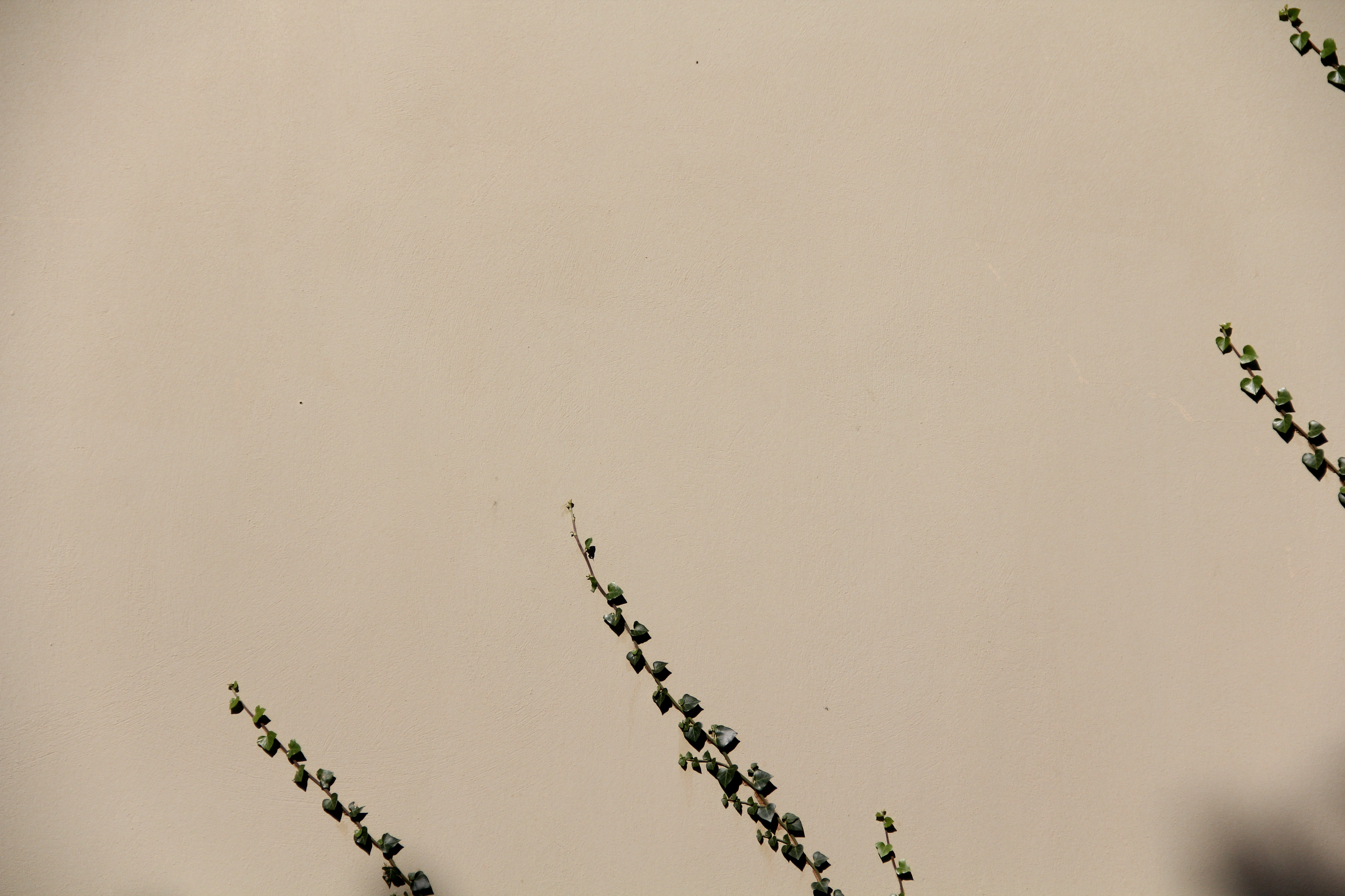
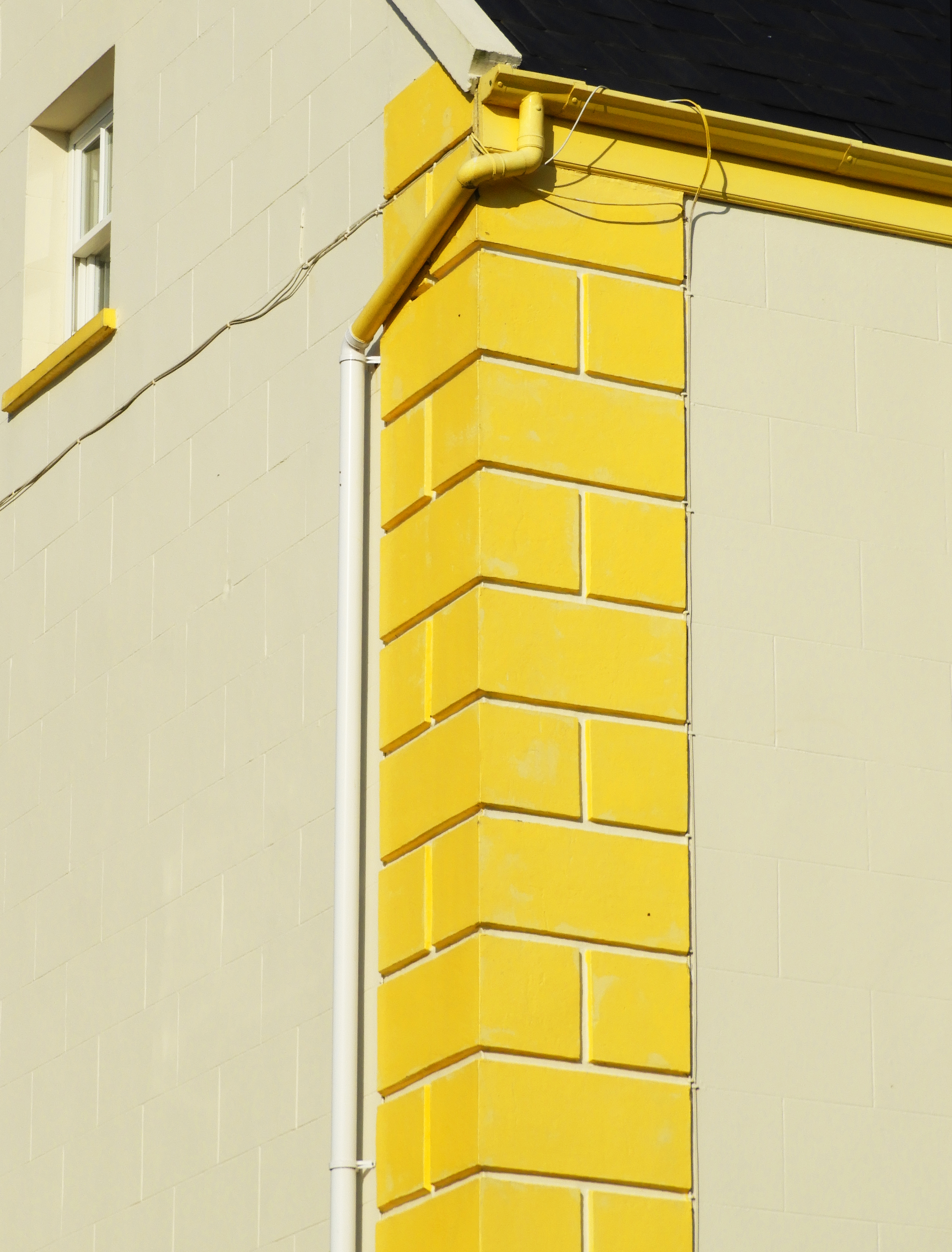
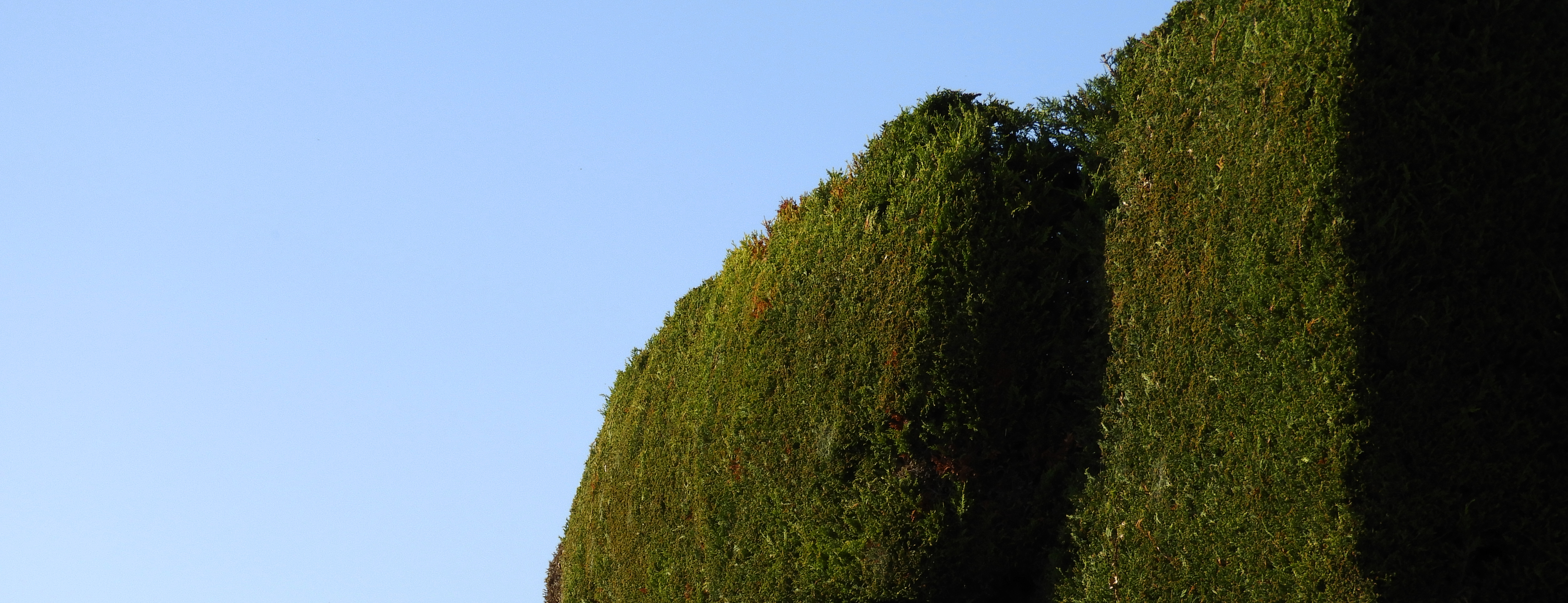
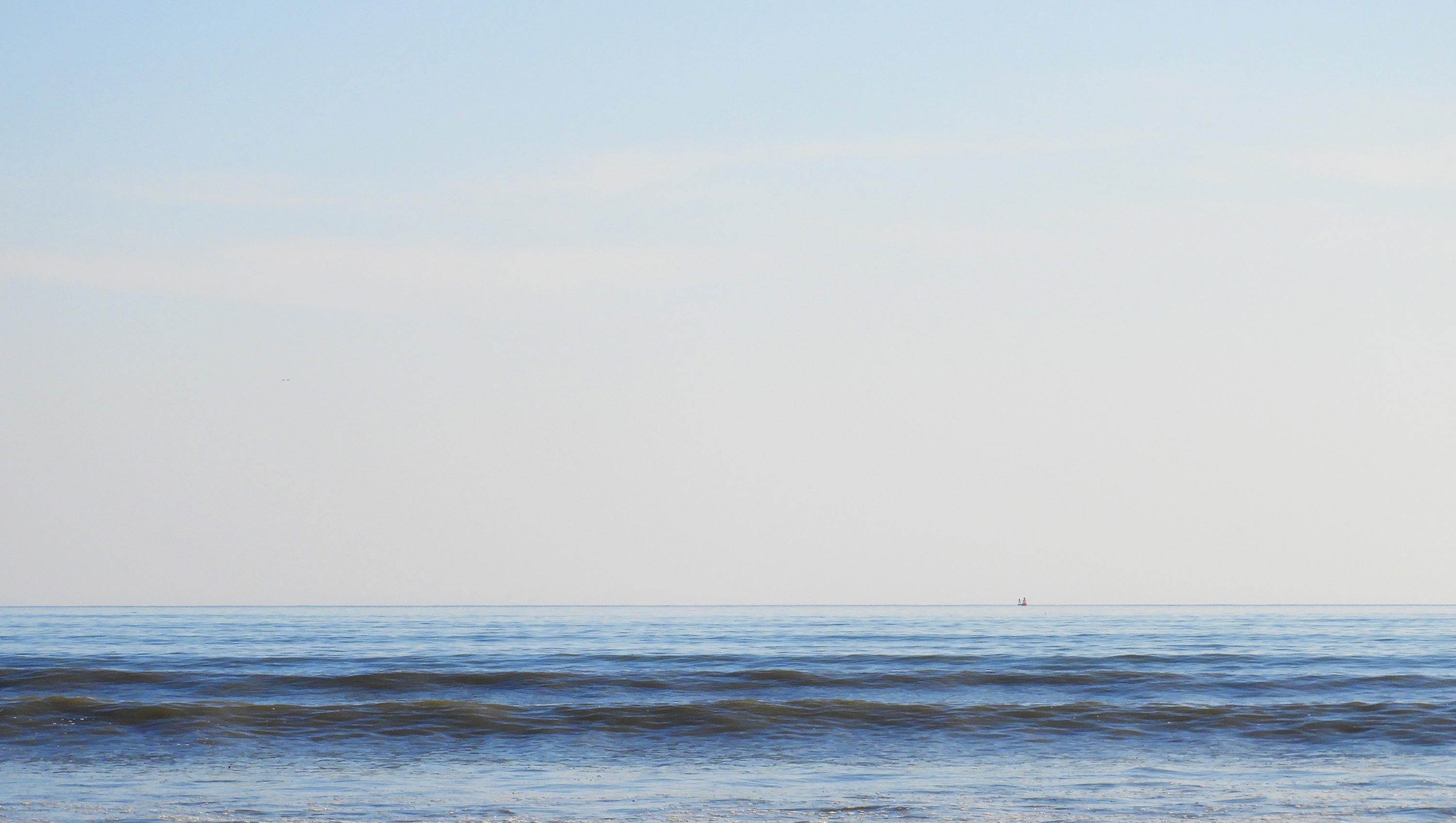
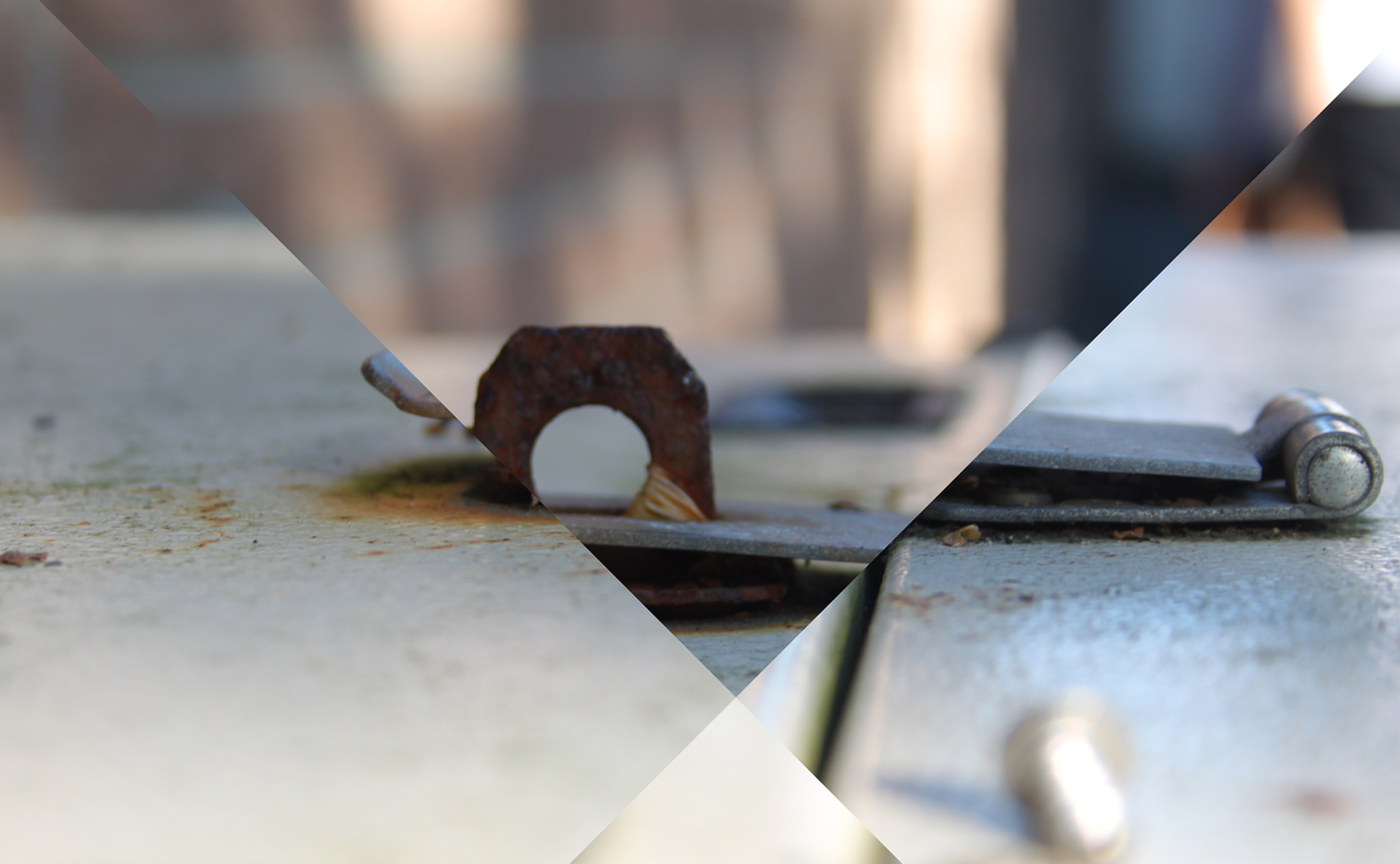
This is a selection of my most successful photos from a photoshoot i did focusing on the work of Franco Fontana. All the images below follow a simplistic approach, mainly concentrating on bold color and minimalist composition. I was not able to capture the beautiful rolling hills like Fontana has done, but I still incorporated similar elements into my work in order portray similar images.