

Clare Rae is an Australian photographer who has recently done a Photo shoot in Jersey based on the work of Claude Cahun, A local photographer who lived on the island during the 1940s and 1950s. The photo shoot explored both Rae and Cahuns love of nature and their position within it in terms of the association of the female body with the natural environment
The shoot itself was taken in rural spots around the Island, with many easily identifiable coastal scenes throughout the piece of work. Gorse bushes and lichen strung rocks play an important part in the shoot. The images are essentially of a self portraiture nature as they highlight the individuals association with their environment and tell a story
Here are a few pictures of the visit
A large amount of images, all themed on coastal fauna and the artists association with them. The images were taken at various locations around the island such as Le Hocq, Grosnez castle and Beauport headland.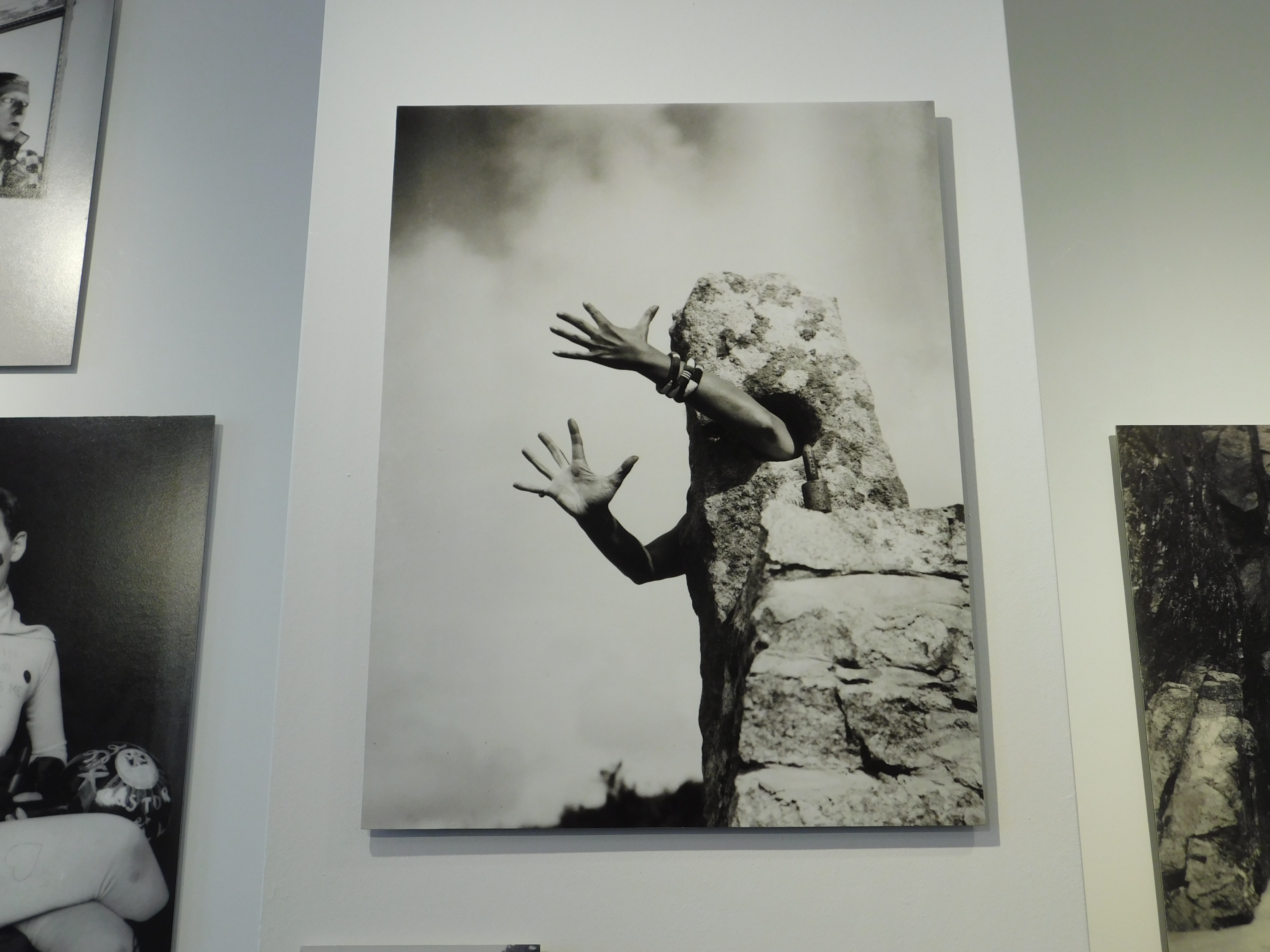
This image is a particular favourite of mine due to the abstract nature of the image. The image depicts rae, Placing one arm through a hole in a piece of old ruin and hiding behind it
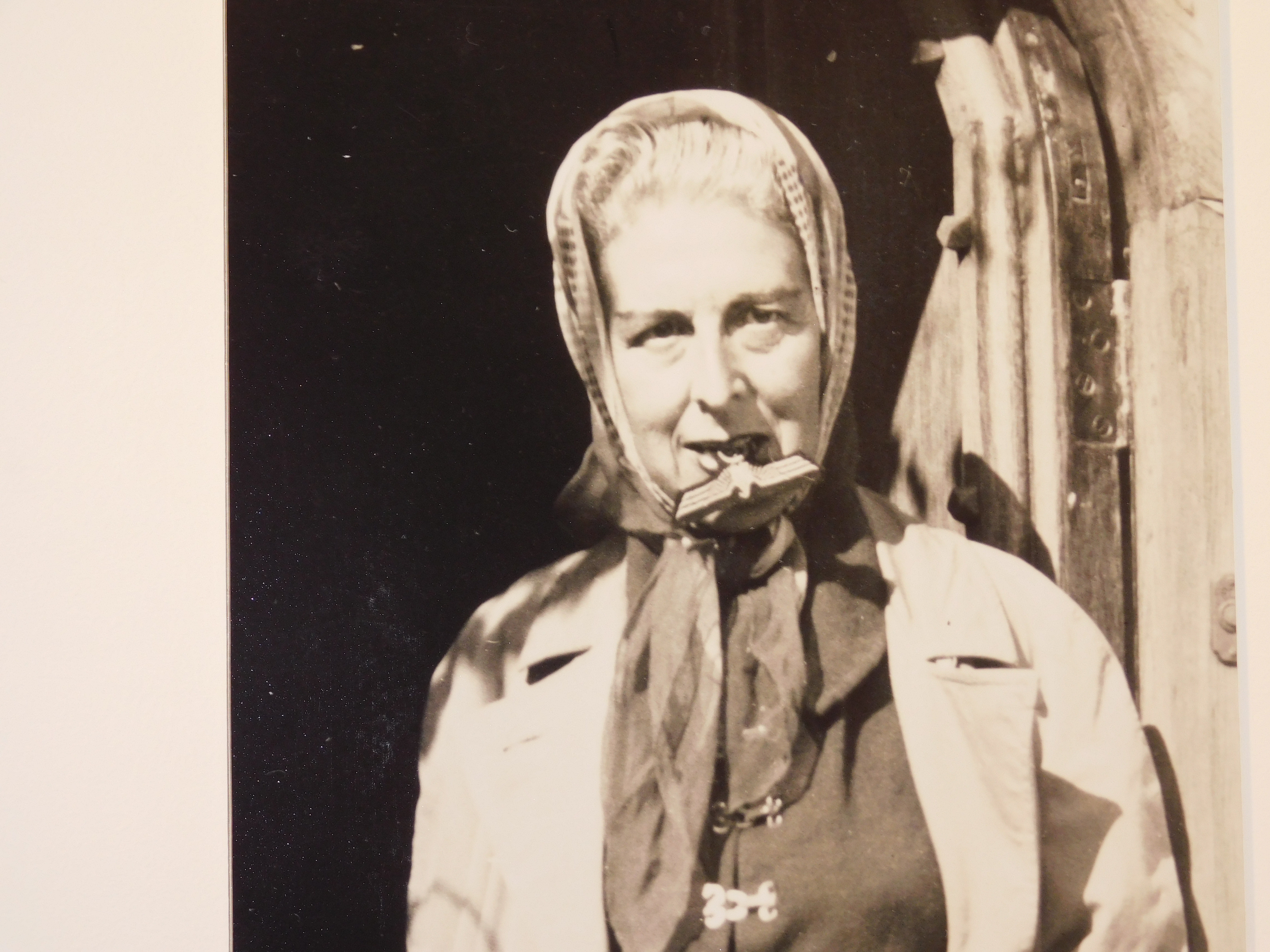
In this image, Cahun is seen with a Nazi eagle badge in her mouth. This can be seen as representative of the local environment at the time of the shoot due to the Nazi occupation of Jersey, Which lasted from late 1939 until may 1945.
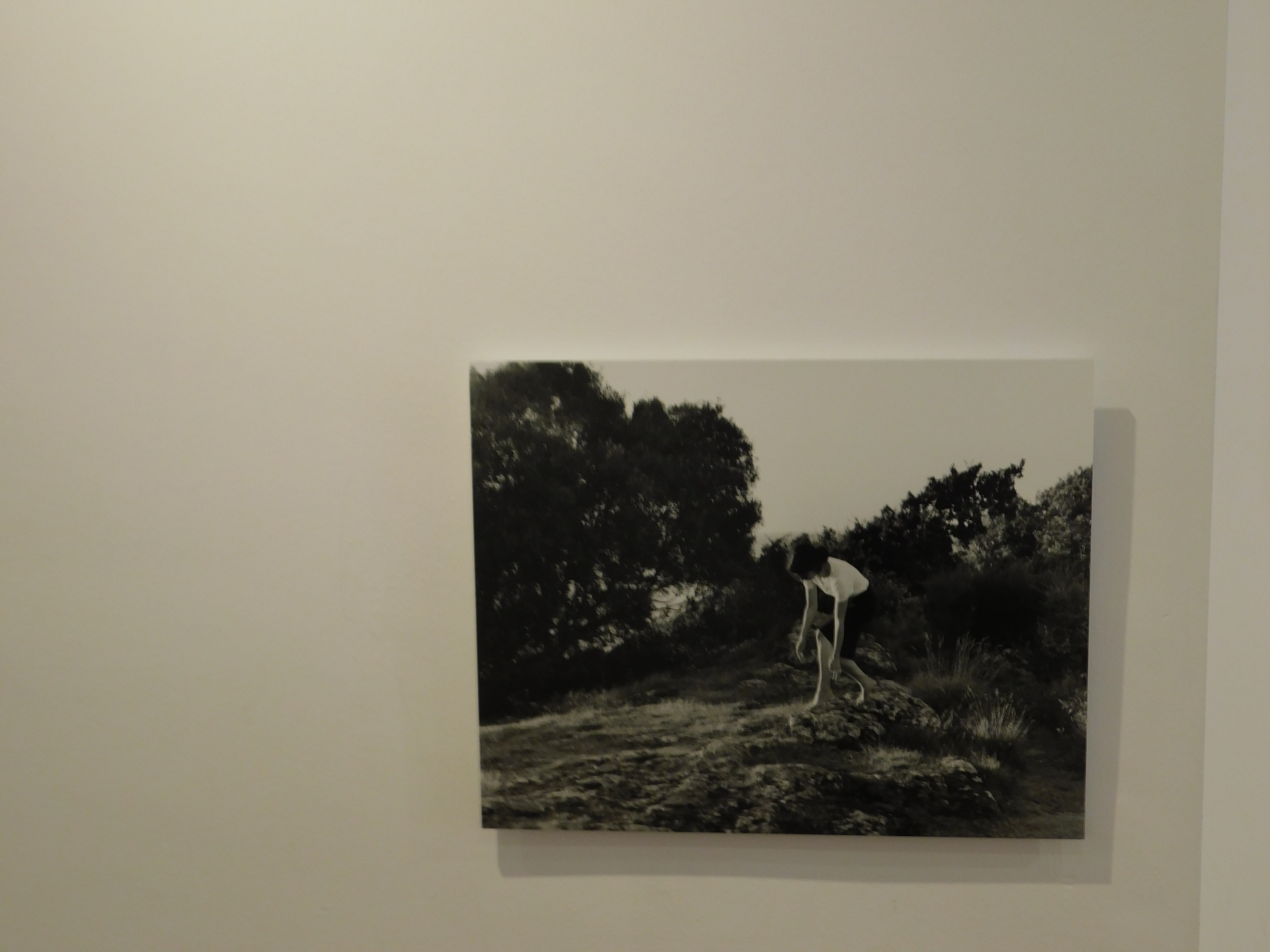
Each Picture tells a different story, yet all explore the unique association both artists have with their natural environment
In this project I have been able to explore into the concept of abstract photography. I have looked at a variety of artists, who use multiple editing and camera skills, allowing me to gain a greater depth into the theme of abstract photography. I have captured a range of subjects, from paper to twigs, allowing to experiment with the formal elements which play an active role in abstract photography. I have acquired many camera skills, from controlling the shutter speed, ISO, White Balance and Depth of Field. I feel that I have successfully demonstrated these skills through my photo shoots, which have been inspired by artists that I previously researched.
Here is a final plan for the layout of my final images:

Analysis
Overall, I chose the images as my final images due to them, in my opinion, reflecting my camera skills and perspective within ‘Abstract Photography’. I also chose them due to their abstract view points on colour: man made vibrant colours next to natural and neutral colours. Throughout my project I focused on photographing abandoned or decayed buildings or surfaces because I liked the idea of the fact that we’re living in a forever growing world with things being introduced to us everyday. Yet, there is so much decay and remains left for us to bare and manage. This overall project was to show how in our everyday lives, we ignore the decay us and proceed with our ‘new’ set in place futures.
After the final prints came through I began to experiment with ways to explore the out of focus photographs I had produced. To do this I am layering tracing paper in different ways to create different effects with the final photographs when they are displayed.
For a first experiment I tried layering up the tracing paper over my final photographs to produce and even more out of focus photograph for effect. I experimented with layering one layer and then two layers of the tracing paper to see what different effects it can create while still being able to understand and see the photograph.

One Layer
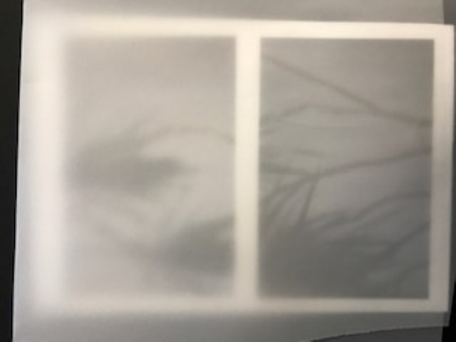
Two Layers
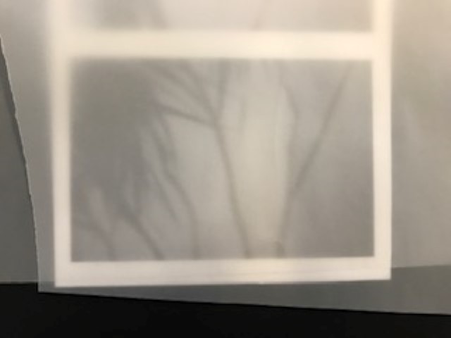
Two Layers
For this I began to experiment with ways in which I could place the tracing paper over my final photographs in different shapes to create different effects. Similar to the ‘Conceal and Reveal’ experiments on Photoshop it is experimenting with hiding and editing certain parts of the photographs to give them certain effects.

Using Triangles

Using Squares
This is the same as the ‘Conceal and Reveal’ experiments as it uses the idea of putting a layer over the photograph and then removing certain parts of the layer to reveal the photograph underneath. I am doing the same hear using tracing paper and cutting shapes out as to reveal parts of the photograph. Some parts are more out of focus than others due to the tracing paper creating another layer of opacity making the image more difficult to see underneath.

Cutting Away Shapes
These are the 4 final images which I have chosen to print out as my final images.
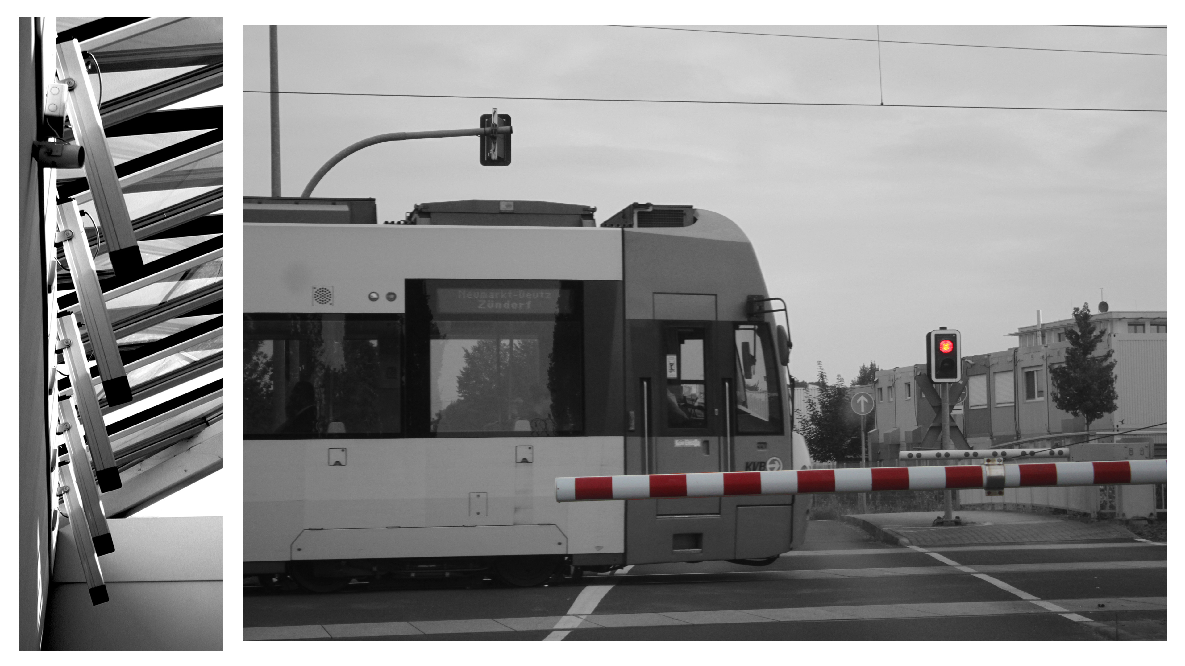 This will be my largest print out (sized at A3). I will seperate the print into the two images it consists of; then stick them onto one layer of white styrofoam board, then display them on a black A2 piece of card. This will make them literally pop out of the page more as they will be lifted approximately 1cm above the card. The whole display will also keep the black & white theme as the display elements are also black & white.
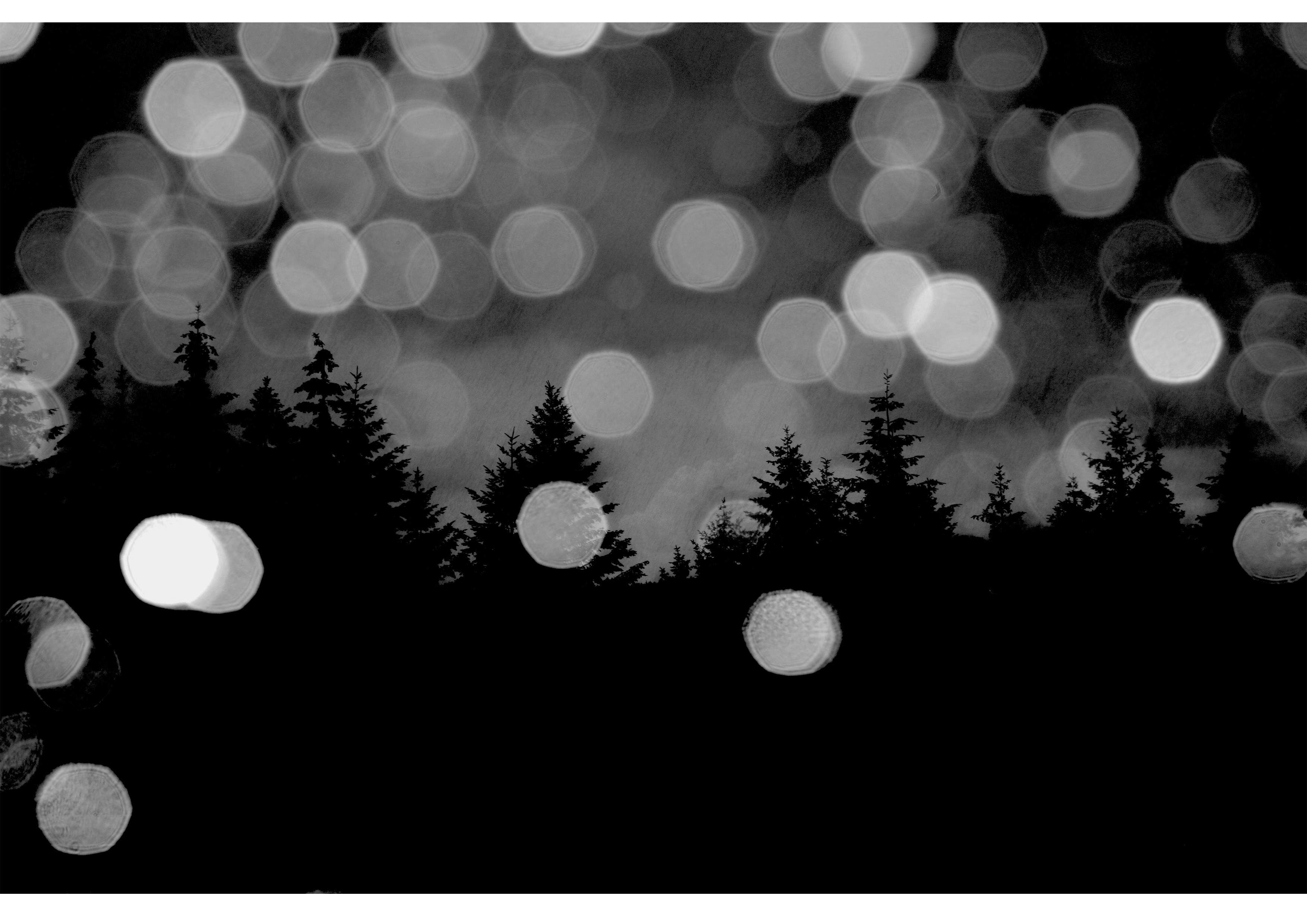 This image will be printed out in A4 size. I will frame it in black A3 card to keep the dark theme of the photo. Howevr, I will bevel the edges around the photo so that the white underside of the card shows through, this will help distinguish the image from the frame without adding too much bright elements.
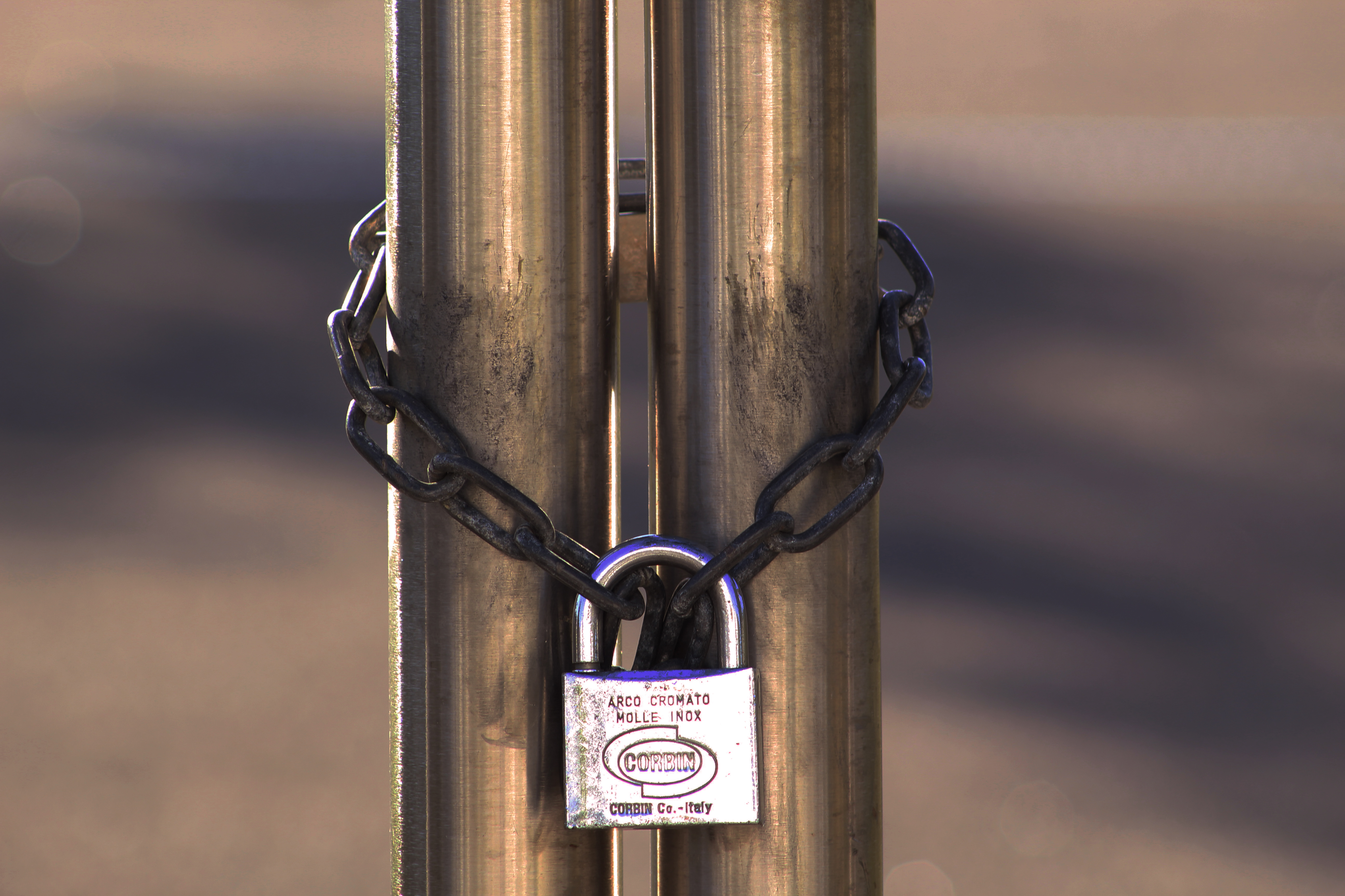 This photo will be printed out in A5 size. I will cut it into three elements (left, middle, right) to help show how the image consists of three clear parts. I will then layer them on different thicknesses of styrofoam board; left part will be 2 layers thick, middle right part will be 3 layers thick, and middle part will be 5 layers thick. These will then be stuck onto an A4 piece of black card with small gaps between each third of the photo.
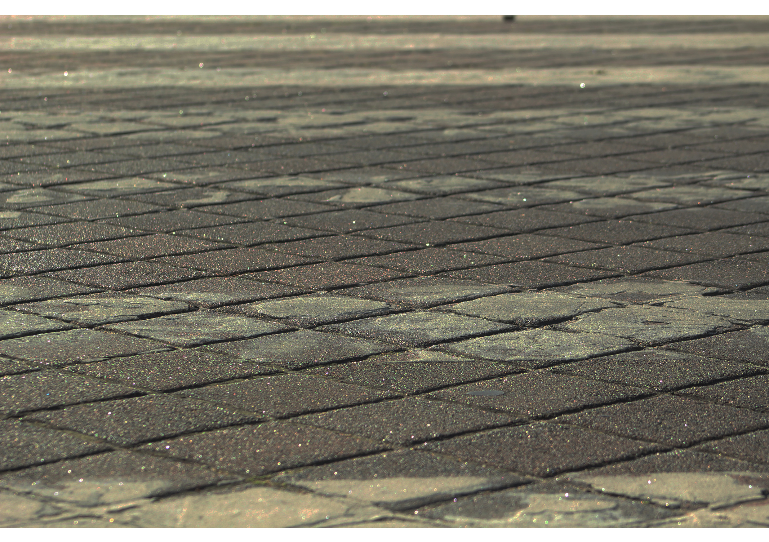
This photo will also be printed at A5 size. For this photo I have decided to keep things simple by only sticking it onto one layer of styrofoam board.
For this task I decided to try the kaleidoscope effect on Photoshop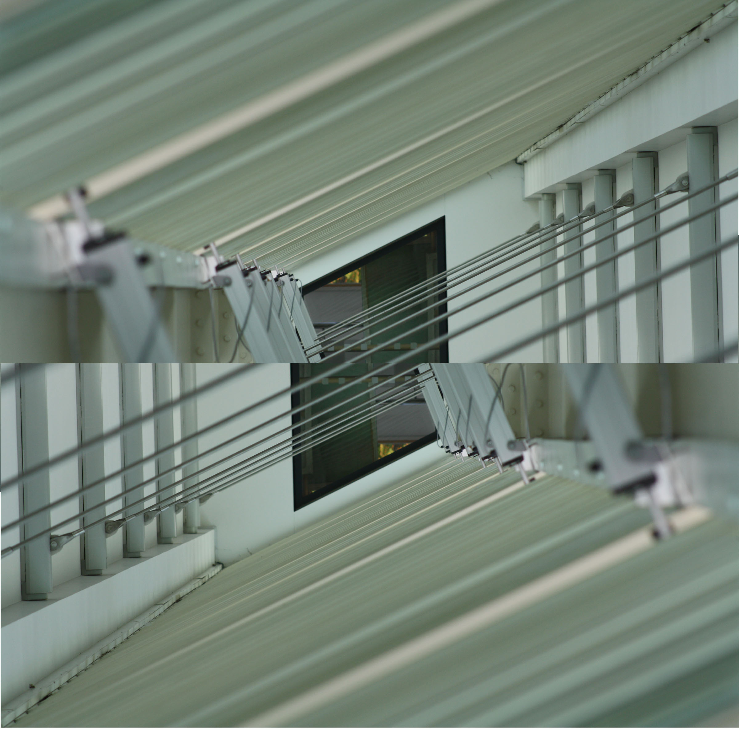
This is how I did it in steps:
I really like how this turned out and I would like to use this technique in upcoming projects.
Uta Barth is a contemporary photographer, who lived and worked in California. Her photographs weren’t about seeing the sharpness and clear images within her photos. She made all the images and shapes within her photo merge together. As photography was mainly about pure visual and seeing what was in the photo, but Uta Barth changed this and her photographs were a sense of art and the viewers ultimately depend on the visual to understand the photo. Her work makes people view her art more than once to understand and appreciate the image.
At first glance this image seems to been taken in a bad way and very simple. But this image conspires with the human eye, to figure out what we are looking at. This photo was taken in a simplistic way, but almost amazes me that an image can look so interesting out of focus. The natural lighting in the images gives the walls a yellowy town to it, the colors in the images are very earth orientated, shades of browns and yellows. When looking at this image, it calls the attention of you to really figure out what the subject of this images would’ve been, its surrounding and the meaning of it. 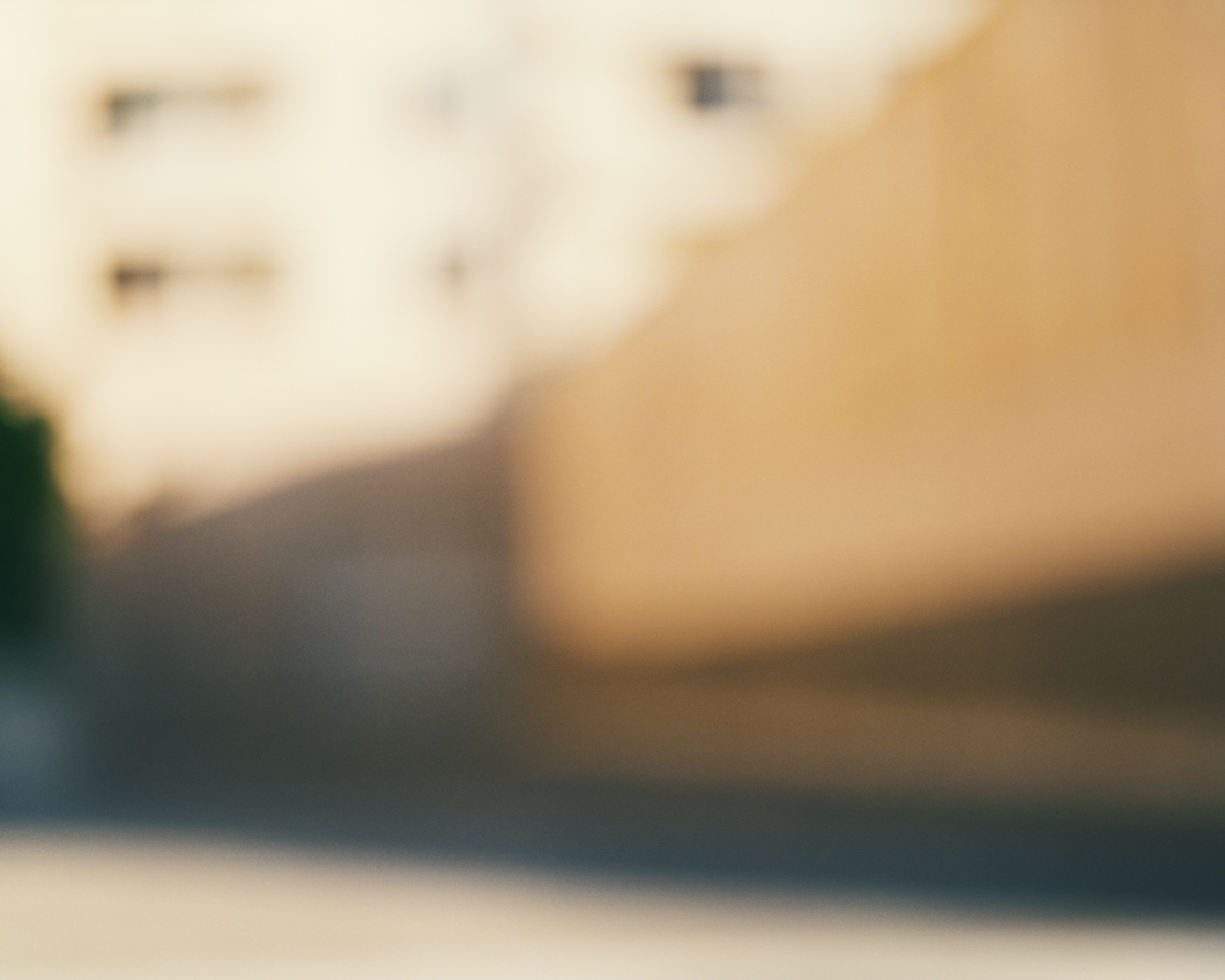
In all of Barth’s work there is little human interaction in them, this is because she says it removed the focus away from the entire photo, as people would play more attention to the clothes they are wearing and using people automatically gives them an identity due to the way they are looked and used in an image, which can overall change the whole subject of the image. The blur theory throughout her images it to make all the objects equal and universal, which meant viewers could pre-judge what they were seeing in front of them. Using a blur makes the viewer question what they are seeing. The story behind her images, it telling people that the world that surrounds us isn’t just a background and scenery, it is equal to us and is as important as us.
When planning for this shoot I had to take into consideration, lighting, camera settings, location and the concept and context of the photos I was going to take. I took into thought about showing the pureness of our surrounds, so I began to focus on focusing on natural shades and tones, such as white and green. The white would represent the pureness and righteous of the world and the green would show the nature of the world. The two colors would work well together, as the white would make the green standout, as it would give a pop of color in the pictures. Then also having my images out of focus it would merge together the two colors, making them equal to each other. These are a few photos I came out with from this shoot;
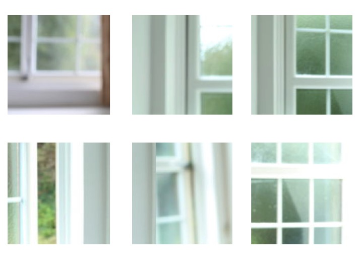
The difficulties I had in this shoot were trying to get the camera settings on the right format. I used a manual setting, with a wide lens, I has a low ISO of 100 or 200 and a slower shutter speed of 1/4 or 1/8, this is so I could let more light into the photo, which made the white become brighter in the images. I adjusted my lens to get the images to be out of focus so the color and shapes could merge together and become equal to each other, this is so that there wasn’t just one center subject of the photo, the whole photo was the main attraction as you had to figure out yourself the meaning, the point and what was actually in the photo.
The second part of my shoot, I focused on using the outside and natural light along side with the natural settings. For this part for the shoot I kept the same ISO but changed the shutter speed to 1/32, this is so you could see what was in photo more clearly, so you could get more of an outline, because if the shutter speed was too slow the photos would of come out white. I photographed the things closer to the camera in focus with the rest of the background and surroundings out of focus. This gave the photo a primary focus, but yet it was showing the shapes and colors of our surroundings. I decided to put in focus something simple, which people don’t see as equal to us. These are my photos from the second part of the shoot;
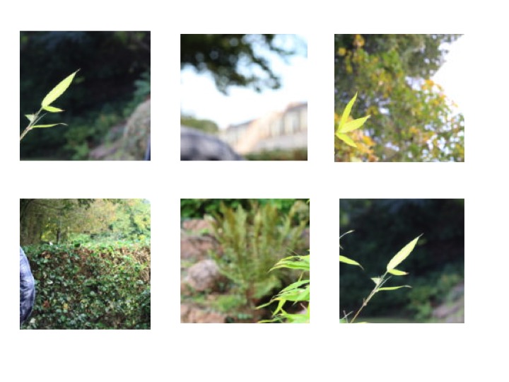
The struggles I had in this part was focusing on one main subject, and not getting everything in or out of focus. Also having to find a simple main subject for the images was a challenge, but looking at some of Barth’s worth gave me inspiration in what to use and focus on.
Overall, this shoot was a chance for me to learn about a new photographer but also learn different ways to photograph images and that all images don’t have to be in focus and that they can have any meaning you make them have.