Category Archives: AO2 Explore Ideas

Filters

Author:
Category:

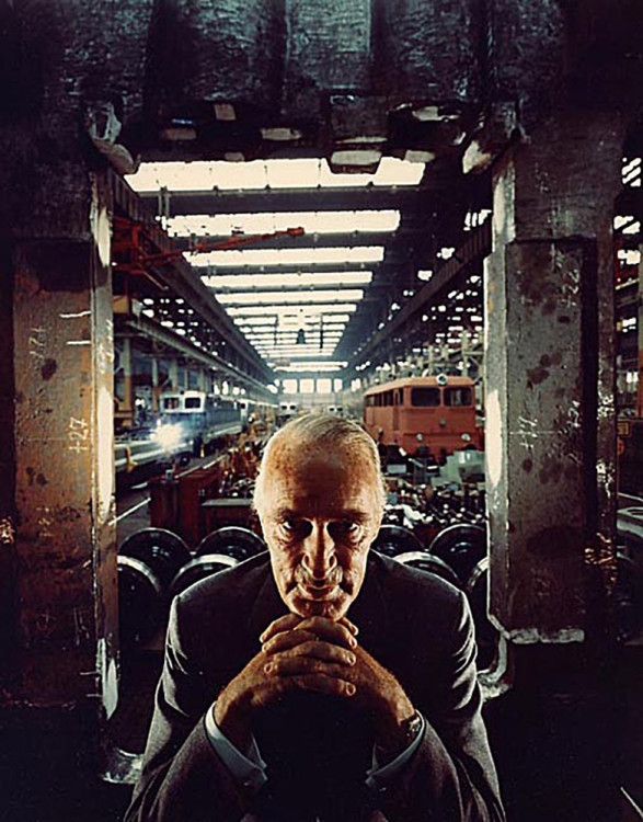
Alfred Krupp – Arnold Newman

Initial Response:

I personally find that the image is over saturated in certain areas, while this adds a sense of drama to the image, i personally find that it leaves the image looking rather tacky. While I dislike the amount of saturation in the photo due to the result looking rather messy, i like the sense of seriousness/drama that it creates. I like the background elements of the photo more than the foreground. While it is more cluttered than the foreground, it has a lot of negative white space which i find balances out the background of he image as a whole. i believe it also addresses the issue of over saturation and i believe that if there was more negative white space in the foreground it would result in an overall more balanced image.

Technical:

It looks as though the image was taken using a small aperture since a lot of the image is in focus. It looks as though a rather long shutter speed was used due to the color depth as well as the fact that it looks as though the photo is taken using a small aperture and so a long shutter speed would be required in order for the photo to be properly exposed. The photo overall looks to be rather warm in color temperature.

Visual:

The photo features some strong colors, particularly some strong oranges as well as accentuating the olive tones in his skin helping to add to the dramatic, evil look of the ex Nazi war criminal.

Image result for arnold newman alfred krupp

Arnold Newman – Portrait photography

Image result for arnold newman famous photographs
Emotional response: Visual: Technical: Conceptual:

Emotional response:  My response to first seeing the photo was that the man in the foreground is quite intimidating and mysterious. There are big differences between light levels, saturation, and contrast within the photo. The man is wearing a suit which shows that he is quite an important person as suits were more expensive than today.

Visual: The man in the middle looks around 75-80 years old, he is lent forward with his hands together (with his fingers intertwined) and is resting his chin on them. The man is less lit than the background which gives a sense of cruelty and mystery about him. He is also in the stereotypical villain pose which makes him more easily associated with being a bad person.

The background also has a lot of contrast, this helps distinguish the trains from the production lines and makes the whole photo more attractive to the eye as it is more colourful.

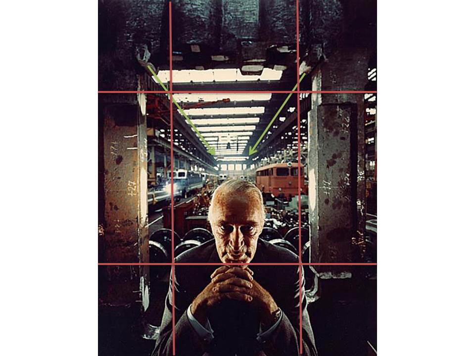
Technical:  The windows at the top  let in more light into the photo as well as giving it more structure as they consist of strong lines. As they windows get further away they appear smaller which draws the eye into the centre of the photo.

The photo is symetrical through the middle, This balance makes it more attractive as people instinctively prefer symetrical objects/things.

The photo was taken with a shorter exposure. This was probably done to avoid overexposing the background; which is more lit than the foreground. This results in the foreground being darker, which works for this photo as it makes the man look more sinister (which was the intent).

Conceptual: The subject of the photo was Alfred Krupp. He was made to look as sinister as possible in this photo because the photographer (Arnold Newman) was Jewish and Alfred Krupp was a nazi, so this photo was Arnold’s ‘bit of revenge’.

Image Analysis:Environmental Portraits:Arnold Newman

Image result for arnold newman alfred kruppEmotional

This portrait provides me with a sense of intimidation and lack of authority. Yet I do think it is a very impressive photo with a message behind it. I like the contrast between the dark area at the front and the light area at the back, which adds great amount of depth. although the photo is busy, I can’t get away from the fact that the man (Krupp) is the focal point, his stern looking face is hard to move away from.

Visual

There is a clear foreground and background which are emphasized by the change in light. In the foreground there is a Caucasian man aged around 65, wearing a suit, with his hands joint together and his chins resting on top, he has little to no emotion on his face, the dark areas around his eyes create a demonic silhouette. In the background it’s light which is flooding in via the windows on the ceiling, below there are trains of different colours and sizes. The warehouse behind him seems eerily quiet and dingy, there doesn’t seem to be an areas of interested in terms of beauty.

Technical

Their is a clear leading eye in this photo, from the man your eye is lead by the symmetry of the windows, this also represents pattern and order within the photo, this creates a large depth of field. The exposure is very well down and is correctly balanced between the dark and light areas. In the background Newman has used natural lighting, whereas to highlight Krupp’s face it appears he has used natural lighting this is indicated by the shadowing on some parts and glowing light on other parts of him, his light may have occurred via an office lamp. Krupp’s direct eye contact with the camera has a big impact making it much more personal and its as if hes staring you down creating more and more intimidation.

Conceptual

The photo was taken by Arnold Newman, a Jewish photographer in 1963. Alfred Krupp was hesitant at first to have his photo taken by Newman but he eventually came round to the idea and thus this photo was taken. Krupp in World War II held much power as he took over his fathers company which he then used as a place to assign Jewish prisoners at the time to work there under slave labour to create Nazi weapons. Krupp’s background story is clearly represented in the photo by Newman and the fact that he was Jewish emphasizes his intentions even further. He made Krupp to look like a demonic figure with the lighting, expression and body language to expose the injustice of the Jews and how much evil people in the time of the war exploited them and such horrific factories. As well as that the rule of  thirds also create a sense of structure, which symbolises the the strict regime of the Nazi’s and how they locked up Jews in tight uniform concentration camps similar to how Krupp forced them to work in rows in his factories for hours on end.


12. Claude Cahun X Clare Rae:

Claude Cahun:

Claude Cahun was a lesbian , Jewish-French Photographer. She was born on October 25th 1894 and moved to Jersey in 1937.

Cahun is best known for her part in the surrealism movement. She worked with self-portraits, which often displayed her in various poses and places with her face, more often than not, covered up.

With her work, Cahun was very political and aimed to use her photos as a way express herself during a time when lesbians and the Jewish were prosecuted for who they were.

Clare Rae:

Clare Rae is an Australian photographer who recently took residence in Jersey for a short time. She wanted to study, take inspiration from, and respond to the work of Claude Cahun.

CCA gallery visit:

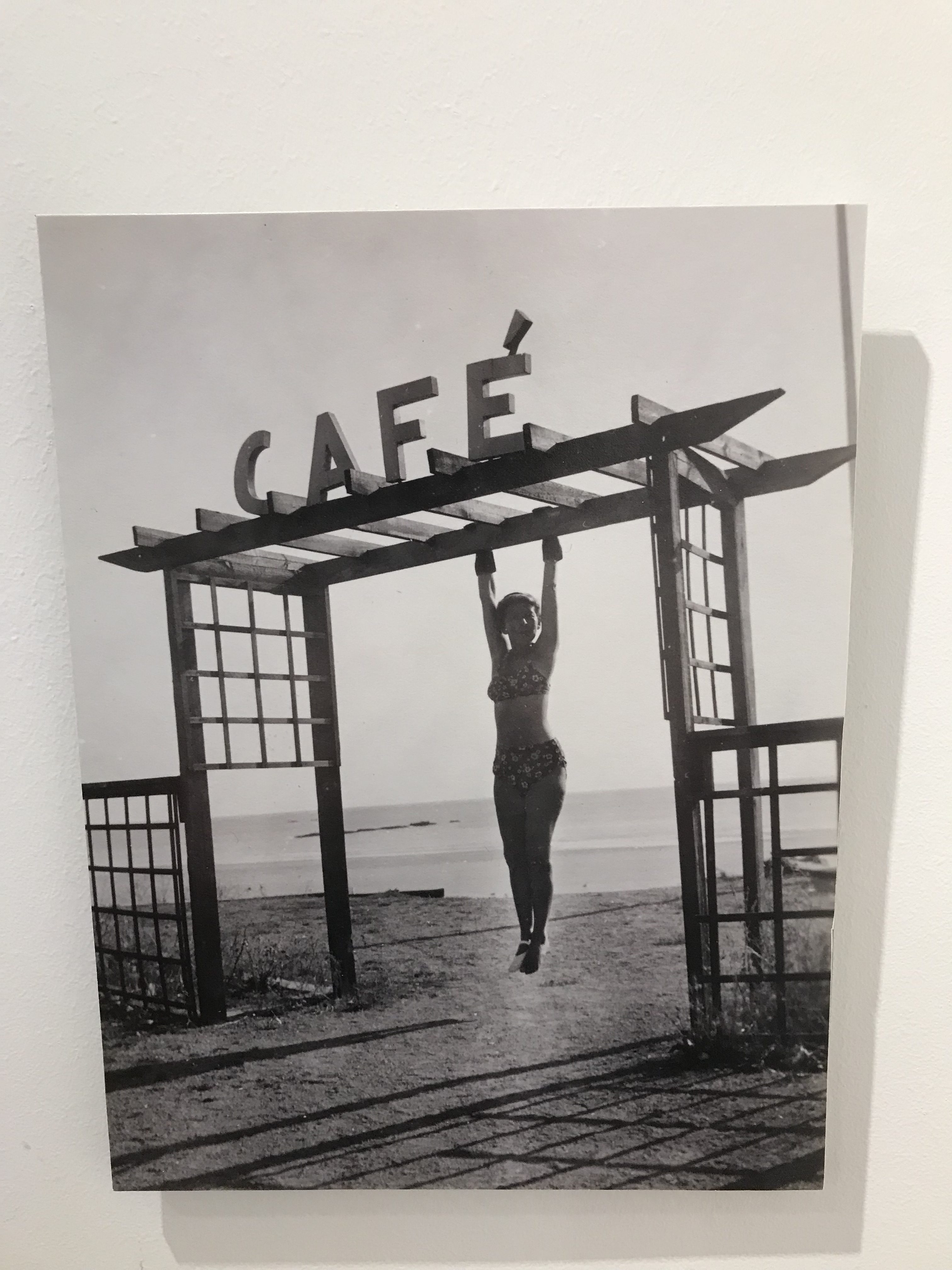
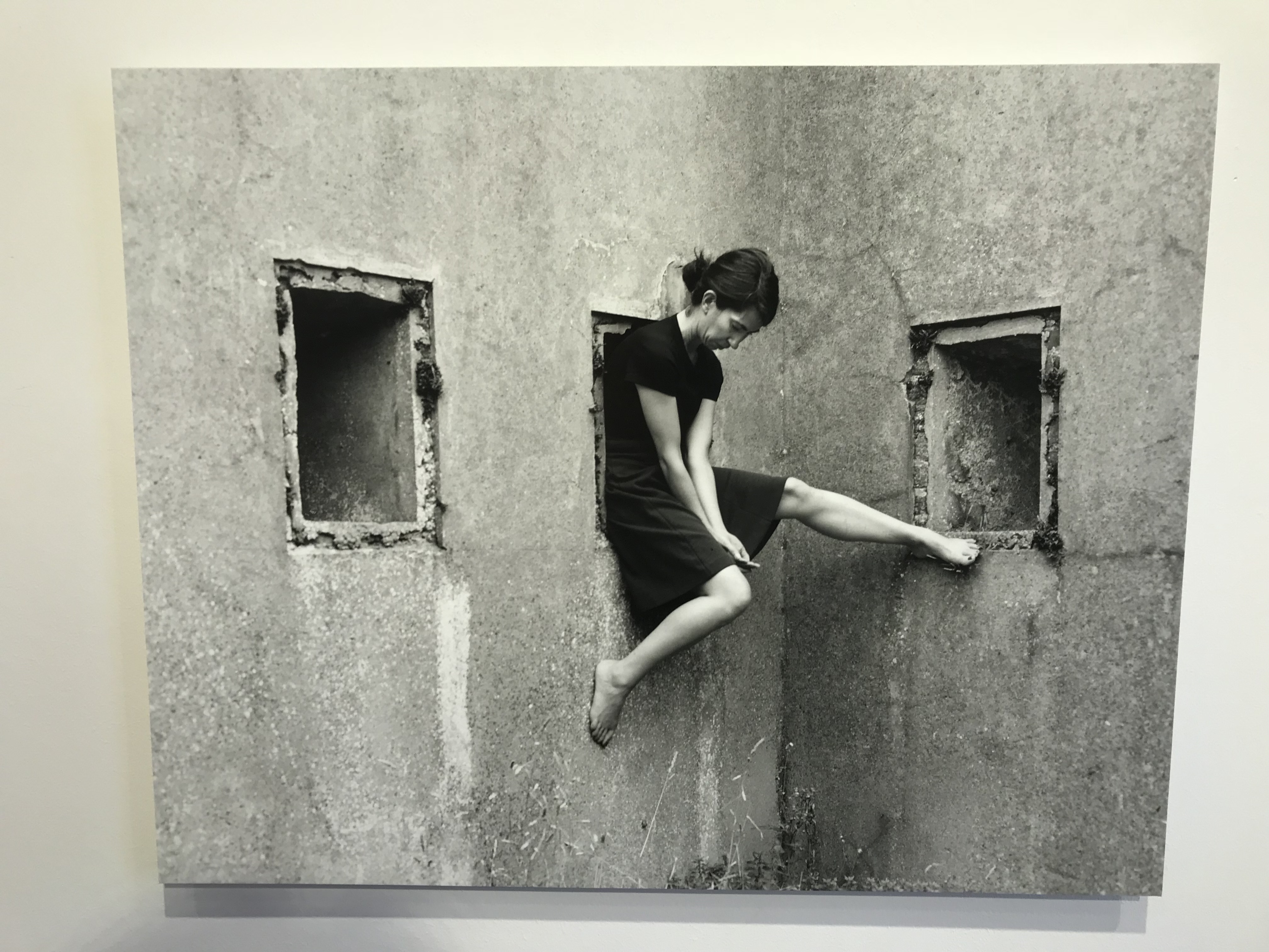
On Friday 14th September, my photography class visited an exhibition at the CCA gallery in St. Helier to look at the work of Claude Cahun and Clare Rae’s response and interpretation of her work.

I thought that the exhibition was really well layed out and it was easy to know which photographer’s work I was looking at as the two were  nicely separated without making them look like separate exhibitions.

By looking at the photos in the exhibition is it easy to see where Claude Cahun has influenced Clare Rae’s work. I noticed that Rae wasn’t wearing any foot wear in her photos and upon further inspection, I noticed the same thing in Cahun’s photos. Another similarity between the different photographers is that they are both taken in similar places. Interesting structures and ares of nature are both common to each pieces of work. Both photographers use their surroundings to give a certain feel to the photos that is often calming, chaotic or miserable.

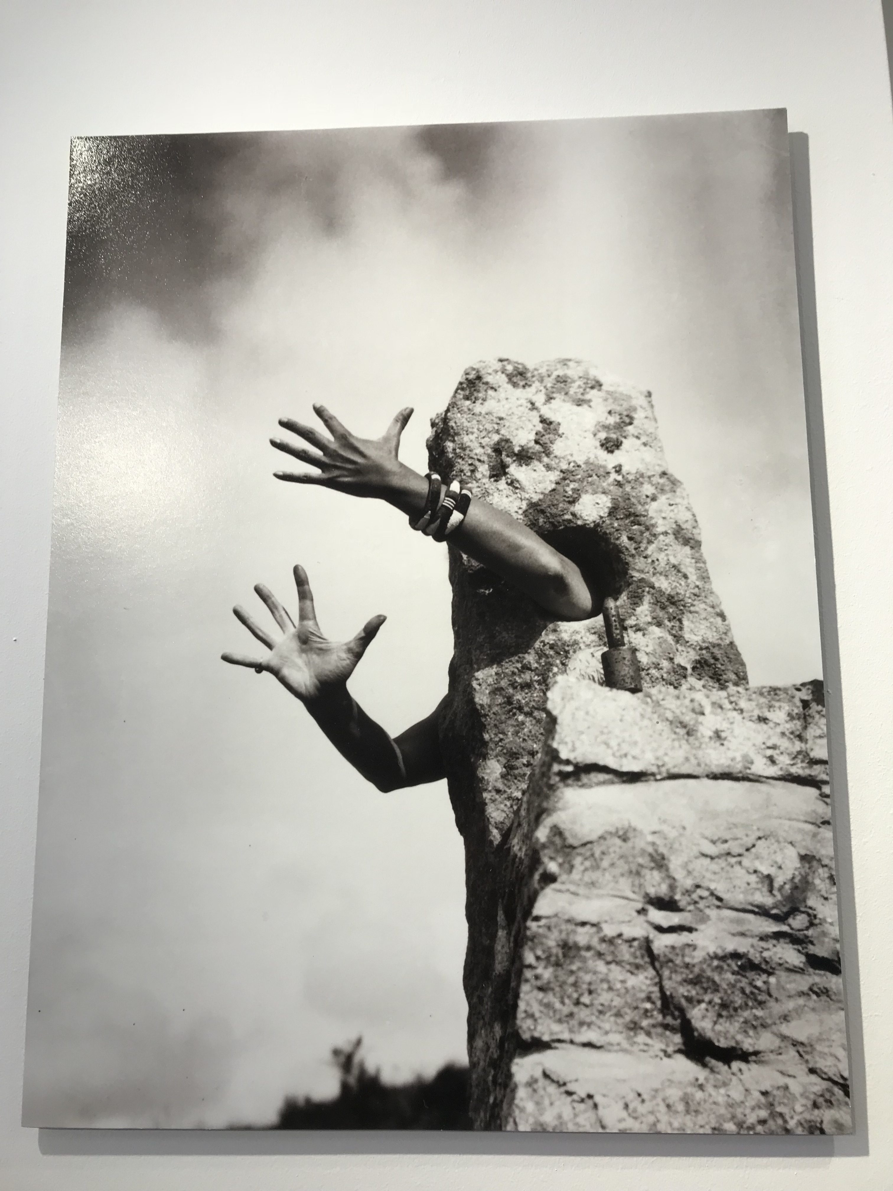
This image by Claude Cahun was one of my favorites. The image shows Cahun hiding behind a large rock with her arms sticking out through the holes in the object. To me, this shows that Cahun is, in a way, apart of the object. However, the stretched out actions of her hands suggests that Cahun is trying to reach out and escape. This could be a reference to the German Occupation of Jersey as that was similarly something that Cahun was apart of, but wanted to be free of.

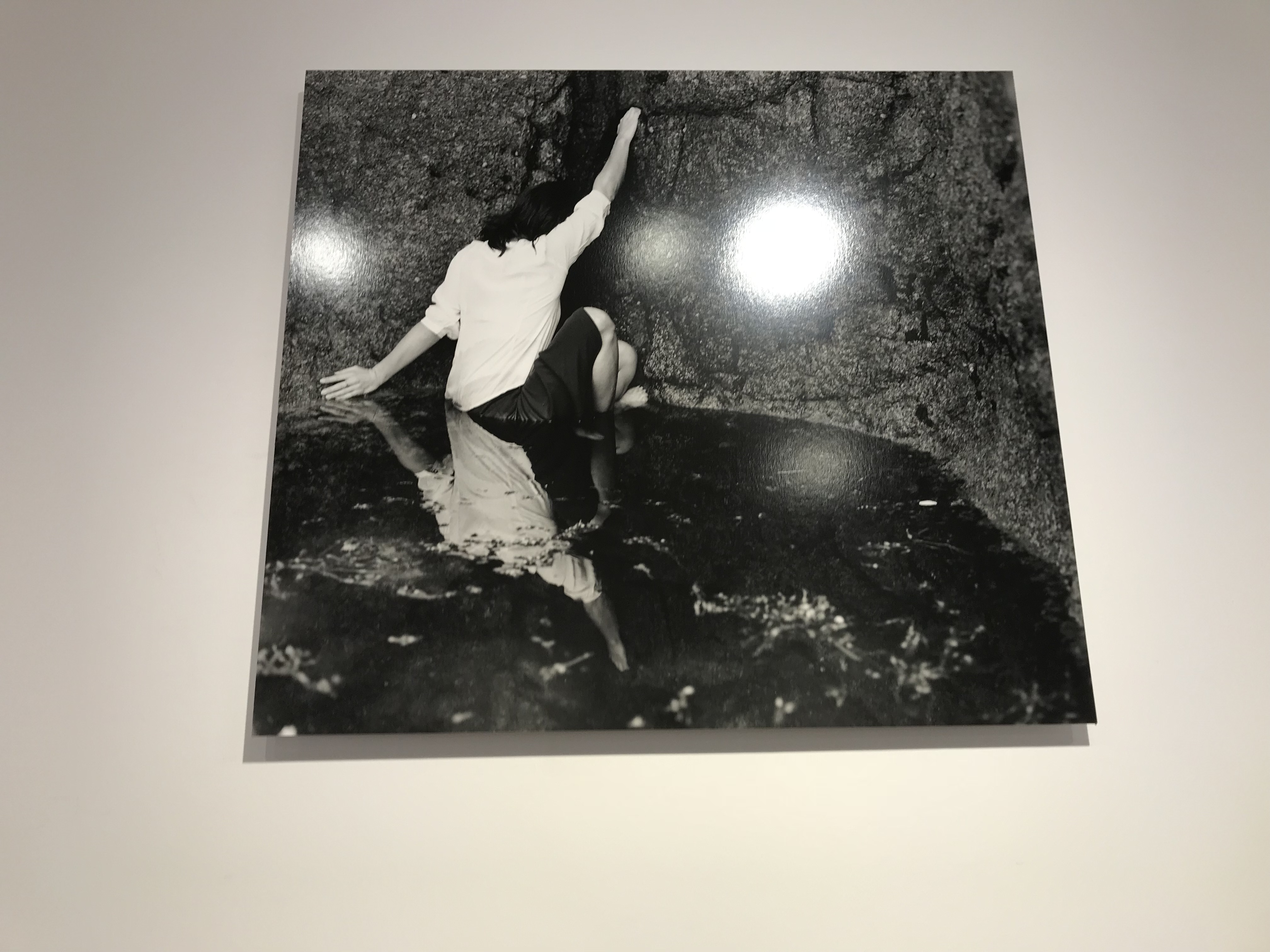
This photo by Clare Rae has a very similar style to Cahun’s work as the image shows Rae with her back to the camera and her face hidden, which is a common occurrence in Cahun’s work. The dark walls of the cave give a feeling a being trapped and isolated. This was likely how Cahun felt during the Occupation due to being a Jewish lesbian. It is clear that Rae has tried to recreate this in this image.

Environmental portrait photography 2

Arnold Newman Biography:

  • Newman was noted for the portrait photography of politicians and Artists. He was also known for his carefully composed abstract still life images.
  • Born in New York City on 3 March 1918, he grew up in Atlantic City, New Jersey.
  • In 1936, he studied painting and drawing at the University of Miami. Unable to afford continuing after two years, he moved to Philadelphia to work for a studio, making 49-cent portraits in 1938.
  • In 1945, Newman opened his own portrait studio in Miami after three years earlier looking after this other studio.
  • in 1946 Newman relocated to New York and opened up his own studio called ” Arnold Newman Studios” and from then on he worked as a freelanced photographer for magazines such as  Fortune, Life, and Newsweek.
  • he focused on photographing personalities of different people. He managed to maintain this even though some were lost or unknown, the photographs had to still be exciting and interest the viewer.
  • he was often credited for being the first environmental portrait photographer. Newman captured his photos in familiar using visuals and representations to show their profession and personalty.
  • Arnold Newman told a magazine in an interview  “The surroundings had to add to the composition and the understanding of the person. No matter who the subject was, it had to be an interesting photograph. Just to simply do a portrait of a famous person doesn’t mean a thing.”
  • Newman’s most famous photographs were in black and white even though he photographed in colour. His 1946 black and white portrait of Igor Stravinsky seated at a grand piano became his signature image.
  • After this Newman taught  photography at Cooper Union for many years.
  • Newman died on the 6th June 2006 in New York City, New York after recovering from a stroke.

Images:


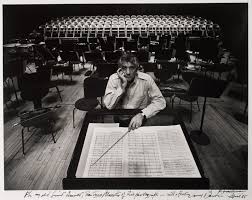
Arnold Newman

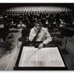
This is my favourite image by Arnold Newman as it is very simple and i like how the light has been reflected in the back so that it hits the seats , also he has got the person to do a emotionless face so that it makes us feel nothing, also as it is in black and white this then makes the image more sinister than before as usually the dark makes us feel that bad is going to happen whereas a the picture was in colour then you would think that it was happy mood. I think that he didn’t use flash and that instead he used a alternative light source.

Here is some of my examples of environmental portraits:

I found when I took these photos that they didn’t come out the way I wanted, for example It looks like i have done a double exposure, I didn’t want this, the problem with this is because the shutter speed was too slow meaning that it din’t capture the picture in detail.

For these picture I found that They came out more clearly than my other attempts. However I found after that one image was slightly over exposure while the other one was under exposed, to solve this problem I increased the exposure on the under exposed image to get a little more light and I have increased the colour intensity. This is my outcome:

Arnold Newman – Portrait Analysis

The image below was taken by Arnold Newman, of Alfried Krupp in 1963. This photograph is one of Newman’s well known images due to hidden message and ideas that can be taken from this environmental portrait.

Arnold Newman’s Photography

I have annotated this photograph in order to show how Newman has used leading lines, to move viewers eyes around the frame. As well as the use of the rule of thirds within this image.

Emotional Response

When I first looked at this image my eyes where immediately drawn to the mysterious man located in the center of the frame. He is an ‘old white man’ which can be seen through his grey hair and wrinkles on his skin. He is giving direct eye contact with the camera and has his head looking slightly down whilst doing this, creating a sinister and mysterious look. It makes us question what he is doing and why. His hands are joined together and place underneath his chin, resting on the hands. Due to this it also adds to the idea that the subject is up to no good. Krupp is found in a suit, showing his high status during the time. He is found sat at a working train station which seems to run down. This makes us question why Krupp is at the train station

Technical Response

The image is presented in color which allows rust/dirt in the station to be more visible. Moreover, it almost makes the picture come to life and allow us to create more ideas about the man in our mind. The background is busy, which informs us that it is a busy train station. The use of leading lines is presented by the ceiling lights. It is used to help direct the viewers eyes around the frame of the photograph, taking in all the details helping us to form an opinion and concept about the image. The man seems to be framed by the walls, which shows segregation between Krupp and what is happening behind him. It also reminds us the status that he is and presents the idea that he is the reason for why what is happening behind him is happening. The clear formal elements which are presented through this image is line, through the trains and ceiling/building structure. Texture can be seen through the rust and different objects which are found within the train station. The depth of field found in this image is large as well as the aperture is high, as nothing seems to be completely out of focus in the image. However, there is a sharper focus on Krupp, which suggests his importance to the setting and situation. The lighting found within the station is quite dark and the image is under exposed which shows how run down and bad the environment of the station was. However, Krupp is lit up also illuminating his importance compared to the station. The image seems to have used a quick shatter speed as no intended blur can be found within the image. In  addition, a little noise can be found due to the lighting suggesting that the ISO is likely to be slightly be high but not too high.

Newman’s Photograph Annotations

Contextual Response

Newman wanted to capture Krupp as a part of his environmental series in 1963. Krupp was an industrialist. However, Krupp was found to be transporting weapons and materials during the second world war. In contrast, Newman was Jewish and did not agree with the same viewpoints as Krupp. Newman still wanted to capture Krupp and managed to persuade him through his portfolios. When capturing the images of Krupp, Newman attempted to portray Krupp as an evil person. This can clearly be seen through the image above.

Conceptual Response

The intended message trying to be presented in this photograph is that there is a man located in this run down train station, who can potentially be the owner of the company. Due to his facial expressions and positioning it makes it seem that he is up to no good and is planning something evil. Many more interpretations can be made about this image, however I believe that this is the most prominent.

Experience Day Task | Welcome Visiting Students !

Welcome to Hautlieu School

A Level Photography Blog !

This is a place where you can find helpful resources, and publish your ideas, processes and coursework.

Please feel free to explore the blog…you will find many years worth of our students’ work as well as prompts and inspiration from the teachers and links to useful websites and learning devices.

Experience Day Task

Here are some basic instructions to help you create something new and different today…

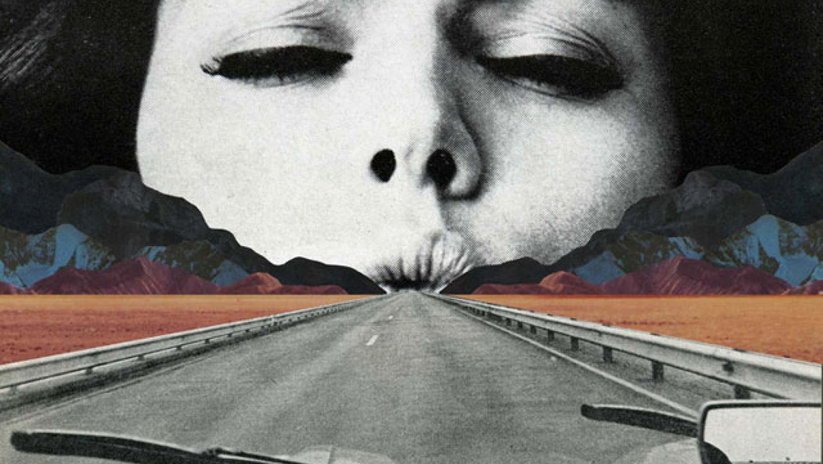
Image result for john stezaker
John Stezaker
Image result for sammy slabbinck
Sammy Slabinck


  • Open Adobe Photoshop
  • Open at least 2 x images from the choices below
  • CTRL A / Select All of one image and drag onto the other image using the MOVE TOOL
  • Overlay 1 image on top of the other
  • Using Free Transform position the image, and alter the size
  • Select all of the image using the Marquee Tool or similar
  • Try using the OPACITY CONTROL
  • Add a “stroke”
  • Adjust your image using IMAGE > ADJUSTMENTS
  • Remove parts of the image using the selection tools, inverse selection and layer mask
  • Flatten Image
  • Save image

Experience Day Images 

(Right click and copy / save to your document area. You will then open these images in Adobe Photoshop to edit and finalise)

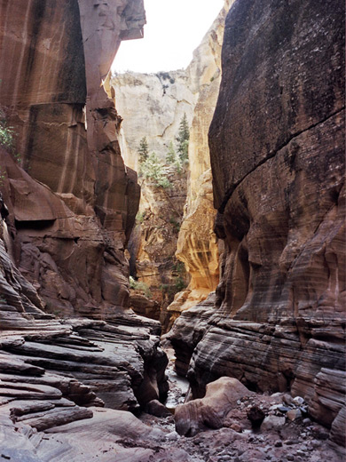
Image result for tunnels caves

Image result for tunnels caves

Image result for tunnels

Image result for tunnels

Image result for rock formations

Image result for canyons gorges and valleys

Image result for ansel adams

Or you may be able to Google Search your own to add and edit

Portraiture – Mood Board

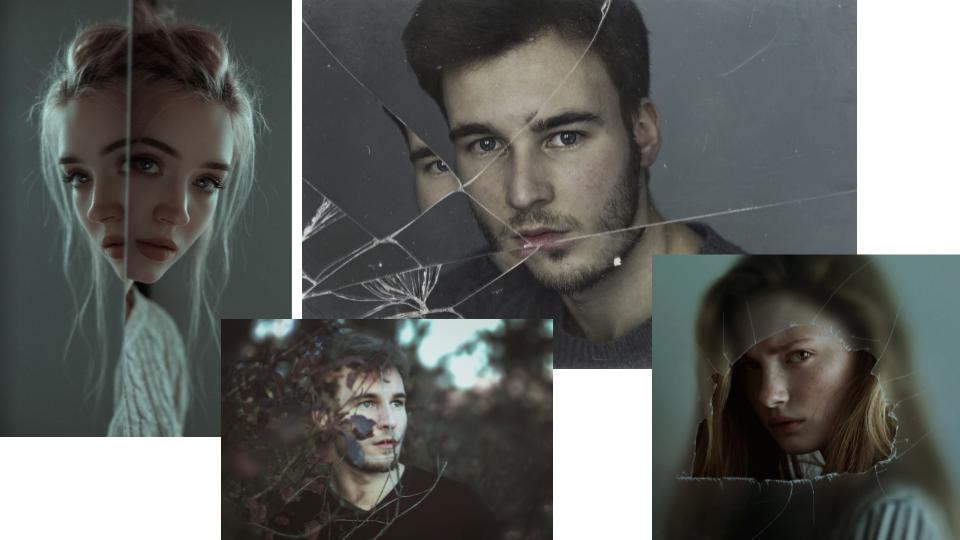
Emotional portraits:

  • cracks
  • asymmetrical
  • dull colours enhance facial features
  • textures: smooth, sharp, frosted, cloudy, clear
  • central
  • sense of emotion
  • posing (set up)

These portraits seem to show some kind of emotional provocation, eg. fear, anger.

The face is slightly distorted yet in all of these images through the use of reflections, focused face with frosted backdrop or objects hindering full view of the face.


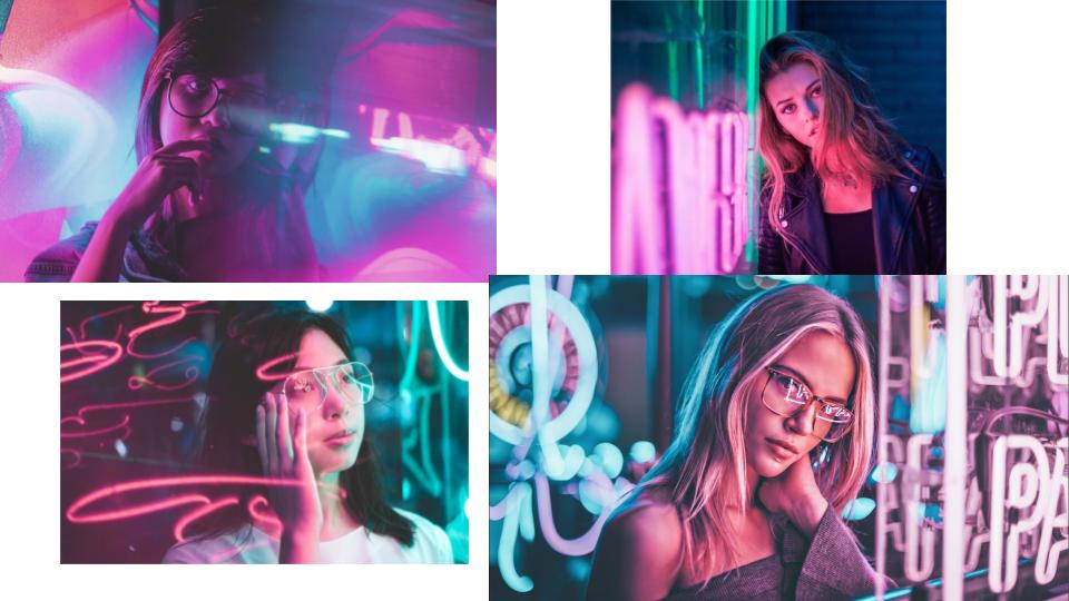
Neon Light Portraits:

  • sharp focus
  • coloured lights
  • party scene
  • fun and vibrant colours
  • reflection
  • blur

These images all show lights and reflections of light creating a fresh and pastel feel.

The sharpness and contrast of the images with the highlighted areas create beautiful cool toned compositions.


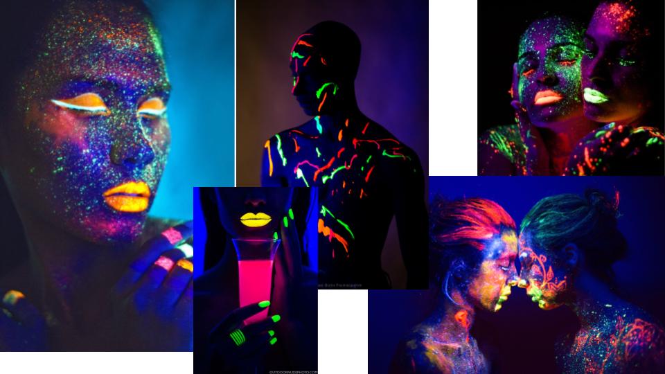
UV Paint Portraits:

  • vibrant colours
  • neon
  • spots/stripes/random
  • close up and intimate
  • psychedelic effect

Extremely vivid and vibrant colours of the UV paints contrasted by the dark tones of the skin.

The colours in the images connote some sense of psychedelic experience.

Environmental Portrait

What is a environmental portrait photography:

An environmental portrait is a portrait executed in the subject’s usual environment, such as in their home or workplace, and typically illuminates the subject’s life and surroundings. The term is most frequently used of a genre of photography.

By photographing a person in their natural surroundings, it is thought that you will be able to better illuminate their character, and therefore portray the essence of their personality, rather than merely a likeness of their physical features. It is also thought that by photographing a person in their natural surroundings, the subject will be more at ease, and so be more conducive to expressing themselves, as opposed to in a studio, which can be a rather intimidating and artificial experience.

Examples of environmental portrait:


Heres a video to create environmental portrait photography:


Arnold Newman – Case Study

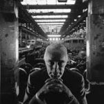
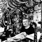
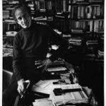
Arnold Newman was an american photographer who primarily worked in portraiture however also occasionally created abstract still life composure’s. More importantly however he coined the phrase and is the founder of environmental portraiture. This usually features a subject looking directly into the camera with the background being pivotal to either their identity or livelihood. There are however photos which don’t follow this pattern and his photos rarely include action shots. These photos are a great way of portraying ones personality and/or interests and the facial expressions are a good way of showing whether or not they enjoy their work/home life and so even a lack of emotion in a photo is able to portray strong emotions.

Due to the time period of his photography most of his work is done with film, although he had access to high end film cameras and so had the benefits of high quality images and glass while still having the subjective ‘benefits’ of film photography such as the light Gaussian grain in darker areas and interesting interactions with light when using a large aperture. The use of film also results in small imperfections in the image which I believe gives the photo more character as these markings are near impossible to accurately replicate digitally and are unique to the image. The majority of his images are done in black and white. I believe this allows for greater use of contrast and tones and results in images that look more structured and sharper. This creates a strong sense of drama in his images.

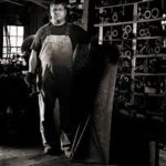
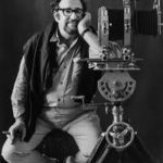
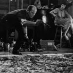
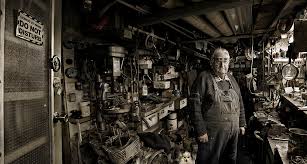
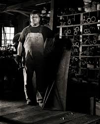
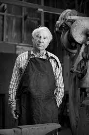
Image result for arnold newman environmental portraitImage result for arnold newman environmental portrait

Image result for arnold newman environmental portrait