Category Archives: AO2 Explore Ideas

Filters

Author:
Category:

Understanding Photo-Book Design:

In order to get a better understanding of the process of designing and creating a book, I have found an already produced photo-book, and took inspiration from it in terms of the ways that books can be edited together, sequences and designed.

For this, I chose to study the photo-book titled “Redheaded Peckerwood” by photographer Christian Patterson.

Image result for christian patterson redheaded peckerwood book

Book in Hand: the book is very slightly textured, however the front cover gives the illusion that it is much more textured than it is in reality. I found this interesting, as I had to spend some time deciding whether the cover was in fact smooth or textured, as the cover photo itself acted as a slightly illusion

Paper and Ink: the book makes use of the same smooth photo-paper throughout, with the exception of a number of handouts/pullouts (such as letters, postcards and small leaflets with writing on). The images in the book are both colour and black and white, although there is a larger number of coloured images.

Format, size and orientation: the book itself is presented in portrait, however the images inside are both landscape and portrait. The overall size of the book is slightly shorter than A4, and includes around 100 pages of images (a d around 5 inserts).

Binding, soft/hardcover: the image is a hardcover book, with case binding used to bind the pages together. The book is without a dust-jacket.

Cover: the front cover is made of a card material, and includes an image of 2 subjects smiling and facing the camera. These subjects have been obscured using a grey, pixelated filter, acting as a shroud over the image, as to reduce the detail available to the viewer, and to obscure the image. The front cover does not include the photographer or the title of the book (these are only included on the spine of the book.

Title: the title “Redheaded Peckerwood” derives from the derogatory, slang name for white, lower class individuals living in the South of the USA. The title is most likely used as a derogatory term for the murderers, who are presented as important subjects in the book.

Narrative: the subject matter of the book is the murder case of 11 individuals by 19 year old Charles Starkweather, and his 14 year old girlfriend Caril Ann Fugate. During the later years Starkweathers childhood, he began to develop aggressive tenancies and anger problems. Starkweather eventually became involved in a dispute with a petrol station attendant named Robert Colvert, who Starkweather eventually shot and killed. Both Starkweather and Fugate then proceeded on a violent rampage, murdering 11 individuals including both parents and the younger sibling of Caril. The book itself follows the story of the killings, using both archival and staged images to slowly hint and give clues to the reader as to the sequence of the murders as the book progresses. The narrative of the book follows the story of the murders themselves, and uses more abstract and conceptual imagery to depict the process of the police, the murderers, and the community as the rampage unfolded.

Structure and architecture: the book follows the structure of focusing on the environment of the community in which the murders occurred. The book becomes progressively more detailed in the clues it gives, with the beginning half focusing on the context of the murders, and the images becoming more and more detailed in the second half of the book, focusing on specific objects, details, people and letters that relate to the crimes committed.

Design and layout: the inserts inside the book are the most unique feature. These inserts include letters (written and typed), postcards and documents. These inserts help to add to the narrative of the book, and moves the story along. The images in the book are rarely full-bleed, and instead sit in the centre of each page, with a white boarder around the edges. There are no double page spreads, although many of the images on opposite pages compliment each other in terms of their composition, colour and structure.

Editing and sequencing: the images seem to involve very little editing, and focus is placed on emphasis of the colour, or changing the image to black and white, rather than physically distorting the image. Overall the only place in which editing is obvious is on the cover of the book, as the rest of the images offer a more scientific and stark documentation of the objects they depict, although the meanings behind the inclusion of these images may be more conceptual. Towards the end of the book, the images begin to compliment each other more and more, with the colours and styles of images included becoming a theme that stretches across a number of pages, before changing again. The overall selection of images has been made to progressively hint more and more obviously at the acts and sequence of events of the murders, although no image is too overt in the way it documents the events. All images are conceptual rather than literal, and therefore the selection of images ranges from images depicting the scenery of the community, to archival images of the murderers themselves (towards the end of the book).

Images and text: the author of the book himself includes very little text, and instead relies on archival evidence of correspondence between the police, the murderers, and letters between the murderers and their family. These documents directly compliment the images they re found among, and help to tell the story without the need for an introduction written by the author, as the first few pages of the book includes the confession letter written by Starkweather and Fugate, setting the scene for the rest of the book. The extracts in the book (including a postcard from Starkweather to his father, and the back of the book contains a leaflet of accounts written by writers, critics, and contemporary photographers regarding the case and their opinions on the photographers work. By using a number of archival writings, critics from other members of the photography community, and the murderers own accounts of events, the author is able to sew together a detailed description of the book and case, while at the same time using very little words of his own.

2nd essay draft

Essay question: How do Diana Markosian and Rita Puig-Serra Costa express the notion of family history and relationships in their work?

Opening quote

"If manipulation is the first thing someone thinks of in connection to photography, what that does that say about the value of the photograph as a reflection of reality?" (Bright and Van Erp 2019:17) 

Introduction (250-500 words): What is your area study? Which artists will you be analyzing and why? How will you be responding to their work and essay question?

My area of study will be focused on my family's history; more specifically the story of both my parents and important events in their life which lead to me being where I am today. I have chosen to analyze Diana Markosian because her project "Inventing My Father" contrasts directly with Rita Puig-serra Costa's study "Where Mimosa Bloom" which I will also be referring to throughout this essay. I like the way Diana explores the absence of her father in her life in such a personal and raw way, as I think it makes people able to empathize with her. In her project she explores the absence of her father, which eventually leads to a reunion which she captures in images. The images along with the context she provides into her life, makes this project very interesting. Equally, I think the way Costa explores her family through the use of archival images and objects was very effective as it really conveyed a sense of love and importance of family.I specifically loved how her entire project was an homage to her mother as it further shows how fond she is of her family when paired with carefully photographed objects, a thoughtfully taken portraits. I decided to really focus on these two photographers throughout my personal study because I could personally relate to the different ways both artists portrayed their family, as I think on one hand I have a close bond with certain members of my family, and due to my Portuguese heritage, family has always been of great value to me. However on the other hand, due to my parents separating there is also an element of a lack of a parental figure in the narrative I intend to tell. In this essay I will be discussing the notion of family and relationships, loss and hope in the works of both these artists.

Pg 1 (500 words): Historical/ theoretical context within art, photography and visual culture relevant to your area of study. Make links to art movements/ isms and some of the methods employed by critics and historian.

Realism is the concept of capturing things in their natural element. This genre of photography is most useful when trying to capture something such as family history, as documentary photography allows us to be able to see someone's real life situation through a photograph. Photographers such as Dorothea Lange and Paul Strand focused on documenting the effects of urbanization and industrialization on working class Americans. This was something very prominent at the time of this movement, as the great depression in 1929 left a lot of people struggling. We now see this type of photography as realism. I feel as if this movement fits in well with my personal study as it recognizes the importance of capturing raw, documentary style images which I think is important when exploring something as personal as a family’s history, especially when it involves immigration and the struggle surrounding that journey. Images of this sort are characterized by having a wide depth of field and having sharp focus which contradicts the pictorialist style. The movement away from creating a painterly aesthetic ultimately opened the door to a more forensic approach…but one that is open to distortion, manipulation and the notion of narrative. This will ultimately depend on the agenda of the artist, their integrity and skill in delivering a message, story or sequence of events.

Good flow of language showing a good understanding of documentary photography. However, what are some of the issues of photography’s relationship with reality? Photography is only a representation of reality and what;s in front of the camera can be altered, re-framed, re-contextualised to suit a particular point of view. You mention Dorothea Lange, who famous image ‘Migrant Worker’ from 1936 embodies photograpy’ ambigious relationship with realism. Use this image as a case-study to write about this problematic. See me tomorrow for something to read!

Pg 2 (500 words): Analyse first artist/photographer in relation to your essay question. Present and evaluate your own images and responses.
In my opinion, Diana Markosian uses an non-traditional method when exploring the family concept in her projects. Instead of focusing on positiveness, and happiness, she focuses on the negative aspect, which is the fact that she grew up without her father figure ;whereas normally happier moments and aspects are explored in relation to family and the concept of a family photograph. I think this makes her work stand out among other photographers who explore the concept of family relationships, as it's more truthful and goes against the dominating stereotype that every family is perfect, making it more contemporary and relatable to modern day people. This view is put across to the audience through her work as she uses a lot of black and white images which present a sense of emptiness or despair and make her images feel cold and slightly unemotional. She also uses archival images, which would otherwise portray a sense of happiness, alongside the black and white images which instead give the audience an indication that there's a slight sense of resentment, especially the archival image that her father is cut out of. I believe Diana Markosian represents a modern wave of photography where the beauty of imperfectness can be appreciated.
Resultado de imagen de diana markosian photography
In my opinion the image above is one of Markosian's best as it is technically appealing a rich in context. After a 15 year separation from her father, her father told her he'd also been looking for her and showed her this suitcase of undelivered letters, a shirt he was saving for her brother's weddings, newspaper clippings and images. This image is in black and white making it more emotionally detached yet since the objects are sentimental it creates an interesting juxtaposition, as it shows the photographer is conflicted over her feelings over the objects.

Choose a specific example now and analyse

Pg 3 (500 words): Analyse second artist/photographer in relation to your essay question. Present and evaluate your own images and responses

Rita Puig-Serra Puig takes the completely opposite approach when compared to Diana Markosian. Throughout Rita's body of work, "where mimosa bloom" it is clear that the project, which is an homage to her mother, is very thoughtful, and shows a clear overpowering sense of love for her family. This can be seen through many aspects of her work, including the light color scheme throughout her images as she effectively conveys a sense of delicacy through a pastel colours and also the metaphorical link to mimosa, a brightly colored type of plant which is very graceful and lively. I think that Rita's work is a more traditional way of portraying family as she utilises portraiture and archival objects in a positive way.I think Rita Puig-Serra's work represents positive sentiments towards relationships giving a romantic representation of a typical family unit.
This book exudes closeness and sentimentality, a kind of poetic bond between women

Conclusion (250-500 words): Draw parallels, explore differences/ similarities between artists/photographers and that of your own work that you have produced

To conclude, both Markosian and Costa have created very emotional pieces of work based on their own personal family stories and journeys. Although we do get a sense of love from Markosian's work, I believe this sentiment is often fighting against a feeling of hatred and resentment towards her father, whereas we purely get the feeling of love and closeness from Costa's photo book. Costa's photo book contains a very unique color palette containing light, delicate, pastel colors which is expected as her images are delicately framed and excrete fondness towards her family. On the other hand, Markosian's body of work contains a lot of black and white images which shows that there is a lot of distance between her and the subject, yet all the things she photographs are of rich sentimental meaning to her. Both photographers also make use of archival images and objects, Costa utilises this to show a deep connection to her mother whereas due to the nature of Markosian's work, her archival objects are used to show her father as being someone she is detached from.

Photobook Research

Sugar Paper Theories – Jack Latham

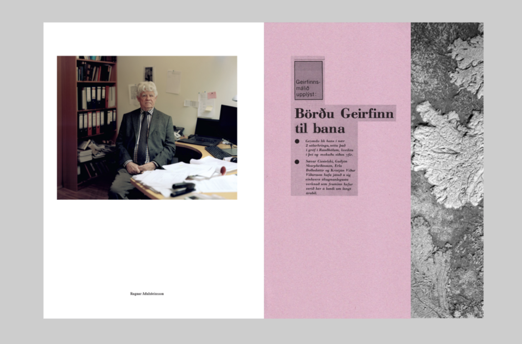
Sugar Paper Theories is Jack Latham’s second major project in response to a notorious unsolved double murder investigation in Iceland.

This video interview with Jack Latham helps to explain the circumstances of the case and the photobook that resulted from the work he made in Iceland:

  • How might fear and suspicion, a sense of isolation, an unforgiving climate, concerns about cultural changes and deep seated folklore traditions, help to create a situation where innocent people are arrested, questioned, charged and convicted of crimes they did not commit?
  • What might have caused those convicted to confess to these crimes? What is Memory Distrust Syndrome and how do people become a victim of it?
  • How do we use photographs to help us remember?
  • How reliable are our memories? How reliable are photographs as a form of evidence?

Narrative:

Sugar Paper Theories tells and documents the various places and people that feature in various accounts of what happened forty years ago when two men went missing in southwest Iceland. The narrative is told using various new photographs of the places produced by Latham himself as well as archival material of photographs as well as information sheets e.g. newspapers, the narrative is told with each disappearance separately and moving from one conspiracy about each to the other. Using police files he immersed himself into all aspects of the case including key protagonists and sites from the investigation as well as conspiracy theories, forensic science to the notion of Memory Distrust Syndrome, Latham’s project examines issues of evidence and truth, certainty and uncertainty, especially with regard to memory and the medium of photography. 

Deconstruction:

Book in Hand: The book is 310 x 230mm and is a soft cover to the touch, a very distinct smell sets itself in the book as the front and back cover are both the material of sugar card and the papers inside consist of sugar paper creating a distinct smell

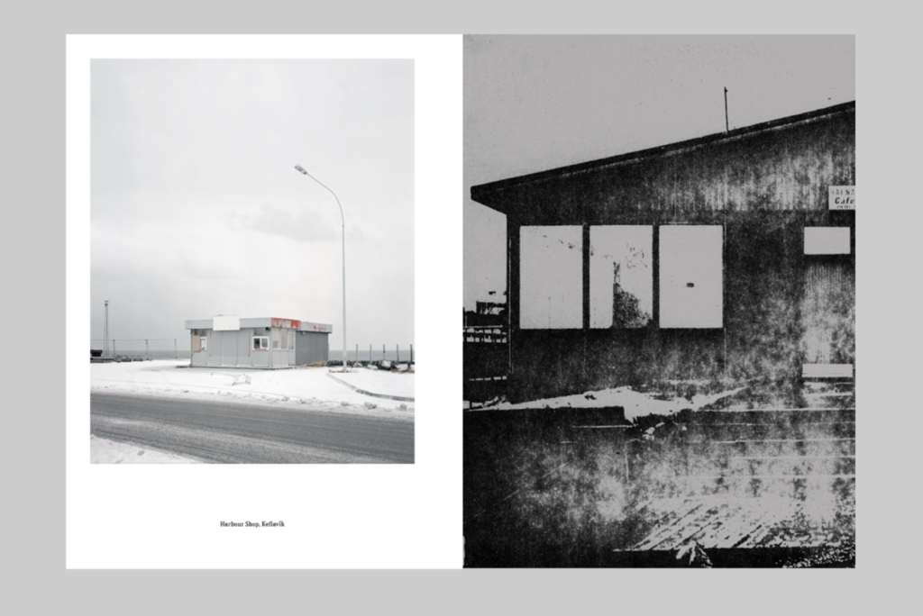
Paper and ink: Sugar Paper Theories uses various types of paper from sugar paper, held in the title, and a thick matt photo paper, which holds a lot of the colour and archival material depicting specific places or people, the sugar paper on the other hand holds black and white photographs speak across the page into slightly unclear images. It also contains smaller matt pages that are thin they are almost transparent which holds some of the informations as well as the cut down sugar paper inserts.

Format, size and orientation: The book is portrait 310 x 230mm in a rectangular shape, overall there are 46 colour photographs, 37 black and white photographs, 8 illustrations, 9 press cuttings.

Binding: It is a soft cover book with a saddle stitch holding together, there is an image wrap across the front and back cover of a drawing of a potential theory from the case. The spine has a fabric cover over that bleeds around a cm onto the front and back. Bound in the same style as the police case files that Latham

Cover: The cover itself is a thick sugar paper, a yellow tinted colour with a hand drawn image spread across of one of the potential theories in felt tip and biro. Could be from a local citizen rather than a legal investigation theory from the connotations of drawn on sugar paper using green felt tips.

Title: The title of the Photobook is inspired by Latham’s findings while out in Iceland, he found a timeline of events mapped out of sugar paper of a conspiracy theorists desk which eventually inspired the title and cover of the book.

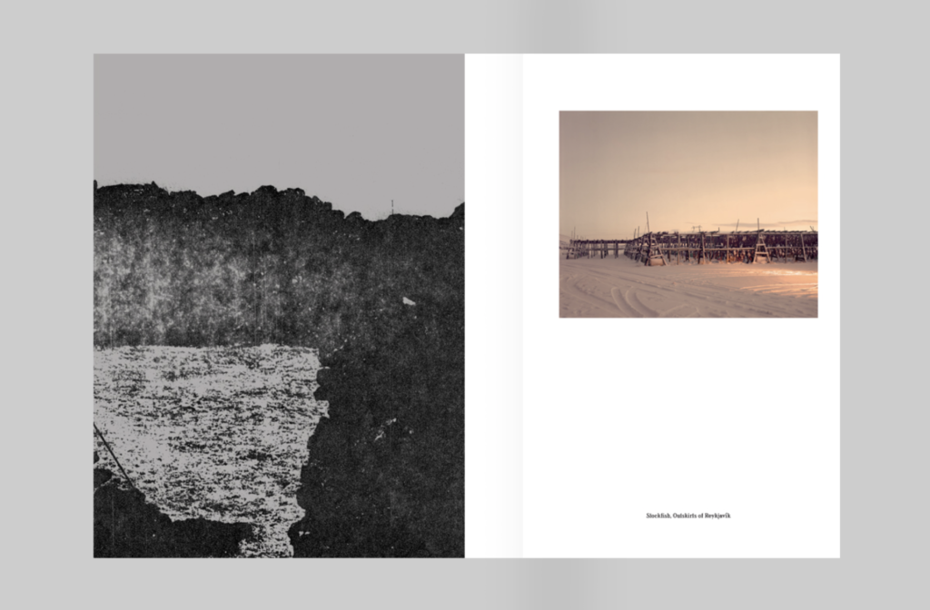
Structure and architecture / Editing and Sequencing: The sequencing alludes to the dubious interrogation technique employed by the police, where they asked questions out of chronological order. Latham uses inserted different sized papers to introduce the elements of police files and evidence, another structure element is the French fold found in the book Latham uses so the reader cannot see the ‘full picture’ developing a sense of ambiguity around what it is or maybe what is going on.

Design and layout: Sugar paper theories leaves near to no blank pages, landscape photographs are often presented on half the portrait pages rather than across the double page and those which are presented larger are folded over with a French Fold.

Images and text: There is no introduction text from Latham however text is used heavily in Sugar Paper Theories, using evidence notes and police files on the inserts, it adds context to some photographs as well as making everything more confusing by showing what was said and found as it was, is, a puzzling case anyway, text is also linked with the photographs to landmark them, names of places and peoples and linking them to the different conspiracy’s≥

Sans Limites – theo Gosselin

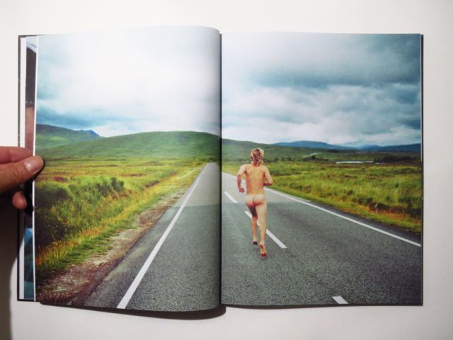
The book is hard back and slightly heavy, with a subtle sawdust smell. The images in the book are printed on A4 white card, which makes the images look bright. Within the book there is no writing, the story telling is through the images in the book which tell the story of Theo Gosselin who goes on a road trip with his friends and documents it through images, it is showing what he say and the carefree personality that people of that age have, this is really represented in the following images;

Image result for SANS LIMITES - THEO GOSSELIN

There are 112 pages showing how Gosselin lived and the activities he got up to during his time of freedom. Also, the lighting of the images is pure and bright which suggests most of his images where taken at sunrise or sunset, making the images highly focused and giving them natural lighting which enhances their surrounding. There are a few full spread images within the book and the rest of the images are one to a page with a white boarder around them, which makes you focus on the image you are looking at.

Image result for SANS LIMITES - THEO GOSSELIN

The following is a link to a flick through the book; https://www.google.com/url?sa=i&source=images&cd=&ved=2ahUKEwie7MzM-ILnAhWExoUKHQTJDxQQjRx6BAgBEAQ&url=https%3A%2F%2Fvimeo.com%2F123189895&psig=AOvVaw23Y4BCu5HR2AzLkDR0lGKb&ust=1579086091739369

The main audience for this book would be the younger generation, as I believe that older people would frown upon some of the images within the book. The images represent a carefree life, and it is encouraging adventure to the audience. The title of the book SANS LIMITES, means without limits, so they are living there life as they please with no regrets, they also stand as role modes to the younger generation to go and enjoy the life. The images are so simple yet captivating, it is as if the images have been taken out of a movie as they tell such a profound story

Photo shoot 4 – Family Event

Planning:

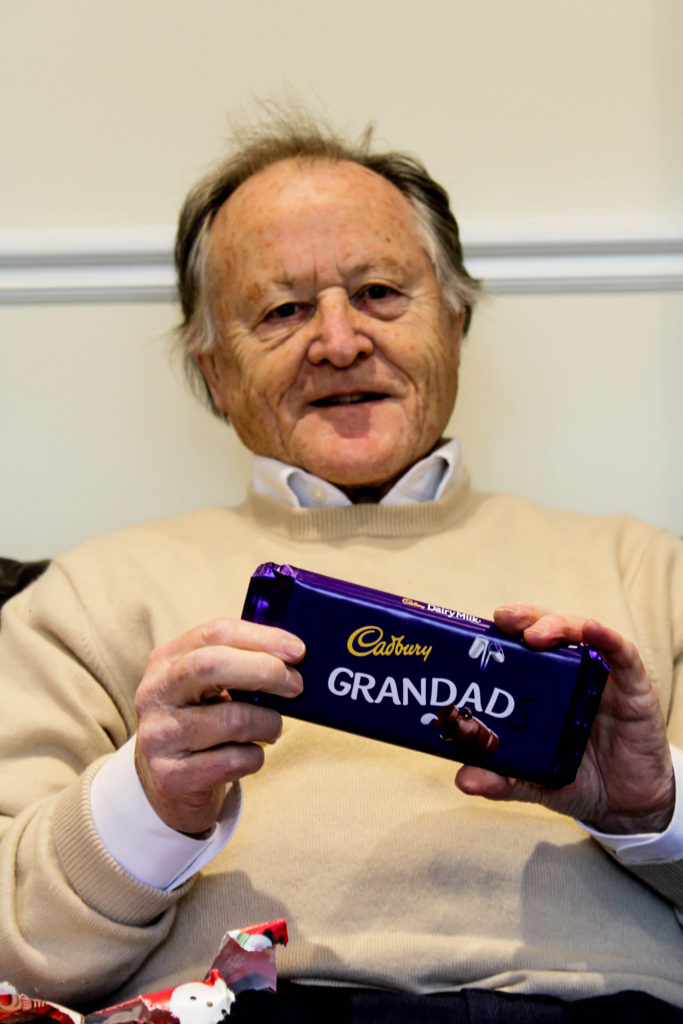
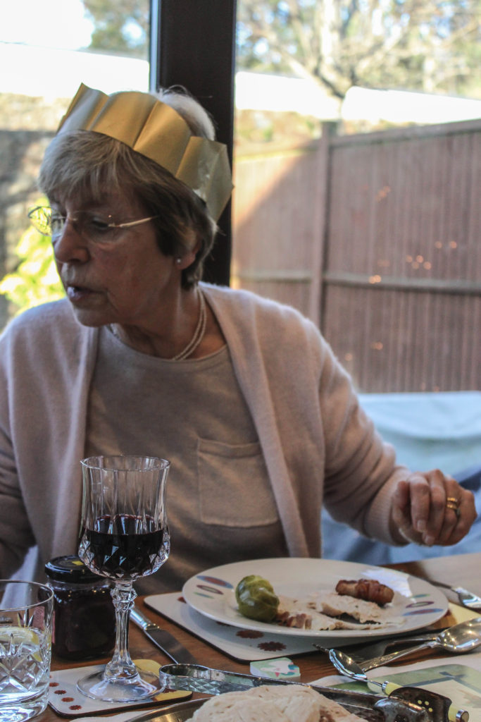
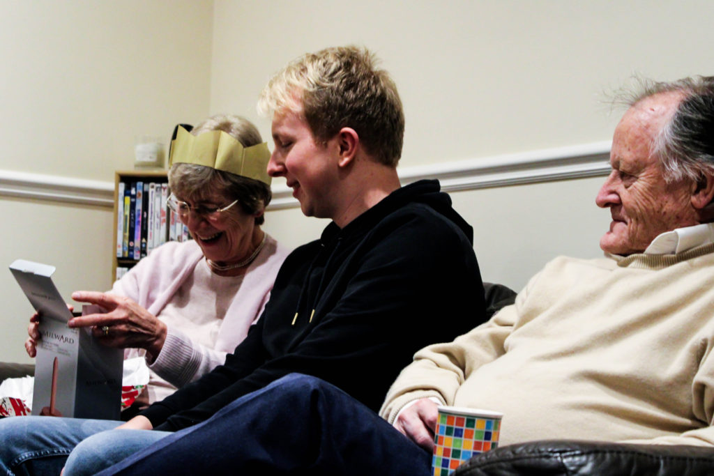
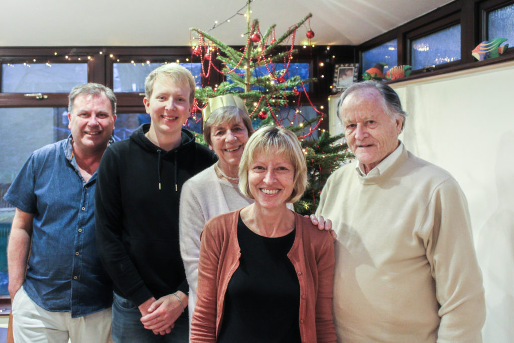
Christmas is a large event, which everyone in my family looks forward to every year. It is a tradition for my Grandparents to go to church in the morning and then come down to my house at around 12pm on Christmas Day to have a Christmas dinner with us, and exchange presents. The aim of this photoshoot is to showcase how my grandparents lifestyle influences the way in which we celebrate Christmas, due to this day being considered religious celebration. I also want to be able to capture the interaction between my grandparents and other family members, as well as showcasing our ‘traditional’ Christmas. When capturing the pictures I tended to take images of key events, and times within the day, and moments when my grandparents personality is clearly being showcased. The camera settings on my DSLR were kept minimal, allowing for a naturalistic documentary style image to be presented. My shutter speed was quick, with my ISO being low and my aperture also being low, reducing noise, blur and allows enough light into my imagery.

Structure of Christmas:

  • 12pm Grandparents arrive – drinks, snacks are presented as we begin celebration.
  • 12:30pm Present exchange – We provide a present exchange, gifting each other plants, car air fresheners etc.
  • 1pm Dinner – at 1pm we gather round the table, say grace, and open our Christmas crackers as the ford begins to arrive. We usually discuss topics such as work, school, future and how our life is in general.
  • 2:30 Dessert – We light the Christmas pudding, and my grandma provides us with her ‘Blue Peter Recipe’, a chocolate cake.
  • 3pm Queens Speech – We all gather around the TV as we watch the queen deliver her yearly speech.
  • 3:30 Christmas Tree Presents – Each year a member of the family will by a ‘joke’ gift for everyone else and will present these gifts later on in the day.
  • 4pm Leaving – My Grandparents leave with their presents, and left over food.

Edits:

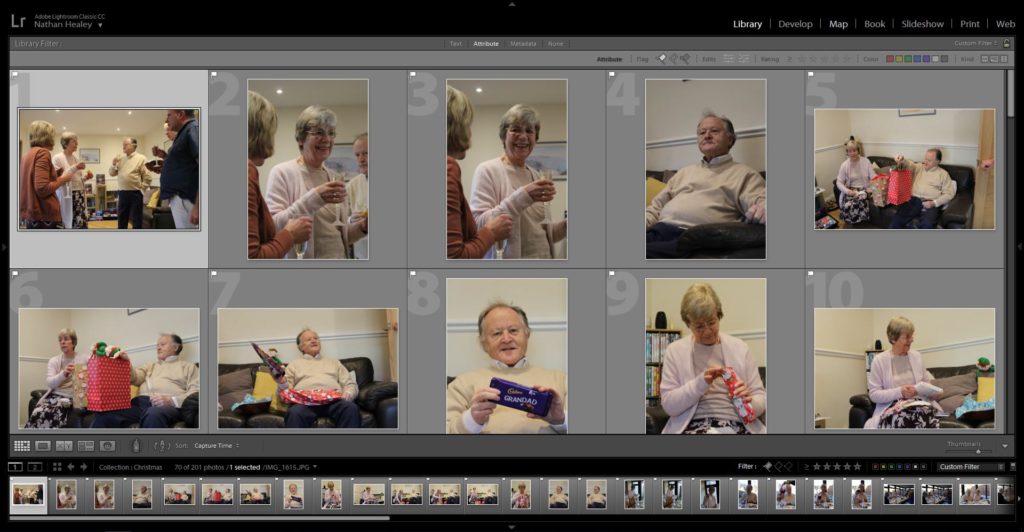
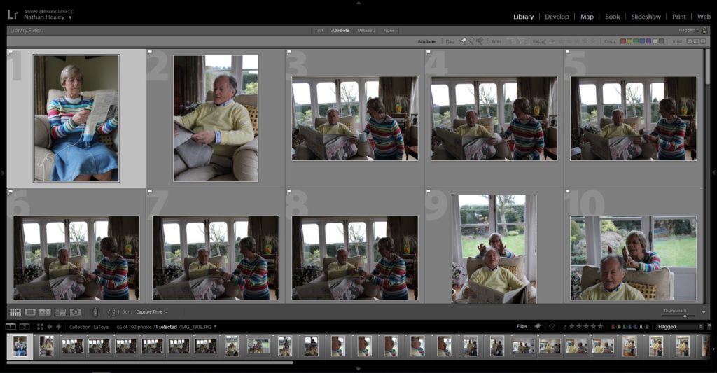
Edit 1 – Flagged
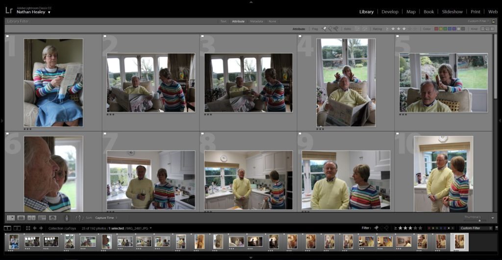
Edit 2 – Star Rating
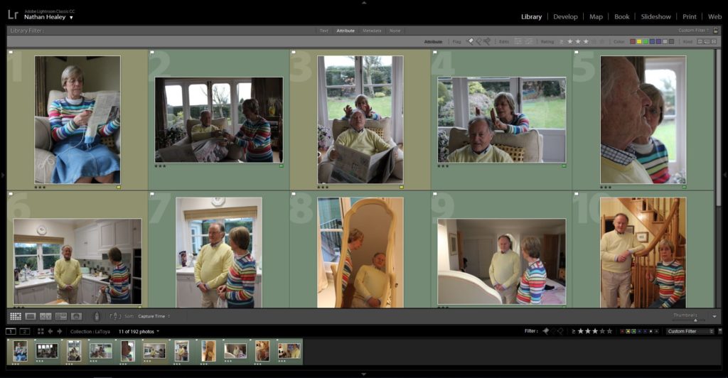
Edit 3. – Colour Rating

Outcomes:

When selecting my outcomes to edit and adjust to improve the quality of the photograph, I wanted to select images which accurately portray the events and the relationship my family have with my Grandparents, and the way in which this tradition reflects their lifestyle. In addition, I critically chose these photographs to work with as I believed that they helped to tell the narrative of this project. When adjusting the images, I wanted to maintain this simplistic and minimalistic aesthetic towards my work, and so I only present the imagery in black and white or in colour, and the I only focused on adjusting, blacks, white, contrast, detail and sharpness of the imagery. These experimentations are clearly presented below.

Analysis:

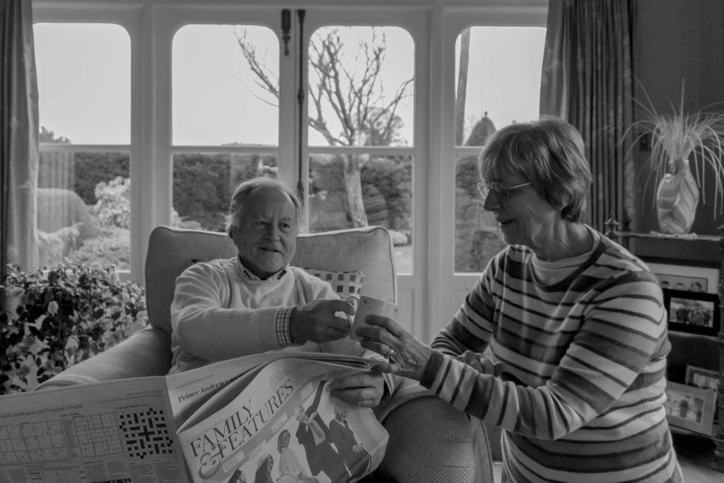
The photograph below is my favourite outcome from this photoshoot as I believe it clearly meets the aims of this photoshoot and clearly presents my theme of lifestyle. Conceptually, this is the moment before food arrives and my family are reading out the jokes from the Christmas crackers. It showcases their reaction to the delivery of the jokes. Typically, my brother does not understand the jokes, like this occasion, and requires people to explain. The photograph shows the bond and strong relationship everyone has around this table, as we follow the family tradition, which illustrates my grandparents lifestyle on a major event like this. Contextually, every Christmas we follow the same schedule and repeat the same day essentially every year. Following this pattern is crucial, as it allows my grandparents Christian religious beliefs to fit in with the day, and allows their grandchildren to follow, understand and practice their beliefs and traditions about christianity. Personally, me and my brother have been christened but do not actively consider ourselves as religious people, so this contextual factor on Christmas influences out day and the way in which we go about activities.

Breaking down the visual and technical components of this image allows for the concept and context of the imagery to clearly be displayed. Visually, we are presented with my family sitting around a table, with Christmas hats on as they laugh and look joyous at one another, making this the main focus point of the imagery. The photograph is presented in black and white, allowing clear tonal contrast, and is taken at a straight on angle. In some respects the photograph can be regarded to be using rule of thirds, to create the composition. Further more, the foreground is considered busy and lively due to a lack of space, with the background remaining plain and simplistic, which reduces distractions from the central focus of this image. The main formal elements which are presented in this frame is, space, detail and texture, which are all shown through the way in which the image has been framed. The photograph is sharp and showcases clear detail on the subjects skin, clothes and the table. Technically, the photograph was captured using and quick shutter speed and low ISO, which reduces intended blur and means no noise is presented in the frame. Additionally, the aperture has been set to a medium setting, as enough light is being let in, and a minor narrow depth of field is being presented. Alongside this, naturalistic lighting is being used, which compliments the daylight white balance being utilised.

Conclusion:

To conclude, I believe that photoshoot has been a success. I have been able to produce imagery which meets my artistic aim, and clearly represents my conceptual message of how my grandparents lifestyle influences the way in which my family celebrate major events. On top of this, I have been able to hint at contextual representations throughout my photographs, which adds additional meaning towards my final outcomes of this photoshoot. I have been able to experiment further with different ways of editing imagery using Lightroom, and have reinforced my skill of being able to critically analyse and select imagery which meet my artistic aim.

Photo shoot 3 – Laura Blight Inspired

Planning:

After researching Laura Blight, and the way in which she conveyed interior of houses to tell the narrative of the previous owner he has recently died, I wanted to conduct a photo shoot in a similar style which showcases my Grandparents house in order to tell the narrative of their lifestyle. I will be looking at interior, as well as capturing exterior, furthering from what Blight captured. When deciding what to capture I will be looking at different areas of the house which I believe help to capture their lifestyle, from macro images to using the formal elements of space, texture and colour to help convey this. My camera settings are going to be kept standard, with my ISO being around 400-800, shutter speed being quick and the aperture being round f/5.6, with the use of manual focus and natural light source.

Edits:

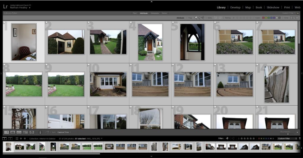
Edit 1 – Flagged
Edit 2 – Star Rating
Edit 3 – Colour Rating

Outcomes:

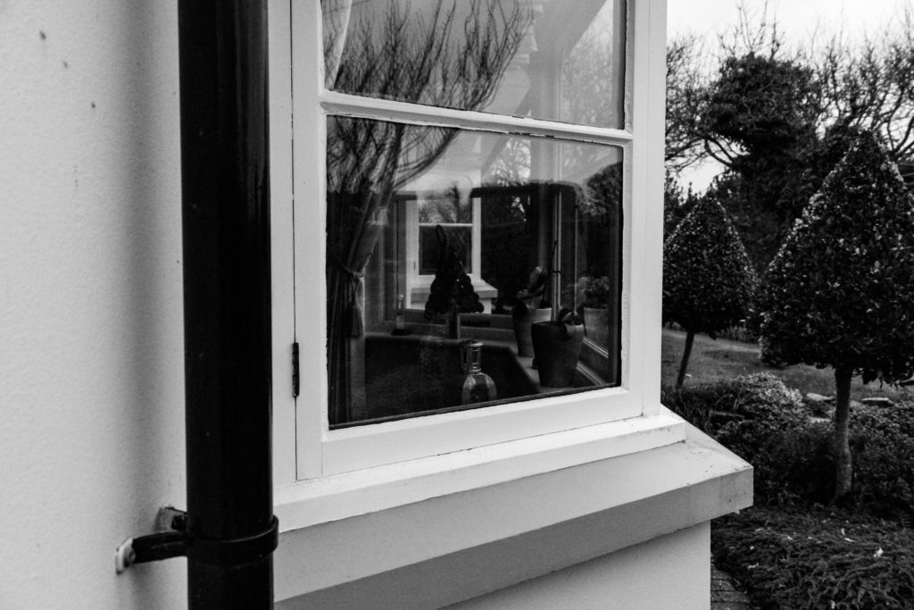
When editing my outcomes, I wanted to adjust the images to look like the work of Blight, by allowing the colours to slightly be desaturated, and noise to be presented, and having a natural darkness and somewhat eerie feel to them. I experimented with mainly the contrast, blacks, whites and shadows as well as the structure on lightroom to produce these outcomes. I tended to stick to black and white outcomes for exterior, as I felt the texture and tonal contrast allows for the house to hold more personality and tell it’s story, and the interior to mainly be in colour so that my work had a similar feel to Blight’s imagery. My experimentation can be viewed below:

Analysis:

Below is my recreation of Blight’s image of the chair in her photographic series ‘House Clearance’. The two images hold a lot of similarities, due to my clear understanding of the technique Blight used. For example, the composition of the framing is similar, with a chair in the foreground and windows in the background. Both photographs clearly represent the formal element of space, texture and colour, and represent the personality and characteristics of the room, as well as showcasing traces of human life, a key conceptual factor of Blight’s work. Due to similar outcomes, it is likely that we used the same shutter speed, quick, and a low aperture, alongside a natural daylight white balance.

In my image, the photograph presents the chair at more of a worms eye view/straight on angle, and is darker than Blight’s imagery. In addition, the surrounding of the chair in my image is a lot busier, which creates the representation of life still living in the house, which allows my conceptual representation of lifestyle to be clearly presented in my work. In addition, my image has more ‘noise’ in the sense that I used a high ISO, due to the natural lighting not being bright enough to illuminate the whole chair. On top of this, my image hold more of a modern day feel, due to my subject being more modern and up to date furniture. A final difference between to two images is that my photograph uses more of a wide depth of field, as we can clearly see the background of the image, which showcases my grandparents garden, but still does not distract viewers from the conceptual representation of my imagery.

I believe that my attempt of recreating this photograph is strong, I have been able to apply the techniques of Blight into my work, and have been able to introduce the ideology into traces of human activity and apply it to represent my grandparents ‘luxury’ lifestyle they live.

Conclusion:

To conclude, I believe I have been able to produce strong imagery, which clearly depict the luxury and wealthy lifestyle my grandparents have, trough capturing the interior and exterior of their homes. Alongside this, I have been able to employ the composition techniques of Blight when capturing my images, in order to hint at her conceptual representation of human trace. I have been able to further explore this by applying these techniques to capturing the exterior of my Grandparents house, in order to showcase the size and ‘traditional’ values that the house holds, emphasising the luxury lifestyle they live, based on their upbringing and contextual elements of their past.

Artist Reference – Laura Blight

Laura Blight

Contextual and Conceptual analysis:

Laura Blight is a British photographer who, who’s interest lies within capturing traces of human activity, exploring the ideology of strange and familiarity. “Traces left by human activity are recurring themes throughout her work” (Laura Blight, 2019). In her 2010 series ‘House Clearances’, Blight captures the interior of British houses, which in most part have had the owner or tenant pass away, leading to her reoccurring theme of traces of human occupation behind. She focuses on the emptiness, objects and furniture which illustrates themselves as the only thing left behind, creating a desolation within the imagery. All these factors leads to mystery towards pass events and the previous owners, which helps to convey the conceptual representation of traces left by human activity through eerie furniture and interior design. This embodiment of work was apart of her degree project, and upon in-depth research of this photographic series, there is little to no reviews or critiques about her work.

Contextually, in 2010 London a standard house costs increased by 437% over to previous 6 years, due to the capacity and business focused area London is, but the interior suggests differently. With costs being so high, it meant residents in 2010 struggled to maintain and modernise properties. This factor may have influenced Blight to capture this series in London due to the character and vintage elements of the house, which creates a more interning to the conceptual ideology stated in the previous paragraph.

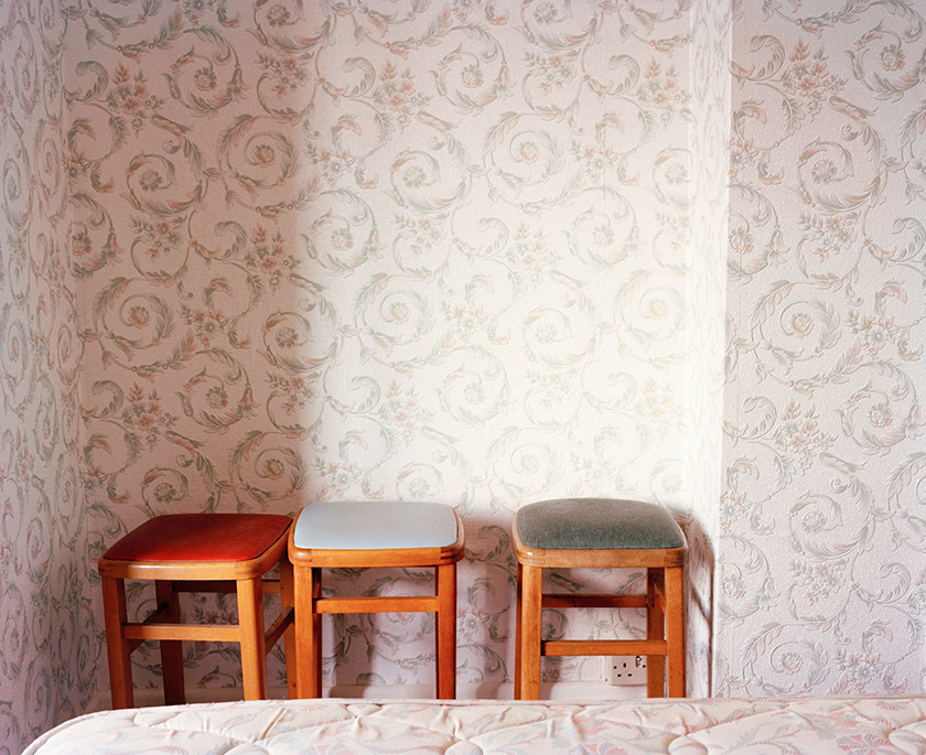
Mood Board Showcasing Laure Blight photographic Series ‘House Clearance’:

Technical and Visual:

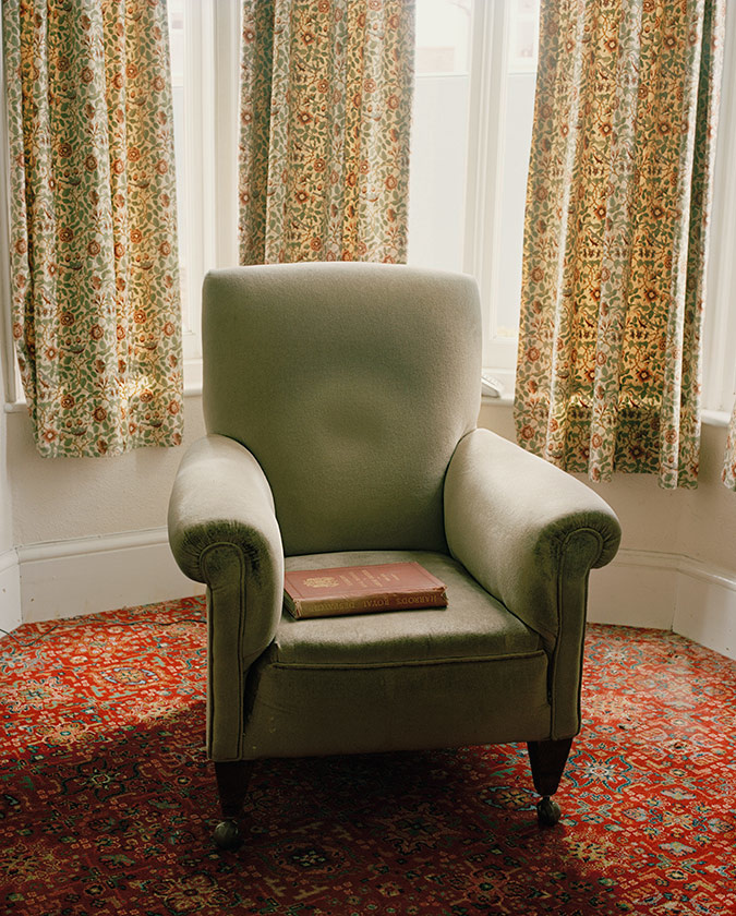
Laura Blight (2010) – House Clearance

The image above is my favourite image in Blight’s photographic series House Clearance. This is due to how the image accurately portray the conceptual representation of showing traces of human activity through interior of houses were the previous owner has passed away, and contextually showcases the rise in houses in central London. In addition, the composition allows for an interesting photograph to be viewed. The portrait image is presented in colour, which allows the character of the design to clearly be illustrated in the imagery. The chair is located in the centre of the frame, with the background being kept plain, allowing the chair to be the main focus point. In the chair you can see an indent on the back with a red book sat on the chair, which creates an eerie atmosphere and depicts the ideology of traces of human life. The formal elements presented in the image, is space, colour, tone and texture which are presented through the composition and subject found within the frame. Technically, the photograph utilises daylight, which comes from the windows in the background, suggesting natural lighting. In the image a sense of noise and texture is shown suggesting a high ISO, which also allows for the character of the interior design to be illustrated. The subject is focused and sharp which suggests a narrow depth of field and a low aperture being used when capturing the imagery, as well as the shutter speed being quick. A final clear observation to make is that the colour seems to be desaturated slightly which allows for this unique retro vibe to be showcased, and makes the conceptual representation clearer. Personally, I really like this embodiment of work, due to framing of the image and how it encapsulates you into this idea of traces of human life during an economic increase in housing prices.

Action Plan:

Understanding the way in which Blight captures imagery of the interior of housing, in order to convey conceptual representation, I intend to conduct a photoshoot were I capture the interior as well as exterior in order to convey the lifestyle of my grandparents, using the same techniques, visually and technically, as Blight.

Bibliography:

Blight, L.(2019), Laura Blight. Bio: https://www.laurablight.co.uk/about

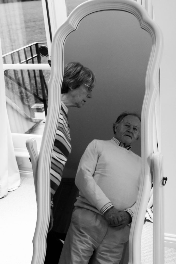
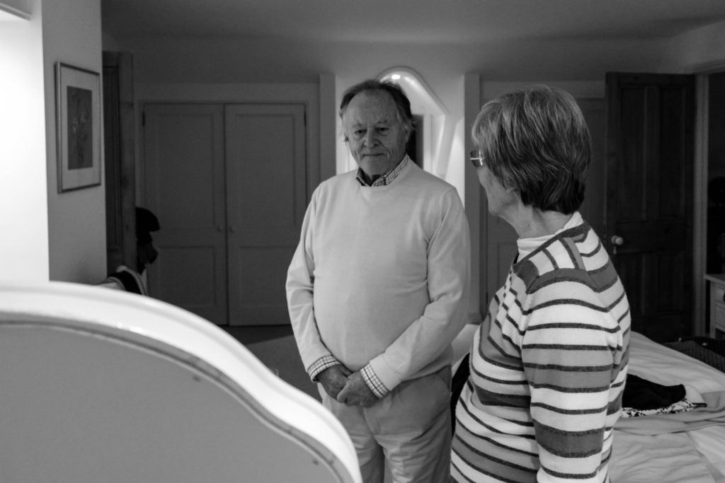
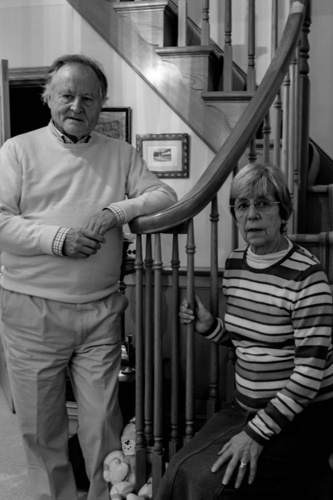
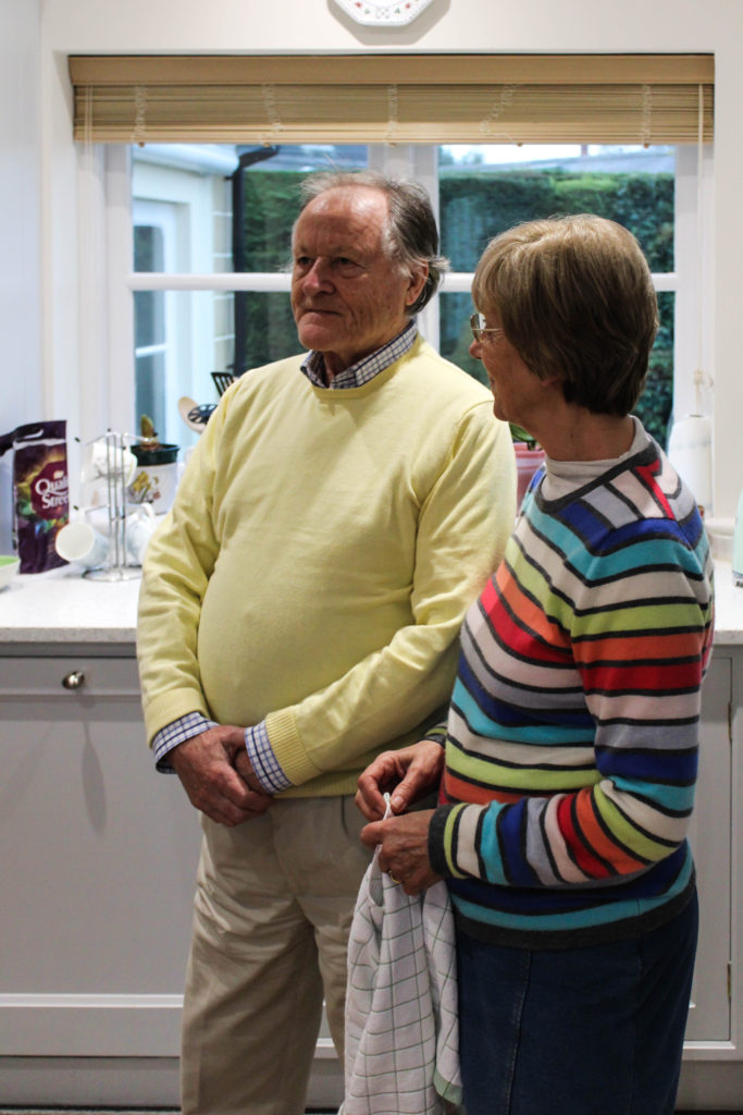
Photo shoot 2 – LaToya Ruby frazier

Planning:

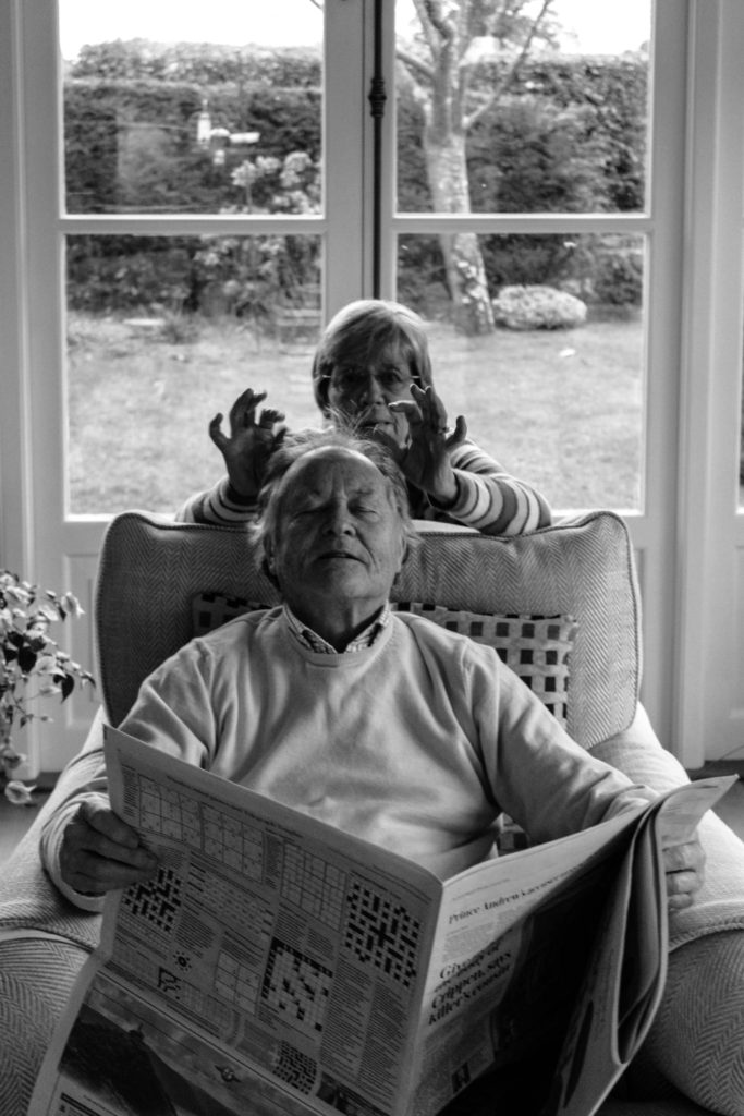
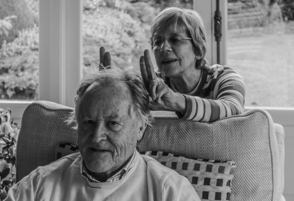
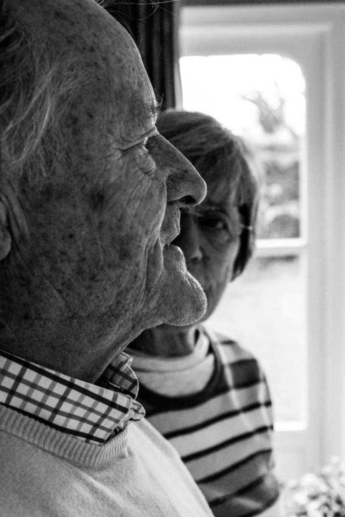
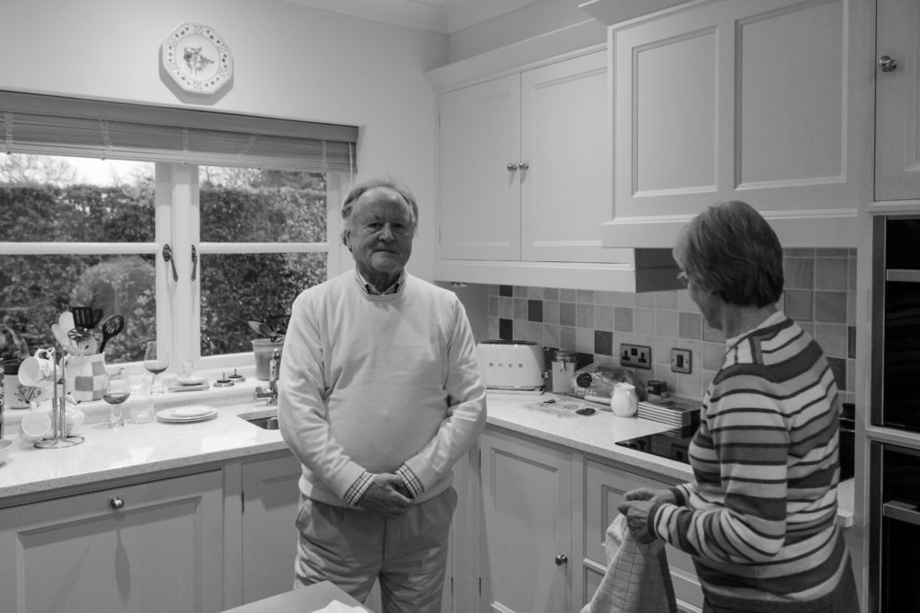
After researching LaToya Ruby Frazier, I was able to understand the way in which her conceptual representations were presented within her imagery. Using this techniques of capturing naturalistic portraits in order to portray lifestyle, I conducted a photoshoot with my grandparents. At the beginning of the session I explained the purpose of the shoot and informed them that I would be following them around as they live out their everyday lives, emphasising the importance of them sticking to their true personality to accurately representing their lifestyle as I followed them around. The shoot was conducted during the middle of the afternoon which meant daylight was beginning to become darker, which forced me to increase my aperture in order to let enough light into, for the frame to clearly illustrate their lifestyle. The camera settings were kept basic, quick shutter speed, middle – high ISO and aperture of around f/5.6 in order to capture the imagery.

Conceptually, I wanted to convey my grandparents lifestyle and how their upbringing and past has influenced their life. For example, I focused on capturing the idea of my grandma being a house wife, while my grandad provided and worked for the family. I also wanted to represent the ideology of economic status and the way in which their financial situation has influenced their lifestyle which they thought were large influencing factors during my interview with them. Due to them being financially stable, it has allowed for them to have luxury habits, such as owning a large house, being able to afford expensive furniture and being able to retire early. These factors I tried to portray through my imagery, as well as recreate and produce imagery which follows the same stylistic features of Frazier.

Edits:

Edit 1 – Flagged
Edit 2 – Star Rating
Edit 3- Colour Edit

Outcomes:

When producing the outcomes from this photo shoot, I wanted to keep them simplistic and authentic, in order to clearly and accurately illustrate the lifestyle they live. Due to Frazier’s work mainly being in black and white, lead most of my outcomes to be showcased in black and white, in order to create close connections between mine and my artists work. However, with two of the images I decided to leave them in colour, as they best suited being presented in colour, due to them having a more authentic persona towards them which meant that the colour allowed for reality to accurately be portrayed within the imagery.

Analysis / Comparison:

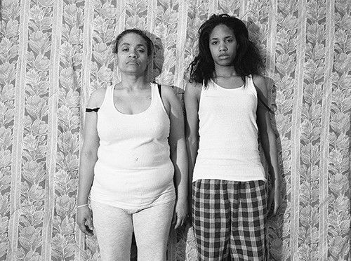
The image below (Frazier’s) is the photograph which I felt held strong conceptual representation, and wanted to recreate within my work to present different concepts in relation to the subjects I was capturing. The two images follow similar composition, by having a subject present in the foreground and background looking in different directions, with a narrow depth of field being utilised. Both photographs are being presented in black and white, with the detail and structure being high, but the smoothness of the imagery and noise being low, likely done through camera settings with editing complimenting these values. Both photographs show clear focus to the formal elements of space, tone and texture which is clearly presented from the proxemics, clothes and basic background. Another similarity between the two is through the camera settings used in order to capture these images, due to them being alike, it suggests that I used similar settings The lighting used would have been artificial through studio lighting and lighting readily found in that room. The light source is soft and can be considered cold, which illustrates the brutality of this reality and how it has negatively impacted the families life. This works well with the low ISO which is used as no intended noise is being presented within the imagery. As well as the white balance being accurately set to an in door setting allowing for clear colour correction, illuminating the tonal contrast within the frame. In addition to this, the shutter speed is kept to a quick capture as there is no movement or intended blur within the frame of the photograph, which helps to compliment the ISO setting used. 

The main difference between the two images are the conceptual representation. Frazier wanted to showcase how herself and her family are being treated as invisible due to their race, presenting political power and situation in their suburb in Braddock. It also illustrates their lifestyle and poverty through the perspective of herself, mum and grandmother, this concept is further explained in my artist research on a previous blog post. Personally, I wanted to convey the social situation which was common in the 1940’s and still present in my grandparents lifestyle today, gender roles. Having my grandad being in the front of the frame well dressed up shows he is the authoritative figure who provides for the household, having my grandmother in the back suggests her submissiveness and willingness to follow instructions from her husband, although this may be considered a bad thing, to them it is normality which they both enjoy.

Conclusion:

In conclusion, I believe that the imagery produced shows close relationships with Fraziers imagery, through the sense of composition and the ideology that we have both conveyed lifestyle in a similar way. With close regards to the final imagery produced, I believe that the photographs shows my ability to capture detailed portraits, which have clear focus and show my ability to produce a strong composition, which compliments the simplistic edits. In addition, I have been able to provide evidence my reinforces my ability to use Lightroom effectively to produce strong imagery.

Contextual Studies: LaToya Ruby Frazier

LaToya Ruby Frazier:

Context and Concept:

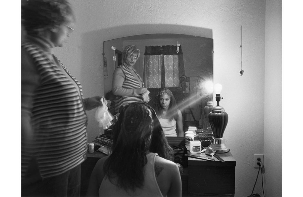
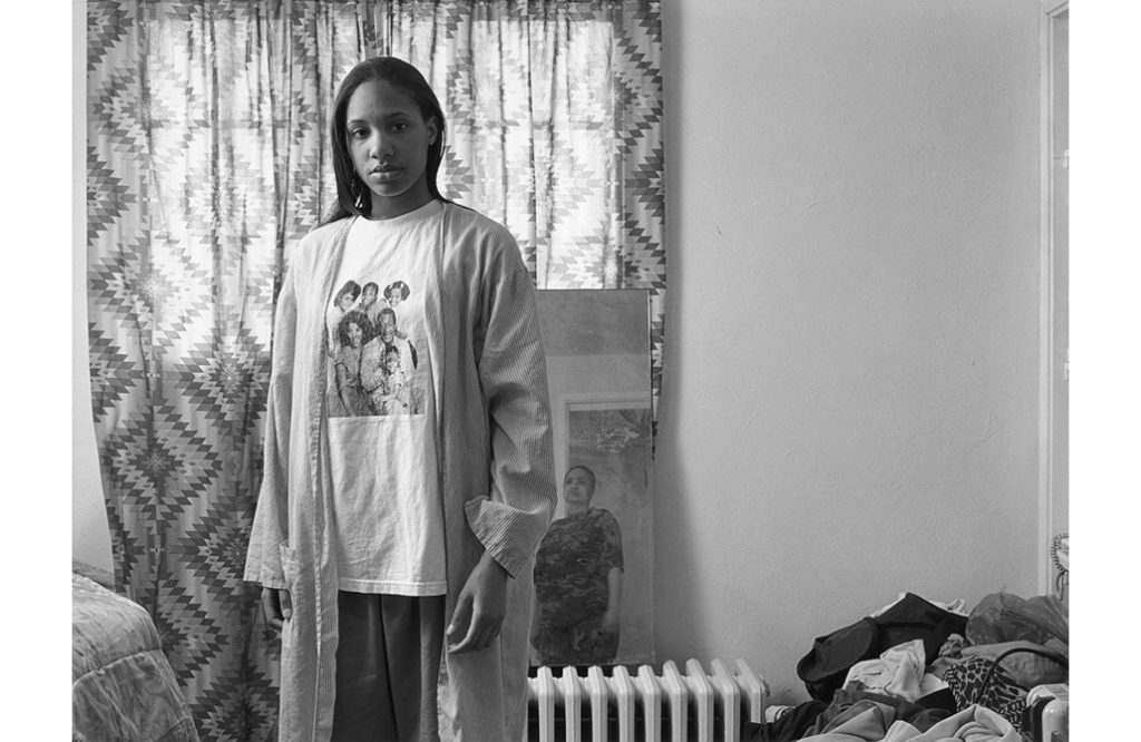
The Notion of Family (2014) is Frazier’s photographic series which aims to tell the narrative of her African-American family whom are struggling to come to terms with oppression (prolonged cruel or unjust treatment or exercise of authority) in Braddock, a suburb of Pittsburgh, and the negative physical and psychological effects of the city’s steel industry. The paperback photo-book also looks at the impact of racism in the small suburb as well as the decline in the community and family, showing her personal and political viewpoint towards this topic. In this she explore three generations of her family who have lived through these issues: her grandmother, mother and herself which reinforces the personal attitudes towards her imagery, who “lives parallel the rise and fall of the steel mill industry,” (Frazier:2014) . Critics refer to her photographs as a “weapon” of choice against racism, intolerance and poverty. This series about the substandard living conditions, hardships and withering effects of the pollution-borne illness that have effected the three women, on top of their struggles to survive, Frazier illuminates the human cost of political indifference and neglect. This begins to explain the conceptual and contextual factors of her work and how it has influenced her narrative.

Mood Board Expressing LaToya Ruby Frazier’s ‘The Notion of Family’ photographic series.

“The Notion Family responds to that call to suspend the passive aesthetics that turns abject poverty into an object of enjoyment” (Frazier:2014:’So Present So Invisible’)

The quote above comes directly from Frazier during an interview with David Company, who gains insight into her recent project ‘The Notion Family’. In this she supports her conceptual representation of showcasing the negative impact of poverty into the suburb and how it has massively impacted her family, whom are African-American. She suggests that the photographic book stops us from being susceptible, as viewers, and fully understand the crisis and the issue that she is raising through her imagery, which is done as a form of enjoyment and entertainment to us. Personally, I believe that she is correct in what she is saying as her imagery holds powerful political and personal response to this issue, as the message is at the forefront of the images. This is reinforced by the use of words, verbatim from her family, which reinforces these viewpoints, and allows us to become a more active viewer and allows the message to be more susceptible to the issue arising.

“I helped Gabriella Kessler and Jean-Loic  Portron by informing them about African-American families and residents that remain voiceless and invisible to mainstream media” (Frazier:2014:’So Present So Invisible’)

During her interview with David Company she explains how and clearly presents her conceptual elements within the photographic series and how it links into the contextual factors. In the quote above she is simplifying the point that her race, African-American, are being ignored by society leaving them to be seen and not heard. She talks about how a she helped tow people who work for the media understand this topic, as it is an issue which is ignored by journalists, thus these issues are not raised with the world. This presents the theme of neglect and really illuminates how poorly treated Frazier and her family are, thus emphasising the conceptual factors of her work. With the statement made above, I believe that what she is saying is true, as after reading around her work it is mainly art critics who are writing about the issue, but no other media source such as the news.

“I am obliged to document and counter this reality, and ultimately re-imagine and rewrite it myself.” (Frazier:2014:’So Present So Invisible’)

Above she is describing how she feels almost forced to outline these issues of racial discrimination in Pittsburg and document how it is affecting these people’s lives, in hope that she can changed the way in which they are treated and “counter this reality” so equality is accomplished within the small suburb. She talks about how this photographic series almost acts as her imagination, how she wants to reshape and create a better world were all races, genders, religions etc are treated equally with respect. Personally, I some what agree to what she is saying, after looking through the series the images hold a pejorative tone which only outline the state at which the town is in now and not the future. However, I believe this is done to also make the viewers reimagine what the town could look like.

Visual and Technical:

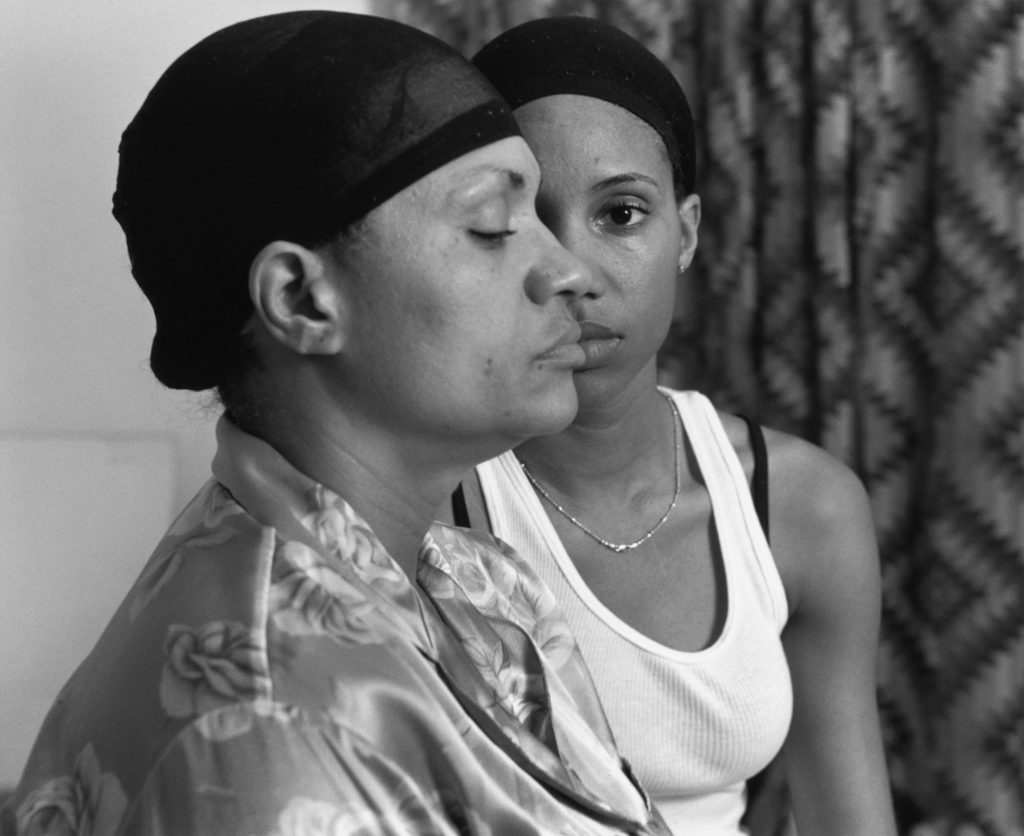
The photograph above is one my favourite outcomes from Frazier’s ‘The Notion Family’ photographic series. When looking at the image, initially out eyes are drawn to the woman’s eye in the background, located in the centre of the frame, thus making this the main focal point of the photograph. Moving around the image out eyes then move to the two models and then onto the plain background, which emphasises their race of African-American, due to the patterned curtain in the background of the imagery. Both models are wearing lounge wear with wig caps on suggesting they are in an environment where they feel safe. The women in the foreground is covering half of the other subjects face and has her eye closed which emphasises the concept that their race is only being seen and not heard and are almost voiceless and forgotten within the small suburb. In addition, the facial expressions on the women also suggest the ideology of a sense of being forgotten. The frame has a sense of space, which works well with the other formal elements of texture and pattern. The photograph itself is taken at a straight on angle with it being presented in black and white, allowing high tonal contrast to be presented, illuminating the texture. The portrait is taken as a landscape, which suggests that it is a wide and on going issue in the suburb, and is in the style of a head shot, which juxtaposes the actual reasons for a head shot.

Technically, Frazier’s work is simplistic which allows the conceptual and contextual representations to be the forefront of her work. The lighting used would have been artificial through studio lighting and lighting readily found in that room. The light source is soft and can be considered cold, which illustrates the brutality of this reality and how it has negatively impacted the families life. This works well with the low ISO which is used as no intended noise is being presented within the imagery. As well as the white balance being accurately set to an in door setting allowing for clear colour correction, illuminating the tonal contrast within the frame. In addition to this, the shutter speed is kept to a quick capture as there is no movement or intended blur within the frame of the photograph, which helps to compliment the ISO setting used. The aperture which has been used is roughly a medium setting as to some extent there is a narrow depth of field being used, as the background is slightly more blurred compared to the foreground. Due to this it creates a little blur which reinforces the ideology of the family being forgotten about in society.

Action Plan:

To further my understanding of the techniques and stylistic features of Frazier, I will implement these techniques into my next photoshoot. I intend to photograph my grandparents lifestyle through black and white portraits in order to raise viewers understanding of their social situation, employing similar conceptual reasoning towards my next photoshoot.