Category Archives: AO2 Explore Ideas

Filters

Author:
Category:

7. Constructed Portraits | Photo-montage | Composite | Collage | Creative

This week’s tasks are designed to encourage you to explore  your creativity by looking responding to Constructed Portraits.

  1. Photo-montage
  2. Composite portraits
  3. Collage

History of Photo-montage (Europe 1910 onwards)

  • A photomontage is a collage constructed from photographs.
  • Historically, the technique has been used to make political statements and gained popularity in the early 20th century (World War 1-World War 2)
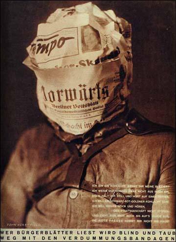
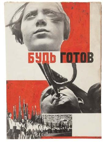
  • Artists such as Raoul Haussman , Hannah Hoch, John Heartfield employed cut-n-paste techniques as a form of propaganda…as did Soviet artists like Aleksander Rodchenko and El Lissitsky
  • Photomontage has its roots in Dadaism…which is closely related to Surrrealism
Raoul Hausmann, ‘The Art Critic’ 1919–20
Raoul Haussman
Image result for hannah hoch
Hannah Hoch
Adolf Hitler addresses the German people on radio on 31st January, 1933
John Heartfield
Image result for man ray photomontage
Man Ray
Image result for grete stern photomontage
Grete Stern
Image result for el lissitzky
El Lissitsky
Image result for rodchenko photomontage
Aleksander Rodchenko

Pop Art developments (USA and UK 1950s-)

  • Photomontage was also used to great effect by various Pop Artists in the mid 20th Century
  • Pop art was a reaction to abstract expressionism and was similar to DADA in some ways
  • Many Pop Art images and constructions tackled popular consumerism, advertising, branding and marketing techniques
  • Pop art also explored political concerns such as war, and gender roles too
Image result for richard hamilton
Richard Hamilton
Image result for peter blake
Peter Blake
Image result for robert rauschenberg
Robert Rauschenburg
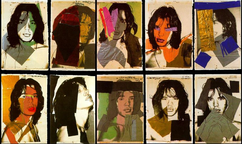
Image result for andy warhol photomontage
Andy Warhol

Examples and Inspiration

  • richard hamilton / kurt schwitters / peter blake /
  • soviet art
  • sammy slabinck
  • john stezaker
  • jesse treece
  • jonny briggs
  • david hockney
  • hannah hoch
  • Annegret Soltau
  • Brno de Szou
  • Joachim Schmid
  • Jesse Draxler
  • Peter Kennard
  • Eugenia Loli
  • Sarah Eisenlohr 
  • Grete Stern
  • Jerry UELSMANN
  • Duane Michals
  • Edmund Teske
  • Man Ray
  • El Lissitsky
  • Martha Rosler
Image result for john stezaker
John Stezaker
Image result for peter kennard
Peter Kennard
Image result for annegret soltau
Annegret Soltau
Image result for leland bobbe posters
Street Poster—Jacques Villegle
Image result for david hockney
David Hockney – joiner photographs
Image result for christian marclay album covers
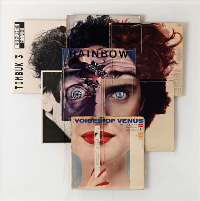
Christian Marclay-Album Covers
Image result for soviet photomontage
Soviet war art and propaganda
Image result for joachim schmid
Joachim Schmid
Image result for jesse draxler
Jesse Draxler
Image result for martha rosler
Martha Rosler
Image result for jerry uelsmann photomontage
Jerry Uelsmann
Image result for sarah eisenlohr
Sarah Eisenlohr

In her artist statement Montana based artist Sarah Eisenlohr explains that her collages use places of existence to create fictional ones in an effort to demonstrate the ways in which humans have transformed the earth. These scenes often carry undertones of spirituality and faith. “I consider the figures’ desire for shelter, warmth, and something stronger than themselves as symbols of serenity that I seek through spirituality, while the use of sublime in my work points to a relationship with the divine,”

Image result for eugenia loli
Eugenia Loli
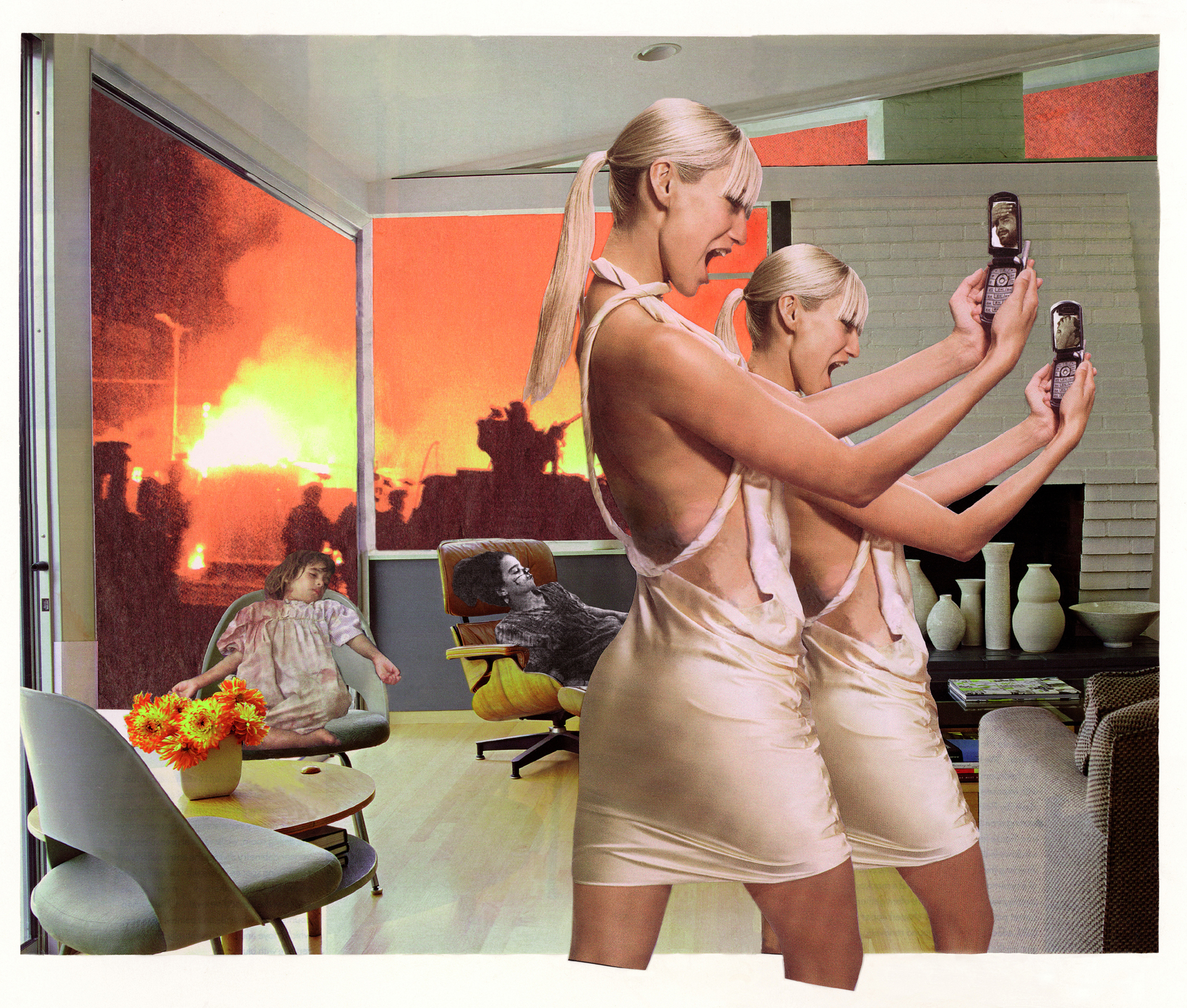
California based artist Eugenia Loli draws inspiration for her surreal art collages from vintage magazine images. Loli intends for her images to serve as a snap shot from a surreal movie from which the viewer can create his or her own narrative.

Task 1

  1. Create a blog post that includes a clear understanding of the history and background of photo-montage.
  2. Include a moodboard / mindmap
  3. Add examples of Early – late 20th Century Photomontage eh Hannah Hoch

Task 2

  1. Choose a specific photo-montage artist and write/create a CASE STUDY
  2. Include a detailed analysis of 1 x key image by the artist
  3. Add TECHNICAL -VISUAL-CONCEPTUAL-CONTEXTUAL understanding

Task 3

  1. Create a set of 3-5 photomontage using a mixture of your own imagery (portrait) and “found” imagery….(this could be archival imagery)
  2. Ensure you  include a sense of identity and place
  3. Show your process clearly…remember to add screen shots etc
  4. Evaluate your process…describe and explain

HUCKMAG LINK HERE

Complete over the Christmas Break…and see you all on Tuesday 8th January 2019


KEY COMPONENTS AND DISTINGUISHING FEATURES of PHOTO-MONTAGE

  • A NARRATIVE, CONCEPT OR THEME (A MESSAGE OR A COMMENT)
  • ARCHIVAL / VINTAGE IMAGERY COMBINED WITH OWN IMAGERY
  • SUBVERSION OF MEANING—-POSTMODERNISM

SOURCE MATERIAL YOU CAN USE

  • NEWSPAPERS
  • MAGAZINES
  • ORIGINAL IMAGERY (from studio, tableau, other portraits etc)
  • INTERNET-SOURCED IMAGERY
  • BOOKS

TECHNIQUES

  • MANUAL CUT-N-PASTE (SCISSORS, SCALPEL AND GLUE)
  • PHOTOSHOP –
  • selection tools (to cut and move elements of images)
  • free transform (CTRL T)– to move, re-size and shape elements
  • layers and layer masks
  • opacity tool
  • blending options
  • distortion
  • proportion
  • scale

Ensure you have enough evidence of…

  1. moodboards
  2. mindmaps
  3. case studies (artist references)
  4. action plans
  5. photoshoots + contact sheets (annotated)
  6. appropriate selection and editing techniques
  7. presentation of final ideas and personal responses
  8. analysis and evaluation of process
  9. compare and contrast to a key photographer
  10. critique / review / reflection of your work

Ensure you discuss / describe / explain your images using key words and vocab…
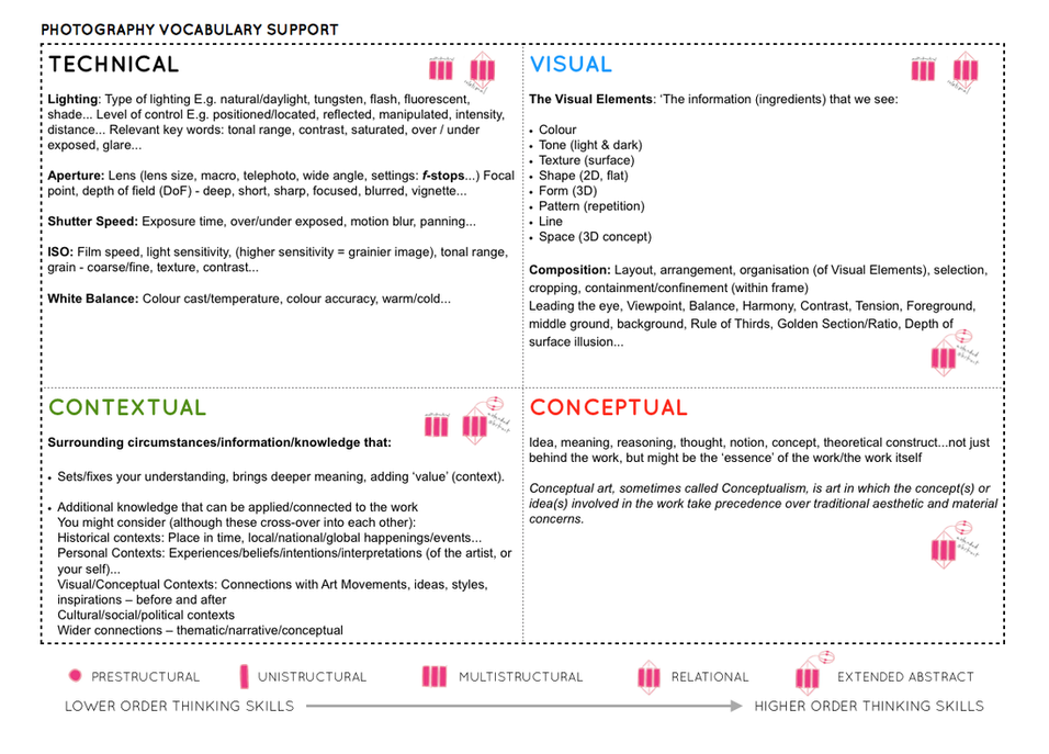
Picture

Tableaux&Staged Reality 2

EXPLORING TABLEAUX/STAGED REALITY PART 2

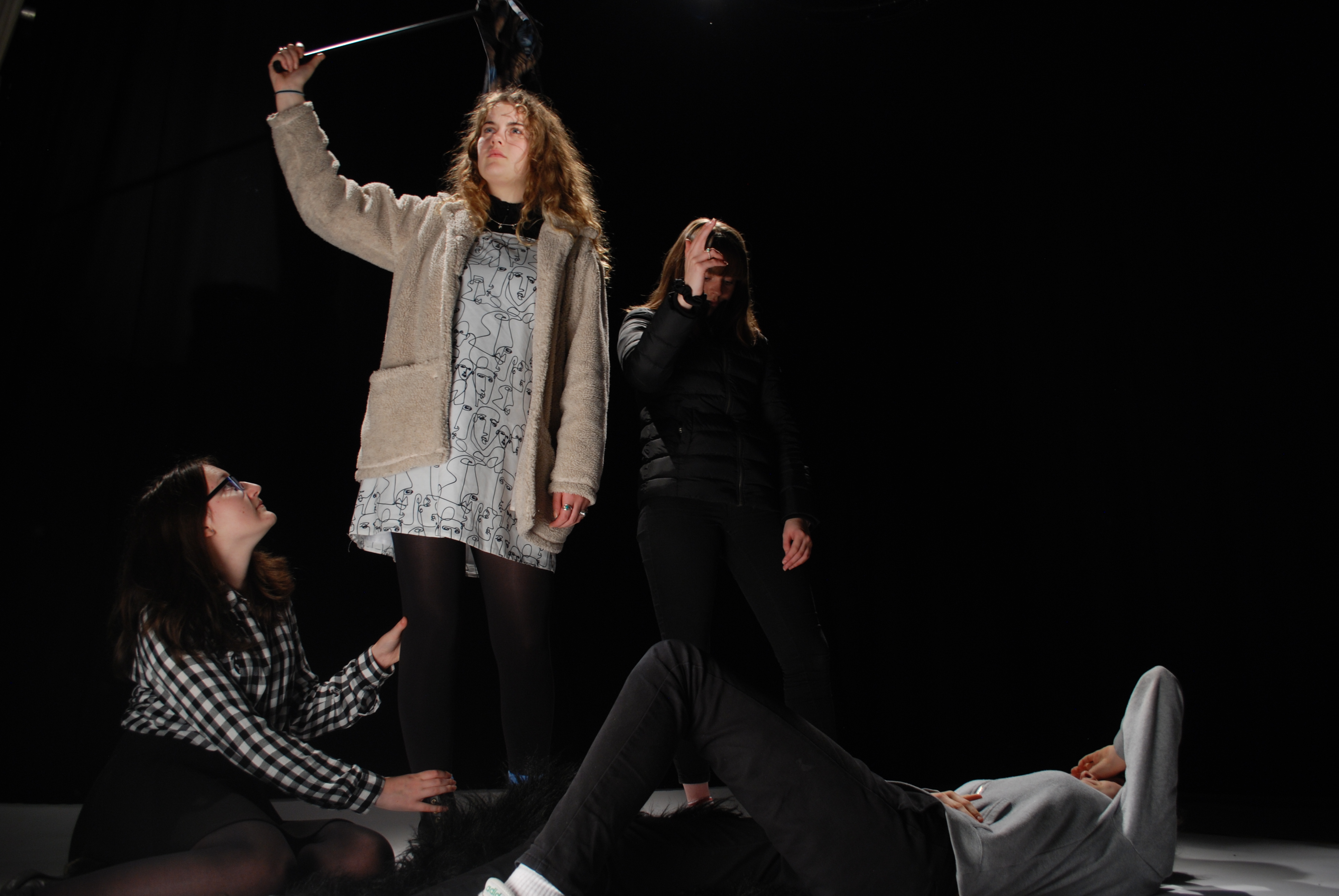
In this part of the project I focused mainly on staged reality, as I was re creating these paintings

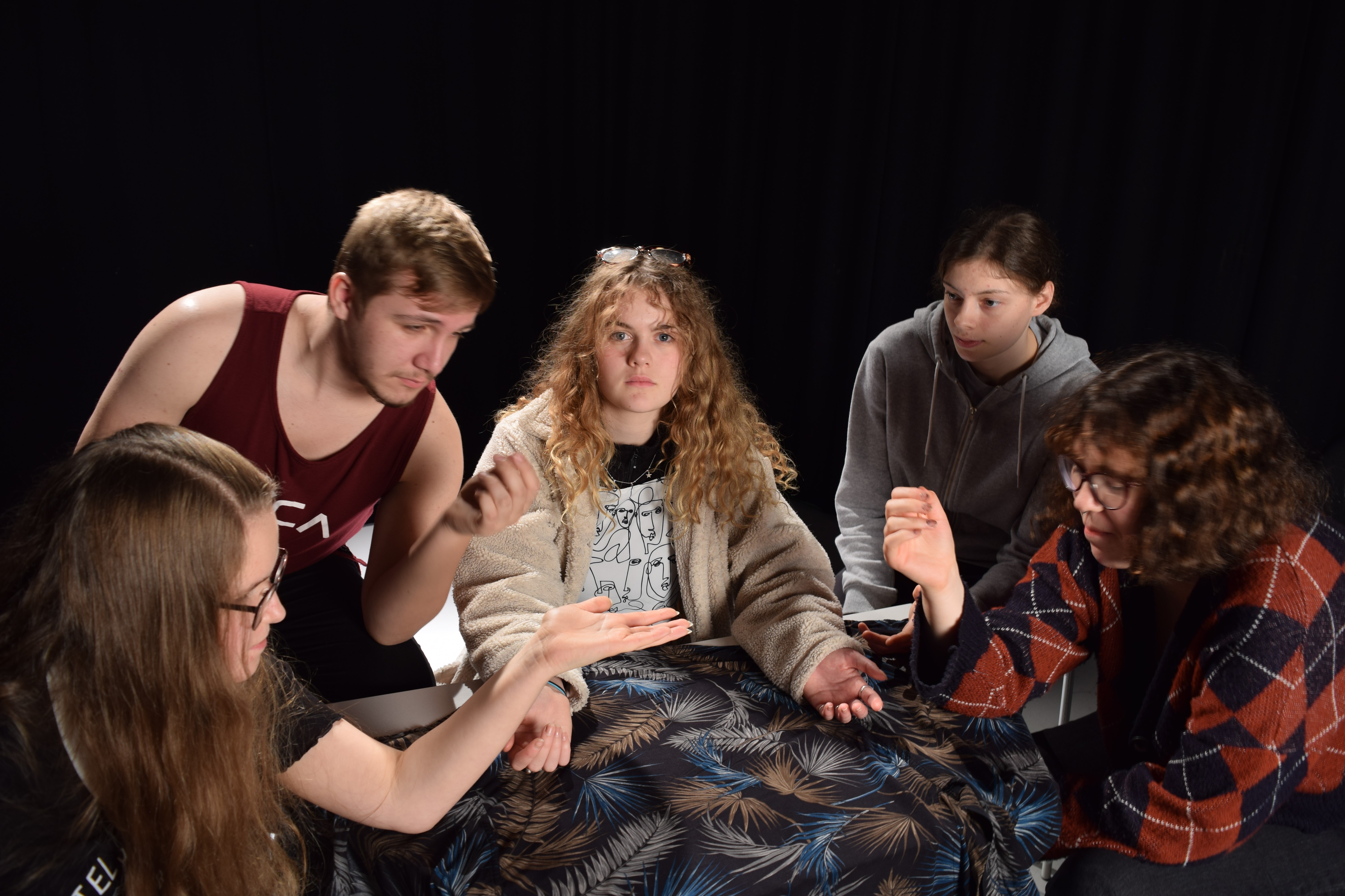
These 3 images are the ones we chose as a class to explore as they were some of our favorites. We chose these images due to the different angles of lighting within the images and the angle the photo has been taken from. The meaning behind these images is strong.

Image result for Eugene Delacroix ‘Leading the PeopleEugene Delacroix ‘Leading the People’

Image result for Caravaggio ‘Deposition’Carravagio ‘Deposition’

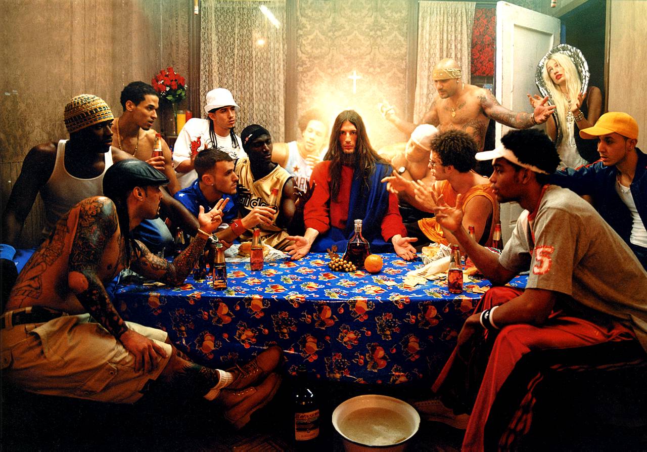
David La Chapelle ‘The Last Supper’
MY RESPONSE; 

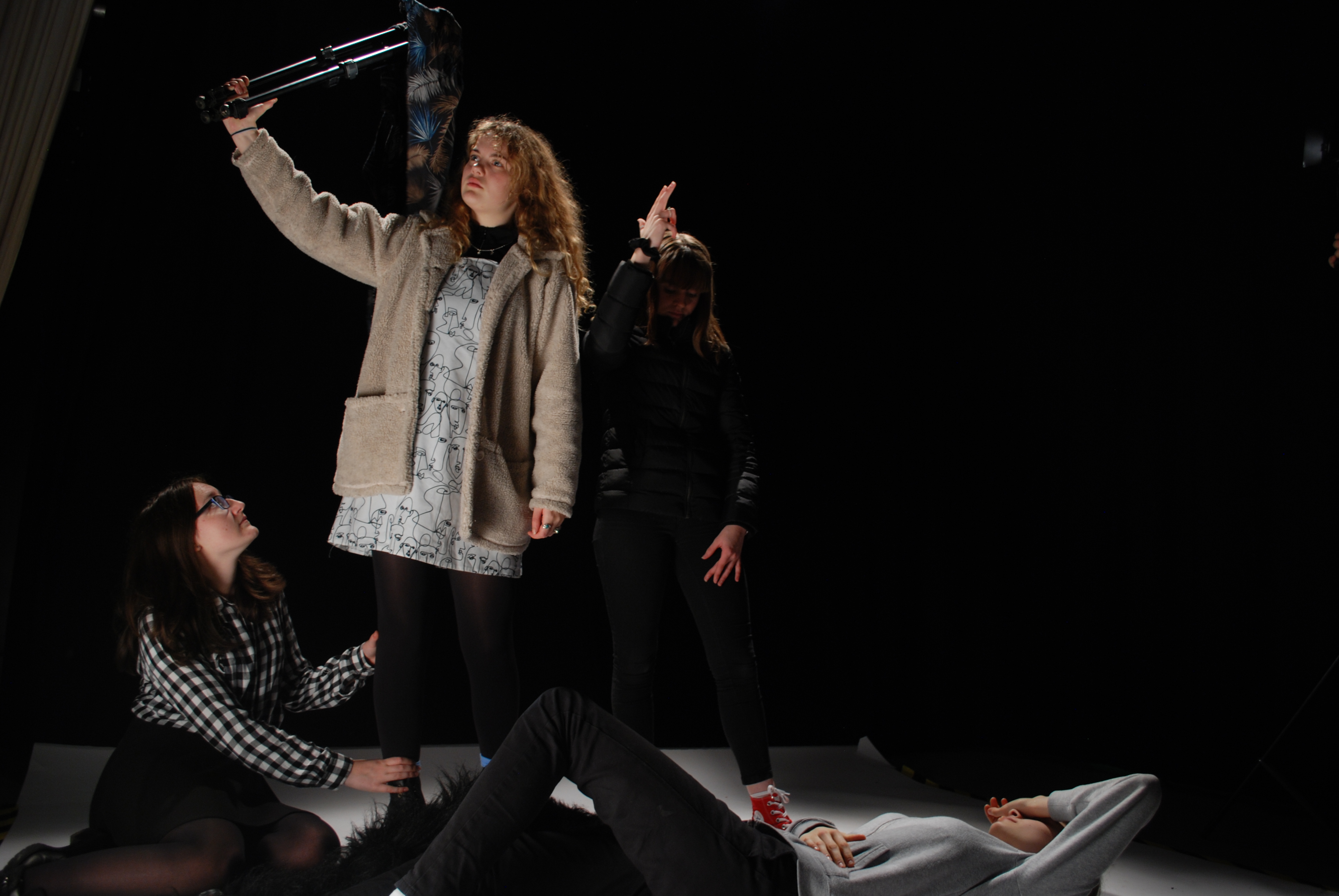
When taking these photos, we had an allocated director, photographer and lighting person, along with the cast of the image. The director was there to order the photo, in order to get out image as close to the one we were copying. It took many tries to get a good image because there was many people to order and the lighting had to be perfect, along with the photographer getting their settings correct to make sure the photo looked sharp and clean.

This photo is my favorite response from experimenting with Caravaggio’s photo ‘Deposition’. As I feel that the characters are in the right place and the image is sharp. We added our own twist on this image, by dressing the person being held in a gorilla suit, just to make it more creative and give it our own feel. 

When photographing the ‘Leading the People’ by Eugene Delacriox, we struggled getting the lighting in the right places to highlight the right parts of the image. I chose to show these two images from this shoot, because the first one has the lighting in the right place, but the whole frame wasn’t shot. Whereas in the second photo you can see the whole frame with acceptance of the flooring slighting in the photo, but that could easily be edited out. 

The final shoot we did was to reenact the image by David La Chapelle, ‘The Last Supper’. When photographing this image I was in charge of the lighting, I had to have a light in front of the set up and also one from behind to create the type of lighting that was created in the original.

EVALUATION

During this second part of investigating tableaux/staged reality we had to set up the people as they photo had theirs set up, we also had to get the correct lighting to make the photo look something like the original. I found staged reality very difficult because, I like being able to have freedom to change things and set things how I want, whereas in this part we had to follow an image. In staged reality and tableaux there isn’t room for you to do what you like and have the ability to be creative. It was frustrating as it took a while to get characters in the right place and then along with the lighting, it was too boring.

Philip-Lorca DiCorcia – My Own Responses and Development

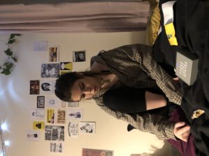
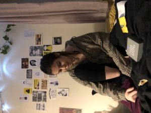
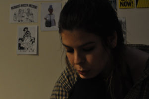
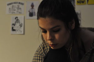
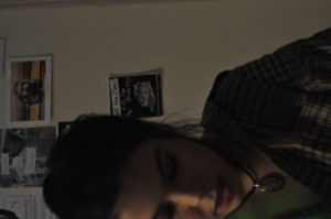
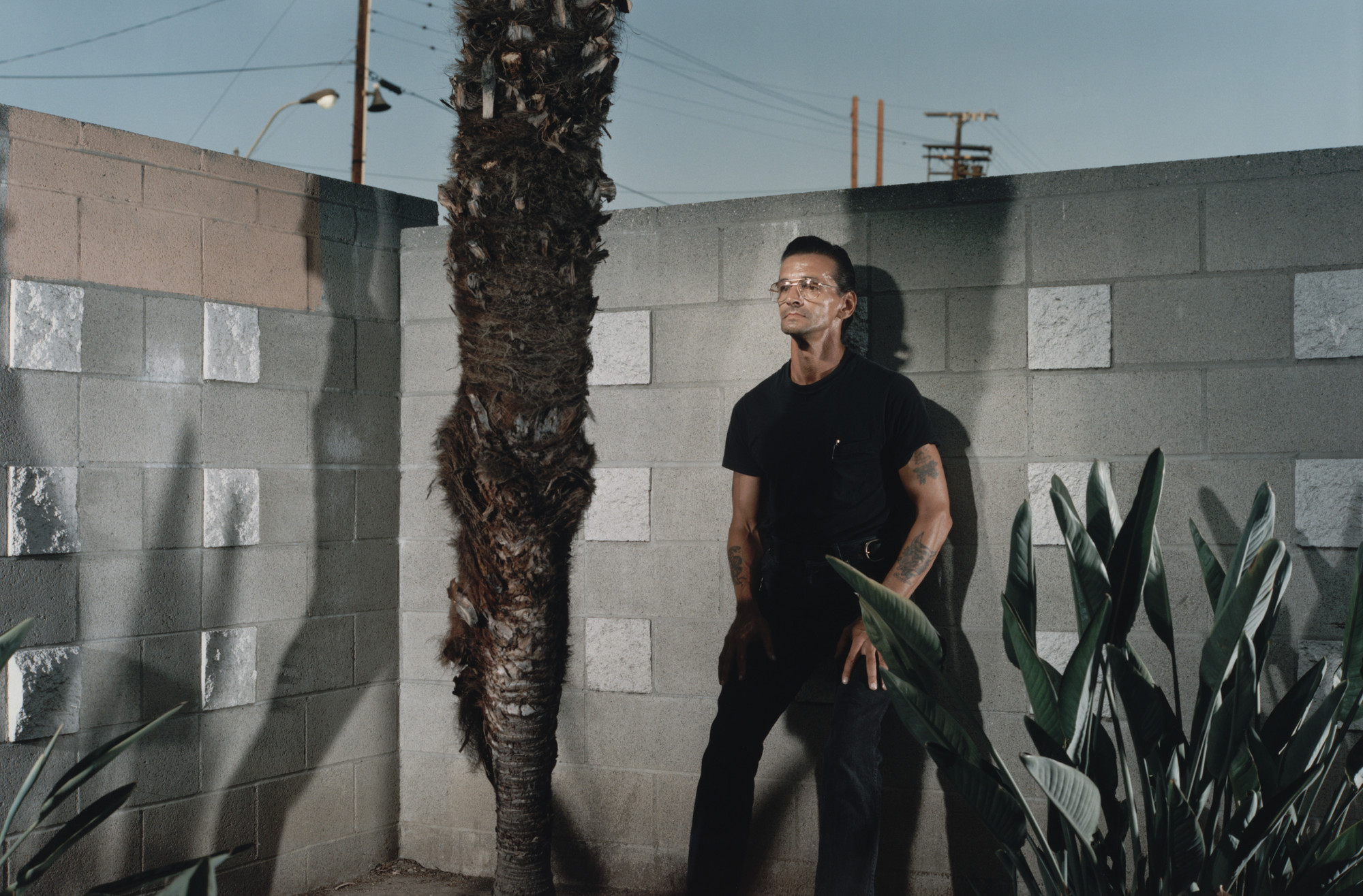
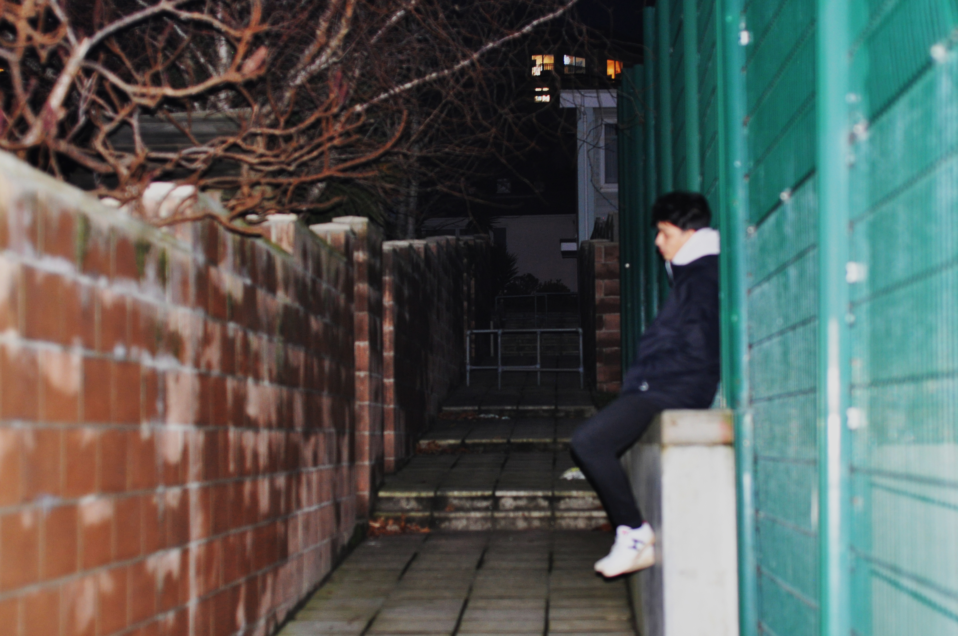
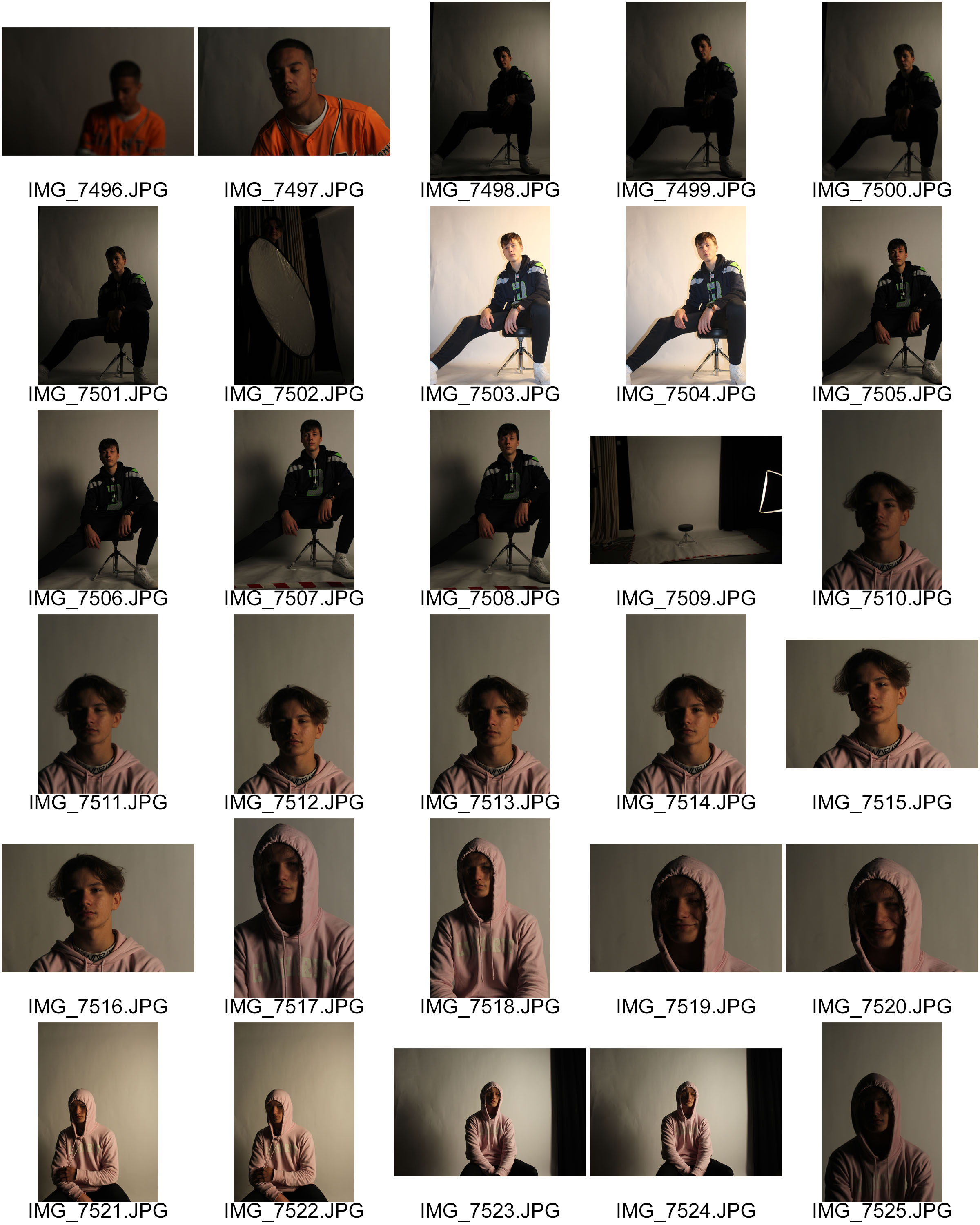
This is what I produced for my own personal photo-shoot in response to Hustlers.  I have produced some images with a subject sat in their own bedroom.  It is a little different to what Philip-Lorca diCorcia produced.  With some okay outcomes I feel this has been a useful experiment for the process and could maybe be used later on in the project.

Contact Sheet of Outcomes

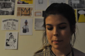
Below shows two of my better outcomes from the shoot, I feel that they have the more filmic qualities that I was trying to capture in response to Philip-Lorca diCorcia,  although the images have not turned out completely clear I feel they could be something that I could work with and edit into if I came to use them in the future.

My Own Response
My Own Response

Philip-Lorca DiCorcia

Reality has become a parallel universe with photographers returning with different versions of what it truly looks like. 

-Philip-Lorca DiCorcia

Philip-Lorca DiCorcia (born 1951) is an American photographer.  He studied at the School of the Museum of Fine Arts.  Afterwards diCorcia attended Yale University where he received a Master of Fine Arts in Photography in 1979.

DiCorcia alternates between informal snapshots and iconic quality staged compositions that often have a baroque theatricality.  Using a carefully planned staging, he takes everyday occurrences beyond the realm of banality, trying to inspire in his picture’s spectators an awareness of the psychology and emotion contained in real-life situations.  His work could be described as documentary photography mixed with the fictional world of cinema and advertising, which creates a powerful link between reality, fantasy and desire. 

DiCorcia’s photographs straddle truth and fiction by combining real people and places.   He insists that his pictures suggest rather than explain a full narrative.  His brand of storytelling results in unstable, unfixed images that point in certain directions but never provide a definitive map.

DiCorcia’s series like Heads, Lucky Thirteen, A Storybook Life and Hustlers – can all be considered his dynamic explorations of conceptual and formal domains of interest.  His images consists of black humour and can be interpreted in various ways by different viewers.  His work is planted with issues and concepts like commodification of morality, identity and art, as the selling of reality.

Image result for Heads, Lucky Thirteen, A Storybook Life, Streetwork, and Hustlers
Philip-Lorca diCorcia | Lucky 13
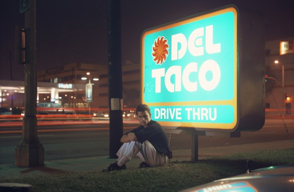
Image result for philip-lorca dicorcia hustlers
Philip-Lorca diCorcia | Roy | ‘in his 20s’ | Los Angeles, California | $50 | Hustlers

In 1989, Philip-Lorca diCorcia shot his dark and defining series, Hustlers, that was shot against the backdrop of devastation and despair during the AIDS pandemic in the late 1980’s and early 90’s.   In the 1990’s he visited Los Angeles five times in order to photograph Hollywood male escorts.  Hustlers was a courageous foray into the twitchy tenor of the post-Reagan era.  He sought out male prostitutes on Los Angeles’ Santa Monica Boulevard, offering them the money they would earn from having sex if he could shoot their portrait.  He took the pictures starting out in motels and later moved to the streets.  Philip-Lorca diCorcia admitted that some of the first subjects fleeced him out more than double the going rate, and professes he found the transaction process awkward.  ‘Most of them didn’t believe I only wanted to pay them for their picture, they were like, “Is there anything else I can do for you?”.

In 1993, 25 photos from this project were exhibited at the Museum of Modern Art.  The show was titled, Strangers and each image was labeled with the subject’s name, age, hometown and money they charge.  The photographs as a series are quite powerful and hold filmic qualities, this set of photographs of the male prostitutes look like stills from movies depicting the Hollywood reality as opposed to the dream that so few can harness.

I feel personally that Philip-Lorca diCorcia chose to shoot in Hollywood as Hollywood is where movies are created and ‘dreams are made’, I feel for me the locations and the filmic qualities are toying and playing with that idea as his photographs show the reality of what many have to live with in Hollywood.

In a moving coda, diCorcia shares a personal story in the new edition of Hustlers that puts this work in a somber new light:  “During that period, 1990-1992, the government officially condemned homosexuality,” he writes, “while AIDS made death commonplace. My brother, Max Pestalozzi diCorcia, died of AIDS on October 18, 1988. How much is too much? My brother was very free. I loved him for it. Freedom has its price, and we never know at the onset what the toll will be. He died unnecessarily. I dedicate this book to him.” –(Found in an article on the Time)

Time Article about Hustlers:  http://time.com/3803327/trade-philip-lorca-dicorcias-hollywood-hustlers-drug-addicts-and-drifters/

Philip-Lorca DiCorcia | Ralph Smith | 21 years old | Ft. Lauderdale, Florida | $25 | Hustlers
Image result for philip-lorca dicorcia hustlers
Philip-Lorca diCorcia | Robert “Sparky” Anderson | 47 years old | Detroit, Michigan | $25 | Hustlers

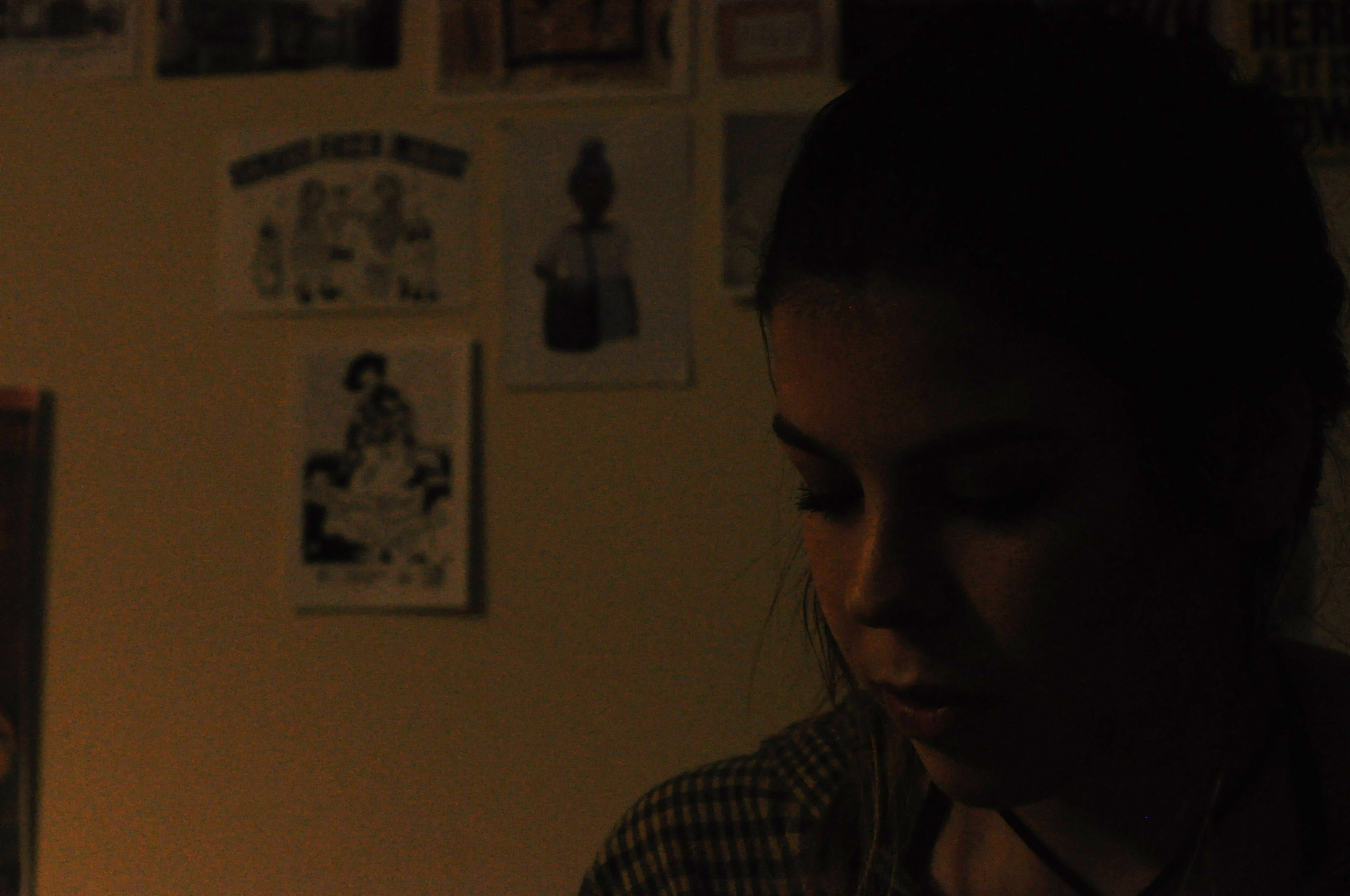
My Own Response

My Own Response

This was one of the photographs that I was able to produce from the shoot that I did, unfortunately I timed it wrong and it had gotten too dark for the photographs which made it difficult to be able to see the focus and get the right lighting for the photographs however this means that when I go to do my own personal shoot I will be able to time it better.


Tableaux Vivants and Staged Reality

Tableaux:  A group of models or motionless figures representing a scene from a story or from history; a tableau vivant.

tableau vivant is French for ‘living picture’, is a static scene containing one or more actors or models. They are stationary and silent, usually in costume, carefully posed, with props and/or scenery, and may be theatrically lit. It thus combines aspects of theatre and the visual arts.

A tableau may either be ‘performed’ live, or depicted in painting, photography and sculpture, such as in many works of the Romantic, Aesthetic, Symbolist, Pre-Raphaelite and Art Nouveau movements.

Image result for tableaux photography caravaggio
Ludovica Rambelli Teatro recreate paintings by Italian painter Michelangelo Merisi da Caravaggio

Above shows a tableaux photograph by the theatre company Ludovica Rambelli Teatro recreating one of Caravaggio’s paintings that would have been drawn from live actors.  Many tableaux photographs are responded to and from paintings.

Below shows a different tableaux photography by Ryan Shude, his work is not so much recreated from paintings but is still set up and staged.

Image result for tableaux photography
Ryan Schude

Class Response

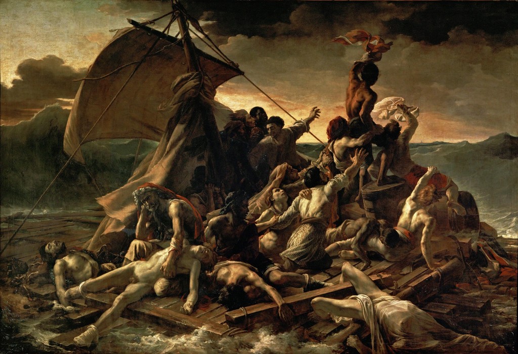
As a class we produced a response to the painting ‘The Raft Of Medusa’.  This is an example of tableaux photography, with the resources we had we tried to recreate this in a well way.

Image result for raft of medusa
The Raft of Medusa
Own Response

Studio Photography – Image Manipulation

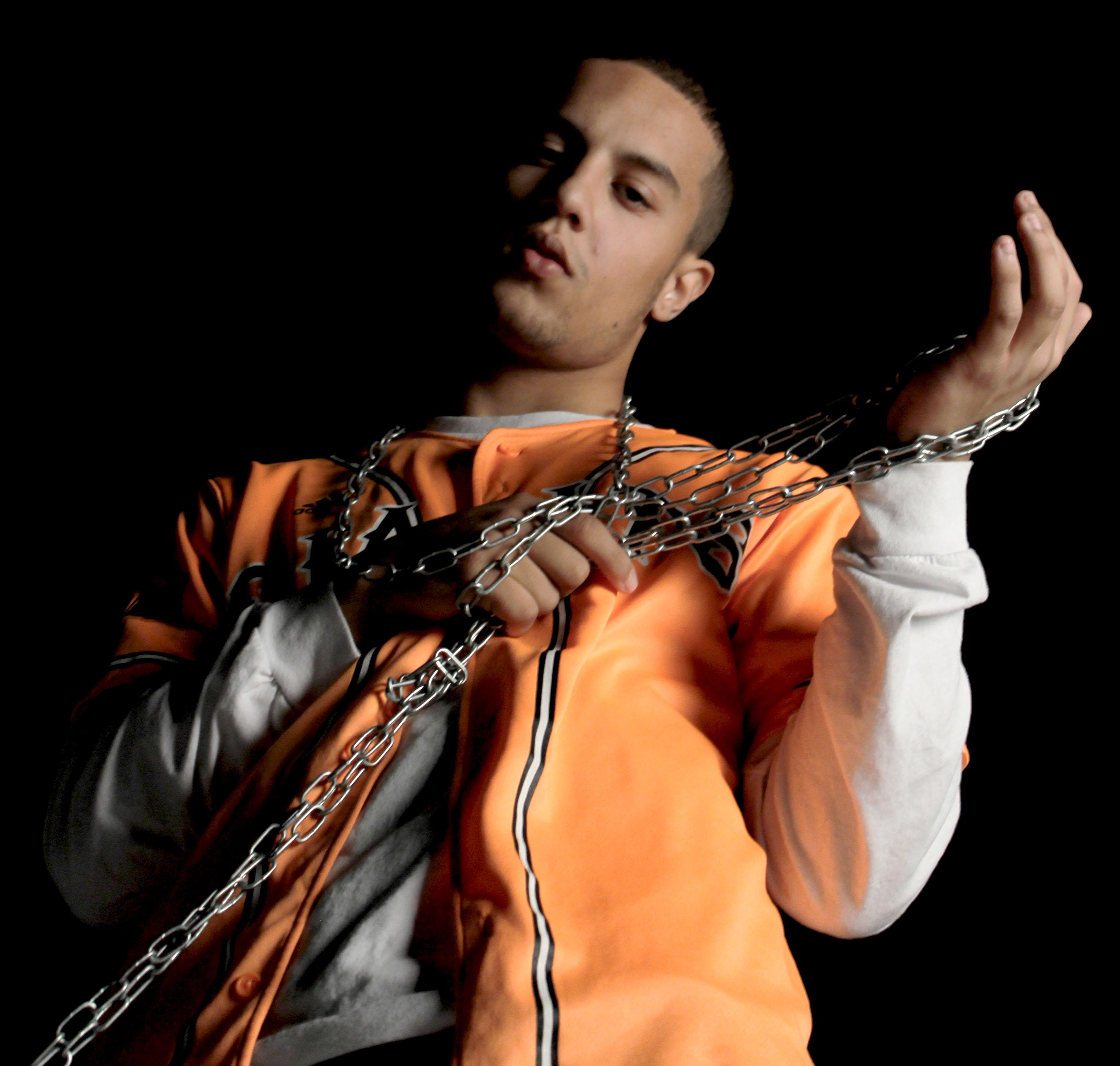
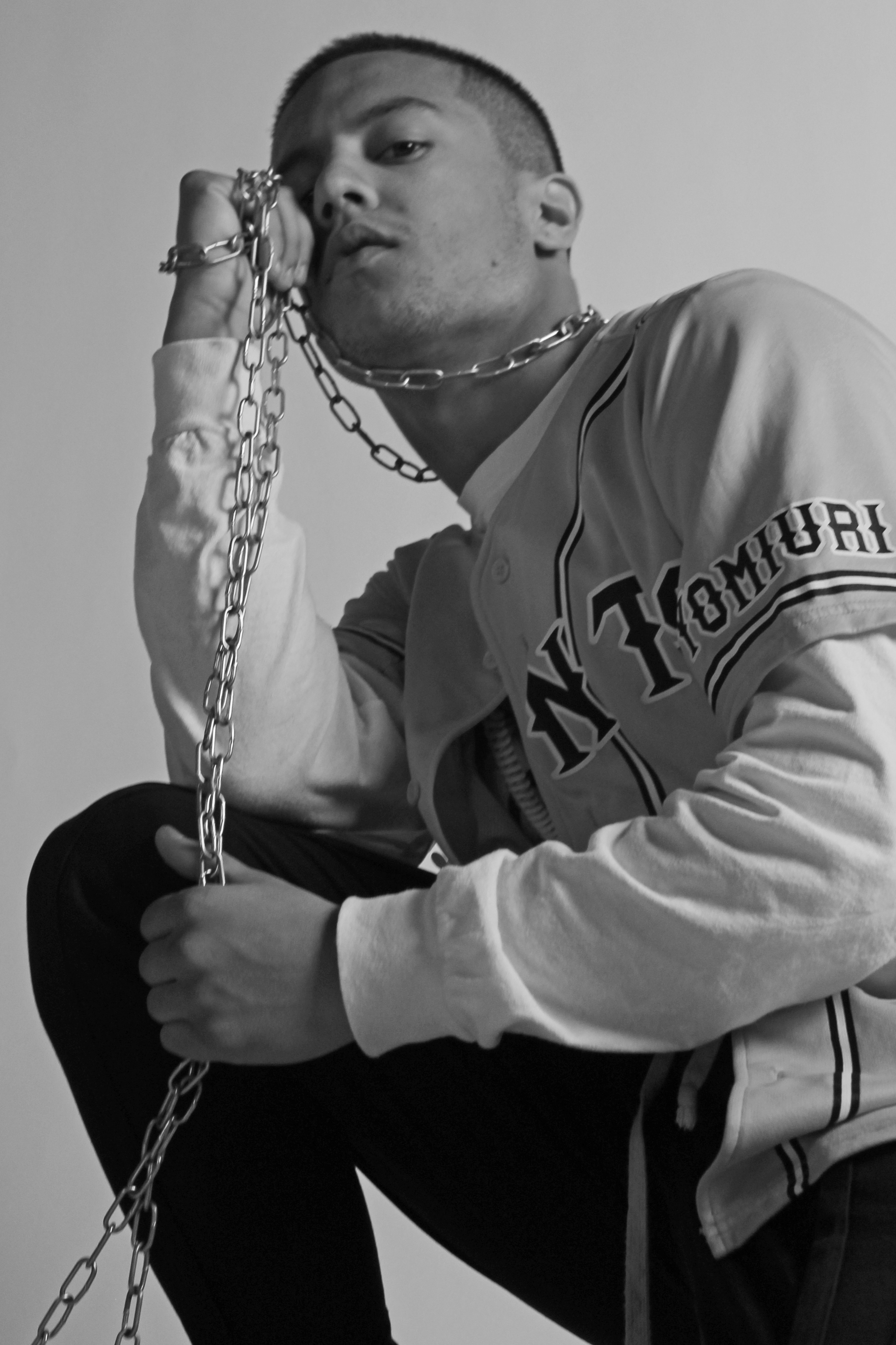
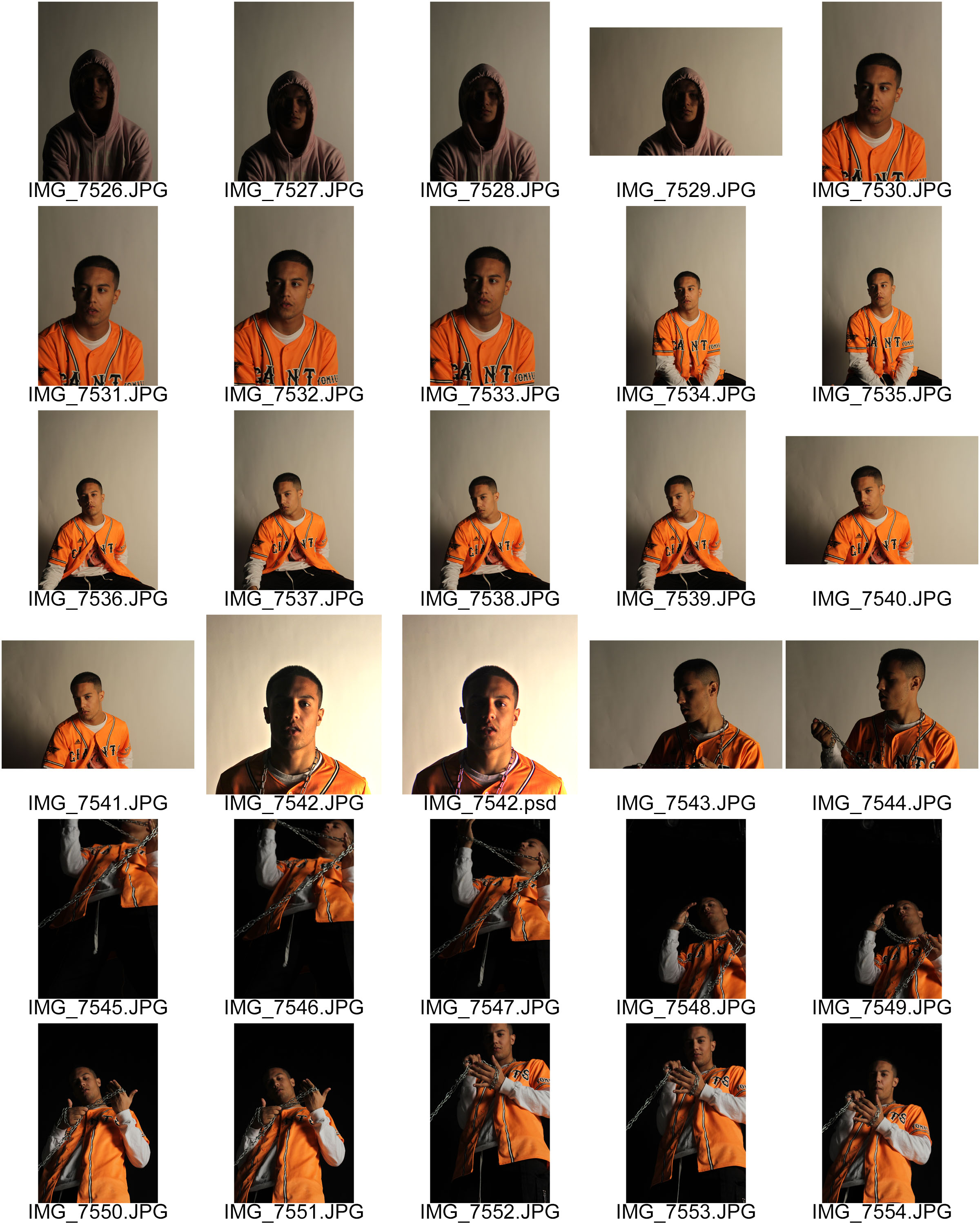
As far as editing goes I decided to be subtle with this image mainly focusing on adjusting levels and color balance. I mainly tried to emphasize the Rembrandt lighting and the slight orange reflection the the sleeve of the white tee shirt. I did this in order to avoid a tacky looking image while still incorporating a sense of drama into the image. Due to the composition of the image i decided to slightly de-saturate the image as I believe the less vibrant tones better compliment the metallic chains.

Here I decided to experiment with the dodge/burn tool and as a result of this I decided to make the image black and white in order to hide any undesirable changes to color caused by this. I also used the channel mixer in conjunction with the saturation tool to create a softer looking image while still maintaining a reasonable amount of contrast. I also cropped the Image to better fit the Fibonacci curve in order to lead the viewers eye through the image.

Tableau Vivants response planning

I have decided to do my own interpretations of music album covers as my response to Tableau Vivants. This is because they are often open to interpretation and sometimes have hidden meanings. This will make for a good response form as  it gives me a wide range of inspirations as well as a rough guide to what to do as the images will be my own take on certain album covers.

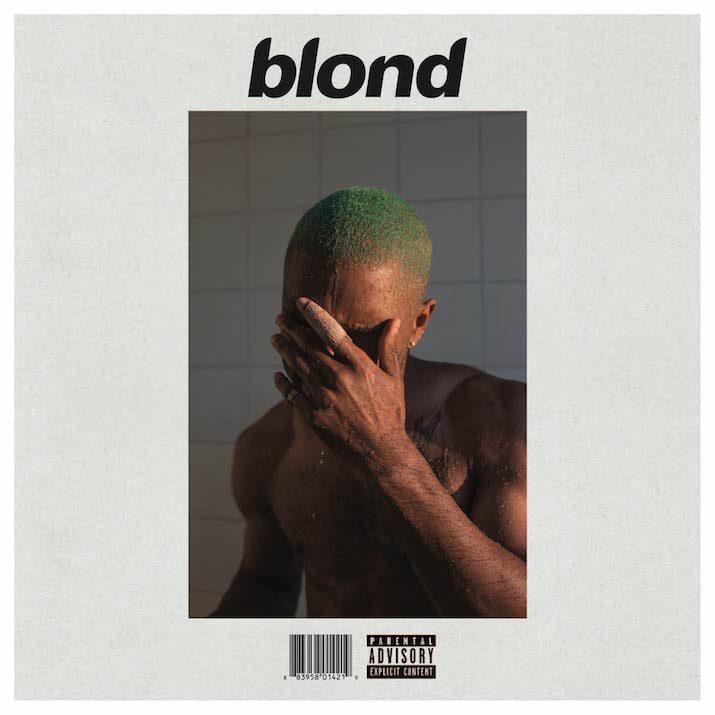
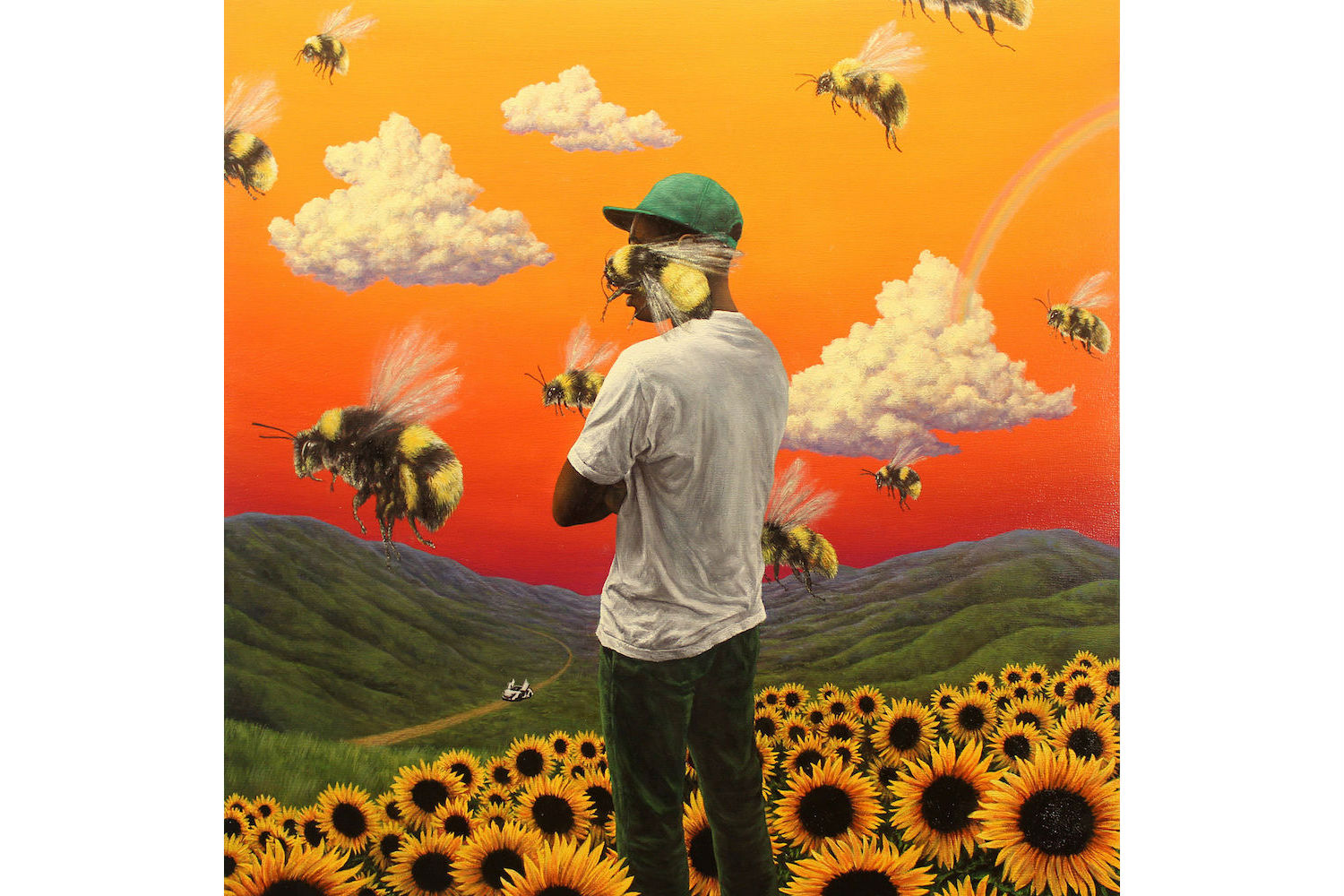
I was thinking of re-interpreting album covers such as ‘Starboy’ ‘Blonde’ and ‘Flower Boy’. I will end up doing more ideas than these, but they are the ones which I will prioritize.

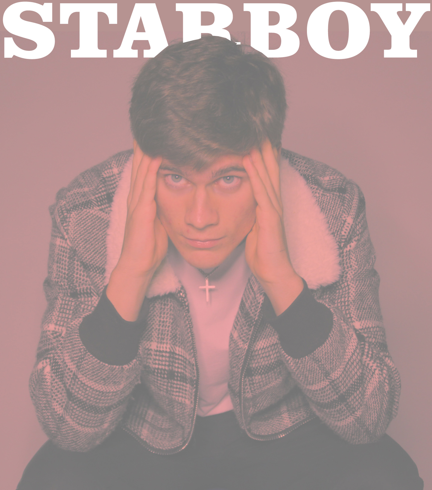
The first thing that stands out in this photo are the artist’s eyes and cross. This is because the musician’s clothes and skin tone are all similar colours which helps his eyes and cross stand out as they greatly contrast as they are bright white. His body language also suggests despair and giving up. His head being low and in line with his shoulders makes him look vunerable which further helps portray this emotion. The lighting is blue which subconciously implies that he isn’t angry or hostile in any way, this is because western society portrays blue and green as calm colours.

The part of this photo that stands out most is the artist’s green hair colour. This fits in with the theme of the album which is reminiscence and sadness at some points; as after a hard time such as a loss, breakup etc. a lot of people decide to make a big change in their appearance such as a haircut or dyeing it an extreme colour. The next part we pick up on is the water dripping off of the artist, it is due to him standing in a shower but as we can’t directly see the shower head it appears as those are his tears, almost as if his emotions have been materialised.  One more aspect of this photo which clearly stands out is the contrast between the artist’s skin tone and the background and border of the photo. This makes him stand out more and therefore makes the photo more striking.

This album cover is less about portraying emotions or feelings, it is instead about self discovery. This theme is carried over through real life parallels which are present in both the songs on the album and on the cover itself. Firstly, there is a white Mclaren in the background on a winding road. He uses the car to portray the journey through life, and the winding road as problems you face on the way. Another important aspect of the cover is that one of the bees is covering the artist’s face, this raises the tension of the photo as we can’t be sure what’s behind the bee, this is also helped by most people’s fear of being stung by a bee or wasp; the bee on his face appears to be ready to sting him which may makes some viewers anxious for him. The bee’s wings are painted as if they are moving which  makes the photo more appealing as there is some sort of action happening.

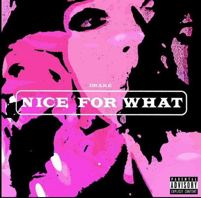
The last two album covers don’t have a deep meaning like the rest, but I have decided to replicate them as they have been edited in a very interesting way. The first cover has had threshold applied to it and had a pink filter applied over every segment of the photo which isn’t solid black. This creates an old school feel, and joined with bright pink creates a connotation of ‘fun’ which matches the song, there isn’t a deeper meaning, it’s just entertaining.
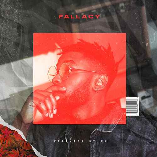
 

This album cover is just about exploring visual effects and using the ones that match the photo and look good. There are multiple exposures in this cover, a photo of the artist, crinkled bed sheets, a classic marshall speaker, and a tilted image of buildings. These help the photo look more full and eliminate any empty space. There is also a semi transparent box around the artist’s head, this highlights him being the most important thing in the photo, as well as strengthening the middle of the photo by differentiating it from the area around it. The bottom-left corner of the photo has been edited so that it appears as if there was a layer of plants behind the photo, the tear between the main image and the plants gives the photo a rough look. The crinkled bed sheets and slight distortion effect helps achieve this image of a torn up and battered album cover.

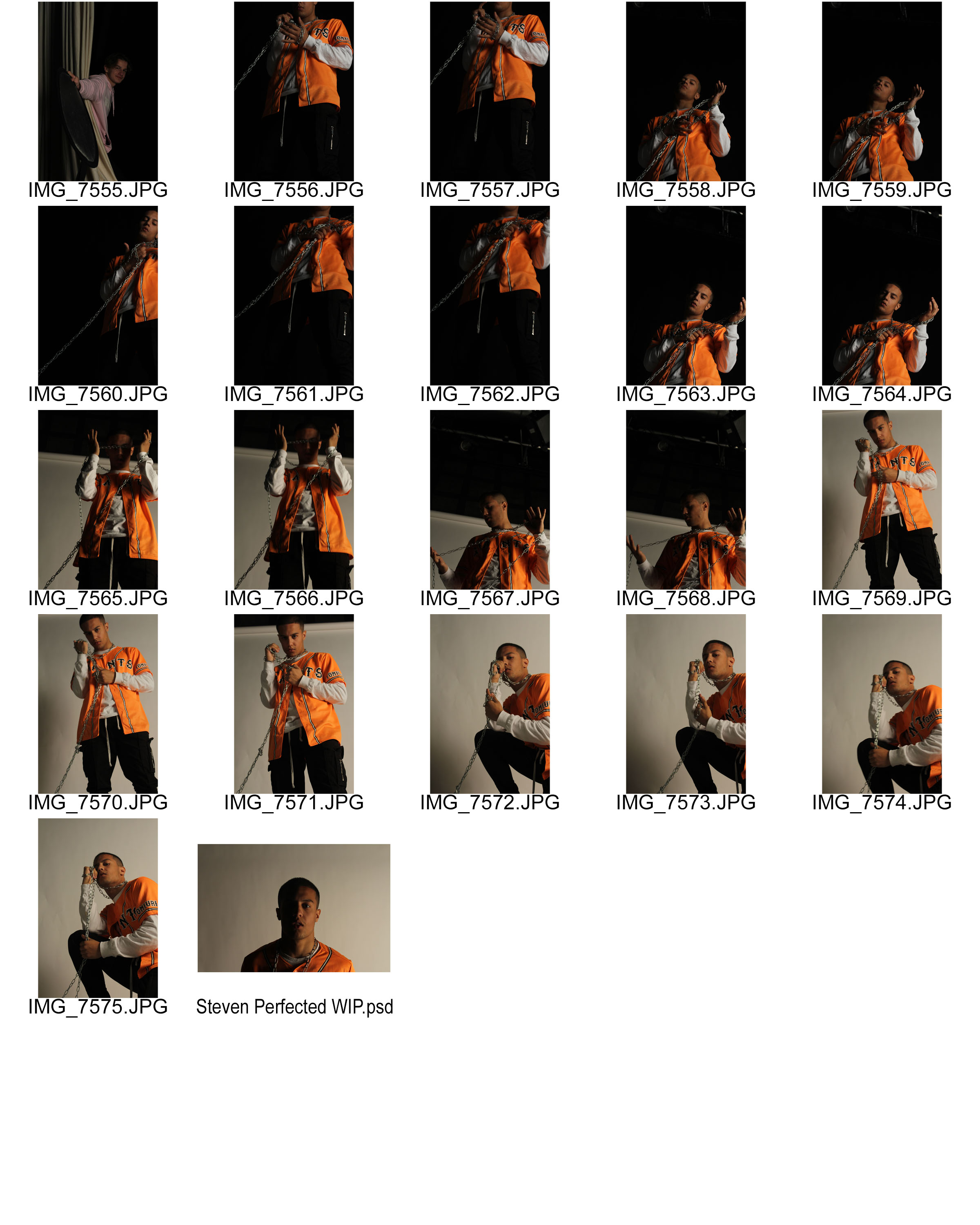
Studio Lighting Experimentation – 1 Point Lighting

For this photo-shoot I primarily experimented using one point lighting in order to create a subtle chiaroscuro effect, I decided to be subtle about this effect as I wanted to have as many options available for editing as possible. With some of the later photos in the shoot i decided to make the effect more evident as i had a set idea for the look of the photos and thus wanted to minimize the amount of unnecessary editing I would have to do afterwards.

My personal favorites of the shoot are:

7564

7571

7544

These are mainly because i like the composition of the images and i like how the lighting complimented the colors in frame. The lighting created a good amount of vibrancy while not leaving the image over saturated. I also like the photo 7542 however i found that the lighting in that image required too much retouching and the edits became very evident.

Tom Hunter, Tableaux Vivant Research

Tableaux Vivant and staged reality is photography that the photographer stages in such a way that it is almost like theater that emphasizes what the photographer wants the story to tell.

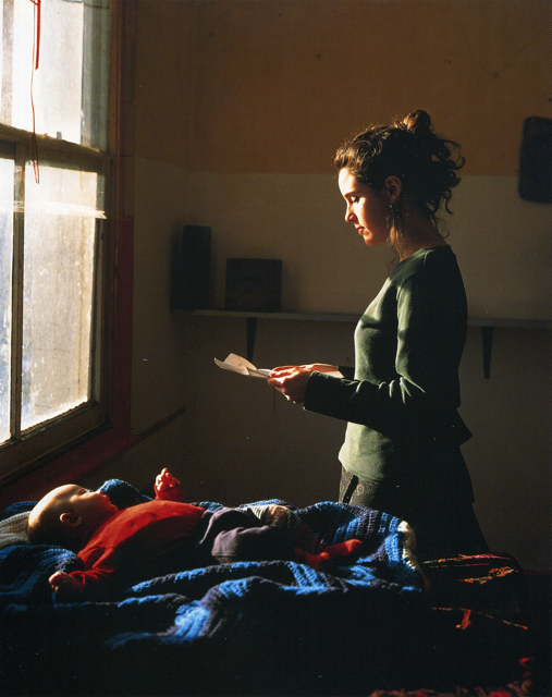
Tom hunter is an English photographer born in Bournemouth in 1965. His work was specialized in documenting life in Hackney. A lot of his images showed the local issues in the area at the time. His images also often referenced other artists work. Quite often he tried to recreate Johannes Vermeer’s work. An example of him doing this would be in his image “Woman Reading a Possession Order” which is shown below:

Woman Reading a Possession Order | Tom Hunter

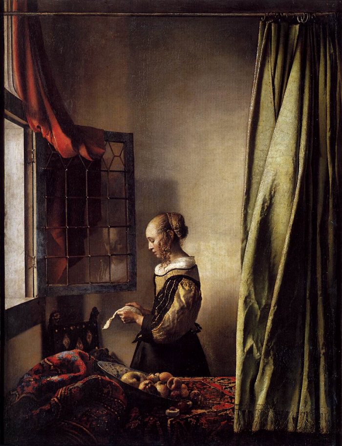
This image is a recreation of a Johannes Vermeer image as shown below:

Girl Reading a Letter at an Open Window | Johannes Vermeer

Contextual/Conceptual: Though, Tom Hunter took inspiration from Johannes Vermeer, he has added his own twist on it by showing a mother with her child reading a letter that says they are going to be evicted from their home. Rather than just a woman reading a letter with little meaning. The use of the child rather than just having a bowl of fruit makes the image look a lot sadder. The baby’s body is contorted in such a way that makes it seem like it knows what is going to happen to its home.

Visual: In the image, Tom Hunter has edited the tone in the image so that the image appears very dark throughout the image with the face appearing very brightly from the light of the window. He may have decided to edit the tone to be dark throughout to display the emotion that the woman would be feeling when reading the letter.

Technical: Tom Hunter seems to have only used natural lighting to create this image. This lighting is coming from the window and illuminates the woman’s face for the most part. Secondly, the image is quite over-exposed. This could have been created by having a long shutter speed. This makes the image seem a lot brighter in the light areas than the dark areas.


“Filipa had just had her first baby. We spent the whole day trying things out: we had a bowl of fruit, then we tried some curtains, then incorporated the baby. The light was perfect, a late winter sun coming through the window, really low, like the northern European light.” – A quote from Tom Hunter about how he came up with the image. From a guardian article:

https://www.theguardian.com/artanddesign/2009/nov/04/photography-tom-hunter-best-shot

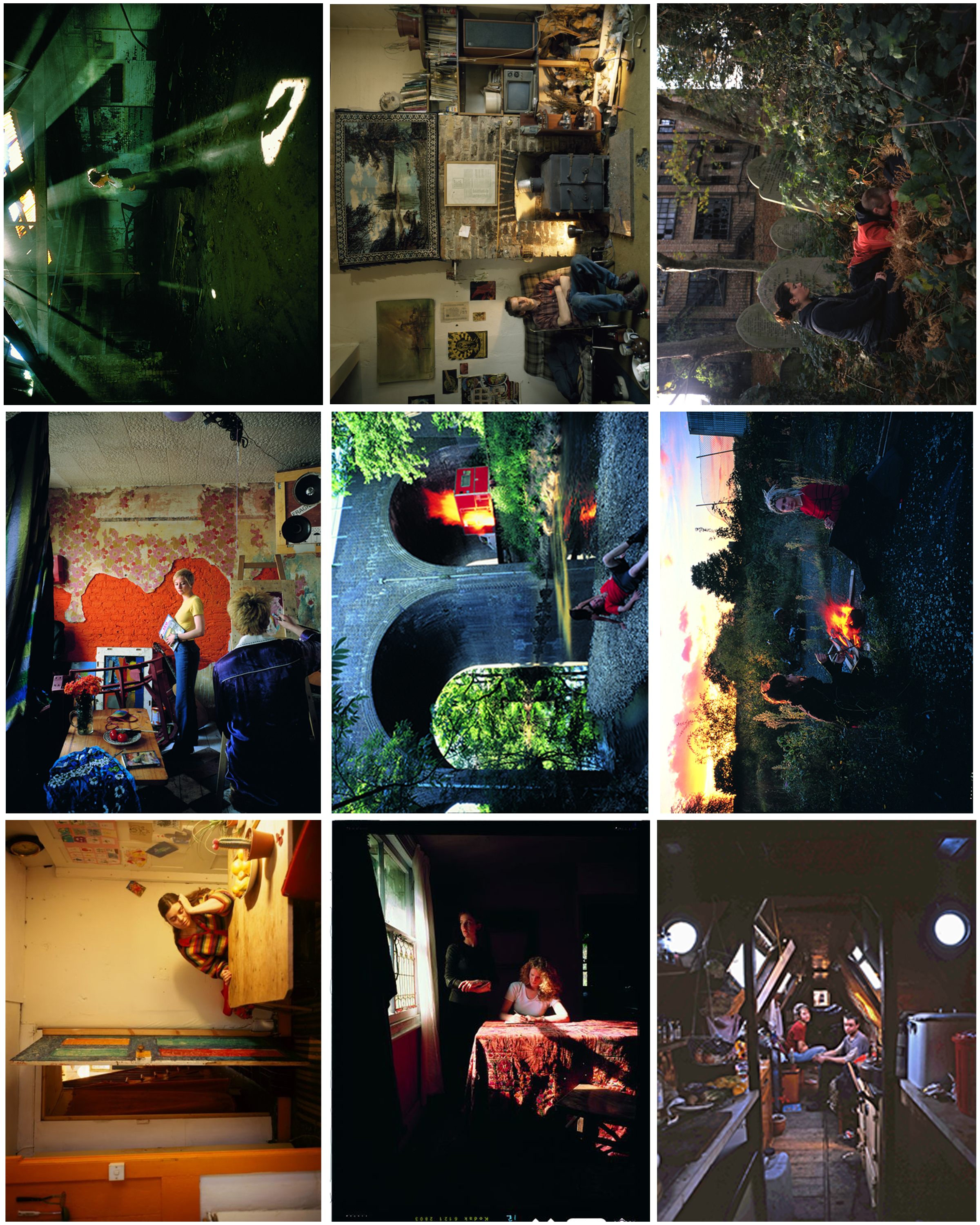
Here is a selection of other Tom Hunter images that I really like and may try to recreate:

I have picked a lot of these as my favorites due to the way Tom Hunter uses lighting and because some of them simply display parts of peoples lives, such as grieving for others.

They are inspired by Vermeer and his use of light. The light can signify various things…such as hope.

Album cover responses

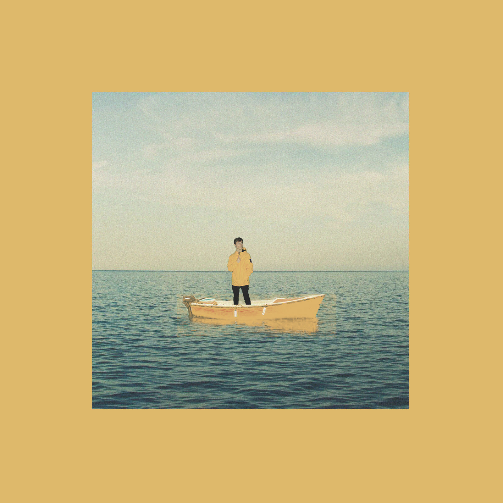
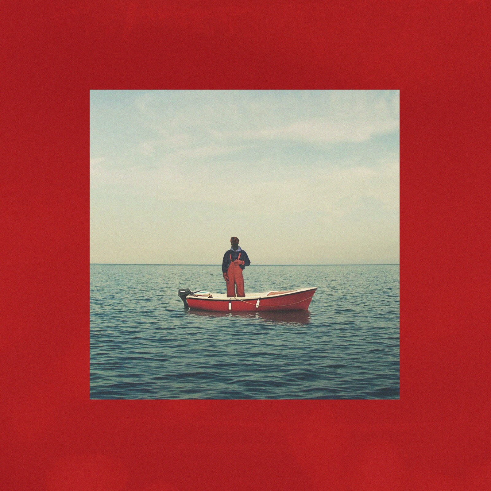
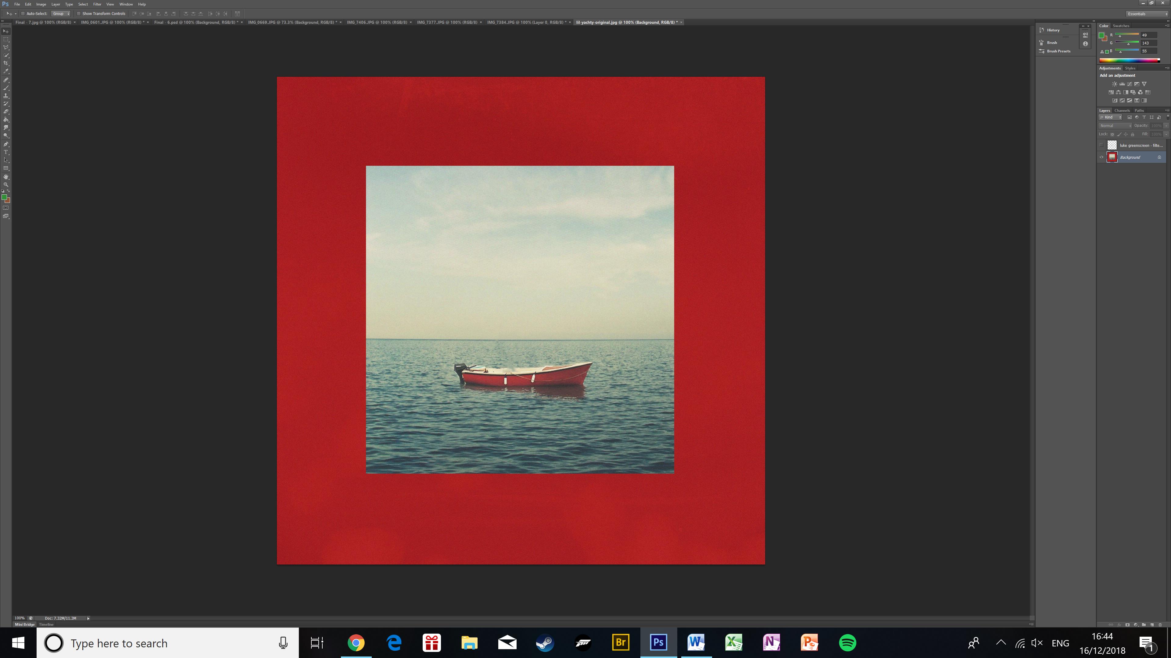
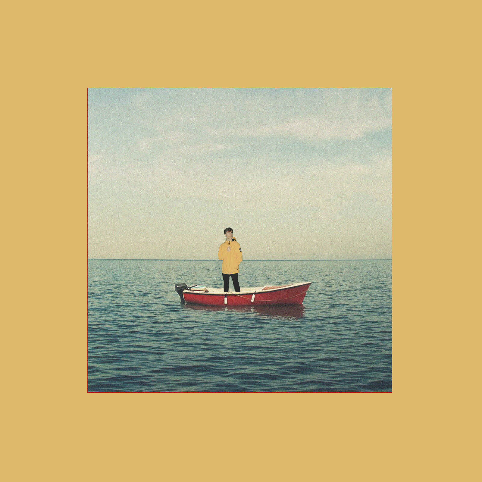
This photo is my recreation of the ‘Lil Boat’ album cover by Lil Yachty. In the original the artist’s clothing, boat, and frame are all very similar shades of red. Whereas in my version all of those elements are yellow, this is because I used a yellow raincoat in the shoot which meant i had to make every previously red element yellow. The original photo was taken in front of a green screen, then edited into the backdrop of the original album cover. I used the content aware brush to remove the artist from the picture and placed a picture of my friend. I used the colour range function to select the boat along with its shadow and change it to yellow. To change the colour of the frame I created a yellow layer the size of the whole cover, then moved it so that it was in front of the original red frame, but behind the image in the centre. I then applied some colour filters to the image of my friend and slightly blurred the edges to make him seem more authentic as part of the photo.

This is what the original cover looked like.
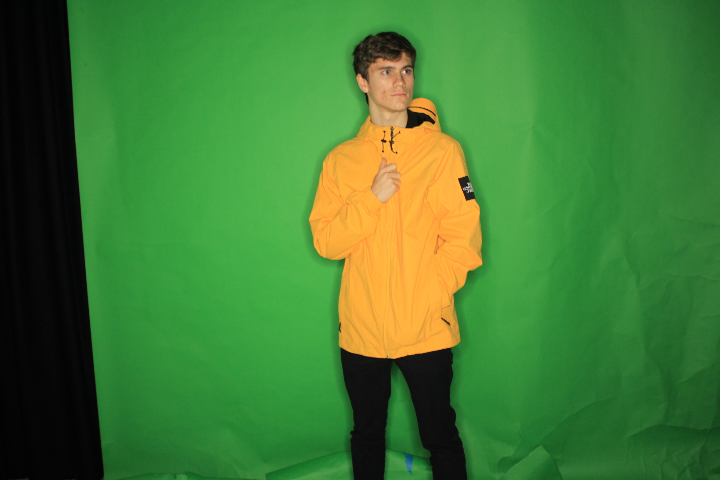
The green screen in the background is a bit creased towards the bottom, but luckily there is a lot of contrast between it and the trousers so it was easy to edit out the background.
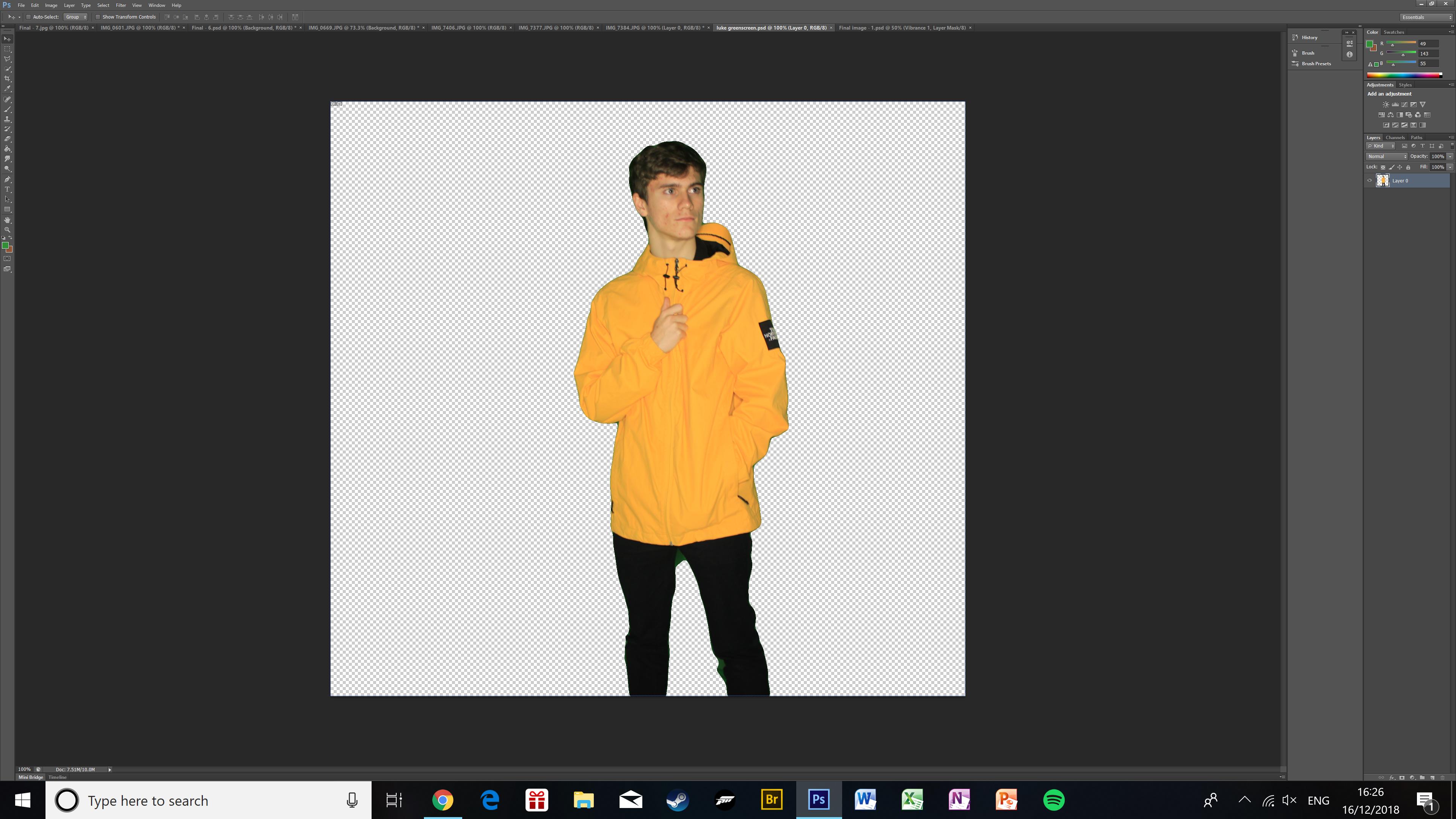
This is the photo of my friend after I had removed the green screen, this is before any colour correction or editing was done so it there is a feint green outline and some green reflections.
This is the original album cover with the artist removed from where he was standing on the boat. I left his shadow in the water is it was easier to give it a yellow tint instead of erasing it all together and replacing it with a feint image of my friend.
This is the album cover with my friend placed in.
Here the frame has been coloured yellow, I used the eye drop tool to match the colour of it to the coat, this makes the photo more relaxing to look at because there is less variety of tones.

This is my take on the ‘starboy’ album cover. I had to change the colours as the blue colour scheme wouldn’t work as well as in the original because of my friend’s ethnicity. I also had to change the positioning of his hands because he has a different hairstyle and colour to the artist. If his hands were in the same pose they would stand out a lot more against his hair; which wouldn’t have the same effect. Also, due to his hair being longer his fingers would be covered up by his hair if he slid them up his head; which would also be less effective than the original album cover.
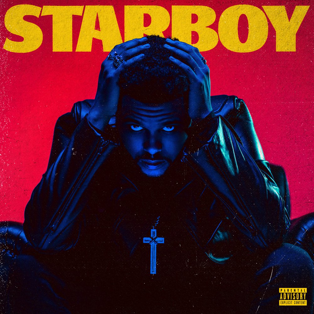
The original album cover, it has a much different colour scheme to my version, but these colours work well only in the original because of the artist’s and my model’s ethnicity. The theme of blue-lit black is possible here due to his dark skin tone. There is also a parental advisory tag in the bottom right due to the contents of the album, I didn’t include this in my version because I had already used that tag in previous covers in this project and i didn’t want to repeatedly use them.
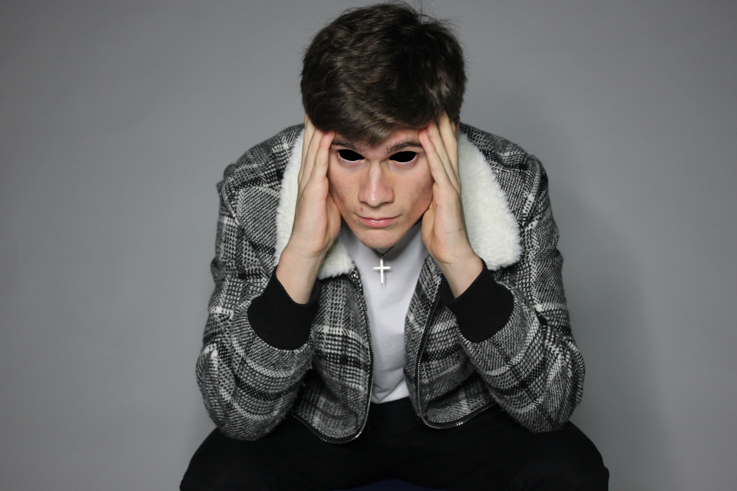
This is a work-in-progress edit of the photo which I decided to abandon because it looked too __ and didn’t fit the theme of the cover. My idea behind it was to make everything light colours apart from the eyes and cross (this is the opposite of what they did in the original album cover; everything dark apart from eyes and cross), I edited the eyes first and realised that the idea didn’t really work out so I didn’t bother editing the rest of it.
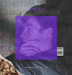
 

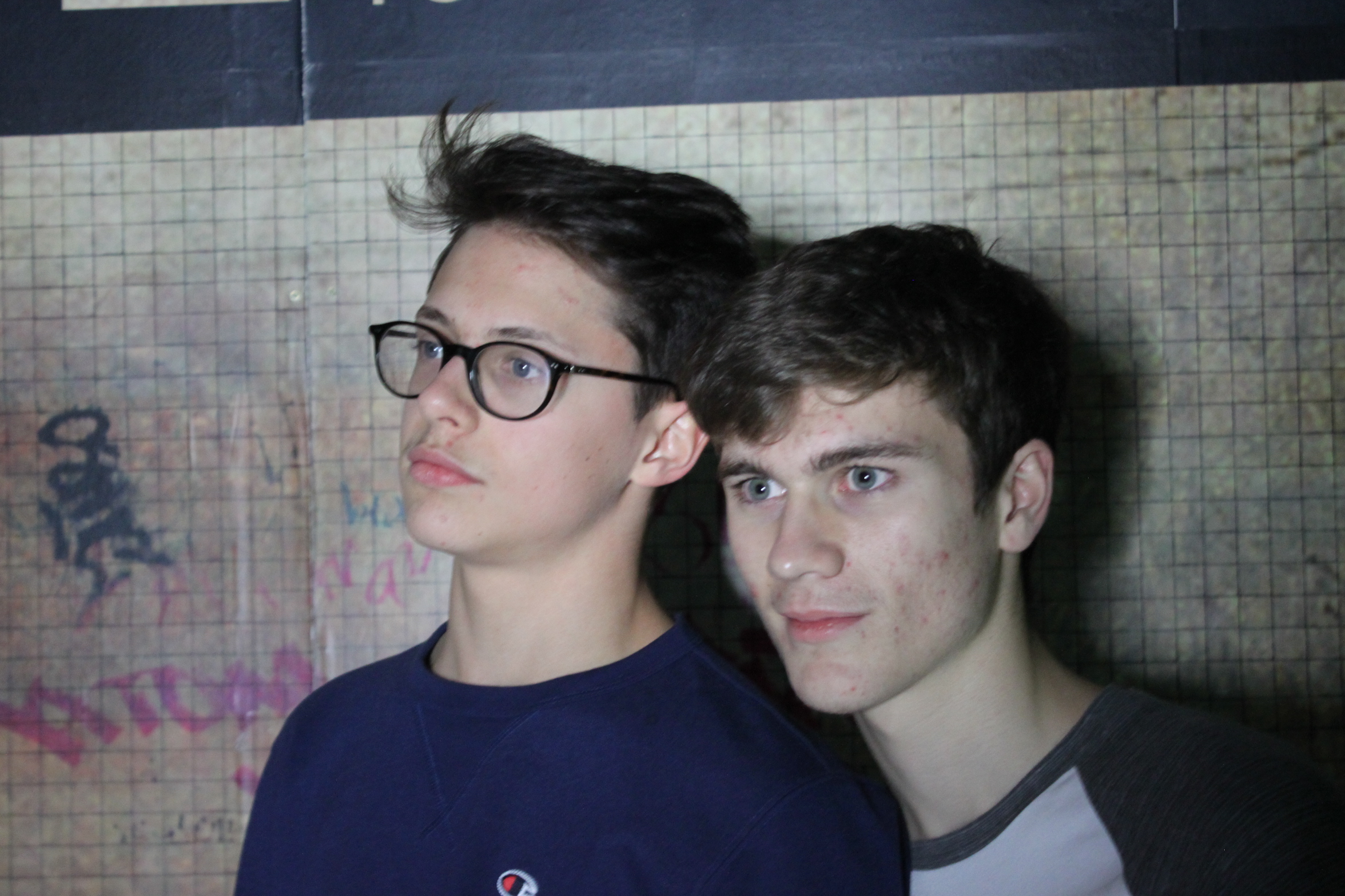
This is my take on the cover of ‘Falacy’ By Raheem Bakare. I have kept the basic composition very similar. However, I have changed around the angles, colours, and used different layers in the photo. I changed the overlays to purple as it complements the brighter skin tone more than red. I have overlayed images of crumpled paper, sound amplifiers, and strip lights, and there is a torn corner with autumn leaves behind it. I also took the photos in front of a subway background to match the urban look of the original cover.

This is the original album cover for ‘Fallacy’. It has a lot of layers placed on top of each other; which fills in the empty space which the main photo would otherwise have. There are plenty gray/dull coloured layers and red elements to highlight the artist’s head, title of the album, as well as leaves in the bottom left corner.
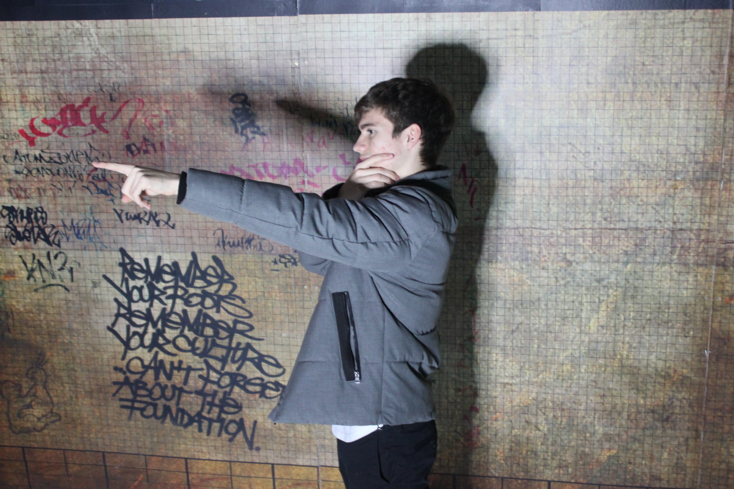
This is the original photo, it doesn’t have the same effect as the finished product as there is too much empty space in the background, the person is standing in the middle, in addition to there only being one layer present, which is the photo itself.

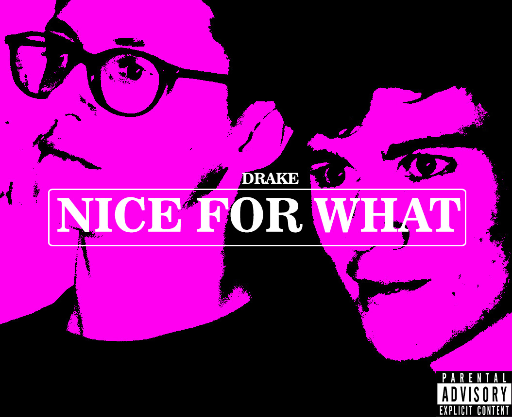
This is my recreation of the ‘Nice For What’ cover by Drake, I posterized it to create blocks of light/dark. I then applied a pink colour block to all the white areas of the photo to match the original again. However, I applied a much darker shade of pink to make the cover pop more as a whole, it also makes the writing in front of it easier to read.  I then cropped the photo to show a close up of two faces like the original cover. The writing is in two different fonts, with a lot of spacing added between the letters so that they fill out more of the box and appear more bold. The final step was adding the parental advisory stamp in the bottom right corner to match the original.

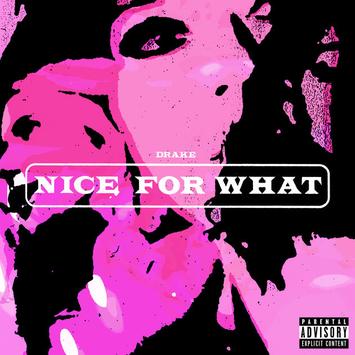
This is the original ‘Nice For What’ album cover, it’s edited so that you can’t really tell what’s going on but it’s possible to make out the main shapes and the title in the middle.


This is the original photo, I chose to take it in front an urban background in hope to achieve some distortion in the background after I applied the filters.
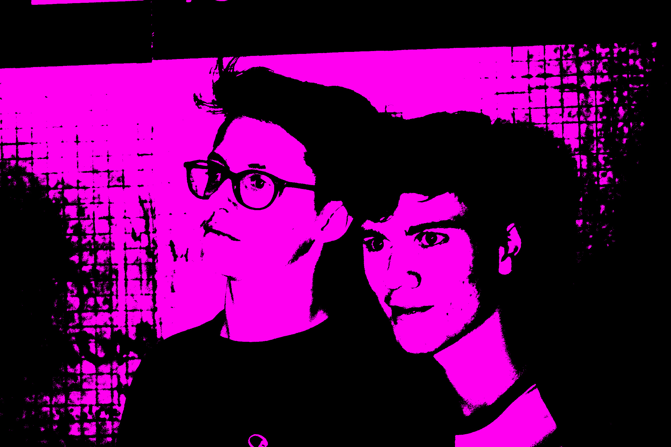
This is the image after I had edited it, but before cropping and adding and lettering. As you can see there is distortion in the background due to its texture, however its only present around the outer edges, so it wasn’t visible in the final cover after I had cropped it.