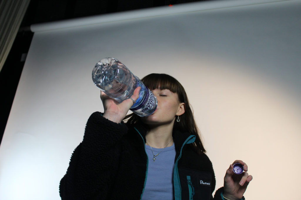
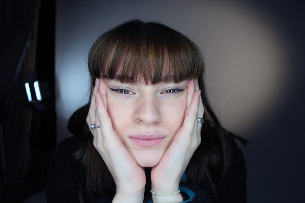
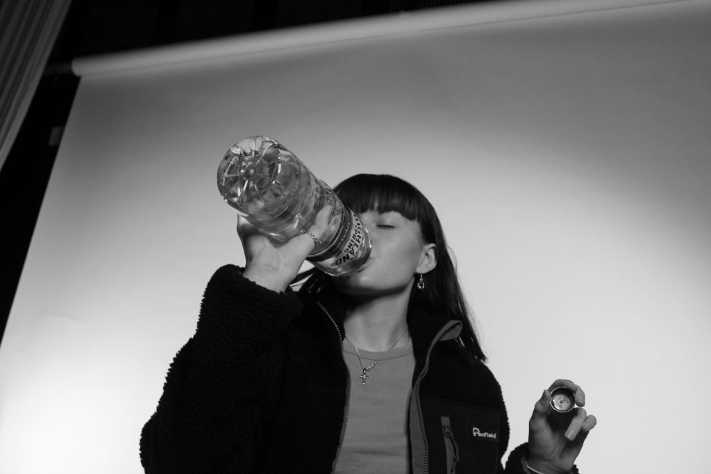
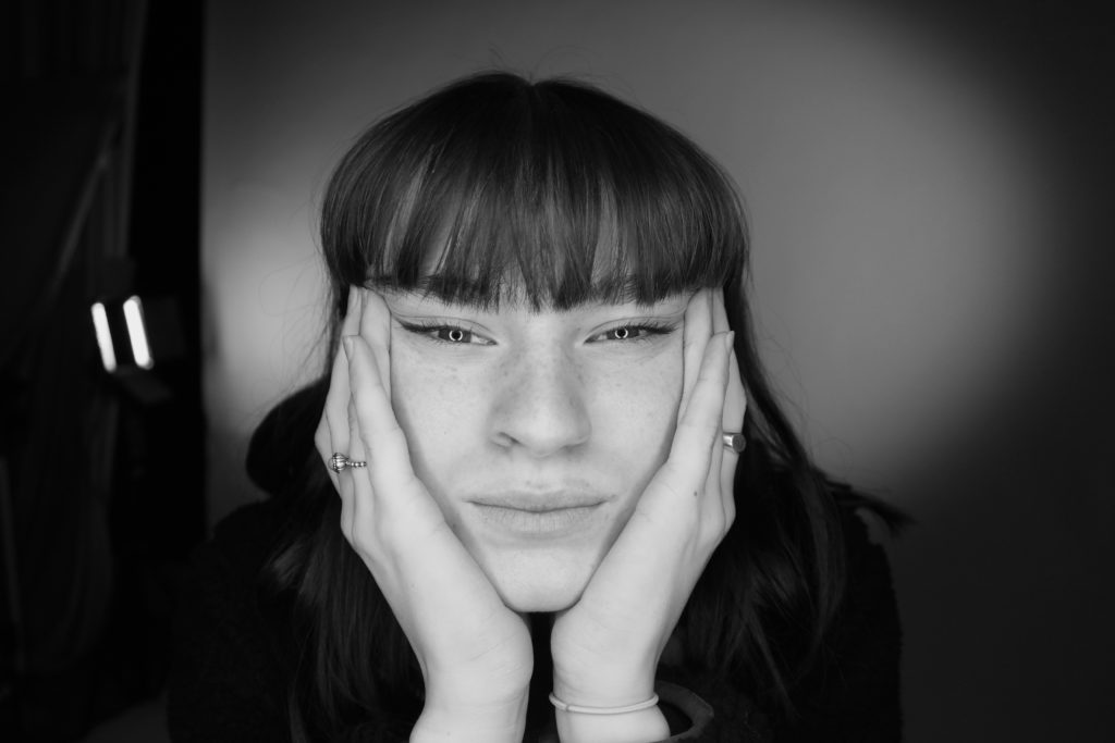
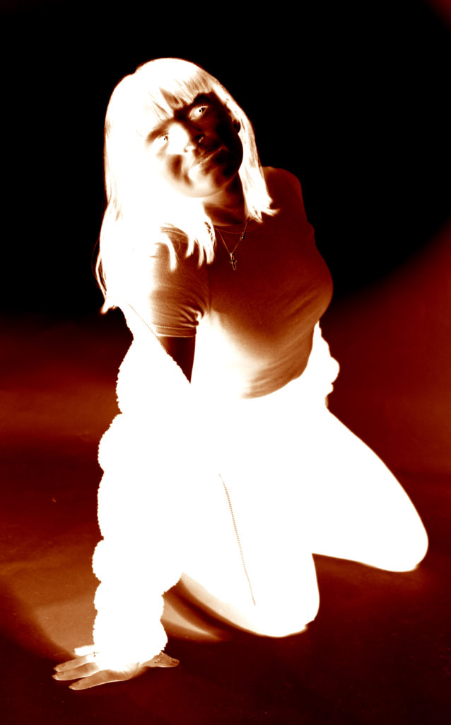
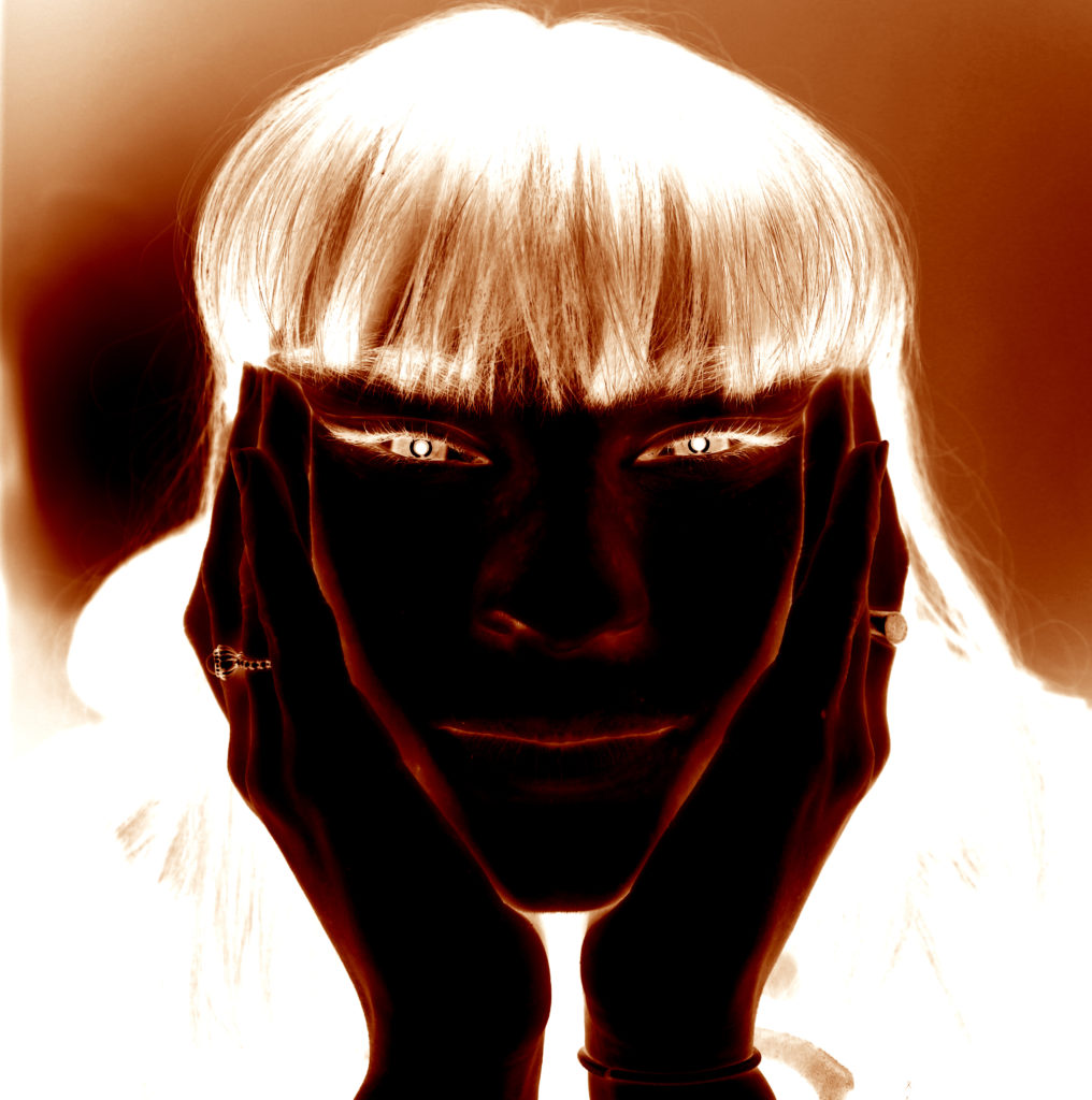
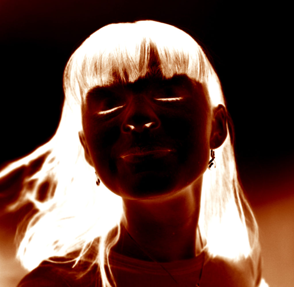


Julia Margaret Cameron was a photographer in the Victorian era. And she was special because she was one of the only female photographers back in her time and everyone was interested in her, she used her family and sibling for her photography .Her photographs focused on both religious and literally work.
Peter Henry Emerson was famous for his book that he wrote and his photographs that had a lot of realism in them and color.
A lot of groups of photographers arised in that time for example The Vienna Camera Club which was mostly on female nudes which raised a lot of concerns and questioned because now a days sexism is not much of a thing any more and females have more rights because the world became more modern, while in the old days specially examples like The Vienna Camera Club you can see how the females bodies where objectivide and that was a normal thing
the pictorialist where a group of photographers around the world which created photographs which had a lot of symbolism in them which where objects in a photograph that meant another thing most of the time about religious or literal stuff
Walker Evans was a documentary photographer that rejected Pictoralisim by photographing farmers or low class people and families and there houses to deliver a message to the people
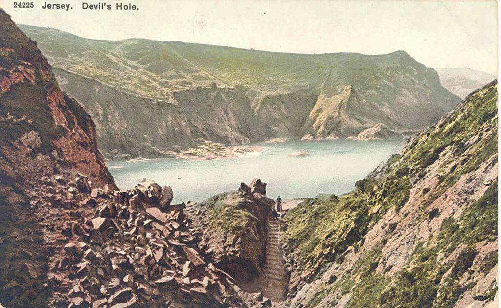
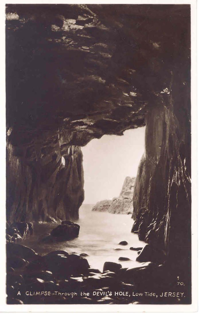
I have looked into using some archival material for my photo-book, exploring the Jersey archives I have found that the Dolmens I have visited were badly excavated int the 19th century and do not have good recorded documents of the sights so I will be unable to use them. Devil’s Hole however was and still is a tourism sight and had made a lot of news around them so there were a lot of postcards on it I have chosen the ones I did specifically as one matches a picture I have myself and the other I feel works well as the entrance of a story.
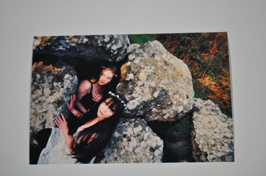
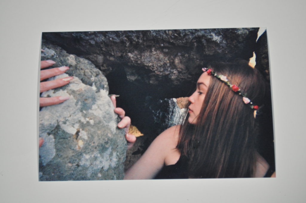
While out at the Dolmens I brought with me a disposable camera as an extra piece of equipment to take my photographs on. Using this camera meant that I would not be able to see the outcome of the photographs until I got them developed which was tricky for me as I had one chance with each photograph as I couldn’t delete any and try again.
Over the course of the photoshoot as I used my regular camera I took photographs on the disposable one to have my photographs with a different effect and look.


Some photographs I found that did not work on the digital camera worked better and became useful outcomes on the physical photographs which I will go onto attempt to use in my photo-book, I found some photographs did not work at all which I will not continue to attempt to use however these outcomes from the shooting on the disposable camera were more successful than I first thought they were going to be as I could not see the photographs until they were printed. I plan to make some of them digital copies to use.




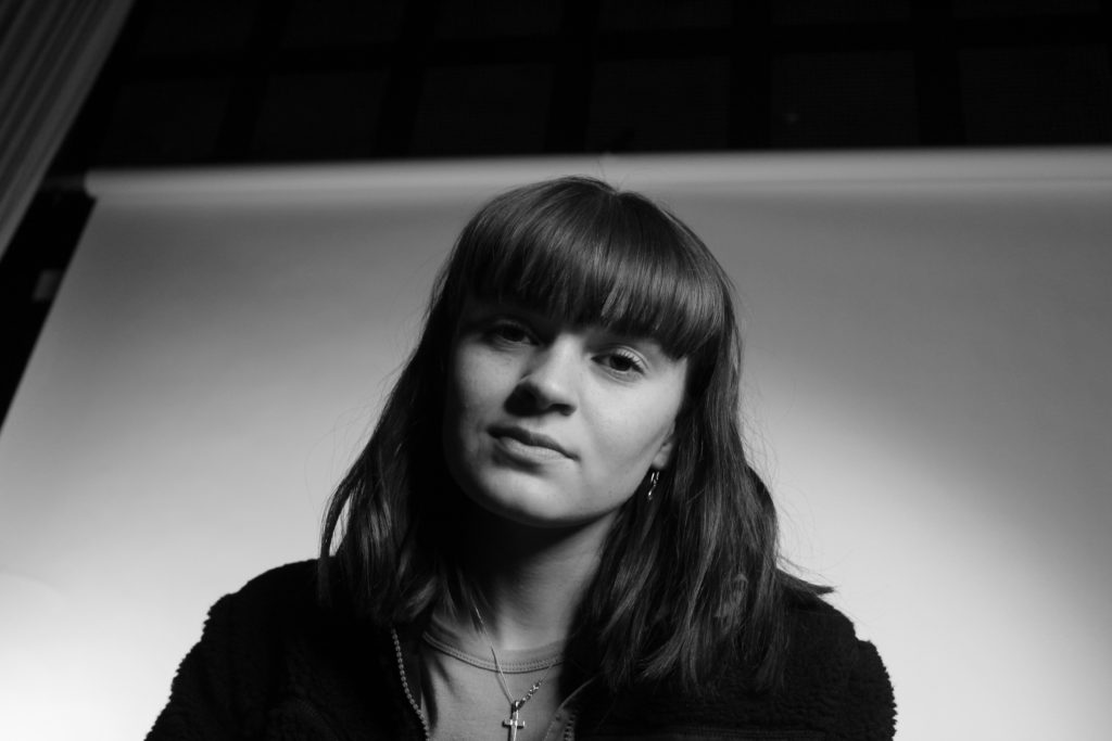
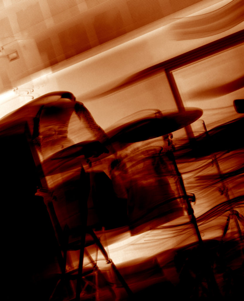
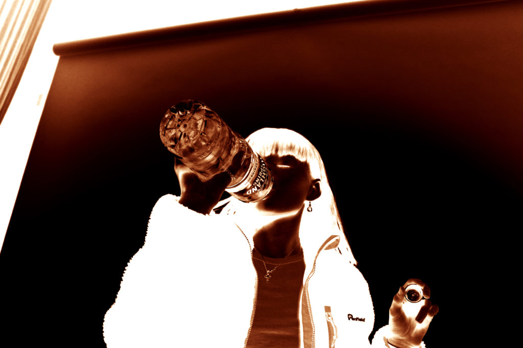
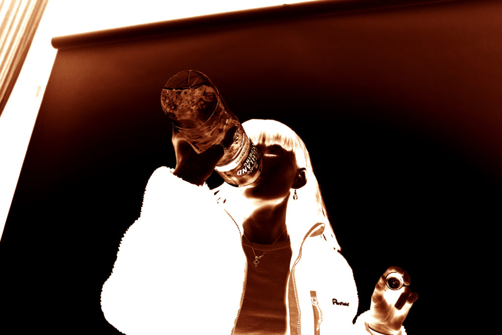
My third photo-shoot will be focusing on the hidden aspect of gender identity that are often not spoken about. I will be focusing on the issues of women who do not want to present as feminine, and yet are forced to by society, as well as men who struggle to show their more feminine aspects without being shamed by society and historical gender norms. In order to do this, I will be focusing on more metaphorical imagery, using portraits and images of objects to do so, as I will be exploring the problems and consequences people face when they try to express themselves in a way they don’t want to/feel forced to.
Below I have included a mind-map of some ideas for this third photo-shoot:
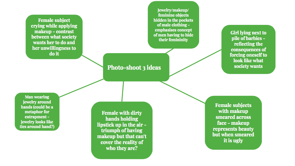
For my third photo-shoot, I will be focusing more on the physical objects that can be associated with gender, and will be contrasting these with each other in the photograph. As the focus of my project is on breaking gender stereotypes (liberation of gender) and showing the truth behind peoples identities and the way they express themselves through gender, I will be focusing on creating images that encapsulate stereotypical gender roles and stereotypes, with small twists within the image that allow the viewer to realise that the image is not what it seems (specifically, that the stereotypes they link to the objects may not always be accurate. For this photoshoot I will be focusing on feminine objects, such as makeup and jewellery, and will be intertwining the idea that both women and men can suffer when it comes to expressing femininity, to create a contrast. This photo-shoot will be focused more on the hints to the viewer that some people express their identity in less stereotypical way, and that there are often social consequences for those who do this.
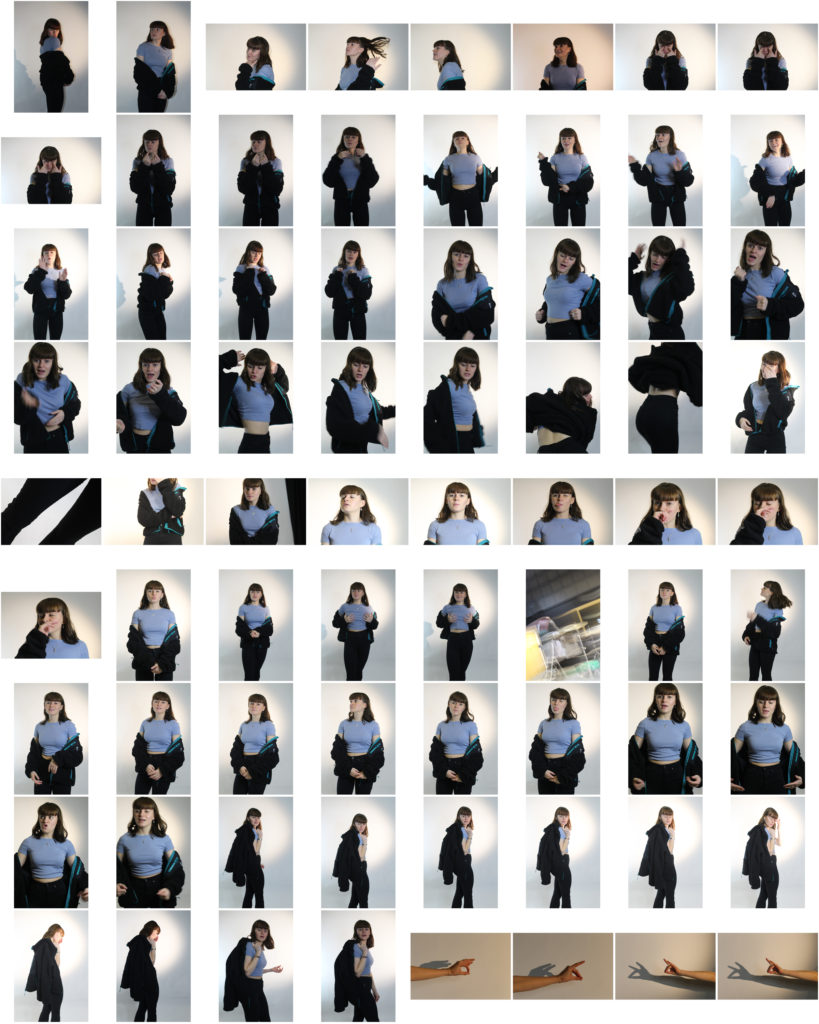
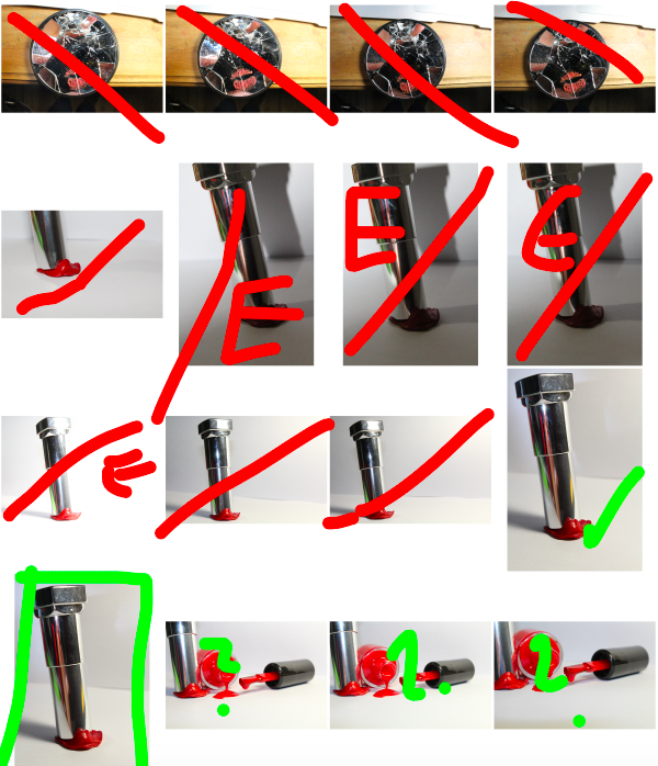
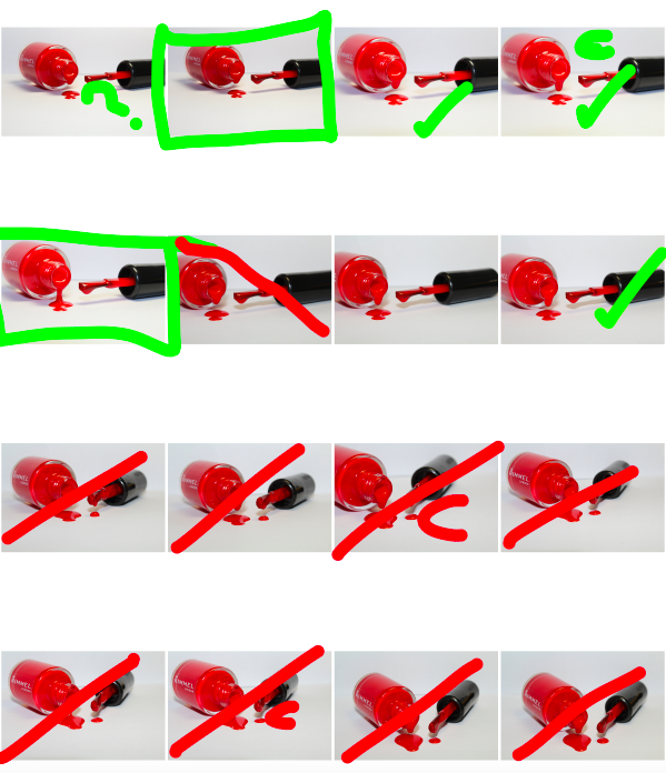
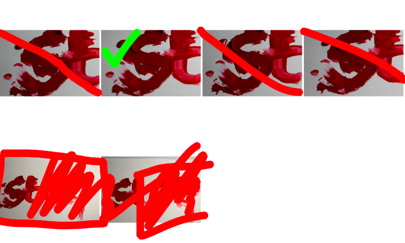
Below are the contact-sheets for my photo-shoot, I have indicated my decision making process using the brush tool:
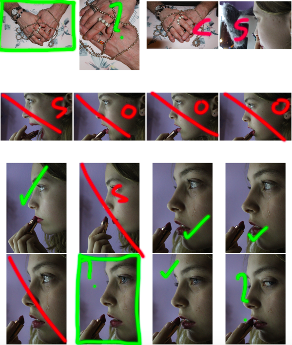
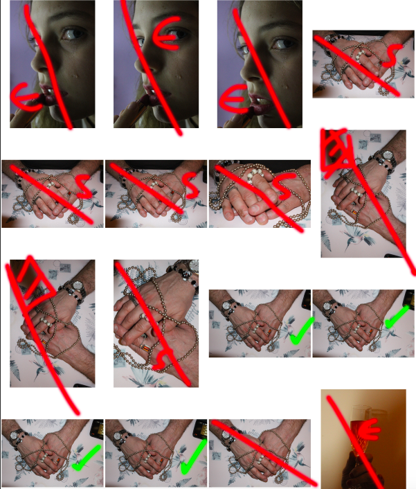
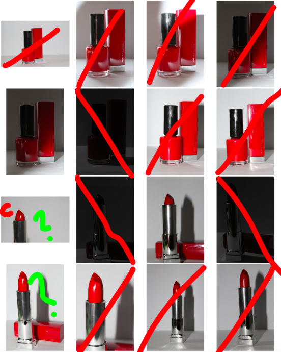
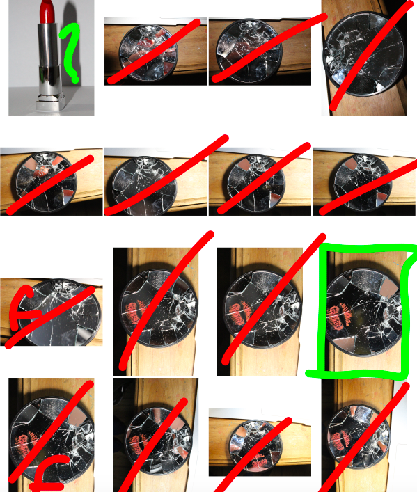
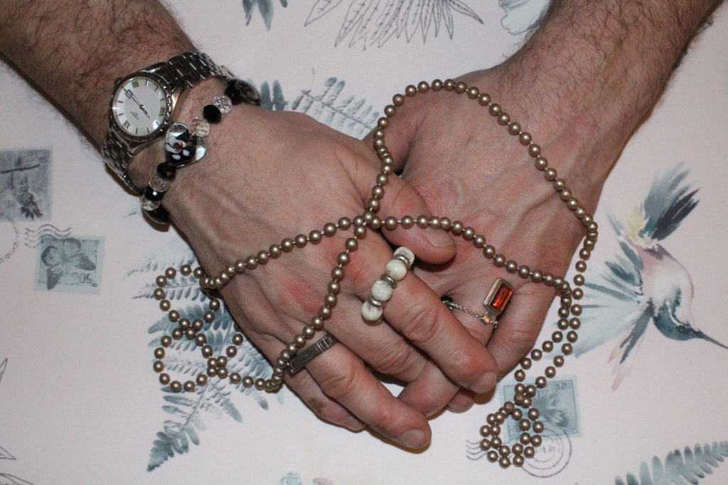
For my first image, I wanted to separate the image itself from the background in order to replace the background with a simple black background (as I felt this would draw maximum attention to the image and details in the foreground). To do this, I used the lasso tool to highlight the areas of the background, and deleted it from the layer. I then went around the edges of the image with a 0% hardness eraser tool in order to soften the boarders so that it would blend more realistically with the black background.
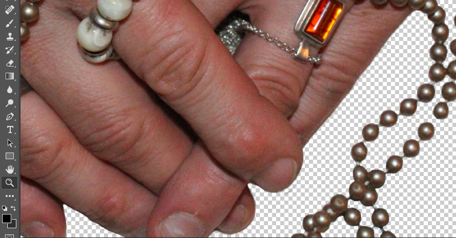
I then added a black background to the image to make the foreground image stand out more and draw maximum attention:
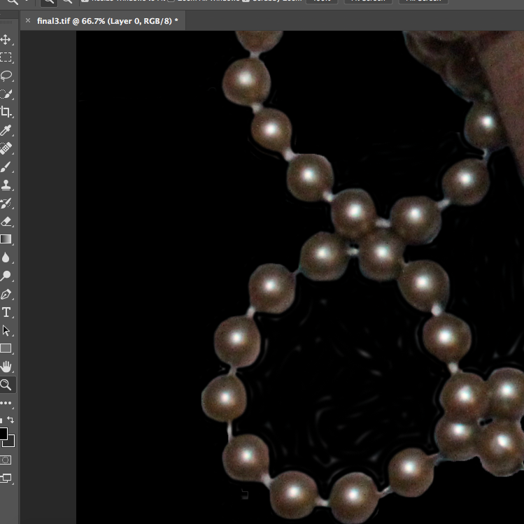
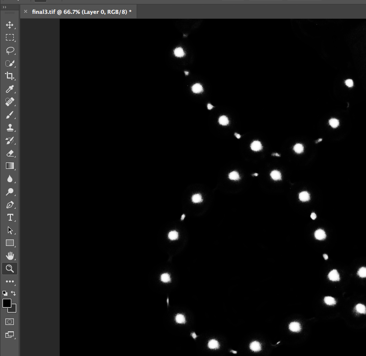
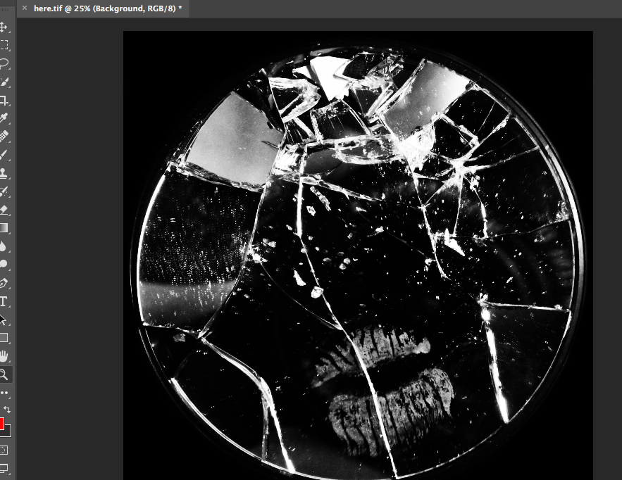
I decided to focus on the contrast of the shades, textures and shapes of the image, and therefore decided to make the image black and white, and raise the contrast substantially in order to emphasise these contrasting aspects:
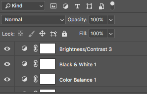
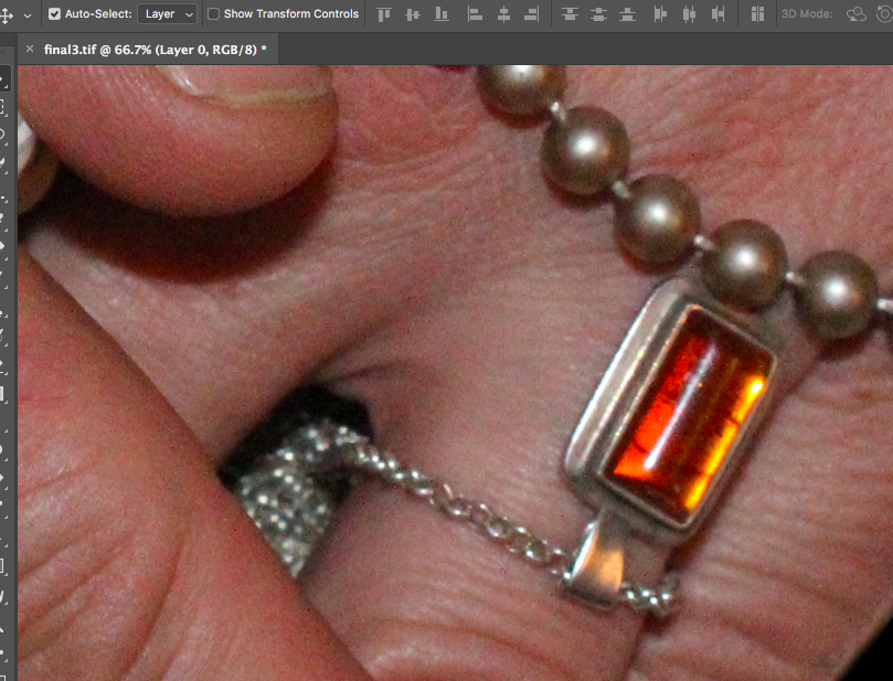
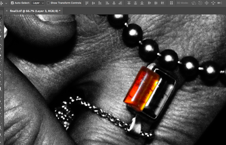
I decided that for this image, I wanted to highlight a certain area of colour in order to draw the viewers attention to the image, and to provide a small amount of contrast in the image which would draw attention to the jewellery that the subject was wearing (by highlighting the colour of the stone, the viewer can more easily focus on the jewellery itself, rather than looking at the whole image as a flat continuous image). To to this, I copied the original coloured image, and copied the stone using the lasso tool. I then pasted that over the top of the black and white image, and smoothed out the edges:
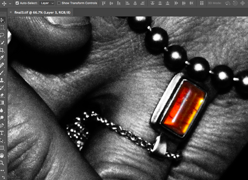
The final image can be seen below:
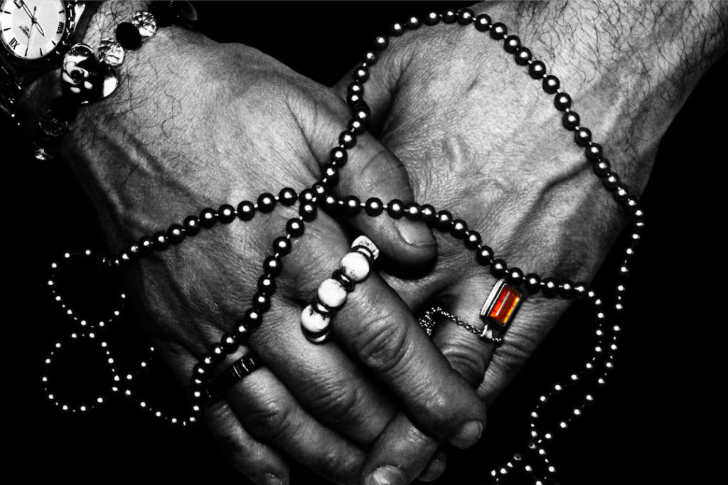
I used the same sort of editing process for the other final images in my photo-shoot. I increased the contrast of many of my photos, (especially if the image was going to be turned monochrome in order to increase contrast between shapes).
Below are my final images for this photo-shoot:
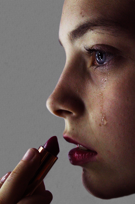

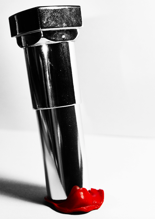
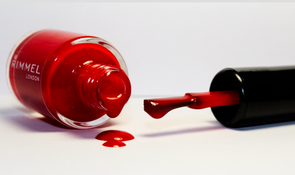
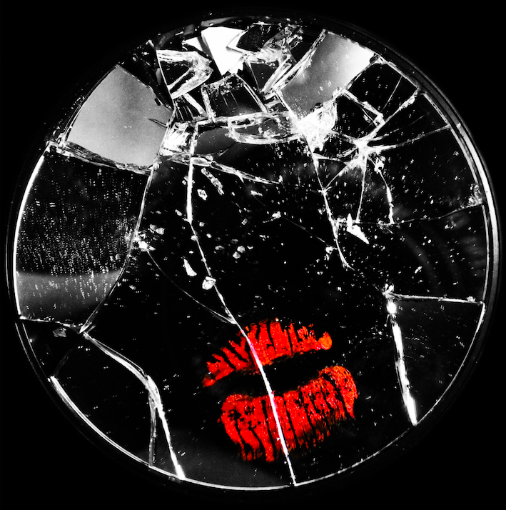
for the below image, I used the lasso tool to cut the lip mark out of the original layer and paste it onto asseverate later. I then made the first layer monochrome and increased the colour contrast of the lips to make them stand out from the background. I also cut the mirror from the background and replaced the table background with all black to force the viewer to focus on the image in the foreground:

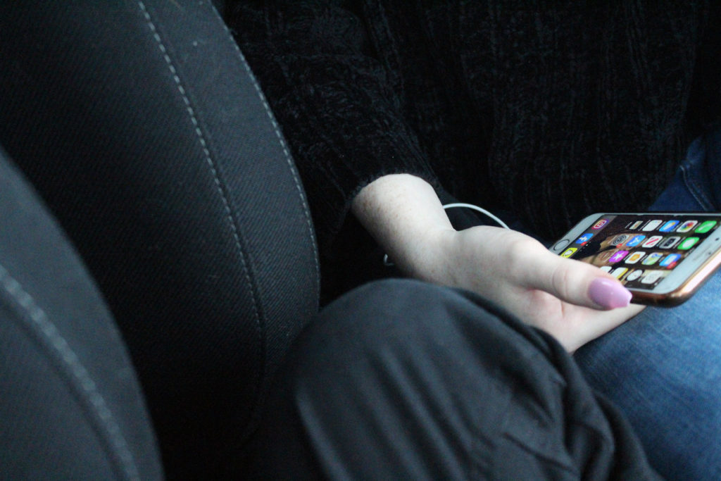
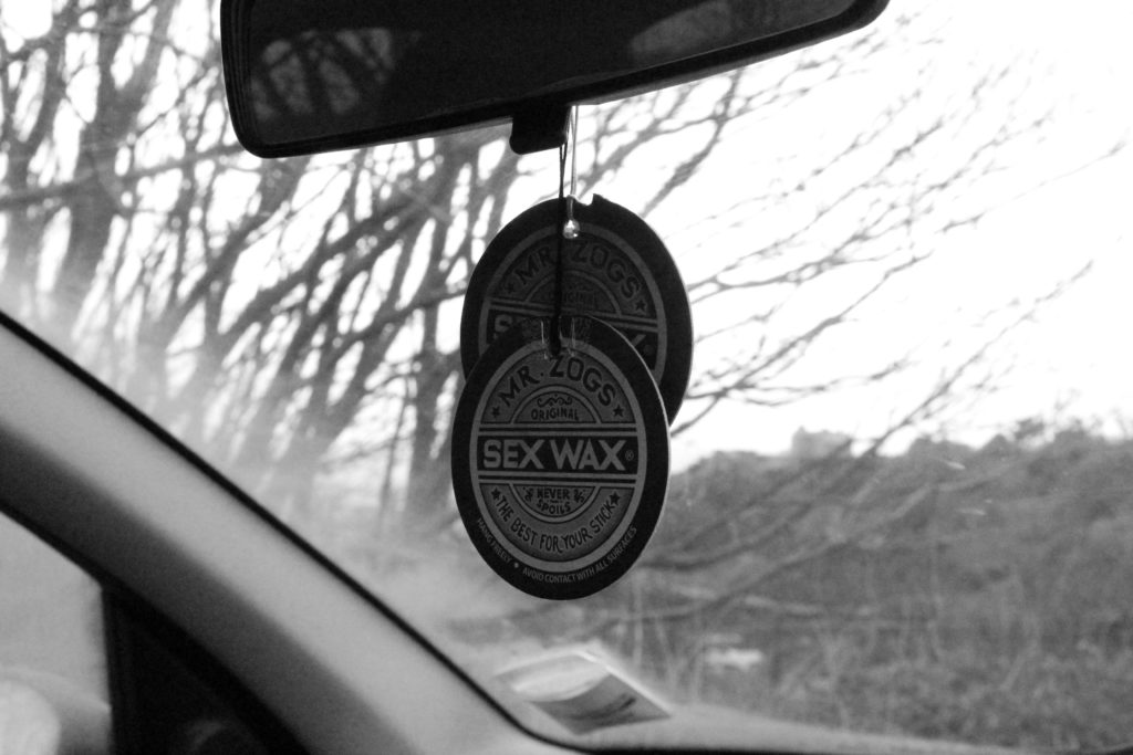
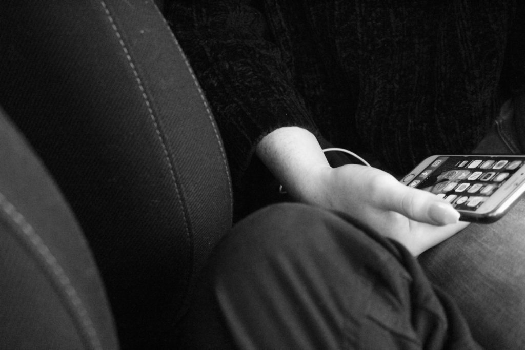
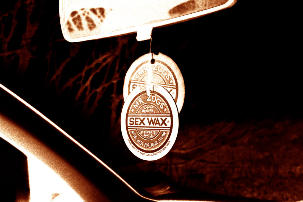
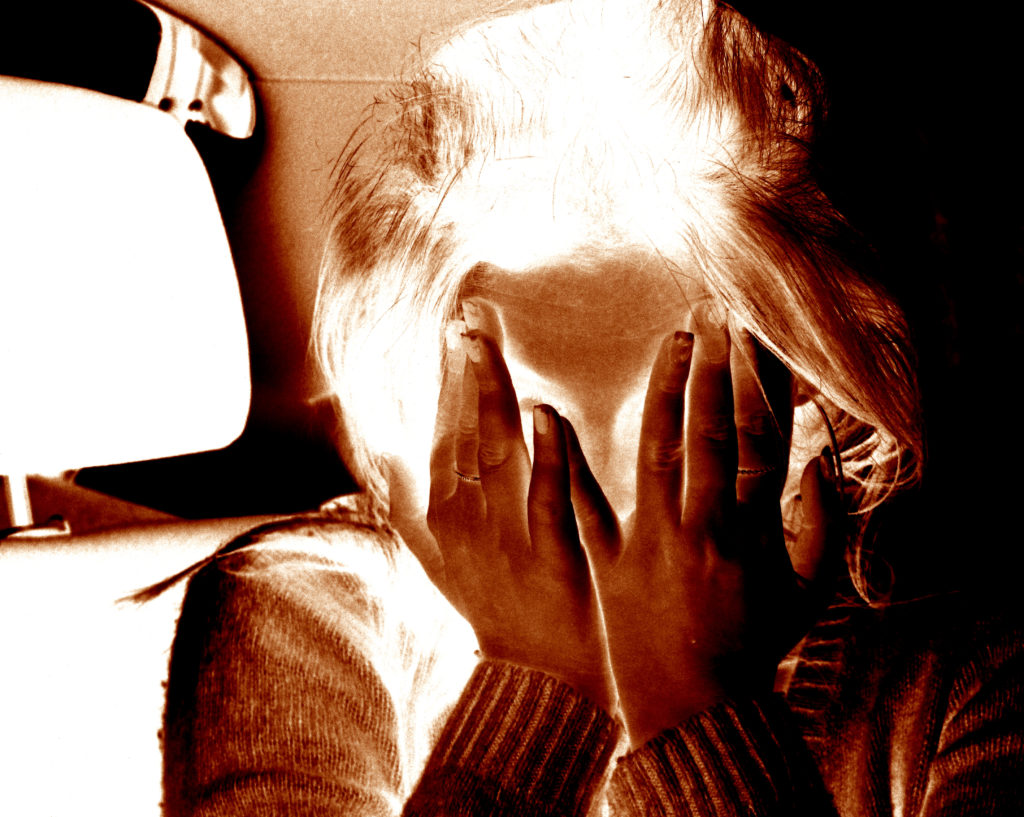
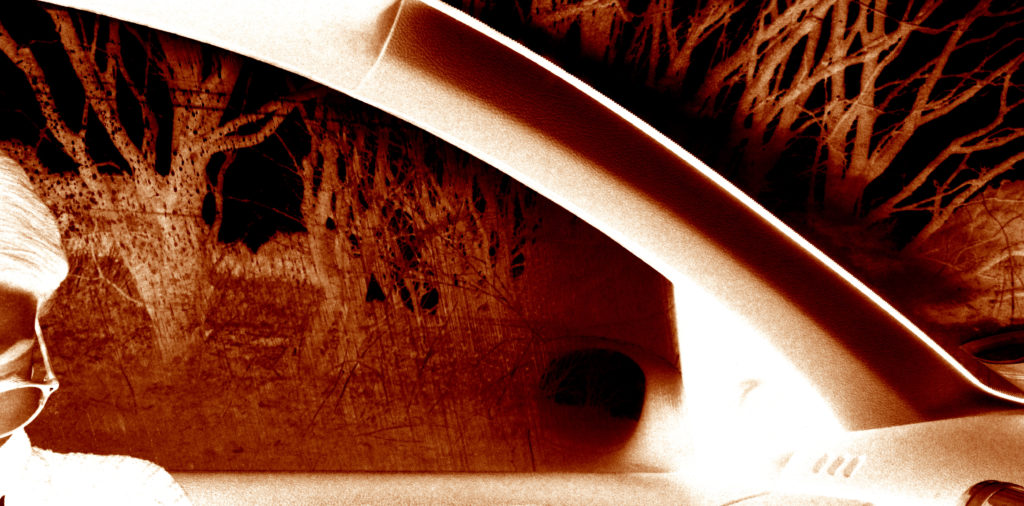
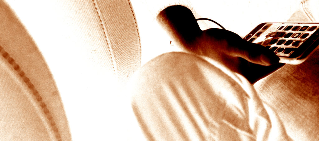

Narrative:What is your story?
Describe in:
Design: Consider the following
Plan:
In order to add more context to my personal study I wanted to make sure to capture landscapes on the island my parents are originally from. While on holiday, I will be taking images in both villages that my parents are from as I think my photobook would benefit from having a few landscapes, to separate the portraiture, and archival images. I want to take images at different points of the day, and the weather will most likely vary slightly meaning I will be using different camera settings depending on what the scene is like.
Lightroom selection:

Editing my best images:

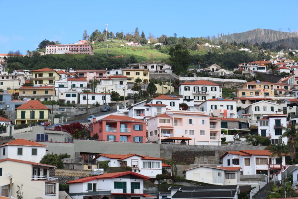
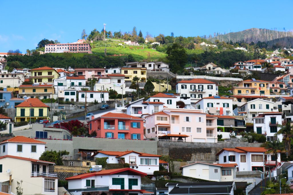
This image was taken just as I was driving out of the airport into the main city, and has no particular symbolic role. I chose this image as one of my best, because I like how to looks messy, yet very aesthetically pleasing at the same time. On one hand, there is nothing particular organised about the photo, however I think that all the bright colours help the image look quite appealing, and helps draw in attention.
These next few images were taken while I was visiting my dad’s hometown, Porto da Cruz. It is a fairly small municipality with a population of around 2,000 people located at the north-eastern part of the island.


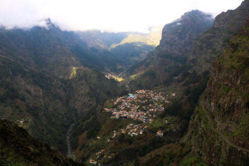
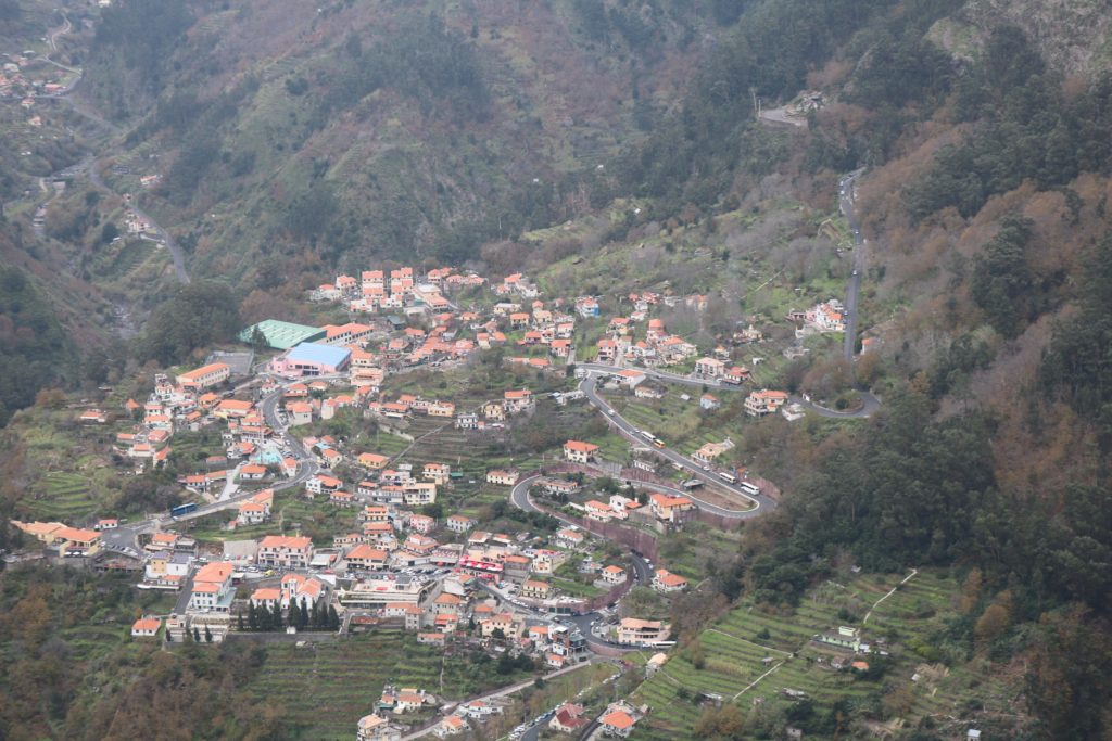
These last images show Curral Das Freiras, where my mother and her family is from. This is a little secluded village in the heart of the island with a population of around 2,000 people. named Valley of the nuns as it was a refuge to 16th century nuns during times where pirates frequently attacked the island. As you’ll be able to see from the images below, the village is surrounded by cliffs and peaks making it quite secluded from other areas of the island. These images were all taken from a particular viewpoint, Eira Do Serrado, which stands at an elevation of 1.096m allowing the entire village to be seen.





Evaluation:
I think overall I was able to capture a few successful images depicting both important parts of the island. However, I think I should have experimented more by photographing a few more different areas as most of my images are taken from the same places.