Category Archives: AO2 Explore Ideas

Filters

Author:
Category:

Identity + Place

Mock January – Identity and Place

Identity –

The fact of being who or what a person or thing is.

Identity can be based on multiple factors. The person someone is today might not be what that person is tomorrow, we adapt and portray ourselves as how we want to be seen and it usually demonstrates aspects of who we are. For examples Identity can reflect on your upbringing, being religious, non religious, being foreign to being born within Europe, culture, family, hobbies, friends and life style choices, even your own appearance can reflect or be used to make you stick out from a crowd weather this being someones features or not its still there.  Regarding to the other theme of place. this can be seen as, what makes this place relatable to you as a person. The environment and colors also come into consideration, the questions asked when having a scenario places within the lines of identity means it has to voice what the model cannot speak in a photograph.

The model I have chosen is my brother, it links well with identity as its someone who I am close with and interact with on day to day basis. After having thought of quite a few different places to set my images out on I presumed that doing something related to sports would be quite a good idea. This to me struck like a good idea as part of his identity i.e. personality is the fact he is good at sports so I have based some of my experiments on places where you’d usually find an activity being performed .

Different types of Identity:

  • Social identity – The portion of an individual’s self concept derived from perceived membership in a relevant social group.
  • Cultural identity-  The feeling of belonging to a group, and culture is all the aspects that represents this individual for who they are and their background.
  • Geographical Identity – an individual’s sense of attachment to a region/country which they live in that also presents part of their personality and nationality
  • lack/Loss Identity- personal psychological conflict that involves confusion about ones role in society or the sense of loss in community.
  • Gender Identity-  a person’s perception of their own or other people’s roles based on their gender

Mood Board –
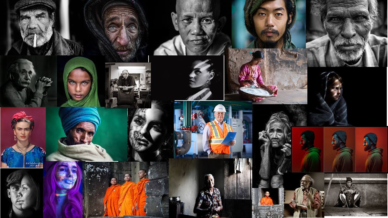
Action Plan:
  • who? Leandro
  • Where? Sports field
  • When? During the day- after schools- weekends
  • How?  Get pictures of my brother whilst he’s a at training or get him to go and kick a ball in a filed and get the images then

My idea is that ill capture my images, before, during and after the game and in general capture home life and how he dreams and thinks about football all the time .This being said i want the images to be presented as a story of the day in the life of someone who plays football.  However my images aren’t just going to be portrait based, i will include images like the football, the equipment, water bottle. For this idea i have chosen to look at a sports photography which also links into environmental portraits.


Artist Case Study- Lucas Simoes & Michal Macku

Intro

Lucas Simoes is a Brazilian photographer based in Brazil. His work is based upon his architectural background and consists of geometric shapes and figures of portrait distortion.

I am inspired by his work due to his unique approach to warping and distorting images such as the ones below

Image result for lucas simoes photography

In each image, the identity of the subject is distorted to the point that no recognizable features of the person can be acknowledged. The facial features are either blurred, rippled or crystallized in these works, Hiding the true identity of the Person beneath. in my opinion, His images almost give off the idea of a distorted glass window, Allowing the outline of the subject to be seen, yet obscuring facial features in the process beyond the point of recognition.

The idea of my project will be about distorting facial features and any other features of the face and body that could be utilized to identify the subject, like hair style, clothing etc. This will be done through the process of using tools within

Michal Maku

Michal Maku is a Czechoslovakian photographer whom utilities his own artistic style known as “gellage”. this process involves the altering of the physical properties of a printed photography using gelatin and elements of collage.

Here are a few images in his style of gellage. Note the contortion of human features through the method of gellage.

Image result for Michal macku gellage

Image result for Michal macku gellage

Image result for Michal macku gellage

Image result for Michal macku gellage

I aim to imitate this style through utilising both digital and physical means of editing. I like the idea of printing off a physical image and using physical processes such as taping, burning and tearing to imitate Macku’s Process.

Francesca Woodman: Photo Shoot 1

MY RESPONSE

To respond to Francesca Woodman’s work, I have replicated some of her photographs to create images that show loss of identity. To replicate her photographs, I had my subject half hidden by slow exposures to blur her figure into a ghostly presence. Since she usually photographed herself in empty interiors, I captured my images in the studio room. In the studio room I turned on the spotlight and changed my camera setting to a slower shutter speed to manipulate the light and movement to create the same photographic effects Woodman has in her images. Woodman explored problems that affect young people such as isolation, questions of self and confusion about identity. I wanted to explore the same themes in my own work to create a series of photographs about lack of identity.

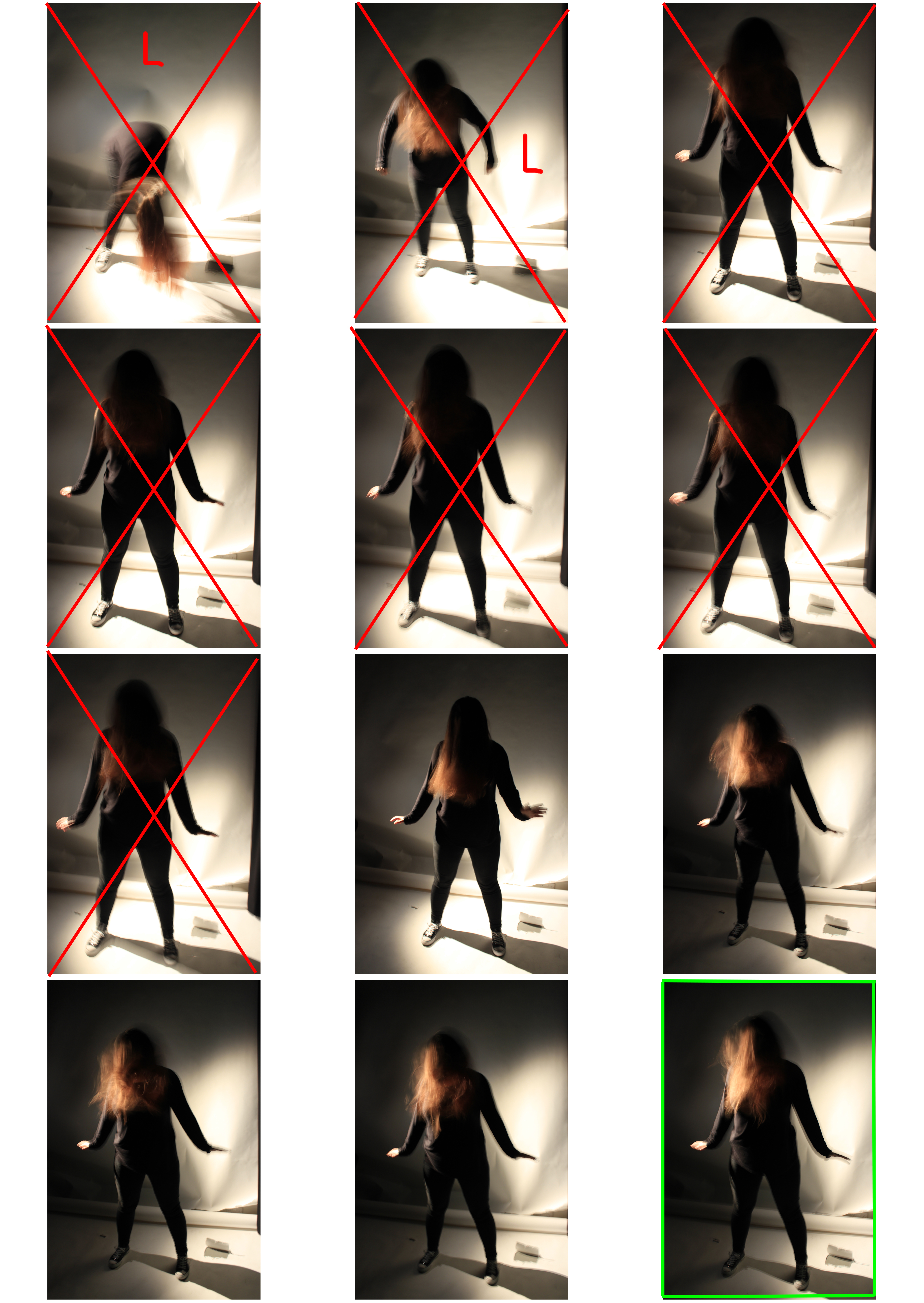
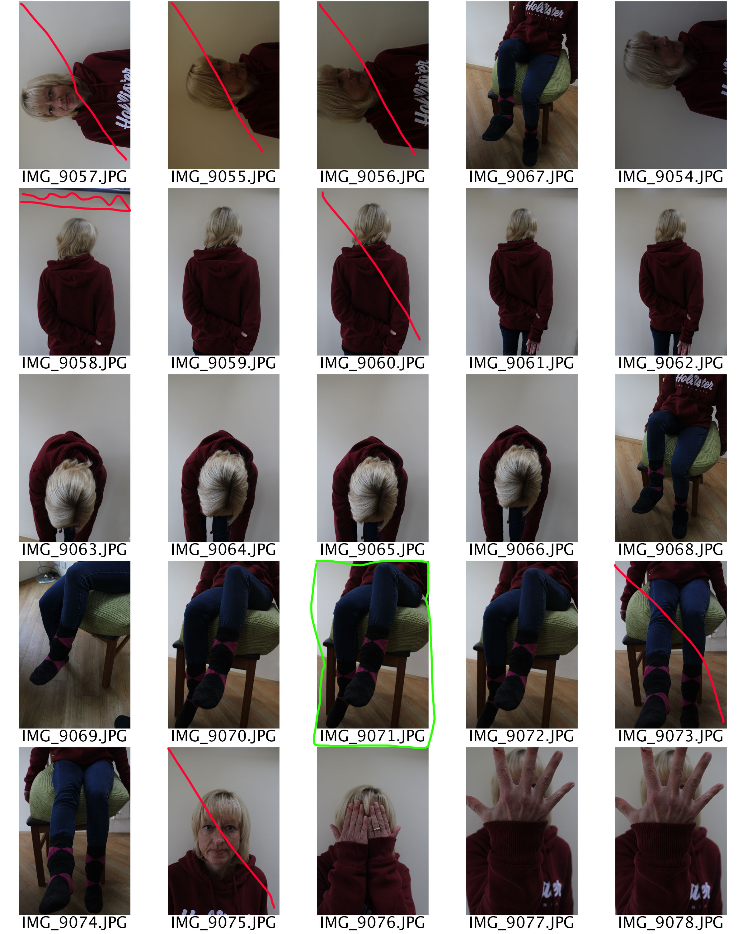
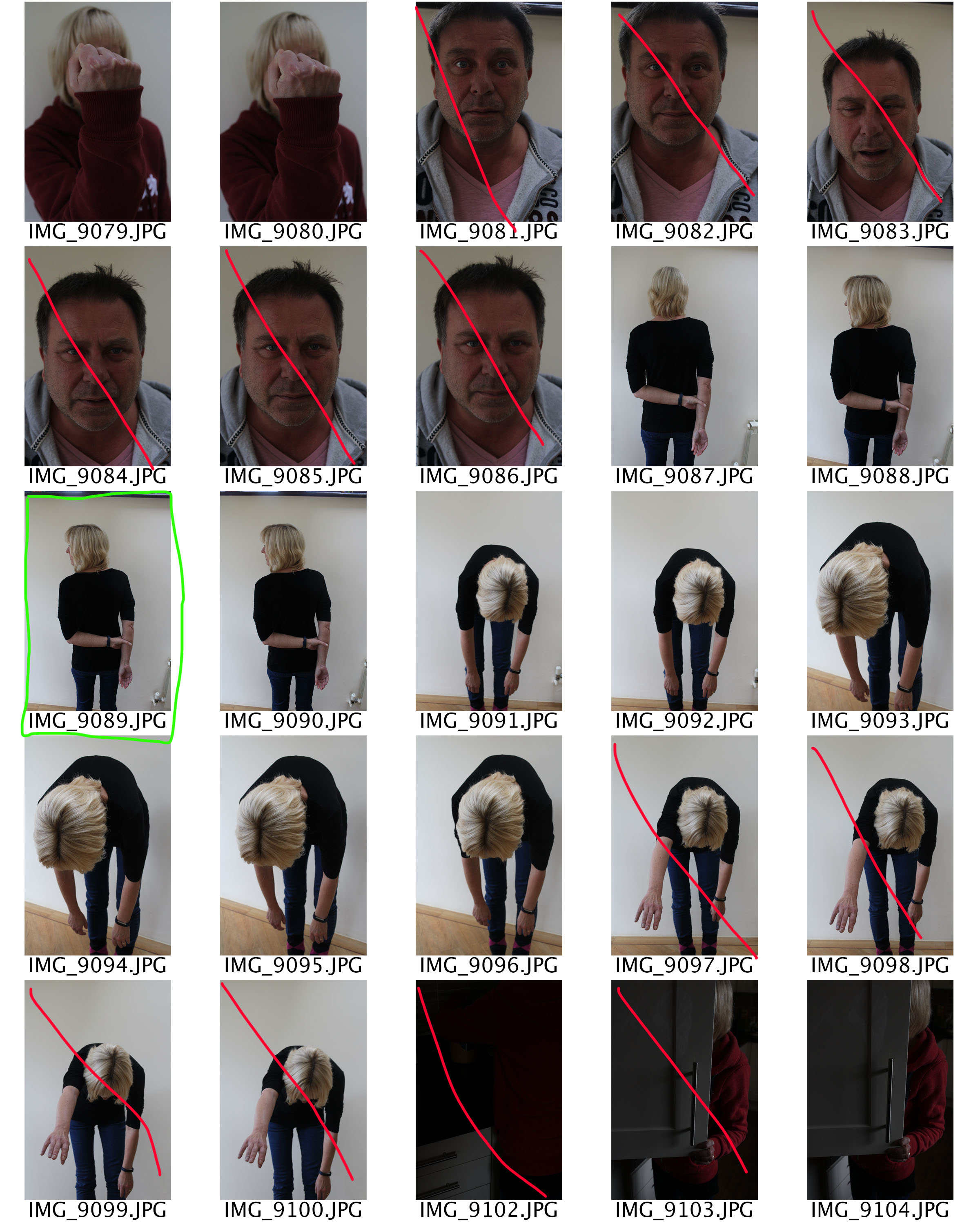
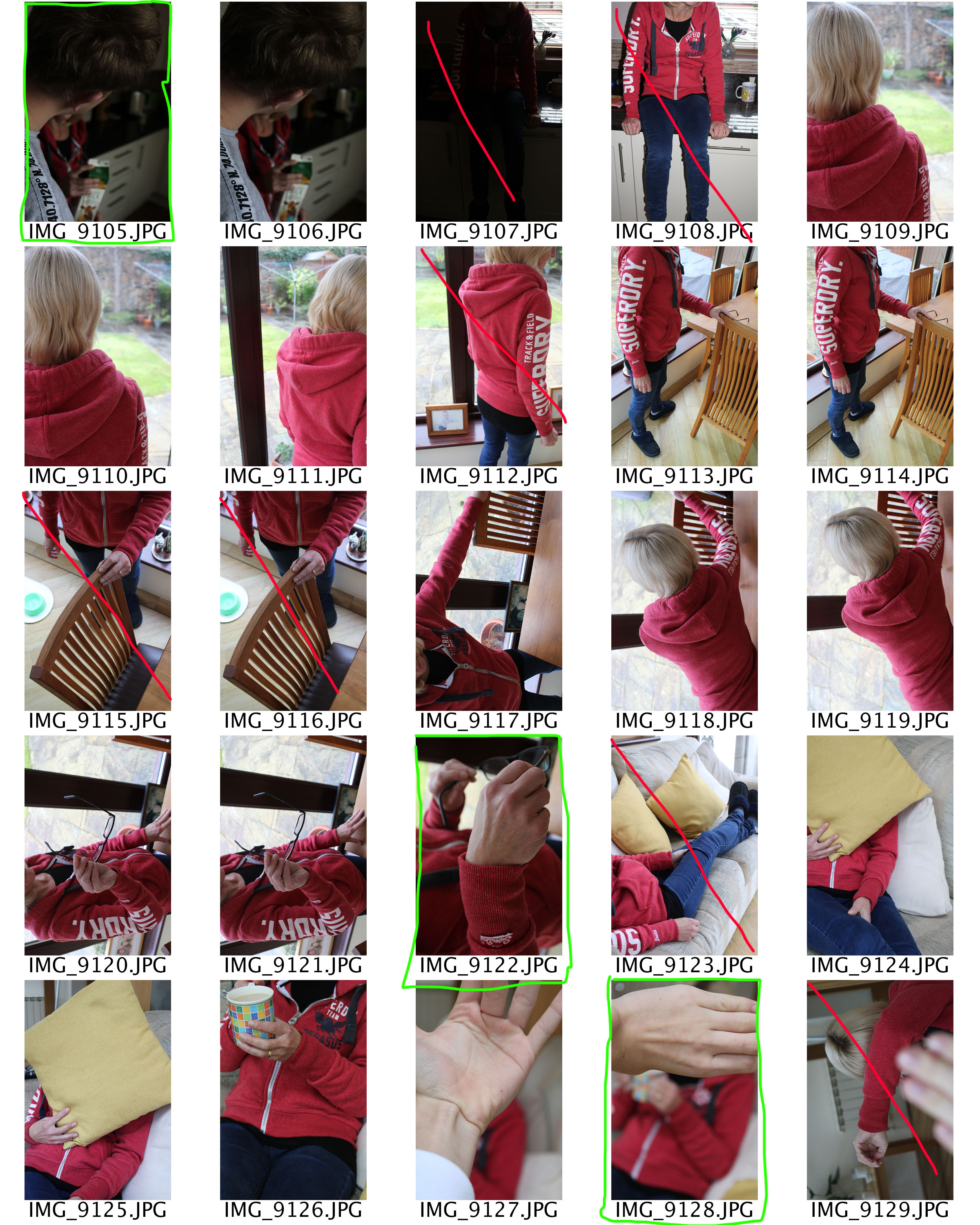
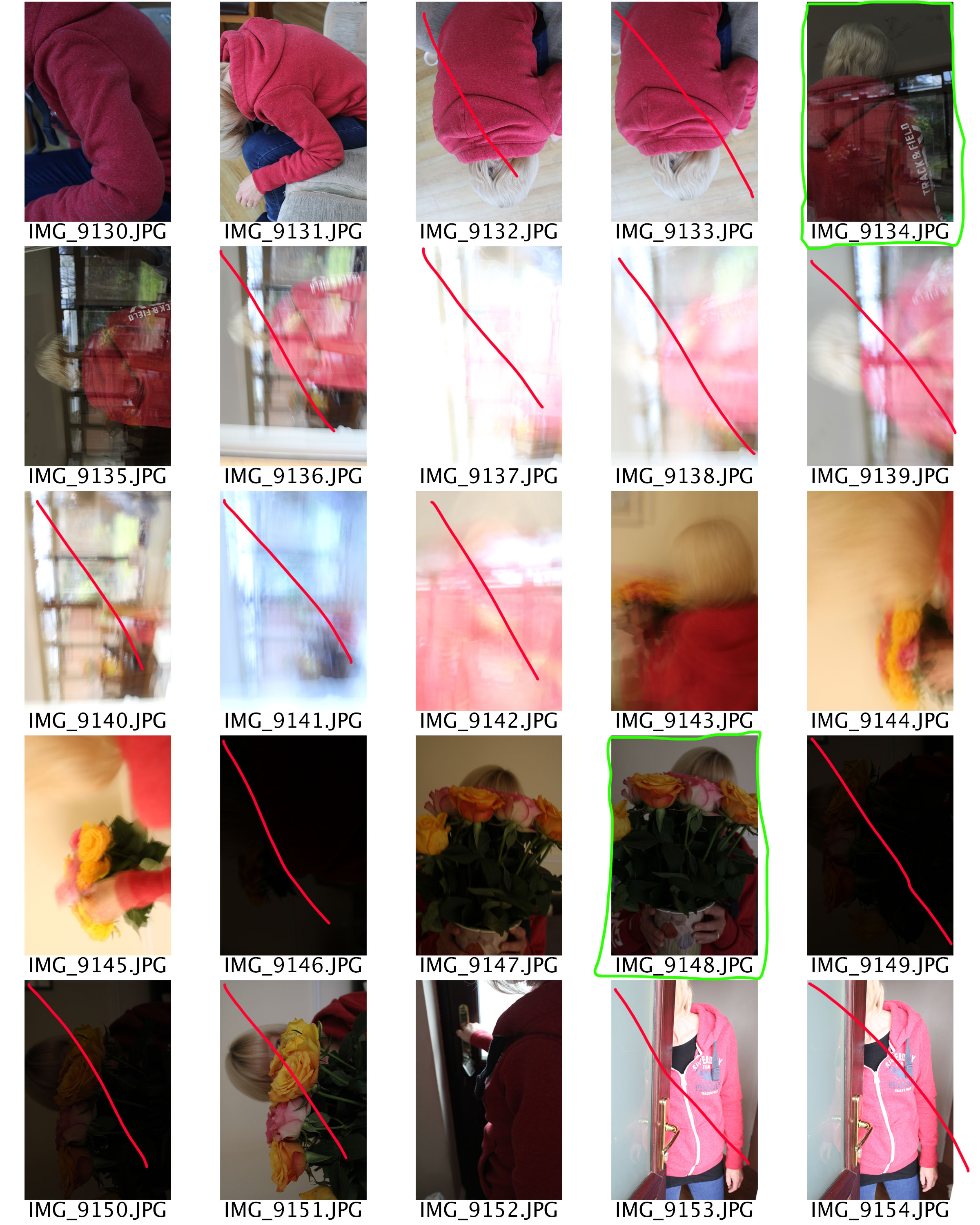
CONTACT SHEET

L: The lighting is overexposed/underexposed
F: The image is out of focus
Red X: I will not use this image
Green square: I will use this image
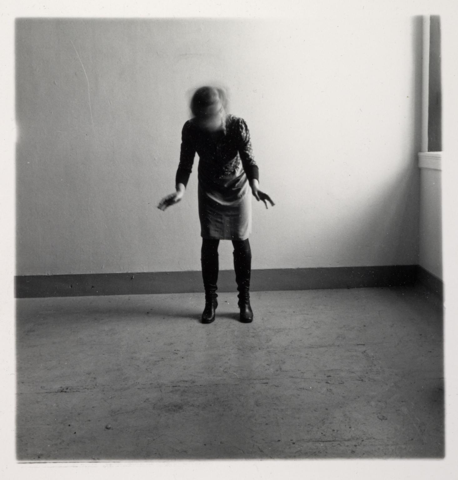
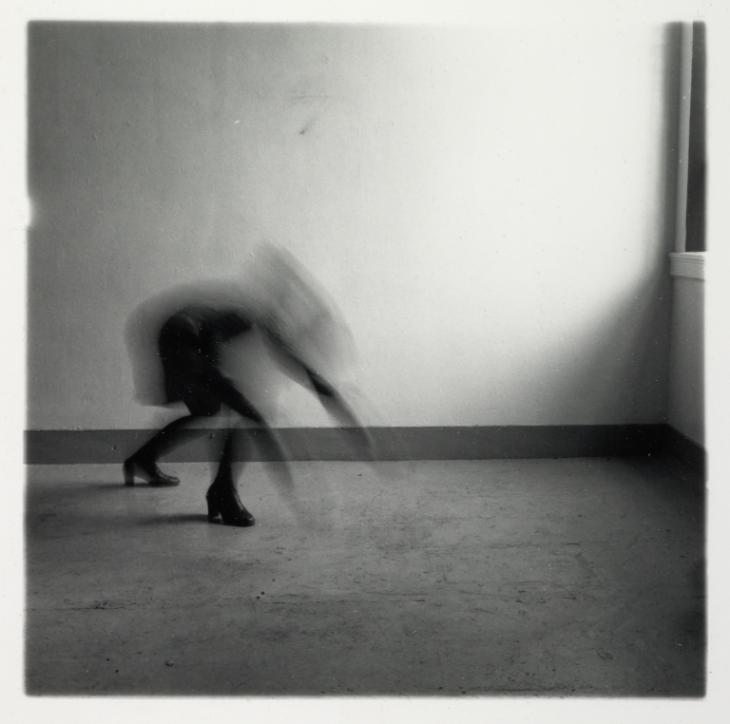
Francesca Woodman, Space 2, 1975-1978

She stands in the centre of the image wearing a dress and black knee high boots. She occupies an empty space in the corner of a room, standing near the back wall. Woodman stands with her feet planted apart and is bent slightly forward towards the camera with her arms and hands out in front of her. Her face, which looks down towards the floor, is obscured by her hair. Woodman is blurred as though she is shaking her head.

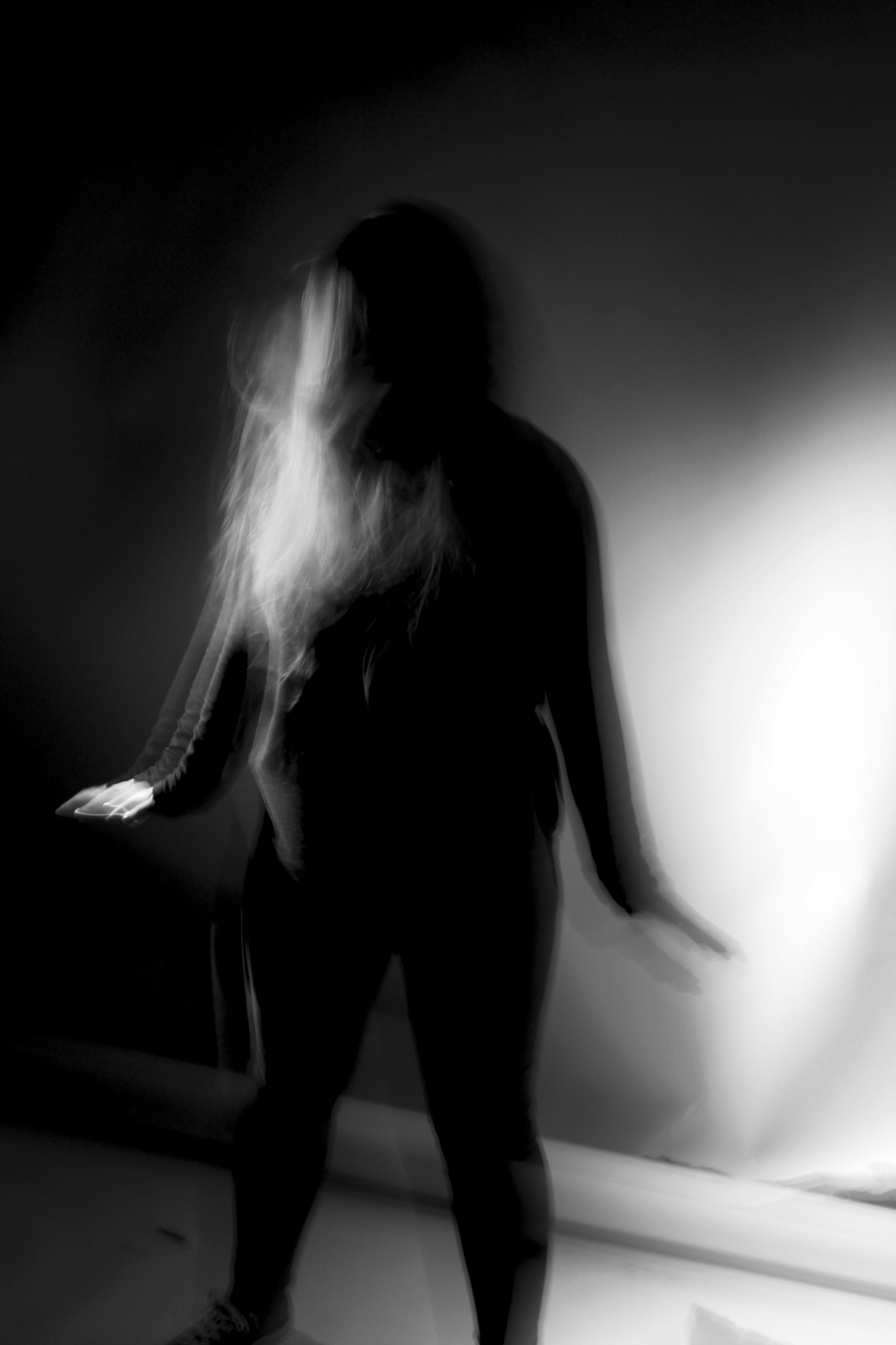
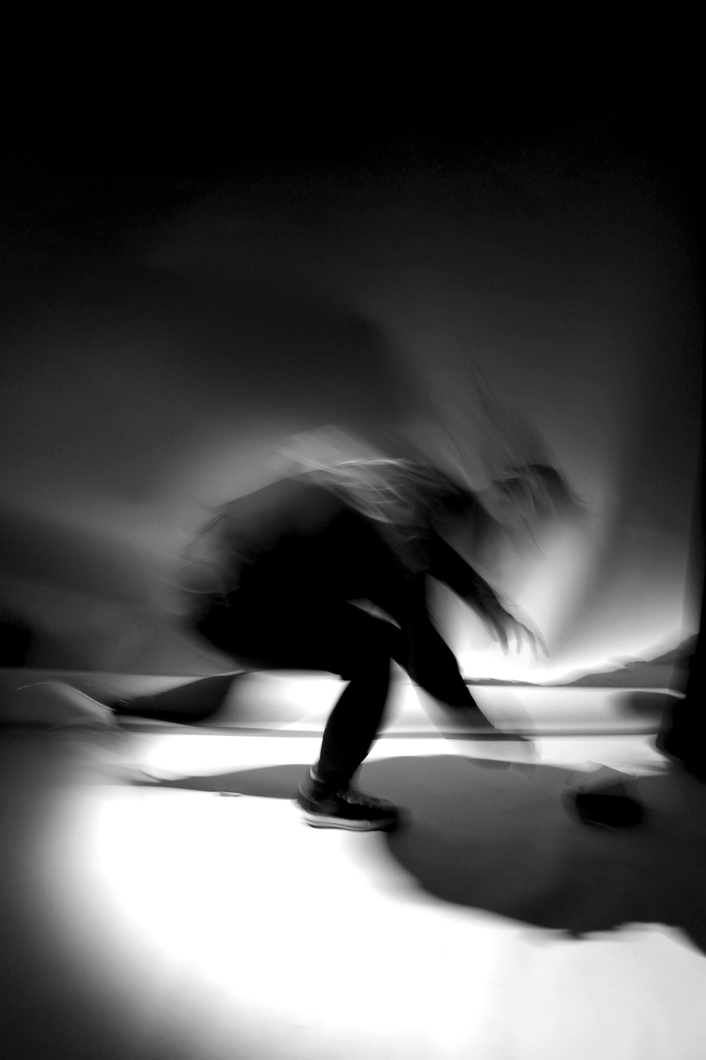
I replicated her first image by having my subject wear all black. I told her to stand with her feet apart and have her arms and hands out in front of her. To create the same blurred effect, I told my subject to look down towards the floor and shake her head. Her face is obscured by her hair which is blurred through movement.  The slow shutter speed captures the movement and creates a ghostly presence. Since there are no windows with light streaming through I used the spotlight in the studio room to create shadows on the floor as well as highlights. On Photoshop I changed the image adjustment to black and white and increased the contrast to create an eerie effect.

Francesca Woodman, Space 2, 1975-1978

Woodman, wearing a dark dress and knee length boots, occupies an empty interior space with bare white walls. A window can be seen on the far right of the image where light enters the room. With feet firmly planted, Woodman appears to lunge forward. Her body is orientated away from the camera, her knees are bent, back hunched and arms stretched out. Her body from the ankles up is blurred as if in motion, obscuring her face.

I replicated the second image by having my subject lunge forward towards the spotlight. Because of the fast motion, most of her body is blurred. This is my favourite image that I replicated from Woodman because the rapid movement creates a sense of loss of identity. She appears lost and confused through the motion blur.

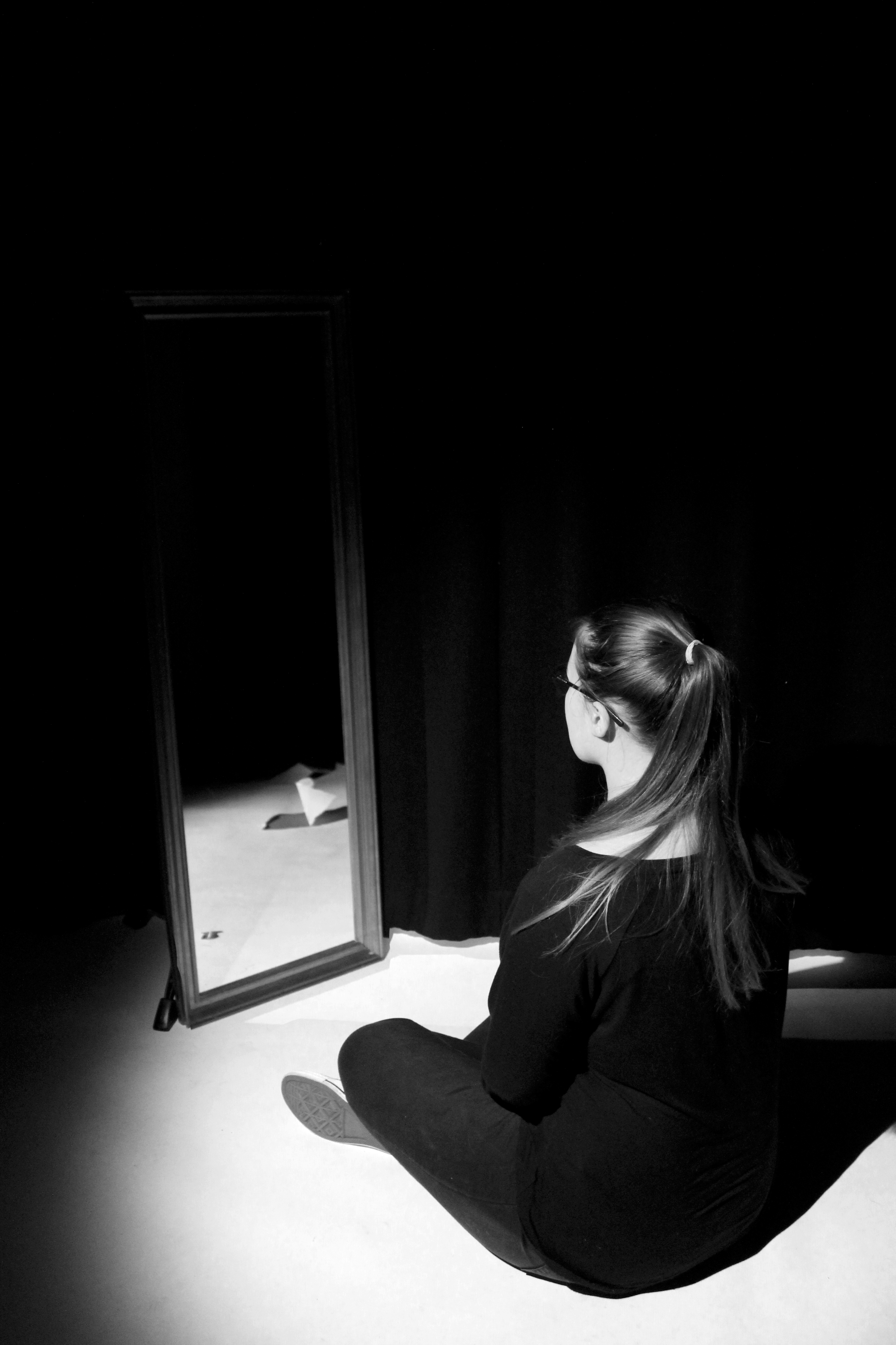
I created more loss of identity images by coming up with my own ideas to represent this topic. Although these images are not a replicate of Francesca Woodman’s photography work, they are inspired by her.  I photographed my subject in front of a mirror admiring herself. I then stayed in the same position and told my subject to move out the frame. On photoshop I opened up the two images and used the opacity tool to help me position the mirror without her reflection onto of the first image. Doing this removed her reflection from the original image which connotes the idea of lack of identity since she cannot see herself through the mirror. I also applied the black and white filter to resemble Francesca Woodman’s images.

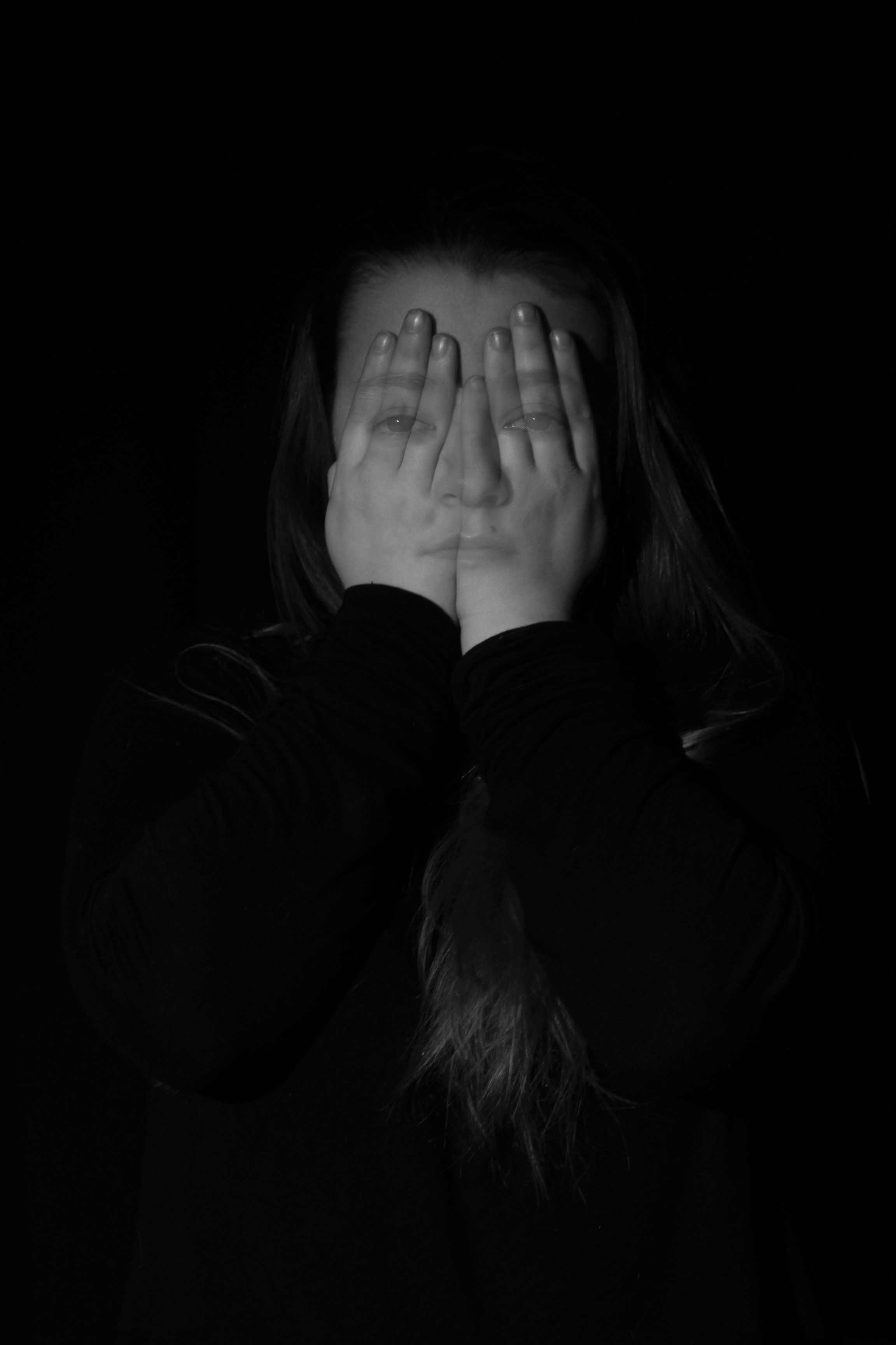
To create this image on Photoshop I told my subject to do two things. I captured one image of her looking directly at the camera, and in the same position I had my her covering her face with her hands. I placed the image with her face showing on top of the other. Using the opacity tool I placed and resized her facial features onto her hands and erased the rest of the image. This edit shows loss of identity since she is hiding her face away from the public. However, she can still be seen faintly through her hands suggesting that she can’t hide away. The subject blending into the black background creates an eerie and dark effect that Francesca Woodman portrays through her images.

BARBARA KRUGER & ANALYSIS (MOCK)

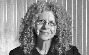
Barbara Kruger was born in New Jersey, 1945. She attended a School of Visual Arts and went on to study Art and Design at Parsons School of Design in New York. She went on to get a job with Conde Nast Publications as a graphic designer, she was quickly promoted to head designer and carried on getting jobs such as; graphic designer, art director and picture editor.

Barbara Kruger is now a very conceptual artist, most of her work is made up from black and white photographs with strong text overlaid.

I try to deal with the complexities of power and social life, but as far as the visual presentation goes I purposely avoid a high degree of difficulty.”

– barbara kruger
barbara kruger


Analysis


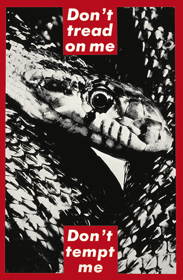
barbara kruger – ‘dont tread on me, dont tempt me’


This image is titled ‘Don’t tread on me. Don’t tempt me’ and is a good example of Barbara Kruger’s quickly recognisable aesthetic.  Krugers aesthetic generally includes phrases layered against a black and white photograph.

In this print Barbara Kruger presents an image of a snake, surrounded by a thick, bold red border, with text boxes splitting the phrase at both the top and bottom of the image. The font used is typically used in advertising, specifically, the well known, popular brand, supreme. Using a familiar and bold design catches peoples attention immediately, therefore reaching a greater amount of people.

Kruger uses red text boxes against black and white photographs producing a contrast between the text and the background, personally I think this is also highly effective as it keeps the two elements separate, rather than merging the whole image into one ‘layer’.

Photo shoot 1 – Edits

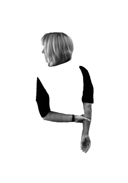
In my first photo shop idea I wanted to show the body of my model disappearing. I decided I wanted to get rid of the body but keep the arms and the head. My model has her head slightly turned showing her nose, this makes it look like she is looking out to the horizon, potentially looking for her identity. Her arms are joined which shows she is trying to keep herself together, due to the disappeared body implies that she is finding it hard to do this. The image is in black and white like Simpson’s work and clearly demonstrates my model loosing her identity. In order to achieve this I cut out my model using the quick selection tool, and placed this layer onto a new A4 white page. I then used the rubber tool in order to rub away the body. I then leveled and desaturated the model layer in order to allow a high contrast in tonal regions. I believe that this edit is successful as it shows the process of the model loosing her identity.

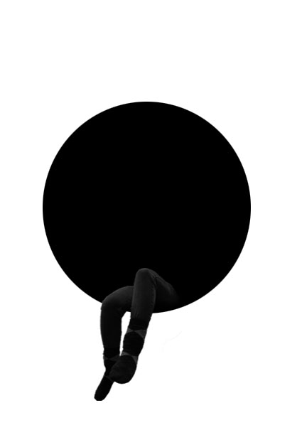
In my second edit I wanted to make it more symbolic, through the use of shapes. In the centre of the image is a black circle, this circle is used to represent the model being swallowed up (her identity being taken away). The color black and white represent a empty void where nothing is, conceptually showing what it is like when you lose your identity. The models legs are sticking out as if she is sitting in this void. This shows that she is so far in (highly depressed) she does not want to come out and talk about, which is usually the best option. Like the other idea no colors have been used in order to prevent a small identity being shown. In order to achieve this idea I created a new A4 page and place a black circle in the center of the page using the ellipsis marquee tool. I the opened up the image I wanted to use and used the quick selection tool to cut out my models legs. I then placed the leg layer on to the A4 document and used the burn and blur tool to blend the legs into the black circle. Using the transformation tool I made the legs smaller, to shows how small loosing your identity can make you feel. I am extremely happy with the outcome of this edit and believe it matches the theme of loss of identity.

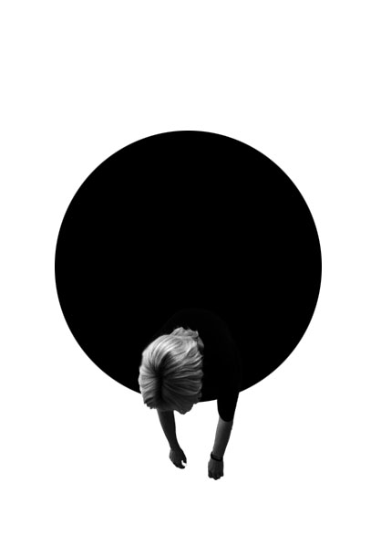
Due to the success of my second edit I wanted to use use the black circle again due to meaning and representations it bought to image. I started off by using the quick selection tool to cut out my model, in the bent over position. I then placed the leg layer on to the A4 document and used the burn and blur tool to blend the legs into the black circle. Using the transformation tool I made the legs smaller, to shows how small loosing your identity can make you feel.

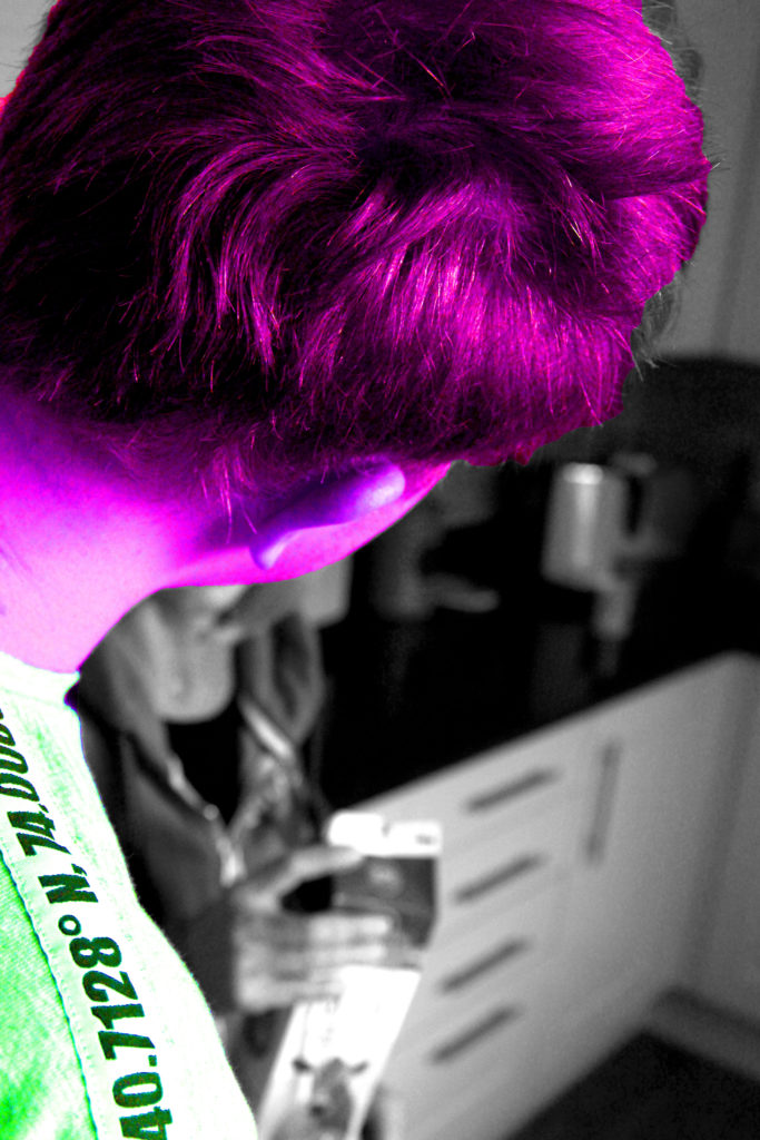
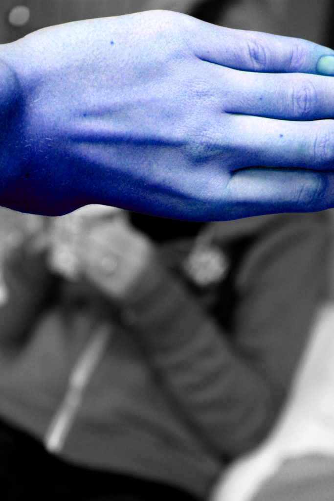
In my next idea, I selected the image were someone else was covering the face of the model who has lost their identity. In order to show this person having an Identity, I decided to use the quick selection tool to cut them out. I then turned the background layer black and white by pressing ctrl + U. This created a colour splash, I felt that I could expand this idea. I decided to change the colour of my model to a ‘wild’ colour in order to create a dramatic contrast. I did this by pressing ctrl + u and altered the hue slider. This contrast I feel clearly portrays someone with identity to someone who has lost their identity. The model who has lost their identity can be seen in the background as a blur, which shows that she is a minor and does not want to be seen by others, thus it helps to create a powerful image.

Due to the success of the idea above I decided to follow the same steps but with the image above. Having the hand of someone else covering the models face shows how she is not important and should not be looked at, also presenting what it is like to have lost an identity.

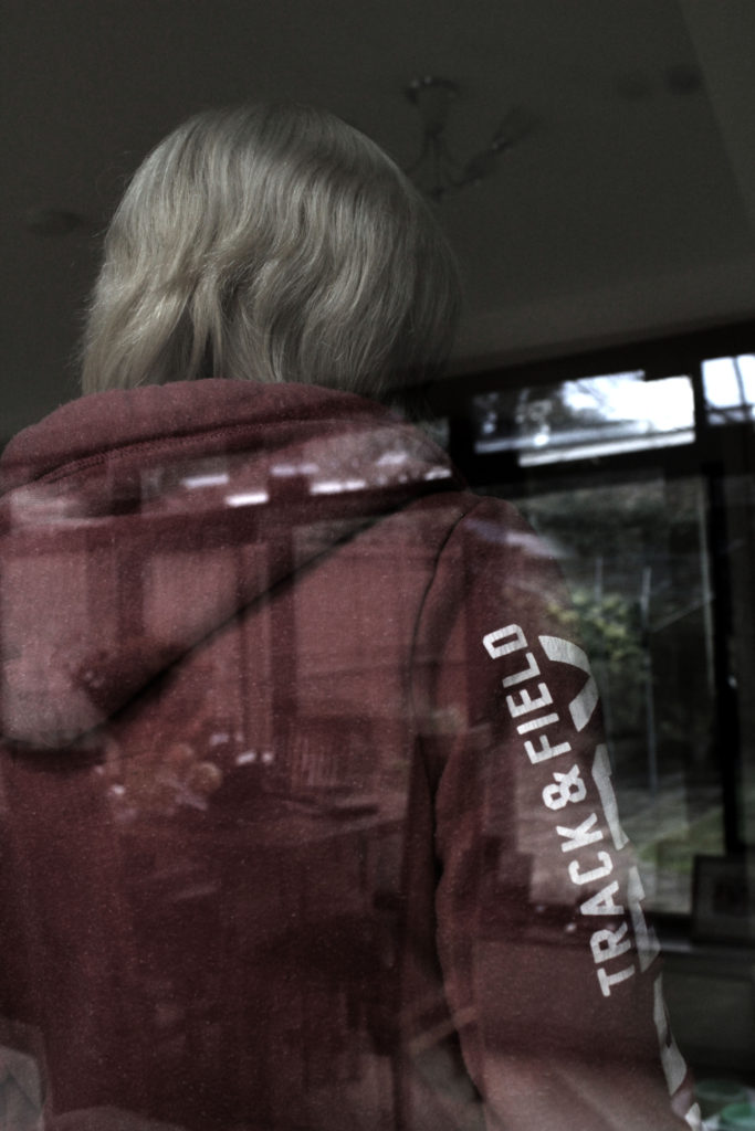
In my final idea I wanted to showcase this natural double exposure. The image was taken through a window, so you are able to see the model and the background being reflected by the mirror. In order to show this I adjusted the levels and curves in order to allow both the model and the scenery to clearly be visible. I turned down the saturation of the image as well to create a dark and depressing mood to the image. I created this to show a before and present image. The scenery is what life was like before the model lost their identity and the model herself is seen looking the other way showing that her life is nothing like this anymore.

I am very happy with all my outcomes from this photoshoot as I believe they all showcase what life is like when you loose your own identity. I believe that these outcomes could lead to successful final pieces.

Identity – Photo shoot 1

This photo shoot is inspired by the artist Lorna Simpson, who captured the model without including their face. I believe that this is a good idea when trying to capture someone loss of their identity.

Planning

I will conduct this photo shoot in a variety of settings, from outdoors to indoors in enclosed areas. In these multiple locations I tend to have a plain background which means setting will not ruin the idea of having no identity. My camera settings will be kept normal, however I may experiment with changing the ISO to make the images darker, which also helps to show the dark and depressing side loosing identity has. Moreover, I am going to look at experimenting with the shutter speed in order to create and intended blur, to convey that maybe loosing an Identity leaves your life in a blur, making those images metaphorical. I will be using different props such as people, pillows, windows etc in order to block the face of my model allowing the sense of loss of identity to be shown.

Contact Sheet

I am very happy with the images I managed to take out of this photoshoot as it has provided me with inspiration in the editing stage. However, I found it hard to capture images without repeating the image before, resulting in less images. Knowing this fact it will help inspire my next photoshoot.

STEVE ROSENFIELD & ANALYSIS (MOCK)

Steve Rosenfield was born and raised in Boston, USA but now lives in Sacramento, California. He started to photograph live music, weddings, senior portraits and other events.


“in 2010 i wanted to do more with photography and hoped i could change the way people looked at their friends, family, significant others, and even themselves – thats where the ‘what i be project’ was created”

– steve rosenfield 
Steve Rosenfield – photographer
What I Be Project 

The What I Be project is Rosenfields most successful photography project.

The What I Be project was a “social experiment” that quickly changed into a movement about honesty and empowerment. In today’s society we are told to look a certain way, or act a certain way and if we do anything differently from these typical standards we’re often judged, or bullied.

 “I started this project in hopes to open up the lines of communication, and to help everyone accept diversity with an open mind & heart and empower those who feel they suffer for something they may see as a flaw.”
– steve rosenfield 

Analysis


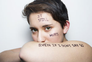
Steve Rosenfield – ‘I am not my abuse’


The model in the photograph is throwing  her insecurities out and into the open, and exposing a side of herself that she hadn’t previously shared with anyone. She’s done this by stating “I am not my abuse”, by this she is saying that she does in fact struggle with these issues, but it does NOT define her, her character, her personality, her identity. This project was created to spread awareness on the affects of societies closed thinking and the serious and very stigmatised issues, that unfortunately, some individuals have to fight on a day to day basis.

Technically this photograph is not very complex, it appears like this has been taken in a studio lit by artificial lighting. However, although maybe not the most technically difficult, I feel that this approach was extremely effective and appropriate, I feel this way as it keeps all the attention on the subject and the writing across her body, which does result in the awareness raising aim that Rosenfield had in mind for this project.

Claude Cahun / Clare Rae Exhibition Analysis

The Claude Cahun and Clare Rae exhibition was very inspiring. It clearly demonstrated how the work of Cahun had inspired the work of Rae. Each photographer had their own room with their photos hung up on the walls, with the sizes of the photos ranging. Both Rae and Cahun take their images in similar styles, with most the images being in black and white, with the main focus being portraiture.

Image result for claude cahun
Claude Cahun


This is my favorite Claude Cahun image. It shows a women sitting down, wearing a shirts saying “I am in training, don’t kiss me”. This shows how Cahun might be trying to pass a message saying that as she is a female that she has to train herself to live up to the expectations of society. Cahun could also be trying to get her personality across by wearing the clothes that she has on.

Clare Rae

This is my favorite Clare Rae image. It shows a women cramming herself under a trolley in what looks like a office. Rae might have done this to show that women might feel trapped in today’s society, so she portrayed this by putting herself under a trolley in a small corridor. Rae also might have taken this photo to express previous experience she might have had.