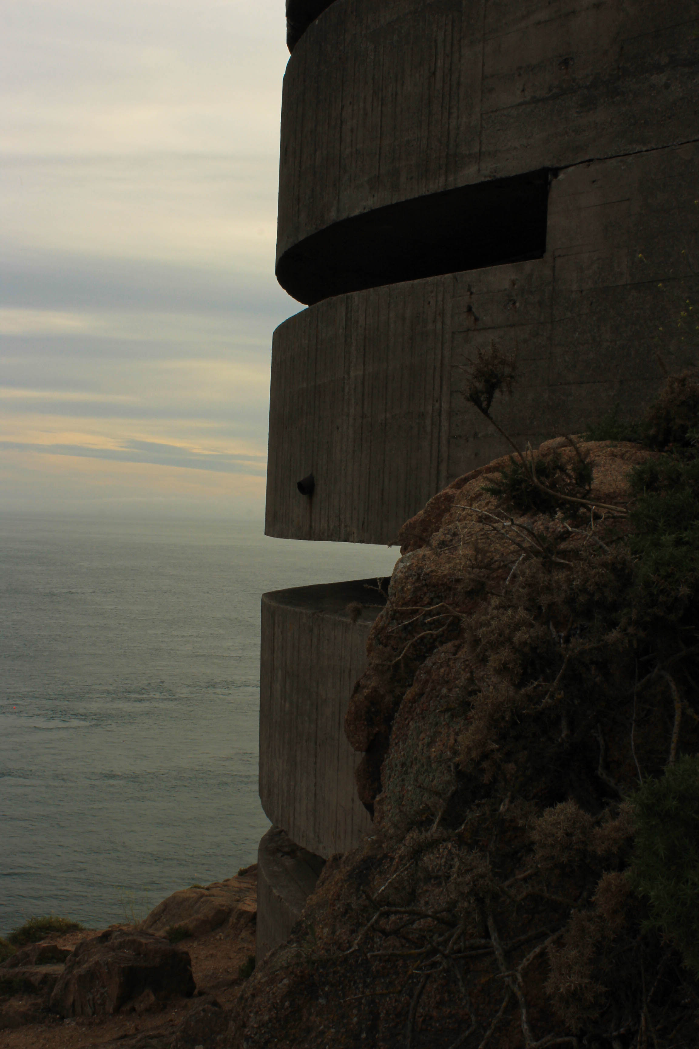
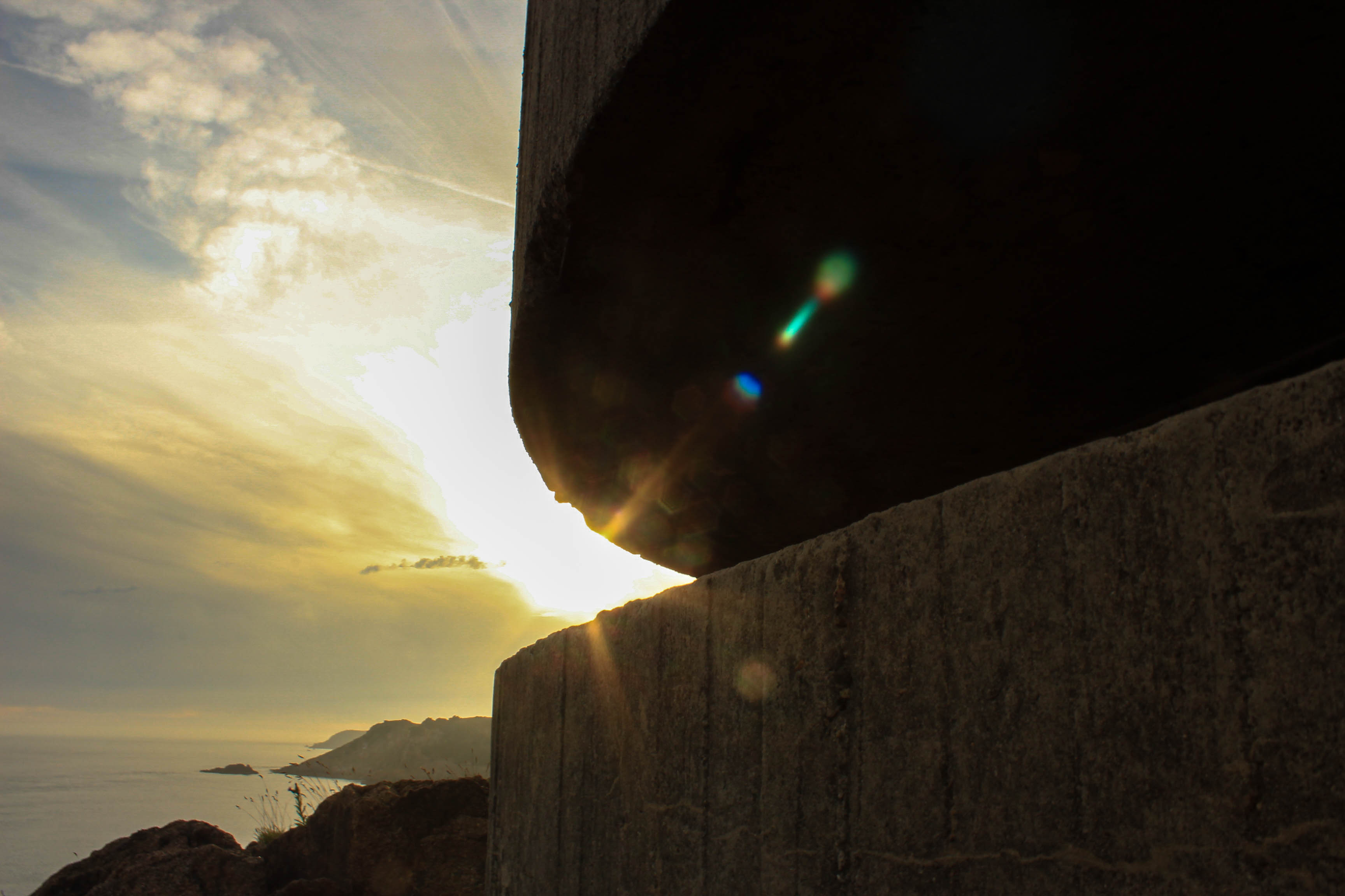
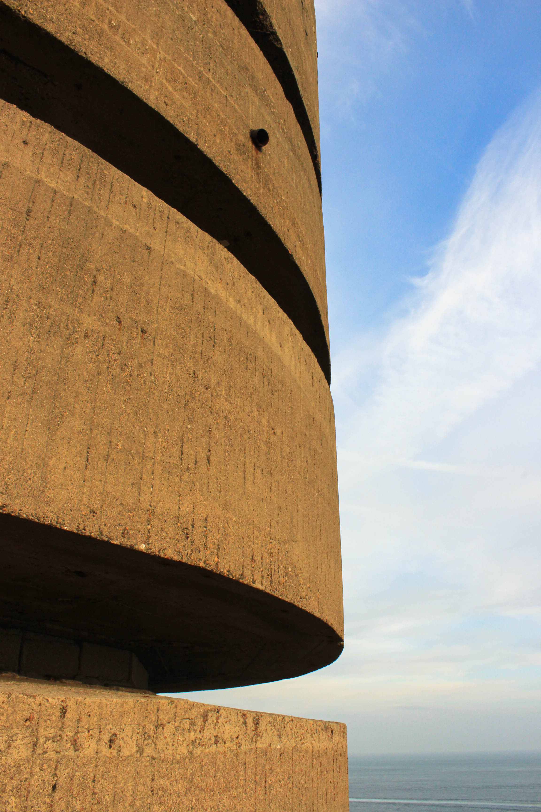
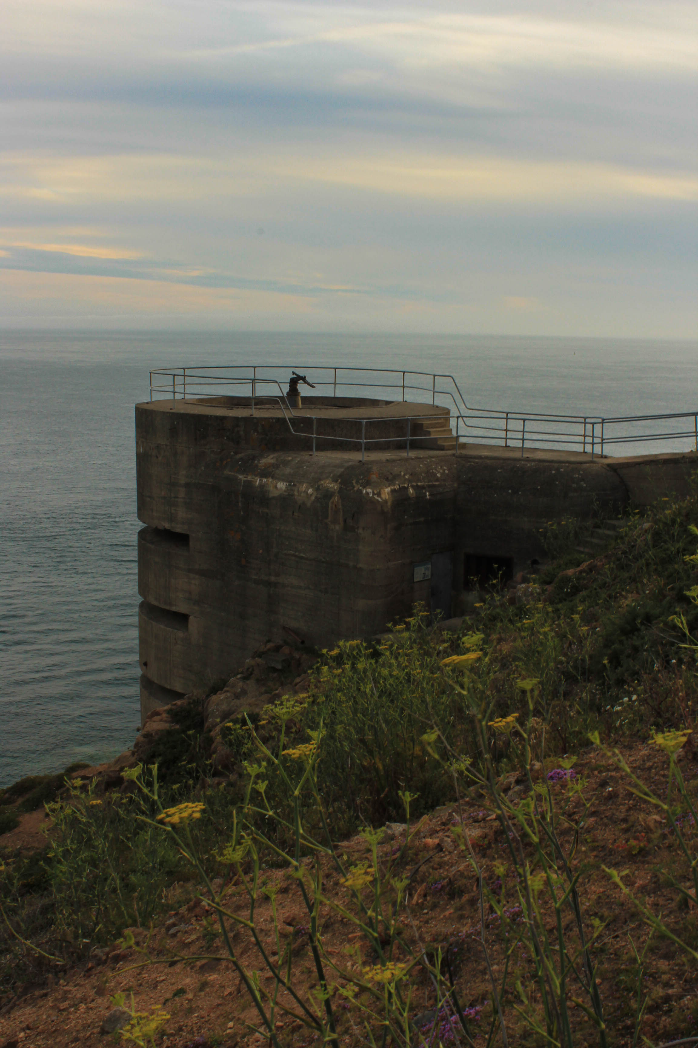
Category Archives: AO2 Explore Ideas

Filters

Author:
Category:

Photomontage – Experimentation

Working with archival work, I decided to creatively explore and experiment with the imagery to create photomontages. Due to previously looking at photomontages, I knew that I could successfully produce imagery which holds many conceptual factors as we as historical. My previous work can be found here :

With my exploration with war archive I decided to take more of a surrelasism approach, presenting a new way to look at the material. I experimented with handcrafts (cutting, sticking etc) images and within photoshop in order to create outcomes which I believe present a new way with looking at the war.

Photoshop Outcomes:
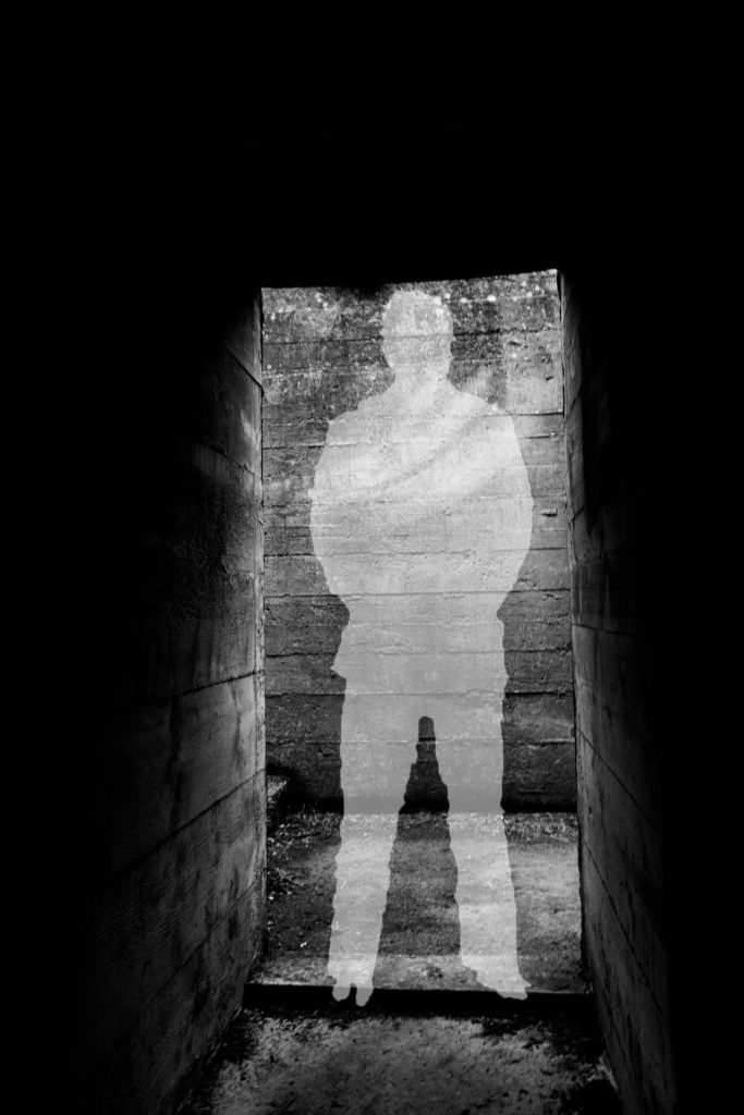
For my first experimentation I looked at the idea of silhouettes and the meaning behind them. This was inspired from the black metal cut out (outline) of soldiers which were spread across the UK, in order to remember those we lost during the war. This lead to the conceptual reasoning of the image above, I created a silhouette in the centre of the picture of the abandoned bunker to get viewers to not only remember the soldiers we lost, but also remind them that the bunkers had a massive impact on these people’s lives. In order to create this I found a cut out of a solider on google, and placed it onto of my image of the bunker. Then using the quick selection tool I outlines the solider, then on the layer with my image on I right clicked the selection and pressed layer via cut. I then deleted the layer with the solider on, and turned down the opacity of the outline I just cut out, creating a silhouette. This simplistic design works well as it clearly showcases the conceptual meaning, with still presenting history of the bunkers. It clearly takes the format of a surrealism photomontage and is an interesting piece for viewers to look at. I think that this outcome has turned out well, but is not the strongest one I produced.
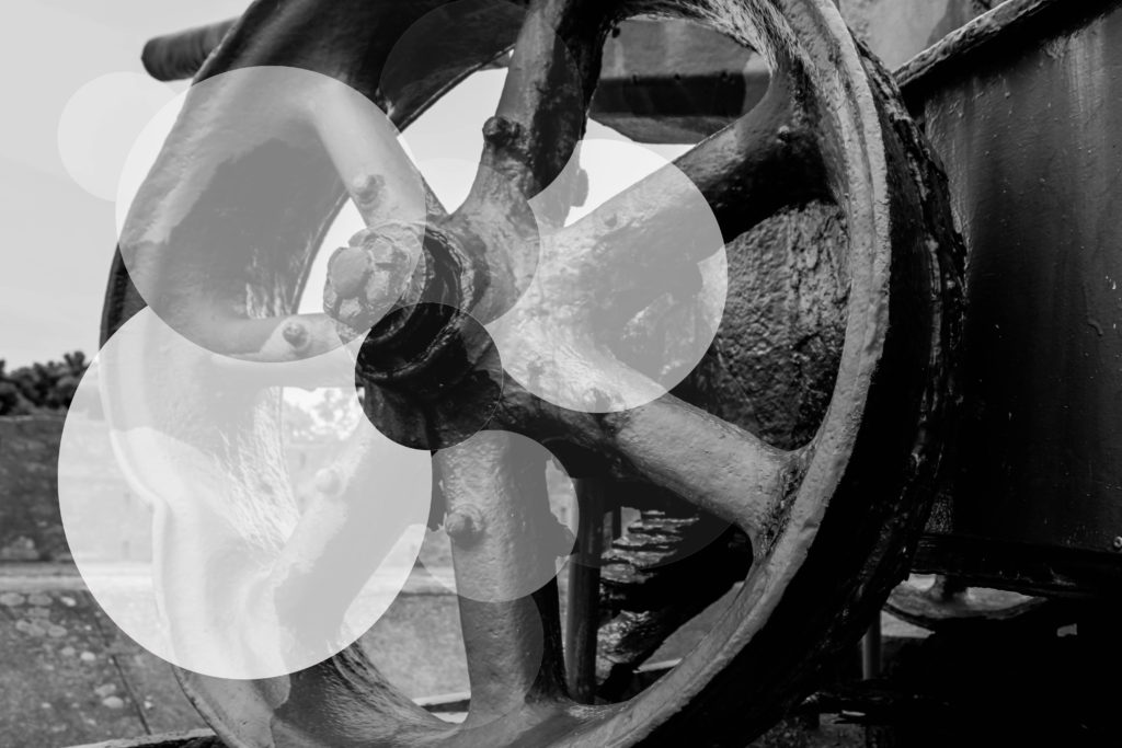
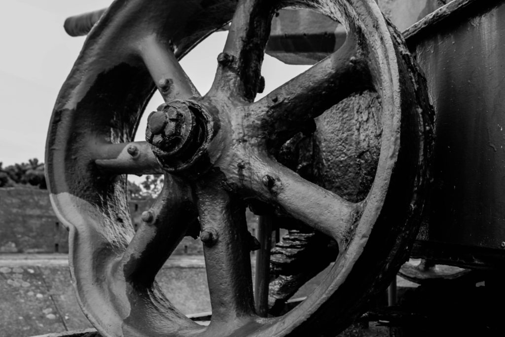
For my second experimentation I wanted to look at exploring with the formal element shape, considering my photograph was a wheel of a gun, found on a bunker site, I decided to use circles in order to manipulate this image. This contemporary final design conceptually presents the idea that although the bunkers are abandoned, and been left alone to rot, they will continue to stand there, reminding us of the horrors of the war. I believe this is mainly shown through the faded circles. Again this image presents the historical factors of the uses of the bunkers in Jersey during this time in history. To achieve this effect I used the circular marquee tool and created circles, adjusting the size by using the transformation tool (ctrl + t), and cut them out of the original layer. Then I turned down the opacity, randomly on each new layer creating the decay effect, reinforcing the conceptual factors of the image. I really like the way in which the outcome turned out, as it really emphasise the formal element of shape, creating and unique and interesting design for viewers to look at. The contemporary design, makes the concept more disguised, but needless to say it is still effective. To critique the design I would make the circles more central, to make them more ascetically pleasing.

Artist Research:
Sky-Alling Phillips Photography

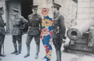
Sky-Alling Phillips created a series of photographs called ‘Paper’, in this she cut out parts of a war archival image and placed floral prints behind it, creating a unique and juxtaposing design. Although this series can not be found online, I captured a photograph of her work, when looking through different Zines. Contextually, this photograph is showcasing solider at a bunker, who seem to be off duty and socialising, making it seem like war was not all that bad as it was said to be. This further reinforced by the background, the structure of the bunker looks strong standing which creates a sense of comfort. Conceptually, Phillips is trying to showcase that those who died at war are still with us. The person in the centre of the frame, made out of the floral design, represents a solider who has been killed but is still with his ‘friends’, creating the sense that we never forget those we loved. To technically analyse this work I will explore the camera settings of the archival image. The camera settings would have been very basic, due to camera’s not being as advanced during the war as they are know. The image would have been taken outside, using natural lighting of the sun to illuminate the subjects, this creates a sense of warmth which is then juxtaposed by turning the image into black and white. The quality of the photograph is poor, which could suggest it has been enlarged to big, or that the shutter speed was slightly slow, creating movement, alongside the ISO being high due to a sense of noise being shown within the image. In addition, the soldiers seem to be in focus with the background being slightly out of focus, suggesting a narrow depth of field being used to capture the image. Visually, the photograph has many elements which makes it pleasing to look at. It uses the formal elements of space, show through the floral patter in the space of a solider as well as a sense of space between the for and background; form, shown through the structure of the bunker and the pattern of the flowers. Having the colourful flowers in the middle of a black and white photo, makes the viewers eye initially draw the there, main focus point, and juxtaposes the black and white creating intrigue and allows the conceptual factors to be presented. In conclusion, I like the simplistic design of Phillips work, as it holds a lot of meanings and is shown in a creative and successful way. The floral pattern in the shape of a solider is a cleaver design creates a sense of separation, even though the cut out is close in proxemics to the other soldiers, making it interesting to view.
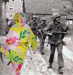
My final experimentation on photoshop was inspired by Sky-Alling Phillips. I found an online image of solider’s walking with weapons, as if they are ready to go into battle. I then decided to use the solider who was closest to the front of the frame, as the effect will stand out more, to cut out using the quick selection tool. I then found a floral pattern online and created a new layer on photoshop, placing it behind the original image, creating this effect. To make it stand out more I decided to add a drop shadow, which outlines the solider and makes the floral patter darker, creating a more subtle blend between the archival image and floral design. I am very happy with the way it turned out as it is very similar to Phillip’s photography, and represents the same conceptual factors. I believe this is my most successful outcome, as it has the strongest conceptual factor, and the design works and is ascetically pleasing to look at.

Craft Experimentations:
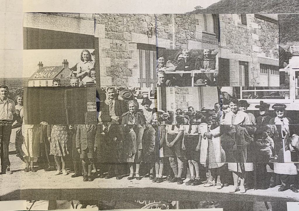
For my first experimentation I weaved two war archival images, one image of a landscape and an image of people, together in order to create a unique and abstract design. Due to the nature of the craft, viewers eyes are constantly looking round the image to try and make sense of what is happening, presenting the conceptual factor of the war was not as simple as it is told to be and there are many layers to what actual happened. Intertwining the two images clearly represents this as it is creating those layers. This outcome experiments with the formal elements of shape and space, which work together to create a eye catching image. Overall, I am pleased with the way in which this outcome has turned out, as the confusing design allows viewers to explore the concept of the overall image.
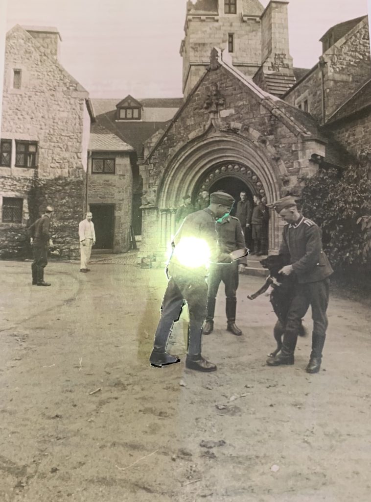
For my final hand craft experimentation, I kept it very simple, due to the simplicity of the image itself. The archival image used had a large sense of space, thus I wanted to utilise this. I decided to cut out man in the centre of the frame, but left bits of him still connected onto the image. I then placed a light behind him lighting his up and making him stand out from the rest, main focus point of the image. Conceptually, I am trying to showcase the light that each solider had but was eventually turned off as they were murdered fighting for their country. This is a more subtle concept, but can still successfully be told by the simplicity of my design. I prefer the outcome above compared to this, only because the design above is more interesting for viewers to look at due to the busyness of the frame, however this outcome is still successful.

Evaluation:

To evaluate my outcomes of my photomontages, I believe that I have managed to produce a strong set of designs. I have been able to showcases my competence in manipulating images on photoshop and give reasoning as to why I did what I did. I have also been able to utilise the main formal elements within an image, making more ascetically pleasing final outcomes. In addition, I have not only manipulated images on photoshop but also by hand to, showcasing the importance of experimenting by hand and computer. If I was to create more photomontages I would look at creating outcomes which take the form of dadaism making it easier to work out what concept is being presented within each design.

Battery Lothringen

Batterie Lothringen was a World War 2 coastal artillery battery in Saint Brélade and constructed by Organisation Todt for the Wehrmacht during the Occupation of the Channel Islands. The first installations were completed in 1941, around the same time as the completion of Battery Moltke.

The site is located at the end of Noirmont Point, a rock headland. It was a part of the Atlantic Wall system of coastal fortifications and most of the concrete structures remain today. The site is preserved by the Channel Islands Occupation Society and open to the public.

In 1950 the States of Jersey purchased the headland of Noirmont as a memorial to all those Jersey people who died during the Occupation. A memorial stone was unveiled at Noirmont on 9 May 1970 to mark the 25th anniversary of Liberation.
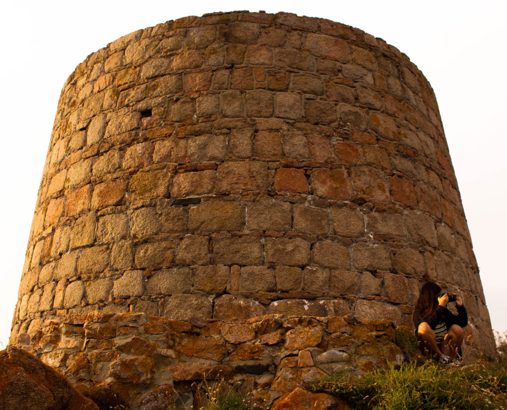
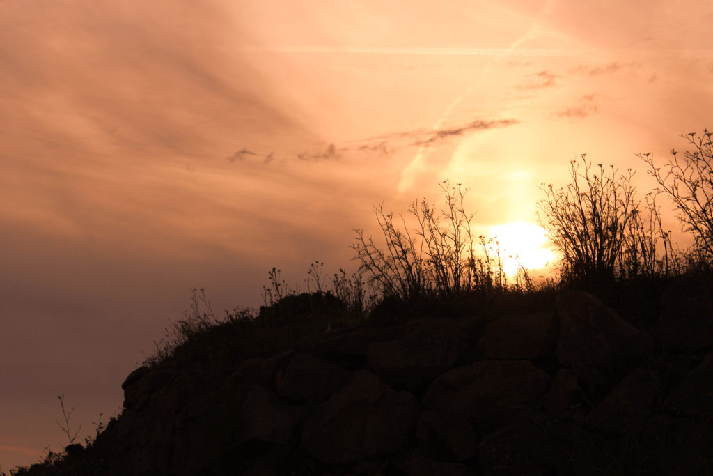
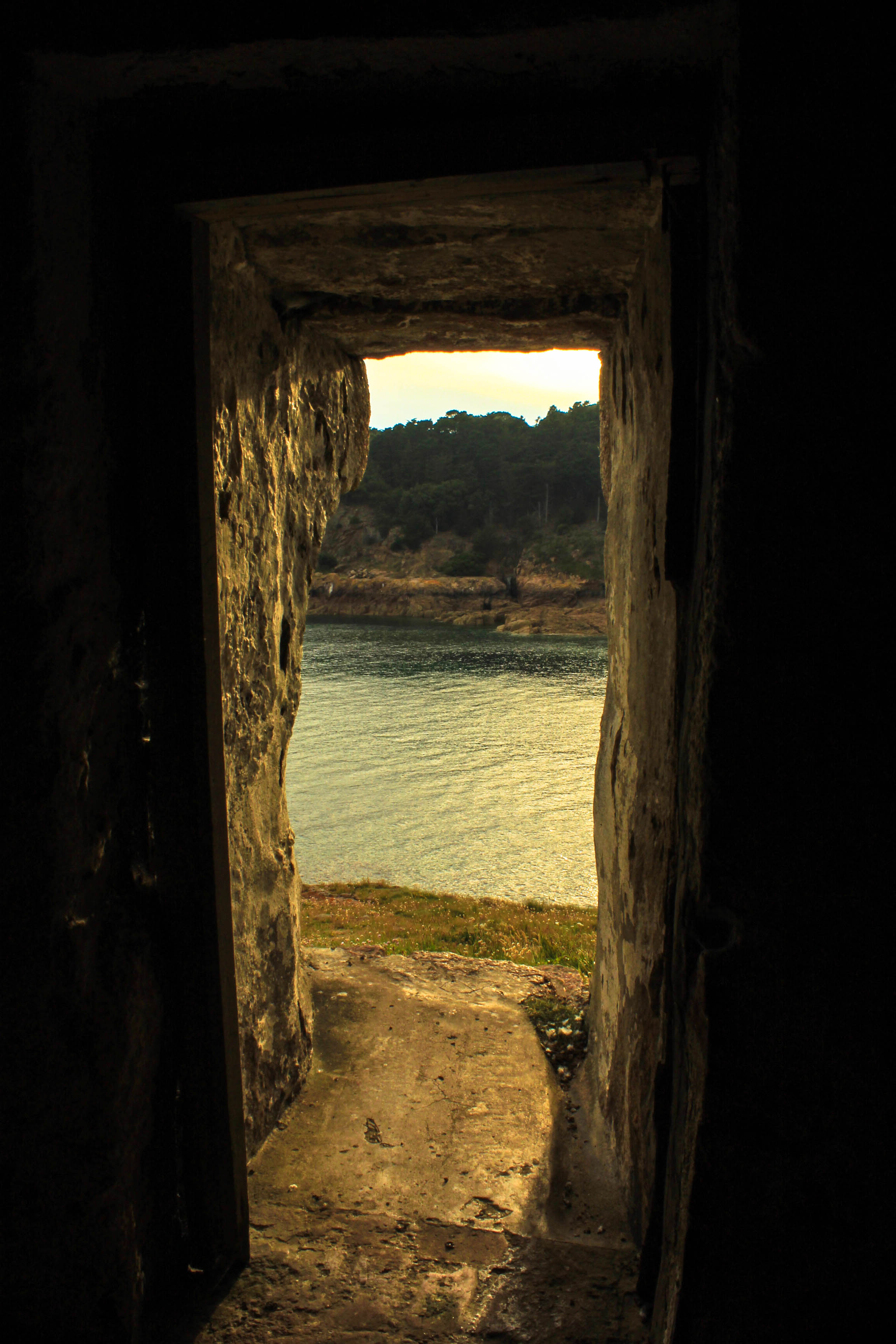
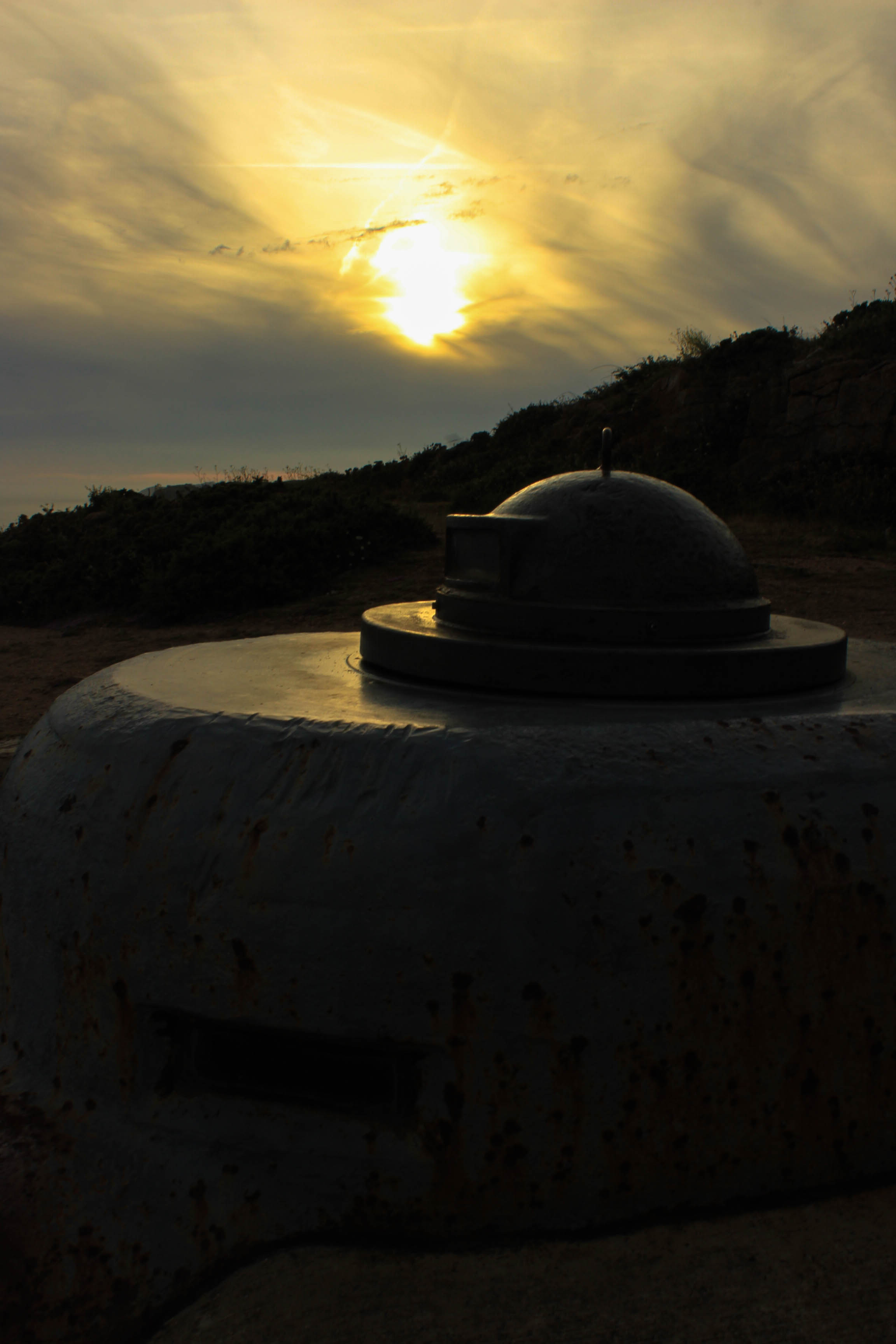
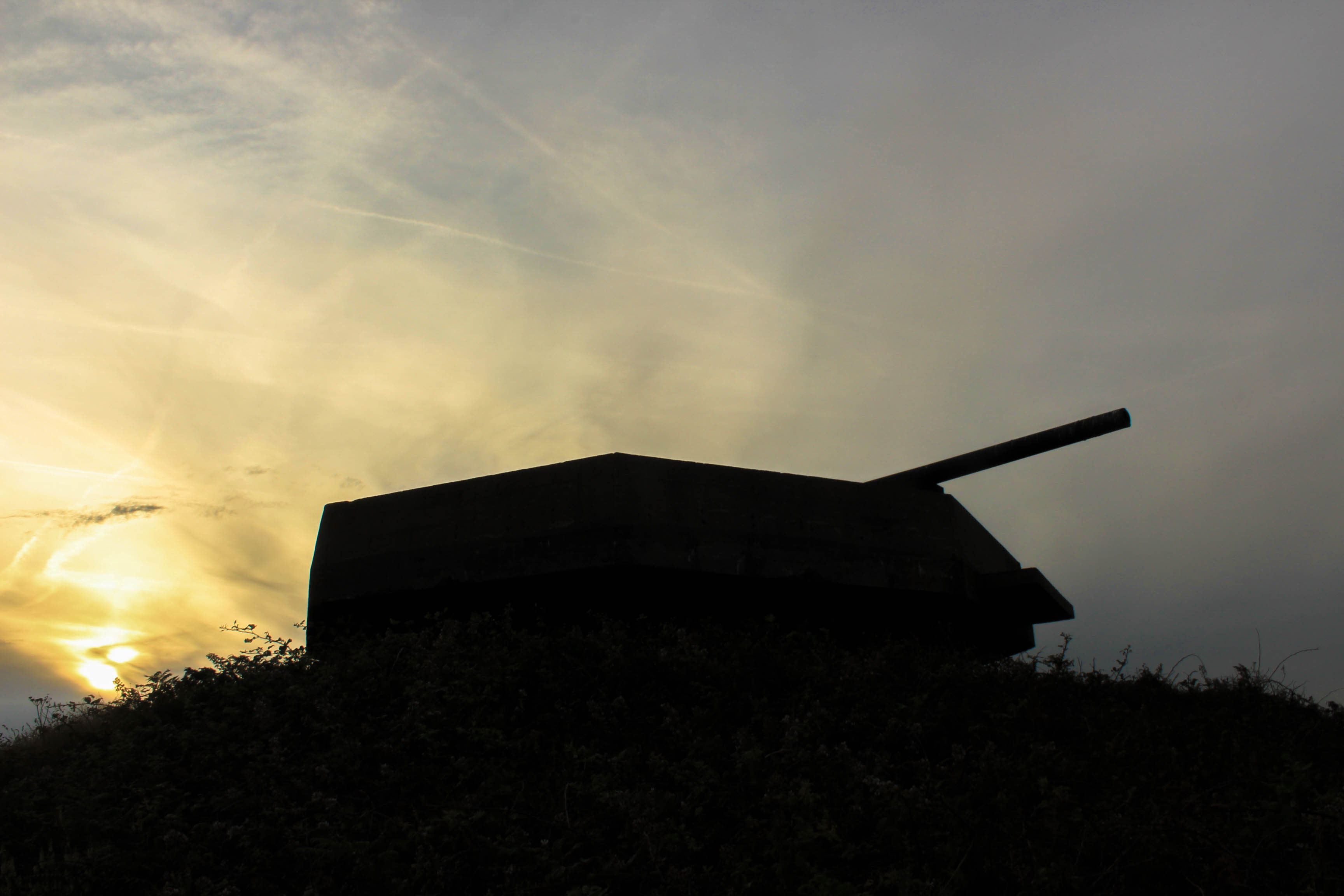
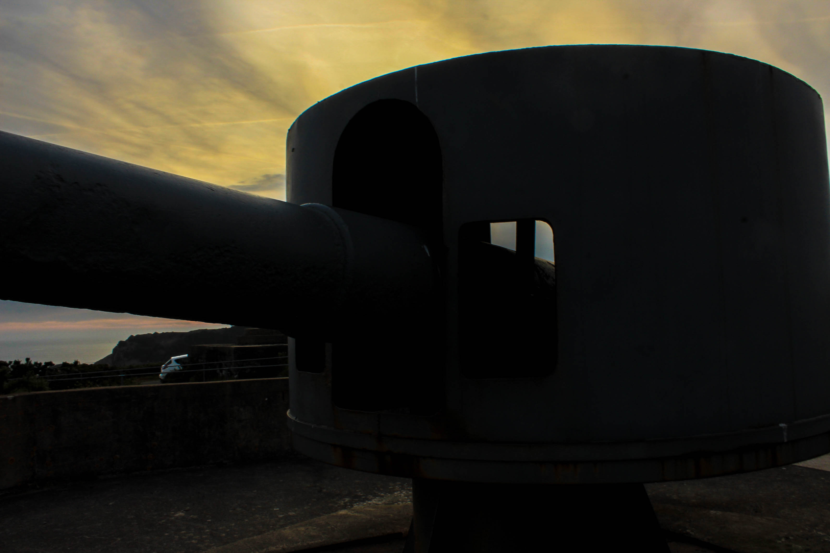
When visiting Batterie Lothringen, I took into account the time of day. I decided to have a photo shoot at the site during the evening around 7pm so I could capture images during the golden hour, the period just before sunset. In landscape photography, the warm colour of the low sun is often considered desirable to enhance the colours of the scene. It is the best time of day for any photography since the light is diffused and warm.

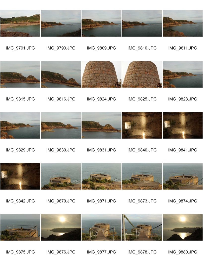
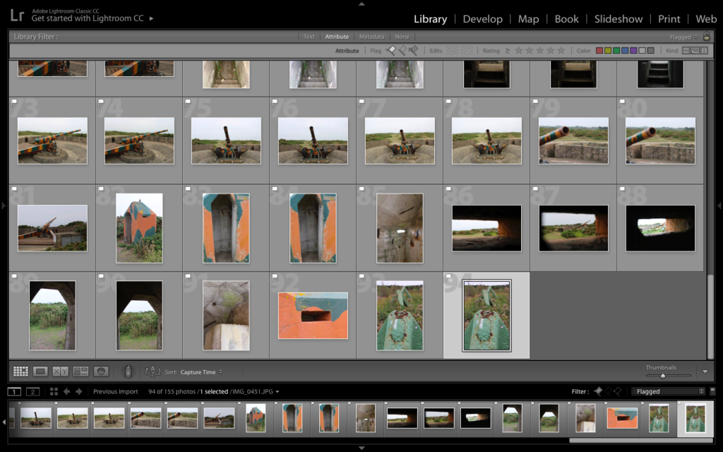
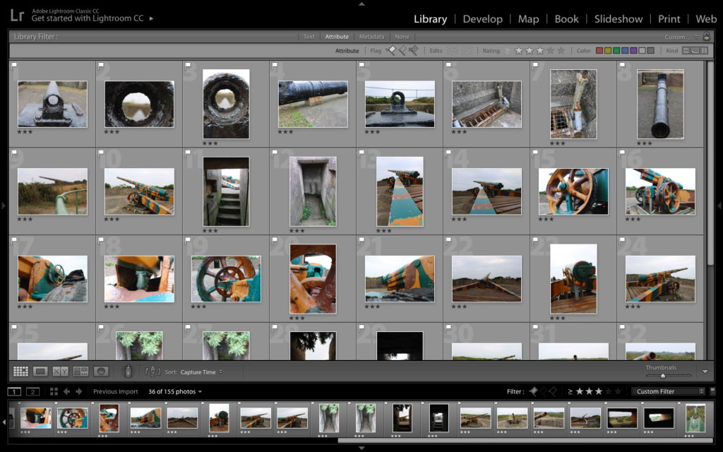
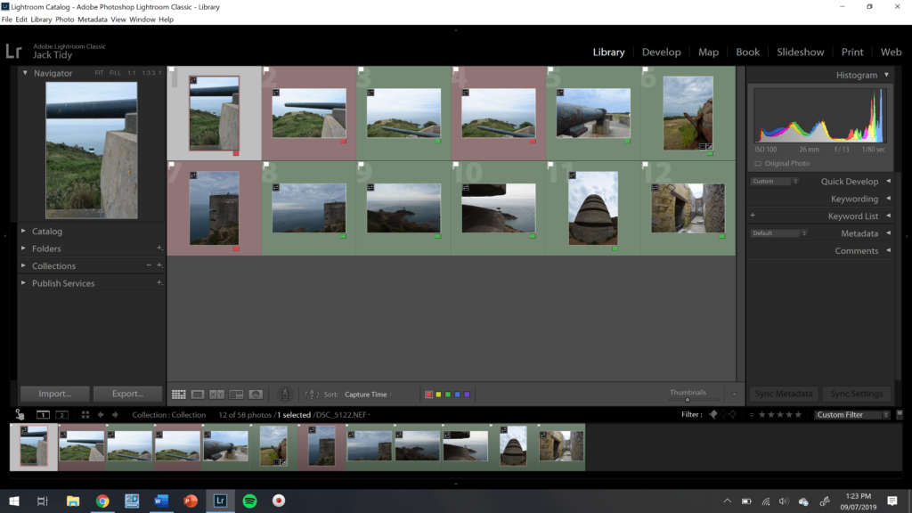
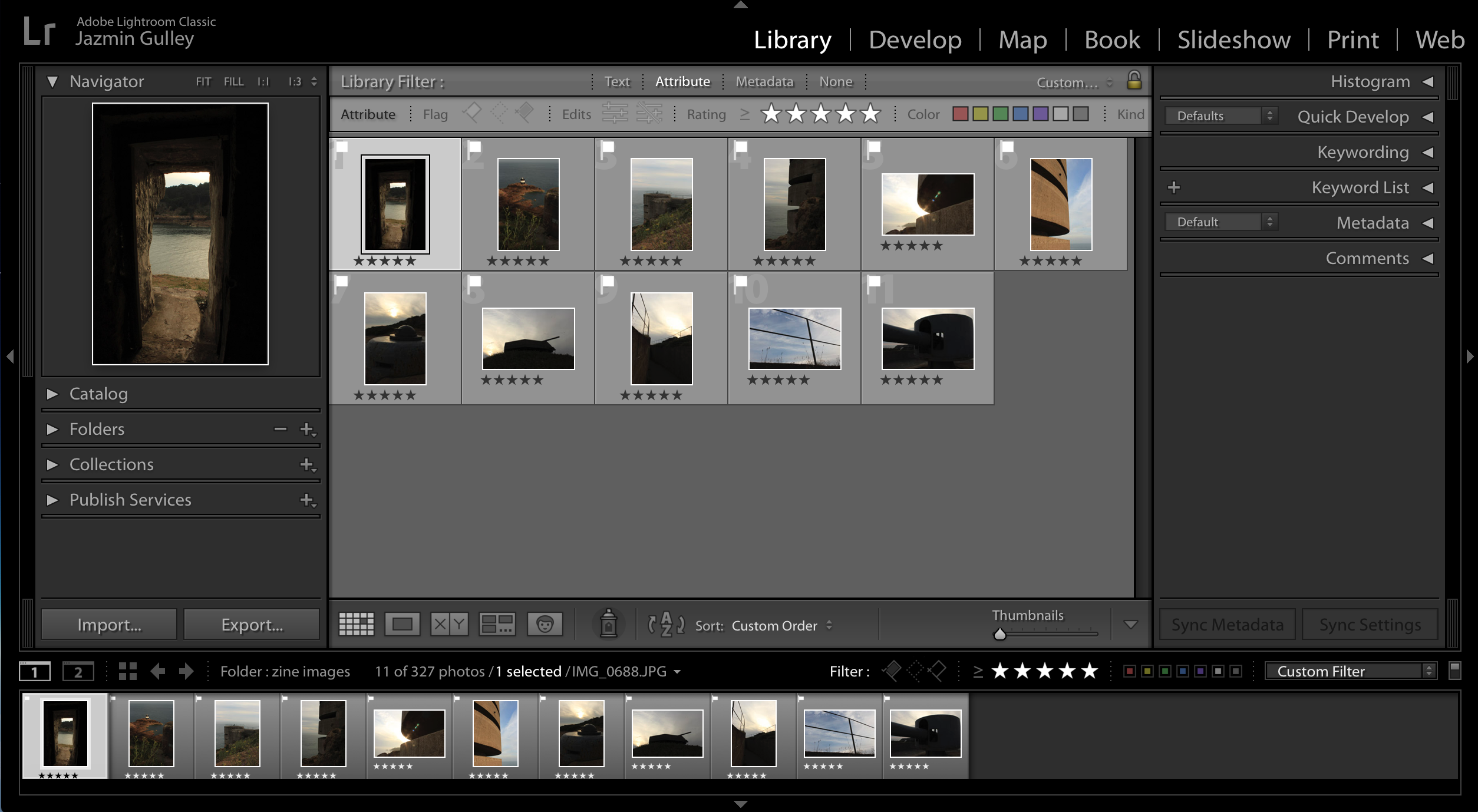
I uploaded my 300 images onto Lightroom so I could carry out the selection process. I used flags and star ratings to help me narrow it down to the best images that were taken at the photo shoot.
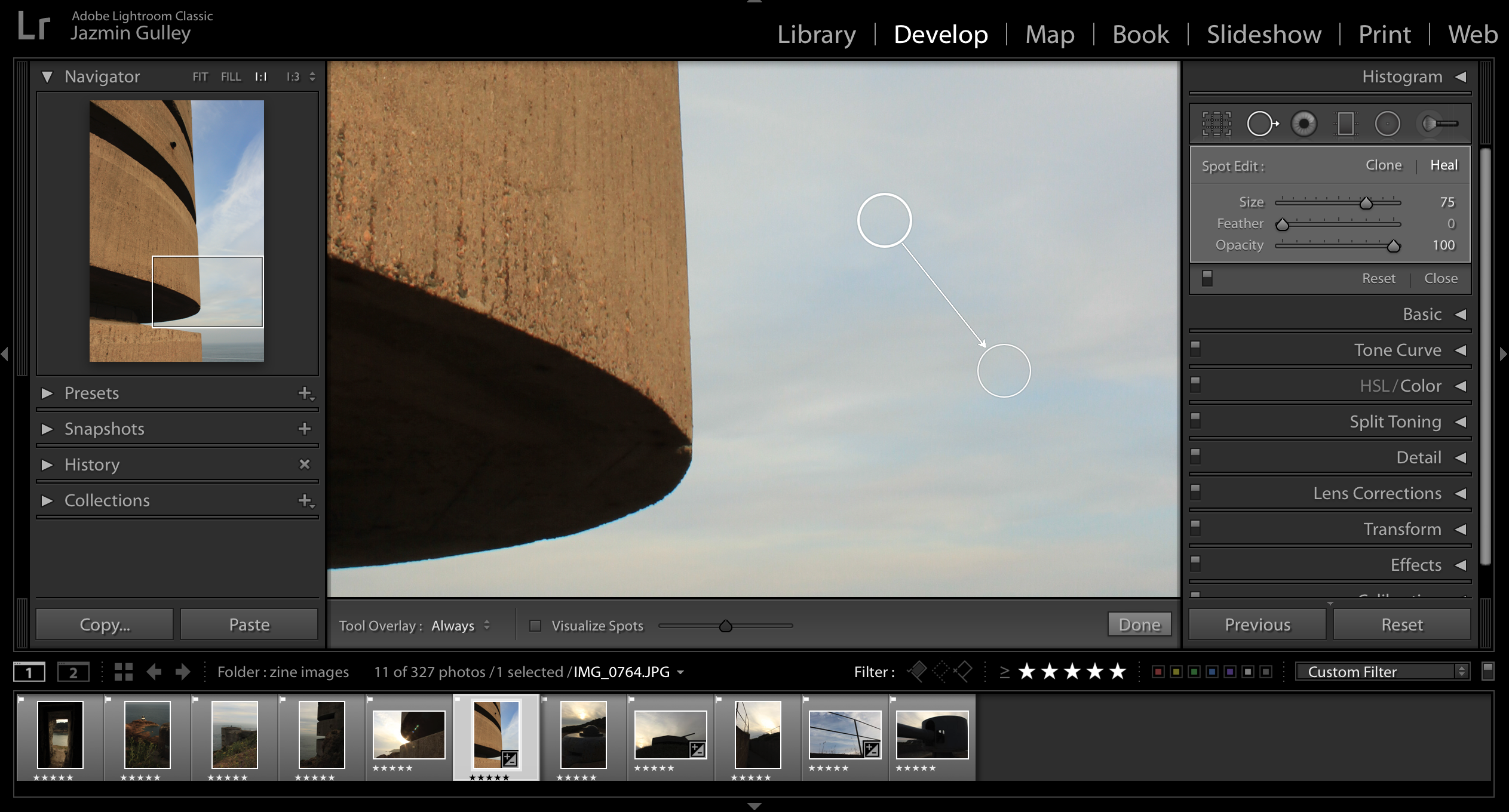
I used Lightroom to remove spots produced by my camera lens.
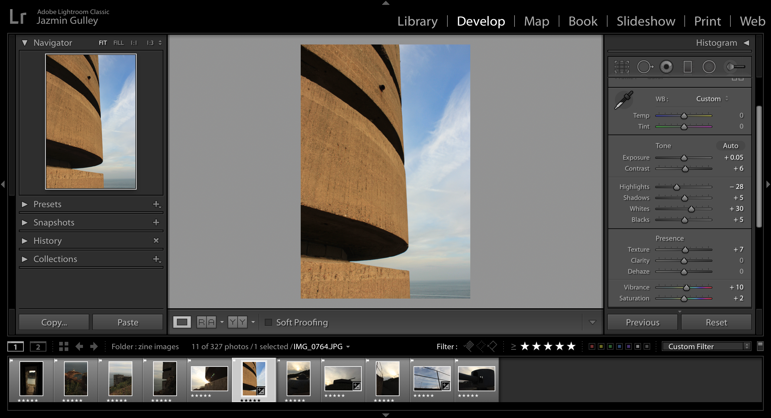
To edit my images I used the develop function to help me adjust the exposure, contrast, highlights, shadows etc. I only edited my images slightly since I wanted the colours produced by the lighting of the sun to be constant throughout each photo.

Bunker Photoshoot – Strongpoint Plemont

Information:

Due to my previous success on the other two photoshoots, capturing different bunker sites in Jersey. I wanted to further explore a different site, looking at different aspects and ways of presenting the decay of bunker archeology, creating a rational for this photoshoot. The site I selected is Strongpoint Plemont, which didn’t have as many structures to capture compared to the other two locations, creating a challenge and allowing me to explore artistically with my camera.

Strongpoint Plemont is site located on the North-West coast on the Island, it was created by the Troopsof 216 Infantry Devision. The purpose of the site was mainly to hold communication cables to Guernsey left Jersey from there. It also was a holiday camp which would have been useful for billeting the soldiers. 319th IR arrive and reinforced field positions are put in place in different levels becoming a Strongpoint. On top of this the bunker site also held many different weapons to prevent unauthorised access into the Island.

Planning:

In preparation for the photoshoot I preplanned and adjusted my camera settings based on the weather outside, when conducting this photoshoot. I used the AV setting on my camera allowing me to put main focus onto my aperture settings. I used a quick shutter speed, alongside a mix of high and low apertures, allowing different depths of fields to be used in order to capture the archeology. The ISO remained low, due to the sun being beaming onto the bunker’s, as well as the white balance being set onto sunny day, in order for a sense of warmth and image colour correction within my composition.

Lightroom Selection:

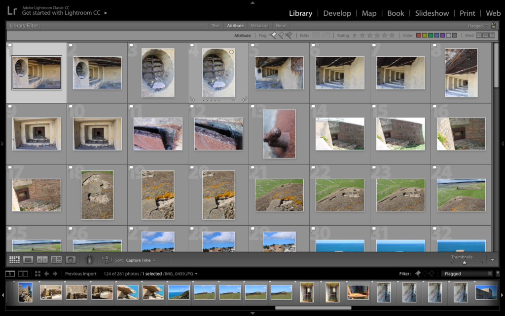
First Edit – Flagged
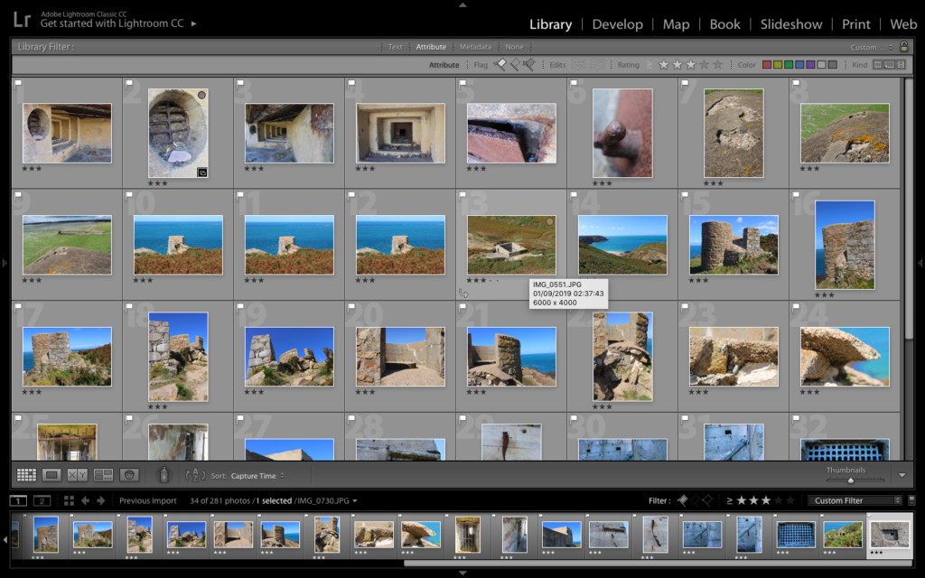
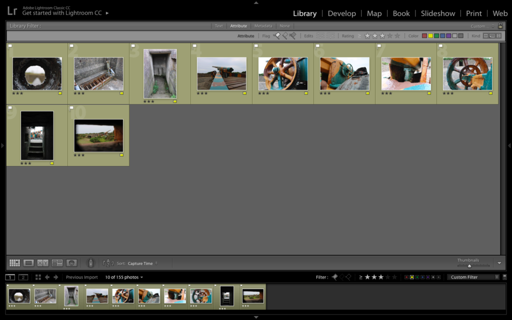
Second Edit – Star Rating
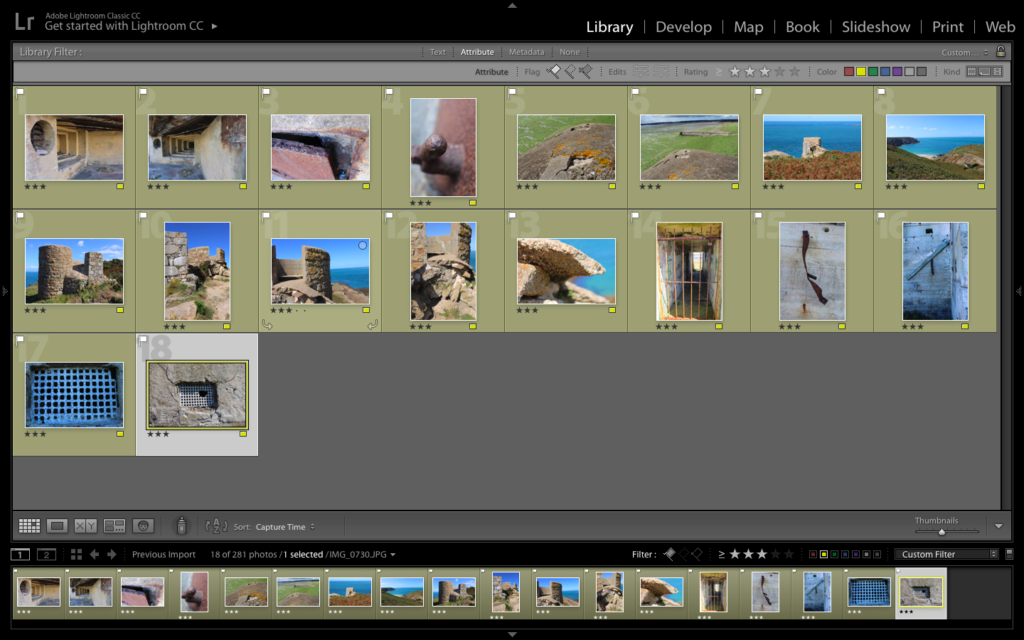
Third Edit – Colour Rating

Black and White Edits:

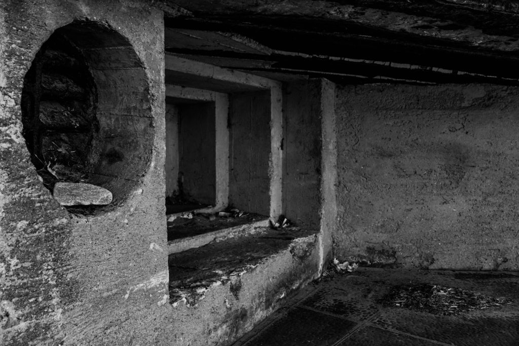
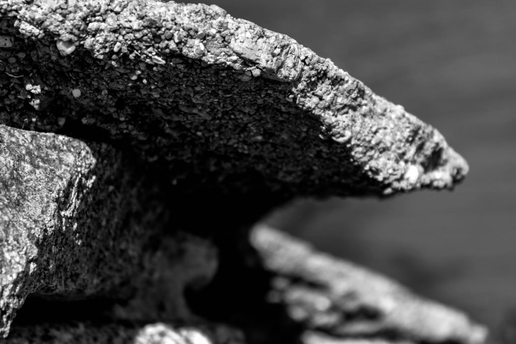
For my black and white final outcomes, I decided to utilise images which clearly presented the formal elements of texture and shape, and wanted these to clearly be presented within the final composition, As well as using macro images, presenting a new way to perceive the archeologies. I started of by cropping some of the images, in order to present a clear subject alongside having a clearer ascetic to my work.

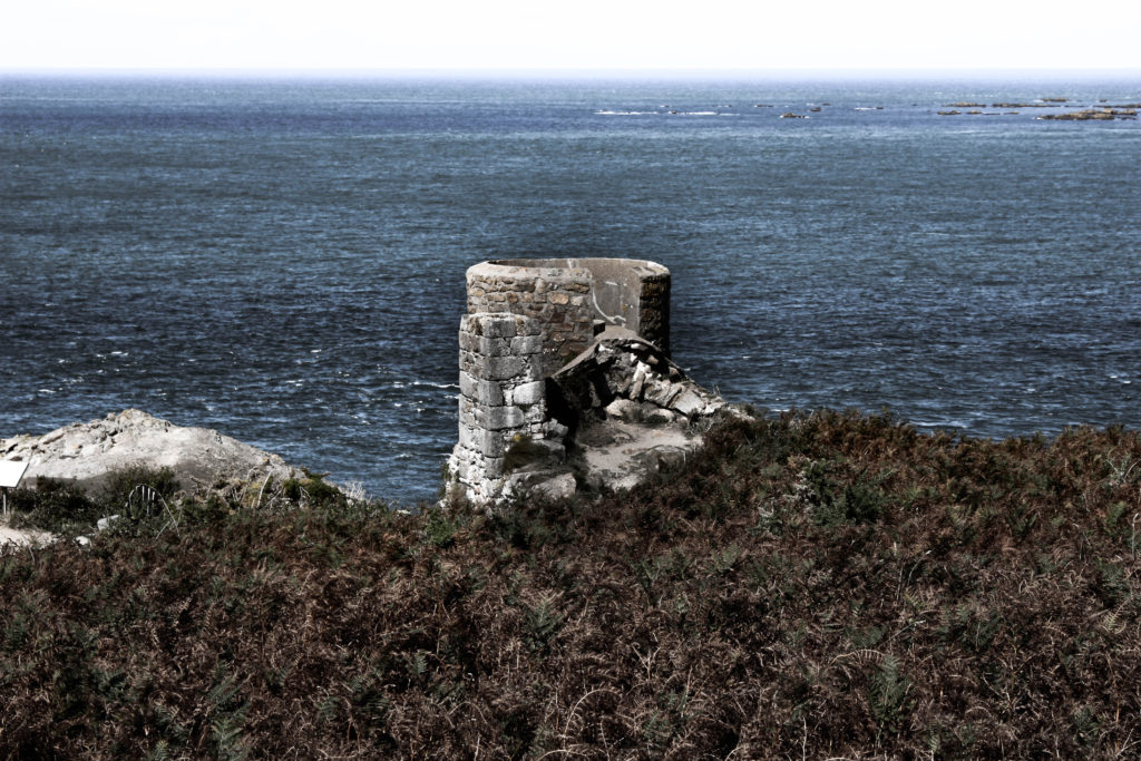
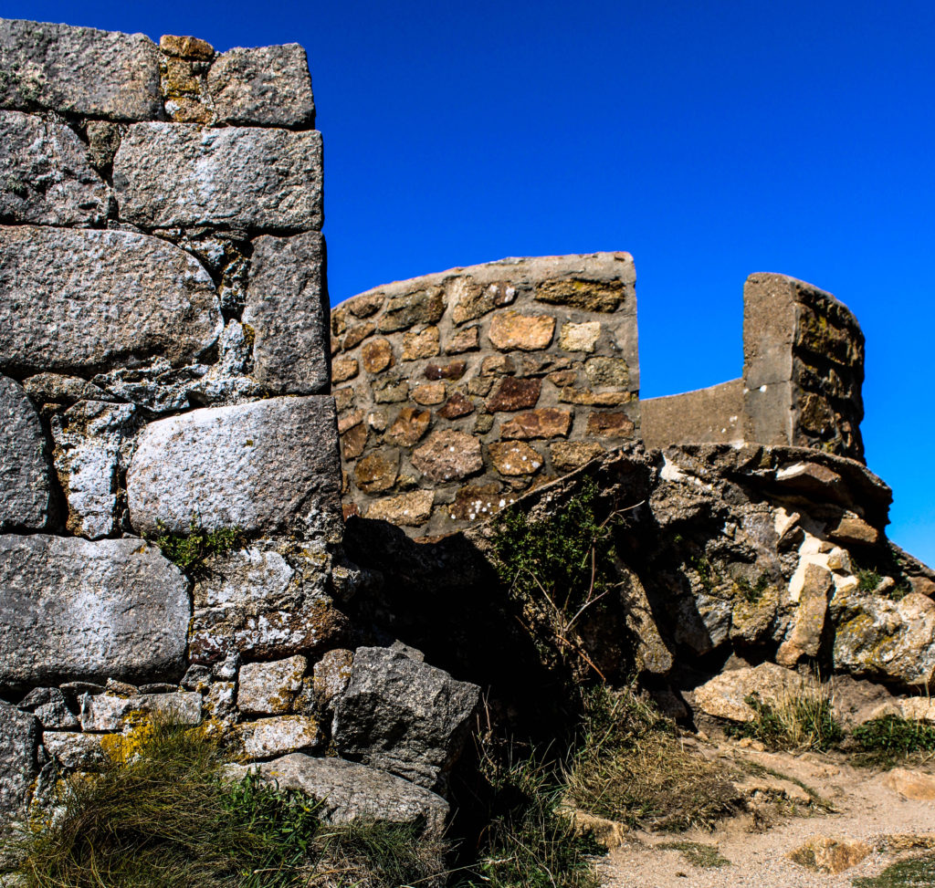
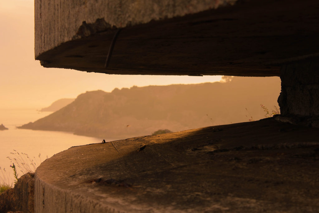
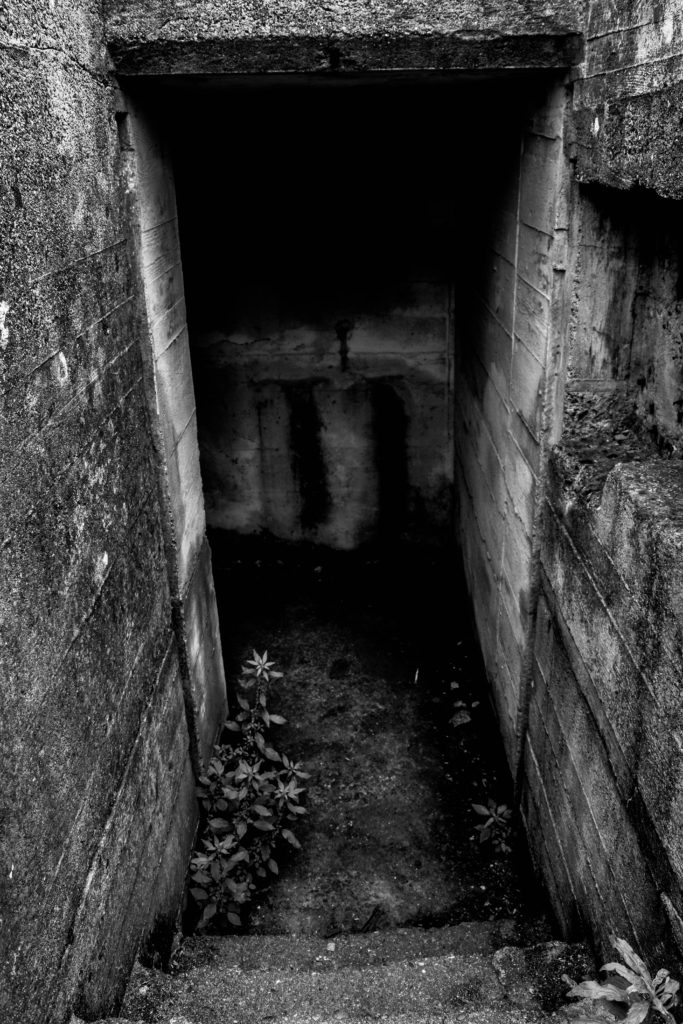
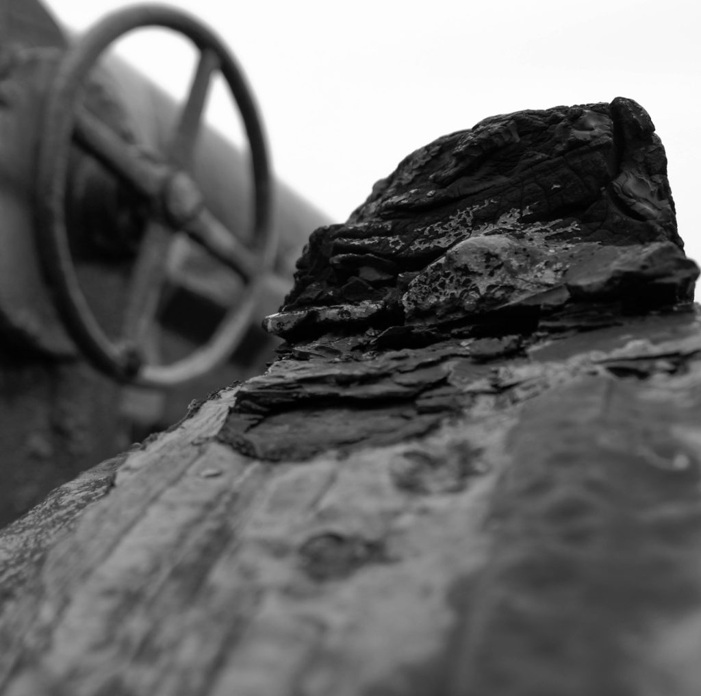
Above is my favourite outcome from the photoshoot, thus I deiced to break down the different components within the image, to showcase my rational as a photographer. Conceptually, I was showcasing the decay of bunkers, and how they have been abandoned and untouched since the war, allowing nature to grow and take back it’s land, whilst leaving a permanent mark on the Island reminding us of the history of Jersey. Contextually, the bunker’s were used to store artillery and weapons in order to prevent unauthorised access into the island. Visually, I have used a macro photograph of the structure of the bunker which has been destroyed, leaving jagger edges, creating a textural design within my imagery. The composition is simplistic as the foreground is apart of the structure and background is the landscape which is blurred, showcasing the use of a narrow depth of field. The photograph was taken at a straight on angle, and is in black and white, allowing a contrast in tonal regions to clearly be illustrated within my work. Technically, the lighting used is natural, produced by the sun, and is soft allowing the structure to not seem so full on, and allows the shadows to naturally be casted onto the structure. The ISO used was low, as there is no intended noise within the photograph as well as the shutter speed being quick as there is no intended blur. The aperture used was low creating the narrow depth of field, which I previously mentioned and the white balance is set to the daylight setting.

Colour Edits:

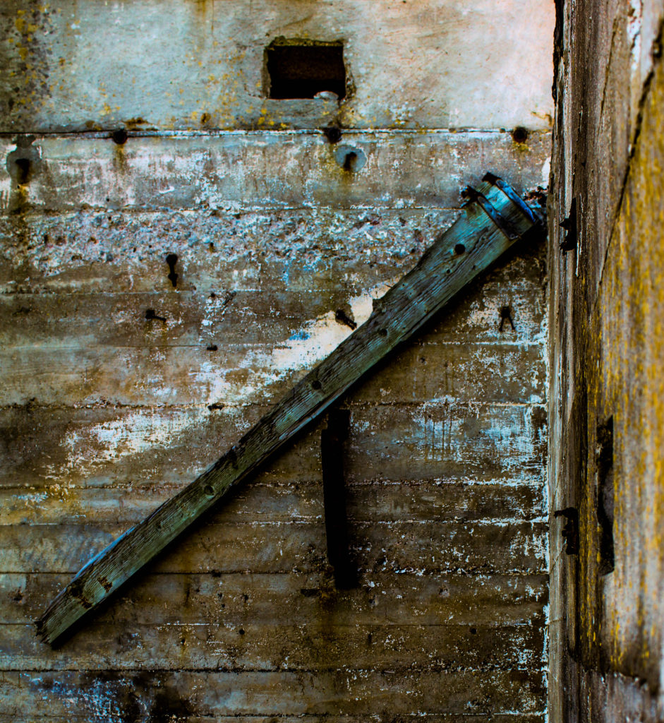
For my colour edits I used different photographs, which allowed me to explore ways of editing the photographs to make the bunkers not look like they are in real life. I achieved this by moving the bipolar bars to either extreme on the panels, for example having the blacks one end and the whites the other end. The unique and abstract designs produced allows us to rethink the purpose of the bunker, outlining their importance to the Island’s history.

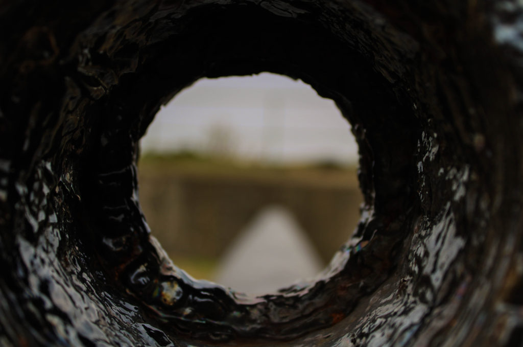
Above is my favourite image from the colour edits, as well as my top image from the whole photoshoot, as I believe it changes the perspective and the way in which we look at Jersey’s bunkers. Conceptually, I was showcasing the decay of bunkers, and how they have been abandoned and untouched since the war, allowing nature to grow and take back it’s land, whilst leaving a permanent mark on the Island reminding us of the history of Jersey. Contextually, the bunker’s were used to store artillery and weapons in order to prevent unauthorised access into the island. Visually, the image clearly showcases the formal elements of texture, space and form, which is showcased by the editing technique I adopted as well as the subject of the image. The composition of this photograph is simple, as the piece of wood is the subject of the photograph, main focus point, and the background is the simple structure of the bunker which has moss and shows decay, again clearly outlines by the editing technique. Technically, the photograph uses natural lighting produced by the sun, which is not harsh as the image was taken at a straight on angle in a location in the shade, allowing my white balance to stay on the daylight setting. The ISO was kept low as there is no noise being presented within my work, as well as the shutter speed being quick due to no intended blur. The photograph uses a wide depth of field which showcases the high aperture used.

Evaluation:

To evaluate my third photoshoot exploring the bunkers, I believe I have been able to produce strong outcomes showcasing the bunkers in an abstract way, allowing us to rethink and remind ourselves of the importance of the bunkers on our Island. I have been able to further explore with the editing on Lightroom, showing my competence to think creatively as well as not sticking to the basic and standard edits that are usually conducted when editing images. I have been able to gain further understanding into the history of Jersey and have shown further exploration into the project.

Noirmont – experimental photo shoot

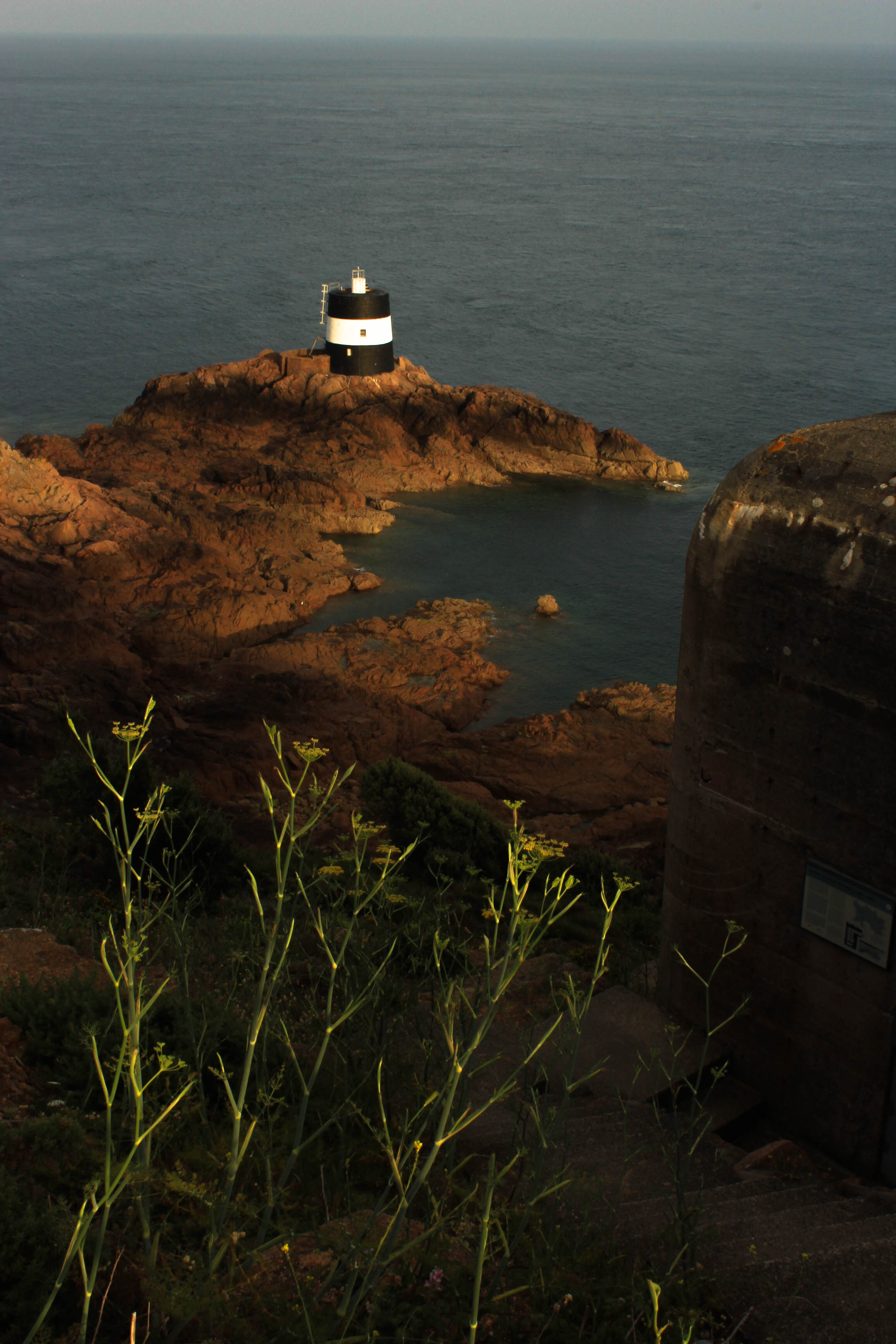
Last weekend I went to Noirmont and then Portlet shortly to take images of the historical German sites it has to offer.

Noirmont is a headland in Saint Brelade enclosing St Aubin’s Bay on the western side.

Noirmont Point and a substantial part of the headland behind it was acquired by the States in 1950 as the Island’s war memorial.

It is a strange irony given its status as a memorial of a war in which Jersey was occupied by the Germans for five years, that probably the main reason for visiting the headland is to view the restored bunkers and gun emplacements of Batterie Lothringen, the only naval coastal artillery battery in the island and part of Hitler’s infamous Atlantic Wall.

Final edited images:

Bunker Photo Shoot – Battery Moltke

Information:

Due to the success of my first trip to Noirmont point, I decided to explore another artillery battery on the island. I wanted to produce more images which supported the theme of bunker abandonment and how nature is taking back the island. I explored more with the weapons located on the site and different details on the structures which could creating an interesting and abstract looking image.

Battery Moltke is an incomplete World War 2 former coastal artillery battery located in St Ouen’s. It is located in Les Lands, which is where all the guns where chucked off the coast at the end of the occupation. The artillery has bunkers, guns and the Marine Peilstand 3 tower located on site. The bunker was being built as the war came to a closure, thus they did not manage to finish making it in time leaving it unfinished. The artillery battery was being built to protect St Ouen’s bay from any attacks to the island. All the different structures were close in proxemics and close to the cliff face, which showcases how the location was ideal for the Nazi’s to prevent anyone entering or leaving the island.

Planning:

To prepare for this shoot I used the AV setting on my camera which allowed me to prioritize my aperture. The weather was some what sunny but had some fog, which meant that my aperture was middle in the range. My ISO was slightly higher than my previous shoot as well due to the lack of sun light provided, did not exceed 600. I used a quick shutter speed, with manual focus in order to allow me to control my camera. I wanted to explore with macro images as well landscape to capture the bunker. When editing I am going to simply stick with the techniques used from the first shoot, but it may vary due to the outcomes I produce.

Lightroom Selections:

Edit 1 – Flagging
Edit 2 – Star Rating
Edit 3 – Color Rating

Color Edits:

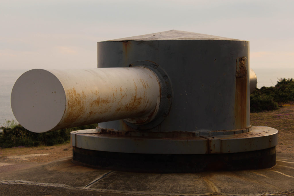
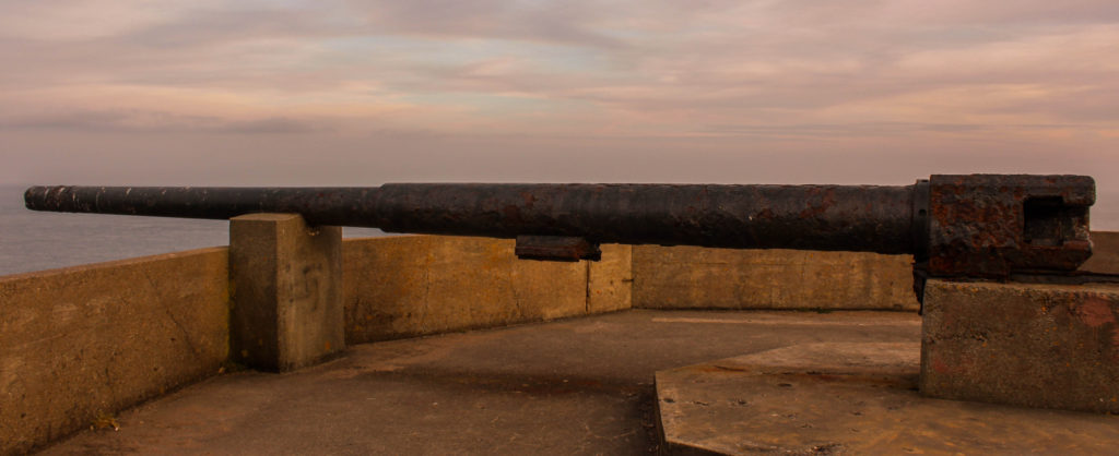
For my color edits I decided to explore and experiment with the different developing tools within light room. I always made the white balance setting to ‘as shut’, but adjusted the clarity, shadows, blacks, whites etc to enable the best possible outcome for my imagery. For the first edit I wanted the center of the frame to be lighter than the outsides, to create a sense of entrapment and allows the viewers eyes to be easily guided around the frame of the image. I did this by using the Radial filter tool. Moreover, for this edit I wanted to encapsulate how nature is growing around the bunker, which I showed by increasing the structure and clarity of the images. For my second macro image I wanted to showcase the detail and texture of inside the the gun, I did this by making the whites and black sliders down to bipolar ends, and made the clarity slightly darker allowing this effect to be created. I am very happy with the way in which these two color edits have come out due to how they clearly present the theme of nature taking back the island from the occupation. In addition, the camera techniques (such as depth of field and rule of thirds) used are effective as they allow the archaeology to present decay and historical factors of the second world war.

Black and White Edits:

For my black and white images I looked at exploring with my macro images and creating a tonal contrast within them. I achieved this by adjusting the blacks, whites, shadows and clarity, by moving the sliders closer to either end allowed a clear tonal contrast within the images, making them interesting for viewers to look at. Moreover, I made these decisions to allow the detail and the formal elements of line and texture to clearly be presented in my images. I also looked at cropping my images to emphasis the details on the bunkers which clearly showcases the decay of the bunkers.

Conclusion:

To conclude I am very happy with the outcomes produced in this shoot. Experimenting with macro and landscape photography allowed me to present bunker archaeology in a new way, developing the idea of capturing bunkers and presenting the decay of them. In addition, I have been able to successfully select and develop these image which showcases my ability to use light room effectively and understand the different settings and how to adjust them to make an interesting outcome. Exploring another bunker has also allowed me to understand that the layout of each site are similar and contain practically the same things, however the weapons and views are different which allows new landscapes to be presented. Moving forward I would like to look at photo montages, combining images from both shoots with archival material in order to showcase bunker archaeology in a new light.

Zine research and analysis

Artist research: Dale Konstanz


Concrete Jungle – Mood Board

The 1st zine I looked at was Concrete Jungle by Dale Konstanz. This zine initially attracted me because of the name. I like how the words concrete and jungle contrast each other in the sense that one is man made and the other occurs naturally. I also really like how there was a semi-transparent border box around the title since it means the writing is very clear, yet we are still able to see the background image.

  • Format, size and orientation

The zine is A5 portrait, most of the images are full spread landscape images that go across both pages. This means the zine is nice and compact, yet not so small that the images cant be seen clearly.

  • Design and layout

The layout of the zine is interesting all of the images are a full bleed onto two pages. This helps the images to appear more successfully as they’re presented clearly and largely which allows details to be seen easily.

  • Rhythm and sequencing

This zine simply shows images of man made structures with nature elements. All the images go together in rhythm because they’re all double page, full bleeds meaning they complement each other well.

  • Narrative and visual concept

The zine’s narrative is interesting as it depicts images of concrete walls surrounded by natural elements.

  • Title and cover

The title is one of the things that initially attracted me. It is simple, yet effective enough that it looks aesthetically pleasing. The title’s font is simple, and black. The front cover has the title written in a semi-transparent box with another image behind it. I think this is successful because it allows the audience to see the title clearly and it’s attracting because you can also see an image behind it

Photo montage

A photo montage is a series of individual photographs, collectively of one subject, arranged together to create a single image. Sometimes a photomontage can move and include video.

A photo montage can contain any number of photos. There is no limit to the amount of time it takes to create this series of images. There is also no limit to the variety of locations the photographer can use to make the photos. To be practical in the execution of a photo montage, some limitation is advisable.

For my photo montage, I took images based on the war and which were taken during that time, and then I also took my own images which are of German bunkers and places which were used during the war. To make my photo montages I took my images and paired them up depending on their similarities, and then cut certain pieces out, stuck them together and even burned one of them. Below are my results.

SONY DSC

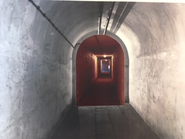
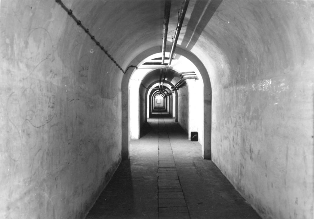
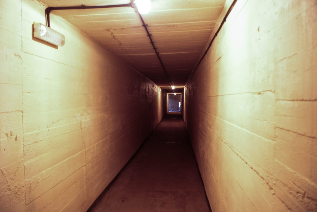
For this montage I took two images, one which was taken during the war in a tunnel and one which I took when I went to Battery Moltke. I then took the image from the war, cut out the middle where the hallway continues and matched it up to the recent image so they look like one hallway.

SONY DSC

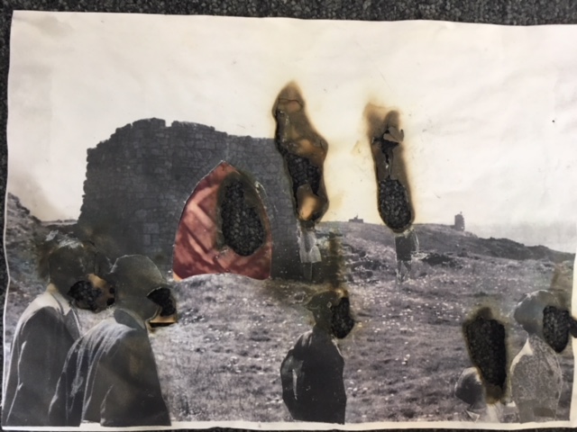
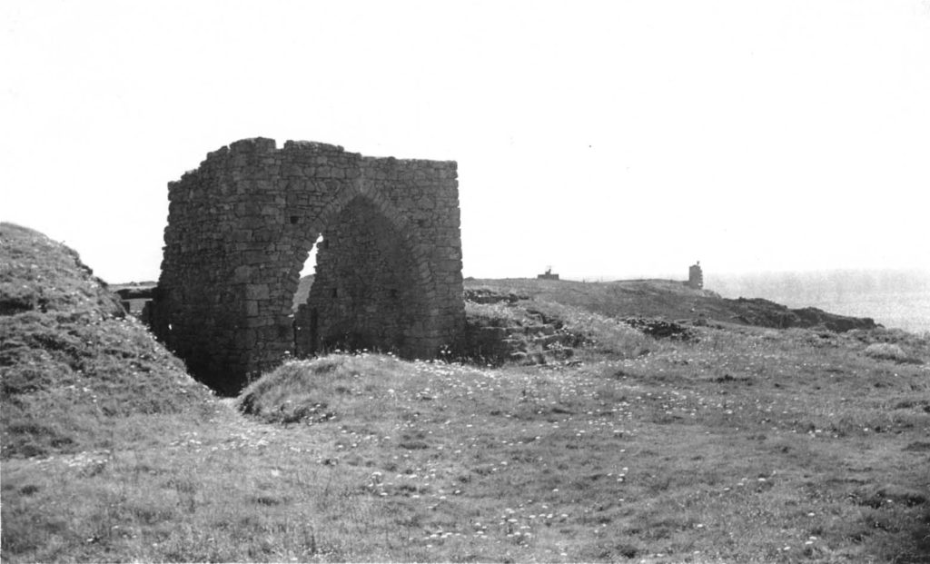
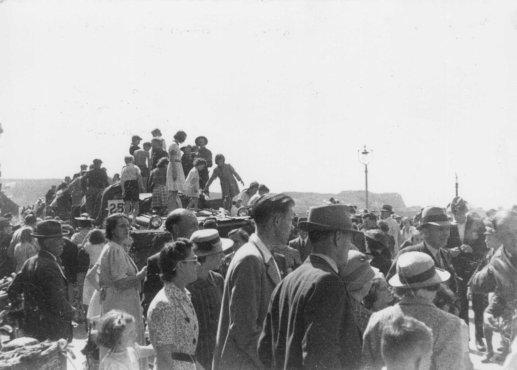
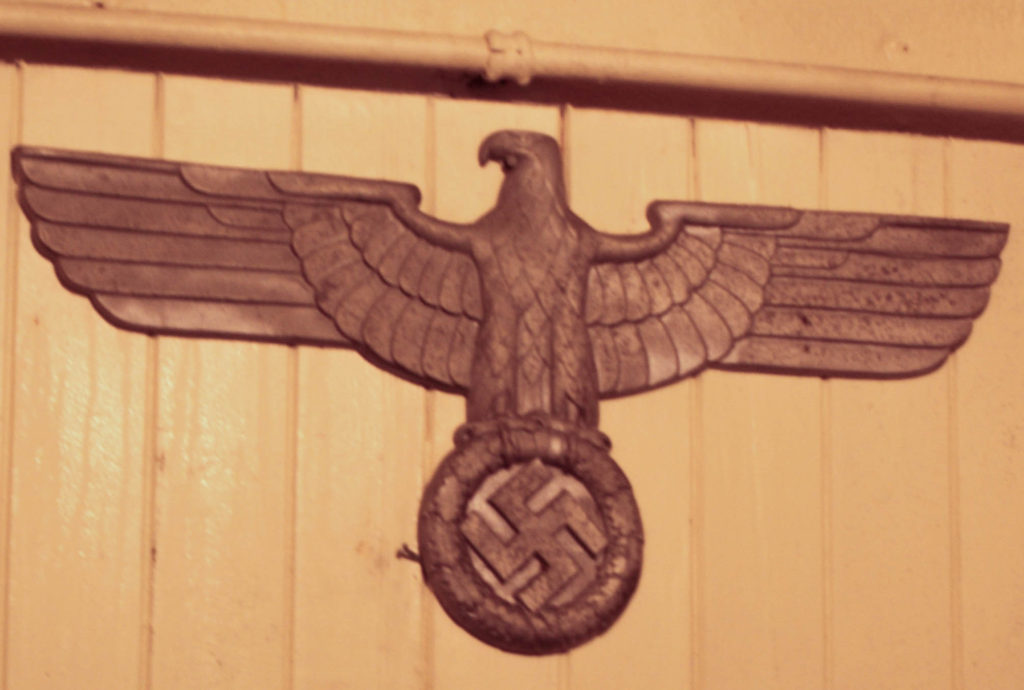
For this image above, I found a picture taken during the war of the French castle ruins close to Battery Moltke, another where there were a crowd of people around a car, and one which I took of a Nazi symbol. I cut out the people in the crowd image and stuck them among the ruins picture to make them appear as if they were there looking at towards the archway and the bunker in the background. I then cut out a hole where the archway was and put the Nazi sign there. To finish it off I burnt holes into the images where the faces of the people were, and where the Nazi sign was so that they lost their identity as they would have when they were taken over during the war.

SONY DSC

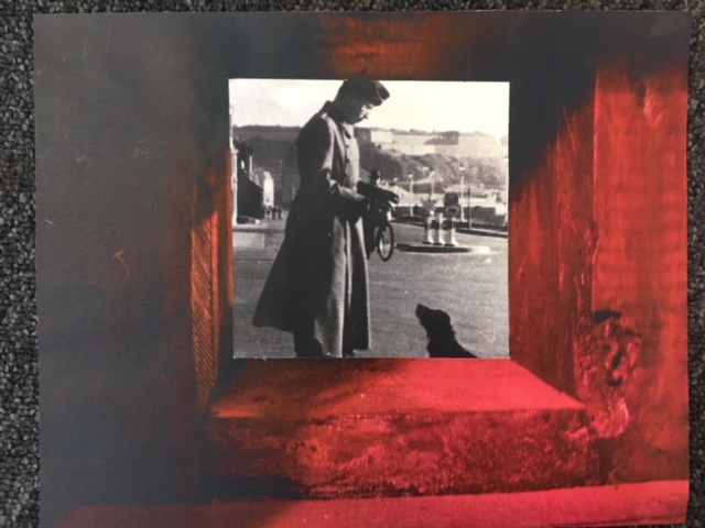
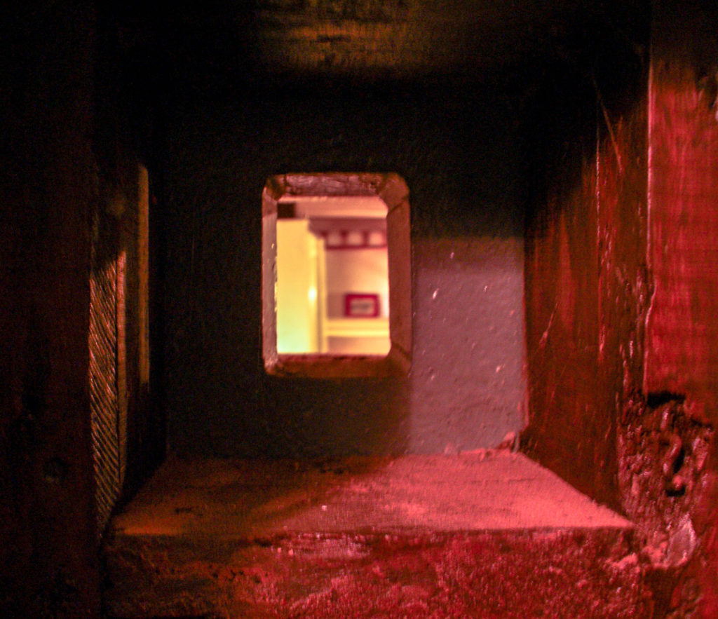
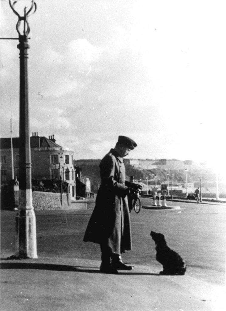
to make this image a took an image of my own, which was a square hole in the wall of the hallways we visited at Battery Molke, and took an image from the archive of a German soldier with a black dog. I cut out the space where the hole would have been in my image and stuck the older image behind it, as if we are looking back into the past through this German-made hole.

Developing and experimenting- Black and White

In this blog post I will be experimenting with radical changes with some of my favorite images. I will be experimenting with tones and contrasts in order to make some images black and white.

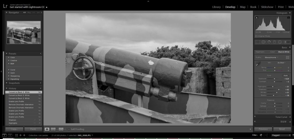
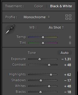
Here I put the image into black and white and I increased the contrast because I thought that the different colours on the guns could really stand out next to each other. I increased the whites and highlights in order to make the brighter colours even more prominent.
Final image
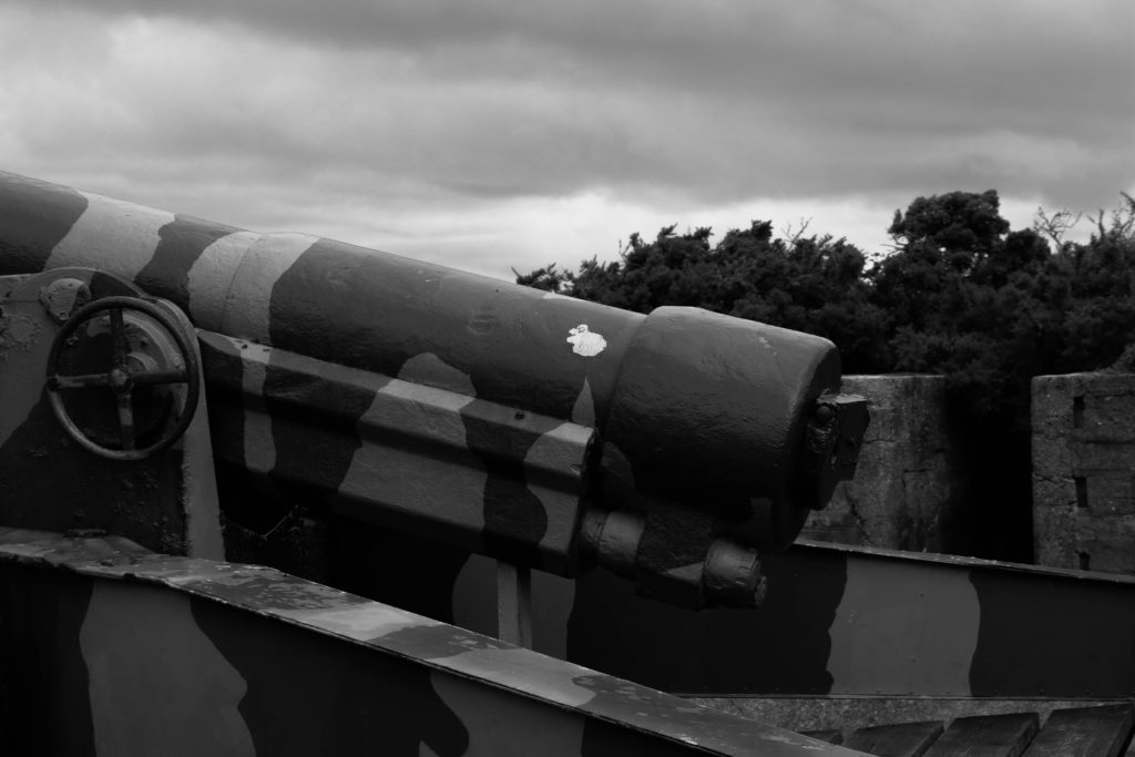
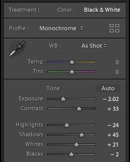
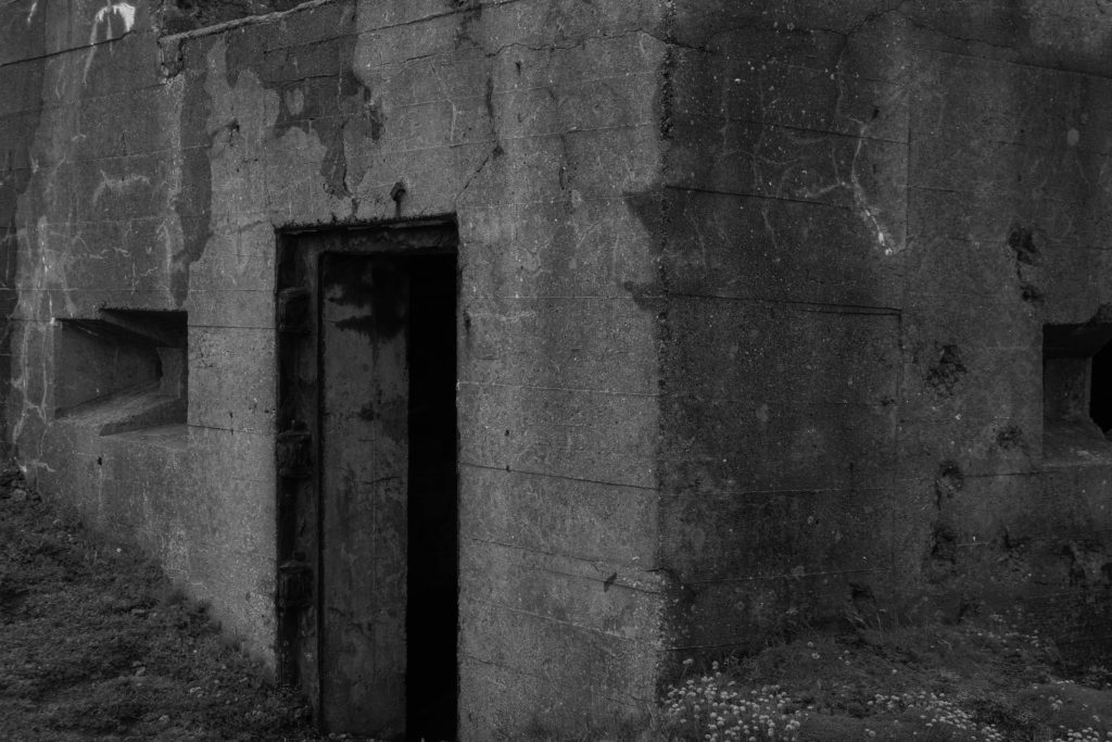
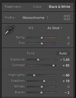
For this image I did something similar to my previous image. In this image I increased the contrast and shadows, and I also decreased the exposure. I dd this because my image has lots of walls facing different ways and by increasing the contrast you are able to see a variety of different tones in the photo. The darkness also symbolises how the occupation was a dark time for both the soldiers and the islanders, so i wanted a sort of aura of tragedy surrounding the images of the fortifications.
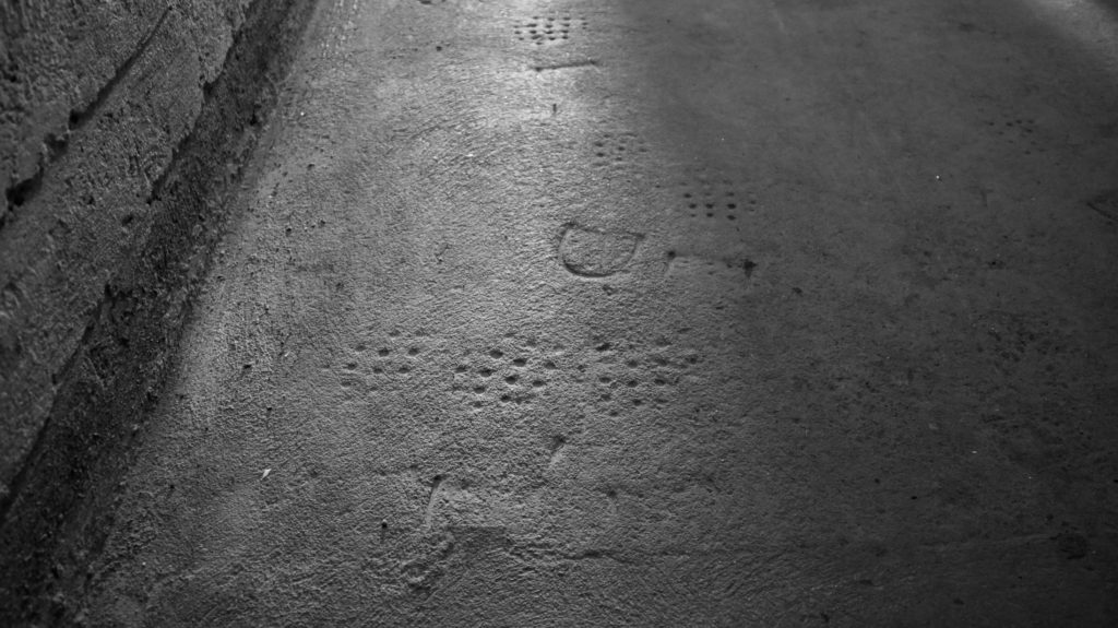
To edit this image I majorly increased the contrast because the image was quite bright, and I also decreased the exposure to make the image seem even darker. I did this because I wanted to show how the foot prints of the German soldiers are in the past and also to make the concept of the occupation feel sadder.

Batterie Lothringen Photoshoot

When at Batterie Lothringen I found that the sky in that day was very dramatic with large clouds that have breaks in them and have light shining through them, for this reason I made an effort to get large amounts of sky in most of my images and took most outside. Also the lighting inside of the museum wasn’t very good.

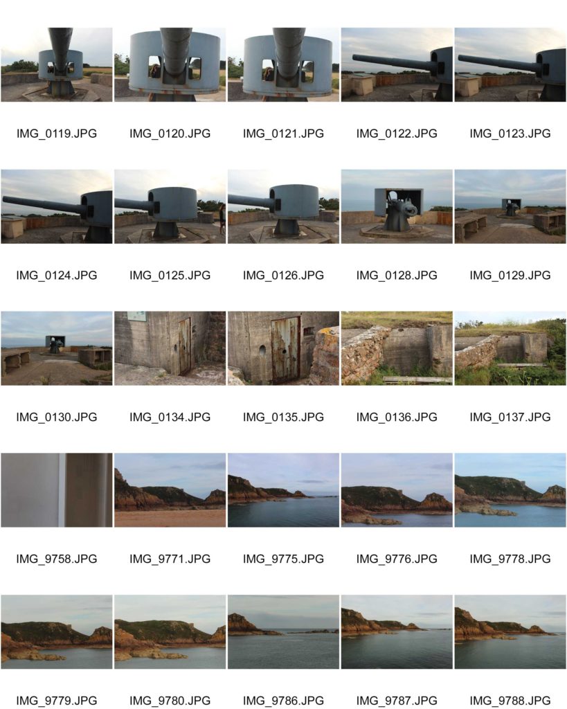
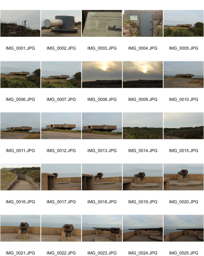
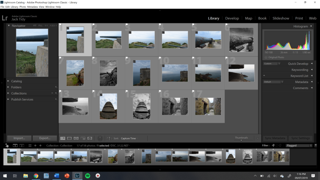
Here are the unedited images that I thought could be taken to editing.

After selecting these images I then used colours to select further some final images.

The green images are the ones that I Believe that I could take into editing as they have good composition and potential.

About Zines

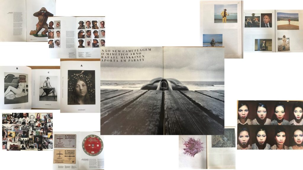
Zines originated in the United States during the 1930’s. A zine is a magazine which is a small, self-publication of your original work where appropriate text and images can be added, depending on what you want to publish,. They are normally printed via a photocopier, meaning that they are pretty cheap and strait forward to produce. Many photographers have created zines and have had them published around society, some even being a series and collectible items. After looking at many different types of zines, created by different photographers, I began to get ideas of how I wanted to lay out images within my zine. Here are some visual representations of what I looked at and what inspired me;

The layout of a zine can differ, some can be landscape or portrait, along with big in different sizes, like A5 or newspaper size. This is similar with the photos that are inside, the images can range in size, some may bleed over two pages, or some pay just cover the corner of one side of the page. Some of the zines had a rhythm/sequence, one I looked as had images in alphabetical order, so the image related to the letter, creating a sequence. The visual concept of the zines can change as well, depending on what the artist is focusing on, some of them related back to the war, whereas some related to different identities. Not all zines just have images only in, a majority of zines also had text printed along side the image, giving a background or maybe writing down the meaning of this page/image.