Ernst Hass
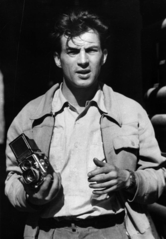
Ernst Hass was born in Vienna in 1921 and decided to do photography after the war. His early work on Austrian returning prisoners of war brought him to the attention of LIFE magazine but he declined the job as a staff photographer in order to keep independence. In 1951 he moved to the US and began to experiment with Kodachrome colour film. He soon became the first colour photographer of the 1950s. In 1962, his work was the first color photography exhibition held at New York museum of modern art. Throughout his career he has traveled and taken pictures for publications such as LIFE, Vogue and Look.
Style
- Pioneer of colour
- Abstract, lines, reflections, texture
- Creating mood through colour and light
- Beauty from the mundane
Hass used a lot of black and white film for most of his career but colour film became very important to his photography. He frequently used techniques such as shallow depth of field, selective focus and blurred motion to create metaphorical works. Once he began working in colour he often used Kodachrome which is known for its saturated colours. To print his colour work he used a dye transfer process which is expensive and a complex process and allowed for great control over colour hue.
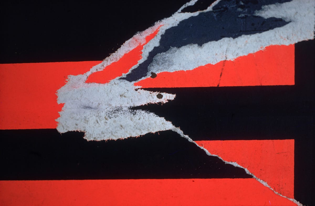
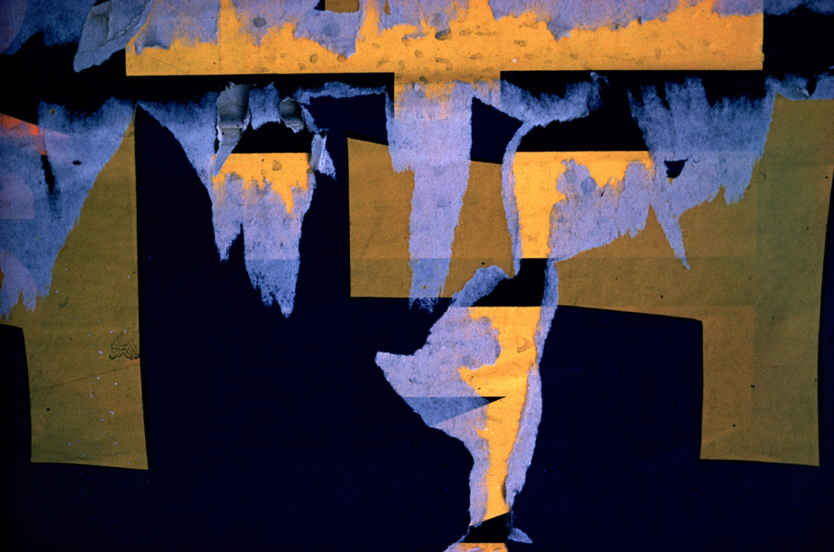
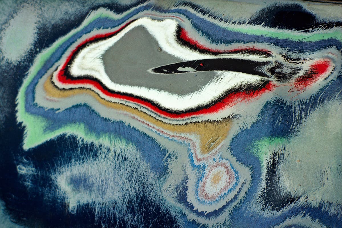
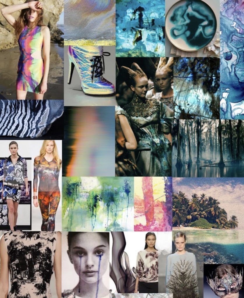
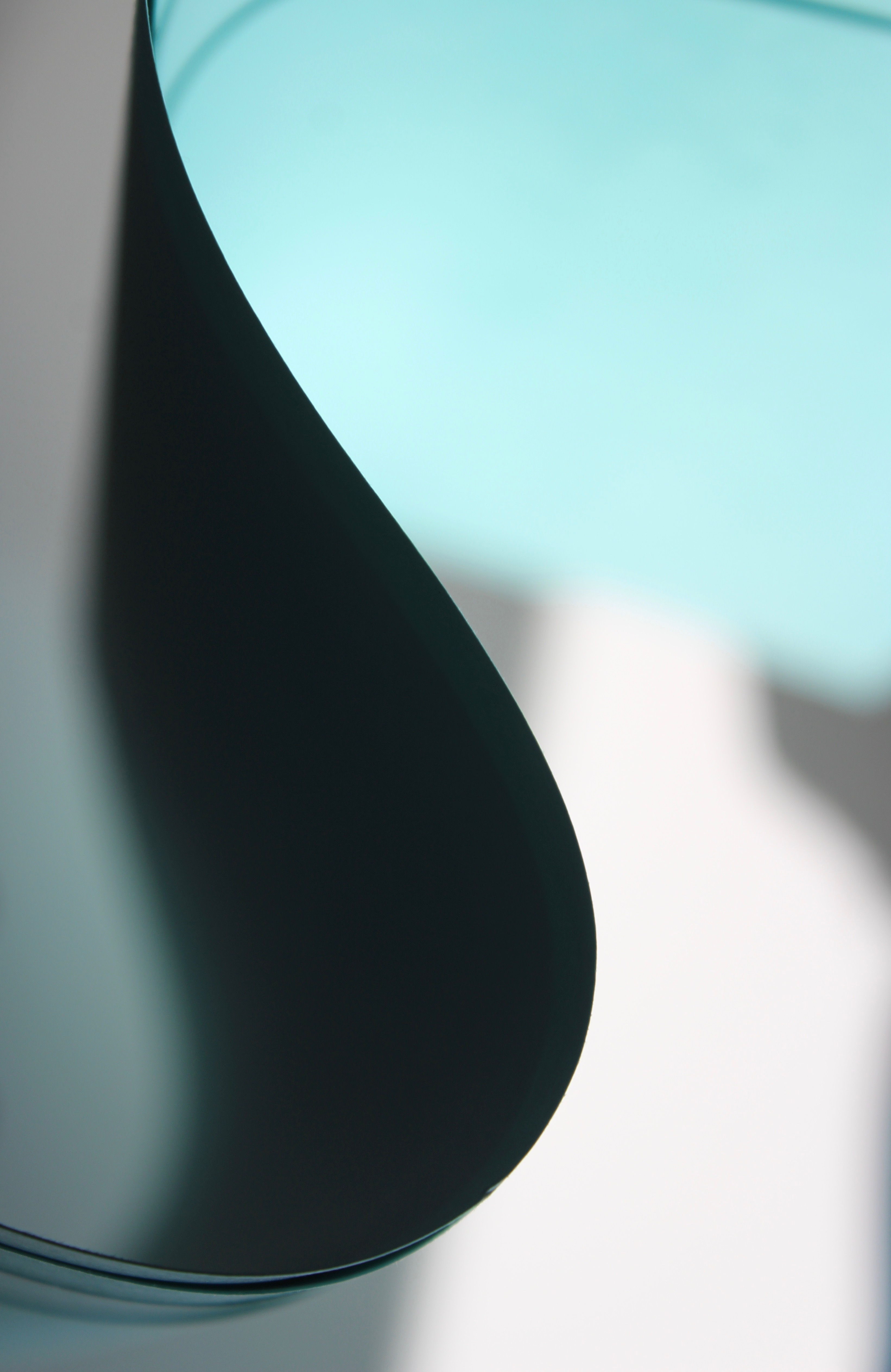
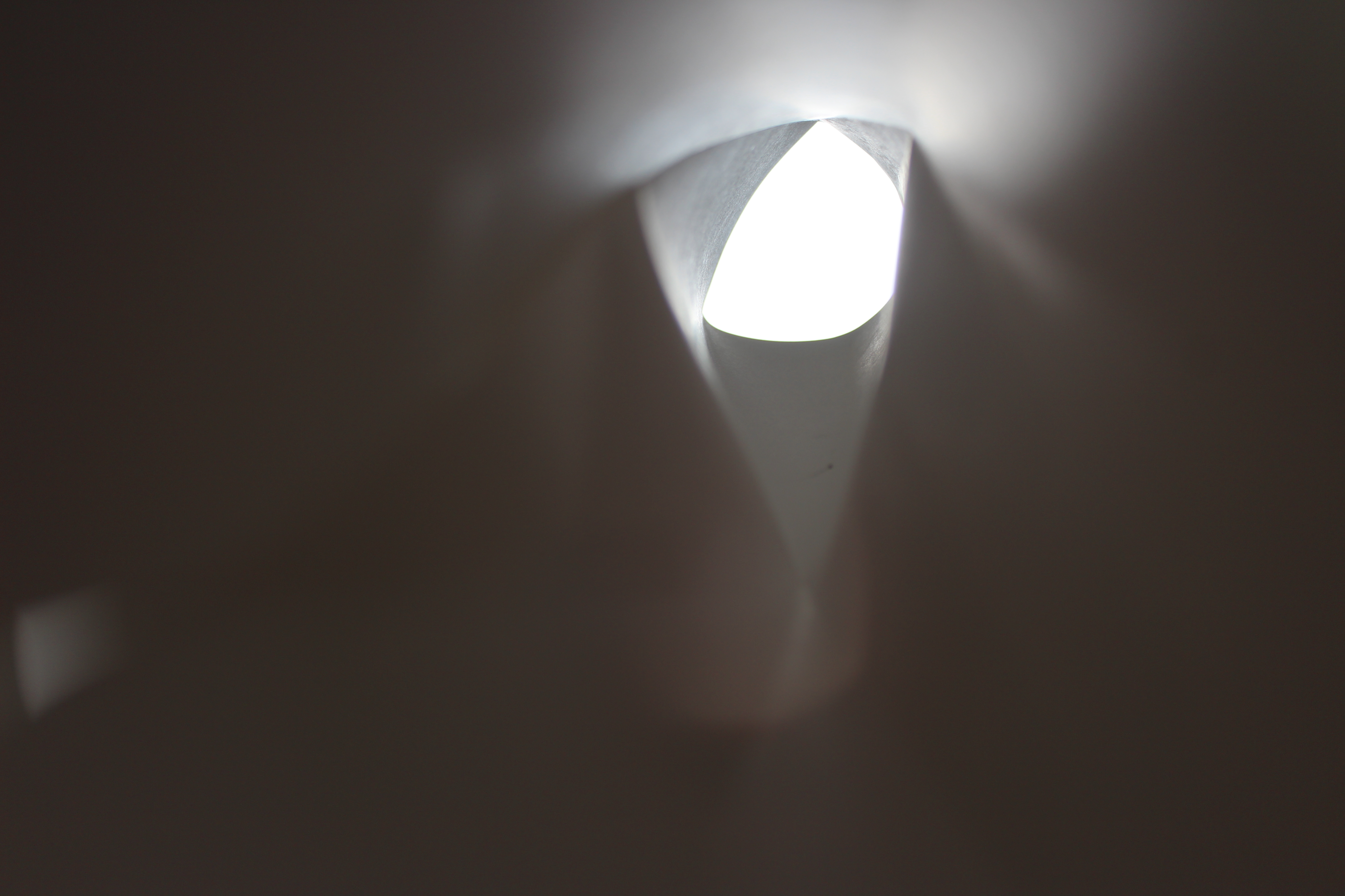
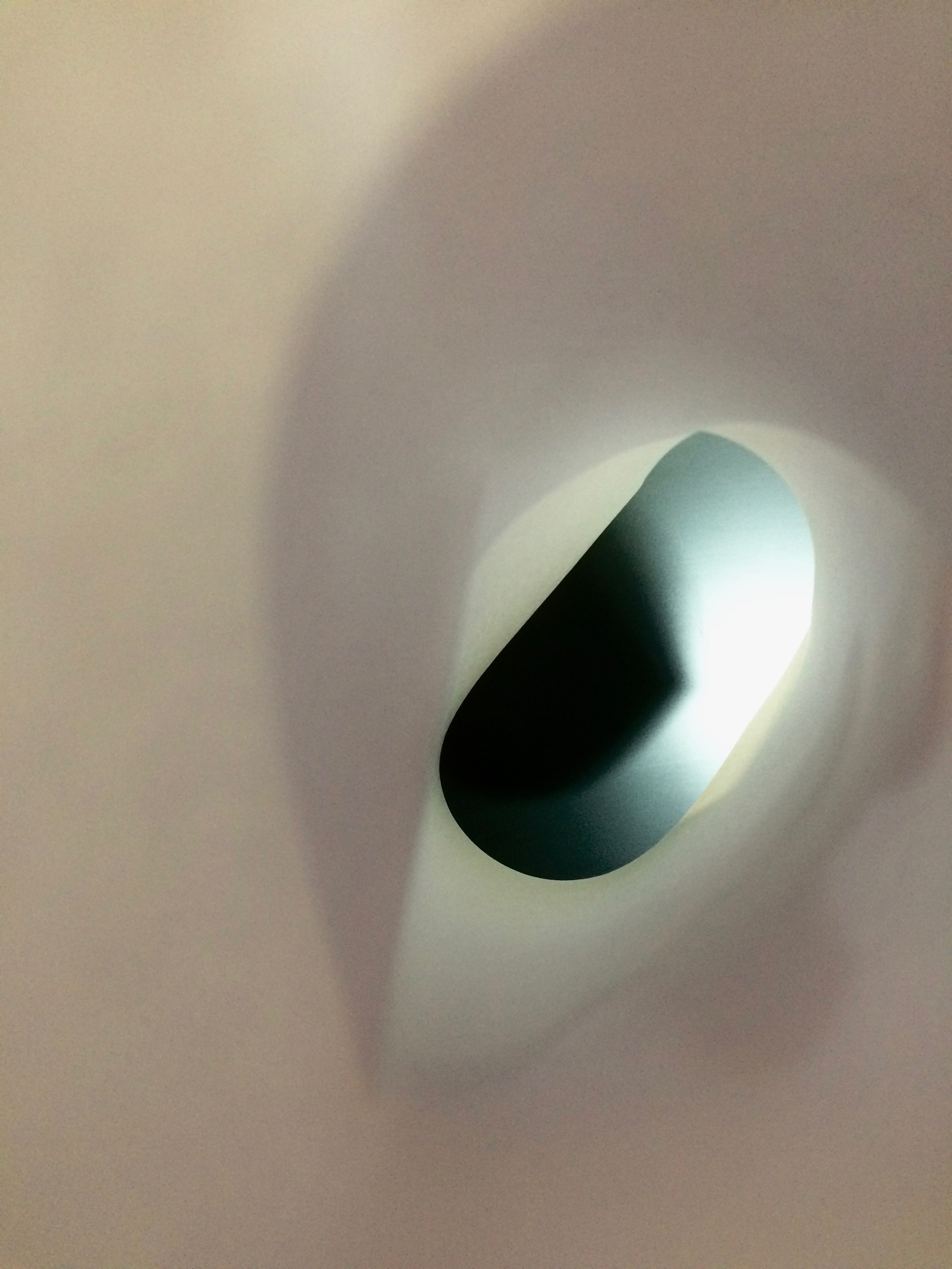
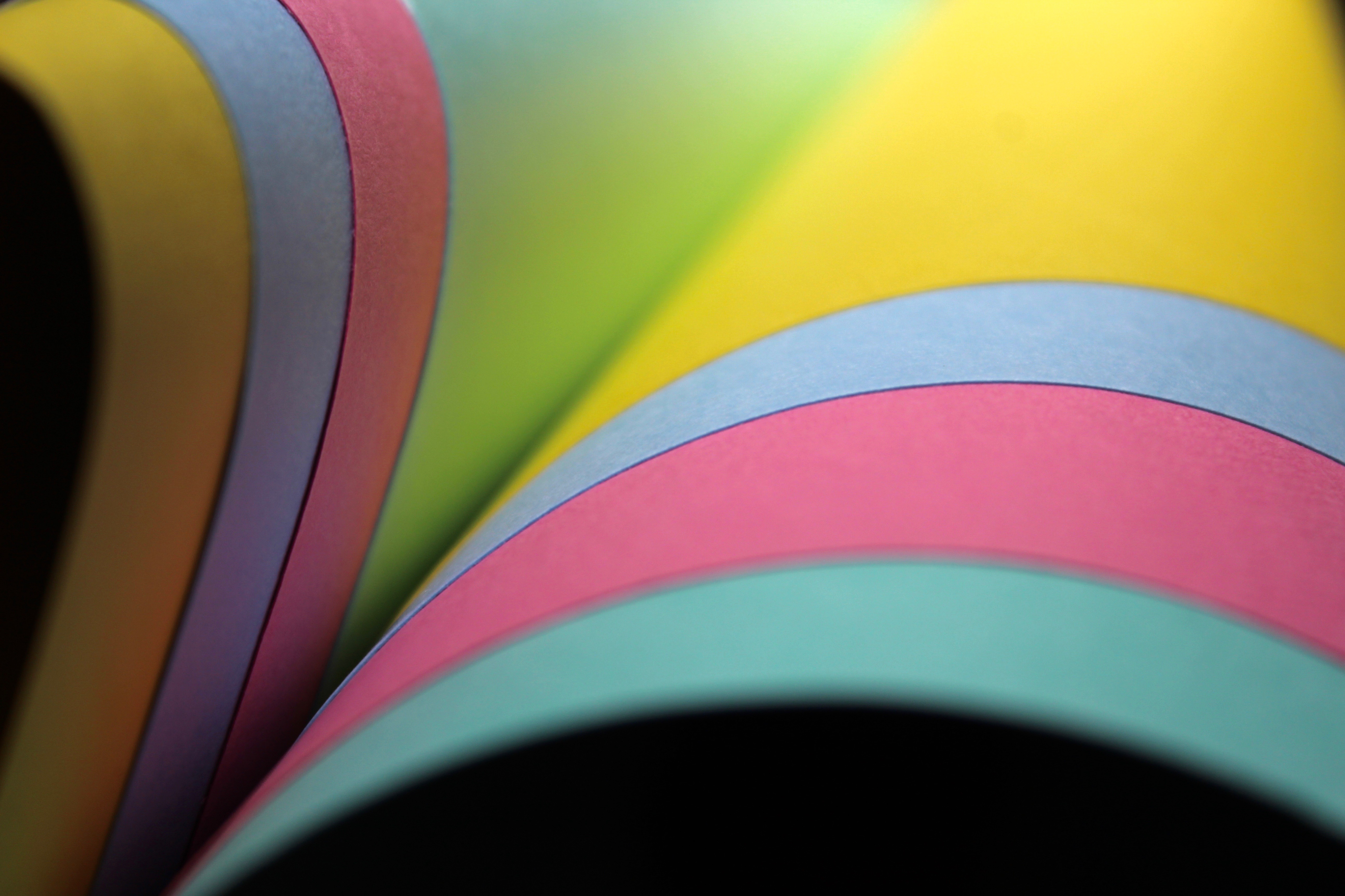
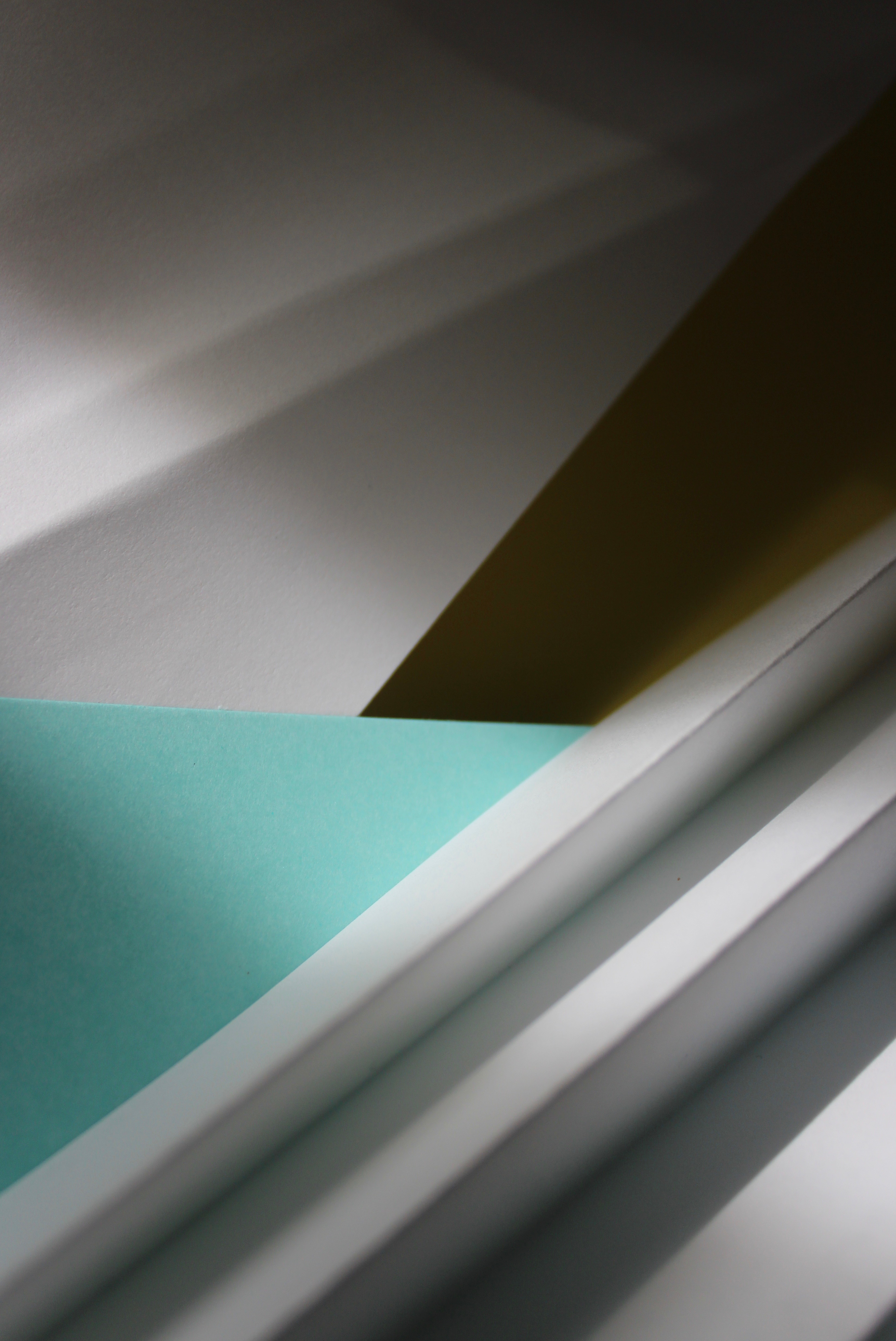
Ernst Hass shows beauty in mundane views or objects. Most of his photography involves creating simple but eye catching pictures, ones that are heavy with texture, have beautiful light and create feelings through colour. Ernst Hass takes simple pictures by finding something fascinating and paying close attention to it. He captures detail through his zoomed in images, making it hard to distinguish what it is. Ernst Hass takes things down to their simplest elements to make it interesting for the viewer. I like the vivid colours you see through his images and the concept of making everyday things that we see look visually stunning. To respond to his work I will focus on elements in nature as well as building structures to create images that have a seemingly unreal appearance from the real object.
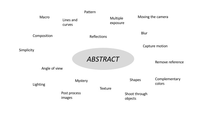
My Response


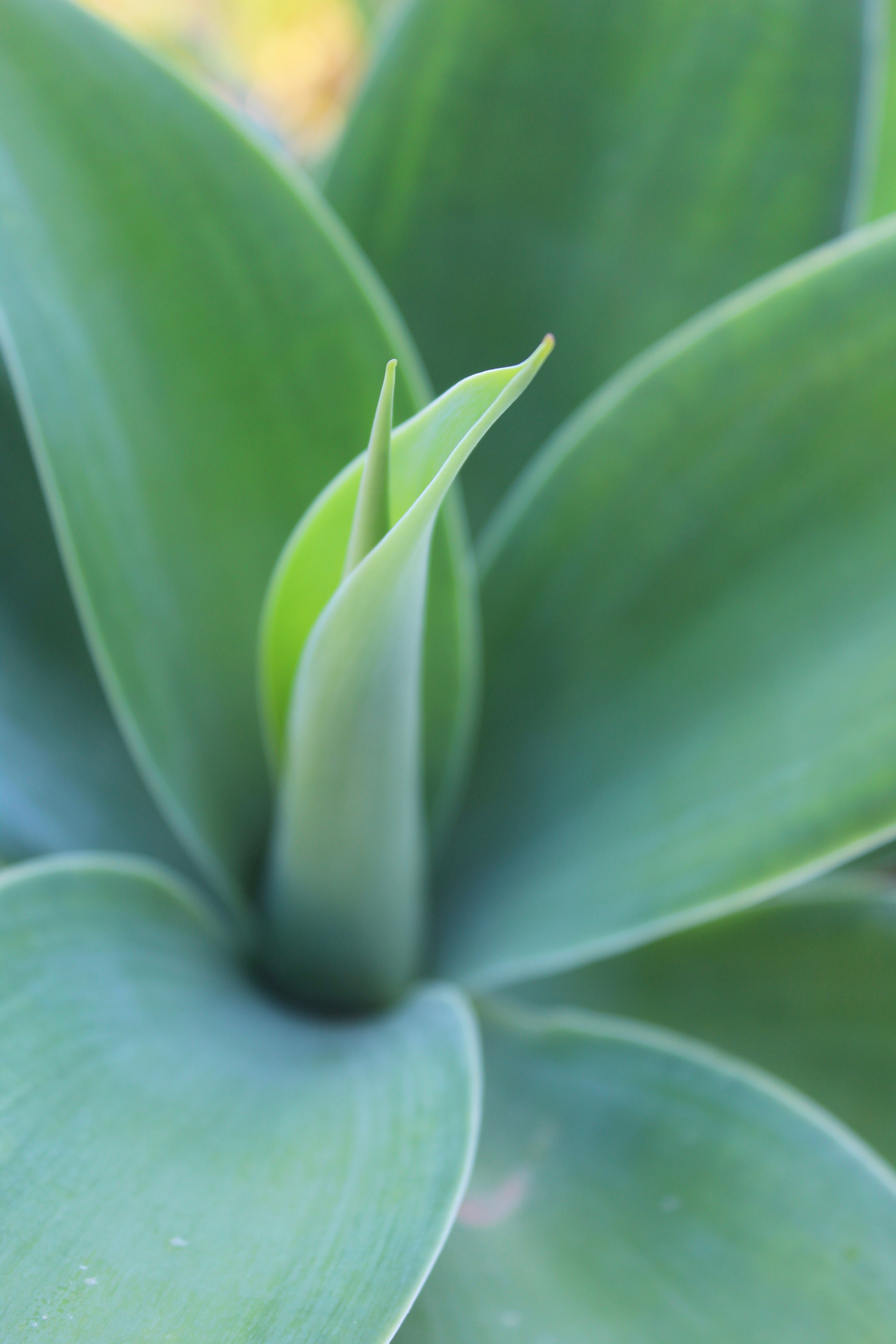


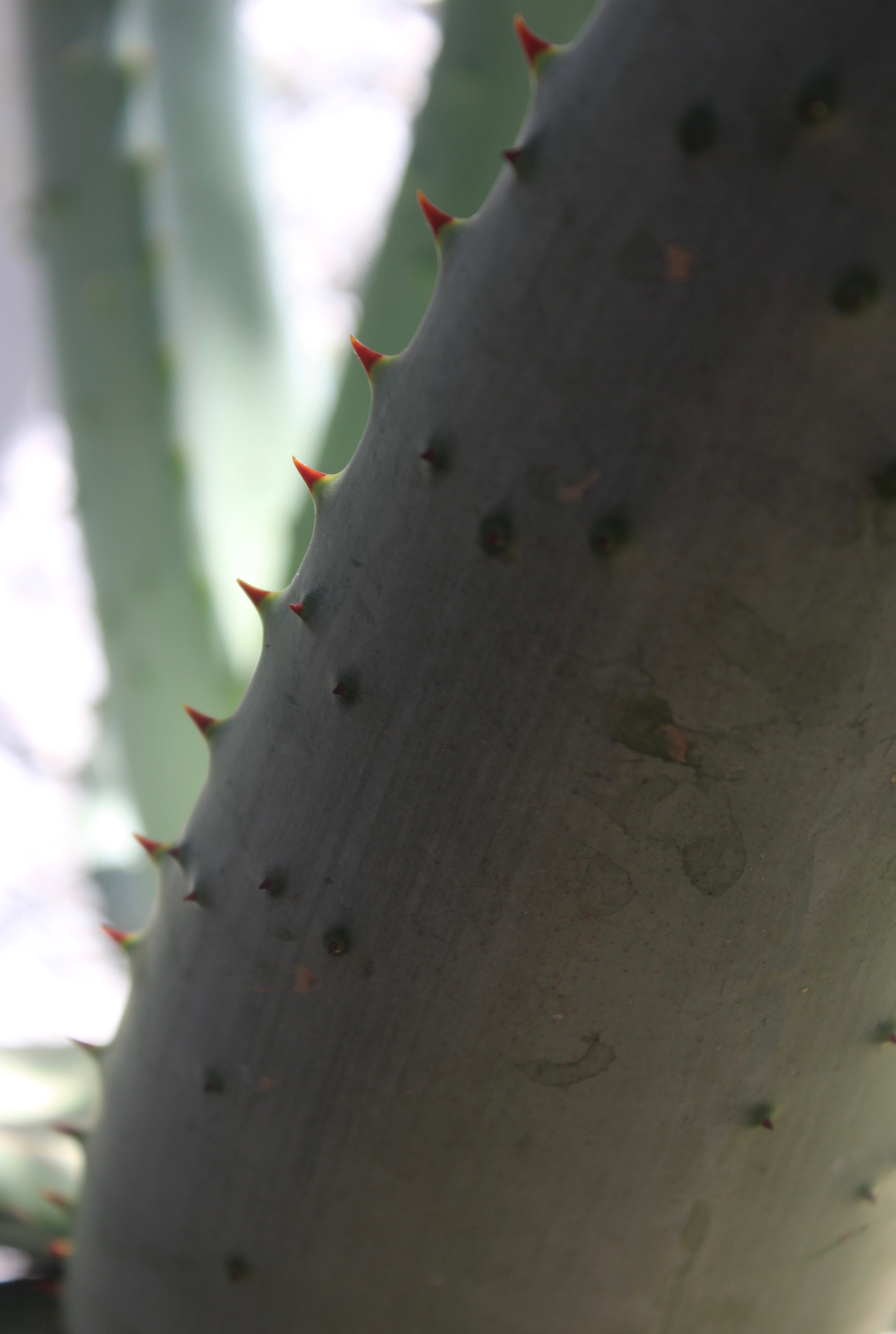

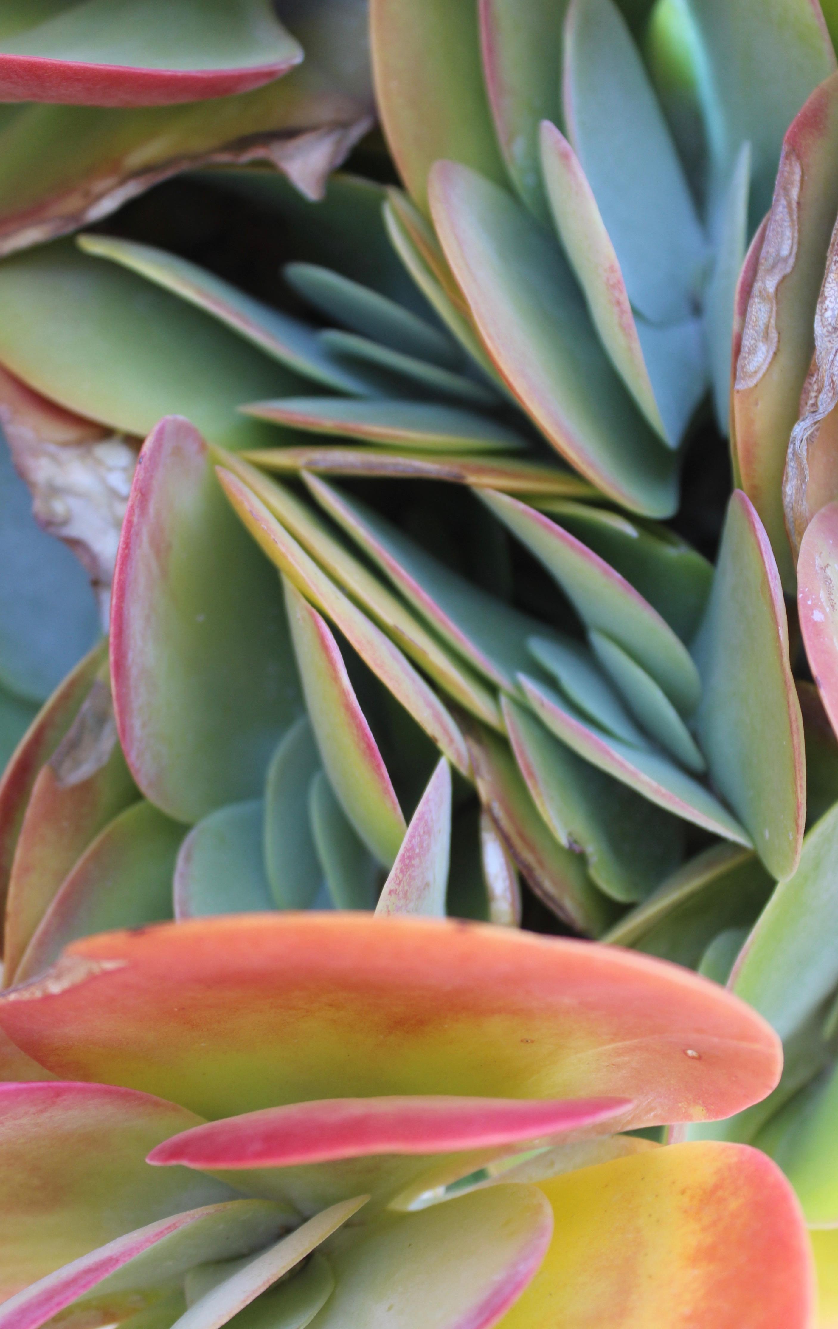
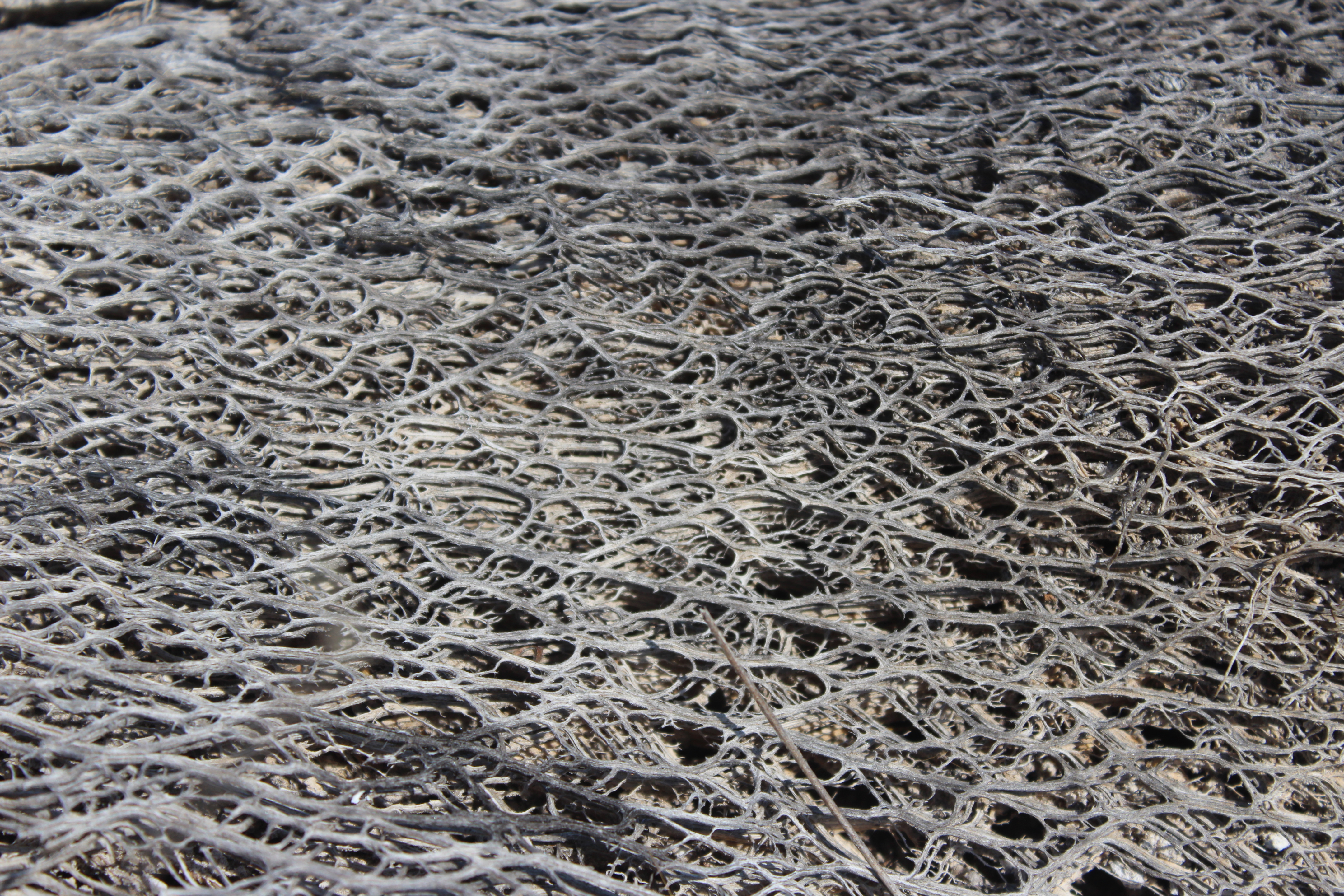
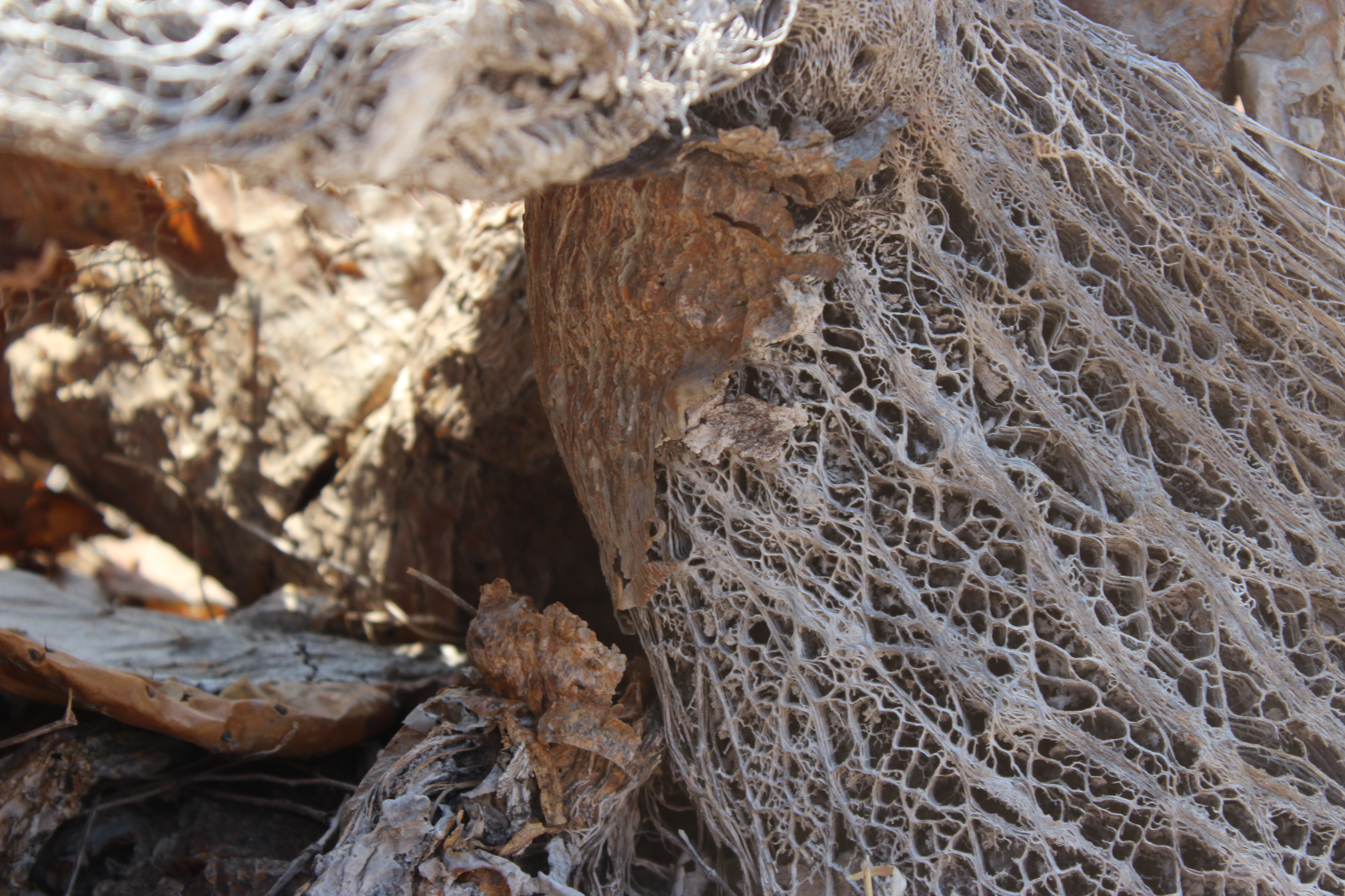
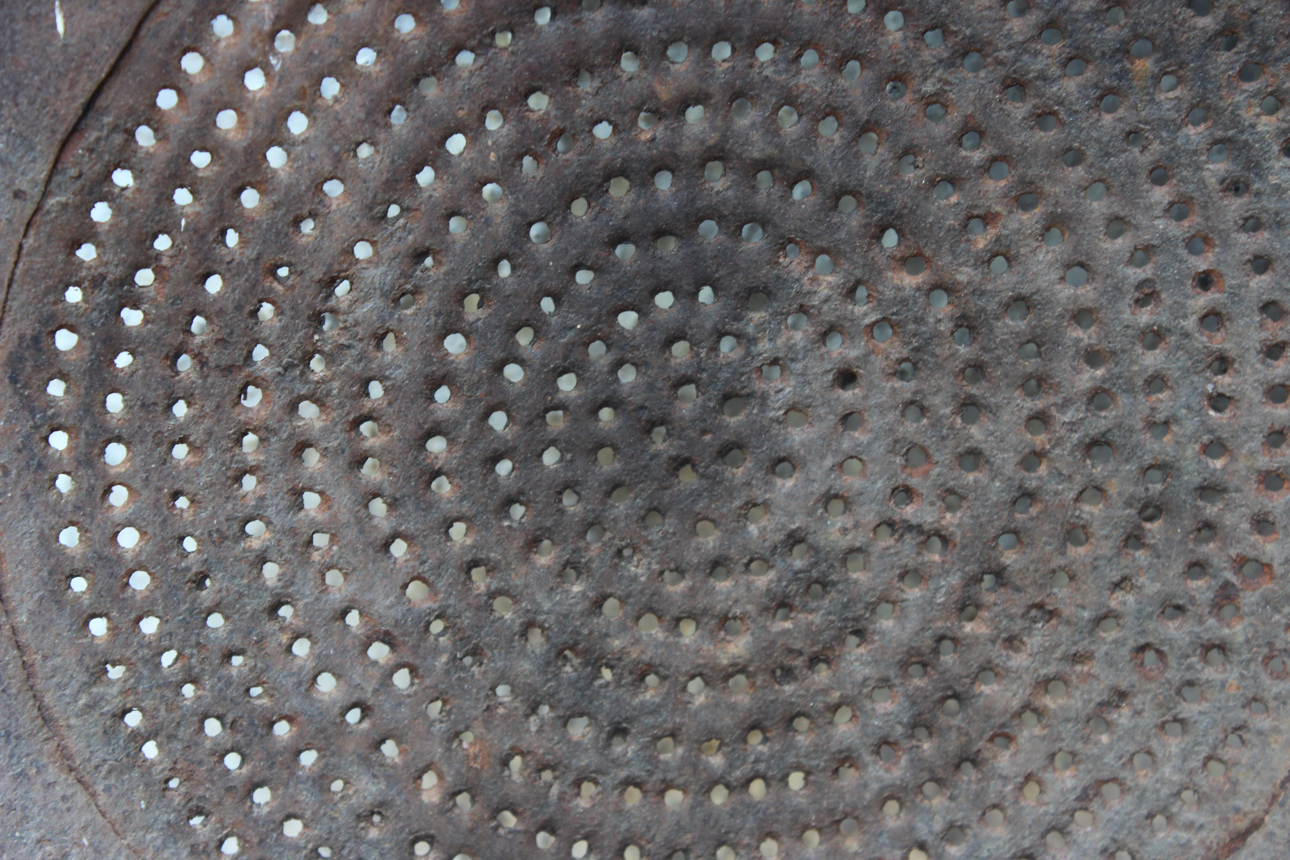

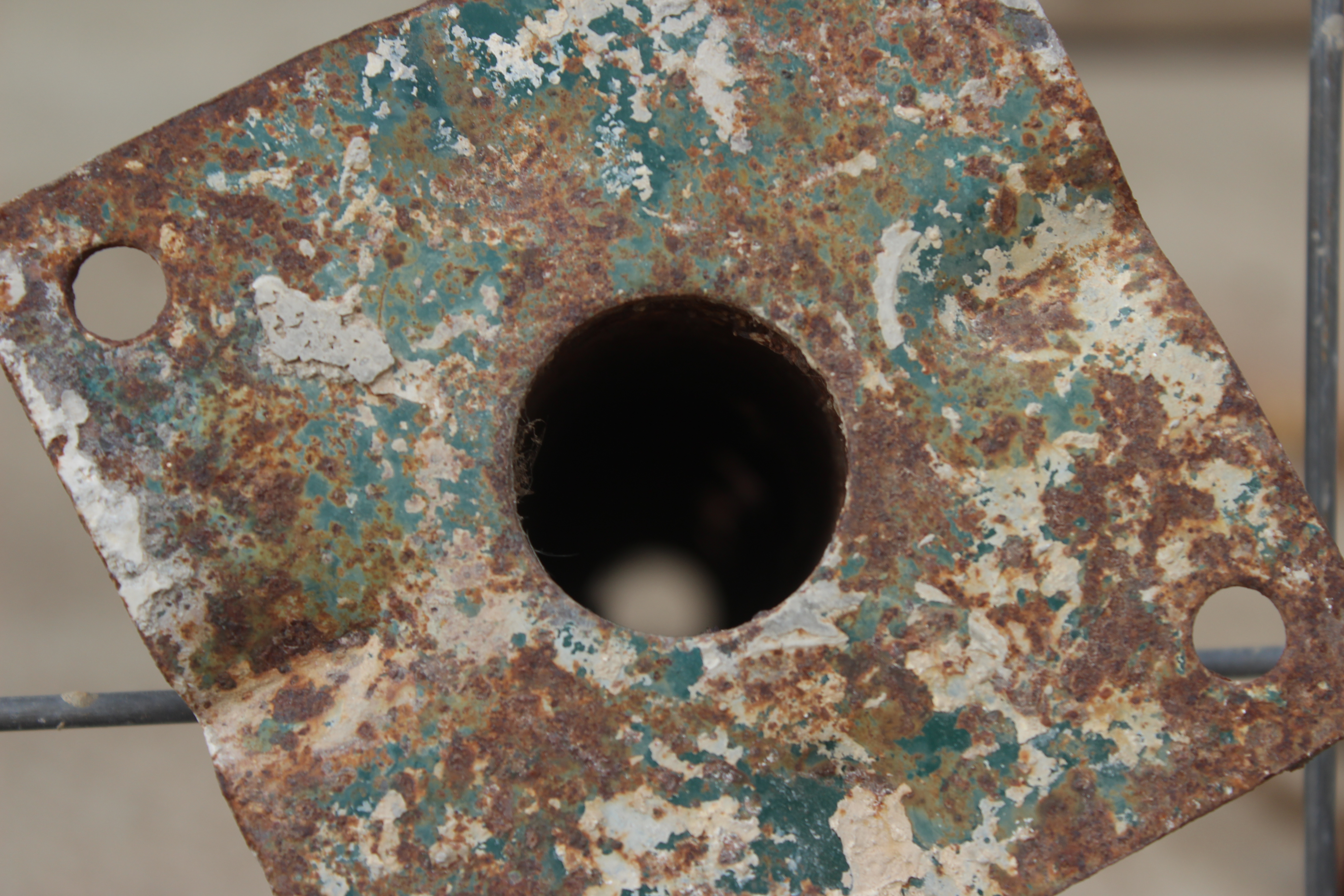
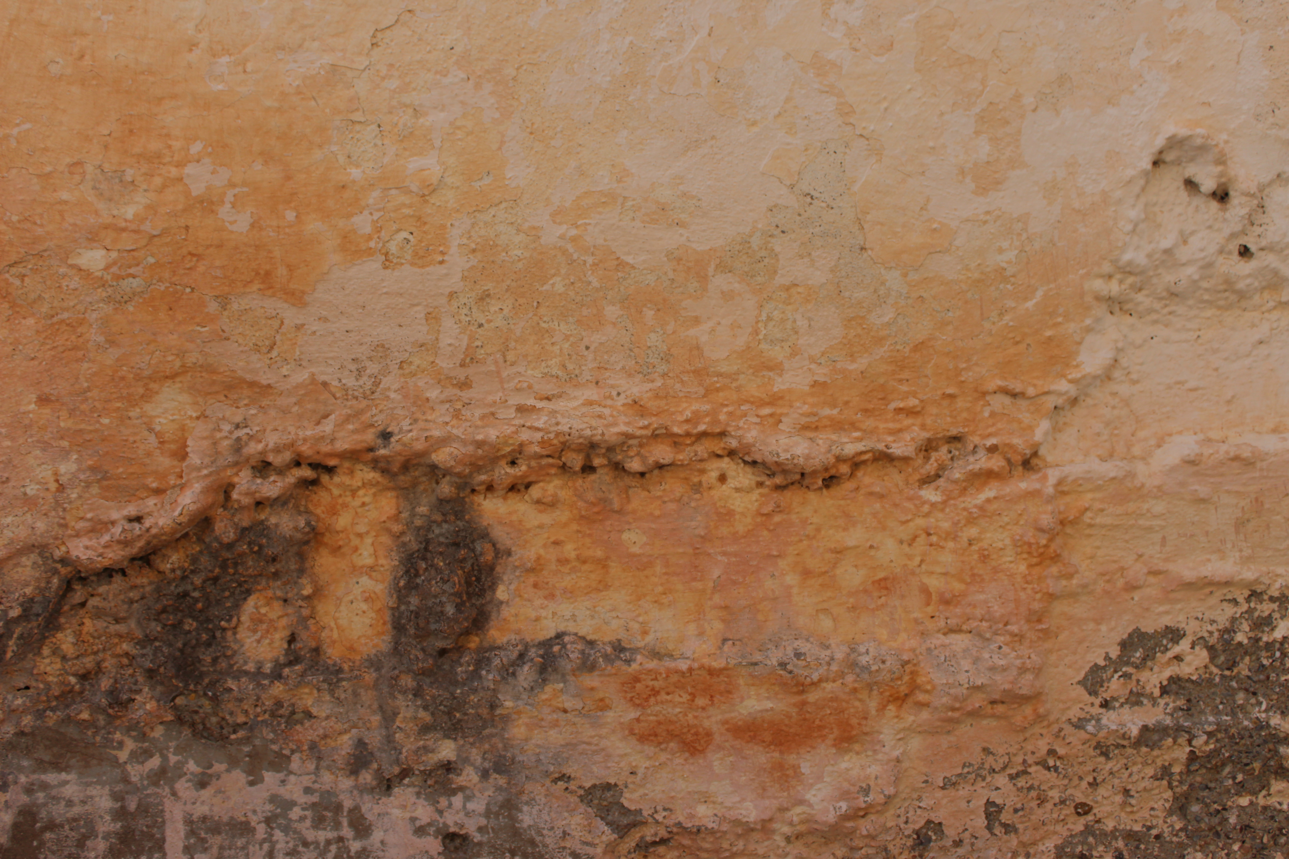


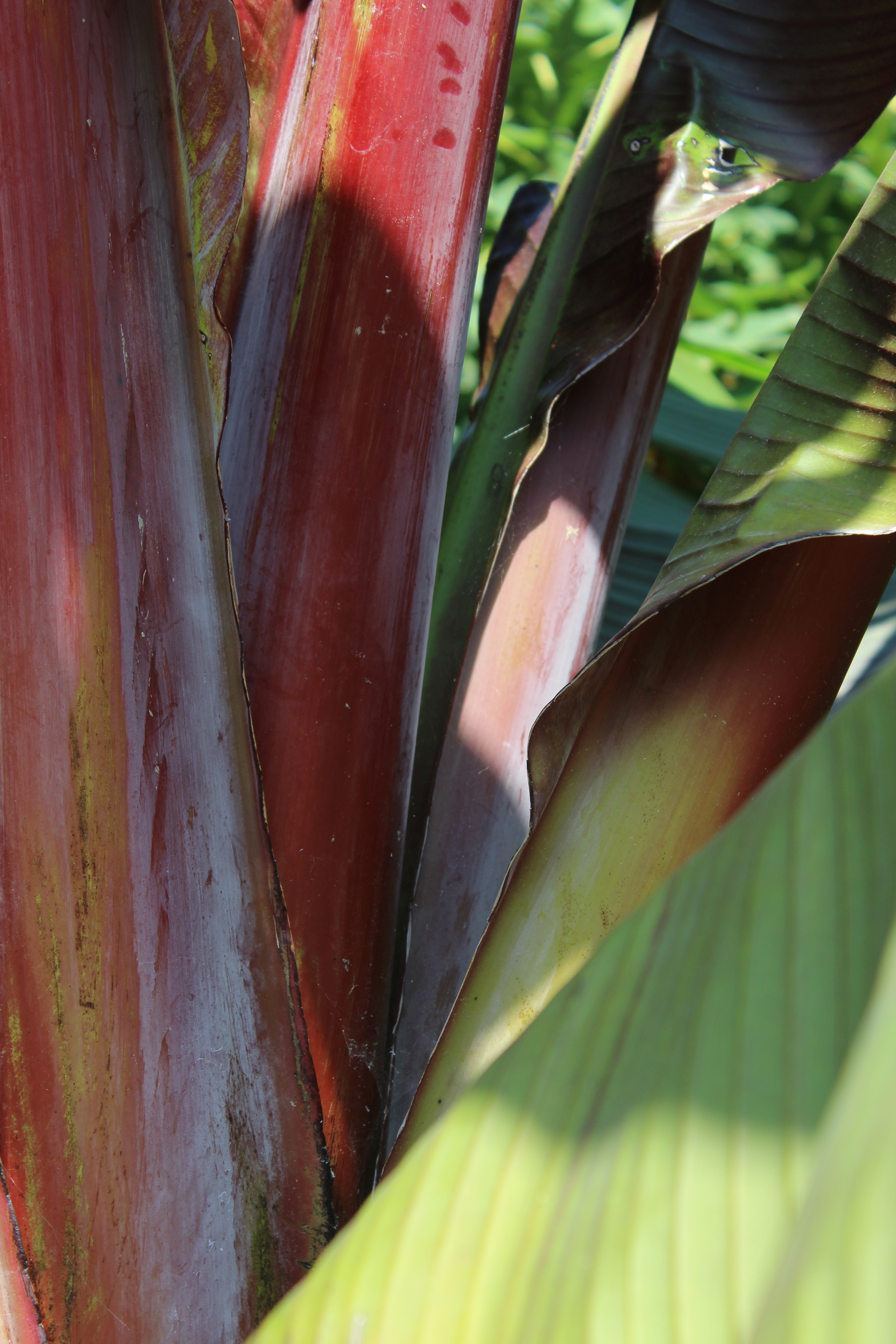
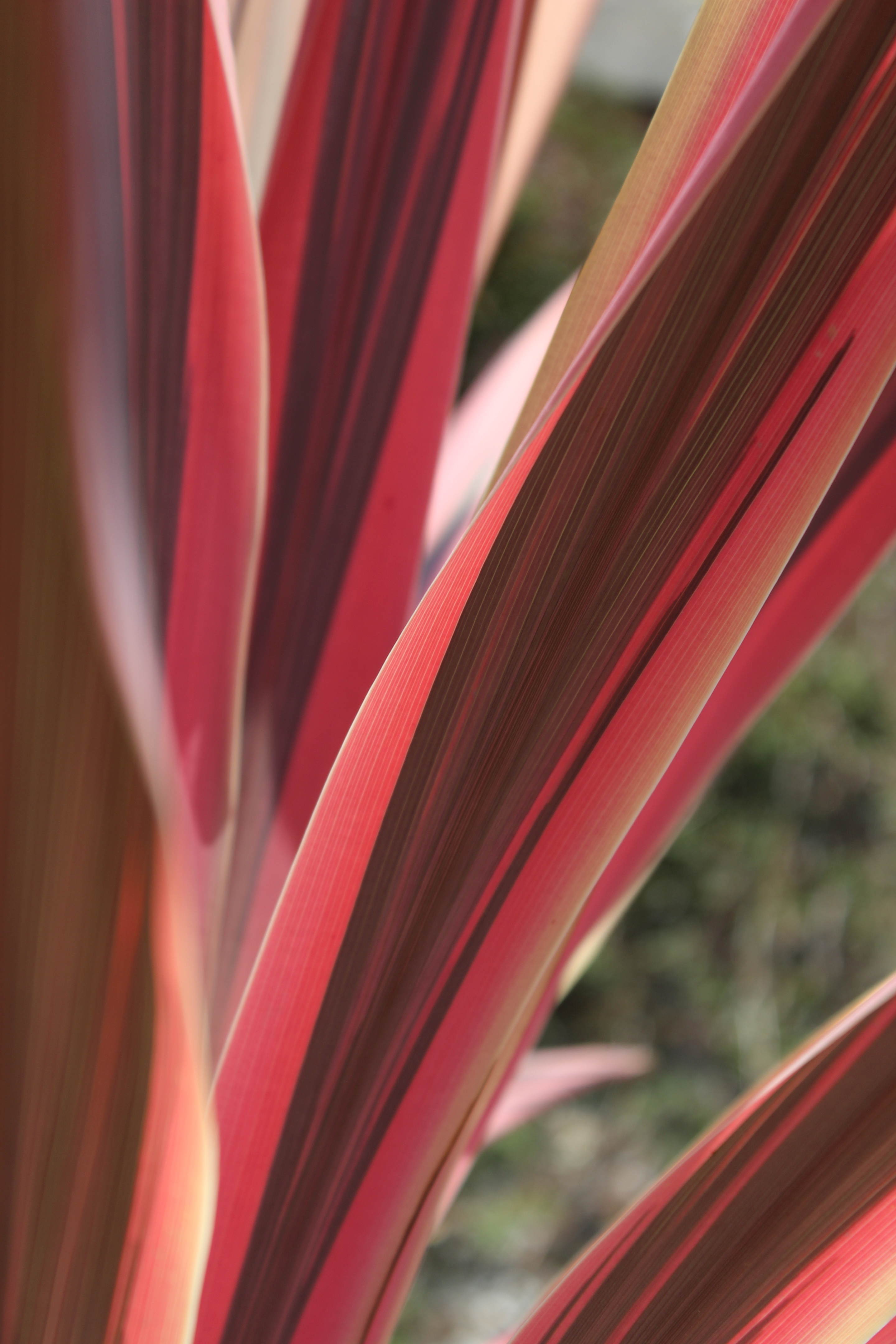
Best abstract images
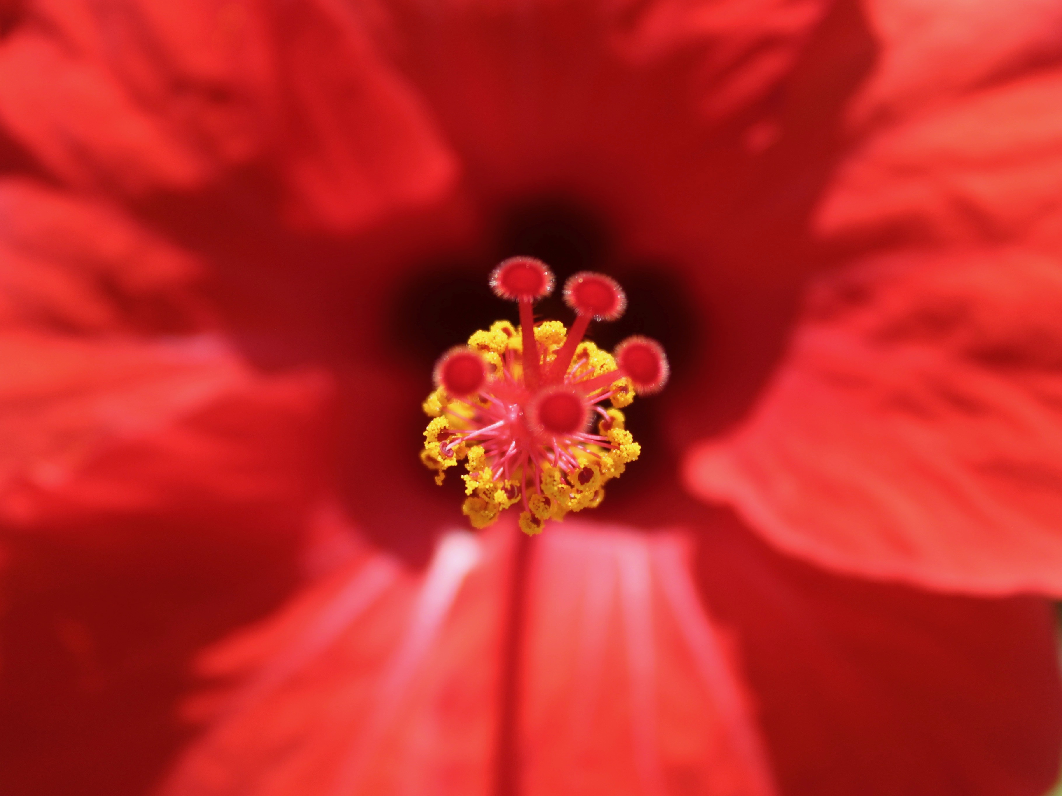
As you get increasingly close to a subject the detail that was not apparent at regular viewing distance will emerge as an abstract photograph. In this case the detail of the stigma is captured instead of the form of the flower. The petals and shadows casted have been blurred in the background so the colour yellow stands out in the image creating a visually interesting photo.
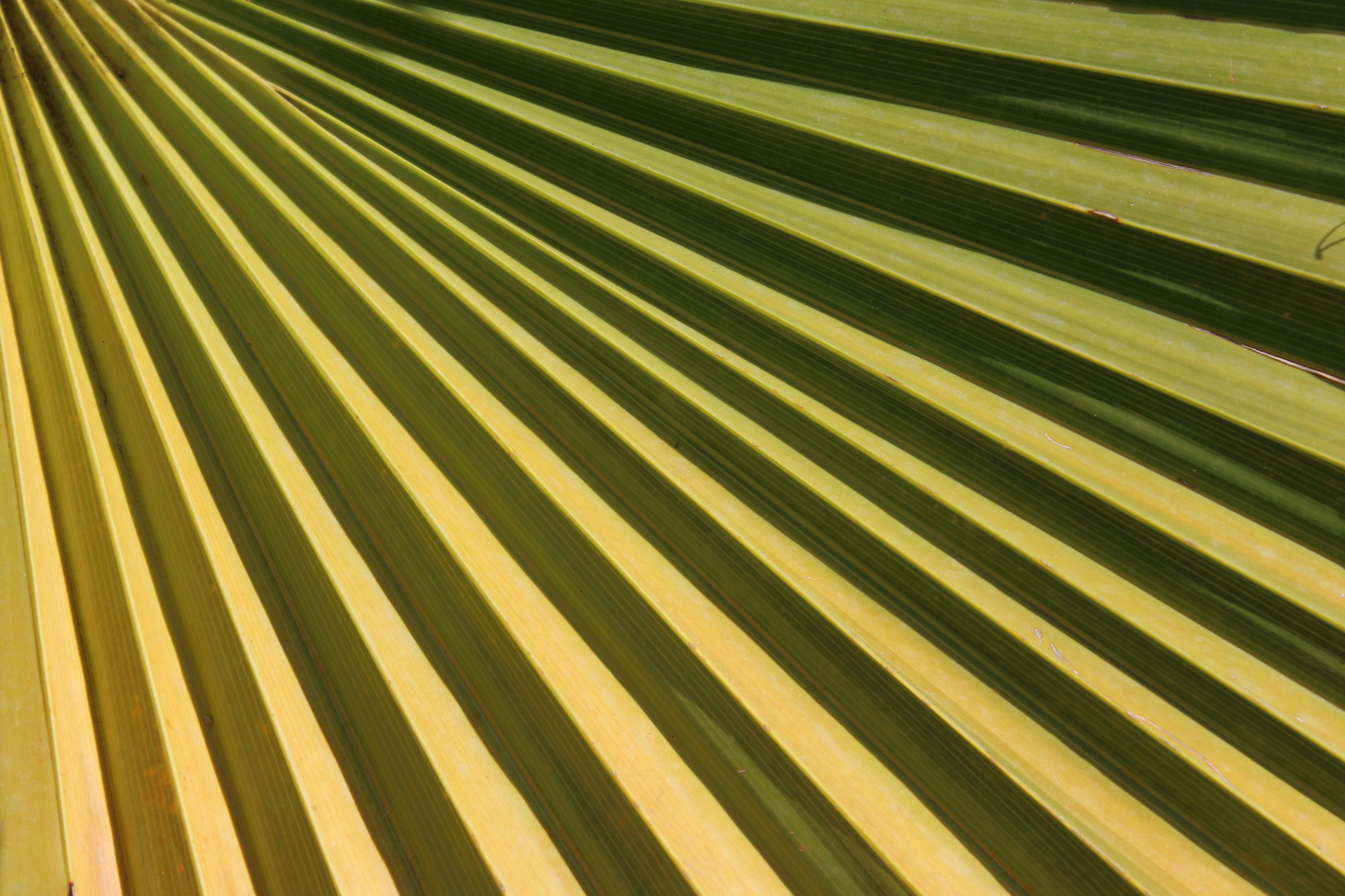
 By capturing a section of the fan palm I have filled the entire frame with the subject, eliminating the unwanted background making the image appear abstract. The different shades of green fill the entire picture creating visual impact. The diagonal lines make the image more dynamic and provide a better overall balanced composition. They add a strong visual interest and make your eyes travel across the photo. They are dominant in the image and are the main focus point.
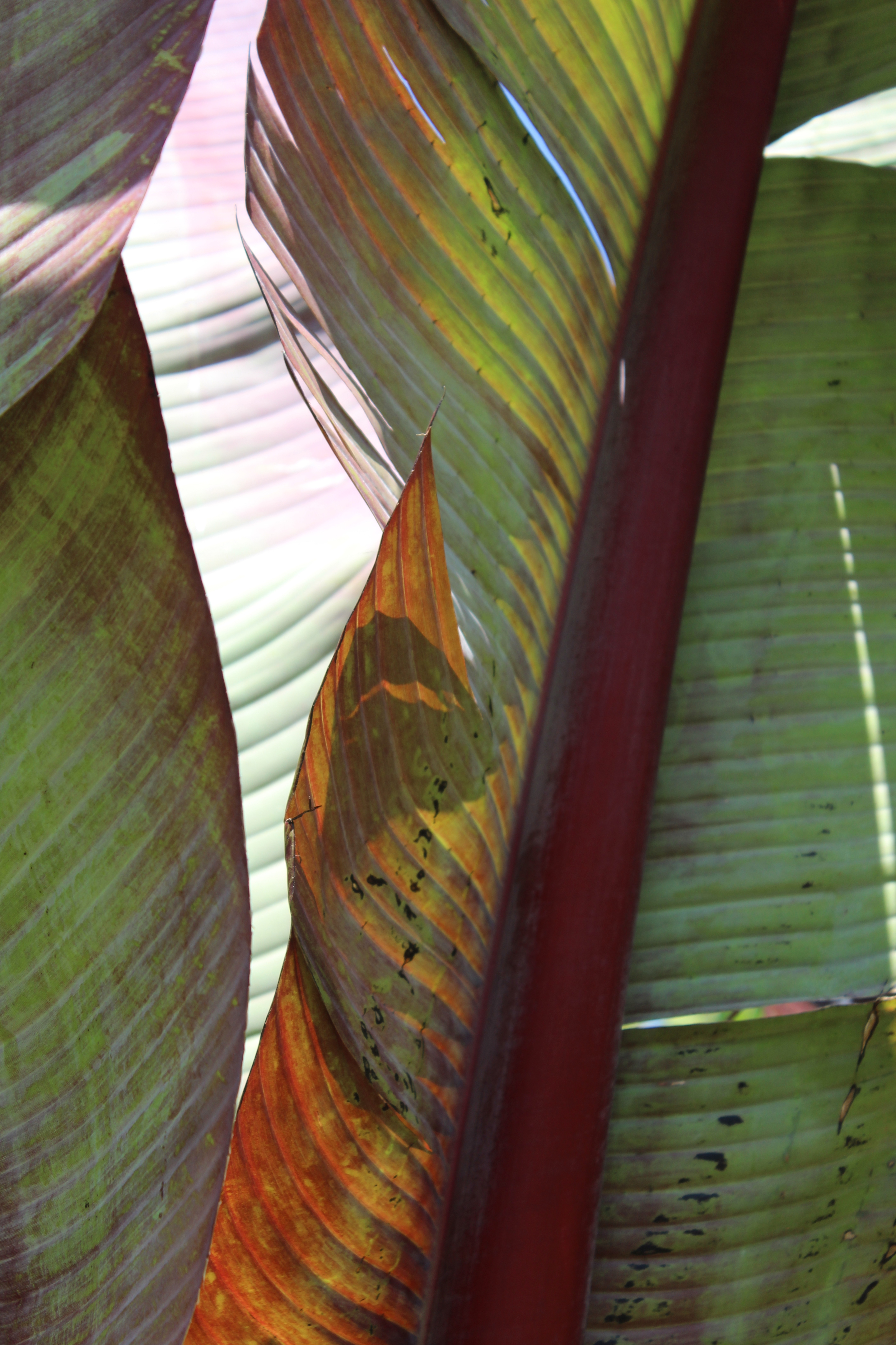
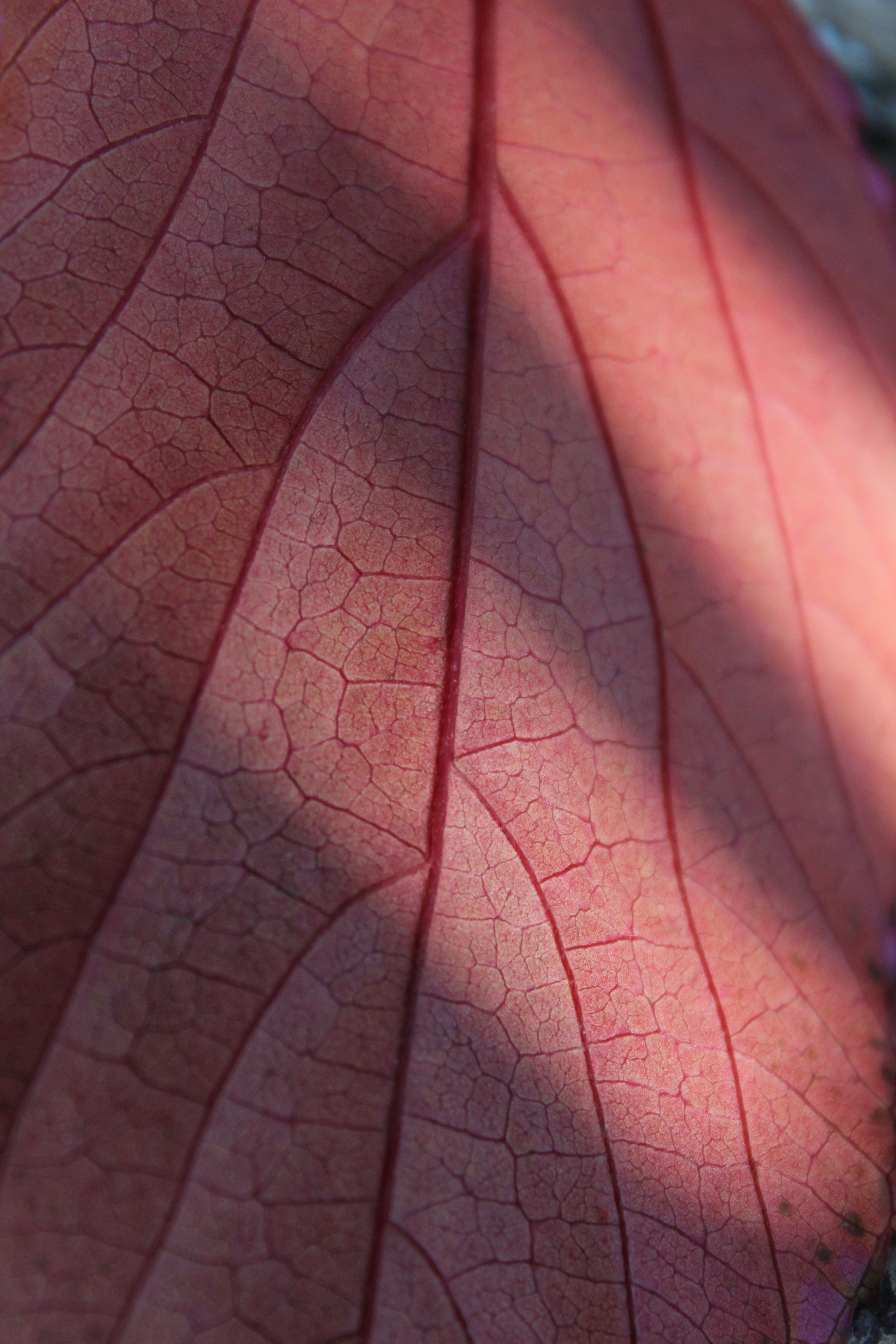 The zoom lens has captured close detail on the leaf as well as texture which can be shown through the focal points. The curved lines coming out the stem are very effective in this photo as they create a more graceful composition. By rotating the photo I created a different orientation, making the image more interesting. The shadows casted on the leave also catch the viewers attention and create a sense of depth to the picture.
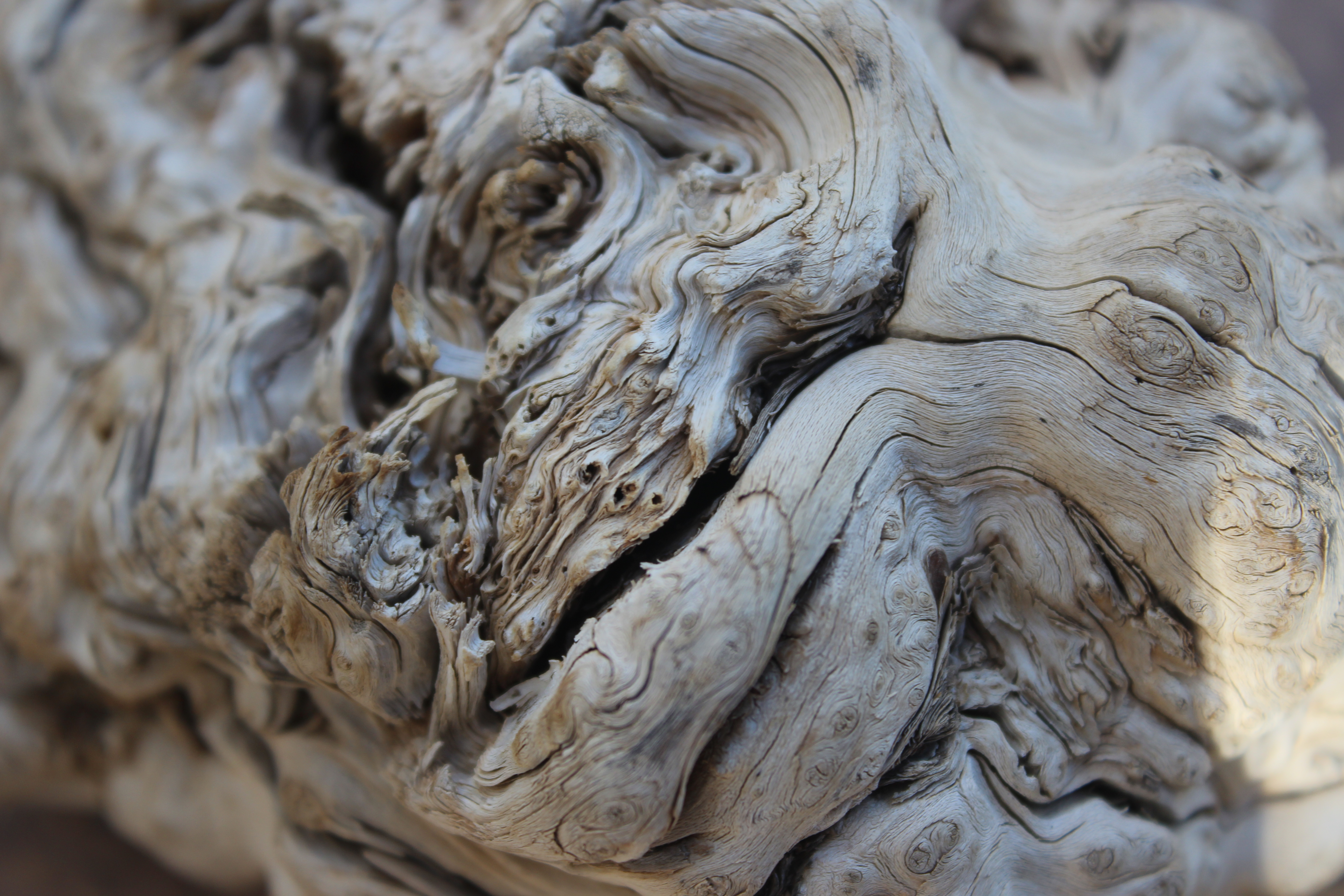 The various width of lines are the main attention in this photo. Since this photo was taken up close you can see lots of detail and texture to the bark. Most of the lines are curved and seamless and create a smooth effect to the image. There’s a lot going on in the image because of the amount of detail captured, creating an unfamiliar image.
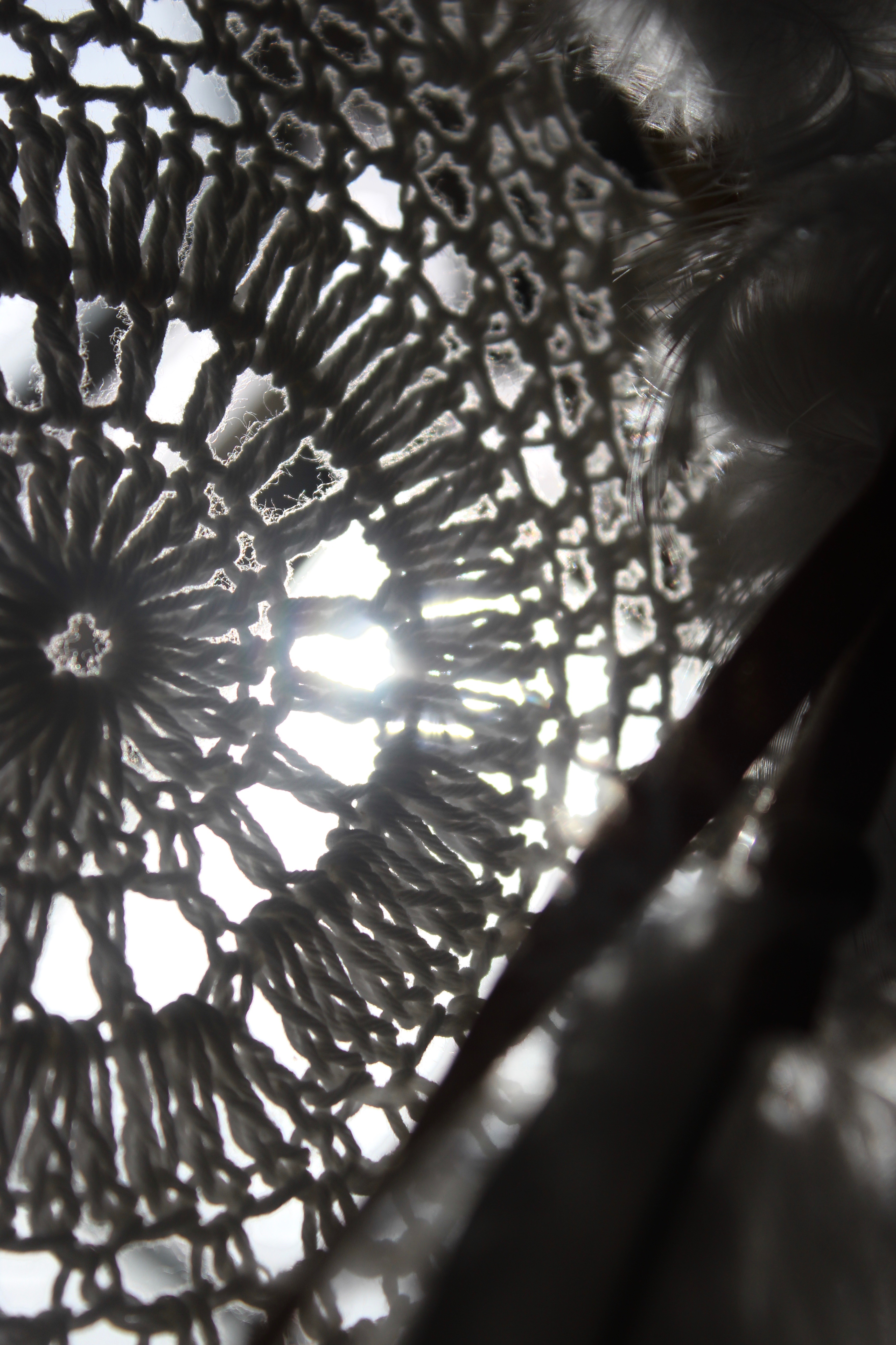
 To capture this image I held a dream catcher towards the sunlight so that a light source would shine through the netting. By manipulating the lighting I created shadows and highlights to add depth and interest to my image. The feathers on the right hand side are out of focus by motion so that the main focal point is on the pattern of the dream catcher. I like the composition of the photo and how the foreground is slightly blurred to create layers.
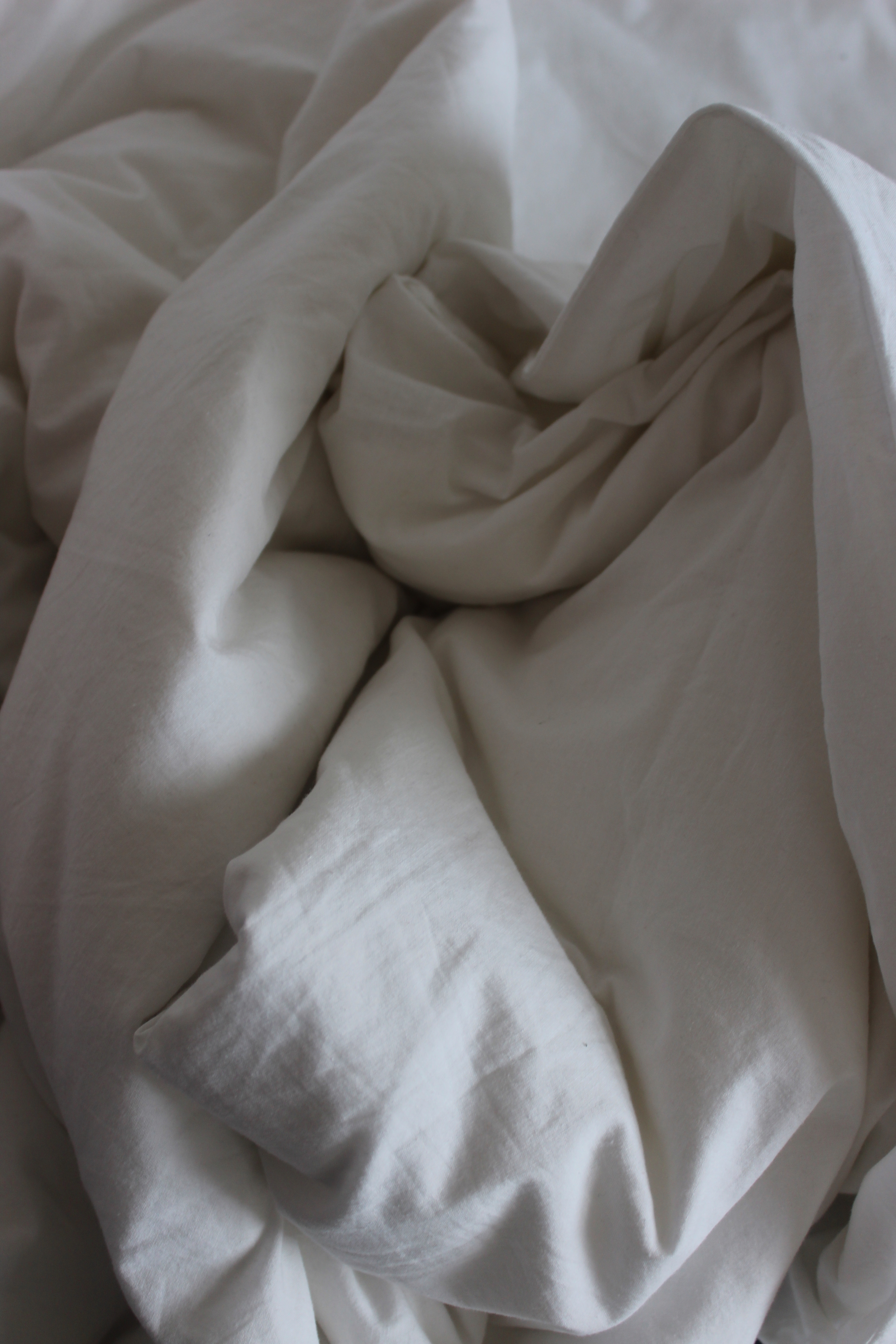
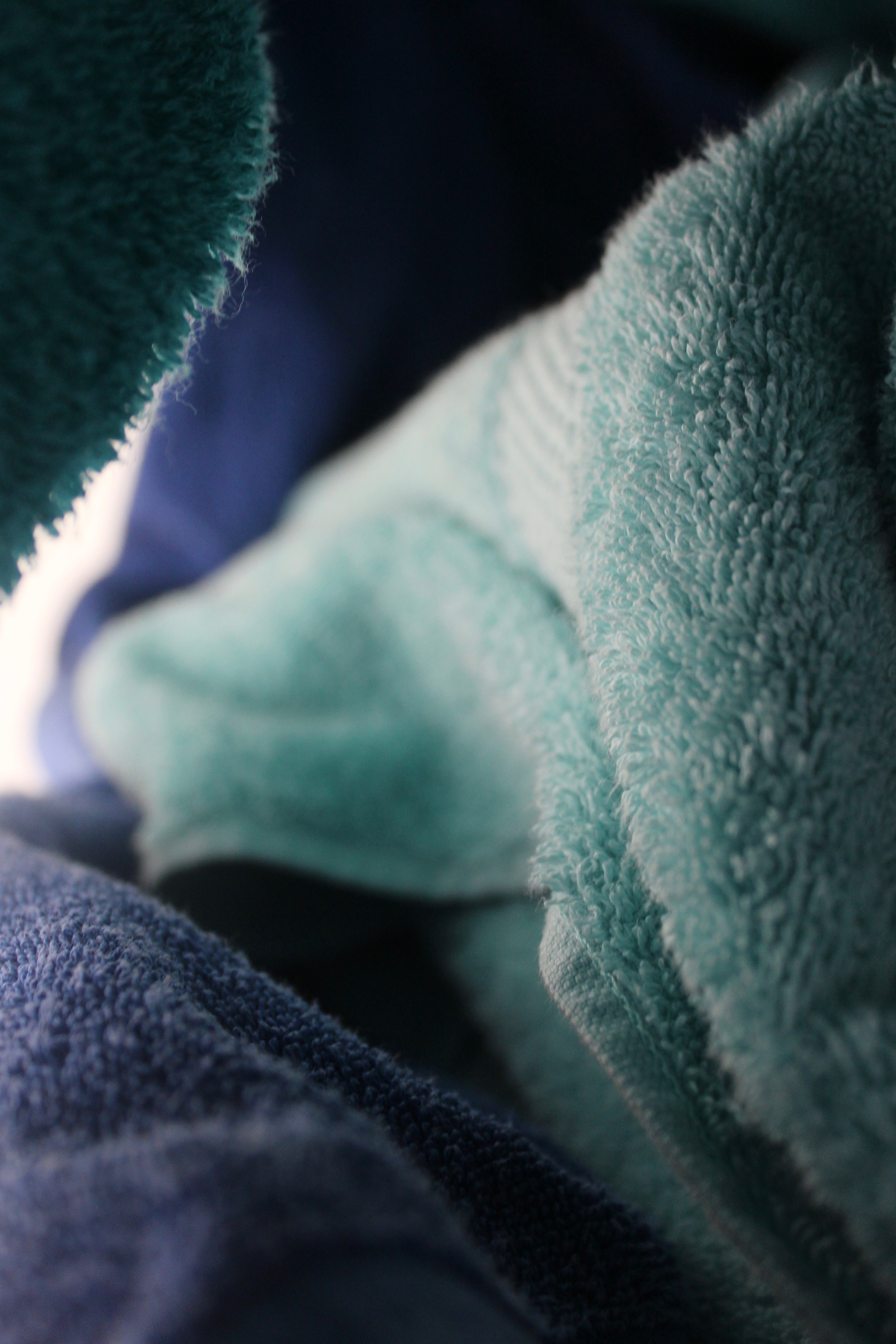
 To take this photo I scrunched a bunch of towels together to create an interesting form. The composition is complex and interesting and makes it appear like a ‘landscape’. Texture from the towels can be seen in the front and slowly begins to blur out further away. The aspect of the photo which most grabs the viewers attention is the different shades of blue which greatly contrast with each other.
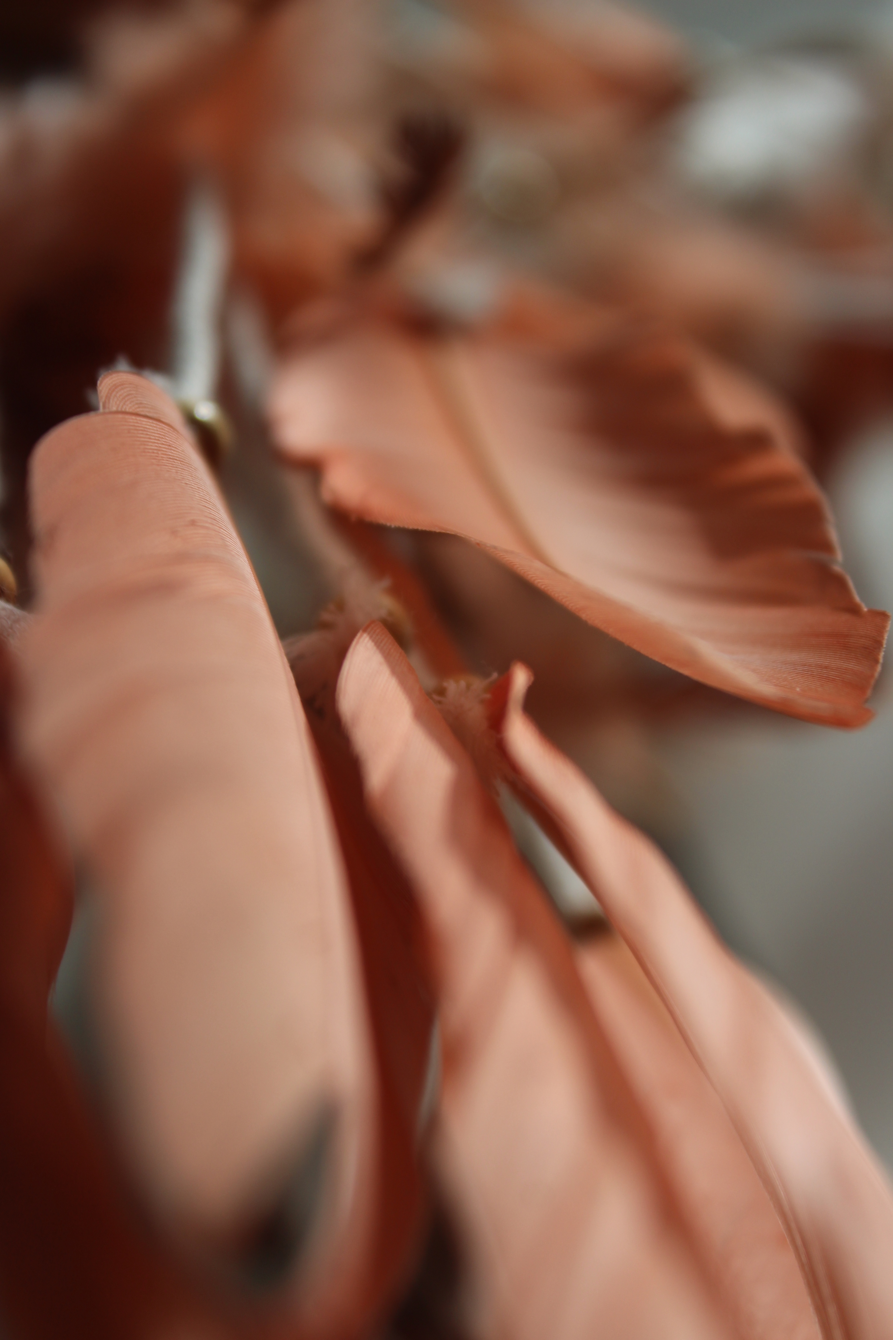
 This photo is of feathers that hang down a dream catcher. Most of the image is blurred since I moved the object side to side so it could create an effect of motion. I like how the photo only captures the edges of the feathers while the rest has been unfocused. The further back, the more blurred it becomes creating a sense of depth which the shadows and highlights also help create.
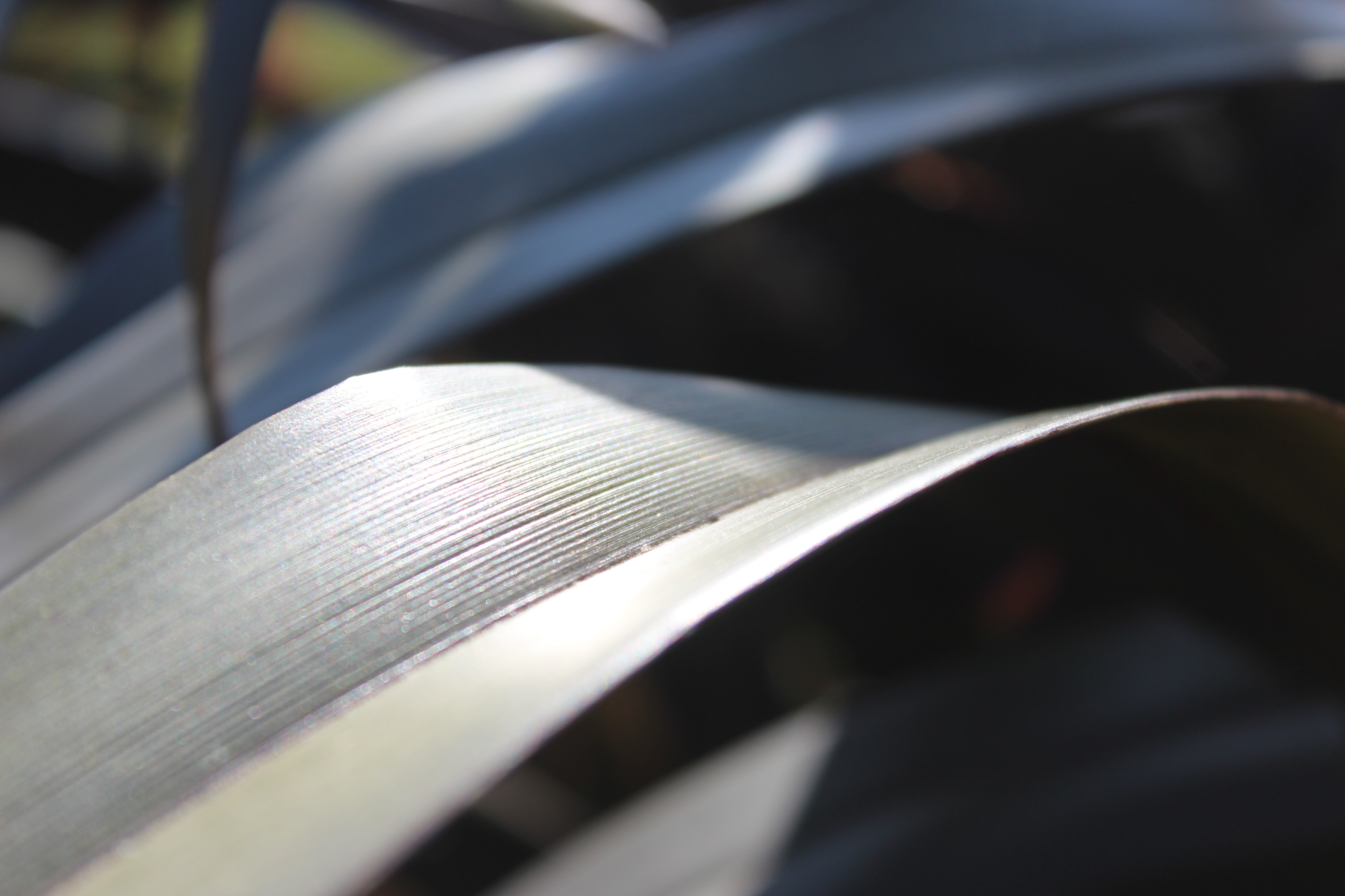
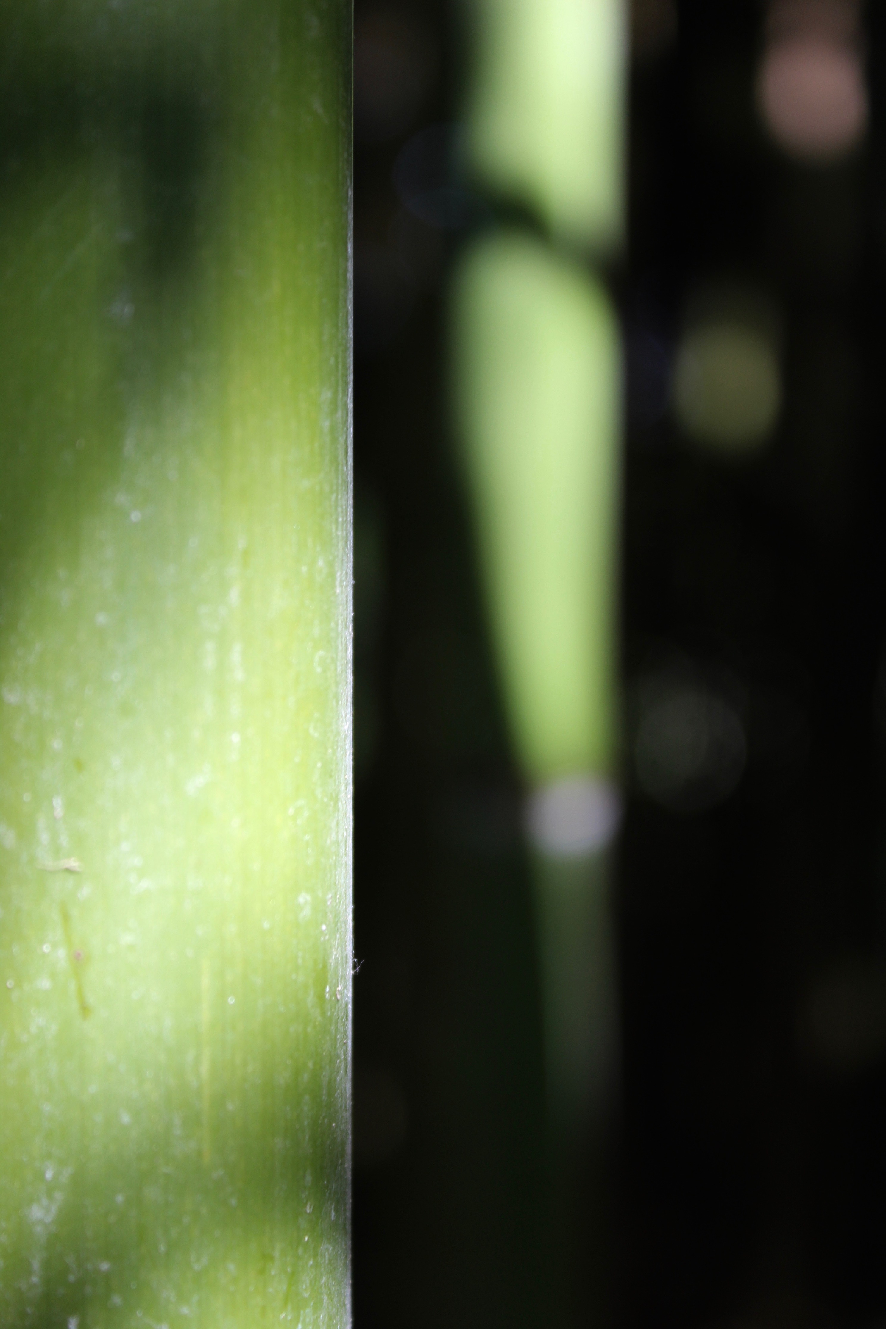
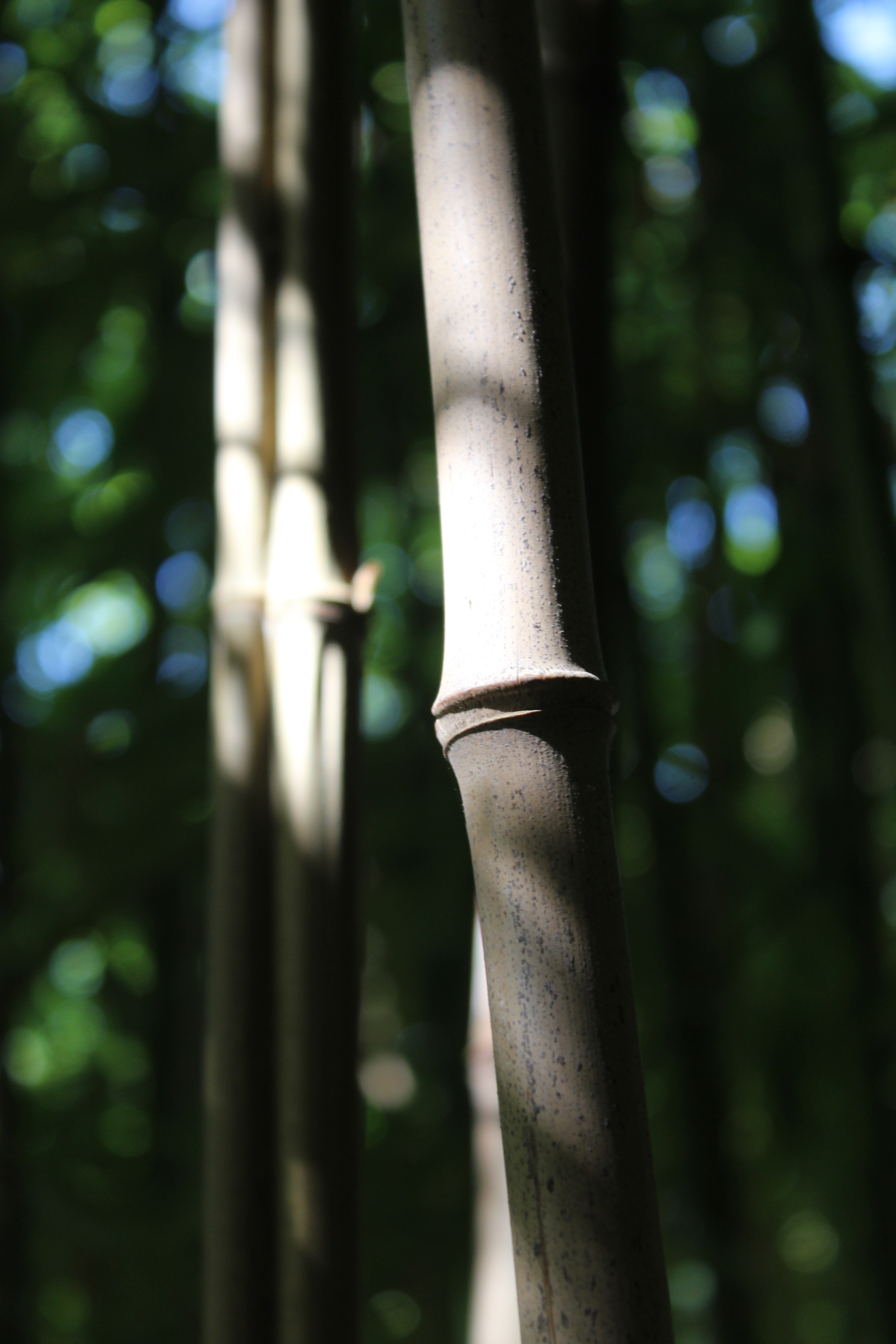
 The sharp vertical line in the middle is the first thing that grabs your attention when looking at the image. I like how one side is focused while the other is blurred. Even through the blurred side the colour is still visible and creates interest to the image. The light specs can also be seen in the background, creating highlight.
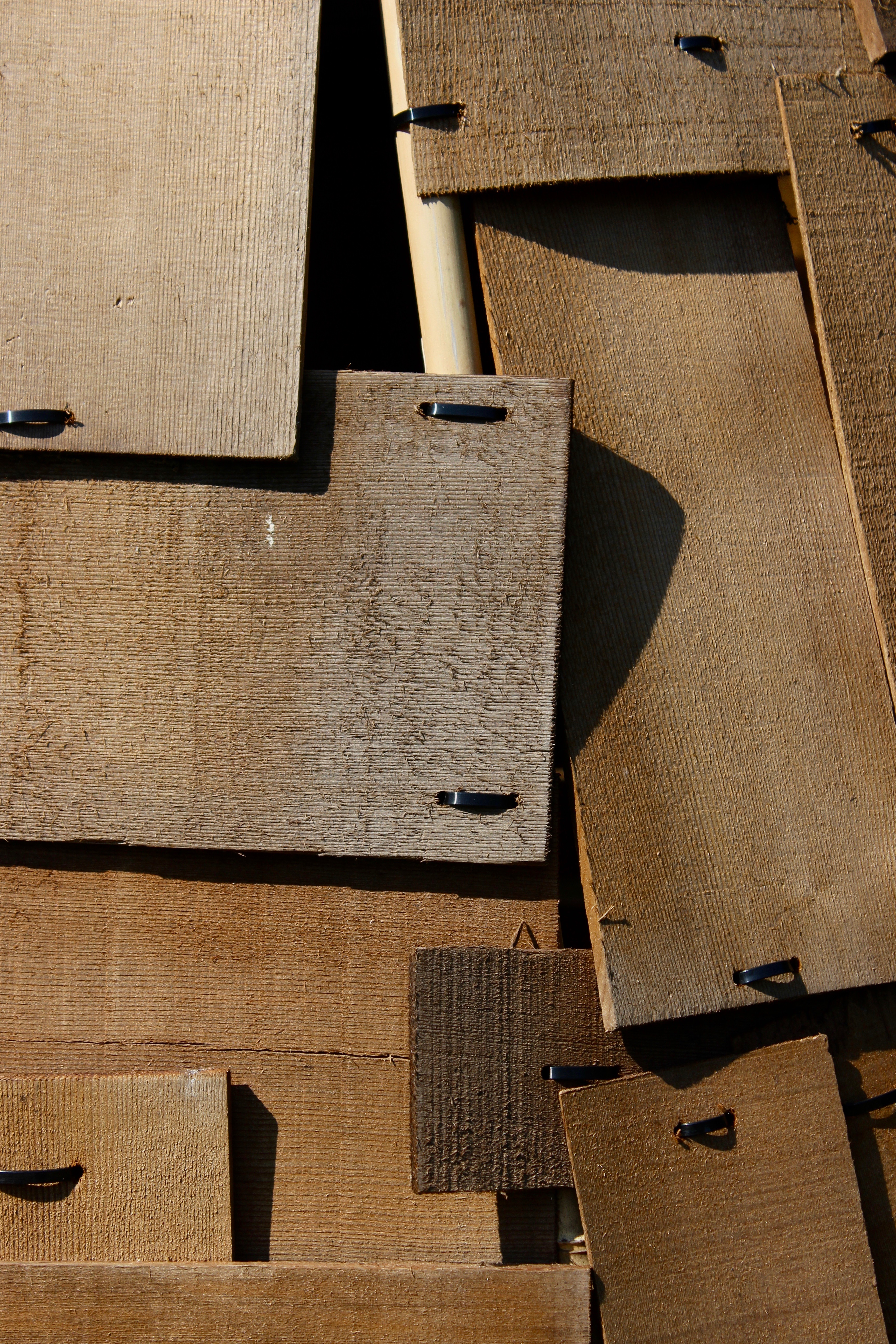
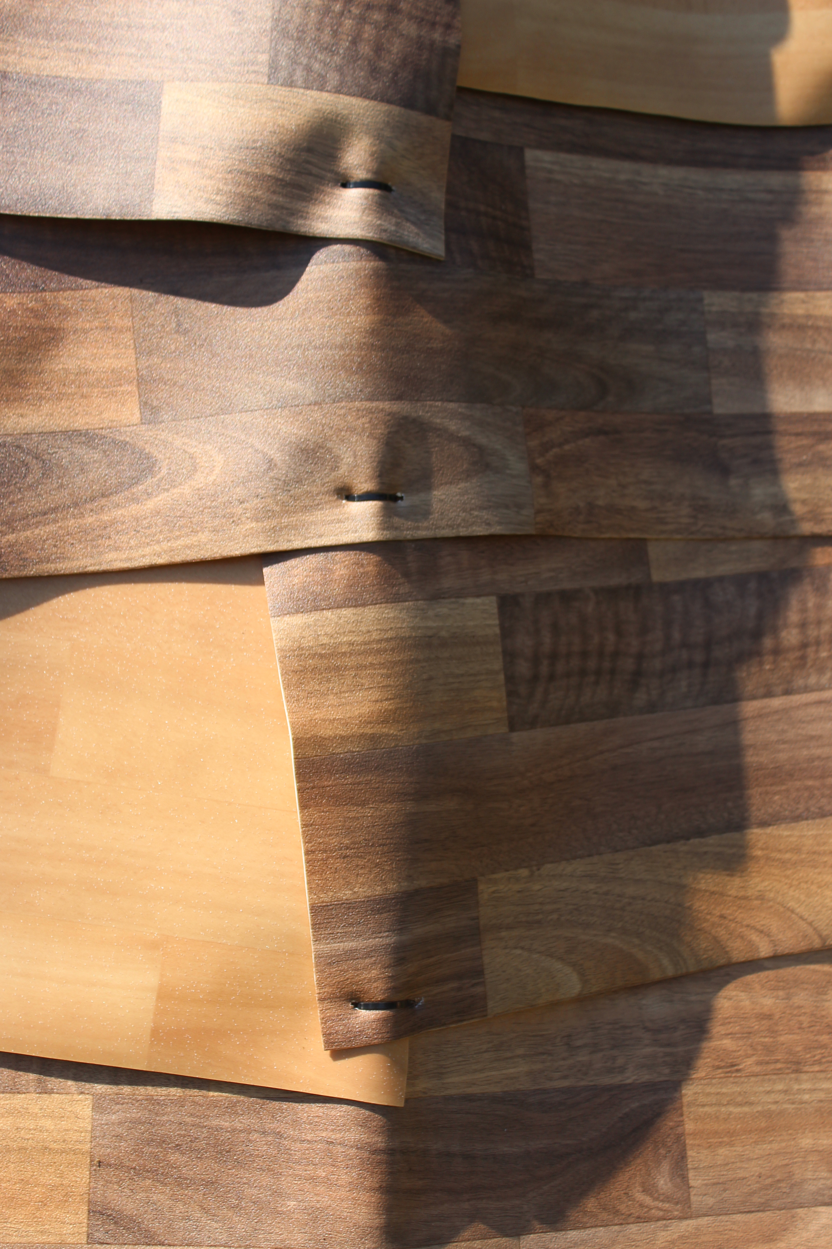
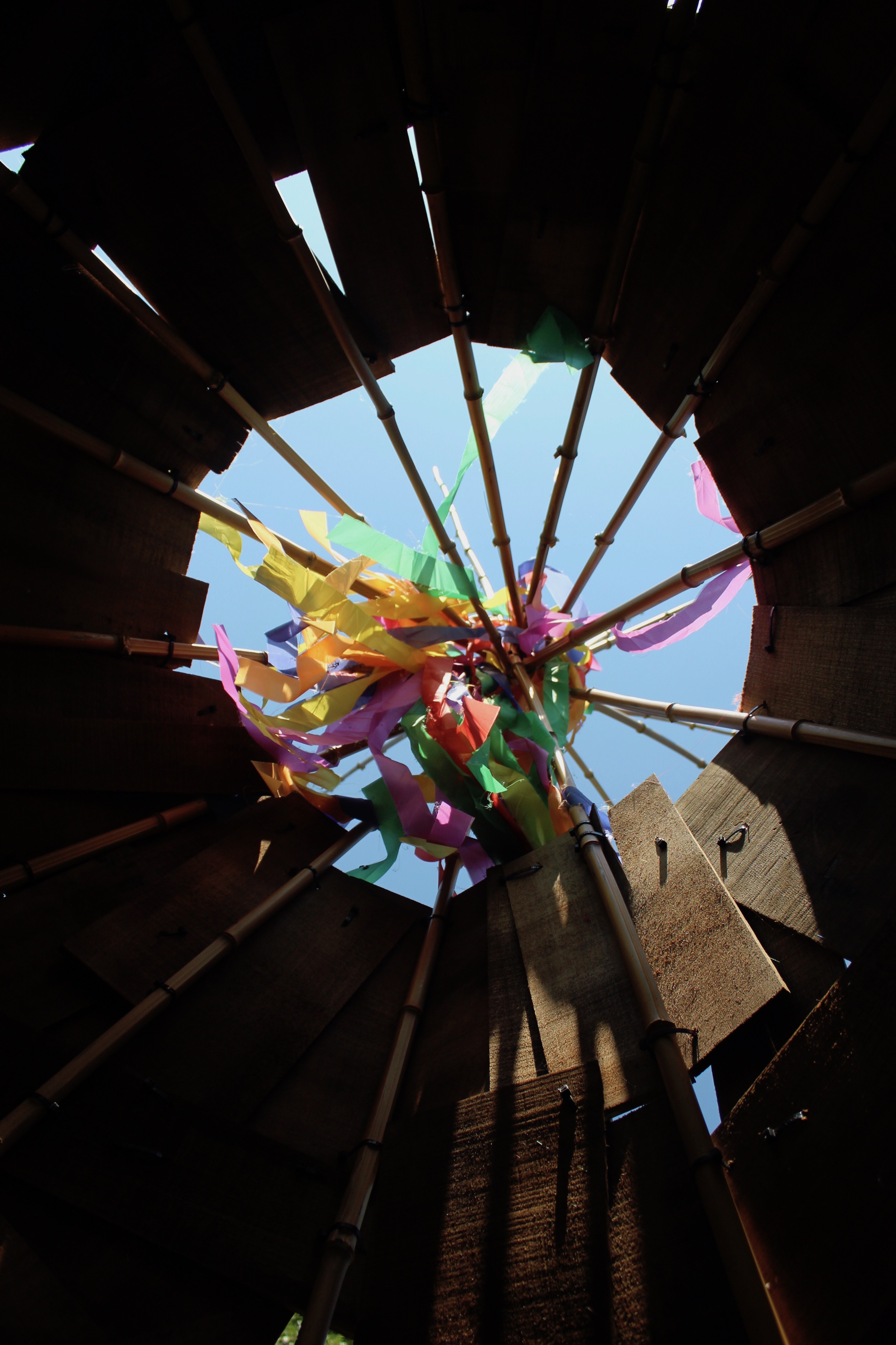
 The rectangle shapes form structure to the image and attract the viewers attention. These strong geometrical shapes with straight edges give the photo a powerful visual impact. The shadows casted by the overlapping wood panels create layers to the photo and make it visually interesting.
Evaluation
My understanding of abstract photography has changed throughout the photo shoots as I have learned different techniques on how to create an abstract image. At the start, most of my abstract images were close ups of subjects to make them appear unrealistic. Later on I learned that you can create abstract images by taking pictures of objects with dynamic shapes, texture, patterns, lines and curves, shadows etc. As long as the photo appears seemingly unreal it will count as an abstract photograph. My photos later on did become better abstract images because they had interesting compositions and were becoming more complex than a close up of a subject. The editing afterwards also enhanced my photos to make them appear more abstract however, to create more effect I could of used Photoshop as it has more editing tools to use and experiment with.
 Favourite outcome
My favourite abstract image out of the ten is the section of the fan palm. Since the photo is a close up of the subject it appears to look different from what it actually is. When I look at the picture I see stairs because of the wide diagonal lines and the different shades of green that fill the entire frame. My favourite aspect of the photo are the lines since they help make the image more dynamic and provide a better overall balanced composition. The lines are the main feature of the photo because they are dominant and makes the image visually interesting since your eyes travel across. The lighting which is coming from the left hand side helps dramatize the form of the plant since the right hand side becomes darker through shadow, creating an illusion of a staircase. To further emphasize this aspect, I edited the image so there would more shadow; This made the photo a better abstract picture. This image is inspired by Ernst Hass work since the saturation of the colouris high and he has lots of bold colours in his photography. The composition is also well balanced and is simple at the same time which is what make Ernst Hass photos visually interesting and stunning.
































 By capturing a section of the fan palm I have filled the entire frame with the subject, eliminating the unwanted background making the image appear abstract. The different shades of green fill the entire picture creating visual impact. The diagonal lines make the image more dynamic and provide a better overall balanced composition. They add a strong visual interest and make your eyes travel across the photo. They are dominant in the image and are the main focus point.
 The zoom lens has captured close detail on the leaf as well as texture which can be shown through the focal points. The curved lines coming out the stem are very effective in this photo as they create a more graceful composition. By rotating the photo I created a different orientation, making the image more interesting. The shadows casted on the leave also catch the viewers attention and create a sense of depth to the picture.
 The various width of lines are the main attention in this photo. Since this photo was taken up close you can see lots of detail and texture to the bark. Most of the lines are curved and seamless and create a smooth effect to the image. There’s a lot going on in the image because of the amount of detail captured, creating an unfamiliar image.
 To capture this image I held a dream catcher towards the sunlight so that a light source would shine through the netting. By manipulating the lighting I created shadows and highlights to add depth and interest to my image. The feathers on the right hand side are out of focus by motion so that the main focal point is on the pattern of the dream catcher. I like the composition of the photo and how the foreground is slightly blurred to create layers.
 To take this photo I scrunched a bunch of towels together to create an interesting form. The composition is complex and interesting and makes it appear like a ‘landscape’. Texture from the towels can be seen in the front and slowly begins to blur out further away. The aspect of the photo which most grabs the viewers attention is the different shades of blue which greatly contrast with each other.
 This photo is of feathers that hang down a dream catcher. Most of the image is blurred since I moved the object side to side so it could create an effect of motion. I like how the photo only captures the edges of the feathers while the rest has been unfocused. The further back, the more blurred it becomes creating a sense of depth which the shadows and highlights also help create.
 The rectangle shapes form structure to the image and attract the viewers attention. These strong geometrical shapes with straight edges give the photo a powerful visual impact. The shadows casted by the overlapping wood panels create layers to the photo and make it visually interesting.
 Favourite outcome


