


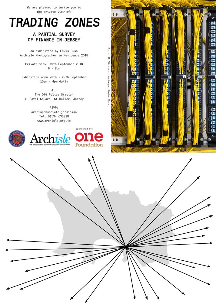
Lewis Bush (Archisle Artist in Residence 2018) is now exhibiting his recent work in response to Jersey’s financial past, present and future…
Please make the effort to go and visit a unique and well-researched show by a young, up and coming photographer and photo-book maker…


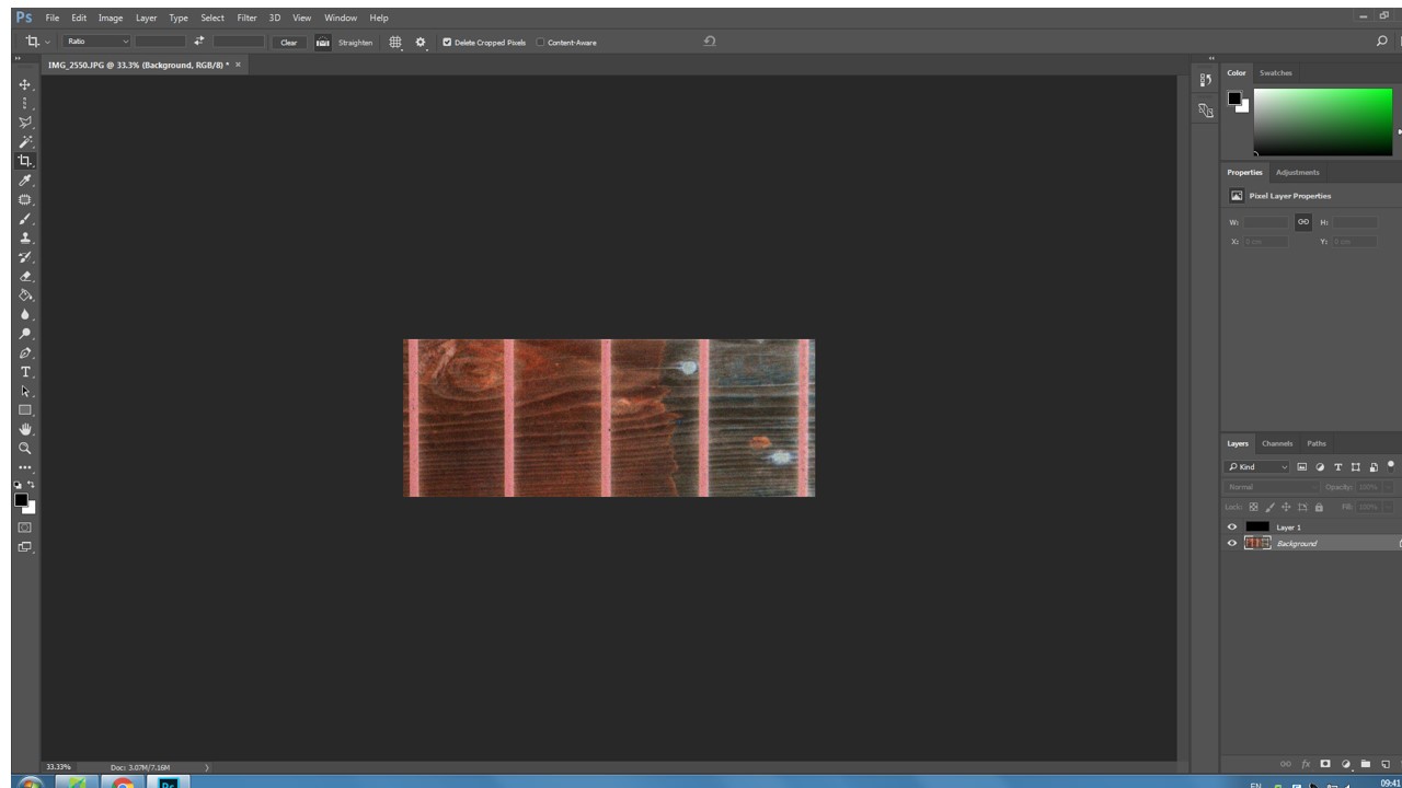

EXPERIMENTING
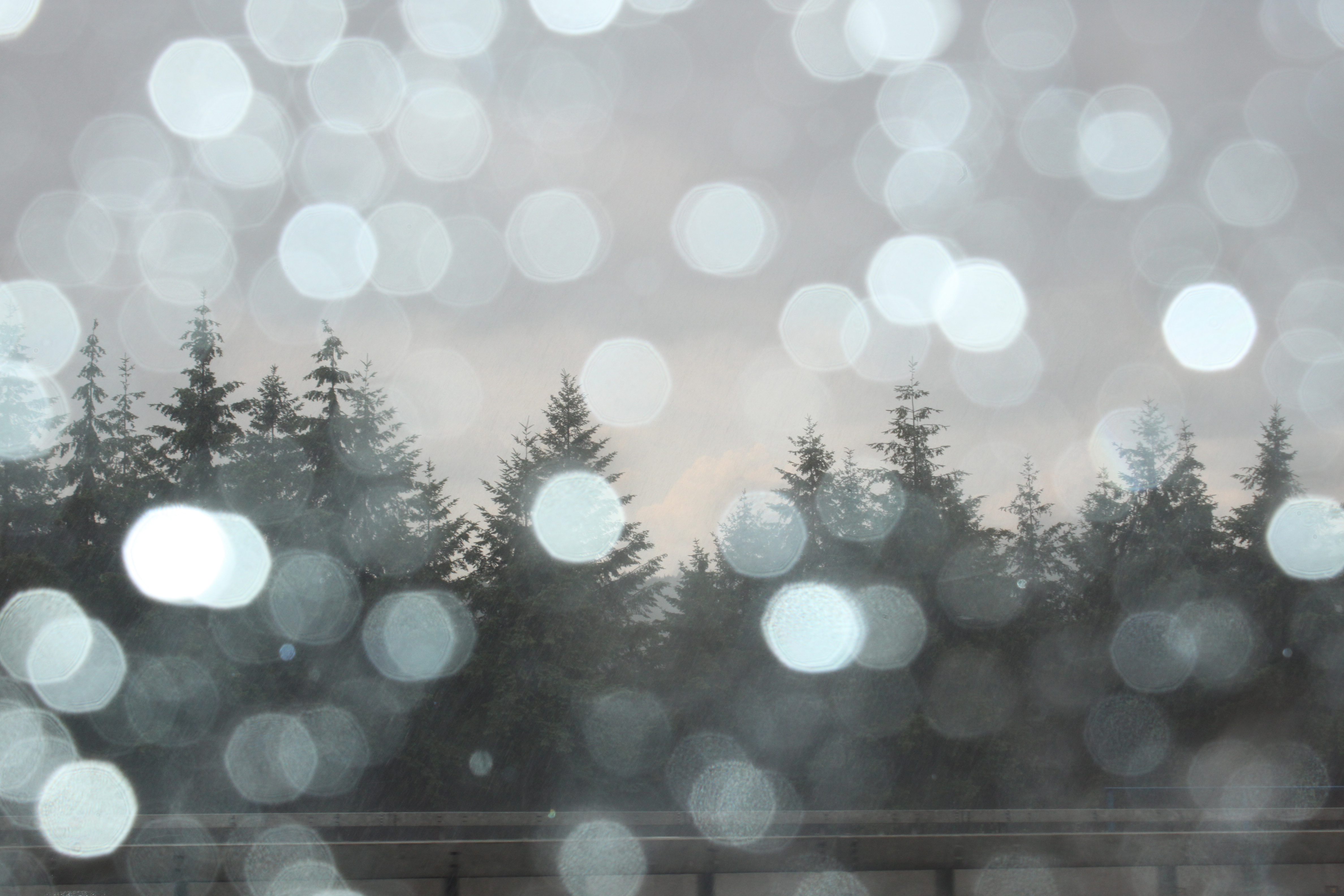
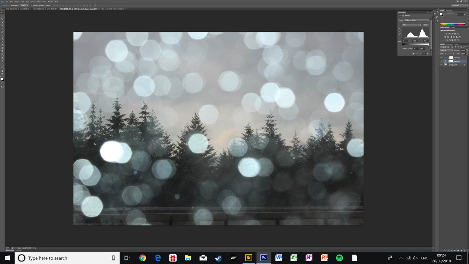
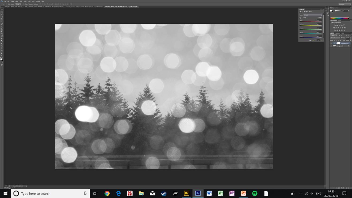
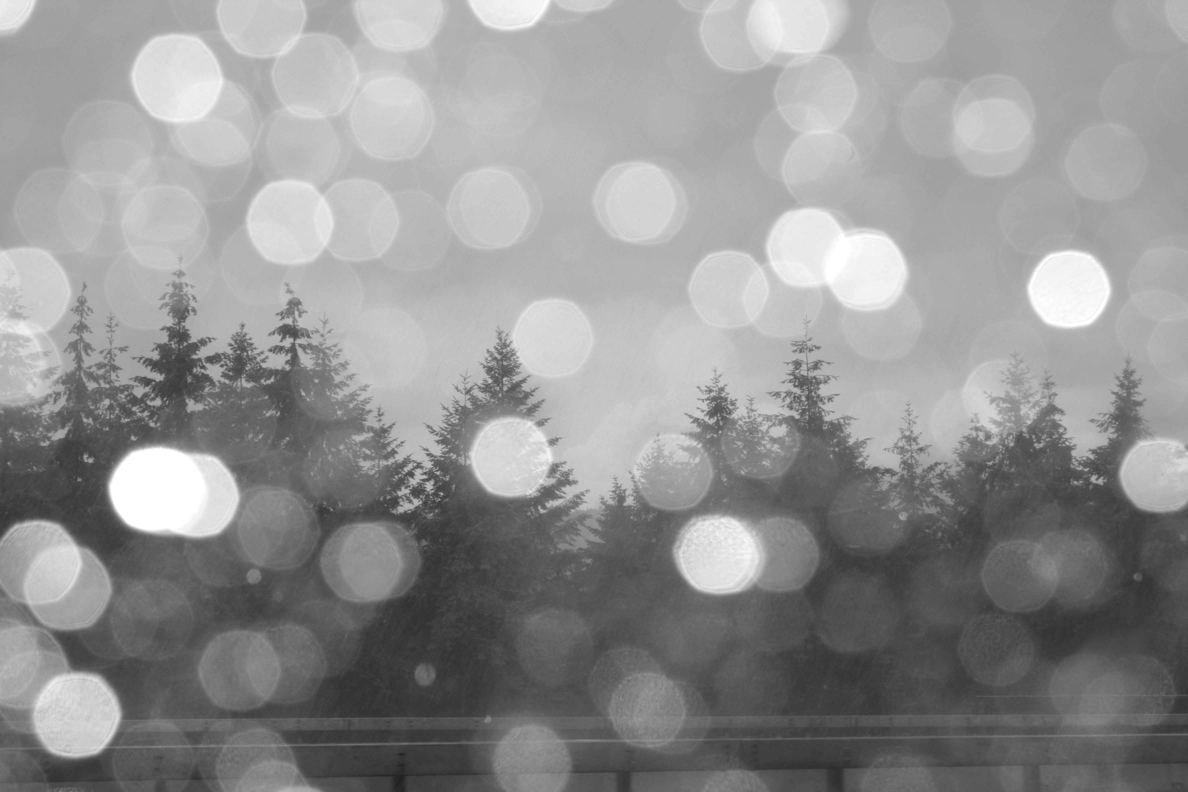
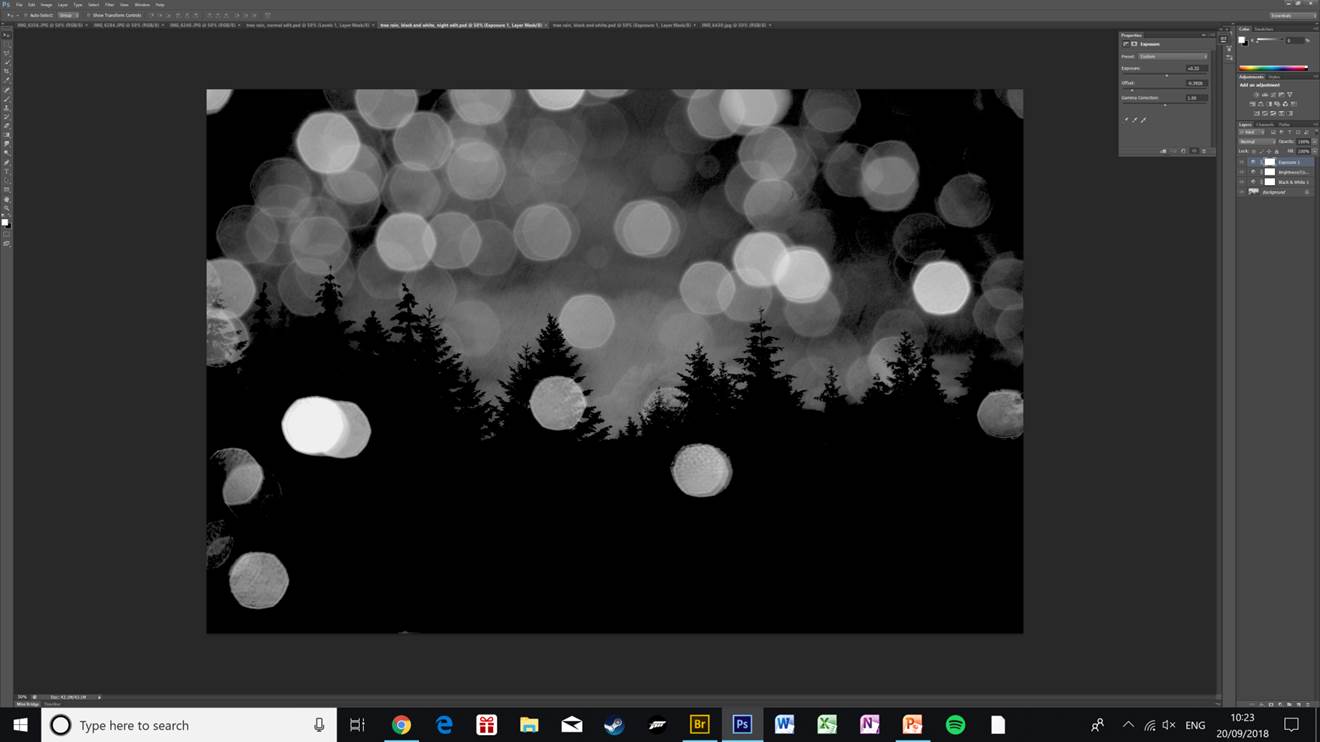
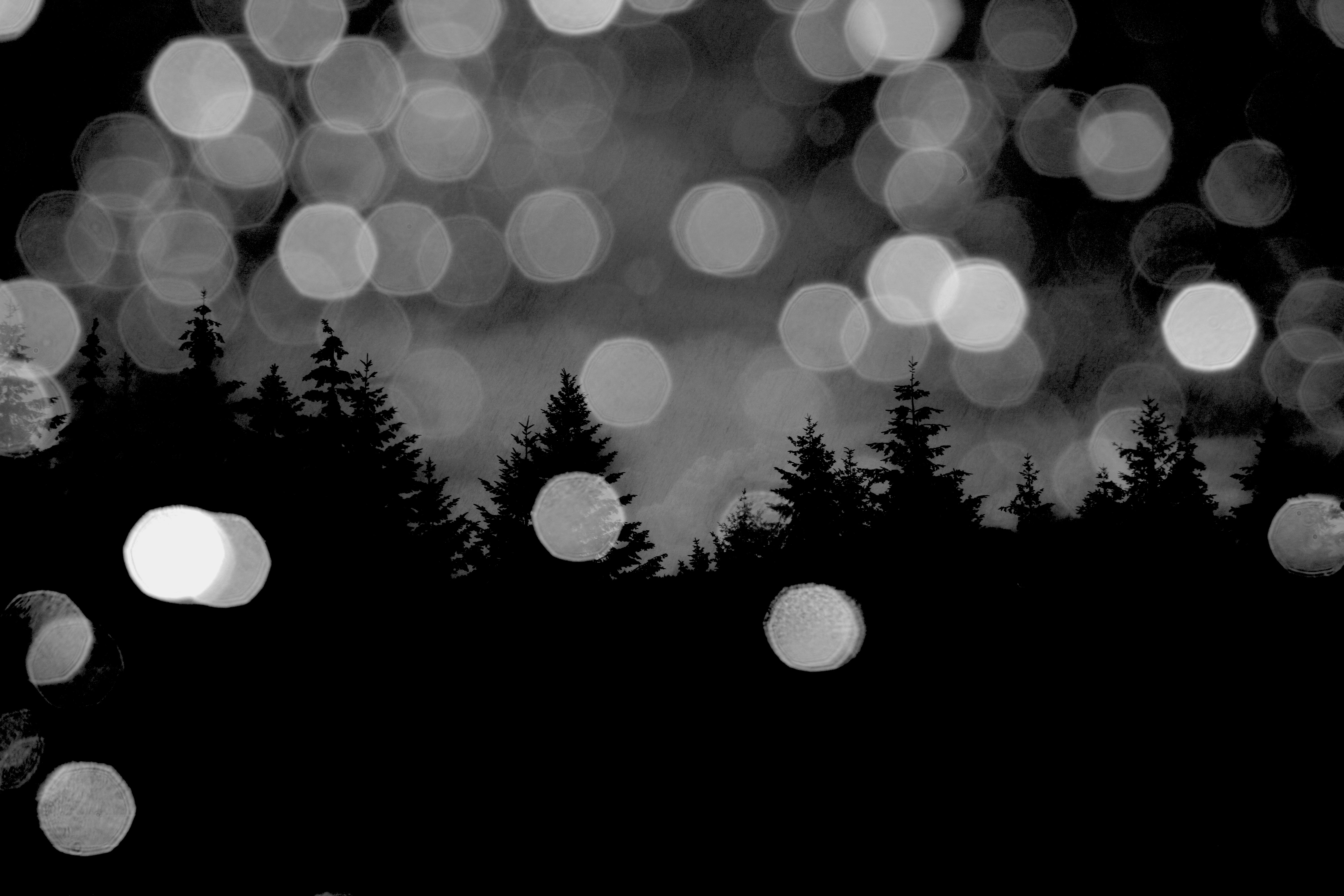
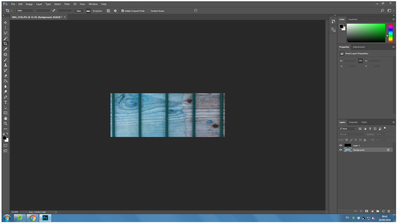
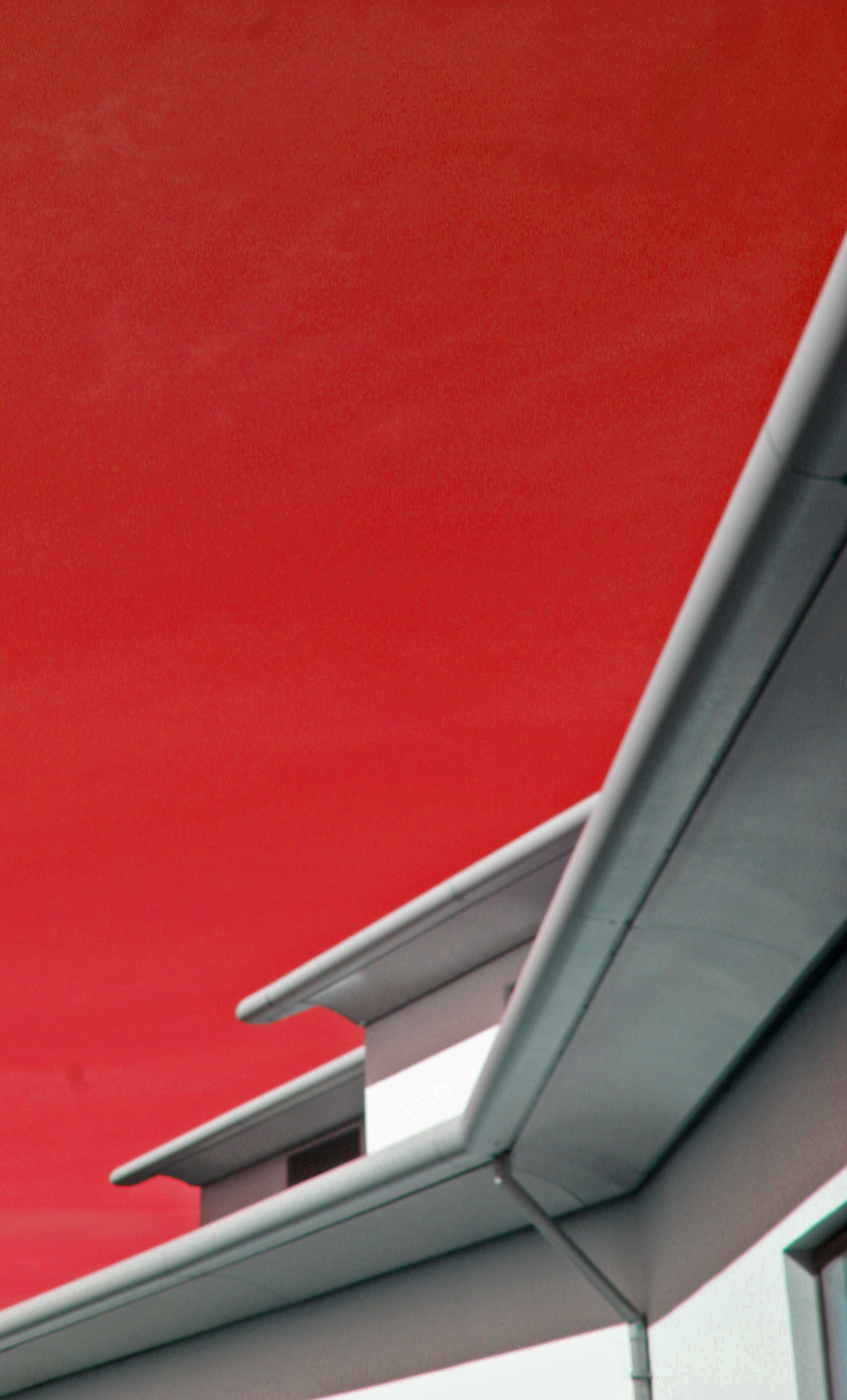
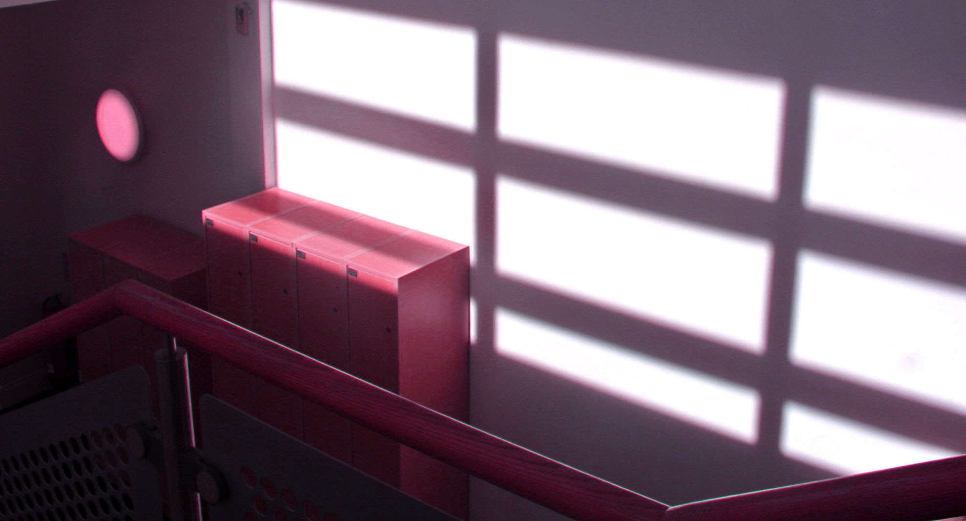
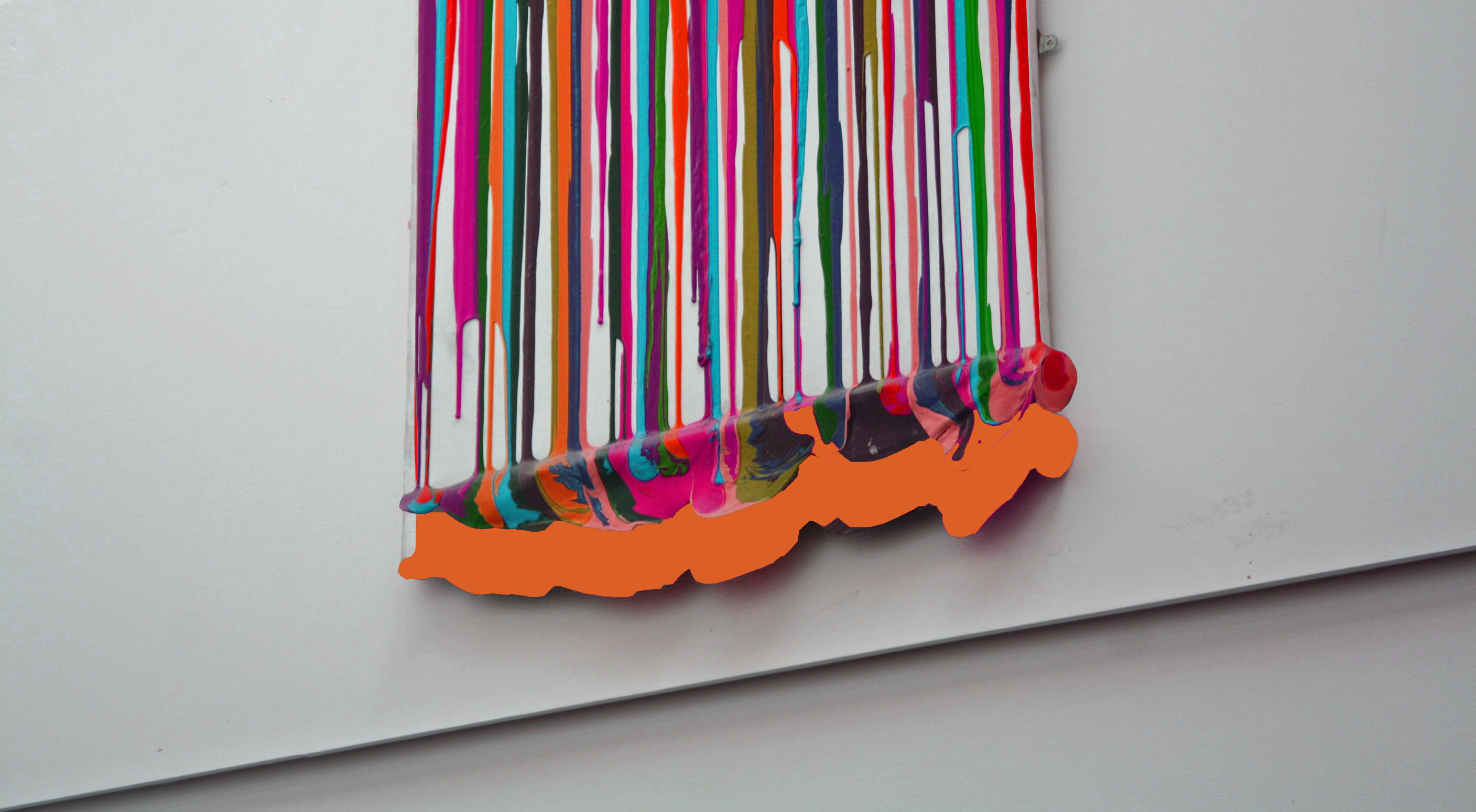
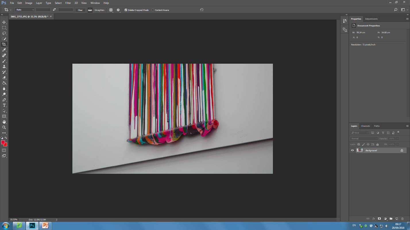
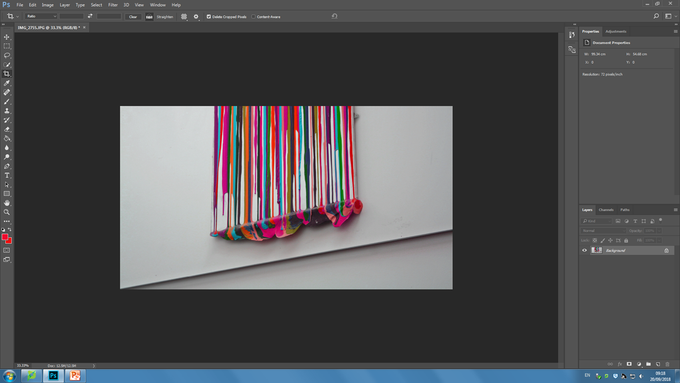
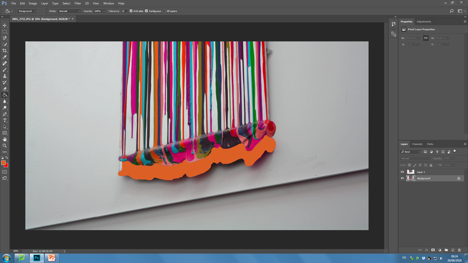
This lesson I experimented with using Photoshop and a variety of different tools which altered the already abstract images to make them even more abstract. In each image I played around with changing the color balance and changing the hues of photos. I also explored using the magnetic lasso tool and what its capabilities it has in Photoshop. I used the crop tool in order to give interesting perspectives and cropping away unnecessary parts that did not add to the photo or disturbed it.
The end result of experimenting with Photoshop was a variety of very abstract and interesting photos which have become more unique and distinctive. They took the photos from being average to something that is more worth while looking at.

Contact sheets consist of several thumbnail photos printed on a single sheet of paper, so you can view them all at once; this can be useful as it allows you to help chose which of your photographs you want to keep/discard/edit
The RED represents the images I want to discard and I am not happy with.
The GREEN images are the photograph I am most happy with and that I believe do not need changing/editing
The YELLOW images are the photos I am not sure and possibly need editing.
Why do people produces contact sheets?
People create many contact sheets after a photo shoot in order to layout and see all images that they have created. this will help the photographer be organised with their images and help then figure out their best images from their worst images. Contact sheets make editing much easier. Editing is the process of the selection of images that will compose a photographic body, which will respond to the specific purpose of the works compete. By using contact sheets its giving editing a whole new experience of the photography workflow. Contact sheets are pages that contain thumb nails of your photo shoots all displayed so its much easier to see all your photos at once. This process is made image comparison much easier.
For this photo shoot I focused on close up photography, using a contrast between a focused foreground and a blurred background and vice versa. Although there are exceptions, the majority of photos in this shoot are of man-made objects which are either very textured or stretch from the foreground to the background (e.g. pipes, mdf planks).
I will edit some of the photos by cropping, enhancing, gray scaling, etc. The contact sheet is just a guide for which photos I’m going to use and edit, and which ones I’m going to leave out.
I have annotated this contact sheet less than my previous one as this has a lot more photos, so going through every one would be tedious. So instead I have marked my favourite photos with a red line next to them, and marked photos which I need to crop with a purple box (indicating what area i need to crop).
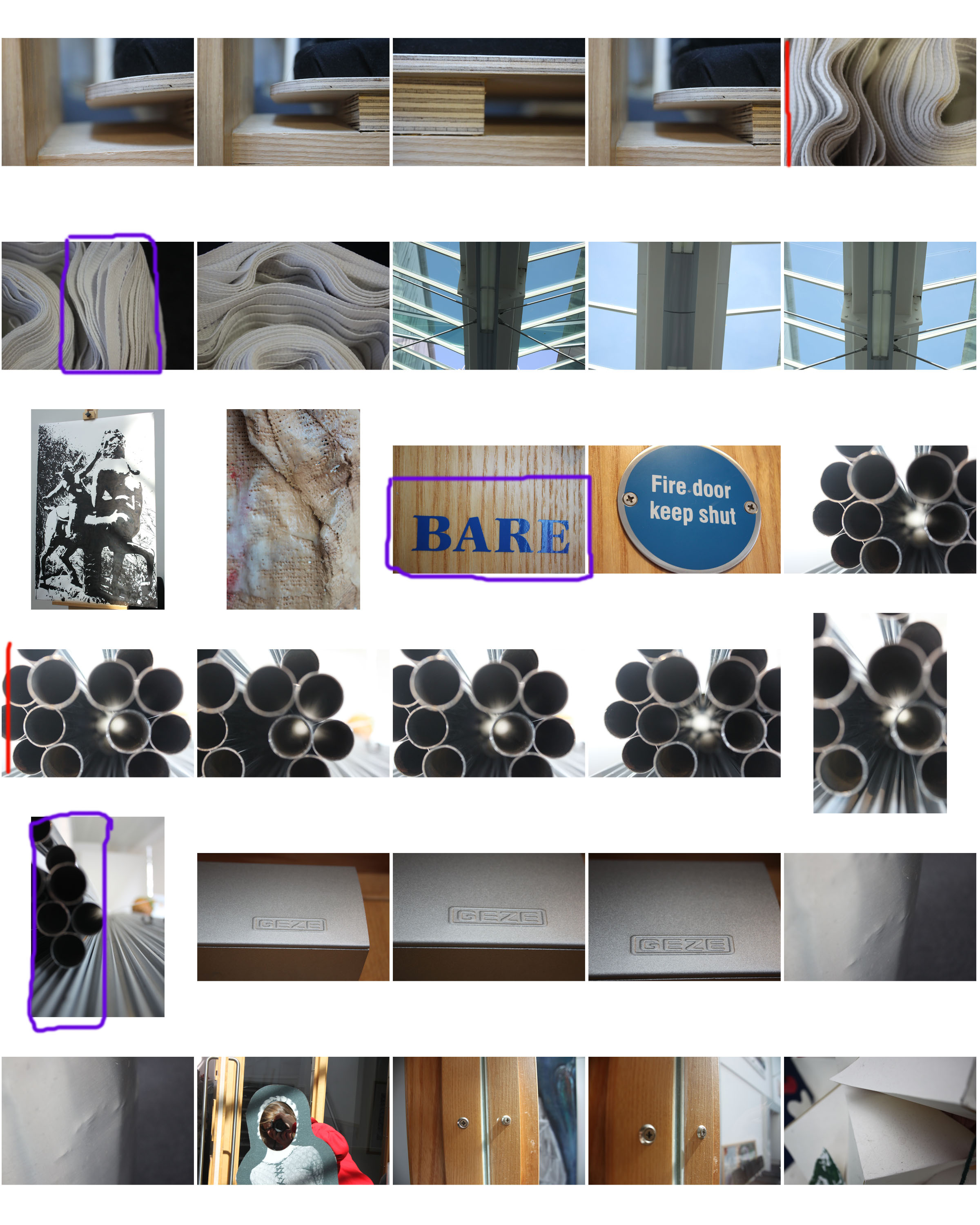
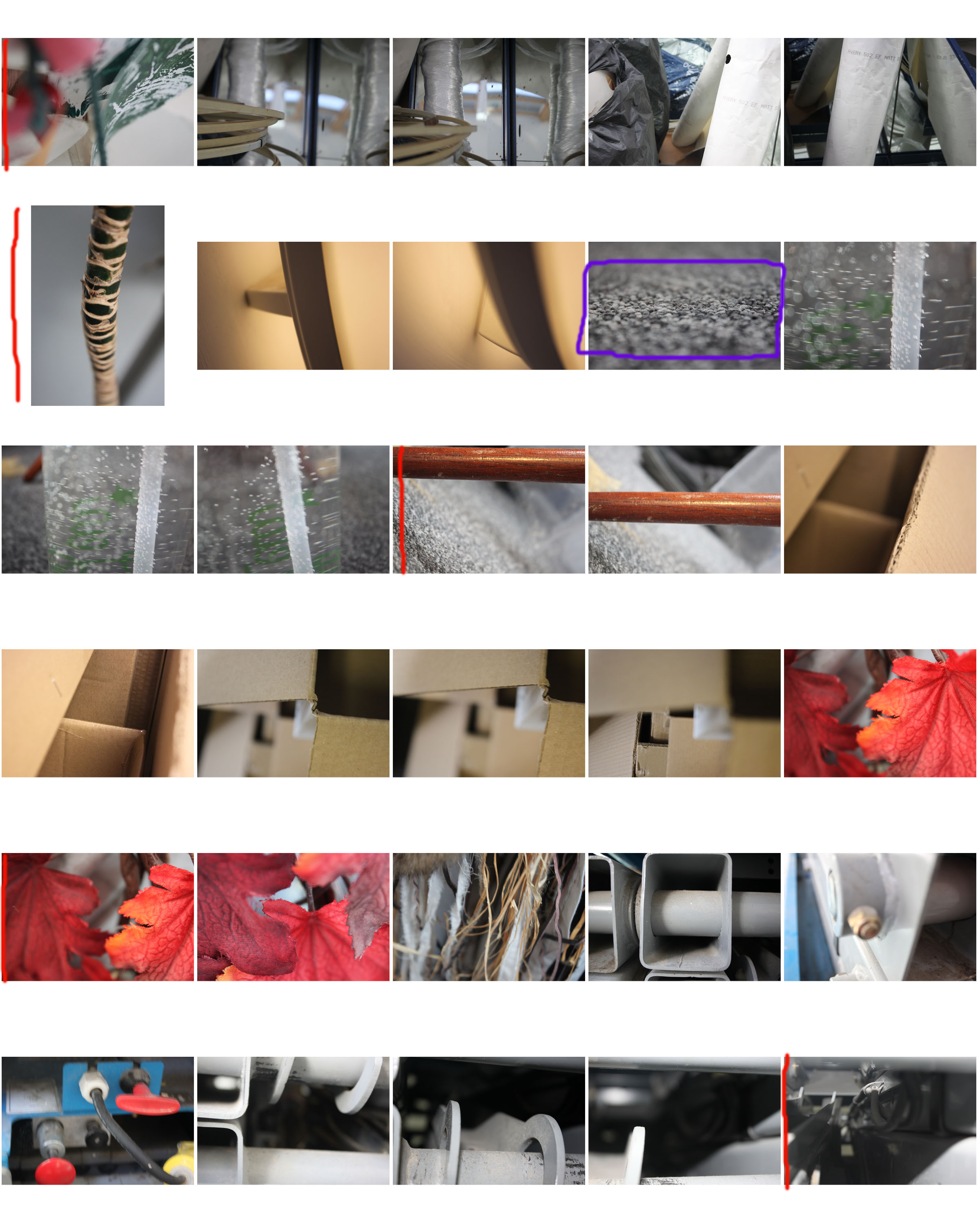
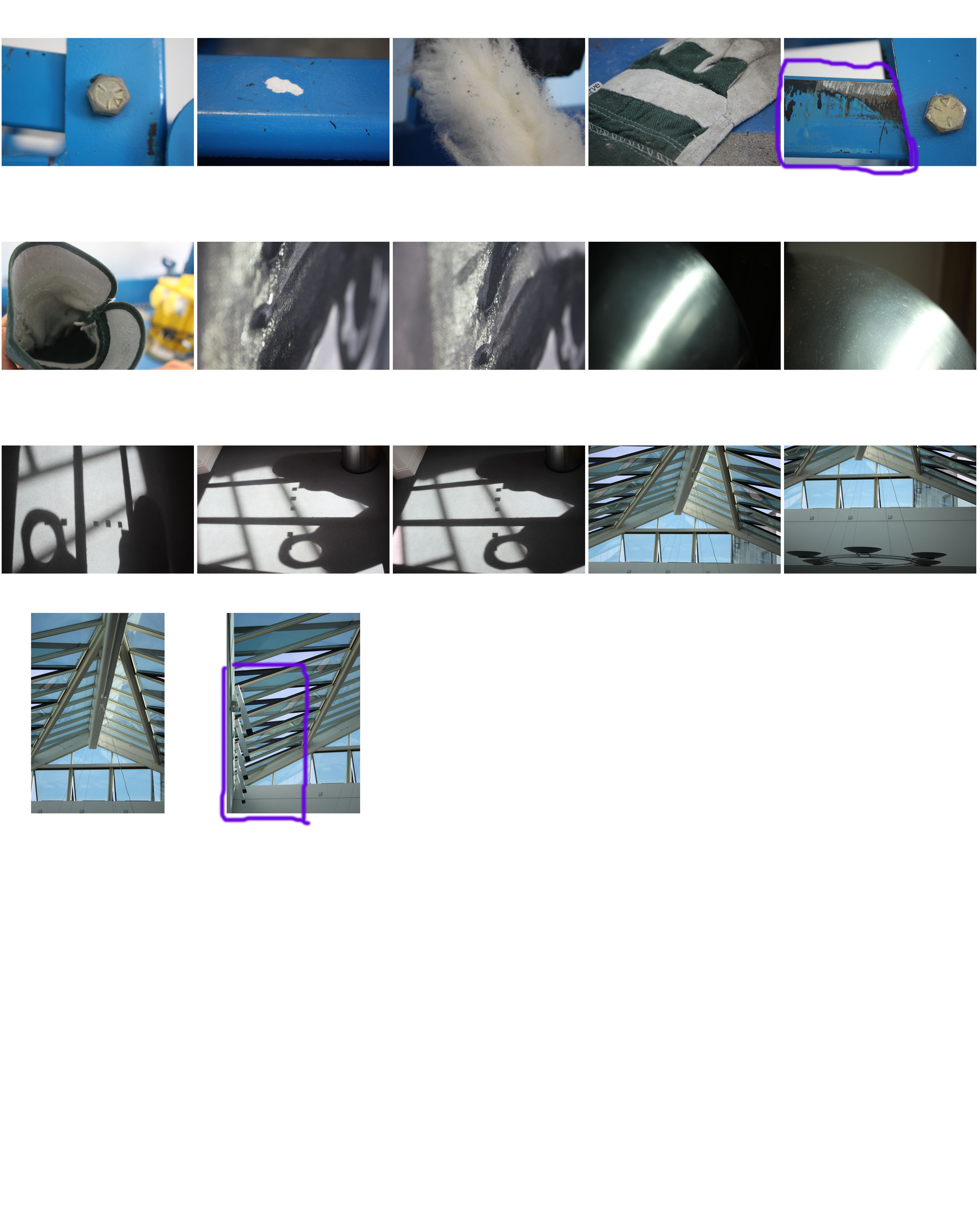
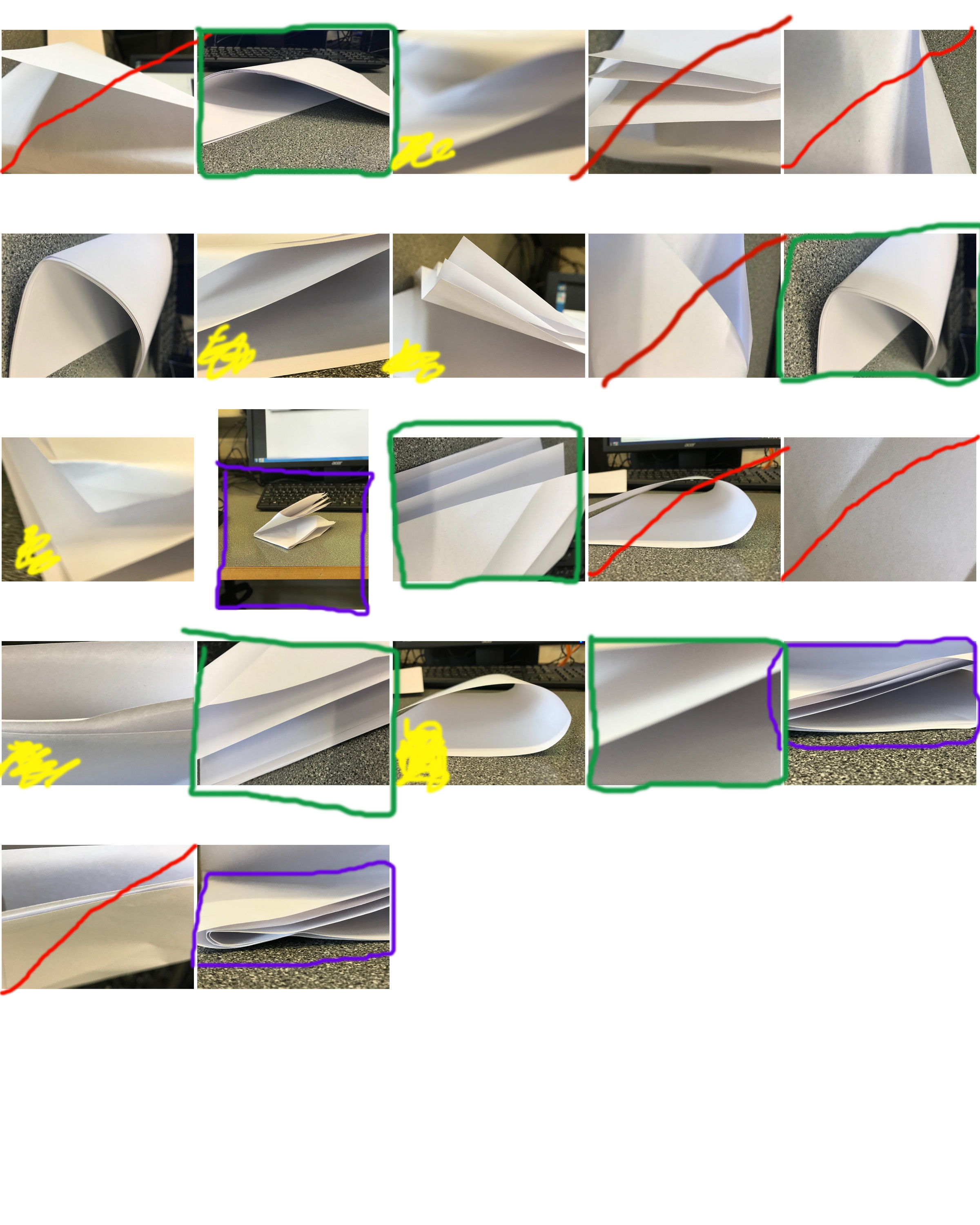 A contact sheet can both be used for distinguishing between your good/bad photos and choosing which ones to use/ edit, or be used as a finished photo. This is because of the image selecting process being used.
Here I have used green to mark photos which I am going to use, red to mark photos which I am going to discard, purple for the area of a photo I will crop, and yellow for pictures which I am unsure about using.
For future projects I will crop and edit the images which I have chosen from the contact sheet, and potentially crop the contact sheet to show only a few photos, which I will annotate with a thick marker and use as a finished photo.
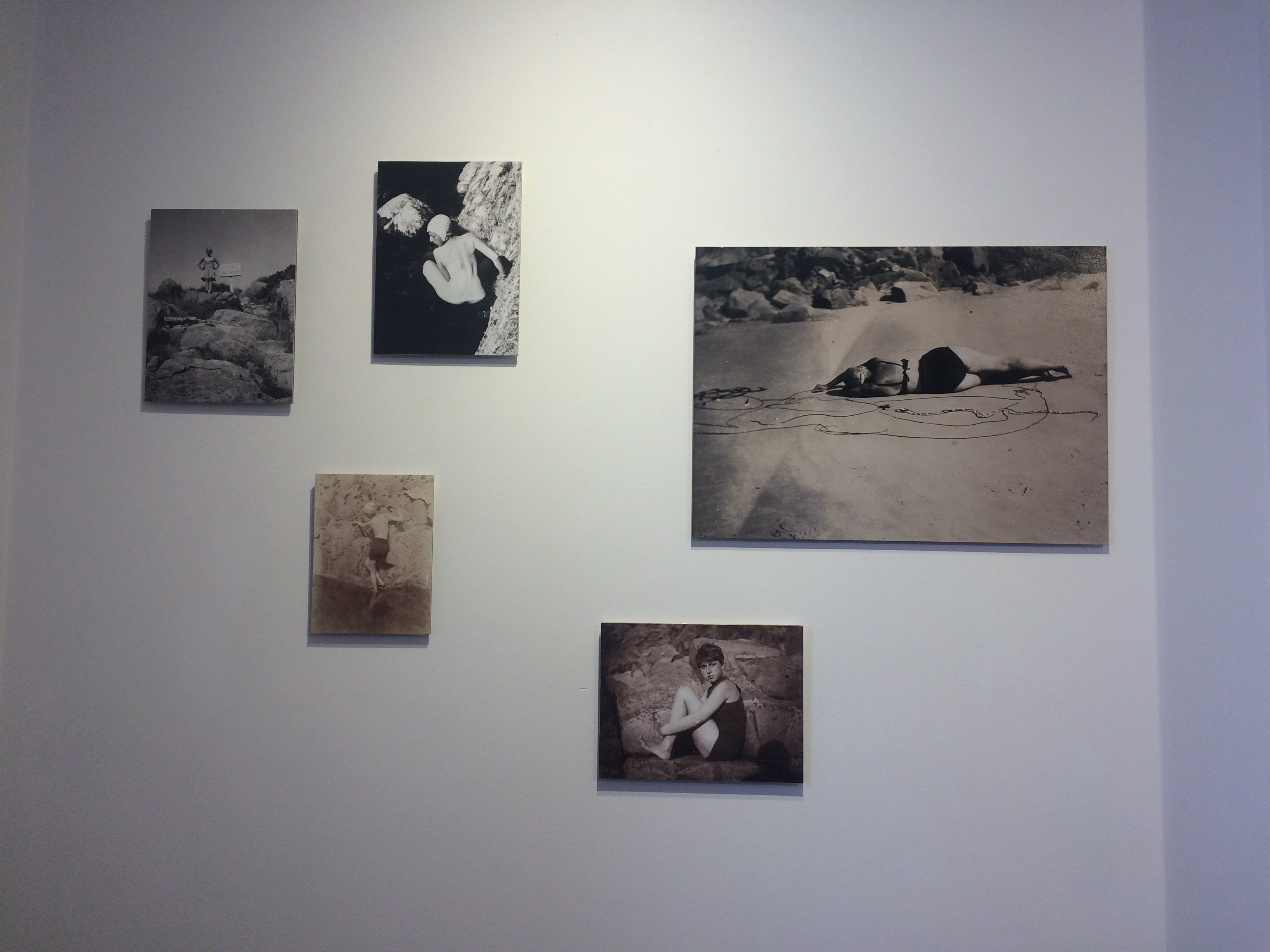

The CCA gallery displayed photographic works of Claude Cahun (1894-1954) and Clare Rae. Claude Cahun was an experimental queer artist and moved to Jersey in 1930 with her female partner Marcel Moore. Cahun’s self portrait photographs have become influential for artists dealing with questions of gender identity and the representation of the female body. While Clare Rae was in Jersey she photographed a series called ‘Never standing on two feet’ where she considered Cahun’s interaction with the physical and cultural landscapes of Jersey. The photographs Claude Cahun has captured in Jersey are intimate and explore an idea of self in the environment. While taking the images for her series, Clare had in mind Cahun’s photographic gestures and the result of a woman’s body aging over time.
The exhibition was displayed well with Claude Cahun’s work on one side of the room and Clare Rae’s on the other. Although their works were in separate room the space had a nice flow as there was a large opening to both ends so you could easily go from one room to the other and compare the similarities in their photographs. Unlike Rae’s, Claude Cahun’s work has been displayed in sections so you can progressively see how her photography has changed and how she has developed as a person by exploring her gender identity.
You can tell that Clare Rae has been inspired by Claude Cahun since her response to Cahun’s work is very similar. She has used Cahun’s style in her series by incorporating the human body into the natural environment as if they are part of it. Both works are in black and white and they both have blurred an indication of gender by only revealing certain parts of the body.
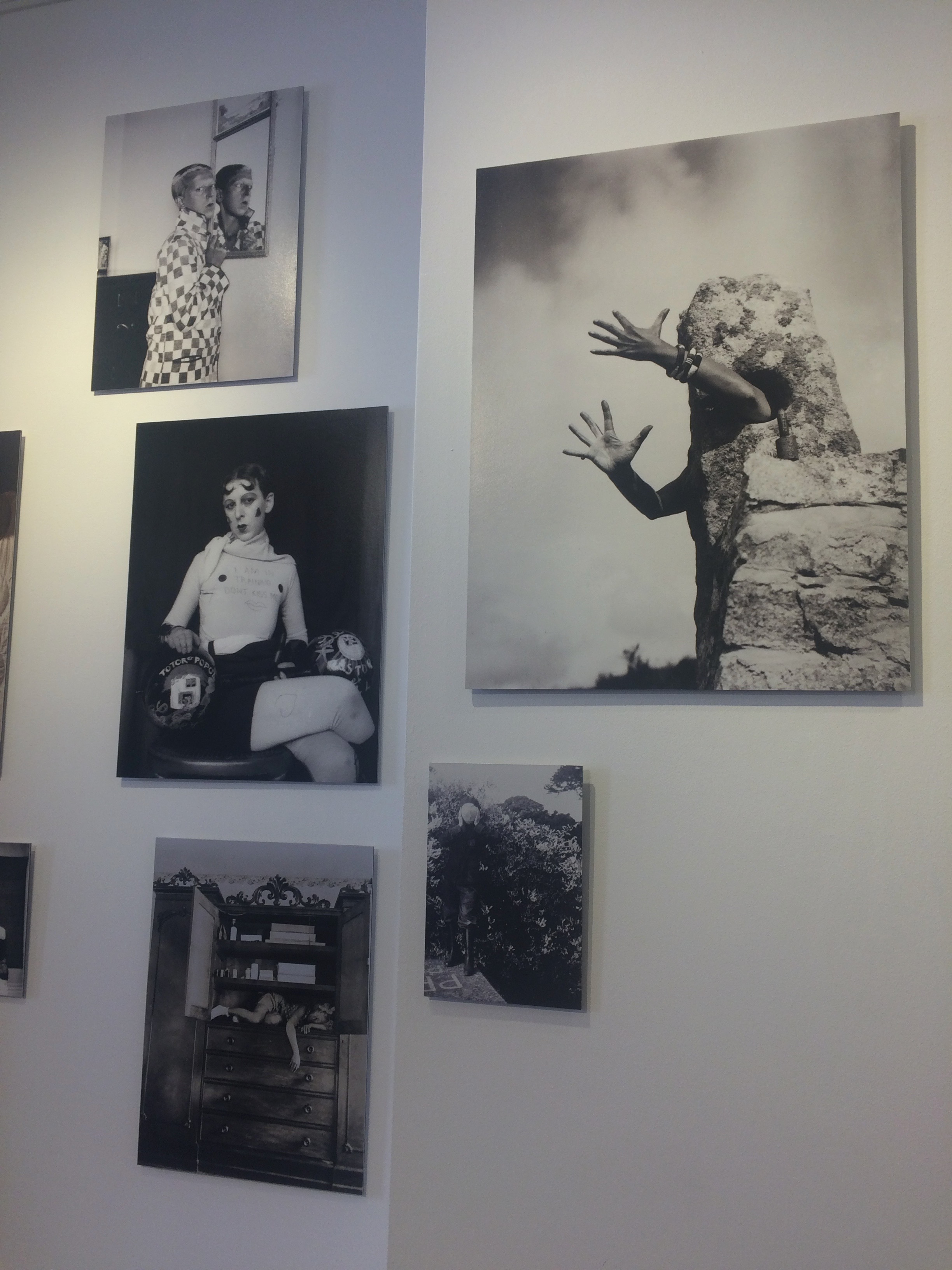
This image by Cahun depicts a rock with arms extended out. The person is blending themselves into the natural environment and becoming the rock. This photo explores identity since the viewer questions who the hands belong to. I think the hand gesture suggests an emotion of anger since Cahun is struggling with gender identity. However, it’s difficult to tell because of the lack of body parts visible in the frame. Since she was queer it would of been difficult for her at the time to blend in with everyone else as it was uncommon. Because she is hidden behind the rock, I think it represents her struggling to show her true self to society.
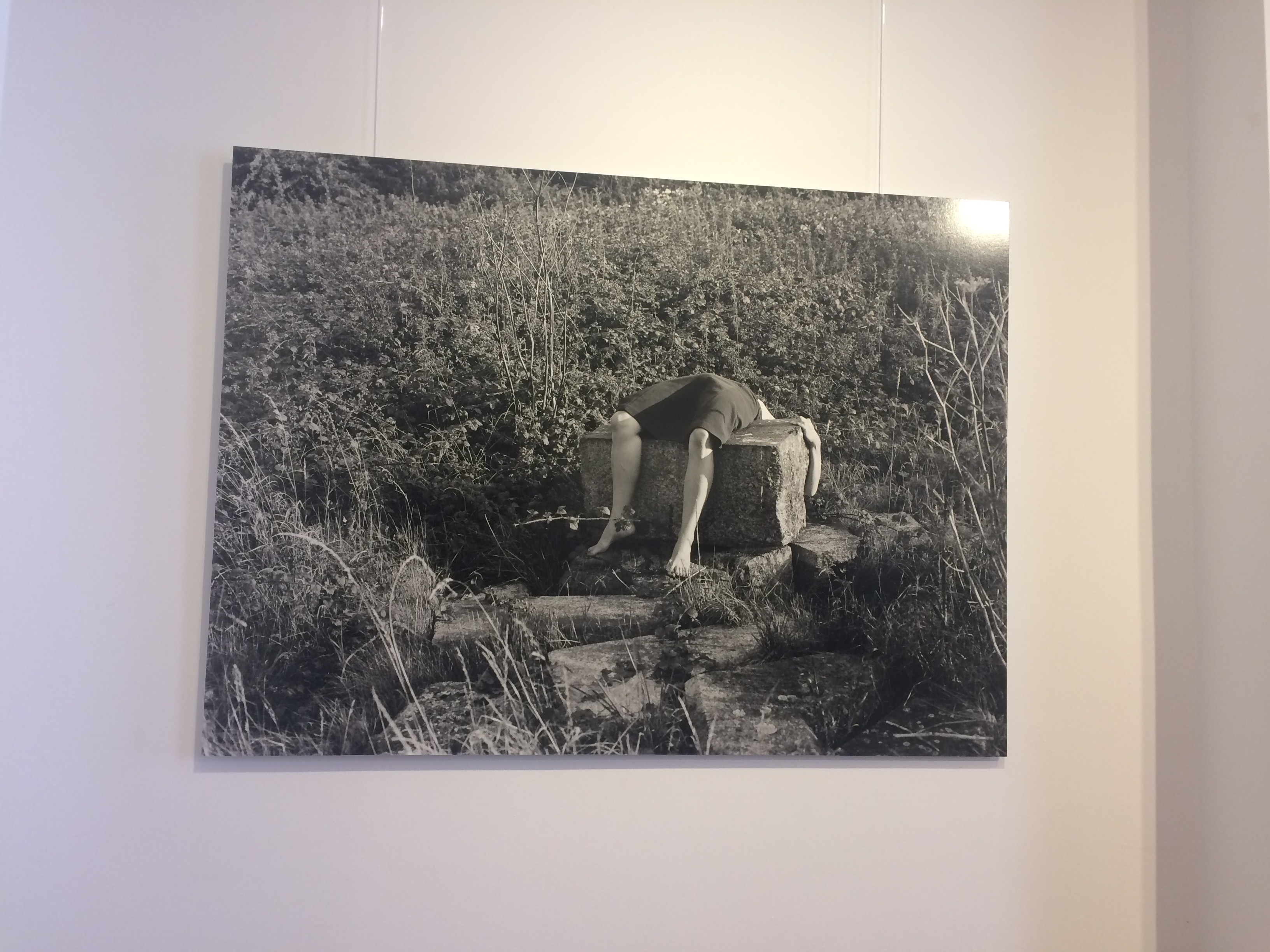
Clare Rae has gained influence from Cahun’s work since the person in the image is giving themselves into nature and becoming a part of it. She has shaped herself into the rock and seems to be in an uncomfortably position. Like the other image it is difficult for the viewer to tell the gender of the person since their face is not visible in the photo. This could also suggest a struggle with identity and perhaps the position represents them giving up with trying to fit in with everyone else. This has to be my favourite image from Clare Rae’s series because of how unsettling and eerie the photo is. It’s almost as if the person is drained and feels empty inside.


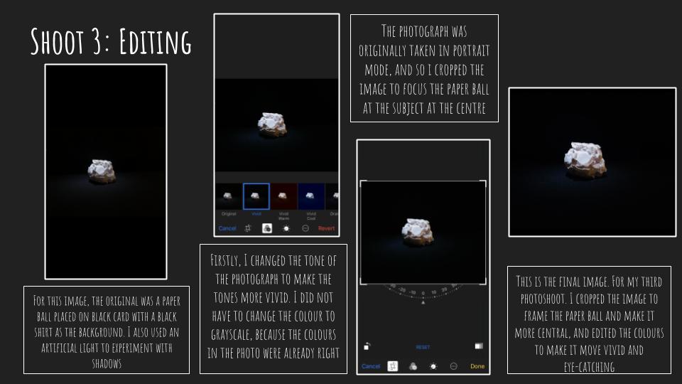

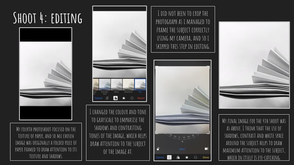
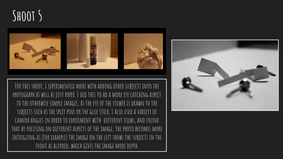

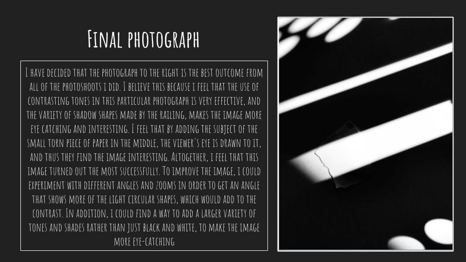
Due in first lesson of Week 4
Minimum Expected frames/ exposures = 150-200 images
We will aim to expand our approach to photographing things around us…whilst responding to influential approaches in the development of modern photography.
Watch this…
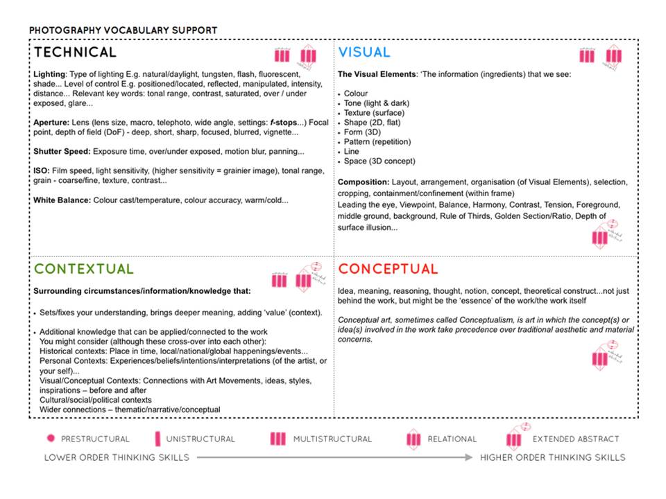
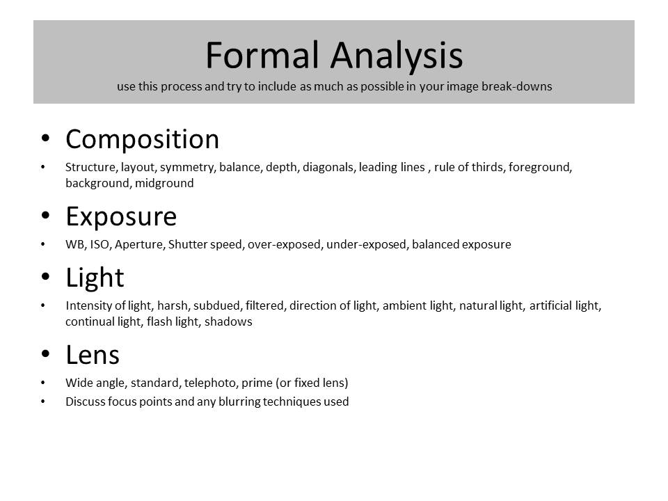
By responding to The New Objectivity you will be able to classify a greater range of your images whilst learning more about the Formal Elements and Adobe Photoshop techniques including :
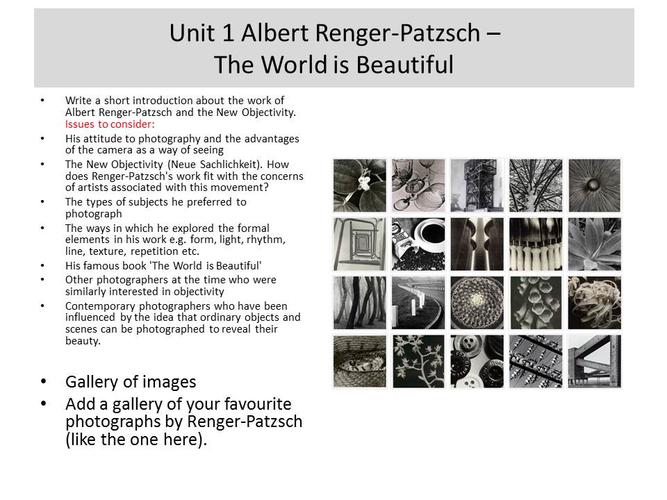
Both photographers were revered for their objective approach to photography…and were re-known for applying technological approaches to creating their imagery.
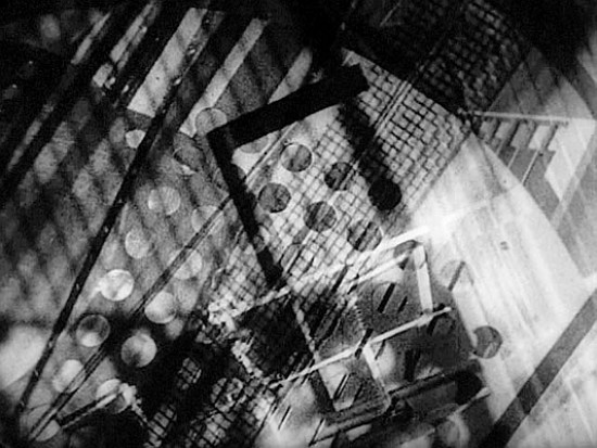
Maholy-Nagy

Karl Blossfeldt
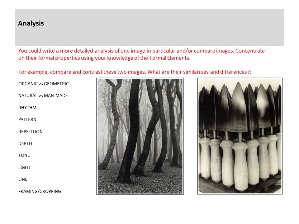
Compare and contrast the 2 approaches by analysing a key example from each artist and responding with your own examples.
Try to demonstrate core skills eg :
Describe, explain and evaluate your process carefully.