Category Archives: AO1 Develop Ideas
Filters
Ralph Meatyard response
RALPH MEATYARD’S WORK AND LIFE:
Ralph Eugene Meatyard (1925–1972) lived in Lexington, Kentucky, where he made his living as an optician while creating an impressive and enigmatic body of photographs. Meatyard’s creative circle included mystics and poets, such as Thomas Merton and Guy Davenport, as well as the photographers Cranston Ritchie and Van Deren Coke, who were mentors and fellow members of the Lexington Camera Club. Meatyard’s work spanned many genres and experimented with new means of expression, from dreamlike portraits—often set in abandoned places—to multiple exposures, motion-blur, and other methods of photographic abstraction. He also collaborated with his friend Wendell Berry on the 1971 book The Unforeseen Wilderness, for which Meatyard contributed photographs of Kentucky’s Red River Gorge. Meatyard’s final series, The Family Album of Lucybelle Crater, are cryptic double portraits of friends and family members wearing masks and enacting symbolic dramas.


WORK ANALYSIS:
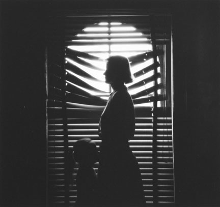
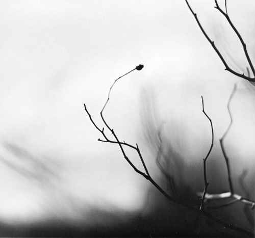
Meatyard stated in a lecture to the Louisville Photographic Society, he was involved in working on no fewer than 12 “methods, series, subjects.” Among them were what he called “photographs made under the influence of Zen,” shown here with the title “Zen Twigs.” While the images are very minimalist, they deal with growth and decay, is impressive, they are familiar enough to be looked over lightly. A particularly beautiful one (untitled, like much of Meatyard’s work) shows a young trunk sprouting — or seeming to sprout — a branch that curls around it in a wiry loop, the whole almost a visual haiku. The simplistic tonal range of the image is effective in portraying the theme of deterioration and degeneration. Meatyard has clearly used a very narrow field o view, with a singular branch being in focus and the rest of the backdrop is extremely blurry. The images are in a mid-range of exposure, not too overexposed or underexposed. The light grey tones from the backdrop of the photo, highlight they unsophisticated, dead branch. The upwards growth of the branches, have strong and dark lines which cut through the sea of blurriness. The image also contains various shades of white, black, and grey, all working together to create a harmonious image. The contrast between the blurry backdrop and the foreground give the image a real sense of depth and space.
MY OWN WORK:
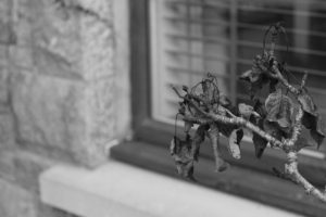
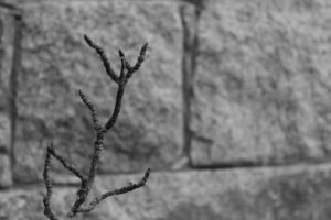
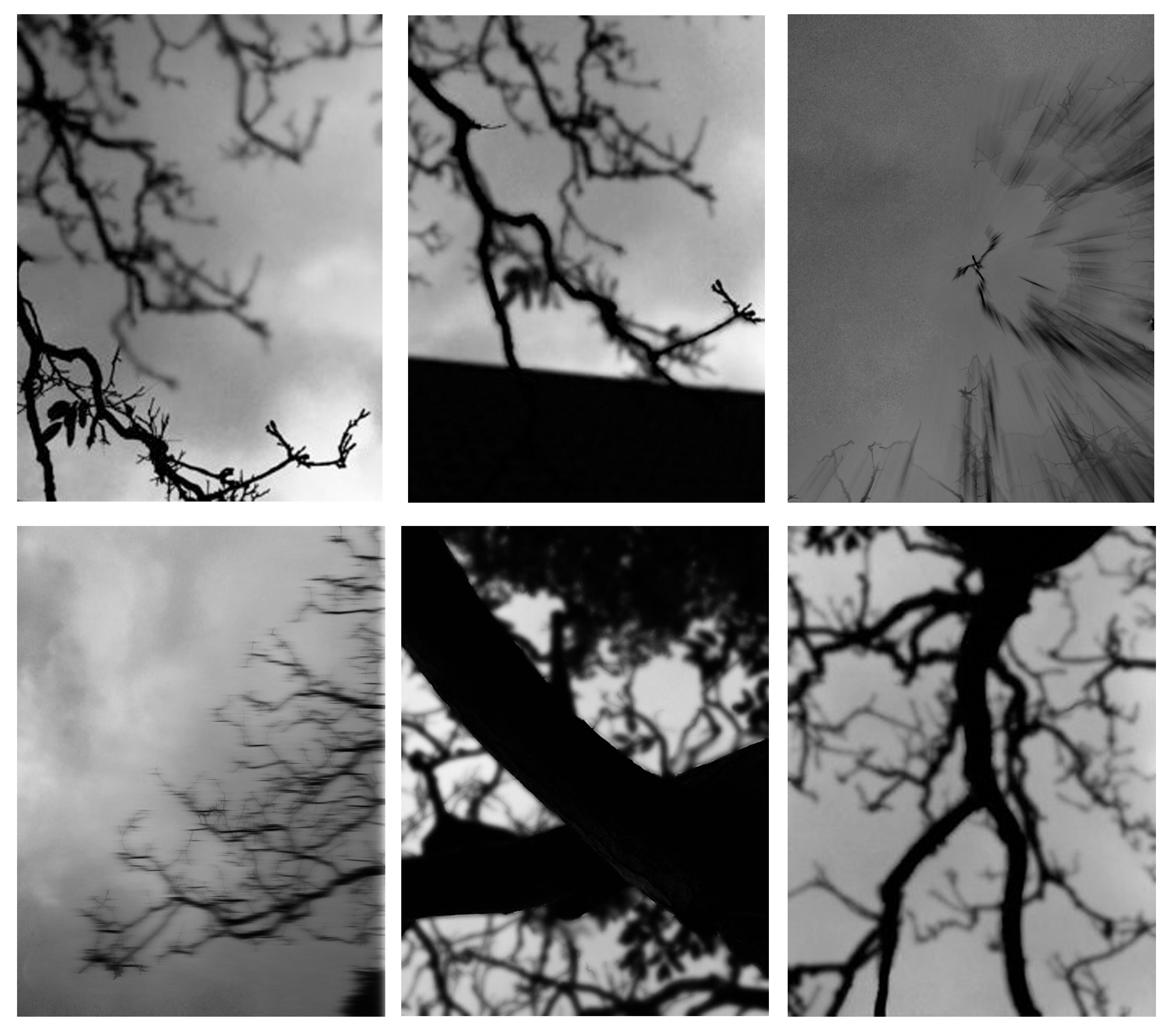
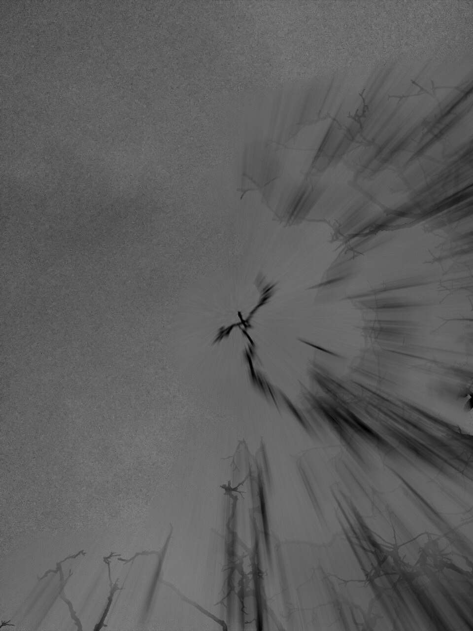
During this photo shoot, I focused mostly of the formal elements which i had to include but also capturing the Gothic nature of Meatyard’s work: dark, still, and simplistic. A dark evening, used in conjunction with editing resulted in a grey dark grey tonal range of the images.
MY WORK ANALYSIS:
For this photo shoot I attempted as much as possible to recreate Meatyard’s “zen sticks” series. I particularly focused on exposure settings, focus control, and depth of field. The photograph below was taken of a dead tree, of the branches facing upwards towards the sky. Meatyard’s images are all very dark and dramatic therefore I chose to do my photo shoot during the evening, on a stormy, grey day. I increased the exposure to 800 in order to capture the branches in a dark setting yet still have some highlights and shadows. The dark night, and mid-range ISO setting meant that the image contracted a lot of motion blur, the effect which i was aiming to get. It resembles the work of Meatyard in many ways. The dark evening also meant that the resolution of the images decreased and became more grainy. The branches of the tree were also quite far up meaning i had to decrease the depth of field and zoom in, again compromising the quality of the image. The grainy texture of the image I feel adds to the overall aesthetic of Meatyard’s work: old and worn. The differences in motion blur also create a focal point in the image, with the central branch being less blurred than the outermost parts of the image. The image is also quite underexposed which further adds to the dramatic and intense tone, giving it almost a Gothic aura. There is a very apparent sense of space in the photo as the lack of branches in the top left hand corner of the image freeing up space. There is also a lack of light in this image due to both the time of day the image was taken and the lack of exposure adjustments made on the image during editing as i wanted to retain the dark theme.
Ralph Meatyard & Uta Barth
Ralph Eugene Meatyard
Meatyard made his living as an optician but was a member of the Lexington Camera Club and pursued his passion for photography outside the mainstream. Meatyard’s work spanned many genres and he experimented with various strategies including multiple exposures, motion blur and other methods of photographic abstraction. Two of his series are concerned with focus and depth of field. They both show the expressive potential of photography, film and cameras when looking at the ordinary world.

Zen strongly influenced Ralph Meatyard's photography works since his photos reflect a connection between nature and humans. His Zen twig series include close up detailed images of thin tree branches set against out of focus backgrounds. To respond to his photographic style, I will take photos zoomed in on twigs and make sure that the background is blurred so the subject is sharply focused.
Uta Barth
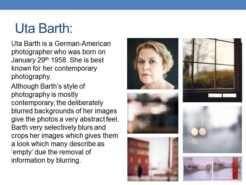
Uta Barth describes herself as an artist who works mostly with photographs. She is interested in light, drawing attention to the viewer’s perception and separating the image from the thing depicted. Although her images are blurred, they appear abstract. The works that brought her international attention is the photographic series Ground and Field. These photographs are blurred caused by focusing the camera on an unoccupied foreground. Uta Barth has made visual perception the subject of her work. She carefully renders blurred backgrounds, cropped frames and the natural qualities of light to capture incidental moments.

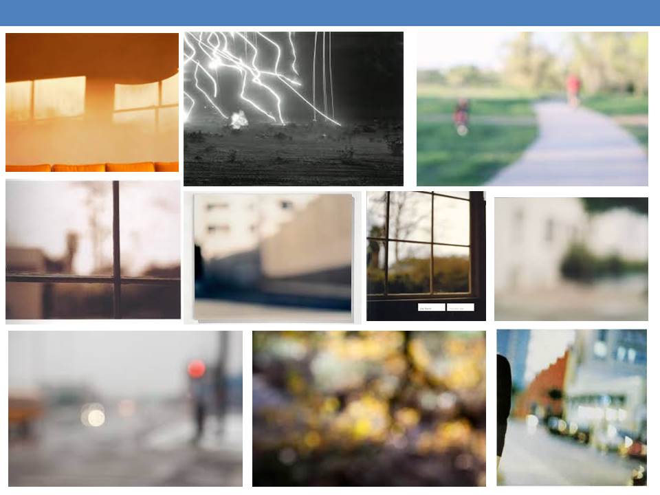
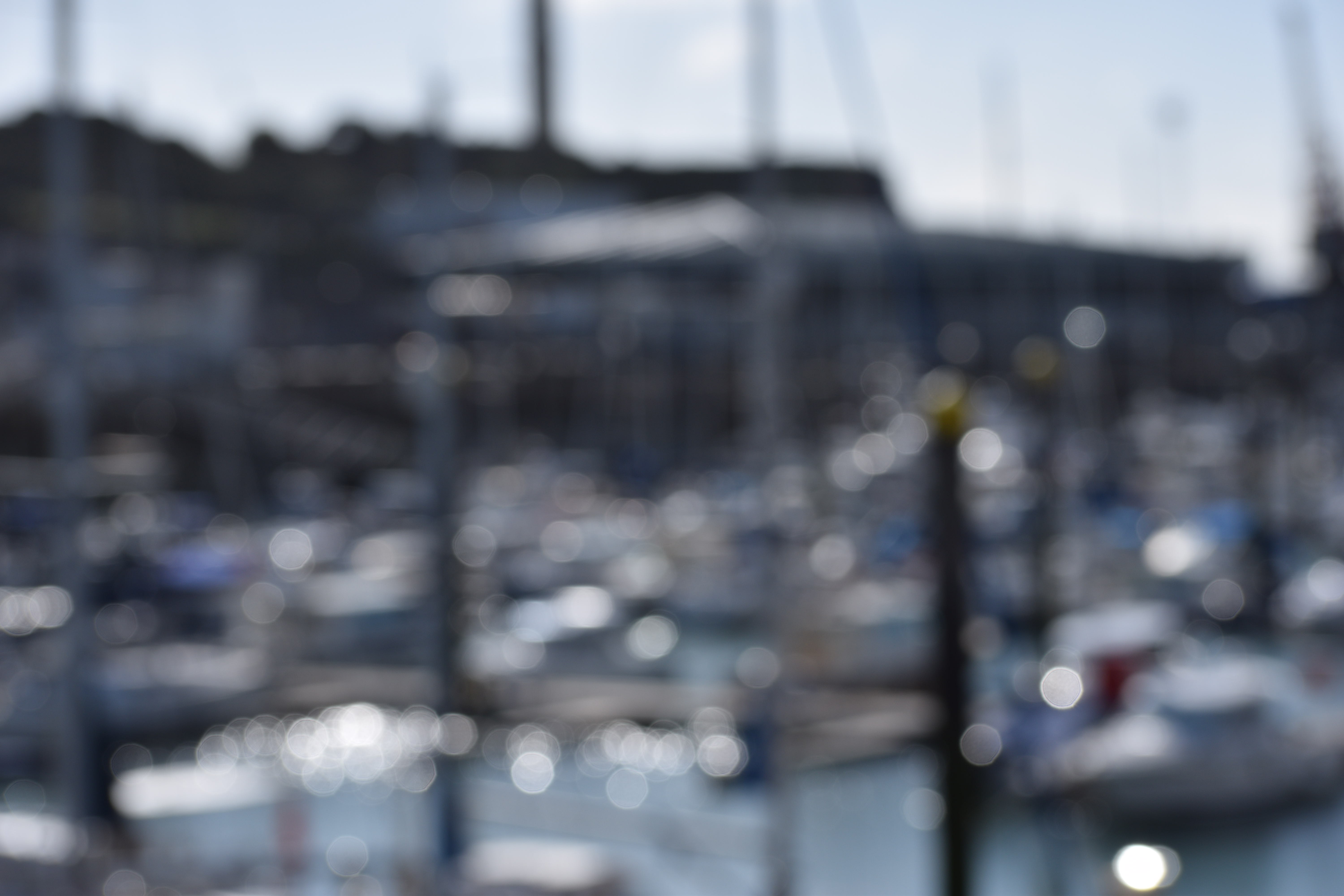
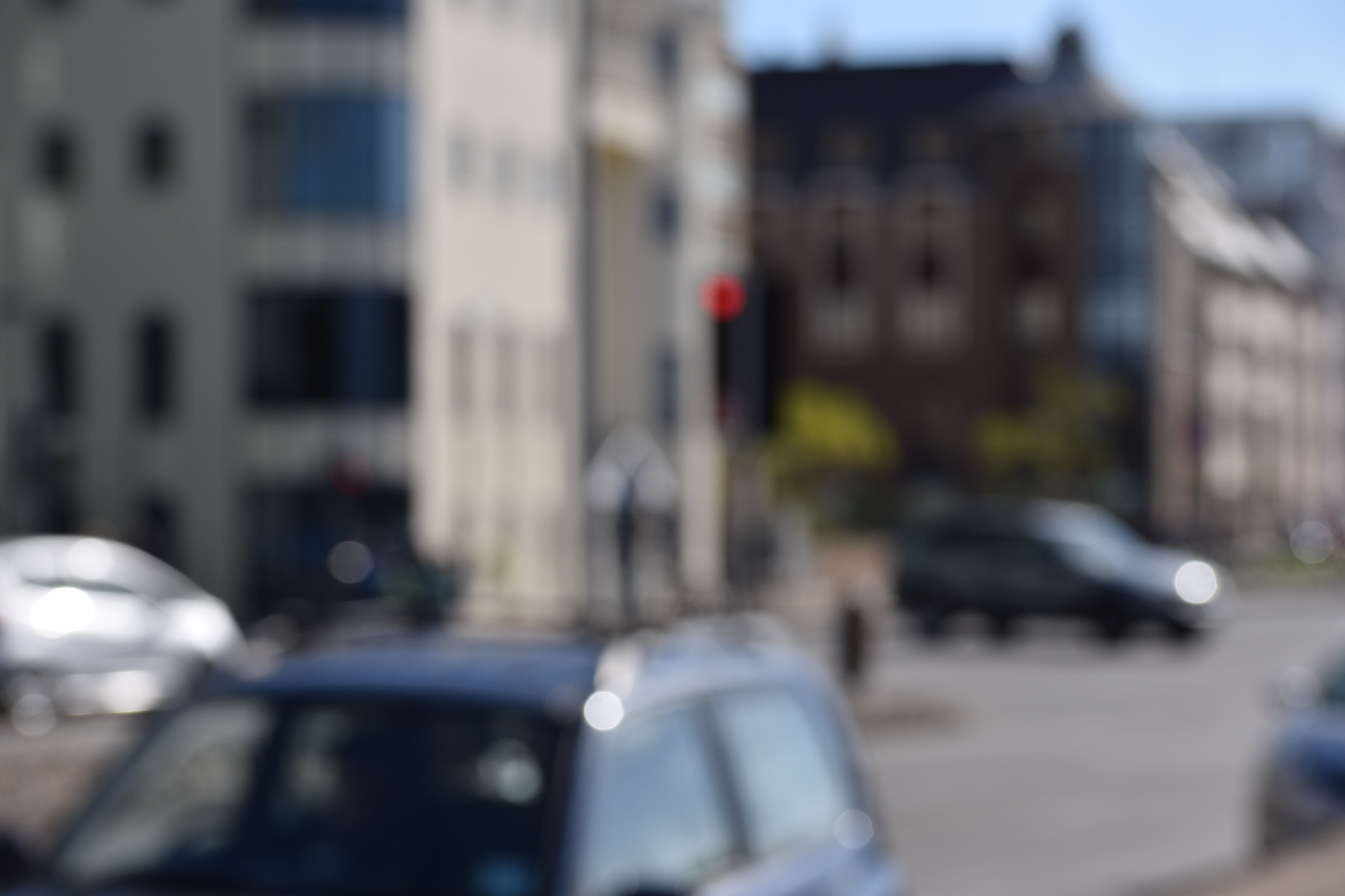
Field #20 is a photograph of a street corner taken deliberately out of focus with a shallow depth of field. At a glance the image appears to look like an abstract design of muted browns and greys with red traffic lights that have been expanded by the out of focus effect. Close up they look like an abstract composition of coloured dots and from a distance the street scenes appear disorted as if seen through a partially opaque glass. To respond to her photography style, I will deliberately take images out of focus to create abstract photos with a merge of colour




Keld Helmer-Peterson Response
Keld Helmer-Peterson is a Danish photographer, who took inspiration from Albert Ranger-Patzsch (who I previously researched). Peterson began his passion of photograph in 1938, where he received his first camera as a gift for graduating. In 1940 Helmer decided to try out and become familiar with war photography // new objectivity as it was a recent concept at the time

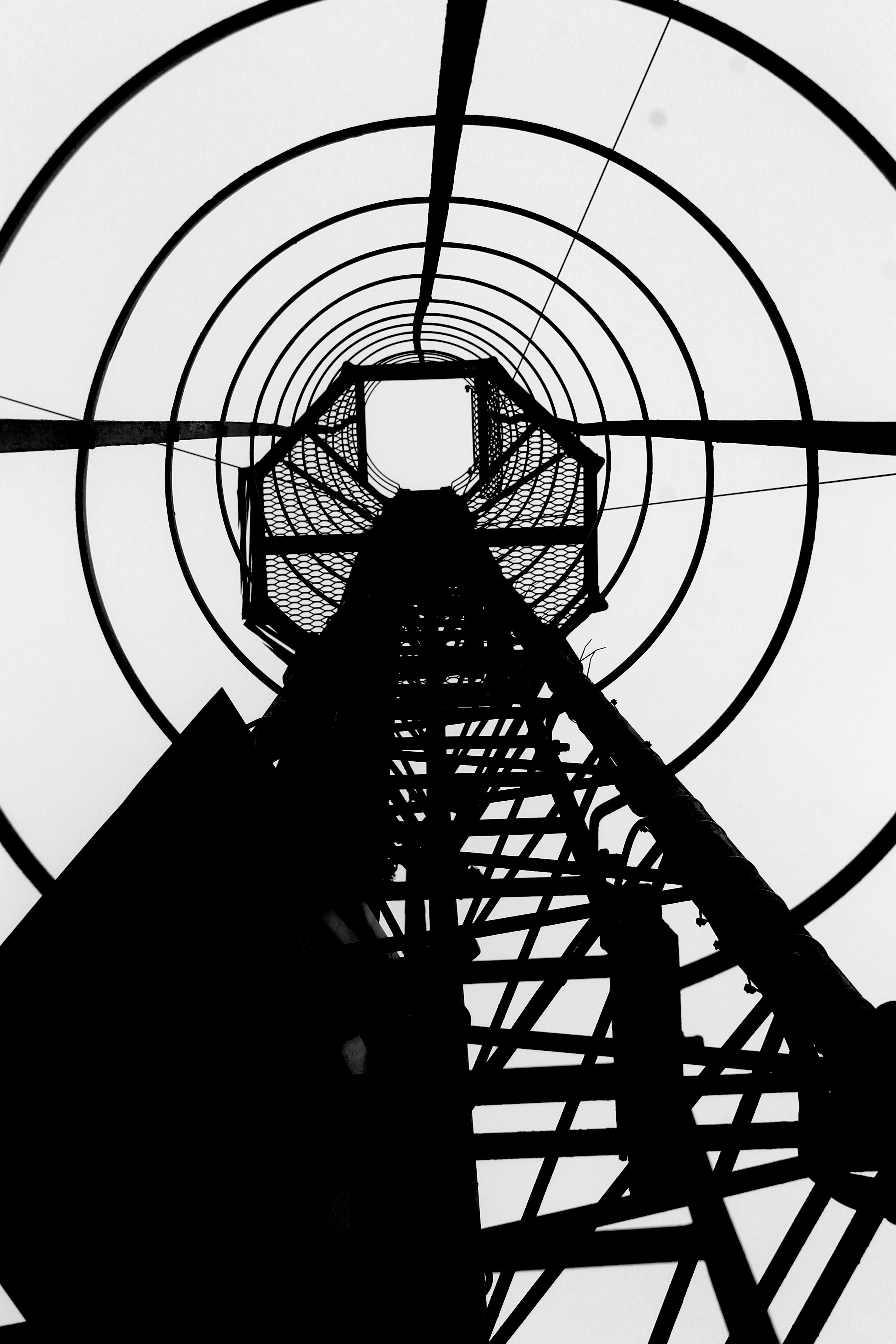
The aim of the images in this series was to get rid of mid tones, He took a normal image, which usually images of industrial machines and places, and turned it completely black and white, making the images more in contrast. In his images there is also a lot of negative space, which has allowed he structure of the metal work to really stand out to us and helps to create a sense of emptiness. The clear formal elements which are presented in this image are tone, shape and line, which are all clearly shown through the structure. The lines are also used to guide the viewers eyes around the frame of the image, starting from the bottom and then making our way to the top. The lighting is most likely to be natural as industrial images are usually taken outside, as you can not place the tall machines inside. The ISO is not sensitive to the light, as there is no visible noise in the frame of the image, which suggests that the ISO is low. Moreover, the shutter speed is likely to be quick as the whole frame seems to be in focus, with no blur. Due to the whole frame being in focus it also means that this photograph has a large depth of field. The aperture of the camera is likely to be high, which helps makes the whole frame more in focus. Due to the nature of the image being completely black and white, it creates a cold temperature adding to the mood of the image. Peterson has cleverly used inspiration from Patzsch but has still managed to add his own ‘twist’ to make his images more unique. I really like the idea of getting rid of the mid tones as it makes the structures seem more isolated, which allows it to stand out more, captivating the viewers.
My Response
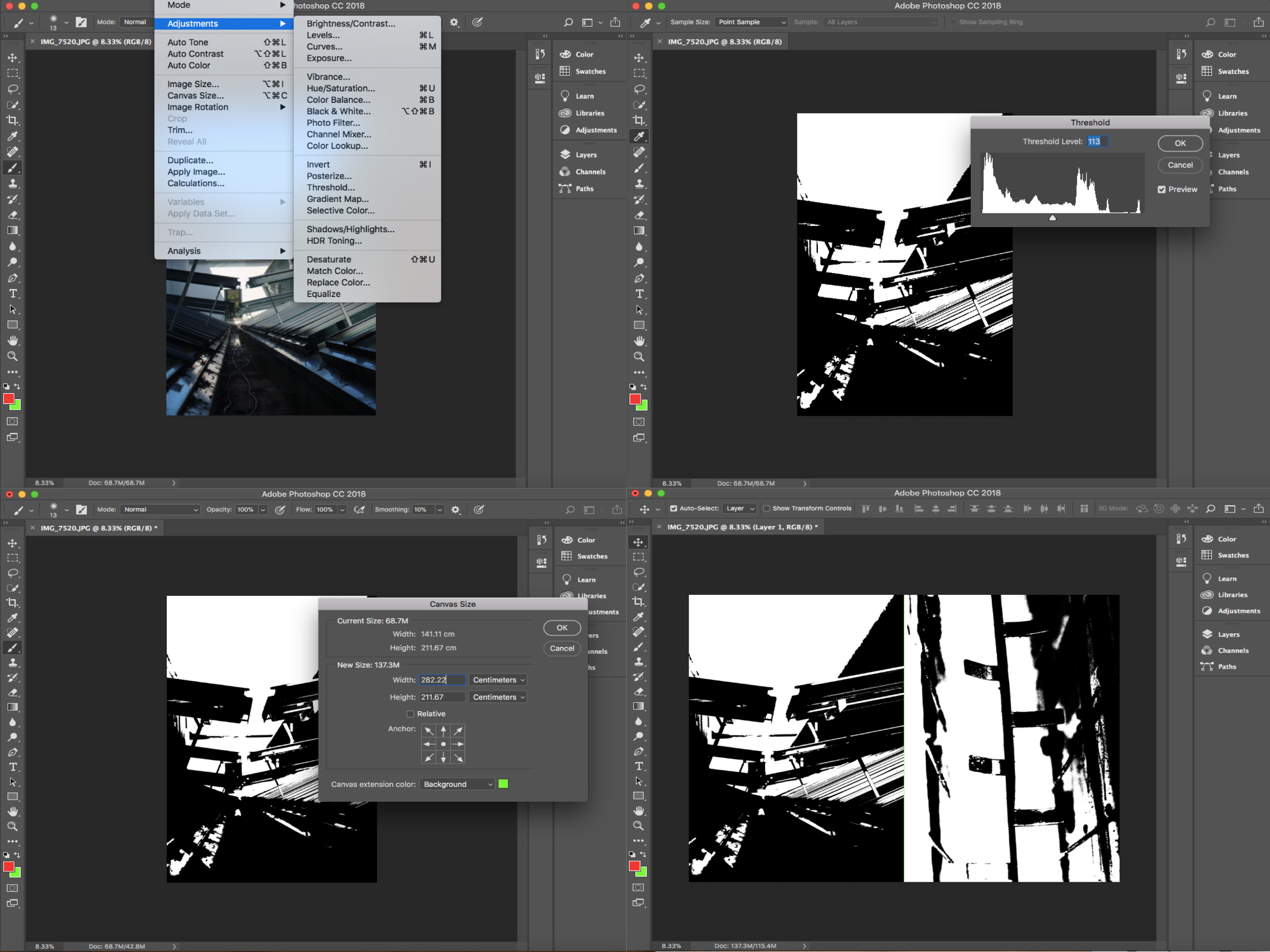
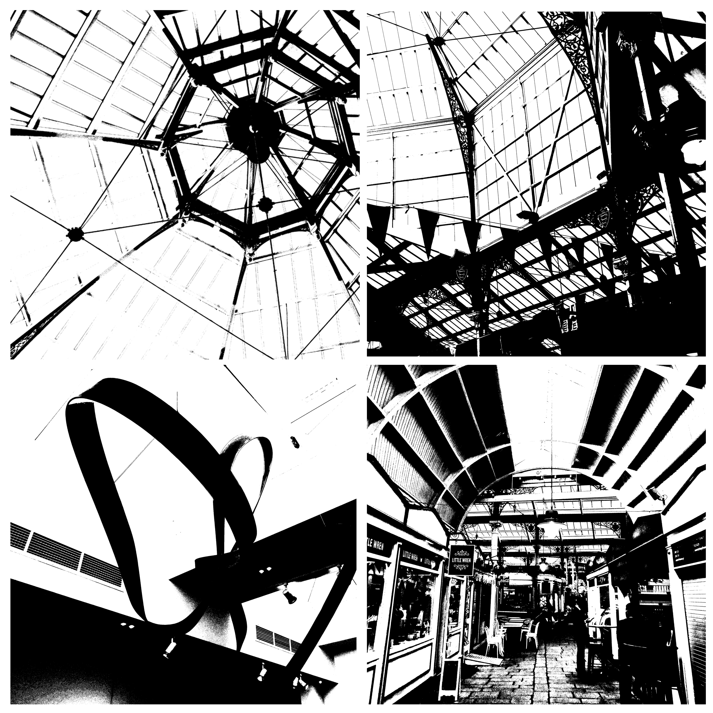
In order to recreate Peterson’s work, I went through previous photoshoots and selected four images which I thought would go well with this mid tone idea. I then opened them all up on photoshop and went up to image>adjusment>threshold. I then adjusted the slider until I was happy with the final outcome (These steps are shown below through the screen shots taken). I then changed the image sizes, in order to make them all the same size. Then on one of the images I doubled the width of the canvas sized and dragged another one of my images next to it. I then doubled the hight allowing me to place the other two edits onto the screen, creating a grid of four. I then saved this edit to the size of an A4 paper, allowing me to print it out.


Final Outcome

Aperture photo shoot
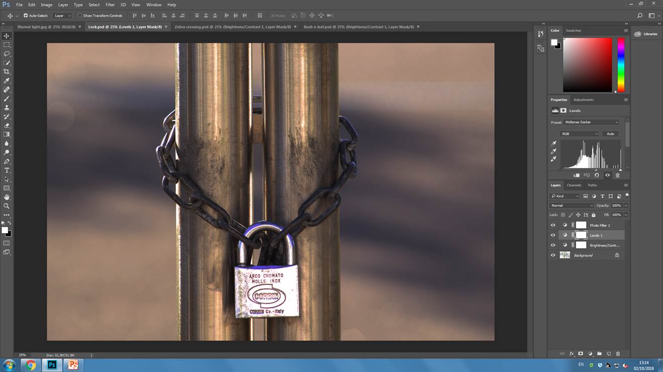
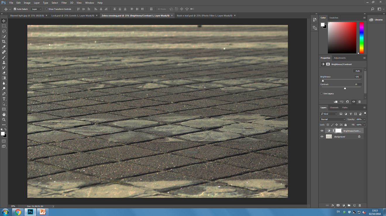
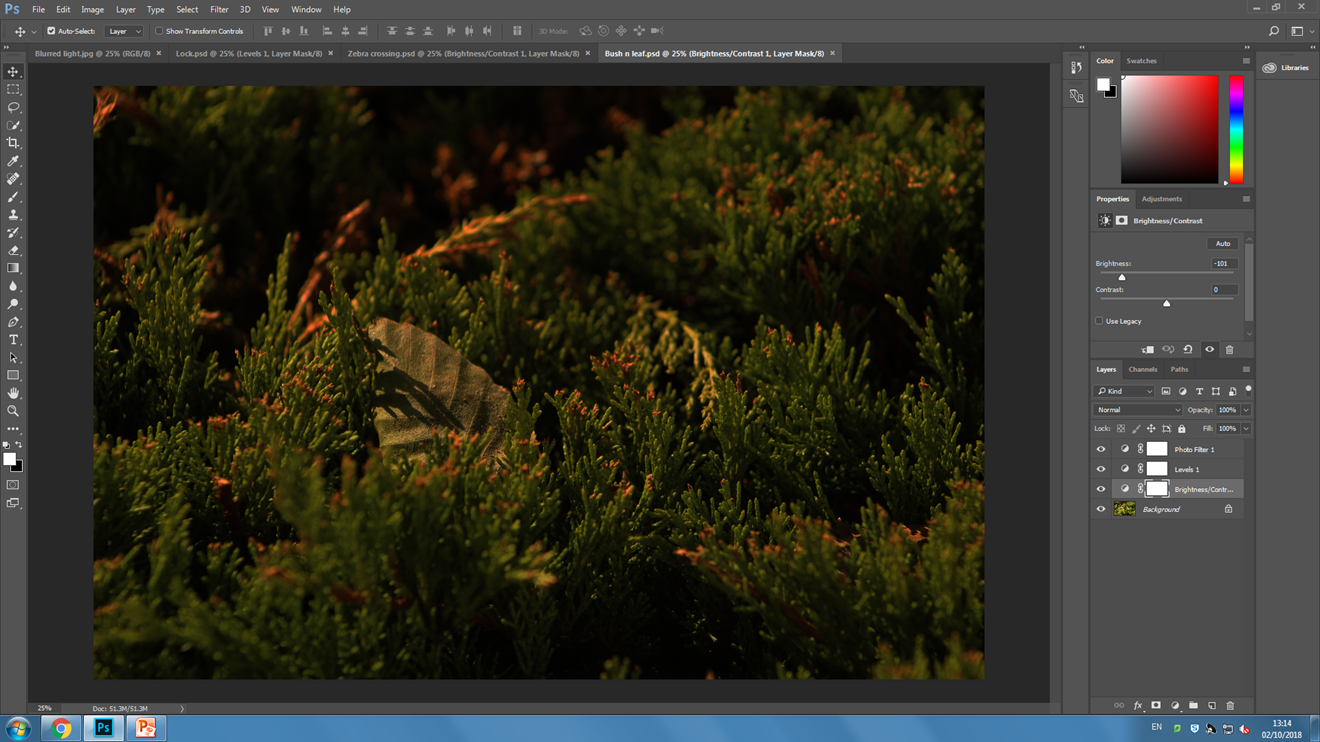
exploring Keld Helmer-Petersen’s photography
KELD HELMER-PETERSEN:
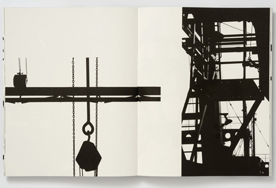
The pioneer of Danish Modernist photography, Keld Helmer-Petersen (1920-2013), is internationally acclaimed for his images of structures, patterns and details found in industrial areas, cityscapes and nature. He started photographing in the late 1930s and first made his name with 122 Colour Photographs in 1948. This book is especially well known due to its innovative use of colour in thoroughly composed photographs of patterns in landscapes and buildings. During the 1950s and 1960s he established himself as a photographer of architecture and design. Simultaneously, his artistic work shifted towards the more abstract, as he found inspiration in German and American photography as well as international abstract art.
CRITICAL ANALYSIS:
The contrast in this image is very high creating a very dramatic and overexposed photo. It is composed of geometric shapes and lines which crisscross each other in regular, sometimes patterned shapes and forms. It is very difficult to create this type of photo purely through camera work therefore I believe that Petersen used heavy editing in his photography in order to create this highly overexposed image whilst in the dark room. It is hard to distinguish between the foreground and the background in this photo as the lack of tonal range merges them together. As the only colours in this image are black and white, they flow and create the appearance of one large structure.
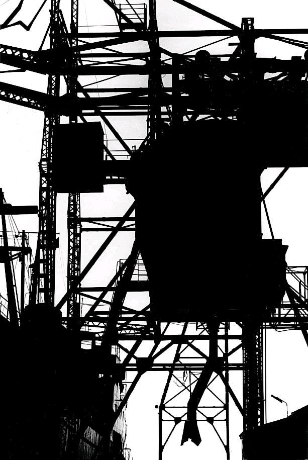
PROCESS:
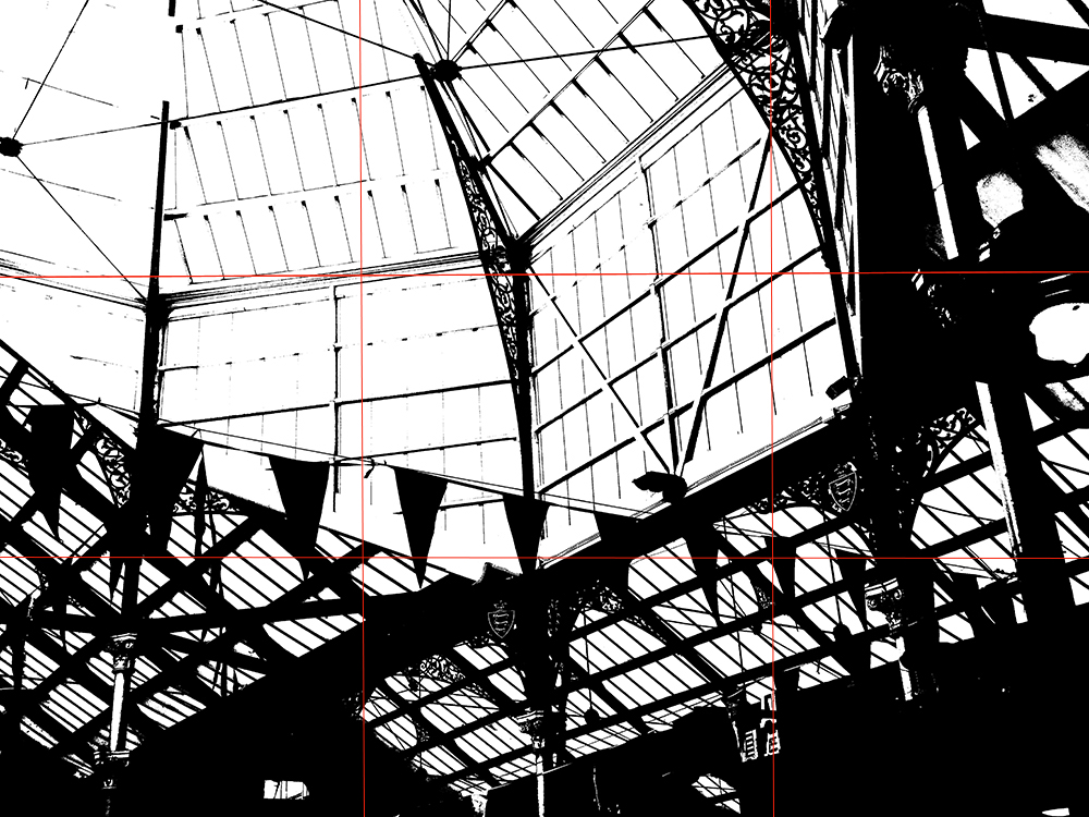
This is the most successful set of images based of the work of Keld Helmer-Petersen who focuses on over exposure of images creating simplistic line work in his work. I applied this same technique to my work through the use o threshold on Photoshop, as the example shows down below. By decreasing the threshold, the image becomes more exposed and white, by increasing the threshold, the image becomes less exposed and black. I tried to keep all my images to the middle of the scale which prevented them from becoming too overly over exposed or underexposed. The images which I chose to include in this work were ones which contained a lot of strong, geometric, line work. I found that the more busy, and packed a photograph is, the more messy the threshold filter looks on it, therefore i chose to stick with fairly simple photographs.
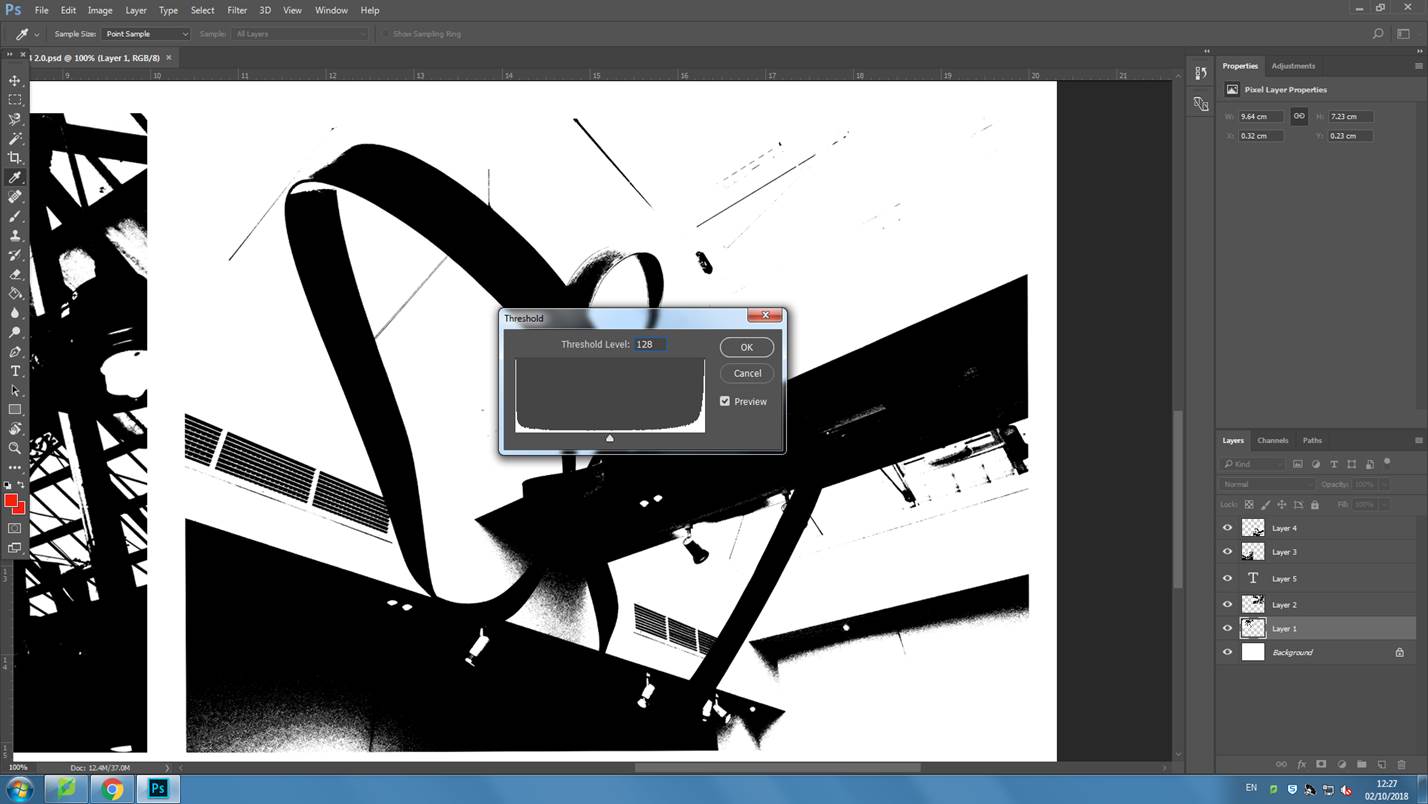
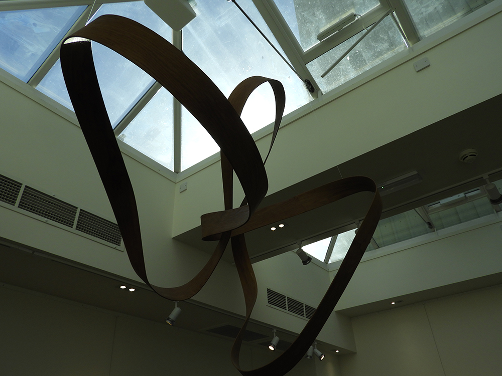
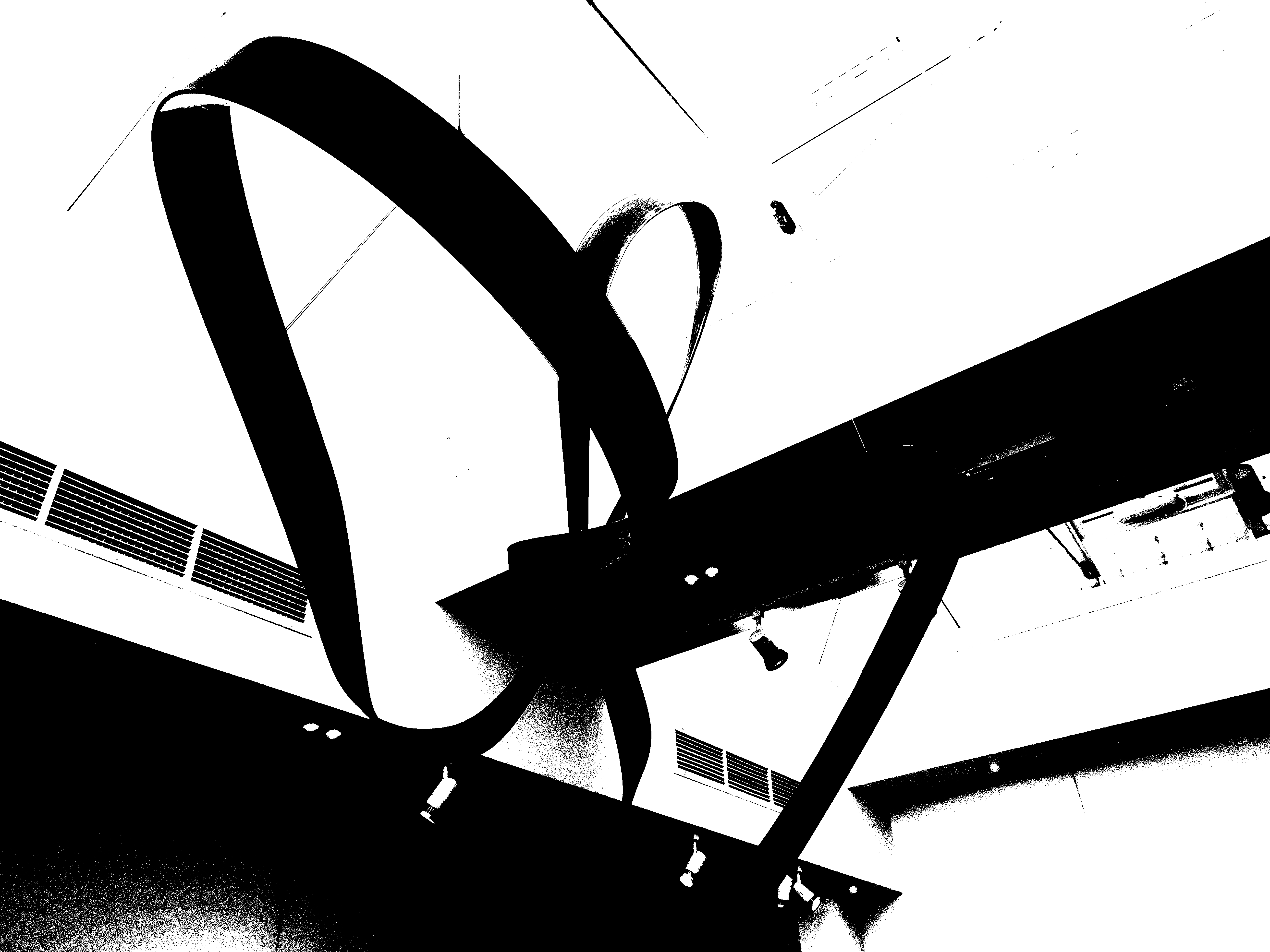
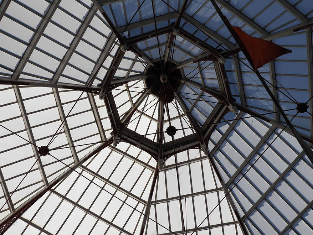
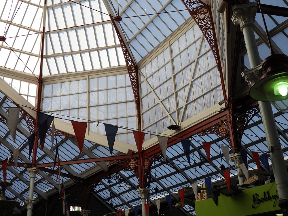
This is the before and after the threshold has been applied to the image, clearly showing the extreme contrast it has between the different geometric shapes in the picture.
CRITICAL ANALYSIS:
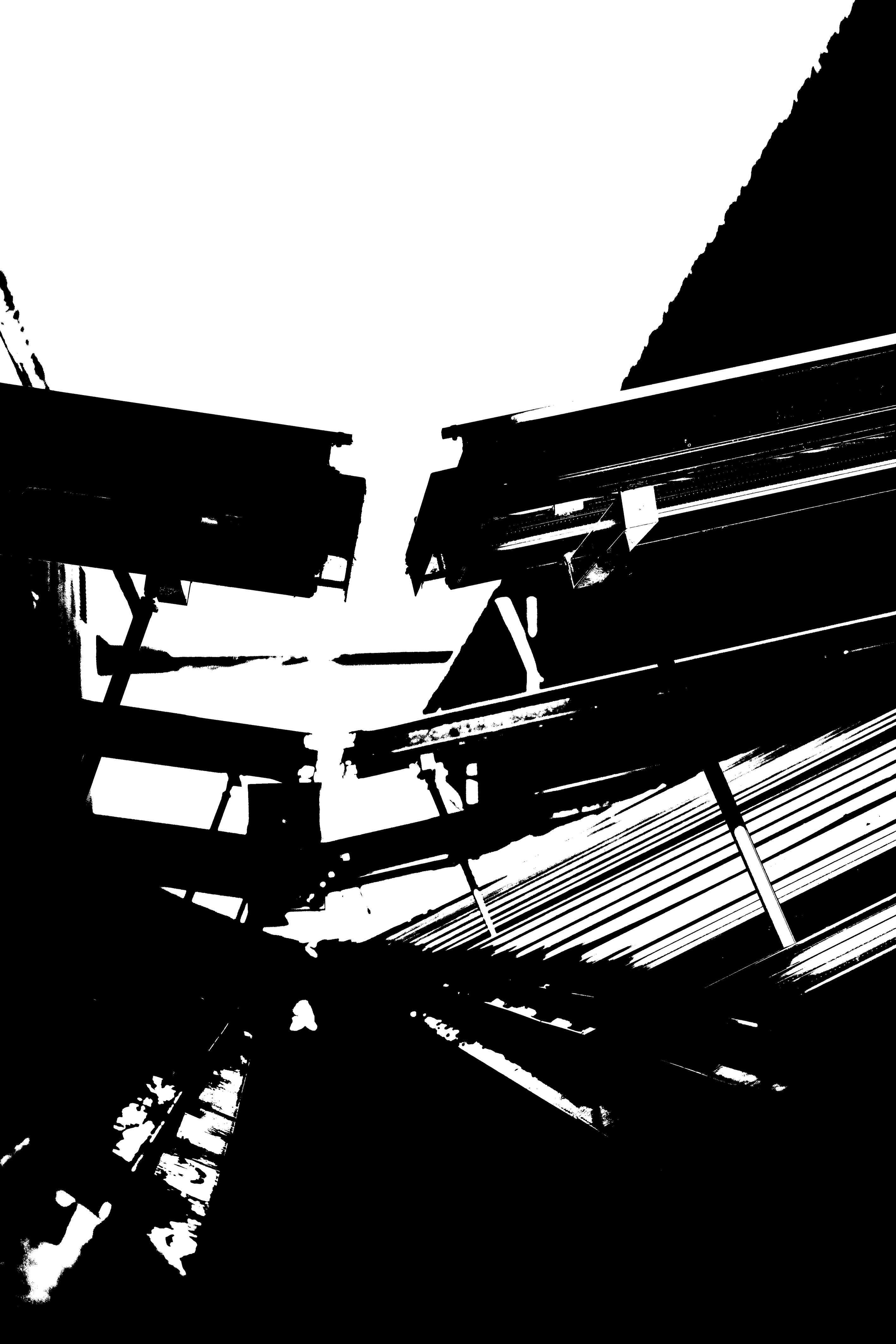
In terms of the technical aspects of this image, the light is coming in from the top left hand corner of the image, creating a lot of exposure making it more white whereas the right bottom corner of the photo has less light hitting it, creating more shadows. In this photo I used a fairly long lense as the subject the image was high up and could not be phothraphed without the aid of zoom, giving a fairly small field of view. In the original photo, the ISO was set to 600 as it was a bright room and I felt that in order to combat the possible overexposure I should decrease the ISO. The grain on the original photo is quite fine therefore the image is detailed and sharp.
After applying the threshold filter, the image has been totally flattened out due to the lack of tonal range, only being composed of black and white. It is difficult to distinguish between the background and the foreground in this image. The photograph is mostly composed of very strong and bold line work. There is also a sense of pattern in this image due to the repeating lines and triangles. There is no real sense of space in this image as the abundance of line work fills every part of the photo.
I created these images with the intent of capturing as many geaometric shapes as I can because I knew that this would work best when applying the threshold filter. More organic shapes tend to look too busy and messy in a sense as they have too many tonal ranges and shadows.
ORIGINAL IMAGES:
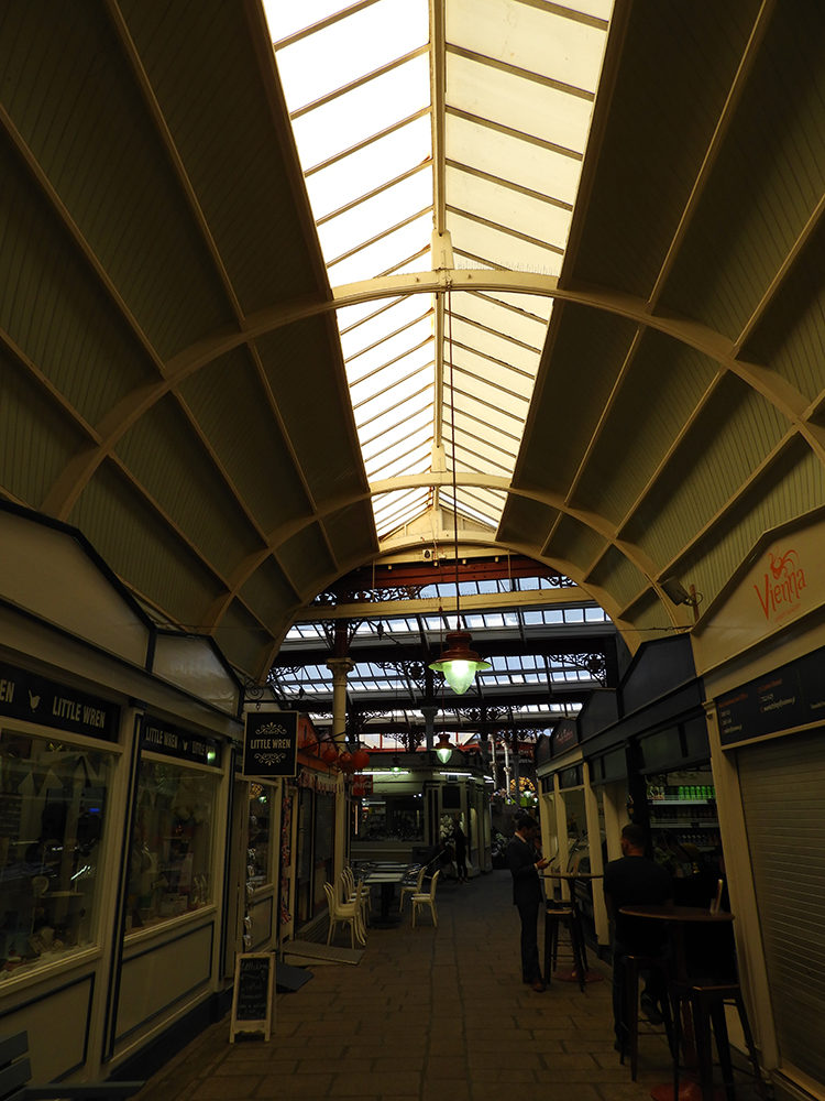

Successful Photos From Photo shoot
ANALYSIS AND APPROACH:
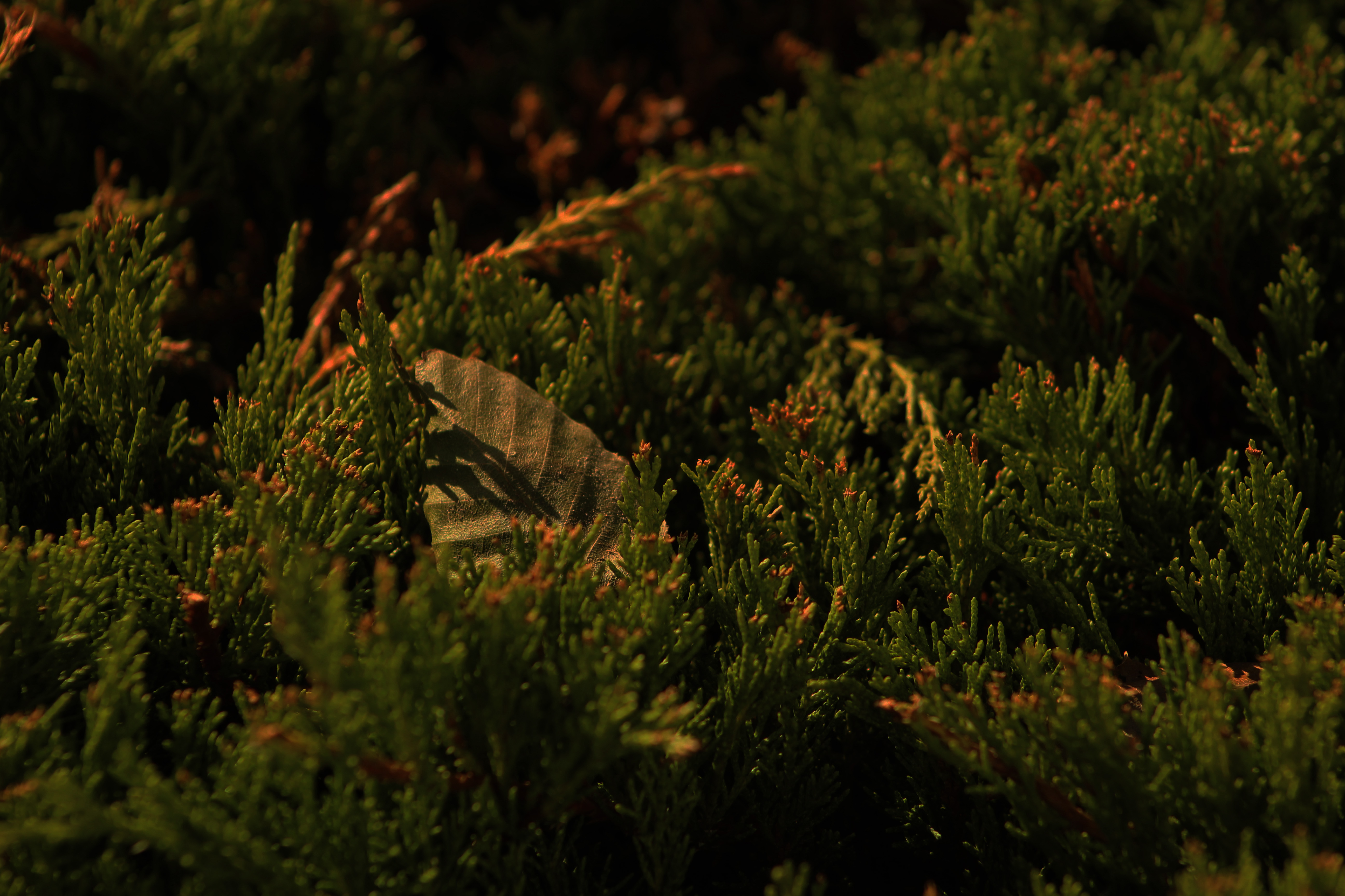
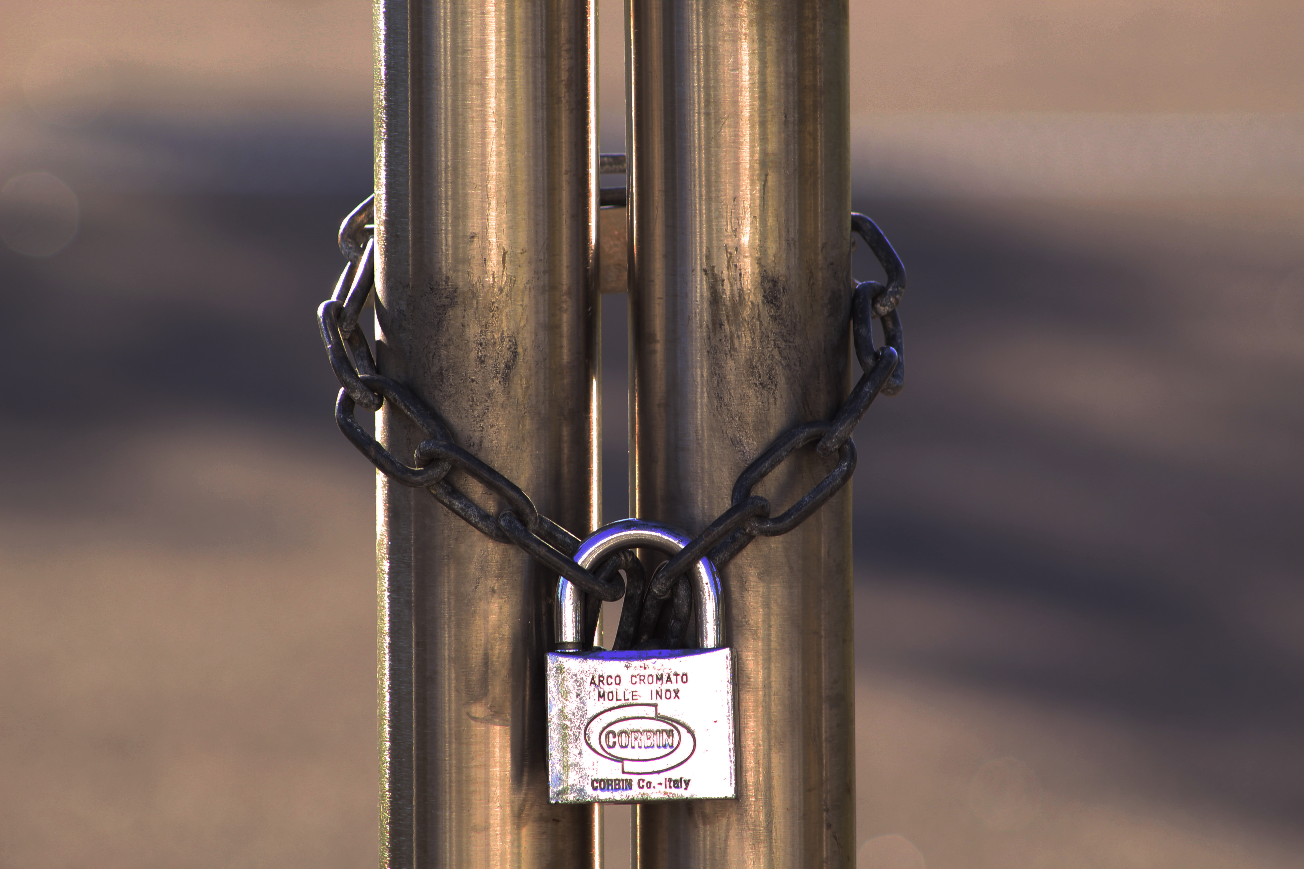
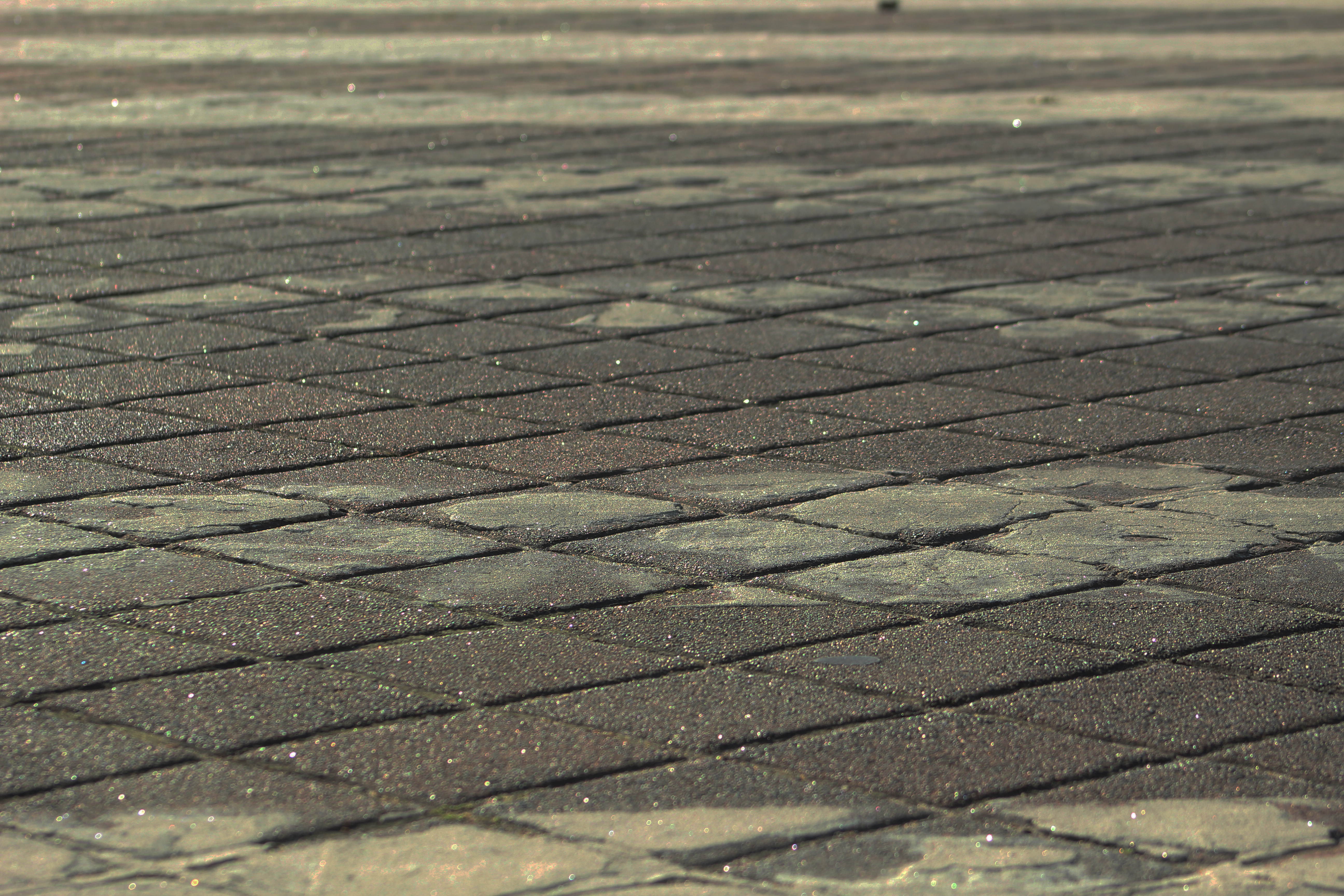
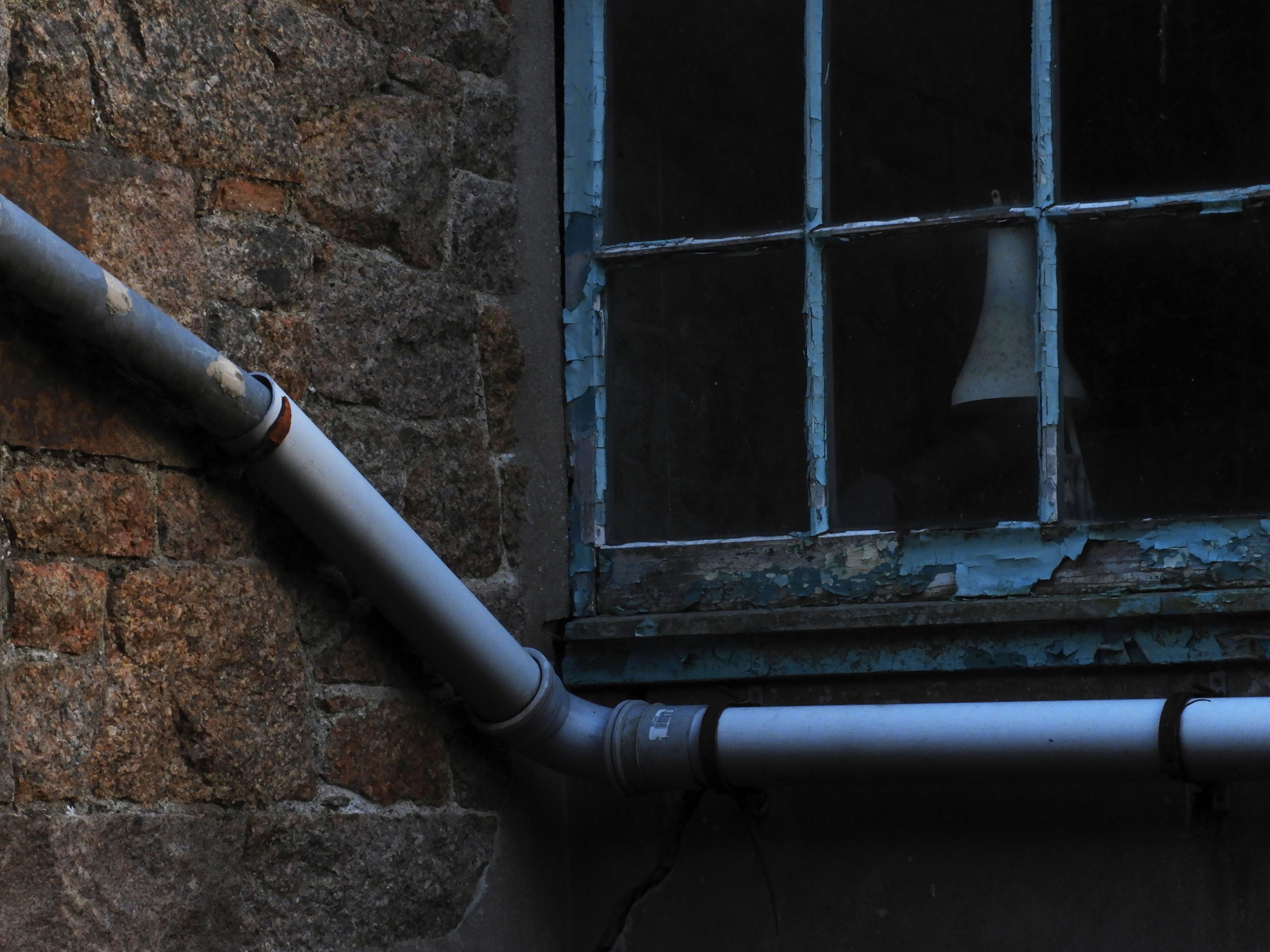
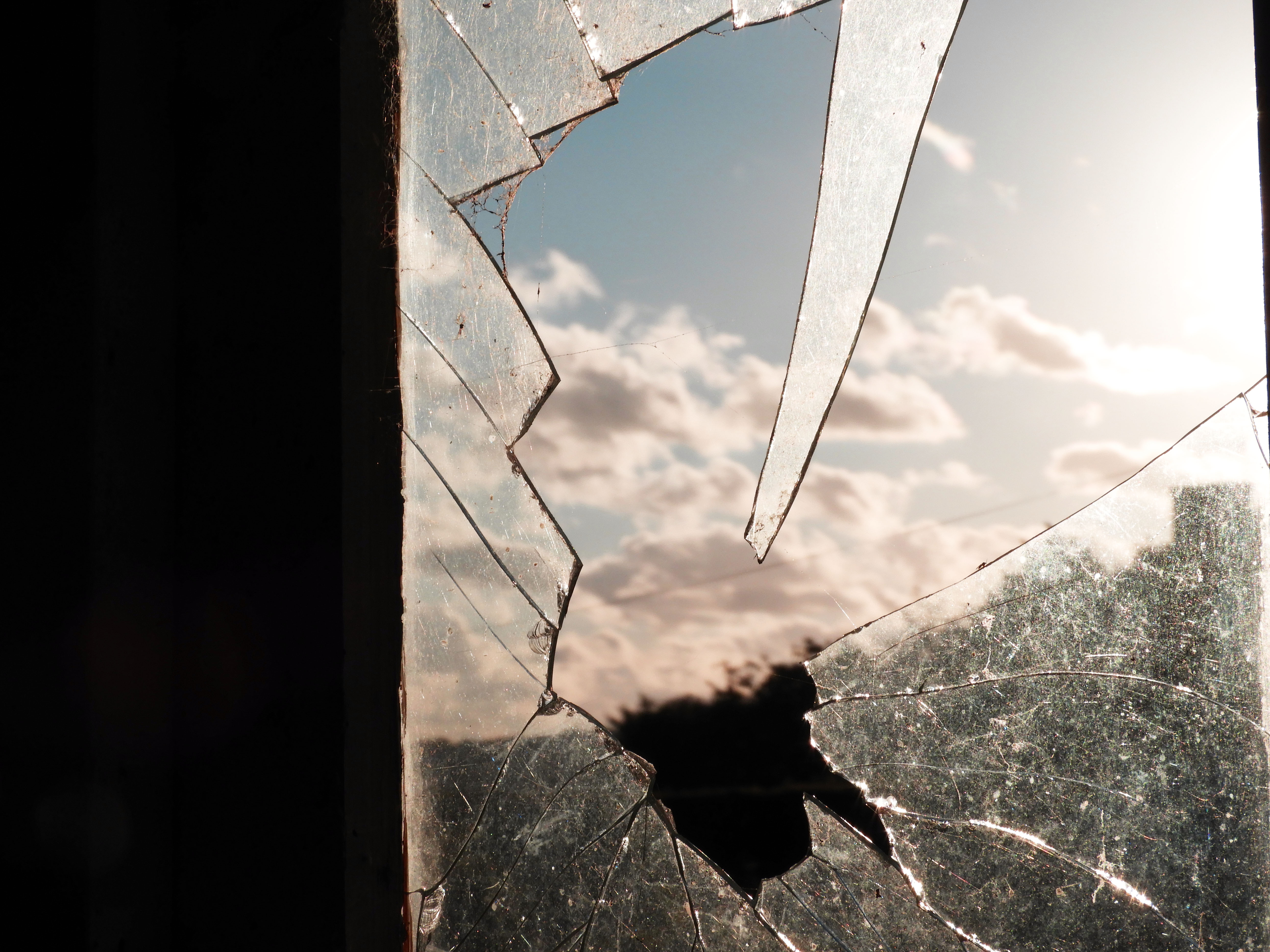
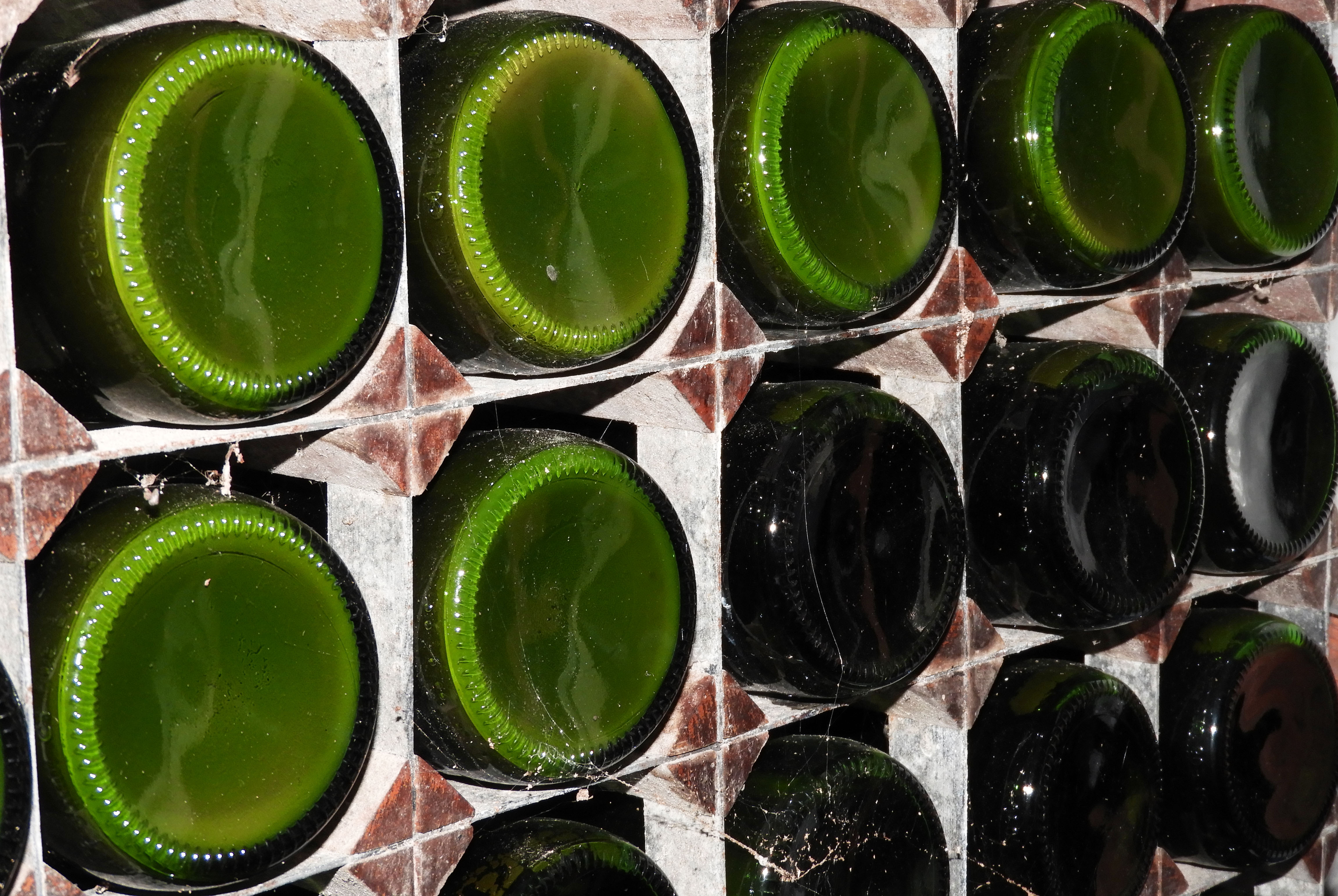
These four photos were the ones which i felt were the most successful out of the Photo shoot I personally did. I really focused on the formal elements which I had to cover such as exposure, shutter speed and focal length. In the first and fourth photo I mainly focused on exploring exposure, changing the ISO speed to 200, resulting in a very dramatic and dark photo. I captured these photos with the aid of a tripod as I found that lowering the ISO speed resulted in shaky photos that distracted away from the main formal elements which I attempted to capture. In the fourth photo, the glass bottles were in a very dimly lit room therefore i changed the ISO setting all the way to 16000, which allowed the colors to pop and stand out.
In the second photo, I experimented with changing the focal length. I zoomed into the piece of broken glass and used manual focus in order to focus on it, this resulted in a very blurry backdrop which was the main aim of this shoot. I had the same approach with the fourth photo, the radio post was quite far away from me which forced me to zoom in. The backdrop is not as blurry as compared to the first photo as I used the infinity focus setting on my camera to see the type of effect it would have on the focus.
Ralph Eugene Meatyard
Ralph Eugene Meatyard was born May 15, 1925. He was an american photographer who initially in the navy during world war 2, after the world war he began to study to become on optician. After he married he continued his trade as an optician with a company that also sold photography equipment. Meatyard purchased his first camera in 1950 and joined the ‘Lexington Camera Club’. He tended to make work in bursts and left his film for long times before developing it in his darkroom at his home. He approaches photography with a heavily influenced jazz music background, he used his children as the prime subject in his photos. He addressed the ‘masks of identity’ and the nature of the surface matter. By the time he dies his work was just being recognized.

This photo by Ralph Eugene Meatyard has a main focus which is the twigs, this then gives the photo depth, because of the blurred background it shoes the distance in the photo and it isn’t just a shallow photo where everything is focused in the image. Meatyard has used a natural light because of the nature of his photo, this gives the photo a mysterious feel to it because of the shadows in the background created by trees behind it, even tho is is blurred out it is still apart of the photo and gives it that mysterious feel.
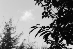
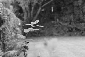
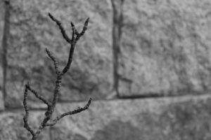
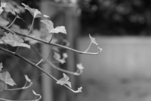
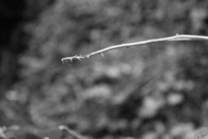
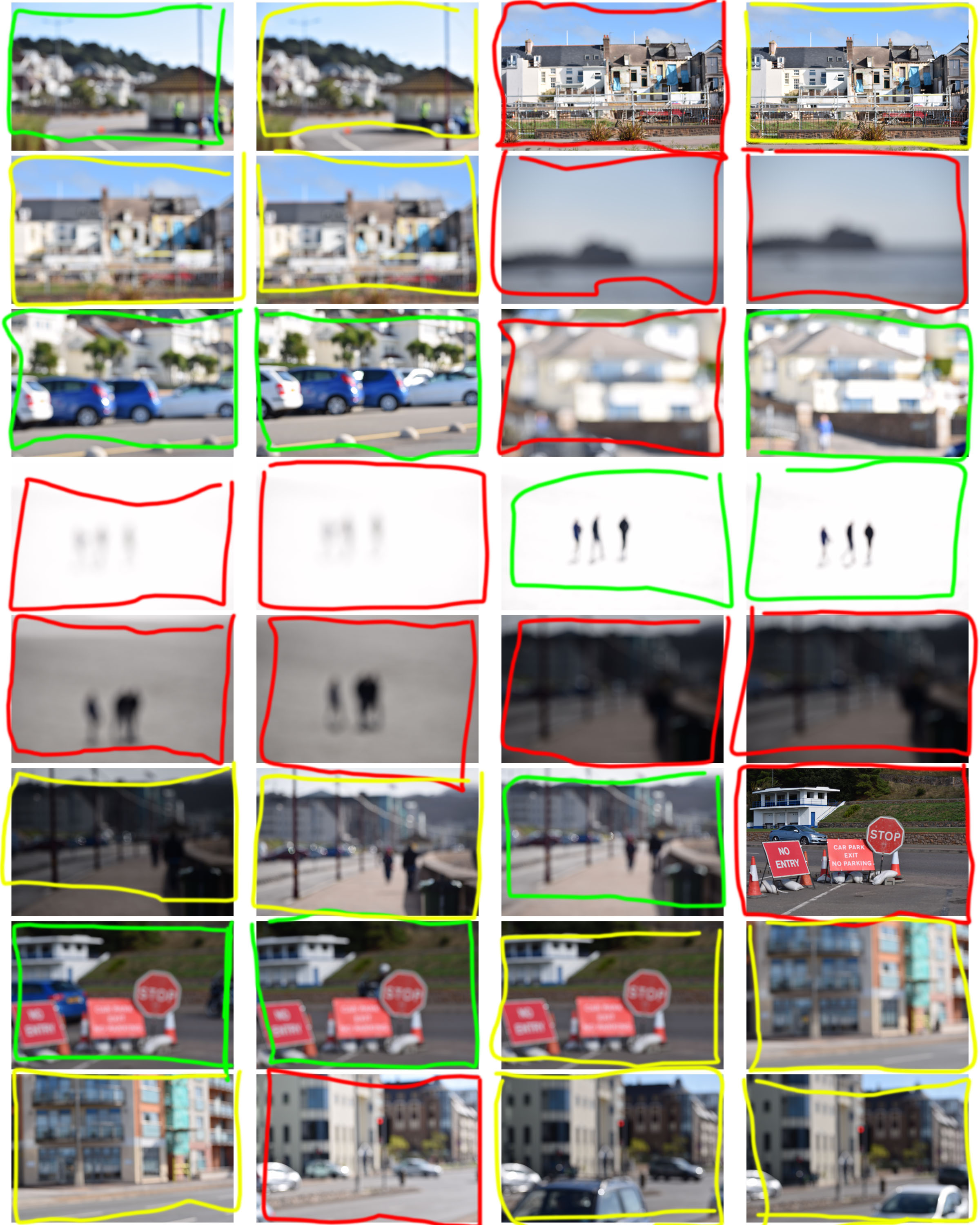
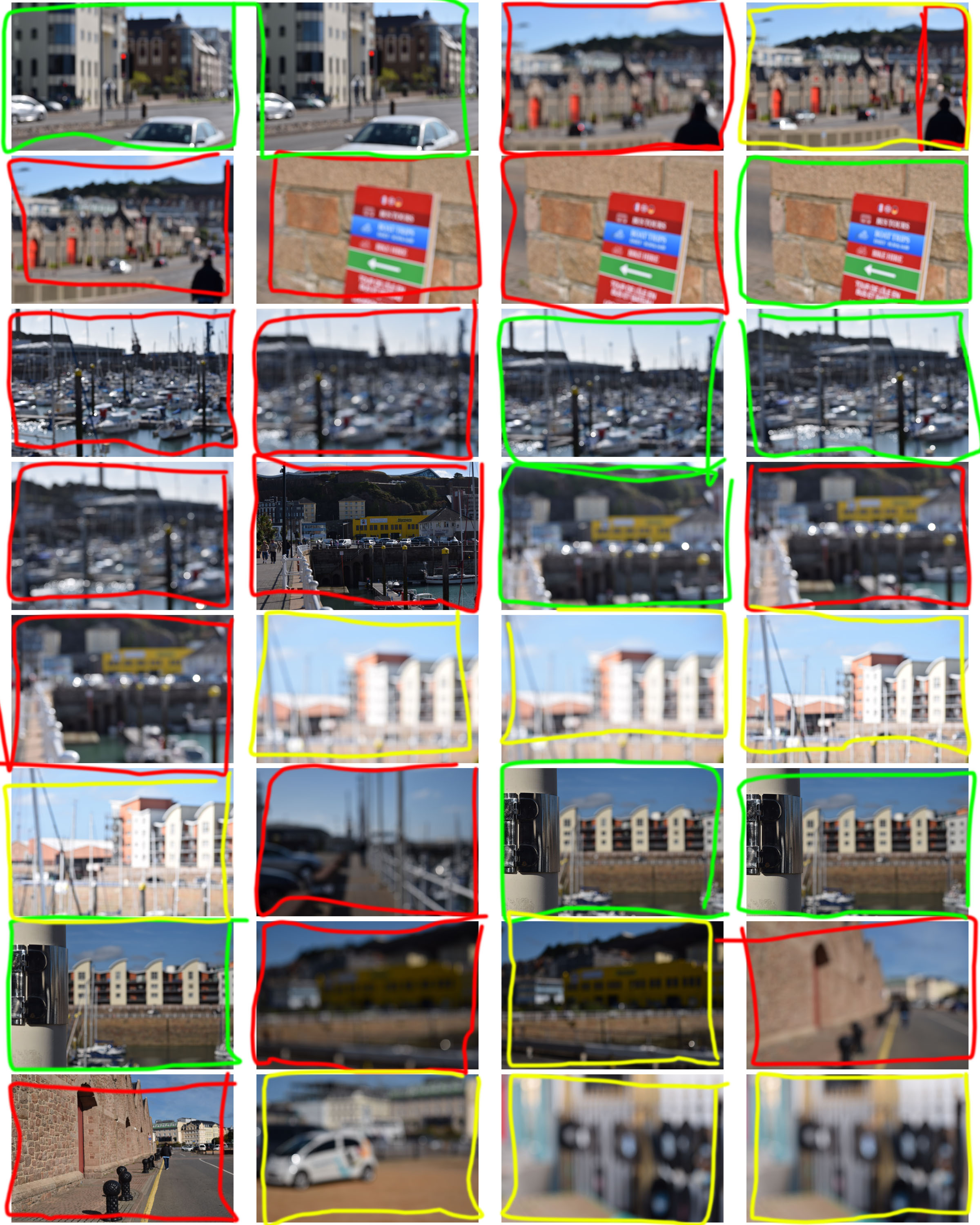
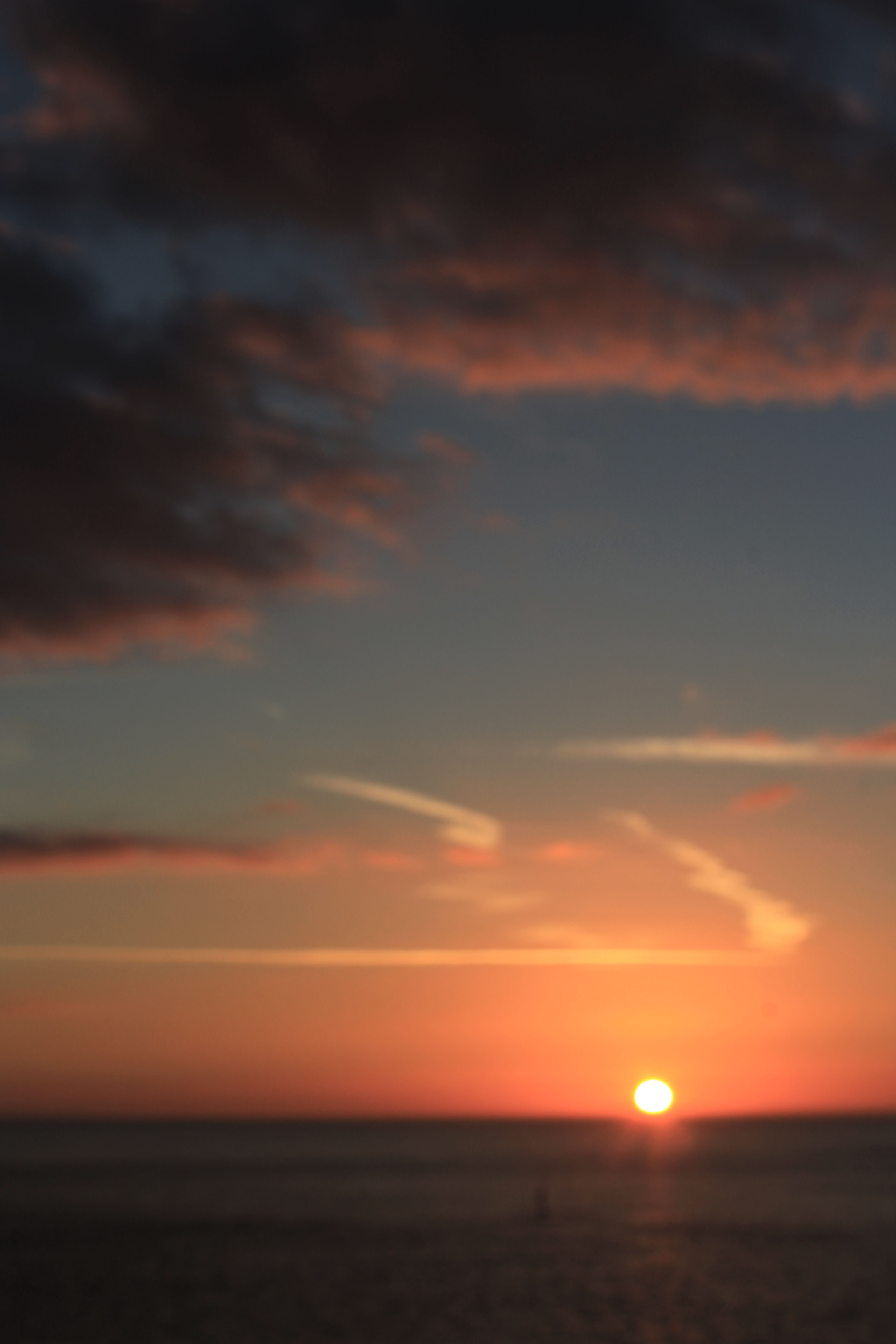
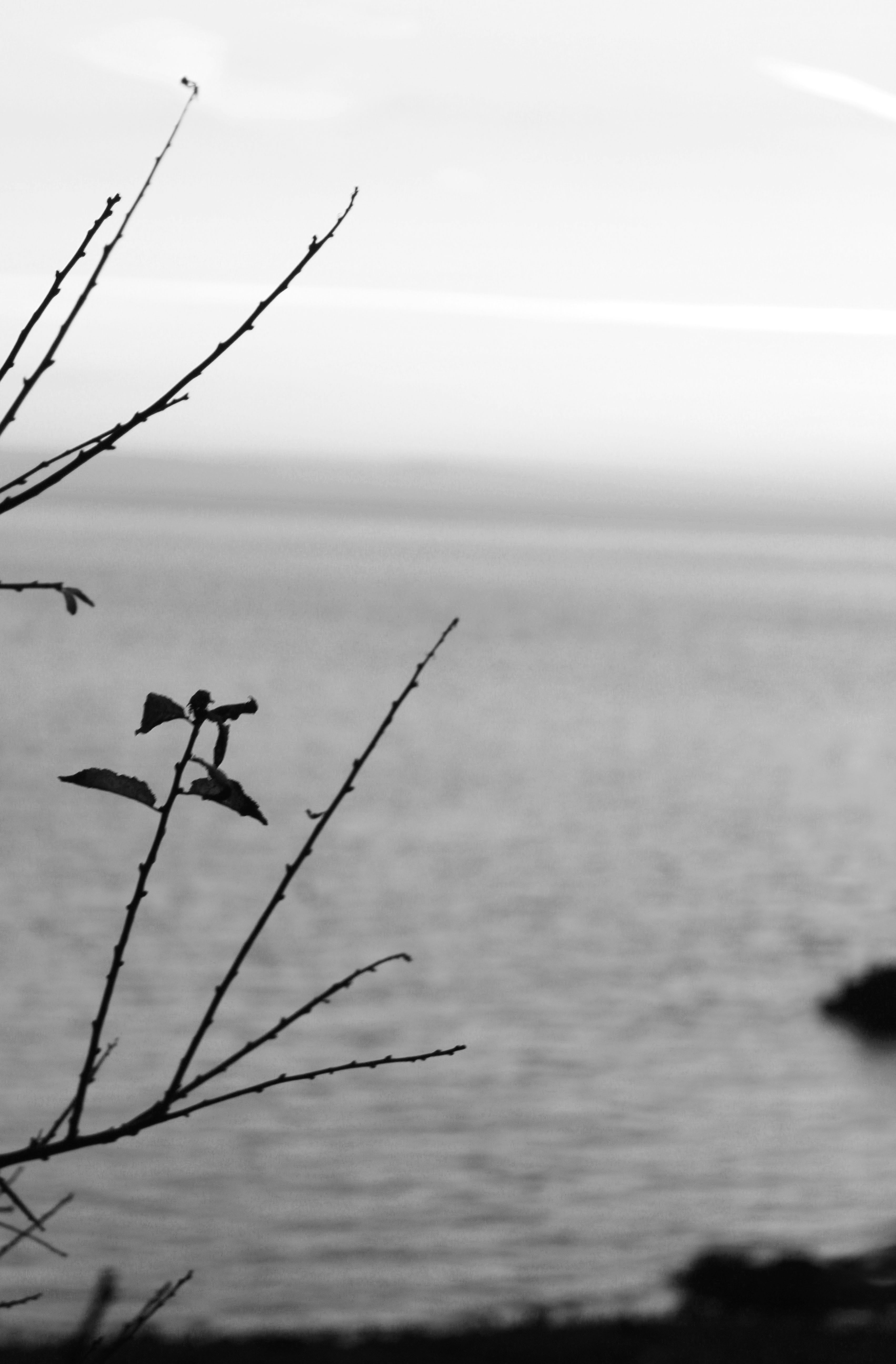
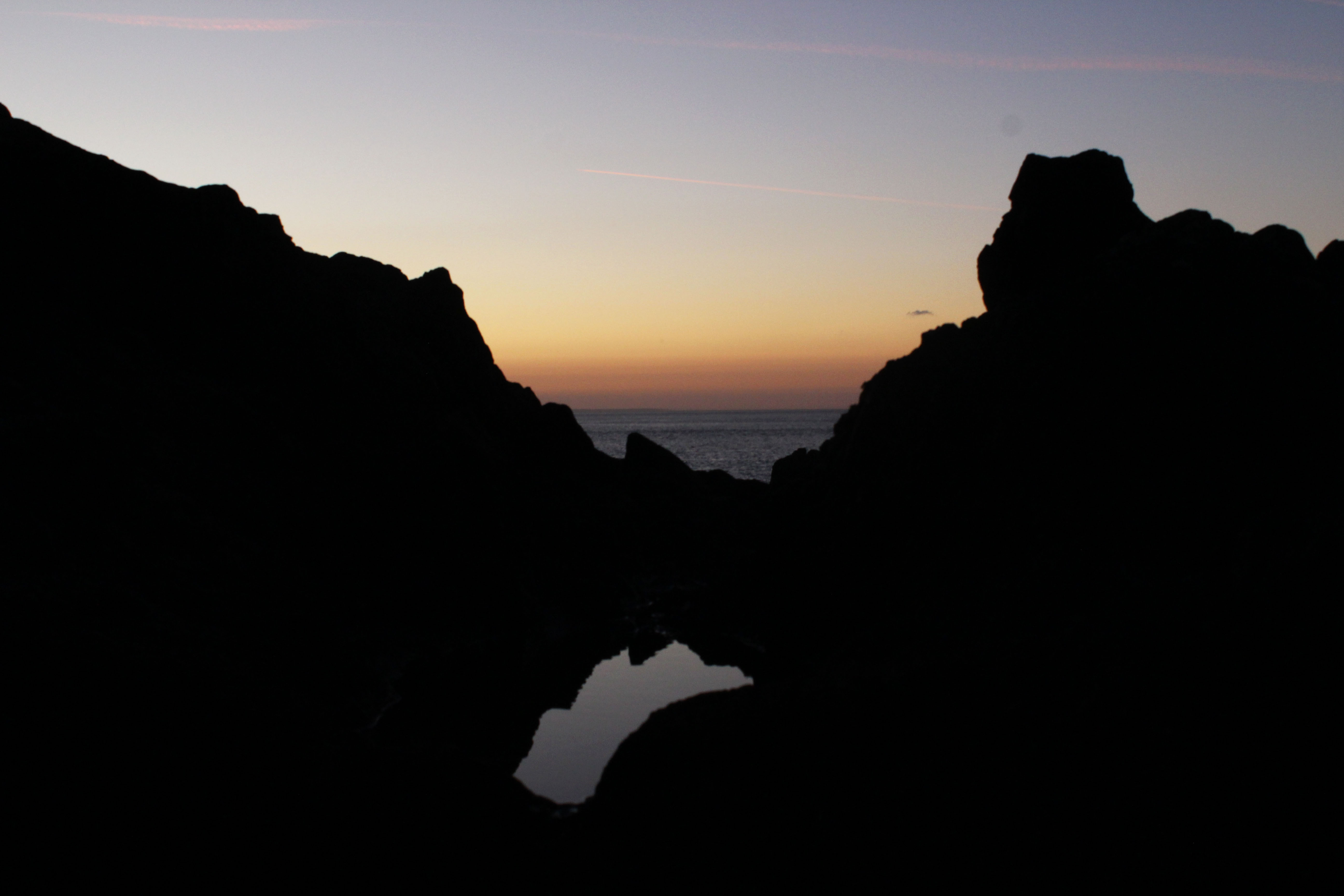
I aimed to take photos like Ralph Eugene Meatyard, with little focus in the pictures. Here are a few of my outcomes;
This small selection of photos show the way I try to copy the way Ralph took his photos. I used manual focus to get these photos and zoom, this is so I could really focus on one thing in the photo. I got inspiration for these photos by his selection of photos known as ‘Zen Twigs’. The depth in these images vary, this is because depending on the background of the photo, how blurred out it was, some of the images had a slightly blurred out background whereas others had one main focus in the photo.
Threshold Adjustment
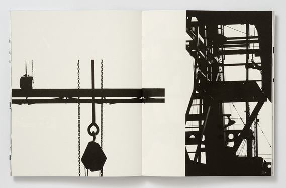
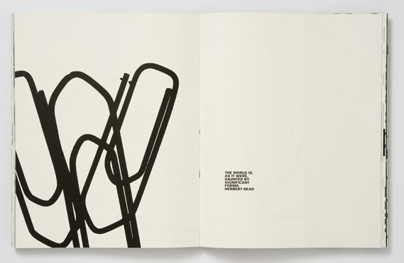
Keld Helmer Peterson was a Danish photographer who spent most of his working life as an architectural photographer. He was inspired by Albert Renger Patzsch, the experiments at the Bauhaus in Germany, Harry Callahan and Aaron Siskind. Although he was best known for his coloured photographs, he also published several books of black and white images that explore dramatic contrast of tone. Some images are purely black and white since all the mid tones have been removed. He created and found these images using both cameras and flat bed scanners to have the effect he wanted. He encourages us to consider the space around the image and to use high contrast to create abstract photos.
My Response
To respond to Keld Helmer photography work I will use four abstract images that I have already taken and experiment with the threshold adjustment on photoshop to adjust the black and white contrast. I will then merge them together so different formal elements can be seen in one image. Using Keld Helmer Peterson’s style of photography will make me consider the negative space around the objects.

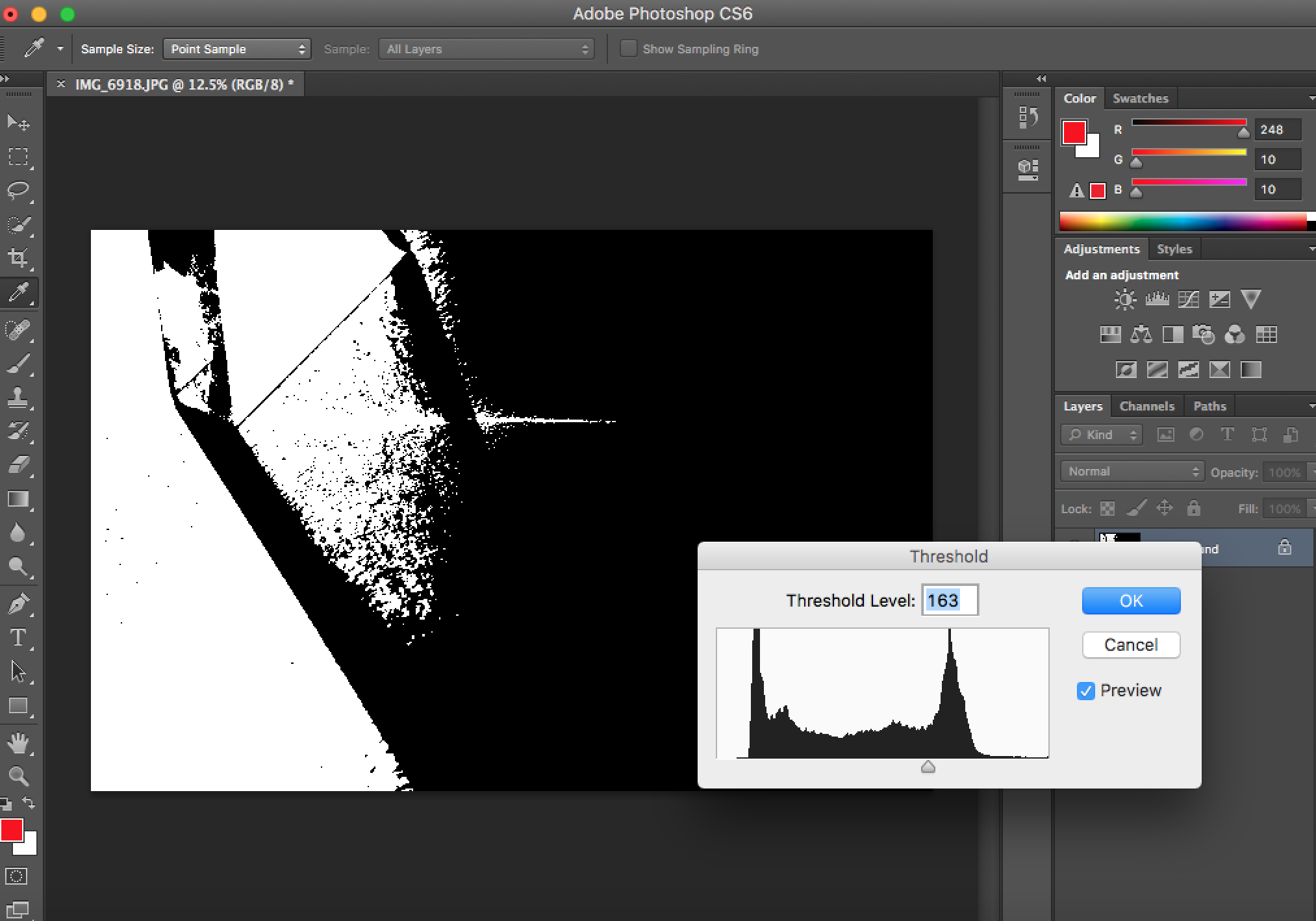
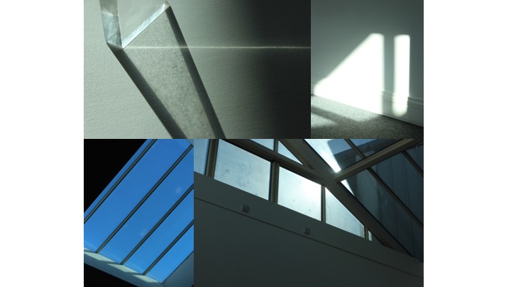
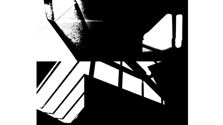
On each photo individually, i adjusted the threshold level to create images in black and white with different contrasts. When increasing the threshold level the negative space became darker and decreasing made the negative space brighter. Afterwards on powerpoint i grouped the images together so the black areas would merge together and connect to create one image. The formal elements line, shape and pattern can be seen in these images. The most dominant formal element that can be seen is line as they appear in different widths and different directions (horizontal, diagonal, vertical). The formal elements would regularly appear in Keld Helmer photographs. What i like about Keld Helmer photographs is that the negative space is the main feature. Although his images appear simple and reject colour and form, they are visually effective. I think my response was a success since I have incorporated his style into my photography and have experimented with the threshold adjustment for the best final outcomes.


