Category Archives: AO1 Develop Ideas
Filters
Finalizing my final images
Now that I have narrowed down my favorite images for printing, I will do the lasts bits of editing and present how I want them to be displayed.
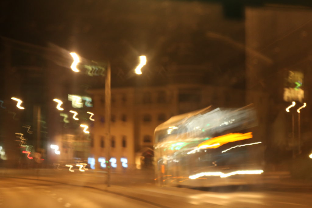
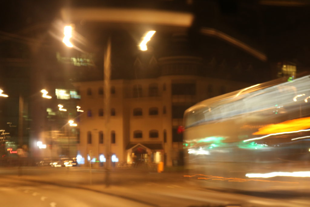
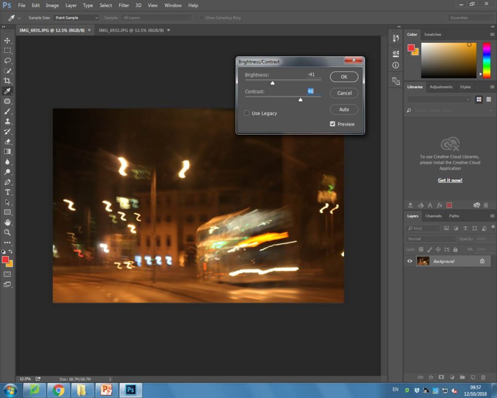
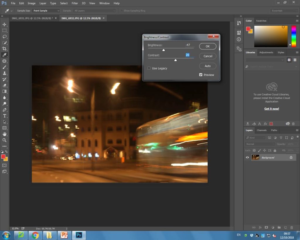
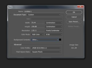
Next, I opened a blank document and set the width and length to make the page A3 size. I also set the background as black instead of white because I wanted the lights on the images to stand out more and this would only work on a dark background.
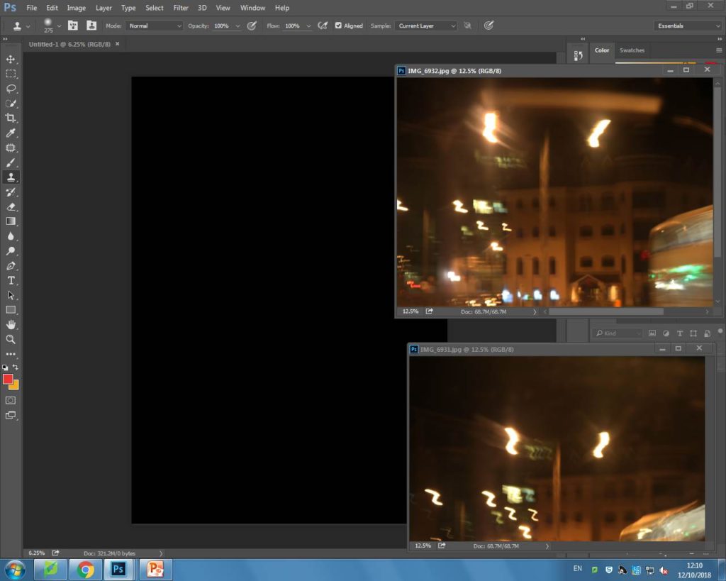
After, I opened up both the images I wanted to display together and I positioned one above the other on the black background in the order that I took them in. Below is my outcome:
My A3 image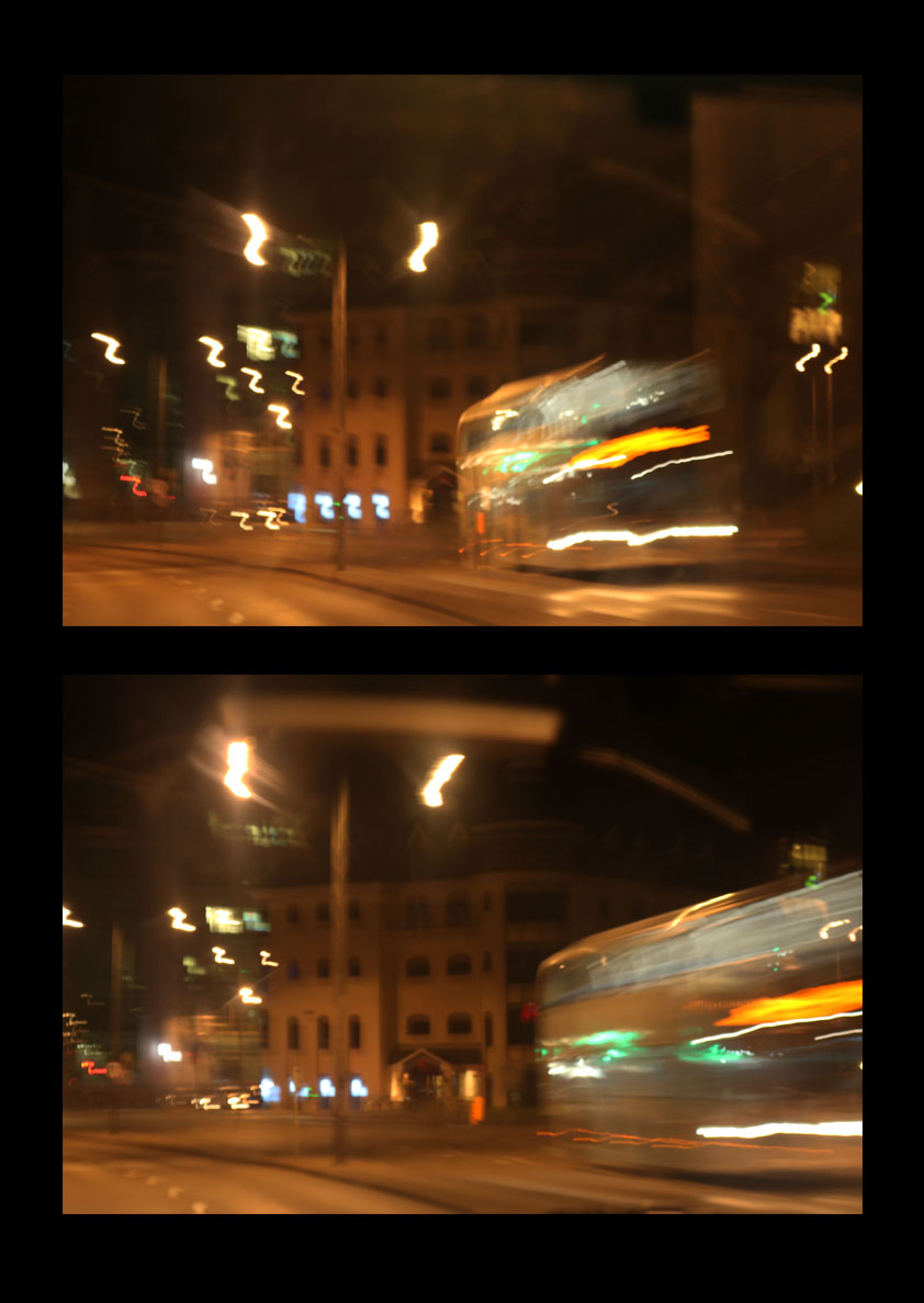
My A4 image

My A5 image

I felt that my other two images would work well by themselves and they didn’t need any more editing to be done. The reason I chose these particular images together, was because they all incorporated some sort of light in the frame, either captured using a bokeh effect or with slow shutter speed.
Initial final pieces
In this post I will be presenting my potential final outcomes for the whole abstract unit.
Potential outcomes



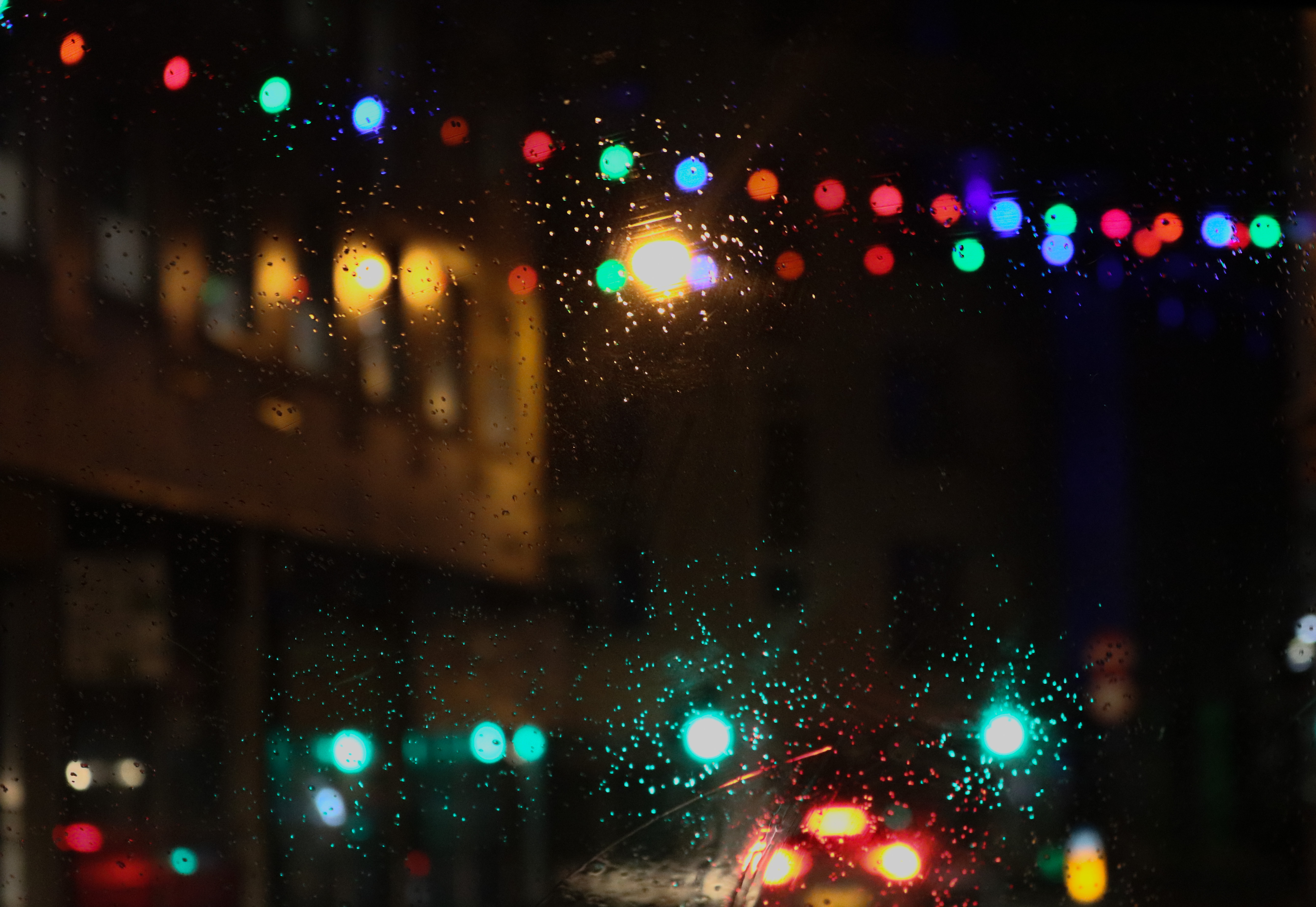
This is the image that I will most probably be choosing for my A4 print out. The reason why I have decided to use this image is because I think it my most successful image from my Uta Barth inspired photo shoot. I think this is My the most successful bokeh image I took because the scenery around me was filled with a lot of light, and the rain helped to enhance the colour in the image helping make the colour a more prominent image.
Another reason why I picked this image is because it displays some camera techniques that i have learnt through the abstract theme. In this image I used manual focus so I was able to purposely make the scenery blurred. In this image I also adjusted the settings to a quick shutter speed so I was able to capture the lights in place, and not shaking, as this image was taken in a moving car. I also made sure that the ISO wasn’t too high as I wanted most of the background to be dark, so the blurred lights would stand out.

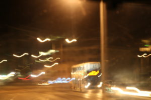
This is one of my best images from my experimentation with slow shutter speed. I think this image is very visually successful as the slow shutter speed meant that when I moved the camera, I created a very interesting pattern with the light, making the image very abstract.
This image also demonstrates a range of camera skills that I learnt, which is another reason why I chose it as a final outcome. In this image I used manual focus again to be able to focus primarily on the lighting, and not on anything in the background. The camera was also on a very slow shutter speed, which meant that the exposure time was longer than normal, meaning that when the camera moved, the final outcome ended up as it did.


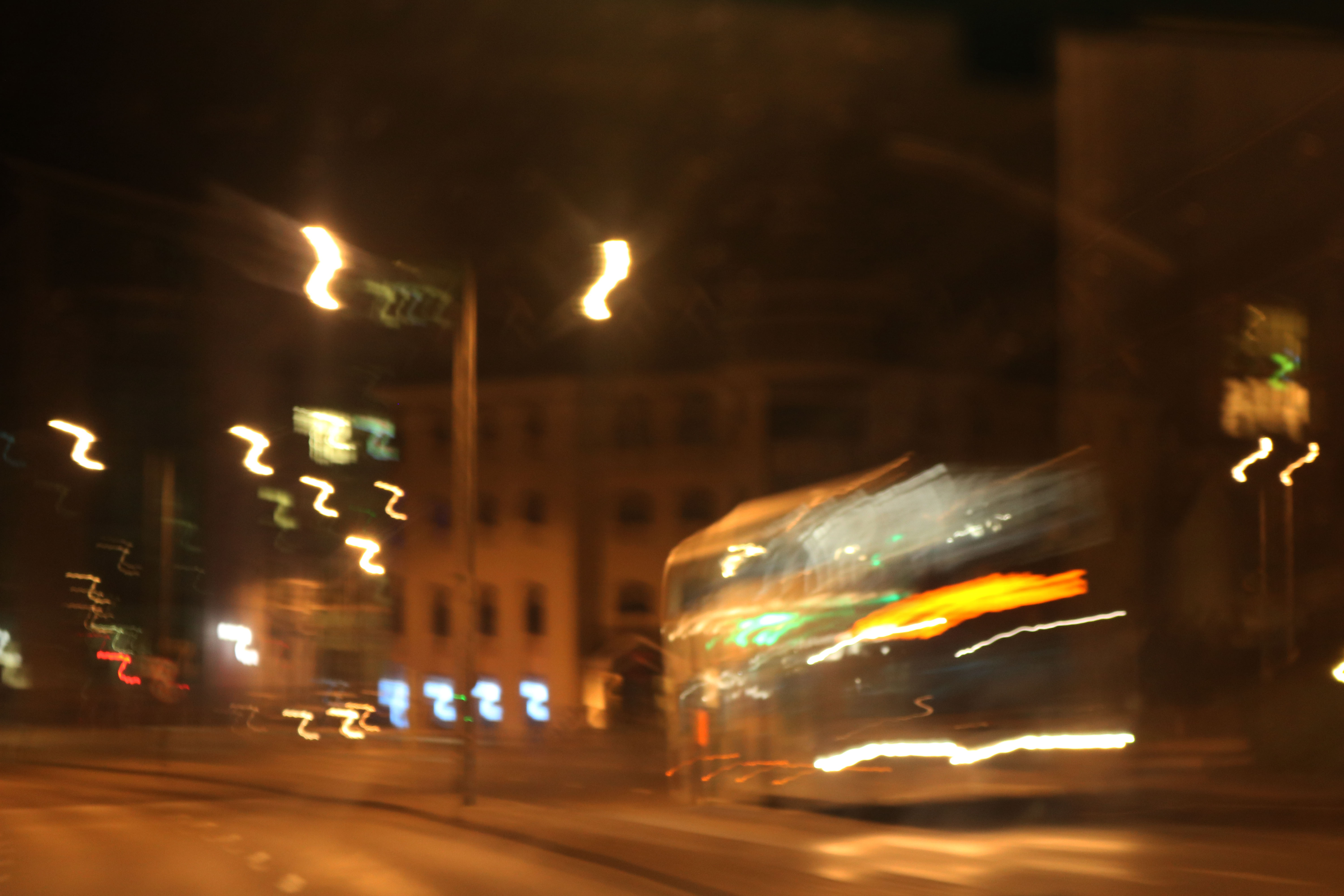
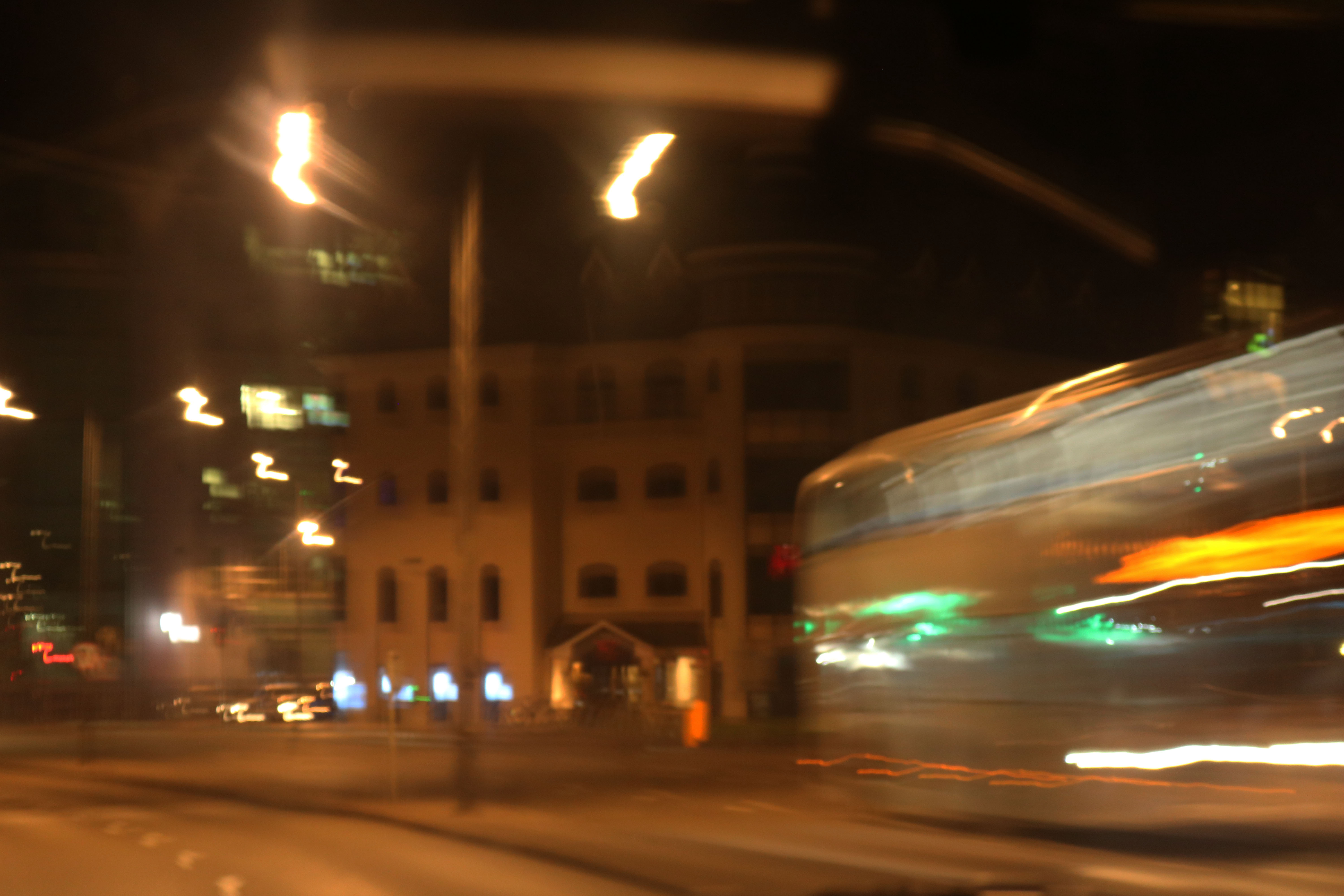
For my last outcome, I am considering these two images. These pictures were also taken while I was using a slow shutter speed, and also continuous shooting. As it was on slow shutter speed I was able to capture the movement of the bus, and the continuous shoot meant that I was able to take one image straight after the other. I chose these two images because i think they would look very well, side by side when displaying them. For my final A3 print, I am going to find a way to display both of these images together in one frame as having the second image together with the first gives the images some context. However, I think that before I find a way to display them both in one image I will slightly Photoshop the images as they are both slightly overexposed due to the slow shutter increasing the exposure time.
Abstract Colour
Mood Board: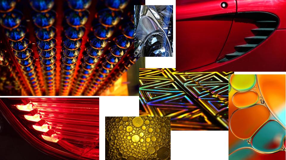
My Response:
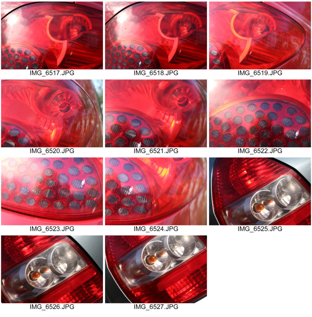
Best Images: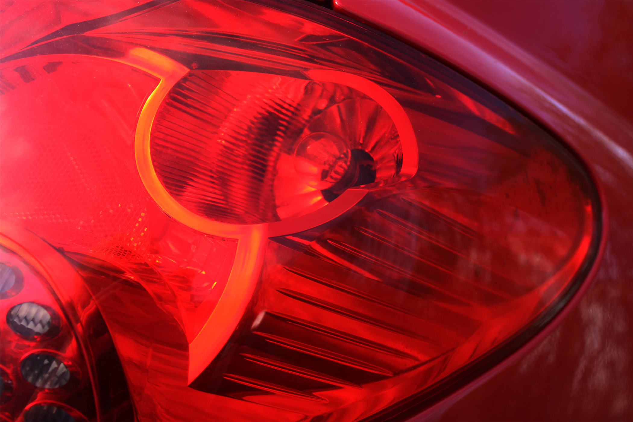
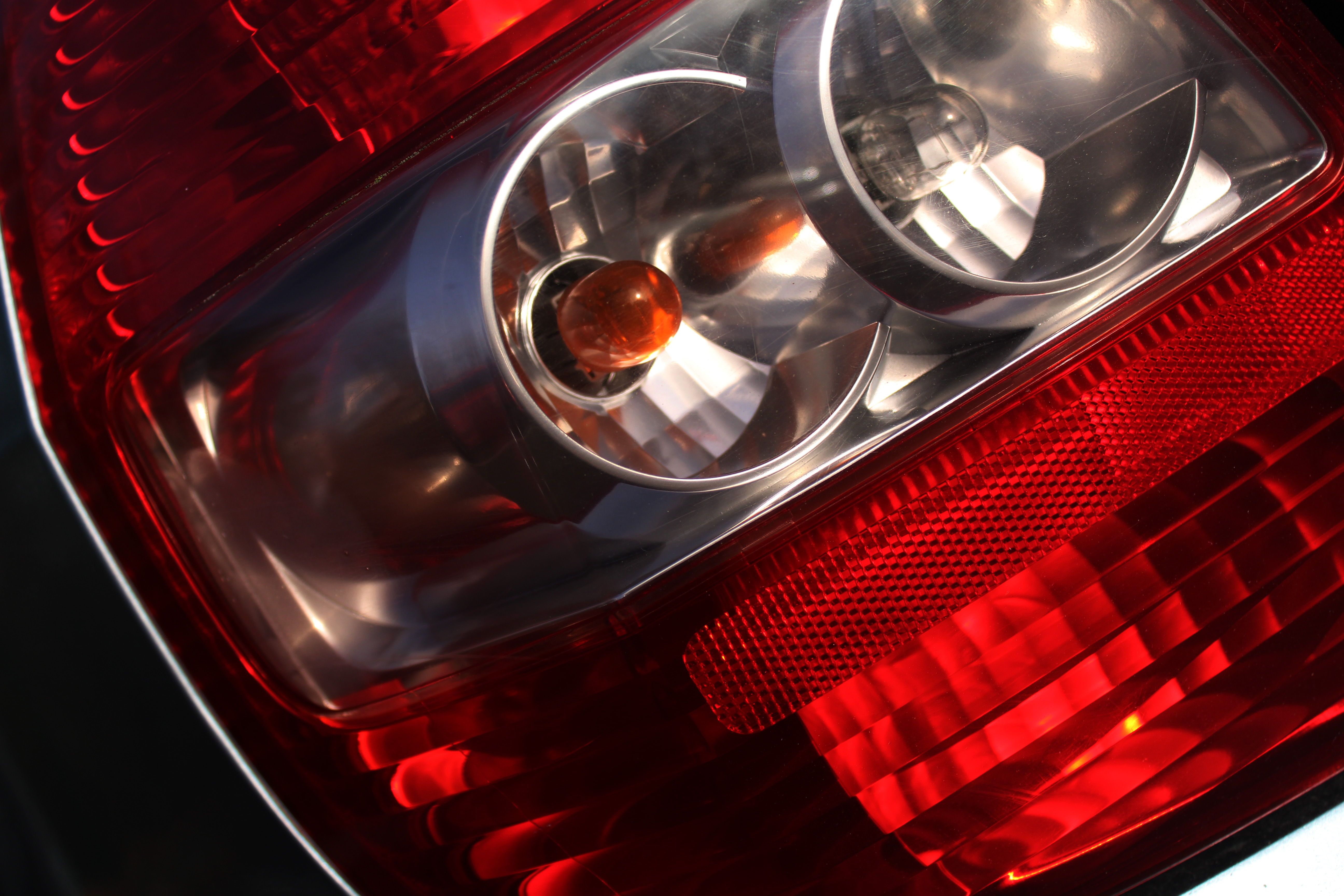
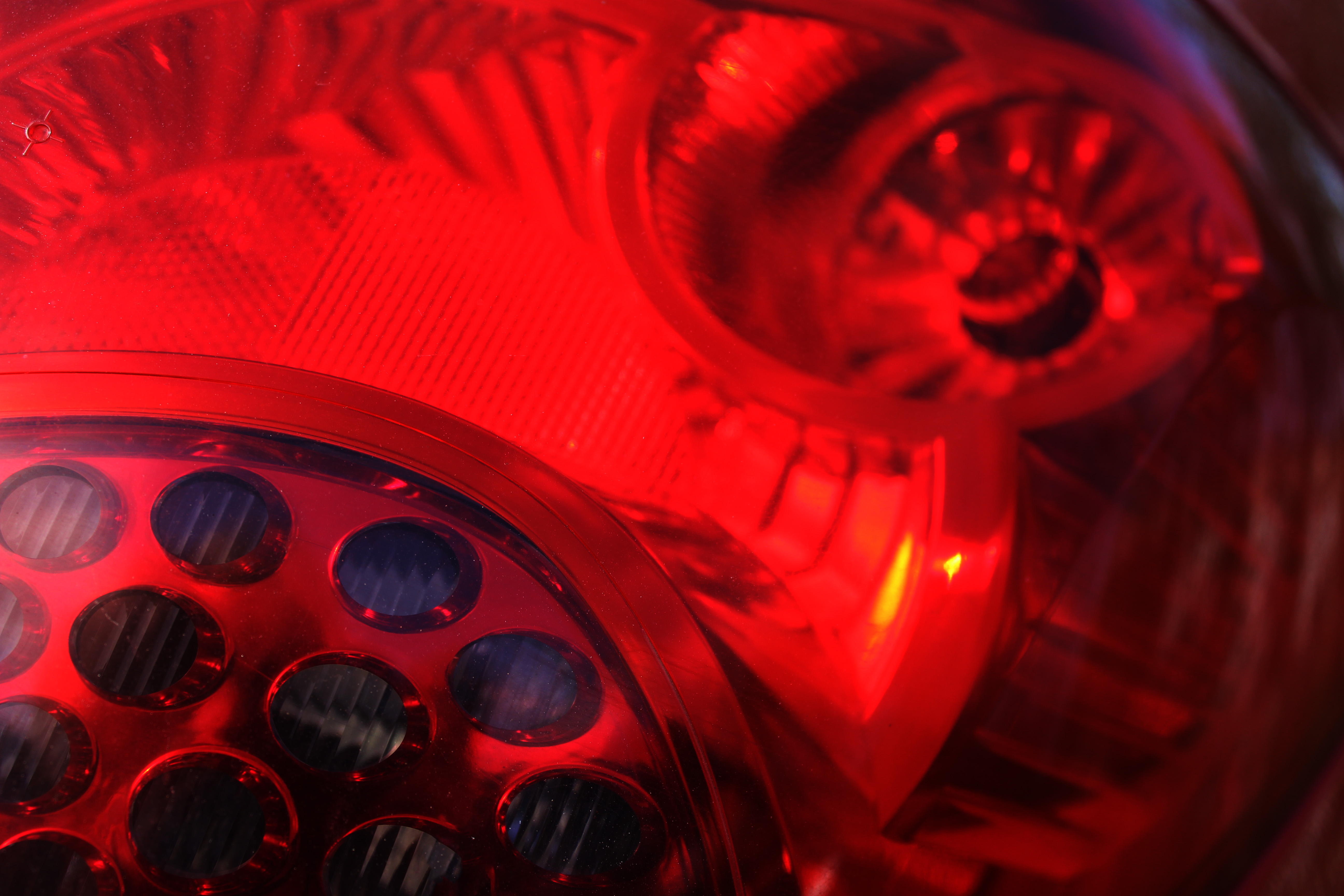
Edited Compositions:
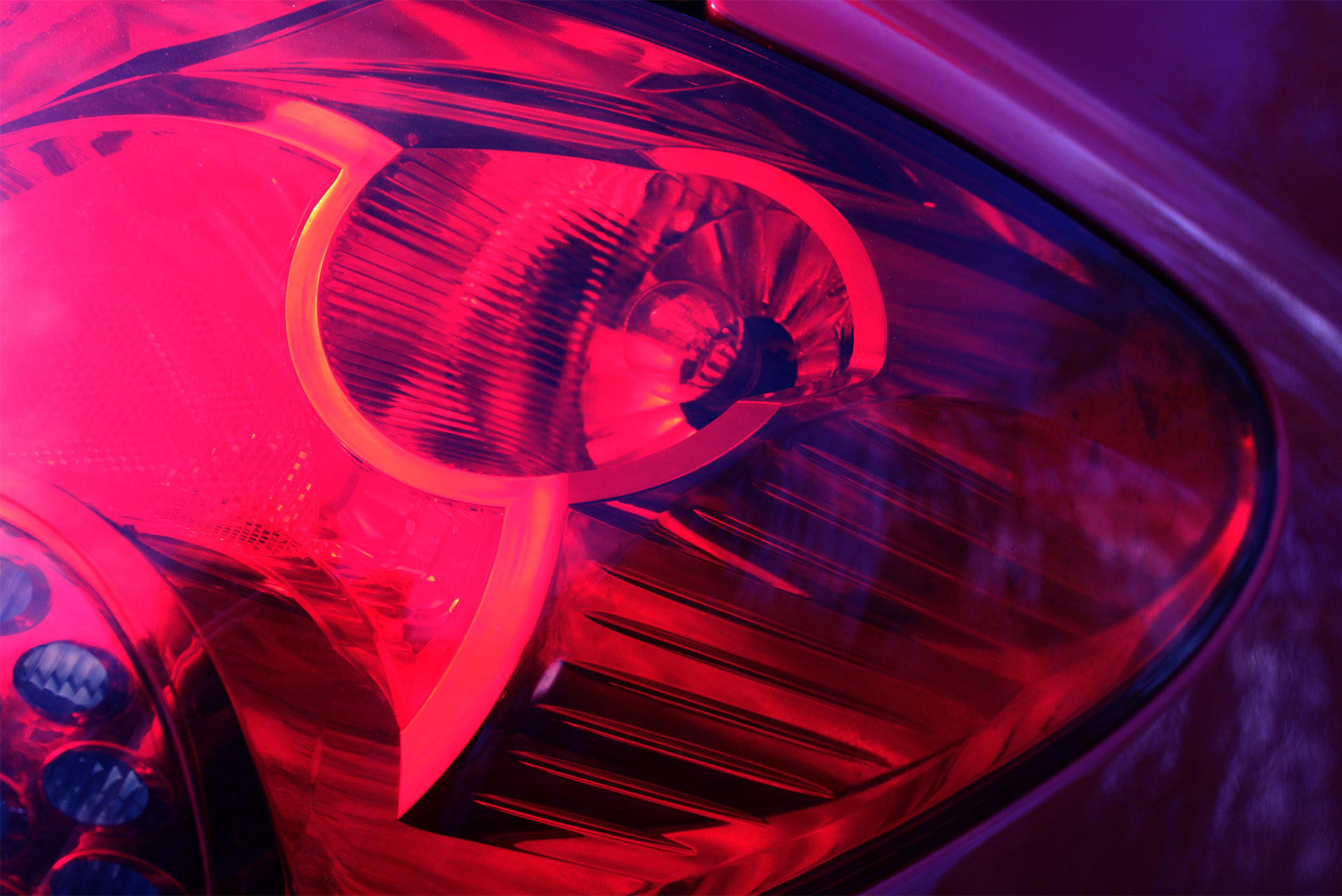
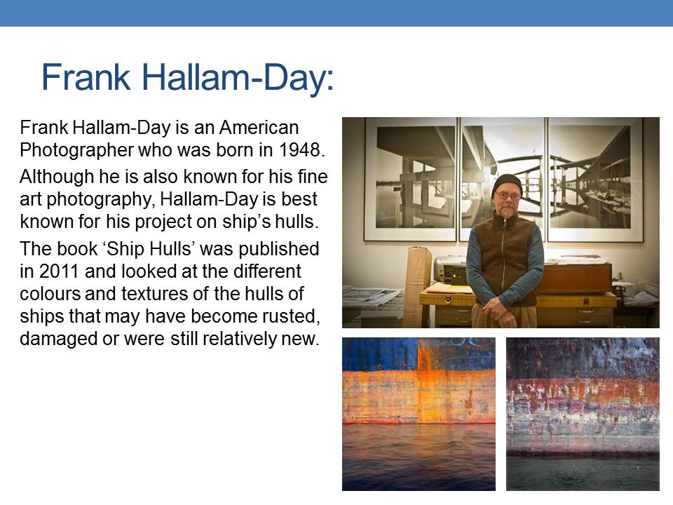
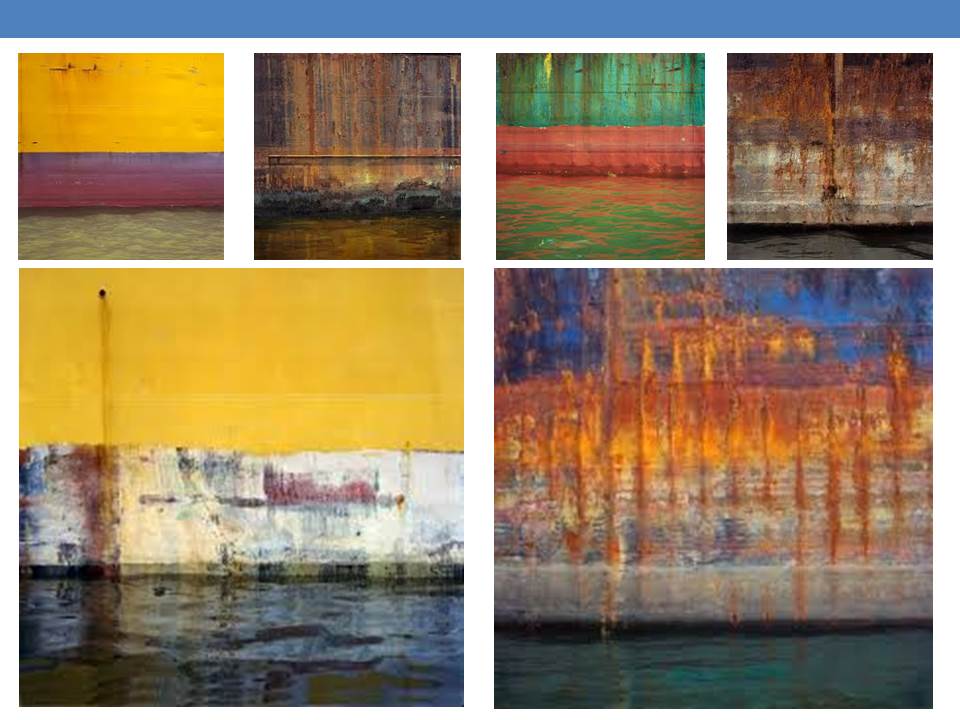
10. Frank Hallam-Day

Final Images – Abstract Project
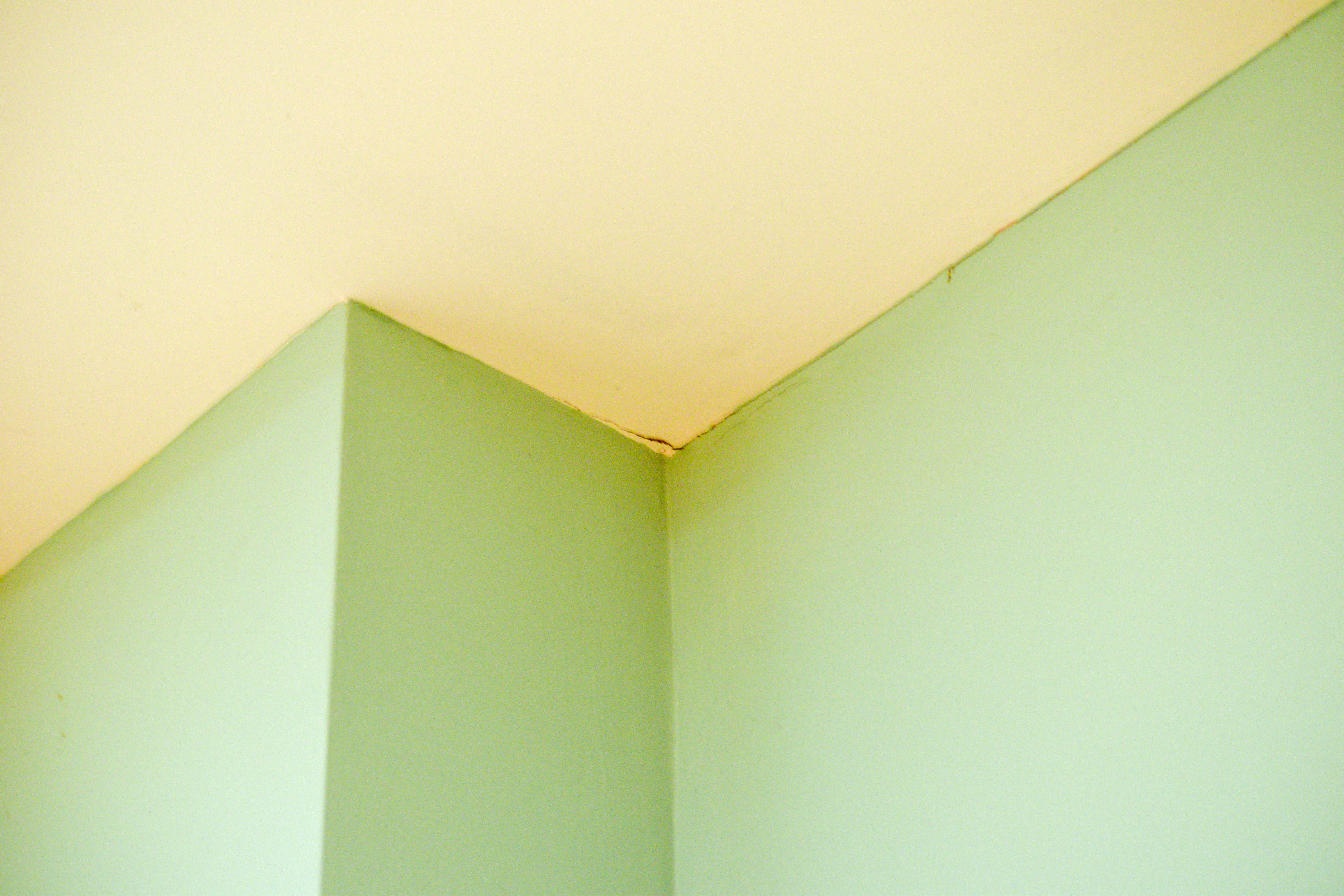
After compiling all of the images I took for the abstract project together, I nailed down my selection to 5 images., the following images are these choices: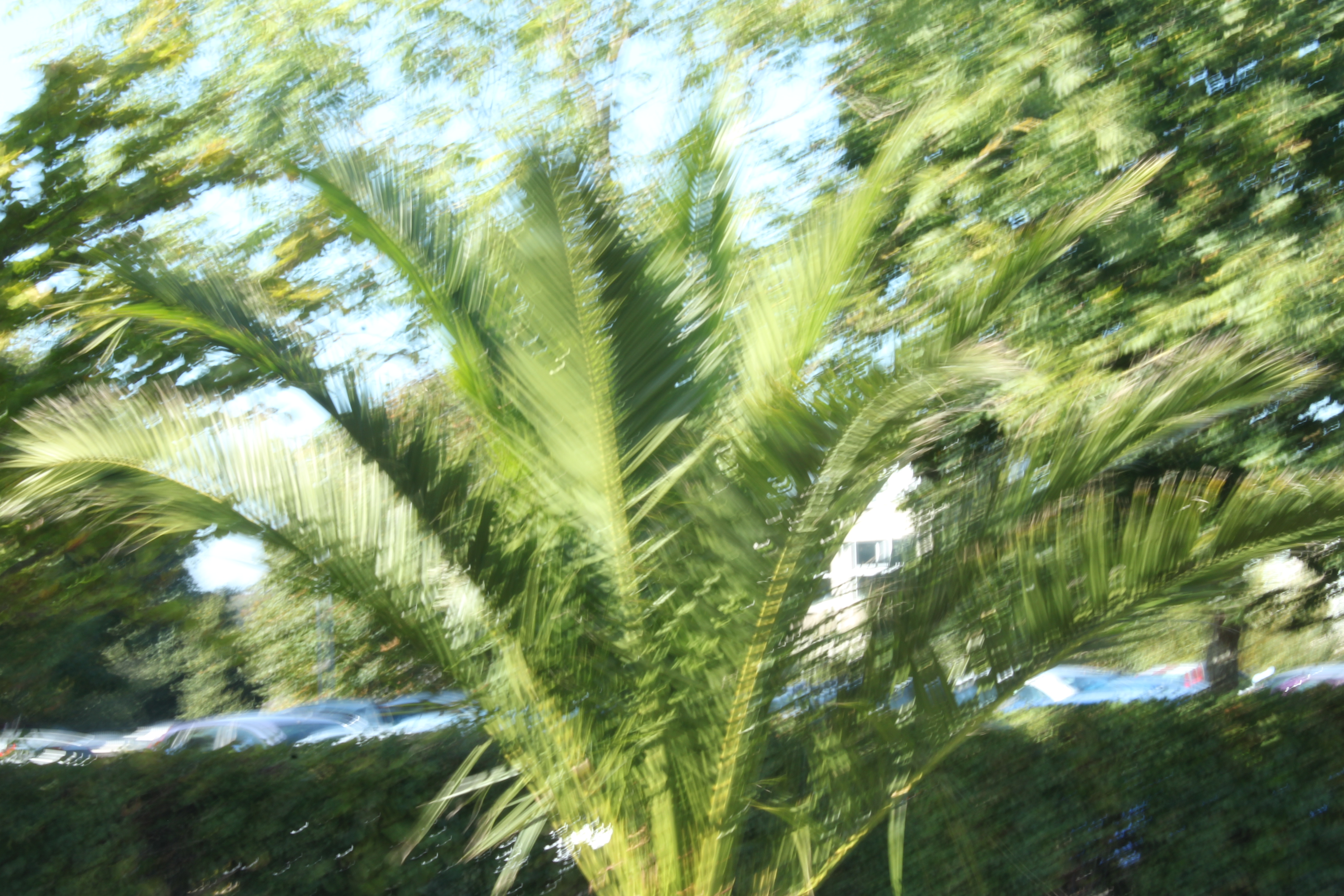
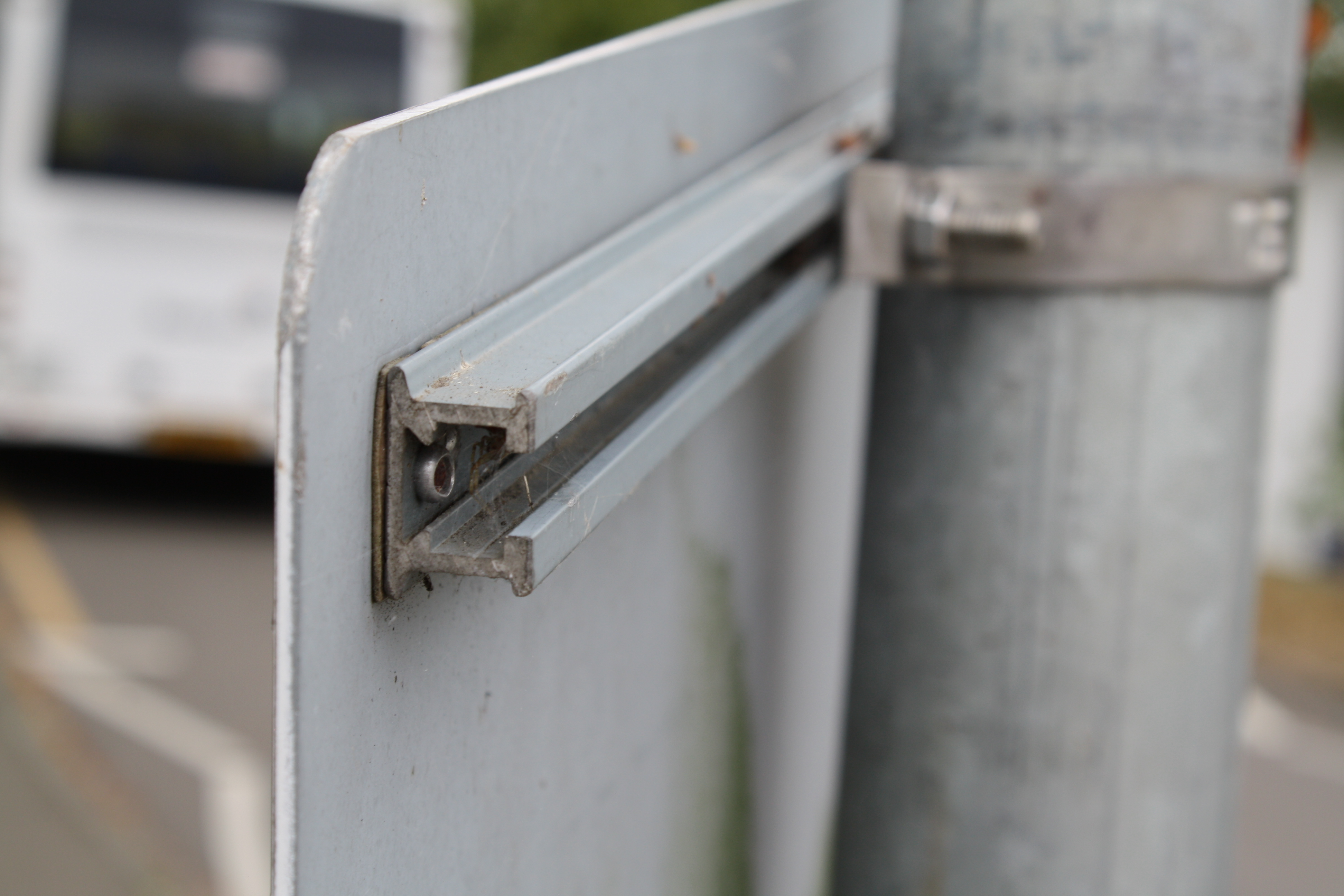
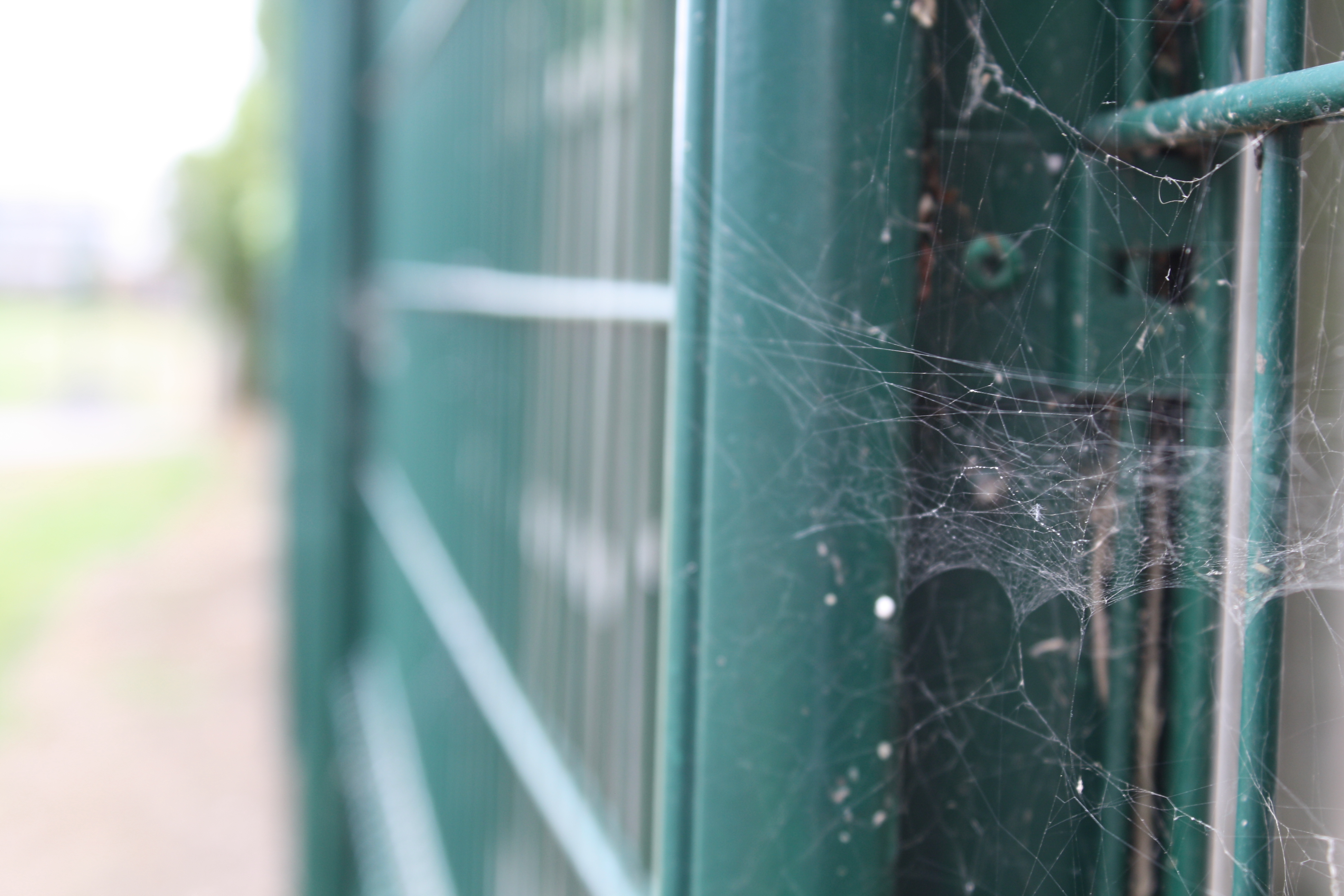
These images were the bare, unedited images that I took only using camera settings (except the second image across was edited black and white and was taken using a mobile phone), I then used Photoshop to refine the images and make them more eye catching. During the editing process, I decided on my final 3 images according to what best fit the project, and depending on what influence I took from artists in order to develop them. The following 3 images are the edited final 3:
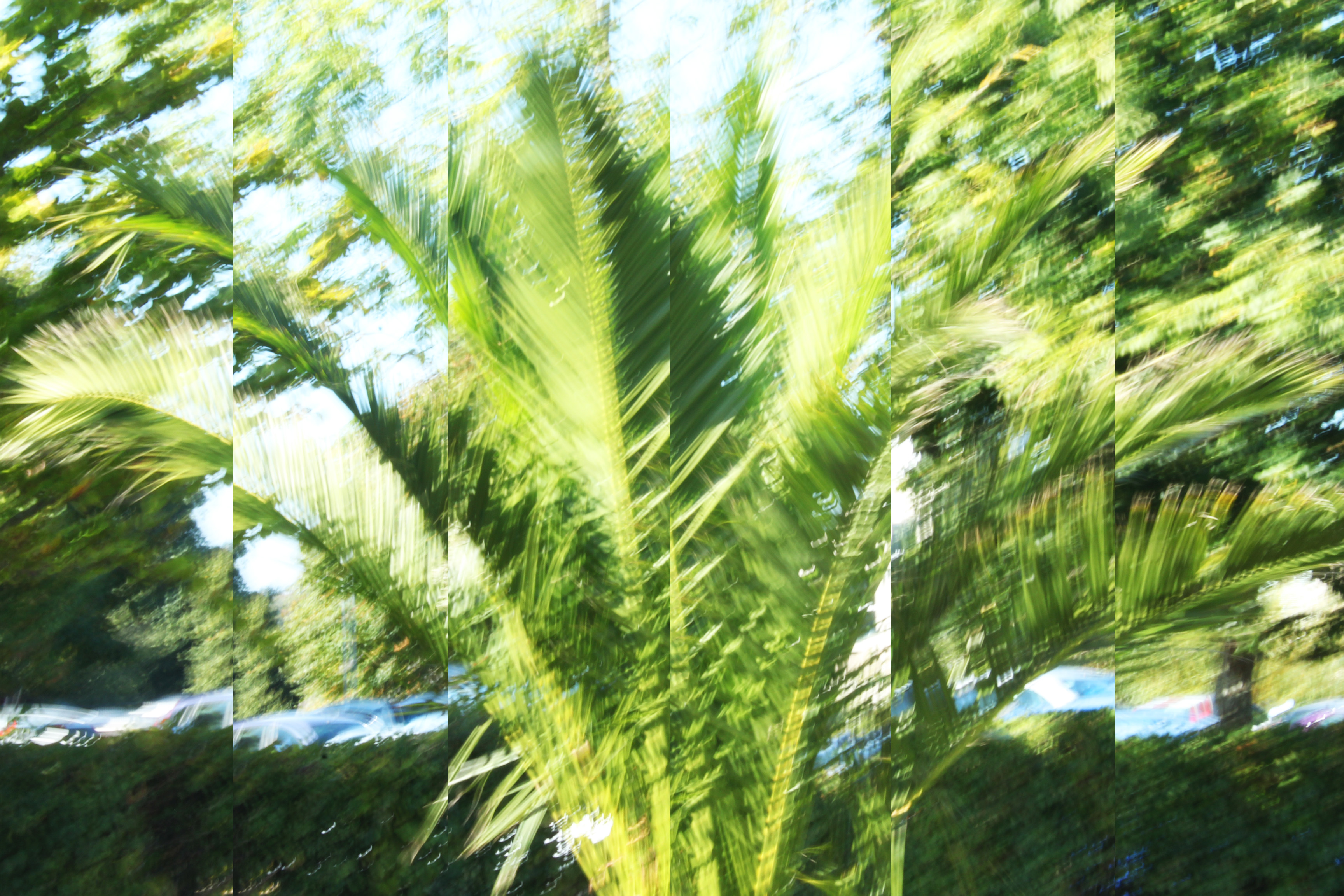
For the below image, I made use of a slow shutter-speed, and captured a tree that was moving with the wind. I found that using a slow shutter-speed distorted the subject, and made the photograph more abstract. After taking the image, I used Photoshop to edit the image. In order to make the image even more abstract, I split the image into 6 parts and expanded and adjusted each image, so that the 6 separate parts of the image added together to make the full image. This gave the image an even more distorted feel, and added to the abstraction of the overall image. I then slightly adjusted the saturation to make the image brighter and stand out more. In terms of inspiration, I took influence from the artists Uta Barth and Albert Renger-Patzsch. Most specifically, I took advantage of the high ISO that Barth uses to create very bright, vibrant images that reply heavily on lighter colours to bring her work to life. I raised the ISO setting of my camera to take this image, and in doing so, the image was naturally brighter than it would have been otherwise. I think that taking inspiration from Barth allowed for my image to come across as more abstract, as brightness slightly blurred the boarders of the subjects, making them more difficult to differentiate from the background. In addition, I took inspiration from Renger-Patzsch by using a natural subject, and taking my image in a slightly more scientific and objective way. Renger-Patzsch often made use of plant life in his work, and I took my photograph in the same style as Albert, looking straight on as if the camera was an eye> the abstraction came as a result of the ISO settings and the shutter-speed, but the initial image itself was taken with inspiration from Renger-Patzsch. This image will be my A3 image, as I believe that the image provides a lot for the viewer to see, and the splitting of the image into 6 sections will be more prominent if the image is printed as large as possible.

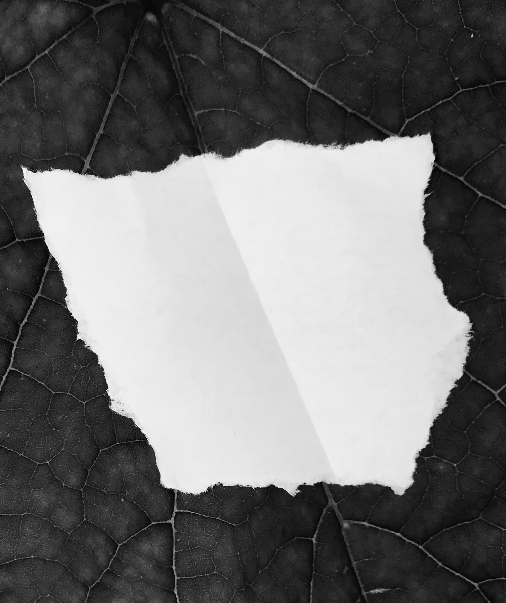
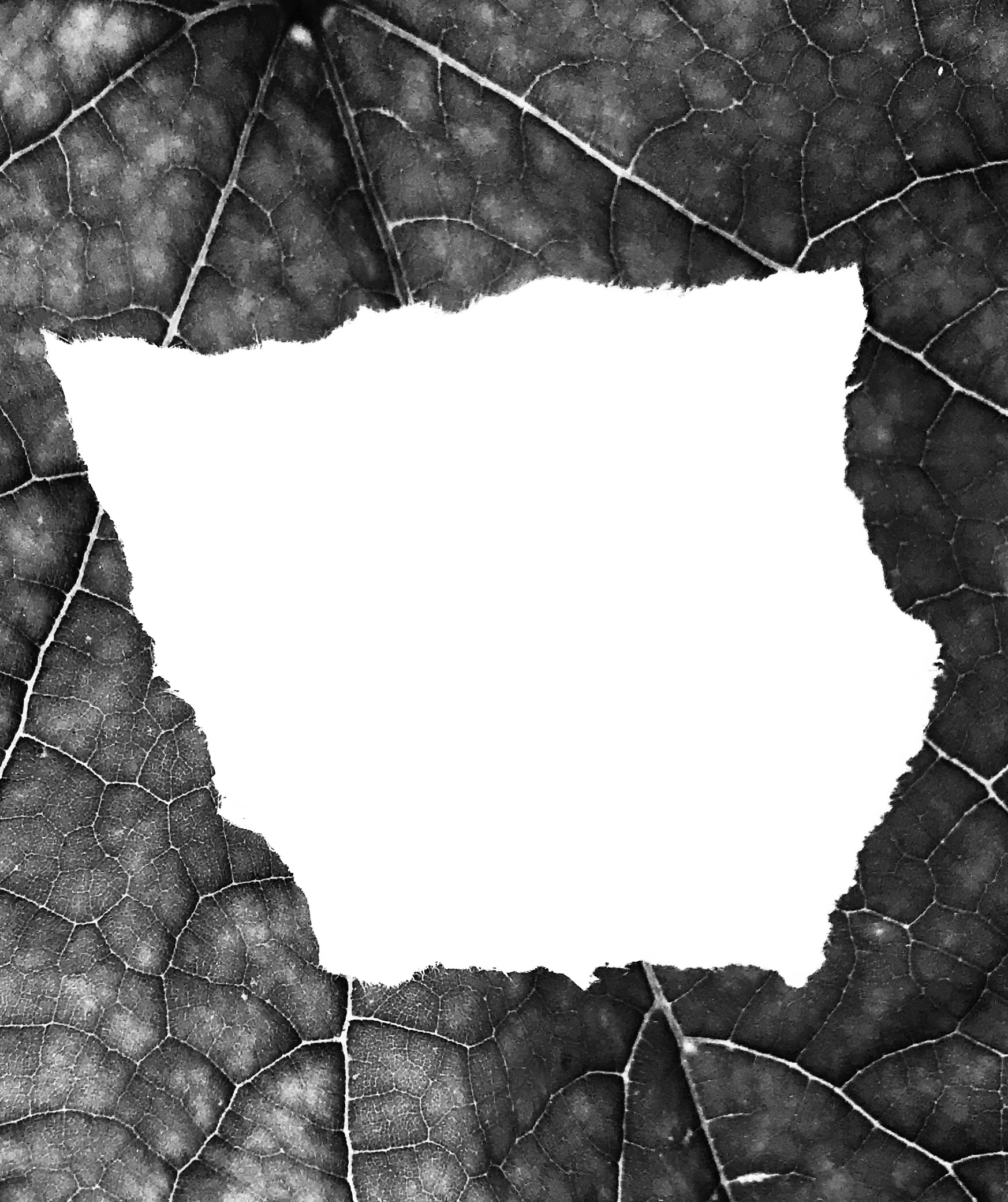
For my second image, I took made use of the manual zoom and focus of my camera, and captured a detailed image of a piece of ripped paper on a leaf. This image was originally taken for my Paper Project, and takes a small amount of inspiration from the photographer Aaron Siskind. Siskind often took close up images of subjects, and presented them in a more factual, objective and flat way. For this image, I am making use of a lack of context in order to present the image as being more abstract, and the high zoom used to take this image helps to cut out the context. I also edited the image in Photoshop to make it grey-scale, as this takes inspiration from Siskinds dark tones work, but also helps to emphasize the details within the leaf. I also believe that the contrasting colours of the leaf and the paper help to make the image more eye-catching as a whole. I will be using this image as my A5 image, as I feel that this will help to emphasize that although the image is detailed, the original subjects are naturally small, and I believe that this will create an effective juxtaposition, between the subject and the detail in the image.

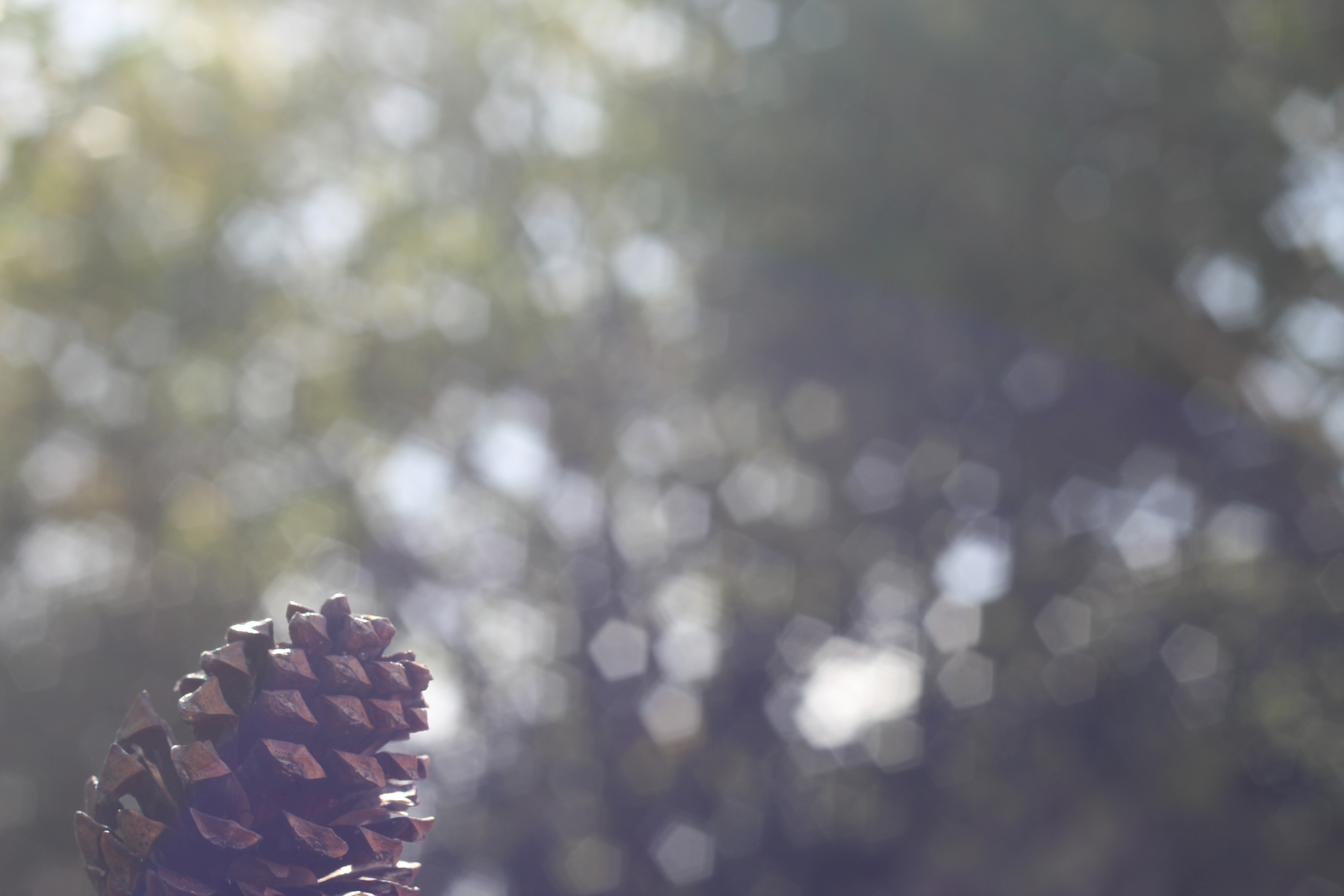
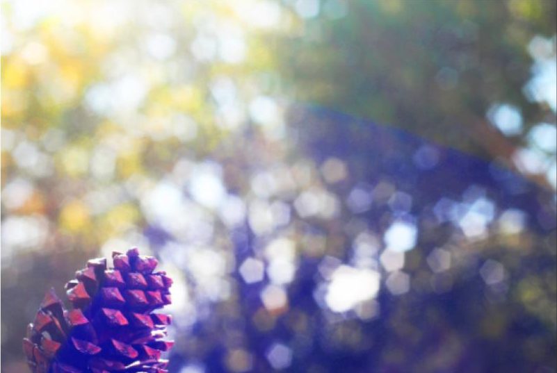
For my final image, I made use of the manual focus of the camera. for this photograph, I focused on the subject (the pine cone) while using a narrow depth of field to throw the background out of focus. I feel that this is an effective technique, as it allows for the viewer to focus on the subject completely, while questioning the context of the image due to most of the photograph being out of focus. I used Photoshop to edit the saturation of this image, and raised the contrast in order to make the colours of the image more vibrant, thus the image can draw more attention. I will be using this image as my A4 image, as I feel that the image will be more effective if it is large enough to make out the main focus point (which is small compared to the rest of the image), yet the image may become too boring and uninteresting if it is printed an larger. For this image, I took inspiration from Uta Barth again, as for some of her work she focuses on a small subject, and uses a narrow depth of field in order to throw the background almost completely out of focus. I was influenced by this technique, as I found it to be effective and eye-catching.

Franco Fontana Response
FRANCO FONTANA’S LIFE AND WORK:
Franco Fontana was born in 1933 in Modena. He took up photography in 1961 and joined an amateur club. He held his earliest solo shows in 1968 in Modena, his native city, which marked a turning point in his career. He has published over seventy books with Italian, French, German, Swiss, Spanish, American and Japanese publishers. His photographs have appeared worldwide in over 400 exhibitions, solo and collective. His images are in collections in over fifty public and private, Italian and international galleries, including: the Bibliothèque Nationale, and the Maison Européenne de la Photographie, Paris; the George Eastman House International Museum of Photography, Rochester, the Musée de la Photographie, Arles, New York, the National Museum, Beijing, the Stedelijk Museum, Amsterdam, the Metropolitan Museum of Photography, Tokyo, the Galleria Civica d’Arte Moderna e Contemporanea, Turin, and the Victoria and Albert Museum, London. Many companies have asked him to collaborate on advertising campaigns, he has published photographs in Time-Life, The New York Times, Vogue Usa, Vogue France, Il Venerdì di Repubblica, Sette del Corriere della Sera, Panorama, Frankfurter Allgemeine Zeitung, Class, Epoca and others. Fontana has been invited to hold photography workshops in various schools, universities and institutes such as the Guggenheim Museum in New York, the Tokyo Institute of Technology, the Académie Royale des Beaux Arts, Brussels, the Toronto University, and so on in Rome, Paris, Arles, Rockpot, Barcelona, Taipei, Politecnico di Torino, and the LUISS University, Rome. He has collaborated with the Centre Georges Pompidou, the Japanese Ministry of Culture, the French Ministry of Culture.
CRITICAL ANALYSIS:
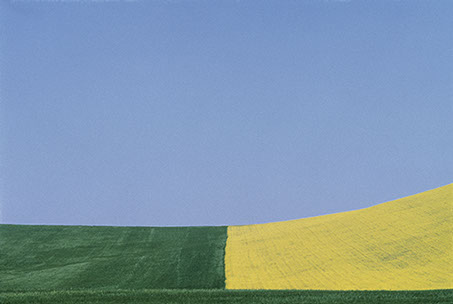
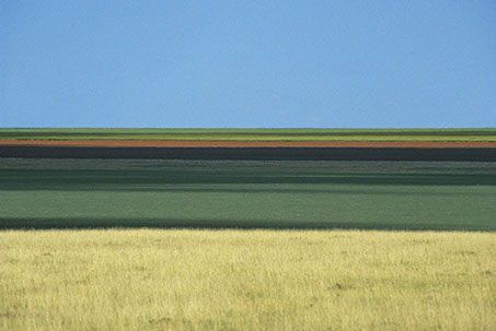
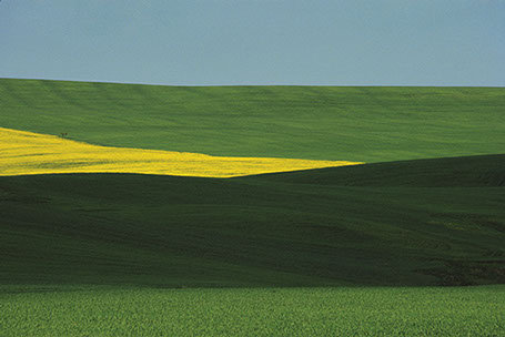
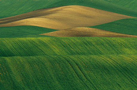
This piece by Franco is very simple in composition, only consisting of simple line work, going along the rolling hills of the grasslands. There are large blocks of color which separate the photo into 3 sections, blocking each color into a section. Even through the photo contains a very simplistic color pallets, the colors merge and harmonize together to create an overalll “tied together”look. There is no real foreground, mid ground or background, therefore the landscape appears 2D and flat. The length and width of each block of color is fairly relative to one another therefore there is a slight sense of pattern and repetition. I believe that during editing, the colors have been over saturated in order to create impact and boldness. The natural lighting coming directly above from the sun, gives the image brightness yet lacks any sort of shadows or tone differentiation. Even though this is a photograph of fields, the image does not feel organic or natural in any sense due to the symmetry and geometry seen within it.
His reasoning for creating these images are “my goal is to interpret reality. Anyone can see the landscapes I photograph, but with my camera I try to capture the details and features that the eye cannot see. Some tell me, “I went to Provence and I saw ‘your’ landscapes”; sometimes they will have seen those places before coming to an exhibition, but only after looking at my work they see that part of reality pinpointing something they had not noticed before.”
CONTACT SHEETS AND SELECTION:
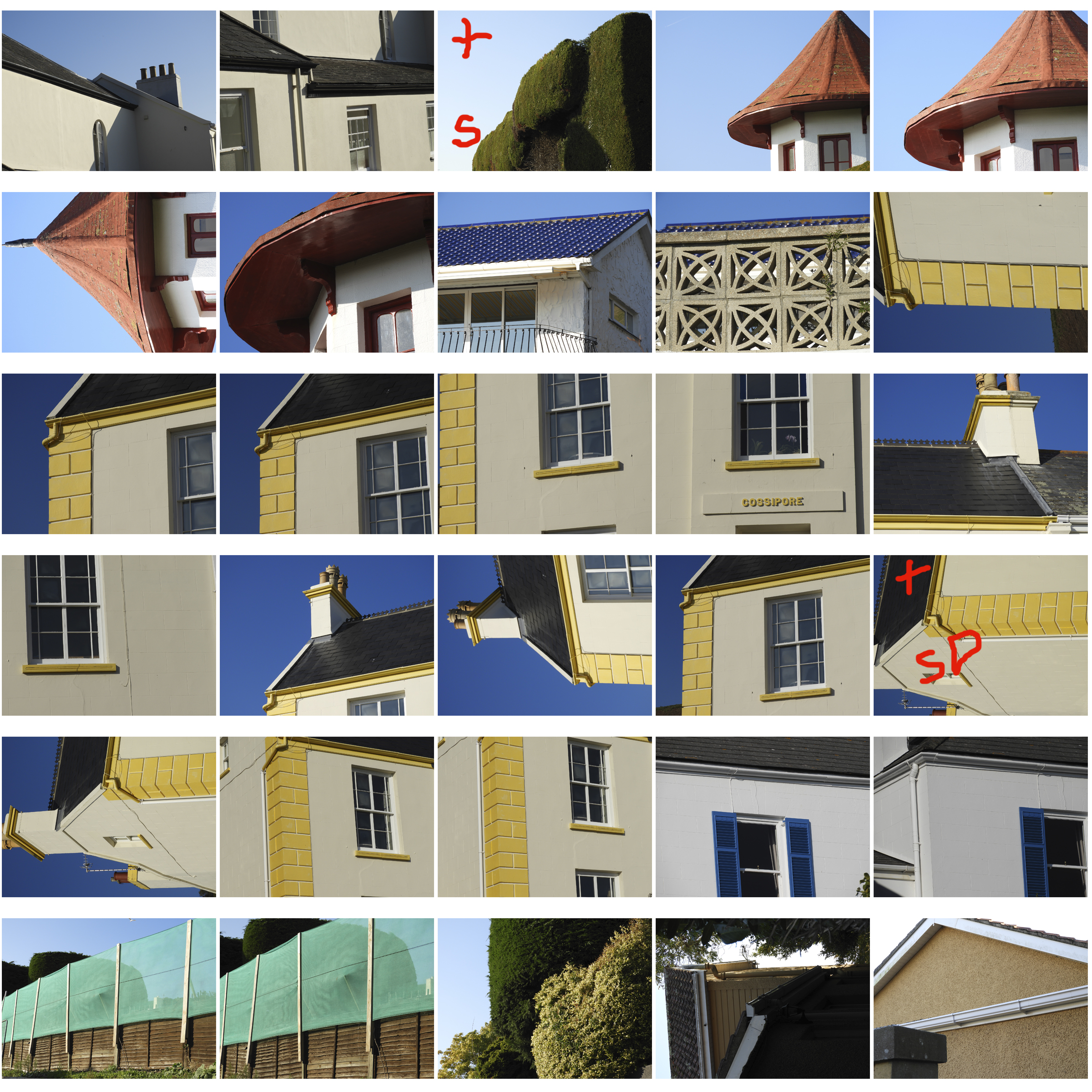
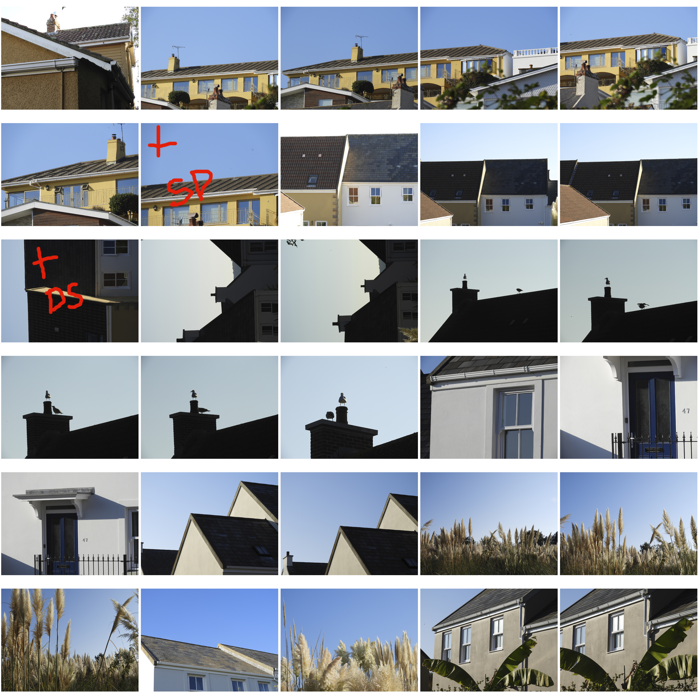
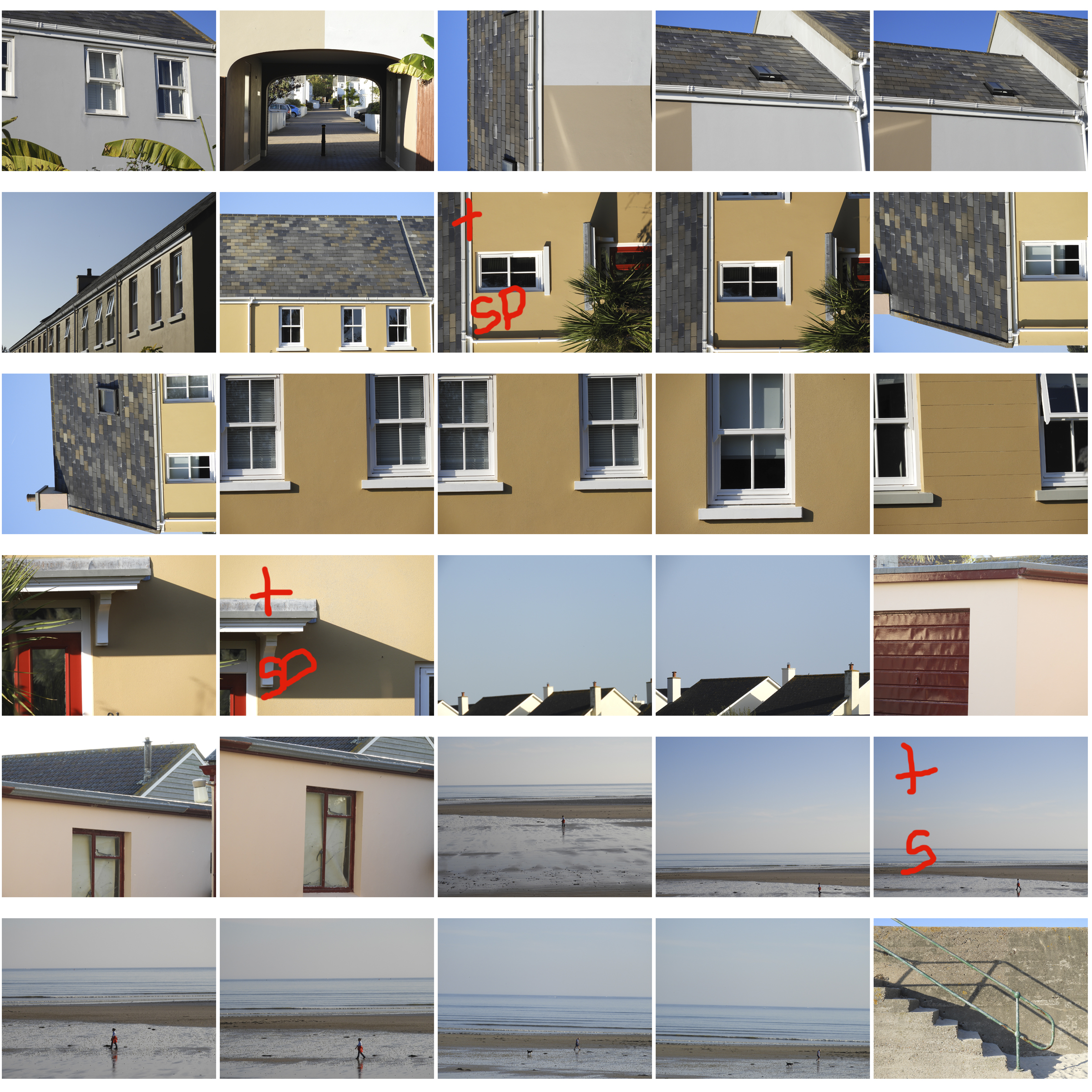
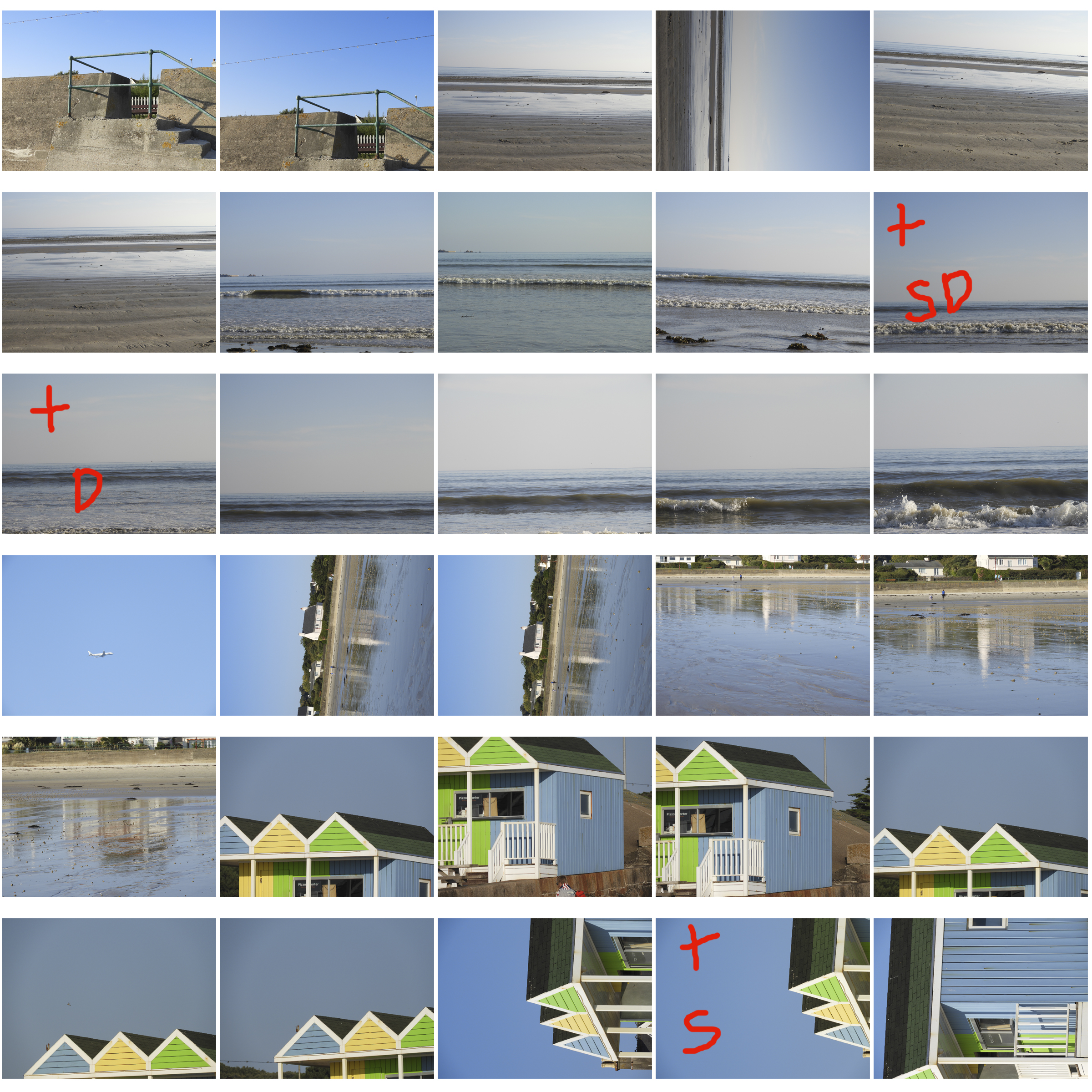
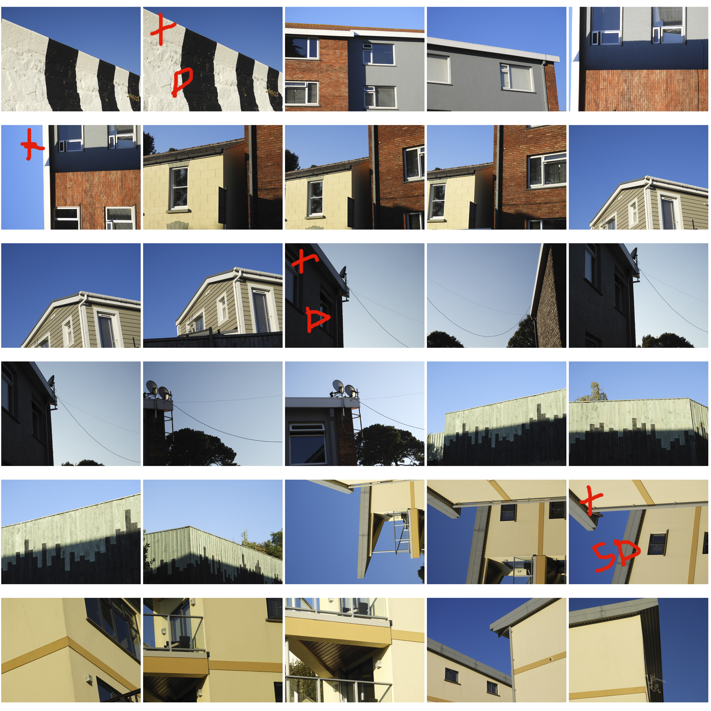
This was a very extensive and thorough photo shoot therefore i ended up with over 200 photos which i eventually cut down to 9 with the help of contact sheets. The plus indicates that the image is successful. The S indicates the need to further saturate the image, and the D indicates the need to lighten the image.
ANALYSIS OF MY MOST SUCCESSFUL PHOTO:
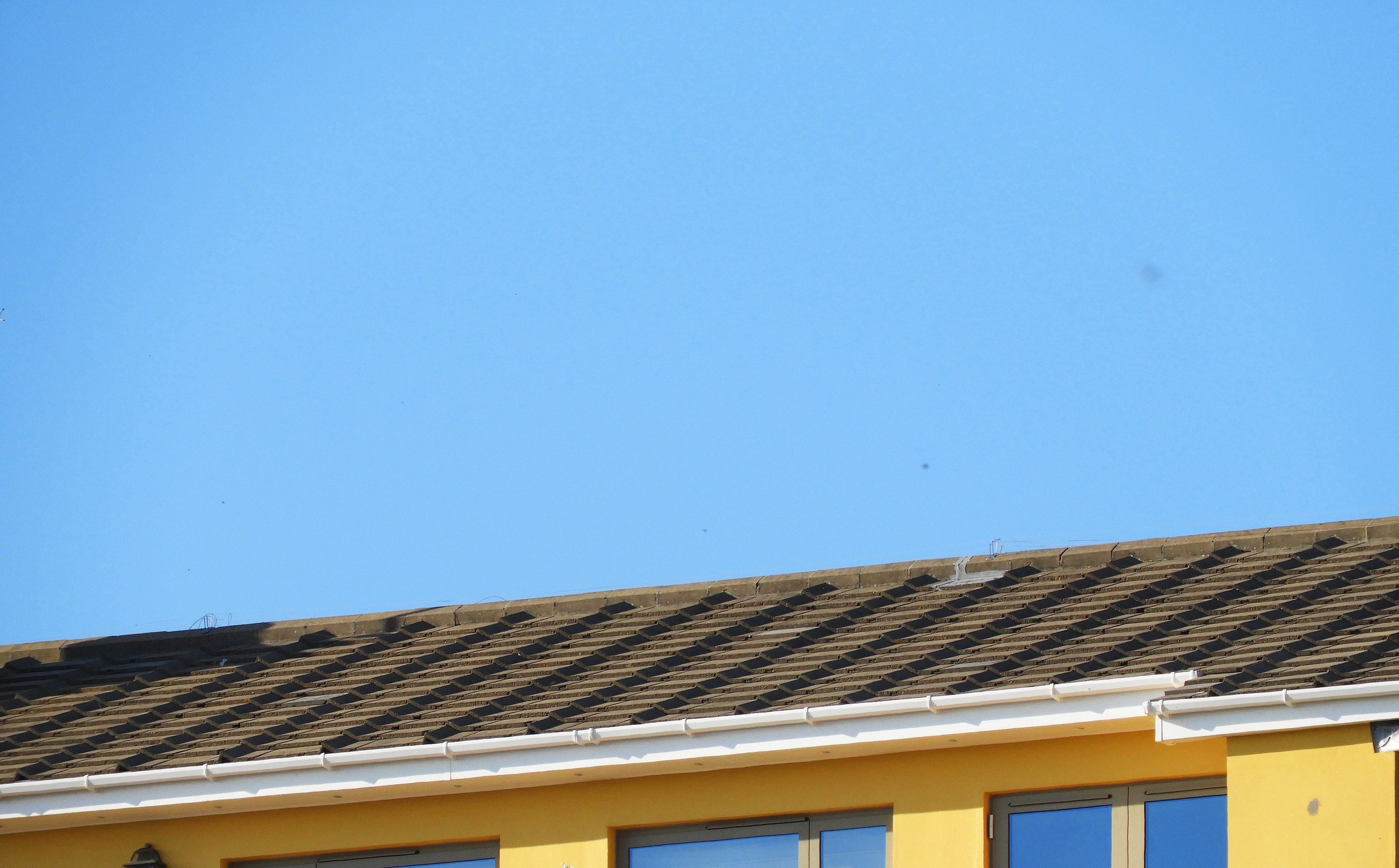
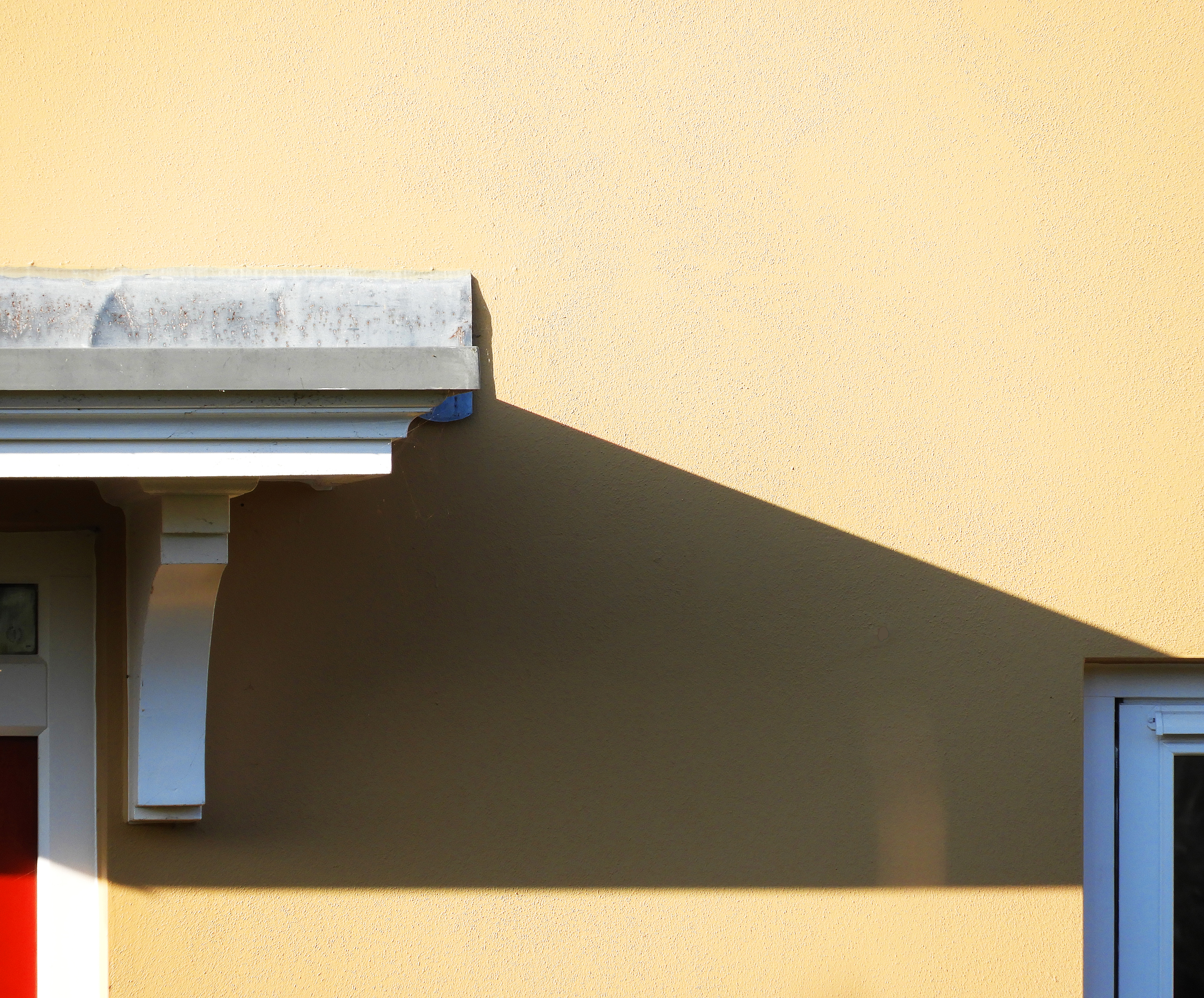
i felt that this photo encapsulated the formal elements that Franco explores best. Firstly, the main focus of the image is the bright and saturated colors of the sky and the yellow building below, which perfectly harmonize to create an impactful image. The light grey and brown roof tones down the image slightly, yet works well together with the blue and yellow. Like Franco, I captured these images on days with few clouds and strong natural lighting which allowed the bright blue sky to pop and provide a clean backdrop for the image. The light was hitting the building from the top left hand of the sky therefore no real shadows are cast onto the building. The image follows the rule of 3, with the sky filling up the top 2/3 of the image and the building filling up only 1/3 of the image. Like with Franco’s work, There is a slight sense of repetition in this image through the evenly spaced roof tiles and windows in the bottom third of the image. The repetition of pattern also makes this image feel industrial and man-made, far from anything organic. This image is also very flat and does not have a clear foreground or background giving it a 2D quality.
Whilst capturing these images, I set my exposure to 600, as it was quite a bright day yet i wanted it high enough to allow color to be bright. As there was plenty of natural light, I maintained my shutter speed at 1/60 which was enough to produce clear and crisp images. I set my white balance to direct sunlight as these were the conditions i was experiencing that day. The field of view in this image is very small, meaning that i zoomed in quite far into the building to capture this image.
Franco Fontana Response: Most Successful Photos
WHAT I DID:
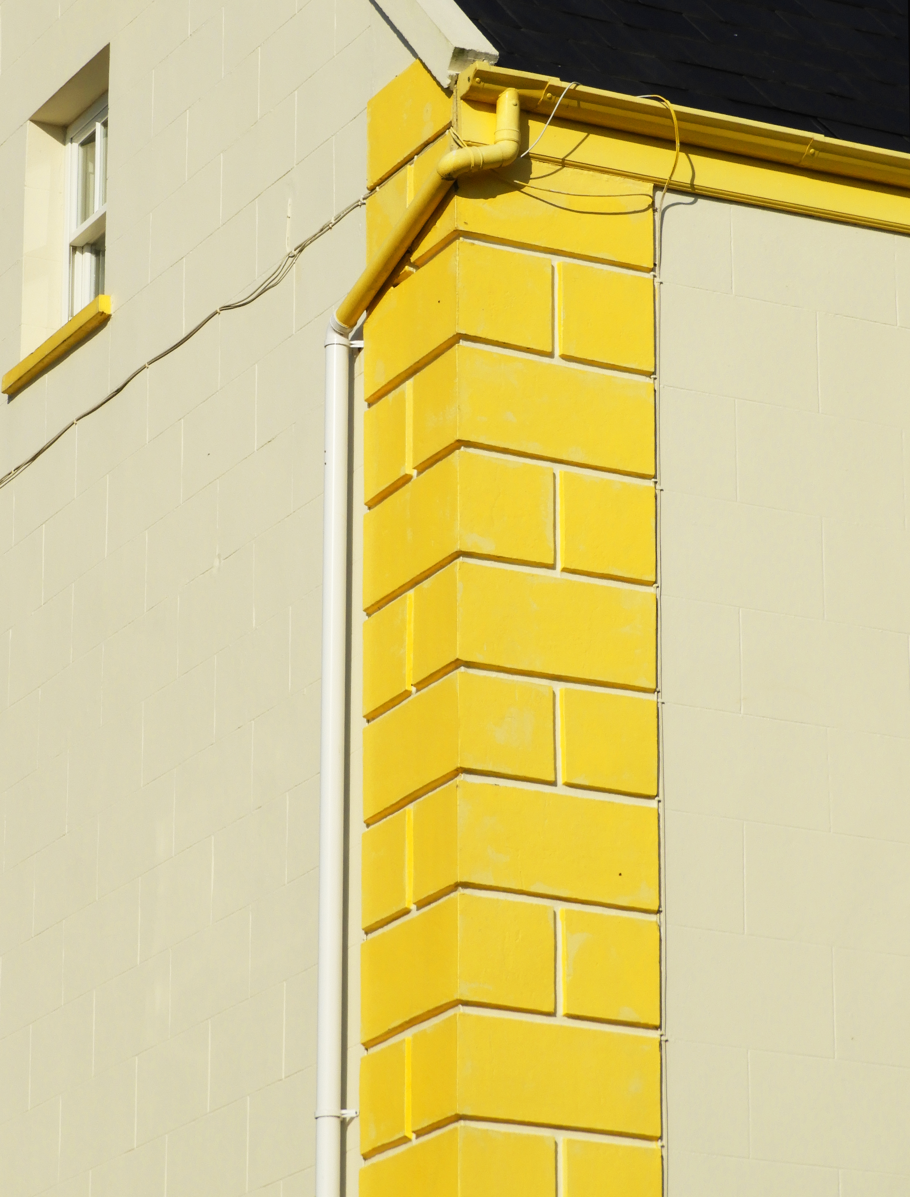
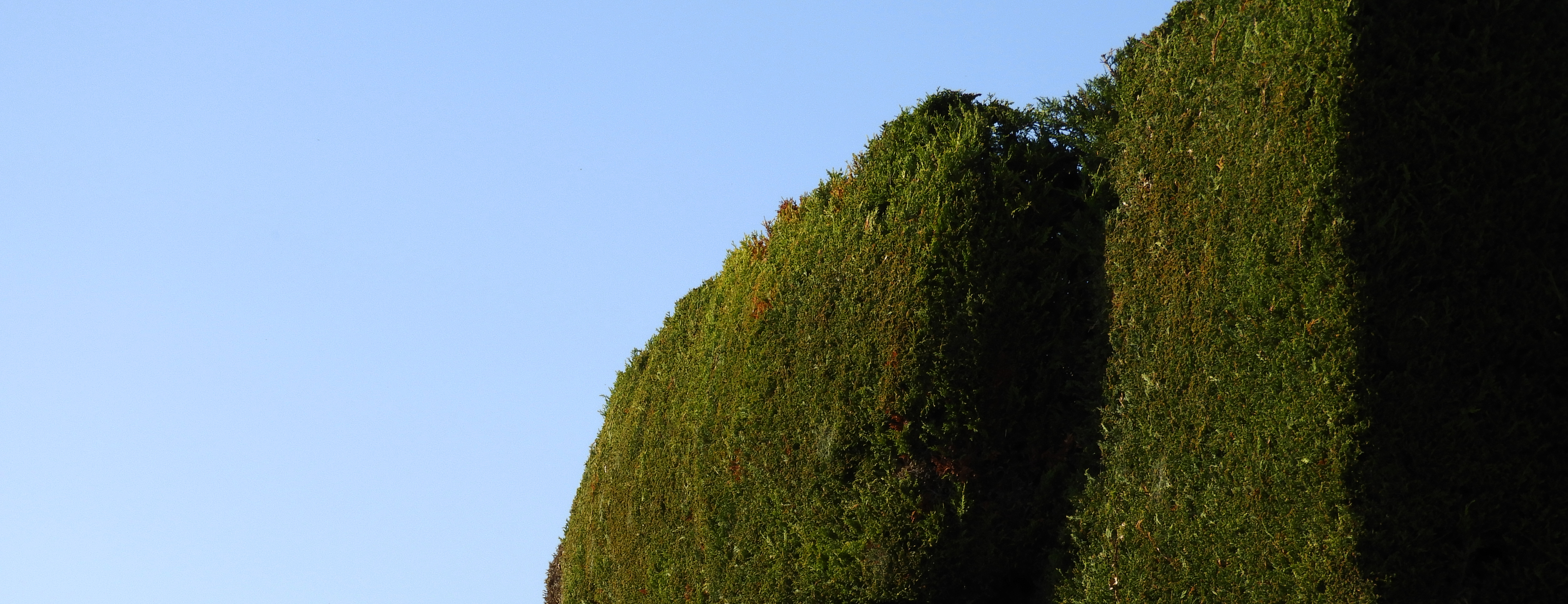
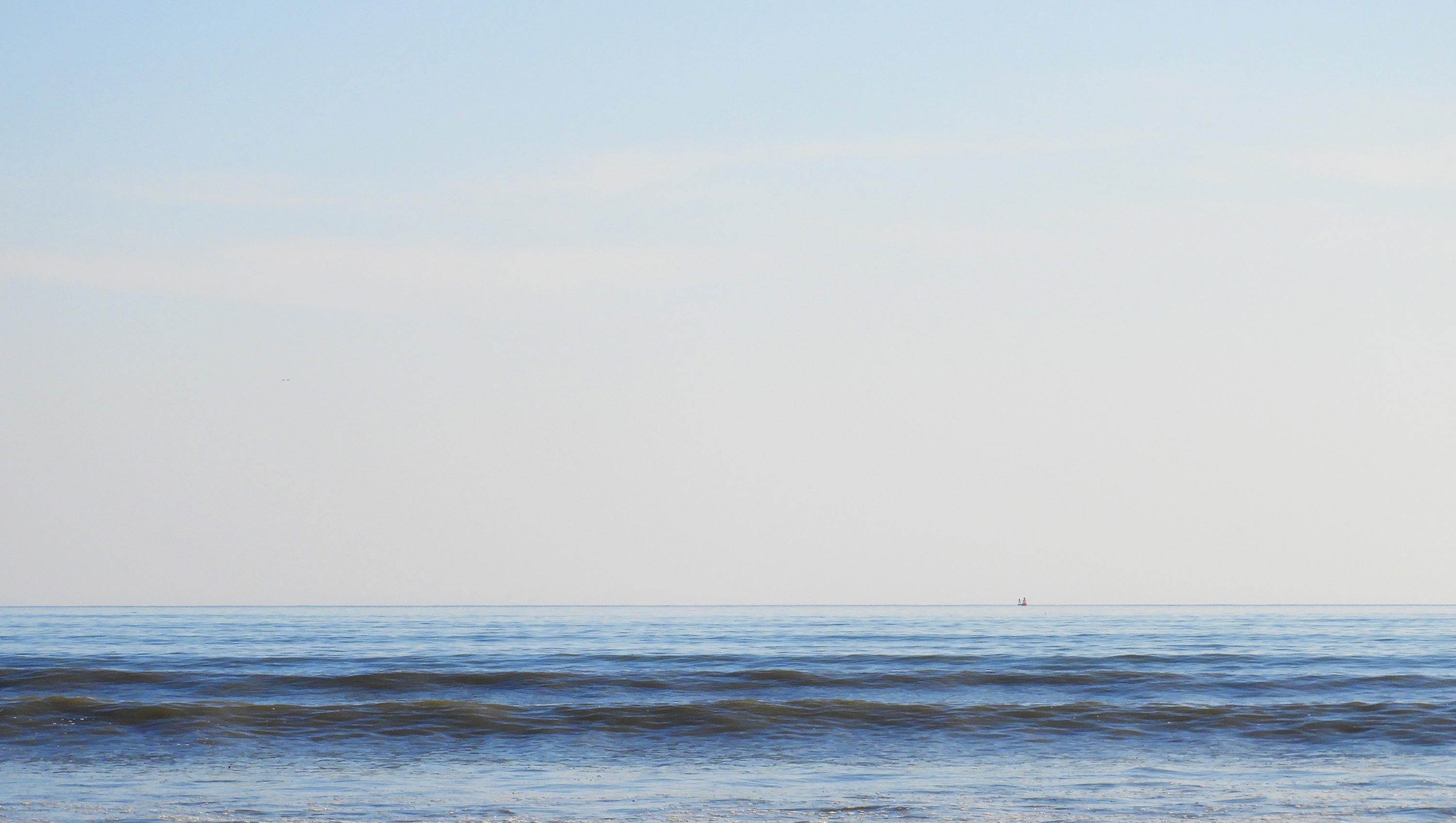
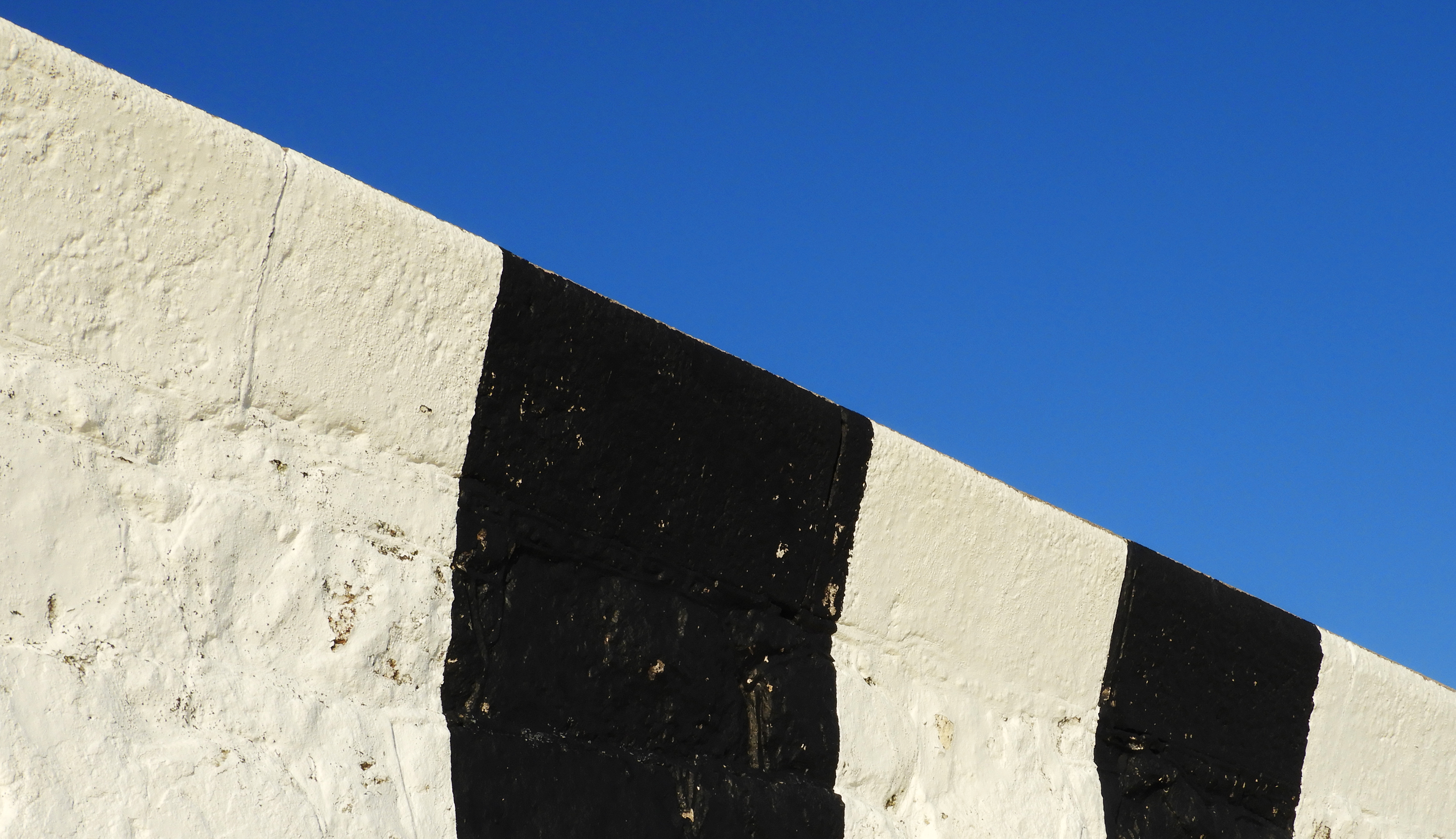
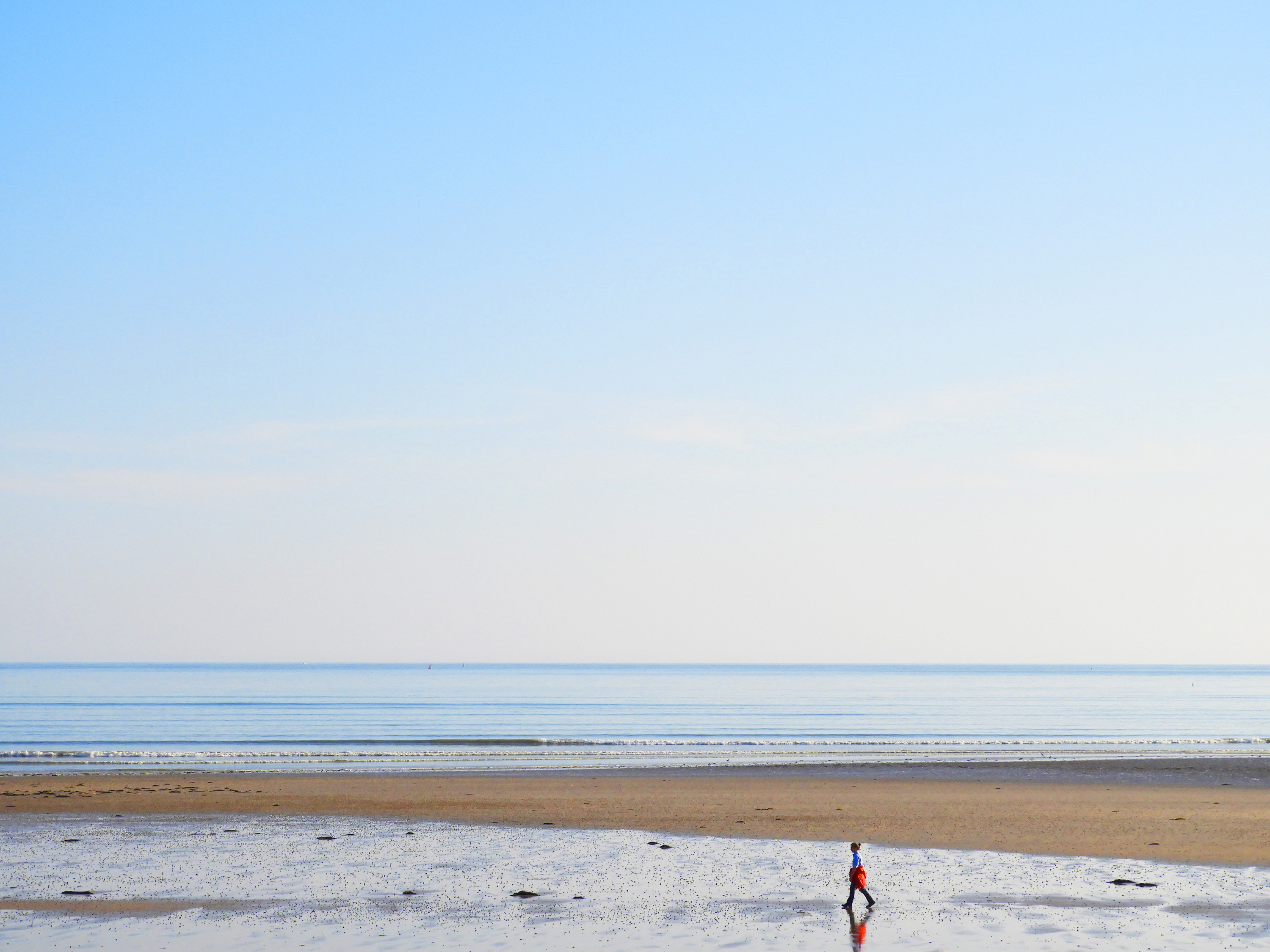
This is a selection of my most successful photos from a photoshoot i did focusing on the work of Franco Fontana. All the images below follow a simplistic approach, mainly concentrating on bold color and minimalist composition. I was not able to capture the beautiful rolling hills like Fontana has done, but I still incorporated similar elements into my work in order portray similar images.

Edits for final Photo
Alfred Stieglitz – week 5
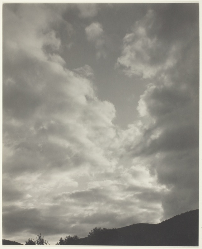
Alfred Stieglitz was an American photographer and modern art promoter who was instrumental over his fifty-year career in making photography an accepted art form. In addition to his photography, Stieglitz was known for the New York art galleries that he ran in the early part of the 20th century, where he introduced many avant-garde European artists to the U.S.
Examples of his cloud works :
In his work, he takes pictures of instructing and unique forms of clouds, with the light and darks clashing.

Contact sheets:
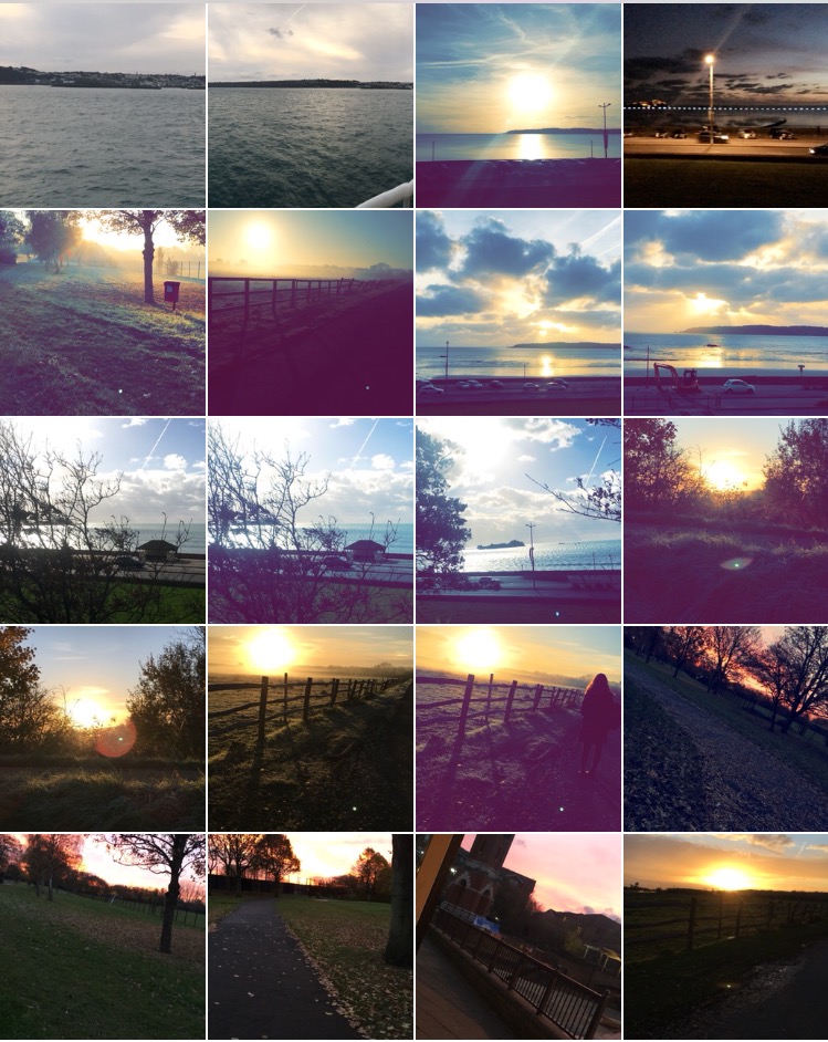
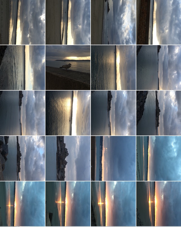
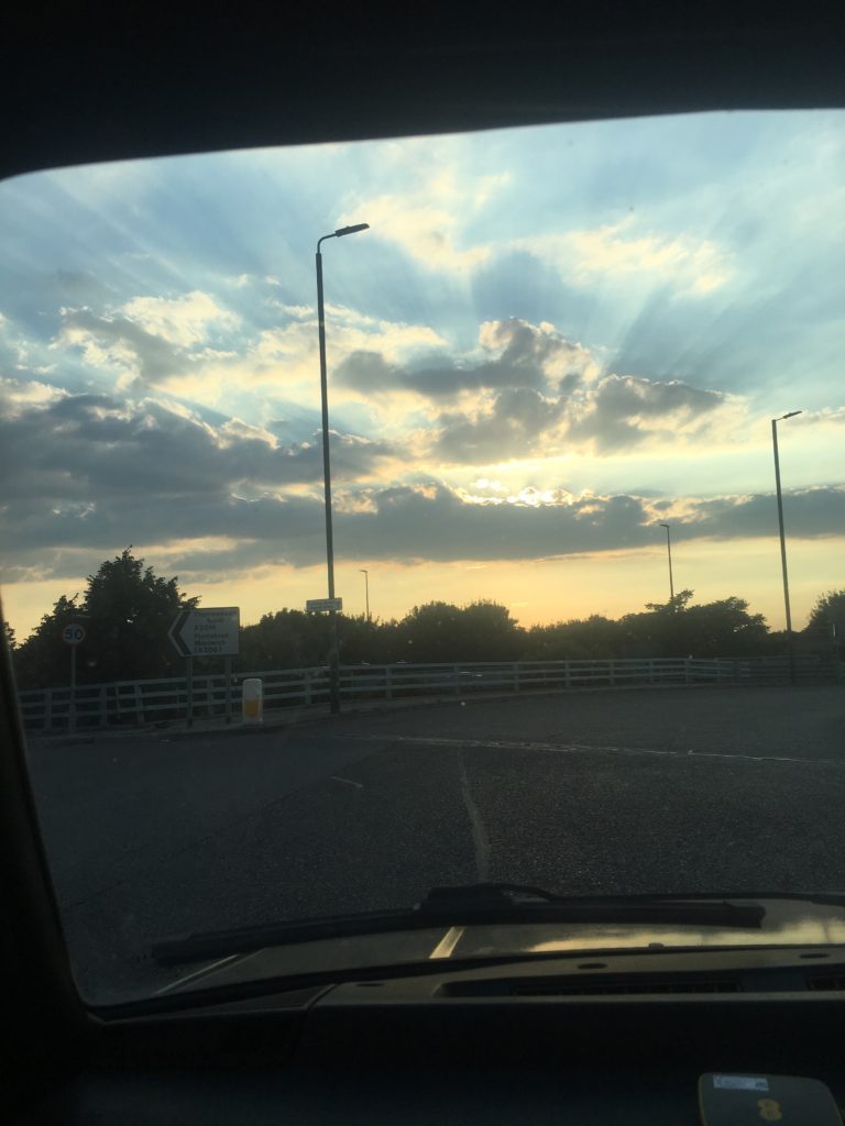
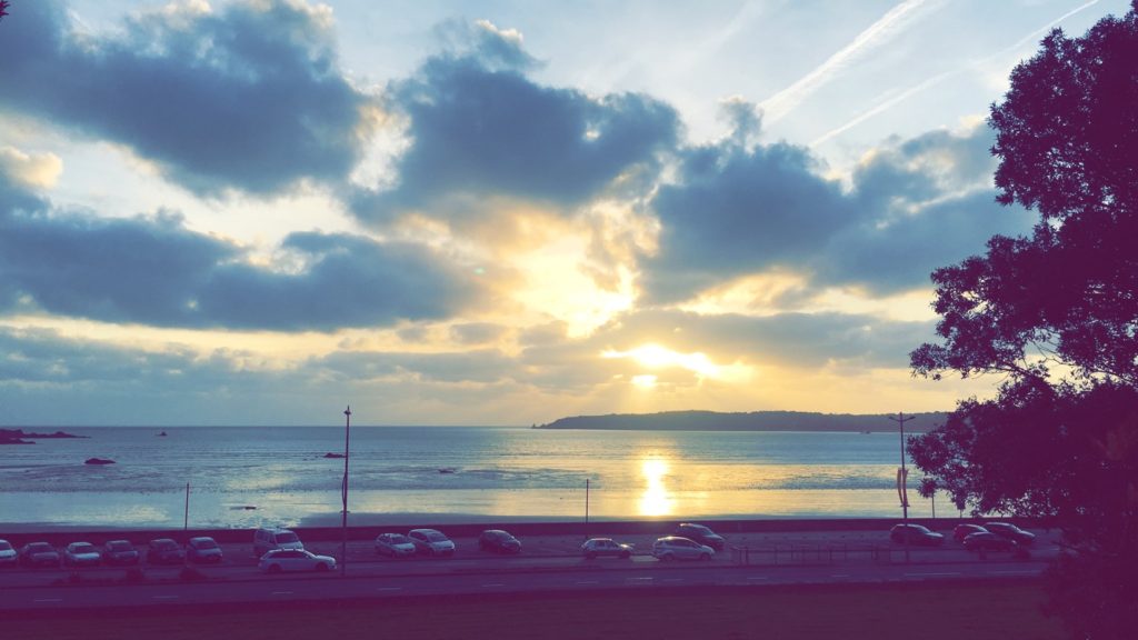
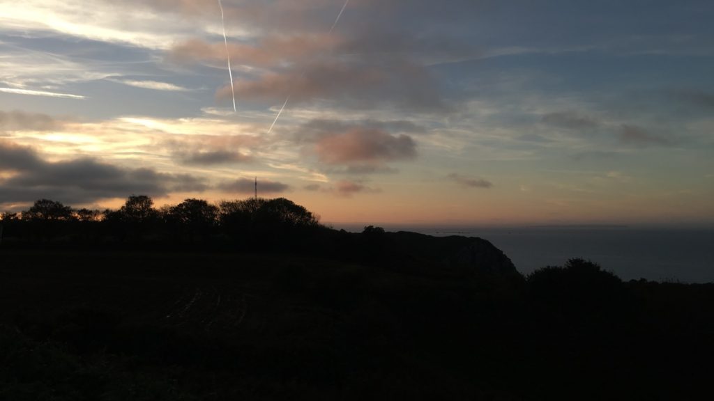
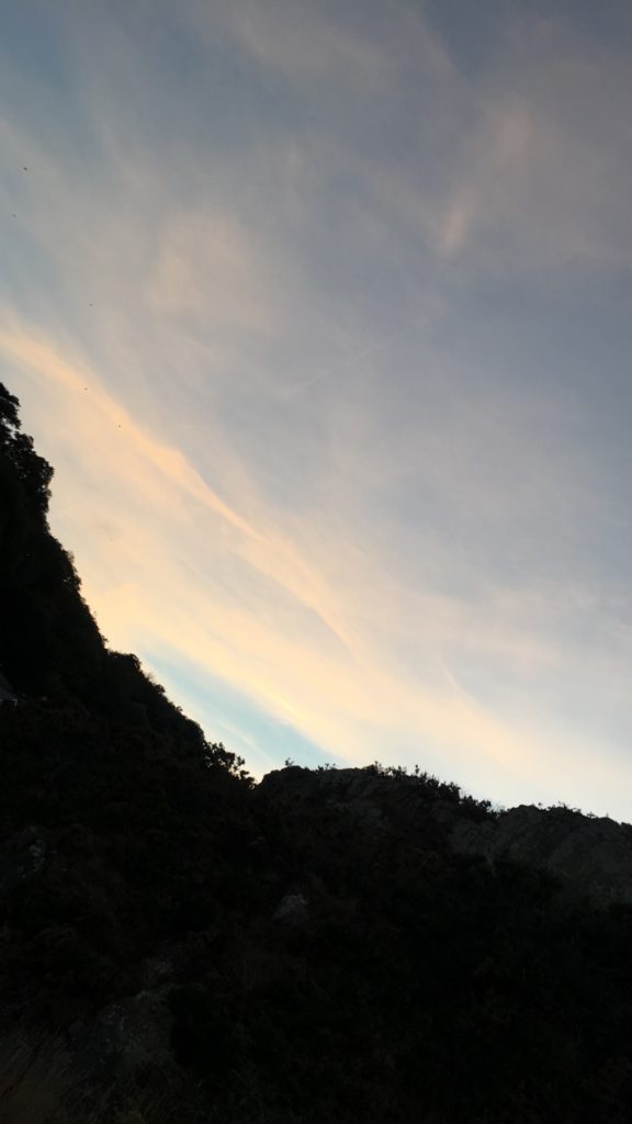
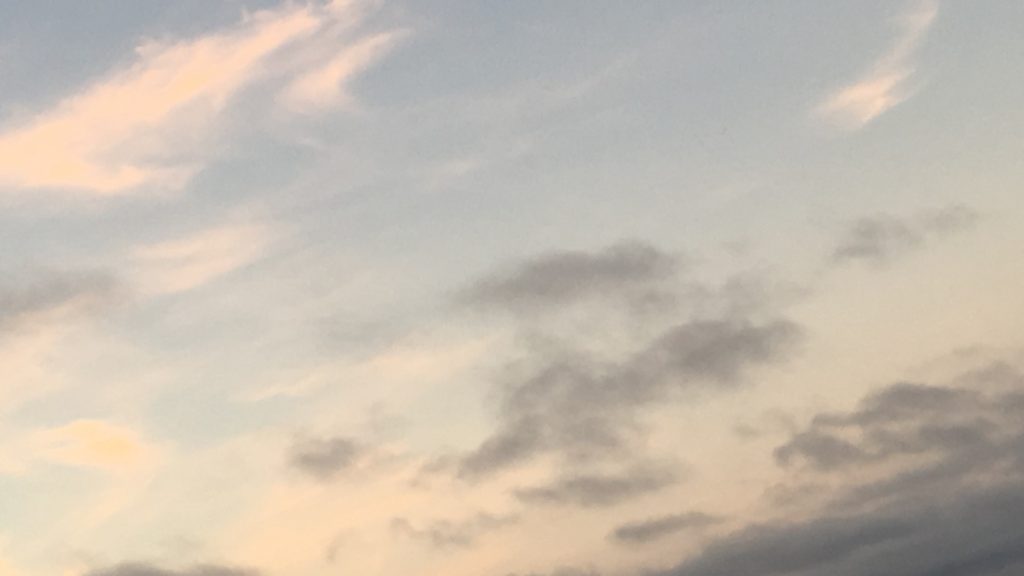
To take photos with inspiration from Stieglitz’s work, I will be aiming to take pictures of clouds, ones with unique textures and where the sun is trying to break through from behind. I’m also looking for pictures where the lights and darks contrast considerably, and ones which I can turn into an abstract photo.


My chosen photos:




Edited photos:
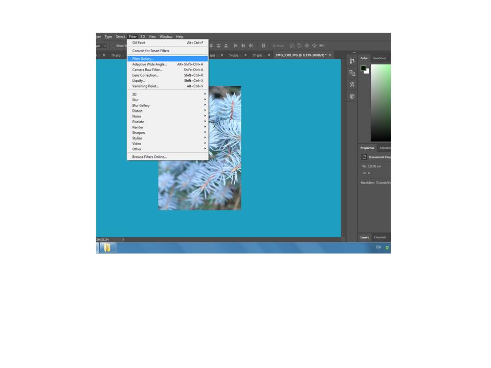
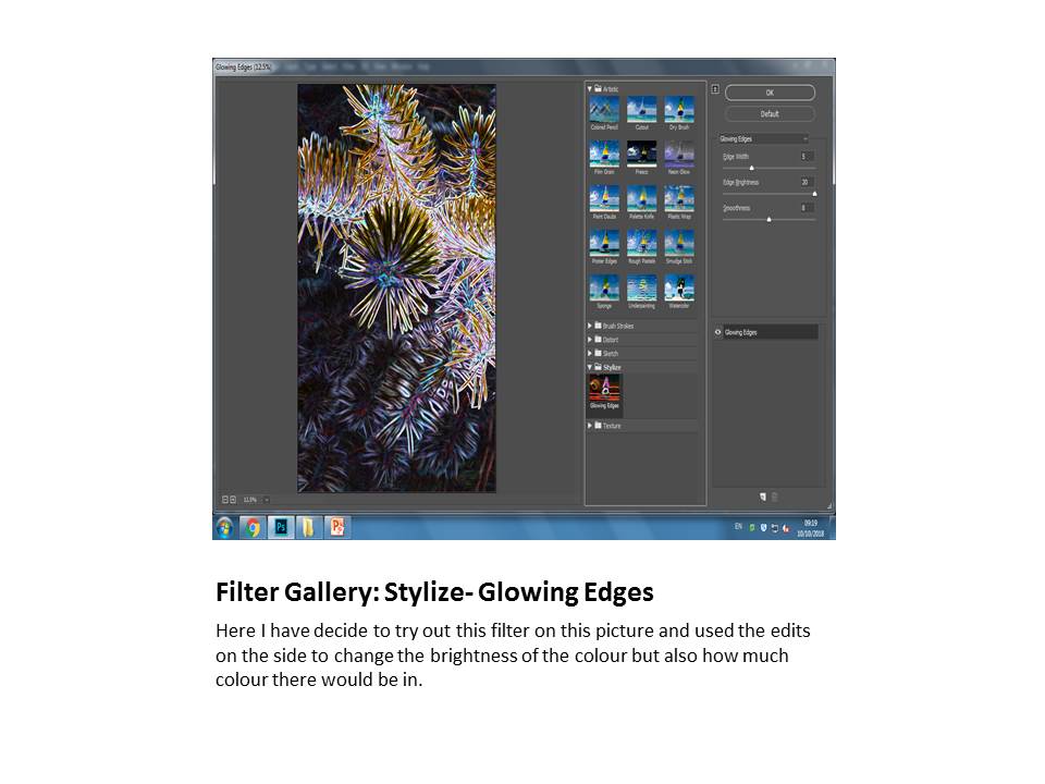
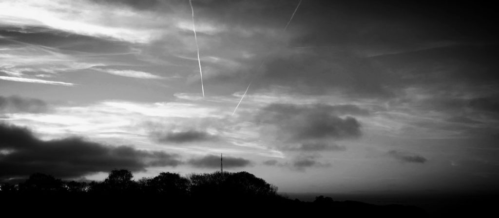
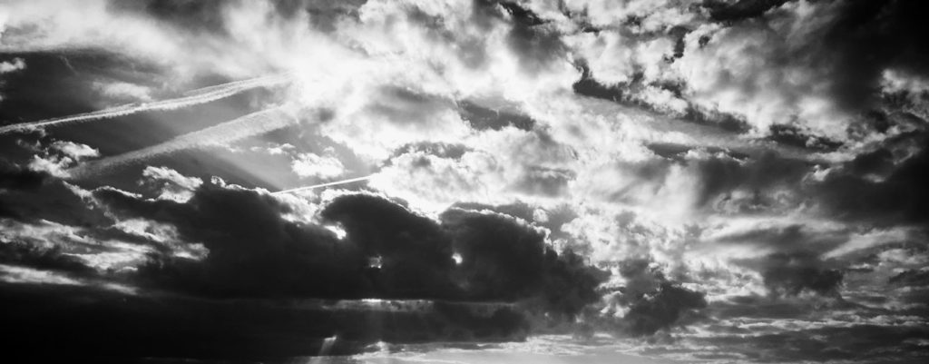
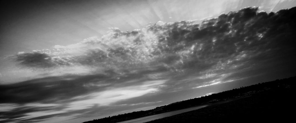
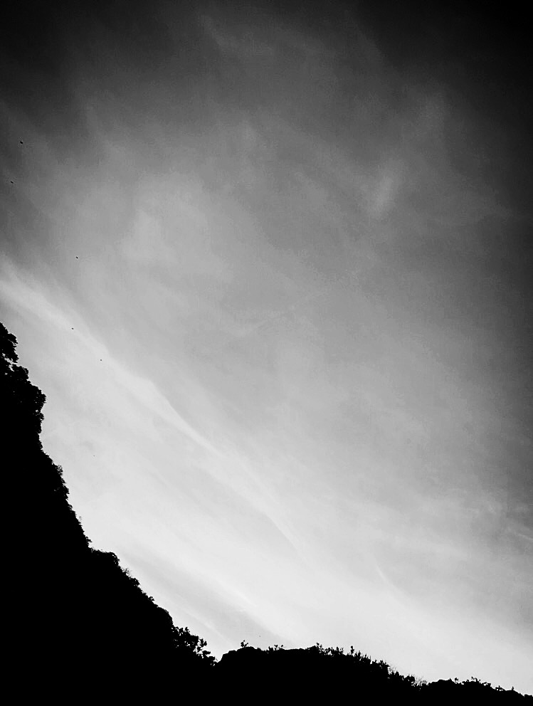
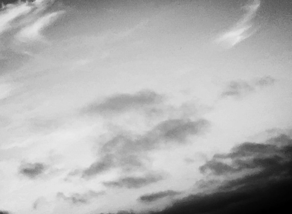
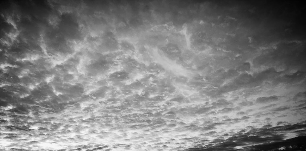
To edit these photos, I went and put a black and white filter on, and then went and played around with the contrast, exposure and light. I brought the light and exposure down, and increased the contrast to try and replicate Alfred’s works.



My final choices :


I chose these three as my final photographs for this task because I believe they relate the most to Stieglitz’s work. It shows contrast between the lights and darks of the clouds and continues on with his black and white style.
