


Category Archives: AO1 Develop Ideas
Filters
Classical Still Life
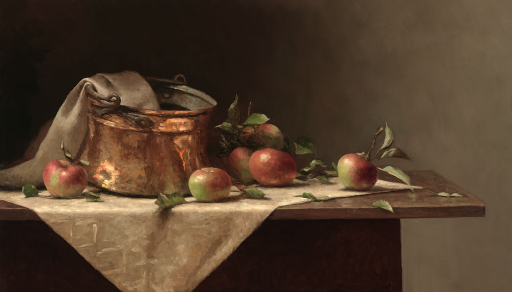
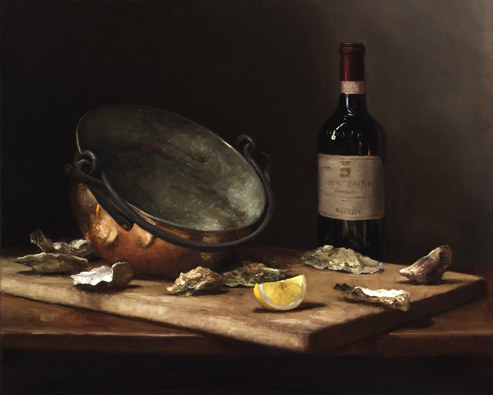
SARAH LAMB:
Sarah Lamb is a talented and dynamic realist painter. With classical skill—and through transparency, depth and texture—she captures the minute details of everyday objects in her dramatic still lifes and luscious landscapes. She makes us love the familiar and see beauty in the mundane.
Born in Petersburg, VA, with a passion for art and an appreciation for the past, Sarah spent a semester at the Studio Art Center International in Florence, Italy before graduating from Brenau Women’s College with a BS degree in Studio Art in 1993. Following a summer workshop in Santa Fe, NM with renowned classical painter Jacob Collins, she spent two years painting at The Ecole Albert Defois in the Loire Valley with classical realist artist Ted Seth Jacobs.
In 1997 she moved to New York and spent the next 6 years studying and painting under Jacob Collins at the Water Street Atelier. During this time, she had successful one-woman shows in major galleries in Atlanta, Houston, and San Francisco and was represented in art galleries in Alexandria, VA, St. Simon’s Island and Gainesville, GA, Sag Harbor, NY and Madison, CT.
More recently, she has had sell-out, one-woman shows at the Spanierman Gallery in NY, the Meredith Long Gallery in Houston, TX and the John Pence Gallery in San Francisco. She has been featured in magazines such as American Artists, American Art Collector and Southwest Art as one of America’s most talented young painters.
British-born art critic, John A. Parks, wrote that “Sarah Lamb brings to her work a robustly sensual grasp of the world. Her keenness of eye and joyful brush make the whole enterprise feel freshly alive as she reminds us what the really wonderful things in life are.”
Sarah, her husband, artist, David Larned, and their daughter, Sadie, divide their time between Pennsylvania’s Brandywine Valley and Houston, Texas.


MY PROCESS AND RESPONSE:
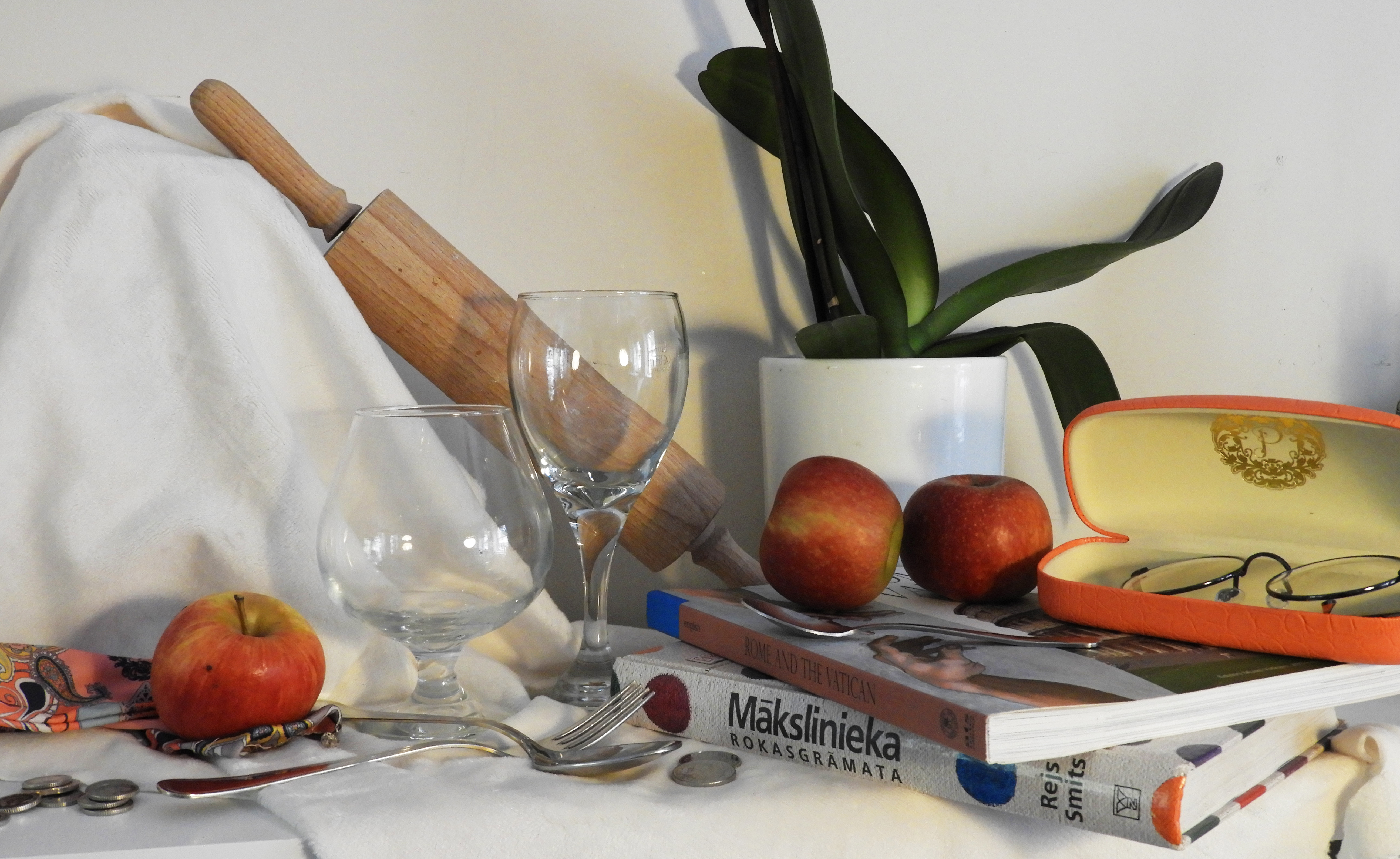
For this photo shoot I set up a still life composition to photograph, including many different types of object that you would find classically such as pottery, glassware and fruit. In order to create the dark and atmospheric setting that most still life possess, I laid down a dark floor which would accommodate the objects. This floor flowing all the way into the left top hand corner of the image. Furthermore, I added a fairly soft light source in order to retain the dark atmosphere. I did not use natural light, but instead an artificial white bulb which kept the images very neutral in color.
For my second photo shoot, I also followed a similar pattern of work, selecting objects that would be fir to include in still life, yet this time I experimented with laying down a white sheet to see the effects this would have on the overall outcome of the image. I kept the light source at top right hand corner of the image. I included less richly color objects and decided to stick to a more neutral color palette which in turn made the images feel more light and breezy.


CRITICAL ANALYSIS OF MY FAVORITE IMAGE:
TECHNICAL: In order to retain the darkness in the first photo shoot, the room which I was in was fairly dark therefore i set my ISO setting quite high, to 1600, which allowed me to have a good balance between the dark and light in the images. Again, due to the darkness in the room, I had to use a slow shutter speed to allow as much light as possible into the camera, setting it to 1/15. To avoid the inevitable motion blur, i used a tripod to keep my camera still whilst taking the photos and to have a very central, head on view of the still life. I kept my aperture high in order to allow my camera to capture a large field of view as the still life set up was quite large itself.
VISUAL: The first thing that the image conveys is the darkness and depth of color, the rich, juicy red of the tomatoes and the dark purple of the grapes that hand from the pottery. The light source, coming directly from the top right hand corner of the image casts a strong highlight onto the tomatoes, giving very powerful light reflections. The light also bounces of the walls of the glass, giving it dimension. The darkness of the shadows also creates a depth of space in the image, the glass and tomatoes being right in the foreground of the image, whilst the delicate tea cups are in the background, There is a harsh contrast between the bright white walls and the darkness of the shadows which further add to the mood of the image. The image overall is very busy and crowded, yet the composition of the objects mean that they are harmoniously linked to one another. There is a wide variety of texture, shape and color in the image. The tomatoes: smooth and glossy, the glass: transparent and delicate, the pottery: rough and uneven. A lot of the objects in the image have smoothness of line and roundness which allows the image to flow and intertwine.
CONTEXTUAL: Historically, still life paintings were deeply imbued with religious and mythological meaning. This was a reflection of the times; the Church was the center of everyday life. Class hierarchy was deeply embedded – everyone knew their place and stayed within it. By the 16th century, society was changing. As science gained more of a stronghold, religious themes fell by the wayside. The natural world was now interesting to observe and record in its own right, not for religious or mythological purposes. As history rattled towards the mid-19th century, depicting the natural world was starting to go out of fashion. Now the art world was more interested in exploring our inner world of moods and emotions. As we sped through the 20th century, still life dissolved into geometry as objects were abstracted more and more on the canvas. By the end of the millennium, the object depicted in paintings were exhaled as commodity and recognized for their commercialism, as in the Pop Art and Photo realism movements.
CONCEPTUAL: The main objective which I tried to capture in these images is the complexity of simple objects. Appearing plain and boring but when placed together and put into a composition, they can create impact and surreal.

CONTACT SHEETS:
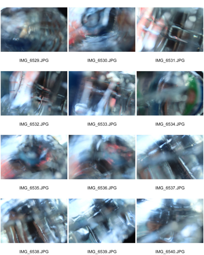
The set ups which i created for this project were fairly simple, yet i found that new effects were created when pointing my camera in different directions. When I really got up close to the objects, I was able to capture detail withing all the objects, and their texture which created complex and intricate images.


Compare&Contrast Edgar Martins
Edgar Martins
He was a Portuguese photographer who is currently living in the United Kingdom. He was born in 1977 in a small town area called Évora, although Martins grew up in China. However Edgar doesn’t just base all his creativity in the photographic area but he has also published a hand full of books in which he has won a variety of awards for. Martins has work exhibited in various places around the world from Portugal to places like Dubai. Not only that but Martins was considered by the UK and the US as one of the most influential artists for this generation. Not only has his work inspired our first project for photography but having looked at my new images and my now edited images there are some obvious changes in terms of contrast and the shadowing I have added to the photo to make it similar to Martin’s developments.
His images is part of a series of work inspired by the writing and sending of letters, the power and intimacy of a letter. Martins has recently won various awards for his minimal, direct and stylish approach. it is pretty evident that Martins puts a lot of thought into his images as not many artists have had the same approach as he had.
Edgar photographed paper. There is a stillness to his images that belies the fact they may have been written as suicide notes, used to communicate between prison inmates and loved ones. Martins spent time working with court, prison and parole officials and indeed, prisoners in Portugal.
Here are just some of my favourite examples of his work.
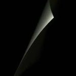
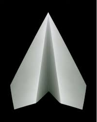
I like these images due to the contrast of lights and darks and how in the second image of the paper there is a real sharpness and contrast on how the black background sits below the white piece of paper. For me this is really eye-catching as the focus is quite vastly spread amongst the image but immediately only draws attention to the white area.
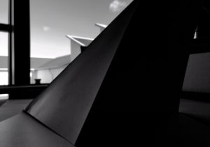
My paper photographs were not as professional as Edgar’s but there was a thought process. Here are some of my examples before I even edited them slightly.  This image was not the first set a paper photographing I did but the second. I chose to edit this image as its one that looks quite similar in terms of Edgars images .
Here I’ve changed the image lighting and added a lot of heavy shading. I’ve edited this image by adjusting the tone, brightness,exposure,contrast and black point.
Final Prints: Display Techniques
Here I am going to be trialing and experimenting with ways to display my final images on the A3, A4 and A5 paper prints. This will include arrangements of multiple images on one page and also just some single images to see what will work well together and if I can create a series of images that work well along one print.
Display 1:
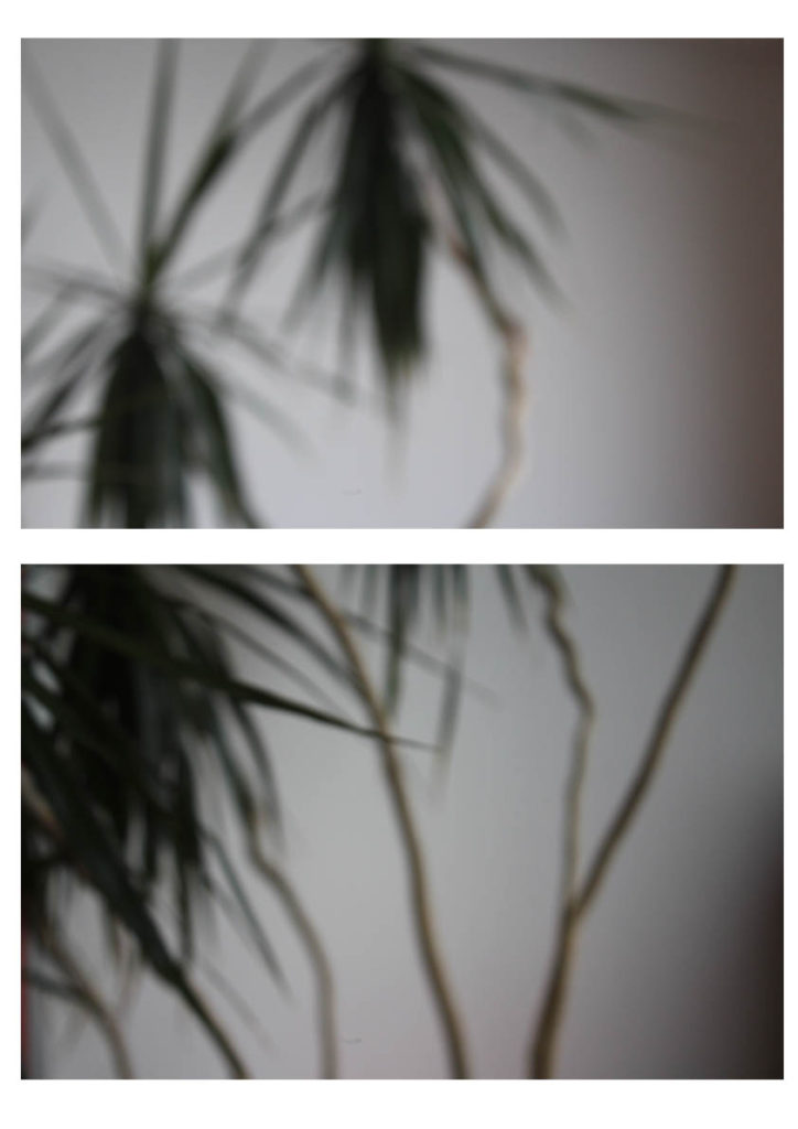
This is my first experiment with a way to display my final images. This display has two photographs from the same shoot one on top of the other. I would either place this image as A3 or A4, this would be so that you could clearly see the images and I feel would have a bigger impact on a larger scale. I feel the two images together have a large impact as they compliment each other and work well together creating a better effect together rather than if I had one of the singular photographs on its own. I feel this would work well displayed as a final piece as it shows off some of my camera skills and having them both on here emphasizes this.
Display 2:

This display I would use for A5 this would enable for the photograph to fill the whole page and I think this would have a larger impact having this particular photograph on its own and isolated. I would use a small boarder of white around the edge as to frame the photograph as I feel this would have a good effect.
Display 3:
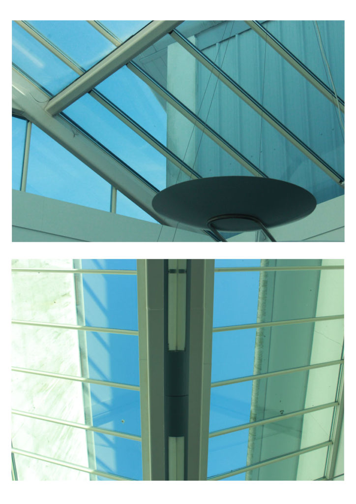
This display combines another of my two chosen images side by side as they work well together in the same style with the geometric abstract lines. I would have it either A4 or A3 as to show off the photographs and to be able to see the detail as I don’t feel this display would work well on a scale of A5. I feel the two images have a larger impact side by side rather than if I displayed the two photographs by themselves.
Display 4:
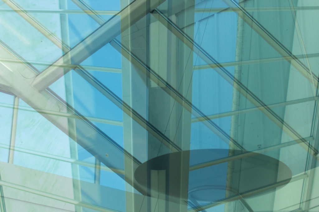
This is a display option for how I would display this edited image. I would make it my large A3 photograph as to show the full effect of the image and I feel it would work well on a larger scale to be able to see all the detail and the contrasting double exposure of the two photographs.
Display 5:

This is another way I may display my out of focus image however this has one just on it’s own like my textured wall photograph I would have this so that you could see the full effect of the photograph on A4 to be able to see my camera skills clearly with the out of focus shot.
Final Prints: Initial Ideas
These are my initial choices and ideas for my final developments as I believe them to be my best photograph outcomes.
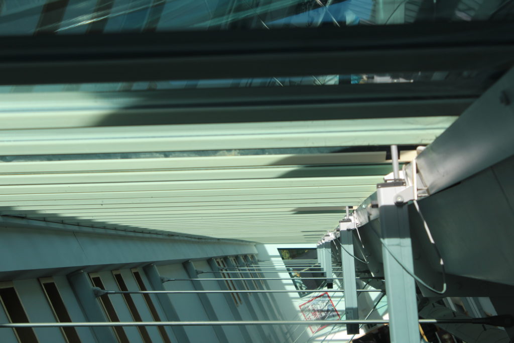
This is one of my initial choices for a final photograph to be produced. I feel it is one of my best images a because it has a strong sense of geometric abstract photography due to the arrangements and patterns of the horizontal lines across my the photograph and this also becomes contrasted with then vertical lines which travel down the right side of the image. The photograph has a lot of light giving it some shadows in the top right of the image contrasting the very light panels that travel through the middle.
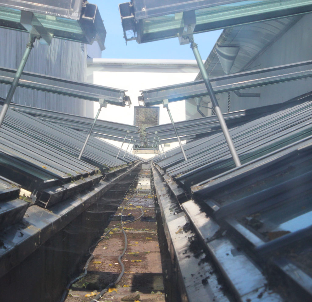
This image again becomes abstract by the use of the symmetrical geometric patterns throughout. The lines range from going diagonally downwards to less of a slant towards the top of the photographs. Unfortunately the image is slightly off centered and the line towards the back of the image does not travel directly up the middle which I feel would’ve made it a better image for the abstract project due to the identical symmetry that it would create. Apart from this I still believe this photograph could be a potential final image as it has strong line and texture running across the bottom of the image which many abstract artists also looked at.
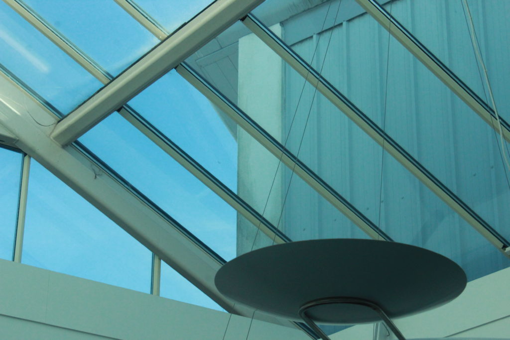
This image has an object off center to the right at the bottom of the frame this is what the eye will naturally draw to first and is darker compared to the rest of the light and blue tinted image and this I feel helps to bring it an abstract feel. This image also has a strong development of lines in different directions which can be seen clearer than some of the previous images due to the clear background behind. The image is very light and doesn’t hold a lot of contrast however I believe it is it’s geometric lines which develop it in an abstract way.

This is another image which works well due to it’s symmetry and it’s use of line. This photograph is unfortunately over exposed however this could be useful into further editing and could be used to my advantage while editing and developing further along. This image has a strong symmetrical line directly down the middle with the geometric lines fraying off, this is what I feel develops it as an abstract image.

This photograph is one that was taken in inspiration from Ralph Meatyard. It was developed by working and experimenting with using manual focus to purposely put the image out of focus to develop an abstract image. I feel it is one of my best photographs as I feel you can clearly still see the form of the plant even though out of focus and unlike some of the other photographs I have produced there is the white negative space in the back which helps to bring the form forward and there isn’t anything in the background that is overpowering and confusing or creating too much noise.

This is another image from the same shoot in inspiration by Ralph Meatyard, I feel if chosen these two images would work well as a pair if developed into a final piece. In this image compared to the previous image there is a slight out of focus colour making it’s way in on the left side which I personally would crop down if I moved forward with this image. As well as the previous image this has a lot of negative space in it’s background however it helps to bring out the forms of the branches on the tree. This image and the previous could relate to Meatyard’s work in ‘Zen Twigs’.
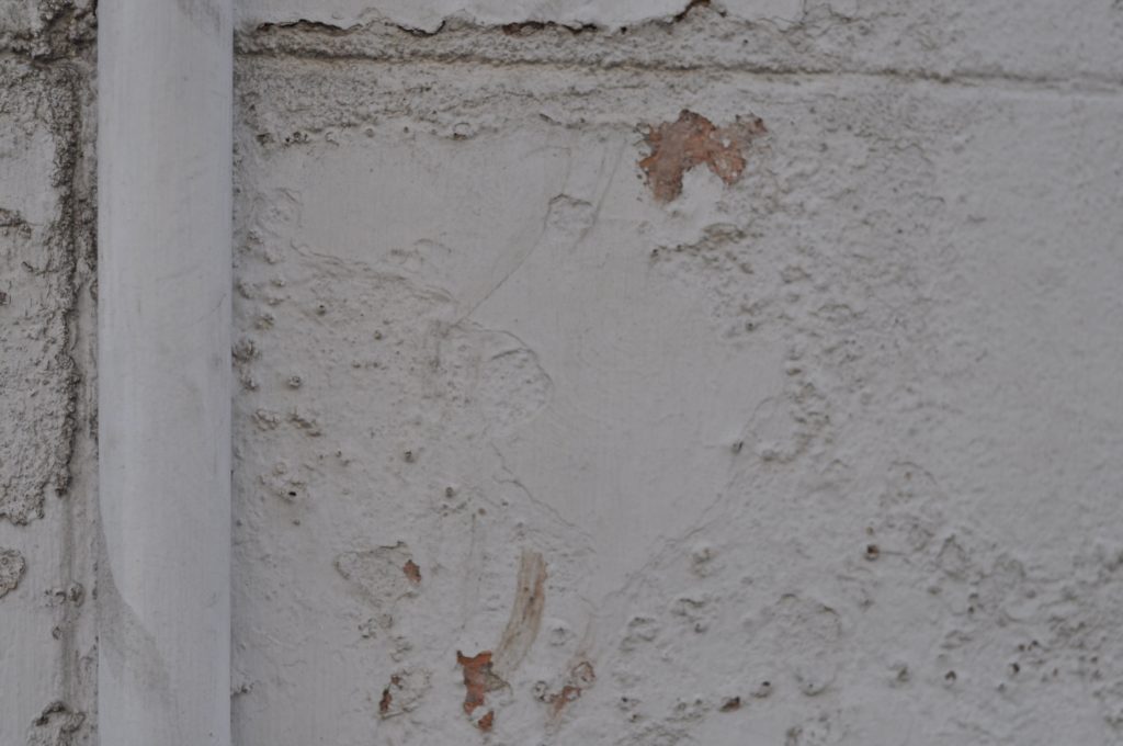
This is one of my photographs that came from inspiration of Aaron Siskind. I feel it was one of my most successful photograph in this experiment but also as a whole, I feel it has an abstract feel due to the rotting and rusting walls and the pipe down the left side draws the eye towards that as an object and contrasts the rotting wall which has soft wavy edges compared the straight vertical edges of the pipe. I feel this would make a good final image in A5 and as a singular image. This image focuses on the uses of texture and line.

This is another from my shoot with inspiration from Aaron Siskind, I felt this was one of my more successful photographs as it shows a lot of contrast and texture whereas a lot of my previous images focus on line contrast. It also shows elements of colour and colour contrasts of the dark colours of the blue and the black contrasted with the white and the creams. I feel these elements work well to create it into an abstract image that works well and could potentially be used for one of my final photographs.
Abstract Project – Evaluate/ Critique
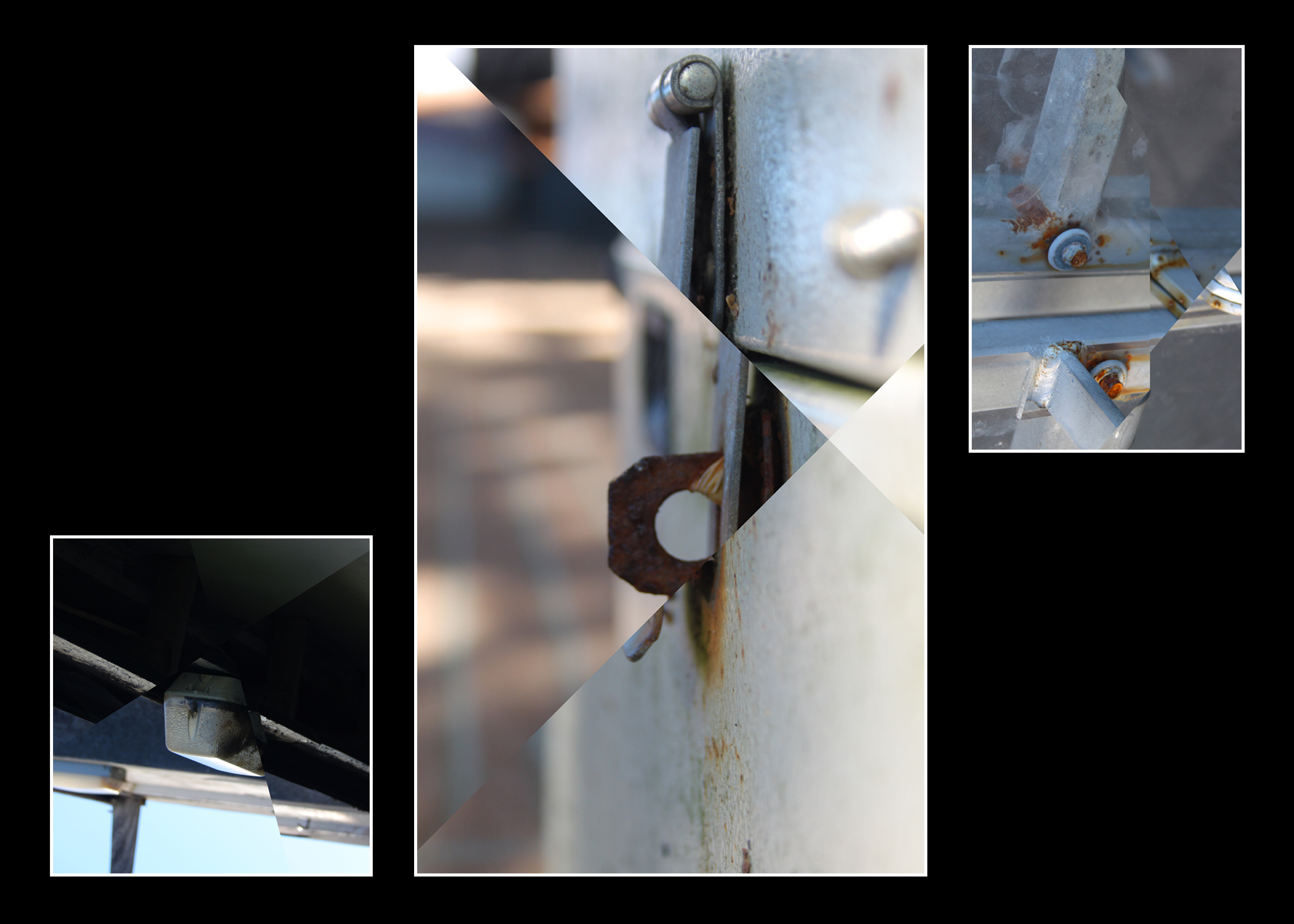
In conclusion I am happy with the final product, while my link to Letha Wilson is rather vague I feel it is still evident in the manipulation of the images. I like the lighting in the images as it creates very soft tones while still having plenty of contrast. I’m also happy with the color balance of the images as none of the tones are too overpowering except for perhaps the brown tones in some areas. The center-piece of the final product is my favorite mostly due to the strong depth of field which nicely compliments the sharp edges created by the style of editing. My favorite display of editing however is the image on the right as that had the most intersections of any image. If I were to redo this project I would likely make sure that the images were more similar in composition and perhaps color. I would also likely tone down the brown slightly as it is a bit too strong for my liking in the central image particularly in the background. I would also make sure that the 2 images on the sides were cropped to the same aspect ratio however these images simply didn’t allow for that as parts of the image were frankly boring and detracted from the image.
FInal Image selection
THE PROCESS IMAGE 1:
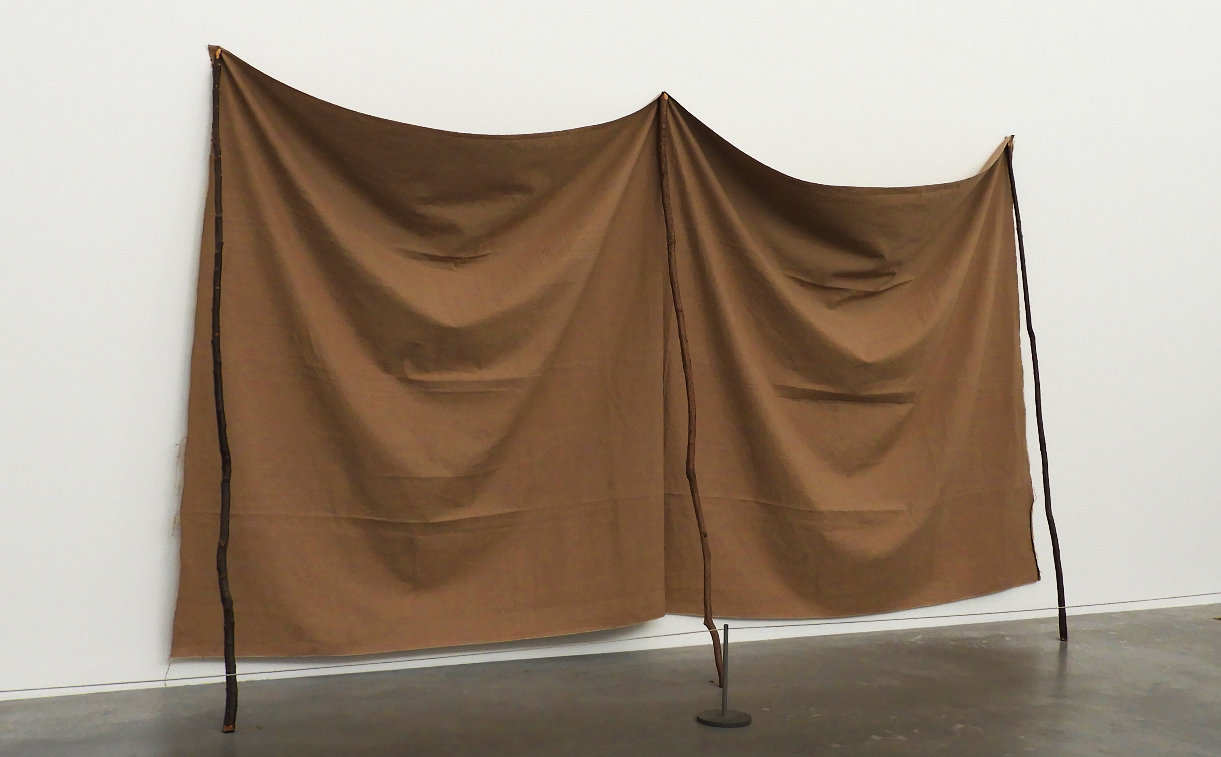
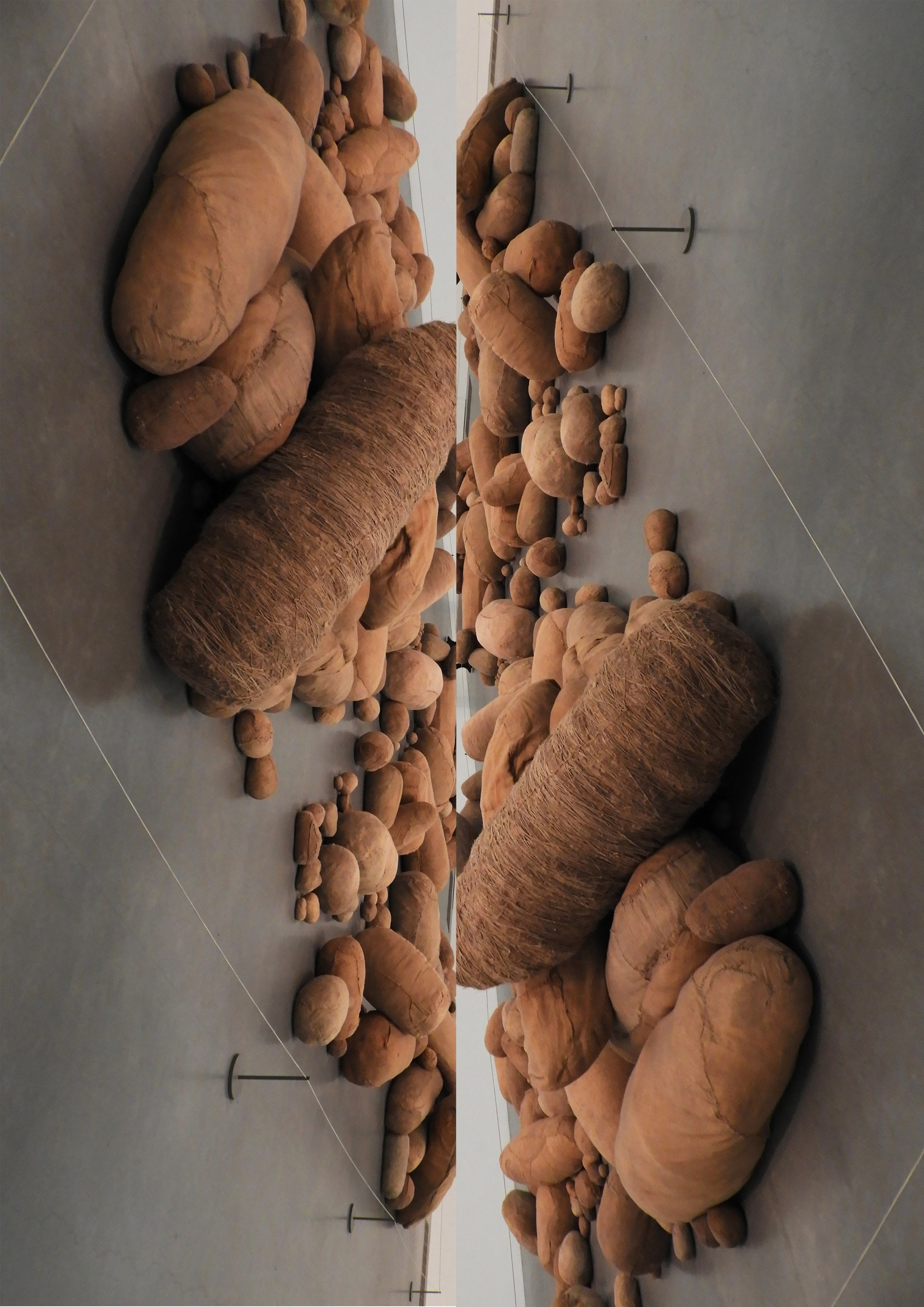
This image was taken at TATE modern in London, a space filled with abstract and modern day art. I particularly loved this exhibition as the space where the art was exhibited in was flooded with natural light. Combining this with the crisp and clean white backdrop allowed me to capture some truly beautiful images that showed of the subtleties in each image. The space was also very large and open which allowed me to maneuver my camera without the disturbance of other people or pieces of art.
This was in my opinion one of the most successful images from this photo shoot, therefore making it into my final selection. I reflected up on many different photo shoots from the last couple of months in order to make my selection, even going through images which i have previously discarded as i have learned throughout the past couple of months that almost any image can be transformed through simple editing and cropping, Image 1 i thought initially was too simplistic and quite frankly boring, yet i have discovered that minimalism is a very real and valid form of photography therefore i reconsidered the image. After reviewing the image, i found that it actually holds many different aspects and qualities, like the interesting creasing of the fabric and the contrasting textures of the wall and the floor.
CRITICAL ANALYSIS OF IMAGE 1:
TECHNICAL: For this photo shoot I approached each image in the same way, setting my focus to auto as each piece of art work was fairly big and i did not focus in on small details therefore setting it to manual would be totally useless. I kept my exposure throughout the photo shoot at 400 as each large, white hall was filled with natural light, the bright white walls added to extra light bouncing into the camera. I kept it at a stable level as i wanted to prevent the images becoming overexposed. I switched on my white auto balance setting as again the white walls created problems with the colors of the art work becoming washed out and dull. I set the shutter speed 1/60 as i wanted to create very clean and crisp images that show all aspects of the art work.
VISUAL: One of the most notable aspects of this image i find are the shadows created by the large creases in the draping fabric, the intensity of the shadow increasing the further down the fabric that the eye travels. All aspects of this image are crisp and clean, the high shutter speed to which i set my camera meant that the image is sharp. There is contrast in texture all around in the image, from the rough surface of the fabric, the smooth and matte white wall, to the glossy grey-black floor. The rule of 1/4 applies to this image as most of the subject is contains in the first 1/2 and 1/3 of the image. There is also a sense of repetition in the image through the even creases that go down the fabric sheets and the 3 sticks that mirror each other. Although the image is already bright, a lot of the light is hitting it from the top right hand corner, creating a slightly deeper shadow on the left side of the sheet. The colors in this image are very simple, consisting of a slightly blue toned white, a grey-black and caramel beige. There are many sharp lines which cut through the image such as the separation between the wall and floor, but also the 3 sticks which prop up the fabric which gives the image some geometry and symmetry.
CRITICAL ANALYSIS OF IMAGE 2:
TECHNICAL: For this photo shoot I approached each image in the same way, setting my focus to auto as each piece of art work was fairly big and i did not focus in on small details therefore setting it to manual would be totally useless. I kept my exposure throughout the photo shoot at 400 as each large, white hall was filled with natural light, the bright white walls added to extra light bouncing into the camera. I kept it at a stable level as i wanted to prevent the images becoming overexposed. I switched on my white auto balance setting as again the white walls created problems with the colors of the art work becoming washed out and dull. I set the shutter speed 1/60 as i wanted to create very clean and crisp images that show all aspects of the art work.
VISUAL: This image overall is very busy and overwhelming with the density and contrast in shape, texture and color. Firstly there is a sharp contrast with the texture in the image, with the white, glossy floor and the ragged and varying fabric of the sculptures. Although being very different, create harmony as an image. The light hitting directly above from the image creates depth and shadow which is cast onto the floor, creating a sort of subtle reflection. The larger the shape, the more dramatic and deep the shadows become. There is a lot of repetition in this image, not only through the editing and mirroring the image, but also the varying round shapes of the sculptures that fill up the image. The small white line creating a border around the sculpture in a way breaks the harmony and separates the image from the chaos of the sculpture and the smoothness of the floor.
CONCEPTUAL: Magdalena Abakanowicz began sewing three-dimensional objects with sacking, stockings, rags and rope in the 1970s.
These cocoon-like objects reflect Abakanowicz’s interest in biological systems, organic matter and regeneration, topics she discussed with scientists in her native Poland. In response to a commission to represent Poland at the Venice Biennale in 1979, she made hundreds of soft sculptures of varying shapes and sizes, ‘rounded like bellies, or elongated like mummies,’ as she described them. Abakanowicz collected old mattresses, clothing and sacks to create this ‘invented anatomy’ of forms and installed eight hundred in Venice under the title Embryology.
CONTEXTUAL: Made at a time of political tension between the Soviet Union and Poland, Abakanowicz has said the work ‘could be understood as a cry from behind the Iron Curtain’. She had come to prominence in the 1960s with a series of large woven sculptures called Abakans. At the time, the Polish state would not allow her to buy or rent a studio, so she made them on a loom in a friend’s basement, using sisal from discarded ropes. Without a large space in which to work she would often see her pieces in their entirety for the first time only when they were installed in exhibitions.
CRITICAL ANALYSIS IMAGE 3:
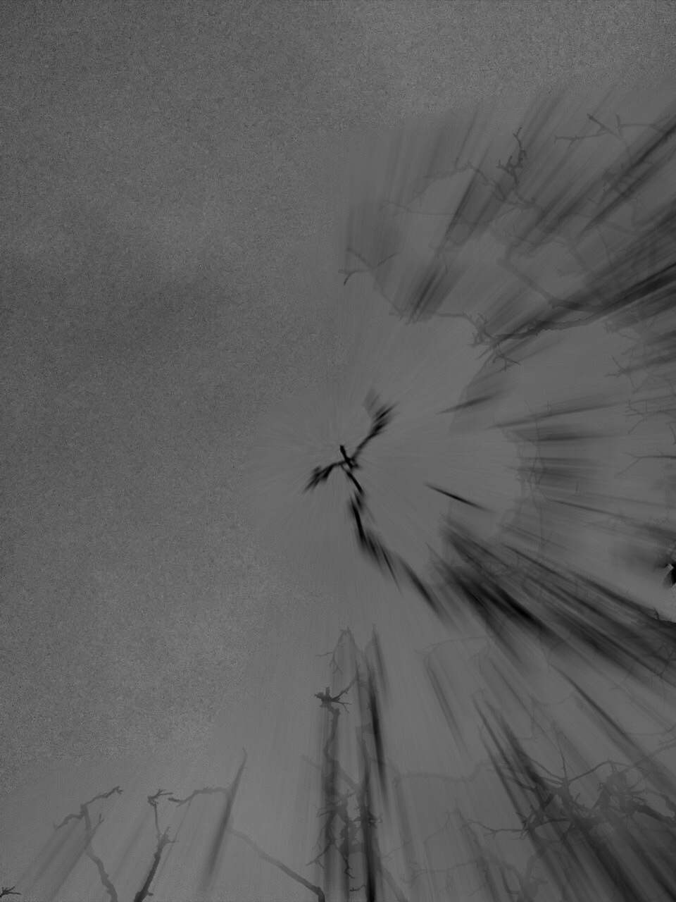
TECHNICAL: For this photo shoot I attempted as much as possible to recreate Meatyard’s “zen sticks” series. I particularly focused on exposure settings, focus control, and depth of field. The photograph below was taken of a dead tree, of the branches facing upwards towards the sky. Meatyard’s images are all very dark and dramatic therefore I chose to do my photo shoot during the evening, on a stormy, grey day. I increased the exposure to 800 in order to capture the branches in a dark setting yet still have some highlights and shadows. The dark night, and mid-range ISO setting meant that the image contracted a lot of motion blur, the effect which i was aiming to get.
VISUAL: It resembles the work of Meatyard in many ways. The dark evening also meant that the resolution of the images decreased and became more grainy. The branches of the tree were also quite far up meaning i had to decrease the depth of field and zoom in, again compromising the quality of the image. The grainy texture of the image I feel adds to the overall aesthetic of Meatyard’s work: old and worn. The differences in motion blur also create a focal point in the image, with the central branch being less blurred than the outermost parts of the image. The image is also quite underexposed which further adds to the dramatic and intense tone, giving it almost a Gothic aura. There is a very apparent sense of space in the photo as the lack of branches in the top left hand corner of the image freeing up space. There is also a lack of light in this image due to both the time of day the image was taken and the lack of exposure adjustments made on the image during editing as i wanted to retain the dark theme.
CONTEXTUAL: Ralph Eugene Meatyard (1925–1972) lived in Lexington, Kentucky, where he made his living as an optician while creating an impressive and enigmatic body of photographs. Meatyard’s creative circle included mystics and poets, such as Thomas Merton and Guy Davenport, as well as the photographers Cranston Ritchie and Van Deren Coke, who were mentors and fellow members of the Lexington Camera Club. Meatyard’s work spanned many genres and experimented with new means of expression, from dreamlike portraits—often set in abandoned places—to multiple exposures, motion-blur, and other methods of photographic abstraction. He also collaborated with his friend Wendell Berry on the 1971 book The Unforeseen Wilderness, for which Meatyard contributed photographs of Kentucky’s Red River Gorge. Meatyard’s final series, The Family Album of Lucybelle Crater, are cryptic double portraits of friends and family members wearing masks and enacting symbolic dramas.
CONCEPTUAL: Meatyard stated in a lecture to the Louisville Photographic Society, he was involved in working on no fewer than 12 “methods, series, subjects.” Among them were what he called “photographs made under the influence of Zen,” shown here with the title “Zen Twigs.” While the images are very minimalist, they deal with growth and decay, is impressive, they are familiar enough to be looked over lightly. A particularly beautiful one (untitled, like much of Meatyard’s work) shows a young trunk sprouting — or seeming to sprout — a branch that curls around it in a wiry loop, the whole almost a visual haiku. The simplistic tonal range of the image is effective in portraying the theme of deterioration and degeneration. Meatyard has clearly used a very narrow field o view, with a singular branch being in focus and the rest of the backdrop is extremely blurry. The images are in a mid-range of exposure, not too overexposed or underexposed. The light grey tones from the backdrop of the photo, highlight they unsophisticated, dead branch. The upwards growth of the branches, have strong and dark lines which cut through the sea of blurriness. The image also contains various shades of white, black, and grey, all working together to create a harmonious image. The contrast between the blurry backdrop and the foreground give the image a real sense of depth and space.
Final Abstract Images
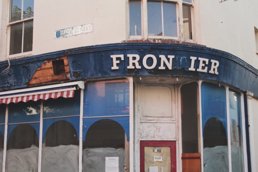
I chose this image as my final A3 print because i think it portrayed: good camera skills, aspects of abstract (the mixture of textures and shapes) and good use of utilizing enhancing tools such as sharpening and contrast.
It’s my favourite exposure because within the concept of ‘Abstract’, i ventured into the idea of abandonment and decay. This idea of utilizing surfaces of decay was to show the different textures side by side to new surfaces.
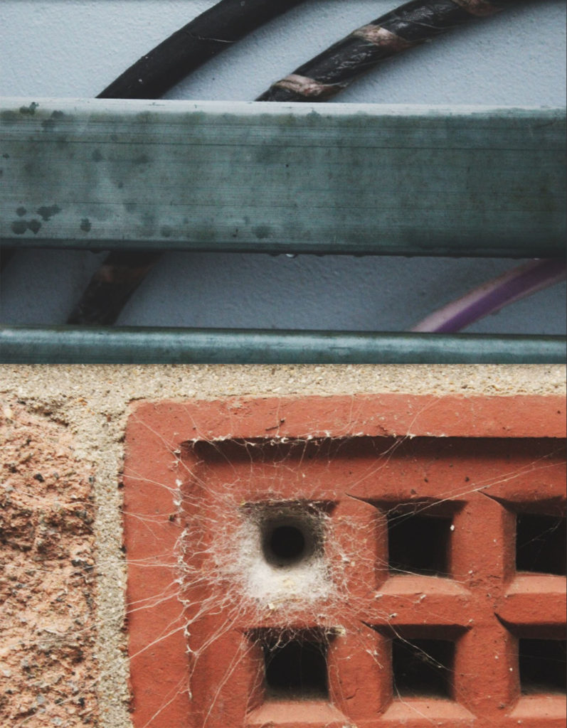
I chose this composition as my A4 print. This is due to again returning to contrasting surfaces: for example- the contrast of the man made bricks compared to the natural spider’s web. I also like these frames because they contrast yet compliment each other due to their colour palettes. The top image shows the cool colour palette with a few pops of the warm palette, compared to the bottom image’s warm colour palette with a centralized cool colour.
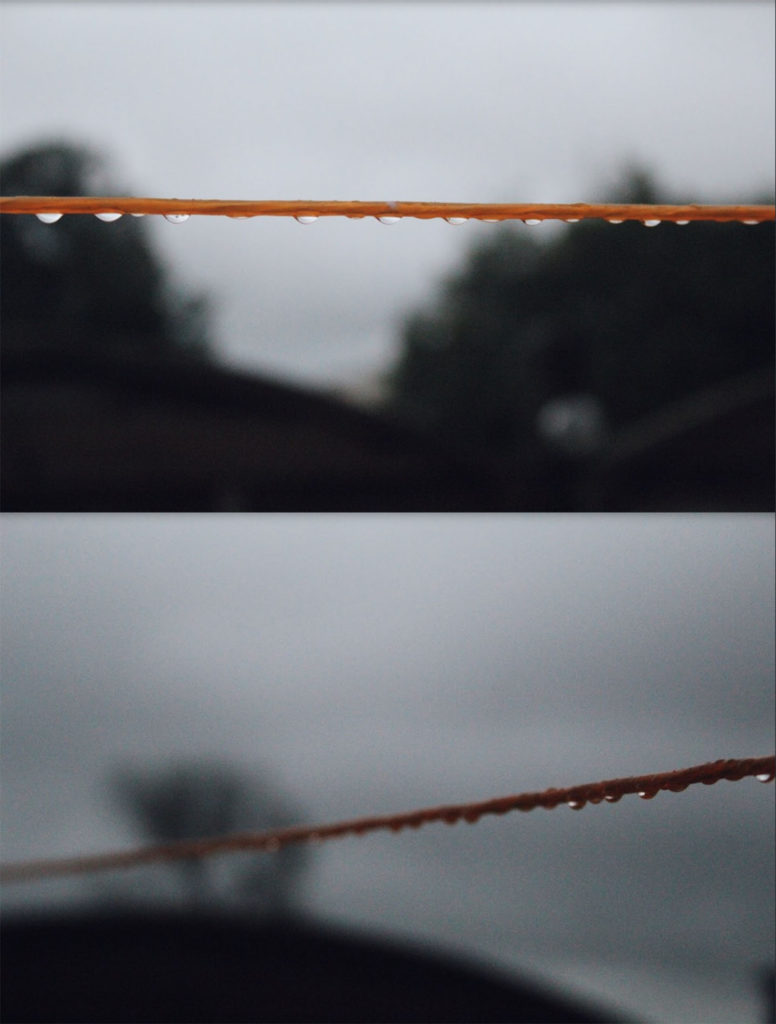
I chose these images as my final A5 frame. This is due to showing my camera skills showing examples of depth of field and area of focus. The top image is a prime example of utilizing focus because by using the camera settings, i was able to focus solely on the washing line in front, blurring the background. Similarly, the bottom image uses focus but in a different way. I was able to focus on one section the the line then create a blurred effect along the rest of it. This creates the sense of depth of field, just by focusing on one specific part.
The World is Beautiful – Albert Renger-Patzsch
Albert Renger-Patzsch and the New Objectivity:
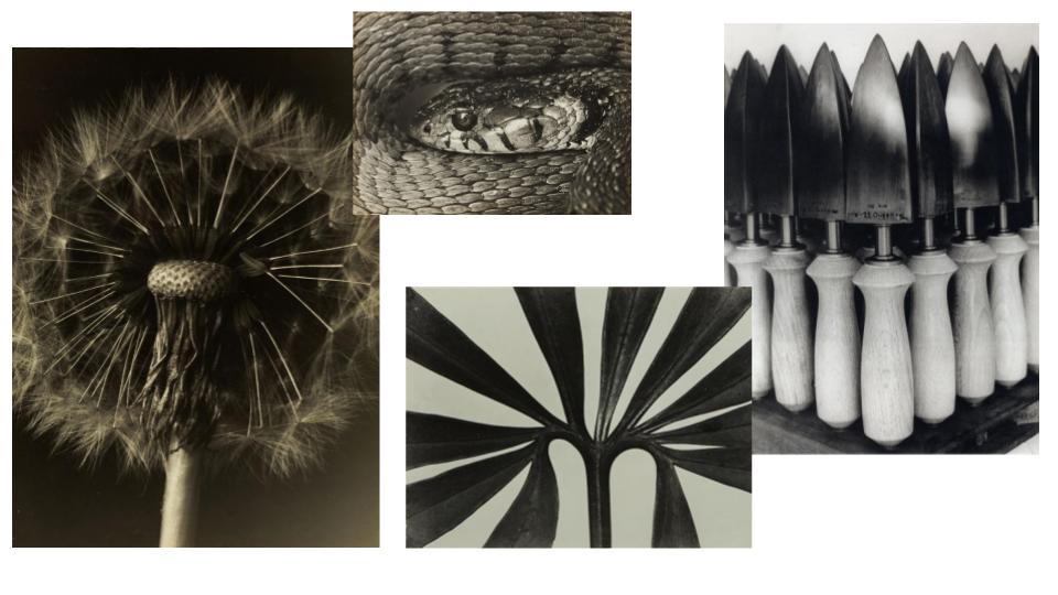
Albert Renger-Patzsch was a German photographer heavily associated with the New Objectivity.
Renger-Patzsch began taking photos at the age of twelve and after serving in the military during the First World War he studied chemistry. His style was very matter-of-fact and exemplified the aesthetic of the New Objectivity which flourished in Germany at this time during the period of the Weimar Republic.
Renger-Patzsch believed that the value of photography was in its ability to reproduce the texture of reality, and to represent the essence of an object. It meant that his images didn’t necessarily need to have a meaning, or reason behind their creation. They were purely snap shots of visually appealing things he encountered or set up. This brought a whole new era of photography on, paving the way for people to start taking photos informally, of simple things they found pleasing to the eye. This aided in the introduction of endorsement photography, especially in fashion and beauty industries where the subjects are supposed to attract the buyer’s attention whether that is through the presentation of a physical product or the appeal behind models presenting certain products or ideals.
My response:
Best Images:
Abstract Project – Letha Wilson – Case Study (Abstract)
Letha Wilson is an artist that is well known for combining her photography with various industrial materials. She makes cuts and tears into her work giving it a strong geometric look, pushing and pulling various components of the images into place. she also occasionally encases parts of her photography in concrete. She often incorporates elements of architecture and 3 dimensional elements. This piece is a personal favorite of mine due to the strong geometric elements and good balance of different tones and colors.
Despite this i’m not too big a fan of the images she uses for her works as personally i find them rather boring in composition, however it can be argued that these types of images would work best with her style of work.
