Category Archives: AO1 Develop Ideas

Filters

Author:
Category:

Arnold Newman

Arnold Newman is widely renowned for pioneering and popularizing the environmental portrait. With his method of portraiture, he placed his sitters in surroundings representative of their professions, aiming to capture the essence of an individual’s life and work. Though this approach is commonplace today, his technique was highly unconventional in the 1930s when began shooting his subjects as such. He is also known for his carefully composed, abstract still lifes.
Born in Manhattan, Newman grew up in Atlantic City, New Jersey and later moved to Miami Beach, Florida. In 1936, he studied painting and drawing at the University of Miami. Unable to afford continuing after two years, he moved to Philadelphia to work for a studio, making 49-cent portraits in 1938.
Newman returned to Florida in 1942 to manage a portrait studio in West Palm Beach. Three years later, he opened his own business in Miami Beach.
In 1946, Newman relocated to New York, opened Arnold Newman Studios and worked as a freelance photographer for Fortune, Life, and Newsweek. Though never a member, Newman frequented the Photo League during the 1940s.


Image result for arnold newman alfred krupp
Alfred Kupp, Essen Germany, 1963
Image result for arnold newman environmental portraits photography
Leonard Bernstein, Philharmonic Hall New York, 1968


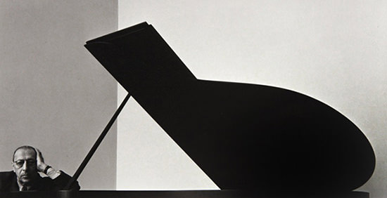
Arnold Newman Igor Stravinsky (composer) 1946


My chosen image:

Image result for arnold newman alfred krupp
Alfred Kupp, Essen Germany, 1963

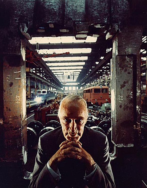
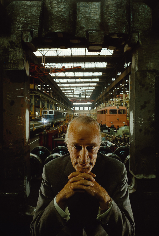
The pictures shows an old man, sitting right at the front of the picture, looking into the camera while resting his chin on his crossed over fingers.  Behind him, looks like a train station or factory, with machinery placed everywhere, and lights on the ceiling going back in a straight line. The image itself seems to be rather symmetrical,  he’s sat in the middle of the image at the front, behind hims seems to be a window or doorway of some sort which almost resembles a boarder, and the lights and beams on the ceiling go down in straight parallel lines.

The man in this picture is Alfred Krupp, a German industrialist who supported the Nazi party and profited from the use of slave labor during World War ll. Despite being convicted of his crimes and sentenced to 12 years in prison, he was pardoned and only served the minimum of 3 years. In 1963, Newsweek magazine commissioned Arnold Newman to take portrait photographs of Krupp. Originally turning down the offer, he came to accept after being reassured by the editor, but promised to make Krupp look like the Devil. After travelling to Frankfurt, associates of Krupp decided to cancel the photo shoot, due to Newman looking a ‘bit Jewish’.  In order to save the shoot, he demanded that his portfolio be shown to their boss, and it worked.  The photo shoot took place in Kruppworks factory, and Newman used lighting and the scenery to portray Krupp as an evil man, with ghastly shadows and a green colour cast. Thankfully, the time it took to get the photos developed gave him time to fool Krupp and his associates, as they would have been furious with the outcome.

Lately people have been labeling my Krupp picture as the greatest photographic “knife job” ever done on anybody. But I’m not so sure. I am convinced that any photographic attempt to show the complete man is nonsense. We can only show, as best we can, what the outer man reveals. The inner man is seldom revealed to anyone, sometimes not even the man himself.

Krupp was a very evil man. You can read all about him in several books, especially the Arms of Krupp by Manchester. Krupp claimed during the Nuremberg Trials that he never knew Hitler and that he was a child at the time. This was bullshit! He grew up supporting Hitler. He married one of the Krupp women and Hitler allowed him to adopt the Krupp name.

He ran the Kruppworks using slave labor. He fed them half the calories Hitler allowed for no reason other than there was so much slave labor available. So what? If they got too weak to work he just simply slipped them off to Auschwitz and the gas chambers. Krupp still had slave labor living in his castle at the time I photographed him!

Later on in the War he built factories right next to the concentration camps where all he had to do when they got too weak to work was walk them into the gas chambers. It was that simple. This “slave labor” were people like you and I. ~ Arnold Newman

Environmental Portraits

An environmental portrait is a portrait executed in the subject’s usual environment, such as in their home or workplace, and typically illuminates the subject’s life and surroundings.

The Golden Ratio

While the rule of thirds is the most widely known composition rule, there’s another principal that plays a big role in composing images with that wow factor; the golden ratio. Google “golden ratio” and you’ll immediately be assaulted by mathematical principles and numbers. While its basis does lie in math and numbers, the golden ratio is really about what the human eye sees, and composing an image that immediately demands attention. You don’t have to be a math whiz to understand the golden ratio. The golden ratio is actually a number. It’s found by taking a line (or sometimes another shape) and dividing it into two parts. When a line or shape is divided into two parts based on the golden ratio, it will be divided in such a way that, if you divided the length of the longest section by the length of the smallest section, it would be equal to the original length of the shape divided by the longest section. The golden ratio is perfectly balanced, and that balance makes it pleasing to the human eye. Because of this, the golden ratio crosses from math over into art. The Mona Lisa and The Last Supper, for example, are both paintings that use this golden ratio. In photography, the golden ratio can be used to identify the main subject while still leading the viewer’s eye through the entire image.

What are environmental portraits?

What is environmental portraiture?

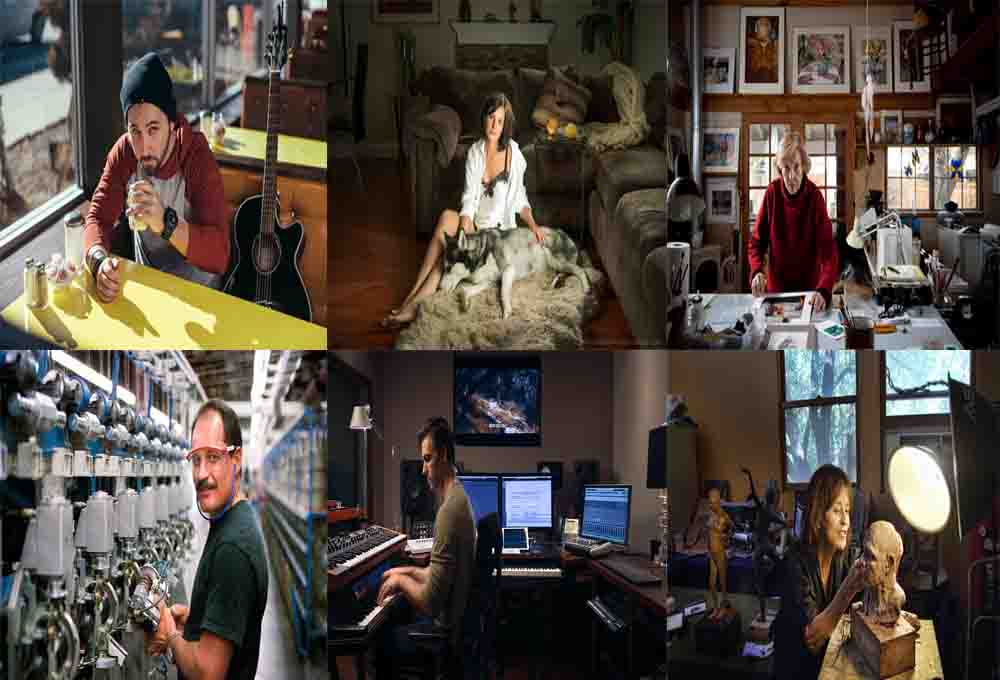
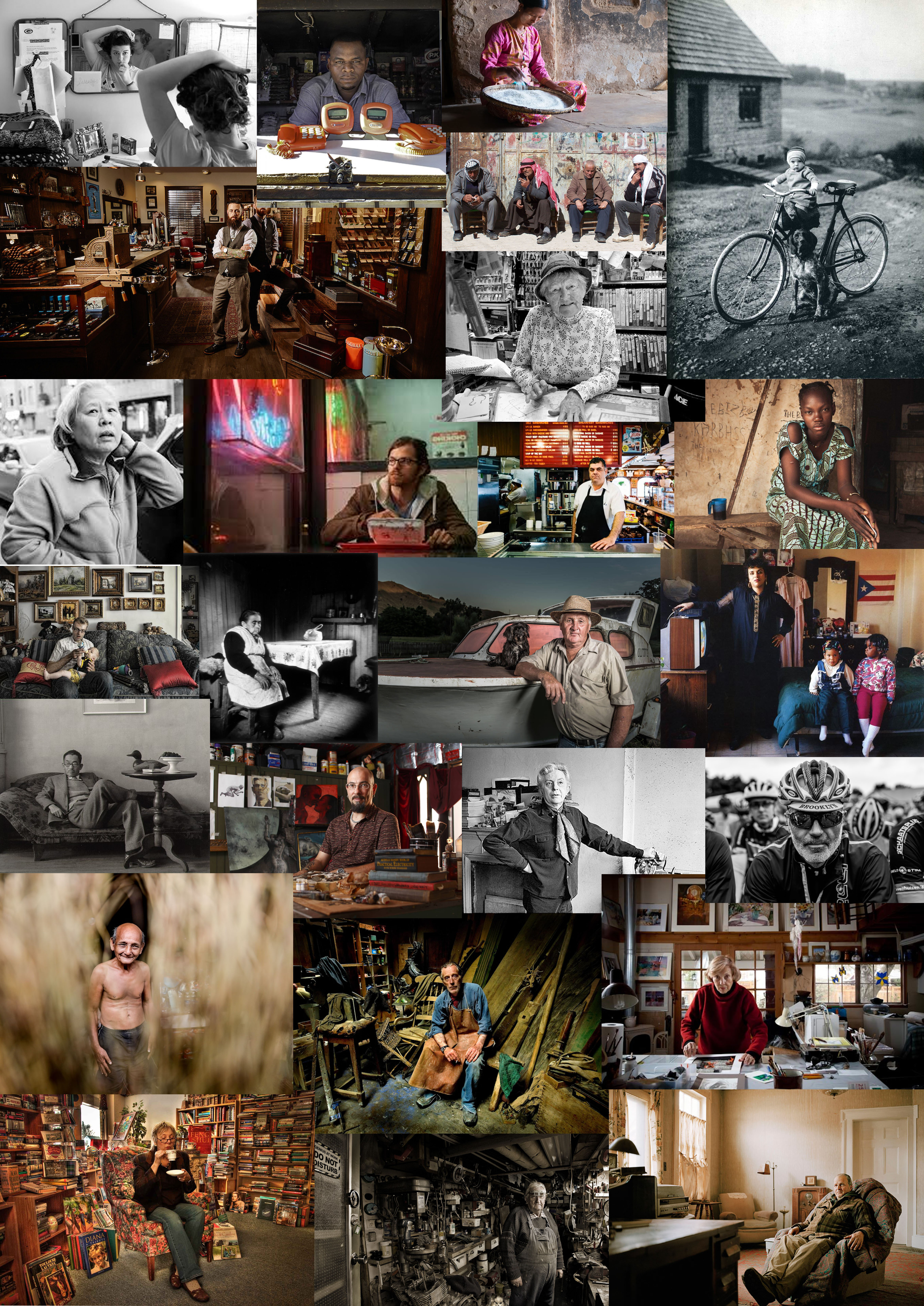
An environmental portrait is a portrait taken of a person or people in a situation that they live in and a place that says something about who they are. It is often a place of work, rest or play. Images which are quite natural, yet  a little staged by the subject making eye contact with the camera. They are making a connection with the camera.

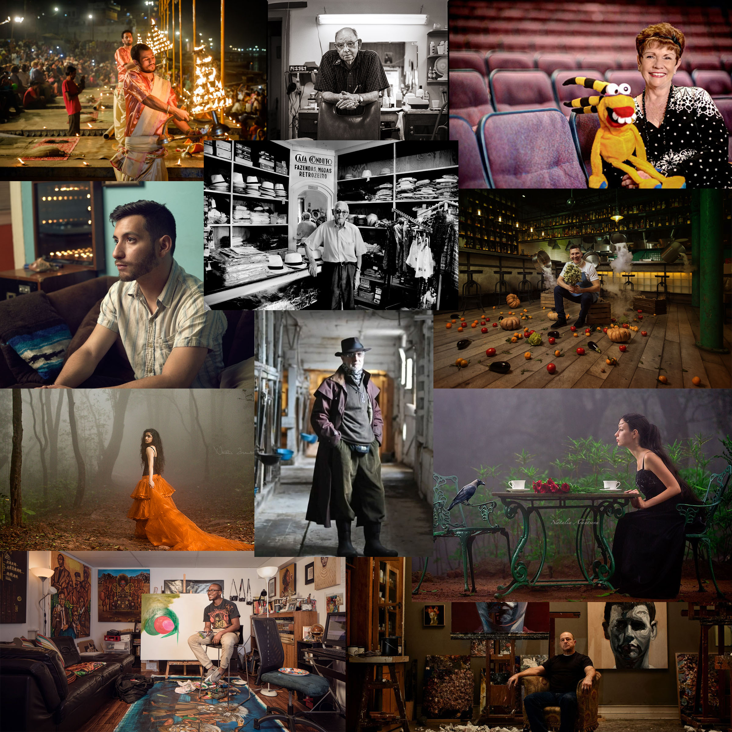
Mood Board:

This mood board displays the general sense of what environmental portraiture is. They all follow a general theme by being staged and the subject making eye contact with the camera. There is a sense of place with the people being in their work, there is a sense of connection by the photographer letting us into the life of the person.

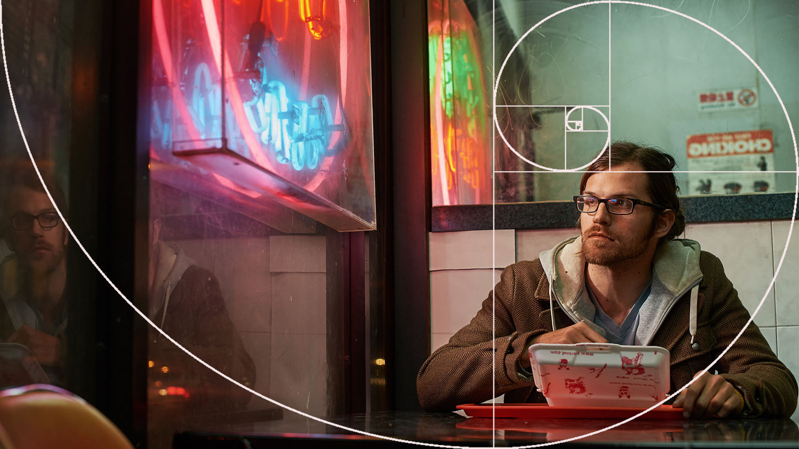
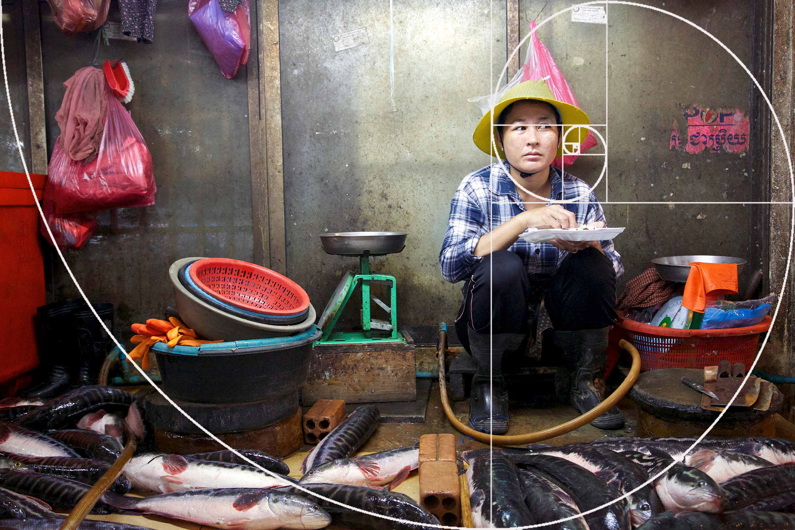
Fibonacci Spiral:

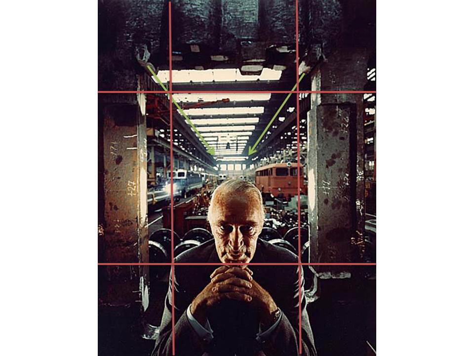
While the rule of thirds is the most widely known composition rule, there’s another principal that plays a big role in composing images with that wow factor; the golden ratio. While its basis does lie in math and numbers, the golden ratio is really about what the human eye sees, and composing an image that immediately demands attention.  This photo also follows the Fibonacci spiral, it follows the composition which makes this a very effective and balanced image.

The golden ratio is actually a number. It’s found by taking a line (or sometimes another shape) and dividing it into two parts. When a line or shape is divided into two parts based on the golden ratio, it will be divided in such a way that, if you divided the length of the longest section by the length of the smallest section, it would be equal to the original length of the shape divided by the longest section.

Useful videos about environmental portraiture: 


Alfred Krupp – Arnold Newman

Initial Response:

I personally find that the image is over saturated in certain areas, while this adds a sense of drama to the image, i personally find that it leaves the image looking rather tacky. While I dislike the amount of saturation in the photo due to the result looking rather messy, i like the sense of seriousness/drama that it creates. I like the background elements of the photo more than the foreground. While it is more cluttered than the foreground, it has a lot of negative white space which i find balances out the background of he image as a whole. i believe it also addresses the issue of over saturation and i believe that if there was more negative white space in the foreground it would result in an overall more balanced image.

Technical:

It looks as though the image was taken using a small aperture since a lot of the image is in focus. It looks as though a rather long shutter speed was used due to the color depth as well as the fact that it looks as though the photo is taken using a small aperture and so a long shutter speed would be required in order for the photo to be properly exposed. The photo overall looks to be rather warm in color temperature.

Visual:

The photo features some strong colors, particularly some strong oranges as well as accentuating the olive tones in his skin helping to add to the dramatic, evil look of the ex Nazi war criminal.

Image result for arnold newman alfred krupp

Arnold Newman – Portrait photography

Image result for arnold newman famous photographs
Emotional response: Visual: Technical: Conceptual:

Emotional response:  My response to first seeing the photo was that the man in the foreground is quite intimidating and mysterious. There are big differences between light levels, saturation, and contrast within the photo. The man is wearing a suit which shows that he is quite an important person as suits were more expensive than today.

Visual: The man in the middle looks around 75-80 years old, he is lent forward with his hands together (with his fingers intertwined) and is resting his chin on them. The man is less lit than the background which gives a sense of cruelty and mystery about him. He is also in the stereotypical villain pose which makes him more easily associated with being a bad person.

The background also has a lot of contrast, this helps distinguish the trains from the production lines and makes the whole photo more attractive to the eye as it is more colourful.

Technical:  The windows at the top  let in more light into the photo as well as giving it more structure as they consist of strong lines. As they windows get further away they appear smaller which draws the eye into the centre of the photo.

The photo is symetrical through the middle, This balance makes it more attractive as people instinctively prefer symetrical objects/things.

The photo was taken with a shorter exposure. This was probably done to avoid overexposing the background; which is more lit than the foreground. This results in the foreground being darker, which works for this photo as it makes the man look more sinister (which was the intent).

Conceptual: The subject of the photo was Alfred Krupp. He was made to look as sinister as possible in this photo because the photographer (Arnold Newman) was Jewish and Alfred Krupp was a nazi, so this photo was Arnold’s ‘bit of revenge’.

Image Analysis:Environmental Portraits:Arnold Newman

Image result for arnold newman alfred kruppEmotional

This portrait provides me with a sense of intimidation and lack of authority. Yet I do think it is a very impressive photo with a message behind it. I like the contrast between the dark area at the front and the light area at the back, which adds great amount of depth. although the photo is busy, I can’t get away from the fact that the man (Krupp) is the focal point, his stern looking face is hard to move away from.

Visual

There is a clear foreground and background which are emphasized by the change in light. In the foreground there is a Caucasian man aged around 65, wearing a suit, with his hands joint together and his chins resting on top, he has little to no emotion on his face, the dark areas around his eyes create a demonic silhouette. In the background it’s light which is flooding in via the windows on the ceiling, below there are trains of different colours and sizes. The warehouse behind him seems eerily quiet and dingy, there doesn’t seem to be an areas of interested in terms of beauty.

Technical

Their is a clear leading eye in this photo, from the man your eye is lead by the symmetry of the windows, this also represents pattern and order within the photo, this creates a large depth of field. The exposure is very well down and is correctly balanced between the dark and light areas. In the background Newman has used natural lighting, whereas to highlight Krupp’s face it appears he has used natural lighting this is indicated by the shadowing on some parts and glowing light on other parts of him, his light may have occurred via an office lamp. Krupp’s direct eye contact with the camera has a big impact making it much more personal and its as if hes staring you down creating more and more intimidation.

Conceptual

The photo was taken by Arnold Newman, a Jewish photographer in 1963. Alfred Krupp was hesitant at first to have his photo taken by Newman but he eventually came round to the idea and thus this photo was taken. Krupp in World War II held much power as he took over his fathers company which he then used as a place to assign Jewish prisoners at the time to work there under slave labour to create Nazi weapons. Krupp’s background story is clearly represented in the photo by Newman and the fact that he was Jewish emphasizes his intentions even further. He made Krupp to look like a demonic figure with the lighting, expression and body language to expose the injustice of the Jews and how much evil people in the time of the war exploited them and such horrific factories. As well as that the rule of  thirds also create a sense of structure, which symbolises the the strict regime of the Nazi’s and how they locked up Jews in tight uniform concentration camps similar to how Krupp forced them to work in rows in his factories for hours on end.


Arnold Newman – Portrait Analysis

The image below was taken by Arnold Newman, of Alfried Krupp in 1963. This photograph is one of Newman’s well known images due to hidden message and ideas that can be taken from this environmental portrait.

Arnold Newman’s Photography

I have annotated this photograph in order to show how Newman has used leading lines, to move viewers eyes around the frame. As well as the use of the rule of thirds within this image.

Emotional Response

When I first looked at this image my eyes where immediately drawn to the mysterious man located in the center of the frame. He is an ‘old white man’ which can be seen through his grey hair and wrinkles on his skin. He is giving direct eye contact with the camera and has his head looking slightly down whilst doing this, creating a sinister and mysterious look. It makes us question what he is doing and why. His hands are joined together and place underneath his chin, resting on the hands. Due to this it also adds to the idea that the subject is up to no good. Krupp is found in a suit, showing his high status during the time. He is found sat at a working train station which seems to run down. This makes us question why Krupp is at the train station

Technical Response

The image is presented in color which allows rust/dirt in the station to be more visible. Moreover, it almost makes the picture come to life and allow us to create more ideas about the man in our mind. The background is busy, which informs us that it is a busy train station. The use of leading lines is presented by the ceiling lights. It is used to help direct the viewers eyes around the frame of the photograph, taking in all the details helping us to form an opinion and concept about the image. The man seems to be framed by the walls, which shows segregation between Krupp and what is happening behind him. It also reminds us the status that he is and presents the idea that he is the reason for why what is happening behind him is happening. The clear formal elements which are presented through this image is line, through the trains and ceiling/building structure. Texture can be seen through the rust and different objects which are found within the train station. The depth of field found in this image is large as well as the aperture is high, as nothing seems to be completely out of focus in the image. However, there is a sharper focus on Krupp, which suggests his importance to the setting and situation. The lighting found within the station is quite dark and the image is under exposed which shows how run down and bad the environment of the station was. However, Krupp is lit up also illuminating his importance compared to the station. The image seems to have used a quick shatter speed as no intended blur can be found within the image. In  addition, a little noise can be found due to the lighting suggesting that the ISO is likely to be slightly be high but not too high.

Newman’s Photograph Annotations

Contextual Response

Newman wanted to capture Krupp as a part of his environmental series in 1963. Krupp was an industrialist. However, Krupp was found to be transporting weapons and materials during the second world war. In contrast, Newman was Jewish and did not agree with the same viewpoints as Krupp. Newman still wanted to capture Krupp and managed to persuade him through his portfolios. When capturing the images of Krupp, Newman attempted to portray Krupp as an evil person. This can clearly be seen through the image above.

Conceptual Response

The intended message trying to be presented in this photograph is that there is a man located in this run down train station, who can potentially be the owner of the company. Due to his facial expressions and positioning it makes it seem that he is up to no good and is planning something evil. Many more interpretations can be made about this image, however I believe that this is the most prominent.

Environmental portraits

An environmental portrait is a portrait executed in the subject’s usual environment, such as in their home or workplace, and typically illuminates the subject’s life and surroundings.

By photographing a person in their natural surroundings, it is thought that you will be able to better illuminate their character, and therefore portray the essence of their personality, rather than merely a likeness of their physical features. It is also thought that by photographing a person in their natural surroundings, the subject will be more at ease, and so be more conducive to expressing themselves, as opposed to in a studio, which can be a rather intimidating and artificial experience.


Environmental portraits mood board

Portrait analysis of Alfred Krupp

Arnold Newman, Portrait of Alfred Krupp, 1963

Alfred Krupp was an armanents manufacturer who used slave labour to make weapons for the Nazis. When finding out that Newman was a jew, Krupp refused to let him take the photograph. Newman insisted to have Krupp look at his portfolio before making a final decision and after seeing Newman’s portfolio he accepted. On July 6th, 1963 they both went into a delict factory in Essen which belonged to Krupp, where Newman decided to make Krupp look as evil as he can under the eerie, demonic lighting of the factory. When Krupp initially saw his portrait he was furious. Newman said “as a jew, it’s my own little moment of revenge”. Krupp in this image is in an elevated position which is important because it shows his declaration that he is the highest authority within these premises, he is the man responsible for all that happens. Krupp is situated in the centre of the image and the lens mostly focuses on his face rather than the background;This emphasises his facial features and gesture. Krupp is slightly leaning forward and clasping his fingers together under his chin. He is staring directly at the camera in an eerie, sinister way with a sort of grin on his face. He’s also wearing a suit and appears to be in a formal position. In the background you can see his factory which gives the impression that Krupp is in charge. The fact that the background is lighter than the foreground makes Krupp appear evil since he seems to be surrounded by darkness. This image makes me feel on edge since he looks like he’s done something  evil. It seems like he’s staring right into the depth of your eyes which makes the viewer feel uncomfortable and uneasy. The whole image seems wicked which is mostly created through the eerie lighting and his facial features.

Portrait Project Introduction

General Definition:

Portrait photography or portraiture in photography is a photograph of a person or group of people that captures the personality of the subject by using effective lighting, backdrops, and poses. A portrait picture might be artistic, or it might be clinical, as part of a medical study.

Aim: To explore the different kinds and ways of acquiring portrait photos and what methods photographers use for different styles.

Types – 

TRADITIONAL PORTRAIT

“Face is the focus”

In this type of portrait photography, the object is supposed to look directly at the camera and the focus is on the face.

CANDID PORTRAIT

“Take as it is”

Candid portraits are generally the real and spontaneous images. Here the photographer has not much control on the surroundings and cannot alter the emotions.

POSED PORTRAIT

“Intentions have been conveyed”

Posed portrait means that the photographer has conveyed the intentions to the subject, by words or by action, and there needs to be a change of body position or expression.

ENVIRONMENTAL PORTRAIT

“At objects own environment”

Environmental portrait means that you are photographing the object in its own environment, where it is comfortable most. Like an Engineer at his construction site,  farmer in the field etc.

FORMAL PORTRAIT

“Object with a formal pose”

This is a posed portrait, but with a formal touch, prepared for business and other formal occasions.

COUPLE PORTRAIT

“Highlighting the relation”

In this type of portrait the emphasis of the photographer is to show the intensity of the relation between the people in the photograph. For ex: The relation of child with his parents.

GLAMOUR PORTRAIT

“Highlight the appeal”

Taking portrait of the model is the best example of this, where you want to enhance the appeal of the object.

CLOSE UP PORTRAIT

“Get it close”

These are the images that are taken from very close, using zoom or macro lens.

Examples of some good portrait photographs/Mood Board –

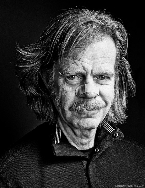
William H. Macy photographed at Sundance Film Festival for Be A Star Anti-Bullying Campaign in partnership with WWE and The Creative Coalition

Image result for examples of portrait photography