For my first Photoshoot for following our stimulus of ‘Identity and Place’ I’ve chosen to respond to the artist Barbara Kruger.
As Kruger uses heavy editing, I’ve chosen to use natural portraits.
Contact Sheets
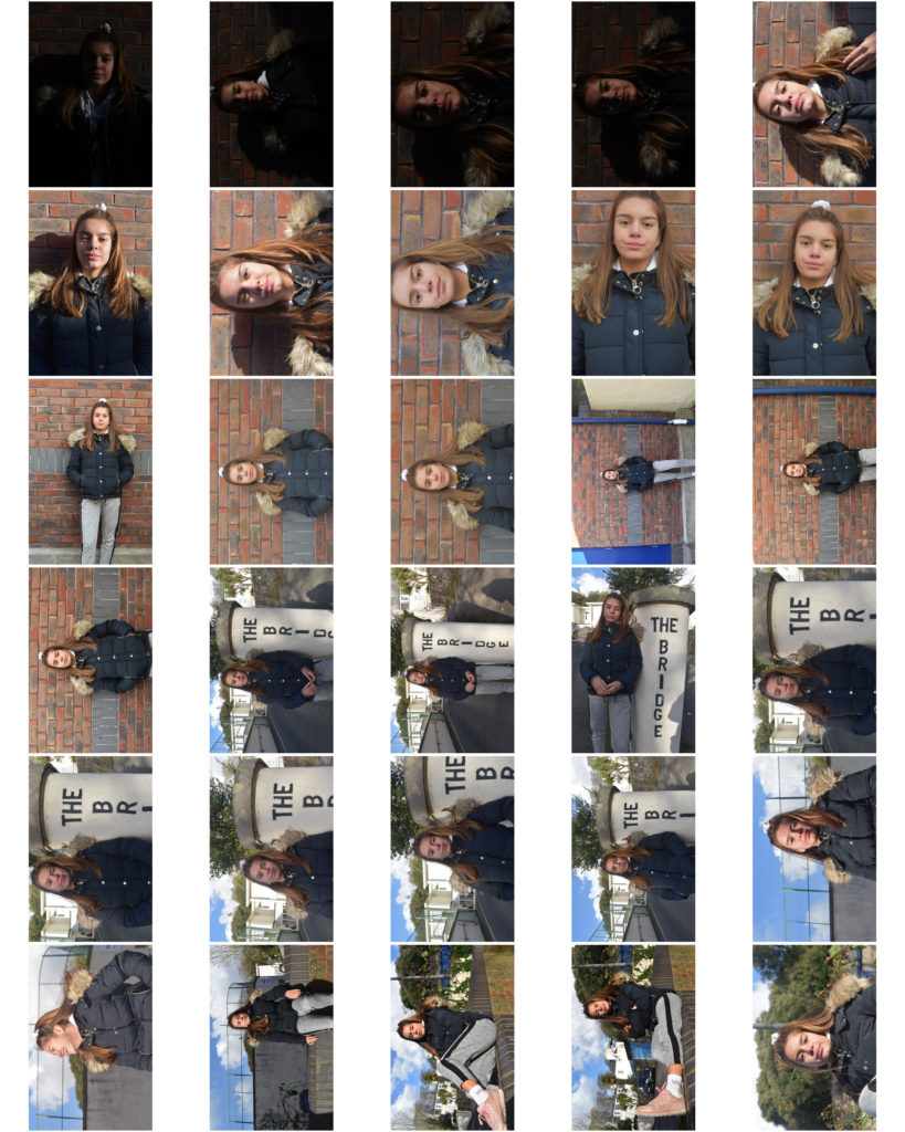
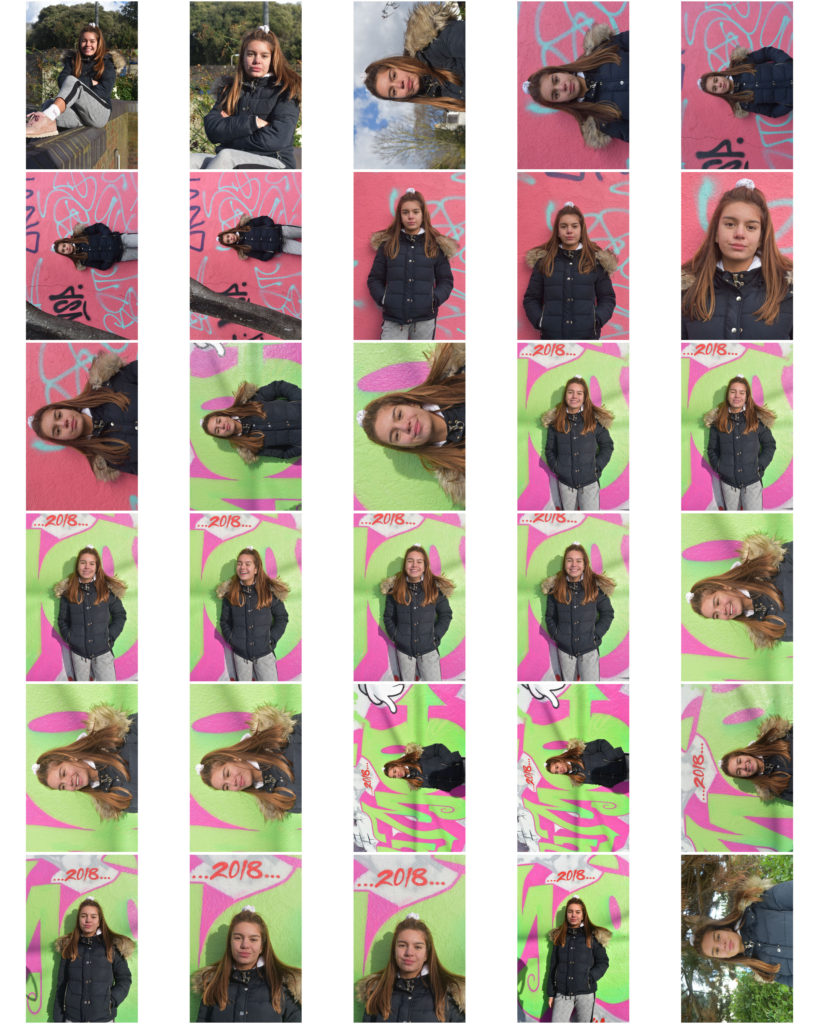
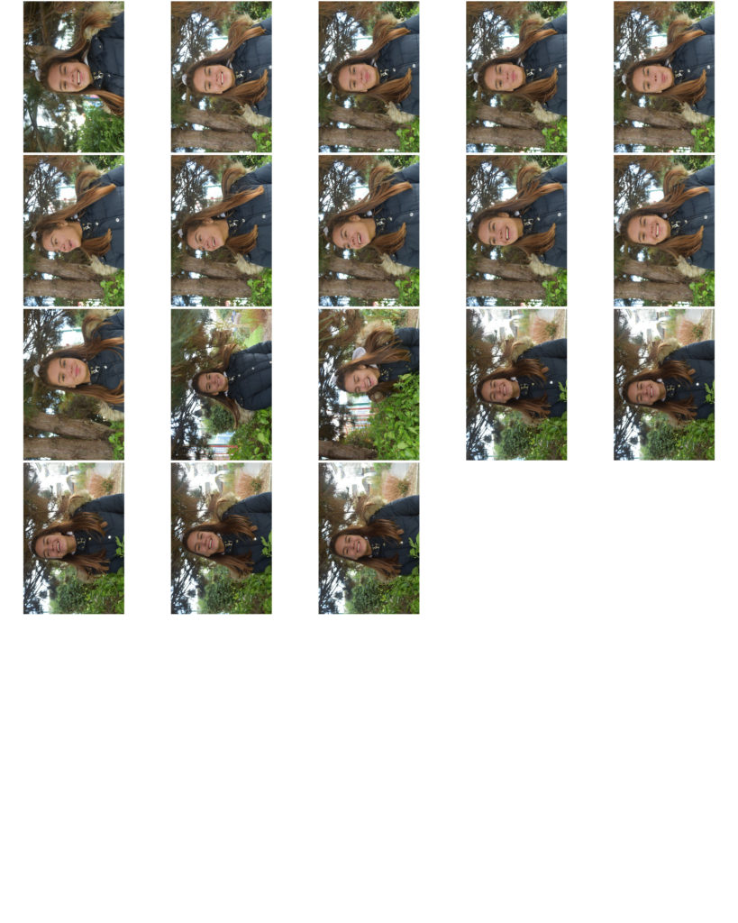
For my first Photoshoot for following our stimulus of ‘Identity and Place’ I’ve chosen to respond to the artist Barbara Kruger.
As Kruger uses heavy editing, I’ve chosen to use natural portraits.


For my response I wanted to explore with fashion and culture. I wanted to show how people express their identities through clothes. I also wanted to explore the fashion trends at the moment, especially over-sized and “unflattering” clothing pieces.
For my first photo shoot I am going to be looking more at casual everyday clothing (in a sense). I will be pairing everyday conventional pieces of clothing and making them more high fashion and runway worthy. I will also be doing the models makeup and hair.
For my second photo shoot I am going to be looking into more sophisticated, elegant and chic pieces of clothing.

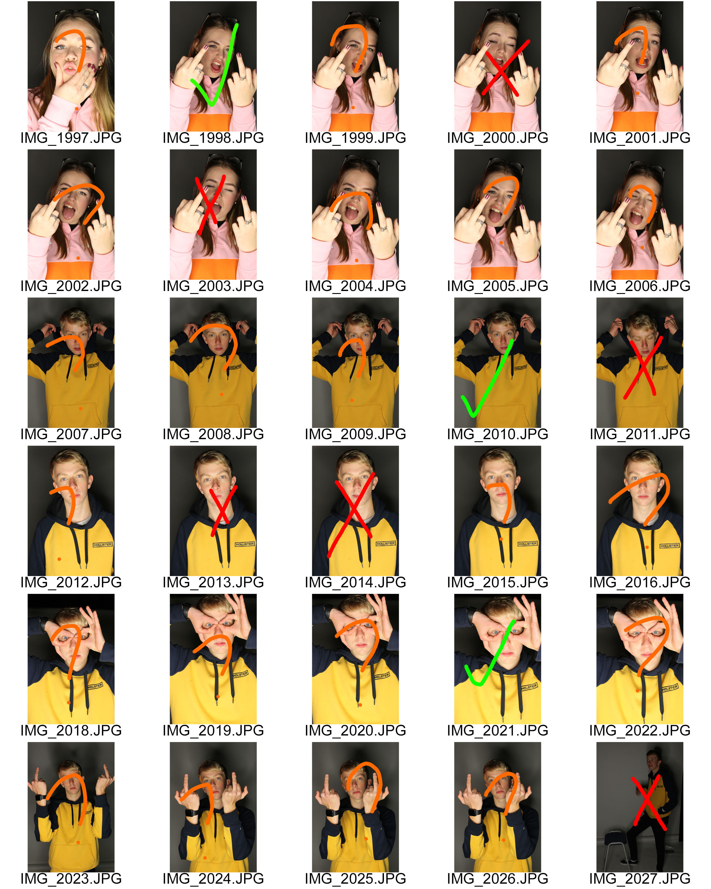
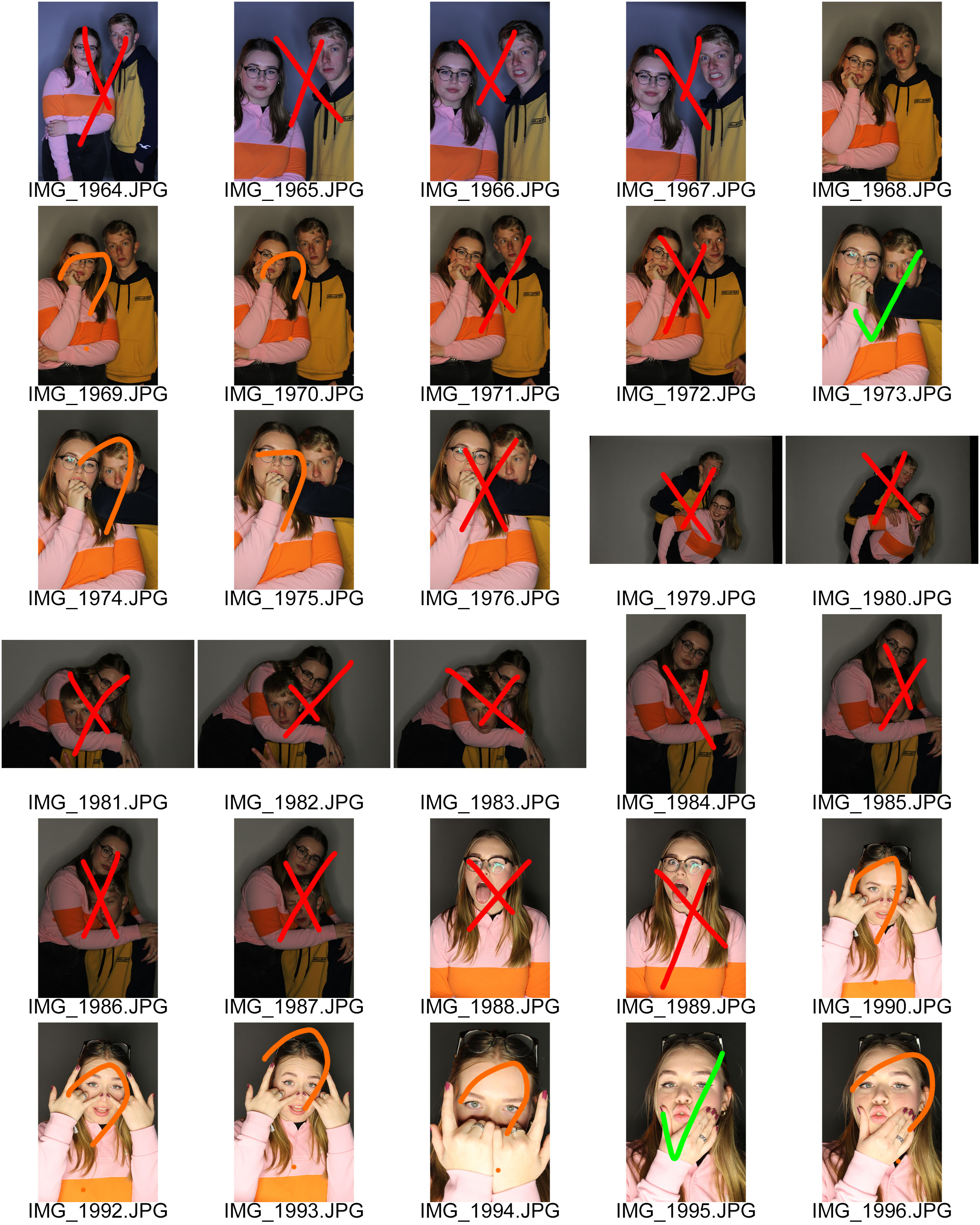

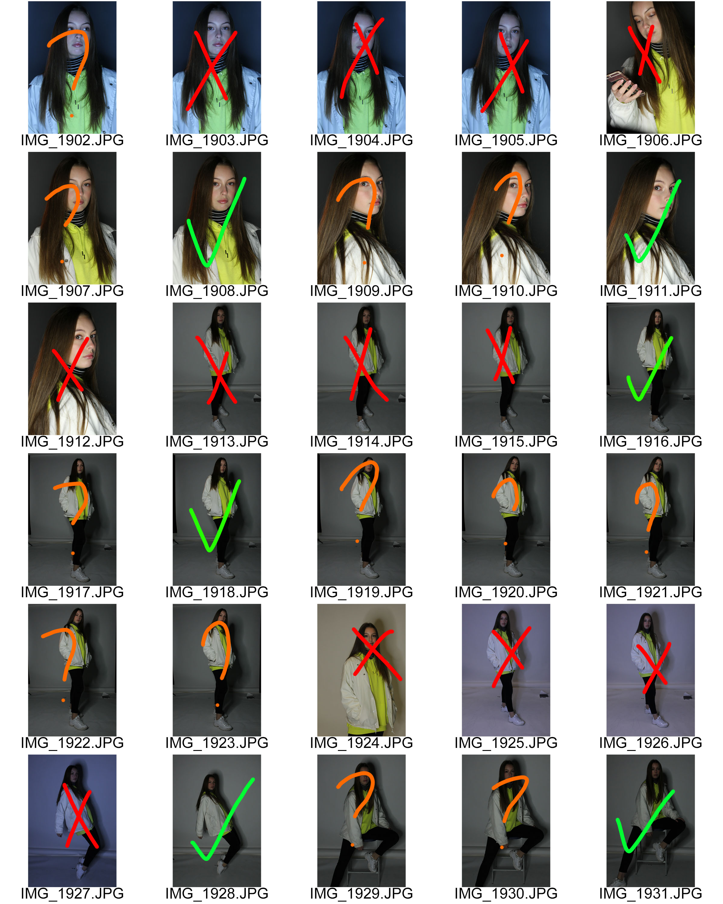
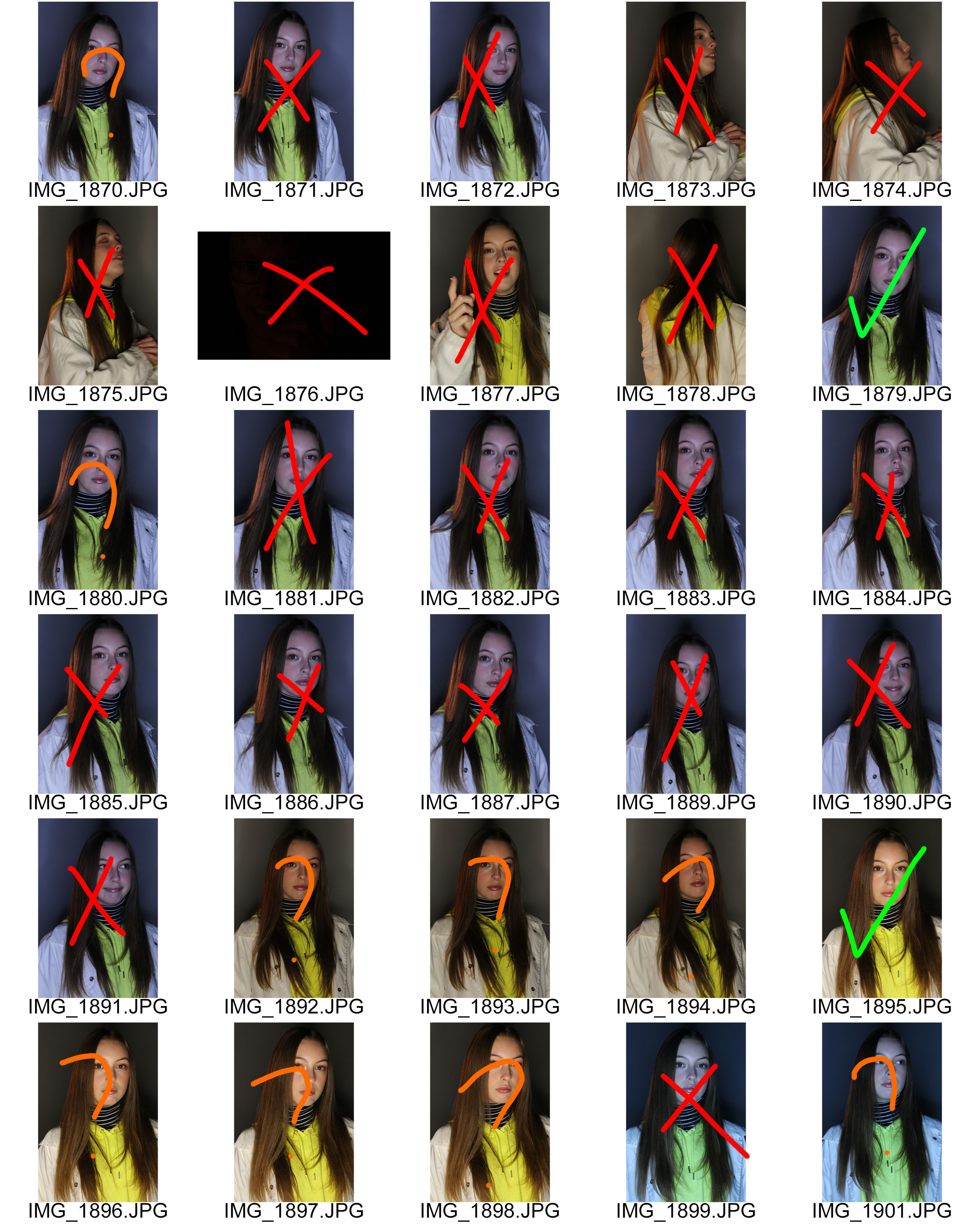
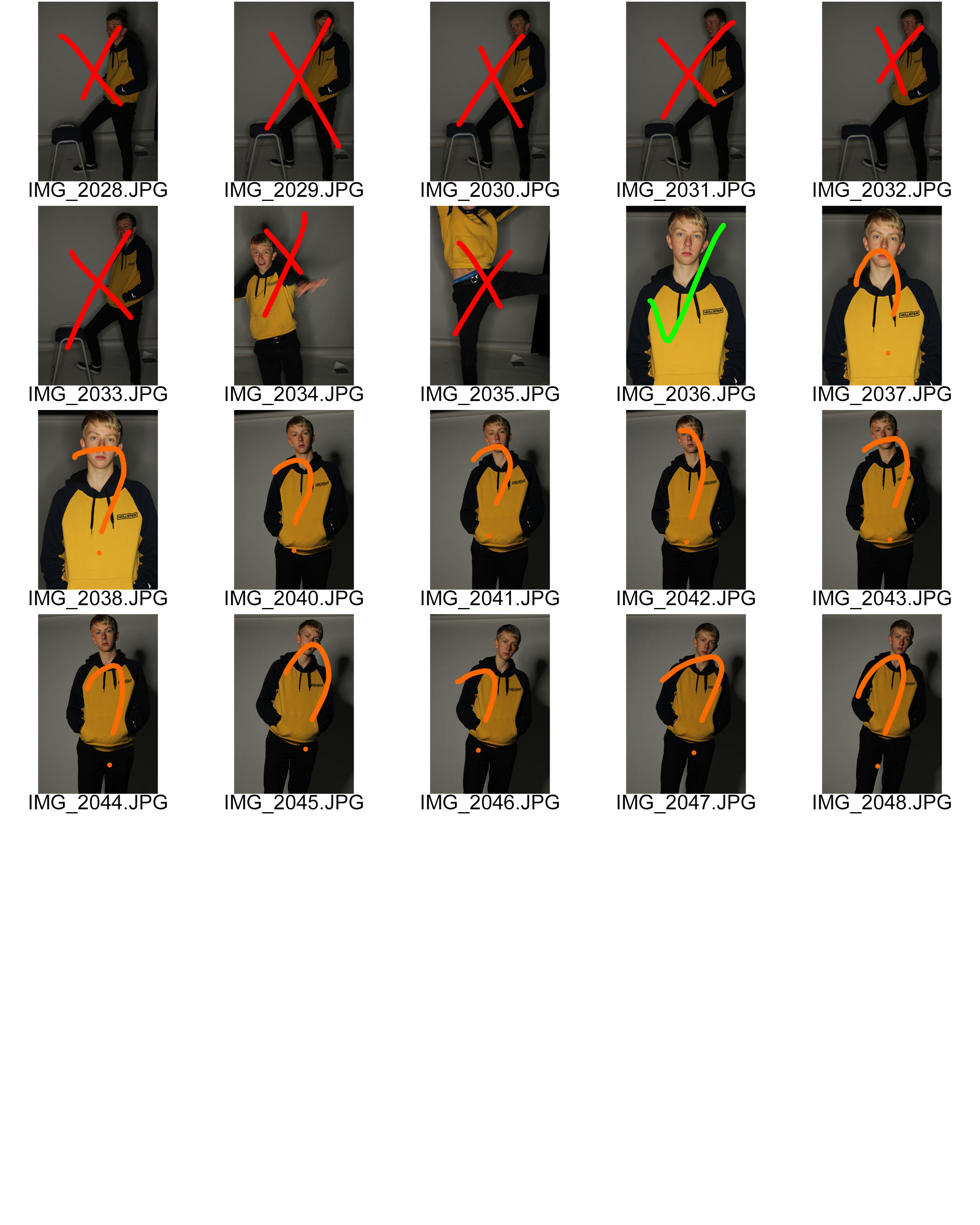
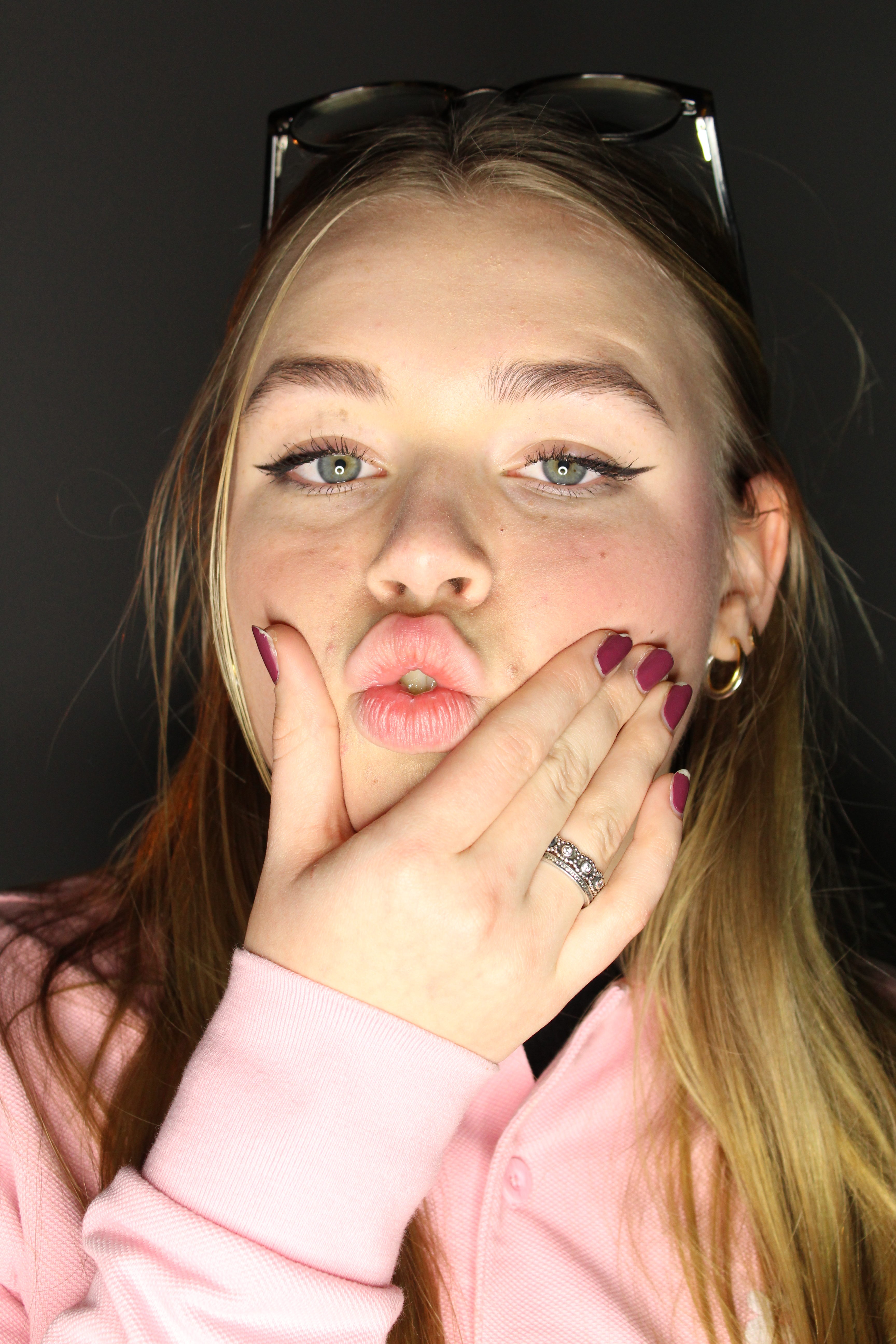
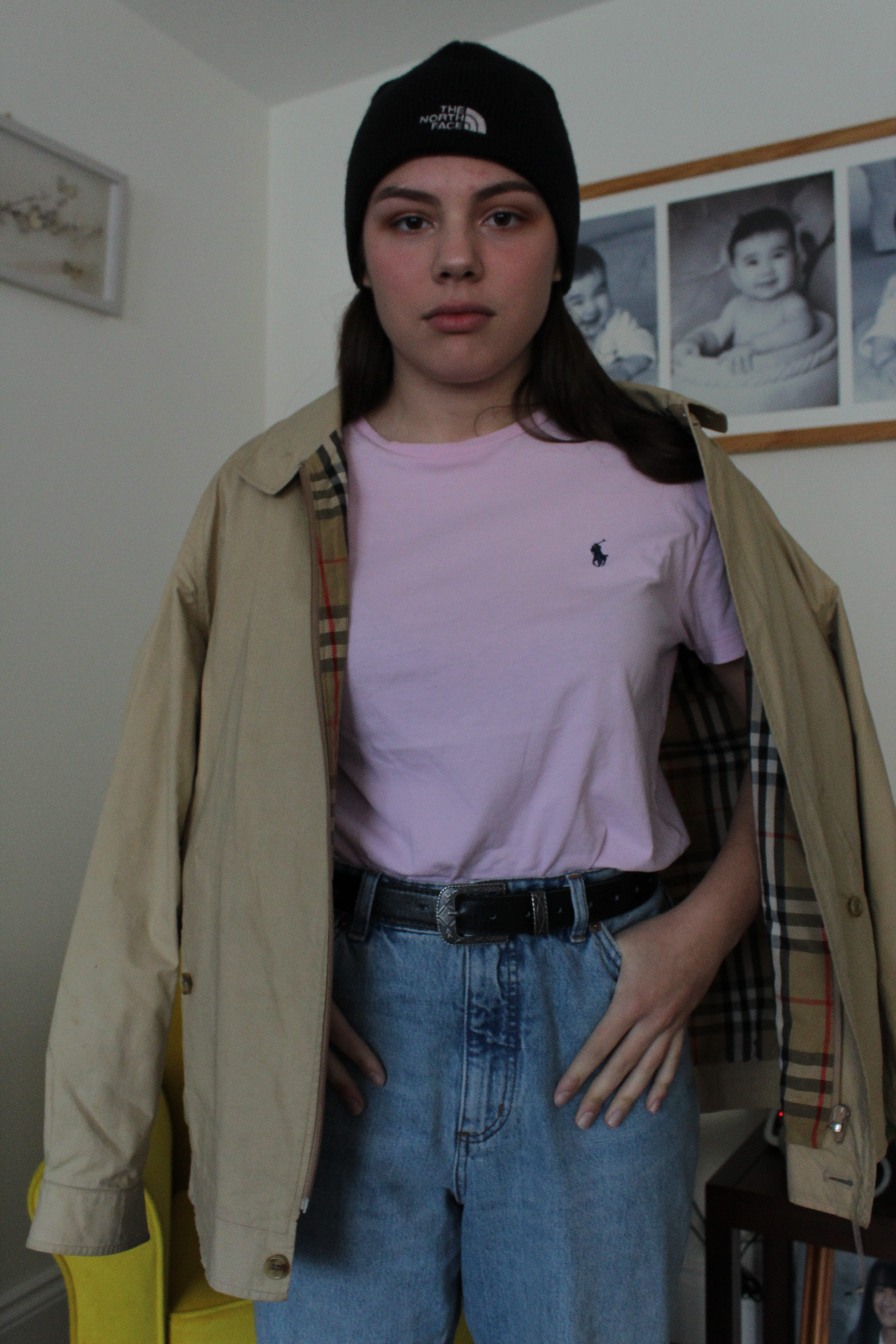
Needed to edit exposure in Photoshop.
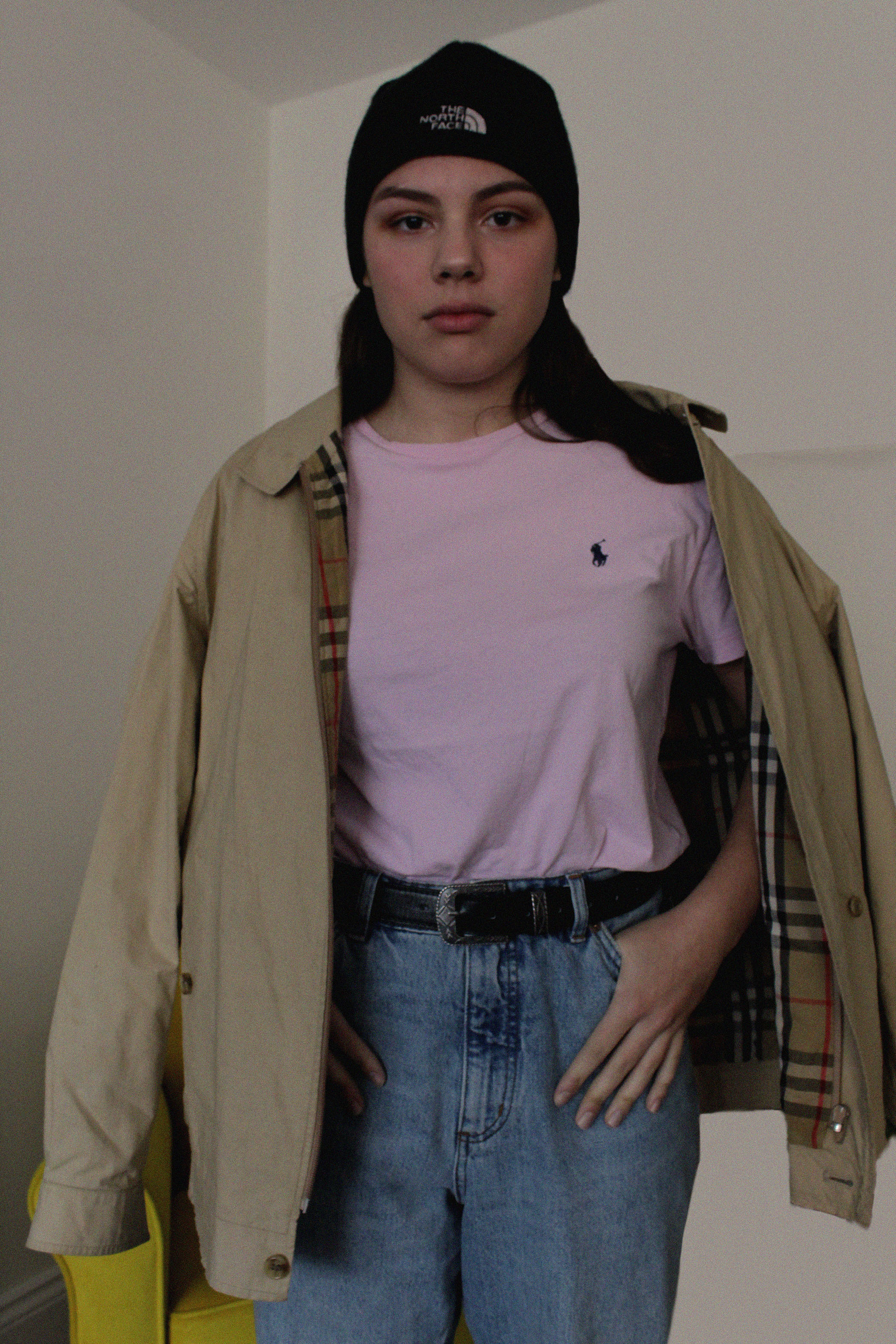
Needed to edit exposure in Photoshop as it is too under exposed.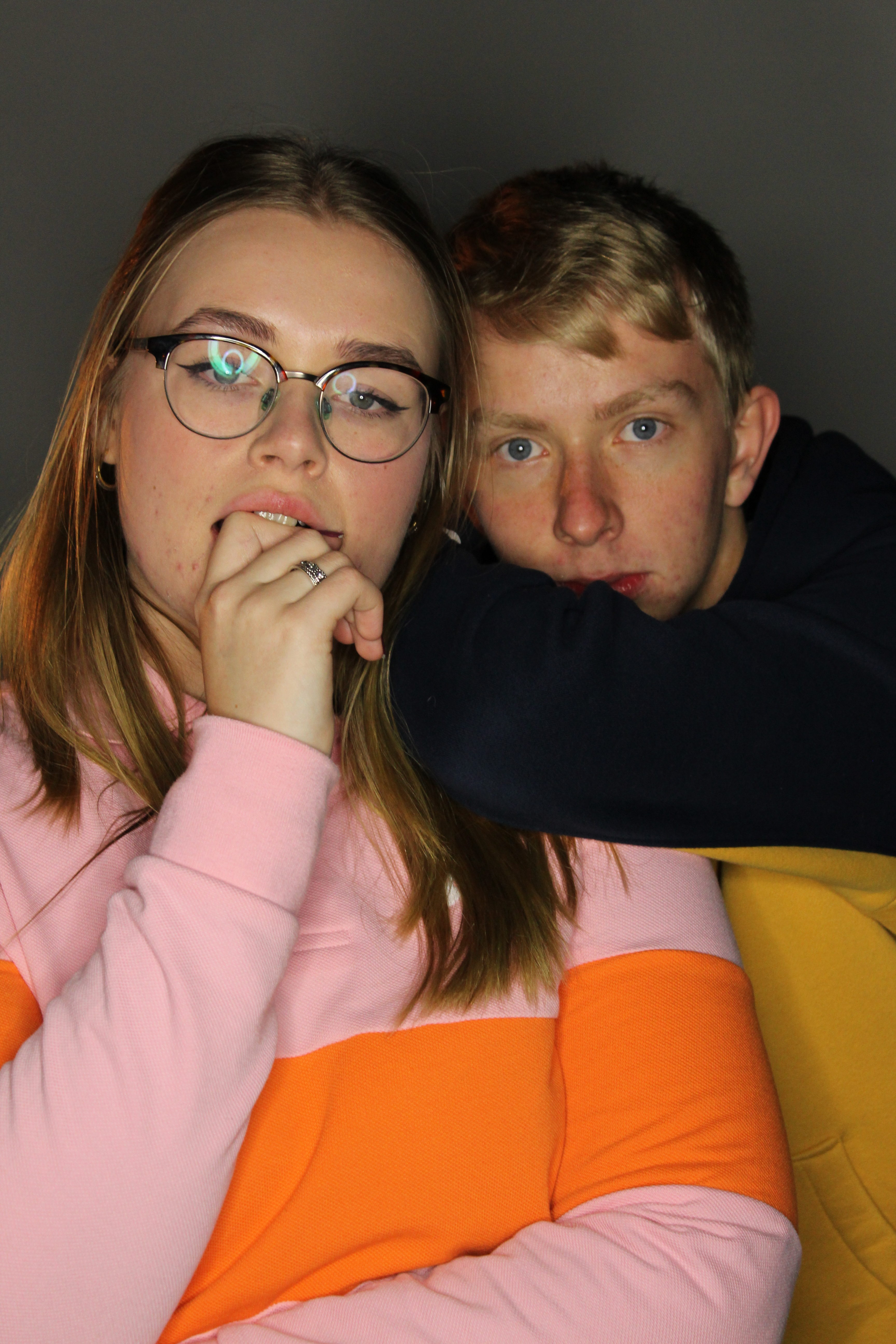

Needed to sharpen this photo in Photoshop.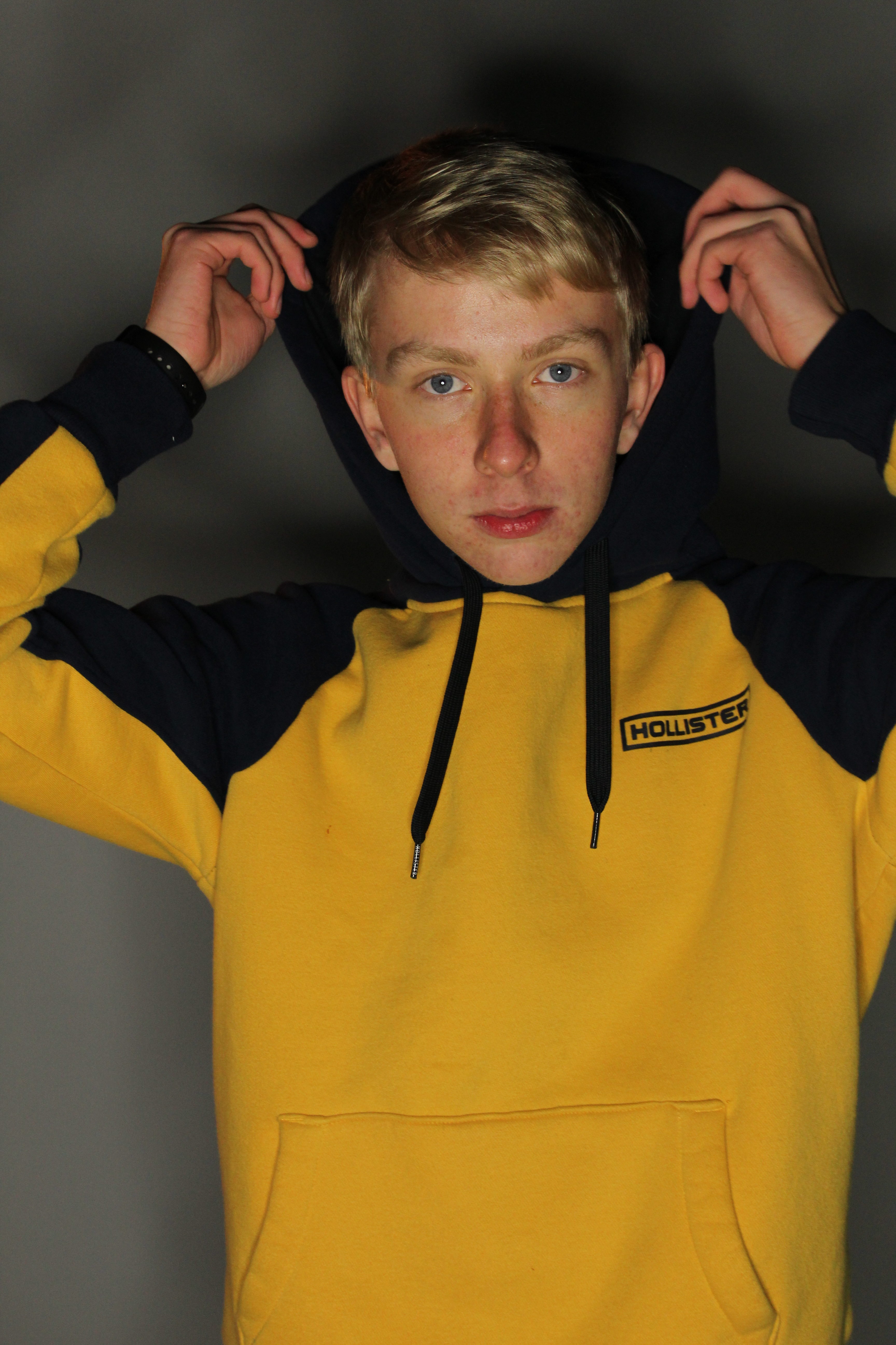

This was too over exposed so I knew I needed to edit the exposure in Photoshop.
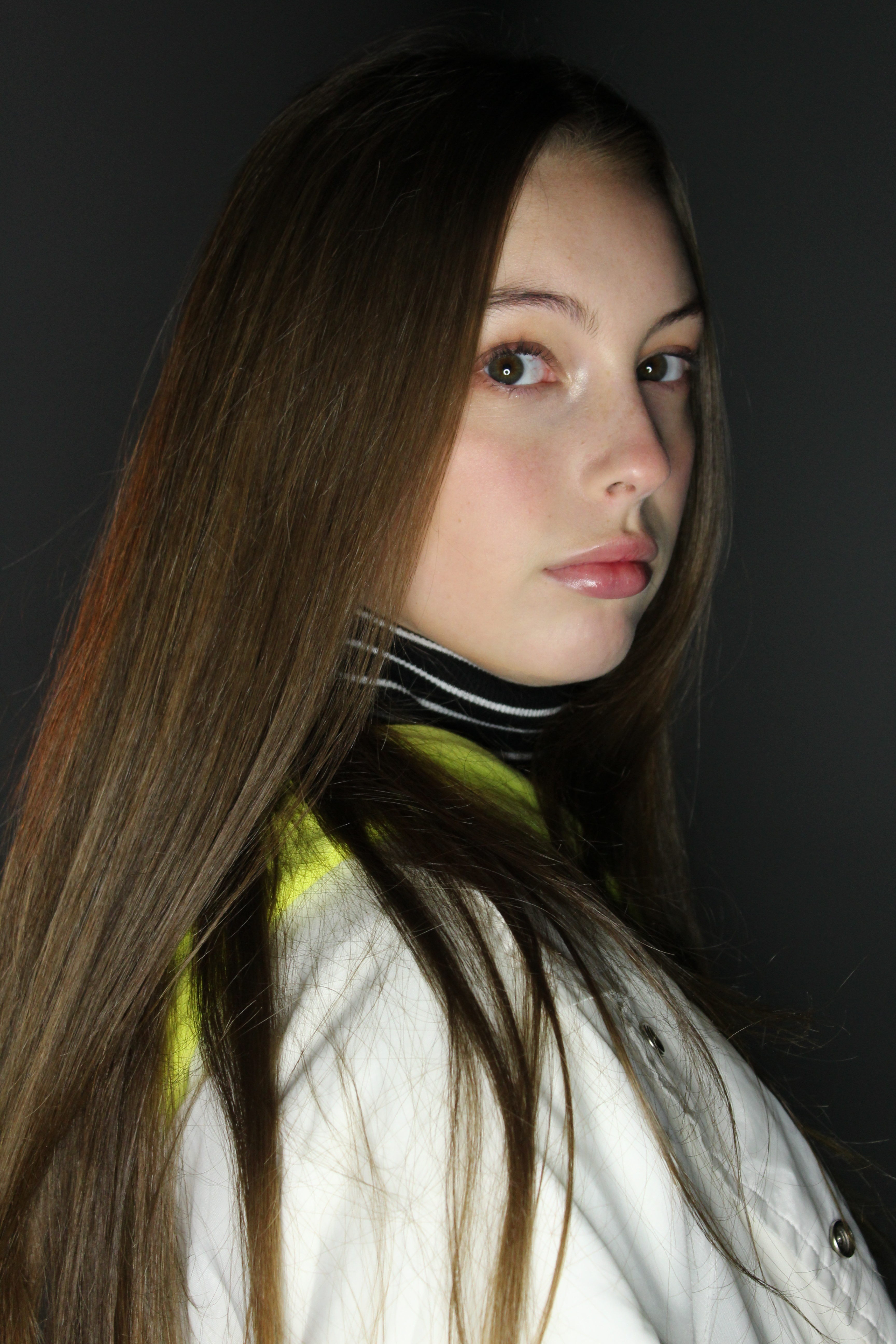

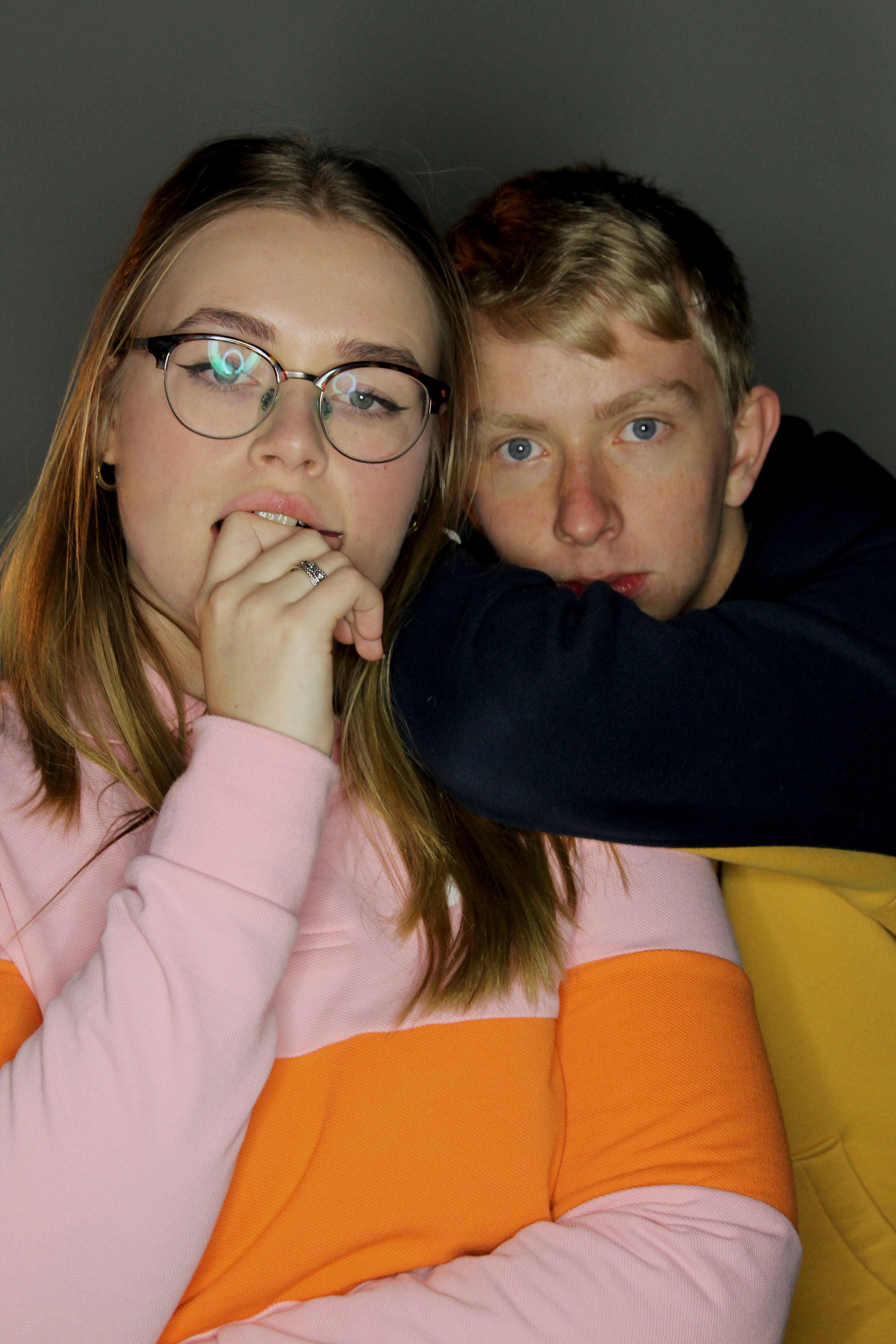
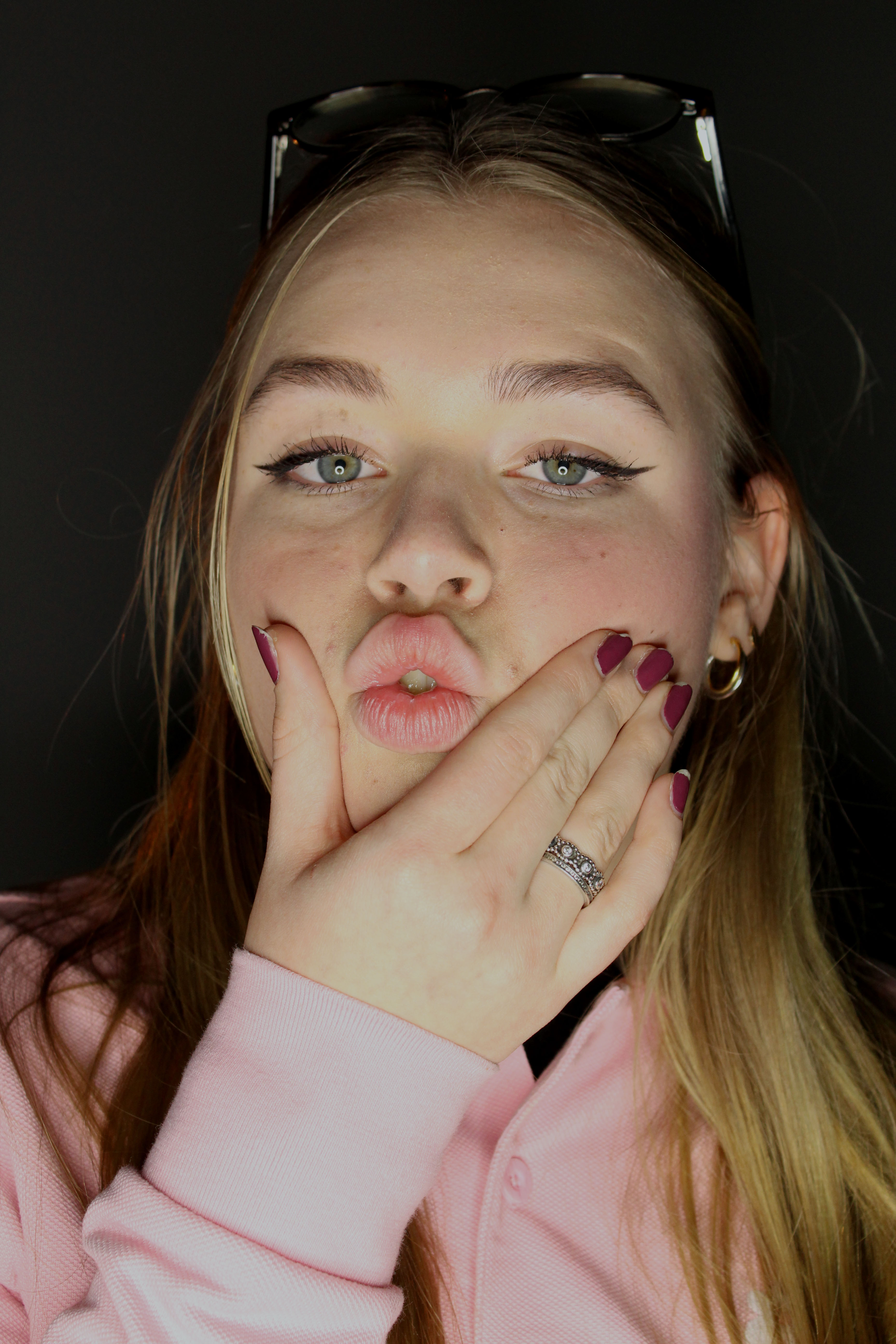
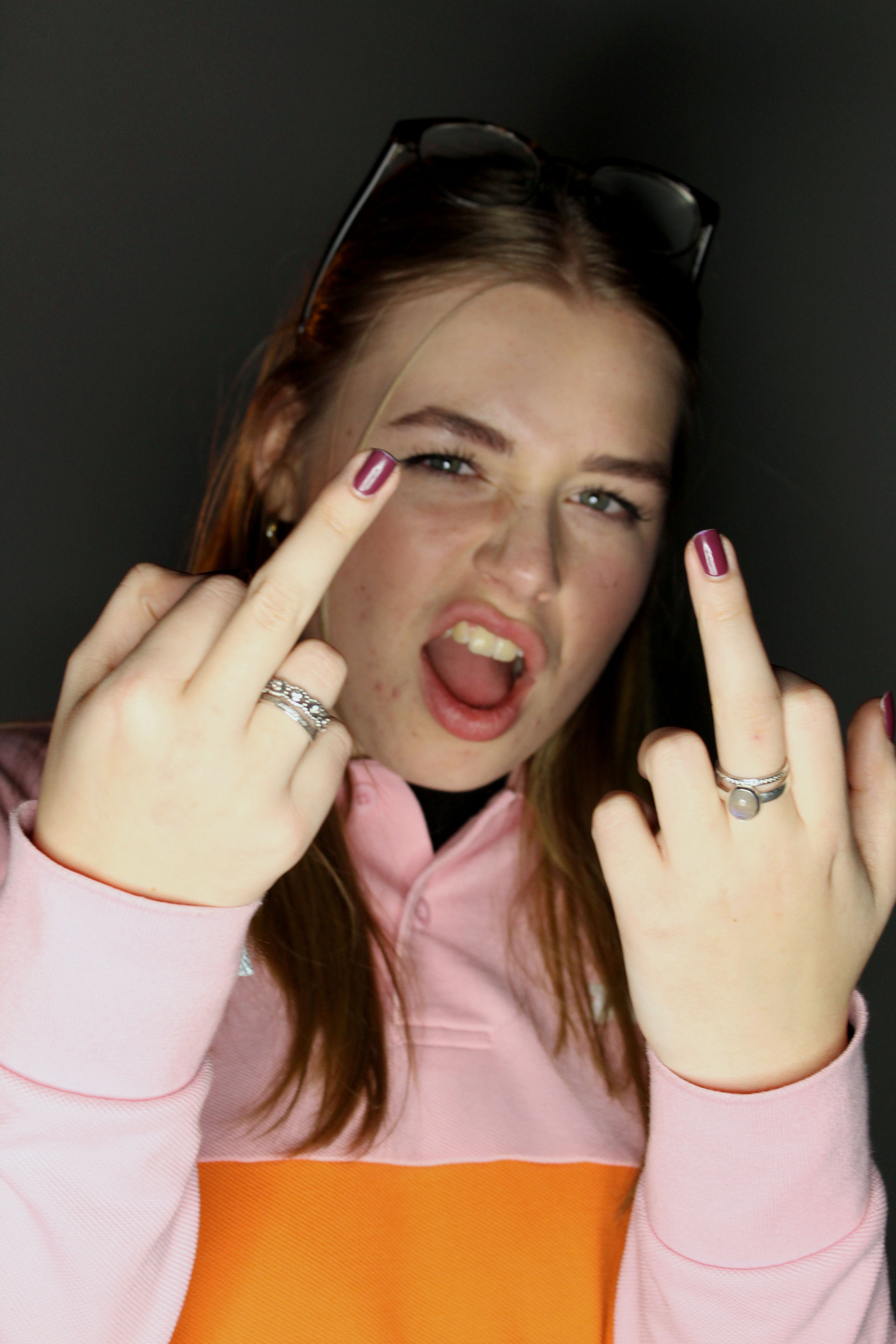
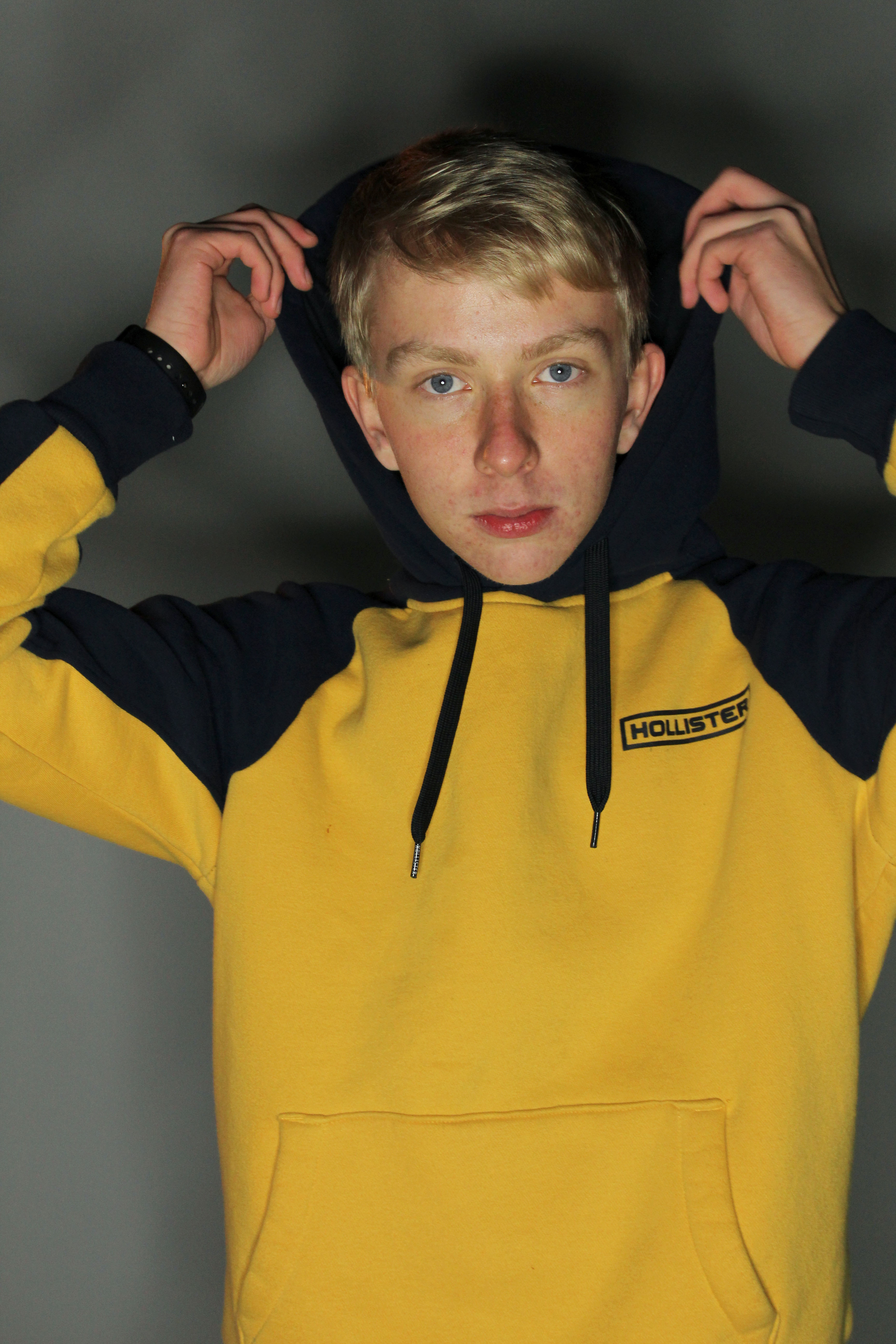

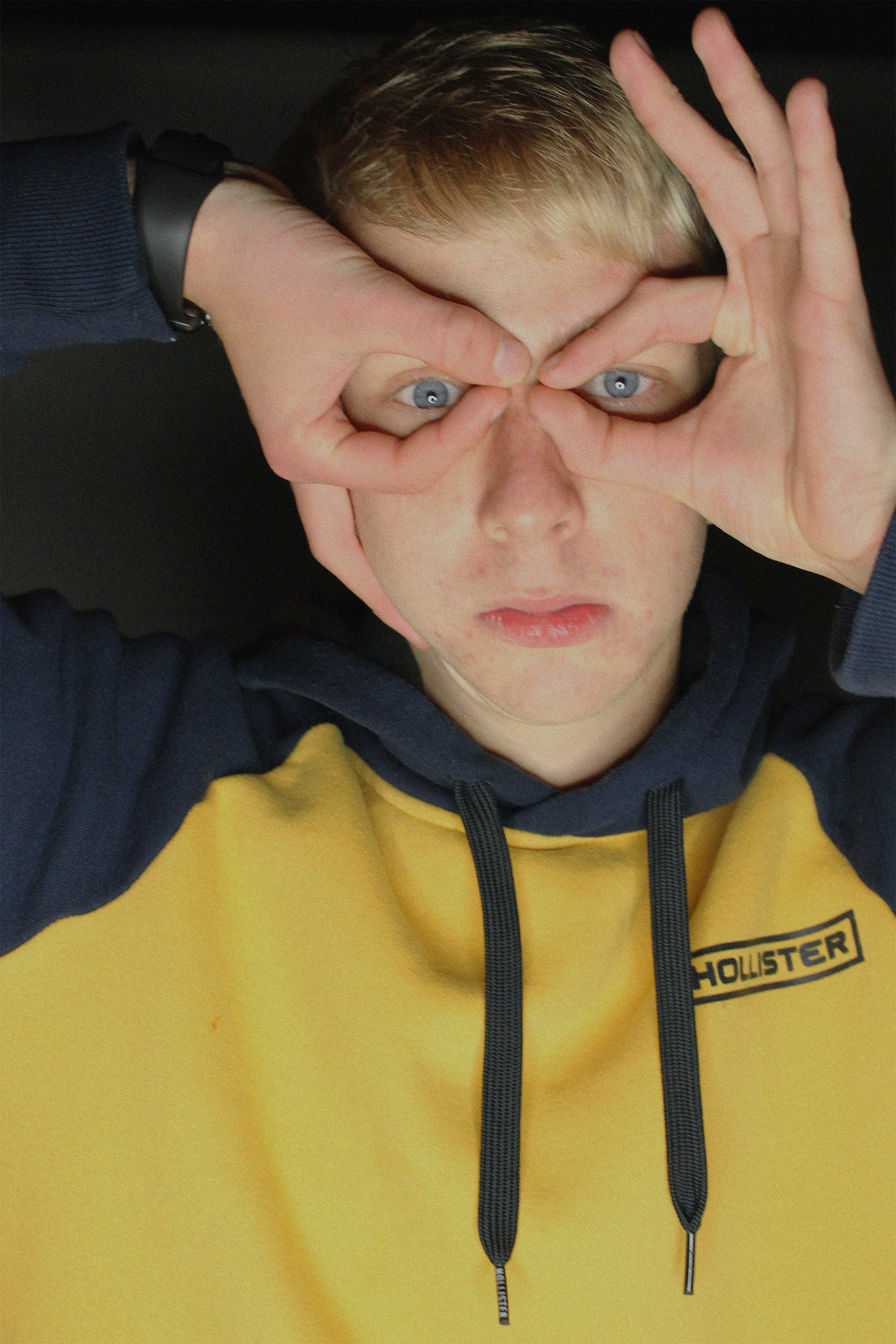
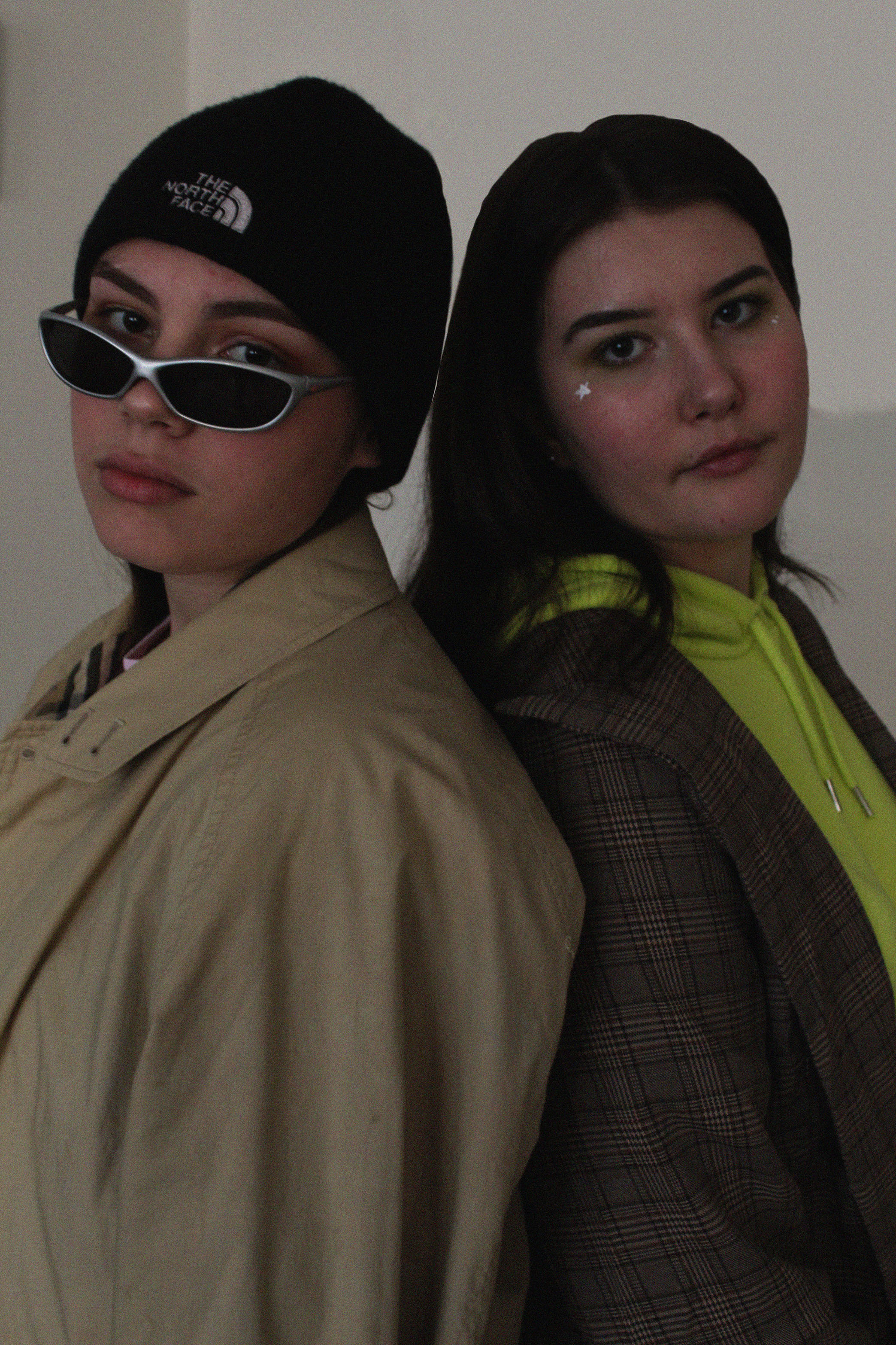
I am really happy with how these edited photos came out. I think I captured the essence of Kiki’s photos really well and I think it shows off my camera skills very well. Overall I’m satisfied as it shows the message I was trying to portray.
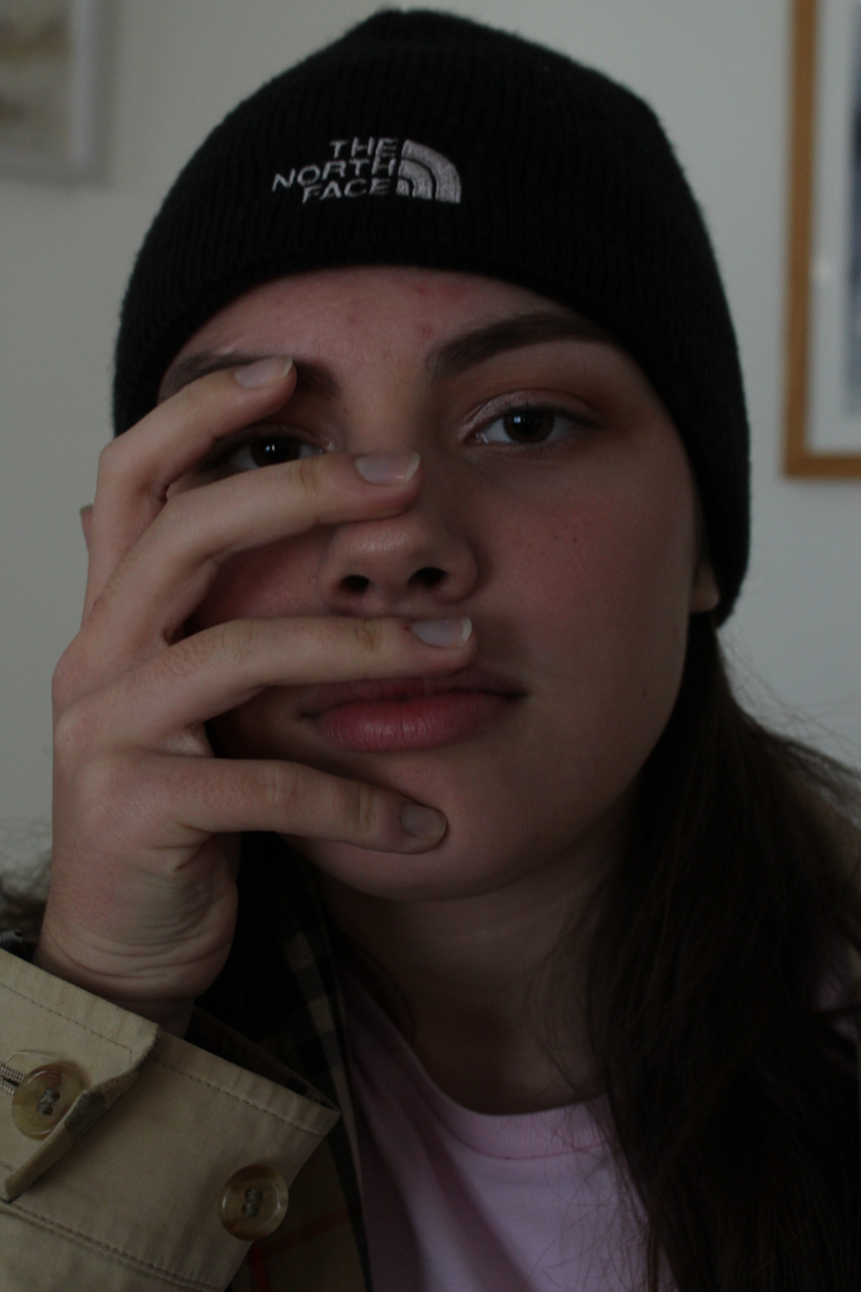
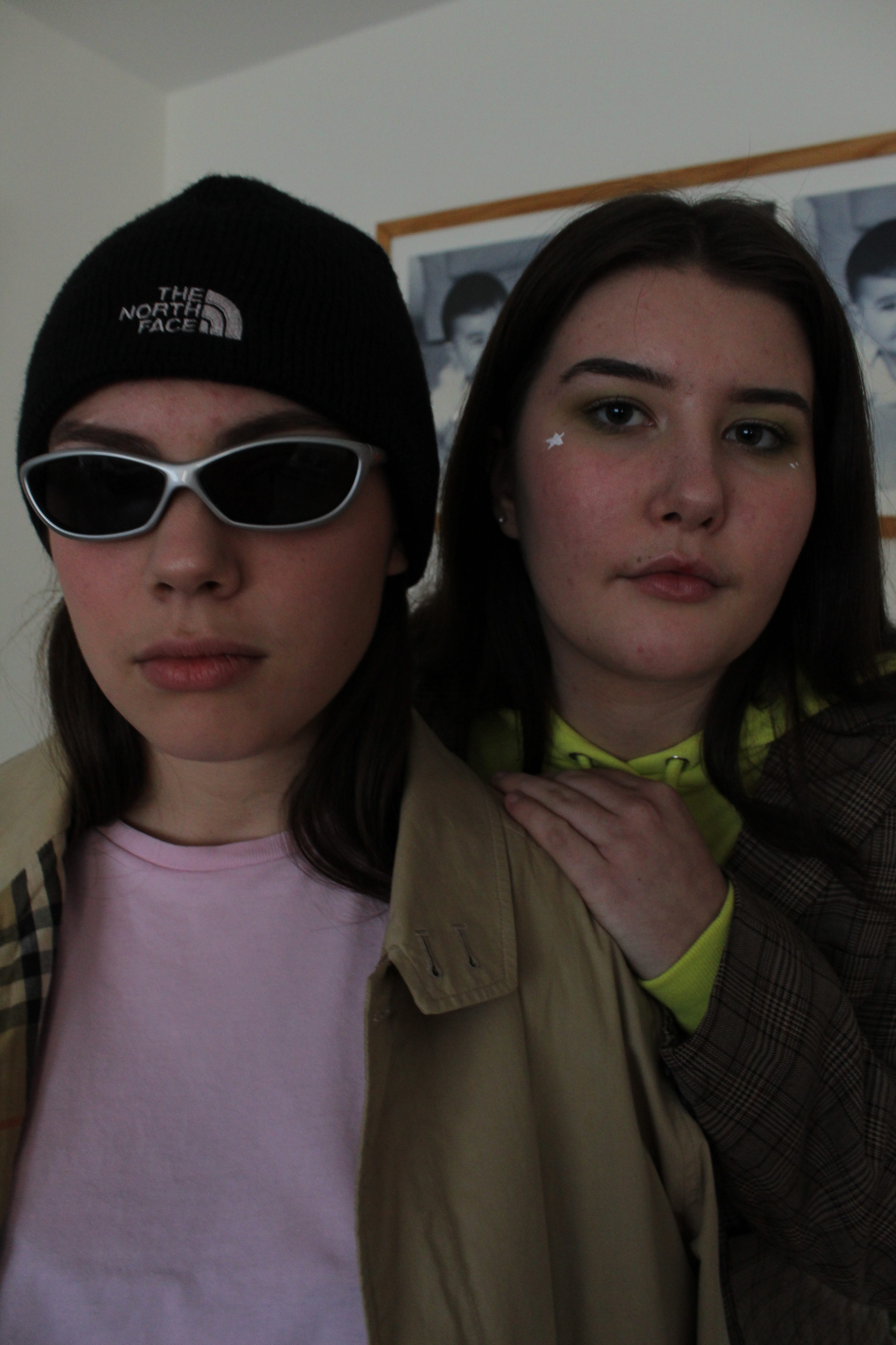
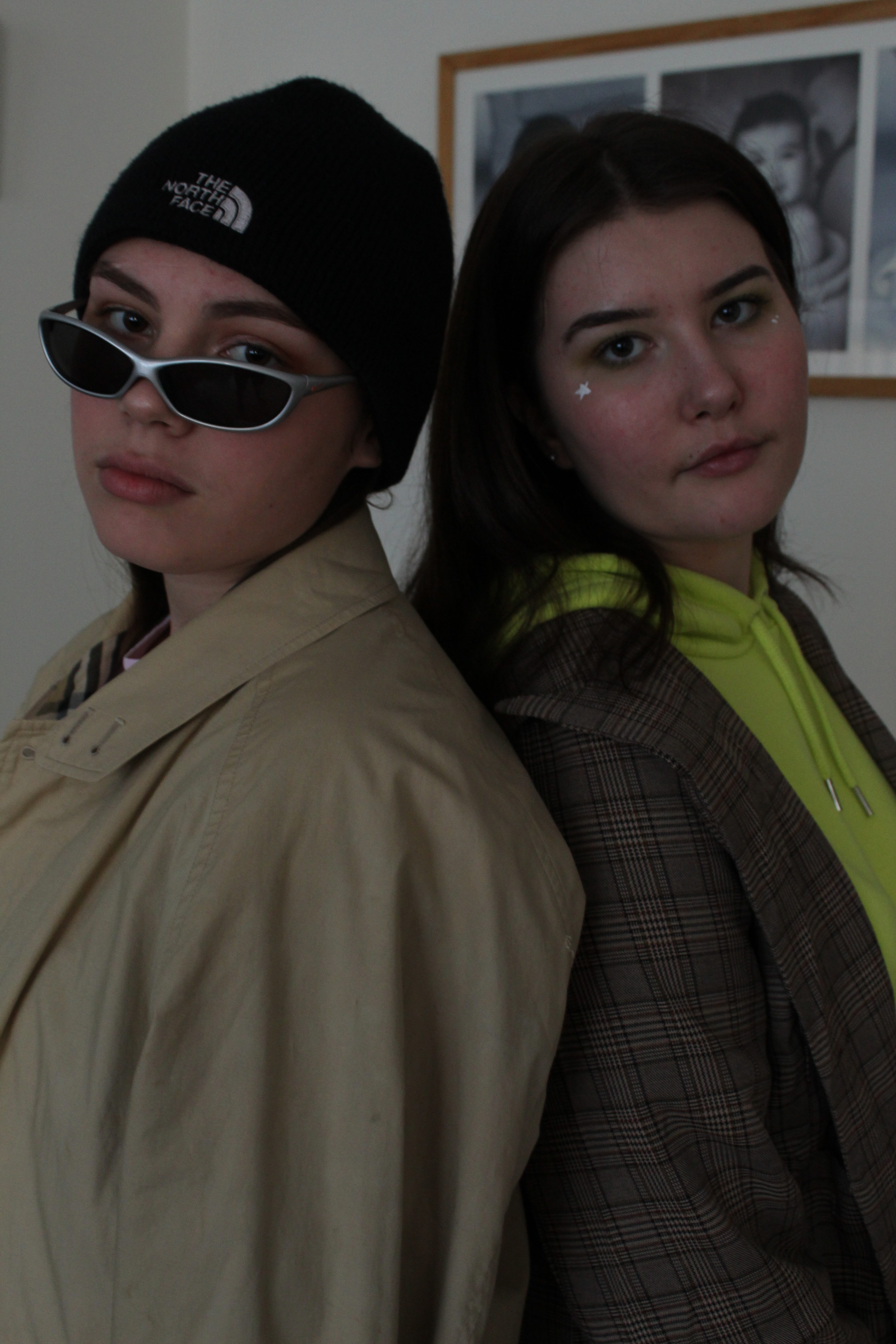

For these edited photos, I decided to get ride of most of the background and just make it plain so the focus is more on the models than the background.

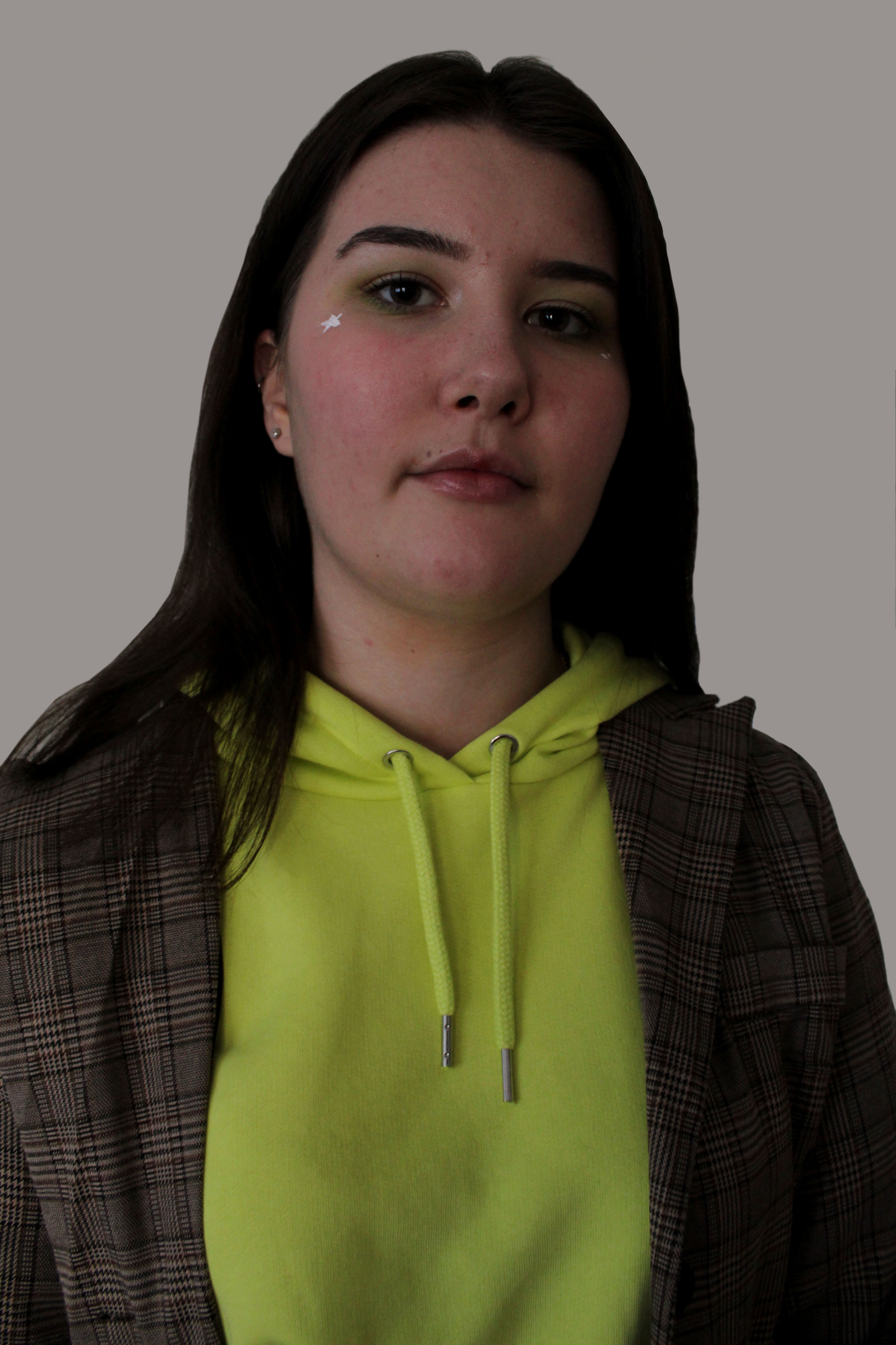
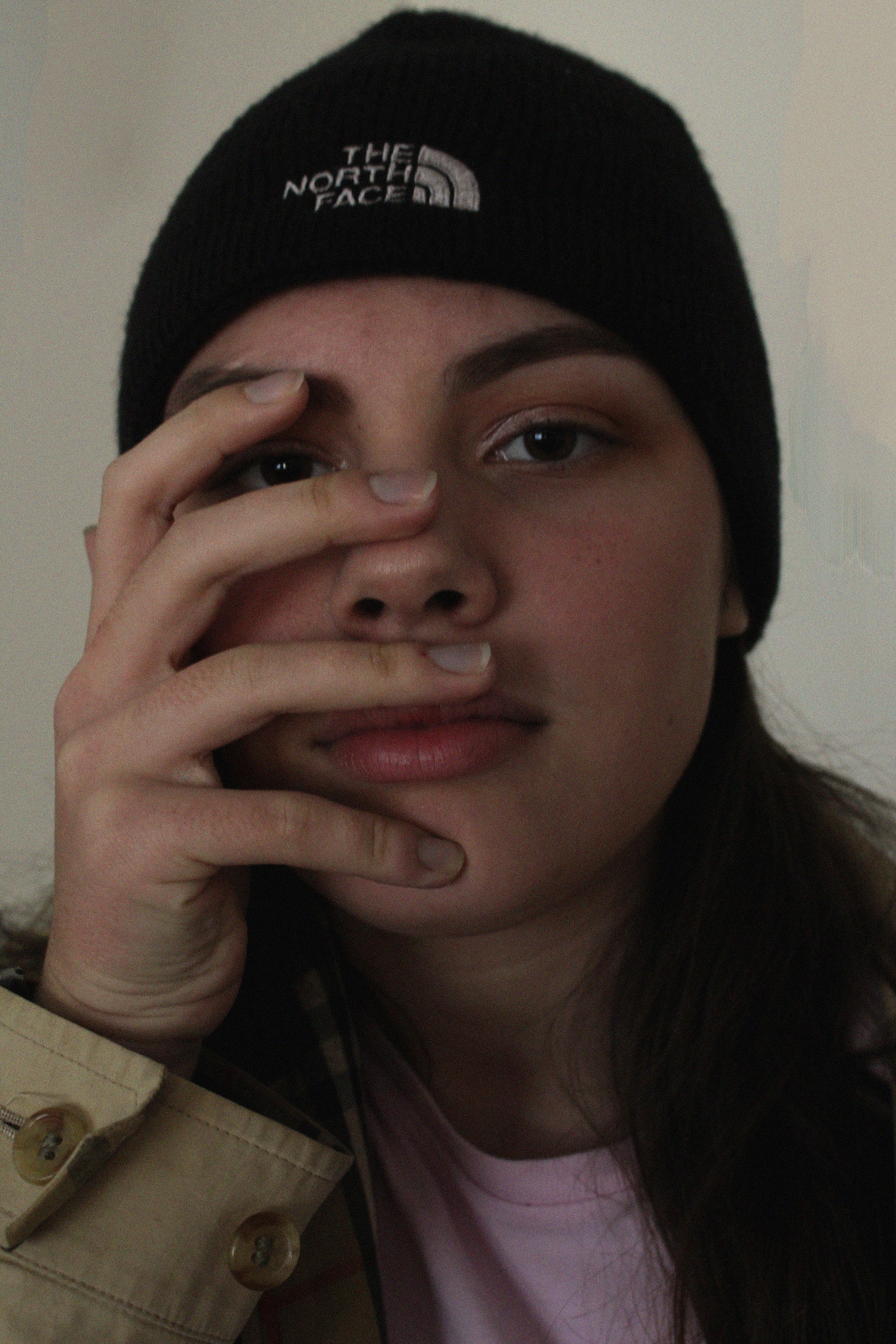
Overall, I am very happy with the outcome of this photo shoot as I feel I was able to capture the images that I wanted to, but, I think I will need to edit better next time as it is a little plain.
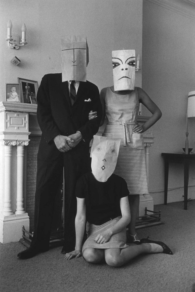
Steinberg captured people with paper bags over there face, hiding and disguising their identity. On the paper bags there are shapes creating a cartoon style face. When someone looses their identity they tend to hide their emotions with fake ones, the paper bag acts metaphorically to show the fake emotions that a person is likely to present when they loose their identity, which presents the conceptual elements within this photographic series. Technically speaking the models are located in the centre of the frame, allowing them to be the main focus point. The background is used to present the background of the person, the type of people they are. In this case they seem rich due to the posh fireplace and large amount of space surrounding them. The photograph is presented in black and white which allows the image to be high in tonal contrast allowing details to be shown clearer. Space, tone and texture are the main formal elements which are being presented within this image. They are all presented through the background and the model, which all add the effect of loosing an identity. The camera settings when taking these images where precise, the ISO seems to be slightly high as there seems to be an intended noise, this also contextually shows the time period (1962) that these images were captured in. The shutter speed seems to be quick as there is no intended blur, moreover there is a large depth of field due to the whole frame being in focus. This photograph presents cold artificial lighting, which adds to the depressing and sinister tone which Steinberg is creating around the idea of someone loosing their identity and trying to be someone whom they aren’t. Contextually, Steinberg wanted to show that everyone is society ‘wears a mask’ to hide the true identity, whether it is metaphorically or physically, through makeup. He said that this was because it acted as “a protection against revelation.”. Applying this to loss of identity, it shows how when people loose their identity they try and pretend to be someone they are not, so people do not find out what they are going through. To apply this contextual idea to this image the paper bags are suggesting that because these people are rich they have to act rude and snobby towards others due to the class system.
Based on this artist research I want to conduct a study where I look at capturing my model disguising their identity. In order to present a stronger relationship between the artist and loss of identity, I intended to use plain white masks and plain simplistic background, so no identity is built around the background of the model. Moreover, I intended to use a similar soft cold lighting in order to create a depressing tone to my work. In order for more inspiration with the use of masks and paper bags, to disguise and present the idea that my model has lost their identity and pretending that they are okay, I intended to conduct visual inspiration through a mood board, were further interests surrounding this topic can be presented.
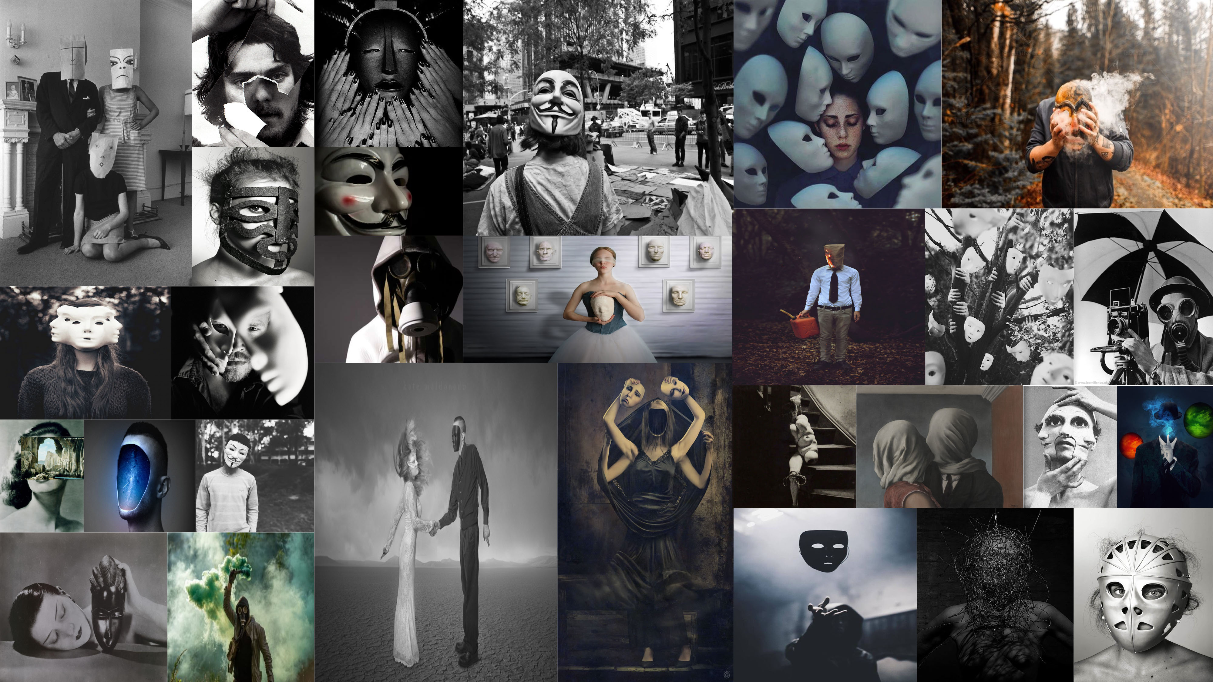
By conducting this further research of mask photography I have clear ideas and visions that I want to bring forward to my photoshoot which will be inspired by Steinberg’s use of paper bags/masks.
I have had a go at editing some of the images I have taken in the past that I may use as final pieces or to help inspire me and show me some of the styles I could use for my final pieces.
On this image I started by using the cropping tool so that I could easily focus on the main point of the image which was the person.
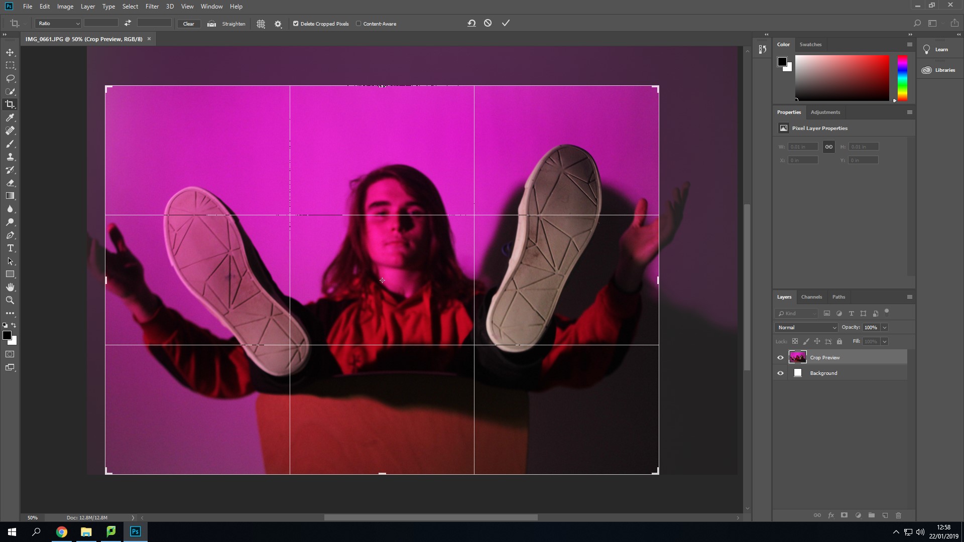
After this I used the black and white option that can be found under – Image > Adjustments > Black and White in Photoshop. I have tried using this with a few of my images because the photographers I have looked at in my case studies all started in black and white.

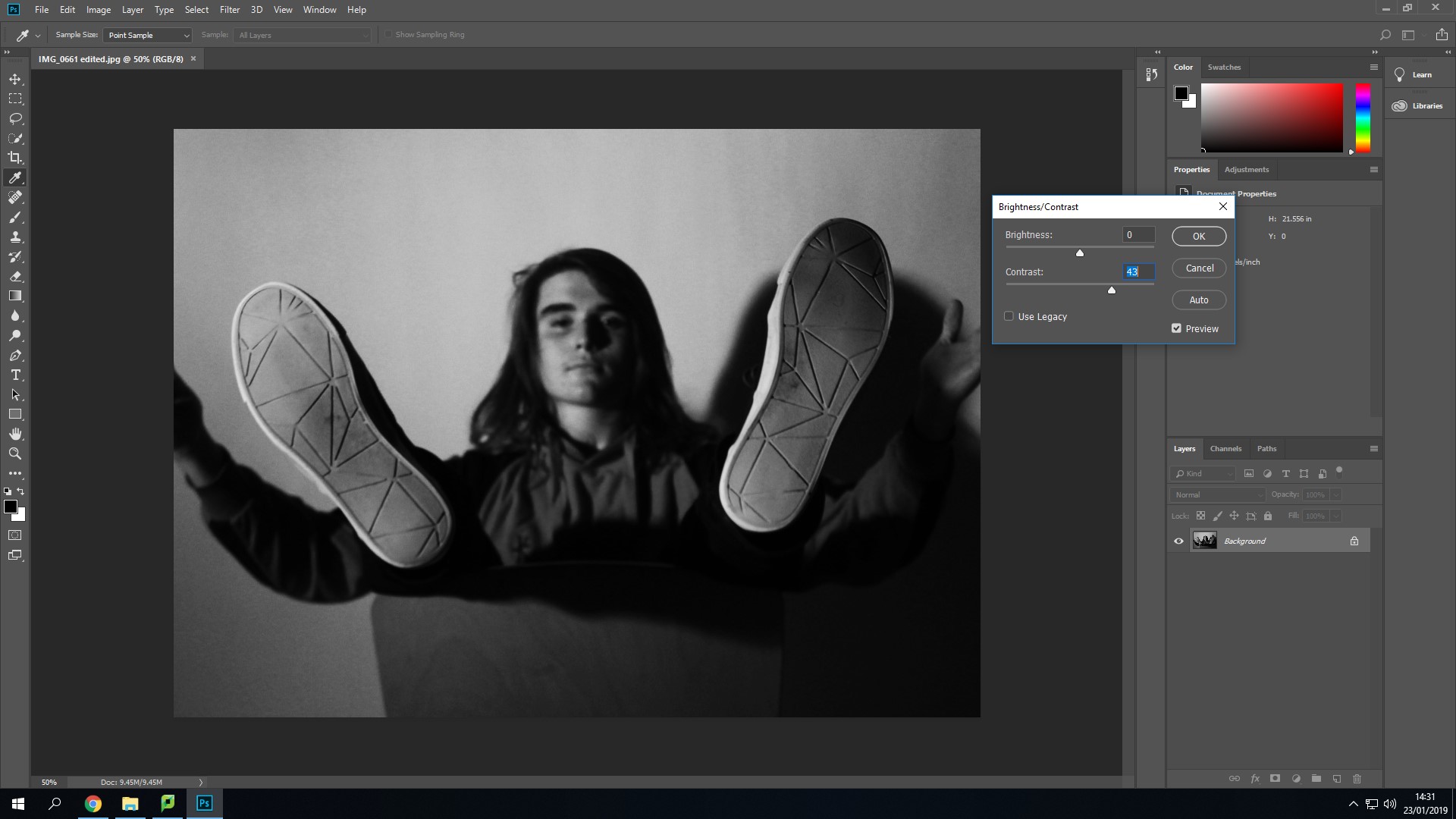
I have then used the Brightness and Contrast option. I have tried not to use this excessively. I used it to make the darker areas in the image darker to make the person stand out more especially since his hair has come out dark.
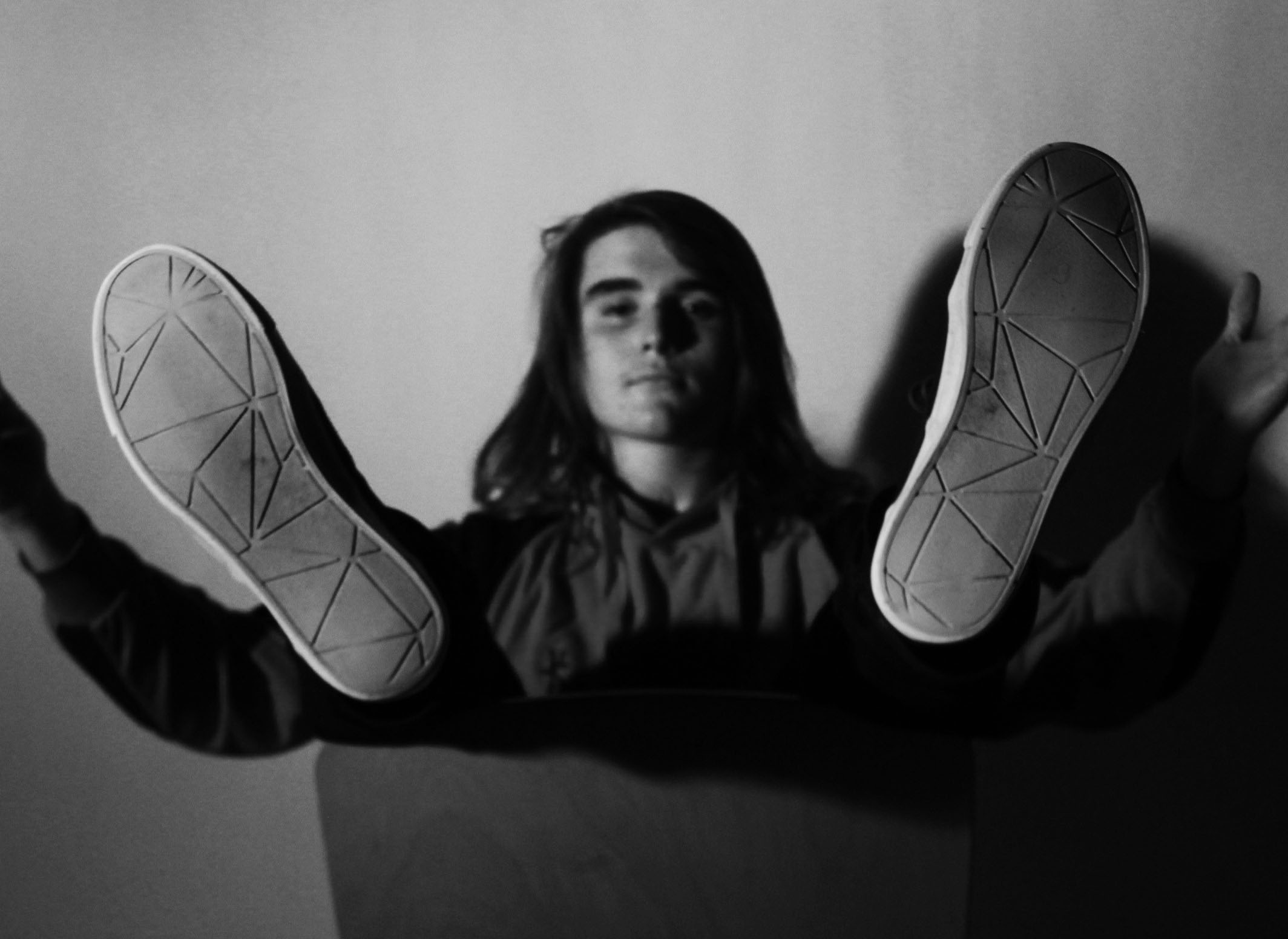
This is the final outcome from the small amount of editing I have done on the image. I like how the image has come out using the black and white filter over the top. I like how this image has come out, it doesn’t really create a detailed view of the persons life though.
This is another one of the images I have taken that I thought I could edit a bit, to experiment using different tools. I have started by using the cropping tool to avoid having too much white space around the person. This also allowed me to use the rule of thirds.

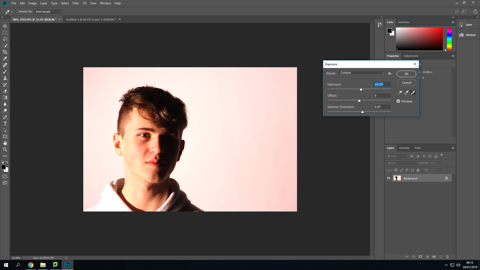
After this I changed the exposure settings to make the background a lot brighter and consistent in colour. This also allowed me to have the light on the person sort of blend in with the background, on the left side.
I have also experimented using the vibrance settings on this image. This allowed me to make the colours seem like they are darker, but look as if they glow a little bit to help them stand out more. 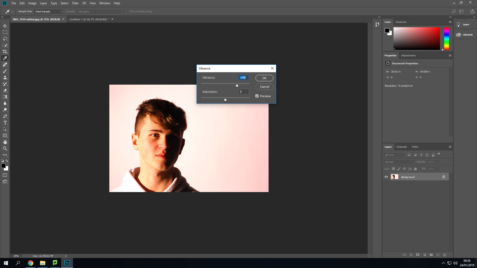
This is the final outcome of this image that I have come with while experimenting with these features. I like how the image has come out using the rule of thirds, but it could use something in the background other than white, as it makes the image look barren and doesn’t really create an identity for the person.
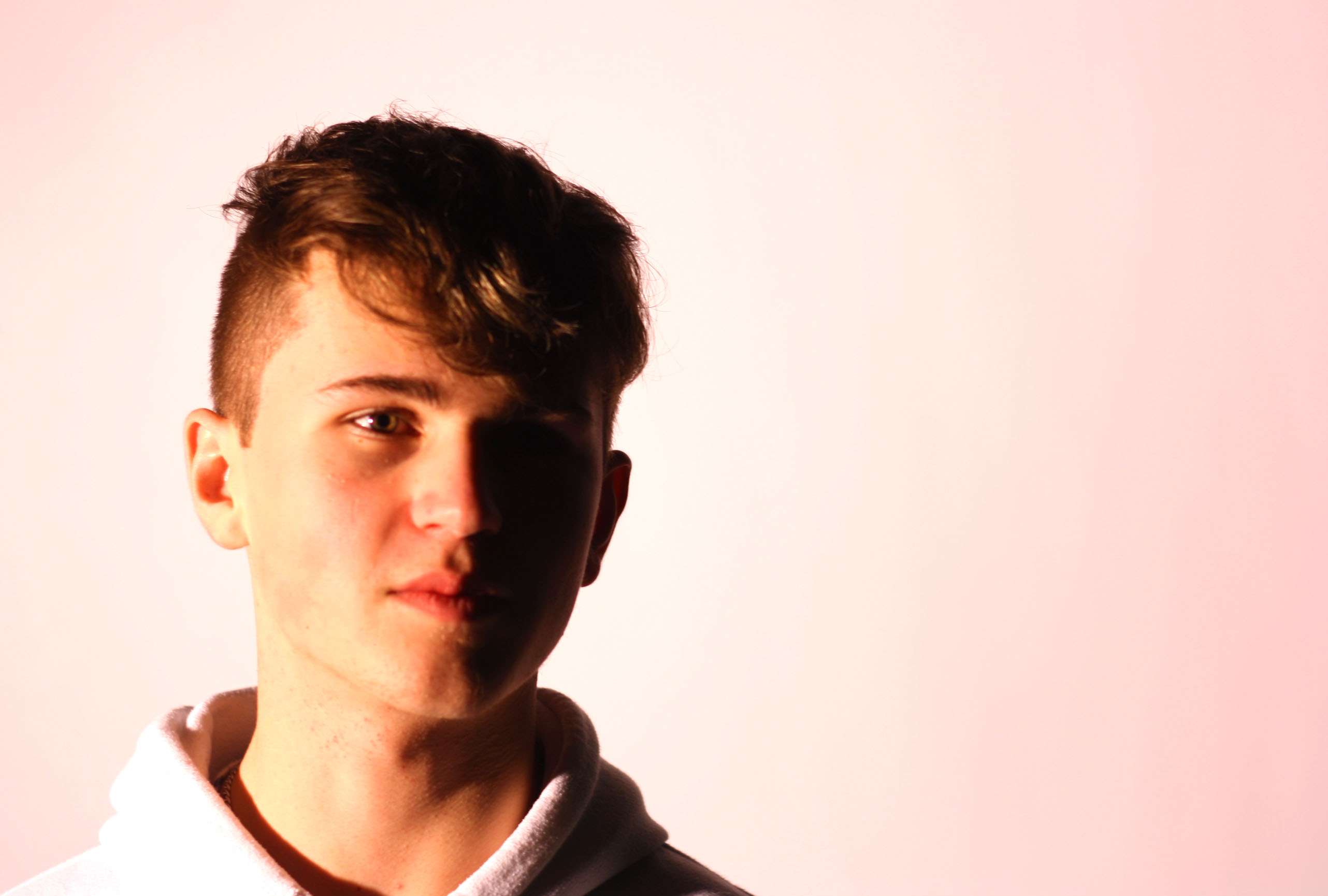
I have decided that I’m going to present my images in the format of a typography. since a lot of my images in the first photo-shoot are very similar in composition and feature the same subject, I believe that a typology would be a good way of presenting my images and thus I will adapt my future photo-shoots for the project to the format of a typology.
One of the most notable photographers in typologies are Brend and Hilla Becher while there work doesn’t thematically link to mine as they photographed buildings as opposed to possessions however I believe that their work is some of the best examples of typologies available.
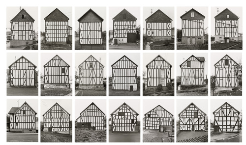
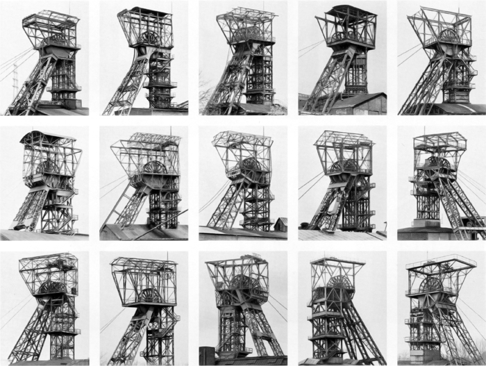
![]()
Some other examples of photographers that have used typologies as a form of presentation for their work include Zhao Xiaomeng, his work with typologies is also more closely related to mine as it deals with possessions in the format of a typology.

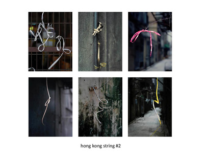
I believe that typologies give the photographer the freedom to use a variety of images which is especially helpful if you believe that there isn’t a single image that could properly represent the best of the photo-shoot and convey the message of the photo-shoot properly.
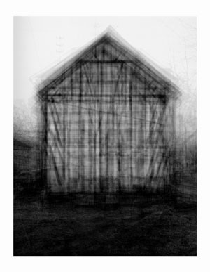
Idris Kahn experimented with the photos of Bernd and Hilla Becher and presented his own take on the ideas of typologies. The images are essentially multiple exposures overlayed over each other. Since the images all come from the same typology they are very similarly composed and thus give an interesting effect with a Gaussian distribution.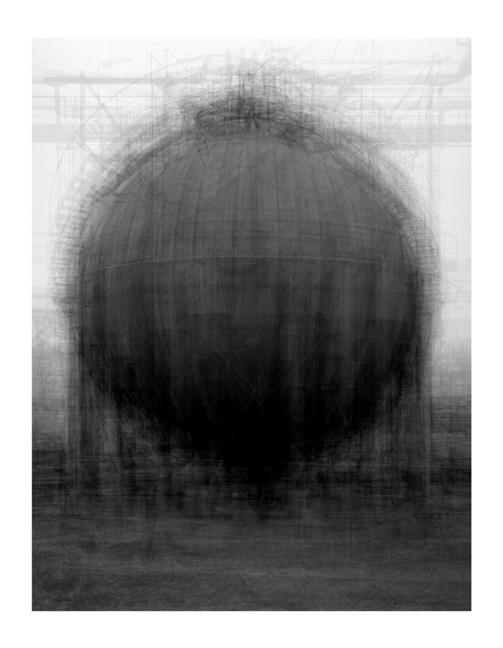

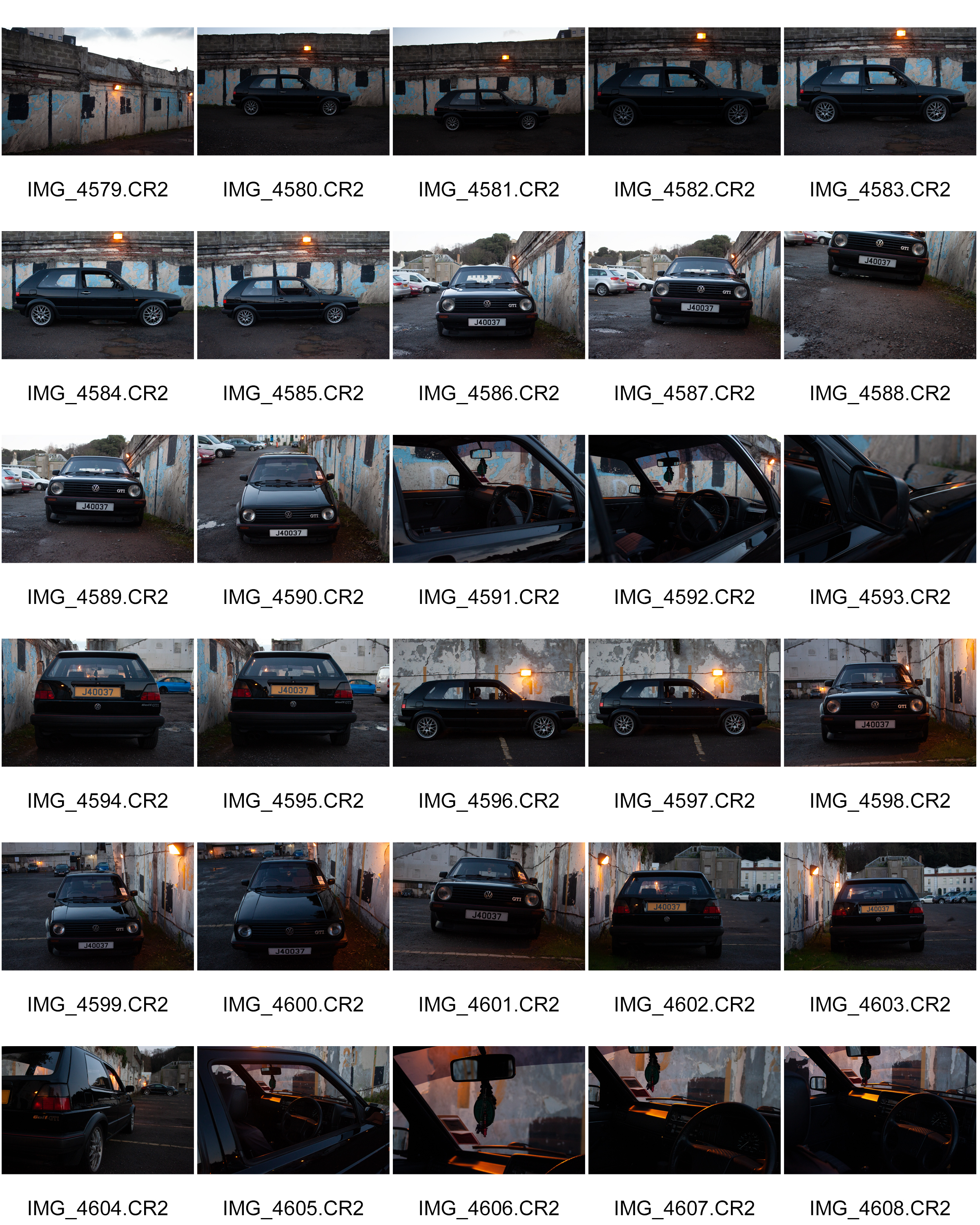
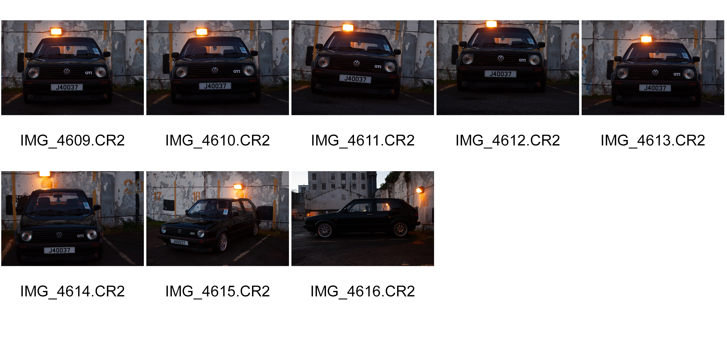
This Photo-shoot was inspired in terms of composure by the images of Zhao Xiaomeng. I used an ISO of 1600 in these images in order to have some grain in the images while allowing for well lit sharp images without a tripod. All images in this photo-shoot were taken using the same settings apart from the first 4 which were taken using a lower ISO than the other images in the series, as for other settings i used an F stop of 5.0 and a shutter speed of 1/125. All these images were taken using raw images in the CR2 format, this allowed for more options when it came to editing the images in light-room.
My personal favourites of this photo-shoot are photos 4584, 4590, 4592, 4593, 4596, 4598, 4601, 4606, 4608, 4610, 4614.
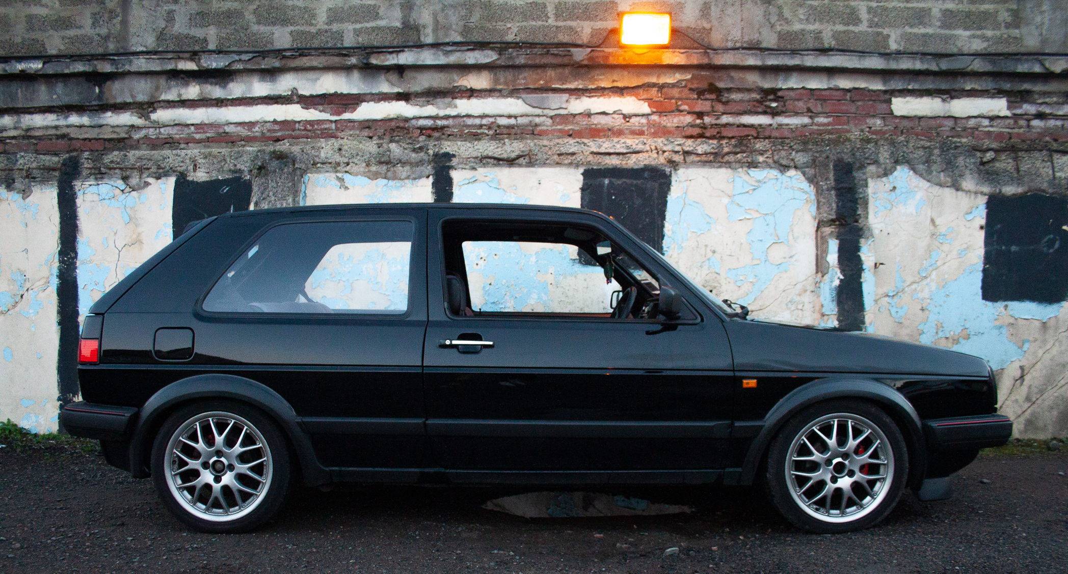
Below are some examples of lightly edited images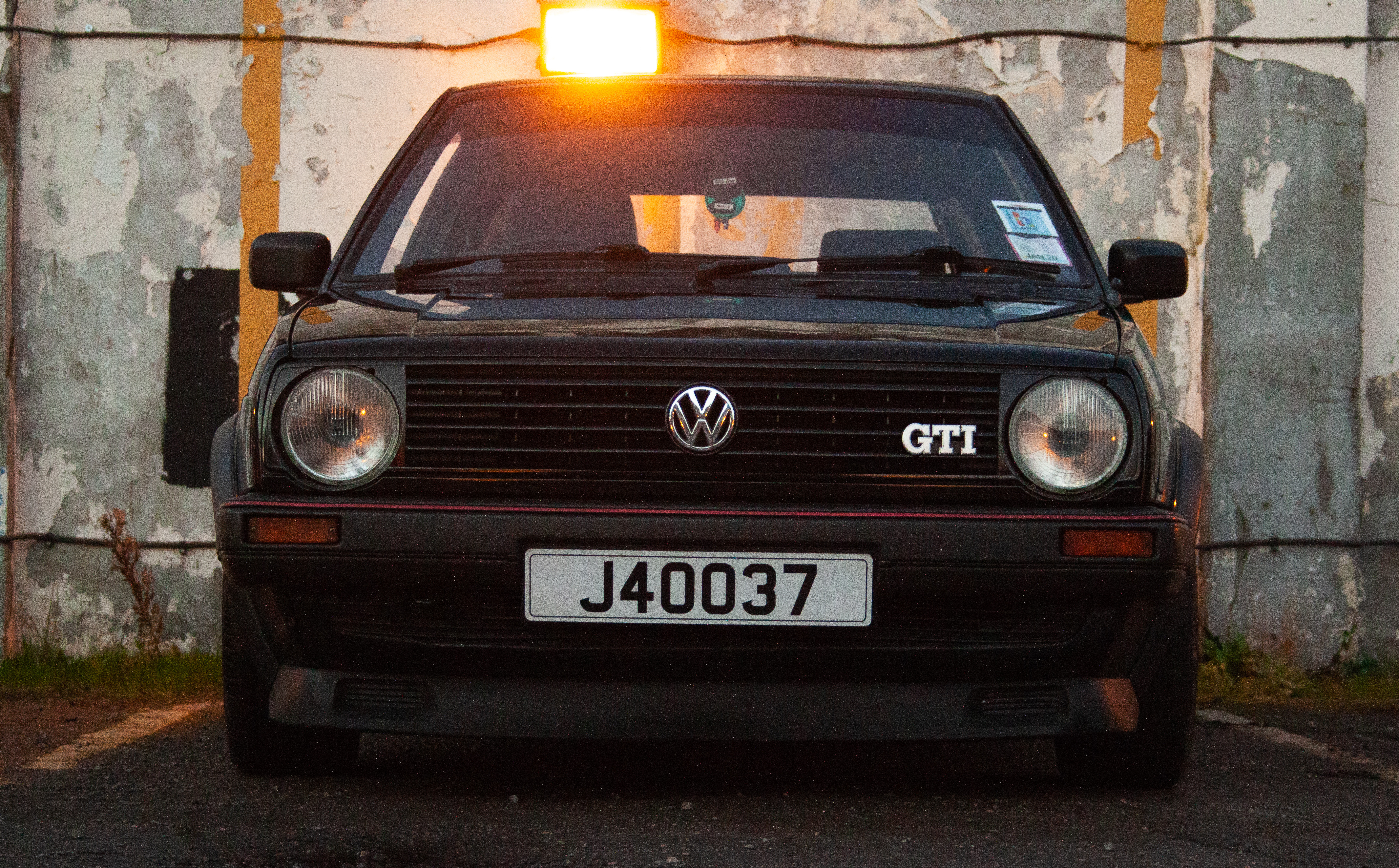
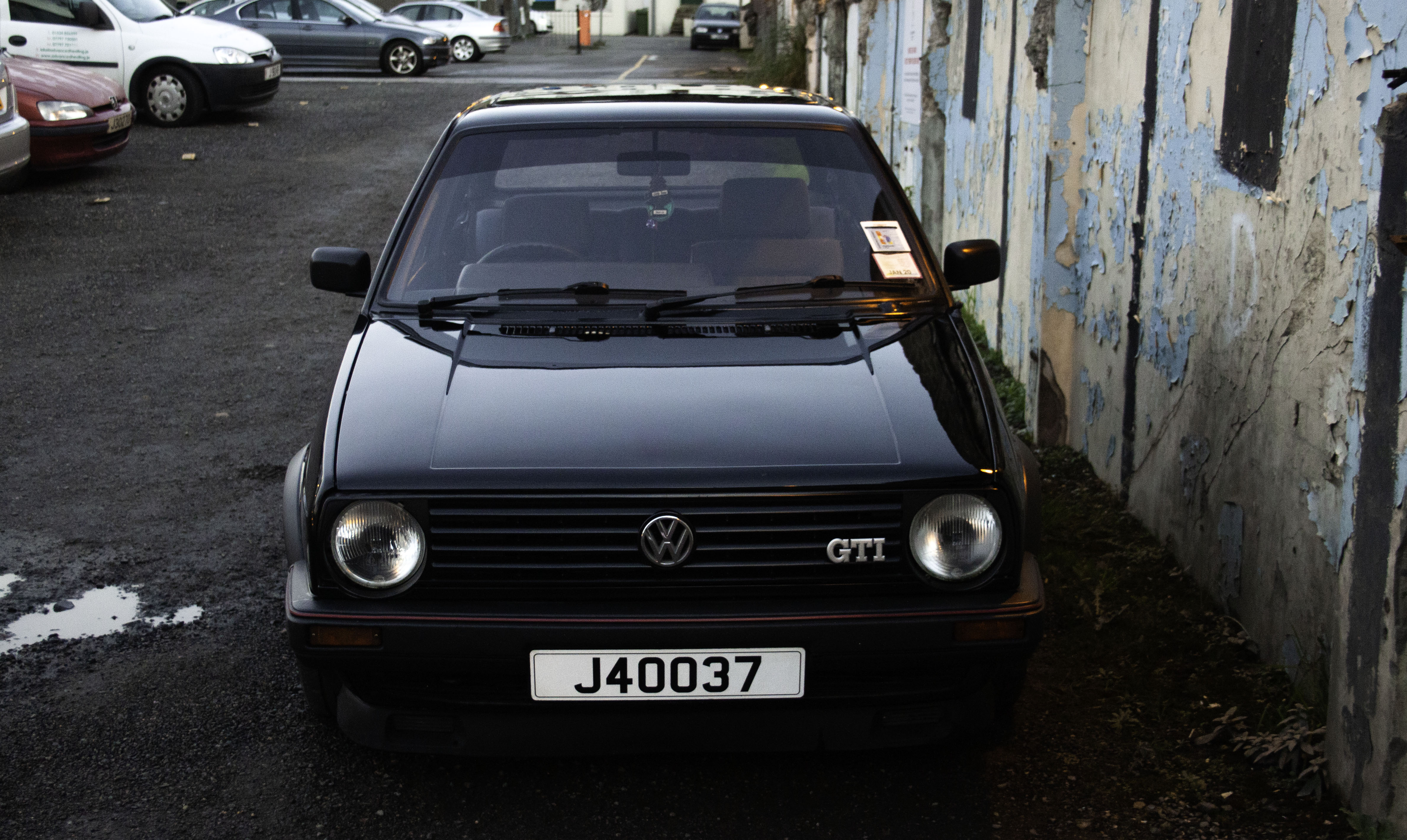
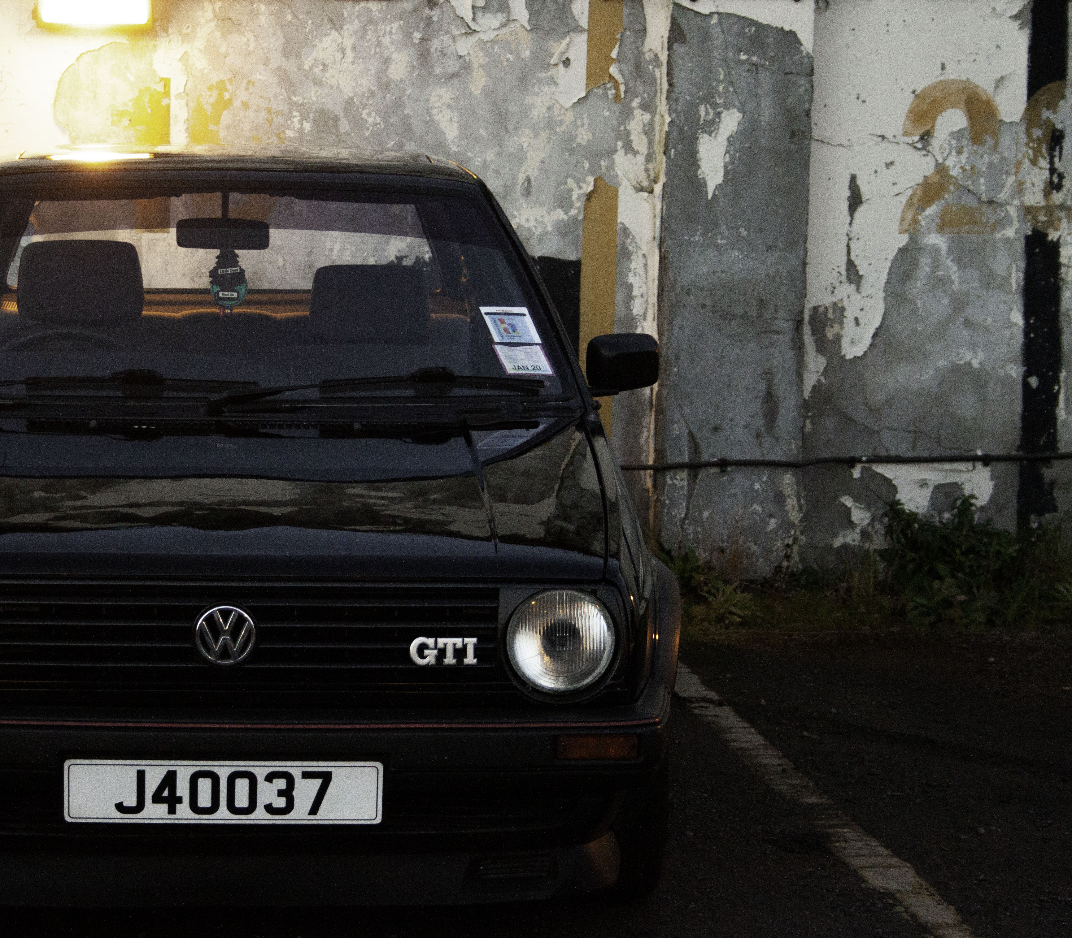
For this image in particular I began in light-room where I most notably adjusted the exposure, contrast and cropped the image, however I did also make some changes to settings such as color temperature and vibrancy. I also made minor adjustments to sharpness and noise reduction settings, this was because although I like the grain created on this image, it looked too heavy in certain areas and in my opinion was affecting image quality.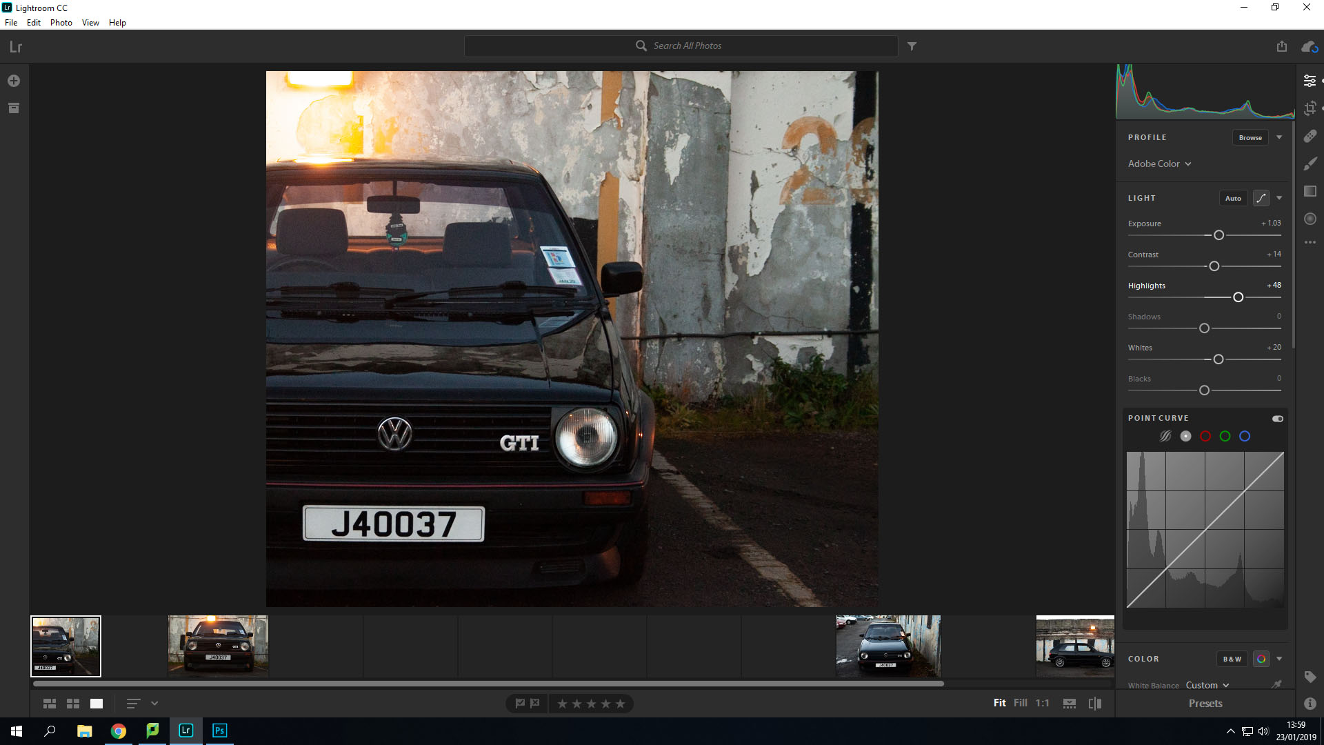
In photo-shop I only used the selective color tool to reintroduce some of the warmer tones into the whites of the image and increase the blacks in some areas.
Original
Retouched
I found the work in the exhibition we went to amazing. The work by Clare Rae, being inspired by Claude Cahun, looks almost as if they were taken by the same person. The fact that they both focus on female empowerment and take their photos in the same sort of white, grey and black tones makes it obvious that Clare Rae was aiming to make her work similar to those by Claude Cahun. However, Rae didn’t copy her completely, she added her own twist to it by taking portraits of herself, whereas Cahun used multiple different women within her pieces.
The way the exhibition was presented helped us compare the two artists in a way which we could easily see the differences and similarities. By being placed in two rooms right next to each other, we could easily switch between the two, and the neatness of it allowed us to see the work clearly and without confusion as to which was who’s.

This is one of my favourite pictures by Clare Rae. It shows Rae hiding behind a part of a cliff that’s sticking out with her legs and one of her hands in clear view. What I especially like is the tone, it’s mysterious. You only see half of her, you can’t see her face at all. You can’t see her emotions and you can’t tell what she’s thinking while taking this picture. Some also might say that it’s her way of saying that she feels like she needs to hide, possibly due to her gender as Cahun got across in her work multiple times.

This is one of my favourite pictures by Claude Cahun. It shows a woman posing with a top which on it says “I am in training. Don’t kiss me”. This could suggest that, as with Clare Rae, that due to her gender she feels restricted with what she can and cannot do. It could also come across as she has certain expectations to live up to as a woman, and the writing on her top may refer to a woman’s role within marriage at the time this was taken, as to be considered the ‘perfect’ wife you’d have to pretty much be trained in what was considered as ‘feminine’ jobs, such as cooking, cleaning and looking after the household.
From the stimuli given, I’m going to focus more on the idea of self identity. This will include self portraits and timed frames. This can aid me to explore a person’s ‘mental identity’ because i’m exploring my own. This then can enable me to convey more emotions and ideas due to the model and the photographer being the same mind – it can help convey they correct message.
The definition of self identity is – ‘the perception or recognition of one’s characteristics as a particular individual, especially in relation to social context’
Self identity is all a collection of beliefs that can physically embody the concept of ‘Who am I?’. This in relation to the stimuli can show the reality of someones thoughts and feelings.
First Ever Self-Portrait
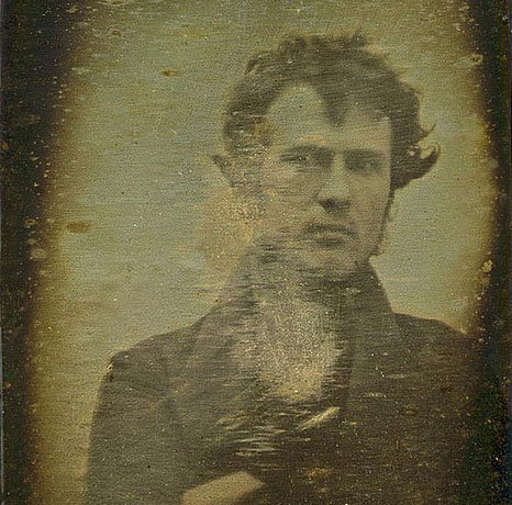
The first ever self portrait photograph was created by Robert Cornelius. It was created in 1839 , taken only a few months after Louis Daguerre revealed his daguerreotype process in 1839. Cornelius simply ran in front of the camera after taking the cover off the lens, vastly different to today’s technique of snapping away.
The fact of being who or what a person or thing is.
Identity can be based on multiple factors. The person someone is today might not be what that person is tomorrow, we adapt and portray ourselves as how we want to be seen and it usually demonstrates aspects of who we are. For examples Identity can reflect on your upbringing, being religious, non religious, being foreign to being born within Europe, culture, family, hobbies, friends and life style choices, even your own appearance can reflect or be used to make you stick out from a crowd weather this being someones features or not its still there. Regarding to the other theme of place. this can be seen as, what makes this place relatable to you as a person. The environment and colors also come into consideration, the questions asked when having a scenario places within the lines of identity means it has to voice what the model cannot speak in a photograph.
The model I have chosen is my brother, it links well with identity as its someone who I am close with and interact with on day to day basis. After having thought of quite a few different places to set my images out on I presumed that doing something related to sports would be quite a good idea. This to me struck like a good idea as part of his identity i.e. personality is the fact he is good at sports so I have based some of my experiments on places where you’d usually find an activity being performed .
Different types of Identity:
Mood Board –
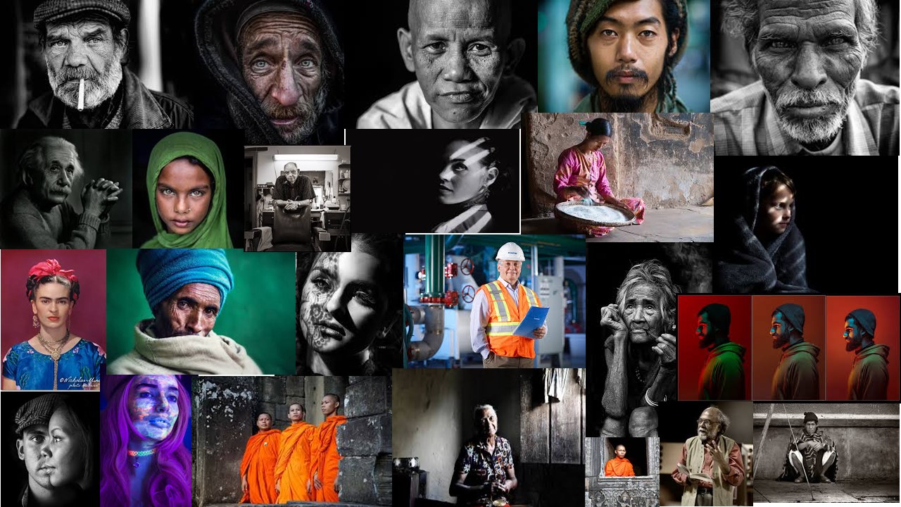
My idea is that ill capture my images, before, during and after the game and in general capture home life and how he dreams and thinks about football all the time .This being said i want the images to be presented as a story of the day in the life of someone who plays football. However my images aren’t just going to be portrait based, i will include images like the football, the equipment, water bottle. For this idea i have chosen to look at a sports photography which also links into environmental portraits.