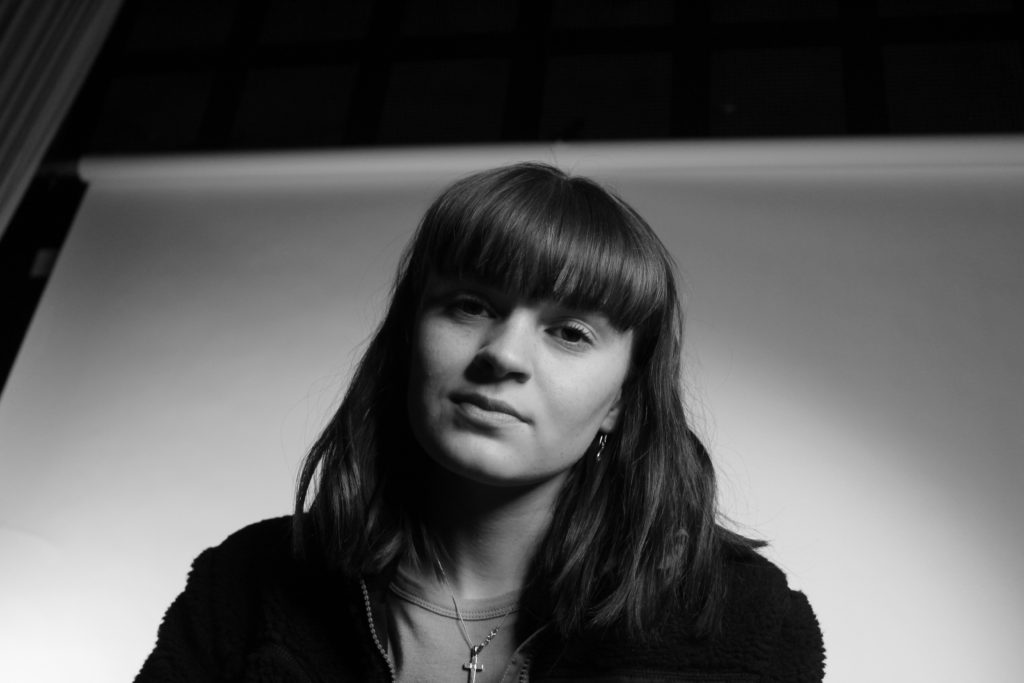
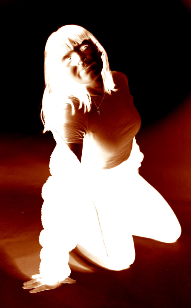
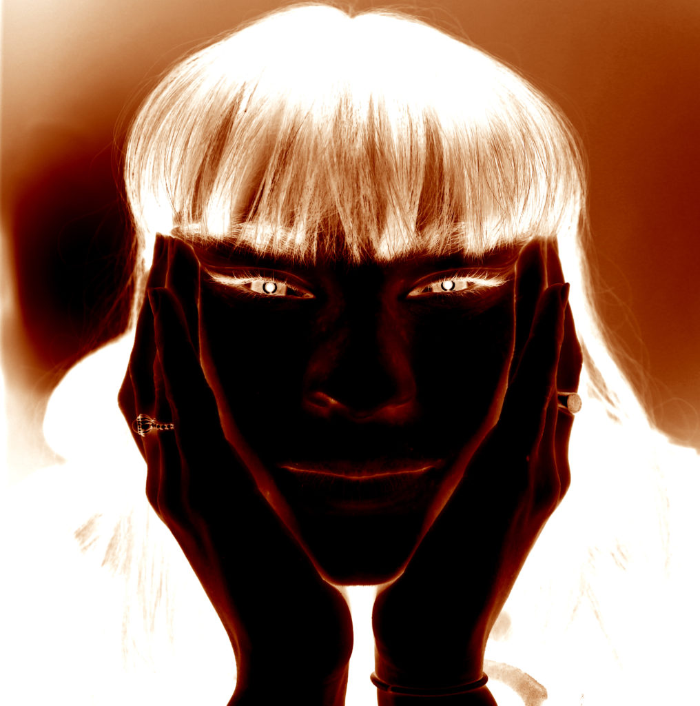
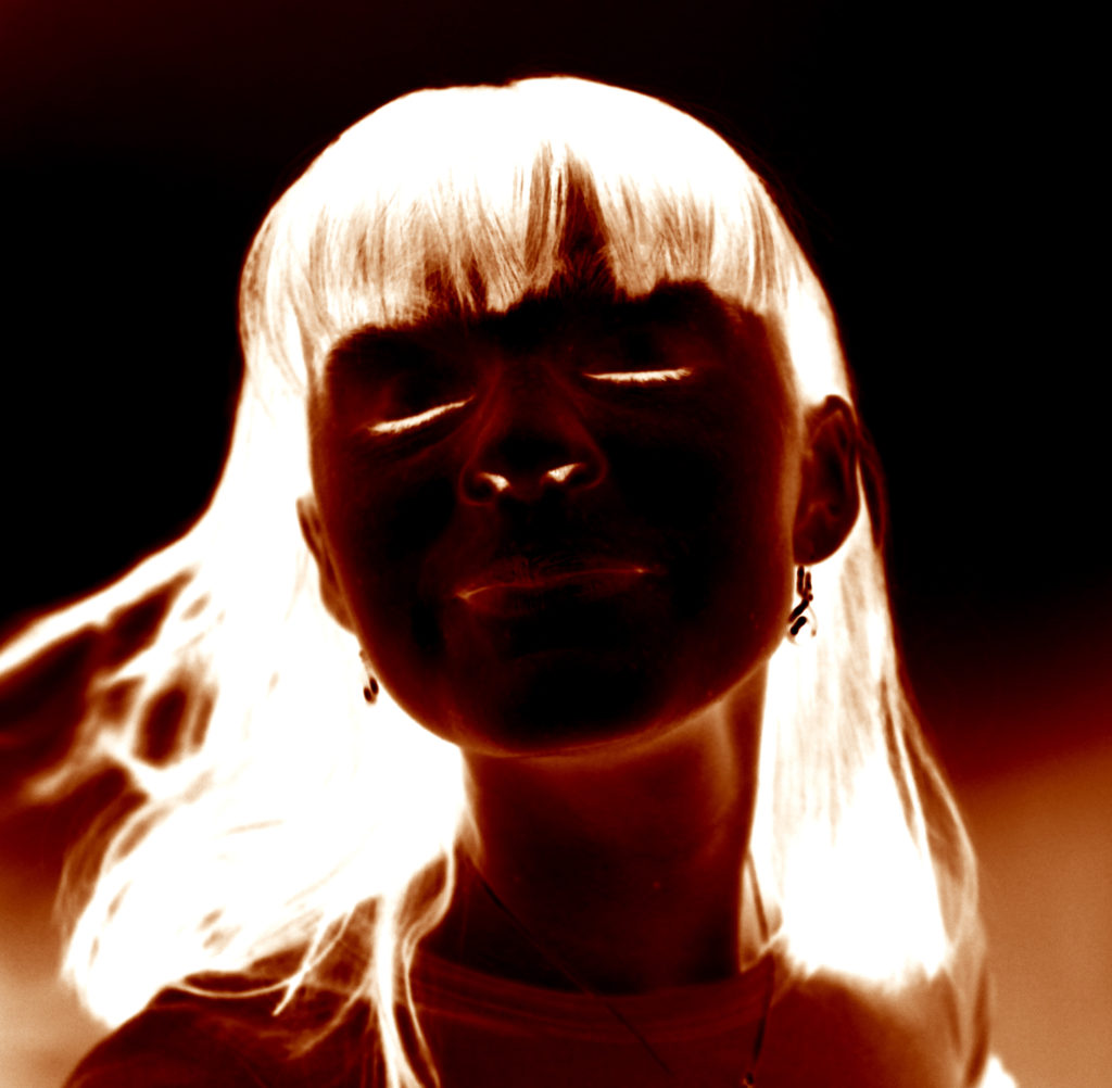


Julia Margaret Cameron was a photographer in the Victorian era. And she was special because she was one of the only female photographers back in her time and everyone was interested in her, she used her family and sibling for her photography .Her photographs focused on both religious and literally work.
Peter Henry Emerson was famous for his book that he wrote and his photographs that had a lot of realism in them and color.
A lot of groups of photographers arised in that time for example The Vienna Camera Club which was mostly on female nudes which raised a lot of concerns and questioned because now a days sexism is not much of a thing any more and females have more rights because the world became more modern, while in the old days specially examples like The Vienna Camera Club you can see how the females bodies where objectivide and that was a normal thing
the pictorialist where a group of photographers around the world which created photographs which had a lot of symbolism in them which where objects in a photograph that meant another thing most of the time about religious or literal stuff
Walker Evans was a documentary photographer that rejected Pictoralisim by photographing farmers or low class people and families and there houses to deliver a message to the people
The images will be of landscapes and areas that were of significance to my grad-parents and their relationship during the occupation. Will include Gory pier, albert pier, areas around Grouville and the sea.
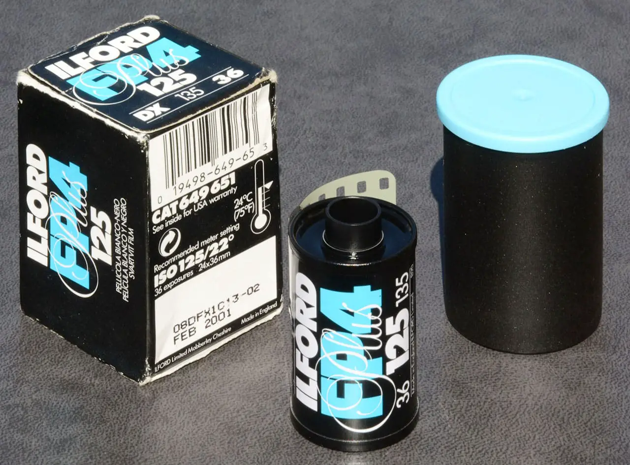
For the photos I will be shooting my images with 2 rolls of vintage ilford blank and white film (FP4-125-35mm) that expired in 1996 the reason I will be doing this is that the ilages will be in blank and white which has “fine grain, medium contrast and outstanding sharpness.”
The film being out of date will mean that the images will likely be distorted with good amounts of grain. There may also be some defects in the developed images in the form of blotches or patches of distortions.
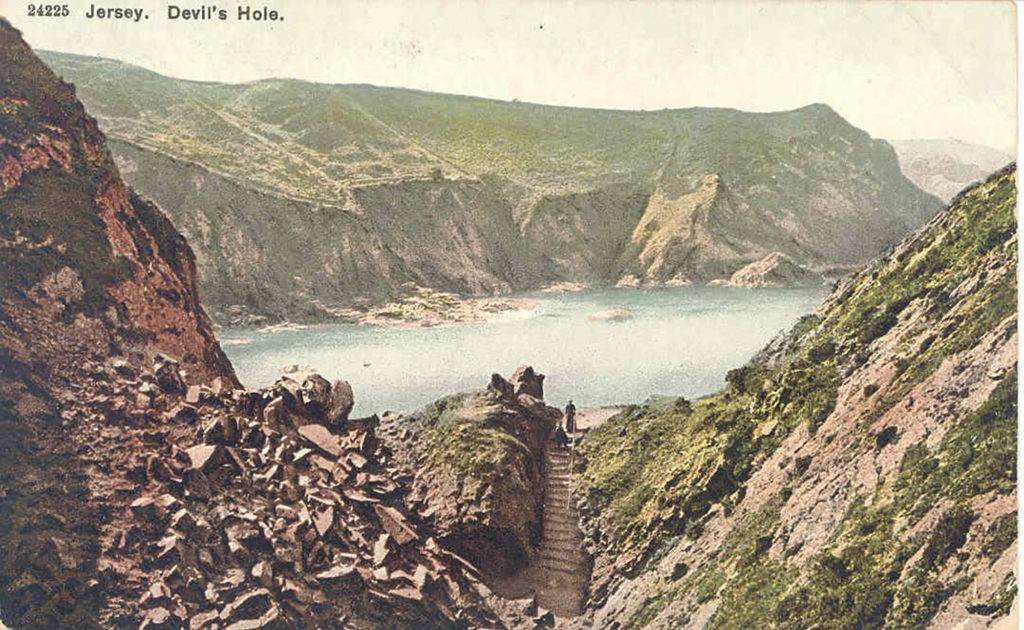
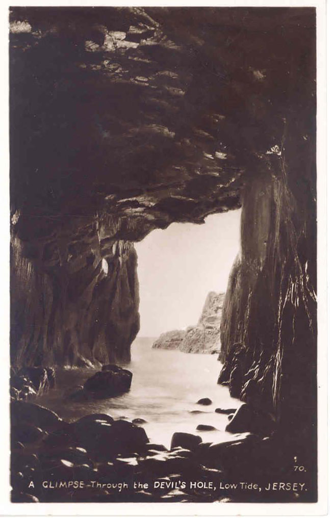
I have looked into using some archival material for my photo-book, exploring the Jersey archives I have found that the Dolmens I have visited were badly excavated int the 19th century and do not have good recorded documents of the sights so I will be unable to use them. Devil’s Hole however was and still is a tourism sight and had made a lot of news around them so there were a lot of postcards on it I have chosen the ones I did specifically as one matches a picture I have myself and the other I feel works well as the entrance of a story.
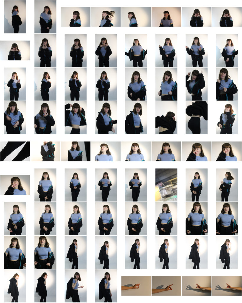


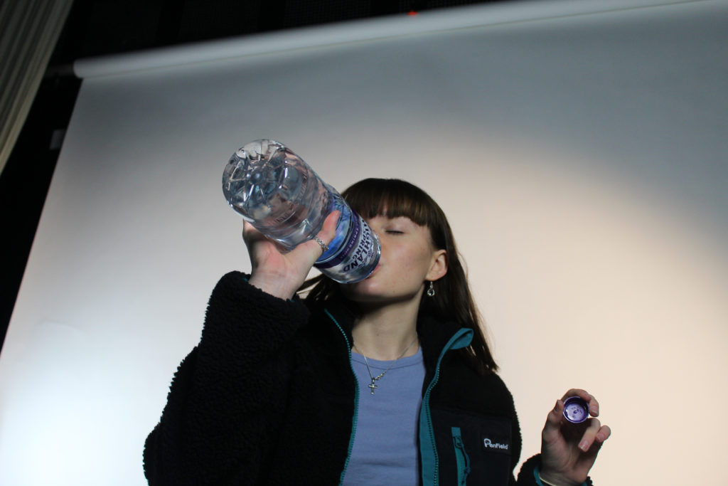
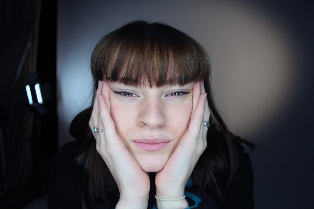
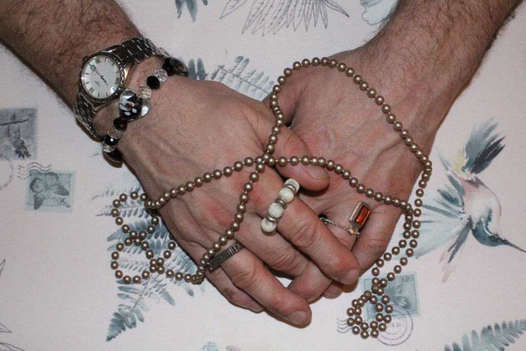
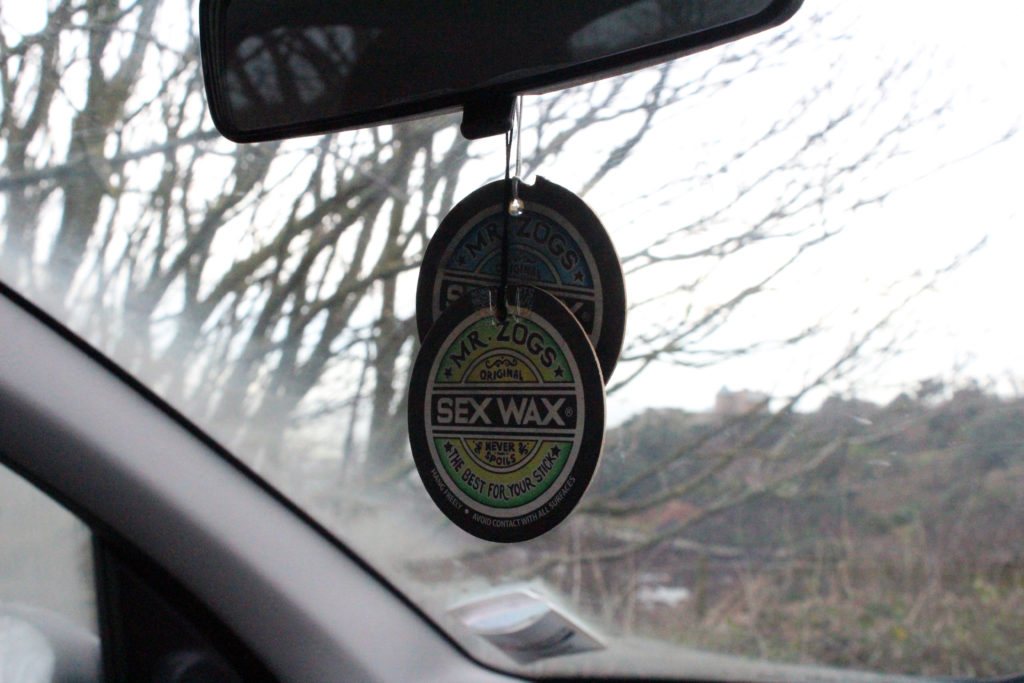
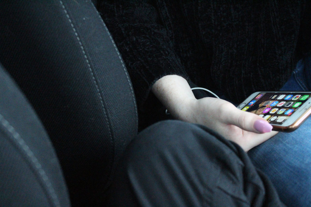
For my third photo-shoot, I will be focusing more on the physical objects that can be associated with gender, and will be contrasting these with each other in the photograph. As the focus of my project is on breaking gender stereotypes (liberation of gender) and showing the truth behind peoples identities and the way they express themselves through gender, I will be focusing on creating images that encapsulate stereotypical gender roles and stereotypes, with small twists within the image that allow the viewer to realise that the image is not what it seems (specifically, that the stereotypes they link to the objects may not always be accurate. For this photoshoot I will be focusing on feminine objects, such as makeup and jewellery, and will be intertwining the idea that both women and men can suffer when it comes to expressing femininity, to create a contrast. This photo-shoot will be focused more on the hints to the viewer that some people express their identity in less stereotypical way, and that there are often social consequences for those who do this.
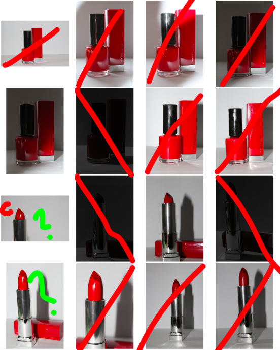
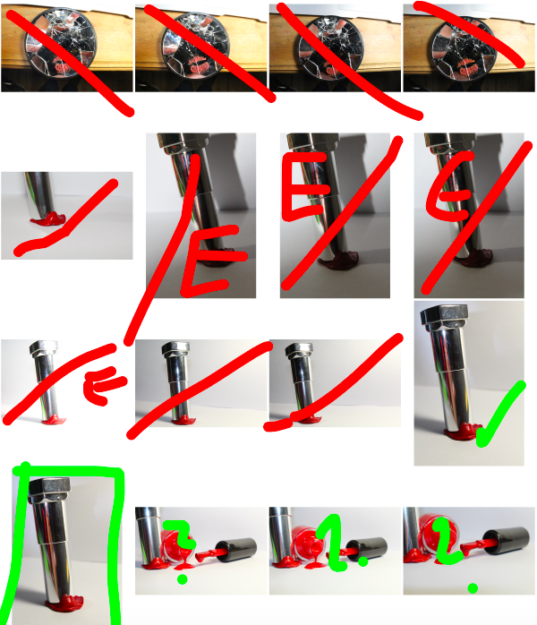
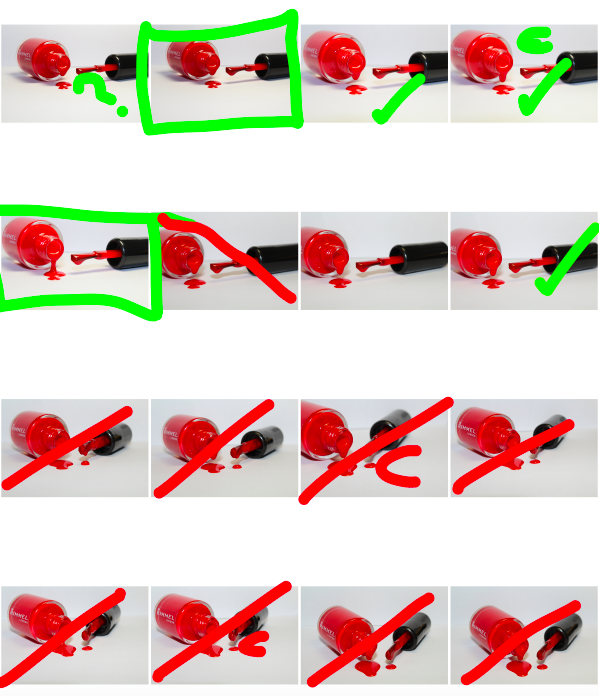
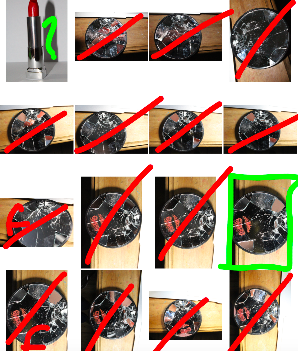
Below are the contact-sheets for my photo-shoot, I have indicated my decision making process using the brush tool:
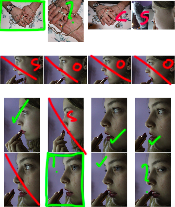
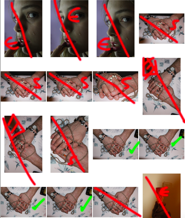
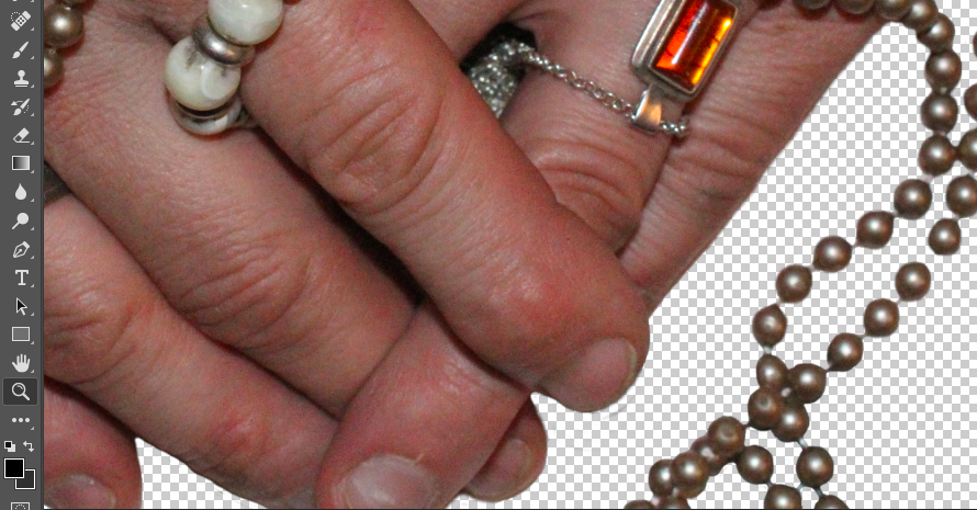
For my first image, I wanted to separate the image itself from the background in order to replace the background with a simple black background (as I felt this would draw maximum attention to the image and details in the foreground). To do this, I used the lasso tool to highlight the areas of the background, and deleted it from the layer. I then went around the edges of the image with a 0% hardness eraser tool in order to soften the boarders so that it would blend more realistically with the black background.
I then added a black background to the image to make the foreground image stand out more and draw maximum attention:
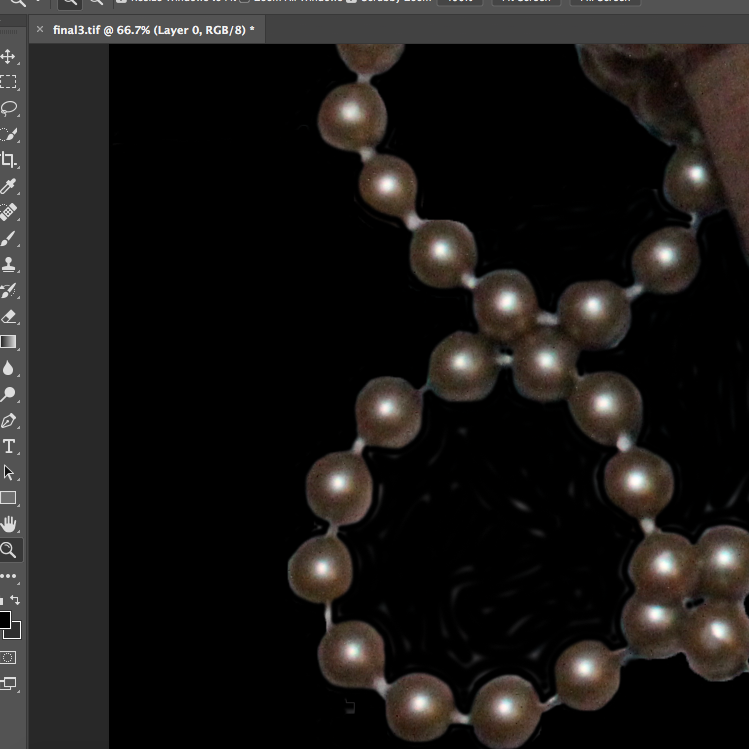
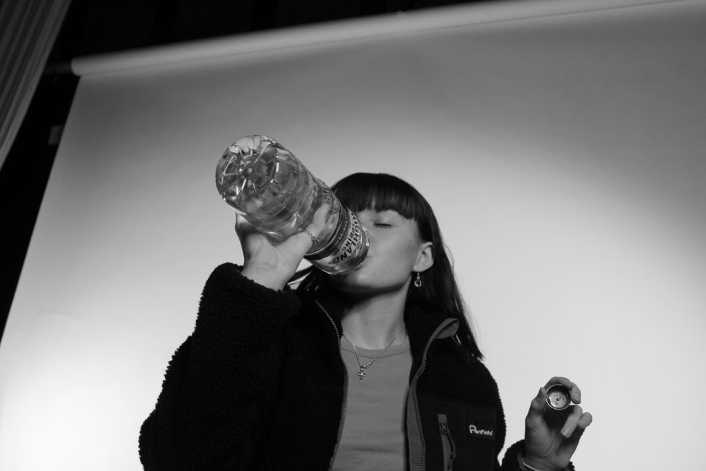
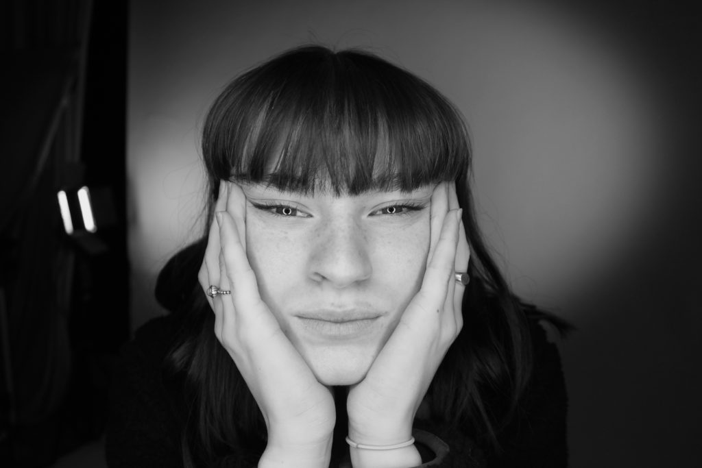
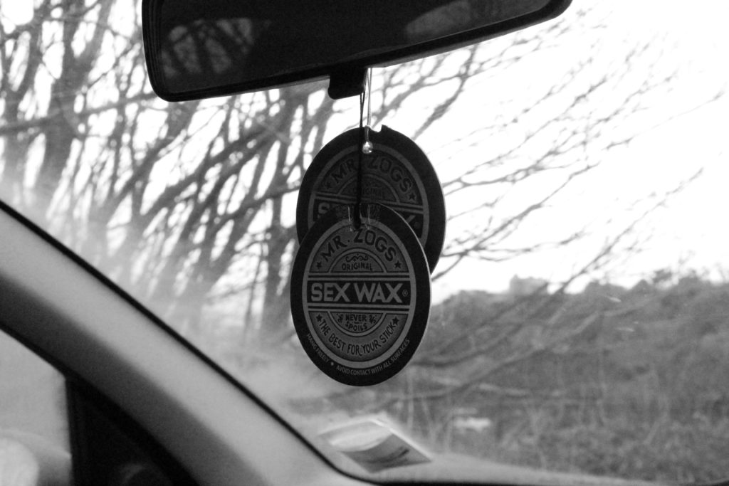
I decided to focus on the contrast of the shades, textures and shapes of the image, and therefore decided to make the image black and white, and raise the contrast substantially in order to emphasise these contrasting aspects:
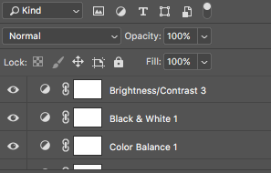
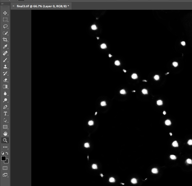
I decided that for this image, I wanted to highlight a certain area of colour in order to draw the viewers attention to the image, and to provide a small amount of contrast in the image which would draw attention to the jewellery that the subject was wearing (by highlighting the colour of the stone, the viewer can more easily focus on the jewellery itself, rather than looking at the whole image as a flat continuous image). To to this, I copied the original coloured image, and copied the stone using the lasso tool. I then pasted that over the top of the black and white image, and smoothed out the edges:
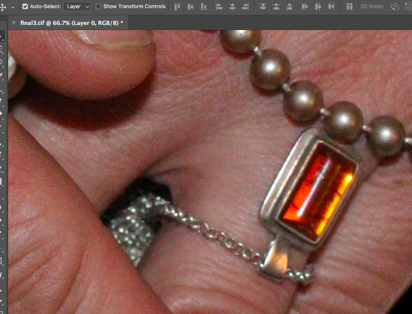
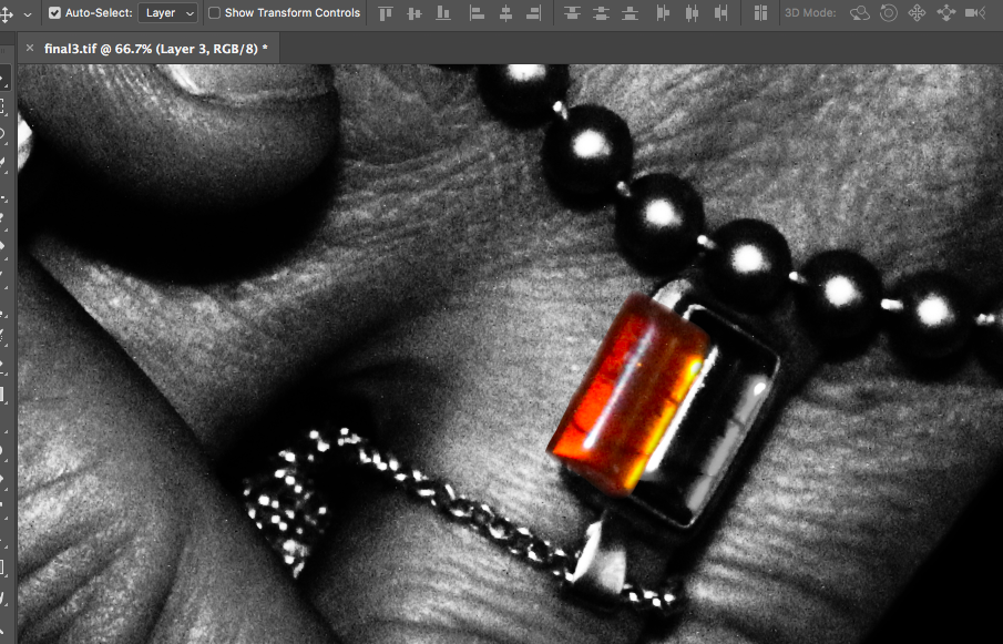
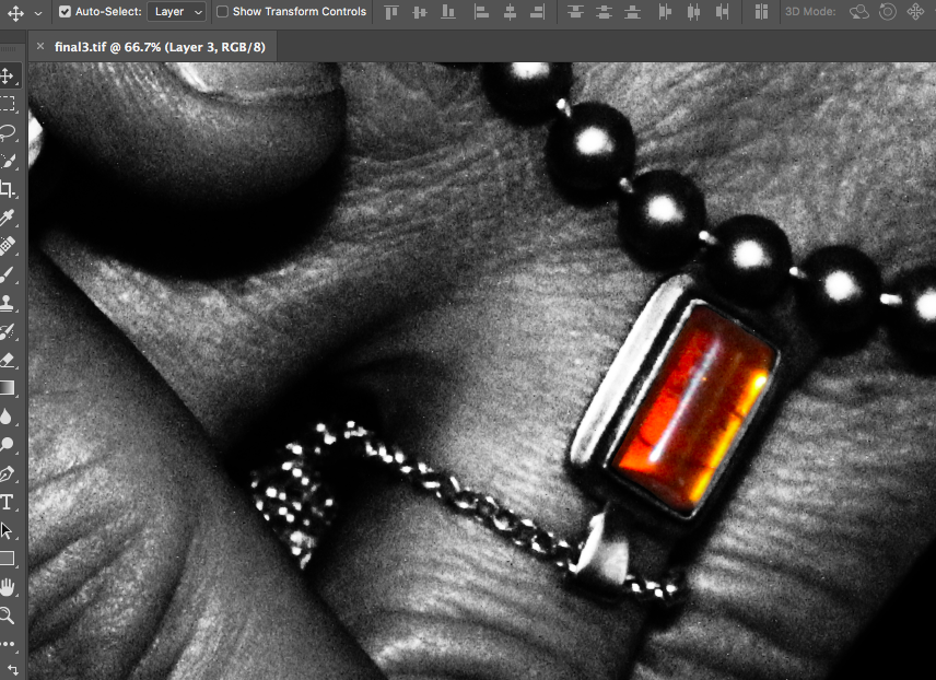
The final image can be seen below:
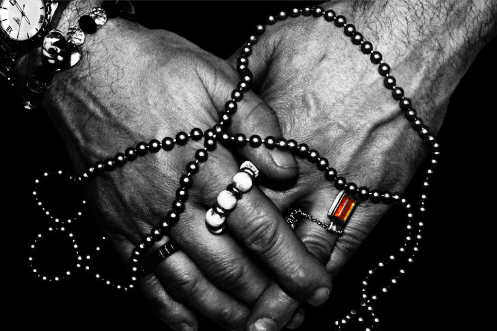
I used the same sort of editing process for the other final images in my photo-shoot. I increased the contrast of many of my photos, (especially if the image was going to be turned monochrome in order to increase contrast between shapes).
Below are my final images for this photo-shoot:
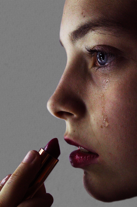

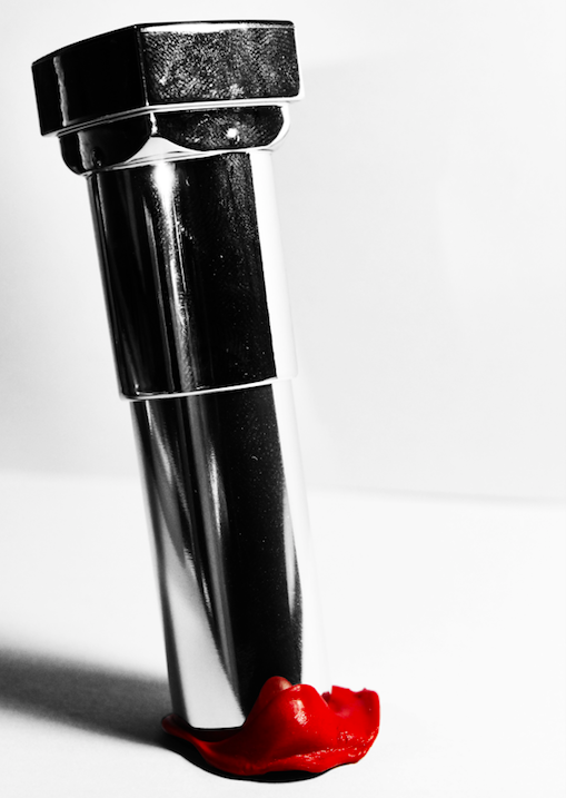
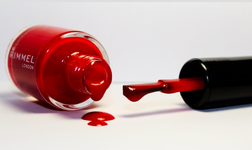
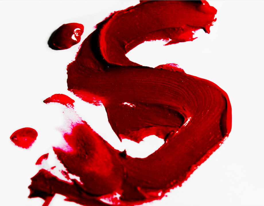
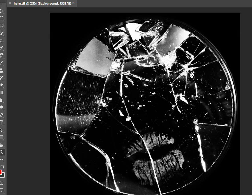
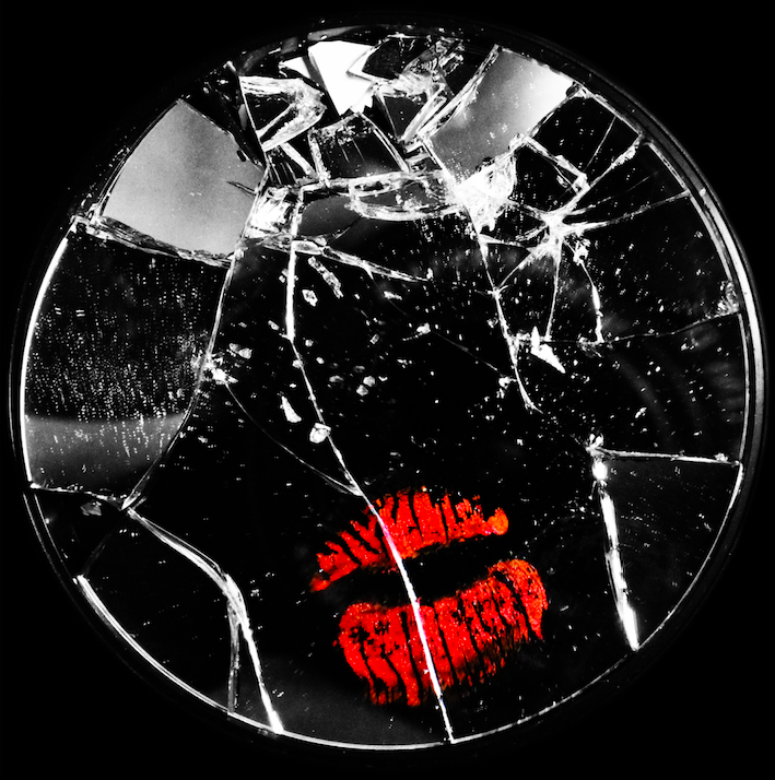
for the below image, I used the lasso tool to cut the lip mark out of the original layer and paste it onto asseverate later. I then made the first layer monochrome and increased the colour contrast of the lips to make them stand out from the background. I also cut the mirror from the background and replaced the table background with all black to force the viewer to focus on the image in the foreground:


Narrative:What is your story?
Describe in:
Design: Consider the following
The invisible hands exhibition is placed in the Jersey Arts Centre and is a collaborative project between artist Alicja Rogalska and The Morning Boat in order to showcase life as a migrant worker. The aim of the exhibition is to bring light onto the poor conditions for migrant workers on the island for the little that they gain back, the topic is one that is not spoken about often in the island however is something that plays a huge part in the identity of it.
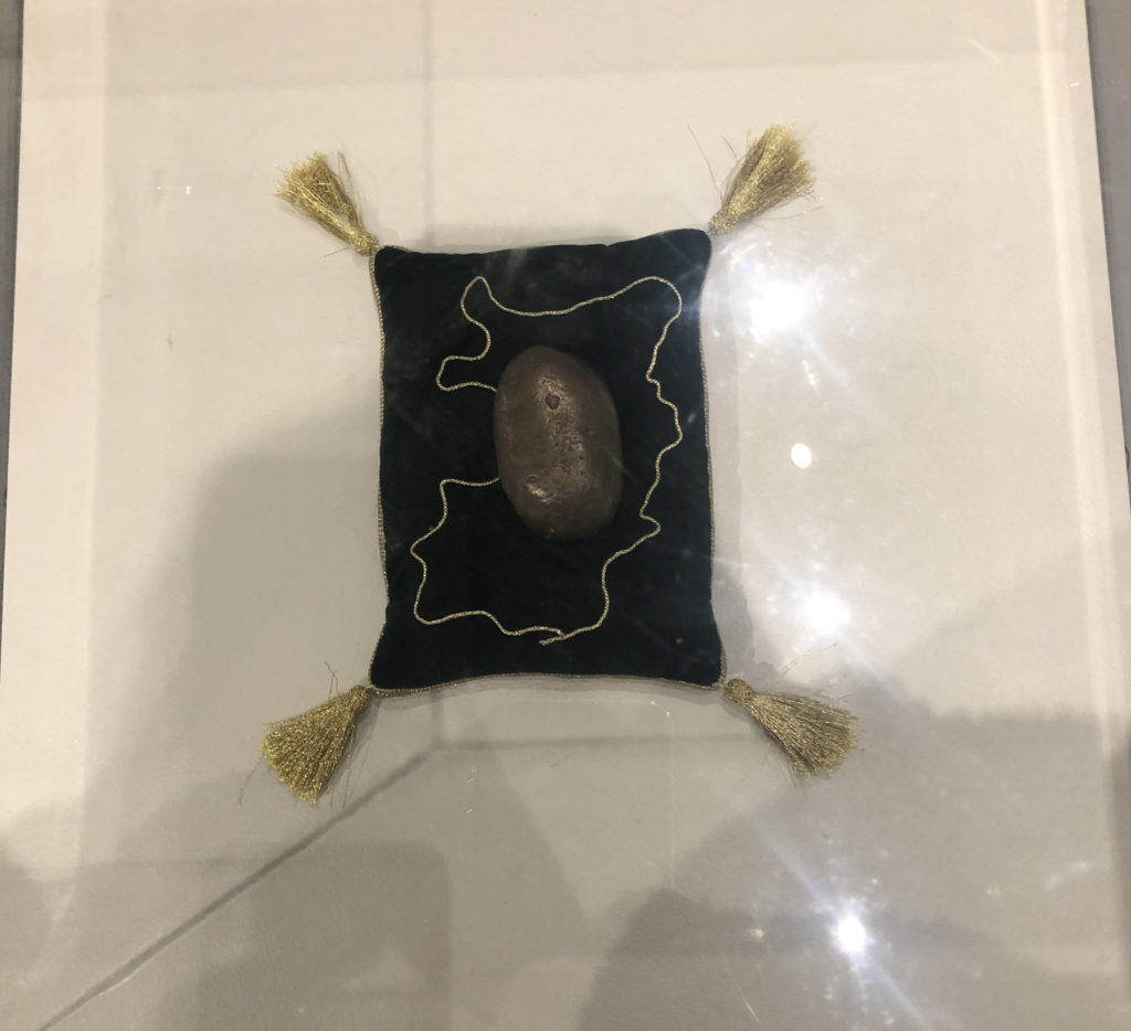
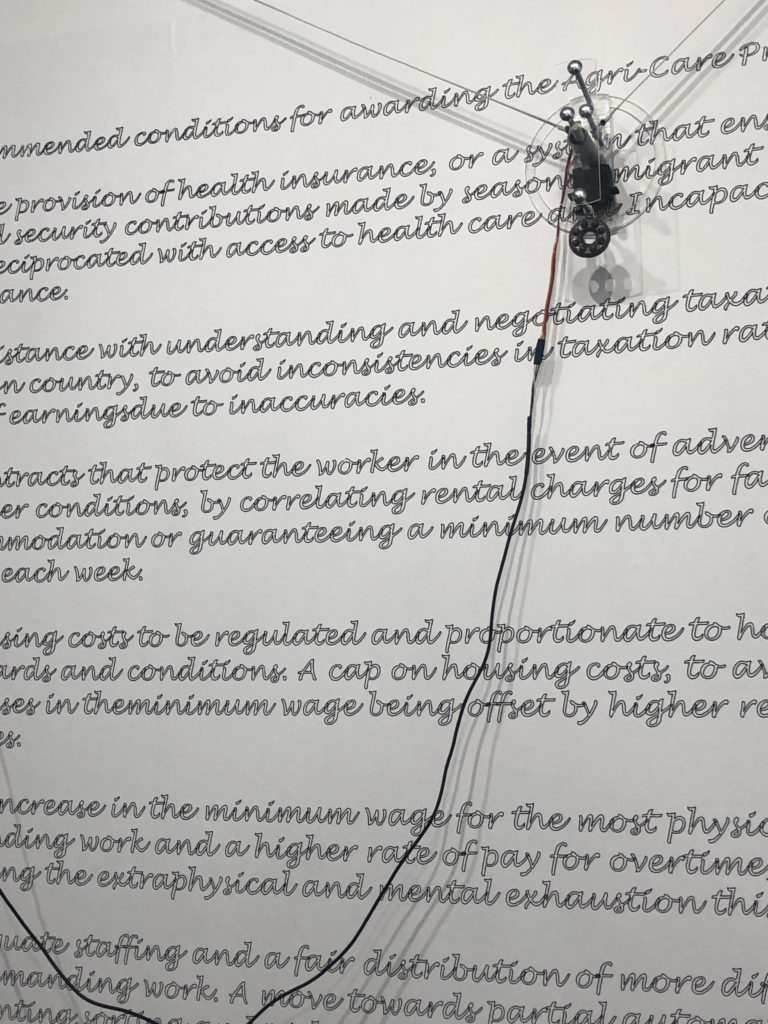
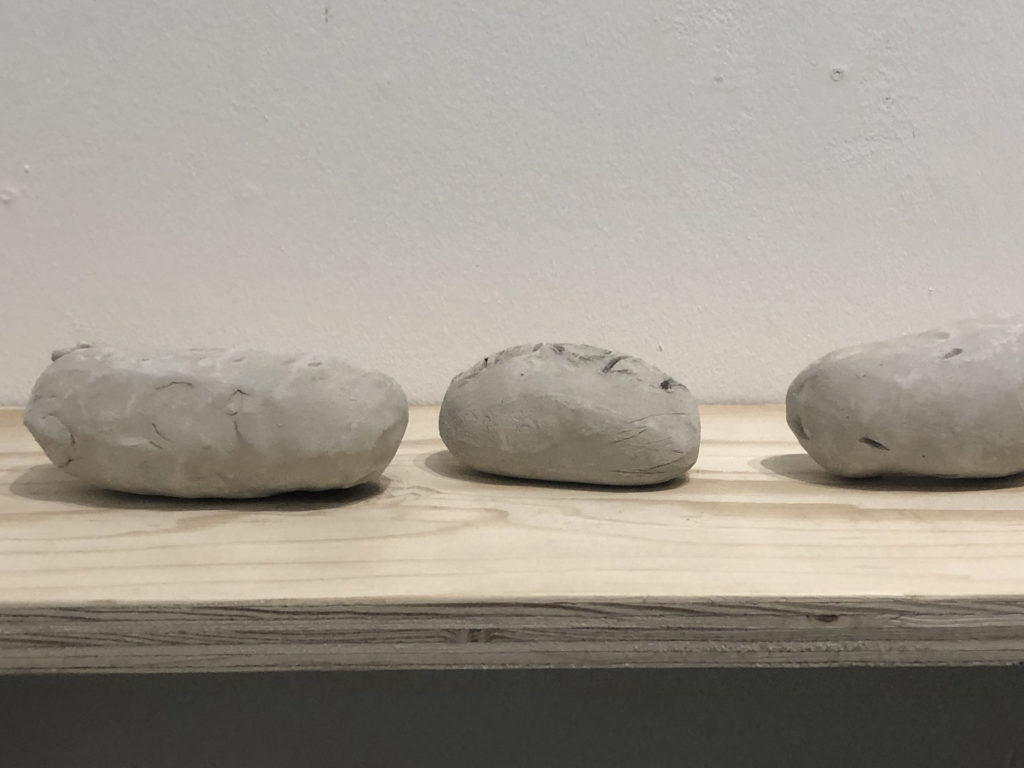
The Agri-Care prize was created during the process of talking to the migrant workers, as they were interviewed they created clay potatoes as a representation for them, potatoes being one of jersey biggest profit gains in farming, while working they decided on how they would pick out a winner for the most authentic clay potato.
Their interviews were filmed without showing their faces and a short film was played, projected on the wall at the exhibition, the lack of faces allowed the workers to remain anonymous, allowing them to speak freely about their work and links back to the title, ‘Invisible Hands’.
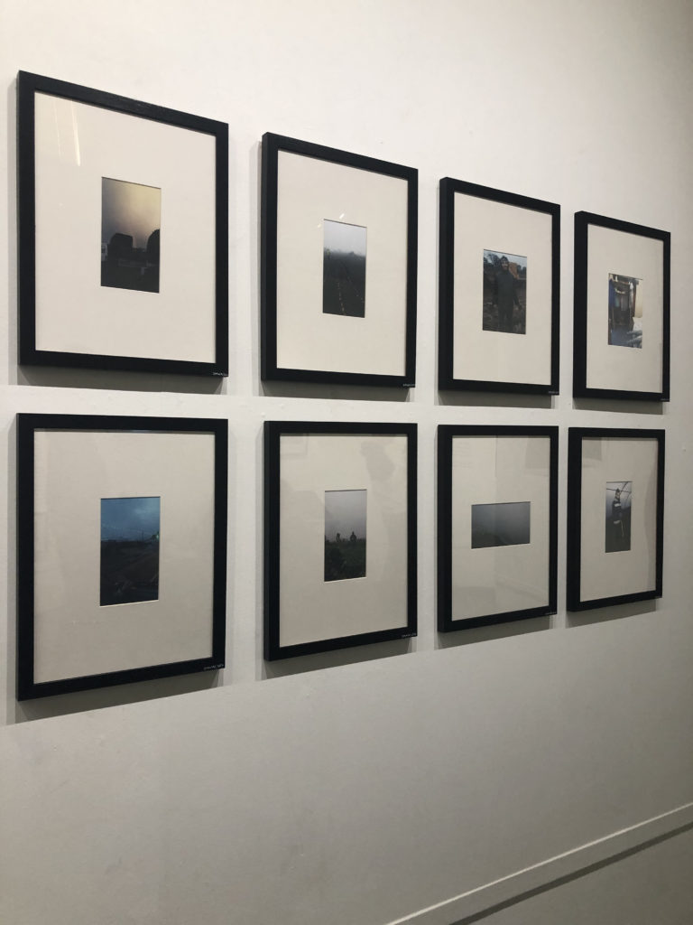
The photographs shown and displayed in the exhibition were documented and taken by the workers themselves, this is adding a personal touch to the photographs, though may not all be high quality it is a real, personal and first hand representation of what life is like working for these people.
This exhibition represents and allows the public and other locals to come in and see the side of the farming and agricultural industry in Jersey that they may not normally be known too or shown.
