Category Archives: AO1 Develop Ideas

Filters

Author:
Category:

Bunker Photo Shoot – Battery Lothringen

Information:

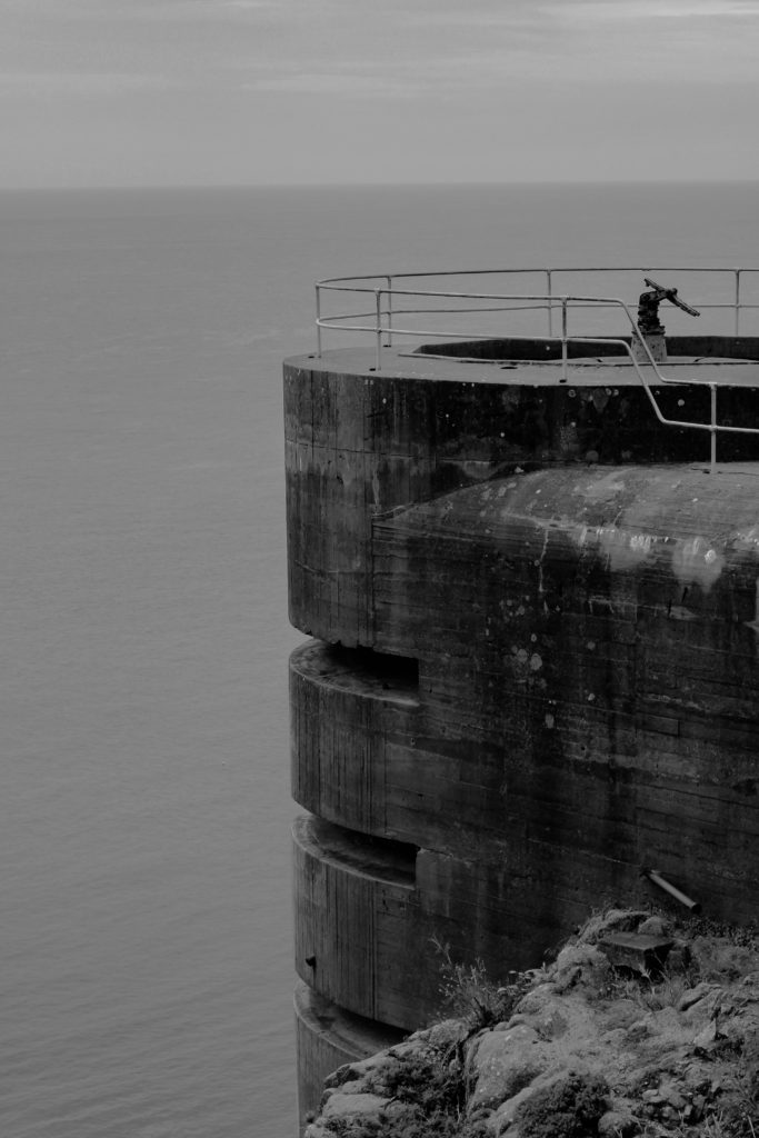
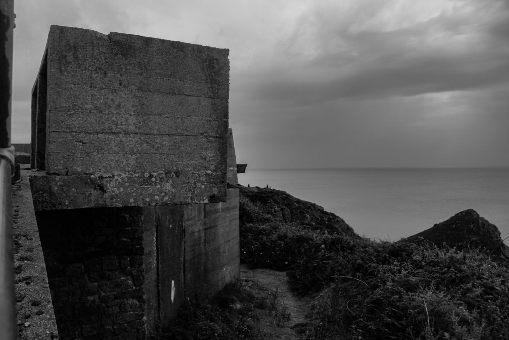
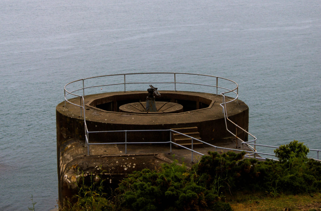
On the 18th June 2019 we visited Batter Lothrigen, at Norimont, which was a battle artillery battery during the second world war. The site was named after SMS Lothrigen, and was built by Organisation Todt (a Nazi organisation who specialized in building such fortification). The main guns located at this site were 3 15cm SK L/45 naval guns which were elevated on concreate and looked out towards the ocean, stopping anybody leaving or entering the island (more information about this weapon). Once liberation was declared the weaponry where thrown over the edge of a cliff at Les Lands, luckily they managed to retrieve and save the weapons and have restored them to the right location on the site.

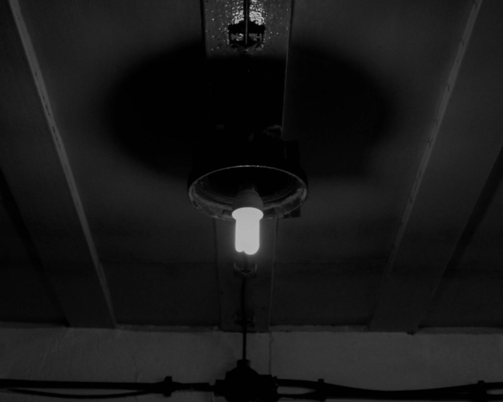
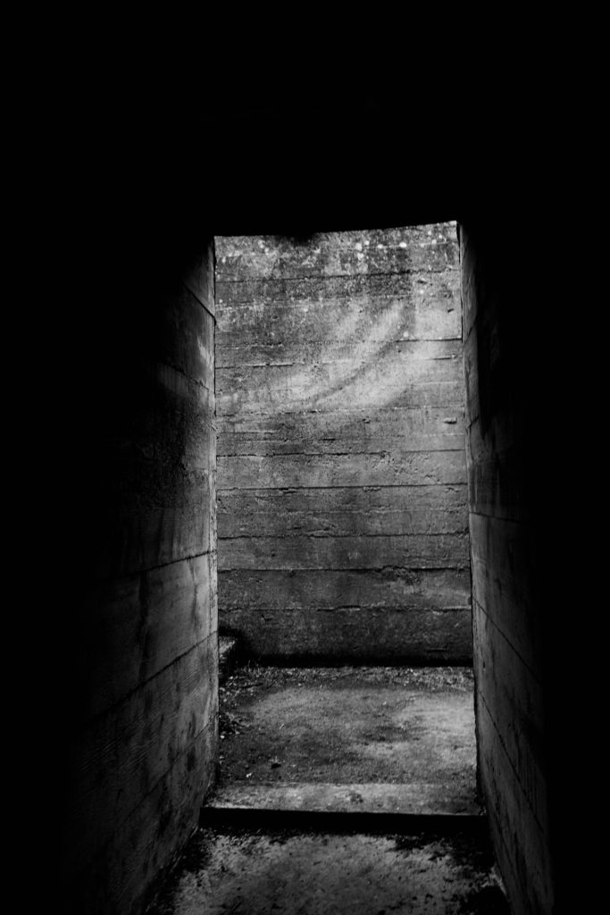
We had a guided tour around the site, with the tour guide explaining in detail what each bunker and place was used for during this time period. Some key information that I picked up, was that the site was mainly used for storing weapons and ammunition, the land was owned by the De Gruchy family who decided to preserve the bunkers and allow it to be constant reminder of that time in history. In addition, the bunkers are spread out in proxemics but are still close enough to have cabled communication connect to each bunker. The guide also had a small collection of archive images of these Bunker’s from when he was a child and used to explore them, which allowed us to see how the archaeology has not majorly changed over time. We spent a lot of time capturing the artillery site from the outside exploring different techniques and angles, but also got the opportunity to go inside one of the bunkers and understand what life was like to work down there and understand how the insides have been preserved. Due to the bunker’s being a tourist attraction on the island, it lead to the bunker being more user friendly, with dummies acting out the use of each room and health and safety coming first. This was good as it allowed a proper feeling and representation of the different uses of the bunker to be shown, however it lacked the historical feeling as the outsides had. The bunker was some what dark and cold and was split into 2 floors, they are designed in a spider shape with a central area and many rooms coming off the side of the center area.

Planning:

When capturing my images outside I set my camera to the setting AV, which allowed me to put more focus into adjusting my aperture. The day was light which meant I used a low aperture and a quick shutter speed to capture these images. I explored with depth of field by using a manual focus and I had a low ISO which ranged between 100-800. When capturing the inside of the bunker I used a much higher aperture due to the lack of natural lighting as well as as higher ISO of 3200, with a quick shutter speed.

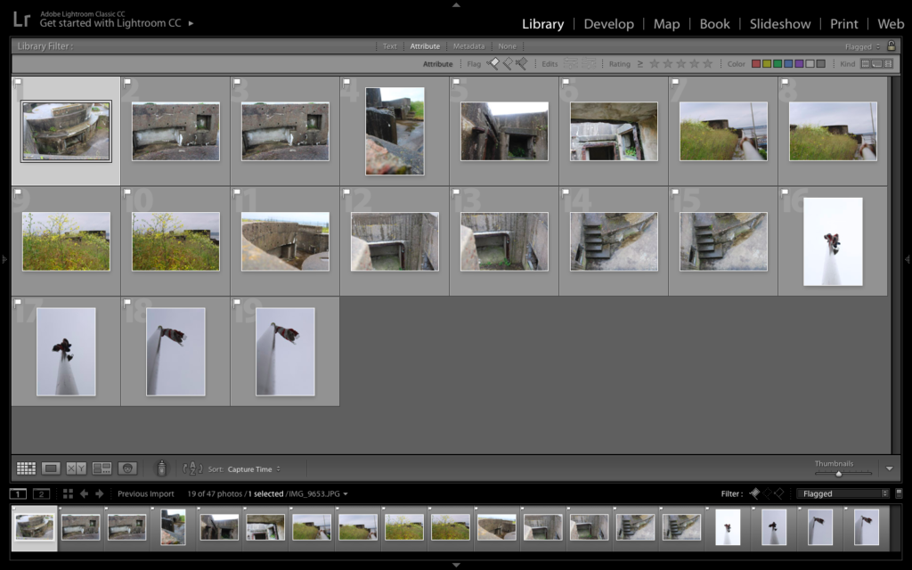
Lightroom Selections:
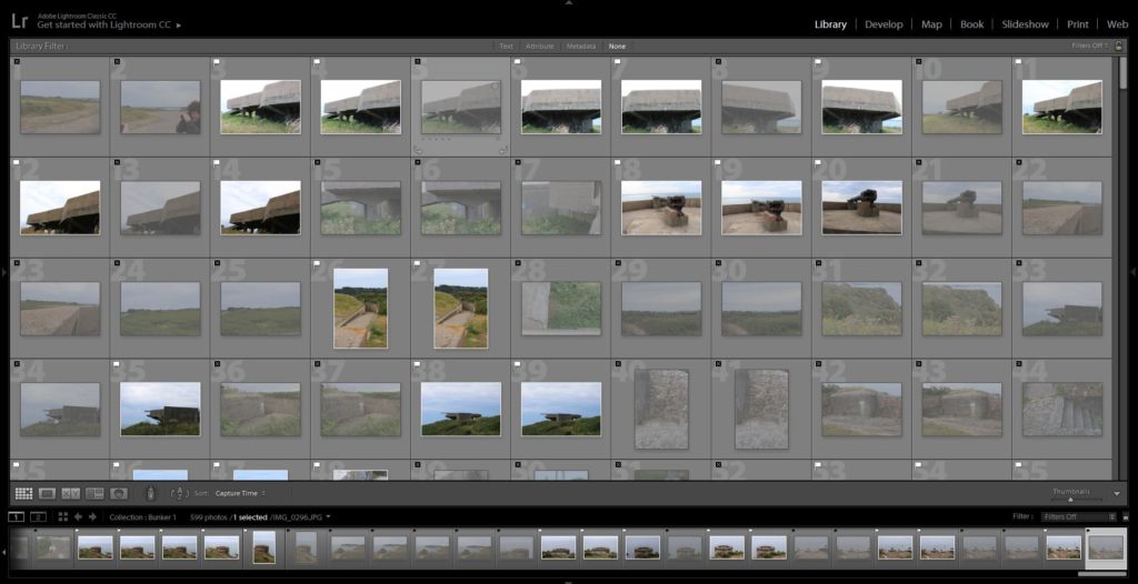
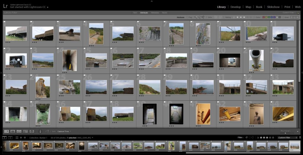
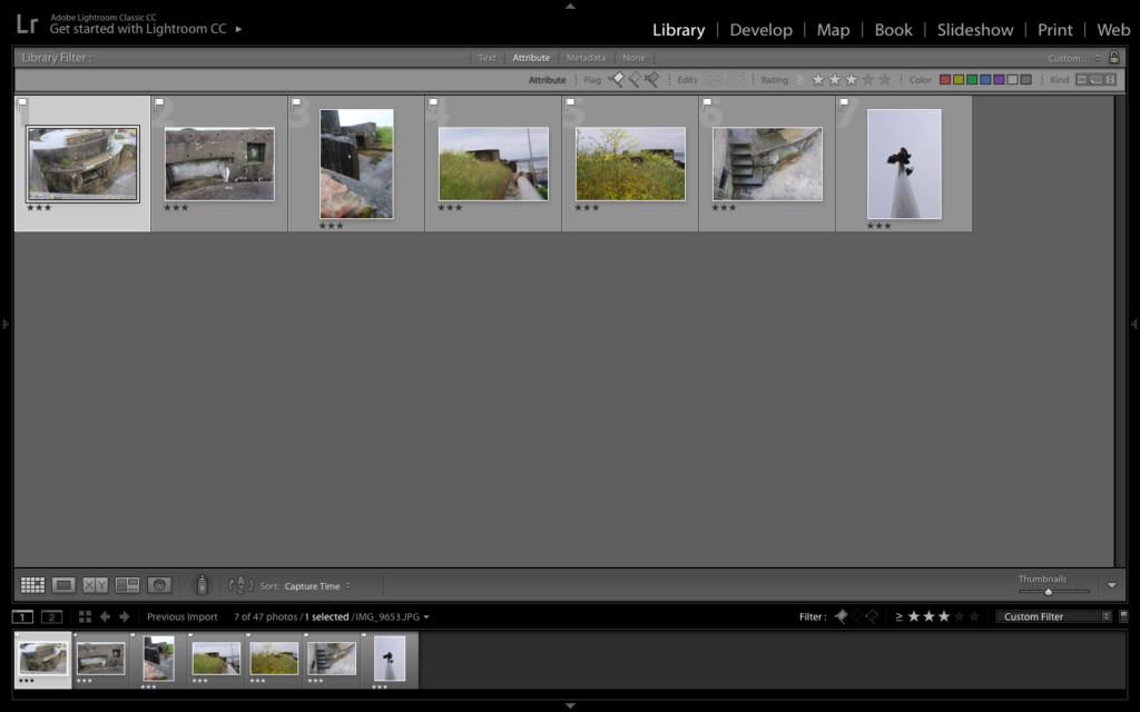
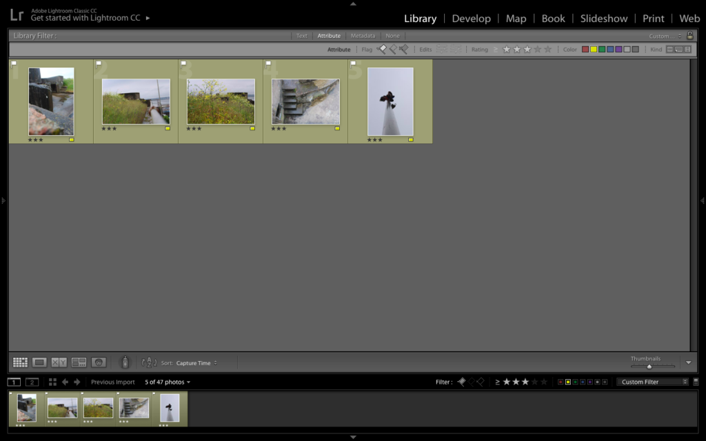
Edit 1 – Flaging
Edit 2 – Star Rating
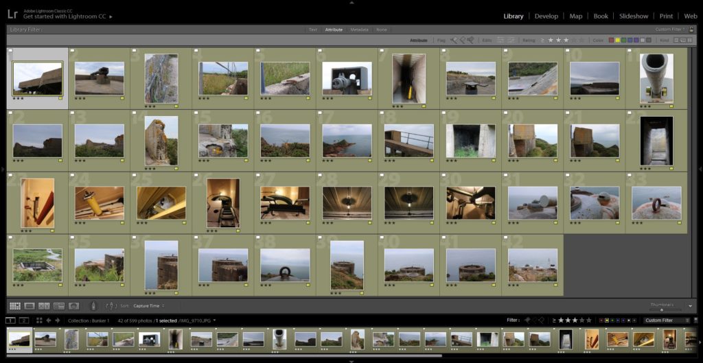
Edit 3 – Color Rating

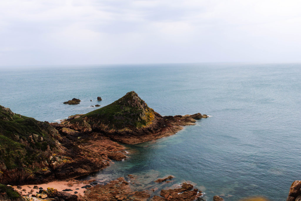
Color Edits:

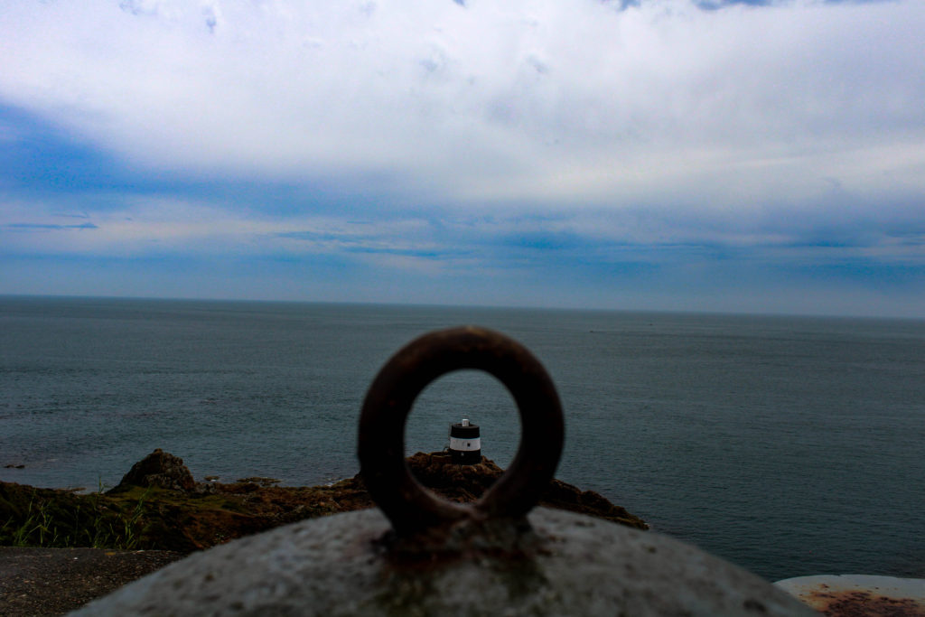
For my color edits I decided to explore and experiment with the different developing tools within light room. I always made the white balance setting to ‘as shut’, but adjusted the clarity, shadows, blacks, whites etc to enable the best possible outcome for my imagery. I wanted to ensure that the structure of the foregrounds where clear, making them the clear focus point, and the background slightly lighter to allow the image to nicely blend off. I really like the way in which these images have turned out due to the different photographic technique such as framing, as well as the clarity of the structures of the images.
Black and White Edits:

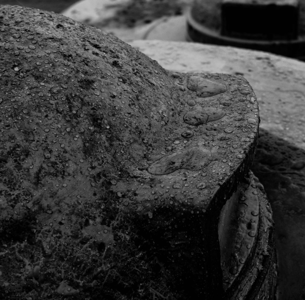
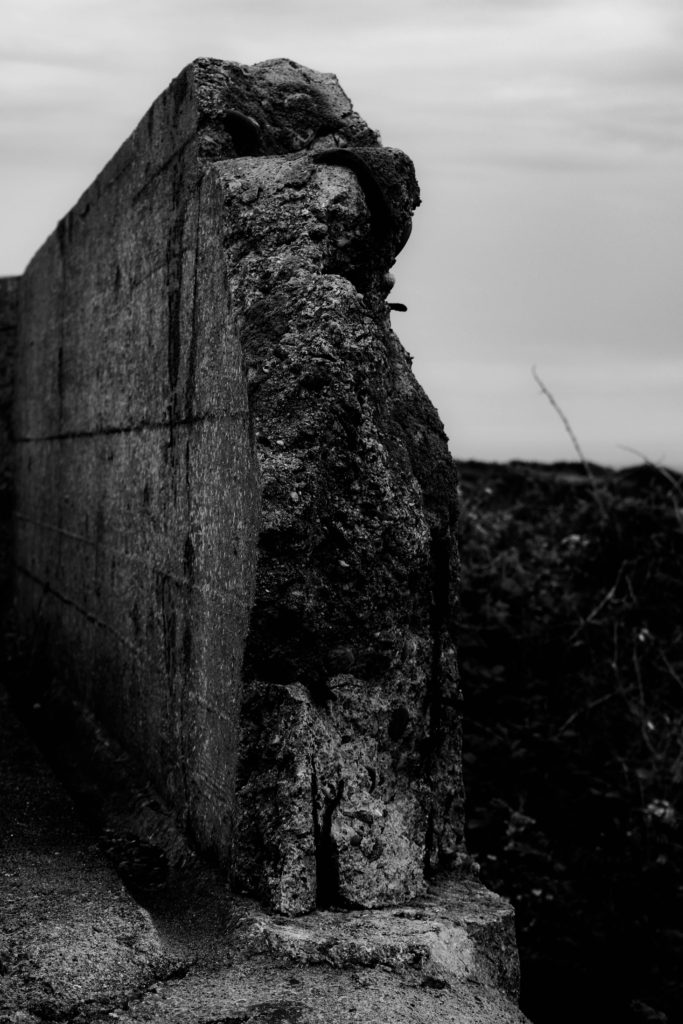
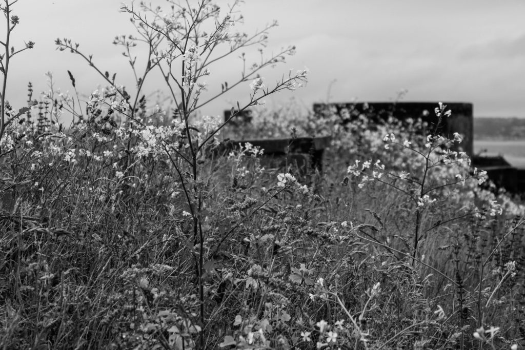
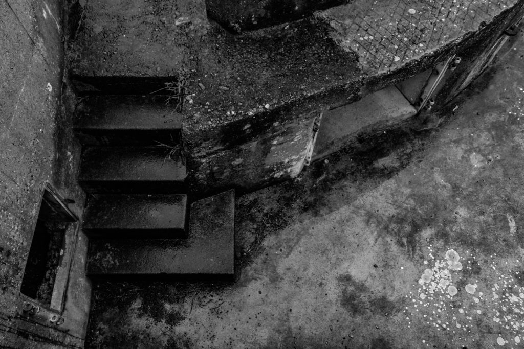
For my black and white experimentation, I started off by turning the image black and white and then did the adjusting of the setting to ensure my time was used effectively. I adjusted the same settings as the color edits, but on occasions I had to move the sliders closer to either end of the setting scales to allow the images to seem more dramatic and interesting for the viewers. I also experimented with cropping my images to explore how cropping can change the moods and values of an image. I made these decisions to have the images black and white as I believe they would help to present a decay of the war, which also helps to add an old fashion feel to the imagery. I am very happy with the way in which these edits have turned, this is due to clear tonal contrasts presented, the cropping used and the overall images itself.
Conclusion:

To conclude I am very happy with the final images produced within this photo shoot. I have successfully managed to use light room to make a selection of images, and been able to use the develop section of the application to manipulate my images to allow the imagery to be more effective and begin to showcase the aftermath of the war. In addition, I have a variety of exploration of black and white images, showing tonal contrast and colored images, exploring how the bunkers have been abounded and how nature has grown around them (Showcasing how Jersey is taking back the island, metaphorical). I have also been able to explore the power of cropping images and how it can change the meaning and mood of an image.

About Zines

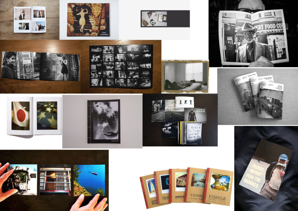
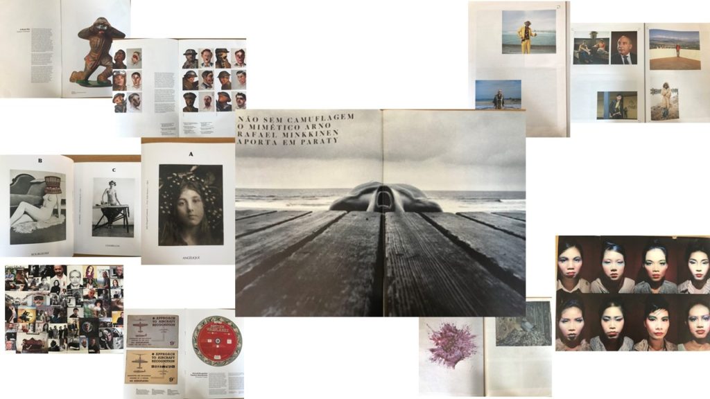
Zines originated in the United States during the 1930’s. A zine is a magazine which is a small, self-publication of your original work where appropriate text and images can be added, depending on what you want to publish,. They are normally printed via a photocopier, meaning that they are pretty cheap and strait forward to produce. Many photographers have created zines and have had them published around society, some even being a series and collectible items. After looking at many different types of zines, created by different photographers, I began to get ideas of how I wanted to lay out images within my zine. Here are some visual representations of what I looked at and what inspired me;

The layout of a zine can differ, some can be landscape or portrait, along with big in different sizes, like A5 or newspaper size. This is similar with the photos that are inside, the images can range in size, some may bleed over two pages, or some pay just cover the corner of one side of the page. Some of the zines had a rhythm/sequence, one I looked as had images in alphabetical order, so the image related to the letter, creating a sequence. The visual concept of the zines can change as well, depending on what the artist is focusing on, some of them related back to the war, whereas some related to different identities. Not all zines just have images only in, a majority of zines also had text printed along side the image, giving a background or maybe writing down the meaning of this page/image.

Developing and experimenting- Photo-montages

In this blog post I will be experimenting by creating photo-montages related to the war, which show the occupation of Jersey and the effects it had on the island. I will be using a mixture of original archive images and also some of my own images that I have taken as part of the project so far.

Montages can be created either physically or digitally using software such as Photoshop. It is the process of putting different types of images on top of each other in creative ways, in order to convey a feeling of theme.

Mood Board

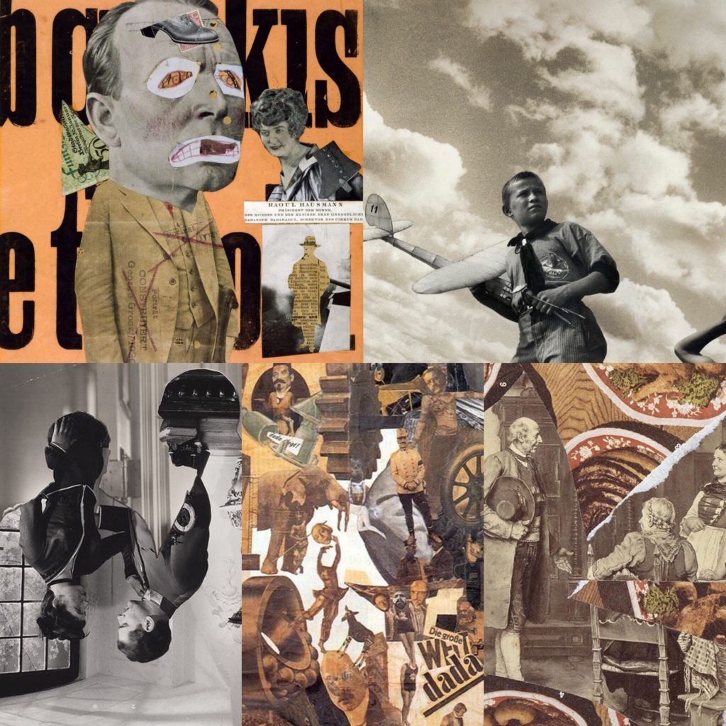
Below are some historical related photo montages that I have looked at, and used as inspiration before creating my own.

Mood board.
Images are not my own.

My Montages

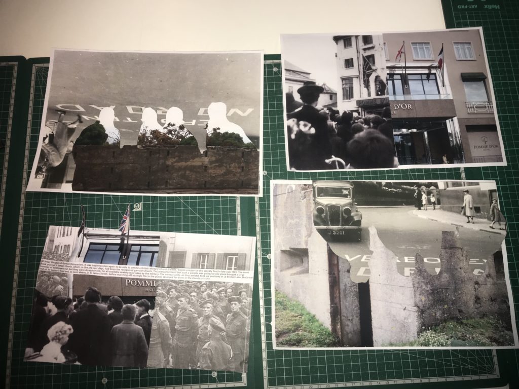
Below are my own montages that I have created my cutting and sticking together printed images.

Here all all 4 of my montages side by side.

1st montage

For this montage I used an image I took of a fortification in St Ouen’s bay. Over the top you can see an image of a road that had German writing on it. Since I printed out some images double sides to try and create an interesting effect, On the reverse of the image was a photo of some German soldiers which I cut around. I then turned the image around and stuck down the cut image with the soldiers on facing down. This created an interesting effect as you can see the sort of outline of the people. The cut of of people is also slightly elevated as I wanted it to stick out

This montage was intended to show how the Island changed under the occupation to include more “Nazi lifestyle”. The image includes something to represent different things that and how they changed Jersey. The fortification I used as my background shows how the island was changed and altered to become resistant to attacks, the road with the German writing on it shows how the language became introduced and forced onto the Jersey people, and the outline of the solders represents how they enforced a different way of life onto people.

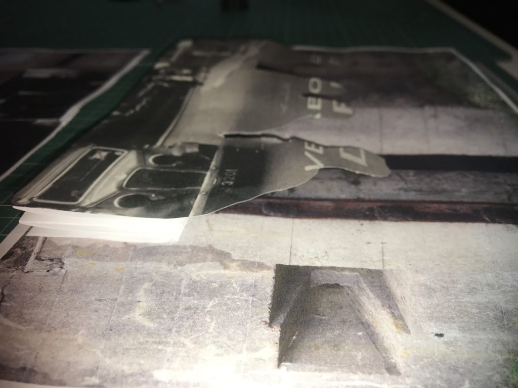
In this image you can see that I made a spring out of paper in order to make the outline of the soldiers stand out more.

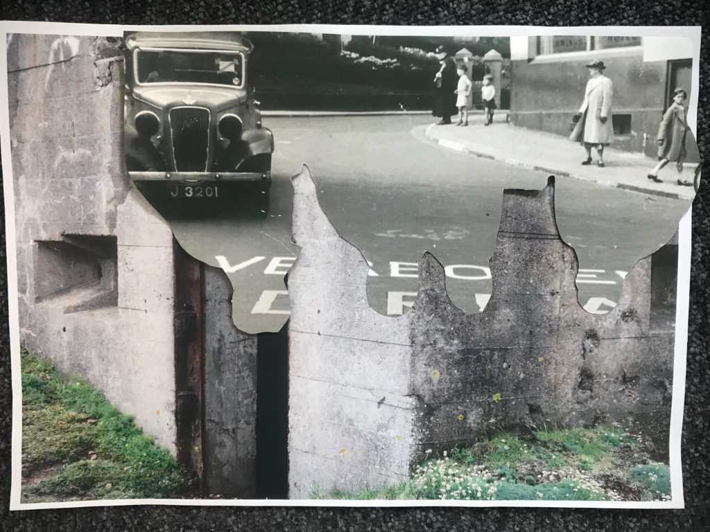
2nd montage

This montage and my previous one complement each other well. To create this montage I used a image of the wall surrounding the gun emplacement in St Ouens. I then used the rest of the paper from the previous image I cut out and stuck it on top. You can once again see the outline of the soldiers on the image.This montage and my previous one complement each other well. To create this montage I used a image of the wall surrounding the gun emplacement in St Ouens. I then used the rest of the paper from the previous image I cut out and stuck it on top. You can once again see the outline of the soldiers on the image.
If I were to display these montages I would display this one with my previous one as they both represent changes in Jersey’s society. This image shows a different part of a fortification in the background, to show how the island was changed into a fortress, the outline of the soldiers and the German writing shows how the islanders lost their freedoms and language.

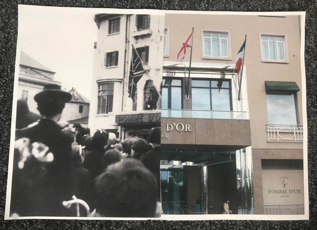
3rd montage

Here I wanted to make a montage where you are able to compare and contrast. I simply cut an archive image showing the Pomme D’Or hotel in St Helier in half, and cut a recent image of the same hotel that i captured in half too. I then simply attached them together by taping the back.

I think this montage is very effective because you can clearly compare. It is very interesting because there is such a huge contrast in era, however you can also see that it is the exact same building. I think this shows that every place can have an important history. I decided to to a montage of this specific hotel because on Liberation Day, British troops hung a Union Jack from the balcony to symbolise the end of Jersey’s occupation, which is a very important turning point in Jersey’s history which I felt could be represented well in this way.

4th montage

For this montage I used an archive images of German soldiers for my background. I then stuck on half a picture of the Pomme D’Or hotel in a way which the middle sticks out. Over the top I stuck an archive image of people that were originally standing outside the Pomme D’Or on liberation day. Over the top I stuck an information caption to give the image more context.

This montage is interesting as it also alludes to Jersey’s liberation. The image of the hotel and the image of the islanders celebrating being liberated is placed over the image of the German soldiers. Having the German soldiers partially hidden represents the fact that they were defeated. Having the contrast of the hotel in the modern day, and the liberators standing outside the same hotel on the original day is also a huge but effective contrast since it shows that the site is just as important in representing liberation as it was in 1945.

Yaniv Waissa: Analysis

Yaniv Waissa is a photographer who was born in Haifa, Israel in 1978. His work deals with rebuilding and replacing the old with the new in Israel, gains a layer of meaning by virtue of the political context in which it is being made. Wherever he goes he examines the relationship between man and nature and the, sometimes absurd, connection and constant tension between past, present and future. Yaniv Waissa creates an intimate atmosphere in every frame and puts his personal feelings, emotions and nostalgia into it. Everywhere he goes he recognizes a personal memory that can ignite a collective memory of the viewer.

https://www.c41magazine.it/yaniv-waissa/
Link to More of Yaniv Waissa’s work and information

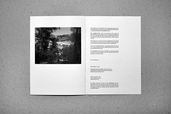
Zine Analysis: Beit Hakerem

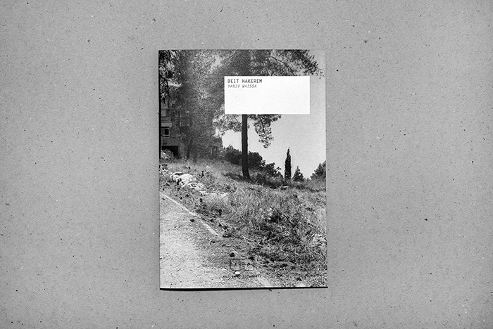
The Zine that I have chosen to look at and analyse by Yaniv Waissa is titled Beit Hakerem (translates to either ‘house’ or ‘village’), after the area of South West Jerusalem that the photographs were taken and produced. I have chosen this Zine and also this photographer to look into as I feel upon first looking without analysis the zine works well and is fluid and follows obvious pattern. As well as this I feel that I can link Wissa’s subject matter to mine in that he is documenting places of the past and ones that are significant to him personally.

Format, Size and Orientation – Design and Layout

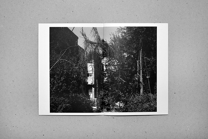
The zine itself is in an A5, portrait format. It is small and compact and the photograph used for the front cover uses a wrap-around method where it bleeds and covers onto the back into one double page, landscape image at full bleed to the very edge of the page. This is effective as the largest, and only full bleed photograph used in this zine.

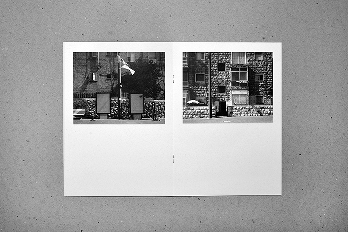
The design and layout inside the zine has all the photographs as landscape, all with a white boarded edge, none of the images apart from the one used on the cover are full bleed. This is effective as on the pages where there are two images, one on each page, there is spacing between the photographs and they don’t start to merge together.

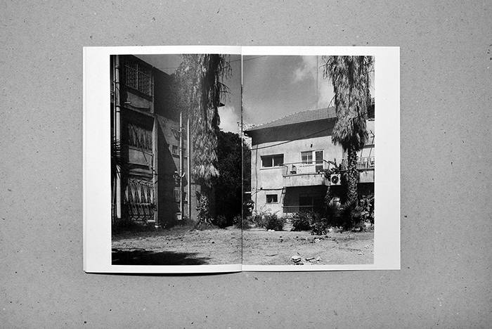
For the layout of the pages Waissa uses only two layouts – either a half image on each page across a double page or a full double page spread with each having a white boarder. This is effective as there are only two displays that have been chosen, it gives senses of simplicity.

Rhythm and sequencing

For the rhythm and sequencing we can see that Waissa is using the only two display choices and produces a sequence and rhythm with the photographs. Towards the middle of the book we have a sequence of two double page with 2 photographs each and then one full double page image, towards the end it then goes to one double page with two images to one full double page spread, it creates a bit of difference while only having to use two design and format layouts adding to the idea of simplicity. It creates a rhythm and sequence instead of jumping between layouts which would have made it make less sense and not show any narrative which can be helped by the rhythm and sequencing.

Narrative and visual concept

The zine follows a narrative of images that we can see and follow, we follow the smaller images showing the urbanized sides of the town, the brick and concrete, the visible man-made elements. Each larger image, however, follows and shows the natural side, the overgrown vegetation covering and hiding the buildings and streets. The last photograph in the book shows a half page display of a bit of a further away image, it is taking in the whole town through the trees rather than close to specific buildings. From this we could take and think of ideas of the narrative being about a journey through this town showing it in small snapshots and ending and closing on an on look of the place as a whole. For me, personally taking and looking on the photographs I feel that Waissa is showing a narrative of the journey and overtaking of the natural world on this landscape.

Title and cover

The title and the cover of this zine I feel work well with the layout and aesthetic. The inside of the zine shows a very simplistic layout and rhythm which is effective as it maps and mirrors the simplicity of the front cover and the title. The cover image bleeds across to the back cover in one large double photograph, one that reflects what is going to be inside. The photograph includes a path and suggests the walking journey that the photographer has gone through while taking the images. The title very simply ‘Beit Hakerem’ is the name of the area of Jerusalem that the photographs were taken and adds to the aesthetic of the zine.

Images and text

The only elements of images and text being used together in this Zine is on the last double page spread. As well as this page including the institutional information for example the websites and publishers, it also includes contextual information on Beit Hakerem, it explains some information surrounding the area historical of the reasons it was built and reasons for its naming, and also how it has changed and what it has become. I feel that it is an effective choice to have it at the end on the last page of the zine, as it lets the viewer create their own ideas and feelings before being given any information that may effect the way that they first initially feel. It allows the viewer to create their own ideas initially and then they are able to go back and re look with a bit more information contextually on the place and the photographs and allows them to generate more ideas and feelings.

ZINE – Analysis

Zine Composition – It is important to have some type of link between the images in a zine in order to form a coherent piece of work, this can be done even by putting similar images on each 2 page spread or by keeping some form of link be it thematic or in the style of photography across the entire zine. This not only helps the images to belong to the zine, it also allows the images to flow throughout the zine.

Juxtaposition can also be put to good use as this can also create a link through the images. This is most commonly done using color however can also be done by simply changing the feel of the images (such as using a smaller aperture next to a large aperture image in order to contrast the amount of depth of field) however juxtaposing the themes of the images can also be done to great effect.

The title and cover of the zine is arguably one of the most important elements of the zine and allows for a great degree of freedom in order to attract a viewer.

Other techniques such as typography and graphics can be used in a zine for a visual effect or for the sake of pacing.

Photo-montage: Experimentation

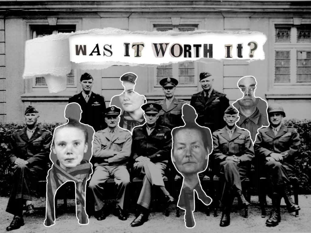
After taking inspiration from the photo-montage style of photography/art, I was able to develop a series of photo-montage pieces. The following are examples of experimental, trial photo-montages that I created using Photoshop, using archival images that I found online:

The above image I developed in Photoshop. It involved cutting out the outlines of 4 German soldiers in the background image, and replacing them with the identification photographs of various concentration camp victims. I did this to show a contrast between the dignity with which the German officers held themselves in the original image, and the reality of how their actions caused unforgivable suffering to millions of people who were left without a voice.
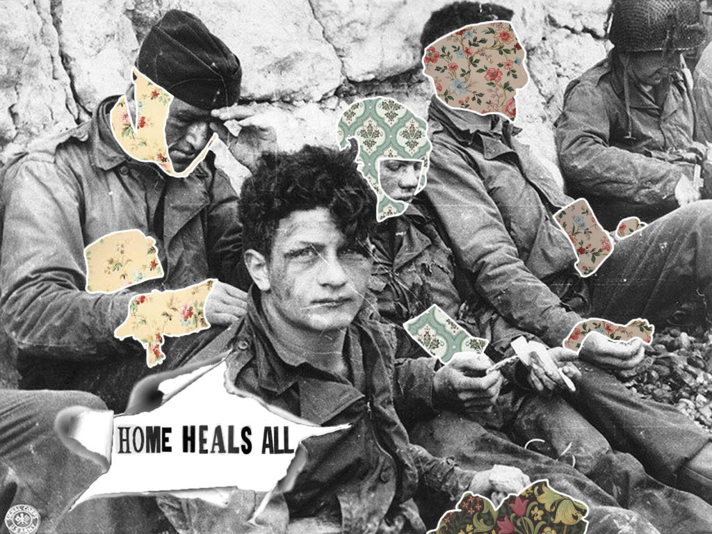
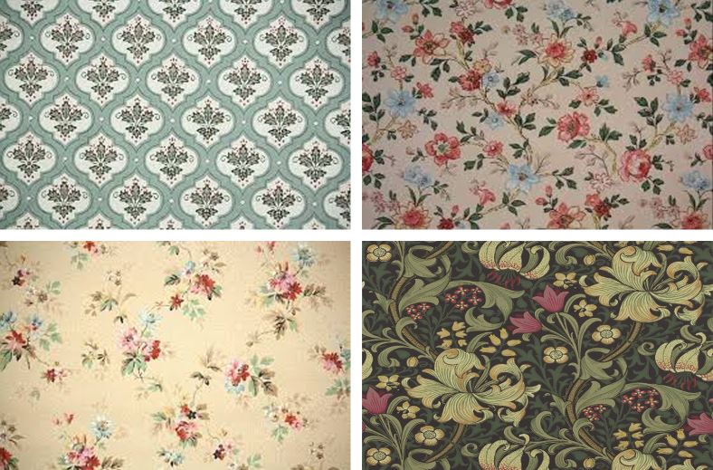
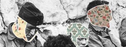
The above image used the same process as the first image, yet this time, I replaced the bandages and wounds of the soldiers with images of 1900’s wallpaper patterns. In doing this, I used this photo-montage to represent that the thought of home encouraged many soldiers to continue fighting, and gave many demoralized individuals something to look forward to after the war.

The above process is the one I used in Photoshop to create the above image. From top left to bottom right:
Left: I researched a range of 1900’s wallpapers that I would use as the background for my image,

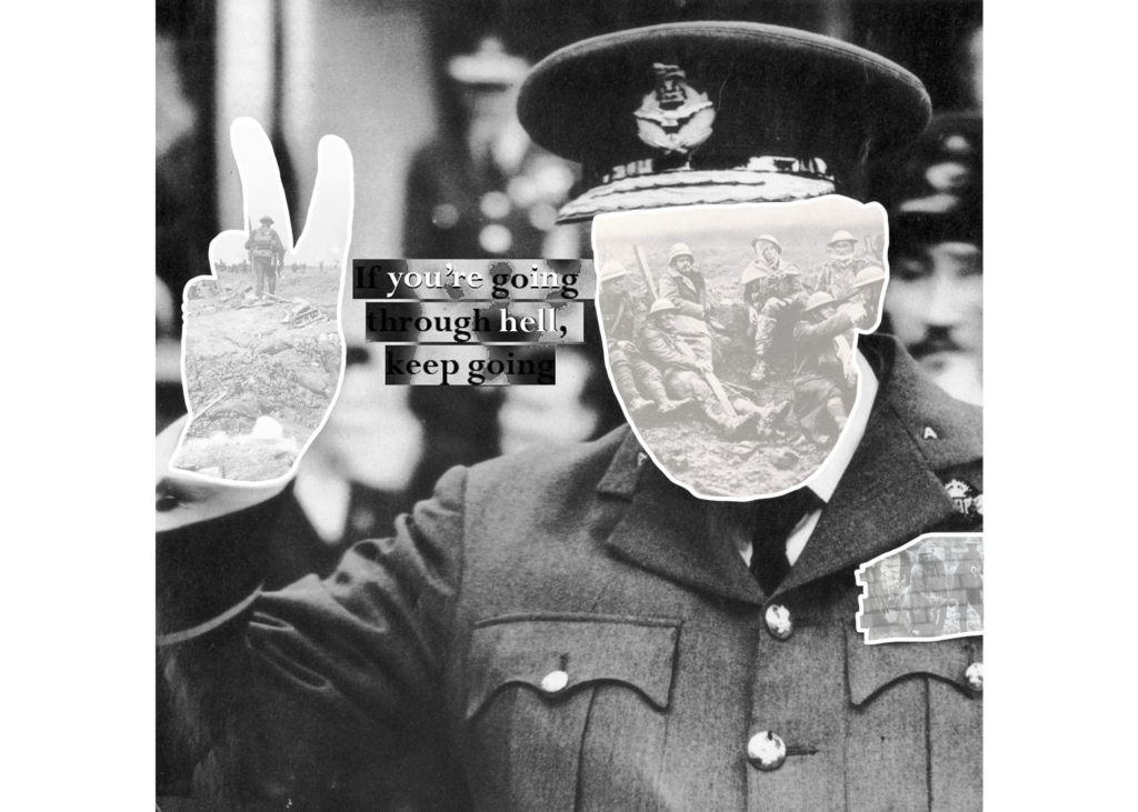
The above photo-montage was created in an attempt to display the sacrifices made for victory during the war.

Above is a gallery showing the process I used to create the final image (seen above). From top left to bottom right:

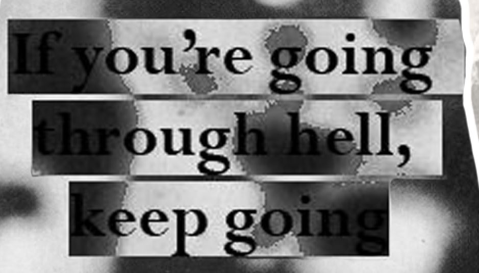
Left: I lowered the opacity of the eraser tool to 50% in order to fade the background of a war scene that I would be replacing the face and hands with. I did this in order to make sure the definition between the foreground (Churchill) and the background (the war scene) was obvious, and also to emphasize that the sacrifice of millions of lives was merely an afterthought to the victory of political leaders during the war.

Middle and right: I outlines the hands and face of Churchill in order to show contrast between the background and foreground. I also feel that by creating an outline, my work mimics the style of many very well known photo-montage artists, who used physical cutting and sticking to create their work.

Bottom row: The bottom row shows the process of creating the text that I placed over the top of the image to act as a centre piece/ main focal point. I took a real quote from Churchill, and decided to emphasize certain words/letters using white text to show contrast between the quote and the reality of war. To create this text, I copied the image of highlighted text and pasted it back onto the image (to give the contrasting background effect) and then placed a second layer of white text over the original black text to show contrast between the words.

Batterie Lothringen

The Channel islands were the most heavily fortified part of the ‘Atlantic wall’ (a line of massive defence works that ran from the baltics to spain). The channel islands were the only part of the British isles that German troops would set foot on, Hitler poured resources into defending the islands from British forces trying to re-capture them; the amount of resources and funds that he put in the islands far outweighed the genuine strategic value of them.

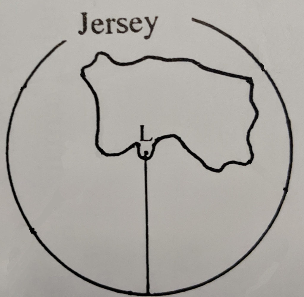
Batterie Lothringen was made so that it could cover the whole island at close range, it was made to mainly protect the south of the island it has an effective range of 14,000m and had 47 permanent implacements from artillery to flamethrowers.

This diagram shows the effective range and protection of the fortification and the main direction of fire.
Photographic archive essay

An archive is a place that forms of documentation are stored, this can include text, paintings, sculptures and pictures. They are mainly set up so records can be kept of times and so that people can reference work and events that occured in history. Most of the time the work in archives is unpublished, this is the main difference between archives and libraries.
The way that I will be making use of the Jersey photographic archive is by looking at the old images and then either using them to make photo-montages with work of my own or to reference when taking my own photos.

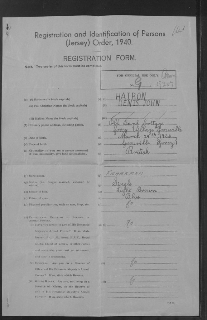
The photos that I have requested from the archive are ones that relate to my grandfather. I have been able to find a copy of his registration card and his identification registration form. I was only able to find my Grandfathers as my grandmother may not have been old enough to have one.

The registration card that I have been able to obtain has important information on it that could be useful to me in the future. This includes the image of him and the writing about him. The card tells me where he lived and gives another iteration about his occupation which reads “Fisherman” This i already knew but it is a vital part of the story about him in the occupation.

Societe Jersiase Archive

On the 4th June 2019 we visited the ‘Societe Jersiase’ where we were introduced to theme of our A2 project ‘Occupation’. During this introduction we where told about key dates and events during the occupation of Jersey (such as the time frame of the occupation form 1939-1945, for more information about the key dates can be seen on this blog post)and Key photographers who captured images within the second world war. These artists included Henry Mullins (portrait photographer), William Collie (Fox Talbet and calotype photography) and Thomas Sutton (panoramic photography).

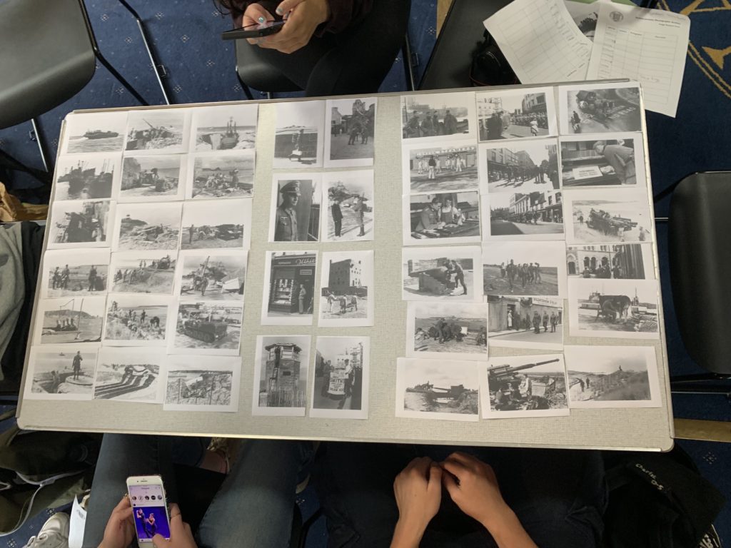
Societe Jersiase is well known for their private photo archive, which explores Jersey’s historical, cultural and social over a large period of time. Thankfully, the archive has numerous of albums containing images taken during the occupation of Jersey, allowing me to explore different aspects of Jersey’s war. All images where placed in plastic covers to ensure our hands do not ruin the photographs which have been preserved over a longitudinal period of time. To further explore these images workers within the archive made some of the images digital and printed them off, allowing us to begin to explore narratives. We had to select our favorite images and order them in order to storyteling and create a narrative, and meaning towards the collection of images. With in depth exploration into the archive and the activity of creating a narrative allowed me to gain a better understanding of what life was like for people living through this time, and how Jersey has changed and developed since the second world war.

As our final activity we were given the opportunity to explore town, now understanding the history of the war, and capture one landscape, one portrait and one picture of an object. Doing this allowed to think and explore creatively trying to capture Jersey’s war or what is left from the war in today’s society. Below are the top images produced:

Our Narrative

Within our narrative we told the story of how the occupation effected different aspects of the island. The story starts on the left, like a book, which showcases the shore of Jersey and how highly protected it was, so that no one entered or left the country. It then followed through to a portrait of a man with different locations and items which were personal to him showcasing a personal effect the war had on someone. Moving over Jersey’s town is presented, which showcases the social and cultural aspects of Jersey during that time. In addition, we used a lot of photographs to make it a chaotic looking narrative which is symbolic for the chaos Jersey experienced during the occupation of Jersey.

After that task we were then allowed to take photographs using our cameras. Our brief was to try and capture the Occupation of Jersey, including a landscape, portrait and photograph of an object. My initial ideas was to walk to the Bunker located on Mount Bingham, for the other two types of images I was unsure what to capture but experimented with different things around town as I wondered around. My camera settings where kept normal, with a quick shutter speed, low ISO, automatic white balance and varied my aperture as well as experimenting with depth of field. My outcomes and editing process can be seen below:

1st edit – Flagging
2nd edit – Star Rating
3rd edit – Color Rating

Outcomes:

To create these outcomes I used the develop section in Lightroom, where I adjusted the contrast, exposure, highlights, black and white, curves, cropping and other elements which slightly adjusted the images. I am very happy with these outcomes as they showcase how Jersey has been left since the war has ended and how Jersey is out growing these abandoned bunkers, due to the over grow and nature taking back that land. All four images clearly show my competence in taking images and my ability to accurately adjust and edit images to showcase a theme or story in a creative manor.

To conclude this outline was successful, I learnt the importance of photo archives, I learnt more about the history of Jersey and have a more in-depth understanding about the occupation of Jersey, as well as how photography has developed on the island. Moreover, I have been able to begin to look at narratives and was able to capture images in town relating to Jersey’s war which creates a narrative in itself. In addition, I have had a successful first attempt at editing and experimenting with the images on Lightroom in order to clearly present the historical and cultural elements towards the images.