Category Archives: AO1 Develop Ideas

Filters

Author:
Category:

Detail Shot – Photo shoot

Planning:

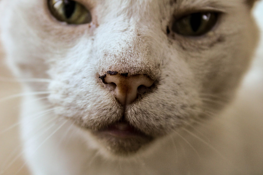
When going about this photoshoot I kept in mind the technique the Martin Parr used when he captured detailed/macro photography, in order to create an effective outcome which can hold a lot of conceptual meaning. On top of this, I also took inspiration from the mood board created on the previous blog post, in order to create new ways and approaches of capturing this style of photography. When capturing this set of photographs I used the AV setting, allowing me to focus on the aperture and depth of field, an important feature for macro style photography. On the day these photographs were taken, the lighting was dull, but well lit, which meant that I used a low ISO. My f number stayed on 5.6, unless the room itself was much darker. The shutter speed was set on a quick setting and the white balance was set to the day light setting. In order for further control I used manual focus, allowing me to control the depth of field and the overall composition.

Edits:
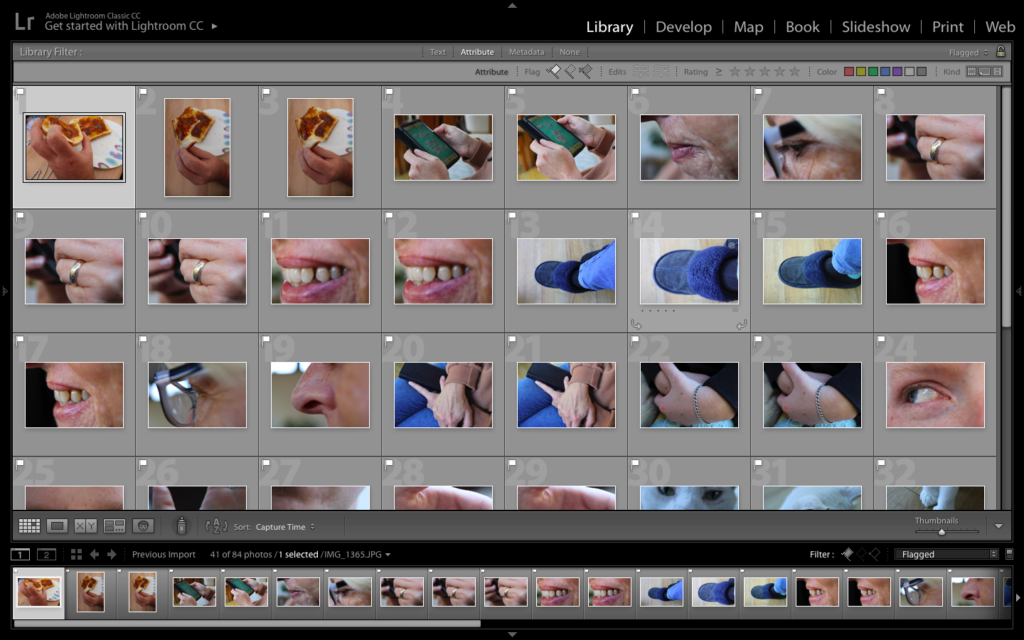
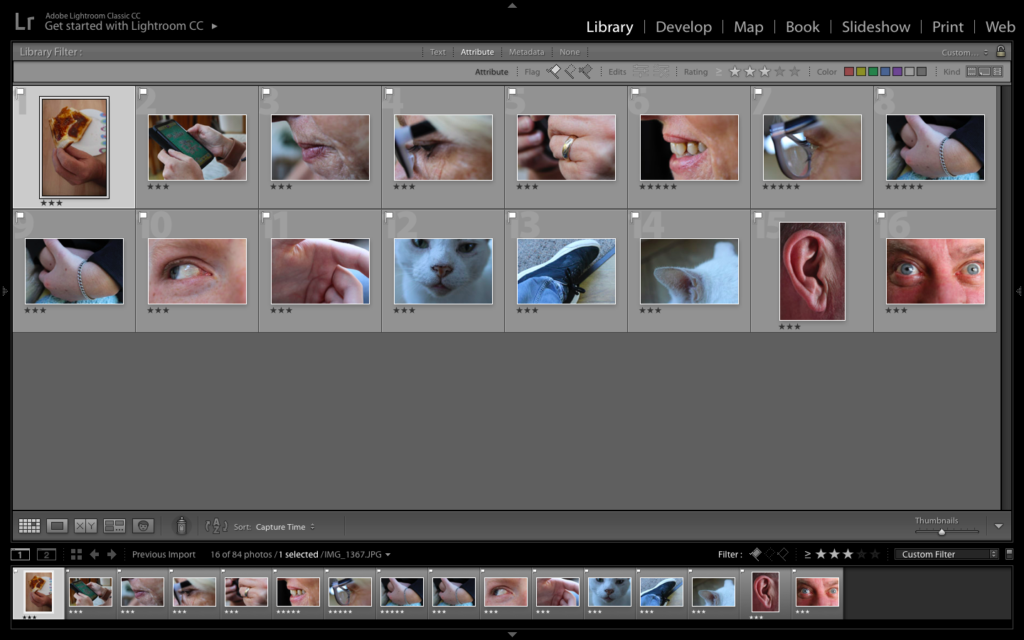
First Edit – Flagged
Second Edit – Star Rating
Third Edit – Colour Rating

Colour Edits:

For my colour edits I tried to explore with making the colours vibrant and over the top, to create a similar outcome as Parr. In order to do this I increased the contrast, vibrance, white and blacks. Although this worked well, I did not think that it was justifying my work, so I decided to edit them normally, as if it was a normal portrait, in order to allow the detail to clearly be showcased. To do this I subtly moved the sliders in order to correct the imagery until I gained my desired effect. I believe my colour outcomes are successful as they clearly showcase the formal elements of colour, texture, space and shape, which enables the macro photographs to meet the briefing and showcase my implementation of Parr’s work within mine.

Black and White:

Experimenting in black and white; I was a little skeptical at first as all my inspiration did not use black and white imagery to present the macro photograph. I then decided to go ahead with this idea, because I knew it would show exploration outside of my research. In order to achieve this effect, I set the image to black and white and mainly focused on adjusting the black, white, contrast, structure and shadow sliders in order to create the outcome below. I am happy that I experimented with black and white, as I believe that this is my strongest outcome from the photoshoot, with my reasoning for this being explained in an analysis of my work below.
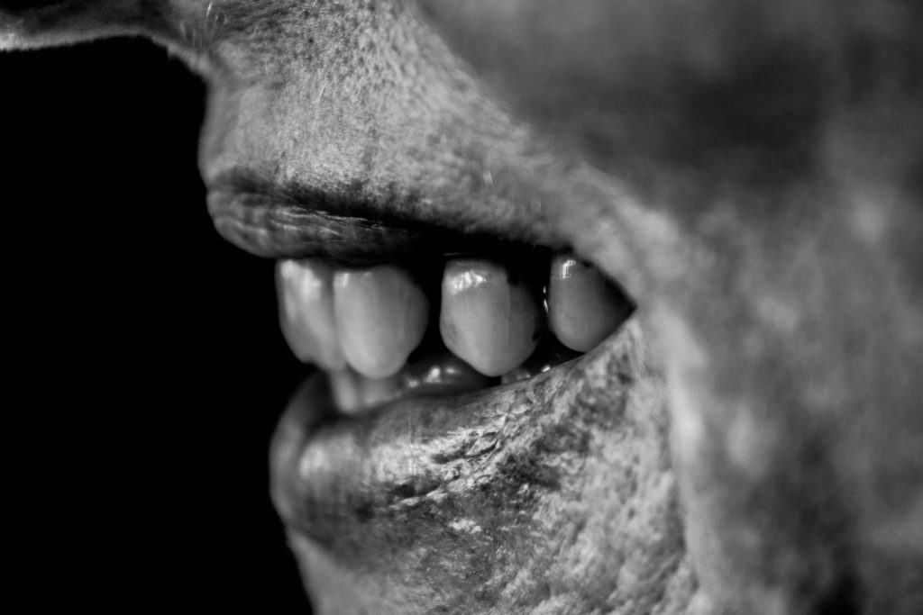
Visually, we are presented with a landscape macro photograph of a models mouth, who is smiling showing her teeth. The frame is 3/4 full, with a sense of space on the left of the frame, presenting the technique of rule of thirds bring utilised in this outcome. The main focus point is the teeth, due to it being the area most in focus, which informs us that a large depth of field has been used when capturing the photograph. The photograph presents the formal elements of space, texture, shape and tone, which is being shown through the detail of the lower half of the models face. The photograph is presented in black and white which allows a clear tonal contrast to be showcased, making the imagery even stronger. The background is black, which enables our attention to be focused on the foreground, the face of the model, allowing the conceptual representation of happiness within a family to be clearly presented.

Technically, the photograph uses a medium aperture, due to the narrow depth of field being utilised in order to allow the focus to be on the mouth and teeth. The ISO used is low which is shown through there being no noise being created. This also allows us to understand that natural lighting produced by the daylight was used to capture this, and informs us that the white balance has colour accuracy and that it presents a sense of warmth, adding to the overall pleasant mood to the piece. In addition, the shutter speed used to capture this macro photograph was quick sue to no intended blur being presented in the overall composition.

Evaluation:

To evaluate this photo shoot, I believe that it was more successful than the previous home sweet home shoot, due to me producing stronger imagery, through more control over my camera settings. I have been able to show my competence with macro photography, as well as showing my ability to use manual focus in order to create depth of field and put different features in focus for effect. I have also shown my ability to take inspiration and implement it into my work, on top of adding my own artist style to show further exploration within my imagery. I believe that my overall outcomes are successful due to high control in my camera settings, and quality editing, making my work have a clear overall aesthetic.

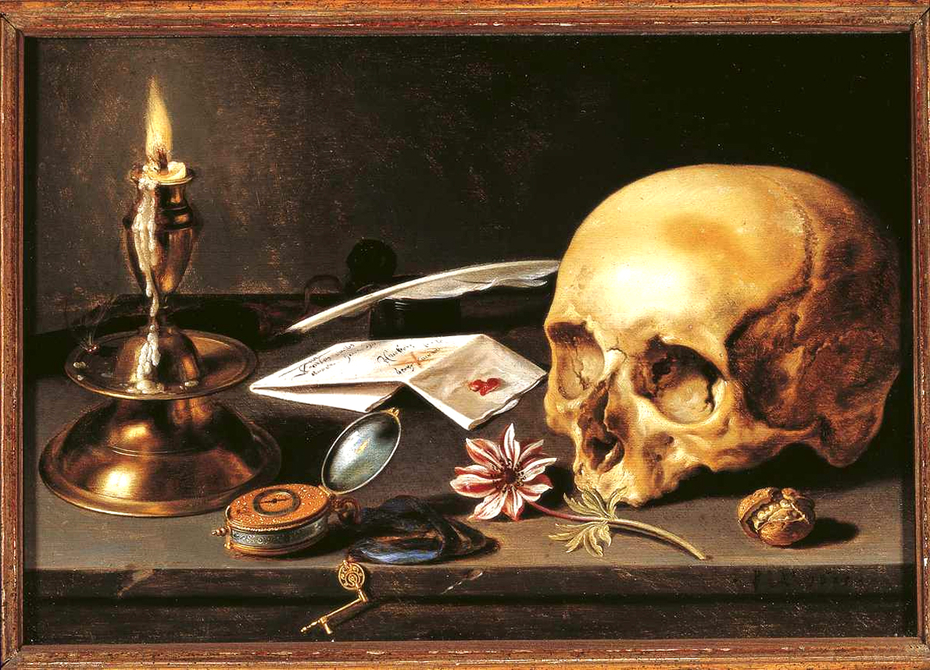
IMAGE ANALYSIS – Vanitas

Image result for pieter claesz

This is one of Pieter Claesz’s most iconic pieces simply titled ‘Vanitas Still Life’ featuring a very traditional vanitas composition and some harsh directional lighting.

Due to the intensity of the image it is unlikely that it is entirely lit using the single candle and thus is likely naturally lit with some additional warmth provided by the candle. The image contains harsh contrast resembling chiaroscuro lighting from left to right. the chosen color palette is quite warm possibly due to the age of the pigments. There is some prominent use of directional strokes visible on the larger rounded surfaces of the painting, this was likely to show the light interacting with the various textures in the image. The main 3D forms of the painting are the candlestick and the skull on either side of the composition with the skull being used as a symbol of mortality as well as potentially the candle as it is this finite, flickering flame destined to eventually go out, its transience may be a metaphor for the human life. This theme of transience also extends to the flower shown in the painting. The quill and ink-pot shown within the image may potentially represent the vain pursuits of man.

Home Sweet Home – Establishing Shots and Detail Shots

Establishing Shot:

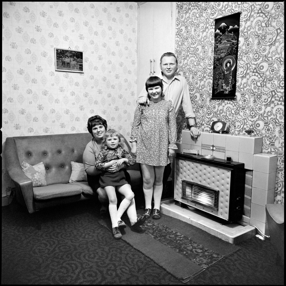
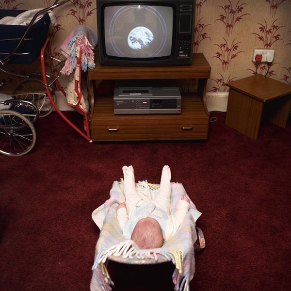
This form of documentary photography requires two or more subjects within the frame. The photograph almost acts like a tableaux as the photographer positions the subjects in order to convey a story and narrative, making this the main element to an established shot. In addition, the story can be presented through the background or the subject (is there an interaction or connection with the subjects in order to convey meaning). This technique is also used within film making, as directors, to establish angles and settings which would work for the scene.

Mood Board Showcasing Photography in the style of ‘Establishing Shots’

Sian Davey:

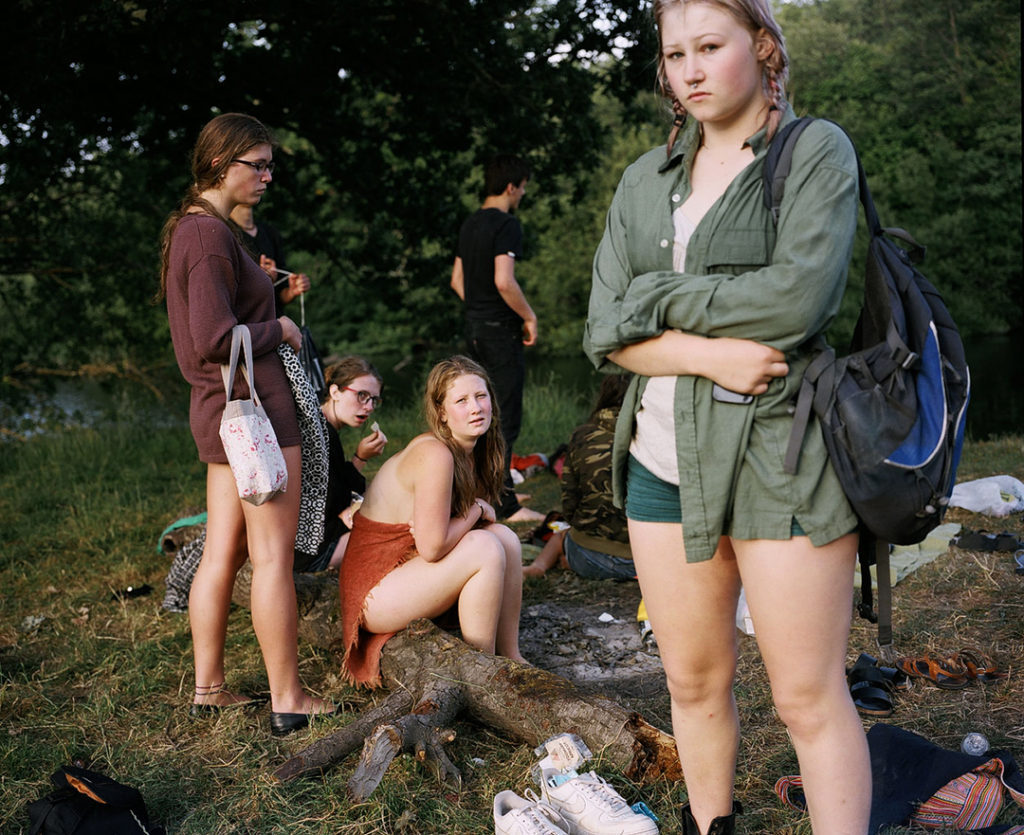
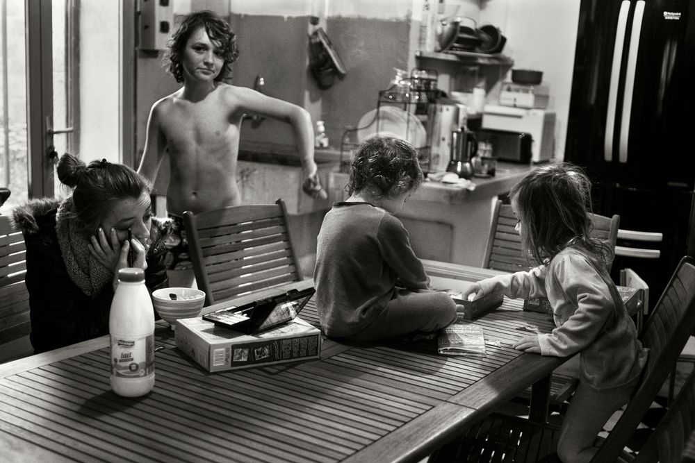
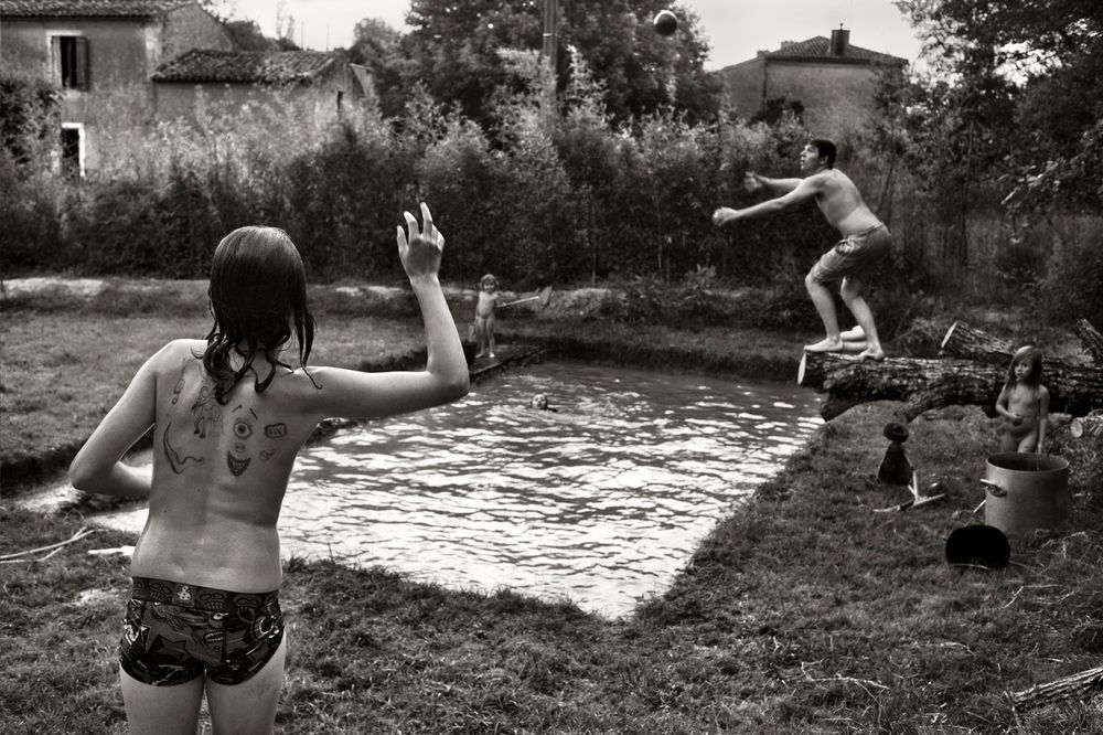
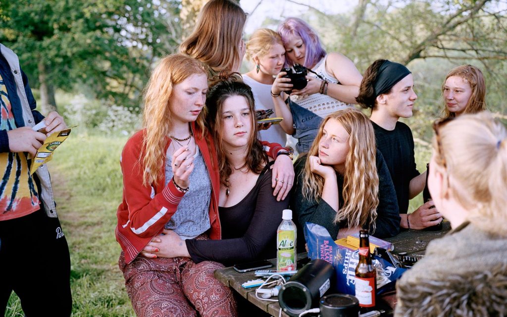
One photographer which I personally enjoy the work of Sian Davey who followed her teenage daughter round capturing her life on camera. The form of naturalistic images found within the ‘Matha’ series clearly conveys the narrative of Martha’s life, social interaction and her growing up and experiencing the world.

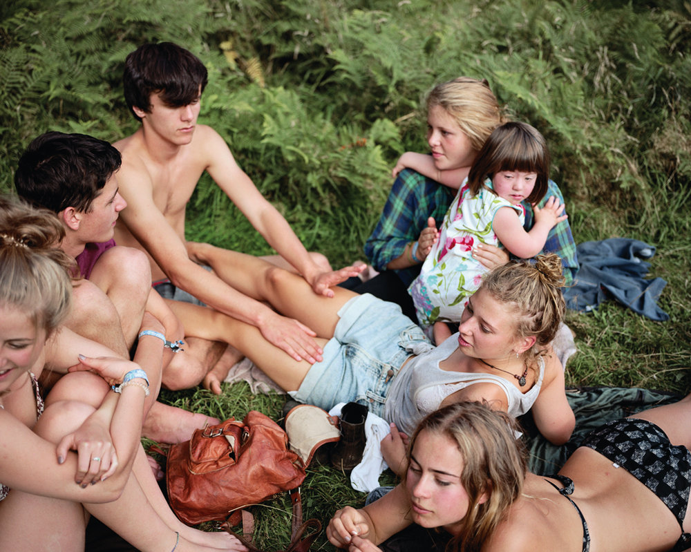
Above is one of my personal favourite photographs from the series. Visually, the photograph is almost chaotic in the sense of a lot of things happening within the frame making it interesting for viewers to look at. The main focal point is the three girls located within the centre of the frame, with the background having other girls and forrest type environment. The photograph captures the girls almost rebelling, and doing things they should not be doing, like drinking and smoking, due to the age of Davey’s daughter only being 16. These are shown through the objects in the frame which help to tell the key narrative within the photograph. The key formal elements within this photograph is colour, space and texture, which is shown through the different elements within the composition as well as the positioning of the girls. The positing of the subjects is naturalistic, creating a sense of realism within this form of documentary photography. In a sense the photograph seems to be using the rule thirds, which allows the naturalistic feel to run through and allows viewers to perceive the photograph more naturally. The photograph is captured at a straight on angle with the orientation of the photograph being landscape.

Conceptually, the narrative told within the photograph is the teenage girl rebelling due to the restrictions she has in her life. In a recent interview with Davey said “providing me with access to her social situations—in a sense, access to her social world at an age where parents are typically explicitly kept at bay.” Contextually, the Davey wanted to explore social norms which was influenced by her interest in her main subjects, her two daughters.

Technically, the photograph uses quite simplistic settings in order to maintain a naturalistic feeling towards the overall image, and photographic series. The lighting is natural, produced by natural sunlight due to the outdoors environment in which the photograph was captured in. This lighting has a sense of warmth which is emphasised through the light beaming through the trees and the correct outdoors white balance being utilised. This also works along the low ISO which is shown as no noise being presented through the frame of the photograph. In addition, the shutter speed has been put on a quick shutter speed due to no intended blur, and the aperture has been slightly raised as a slightly narrow depth of field is being presented, as the background is slightly blurred.

Detail Shot:

This form of macro photography, looks at capturing a portrait to convey new conceptual meaning. The imagery produced has close connotations with identity and informs us about the subject being captured within the shot. Normally, the main formal elements produced within this style of photography are: texture, shape and space, which all work together to create a powerful set of imagery.

Mood Board Inspiring my Detailed Shot:

Martin Parr:

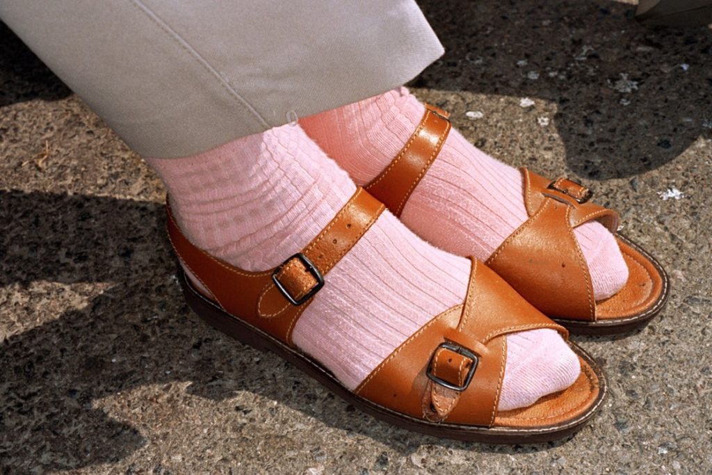
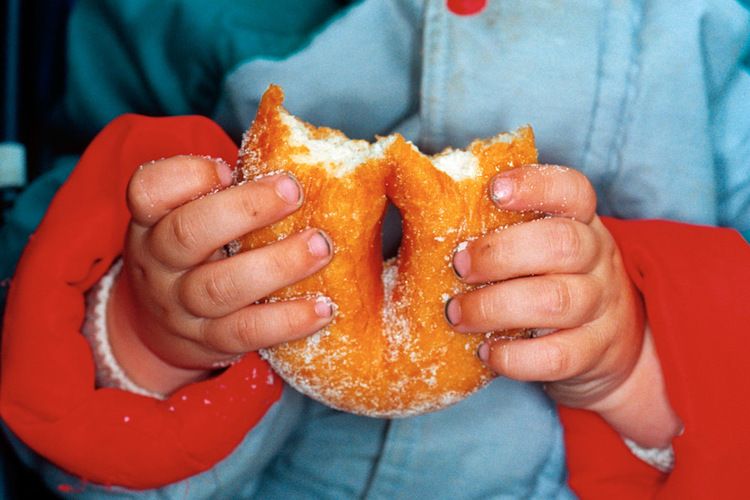
Martin Parr is a British photographer, who capture photographs in the style of documentary photography. His photograph looks at capturing an anthropological way of looking at modern life, with major focus looking at the still existing class system within the UK. Within his time as a photographer, he has published over 40 phonebooks and his work has put into 80 exhibitions world wide, showcasing his success. I will be analysing the work which was displayed in a exhibition name Souvenir in 2013. The images are apart of the ‘Real Food’ photographic book too, which contained images similar to the one below.

Martin Parr – 1996 – ‘New British’ + ‘Common Sense’

The above photograph is my favourite from the Real Food photographic book as it clearly showcases the techniques of a detail shot. Visually, we are presented with a photograph of a child holding a sugar doughnut which has been bitten into. The composition of the frame is full, however not busy, due to the photograph being considered as a macro style image, which creates a sense of containment and enclosure drawing us into the photograph. The main focal point is the doughnut, which is suggested through the central positing of the food in the frame and the narrow depth of field being used. This illuminates our understanding that the foreground is the hands and doughnuts and the background is the coat. The frame of the photograph tells us a lot about whats going on, the small hands, belonging to a small child wearing a vibrant coloured coat, which grip onto the doughnut, informs us that this child could be on holiday and enjoying himself. The photograph presents the formal elements of colour and texture, which helps to emphases the point just stated. The colours seem to be warm suggesting happiness, creating and overall pleasant mood to the imagery.

Conceptually, Parr wanted to capture an anthropological way of looking at modern life, which is clearly being showcased within the macro photograph. Contextually, Parr still noticed that the UK still presents a subtle class decided within modern society, which can be seen emphasised within his work. The colour of the coat seem to represent the same as a place like Butlins, holiday location in the UK, these places where considered cheap and accessible for those in the lower and middle class, which represent his negative viewpoint towards the class system.

To technically analyse this piece, Parr has kept his camera setting simple allowing the detailed shot to be successful and impactful on viewers. The lighting used half natural, through daylight, and half artificial, as it seems that he has used his flash allowing the foreground to be illuminated, with the background having shadows. This creates a warm atmosphere this was achieved through the correct white balance being used, which works in co with the low ISO being used due to the low intended noise. The shutter speed seems to be quick due to there being no intended blur. As mentioned before there is a small narrow depth of field being used to allow the doughnut and hands to be the centre of focus, allowing the conceptual and contextual elements to be illuminated.

Action Plan:

As an action plan I will now produce a set of images to respond to the ideology of establishing shot and detail shot, using inspiration from the work of Parr and Davey. I will look at using their methodology when capturing my family, and try and apply their conceptual reasoning into my work, adjusting it in order to fit within my family.

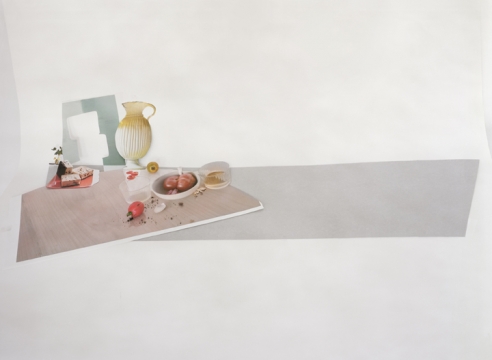
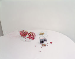
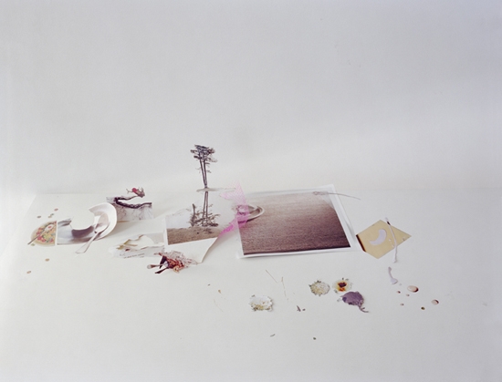
Contemporary still life – laura letinsky

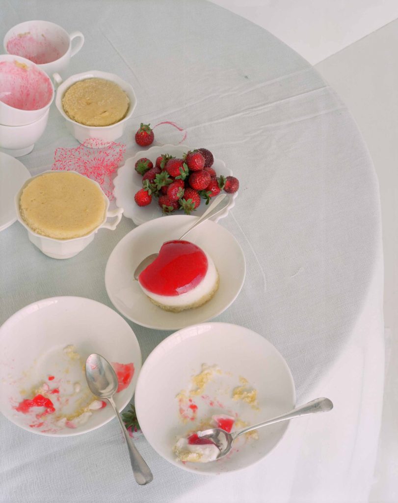
Laura Letinsky is a Canadian photographer, who graduated from Yale School of Art in 1991. At present she is teaching her expertise and the Visual Art University in Chicago. Her initial interest was in portrait photography, but soon moved to still life where she focuses on capturing food, and the symbolism for the food. It is said that she uses photography to convey our understanding of relationships and love. Her investigation of still life is in associations with femininity, the minor arts, and its imbrication within the home as the space of intimacy.

“Still lifes provides her with the potential to explore the false dichotomy between the personal and the political.”

The Quote above is suggesting that this style of photography is allowing Letinsky to explore the contrast of people and political viewpoints through objects, in this case leftover food and crockery. Letinsky’s carefully crafted scenes often focus on the remnants of a meal or party, as she plays with ideas about perception and the transformative qualities of a photograph. Her close photographs on this subject enables us to understand the beauty of the objects that we take for granted.

Mood Board Showcasing Imagery From ‘Hardly More Than Ever Series

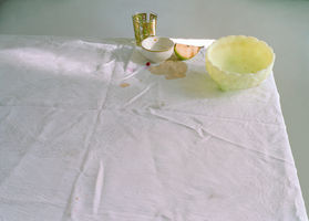
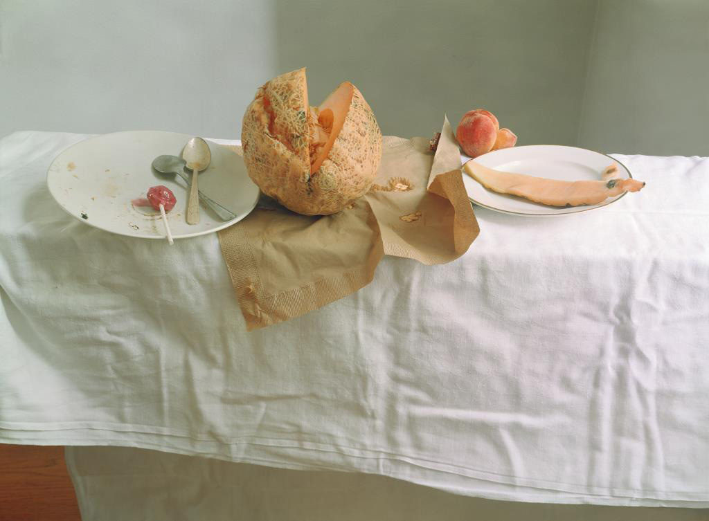
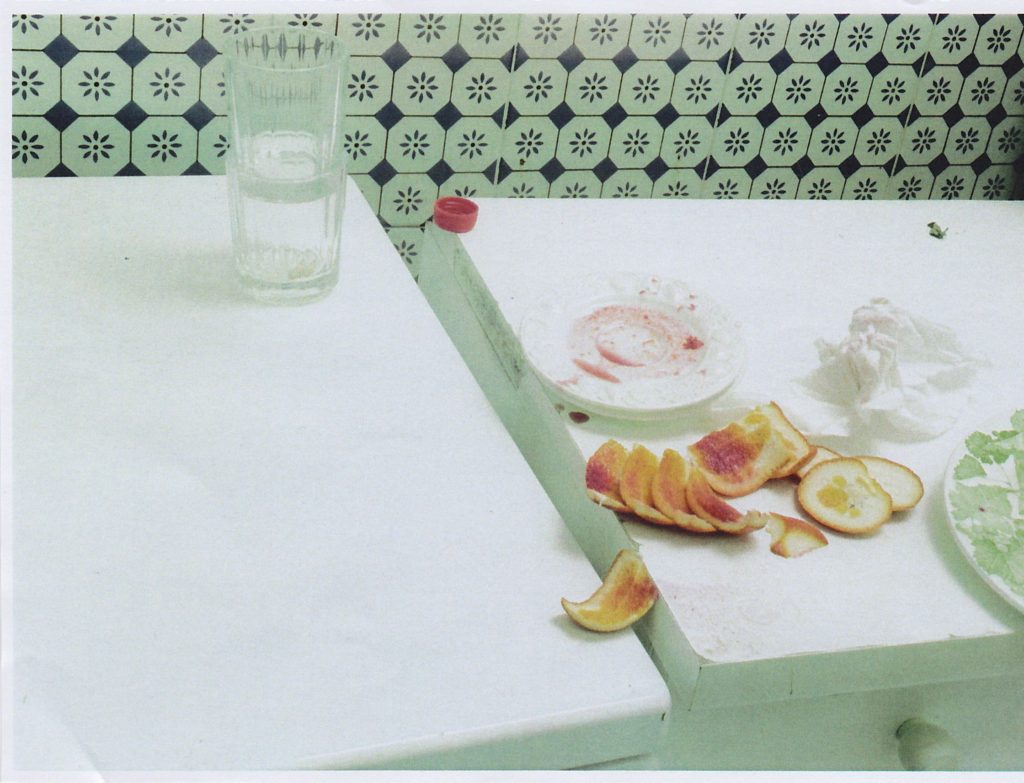
 UNTITLED #54 FROM HARDLY MORE THAN EVER SERIES 2002.

The photograph above is my favourite photograph from her ‘Hardly More Than Ever’ photographic series. The work showcases the transformation of still life painting from the 16th century into the 21st, with the main difference being the photograph being presented in colour and is a high resolution photograph. The photograph is taken as a landscape with the main focus point being in the centre of the frame, the half eaten melon. The colours are very dull and monotone, whites blacks and greys, which is similar to the classical outlook on still life imagery. This contrast the yellow/orange/green melon located in the centre reinforcing this as the main focal point. In addition, the background is kept simplistic, in order for attention to remain on the symbolic representation of the fruit. In Letinsky’s work the left over food is symbolic for inner beauty. Contextually, melons where considered a way of expressing a males fantasies of the female figure, having this melon broken showcases feminism in the present and the ideology that woman are not objects. The table cloth is creased, which creates a sense of mess and uncleanliness which adds to the overall tone and mood of the Letinsky’s work. The main formal elements which are being presented within the composition is shape, texture and space through the artificial positing of the food.

Conceptually, Letinsky wanted to capture the inner beauty of woman, through breaking the historical stereotypes and objectifying of woman through the half eaten melons and the uncleanliness of the table. This also helps to showcase the contextual transformation that still life imagery has undergone in today’s society, with new meanings and symbolism being presented through the objects.

Technically, the photograph uses simplistic camera settings, allowing the symbolism and the conceptual factors to be the importance of the photograph. The shutter speed used to capture the photograph is quick due to there being no intended blur within the frame. The ISO is low due to soft artificial lighting, created through studio lights which have a cold tone, due to there being no noise or texture through the light source. The white balance shows colour accuracy of the environment to which the photograph is set in, and allows the monotone colour scheme to really be emphasised. The aperture used to capture this still life image seems to be low due to the large depth of field it has, although the background begins to slightly to blur showing that there a small use of this technique within the work.

Action Plan:

After reviewing a contextual and contemporary version of still life I have been able to develop and understanding of the importance of this type of imagery. I have learnt that the positing of items is important as it allows the clarity of the symbolic representations to be clearly shown, thus making it something I need to consider when I capture my still life imagery. Photographic wise I have learnt that I should implement simple camera settings such as quick shutter speed, low ISO and some what low aperture, with soft cold artificial lighting to be used. when I capture my still life I will be copying the stylistic features of Letinsky, however showing experimentation through depth of field and positing of the items within the table. I intended to produce a strong set of still life photograph which showcase a symbolic representation of the Occupation through the technique and outlook stated above.

HISTORICAL CONTEXT – Still Life

Still life is a form of art depicting any arrangement of inanimate objects, often using various commodities such as food. The style has its roots in Greco-roman art however was truly pioneered by a group of Dutch artists during the 16th century. Their artwork served as a form of rebellion against the conservative themes of art (most of the art of the renaissance featured strong religious undertones) by displaying themes of opulence and debauchery. Despite this history, still life currently occupies the lowest rung on the ‘hierarchy of genres’ however its success with consumers has allowed it to stay relevant in modern art.

Still life is an umbrella category covering several sub-genres; The earliest form of true still life painting is the early renaissance paintings, these typically depicting harvests or flowers as a symbol of wealth.

Vanitas was a form of still life created to display the futile struggle of mankind against time. The work often feature numerous symbols showing the effects of time as well as death and decay. These symbols range from more obvious symbols such as the use of clocks and various animal skulls to more subtle symbolism such as the use of lilies to represent death. Where traditional works of still life aimed to display the opulence and achievement of man, vanitas undermined this by displaying that this possessions are meaningless as time would inevitably claim them in the end.

Still life research

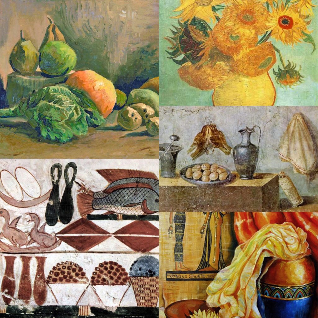
A still life is a painting of a range of inanimate objects. This became very popular in the 16th century in the Netherlands where it was called “stilleven”, however this form of art can be seen all the way back in ancient times.

History

Still life paintings were seen in as early as the 15 century during the Egyptian times where paintings of different foods such as meat, fish and crops were discovered in ancient burial sights. The Romans and the Greeks also made similar forms of art using a technique called Frescoes which is where they painted on plaster. In the middle ages this form of art was modified to include more religious elements. In the Renascence era, floral designs became more popular. Paintings from this time usually show a vast amount of flowers from different areas around the world all blooming in the same vase. During the Dutch golden era, this was adapted slightly to create painting known as Vanitas which are floral painting that were paired together with objects like human skulls and hour glasses to convey the concept of the nature of life. Closer to the modern day era, this technique was adopted by artists such as Van Gough who painted lots of images of objects such as sunflowers, water jugs and wine bottles.

Dutch still life

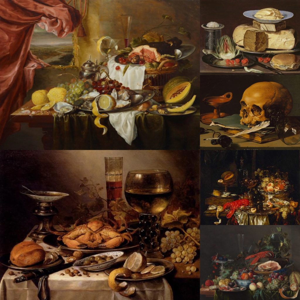
Dutch still life painting are known for depicting objects such as fruit, flowers and meat. When looking deeply into these painting we are able to focus on underlying metaphors. This era was known for its wealth. This was a time where overseas trading was prominent in the Netherlands and exotic luxuries from all over the world were imported into the country. Luxuries included things such as tobacco, spices, salt, gems, tea, silk and sugar. Dutch citizens wanted to celebrate their new found imports by incorporating them into their art. From this point on, these paintings became more elaborate and affluent.

Cherries and strawberries were used to represent men’s souls and dragonflies were used to show evil since it was seen as a subspecies to butterflies which represent salvation. Skulls and hourglasses were also very common in dutch still life paintings as a warning, and were often seen next to luxury goods as a reminder that such things would not be important in the after life.

Analysing Still life paintings


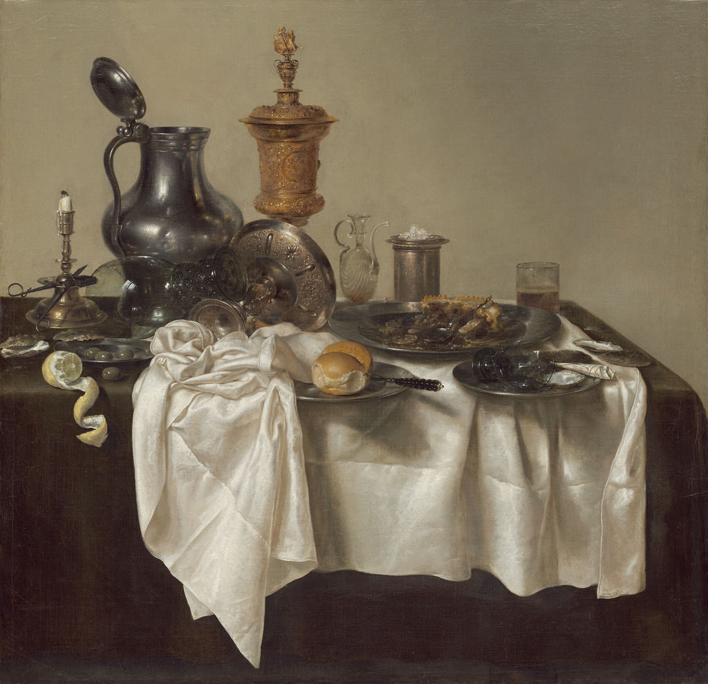
Banquet Piece with Mince Pie, 1635

by Willem Claesz Heda

In this painting we can see an abundance of goods and luxuries. The gold and silver jugs on the table shows a high status and symbolises riches, it also pops against the background. The tablecloth also reflects power as it seems to be a type of quite expensive cloth, perhaps silk. On the table we can see all sorts of foods from lemon imported from Mediterranean countries, to mince pie that was seasoned with spices from eastern countries. These imported goods show a high social status and an abundance of wealth.


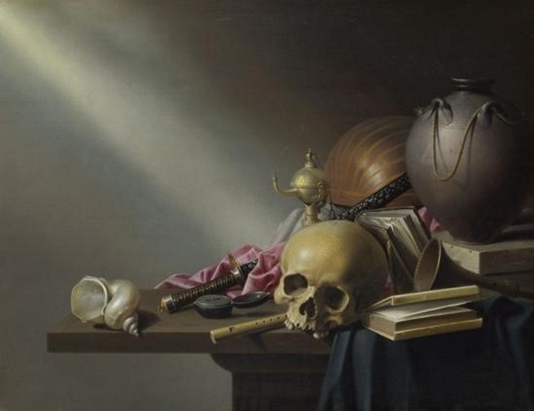
An Allegory of the Vanities of Human Life, c. 1640
by Harmen Steenwyck

In contrast to the image above this painting is slightly different as it is more religious in symbolism. Firstly, it is clear to see that it is a lot more monotone, and a lack of light shining which shows that the concept is darker or more serious. All the objects on the table are displayed in a chaotic order which could represent sadness or anger, and implies that someone may have been present at the scene and then left. We can also see that although the image contains some objects, there is quite a lot of bare space. This represents a feeling of emptiness that comes with having luxuries. The painting also refers to death as there is a very prominent skull on the table, that the steak of light is shining on to to highlight it further. The presence of books and instruments is used to indicate knowledge. Having the skull in front of the objects shows that when death comes luxuries will not mean anything.
https://www.artsy.net/article/artsy-editorial-dutch-lifes-dark-secrets-hide-exotic-delicacies

Autochromes

Autochromes is a material which was once used for colour photography, consisting of a photographic emulsion applied over a multicolored screen of minute starch grains dyed red, green, and blue-violet. This effect was achieved by getting a glass plate and coating it with a latex-based varnish and covered with a thin, regular layer of grains of potato starch dyed green, blue, and red-orange. In order to achieve the negative element of this type of photograph, one side of the glass would be covered with a thin layer of collodion (a flammable syrup) containing ammonium or potassium halides (iodide or iodide and bromide). The collodion is richer than the other substances which creates the negative, producing the whitish image. allowing it show up better against the dark background used when viewing the final outcome.

 Emile F. Guiton:

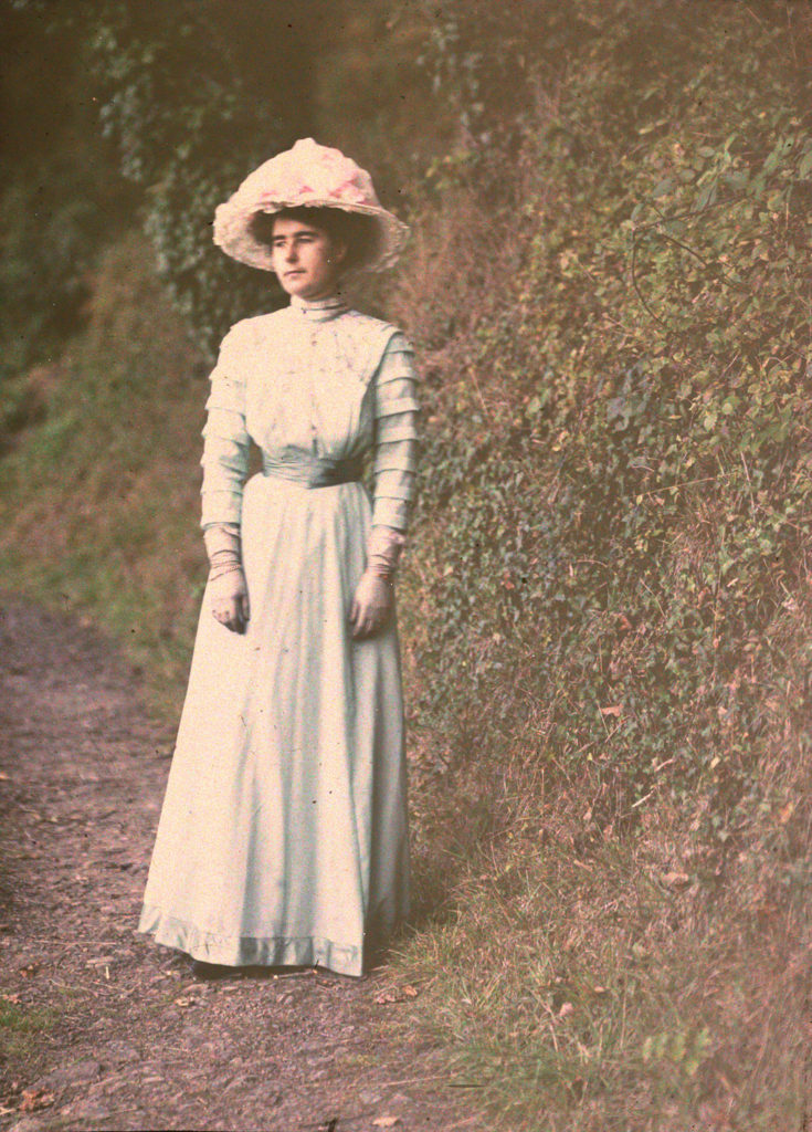
The founder of the Societe Jersiaise Photographic Archive had a passion for capturing colour photographs, during the begining of colour photography in the early 20th century. Emile captured two categories when using the autochrome technique: still life, fruit and flowers showcasing symbolism and domestic photographs, taking a more portraiture approach. He used still life photography in order for him to develop his skills, when using the chemicals to create the autochrome effect. In addition, the subject was still allowing for a controlled environment making the colour experimentation to be clearer. Emile would sell the autochromes in packs of four, which showed his experimentation with the chemicals. It is said that he created his work to capture the heritage of the island.

One of Emile’s most famous photographs was Valley de Vaux, which showcased two of Jersey’s landscapes in colour. One was a country environment and one was showcasing the urban life of Jersey, creating a clear juxtaposition. This photograph I could not find online, but from the description read on https://hautlieucreative.co.uk/photo20al/wp-content/uploads/sites/33/2019/09/The-Autochromes-of-Emile-Guiton.pdf it is clear that the work is trying to showcase the cultural change during this time period.

Laura Letinsky

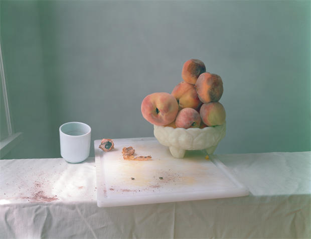
Laura Letinsky is best known for her elegant composed still life photographs. Inspired by the 17th century European still life paintings, Letinksy offers her 21st century perspective of the genre. She is aware of the rich narrative possibilities that still life presents. Although her photographs are similar to Dutch still life, they are more modernised.

The scenery usually has a dirty table cloth, as if someone just got up and left their meal after a huge argument with someone. Although as thoughtfully composed as the arrangements of those historic painters, her images embrace the messiness of real life where peaches rot, and table cloths are stained with spilled red wine and covered with crumbs from meals consumed.

Early in her career, she photographed couples in their own homes creating visual narratives about love and relationships. By the late 1990s she stopped photographing people and replaced them with objects. She began using objects that hinted at human presence.

Autochromes

The autochrome process was invented in France by brothers Auguste and Louis Lumière. The Lumières began a commercial manufacture of autochrome plates in the early 20th century.

Autochrome plates are covered in microscopic red, green an blue coloured potato starch grains. When the photograph is taken, light passes through these colour filters to the photographic emulsion. The plate is processed to produce a positive transparency. Light, passing through the coloured starch grains, combines to recreate a full colour image of the original subject.

Autochrome plates were manufactured at the Lumière factory in Lyon and was a complex industrial process. The transparent starch grains were passed through many sieves to isolate grains. These gains were separated into batches, dyed red, green and violet, mixed together and spread over a glass plate. Next charcoal powder was spread over the plate to fill any gaps between the coloured starch grains. A roller spread the grains and flattened them out. Finally, the plate was coated with a panchromatic photographic emulsion.

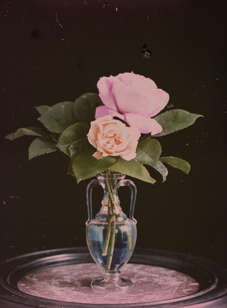
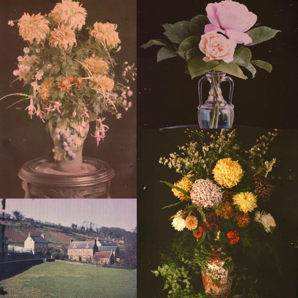
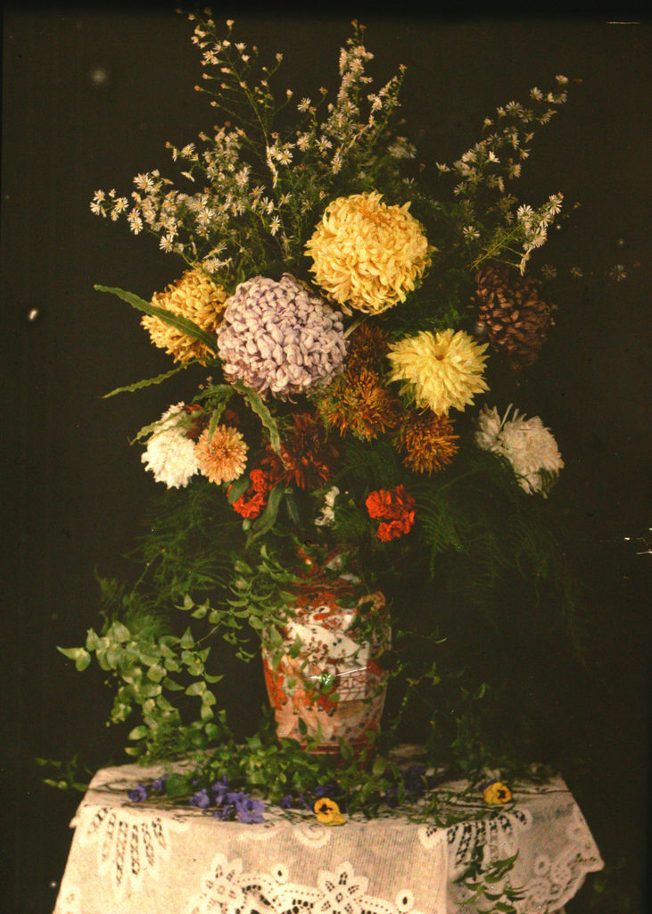
Lumière Autochrome is the first colour photograph taken in Jersey in 1904 G. Guiton & E. Guiton. This photograph of a vase containing roughly assembled garden flowers was the starting point for photographers to explore the possibilities of colour.

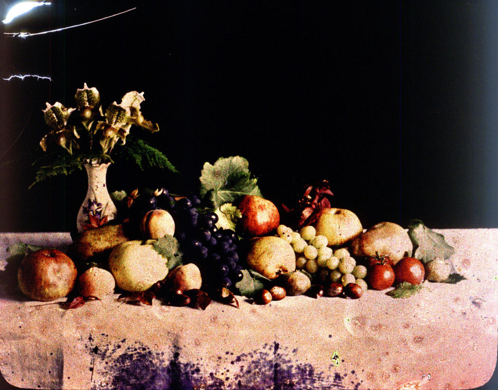
Emile’s autochromes fall into two categories. The first category are still life photographs such as flowers, stained glass windows, fruit. The second category can be described as domestic photographs such as children playing, a garden, local country scenes.

The still life photographs are an attempt to experiment with the autochrome process, to improve his technical understanding and the quality of his images. Guiton was also making attempts at classical arrangements and compositions.

https://blog.scienceandmediamuseum.org.uk/autochromes-the-dawn-of-colour-photography/

https://hautlieucreative.co.uk/photo20al/wp-content/uploads/sites/33/2019/09/The-Autochromes-of-Emile-Guiton.pdf

Autochrome research

Autochrome history

Guiton was the founder of the Jersey photo archive, and he was also a prominent figure in establishing colour photography in Jersey, through using autochrome plates.

The autochrome process my created by the Lumiere brothers; Auguste and Louis in France. Autochrome plates allowed colour photography to be created. These plates were cover in microscopically small pieces of potato starch. When the light passes through, it mixes with the emulsion to create a full colour copy of the photographed scene. The grains of starch were separated into different groups to be dyed red, green and violet. All the different colored grains were then mixed together and put over a glass plate to finally be coated with varnish. Charcoal powder was then added onto the plate to fill in any gaps left by the colored grains. These plates could be used on regular cameras, no extra equipment was necessary.

When placing the plates in the camera, the plain glass side of the plate had to be facing the lens so that the light could pass through before reaching the emulsion. When using these plates, exposure time had to be slight higher, about thirty times longer than black and white plates. The complex manufacturing process of these plates meant that they were more expensive, which limited it to only certain people.

Autochrome plates were also harder to be able to display, for personal viewing it was possible to just hold them up to the light, however when it came to displaying them for others a stand was used in combination with a mirror, or they could also be projected using a magic lantern.