Category Archives: AO1 Develop Ideas

Filters

Author:
Category:

Zine: Sequencing and Narrative

After finalizing the editing for all of the photographs I took over the course of the project, and reducing my selection of images to the ones that I wanted to use as final images, I was left with the below images:

These would be the images I would use in my zine, and I felt like these images could all be linked together using a narrative. My first thought was that the contrast between the portraits (clearly taken in modern time) and the images of the archival, old objects would work to add to a narrative that represented the reflection between the present individuals who still deal with the trauma of the occupation, and the reality that the occupation is still a very important and present part of the history of Jersey (as clearly the objects have been looked after and archived to preserve them and their importance). I decided to develop a narrative that would help to link between the past and present, and show the differences and similarities that could still be found within past and present representations of war and occupation if they are actively sought out.

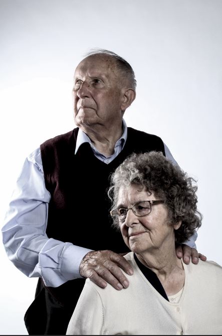
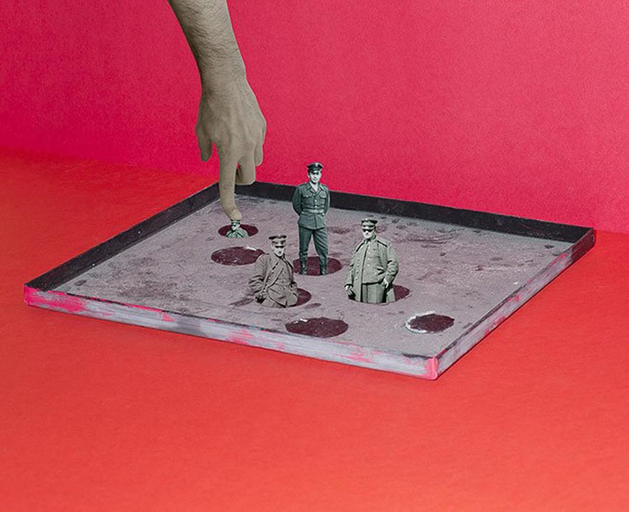
The first 2 images I decided on to place side by side were a portrait and a photo-montage. I feel that placing these 2 images together shows a contrast between the bold colours on the right, and the dulled, somber colours of the left. I specifically placed these images together due to their contrasting colours which would draw attention of the viewer, but also the fact that the subjects of both images are looking in the same direction, showing a connection between the two images, and drawing attention to the fact that the subjects of both images, although presented very differently, still hold experiences of war and trauma that they deal with in their own way. I made these the first images to immediately draw attention to the similarities between old and new.
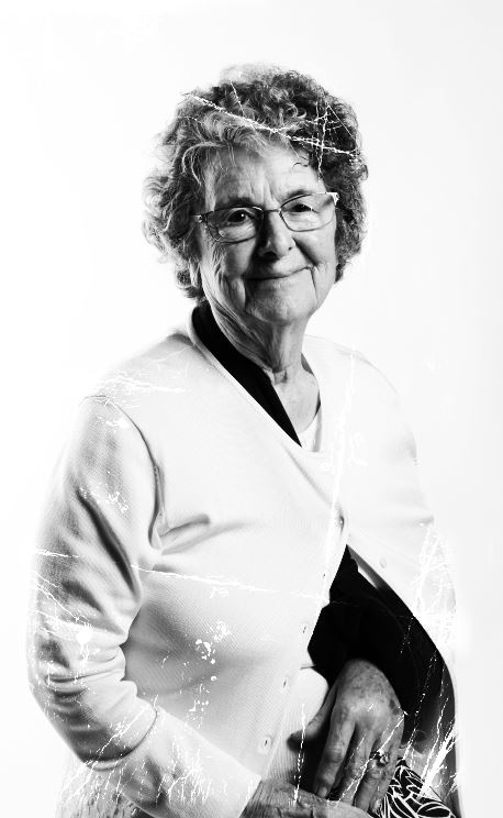
I then began sequencing the next images, to show a subtle decent into a set of images that focused more on the historical aspect of the war, drawing attention to archival images and photo-montage representations of how war influenced those involved in it. I did this by placing an image of a single subject that has been edited to look slightly ripped. I did this to show a decent, as if tearing away the present to reveal the past reality of the war and occupation. I then placed a series of objects and photo-montages, progressively becoming darker and bolder in colour as well as theme, in order to represent the growing despair and hopelessness of the occupation.

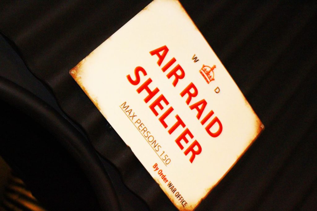
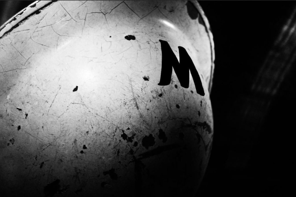
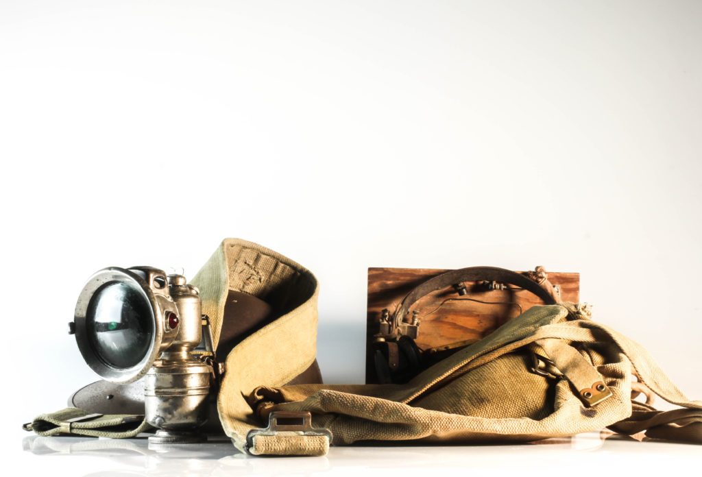
As seen in the gallery of images above, the sequence moves from lighter, studio photography of objects, towards more raw, darker tones images of objects in the environment in which they would have been found during the occupation. I did this to emphasize the reality, in which archival objects themselves struggle to tell the full story, unless the reality and truth of the occupation itself is considered, and the objects are seen in their real, frightening and more disturbing setting.
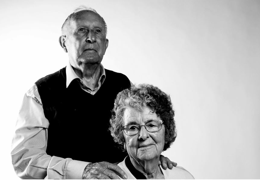
I decided to use this image as my final image. I feel like the tones of this image encapsulate the sorrow of the war, as the contrasting black and whites present a stark and harsh contrast, with the subjects presenting neutral faces (rather than happy). I used this as my final image to bring attention back to the present, where individuals present during the Occupation still deal with the negative memories of the Occupation, and I feel that this image reflects the dark struggles that the subjects still deal with every day.

Montage experiment

In The First March of Gentlemen, Rafal Milach creates a narrative composed of real stories. He retells the historical childrens strike in Wrzenia in Poland from the early 20th Century, through collaged archive photographs from the 1950s and 1960. He has created a narrative to be read as a playful metaphor for the social and political tensions of the present.

When western Poland was under German occupation, over 100 students of the Catholic People’s School took part in a strike against the German influence on their education. The Germans aim was to remove the Polish language from their teachings.

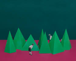
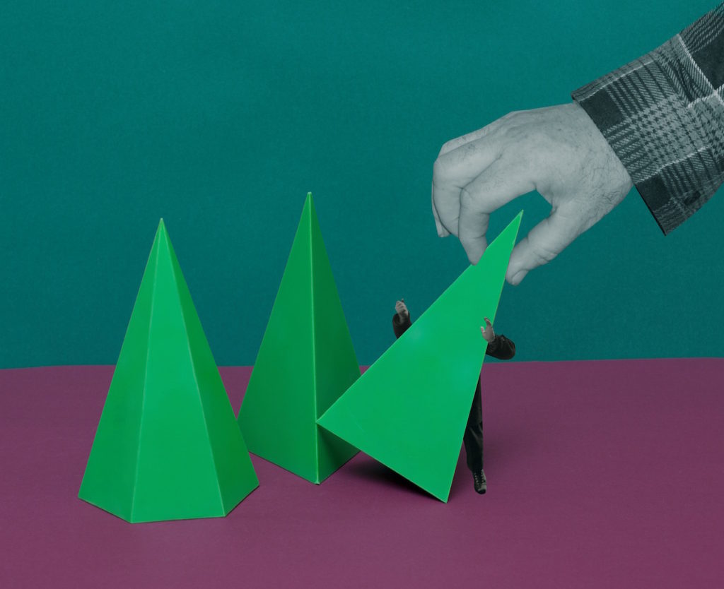
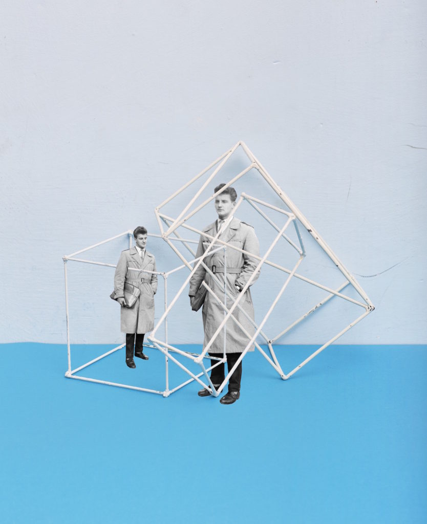
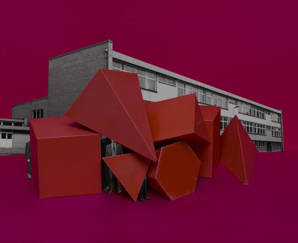
Milach detached the figures from Szczepaniak’s photographs, both literally and figuratively, from their original context and placed them onto bright, candy coloured backgrounds. The design is “like a toy, like a candy – something nice to look at and to touch.” The figures are caged in geometric shapes, which as the book progresses, increasingly constrict and restrain them. The figures remain oblivious to their imprisonment. Ania Nałęcka-Milach, the designer of the book, created the physical object to reference the size and colour scheme of children’s school exercise books, as a camouflage for the serious subject matter.

https://en.artbooksonline.eu/art-20507

https://www.bjp-online.com/2018/06/milach-gentlemen/

MY RESPONSE:

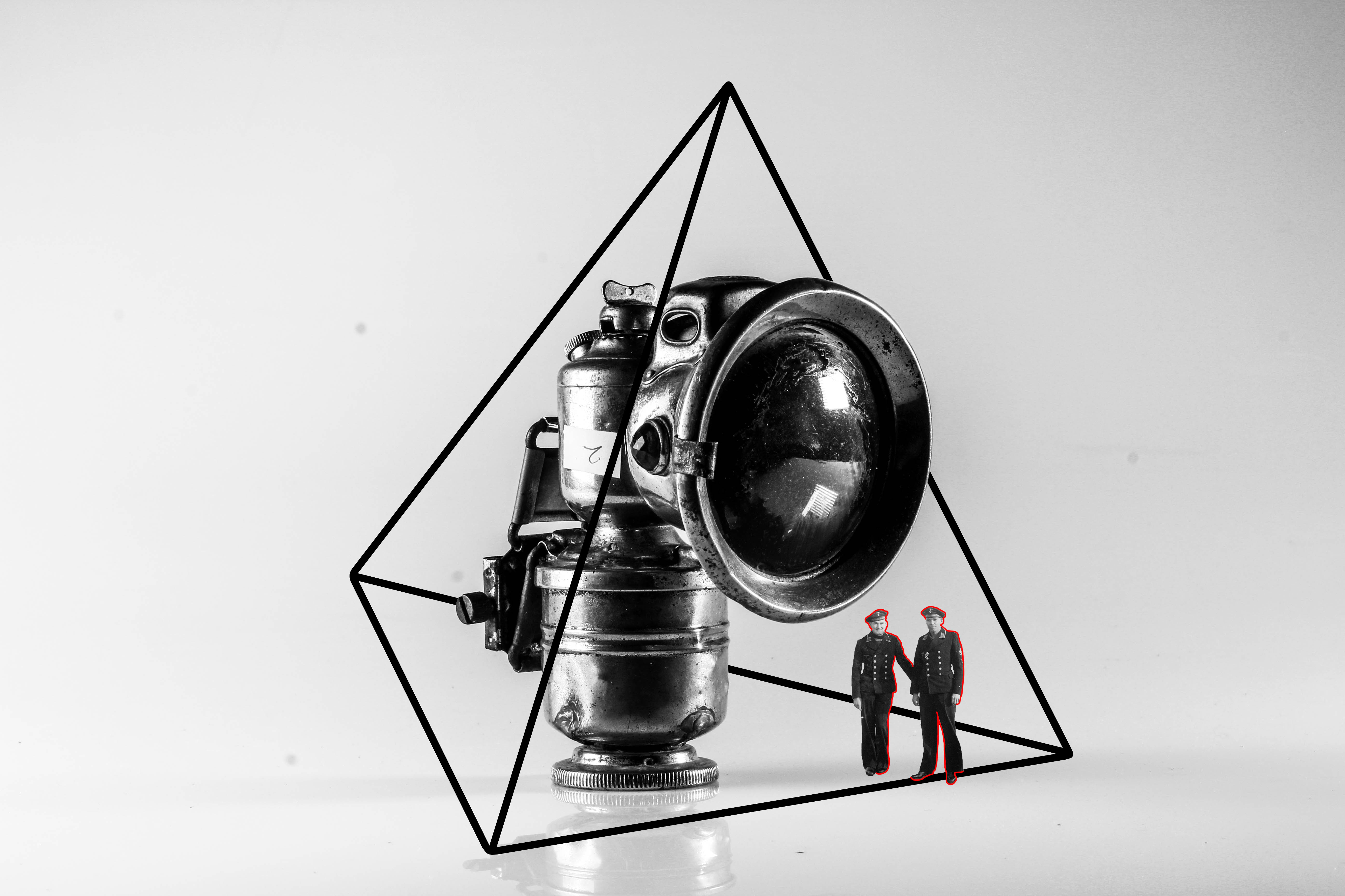
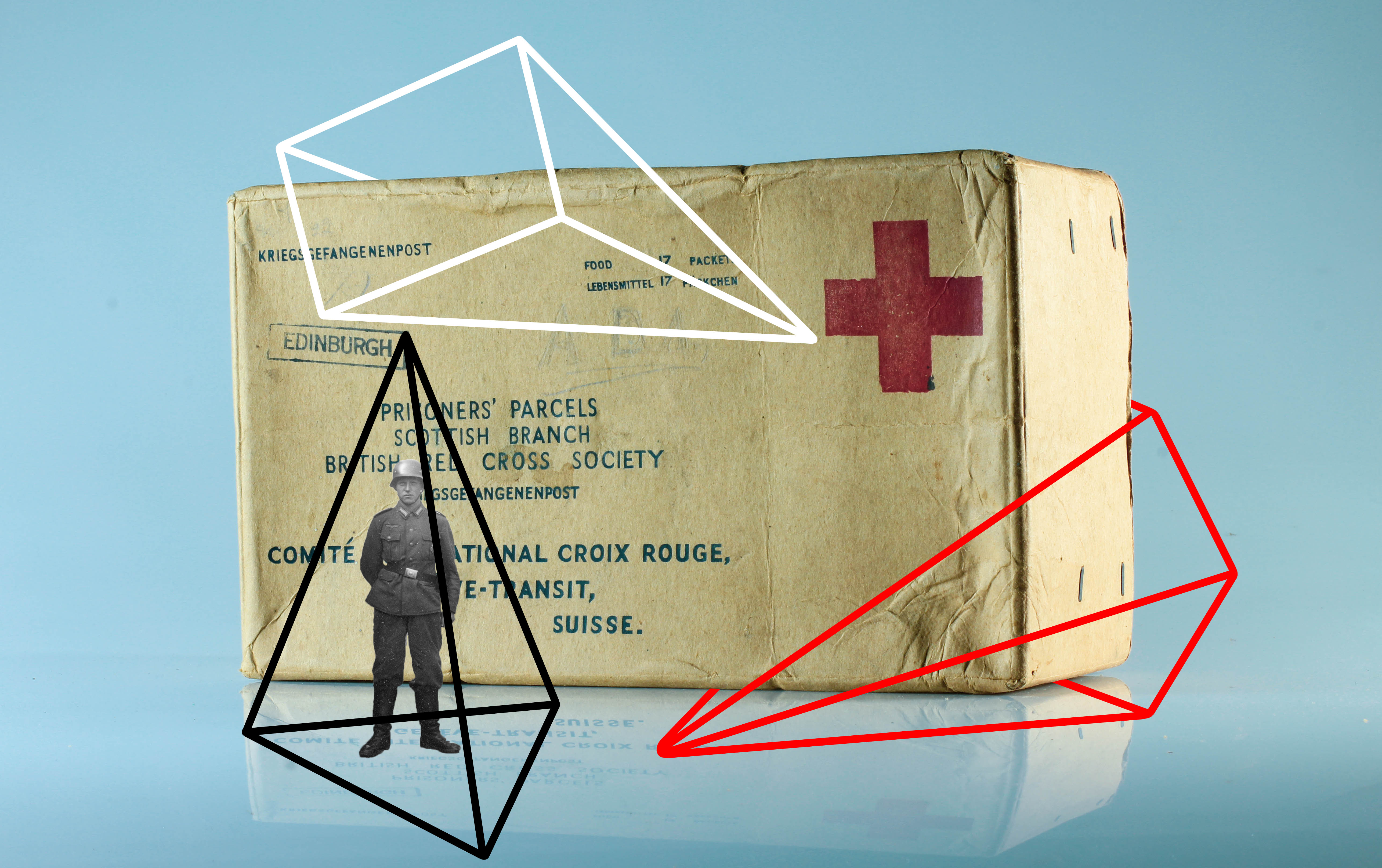
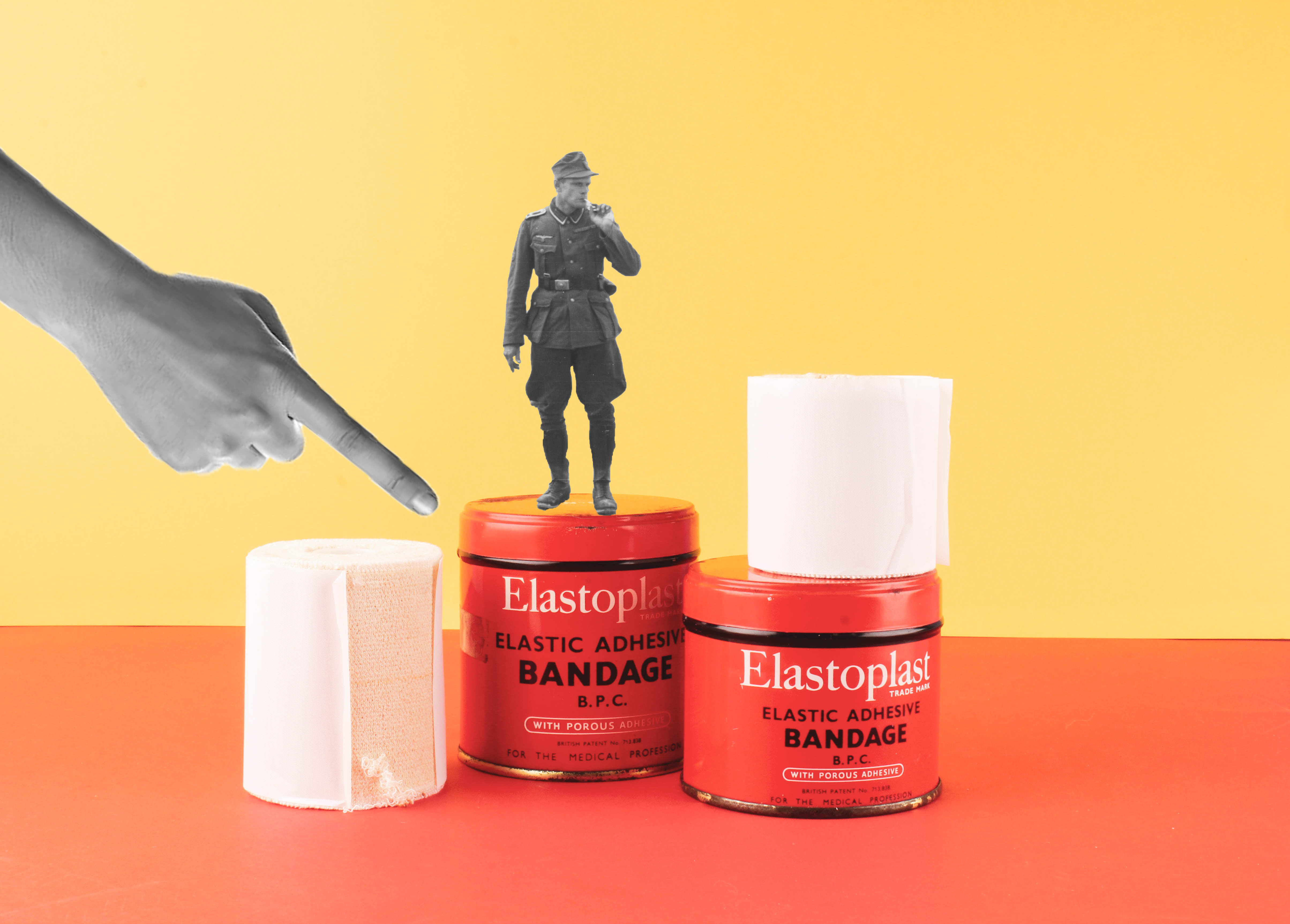
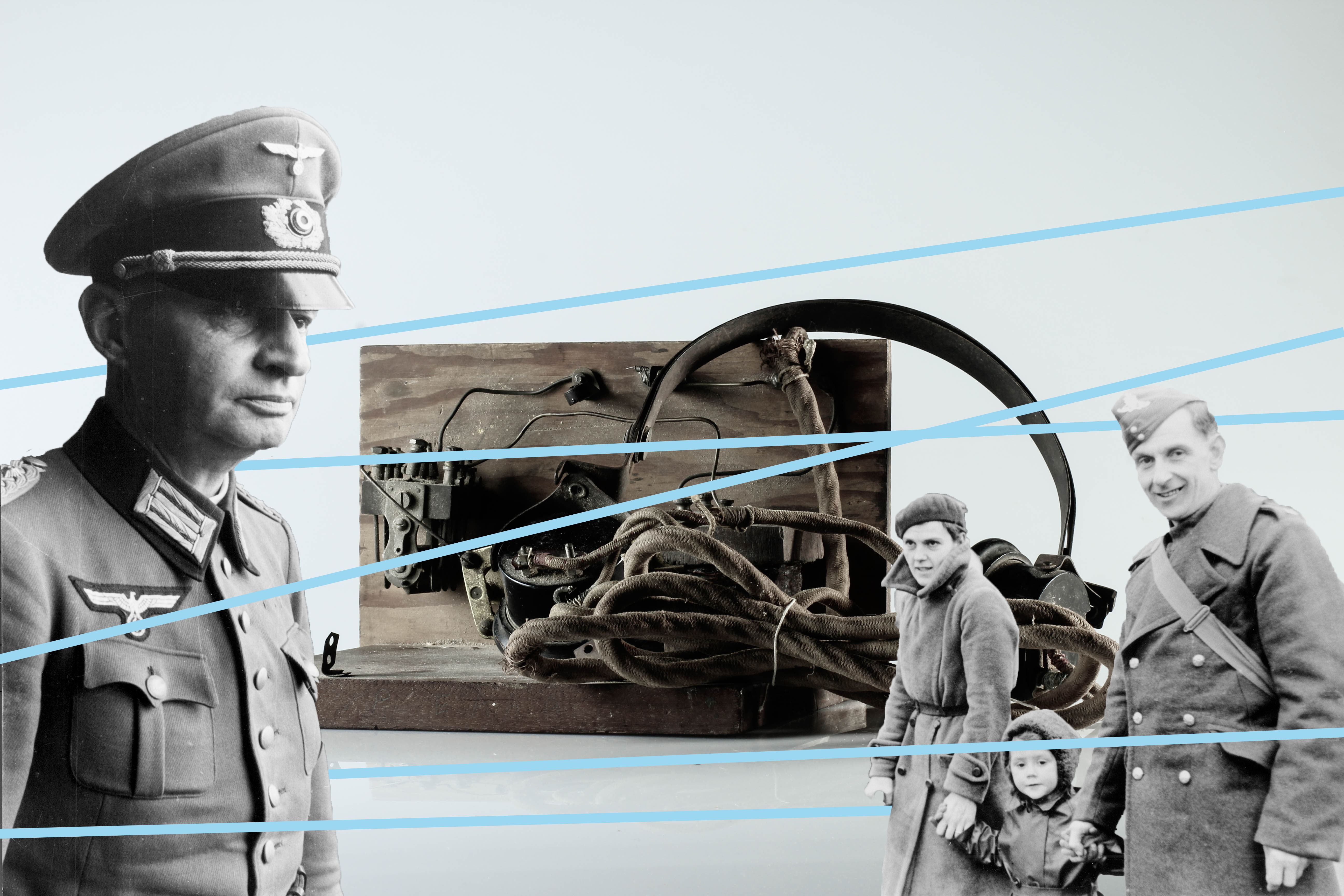
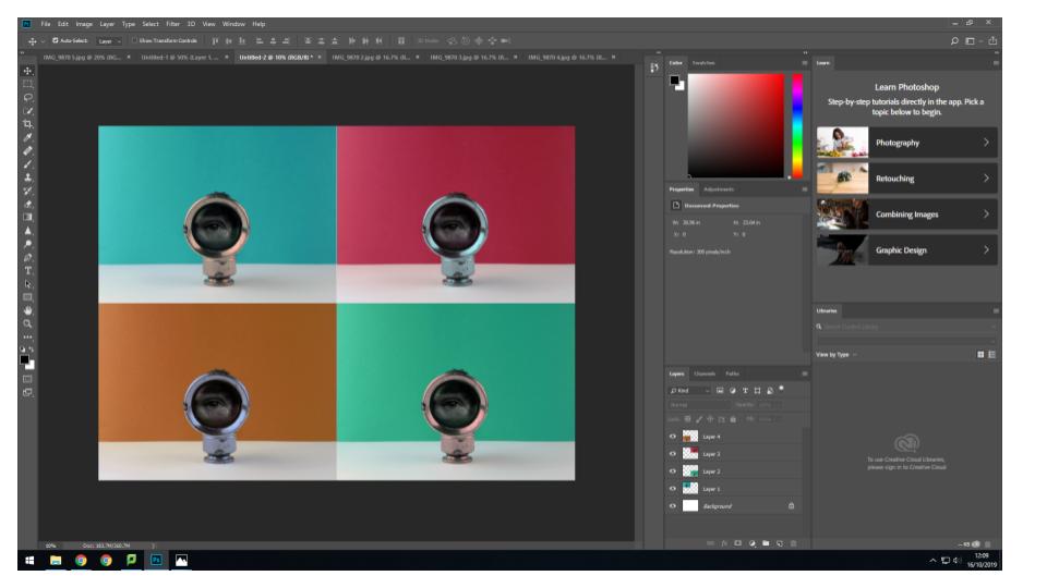
In order to create these photomontages, I edited my still life Occupation objects on photoshop. These 4 outcomes are inspired by Rafal Milach, a photographer who created montages with figures caged in geometric shapes to retell the historical children strike in Wrzenia in Poland. His vivid colour scheme and “toy and candy” design has inspired me to further explore my editing skills on photoshop.

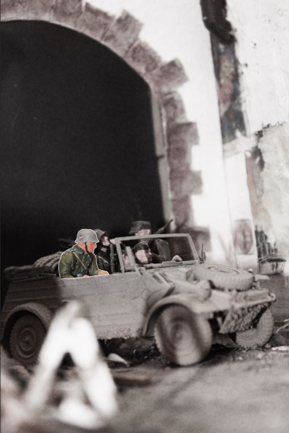
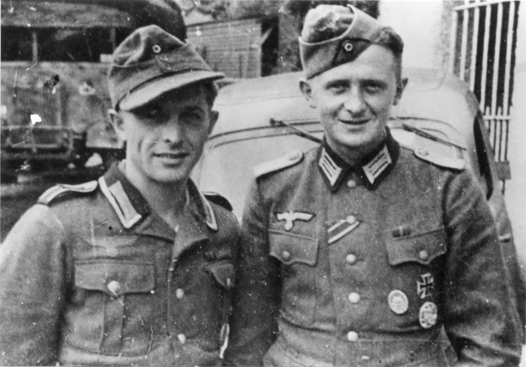
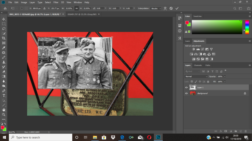
To create these several designs, I used archival images of German soldier from société jersiaise. The quick selection tool on photoshop allowed me to cut out the soldiers from their original photo and place it onto the still life photographs. Before using the line tool, I adjusted the figures using the transformation tool to change the size and placement. What I enjoyed the most about editing these photomontages was adding geometrical shapes onto the images to have the same contextual meaning as Milach’s book. The figures are restrained and caged by these lines to convey the restrictions the German’s introduced into Jersey when it was Occupied.

Photo-Montage Experimentation

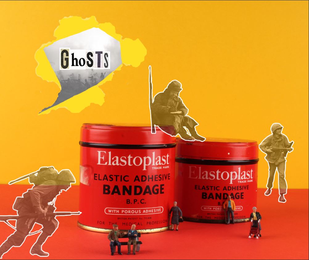
After taking a series of images using the studio layout, I began to combine multiple elements to create photo-montages. In the initial studio photograph, I took inspiration from Rafal Milach’s “The First March of Gentlemen”, and used contrasting card colours to provide the background for the objects. I used one colour as a back wall, and a it’s complimentary colour as the ground colour in order to create an obvious separation between the 2. I then took a photograph of a series of objects taken from the Jersey archives, and for one of the images I made use of a number of tiny figurines. I then used Photoshop to create a montage out of these original images, and a series of archive images, taken during WW2.

I produced this first image after taking an initial photograph of the objects and figurines, and then used Photoshop to edit in the faded outlines of the soldiers. I did this to try and create a representation of the memories of the war (represented by the faded soldiers) in contrast to the present day (represented by the figurines of the elderly people). I produced this image to represent the reality of many individuals who survived occupation and war, as they now all live with constant memories and reminders of the experiences they survived during the war.

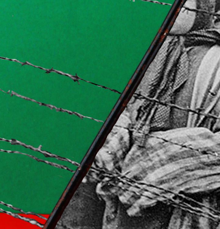
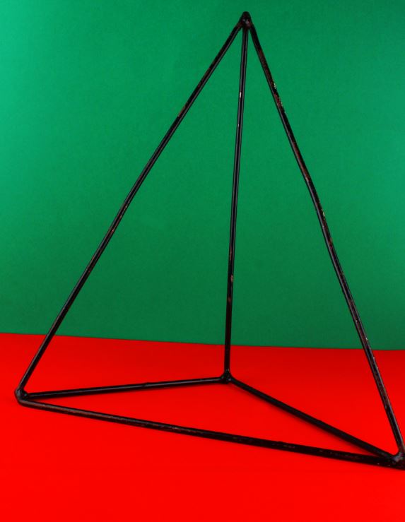
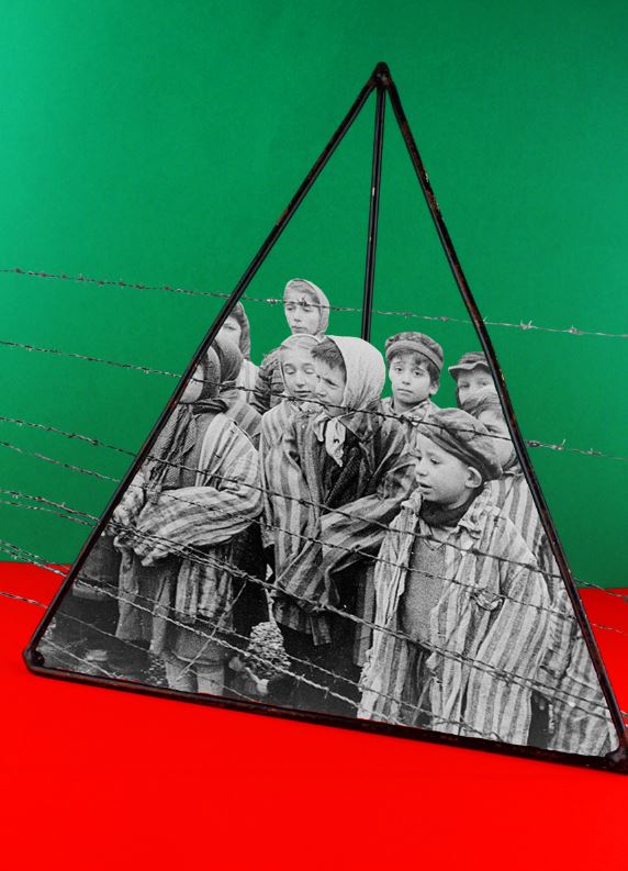
For my second photo-montage, I made use of 2 complimentary colours in the background, and photographed a pyramid maths object (taking inspiration from Rafal Milach). I then used an archived image of children in a concentration camp, and edited the image so it looked like the children were trapped inside of the object. I did this to reflect the horrors that many children faced during the war, while also contrasting this with the use of an object used in school, which is supposed to be a safe environment for children.

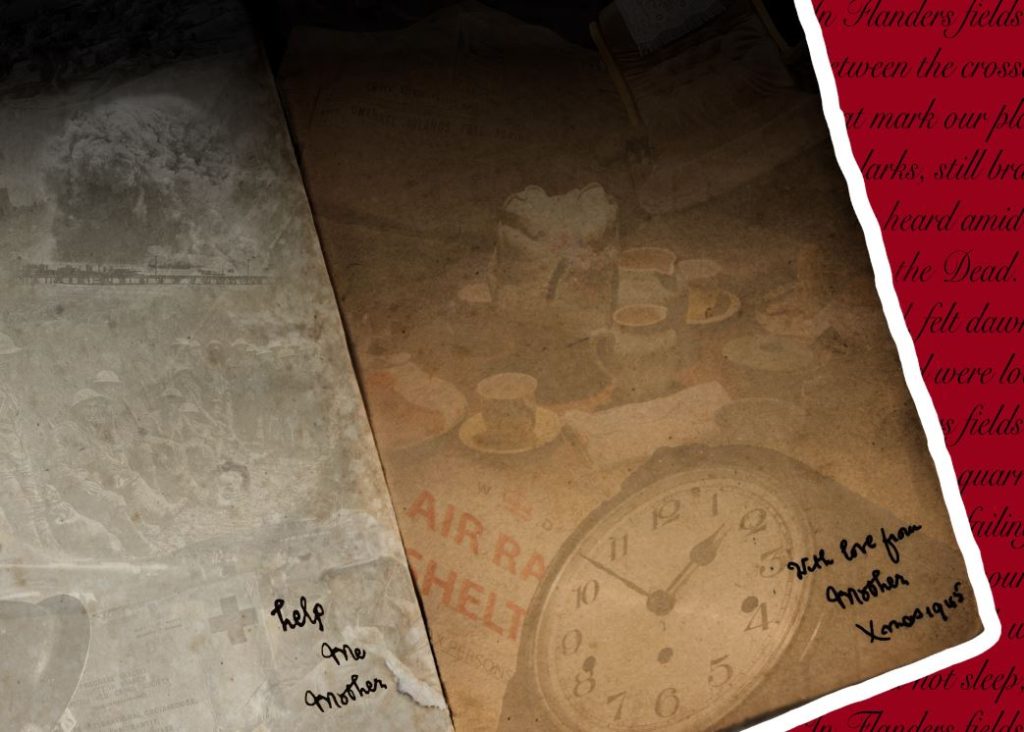
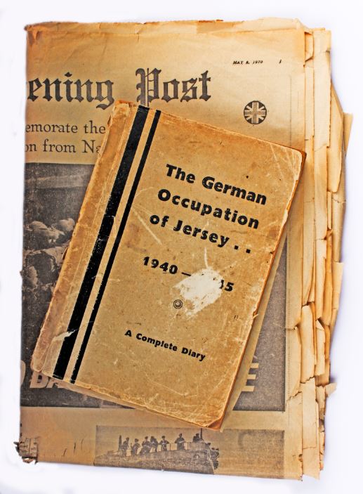
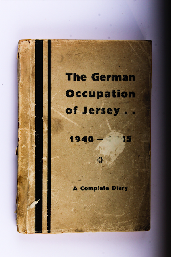
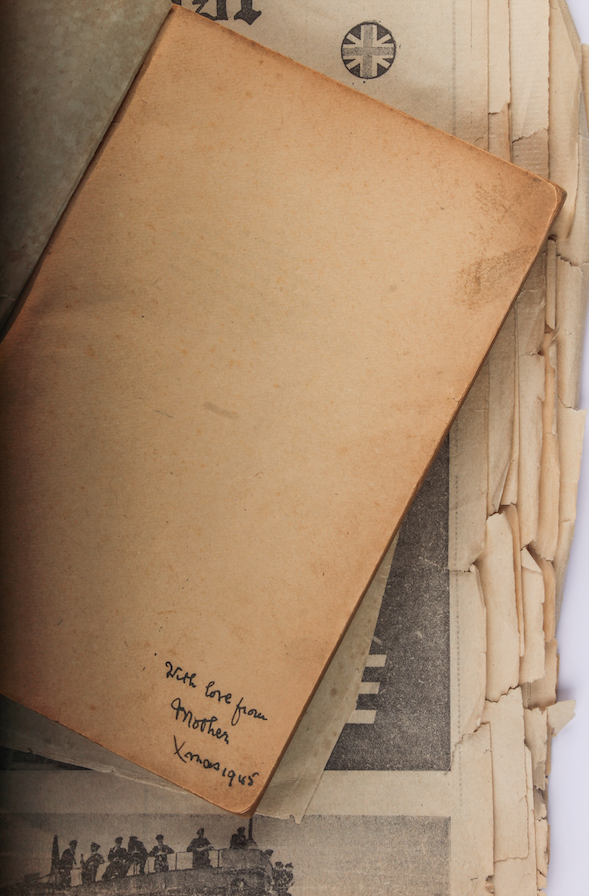
For the above image, I took a more experimental approach. I took inspiration from the note within the original book, saying “with love from mother, Xmas 1945”. I created a contrast between the 2 sides of the book, with the memories from home on the right, and the horrors of the trenches on the left. I did this to uncover the reality of war, and the differences between experiences of different people during WW2.

Rafal Milach: Photomontage

Ralf Milach | Photography

Rafał Milach (born 1978) is a Polish visual artist and photographer. His work is about the transformation taking place in the former Eastern Bloc, for which he undertakes long-term project. He is a nominee member of Magnum Photos. Rafal Milach is a visual artist, photographer, and author of photo books. His work focuses on topics related to the transformation in the former Eastern Block. His works have been widely exhibited in Poland and worldwide, and can be found in the collections of the Centre for Contemporary Art Ujazdowski Castle in Warsaw, the ING Polish Art Foundation, Kiyosato, the Museum of Photographic Arts (Japan), and Brandts in Odense (Denmark).

I will be personally looking directly at Milach’s work ‘The First March of Gentlemen’ which was developed in 2017. The book is contextually produced surrounding the historical events around the town of Września and this came to be the starting point for reflection on the protest and disciplinary mechanisms.  In the series of collages, the reality of the 1950s Poland ruled by the communists blends with the memory of the  Września children strike from the beginning of the 20th century,  which was a protest of Polish children and parents against the Germanization. This shift in time is not just a coincidence, as the problems which the project touches upon are universal, and may be seen as a metaphor for the contemporary social tensions.

“The initial idea of working with the archive was sustained, but the topic changed as I began looking for material that could occupy two spheres – discipline and pacification, and the sphere of freedom – and to bring these elements together in a series of collages.”

The above quote has been taken from an interview that Rafal Milach took part in with the British Journal of Photography, over the subject of ‘The First March of Gentlemen’, I found this quote useful to me while researching having used my own island’s archives as something to be used in my photographs and in montages. It intrigued me the way that he speaks about the subjects changing to go into a ‘sphere of freedom’ as the initial subject on looking is relating to a time of no freedom and occupation and I have just found it intriguing to see the way in which the photographer views and uses the archives as context before going in and looking at the book and photographs as a whole.

https://www.bjp-online.com/2018/06/milach-gentlemen/

Below shows my chosen photograph of Rafal Milach’s series. When first looking at the photographs we can see the same man, produced twice with photomontage, encaged in two geometric tools. Contextually these shapes and objects were brought into and across schools to be used as teaching tools for subjects such as mathematics, in the case of the book, as you slowly move through the photo-book the figures used from the archives slowly become more entrapped and claustaphobed into these instruments. The figure in the photograph seems looking quite dapper, he stands with not much authority but not as a suppressed minority, however this stand of posture is all juxtaposed with the fact he is encaged in this structure metaphorically speaking it could be taken and seen as a sign of the freedom they had or the lack of. This photograph was not produced all in camera, it is montaged together meaning he subject is unaware of the cage around him.

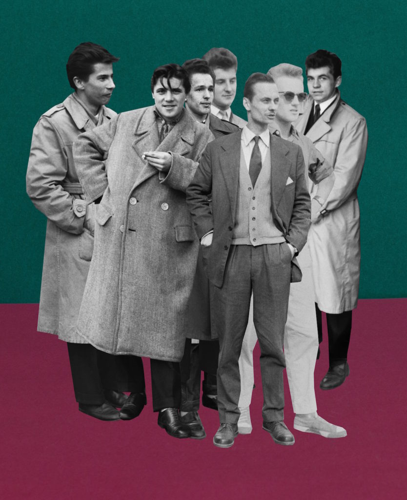
Milach found the archived photographs in the work of local amateur photographer Ryszard Szczepaniak, and his archive of images shot in Września during the 1950s and 1960s. He photographed people in formal street poses, many of them while on leave from the military, some of whom came from the Armia Ludowa, a communist partisan force set up by the Polish Workers’ Party while under German occupation during World War II. We can see from the photograph below and those alike in the mood board they pose well-dressed, whether in uniform or not, they are as Milach described them ‘dandy-esque’ figures.

Quite literally Milach has detached these figures from their photographs and their surroundings. He is placing them on brightly coloured backgrounds, a hint to child-like features, and he is displacing them on the page and contrasting them. This decision can be contextually backed by looking at what Milach speaks about when describing the figures. – “They were a poorer version of the glamour they probably knew from American films,” “This intrigued me… The photo shoots were somehow detaching the guys from the context of contempt in those days. The 1950s in Poland was a pretty oppressive time in terms of the communist regime, and these guys were just having fun in some remote areas within Września county… posing, staging shooting scenes… It was like being part of the system, but making a joke out of it.”

Contemporary Practice: Irving Penn

“I myself have always stood in the awe of the camera. I recognize it for the instrument it is, part Stradivarius, part scalpel.” 

https://irvingpenn.org

Irving Penn was an American photographer known for his portraits and fashion photography alongside still life’s. He has a book titled ‘Still Life: Irving Penn Photographs 1938-2000’ – This book gathers Penn’s work in the still life genre, so central to his art, from 1938 until 2001. It opens with an introduction by John Szarkowski, who places Penn within the larger context of artists working in still life. Penn oversaw the design and production. – Published by Bulfinch Press, Boston, 200

At a time when photography was primarily understood as a means of communication, he approached it with an artist’s eye and expanded the creative potential of the medium, both in his professional and personal work. Penn’s preference for photographing in the controlled environment of a studio, where he could trim away anything that was not essential to his compositions and hone in on his subjects.

I have previously taken some time to look into Irving Penn studio portrait photograph and look into his style of working and found it very interesting and informative and eventually worked very well with outcomes for studio portraits, which is why I have chosen to look at Penn for still life photography of objects as well.

Previous Look into Irving Penn and Studio Portraits
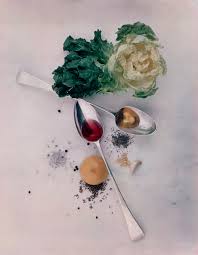
Collection of Irving Penn’s still life work:

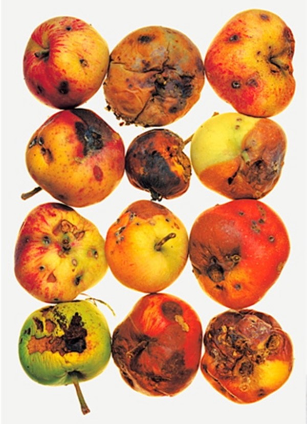
I enjoy Irving Penn’s work as I find it pleasing to the eye and I like the way that some of the photographs look less staged, like somebody has been using the cutlery or using the ruler and then Penn has taken a photograph how it has been left and this is something that I like about the images and how they are presented. I also like how some show repetition with the apples they are all laid out 3 by 4 and is something I would like to try and experiment with when I look at making my own still life photographs.

Image Analysis:

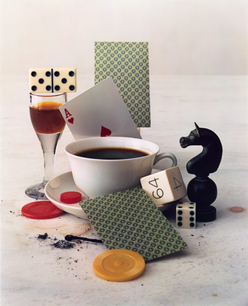
Below shows the photograph I have chosen to edit and look into in more depth. This photograph is called ‘After Dinner Games’ and was taken in New York in 1947. The photograph shows a variety of objects placed on a table. Unlike some other still life photographs I have seen where there is no horizon line, in this image we can clearly see the line where the table cloth ends and the wall begins, I feel this generates a more ‘lived-in’ feel as it is less artificially placed. The objects have been arranged to seem as though people have been using them and this is how they have been left, we can see drink and ash stains on the cloth as well which adds to less synthetic feel to the photograph. The image has fairly white light suggesting that is probably artificial rather than natural light which I feel tends to be more warm and yellow, there is a slight shadow falling to the right of the photograph from the underneath of the card, the dice and the chess piece suggesting the light is mainly coming from the left side of the photograph. I enjoy the composition of this photograph with how all of the objects are linking together and aren’t just laid out separately, I feel it creates a really interesting photograph that is pleasing to look at and creates and idea or story of what could have been happening if this photograph was taken in a real life situation.

Crop and Colour experimentation

With the images from my visit to Batterie Moltke, I am going to experiment with various techniques such as cropping and colour adjustment as well as Desaturating images entirely to create a series of variation in my images

Cropping

Below I have included some of my original images followed by cropped edits. Cropping is used to remove irrelevant or unwanted subjects fro an image which allows for more focus and emphasis on the main subject. Cropping also helps change the aspect ratio of an image and also allows for an overall improvement in terms of the images composition

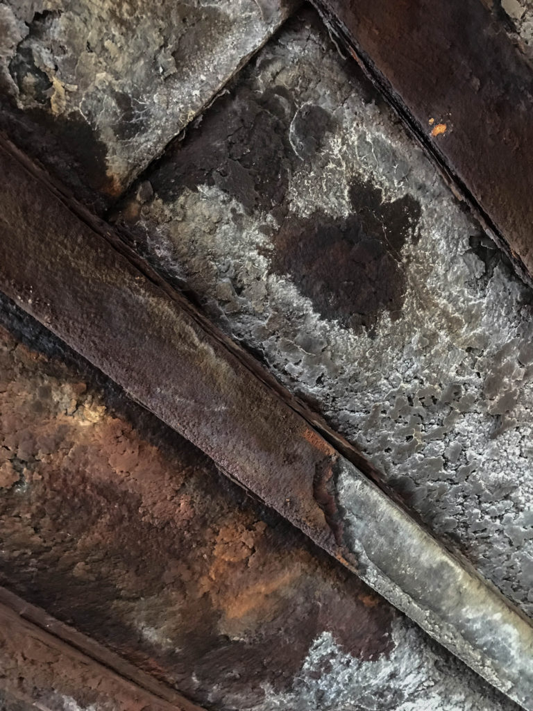
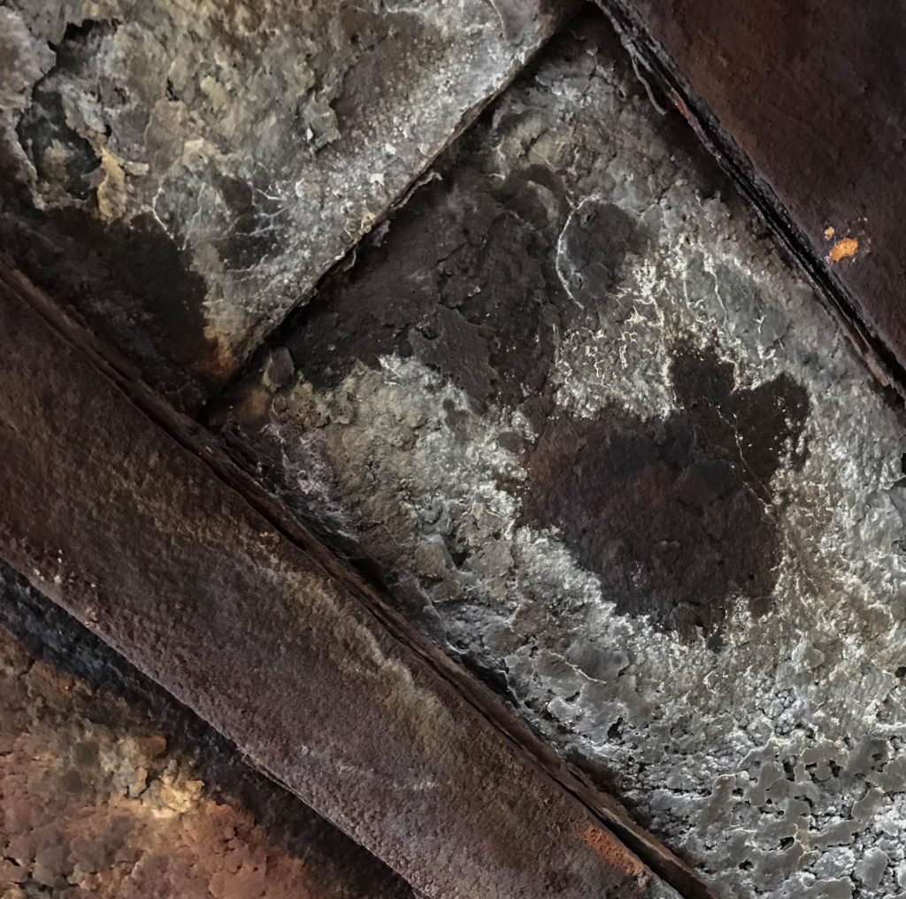
Above is an image of a corroded ceiling inside of the German MP4 Radio Tower. I like the texture given off in the image as it shows a true sense of age and decay, However I find that a crop could benefit the image well in terms of overall composition. Below is my Cropped Image

I have decided in this edit to focus more on the patch of decaying brown material in the roof rather than focus on the wider Image as I found there was too much to take in #

Colour Adjustment

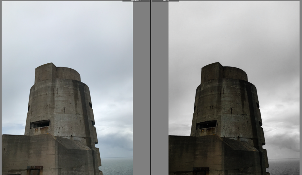
Colour Adjustment involves utilizing the colour palette in an image to create variation. In Adobe Lightroom, There is a whole HSL/Colour control panel which enables the user to have control over the various colours in an image and allows for the Hue, Saturation and luminescence to be controlled with sliders. Below is an example of an image where I used this function to alter the colours to create a dramatic image

For this image, I took control of the Aqua and blue colour filters and completely desaturated the image, Leaving the Gray/ brown of the concrete bunker as the only subject with colour in the image. This method also helps to isolate the main subject to give it much more emphasis and make it stand out from the image. I further altered the contrast and exposure to create a dark and moody image

Black and White

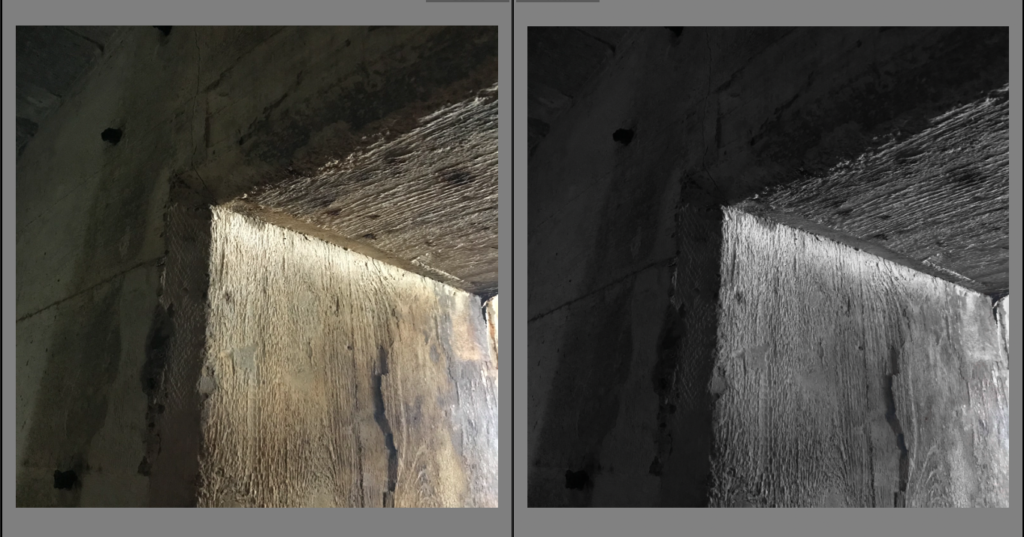
Desaturating an image is a great way to create an atmosphere within the image. This process is acheived through desaturating the image and then dependent on the mood of the image the photographer/ editor wants to give off, The contrast, exposure, shadows and highlights are altered to give off the desired effect.

For this image I desaturated all of the yellows, Greens and oranges within the image as these are the only colours present and turned up the contrast slightly and altered the exposure to create an effect involving the light and the darkness inside of the wall. I find that using black and white gives a great emphasis of contrast within the image

Still life: Studio Photography

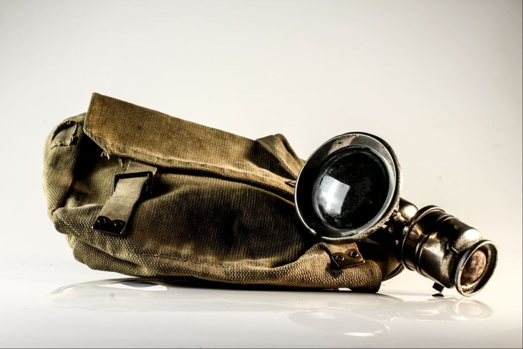
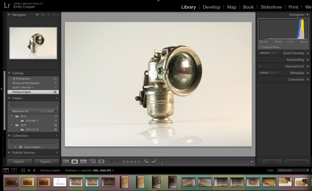
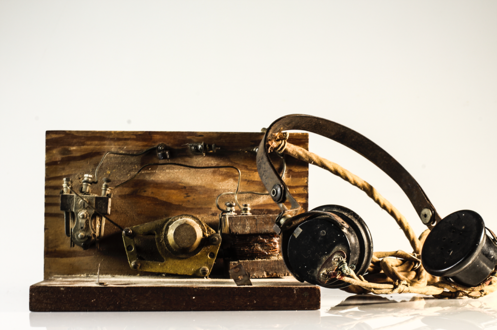
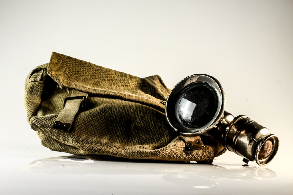
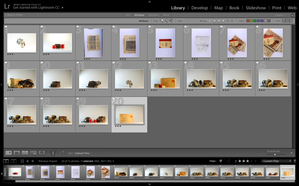
Once I was confident with my understanding of the lights and layout of the studio, I could begin taking photographs of the archival objects that were loaned from the Jersey Archives. I made use of the cameras already attached to the tripods but used my own SD card. After taking a series of images, I came out with the below series (unedited):

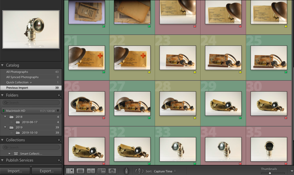
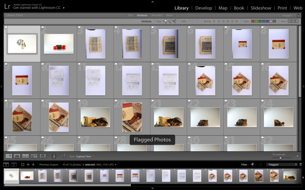
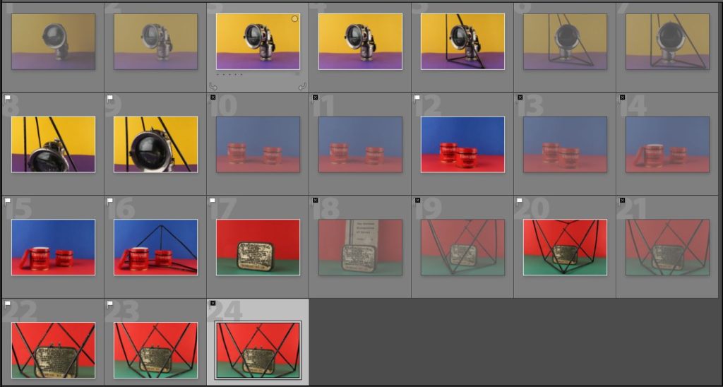
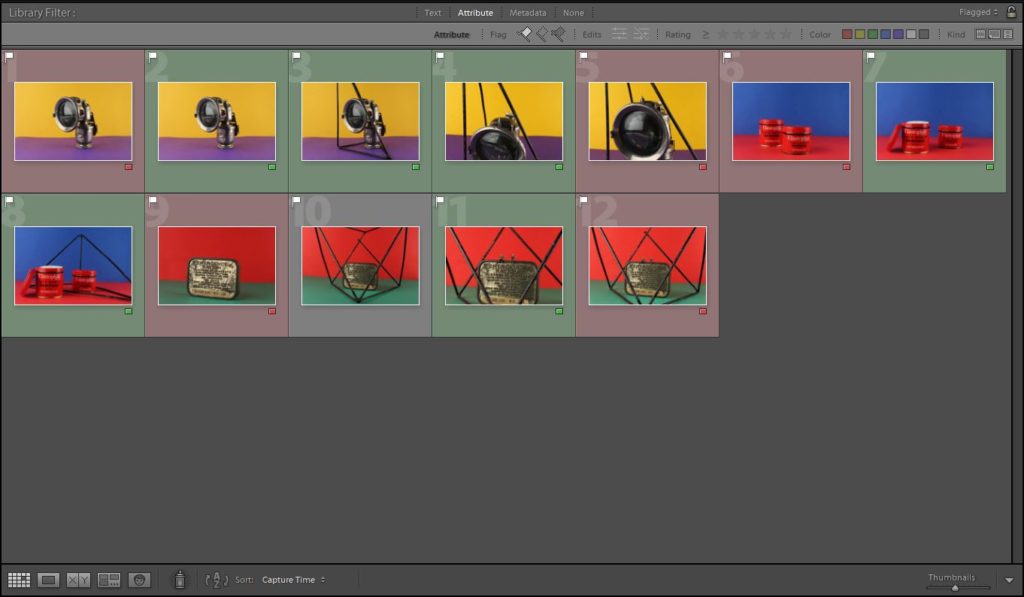
As some of the images were either overexposed, underexposed, or had the wrong composition, I uploaded the images into Light-room, and used the colour option to highlight which images I wanted to use, and which images I would reject. The following screenshot is the collection of all of my images after they had been colour coded:

Key:
Green: Final images
Yellow: Possible final images (need more editing)
Red: Rejected images

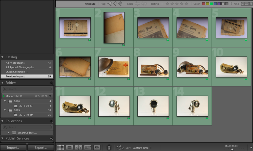
Out of the images I uploaded to Light-room, I only decided to edit 14 of my best (those highlighted green). The final 14 images can be seen below:

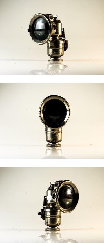
I took some of these images with the knowledge I would most likely use them in a series/pattern (for example, the final 3 images are the same object at different angles, which I took under the assumption that I would use them in series)

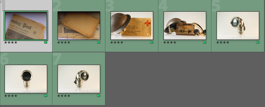
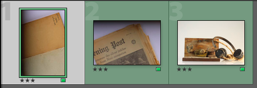
As a further method of rating each image, I decided to rate each of the green images /5 in order to record which images I felt would work best, and which ones I felt needed the most editing during the development stage:

The ratings of the above images ranges from 3/5 to 5/5, showing a variation of images at different levels.

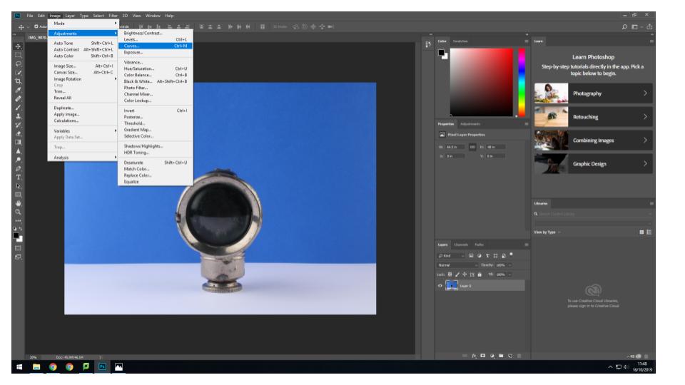
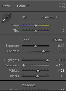
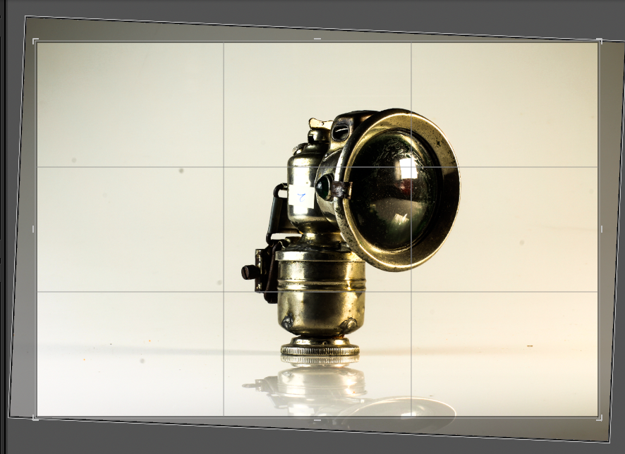
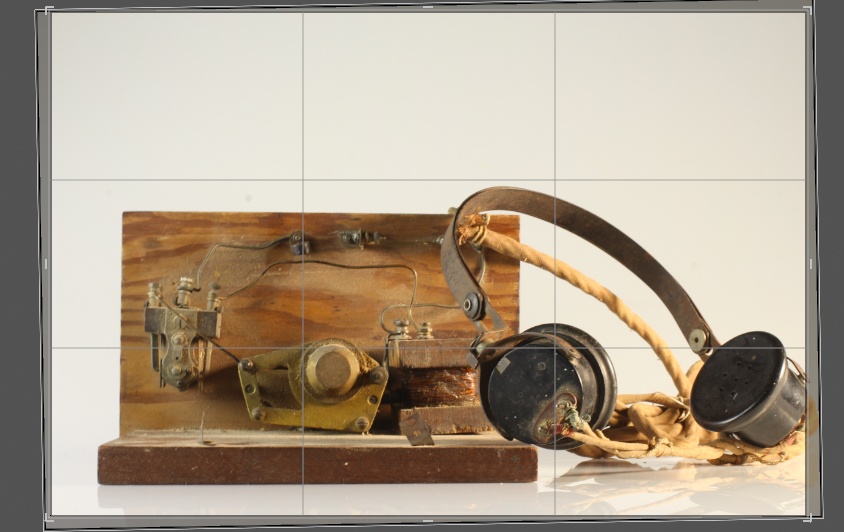
I then began the development process, in which I would edit the images that I had labelled green. I used the Light-room editing software, as I find it more detailed and specific than the Photo-shop software. I found that editing the colour gradients and contrasts of my images would be the most important part of this process, along with altering the orientation of some of the images so that the objects lay parallel to the bottom of the image frame.

For many of the images, I increased the contrast of the colours in order to produce bolder outlines and harsher colours. I felt that this helped to make the images appear more sharp and clinical, and gave harsher outlines and contrast in the colours and shadows. I decided to do this as I feel this harsh, sharp appearance reflects the atmosphere of the occupation, as the occupation of Jersey can be seen as a harsh and cruel event that made the lives of the occupants of the island much harder.

Furthermore, I decided to increase the clarity of some of my images. I found that by raising the clarity, the clarity of every small damaged area/detail was emphasized, making the objects of each image look more worn and used. I decided to use this on a range of occasions to emphasize the time difference between now and the occupation, and to emphasize that, although these objects represent a time man years ago, the implications of this event is no less relevant.

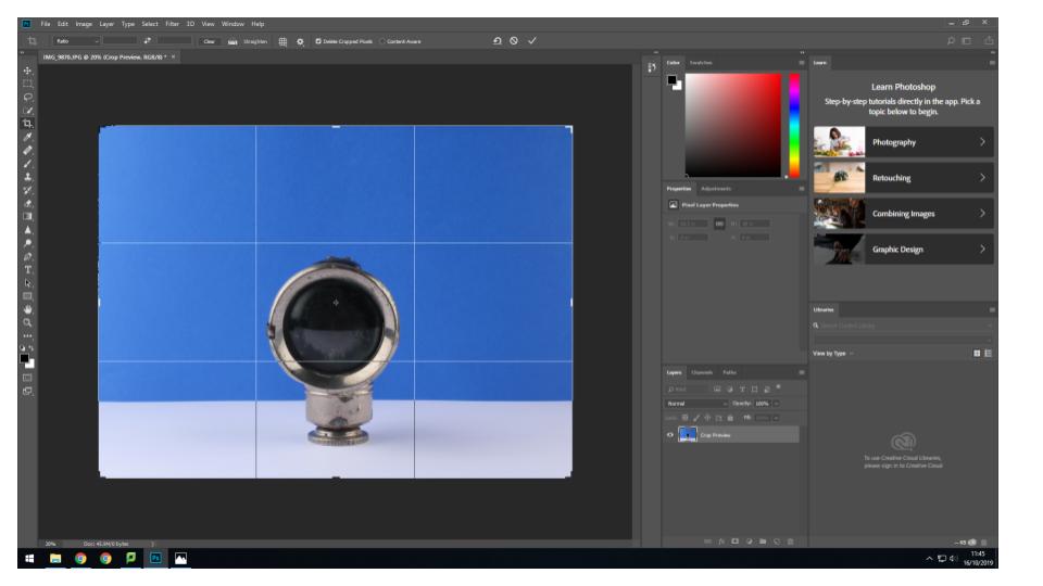
I also adjusted the orientation of some of my images, as the way the tripod was set out meant that the camera took some of the images at a slight angle, meaning the lines of the objects were not parallel to the bottom lie of the image frame. I found this to be a small issue which could have reduced the viewers focus on the subject itself, as their attention may instead have been drawn to the conflicting angles at the bottom of the image. I altered this using the crop option found on the tool bar at the side of the screen, and simply rotated the image until the lines were parallel:

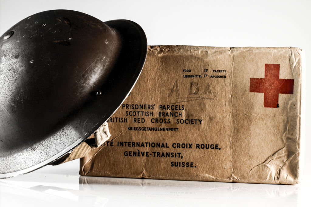
After the editing process, I was able to save the below images as my final images:

Still life – Photo Shoot

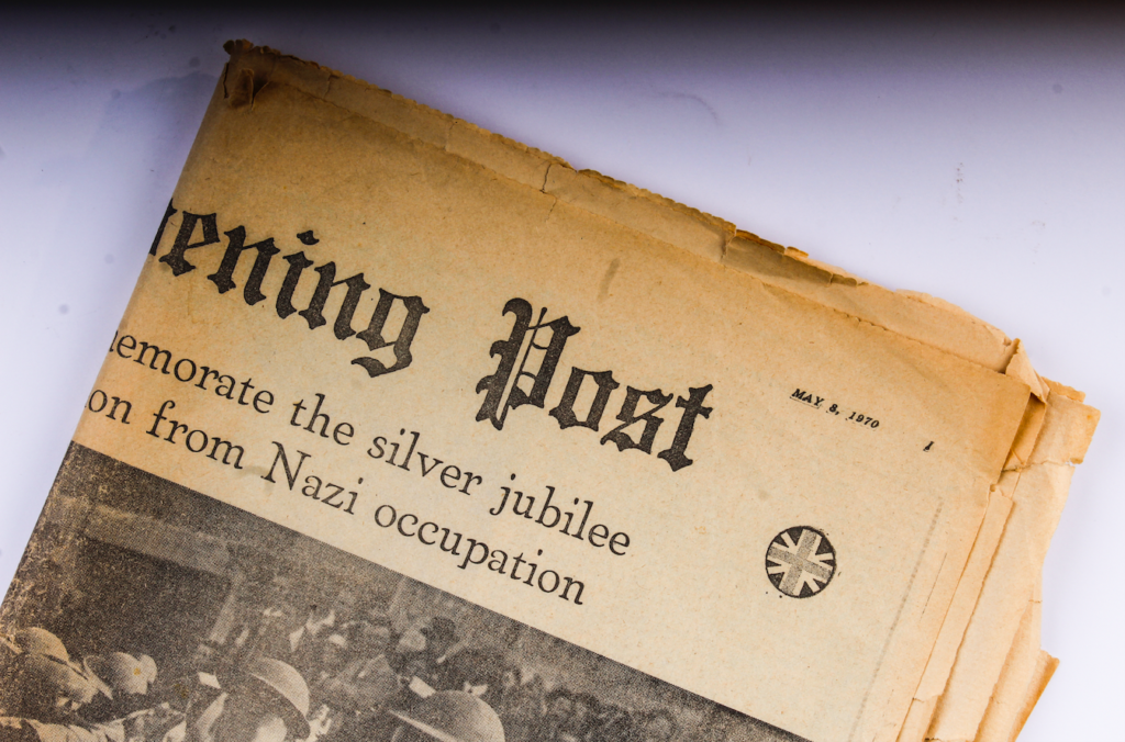
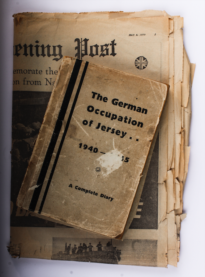
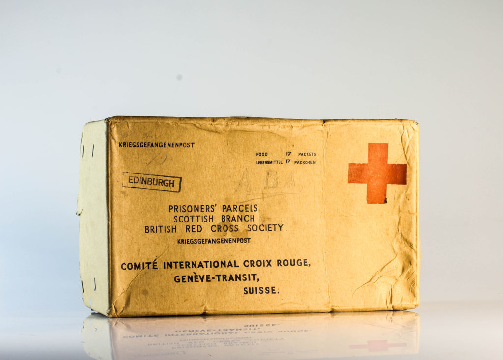
Planning:

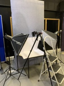
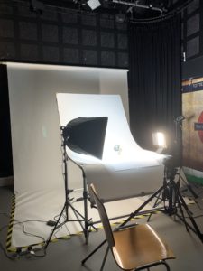
For this photoshoot I intended to photograph objects from the war, which was given to me by the Jersey Archives. There is a mixture of objects such as Red Cross packages, Tins, Helmets, Newspaper’s, Letters and many more which symbolically represented the war. Having this many items, I used two set ups, the first for more flat objects (Birds Eye View) and one for 3-Dimensional objects (Straight on Angle). These two set ups required different lighting rigs, which is explained below. With my camera settings I put the mode to Manual, the ISO to 100 and the aperture to F16, allowing a wide depth of field to be utilised. The shutter speed for the Birds Eye View was between 1/250 – 1/200 and the straight on angle’s shutter speed was 0.5 – 0.8. The white balance for both was set onto daylight, with manual focus being used.

Birds Eye View Lighting Setup:

For the Birds eye view set up, I used two flash head lights, set on a 2.0 power output. The lights where paced either side of the table, slightly facing downwards towards the object. On my camera I used a transmitter which triggered the flash heads to operate as I captured my imagery. In addition, I also used a pilot light in order to position a and frame my composition, this was located at the back of the table (on right) and did not affect the colouring or the outcomes of my image. The camera itself was placed on a tripod looking down at the table.

Straight On Angle Lighting Set Up:

For the straight on angle set up I used a continuous light set up. I used a fill light illuminating the object, with a secondary (tungsten light) light source to reduce the shadows and clearly showcase the object. I also experimented with back lights, but felt that it was not successful and did not justify the objects, thus I stopped using the back light. The camera was on a tripod with a 50mm lens.

Edits:

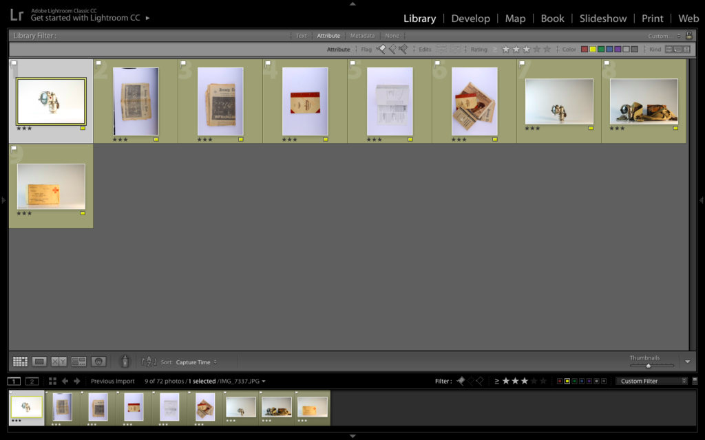
First Edit – Flagged
Second Edit – Star Rating
Third Edit – Colour Rating

Straight On Angle Edits:

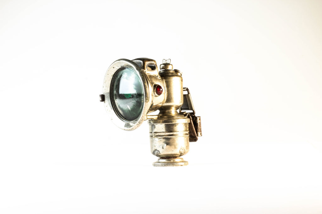
For my straight on angle edits, I began by cropping the photographs, to ensure that the object is in the centre of the composition. I then focused on adjusting the whites, blacks, shadows, contrast and structure in order to accurately portray the objects. This also ensured a complete white background, allowing the objects to be the main focal point within the photograph. Within each photograph, there is a sense of warmth through the artificial lighting, which presents a positive view point towards the contextual meaning of the objects.

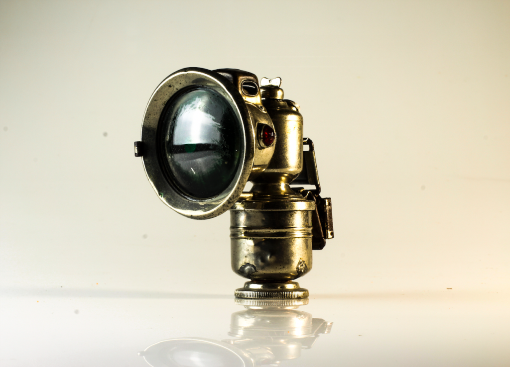
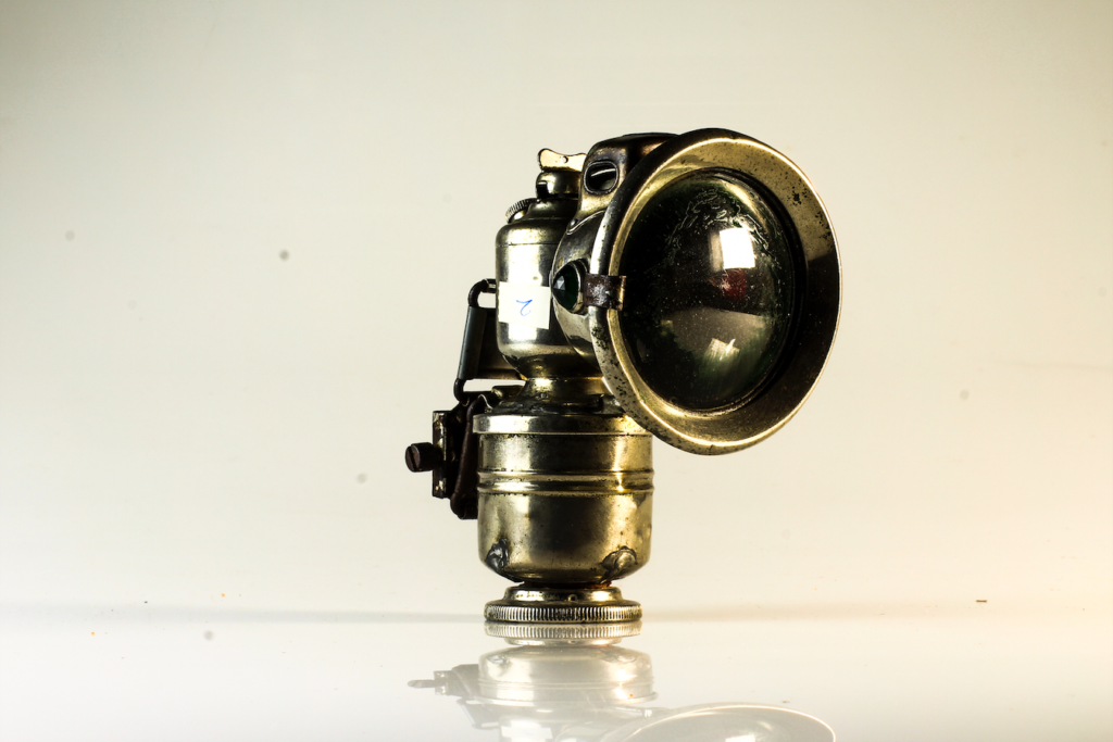
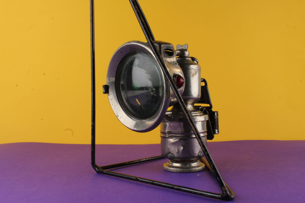
The image above is my top photograph from this exploration of still life photography. Visually, we are presented with a light used in the mines during the occupation of Jersey in 1940-45. This object is the main focal point due to the positioning of it in the frame, and it being the only item within the frame of the photograph. The use of artificial lighting allows reflection on the metal object creating tonal contrast of the rust and decay of the object to clearly be presented. When analysing the main formal elements within the frame, we are clearly presented with a sense of space, and emptiness (showcasing the lack of purpose the item now has within today’s society) form, colour and texture. The photograph captures the object at a straight on angle which works in harmony with the plain background, allowing emphasis on the conceptual and contextual factors.

Contextually, the photograph brings viewers back to the second world war and the impact it had on Jersey. It showcases the torch and how slaves, who were taken (from places such as Russia etc) and forced to work digging out tunnels, such as the underground hospital. This conceptually remind us of the importance of this object in Jersey’s history and enriches our understanding of what life was like for the slaves who were forced to work.

Technically, the photograph uses a slow shutter speed, allowing enough light to be presented within the photograph to emphasis the object, which did not create any blur due to a tripod being utilised when capturing the photograph. The ISO was kept at 100 to ensure that no noise is presented within the frame and the aperture was set to F16 which has let a wide depth of field to be used on top of allowing enough light into the exposure of the photograph. The white balance was sunlight, allowing a clear white balance correction which complemented the warm artificial light source used (a two point lighting set up, with a tungsten light).

Birds Eye View Angle Edits:

With my birds eye view photographs, I began by cropping the photographs, to ensure that the object is in the centre of the composition. I then focused on adjusting the whites, blacks, shadows, contrast and structure in order to accurately portray the objects. After ‘correcting’ the photograph I then decided to try and make the object stand out for it’s background, almost as if it has been raised and is separated from the background. To do this I looked at further increasing the shadows and blacks, although I achieved this effect, it has meant that the background now has grey tones, which slightly distracts viewers from the focal point of the photograph

Evaluation:

To evaluate my attempt at still life photography, I believe I have been able to produce clear example of my exploration with this style of photography. From taking the photographs at different angles with different lighting set ups, to applying my artist inspiration within my work, I have successfully been able to conceptually and contextually showcase the importance of these items to Jersey’s history. The simplistic editing used within these outcomes have worked well, as it does not distract viewers from the true values of the outcomes, which showcases my aesthetic for the photo shoot. To conclude, I am happy with the outcomes I have produced due to the high quality images created, through correct camera settings, and good edits. If I was to improve this I would look at producing another photo shoot capturing more objects, singularly, at a straight on angle, allowing me then to explore with typologies as a format for displaying the objects.

Rafal Milach inspired photo shoot/montage making

In this photo shoot I plan on taking image of the occupation objects in a slightly more artistic way. I will be using very vividly colored background as this is what Rafal did in his work, and I like how it makes the objects he’s photographing stand out more. I also like how he used geometrical patterns in order to symbolise being being enclosed or trapped, so I will be using different geometrical shapes in order to do the same thing as it symbolises how Jersey people must have felt under the occupation. I want to create a strong sense of displacement through contrasting colours, and a feeling of being trapped through the use of geometrical shapes.
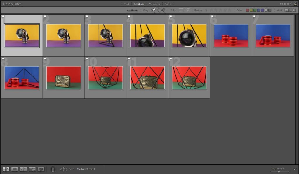
Here are all the images I took, you can see the both the flagged and rejected images.
Here is an image of just my flagged images, which are my best images.
From my flagged images, I colour coded my best pictures green and my least favorite, red.

Best images

Further developing using archive images

1st montage:

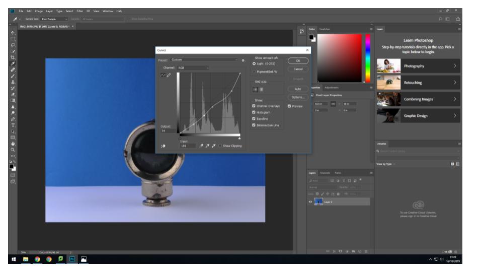
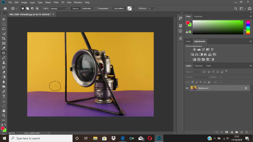
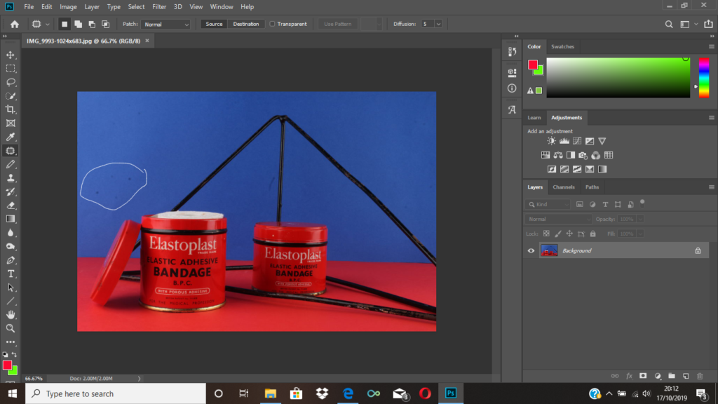
Firstly, I used the patch tool to get rid of some marks that can be seen on the card as I wanted the background to appear very pristine and put together.
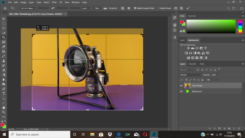
I then cropped the image because I wanted the object to be at the centre since it didn’t look right having a lot of clear space to the left of the image.
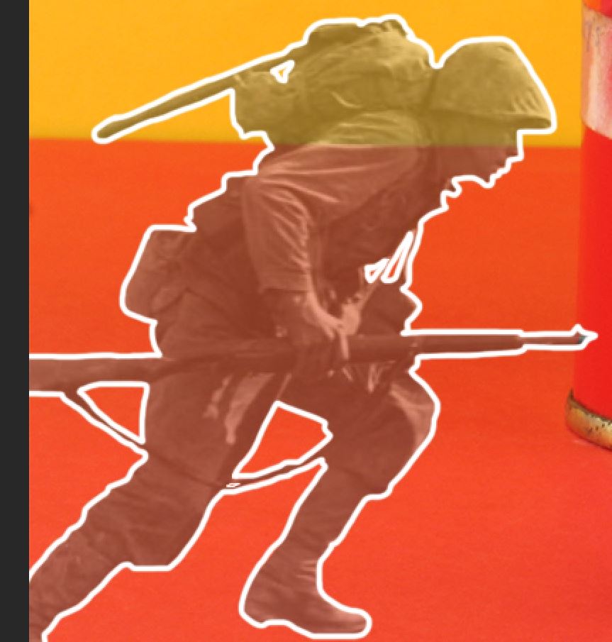
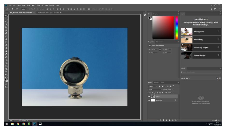
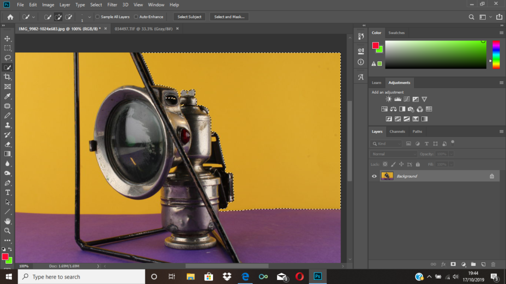
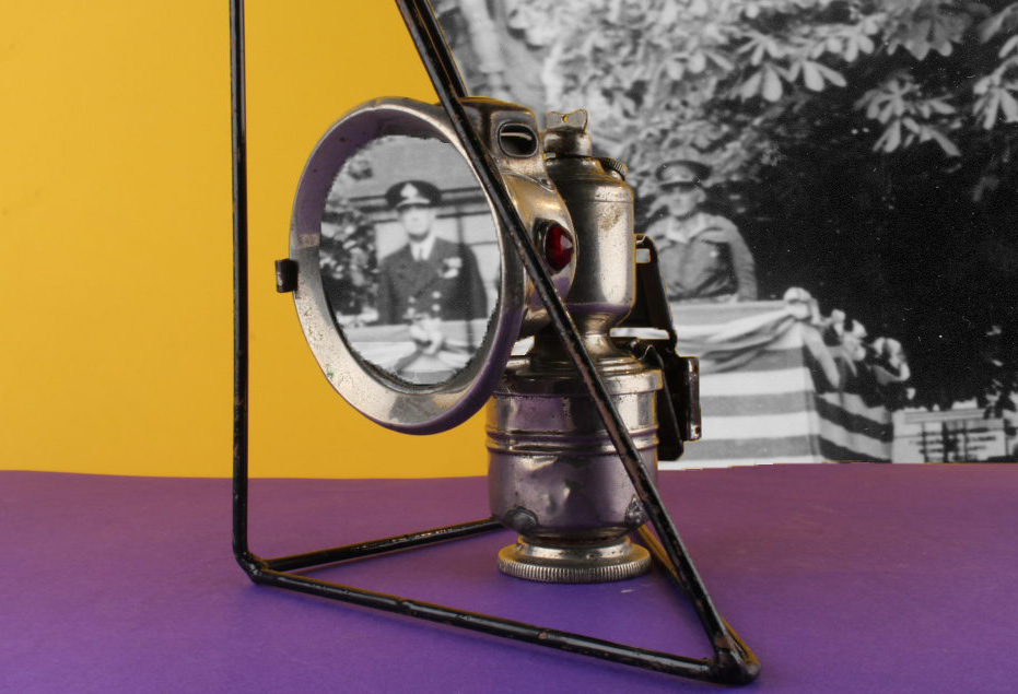
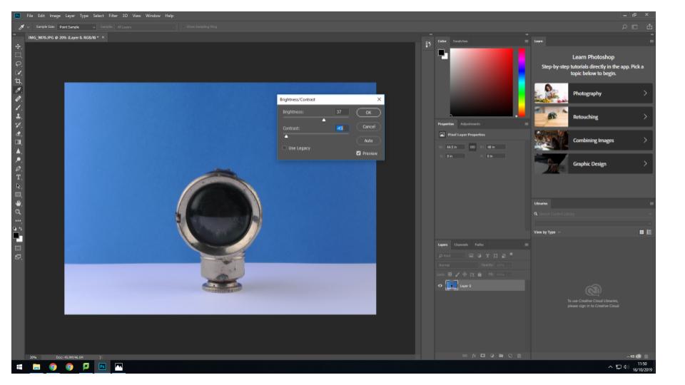
I then used to quick selection tool to highlight the area shown above as I wanted to place an archival image there. I then right clicked the area, and pressed layer via cut so that part of the image became a layer that I could delete at the end.
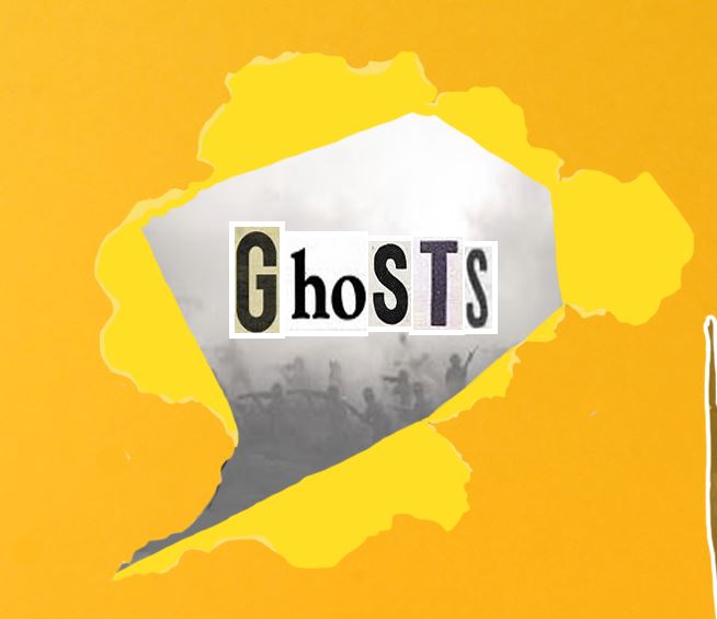
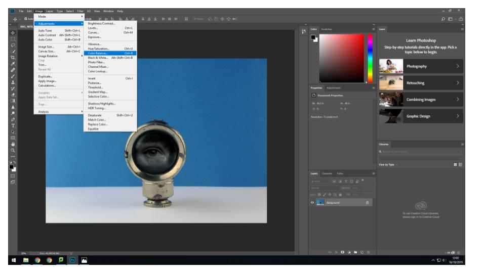
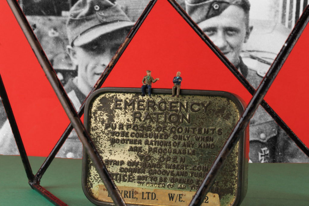
I then dragged and dropped an archival image onto my initial image and placed it just above my background. I also decided to use the quick selection tool again to get rid of the lens of the object. I then moved the archival image in the background, so that one of the figures could be seen through the lens area.
Final image.

2nd montage:

To begin, I used the quick selection tool in order to get rid of any markings on the backgrounds I used.
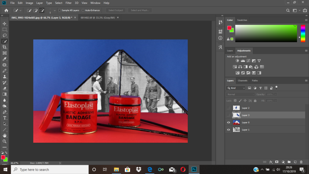
I then used the quick selection tool to get rid of the area of my original picture that I wanted gone.
As you can see above, I got rid of the area within the geometrical shapes as I thought this was the place where the archival image would look best.
Final image.

3rd montage:

Similarly to before, I dragged my archival background picture onto my original image.
I then selected certain areas of the picture that I wanted removed so that we could see the archive image in the background.
Final image.

4th montage:

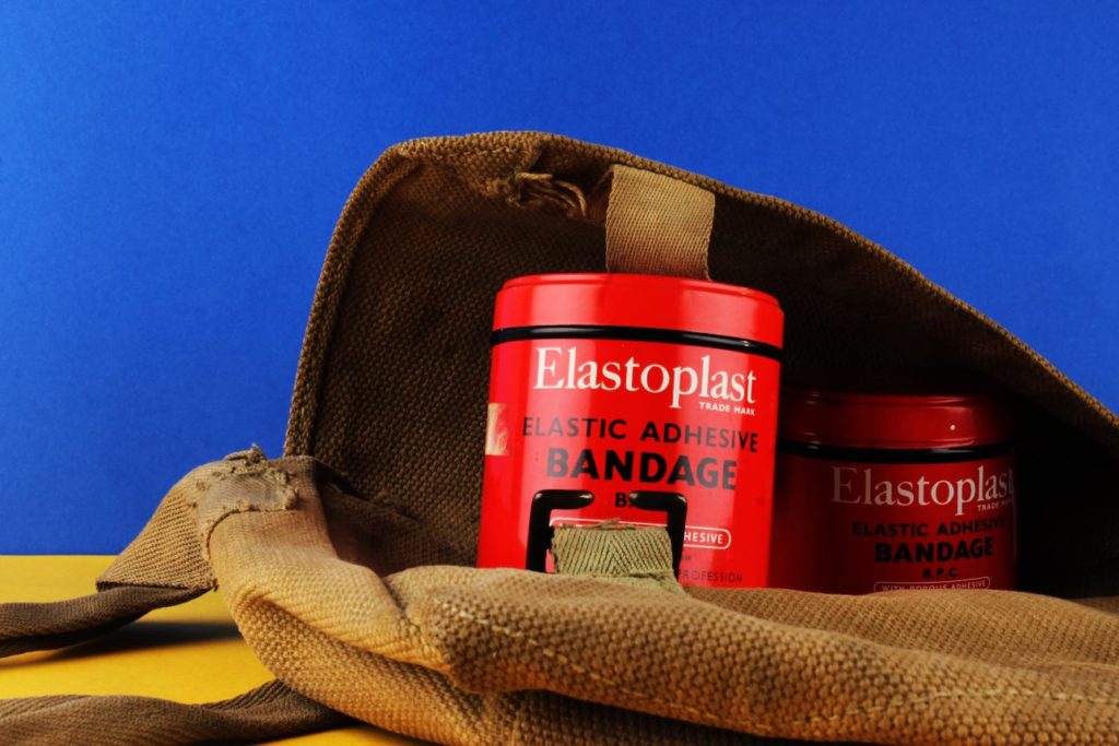
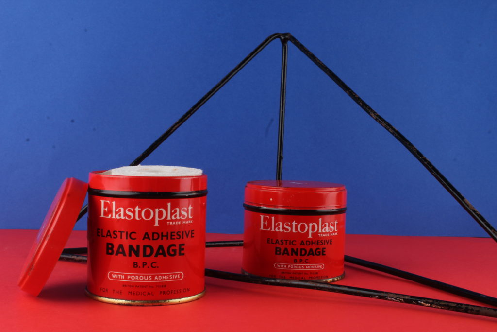
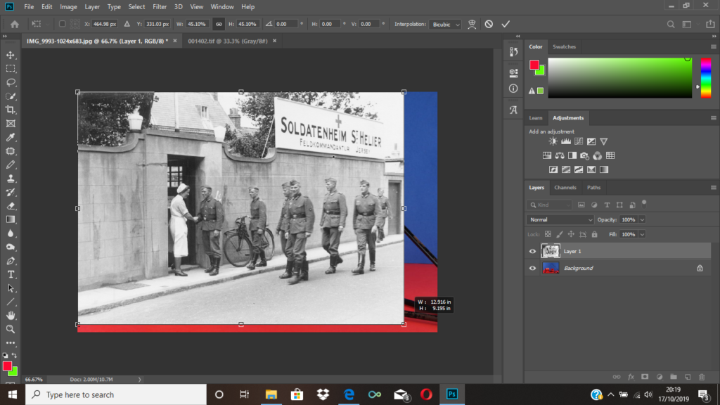
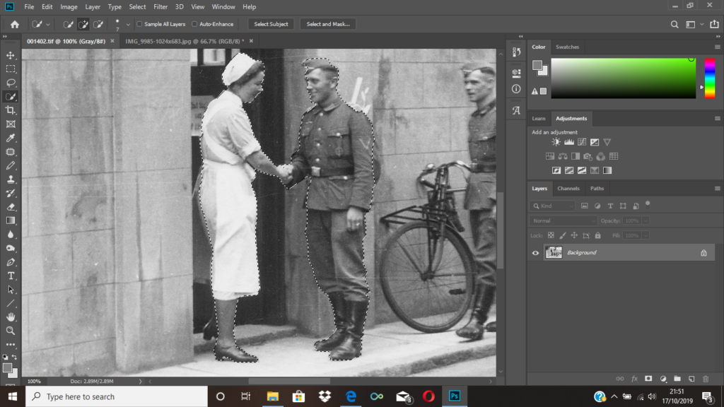
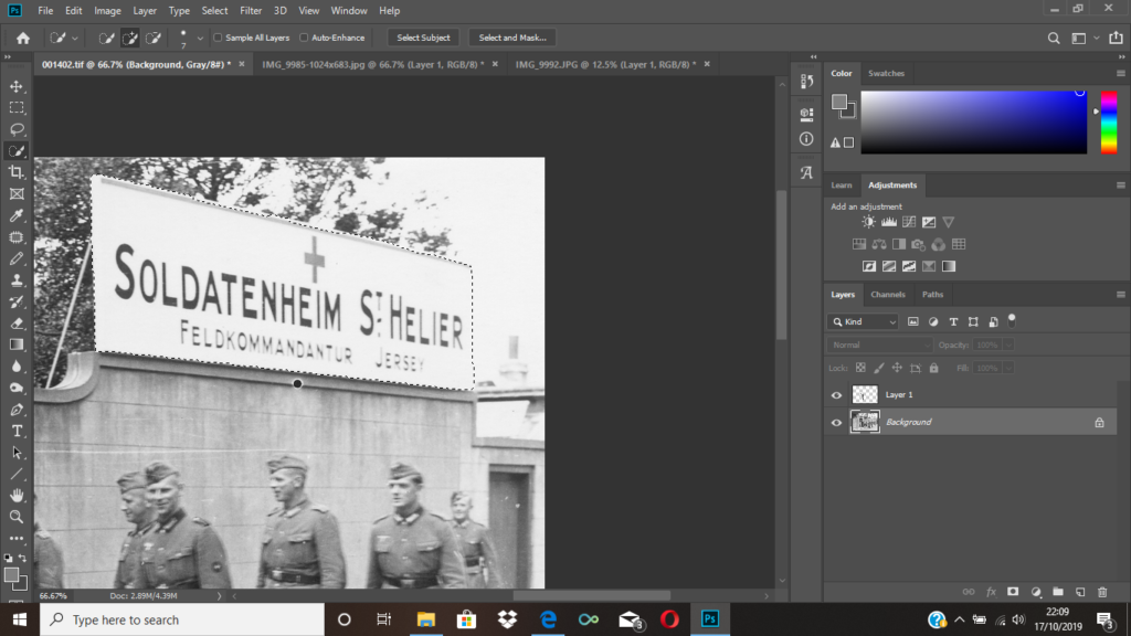
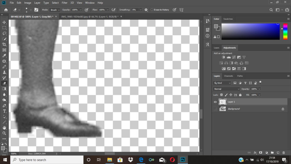
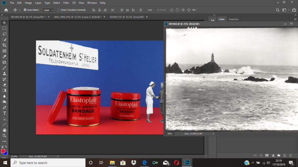
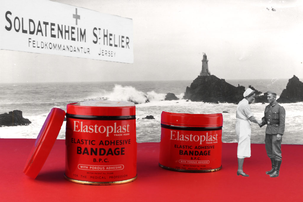
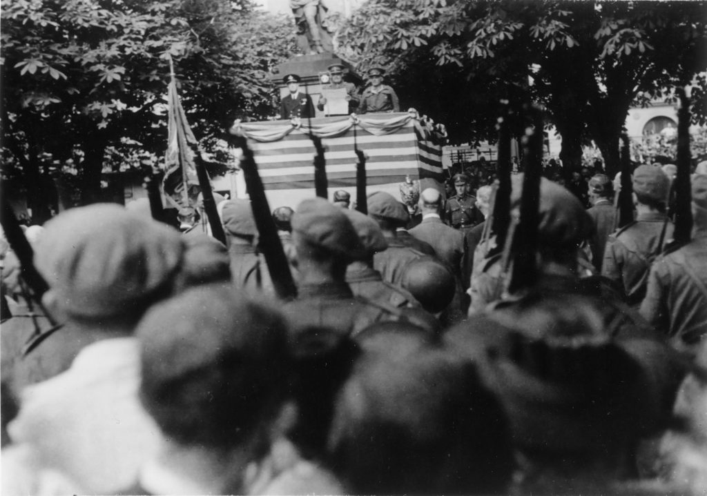
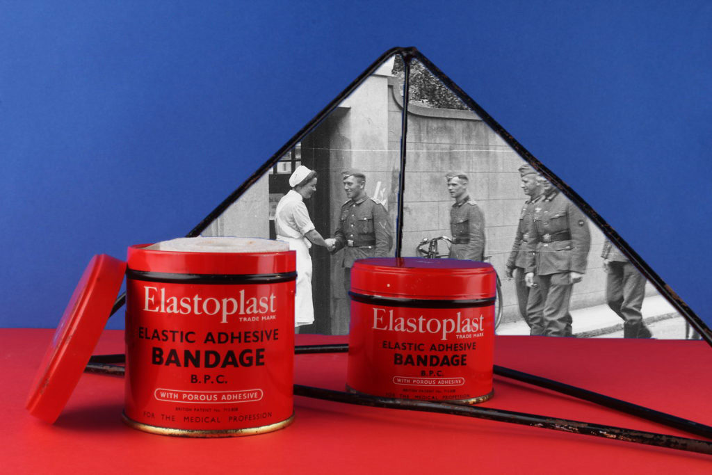
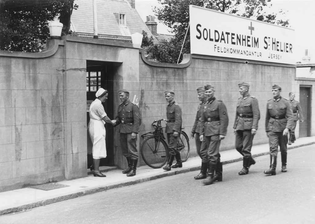
To achieve my final montage, I used the archive image seen above. I thought an interesting part of the image was the nurse and the soldier shaking hands, and also the medical sign. I selected both of these areas using the quick selection took, so that I was then able to place them onto my image. After selecting them, I used to eraser tool to clean up the edges as I knew they would be going onto a photo with a bright background.

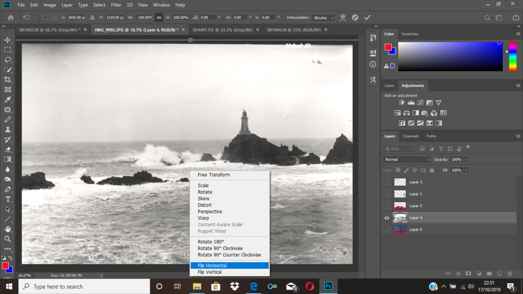
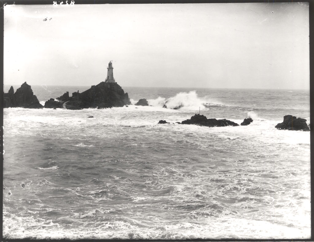
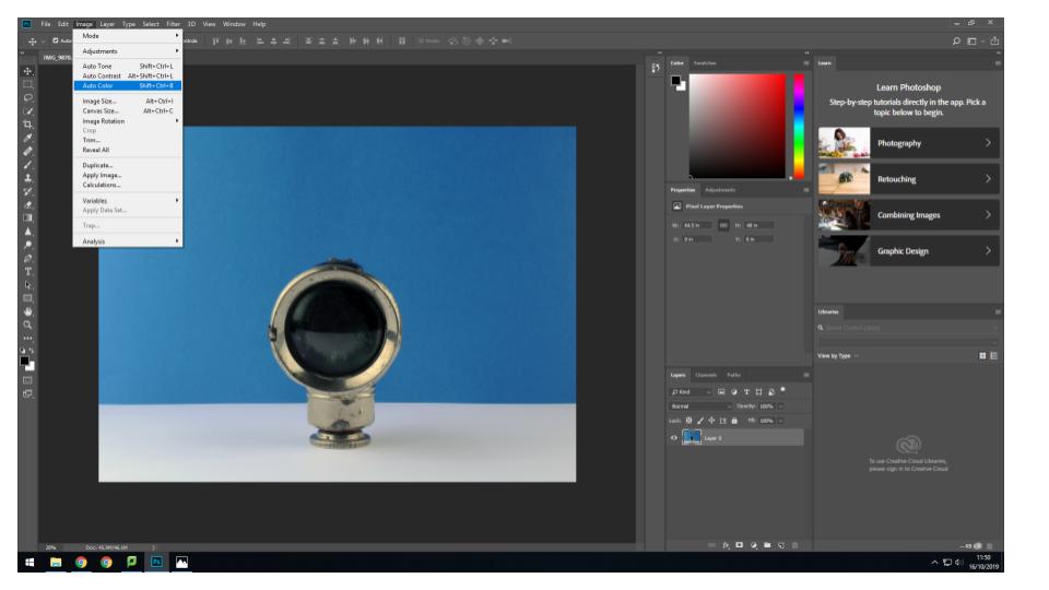
After placing the two sections of the archive image, onto my own, I then went on to open another archival image of a Jersey landscape as I thought this would make my montage more interesting. I selected the blue area of my montage with the quick selection tool, deleted the selected layer and dragged the archival image on. Since the lighthouse would’ve originally been covered to the my placement of the medical sign, I then flipped the image horizontally.
Final image.

Initial images vs. Final images
1st montage:

2nd montage:

I thought these images would look interesting together because it shows a medicinal side to the occupation in 2 different time periods. It almost looks like we are looking into the past through the geometrical shape, and we can also see a medical product used back then, in the present.

3rd montage:

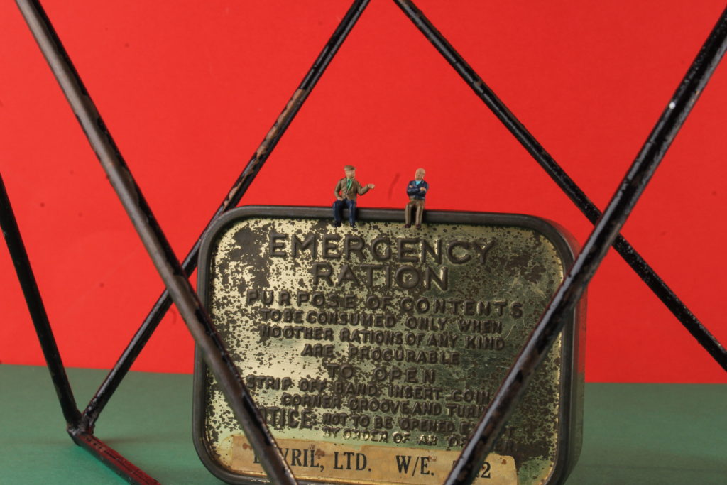
I chose to place these 2 specific pictures together because I thought they had an interesting narrative together. My original image contains an emergency ration pot, with 2 little figures of old men sitting on top. By having the picture of the 2 young soldiers as a background, it could represent the 2 people in different time periods.

4th montage:

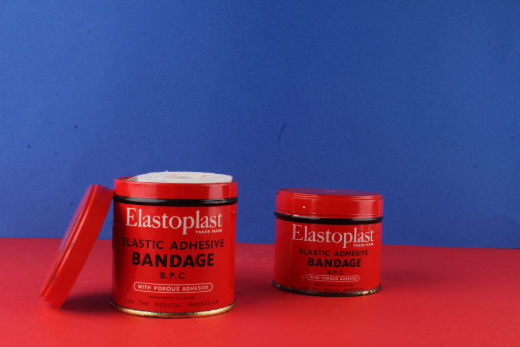
I chose to put all these specific images together as they’re all quite similar in theme. I added the nurse and the medical sign onto my original image because the original image contains bandages as my object, so I thought something medical related would be fitting. I decided to add the landscape as my background as I thought it makes it more related to Jersey under the occupation.