Category Archives: AO1 Develop Ideas

Filters

Author:
Category:

Artist Study- JEff Wall

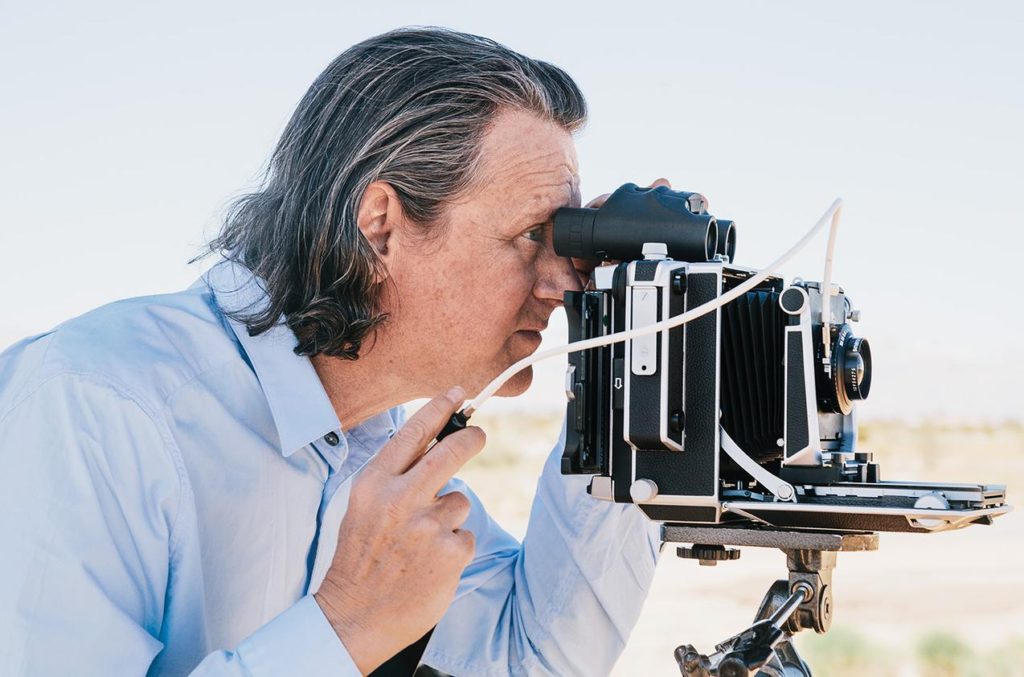
Jeff Wall is a Canadian born, Vancouver based photographer who specializes in back lit tableaux photographs of the city of Vancouver itself

Wall studied at the University of British Colombia and graduated with a masters degree in photography in 1970. In the same year he relocated to London to study for a post graduate degree at the courtyard institute, studying with Manet expert T.J Clark. He then went on to become the Assistant professor at Nova Scotia college of Art and Design from 1974-1975 and he then became the associate professor at Simon Fraser University, British Columbia from 1976-1987 whilst also teaching at The University of British Columbia.

Wall is renowned for his tableaux reconstructions of scenarios he had witnessed himself that were representative of the political environment at the time. His photos are always back lit and in a cinematographic style, Depicting more of a story through this means. Due to his tableaux style, His shoots often consisted of many people such as cast, crew as well as digital post production workers. Almost all of his shoots are centered around suburban Vancouver, world renowned for the relationship between the suburban environment and the rural environment. Many of the suburban areas have mountainous backdrops and are bordered by forests as well as having a substantial amount of urban architecture, which Wall finds to be a great way of providing contrast within an image.

Image Analysis
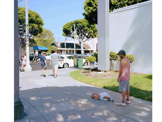
Image result for jeff wall
Parent Child- Jeff Wall 2018

In Walls image ‘Parent Child’ we see a striking usage of colour. The green of the foliage and grass compared with the white shades of the wall and sidewalk as well as the vehicles in the road create a sense of elegance and almost calm. The blue of the sky above also depicts a sense of calm. The child on the floor seemingly sleeping calmly acts as a further metaphor for this portrayal of calm. The father looks over the child dressed in a pink vest and gray shorts, and judging by his slightly slouched posture and his tilted head, He is tired of his child playing games and playing around as he potentially may be on his way somewhere with her and she is holding him up. The image is very bright in itself and consists of high contrast colour to reflect the atmosphere of a sunny midsummer day. Overall there is a sense of serenity and happiness in the image and the person in the background on the scooter can be seen as representative of time passing by. This point is furthermore illustrated by the presence of people walking past the parent and child, just in front of them, with the subject on the left looking over his right shoulder to examine the scene presented before him. This makes us ask the question ‘What is it he sees’? Does he see a Child having a tantrum? Does he see a fed up father? Does he feel sorry for the father?.

Personal Opinion

Personally, I am a big fan of Wall’s work and his representation of modern day life in a suburban community. His usage of back lighting makes his images consistently bright and vibrant and allows for him to experiment with contrast between brighter and darker colors. Walls Tableaux approach is a method that I would like to replicate in my personal study, essentially creating everyday life scenes that appear candid in nature but are actually fully staged and instructed. This would aid me in portraying senses and feelings of occupation and liberty however I please, rather than waiting for an opportunity, I am able to capture exactly what I would like to achieve when I want to capture it.

Contextual Studies: Conversations on Photography

Jeff Wall Image Analysis

Image result for Jeff Wall

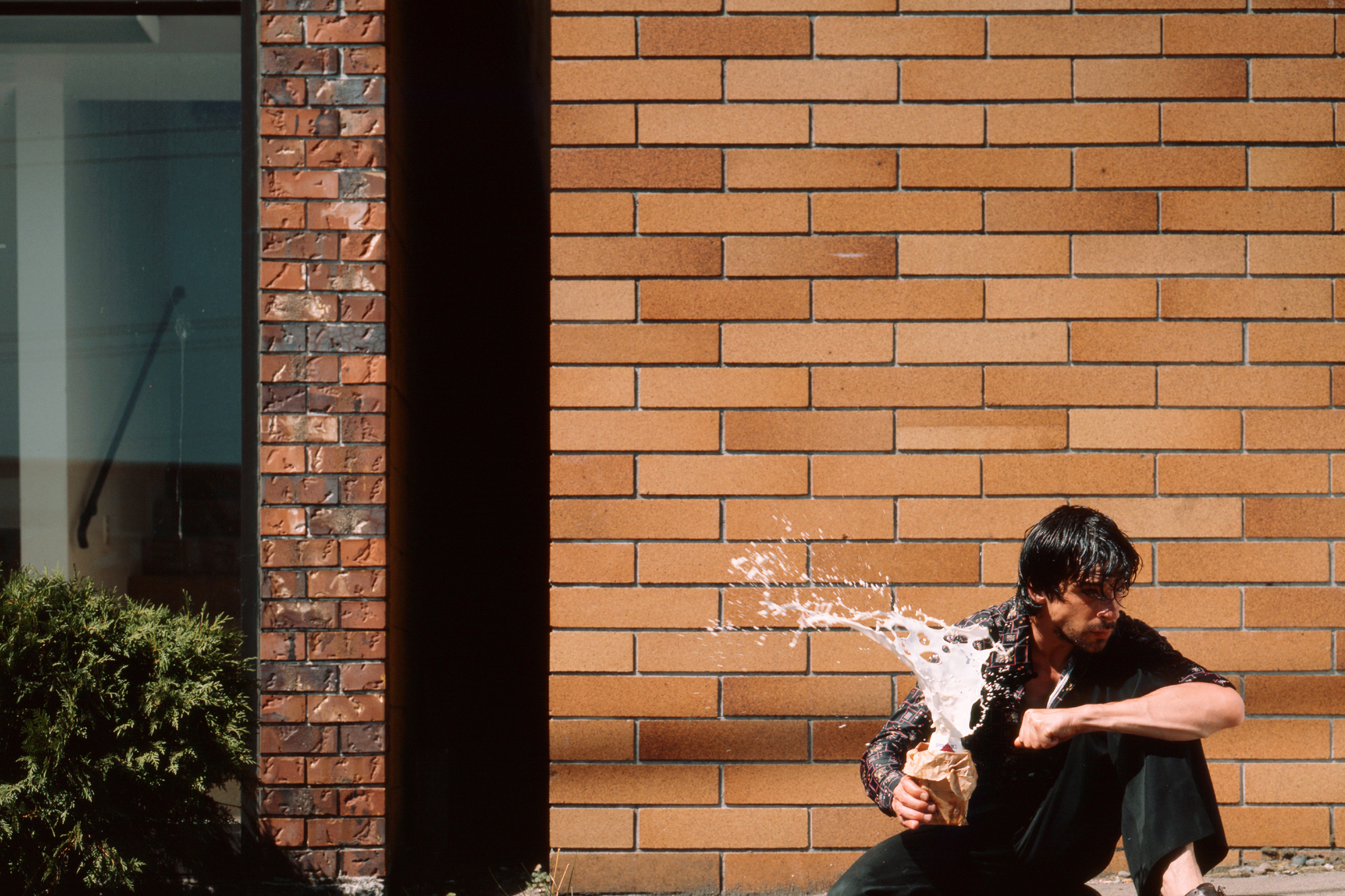
In this image titled simply “Milk”, Wall has depicted a male holding a milk drink and squeezing it, causing the milk to erupt in the subjects hands. The subject is in full focus and the background seems to be that of the exterior of a well kept and clean building, Whereas the subject appears dirty and scruffy, With greasy hair and dirty clothes. This creates a contrasting image, With a sense of cleanliness making up the background with the focus being on the messiness of the main subject of the image. The explosion of the milk carton makes us question why this is happening. Is the man angry? is he undergoing stress? or is he potentially in a crazed mental state?. This image essentially allows for the critic to create their own context to the image and create their own story due to the multiple scenarios that may be at play here in a contextual mannerism. Wall quotes from his interview with David Campany ” I think the pictorial problems emerge from the accidental encounter that reveals the subject”. I find that his quote means in a sense that the use of the medium of photography has opened up a conversation regarding the issues the subject themselves could potentially be dealing with, and that photography can be used to portray an individuals expression of their inner selves. The composition of the image in terms of contrast plays a role in telling the story as well, As the background is bright, contrasted by the small shadow of the wall of the windowed building. The usage of tinted blue for the glass and the green of the plant give the background an uplifting feel due to the bright colours. However this is contrasted by the ragged appearance of the male subject in the foreground, Depicted by his dark coloured clothing and dark hair. The white of the milk drink exploding instantly draws us to the image due to the absence of white in the background as well as the shape and texture of the liquid itself captured in the time frame it was captured in. The explosion of the milk carton creates a dramatic contrast when observed in comparison to the solid, tranquil background of the image. The eruption of the milk itself creates a talking point. Why is the milk exploding in this manner? What is the subject currently feeling in terms of emotion? Was there an event that caused this reaction?

contextual study; conversations on photography

JEFF WALL

Jeff Wall

Jeff Wall is a Canadian artist who is best known for his large-scale photographs and theories on art history. In an interview which was conducted with Wall he said;

‘Not every image is (or wants to be, or needs to be) a tableau…and when an image isn’t as acutely composed, it has less presence as a tableau. – this is suggesting that even if an image is directed/staged it doesn’t has to be categorized as a tableau, as you the photographer are adding your emotions and effects to it, making it an unique image,.

‘Photographers often want to treat a subject extensively, devote themselves to it and make groups or sequence of pictures about it. I do it to one image, and clear the debt in one throw of the dice

‘Subjects might have their own specific pictorial energy, but I don’t think they require any predictable way of being shown. So, I look forward to showing, ways of creating an appearance of something, whether it is a scene of tension or of something else.’ – this is suggesting that images can present different emotions, depending on how the photographer photographed their image and the meaning behind the image can help set the scene and emotion for a project or an individual image. Along with this, experimenting with how to present your work can be fun as you can show it in different ways, which can simple of unique.

‘Any slightly unusual subject would likely have to come to the artist through some sort of unexpected encounter. In the absence of such an encounter, you can still keep working by using once of the generic subjects as your starting point.’

‘there are simply NO RULES’ – from this quote, Walls is saying that there are no rules within photography. You can photograph what interests you and experiment it in different ways and it won’t be wrong as it is your view and perception on a certain genre and topic.

Image result for jeff wall photography
Overpass, 2001

Technical; The lighting in the image is bright and sharp which contrasts against the dark, grey sky, the lighting is a natural source and the photo may have been slightly edited to make it brighter in certain areas. The image has a wide depth of field, this is due to the face the subjects are up close to the camera, yet you can see far down the street, making the image seem longer than it is. The color of the image is blue and grey, which gives off a cold effect and this is enhanced by the way the subjects are dressed as they are in coats.

Visual; Within the image there are three main subjects you can visually see, who are carrying luggage with them, they are also walking past traffic on an overpass. The lines created by the barriers of the left hand side of the image create a parallel effect for the image and these correspond with the shadows create on the floor and the line on the pavement. The shadows in the image give it a 3D effect.

Contextual/Conceptual; Within one of Walls interviews that I have looked at he said ‘Not every image is (or wants to be, or needs to be) a tableau…and when an image isn’t as acutely composed, it has less presence as a tableau.‘ part of this image may have been staged so Walls could get the affect of commuters he wanted but this image would’ve taken divers planning to photograph the people at the right time and to give off the correct emotion. As Wall said ‘Subjects might have their own specific pictorial energy‘, such as this image is presenting what it is like for travelers going to the airport, work, etc this images gives off the sense living and he is documenting what it is like for people living in different areas. The image is simple, but possess it’s own ‘pictorial energy‘ as photography has ‘NO RULES’ according to Wall, it is a free flow and everyone gets their inspiration from different subjects and whats to present their work in different way as mentioned when Wall expressed ‘I look forward to showing, ways of creating an appearance of something, whether it is a scene of tension or of something else.’, this scene carries some slight tension, the stress of having to be at a detestation will all your baggage both physically ad emotionally. Wall, throws everything he has at an image to give it a feeling of emotion and in this instance tension, which is present through the subjects and the dark sky as a background.

Contextual STUDIES: conversations on PHOTOGRAPHY

This image is by LaToya Ruby Frazier who is from Braddock. The image shows the back of an African-american woman who looks as if she is in a hospital bed attached to wires. Next to this image we can see a run down construction sight that looks fairly dangerous and unhealthy.

Contextual

LaToya describes her hometown as having “harmful and painful” effects on both her family and others growing up around her, which she has expressed visually. This is clearly implied in the image above as we can see a sick woman in a hospital bed, which the photographer places next to an image of construction which implies there’s a link between environment and health. The image on the right shows some sort of building that is being knocked down which may represent the harmful effects of industry in the area she grew up in. LaToya has spoken about the “terrible effects of the city’s steel industry”, which is visually shown through her choice of displaying both these specific images side by side.

Conceptual

The photographer has previously mentioned how the aim of her photography was to “amplify the voices of the marginalized who have many important stories to tell”. This means that the concept of her image may be trying to convey the injustices the black community in her area suffer. This is further confirmed as She also mentions that “Braddock is predominately African American with residents fighting for social and economic opportunity” which confirms this concept was something intentionally explored by LaToya. Placing an image of a figure of a black woman looking ill, and implying it was caused by her environment shows, what LaToya has branded, “environmental racism” shows the photographer has strong political views making politics a strong underlying concept relating to this image also.

inspiration from past personal studies

To begin my research for my personal investigation, I will take inspiration from examples of personal studies from the last couple of years from students very personal and mature subjects. I looked through photo-books from previous year 13 students to gain ideas.

Matthew Knapman: Is that My Blue Butterfly?

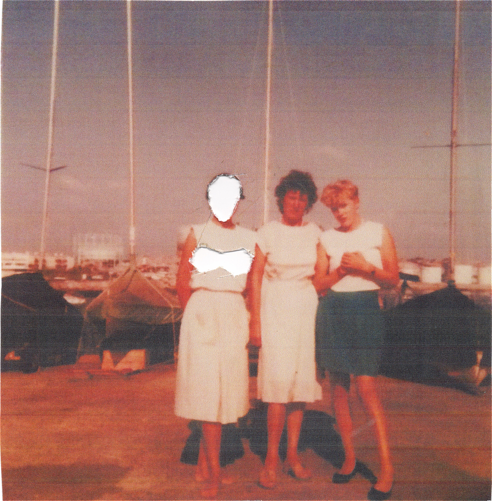
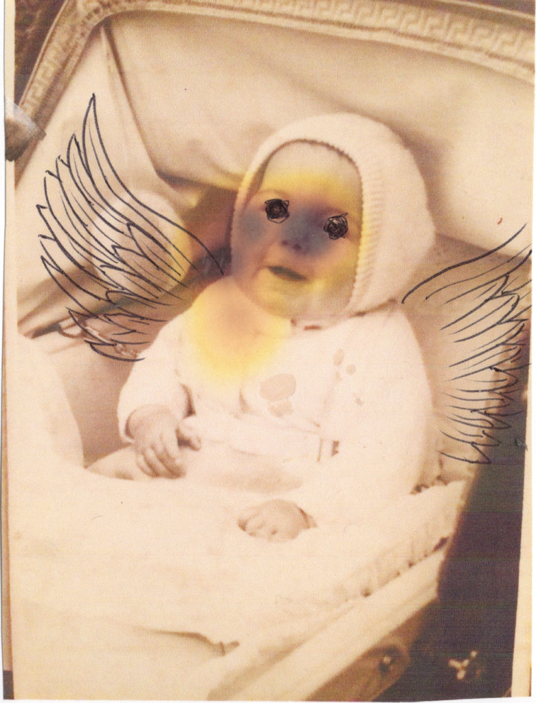
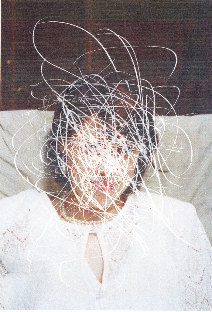
His project focuses on the life of his mother, diagnosed with metastatic breast cancer. The photo-book contains archival images that have been drawn, scratched and edited in order to illustrate his emotions and what his mother was going through. To convey his emotions through the photos he has used destructive methods such as using chemicals to showcase his anger and grief. What I like about this photo-book is that he uses art as a visual guide to tell the audience his mother’s story regarding the illness. He includes personal items into the photo-book such as his mothers hospital bracelet and a note which explains the reason behind the title. When creating my own photo-book, I would also like to add personal items, such as documents, in order to create a personal connection between the photographer and viewer.

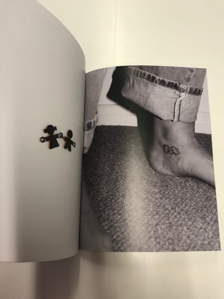
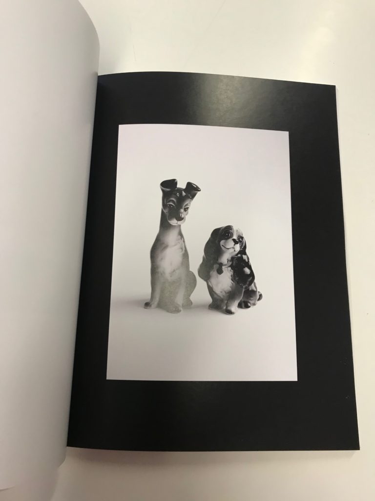
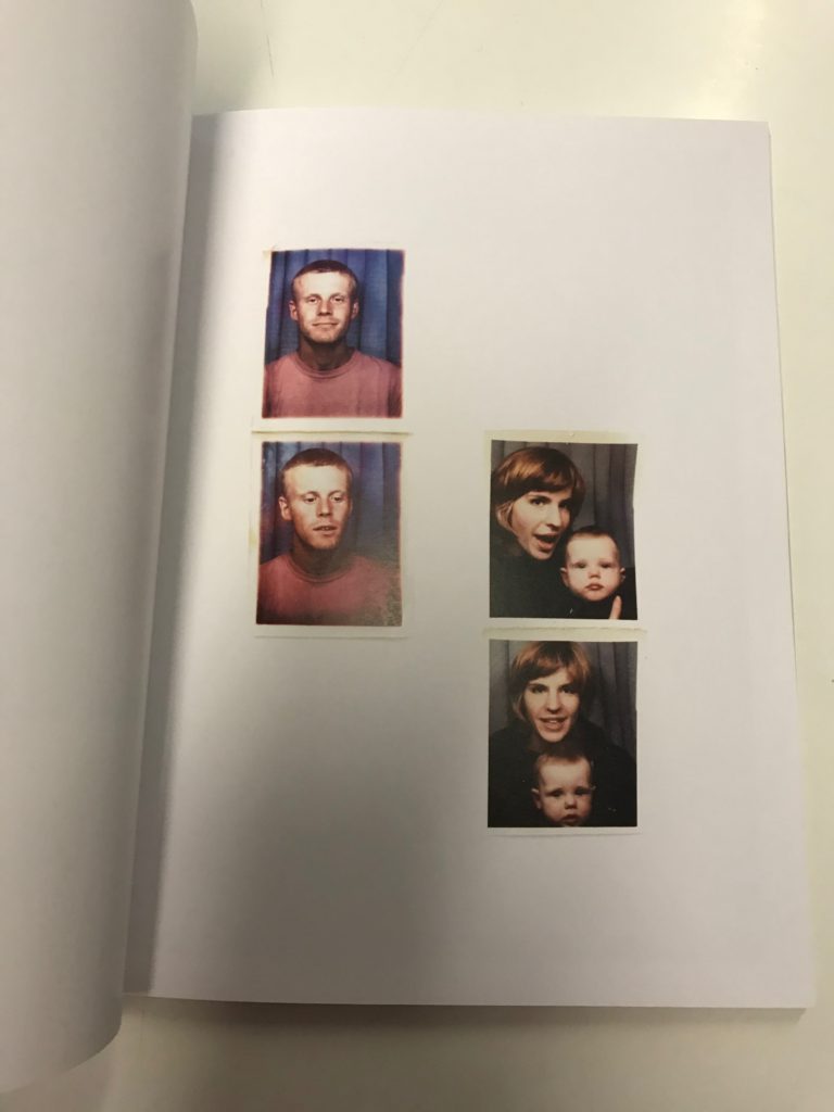
Jude Luce: All my love

His photo-book gives insight into his family life. He displays this constant theme through photos of landscapes and objects in order to convey a deep, poetic meaning. Portraits have also been included to showcase the relationships he has with others and to display these individuals emotions. There is juxtaposition in his photo-book where he presents his mum and dad’s relationship when they were together with his own relationship. Through his photo-book he aims to showcase his development through his parents divorce and how that has shaped his life. He wanted to display an obvious them of attachment but also an underlying theme of detachment. Like Matthew Knapman’s photo-book, he has also included sentimental items in order to help convey his narrative. The concept of presenting his life as stable, depicted through his relationship with his girlfriend, as well as unstable, through the divorce of his parents, displays contrast since the viewer gets to see two sides.

Contextual Study

The introduction of David Campany’s book So present, so invisible claims that “Photography is the easiest thing to talk about, and for that reason it can be the most difficult.” He comments that people with articulate voices are able to “see past the obvious” and “say something about the profound aspects of the medium”.

An intriguing piece of information that Campany mentions is that photographers seem much more approachable when they were talking freely to others and not addressing him. Something about this format of conversation is freeing since he feels like he was eavesdropping.

Campany is often invited by artists and photographers to write about their practice. He states that a conversation is better than preparing question in advance since he doesn’t want to “interrogate”. This is why he never fully researches in advance since he wants to converse with the photographer and discover more. Campany says that the best moments come when both individuals are clarifying each others thinking. No matter the length of the conversation, nearly all were open ended. No one knew where the conversation might go or where things would end up.

JOHN STEZAKER

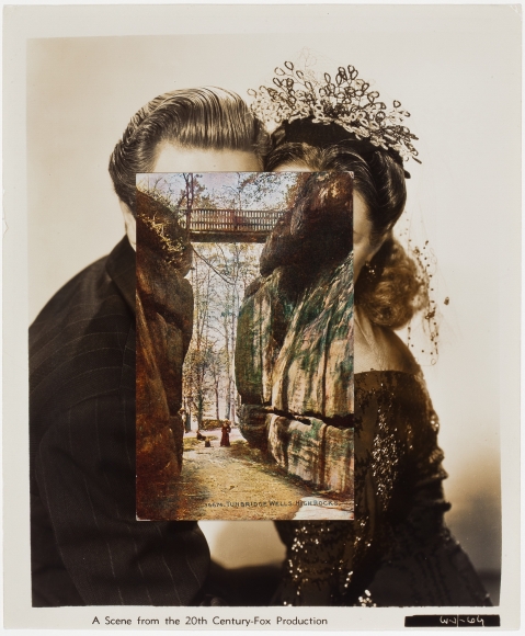
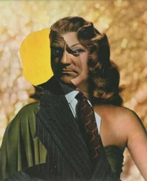
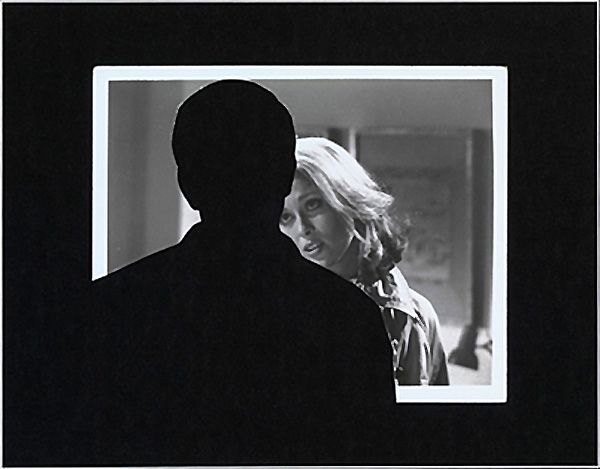
John Stezaker has been making collages for over forty years, by combining 2 photographs or by removing an element from one photograph. His art is associated with surrealism, situationism and pop. Stezaker uses familiar materials such as postcard pictures and generic film publicity photos. From these ordinary images he has been able to express his creativity through collages.

Initially his painting were “not as interesting as his collages” and the collages were “not as interesting as the original image”. This led to a crisis in his first year at London’s Slade School of Fine Art, which resulted in him giving up art. Stezaker didn’t know how to improve on his photos because in order for him to be fascinated with an image it had to “already be there, it had to be found”. This is when he began to use a process of collecting, fragmenting and reassembling images as a primary activity. Around this time he also discovered situationism which created justification for what he was doing.

Digression is important to Stezaker because “it is a way of escaping conscious control”. creating collages involves digression and allows a “conscious contemplation of the image in its dream state”.

From the start, he thought of his collages as “cutting into, opening up”. That is why so many of his early titles relate to surgery. He wanted to open up a space that he thought was closed. Somehow the cut also helped to create a feeling of depth.

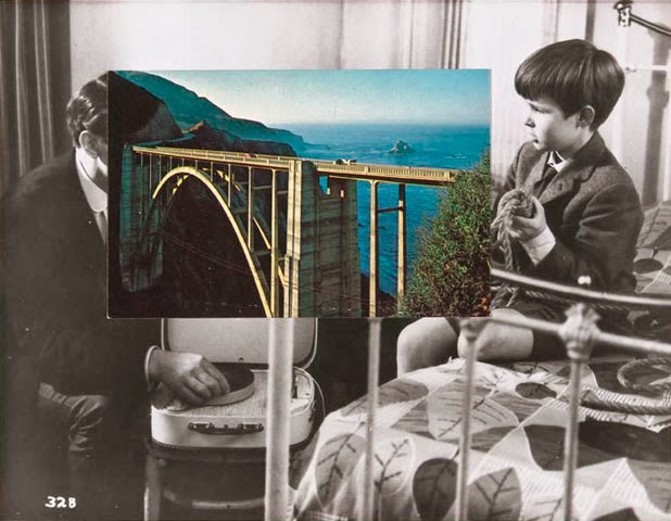
The photograph is called ‘Bridge’ and is part of Stezaker’s masks series. The image seems to depict the relationship between the child and the man, which I assume is the boy’s father. The boys seems to be showing something and he attentively watches. I instantly made the assumption that the boy and the man are related due to their positioning; Their gaze is towards one another, they are close to each other and they seem to be in the boys room.

The black and white image and the photo of the bridge combine together well since they appear like they are meant to be together. The smaller image is vibrant and there may be a deeper meaning behind the choice of this photograph. The placement of the bridge reinforces this assumption.

The section of the bridge closest to the father is more complex in structure. This could be a reflection of the man since fathers are complex and have greater life experiences. Whereas the bridge in the sons direction is simpler in structure as he has yet to face these hardships since he is only a child. He doesn’t have any responsibilities yet and therefore does not need extra support.

The photograph could also represent a shared memory between father and son; A memory of a holiday perhaps since the image depicts a landscape.

A bond between a father and his son is strong and usually starts from an early age. The bond one would have with their father would be completely different to one had with a mother. I feel like the photograph touches on the subject of bonding and appreciating time together.

When I first explored his work I thought he simply placed one image on top of the other. However upon further inspection, I found that was not the case at all. I like how he has chosen to combine old images with different aspects of nature or architecture. Though at first glance it seems like they are just two separate images, you come to realise that the images fit together perfectly.

Personal investigation

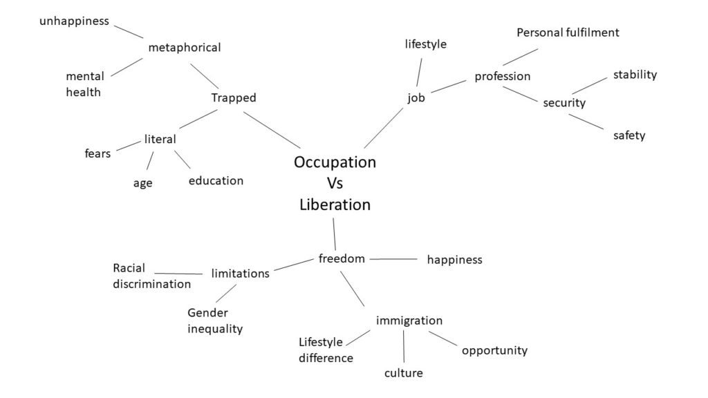
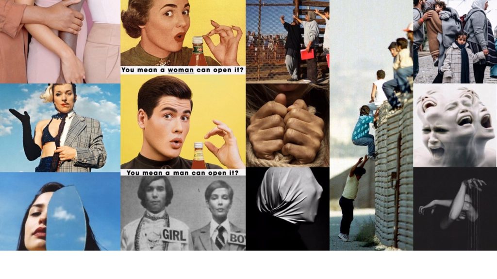
Below is a mind map and moodboard of how I have personally interpreted the theme of Occupation vs. Liberation in order to begin my personal study. as you can see below, i interpreted Occupation in a metaphorical way, but also in a more literal manor. I also associated Liberation with the concept of freedom and limitations which led me to explore things such as immigration and gender inequality.

Mind Map

Moodboard

Personal Study moodboard.
Images are not my own.

Artist Reference: Richard Avedon

Richard Avedon was born in 1923 in New York city and had an interest in photography from a very early age. He joined the YMHA camera club at the age of 12 years old, And then attended the DeWitt Clinton High School in the Bronx where he was a key figure in the development and production of the schools magazine. Soon after he was named as the poet laureate of New York City high schools in 1943.

Avedon served in the US Army in World War 2 as an identity card photographer, Photographing soldiers for use of an ID card. After the war he went into fashion photography and he studied at the Design Laboratory at the New School for Social Research. When he was 22, Avedon was approached by Harpers Bazaar, An American female fashion magazine. He was initaially denied access to a studio by them so he used to photograph subjects in abnormal environments such as at a circus, the beach and nightclubs. This very quickly became a key element of his work. He soon rose up to become the lead photographer for Harpers Bazaar. Avedons main focus on his work was the suggestion of a persons personality that photography was able to portray, so he took extra care in planning and detailing shoots and hairstyles, outfits and objects became key focal points for expression within his work. Below are some examples of his work that highlight his ideals

Samuel Beckett, writer, Paris, France, April 13, 1979
In this image of authour Samuel Beckett, Avedon has chosen to keep the composition of the image simple, utilising a plan white background. the contrast in the image is one of the most striking elements to me as there is a lot of detail highlighted by the contrast, Specifically Beckett’s Hair. The use of a turtleneck jumper with a three button blazer suggests class and order
Bob Dylan, singer, New York City, February 10, 1965
In this image of American musical artist Bob Dylan, Avedon has chosen to keep Dylan within focus and have the background out of focus. This effect can be seen as metaphorical in terms of Bob Dylan being a world famous musician at the time, In a sense that he stands out from anywhere and is instantly recognizable.
New York Life #9, Harlem, New York, March 23, 1949
This particular image, Taken in Harlem, New York, Depicts a dalmatian and his owner, with another male seemingly admiring the dog. This image strongly represents the idea of ‘mans best friend’ as both of the subjects are admiring the dog and there is a sense of unity within this ideal, as the two men, Judging by the way they are dressed, have different occupations and backgrounds, yet they are united as one over the dalmatian and there could also be a link to the sociological state of the United States at the time this photograph was taken in 1949, As African Americans were the target of severe racism and discrimination. This image thereby can also depict a feeling of unity between the two men as despite their different occupations and socio-economic status, They are united as one in their fight against racism.
Mike Bencich, Dan Ashberger, coal miners, Somerset, Colorado, August 29, 1980
In this image of two coal miners from Colorado We see a striking usage of contrast to highlight and depict the conditions they are working in by highlighting the soot and dirt on the skin and clothes of the workers. There is also a sense of unity between the two as seen by the hand of the left hand subject on the center subjects shoulder, a universal sign of unity and compassion.

Personal opinion

I personally find Avdeons work inspiring due to his portrayal of different people and their lives through his attention to detail within his work and use of varying photographic techniques to utilise the full scene to full affect. I would like to take inspiration from Avedon as I am inspired by his work and I take a lot of inspiration from his technique and ideas. I would like to have a main focus on personality within my personal study, focusing on the elements of a person that makes them who they are. Whether this be clothing, location or accessories and objects that highlight aspects of the subjects personality and who they are. Based upon the theme of Occupation VS Liberation, I would like to photograph subjects in their spare time and partaking in hobby’s/ past times and highlighting this sense of liberty through their clothing objects and scenario.

Artist study: peter Hujar

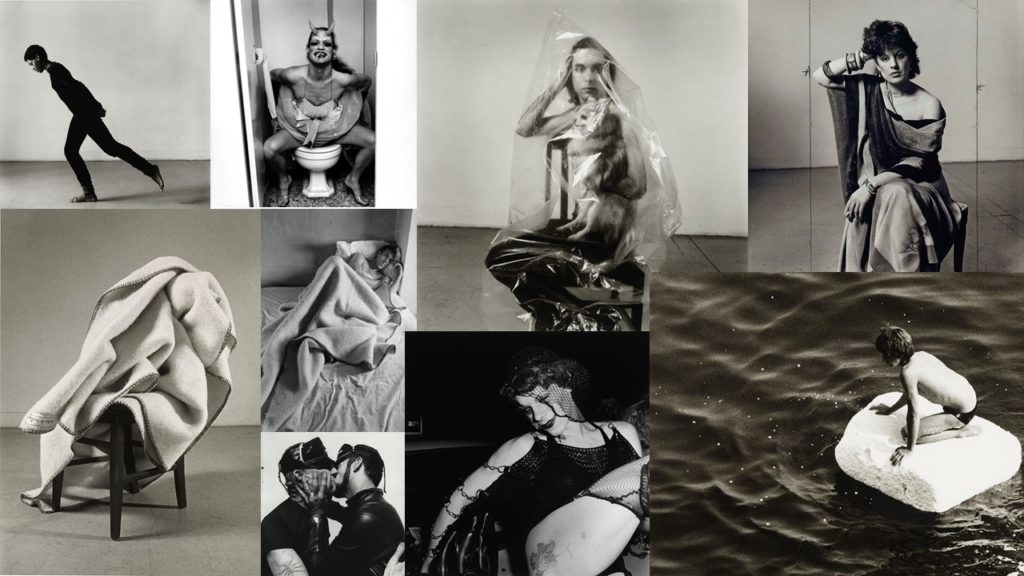
A Selection of Peter’s images.

Peters work was mainly based around the tackling of difficult topics and he would take photos that address them but the photos are simple and the composition of them isn’t made to be complicated. Peters himself was a homosexual man and has found difficulty and faced discrimination within society. His work is normally of groups of people or a person to represent a group that can struggle in society or faces regular discrimination, he often does this through the use of the nude human from, or he does it with the model being in a compromising, exposing or akward positioning. He described his style of photography as “uncomplicated, direct photographs of complicated and difficult subjects.”

A style of image that he often did was a studio portrait, they were almost always taken with the subject on the same chair or on the same bed, he also used the same blanket.

Peters presentation of his work was somewhat chaotic seeming at first as it may look like it had no theme but when inspected closer the photos of objects, animals, people and landscapes are all related to the area that they are in and the framing and positioning are all planned to tell a story.

The person who appeared the most in Peter’s work was Divine (Harris Glen Milstead) who was a drag queen who was close to Peter, Divine can be seen in a large number of photos by Peter.

https://wexarts.org/exhibitions/peter-hujar-speed-life

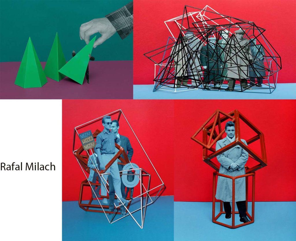
Rafal Milach

Rafal Milach was born in Gliwice, Poland in 1978. He is a photographer, visual artist, and author of multiple photo books.

His works have been exhibited in Poland and worldwide, and can be found in the collections of the Center for Contemporary Art Ujazdowski Castle in Warsaw, the ING Polish Art Foundation, Kiyasato, the Museum of Photographic Arts in Japan, and the Brandts in Odense in Denmark.

In his photo book, The First March Of Gentlemen, he focuses on using bright backgrounds with objects and cut outs of archive images. He takes two sheets of coloured paper, one for the floor and one for the wall, and places them on a table against a wall. He then chooses an object and places it on the coloured paper, and takes images of it. During editing, he chooses archive images which feature people in black and white, cuts them out, and chooses places to put them around the objects to make the people look like they’re interacting with the objects.

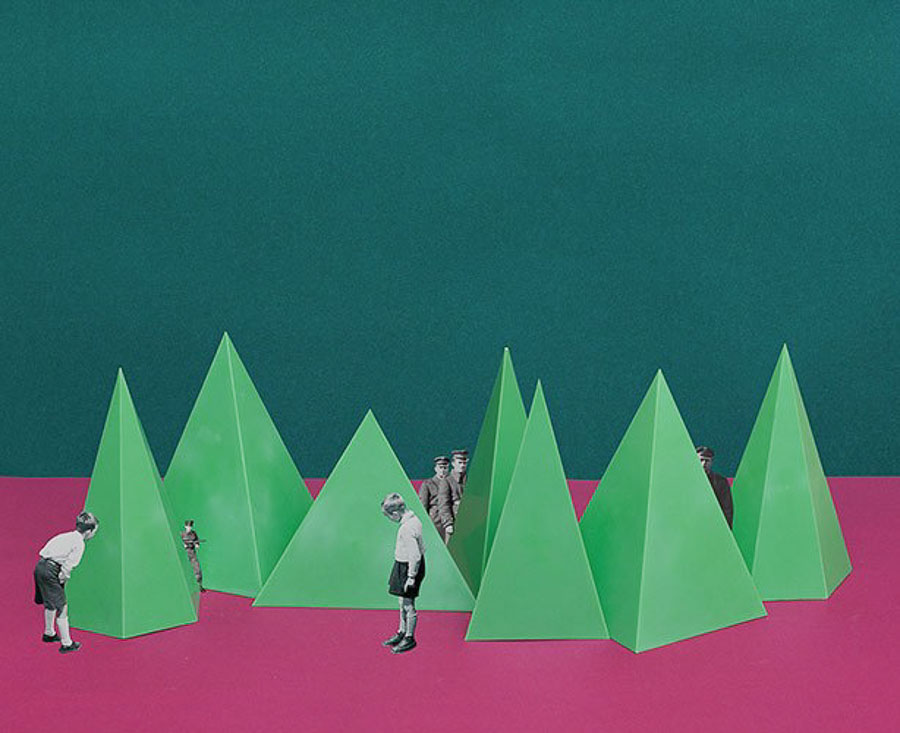
Visual :

In this image you are immediately drawn to the colours which have been chosen for this image. A dark green against a pinkish-purple with emerald green pyramids placed in the middle. There are cut-outs of people from images which seem to be from the archives, of two young boys and four soldiers. The boys seem to be possible hiding from the soliders from behind the pyramids.