Category Archives: AO1 Develop Ideas

Filters

Author:
Category:

ESSAY – Final Text

How does the work of Darren Harvey-Regan explore abstraction as an intention and process? 

 “Something I’ve tried to cloud in the past by showing photographs alongside the exact objects they depict. While that considers the interplay around the translation of object to image – a photographic object being located at an intriguing point of overlap between the two –The Erratics does attempt to reach wider, bringing the flattening of that fourth dimension into the picture.” (Darren Harvey-Regan on Naomi Itami. 11.Dec.2016: ¶5) 

This quote explores the idea that the medium of photography as a whole is an abstraction of times as it is able to capture that moment with no context of the prior nor future events, potentially meaning that abstraction is an unintentional reality for all works of photography. In my personal investigation I am looking to explore the concept of abstract photography, its application and the process of intentionally practicing abstraction. This work intrigues me as it is – at times – able to derive the basest elements of a complex three-dimensional form, resulting in a visually interesting product. The best works of abstraction are able to reduce a form to the point where there are no discernible three dimensional forms in the image similar to the works in The Erratics, the merging of three and two dimensional forms seamlessly through precise lighting and composition. I will be primarily exploring the works of Darren Harvey-Regan in The Erratics due to the use of shape and black & white photography to approach abstraction in a variety of forms of photography and lighting, revolving around a primary subject. Previously I have studied abstraction of forms using a large aperture and close up photography; I am now looking to practice abstraction via subject and lighting manipulation as opposed to camera/ editing tricks. I am looking to photograph the sea wall and establishing shots of the surrounds as well as forming sculpture from similar aggregates used in the sea wall in order to explore the forced labour used to construct the German defensive structures in Jersey. I will be shooting using a small aperture in order to capture the full detail in the image in conjunction with a tripod in order to allow the use of longer shutter speeds to capture any darker details. “If manipulation is the first thing someone thinks of in connection to photography, what does that say about the photograph as a reflection of reality?” (Bright, S. and Van Erp, H. 2019: 17) as such post-processing will be kept minimal and will mostly consist of contrast adjustments and/ or making the images black & white in particular cases as I want the image to closely resemble that of reality while not being immediately recognizable as an untouched image. 

– Abstraction in Modernism – 

This paragraph will be exploring the concept of abstraction in photography, relating to the modernist movement and its strong themes of abstraction. I will also briefly address the idea of abstraction time. The idea that photography is intrinsically an abstraction of time stems from the fact that photos capture a scene at a moment in time, quintessentially removing itself from the fourth dimension “bringing the flattening of that fourth dimension into the picture.” (Itami, N. 11.Dec.2016: ¶5). Since abstraction can be defined as the consideration of something separate from its attributes or associations, all photography has an element of abstraction as time is an intrinsic property of the scene however the scene is removed from time in a photograph. Abstract photography began amassing popularity approaching the 1920s, this was spurred on by the works of those such as Christian Schad and Man Ray and was preceded by several years by what many consider the birth of modernist photography. Modernism in design and art had already began in the late 19th century however photography picked up modernism in the 1910s. The term ‘abstract photography’ is incredibly ambiguous however from the definition of abstraction it can at least be inferred that a defining property of abstract artwork is the detachment from different attributes or associations. This definition can be interpreted in numerous ways; many of the early abstract photographers used this to explore taboo socio-political matters including that of the gradual absolution of gender roles within the modern world or tackling issues of racism and segregation prevalent at the time. Abstraction can however also be tackled in a more visual sense via the removal of dimensions to create visually interesting compositions, most commonly the removal of the third dimension in order to explore textural work or the interaction of different tones and colours together. Many of the early abstract photographers explored the possibility of creating photography without the use of a camera. This would be done by placing objects directly onto photosensitive paper, essentially removing the third dimension as only the surface in contact with the photosensitive paper would transfer onto it resulting in a flat composition with only texture, shape tone and colour. This relates to the ideas of modernist photography as works prior to the movement were to comply with the confines of traditional art in order to have a chance at being considered as art, this movement however served to defy these confines thus helping bring photography into an artistic medium of its own and not simply an imitation of traditional paintings.   

– Darren Harvey-Regan – 

“The photography of British artist Darren Harvey-Regan (b.1974) embraces the convergence of genres: abstract, landscape and still life. Darren’s photographs are not saturated with objects. He defines his focus towards particular sculptural forms and geometrical shapes, often looking towards nature’s own lines and curves – in order to create pure abstract worlds with mixed dimensions and clean contours.” (Savitskaya, A. 15.May.2015: ¶1). 

This quote defines the aspects of Darren Harvey -Regan’s photography I am looking to explore. His work on The Erratics perfectly exemplifies this quote. The Erratics is a collection of work comprised of sculptures, photography as well as a book created by Darren Harvey-Regan. The word ‘erratic’ referring to “a rock that has been transported by a glacier to somewhere far from its native environment.” (Graham, T. 11.May.2017: ¶1). The body of work is focused of rock formations and sculpted chalk with the subject of the photos alternating across pages between the found rocks (particularly the stones within the desert at the start of the book) where these monolithic structures are contrasted with the manmade chalk sculptures. The outdoor shots spanned from the white cliffs of Dover to eastern Egypt. The use of sliced chalk facilitates the contrast of the textured, natural surface of the stone as well as the smooth faces where it has been cut. This results in an interesting reaction from the subject with the lighting; the lighting appears to be a single source painstakingly placed at an angle at which the drop shadows from the subject aren’t harsh despite detailing a lot of the texture surface while creating flat lighting of the smooth surfaces of the chalk resulting in an abstraction of the three dimensional forms by creating these surfaces which appear flat in the three dimensional space. The flat subjects are aligned with the edges of the plinth upon which it is placed. The plinth itself is cuboidal thus complimenting the sharp cut faces of the sculpture. By aligning the sculptures in this manner, it creates the illusion that the images are composed of two or more separate exposures, combined in the post-production process. The creative choice to shoot in black and white allows the white levels of the sculptures, plinth and the background as well as hiding any colour differences in frame. The lack of colour also allows for better control over tone by allowing the colour levels to be adjusted (assuming the images where originally, digitally shot in colour) while having no bearing on the saturation nor vibrancy of the image. Contrast and detail are essential to creating impactful images of such subjects when shot in this manner. The images shot in the desert are considerably more chaotic due to the lack of control over lighting conditions thus much of the work feature harsher lighting with more interesting background conditions. This work displays the erosion of these rock formations over time, linking back to the idea of abstraction of time. 

For my response to The Erratics I decided it would be fitting to my narrative to use pieces of concrete collected from various defensive sites that had been chipped off on account of decades of weathering; as a result, the indentations are filled with various sediments giving more colour depth than the concrete alone. Outward facing surfaces of the concrete are also visibly worn down, creating a variety of textures in each image.  

My responses were shot using single point lighting (with negligible ambient lighting) in the studio, using a still life table. All photos were taken using 200 ISO, 55mm focal length, 1/50th second shutter and an aperture of f/ 5.6. 

I decided not to use a plinth to hold the concrete and instead used an infinity screen. This allowed me to better explore texture as opposed to shape. In reflection, more ambient lighting (and potentially backlighting) would’ve been beneficial as it would minimize the drop shadow further abstracting the third dimension. The presence of the reflection doesn’t bother me as it still appears flat and doesn’t add to form in the manner of a drop shadow. In spite of these issues, the images still serve their purpose from a contextual standpoint as it gives a closer look to the workmanship of the slave labourers. I believe my responses do visually reflect the work of Harvey-Regan to an extent due to the similar level of contrast however my images do feature a brighter white level although this may be a result of Harvey-Regan’s work being scanned from prints.  

– Donald Weber –  

“Once the link between flatness and immediacy is severed a concern with the surface does not vanish. It is rather that the surface is refigured and consequently it becomes possible to reintroduce the surface, though now as open space without a single unified texture. Hence-forth the surface will have been freed from the necessity to be a single texture and thus will have been opened up such that not only can it bear the complexity of the art’s work, but it can represent itself as the field of that work” (Benjamin, A. 1996: p.42) 

Immediacy is a philosophical concept with implications of an event or object destitute of any intervening medium. An exemplar of this being viewing an artwork and experiencing the scene as your own, unlike the sense of viewing a photograph or painting and instead experiencing the moment captured by the artist, Irregardless of the medium. This is a philosophical concept that primarily lends itself to realism in photography or ‘Trompe-l’œil’ painting. The quote above can be summarised as breaking the link between flat artwork and realism or representation, implying that art doesn’t have to represent the real world, and this applies to photography. This idea and its antithesis are explored throughout War Sand by both including Tableaux vivants images comprised of figurines and sand samples, re-enacting the Normandy landings while also photographing everyday scenes in a manner which abstracts form from the scene and by using spectroscopic imagery of various sand samples from the beaches of Normandy – known under the alias of micro-archaeology – providing an unusual perspective on an all too usual subject. This medium allows the highlighting of the remaining shrapnel across Normandy from the infamous D-Day landings; this metaphorically explores the long-lasting impact caused by WW2, still experienced today by people across the globe. Many of images in the given body of work are shot featuring overcast weather thus creating an abundance of ambient light resultantly lacking in drop shadows and minimising saturation subsequently maintaining a documentary approach while exploring abstraction of form. Many of the images are quite similar and can appear repetitive by design; this appears to be a conscious choice made by Donald Weber to maintain the clinical approach to this body of work, further emphasized by the inclusion of spectroscopic imagery towards the conclusion of book. These images are later contrasted by the Tableaux images which ironically are more familiar to the viewer than the images of the – so to speak – real subjects.  

In response to Donald Weber, I have decided to stick to photographing solely landscape subjects as I found that the tableaux and spectroscopic imagery wouldn’t fit thematically nor aesthetically with my body of work.  

My response shots were taken using natural lighting under overcast conditions to create soft drop shadows and diminished contrast and saturation. The photos were taken using a variety of camera settings according to the different lighting situations encountered as well as differing subjects. All photos however used an ISO tending towards 1600 and the shutter speed matched the inverse of the focal length in mm in allow adequate exposure without capturing motion blur – to a reasonable degree – and an aperture of f/ 5.6 to allow more light to reach the sensor.  

I believe that my images quite closely resembled those of Weber in composition however due to my choice of lighting and editorial choices to keep the images muted they do not resemble his images tonally nor in saturation. 

– Conclusion –  

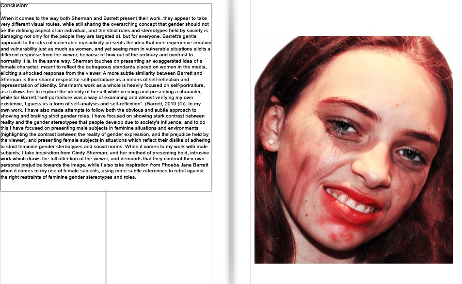
In conclusion I have found that abstraction is more than simply a genre and is however a powerful tool that can be used to explore a wide array of subject manner, ranging from simply exploring interesting visual compositions to peacefully protesting various socio-political taboos. The introduction of influence from the likes of Weber and Harvey-Regan have allowed me to develop my work in a manner that allowed me to better explore abstraction of visual elements. The studio shots allowed me to explore shape and lighting in a manner similar to that of Harvey-Regan while having an element of texture within the primary subject while introducing elements of my own artistic identity. While this did distract from the initial intention of the artist study, I believe this did help me to grow as both a photographer and an artist, while deepening my overall understanding of abstraction as a medium as there is no precise definition to abstraction in art, only loose guidelines and implications associated with the genre. My artist study of Weber was more faithful in a visual regard as I believed that his style of composition particularly fit my desired aesthetic. I did however take some artistic liberties when choosing both the timing and weather conditions for my shoots as well as the choices made in post-production as my work is more muted than Weber’s body of work. My study on Weber was an excellent opportunity to explore texture in photography as the lack of discernible three-dimensional forms left ample room to incorporate form without resulting in an image that looks overly cluttered. 

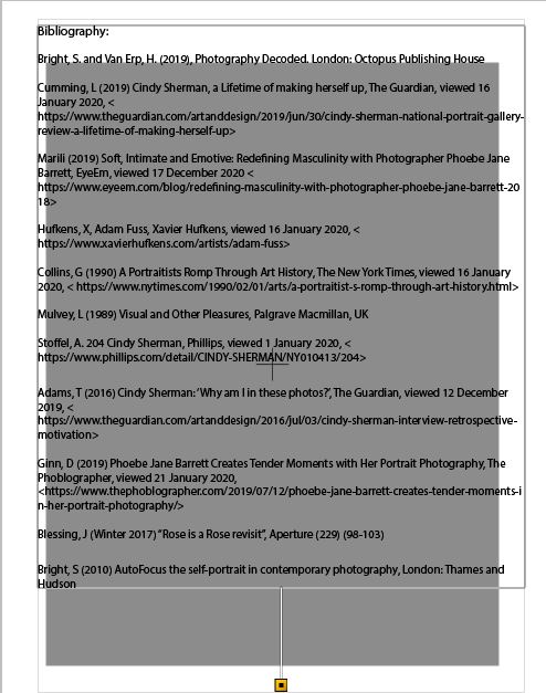
Bibliography: Bright, S. and Van Erp, H. (2019). Photography Decoded. London: Ilex. 

Itami, N. (11.Dec.2016). Darren Harvey-Regan/ The Erratics/ Interview. Berlin: Hatjecantz. 

Graham, T. (19.May.2017). Snapshot: ‘The Erratics’ by Darren Harvey-Regan. London: Financial Times. 

Savitskaya, A. (15.May.2015). I think we confuse photography and art by trying to harmonize all its possible contexts – interview with Darren Harvey-Regan. Belgium: ArtDependance.  

Benjamin, A. (1996). What is Abstraction. London: ACADEMY EDITIONS. 

still life-Historical content

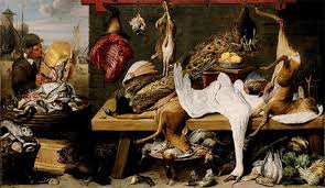
still life is a work of art depicting mostly inanimate subject matter, typically commonplace objects which are either natural (food, flowers, dead animals, plants, rocks, shells, etc.) or man-made (drinking glasses, books, vases, jewelry, coins, pipes, etc.).

With origins in the Middle Ages and Ancient Greco-Roman art, still-life painting emerged as a distinct genre and professional specialization in Western painting by the late 16th century, and has remained significant since then. One advantage of the still-life artform is that it allows an artist a lot of freedom to experiment with the arrangement of elements within a composition of a painting. Still life, as a particular genre, began with Netherlandish painting of the 16th and 17th centuries, and the English term still life derives from the Dutch word stilleven. Early still-life paintings, particularly before 1700, often contained religious and allegorical symbolism relating to the objects depicted. Later still-life works are produced with a variety of media and technology, such as found objects, photography, computer graphics, as well as video and sound.

The term includes the painting of dead animals, especially game. Live ones are considered animal art, although in practice they were often painted from dead models. Because of the use of plants and animals as a subject, the still-life category also shares commonalities with zoological and especially botanical illustration. However, with visual or fine art, the work is not intended merely to illustrate the subject correctly.

Still life occupied the lowest rung of the hierarchy of genres, but has been extremely popular with buyers. As well as the independent still-life subject, still-life painting encompasses other types of painting with prominent still-life elements, usually symbolic, and “images that rely on a multitude of still-life elements ostensibly to reproduce a ‘slice of life'”. The trompe-l’œil painting, which intends to deceive the viewer into thinking the scene is real, is a specialized type of still life, usually showing inanimate and relatively flat objects..

Text Within the Photo-Book: Essay

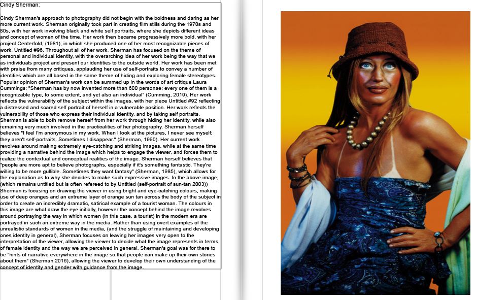
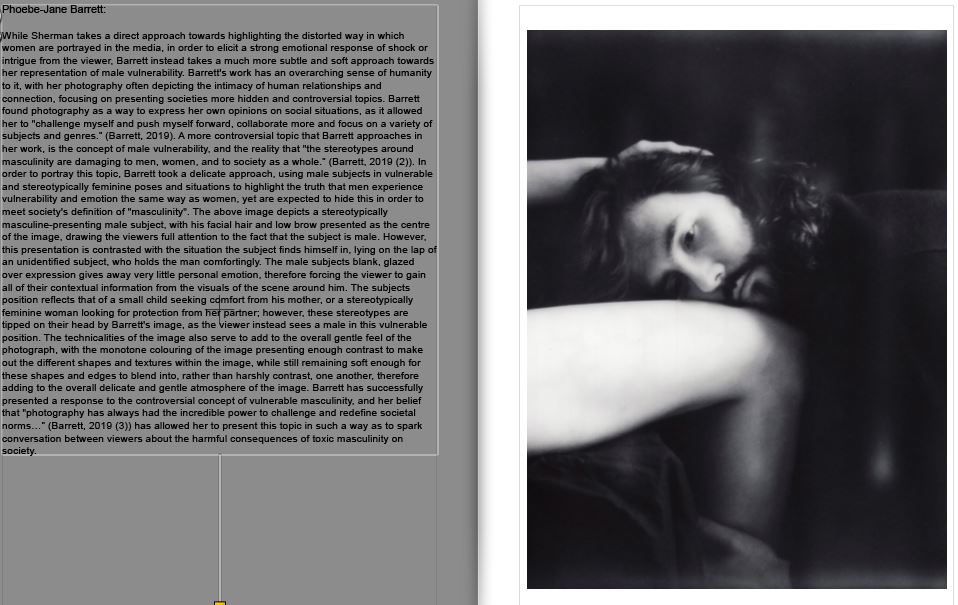
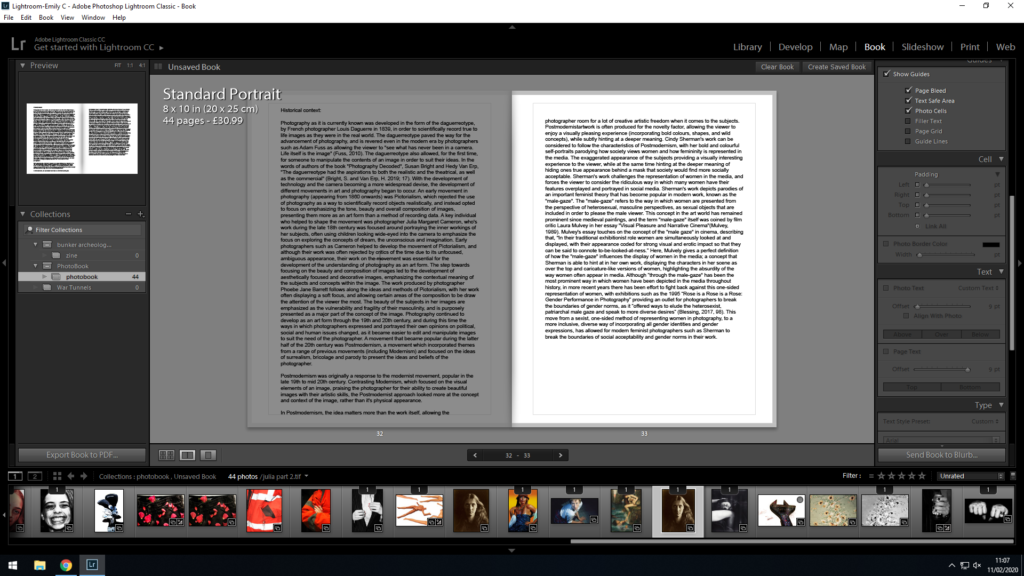
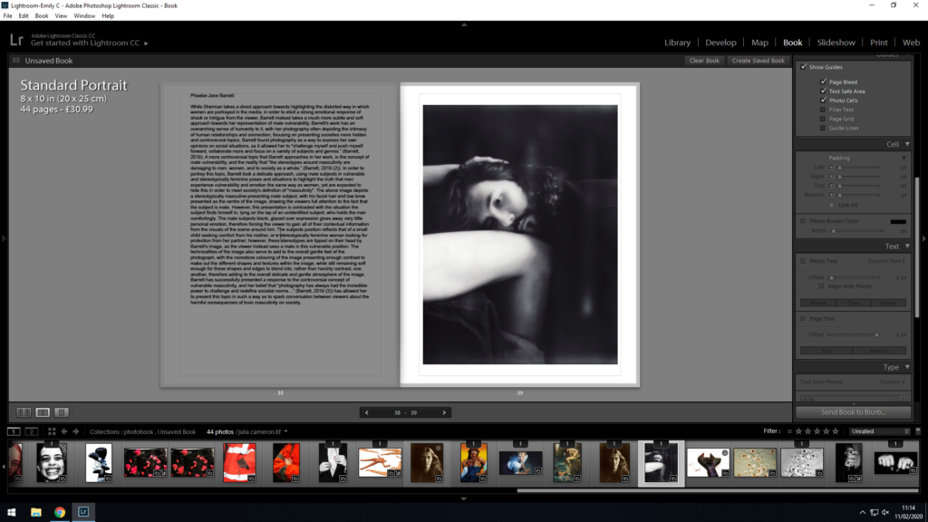
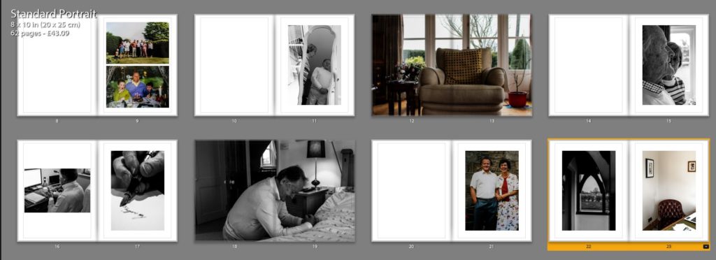
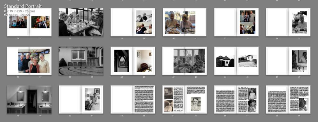
I needed to find a way to incorporate my essay in a visually appropriate and practical way, while not taking away from the main purpose of the book (the photos). In order to do this, I pasted the essay into Light-room, and from there I experimented with the placement of text, titles and photos that I would use to layout my essay and present it at the back of my book. My first draft of organizing and layout of the essay in my book was as below:

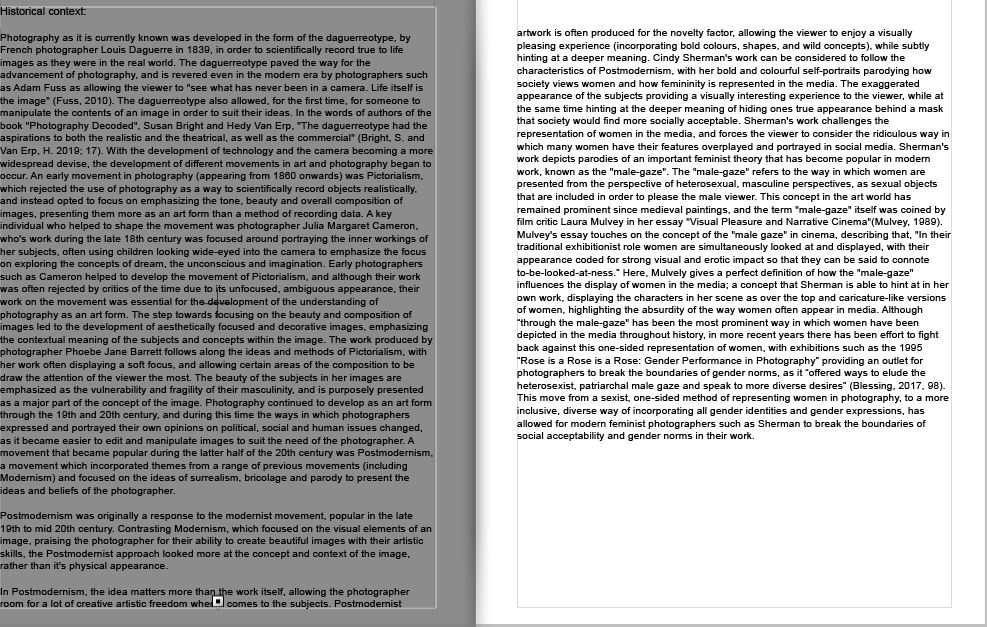
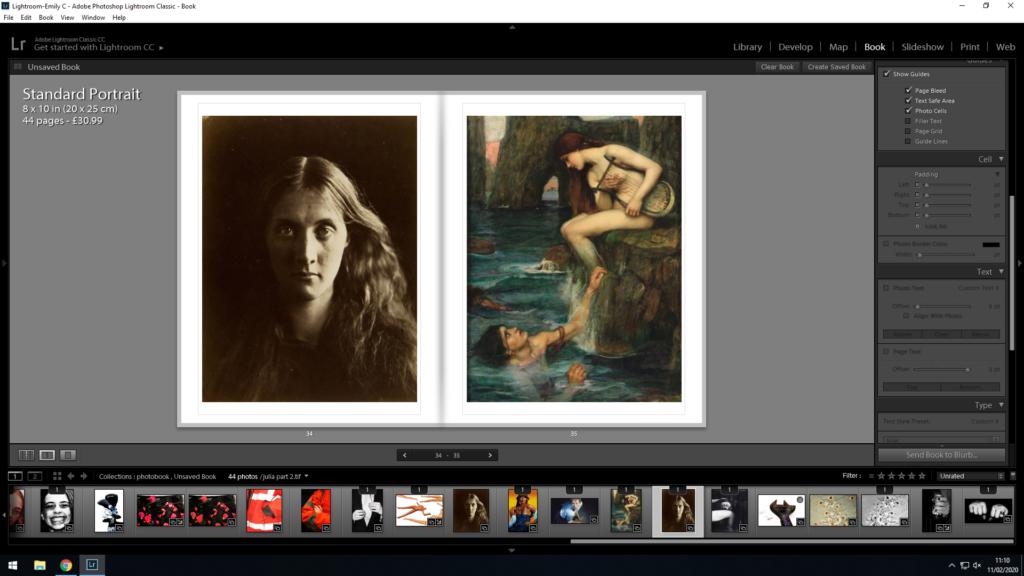
With this initial layout, I placed the essay in paragraphs, and tried to make sure each paragraph was written with a corresponding image on the page next to it, this way I could maintain the viewers attention, and give examples of the concepts and works that I was referencing in the essay. As my historical context paragraph was longer than the others, I gave that section of my essay a double page spread, and decided to include 2 images over the following 2 pages to present examples for the viewer to better understand the contents of the historical context portion of the essay. This double page of images also allows for a split in the essay after the 2 whole pages of text, therefore I find it important to add in order to split the essay into manageable chunks.

After placing my essay using the initial layout, I decided to restructure the layout so that it fit more flush with the pages, and the size was small enough to fit and work on the page, but large enough to be read without issue.

Firstly, I decided to keep the title at 12 pt, and move it into the middle of the page. I felt like this allowed for the title to stand out against the essay, and gave the reader a clear beginning to start reading. I differentiated from the title by placing the essay in 11 pt (a size large enough to read but small enough to fit on the page). Furthermore, I increased the padding from the left and right sides of the page to 26 pt, as I did not want the text to spill out into the gutter of the book (where the paper begins to bend over) as I felt that this would make it difficult to read.

I used the same 11 pt font and 26 pt padding across all of the pages with my essay on (to ensure continuity). I feel like this layout gives the essay pages more structure, and I am happy that the text does not come too close to the edges of the paper, or the gutter of the book.

Below is the final layout for the essay portion of my book:

When comparing between my first and second draft, I fee like my second layout has a lot more structure to it, and allows the reader to navigate the essay much more easily.

Photobook Experimentation

Initial Development:

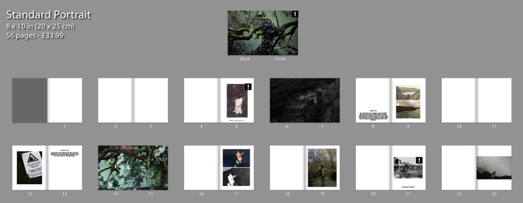
Initially I began developing my photo-book by setting out my two stories that I have chosen to display, I began working forwards from the front and then backwards towards the middle with my last photograph, this helped me be able to see them beginning to join together rather than put one in and then another, going from both the front and back helped me personally merge them easier and also helped as I had previously began to choose out my narratives. I have decided to use a mixer of double page spreads and individual images to break up the narratives and help to create a flow.

Narrative Beginnings:

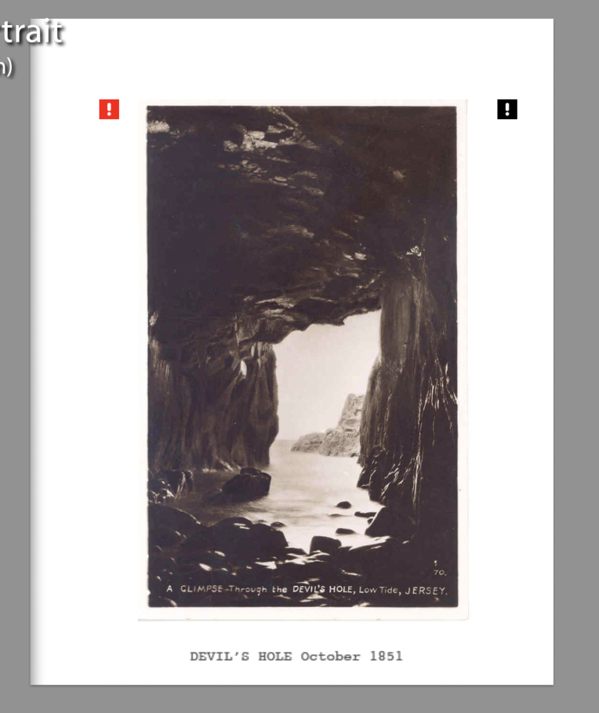
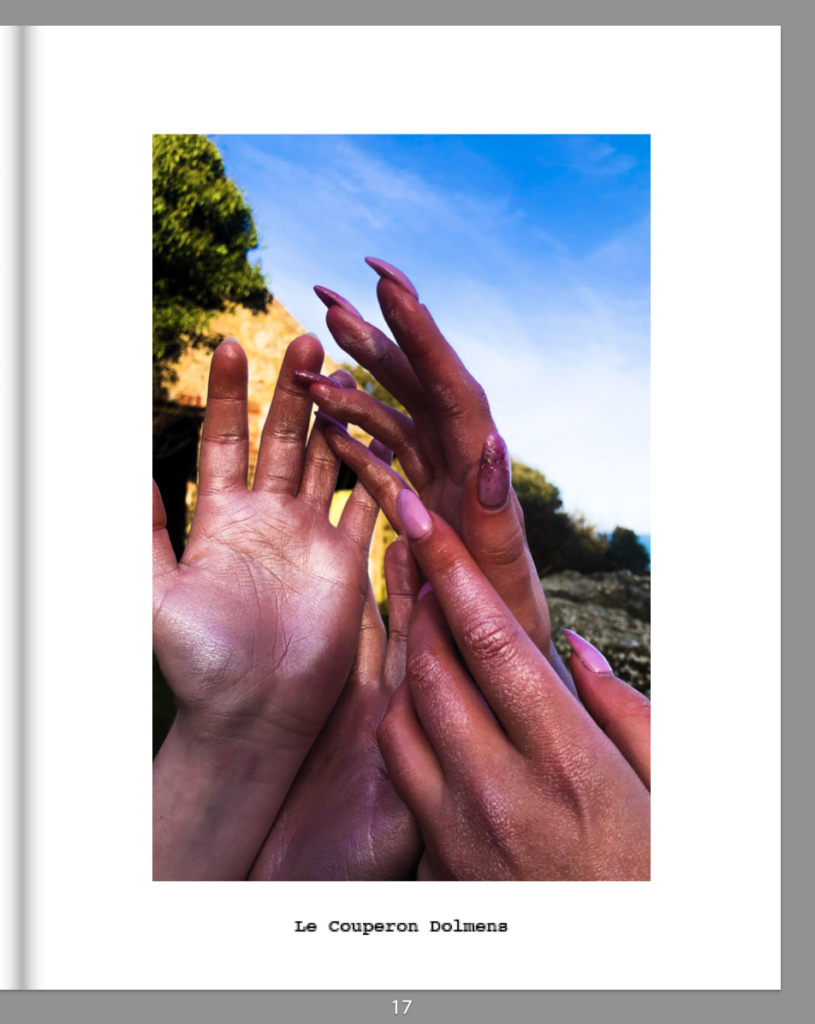
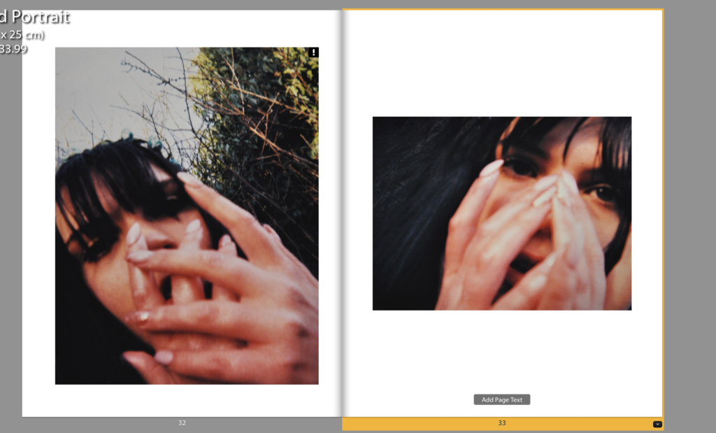
As I have two stories I had to find a way in which to show the beginning of my stories, I chose to do this with a centred photograph and a small caption underneath, I didn’t do any other photographs with this writing and positioning combination as to have them stand out and be noticeable from my other page spreads. For my first story I chose to use an archival image for my starting photograph, this is because the sight itself has a lot of tourism and history around it, the story brought a lot of news and tales so there was a lot of content which I found interesting, I personally chose to use a postcard looking directly through the Devil’s Hole cave, I chose this photograph as I feel it fitting for the beginning of a tale as it looks through into the story like a walkway. For my second story I began trying to also use an archival image to match and connect with the previous one, I decided against this as the sight I had visited for the shoot was badly excavated the first time so was no good documentation of the sight, I eventually chose to use one of my own photographs I had taken on sight which I did not plan to use in my narrative however I felt was one of my strongest photographs, the collection of hands which high contrast and bright intense colours stand out and the jarring angles work to entice and suggest the outer worldly sense of something abnormal.

Page Layout Experiments:

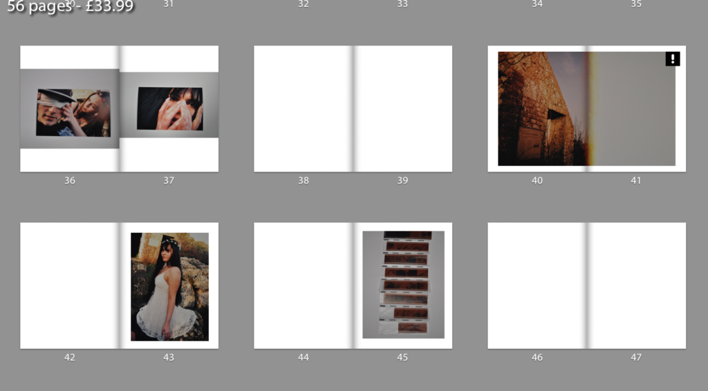
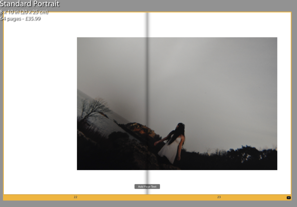
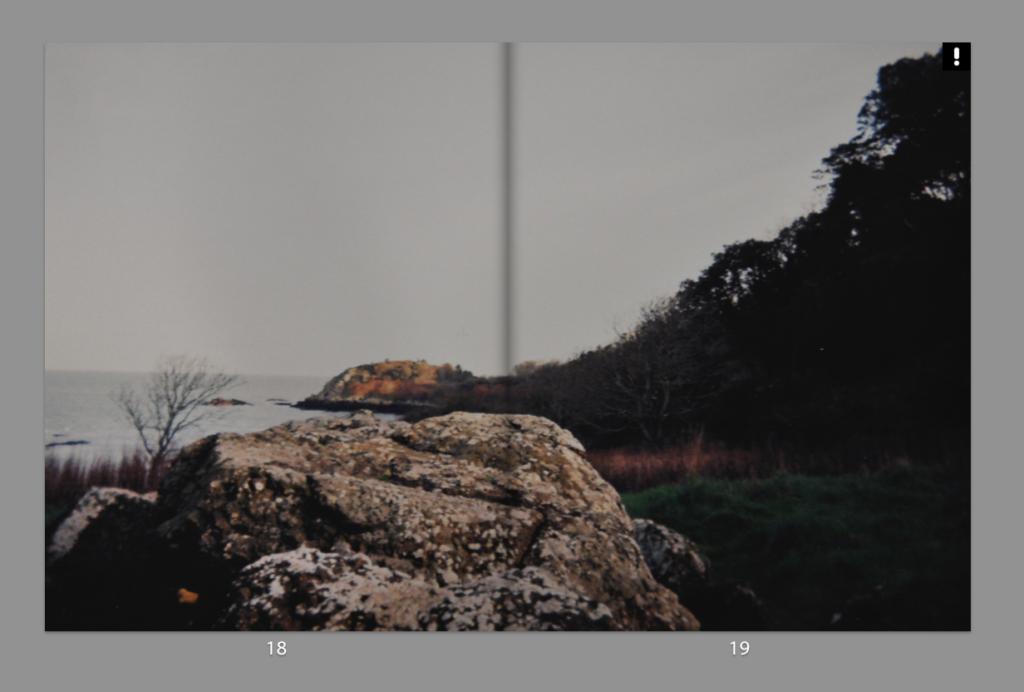
Setting out my photographs I found my narrative working best with a mixture of double page spread and individual photographs, I began to experiment and trial having my photographs in three quarter spreads as well, this is due to some of my photographs being I feel stronger when large however had an important figure going through the seam which would not work so I worked with three-quarter spreads instead as I feel this gave off a better effect than the smaller photographs but solved the issue I was having with double page spreads. Any double page spreads I did create I chose to do with my landscape photographs, this is because there was no disruption due to the seam and they worked well in breaking up the narrative to help make the narrative and the story flow better. I chose to go through with a flow of every double page or three page spreads I have a full bleed photograph to create a narrative and a good sequence ing of my photographs which I feel worked better than just having one or two double page full bleeds throughout my book.

Physical Photograph Use:

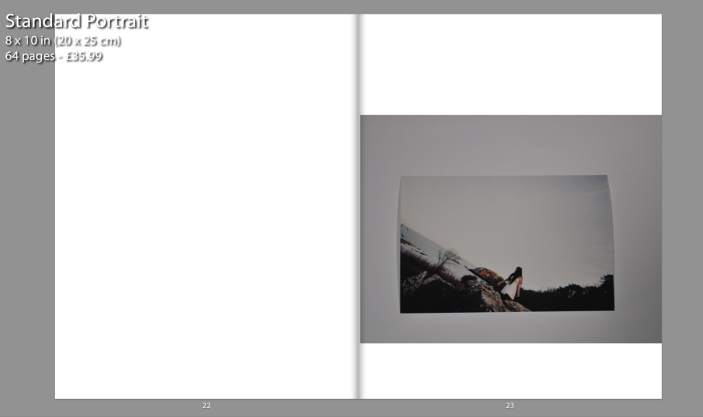
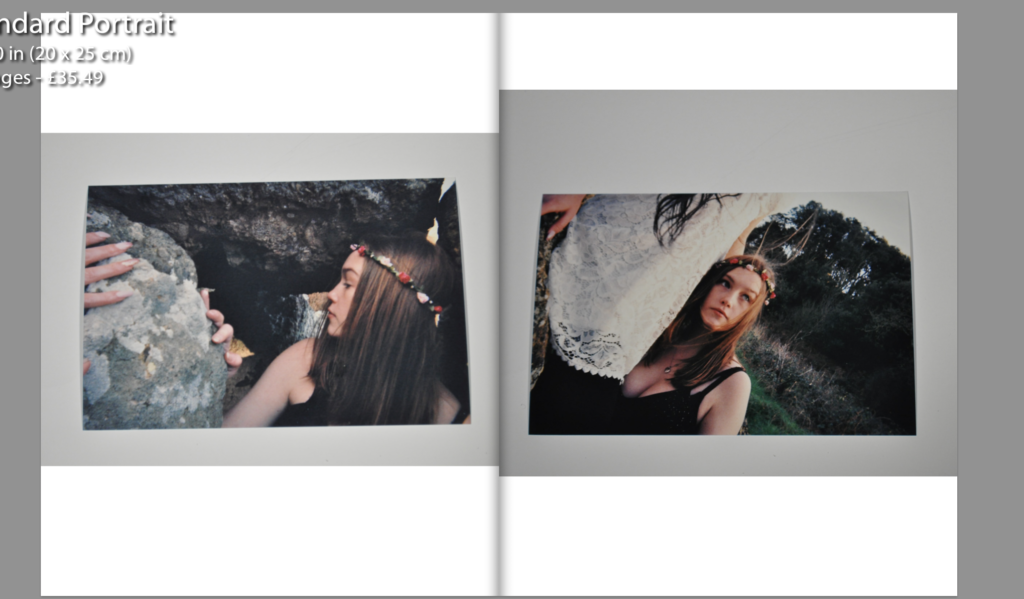
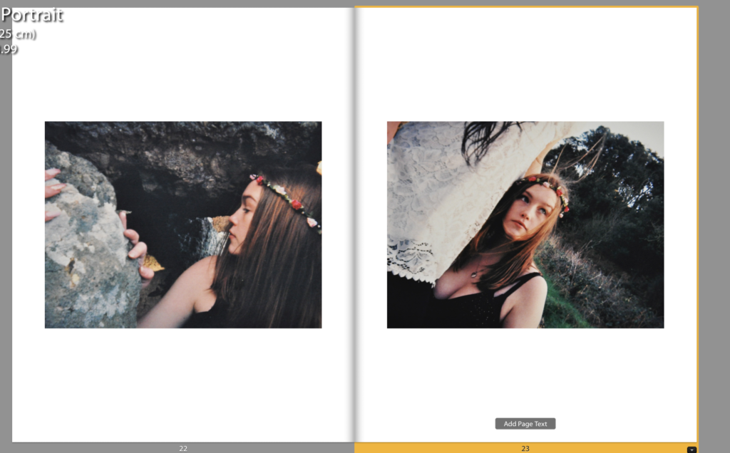
As I had worked on a disposable camera for some of my project I felt I wanted to find a way to incorporate them into my photo-book, I plan to by some photo-corners and stick them in once I finally have my photo-book printed as I feel this will present them nicely while still having the effect of the physical photographs. I began trailing and experimenting with which photographs I wanted to have a physical and which as digital images printed in the photographs. I began trialing this with some images that I had side by side and was using together. I eventually decided on keeping these as digital photographs as I didn’t want to overload my photo-book and I feel that they worked better with two digitally as I could get them aligned directly. I chose to use the photographs I was going to place individually physically as I feel it will be more impactful not the narrative and the book as a whole.

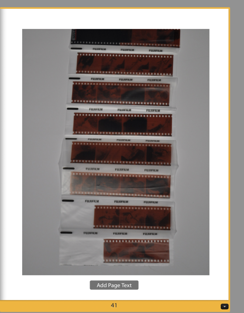
I plan on inserting strip of my negative films into the photo-book right at the very end for a personal touch and effect, I plan to only insert one strip with my best or most important photographs on. I feel this adds a good effect from the narrative of my photo-book as it is showing a sense of the taking of the photographs and the idea of these beings being in the island and the occupation they have on the island as a whole and them being real and here.

Final Piece Displaying Ideas

For my first three layouts I wanted to explore typologies and how putting photographs in a triptych and diptych format in order to portray the narrative of the occupation of my Grandparents lifestyle. I decided to use the portraits which have emotional value and suggest important part of my Grandparents lifestyle as the first triptych. These photographs are being printed as A4 photographs and will be displayed with a 4cm gap between each photograph and will be either stuck onto foam board or put in a window mount on white card, as I believe white compliments the photographs the best. For my next triptych layout I printed out four landscape photographs of the interior of my Grandparents house, two in colour and one in black and white. The images are being printed as A5, and will be displayed in a similar format, 4cm gap between each photograph and displayed vertically. My final out come using typologies is a diptych which is a portrait of my Grandad and one of my Grandma. I printed one out as an A4 and one as an A5, the size difference of both will reinforce the ideology of power within family structure and how my Grandad has the most dominance. I will display the two images next to each other as a window mount or on white foam board with a 4cm gap between each photograph. These designs can be viewed below, as I created a layout of them using photoshop.

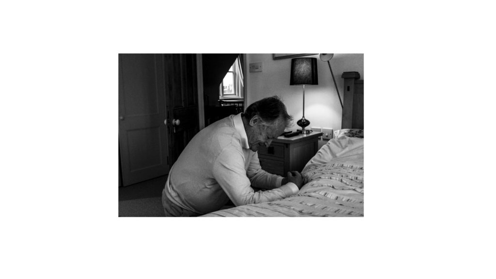
The next two display ideas are singular photographs, which would not work as a typology, and so I have deiced to display them on their own. The first photograph is of my family sat around a table at Christmas, showing the interaction of my lifestyle with my Grandparents lifestyle at a religious event. The photograph will be printed on A3 paper and displayed on white foam board. Below is a photograph of my Grandad praying, conceptually representing intimacy and the idea of religion on his lifestyle. The photograph is being printed as an A4 photograph as will displayed in the same way as the A3 photograph of my family. These full bleed photograph displays are visible below.

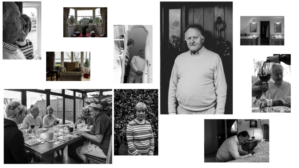
To show further experimentation and thought into the displaying of my photographs, I decided to create an eclectic display of all the outcomes. The chaotic design suggests that their lifestyle isn’t simple and has its ups and downs, and conceptually clearly presents my intended narrative. Personally, I really like the way in which this looks and will look at creating this on a large piece of foam board when the prints arrive, the design may change due to the size of the photographs, however I do want to see what this would look like with the real images and how impactful the narrative it displays is.

Development of My Photo Book

Initial Design Process:

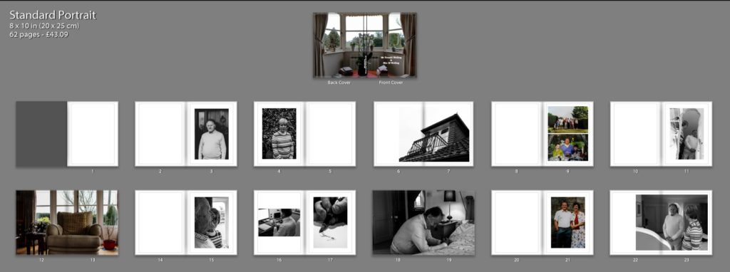
In the initial stages of my photo book design I wanted to ensure I maintained simplicity whilst making the narrative of my Grandparents lifestyle clearly presented. I started by experimenting with the sequencing of my imagery, combing interior and exterior with my portraits, trying to form a relationship between the two to create meaning to illustrate the lifestyle of my Grandparents. I decided to have two portraits or archives and then add an interior and or exterior to have a ‘break from the action’ to change the pace of the book. Although I liked the way in which it looked, I felt the sequencing of my photographs was not the clearest way of presenting my intended narrative, thus making me further explore the way in which I could sequence my photographs. In addition, in this first section of the book I wanted to include archival imagery which allowed a comparison between the past and present lifestyle to portray how their lifestyle has changed or stayed the same, thus emphasising how the time period they were brought up in has influenced their lifestyle. I felt this sequencing of archival imagery amongst present portraits was an affective way of showcasing my intended narrative and allowed a sense of flow within the book itself, therefore I am going to keep these archival images in this position of the sequence due to the reasons stated above. Due to the interior and exterior photographs not ‘fitting in’ well with this particular moment of my book I decided to move them into a new section, allowing for further experimentation.

Second Design:

Taking from the experimentation of my first design I took what went well and things needed to be changed to produce my second design. As mentioned in my book specification I wanted the book to start and end with a strong portrait of my Grandad as I felt it was a clear way of presenting my narrative at the beginning of the book, as well as using a similar portrait at the end to clarify and support the narrative, allowing the book to finish in a conclusive way. I then mainly had portrait and archival imagery in the first section, as this is what worked in my initial design. Occasionally, I did decided to implement 3/4 and double page spreads of interior and exterior to give a break from the action and present my narrative in a new light, however I did not over do this like in my first design. Moving onto the next section of my photo book I wanted to showcase the interaction of their lifestyle with mine at a family event, and so decided to utilise the photographs from Christmas. I occasionally added more archival imagery of family events in order to show the change in interaction of both lifestyles. Within this section I tended to stick with using single, 3/4 and double page spreads in order to show the interaction of lifestyles. I believe the way in which I sequenced these photographs was successful as it allows the narrative to flow, presenting a new way of looking at their lifestyle, with looking at aspects of religious events and how it impacts them. Moving onto the next section I wanted to use my interior and exterior images, as I believe these photographs are a clear way of presenting their lifestyle as well as them being some of my strongest outcomes. The sequencing of these images was kept simplistic, as I tended to show these photographs and then on the following page would be a portrait, to support the conceptual understanding of the location and my Grandparents relationship with it. In this version I decided to layout my essay within the book, I tended to have a combination of full page of text and the use of columns, to break up the chunk of text, making it seem more manageable, thus making viewers more likely to read the essay. To evaluate this design, I believe the overall sequence clearly presents my intended narrative of the occupation of lifestyle on my Grandparents, and flows smoothly with each image being an asset of presenting my intended narrative.

Fine Tuning My Design:

After the second design I am happy with the sequencing of my photographs in order to show my intended narrative. I decided to focus on fine tuning some of my spreads to make the photographs more effective in presenting my narrative, as well as improving the overall aesthetic of my photo book. A few of these artistic decision can be seen below, in order to show my experimentation in my design, as well as my decision making and thought process.

In my first fine tuning of my design I looked at the way in which I presented my double page spreads. For the most part I had a white boarder around the photograph, so it did not fill the whole page, I did this as it allowed the whole photograph to be showcased without anything being cut out, thus making my imagery more reliable in depicting reality. However, after consideration I felt that I was not achieving maximum impact of the photographs and so decided to get rid of the white boarder and have the photograph fill up the whole page. This meant that elements of the photograph was cut out, however I believe it allowed the sequence to flow a lot smoother as well as the photograph to have maximum impact on the side of story telling. The ‘cutting’ of the photograph was not highly impactful, as it did not cut out the main focus point of the chair it only cut out a slight part of the background, thus we were not loosing useful information, making this decision more affective. I decided to do this for my other double page spreads, in order to make all double pages look the same, in the sense to maintain my overall aesthetic. The old and new design are showcased below.

The next fine tuning I wanted to focus on was the title page, this is because it is the first thing a viewer will see, thus I wanted it to be high effective and clear in depicting what is within the book. After consideration I decided upon the title ‘Mr Ronald Welling & Mrs M Welling’, I chose this as I felt it clearly presented what the narrative is about and conceptually begins to present my Grandad authority. Using the picture of the windowsill was a good artistic decision as the simplicity and inactive frame allows a sense of tranquil to be presented, suggesting an ameliorative and calm lifestyle. I wanted the text in white in the bottom left corner as I felt it was the most subtle place to have the text, emphasising the sense of calm. Initially I decided to use the typography of ‘Candara’ as I liked the way in which the letters were structured. However, after time and consideration I felt this effectiveness fell and so I decided to change the font to ‘Bookman Old Style’. This fonts structure reminded me of an envelope or address on an important letter. In a way it also reminds me of my Grandad’s writing, and therefore these two reasonings made this decision affective as it suggest the business side of my Grandad, due to the formal representations it holds.

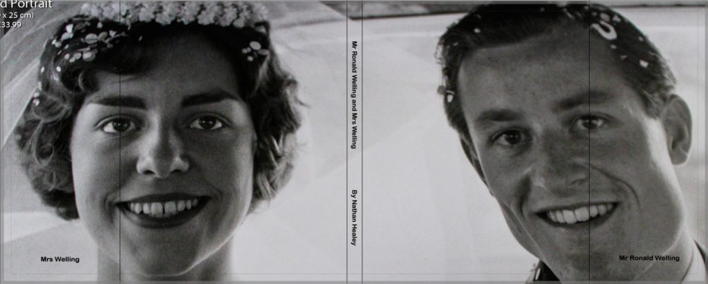
I then experimented with a different cover design using a photograph which more explicitly outlines the narrative of my book. I decided to use the archival imagery of my Grandparents wedding. I decided to change the front cover to a dust jacket, which has allowed this photograph to wrap around the book. The front cover holds my Grandad and the back cover holds my Grandma, suggesting the idea of my Grandad’s authority and my Grandma being the backbone of him in essence. Using the crop tool I accurately cropped the photograph so the dust jacket would fold on the same point of each of their eye, and on the fold in I placed their name ‘Mr Ronald Welling’ and ‘Mrs Welling’. Sticking to the title as stated above supports the idea of authority. In this design I decided to again experiment with text font and changed it to a more bold font which makes the title stand out a lot clearer. Personally, I much prefer this design as I feel it gets straight to the point and clearly presents my underlying theme and narrative. Therefore, I have decided to change my front cover to this design, as well as the text font.

My next piece of fine tuning was to do with the sequencing of my photographs in order to emphasises the authoritative conceptual representation of my Grandad. Initially, I had one portrait on each side so that they are next to each other, in order to emphasise relationship of the two subject, however I felt this was not sustained as much as the authority of my Grandad, and so decided to change the sequencing. The first image you see in the book is my Walker Evans inspired photograph of my Grandad on the right hand side, as the right is the page to which viewers first look at. Turning the page my Grandma is placed on the left page, as we do not immediately look on that side of the book, thus suggesting authority of my Grandad and the submissiveness of my Grandma, thus helping to portray my intended narrative.

Evaluation:

To evaluate, I believe I have been able to successfully sequence my photographs in order to present my intended narrative. Through experimentation, I have been able to see the layouts which are most successful, allowing the photographs to have maximum impact and flow nicely in order to showcase the underlying theme of lifestyle. In addition, I have been able to articulate my thought process and decision making as to why I have decided to sequence the photographs in a particular order and why I have chosen that page spread. The development of my photo book has been a long process and so I only showcased the major and most important changes, as well as details on each section and what its meant to showcase and suggest. From now to the final product, it is likely more minor changes will be made and will be discussed in my final photo book layout blog post.

Photo Book Specification

Narrative: What is your story?
Describe in:

  • 3 words

Lifestyle, Relationship and Personality

  • A sentence

Exploring my Grandparents lifestyle, based on their upbringing, occupation and relationship with each other as well as other family members.

  • A paragraphs

My photographic book looks at exploring the occupation of Ron Welling and Margret Welling’s lifestyle through portraits and objects. Being brought up in the 1940’s means their lifestyle is very different to mine. Traditionally, they were raised to believe that the husband has to provide for the family, as the wife stays at home as a house wife. On top of this, religion has impacted their lifestyle and the way in which they structure their days and has been apart of their life since a young age. My Granddad worked in the financial industry, after moving to Jersey in the year of 1984, and managed to make his fortune out of this industry, due to his hard work he not only managed to provide as the only financial support for his family, but also has provided a luxury retirement for himself and his wife which has clearly influenced their lifestyle.

Design: Consider the following

  • How you want your book to look and feel

I want my cover to be a hard back, suggesting an official book with official information like a hard back dictionary, the information in a dictionary can not be changed like my Grandparents lifestyle, suggesting a reliable source for their lifestyle, The book will feel smooth and the image wrap cover will allow this to be achieved, creating an overall nice book to hold. As it is a book about family the book will look like a coffee table book which are often found in open areas of homes, these coffee table books often are family albums. Therefore, my subtle cover will allow the coffee table ideology to be achieved.

  • Paper and ink

Due to my photographs sticking to a documentary style, I want the books to clearly depict reality and so I have decided to use matte paper. I also believe that having my main subject being my Grandad, who is an authoritative figure, the matte paper will conceptually present this as well as making the pages look like an important document showing his work life, it will also complement my black and white imagery.

  • Format, size and orientation

My book will be 20 x 25cm standard portrait, due to the majority of my imagery being portraits allowing for the full frame to clearly be presented and making clearer emphasis on my portrait photographs, allowing the conceptual representation to clearly be illustrated within my book.

  • Binding and cover

For my cover I am wanting to use an image warp, of one of my top interior imagery. The photograph is of a window looking out onto their garden, the curtains either side suggests the ideology of stage curtains and the window is the narrative about to be told, making this an effective image to use as it is their interior suggesting their lifestyle. With regards to binding I will have a saddle stitch which I took inspiration from Sam Harris’ book as I believe the subtle stitch will suit my narrative.

  • Title 

Retirement

Mr Ronald Welling and Mrs M Welling

  • Structure and architecture

I want the structure of my photo book to maintain a simplistic theme, in order to not distract viewers from reality and the narrative trying to be portrayed. The photographs will be matched in a sense of whats happening in the frame, colour and texture in order to display the narrative of my Grandparents lifestyle. The double page spread will illustrate the key element of my Grandparents lifestyle, as well as having key portraits on a single page on the right with nothing on the left to emphasise the frame and conceptually what is happening. The photographs will be in a chronological order to display portraits, family event and then interior to clearly present a clear understanding of my narrative.

  • Design and layout

I will mainly use single page spreads for my portraits, with having nothing on the left to allow the main focus to be on the portrait suggesting an element of my Grandparents lifestyle. With archival imagery I will use two on a page and if I want a comparison I will use two images to a page. I will use more double page spreads rather than 3/4 page spreads to allow maximum effect on my imagery. I do not intend to having any inserts with texts, as I want the main focus to be on my imagery.

  • Editing and sequencing

The first photograph of my book will be a portrait of my Grandad on the right side of the double page, to illustrate the idea that he is the authoritative and main figure of the family. The next two pages will have a picture of my Grandma on the left hand side, making this artistic decision emphasise how my Grandma is more submissive as when you look at a photo book you look on the right hand side then the left, so she is less likely to be looked at. The last image will also be a portrait of my Grandad allow the sense of authority to be the closing statement of my book.

  • Images and text

I do not to add texts to my photographs as I believe that it will influence interpretations of my Grandparents lifestyle, which leads to an unreliable source of depicting their lifestyle.

Personal Investigation – Photobooks – Post 4 (Final Layout)

Final layout of photo book:

Front Cover:

For the front cover of my photo book I selected the only ‘in colour’, mostly unedited image incorporated into the book. The cover contrasts with the images inside, yet the themes bright colours in the cover are reflected in the images and the relationship between the blue and red follows on with the concept of the different coloured, more abtract full bleed image throughout the book. I have selected the title ‘Understated’ as an oxymoron to the actual images, as they are bold and overstated. The term understated relates to the content of the book as the theme throughout is simple, abstracted portraits and still life images depicting how me and my friends go through life together, and the ideas and concepts that bring us together.

Main Images:

The main layout inside the book is stark, bright images on black paper to enhance the compositions. There are a combination of double page spreads, single photos and two photos on a double page spread, which each work to frame and marry together the key concepts and ideas of the book and the photos.

Dividing Images:

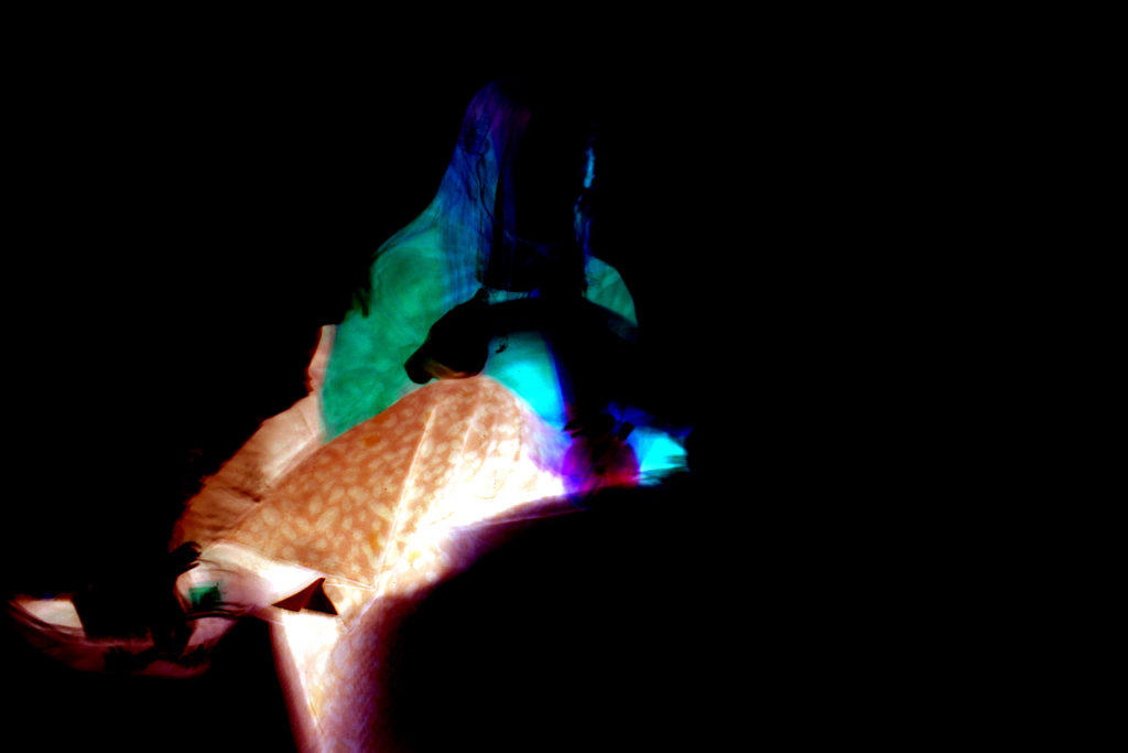
An addition theme to my photo book is the incorporation of a series of linked, colour contrasting full bleed images throughout the book. This helps break up the colour scheme of the book and adds a different perspective to the images.