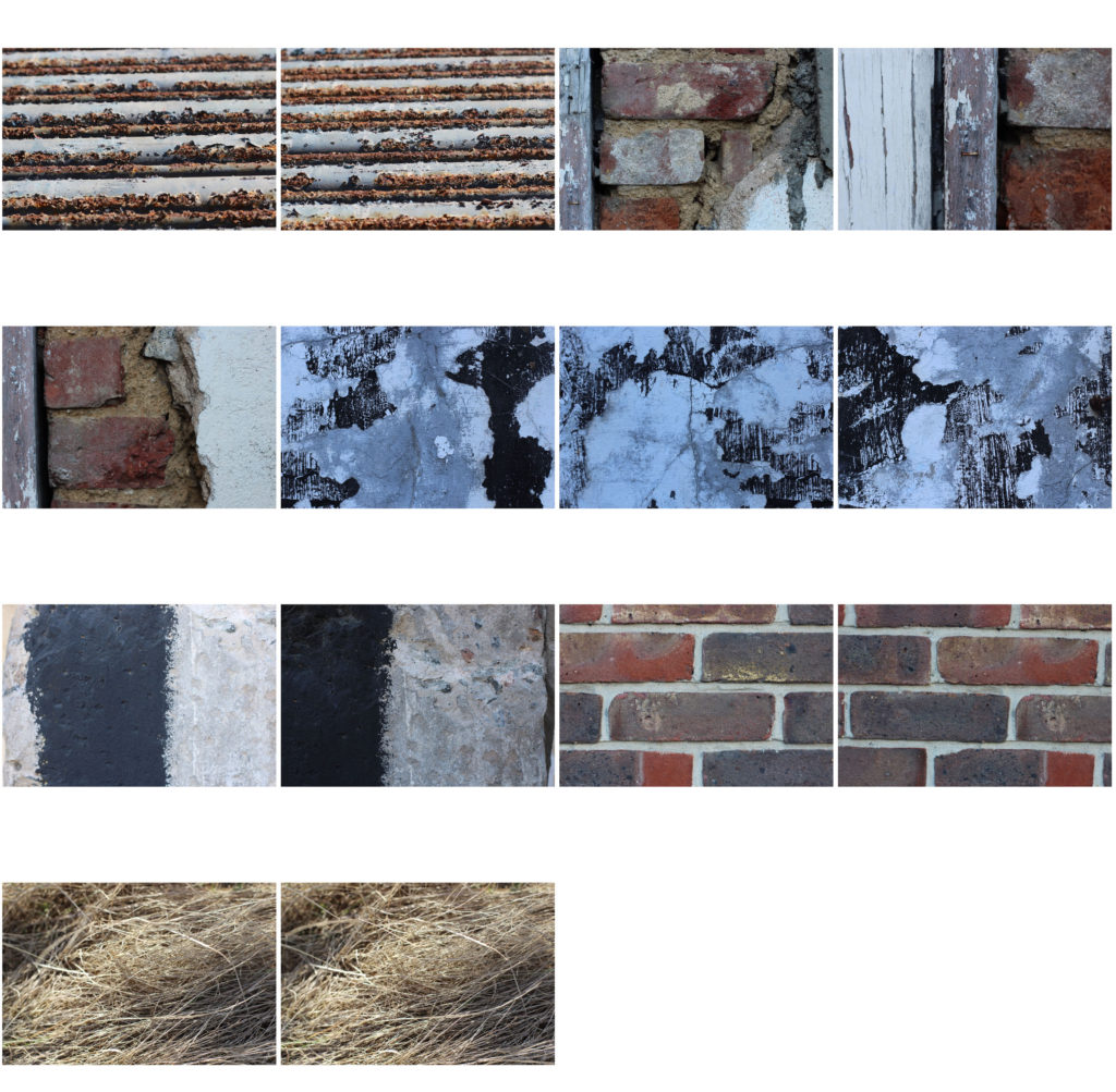
All posts by Yordi H

Filters

Author:
Category:

Experiment – Depth of Field

Depth of Field:

In photography, depth of field determines the closest and farthest objects in an image. This can involve the entire image being focus or something in the foreground or background being sharp while the rest of the image appears unfocused. This is useful in highlighting a certain aspect of a frame and can enhance the importance and effect of an object.

Three main factors that affect a photographer’s control over depth of field are the aperture, proximity to the image being photographed and the focal length of the camera lens.

Large aperture = shallow DOF

Small aperture = deep DOF

My Examples:
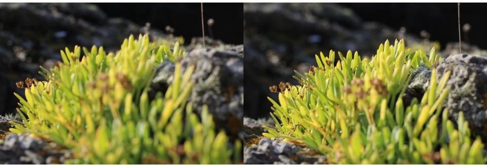
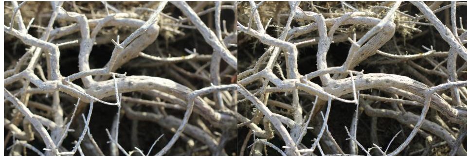
As visible in the frames above the depth of field greatly affects the appearance of an image. The first two images are focused on the furthest away section of the plant in relation to the position of the camera and create a relatively bland image while the bottom two images are focused on the section of plant in the foreground highlighting the stem in the centre of the image, giving the composition much more life and dimension with different colours and shapes making the image more interesting.

Further Examples:
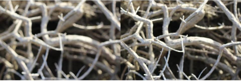
This is another example of how depth of field reveals different layers of an image, creating different focal areas. This creates a more dramatic image as aspects of the frame are much sharper and bolder.

Keld Helmer-Petersen – Threshold

Keld Helmer-Petersen:

Helmer-Petersen was born and raised in the Osterbro quarter of Copenhagen (Denmark). His interest in photography began in 1938 when he received a Leica camera as a graduation present. He became aware of international photography trends early on in his photography career. Helmer-Petersen’s interest in contemporary art and architecture heavily influenced his work, as he became one of the first Danish photographers to begin working on abstract photography.

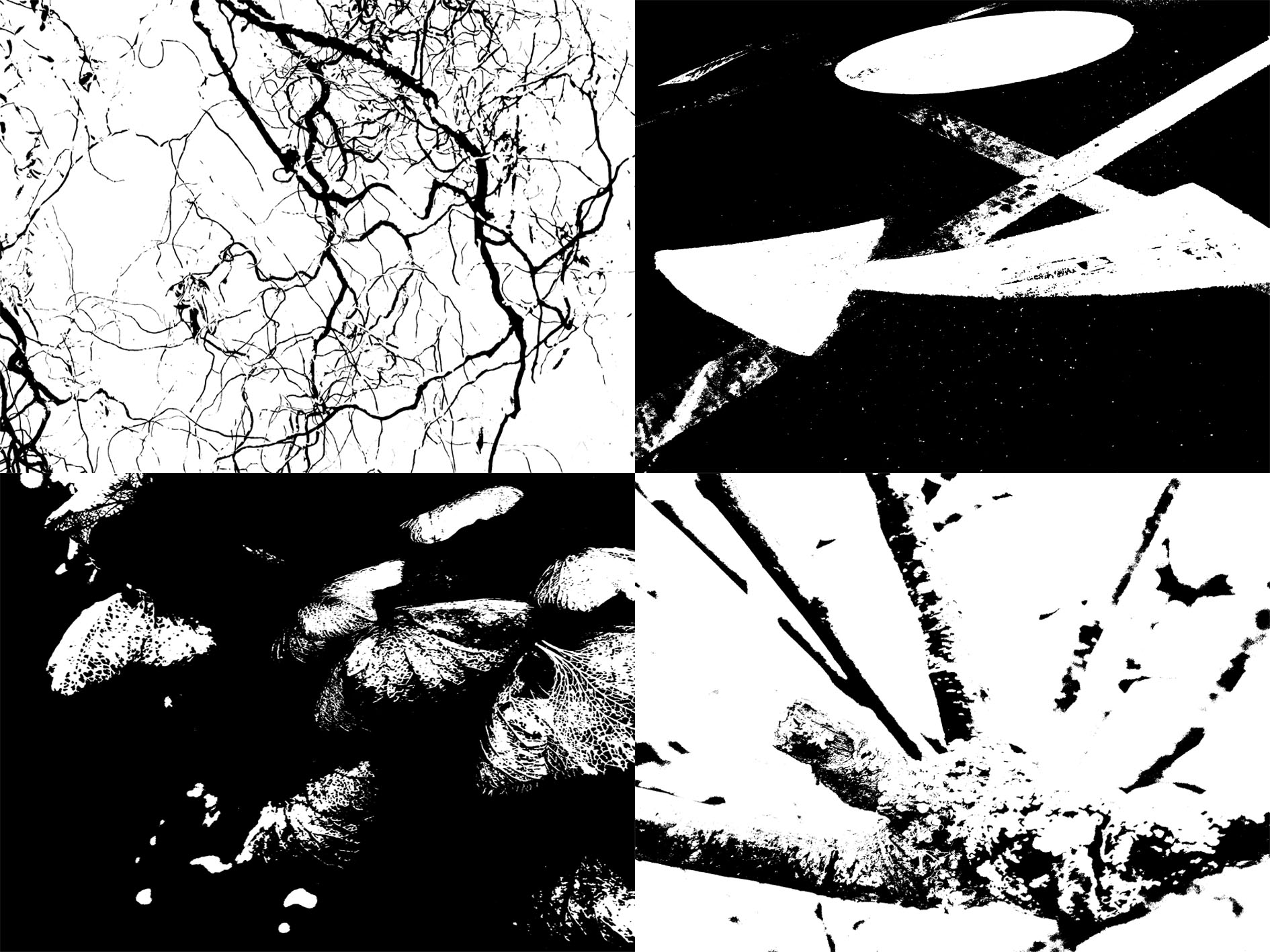
Helmer-Petersen used high thresholds to give his work a dramatic finish. The frames below are examples of my response to the work of Helmer Peterson.

My Response:

Experiment – Curve/Tonality (Colour)

Tonality: Colour

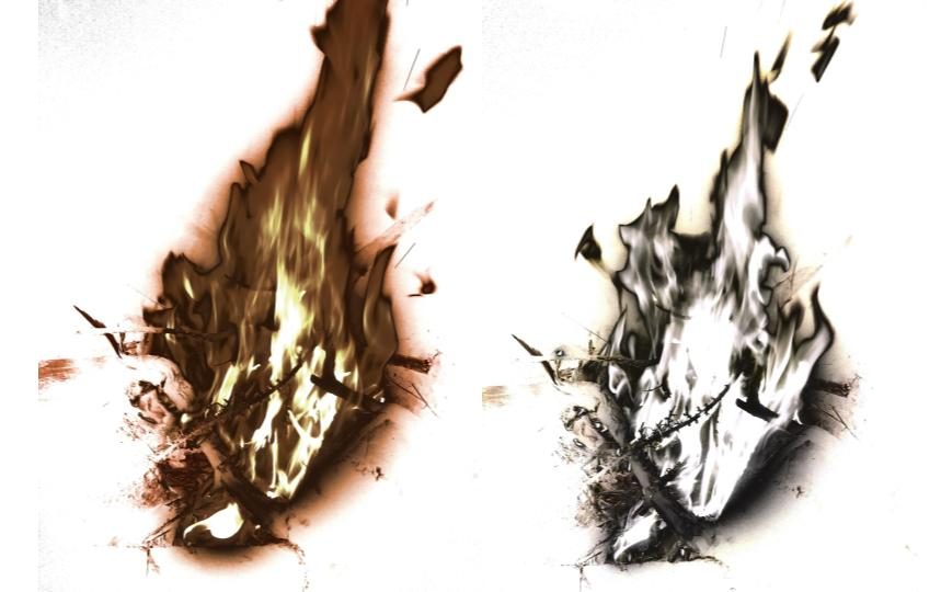
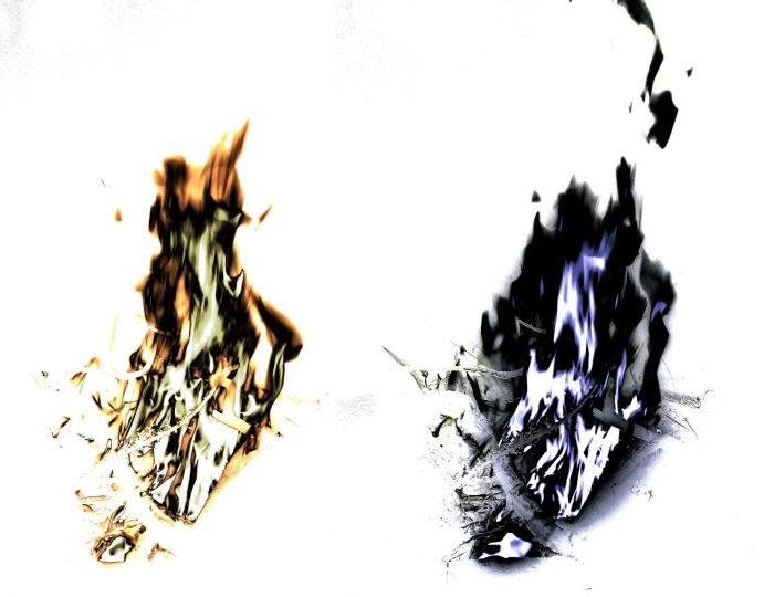
A curve, in image editing, is a remapping of image tonality, as a way to emphasise colours or tone in an picture. Changing the black point, grey point or white point of an image can dramatically affect the colours shown in an image. Below I have included some examples of where I have changed these points in different areas of the image to create different colour schemes in each image. I used an image of fire as it had many tones running through it that I thought may give good results.

As shown in these images, changing the black point, grey point or white point of an image can massively change the appearance of an image. The original colours of the fire (white, yellow and orange) were changed as I changed the tone points of each image.

I was less subtle with the editing process of these images, resulting in them looking highly unrealistic and obviously manipulated, however in doing so I produced some dramatic very images.

Experiment: Curve/Tonality (Contrast)

Tonality:  Contrast

A curve, in image editing, is a remapping of image tonality, as a way to emphasise colours or tone in a picture.

Applying a curve to all channels of an image typically change the brightness. Light parts of an image can become lighter while dark parts of an image become darker, increasing the contrast in a composition.

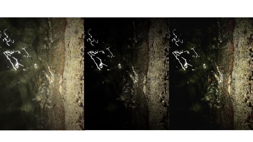
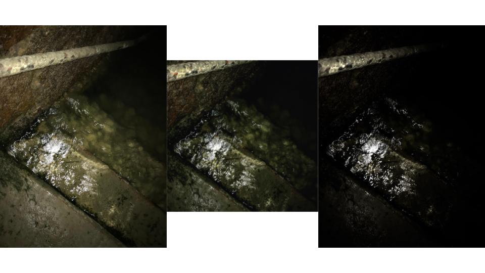
Below I have shown examples of images in their original form as well as with two examples of the same image with different levels of contrast.

As displayed in these images, the higher the contrast the more dramatic the image. I took these frames of light reflecting on water at night to create natural contrast before the editing process to show how slight changes to the tonality of an image can drastically change how an image appears.

I could have further increased the curve of these images or perhaps even decreased it to give the images less contrast, however I felt it was most effective for these specific images to increase the curve sensibly to create realistic images rather than obviously edited ones.

Experiment – Coloured Light

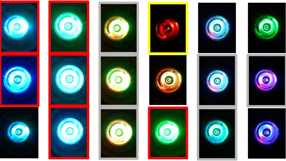
Contact Sheet:

(Unfortunately due to the fact I increased the size of the contact sheet for this experiment the quality of each photo has decreased slightly making many frames look fuzzy and out of focus)

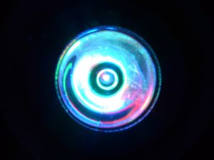
(I have attached two images below of what the photos looked like before being formatted in a contact sheet.)

I did this coloured light experiment to see how well my camera could capture different colours of light. Finding that some colours appeared under or over exposed simply due to the colour of light they appeared to be.

Yellow: indicates a frame that is underexposed.

Red: indicates a frame that is overexposed.

Grey: indicates a composition that is out of focus

Experiment – ISO

ISO:

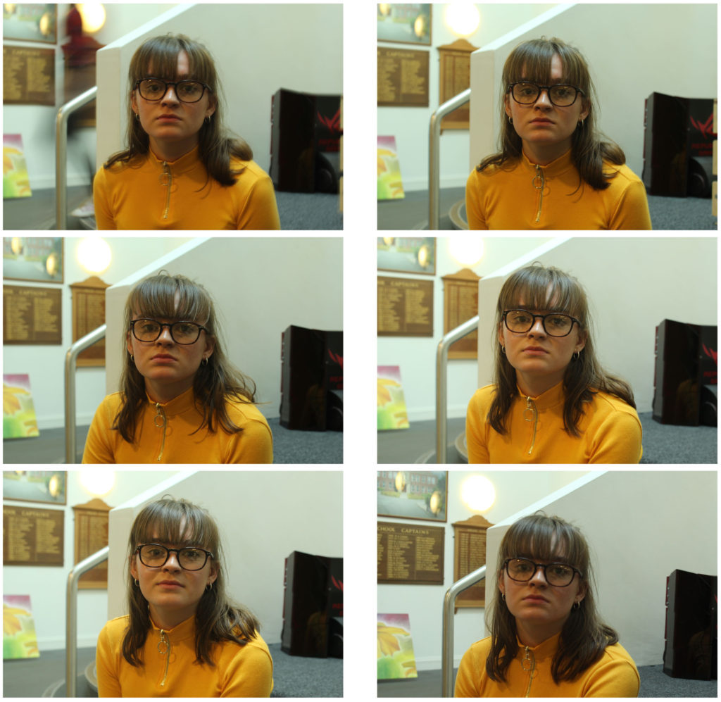
ISO simply stand for International Organisation of Standardisation. Changing the ISO of a camera controls its sensitivity to light, helping to manage the exposure of an image and prevent under and over-exposure of frames.

Changing the ISO changes the cameras sensitivity to light and can therefore allow for clean frames in lighter and darker places. The lower the ISO the lower the sensitivity to light, and vice versa to higher the ISO the higher the sensitivity to light will be. One downside to ISO is the higher the ISO the noisier or grainier an image becomes, as displayed below.

http://www.digitaltrends.com/phtotgraphy/what-is-iso/


Examples of my experiment in indoor lighting:

Settings: 200, 5.6 ISO 100-6400

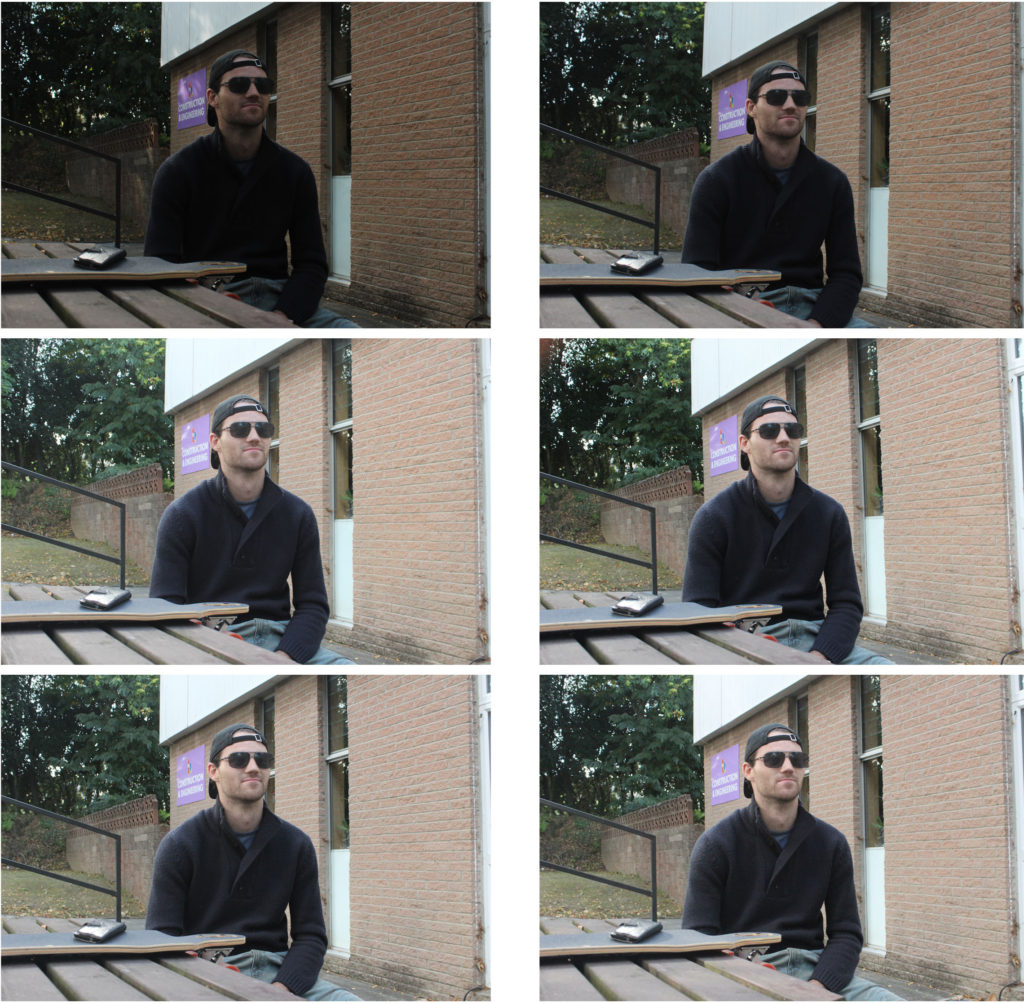
Examples of my experiment in outdoor lighting:

Settings: 200, 5.6 ISO 100-6400

As shown in these frames as the ISO increases with each image the quality of the picture is reduced and seems more pixelated, this is often referred to as ‘noise’.  Changes in ISO can allow photos to look more natural and visible, however the negative effect of a high ISO can sometimes defeat the object of changing the ISO.

However many photographers have used a high ISO  to their images on purpose, in order to create the grainy effect.

Experiment – White Balance

White Balance:

White balance just means adjusting colours so that the image looks more natural. We go through the process of adjusting colours  to get rid of colour casts in order to match the image to what we saw while capturing the frame. Factors such as sunlight, lightbulbs and flashlights do not emit purely white light and have a certain ‘colour temperature’. This can cause parts of images to appear different colours on camera than what the eye sees.

In a non digital way this can be demonstrated with the use of tinted glasses or goggles. For example if you are skiing with yellow tinted goggles on, the snow will look yellowish. However, after you ski for a little bit, your eyes and your brain will adjust for the colour and the snow should look white again. When you take off your ski goggles after skiing, the snow will look bluish in colour rather than pure white for a little bit, until your brain adjusts the colours back to normal again. This is done automatically for us. The white balance setting on a camera is just the manual version of this.

Examples of my experiment in outdoor lighting:

Setting – 1/4000, f5.6, ISO 400

Examples of my experiment in indoor lighting:

Setting – 1/30, f5.6, ISO 400

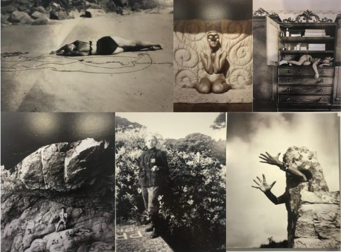
CCA Galleries: Claude Cahun and Clare Rae Exhibition

Claude Cahun:

Claude Cahun is a French-Jewish photographer that grew up in Nates (western France) with her mother but ended up living with her grandmother after at a young age, Cahun’s mother, Mary-Antoinette Courbebaisse, was institutionalised. Cahun faced anti-semitism at her high school in Nates, therefor she joined a private school during her time in Surrey.

Her work reflects her sexuality and ideas of gender-ambiguity. Much of her work involves self-portraits in which she usually looked directly at the viewer, showing her shaved head and shoulders, blurring an indicators of her gender.


Clare Rae:

Clare Rae is an artist based in Melbourne (Australia). In her photos she explores ideas of performance and gesture. A lot of her work is informed by feminist theory and usually presents an alternate experience of subjectivity and the female body.

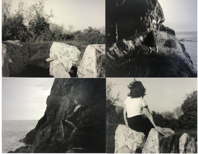
Her work, a response to the earlier work of Claude Cahun, is defined by the main aspect of all the frames being of the artists body. Clare Rae understood that Cahun produced many intimate photographs in Jersey. Rae followed in this aspect by depicting her body in many of the photos, utilising gesture and the performing body to contrast traditional representations of the female figure and attract the male eye to the landscape rather than the body.

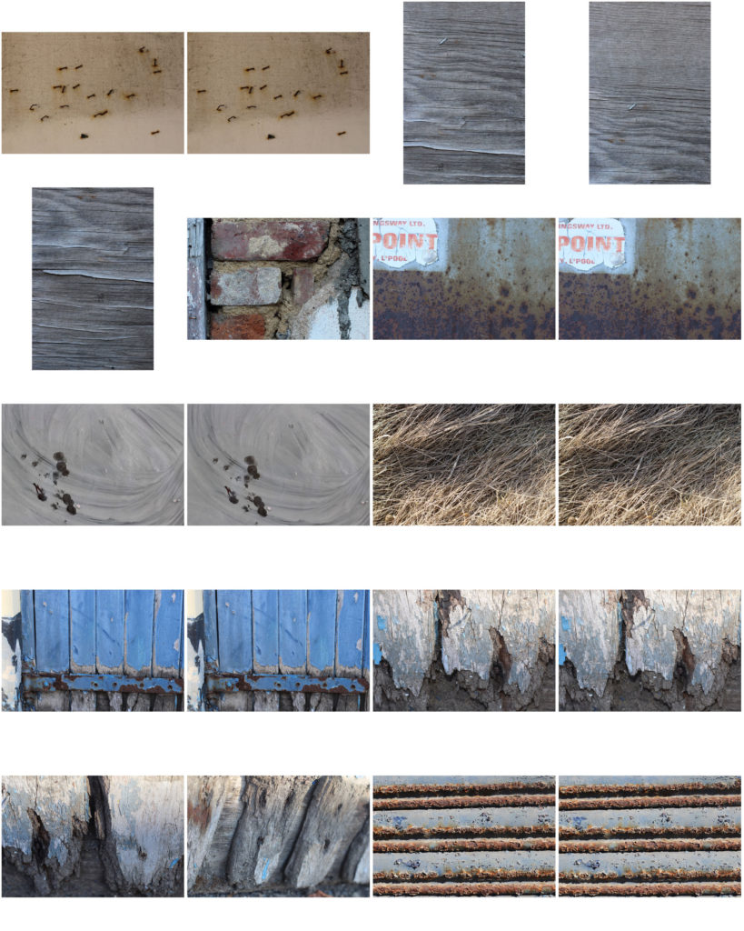
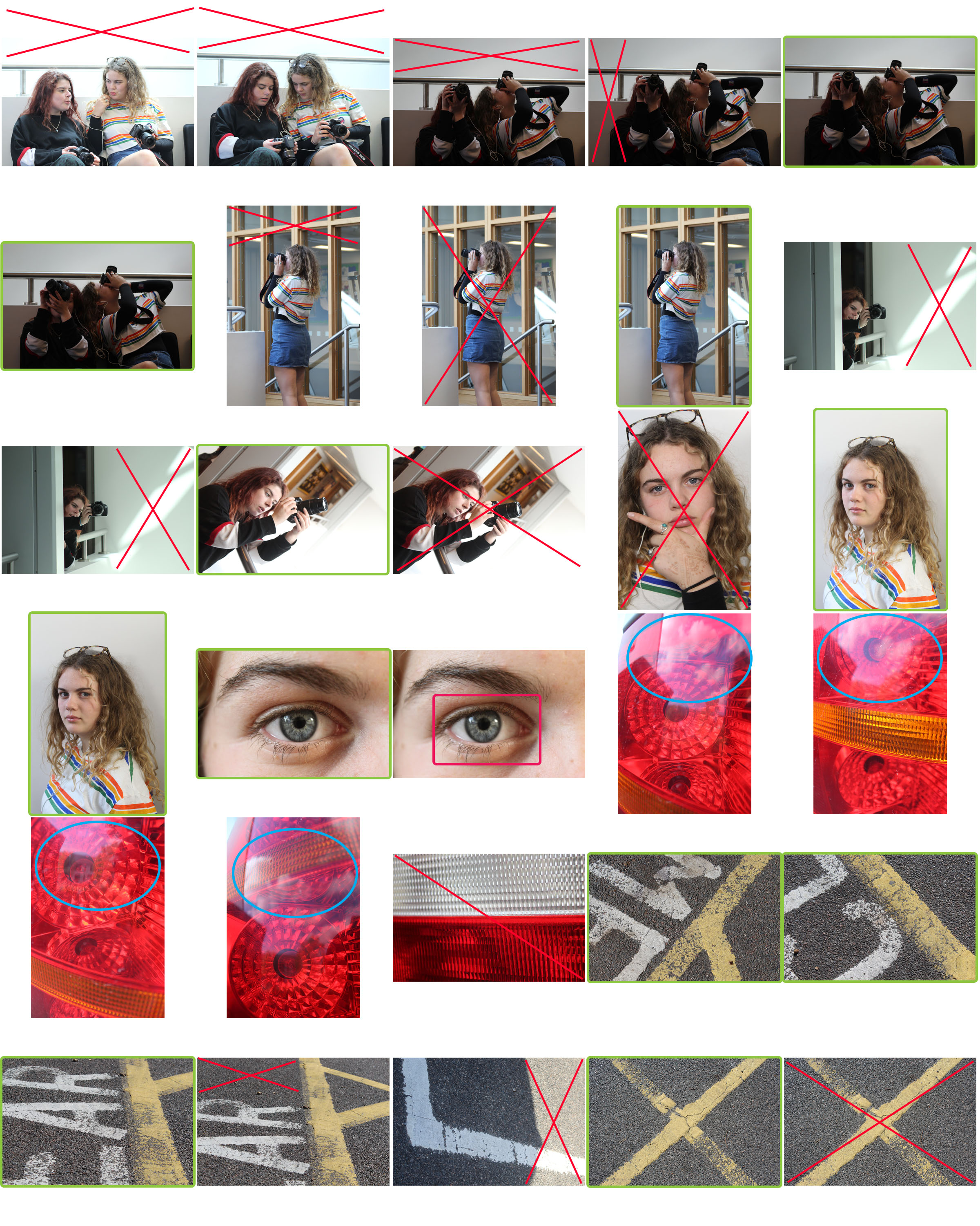
Contact Sheet

The meaning of each colour is:

Red:  Indicates a photo or area I dislike. I would either discard the photo or crop the red areas to enhance the focal points of each frame.

Green:  Indicates a composition that I am pleased with and would go on to edit to further improve the image.

Blue:  Shows an area where there is an area of overexposure in the frame.

Pink:  Shows an area that is out of focus where this was not my aim.