All posts by Talal B

Filters

Author:
Category:

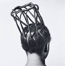
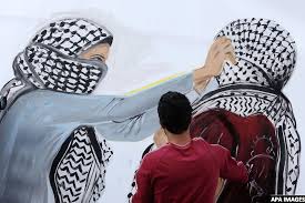
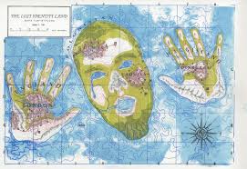
Place and Identity-Mock 2019

Place identity or place-based identity refers to a cluster of ideas about place and identity in the fields of geography, urban planning, urban design, landscape architecture, environmental psychology, ecocriticism and urban sociology/ecological sociology.
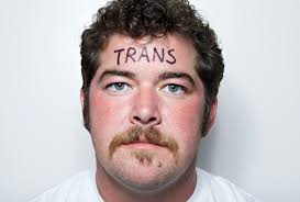
The bonds between place and identity can influence social formations, cultural practices, and political actions. Place identity is a core concept in the field of environmental psychology which proposes that identities form in relation to environments.
Cultural identity is the identity or feeling of belonging to a group. It is part of a person’s self-conception and self-perception and is related to nationality, ethnicity, religion, social class, generation, locality or any kind of social group that has its own distinct culture.
Image result for cultural identity
Gender identity is the personal sense of one’s own gender. Gender identity can correlate with assigned sex at birth, or can differ from it. All societies have a set of gender categories that can serve as the basis of the formation of a person’s social identity in relation to other members of society.
Image result for gender identity photography
Social identity is a person’s sense of who they are based on their group membership. (e.g. social class, family, football team etc.) which people belonged to were an important source of pride and self-esteem.
Image result for social identity photography
The term identity politics refers to political positions based on the interests and perspectives of social groups with which people identify. Identity politics includes the ways in which people’s politics are shaped by aspects of their identity through loosely correlated social organizations.Image result for political identity photography
    Geographical identity is An individual or group’s sense of attachment to the country, region, city, or village in which they live. And the key characteristics with which a particular country, region, city, or village is associated.
Image result for geographical identity
    Loss of identity may follow all sorts of change; changes in the workplace, loss of a job or profession, loss of a role that once defined us, as a child, as a parent, as a spouse. When we lose our identity and sense of self, we are likely to seek our sense of self-worth from others.
Image result for loss of identity
how is identity influenced by “place” or belonging, your environment or upbringing:
A persons identity is built through the time they grow up, along the journey of life, but it is influenced by the place they were brought up in. Cultural identity depends on the place and family the person was grown up in. for example i was grown up in and Arabic country since i was young but then before becoming an adult i got sent to England due to the better education, but that just lead me to lack of identity and place, the mixing of two cultures and the movement between them just makes a person lost as they would be someone in a culture and a someone else in another culture as it becomes really confusing so the person will feel lost as they are not sure who exactly are they due to having two personalities and different behaviors depending on the surroundings and culture.
Being brought up by two different cultures is really rare and i would say hard as each culture has its own way of bringing up there children and each culture has a different mind set in addition to a different way of thinking. I was born in Jordan, Middle East and was raised up by a Muslim family following Muslim traditions then i was sent to live with my other family which is Christian and continued growing up there following Christian characteristics.
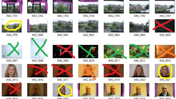
mind map:
purple: unwanted areas
red: too dim
green: other subjects
yellow: good photographs
orange: wrong timing
photographers i feel explore identity as a theme:
  1. Sam Contis
  2. Andrzej Steinbach
  3. Paul Mpagi Sepuya
  4. Sofia Borges
  5. Shilpa Gupta

case study 1:

Sam Contis

Image result for sam contis about

Sam Contis lives and works in California. Her work has been shown internationally with recent exhibitions in Los Angeles, Amsterdam, Antwerp, and London, and solo shows at the Berkeley Art Museum and Pacific Film Archive and Klaus von Nichtssagend Gallery in New York. She is a recipient of the 2017 Nancy Graves Foundation Artist Grant, 2016 Aaron Siskind Foundation Fellowship, and the Tierney Fellowship. Contis’s work is represented in the collections of the Los Angeles County Museum of Art, the Yale University Art Gallery, and the Whitney Museum of American Art. Deep Springs, her first book, was recently published by MACK. In 2018, her work will be on view in “Being: New Photography” at the Museum of Modern Art in New York.

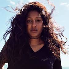
This is my favorite work made by Sam Contis. it is in black and white,it shows two men that look young wearing different clothes and what seems to be that one of them is giving the other one a hair cut.
case study 2:
Sonal Kantaria
Image result for sonal kantaria

Sonal Kantaria is a visual artist and academic based in London and holds a Masters in Photojournalism from the University of Westminster, UK. She is currently undertaking a PhD in Film Studies at King’s College London.

Her work has been exhibited extensively both in the UK and internationally. Her film and photographic project Naseeb: Traffickedwas shown as a solo exhibition both at the Perth Centre for Photography (2013) and by at Next Level Projects in London and presented by Autograph ABP (2012). The work was also selected and exhibited by the Photographers Gallery London for FreshFacedandWildEyed11.

In 2011 she was the finalist in the Julia Cameron Awards and a nominee for Magenta Flash Forward 2012. Sonal has completed an artist residency at the Perth Institute for Contemporary Art (PICA) (2015), Perth Centre for Photography in Australia (2013) and an artist residency with the City of Greater Geraldton in Western Australia (2014).

Aboriginal teenagers

In March 2014 I was commissioned as a community artist by DADAA as part of FIVE Geraldon a collaboration between DADAA and Rio Tinto. In collaboration with the Geraldton Streetwork Aboriginal Corporation (an organisation that brings about cultural awareness to young people) she designed and facilitated a photography workshop series with young people, aged 14-16 years. The workshops explored Aboriginal peoples connection to land, a cultural facet which resonated with the young people. The series culminated in an outdoor exhibition of young people’s work curated by myself. The opportunity for the young people to exhibit their own work was both empowering and significant in building their confidence.

Image result for aboriginal teenagers sonal

Image result for aboriginal teenagers sonal

Image result for aboriginal teenagers sonal

Image result for aboriginal teenagers sonal

Sonal’s photographs inspired me to try to produce photographs similar to hers.
Experimenting to stimulate Sonal’s work: 
I tried to stimulate Sonal’s work, so i went to my photography class an burrowed a camera, then i went around the school to find the best model to fit this project and i met a student that has just come over from Switzerland. and i thought he fits this project because he is a foreigner and looks back to his country everyday. so i photographed him and this is the steps i made:

1.   I spoke to him about his identity placement and this is what he  told me “sometimes i look in the mirror and i don’t even know who am i exactly. and he explained to me that this is due to the continuous movement between the two cultures which are English and Swiss

2.  Secondly i photographed him with my camera at a fast shutter speed with florescent shutter speed and while on manual mode. i used the day light coming from the window as it was a cloudy day and that means the light was diffused which produces a good portarait and mixed it with the florescent light from the class rooms lighting system.

3.   I created a mood board  and chose my final image then installed it on to Photoshop cc.

4.   I researched photographs of Switzerland and used the best one as my background as i don’t have any access to take photographs of Switzerland, so i cropped my portrait and added it on top of the landscape photo as a normal layer.

5.   Then i decreased the opacity of the portrait to when its just about right.

6.   Lastly i used the eraser with low opacity to soften the edges of the photograph and blend it in with the photograph.
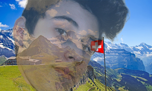
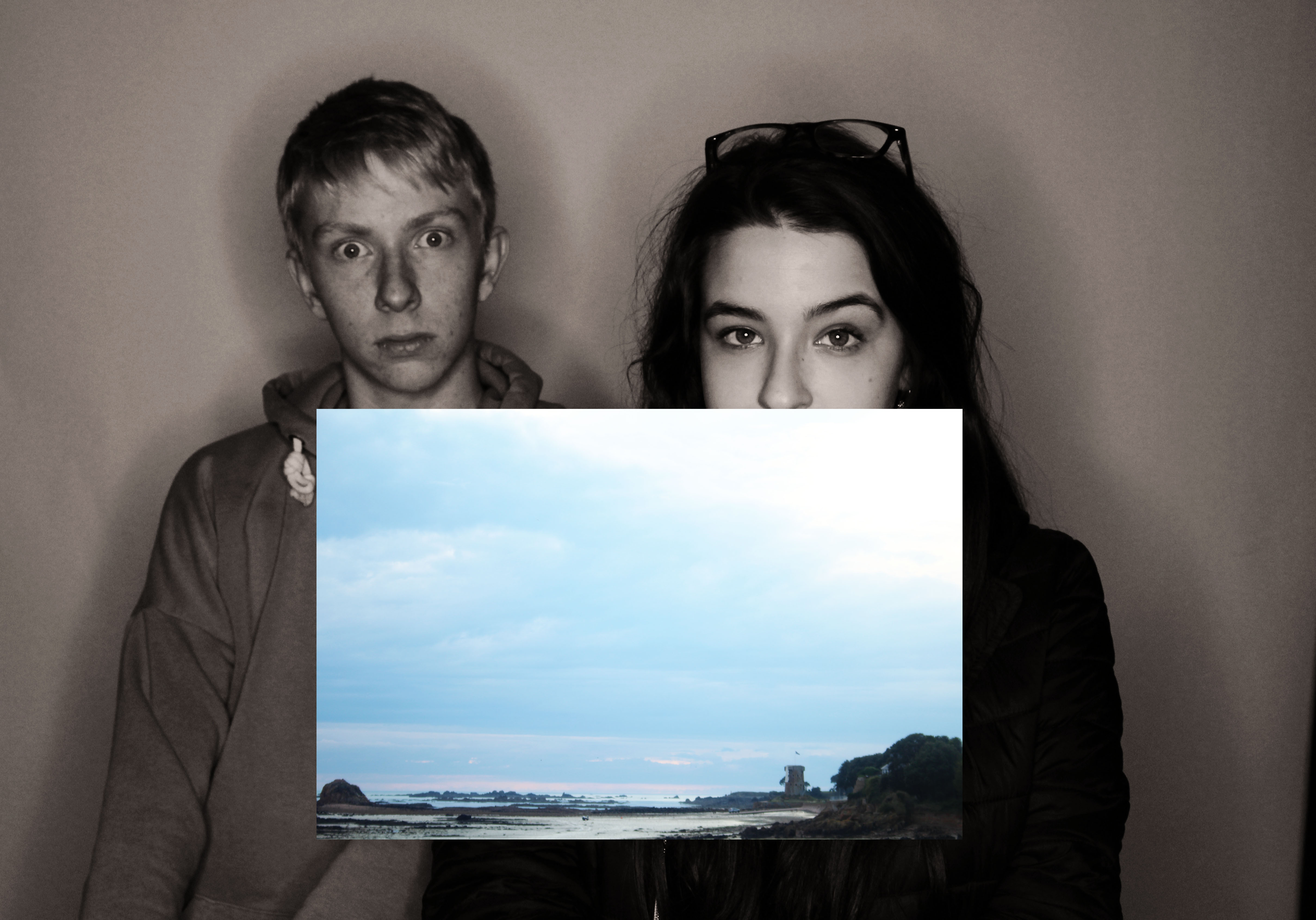
and this was my final result:

The reason i created this photograph was to show how this foreign student looks back at his country at all times but cant due to current situation so he is currently lacking identity and that’s what happens when people migrate to other countries.
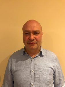
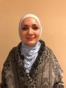
Personal lack of identity  and cultural identity project:
i wanted to become a feature of my work as i am a good example for this kind of project and the current situation i’m in. i also decided to point the camera at my self during this project.
 i began of by photographing both my families, the christian part of my family that i’m living with right now in England, and the Muslim part of my family that brought me up.
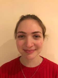
So used photographs i took of my Arabic family in 2018 when we went to our second house in Turkey. i took these photographs using my phone and i asked them not to smile although some of them didnt manage to do that. and i also asked them to lay back on the plain wall and just be themselves and wear the clothes they normaly are wearing to show the diffrence in culture and religion and these were my results:
this is my Muslim family, it just consists of my father, mother, and two sisters.
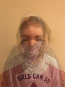
i wanted to combine this project with the photo montage project so i tried producing two results from these four photos and these were my results:

in this piece i just added all the photographs with my father in the background with 100% opacity because hes the oldest and hes normally in charge. then i added my mother’s photograph on top it with around 70% opacity because shes the youngest of my parents, after that i added my older sister’s photograph with 50% opacity as shes the oldest sibling, and finally i added my youngest sister’s photograph with only 30% opacity as shes the youngest in the family. And the result was this image of all my family in one photograph and they are in order of oldest and most in charge to the youngest.
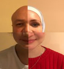
So in this piece or pieces i chose a part of each one of my family member’s face and combined them all to one piece. i chose my dads right eye to show the seriousness in his look and this is the way he looks at me as if im a grown up due to my ability to migrate alone at a young age. then i chose my mothers left eye to show how she looks at me and sees her young kid travelling between all these country’s alone and lost but still looks at me in a way that shows how much shes suffering due to the sacrifice she made which was being with her son just for the sake of him having a better future. and lastly i combined both my sisters smiles to create one big smile and thatisthe thing keeping me going. they just always smile at me to give me motivation to go through all the rough times. Although the piece is in bad quality and thats because the photographs were taken using a phone so they’re in a different file format and when i transferred them to the computer they were in a small format so i had to maximize there size which made the pixels bigger and that resulted in a bad quality photograph.

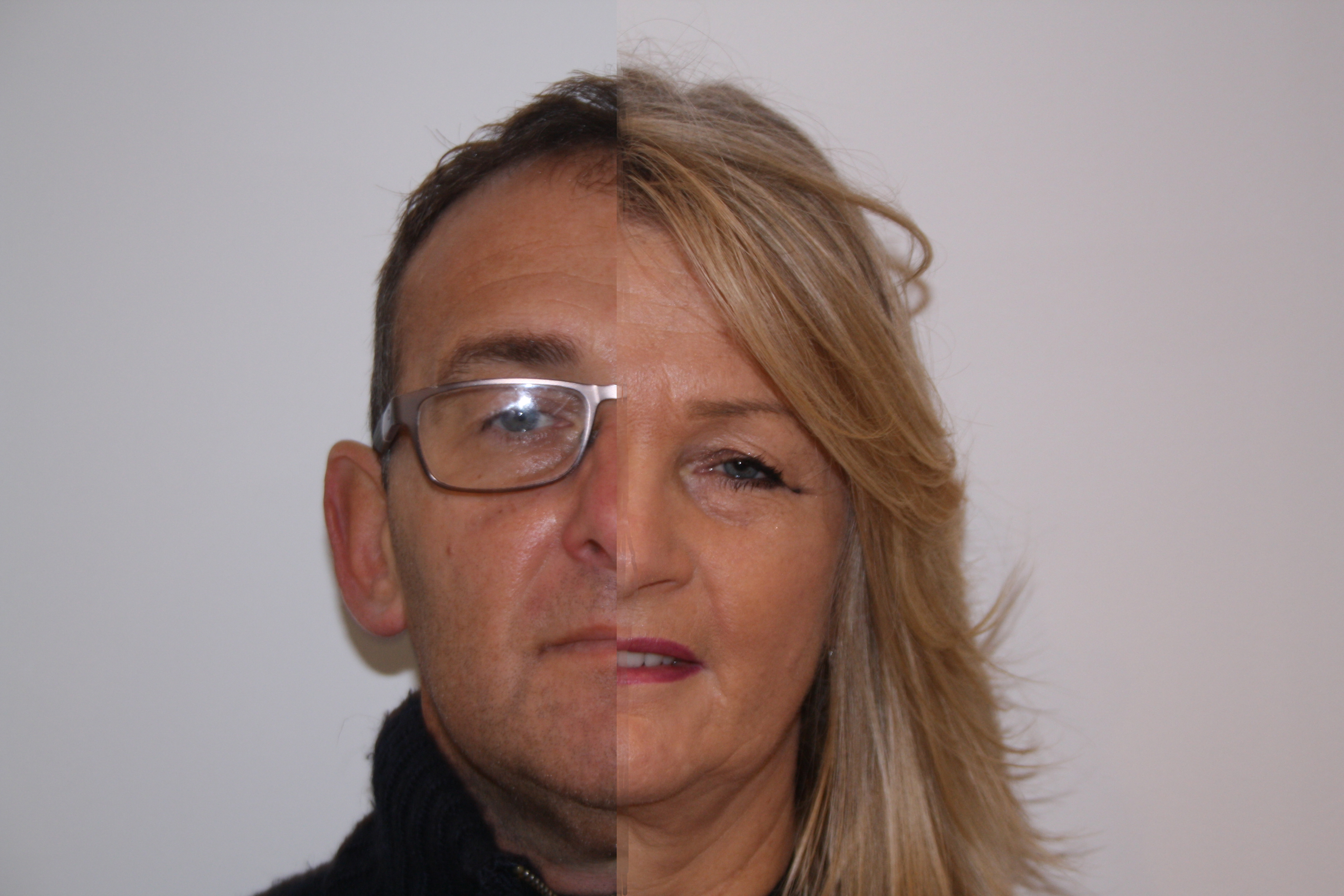
My second part of the project was taking two photographs of both my grandmother and her partner and they are the christian part of my family that im living with right now. so i asked them to both to lay back against the white wall and pretend as if its a passport photograph and these were the results:
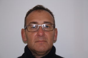
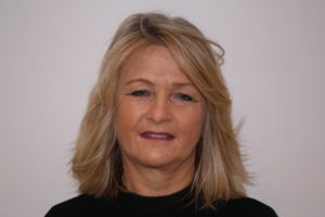
I had to take these photographs right before the exam as they wouldn’t let me photograph them in there natural appearance and kept delaying just to get ready. and that is one thing i noticed about the difference between the two cultures, English people don’t like to show there pain, suffering, or any personal problems; meanwhile Arabic people or at least my family don’t usually hide there pain or personal problems and are more open minded about it so they would let me photograph them whenever and wherever, unlike my christian family. and unfortunately my grandmother’s partner didn’t accept taking off his glasses as he “wouldn’t look good”, so that made the flash reflect from his glasses. so i tried to combine both photographs into one photo montage piece and that’s what i came up with:
personal view of difference between living in Jordan and the UK:

living between these two places really plays with your head and changes the way you see and think about stuff. but the biggest difference i have noticed about my self is that i got fat here in England, i’m not sure why exactly that is but probably because Jordan used to provide a good sports system and if a person was good at a certain sport they pay him for practicing it and i was good at cycling so i was in the Jordanian Olympic team and one several medals among playing against Arabic and bordering countries and i used to get payed for it so i practiced it a lot meanwhile in England i’m not doing much sports and eating a lot due to stress and that’s why i gained weight. to provide evidence for that i used two pictures, one was taken of my back in my homeland and the second one was taken of me in my current environment and these where the results:
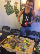
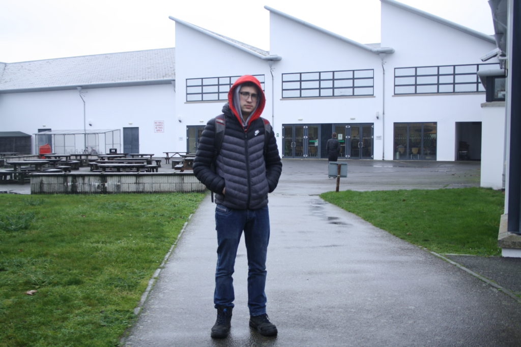
The first portrait is of me two days before i moved to England, showing how healthy and skinny i was, meanwhile in the second one you can see how much i have gained weight. the first one was taken in the 30th of July during my birthday, while the second one was taken right before my mock exam to show exactly where i am at right now. in the first photograph my friends took of me because i had a unique expression on my face looking at that dish of ‘Mansaf’ the Jordanian traditional dish also my favorite dish. and i asked for it instead of a birthday cake due to how much i like it. and that look on my face basically means “i cant wait to put you in my belly”. Also you can notice the difference in the style of clothing between the two portraits, in the first one i was wearing a tank top in addition to shorts and that’s due to the climate there being very warm and humid, plus in that culture no one really cares what are you wearing so you wont find much people wearing formal clothes a most times; meanwhile in England you can see how different the style of clothing there is, first of i was wearing boots due to the rain with multiple hoodies and a puffer jacket, and lastly some jeans. i am wearing that type of clothes because of how cold and rainy it is, plus in England people normally wear normal to casual clothes at most times. lastly you can see the difference in the color of my skin being darker in Jordan due to the amount of sunlight i get exposed to there.                               The first photo was taken in my fathers restaurant using a mobile phone, while the second one was taken at my school using the school’s camera.

I also wanted to show the difference in the geographical characteristics between Jordan and England, because the geography of the place your living in plays a big role in your geographical identity.

In order to do that i took two photographs showing the view from both my rooms, the one in Jordan and the room in England and compare them with each other, so this is what i came up with:
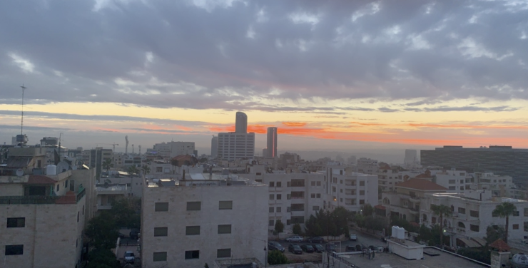
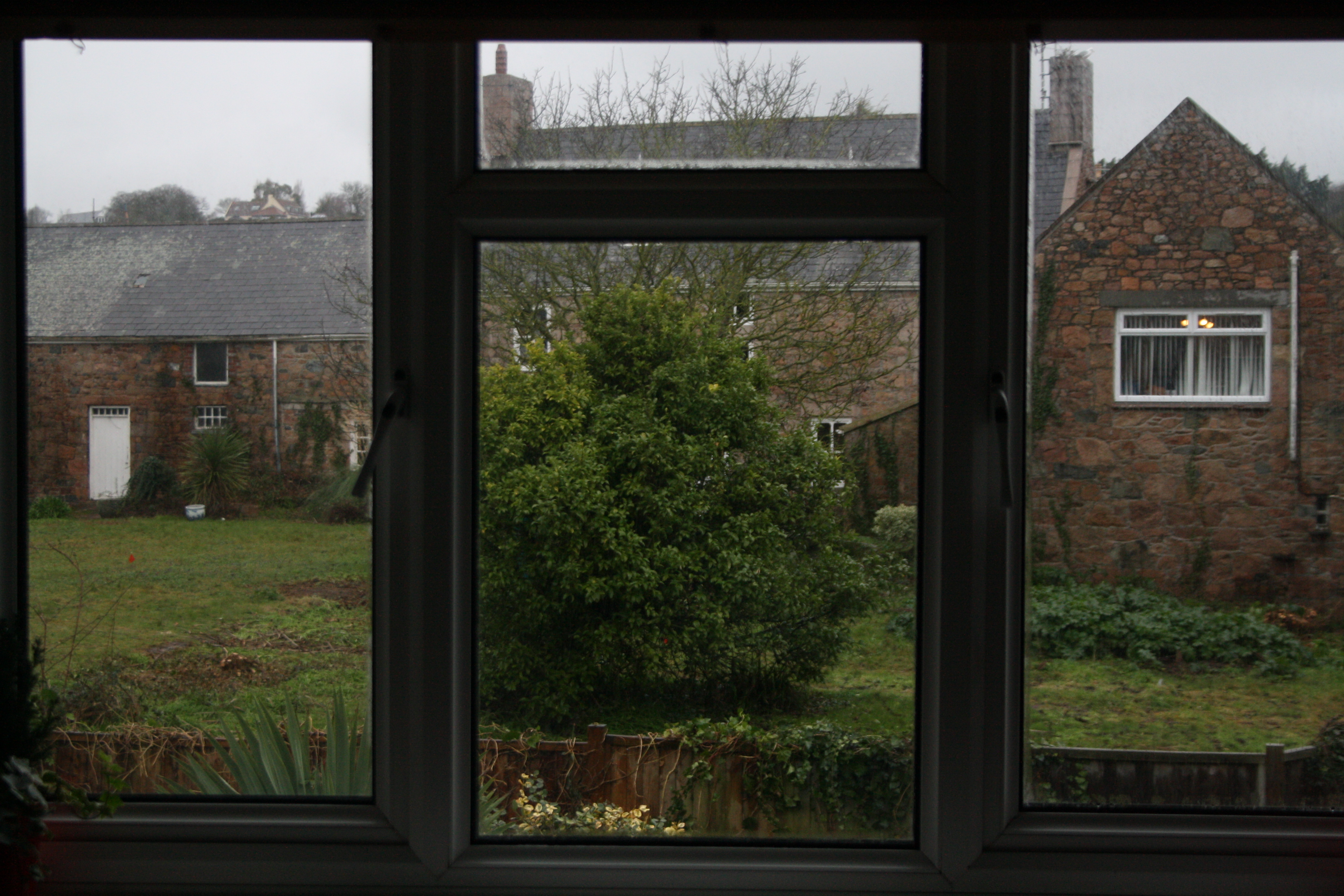
You can see the difference between the geography of |Jordan and England, in England all i can see from my room is just the house behind us and the small backyard with a pale sky that you cant see due to the amount of clouds in England but it has some greenery and that’s something less common in Jordan. while in the photograph of the view from my room in Jordan you can see beautiful colorful skies with a lot of building and that’s due to the big size of the population in Jordan comparing to Jersey. i took the first photograph using my phone when i went back to Jordan during Christmas 2018. and the second one was taken using the school’s camera 2 days before my mock exam.

The last way to show the difference of the geography of both countries is by comparing two photographs taken from the plane in both England and Jordan and these were the results:
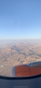
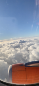
So the photograph on the right is a planes eye view of England from the window and you can see that its pretty much just clouds while in the photograph on the left its when i arrived Jordan in the same plane and its the bird’s eye view of Jordan and you can see that it’s pretty much just a desert but that’s the area that is uninhabited. both photographs were taken in December 2018 using my mobile phone.


Conclusion

So you can see now how much a person’s identity can be influenced by “place”, or belonging, tour environment or upbringing.


Street Photography

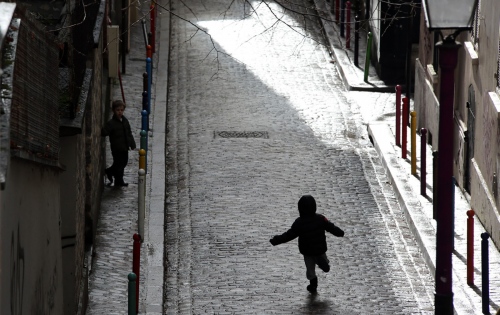
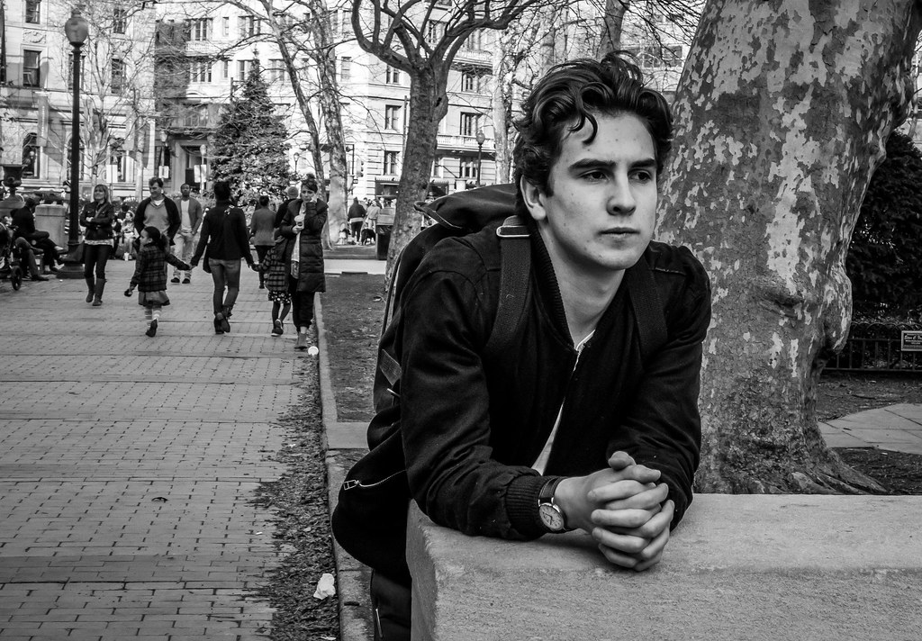
Street photography, also sometimes called candid photography, is photography conducted for art or enquiry that features unmediated chance encounters and random incidents within public places. Although there is a difference between street and candid photography, it is usually subtle with most street photography being candid in nature and some candid photography being classifiable as street photography. Street photography does not necessitate the presence of a street or even the urban environment. Though people usually feature directly, street photography might be absent of people and can be of an object or environment where the image projects a decidedly human character in facsimile or aesthetic.

Image result for absent of people street photography  Image result for absent of people street photography

The photographer is an armed version of the solitary walker reconnoitering, stalking, cruising the urban inferno, the voyeuristic stroller who discovers the city as a landscape of voluptuous extremes. Adept of the joys of watching, connoisseur of empathy, the flâneur finds the world “picturesque”.


The street photographer can be seen as an extension of the flâneur, an observer of the streets (who was often a writer or artist).


Framing and timing can be key aspects of the craft with the aim of some street photography being to create images at a decisive or poignant moment.Image result for framing street photography

Street photography can focus on people and their behavior in public, thereby also recording people’s history. This motivation entails having also to navigate or negotiate changing expectations and laws of privacy, security and property. In this respect the street photographer is similar to social documentary photographers or photojournalists who also work in public places, but with the aim of capturing newsworthy events; any of these photographers’ images may capture people and property visible within or from public places. The existence of services like Google Street View, recording public space at a massive scale, and the burgeoning trend of self-photography (selfies), further complicate ethical issues reflected in attitudes to street photography.Image result for ethical issues street photography

Much of what is regarded, stylistically and subjectively, as definitive street photography was made in the era spanning the end of the 19th century through to the late 1970s, a period which saw the emergence of portable cameras that enabled candid photography in public places.

experimenting with street photography:

as i was not able to go to town with the class i burrowed a camera from school and went to the schools street and starting taking pictures of people passing through the street while to trying to surprise them to get good reactions in the photographs, and this is what i came up with with:

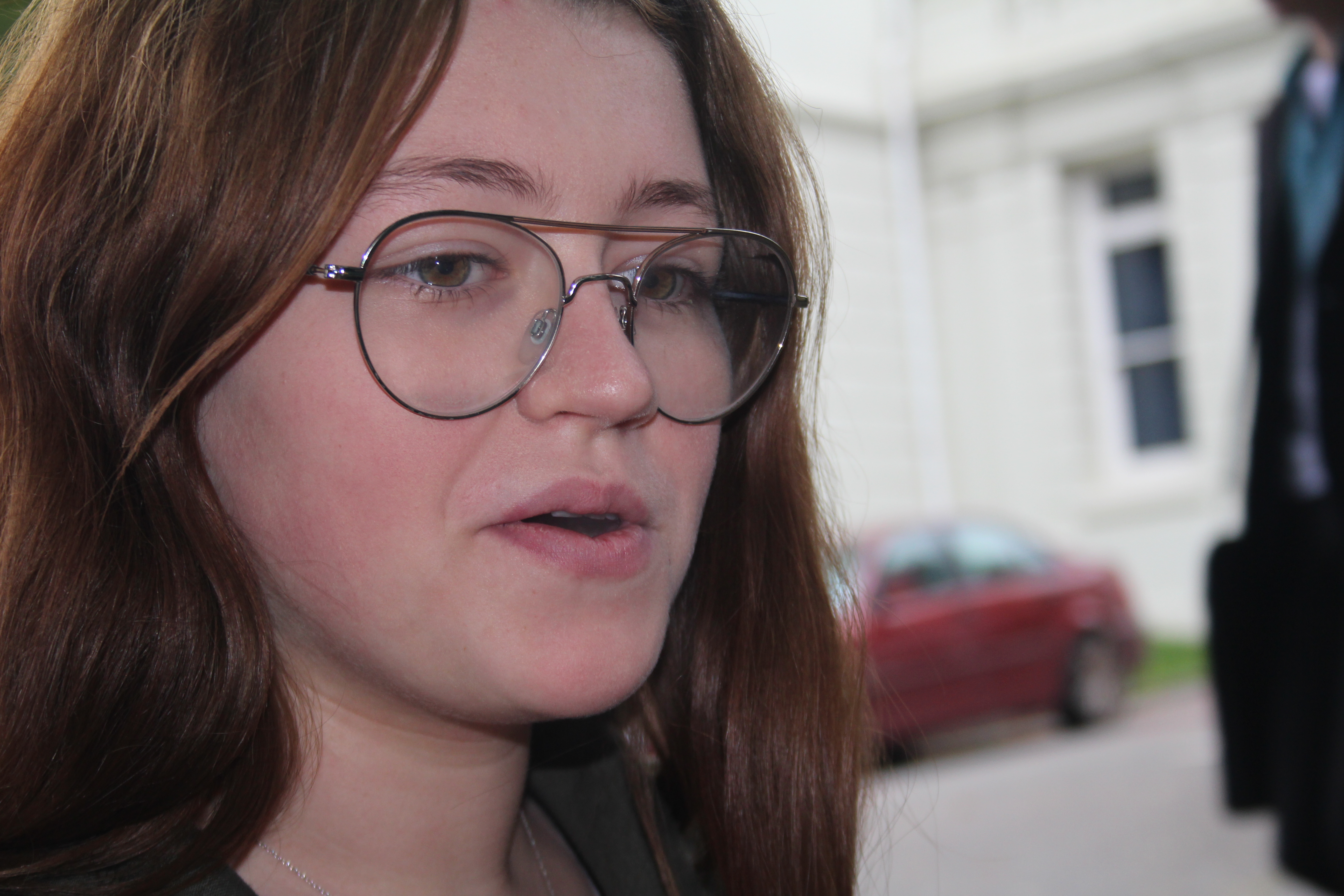
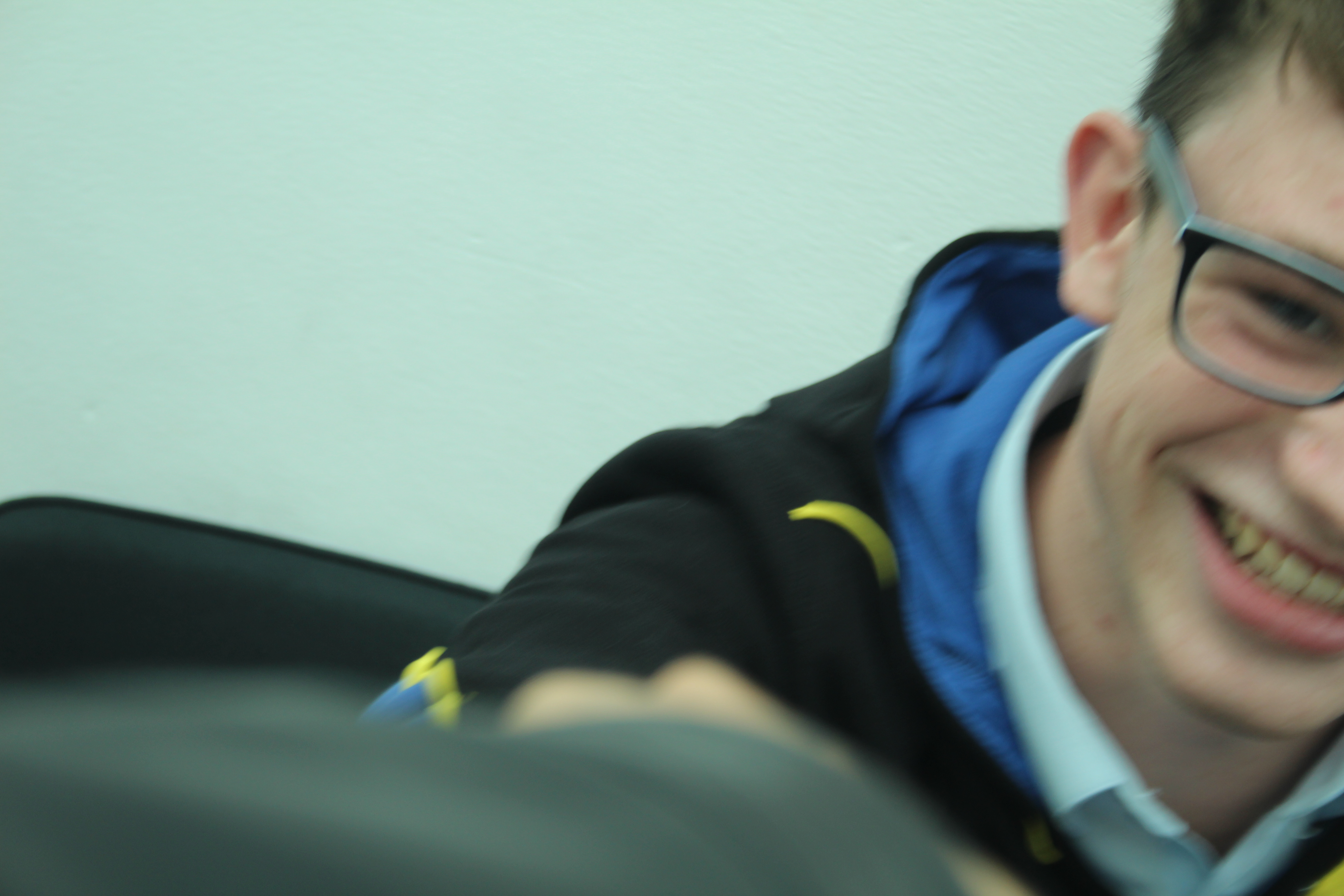
In this photograph i took it without letting the person realize so i had to turn off the flash and that’s why the photograph is a bit dim, although the face expression of this student is quite interesting.

I took this photograph partially by mistake, this person was passing bu and my camera wasn’t setup yet so i didn’t know what the settings was on but i took it quickly anyways and while going through my photos it caught my eye. the brightness is so high and it wasn’t focused. and i didn’t adjust the white balance, but it did turn out quite interesting.

I tried to take this photograph without the persons notice but seconds before the shutter closed he looked and laughed, this made him look as if he was smiling for the camera although the photograph is very dim and that’s due to the lack of flash.

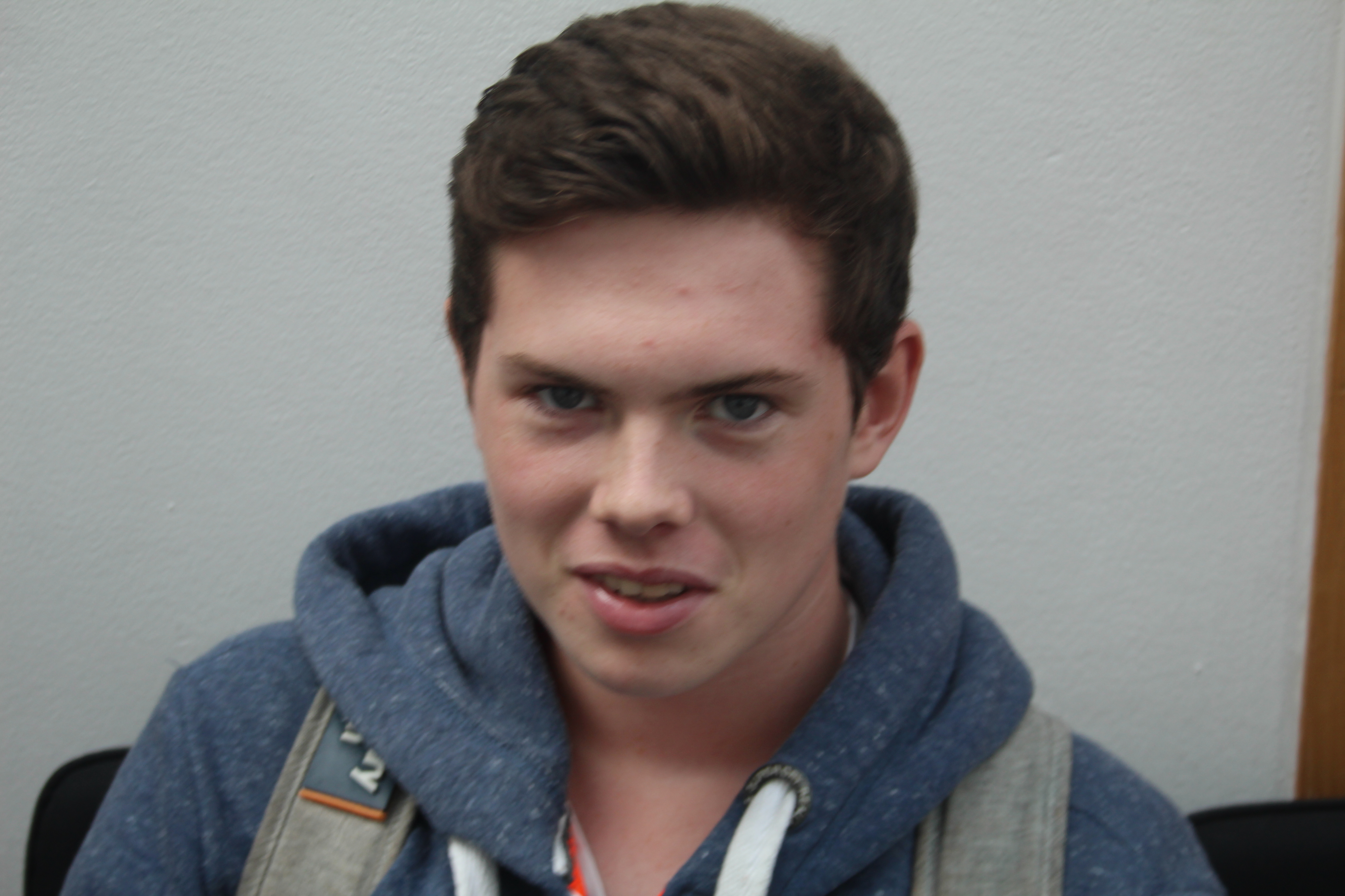
i took this photograph while the person was looking at the camera but made it quick so i wouldn’t lose his reaction. and the flash along with the fast shutter speed created a highly bright photo.

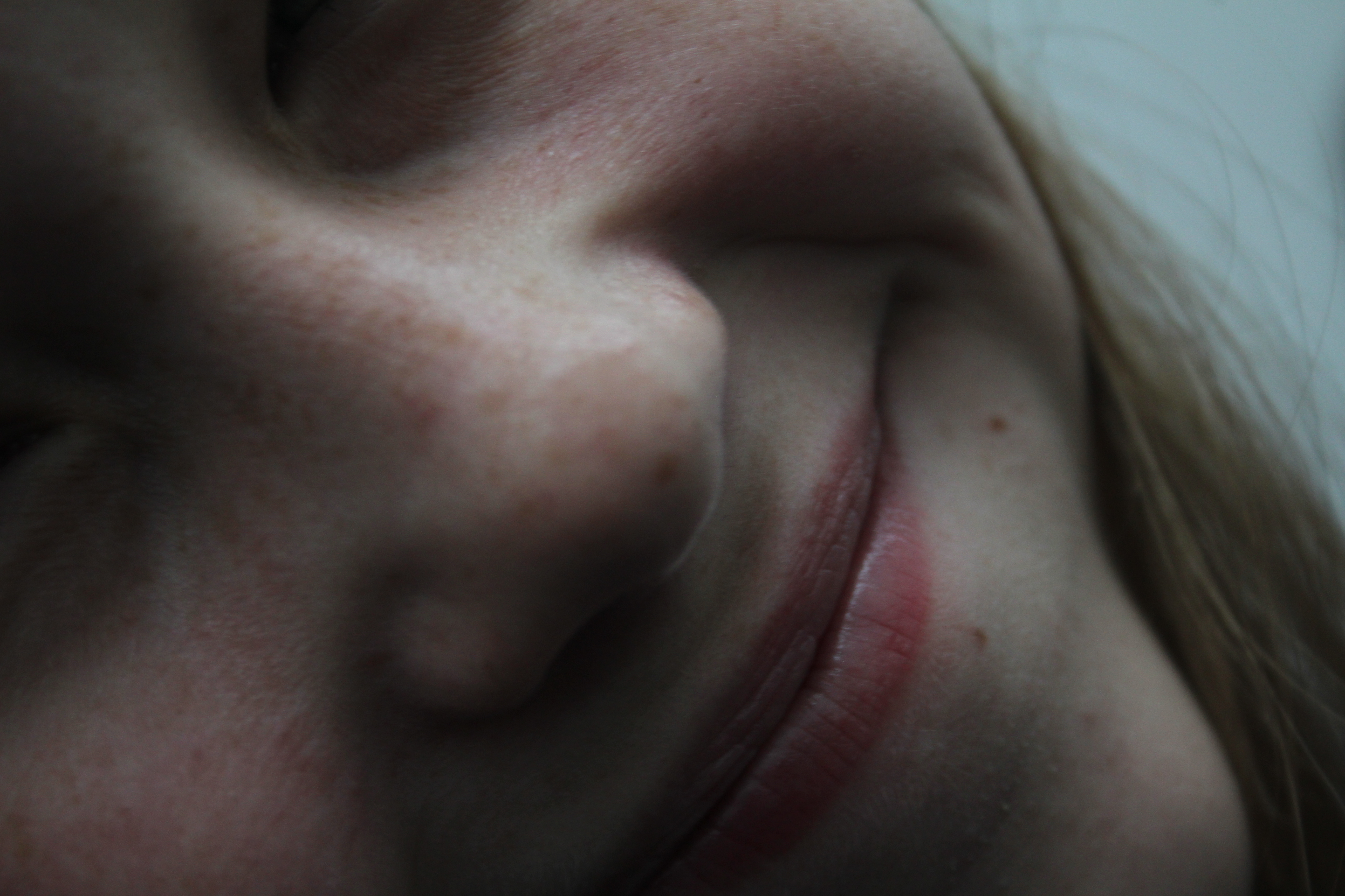
I took the photograph without flash while it was fully zoomed in so almost only her smile and nose are visible.

I took this photograph of a person in the smoking area while they were busy doing other stuff so weren’t paying attention to the camera which created a photography with an anonymous definition.

This photograph was taken so quickly that it caught the reaction of the person between changing it from one reaction to another.

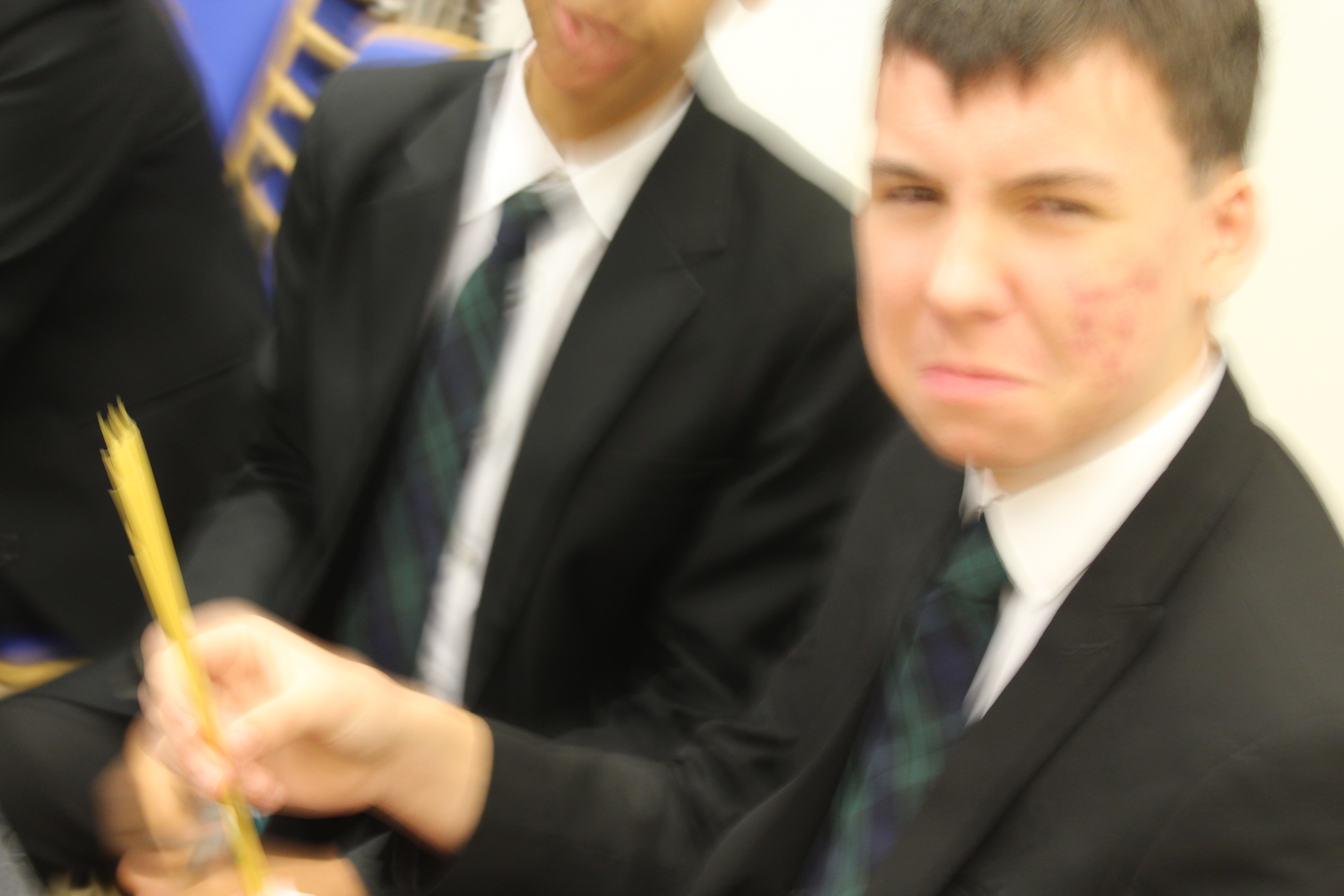
I took this photograph while this person was doing a pasta competition so they were angry that i was distracting them which created a good photo with an interesting face expression. Also the settings was on low shutter speed which created some movement in the photograph.

I took this photograph right after i told the person in it a joke so i had to take it quickly before he loses his reaction so due to the lack of time to set up the cameras position it only took half of the persons face which still created an interesting photograph so i decided to put it on my blog anyways.

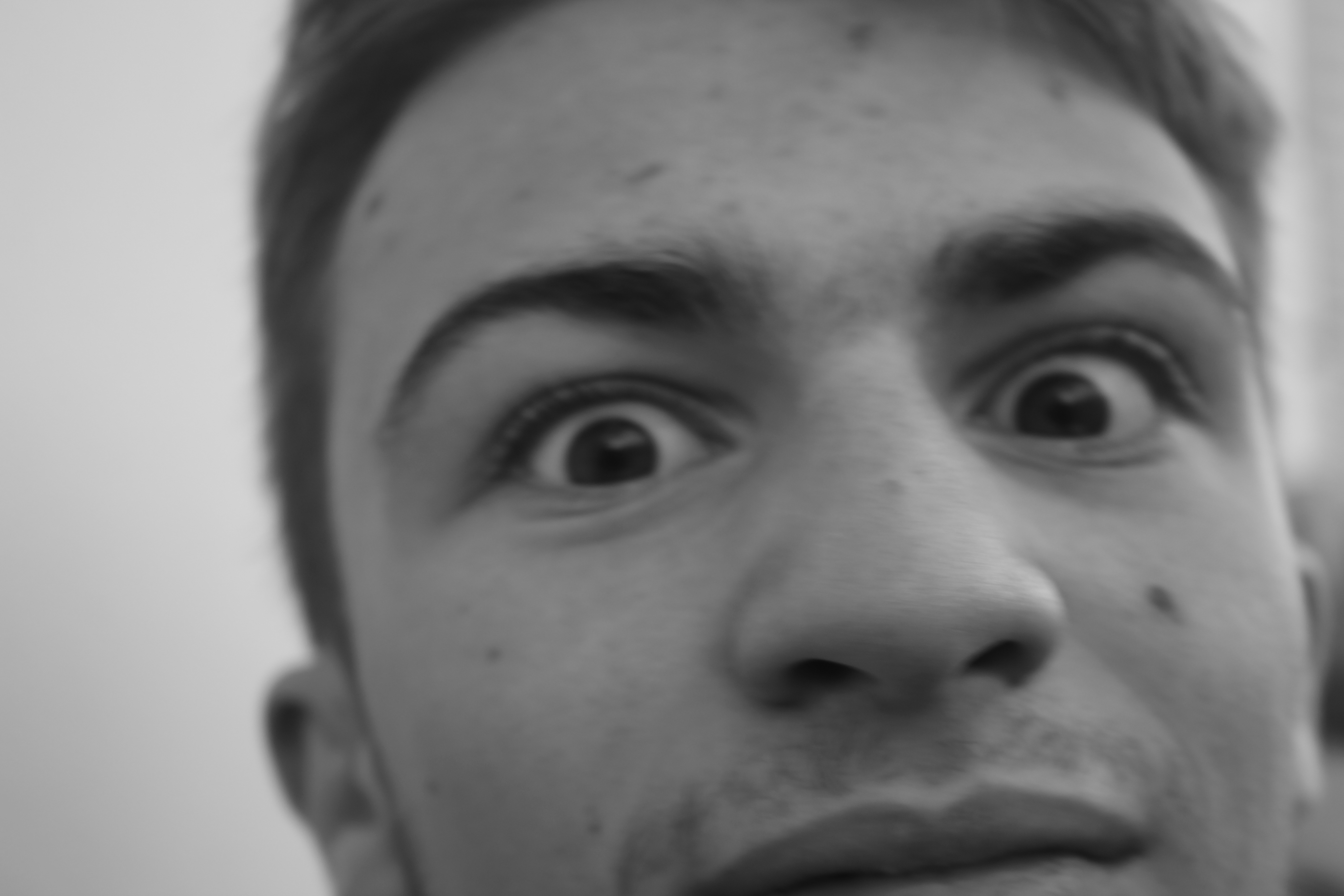
I took this photograph of this students face expression with black and white settings and no flash light.

This photograph was taken meanwhile the person was busy talking to another person.


Homework-Portraits

Portrait photography or portraiture in photography is a photograph of a person or group of people that captures the personality of the subject by using effective lighting, backdrops, and poses. A portrait picture might be artistic, or it might be clinical, as part of a medical study. Frequently, portraits are commissioned for special occasions, such as weddings or school events.Portraits can serve many purposes, from usage on a personal Web site to display in the lobby of a business.

Image result for portraits as photography

History

The relatively low cost of the daguerreotype in the middle of the 19th century and the reduced sitting time for the subject, though still much longer than now, led to a general rise in the popularity of portrait photography over painted portraiture.  The style of these early works reflected the technical challenges associated with long exposure times and the painterly aesthetic of the time. Hidden mother photography, in which portrait photographs featured young children’s mothers hidden in the frame to calm them and keep them still, arose from this difficulty. Subjects were generally seated against plain backgrounds and lit with the soft light of an overhead window and whatever else could be reflected with mirrors. Advances in photographic equipment and techniques developed, and gave photographers the ability to capture images with shorter exposure times and the making of portraits outside the studio.

Experimenting with portraits:

I experimented to take portrait photographs at school so i grabbed a camera from my class and went to the schools studio and my photography teacher was happy to help by being my model and this is what i came up with:

As you can see i crossed some pictures that are not worthy, the ones crossed with  blue color were too dark, the red ones were wrong timing and the green ones were out of focus.

Final outcomes:

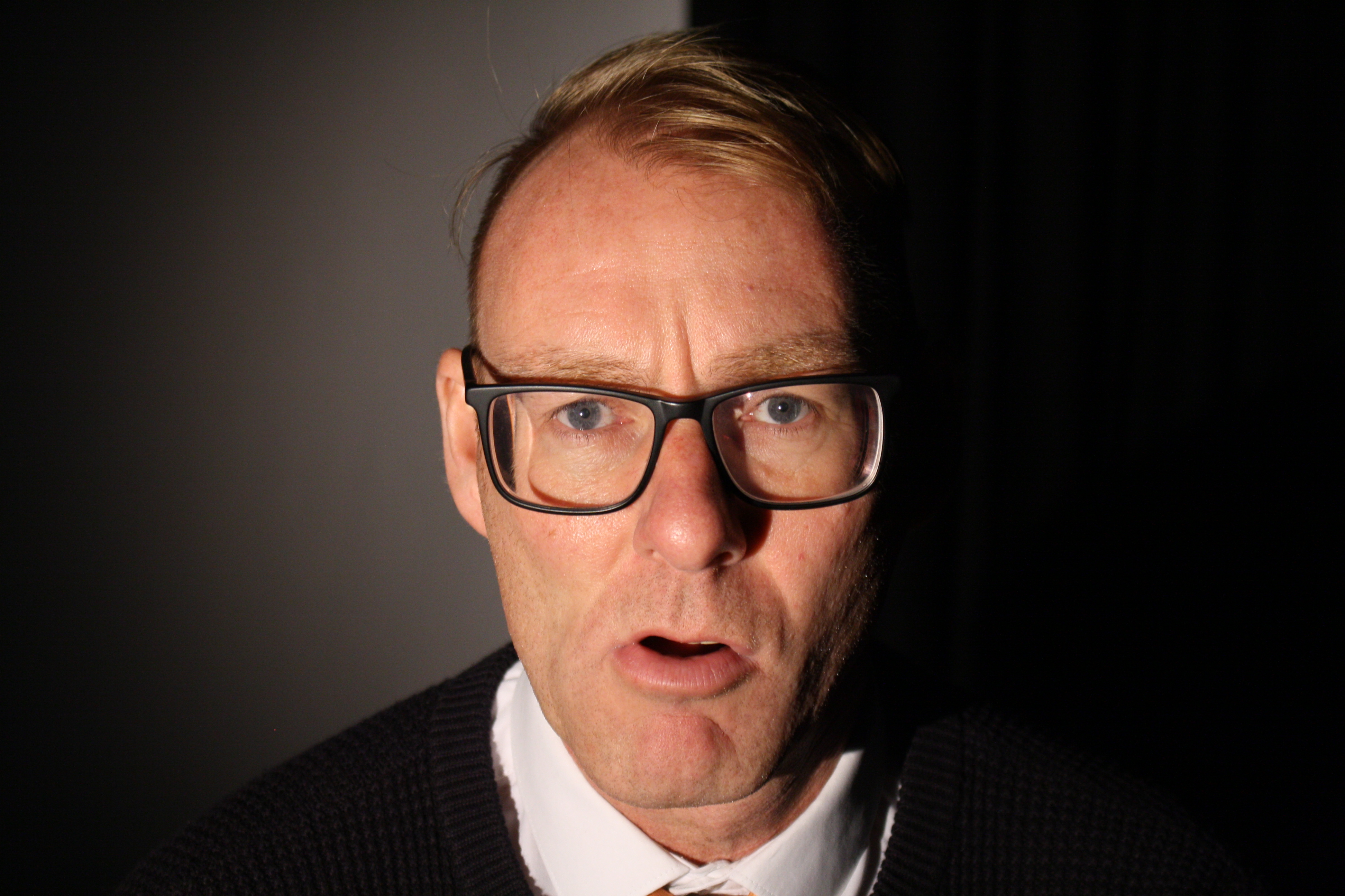
This is my favorite one because the face expression of the model gave a lot of meaning to the photograph. in this photograph it was taken inside the schools studio using a trigger flash, in which a Bluetooth device is connected on the camera and as soon as the photograph is taken it triggers the flash light its connected to.  And as you can see only the front of his face is lighten meanwhile his sides are dark and that’s because the studio room was dark and the only light was the one pointed on his face.


This is also a good photograph with a good face expression and as you can see unlike the other photo only one side of his face is dark here and that’s because an extra studio light was added pointed to the side of his face.


Identity and Place : John Stezaker Case Study

Born 1949 (age 69–70)

Worcester, England
Nationality British
Education Slade School of Art (London)
Known for Conceptual art

John Stezaker

Stezaker attended the Slade School of Art in London, artists to react against what was then the predominance of Pop art.

Solo exhibitions for Stezaker have been rare, however, in the mid-2000s, his work was rediscovered by the art market;he is now collected by several international collectors and museums.

His work is surreal in tone and is often made using collage and the appropriation of pre-existing images such as postcards, film stills, and publicity photographs. Art historian Julian Stallabrass said, “The contrast at the heart of these works [by Stezaker] is not between represented and real, but between the unknowing primitives of popular culture, and the conscious, ironic artist and viewer of post-modern images.”One work included in an exhibition at Salama-Caro Gallery, London, in 1991, depicted an image of a punch clock together with the caption “Why Spend Time on an Exhibition Like This?” Colin Gleadell wrote in The Daily Telegraph in 2007 that Stezaker “is now being hailed as a major influence on the Young British Art movement,” in reference to Young British Artists.

Until 2006, Stezaker was Senior Tutor in Critical and Historical Studies at the Royal College of Art in London.

photomontage

Photomontage is the process and the result of making a composite photograph by cutting, gluing, rearranging and overlapping two or more photographs into a new image.
his work:
Image result for john stezaker photomontage
This photograph is so interesting, i like the idea how the background is black and white while the front photo is colored. and in the back are a man in the women as if they are dreaming about the place in the front photograph and they’re living in a dark pale place while the place they’re dreaming about is so colorful.
experimenting result:
this is my photo i made by taking a photograph i took of my two class colleagues in the schools studio with ring lights and adding another layer on top of it which presents the place they live in. the background is black and white while the front layer is colored to give meaning to the photograph. also the student’s diffrent face expressions give more meaning and makes the viewer wonder whats their exact reaction to the place they’re living in.

environmental portraits-half term homework

what is an environmental portrait?

An environmental portrait is a portrait executed in the subject’s usual environment, such as in their home or workplace, and typically illuminates the subject’s life and surroundings. The term is most frequently used of a genre of photography.

Image result for environmental portrait

how to take good environmental portraits?

1.Spend time getting to know your subject

Before you select a location and start shooting, spend some time getting to know your subject. Find out where they spend their time, what the rhythm of their life is like and observing their personality. Out of this you’ll not only find appropriate locations but will begin to get a feel for the style of shots that might be appropriate and you’ll begin the process of helping your subject relax into the photo shoot. If possible it might even be helpful to accompany your subject to some possible locations to see both how they look but also how your subject behaves and interacts there.

2.Choosing a Location

Sometimes a location chooses you (it’s easy) but on other occasions you need to be quite deliberate and purposeful in making your choice (and it can take a lot of searching). When choosing your environment you ideally want to get one that:

  • says something about your subject – after all that’s what this style of photography is all about
  • adds interest to the shot – as I’ve written in previous tutorials – every element in an image can add or detract from your shots. The environment that you place your subject in needs to provide context and be interest without overwhelming the shot
  • doesn’t dominate the shot – sometimes the location can dominate the image so much that it distracts your viewer away from your main focal point (the subject). Try to avoid cluttered backgrounds (and foregrounds), colors that are too bright etc. Keep in mind that you might be able to decrease the distractions with clever use of cropping, depth of field and subject placement.


3.Posing

What sets the environmental portrait apart from candid portraits is that you post your subject (it’s a fine line and you might end up doing a bit of both in any given shoot). Don’t be afraid to direct your subject to sit, stand or act in a certain way that fits with the environment that you’re shooting in. Some of the poses might seem slightly unnatural and dramatic but it’s often these more purposely posed shots that are more dramatic and give a sense of style to your shot.

The expression on the face of your subject is also very important in environmental photography and you should consider how it fits with the overall scene. For example if you’re shooting in a formal environment it may not be appropriate to have your subject with a big cheesy smile and you might like a more somber or serious look. Again – mix it up to see what does and doesn’t work.


4.Camera Settings

There is no right or wrong way to set your camera up for an environmental portrait as it will depend completely upon the effect you’re after and the situation you’re shooting in. You might find that shooting at a smaller aperture (larger numbers) will be appropriate as it will help keep the foreground and background in focus. I generally shoot with a wider focal length in these situations also to give the environment prominence in the shot. Of course this doesn’t mean you can’t shoot more tightly cropped or with a large aperture and shallow depth of field – ultimately anything goes and you’ll probably want to mix up your shots a little.

experimenting with environmental photography:

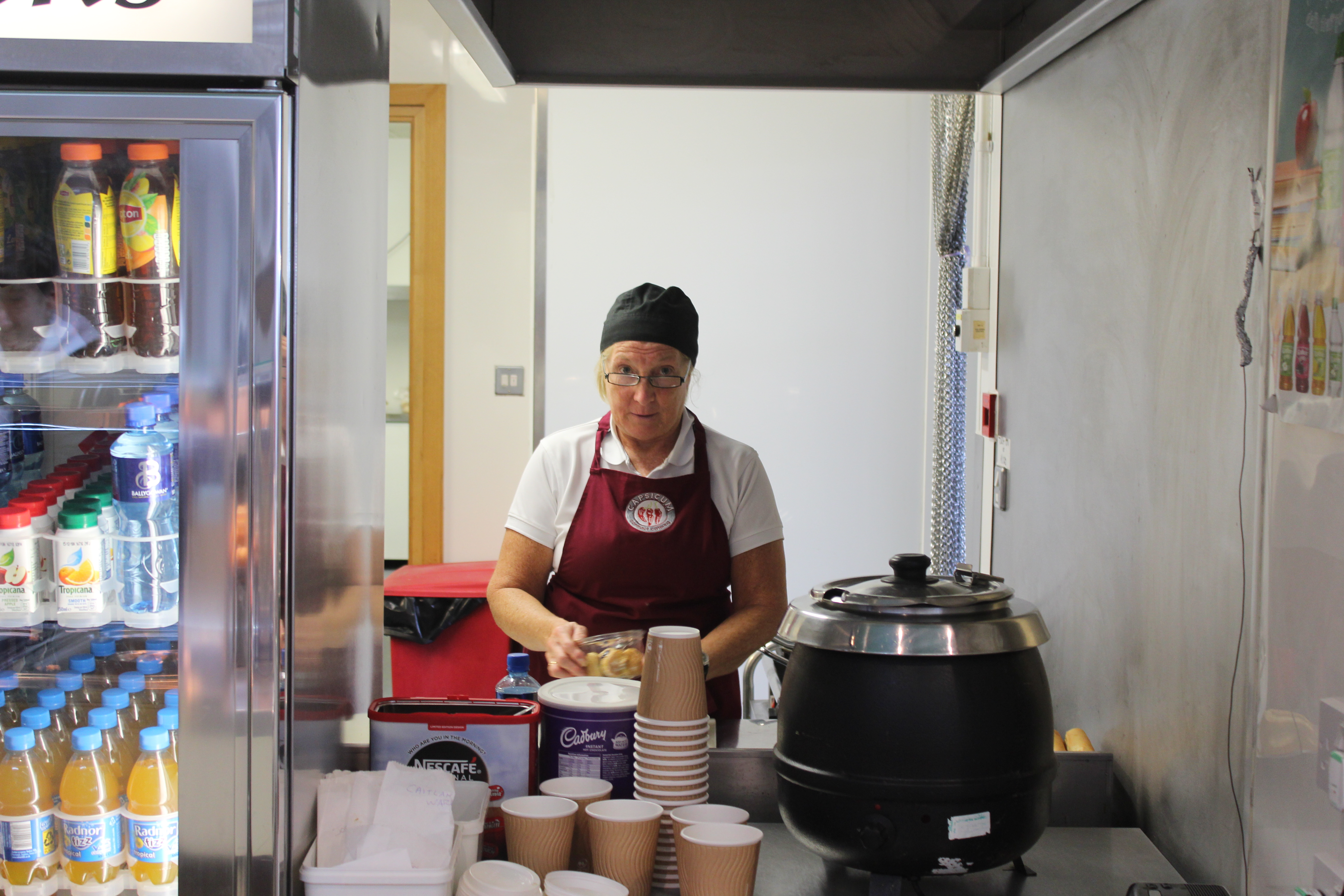
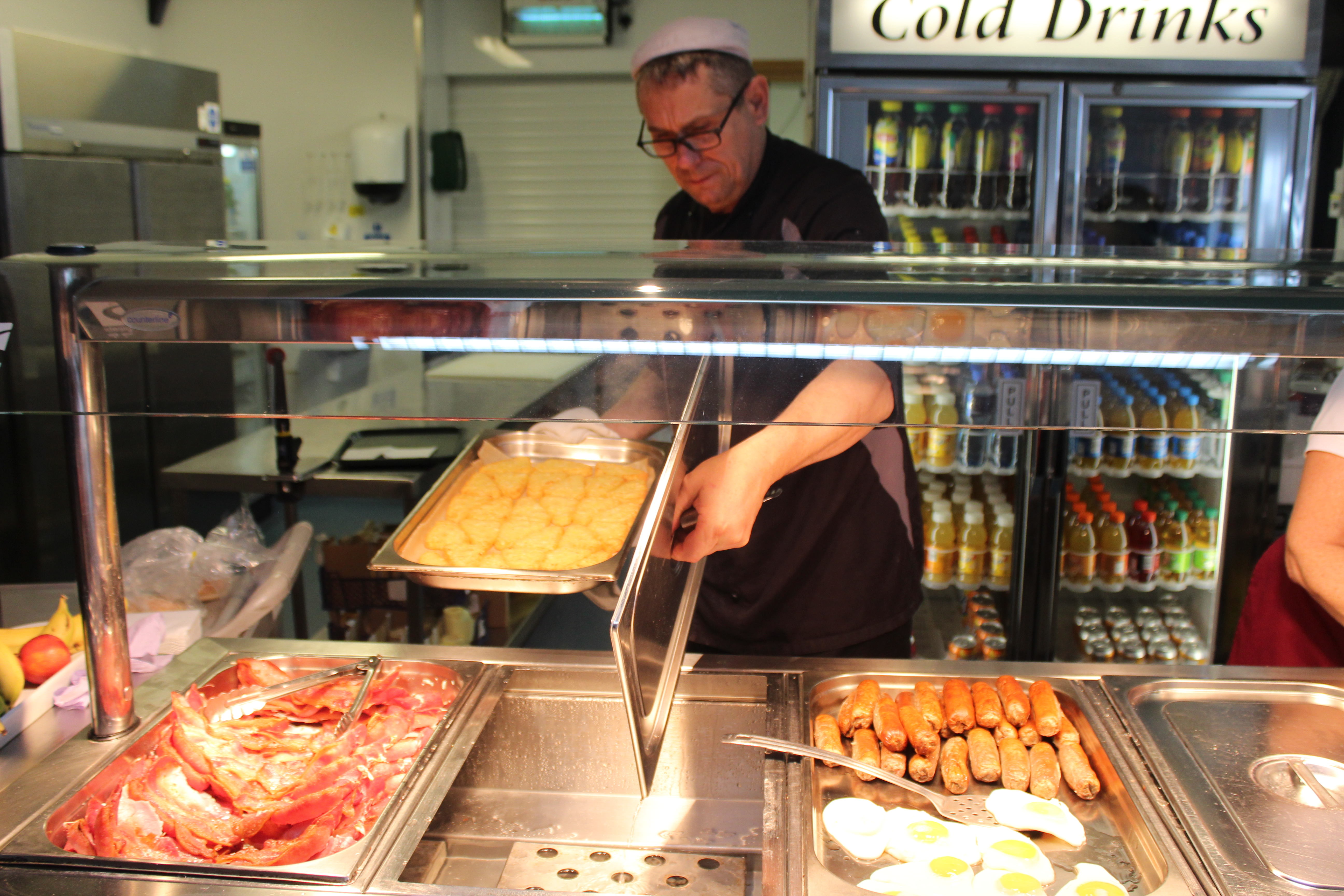
in school we were asked to take environmental portraits in the streets of St. Helier but as i didn’t attend that class i was asked to take the portraits inside the school, so my best bet was to go to the canteen in the staff’s working time. And this is what i came up with:


Before i took the portrait i asked the canteen lady to have direct contact with the camera  and she kindly accepted. as you can see she is working as she naturally would.

And over here i didn’t ask the chef i i could photograph him i did it without his notice to get a fully natural portrait. but of course i asked if i could use the photograph later on.

case study-Kurt Schwitters

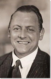
Kurt Hermann Eduard Karl Julius Schwitters (20 June 1887 – 8 January 1948) was a German artist who was born in Hanover, Germany.

Schwitters worked in several genres and media,

Kurt Schwitters Photo

including dadaism, constructivism, surrealism, poetry, sound, painting, sculpture, graphic design, typography, and what came to be known as installation art. He is most famous for his collages, called Merz Pictures.

After studying art at the Dresden Academy alongside Otto Dix and George Grosz, (although Schwitters seems to have been unaware of their work, or indeed of contemporary Dresden artists Die Brücke[4]), 1909–1915, Schwitters returned to Hanover and started his artistic career as a post-impressionist. In 1911 he took part in his first exhibition, in Hanover. As the First World War progressed his work became darker, gradually developing a distinctive expressionist tone

Directly affected by the depressed state of Germany following World War I, and the modernist ethos of the Dada movement, Kurt Schwitters began to collect garbage from the streets and incorporate it directly into his art work. The resulting collages were characterized by their especially harmonious, sentimental arrangements and their incorporation of printed media. He actively produced artistic journals, illustrated works, and advertisements, as well as founding his own Merz journal. He wrote poems and musical works that played with letters, lacing them together in unusual combinations, as he’d done in the collages, in the hope of encouraging his audience to find their own meanings. His multiple avant-garde efforts culminated in his large merzbau creations. These works, collaborations with other avant-garde artists, would start with one object to which others were added, causing the whole piece to change and evolve over time, growing to great proportions that forced the viewer to actually experience, rather than simply view, the art.

Important Art by Kurt Schwitters

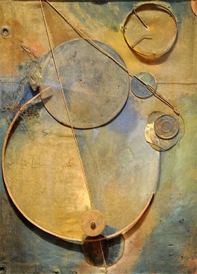
1-Revolving (1919)

Revolving (1919)

Artwork description & Analysis: This work demonstrates a significant shift in Schwitters’ early artistic practice from primarily conservative figurative painting to abstract collage. After World War I, Schwitters began to collect broken and discarded materials he found on the streets and arrange them into works of art. Born from the rubble left by the war, these works emphasize the fact that art can be made from destruction; that urban detritus could be made into something beautiful. In Revolving, found items are organized to form lines and shapes to which he adds bits of yellow and blue paint for shading.

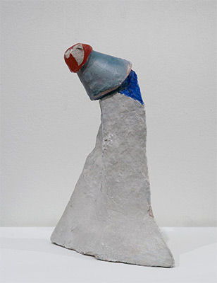
2-(The Clown) (c. 1945-7)

Untitled (The Clown) (c. 1945-7)

Artwork description & Analysis: Fashioned from plaster and found objects, this diminutive assemblage is characteristic of the mixed media sculptures Schwitters produced toward the end of his life, while exiled in England. Despite its unassuming stature and materials, this sculpture embodies the enduring tenderness and whimsy unique to the artist’s oeuvre.

my favorite art pieces of his:

Image result for Kurt Schwitters

Image result for Kurt Schwitters       Image result for Kurt Schwitters    Image result for Kurt Schwitters


I really enjoy looking at Kurt’s art as it has a lot of texture, color, and meaning to it. I also like the fact that he uses anything like garbage scraps and scraps left from the after war to create his master pieces.

photo montage task

what is it?


 Photomontage is the process and the result of making a composite photograph by cutting, gluing, rearranging and overlapping two or more photographs into a new image. Sometimes the resulting composite image is photographed so that a final image may appear as a seamless photographic print. A similar method, although one that does not use film, is realized today through image-editing software. This latter technique is referred to by professionals as “compositing”, and in casual usage is often called “photoshopping” (from the name of the popular software system). A composite of related photographs to extend a view of a single scene or subject would not be labeled as a montage.

history of photomontage:


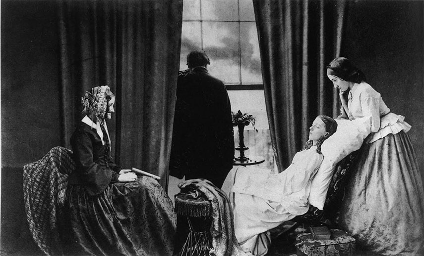
The first and most famous mid-Victorian photomontage (then called combination printing) was “The Two Ways of Life” (1857) by Oscar Rejlander, followed shortly thereafter by the images of photographer Henry Peach Robinsonsuch as “Fading Away” (1858). These works actively set out to challenge the then-dominant painting and theatrical tableau vivants.

In 1916, John Heartfield and George Grosz experimented with pasting pictures together, a form of art later named “Photomontage.”

The pioneering techniques of early photomontage artists were co-opted by the advertising industry from the late 1920s onward. The American photographer Alfred Gescheidt, while working primarily in advertising and commercial art in the 1960s and 1970s, used photomontage techniques to create satirical posters and postcards.

Image result for first photomontage

this is probably the first photomontage ever came out

late 20th century photomontage eh Hannah Hosh

Hannah Höch ; 1 November 1889 – 31 May 1978) was a German Dada artist. She is best known for her work of the Weimar period, when she was one of the originators of photomontage.[1] Photomontage is a type of collage in which the pasted items are actual photographs, or photographic reproductions pulled from the press and other widely produced media.

Höch was not only a rare female practicing prominently in the arts in the early part of the 20thcentury – near unique as a female active in the Dada movement that coalesced in her time – she also consciously promoted the idea of women working creatively more generally in society. She explicitly addressed in her pioneering artwork in the form of photomontage the issue of gender and the figure of woman in modern society. Her transformation of the visual elements of others by integrating them into her own larger creative projects evidenced a well-developed early example of “appropriation” as an artistic technique.

Image result for late 20th century photomontage eh hannah hoch
Höch also helped expand the notion of what could be considered art by incorporating found elements of popular culture into “higher” art. She was one of many Dadaists to take advantage of such means, but she was both among the first, and one of the most self-consciously explicit in describing the goals and effects of doing so.

week 2-CCA gallery exhibition analysis

This exhibition in Saint Helier shows  how  Clara Rae the Australian artist that uses photography to explore ideas of performance and gesture to interrogate and subvert dominant modes of representation, responds to the older photographer Claude Cahun a Jewish-French photographer

Image result for clare rae jersey

This self portrait of Rae shows how she is in a very uncomfortable position, lying on a large stone with her back and head falling behind and her hips on the edge of the stone. this portrait makes the watcher questioning her position and the meaning of it.

Image result for clare rae jersey

This portrait shows how Rae is clinging her self between holes in what seems to be a building, she uses her body to show weird but unique positions that are very questionable.


Image result for claude cahun

Cahun uses different faces in a every portrait, in this photo she is representing a doll wearing a shirt saying “i’m still in training don’t kiss me” makes the viewer question what exactly does she mean.


Clare specifically came to jersey to respond to Claude’s questionable work, both Clare and Claude use black and white self portraits in their work. Claude has acquired cult status among artists dealing with issues of gender, identity and self-representation, she is very known for her radical self-portraits she produced, in collaboration with her female partner Marcel Moore.

The exhibition reflects a dialogue between two performative photographic practices created some 70 years apart. in two separate yet open rooms.

studio photography experiment

A photographic studio (also known as a photography studio or photo studio) is a work space to take, develop, print and duplicate photographs. The studio may have a darkroom, storage space, a studio proper where photographs are taken, a display room and space for other related work.

Why use Studio Equipment?

Studio Photography used to be a expensive business. Because of this, this kind of photography was relatively unknown to many photographers.

But now, a professional photo studio is very affordable! Our vast product range can be a bit overwhelming, so we wrote this mini studio guide to cover the basics and to explain some terminology.Image result for studio photographs reflectors

Basic Knowledge about Shadows

The length and hardness of a shadow is determined by the power of the light source, the distance to the subject and the type of light: direct or indirect. Compare this to your own shadow: on a sunny day, you have a long, hard shadow. On a cloudy day, your shadowis hardly visible. This is because the clouds have the same effect on the sunlight as a diffuser has on a studio flash: it makes the light more even and bounce around the subject.

Image result for studio photographs shadows

Using reflectors

Reflectors are one of the most widely used tools in studio photography.
You can use them to lighten up shadows, or to reflected a slightly colored light onto the subject. They come in various sizes and shapes, some are 5-in-1 or 7-in-1 with multiple colors you can choose from.

They also enable you to make the best use of available daylight, when you don’t want to use lighting equipment.Image result for studio photographs reflectors

experimenting with studio photography:

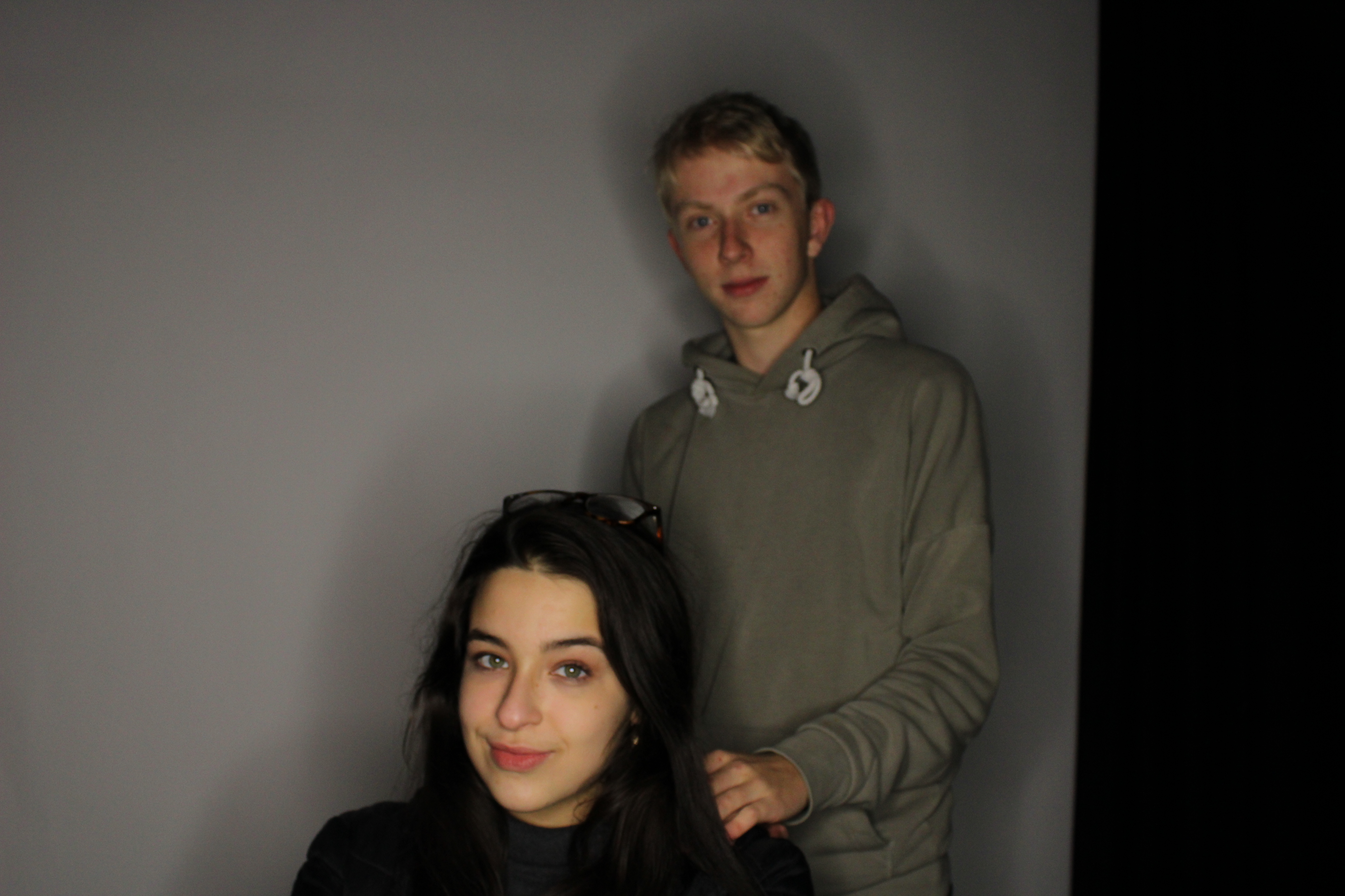
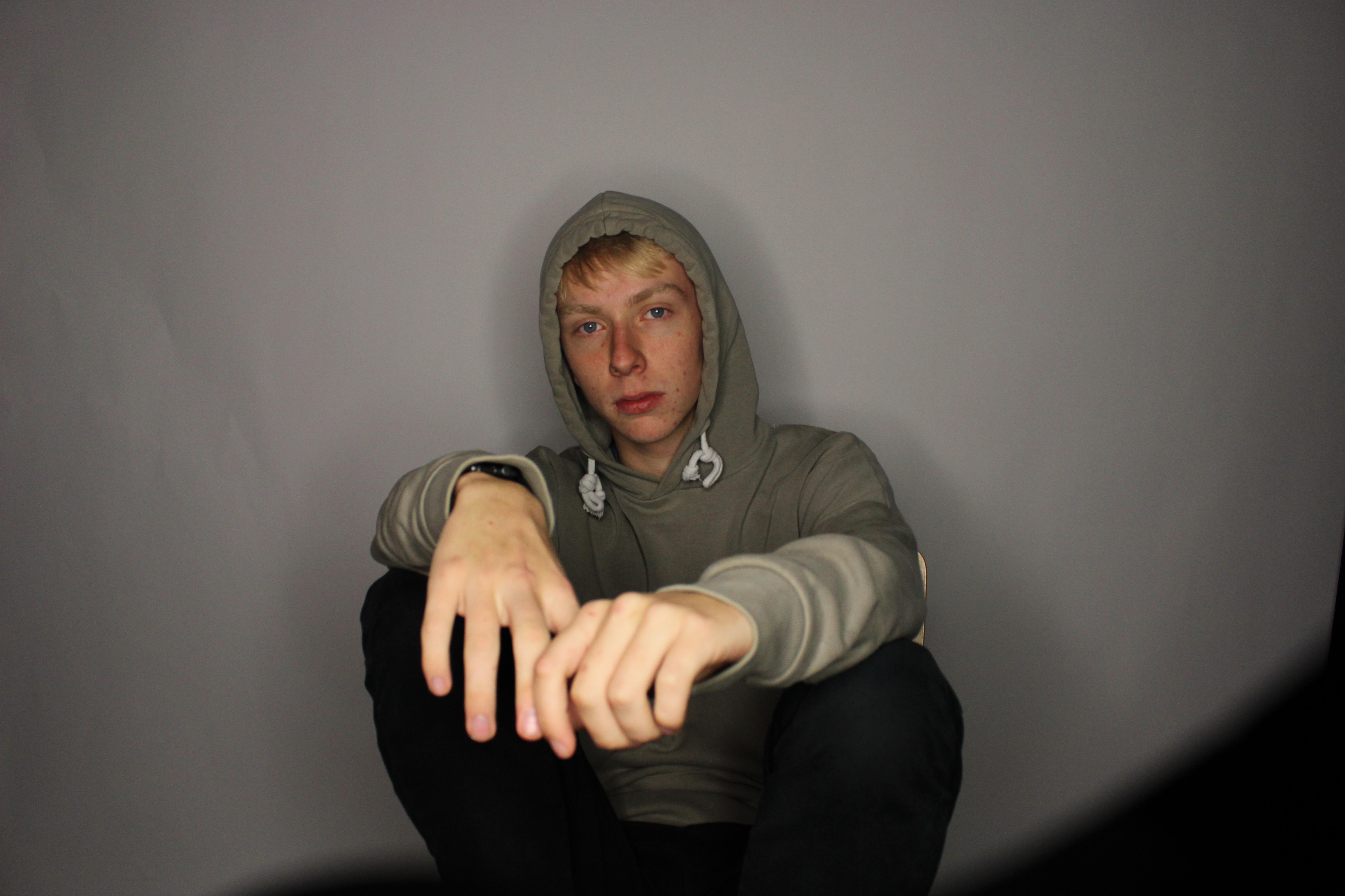
we went to experiment studio photography with the schools cameras as groups of threes in the schools studio. in most of the photos one was being the model photographed, one will be taking the photograph, and last but not least one will be responsible for the positioning and adjusting of the lighting.

this photograph was taken on manual settings with a slow shutter speed, and the focus point was on the persons face not the hands as they are in the front which would make the face unfocused if they were. the lighting source in this portrait was from an umbrella light, so the white balance was set on tungsten.

in this family friendly photograph the curtains in the background where white, the source of lighting was a ring light with a mixture of the room’s florescent lighting, so the white balance was set on florescent. the black part in the background was the photographer’s mistake as they didn’t chose a good angle to take the photograph from so this created some shadow in the background.

What is Chiaroscuro Photography?

The word chiaroscuro is Italian for light and shadow. It’s one of the classic techniques used in the works of artists like Rembrandt, da Vinci, and Caravaggio. It refers to the use of light and shadow to create the illusion of light from a specific source shining on the figures and objects in the painting. Chiaroscuro means light and dark and basically refers to the high contrast light/dark style used in Renaissance painting and later in cinema.

Image result for chiaroscuro photography


experimenting with chiaroscuro photography in the studio:

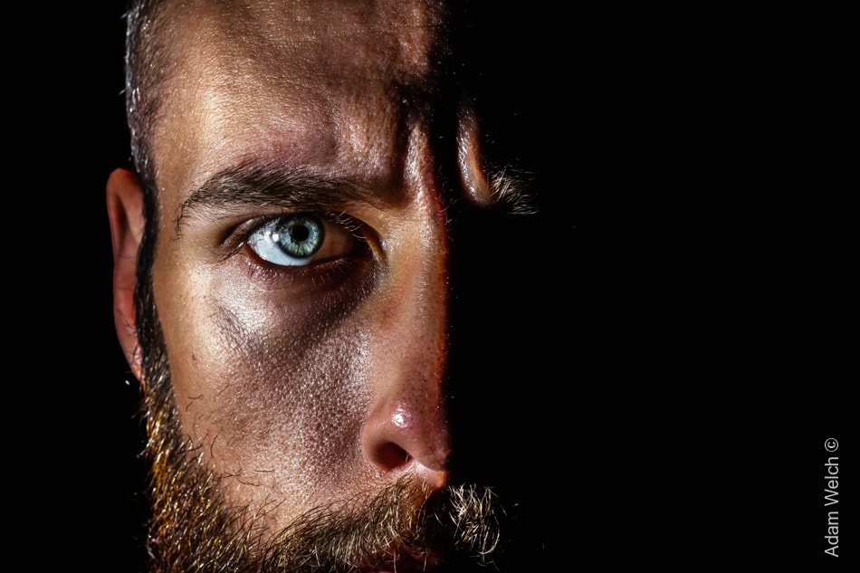
we tried to use chiaroscuro photography in the schools studio using the school’s cameras as groups of threes. and this was some of me and my groups results:

in this portrait the model was centered in the middle as to let the middle focus point to be on the eyeball, the light source was an umbrella warm light from the right of the photograph and no reflectors were used here as to create a shadow on one side of the face. the white balance was set on tungsten.

this photograph was taken in a portrait position to display most the model, the white balance was also set on tungsten as its the same light source from the same direction.


experimenting with window lighting

Window light is an excellent, free light source. It can achieve the same effects as much bigger, more expensive lighting equipment. A large window is essentially a huge softbox. It will diffuse light into the room and around the subject you place in front of it.

If you see the window as a softbox, everything that you know about a softbox will be relevant to this lighting.

First of all, the larger the window, the softer the light. A large window provides a wider angle from which the light falls on to your face. It produces less shadows. This is very important to remember if you’re trying to take photos with hard shadows.

There are many ways in which a window is better than a softbox. They come in all shapes and sizes. They’re everywhere. They’re free to use. And they’re easy to experiment with.

The downsides are that the light is dependent upon the weather and time of day. You also have to move the model or subject, rather than just the light source (the window).

The soft nature of window light makes it very flattering for portrait photography. The shadows that appear on the face are very natural and don’t accentuate any features.

If there were any features that you would want to hide, you’d want to make the light harder. You do this by standing farther from the window, or using a smaller window.

A window is a great way to get an expensive look for free – how you use your window is up to you.

Image result for window lighting

Move the subject closer to you with the majority of the window light behind them. The lighting on the face will become softer as the left side of the face starts to even out with the right.

Turn this the other way and the right side of the face will even out with the left, making for a more evenly lit subject.

It’s important to experiment and see which you like the most and whether it suits whatever you’re shooting.

Obviously there are more uses for window lighting than just models: still life, animals, etc.

When the subject is facing a window, you will end up with a very soft, yet rather flat, image with fewer shadows.

Yes, this will light the subject but it won’t look all that interesting compared to some of the other possible effects.

It’s also important to note any other light available in the room. You don’t want any of the lights to be on or you’ll struggle to set the right white balance; there is more than one light source.

When the window is behind the subject, you get the same sort of results as when you shoot into the sun: the camera will probably try to expose for the window, unless you’re using spot metering, causing a silhouette.

When you have the camera set to spot metering, you can overexpose the background to blow out the light, while exposing for the subject in the foreground. This can produce a very cool effect and it’s about the only interesting white/light background that I like to use.

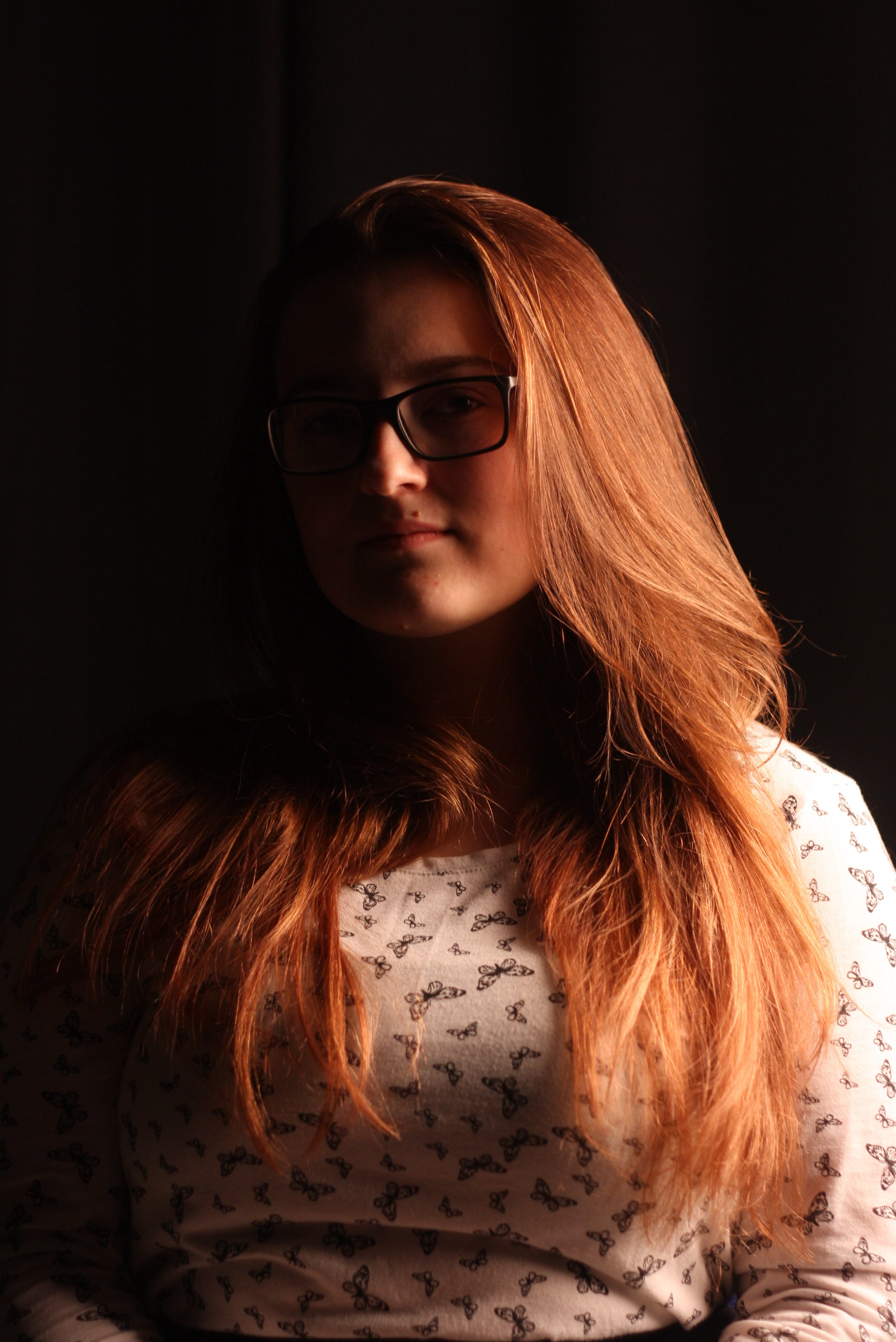
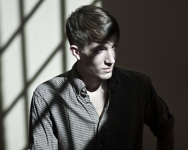
experimenting with window lighting:

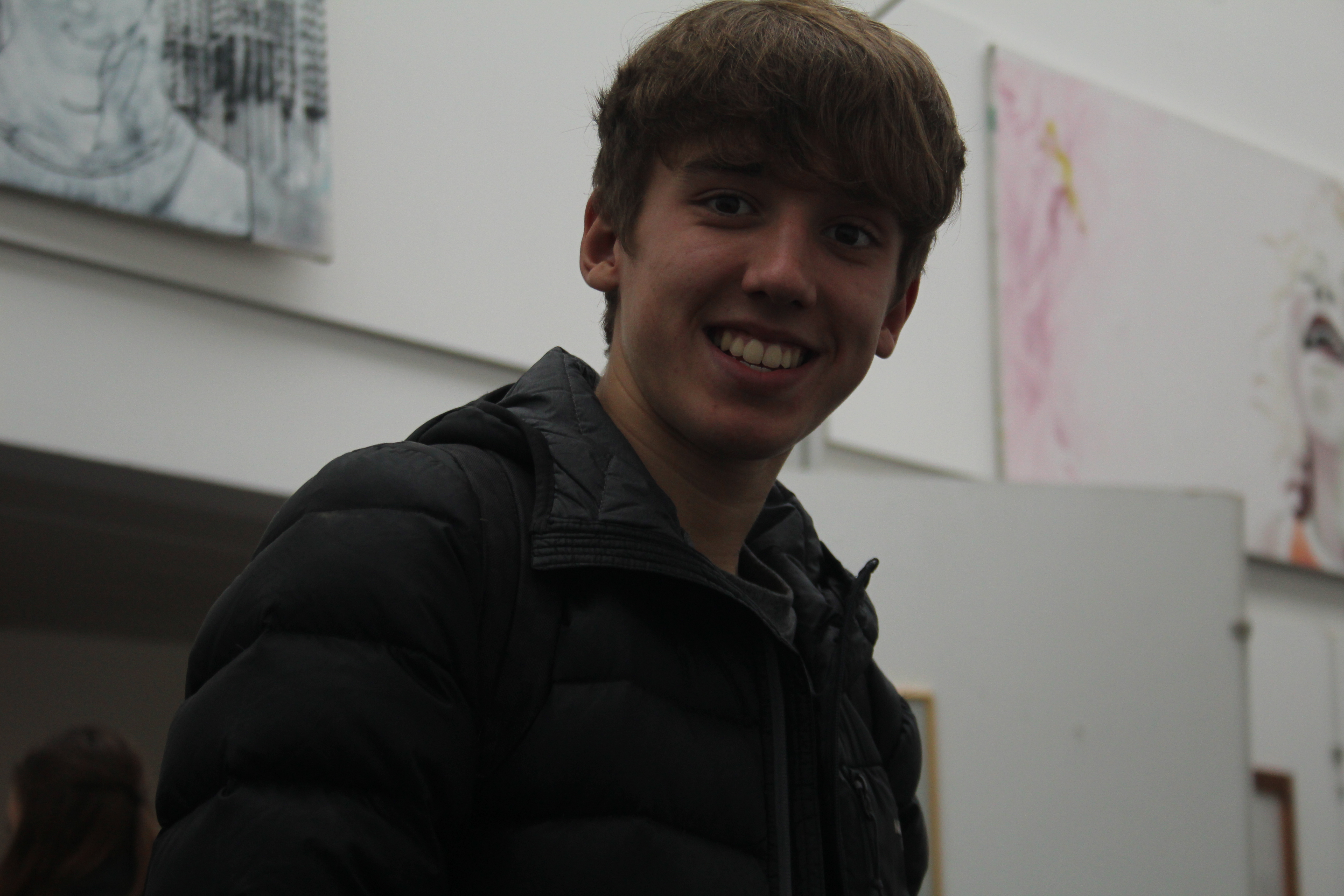
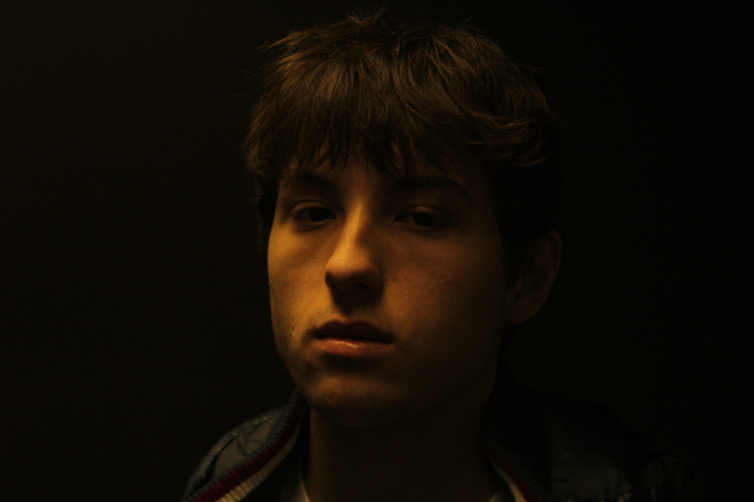
in this portrait the iso was on 400, it was taken under an artificial yellow light with a black card behind the person in the portrait. The shooting settings was on manual like the focus settings. the person in the portrait was not positions in the center he was a bit to the right of the light so that half of his face is in shadow and the other half is lighten.

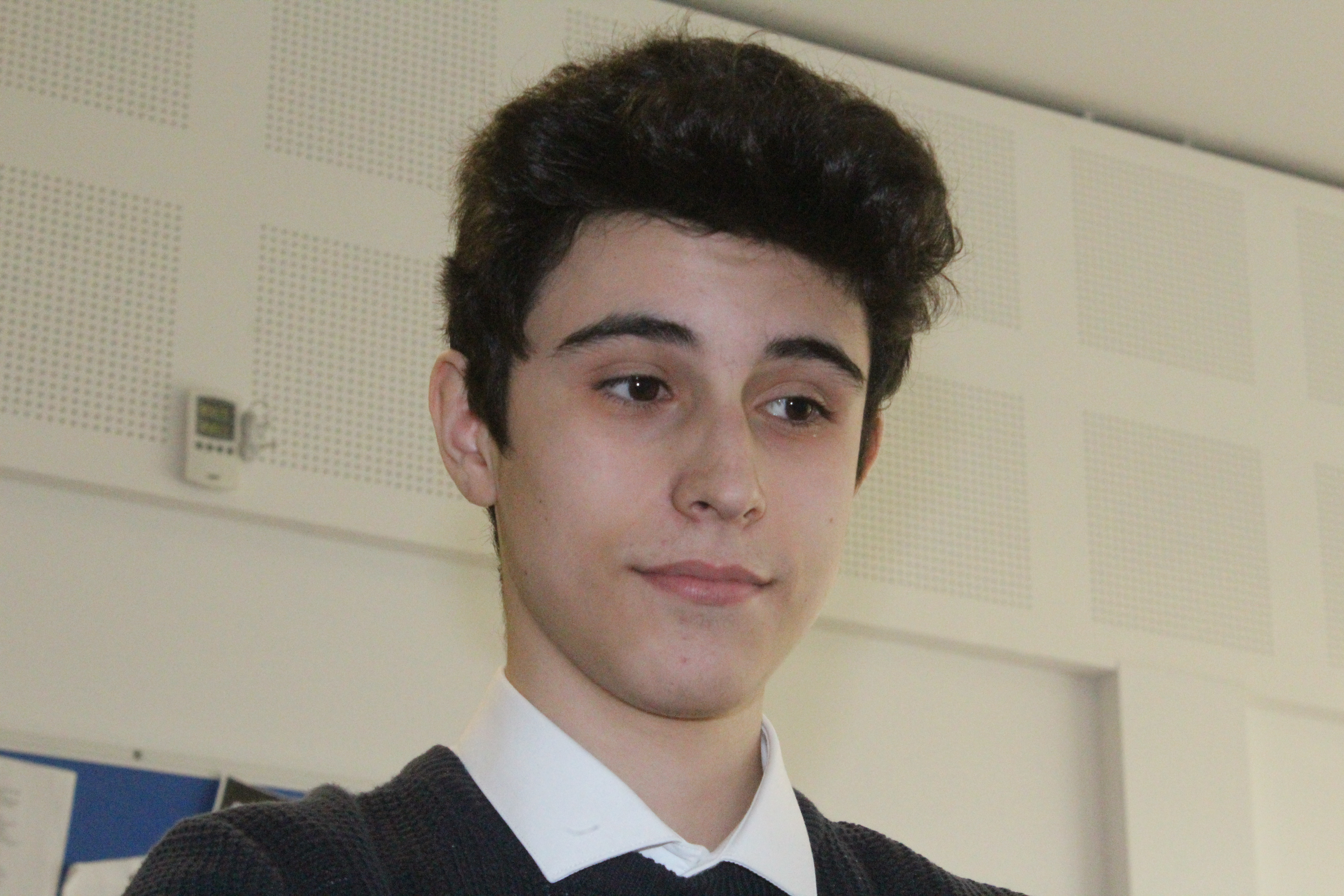
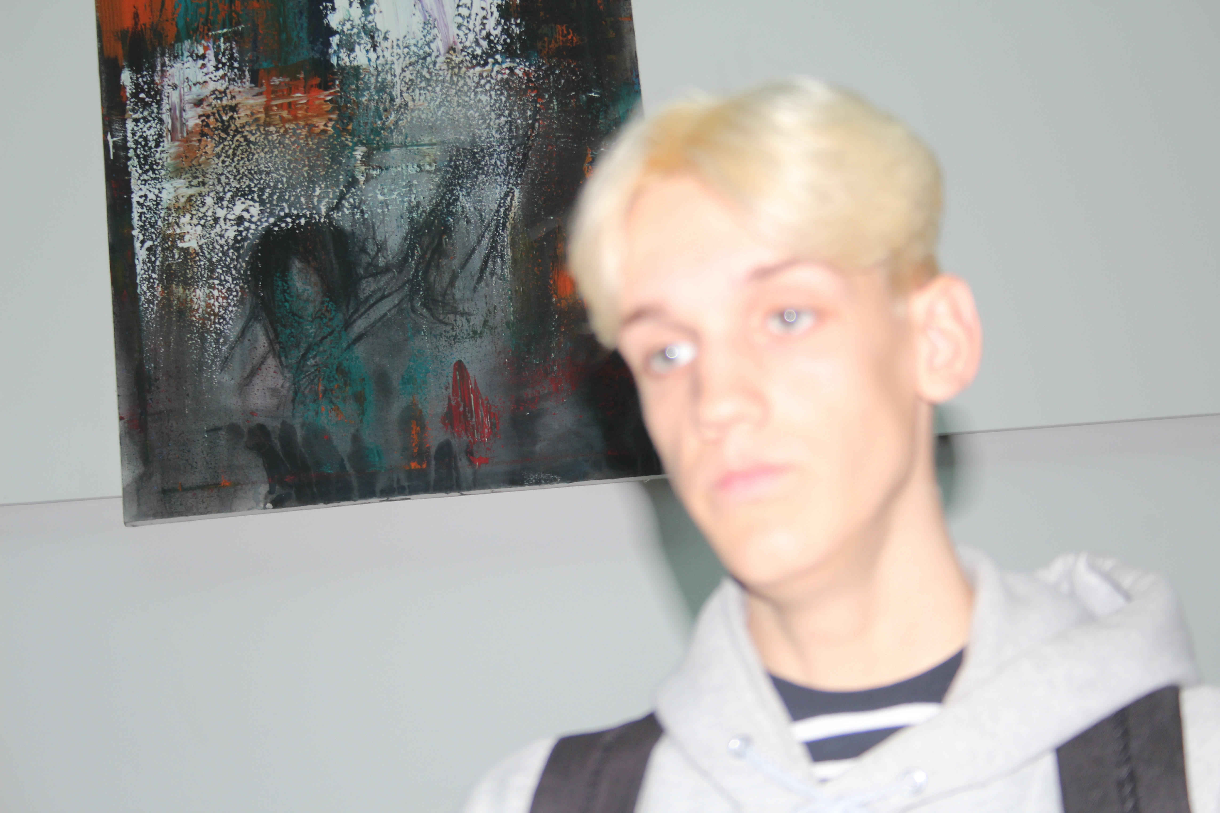
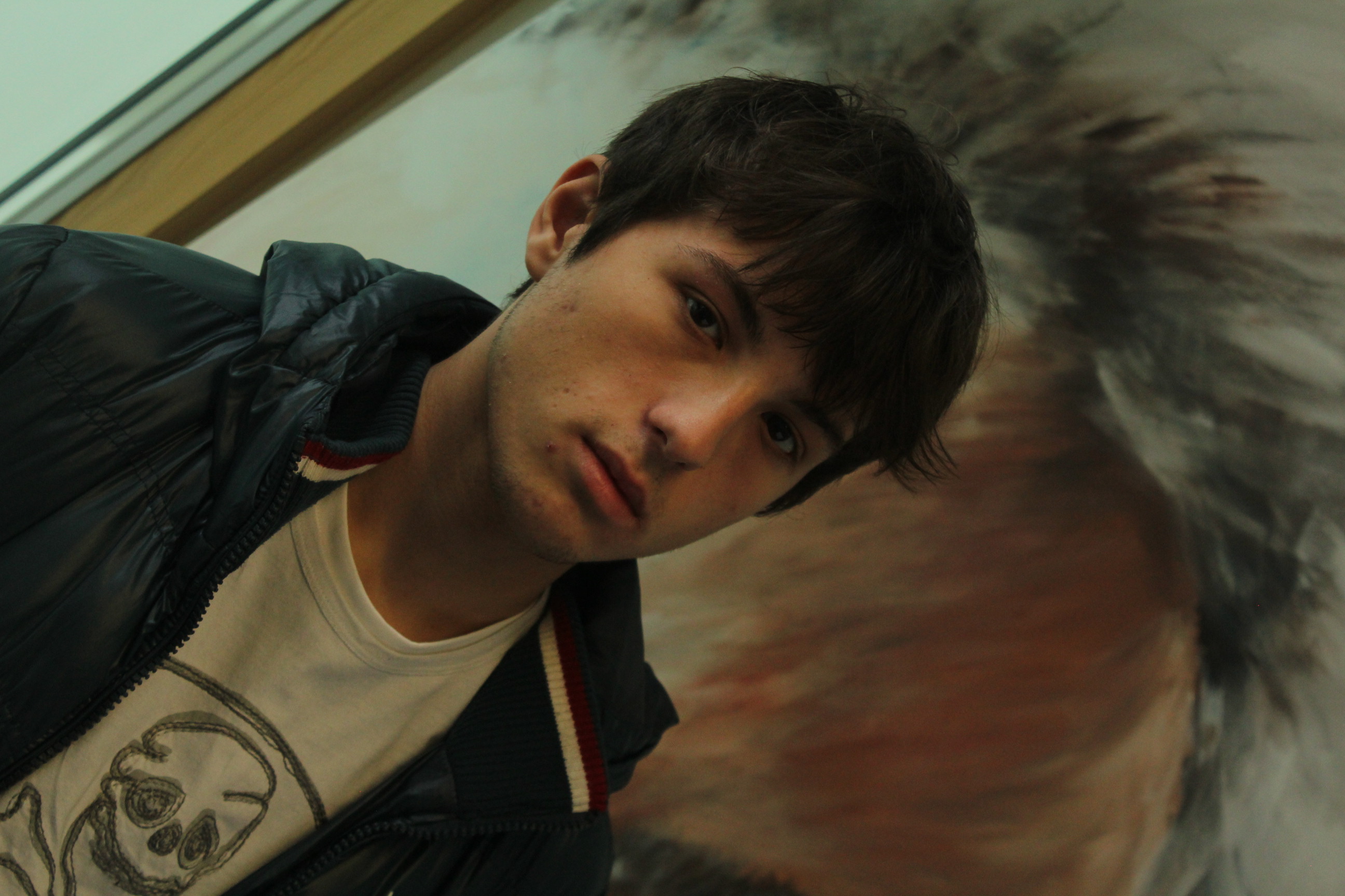
in this photo it was on high shutter speed, and was focused using manual focus. the photo was taken at a 45 degree angle to create movement in the portrait. the background was chosen on purpose, its an abstract painting that was made by one of the art students, it creates a lot of color in the background. the light was natural coming the window on the left of the photo but it was distributed and soft because the sunlight went through the clouds which diffused the light. but as you can see there is still some light on the right of the photo, that light was created using a light reflector board that was positioned from the bottom by the other student to reflect some of the window on the right side of the face.

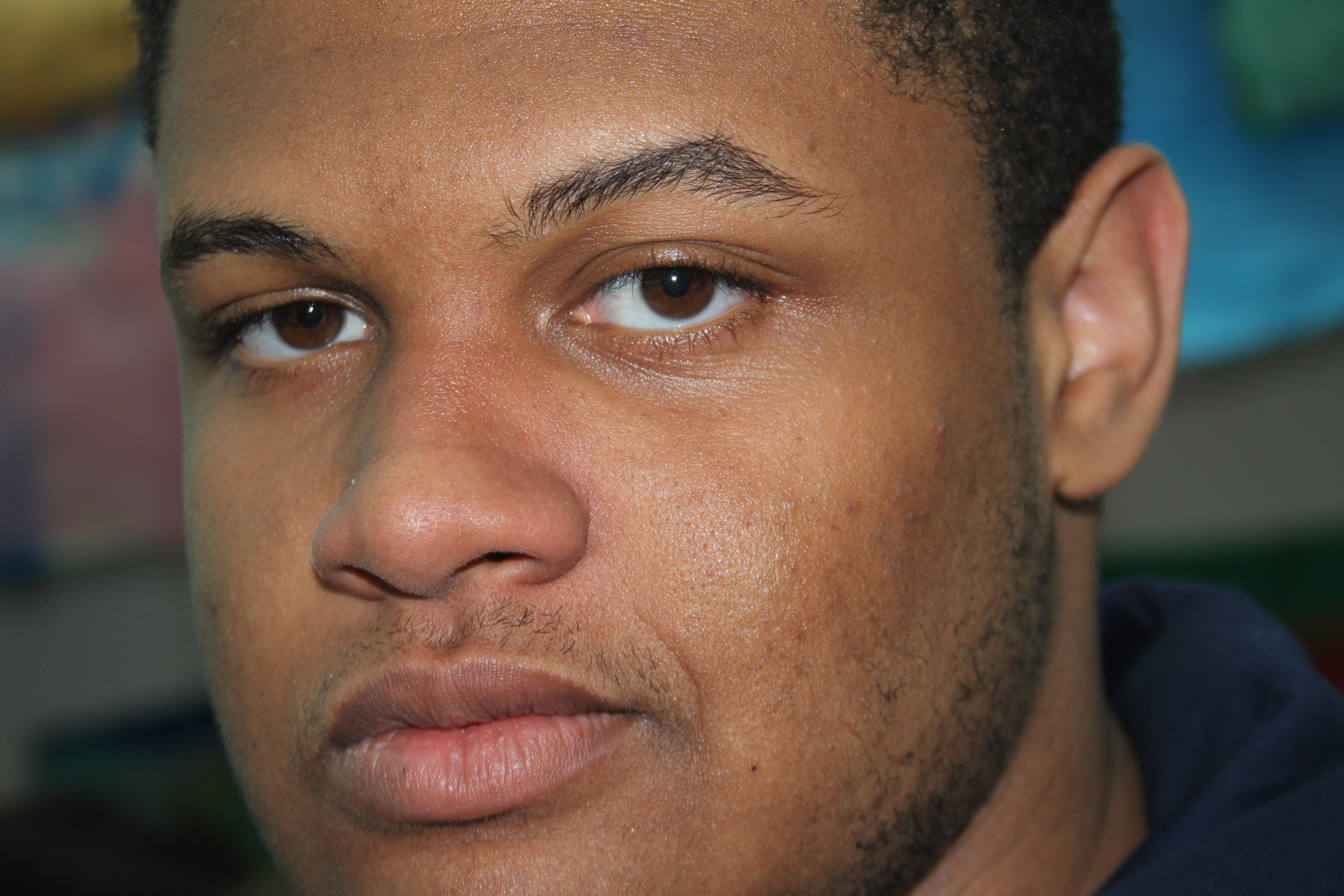
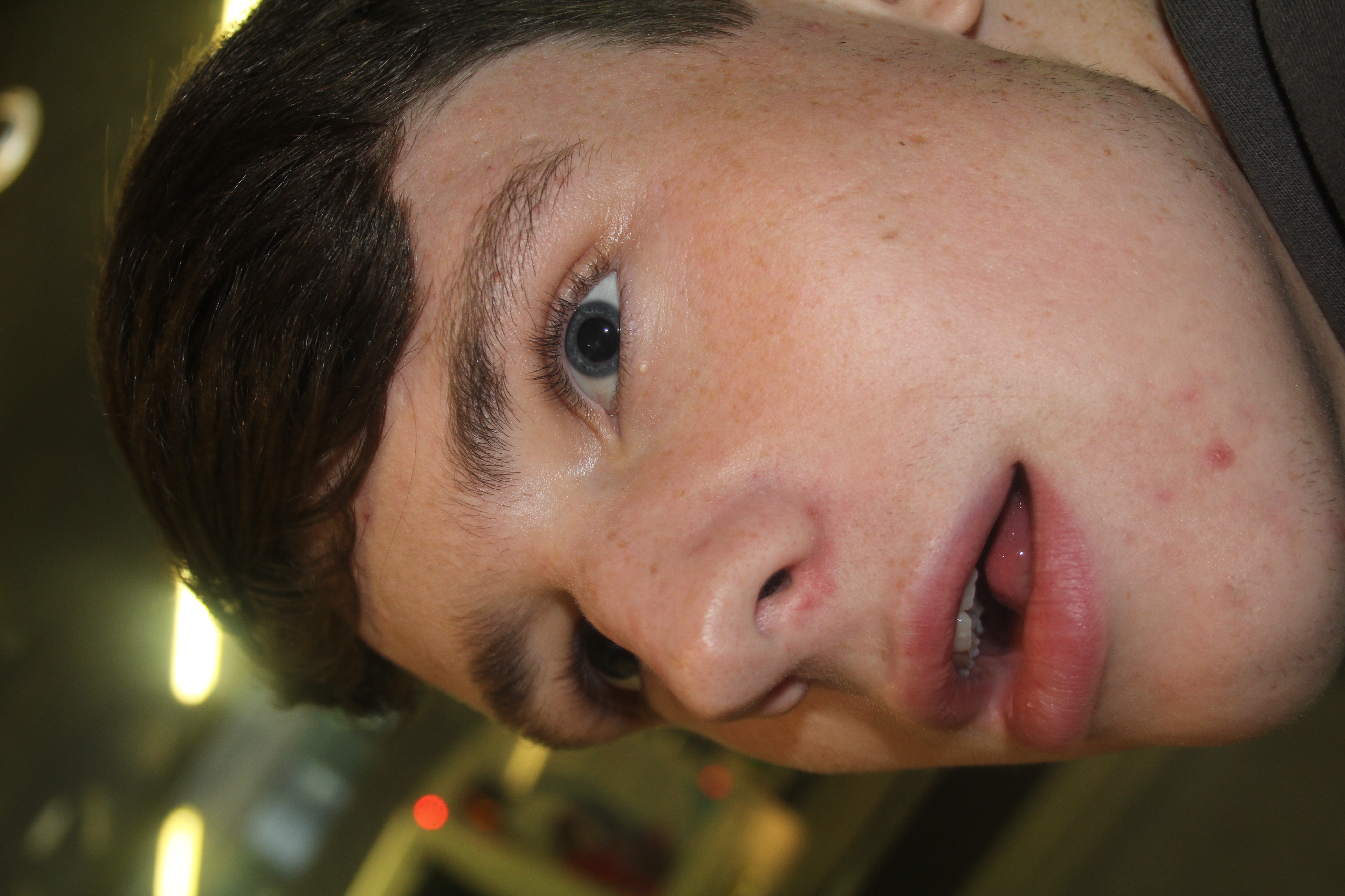
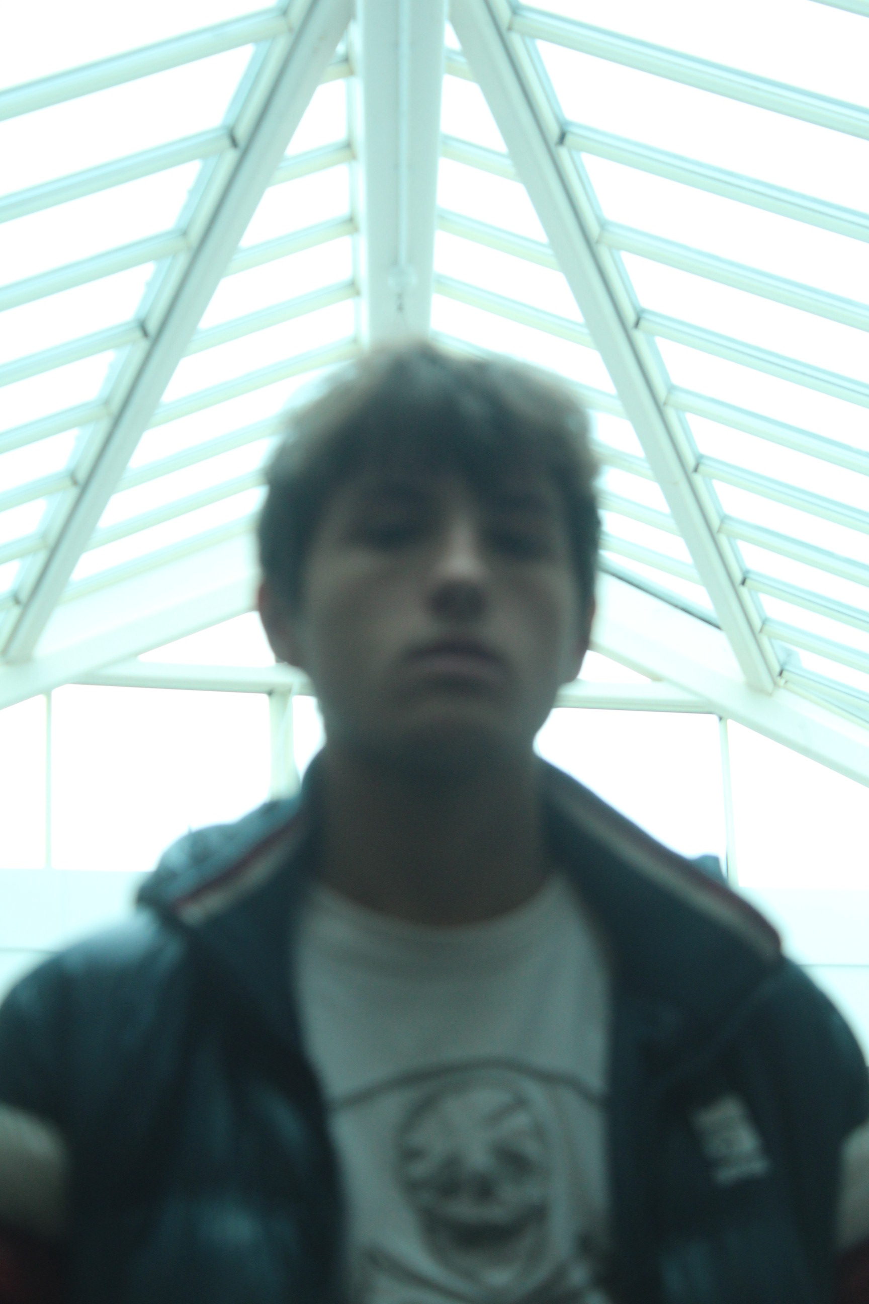
this portrait was taken from the bottom looking upwardish on the face. it was taken using low shutter speed and manual focus that made the photo not focused to create texture in the portrait. the light was coming from ceiling windows on top of the school, the windows are actually the background of the portrait. and light on the front of the face was created by reflecting the background light through reflectors positioned under the camera.


in conclusion all portraits that are made with window lighting have a special affect on them. and a lot can be experimented using window lighting (direct sunlight, diffused sunlight, using reflectors….) and not all portraits have to be focused. and last but not least you have to always have your person in the portrait have direct eye contact with the cameras lens.